Trigonometry in CSS and JavaScript: Beyond Triangles

In the previous article we looked at how to clip an equilateral triangle with trigonometry, but what about some even more interesting geometric shapes?

This article is the 3rd part in a series on Trigonometry in CSS and JavaScript:

  1. Introduction to Trigonometry
  2. Getting Creative with Trigonometric Functions
  3. Beyond Triangles (this article)

Plotting regular polygons

A regular polygon is a polygon with all equal sides and all equal angles. An equilateral triangle is one, so too is a pentagon, hexagon, decagon, and any number of others that meet the criteria. We can use trigonometry to plot the points of a regular polygon by visualizing each set of coordinates as points of a triangle.

Polar coordinates

If we visualize a circle on an x/y axis, draw a line from the center to any point on the outer edge, then connect that point to the horizontal axis, we get a triangle.

A circle centrally positioned on an axis, with a line drawn along the radius to form a triangle

If we repeatedly rotated the line at equal intervals six times around the circle, we could plot the points of a hexagon.

A hexagon, made by drawing lines along the radius of the circle

But how do we get the x and y coordinates for each point? These are known as cartesian coordinates, whereas polar coordinates tell us the distance and angle from a particular point. Essentially, the radius of the circle and the angle of the line. Drawing a line from the center to the edge gives us a triangle where hypotenuse is equal to the circle’s radius.

Showing the triangle made by drawing a line from one of the vertices, with the hypotenuse equal to the radius, and the angle as 2pi divided by 6

We can get the angle in degrees by diving 360 by the number of vertices our polygon has, or in radians by diving 2pi radians. For a hexagon with a radius of 100, the polar coordinates of the uppermost point of the triangle in the diagram would be written (100, 1.0472rad) (r, θ).

An infinite number of points would enable us to plot a circle.

Polar to cartesian coordinates

We need to plot the points of our polygon as cartesian coordinates – their position on the x and y axis.

As we know the radius and the angle, we need to calculate the adjacent side length for the x position, and the opposite side length for the y position.

Showing the triangle superimposed on the hexagon, and the equations needed to calculate the opposite and adjacent sides.

Therefore we need Cosine for the former and Sine for the latter:

adjacent = cos(angle) * hypotenuse
opposite = sin(angle) * hypotenuse

We can write a JS function that returns an array of coordinates:

const plotPoints = (radius, numberOfPoints) => {

	/* step used to place each point at equal distances */
	const angleStep = (Math.PI * 2) / numberOfPoints

	const points = []

	for (let i = 1; i <= numberOfPoints; i++) {
		/* x & y coordinates of the current point */
		const x = Math.cos(i * angleStep) * radius
		const y = Math.sin(i * angleStep) * radius

		/* push the point to the points array */
		points.push({ x, y })
	}
	
	return points
}

We could then convert each array item into a string with the x and y coordinates in pixels, then use the join() method to join them into a string for use in a clip path:

const polygonCoordinates = plotPoints(100, 6).map(({ x, y }) => {
		return `${x}px ${y}px`
	}).join(',')

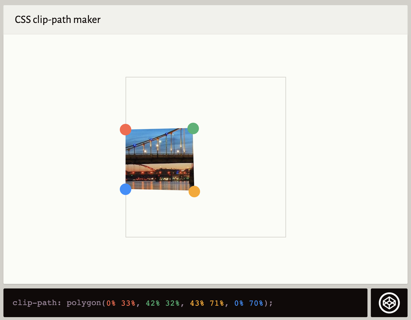
shape.style.clipPath = `polygon(${polygonCoordinates})`

See the Pen Clip-path polygon by Michelle Barker (@michellebarker) on CodePen.dark

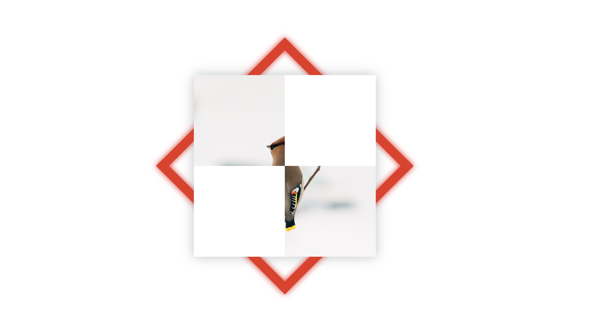
This clips a polygon, but you’ll notice we can only see one quarter of it. The clip path is positioned in the top left corner, with the center of the polygon in the corner. This is because at some points, calculating the cartesian coordinates from the polar coordinates is going to result in negative values. The area we’re clipping is outside of the element’s bounding box.

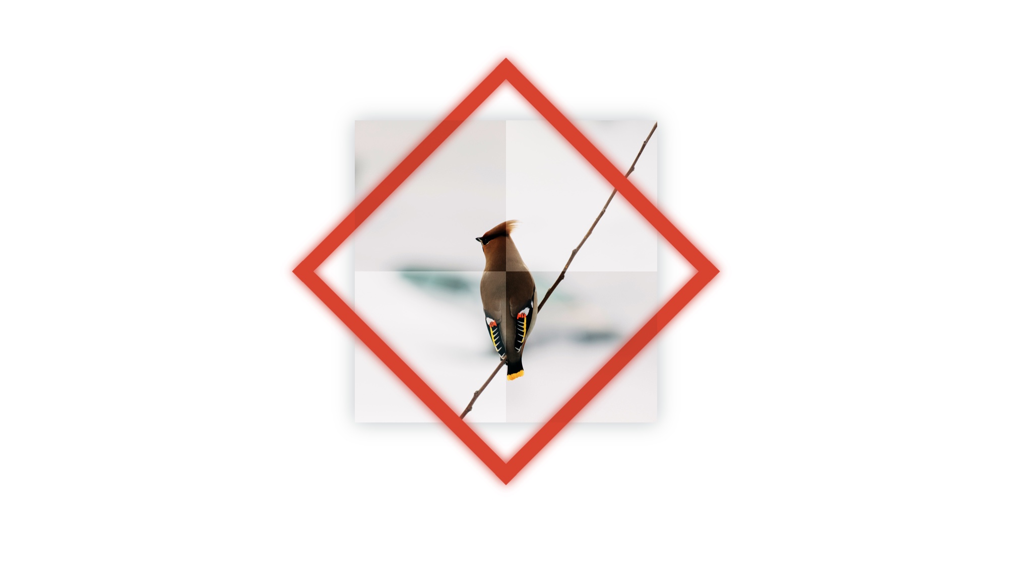
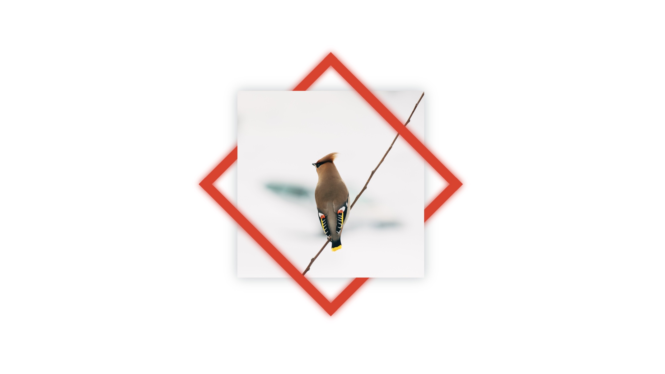
To position the clip path centrally, we need to add half of the width and height respectively to our calculations:

const xPosition = shape.clientWidth / 2
const yPosition = shape.clientHeight / 2

const x = xPosition + Math.cos(i * angleStep) * radius
const y = yPosition + Math.sin(i * angleStep) * radius

Let’s modify our function:

const plotPoints = (radius, numberOfPoints) => {
	const xPosition = shape.clientWidth / 2
	const yPosition = shape.clientHeight / 2
	const angleStep = (Math.PI * 2) / numberOfPoints
	const points = []

	for (let i = 1; i <= numberOfPoints; i++) {
		const x = xPosition + Math.cos(i * angleStep) * radius
		const y = yPosition + Math.sin(i * angleStep) * radius

		points.push({ x, y })
	}
	
	return points
}

Our clip path is now positioned in the center.

See the Pen Clip-path polygon by Michelle Barker (@michellebarker) on CodePen.dark

Star polygons

The types of polygons we’ve plotted so far are known as convex polygons. We can also plot star polygons by modifying our code in the plotPoints() function ever so slightly. For every other point, we could change the radius value to be 50% of the original value:

/* Set every other point’s radius to be 50% */
const radiusAtPoint = i % 2 === 0 ? radius * 0.5 : radius
		
/* x & y coordinates of the current point */
const x = xPosition + Math.cos(i * angleStep) * radiusAtPoint
const y = yPosition + Math.sin(i * angleStep) * radiusAtPoint

See the Pen Clip-path star polygon by Michelle Barker (@michellebarker) on CodePen.dark

Here’s an interactive example. Try adjusting the values for the number of points and the inner radius to see the different shapes that can be made.

See the Pen Clip-path adjustable polygon by Michelle Barker (@michellebarker) on CodePen.dark

Drawing with the Canvas API

So far we’ve plotted values to use in CSS, but trigonometry has plenty of applications beyond that. For instance, we can plot points in exactly the same way to draw on a <canvas> with Javascript. In this function, we’re using the same function as before (plotPoints()) to create an array of polygon points, then we draw a line from one point to the next:

const canvas = document.getElementById('canvas')
const ctx = canvas.getContext('2d')

const draw = () => {
	/* Create the array of points */
	const points = plotPoints()
	
	/* Move to starting position and plot the path */
	ctx.beginPath()
	ctx.moveTo(points[0].x, points[0].y)
	
	points.forEach(({ x, y }) => {
		ctx.lineTo(x, y)
	})
	
	ctx.closePath()
	
	/* Draw the line */
	ctx.stroke()
}

See the Pen Canvas polygon (simple) by Michelle Barker (@michellebarker) on CodePen.dark

Spirals

We don’t even have to stick with polygons. With some small tweaks to our code, we can even create spiral patterns. We need to change two things here: First of all, a spiral requires multiple rotations around the point, not just one. To get the angle for each step, we can multiply pi by 10 (for example), instead of two, and divide that by the number of points. That will result in five rotations of the spiral (as 10pi divided by two is five).

const angleStep = (Math.PI * 10) / numberOfPoints

Secondly, instead of an equal radius for every point, we’ll need to increase this with every step. We can multiply it by a number of our choosing to determine how far apart the lines of our spiral are rendered:

const multiplier = 2
const radius = i * multiplier
const x = xPosition + Math.cos(i * angleStep) * radius
const y = yPosition + Math.sin(i * angleStep) * radius

Putting it all together, our adjusted function to plot the points is as follows:

const plotPoints = (numberOfPoints) => {
	const angleStep = (Math.PI * 10) / numberOfPoints
	const xPosition = canvas.width / 2
	const yPosition = canvas.height / 2

	const points = []

	for (let i = 1; i <= numberOfPoints; i++) {
		const radius = i * 2 // multiply the radius to get the spiral
		const x = xPosition + Math.cos(i * angleStep) * radius
		const y = yPosition + Math.sin(i * angleStep) * radius

		points.push({ x, y })
	}
	
	return points
}

See the Pen Canvas spiral – simple by Michelle Barker (@michellebarker) on CodePen.dark

At the moment the lines of our spiral are at equal distance from each other, but we could increase the radius exponentially to get a more pleasing spiral. By using the Math.pow() function, we can increase the radius by a larger number for each iteration. By the golden ratio, for example:

const radius = Math.pow(i, 1.618)
const x = xPosition + Math.cos(i * angleStep) * radius
const y = yPosition + Math.sin(i * angleStep) * radius

See the Pen Canvas spiral by Michelle Barker (@michellebarker) on CodePen.dark

Animation

We could also rotate the spiral, using (using requestAnimationFrame). We’ll set a rotation variable to 0, then on every frame increment or decrement it by a small amount. In this case I’m decrementing the rotation, to rotate the spiral anti-clockwise

let rotation = 0

const draw = () => {
	const { width, height } = canvas
	
	/* Create points */
	const points = plotPoints(400, rotation)
	
	/* Clear canvas and redraw */
	ctx.clearRect(0, 0, width, height)
	ctx.fillStyle = '#ffffff'
	ctx.fillRect(0, 0, width, height)
	
	/* Move to beginning position */
	ctx.beginPath()
	ctx.moveTo(points[0].x, points[0].y)
	
	/* Plot lines */
	points.forEach((point, i) => {
		ctx.lineTo(point.x, point.y)
	})
	
	/* Draw the stroke */
	ctx.strokeStyle = '#000000'
	ctx.stroke()
	
	/* Decrement the rotation */
	rotation -= 0.01
	
	window.requestAnimationFrame(draw)
}

draw()

We’ll also need to modify our plotPoints() function to take the rotation value as an argument. We’ll use this to increment the x and y position of each point on every frame:

const x = xPosition + Math.cos(i * angleStep + rotation) * radius
const y = yPosition + Math.sin(i * angleStep + rotation) * radius

This is how our plotPoints() function looks now:

const plotPoints = (numberOfPoints, rotation) => {
	/* 6 rotations of the spiral divided by number of points */
	const angleStep = (Math.PI * 12) / numberOfPoints 
	
	/* Center the spiral */
	const xPosition = canvas.width / 2
	const yPosition = canvas.height / 2

	const points = []

	for (let i = 1; i <= numberOfPoints; i++) {
		const r = Math.pow(i, 1.3)
		const x = xPosition + Math.cos(i * angleStep + rotation) * r
		const y = yPosition + Math.sin(i * angleStep + rotation) * r

		points.push({ x, y, r })
	}
	
	return points
}

See the Pen Canvas spiral by Michelle Barker (@michellebarker) on CodePen.dark

Wrapping up

I hope this series of articles has given you a few ideas for how to get creative with trigonometry and code. I’ll leave you with one more creative example to delve into, using the spiral method detailed above. Instead of plotting points from an array, I’m drawing circles at a new position on each iteration (using requestAnimationFrame).

See the Pen Canvas spiral IIII by Michelle Barker (@michellebarker) on CodePen.dark

Special thanks to George Francis and Liam Egan, whose wonderful creative work inspired me to delve deeper into this topic!

The post Trigonometry in CSS and JavaScript: Beyond Triangles appeared first on Codrops.

Trigonometry in CSS and JavaScript: Getting Creative with Trigonometric Functions

In part 1 we got an overview of trigonometry and learnt how we can use trigonometric functions in Sass. But for dynamic variables, we would be wise to move our calculations into JavaScript. Let’s take a look at an example that’s slightly more complex than clipping a simple triangle.

This article is the 2nd part in a series on “Trigonometry in CSS and JavaScript”:

  1. Introduction to Trigonometry
  2. Getting Creative with Trigonometric Functions (this article)
  3. Beyond Triangles

In the following demo we have a square-based pyramid, built with CSS 3D transforms. Using the slider, we can change the length of the sides of the pyramid, which results in changes to the overall height, and the angle of the sloping sides.

See the Pen Pyramids by Michelle Barker (@michellebarker) on CodePen.dark

To recalculate the angle at which the sides are rotated every time the input value changes, we need trigonometry. In order to do that, we can take a cross-section of the pyramid from the side, and visualize it as a triangle.

We can see that, just like our equilateral triangle in the previous article, the cross-section of our pyramid can be broken up into two right-angled triangles. (This time the shape of the cross-section is an isosceles triangle — a triangle that has two sides of equal length.)

To create the shapes for the base and sides of the pyramid, we can set the width and initial height, and use clip-path to clip the triangular shape of the sides.

.shape__base {
	--w: 10rem;
	
	width: var(--w);
	height: var(--w);
}

.shape__side {
	width: var(--side);
	height: var(--h, 20rem);
	clip-path: polygon(50% 0, 100% 100%, 0 100%);
}

I’m using custom properties here because they allow us to easily reuse identical values. I’m setting a default value for the --h custom property for the height value of the shape side, as we’ll change this value later on with JavaScript. (This is the value we’ll get from the slider.)

Going back to our cross-section diagram, we can see that our known values are the opposite side (which will be half of our --w variable) and the hypotenuse (the --h variable). What is unknown is the angle at which we need to rotate the sides so that they meet in the middle.

If we imagine the side of the pyramid originates from a starting position in the center, the angle we need to calculate is the one at the top of the triangle. We can think of it as being a bit like leaning a ladder against a wall. The angle between the ladder and the wall is the one we need to calculate.

Again, we can use custom properties in our CSS to set some transform values. Each side will have the same rotateX() value (the angle we’re going to calculate), but different rotateY() values, as they’ll be rotated around the pyramid (represented by the --ry custom property here):

.shape__side {
	transform-origin: top center;
	transform: 	
		rotateY(var(--ry, 0)) 
		rotateX(var(--angle, 15deg));	
}

.shape__side:nth-child(2) {
	--ry: 90deg;
}
	
.shape__side:nth-child(3) {
	--ry: -90deg;
}

.shape__side:nth-child(4) {
	--ry: 180deg;
}

Calculating angles

In the previous article we saw how we can calculate the length of any side of a right-angled triangle if we know the angle, but how about calculating the angle itself? For that, we need to rearrange our equations.

We know the opposite side and the hypotenuse, which indicates we need to use the Sine function. Dividing the opposite by the hypotenuse gives us sin(ϴ):

sin(angle) = o / h
Thee trigonometric equations, abbreviated to SOHCAHTOA

Therefore the angle is calculated by the inverse Sine (or Arcsine) of the opposite divided by the hypotenuse:

Math functions

We can use JavaScript math functions for this. Let’s create a function to call whenever the input changes, and update the --h (for the hypotenuse) and --angle custom properties. To get the Arcsine value we use Math.asin():

const shape = document.querySelector('.shape')
const input = document.querySelector('[data-slider]')

const setAngles = () => {
	const o = shape.clientWidth / 2
	const h = input.value
	const angle = Math.asin(o / h)
	
	shape.style.setProperty('--h', `${h}px`)
	shape.style.setProperty('--angle', `${angle}rad`)
}

input.addEventListener('input', setAngles)

Radians versus degrees

You might notice that we’re setting the --angle custom property value in radians, not degrees. Unless you’re a mathematician, there’s a good chance you usually think of angles in terms of degrees, rather than radians. A radian can be visualized as the length of the radius of a circle wrapped around the circumference. There are 2pi radians in a circle.

Diagram illustrating 2pi radians in a circle

The Math.asin() function gives us the angle in radians, and radians are perfectly legitimate units in CSS, so this will work just fine. But if you prefer to set the value in degrees, we can convert them with a simple function:

const radToDeg = (radians) => {
	return radians * (180 / Math.PI)
}

In the demo I’m also rounding the resulting value to two decimal places with toFixed():

const setAngles = () => {
	const o = shape.clientWidth / 2
	const h = input.value
	const radians = Math.asin(o / h)
	const angle = radToDeg(radians).toFixed(2)
	
	shape.style.setProperty('--h', `${h}px`)
	shape.style.setProperty('--angle', `${angle}deg`)
}

Now the angles of the sides of our pyramid will be recalculated every time we move the slider to change the length of the sides.

Get creative

Using the same method, we could even create a bunch of pyramids of random heights, by changing a single custom property:

See the Pen Pyramids by Michelle Barker (@michellebarker) on CodePen.dark

Here’s another creative example of trigonometry in action: A paper snowflake maker, where the user can drag the handles to clip out segments of a triangle to generate the snowflake pattern. The clip path coordinates were calculated using trigonometric functions.

See the Pen Snowflakes with clip-path trigonometry by Michelle Barker (@michellebarker) on CodePen.dark

In the next article we’ll see how trigonometry affords us even more creative possibilities when combined with JS, by enabling us to plot polygons and more complex shapes.

The post Trigonometry in CSS and JavaScript: Getting Creative with Trigonometric Functions appeared first on Codrops.

Let’s Create an Image Pop-Out Effect With SVG Clip Path

Few weeks ago, I stumbled upon this cool pop-out effect by Mikael Ainalem. It showcases the clip-path: path() in CSS, which just got proper support in most modern browsers. I wanted to dig into it myself to get a better feel for how it works. But in the process, I found some issues with clip-path: path(); and wound up finding an alternative approach that I wanted to walk through with you in this article.

If you haven’t used clip-path or you are unfamiliar with it, it basically allows us to specify a display region for an element based on a clipping path and hide portions of the element that fall outside the clip path.

A rectangle with a pastel pattern, plus an unfilled star shape with a black border, equals a star shape with the pastel background pattern.
You can kind of think of it as though the star is a cookie cutter, the element is the cookie dough, and the result is a star-shaped cookie.

Possible values for clip-path include circle , ellipse and polygon which limit the use-case to just those specific shapes. This is where the new path value comes in — it allows us to use a more flexible SVG path to create various clipping paths that go beyond basic shapes.

Let’s take what we know about clip-path and start working on the hover effect. The basic idea of the is to make the foreground image of a person appear to pop-out from the colorful background and scale up in size when the element is hovered. An important detail is how the foreground image animation (scale up and move up) appears to be independent from the background image animation (scale up only).

This effect looks cool, but there are some issues with the path value. For starters, while we mentioned that support is generally good, it’s not great and hovers around 82% coverage at the time of writing. So, keep in mind that mobile support is currently limited to Chrome and Safari.

Besides support, the bigger and more bizarre issue with path is that it currently only works with pixel values, meaning that it is not responsive. For example, let’s say we zoom into the page. Right off the bat, the path shape starts to cut things off.

This severely limits the number of use cases for clip-path: path(), as it can only be used on fixed-sized elements. Responsive web design has been a widely-accepted standard for many years now, so it’s weird to see a new CSS property that doesn’t follow the principle and exclusively uses pixel units.

What we’re going to do is re-create this effect using standard, widely-supported CSS techniques so that it not only works, but is truly responsive as well.

The tricky part

We want anything that overflows the clip-path to be visible only on the top part of the image. We cannot use a standard CSS overflow property since it affects both the top and bottom.

Photo of a young woman against a pastel floral pattern cropped to the shape of a circle.
Using overflow-y: hidden, the bottom part looks good, but the image is cut-off at the top where the overflow should be visible.

So, what are our options besides overflow and clip-path? Well, let’s just use <clipPath> in the SVG itself. <clipPath> is an SVG property, which is different than the newly-released and non-responsive clip-path: path.

SVG <clipPath> element

SVG <clipPath> and <path> elements adapt to the coordinate system of the SVG element, so they are responsive out of the box. As the SVG element is being scaled, its coordinate system is also being scaled, and it maintains its proportions based on the various properties that cover a wide range of possible use cases. As an added benefit, using clip-path in CSS on SVG has 95% browser support, which is a 13% increase compared to clip-path: path.

Let’s start by setting up our SVG element. I’ve used Inkscape to create the basic SVG markup and clipping paths, just to make it easy for myself. Once I did that, I updated the markup by adding my own class attributes.

<svg xmlns="http://www.w3.org/2000/svg" viewBox="0 -10 100 120" class="image">
  <defs>
    <clipPath id="maskImage" clipPathUnits="userSpaceOnUse">
      <path d="..." />
    </clipPath>
    <clipPath id="maskBackground" clipPathUnits="userSpaceOnUse">
      <path d="..." />
    </clipPath>
  </defs>
  <g clip-path="url(#maskImage)" transform="translate(0 -7)">
    <!-- Background image -->
    <image clip-path="url(#maskBackground)" width="120" height="120" x="70" y="38" href="..." transform="translate(-90 -31)" />
    <!-- Foreground image -->
    <image width="120" height="144" x="-15" y="0" fill="none" class="image__foreground" href="..." />
  </g>
</svg>
A bright green circle with a bright red shape coming out from the top of it, as if another shape is behind the green circle.
SVG <clipPath> elements created in Inkscape. The green element represents a clipping path that will be applied to the background image. The red is a clipping path that will be applied to both the background and foreground image.

This markup can be easily reused for other background and foreground images. We just need to replace the URL in the href attribute inside image elements.

Now we can work on the hover animation in CSS. We can get by with transforms and transitions, making sure the foreground is nicely centered, then scaling and moving things when the hover takes place.

.image {
  transform: scale(0.9, 0.9);
  transition: transform 0.2s ease-in;
}

.image__foreground {
  transform-origin: 50% 50%;
  transform: translateY(4px) scale(1, 1);
  transition: transform 0.2s ease-in;
}

.image:hover {
  transform: scale(1, 1);
}

.image:hover .image__foreground {
  transform: translateY(-7px) scale(1.05, 1.05);
}

Here is the result of the above HTML and CSS code. Try resizing the screen and changing the dimensions of the SVG element to see how the effect scales with the screen size.

This looks great! However, we’re not done. We still need to address some issues that we get now that we’ve changed the markup from an HTML image element to an SVG element.

SEO and accessibility

Inline SVG elements won’t get indexed by search crawlers. If the SVG elements are an important part of the content, your page SEO might take a hit because those images probably won’t get picked up.

We’ll need additional markup that uses a regular <img> element that’s hidden with CSS. Images declared this way are automatically picked up by crawlers and we can provide links to those images in an image sitemap to make sure that the crawlers manage to find them. We’re using loading="lazy" which allows the browser to decide if loading the image should be deferred.

We’ll wrap both elements in a <figure> element so that we markup reflects the relationship between those two images and groups them together:

<figure>
  <!-- SVG element -->
  <svg xmlns="http://www.w3.org/2000/svg" viewBox="0 -10 100 120" class="image">
     <!-- ... -->
  </svg>
  <!-- Fallback image -->
  <img src="..." alt="..." loading="lazy" class="fallback-image" />
</figure>

We also need to address some accessibility concerns for this effect. More specifically, we need to make improvements for users who prefer browsing the web without animations and users who browse the web using screen readers.

Making SVG elements accessible takes a lot of additional markup. Additionally, if we want to remove transitions, we would have to override quite a few CSS properties which can cause issues if our selector specificities aren’t consistent. Luckily, our newly added regular image has great accessibility features baked right in and can easily serve as a replacement for users who browse the web without animations.

<figure>
  <!-- Animated SVG element -->
  <svg xmlns="http://www.w3.org/2000/svg" viewBox="0 -10 100 120" class="image" aria-hidden="true">
    <!-- ... -->
  </svg>

  <!-- Fallback SEO & a11y image -->
  <img src="..." alt="..." loading="lazy" class="fallback-image" />
</figure>

We need to hide the SVG element from assistive devices, by adding aria-hidden="true", and we need to update our CSS to include the prefers-reduced-motion media query. We are inclusively hiding the fallback image for users without the reduced motion preference meanwhile keeping it available for assistive devices like screen readers.

@media (prefers-reduced-motion: no-preference) {
.fallback-image {
  clip: rect(0 0 0 0); 
  clip-path: inset(50%);
  height: 1px;
  overflow: hidden;
  position: absolute;
  white-space: nowrap; 
  width: 1px;
  } 
}

@media (prefers-reduced-motion) {
  .image {
    display: none;
  }
}

Here is the result after the improvements:

Please note that these improvements won’t change how the effect looks and behaves for users who don’t have the prefers-reduced-motion preference set or who aren’t using screen readers.

That’s a wrap

Developers were excited about path option for clip-path CSS attribute and new styling possibilities, but many were displeased to find out that these values only support pixel values. Not only does that mean the feature is not responsive, but it severely limits the number of use cases where we’d want to use it.

We converted an interesting image pop-out hover effect that uses clip-path: path into an SVG element that utilizes the responsiveness of the <clipPath> SVG element to achieve the same thing. But in doing so, we introduced some SEO and accessibility issues, that we managed to work around with a bit of extra markup and a fallback image.

Thank you for taking the time to read this article! Let me know if this approach gave you an idea on how to implement your own effects and if you have any suggestions on how to approach this effect in a different way.


The post Let’s Create an Image Pop-Out Effect With SVG Clip Path appeared first on CSS-Tricks.

You can support CSS-Tricks by being an MVP Supporter.

Shape Slideshow with Clip-path

Rounded shapes are back in fashion! Specifically, pill shaped forms are really hot right now, as can be seen on Icelandic Explorer for example:

On Gucci Beauty you can see many rounded shapes, especially rounded cards:

Window-like shapes are also super trendy, as can be seen in this beautiful poster design by Ana Sakac:

Another example is this great design by mashiqo:

I recently also stumbled across this beautiful Dribbble shot by Tyshchuk Maryna:

I thought that this might be somehow possible to do with a clip-path animation, so I started experimenting. It turns out that by using any kind of <basic-shape> you can create a unique look for a slideshow transition, or any other kind of transition, like a hover for example:

As a result, I have created four demos showing some ideas that might spark your inspiration. I really hope you like them!

Here is that pill-shaped look I was after:

Note that for non-supporting browsers, we’ll simply see the slide move without a clip-path applied to it.

Thank you for checking by and hope you enjoy this!

The post Shape Slideshow with Clip-path appeared first on Codrops.

Weekly Platform News: The :not() pseudo-class, Video Media Queries, clip-path: path() Support

Hey, we’re back with weekly updates about the browser landscape from Šime Vidas.

In this week’s update, the CSS :not pseudo class can accept complex selectors, how to disable smooth scrolling when using “Find on page…” in Chrome, Safari’s support for there media attribute on <video> elements, and the long-awaited debut of the path() function for the CSS clip-path property.

Let’s jump into the news…

The enhanced :not() pseudo-class enables new kinds of powerful selectors

After a years-long wait, the enhanced :not() pseudo-class has finally shipped in Chrome and Firefox, and is now supported in all major browser engines. This new version of :not() accepts complex selectors and even entire selector lists.

For example, you can now select all <p> elements that are not contained within an <article> element.

/* select all <p>s that are descendants of <article> */
article p {
}

/* NEW! */
/* select all <p>s that are not descendants of <article> */
p:not(article *) {
}

In another example, you may want to select the first list item that does not have the hidden attribute (or any other attribute, for that matter). The best selector for this task would be :nth-child(1 of :not([hidden])), but the of notation is still only supported in Safari. Luckily, this unsupported selector can now be re-written using only the enhanced :not() pseudo-class.

/* select all non-hidden elements that are not preceded by a non-hidden sibling (i.e., select the first non-hidden child */
:not([hidden]):not(:not([hidden]) ~ :not([hidden])) {
}

The HTTP Refresh header can be an accessibility issue

The HTTP Refresh header (and equivalent HTML <meta> tag) is a very old and widely supported non-standard feature that instructs the browser to automatically and periodically reload the page after a given amount of time.

<!-- refresh page after 60 seconds -->
<meta http-equiv="refresh" content="60">

According to Google’s data, the <meta http-equiv="refresh"> tag is used by a whopping 2.8% of page loads in Chrome (down from 4% a year ago). All these websites risk failing several success criteria of the Web Content Accessibility Guidelines (WCAG):

If the time interval is too short, and there is no way to turn auto-refresh off, people who are blind will not have enough time to make their screen readers read the page before the page refreshes unexpectedly and causes the screen reader to begin reading at the top.

However, WCAG does allow using the <meta http-equiv="refresh"> tag specifically with the value 0 to perform a client-side redirect in the case that the author does not control the server and hence cannot perform a proper HTTP redirect.

(via Stefan Judis)

How to disable smooth scrolling for the “Find on page…” feature in Chrome

CSS scroll-behavior: smooth is supported in Chrome and Firefox. When this declaration is set on the <html> element, the browser scrolls the page “in a smooth fashion.” This applies to navigations, the standard scrolling APIs (e.g., window.scrollTo({ top: 0 })), and scroll snapping operations (CSS Scroll Snap).

Unfortunately, Chrome erroneously keeps smooth scrolling enabled even when the user performs a text search on the page (“Find on page…” feature). Some people find this annoying. Until that is fixed, you can use Christian Schaefer’s clever CSS workaround that effectively disables smooth scrolling for the “Find on page…” feature only.

@keyframes smoothscroll1 {
  from,
  to {
    scroll-behavior: smooth;
  }
}

@keyframes smoothscroll2 {
  from,
  to {
    scroll-behavior: smooth;
  }
}

html {
  animation: smoothscroll1 1s;
}

html:focus-within {
  animation-name: smoothscroll2;
  scroll-behavior: smooth;
}

In the following demo, notice how clicking the links scrolls the page smoothly while searching for the words “top” and “bottom” scrolls the page instantly.

Safari still supports the media attribute on video sources

With the HTML <video> element, it is possible to declare multiple video sources of different MIME types and encodings. This allows websites to use more modern and efficient video formats in supporting browsers, while providing a fallback for other browsers.

<video>
  <source src="/flower.webm" type="video/webm">
  <source src="/flower.mp4" type="video/mp4">
</video>

In the past, browsers also supported the media attribute on video sources. For example, a web page could load a higher-resolution video if the user’s viewport exceeded a certain size.

<video>
  <source media="(min-width: 1200px)" src="/large.mp4" type="video/mp4">
  <source src="/small.mp4" type="video/mp4">
</video>

The above syntax is in fact still supported in Safari today, but it was removed from other browsers around 2014 because it was not considered a good feature:

It is not appropriate for choosing between low resolution and high resolution because the environment can change (e.g., the user might fullscreen the video after it has begun loading and want high resolution). Also, bandwidth is not available in media queries, but even if it was, the user agent is in a better position to determine what is appropriate than the author.

Scott Jehl (Filament Group) argues that the removal of this feature was a mistake and that websites should be able to deliver responsive video sources using <video> alone.

For every video we embed in HTML, we’re stuck with the choice of serving source files that are potentially too large or small for many users’ devices … or resorting to more complicated server-side or scripted or third-party solutions to deliver a correct size.

Scott has written a proposal for the reintroduction of media in video <source> elements and is welcoming feedback.

The CSS clip-path: path() function ships in Chrome

It wasn’t mentioned in the latest “New in Chrome 88” article, but Chrome just shipped the path() function for the CSS clip-path property, which means that this feature is now supported in all three major browser engines (Safari, Firefox, and Chrome).

The path() function is defined in the CSS Shapes module, and it accepts an SVG path string. Chris calls this the ultimate syntax for the clip-path property because it can clip an element with “literally any shape.” For example, here’s a photo clipped with a heart shape:


The post Weekly Platform News: The :not() pseudo-class, Video Media Queries, clip-path: path() Support appeared first on CSS-Tricks.

You can support CSS-Tricks by being an MVP Supporter.

clipPath vs. mask

These things are so similar, I find it hard to keep them straight. This is a nice little explanation from viewBox (what a cool name and URL, I hope they keep it up).

The big thing is that clipPath (the element in SVG, as well as clip-path in CSS) is vector and when it is applied, whatever you are clipping is either in or out. With a mask, you can also do partial transparency, meaning you can use a gradient to, for example, fade out the thing you are masking. So it occurs to me that masks are more powerful, as they can do everything a clip path can do and more.

Sarah has a whole post going into this as well.

What always bends my brain with masks is the idea that they can be luminance-style, meaning white is transparent, black is opaque, and everything in between is partially transparent. Or they can be alpha-style, where the alpha channel of the pixel is the alpha-ness of the mask. Writing that feels relatively clear, but when you then apply it to an element it feels all reverso and confusing.

Direct Link to ArticlePermalink


The post clipPath vs. mask appeared first on CSS-Tricks.

You can support CSS-Tricks by being an MVP Supporter.

How to Make an Area Chart With CSS

You might know a few ways to create charts with pure CSS. Some of them are covered here on CSS-Tricks, and many others can be found on CodePen, but I haven’t seen many examples of “area charts” (imagine a line chart with the bottom area filled in), particularly any in HTML and CSS alone. In this article, we’ll do just that, using a semantic and accessible HTML foundation.

A red area chart against a dark gray background.

Let’s start with the HTML

To simplify things, we will be using <ul> tags as wrappers and <li> elements for individual data items. You can use any other HTML tag in your project, depending on your needs.

<ul class="area-chart">
  <li> 40% </li>
  <li> 80% </li>
  <li> 60% </li>
  <li> 100% </li>
  <li> 30% </li>
</li>

CSS can’t retrieve the inner HTML text, that is why we will be using CSS custom properties to pass data to our CSS. Each data item will have a --start and an --end custom properties.

<ul class="area-chart">
  <li style="--start: 0.1; --end: 0.4;"> 40% </li>
  <li style="--start: 0.4; --end: 0.8;"> 80% </li>
  <li style="--start: 0.8; --end: 0.6;"> 60% </li>
  <li style="--start: 0.6; --end: 1.0;"> 100% </li>
  <li style="--start: 1.0; --end: 0.3;"> 30% </li>
</li>

Here’s what we need to consider…

There are several design principles we ought to consider before moving into styling:

  • Units data: We will be using unit-less data in our HTML (i.e. no px, em , rem , % or any other unit). The --start and --end custom properties will be numbers between 0 and 1.
  • Columns width: We won’t set a fixed width for each <li> element. We won’t be using % either, as we don’t know how many items are there. Each column width will be based on the main wrapper width, divided by the total number of data items. In our case, that’s the width of the <ul> element divided by the number of <li> elements.
  • Accessibility: The values inside each <li> is optional and only the --start and --end custom properties are required. Still, it’s best to include some sort of text or value for screen readers and other assistive technologies to describe the content.

Now, let’s start styling!

Let’s start with general layout styling first. The chart wrapper element is a flex container, displaying items in a row, stretching each child element so the entire area is filled.

.area-chart {
  /* Reset */
  margin: 0;
  padding: 0;
  border: 0;

  /* Dimensions */
  width: 100%;
  max-width: var(--chart-width, 100%);
  height: var(--chart-height, 300px);

  /* Layout */
  display: flex;
  justify-content: stretch;
  align-items: stretch;
  flex-direction: row;
}

If the area chart wrapper is a list, we should remove the list style to give us more styling flexibility.

ul.area-chart,
ol.area-chart {
  list-style: none;
}

This code styles all of the columns in the entire chart. With bar charts it’s simple: we use background-color and height for each column. With area charts we are going to use the clip-path property to set the region that should be shown.

First we set up each column:

.area-chart > * {
  /* Even size items */
  flex-grow: 1;
  flex-shrink: 1;
  flex-basis: 0;

  /* Color */
  background: var(--color, rgba(240, 50, 50, .75));
}

To create a rectangle covering the entire area, we will reach for the clip-path property and use its polygon() function containing the coordinates of the area. This basically doesn’t do anything at the moment because the polygon covers everything:

.area-chart > * {
  clip-path: polygon(
    0% 0%,     /* top left */
    100% 0%,   /* top right */
    100% 100%, /* bottom right */
    0% 100%    /* bottom left */
  );
}

Now for the best part!

To show just part of the column, we clip it to create that area chart-like effect. To show just the area we want, we use the --start and --end custom properties inside the clip-path polygon:

.area-chart > * {
  clip-path: polygon(
    0% calc(100% * (1 - var(--start))),
    100% calc(100% * (1 - var(--size))),
    100% 100%,
    0% 100%
  );
}

Seriously, this one bit of CSS does all of the work. Here’s what we get:

Working with multiple datasets

Now that we know the basics, let’s create an area chart with multiple datasets. Area charts often measure more than one set of data and the effect is a layered comparison of the data.

This kind of chart requires several child elements, so we are going to replace our <ul> approach with a <table>.

<table class="area-chart">
  <tbody>
    <tr>
      <td> 40% </td>
      <td> 80% </td>
    </tr>
    <tr>
      <td> 60% </td>
      <td> 100% </td>
    </tr>
  </tbody>
</table>

Tables are accessible and search engine friendly. And if the stylesheet doesn’t load for some reason, all the data is still visible in the markup.

Again, we will use the --start and --end custom properties with numbers between 0 and 1.

<table class="area-chart">
  <tbody>
    <tr>
      <td style="--start: 0; --end: 0.4;"> 40% </td>
      <td style="--start: 0; --end: 0.8;"> 80% </td>
    </tr>
    <tr>
      <td style="--start: 0.4; --end: 0.6;"> 60% </td>
      <td style="--start: 0.8; --end: 1.0;"> 100% </td>
    </tr>
  </tbody>
</table>

So, first we will style the general layout for the wrapping element, our table, which we’ve given an .area-chart class:

.area-chart {
  /* Reset */
  margin: 0;
  padding: 0;
  border: 0;

  /* Dimensions */
  width: 100%;
  max-width: var(--chart-width, 600px);
  height: var(--chart-height, 300px);
}

Next, we will make the <tbody> element a flex container, displaying the <tr> items in a row and evenly sized:

.area-chart tbody {
  width: 100%;
  height: 100%;

  /* Layout */
  display: flex;
  justify-content: stretch;
  align-items: stretch;
  flex-direction: row;
}
.area-chart tr {
  /* Even size items */
  flex-grow: 1;
  flex-shrink: 1;
  flex-basis: 0;
}

Now we need to make the <td> elements cover each other, one element on top of each other so we get that layered effect. Each <td> covers the entire area of the <tr> element that contains it.

.area-chart tr {
  position: relative;
}
.area-chart td {
  position: absolute;
  top: 0;
  right: 0;
  bottom: 0;
  left: 0;
}

Let’s put the magical powers of clip-path: polygon() to use! We’re only displaying the area between the --start and --end custom properties which, again, are values between 0 and 1:

.area-chart td {
  clip-path: polygon(
    0% calc(100% * (1 - var(--start))),
    100% calc(100% * (1 - var(--end))),
    100% 100%,
    0% 100%
  );
}

Now let’s add color to each one:

.area-chart td {
  background: var(--color);
}
.area-chart td:nth-of-type(1) {
  --color: rgba(240, 50, 50, 0.75);
}
.area-chart td:nth-of-type(2) {
  --color: rgba(255, 180, 50, 0.75);
}
.area-chart td:nth-of-type(3) {
  --color: rgba(255, 220, 90, 0.75);
}

It’s important to use colors with opacity to get a nicer effect, which is why we’re using rgba() values. You could use hsla() here instead, if that’s how you roll.

And, just like that:

Wrapping up

It doesn’t matter how many HTML elements we add to our chart, the flex-based layout makes sure all the items are equally sized. This way, we only need to set the width of the wrapping chart element and the items will adjust accordingly for a responsive layout.

We have covered one technique to create area charts using pure CSS. For advanced use cases, you can check out my new open source data visualization framework, ChartsCSS.org. See the Area Chart section to see how area charts can be customized with things like different orientations, axes, and even a reversed order without changing the HTML markup, and much more!


The post How to Make an Area Chart With CSS appeared first on CSS-Tricks.

You can support CSS-Tricks by being an MVP Supporter.

Background Scale Hover Effect with CSS Clip-path

Today I’d like to share a simple hover effect with you. It’s a recreation of the hover effect seen in the menu on the DDD Hotel website by Garden Eight. The idea is to scale down the background image and “fitting” it to a clip shape which contains the same background image. The shape is visible because the opacity of the background is a bit lower:

When I saw the effect on the DDD Hotel website, I wanted to try to do it using the clip-path property and explore different shapes.

It’s very straightforward: one layer has the background image and a second layer has the additional clip path with a basic shape.

For the last demo, where I wanted to show two circles, I simply stacked two clip-path layers. But for more complex paths, one could also use an SVG instead.

Other interesting things that could be done here is to animate the clip-path (scale it/move it) or change the shape for each link. What do you think?

Background Scale Hover Effect with CSS Clip-path was written by Mary Lou and published on Codrops.

Unfortunately, clip-path: path() is Still a No-Go

I was extremely excited when I first heard that clip-path: path() was coming to Firefox. Just imagine being able to easily code a breathing box like the one below with just one HTML element and very little CSS without needing SVG or a huge list of points inside the polygon function!

Chris was excited about the initial implementation, too.

How fun would this be:

Animated gif. Shows a square breathing in and out - its waistline smoothly contracts and then expands.
Breathing box.

I decided to give it a try. I went on CodePen, dropped a <div> in the HTML panel, gave it dimensions in viewport units so that it scales nicely, added a background so that I could see it. Then I went on MDN to check out some usage examples... and my fluffy cloud of a dream began to crash!

Note that clip-path: path() only works in Firefox 63-70 with the layout.css.clip-path-path.enabled flag set to true in about:config and in Firefox 71+ without needing to enable any flag. (Source: MDN.)

These were the examples I found:

path('M0 200L0 110A110 90 0 0 1 240 100L 200 340z')
path('M.5 1C.5 1 0 .7 0 .3A.25 .25 1 1 1 .5 .3 .25 .25 1 1 1 1 .3C1 .7 .5 1 .5 1Z')

What are those coordinates? The sad answer is pixel values! Those are used because the path() function takes an SVG <path> string as an argument which — like the value of the SVG d attribute on a <path> element — only contains one kind of coordinate value: unit-less pixels. In the SVG case, these pixels scale with the viewBox of the <svg> element but they don't scale at all inside the CSS path() function!

This means the element always gets clipped to the same fixed area if we have a responsive element with a path() value for the clip-path property. For example, consider a square .box whose edge length is 35vw. We clip it to a heart using the path() function:

clip-path: path('M256 203C150 309 150 309 44 203 15 174 15 126 44 97 73 68 121 68 150 97 179 68 227 68 256 97 285 126 285 174 256 203')

This heart shape stays the same size while the dimensions of our actual .box element changes with the viewport:

Animated gif. Shows how the heart clipped using a fixed pixel path() doesn't fit within the element's bounding rectangle when its viewport-depending size goes down at small screen sizes.
The issue with a fixed pixel path().

This is bad news here in 2020, where responsive design is the standard, not the exception. Save for the odd case where the element we want to clip actually has a fixed pixel size, the path() function is completely useless! We're still better off using an actual SVG today, or even a polygon() approximation value for clip-path. In short, path() is still in need of improvement, despite getting off the ground.

Amelia Bellamy-Royds has suggested two possibilities here:

Option 1: Allow calc() values/units inside path data. This would probably be done while extending SVG path syntax in general.

Option 2: Specify viewBox in clip-path declaration, scale path to fit.

I personally prefer the first option. The only advantage the second one offers over using SVG is the fact that we don't have to include an actual SVG. That said, including an actual SVG is always going to have better support.

The first option, however, could be a huge improvement over using SVG — at least enough of an improvement to justify using clip-path on an HTML element instead of including an SVG inside it. Let's consider the breathing box at the top of this post. Using SVG, we have the following markup:

<svg viewBox='-75 -50 150 100'>
  <path/>
</svg>

Note that the viewBox is set such that the 0,0 point is dead in the middle. This means we've got to make the coordinates of the top-left corner (i.e. first two viewBox values) equal to minus half the viewBox dimensions (i.e. the last two viewBox values).

In SCSS, we set the edge length ($l) of the initial square box as the smallest viewBox dimension (which is the smallest of the last two values). This is 100 in our case.

We start the path from the top-left corner of our square box. This means a move to (M) command to this point, with coordinates that are both equal to minus half the length of the edge.

We then go down to the bottom-left corner. This requires drawing a vertical line with a length that equals an edge length ($l) and goes down, in the positive direction of the y axis. So, we'll use the v command.

Next, we go to the bottom-right corner. We'll draw a horizontal line with a length that equals an edge length ($l) and goes right, in the positive direction of the x axis. We'll use the h command to make that happen.

Going to the top-right corner means drawing another vertical line of with a length equal to the edge length ($l), so we will use the v command again — only this time, the difference is the fact that we go in the opposite direction of the y axis, meaning we use the same coordinates, but with a minus sign.

Putting it all together, we have the SCSS that allows us to create the initial square box:

.box {
  d: path('M#{-.5*$l},#{-.5*$l} v#{$l} h#{$l} v#{-$l}');
  fill: darkorange
}

The generated CSS (where $l is replaced with 100) looks like this:

.box {
  d: path('M-50,-50 v100 h100 v-100');
  fill: darkorange;
}

The result can be seen in the interactive demo below where hovering a part of the path data highlights the corresponding part in the resulting SVG and the other way around:

See the Pen by thebabydino (@thebabydino) on CodePen.

However, if we want the lateral edges to breathe, we can't use straight lines. Let's replace those with quadratic Bézier (q) ones. The end point remains the same, which is one edge length down along the same vertical line. We travel by 0,#{$l} to get there.

But what about the control point we need to specify before that? We place the point to be vertically midway between the start and end points, meaning we go down to it by half of we travel to get to the end point.

And let's say that, horizontally, we place it by a quarter of an edge length to the side in one direction or the other. If we want the lines to protrude to widen the box or squeeze them in to narrow it, we need to do something like this:

d: path('M#{-.5*$l},#{-.5*$l} 
         q#{-.25*$l},#{.5*$l} 0,#{$l} 
         h#{$l} 
         v#{-$l}'); /* swollen box */

d: path('M#{-.5*$l},#{-.5*$l} 
         q#{.25*$l},#{.5*$l} 0,#{$l} 
         h#{$l} 
         v#{-$l}'); /* squished box */

This compiles to the following CSS:

d: path('M-50,-50 
         q-25,50 0,100 
         h100 
         v-100'); /* swollen box */

d: path('M-50,-50 
         q25,50 0,100 
         h100 
         v-100'); /* squished box */

The interactive demo below shows how this path works. You can hover over path data components to see them highlighted on the SVG graphic. You can also toggle between the swollen and squished versions.

See the Pen by thebabydino (@thebabydino) on CodePen.

This is only the left edge. We need to do the same thing for the right edge as well. The difference here is that we're going from the bottom-right corner to the top-right corner instead, which is up (in the negative direction of the y axis). We'll place the control point outside the box to get the wide ox effect, which also means placing it to the right of its endpoints (in the positive direction of the x axis). Meanwhile, we'll place the control point inside to get the narrow box effect, which means placing it to the left of its endpoints (in the negative direction of the x axis).

d: path('M#{-.5*$l},#{-.5*$l} 
         q#{-.25*$l},#{.5*$l} 0,#{$l} 
         h#{$l} 
         q#{.25*$l},#{-.5*$l} 0,#{-$l}'); /* swollen box */

d: path('M#{-.5*$l},#{-.5*$l} 
         q#{.25*$l},#{.5*$l} 0,#{$l} 
         h#{$l} 
         q#{-.25*$l},#{-.5*$l} 0,#{-$l}'); /* squished box */

The above SCSS generates the CSS below:

d: path('M-50,-50 
         q-25,50 0,100 
         h100 
         q25,-50 0,100'); /* swollen box */

d: path('M-50,-50 
         q25,50 0,100 
         h100 
         q-25,-50 0,-100'); /* squished box */

See the Pen by thebabydino (@thebabydino) on CodePen.

In order to get the breathing effect, we animate between the swollen state and the squished state:

.box {
  d: path('M#{-.5*$l},#{-.5*$l} 
           q#{-.25*$l},#{.5*$l} 0,#{$l} 
           h#{$l} 
           q#{.25*$l},#{-.5*$l} 0,#{-$l}'); /* swollen box */
  animation: breathe .5s ease-in-out infinite alternate
}

@keyframes breathe {
  to {
    d: path('M#{-.5*$l},#{-.5*$l} 
             q#{.25*$l},#{.5*$l} 0,#{$l} 
             h#{$l} 
             q#{-.25*$l},#{-.5*$l} 0,#{-$l}'); /* squished box */
  }
}

Since the only thing that differs between the two states is the sign of the horizontal difference to the control points (the sign of the first number after the quadratic Bézier curve q command), we can simplify things with a mixin:

@mixin pdata($s: 1) {
  d: path('M#{-.5*$l},#{-.5*$l} 
           q#{-.25*$s*$l},#{.5*$l} 0,#{$l} 
           h#{$l} 
           q#{.25*$s*$l},#{-.5*$l} 0,#{-$l}')
}

.box {
  @include pdata();
  animation: breathe .5s ease-in-out infinite alternate
}

@keyframes breathe { to { @include pdata(-1) } }

This is pretty much what I'm doing for the actual breathing box demo, though the motion is slightly more discreet. Still, this does absolutely nothing for the generated CSS — we still have two long, ugly and almost identical paths in the compiled code.

However, if we were able to use a <div>, clipped with a clip-path: path() that supported all sorts of values, including calc() values inside, then we could make the sign a custom property --sgn, which we could then animate between -1 and 1 with the help of Houdini.

div.box {
  width: 40vmin; height: 20vmin;
  background: darkorange;
  --sgn: 1;
  clip-path: path(M 25%,0%
                  q calc(var(--sgn)*-25%),50% 0,100%
                  h 50%
                  q calc(var(--sgn)*25%),-50% 0,-100%);
  animation: breathe .5s ease-in-out infinite alternate
}

@keyframes breathe { to { --sgn: -1 } }

Being able to do this would make a whole world of difference. Our element would scale nicely with the viewport and so would the breathing box we clip out of it. And, most importantly, we wouldn't need to repeat this clipping path in order to get the two different versions of it (the swollen one and the squished one), because using the sign custom property (--sgn) inside a calc() value would do the trick. As it is right now, however, clip-path: path() is pretty much useless.

The post Unfortunately, clip-path: path() is Still a No-Go appeared first on CSS-Tricks.

Crafting a Cutout Collage Layout with CSS Grid and Clip-path

Disclaimer: This event is fake, it’s made up. I got the name from a generator, I recommend not going. But if you do, don’t you dare @ me! 😉

In this article, I’ll show you how to create an accessible and responsive layout using semantic HTML and modern CSS. As a bonus, we’ll add some spice with a little bit of JavaScript to make the design feel more alive. We’ll be covering the following:

  • Accessible and semantic HTML
  • Responsive design
  • Flexbox
  • CSS Grid
  • Clip-path

As a bonus, we’ll look at how to bring the layout to live by adding a subtle parallax scroll effect.

The inspiration for the design comes from this poster and the cubist-style portraits by Brno Del Zou.

You can skip to the sections that most interest you, or follow along on our journey of building the entire layout. This article is for developers of all experience levels. So, if I’m covering something you already know, you can simply skip ahead, no hard feelings.

Getting Started

For following along visually, have a look at the Figma file here, that lays out the desktop, tablet, and mobile designs.

Note that I’ll be using rems for units instead of pixels. In case a user zooms in, it’ll keep the design and fonts scalable. Our root pixel size is 16px, so the formula for wanting to know how many rems a pixel value would be is to divide the pixel size by 16. So, if we wanted to convert 20px into rems, we’d calculate 20 / 16 = 1.25rem. 

First, let’s build out the basic layout that involves a <header> that contains a <nav> element and adjacent to the header, we have a <main> element which houses the heading and main component (the magazine cutout). 

Here’s the HTML structure:

<body class="site">
  <header class="site__header">
    <p>When: <span class="block">May 10-12</span></p>
    <p>Where: <span class="block">UCL London</span></p>
     <nav class="site__nav">
      <ul class="site__nav-list">
        <li><a class="site__nav-link" href="/">Tickets</a></li>
        <li><a class="site__nav-link"  href="/">About</a></li>
        <li><a class="site__nav-link"  href="/">Contact</a></li>
      </ul>
    </nav>
  </header>
  
  <main class="main">
    <div class="container">
        <h1 class="heading">
          heading here
        </h1>
    
        <div>Main Component here</div>
    </div>
  </main>
</body>

Body

Let’s cover the body element’s styles which have a background radial gradient:

.site {
  background: radial-gradient(50% 50% at 50% 50%, rgba(123, 131, 126, 0.9) 0%, rgba(54, 75, 73, 0.9) 100%), #364b49;
  color: #FFF;
  height: 100%;
  min-height: 120vh; // we’re adding an extra 20vh here for scrolling purposes we'll use later
}

This line is the gradient: background: radial-gradient(50% 50% at 50% 50%, rgba(123, 131, 126, 0.9) 0%, rgba(54, 75, 73, 0.9) 100%), #898989;. If you’re unfamiliar with background gradients, the first argument 50% 50% indicates the width and height of the inner shape and at 50% 50% refers to the x and y position of the container. Next, the rgba value is the color with a .1 value of transparency and the color starts from the middle of the circle (0%). The next rgba value indicates the last color which starts at the very end (100%). Finally, the last value of #364b49is the background color that shows beneath the gradient since we’re using a little bit of the transparency in the alpha channel for the two gradient values. And just like that, we have an ambient radial-gradient! Neat!

Next, we place a min-height on the body to span at least 120% of the viewport. This allows the gradient to cover the entire screen, but don’t stare too closely at it… it can read your thoughts.

Navigation

Next, let’s cover the <nav> and its styles:

<header class="site__header">
    <p>When: <span class="block">May 10-12</span></p>
    <p>Where: <span class="block">UCL London</span></p>
     <nav class="site__nav">
      <ul class="site__nav-list">
        <li><a class="site__nav-link" href="/tickets">Tickets</a></li>
        <li><a class="site__nav-link"  href="/about">About</a></li>
        <li><a class="site__nav-link"  href="/contact">Contact</a</li>
      </ul>
    </nav>
 </header>

We’re using the <header> element here since it contains a group of information about the site which makes up important conference details and the navigation to all of the links. In the case that a screen reader is reading it, it’s concise and accessible to the user. 

Ok, let’s talk about the styles now. What’s required of this component is the following:

  • Spread elements across the height of the viewport
  • Align items at their top
  • Fix it to the window
  • Display the text on its side

CSS that requires equal spacing and can align at the top or center is a perfect use case for Flexbox. We don’t have to do too much in order to get that. 

For the parent element .site__header and the .site__nav-list, we’ll add this flex style:

.site__header,
.site__nav-list {
  display: flex;
}

What this does is lay out the direct children of the elements to situate beside each other and align at the top of the elements.

For the direct children of .site__header, we want them to grow to fill the available space by adding the following:

.site__header > * {
  flex: 1 1 auto;
}

The flex property is a shorthand property for flex children. The three values stand for flex-grow, flex-shrink, and flex-basis. These values indicate to grow to the available space and be able to shrink/get smaller if need be, and auto is the default value which tells the browser to look at the element’s width or height property rather than specifying a particular width value like a percentage. 

Finally for the .site__nav-list, we’ll add justify-content: space-between so the elements spread out equally among the available space.

.site__nav-list {
  justify-content: space-between;
}

Alright, now let’s finish the header by turning it on its side and fixing it to the window!

.site__header {
  height: 100%;
  padding: 1.25rem 0;
  position: fixed;
  right: 1.25rem;
  top: 0;
  writing-mode: vertical-rl;
}

In order for the text to turn 90 degrees, we give the writing-mode property the value of vertical-rl. The writing-mode property determines if lines of text are horizontal, vertical, and what direction the blocks should be laid out.

Next, we fix the position of the header which means the element stays at a specific point relative to the window as one scrolls, so the user always sees it and never scrolls away from it. It’s best practice to put at least one Y or X value for fixed and absolute positioned elements. We have our Y value of top: 0, and the X value of right: 1.25rem to move it to the top and right of the window. Then we want to have some padding on both ends so the text doesn’t hit the sides of the window by adding `1.25rem` which is equal to 20px.

Note: since we’re dealing with a different writing mode, we have a padding-top and bottom instead of padding-left/right as the element now behaves as a vertical element. And to get the header to span the entire height of the body, we add 100% to the height property.

See the Pen Magazine Cutout Basic Layout – 1 by Bri Camp Gomez (@brianacamp) on CodePen.light

Main Component

What we have so far is a responsive foundation of a fixed navigation and background. Great job for making it all this way, dear reader. Now let’s cover the <h1> and the grid cutout section.

Our HTML looks as follows:

<main class="main">
    <div class="container">
        <h1 class="heading">
          <mark>2020</mark>
          <br />
          <mark>Golden Makers</mark>
          <br />  
          <mark>Awards &amp; Ceremony</mark>
        </h1>
        <div>Magazine cutout</div>
    </div>
</main>

For the <main> element we have the following styles:

.main {
  padding: 5rem 0;
  display: flex;
  justify-content: center; // centers content horizontally
  align-items: center; // centers content vertically
  min-height: 100vh; // make content at least as tall as the viewport
  width: 100%;
}

.container {
  position: relative;
}

Heading

If we look at the desktop, tablet, and mobile designs we notice that the heading is on top of the cutout component for desktop and tablet indicating it’s out of the document flow, and on mobile, it’s back in the normal document flow. We’ll implement this via the position property and a media query. Since we’re going to absolutely position the heading, we need to add position: relative to its parent element so the heading position value is relative to the .container vs the window. 

To implement this layout we’ll leave it a static positioned element (which means it’s in the normal document flow), and then absolutely position it on screens larger than 40rem (640px) and above. We position it 6rem (92px) from the top of the <main> element and to be exactly on the left edge as we’ll need that for tablet and mobile screens.

.heading {
  font-size: 1.5rem;
  text-transform: uppercase;
  margin-bottom: 2rem;

  @media screen and (min-width: 40rem) {
    font-size: 2rem;
    left: 0;
    position: absolute;
    top: 6rem;
    z-index: 10; // to be on top of grid
  }
}

We also slightly change font sizes to be 1.5rem on mobile and 2rem on larger screens:

For the heading, we’re using the <mark> HTML element for the highlight styles instead of a <span> since it’s a little more semantic. It’s how we get the background color to show beneath the text.

mark {
  color: #FFF;
  background-color: #000;
  line-height: 1.35;
  padding: .375rem;
}

See the Pen Magazine Cutout Basic Layout – 2 by Bri Camp Gomez (@brianacamp) on CodePen.light

Magazine Cutout

Now it’s time for the magazine cutout. Since there’s a lot of images overlapping each other, we’re going to use CSS Grid. Wahoo, let’s get started!

Alright, let’s take a look at how we can best implement this via a grid. 

This image shows us the grid and clip-path outlines of the images so we can easily see what’s happening here with the different layers. The design allows us to divide the grid into 12 equal columns. Perfect! This image will be our rough guide for where to put each item in the grid. 

Let’s set up the starting HTML structure:

<div class="grid-container" aria-hidden="true">
  <div class="grid" aria-hidden="true">
     <div class="grid__item">
       <img src="" alt="">
     </div>
  </div>
</div>

We have a parent div that’ll contain the grid and its styles with an aria-hidden=“true" attribute which tells screenreaders to not add this element and its children to the Accessibility Tree or in other words, skip over this element because it’s purely for decoration. If you’d like to learn more about when to use aria-hidden=“true” or role=“presentation”, I encourage reading this wonderful article explaining the differences and when to use what. 

For the grid styles we’ll add:

.grid-container {
  margin: 0 auto; // centers itself horizontally
  padding: 0 10%;
  max-width: 65rem; // restricts the grid from getting too big
}

.grid {
  display: grid;
  grid-template-columns: repeat(12, 1fr);
  grid-template-rows: repeat(12, 1fr);
  position: relative;
}

In order for the grid to act like a grid, we define the display property as, well, grid. Next, we want to be explicit about how many columns and rows we want for this grid since we’ll be laying out the images at a particular column and row value.

This line: grid-template-columns: repeat(12, 1fr) means to make 12 equal columns with the available space of 1fr. fr is a flexible unit that indicates the fraction of the available space in the grid. To learn more, I’d recommend reading this article and this article to see different fr unit use cases.

The same goes for grid-template-rows; we’ll want 12 equally spaced rows. This allows the images to scale beautifully and keep their positions in the grid once the browser is resized. Lastly, we add position: relative for the ability to overlap images which we’ll be covering soon.

Let’s look at the assets needed for this: 

Since we’re dealing with images, we’ll want them to act as a block-level element and take up the entire space of the container. So we’ll add this to all of our images:

img {
  display: block;
  width: 100%;
}

Next, we add the .grid__item children elements with their specific classes and placements.  I will write about a couple of them so you can see the thinking behind them.

<div class="grid__item grid__item--bg">
  <img src="https://s3-us-west-2.amazonaws.com/s.cdpn.io/110238/codrops-portrait.jpg">
</div>
.grid__item--bg {
  grid-column: 2 / span 9;
  z-index: 0;
  grid-row: 1 / -1;
}

For each .grid__item element, we have 3 very important properties that we’ll use to place the element where we want in the grid and where in the z-stack we want it to reside.

The grid-column property is a shorthand that takes the grid-column-start and grid-column-end property values separated by a “/“.  Let’s take grid-column: 2 / span 9. This rule says to start at the second grid-line and span 9 columns. I recommend using Firefox’s dev tools when you’re working with grid so you can easily see the grid lines. The grid-row property acts very similarly to grid-column; it’s a shorthand property that combines grid-row-start and grid-row-end. This line grid-row: 1 / -1 says start at grid-row 1, and stretch all the way to the end which is -1. It’s the same as saying grid-row: 1 / span 12. Last we have the z-index property to be at the very bottom or background of the grid which is what we get with the value of  0.

Another grid__item is a half portrait:

<div class="grid__item grid__item--portrait-half">
   <img src="https://s3-us-west-2.amazonaws.com/s.cdpn.io/110238/codrops-portrait-half.jpg" alt="">
</div>

We do very close to what we did with the background but shift it to the right of the grid:

.grid__item--portrait-half {
  grid-column: 6 / span 6;
  z-index: 1;
  grid-row: 1 / -1;
}

We start at grid-line 6 and span 6 columns, make it stretch the entire height of the grid with the grid-row property, and with a higher z-index than the background, so it sits right on top of the background. 

Since there are a total of 10 grid elements I won’t list them all out here but here’s a demo so you can see what I did for each and every one of them:

See the Pen Magazine Cutout – Sans Clip Path – 3 by Bri Camp Gomez (@brianacamp) on CodePen.light

Clip-path

Now we want to add the clip-paths to make the cutout shapes appear on the images. Cool cool, but what’s a clip-path?

I’m glad you asked! A clip-path is a clipping area that determines what part of an element can be seen. What’s inside of the area is shown, while what’s outside of the area is hidden. Clip-paths can take several values, but we’re going to use the polygon shape for the most part.  

The anatomy of a clip-path property value is this:

clip-path: polygon(x1 y1, x2 y2, x3 y3);

You can add more than 3 x/y values, which we’ll be doing for our images. Since it can be complicated to write out clip-path values by hand, I find it necessary to use clip-path tools that make clip-path shapes. I like to use Clippy and Firefox’s dev tools to create the clip-paths because they both make it incredibly easy to get the exact shapes you want and give you the values for it. So nice!

In order to make this shape:

It consists of these values: the first point value (the white dots in the above photo) indicates 5% from the left and 10% from the top, then the second point is 27% from the left and 3% from the top, and so on and so forth for all of the points.

.grid__item--portrait-half {
  clip-path: polygon(5% 10%, 27% 3%, 94% 25%, 84% 98%, 39% 98%, 11% 98%, 4% 66%, 4% 34%);
}

I apply different clip-paths to each element to make each image look cutout and unique. I highly recommend experimenting with the different points, it’s loads of fun!

See the Pen Magazine Cutout – With Clip Path – 4 by Bri Camp Gomez (@brianacamp) on CodePen.light

And there you have it, a responsive, accessible layout that employs modern CSS and semantic HTML.  You’re probably thinking, cool, but how can we spice this up a bit? In the next section, we’ll make the image’s layers come alive!  

Bonus: Interactivity and Animation

To get this spice party started there are a two things we could do:

1. Add some fun little parallax

2. Animate the clip-path on hover with the transition property

I recommend doing one instead of both. As much as I love animation, there’s a fine line between a little spice and completely over the top psychopathic. 

We’re going to cover the first option, a little bit of parallax, since the overlapping images call for it, in my opinion! If you wanted to see an example of an animated clip-path, check out the demo in the reference section at the bottom of this article.

Adding animation comes with great responsibility. We need to be mindful of users that have vestibular disorders who might get dizzy when seeing parallax. After we implement the parallax we’ll cover how to remove it if the user has their “Prefers Reduced Motion” Preference turned on via their operating system.

This section will cover a basic implementation of the very small parallax library called rellax.js. We only need one line of JavaScript to make it happen, which is great!

Depending on your project, you can import the library via npm/yarn or add the minified file itself in your project. We’re going to go with the latter by way of their CDN. So, before the end of the closing body tag we’ll add:

<script src="https://cdnjs.cloudflare.com/ajax/libs/rellax/1.10.0/rellax.min.js"></script>

In our JavaScript file, all we need to do to instantiate the Rellax object in the following line:

const rellax = new Rellax(‘.js-rellax');

There are many options you can also pass in via JavaScript but for our purposes, we only need this line. We’ll handle the different scrolling speeds in the HTML.

In order for Rellax to know what elements should be used for parallax we need to add the class js-rellax to them. I like to prepend js to classes that are only used in JavaScript so it’s easy to tell if it’s tied to JavaScript, i.e. if you remove that class from the HTML, something will likely break!

We’ll add the class to the all of the elements in the .grid so it’s easy to control what we want. Next, Rellax has a handy data attribute called data-rellax-speed which handles the scrolling speed of the element. If you don’t specify the speed, it’ll fall back to its default speed of -2. It’s recommended to use the values of -10 through 10. -10 is the slowest while 10 is the fastest. In order to add a speed, we add this line to each element with a different value, for example: data-rellax-speed="3". I encourage you to play around with different speeds, I find it a ton of fun!

Here’s the final output:

See the Pen Magazine Cutout – With Animation – 5 by Bri Camp Gomez (@brianacamp) on CodePen.light

Animations and Accessibility

For users who have vestibular (or inner ear) disorders, where they can get dizzy by seeing animations they can tell their operating systems to reduce motion in their system preferences. Wonderfully, there’s a media query that captures that information and is called prefers-reduced-motion and takes the values of no-preference and reduce. Read more about where the browsers look for various operating systems here: prefers-reduced-motion on MDN

Since we’re not animating anything via CSS and only JS, we’ll detect the media query via JavaScript and kill the parallax animations if the media query is set to reduce.

To turn off the animations for users who prefer reduced motion we’ll add these two lines of code:

// grabs the media query
const motionMediaQuery = window.matchMedia('(prefers-reduced-motion: reduce)');

// if there is a prefers-reduced-motion media query set to reduce, destroy animations
if (motionMediaQuery.matches) rellax.destroy();

Read more about the topic here: Move Ya! Or maybe, don’t, if the user prefers-reduced-motion!

See the Pen Final Magazine Cutout – With Accessible Animation – 6 by Bri Camp Gomez (@brianacamp) on CodePen.light

If you made it this far, you get 5 gold stars! This was a full tutorial that builds from a Figma file, is responsive, uses modern CSS, semantic HTML, and accessible animations. I hope you enjoyed it!

Resources & Credits

Crafting a Cutout Collage Layout with CSS Grid and Clip-path was written by Bri Camp Gomez and published on Codrops.

Re-creating the ‘His Dark Materials’ Logo in CSS

The text logo has a slash cut through the text. You set two copies on top of one another, cropping both of them with the clip-path property.

What's interesting to me is how many cool design effects require multiple copies of an element to do something cool. To get the extra copy, at least with text, we can sometimes use a pseudo-element. For more elaborate content, there is an element() function in CSS, but it's limited to a prefixed property in Firefox. Still, it enables awesome stuff, like making a mini-map of long content.

You can style it differently with a pseudo-element, which was useful here. Might be cool to see a way to clone elements on a page and apply styling all through CSS... someday.

See the Pen
His Dark Materials TV series logo with CSS
by Michelle Barker (@michellebarker)
on CodePen.

Direct Link to ArticlePermalink

The post Re-creating the ‘His Dark Materials’ Logo in CSS appeared first on CSS-Tricks.

The Amazingly Useful Tools from Yoksel

I find myself web searching for some tool by Yoksel at least every month. I figured I'd list out some of my favorites here in case you aren't aware of them.

The post The Amazingly Useful Tools from Yoksel appeared first on CSS-Tricks.

Float Element in the Middle of a Paragraph

Say you want to have an image (or any other element) visually float left into a paragraph of text. But like... in the middle of the paragraph, not right at the top. It's doable, but it's certainly in the realm of CSS trickery!

One thing you can do is slap the image right in the middle of the paragraph:

<p>
  Lorem ipsum dolor sit amet consectetur, adipisicing 
  <img src="tree.jpg" alt="An oak tree." />
  elit. Similique quibusdam aliquam provident suscipit 
  corporis minima? Voluptatem temporibus nulla
</p>

But that's mega awkward. Note the alt text. We can't have random alt text in the middle of a sentence. It's semantically blech and literally confusing for people using assistive technology.

So what we have to do is put the image before the paragraph.

<img src="tree.jpg" alt="An oak tree." />

<p>
  Lorem ipsum dolor sit amet consectetur, adipisicing 
  elit. Similique quibusdam aliquam provident suscipit 
  corporis minima? Voluptatem temporibus nulla
</p>

But when we do that, we aren't exactly floating the image in the middle of the paragraph anymore. It's right at the top. No margin-top or vertical translate or anything is going to save us here. margin will just extend the height of the floated area and translate will push the image into the text.

The trick, at least one I've found, is to leverage shape-outside and a polygon() to re-shape the floated area around where you want it. You can skip the top-left part. Using Clippy is a great way to get a start to the polygon:

But instead of the clip-path Clippy gives you by default, you apply that value to shape-outside.

That should be enough if you are just placing a box in that place. But if it's literally an image or needs a background color, you might also need to apply clip-path and perhaps transform things into place. This is where I ended up with some fiddling.

See the Pen
Float cutout in middle of paragraph.
by Chris Coyier (@chriscoyier)
on CodePen.

The post Float Element in the Middle of a Paragraph appeared first on CSS-Tricks.

Weaving One Element Over and Under Another Element

In this post, we’re going to use CSS superpowers to create a visual effect where two elements overlap and weave together. The epiphany for this design came during a short burst of spiritual inquisitiveness where I ended up at The Bible Project’s website. They make really cool animations, and I mean, really cool animations.

My attention, however, deviated from spiritualism to web design as I kept spotting these in-and-out border illustrations.

Screenshot form The Bible Project website.

I wondered if a similar could be made from pure CSS… and hallelujah, it’s possible!

See the Pen
Over and under border design using CSS
by Preethi Sam (@rpsthecoder)
on CodePen.

The principal CSS standards we use in this technique are CSS Blend Modes and CSS Grid.

First, we start with an image and a rotated frame in front of that image.

<div class="design">
  <img src="bird-photo.jpg">
  <div class="rotated-border"></div>
</div>
.design {
  position: relative;
  height: 300px;
  width: 300px;
}

.design > * {
  position: absolute;
  height: 100%;
  width: 100%;
}

.rotated-border {
  box-sizing: border-box;
  border: 15px #eb311f solid;
  transform: rotate(45deg);
  box-shadow: 0 0 10px #eb311f, inset 0 0 20px #eb311f;
}

The red frame is created using border. Its box-sizing is set to include the border size in the dimensions of the box so that the frame is centered around the picture after being rotated. Otherwise, the frame will be bigger than the image and get pulled towards the bottom-right corner.

Then we pick a pair of opposite corners of the image and overlay their quadrants with their corresponding portion in a copy of the same image as before. This hides the red frame in those corners.

We basically need to make a cut portion of the image that looks like below to go on top of the red frame.

The visible two quadrants will lay on top of the .rotated-border element.

So, how do we alter the image so that only two quadrants of the image are visible? CSS Blend Modes! The multiply value is what we’re going to reach for in this instance. This adds transparency to an element by stripping white from the image to reveal what’s behind the element.

Chris has a nice demo showing how a red background shows through an image with the multiply blend mode.

See the Pen
Background Blending
by Chris Coyier (@chriscoyier)
on CodePen.

OK, nice, but what about those quadrants? We cover the quadrants we want to hide with white grid cells that will cause the image to bleed all the way through in those specific areas with a copy of the bird image right on top of it in the sourcecode.

<div id="design">
    <img src="bird-photo.jpg">
    <div class="rotated-border"></div>

    <div class="blend">
      <!-- Copy of the same image -->
      <img src="bird-photo.jpg">
      <div class="grid">
        <!-- Quadrant 1: Top Left -->
        <div></div>
        <!-- Quadrant 2: Top Right -->
        <div data-white></div>
        <!-- Quadrant 3: Bottom Left -->
        <div data-white></div>
        <!-- Quadrant 4: Bottom Right -->
        <div></div>
      </div>
    </div>

</div>
.blend > * {
  position: absolute;
  height: 100%;
  width: 100%;
}

/* Establishes our grid */
.grid {
  display: grid;
  grid: repeat(2, 1fr) / repeat(2, 1fr);
}

/* Adds white to quadrants with this attribute */
[data-white]{
  background-color: white;
}

The result is a two-by-two grid with its top-right and bottom-left quadrants that are filled with white, while being grouped together with the image inside .blend.

To those of you new to CSS Grid, what we’re doing is adding a new .grid element that becomes a "grid" element when we declare display: grid;. Then we use the grid property (which is a shorthand that combines grid-template-columns and grid-template-rows) to create two equally spaced rows and columns. We’re basically saying, "Hey, grid, repeat two equal columns and repeat two equal rows inside of yourself to form four boxes."

A copy of the image and a grid with white cells on top of the red border.

Now we apply the multiply blend mode to .blend using the mix-blend-mode property.

.blend { mix-blend-mode: multiply; }

The result:

As you can see, the blend mode affects all four quadrants rather than just the two we want to see through. That means we can see through all four quadrants, which reveals all of the red rotated box.

We want to bring back the white we lost in top-left and bottom-right quadrants so that they hide the red rotated box behind them. Let’s add a second grid, this time on top of .blend in the sourcecode.

<div id="design">
  <img src="bird-photo.jpg">
  <div class="rotated-border"></div>
    
  <!-- A second grid  -->
  <!-- This time, we're adding white to the image quandrants where we want to hide the red frame  -->
  <div class="grid">
    <!-- Quadrant 1: Top Left -->
    <div data-white></div>
    <!-- Quadrant 2: Top Right -->
    <div></div>
    <!-- Quadrant 3: Bottom Left -->
    <div></div>
    <!-- Quadrant 4: Bottom Right -->
    <div data-white></div>
  </div>

  <div class="blend">
    <img src="bird-photo.jpg">
    <div class="grid">
      <!-- Quadrant 1: Top Left -->
      <div></div>
      <!-- Quadrant 2: Top Right -->
      <div data-white></div>
      <!-- Quadrant 3: Bottom Left -->
      <div data-white></div>
      <!-- Quadrant 4: Bottom Right -->
      <div></div>
    </div>
  </div>

</div>

The result!

Summing up, the browser renders the elements in our demo like this:
​​

  1. ​​At bottommost is the bird image (represented by the leftmost grey shape in the diagram below)
  2. ​​Then a rotated red frame
  3. ​​On top of them is a grid with top-left and bottom-right white cells (corners where we don’t want to see the red frame in the final result)
  4. ​​Followed by a copy of the bird image from before and a grid with top-right and bottom-left white cells (corners where we do want to see the red frame) – both grouped together and given the blending mode, multiply​.

You may have some questions about the approach I used in this post. Let me try to tackle those.

What about using CSS Masking instead of CSS Blend Modes?

For those of you familiar with CSS Masking – using either mask-image or clip-path – it can be an alternative to using blend mode.

I prefer blending because it has better browser support than masks and clipping. For instance, WebKit browsers don't support SVG <mask> reference in the CSS mask-image property and they also provide partial support for clip-path values, especially Safari.

Another reason for choosing blend mode is the convenience of being able to use grid to create a simple white structure instead of needing to create images (whether they are SVG or otherwise).

Then again, I’m fully on board the CSS blend mode train, having used it for knockout text, text fragmentation effect... and now this. I’m pretty much all in on it.

Why did you use grid for the quadrants?

The white boxes needed in the demo can be created by other means, of course, but grid makes things easier for me. For example, we could've leaned on flexbox instead. Use what works for you.

Why use a data-attribute on the grid quadrant elements to make them white?

I used it while coding the demo without thinking much about it – I guess it was quicker to type. I later thought of changing it to a class, but left it as it is because the HTML looked neater that way… at least to me. :)

Is multiply the only blend mode that works for this example?

Nope. If you already know about blend modes then you probably also know you can use either screen, darken, or lighten to get a similar effect. (Both screen and lighten will need black grid cells instead of white.)

The post Weaving One Element Over and Under Another Element appeared first on CSS-Tricks.

Clipping, Clipping, and More Clipping!

There are so many things you can do with clipping paths. I've been exploring them for quite some time and have come up with different techniques and use cases for them — and I want to share my findings with you! I hope this will spark new ideas for fun things you can do with the CSS clip-path property. Hopefully, you'll either put them to use on your projects or play around and have fun with them.

Before we dive in, it’s worth mentioning that this is my third post here on CSS-Tricks about clip paths. You might want to check those out for a little background:

This article is full of new ideas!

Idea 1: The Double Clip

One neat trick is to use clipping paths to cut content many times. It might sound obvious, but I haven’t seen many people using this concept.

For example, let’s look at an expanding menu:

See the Pen
The more menu
by Mikael Ainalem (@ainalem)
on CodePen.

Clipping can only be applied to a DOM node once. A node cannot have several active instances of the same CSS rule, so that means one clip-path per instance. Yet, there is no upper limit for how many times you can combine clipped nodes. We can, for example, place a clipped <div> inside another clipped <div> and so on. In the ancestry of DOM nodes, we can apply as many separate cuts as we want.

That’s exactly what I did in the demo above. I let a clipped node fill out another clipped node. The parent acts as a boundary, which the child fills up while zooming in. This creates an unusual effect where a rounded menu appears. Think of it as an advanced method of overflow: hidden.

You can, of course, argue that SVGs are better suited for this purpose. Compared to clipping paths, SVG is capable of doing a lot more. Among other things, SVG provides smooth scaling. If clipping fully supported Bézier curves, the conversation would be different. This is not the case at the time of writing. Regardless, clipping paths are very convenient. One node, one CSS rule and you're good to go. As far as the demo above is concerned, clipping paths do a good job and thus are a viable option.

I put together short video that explains the inner workings of the menu:

Idea 2: Zooming Clip Paths

Another (less obvious) trick is to use clipping paths for zooming. We can actually use CSS transitions to animate clipping paths!

The transition system is quite astonishing in how it's built. In my opinion, its addition to the web is one of the biggest leaps that the web has taken in recent years. It supports transitions between a whole range of different values. Clipping paths are among the accepted values we can animate. Animation, in general, means interpolation between two extremes. For clipping, this translates to an interpolation between two complete, different paths. Here's where the web's refined animation system shows its strength. It doesn’t only work with single values — it also works when animating sets of values.

When animating clipping paths specifically, each coordinate gets interpolated separately. This is important. It makes clipping path animations look coherent and smooth.

Let's look at the demo. Click on an image to restart the effect:

See the Pen
Brand cut zoom
by Mikael Ainalem (@ainalem)
on CodePen.

I’m using clip-path transitions in this demo. It's used to zoom in from one clipping path covering a tiny region going into another huge one. The smallest version of the clipping path is much smaller than the resolution — in other words, it's invisible to the eye when applied. The other extreme is slightly bigger than the viewport. At this zoom level, no cuts are visible since all clipping takes place outside the visible area. Animating between these two different clipping paths creates an interesting effect. The clipped shape seems to reveal the content behind it as it zooms in.

As you may have noticed, the demo uses different shapes. In this case, I'm using logos of popular shoe brands. This gives you an idea of what the effect would look like when used in a more realistic scenario.

Again, here’s a video that walks through the technical stuff in fine detail:

Idea 3: A Clipped Overlay

Another idea is to use clipping paths to create highlight effects. For example, let’s say we want to use clipping paths to create an active state in a menu.

See the Pen
Skewed stretchy menu
by Mikael Ainalem (@ainalem)
on CodePen.

The clipped path above stretches between the different menu options when it animates. Besides, we’re using an interesting shape to make the UI stand out a bit.

The demo uses an altered copy of the same content where the duplicate copy sits on top of the existing content. It's placed in the exact same position as the menu and serves as the active state. In essence, it appears like any other regular active state for a menu. The difference is that it's created with clipping paths rather than fancy CSS styles on HTML elements.

Using clipping enables creating some unusual effects here. The skewed shape is one thing, but we also get the stretchy effect as well. The menu comes with two separate cuts — one on the left and one on the right — which makes it possible to animate the cuts with different timing using transition delays. The result is a stretchy animation with very little effort. As the default easing is non-linear, the delay causes a slight rubber band effect.

The second trick here is to apply the delays depending on direction. If the active state needs to move to the right, then the right side needs to start animating first, and vice versa. I get the directional awareness by using a dash of JavaScript to apply the correct class accordingly on clicks.

Idea 4: Slices of the Pie

How often do you see a circular expanding menu on the web? Preposterous, right!? Well, clipping paths not only make it possible but fairly trivial as well.

See the Pen
The circular menu
by Mikael Ainalem (@ainalem)
on CodePen.

We normally see menus that contain links ordered in a single line or even in dropdowns, like the first trick we looked at. What we’re doing here instead is placing those links inside arcs rather than rectangles. Using rectangles would be the conventional way, of course. The idea here is to explore a more mobile-friendly interaction with two specific UX principles in mind:

  • A clear target that is comfortable to tap with a thumb
  • Change takes place close to the focal point — the place where your visual focus is at the moment

The demo is not specifically about clipping paths. I just happen to use clipping paths to create the pen. Again, like the expandable menu demo earlier, it's a question of convenience. With clipping and a border radius of 50%, I get the arcs I need in no time.

Idea 5: The Toggle

Toggles never cease to amaze web developers like us. It seems like someone introduces a new interpretation of a toggle every week. Well, here’s mine:

See the Pen
Inverted toggle
by Mikael Ainalem (@ainalem)
on CodePen.

The demo is a remake of this dribbble shot by Oleg Frolov. It combines all three of the techniques we covered in this article. Those are:

  • The double clip
  • Zooming clip paths
  • A clipped overlay

All these on/off switches seem to have one thing in common. They consist of an oval background and a circle, resembling real mechanical switches. The way this toggle works is by scaling up a circular clipping path inside a rounded container. The container cuts the content by overflow: hidden, i.e. double clipping.

Another key part of the demo is having two alternating versions in markup. They are the original and its yin-yang inverted mirrored copy. Using two versions instead of one is, at risk of being repetitive, a matter of convenience. With two, we only need to create a transition for the first version. Then, we can reuse most of it for the second. At the end of the transition the toggle switches over to the opposite version. As the inverted version is identical with the previous end state, it's impossible to spot the shift. The good thing about this technique is reusing parts of the animation. The drawback is the jank we get when interrupting the animation. That happens when the user punches the toggle before the animation has completed.

Let's again have look under the hood:

Closing words

You might think: Exploration is one thing, but what about production? Can I use clipping paths on a site I’m currently working on? Is it ready for prime time?

Well, that question doesn’t have a straightforward answer. There are, among other things, two problems to take a closer look at:

1. Browser support
2. Performance

At the time of writing there is, according to caniuse, about 93% browser support. I'd say we're on the verge of of mass adoption. Note, this number is takes the WebKit prefix into account.

There's also always the IE argument but it's really no argument to me. I can't see that it's worthwhile to go the extra mile for IE. Should you create workarounds for an insecure browser? Your users are better off with a modern browser. There are, of course, a few rare cases where legacy is a must. But you probably won't consider modern CSS at all in those cases.

How about performance then? Well, performance gets tricky as things mount up, but nothing that I'd say would prevent us from using clipping paths today. It's always measured performance that counts. It's probable that clipping, on average, causes a bigger performance hit than other CSS rules. But remember that the practices we've covered here are recommendations, not law. Treat them as such. Make a habit out of measuring performance.

Go on, cut your web pages in pieces. See what happens!

The post Clipping, Clipping, and More Clipping! appeared first on CSS-Tricks.

The Many Ways to Link Up Shapes and Images with HTML and CSS

Different website designs often call for a shape other than a square or rectangle to respond to a click event. Perhaps your site has some kind of tilted or curved banner where the click area would be awkwardly large as a straight rectangle. Or you have a large uniquely shaped logo where you only want that unique shape to be clickable. Or you have an interactive image that responds differently when different regions of it are clicked.

You can surround those assets with an un-styled <a> tag to get a clickable rectangle that's approximately the right size. However, you can also control the shape of that region with different techniques, making sure the target for your click area exactly matches what’s visible on the screen.

SVG shapes

If your click target is an image or a portion of an image, and you have the ability to choose SVG as its format, you already have a great deal of control over how that element will behave on your page. The simplest way to make a portion of an SVG clickable is to add an an SVG hyperlink element to the markup. This is as easy as wrapping the target with an <a> tag, just as you would a nested html element. Your <a> tag can surround a simple shape or more complex paths. It can surround a group of SVG elements or just one. In this example the link for the bullseye wraps a single circle element, but the more complex arrow shape is made up of two polygons and a path element.

See the Pen
target svg
by Bailey Jones (@bailey_jones)
on CodePen.

Note that I’ve used the deprecated xlink:href property in this demo to ensure that the link will work on Safari. The href alone would have worked in Internet Explorer, Chrome, and Firefox.

The only trick here is to make sure the <a> tag is inside the SVG markup and that the tag wraps the shape you want to be clickable. The viewbox for this SVG is still a rectangle, so wrapping the entire SVG element wouldn't have the same effect.

Image maps

Let’s say you don’t have control over the SVG markup, or that you need to add a clickable area to a raster image instead. It’s possible to apply a clickable target to a portion of an <img> tag using an image map.

Image maps are defined separately from the image source. The map will effectively overlay the entire image element, but it's up to you to define the clickable area. Unlike the hyperlink element in the SVG example, the coordinates in the image map don’t have anything to do with the definition of the source image. Image maps have been around since HTML 3, meaning they have excellent browser support. However, they can’t be styled with CSS alone to provide interactive cues, like we were able to do with SVG on hover — the cursor is the only visual indicator that the target area of the image can be clicked. There are, however, options for styling the areas with JavaScript.

W3 Schools has an excellent example of an image map using a picture of the solar system where the sun and planets are linked to close-up images of those targets — everywhere else in the image is un-clickable. That’s because the coordinates of the areas defined in their image map match the locations of the sun and planets in the base image.

Here’s another example from Derek Fogge that uses uses maps to create more interesting click targets. It does use jQuery to style the areas on click, but notice the way a map overlays the image and coordinates are used to create the targets.

See the Pen
responsive image map demo
by Derek Fogge (@PositionRelativ)
on CodePen.

You can implement image maps on even more complex shapes too. In fact, let’s go back to the same target shape from the SVG example but using a raster image instead. We still want to link up the arrow and the bullseye but this time do not have SVG elements to help us out. For the bullseye, we know the X and Y coordinates and its radius in the underlying image, so it’s fairly easy to define a circle for the region. The arrow shape is more complicated. I used https://www.image-map.net to plot out the shape and generate the area for the image map — it’s made up of one polygon and one circle for the rounded edge at the top.

See the Pen
target image map
by Bailey Jones (@bailey_jones)
on CodePen.

Clip-path

What if you want to use CSS to define the shape of a custom click region without resorting to JavaScript for the styling? The CSS clip-path property provides considerable flexibility for defining and styling target areas on any HTML element.

Here we have a click area in the shape of a five-pointed star. The star is technically a polygon, so we could use a star-shaped base image and an image map with corresponding coordinates like we did in the previous image map example. However, let’s put clip-path to use. The following example shows the same clip-path applied to both a JPG image and an absolutely positioned hyperlink element.

See the Pen
Clip-path
by Bailey Jones (@bailey_jones)
on CodePen.

Browser support for clip-path has gotten much better, but it can still be inconsistent for some values. Be sure to check support and vendor prefixes before relying on it.

We can also mix and match different approaches depending on what best suits the shape of a particular click target. Here, I’ve combined the "close" shape using Bennet Freely’s clippy with an SVG hyperlink element to build the start of a clickable tic-tac-toe game. SVG is useful here to make sure the "hole" in the middle of the "O" shape isn’t clickable. For the "X" though, which is a polygon, a single clip-path can style it.

See the Pen
tic tac toe
by Bailey Jones (@bailey_jones)
on CodePen.

Again, beware of browser support especially when mixing and matching techniques. The demo above will not be supported everywhere.

CSS shapes without transparent borders

The clip-path property allowed us to apply a predefined shape to an HTML element of our choice, including hyperlink elements. There are plenty of other options for creating elements HTML and CSS that aren’t squares and rectangles — you can see some of them in The Shapes of CSS. However, not all techniques will effect the shape of the click area as you might expect. Most of the examples in the Shapes of CSS rely on transparent borders, which the DOM will still recognize as part of your click target even if your users can’t see them. Other tricks like positioning, transform, and pseudo elements like ::before and ::after will keep your styled hyperlink aligned with its visible shape.

Here’s a CSS heart shape that does not rely on transparent borders. You can see how the the red heart shape is the only clickable area of the element.

See the Pen
Clickable heart
by Bailey Jones (@bailey_jones)
on CodePen.

Here’s another example that creates a CSS triangle shape using transparent borders. You can see how the click area winds up being outside the actual shape. Hover over the element and you’ll be able to see the true size of the click area.

See the Pen
clickable triangle
by Bailey Jones (@bailey_jones)
on CodePen.


Hopefully this gives you a good baseline understanding of the many ways to create clickable regions on images and shapes, relying on HTML and CSS alone. You may find that it’s necessary to reach for JavaScript in order to get a more advanced interactive experience. However, the combined powers of HTML, CSS, and SVG provide considerable options for controlling the precise shape of your click target.

The post The Many Ways to Link Up Shapes and Images with HTML and CSS appeared first on CSS-Tricks.

Various Methods for Expanding a Box While Preserving the Border Radius

I've recently noticed an interesting change on CodePen: on hovering the pens on the homepage, there's a rectangle with rounded corners expanding in the back.

Animated gif recording the CodePen expanding box effect on hover.
Expanding box effect on the CodePen homepage.

Being the curious creature that I am, I had to check how this works! Turns out, the rectangle in the back is an absolutely positioned ::after pseudo-element.

Collage. On the left side, there is a DevTools screenshot showing the initial styles applied on the ::after pseudo-element. The relevant ones are those making it absolutely positioned with an offset of 1rem from the top and left and with an offset of -1rem from the right and bottom. On the right side, we have an illustration of these styles, showing the parent element box, the ::after box and the offsets between their edges.
Initial ::after styles. A positive offset goes inwards from the parent's padding limit, while a negative one goes outwards.

On :hover, its offsets are overridden and, combined with the transition, we get the expanding box effect.

Collage. On the left side, there is a DevTools screenshot showing the :hover styles applied on the ::after pseudo-element. These are all offsets overriding the initial ones and making the boundary of the ::after shift outwards by 2rem in all directions except the right. On the right side, we have an illustration of these styles, showing the parent element box, the ::after box and the offsets between their edges.
The ::after styles on :hover.

The right property has the same value (-1rem) in both the initial and the :hover rule sets, so it's unnecessary to override it, but all the other offsets move by 2rem outwards (from 1rem to -1rem for the top and left offsets and from -1rem to -3rem for the bottom offset)

One thing to notice here is that the ::after pseudo-element has a border-radius of 10px which gets preserved as it expands. Which got me to think about what methods we have for expanding/shrinking (pseudo-) elements while preserving their border-radius. How many can you think of? Let me know if you have ideas that haven't been included below, where we take a look at a bunch of options and see which is best suited for what situation.

Changing offsets

This is the method used on CodePen and it works really well in this particular situation for a bunch of reasons. First off, it has great support. It also works when the expanding (pseudo-) element is responsive, with no fixed dimensions and, at the same time, the amount by which it expands is fixed (a rem value). It also works for expanding in more than two directions (top, bottom and left in this particular case).

There are however a couple of caveats we need to be aware of.

First, our expanding element cannot have position: static. This is not a problem in the context of the CodePen use case since the ::after pseudo-element needs to be absolutely positioned anyway in order to be placed underneath the rest of this parent's content.

Second, going overboard with offset animations (as well as, in general, animating any property that affects layout with box properties the way offsets, margins, border widths, paddings or dimensions do) can negatively impact performance. Again, this is not something of concern here, we only have a little transition on :hover, no big deal.

Changing dimensions

Instead of changing offsets, we could change dimensions instead. However, this is a method that works if we want our (pseudo-) element to expand in, at most, two directions. Otherwise, we need to change offsets as well. In order to better understand this, let's consider the CodePen situation where we want our ::after pseudo-elements to expand in three directions (top, bottom and left).

The relevant initial sizing info is the following:

.single-item::after {
  top: 1rem;
  right: -1rem;
  bottom: -1rem;
  left: 1rem;
}

Since opposing offsets (the top-bottom and left-right pairs) cancel each other (1rem - 1rem = 0), it results that the pseudo-element's dimensions are equal to those of its parent (or 100% of the parent's dimensions).

So we can re-write the above as:

.single-item::after {
  top: 1rem;
  right: -1rem;
  width: 100%;
  height: 100%;
}

On :hover, we increase the width by 2rem to the left and the height by 4rem, 2rem to the top and 2rem to the bottom. However, just writing:

.single-item::after {
  width: calc(100% + 2rem);
  height: calc(100% + 4rem);
}

...is not enough, as this makes the height increase the downward direction by 4rem instead of increasing it by 2rem up and 2rem down. The following demo illustrates this (put :focus on or hover over the items to see how the ::after pseudo-element expands):

See the Pen by thebabydino (@thebabydino) on CodePen.

We'd need to update the top property as well in order to get the desired effect:

.single-item::after {
  top: -1rem;
  width: calc(100% + 2rem);
  height: calc(100% + 4rem);
}

Which works, as it can be seen below:

See the Pen by thebabydino (@thebabydino) on CodePen.

But, to be honest, this feels less desirable than changing offsets alone.

However, changing dimensions is a good solution in a different kind of situation, like when we want to have some bars with rounded corners that expand/shrink in a single direction.

See the Pen by thebabydino (@thebabydino) on CodePen.

Note that, if we didn't have rounded corners to preserve, the better solution would be to use directional scaling via the transform property.

Changing padding/border-width

Similar to changing the dimensions, we can change the padding or border-width (for a border that's transparent). Note that, just like with changing the dimensions, we need to also update offsets if expanding the box in more than two dimensions:

See the Pen by thebabydino (@thebabydino) on CodePen.

In the demo above, the pinkish box represents the content-box of the ::after pseudo-element and you can see it stays the same size, which is important for this approach.

In order to understand why it is important, consider this other limitation: we also need to have the box dimensions defined by two offsets plus the width and the height instead of using all four offsets. This is because the padding/ border-width would only grow inwards if we were to use four offsets rather than two plus the width and the height.

See the Pen by thebabydino (@thebabydino) on CodePen.

For the same reason, we cannot have box-sizing: border-box on our ::after pseudo-element.

See the Pen by thebabydino (@thebabydino) on CodePen.

In spite of these limitations, this method can come in handy if our expanding (pseudo-) element has text content we don't want to see moving around on :hover as illustrated by the Pen below, where the first two examples change offsets/ dimensions, while the last two change paddings/ border widths:

See the Pen by thebabydino (@thebabydino) on CodePen.

Changing margin

Using this method, we first set the offsets to the :hover state values and a margin to compensate and give us the initial state sizing:

.single-item::after {
  top: -1rem;
  right: -1rem;
  bottom: -3rem;
  left: -1rem;
  margin: 2rem 0 2rem 2rem;
}

Then we zero this margin on :hover:

.single-item:hover::after { margin: 0 }

See the Pen by thebabydino (@thebabydino) on CodePen.

This is another approach that works great for the CodePen situation, though I cannot really think of other use cases. Also note that, just like changing offsets or dimensions, this method affects the size of the content-box, so any text content we may have gets moved and rearranged.

Changing font size

This is probably the trickiest one of all and has lots of limitations, the most important of which being we cannot have text content on the actual (pseudo-) element that expands/shrinks — but it's another method that would work well in the CodePen case.

Also, font-size on its own doesn't really do anything to make a box expand or shrink. We need to combine it with one of the previously discussed properties.

For example, we can set the font-size on ::after to be equal to 1rem, set the offsets to the expanded case and set em margins that would correspond to the difference between the expanded and the initial state.

.single-item::after {
  top: -1rem;
  right: -1rem;
  bottom: -3rem;
  left: -1rem;
  margin: 2em 0 2em 2em;
  font-size: 1rem;
}

Then, on :hover, we bring the font-size to 0:

.single-item:hover::after { font-size: 0 }

See the Pen by thebabydino (@thebabydino) on CodePen.

We can also use font-size with offsets, though it gets a bit more complicated:

.single-item::after {
  top: calc(2em - 1rem);
  right: -1rem;
  bottom: calc(2em - 3rem);
  left: calc(2em - 1rem);
  font-size: 1rem;
}

.single-item:hover::after { font-size: 0 }

Still, what's important is that it works, as it can be seen below:

See the Pen by thebabydino (@thebabydino) on CodePen.

Combining font-size with dimensions is even hairier, as we also need to change the vertical offset value on :hover on top of everything:

.single-item::after {
  top: 1rem;
  right: -1rem;
  width: calc(100% + 2em);
  height: calc(100% + 4em);
  font-size: 0;
}

.single-item:hover::after {
  top: -1rem;
  font-size: 1rem
}

Oh, well, at least it works:

See the Pen by thebabydino (@thebabydino) on CodePen.

Same thing goes for using font-size with padding/border-width:

.single-item::after {
  top: 1rem;
  right: -1rem;
  width: 100%;
  height: 100%;
  font-size: 0;
}

.single-item:nth-child(1)::after {
  padding: 2em 0 2em 2em;
}

.single-item:nth-child(2)::after {
  border: solid 0 transparent;
  border-width: 2em 0 2em 2em;
}

.single-item:hover::after {
  top: -1rem;
  font-size: 1rem;
}

See the Pen by thebabydino (@thebabydino) on CodePen.

Changing scale

If you've read pieces on animation performance, then you've probably read it's better to animate transforms instead of properties that impact layout, like offsets, margins, borders, paddings, dimensions — pretty much what we've used so far!

The first issue that stands out here is that scaling an element also scales its corner rounding, as illustrated below:

See the Pen by thebabydino (@thebabydino) on CodePen.

We can get around this by also scaling the border-radius the other way.

Let's say we scale an element by a factor $fx along the x axis and by a factor $fy along the y axis and we want to keep its border-radius at a constant value $r.

This means we also need to divide $r by the corresponding scaling factor along each axis.

border-radius: #{$r/$fx}/ #{$r/$fy};
transform: scale($fx, $fy)

See the Pen by thebabydino (@thebabydino) on CodePen.

However, note that with this method, we need to use scaling factors, not amounts by which we expand our (pseudo-) element in this or that direction. Getting the scaling factors from the dimensions and expansion amounts is possible, but only if they're expressed in units that have a certain fixed relation between them. While preprocessors can mix units like in or px due to the fact that 1in is always 96px, they cannot resolve how much 1em or 1% or 1vmin or 1ch is in px as they lack context. And calc() is not a solution either, as it doesn't allow us to divide a length value by another length value to get a unitless scale factor.

This is why scaling is not a solution in the CodePen case, where the ::after boxes have dimensions that depend on the viewport and, at the same time, expand by fixed rem amounts.

But if our scale amount is given or we can easily compute it, this is an option to consider, especially since making the scaling factors custom properties we then animate with a bit of Houdini magic can greatly simplify our code.

border-radius: calc(#{$r}/var(--fx))/ calc(#{$r}/var(--fy));
transform: scale(var(--fx), var(--fy))

Note that Houdini only works in Chromium browsers with the Experimental Web Platform features flag enabled.

For example, we can create this tile grid animation:

Looping tile grid animation (Demo, Chrome with flag only)

The square tiles have an edge length $l and with a corner rounding of $k*$l:

.tile {
  width: $l;
  height: $l;
  border-radius: calc(#{$r}/var(--fx))/ calc(#{$r}/var(--fy));
  transform: scale(var(--fx), var(--fy))
}

We register our two custom properties:

CSS.registerProperty({
  name: '--fx', 
  syntax: '<number>', 
  initialValue: 1, 
  inherits: false
});

CSS.registerProperty({
  name: '--fy', 
  syntax: '<number>', 
  initialValue: 1, 
  inherits: false
});

And we can then animate them:

.tile {
  /* same as before */
  animation: a $t infinite ease-in alternate;
  animation-name: fx, fy;
}

@keyframes fx {
  0%, 35% { --fx: 1 }
  50%, 100% { --fx: #{2*$k} }
}

@keyframes fy {
  0%, 35% { --fy: 1 }
  50%, 100% { --fy: #{2*$k} }
}

Finally, we add in a delay depending on the horizontal (--i) and vertical (--j) grid indices in order to create a staggered animation effect:

animation-delay: 
  calc((var(--i) + var(--m) - var(--j))*#{$t}/(2*var(--m)) - #{$t}), 
  calc((var(--i) + var(--m) - var(--j))*#{$t}/(2*var(--m)) - #{1.5*$t})

Another example is the following one, where the dots are created with the help of pseudo-elements:

Looping spikes animation (Demo, Chrome with flag only)

Since pseudo-elements get scaled together with their parents, we need to also reverse the scaling transform on them:

.spike {
  /* other spike styles */
  transform: var(--position) scalex(var(--fx));

  &::before, &::after {
    /* other pseudo styles */
    transform: scalex(calc(1/var(--fx)));
  }
}

Changing... clip-path?!

This is a method I really like, even though it cuts out pre-Chromium Edge and Internet Explorer support.

Pretty much every usage example of clip-path out there has either a polygon() value or an SVG reference value. However, if you've seen some of my previous articles, then you probably know there are other basic shapes we can use, like inset(), which works as illustrated below:

Illustration showing what the four values of the inset() function represent. The first one is the offset of the top edge of the clipping rectangle with respect to the top edge of the border-box. The second one is the offset of the right edge of the clipping rectangle with respect to the right edge of the border-box. The third one is the offset of the bottom edge of the clipping rectangle with respect to the bottom edge of the border-box. The fourth one is the offset of the left edge of the clipping rectangle with respect to the left edge of the border-box.
How the inset() function works. (Demo)

So, in order to reproduce the CodePen effect with this method, we set the ::after offsets to the expanded state values and then cut out what we don't want to see with the help of clip-path:

.single-item::after {
  top: -1rem;
  right: -1rem;
  bottom: -3em;
  left: -1em;
  clip-path: inset(2rem 0 2rem 2rem)
}

And then, in the :hover state, we zero all insets:

.single-item:hover::after {
  clip-path: inset(0)
}

This can be seen in action below:

See the Pen by thebabydino (@thebabydino) on CodePen.

Alright, this works, but we also need a corner rounding. Fortunately, inset() lets us specify that too as whatever border-radius value we may wish.

Here, a 10px one for all corners along both directions does it:

.single-item::after {
  /* same styles as before */
  clip-path: inset(2rem 0 2rem 2rem round 10px)
}

.single-item:hover::after {
  clip-path: inset(0 round 10px)
}

And this gives us exactly what we were going for:

See the Pen by thebabydino (@thebabydino) on CodePen.

Furthermore, it doesn't really break anything in non-supporting browsers, it just always stays in the expanded state.

However, while this is method that works great for a lot of situations — including the CodePen use case — it doesn't work when our expanding/shrinking elements have descendants that go outside their clipped parent's border-box, as it is the case for the last example given with the previously discussed scaling method.

The post Various Methods for Expanding a Box While Preserving the Border Radius appeared first on CSS-Tricks.

A Glassy (and Classy) Text Effect

The landing page for Apple Arcade has a cool effect where some "white" text has a sort of translucent effect. You can see some of the color of the background behind it through the text. It's not like knockout text where you see the exact background. In this case, live video is playing underneath. It's like if you were to blur the video and then show that blurry video through the letters.

Well, that's exactly what's happening.

Here's a video so you can see it in action (even after they change that page or you are in a browser that doesn't support the effect):

And hey, if you don't like the effect, that's cool. The rest of this is a technological exploration of how it was done — not a declaration of when and how you should use it.

There are two main properties here that have to work together perfectly to pull this off:

  1. backdrop-filter
  2. clip-path

The backdrop-filter property is easy as heck to use. Set it, and it can filter whatever background is seen through that element.

See the Pen
Basic example of backdrop-filter
by Chris Coyier (@chriscoyier)
on CodePen.

Next we'll place text in that container, but we'll actually hide it. It just needs to be there for accessibility. But we'll end up sort of replacing the text by making a clip path out of the text. Yes indeed! We'll use the SVG <text> inside a <clipPath> element and then use that to clip the entire element that has backdrop-filter on it.

See the Pen
Text with Blurred Background
by Chris Coyier (@chriscoyier)
on CodePen.

For some reason (that I think is a bug), Chrome renders that like this:

It's failing to clip the element properly, even though it supposedly supports both of those properties. I tried using an @supports block, but that's not helpful here. It looks like Apple's site has a .no-backdrop-blur class on the <html> element (Modernizr-style) that is set on Chrome to avoid using the effect at all. I just let my demo break. Maybe someday it'll get that fixed.

It looks right in Safari:

And Firefox doesn't support backdrop-filter at the moment, so the @supports block does its thing and gives you white text instead.

The post A Glassy (and Classy) Text Effect appeared first on CSS-Tricks.