Responsive Animations for Every Screen Size and Device

Before I career jumped into development, I did a bunch of motion graphics work in After Effects. But even with that background, I still found animating on the web pretty baffling.

Video graphics are designed within a specific ratio and then exported out. Done! But there aren’t any “export settings” on the web. We just push the code out into the world and our animations have to adapt to whatever device they land on.

So let’s talk responsive animation! How do we best approach animating on the wild wild web? We’re going to cover some general approaches, some GSAP-specific tips and some motion principles. Let’s start off with some framing…

How will this animation be used?

Zach Saucier’s article on responsive animation recommends taking a step back to think about the final result before jumping into code.

Will the animation be a module that is repeated across multiple parts of your application? Does it need to scale at all? Keeping this in mind can help determine the method in which an animation should be scaled and keep you from wasting effort.

This is great advice. A huge part of designing responsive animation is knowing if and how that animation needs to scale, and then choosing the right approach from the start.

Most animations fall into the following categories:

  • Fixed: Animations for things like icons or loaders that retain the same size and aspect ratio across all devices. Nothing to worry about here! Hard-code some pixel values in there and get on with your day.
  • Fluid: Animations that need to adapt fluidly across different devices. Most layout animations fall into this category.
  • Targeted: Animations that are specific to a certain device or screen size, or change substantially at a certain breakpoint, such as desktop-only animations or interactions that rely on device-specific interaction, like touch or hover.

Fluid and targeted animations require different ways of thinking and solutions. Let’s take a look…

Fluid animation

As Andy Bell says: Be the browser’s mentor, not its micromanager — give the browser some solid rules and hints, then let it make the right decisions for the people that visit it. (Here are the slides from that presentation.)

Fluid animation is all about letting the browser do the hard work. A lot of animations can easily adjust to different contexts just by using the right units from the start. If you resize this pen you can see that the animation using viewport units scales fluidly as the browser adjusts:

The purple box even changes width at different breakpoints, but as we’re using percentages to move it, the animation scales along with it too.

Animating layout properties like left and top can cause layout reflows and jittery ‘janky’ animation, so where possible stick to transforms and opacity.

We’re not just limited to these units though — let’s take a look at some other possibilities.

SVG units

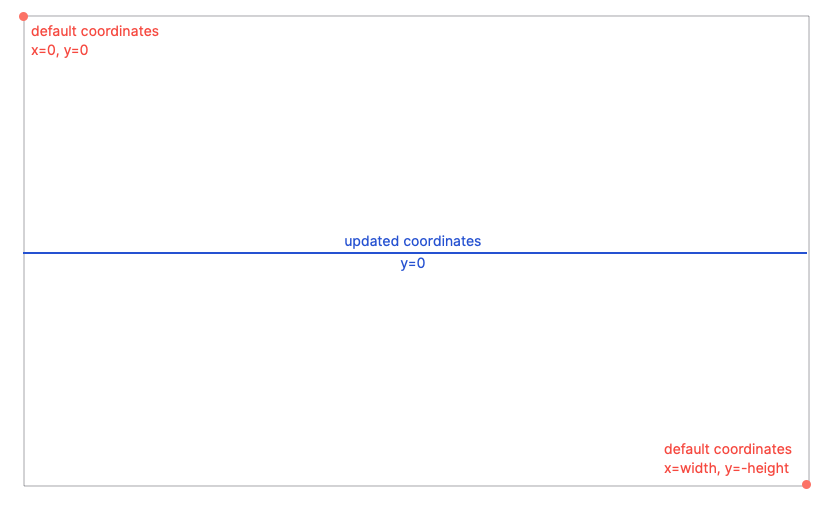
One of the things I love about working with SVG is that we can use SVG user units for animation which are responsive out of the box. The clue’s in the name really — Scalable Vector Graphic. In SVG-land, all elements are plotted at specific coordinates. SVG space is like an infinite bit of graph paper where we can arrange elements. The viewBox defines the dimensions of the graph paper we can see.

viewBox="0 0 100 50”

In this next demo, our SVG viewBox is 100 units wide and 50 units tall. This means if we animate the element by 100 units along the x-axis, it will always move by the entire width of its parent SVG, no matter how big or small that SVG is! Give the demo a resize to see.

Animating a child element based on a parent container’s width is a little tricker in HTML-land. Up until now, we’ve had to grab the parent’s width with JavaScript, which is easy enough when you’re animating from a transformed position, but a little fiddlier when you’re animating to somewhere as you can see in the following demo. If your end-point is a transformed position and you resize the screen, you’ll have to manually adjust that position. Messy… 🤔

If you do adjust values on resize, remember to debounce, or even fire the function after the browser is finished resizing. Resize listeners fire a ton of events every second, so updating properties on each event is a lot of work for the browser.

But, this animation speed-bump is soon going to be a thing of the past! Drum roll please… 🥁

Container Units! Lovely stuff. At the time I’m writing this, they only work in Chrome and Safari — but maybe by the time you read this, we’ll have Firefox too. Check them out in action in this next demo. Look at those little lads go! Isn’t that exciting, animation that’s relative to the parent elements!

This browser support data is from Caniuse, which has more detail. A number indicates that browser supports the feature at that version and up.

Desktop

ChromeFirefoxIEEdgeSafari
105NoNo10516.0

Mobile / Tablet

Android ChromeAndroid FirefoxAndroidiOS Safari
106No10616.0

Fluid layout transitions with FLIP

As we mentioned earlier, in SVG-land every element is neatly placed on one grid and really easy to move around responsively. Over in HTML-land it’s much more complex. In order to build responsive layouts, we make use of a bunch of different positioning methods and layout systems. One of the main difficulties of animating on the web is that a lot of changes to layout are impossible to animate. Maybe an element needs to move from position relative to fixed, or some children of a flex container need to be smoothly shuffled around the viewport. Maybe an element even needs to be re-parented and moved to an entirely new position in the DOM.

Tricky, huh?

Well. The FLIP technique is here to save the day; it allows us to easily animate these impossible things. The basic premise is:

  • First: Grab the initial position of the elements involved in the transition.
  • Last: Move the elements and grab the final position.
  • Invert: Work out the changes between the first and last state and apply transforms to invert the elements back to their original position. This makes it look like the elements are still in the first position but they’re actually not.
  • Play: Remove the inverted transforms and animate to their faked first state to the last state.

Here’s a demo using GSAP’s FLIP plugin which does all the heavy lifting for you!

If you want to understand a little more about the vanilla implementation, head over to Paul Lewis’s blog post — he’s the brain behind the FLIP technique.

Fluidly scaling SVG

You got me… this isn’t really an animation tip. But setting the stage correctly is imperative for good animation! SVG scales super nicely by default, but we can control how it scales even further with preserveAspectRatio, which is mega handy when the SVG element’s aspect ratio and the viewBox aspect ratio are different. It works much in the same way as the background-position and background-size properties in CSS. The declaration is made up of an alignment value (background-position) and a Meet or Slice reference (background-size).

As for those Meet and Slice references — slice is like background size: cover, and meet is like background-size: contain.

  • preserveAspectRatio="MidYMax slice" — Align to the middle of the x-axis, the bottom of the y-axis, and scale up to cover the entire viewport.
  • preserveAspectRatio="MinYMin meet" — Align to the left of the x-axis, the top of the y-axis, and scale up while keeping the entire viewBox visible.

Tom Miller takes this a step further by using overflow: visible in CSS and a containing element to reveal “stage left” and “stage right” while keeping the height restricted:

For responsive SVG animations, it can be handy to make use of the SVG viewbox to create a view that crops and scales beneath a certain browser width, while also revealing more of the SVG animation to the right and left when the browser is wider than that threshold. We can achieve this by adding overflow visible on the SVG and teaming it up with a max-height wrapper to prevent the SVG from scaling too much vertically.

Fluidly scaling canvas

Canvas is much more performant for complex animations with lots of moving parts than animating SVG or HTML DOM, but it’s inherently more complex too. You have to work for those performance gains! Unlike SVG that has lovely responsive units and scaling out of the box, <canvas> has to be bossed around and micromanaged a bit.

I like setting up my <canvas> so that it works much in the same way as SVG (I may be biased) with a lovely unit system to work within and a fixed aspect ratio. <canvas> also needs to be redrawn every time something changes, so remember to delay the redraw until the browser is finished resizing, or debounce!

George Francis also put together this lovely little library which allows you to define a Canvas viewBox attribute and preserveAspectRatio — exactly like SVG!

Targeted animation

You may sometimes need to take a less fluid and more directed approach to your animation. Mobile devices have a lot less real estate, and less animation-juice performance-wise than a desktop machine. So it makes sense to serve reduced animation to mobile users, potentially even no animation:

Sometimes the best responsive animation for mobile is no animation at all! For mobile UX, prioritize letting the user quickly consume content versus waiting for animations to finish. Mobile animations should enhance content, navigation, and interactions rather than delay it. Eric van Holtz

In order to do this, we can make use of media queries to target specific viewport sizes just like we do when we’re styling with CSS! Here’s a simple demo showing a CSS animation being handled using media queries and a GSAP animation being handled with gsap.matchMedia():

The simplicity of this demo is hiding a bunch of magic! JavaScript animations require a bit more setup and clean-up in order to correctly work at only one specific screen size. I’ve seen horrors in the past where people have just hidden the animation from view in CSS with opacity: 0, but the animation’s still chugging away in the background using up resources. 😱

If the screen size doesn’t match anymore, the animation needs to be killed and released for garbage collection, and the elements affected by the animation need to be cleared of any motion-introduced inline styles in order to prevent conflicts with other styling. Up until gsap.matchMedia(), this was a fiddly process. We had to keep track of each animation and manage all this manually.

gsap.matchMedia() instead lets you easily tuck your animation code into a function that only executes when a particular media query matches. Then, when it no longer matches, all the GSAP animations and ScrollTriggers in that function get reverted automatically. The media query that the animations are popped into does all the hard work for you. It’s in GSAP 3.11.0 and it’s a game changer!

We aren’t just constrained to screen sizes either. There are a ton of media features out there to hook into!

(prefers-reduced-motion) /* find out if the user would prefer less animation */

(orientation: portrait) /* check the user's device orientation */

(max-resolution: 300dpi) /* check the pixel density of the device */

In the following demo we’ve added a check for prefers-reduced-motion so that any users who find animation disorienting won’t be bothered by things whizzing around.

And check out Tom Miller’s other fun demo where he’s using the device’s aspect ratio to adjust the animation:

Thinking outside of the box, beyond screen sizes

There’s more to thinking about responsive animation than just screen sizes. Different devices allow for different interactions, and it’s easy to get in a bit of a tangle when you don’t consider that. If you’re creating hover states in CSS, you can use the hover media feature to test whether the user’s primary input mechanism can hover over elements.

@media (hover: hover) {
 /* CSS hover state here */
}

Some advice from Jake Whiteley:

A lot of the time we base our animations on browser width, making the naive assumption that desktop users want hover states. I’ve personally had a lot of issues in the past where I would switch to desktop layout >1024px, but might do touch detection in JS – leading to a mismatch where the layout was for desktops, but the JS was for mobiles. These days I lean on hover and pointer to ensure parity and handle ipad Pros or windows surfaces (which can change the pointer type depending on whether the cover is down or not)

/* any touch device: */
(hover: none) and (pointer: coarse)
/* iPad Pro */
(hover: none) and (pointer: coarse) and (min-width: 1024px)

I’ll then marry up my CSS layout queries and my JavaScript queries so I’m considering the input device as the primary factor supported by width, rather than the opposite.

ScrollTrigger tips

If you’re using GSAP’s ScrollTrigger plugin, there’s a handy little utility you can hook into to easily discern the touch capabilities of the device: ScrollTrigger.isTouch.

  • 0no touch (pointer/mouse only)
  • 1touch-only device (like a phone)
  • 2 – device can accept touch input and mouse/pointer (like Windows tablets)
if (ScrollTrigger.isTouch) {
  // any touch-capable device...
}

// or get more specific: 
if (ScrollTrigger.isTouch === 1) {
  // touch-only device
}

Another tip for responsive scroll-triggered animation…

The following demo below is moving an image gallery horizontally, but the width changes depending on screen size. If you resize the screen when you’re halfway through a scrubbed animation, you can end up with broken animations and stale values. This is a common speedbump, but one that’s easily solved! Pop the calculation that’s dependent on screen size into a functional value and set invalidateOnRefresh:true. That way, ScrollTrigger will re-calculate that value for you when the browser resizes.

Bonus GSAP nerd tip!

On mobile devices, the browser address bar usually shows and hides as you scroll. This counts as a resize event and will fire off a ScrollTrigger.refresh(). This might not be ideal as it can cause jumps in your animation. GSAP 3.10 added ignoreMobileResize. It doesn’t affect how the browser bar behaves, but it prevents ScrollTrigger.refresh() from firing for small vertical resizes on touch-only devices.

ScrollTrigger.config({
  ignoreMobileResize: true
});

Motion principles

I thought I’d leave you with some best practices to consider when working with motion on the web.

Distance and easing

A small but important thing that’s easy to forget with responsive animation is the relationship between speed, momentum, and distance! Good animation should mimic the real world to feel believable, and it takes a longer in the real world to cover a larger distance. Pay attention to the distance your animation is traveling, and make sure that the duration and easing used makes sense in context with other animations.

You can also often apply more dramatic easing to elements with further to travel to show the increased momentum:

For certain use cases it may be helpful to adjust the duration more dynamically based on screen width. In this next demo we’re making use of gsap.utils to clamp the value we get back from the current window.innerWidth into a reasonable range, then we’re mapping that number to a duration.

Spacing and quantity

Another thing to keep in mind is the spacing and quantity of elements at different screen sizes. Quoting Steven Shaw:

If you have some kind of environmental animation (parallax, clouds, trees, confetti, decorations, etc) that are spaced around the window, make sure that they scale and/or adjust the quantity depending on screen size. Large screens probably need more elements spread throughout, while small screens only need a few for the same effect.

I love how Opher Vishnia thinks about animation as a stage. Adding and removing elements doesn’t just have to be a formality, it can be part of the overall choreography.

When designing responsive animations, the challenge is not how to cram the same content into the viewport so that it “fits”, but rather how to curate the set of existing content so it communicates the same intention. That means making a conscious choice of which pieces content to add, and which to remove. Usually in the world of animation things don’t just pop in or out of the frame. It makes sense to think of elements as entering or exiting the “stage”, animating that transition in a way that makes visual and thematic sense.

And that’s the lot. If you have any more responsive animation tips, pop them in the comment section. If there’s anything super helpful, I’ll add them to this compendium of information!

Addendum

One more note from Tom Miller as I was prepping this article:

I’m probably too late with this tip for your responsive animations article, but I highly recommend “finalize all the animations before building”. I’m currently retrofitting some site animations with “mobile versions”. Thank goodness for gsap.matchMedia… but I sure wish we’d known there’d be separate mobile layouts/animations from the beginning.

I think we all appreciate that this tip to “plan ahead” came at the absolute last minute. Thanks, Tom, and best of luck with those retrofits.


Responsive Animations for Every Screen Size and Device originally published on CSS-Tricks, which is part of the DigitalOcean family. You should get the newsletter.

An Interactive Starry Backdrop for Content

I was fortunate last year to get approached by Shawn Wang (swyx) about doing some work for Temporal. The idea was to cast my creative eye over what was on the site and come up with some ideas that would give the site a little “something” extra. This was quite a neat challenge as I consider myself more of a developer than a designer. But I love learning and leveling up the design side of my game.

One of the ideas I came up with was this interactive starry backdrop. You can see it working in this shared demo:

The neat thing about this design is that it’s built as a drop-in React component. And it’s super configurable in the sense that once you’ve put together the foundations for it, you can make it completely your own. Don’t want stars? Put something else in place. Don’t want randomly positioned particles? Place them in a constructed way. You have total control of what to bend it to your will.

So, let’s look at how we can create this drop-in component for your site! Today’s weapons of choice? React, GreenSock and HTML <canvas>. The React part is totally optional, of course, but, having this interactive backdrop as a drop-in component makes it something you can employ on other projects.

Let’s start by scaffolding a basic app

import React from 'https://cdn.skypack.dev/react'
import ReactDOM from 'https://cdn.skypack.dev/react-dom'
import gsap from 'https://cdn.skypack.dev/gsap'

const ROOT_NODE = document.querySelector('#app')

const Starscape = () => <h1>Cool Thingzzz!</h1>

const App = () => <Starscape/>

ReactDOM.render(<App/>, ROOT_NODE)

First thing we need to do is render a <canvas> element and grab a reference to it that we can use within React’s useEffect. For those not using React, store a reference to the <canvas> in a variable instead.

const Starscape = () => {
  const canvasRef = React.useRef(null)
  return <canvas ref={canvasRef} />
}

Our <canvas> is going to need some styles, too. For starters, we can make it so the canvas takes up the full viewport size and sits behind the content:

canvas {
  position: fixed;
  inset: 0;
  background: #262626;
  z-index: -1;
  height: 100vh;
  width: 100vw;
}

Cool! But not much to see yet.

We need stars in our sky

We’re going to “cheat” a little here. We aren’t going to draw the “classic” pointy star shape. We’re going to use circles of differing opacities and sizes.

Draw a circle on a <canvas> is a case of grabbing a context from the <canvas> and using the arc function. Let’s render a circle, err star, in the middle. We can do this within a React useEffect:

const Starscape = () => {
  const canvasRef = React.useRef(null)
  const contextRef = React.useRef(null)
  React.useEffect(() => {
    canvasRef.current.width = window.innerWidth
    canvasRef.current.height = window.innerHeight
    contextRef.current = canvasRef.current.getContext('2d')
    contextRef.current.fillStyle = 'yellow'
    contextRef.current.beginPath()
    contextRef.current.arc(
      window.innerWidth / 2, // X
      window.innerHeight / 2, // Y
      100, // Radius
      0, // Start Angle (Radians)
      Math.PI * 2 // End Angle (Radians)
    )
    contextRef.current.fill()
  }, [])
  return <canvas ref={canvasRef} />
}

So what we have is a big yellow circle:

This is a good start! The rest of our code will take place within this useEffect function. That’s why the React part is kinda optional. You can extract this code out and use it in whichever form you like.

We need to think about how we’re going to generate a bunch of “stars” and render them. Let’s create a LOAD function. This function is going to handle generating our stars as well as the general <canvas> setup. We can also move the sizing logic of the <canvas> sizing logic into this function:

const LOAD = () => {
  const VMIN = Math.min(window.innerHeight, window.innerWidth)
  const STAR_COUNT = Math.floor(VMIN * densityRatio)
  canvasRef.current.width = window.innerWidth
  canvasRef.current.height = window.innerHeight
  starsRef.current = new Array(STAR_COUNT).fill().map(() => ({
    x: gsap.utils.random(0, window.innerWidth, 1),
    y: gsap.utils.random(0, window.innerHeight, 1),
    size: gsap.utils.random(1, sizeLimit, 1),
    scale: 1,
    alpha: gsap.utils.random(0.1, defaultAlpha, 0.1),
  }))
}

Our stars are now an array of objects. And each star has properties that define their characteristics, including:

  • x: The star’s position on the x-axis
  • y: The star’s position on the y-axis
  • size: The star’s size, in pixels
  • scale: The star’s scale, which will come into play when we interact with the component
  • alpha: The star’s alpha value, or opacity, which will also come into play during interactions

We can use GreenSock’s random() method to generate some of these values. You may also be wondering where sizeLimit, defaultAlpha, and densityRatio came from. These are now props we can pass to the Starscape component. We’ve provided some default values for them:

const Starscape = ({ densityRatio = 0.5, sizeLimit = 5, defaultAlpha = 0.5 }) => {

A randomly generated star Object might look like this:

{
  "x": 1252,
  "y": 29,
  "size": 4,
  "scale": 1,
  "alpha": 0.5
}

But, we need to see these stars and we do that by rendering them. Let’s create a RENDER function. This function will loop over our stars and render each of them onto the <canvas> using the arc function:

const RENDER = () => {
  contextRef.current.clearRect(
    0,
    0,
    canvasRef.current.width,
    canvasRef.current.height
  )
  starsRef.current.forEach(star => {
    contextRef.current.fillStyle = `hsla(0, 100%, 100%, ${star.alpha})`
    contextRef.current.beginPath()
    contextRef.current.arc(star.x, star.y, star.size / 2, 0, Math.PI * 2)
    contextRef.current.fill()
  })
}

Now, we don’t need that clearRect function for our current implementation as we are only rendering once onto a blank <canvas>. But clearing the <canvas> before rendering anything isn’t a bad habit to get into, And it’s one we’ll need as we make our canvas interactive.

Consider this demo that shows the effect of not clearing between frames.

Our Starscape component is starting to take shape.

See the code
const Starscape = ({ densityRatio = 0.5, sizeLimit = 5, defaultAlpha = 0.5 }) => {
  const canvasRef = React.useRef(null)
  const contextRef = React.useRef(null)
  const starsRef = React.useRef(null)
  React.useEffect(() => {
    contextRef.current = canvasRef.current.getContext('2d')
    const LOAD = () => {
      const VMIN = Math.min(window.innerHeight, window.innerWidth)
      const STAR_COUNT = Math.floor(VMIN * densityRatio)
      canvasRef.current.width = window.innerWidth
      canvasRef.current.height = window.innerHeight
      starsRef.current = new Array(STAR_COUNT).fill().map(() => ({
        x: gsap.utils.random(0, window.innerWidth, 1),
        y: gsap.utils.random(0, window.innerHeight, 1),
        size: gsap.utils.random(1, sizeLimit, 1),
        scale: 1,
        alpha: gsap.utils.random(0.1, defaultAlpha, 0.1),
      }))
    }
    const RENDER = () => {
      contextRef.current.clearRect(
        0,
        0,
        canvasRef.current.width,
        canvasRef.current.height
      )
      starsRef.current.forEach(star => {
        contextRef.current.fillStyle = `hsla(0, 100%, 100%, ${star.alpha})`
        contextRef.current.beginPath()
        contextRef.current.arc(star.x, star.y, star.size / 2, 0, Math.PI * 2)
        contextRef.current.fill()
      })
    }
    LOAD()
    RENDER()
  }, [])
  return <canvas ref={canvasRef} />
}

Have a play around with the props in this demo to see how they affect the the way stars are rendered.

Before we go further, you may have noticed a quirk in the demo where resizing the viewport distorts the <canvas>. As a quick win, we can rerun our LOAD and RENDER functions on resize. In most cases, we’ll want to debounce this, too. We can add the following code into our useEffect call. Note how we also remove the event listener in the teardown.

// Naming things is hard...
const RUN = () => {
  LOAD()
  RENDER()
}

RUN()

// Set up event handling
window.addEventListener('resize', RUN)
return () => {
  window.removeEventListener('resize', RUN)
}

Cool. Now when we resize the viewport, we get a new generated starry.

Interacting with the starry backdrop

Now for the fun part! Let’s make this thing interactive.

The idea is that as we move our pointer around the screen, we detect the proximity of the stars to the mouse cursor. Depending on that proximity, the stars both brighten and scale up.

We’re going to need to add another event listener to pull this off. Let’s call this UPDATE. This will work out the distance between the pointer and each star, then tween each star’s scale and alpha values. To make sure those tweeted values are correct, we can use GreenSock’s mapRange() utility. In fact, inside our LOAD function, we can create references to some mapping functions as well as a size unit then share these between the functions if we need to.

Here’s our new LOAD function. Note the new props for scaleLimit and proximityRatio. They are used to limit the range of how big or small a star can get, plus the proximity at which to base that on.

const Starscape = ({
  densityRatio = 0.5,
  sizeLimit = 5,
  defaultAlpha = 0.5,
  scaleLimit = 2,
  proximityRatio = 0.1
}) => {
  const canvasRef = React.useRef(null)
  const contextRef = React.useRef(null)
  const starsRef = React.useRef(null)
  const vminRef = React.useRef(null)
  const scaleMapperRef = React.useRef(null)
  const alphaMapperRef = React.useRef(null)
  
  React.useEffect(() => {
    contextRef.current = canvasRef.current.getContext('2d')
    const LOAD = () => {
      vminRef.current = Math.min(window.innerHeight, window.innerWidth)
      const STAR_COUNT = Math.floor(vminRef.current * densityRatio)
      scaleMapperRef.current = gsap.utils.mapRange(
        0,
        vminRef.current * proximityRatio,
        scaleLimit,
        1
      );
      alphaMapperRef.current = gsap.utils.mapRange(
        0,
        vminRef.current * proximityRatio,
        1,
        defaultAlpha
      );
    canvasRef.current.width = window.innerWidth
    canvasRef.current.height = window.innerHeight
    starsRef.current = new Array(STAR_COUNT).fill().map(() => ({
      x: gsap.utils.random(0, window.innerWidth, 1),
      y: gsap.utils.random(0, window.innerHeight, 1),
      size: gsap.utils.random(1, sizeLimit, 1),
      scale: 1,
      alpha: gsap.utils.random(0.1, defaultAlpha, 0.1),
    }))
  }
}

And here’s our UPDATE function. It calculates the distance and generates an appropriate scale and alpha for a star:

const UPDATE = ({ x, y }) => {
  starsRef.current.forEach(STAR => {
    const DISTANCE = Math.sqrt(Math.pow(STAR.x - x, 2) + Math.pow(STAR.y - y, 2));
    gsap.to(STAR, {
      scale: scaleMapperRef.current(
        Math.min(DISTANCE, vminRef.current * proximityRatio)
      ),
      alpha: alphaMapperRef.current(
        Math.min(DISTANCE, vminRef.current * proximityRatio)
      )
    });
  })
};

But wait… it doesn’t do anything?

Well, it does. But, we haven’t set our component up to show updates. We need to render new frames as we interact. We can reach for requestAnimationFrame often. But, because we’re using GreenSock, we can make use of gsap.ticker. This is often referred to as “the heartbeat of the GSAP engine” and it’s is a good substitute for requestAnimationFrame.

To use it, we add the RENDER function to the ticker and make sure we remove it in the teardown. One of the neat things about using the ticker is that we can dictate the number of frames per second (fps). I like to go with a “cinematic” 24fps:

// Remove RUN
LOAD()
gsap.ticker.add(RENDER)
gsap.ticker.fps(24)

window.addEventListener('resize', LOAD)
document.addEventListener('pointermove', UPDATE)
return () => {
  window.removeEventListener('resize', LOAD)
  document.removeEventListener('pointermove', UPDATE)
  gsap.ticker.remove(RENDER)
}

Note how we’re now also running LOAD on resize. We also need to make sure our scale is being picked up in that RENDER function when using arc:

const RENDER = () => {
  contextRef.current.clearRect(
    0,
    0,
    canvasRef.current.width,
    canvasRef.current.height
  )
  starsRef.current.forEach(star => {
    contextRef.current.fillStyle = `hsla(0, 100%, 100%, ${star.alpha})`
    contextRef.current.beginPath()
    contextRef.current.arc(
      star.x,
      star.y,
      (star.size / 2) * star.scale,
      0,
      Math.PI * 2
    )
    contextRef.current.fill()
  })
}

It works! 🙌

It’s a very subtle effect. But, that’s intentional because, while it’s is super neat, we don’t want this sort of thing to distract from the actual content. I’d recommend playing with the props for the component to see different effects. It makes sense to set all the stars to low alpha by default too.

The following demo allows you to play with the different props. I’ve gone for some pretty standout defaults here for the sake of demonstration! But remember, this article is more about showing you the techniques so you can go off and make your own cool backdrops — while being mindful of how it interacts with content.

Refinements

There is one issue with our interactive starry backdrop. If the mouse cursor leaves the <canvas>, the stars stay bright and upscaled but we want them to return to their original state. To fix this, we can add an extra handler for pointerleave. When the pointer leaves, this tweens all of the stars down to scale 1 and the original alpha value set by defaultAlpha.

const EXIT = () => {
  gsap.to(starsRef.current, {
    scale: 1,
    alpha: defaultAlpha,
  })
}

// Set up event handling
window.addEventListener('resize', LOAD)
document.addEventListener('pointermove', UPDATE)
document.addEventListener('pointerleave', EXIT)
return () => {
  window.removeEventListener('resize', LOAD)
  document.removeEventListener('pointermove', UPDATE)
  document.removeEventListener('pointerleave', EXIT)
  gsap.ticker.remove(RENDER)
}

Neat! Now our stars scale back down and return to their previous alpha when the mouse cursor leaves the scene.

Bonus: Adding an Easter egg

Before we wrap up, let’s add a little Easter egg surprise to our interactive starry backdrop. Ever heard of the Konami Code? It’s a famous cheat code and a cool way to add an Easter egg to our component.

We can practically do anything with the backdrop once the code runs. Like, we could make all the stars pulse in a random way for example. Or they could come to life with additional colors? It’s an opportunity to get creative with things!

We’re going listen for keyboard events and detect whether the code gets entered. Let’s start by creating a variable for the code:

const KONAMI_CODE =
  'arrowup,arrowup,arrowdown,arrowdown,arrowleft,arrowright,arrowleft,arrowright,keyb,keya';

Then we create a second effect within our the starry backdrop. This is a good way to maintain a separation of concerns in that one effect handles all the rendering, and the other handles the Easter egg. Specifically, we’re listening for keyup events and check whether our input matches the code.

const codeRef = React.useRef([])
React.useEffect(() => {
  const handleCode = e => {
    codeRef.current = [...codeRef.current, e.code]
      .slice(
        codeRef.current.length > 9 ? codeRef.current.length - 9 : 0
      )
    if (codeRef.current.join(',').toLowerCase() === KONAMI_CODE) {
      // Party in here!!!
    }
  }
  window.addEventListener('keyup', handleCode)
  return () => {
    window.removeEventListener('keyup', handleCode)
  }
}, [])

We store the user input in an Array that we store inside a ref. Once we hit the party code, we can clear the Array and do whatever we want. For example, we may create a gsap.timeline that does something to our stars for a given amount of time. If this is the case, we don’t want to allow Konami code to input while the timeline is active. Instead, we can store the timeline in a ref and make another check before running the party code.

const partyRef = React.useRef(null)
const isPartying = () =>
  partyRef.current &&
  partyRef.current.progress() !== 0 &&
  partyRef.current.progress() !== 1;

For this example, I’ve created a little timeline that colors each star and moves it to a new position. This requires updating our LOAD and RENDER functions.

First, we need each star to now have its own hue, saturation and lightness:

// Generating stars! ⭐️
starsRef.current = new Array(STAR_COUNT).fill().map(() => ({
  hue: 0,
  saturation: 0,
  lightness: 100,
  x: gsap.utils.random(0, window.innerWidth, 1),
  y: gsap.utils.random(0, window.innerHeight, 1),
  size: gsap.utils.random(1, sizeLimit, 1),
  scale: 1,
  alpha: defaultAlpha
}));

Second, we need to take those new values into consideration when rendering takes place:

starsRef.current.forEach((star) => {
  contextRef.current.fillStyle = `hsla(
    ${star.hue},
    ${star.saturation}%,
    ${star.lightness}%,
    ${star.alpha}
  )`;
  contextRef.current.beginPath();
  contextRef.current.arc(
    star.x,
    star.y,
    (star.size / 2) * star.scale,
    0,
    Math.PI * 2
  );
  contextRef.current.fill();
});

And here’s the fun bit of code that moves all the stars around:

partyRef.current = gsap.timeline().to(starsRef.current, {
  scale: 1,
  alpha: defaultAlpha
});

const STAGGER = 0.01;

for (let s = 0; s < starsRef.current.length; s++) {
  partyRef.current
    .to(
    starsRef.current[s],
    {
      onStart: () => {
        gsap.set(starsRef.current[s], {
          hue: gsap.utils.random(0, 360),
          saturation: 80,
          lightness: 60,
          alpha: 1,
        })
      },
      onComplete: () => {
        gsap.set(starsRef.current[s], {
          saturation: 0,
          lightness: 100,
          alpha: defaultAlpha,
        })
      },
      x: gsap.utils.random(0, window.innerWidth),
      y: gsap.utils.random(0, window.innerHeight),
      duration: 0.3
    },
    s * STAGGER
  );
}

From there, we generate a new timeline and tween the values of each star. These new values get picked up by RENDER. We’re adding a stagger by positioning each tween in the timeline using GSAP’s position parameter.

That’s it!

That’s one way to make an interactive starry backdrop for your site. We combined GSAP and an HTML <canvas>, and even sprinkled in some React that makes it more configurable and reusable. We even dropped an Easter egg in there!

Where can you take this component from here? How might you use it on a site? The combination of GreenSock and <canvas> is a lot of fun and I’m looking forward to seeing what you make! Here are a couple more ideas to get your creative juices flowing…


An Interactive Starry Backdrop for Content originally published on CSS-Tricks. You should get the newsletter.

Drawing Basic Shapes with HTML5 Canvas

Since HTML5 Canvas is a graphic tool, it goes without saying that it allows us to draw shapes. We can draw new shapes using a number of different functions available to use via the context we set. 

In this guide, we'll cover how to make some of the most basic shapes with HTML5 Canvas — squares, rectangles, circles, and triangles.

Bartosz Ciechanowski’s Interactive Blog Posts

I saw Bartosz Ciechanowski’s “Curves and Surfaces” going around the other day and was like, oh hey, this is the same fella that did that other amazingly interactive blog post on the Internal Combustion Engine the other day. I feel like I pretty much get how engines work now because of that blog post. Then I thought I should see what other blog posts Bartosz has and, lo and behold, there are a dozen or so — and they are all super good. Like one on gears, color spaces, Earth and Sun, and mesh transforms.

If I was a person who hired people to design interactive science museums, I’d totally try to hire Bartosz to design one. I’m glad, though, that the web is the output of choice so far as the reach of the web is untouchable.

I wonder what the significance of the Patreon membership level numbers are? 3, 7, 19, 37, 71. Just random prime numbers? I threw in a few bucks. I’d increase my pledge if some of the bucks could go toward an improved accessibility situation. I think the sliders are largely unfocusable <div> situations so I imagine something better could be done there.

Exploring the CSS Paint API: Rounding Shapes

Adding borders to complex shapes is a pain, but rounding the corner of complex shapes is a nightmare! Luckily, the CSS Paint API is here to the rescue! That’s what we’re going to look at as part of this “Exploring the CSS Paint API” series.

Exploring the CSS Paint API series:


Here’s what we’re aiming for. Like everything else we’ve looked at in this series, note that only Chrome and Edge support this for now.

Live Demo

You may have noticed a pattern forming if you’ve followed along with the rest of the articles. In general, when we work with the CSS Paint API:

  • We write some basic CSS that we can easily adjust.
  • All the complex logic is done behind the scene inside the paint() function.

We can actually do this without the Paint API

There are probably a lot of ways to put rounded corners on complex shapes, but I will share with you three methods I’ve used in my own work.

I already hear you saying: If you already know three methods, then why are you using the Paint API? Good question. I’m using it because the three methods I’m aware of are difficult, and two of them are specifically related to SVG. I have nothing against SVG, but a CSS-only solution makes thing easier to maintain, plus it’s easier for someone to walk into and understand when grokking the code.

Onto those three methods…

Using clip-path: path()

If you are an SVG guru, this method is for you. the clip-path property accepts SVG paths. That means we can easily pass in the path for a complex rounded shape and be done. This approach is super easy if you already have the shape you want, but it’s unsuitable if you want an adjustable shape where, for example, you want to adjust the radius.

Below an example of a rounded hexagon shape. Good luck trying to adjust the curvature and the shape size! You’re gonna have to edit that crazy-looking path to do it.

I suppose you could refer to this illustrated guide to SVG paths that Chris put together. But it’s still going to be a lot of work to plot the points and curves just how you want it, even referencing that guide.

Using an SVG filter

I discovered this technique from Lucas Bebber’s post about creating a gooey effect. You can find all the technical details there, but the idea is to apply an SVG filter to any element to round its corners.

We simply use clip-path to create the shape we want then apply the SVG filter on a parent element. To control the radius, we adjust the stdDeviation variable.

This is a good technique, but again, it requires a deep level of SVG know-how to make adjustments on the spot.

Using Ana Tudor’s CSS-only approach

Yes, Ana Tudor found a CSS-only technique for a gooey effect that we can use to round the corner of complex shapes. She’s probably writing an article about it right now. Until then, you can refer to the slides she made where she explain how it works.

Below a demo where I am replacing the SVG filter with her technique:

Again, another neat trick! But as far as being easy to work with? Not so much here, either, especially if we’re considering more complex situations where we need transparency, images, etc. It’s work finding the correct combination of filter, mix-blend-mode and other properties to get things just right.

Using the CSS Paint API instead

Unless you have a killer CSS-only way to put rounded borders on complex shapes that you’re keeping from me (share it already!), you can probably see why I decided to reach for the CSS Paint API.

The logic behind this relies on the same code structure I used in the article covering the polygon border. I’m using the --path variable that defines our shape, the cc() function to convert our points, and a few other tricks we’ll cover along the way. I highly recommend reading that article to better understand what we’re doing here.

First, the CSS setup

We first start with a classic rectangular element and define our shape inside the --path variable (shape 2 above). The --path variable behaves the same way as the path we define inside clip-path: polygon()Use Clippy to generate it. 

.box {
  display: inline-block;
  height: 200px;
  width: 200px;

  --path: 50% 0,100% 100%,0 100%;
  --radius: 20px;
  -webkit-mask: paint(rounded-shape);
}

Nothing complex so far. We apply the custom mask and we define both the --path and a --radius variable. The latter will be used to control the curvature.

Next, the JavaScript setup

In addition to the points defined by the path variable (pictured as red points above), we’re adding even more points (pictured as green points above) that are simply the midpoints of each segment of the shape. Then we use the arcTo() function to build the final shape (shape 4 above).

Adding the midpoints is pretty easy, but using arcTo() is a bit tricky because we have to understand how it works. According to MDN:

[It] adds a circular arc to the current sub-path, using the given control points and radius. The arc is automatically connected to the path’s latest point with a straight line, if necessary for the specified parameters.

This method is commonly used for making rounded corners.

The fact that this method requires control points is the main reason for the extra midpoints points. It also require a radius (which we are defining as a variable called --radius).

If we continue reading MDN’s documentation:

One way to think about arcTo() is to imagine two straight segments: one from the starting point to a first control point, and another from there to a second control point. Without arcTo(), these two segments would form a sharp corner: arcTo() creates a circular arc that fits this corner and smooths is out. In other words, the arc is tangential to both segments.

Each arc/corner is built using three points. If you check the figure above, notice that for each corner we have one red point and two green points on each side. Each red-green combination creates one segment to get the two segments detailed above.

Let’s zoom into one corner to better understand what is happening:

We have both segments illustrated in black.
The circle in blue illustrates the radius.

Now imagine that we have a path that goes from the first green point to the next green point, moving around that circle. We do this for each corner and we have our rounded shape.

Here’s how that looks in code:

// We first read the variables for the path and the radius.
const points = properties.get('--path').toString().split(',');
const r = parseFloat(properties.get('--radius').value);

var Ppoints = [];
var Cpoints = [];
const w = size.width;
const h = size.height;
var N = points.length;
var i;
// Then we loop through the points to create two arrays.
for (i = 0; i < N; i++) {
  var j = i-1;
  if(j<0) j=N-1;
  
  var p = points[i].trim().split(/(?!\(.*)\s(?![^(]*?\))/g);
  // One defines the red points (Ppoints)
  p = cc(p[0],p[1]);
  Ppoints.push([p[0],p[1]]);
  var pj = points[j].trim().split(/(?!\(.*)\s(?![^(]*?\))/g);
  pj = cc(pj[0],pj[1]);
  // The other defines the green points (Cpoints)
  Cpoints.push([p[0]-((p[0]-pj[0])/2),p[1]-((p[1]-pj[1])/2)]);
}

/* ... */

// Using the arcTo() function to create the shape
ctx.beginPath();
ctx.moveTo(Cpoints[0][0],Cpoints[0][1]);
for (i = 0; i < (Cpoints.length - 1); i++) {
  ctx.arcTo(Ppoints[i][0], Ppoints[i][1], Cpoints[i+1][0],Cpoints[i+1][1], r);
}
ctx.arcTo(Ppoints[i][0], Ppoints[i][1], Cpoints[0][0],Cpoints[0][1], r);
ctx.closePath();

/* ... */

ctx.fillStyle = '#000';
ctx.fill();

The last step is to fill our shape with a solid color. Now we have our rounded shape and we can use it as a mask on any element.

That’s it! Now all we have to do is to build our shape and control the radius like we want — a radius that we can animate, thanks to @property which will make things more interesting!

Live Demo

Are there any drawbacks with this method?

Yes, there are drawbacks, and you probably noticed them in the last example. The first drawback is related to the hover-able area. Since we are using mask, we can still interact with the initial rectangular shape. Remember, we faced the same issue with the polygon border and we used clip-path to fix it. Unfortunately, clip-path does not help here because it also affects the rounded corner.

Let’s take the last example and add clip-path. Notice how we are losing the “inward” curvature.

There’s no issue with the hexagon and triangle shapes, but the others are missing some curves. It could be an interesting feature to keep only the outward curvature — thanks to clip-path— and at the same time we fix the hover-able area. But we cannot keep all the curvatures and reduce the hover-able area at the same time.

The second issue? It’s related to the use of a big radius value. Hover over the shapes below and see the crazy results we get:

It’s actually not a “major” drawback since we have control over the radius, but it sure would be good to avoid such a situation in case we wrongly use an overly large radius value. We could fix this by limiting the value of the radius to within a range that caps it at a maximum value. For each corner, we calculate the radius that allows us to have the biggest arc without any overflow. I won’t dig into the math logic behind this (😱), but here is the final code to cap the radius value:

var angle = 
Math.atan2(Cpoints[i+1][1] - Ppoints[i][1], Cpoints[i+1][0] - Ppoints[i][0]) -
Math.atan2(Cpoints[i][1]   - Ppoints[i][1], Cpoints[i][0]   - Ppoints[i][0]);
if (angle < 0) {
  angle += (2*Math.PI)
}
if (angle > Math.PI) {
  angle = 2*Math.PI - angle
}
var distance = Math.min(
  Math.sqrt(
    (Cpoints[i+1][1] - Ppoints[i][1]) ** 2 + 
    (Cpoints[i+1][0] - Ppoints[i][0]) ** 2),
  Math.sqrt(
    (Cpoints[i][1] - Ppoints[i][1]) ** 2 + 
    (Cpoints[i][0] - Ppoints[i][0]) ** 2)
  );
var rr = Math.min(distance * Math.tan(angle/2),r);

r is the radius we are defining and rr is the radius we’re actually using. It equal either to r or the maximum value allowed without overflow.

If you hover the shapes in that demo, we no longer get strange shapes but the “maximum rounded shape” (I just coined this) instead. Notice that the regular polygons (like the triangle and hexagon) logically have a circle as their “maximum rounded shape” so we can have cool transitions or animations between different shapes.

Can we have borders?

Yes! All we have to do is to use stroke() instead of fill() inside our paint() function. So, instead of using:

ctx.fillStyle = '#000';
ctx.fill();

…we use this:

ctx.lineWidth = b;
ctx.strokeStyle = '#000';
ctx.stroke();

This introduces another variable, b, that controls the border’s thickness.

Did you notice that we have some strange overflow? We faced the same issue in the previous article, and that due to how stroke() works. I quoted MDN in that article and will do it again here as well:

Strokes are aligned to the center of a path; in other words, half of the stroke is drawn on the inner side, and half on the outer side.

Again, it’s that “half inner side, half outer side” that’s getting us! In order to fix it, we need to hide the outer side using another mask, the first one where we use the fill(). First, we need to introduce a conditional variable to the paint() function in order to choose if we want to draw the shape or only its border.

Here’s what we have:

if(t==0) {
  ctx.fillStyle = '#000';
  ctx.fill();
} else {
  ctx.lineWidth = 2*b;
  ctx.strokeStyle = '#000';
  ctx.stroke();
}

Next, we apply the first type of mask (t=0) on the main element, and the second type (t=1) on a pseudo-element. The mask applied on the pseudo-element produces the border (the one with the overflow issue). The mask applied on the main element addresses the overflow issue by hiding the outer part of the border. And if you’re wondering, that’s why we are adding twice the border thickness to lineWidth.

Live Demo

See that? We have perfect rounded shapes as outlines and we can adjust the radius on hover. And can use any kind of background on the shape.

And we did it all with a bit of CSS:

div {
  --radius: 5px; /* Defines the radius */
  --border: 6px; /* Defines the border thickness */
  --path: /* Define your shape here */;
  --t: 0; /* The first mask on the main element */
  
  -webkit-mask: paint(rounded-shape);
  transition: --radius 1s;
}
div::before {
  content: "";
   background: ..; /* Use any background you want */
  --t: 1; /* The second mask on the pseudo-element */
  -webkit-mask: paint(rounded-shape); /* Remove this if you want the full shape */
}
div[class]:hover {
  --radius: 80px; /* Transition on hover */
}

Let’s not forget that we can easily introduce dashes using setLineDash() the same way we did in the previous article.

Live Demo

Controlling the radius

In all the examples we’ve looked at, we always consider one radius applied to all the corners of each shape. It would be interesting if we could control the radius of each corner individually, the same way the border-radius property takes up to four values. So let’s extend the --path variable to consider more parameters.

Actually, our path can be expressed as a list of [x y] values. We’ll make a list of [x y r] values where we introduce a third value for the radius. This value isn’t mandatory; if omitted, it falls back to the main radius.

.box {
  display: inline-block;
  height: 200px;
  width: 200px;

  --path: 50% 0 10px,100% 100% 5px,0 100%;
  --radius: 20px;
  -webkit-mask: paint(rounded-shape);
}

Above, we have a 10px radius for the first corner, 5px for the second, and since we didn’t specify a value for the third corner, it inherits the 20px defined by the --radius variable.

Here’s our JavaScript for the values:

var Radius = [];
// ...
var p = points[i].trim().split(/(?!\(.*)\s(?![^(]*?\))/g);
if(p[2])
  Radius.push(parseInt(p[2]));
else
  Radius.push(r);

This defines an array that stores the radius of each corner. Then, after splitting the value of each point, we test whether we have a third value (p[2]). If it’s defined, we use it; if not, we use the default radius. Later on, we’re using Radius[i] instead of r.

Live Demo

This minor addition is a nice feature for when we want to disable the radius for a specific corner of the shape. In fact, let’s look at a few different examples next.

More examples!

I made a series of demos using this trick. I recommend setting the radius to 0 to better see the shape and understand how the path is created. Remember that the --path variable behaves the same way as the path we define inside clip-path: polygon(). If you’re looking for a path to play with, try using Clippy to generate one for you.

Example 1: CSS shapes

A lot of fancy shapes can be created using this technique. Here are a few of them done without any extra elements, pseudo-elements, or hack-y code.

Example 2: Speech bubble

In the previous article, we added border to a speech bubble element. Now we can improve it and round the corners using this new method.

If you compare with this example with the original implementation, you may notice the exact same code. I simply made two or three changes to the CSS to use the new Worklet.

Example 3: Frames

Find below some cool frames for your content. No more headaches when we need gradient borders!

Simply play with the --path variable to create your own responsive frame with any coloration your want.

Example 4: Section divider

SVG is no longer needed to create those wavy section dividers that are popular these days.

Notice that the CSS is light and relatively simple. I only updated the path to generate new instances of the divider.

Example 5: Navigation menu

Here’s a classic design pattern that I’m sure many of us have bumped into at some time: How the heck do we invert the radius? You’ve likely seen it in navigation designs.

A slightly different take on it:

Example 6: Gooey effect

If we play with the path values we can reach for some fancy animation.
Below an idea where I am applying a transition to only one value of the path and yet we get a pretty cool effect

This one’s inspired by Ana Tudor’s demo.

Another idea with a different animation

Another example with a more complex animation:

What about a bouncing ball

Example 7: Shape morphing

Playing with big radius values allows us to create cool transitions between different shapes, especially between a circle and a regular polygon.

If we add some border animation, we get “breathing” shapes!

Let’s round this thing up

I hope you’ve enjoyed getting nerdy with the CSS Paint API. Throughout this series, we’ve applied paint() to a bunch of real-life examples where having the API allows us to manipulate elements in a way we’ve never been able to do with CSS — or without resorting to hacks or crazy magic numbers and whatnot. I truly believe the CSS Paint API makes seemingly complicated problems a lot easier to solve in a straightforward way and will be a feature we reach for time and again. That is, when browser support catches up to it.

If you’ve followed along with this series, or even just stumbled into this one article, I’d love to know what you think of the CSS Paint API and how you imagine using it in your work. Are there any current design trends that would benefit from it, like the wavy section dividers? Or blobby designs? Experiment and have fun!

This one’s taken from my previous article


Exploring the CSS Paint API series:


The post Exploring the CSS Paint API: Rounding Shapes appeared first on CSS-Tricks. You can support CSS-Tricks by being an MVP Supporter.

Creating 3D Characters in Three.js

Three.js is a JavaScript library for drawing in 3D with WebGL. It enables us to add 3D objects to a scene, and manipulate things like position and lighting. If you’re a developer used to working with the DOM and styling elements with CSS, Three.js and WebGL can seem like a whole new world, and perhaps a little intimidating! This article is for developers who are comfortable with JavaScript but relatively new to Three.js. Our goal is to walk through building something simple but effective with Three.js — a 3D animated figure — to get a handle on the basic principles, and demonstrate that a little knowledge can take you a long way!

Setting the scene

In web development we’re accustomed to styling DOM elements, which we can inspect and debug in our browser developer tools. In WebGL, everything is rendered in a single <canvas> element. Much like a video, everything is simply pixels changing color, so there’s nothing to inspect. If you inspected a webpage rendered entirely with WebGL, all you would see is a <canvas> element. We can use libraries like Three.js to draw on the canvas with JavaScript.

Basic principles

First we’re going to set up the scene. If you’re already comfortable with this you can skip over this part and jump straight to the section where we start creating our 3D character.

We can think of our Three.js scene as a 3D space in which we can place a camera, and an object for it to look at.

Drawing of a transparent cube, with a smaller cube inside, showing the x, y and z axis and center co-ordinates
We can picture our scene as a giant cube, with objects placed at the center. In actual fact, it extends infinitely, but there is a limit to how much we can see.

First of all we need to create the scene. In our HTML we just need a <canvas> element:

<canvas data-canvas></canvas>

Now we can create the scene with a camera, and render it on our canvas in Three.js:

const canvas = document.querySelector('[data-canvas]')

// Create the scene
const scene = new THREE.Scene()

// Create the camera
const camera = new THREE.PerspectiveCamera(75, sizes.width / sizes.height, 0.1, 1000)
scene.add(camera)

// Create the renderer
const renderer = new THREE.WebGLRenderer({ canvas })

// Render the scene
renderer.setSize(window.innerWidth, window.innerHeight)
renderer.render(scene, camera)

For brevity, we won’t go into the precise details of everything we’re doing here. The documentation has much more detail about creating a scene and the various camera attributes. However, the first thing we’ll do is move the position of our camera. By default, anything we add to the scene is going to be placed at co-ordinates (0, 0, 0) — that is, if we imagine the scene itself as a cube, our camera will be placed right in the center. Let’s place our camera a little further out, so that our camera can look at any objects placed in the center of the scene.

Showing the camera looking towards the center of the scene
Moving the camera away from the center allows us to see the objects placed in the center of the scene.

We can do this by setting the z position of the camera:

camera.position.z = 5

We won’t see anything yet, as we haven’t added any objects to the scene. Let’s add a cube to the scene, which will form the basis of our figure.

3D shapes

Objects in Three.js are known as meshes. In order to create a mesh, we need two things: a geometry and a material. Geometries are 3D shapes. Three.js has a selection of geometries to choose from, which can be manipulated in different ways. For the purpose of this tutorial — to see what interesting scenes we can make with just some basic principles — we’re going to limit ourselves to only two geometries: cubes and spheres.

Let’s add a cube to our scene. First we’ll define the geometry and material. Using Three.js BoxGeometry, we pass in parameters for the x, y and z dimensions.

// Create a new BoxGeometry with dimensions 1 x 1 x 1
const geometry = new THREE.BoxGeometry(1, 1, 1)

For the material we’ll choose MeshLambertMaterial, which reacts to light and shade but is more performant than some other materials.

// Create a new material with a white color
const material = new THREE.MeshLambertMaterial({ color: 0xffffff })

Then we create the mesh by combining the geometry and material, and add it to the scene:

const mesh = new THREE.Mesh(geometry, material)
scene.add(mesh)

Unfortunately we still won’t see anything! That’s because the material we’re using depends on light in order to be seen. Let’s add a directional light, which will shine down from above. We’ll pass in two arguments: 0xffffff for the color (white), and the intensity, which we’ll set to 1.

const lightDirectional = new THREE.DirectionalLight(0xffffff, 1)
scene.add(lightDirectional)
Light shining down from above at position 0, 1, 0
By default, the light points down from above

If you’ve followed all the steps so far, you still won’t see anything! That’s because the light is pointing directly down at our cube, so the front face is in shadow. If we move the z position of the light towards the camera and off-center, we should now see our cube.

const lightDirectional = new THREE.DirectionalLight(0xffffff, 1)
scene.add(lightDirectional)

// Move the light source towards us and off-center
lightDirectional.position.x = 5
lightDirectional.position.y = 5
lightDirectional.position.z = 5
Light position at 5, 5, 5
Moving the light gives us a better view

We can alternatively set the position on the x, y and z axis simultaneously by calling set():

lightDirectional.position.set(5, 5, 5)

We’re looking at our cube straight on, so only one face can be seen. If we give it a little bit of rotation, we can see the other faces. To rotate an object, we need to give it a rotation angle in [radians](). I don’t know about you, but I don’t find radians very easy to visualize, so I prefer to use a JS function to convert from degrees:

const degreesToRadians = (degrees) => {
	return degrees * (Math.PI / 180)
}

mesh.rotation.x = degreesToRadians(30)
mesh.rotation.y = degreesToRadians(30)

We can also add some ambient light (light that comes from all directions) with a color tint, which softens the effect slightly end ensures the face of the cube turned away from the light isn’t completely hidden in shadow:

const lightAmbient = new THREE.AmbientLight(0x9eaeff, 0.2)
scene.add(lightAmbient)

Now that we have our basic scene set up, we can start to create our 3D character. To help you get started I’ve created a boilerplate which includes all the set-up work we’ve just been through, so that you can jump straight to the next part if you wish.

Creating a class

The first thing we’ll do is create a class for our figure. This will make it easy to add any number of figures to our scene by instantiating the class. We’ll give it some default parameters, which we’ll use later on to position our character in the scene.

class Figure {
	constructor(params) {
		this.params = {
			x: 0,
			y: 0,
			z: 0,
			ry: 0,
			...params
		}
	}
}

Groups

In our class constructor, let’s create a Three.js group and add it to our scene. Creating a group allows us to manipulate several geometries as one. We’re going to add the different elements of our figure (head, body, arms, etc.) to this group. Then we can position, scale or rotate the figure anywhere in our scene without having to concern ourselves with individually positioning those parts individually every time.

class Figure {
	constructor(params) {
		this.params = {
			x: 0,
			y: 0,
			z: 0,
			ry: 0,
			...params
		}
		
		this.group = new THREE.Group()
		scene.add(this.group)
	}
}

Creating the body parts

Next let’s write a function to render the body of our figure. It’ll be much the same as the way we created a cube earlier, except, we’ll make it a little taller by increasing the size on the y axis. (While we’re at it, we can remove the lines of code where we created the cube earlier, to start with a clear scene.) We already have the material defined in our codebase, and don’t need to define it within the class itself.

Instead of adding the body to the scene, we instead add it to the group we created.

const material = new THREE.MeshLambertMaterial({ color: 0xffffff })

class Figure {
	constructor(params) {
		this.params = {
			x: 0,
			y: 0,
			z: 0,
			ry: 0,
			...params
		}
		
		this.group = new THREE.Group()
		scene.add(this.group)
	}
	
	createBody() {
		const geometry = new THREE.BoxGeometry(1, 1.5, 1)
		const body = new THREE.Mesh(geometry, material)
		this.group.add(body)
	}
}

We’ll also write a class method to initialize the figure. So far it will call only the createBody() method, but we’ll add others shortly. (This and all subsequent methods will be written inside our class declaration, unless otherwise specified.)

createBody() {
	const geometry = new THREE.BoxGeometry(1, 1.5, 1)
	const body = new THREE.Mesh(geometry, material)
	this.group.add(body)
}
	
init() {
	this.createBody()
}

Adding the figure to the scene

At this point we’ll want to render our figure in our scene, to check that everything’s working. We can do that by instantiating the class.

const figure = new Figure()
figure.init()

Next we’ll write a similar method to create the head of our character. We’ll make this a cube, slightly larger than the width of the body. We’ll also need to adjust the position so it’s just above the body, and call the function in our init() method:

createHead() {
	const geometry = new THREE.BoxGeometry(1.4, 1.4, 1.4)
	const head = new THREE.Mesh(geometry, material)
	this.group.add(head)
	
	// Position it above the body
	head.position.y = 1.65
}

init() {
	this.createBody()
	this.createHead()
}

You should now see a narrower cuboid (the body) rendered below the first cube (the head).

Adding the arms

Now we’re going to give our character some arms. Here’s where things get slightly more complex. We’ll add another method to our class called createArms(). Again, we’ll define a geometry and a mesh. The arms will be long, thin cuboids, so we’ll pass in our desired dimensions for these.

As we need two arms, we’ll create them in a for loop.

createArms() {
	for(let i = 0; i < 2; i++) {
		const geometry = new THREE.BoxGeometry(0.25, 1, 0.25)
		const arm = new THREE.Mesh(geometry, material)
		
		this.group.add(arm)
	}
}

We don’t need to create the geometry in the for loop, as it will be the same for each arm.

Don’t forget to call the function in our init() method:

init() {
	this.createBody()
	this.createHead()
	this.createArms()
}

We’ll also need to position each arm either side of the body. I find it helpful here to create a variable m (for multiplier). This helps us position the left arm in the opposite direction on the x axis, with minimal code. (We’ll also use it rotate the arms in a moment too.)

createArms() {
	for(let i = 0; i < 2; i++) {
		const geometry = new THREE.BoxGeometry(0.25, 1, 0.25)
		const arm = new THREE.Mesh(geometry, material)
		const m = i % 2 === 0 ? 1 : -1
		
		this.group.add(arm)
		
		arm.position.x = m * 0.8
		arm.position.y = 0.1
	}
}

Additionally, we can rotate the arms in our for loop, so they stick out at a more natural angle (as natural as a cube person can be!):

arm.rotation.z = degreesToRadians(30 * m)
Figure with co-ordinate system overlaid
If our figure is placed in the center, the arm on the left will be positioned at the negative equivalent of the x-axis position of the arm on the right

Pivoting

When we rotate the arms you might notice that they rotate from a point of origin in the center. It can be hard to see with a static demo, but try moving the slider in this example.

See the Pen
ThreeJS figure arm pivot example (default pivot from center)
by Michelle Barker (@michellebarker)
on CodePen.0

We can see that the arms don’t move naturally, at an angle from the shoulder, but instead the entire arm rotates from the center. In CSS we would simply set the transform-origin. Three.js doesn’t have this option, so we need to do things slightly differently.

Two figures, the leftmost with an arm that pivots from the center, the rightmost with an arm that pivots from the top left
The figure on the right has arms that rotate from the top, for a more natural effect

Our steps are as follows for each arm:

  1. Create a new Three.js group.
  2. Position the group at the “shoulder” of our figure (or the point from which we want to rotate).
  3. Create a new mesh for the arm and position it relative to the group.
  4. Rotate the group (instead of the arm).

Let’s update our createArms() function to follow these steps. First we’ll create the group for each arm, add the arm mesh to the group, and position the group roughly where we want it:

createArms() {
	const geometry = new THREE.BoxGeometry(0.25, 1, 0.25)
	
	for(let i = 0; i < 2; i++) {
		const arm = new THREE.Mesh(geometry, material)
		const m = i % 2 === 0 ? 1 : -1
		
		// Create group for each arm
		const armGroup = new THREE.Group()
		
		// Add the arm to the group
		armGroup.add(arm)
		
		// Add the arm group to the figure
		this.group.add(armGroup)
		
		// Position the arm group
		armGroup.position.x = m * 0.8
		armGroup.position.y = 0.1
	}
}

To assist us with visualizing this, we can add one of Three.js’s built-in helpers to our figure. This creates a wireframe showing the bounding box of an object. It’s useful to help us position the arm, and once we’re done we can remove it.

// Inside the `for` loop:
const box = new THREE.BoxHelper(armGroup, 0xffff00)
this.group.add(box)

To set the transform origin to the top of the arm rather than the center, we then need to move the arm (within the group) downwards by half of its height. Let’s create a variable for height, which we can use when creating the geometry:

createArms() {
	// Set the variable
	const height = 1
	const geometry = new THREE.BoxGeometry(0.25, height, 0.25)
	
	for(let i = 0; i < 2; i++) {
		const armGroup = new THREE.Group()
		const arm = new THREE.Mesh(geometry, material)
		
		const m = i % 2 === 0 ? 1 : -1
		
		armGroup.add(arm)
		this.group.add(armGroup)
		
		// Translate the arm (not the group) downwards by half the height
		arm.position.y = height * -0.5
		
		armGroup.position.x = m * 0.8
		armGroup.position.y = 0.6
		
		// Helper
		const box = new THREE.BoxHelper(armGroup, 0xffff00)
		this.group.add(box)
	}
}

Then we can rotate the arm group.

// In the `for` loop
armGroup.rotation.z = degreesToRadians(30 * m)

In this demo, we can see that the arms are (correctly) being rotated from the top, for a more realistic effect. (The yellow is the bounding box.)

See the Pen
ThreeJS figure arm pivot example (using group)
by Michelle Barker (@michellebarker)
on CodePen.0

Eyes

Next we’re going to give our figure some eyes, for which we’ll use the Sphere geometry in Three.js. We’ll need to pass in three parameters: the radius of the sphere, and the number of segments for the width and height respectively (defaults shown here).

const geometry = new THREE.SphereGeometry(1, 32, 16)

As our eyes are going to be quite small, we can probably get away with fewer segments, which is better for performance (fewer calculations needed).

Let’s create a new group for the eyes. This is optional, but it helps keep things neat. If we need to reposition the eyes later on, we only need to reposition the group, rather than both eyes individually. Once again, let’s create the eyes in a for loop and add them to the group. As we want the eyes to be a different color from the body, we can define a new material:

createEyes() {
	const eyes = new THREE.Group()
	const geometry = new THREE.SphereGeometry(0.15, 12, 8)
	
	// Define the eye material
	const material = new THREE.MeshLambertMaterial({ color: 0x44445c })
	
	for(let i = 0; i < 2; i++) {
		const eye = new THREE.Mesh(geometry, material)
		const m = i % 2 === 0 ? 1 : -1
		
		// Add the eye to the group
		eyes.add(eye)
		
		// Position the eye
		eye.position.x = 0.36 * m
	}
}

We could add the eye group directly to the figure. However, if we decide we want to move the head later on, it would be better if the eyes moved with it, rather than being positioned entirely independently! For that, we need to modify our createHead() method to create another group, comprising both the main cube of the head, and the eyes:

createHead() {
	// Create a new group for the head
	this.head = new THREE.Group()
	
	// Create the main cube of the head and add to the group
	const geometry = new THREE.BoxGeometry(1.4, 1.4, 1.4)
	const headMain = new THREE.Mesh(geometry, material)
	this.head.add(headMain)
	
	// Add the head group to the figure
	this.group.add(this.head)
	
	// Position the head group
	this.head.position.y = 1.65
	
	// Add the eyes by calling the function we already made
	this.createEyes()
}

In the createEyes() method we then need to add the eye group to the head group, and position them to our liking. We’ll need to position them forwards on the z axis, so they’re not hidden inside the cube of the head:

// in createEyes()
this.head.add(eyes)

// Move the eyes forwards by half of the head depth - it might be a good idea to create a variable to do this!
eyes.position.z = 0.7

Legs

Lastly, let’s give our figure some legs. We can create these in much the same way as the eyes. As they should be positioned relative to the body, we can create a new group for the body in the same way that we did with the head, then add the legs to it:

createLegs() {
	const legs = new THREE.Group()
	const geometry = new THREE.BoxGeometry(0.25, 0.4, 0.25)
	
	for(let i = 0; i < 2; i++) {
		const leg = new THREE.Mesh(geometry, material)
		const m = i % 2 === 0 ? 1 : -1
		
		legs.add(leg)
		leg.position.x = m * 0.22
	}
	
	this.group.add(legs)
	legs.position.y = -1.15
	
	this.body.add(legs)
}

Positioning in the scene

If we go back to our constructor, we can position our figure group according to the parameters:

class Figure {
	constructor(params) {
		this.params = {
			x: 0,
			y: 0,
			z: 0,
			ry: 0,
			...params
		}
		
		this.group.position.x = this.params.x
		this.group.position.y = this.params.y
		this.group.position.z = this.params.z
		this.group.rotation.y = this.params.ry
	}
}

Now, passing in different parameters enables us to position it accordingly. For example, we can give it a bit of rotation, and adjust its x and y position:

const figure = new Figure({ 
	x: -4,
	y: -2,
	ry: degreesToRadians(35)
})
figure.init()

Alternatively, if we want to center the figure within the scene, we can use the Three.js Box3 function, which computes the bounding box of the figure group. This line will center the figure horizontally and vertically:

new THREE.Box3().setFromObject(figure.group).getCenter(figure.group.position).multiplyScalar(-1)

Making it generative

At the moment our figure is all one color, which doesn’t look particularly interesting. We can add a bit more color, and take the extra step of making it generative, so we get a new color combination every time we refresh the page! To do this we’re going to use a function to randomly generate a number between a minimum and a maximum. This is one I’ve borrowed from George Francis, which allows us to specify whether we want an integer or a floating point value (default is an integer).

const random = (min, max, float = false) => {
  const val = Math.random() * (max - min) + min

  if (float) {
    return val
  }

  return Math.floor(val)
}

Let’s define some variables for the head and body in our class constructor. Using the random() function, we’ll generate a value for each one between 0 and 360:

class Figure {
	constructor(params) {
		this.headHue = random(0, 360)
		this.bodyHue = random(0, 360)
	}
}

I like to use HSL when manipulating colors, as it gives us a fine degree of control over the hue, saturation and lightness. We’re going to define the material for the head and body, generating different colors for each by using template literals to pass the random hue values to the hsl color function. Here I’m adjusting the saturation and lightness values, so the body will be a vibrant color (high saturation) while the head will be more muted:

class Figure {
	constructor(params) {
		this.headHue = random(0, 360)
		this.bodyHue = random(0, 360)
		
		this.headMaterial = new THREE.MeshLambertMaterial({ color: `hsl(${this.headHue}, 30%, 50%` })
		this.bodyMaterial = new THREE.MeshLambertMaterial({ color: `hsl(${this.bodyHue}, 85%, 50%)` })
	}
}

Our generated hues range from 0 to 360, a full cycle of the color wheel. If we want to narrow the range (for a limited color palette), we could select a lower range between the minimum and maximum. For example, a range between 0 and 60 would select hues in the red, orange and yellow end of the spectrum, excluding greens, blues and purples.

We could similarly generate values for the lightness and saturation if we choose to.

Now we just need to replace any reference to material with this.headMaterial or this.bodyMaterial to apply our generative colors. I’ve chosen to use the head hue for the head, arms and legs.

See the Pen
ThreeJS figure (generative)
by Michelle Barker (@michellebarker)
on CodePen.0

We could use generative parameters for much more than just the colors. In this demo I’m generating random values for the size of the head and body, the length of the arms and legs, and the size and position of the eyes.

See the Pen
ThreeJS figure random generated
by Michelle Barker (@michellebarker)
on CodePen.0

Animation

Part of the fun of working with 3D is having our objects move in a three-dimensional space and behave like objects in the real world. We can add a bit of animation to our 3D figure using the Greensock animation library (GSAP).

GSAP is more commonly used to animate elements in the DOM. As we’re not animating DOM elements in this case, it requires a different approach. GSAP doesn’t require an element to animate — it can animate JavaScript objects. As one post in the GSAP forum puts it, GSAP is just “changing numbers really fast”.

We’ll let GSAP do the work of changing the parameters of our figure, then re-render our figure on each frame. To do this, we can use GSAP’s ticker method, which uses requestAnimationFrame. First, let’s animate the ry value (our figure’s rotation on the y axis). We’ll set it to repeat infinitely, and the duration to 20 seconds:

gsap.to(figure.params, {
	ry: degreesToRadians(360),
	repeat: -1,
	duration: 20
})

We won’t see any change just yet, as we aren’t re-rendering our scene. Let’s now trigger a re-render on every frame:

gsap.ticker.add(() => {
	// Update the rotation value
	figure.group.rotation.y = this.params.ry
	
	// Render the scene
	renderer.setSize(window.innerWidth, window.innerHeight)
	renderer.render(scene, camera)
})

Now we should see the figure rotating on its y axis in the center of the scene. Let’s give him a little bounce action too, by moving him up and down and rotating the arms. First of all we’ll set his starting position on the y axis to be a little further down, so he’s not bouncing off screen. We’ll set yoyo: true on our tween, so that the animation repeats in reverse (so our figure will bounce up and down):

// Set the starting position
gsap.set(figure.params, {
	y: -1.5
})

// Tween the y axis position and arm rotation
gsap.to(figure.params, {
	y: 0,
	armRotation: degreesToRadians(90),
	repeat: -1,
	yoyo: true,
	duration: 0.5
})

As we need to update a few things, let’s create a method called bounce() on our Figure class, which will handle the animation. We can use it to update the values for the rotation and position, then call it within our ticker, to keep things neat:

/* In the Figure class: */
bounce() {
	this.group.rotation.y = this.params.ry
	this.group.position.y = this.params.y
}

/* Outside of the class */
gsap.ticker.add(() => {
	figure.bounce()
	
	// Render the scene
	renderer.setSize(window.innerWidth, window.innerHeight)
	renderer.render(scene, camera)
})

To make the arms move, we need to do a little more work. In our class constructor, let’s define a variable for the arms, which will be an empty array:

class Figure {
	constructor(params) {
		this.arms = []
	}
}

In our createArms() method, in addition to our code, we’ll push each arm group to the array:

createArms() {
	const height = 0.85
	
	for(let i = 0; i < 2; i++) {
		/* Other code for creating the arms.. */
		
		// Push to the array
		this.arms.push(armGroup)
	}
}

Now we can add the arm rotation to our bounce() method, ensuring we rotate them in opposite directions:

bounce() {
	// Rotate the figure
	this.group.rotation.y = this.params.ry
	
	// Bounce up and down
	this.group.position.y = this.params.y
	
	// Move the arms
	this.arms.forEach((arm, index) => {
		const m = index % 2 === 0 ? 1 : -1
		arm.rotation.z = this.params.armRotation * m
	})
}

Now we should see our little figure bouncing, as if on a trampoline!

See the Pen
ThreeJS figure with GSAP
by Michelle Barker (@michellebarker)
on CodePen.0

Wrapping up

There’s much, much more to Three.js, but we’ve seen that it doesn’t take too much to get started building something fun with just the basic building blocks, and sometimes limitation breeds creativity! If you’re interested in exploring further, I recommend the following resources.

Resources

The post Creating 3D Characters in Three.js appeared first on Codrops.

Exploring the CSS Paint API: Blob Animation

After the fragmentation effect, I am going to tackle another interesting animation: the blob! We all agree that such effect is hard to achieve with CSS, so we generally reach for SVG to make those gooey shapes. But now that the powerful Paint API is available, using CSS is not only possible, but maybe even a preferable approach once browser support comes around.

Here’s what we’re making. It’s just Chrome and Edge support for now, so check this out on one of those browsers as we go along.

Live demo (Chrome and Edge only)

Building the blob

Let’s understand the logic behind drawing a blob using a classic <canvas> element to better illustrate the shape:

When talking about a blob, we’re also talking about the general shape of a distorted circle, so that’s the shape we can use as our base. We define N points that we place around a circle (illustrated in green).

const CenterX = 200;
const CenterY = 200;
const Radius = 150;
const N = 10;
var point = [];

for (var i = 0; i < N; i++) {
  var x = Math.cos((i / N) * (2 * Math.PI)) * Radius + CenterX;
  var y = Math.sin((i / N) * (2 * Math.PI)) * Radius + CenterY;
  point[i] = [x, y];
}

Considering the center point (defined by CenterX/CenterY) and the radius, we calculate the coordinate of each point using some basic trigonometry.

After that, we draw a cubic Bézier curve between our points using quadraticCurveTo(). To do this, we introduce more points (illustrated in red) because a cubic Bézier curve requires a start point, a control point, and an end point.

The red points are the start and end points, and the green points can be the control points. Each red point is placed at the midpoint between two green points.

ctx.beginPath(); /* start the path */
var xc1 = (point[0][0] + point[N - 1][0]) / 2;
var yc1 = (point[0][1] + point[N - 1][1]) / 2;
ctx.moveTo(xc1, yc1);
for (var i = 0; i < N - 1; i++) {
  var xc = (point[i][0] + point[i + 1][0]) / 2;
  var yc = (point[i][1] + point[i + 1][1]) / 2;
  ctx.quadraticCurveTo(point[i][0], point[i][1], xc, yc);
}
ctx.quadraticCurveTo(point[N - 1][0], point[N - 1][1], xc1, yc1);
ctx.closePath(); /* end the path */

Now all we have to do is to update the position of our control points to create the blob shape. Let’s try with one point by adding the following:

point[3][0]= Math.cos((3 / N) * (2 * Math.PI)) * (Radius - 50) + CenterX;
point[3][1]= Math.sin((3 / N) * (2 * Math.PI)) * (Radius - 50) + CenterY;

The third point is closest to the center of our circle (by about 50px) and our cubic Bézier curve follows the movement perfectly to keep a curved shape.

Let’s do the same with all the points. We can use the same general idea, changing these existing lines:

var x = Math.cos((i / N) * (2 * Math.PI)) * Radius + CenterX;
var y = Math.sin((i / N) * (2 * Math.PI)) * Radius + CenterY;

…into:

var r = 50*Math.random();
var x = Math.cos((i / N) * (2 * Math.PI)) * (Radius - r) + CenterX;
var y = Math.sin((i / N) * (2 * Math.PI)) * (Radius - r) + CenterY;

Each point is offset by a random value between 0 and 50 pixels, bringing each point closer to the center by a slightly different amount. And we get our blob shape as a result!

Now we apply that shape as a mask on an image using the CSS Paint API. Since we are dealing with a blobby shape, it’s suitable to consider square elements (height equal to width) instead, where the radius is equal to half the width or height.

Here we go using a CSS variable (N) to control the number of points.

I highly recommend reading the first part of my previous article to understand the structure of the Paint API.

Each time the code runs, we get a new shape, thanks to the random configuration.

Let’s animate this!

Drawing a blog is good and all, but animating it is better! Animating the blob is actually the main purpose of this article, after all. We will see how to create different kinds of gooey blob animations using the same foundation of code.

The main idea is to smoothly adjust the position of the points — whether it’s all or some of them — to transition between two shapes. Let’s start with the basic one: a transition from a circle into a blob by changing the position of one point.

Animated gif shoeing a cursor hovering the right edge of a circular image. The right side of the image caves in toward the center of the shape on hover, and returns when the cursor leaves the shape.
Live demo (Chrome and Edge only)

For this, I introduced a new CSS variable, B , to which I am applying a CSS transition.

@property --b{
  syntax: '<number>';
  inherits: false;
  initial-value: 0;
}
img {
  --b:0;
  transition:--b .5s;
}
img:hover {
  --b:100
}

I get the value of this variable inside the paint() function and use it to define the position of our point.

If you check the code in the embedded linked demo, you will notice this:

if(i==0) 
  var r = RADIUS - B;
else
  var r = RADIUS

All the points have a fixed position (defined by the shape’s radius) but the first point specifically has a variable position, (RADIUS - B ). On hover, The value of B is changing from 0 to 100, moving our point closer to the middle while creating that cool effect.

Let’s do this for more points. Not all of them but only the even ones. I will define the position as follow:

var r = RADIUS - B*(i%2);
An animated gif showing a cursor hovering over a circular image. The shape of the image morphs to a sort of star-like shape when the cursor enters the image, then returns when the cursor leaves.
Live demo (Chrome and Edge only)

We have our first blob animation! We defined 20 points and are making half of them closer to the center on hover.

We can easily have different blobby variations simply by adjusting the CSS variables. We define the number of points and the final value of the B variable.

Live demo (Chrome and Edge only)

Now let’s try it with some random stuff. Instead of moving our points with a fixed value, let’s make that value random move them all around. We previously used this:

var r = RADIUS - B*(i%2);

Let’s change that to this:

var r = RADIUS - B*random();

…where random() gives us a value in the range [0 1]. In other words, each point is moved by a random value between 0 and B . Here’s what we get:

Live demo (Chrome and Edge only)

See that? We get another cool animation with the same code structure. We only changed one instruction. We can make that instruction a variable so we can decide if we want to use the uniform or the random configuration without changing our JavaScript. We introduce another variable, T, that behaves like a boolean:

if(T == 0) 
  var r = RADIUS - B*(i%2);
else 
  var r = RADIUS - B*random();

We have two animations and, thanks to the T variable, we get to decide which one to use. We can control the number of points using N and the distance using the variable V. Yes, a lot of variables but don’t worry, we will sum up everything at the end.

What is that random() function doing?

It’s the same function I used in the previous article. We saw there that we cannot rely on the default built-in function because we need a random function where we are able to control the seed to make sure we always get the same sequence of random values. So the seed value is also another variable that we can control to get a different blob shape. Go change that value manually and see the result.

In the previous article, I mentioned that the Paint API removes all of the complexity on the CSS side of things, and that gives us more flexibility to create complex animations. For example, we can combine what we have done up to this point with keyframes and cubic-bezier():

Live demo (Chrome and Edge only)

The demo includes another example using the parabolic curve I detailed in a previous article.

Controlling the movement of the points

In all the blobs we’ve created so far, we considered the same movement for our points. Whether we’re using the uniform configuration or the random one, we always move the points from the edge to the center of the circle following a line.

Now let’s see how we can control that movement in order to get even more animations. The idea behind this logic is simple: we move the x and y differently.

Previously we were doing this:

var x = Math.cos((i / N) * (2 * Math.PI)) * (Radius - F(B)) + CenterX;
var y = Math.sin((i / N) * (2 * Math.PI)) * (Radius - F(B)) + CenterY;

…where F(B) is a function based on the variable B that holds the transition.

Now we will have something like this instead:

var x = Math.cos((i / N) * (2 * Math.PI)) * (Radius - Fx(B)) + CenterX;
var y = Math.sin((i / N) * (2 * Math.PI)) * (Radius - Fy(B)) + CenterY;

…where we’ve updating the x and y variables differently to makes more animations. Let’s try a few.

One axis movement

For this one, we will make one of the functions equal to 0 and keep the other one the same as before. In other words, one coordinate remains fixed along the animation

If we do:

Fy(B) = 0

…we get:

A cursor hovers two circular images, which has points that pull inward from the left and right edges of the circle to created jagged sides along the circles.
Live demo (Chrome and Edge only)

The points are only moving horizontally to get another kind of effect. We can easily do the same for the other axis by making Fx(B)=0 (see a demo).

I think you get the idea. All we have to do is to adjust the functions for each axis to get a different animation.

Left or right movement

Let’s try another kind of movement. Instead of making the points converging into the center, let’s make them move into the same direction (either right or left). We need a condition based on the location of the point which is defined by the angle.

Illustration showing the blue outline of a circle with 8 points around the shape and thick red lines bisecting the circle to show the axes.

We have two group of points: ones in the [90deg 270deg] range (the left side), and the remaining points along the ride side of the shape. If we consider the indexes, we can express the range differently, like [0.25N 0.75N] where N is the number of points.

The trick is to have a different sign for each group:

var sign = 1;
if(i<0.75*N && i>0.25*N) 
  sign = -1; /* we invert the sign for the left group */
if(T == 0) 
  var r = RADIUS - B*sign*(i%2);
else 
  var r = RADIUS - B*sign*random();
var x = Math.cos((i / N) * (2 * Math.PI)) * r + cx;

And we get:

An animated gif showing a cursor entering the right side of a circular image, which has points the are pulled toward the center of the circle, then return once the cursor exits.
Live demo (Chrome and Edge only)

We are able to get the same direction but with one small drawback: one group of the points are going outside the mask area because we are increasing the distance on some points while decreasing the distance on others. We need to reduce the size of our circle to leave enough space for all of our points.

We simply decrease the size of our circle using the V value that defines the final value for our B variable. In other words, it’s the maximum distance that one point can reach.

Our initial shape (illustrated by the grey area and defined with the green points) will cover a smaller area since we will decrease the Radius value with the value of V:

const V = parseFloat(properties.get('--v'));
const RADIUS = size.width/2 - V;
Live demo (Chrome and Edge only)

We fixed the issue of the points getting outside but we have another small drawback: the hover-able area is the same, so the effect starts even before the cursor hits the image. It would be good if we can also reduce that area so everything is consistent.

We can use an extra wrapper and a negative margin trick. Here’s the demo. The trick is pretty simple:

.box {
  display: inline-block;
  border-radius: 50%;
  cursor: pointer;
  margin: calc(var(--v) * 1px);
  --t: 0;
}

img {
  display: block;
  margin: calc(var(--v) * -1px);
  pointer-events: none;
  -webkit-mask: paint(blob);
  --b: 0;
  transition:--b .5s;
}
.box:hover img {
  --b: var(--v)
}

The extra wrapper is an inline-block element. The image inside it has negative margins equal to the V variable which reduces the overall size of the shape’s box. Then we disable the hover effect on the image element (using pointer-events: none) so only the box element triggers the transition. Finally we add some margin to the box element to avoid any overlap.

Like the previous effect, this one can also be combined with cubic-bezier() and keyframes to get more cool animations. Below is an example using my sinusoidal curve for a wobbling effect on hover.

Live demo (Chrome and Edge only)

If we add some transforms, we can create a kind of strange (but pretty cool) sliding animation:

A circular image is distorted and slides from right to left on hover in this animated gif.
Live demo (Chrome and Edge only)

Circular movement

Let’s tackle another interesting movement that will allow us to create infinite and “realistic” blob animations. Instead of moving our points from one location to another, we will rotate them around an orbit to have a continuous movement.

The blue outline of a circle with ten green points along its edges. A gray arrow shows the circle's radius and assigns it to a point on the circle with a variable, r, that has a red circle around it showing its hover boundary.

The initial location of our points (in green) will become an orbit and the red circle is the path that our points will take. In other words, each point will rotate around its initial position following a circle having a radius r.

All we need to do is make sure there is no overlap between two adjacent paths so the radius need to have a maximum allowed value.

I will not detail the math but the max value is equal to:

const r = 2*Radius*Math.sin(Math.PI/(2*N));
A blobby shape moves in a circular motion around an image of a cougar's face.
Live demo (Chrome and Edge only)

This is the relevant part of the code:

var r = (size.width)*Math.sin(Math.PI/(N*2));
const RADIUS = size.width/2 - r;
// ...

for(var i = 0; i < N; i++) {
  var rr = r*random();
  var xx = rr*Math.cos(B * (2 * Math.PI));
  var yy = rr*Math.sin(B * (2 * Math.PI)); 
  var x = Math.cos((i / N) * (2 * Math.PI)) * RADIUS + xx + cx;
  var y = Math.sin((i / N) * (2 * Math.PI)) * RADIUS + yy + cy;
  point[i] = [x,y];
}

We get the max value of the radius and we reduce that value from the main radius. Remember that we need to have enough space for our points so we need to reduce the mask area like we did with the previous animation. Then for each point we get a random radius rr (between 0 and r). Then we calculate the position inside the circular path using xx and yy. And, finally, we place the path around its orbit and get the final position (the x, y values).

Notice the value B which is, as usual, the one with the transition. This time, we will have a transition from 0 to 1 in order to make a full turn around the orbit.

Spiral movement

One more for you! This one is a combination of the two previous ones.

We saw how to move the points around a fixed orbit and how to move a point from the edge of the circle to the center. We can combine both and have our point move around an orbit and we do the same for the orbit by moving it from the edge to the center.

Let’s add an extra variable to our existing code:

for(var i = 0; i < N; i++) {
  var rr = r*random();
  var xx = rr*Math.cos(B * (2 * Math.PI));
  var yy = rr*Math.sin(B * (2 * Math.PI)); 

  var ro = RADIUS - Bo*random();
  var x = Math.cos((i / N) * (2 * Math.PI)) * ro + xx + cx;
  var y = Math.sin((i / N) * (2 * Math.PI)) * ro + yy + cy;
  point[i] = [x,y];
}

As you can see, I used the exact same logic as the very first animation we looked at. We reduce the radius with a random value (controlled with Bo in this case).

A blob morphs shape as it moves around an image of a cougar's face.
Live demo (Chrome and Edge only)

Yet another fancy blob animation! Now each element has two animations: one animates the orbit (Bo), and the other animates the point in its circular path (B). Imagine all the effects that you can get by simply adjusting the animation value (duration, ease, etc.)!

Putting everything together

Oof, we are done with all the animations! I know that some of you may have gotten lost with all the variations and all the variables we introduced, but no worries! We will sum everything up right now and you will see that it’s easier than what might expect.

I want to also highlight that what I have done is not an exhaustive list of all the possible animations. I only tackled a few of them. We can define even more but the main purpose of this article is to understand the overall structure and be able to extend it as needed.

Let’s summarize what we have done and what are the main points:

  • The number of points (N): This variable is the one that controls the granularity of the blob’s shape. We define it in the CSS and it is later used to define the number of control points.
  • The type of movement (T): In almost all the animations we looked at, I always considered two kind of animations: a “uniform” animation and a “random” one. I am calling this the type of movement that we can control using the variable T set in the CSS. We will have somewhere in the code to do an if-else based on that T variable.
  • The random configuration: When dealing with random movement, we need to use our own random() function where we can control the seed in order to have the same random sequence for each element. The seed can also be considered a variable, one that generates different shapes.
  • The nature of movement: This is the path that the points take. We can have a lot of variations, for example:
    • From the edge of the circle to the center
    • A one axis movement (the x or y axis)
    • A circular movement
    • A spiral movement
    • and many others…

Like the type of movement, the nature of the movement can also be made conditional by introducing another variable, and there is no limit to what can be done here. All we have to do is to find the math formula to create another animation.

  • The animation variable (B): This is the CSS variable that contains the transition/animation. We generally apply a transition/animation from 0 to a certain value (defined in all the examples with the variable V). This variable is used to express the position of our points. Updating that variable logically updates the positions; hence the animations we get. In most cases, we only need to animate one variable, but we can have more based on the nature of the movement (like the spiral one where we used two variables).
  • The shape area: By default, our shape covers the entire element area, but we saw that some movement require the points to go outside the shape. That’s why we had to reduce the area. We generally do this by the maximum value of B (defined by V), or a different value based on the nature of the movement.

Our code is structured like this:

var point = []; 
/* The center of the element */
const cx = size.width/2;
const cy = size.height/2;
/* We read all of the CSS variables */
const N = parseInt(properties.get('--n')); /* number of points */
const T = parseInt(properties.get('--t')); /* type of movement  */
const Na = parseInt(properties.get('--na')); /* nature of movement  */
const B = parseFloat(properties.get('--b')); /* animation variable */
const V = parseInt(properties.get('--v'));  /* max value of B */
const seed = parseInt(properties.get('--seed')); /* the seed */
// ...

/* The radius of the shape */
const RADIUS = size.width/2 - A(V,T,Na);

/* Our random() function */
let random =  function() {
  // ...
}
/* we define the position of our points */
for(var i = 0; i < N; i++) {
   var x = Fx[N,T,Na](B) + cx;
   var y = Fy[N,T,Na](B) + cy;
   point[i] = [x,y];
}

/* We draw the shape, this part is always the same */
ctx.beginPath();
// ...
ctx.closePath();
/* We fill it with a solid color */
ctx.fillStyle = '#000';
ctx.fill();

As you can see, the code is not as complex as you might have expected. All the work is within those function Fx and Fy, which defines the movement based on N,T and Na. We also have the function A that reduces the size of the shape to prevent points overflowing the shape during the animation.

Let’s check the CSS:

@property --b {
  syntax: '<number>';
  inherits: false;
  initial-value: 0;
}

img {
  -webkit-mask:paint(blob);
  --n: 20;
  --t: 0;
  --na: 1;
  --v: 50;
  --seed: 125;
  --b: 0;
  transition: --b .5s;
}
img:hover {
  --b: var(--v);
}

I think the code is self-explanatory. You define the variables, apply the mask, and animate the B variable using either a transition or keyframes. That’s all!

I will end this article with a final demo where I put all the variations together. All you have to do is to play with the CSS variables


Exploring the CSS Paint API series:


The post Exploring the CSS Paint API: Blob Animation appeared first on CSS-Tricks. You can support CSS-Tricks by being an MVP Supporter.

Trigonometry in CSS and JavaScript: Beyond Triangles

In the previous article we looked at how to clip an equilateral triangle with trigonometry, but what about some even more interesting geometric shapes?

This article is the 3rd part in a series on Trigonometry in CSS and JavaScript:

  1. Introduction to Trigonometry
  2. Getting Creative with Trigonometric Functions
  3. Beyond Triangles (this article)

Plotting regular polygons

A regular polygon is a polygon with all equal sides and all equal angles. An equilateral triangle is one, so too is a pentagon, hexagon, decagon, and any number of others that meet the criteria. We can use trigonometry to plot the points of a regular polygon by visualizing each set of coordinates as points of a triangle.

Polar coordinates

If we visualize a circle on an x/y axis, draw a line from the center to any point on the outer edge, then connect that point to the horizontal axis, we get a triangle.

A circle centrally positioned on an axis, with a line drawn along the radius to form a triangle

If we repeatedly rotated the line at equal intervals six times around the circle, we could plot the points of a hexagon.

A hexagon, made by drawing lines along the radius of the circle

But how do we get the x and y coordinates for each point? These are known as cartesian coordinates, whereas polar coordinates tell us the distance and angle from a particular point. Essentially, the radius of the circle and the angle of the line. Drawing a line from the center to the edge gives us a triangle where hypotenuse is equal to the circle’s radius.

Showing the triangle made by drawing a line from one of the vertices, with the hypotenuse equal to the radius, and the angle as 2pi divided by 6

We can get the angle in degrees by diving 360 by the number of vertices our polygon has, or in radians by diving 2pi radians. For a hexagon with a radius of 100, the polar coordinates of the uppermost point of the triangle in the diagram would be written (100, 1.0472rad) (r, θ).

An infinite number of points would enable us to plot a circle.

Polar to cartesian coordinates

We need to plot the points of our polygon as cartesian coordinates – their position on the x and y axis.

As we know the radius and the angle, we need to calculate the adjacent side length for the x position, and the opposite side length for the y position.

Showing the triangle superimposed on the hexagon, and the equations needed to calculate the opposite and adjacent sides.

Therefore we need Cosine for the former and Sine for the latter:

adjacent = cos(angle) * hypotenuse
opposite = sin(angle) * hypotenuse

We can write a JS function that returns an array of coordinates:

const plotPoints = (radius, numberOfPoints) => {

	/* step used to place each point at equal distances */
	const angleStep = (Math.PI * 2) / numberOfPoints

	const points = []

	for (let i = 1; i <= numberOfPoints; i++) {
		/* x & y coordinates of the current point */
		const x = Math.cos(i * angleStep) * radius
		const y = Math.sin(i * angleStep) * radius

		/* push the point to the points array */
		points.push({ x, y })
	}
	
	return points
}

We could then convert each array item into a string with the x and y coordinates in pixels, then use the join() method to join them into a string for use in a clip path:

const polygonCoordinates = plotPoints(100, 6).map(({ x, y }) => {
		return `${x}px ${y}px`
	}).join(',')

shape.style.clipPath = `polygon(${polygonCoordinates})`

See the Pen Clip-path polygon by Michelle Barker (@michellebarker) on CodePen.dark

This clips a polygon, but you’ll notice we can only see one quarter of it. The clip path is positioned in the top left corner, with the center of the polygon in the corner. This is because at some points, calculating the cartesian coordinates from the polar coordinates is going to result in negative values. The area we’re clipping is outside of the element’s bounding box.

To position the clip path centrally, we need to add half of the width and height respectively to our calculations:

const xPosition = shape.clientWidth / 2
const yPosition = shape.clientHeight / 2

const x = xPosition + Math.cos(i * angleStep) * radius
const y = yPosition + Math.sin(i * angleStep) * radius

Let’s modify our function:

const plotPoints = (radius, numberOfPoints) => {
	const xPosition = shape.clientWidth / 2
	const yPosition = shape.clientHeight / 2
	const angleStep = (Math.PI * 2) / numberOfPoints
	const points = []

	for (let i = 1; i <= numberOfPoints; i++) {
		const x = xPosition + Math.cos(i * angleStep) * radius
		const y = yPosition + Math.sin(i * angleStep) * radius

		points.push({ x, y })
	}
	
	return points
}

Our clip path is now positioned in the center.

See the Pen Clip-path polygon by Michelle Barker (@michellebarker) on CodePen.dark

Star polygons

The types of polygons we’ve plotted so far are known as convex polygons. We can also plot star polygons by modifying our code in the plotPoints() function ever so slightly. For every other point, we could change the radius value to be 50% of the original value:

/* Set every other point’s radius to be 50% */
const radiusAtPoint = i % 2 === 0 ? radius * 0.5 : radius
		
/* x & y coordinates of the current point */
const x = xPosition + Math.cos(i * angleStep) * radiusAtPoint
const y = yPosition + Math.sin(i * angleStep) * radiusAtPoint

See the Pen Clip-path star polygon by Michelle Barker (@michellebarker) on CodePen.dark

Here’s an interactive example. Try adjusting the values for the number of points and the inner radius to see the different shapes that can be made.

See the Pen Clip-path adjustable polygon by Michelle Barker (@michellebarker) on CodePen.dark

Drawing with the Canvas API

So far we’ve plotted values to use in CSS, but trigonometry has plenty of applications beyond that. For instance, we can plot points in exactly the same way to draw on a <canvas> with Javascript. In this function, we’re using the same function as before (plotPoints()) to create an array of polygon points, then we draw a line from one point to the next:

const canvas = document.getElementById('canvas')
const ctx = canvas.getContext('2d')

const draw = () => {
	/* Create the array of points */
	const points = plotPoints()
	
	/* Move to starting position and plot the path */
	ctx.beginPath()
	ctx.moveTo(points[0].x, points[0].y)
	
	points.forEach(({ x, y }) => {
		ctx.lineTo(x, y)
	})
	
	ctx.closePath()
	
	/* Draw the line */
	ctx.stroke()
}

See the Pen Canvas polygon (simple) by Michelle Barker (@michellebarker) on CodePen.dark

Spirals

We don’t even have to stick with polygons. With some small tweaks to our code, we can even create spiral patterns. We need to change two things here: First of all, a spiral requires multiple rotations around the point, not just one. To get the angle for each step, we can multiply pi by 10 (for example), instead of two, and divide that by the number of points. That will result in five rotations of the spiral (as 10pi divided by two is five).

const angleStep = (Math.PI * 10) / numberOfPoints

Secondly, instead of an equal radius for every point, we’ll need to increase this with every step. We can multiply it by a number of our choosing to determine how far apart the lines of our spiral are rendered:

const multiplier = 2
const radius = i * multiplier
const x = xPosition + Math.cos(i * angleStep) * radius
const y = yPosition + Math.sin(i * angleStep) * radius

Putting it all together, our adjusted function to plot the points is as follows:

const plotPoints = (numberOfPoints) => {
	const angleStep = (Math.PI * 10) / numberOfPoints
	const xPosition = canvas.width / 2
	const yPosition = canvas.height / 2

	const points = []

	for (let i = 1; i <= numberOfPoints; i++) {
		const radius = i * 2 // multiply the radius to get the spiral
		const x = xPosition + Math.cos(i * angleStep) * radius
		const y = yPosition + Math.sin(i * angleStep) * radius

		points.push({ x, y })
	}
	
	return points
}

See the Pen Canvas spiral – simple by Michelle Barker (@michellebarker) on CodePen.dark

At the moment the lines of our spiral are at equal distance from each other, but we could increase the radius exponentially to get a more pleasing spiral. By using the Math.pow() function, we can increase the radius by a larger number for each iteration. By the golden ratio, for example:

const radius = Math.pow(i, 1.618)
const x = xPosition + Math.cos(i * angleStep) * radius
const y = yPosition + Math.sin(i * angleStep) * radius

See the Pen Canvas spiral by Michelle Barker (@michellebarker) on CodePen.dark

Animation

We could also rotate the spiral, using (using requestAnimationFrame). We’ll set a rotation variable to 0, then on every frame increment or decrement it by a small amount. In this case I’m decrementing the rotation, to rotate the spiral anti-clockwise

let rotation = 0

const draw = () => {
	const { width, height } = canvas
	
	/* Create points */
	const points = plotPoints(400, rotation)
	
	/* Clear canvas and redraw */
	ctx.clearRect(0, 0, width, height)
	ctx.fillStyle = '#ffffff'
	ctx.fillRect(0, 0, width, height)
	
	/* Move to beginning position */
	ctx.beginPath()
	ctx.moveTo(points[0].x, points[0].y)
	
	/* Plot lines */
	points.forEach((point, i) => {
		ctx.lineTo(point.x, point.y)
	})
	
	/* Draw the stroke */
	ctx.strokeStyle = '#000000'
	ctx.stroke()
	
	/* Decrement the rotation */
	rotation -= 0.01
	
	window.requestAnimationFrame(draw)
}

draw()

We’ll also need to modify our plotPoints() function to take the rotation value as an argument. We’ll use this to increment the x and y position of each point on every frame:

const x = xPosition + Math.cos(i * angleStep + rotation) * radius
const y = yPosition + Math.sin(i * angleStep + rotation) * radius

This is how our plotPoints() function looks now:

const plotPoints = (numberOfPoints, rotation) => {
	/* 6 rotations of the spiral divided by number of points */
	const angleStep = (Math.PI * 12) / numberOfPoints 
	
	/* Center the spiral */
	const xPosition = canvas.width / 2
	const yPosition = canvas.height / 2

	const points = []

	for (let i = 1; i <= numberOfPoints; i++) {
		const r = Math.pow(i, 1.3)
		const x = xPosition + Math.cos(i * angleStep + rotation) * r
		const y = yPosition + Math.sin(i * angleStep + rotation) * r

		points.push({ x, y, r })
	}
	
	return points
}

See the Pen Canvas spiral by Michelle Barker (@michellebarker) on CodePen.dark

Wrapping up

I hope this series of articles has given you a few ideas for how to get creative with trigonometry and code. I’ll leave you with one more creative example to delve into, using the spiral method detailed above. Instead of plotting points from an array, I’m drawing circles at a new position on each iteration (using requestAnimationFrame).

See the Pen Canvas spiral IIII by Michelle Barker (@michellebarker) on CodePen.dark

Special thanks to George Francis and Liam Egan, whose wonderful creative work inspired me to delve deeper into this topic!

The post Trigonometry in CSS and JavaScript: Beyond Triangles appeared first on Codrops.

Nailing That Cool Dissolve Transition

We’re going to create an impressive transition effect between images that’s, dare I say, very simple to implement and apply to any site. We’ll be using the kampos library because it’s very good at doing exactly what we need. We’ll also explore a few possible ways to tweak the result so that you can make it unique for your needs and adjust it to the experience and impression you’re creating.

Take one look at the Awwwards Transitions collection and you’ll get a sense of how popular it is to do immersive effects, like turning one media item into another. Many of those examples use WebGL for the job. Another thing they have in common is the use of texture mapping for either a displacement or dissolve effect (or both).

To make these effects, you need the two media sources you want to transition from and to, plus one more that is the map, or a grid of values for each pixel, that determines when and how much the media flips from one image to the next. That map can be a ready-made image, or a <canvas> that’s drawn upon, say, noise. Using a dissolve transition effect by applying a noise as a map is definitely one of those things that can boost that immersive web experience. That’s what we’re after.

Setting up the scene

Before we can get to the heavy machinery, we need a simple DOM scene. Two images (or videos, if you prefer), and the minimum amount of JavaScript to make sure they’re loaded and ready for manipulation.

<main>
  <section>
    <figure>
      <canvas id="target">
        <img id="source-from" src="path/to/first.jpg" alt="My first image" />
        <img id="source-to" data-src="path/to/second.jpg" alt="My second image" />
      </canvas>
    <figure>
  </section>
</main>

This will give us some minimal DOM to work with and display our scene. The stage is ready; now let’s invite in our main actors, the two images:

// Notify when our images are ready
function loadImage (src) {
  return new Promise(resolve => {
    const img = new Image();
    img.onload = function () {
      resolve(this);
    };
    img.src = src;
  });
}
// Get the image URLs
const imageFromSrc = document.querySelector('#source-from').src;
const imageToSrc = document.querySelector('#source-to').dataset.src;
// Load images  and keep their promises so we know when to start
const promisedImages = [
  loadImage(imageFromSrc),
  loadImage(imageToSrc)
];

Creating the dissolve map

The scene is set, the images are fetched — let’s make some magic! We’ll start by creating the effects we need. First, we create the dissolve map by creating some noise. We’ll use a Classic Perlin noise inside a turbulence effect which kind of stacks noise in different scales, one on top of the other, and renders it onto a <canvas> in grayscale:

const turbulence = kampos.effects.turbulence({ noise: kampos.noise.perlinNoise });

This effect kind of works like the SVG feTurbulence filter effect. There are some good examples of this in “Creating Patterns With SVG Filters” from Bence Szabó.

Second, we set the initial parameters of the turbulence effect. These can be tweaked later for getting the specific desired visuals we might need per case:

// Depending of course on the size of the target canvas
const WIDTH = 854;
const HEIGHT = 480;
const CELL_FACTOR = 2;
const AMPLITUDE = CELL_FACTOR / WIDTH;

turbulence.frequency = {x: AMPLITUDE, y: AMPLITUDE};
turbulence.octaves = 1;
turbulence.isFractal = true;

This code gives us a nice liquid-like, or blobby, noise texture. The resulting transition looks like the first image is sinking into the second image. The CELL_FACTOR value can be increased to create a more dense texture with smaller blobs, while the octaves=1 is what’s keeping the noise blobby. Notice we also normalize the amplitude to at least the larger side of the media, so that texture is stretched nicely across our image.

Next we render the dissolve map. In order to be able to see what we got, we’ll use the canvas that’s already in the DOM, just for now:

const mapTarget = document.querySelector('#target'); // instead of document.createElement('canvas');
mapTarget.width = WIDTH;
mapTarget.height = HEIGHT;

const dissolveMap = new kampos.Kampos({
  target: mapTarget,
  effects: [turbulence],
  noSource: true
});
dissolveMap.draw();

Intermission

We are going to pause here and examine how changing the parameters above affects the visual results. Now, let’s tweak some of the noise configurations to get something that’s more smoke-like, rather than liquid-like, say:

const CELL_FACTOR = 4; // instead of 2

And also this:

turbulence.octaves = 8; // instead of 1

Now we have a more a dense pattern with eight levels (instead of one) superimposed, giving much more detail:

Fantastic! Now back to the original values, and onto our main feature…

Creating the transition

It’s time to create the transition effect:

const dissolve = kampos.transitions.dissolve();
dissolve.map = mapTarget;
dissolve.high = 0.03; // for liquid-like effect

Notice the above value for high? This is important for getting that liquid-like results. The transition uses a step function to determine whether to show the first or second media. During that step, the transition is done smoothly so that we get soft edges rather than jagged ones. However, we keep the low edge of the step at 0.0 (the default). You can imagine a transition from 0.0 to 0.03 is very abrupt, resulting in a rapid change from one media to the next. Think of it as clipping.

On the other hand, if the range was 0.0 to 0.5, we’d get a wider range of “transparency,” or a mix of the two images — like we would get with partial opacity — and we’ll get a smoke-like or “cloudy” effect. We’ll try that one in just a moment.

Before we continue, we must remember to replace the canvas we got from the document with a new one we create off the DOM, like so:

const mapTarget = document.createElement('canvas');

Plug it in, and… action!

We’re almost there! Let’s create our compositor instance:

const target = document.querySelector(‘#target’);
const hippo = new kampos.Kampos({target, effects: [dissolve]});

And finally, get the images and play the transition:

Promise.all(promisedImages).then(([fromImage, toImage]) => {
  hippo.setSource({media: fromImage, width, height});
  dissolve.to = toImage;
  hippo.play(time => {
    // a sin() to play in a loop
    dissolve.progress = Math.abs(Math.sin(time * 4e-4)); // multiply time by a factor to slow it down a bit
  });
});

Sweet!

Special effects

OK, we got that blobby goodness. We can try playing a bit with the parameters to get a whole different result. For example, maybe something more smoke-like:

const CELL_FACTOR = 4;
turbulence.octaves = 8;

And for a smoother transition, we’ll raise the high edge of the transition’s step function:

dissolve.high = 0.3;

Now we have this:

Extra special effects

And, for our last plot twist, let’s also animate the noise itself! First, we need to make sure kampos will update the dissolve map texture on every frame, which is something it doesn’t do by default:

dissolve.textures[1].update = true;

Then, on each frame, we want to advance the turbulence time property, and redraw it. We’ll also slow down the transition so we can see the noise changing while the transition takes place:

hippo.play(time => {
  turbulence.time = time * 2;
  dissolveMap.draw();
  // Notice that the time factor is smaller here
  dissolve.progress = Math.abs(Math.sin(time * 2e-4));
});

And we get this:

That’s it!

Exit… stage right

This is just one example of what we can do with kampos for media transitions. It’s up to you now to mix the ingredients to get the most mileage out of it. Here are some ideas to get you going:

  • Transition between site/section backgrounds
  • Transition between backgrounds in an image carousel
  • Change background in reaction to either a click or hover
  • Remove a custom poster image from a video when it starts playing

Whatever you do, be sure to give us a shout about it in the comments.


The post Nailing That Cool Dissolve Transition appeared first on CSS-Tricks.

You can support CSS-Tricks by being an MVP Supporter.

Definition of Done Canvas

UPDATED 11/2020:

This article and the DoD Canvas have been updated to reflect the Scrum Guide 2020. In the DoD Canvas, this includes removing the speech marks from the word Done and enriching some of the wording in the Benchmark section.

Creating WebGL Effects with CurtainsJS

This article focuses adding WebGL effects to <image> and <video> elements of an already “completed” web page. While there are a few helpful resources out there on this subject (like these two), I hope to help simplify this subject by distilling the process into a few steps: 

  • Create a web page as you normally would.
  • Render pieces that you want to add WebGL effects to with WebGL.
  • Create (or find) the WebGL effects to use.
  • Add event listeners to connect your page with the WebGL effects.

Specifically, we’ll focus on the connection between regular web pages and WebGL. What are we going to make? How about a draggle image slider with an interactive mouse hover!

We won’t cover the core functionality of slider or go very far into the technical details of WebGL or GLSL shaders. However, there are plenty of comments in the demo code and links to outside resources if you’d like to learn more. 

We’re using the latest version of WebGL (WebGL2) and GLSL (GLSL 300) which currently do not work in Safari or in Internet Explorer. So, use Firefox or Chrome to view the demos. If you’re planning to use any of what we’re covering in production, you should load both the GLSL 100 and 300 versions of the shaders and use the GLSL 300 version only if curtains.renderer._isWebGL2 is true. I cover this in the demo above.

First, create a web page as you normally would

You know, HTML and CSS and whatnot. In this case, we’re making an image slider but that’s just for demonstration. We’re not going to go full-depth on how to make a slider (Robin has a nice post on that). But here’s what I put together:

  1. Each slide is equal to the full width of the page.
  2. After a slide has been dragged, the slider continues to slide in the direction of the drag and gradually slow down with momentum.
  3. The momentum snaps the slider to the nearest slide at the end point. 
  4. Each slide has an exit animation that’s fired when the drag starts and an enter animation that’s fired when the dragging stops.
  5. When hovering the slider, a hover effect is applied similar to this video.

I’m a huge fan of the GreenSock Animation Platform (GSAP). It’s especially useful for us here because it provides a plugin for dragging, one that enables momentum on drag, and one for splitting text by line . If you’re uncomfortable creating sliders with GSAP, I recommend spending some time getting familiar with the code in the demo above.

Again, this is just for demonstration, but I wanted to at least describe the component a bit. These are the DOM elements that we will keep our WebGL synced with. 

Next, use WebGL to render the pieces that will contain WebGL effects

Now we need to render our images in WebGL. To do that we need to:

  1. Load the image as a texture into a GLSL shader.
  2. Create a WebGL plane for the image and correctly apply the image texture to the plane.
  3. Position the plane where the DOM version of the image is and scale it correctly.

The third step is particularly non-trivial using pure WebGL because we need to track the position of the DOM elements we want to port into the WebGL world while keeping the DOM and WebGL parts in sync during scroll and user interactions.

There’s actually a library that helps us do all of this with ease: CurtainsJS! It’s the only library I’ve found that easily creates WebGL versions of DOM images and videos and syncs them without too many other features (but I’d love to be proven wrong on that point, so please leave a comment if you know of others that do this well).

With Curtains, this is all the JavaScript we need to add:

// Create a new curtains instance
const curtains = new Curtains({ container: "canvas", autoRender: false });
// Use a single rAF for both GSAP and Curtains
function renderScene() {
  curtains.render();
}
gsap.ticker.add(renderScene);
// Params passed to the curtains instance
const params = {
  vertexShaderID: "slider-planes-vs", // The vertex shader we want to use
  fragmentShaderID: "slider-planes-fs", // The fragment shader we want to use
  
 // Include any variables to update the WebGL state here
  uniforms: {
    // ...
  }
};
// Create a curtains plane for each slide
const planeElements = document.querySelectorAll(".slide");
planeElements.forEach((planeEl, i) => {
  const plane = curtains.addPlane(planeEl, params);
  // const plane = new Plane(curtains, planeEl, params); // v7 version
  // If our plane has been successfully created
  if(plane) {
    // onReady is called once our plane is ready and all its texture have been created
    plane.onReady(function() {
      // Add a "loaded" class to display the image container
      plane.htmlElement.closest(".slide").classList.add("loaded");
    });
  }
});

We also need to update our updateProgress function so that it updates our WebGL planes.

function updateProgress() {
  // Update the actual slider
  animation.progress(wrapVal(this.x) / wrapWidth);
  
  // Update the WebGL slider planes
  planes.forEach(plane => plane.updatePosition());
}

We also need to add a very basic vertex and fragment shader to display the texture that we’re loading. We can do that by loading them via <script> tags, like I do in the demo, or by using backticks as I show in the final demo.  

Again, this article will not go into a lot of detail on the technical aspects of these GLSL shaders. I recommend reading The Book of Shaders and the WebGL topic on Codrops as starting points.

If you don’t know much about shaders, it’s sufficient to say that the vertex shader positions the planes and the fragment shader processes the texture’s pixels. There are also three variable prefixes that I want to point out:

  • ins are passed in from a data buffer. In vertex shaders, they come from the CPU (our program). In fragment shaders, they come from the vertex shader.
  • uniforms are passed in from the CPU (our program).
  • outs are outputs from our shaders. In vertex shaders, they are passed into our fragment shader. In fragment shaders, they are passed to the frame buffer (what is drawn to the screen).

Once we’ve added all of that to our project, we have the same exact thing before but our slider is now being displayed via WebGL! Neat.

CurtainsJS easily converts images and videos to WebGL. As far as adding WebGL effects to text, there are several different methods but perhaps the most common is to draw the text to a <canvas> and then use it as a texture in the shader (e.g. 1, 2). It’s possible to do most other HTML using html2canvas (or similar) and use that canvas as a texture in the shader; however, this is not very performant.

Create (or find) the WebGL effects to use

Now we can add WebGL effects since we have our slider rendering with WebGL. Let’s break down the effects seen in our inspiration video:

  1. The image colors are inverted.
  2. There is a radius around the mouse position that shows the normal color and creates a fisheye effect.
  3. The radius around the mouse animates from 0 when the slider is hovered and animates back to 0 when it is no longer hovered.
  4. The radius doesn’t jump to the mouse’s position but animates there over time.
  5. The entire image translates based on the mouse’s position in reference to the center of the image.

When creating WebGL effects, it’s important to remember that shaders don’t have a memory state that exists between frames. It can do something based on where the mouse is at a given time, but it can’t do something based on where the mouse has been all by itself. That’s why for certain effects, like animating the radius once the mouse has entered the slider or animating the position of the radius over time, we should use a JavaScript variable and pass that value to each frame of the slider. We’ll talk more about that process in the next section.

Once we modify our shaders to invert the color outside of the radius and create the fisheye effect inside of the radius, we’ll get something like the demo below. Again, the point of this article is to focus on the connection between DOM elements and WebGL so I won’t go into detail about the shaders, but I did add comments to them.

But that’s not too exciting yet because the radius is not reacting to our mouse. That’s what we’ll cover in the next section.

I haven’t found a repository with a lot of pre-made WebGL shaders to use for regular websites. There’s ShaderToy and VertexShaderArt (which have some truly amazing shaders!), but neither is aimed at the type of effects that fit on most websites. I’d really like to see someone create a repository of WebGL shaders as a resource for people working on everyday sites. If you know of one, please let me know.

Add event listeners to connect your page with the WebGL effects

Now we can add interactivity to the WebGL portion! We need to pass in some variables (uniforms) to our shaders and affect those variables when the user interacts with our elements. This is the section where I’ll go into the most detail because it’s the core for how we connect JavaScript to our shaders.

First, we need to declare some uniforms in our shaders. We only need the mouse position in our vertex shader:

// The un-transformed mouse position
uniform vec2 uMouse;

We need to declare the radius and resolution in our fragment shader:

uniform float uRadius; // Radius of pixels to warp/invert
uniform vec2 uResolution; // Used in anti-aliasing

Then let’s add some values for these inside of the parameters we pass into our Curtains instance. We were already doing this for uResolution! We need to specify the name of the variable in the shader, it’s type, and then the starting value:

const params = {
  vertexShaderID: "slider-planes-vs", // The vertex shader we want to use
  fragmentShaderID: "slider-planes-fs", // The fragment shader we want to use
  
  // The variables that we're going to be animating to update our WebGL state
  uniforms: {
    // For the cursor effects
    mouse: { 
      name: "uMouse", // The shader variable name
      type: "2f",     // The type for the variable - https://webglfundamentals.org/webgl/lessons/webgl-shaders-and-glsl.html
      value: mouse    // The initial value to use
    },
    radius: { 
      name: "uRadius",
      type: "1f",
      value: radius.val
    },
    
    // For the antialiasing
    resolution: { 
      name: "uResolution",
      type: "2f", 
      value: [innerWidth, innerHeight] 
    }
  },
};

Now the shader uniforms are connected to our JavaScript! At this point, we need to create some event listeners and animations to affect the values that we’re passing into the shaders. First, let’s set up the animation for the radius and the function to update the value we pass into our shader:

const radius = { val: 0.1 };
const radiusAnim = gsap.from(radius, { 
  val: 0, 
  duration: 0.3, 
  paused: true,
  onUpdate: updateRadius
});
function updateRadius() {
  planes.forEach((plane, i) => {
    plane.uniforms.radius.value = radius.val;
  });
}

If we play the radius animation, then our shader will use the new value each tick.

We also need to update the mouse position when it’s over our slider for both mouse devices and touch screens. There’s a lot of code here, but you can walk through it pretty linearly. Take your time and process what’s happening.

const mouse = new Vec2(0, 0);
function addMouseListeners() {
  if ("ontouchstart" in window) {
    wrapper.addEventListener("touchstart", updateMouse, false);
    wrapper.addEventListener("touchmove", updateMouse, false);
    wrapper.addEventListener("blur", mouseOut, false);
  } else {
    wrapper.addEventListener("mousemove", updateMouse, false);
    wrapper.addEventListener("mouseleave", mouseOut, false);
  }
}


// Update the stored mouse position along with WebGL "mouse"
function updateMouse(e) {
  radiusAnim.play();
  
  if (e.changedTouches && e.changedTouches.length) {
    e.x = e.changedTouches[0].pageX;
    e.y = e.changedTouches[0].pageY;
  }
  if (e.x === undefined) {
    e.x = e.pageX;
    e.y = e.pageY;
  }
  
  mouse.x = e.x;
  mouse.y = e.y;
  
  updateWebGLMouse();
}


// Updates the mouse position for all planes
function updateWebGLMouse(dur) {
  // update the planes mouse position uniforms
  planes.forEach((plane, i) => {
    const webglMousePos = plane.mouseToPlaneCoords(mouse);
    updatePlaneMouse(plane, webglMousePos, dur);
  });
}


// Updates the mouse position for the given plane
function updatePlaneMouse(plane, endPos = new Vec2(0, 0), dur = 0.1) {
  gsap.to(plane.uniforms.mouse.value, {
    x: endPos.x,
    y: endPos.y,
    duration: dur,
    overwrite: true,
  });
}


// When the mouse leaves the slider, animate the WebGL "mouse" to the center of slider
function mouseOut(e) {
  planes.forEach((plane, i) => updatePlaneMouse(plane, new Vec2(0, 0), 1) );
  
  radiusAnim.reverse();
}

We should also modify our existing updateProgress function to keep our WebGL mouse synced.

// Update the slider along with the necessary WebGL variables
function updateProgress() {
  // Update the actual slider
  animation.progress(wrapVal(this.x) / wrapWidth);
  
  // Update the WebGL slider planes
  planes.forEach(plane => plane.updatePosition());
  
  // Update the WebGL "mouse"
  updateWebGLMouse(0);
}

Now we’re cooking with fire! Our slider now mets all of our requirements.

Two additional benefits of using GSAP for your animations is that it provides access to callbacks, like onComplete, and GSAP keeps everything perfectly synced no matter the refresh rate (e.g. this situation).

You take it from here!

This is, of course, just the tip of the iceberg when it comes to what we can do with the slider now that it is in WebGL. For example,  common effects like turbulence and displacement can be added to the images in WebGL. The core concept of a displacement effect is to move pixels around based on a gradient lightmap that we use as an input source. We can use this texture (that I pulled from this displacement demo by Jesper Landberg — you should give him a follow) as our source and then plug it into our shader. 

To learn more about creating textures like these, see this article, this tweet, and this tool. I am not aware of any existing repositories of images like these, but if you know of one please, let me know.

If we hook up the texture above and animate the displacement power and intensity so that they vary over time and based on our drag velocity, then it will create a nice semi-random, but natural-looking displacement effect:

It’s also worth noting that Curtains has its own React version if that’s how you like to roll.

That’s all I’ve got for now. If you create something using what you’ve learned from this article, I’d love to see it! Connect with me via Twitter.


The post Creating WebGL Effects with CurtainsJS appeared first on CSS-Tricks.

You can support CSS-Tricks by being an MVP Supporter.

Coding the Mouse Particle Effect from Mark Appleby’s Website

Editor’s note: We want to share more of the web dev and design community directly here on Codrops, so we’re very happy to start featuring Yuriy’s newest live coding sessions plus the demo!

In this episode of ALL YOUR HTML, I decompile the particles effect from Mark Appleby’s website and show you how you can create a particle system from scratch, using no libraries at all. I also address some performance tips, and ideas about SDF in the 2D world.

This coding session was streamed live on Oct 11, 2020.

Check out the live demo.

Original website: Mark Appleby

Support: https://www.patreon.com/allyourhtml

Setup: https://gist.github.com/akella/a19954…

The post Coding the Mouse Particle Effect from Mark Appleby’s Website appeared first on Codrops.

Nailing the Perfect Contrast Between Light Text and a Background Image

Have you ever come across a site where light text is sitting on a light background image? If you have, you’ll know how difficult that is to read. A popular way to avoid that is to use a transparent overlay. But this leads to an important question: Just how transparent should that overlay be? It’s not like we’re always dealing with the same font sizes, weights, and colors, and, of course, different images will result in different contrasts.

Trying to stamp out poor text contrast on background images is a lot like playing Whac-a-Mole. Instead of guessing, we can solve this problem with HTML <canvas> and a little bit of math.

Like this:

We could say “Problem solved!” and simply end this article here. But where’s the fun in that? What I want to show you is how this tool works so you have a new way to handle this all-too-common problem.

Here’s the plan

First, let’s get specific about our goals. We’ve said we want readable text on top of a background image, but what does “readable” even mean? For our purposes, we’ll use the WCAG definition of AA-level readability, which says text and background colors need enough contrast between them such that that one color is 4.5 times lighter than the other.

Let’s pick a text color, a background image, and an overlay color as a starting point. Given those inputs, we want to find the overlay opacity level that makes the text readable without hiding the image so much that it, too, is difficult to see. To complicate things a bit, we’ll use an image with both dark and light space and make sure the overlay takes that into account.

Our final result will be a value we can apply to the CSS opacity property of the overlay that gives us the right amount of transparency that makes the text 4.5 times lighter than the background.

Optimal overlay opacity: 0.521

To find the optimal overlay opacity we’ll go through four steps:

  1. We’ll put the image in an HTML <canvas>, which will let us read the colors of each pixel in the image.
  2. We’ll find the pixel in the image that has the least contrast with the text.
  3. Next, we’ll prepare a color-mixing formula we can use to test different opacity levels on top of that pixel’s color.
  4. Finally, we’ll adjust the opacity of our overlay until the text contrast hits the readability goal. And these won’t just be random guesses — we’ll use binary search techniques to make this process quick.

Let’s get started!

Step 1: Read image colors from the canvas

Canvas lets us “read” the colors contained in an image. To do that, we need to “draw” the image onto a <canvas> element and then use the canvas context (ctx) getImageData() method to produce a list of the image’s colors.

function getImagePixelColorsUsingCanvas(image, canvas) {
  // The canvas's context (often abbreviated as ctx) is an object
  // that contains a bunch of functions to control your canvas
  const ctx = canvas.getContext('2d');


  // The width can be anything, so I picked 500 because it's large
  // enough to catch details but small enough to keep the
  // calculations quick.
  canvas.width = 500;


  // Make sure the canvas matches proportions of our image
  canvas.height = (image.height / image.width) * canvas.width;


  // Grab the image and canvas measurements so we can use them in the next step
  const sourceImageCoordinates = [0, 0, image.width, image.height];
  const destinationCanvasCoordinates = [0, 0, canvas.width, canvas.height];


  // Canvas's drawImage() works by mapping our image's measurements onto
  // the canvas where we want to draw it
  ctx.drawImage(
    image,
    ...sourceImageCoordinates,
    ...destinationCanvasCoordinates
  );


  // Remember that getImageData only works for same-origin or 
  // cross-origin-enabled images.
  // https://developer.mozilla.org/en-US/docs/Web/HTML/CORS_enabled_image
  const imagePixelColors = ctx.getImageData(...destinationCanvasCoordinates);
  return imagePixelColors;
}

The getImageData() method gives us a list of numbers representing the colors in each pixel. Each pixel is represented by four numbers: red, green, blue, and opacity (also called “alpha”). Knowing this, we can loop through the list of pixels and find whatever info we need. This will be useful in the next step.

Image of a blue and purple rose on a light pink background. A section of the rose is magnified to reveal the RGBA values of a specific pixel.

Step 2: Find the pixel with the least contrast

Before we do this, we need to know how to calculate contrast. We’ll write a function called getContrast() that takes in two colors and spits out a number representing the level of contrast between the two. The higher the number, the better the contrast for legibility.

When I started researching colors for this project, I was expecting to find a simple formula. It turned out there were multiple steps.

To calculate the contrast between two colors, we need to know their luminance levels, which is essentially the brightness (Stacie Arellano does a deep dive on luminance that’s worth checking out.)

Thanks to the W3C, we know the formula for calculating contrast using luminance:

const contrast = (lighterColorLuminance + 0.05) / (darkerColorLuminance + 0.05);

Getting the luminance of a color means we have to convert the color from the regular 8-bit RGB value used on the web (where each color is 0-255) to what’s called linear RGB. The reason we need to do this is that brightness doesn’t increase evenly as colors change. We need to convert our colors into a format where the brightness does vary evenly with color changes. That allows us to properly calculate luminance. Again, the W3C is a help here:

const luminance = (0.2126 * getLinearRGB(r) + 0.7152 * getLinearRGB(g) + 0.0722 * getLinearRGB(b));

But wait, there’s more! In order to convert 8-bit RGB (0 to 255) to linear RGB, we need to go through what’s called standard RGB (also called sRGB), which is on a scale from 0 to 1.

So the process goes: 

8-bit RGB → standard RGB  → linear RGB → luminance

And once we have the luminance of both colors we want to compare, we can plug in the luminance values to get the contrast between their respective colors.

// getContrast is the only function we need to interact with directly.
// The rest of the functions are intermediate helper steps.
function getContrast(color1, color2) {
  const color1_luminance = getLuminance(color1);
  const color2_luminance = getLuminance(color2);
  const lighterColorLuminance = Math.max(color1_luminance, color2_luminance);
  const darkerColorLuminance = Math.min(color1_luminance, color2_luminance);
  const contrast = (lighterColorLuminance + 0.05) / (darkerColorLuminance + 0.05);
  return contrast;
}


function getLuminance({r,g,b}) {
  return (0.2126 * getLinearRGB(r) + 0.7152 * getLinearRGB(g) + 0.0722 * getLinearRGB(b));
}
function getLinearRGB(primaryColor_8bit) {
  // First convert from 8-bit rbg (0-255) to standard RGB (0-1)
  const primaryColor_sRGB = convert_8bit_RGB_to_standard_RGB(primaryColor_8bit);


  // Then convert from sRGB to linear RGB so we can use it to calculate luminance
  const primaryColor_RGB_linear = convert_standard_RGB_to_linear_RGB(primaryColor_sRGB);
  return primaryColor_RGB_linear;
}
function convert_8bit_RGB_to_standard_RGB(primaryColor_8bit) {
  return primaryColor_8bit / 255;
}
function convert_standard_RGB_to_linear_RGB(primaryColor_sRGB) {
  const primaryColor_linear = primaryColor_sRGB < 0.03928 ?
    primaryColor_sRGB/12.92 :
    Math.pow((primaryColor_sRGB + 0.055) / 1.055, 2.4);
  return primaryColor_linear;
}

Now that we can calculate contrast, we’ll need to look at our image from the previous step and loop through each pixel, comparing the contrast between that pixel’s color and the foreground text color. As we loop through the image’s pixels, we’ll keep track of the worst (lowest) contrast so far, and when we reach the end of the loop, we’ll know the worst-contrast color in the image.

function getWorstContrastColorInImage(textColor, imagePixelColors) {
  let worstContrastColorInImage;
  let worstContrast = Infinity; // This guarantees we won't start too low
  for (let i = 0; i < imagePixelColors.data.length; i += 4) {
    let pixelColor = {
      r: imagePixelColors.data[i],
      g: imagePixelColors.data[i + 1],
      b: imagePixelColors.data[i + 2],
    };
    let contrast = getContrast(textColor, pixelColor);
    if(contrast < worstContrast) {
      worstContrast = contrast;
      worstContrastColorInImage = pixelColor;
    }
  }
  return worstContrastColorInImage;
}

Step 3: Prepare a color-mixing formula to test overlay opacity levels

Now that we know the worst-contrast color in our image, the next step is to establish how transparent the overlay should be and see how that changes the contrast with the text.

When I first implemented this, I used a separate canvas to mix colors and read the results. However, thanks to Ana Tudor’s article about transparency, I now know there’s a convenient formula to calculate the resulting color from mixing a base color with a transparent overlay.

For each color channel (red, green, and blue), we’d apply this formula to get the mixed color:

mixedColor = baseColor + (overlayColor - baseColor) * overlayOpacity

So, in code, that would look like this:

function mixColors(baseColor, overlayColor, overlayOpacity) {
  const mixedColor = {
    r: baseColor.r + (overlayColor.r - baseColor.r) * overlayOpacity,
    g: baseColor.g + (overlayColor.g - baseColor.g) * overlayOpacity,
    b: baseColor.b + (overlayColor.b - baseColor.b) * overlayOpacity,
  }
  return mixedColor;
}

Now that we’re able to mix colors, we can test the contrast when the overlay opacity value is applied.

function getTextContrastWithImagePlusOverlay({textColor, overlayColor, imagePixelColor, overlayOpacity}) {
  const colorOfImagePixelPlusOverlay = mixColors(imagePixelColor, overlayColor, overlayOpacity);
  const contrast = getContrast(this.state.textColor, colorOfImagePixelPlusOverlay);
  return contrast;
}

With that, we have all the tools we need to find the optimal overlay opacity!

Step 4: Find the overlay opacity that hits our contrast goal

We can test an overlay’s opacity and see how that affects the contrast between the text and image. We’re going to try a bunch of different opacity levels until we find the contrast that hits our mark where the text is 4.5 times lighter than the background. That may sound crazy, but don’t worry; we’re not going to guess randomly. We’ll use a binary search, which is a process that lets us quickly narrow down the possible set of answers until we get a precise result.

Here’s how a binary search works:

  • Guess in the middle.
  • If the guess is too high, we eliminate the top half of the answers. Too low? We eliminate the bottom half instead.
  • Guess in the middle of that new range.
  • Repeat this process until we get a value.

I just so happen to have a tool to show how this works:

In this case, we’re trying to guess an opacity value that’s between 0 and 1. So, we’ll guess in the middle, test whether the resulting contrast is too high or too low, eliminate half the options, and guess again. If we limit the binary search to eight guesses, we’ll get a precise answer in a snap.

Before we start searching, we’ll need a way to check if an overlay is even necessary in the first place. There’s no point optimizing an overlay we don’t even need!

function isOverlayNecessary(textColor, worstContrastColorInImage, desiredContrast) {
  const contrastWithoutOverlay = getContrast(textColor, worstContrastColorInImage);
  return contrastWithoutOverlay < desiredContrast;
}

Now we can use our binary search to look for the optimal overlay opacity:

function findOptimalOverlayOpacity(textColor, overlayColor, worstContrastColorInImage, desiredContrast) {
  // If the contrast is already fine, we don't need the overlay,
  // so we can skip the rest.
  const isOverlayNecessary = isOverlayNecessary(textColor, worstContrastColorInImage, desiredContrast);
  if (!isOverlayNecessary) {
    return 0;
  }


  const opacityGuessRange = {
    lowerBound: 0,
    midpoint: 0.5,
    upperBound: 1,
  };
  let numberOfGuesses = 0;
  const maxGuesses = 8;


  // If there's no solution, the opacity guesses will approach 1,
  // so we can hold onto this as an upper limit to check for the no-solution case.
  const opacityLimit = 0.99;


  // This loop repeatedly narrows down our guesses until we get a result
  while (numberOfGuesses < maxGuesses) {
    numberOfGuesses++;


    const currentGuess = opacityGuessRange.midpoint;
    const contrastOfGuess = getTextContrastWithImagePlusOverlay({
      textColor,
      overlayColor,
      imagePixelColor: worstContrastColorInImage,
      overlayOpacity: currentGuess,
    });


    const isGuessTooLow = contrastOfGuess < desiredContrast;
    const isGuessTooHigh = contrastOfGuess > desiredContrast;
    if (isGuessTooLow) {
      opacityGuessRange.lowerBound = currentGuess;
    }
    else if (isGuessTooHigh) {
      opacityGuessRange.upperBound = currentGuess;
    }


    const newMidpoint = ((opacityGuessRange.upperBound - opacityGuessRange.lowerBound) / 2) + opacityGuessRange.lowerBound;
    opacityGuessRange.midpoint = newMidpoint;
  }


  const optimalOpacity = opacityGuessRange.midpoint;
  const hasNoSolution = optimalOpacity > opacityLimit;


  if (hasNoSolution) {
    console.log('No solution'); // Handle the no-solution case however you'd like
    return opacityLimit;
  }
  return optimalOpacity;
}

With our experiment complete, we now know exactly how transparent our overlay needs to be to keep our text readable without hiding the background image too much.

We did it!

Improvements and limitations

The methods we’ve covered only work if the text color and the overlay color have enough contrast to begin with. For example, if you were to choose a text color that’s the same as your overlay, there won’t be an optimal solution unless the image doesn’t need an overlay at all.

In addition, even if the contrast is mathematically acceptable, that doesn’t always guarantee it’ll look great. This is especially true for dark text with a light overlay and a busy background image. Various parts of the image may distract from the text, making it difficult to read even when the contrast is numerically fine. That’s why the popular recommendation is to use light text on a dark background.

We also haven’t taken where the pixels are located into account or how many there are of each color. One drawback of that is that a pixel in the corner could possibly exert too much influence on the result. The benefit, however, is that we don’t have to worry about how the image’s colors are distributed or where the text is because, as long as we’ve handled where the least amount of contrast is, we’re safe everywhere else.

I learned a few things along the way

There are some things I walked away with after this experiment, and I’d like to share them with you:

  • Getting specific about a goal really helps! We started with a vague goal of wanting readable text on an image, and we ended up with a specific contrast level we could strive for.
  • It’s so important to be clear about the terms. For example, standard RGB wasn’t what I expected. I learned that what I thought of as “regular” RGB (0 to 255) is formally called 8-bit RGB. Also, I thought the “L” in the equations I researched meant “lightness,” but it actually means “luminance,” which is not to be confused with “luminosity.” Clearing up terms helps how we code as well as how we discuss the end result.
  • Complex doesn’t mean unsolvable. Problems that sound hard can be broken into smaller, more manageable pieces.
  • When you walk the path, you spot the shortcuts. For the common case of white text on a black transparent overlay, you’ll never need an opacity over 0.54 to achieve WCAG AA-level readability.

In summary…

You now have a way to make your text readable on a background image without sacrificing too much of the image. If you’ve gotten this far, I hope I’ve been able to give you a general idea of how it all works.

I originally started this project because I saw (and made) too many website banners where the text was tough to read against a background image or the background image was overly obscured by the overlay. I wanted to do something about it, and I wanted to give others a way to do the same. I wrote this article in hopes that you’d come away with a better understanding of readability on the web. I hope you’ve learned some neat canvas tricks too.

If you’ve done something interesting with readability or canvas, I’d love to hear about it in the comments!


The post Nailing the Perfect Contrast Between Light Text and a Background Image appeared first on CSS-Tricks.

You can support CSS-Tricks by being an MVP Supporter.

Easing Animations in Canvas

The <canvas> element in HTML and Canvas API in JavaScript combine to form one of the main raster graphics and animation possibilities on the web. A common canvas use-case is programmatically generating images for websites, particularly games. That’s exactly what I’ve done in a website I built for playing Solitaire. The cards, including all their movement, is all done in canvas.

In this article, let’s look specifically at animation in canvas and techniques to make them look smoother. We’ll look specifically at easing transitions — like “ease-in” and “ease-out” — that do not come for free in canvas like they do in CSS.

Let’s start with a static canvas. I’ve drawn to the canvas a single playing card that I grabbed out of the DOM:

Let’s start with a basic animation: moving that playing card on the canvas. Even for fairly basic things like requires working from scratch in canvas, so we’ll have to start building out functions we can use.

First, we’ll create functions to help calculate X and Y coordinates:

function getX(params) {
  let distance = params.xTo - params.xFrom;
  let steps = params.frames;
  let progress = params.frame;
  return distance / steps * progress;
}


function getY(params) {
  let distance = params.yTo - params.yFrom;
  let steps = params.frames;
  let progress = params.frame;
  return distance / steps * progress;
}

This will help us update the position values as the image gets animated. Then we’ll keep re-rendering the canvas until the animation is complete. We do this by adding the following code to our addImage() method.

if (params.frame < params.frames) {
  params.frame = params.frame + 1;
  window.requestAnimationFrame(drawCanvas);
  window.requestAnimationFrame(addImage.bind(null, params))
}

Now we have animation! We’re steadily incrementing by 1 unit each time, which we call a linear animation.

You can see how the shape moves from point A to point B in a linear fashion, maintaining the same consistent speed between points. It’s functional, but lacks realism. The start and stop is jarring.

What we want is for the object to accelerate (ease-in) and decelerate (ease-out), so it mimics what a real-world object would do when things like friction and gravity come into play.

A JavaScript easing function

We’ll achieve this with a “cubic” ease-in and ease-out transition. We’ve modified one of the equations found in Robert Penner’s Flash easing functions, to be suitable for what we want to do here.

function getEase(currentProgress, start, distance, steps) {
  currentProgress /= steps/2;
  if (currentProgress < 1) {
    return (distance/2)*(Math.pow(currentProgress, 3)) + start;
  }
  currentProgress -= 2;
  return distance/2*(Math.pow(currentProgress, 3)+ 2) + start;
}

Inserting this into our code, which is a cubic ease, we get a much smoother result. Notice how the card speeds towards the center of the space, then slows down as it reaches the end.

Advanced easing with JavaScript

We can get a slower acceleration with either a quadratic or sinusoidal ease.

function getQuadraticEase(currentProgress, start, distance, steps) {
  currentProgress /= steps/2;
  if (currentProgress <= 1) {
    return (distance/2)*currentProgress*currentProgress + start;
  }
  currentProgress--;
  return -1*(distance/2) * (currentProgress*(currentProgress-2) - 1) + start;
}
function sineEaseInOut(currentProgress, start, distance, steps) {
  return -distance/2 * (Math.cos(Math.PI*currentProgress/steps) - 1) + start;
};

For a faster acceleration, go with a quintic or exponential ease:

function getQuinticEase(currentProgress, start, distance, steps) {
  currentProgress /= steps/2;
  if (currentProgress < 1) {
    return (distance/2)*(Math.pow(currentProgress, 5)) + start;
  }
  currentProgress -= 2;
  return distance/2*(Math.pow(currentProgress, 5) + 2) + start;
}

function expEaseInOut(currentProgress, start, distance, steps) {
  currentProgress /= steps/2;
  if (currentProgress < 1) return distance/2 * Math.pow( 2, 10 * (currentProgress - 1) ) + start;
 currentProgress--;
  return distance/2 * ( -Math.pow( 2, -10 * currentProgress) + 2 ) + start;
};

More sophisticated animations with GSAP

Rolling your own easing functions can be fun, but what if you want more power and flexibility? You could continue writing custom code, or you could consider a more powerful library. Let’s turn to the GreenSock Animation Platform (GSAP) for that.

Animation becomes a lot easier to implement with GSAP. Take this example, where the card bounces at the end. Note that the GSAP library is included in the demo.

The key function is moveCard:

function moveCard() {
  gsap.to(position, {
    duration: 2,
    ease: "bounce.out",
    x: position.xMax, 
    y: position.yMax, 
    onUpdate: function() {
      draw();
    },
    onComplete: function() {
      position.x = position.origX;
      position.y = position.origY;
    }
  });
}

The gsap.to method is where all the magic happens. During the two-second duration, the position object is updated and, with every update, onUpdate is called triggering the canvas to be redrawn.

And we’re not just talking about bounces. There are tons of different easing options to choose from.

Putting it all together

Still unsure about which animation style and method you should be using in canvas when it comes to easing? Here’s a Pen showing different easing animations, including what’s offered in GSAP.

Check out my Solitaire card game  to see a live demo of the non-GSAP animations. In this case, I’ve added animations so that the cards in the game ease-out and ease-in when they move between piles.

In addition to creating motions, easing functions can be applied to any other attribute that has a from and to state, like changes in opacity, rotations, and scaling. I hope you’ll find many ways to use easing functions to make your application or game look smoother.

The post Easing Animations in Canvas appeared first on CSS-Tricks.

Let’s Make One of Those Fancy Scrolling Animations Used on Apple Product Pages

Apple is well-known for the sleek animations on their product pages. For example, as you scroll down the page products may slide into view, MacBooks fold open and iPhones spin, all while showing off the hardware, demonstrating the software and telling interactive stories of how the products are used.

Just check out this video of the mobile web experience for the iPad Pro:

Source: Twitter

A lot of the effects that you see there aren’t created in just HTML and CSS. What then, you ask? Well, it can be a little hard to figure out. Even using the browser’s DevTools won’t always reveal the answer, as it often can’t see past a <canvas> element.

Let’s take an in-depth look at one of these effects to see how it’s made so you can recreate some of these magical effects in our own projects. Specifically, let’s replicate the AirPods Pro product page and the shifting light effect in the hero image.

The basic concept

The idea is to create an animation just like a sequence of images in rapid succession. You know, like a flip book! No complex WebGL scenes or advanced JavaScript libraries are needed.

By synchronizing each frame to the user’s scroll position, we can play the animation as the user scrolls down (or back up) the page.

Start with the markup and styles

The HTML and CSS for this effect is very easy as the magic happens inside the <canvas> element which we control with JavaScript by giving it an ID.

In CSS, we’ll give our document a height of 100vh and make our <body> 5⨉ taller than that to give ourselves the necessary scroll length to make this work. We’ll also match the background color of the document with the background color of our images.

The last thing we’ll do is position the <canvas>, center it, and limit the max-width and height so it does not exceed the dimensions of the viewport.

html {
  height: 100vh;
}


body {
  background: #000;
  height: 500vh;
}


canvas {
  position: fixed;
  left: 50%;
  top: 50%;
  max-height: 100vh;
  max-width: 100vw;
  transform: translate(-50%, -50%);
}

Right now, we are able to scroll down the page (even though the content does not exceed the viewport height) and our <canvas> stays at the top of the viewport. That’s all the HTML and CSS we need.

Let’s move on to loading the images.

Fetching the correct images

Since we’ll be working with an image sequence (again, like a flip book), we’ll assume the file names are numbered sequentially in ascending order (i.e. 0001.jpg, 0002.jpg, 0003.jpg, etc.) in the same directory.

We’ll write a function that returns the file path with the number of the image file we want, based off of the user’s scroll position.

const currentFrame = index => (
  `https://www.apple.com/105/media/us/airpods-pro/2019/1299e2f5_9206_4470_b28e_08307a42f19b/anim/sequence/large/01-hero-lightpass/${index.toString().padStart(4, '0')}.jpg`
)

Since the image number is an integer, we’ll need to turn it in to a string and use padStart(4, '0') to prepend zeros in front of our index until we reach four digits to match our file names. So, for example, passing 1 into this function will return 0001.

That gives us a way to handle image paths. Here’s the first image in the sequence drawn on the <canvas> element:

As you can see, the first image is on the page. At this point, it’s just a static file. What we want is to update it based on the user’s scroll position. And we don’t merely want to load one image file and then swap it out by loading another image file. We want to draw the images on the <canvas> and update the drawing with the next image in the sequence (but we’ll get to that in just a bit).

We already made the function to generate the image filepath based on the number we pass into it so what we need to do now is track the user’s scroll position and determine the corresponding image frame for that scroll position.

Connecting images to the user’s scroll progress

To know which number we need to pass (and thus which image to load) in the sequence, we need to calculate the user’s scroll progress. We’ll make an event listener to track that and handle some math to calculate which image to load.

We need to know:

  • Where scrolling starts and ends
  • The user’s scroll progress (i.e. a percentage of how far the user is down the page)
  • The image that corresponds to the user’s scroll progress

We’ll use scrollTop to get the vertical scroll position of the element, which in our case happens to be the top of the document. That will serve as the starting point value. We’ll get the end (or maximum) value by subtracting the window height from the document scroll height. From there, we’ll divide the scrollTop value by the maximum value the user can scroll down, which gives us the user’s scroll progress.

Then we need to turn that scroll progress into an index number that corresponds with the image numbering sequence for us to return the correct image for that position. We can do this by multiplying the progress number by the number of frames (images) we have. We’ll use Math.floor() to round that number down and wrap it in Math.min() with our maximum frame count so it never exceeds the total number of frames.

window.addEventListener('scroll', () => {  
  const scrollTop = html.scrollTop;
  const maxScrollTop = html.scrollHeight - window.innerHeight;
  const scrollFraction = scrollTop / maxScrollTop;
  const frameIndex = Math.min(
    frameCount - 1,
    Math.floor(scrollFraction * frameCount)
  );
});

Updating <canvas> with the correct image

We now know which image we need to draw as the user’s scroll progress changes. This is where the magic of  <canvas> comes into play. <canvas> has many cool features for building everything from games and animations to design mockup generators and everything in between!

One of those features is a method called requestAnimationFrame that works with the browser to update <canvas> in a way we couldn’t do if we were working with straight image files instead. This is why I went with a <canvas> approach instead of, say, an <img> element or a <div> with a background image.

requestAnimationFrame will match the browser refresh rate and enable hardware acceleration by using WebGL to render it using the device’s video card or integrated graphics. In other words, we’ll get super smooth transitions between frames — no image flashes!

Let’s call this function in our scroll event listener to swap images as the user scrolls up or down the page. requestAnimationFrame takes a callback argument, so we’ll pass a function that will update the image source and draw the new image on the <canvas>:

requestAnimationFrame(() => updateImage(frameIndex + 1))

We’re bumping up the frameIndex by 1 because, while the image sequence starts at 0001.jpg, our scroll progress calculation starts actually starts at 0. This ensures that the two values are always aligned.

The callback function we pass to update the image looks like this:

const updateImage = index => {
  img.src = currentFrame(index);
  context.drawImage(img, 0, 0);
}

We pass the frameIndex into the function. That sets the image source with the next image in the sequence, which is drawn on our <canvas> element.

Even better with image preloading

We’re technically done at this point. But, come on, we can do better! For example, scrolling quickly results in a little lag between image frames. That’s because every new image sends off a new network request, requiring a new download.

We should try preloading the images new network requests. That way, each frame is already downloaded, making the transitions that much faster, and the animation that much smoother!

All we’ve gotta do is loop through the entire sequence of images and load ‘em up:

const frameCount = 148;


const preloadImages = () => {
  for (let i = 1; i < frameCount; i++) {
    const img = new Image();
    img.src = currentFrame(i);
  }
};


preloadImages();

Demo!

A quick note on performance

While this effect is pretty slick, it’s also a lot of images. 148 to be exact.

No matter much we optimize the images, or how speedy the CDN is that serves them, loading hundreds of images will always result in a bloated page. Let’s say we have multiple instances of this on the same page. We might get performance stats like this:

1,609 requests, 55.8 megabytes transferred, 57.5 megabytes resources, load time of 30.45 seconds.

That might be fine for a high-speed internet connection without tight data caps, but we can’t say the same for users without such luxuries. It’s a tricky balance to strike, but we have to be mindful of everyone’s experience — and how our decisions affect them.

A few things we can do to help strike that balance include:

  • Loading a single fallback image instead of the entire image sequence
  • Creating sequences that use smaller image files for certain devices
  • Allowing the user to enable the sequence, perhaps with a button that starts and stops the sequence

Apple employs the first option. If you load the AirPods Pro page on a mobile device connected to a slow 3G connection and, hey, the performance stats start to look a whole lot better:

8 out of 111 requests, 347 kilobytes of 2.6 megabytes transferred, 1.4 megabytes of 4.5 megabytes resources, load time of one minute and one second.

Yeah, it’s still a heavy page. But it’s a lot lighter than what we’d get without any performance considerations at all. That’s how Apple is able to get get so many complex sequences onto a single page.


Further reading

If you are interested in how these image sequences are generated, a good place to start is the Lottie library by AirBnB. The docs take you through the basics of generating animations with After Effects while providing an easy way to include them in projects.

The post Let’s Make One of Those Fancy Scrolling Animations Used on Apple Product Pages appeared first on CSS-Tricks.

Making an Audio Waveform Visualizer with Vanilla JavaScript

As a UI designer, I’m constantly reminded of the value of knowing how to code. I pride myself on thinking of the developers on my team while designing user interfaces. But sometimes, I step on a technical landmine.

A few years ago, as the design director of wsj.com, I was helping to re-design the Wall Street Journal’s podcast directory. One of the designers on the project was working on the podcast player, and I came upon Megaphone’s embedded player.

I previously worked at SoundCloud and knew that these kinds of visualizations were useful for users who skip through audio. I wondered if we could achieve a similar look for the player on the Wall Street Journal’s site.

The answer from engineering: definitely not. Given timelines and restraints, it wasn’t a possibility for that project. We eventually shipped the redesigned pages with a much simpler podcast player.

But I was hooked on the problem. Over nights and weekends, I hacked away trying to achieve this
effect. I learned a lot about how audio works on the web, and ultimately was able to achieve the look with less than 100 lines of JavaScript!

It turns out that this example is a perfect way to get acquainted with the Web Audio API, and how to visualize audio data using the Canvas API.

But first, a lesson in how digital audio works

In the real, analog world, sound is a wave. As sound travels from a source (like a speaker) to your ears, it compresses and decompresses air in a pattern that your ears and brain hear as music, or speech, or a dog’s bark, etc. etc.

An analog sound wave is a smooth, continuous function.

But in a computer’s world of electronic signals, sound isn’t a wave. To turn a smooth, continuous wave into data that it can store, computers do something called sampling. Sampling means measuring the sound waves hitting a microphone thousands of times every second, then storing those data points. When playing back audio, your computer reverses the process: it recreates the sound, one tiny split-second of audio at a time.

A digital sound file is made up of tiny slices of the original audio, roughly re-creating the smooth continuous wave.

The number of data points in a sound file depends on its sample rate. You might have seen this number before; the typical sample rate for mp3 files is 44.1 kHz. This means that, for every second of audio, there are 44,100 individual data points. For stereo files, there are 88,200 every second — 44,100 for the left channel, and 44,100 for the right. That means a 30-minute podcast has 158,760,000 individual data points describing the audio!

How can a web page read an mp3?

Over the past nine years, the W3C (the folks who help maintain web standards) have developed the Web Audio API to help web developers work with audio. The Web Audio API is a very deep topic; we’ll hardly crack the surface in this essay. But it all starts with something called the AudioContext.

Think of the AudioContext like a sandbox for working with audio. We can initialize it with a few lines of JavaScript:

// Set up audio context
window.AudioContext = window.AudioContext || window.webkitAudioContext;
const audioContext = new AudioContext();
let currentBuffer = null;

The first line after the comment is a necessary because Safari has implemented AudioContext as webkitAudioContext.

Next, we need to give our new audioContext the mp3 file we’d like to visualize. Let’s fetch it using… fetch()!

const visualizeAudio = url => {
  fetch(url)
    .then(response => response.arrayBuffer())
    .then(arrayBuffer => audioContext.decodeAudioData(arrayBuffer))
    .then(audioBuffer => visualize(audioBuffer));
};

This function takes a URL, fetches it, then transforms the Response object a few times.

  • First, it calls the arrayBuffer() method, which returns — you guessed it — an ArrayBuffer! An ArrayBuffer is just a container for binary data; it’s an efficient way to move lots of data around in JavaScript.
  • We then send the ArrayBuffer to our audioContext via the decodeAudioData() method. decodeAudioData() takes an ArrayBuffer and returns an AudioBuffer, which is a specialized ArrayBuffer for reading audio data. Did you know that browsers came with all these convenient objects? I definitely did not when I started this project.
  • Finally, we send our AudioBuffer off to be visualized.

Filtering the data

To visualize our AudioBuffer, we need to reduce the amount of data we’re working with. Like I mentioned before, we started off with millions of data points, but we’ll have far fewer in our final visualization.

First, let’s limit the channels we are working with. A channel represents the audio sent to an individual speaker. In stereo sound, there are two channels; in 5.1 surround sound, there are six. AudioBuffer has a built-in method to do this: getChannelData(). Call audioBuffer.getChannelData(0), and we’ll be left with one channel’s worth of data.

Next, the hard part: loop through the channel’s data, and select a smaller set of data points. There are a few ways we could go about this. Let’s say I want my final visualization to have 70 bars; I can divide up the audio data into 70 equal parts, and look at a data point from each one.

const filterData = audioBuffer => {
  const rawData = audioBuffer.getChannelData(0); // We only need to work with one channel of data
  const samples = 70; // Number of samples we want to have in our final data set
  const blockSize = Math.floor(rawData.length / samples); // Number of samples in each subdivision
  const filteredData = [];
  for (let i = 0; i < samples; i++) {
    filteredData.push(rawData[i * blockSize]); 
  }
  return filteredData;
}
This was the first approach I took. To get an idea of what the filtered data looks like, I put the result into a spreadsheet and charted it.

The output caught me off guard! It doesn’t look like the visualization we’re emulating at all. There are lots of data points that are close to, or at zero. But that makes a lot of sense: in a podcast, there is a lot of silence between words and sentences. By only looking at the first sample in each of our blocks, it’s highly likely that we’ll catch a very quiet moment.

Let’s modify the algorithm to find the average of the samples. And while we’re at it, we should take the absolute value of our data, so that it’s all positive.

const filterData = audioBuffer => {
  const rawData = audioBuffer.getChannelData(0); // We only need to work with one channel of data
  const samples = 70; // Number of samples we want to have in our final data set
  const blockSize = Math.floor(rawData.length / samples); // the number of samples in each subdivision
  const filteredData = [];
  for (let i = 0; i < samples; i++) {
    let blockStart = blockSize * i; // the location of the first sample in the block
    let sum = 0;
    for (let j = 0; j < blockSize; j++) {
      sum = sum + Math.abs(rawData[blockStart + j]) // find the sum of all the samples in the block
    }
    filteredData.push(sum / blockSize); // divide the sum by the block size to get the average
  }
  return filteredData;
}

Let’s see what that data looks like.

This is great. There’s only one thing left to do: because we have so much silence in the audio file, the resulting averages of the data points are very small. To make sure this visualization works for all audio files, we need to normalize the data; that is, change the scale of the data so that the loudest samples measure as 1.

const normalizeData = filteredData => {
  const multiplier = Math.pow(Math.max(...filteredData), -1);
  return filteredData.map(n => n * multiplier);
}

This function finds the largest data point in the array with Math.max(), takes its inverse with Math.pow(n, -1), and multiplies each value in the array by that number. This guarantees that the largest data point will be set to 1, and the rest of the data will scale proportionally.

Now that we have the right data, let’s write the function that will visualize it.

Visualizing the data

To create the visualization, we’ll be using the JavaScript Canvas API. This API draws graphics into an HTML <canvas> element. The first step to using the Canvas API is similar to the Web Audio API.

const draw = normalizedData => {
  // Set up the canvas
  const canvas = document.querySelector("canvas");
  const dpr = window.devicePixelRatio || 1;
  const padding = 20;
  canvas.width = canvas.offsetWidth * dpr;
  canvas.height = (canvas.offsetHeight + padding * 2) * dpr;
  const ctx = canvas.getContext("2d");
  ctx.scale(dpr, dpr);
  ctx.translate(0, canvas.offsetHeight / 2 + padding); // Set Y = 0 to be in the middle of the canvas
};

This code finds the <canvas> element on the page, and checks the browser’s pixel ratio (essentially the screen’s resolution) to make sure our graphic will be drawn at the right size. We then get the context of the canvas (its individual set of methods and values). We calculate the pixel dimensions pf the canvas, factoring in the pixel ratio and adding in some padding. Lastly, we change the coordinates system of the <canvas>; by default, (0,0) is in the top-left of the box, but we can save ourselves a lot of math by setting (0, 0) to be in the middle of the left edge.

Now let’s draw some lines! First, we’ll create a function that will draw an individual segment.

const drawLineSegment = (ctx, x, y, width, isEven) => {
  ctx.lineWidth = 1; // how thick the line is
  ctx.strokeStyle = "#fff"; // what color our line is
  ctx.beginPath();
  y = isEven ? y : -y;
  ctx.moveTo(x, 0);
  ctx.lineTo(x, y);
  ctx.arc(x + width / 2, y, width / 2, Math.PI, 0, isEven);
  ctx.lineTo(x + width, 0);
  ctx.stroke();
};

The Canvas API uses an concept called “turtle graphics.” Imagine that the code is a set of instructions being given to a turtle with a marker. In basic terms, the drawLineSegment() function works as follows:

  1. Start at the center line, x = 0.
  2. Draw a vertical line. Make the height of the line relative to the data.
  3. Draw a half-circle the width of the segment.
  4. Draw a vertical line back to the center line.

Most of the commands are straightforward: ctx.moveTo() and ctx.lineTo() move the turtle to the specified coordinate, without drawing or while drawing, respectively.

Line 5, y = isEven ? -y : y, tells our turtle whether to draw down or up from the center line. The segments alternate between being above and below the center line so that they form a smooth wave. In the world of the Canvas API, negative y values are further up than positive ones. This is a bit counter-intuitive, so keep it in mind as a possible source of bugs.

On line 8, we draw a half-circle. ctx.arc() takes six parameters:

  • The x and y coordinates of the center of the circle
  • The radius of the circle
  • The place in the circle to start drawing (Math.PI or π is the location, in radians, of 9 o’clock)
  • The place in the circle to finish drawing (0 in radians represents 3 o’clock)
  • A boolean value telling our turtle to draw either counterclockwise (if true) or clockwise (if false). Using isEven in this last argument means that we’ll draw the top half of a circle — clockwise from 9 o’clock to 3 clock — for even-numbered segments, and the bottom half for odd-numbered segments.

OK, back to the draw() function.

const draw = normalizedData => {
  // Set up the canvas
  const canvas = document.querySelector("canvas");
  const dpr = window.devicePixelRatio || 1;
  const padding = 20;
  canvas.width = canvas.offsetWidth * dpr;
  canvas.height = (canvas.offsetHeight + padding * 2) * dpr;
  const ctx = canvas.getContext("2d");
  ctx.scale(dpr, dpr);
  ctx.translate(0, canvas.offsetHeight / 2 + padding); // Set Y = 0 to be in the middle of the canvas

  // draw the line segments
  const width = canvas.offsetWidth / normalizedData.length;
  for (let i = 0; i < normalizedData.length; i++) {
    const x = width * i;
    let height = normalizedData[i] * canvas.offsetHeight - padding;
    if (height < 0) {
        height = 0;
    } else if (height > canvas.offsetHeight / 2) {
        height = height > canvas.offsetHeight / 2;
    }
    drawLineSegment(ctx, x, height, width, (i + 1) % 2);
  }
};

After our previous setup code, we need to calculate the pixel width of each line segment. This is the canvas’s on-screen width, divided by the number of segments we’d like to display.

Then, a for-loop goes through each entry in the array, and draws a line segment using the function we defined earlier. We set the x value to the current iteration’s index, times the segment width. height, the desired height of the segment, comes from multiplying our normalized data by the canvas’s height, minus the padding we set earlier. We check a few cases: subtracting the padding might have pushed height into the negative, so we re-set that to zero. If the height of the segment will result in a line being drawn off the top of the canvas, we re-set the height to a maximum value.

We pass in the segment width, and for the isEven value, we use a neat trick: (i + 1) % 2 means “find the reminder of i + 1 divided by 2.” We check i + 1 because our counter starts at 0. If i + 1 is even, its remainder will be zero (or false). If i is odd, its remainder will be 1 or true.

And that’s all she wrote. Let’s put it all together. Here’s the whole script, in all its glory.

See the Pen
Audio waveform visualizer
by Matthew Ström (@matthewstrom)
on CodePen.

In the drawAudio() function, we’ve added a few functions to the final call: draw(normalizeData(filterData(audioBuffer))). This chain filters, normalizes, and finally draws the audio we get back from the server.

If everything has gone according to plan, your page should look like this:

Notes on performance

Even with optimizations, this script is still likely running hundreds of thousands of operations in the browser. Depending on the browser’s implementation, this can take many seconds to finish, and will have a negative impact on other computations happening on the page. It also downloads the whole audio file before drawing the visualization, which consumes a lot of data. There are a few ways that we could improve the script to resolve these issues:

  1. Analyze the audio on the server side. Since audio files don’t change often, we can take advantage of server-side computing resources to filter and normalize the data. Then, we only have to transmit the smaller data set; no need to download the mp3 to draw the visualization!
  2. Only draw the visualization when a user needs it. No matter how we analyze the audio, it makes sense to defer the process until well after page load. We could either wait until the element is in view using an intersection observer, or delay even longer until a user interacts with the podcast player.
  3. Progressive enhancement. While exploring Megaphone’s podcast player, I discovered that their visualization is just a facade — it’s the same waveform for every podcast. This could serve as a great default to our (vastly superior) design. Using the principles of progressive enhancement, we could load a default image as a placeholder. Then, we can check to see if it makes sense to load the real waveform before initiating our script. If the user has JavaScript disabled, their browser doesn’t support the Web Audio API, or they have the save-data header set, nothing is broken.

I’d love to hear any thoughts y’all have on optimization, too.

Some closing thoughts

This is a very, very impractical way of visualizing audio. It runs on the client side, processing millions of data points into a fairly straightforward visualization.

But it’s cool! I learned a lot in writing this code, and even more in writing this article. I refactored a lot of the original project and trimmed the whole thing in half. Projects like this might not ever go on to see a production codebase, but they are unique opportunities to develop new skills and a deeper understanding of some of the neat APIs modern browsers support.

I hope this was a helpful tutorial. If you have ideas of how to improve it, or any cool variations on the theme, please reach out! I’m @ilikescience on Twitter.

The post Making an Audio Waveform Visualizer with Vanilla JavaScript appeared first on CSS-Tricks.