Different Ways to Get CSS Gradient Shadows

It’s a question I hear asked quite often: Is it possible to create shadows from gradients instead of solid colors? There is no specific CSS property that does this (believe me, I’ve looked) and any blog post you find about it is basically a lot of CSS tricks to approximate a gradient. We’ll actually cover some of those as we go.

But first… another article about gradient shadows? Really?

Yes, this is yet another post on the topic, but it is different. Together, we’re going to push the limits to get a solution that covers something I haven’t seen anywhere else: transparency. Most of the tricks work if the element has a non-transparent background but what if we have a transparent background? We will explore this case here!

Before we start, let me introduce my gradient shadows generator. All you have to do is to adjust the configuration, and get the code. But follow along because I’m going to help you understand all the logic behind the generated code.

Non-transparent solution

Let’s start with the solution that’ll work for 80% of most cases. The most typical case: you are using an element with a background, and you need to add a gradient shadow to it. No transparency issues to consider there.

The solution is to rely on a pseudo-element where the gradient is defined. You place it behind the actual element and apply a blur filter to it.

.box {
  position: relative;
}
.box::before {
  content: "";
  position: absolute;
  inset: -5px; /* control the spread */
  transform: translate(10px, 8px); /* control the offsets */
  z-index: -1; /* place the element behind */
  background: /* your gradient here */;
  filter: blur(10px); /* control the blur */
}

It looks like a lot of code, and that’s because it is. Here’s how we could have done it with a box-shadow instead if we were using a solid color instead of a gradient.

box-shadow: 10px 8px 10px 5px orange;

That should give you a good idea of what the values in the first snippet are doing. We have X and Y offsets, the blur radius, and the spread distance. Note that we need a negative value for the spread distance that comes from the inset property.

Here’s a demo showing the gradient shadow next to a classic box-shadow:

If you look closely you will notice that both shadows are a little different, especially the blur part. It’s not a surprise because I am pretty sure the filter property’s algorithm works differently than the one for box-shadow. That’s not a big deal since the result is, in the end, quite similar.

This solution is good, but still has a few drawbacks related to the z-index: -1 declaration. Yes, there is “stacking context” happening there!

I applied a transform to the main element, and boom! The shadow is no longer below the element. This is not a bug but the logical result of a stacking context. Don’t worry, I will not start a boring explanation about stacking context (I already did that in a Stack Overflow thread), but I’ll still show you how to work around it.

The first solution that I recommend is to use a 3D transform:

.box {
  position: relative;
  transform-style: preserve-3d;
}
.box::before {
  content: "";
  position: absolute;
  inset: -5px;
  transform: translate3d(10px, 8px, -1px); /* (X, Y, Z) */
  background: /* .. */;
  filter: blur(10px);
}

Instead of using z-index: -1, we will use a negative translation along the Z-axis. We will put everything inside translate3d(). Don’t forget to use transform-style: preserve-3d on the main element; otherwise, the 3D transform won’t take effect.

As far as I know, there is no side effect to this solution… but maybe you see one. If that’s the case, share it in the comment section, and let’s try to find a fix for it!

If for some reason you are unable to use a 3D transform, the other solution is to rely on two pseudo-elements — ::before and ::after. One creates the gradient shadow, and the other reproduces the main background (and other styles you might need). That way, we can easily control the stacking order of both pseudo-elements.

.box {
  position: relative;
  z-index: 0; /* We force a stacking context */
}
/* Creates the shadow */
.box::before {
  content: "";
  position: absolute;
  z-index: -2;
  inset: -5px;
  transform: translate(10px, 8px);
  background: /* .. */;
  filter: blur(10px);
}
/* Reproduces the main element styles */
.box::after {
  content: """;
  position: absolute;
  z-index: -1;
  inset: 0;
  /* Inherit all the decorations defined on the main element */
  background: inherit;
  border: inherit;
  box-shadow: inherit;
}

It’s important to note that we are forcing the main element to create a stacking context by declaring z-index: 0, or any other property that do the same, on it. Also, don’t forget that pseudo-elements consider the padding box of the main element as a reference. So, if the main element has a border, you need to take that into account when defining the pseudo-element styles. You will notice that I am using inset: -2px on ::after to account for the border defined on the main element.

As I said, this solution is probably good enough in a majority of cases where you want a gradient shadow, as long as you don’t need to support transparency. But we are here for the challenge and to push the limits, so even if you don’t need what is coming next, stay with me. You will probably learn new CSS tricks that you can use elsewhere.

Transparent solution

Let’s pick up where we left off on the 3D transform and remove the background from the main element. I will start with a shadow that has both offsets and spread distance equal to 0.

The idea is to find a way to cut or hide everything inside the area of the element (inside the green border) while keeping what is outside. We are going to use clip-path for that. But you might wonder how clip-path can make a cut inside an element.

Indeed, there’s no way to do that, but we can simulate it using a particular polygon pattern:

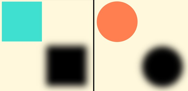
clip-path: polygon(-100vmax -100vmax,100vmax -100vmax,100vmax 100vmax,-100vmax 100vmax,-100vmax -100vmax,0 0,0 100%,100% 100%,100% 0,0 0)

Tada! We have a gradient shadow that supports transparency. All we did is add a clip-path to the previous code. Here is a figure to illustrate the polygon part.

Showing the clip-path coordinates for the element.

The blue area is the visible part after applying the clip-path. I am only using the blue color to illustrate the concept, but in reality, we will only see the shadow inside that area. As you can see, we have four points defined with a big value (B). My big value is 100vmax, but it can be any big value you want. The idea is to ensure we have enough space for the shadow. We also have four points that are the corners of the pseudo-element.

The arrows illustrate the path that defines the polygon. We start from (-B, -B) until we reach (0,0). In total, we need 10 points. Not eight points because two points are repeated twice in the path ((-B,-B) and (0,0)).

There’s still one more thing left for us to do, and it’s to account for the spread distance and the offsets. The only reason the demo above works is because it is a particular case where the offsets and spread distance are equal to 0.

Let’s define the spread and see what happens. Remember that we use inset with a negative value to do this:

The pseudo-element is now bigger than the main element, so the clip-path cuts more than we need it to. Remember, we always need to cut the part inside the main element (the area inside the green border of the example). We need to adjust the position of the four points inside of clip-path.

.box {
  --s: 10px; /* the spread  */
  position: relative;
}
.box::before {
  inset: calc(-1 * var(--s));
  clip-path: polygon(
    -100vmax -100vmax,
     100vmax -100vmax,
     100vmax 100vmax,
    -100vmax 100vmax,
    -100vmax -100vmax,
    calc(0px  + var(--s)) calc(0px  + var(--s)),
    calc(0px  + var(--s)) calc(100% - var(--s)),
    calc(100% - var(--s)) calc(100% - var(--s)),
    calc(100% - var(--s)) calc(0px  + var(--s)),
    calc(0px  + var(--s)) calc(0px  + var(--s))
  );
}

We’ve defined a CSS variable, --s, for the spread distance and updated the polygon points. I didn’t touch the points where I am using the big value. I only update the points that define the corners of the pseudo-element. I increase all the zero values by --s and decrease the 100% values by --s.

It’s the same logic with the offsets. When we translate the pseudo-element, the shadow is out of alignment, and we need to rectify the polygon again and move the points in the opposite direction.

.box {
  --s: 10px; /* the spread */
  --x: 10px; /* X offset */
  --y: 8px;  /* Y offset */
  position: relative;
}
.box::before {
  inset: calc(-1 * var(--s));
  transform: translate3d(var(--x), var(--y), -1px);
  clip-path: polygon(
    -100vmax -100vmax,
     100vmax -100vmax,
     100vmax 100vmax,
    -100vmax 100vmax,
    -100vmax -100vmax,
    calc(0px  + var(--s) - var(--x)) calc(0px  + var(--s) - var(--y)),
    calc(0px  + var(--s) - var(--x)) calc(100% - var(--s) - var(--y)),
    calc(100% - var(--s) - var(--x)) calc(100% - var(--s) - var(--y)),
    calc(100% - var(--s) - var(--x)) calc(0px  + var(--s) - var(--y)),
    calc(0px  + var(--s) - var(--x)) calc(0px  + var(--s) - var(--y))
  );
}

There are two more variables for the offsets: --x and --y. We use them inside of transform and we also update the clip-path values. We still don’t touch the polygon points with big values, but we offset all the others — we reduce --x from the X coordinates, and --y from the Y coordinates.

Now all we have to do is to update a few variables to control the gradient shadow. And while we are at it, let’s also make the blur radius a variable as well:

Do we still need the 3D transform trick?

It all depends on the border. Don’t forget that the reference for a pseudo-element is the padding box, so if you apply a border to your main element, you will have an overlap. You either keep the 3D transform trick or update the inset value to account for the border.

Here is the previous demo with an updated inset value in place of the 3D transform:

I‘d say this is a more suitable way to go because the spread distance will be more accurate, as it starts from the border-box instead of the padding-box. But you will need to adjust the inset value according to the main element’s border. Sometimes, the border of the element is unknown and you have to use the previous solution.

With the earlier non-transparent solution, it’s possible you will face a stacking context issue. And with the transparent solution, it’s possible you face a border issue instead. Now you have options and ways to work around those issues. The 3D transform trick is my favorite solution because it fixes all the issues (The online generator will consider it as well)

Adding a border radius

If you try adding border-radius to the element when using the non-transparent solution we started with, it is a fairly trivial task. All you need to do is to inherit the same value from the main element, and you are done.

Even if you don’t have a border radius, it’s a good idea to define border-radius: inherit. That accounts for any potential border-radius you might want to add later or a border radius that comes from somewhere else.

It’s a different story when dealing with the transparent solution. Unfortunately, it means finding another solution because clip-path cannot deal with curvatures. That means we won’t be able to cut the area inside the main element.

We will introduce the mask property to the mix.

This part was very tedious, and I struggled to find a general solution that doesn’t rely on magic numbers. I ended up with a very complex solution that uses only one pseudo-element, but the code was a lump of spaghetti that covers only a few particular cases. I don’t think it is worth exploring that route.

I decided to insert an extra element for the sake of simpler code. Here’s the markup:

<div class="box">
  <sh></sh>
</div>

I am using a custom element, <sh>, to avoid any potential conflict with external CSS. I could have used a <div>, but since it’s a common element, it can easily be targeted by another CSS rule coming from somewhere else that can break our code.

The first step is to position the <sh> element and purposely create an overflow:

.box {
  --r: 50px;
  position: relative;
  border-radius: var(--r);
}
.box sh {
  position: absolute;
  inset: -150px;
  border: 150px solid #0000;
  border-radius: calc(150px + var(--r));
}

The code may look a bit strange, but we’ll get to the logic behind it as we go. Next, we create the gradient shadow using a pseudo-element of <sh>.

.box {
  --r: 50px;
  position: relative;
  border-radius: var(--r);
  transform-style: preserve-3d;
}
.box sh {
  position: absolute;
  inset: -150px;
  border: 150px solid #0000;
  border-radius: calc(150px + var(--r));
  transform: translateZ(-1px)
}
.box sh::before {
  content: "";
  position: absolute;
  inset: -5px;
  border-radius: var(--r);
  background: /* Your gradient */;
  filter: blur(10px);
  transform: translate(10px,8px);
}

As you can see, the pseudo-element uses the same code as all the previous examples. The only difference is the 3D transform defined on the <sh> element instead of the pseudo-element. For the moment, we have a gradient shadow without the transparency feature:

Note that the area of the <sh> element is defined with the black outline. Why I am doing this? Because that way, I am able to apply a mask on it to hide the part inside the green area and keep the overflowing part where we need to see the shadow.

I know it’s a bit tricky, but unlike clip-path, the mask property doesn’t account for the area outside an element to show and hide things. That’s why I was obligated to introduce the extra element — to simulate the “outside” area.

Also, note that I am using a combination of border and inset to define that area. This allows me to keep the padding-box of that extra element the same as the main element so that the pseudo-element won’t need additional calculations.

Another useful thing we get from using an extra element is that the element is fixed, and only the pseudo-element is moving (using translate). This will allow me to easily define the mask, which is the last step of this trick.

mask:
  linear-gradient(#000 0 0) content-box,
  linear-gradient(#000 0 0);
mask-composite: exclude;

It’s done! We have our gradient shadow, and it supports border-radius! You probably expected a complex mask value with oodles of gradients, but no! We only need two simple gradients and a mask-composite to complete the magic.

Let’s isolate the <sh> element to understand what is happening there:

.box sh {
  position: absolute;
  inset: -150px;
  border: 150px solid red;
  background: lightblue;
  border-radius: calc(150px + var(--r));
}

Here’s what we get:

Note how the inner radius matches the main element’s border-radius. I have defined a big border (150px) and a border-radius equal to the big border plus the main element’s radius. On the outside, I have a radius equal to 150px + R. On the inside, I have 150px + R - 150px = R.

We must hide the inner (blue) part and make sure the border (red) part is still visible. To do that, I’ve defined two mask layers —One that covers only the content-box area and another that covers the border-box area (the default value). Then I excluded one from another to reveal the border.

mask:
  linear-gradient(#000 0 0) content-box,
  linear-gradient(#000 0 0);
mask-composite: exclude;

I used the same technique to create a border that supports gradients and border-radius. Ana Tudor has also a good article about masking composite that I invite you to read.

Are there any drawbacks to this method?

Yes, this definitely not perfect. The first issue you may face is related to using a border on the main element. This may create a small misalignment in the radii if you don’t account for it. We have this issue in our example, but perhaps you can hardly notice it.

The fix is relatively easy: Add the border’s width for the <sh> element’s inset.

.box {
  --r: 50px;
  border-radius: var(--r);
  border: 2px solid;
}
.box sh {
  position: absolute;
  inset: -152px; /* 150px + 2px */
  border: 150px solid #0000;
  border-radius: calc(150px + var(--r));
}

Another drawback is the big value we’re using for the border (150px in the example). This value should be big enough to contain the shadow but not too big to avoid overflow and scrollbar issues. Luckily, the online generator will calculate the optimal value considering all the parameters.

The last drawback I am aware of is when you’re working with a complex border-radius. For example, if you want a different radius applied to each corner, you must define a variable for each side. It’s not really a drawback, I suppose, but it can make your code a bit tougher to maintain.

.box {
  --r-top: 10px;
  --r-right: 40px;
  --r-bottom: 30px;
  --r-left: 20px;
  border-radius: var(--r-top) var(--r-right) var(--r-bottom) var(--r-left);
}
.box sh {
  border-radius: calc(150px + var(--r-top)) calc(150px + var(--r-right)) calc(150px + var(--r-bottom)) calc(150px + var(--r-left));
}
.box sh:before {
  border-radius: var(--r-top) var(--r-right) var(--r-bottom) var(--r-left);
}

The online generator only considers a uniform radius for the sake of simplicity, but you now know how to modify the code if you want to consider a complex radius configuration.

Wrapping up

We’ve reached the end! The magic behind gradient shadows is no longer a mystery. I tried to cover all the possibilities and any possible issues you might face. If I missed something or you discover any issue, please feel free to report it in the comment section, and I’ll check it out.

Again, a lot of this is likely overkill considering that the de facto solution will cover most of your use cases. Nevertheless, it’s good to know the “why” and “how” behind the trick, and how to overcome its limitations. Plus, we got good exercise playing with CSS clipping and masking.

And, of course, you have the online generator you can reach for anytime you want to avoid the hassle.


Different Ways to Get CSS Gradient Shadows originally published on CSS-Tricks, which is part of the DigitalOcean family. You should get the newsletter.

How to Easily Add Box Shadow in WordPress (4 Ways)

Recently one of our readers asked if there is an easy way to add box shadows in WordPress?

Shadows can make your most important content stand out and grab your visitors’ attention. They can also help flat website designs appear more engaging and interesting.

In this article, we will show you how to easily add box shadows in WordPress, step by step.

How to easily add box shadow in WordPress

Why Add Box Shadows in WordPress?

A box shadow, sometimes also known as a drop shadow, is a visual effect that makes it look like an onscreen object is casting a shadow.

We tend to pay more attention to objects that appear closer to us. That’s why many website owners add box shadows to their most important content to make it look like it’s hovering above the page.

For example, if you add a big shadow to a call to action button, then it will look physically closer to the visitor. This will draw the person’s attention toward this important button.

With that said, let’s see how you can add box shadows to your WordPress blog or website. Simply use the quick links below to jump straight to the method you want to use.

When adding box shadow, the best practice is to only add it on your most important website elements. If you add a unique shadow effect to each WordPress block, then it can make your site look messy and confusing.

It’s also important that you keep your box shadows consistent across the site. The best way to do this is by defining the style in CSS using WPCode.

WPCode is the best code snippets plugin used by over 1 million WordPress websites. It makes it easy to add custom code in WordPress without having to edit the functions.php file.

With WPCode, even beginners can edit their website’s code without risking mistakes and typos that can cause many common WordPress errors.

The first thing you need to do is install and activate the free WPCode plugin. For more details, see our step-by-step guide on how to install a WordPress plugin.

Upon activation, head over to Code Snippets » Add Snippet.

How to add box shadows using WPCode

Here, simply hover your mouse over ‘Add Your Custom Code.’

When it appears, click on ‘Use snippet.’

Adding drop shadows to WordPress using WPCode

To start, type in a title for the custom code snippet. This can be anything that helps you identify the snippet in the WordPress dashboard.

After that, open the ‘Code Type’ dropdown and select ‘CSS Snippet.’

Adding a CSS snippet to WordPress

In the code editor, add the following code snippet:

.shadow-effect {
box-shadow: 5px 5px 0px 2px #a9a1a1;
}

In the above snippet, you may need to replace the px values depending on the kind of shadow you want to create.

To help you out, here’s what the different px values mean, going from left-to-right:

  • Horizontal offset. When you set a positive value, the shadow gets pushed to the left. If you type in a negative value like -5px, then the shadow will be pushed to the right. If you don’t want to add a horizontal offset, then you can use 0px instead.
  • Vertical offset. If you use a positive value, then the shadow will be pushed downwards. If you type in a negative value then the shadow will be pushed upwards. If you don’t want to offset the shadow vertically, then just type in 0px.
  • Blur radius. This blurs the shadow so that it doesn’t have any harsh edges. The higher the value, the greater the blur effect. If you prefer to use sharp edges, then type in 0px.
  • Spread radius. The higher the value, the greater the shadow’s spread. This value is optional, so skip this one if you don’t want to show a spread.
  • Color. Although grey is the most common color for shadows, you can use any color you want by typing in a hex code. If you’re not sure what code to use, then you can explore different colors using a resource like HTML Color Codes.
Adding shadows to WordPress using custom CSS

When you’re happy with the snippet, scroll to the ‘Insertion’ section. WPCode can add your code to different locations, such as after every post, frontend only, or admin only.

We want to use the custom CSS code across our entire WordPress website, so click on ‘Auto Insert’ if it isn’t already selected. Then, open the ‘Location’ dropdown menu and choose ‘Site Wide Header.’

How to auto-insert custom code using WPCode

After that, you’re ready to scroll to the top of the screen and click on the ‘Inactive’ toggle, so it changes to ‘Active.’

Finally, click on ‘Save Snippet’ to make the CSS snippet live.

Publishing a custom CSS code snipppet

Now, you can add the custom CSS class to any block.

In the WordPress content editor, simply select the block where you want to add a box shadow. Then, in the right-hand menu click to expand the ‘Advanced’ section.

Adding a drop shadow to WordPress using a CSS snippet

Here, you’ll see fields where you can add different classes.

In ‘Additional CSS Class(es),’ type in shadow-effect.

WordPress' advanced code settings

When you’re ready to publish the box shadow, just click on the ‘Publish’ or ‘Update’ button.

Now if you visit your website, you’ll see the box shadow live.

Method 2. Add a Box Shadow Using a Free Plugin (Quick and Easy)

If you’re not comfortable writing code, then you might prefer to create shadows using Drop Shadow Box. This free plugin allows you to add box shadows to any block using the built-in WordPress page and post editor.

A box shadow, created using the Drop Shadow WordPress plugin

First, you’ll need to install and activate the plugin. If you need help, then please see our guide on how to install a WordPress plugin.

There are no settings to configure, so you can start using this plugin straight away.

To add a drop shadow, simply click on the ‘+’ icon and start typing in ‘Drop Shadow Box.’ When the right block appears, give it a click to add it to the page or post.

Adding a Drop Shadow Block in the WordPress page or post editor

This adds the drop shadow as an empty box, so the next step is adding some content.

To do this, go ahead and click on the ‘+’ inside the Drop Shadow Box block.

Adding a shadow block in the WordPress page and post editor

Then, simply add the block you want to use and configure it as normal.

For example, in the following image we’ve added an Image block and selected a picture from the WordPress media library.

An image, with a block shadow

With that done, click to select the Drop Shadow Box block. In the right-hand menu, you’ll see all the settings you can use to style this block.

WordPress sets the shadow’s width automatically but you can change this by opening the ‘Width’ dropdown and then choosing either ‘Pixels’ or ‘%.’

You can then resize it using the settings that appear.

Changing the width of a drop shadow using a free WordPress plugin

The Drop Box Shadow plugin comes with a few different effects such as curved edges and an eye-catching ‘Perspective’ effect.

To preview the different effects, simply open the ‘Effect’ dropdown and choose from the list. The preview will update automatically so you can try different styles to see what you prefer.

Adding different box shadow effects to WordPress

You can also change whether the plugin shows the shadow inside the box, outside the box, or both using the ‘Inside Shadow’ and ‘Outside Shadow’ toggles.

After that, you can change the color of the box and border using the settings under the ‘Colors’ header.

Just be aware that ‘Background’ refers to the inside of the Drop Shadow Box, while ‘Border’ appears outside of the block.

How to add a colored shadow effect to WordPress

If you want to create a softer, curved shadow box then you can enable the ‘Rounded corners’ toggle. Finally, you can change the alignment and padding, similar to how you customize other blocks in WordPress.

To create more box shadows, just follow the same process described above.

When you’re happy with how the page looks, simply click on ‘Update’ or ‘Publish’ to make all your new box shadows live.

Method 3. Add a Box Shadow Using a Page Builder (Advanced)

If you want to add box shadows to landing pages, custom homepages, or any part of your WordPress theme, then we recommend using a page builder plugin.

SeedProd is the best drag and drop WordPress page builder. It allows you to design custom landing pages and even create a custom WordPress theme without having to write a single line of code.

It also lets you add box shadows to any block using its advanced drag-and-drop editor.

First, you need to install and activate the SeedProd plugin. For more details, see our step-by-step guide on how to install a WordPress plugin.

Note: There’s also a premium version of SeedProd that comes with more professionally-designed templates, advanced features, and WooCommerce integration. However, we’ll be using the free version as it has everything you need to add box shadows in WordPress.

After activating the plugin, SeedProd will ask for your license key.

Adding the SeedProd license key to WordPress

You can find this license key under your account on the SeedProd website. After entering the information, click on the ‘Verify Key’ button.

After entering your key, go to SeedProd » Landing Pages in your WordPress dashboard.

SeedProd's professionally-designed templates

SeedProd comes with 150 professionally designed templates that are grouped into categories. Along the top you’ll see categories that let you create beautiful coming soon pages, activate maintenance mode, create a custom login page for WordPress, and more.

All of SeedProd’s templates are easy to customize, so you can use any design you want.

When you find a template that you like, simply hover your mouse over it and click on the checkmark icon.

Selecting a professionally-designed SeedProd page layout

You can now type in a name for your landing page into the ‘Page Name’ field. SeedProd will automatically create a ‘Page URL’ using the page name.

It’s smart to include relevant keywords in your URL wherever possible, as this can help search engines understand what the page is about. This will often improve your WordPress SEO.

To change the page’s automatically-generated URL, simply type into the ‘Page URL’ field.

Adding an SEO-friendly page title to a SeedProd design

When you’re happy with the information you’ve typed in, click on ‘Save and Start Editing the Page.’ This will load the SeedProd page builder interface.

This simple drag-and-drop builder shows a live preview of your page design to the right. On the left is a menu showing all the different blocks and sections you can add to the page.

The SeedProd page editor

When you find a block that you want to add, simply drag and drop it onto your template.

To customize a block, go ahead and click to select that block in the SeedProd editor. The left-hand menu will now update to show all the settings you can use to customize the block.

For example, if you click on a Headline block then you can type in your own text, or change the text color and font size.

Customizing a headline block in SeedProd

As you’re building the page, you can move blocks around your layout by dragging and dropping them. For more detailed instructions, please see our guide on how to create a landing page with WordPress.

To create a box shadow, click to select any block in the SeedProd page editor. The settings in the left-hand menu may vary between blocks, but you’ll typically need to click on an ‘Advanced’ tab.

Adding a box shadow in WordPress using SeedProd

Here, look for a ‘Shadow’ dropdown menu under the ‘Styles’ section. Simply open this dropdown and choose a shadow style such as Hairline, Medium, or 2X Large.

The preview will update automatically, so you can try different styles to see what looks the best on your page design.

How to easily add a box shadow in WordPress using a page builder

If you don’t want to use any of the ready-made styles, then click on ‘Custom.’

This adds some new settings where you can change the color, blur, spread, and position of the custom shadow.

Adding drop shadows to WordPress using SeedProd

That done, you can continue working on the page by adding more blocks and box shadows.

When you’re happy with how the page looks, click the ‘Save’ button and then choose ‘Publish’ to make it live.

Publishing a page with block shadows using SeedProd

Method 4. How to Add a Box Shadow Using CSS Hero (Premium Plugin)

If you’re not comfortable working with code but still want to create advanced box shadows, then you can try CSS Hero. This premium plugin allows you to fine-tune every part of your WordPress theme without having to write a single line of code.

CSS Hero allows you to create a unique shadow for each block, so it’s also a great choice if you want to create lots of different shadow effects.

First, you need to install and activate the CSS Hero plugin. For more details, see our step-by-step guide on how to install a WordPress plugin.

Upon activation, you’ll see a ‘Proceed to Product Activation’ button at the top of the screen. Go ahead and click on this button.

Activating the CSS Hero WordPress plugin

This will take you to the CSS Hero website where you can log into your account and get a license key. Simply follow the onscreen instructions, and you’ll be redirected back to your site in a few clicks.

Next, click the ‘Customize with CSS Hero’ text in the WordPress admin toolbar.

Customizing a WordPress theme using CSS Hero

This will open the CSS Hero editor.

By default, clicking on any piece of content will open a panel with all the settings you can use to customize that content.

The CSS Hero user-friendly page editor

This is great if you want to add a box shadow to your website’s homepage. However, if you want to customize any other page then you’ll need to switch from ‘Select’ mode to ‘Navigate’ mode, as this allows you to interact with menus, links, and other content as normal.

To do this, click on the ‘Select / Navigate’ toggle in the toolbar so that it shows ‘Navigate.’

The CSS Hero WordPress plugin

You can now navigate to the page or post where you want to add the shadow.

As soon as you reach that page, go ahead and click on the ‘Select / Navigate’ toggle again so that it shows ‘Select.’

Switching between Select and Navigation mode using CSS Hero

With that done, click on the paragraph, image, button, or any other content where you want to add a box shadow.

In the left-hand panel, click on ‘Extra.’

Creating a drop shadow using CSS Hero

You can now go ahead and click on ‘Make Shadow,’ which shows all the settings you can use to create a box shadow.

To start, you can change whether the shadow appears inside or outside the block using the ‘Shadow Position’ settings.

Changing the position of a shadow box using CSS Hero

After making this decision, you can fine-tune the shadow’s orientation using the small dot in the ‘Orientation’ box.

Simply drag and drop the dot into a new position to see it move in the live preview.

Customizing a drop shadow in WordPress

When you’re happy with the shadow’s position, you can change its color, blur, and spread.

CSS Hero will show these changes immediately, so you can try different settings to see what looks the best.

Creating a custom box shadow using a drag and drop editor

To add a box shadow to other blocks, just follow the same process described above.

When you’re happy with how the page looks, click on ‘Save & Publish’ to make it live.

How to publish a CSS shadow to WordPress

We hope this tutorial helped you learn how to add a box shadow in WordPress. You may also want to learn how to create a table of content in WordPress, or check out our list of the best WordPress popup plugins.

If you liked this article, then please subscribe to our YouTube Channel for WordPress video tutorials. You can also find us on Twitter and Facebook.

The post How to Easily Add Box Shadow in WordPress (4 Ways) first appeared on WPBeginner.

Getting Deep into Shadows

Let’s talk shadows in web design. Shadows add texture, perspective, and emphasize the dimensions of objects. In web design, using light and shadow can add physical realism and can be used to make rich, tactile interfaces.

Take the landing page below. It is for cycling tours in Iceland. Notice the embellished drop shadow of the cyclist and how it creates the perception that they are flying above not only the content on the page, but the page itself, as though they are “popping” over the screen. It feels dynamic and immediate, which is perfect for the theme of adventure.

A view of a BMX biker from above leaping over a vast area of light brown land with the words free ride along the bottom edge in large, bold, and white block lettering.
Credit: Kate Hahu

Compare that with this next example. It’s a “flat” design, sans shadows. In this case, the bike itself is the focal point. The absence of depth and realism allows the bike to stand out on its own.

Screenshot of a webpage with a light pink background with a white box that contains the site content with a headline that reads "Ride as Much or as Little" in red, an email subscription form, and a large image of a red and white bicycle to the right.
Credit: saravana

You can appreciate the differences between these approaches. Using shadows and depth is a design choice; they should support the theme and the message you want the content to convey.

Light and shadows

As we just saw, depth can enhance content. And what exactly makes a shadow? Light!

It’s impossible to talk about shadow without getting into light. It controls the direction of a shadow as well as how deep or shallow the shadow appears. You can’t have one without the other.

Google’s Material Design design system is a good example of employing light and shadows effectively. You’ve certainly encountered Material Design’s aesthetics because Google employs it on nearly all of its products.

A masonry grid of photos on a mobile screen. The purple header that contains the page title and hamburger menu has a shadow along its bottom edge that separates it from the white background of the photos.
White modal with a list of checkboxes. The modal has an underlying black shadow against the background.
A two-by-three grid of cards on a mobile screen. Each card has a light shallow shadow against a white background.

The design system takes cues from the physical world and expresses interfaces in three-dimensional space using light, surfaces, and cast shadows. Their guidelines on using light and shadows covers this in great detail.

In the Material Design environment, virtual lights illuminate the UI. Key lights create sharper, directional shadows, called key shadows. Ambient light appears from all angles to create diffused, soft shadows, called ambient shadows.

Shadows are a core component of Material Design. Compare that with Apple’s Human Interface Guidelines for macOS, where translucency and blurring is more of a driving factor for evoking depth.

Screenshot of Apple's Reminders app on a desktop. The left column that contains search and navigation is opaque and blends lightly into the desktop background while the solid white right column contains a checkbox list of reminders.
Screenshot of Apple's Maps app. The left column contains the map addresses and different route options with an opaque background that lightly blends in with the desktop background. The right column contains the map and does not blend in with the background.

In this case, light is still an influential factor, as it allows elements to either blend into the desktop, or even into other panels in the UI. Again, it’s is a design choice to employ this in your interface. Either way, you can see how light influences the visual perception of depth.

Light sources and color

Now that we understand the relationship between light and shadows, we ought to dig in a little deeper to see how light affects shadows. We’ve already seen how the strength of light produces shadows at different depths. But there’s a lot to say about the way light affects the direction and color of shadows.

There are two kinds of shadows that occur when a light shines on an object, a drop shadow and a form shadow.

Photo of an orange with light shining on it from the top right. That area is brighter than the left side which is covered in shadow. The ground contains a light reflection of the orange.

Drop shadows

A drop shadow is cast when an object blocks a light source. A drop shadow can vary in tone and value. Color terminology can be dense and confusing, so let’s talk about tone and value for a moment.

Tone is a hue blended with grey. Value describes the overall lightness or darkness of a color. Value is a big deal in painting as it is how the artist translates light and object relationships to color.

Illustration showing the effects of Hue, Tint, Tone, and Shade on red rectangles. Each rectangle is a slightly different shade of red where tint adds white, tone adds gray and shade adds black.

In the web design world, these facets of color are intrinsic to the color picker UI.

Form shadows

A form shadow, on the other hand, is the side of an object facing away from the light source. A form shadow has softer, less defined edges than a drop shadow. Form shadows illustrate the volume and depth of an object.

The appearance of a shadow depends on the direction of light, the intensity of light, and the distance between the object and the surface where the shadow is cast. The stronger the light, the darker and sharper the shadow is. The softer the light, the fainter and softer the shadow is. In some cases, we get two distinct shadows for directional light. The umbra is where light is obstructed and penumbra is where light is cast off.

Two vertically stacked illustrations.The top is a green circle with a yellow light source coming at it from the left and both umbra and penumbra shadows are cast to the right. The bottom illustration is the same green circle and light source, but with a solid black shadow cast to the right.

If a surface is close to an object, the shadow will be sharper. If a surface is further away, the shadow will be fainter. This is not some abstract scientific stuff. This is stuff we encounter every day, whether you realize it or not.

This stuff comes up in just about everything we do, even when writing with a pencil.

Light may also be reflected from sides of an object or another surface. Bright surfaces reflect light, dark surfaces absorb light.

These are the most valuable facets of light to understand for web design. The physics behind light is a complex topic, I have just lightly touched on some of it here. If you’d like to see explicit examples of what shadows are cast based on different light sources, this guide to drawing shadows for comics is instructive.

Positioning light sources

Remember, shadows go hand-in-hand with light, so defining a light source — even though there technically isn’t one — is the way to create impressive shadow effects. The trick is to consistently add shadows relative to the light source. A light source positioned above an element will cast a shadow below the element. Placing a light source to the left of an element will cast a shadow to the right. Placing multiple light sources to the top, bottom, left and right of an element actually casts no shadow at all!

Showing two browser mockups side by side. The left has light shining on it from all four directions showing uniform light and no shadows. The right has a single light source from the top casting a shadow along the bottom edge.

A light source can be projected in any direction you choose. Just make sure it’s used consistently in your design, so the shadow on one element matches other shadows on the page.

Elevation

Shadows can also convey elevation. Once again, Material Design is a good example because it demonstrates how shadows are used to create perceived separation between elements.

Showing a mobile screen flat on a light blue background with header, box, and navigational elements elevated over the screen showing depth.
Credit: Nate Wilson

Inner shadows

Speaking of elevation, the box-shadow property is the only property that can create inner shadows for a sunken effect. So, instead of elevating up, the element appears to be pressed in. That’s thanks to the inset keyword.

That good for something like an effect where clicking a button appears to physically press it.

It’s also possible to “fake” an inner text shadow with a little trickery that’s mostly supported across browsers:

Layering shadows

We’re not limited to a single shadow per element! For example, we can provide a comma-separated list of shadows on the box-shadow property. Why would we want to do that? Smoother shadows, for one.

Interesting effects is another.

Layering shadows can even enhance typography using the text-shadow property.

Just know that layering shadows is a little different for filter: drop-shadow() It’s syntax also takes a list, but it’s space-separated instead of comma-separated.

.box {
  box-shadow: 
    0 2px 2px #555, /* commas */
    0 6px 5px #777,
    0 12px 10px #999
  ;
}

.box {
  filter:
    drop-shadow(0 2px 2px #555) /* spaces */
    drop-shadow(0 6px 5px #777)
    drop-shadow(0 12px 10px #999);
}

Another thing? Shadows stack on top of one another, in the order they are declared where the top shadow is the first one in the list.

Two vertically stacked examples showing a white circle with a yellow and a grey circle behind it and the CSS code snippets that create the effect. On the top, the gray shadow is above the yellow shadow. On the bottom, the yellow shadow is above the gray shadow.

You may have guessed that drop-shadow() works a little differently here. Shadows are added exponentially, i.e. 2^number of shadows - 1.

Here’s how that works:

  • 1 shadow = (2^1 – 1). One shadow is rendered.
  • 2 shadows = (2^2 – 1). Three shadows are rendered.
  • 3 shadows = (2^3 – 1). Seven shadows are rendered.

Or, in code:

.one-shadow {
  filter: drop-shadow(20px 20px 0 grey);
}

.three-shadows {
  filter: 
    drop-shadow(20px 20px 0 grey)
    drop-shadow(40px 0 0 yellow);
}

.seven-shadows {
  filter: 
    drop-shadow(20px 20px 0 grey)
    drop-shadow(40px 0 0 yellow);
    drop-shadow(80px 0 0 red);
}

The <feDropShadow> element works the exact same way for SVGs.

Shadows and accessibility

Here’s something for you to chew on: shadows can help improve accessibility.

Google conducted a study with low-vision participants to better understand how shadows and outlines impact an individual’s ability to identify and interact with a component. They found that using shadows and outlines:

  • increases the ease and speed of finding a component when scanning pages, and
  • improves one’s ability to determine whether or not a component is interactive.

That wasn’t a wide-ranging scientific study or anything, so let’s turn around and see what the W3C says in it’s guidelines for WCAG 2.0 standards:

[…] the designer might darken the background behind the letter, or add a thin black outline (at least one pixel wide) around the letter in order to keep the contrast ratio between the letter and the background above 4.5:1.

That’s talking about light text on a light background. WCAG recommends a contrast ratio that’s at least 4.5:1 between text and images. You can use text shadows to add a stronger contrast between them.

Photo credit: Woody Van der Straeten

Shadows and performance

Before diving into shadows and adding them on all the things, it’s worth calling out that they do affect performance.

For example, filter: drop-shadow is hardware-accelerated by some browsers. A new compositor layer may be created for that element, and offloaded to the GPU. You don’t want to have too many layers, as it takes up limited GPU memory, and will eventually degrade performance. You can assess this in your browser’s DevTools.

Blurring is an expensive operation, so use it sparingly. When you blur something, it mixes the colors from pixels all around the output pixel to generate a blurred result. For example, if your <blur-radius> parameter is 2px, then the filter needs to look at two pixels in every direction around each output pixel to generate the mixed color. This happens for each output pixel, so that means a lot of calculations that grow exponentially. So, shadows with a large blur radius are generally slower to render than other shadows.

Did you know?

Did you know that shadows don’t influence the document layout?

A shadow is the same size as the element it targets. You can modify the size of a box-shadow (through the spread radius parameter), but other properties cannot modify the shadow size.

And did you know that a shadow implicitly has a lower z-index than elements? That’s why shadows sit below other elements.

And what about clipping and masking? If an element with a box-shadow is clipped (with clip-path) or uses a mask (with mask), the shadow isn’t shown. Conversely, if an element with text-shadow or filter: drop-shadow() is clipped, a shadow is shown, as long as it is within the clip region.

Here’s another: We can’t create oblique shadows (with diagonal lines) with shadow properties. That requires creating a shadow element and use a transform:skew() on it.

Oh, and one more: box-shadow follows border-radius. If an element has rounded corners, the shadow is rounded as well. In other words, the shadow mirrors the shape of the box. On the other hand, filter: drop-shadow() can create an irregular shape because it respects transparency and follows the shape of the content.

Showing two of the same card component side-by-side. They are brightly colored with a background gradient that goes from red to gold. The Nike logo is at the top, a title is below it, then a paragraph of white text beneath that. A red show with an exaggerated shadow is on both cards. The cards illustrated the difference between box shadow, which follows the boundaries of the card's edges, and drop shadow, which includes the shape of the shoe outside the card boundary.

Best use cases for different types of shadows

Practically anything on the web can have a shadow and there are multiple CSS properties and functions that create shadows. But choosing the right type of shadow is what makes a shadow effective.

Let’s evaluate the options:

  • box-shadow: This CSS property creates shadows that conform to the elements bounding box. It’s versatile and can be used on anything from cards to buttons to just about anything where the shadow simply needs to follow the element’s box.
  • text-shadow: This is a CSS property that creates shadows specifically for text elements.
  • filter: drop-shadow(): The CSS property here is filter, but what create the shadow is the drop-shadow function it accepts. What makes this type of shadow different from, say box-shadow, is that it follows the rendered shape of any element (including pseudos).
  • <feDropShadow>: This is actually an SVG element, whereas the rest are CSS properties. So, you would use this to create drop shadows directly in SVG markup.

Once you get the hang of the different types of shadows and each one’s unique shadow-creating powers, the possibilities for shadow effects feels endless. From simple drop shadows to floating elements, and even inner shadows, we can create interesting visuals that add extra meaning or value to UI.

The same goes for text shadows.

Shadows in the wild

Shadows are ubiquitous. We’re seeing them used in new and interesting ways all the time.

Have you heard the buzzword “neumorphism” floating around lately? That’s all about shadows. Here’s an implementation by Maria Muñoz:

Yuan Chuan, who makes amazing generative art, calls shadows a secret weapon in UI design:

CSS relies on existing DOM structure in the browser. It’s not possible to generate new elements other than ::before and ::after. Sometimes I really wish CSS had the ability to do so straightforwardly.

Yet, we can partially make up for this by creating various shadows and gradients entirely in CSS.

That’s why having drop-shadow is so exciting. Together with text-shadow and box-shadow we can do a lot more.

Just check out how he uses drop shadows to create intricate patterns.

Yes, that’s pretty crazy. And speaking of crazy, it’s worth mentioning that going too crazy can result in poor performance, so tread carefully.

What about pseudo-elements?

Oh yes, shadow properties are supported by the ::before and ::after pseudo-elements.

Other pseudos that respect shadows? The ::first-letter pseudo-element accepts box-shadow and text-shadow. The ::first-line pseudo-element accepts text-shadow.

Look at how Jhey Tompkins got all creative using box-shadow on pseudo elements to create animated loaders.

Animating shadows

Yes, we can make them move! The properties and function we’ve covered here are totally compatible with CSS animations and transitions. That means we can move shadows, blur shadows, expand/shrink shadows (with box-shadow), and alter the color.

Animating a shadow can provide a user with a cue that an element is interactive, or that an action has taken place. We saw earlier with our button example that an inset shadow showed that the button had been pressed. Another common animation pattern is elevating a card on hover.

If you want to optimize the animation performance, avoid animating box-shadow! It is more performant to animate drop-shadow(). But if you want the smoothest animation, a hack is the best option! Add an ::after pseudo-element with a bigger box-shadow, and animate its opacity instead.

Of course, there is a lot more you can animate. I will leave that exploration up to you!

Wrapping up

Phew, who knew there was so much to something as seemingly “simple” as CSS shadows! There’s the light source and how shadows are cast. The different types of shadows and their color. There’s using shadows for evoking depth, elevating elements and insetting them. There’s the fact that we can layer shadows on top of other shadows. And that we have a selection of CSS properties that we can use for different use cases. Then, there are the accessibility and performance implications that come with them. And, hey, animation is thing! That’s a heckuva lot!

Anyway, hopefully this broad overview gave you something new to chew on, or at the very least, helped you brush up on some concepts.


The post Getting Deep into Shadows appeared first on CSS-Tricks.

You can support CSS-Tricks by being an MVP Supporter.

Make a smooth shadow, friend.

One box-shadow is cool and all, but check out Philipp Brumm's tool for building out comma-separated multiple box-shadows, which result in a much smoother and more natural look.

This reminds me very much of the idea for easing linear-gradient. In a gradient, this smoothing effect is handled by multiple stops with the position and color eased (sloped) rather than linear (straight). The result is noticeably smoother and a more pleasing look.

See the Pen
smooth box-shadow
by Chris Coyier (@chriscoyier)
on CodePen.

Direct Link to ArticlePermalink

The post Make a smooth shadow, friend. appeared first on CSS-Tricks.

Drawing Realistic Clouds with SVG and CSS

Greek mythology tells the story of Zeus creating the cloud nymph, Nephele. Like other Greek myths, this tale gets pretty bizarre and X-rated. Here’s a very abridged, polite version.

Nephele, we are told, was created by Zeus in the image of his own beautiful wife. A mortal meets Nephele, falls in love with her and, together, they take an adult nap™. Finally, in a strange twist, the cloud gives birth to half-human half-horse Centaur babies.

Weird, right? Personally, I can’t make heads or tails of it. Thankfully, the process for creating clouds in the browser is much more straightforward and far less risqué.

Yuan Chuan’s clouds detail. (Demo)

Recently, I discovered that developer Yuan Chuan has realized code-generated, photorealistic clouds. For me, this notion in the browser had long been the stuff of myth.

With one glance at the code in this pen we can imagine that convincing individual clouds are achievable through the use of CSS box-shadow with a <filter> element containing two SVG filters as its complement.

The photorealism we want is achieved with a delicate mix of feTurbulence and feDisplacementMap. These SVG filters are powerful, complex and offer very exciting features (including an Oscar winning algorithm)! However, under the hood, their complexity can be a bit intimidating.

While the physics of SVG filters is beyond the scope of this article, there is ample documentation available on MDN and w3.org. A very informative page on feTurbulence and feDisplacement is freely available (and offered as a chapter of this amazing book).

For this article, we will focus on learning to use these SVG filters to get spectacular results. We don’t need to delve too deeply into what is happening behind the scenes algorithmically, much in the way an artist isn’t required know the molecular structure of paint to render a stunning landscape.

Instead, let's pay close attention to small handful of SVG attributes that are essential for drawing convincing clouds in the browser. Their use will enable us to bend these powerful filters to our will and learn how to customize them with precision in our own projects.

Let’s start with some basics

The CSS box-shadow property has five values that deserve close attention:

box-shadow: <offsetX> <offsetY> <blurRadius> <spreadRadius> <color>;

Let’s crank these values up (probably higher than what any sane developer would so that this shadow becomes a player on the stage in its own right.

(Demo)
#cloud-square {
  background: turquoise;
  box-shadow: 200px 200px 50px 0px #000;
  width: 180px;
  height: 180px;
}

#cloud-circle {
  background: coral;
  border-radius: 50%;
  box-shadow: 200px 200px 50px 0px #000;
  width: 180px;
  height: 180px;
}

You’ve either made or seen shadow puppets, right?

Credit: Double-M

In the same way that a hand changes shape to alter the shadow, a "source shape" in the our HTML can move and morph to move and alter the shape of a shadow rendered in the browser. box-shadow duplicates the "morphing" features on the original size and border-radius. SVG filters get applied to both the element and its shadow.

<svg width="0" height="0"> 
  <filter id="filter">
    <feTurbulence type="fractalNoise" baseFrequency=".01" numOctaves="10" />
    <feDisplacementMap in="SourceGraphic" scale="10" />
  </filter>
</svg>

This is the markup for our SVG so far. It won’t render because we haven’t defined anything visual (not to mention the zero width and height). It’s sole purpose is to hold a filter that we feed our SourceGraphic (aka our <div>). Our source <div> and its shadow are both being distorted independently by the filter.

We’ll add the essential CSS rule linking the HTML element (`#cloud-circle`) to the SVG filter using its ID:

#cloud-circle {
  filter: url(#filter);
  box-shadow: 200px 200px 50px 0px #fff;
}

Et Voilà!

OK, so admittedly, adding the SVG filter is pretty underwhelming.

(Demo)

No worries! We have only just scratched the surface and have a lot more good stuff to look at.

Experimenting with the feDisplacementMap scale attribute

A few un-scientific experiments with this one attribute can yield dramatic results. For the moment, let’s keep the all values in feTurbulence constant and simply adjust the scale attribute of DisplacementMap.

As scale increases (by increments of 30) our source <div> becomes distorted and casts a shadow to mirror the stochastic form in which clouds appear in the sky.

<feDisplacementMap in="SourceGraphic" scale="180"/>
The scale attribute incremented by values of 30. (Demo)

OK, we’re getting somewhere! Let’s change the colors a bit to produce a more convincing cloud and to "sell" the effect.

body {
  background: linear-gradient(165deg, #527785 0%, #7FB4C7 100%);
}

#cloud-circle {
    width: 180px;
    height: 180px;
    background: #000;
    border-radius: 50%;
    filter: url(#filter);
    box-shadow: 200px 200px 50px 0px #fff;
}

Now we’re getting closer to a realistic cloud effect!

Modifying the box-shadow blur value

The following suite of images shows the influence that the blur value has on box-shadow. Here, blur is increased by 10 pixels incrementally.

The cloud becomes "softer" as the blur value increases.

To give our cloud a bit of a cumulus-like effect, we can widen our source <div> a bit.

#cloud-circle {
  width: 500px;
  height: 275px;
  background: #000;
  border-radius: 50%;
  filter: url(#filter);
  box-shadow: 200px 200px 60px 0px #fff;
}
Great, now the source element is getting in the way. 😫

Wait! We’ve widened the source element and now it’s in the way of our of the white shadow we’re calling a cloud. Let’s "re-cast" the shadow at a greater distance so that our cloud is no longer obscured by the source image. (Think of this as moving your hand away further from the wall so it doesn’t block the view of your shadow puppet.)

This is nicely achieved with a bit of CSS positioning. The <body> is the parent element for our cloud, which is statically positioned by default. Let’s "tuck" our source <div> up and out of the way with some absolute positioning. Initially, that will reposition our shadow as well, so we’ll also need to increase the distance of the shadow from the element and nudge the element a bit more.

#cloud-circle {
  width: 500px;
  height: 275px;
  background: #000;
  border-radius: 50%;
  filter: url(#filter);
  box-shadow: 400px 400px 60px 0px #fff; /* Increase shadow offset */
  position: absolute; /* Take the parent out of the document flow */
  top: -320px; /* Move a little down */
  left: -320px; /* Move a little right */
}

Yes! We've arrived at a pretty persuasive cloud.

See the Pen
by Beau Haus (@beauhaus)
on CodePen.

What is painted to the browser is a pretty decent depiction of a cloud–But, I’m not sure…does this cloud really do justice the cloud nymph, Nephele? I'm sure we can do better!

Conveying depth with layers

Here’s what we want:

A photo of clouds against a blue sky. The clouds have shades of gray that provide depth.
Credit: pcdazero

From the look of the depth, texture and richness of the clouds in this photograph, one thing is clear: Zeus went to art school. At the very least, he must have read the The Universal Principles of Design which illustrates a powerful–yet, deceptively ordinary–concept:

[...] lighting bias plays a significant role in the interpretation of depth and naturalness, and can be manipulated in a variety of ways by designers...Use the level of contrast between light and dark areas to vary the appearance of depth.

This passage provides for us a hint as to how to we can vastly improve our own code-generated cloud. We can render our cloud with a good deal of fidelity to the clouds in our reference image by stacking layers of differing form, size and color on top of each other. All that takes is calling our filter as many times as we want layers.

<svg width="0" height="0">
    <!-- Back Layer -->
    <filter id="filter-back">
      <feTurbulence type="fractalNoise" baseFrequency="0.012" numOctaves="4" />
      <feDisplacementMap  in="SourceGraphic" scale="170" />
    </filter>
    <!-- Middle Layer -->
    <filter id="filter-mid">
      <feTurbulence type="fractalNoise" baseFrequency="0.012" numOctaves="2" />
      <feDisplacementMap  in="SourceGraphic" scale="150" />
    </filter>
    <!-- Front Layer -->
    <filter id="filter-front">
      <feTurbulence type="fractalNoise" baseFrequency="0.012" numOctaves="2" />
      <feDisplacementMap  in="SourceGraphic" scale="100" />
    </filter>
</svg>

Applying our layers will afford us an opportunity to explore feTurbulence and realize its versatility. We’ll choose the smoother type available to us: fractalNoise with numOctaves cranked up to 6.

<feTurbulence type="fractalNoise" baseFrequency="n" numOctaves="6"/>

What does all that mean? For now, let’s focus specifically on the baseFrequency attribute. Here’s what we get as we increase the value of n:

The lower the value, the rounder and fuzzier we get. The higher the value, the rounder and more rigid we get.

Words like turbulence, noise, frequency, and octave may seem odd and even confusing. But fear not! It’s actually perfectly accurate to analogize this filter’s effects to sound waves. We may equate a low frequency (baseFrequency=0.001) with a low, muffled noise and a rising frequency (baseFrequency=0.1) with a higher, crisper pitch.

We can see that our sweet spot for a cumulus-like effect may lie comfortably around the ~0.005 and ~0.01 range for the baseFrequency.

Adding detail with numOctaves

Incrementing numOctaves allows us to render our image in extremely granular detail. This requires a great deal of calculation, so be warned: high values are a significant performance hit. Try to resist the temptation to pump up this value unless your browser is wearing a helmet and knee-pads.

The higher the value we put into numOctaves the more granular detail give to our cloud.

The good news is that we don’t have to crank this value too high in order to produce detail and delicacy. As the array of images above shows, we can satisfy ourselves with a numOctavesvalue of 4 or 5.

Here’s the result

See the Pen
by Beau Haus (@beauhaus)
on CodePen.

Infinite variety with the seed attribute

There is much to say about the seed attribute as it offers a hint into the magic happening behind the scenes. But, for our purposes, the utility of seed can be reduced to four words: "different value, different shape."

The Perlin Noise function (mentioned earlier) uses this value as the starting point for its random number generator. Choosing not to include this attribute will default seed to zero. When included, however, whatever value we give seed, we don’t need to worry about a performance hit.

Animation showing thr shape of a cloud changing as the seed value changes.
Different seed values produce different shapes.

The GIF above represents some of what seed has to offer. Keep in mind that each of those clouds is a layered, composite cloud. (While I have tweaked attributes for each layer, I have kept their respective seed values uniform.)

Credit: Brockenhexe

Here, with a close look at the reference image, I've layered 3 cloud-<div>s (of differing in opacity) onto a single base div. Through trial and error and punching in arbitrary seed values, I eventually arrived at a shape resembling the shape of the cloud in the photograph.

See the Pen
Nephele Reference Image study
by BEAU.HAUS (@beauhaus)
on CodePen.

Sky’s the limit

Of course, it would be hubris to think that the <div>s that we paint to the browser could be superior to Zeus’s, Nephele.

However, the more mystery we are able to tease out of CSS and SVG filters, the more we are empowered create something visually stunning with a high degree of fidelity to the Thunder God’s original creation. We can, then, can go on experiment further!

Reflecting Mist

Animated Reflecting mist

Alto-Cirrus Clouds

Alto-Cirrus clouds

In this article, we have just dipped our toe in an ocean of power and complexity. SVG filters can often seem overwhelming and unapproachable.

However, much like the examples found in the A Single Div project project or Diana Smith's painting techniques, a playful and experimental approach will always rewarded with spectacular results!

I hope this gets you excited about creating a bit of photorealism on the web. I developed a little tool to help put them all to use and experiment a bit. Any questions, suggestions or advice? Ping me in the twitterverse drop a comment here.


Many thanks to Amelia Bellamy-Royds for her kind advice on this article.

The post Drawing Realistic Clouds with SVG and CSS appeared first on CSS-Tricks.

Using “box shadows” and clip-path together

Let's do a little step-by-step of a situation where you can't quite do what seems to make sense, but you can still get it done with CSS trickery. In this case, it'll be applying a shadow to a shape.

You make a box

.tag {
  background: #FB8C00;
  color: #222;
  font: bold 32px system-ui;
  padding: 2rem 3rem 2rem 4rem;
}

You fashion it into a nice tag shape

You use clip-path because it's great for that.

.tag {
  /* ... */
  clip-path: polygon(30px 0%, 100% 0%, 100% 100%, 30px 100%, 0 50%)
}

You want a shadow on it, so you...

Try to use box-shadow.

.tag {
  /* ... */
  box-shadow: 5px 5px 10px rgba(0, 0, 0, 0.5);
}

But it doesn't work. Nothing shows up. You think you're going crazy. You assume you have the syntax wrong. You don't. The problem is that clip-path is cutting it off.

You can drop-shadow a parent element instead

There is a filter that does shadows as well: drop-shadow(). But you can't use it directly on the element because the clip-path will cut it off as well. So you make a parent:

<span class="tag-wrap">
  <span class="tag">
    Tag
  </span>
</span>

You can't use box-shadow on that parent either, because the parent is still a rectangle and the shadow will look wrong. But you can use filter, and the shadow will follow the shape.

See the Pen
Shadow on Shape
by Chris Coyier (@chriscoyier)
on CodePen.

That's all.

The post Using “box shadows” and clip-path together appeared first on CSS-Tricks.