Remember when Ahmad Shadeed wrote about that border-radius “toggle” he found in Facebook’s CSS? It was interesting! I covered it. A few weeks after that surge of linkage, a couple of articles came out digging into it a little deeper.
While undoubtedly clever, and super interesting to read about, I side with Robin Rendle in the CSS-Tricks newsletter when he says:
I can’t help but feel that it’s a little too smart.
I have to agree here. Tricks like this have their place, and Facebook (which can clearly afford to hire the best of the best CSS developers) might be one of them. But speaking personally, when forced to pick between a trick like this and an ever-so-slightly less optimal but far more readable solution (say, a media query), in 99% of cases I’d plump for the latter.
Michelle is aware that a media query isn’t the same solution here. A non-clever solution would be a container query. I agree as well. I almost never opt for tricky solutions in production, as even if they seem to work, I worry about the long term maintenance and sometimes even the fragility of the solution.
Stefan Judis looked at how we might pull of the same “conditional border-radius” idea only using the upcoming container queries syntax.
/* If the container's width is equal to or greater than
   the viewport width, remove the border-radius */
@container (width >= 100vw) {
  .conditional-border-radius {
    border-radius: 0;
  }
}
That’s pretty darn clear to me. Stefan also mentions that if we could use the theoretically upcoming @when feature, it could be even clearer:
That is a big maybe, as there is no evidence these brand new specs will overlap like this. I hope they do though. CSS has gotten much more logical and readable over the years and this would keep that train moving.
The 9999 multiplication means that you’ll never get low-positive numbers. It’s a toggle. You’ll either get 8px or 0px and nothing in between. Try removing that part, resizing the screen, and seeing it sorta morph as the viewport becomes close to the component size
But I regretted not putting a video in there to make the concept clearer, so I’ll rectify that here.
Ahmad Shadeed documents a bonafide CSS trick from the Facebook CSS codebase. The idea is that when an element is the full width of the viewport, it doesn’t have any border-radius. But otherwise, it has 8px of border-radius. Here’s the code:
One line! Super neat. The guts of it is the comparison between 100vw and 100%. Essentially, the border-radius comes out to 8px most of the time. But if the component becomes the same width as the viewport (within 4px, but I’d say that part is optional), then the value of the border-radius becomes 0px, because the equation yields a negative (invalid) number.
The 9999 multiplication means that you’ll never get low-positive numbers. It’s a toggle. You’ll either get 8px or 0px and nothing in between. Try removing that part, resizing the screen, and seeing it sorta morph as the viewport becomes close to the component size:
Why do it like this rather than at a @media query? Frank, the developer behind the Facebook choice, says:
It’s not a media query, which compares the viewport to a fixed width. It’s effectively a kind of container query that compares the viewport to its own variable width.
Every letter in this “font” by Davor Suljic is a single div and drawn only with border. That means employing some trickery like border-radius with exotic syntax like border-radius: 100% 100% 0 0 / 37.5% 37.5% 0 0; which rounds just the top of an element with a certain chillness that works here. Plus, using pseudo-elements. I love all the wacky variations with colors, shadows, and border styles, leaning into the limits of CSS.
Drawing things with CSS has long fascinated people. Icons are a popular choice (famously, Nicolas Gallagher’s Pure CSS GUI icons from 2010), since we can draw so many shapes with CSS without even needing to lean on the all-powerful clip-path.
Blobs are the smooth, random, jelly-like shapes that have a whimsical quality and are just plain fun. They can be used as illustration elements and background effects on the web.
So, how are they made? Just crack open an illustration app and go for it, right? Sure, that’s cool. But we’re in a post here on CSS-Tricks, and it would be much more fun to look at the possibilities we have to do this with CSS and SVG — two of our favorite ingredients!
We actually have a few ways to go about blobs. Let’s check them out.
Drawing circles in SVG
Let’s start easy. We can draw SVG in something like Illustrator, Sketch, Figma or whatever, but we’re going to draw in SVG code instead.
SVG makes it pretty trivial to draw a circle, thanks to the appropriately named <circle> element:
<circle cx="100" cy="100" r="40" fill="red" />
Those funky attributes? They make sense once you break them down:
cx defines the x-coordinate of center of circle.
cy defines the y-coordinate.
r is the radius.
fill is used to fill the shape with color.
That snippet creates a circle with a 40px radius with its center at 100px on the x-axis and 100px on the y-axis. The coordinates start from the upper-left corner of the parent container.
Let’s create multiple overlapping circles like this:
<svg> acts as the art board where all the different shapes and figures are drawn. So, its height and width indicates the size in which the whole drawing needs to be enclosed. If some part of figure is out of bounds of the SVG’s size, then that part will be truncated.
But blobs aren’t always so perfectly… round. We can mix things up by using <ellipse> instead of <circle>:
This is nearly identical to the circle except the change in tag name and two radii values to define the horizontal (rx) and vertical (ry) radii separately. The funny thing is that we can still get a perfect circle if we want if the radii values are the same. So, in a sense, <ellipse> is a little more versatile.
And, if all you need is a circle, we could probably lean on CSS without SVG at all. Any box element can become a circle or ellipse with border-radius.
Thanks to SVG’s <path> tag, we can create any kind of shape. It is like drawing with a pencil or pen. You start from a point and draw lines, curves, shapes and close the loop.
There are many data parameters in path for different tasks like:
M – Moving to the point
L – Drawing line
C – Drawing a curve
Q – Bézier curve
Z – Closing the path
Chris has a super thorough guide that explains these parameters in great detail.
We just need the curve (C) parameter for the actual drawing. But we’ll also be moving the starting point and closing the path, so we’ll reach for the M and Z parameters as well.
This is a random blobby shape I put together using SVG’s <path> element.
Ready to break this down? Coordinates play a big role in <path> so what we’re about to look at will look like Google Maps data barfed inside our code. But it makes a lot more sense when we know what they’re doing.
Here, the d attribute stores the path data. It holds information containing where the drawing starts, what direction it moves, what shape it follows, and where it ends. For example:
It shows that our path starts from coordinates 10 10, indicated by the M that precedes them. Then, it establishes a Cubic Bézier curve (C) with two control points. Bézier curves are like handles on the both ends of a path that control the curviness between them. We have two Bézier “handles”: one for starting position (20 20) of the curve and another for ending position (40 20).
Let’s use this knowledge to design our blob. The blob I drew is actually a bit complex, with a number of curves and control points. It doesn’t help that many of the coordinates aren’t full integers. But, still, now that we know what the <path> ‘s d parameter does and the attributes it uses to draw points along the path, it doesn’t look quite as scary.
SVG path is complex. Right? What if I present you a way to convert many custom shapes (which you can create through divs) into gooey blobs? Here’s the idea. We’re going to create two rectangles that intersect. They’re the same color, but have a little transparency to darken where they intersect.
Then we’re going to leverage SVG’s blurring features to smudge the rectangles, creating an extra gooey blob with softer edges. The two intersecting rectangles will turn into this –
Let’s first understand how filters work in SVG. They are declared using <filter> on HTML elements or other SVG elements, like circle.
circle {
  filter: url("#id_of_filter");
}
<filter> is basically a wrapper for the actual filter effects, that include:
Our blob is blurred and colored, so that’s why we’re going to put <feGaussianBlur> and <feColorMatrix> to use.
<feGaussianBlur> takes multiple attributes, but we are only interested in two of them: how much blur we want and where we want it. The standard deviation (stdDeviation) and in properties align with those needs, respectively.
in accepts one of two values:
SourceGraphic – Blurs the entire shape
SourceAlpha – Blurs the alpha value, and is used to create shadow effects
After playing around a bit, here’s where I landed on the <feGaussianBlur> effect:
This isn’t done just yet. The blur is scattered and the element’s shape lost its boundary and color. We need a bulging effect with blur on the boundaries and a solid color to fill the shape. This is where our next SVG filter, <feColorMatrix>, comes into play.
There are two <feColorMatrix> attributes we want:
in – Indicates where the effect is applied, just like <feGaussianBlur>.
values – A matrix of four rows and five columns.
The values attribute bears a little more nuance. It holds a matrix that gets multiplied with the color and alpha values of each pixel and generates a new color value for that pixel. Mathematically speaking:
new pixel color value = ( values matrix ) × ( current pixel color value )
Let’s get a little numbers nerdy here. In that equation, values matrix is equal to:
Here, F-red means a fraction of red in pixels, with a value ranging from 0 to 1. F-constant is some constant value to add (or subtract) from color value.
Breaking this down further… We have a color pixel with an RGBA value of rgba(214, 232, 250, 1). To convert it into a new color, we will multiply it with our values matrix.
The pixel value didn’t change because we multiplied it by the identity matrix, but if you change the values of the matrix, then its pixel value will change too. Learn more about values matrix from MDN documentation.
In our case, these values seem to work pretty well:
I’ve added few more styles in the blob to stretch it from the corner.
Try to use these filter values in other shapes and let me know how they work out for you in the comments.
Using CSS border-radius
We teased this earlier, but now let’s get to the CSS border-radius property. It can also create blob-like shape, thanks to it’s ability to smooth out the corners of an element. This is possible because each corner radius is divided into two radii, one for each edge. That’s why we can have more shapes apart from circle and ellipse.
You might be used to using border-radius as a shorthand for all four corners of an element:
.rounded {
  border-radius: 25%;
}
That’s a nice way to get uniformity for all of the corners. But blobs aren’t so uniform. We want some corners to be rounder than others to get some that looks gooey. That’s why we go for the constituent properties of border-radius, like:
And see how each properties takes two values? That’s one for each edge of the corner, giving us a lot of flexibility to curve an element into interesting shapes. Then we can drop in a background color, fill it up with a gradient, or even set a box-shadow on it to get a neat effect.
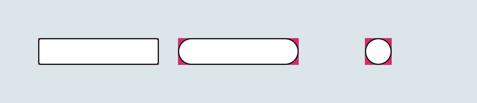
I’d wager that most times we’re rounding box corners in CSS, we’re applying a uniform border-radius value across the border. It’s a nice touch of polish in many designs. But there are times when we might want different radii for different corners. Easy, right? That way the property takes four values. Well, as it turns out, it’s actually possible to paint ourselves into a corner because rounded borders are capable of overlapping one other.
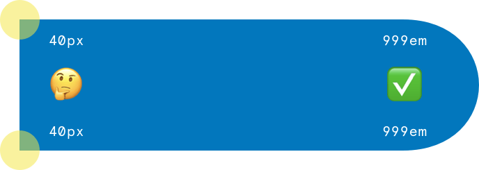
Many of us know the common “999em hack” for getting a “pill-shaped” rectangle:
We set the border-radius to an absurdly large number, like 999em or 999vmax, and instead of becoming some kind of impossible, Escher-esque möbius strip, the corners are nicely rounded off to form a semicircle. This is convenient because it means we don’t have to know the dimensions of the rectangle to achieve this effect — it “just works.”
But, like many “hacks”, we can encounter some odd behavior in certain edge cases. For instance, why does that work when this doesn’t:
We want the right side of the rectangle to be “pill-shaped,” and the left side to have corners rounded to 40px. But our 40px corners are gone! Where did they go?
Hey, those left corners should be slightly rounded!
The answer is that they didn’t go anywhere; the browser has just reduced their values so close to zero that they merely look like they’re gone.
The browser is diverging somehow from the values we requested, but when and how does it decide to step in? Let’s check the spec:
Let f = min(Li/Si), where i ∈ {top, right, bottom, left}, Si is the sum of the two corresponding radii of the corners on side i, and Ltop = Lbottom = the width of the box, and Lleft = Lright = the height of the box. If f < 1, then all corner radii are reduced by multiplying them by f.
Ah, that explains it! Have a great rest of your week! :wipes hands conclusively:
…I’m joking, of course. That requires a little decoding, so let’s look at it two ways, mathematically and geometrically. Always keep in mind that the purpose of this formula is to prevent radius overlap. In fact, that’s why the “999em hack” works in the first place!
Here’s what I mean.
In plain English, the browser is essentially thinking: “Shrink all radii proportionally until there is no overlap between them.” (Note that it’s the radii that mustn’t overlap; the circles they form may indeed overlap.)
But a computer doesn’t understand English, so what the formula does is this.
First, it calculates the ratio of the length of each side of the rectangle to the sum of the radii that touch it. So, in our standard “pill hack” that works out to:
Then it multiplies all of the radii by the smallest of these ratios. The smallest ratio is 0.125, so we’ll multiply that by our initial 400px radii:
400px * 0.125 = 50px
That leaves all our radii at 50px. For a rectangle whose shortest sides are 100px, this gives us a perfect pill shape. Cool! Take a look at the following animation:
(To make things easier to see, we’re using 400px here for our “absurdly large” radii rather than 999em; they’ll overlap as long as they are at least half the length of the shortest side of the rectangle.)
The circles representing the radii we specified start out at their requested size, then shrink by the ratio dictated by the formula above. What’s important to note is that they all shrink by the same ratio. It’s perhaps more intuitive here, since they all start out at the same size anyway.
Now let’s go back to our “broken” example that got everything started.
What’s going on here? Let’s try a less extreme example to show border radii that are affected by this shrinking, but not to the extent that they virtually disappear:
We can see there that we’re not getting the 40px radii we’re asking for in the top-left and bottom-left corners, but we are getting something. Let’s work through that formula again, first finding the ratios between all the sides and their adjacent radii:
Again, our lowest ratio there is 0.125, so we multiply all the specified radii by that amount, giving us 50px radii for the right corners and 5px radii for the left corners.
What the formula is ensuring here is that the two large radii on the right side of the rectangle don’t overlap, but in doing so, has shrunk the small radii on the left side of the rectangle more than they “need to be” shrunk to prevent radius overlap on the top, bottom, and left sides.
Here’s a richer example that shows what happens in different circumstances. Play around with some of the values to see what happens. Again, the large sizes are the radii we specified in code, and the small sizes are how the browser reconciles them to prevent overlap.
Why would the Oz-like spec makers decide on doing things this way? Why not shrink the larger border radii first, rather than shrinking all radii from the start?
I can’t read their minds, of course, but the benefit of this approach is that the radii maintain their proportions to one another. If we were to instruct the browser to decrease the largest radius until there was no overlap or until it was equal to the second largest radii (whichever came first) and repeat, then our “hybrid pill hack” would have worked; but there are cases where you could end up with four equal radii when the user had asked for very different sizes. In other words, the implementation has to be “unfaithful” to the numbers one way or the other, and this is the way they chose (wisely, I think).
Thanks to my colleague Catherine for first noticing this “disappearing radii” issue!
The first rule of animating on the web: don't animate width and height. It forces the browser to recalculate a bunch of stuff and it's slow (or "expensive" as they say). If you can get away with it, animating any transform property is faster (and "cheaper").
Butttt, transform can be tricky. Check out how complex this menu open/close animation becomes in order to make it really performant. Rik Schennink blogs about another tricky situation: border-radius. When you animate the scale of an element in one direction, you get a squishy effect where the corners don't maintain their nice radius. The solution? 9-slice scaling:
This method allows you to scale the element and stretch image 2, 4, 6, and 8, while linking 1, 3, 7, and 9 to their respective corners using absolute positioning. This results in corners that aren’t stretched when scaled.
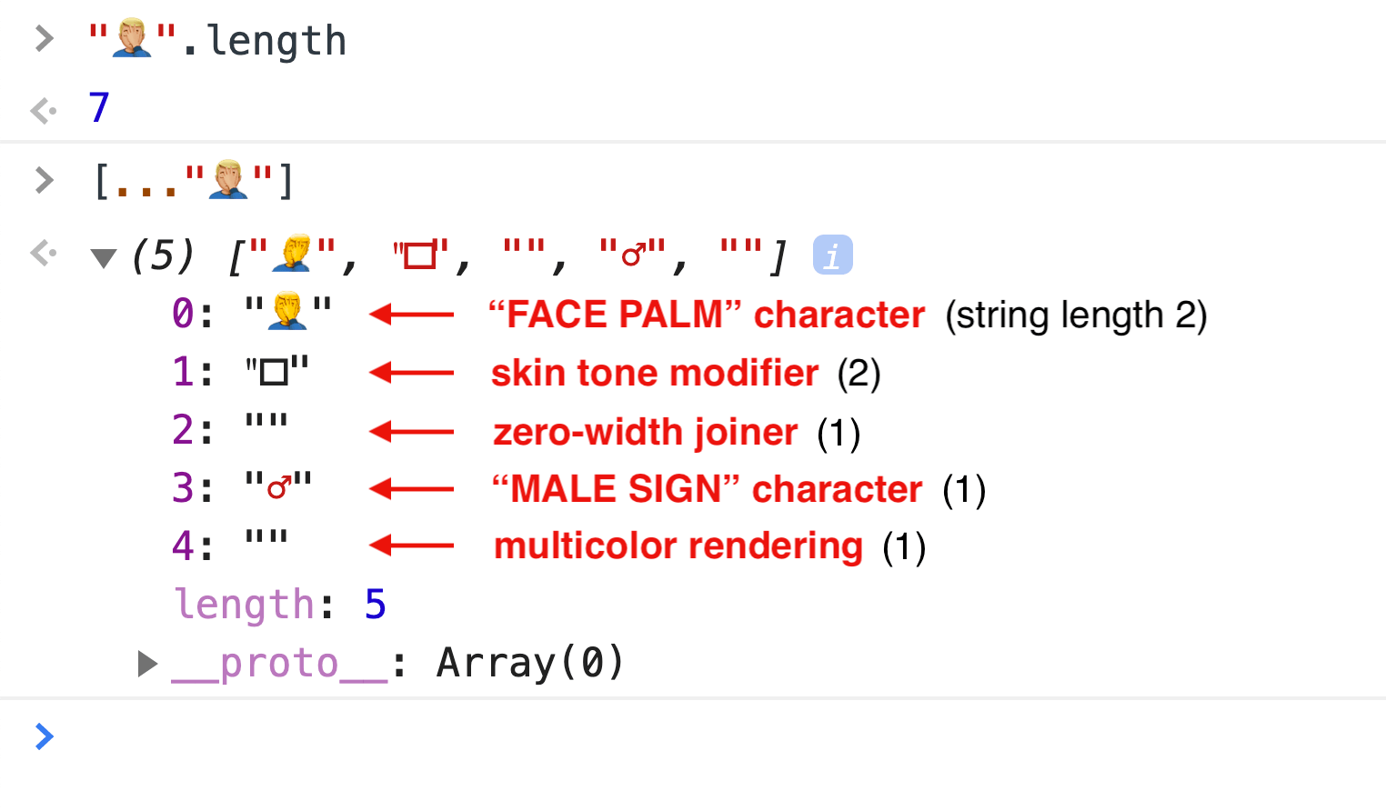
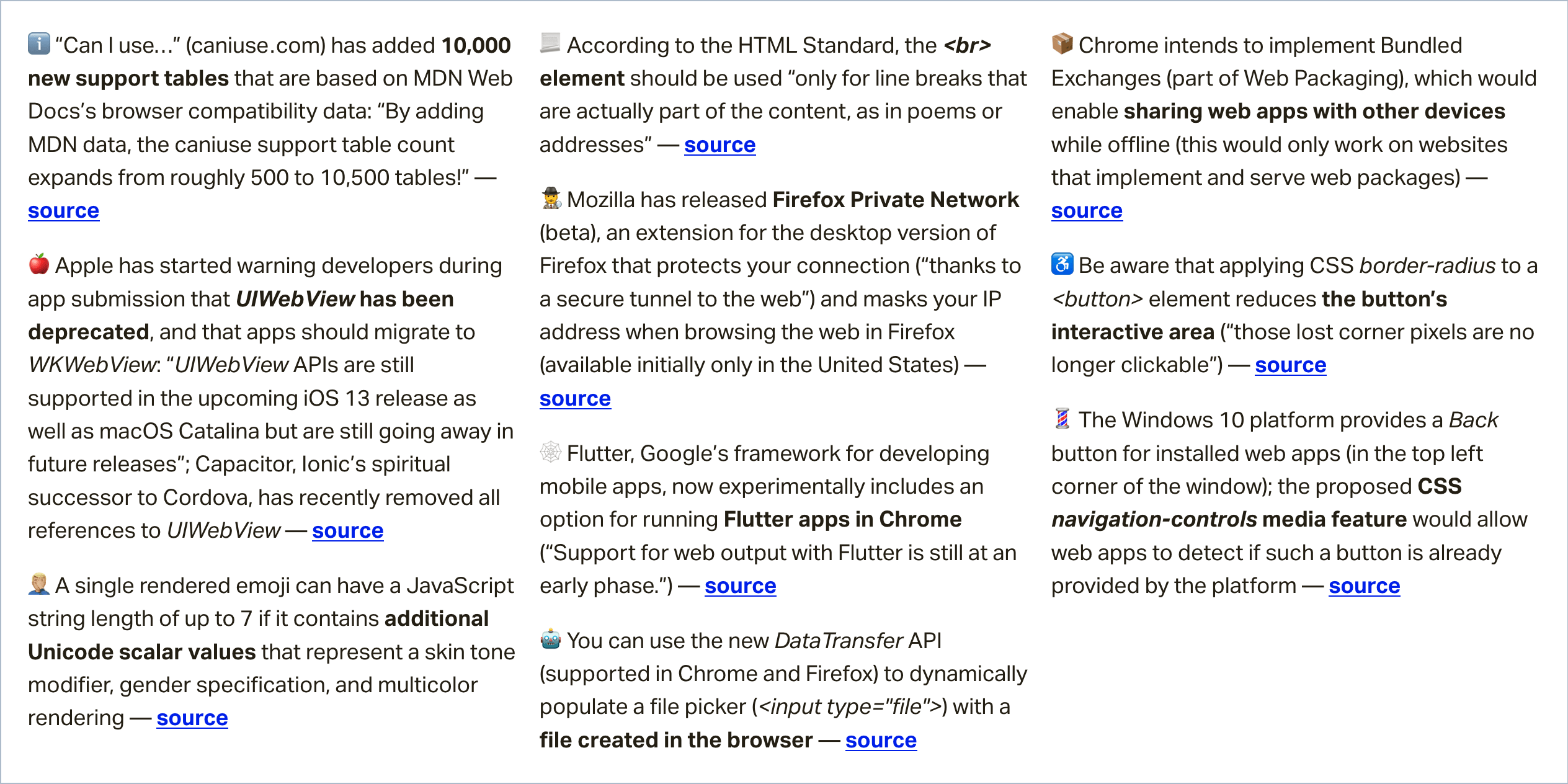
In this week's roundup, the string length of two emojis is not always equal, something to consider before making that rounded button, and we may have a new way to share web apps between devices, even when they are offline.
The JavaScript string length of emoji characters
A single rendered emoji can have a JavaScript string length of up to 7 if it contains additional Unicode scalar values that represent a skin tone modifier, gender specification, and multicolor rendering.
Be aware that applying CSS border-radius to a <button> element reduces the button’s interactive area (“those lost corner pixels are no longer clickable”).
You can avoid this accessibility issue in CSS, e.g., by emulating rounded corners via border-image instead, or by overlaying the button with an absolutely positioned, transparent ::before pseudo-element.
Sharing web pages while offline with Bundled Exchanges
Chrome plans to add support for navigation to Bundled Exchanges (part of Web Packaging). A bundled exchangeis a collection of HTTP request/response pairs, and it can be used to bundle a web page and all of its resources.
The browser should be able to parse and verify the bundle’s signature and then navigate to the website represented by the bundle without actually connecting to the site as all the necessary subresources could be served by the bundle.
Kinuko Yasuda from Google has posted a video that demonstrates how Bundled Exchanges enable sharing web pages (e.g., a web game) with other devices while offline.
Read even more news in my weekly Sunday issue, which can be delivered to you via email every Monday morning. Visit webplatform.news for more information.