How to Animate a SVG with border-image

Let’s take a look at how to combine the border-image property in CSS with animated SVGs that move around a border. In the process, we’ll cover how to hand-craft resizable, nine-slice animated SVGs that you can use not only re-create the effect, but to make it your own.

Here’s what we’re making:

Animated gif of red skulls moving around a list of high scores in a retro arcade font that go from first place to tenth place.
Spooky skulls? Retro arcade? What’s not to like?!

This is actually part of The Skull, a capture-the-flag riddle I’m working on that’s designed to explore the internals of Arduino and its microcontroller. I searched how to animate a border like this, but couldn’t find any useful examples. Most of the stuff I found was about marching ants, but unfortunately, the stroke-dasharray trick doesn’t work with skulls, let alone more complex shapes.

So, in the spirit of learning and sharing, I’m blogging about it here with you!

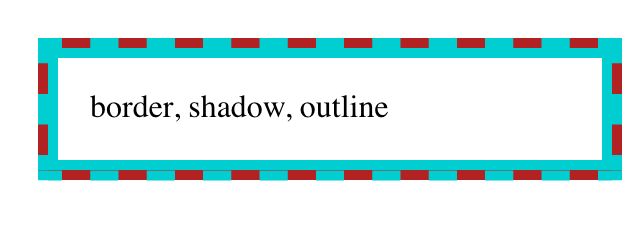
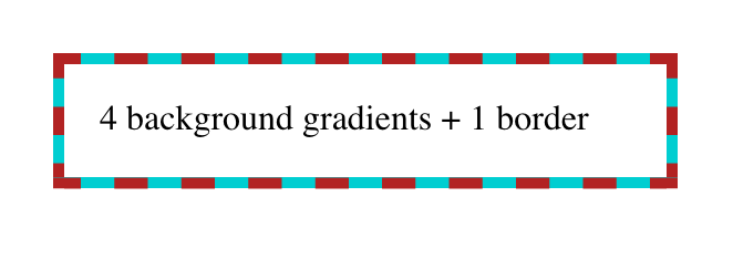
Should we use background or border-image?

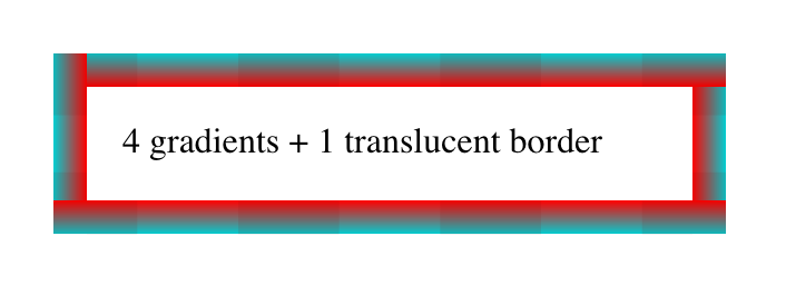
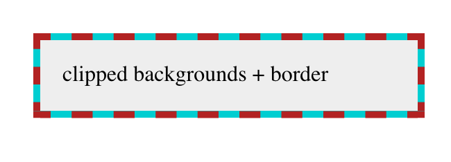
At first, I didn’t even know border-image was a thing. I tried using a ::before pseudo-element in my first attempt, and animated its background-position property. That got me this far:

As you can see, it worked, but completing the border would require at least eight different elements (or pseudo-elements). Not ideal to clutter the HTML like that.

I posted a question on the Israeli CSS developers Facebook group, and everyone pointed me at the border-image property. It does exactly what it says on the tin: use an image (or CSS gradient) for an element’s border.

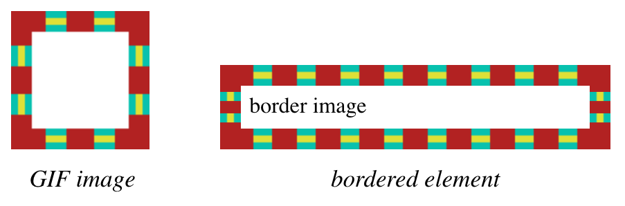
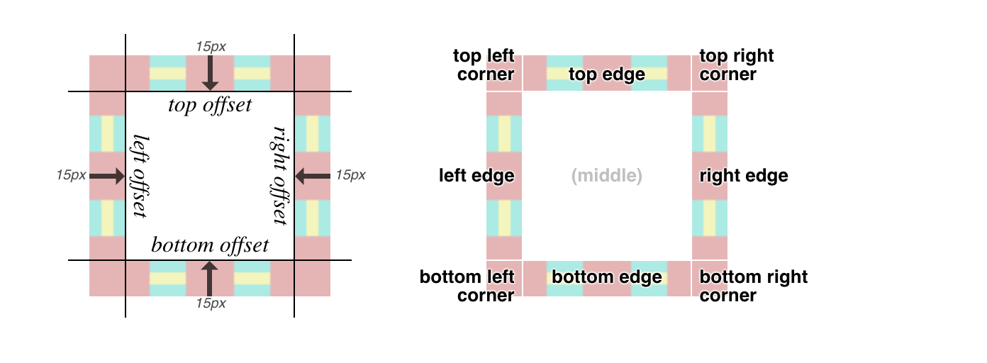
To work with border-image, you have to provide it an image which is used in a nine-slice way (think of a tic-tac-toe board over the image). Each of those nine regions represents a different part of the border: the top, right, left, and bottom, each of the four corners, and then the middle (which is ignored).

For instance, if we just wanted static skulls, we could take advantage of SVG patterns to repeat the skull nine times. First, we define an 24×24 pattern using the skull’s path, and then use this pattern as the fill for a 72×72 rect:

<svg version="1.1" height="72" width="72" xmlns="http://www.w3.org/2000/svg">
 <defs>
  <pattern id="skull-fill" width="24" height="24" 
patternUnits="userSpaceOnUse">
    <path d="..." fill="red"/>
  </pattern>
 </defs>
 <rect fill="url(#skull-fill)" width="72" height="72" />
</svg>

Next, we define a border and set the border-image on the target element:

.skulls {
  border: 24px solid transparent;
  border-image: url("https://skullctf.com/images/skull-9.svg") 24 round;
}

And we get a border made out of skulls:

Adding SVG animations

Now we can animate those skulls! It works, uh, for the most part.

The idea is to create a different animation for each region in the border image. For instance, in the top-left corner, we have one skull going from the right-to-left, while a second skull goes from top- to-bottom at the same time.

We’ll animate the transform property for the movement. We’ll also take advantage of SVG’s <use> to avoid repeating the lengthy <path> definition for each skull:

<svg version="1.1" height="96" width="96" xmlns="http://www.w3.org/2000/svg" xmlns:xlink="http://www.w3.org/1999/xlink">
 <style>
  @keyframes left {to {transform: translate(-32px, 0)}}
  @keyframes down {to {transform: translate(0, 32px)}}
 </style>
 <defs>
  <path id="skull" d="..." fill="red"/>
 </defs>

 <!-- Top-left corner: one skull goes left, another goes down -->
 <use href="#skull" x="0" y="0"  style="animation: down .4s infinite linear"/>
 <use href="#skull" x="32" y="0" style="animation: left .4s infinite linear"/>
</svg>

The SVG animation syntax might look familiar there, because rather than some SVG-specific syntax, like SMIL, it’s just using CSS animations. Cool, right?

This is what we get:

And if we add a grid, we can see how this animation also covers some of the top and left edges as well:

It starts looking more impressive after we add the remaining three edges, thus completely covering all the eight regions of the border image:

<svg version="1.1" height="96" width="96" xmlns="http://www.w3.org/2000/svg" xmlns:xlink="http://www.w3.org/1999/xlink">
 <style>
  @keyframes left {to {transform: translate(-32px, 0)}}
  @keyframes down {to {transform: translate(0, 32px)}}
  @keyframes right {to {transform: translate(32px, 0)}}
  @keyframes up {to {transform: translate(0, -32px)}}
 </style>
 <defs>
  <path id="skull" d="..." fill="red"/>
 </defs>

 <!-- Top-left corner: one skull goes left, another goes down -->
 <use href="#skull" x="0" y="0"  style="animation: down .4s infinite linear"/>
 <use href="#skull" x="32" y="0" style="animation: left .4s infinite linear"/>

 <!-- Top-right corner: one skull goes up, another goes left -->
 <use href="#skull" x="64" y="0" style="animation: left .4s infinite linear"/>
 <use href="#skull" x="64" y="32" style="animation: up .4s infinite linear"/>

 <!-- Bottom-left corner: one skull goes down, another goes right -->
 <use href="#skull" x="0" y="32" style="animation: down .4s infinite linear"/>
 <use href="#skull" x="0" y="64" style="animation: right .4s infinite linear"/>

 <!-- Bottom-right corner: one skull goes right, another goes up -->
 <use href="#skull" x="32" y="64" style="animation: right .4s infinite linear"/>
 <use href="#skull" x="64" y="64" style="animation: up .4s infinite linear"/>
</svg>

And this gives us a complete circuit:

Dancing skulls, ready to go into your border!

Putting everything together, we use the animated SVG we’ve just created as the border-image, and get the desired result:

I could play with this all day…

Once I got this to work, I started tinkering with the animation properties. This is one of the advantages of using SVGs instead of GIFs: changing the nature of the animation is as easy as changing one CSS property in the SVG source file, and you get to see the result instantly, not to mention the smaller file sizes (especially if you are dealing with gradients), full color support and crisp scaling.

For starters, I tried to see what it would like like if I changed the animation timing function to ease:

We can also make the skulls fade between red and green:

We can even make the skulls change orientation as they go around the high score table:

Head to the JavaScript tab where you can tinker with the SVG source and try it for yourself.

The giant 🐘 in the room (cough, Firefox)

I was very happy when I first got this to work. However, there are some caveats that you should be aware of. First and foremost, for some reason, Firefox doesn’t render the animation at the edges of the border, only at the corners:

Funny enough, if I changed the SVG to a GIF with the same animation, it worked perfectly fine. But then the edges stop animating on Chrome! 🤦‍♂️

In any case, it seems to be a browser bug, because if we change the border-image-repeat property to stretch , Firefox does animate the edges, but the result is a bit quirky (though it can probably fit the theme of the page):

Changing the border-image-repeat value to space also seems to work, but only if the width of the element is not a whole multiple of the skull size, which means we get some gaps in the animation.

I also spotted a few visual issues in cases when the container size is not a multiple of the patch size (32px in this case), such as tiny black lines on the skulls. I suspect this has to do with some floating point rounding issue. It also tends to break when zooming in.


Not perfect, but definitely done! If you want to see the final version in action, you are invited to check out The Skull’s High Scores page. Hopefully, it’ll have some of your names on it very soon!


The post How to Animate a SVG with border-image appeared first on CSS-Tricks.

You can support CSS-Tricks by being an MVP Supporter.

Stacked “Borders”

A little while back, I was in the process of adding focus styles to An Event Apart’s web site. Part of that was applying different focus effects in different areas of the design, like white rings in the header and footer and orange rings in the main text. But in one place, I wanted rings that were more obvious—something like stacking two borders on top of each other, in order to create unusual shapes that would catch the eye.

A row of four images, the second of which includes a dashed red border.

I toyed with the idea of nesting elements with borders and some negative margins to pull one border on top of another, or nesting a border inside an outline and then using negative margins to keep from throwing off the layout. But none of that felt satisfying.

It turns out there are a number of tricks to create the effect of stacking one border atop another by combining a border with some other CSS effects, or even without actually requiring the use of any borders at all. Let’s explore, shall we?

Outline and box-shadow

If the thing to be multi-bordered is a rectangle—you know, like pretty much all block elements—then mixing an outline and a spread-out hard box shadow may be just the thing.

Let’s start with the box shadow. You’re probably used to box shadows like this:

.drop-me {
  background: #AEA;
  box-shadow: 10px 12px 0.5rem rgba(0,0,0,0.5);
}
A turquoise box containing the words div text and a heavy box shadow.

That gets you a blurred shadow below and to the right of the element. Drop shadows, so last millennium! But there’s room, and support, for a fourth length value in box-shadow that defines a spread distance. This increases the size of the shadow’s shape in all directions by the given length, and then it’s blurred. Assuming there’s a blur, that is.

So if we give a box shadow no offset, no blur, and a bit of spread, it will draw itself all around the element, looking like a solid border without actually being a border.

.boxborder-me {
  box-shadow: 0 0 0 5px firebrick;
}
A red box containing a thick red border.

This box-shadow "border" is being drawn just outside the outer border edge of the element. That’s the same place outlines get drawn around block boxes, so all we have to do now is draw an outline over the shadow. Something like this:

.boxborder-me {
  box-shadow: 0 0 0 5px firebrick;
  outline: dashed 5px darkturquoise;
}
A box containing a dashed red border with a turquoise background filling the dash gaps.

Bingo. A multicolor "border" that, in this case, doesn’t even throw off layout size, because shadows and outlines are drawn after element size is computed. The outline, which sits on top, can use pretty much any outline style, which is the same as the list of border styles. Thus, dotted and double outlines are possibilities. (So are all the other styles, but they don’t have any transparent parts, so the solid shadow could only be seen through translucent colors.)

If you want a three-tone effect in the border, multiple box shadows can be created using a comma-separated list, and then an outline put over top that. For example:

.boxborder-me {
  box-shadow: 0 0 0 1px darkturquoise,
              0 0 0 3px firebrick,
              0 0 0 5px orange,
              0 0 0 6px darkturquoise;
  outline: dashed 6px darkturquoise;
}
A box containing a dashed border where the dashes are doubled with red and gold and a turquoise background filling in the dash gaps.

Taking it back to simpler effects, combining a dashed outline over a spread box shadow with a solid border of the same color as the box shadow creates yet another effect:

.boxborder-me {
  box-shadow: 0 0 0 5px firebrick;
  outline: dashed 5px darkturquoise;
  border: solid 5px darkturquoise;
}
A box with a dashed red border and a turquoise background that not only fills the dash gaps, but overflows the red border toward the inside edge of the box.

The extra bonus here is that even though a box shadow is being used, it doesn’t fill in the element’s background, so you can see the backdrop through it. This is how box shadows always behave: they are only drawn outside the outer border edge. The "rest of the shadow," the part you may assume is always behind the element, doesn’t exist. It’s never drawn. So you get results like this:

A box with a turquoise border and heavy box shadow toward the bottom right edge that is set against a turquoise background.

This is the result of explicit language in the CSS Background and Borders Module, Level 3, section 7.1.1:

An outer box-shadow casts a shadow as if the border-box of the element were opaque. Assuming a spread distance of zero, its perimeter has the exact same size and shape as the border box. The shadow is drawn outside the border edge only: it is clipped inside the border-box of the element.

(Emphasis added.)

Border and box-shadow

Speaking of borders, maybe there’s a way to combine borders and box shadows. After all, box shadows can be more than just drop shadows. They can also be inset. So what if we turned the previous shadow inward, and dropped a border over top of it?

.boxborder-me {
  box-shadow: 0 0 0 5px firebrick inset;
  border: dashed 5px darkturquoise;
}
A box with a dashed turquoise border and a solid red border that lies on the inside of the dashed border.

That’s... not what we were after. But this is how inset shadows work: they are drawn inside the outer padding edge (also known as the inner border edge), and clipped beyond that:

An inner box-shadow casts a shadow as if everything outside the padding edge were opaque. Assuming a spread distance of zero, its perimeter has the exact same size and shape as the padding box. The shadow is drawn inside the padding edge only: it is clipped outside the padding box of the element.

(Ibid; emphasis added.)

So we can’t stack a border on top of an inset box-shadow. Maybe we could stack a border on top of something else...?

Border and multiple backgrounds

Inset shadows may be restricted to the outer padding edge, but backgrounds are not. An element’s background will, by default, fill the area out to the outer border edge. Fill an element background with solid color, give it a thick dashed border, and you’ll see the background color between the visible pieces of the border.

So what if we stack some backgrounds on top of each other, and thus draw the solid color we want behind the border? Here’s step one:

.multibg-me {
  border: 5px dashed firebrick;
  background:
    linear-gradient(to right, darkturquoise, 5px, transparent 5px);
  background-origin: border-box;
}
A box with a dashed red border and a turquoise background filling in the dash gaps along the left edge of the box.

We can see, there on the left side, the blue background visible through the transparent parts of the dashed red border. Add three more like that, one for each edge of the element box, and:

.multibg-me {
  border: 5px dashed firebrick;
  background:
    linear-gradient(to top, darkturquoise, 5px, transparent 5px),
    linear-gradient(to right, darkturquoise, 5px, transparent 5px),
    linear-gradient(to bottom, darkturquoise, 5px, transparent 5px),
    linear-gradient(to left, darkturquoise, 5px, transparent 5px);
  background-origin: border-box;
}
A box with a dashed red border and a turquoise background that fills in the dash gaps.

In each case, the background gradient runs for five pixels as a solid dark turquoise background, and then has a color stop which transitions instantly to transparent. This lets the "backdrop" show through the element while still giving us a "stacked border."

One major advantage here is that we aren’t limited to solid linear gradients—we can use any gradient of any complexity, just to spice things up a bit. Take this example, where the dashed border has been made mostly transparent so we can see the four different gradients in their entirety:

.multibg-me {
  border: 15px dashed rgba(128,0,0,0.1);
  background:
    linear-gradient(to top,    darkturquoise, red 15px, transparent 15px),
    linear-gradient(to right,  darkturquoise, red 15px, transparent 15px),
    linear-gradient(to bottom, darkturquoise, red 15px, transparent 15px),
    linear-gradient(to left,   darkturquoise, red 15px, transparent 15px);
  background-origin: border-box;
}
A diagram showing the same box with a dashed red border and turquoise background, but with transparency to show how the stacked borders overlap.

If you look at the corners, you’ll see that the background gradients are rectangular, and overlap each other. They don’t meet up neatly, the way border corners do. This can be a problem if your border has transparent parts in the corners, as would be the case with border-style: double.
Also, if you just want a solid color behind the border, this is a fairly clumsy way to stitch together that effect. Surely there must be a better approach?

Border and background clipping

Yes, there is! It involves changing the clipping boxes for two different layers of the element’s background. The first thing that might spring to mind is something like this:

.multibg-me {
  border: 5px dashed firebrick;
  background: #EEE, darkturquoise;
  background-clip: padding-box, border-box;
}

But that does not work, because CSS requires that only the last (and thus lowest) background be set to a <color> value. Any other background layer must be an image.

So we replace that very-light-gray background color with a gradient from that color to that color: this works because gradients are images. In other words:

.multibg-me {
  border: 5px dashed firebrickred;
  background: linear-gradient(to top, #EEE, #EEE), darkturquoise;
  background-clip: padding-box, border-box;
}
A box with a red dashed border, a turquoise background to fill in the dash gaps, and a light gray background set inside the box.

The light gray "gradient" fills the entire background area, but is clipped to the padding box using background-clip. The dark turquoise fills the entire area and is clipped to the border box, as backgrounds always have been by default. We can alter the gradient colors and direction to anything we like, creating an actual visible gradient or shifting it to all-white or whatever other linear effect we would like.

The downside here is that there’s no way to make that padding-area background transparent such that the element’s backdrop can be seen through the element. If the linear gradient is made transparent, then the whole element background will be filled with dark turquoise. Or, more precisely, we’ll be able to see the dark turquoise that was always there.

In a lot of cases, it won’t matter that the element background isn‘t see-through, but it’s still a frustrating limitation. Isn’t there any way to get the effect of stacked borders without wacky hacks and lost capabilities?

Border images

In fact, what if we could take an image of the stacked border we want to see in the world, slice it up, and use that as the border? Like, say, this image becomes this border?

An image of two stacked boxes, the top a square box with a red dashed border and a turquoise and gold striped background filling in the dash gaps. The bottom box is a demonstration using the top box as a border image for the bottom box.

Here’s the code to do exactly that:

.borderimage-me {
  border: solid 5px;
  border-image: url(triple-stack-border.gif) 15 / 15px round;
}

First, we set a solid border with some width. We could also set a color for fallback purposes, but it’s not really necessary. Then we point to an image URL, define the slice inset(s) at 15 and width of the border to be 15px, and finally the repeat pattern of round.

There are more options for border images, which are a little too complex to get into here, but the upshot is that you can take an image, define nine slices of it using offset values, and have those images used to synthesize a complete border around an image. That’s done by defining offsets from the edges of the image itself, which in this case is 15. Since the image is a GIF and thus pixel-based, the offsets are in pixels, so the "slice lines" are set 15 pixels inward from the edges of the image. (In the case of an SVG, the offsets are measured in terms of the SVG’s coordinate system.) It looks like this:

A diagram outlining how the border image is sliced and positioned along the box's edges, corner's and offsets.

Each slice is assigned to the corner or side of the element box that corresponds to itself; i.e., the bottom right corner slice is placed in the bottom right corner of the element, the top (center) slice is used along the top edge of the element, and so on.

If one of the edge slices is smaller than the edge of the element is long—which almost always happens, and is certainly true here—then the slice is repeated in one of a number of ways. I chose round, which fills in as many repeats as it can and then scales them all up just enough to fill out the edge. So with a 70-pixel-long slice, if the edge is 1,337 pixels long, there will be 19 repetitions of the slice, each of which is scaled to be 70.3 pixels wide. Or, more likely, the browser generates a single image containing 19 repetitions that’s 1,330 pixels wide, and then stretches that image the extra 7 pixels.

You might think the drawback here is browser support, but that turns out not to be the case.

This browser support data is from Caniuse, which has more detail. A number indicates that browser supports the feature at that version and up.

Desktop

ChromeOperaFirefoxIEEdgeSafari
56435011129.1

Mobile / Tablet

iOS SafariOpera MobileOpera MiniAndroidAndroid ChromeAndroid Firefox
9.346all*677164

Just watch out for the few bugs (really, implementation limits) that linger around a couple of implementations, and you’ll be fine.

Conclusion

While it might be a rare circumstance where you want to combine multiple "border" effects, or stack them atop each other, it’s good to know that CSS provides a number of ways to get the job done, and that most of them are already widely supported. And who knows? Maybe one day there will be a simple way to achieve these kinds of effects through a single property, instead of by mixing several together. Until then, happy border stacking!

The post Stacked “Borders” appeared first on CSS-Tricks.

Gradient Borders in CSS

Let's say you need a gradient border around an element. My mind goes like this:

  • There is no simple obvious CSS API for this.
  • I'll just make a wrapper element with a linear-gradient background, then an inner element will block out most of that background, except a thin line of padding around it.

Perhaps like this:

See the Pen Gradient with Wrapper by Chris Coyier (@chriscoyier) on CodePen.

If you hate the idea of a wrapping element, you could use a pseudo-element, as long as a negative z-index value is OK (it wouldn't be if there was much nesting going on with parent elements with their own backgrounds).

Here's a Stephen Shaw example of that, tackling border-radius in the process:

See the Pen Gradient border + border-radius by Shaw (@shshaw) on CodePen.

You could even place individual sides as skinny pseudo-element rectangles if you didn't need all four sides.

But don't totally forget about border-image, perhaps the most obtuse CSS property of all time. You can use it to get gradient borders even on individual sides:

See the Pen Gradient Border on 2 sides with border-image by Chris Coyier (@chriscoyier) on CodePen.

Using both border-image and border-image-slice is probably the easiest possible syntax for a gradient border, it's just incompatible with border-radius, unfortunately.

See the Pen CSS Gradient Borders by Chris Coyier (@chriscoyier) on CodePen.

The post Gradient Borders in CSS appeared first on CSS-Tricks.