The outline property in CSS draws a line around the outside of an element. This is quite similar to the border property, the main exception being that outline isn’t a part of the box model. It is often used for highlighting elements, for example, the :focus style.
In this article, let’s put a point on it, leaning into what outline is good at:
They can be collapsed with each other (trickery!) because they technically “take up no space.”
Showing and hiding outlines, or changing outline-width, doesn’t trigger layouts (which is good for performant animations and transitions).
Easier faux-table cell borders
Below is an example of a list that is laid out as a grid, making it look a bit like a table layout. Every cell has a minimum width, and will grow/shrink as the container becomes wider/narrower.
We could use border to pull this off, like this:
But in order to make an even border around each cell — never doubling up or missing — it’s a cumbersome process. Above, I used a border on all sides of each “cell” then negative margins to overlap them and prevent doubling. That meant clipping off the border on two sides, so the borders had to be re-applied there on the parent. Too much fiddly work, if you ask me.
Even having to hide the overflow is a big ask, which you have to do because, otherwise, you’ll trigger scrollbars unless you resort to even thicker trickery, like using absolutely-positioned pseudo elements.
Check out the same result, visually, only using outline instead:
The code here is much cleaner. There is no real trickery at play. Each “cell” just has an outline around it, and that’s it.
Border in animation
Changing border-width will always trigger layout, no matter if it is actually needed.
In addition, due to Chrome’s special handling of sub-pixels for border widths, animating the border-width property makes the entire border shake (which I think is strange). Firefox doesn’t have this issue.
There are pros and cons when it comes to animating borders. Check out Stephen Shaw’s post from a while back for an example of the performance implications.
There are some gotchas
Of course there are. Like most other CSS properties, there are a few “gotchas” or things to know when working with the outline property:
An outline always goes around all the sides. That is to say it’s not a shorthand property like, say, border; so no outline-bottom, and so on.
But we can work around these limitations! For example, we can use add a box-shadow with no blur radius as an alternative. But remember: box-shadow has a higher performance cost than using either outline and border.
That’s it!
Will you always be working on something that calls for faking a table with an unordered list? Unlikely. But the fact that we can use outline and its lack of participation in the box model makes it interesting, particularly as a border alternative in some cases.
Maybe something like this tic-tac-toe board Chris put together several years ago could benefit from outline, instead of resorting to individually-crafted cell borders. Challenge accepted, Mr. Coyier? 😉
Let’s say someone asks you to add a double border to some random geometric SVG shapes. For some reason, you can’t use any graphic editor — they need to be generated at runtime — so you have to solve it with CSS or within the SVG syntax.
Your first question might be: Is there anything like stroke-style: double in SVG? Well, the answer is not yet and it’s not that easy. But I’ll attempt it anyway to see what methods I can uncover. I’ll explore the possibilities of three different basic shapes: circle, rectangle, and polygon. Pointing the ones that can keep a transparent color in the middle of the two lines.
Spoiler alert: all the results have their downsides, at least with CSS and SVG, but let me walk you through my intents.
The simple solutions
These don’t work with all shapes, but they are the easiest of the solutions.
outline and box-shadow
The CSS properties outline and box-shadow only apply to the bounding box of the shape or SVG, and so both are great solutions only for squares and rectangles. They also allow flexible colors using custom properties.
It only takes two lines of CSS with outline, plus it keeps the background color visible through the shape.
🙁 Solution only for one shape.
✅ Simple code
✅ Borders are smooth
✅ Transparent background
box-shadow only needs one line of CSS, but we have to make sure that each shape has its own SVG as we can’t apply box-shadow directly to the shapes. Another thing to consider is that we have to apply the color of the background in the declaration.
🙁 Solution only for one shape
✅ Simple code
✅ Borders are smooth
🙁 No transparent background
SVG gradients
SVG radial gradients only work on circles ☺️. We can directly apply the gradient on the stroke, but it’s better to use variables as we have to declare the colors many times in the code.
🙁 Solution only for one shape
✅ Simple code
🙁 Borders are smooth
🙁 No transparent background
Solutions for all shapes
These will work with all shapes, but the code could become bloated or complex.
filter:drop-shadow()
Finally, one solution for all shapes! We must have each shape in its own <svg> since the filter won’t apply directly to the shapes. We are using one declaration in CSS and have flexible colors using variables. The downside? The borders don’t look very smooth.
✅ One solution for all shapes
✅ Simple code
🙁 Borders look pixelated
🙁 No transparent background
SVG filters
This is a very flexible solution. We can create a filter and add it to the shapes through SVG’s filter attribute. The complicated part here is the filter itself. We’ll need three paintings, one for the outside border, one for the background flood, and the last one to paint the shape on the front. The result looks better than using drop-shadow, but the borders are still pixelated.
✅ One solution for all shapes
🙁 Complex code
🙁 Borders look pixelated
🙁 No transparent background
Reusing shapes
There are a couple of possible options here.
Option 1: Transforms
This solution requires transforms. We place one figure over the other, where the main figure has a fill color and a stroke color, and the other figure has no fill, a red stroke, and is scaled and repositioned to the center. We defined our shapes on the <defs>. The trick is to translate half of theviewBoxto the negative space so that, when we scale them, we can do it from the center of the figure.
✅ One solution for all shapes
🙁 Duplicated code
✅ Borders are smooth
✅ Transparent background
Option 2: <use>
I found a clever solution in the www-svg mailing list by Doug Schepers that uses SVG <use>. Again, it requires defining the shapes once and referring to them twice using <use>. This time the main shape has a bigger stroke. The second shape has half the stroke of the main shape, no fill, and a stroke matching the background color.
✅ One solution for all shapes
🙁 Duplicated code
✅ Borders are smooth
🙁 No transparent background
Here are the full results!
Just so you have them all in one place. Let me know it you can think of other possible solutions!
Some HTML elements come with preset designs, like the inconveniently small squares of <input type="checkbox"> elements, the limited-color bars of <meter> elements, and the “something about them bothers me” arrows of the <details> elements. We can style them to match the modern aesthetics of our websites while making use of their functionalities. There are also many elements that rarely get used as both their default appearance and functionality are less needed in modern web designs.
One such HTML element is <fieldset>, along with its child element <legend>.
A <fieldset> element is traditionally used to group and access form controls. We can visually notice the grouping by the presence of a border around the grouped content on the screen. The caption for this group is given inside the <legend> element that’s added as the first child of the <fieldset>.
This combination of <fieldset> and <legend> creates a unique ready-made “text in border” design where the caption is placed right where the border is and the line of the border doesn’t go through the text. The border line “breaks” when it encounters the beginning of the caption text and resumes after the text ends.
In this post, we’ll make use of the <fieldset> and <legend> combo to create a more modern border text design that’s quick and easy to code and update.
For the four borders, we need four <fieldset> elements, each containing a <legend> element inside. We add the text that will appear at the borders inside the <legend> elements.
<fieldset><legend>Wash Your Hands</legend></fieldset>
<fieldset><legend>Stay Apart</legend></fieldset>
<fieldset><legend>Wear A Mask</legend></fieldset>
<fieldset><legend>Stay Home</legend></fieldset>
To begin, we stack the <fieldset> elements on top of each other in a grid cell and give them borders. You can stack them using any way you want — it doesn’t necessarily have to be a grid.
Only the top border of each <fieldset> element is kept visible while the remaining edges are transparent since the text of the <legend> element appears at the top border of the <fieldset> by default.
Also, we give all the <fieldset> elements a box-sizing property with a value of border-box so the width and height of the <fieldset> elements include their border and padding sizes too. Doing this later creates a leveled design, when we style the <legend> elements.
body {
  display: grid;
  margin: auto; /* to center */
  margin-top: calc(50vh - 170px); /* to center */
  width: 300px; height: 300px;
}

fieldset {
  border: 10px solid transparent;
  border-top-color: black;
  box-sizing: border-box;
  grid-area: 1 / 1; /* first row, first column */
  padding: 20px;
  width: inherit;
}
After this, we rotate the last three <fieldset> elements in order to use their top borders as the side and bottom borders of our design.
/* rotate to right */
fieldset:nth-of-type(2){ transform: rotate(90deg); }
/* rotate to bottom */
fieldset:nth-of-type(3){ transform: rotate(180deg); }
/* rotate to left */
fieldset:nth-of-type(4){ transform: rotate(-90deg); }
Next up is styling the <legend> elements. The key to create smooth border text using a <legend> element is to give it a zero (or small enough) line-height. If it has a large line height, that will displace the position of the border it’s in, pushing the border down. And when the border moves with the line height, we won’t be able to connect all the four sides of our design and will need to readjust the borders.
I used the font shorthand property to give the values for the font-size, line-height and font-family properties of the <legend> elements.
The <legend> element that adds the text at the bottom border of our design, fieldset:nth-of-type(3)>legend, is upside-down because of its rotated <fieldset> parent element. Flip that <legend> element vertically to show its text right-side-up.
Add an image to the first <fieldset> element and you get something like this:
Lateral margins can move the text along the border. Left and right margins with auto values will center the text, as seen in the above Pen. Only the left margin with an auto value will flush the text to the right, and vice versa, for the right margin.
Bonus: After a brief geometrical detour, here’s an octagonal design I made using the same technique:
You don’t have all that much control over how big or long the dashes or gaps are. And you certainly can’t give the dashes slants, fading, or animation! You can do those things with some trickery though.
Amit Sheen build this really neat Dashed Border Generator:
The trick is using four multiple backgrounds. The background property takes comma-separated values, so by setting four backgrounds (one along the top, right, bottom, and left) and sizing them to look like a border, it unlocks all this control.
Say we want to target an element and just visually blur the border of it. There is no simple, single built-in web platform feature we can reach for. But we can get it done with a little CSS trickery.
Here's what we're after:
The desired result.
Let's see how we can code this effect, how we can enhance it with rounded corners, extend support so it works cross-browser, what the future will bring in this department and what other interesting results we can get starting from the same idea!
Coding the basic blurred border
We start with an element on which we set some dummy dimensions, a partially transparent (just slightly visible) border and a background whose size is relative to the border-box, but whose visibility we restrict to the padding-box:
The box specified by background-origin is the box whose top left corner is the 0 0 point for background-position and also the box that background-size (set to cover in our case) is relative to. The box specified by background-clip is the box within whose limits the background is visible.
The initial values are padding-box for background-origin and border-box for background-clip, so we need to specify them both in this case.
If you need a more in-depth refresher on background-origin and background-clip, you can check out this detailed article on the topic.
Next, we add an absolutely positioned pseudo-element that covers its entire parent's border-box and is positioned behind (z-index: -1). We also make this pseudo-element inherit its parent's border and background, then we change the border-color to transparent and the background-clip to border-box:
$b: 1.5em; // border-width

div {
  position: relative;
  /* same styles as before */

  &:before {
    position: absolute;
    z-index: -1;
    /* go outside padding-box by
     * a border-width ($b) in every direction */
    top: -$b; right: -$b; bottom: -$b; left: -$b;
    border: inherit;
    border-color: transparent;
    background: inherit;
    background-clip: border-box;
    content: ''
  }
}
Now we can also see the background behind the barely visible border:
Alright, you may be seeing already where this is going! The next step is to blur() the pseudo-element. Since this pseudo-element is only visible only underneath the partially transparent border (the rest is covered by its parent's padding-box-restricted background), it results the border area is the only area of the image we see blurred.
We've also brought the alpha of the element's border-color down to .03 because we want the blurriness to be doing most of the job of highlighting where the border is.
This may look done, but there's something I still don't like: the edges of the pseudo-element are now blurred as well. So let's fix that!
One convenient thing when it comes to the order browsers apply properties in is that filters are applied before clipping. While this is not what we want and makes us resort to inconvenient workarounds in a lot of other cases... right here, it proves to be really useful!
It means that, after blurring the pseudo-element, we can clip it to its border-box!
My preferred way of doing this is by setting clip-path to inset(0) because... it's the simplest way of doing it, really! polygon(0 0, 100% 0, 100% 100%, 0 100%) would be overkill.
In case you're wondering why not set the clip-path on the actual element instead of setting it on the :before pseudo-element, this is because setting clip-path on the element would make it a stacking context. This would force all its child elements (and consequently, its blurred :before pseudo-element as well) to be contained within it and, therefore, in front of its background. And then no nuclear z-index or !important could change that.
We can prettify this by adding some text with a nicer font, a box-shadow and some layout properties.
What if we have rounded corners?
The best thing about using inset() instead of polygon() for the clip-path is that inset() can also accommodate for any border-radius we may want!
And when I say anyborder-radius, I mean it! Check this out!
div {
  --r: 15% 75px 35vh 13vw/ 3em 5rem 29vmin 12.5vmax;
  border-radius: var(--r);
  /* same styles as before */

  &:before {
    /* same styles as before */
    border-radius: inherit;
    clip-path: inset(0 round var(--r));
  }
}
Some mobile browsers still need the -webkit- prefix for both filter and clip-path, so be sure to include those versions too. Note that they are included in the CodePen demos embeded here, even though I chose to skip them in the code presented in the body of this article.
Alright, but what if we need to support Edge? clip-path doesn't work in Edge, but filter does, which means we do get the blurred border, but no sharp cut limits.
Well, if we don't need corner rounding, we can use the deprecated clip property as a fallback. This means adding the following line right before the clip-path ones:
clip: rect(0 100% 100% 0)
And our demo now works in Edge... sort of! The right, bottom and left edges are cut sharply, but the top one still remains blurred (only in the Debug mode of the Pen, all seems fine for the iframe in the Editor View). And opening DevTools or right clicking in the Edge window or clicking anywhere outside this window makes the effect of this property vanish. Bug of the month right there!
Alright, since this is so unreliable and it doesn't even help us if we want rounded corners, let's try another approach!
This is a bit like scratching behind the left ear with the right foot (or the other way around, depending on which side is your more flexible one), but it's the only way I can think of to make it work in Edge.
Some of you may have already been screaming at the screen something like "but Ana... overflow: hidden!" and yes, that's what we're going for now. I've avoided it initially because of the way it works: it cuts out all descendant content outside the padding-box. Not outside the border-box, as we've done by clipping!
This means we need to ditch the real border and emulate it with padding, which I'm not exactly delighted about because it can lead to more complications, but let's take it one step at a time!
As far as code changes are concerned, the first thing we do is remove all border-related properties and set the border-width value as the padding. We then set overflow: hidden and restrict the background of the actual element to the content-box. Finally, we reset the pseudo-element's background-clip to the padding-box value and zero its offsets.
$fake-b: 1.5em; // fake border-width
div {
/* same styles as before */
overflow: hidden;
padding: $fake-b;
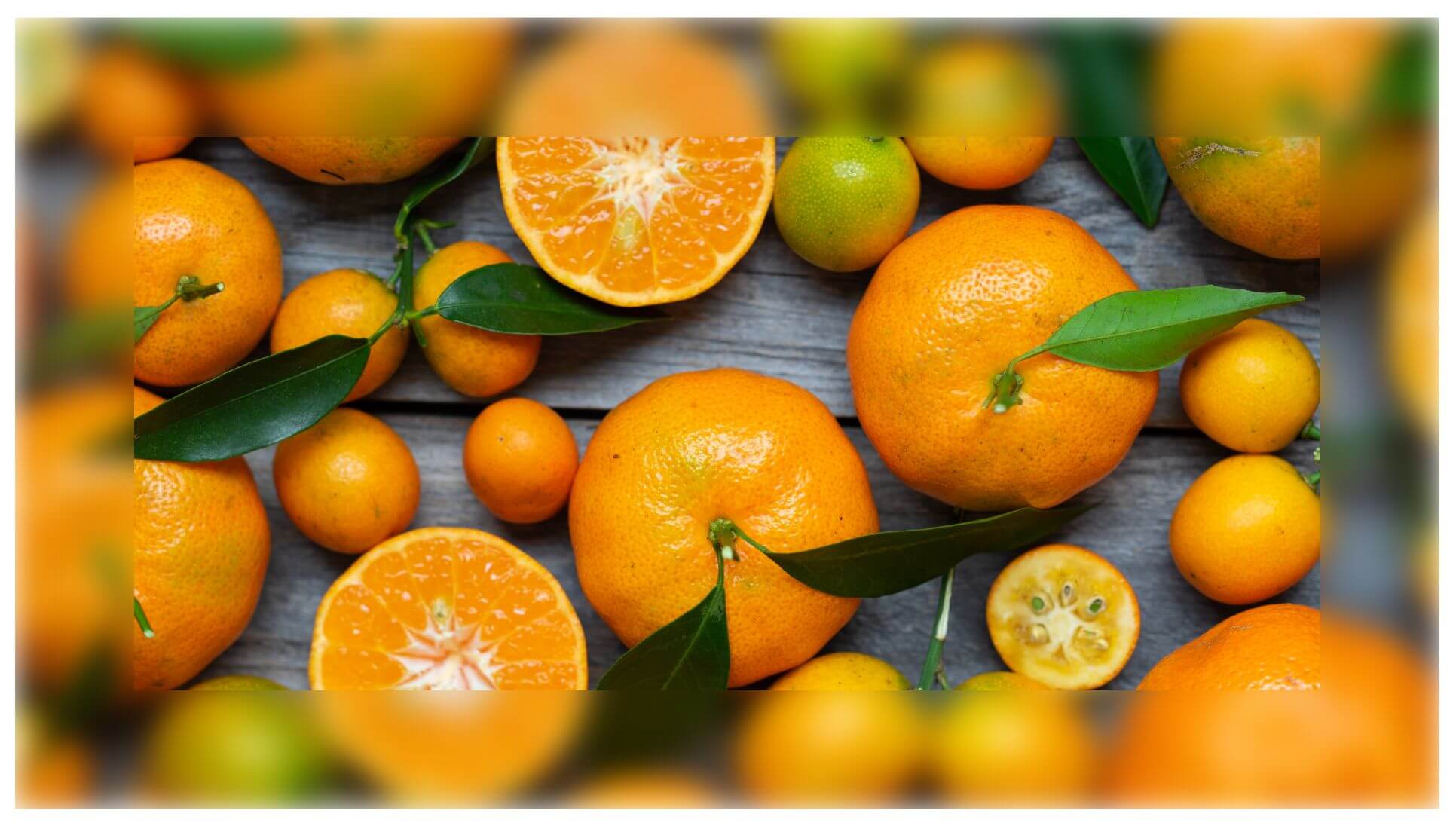
background: url(oranges.jpg) 50%/ cover
padding-box /* background-origin */
content-box /* background-clip */;
&:before {
/* same styles as before */
top: 0; right: 0; bottom: 0; left: 0;
background: inherit;
background-clip: padding-box;
}
}
So why didn't we do this from the very beginning?!
Remember when I said a bit earlier that not using an actual border can complicate things later on?
Well, let's say we want to have some text. With the first method, using an actual border and clip-path, all it takes to prevent the text content from touching the blurred border is adding a padding (of let's say 1em) on our element.
But with the overflow: hidden method, we've already used the padding property to create the blurred "border". Increasing its value doesn't help because it only increases the fake border's width.
We could add the text into a child element. Or we could also use the :after pseudo-element!
The way this works is pretty similar to the first method, with the :after replacing the actual element. The difference is we clip the blurred edges with overflow: hidden instead of clip-path: inset(0) and the padding on the actual element is the pseudos' border-width ($b) plus whatever padding value we want:
What about having both text and some pretty extreme rounded corners? Well, that's something we'll discuss in another article - stay tuned!
What about backdrop-filter?
Some of you may be wondering (as I was when I started toying with various ideas in order to try to achieve this effect) whether backdrop-filter isn't an option.
Well, yes and no!
Technically, it is possible to get the same effect, but since Firefox doesn't yet implement it, we're cutting out Firefox support if we choose to take this route. Not to mention this approach also forces us to use both pseudo-elements if we want the best support possible for the case when our element has some text content (which means we need the pseudos and their padding-box area background to show underneath this text).
Update: due to a regression, the backdrop-filter technique doesn't work in Chrome anymore, so support is now limited to Safari and Edge at best.
For those who don't yet know what backdrop-filter does: it filters out what can be seen through the (partially) transparent parts of the element we apply it on.
The way we need to go about this is the following: both pseudo-elements have a transparent border and a background positioned and sized relative to the padding-box. We restrict the background of pseudo-element on top (the :after) to the padding-box.
Now the :after doesn't have a background in the border area anymore and we can see through to the :before pseudo-element behind it there. We set a backdrop-filter on the :after and maybe even change that border-color from transparent to slightly visible. The bottom (:before) pseudo-element's background that's still visible through the (partially) transparent, barely distinguishable border of the :after above gets blurred as a result of applying the backdrop-filter.
Remember that the live demo for this doesn't currently work in Firefox and needs the Experimental Web Platform features flag enabled in chrome://flags in order to work in Chrome.
Eliminating one pseudo-element
This is something I wouldn't recommend doing in the wild because it cuts out Edge support as well, but we do have a way of achieving the result we want with just one pseudo-element.
We start by setting the image background on the element (we don't really need to explicitly set a border as long as we include its width in the padding) and then a partially transparent, barely visible background on the absolutely positioned pseudo-element that's covering its entire parent. We also set the backdrop-filter on this pseudo-element.
Alright, but this blurs out the entire element behind the almost transparent pseudo-element, including its text. And it's no bug, this is what backdrop-filter is supposed to do.
The problem at hand.
In order to fix this, we need to get rid of (not make transparent, that's completely useless in this case) the inner rectangle (whose edges are a distance $b away from the border-box edges) of the pseudo-element.
$b: 1.5em; // border-width
$o: calc(100% - #{$b});

div {
  /* same styles as before */

  &:before {
    /* same styles as before */

    /* doesn't work in Edge */
    clip-path: polygon(0 0, 100% 0, 100% 100%, 0 100%,
                       0 0,
                       #{$b $b}, #{$b $o}, #{$o $o}, #{$o $b},
                       #{$b $b});
  }
}
The second way (live demo) is with two composited mask layers (note that, in this case, we need to explicitly set a border on our pseudo):
$b: 1.5em; // border-width

div {
  /* same styles as before */

  &:before {
    /* same styles as before */

    border: solid $b transparent;

    /* doesn't work in Edge */
    --fill: linear-gradient(red, red);
    -webkit-mask: var(--fill) padding-box,
                  var(--fill);
    -webkit-mask-composite: xor;
            mask: var(--fill) padding-box exclude,
                  var(--fill);
  }
}
Since neither of these two properties works in Edge, this means support is now limited to WebKit browsers (and we still need to enable the Experimental Web Platform features flag for backdrop-filter to work in Chrome).
Future (and better!) solution
The filter() function allows us to apply filters on individual background layers. This eliminates the need for a pseudo-element and reduces the code needed to achieve this effect to two CSS declarations!
As you may have guessed, the issue here is support. Safari is the only browser to implement it at this point, but if you think the filter() is something that could help you, you can add your use cases and track implementation progress for both Chrome and Firefox.
More border filter options
I've only talked about blurring the border up to now, but this technique works for pretty much any CSS filter (save for drop-shadow() which wouldn't make much sense in this context). You can play with switching between them and tweaking values in the interactive demo below:
And all we've done so far has used just one filter function, but we can also chain them and then the possibilities are endless - what cool effects can you come up with this way?
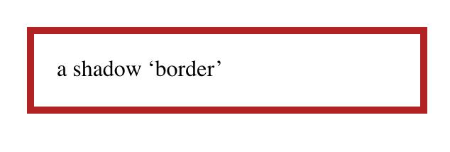
A little while back, I was in the process of adding focus styles to An Event Apart’s web site. Part of that was applying different focus effects in different areas of the design, like white rings in the header and footer and orange rings in the main text. But in one place, I wanted rings that were more obvious—something like stacking two borders on top of each other, in order to create unusual shapes that would catch the eye.
I toyed with the idea of nesting elements with borders and some negative margins to pull one border on top of another, or nesting a border inside an outline and then using negative margins to keep from throwing off the layout. But none of that felt satisfying.
It turns out there are a number of tricks to create the effect of stacking one border atop another by combining a border with some other CSS effects, or even without actually requiring the use of any borders at all. Let’s explore, shall we?
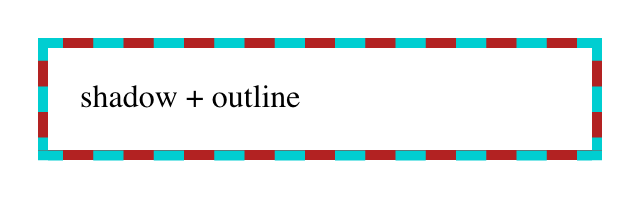
Outline and box-shadow
If the thing to be multi-bordered is a rectangle—you know, like pretty much all block elements—then mixing an outline and a spread-out hard box shadow may be just the thing.
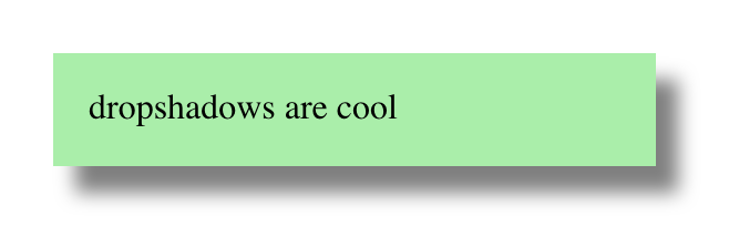
Let’s start with the box shadow. You’re probably used to box shadows like this:
That gets you a blurred shadow below and to the right of the element. Drop shadows, so last millennium! But there’s room, and support, for a fourth length value in box-shadow that defines a spread distance. This increases the size of the shadow’s shape in all directions by the given length, and then it’s blurred. Assuming there’s a blur, that is.
So if we give a box shadow no offset, no blur, and a bit of spread, it will draw itself all around the element, looking like a solid border without actually being a border.
This box-shadow "border" is being drawn just outside the outer border edge of the element. That’s the same place outlines get drawn around block boxes, so all we have to do now is draw an outline over the shadow. Something like this:
Bingo. A multicolor "border" that, in this case, doesn’t even throw off layout size, because shadows and outlines are drawn after element size is computed. The outline, which sits on top, can use pretty much any outline style, which is the same as the list of border styles. Thus, dotted and double outlines are possibilities. (So are all the other styles, but they don’t have any transparent parts, so the solid shadow could only be seen through translucent colors.)
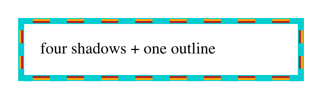
If you want a three-tone effect in the border, multiple box shadows can be created using a comma-separated list, and then an outline put over top that. For example:
Taking it back to simpler effects, combining a dashed outline over a spread box shadow with a solid border of the same color as the box shadow creates yet another effect:
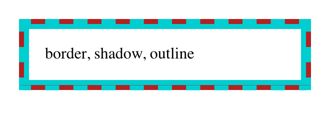
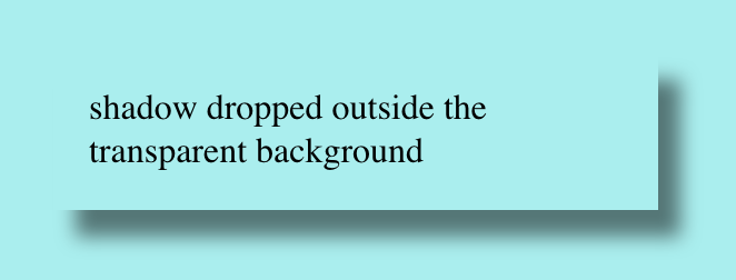
The extra bonus here is that even though a box shadow is being used, it doesn’t fill in the element’s background, so you can see the backdrop through it. This is how box shadows always behave: they are only drawn outside the outer border edge. The "rest of the shadow," the part you may assume is always behind the element, doesn’t exist. It’s never drawn. So you get results like this:
An outer box-shadow casts a shadow as if the border-box of the element were opaque. Assuming a spread distance of zero, its perimeter has the exact same size and shape as the border box. The shadow is drawn outside the border edge only: it is clipped inside the border-box of the element.
(Emphasis added.)
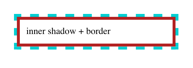
Border and box-shadow
Speaking of borders, maybe there’s a way to combine borders and box shadows. After all, box shadows can be more than just drop shadows. They can also be inset. So what if we turned the previous shadow inward, and dropped a border over top of it?
That’s... not what we were after. But this is how inset shadows work: they are drawn inside the outer padding edge (also known as the inner border edge), and clipped beyond that:
An inner box-shadow casts a shadow as if everything outside the padding edge were opaque. Assuming a spread distance of zero, its perimeter has the exact same size and shape as the padding box. The shadow is drawn inside the padding edge only: it is clipped outside the padding box of the element.
(Ibid; emphasis added.)
So we can’t stack a border on top of an inset box-shadow. Maybe we could stack a border on top of something else...?
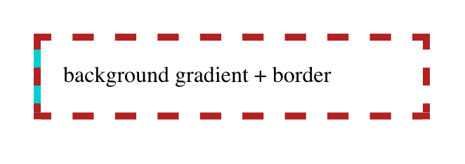
Border and multiple backgrounds
Inset shadows may be restricted to the outer padding edge, but backgrounds are not. An element’s background will, by default, fill the area out to the outer border edge. Fill an element background with solid color, give it a thick dashed border, and you’ll see the background color between the visible pieces of the border.
So what if we stack some backgrounds on top of each other, and thus draw the solid color we want behind the border? Here’s step one:
We can see, there on the left side, the blue background visible through the transparent parts of the dashed red border. Add three more like that, one for each edge of the element box, and:
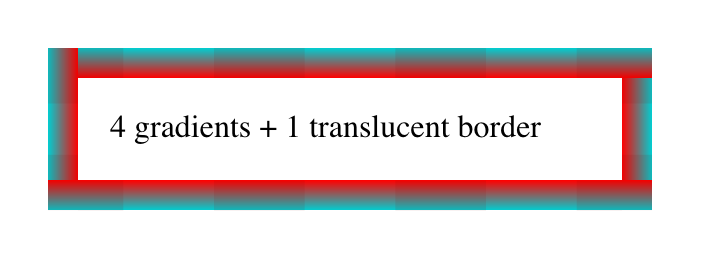
In each case, the background gradient runs for five pixels as a solid dark turquoise background, and then has a color stop which transitions instantly to transparent. This lets the "backdrop" show through the element while still giving us a "stacked border."
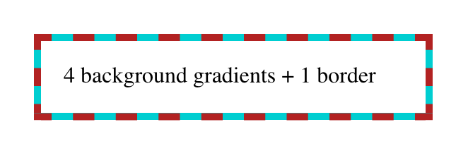
One major advantage here is that we aren’t limited to solid linear gradients—we can use any gradient of any complexity, just to spice things up a bit. Take this example, where the dashed border has been made mostly transparent so we can see the four different gradients in their entirety:
.multibg-me {
  border: 15px dashed rgba(128,0,0,0.1);
  background:
    linear-gradient(to top,    darkturquoise, red 15px, transparent 15px),
    linear-gradient(to right,  darkturquoise, red 15px, transparent 15px),
    linear-gradient(to bottom, darkturquoise, red 15px, transparent 15px),
    linear-gradient(to left,   darkturquoise, red 15px, transparent 15px);
  background-origin: border-box;
}
If you look at the corners, you’ll see that the background gradients are rectangular, and overlap each other. They don’t meet up neatly, the way border corners do. This can be a problem if your border has transparent parts in the corners, as would be the case with border-style: double.
Also, if you just want a solid color behind the border, this is a fairly clumsy way to stitch together that effect. Surely there must be a better approach?
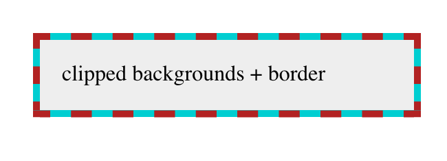
Border and background clipping
Yes, there is! It involves changing the clipping boxes for two different layers of the element’s background. The first thing that might spring to mind is something like this:
But that does not work, because CSS requires that only the last (and thus lowest) background be set to a <color> value. Any other background layer must be an image.
So we replace that very-light-gray background color with a gradient from that color to that color: this works because gradients are images. In other words:
The light gray "gradient" fills the entire background area, but is clipped to the padding box using background-clip. The dark turquoise fills the entire area and is clipped to the border box, as backgrounds always have been by default. We can alter the gradient colors and direction to anything we like, creating an actual visible gradient or shifting it to all-white or whatever other linear effect we would like.
The downside here is that there’s no way to make that padding-area background transparent such that the element’s backdrop can be seen through the element. If the linear gradient is made transparent, then the whole element background will be filled with dark turquoise. Or, more precisely, we’ll be able to see the dark turquoise that was always there.
In a lot of cases, it won’t matter that the element background isn‘t see-through, but it’s still a frustrating limitation. Isn’t there any way to get the effect of stacked borders without wacky hacks and lost capabilities?
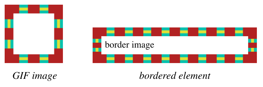
Border images
In fact, what if we could take an image of the stacked border we want to see in the world, slice it up, and use that as the border? Like, say, this image becomes this border?
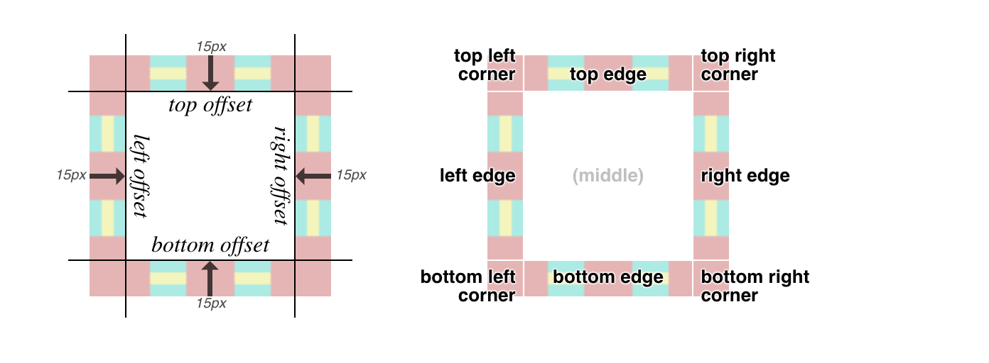
First, we set a solid border with some width. We could also set a color for fallback purposes, but it’s not really necessary. Then we point to an image URL, define the slice inset(s) at 15 and width of the border to be 15px, and finally the repeat pattern of round.
There are more options for border images, which are a little too complex to get into here, but the upshot is that you can take an image, define nine slices of it using offset values, and have those images used to synthesize a complete border around an image. That’s done by defining offsets from the edges of the image itself, which in this case is 15. Since the image is a GIF and thus pixel-based, the offsets are in pixels, so the "slice lines" are set 15 pixels inward from the edges of the image. (In the case of an SVG, the offsets are measured in terms of the SVG’s coordinate system.) It looks like this:
Each slice is assigned to the corner or side of the element box that corresponds to itself; i.e., the bottom right corner slice is placed in the bottom right corner of the element, the top (center) slice is used along the top edge of the element, and so on.
If one of the edge slices is smaller than the edge of the element is long—which almost always happens, and is certainly true here—then the slice is repeated in one of a number of ways. I chose round, which fills in as many repeats as it can and then scales them all up just enough to fill out the edge. So with a 70-pixel-long slice, if the edge is 1,337 pixels long, there will be 19 repetitions of the slice, each of which is scaled to be 70.3 pixels wide. Or, more likely, the browser generates a single image containing 19 repetitions that’s 1,330 pixels wide, and then stretches that image the extra 7 pixels.
You might think the drawback here is browser support, but that turns out not to be the case.
This browser support data is from Caniuse, which has more detail. A number indicates that browser supports the feature at that version and up.
Desktop
Chrome
Opera
Firefox
IE
Edge
Safari
56
43
50
11
12
9.1
Mobile / Tablet
iOS Safari
Opera Mobile
Opera Mini
Android
Android Chrome
Android Firefox
9.3
46
all*
67
71
64
Just watch out for the few bugs (really, implementation limits) that linger around a couple of implementations, and you’ll be fine.
Conclusion
While it might be a rare circumstance where you want to combine multiple "border" effects, or stack them atop each other, it’s good to know that CSS provides a number of ways to get the job done, and that most of them are already widely supported. And who knows? Maybe one day there will be a simple way to achieve these kinds of effects through a single property, instead of by mixing several together. Until then, happy border stacking!
Let's say you need a gradient border around an element. My mind goes like this:
There is no simple obvious CSS API for this.
I'll just make a wrapper element with a linear-gradient background, then an inner element will block out most of that background, except a thin line of padding around it.
If you hate the idea of a wrapping element, you could use a pseudo-element, as long as a negative z-index value is OK (it wouldn't be if there was much nesting going on with parent elements with their own backgrounds).
Here's a Stephen Shaw example of that, tackling border-radius in the process:
You could even place individual sides as skinny pseudo-element rectangles if you didn't need all four sides.
But don't totally forget about border-image, perhaps the most obtuse CSS property of all time. You can use it to get gradient borders even on individual sides:
Using both border-image and border-image-slice is probably the easiest possible syntax for a gradient border, it's just incompatible with border-radius, unfortunately.


