👋 The demos in this article experiment with a non-standard bug related to CSS gradients and sub-pixel rendering. Their behavior may change at any time in the future. They’re also heavy as heck. We’re serving them async where you click to load, but still want to give you a heads-up in case your laptop fan starts spinning.
Do you remember that static noise on old TVs with no signal? Or when the signal is bad and the picture is distorted? In case the concept of a TV signal predates you, here’s a GIF that shows exactly what I mean.
View image (contains auto-playing media)
Yes, we are going to do something like this using only CSS. Here is what we’re making:
Before we start digging into the code, I want to say that there are better ways to create a static noise effect than the method I am going to show you. We can use SVG, <canvas>, the filter property, etc. In fact, Jimmy Chion wrote a good article showing how to do it with SVG.
What I will be doing here is kind of a CSS experiment to explore some tricks leveraging a bug with gradients. You can use it on your side projects for fun but using SVG is cleaner and more suitable for a real project. Plus, the effect behaves differently across browsers, so if you’re checking these out, it’s best to view them in Chrome, Edge, or Firefox.
Let’s make some noise!
To make this noise effect we are going to use… gradients! No, there is no secret ingredient or new property that makes it happen. We are going to use stuff that’s already in our CSS toolbox!
The “trick” relies on the fact that gradients are bad at anti-aliasing. You know those kind of jagged edges we get when using hard stop colors? Yes, I talk about them in most of my articles because they are a bit annoying and we always need to add or remove a few pixels to smooth things out:
As you can see, the second circle renders better than the first one because there is a tiny difference (0.5%) between the two colors in the gradient rather than using a straight-up hard color stop using whole number values like the first circle.
Here’s another look, this time using a conic-gradient where the result is more obvious:
An interesting idea struck me while I was making these demos. Instead of fixing the distortion all the time, why not trying to do the opposite? I had no idea what would happen but it was a fun surprise! I took the conic gradient values and started to decrease them to make the poor anti-aliasing results look even worse.
Do you see how bad the last one is? It’s a kind of scrambled in the middle and nothing is smooth. Let’s make it full-screen with smaller values:
I suppose you see where this is going. We get a strange distorted visual when we use very small decimal values for the hard colors stops in a gradient. Our noise is born!
We are still far from the grainy noise we want because we can still see the actual conic gradient. But we can decrease the values to very, very small ones — like 0.0001% — and suddenly there’s no more gradient but pure graininess:
Tada! We have a noise effect and all it takes is one CSS gradient. I bet if I was to show this to you before explaining it, you’d never realize you’re looking at a gradient. You have to look very carefully at center of the gradient to see it.
We can increase the randomness by making the size of the gradient very big while adjusting its position:
The gradient is applied to a fixed 3000px square and placed at the 60% 60% coordinates. We can hardly notice its center in this case. The same can be done with radial gradient as well:
And to make things even more random (and closer to a real noise effect) we can combine both gradients and use background-blend-mode to smooth things out:
Our noise effect is perfect! Even if we look closely at each example, there’s no trace of either gradient in there, but rather beautiful grainy static noise. We just turned that anti-aliasing bug into a slick feature!
Now that we have this, let’s see a few interesting examples where we might use it.
Animated no TV signal
Getting back to the demo we started with:
If you check the code, you will see that I am using a CSS animation on one of the gradients. It’s really as simple as that! All we’re doing is moving the conic gradient’s position at a lightning fast duration (.1s) and this is what we get!
I used this same technique on a one-div CSS art challenge:
Grainy image filter
Another idea is to apply the noise to an image to get an old-time-y look. Hover each image to see them without the noise.
I am using only one gradient on a pseudo-element and blending it with the image, thanks to mix-blend-mode: overlay.
We can get an even funnier effect if we use the CSS filter property
And if we add a mask to the mix, we can make even more effects!
Grainy text treatment
We can apply this same effect to text, too. Again, all we need is a couple of chained gradients on a background-image and then blend the backgrounds. The only difference is that we’re also reaching for background-clip so the effect is only applied to the bounds of each character.
Generative art
If you keep playing with the gradient values, you may get more surprising results than a simple noise effect. We can get some random shapes that look a lot like generative art!
Of course, we are far from real generative art, which requires a lot of work. But it’s still satisfying to see what can be achieved with something that is technically considered a bug!
I hope you enjoyed this little CSS experiment. We didn’t exactly learn something “new” but we took a little quirk with gradients and turned it into something fun. I’ll say it again: this isn’t something I would consider using on a real project because who knows if or when anti-aliasing will be addressed at some point in time. Instead, this was a very random, and pleasant, surprise when I stumbled into it. It’s also not that easy to control and it behaves inconsistently across browsers.
This said, I am curious to see what you can do with it! You can play with the values, combine different layers, use a filter, or mix-blend-mode, or whatever, and you will for sure get something really cool. Share your creations in the comment section — there are no prizes but we can get a nice collection going!
In this article, we will build off those two articles to create even more complex CSS hover animations. We’re talking about background clipping, CSS masks, and even getting our feet wet with 3D perspectives. In other words, we are going to explore advanced techniques this time around and push the limits of what CSS can do with hover effects!
Cool Hover Effects That Use Background Clipping, Masks, and 3D (you are here!)
Here’s just a taste of what we’re making:
Hover effects using background-clip
Let’s talk about background-clip. This CSS property accepts a text keyword value that allows us to apply gradients to the text of an element instead of the actual background.
So, for example, we can change the color of the text on hover as we would using the color property, but this way we animate the color change:
All I did was add background-clip: text to the element and transition the background-position. Doesn’t have to be more complicated than that!
But we can do better if we combine multiple gradients with different background clipping values.
In that example, I use two different gradients and two values with background-clip. The first background gradient is clipped to the text (thanks to the text value) to set the color on hover, while the second background gradient creates the bottom underline (thanks to the padding-box value). Everything else is straight up copied from the work we did in the first article of this series.
How about a hover effect where the bar slides from top to bottom in a way that looks like the text is scanned, then colored in:
This time I changed the size of the first gradient to create the line. Then I slide it with the other gradient that update the text color to create the illusion! You can visualize what’s happening in this pen:
We’ve only scratched the surface of what we can do with our background-clipping powers! However, this technique is likely something you’d want to avoid using in production, as Firefox is known to have a lot of reported bugs related to background-clip. Safari has support issues as well. That leaves only Chrome with solid support for this stuff, so maybe have it open as we continue.
Let’s move on to another hover effect using background-clip:
You’re probably thinking this one looks super easy compared to what we’ve just covered — and you are right, there’s nothing fancy here. All I am doing is sliding one gradient while increasing the size of another one.
But we’re here to look at advanced hover effects, right? Let’s change it up a bit so the animation is different when the mouse cursor leaves the element. Same hover effect, but a different ending to the animation:
We have three background layers — two gradients and the background-color defined using --_c variable which is initially set to transparent (#0000). On hover, we change the color to white and the --_c variable to the main color (--c).
Here’s what is happening on that transition: First, we apply a transition to everything but we delay the color and background-color by 0.5s to create the sliding effect. Right after that, we change the color and the background-color. You might notice no visual changes because the text is already white (thanks to the first gradient) and the background is already set to the main color (thanks to the second gradient).
Then, on mouse out, we apply an instant change to everything (notice the 0s delay), except for the color and background-color that have a transition. This means that we put all the gradients back to their initial states. Again, you will probably see no visual changes because the text color and background-color already changed on hover.
Lastly, we apply the fading to color and a background-color to create the mouse-out part of the animation. I know, it may be tricky to grasp but you can better visualize the trick by using different colors:
Hover the above a lot of times and you will see the properties that are animating on hover and the ones animating on mouse out. You can then understand how we reached two different animations for the same hover effect.
Let’s not forget the DRY switching technique we used in the previous articles of this series to help reduce the amount of code by using only one variable for the switch:
If you’re wondering why I reached for the RGB syntax for the main color, it’s because I needed to play with the alpha transparency. I am also using the variable --_t to reduce a redundant calculation used in the transition property.
Before we move to the next part here are more examples of hover effects I did a while ago that rely on background-clip. It would be too long to detail each one but with what we have learned so far you can easily understand the code. It can be a good inspiration to try some of them alone without looking at the code.
I know, I know. These are crazy and uncommon hover effects and I realize they are too much in most situations. But this is how to practice and learn CSS. Remember, we pushing the limits of CSS hover effects. The hover effect may be a novelty, but we’re learning new techniques along the way that can most certainly be used for other things.
Hover effects using CSS mask
Guess what? The CSS mask property uses gradients the same way the background property does, so you will see that what we’re making next is pretty straightforward.
Let’s start by building a fancy underline.
I’m using background to create a zig-zag bottom border in that demo. If I wanted to apply an animation to that underline, it would be tedious to do it using background properties alone.
Enter CSS mask.
The code may look strange but the logic is still the same as we did with all the previous background animations. The mask is composed of two gradients. The first gradient is defined with an opaque color that covers the content area (thanks to the content-box value). That first gradient makes the text visible and hides the bottom zig-zag border. content-box is the mask-clip value which behaves the same as background-clip
linear-gradient(#000 0 0) content-box
The second gradient will cover the whole area (thanks to padding-box). This one has a width that’s defined using the --_p variable, and it will be placed on the left side of the element.
Now, all we have to do is to change the value of --_p on hover to create a sliding effect for the second gradient and reveal the underline.
.hover:hover {
  --_p: 100%;
  color: var(--c);
}
The following demo uses with the mask layers as backgrounds to better see the trick taking place. Imagine that the green and red parts are the visible parts of the element while everything else is transparent. That’s what the mask will do if we use the same gradients with it.
With such a trick, we can easily create a lot of variation by simply using a different gradient configuration with the mask property:
Each example in that demo uses a slightly different gradient configuration for the mask. Notice, too, the separation in the code between the background configuration and the mask configuration. They can be managed and maintained independently.
Let’s change the background configuration by replacing the zig-zag underline with a wavy underline instead:
Another collection of hover effects! I kept all the mask configurations and changed the background to create a different shape. Now, you can understand how I was able to reach 400 hover effects without pseudo-elements — and we can still have more!
Like, why not something like this:
Here’s a challenge for you: The border in that last demo is a gradient using the mask property to reveal it. Can you figure out the logic behind the animation? It may look complex at first glance, but it’s super similar to the logic we’ve looked at for most of the other hover effects that rely on gradients. Post your explanation in the comments!
Hover effects in 3D
You may think it’s impossible to create a 3D effect with a single element (and without resorting to pseudo-elements!) but CSS has a way to make it happen.
What you’re seeing there isn’t a real 3D effect, but rather a perfect illusion of 3D in the 2D space that combines the CSS background, clip-path, and transform properties.
The trick may look like we’re interacting with a 3D element, but we’re merely using 2D tactics to draw a 3D box
The top and right sides of the element both need to equal the --b value while the bottom and left sides need to equal to the sum of --b and --d (which is the --_s variable).
For the second part of the trick, we need to define one gradient that covers all the border areas we previously defined. A conic-gradient will work for that:
We add another gradient for the third part of the trick. This one will use two semi-transparent white color values that overlap the first previous gradient to create different shades of the main color, giving us the illusion of shading and depth.
That’s all! We just made a 3D rectangle with nothing but two gradients and a clip-path that we can easily adjust using CSS variables. Now, all we have to do is to animate it!
Notice the coordinates from the previous figure (indicated in red). Let’s update those to create the animation:
The trick is to hide the bottom and left parts of the element so all that’s left is a rectangular element with no depth whatsoever.
This pen isolates the clip-path portion of the animation to see what it’s doing:
The final touch is to move the element in the opposite direction using translate — and the illusion is perfect! Here’s the effect using different custom property values for varying depths:
The second hover effect follows the same structure. All I did is to update a few values to create a top left movement instead of a top right one.
The actual code might be confusing at first, but go ahead and dissect it a little further — you’ll notice that it’s merely a combination of those three different effects, pretty much smushed together.
Let me finish this article with a last hover effect where I am combining background, clip-path, and a dash of perspective to simulate another 3D effect:
I applied the same effect to images and the result was quite good for simulating 3D with a single element:
Oof, we are done! I know, it’s a lot of tricky CSS but (1) we’re on the right website for that kind of thing, and (2) the goal is to push our understanding of different CSS properties to new levels by allowing them to interact with one another.
You may be asking what the next step is from here now that we’re closing out this little series of advanced CSS hover effects. I’d say the next step is to take all that we learned and apply them to other elements, like buttons, menu items, links, etc. We kept things rather simple as far as limiting our tricks to a heading element for that exact reason; the actual element doesn’t matter. Take the concepts and run with them to create, experiment with, and learn new things!
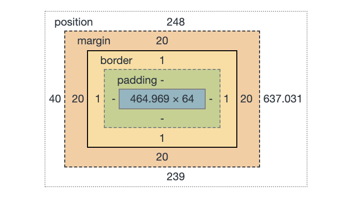
That's showing you the size and position of an element, as well as how that size is made up: content size, padding, margin, and border.
Those things aren't just theoretical to help with understanding and debugging. Elements actually have a content-box, padding-box, and border-box. Perhaps we encounter that most often when we literally set the box-sizing property. (It's tremendously useful to universally set it to border-box).
Those values are the same values as background-clip uses! Meaning that you can set a background to only cover those specific areas. And because multiple backgrounds is a thing, that means we can have multiple backgrounds with different clipping on each.
body {
  background-image:
    url(image-one.jpg),
    url(image-two.jpg);
}
That's just background-image. You can set their position too, as you might expect. We'll shorthand it:
body {
  background:
    url(image-one.jpg) no-repeat top right,
    url(image-two.jpg) no-repeat bottom left;
}
I snuck background-repeat in there just for fun. Another one you might not think of setting for multiple different backgrounds, though, is background-clip. In this linked article, Stefan Judis notes that this unlocks some pretty legit CSS-Trickery!