Are you tired of struggling to remove the background from your images? Look no further! In this article, we will be diving into the world of Canva and exploring how you can easily remove backgrounds...
On one hand, creating simple checkered backgrounds with CSS is easy. On the other hand, though, unless we are one of the CSS-gradient-ninjas, we are kind of stuck with basic patterns.
At least that’s what I thought while staring at the checkered background on my screen and trying to round those corners of the squares just a little…until I remembered my favorite bullet point glyph — ✦ — and figured that if only I could place it over every intersection in the pattern, I’ll surely get the design I want.
Turns out it’s possible! Here’s the proof.
Let’s start with the basic pattern:
<div></div>
div {
 background:
  repeating-linear-gradient(
    to right, transparent,
    transparent 50px,
    white 50px,
    white 55px
  ),
  repeating-linear-gradient(
    to bottom, transparent,
    transparent 50px,
    white 50px,
    white 55px
  ),
  linear-gradient(45deg, pink, skyblue);
  /* more styles */
}
What that gives us is a repeating background of squares that go from pink to blue with 5px white gaps between them. Each square is fifty pixels wide and transparent. This is created using repeating-linear-gradient, which creates a linear gradient image where the gradient repeats throughout the containing area.
In other words, the first gradient in that sequence creates white horizontal stripes and the second gradient creates white vertical stripes. Layered together, they form the checkered pattern, and the third gradient fills in the rest of the space.
Now we add the star glyph I mentioned earlier, on top of the background pattern. We can do that by including it on the same background property as the gradients while using an encoded SVG for the shape:
div {
  background:
    repeat left -17px top -22px/55px 55px
    url("data:image/svg+xml,
    <svg xmlns='http://www.w3.org/2000/svg' viewBox='0 0 35px 35px'>
      <foreignObject width='35px' height='35px'>
        <div xmlns='http://www.w3.org/1999/xhtml' style='color: white; font-size: 35px'>✦</div>
      </foreignObject>
    </svg>"
    ),
    repeating-linear-gradient(
      to right, transparent,
      transparent 50px,
      white 50px,
      white 55px
    ),
    repeating-linear-gradient(
      to bottom, transparent,
      transparent 50px,
      white 50px,
      white 55px
    ),
    linear-gradient(45deg, pink, skyblue);
  /* more style */
}
Let’s break that down. The first keyword, repeat, denotes that this is a repeating background image. Followed by that is the position and size of each repeating unit, respectively (left -17px top -22px/55px 55px). This offset position is based on the glyph and pattern’s size. You’ll see below how the glyph size is given. The offset is added to re-position the repeating glyph exactly over each intersection in the checkered pattern.
The SVG has an HTML <div> carrying the glyph. Notice that I declared a font-size on it. That ultimately determines the border radius of the squares in the checkerboard pattern — the bigger the glyph, the more rounded the squares. The unrolled SVG from the data URL looks like this:
Now that a CSS pattern is established, let’s add a :hover effect where the glyph is removed and the white lines are made slightly translucent by using rgb() color values with alpha transparency.
There we go! Now, not only do we have our rounded corners, but we also have more control control over the pattern for effects like this:
Again, this whole exercise was an attempt to get a grid of squares in a checkerboard pattern that supports rounded corners, a background gradient that serves as an overlay across the pattern, and interactive styles. I think this accomplishes the task quite well, but I’m also interested in how you might’ve approached it. Let me know in the comments!
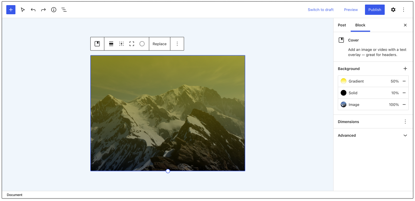
Background tools in Gutenberg are currently limited to the Cover block, but contributors are working on expanding support so that any block can opt into it. Discussions about the best way to do this have been happening for the past two years and now are gaining some momentum.
“Right now it’s possible to add video backgrounds, colored overlays, etc, to the Cover block alone,” Matias Ventura said in 2019 ticket on the UI for background tools. “It would make sense to extract this and extend to other container blocks (group and columns, for example) as well as expanding the features.”
Gutenberg contributor Andrew Serong has created a draft exploratory PR for adding opt-in, server-rendered background support for blocks, which would save background image values to the block’s style attribute in a backgroundImage key. Serong created the PR as a rough, experimental approach and published a few screenshots of how the inspector controls might fit in. However, Gutenberg designers are working on a more refined design for background support in the editor.
Today, Gutenberg designers Joen Asmussen and Javier Arce published a GitHub issue with their vision for a complete reorganization of background controls that includes layer management, layer reordering, and support for filters/blend modes.
“The core idea is to group all the layers (both overlays and media layer) inside a single sidebar section called Background, abstracting the organization of the Cover Block layers on the canvas and simplifying the block sidebar,” Arce said.
These new designs intersect with the goal of expanding background support for use in other blocks beyond the Cover block. There are many other considerations that splinter out of adding background image support to blocks, which contributors have noted in the discussions. These include features like the ability to add a body background image to block themes, specify a color palette to be used for background colors, and the ability to add multiple background images.
Expanding background image support and refining the UI for background controls is still a little ways off, but the project is starting to make significant steps forward. This will be an exciting addition that will markedly expand users’ ability to customize blocks.
Some days ago I encountered the beautiful website of Alef Estate made by the amazing folks of Advanced Team. The site has so many interesting details and interactions! What strikes me the most is the changing cursor that also has a blend mode. When scrolling further down, the whole page switches to a black background with a kind of slice animation. I think this is a super interesting effect! It’s the perfect excuse to code up a portfolio design and play with mix-blend-mode and some background trickery.
If you want to learn about CSS Blend Modes, check out the entry in our CSS Reference by Sara Soueidan: mix-blend-mode. It has lots of examples and demos.
I really hope you are enjoying this effect remake and experiment and find it interesting!
Today I’d like to share a little menu effect with you. It is composed of two things which is an SVG path overlay animation when it opens (or closes) and an infinite CSS powered background animation of an image grid.
Nothing special really, but I enjoyed putting it together and hopefully it is somehow useful to you!
The SVG path animation for the overlay is based on this demo by Sebastien Gilbert which is a good starter for a nice motion. If you need to adjust paths, I can recommend this fantastic path editor tool by Yann Armelin.
The infinite background animation of the menu is made with a CSS animation. The trick is to have a repeated set of images and once we translate to the visually equal part, we restart the animation.
A bona fide CSS trick from Kirupa Chinnathambi here. To match a colored shadow with the colors in the background-image of an element, you inherit the background in a pseudo-element, kick it behind the original, then blur and filter it.
Negative z-index is always a yellow flag for me as that only works if there are no intermediary backgrounds. But the trick holds. There would always be some other way to layer the backgrounds (like a <span> or whatever).
For some reason this made me think of a demo I saw (I can’t remember who to credit!). Emojis had text-shadow on them, which really made them pop. And those shadows could also be colorized to a similar effect.
In this week’s round-up, prefers-contrast lands in Safari, MathML gets some attention, :is() is actually quite forgiving, more ADA-related lawsuits, inconsistent initial values for CSS Backgrounds properties can lead to unwanted — but sorta neat — patterns.
The prefers-contrast: more media query is supported in Safari Preview
After prefers-reduced-motion in 2017, prefers-color-scheme in 2019, and forced-colors in 2020, a fourth user preference media feature is making its way to browsers. The CSS prefers-contrast: more media query is now supported in the preview version of Safari. This feature will allow websites to honor a user’s preference for increased contrast.
Apple could use this new media query to increase the contrast of gray text on its website
One of the earliest specifications developed by the W3C in the mid-to-late ’90s was a markup language for displaying mathematical notations on the web called MathML. This language is currently supported in Firefox and Safari. Chrome’s implementation was removed in 2013 because of “concerns involving security, performance, and low usage on the Internet.”
If you’re using Chrome or Edge, enable “Experimental Web Platform features” on the about:flags page to view the demo.
There is a renewed effort to properly integrate MathML into the web platform and bring it to all browsers in an interoperable way. Igalia has been developing a MathML implementation for Chromium since 2019. The new MathML Core Level 1 specification is a fundamental subset of MathML 3 (2014) that is “most suited for browser implementation.” If approved by the W3C, a new Math Working Group will work on improving the accessibility and searchability of MathML.
The mission of the Math Working Group is to promote the inclusion of mathematics on the Web so that it is a first-class citizen of the web that displays well, is accessible, and is searchable.
CSS :is() upgrades selector lists to become forgiving
The new CSS :is() and :where() pseudo-classes are now supported in Chrome, Safari, and Firefox. In addition to their standard use cases (reducing repetition and keeping specificity low), these pseudo-classes can also be used to make selector lists “forgiving.”
For legacy reasons, the general behavior of a selector list is that if any selector in the list fails to parse […] the entire selector list becomes invalid. This can make it hard to write CSS that uses new selectors and still works correctly in older user agents.
In other words, “if any part of a selector is invalid, it invalidates the whole selector.” However, wrapping the selector list in :is() makes it forgiving: Unsupported selectors are simply ignored, but the remaining selectors will still match.
Unfortunately, pseudo-elements do not work inside :is() (although that may change in the future), so it is currently not possible to turn two vendor-prefixed pseudo-elements into a forgiving selector list to avoid repeating styles.
/* One unsupported selector invalidates the entire list */
::-webkit-slider-runnable-track, ::-moz-range-track {
  background: red;
}

/* Pseudo-elements do not work inside :is() */
:is(::-webkit-slider-runnable-track, ::-moz-range-track) {
  background: red;
}

/* Thus, the styles must unfortunately be repeated */
::-webkit-slider-runnable-track {
  background: red;
}
::-moz-range-track {
  background: red;
}
Dell and Kraft Heinz sued over inaccessible websites
More and more American businesses are facing lawsuits over accessibility issues on their websites. Most recently, the tech corporation Dell was sued by a visually impaired person who was unable to navigate Dell’s website and online store using the JAWS and VoiceOver screen readers.
The Defendant fails to communicate information about its products and services effectively because screen reader auxiliary aids cannot access important content on the Digital Platform. […] The Digital Platform uses visual cues to convey content and other information. Unfortunately, screen readers cannot interpret these cues and communicate the information they represent to individuals with visual disabilities.
Earlier this year, Kraft Heinz Foods Company was sued for failing to comply with the Web Content Accessibility Guidelines on one of the company’s websites. The complaint alleges that the website did not declare a language (lang attribute) and provide accessible labels for its image links, among other things.
In the United States, the Americans with Disabilities Act (ADA) applies to websites, which means that people can sue retailers if their websites are not accessible. According to the CEO of Deque Systems (the makers of axe), the recent increasing trend of web-based ADA lawsuits can be attributed to a lack of a single overarching regulation that would provide specific compliance requirements.
background-clip and background-origin have different initial values
By default, a CSS background is painted within the element’s border box (background-clip: border-box) but positioned relative to the element’s padding box (background-origin: padding-box). This inconsistency can result in unexpected patterns if the element’s border is semi-transparent or dotted/dashed.
.box {
  /* semi-transparent border */
  border: 20px solid rgba(255, 255, 255, 0.25);

  /* background gradient */
  background: conic-gradient(
    from 45deg at bottom left,
    deeppink,
    rebeccapurple
  );
}
Because of the different initial values, the background gradient in the above image is repeated as a tiled image on all sides under the semi-transparent border. In this case, positioning the background relative to the border box (background-origin: border-box) makes more sense.
You can create stripes in CSS. That’s all I thought about in terms of CSS background patterns for a long time. There’s nothing wrong with stripes; stripes are cool. They can be customized into wide and narrow bands, criss-crossed into a checked pattern, and played with in other ways using the idea of hard stops. But stripes can be boring, too. Too conventional, out of fashion, and sometimes even unpleasant.
Thankfully, we can conjure up far more background patterns than you can even imagine with CSS, with code that is similar in spirit to stripes.
Background patterns are images repeated across a background. They can be done by referencing an external image, like a PNG file, or can be drawn with CSS, which is traditionally done using CSS gradients.
Linear gradients (and repeating linear gradients) for instance, are typically used for stripes. But there are other ways to create cool background patterns. Let’s see how we can use gradients in other ways and toss in other things, like CSS shapes and emoji, to spice things up.
Gradient patterns
There are three types of CSS gradients.
Linear (left), radial (center) and conic (right) gradients
linear-gradient(): Colors flow from left-to-right, top-to-bottom, or at any angle you choose in a single direction.
radial-gradient(): Colors start at a single point and emanate outward
conic-gradient(): Similar in concept to radial gradients, but the color stops are placed around the circle rather than emanating from the center point.
Let’s look at radial gradients first because they give us very useful things: circles and ellipses. Both can be used for patterns that are very interesting and might unlock some ideas for you!
background: radial-gradient(<gradient values>)
Here’s a pattern of repeating watermelons using this technique:
background:
	radial-gradient(circle at 25px 9px, black 2px, transparent 2px),
	radial-gradient(circle at 49px 28px, black 2px, transparent 2px),
	radial-gradient(circle at 38px 1px, black 2px, transparent 2px),
	radial-gradient(circle at 20px 4px, black 2px, transparent 2px),
	radial-gradient(circle at 80px 4px, black 2px, transparent 2px),
	radial-gradient(circle at 50px 10px, black 2px, transparent 2px),
	radial-gradient(circle at 60px 16px, black 2px, transparent 2px),
	radial-gradient(circle at 70px 16px, black 2px, transparent 2px),
	radial-gradient(ellipse at 50px 0, red 33px, lime 33px, lime 38px, transparent 38px)
	white;
background-size: 100px 50px;
We start by providing a background size on the element then stack up the gradients inside it. An ellipse forms the green and red parts. Black circles are scattered across to represent the watermelon seeds.
The first two parameters for a radial gradient function determine whether the gradient shape is a circle or an ellipse and the starting position of the gradient. That’s followed by the gradient color values along with the start and ending positions within the gradient.
Conic gradient patterns
Conic gradients create ray-like shapes. Like linear and radial gradients, conic gradients can be used to create geometric patterns.
background: conic-gradient(<gradient values>)
background:
  conic-gradient(yellow 40deg, blue 40deg, blue 45deg, transparent 45deg),
  conic-gradient(transparent 135deg, blue 135deg, blue 140deg, transparent 140deg) ;
background-size: 60px 60px;
background-color: white;
The rub with conic gradient is that it’s not supported in Firefox, at least at the time of writing. It’s always worth keeping an eye out for deeper support.
This browser support data is from Caniuse, which has more detail. A number indicates that browser supports the feature at that version and up.
Desktop
Chrome
Firefox
IE
Edge
Safari
69
No
No
79
12.1
Mobile / Tablet
Android Chrome
Android Firefox
Android
iOS Safari
81
No
81
12.2-12.4
Emoji icon patterns
This is where things begin to get interesting. Rather than just using geometric patterns (as in gradients), we now use the organic shapes of emojis to create background patterns. 🎉
It starts with emoji icons.
Solid-color emoji patterns
We can create emoji icons by giving emojis a transparent color and text shadow.
color: transparent;
text-shadow: 0 0 black;
Those icons can then be turned into an image that can be used as a background, using SVG.
<svg>
  <foreignObject>
    <!-- The HTML code with emoji -->
  </foreignObject>
</svg>
The SVG can then be referred by the background property using data URL.
Other than emojis, it’s also possible to draw CSS shapes and use them as patterns. Emojis are less work, though. Just saying.
Gradient-colored emoji patterns
Instead of using plain emoji icons, we can use gradient emoji icons. To do that, skip the text shadow on the emojis. Add a gradient background behind them and use background-clip to trim the gradient background to the shape of the emojis.
Then, just as before, use the combination of SVG and data URL to create the background pattern.
Translucent-colored emoji patterns
This is same as using block colored emoji icons. This time, however, we take away the opaqueness of the colors by using rgba() or hsla() values for the text shadow.
We’ve already looked at all the working methods I could think of to create background patterns, but I feel like I should also mention this other technique I tried, which is not as widely supported as I’d hoped.
I tried placing the emoji in an SVG <text> element instead of the HTML added using <foreignObject>. But I wasn’t able to create a solid shadow behind it in all the browsers.
Just in case, I tried using CSS and SVG filters for the shadow as well, thinking that might work. It didn’t. I also tried using the stroke attribute, to at least create an outline for the emoji, but that didn’t work, either.
CSS element() patterns
I didn’t think of SVG when I first thought of converting emoji icons or CSS shapes into background images. I tried CSS element(). It’s a function that directly converts an HTML element into an image that can be referenced and used. I really like this approach, but browser support is a huge caveat, which is why I’m mentioning it here at the end.
Basically, we can drop an element in the HTML like this:
<div id=snake >🐍</div>
…then pass it into the element() function to use like an image on other elements, like this:
background:
  -moz-element(#snake), /* Firefox only */
  linear-gradient(45deg, transparent 20px, blue 20px, blue 30px, transparent 30px)
  white;
background-size: 60px 60px;
background-color: white;
Now that snake emoji is technically an image that we get to include in the pattern.
Again, browser support is spotty, making this approach super experimental.
This browser support data is from Caniuse, which has more detail. A number indicates that browser supports the feature at that version and up.
Desktop
Chrome
Firefox
IE
Edge
Safari
No
4*
No
No
No
Mobile / Tablet
Android Chrome
Android Firefox
Android
iOS Safari
No
68*
No
No
In this method, the original emoji (or any CSS shape for that matter) used for the background pattern needs to render on screen for it to appear in the background pattern as well. To hide that original emoji, I used mix-blend-mode — it sort of masks out the original emoji in the HTML so it doesn’t show up on the page.
I hope you find the methods in this post useful in one way or another and learned something new in the process! Give them a try. Experiment with different emojis and CSS shapes because gradients, while cool and all, aren’t the only way to make patterns.. The background property takes multiple values, allowing us to think of creative ways to stack things.
One cool thing about CSS custom properties is that they can be a part of a value. Let's say you're using multiple backgrounds to pull off a a design. Each background will have its own color, image, repeat, position, etc. It can be verbose!
You have four images:
body {

  background-position:
    top 10px left 10px,
    top 10px right 10px,
    bottom 10px right 10px,
    bottom 10px left 10px;

  background-repeat: no-repeat;

  background-image:
    url(https://s3-us-west-2.amazonaws.com/s.cdpn.io/3/angles-top-left.svg),
    url(https://s3-us-west-2.amazonaws.com/s.cdpn.io/3/angles-top-right.svg),
    url(https://s3-us-west-2.amazonaws.com/s.cdpn.io/3/angles-bottom-right.svg),
    url(https://s3-us-west-2.amazonaws.com/s.cdpn.io/3/angles-bottom-left.svg);

}
You want to add a fifth in a media query:
@media (min-width: 1500px) {
  body {
    /* REPEAT all existing backgrounds, then add a fifth. */
  }
}
That's going to be super verbose! You'll have to repeat each of those four images again, then add the fifth. Lots of duplication there.
One possibility is to create a variable for the base set, then add the fifth much more cleanly:
body {
  --baseBackgrounds:
    url(https://s3-us-west-2.amazonaws.com/s.cdpn.io/3/angles-top-left.svg),
    url(https://s3-us-west-2.amazonaws.com/s.cdpn.io/3/angles-top-right.svg),
    url(https://s3-us-west-2.amazonaws.com/s.cdpn.io/3/angles-bottom-right.svg),
    url(https://s3-us-west-2.amazonaws.com/s.cdpn.io/3/angles-bottom-left.svg);

  background-position:
    top 10px left 10px,
    top 10px right 10px,
    bottom 10px right 10px,
    bottom 10px left 10px;

  background-repeat: no-repeat;

  background-image: var(--baseBackgrounds);
}
@media (min-width: 1500px) {
  body {
    background-image:
      var(--baseBackgrounds),
      url(added-fifth-background.svg);
  }
}
But, it's really up to you. It might make more sense and be easier manage if you made each background image into a variable, and then pieced them together as needed.
Note, too, that with backgrounds, it might be best to include the entire shorthand as the variable. That way, it's much easier to piece everything together at once, rather than needing something like...
--bg_1_url: url();
--bg_1_size: 100px;
--bg_1_repeat: no-repeat;
/* etc. */
It's easier to put all of the properties into shorthand and use as needed:
body {
  --bg_1: url(https://s3-us-west-2.amazonaws.com/s.cdpn.io/3/angles-top-left.svg) top 10px left 10px / 86px no-repeat;
  --bg_2: url(https://s3-us-west-2.amazonaws.com/s.cdpn.io/3/angles-top-right.svg) top 10px right 10px / 86px no-repeat;
  --bg_3: url(https://s3-us-west-2.amazonaws.com/s.cdpn.io/3/angles-bottom-right.svg) bottom 10px right 10px / 86px no-repeat;
  --bg_4: url(https://s3-us-west-2.amazonaws.com/s.cdpn.io/3/angles-bottom-left.svg) bottom 10px left 10px  / 86px no-repeat;

  background:
    var(--bg_1), var(--bg_2),var(--bg_3),var(--bg_4);
}
body {
  background-image:
    url(image-one.jpg),
    url(image-two.jpg);
}
That's just background-image. You can set their position too, as you might expect. We'll shorthand it:
body {
  background:
    url(image-one.jpg) no-repeat top right,
    url(image-two.jpg) no-repeat bottom left;
}
I snuck background-repeat in there just for fun. Another one you might not think of setting for multiple different backgrounds, though, is background-clip. In this linked article, Stefan Judis notes that this unlocks some pretty legit CSS-Trickery!
Today we’ll be exploring some ambient webpage background animations. The idea here was to create a collection of animations that are interesting to look at without being (too) distractive, and could be easily applied to the background of a webpage. Each animation is created using vanilla (es6+) JavaScript with the Canvas API, and 3 of 5 use Jonas Wagner’s Simplex Noise library.
There are a couple useful techniques I use in each demo to make things run more efficiently.
One is offscreen drawing or buffering. The idea is to have an in-memory canvas and context to handle all of the complex drawing, and an onscreen canvas to draw each new frame in the rendering loop. This technique also allows for re-drawing the same reference frame multiple times, which can be combined with filtering and compositing techniques to create some interesting effects.
Example:
  function render() {
    ctx.onscreen.drawImage(canvas.offscreen, 0, 0); // render offscreen canvas to onscreen
  }

  function draw() {
    ctx.offscreen.fillStyle = 'hsla(220,50%,50%,1)';
    ctx.offscreen.fillRect(0, 0, canvas.offscreen.width, canvas.offscreen.height); // fill offscreen canvas background

    // draw objects to offscreen canvas here

    render();
    window.requestAnimationFrame(draw);
  }
Another technique I use is to reduce all complex objects’ properties down into a single array.
For example, let’s say we want to draw a particle. A 2D particle tends to have the following basic properties:
position (x, y)
velocity (x, y)
color
Rather than storing these values as object properties, we can store them in a single typed array, thereby eliminating the need for a large array of complex particle objects.
Example:
  const particleCount = 200;
  const propCount = 5; // x, y, vx, vy, hue (hsla color)
  const propsLength = particleCount * propCount; // length of the props array

  let props;

  function createParticles() {
    props = new Float32Array(propCount);

    // iterate for the length of the props array
    // increment by the number of props per particle
    for (let i = 0; i < propsLength; i += propCount) {
      createParticle(i);
    }
  }

  function createParticle(i) {
    let x, y, vx, vy, hue;

    // initialize values here, can randomize, use simplex noise or anything really :)

    props.set([x, y, vx, vy, hue], i);
  }
Attention: Some of these techniques are very experimental and won’t work in all browsers.
Demo #1: Aurora
The first step in creating this effect was setting up the rays. The basic idea was to place them randomly along the x-axis and centered along the y-axis, then offset by the simplex noise field value at each position and draw as a gradient.
To achieve the blur effect, I initially draw everything to an offscreen canvas as mentioned above, then I copy and blur the image, then render in the onscreen canvas.
Demo #2: Swirl
To create this effect I use the simplex noise library to determine the noise value at each particle’s position at the current time in the animation. I then multiply that value by tau, or 2 * pi to get an angle in radians. I multiply that value by the number of noise steps, in this case 8, and apply that final value to the particles’ velocity. Multiplying by a number of steps creates the “banding” look in the particle movement.
To achieve the glow effect, I use the same blur technique as in the aurora demo, and then I re-draw the reference (offscreen) canvas without a blur and composite the frame with the current onscreen canvas.
Demo #3: Shift
For this effect, I create a number of large circles and place them randomly on the screen. I move them along at random and update their color values using the current noise value at their position and time. Then I blur and draw the reference frame to the onscreen canvas.
Demo #4: Coalesce
This effect uses the same technique for creating a glow effect as the swirl demo.
What I wanted to do here was to have each particle start out rushing for the center and then get caught in a spiral toward the center. To do this I store the direction value in my props array, then in my update loop I interpolate their direction from pointing directly at the center to pointing slightly off-center, also slowing the speed along the way.
To keep the squares from always facing the same direction, I used the .translate() and .rotate() functions to rotate each particle.
Demo #5: Pipeline
Although they may look like pipes, this is also a particle animation. Each particle is drawn only as a circle with a stroke, no fill and low opacity. They move along slowly and each previous frame is retained onscreen, which creates the look of pipes.
For the pipe turns, I setup an initial count for the number of possible turns, 8 for this animation. I get the value in radians of a single turn, and randomly decide for each pipe when to allow a turn and also decide if the turn should be negative or positive.