I love these little posts where some tricky-looking design is solved by a single line of CSS using a little-known property. In this case, the design is a frosted glass effect and the CSS property is backdrop-filter.
The approach? Easy peasy:
.container {
  backdrop-filter: blur(10px);
}
The comments in the post are worth looking into because they address cross-browser support. Coverage is actually pretty good. Caniuse shows 83% global coverage with Firefox (and, predictably, Internet Explorer) lacking support. One commenter offered a nice fallback, along with a small tweak that desaturates the effect:
.container {
  background: rgba(0,0,0,0.8);
  backdrop-filter: saturate(180%) blur(10px);
}
Nice. But we can take it a little further by sprinkling @supports in there, as demonstrated in our background-filter Almanac entry:
.container {
background: rgba(0,0,0,0.8);
}
@supports (-webkit-backdrop-filter: none) or (backdrop-filter: none) {
.container {
-webkit-backdrop-filter: blur(10px);
backdrop-filter: blur(10px);
}
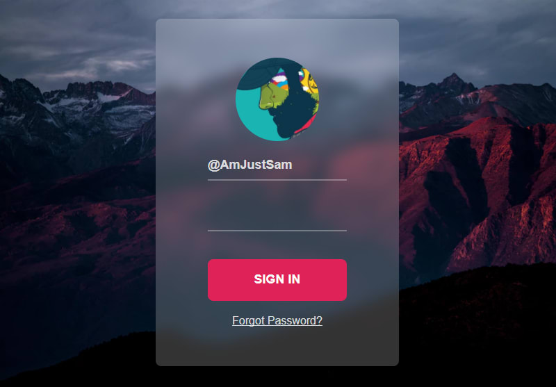
}Notice the -webkit prefix in there. It’s still worth using it in production, though that’s not a big deal assuming you’re wired up with Autoprefixer. Here’s the demo from the Almanac:
OK, so maybe not the one-line solution it appeared to be. But hey, it’s cool that this sort of thing is relatively trivial in CSS.
Direct Link to Article — Permalink
The post Backdrop Filter effect with CSS appeared first on CSS-Tricks.
You can support CSS-Tricks by being an MVP Supporter.