Reliability, user-friendliness, and optimized performance are synonymous with Apple’s Mac. But even the best computers experience problems from time to time. When a Mac disaster strikes, it can be incredibly frustrating for the users. You...
Apple is expected to make a big announcement today, holding a special press event that has generated a lot of buzz in the past few weeks.
Rumors abound about what Apple will announce, with popular speculation that two new iPhones will be revealed -- the iPhone 5S, the successor to the current-gen iPhone, and the cheaper iPhone 5C, an economical version of the iPhone meant to compete with Samsung in emerging markets.
In one of Apple’s latest TV adverts, ‘Strength’, they showcase some of the most popular fitness apps, integrating smart technology with tracking and analysis.
The ad shows people using iPhone as part of their daily fitness routine – weighing themselves, swimming, running, doing weights – all with apps connected to iOS.
Apple unveiled an expanded version of its San Francisco system font at WWDC 2022. Then, last month, Jim Nielsen zeroed in on the font’s variations, explaining how the font provides a spectrum of variations based on the width and weight. It’s a remarkable read if you haven’t checked it.
With all of these great new options, you might be tempted to use them in a web design. Chris was ogling over the expanded sets as well over on his personal blog and pondered:
But it’s not year clear how we might tap into the condensed, compressed, and expanded varieties in CSS, or if there is even a plan to allow that. I suppose we can peek around Apple.com eventually and see how they do it if they start using them there.
Doesn’t this make perfect sense to construct as a variable font and ship the whole kit and kaboodle that way?
Turns out, yes. It does make perfect sense. Chris follows up in a new post:
But just yesterday I randomly stumbled across the fact that the built-in San Francisco font (on the Apple devices that have it built-in) is already variable (!!). See, I was derping around with Roboto Flex, and had system-ui as the fallback font, and I was noticing that during the FOUT, the font-variation-settings I was using had an effect on the fallback font, which renders as San Francisco on my Mac. Which… unless I’m daft… means that San Francisco is a variable font.
So, as for using it? Chris has a demo, of course:
There are some gotchas to all this, the most significant being fallbacks for non-Apple devices. After all, that demo is simply calling system-ui for the font family — it’s not telling the browser to download a font file or anything and who knows if Apple is gonna ever ship a variable font file we can serve up as an actual custom web font.
The other interesting thing? Chris did some sleuthing and counted 35 layout featured included in that system font. Go read the rest of the post to see ’em all (and to get a good ol’ dose of Chris-isms — I know I miss them!).
Augmented Reality (AR) and Virtual Reality (VR) get traction across industries far beyond gaming. Retail, manufacturing, transportation, healthcare, and other verticals leverage it more and more. This blog post explores a retail demo that integrates a cutting-edge augmented reality mobile shopping experience with the backend systems via the event streaming platform Apache Kafka.
Augmented Reality (AR) and Virtual Reality (VR)
Augmented reality (AR) is an interactive experience of a real-world environment where the objects in the real world are enhanced by computer-generated perceptual information. AR is a system that fulfills three basic features: a combination of real and virtual worlds, real-time interaction, and accurate 3D registration of virtual and real objects.
I don’t know about you, but when I text, I use a lot of emojis to express myself.
Maybe too many.
And there were so many times where there just wasn’t an emoji I needed to express myself, or something to describe what I was doing.
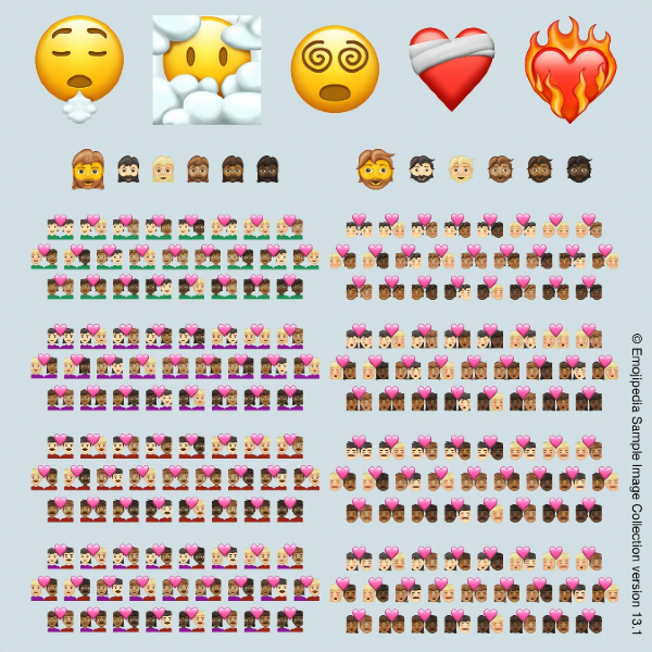
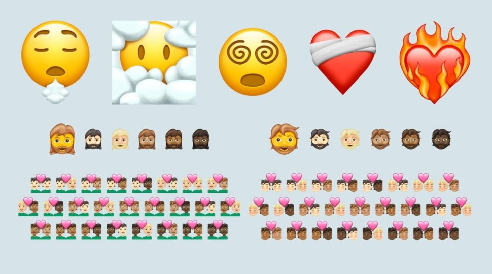
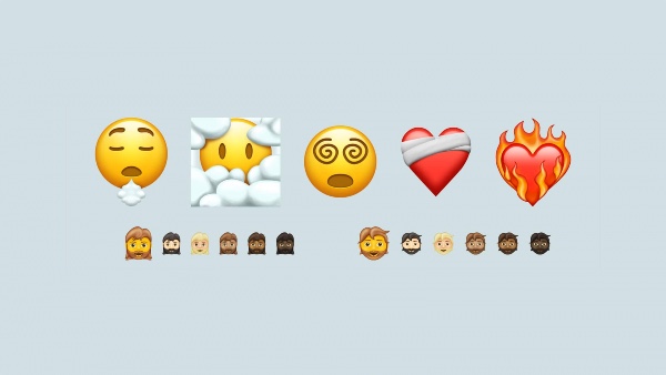
That’s why I’m so incredibly excited to announce that Apple will be adding an additional 217 emojis to the pack.
This year, they already added over 100 new emojis, including one of my personal favorites, the otter.
And now, we wait for 217 more in 2021.
If you’re a big dreamer, you’ll finally have an emoji to describe your head being in the clouds.
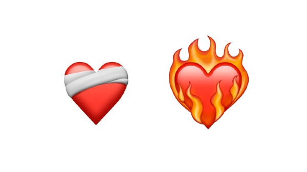
There’s also a mending heart, which I love, an exhaling face, and a few others!
One important thing that you should know is that 200 of 210 of these emojis are skin tone variants, which is incredibly exciting!
It’ll be amazing now that we can all find the perfect relationship emoji to describe our lives.
The update is expected to take place in January and will gradually roll out new emojis until October of next year.
And although we haven’t gotten an exact image of the new emojis from Apple, the talented designer Joshua Jones from emojipedia has made some mock-ups of what we can expect to see soon!
What are you most excited for in the upcoming emoji release?
What other emojis would you like for Apple to release?
Let us know in the comments below.
Maybe we can come together and make some emoji mock-ups and send a request to Apple to implement them.
Who knows what we could accomplish if we all come together.
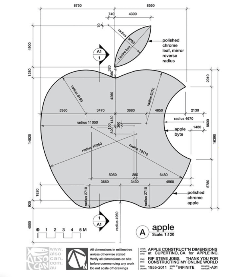
Have you ever wondered what a bitten apple and technology have in common?
The Apple logo has become one of the most iconic and world-wide known logo, but not many people know the history and the meaning behind the bitten apple.
Today, we’re going to dive into the history of the Apple logo, so you can know all about it.
And hey, it’s a cool party story to tell… that is, if you go to parties. I wouldn’t know. #quarantinelife
The first logo of the company doesn’t look at all like the actual one that represents the Apple brand.
And if you ask me, it actually gives me kind of creepy vibes.
The first logo of Apple only survived for one year before Steve Jobs asked the talented artist Rob Janoff to create something more modern and representative for Apple.
The final logo, designed by Ronald Wayne and Steve Jobs, illustrated Sir Isaac Newton under an apple tree, and for the background, it had a poem written on the side of the drawing.
The quotation by Wordsworth that was also inscribed into the logo said: “Newton… a mind forever voyaging through strange seas of thought.”
The Apple Logo: How did it become an iconic image of the company?
The iconic Apple logo, the bitten apple that we all know and love, can now be found on all the company’s products.
This apple was created by Rob Janoff in the ’70s.
According to Rob, the reason Steve Jobs wanted the apple to have a bite mark in it, was so that no one would mistake the apple for a tomato.
You can also look at the bite as a clever play on words.
Instead of spelling it B-I-T-E, you can spell it B-Y-T-E, as in the measurement for digital storage.
It is, of course, a strong reference for a tech company.
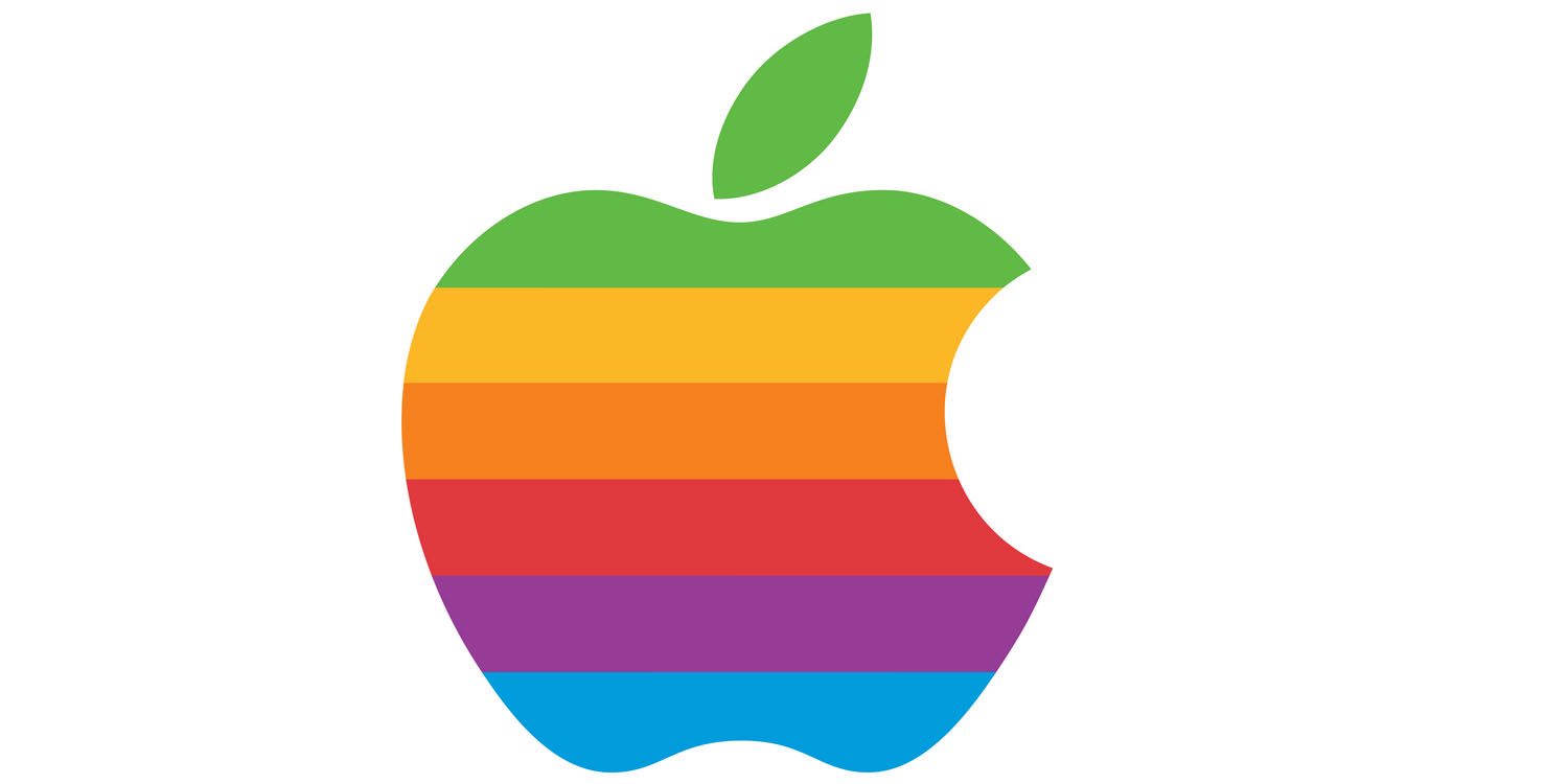
The rainbow Apple Logo
So soon after they retired good old Isaac Newton and the weird first logo, the first iconic version of the bitten apple was presented as a rainbow-striped apple.
This Apple logo represented the company between 1976 and 1998.
Rob Janoff explains why Jobs opted for the rainbow in one of his interviews.
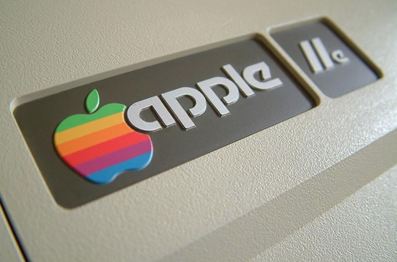
Once the personal computer Apple II was launched, it was the first computer ever that could display colors on the screen.
A huge win for Apple and for all of humanity.
We come a long way since then, huh?
Crazy to think that it wasn’t even that long ago that we didn’t have computers that displayed colors!
The representatives of the company wanted to make this fact known by all, thus was born the rainbow apple.
Also, the colors were also an attempt to make the logo more accessible and to attract the young generation.
Here is Apple II in all of her spectacular glory.
In 1998, things started to change again, which means that the Apple logo went through a change as well.
As should all companies after a while!
Steve Jobs decided to change the rainbow apple into a monochromatic apple.
A great, modern move on their part.
Apple always seems to be in the lead.
The rainbow colors of the apple were going to go out of fashion and just wouldn’t cut it anymore.
Especially when the decided to put the logo on the back of all their products, for everyone to see.
The new monochromatic logo matched the image of the newest products on the market better than anything else.
Regarding the name of the company, there are many speculations.
Unfortunately, there isn’t one most plausible theory among all the existent ones.
Some believe that the founder’s, Steve Jobs, and Steve Wozniak, wanted their start-up to appear on the first pages of the phone books.
Others believe that they wanted to stand out of the crowd with a simple name, that was easy to be remembered by.
They wanted to create a contrast between their company and all the other hard to remember names of tech companies such as TRS-80, IBM, or Cincom.
Also, the idea that the founders wanted to bring a tribute to The Beatles’ record label.
As time went on, Apple kept simplifying their logo all the more.
Now, their logo is minimalistic and you can find it in different colors across all products; Gold, Rosegold, Silver, and Black.
Despite the color changes that we’ve been seeing since the ’70s, the apple has and probably will remain intact from here on out.
The iconic apple is here to stay, with just a few modifications here and there every few years.
What do you guys think of Apple’s logo?
If you were in complete control of creating a new logo, would you totally revamp it? If so, then how?
You might have seen a lot of websites and mobile apps that allow you to “Sign in/Log in via” Google, Facebook or Twitter. “Sign in with Apple” is an addition to the same set of authentication providers. In this approach a user need not create an account on every individual website. Rather they can simply use their existing accounts in Google, Facebook, Twitter, or Apple to access the 3rd party website. This is called a 3rd party sign in. This website is called a 3rd party since the first two parties are the user and the authentication provider like Google.
The benefit to these websites is that they get to leverage the superior security protocols put in place by the tech giants. Additionally, they avoid the overhead of building any sort of authentication mechanisms themselves on their own websites.
Apple is well-known for the sleek animations on their product pages. For example, as you scroll down the page products may slide into view, MacBooks fold open and iPhones spin, all while showing off the hardware, demonstrating the software and telling interactive stories of how the products are used.
Just check out this video of the mobile web experience for the iPad Pro:
A lot of the effects that you see there aren’t created in just HTML and CSS. What then, you ask? Well, it can be a little hard to figure out. Even using the browser’s DevTools won’t always reveal the answer, as it often can’t see past a <canvas> element.
Let’s take an in-depth look at one of these effects to see how it’s made so you can recreate some of these magical effects in our own projects. Specifically, let’s replicate the AirPods Pro product page and the shifting light effect in the hero image.
The basic concept
The idea is to create an animation just like a sequence of images in rapid succession. You know, like a flip book! No complex WebGL scenes or advanced JavaScript libraries are needed.
By synchronizing each frame to the user’s scroll position, we can play the animation as the user scrolls down (or back up) the page.
Start with the markup and styles
The HTML and CSS for this effect is very easy as the magic happens inside the <canvas> element which we control with JavaScript by giving it an ID.
In CSS, we’ll give our document a height of 100vh and make our <body> 5⨉ taller than that to give ourselves the necessary scroll length to make this work. We’ll also match the background color of the document with the background color of our images.
The last thing we’ll do is position the <canvas>, center it, and limit the max-width and height so it does not exceed the dimensions of the viewport.
Right now, we are able to scroll down the page (even though the content does not exceed the viewport height) and our <canvas> stays at the top of the viewport. That’s all the HTML and CSS we need.
Let’s move on to loading the images.
Fetching the correct images
Since we’ll be working with an image sequence (again, like a flip book), we’ll assume the file names are numbered sequentially in ascending order (i.e. 0001.jpg, 0002.jpg, 0003.jpg, etc.) in the same directory.
We’ll write a function that returns the file path with the number of the image file we want, based off of the user’s scroll position.
const currentFrame = index => (
  `https://www.apple.com/105/media/us/airpods-pro/2019/1299e2f5_9206_4470_b28e_08307a42f19b/anim/sequence/large/01-hero-lightpass/${index.toString().padStart(4, '0')}.jpg`
)
Since the image number is an integer, we’ll need to turn it in to a string and use padStart(4, '0') to prepend zeros in front of our index until we reach four digits to match our file names. So, for example, passing 1 into this function will return 0001.
That gives us a way to handle image paths. Here’s the first image in the sequence drawn on the <canvas> element:
As you can see, the first image is on the page. At this point, it’s just a static file. What we want is to update it based on the user’s scroll position. And we don’t merely want to load one image file and then swap it out by loading another image file. We want to draw the images on the <canvas> and update the drawing with the next image in the sequence (but we’ll get to that in just a bit).
We already made the function to generate the image filepath based on the number we pass into it so what we need to do now is track the user’s scroll position and determine the corresponding image frame for that scroll position.
Connecting images to the user’s scroll progress
To know which number we need to pass (and thus which image to load) in the sequence, we need to calculate the user’s scroll progress. We’ll make an event listener to track that and handle some math to calculate which image to load.
We need to know:
Where scrolling starts and ends
The user’s scroll progress (i.e. a percentage of how far the user is down the page)
The image that corresponds to the user’s scroll progress
We’ll use scrollTop to get the vertical scroll position of the element, which in our case happens to be the top of the document. That will serve as the starting point value. We’ll get the end (or maximum) value by subtracting the window height from the document scroll height. From there, we’ll divide the scrollTop value by the maximum value the user can scroll down, which gives us the user’s scroll progress.
Then we need to turn that scroll progress into an index number that corresponds with the image numbering sequence for us to return the correct image for that position. We can do this by multiplying the progress number by the number of frames (images) we have. We’ll use Math.floor() to round that number down and wrap it in Math.min() with our maximum frame count so it never exceeds the total number of frames.
We now know which image we need to draw as the user’s scroll progress changes. This is where the magic of <canvas> comes into play. <canvas> has many cool features for building everything from games and animations to design mockup generators and everything in between!
One of those features is a method called requestAnimationFrame that works with the browser to update <canvas> in a way we couldn’t do if we were working with straight image files instead. This is why I went with a <canvas> approach instead of, say, an <img> element or a <div> with a background image.
requestAnimationFrame will match the browser refresh rate and enable hardware acceleration by using WebGL to render it using the device’s video card or integrated graphics. In other words, we’ll get super smooth transitions between frames — no image flashes!
Let’s call this function in our scroll event listener to swap images as the user scrolls up or down the page. requestAnimationFrame takes a callback argument, so we’ll pass a function that will update the image source and draw the new image on the <canvas>:
We’re bumping up the frameIndex by 1 because, while the image sequence starts at 0001.jpg, our scroll progress calculation starts actually starts at 0. This ensures that the two values are always aligned.
The callback function we pass to update the image looks like this:
We pass the frameIndex into the function. That sets the image source with the next image in the sequence, which is drawn on our <canvas> element.
Even better with image preloading
We’re technically done at this point. But, come on, we can do better! For example, scrolling quickly results in a little lag between image frames. That’s because every new image sends off a new network request, requiring a new download.
We should try preloading the images new network requests. That way, each frame is already downloaded, making the transitions that much faster, and the animation that much smoother!
All we’ve gotta do is loop through the entire sequence of images and load ‘em up:
const frameCount = 148;


const preloadImages = () => {
  for (let i = 1; i < frameCount; i++) {
    const img = new Image();
    img.src = currentFrame(i);
  }
};


preloadImages();
Demo!
A quick note on performance
While this effect is pretty slick, it’s also a lot of images. 148 to be exact.
No matter much we optimize the images, or how speedy the CDN is that serves them, loading hundreds of images will always result in a bloated page. Let’s say we have multiple instances of this on the same page. We might get performance stats like this:
That might be fine for a high-speed internet connection without tight data caps, but we can’t say the same for users without such luxuries. It’s a tricky balance to strike, but we have to be mindful of everyone’s experience — and how our decisions affect them.
A few things we can do to help strike that balance include:
Loading a single fallback image instead of the entire image sequence
Creating sequences that use smaller image files for certain devices
Allowing the user to enable the sequence, perhaps with a button that starts and stops the sequence
Apple employs the first option. If you load the AirPods Pro page on a mobile device connected to a slow 3G connection and, hey, the performance stats start to look a whole lot better:
Yeah, it’s still a heavy page. But it’s a lot lighter than what we’d get without any performance considerations at all. That’s how Apple is able to get get so many complex sequences onto a single page.
Further reading
If you are interested in how these image sequences are generated, a good place to start is the Lottie library by AirBnB. The docs take you through the basics of generating animations with After Effects while providing an easy way to include them in projects.
Many years back (well, five or so, but that's an eternity in technical worlds), I used to be the editor of the mobile channel of a developer website. This was when app-building was the hottest thing in town, and well, Objective-C, the default language for building iOS apps, was looking ancient.
Then in 2014, Apple announced, Swift, a new modern option for building apps in the Apple ecosystem, and with an increasing amount of cross-platform, server-side support, it was always a language I had a lot of hope for and kept a keen eye on.
Technology giant Apple Inc. is in an endeavor to extend support for web apps in its default browser Safari. Experts are already working to introduce support for Service Workers in this browser. This move from Apple is a clear hint that they are moving ahead with the growing concept of Progressive Web Apps (PWA).
How will the extended support of Service Workers in Safari browser impact enterprises? Are mobile apps being challenged by progressive web apps for the iOS platform? How does the future of iOS app development for the App Store look after this move by Apple? Let’s dig deeper to understand the intention behind this massive move by Apple.
He says it all started when he was a kid, and his love for design showed through the way he played with legos.
He had always had a passion for designing and engineering, so he specialized in cognitive ergonomics, which proves to be a very useful field for a designer.
When Aurélien starts a new design project with a new client, he says that he always that it is vital to understand their business, what the business is trying to achieve and how you as a designer can impact their project in the best way possible.
After all of this, he starts to gain inspiration from various platforms, such as Dribbble, Behance, or even real-life things, such as books and movies.
When asked what is the most important element of UX design, he said…
“The most important part of UX is to come up with a holistic approach.”
Google is now a big player in the wearable tech and health tracking.
Those in the IoT space have been watching the evolution of wearable tech from clothing and hearables to variations in connected glasses and more. In the consumer space, wrist-based wearables have been the most persistent — Apple owns 48 percent of the market share, followed by Samsung and Fitbit jostling for second and third space. Sales of the Apple smartwatch increased in the third quarter of 2019 to 6.8 million copies sold — an increase of 51 percent compared to the previous year.
Google recently acquired one of the pioneers in the wearables market, Fitbit, for $2.1 billion. This raises issues numerous issues regarding personal data, anti-competition, and the state of wearable health startups.
As we continue through this eventful 2019, there are many newsletter design trends that have already come and gone. But, there are also quite a few that have stuck around, and even more that are just beginning to show up.
So what are they? Great question. Newsletters are one of the most simple and effective marketing strategies out there, so it’s worth knowing what’s trending and what you should avoid. With that said, here are some of the best 2019 newsletter design trends that you’ve gotta know.
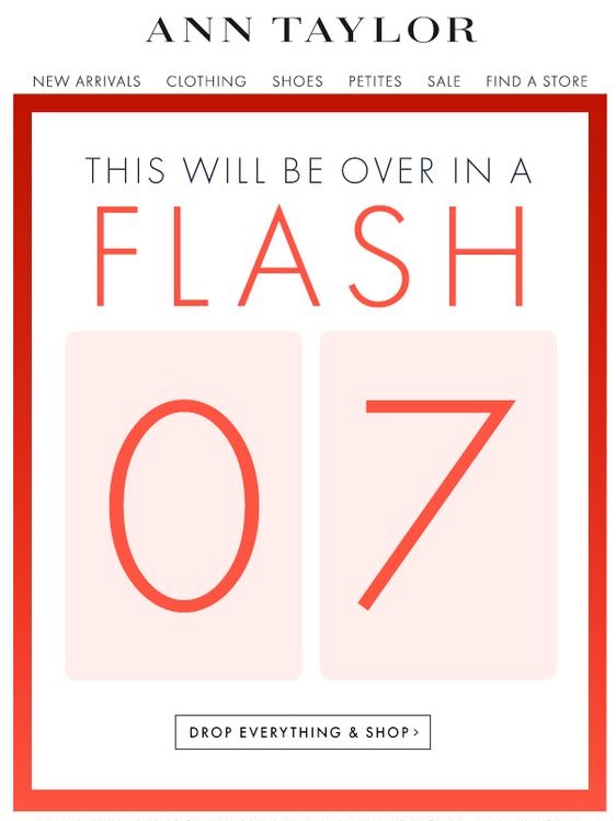
Interactive newsletters
Interactivity has been a trend in the design world for a while now. The reason is as cut and dry as it gets: people love to be entertained. There’s just something about being able to navigate, click, and watch the screen evolve in front of you that just can’t be beaten.
Take this newsletter from Ann Taylor, for example. It has a simple design that allows users to interact with it, see all the new products, and even go straight to the online store. Things like sidebars, drop-down tabs, and shopping links are actually taking off as a trend. This is an interactive email newsletter if I’ve ever seen one. As long as you don’t go overboard with it, this is a great trend to follow.
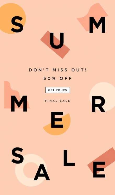
Simple and clean design
Minimalism is a huge trend in design right now. It’s no big surprise that it’s snuck its way into newsletter design trends, too.
There’s nothing more annoying than getting a newsletter, opening it, and finding an explosion of information that you can’t seem to click away from fast enough. The whole point of a newsletter is to grab someone’s attention quickly and direct them to the announcement.
Something like this simple newsletter design clearly shows the reader that there’s a summer sale, it’s 50% off, and then gives them a link to go shopping. There’s nothing overwhelming or misleading about it. By definition, this is a perfectly simply newsletter, and it does the trick.
Catchy newsletter names
You may think that a name really isn’t part of the design, but I think that the name is the first thing that really grabs the reader’s attention. Amidst the absolute ocean of emails that some of us get daily, the subject lines can easily blend in with the background.
It helps to have a name that people not only recognize as your own but by having a name that stands out. There’s really no guideline for this other than be creative. Overall, you should just try to avoid names like (insert company name)’s newsletter.
Infographics in newsletters
If you absolutely need to give a lot of information, a nice infographic can really help maintain your clean design. One particular style of infographics that a lot of businesses are using is video infographics.
Video marketing, in general, has really rocketed forward in recent years. For many businesses, it’s their main focus. A simple video infographic is an easy way to pump out a lot of your information and still keep the target audience engaged.
Personalization
Creating a newsletter design that is easy to adapt to any reader can be hard to do, but it drives opening rates and engagement like crazy.
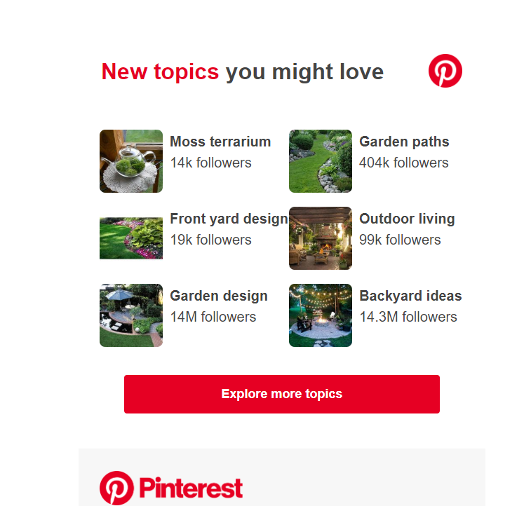
A good example of this would be Pinterest. For years now, they have sent you Pins via email based on the things that you like.
On top of that, they will often use your name in the subject line. It makes it feel less like a corporate cash-grab, and more like a friendly email from a close friend. I don’t know about you, but when scrolling through my inbox, my name in a subject line stands out drastically. Many times, it’s all I look for.
Videos in newsletters
The reason videos work well in newsletters is simple: people love to be entertained. On top of that, listening to a video requires much less effort than reading.
That being said, adding a video to a newsletter can be tricky. If someone has rendering issues, or they can’t watch the video the moment they open it, then they may leave and never come back. There has to be a balance between making the video catchy enough to grab their attention and keep it and being short enough to not waste their time. Basically, keep it short and sweet.
Bright and contrasting colors
A little splash of color never hurt anyone. This statement rings true for a lot of things, but with design, it’s a little more complicated. It’s true that the right colors can really help any design. But, notice I said the RIGHT colors.
Just because you toss in some bright and contrasting colors doesn’t mean that people are going to love it. In fact, if you don’t get the colors almost exactly right, most people are going to hate it.
The colors you choose have to make sense. They have to match your brand’s tone, but they don’t necessarily have to be the brand’s colors. Take this newsletter for example:
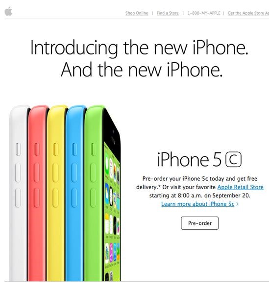
We’re all familiar with the trillion-dollar company, Apple. They’re infamous for their simplicity in design. Most of the time, their devices are simple gold, black, grey, or white. It was quite a shock when they released the 5c, simply because they were like nothing Apple fans had ever seen.
Granted, this email newsletter design is a few years old at this point, but you can see the strategy in using these colors. They absolutely pop off the screen at you. They used the phone’s colors to highlight the phones themselves on the screen.
Or, how about this one:
Again, what we have here is an ingeniously implemented design with contrasting colors. They’re not wildly different from each other, but they certainly do a great job of highlighting the products. These colors make sense, and they look good.
Full-width images
Just like the colors, images have become the main focal point of the newsletter in 2019. And, just like the example above with Apple, the images have quickly started to take up the majority of the newsletter.
It makes sense if you think about it. Let your product do the talking for you. Even if you’re newsletter is a software or a simple announcement, you should be confident enough with what you’re proposing in the newsletter.
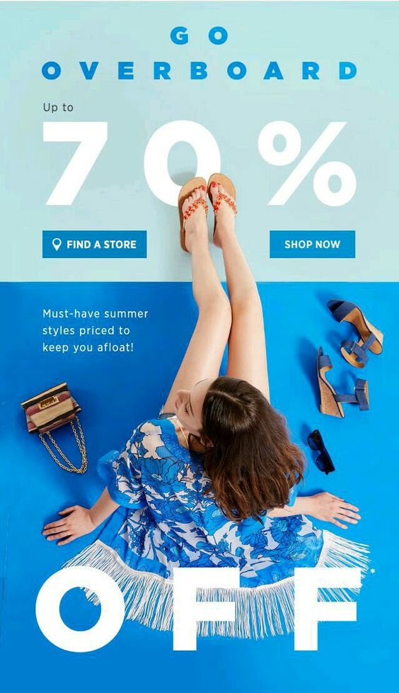
This newsletter advertisement is a perfect example of this. The image of the woman in the middle takes up nearly the entire thing, from end to end.
In fact, this particular design hits on a few of the points we talked about, so we’ll end it here. You have a nice big image, contrasting and bold colors, a simple image, and interactivity.
Get creative
As I hinted at several times throughout this article, creativity is key. Most people will scan their emails, look for only the most important emails, and forget about the rest, newsletters included.
A combination of many or all the design elements above will definitely give you a competitive edge, but don’t forget to play around a little. Just because someone doesn’t open a newsletter email of yours once, doesn’t mean they’ll never do it again. This process will have a lot of trial and error, but you will get the hang of it eventually. Especially is you use these 2019 newsletter design trends.
Dark design is and always will be a trend. The level of darkness will always vary, but basically, it’s really hard to screw up a simple, dark design. This is especially true for dark UI design.
Not everyone gets it right all the time. There are a few things you have to keep in mind when working with a Dark UI. But, don’t pull your hair out yet. We’re going to go over the elements that you need to keep in mind, and a few you’ll probably want to avoid. This is the basics to dark UI: the good, bad, and of course, the ugly.
Why use dark UI?
To be completely honest here, I don’t think every site can pull of dark UI. It is an interesting design tactic, but it sometimes just doesn’t fit the overall style or brand.
But, putting that aside, it is a very visually striking change. For starters, you don’t see lots of dark UI in the digital world. It’s way easier to put dark text on a light background. Most blogs, for example, choose to go with the light UI simply because they pump out a lot of content.
But, what about the other types of sites? I mean, even a blog can pull it off if they try hard enough. You just have to make sure the dark theme will work. And with that in mind, remember that “dark” doesn’t always mean “black”.
A dark background can be a variety of colors. As long as it’s not completely light, or at least has more than half its elements in a dark color, you could consider it to be a dark UI theme.
To be fair to those who don’t choose dark UI, you have a little more maintenance with a dark background. You have to choose everything (fonts, font size, icons, images, colors, etc.) perfectly. If you have a font that’s too small, it will be engulfed by the dark background. If you have a color that contrasts just a little too much, it can make the entire design theme look cheap.
So, why use dark UI? It’s bold and awesome.
Good examples of dark UI
I’m always a fan of examples, so this is where that portion is going to start. Don’t get me wrong, there are plenty of horrible dark UI examples, but let’s save those for the finale. For now, let’s talk about good examples of dark UI and discuss what they’re doing right.
Spotify
Welcome to the Spotify app. This is the application window that you get when you download Spotify to your device. Spotify is notorious for their dark UI, and it’s for good reason.
For starters, “dark” doesn’t always mean black. There is a slight color gradient that breaks up the normal “black” scheme. It’s very smart because they only integrated the gradient into the middle and right side. If you notice on the left, the sidebar is still solid black, outlining it subtly, but just enough.
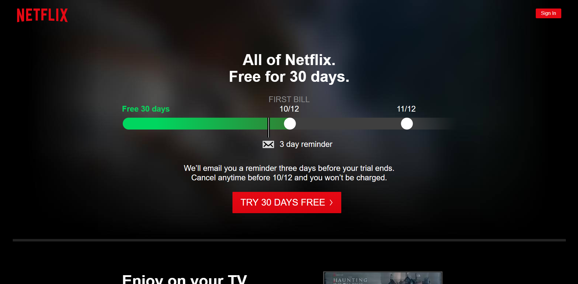
Netflix
Here’s another name we’re all fairly familiar with: Netflix. Netflix has a beautifully dark UI throughout. Most of us already know the dark UI they have when selecting a show to watch, but few of us probably remember the signup screen.
The reason I selected this screenshot is to highlight another element of dark UI that you need to remember: consistency. You simply cannot have a dark UI in one area, and then switch to a light. Visually, this is kind of an eye sore.
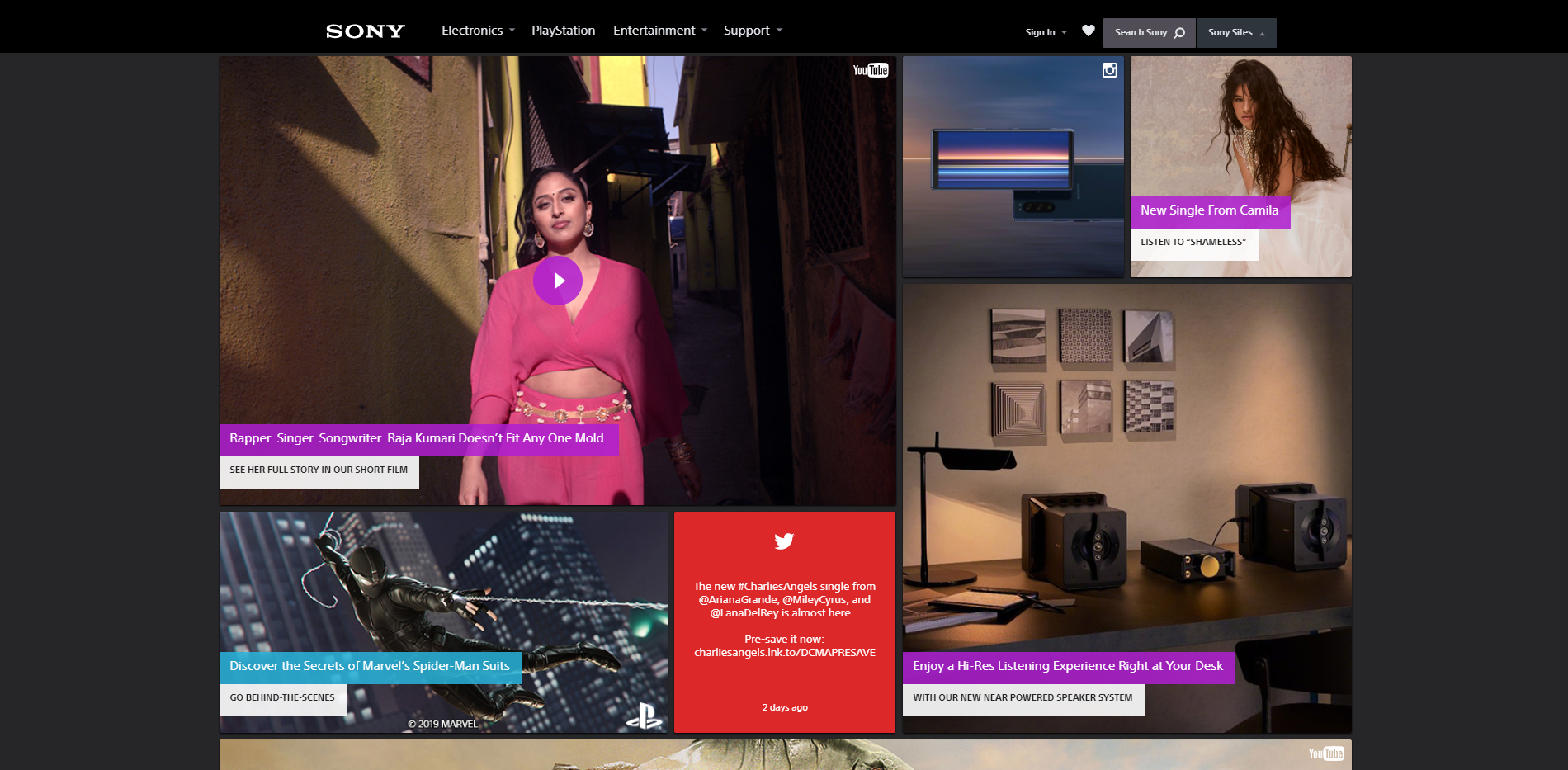
Sony
Here we have Sony’s main site. The dark background draws your eyes instantly to the center where all the content is gathered. It’s very, very simple, but it does the job. Plus, Sony’s logo is notoriously white, so a light background would’ve been a poor choice.
So what is Sony getting right? The lack of elements. The dark UI is contrast enough, and they know that. They don’t need to load up their main page with gradients and contrasting colors. They went with black, plain and simple.
The bad and ugly dark UI
In order for there to be good examples of dark UI, there also has to be at least a few bad ones, too. Honestly, we can probably learn the most from bad examples. They teach us what not to do instead of giving us examples that we just copy.
I don’t really like calling anyone out, so we’ll avoid names here and just jump straight to what’s wrong with the UI. To do that, let’s play a little game involving the image above. I like to call this game: Spot the tablet. Believe it or not, there are 2 tablets in that image. Can you spot number 2?
The point of this is to show you that not all images work well with dark UI. Sure, they could of had limited options. But this all points back to one of our original points when using dark UI – pick your images wisely. The fact is that the tablet blends in almost perfectly into the background. It doesn’t work.
This one I want you to really look at. From a glance, it looks pretty okay. There’s nothing special about it, but it’s certainly not the worst thing I’ve ever seen.
What they did wrong here is the overuse of contrasting colors. Bright redish-pink, lime green, and neon blue all come clashing together to make this app look like the inside of a cheap nightclub. It simply doesn’t work.
Now, if they had gone with fewer colors, or maybe turned the intensity of the colors down a little bit, this could work very well. But, as it sits now, there are better designs out there.
Additional things to avoid with dark UI
We hit the basics on things to avoid with dark UI (too much color, poor image choices, etc.) but there are a few guidelines that I want to leave you with here:
Avoid a lot of text
We briefly mentioned how choosing the right size font makes a big difference. Well, the amount of text does, too. If you have too much light colored text on screen, it can be hard to focus.
Avoid a lot of content
In general, you’ll probably want to avoid too much content on screen at one time. Again, it can be very hard to focus.
Don’t use too many colors
Even if the design has nothing but dark colors, using too many can cause a lot of headache. With a dark UI, your brain will automatically be attracted to anything that stands out. Including varying colors. The quick change for your eyes can and will be straining.
There you have it everyone: dark UI. Overall, it can be quite a challenge to pull off dark UI design. But, if it’s done right, it will definitely make you stand out. But of course remember, dark UI is absolutely not for everyone.
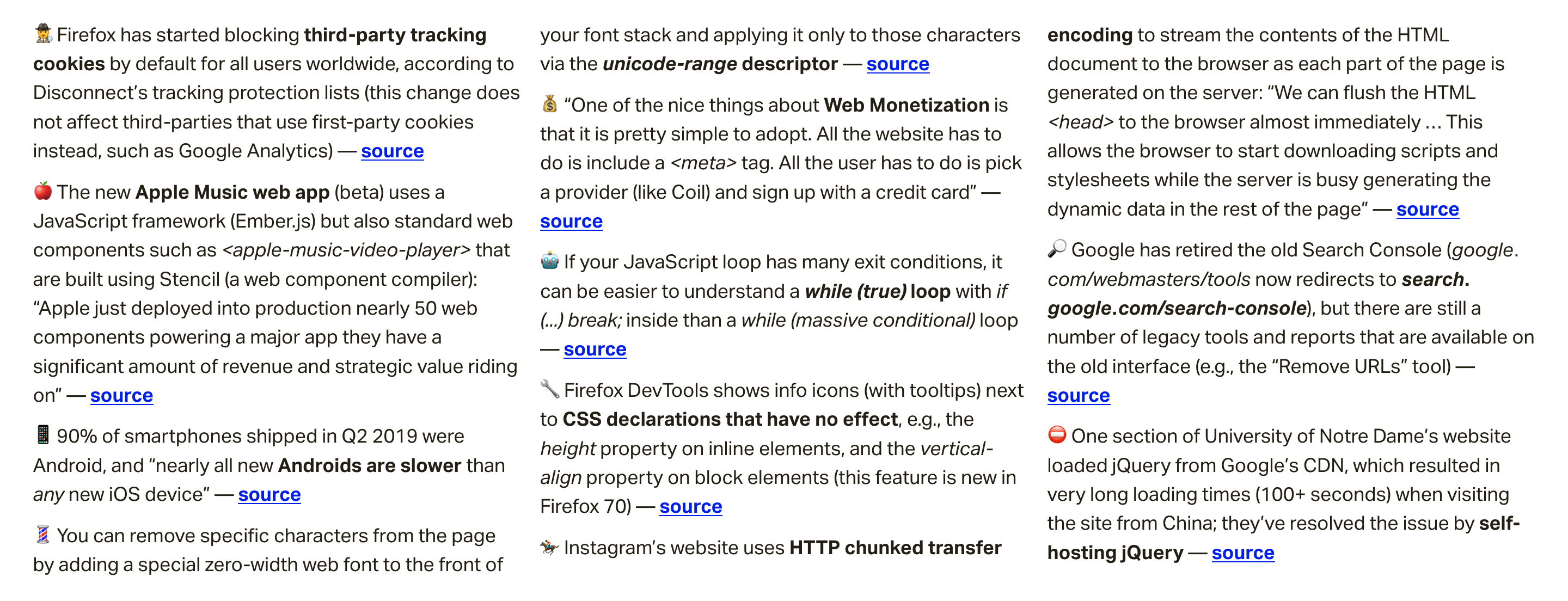
In this week's roundup, Apple gets into web components, how Instagram is insta-loading scripts, and some food for thought for self-hosting critical resources.
Apple deploys web components built using Stencil
The new Apple Music web app (beta) uses a JavaScript framework (Ember.js) but also standard web components such as <apple-music-video-player> that are built using Stencil, a web component compiler.
Stencil is a build-time tool that generates standard web components with minimal overhead, while providing core features such as templating, state management, and routing, as well as performance features such as code-splitting and lazy-loading.
Apple just deployed into production nearly 50 web components powering a major app they have a significant amount of revenue and strategic value riding on. You can’t say that “no one uses web components” or they are “solving problems that don‘t exist or have been solved better in user land” with a straight face anymore.
Instagram makes use of chunked transfer encoding and progressive HTML rendering
Instagram’s website uses HTTP chunked transfer encoding to stream the contents of the HTML document to the browser as each part of the page is generated on the server.
We can flush the HTML <head> to the browser almost immediately ... This allows the browser to start downloading scripts and stylesheets while the server is busy generating the dynamic data in the rest of the page.
They also use this technique to flush JSON data to the page in <script> elements. The client script waits for this data (using Promise) instead of requesting it via XHR.
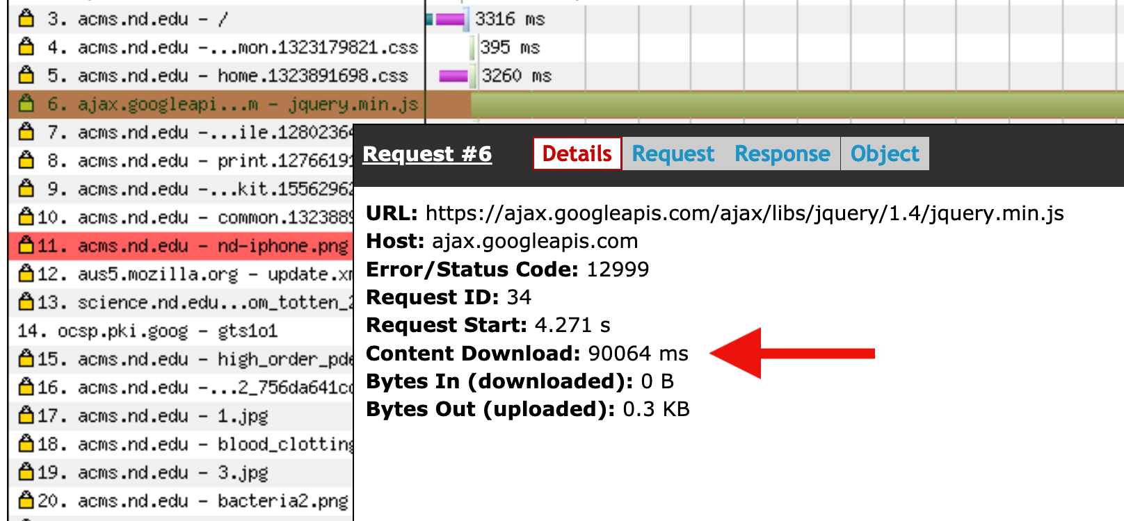
One section of University of Notre Dame’s website used to load jQuery from Google’s CDN, which could result in very long loading times (100+ seconds) when visiting the site from China. They’ve resolved the issue by self-hosting jQuery instead.
Seeing all the time, effort, emojis, drawings, and true works of art put into an Insta story, we know for sure stories are not what they once were. They’re no longer just pictures and videos shot in real-time. Stories have become a true marketing platform, with intensely strategic moves behind each piece of content published. Every Insta story most likely has a cool (maybe expensive) story app that was used to produce the content.
With Insta stories looking more polished and aesthetically pleasing than ever, as a designer, you have to be on top of your game. But to what end and to what cost?
I’m here to help you save a good buck. I’ve got the 10 best free Insta story apps for you to use to improve your Insta stories game without breaking the bank. Without further ado, let’s jump right in.
10 Best Free Insta Story Apps
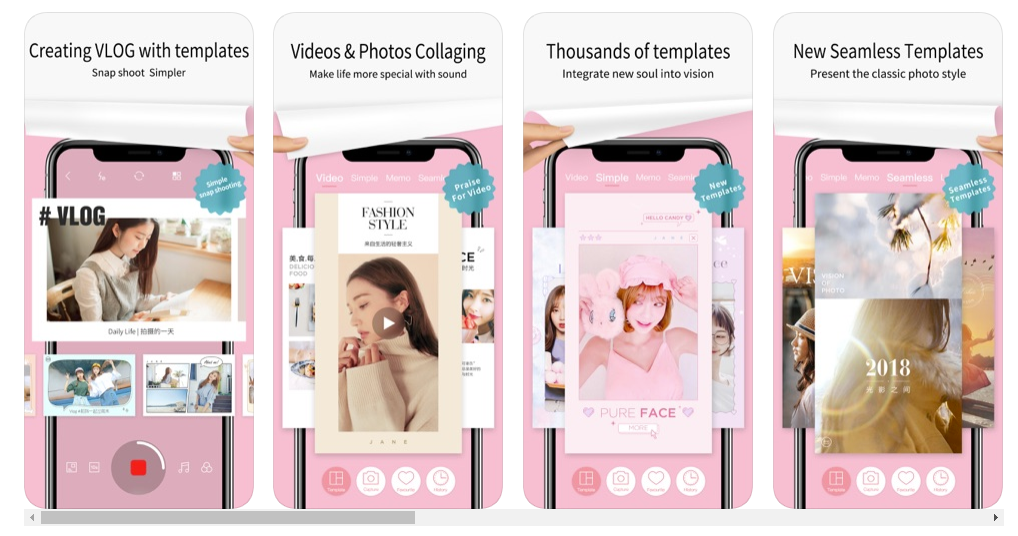
1. Unfold
Unfold is an amazing Insta story app that is free, but also has in-app purchases if you fancy a certain look and template theme. With many texts and elements to choose from, and themes spanning from elegant or retro, there’s something for everyone.
A very underappreciated and not talked about enough app, in my opinion, is Jane. The app is free and has very many free beautiful templates for you to use to spice up your stories. They are quite girly and are perfect for maintaining an elegant or playful story vibe. Create amazing videos with royalty-free music and amazing visuals. Again, this app is free but has in-app purchases.
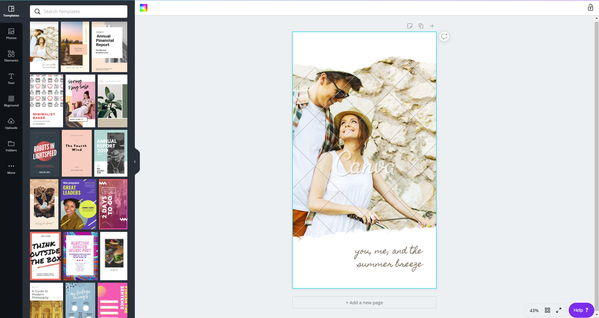
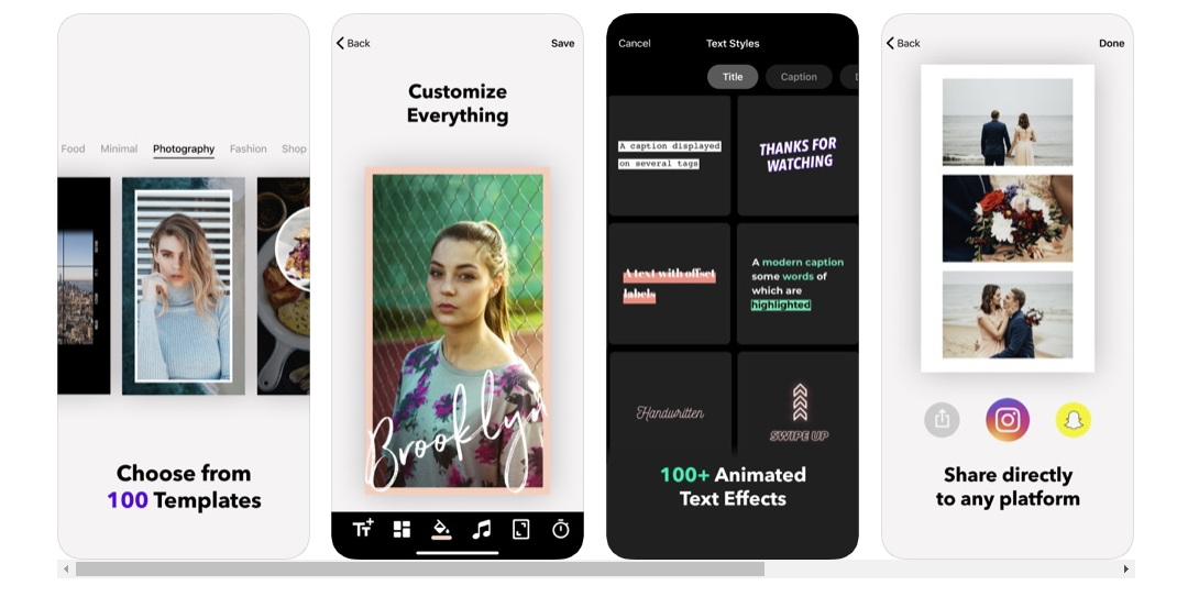
Canva is hands-down one of the best online CMP’s out there. It’s great for beginner and advanced designers alike. With tons of templates to choose from and customize, you’ll surely find the one that suits your style best. The mobile app is free and has in-app purchases, although you can totally rock with all the free elements and templates and just tune them to your liking.
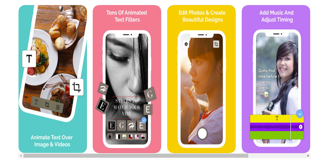
With a vast and wide collection of fonts, you can do some serious designing with this app. Hype type is absolutely killing the font game. If you’re focused on spreading a message, then this is absolutely the app for you. The app is free with some paid features, but it’s up to you to decide if they’re a necessary buy.
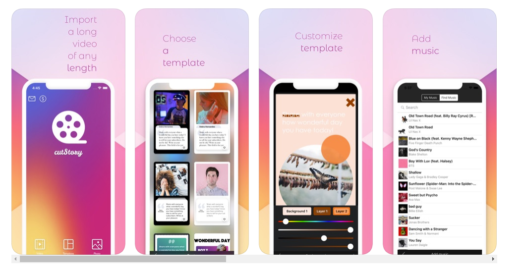
Another great app for managing your stories is Cut Story. Cut Story’s is an amazing video editing app where you can create engaging videos and add music, texts, elements, your logo and more to your video. There are special features that you can buy to enhance your UX, but only if you deem necessary.
Mojo is the way to go for Insta stories because they have 100 templates for you to choose from! Customize your stories with text to create relevance, engage with your followers and make them feel what you feel, and share the message you want to portray with them. A huge plus to this app is that you can share your new and improved story directly to your Instagram and also your Snapchat!
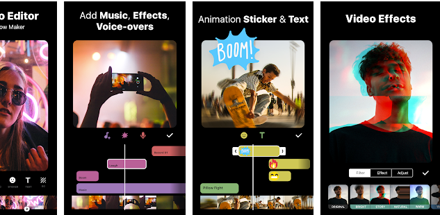
For all my influencers out here, Inshot is the app for you. We don’t always have time to film, import, and edit our footage on our laptops or computers, so having this app will be a valuable asset for you. Edit all your video content in a single app on your phone and import it directly to your Instagram. This app is truly a gift to all of us creators out there.
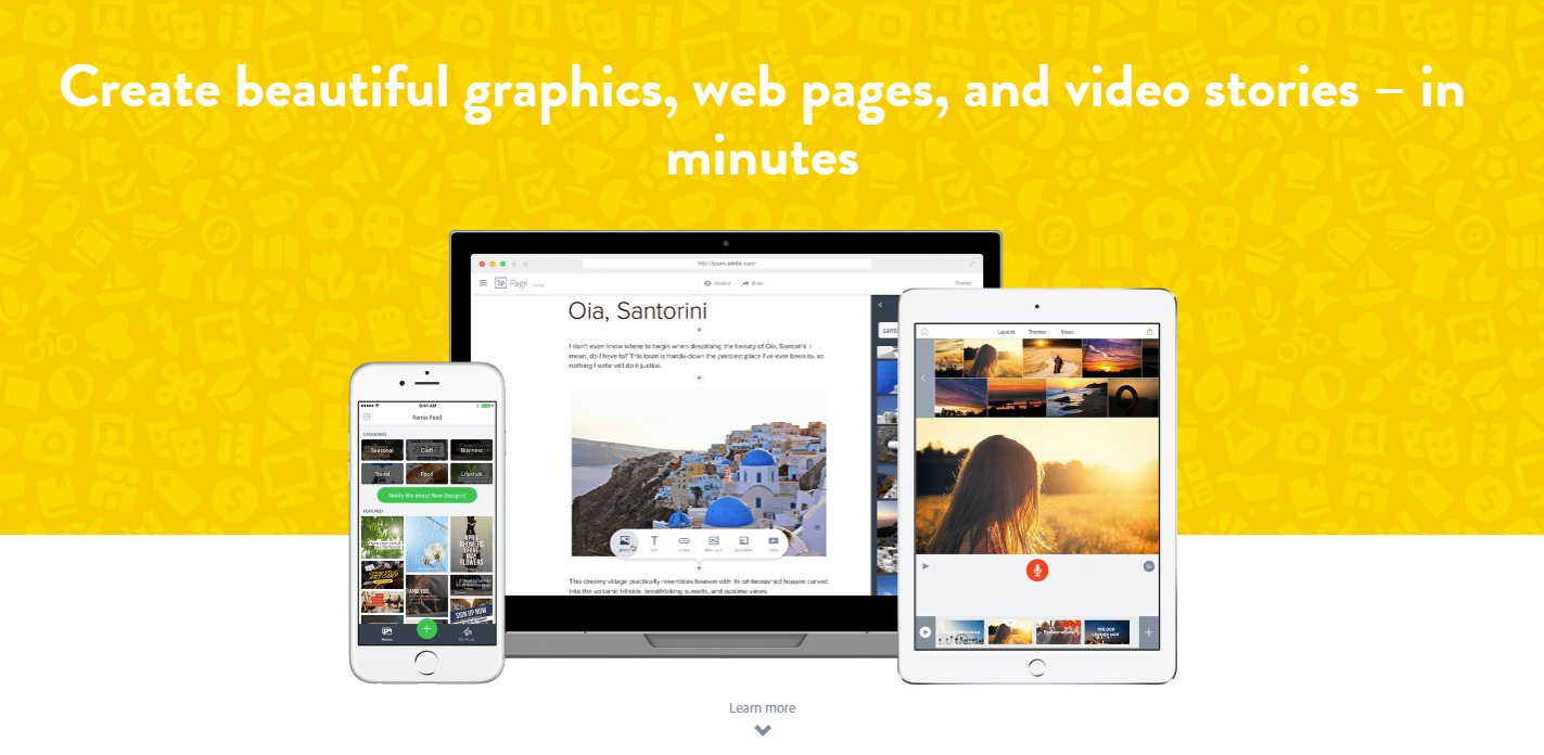
Adobe, king of all things editing programs, in my own personal opinion. Adobe has great editing programs, from video-editing to photoshopping images, and when they saw an opportunity to create an app to help you create amazing stories to tell your followers, well, we all know they wouldn’t pass that up. With this app you can do more than edit stories photos, you can also edit video and image posts. The app is initially free and then they offer you the chance to upgrade if you end up falling in love with the app.
And last, but not least, we have the app called Over. I love that when you visit their webpage, it’s just absolutely inspiring. It inspires you to be different, to stand out, the influence others. A great app for you to use to for free to make your Insta stories more engaging for your followers and for you to really create a brand name and grow your recognizability.
Now that you have 10 new and fresh apps for you to choose from to start stepping up your Insta story game, it’s time for you to hop on it. Download any one of these apps and tag us in any of your Instagram stories for a chance to be featured on our stories. Our Instagram handle is @webdesignledger.
Don’t sleep on these amazing free Insta story apps! Try them out today.
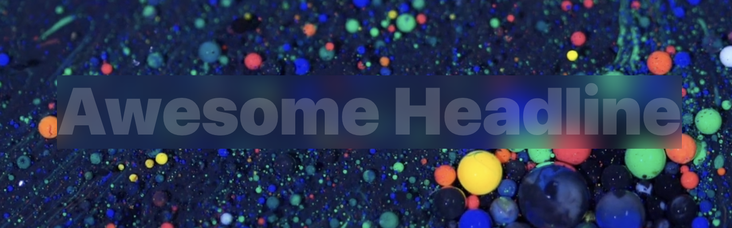
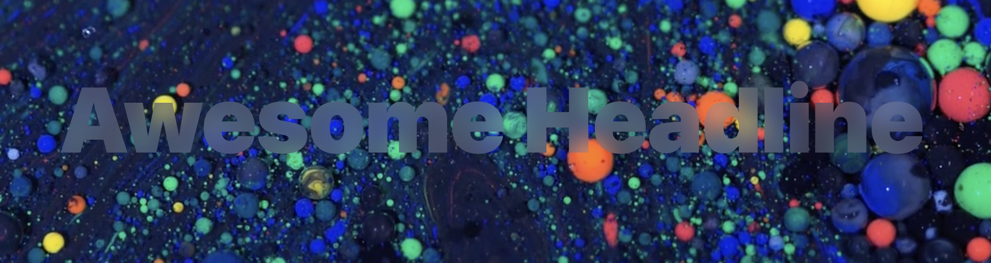
The landing page for Apple Arcade has a cool effect where some "white" text has a sort of translucent effect. You can see some of the color of the background behind it through the text. It's not like knockout text where you see the exact background. In this case, live video is playing underneath. It's like if you were to blur the video and then show that blurry video through the letters.
Well, that's exactly what's happening.
Here's a video so you can see it in action (even after they change that page or you are in a browser that doesn't support the effect):
And hey, if you don't like the effect, that's cool. The rest of this is a technological exploration of how it was done — not a declaration of when and how you should use it.
There are two main properties here that have to work together perfectly to pull this off:
Next we'll place text in that container, but we'll actually hide it. It just needs to be there for accessibility. But we'll end up sort of replacing the text by making a clip path out of the text. Yes indeed! We'll use the SVG <text> inside a <clipPath> element and then use that to clip the entire element that has backdrop-filter on it.
For some reason (that I think is a bug), Chrome renders that like this:
It's failing to clip the element properly, even though it supposedly supports both of those properties. I tried using an @supports block, but that's not helpful here. It looks like Apple's site has a .no-backdrop-blur class on the <html> element (Modernizr-style) that is set on Chrome to avoid using the effect at all. I just let my demo break. Maybe someday it'll get that fixed.
It looks right in Safari:
And Firefox doesn't support backdrop-filter at the moment, so the @supports block does its thing and gives you white text instead.


 Apple is expected to make a big announcement today, holding a special press event that has generated a lot of buzz in the past few weeks.


