There’s a little-known timing function in CSS animations that lets us break an animation into segments––or steps––instead of running it as one continuous animation from start to finish. This function is useful for creating sprite animation because we’re able to...
My path to learning CSS was a little unorthodox. I didn’t start as a front-end developer. I was a Java developer. In fact, my earliest recollections of CSS were picking colors for things in Visual Studio.
It wasn’t until later that I got to tackle and find my love for the front end. And exploring CSS came later. When it did, it was around the time CSS3 was taking off. 3D and animation were the cool kids on the block. They almost shaped my learning of CSS. They drew me in and shaped (pun intended) my understanding of CSS more than other things, like layout, color, etc.
What I’m getting at is I’ve been doing the whole 3D CSS thing a minute. And as with anything you spend a lot of time with, you end up refining your process over the years as you hone that skill. This article is a look at how I’m currently approaching 3D CSS and goes over some tips and tricks that might help you!
Everything’s a cuboid
For most things, we can use a cuboid. We can create more complex shapes, for sure but they usually take a little more consideration. Curves are particularly hard and there are some tricks for handling them (but more on that later).
We aren’t going to walk through how to make a cuboid in CSS. We can reference Ana Tudor’s post for that, or check out this screencast of me making one:
At its core, we use one element to wrap our cuboid and then transform six elements within. Each element acts as a side to our cuboid. It’s important that we apply transform-style: preserve-3d. And it’s not a bad idea to apply it everywhere. It’s likely we’ll deal with nested cuboids when things get more complex. Trying to debug a missing transform-style while hopping between browsers can be painful.
* { transform-style: preserve-3d; }
For your 3D creations that are more than a few faces, try and imagine the whole scene built from cuboids. For a real example, consider this demo of a 3D book. It’s four cuboids. One for each cover, one for the spine, and one for the pages. The use of background-image does the rest for us.
Setting a scene
We’re going to use cuboids like LEGO pieces. But, we can make our lives a little easier by setting a scene and creating a plane. That plane is where our creation will sit and makes it easier for us to rotate and move the whole creation.
For me, when I create a scene, I like to rotate it on the X and Y axis first. Then I lay it flat with rotateX(90deg). That way, when I want to add a new cuboid to the scene, I add it inside the plane element. Another thing I will do here is to set position: absolute on all cuboids.
Creating cuboids of various sizes and across a plane makes for a lot of repetition for each creation. For this reason, I use Pug to create my cuboids via a mixin. If you’re not familiar with Pug, I wrote a 5-minute intro.
A typical scene looks like this:
//- Front
//- Back
//- Right
//- Left
//- Top
//- Bottom
mixin cuboid(className)
  .cuboid(class=className)
    - let s = 0
    while s < 6
      .cuboid__side
      - s++
.scene
  //- Plane that all the 3D stuff sits on
  .plane
    +cuboid('first-cuboid')
As for the CSS. My cuboid class is currently looking like this:
You may have noticed a fair few CSS variables (aka custom properties) in there. This is a big time-saver. I’m powering my cuboids with CSS variables.
--width: The width of a cuboid on the plane
--height: The height of a cuboid on the plane
--depth: The depth of a cuboid on the plane
--x: The X position on the plane
--y: The Y position on the plane
I use vmin mostly as my sizing unit to keep everything responsive. If I’m creating something to scale, I might create a responsive unit. We mentioned this technique in a previous article. Again, I lay the plane down flat. Now I can refer to my cuboids as having height, width, and depth. This demo shows how we can move a cuboid around the plane changing its dimensions.
Debugging with dat.GUI
You might have noticed that little panel in the top right for some of the demos we’ve covered. That’s dat.GUI. It’s a lightweight controller library for JavaScript that super useful for debugging 3D CSS. With not much code, we can set up a panel that allows us to change CSS variables at runtime. One thing I like to do is use the panel to rotate the plane on the X and Y-axis. That way, it’s possible to see how things are lining up or work on a part that you might not see at first.
That dat.GUI code is a little repetitive. We can create functions that will take a configuration and generate the controller. It takes a little tinkering to cater to your needs. I started playing with dynamically generated controllers in this demo.
Centering
You may have noticed that by default each cuboid is half under and half above the plane. That’s intentional. It’s also something I only recently started to do. Why? Because we want to use the containing element of our cuboids as the center of the cuboid. This makes animation easier. Especially, if we’re considering rotating around the Z-axis. I found this out when creating “CSS is Cake”. After making the cake, I then decided I wanted each slice to be interactive. I then had to go back and change my implementation to fix the rotation center of the flipping slice.
Here I’ve broken that demo down to show the centers and how having an offset center would affect the demo.
Positioning
If we are working with a scene that’s more complex, we may split it up into different sections. This is where the concept of sub-planes comes in handy. Consider this demo where I’ve recreated my personal workspace.
There’s quite a bit going on here and it’s hard to keep track of all the cuboids. For that, we can introduce sub-planes. Let’s break down that demo. The chair has its own sub-plane. This makes it easier to move it around the scene and rotate it — among other things — without affecting anything else. In fact, we can even spin the top without moving the feet!
Aesthetics
Once we’ve got a structure, it’s time to work on the aesthetics. This all depends on what you’re making. But you can get some quick wins from using certain techniques. I tend to start by making things “ugly” then go back and make CSS variables for all the colors and apply them. Three shades for a certain thing allows us to differentiate the sides of a cuboid visually. Consider this toaster example. Three shades cover the sides of the toaster:
https://codepen.io/jh3y/pen/KKVjLrx
Our Pug mixin from earlier allows us to define class names for a cuboid. Applying color to a side usually looks something like this:
It’s a little tricky to include extra elements with our Pug mixin. But let’s not forget, every side to our cuboid offers two pseudo-elements. We can use these for various details. For example, the toaster slot and the slot for the handle on the side are pseudo-elements.
Another trick is to use background-image for adding details. For example, consider the 3D workspace. We can use background layers to create shading. We can use actual images to create textured surfaces. The flooring and the rug are a repeating background-image. In fact, using a pseudo-element for textures is great because then we can transform them if needed, like rotating a tiled image. I’ve also found that I get flickering in some cases working directly with a cuboid side.
One issue with using an image for texture is how we create different shades. We need shades to differentiate the different sides. That’s where the filter property can help. Applying a brightness``() filter to the different sides of a cuboid can lighten or darken them. Consider this CSS flipping table. All the surfaces are using a texture image. But to differentiate the sides, brightness filters are applied.
Smoke and mirrors perspective
How about shapes — or features we want to create that seem impossible — using a finite set of elements? Sometimes we can trick the eye with a little smoke and mirrors. We can provide a “faux” like sense of 3D. The Zdoglibrary does this well and is a good example of this.
Consider this bundle of balloons. The strings holding them use the correct perspective and each has its own rotation, tilt, etc. But the balloons themselves are flat. If we rotate the plane, the balloons maintain the counter plane rotation. And this gives that “faux” 3D impression. Try out the demo and switch off the countering.
Sometimes it takes a little out-of-the-box thinking. I had a house plant suggested to me as I built the 3D workspace. I have a few in the room. My initial thought was, “No, I can make a square pot, and how would I make all the leaves?” Well actually, we can use some eye tricks on this one too. Grab a stock image of some leaves or a plant. Remove the background with a tool like remove.bg. Then position many images in the same spot but rotate them each a certain amount. Now, when they’re rotated, we get the impression of a 3D plant.
Tackling awkward shapes
Awkward shapes are tough to cover in a generic way. Every creation has its own hurdles. But, there is a couple of examples that could help give you ideas for tackling things. I recently read an article about the UX of LEGO interface panels. In fact, approaching 3D CSS work like it’s a LEGO set isn’t a bad idea. But the LEGO interface panel is a shape we could make with CSS (minus the studs — I only recently learned this is what they are called). It’s a cuboid to start with. Then we can clip the top face, make the end face transparent, and rotate a pseudo-element to join it up. We can use the pseudo-element for adding the details with some background layers. Try turning the wireframe on and off in the demo below. If we want the exact heights and angles for the faces, we can use some math to workout the hypoteneuse etc.
Another awkward thing to cover is curves. Spherical shapes are not in the CSS wheelhouse. We have various options at this point. One option is to embrace that fact and create polygons with a finite number of sides. Another is to create rounded shapes and use the rotation method we mentioned with the plant. Each of these options could work. But again, it’s on a use case basis. Each has pros and cons. With the polygon, we surrender the curves or use so many elements that we get an almost curve. The latter could result in performance issues. With the perspective trick, we may also end up with performance issues depending. We also surrender being able to style the “sides” of the shape as there aren’t any.
Z fighting
Last, but not least, it’s worth mentioning “Z-fighting.” This is where certain elements on a plane may overlap or cause an undesirable flicker. It’s hard to give good examples of this. There’s not a generic solution for it. It’s something to tackle on a case-by-case basis. The main strategy is to order things in the DOM as appropriate. But sometimes that’s not the only issue.
Being accurate can sometimes cause issues. Let’s refer to the 3D workspace again. Consider the canvas on the wall. The shadow is a pseudo-element. If we place the canvas exactly against the wall, we are going to hit issues. If we do that, the shadow and the wall are going to fight for the front position. To combat this, we can translate things by a slight amount. That will solve the issue and declare what should sit in front.
Try resizing this demo with the “Canvas offset” on and off. Notice how the shadow flickers when there is no offset? That’s because the shadow and the wall are fighting for view. The offset sets the --x to a fraction of 1vmin that we’ve named --cm. That’s a responsive unit being used for that creation.
That’s “it”!
Take your CSS to another dimension. Use some of my tips, create your own, share them, and share your 3D creations! Yes, making 3D things in CSS can be tough and is definitely a process that we can refine as we go along. Different approaches work for different people and patience is a required ingredient. I’m interested to see where you take your approach!
When I first discovered Material Design, I was particularly inspired by its button component. It uses a ripple effect to give users feedback in a simple, elegant way.
How does this effect work? Material Design’s buttons don’t just sport a neat ripple animation, but the animation also changes position depending on where each button is clicked.
We can achieve the same result. We’ll start with a concise solution using ES6+ JavaScript, before looking at a few alternative approaches.
HTML
Our goal is to avoid any extraneous HTML markup. So we’ll go with the bare minimum:
<button>Find out more</button>
Styling the button
We’ll need to style a few elements of our ripple dynamically, using JavaScript. But everything else can be done in CSS. For our buttons, it’s only necessary to include two properties.
button {
  position: relative;
  overflow: hidden;
}
Using position: relative allows us to use position: absolute on our ripple element, which we need to control its position. Meanwhile, overflow: hidden prevents the ripple from exceeding the button’s edges. Everything else is optional. But right now, our button is looking a bit old school. Here’s a more modern starting point:
Later on, we’ll be using JavaScript to inject ripples into our HTML as spans with a .ripple class. But before turning to JavaScript, let’s define a style for those ripples in CSS so we have them at the ready:
span.ripple {
  position: absolute; /* The absolute position we mentioned earlier */
  border-radius: 50%;
  transform: scale(0);
  animation: ripple 600ms linear;
  background-color: rgba(255, 255, 255, 0.7);
}
To make our ripples circular, we’ve set the border-radius to 50%. And to ensure each ripple emerges from nothing, we’ve set the the default scale to 0. Right now, we won’t be able to see anything because we don’t yet have a value for the top, left, width, or height properties; we’ll soon be injecting these properties with JavaScript.
As for our CSS, the last thing we need to add is an end state for the animation:
Notice that we’re not defining a starting state with the from keyword in the keyframes? We can omit from and CSS will construct the missing values based on those that apply to the animated element. This occurs if the relevant values are stated explicitly — as in transform: scale(0) — or if they’re the default, like opacity: 1.
Now for the JavaScript
Finally, we need JavaScript to dynamically set the position and size of our ripples. The size should be based on the size of the button, while the position should be based on both the position of the button and of the cursor.
We’ll start with an empty function that takes a click event as its argument:
function createRipple(event) {
  //
}
We’ll access our button by finding the currentTarget of the event.
const button = event.currentTarget;
Next, we’ll instantiate our span element, and calculate its diameter and radius based on the width and height of the button.
Before adding our span element to the DOM, it’s good practice to check for any existing ripples that might be leftover from previous clicks, and remove them before executing the next one.
const ripple = button.getElementsByClassName("ripple")[0];

if (ripple) {
  ripple.remove();
}
As a final step, we append the span as a child to the button element so it is injected inside the button.
button.appendChild(circle);
With our function complete, all that’s left is to call it. This could be done in a number of ways. If we want to add the ripple to every button on our page, we can use something like this:
const buttons = document.getElementsByTagName("button");
for (const button of buttons) {
  button.addEventListener("click", createRipple);
}
We now have a working ripple effect!
Taking it further
What if we want to go further and combine this effect with other changes to our button’s position or size? The ability to customize is, after all, one of the main advantages we have by choosing to recreate the effect ourselves. To test how easy it is to extend our function, I decided to add a “magnet” effect, which causes our button to move towards our cursor when the cursor’s within a certain area.
We need to rely on some of the same variables defined in the ripple function. Rather than repeating code unnecessarily, we should store them somewhere they’re accessible to both methods. But we should also keep the shared variables scoped to each individual button. One way to achieve this is by using classes, as in the example below:
Since the magnet effect needs to keep track of the cursor every time it moves, we no longer need to calculate the cursor position to create a ripple. Instead, we can rely on cursorX and cursorY.
Two important new variables are magneticPullX and magneticPullY. They control how strongly our magnet method pulls the button after the cursor. So, when we define the center of our ripple, we need to adjust for both the position of the new button (x and y) and the magnetic pull.
To apply these combined effects to all our buttons, we need to instantiate a new instance of the class for each one:
const buttons = document.getElementsByTagName("button");
for (const button of buttons) {
  new Button(button);
}
Other techniques
Of course, this is only one way to achieve a ripple effect. On CodePen, there are lots of examples that show different implementations. Below are some of my favourites.
CSS-only
If a user has disabled JavaScript, our ripple effect doesn’t have any fallbacks. But it’s possible to get close to the original effect with just CSS, using the :active pseudo-class to respond to clicks. The main limitation is that the ripple can only emerge from one spot — usually the center of the button — rather than responding to the position of our clicks. This example by Ben Szabo is particularly concise:
Pre-ES6 JavaScript
Leandro Parice’s demo is similar to our implementation but it’s compatible with earlier versions of JavaScript:
jQuery
This example use jQuery to achieve the ripple effect. If you already have jQuery as a dependency, it could help save you a few lines of code.
React
Finally, one last example from me. Although it’s possible to use React features like state and refs to help create the ripple effect, these aren’t strictly necessary. The position and size of the ripple both need to be calculated for every click, so there’s no advantage to holding that information in state. Plus, we can access our button element from the click event, so we don’t need refs either.
This React example uses a createRipple function identical to that of this article’s first implementation. The main difference is that — as a method of the Button component — our function is scoped to that component. Also, the onClick event listener is now part of our JSX:
Let’s create a pure CSS effect that changes the color of a text link on hover… but slide that new color in instead of simply swapping colors.
There are four different techniques we can use to do this. Let’s look at those while being mindful of important things, like accessibility, performance, and browser support in mind.
Let’s get started!
Technique 1: Using background-clip: text
At the time of writing, the background-clip: text property is an experimental feature and is not supported in Internet Explorer 11 and below.
This technique involves creating knockout text with a hard stop gradient. The markup consists of a single HTML link (<a>) element to create a hyperlink:
<a href="#">Link Hover</a>
We can start adding styles to the hyperlink. Using overflow: hidden will clip any content outside of the hyperlink during the hover transition:
We will need to use a linear gradient with a hard stop at 50% to the starting color we want the link to be as well as the color that it will change to:
a {
  /* Same as before */
  background: linear-gradient(to right, midnightblue, midnightblue 50%, royalblue 50%);
}
Let’s use background-clip to clip the gradient and the text value to display the text. We will also use the background-size and background-position properties to have the starting color appear:
a {
  /* Same as before */
  background-clip: text;
  -webkit-background-clip: text;
  -webkit-text-fill-color: transparent;
  background-size: 200% 100%;
  background-position: 100%;
}
Finally, let’s add the transition CSS property and :hover CSS pseudo-class to the hyperlink. To have the link fill from left to right on hover, use the background-position property:
a {
  /* Same as before */
  transition: background-position 275ms ease;
}
a:hover {
  background-position: 0 100%;
}
While this technique does achieve the hover effect, Safari and Chrome will clip text decorations and shadows, meaning they won’t be displayed. Applying text styles, such as an underline, with the text-decoration CSS property will not work. Perhaps consider using other approaches when creating underlines.
Technique 2: Using width/height
This works by using a data attribute containing the same text as the one in the <a> tag and setting the width (filling the text from left-to-right or right-to-left) or height (filling the text from top-to-bottom or bottom-to-top), from 0% to 100% on hover.
This is when we need to use the content from the data-content attribute. It will be positioned above the content in the <a> tag. We get to use the nice little trick of copying the text in the data attribute and displaying it via the attr() function on the content property of the element’s ::before pseudo-element.
a::before {
  position: absolute;
  content: attr(data-content); /* Prints the value of the attribute */
  top: 0;
  left: 0;
  color: midnightblue;
  text-decoration: underline;
  overflow: hidden;
  transition: width 275ms ease;
}
To keep the text from wrapping to the next line, white-space: nowrap will be applied. To change the link fill color, set the value for the color CSS property using the ::before pseudo-element and having the width start at 0:
a::before {
  /* Same as before */
  width: 0;
  white-space: nowrap;
}
Increase the width to 100% to the ::before pseudo element to complete the text effect on hover:
a:hover::before {
  width: 100%;
}
While this technique does the trick, using the width or height properties will not produce a performant CSS transition. It is best to use either the transform or opacity properties to achieve a smooth, 60fps transition.
Using the text-decoration CSS property can allow for different underline styles to appear in the CSS transition. I created a demo showcasing this using the next technique: the clip-path CSS property.
Technique 3: Using clip-path
For this technique, we will be using the clip-path CSS property with a polygon shape. The polygon will have four vertices, with two of them expanding to the right on hover:
The markup is the same as the previous technique. We will use a ::before pseudo-element again, but the CSS is different:
Unlike the previous techniques, text-decoration: underline must be declared to the ::before pseudo-element for the color to fill the underline on hover.
Now let’s look into the CSS for the clip-path technique:
clip-path: polygon(0 0, 0 0, 0% 100%, 0 100%);
The polygon’s vertices of the clip-path property are set in percentages to define coordinates by the order written:
0 0 = top left
0 0 = top right
100% 0 = bottom right
0 100% = bottom left
The direction of the fill effect can be changed by modifying the coordinates. Now that we have an idea for the coordinates, we can make the polygon expand to the right on hover:
This technique works pretty well, but note that support for the clip-path property varies between browsers. Creating a CSS transition with clip-path is a better alternative than using the width/height technique; however, it does affect the browser paint.
Technique 4: Using transform
The markup for this technique uses a masking method with a <span> element. Since we will be using duplicated content in a separate element, we will use aria-hidden="true" to improve accessibility — that will hide it from screen readers so the content isn’t read twice:
Next, we need to get the <span> to slide the right like this:
To do this, we will use the translateX() CSS function and set it to 0:
a:hover span {
  transform: translateX(0);
}
Then, we will use the ::before pseudo-element for the <span>, again using the data-content attribute we did before. We’ll set the position by translating it 100% along the x-axis.
While this technique is the the most cross-browser compatible of the bunch, it requires more markup and CSS to get there. That said, using the transform CSS property is great for performance as it does not trigger repaints and thus produces smooth, 60fps CSS transitions.
There we have it!
We just looked at four different techniques to achieve the same effect. Although each has its pros and cons, you can see that it’s totally possible to slide in a color change on text. It’s a neat little effect that makes links feel a little more interactive.
Have you ever needed animation in your React application? Traditionally, implementing animation has not an easy feat to accomplish. But now, thanks to Paul Henschel, we there’s a new React tool just for that. react-spring inherits from animated and react-motion for interpolations, optimized performance, and a clean API.
In this tutorial, we will be looking at two of the five hooks included in react-spring, specifically useSpring and useTrail. The examples we’ll implement make use of both APIs.
If you want to follow along, install react-spring to kick things off:
The Spring prop can be used for moving data from one state to another. We are provided with a from and to prop to help us define the animation’s starting and ending states. The from prop determines the initial state of the data during render, while we use to in stating where it should to be after the animation completes.
In the first example, we will make use of the render prop version of creating spring animation.
On initial render, we want to hide a box, and slide it down to the center of the page when a button is clicked. It’s possible to do this without making use of react-spring, of course, but we want to animate the entrance of the box in to view and only when the button is clicked.
class App extends React.Component {
  state = {
    content: false
  }

  displayContent = (e) => {
    e.preventDefault()
    this.setState({ content: !this.state.content })
  }

  render() {
    return (
      <div className="container">
          // The button that toggles the animation
          <div className="button-container">
            <button
              onClick={this.displayContent}
              className="button">
                Toggle Content
            </button>
          </div>
          {
            !this.state.content ?
              (
                // Content in the main container
                <div>
                  No Content
                </div>
              )
            : (
              // We call Spring and define the from and to props
              <Spring
                from={{
                  // Start invisible and offscreen
                  opacity: 0, marginTop: -1000,
                }}
                to={{
                  // End fully visible and in the middle of the screen
                  opacity: 1, marginTop: 0,
                }}
              >
                { props => (
                  // The actual box that slides down
                  <div  className="box" style={ props }>
                    <h1>
                      This content slid down. Thanks to React Spring
                    </h1>
                  </div>
              )}
            </Spring>
            )
        }
      </div>
    )
  }
}
Most of the code is basic React that you might already be used to seeing. We make use of react-spring in the section where we want to conditionally render the content after the value of content has been changed to true. In this example, we want the content to slide in from the top to the center of the page, so we make use of marginTop and set it to a value of -1000 to position it offscreen, then define an opacity of 0 as our values for the from prop. This means the box will initially come from the top of the page and be invisible.
Clicking the button after the component renders updates the state of the component and causes the content to slide down from the top of the page.
We can also implement the above example using the hooks API. For this, we’ll be making use of the useSpring and animated hooks, alongside React’s built-in hooks.
const App = () => {
  const [contentStatus, displayContent] = React.useState(false);
  // Here's our useSpring Hook to define start and end states
  const contentProps = useSpring({
    opacity: contentStatus ? 1 : 0,
    marginTop: contentStatus ? 0 : -1000
  })
  return (
    <div className="container">
      <div className="button-container">
        <button
          onClick={() => displayContent(a => !a)}
          className="button">Toggle Content</button>
      </div>
        {
          !contentStatus ?
            (
              <div>
                No Content
              </div>
            )
          : (
            // Here's where the animated hook comes into play
            <animated.div className="box" style={ contentProps }>
              <h1>
                This content slid down. Thanks to React Spring
              </h1>
            </animated.div>
          )
        }
    </div>
  )
}
First, we set up the state for the component. Then we make use of useSpring to set up the animations we need. When contentStatus is true, we want the values of marginTop and opacity to be 0 and 1, respectively. Else, they should be -1000 and 0. These values are assigned to contentProps which we then pass as props to animated.div.
When the value of contentStatus changes, as a result of clicking the button, the values of opacity and marginTop changes alongside. This cause the content to slide down.
The Trail prop animates a list of items. The animation is applied to the first item, then the siblings follow suit. To see how that works out, we’ll build a component that makes a GET request to fetch a list of users, then we will animate how they render. Like we did with Spring, we’ll see how to do this using both the render props and hooks API separately.
When the component mounts, we make a request to fetch some random users from a third-party API service. Then, we update this.state.users using the data the API returns. We could list the users without animation, and that will look like this:
We set the keys to the ID of each user. You can see we are also making use of the from and to props to determine where the animation should start and end.
Now our list of users slides in with a subtle animation:
The hooks API gives us access to useTrail hook. Since we are not making use of a class component, we can make use of the useEffect hook (which is similar to componentDidMount and componentDidUpdatelifecycle methods) to fetch the users when the component mounts.
We have the initial state of users set to an empty array. Using useEffect, we fetch the users from the API and set a new state using the setUsers method we created with help from the useState hook.
Using the useTrail hook, we create the animated style passing it values for from and to, and we also pass in the length of the items we want to animate. In the part where we want to render the list of users, we return the array containing the animated props.
Now you have a new and relatively easy way to work with animations in React. Try animating different aspects of your application where you see the need. Of course, be mindful of user preferences when it comes to animations because they can be detrimental to accessibility.
While you’re at it, ensure you check out the official website of react-spring because there are tons of demo to get your creative juices flowing with animation ideas.
In this article, I want to show off the flexibility and real power of amCharts 4. We’re going to learn how to combine multiple charts that run together with animations that form a movie experience. Even if you’re only interested in creating a different kind of animation that has nothing to do with charts, you can still use this library, since it’s more than making charts. The core of amCharts is made to help with everything SVG: creation, layout, animation — basically a library that makes working with SVG fun!
Here’s the kind of thing I’m talking about. It's actually a demonstration of seven different charts animated together. We’ll walk through this together, covering how it works and how to re-create it so you can have amCharts in your tool belt the next time you’re working with charts or complex animations.
There’s a lot going on in the movie. Let’s break it up into digestible parts that allow us to parse out what’s going on and re-create those parts under the hood.
The first thing we’re hit is a pie chart rising from the depths with a curved line wrapped around it. There’s nothing special about the pie chart at this point, but we’ll cover it in the next section.
But what about that curved line? Remember, we make charts, so this line is simply a XY chart with a single line on it. All the other details — grid, labels, tick marks, etc. — are hidden. So, what we’re really looking at is a stripped-down line chart!
Setting up the line and pie chart animations
amCharts calls the lines on this chart a line series. A line series has a variable called tensionX and, in this case, it’s been set to 0.75, making for a curvy line. We have to think of tension like we would a rope that is being held by two people and both ends: the tighter the rope is pulled, the greater the tension; conversely, the tension gets looser as the two ends let up. That 0.75 value is a taking a quarter of a unit away from the initial value (1), creating less tension.
// Creates the line on the chart
var lineSeries = lineChart.series.push(new am4charts.LineSeries());
lineSeries.dataFields.dateX = "date";
lineSeries.dataFields.valueY = "value";
lineSeries.sequencedInterpolation = true;
lineSeries.fillOpacity = 0.3;
lineSeries.strokeOpacity = 0;
lineSeries.tensionX = 0.75; Loosens the tension to create a curved line
lineSeries.fill = am4core.color("#222a3f");
lineSeries.fillOpacity = 1;
Initially, all the values of the series are the same: a flat line. Then, we set valueY value of the line’s animation to 80, meaning it pops up to the eights row of the chart height — that will make plenty of room for the pie when it comes in.
// Defines the animation that reveals the curved line
lineSeries.events.on("shown", function(){
  setTimeout(showCurve, 2000)
});

// Sets the animation properties and the valueY so the line bounces up to
// 80 on the chart's y-axis
function showCurve() {
  lineSeries.interpolationEasing = am4core.ease.elasticOut;
  lineSeries.dataItems.getIndex(3).setValue("valueY", 80, 2000);
  setTimeout(hideCurve, 2000);
}

// This is the initial state where the line starts at 30 on the y-axis
// before it pops up to 80
function hideCurve() {
  lineSeries.interpolationEasing = am4core.ease.elasticOut;
  lineSeries.dataItems.getIndex(3).setValue("valueY", 30, 2000);
  setTimeout(showCurve, 2000);
}
Here is the line chart alone so we have a better visual for how that looks:
Next, the pie chart pops up from the bottom. Like a line series, amCharts includes a pie series and it has a dy property that we can set to hidden with a state of 400.
// Make the circle to show initially, meaning it will animate its properties from hidden state to default state
circle.showOnInit = true;

// Set the circle's easing and the duration of the pop up animation
circle.defaultState.transitionEasing = am4core.ease.elasticOut;
circle.defaultState.transitionDuration = 2500;

// Make it appear from bottom by setting dy of hidden state to 300;
circle.hiddenState.properties.dy = 300;
To illustrate this concept, here is a demo with that simple circle in place of a pie chart:
The idea of states in amCharts is this: you can have any number of custom states on any sprite. Then, instead of creating multiple animations with a slew of various different properties, state is changed from one to another and all the required properties that are set on the target state will animate from current values to the new state values.
Any numeric, percentage or color property of a sprite can be animated. By default, sprites have hidden and default states baked in. The hidden state is applied initially and followed by the revealed state, which is the default. There are other states, of course, like hover, active, disabled, among others, including custom states. Here is another demo showing a slice chart with innerRadius, radius and fill animating on hover:
If you look at the code in the demo, you will see some of properties of the slices are customized via pieSeries.slices.template or pieSeries.labels.template. Most of the customization, of course, can be done using themes (amCharts 4 supports using multiple themes at the same time), but since we only need to change a few properties, we can use a template. We’re using a pie chart type and all of the slices of the pie series will be created using the provided template which passes any of the inherited properties we use from the template onto our pie chart.
// Call included themes for styling and animating
am4core.useTheme(am4themes_amchartsdark);
am4core.useTheme(am4themes_animated);
// ...
// Call the Pie Chart template
var pieChart = mainContainer.createChild(am4charts.PieChart);
What if you want to set a custom color for the chart’s font? We can do this by adding a field in the data, like fontColor. That allows us to set custom colors there and then tell the label template that it should look at the field to inform the color property value.
// Define custom values that override one provided by the template
pieChart.data = [{
  "name": "[bold]No[/]",
  "fontColor": am4core.color("#222a3f"),
  "value": 220,
  "tickDisabled":true
}, {
  "name": "Hm... I don't think so.",
  "radius":20,
  "value": 300,
  "tickDisabled":false
}, {
  "name": "Yes, we are using amCharts",
  "value": 100,
  "labelDisabled": true,
  "tickDisabled":true
}];
Any property of a sprite can be customized like this. And even later, after the chart is initialized, we can change any property via the template, or if we need to access some individual object, we can get any value using something like series.slices.getIndex(3) to isolate it.
To summarize: there isn't a single object on the chart that can’t be customized or accessed, changed, even after the chart is built. We’re working with a lot of flexibility!
The pie chart morphs into a country
I’ll be blunt: There is no way to morph a whole pie chart or some other complex object to the shape of a country. In amCharts 4, one polygon can morph into another one. And there are prebuilt methods that simply morph a polygon to a circle or to a rectangle. Here’s what we’ll do:
First, we hide all the slices of a pie chart, except one. This makes effectively transforms the remaining slice into a circle.
Then we animate the innerRadius property to 0, and the slice becomes a true circle.
There’s already a map chart at this moment, but it is hidden out of view. While it hides, we zoom into a selected country and morph it into a circle as well.
Next, we’ll show the country (which is now a circle) and hide the pie chart (which looks like the same circle at this time).
Finally, we morph the country back to its original shape.
Here is a simplified demo where we zoom in to the country, morph it to a circle, then morph it back to its default state:
Inspect that code. Note that all the methods we call, like zoomToMapObject, morphToCircle or morphBack, return an Animation object. An animation object dispatches events like animationstarted, animationprogress or animationended and we can attach listeners to them. This ensures that one animation is triggered only after another one is finished. And, if we change the duration of an animation, we won't need to adjust timers accordingly, because events will handle it. In amCharts 4, Sprites, Components, DataItems, Animations, and other objects have an event dispatcher object which regulate any events. You can add listeners for these events and use them to make your applications super interactive.
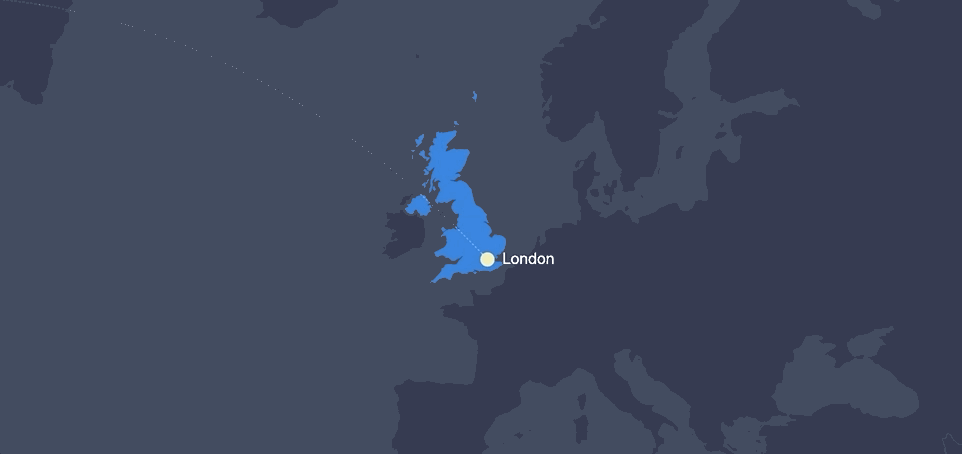
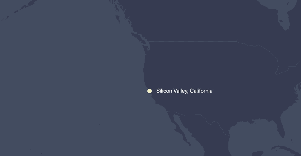
The plane flies from one country to another
At one point, an airplane surfaces at London on a map chart and travels all the way to Silicon Valley.
It might look complex and scary, but it’s using a lot of the concepts we’ve already covered and the features come standard with the map chart included in amCharts:
MapImageSeries is created and sprites (circles and labels) are mapped to the actual longitude latitude coordinates of both cities.
// Create first image container
var imageSeries = mapChart.series.push(new am4maps.MapImageSeries());

// London properties
var city1 = imageSeries.mapImages.create();
// London's latitude/longitude
city1.latitude = 51.5074;
city1.longitude = 0.1278;
// prevent from scaling when zoomed
city1.nonScaling = true;

// New York City properties
var city2 = imageSeries.mapImages.create();
// NY latitude/longitude
city2.latitude = 40.7128;
city2.longitude = -74.0060;
// Prevent scaling when zoomed
city2.nonScaling = true;
MapLineSeries, like the standard line series we saw earlier, creates a line between the cities based on the coordinates that are provided, going from one map image to another. By default, the line is drawn so that it follows the shortest distance between the objects. That happens to be a curved line in this case. We could make it a straight line if we’d like.
// Create the map line series
var lineSeries = mapChart.series.push(new am4maps.MapLineSeries());
var mapLine = lineSeries.mapLines.create();

// Tell the line to connect the two cities (latitudes/longitudes an be used alternatively)
mapLine.imagesToConnect = [city1, city2]

// Draw the line in dashes
mapLine.line.strokeDasharray = "1,1";
mapLine.line.strokeOpacity = 0.2;
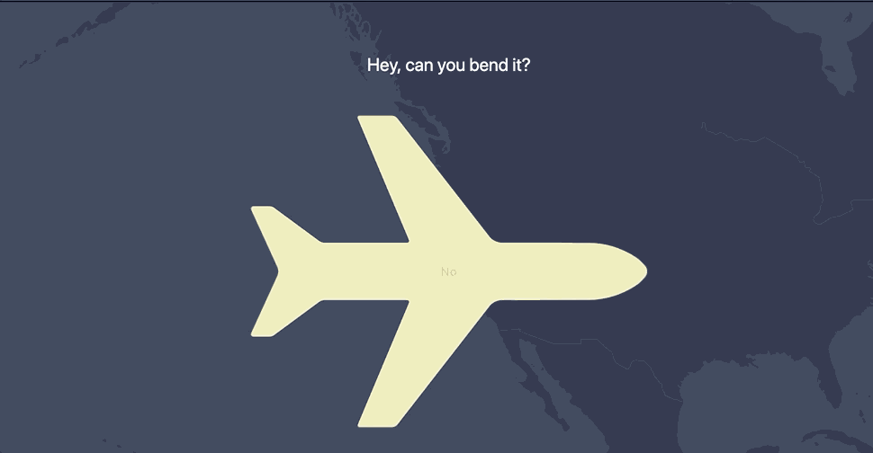
An object (plane) is added to the MapLine and it moves between the endpoints of the line by animating the plane’s position property from 0 to 1.
// Create the plane container
var planeContainer = mapLine.lineObjects.create();

planeContainer.position = 0;
// Set the SVG path of a plane for the sprite
var plane = planeContainer.createChild(am4core.Sprite);
planeContainer.nonScaling = false;
planeContainer.scale = 0.015;

// SVG plane illustration
plane.path = "M71,515.3l-33,72.5c-0.9,2.1,0.6,4.4,2.9,4.4l19.7,0c2.8,0,5.4-1,7.5-2.9l54.1-39.9c2.4-2.2,5.4-3.4,8.6-3.4 l103.9,0c1.8,0,3,1.8,2.3,3.5l-64.5,153.7c-0.7,1.6,0.5,3.3,2.2,3.3l40.5,0c2.9,0,5.7-1.3,7.5-3.6L338.4,554c3.9-5,9.9-8,16.2-8c24.2,0,85.5-0.1,109.1-0.2c21.4-0.1,41-6.3,59-17.8c4.2-2.6,7.9-6.1,11.2-9.8c2.6-2.9,3.8-5.7,3.7-8.5c0.1-2.8-1.1-5.5-3.7-8.5c-3.3-3.7-7-7.2-11.2-9.8c-18-11.5-37.6-17.7-59-17.8c-23.6-0.1-84.9-0.2-109.1-0.2c-6.4,0-12.3-2.9-16.2-8L222.6,316.6c-1.8-2.3-4.5-3.6-7.5-3.6l-40.5,0c-1.7,0-2.9,1.7-2.2,3.3L237,470c0.7,1.7-0.5,3.5-2.3,3.5l-103.9,0c-3.2,0-6.2-1.2-8.6-3.4l-54.1-39.9c-2.1-1.9-4.7-2.9-7.5-2.9l-19.7,0c-2.3,0-3.8,2.4-2.9,4.4l33,72.5C72.6,507.7,72.6,511.8,71,515.3z";
plane.fill = am4core.color("#eeeab5");

plane.horizontalCenter = "middle";
plane.verticalCenter = "middle";
Here is a demo of a plane flying from London to New York:
Notice that the plane becomes bigger when it hits the line’s halfway point? This is done with three additional lines of code we can stick at the end.
// Make the plane to be bigger in the middle of the line
planeContainer.adapter.add("scale", function(scale, target) {
  return (0.07 - 0.10 * (Math.abs(0.5 - target.position))) / mapChart.zoomLevel;
})
We’re using a method that called an adapter, which is another super-powerful feature of amCharts 4. In this case, the adapter modifies the scale property (0.07 to 0.10), based on planes position (0.5).
The plane becomes big and flies away
When our plane reaches the target city (Silicon Valley in the full movie), we scale and rotate it to become horizontal and big.
At the same moment, we create another chart (the SlicedChart type) and add a PictorialSeries to it. The series share’s the same path as the plane, which creates a mask for the slices. We can use any SVG path here.
When the slices are shown, we want the plane to fly away:
This happens by animating the chart object’s dx property.
flyAway()

function flyAway(){
  var animation = pictorialChart.animate({property:"dx", to:2000}, 1500, am4core.ease.quadIn).delay(2000);
  animation.events.on("animationended", flyIn);
}

function flyIn(){
  var animation = pictorialChart.animate({property:"dx", from:-2000, to:0}, 1500, am4core.ease.quadOut);
  animation.events.on("animationended", flyAway);
}
The trail of a plane is again made with a line series, similar to the one we had in the beginning. This time, it's a combination of two separate series: one with positive and another with negative values. When a series has the sequencedInterpolation property set to true, the animation happens with some delay for each data value and we get an effect like this:
This uses the same chart as the plane trail. We basically add another value axis to the chart and create a column series:
// Add a new axis to the chart
var valueAxis = chart.yAxes.push(new am4charts.ValueAxis());
// ... shortened for brevity

// Configure the column series
var series = chart.series.push(new am4charts.ColumnSeries())
series.dataFields.dateX = "date";
series.dataFields.valueY = "value";
series.sequencedInterpolation = true;
series.fillOpacity = 1;
series.fill = am4core.color("#222a3f");
series.stroke = am4core.color("#222a3f")

// Establish the columns at full width
series.columns.template.width = am4core.percent(100);
Then we update the background to gradient:
chart.background.fillOpacity = 0.2;
  var gradient = new am4core.LinearGradient();
  gradient.addColor(am4core.color("#222a3f"));
  gradient.addColor(am4core.color("#0975da"));
  gradient.rotation = -90;
  chart.background.fill = gradient;
And finally, we zoom in on the chart to half of the total range so that we can slowly change the zoom level later to create the moving city effect.
function startZoomAnimation(){
  // Animate the start and end values slowly to make it look like the city is moving
  var animation = dateAxis.animate([{property:"start", from:0, to:0.5}, {property:"end", from:0.5, to:1}], 15000, am4core.ease.linear);
  animation.events.on("animationended", startZoomAnimation);
}
Here is all the code, without the trail part for brevity:
am4core.useTheme(am4themes_amchartsdark);
am4core.useTheme(am4themes_animated);

// Main container
var mainContainer = am4core.create("introchart", am4core.Container);
mainContainer.width = am4core.percent(100);
mainContainer.height = am4core.percent(100);

var chart = mainContainer.createChild(am4charts.XYChart);
chart.padding(0, 0, 0, 0)
chart.zIndex = 20;

var data = [];
var date = new Date(2000, 0, 1, 0, 0, 0, 0);

for (var i = 0; i < 40; i++) {
  var newDate = new Date(date.getTime());
  newDate.setDate(i + 1);

  var value = Math.abs(Math.round(((Math.random() * 100 - i + 10) / 10)) * 10)

  data.push({ date: newDate, value: value });
}

chart.data = data;
chart.zoomOutButton.disabled = true;
chart.seriesContainer.zIndex = -1;

chart.background.fillOpacity = 0.2;
var gradient = new am4core.LinearGradient();
gradient.addColor(am4core.color("#222a3f"));
gradient.addColor(am4core.color("#0975da"));
gradient.rotation = -90;
chart.background.fill = gradient;

var dateAxis = chart.xAxes.push(new am4charts.DateAxis());
dateAxis.renderer.grid.template.location = 0;
dateAxis.renderer.ticks.template.disabled = true;
dateAxis.renderer.axisFills.template.disabled = true;

dateAxis.renderer.labels.template.disabled = true;
dateAxis.rangeChangeEasing = am4core.ease.sinIn;
dateAxis.renderer.inside = true;
dateAxis.startLocation = 0.5;
dateAxis.endLocation = 0.5;
dateAxis.renderer.baseGrid.disabled = true;
dateAxis.tooltip.disabled = true;
dateAxis.renderer.line.disabled = true;
dateAxis.renderer.grid.template.strokeOpacity = 0.07;

var valueAxis = chart.yAxes.push(new am4charts.ValueAxis());
valueAxis.tooltip.disabled = true;
valueAxis.renderer.ticks.template.disabled = true;
valueAxis.renderer.axisFills.template.disabled = true;
valueAxis.renderer.labels.template.disabled = true;
valueAxis.renderer.inside = true;
valueAxis.min = 0;
valueAxis.max = 100;
valueAxis.strictMinMax = true;
valueAxis.tooltip.disabled = true;
valueAxis.renderer.line.disabled = true;
valueAxis.renderer.baseGrid.disabled = true;
valueAxis.renderer.grid.template.strokeOpacity = 0.07;

var series = chart.series.push(new am4charts.ColumnSeries())
series.dataFields.dateX = "date";
series.dataFields.valueY = "value";
series.sequencedInterpolation = true;
series.fillOpacity = 1;
series.fill = am4core.color("#222a3f");
series.stroke = am4core.color("#222a3f")

series.columns.template.width = am4core.percent(100);

chart.events.on("ready", startZoomAnimation);

function startZoomAnimation(){
  // Animate the start and end values slowly to make it look like city is moving
  var animation = dateAxis.animate([{property:"start", from:0, to:0.5}, {property:"end", from:0.5, to:1}], 15000, am4core.ease.linear);
  animation.events.on("animationended", startZoomAnimation);
}
The column chart appears and bends to a radar column chart
Can you guess what happens in the final scene? The initial chart (which looks like a regular column chart) is actually what’s called a radar chart with a very small arc between the chart’s startAngle (269.9°) and endAngle (270.1°) properties.
var radarChart = mainContainer.createChild(am4charts.RadarChart);
// ... Chart properties go here

radarChart.startAngle = 269.9;
radarChart.endAngle = 270.1;
The total arc angle is only 0.2° degrees and that's why the radius of a chart becomes very big and tough tell it apart from a regular XY chart. And all we do to bend the chart is animate the start and end angles. I told you… we can literally animate everything, including angles!
radarChart.events.on("ready", bend);

function bend() {
  var animation = radarChart.animate([{ property: "startAngle", to: 90 }, { property: "endAngle", to: 450 }], 3500, am4core.ease.cubicIn).delay(1000);
    animation.events.on("animationended", unbend);
}

function unbend() {
  var animation = radarChart.animate([{ property: "startAngle", to: 269.9 }, { property: "endAngle", to: 270.1 }], 3500, am4core.ease.cubicIn).delay(500);
  animation.events.on("animationended", bend);
}
Oh, but there is one last, important thing I would like to mention: Containers. All charts and other non-chart objects in this movie are contained in a single div element. Initially, we created mainConatainer and arranged all the objects inside it. Containers support horizontal, vertical, grid and absolute layouts. Fixed or absolute positions can be used for a container's children, and containers can be nested inside other containers. They can be aligned horizontally or vertically, set to a fixed or absolute width or height… and so on. And did I mentioned, that amCharts has built-in date, number and text formatters? Seriously, I will stop here.
As a part of the amCharts team, I often hear comments like, "but you can do all of this with d3.” Yes, you are probably right. But there are still real benefits we’re working with here — fewer lines of code, time spent writing it, and a relatively simple startup. All the animation is made up of 1,000 lines of code, so this is also a pretty lightweight resource.
But, I’m really interested in what you think. Have you tried amCharts before and have examples to show off? How about questions about getting started? Or maybe you’re not sold on the concept altogether and want to chat the pros and cons? Let’s hear it in the comments!
Animations are now booming like never before. Today, it is not only used in movies, but also in other industries. Even small businesses use animated videos to engage their audience. Whether you crave a life in design and animation or you just want to refresh your skills, the Complete Beginner’s Guide to Animation Bundle has […]