Well, color me this! I was griping to myself last night about just how gosh dang hard it is to read text messages in Apple Messages. You know, not the blue bubbles that you get when messaging other iPhone users. Those are iMessages.
What I’m talking about are the green bubbles you get when messaging non-iPhone users. Those are standard text messages.
iMessage (left) and text message (right)
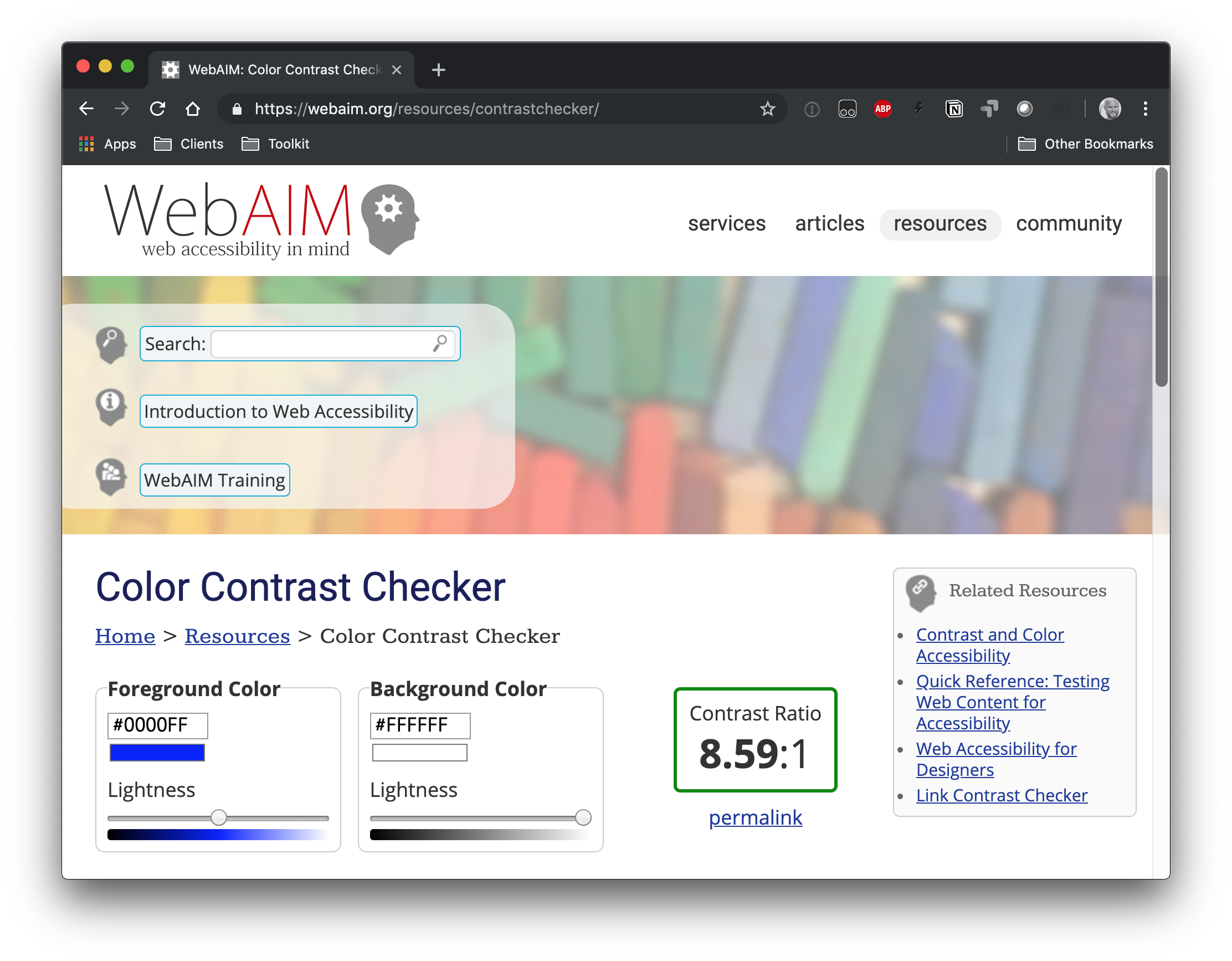
Let’s run the green through a contrast checker to see what’s up.
Oomph. Now I know why I always reach for my reading glasses when a text message pops up. That 2.17:1 ratio is below the WCAG 2.0 AA requirement of 4.5:1 and wayyyyy below the AAA level of 7:1.
Turns out I’m not the only one griping. A quick search turned up a little trove of news and blog posts — some as recent as last week — about the readability of those green text message bubbles.
I’m no conspiracy theorist and like to give benefit to doubt. Buuuuut…
Apple Messages in iOS 6 (left) and iOS 7 (right) Credit: Phoceis
iOS 6: Dark text on a green gradient background
iOS 7: White text on a #5AB539 background (or something close to it)
iOS 16.1: White text on a #6ACC46 background
That second one is based on old screenshots and might not be the most accurate color value. But still, the transition from iOS 6 with dark text to what we have today in iOS 16.1 shows a clear regression. I’d like think the design team checked the updated values against WCAG guidelines, sure, but at least against their own Human Interface Guidelines.
The current green background (#65C466) appears to be different than what is listed as the green “system color” (#30D158, converted from a RGB of 48, 209, 88) in the iOS palette listed in the guidelines. But it’s not like that gets us any closer to a passing WCAG AA or AAA rating.
We’re all looking for low-hanging fruit to make our sites and apps more accessible. One of the easier things we can do is make sure the colors we use are easy on the eyes. High color contrast is something that benefits everyone. It not only reduces eye strain in general, but is crucial for folks who deal with reduced vision.
So let’s not only use better color combinations in our designs but find a way to make it easier for us to implement high contrasts. There’s one specific strategy we use over at Oomph that lets a Sass function do all the heavy lifting for us. I’ll walk you through how we put that together.
Want to jump right to the code because you already understand everything there is to know about color accessibility? Here you go.
What we mean by “accessible color combinations”
Color contrast is also one of those things we may think we have handled. But there’s more to high color contrasts than eyeballing a design. There are different levels of acceptable criteria that the WCAG has defined as being accessible. It’s actually humbling to crack open the WebAIM Contrast Checker and run a site’s color combinations through it.
My team adheres to WCAG’s Level AA guidelines by default. This means that:
Text that is 24px and larger, or 19px and larger if bold, should have a Color Contrast Ratio (CCR) of 3.0:1.
Text that is smaller than 24px should have a CCR of 4.5:1.
If a site needs to adhere to the enhanced guidelines for Level AAA, the requirements are a little higher:
Text that is 24px and larger, or 19px and larger if bold, should have a CCR of 4.5:1.
Text that is smaller than 24px should have a CCR of 7:1.
Ratios? Huh? Yeah, there’s some math involved here. But the good news is that we don’t need to do it ourselves or even have the same thorough understanding about how they’re calculated the way Stacie Arellano recently shared (which is a must read if you’re into the science of color accessibility).
That’s where Sass comes in. We can leverage it to run difficult mathematical computations that would otherwise fly over many of our heads. But first, I think it’s worth dealing with accessible colors at the design level.
Accessible color palettes start with the designs
That’s correct. The core of the work of creating an accessible color palette starts with the designs. Ideally, any web design ought to consult a tool to verify that any color combinations in use pass the established guidelines — and then tweak the colors that don’t. When our design team does this, they use a tool that we developed internally. It works on a list of colors, testing them over a dark and a light color, as well as providing a way to test other combinations.
ColorCube provides an overview of an entire color palette, showing how each color performs when paired with white, black, and even each other. It even displays results for WCAG Levels AA and AAA next to each result. The tool was designed to throw a lot of information at the user all at once when evaluating a list of colors.
This is the first thing our team does. I’d venture to guess that many brand colors aren’t chosen with accessibility at the forefront. I often find that those colors need to change when they get translated to a web design. Through education, conversation, and visual samples, we get the client to sign off on the new color palette. I’ll admit: that part can be harder than the actual work of implementing accessible colors combinations.
The Color Contrast Audit: A typical design delivery when working with an existing brand’s color palette. Here, we suggest to stop using the brand color Emerald with white, but use an “Alt” version that is slightly darker instead.
The problem that I wanted to solve with automation are the edge cases. You can’t fault a designer for missing some instance where two colors combine in an unintended way — it just happens. And those edge cases will come up, whether it is during the build or even a year later when new colors are added to the system.
Developing for accessibility while keeping true to the intent of a color system
The trick when changing colors to meet accessibility requirements is not changing them so much that they don’t look like the same color anymore. A brand that loves its emerald green color is going to want to maintain the intent of that color — it’s “emerald-ness.” To make it pass for accessibility when it is used as text over a white background, we might have to darken the green and increase its saturation. But we still want the color to “read” the same as the original color.
To achieve this, we use the Hue Saturation Lightness (HSL) color model. HSL gives us the ability to keep the hue as it is but adjust the saturation (i.e. increase or decrease color) and lightness (i.e. add more black or more white). The hue is what makes a green that green, or a blue that blue. It is the “soul” of the color, to get a little mystical about it.
Hue is represented as a color wheel with a value between 0° and 360° — yellow at 60°, green at 120°, cyan at 180°, etc. Saturation is a percentage ranging from 0% (no saturation) to 100% (full saturation). Lightness is also a value that goes from 0% to 100%, where no lightness is at 0%, no black and no white is at 50%, and 100% is all lightness, or very light.
A quick visual of what tweaking a color looks like in our tool:
With HSL, changing the low-contrast green to a higher contrast meant changing the saturation from 63 to 95 and the lightness from 45 to 26 on the left. That's when the color gets a green check mark in the middle when used with white. The new green still feels like it is in the same family, though, because the Hue remained at 136, which is like the color’s “soul.”
Designers can adjust colors with the tools that we just reviewed, but so far, no Sass that I have found could do it with mathematical magic. There had to be a way.
These are some similar approaches I have seen in the wild:
An idea by Josh Bader uses CSS variables and colors split into their RGB values to calculate whether white or black is the best accessible color to use in a given situation.
I didn't like these approaches. I didn’t want to fallback to white or black. I wanted colors to be maintained but adjusted to be accessible. Additionally, changing colors to their RGB or HSL components and storing them with CSS variables seemed messy and unsustainable for a large codebase.
I wanted to use a preprocessor like Sass to do this: given two colors, automagically adjust one of them so the pair receives a passing WCAG grade. The rules state a few other things to consider as well — size of the text and whether or not the font is bold. The solution had to take this into account.
In code terms, I wanted to do this:
// Transform this non-passing color pair:
.example {
  background-color: #444;
  color: #0094c2; // a 2.79 contrast ratio when AA requires 4.5
  font-size: 1.25rem;
  font-weight: normal;
}


// To this passing color pair:
.example {
  background-color: #444;
  color: #00c0fc; // a 4.61 contrast ratio
  font-size: 1.25rem;
  font-weight: normal;
}
A solution that does this would be able to catch and handle those edge cases we mentioned earlier. Maybe the designer accounted for a brand blue to be used over a light blue, but not a light gray. Maybe the red used in error messages needs to be tweaked for this one form that has a one-off background color. Maybe we want to implement a dark mode feature to the UI without having to retest all the colors again. These are the use cases I had in mind going into this.
With formulas can come automation
The W3C has provided the community with formulas that help analyze two colors used together. The formula multiplies the RGB channels of both colors by magic numbers (a visual weight based on how humans perceive these color channels) and then divides them to come up with a ratio from 0.0 (no contrast) to 21.0 (all the contrast, only possible with white and black). While imperfect, this is the formula we use right now:
If L1 is the relative luminance of a first color
And L2 is the relative luminance of a second color, then
- Color Contrast Ratio = (L1 + 0.05) / (L2 + 0.05)
Where
- L = 0.2126 * R + 0.7152 * G + 0.0722 * B
And
- if R sRGB <= 0.03928 then R = R sRGB /12.92 else R = ((R sRGB +0.055)/1.055) ^ 2.4
- if G sRGB <= 0.03928 then G = G sRGB /12.92 else G = ((G sRGB +0.055)/1.055) ^ 2.4
- if B sRGB <= 0.03928 then B = B sRGB /12.92 else B = ((B sRGB +0.055)/1.055) ^ 2.4
And
- R sRGB = R 8bit /255
- G sRGB = G 8bit /255
- B sRGB = B 8bit /255
While the formula looks complex, it’s just math right? Well, not so fast. There is a part at the end of a few lines where the value is multiplied by a decimal power — raised to the power of 2.4. Notice that? Turns out that it’s complex math which most programming languages can accomplish — think Javascript’s math.pow() function — but Sass is not powerful enough to do it.
There’s got to be another way…
Of course there is. It just took some time to find it. 🙂
My first version used a complex series of math calculations that did the work of decimal powers within the limited confines of what Sass can accomplish. Lots of Googling found folks much smarter than me supplying the functions. Unfortunately, calculating only a handful of color contrast combinations increased Sass build times exponentially. So, that means Sass can do it, but that does not mean it should. In production, build times for a large codebase could increase to several minutes. That’s not acceptable.
After more Googling, I came across a post from someone who was trying to do a similar thing. They also ran into the lack of exponent support in Sass. They wanted to explore “the possibility of using Newtonian approximation for the fractional parts of the exponent.” I totally understand the impulse (not). Instead, they decided to use a “lookup table.” It’s a genius solution. Rather than doing the math from scratch every time, a lookup table provides all the possible answers pre-calculated. The Sass function retrieves the answer from the list and it’s done.
In their words:
The only part [of the Sass that] involves exponentiation is the per-channel color space conversions done as part of the luminance calculation. [T]here are only 256 possible values for each channel. This means that we can easily create a lookup table.
Now we’re cooking. I had found a more performant direction.
Usage example
Using the function should be easy and flexible. Given a set of two colors, adjust the first color so it passes the correct contrast value for the given WCAG level when used with the second color. Optional parameters will also take the font size or boldness into account.
// @function a11y-color(
//   $color-to-adjust,
//   $color-that-will-stay-the-same,
//   $wcag-level: 'AA',
//   $font-size: 16,
//   $bold: false
// );


// Sass sample usage declaring only what is required
.example {
  background-color: #444;
  color: a11y-color(#0094c2, #444); // a 2.79 contrast ratio when AA requires 4.5 for small text that is not bold
}


// Compiled CSS results:
.example {
  background-color: #444;
  color: #00c0fc; // which is a 4.61 contrast ratio
}
I used a function instead of a mixin because I preferred the output of a single value independent from a CSS rule. With a function, the author can determine which color should change.
An example with more parameters in place looks like this:
// Sass
.example-2 {
  background-color: a11y-color(#0094c2, #f0f0f0, 'AAA', 1.25rem, true); // a 3.06 contrast ratio when AAA requires 4.5 for text 19px or larger that is also bold
  color: #f0f0f0;
  font-size: 1.25rem;
  font-weight: bold;
}


// Compiled CSS results:
.example-2 {
  background-color: #087597; // a 4.6 contrast ratio
  color: #f0f0f0;
  font-size: 1.25rem;
  font-weight: bold;
}
A deeper dive into the heart of the Sass function
To explain the approach, let’s walk through what the final function is doing, line by line. There are lots of helper functions along the way, but the comments and logic in the core function explain the approach:
// Expected:
// $fg as a color that will change
// $bg as a color that will be static and not change
// Optional:
// $level, default 'AA'. 'AAA' also accepted
// $size, default 16. PX expected, EM and REM allowed
// $bold, boolean, default false. Whether or not the font is currently bold
//
@function a11y-color($fg, $bg, $level: 'AA', $size: 16, $bold: false) {
  // Helper: make sure the font size value is acceptable
  $font-size: validate-font-size($size);
  // Helper: With the level, font size, and bold boolean, return the proper target ratio. 3.0, 4.5, or 7.0 results expected
  $ratio: get-ratio($level, $font-size, $bold);
  // Calculate the first contrast ratio of the given pair
  $original-contrast: color-contrast($fg, $bg);

  @if $original-contrast >= $ratio {
    // If we pass the ratio already, return the original color
    @return $fg;
  } @else {
    // Doesn't pass. Time to get to work
    // Should the color be lightened or darkened?
    // Helper: Single color input, 'light' or 'dark' as output
    $fg-lod: light-or-dark($fg);
    $bg-lod: light-or-dark($bg);


    // Set a "step" value to lighten or darken a color
    // Note: Higher percentage steps means faster compile time, but we might overstep the required threshold too far with something higher than 5%
    $step: 2%;

    // Run through some cases where we want to darken, or use a negative step value
    @if $fg-lod == 'light' and $bg-lod == 'light' {
      // Both are light colors, darken the fg (make the step value negative)
      $step: - $step;
    } @else if $fg-lod == 'dark' and $bg-lod == 'light' {
      // bg is light, fg is dark but does not pass, darken more
      $step: - $step;
    }
    // Keeping the rest of the logic here, but our default values do not change, so this logic is not needed
    //@else if $fg-lod == 'light' and $bg-lod == 'dark' {
    //  // bg is dark, fg is light but does not pass, lighten further
    //  $step: $step;
    //} @else if $fg-lod == 'dark' and $bg-lod == 'dark' {
    //  // Both are dark, so lighten the fg
    //  $step: $step;
    //}

    // The magic happens here
    // Loop through with a @while statement until the color combination passes our required ratio. Scale the color by our step value until the expression is false
    // This might loop 100 times or more depending on the colors
    @while color-contrast($fg, $bg) < $ratio {
      // Moving the lightness is most effective, but also moving the saturation by a little bit is nice and helps maintain the "power" of the color
      $fg: scale-color($fg, $lightness: $step, $saturation: $step/2);
    }
    @return $fg;
  }
}
The final Sass file
Here’s the entire set of functions! Open this in CodePen to edit the color variables at the top of the file and see the adjustments that the Sass makes:
All helper functions are there as well as the 256-line lookup table. Lots of comments should help folks understand what is going on.
When an edge case has been encountered, a version in SassMeister with debug output was helpful while I was developing it to see what might be happening. (I changed the main function to a mixin so I can debug the output.) Feel free to poke around at this as well.
And finally, the functions have been stripped out of CodePen and put into a GitHub repo. Drop issues into the queue if you run into problems.
Cool code! But can I use this in production?
Maybe.
I’d like to say yes, but I’ve been iterating on this thorny problem for a while now. I feel confident in this code but would love more input. Use it on a small project and kick the tires. Let me know how the build time performs. Let me know if you come across edge cases where passing color values are not being supplied. Submit issues to the GutHub repo. Suggest improvements based on other code you’ve seen in the wild.
I’d love to say that I have Automated All the A11y Things, but I also know it needs to be road-tested before it can be called Production Ready™. I’m excited to introduce it to the world. Thanks for reading and I hope to hear how you are using it real soon.
What should you do when you get a complaint about the color contrast in your web design? It might seem perfectly fine to you because you’re able to read content throughout the site, but to someone else, it might be a totally different experience. How can put yourself in that person’s shoes to improve their experience?
There are some relatively easy ways to test contrast. For example, you can check the site on your phone or tablet in bright sunlight, or add a CSS filter to mimic a grayscale view). But… you don’t have to trust your eyes. Not everyone has your exact eyes anyway, so your subjective opinion can possibly be a faulty measurement.
You can mathematically know if two colors have enough contrast between them.
The W3C has a document called Web Content Accessibility Guidelines (WCAG) 2.1 that covers successful contrast guidelines. Before we get to the math, we need to know what contrast ratio scores we are aiming to meet or exceed. To get a passing grade (AA), the contrast ratio is 4.5:1 for most body text and 3:1 for larger text.
How did the W3C arrive at these ratios?
The guidelines were created for anyone using a standard browser, with no additional assistive technology. The contrast ratios that the WCAG suggests were based initially on earlier contrast standards and adjusted to accommodate newer display technologies, like antialiased text, so content would be readable by people with a variety of visual or cognitive difficulties, whether it be due to age, sickness, or other losses of visual acuity.
We’re basically aiming to make text readable for someone with 20/40 vision, which is equivilent to the vision of someone 80 years old. Visual acuity of 20/40 means you can only read something at 20 feet away that someone with perfect 20/20 vision could read if it was 40 feet away.
So, say your design calls for antialiased text because it looks much smoother on a screen. It actually sacrifices a bit of contrast and ding your ratio. The WCAG goes into more detail on how scoring works.
There are other standards that take contrast in consideration, and the WCAG used some of these considerations to develop their scoring. One is called the Human Factors Engineering of Computer Workstations (ANSI/HFES 100-2007) was published in 2007 and designated as an American standard for ergonomics. It combined and replaced two earlier standards that were created by separate committees. The goal of the combined standard was to accommodate 90% of computer users, and cover many aspects of computer use and ergonomics, including visual displays and contrast. So, that means we have physical screens to consider in our designs.
What does the ratio mean?
The contrast ratio explains the difference between the lightest color brightness and the darkest color brightness in a given range. It’s the relative luminance of each color.
Let’s start with an egregious example of a teal color text on a light gray background.
<h1>Title of Your Awesome Site</h1>
h1 {
  background-color: #1ABC9C;
  color: #888888;
}
Yikes!
It’s worth calling out that some tools, like WordPress, provide a helpful warning for this when there’s a poorly contrasted text and background combination. In the case of WordPress, a you get notice in the sidebar.
"This color combination may be hard for people to read. Try using a brighter background color and/or a darker text color."
“OK,” you say. “Perhaps you think that teal on gray color combination is not exactly great, but I can still make out what the content says.“ (I’m glad one of us can because it’s pretty much a muddy gray mess to me.)
The contrast ratio for that fine piece of hypertext is 1.47:1.
I wanted a better understanding of what the contrast scores were actually checking and came to find that it requires the use of mathematics… with a side of understanding the differences between human and computer vision. This journey taught me about the history of computer vision and a bit about biology, and gave me a small review of some math concepts I haven’t touched since college.
Here’s the equation:
(L1 + 0.05) / (L2 + 0.05)
L1 is the relative luminance of the lighter of the colors.
L2 is the relative luminance of the darker of the colors.
This seems simple, right? But first we need to determine the relative luminance for each color to get those variables.
OK, back to relative luminance
We mentioned it in passing, but it’s worth going deeper into relative luminance, or the relative brightness of any color expressed into a spectrum between 0 (black) and 1 (white).
To determine the relative luminance for each color, we first need to get the RGB notation for a color. Sometimes we’re working with HEX color values and need to covert that over to RGB. There are online calculators that will do this for us, but there’s solid math happening in the background that makes it happen. Our teal hex color, #1ABC9C, becomes an RGB of 26, 188, 156.
Next, we take each value of the RGB color and divide each one by 255 (the max integer of RGB values) to get a linear value between 0 and 1.
So now with our teal color it looks like this:
Component
Equation
Value
Red
26/255
0.10196078
Green
188/255
0.73725490
Blue
156/255
0.61176471
Then we apply gamma correction, which defines the relationship between a pixel's numerical value and its actual luminance, to each component part of the RGB color. If the linear value of a component is less than .03938, we divide it by 12.92. Otherwise, we add .055 and divide the total by 1.055 and take the result to the power of 2.4.
Our gamma corrected color components from our teal color end up like this:
We just sort of sped past gamma correction there without talking much about it and what it does. In short, it translates what a computer "sees” into the human perception of brightness. Computers record light directly where twice the photons equals twice the brightness. Human eyes perceive more levels of light in dim conditions and fewer in bright conditions. The digital devices around us make gamma encoding and decoding calculations all the time. It’s used to show us things on the screens that match up to our perception of how things appear to our eyes.
Finally, we multiply the different colors by numbers that signify how bright that color appears to the human eye. That means we determine the luminance of each color by multiplying the red component value by .2126, the green component value by .7152, and the blue component by .0722 before adding all three of those results together. You'll note that green gets the highest value here,
If we do the same to get our L2 value, that gives us 0.24620133.
We finally have the L1 and L2 values we need to calculate contrast. To determine which value is L1 and and which is L2 , we need to make sure that the larger number (which shows the lighter color) is always L1 and is divided by the smaller/darker color as L2.
Now compare that result with the WCAG success criterias. For standard text size, between 18-22 points, a minimul result of 4.5 will pass with a grade of AA. If our text is larger, then a slightly lower score of 3 will do the job. But to get the highest WCAG grade (AAA), we have to have a contrast ratio result of at least 7. Our lovely combination fails all tests, coming far under 4.5 for regular text or 3 for headline style text. Time to choose some better colors!
I’m so glad we have computers and online tools to do this work for us! Trying to work out the details step-by-step on paper gave me a couple weeks of frustration. It was a lot of me getting things wrong when comparing results to those of automated contrast checkers.
Remember how teachers in school always wanted you to show your math work to prove how you got to the answer? I made something to help us out.
If you view this demo with the console open, you’ll see the math that goes into each step of the calculations. Go ahead, try our two example colors, like #1ABC9C and #888888.
I just want my page to have proper contrast, what do I do?!
First, identify areas that are not serving your accessibility needs.
The WAVE accessibility tool is a good place to start. Run your site through that and it will give you contrast results and help identify trouble areas.
Yay, passing scores!
Follow the suggestions of the audit
Use best practices to improve your scores, and remove the errors. Once you identify contrast errors, you can try out some different options right there in the WAVE tool. Click on the color box to pop open a color picker. Then play around until the errors go away, and you’ll know what you can replace in your code.
Run the test again
This way, you can make sure your changes improved things. Congratulations! You just made your product better for all users, not just ones affected by the accessibility errors!
What comes next is up to you!
You can make it easier on yourself and start all new products with the goal of making them accessible. Make accessibility guidelines part of your requirements for both technology and design. You’ll save yourself potentially hundreds of hours of remediation, and potential legal complaints. U.S. government and education websites are required to comply, but other industries are often taken to task for not making their sites equally available for all people.
If you have the option, consider using established and tested frameworks and web libraries (like Bootstrap or Google’s Material Design) that have already figured out optimum contrast theme colors. In many cases, you can take just what you need (like only the CSS) or at least review their color palettes to inform choices. You should still check the contrast though because, while most standard text options in a framework may follow contrast ratio WCAG suggestions, things like alert and message styles may not. (I’m looking at you, Bootstrap!)
Derek Kay has reviewed a list of web frameworks with a focus on accessibility, which I suggest you read if you are looking for more options. The U.S. Web Design System shows one way to solve color/contrast puzzles using their CSS token system that labels colors to make contrast differences super clear), but they also link to several very good resources for improving and understanding contrast.
We took a deeper dive here than perhaps you ever really need to know, but understanding what a contrast ratio is and what it actually means should help you remember to keep contrast in mind when designing future sites, web apps, and other software.
Having a clearer understanding of what the contrast ratio means helps me to remember who poor contrast can affect, and how to improve web and mobile products overall.
I’m not the ultimate subject expert on contrast, just a very, very curious girl who sometimes has issues reading things on the web with low contrast.
If you have any additional thoughts, corrections or further research to share, please leave a comment and I’ll amend this article! The fuller our understanding of the needs and requirements of our sites is, the better we can plan improvements and ultimately serve the needs of our audiences.
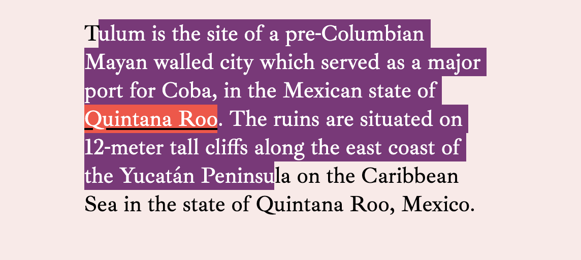
When we're thinking about choosing colors in design, we're always thinking about accessibility. Whenever colors touch, there is contrast and, if we're talking about the color contrast of text, it needs to be high enough to be readable. This benefits people with a variety of visual disabilities, but also everyone appreciates easily readable text.
Let's look at the color contrast considerations of just a single paragraph!
A link in a paragraph is probably set in another color to distinguish it as a link.
This link color has insufficient color contrast.
Focusable elements, like links, need to have focus styles as well. By default, we'll probably get a fuzzy blue outline, so we'll need to check that that has sufficient color contrast. And if we customize it, that customization will need good color contrast as well.
We'll also need a hover state for mouse users. Here, I'll use a background effect that covers about half the text. When you do something like that, the effect needs to be strong enough to be noticeable on hover, and the contrast needs to work on both backgrounds.
It's not ultra common, but you can style :visited links as well. The styling is somewhat limited (you can't change opacity or background, for example, because it's a security concern), but you can change the color. If you do that, it also needs proper contrast. Perhaps we could yank the color differentiation away with color: inherit; to somewhat de-emphasize the link but still indicate it.
Another thing to consider is people highlighting text. On my machine, I have it set up to highlight in an orange color by default (it's normally a light blue on macOS).
Hopefully, the link colors hold up under any highlight color choice a user might have. They tend to be very light shades.
The text selection colors on macOS Catalina
You can control text selection color through CSS as well with ::selection { background: purple; }. If you've done that, you have to check all your colors again to make sure you've gotten sufficient contrast.
You can try to take measures into your own hands by changing both color and background.
But note that the link inside the text has lost some of its contrast here. We could keep going down the rabbit hole by setting new colors on a::selection and every other element that has its own colorations within the text.
I'd say a good rule of thumb is to go very light if you're going to do a custom highlighting color and then not do any further customizations specifically for the selected text.
The idea for this post came from some bug reports I've gotten from people reporting that links are hard to read on this site when highlighting text, then focusing a link. I tried fixing it by getting more elaborate, but there are limits to what you can do.
I recently read Ethan Muller's Designing for Design Systems post and he makes a similar point about contrast, but across a color spectrum rather than across contexts. For example, your blue link color might work just fine on a few of your design system colors, but not so much on others.
There are a couple things that might help with this.
The generic advice of "every time you declare a background-color, declare a color" might help.
I've used parent-level classes like on-light to change colors of things broadly inside light-colored containers.
I've used a Sass mixin to help make it easier to change links and the link states, so I'm more apt to do it when changing backgrounds.
@mixin linkStyleText($linkColor) {
  a {
    // Update generic link styles with $linkColor
    &:hover,
    &:focus {
      // Also change the hover/focus styles, probably by altering $linkColor programatically
    }
  }
}

.variation {
   background: $someNewBGColor;
   linkStyleText($someNewLinkColor)
}
Well, thanks for coming on this journey with me. It just occurred to me that color contrast isn't quite as simple as checking a single link color on a background to make sure it passes. There might be a dozen or more things to check depending on how many things you colorize in your body copy.
The font in these screenshots is Ibarra Real Nova, which was just recently released on Google Fonts.
There are loads of microsites and developer tools for looking at color accessibility, including tools built right into browser DevTools. They often show you if a color passes AA or AAA WCAG guidelines. But color contrast is more complicated than that because there is a wide variety of vision impairments.
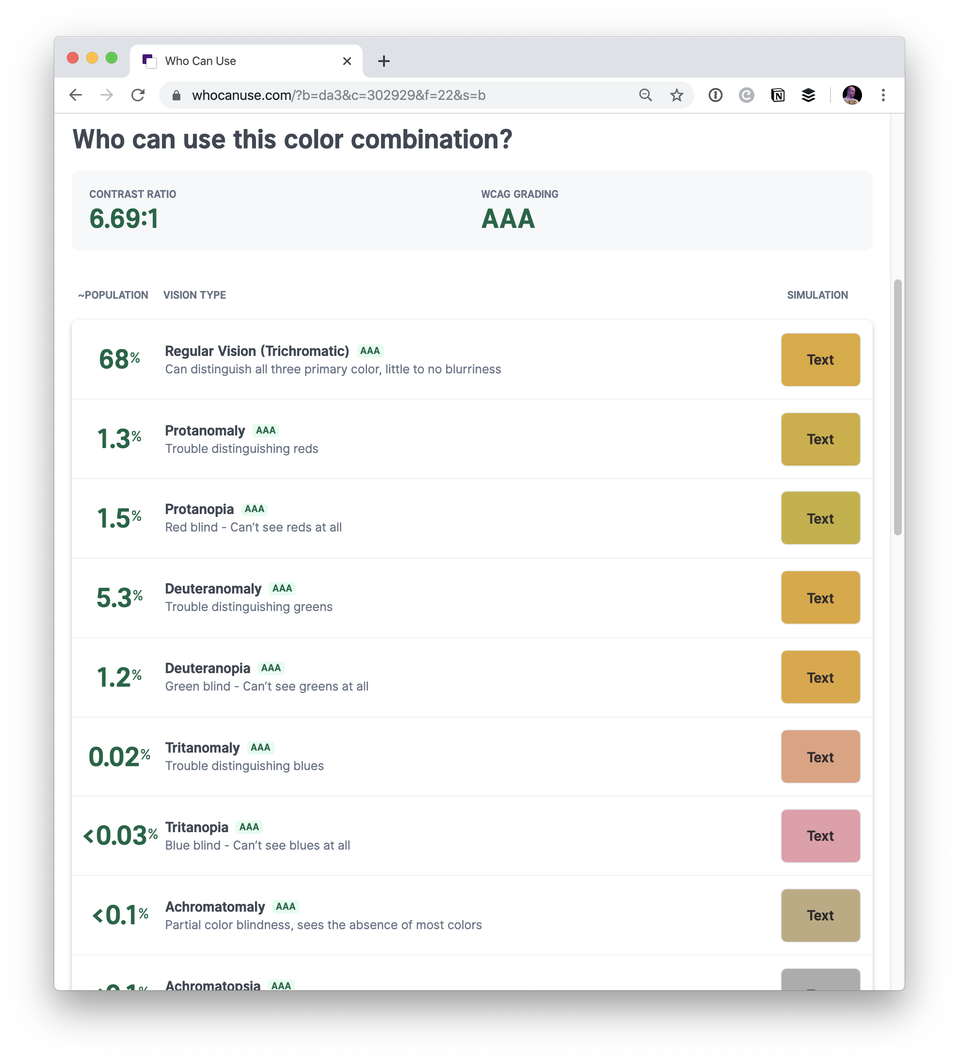
This site from Corey Ginnivan takes two colors and then shows you a simulation of different vision types (e.g. Tritanomaly, trouble distinguishing blues) and whether the colors still pass OK. It situational events, like whether a screen is in direct sunlight.
The team at Stripe explores how they’re refining their color palette to make it more accessible and legible for users across all their products and interfaces. Not only that but the team built a wonderful and yet entirely bonkers app for figuring out the ideal range of colors that they needed.
We built a web interface to allow us to visualize and manipulate our color system using perceptually uniform color models. The tool gave us an immediate feedback loop while we were iterating on our colors—we could see the effect of every change.
This tool is...whoa! I would love to learn a bit more about why they built this though as it looks like it wouldn’t have been a particularly quick and easy thing to put together. I wonder if that team has to support a wide-range of colors for their charts or data-visualization UI (as complex charts can often require a much larger range of colors for comparing bits of data effectively). Either way, this is pretty inspiring work.
This somewhat harkens to a couple of techniques for enforcing accessible colors, including one that uses custom properties with calc() and rgb by Josh Bader, and another by Facundo Corradini that also uses custom properties but with hsl with conditional statements.
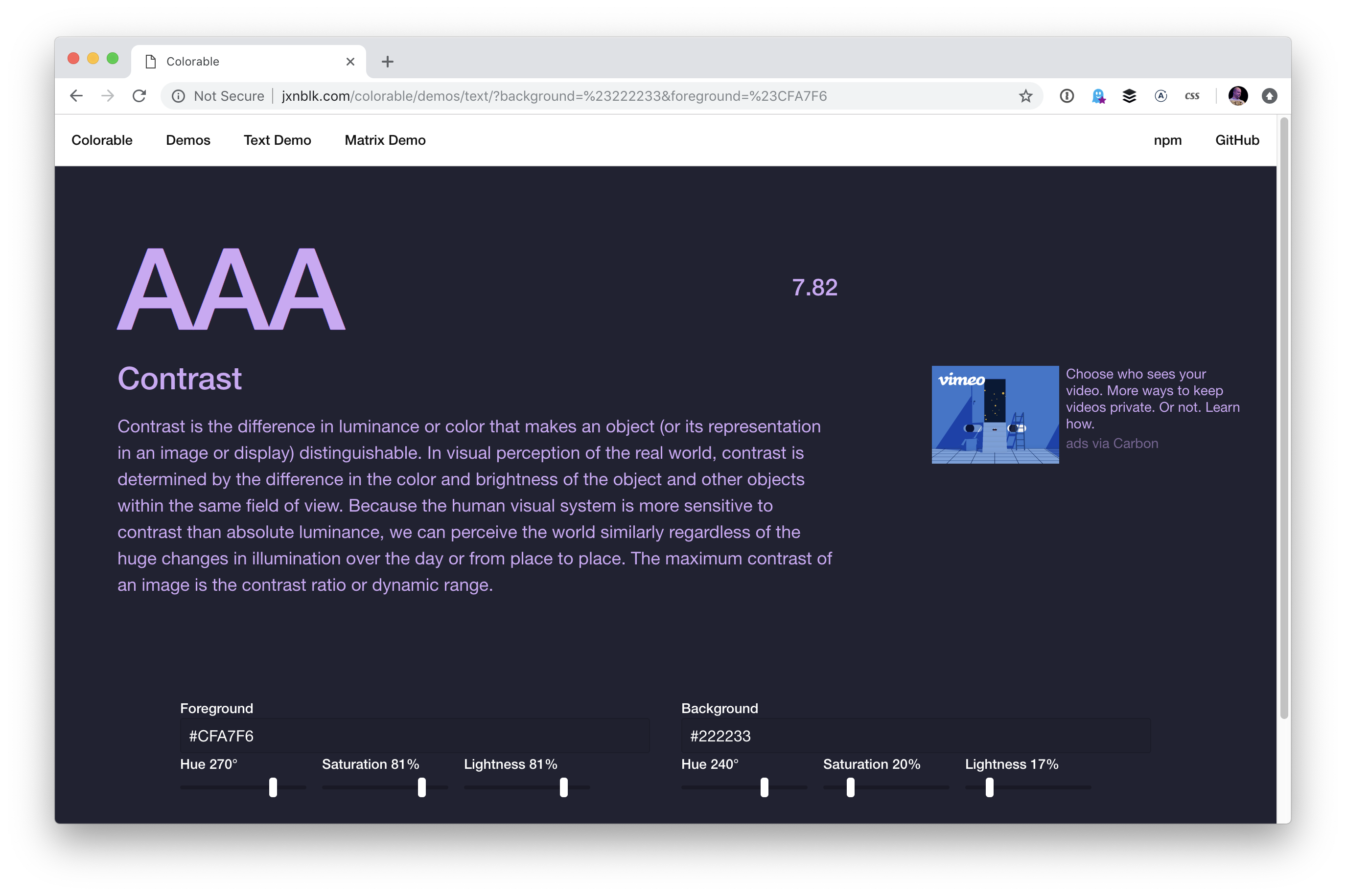
Accessibility is all the rage these days, specifically when it comes to color contrast. I’ve stumbled upon a couple of tools this week that I think are pretty nifty for helping make sure that all of the text on our websites is legible regardless of what background color they might have.
First up is the Accessible Color Generator which happens to be a wonderful tool for picking alternative colors. Let’s say you’re working on a brand with color X. You can generate a host of other complimentary colors like this:
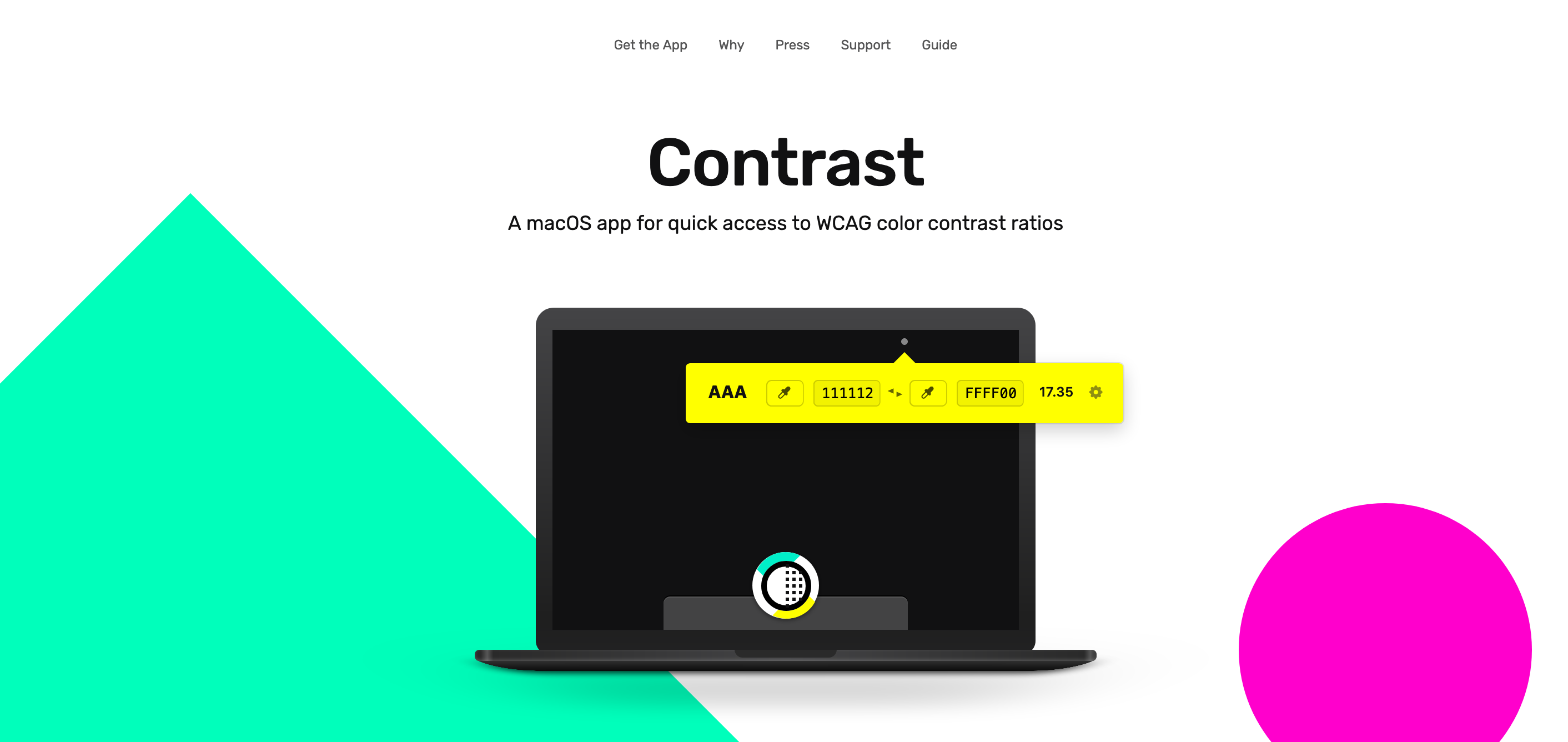
Next up is Contrast, a rather great MacOS app that sits in the menu bar at all times and helps identify accessible color pairings based on WCAG Guidelines. This one is particularly useful if you happen to be a designer:
This reminds me of a wonderful post about how the Lyft design team re-approached the way they use color in their app. Kevyn Arnott explains:
Color, at least on the surface, appears almost naively simple, yet as it scales across larger products it becomes unbelievably complex. You have thousands of people building products all at once, and those products are all heavily reliant on color. This puts a lot of pressure on the color system to ensure that all the products are being created consistently, but very hard to implement since it’s all too easy to apply colors on a one-off basis.
The team then went ahead and built ColorBox.io which lets you systematically build out a ton of colors for your design systems work. It’s pretty nifty!
Plus the folks over at GOV.UK made their own color accessibility tool called Contrast Checker which (as you have guessed by the name) helps check the contrast between the background of an element and the page itself:
And, of course, there's the trusty WebAIM contrast checker, which is a go-to for many developers out there.
So far, we've looked at tools that check contrast. But there is a class of tooling that can automate accessible contrasts during development. Josh Bader wrote up an approach that enforces high contrast by pairing CSS custom properties with the calc() function. Facundo Corradini did something similar that switches font color based on the background color behind it.
Oh! And we may have something to look forward to with the color-adjust property. It is proposed in the CSS Color Module Level 4 specification and could give browsers more control to adjust color values that are declared in the stylesheet. It's not really geared towards color contrast, but there's something interesting about handing off the responsibility of rendering color values to the browser based on certain conditions.
As you may know, the recent updates and additions to CSS are extremely powerful. From Flexbox to Grid, and — what we’re concerned about here — Custom Properties (aka CSS variables), all of which make robust and dynamic layouts and interfaces easier than ever while opening up many other possibilities we used to only dream of.
The other day, I was thinking that there must be a way to use Custom Properties to color an element's background while maintaining a contrast with the foreground color that is high enough (using either white or black) to pass WCAG AA accessibility standards.
It’s astonishingly efficient to do this in JavaScript with a few lines of code:
var rgb = [255, 0, 0];

function setForegroundColor() {
  var sum = Math.round(((parseInt(rgb[0]) * 299) + (parseInt(rgb[1]) * 587) + (parseInt(rgb[2]) * 114)) / 1000);
  return (sum > 128) ? 'black' : 'white';
}
This takes the red, green and blue (RGB) values of an element’s background color, multiplies them by some special numbers (299, 587, and 144, respectively), adds them together, then divides the total by 1,000. When that sum is greater than 128, it will return black; otherwise, we’ll get white. Not too bad.
The only problem is, when it comes to recreating this in CSS, we don't have access to a native if statement to evaluate the sum. So,how can we replicate this in CSS without one?
Luckily, like HTML, CSS can be very forgiving. If we pass a value greater than 255 into the RGB function, it will get capped at 255. Same goes for numbers lower than 0. Even negative integers will get capped at 0. So, instead of testing whether our sum is greater or less than 128, we subtract 128 from our sum, giving us either a positive or negative integer. Then, if we multiply it by a large negative value (e.g. -1,000), we end up with either very large positive or negative values that we can then pass into the RGB function. Like I said earlier, this will get capped to the browser’s desired values.
If my math is correct (and it's very possible that it's not) we get a total of 16,758, which is much greater than 255. Pass this total into the rgb() function for all three values, and the browser will set the text color to white.
At this point, everything seems to be working in both Chrome and Firefox, but Safari is a little cranky and gives a different result. At first, I thought this might be because Safari was not capping the large values I was providing in the function, but after some testing, I found that Safari didn't like the division in my calculation for some reason.
Taking a closer look at the calc() function, I noticed that I could remove the division of 1,000 by increasing the value of 128 to 128,000. Here’s how that looks so far:
Throw in a few range sliders to adjust the color values, and there you have it: a dynamic UI element that can swap text color based on its background-color while maintaining a passing grade with WCAG AA.
Below is a Pen showing how this technique can be used to theme a user interface. I have duplicated and moved the --accessible-color variable into the specific CSS rules that require it, and to help ensure backgrounds remain accessible based on their foregrounds, I have multiplied the --accessible-color variable by -1 in several places. The colors can be changed by using the controls located at the bottom-right. Click the cog/gear icon to access them.
A little while back, Facundo Corradini explained how to do something very similar in this post. He uses a slightly different calculation in combination with the hsl function. He also goes into detail about some of the issues he was having while coming up with the concept:
Some hues get really problematic (particularly yellows and cyans), as they are displayed way brighter than others (e.g. reds and blues) despite having the same lightness value. In consequence, some colors are treated as dark and given white text despite being extremely bright.
What in the name of CSS is going on?
He goes on to mention that Edge wasn’t capping his large numbers, and during my testing, I noticed that sometimes it was working and other times it was not. If anyone can pinpoint why this might be, feel free to share in the comments.
Further, Ana Tudor explains how using filter + mix-blend-mode can help contrast text against more complex backgrounds. And, when I say complex, I mean complex. She even goes so far as to demonstrate how text color can change as pieces of the background color change — pretty awesome!
So, count this as yet another approach to throw into the mix. It’s incredibly awesome that Custom Properties open up these sorts of possibilities for us while allowing us to solve the same problem in a variety of ways.
There are so many tools out there to help you pick colors. I totally get it! It's hard! When colors are done well, it's like magic. It adds a level of polish to a design that can really set it apart.
Let's look at some, then talk about this idea some more.
Generating random colors won’t guarantee pleasing palettes, especially if a bunch of random colors are paired together. PleaseJS can help build color schemes that work together. You provide it a base color and other options (like what type of color scheme) and it spits out colors for you.
generates attractive colors by default. More specifically, randomColor produces bright colors with a reasonably high saturation. This makes randomColor particularly useful for data visualizations and generative art.
It doesn't claim to make multiple colors part of a cohesive theme aside from passing in a base hue or luminosity.
But the thing about just being handed colors is...
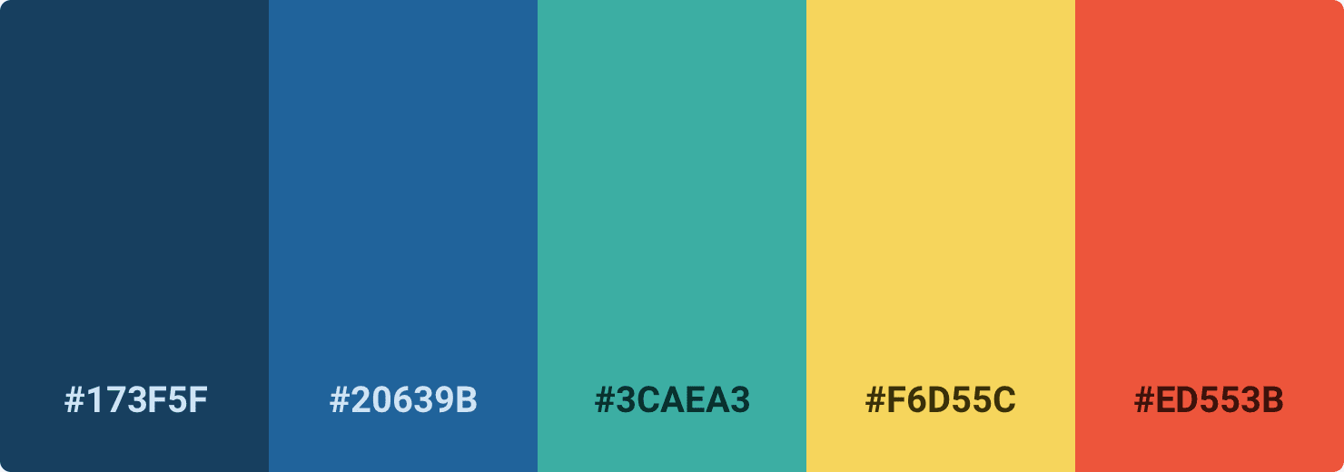
...they don't exactly tell you how to use them. Steve Schoger makes a point of this, rather hilariously in a blog post. This is a perfectly lovely color palette:
But if you just pick those colors and plop them onto a design, you could end up with something like this:
You might like that, but you'd be in the minority. It's not a refined design that gets out of the way and would be nice to use every day. Color usage is a bit more complicated than plopping five nice colors into a design. It's variations on those and using them in tasteful ways, like this: