Every person I’ve worked with has agreed that making the web more accessible is a good thing. We don’t want to disservice any of our users.
However, accessibility is nuanced, the work is not always straightforward, and responsibility can be unclear. After all, building websites requires many steps, and accessibility is impacted by the decisions at each stage; design, development, content creation.
In a world where we are more connected than ever before, everyone must have access to the same information and opportunities. Achieving web accessibility means removing any barriers that stand in the way of disadvantaged and or handicapped users accessing online content or services with the same capacity as other users.
In this guide, you will learn how to create a website that is accessible for screen-readers and SEO robots.
On May 20, 2021, Treehouse joins in the celebration of the tenth Global Accessibility Awareness Day, or GAAD. Source: ucsd.edu According to the Global Accessibility Awareness Day website, The purpose of GAAD is to get everyone talking, thinking and learning...
On February 24, 2021, Zoom announced it was making live transcription available on free accounts. Prior to this announcement, Zoom’s captions were available only to paid users. If users dependent on captions couldn’t afford a paid account, they were excluded...
The third WCAG Guideline, Adaptable, is part of the Perceivable principle and covers adapting to the different needs of users by allowing content to be received in multiple ways. WCAG 1.3: Use Semantic HTML One of the most important ways...
The second WCAG Guideline, Time-based Media, is part of the Perceivable principle and covers providing alternatives for audio and video content. Accessible Podcasts A text transcript can make audio-only content like a podcast accessible to deaf and hard-of-hearing users, as...
The first WCAG Guideline, Text Alternatives, is part of the Perceivable principle. The guideline states Provide text alternatives for any non-text content so that it can be changed into other forms people need, such as large print, braille, speech, symbols,...
I never see people asking why WWI is written out the way it is, either. Won’t people confuse that with the first Wonder Woman movie? Or the first season of Westworld? Or some new Weight Watchers product? I also never see people questioning technical numeronyms like P2P, S3, or W3C?
If you are seeing the term for the first time and are confused, it’s extremely easy to search for and figure out. There are heaping piles of examples of people using it for very legitimate sites, products, conferences, and more. It’s no more of a spell-checking foul as any other industry jargon and easy enough to ignore.
Plus, you can always introduce it with semantic HTML:
Like any other abbreviation, I observe the Web Content Accessibility Guideline’s (WCAG) Success Criterion 3.1.4. Like any other acronym or industry jargon, I spell out the term in full the first time it appears in my writing, then follow it up with the acronym it represents:
Throughout my career as a web design and development educator, I’ve noticed a consistent lack of attention paid to Accessibility principles in both college and bootcamp curriculum. The results of a 2018 WebAIM global survey of web accessibility practitioners was...
After we shared that in our newsletter, we got an interesting reply from Michael Gale:
What about folks who love their animated GIFs, but just didn’t want the UI to be zooming all over the place? Are they now forced to make a choice between content and UI?
I thought that was a pretty interesting question.
Also, whenever I see <img src="gif.gif"> these days, my brain is triggered into WELL WHAT ABOUT MP4?! territory, as I've been properly convinced that videos are better-in-all-ways on the web than GIFs. Turns out, some browsers support videos right within the <img> element and, believe it or not, you can write fallbacks for that, with — drumroll, please — for the <picture> element as well!
Let's take a crack at combining all this stuff.
Adding an MP4 source
The easy one is adding an additional <source> with the video. That means we'll need three source media files:
A fallback non-animated graphic when prefers-reduced-motion is reduce.
An animated GIF as the default.
An MP4 video to replace the GIF, if the fallback is supported.
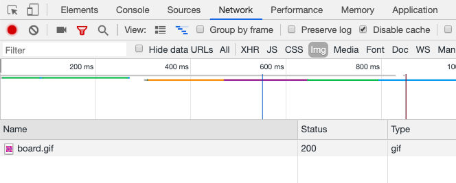
Under default conditions in Chrome, only the GIF is downloaded and shown:
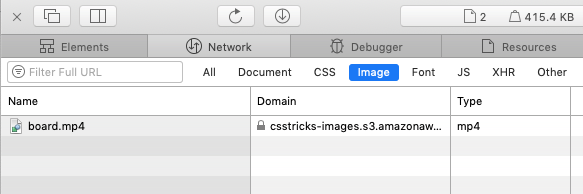
Under default conditions in Safari, only the MP4 is downloaded and shown:
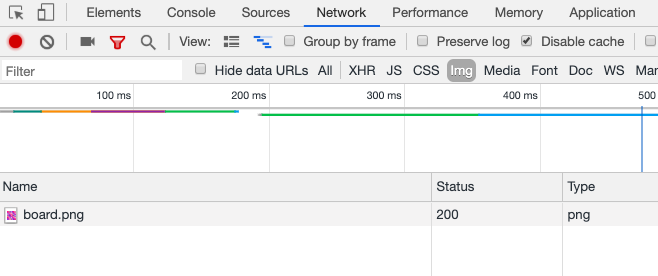
If you've activated prefers-reduced-motion: reduce in either Chrome or Safari (on my Mac, I go to System Preferences → Accessibility → Display → Reduce Motion), both browsers only download the static PNG file.
I tested Firefox and it doesn't seem to work, instead continuing to download the GIF version. Firefox seems to supportprefers-reduced-motion, but perhaps it's just not supported on <source> elements yet? I'm not sure what's up there.
Wouldn't it be kinda cool to provide a single animated source and have a tool generate the others from it? I bet you could wire that up with something like Cloudinary.
Adding a toggle to show the animated version
Like Michael Gale mentioned, it seems a pity that you're entirely locked out from seeing the animated version just because you've flipped on a reduced motion toggle.
It should be easy enough to have a <button> that would use JavaScript to yank out the media query and force the browser to show the animated version.
I'm fairly sure there is no practical way to do this declaratively in HTML. We also can't put this button within the <picture> tag. Even though <picture> isn't a replaced element, the browser still gets confused and doesn't like it. Instead, it doesn't render it at all. No big deal, we can use a wrapper.
We can position the button on top of the image somewhere. This is just an arbitrary choice — you could put it wherever you want, or even have the entire image be tappable as long as you think you could explain that to users. Remember to only show the button when the same media query matches:
There are a few differences between keyboards and screen readers and Léonie Watson highlights of them:
When using the tab key, keyboard focus and screen reader focus are synchronised with each other. The rest of the time, screen reader users have an enormous range of commands at their disposal for reading and navigating content independently of keyboard focus. The commands vary between screen readers, but they all have one thing in common: they’re tied to different HTML elements.
This is also a good reminder that screen readers behave differently from one another. It’s worth doing some research to see how our sites work in all these environments. One thing is clear from this post though: writing semantic and concise HTML is the best way to improve accessibility for both users with keyboards and screen readers. For example, Scott O'Hara has this recent post on best practices using the tabindex attribute to ensure accessible navigation using the keyboard.
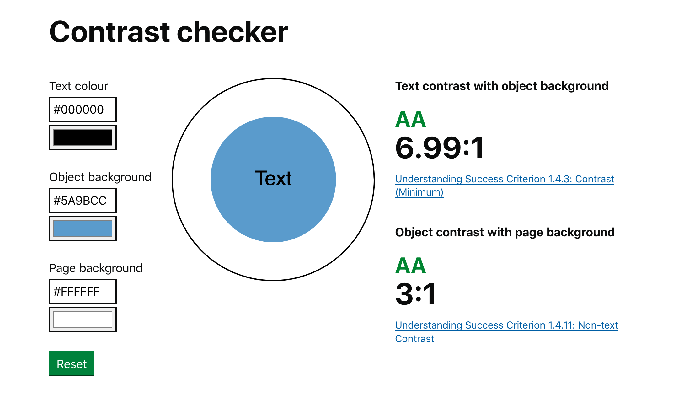
Accessibility is all the rage these days, specifically when it comes to color contrast. I’ve stumbled upon a couple of tools this week that I think are pretty nifty for helping make sure that all of the text on our websites is legible regardless of what background color they might have.
First up is the Accessible Color Generator which happens to be a wonderful tool for picking alternative colors. Let’s say you’re working on a brand with color X. You can generate a host of other complimentary colors like this:
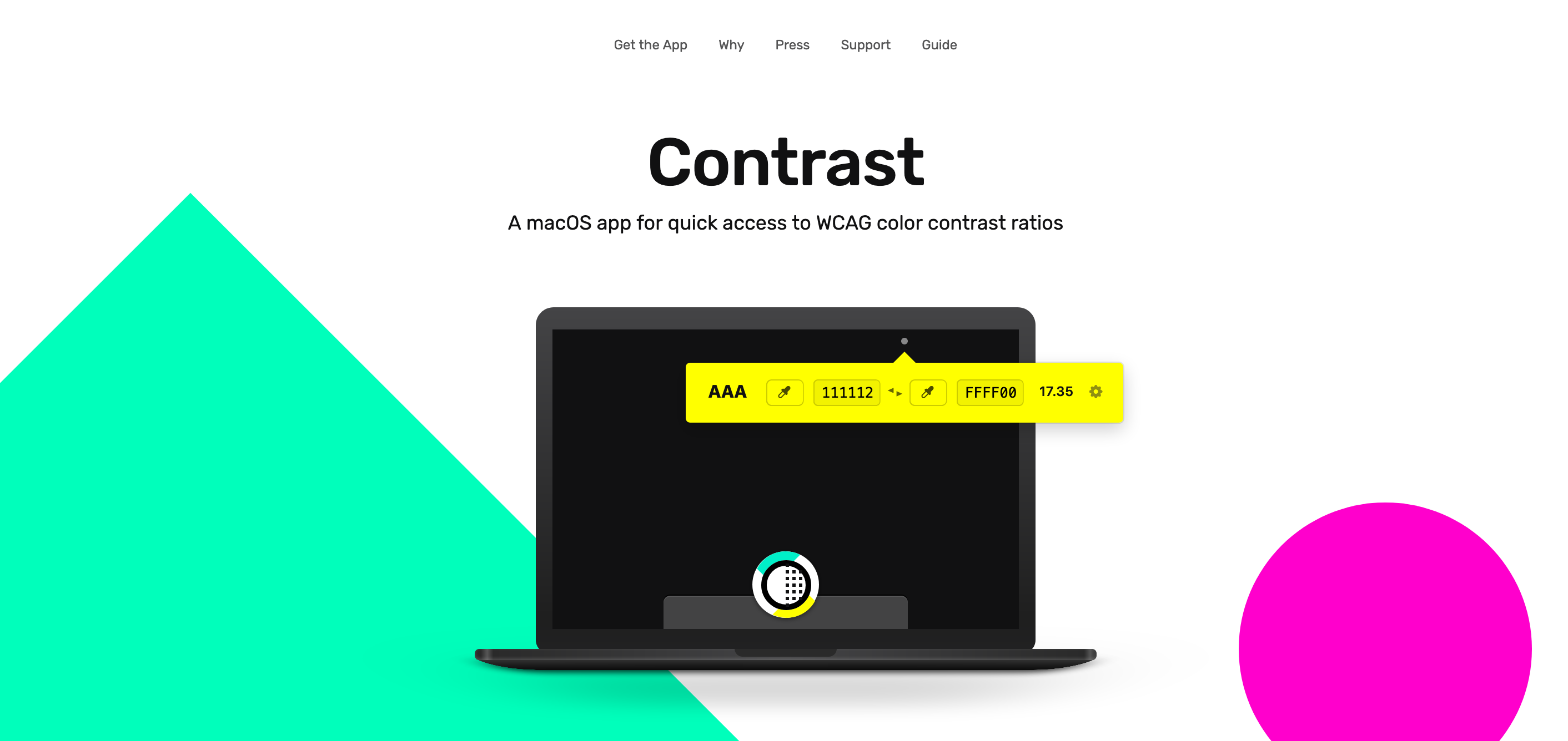
Next up is Contrast, a rather great MacOS app that sits in the menu bar at all times and helps identify accessible color pairings based on WCAG Guidelines. This one is particularly useful if you happen to be a designer:
This reminds me of a wonderful post about how the Lyft design team re-approached the way they use color in their app. Kevyn Arnott explains:
Color, at least on the surface, appears almost naively simple, yet as it scales across larger products it becomes unbelievably complex. You have thousands of people building products all at once, and those products are all heavily reliant on color. This puts a lot of pressure on the color system to ensure that all the products are being created consistently, but very hard to implement since it’s all too easy to apply colors on a one-off basis.
The team then went ahead and built ColorBox.io which lets you systematically build out a ton of colors for your design systems work. It’s pretty nifty!
Plus the folks over at GOV.UK made their own color accessibility tool called Contrast Checker which (as you have guessed by the name) helps check the contrast between the background of an element and the page itself:
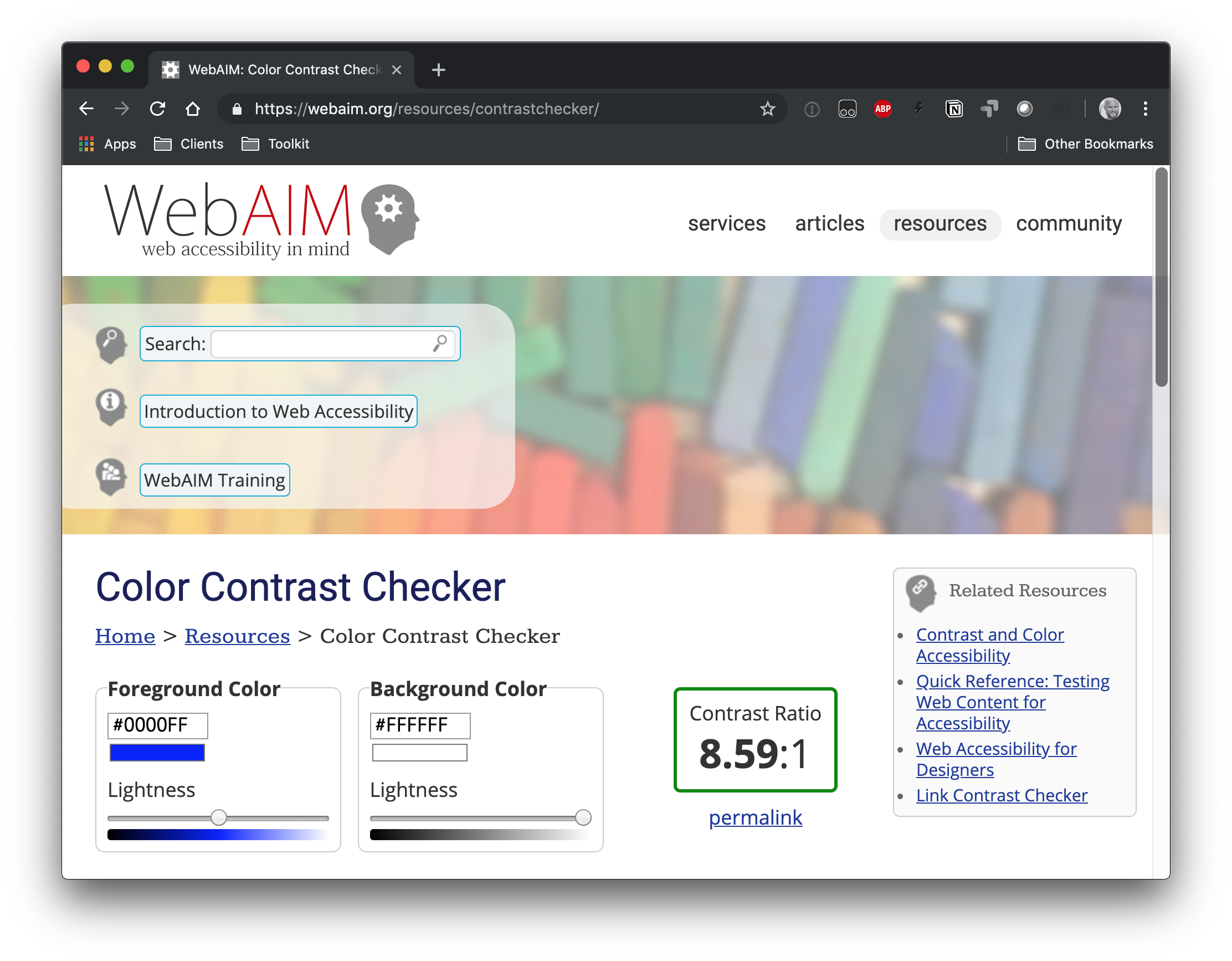
And, of course, there's the trusty WebAIM contrast checker, which is a go-to for many developers out there.
So far, we've looked at tools that check contrast. But there is a class of tooling that can automate accessible contrasts during development. Josh Bader wrote up an approach that enforces high contrast by pairing CSS custom properties with the calc() function. Facundo Corradini did something similar that switches font color based on the background color behind it.
Oh! And we may have something to look forward to with the color-adjust property. It is proposed in the CSS Color Module Level 4 specification and could give browsers more control to adjust color values that are declared in the stylesheet. It's not really geared towards color contrast, but there's something interesting about handing off the responsibility of rendering color values to the browser based on certain conditions.
I like the this wrap-up statement from Hidde de Vries:
In modern browsers, our markup becomes an accessibility tree that ultimately informs what our interface looks like to assistive technologies. It doesn’t matter as much whether you’ve written this markup:
in a .html file
in Twig, Handlebars or Nunjucks
as the <template> in a Vue Single File Component
exported in the JSX of your React component
outputted by a weird legacy CMS
It is which markup that determines if your site is pleasurable to experience for AT users. In short: it’s the markup that matters
As a front-end developer, you'll find yourself writing markup in lots of different places with lots of different technologies. I think it behooves you think of how best to write it regardless of where and how.
Earlier this month Eric Bailey wrote about the current state of accessibility on the web and why it felt like fighting an uphill battle:
As someone with a good deal of interest in the digital accessibility space, I follow WebAIM’s work closely. Their survey results are priceless insights into how disabled people actually use the web, so when the organization speaks with authority on a subject, I listen.
WebAIM’s accessibility analysis of the top 1,000,000 homepages was released to the public on February 27, 2019. I’ve had a few days to process it, and frankly, it’s left me feeling pretty depressed. In a sea of already demoralizing findings, probably the most notable one is that pages containing ARIA—a specialized language intended to aid accessibility—are actually more likely to have accessibility issues.
Following up from that post, Ethan Marcotte jotted down his thoughts on the matter and about who has the responsibility to fix these issues in the long run:
Organizations like WebAIM have, alongside countless other non-profits and accessibility advocates, been showing us how we could make the web live up to its promise as a truly universal medium, one that could be accessed by anyone, anywhere, regardless of ability or need. And we failed.
I say we quite deliberately. This is on us: on you, and on me. And, look, I realize it may sting to read that. Hell, my work is constantly done under deadline, the way I work seems to change every year month, and it can feel hard to find the time to learn more about accessibility. And maybe you feel the same way. But the fact remains that we’ve created a web that’s actively excluding people, and at a vast, terrible scale. We need to meditate on that.
I suppose the lesson I’m taking from this is, well, we need to much, much more than meditating. I agree with Marcy Sutton: accessibility is a civil right, full stop. Improving the state of accessibility on the web is work we have to support. The alternative isn’t an option. Leaving the web in its current state isn’t fair. It isn’t just.
I entirely agree with Ethan here – we all have a responsibility to make the web a better place for everyone and especially when it comes to accessibility where the bar is so very low for us now. This isn’t to say that I know best, because there’s been plenty of times when I’ve dropped the ball when I’m designing something for the web.
What can we do to tackle the widespread issue surrounding web accessibility?
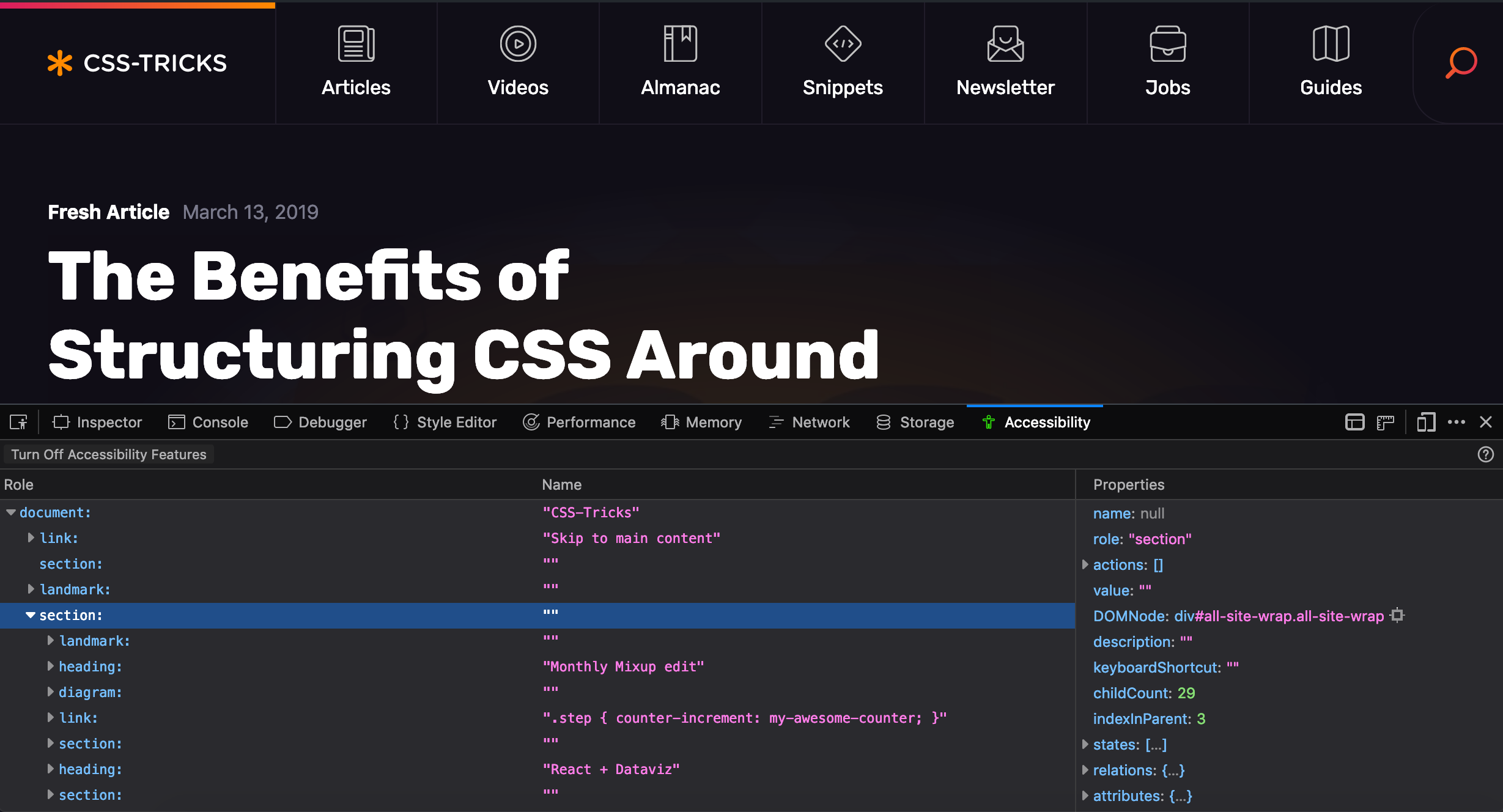
Well, as Eric mentions in his post, it’s first and foremost a problem of education and he points to Firefox and their great accessibility inspector as a tool to help us see and understand accessibility principles in action:
This inspector is not meant as an evaluation tool. It is an inspection tool. So it will not give you hints about low contrast ratios, or other things that would tell you whether your site is WCAG compliant. It helps you inspect your code, helps you understand how your web site is translated into objects for assistive technologies.
Chris also wrote up some of his thoughts a short while ago, including other accessibility testing tools and checklists that can help us get started making more accessible experiences. The important thing to note here is that these tools need to be embedded within our process for web design if they’re going to solve these issues.
We can’t simply blame our tools.
I know the current state of web accessbility is pretty bad and that there’s an enormous amount of work to do for us all, but to be honest, I can’t help but feel a little optimistic. For the first time in my career, I’ve had designers and engineers alike approach me excitedly about accessibility. Each year, there are tons of workshops, articles, meetups, and talks (and I particularly like this talk by Laura Carvajal) on the matter meaning there's a growing source of referential content that can teach us to be better.
And I can’t help but think that all of these conversations are a good sign – but now it’s up to us to do the work.
While [lots of divs, inline styles, focus management problems] are valid concerns, it should be noted that nothing in React prevents us from building accessible web apps.
True. I'm quite capable (and sadly, guilty) of building inaccessible interfaces with React or without.
I've long told people that one way to level up your front-end design and development skills, especially in your early days, is to understand how to change classes. I can write a few lines of JavaScript to add/remove an active class and build a tabbed interface quite quickly. But did I build the HTML in such a way that it's accessible by default? Did I deal with keyboard events? Did I deal with all the relevant aria-* attributes? I'll answer for myself here: no. I've gotten better about it over time, but sadly my muscle memory for the correct pattern isn't always there.
I'm optimistic though. For example, React has a blessed tabs solution that is accessible out of the box. I reach for those, and thus my muscle memory for building tabs now results in a more accessible product. And when I need to do routing/linking with React, I reach (get it?!) for Reach Router, and I get accessibility "baked in," as they say. That's a powerful thing to get "for free," again, as they say.
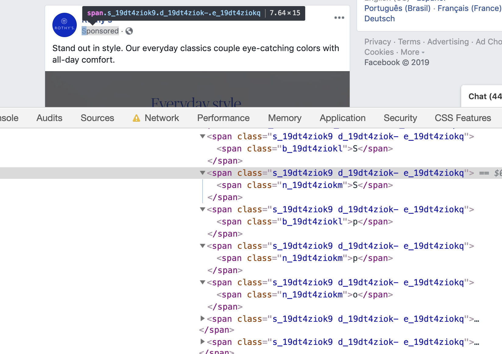
"Why do I need a 4Ghz quadcore to run facebook?" This is why. A single word split up into 11 HTML DOM elements to avoid adblockers. pic.twitter.com/Zv4RfInrL0
I popped over to Facebook to verify that and what I saw was a different and even more nested mess:
They are trying to fight your ad blocker browser extension. Of course they are. I'm sure at their scale not doing this means losing millions of dollars. But I wonder if it's really losing money when you factor in losing trust, and potentially losing people on the platform entirely.
It just feels so rude, doesn't it? Like a user specifically installs technology onto their computer in order to exert some control over what they allow onto their computers and into their eyeballs. And they are saying, "No, we do not respect that choice. We are going to fight your technology with our technology and force feed this stuff onto your computer and your eyeballs." Doesn't sit right.
I'm not unaware that ad blockers have ad adverse effect on the ability for websites to make money. That's quite literally how I make money. But I don't want to do it fighting and at the expense of breaking trust. I want to do it gracefully while building trust.
Anyway.
I wonder what writing HTML to help ad blockers would look like instead:
This span-based lettering stuff makes me think of libraries like Splitting.js and Lettering.js that break up text into individual <span>s for styling reasons.
Turns out that doesn't affect on-page search (i.e. if you search for "dog," you'll find <span>d</span><span>o</span><span>g</span>), but it does affect some screen readers in that they will treat each letter distinctly, which can result in pretty awful audio output, like pauses between letters where you wouldn't expect or want them.
Icons are great and all, but as we've been shown time and time again, they often don't do the job all by themselves. Even if you do a good job with the accessibility part and make sure there is accompanying text there for assistive technology, in an ironic twist, you might be confusing people who browse visually, like the situation Matt Wilcox describes with his mother in this linked article.