Useful JavaScript Data Grid Libraries

This article is a sponsored by Bryntum

While there exist numerous data grid libraries with similar features out in the world, not all may adequately fit your business and app use cases. When choosing a suitable data grid library for your application, you must consider its feature set, performance, price, license, and support, among other factors. In this article, you’ll get a rundown of some popular data grid libraries that would be a great addition to any data-heavy application.

But first, let’s break down what a data grid is. A data grid is a table component that usually loads, presents, and manipulates a large data set. They typically ship with extended functionality like data filtering, sorting, selection, streaming, aggregation, highly configurable columns and rows, and so on to help users better read and handle the massive dataset. More specialized data grids even embed other components like charts and enable in-table editing. Owing to the enormous data they handle, data grids are often built with efficiency and streamlined performance in mind. Moreover, they tend to be highly customizable and extendable to meet niche use cases related to the data they present.

Data grids can be applied to a variety of use cases. For one, you could use them for simple tables while taking advantage of their enhanced search, filtering, aggregation, and functionality. Data grids can be essential on KPI dashboards to get a unified view of multiple indicators from several data sources. Another area they can be useful is on financial dashboards, where tracking and visualizing accounting and financial information is crucial. Data grids can also be helpful in inventory management systems to track and manage goods, orders, sales, and other commercial operations. These are just a few use cases they can be instrumental in.

This article will run down a list of popular data grid libraries specialized for handling large datasets. They will be evaluated on a number of different factors:

  • Feature set,
  • Price,
  • Licensing options and open source status,
  • Frontend framework support,
  • Ease of customization and extensibility,
  • Performance,
  • Documentation, learning resources, community, and offered support.
AG Grid

AG Grid is a mature and fast data grid with features such as:

  • Row and range selection;
  • Filtering across multiple data types;
  • Cell rendering;
  • Advanced in-table editing;
  • Grouping, pivoting, aggregation, and tree data;
  • CSV and Excel import and export;
  • Drag-and-drop functionality;
  • Clipboard functionality;
  • Embeddable components and accessories like tools panels, sidebars, menus, and so on;
  • Chart integration;
  • Internationalization;
  • Keyboard navigation.

Originally designed for Angular, it now also supports vanilla JavaScript, React, and Vue. It supports live data streaming. The grid’s layout and styling of its columns and rows can be customized through themes and CSS/SASS styling. “Accessories,” external components, and charts can be added to it to extend its functionality. While it offers a basic open source community version that is free to use, it does offer a licensed paid enterprise version with expanded functionality. The documentation available on its site is very detailed, but AG Grid only provides dedicated support for its enterprise product.

Bryntum Grid

Bryntum Grid is a pure JavaScript cross-browser compatible high-performance data grid. While it has a rich feature set, some of its more notable features include:

  • Inline cell editing;
  • Cell tooltips;
  • Customizable cells;
  • Localization and responsiveness;
  • Drag-and-drop columns and rows;
  • Column reordering and resizing;
  • Row filtering;
  • Keyboard navigation & Accessibility;
  • Scrollable grid sections;
  • Row grouping;
  • Grouped headers;
  • Summaries and aggregation;
  • Search and quick find;
  • Sorting;
  • Tree view;
  • PDF, PNG, and Excel export;
  • Virtual rendering;
  • Paging;
  • Multiple themes.

It integrates with any frontend framework, including Angular, React, and Vue. Bryntum Grid is optimized for superior rendering and scrolling performance through its virtual rendering. You can check out Bryntum’s detailed performance review here. When it comes to cost, Bryntum offers their grid on per-product pricing at a reasonable price. You can also purchase their complete bundle that includes other useful components like schedulers, Gantt charts, and calendars, among others. The grid is not open-sourced.

Bryntum offers training, webinars, guides, and various levels of extensive support that come in handy when learning to use the grid. Its API documentation is robust and covers multiple frontend frameworks, and there is a multitude of live demos on its site that demonstrate the grid’s powerful features.

Handsontable

Handsontable is a spreadsheet-like data grid with these note-worthy features:

  • Custom column headers and menus;
  • Summaries;
  • Column and row hiding, moving, and freezing;
  • Column filtering, sorting, groups;
  • Column and row virtualization;
  • Custom row headers;
  • Row sorting, pre-population, and trimming;
  • Clipboard functionality;
  • Selection;
  • Cell merging and rendering;
  • Cell editors and validators;
  • Comments;
  • Multiple cell types like dates, passwords, checkboxes, and so on;
  • CSV and other file type exports;
  • Internationalization.

It works with plain JavaScript, Angular, React, and Vue. Handsontable can efficiently handle large datasets without performance problems. You can build and use your own custom plugins to extend the functionality of the grid. It has a free and open-source version for personal projects and a commercially licensed version that you can purchase. The Handsontable commercial offers extended support. Its API documentation is thorough, and its site provides many examples, guides, case studies, and a developer forum.

DHTMLX JavaScript DataGrid

The DHTMLX JavaScript DataGrid is a grid that ships as part of the DHTMLX Suite UI widgets library. Some of its important features include:

  • Data editing, formatting, sorting, and filtering;
  • Row and cell selection;
  • Column drag-and-drop and freezing;
  • Column and row reordering;
  • Tooltips;
  • Excel exports;
  • Keyboard navigation.

The DHTMLX DataGrid is compatible with React, Angular, and Vue. The grid’s rows, cells, footers, headers, and tooltips can be customized through its API with CSS styling and templates. The library it’s included in is not open source. It has a free standard edition with a limited API that sometimes makes it cumbersome to nearly impossible to adapt the component to basic professional requirements. Its PRO paid licensed edition ships with expanded functionality that solves the aforementioned issue. On its website, you can find in-depth documentation, samples, demos, and a community forum. Expanded technical support is included only in the PRO edition.

Kendo UI Data Grid

The Kendo UI Grid is a data grid that is part of the Kendo UI library that bundles several other components. A couple of its essential features include:

  • Excel and PDF selection, copying, and exports;
  • Inline, pop-up, and batch data editing;
  • Custom data editors and validators;
  • Column virtualization for local and remote data;
  • Filtering, sorting, selection, search, sorting, and drag-and-drop;
  • Row and toolbar templates;
  • Frozen, sticky, resizable, and reorderable columns;
  • Column menus and multi-column headers;
  • Globalization and localization.

The Kendo UI library is available in jQuery, Angular, Vue, and React versions. The grid supports live data loading. The libraries are native to each framework it’s released for and are not wrappers. As such, they have fast native performance. Its column and row virtualization features render only visible parts of the grid for better performance. The library ships with themes that can be used to customize the grid. The other components available in the library can be embedded within the grid to extend its functionality. The library is not open source nor free. The grid has comprehensive documentation, demos, and samples, and its site has a knowledge base. It also has a community forum and feedback portal. Expanded support services are offered to its customers who purchase licenses.

DevExtreme Data Grid

The DevExtreme Data Grid ships as part of the DevExtreme component suite. Its noteworthy features include:

  • Filtering, sorting, grouping, and searching;
  • Data summaries with aggregate functions;
  • Master-detail layouts;
  • Row, batch, cell, form, and pop-up data editing;
  • Data validation;
  • Single to multi-select record selection;
  • Fixed, resizable, recordable, and hidden columns;
  • Customizable Excel exports.

The suite is compatible with jQuery, Angular, React, and Vue. It has a non-commercial license that is free but has limited features. Its complete license version isn’t free but enables pro features. The grid can load and bind to the large datasets server side. However, beyond 10,000 rows in the grid, it is easy to spot the frame rate dropping when scrolling. The suite offers a theme builder that you can use to generate a custom theme for the data grid. On the DevExtreme site, demos, code examples, exhaustive docs, and webinars are made available, and you can file tickets if you encounter bugs. Dedicated support is only offered to complete license holders.

FusionGrid

FusionGrid is a data grid that is part of the FusionCharts library. It ships with these features:

  • Filter, sort, and search;
  • CSV, JSON, and Excel exports;
  • Row and cell selection;
  • Nested columns and column grouping;
  • Real-time data updates.

FusionGrid offers free licenses for non-commercial use. Enterprise customers have to purchase licenses that are available at a variety of pricing tiers. The grid works with plain JavaScript and frontend frameworks like Angular, React, and Vue. FusionGrid supports the loading of large datasets without hampering performance. It is not open-sourced, and its site provides limited documentation and examples, so only paid license holders receive dedicated technical support.

Tabulator

Tabulator is an open-source and free data grid with a rich feature set that includes:

  • Keyboard navigation and touch-friendliness;
  • Tree structures;
  • Connect tables;
  • Row, cell, and column context menus;
  • User action history, undo or redo actions, and a clipboard;
  • Column summaries and calculations;
  • Localization and RTL text direction support;
  • CSV and Excel exports;
  • Themes;
  • Data editing, validation, formatting, persistence, and mutation;
  • Row selection and grouping;
  • Filtering and sorting;
  • Column and row freezing.

It is written in pure JavaScript and works with several frontend frameworks, including Angular, React, and Vue. Large data sets are rendered in it fast with a virtualized DOM. Customization of the grid is only limited to CSS styling. It has comprehensive documentation and examples on its site. The vibrant community of contributors behind it can be interacted with on Discord and GitHub.

Toast UI Grid

Toast UI Grid is part of the Toast UI library. Some of its notable features are:

  • Data summaries and calculations;
  • Hierarchical tree data representation;
  • Custom data input and editing elements;
  • Themes;
  • Keyboard navigation;
  • Clipboard functionality;
  • Custom cell renderers;
  • Virtual scrolling;
  • Frozen, hidden, resizable, and reorderable columns;
  • Selection and sorting;
  • Cell merging;
  • Data validation.

The grid is free and open source. It is distributed in three packages for plain Javascript, React, and Vue. Its enhanced virtual scrolling functionality lets you load large datasets without degrading performance. The grid can be customized using themes for a unique look and feel. Its website offers exhaustive documentation and detailed examples on the grid.

FlexGrid

FlexGrid is part of the GrapeCity Wijmo UI component library. Some of its features include:

  • Client-side and server-side data binding;
  • Cell customization;
  • Cell data maps;
  • Virtual scrolling;
  • Clipboard functionality;
  • Editing, sorting, and filtering;
  • Grouping and aggregation;
  • Tree Grids and a Master-Detail mode;
  • Excel imports and exports;
  • PDF exports and printing;
  • Globalization and Right-to-left text direction support;
  • Row and column pinning and freezing;
  • Sticky headers;
  • Search and filtering;
  • Column drag-and-drop reordering and resizing;
  • Cell merging.

FlexGrid works with Angular, React, Vue, and PureJS. Its bundle is small, and the grid is fast and loads quickly. You can customize cell content with data maps. Unfortunately, Wijmo is not free or open-source. The GrapeCity site provides in-depth documentation, a knowledge base, a forum, case studies, white pages, demos, webinars, and video content. Technical support is offered at a premium, separate from the license purchase.

FancyGrid

FancyGrid is a grid library with chart integration. Its notable features include:

  • Filtering and sorting;
  • Chart integration;
  • Theming;
  • Checkbox selection;
  • Row and header grouping;
  • Forms;
  • Excel and CSV export;
  • Internationalization;
  • Column reordering;
  • Grid to grid drag-and-drop;
  • Tree Grid, sub-grids, and sub-forms.

This library works with plain JavaScript, Angular, React, Vue, and jQuery. You can extend its functionality by embedding charts and customizing it using the themes it offers. Its source code is available on Github, and licenses are available at several tiers. Its documentation is good and contains detailed examples. Technical support for license holders is available through Slack and other communication channels.

Webix Data Table

Webix Data Table is part of the Webix UI library and includes features like:

  • Editing, sorting, filtering, and validation;
  • Row and column drag-and-drop and resizing;
  • Clipboard support;
  • Column grouping;
  • Header menus;
  • Sparklines;
  • Sub-rows and sub-views.

Webix is offered on a free and a paid license tier. It works with jQuery, Angular, React, and Vue. Its components are small and written with pure JavaScript. Unfortunately, the lack of row virtualization makes the component unsuitable for big data sets unless you use paging. You can customize the grid only using CSS. The standard version of the library is free and open source, while you need to purchase a license to access its enterprise version. Detailed documentation, webinars, tutorials, and samples are available on its site. Technical support is only available for license holders.

Conclusion

Data grids are essential in developing any modern SaaS or internal business-critical applications. A good table component should offer advanced functionality like configurable cells, rows, and columns, sorting, filtering, grouping, summaries, and so on. Data grids mainly improve the readability and make the manipulation of large datasets easier. Professional data grids should also be able to handle massive amounts of data without degrading your app’s performance. They also need to be customizable and extensible to fit niche use cases related to the data they present. When choosing a data grid library, you have to consider the frameworks it works with, pricing, licensing, technical support, and whether its feature set fits your business needs.

Core Web Vitals Tools To Boost Your Web Performance Scores

The success of your website depends on the impression it leaves on its users. By optimizing your Core Web Vitals scores, you can gauge and improve user experience. Essentially, a web vital is a quality standard for UX and web performance set by Google. Each web vital represents a discrete aspect of a user’s experience. It can be measured based on real data from users visiting your sites (field metric) or in a lab environment (lab metric).

In fact, several user-centric metrics are used to quantify web vitals. They keep evoling, too: as there were conversations around slowly adding accessibility and responsiveness as web vitals as well. In fact, Core Web Vitals are just a part of this large set of vitals.

It’s worth mentioning that good Core Web Vitals scores don’t necessarily mean that your website scores in high 90s on Lighthouse. You might have a pretty suboptimal Lighthouse score while having green Core Web Vitals scores. Ultimately, for now it seems that it’s only the latter that contribute to SEO ranking — both on mobile and on desktop.

While most of the tools covered below only rely on field metrics, others use a mix of both field and lab metrics. 1

PageSpeed Compare

PageSpeed Compare is a page speed evaluation and benchmarking tool. It measures the web performance of a single page using Google PageSpeed Insights. It can also compare the performance of multiple pages of your site or those of your competitors’ websites. It evaluates lab metrics, field metrics, page resources, DOM size, CPU time, and potential savings for a website. PageSpeed Compare measures vitals like FCP, LCP, FID, CLS, and others using land and field data.

The report it generates lists the resources loaded by a page, the overall size for each resource type category, and the number of requests made for each type. Additionally, it examines the number of third-party requests and resources a page makes. It also lists cached resources and identifies unused Javascript. PageSpeed Compare checks the DOM of the page and breaks down its size, complexity, and children. It also identifies unused images and layout shifts in a graph.

When it comes to CPU time, the tool breaks down CPU time spent for various tasks, Javascript execution time, and CPU blocking. Lastly, it recommends optimizations you can make to improve your page. It graphs server, network, CSS, Javascript, critical content, and image optimizations to show the potential savings you could gain by incorporating fixes into your site. It gives resource-specific suggestions you could make to optimize the performance of your page. For example, it could recommend that you remove unused CSS and show you the savings this would give in a graph.

PageSpeed Compare provides web performance reports in a dashboard-alike overview with a set of graphs. You can compare up to 12 pages at once and presents the report in a simple and readable way since it uses PageSpeed Insights to generate reports. Network and CPU are throttled for lab data tests for more realistic conditions.

Bulk Core Web Vitals Check

Experte's Bulk Core Web Vitals Check is a free tool that crawls up to 500 pages of the entire domain and provides an overview of the Core Web Vitals scores for them. Once the tool has crawled all the pages, it starts performing a Core Web Vitals check for each page and returns the results in a table. Running the test takes a while, as each web page test is done one at a time. So it’s a good idea to let it run for 15-30 mins to get your results.

What’s the benefit then? As a result, you get a full overview of the pages that perform best, and pages that perform worst — and can compare the values over time. Under the hood, the tool uses Pagespeed Insights to measure Core Web Vitals.

You can export the results as a CSV file for Excel, Google Sheets or Apple Pages. The table format in which the results are returned makes it easy to compare web vitals across different pages. The tests can be run for both mobile and desktop.

Alternatively, you can also check David Gossage's article on How to review Core Web Vitals scores in bulk, in which he shares the scripts and how to get an API key to run the script manually without any external tools or services.

Treo

If you’re looking for a slightly more advanced option for bulk Core Web Vitals check, this tool will cover your needs well. Treo Site Speed also performs site speed audits using data from the Chrome UX Report, Lighthouse and PageSpeed Insights.

The audits can be performed across various devices and network conditions. Additionally though, with Treo, you can track the performance of all your pages across your sitemap, and even set up alerts for performance regressions. Additionally, you can receive monthly updates on your website’s performance.

With Treo Site Speed, you can also benchmark a website against competitors. The reports Treo generates are comprehensive, broken down by devices and geography. They are granular and available at domain and page levels. You can export the reports or access their data using an API. They are also shareable.

WebPageTest Core Web Vitals Test

WebPageTest is, of course, a performance testing suite on its own. Yet one of the useful features it provides is a detailed breakdown of Core Web Vitals metrics and pointers to problematic areas and how to fix them.

There are also plenty of Core Web Vitals-related details in the actual performance audit, along with suggestions for improvements which you can turn on without changing a line of code. For some, you will need a pro account though.

Cumulative Layout Shift Debuggers

Basically, the CLS Debugger helps you visualize CLS. It uses the Layout Instability API in Chromium to load pages and calculate their CLS. The CLS is calculated for both mobile and desktop devices and takes a few minutes to complete. The network and CPU are throttled during the test, and the pages are requested from the US.

The CLS debugger generates a GIF image with animations showing how the viewport elements shift. The generated GIF is important in practically visualizing layout shifts. The elements that contribute most to CLS are marked with squares to see their size and layout shift visually. They are also listed in a table together with their CLS scores.


CLS debugger in action: highlighting the shifts frame by frame.

Although the CLS is calculated as a lab metric initially, the CLS debugger receives CLS measurements from the Chrome UX Report as well. The CLS, then, is a rolling average of the past 28 days. The CLS debugger allows you to ignore cookie interstitials — plus, you can generate reports for specific countries, too.

Alternatively, you can also use the Layout Shift GIF Generator. The tool is available on its webpage or as a command line tool. With the CLI tool, you can specify additional options, such as the viewport width and height, cookies to supply to the page, the GIF output options, and the CLS calculation method.

Polypane Web Vitals

If you want to keep your Core Web Vitals scores nearby during development, Polypane Web Vitals is a fantastic feature worth looking into. Polypane is a standalone browser for web development, that includes tools for accessibility, responsive design and, most recently, performance and Core Web Vitals, too.

You can automatically gather Web Vitals scores for each page, and these are then shown at the bottom of your page. The tool also provides LCP visualization, and shows layout shifts as well.

Noteable Mentions
  • Calibre’s Core Web Vitals Checker allows you to check Core Web Vitals for your page with one click. It uses data from the Chrome UX Report and measures LCP, CLS, FID, TTFB, INP and FCP.

Kendo UI For Angular Data Grid And Angular Material: Have Your Cake And Eat It Too

This article is a sponsored by Progress Kendo UI

Designing and building data tables that handle large amounts of data requires a lot of consideration, planning, expertise, and time. The data tables have to be easy to read and navigate, allow users to search, filter, and group existing data as well as be able to load new data seamlessly. Some use cases may require that the data be editable within the table. While there exist tables like the Angular Material Table that can handle some basic tasks, the majority lack these crucial features. With the Kendo UI for Angular Data Grid, you can simplify the process of adding data tables with a material design feel to your application.

But what is Kendo UI? Kendo UI for Angular is a feature-rich component library that ships with more than 100 native Angular components. It covers everything from UX, performance, design, accessibility, globalization, and data handling. It offers three themes: standard, material, and bootstrap, and provides a theme builder if you wish to create a custom one.

Some of the components it ships with include data grids, charts, diagrams, schedulers, editors, date inputs, progress indicators, bar and QR code generators, upload inputs, gauges, and conversational UI, just to name a few. It’s built with quality and consistency in mind and strictly adheres to industry standards, making it ideal for enterprise applications. Its wide array of components can be applied to innumerable use cases. As such, you’ll find that you only need to rely on one library in your application. Since all the UI and UX design and implementation are already done, you don’t need to be an expert to use it. It saves you time during app development as its components only require minimal configuration to use.

The Data Grid is a comprehensive native table component that the Kendo UI for Angular library offers. Its UI is highly customizable, accessible, and automatically performs data filtering, sorting, and grouping. Besides that, it has first-rate features like in-table editing and CRUD operations, live reload, virtualization, and PDF and Excel exports. Rows and columns can be configured to be frozen, sticky, or selectable. Complex and hierarchical data can be adequately visualized using its detail template feature, multi-column headers, or even tree views. These are just a few of the things you can do with the Data Grid.

The Data Grid can be applied to a multitude of use cases. It can be used for simpler data tables, for KPI dashboards, in CRMs or POS systems. It can also be used for financial reporting or in inventory systems. The Data Grid makes visualizing, reading, and working with detailed complex data easier. It streamlines in-table data modification. Most importantly, it makes fetching and interacting with large amounts of data a whole lot simpler.

Angular Material is one of the most popular component libraries used in a majority of Angular applications. Its popularity is due to its clean material design, high-quality features, versatility, and ease of use with Angular. While it does offer a table, it lacks some crucial data handling features. In this article, we shall examine some of the features of the Kendo UI for Angular Data Grid in comparison to those offered by the Angular Material Table.

Kendo UI For Angular Data Grid vs. Angular Material Table

1. Pagination

The Data Grid handles pagination automatically only with minimal configuration. Its kendoGridBinding data binding directive specifically handles paging in the grid. The only thing you need to do to enable it is to set its pageable option to true and set the size of the page with the pageSize option. The Data Grid will then automatically have a paginator added to it. If you’d like to customize your paginator further, the Data Grid allows you to use Pager Templates that you can use with pre-built pager building blocks or with other Kendo UI for Angular components. For example, the PagerInfoComponent allows you to add information about the current page to the paginator.

In Angular Material, you have to explicitly add the mat-paginator component after a table. You then have to implement the pagination logic by listening for the paginator’s page event. Alternatively, you could specify the paginator as a paginator for the table’s MatTableDataSource. Adding a paginator to an Angular Material Table would involve a lot more work.

Pagination in Angular Material is a lot more involved because you not only have to add it to the table explicitly, but you also have to implement pagination logic. Comparatively, pagination in the Kendo UI for Angular Data Grid can be achieved in just a few simple steps.

2. Sorting, Filtering, And Grouping

Similar to pagination, the kendoGridBinding data binding directive handles sorting automatically. All you have to do is set its sortable option to true to enable it. Sorting functionality is then applied to each of the columns on the data grid. To achieve sorting in an Angular Material Table, you’d have to add the matSort directive to the table component. Then for each column, you wish to sort, you’d have to add the mat-sort-header directive to each column header cell. Lastly, you’d have to implement sorting logic or provide the MatSort directive to the table’s MatTableDataSource if it has one.

The kendoGridBinding directive also performs filtering automatically when added to a Data Grid with the filterable option set to true. The directive adds filter input fields to each column and allows you to filter text, dates, numbers, and boolean values. You can also set ranges and make comparisons on the data. The filters are customizable and can be extended. If you wish, you can customize the filter to be presented as menus or pop-ups. The directive can handle local and server-side filtering. In Angular Material, you would have to manually add an input field to your table to capture filter terms. You would then have to use the filterPredicate function of MatTableDataSource to enable filtering.

In addition to sorting and filtering, the kendoGridBinding directive enables the grouping of data within the data grid. It allows you to group either local or server-side data using single or multiple fields. The grouping is achieved by dragging and dropping column headers to a group panel. The grouped data is presented in data rows that are expendable, collapsible, dismissible, and sortable. You can also apply group aggregates to them and customize them using built-in group templates. To enable grouping, all you have to do is set the groupable option of the directive to true. The Angular Material table offers no grouping functionality. You would have to implement this complicated functionality from scratch.

3. Editing

To enable editing on the Data Grid, you’d use the kendoGridReactiveEditing and kendoGridTemplateEditing directives. These directives enable you to perform CRUD operations within the grid. Editing can be performed on a per-row or per-cell basis. Each of the directives requires that you provide a callback function that returns a form group as its value. kendoGridReactiveEditing works with reactive forms while kendoGridTemplateEditing works with template-driven forms. The data grid will then automatically handle CRUD operations.

Edits are usually in-line or in-cell but can be configured to be performed within pop-ups. Additionally, you can set up deletion confirmation pop-ups and configure custom input controls and validation on the edited data. Editing controls are not limited to text boxes, as you can also use date pickers, numeric text boxes, and checkboxes while editing within the grid.

The Angular Material Table makes no provisions for in-table editing. So, you would have to implement editing for the table data, which can get complicated.

4. Column Configuration

The Data Grid allows you to configure columns in different ways. For one, you can hide columns by enabling a hide option on it. You can also lock columns when a user scrolls through the Data Grid to keep the column visible all the time. You’d do this using the locked option on the column. Moreover, the Data Grid supports sticky columns that are similar to locked columns but can be placed on either side of the viewport. You’d enable sticky columns with the sticky option.

With the Data Grid, cells can span multiple columns with spanned columns. Spanned columns are added using the kendo-grid-span-column element. Additionally, you may choose to customize how column headers, footers, and cells look using column templates made available through various directives. You also have the option to group multiple columns under one column header with multi-column headers. Moreover, the Data Grid facilitates column resizing and reordering.

On the other hand, the Angular Material Table only supports one column configuration feature — sticky columns. This is achieved using the sticky or stickyEnd directives.

5. Row Configuration

When it comes to rows, the Data Grid supports row and cell selection. It facilitates single-row and multiple-row, checkboxes-only, and select-all selection. Additionally, you can select single or multiple cells. Rows can also be configured to be sticky using the rowSticky callback option. If you are working with detailed or complex data, you can take advantage of the Detail Row Template feature to properly visualize the data by embedding custom components. This feature is especially helpful for hierarchically ordered data.

The Angular Material Table does not have formal support for a row or cell selection, and embedding custom components within the table can be difficult. Although sticky rows can be achieved on the table through CSS styling.

6. Virtualization

Through the Data Grid’s column virtualization and virtual scrolling feature, you can choose only to render columns and rows that are in the viewport respectively. For column virtualization, you only have to set the virtualColumns property to true on the grid to enable it. For virtual rows, set the scrollable option to virtual. Unfortunately, the Angular Material Table has no support for virtualization.

7. Globalization

The Data Grid offers support for the loading of multiple locale data sets through the Kendo UI for Angular Internationalization package. This package also ships with an Intl Service that exposes formatting and parsing methods for dates and numbers. The package provides Intl Pipes for transforming locale values. Moreover, the grid offers Right-to-Left language support. With this package, you can easily load different locales at runtime within the grid.

When it comes to internationalization in Angular Material, only mat-pagination offers support. The Angular Material Table offers no explicit support for it.

8. PDF And Excel Exports

Exporting grid data to Excel or PDF is possible using the data grid. To enable it, you’d just have to add a kendo-grid-pdf or kendo-grid-excel component to the grid and bind their respective export methods to download buttons. With the PDF export component, you can configure page size, change column sizes, use templates, combine multiple grids in one PDF file, set up external export with triggers, and use custom fonts, among other handy features. Using the Excel export component, you can choose specific data or columns to export, customize columns and workbooks, set up external export with triggers, and export asynchronous data. The Angular Material Table has no support for either Excel or PDF exports.

9. Accessibility

The data grid meets two accessibility standards: WAI-ARIA and Section 508. It strictly follows best practices and requirements laid out in WAI-ARIA and Section 508 to ensure that it is keyboard navigable and works well with screen readers. While all Angular Material Tables automatically are assigned the role= “table” attribute, it’s not stated whether they meet any accessibility guidelines or standards.

How Kendo UI for Angular Data Grid Makes Developing Data-Heavy Tables Simpler

The numerous features that the Data Grid ships with make it flexible enough to fit a wide range of use cases, from simpler data tables to more complex data grid applications. The components it’s bundled with can be combined with it to meet more niche user needs. The Data Grid is available in multiple themes, including a material one, so it would fit well in an app that already uses Angular Material.

While the Data Grid can be immediately used with minimal modification, it still offers a wide range of configuration options if you choose to use them. The Kendo UI for Angular library has a well-documented API, and its site has an assortment of guides, tutorials, and support documents. Demos and sample applications are also available. The Kendo UI community offers support in their forums, Github repositories, and on Stack Overflow. So its learning curve is gentle.

By using the Data Grid, you free up crucial engineering time as it requires minimal modification and can pretty much be used out of the box. This leaves engineers more time to focus on solving more important problems crucial to reaching main business goals. In the long run, using the Data Grid is more cost-effective as engineering time and expertise that would go into building a data grid UI from scratch are saved. The Kendo UI for Angular ships with 100+ components that you could use in your application in addition to the Data Grid.

Conclusion

The Kendo UI for Angular Data Grid is a comprehensive table component that can seamlessly visualize large amounts of data. It automatically handles pagination, sorting, filtering, and grouping. Moreover, its rows and columns are highly customizable and can be virtualized and globalized. It meets multiple accessibility standards and offers both PDF and Excel data exports. If you’re migrating from using the Angular Material Table, the Data Grid offers a compatible material theme. To learn more about the Data Grid, check out its documentation on the Kendo UI for Angular site.

How To Build A Localized Website With Hugo And Strapi

Localizing your site can benefit your business or organization in several ways. By translating your content or site, you expand the markets you target. Adapting your product to the language and cultural preferences of potential customers who were not able to use your product before boosts your conversion rates.

Ultimately, this often leads to a growth in the revenue you generate. With a larger, more widespread customer base, your brand becomes increasingly recognizable and strengthened in newer markets.

A localized website has a higher SEO score which means that users within a specific market can find it easier through a search engine. A recognizable brand and improved SEO score reduce the cost of marketing to users within the markets you target.

We’ve seen that localization has its benefits, but what exactly is it? Localization is the process of revising your website, app, or content that was initially intended for a primary market to suit the needs of a new market you plan on targeting. Localization often involves translating a product into the language used in the market you want to introduce it to. It can also mean adding new things or removing parts of the product, for example, that might offend the market. You may also modify a product by changing its look and feel based on writing systems, color preferences, etc.

Although localization may seem straightforward, it cannot happen if the underlying site or app cannot accommodate these changes. Since it isn’t practical to build the same site for every market you want to enter, it makes sense that your site should switch content, language, UI elements, etc., between markets. That’s where internationalization comes in.

Internationalization is the process of designing and building a site or app to accommodate localization across different markets. For example, an online magazine’s site published in Portugal, Japan, and Ireland needs to accommodate different languages, writing systems, payment processors, and so on.

Before embarking on localization, it is important to pick a backend that will help you manage your site content across different locales. Strapi is one choice that provides this functionality. It’s an open-source headless content management system (CMS) built with Node.js. With it, you can manage and structure content into types using its content types builder on its user-friendly admin panel. For every content type you create, it automatically generates a customizable API for it. You can upload all kinds of media and manage them using its media library.

With its Role-Based Access Control (RBAC) features, you can set custom roles and permissions for content creators, marketers, localizers, and translators. This is especially useful since different people on a team should only be responsible for the content in the locales they manage. In this tutorial, you will learn about its internationalization feature that allows you to manage content in different languages and locales.

Your frontend also needs to handle your content in different languages and present it to multiple locales adequately and efficiently. Hugo is an amazing option for this. It’s a static site generator built with Go. It takes your data and content and applies it to templates. It then converts them to static pages, which are faster to deliver to your site visitors.

Hugo builds sites pretty fast, with average site builds completed in a second or less. It supports several content types, enables theme integration, meticulously organizes your content, allows you to build your site in multiple languages, and write content in markdown. It also supports Google Analytics, comments with Disqus, code highlighting, and RSS. Static sites are faster, have great SEO scores, have better security, and are cheaper and less complicated to make.

Without further ado, let’s dive right in!

Pre-Requisites

Before you can proceed with this tutorial, you will need to have:

  1. Hugo installed.
    You can get it through pre-built binaries, which are available for macOS, Windows, Linux, and other operating systems. You can also install it from the command line. These installation guides are available on the Hugo website explaining how to get it in this way. This tutorial was written using v0.68.
  2. Node.js installed.
    Strapi requires at minimum Node.js 12 or higher but recommends Node.js 14. Do not install a version higher than 14 as Strapi may not support it. The Node.js downloads page offers pre-built installers for various operating systems on its website.
An Example Site

To illustrate how localization can work using Strapi and Hugo, you’ll build a documentation website for a product used in Canada, Mexico, and America. The top three languages spoken in those regions are English, French, and Spanish. So, the documents on this site need to be displayed in each of them. The site will have three pages: a home page, an about page, and a terms page.

The Strapi CMS provides a platform to create content for those pages in those three languages. It will later serve the markdown versions of the content created through its API. The Hugo site will consume this content and display it depending on the language a user selects.

Step 1: Setting Up the Strapi App

In this step, you will install the Strapi app and set up an administrator account on its admin panel. The app will be called docs-server. To begin, on your terminal, change directories to the location you’d like the Strapi app to reside and run:

npx create-strapi-app@3.6.8 docs-server

When prompted:

  1. Select Quickstart as the installation type.
  2. Pick No when asked to use a template.
? Choose your installation type Quickstart (recommended)
? Would you like to use a template? (Templates are Strapi configurations designed for a specific use case) No

This command will create a Strapi quickstart project, install the dependencies it requires, and run the application. It will be available at http://localhost:1337. To register an administrator, head to http://localhost:1337/admin/auth/register-admin. You should see the page below.

Enter your first and last names, an email, and a password. Once you’ve finished signing up, you will be redirected to the admin panel. Here’s what it looks like.

On the admin panel, you can create content types, add content entries, and manage settings for the Strapi app. In this step, you generate the Strapi app and set up an administrator account. In the next one, you will create content types for each of the three pages.

Step 2: Create the Content Types

In this step, you will create content types for each of the three pages. A content type on Strapi, as the name suggests, is a type of content. Strapi supports two categories of content types: collection types and single types. A collection type is for content that takes a single structure and has multiple entries.

For example, a blog post collection type collects multiple blog posts. A single type is for content that is unique and only has one entry. An about content type that models content for an about page, for instance, is a single type because a site typically has only one about page.

To generate these types, you’re going to use the Strapi CLI. You have the option of using the existing Strapi admin panel to create the types if you wish. However, the Strapi CLI can be faster and involves fewer steps.

If the Strapi is running, stop it. Running the commands in this step will cause errors that will crash the app. Once you’ve completed this step, you can run it again with the command below on your terminal within the docs-server directory:

npm run develop

Since you will have three separate pages, you will create three different single types. These will be the home, about, and terms types. Each will have a content and title attribute. These two attributes are just a starting point. You can modify the types later if you’d like to add more attributes or customize them further. To create them, run this command on your terminal within the docs-server directory:

for page in home about terms; do npm run strapi generate:api $page title:string content:richtext ;done

Running the above command will generate the home, about, and terms content types with title and content attributes. It also generates APIs for each of the page types. The APIs are generated within the api/ folder. Here’s what this folder looks like now.

api
├── about
│   ├── config
│   │   └── routes.json
│   ├── controllers
│   │   └── about.js
│   ├── models
│   │   ├── about.js
│   │   └── about.settings.json
│   └── services
│       └── about.js
├── home
│   ├── config
│   │   └── routes.json
│   ├── controllers
│   │   └── home.js
│   ├── models
│   │   ├── home.js
│   │   └── home.settings.json
│   └── services
│       └── home.js
└── terms
    ├── config
    │   └── routes.json
    ├── controllers
    │   └── terms.js
    ├── models
    │   ├── terms.js
    │   └── terms.settings.json
    └── services
        └── terms.js

Each of the content types have models, services, controllers, and configuration created for them. Several API routes are added as well to create, modify, and retrieve content modeled against these types.

In the api/about/models/about.settings.json file, you will change the kind of the about content type from a collection type to a singleType. You will also add a description and enable localization for it and its attributes. Replace the code with the following:

{
  "kind": "singleType",
  "collectionName": "about",
  "info": {
    "name": "about",
    "description": "The about page content"
  },
  "options": {
    "increments": true,
    "timestamps": true,
    "draftAndPublish": true
  },
  "pluginOptions": {
    "i18n": {
      "localized": true
    }
  },
  "attributes": {
    "title": {
      "pluginOptions": {
        "i18n": {
          "localized": true
        }
      },
      "type": "string"
    },
    "content": {
      "pluginOptions": {
        "i18n": {
          "localized": true
        }
      },
      "type": "richtext"
    }
  }
}

In this file, you are adding detail to the content type that you can’t specify when generating them through the CLI. The kind property changes to a singleType from a collection type. Localization is enabled using the pluginOptions property. By setting localized to true under the i18n internationalization property, localization is enabled for the type as well as the attributes that specify the same property.

Next, you will modify its API routes to only have routes that will update, delete, and retrieve content. When you create a content type using the CLI, it is by default a collection type. A collection type has five routes created for it: routes to find, find one, count, delete, update, and post. A single type doesn’t need count, post and find-one routes since there’s just one entry. So you will be removing these. Replace the contents of api/about/config/routes.json with this code:

{
  "routes": [
    {
      "method": "GET",
      "path": "/about",
      "handler": "about.find",
      "config": {
        "policies": []
      }
    },
    {
      "method": "PUT",
      "path": "/about",
      "handler": "about.update",
      "config": {
        "policies": []
      }
    },
    {
      "method": "DELETE",
      "path": "/about",
      "handler": "about.delete",
      "config": {
        "policies": []
      }
    }
  ]
}

Since the other content types share the same attributes, you will make similar changes to the model settings for each of the other types. The content types in this tutorial share the same attributes for demonstration purposes but you can modify them to suit the needs of the pages you create. In the api/privacy/models/home.settings.json file, change the code to:

{
  "kind": "singleType",
  "collectionName": "home",
  "info": {
    "name": "Home",
    "description": "The home page content"
  },
  "options": {
    "increments": true,
    "timestamps": true,
    "draftAndPublish": true
  },
  "pluginOptions": {
    "i18n": {
      "localized": true
    }
  },
  "attributes": {
    "title": {
      "type": "string",
      "pluginOptions": {
        "i18n": {
          "localized": true
        }
      }
    },
    "content": {
      "type": "richtext",
      "pluginOptions": {
        "i18n": {
          "localized": true
        }
      }
    }
  }
}

Similar to the about API routes, you will remove the find-one, count, and post routes for the home content type since it’s a single type. Replace the contents of the api/home/config/routes.json file with this code:

{
  "routes": [
    {
      "method": "GET",
      "path": "/home",
      "handler": "home.find",
      "config": {
        "policies": []
      }
    },
    {
      "method": "PUT",
      "path": "/home",
      "handler": "home.update",
      "config": {
        "policies": []
      }
    },
    {
      "method": "DELETE",
      "path": "/home",
      "handler": "home.delete",
      "config": {
        "policies": []
      }
    }
  ]
}

Lastly, in the api/terms/models/terms.settings.json file, replace the existing code with:

{
  "kind": "singleType",
  "collectionName": "terms",
  "info": {
    "name": "Terms",
    "description": "The terms content"
  },
  "options": {
    "increments": true,
    "timestamps": true,
    "draftAndPublish": true
  },
  "pluginOptions": {
    "i18n": {
      "localized": true
    }
  },
  "attributes": {
    "title": {
      "type": "string",
      "pluginOptions": {
        "i18n": {
          "localized": true
        }
      }
    },
    "content": {
      "type": "richtext",
      "pluginOptions": {
        "i18n": {
          "localized": true
        }
      }
    }
  }
}

To remove the unnecessary find-one, count and post API routes for the terms content type, change the contents of api/terms/config/routes.json to this:

{
  "routes": [
    {
      "method": "GET",
      "path": "/terms",
      "handler": "terms.find",
      "config": {
        "policies": []
      }
    },
    {
      "method": "PUT",
      "path": "/terms",
      "handler": "terms.update",
      "config": {
        "policies": []
      }
    },
    {
      "method": "DELETE",
      "path": "/terms",
      "handler": "terms.delete",
      "config": {
        "policies": []
      }
    }
  ]
}

Now you have content types set up for all three pages. In the next step, you will add locales for the markets your content is targeted to.

Step 3: Adding the Locales

In this step, you will add the different locales you’d like to support. As explained in the example section, you will add English(America)(en-US), French(Canada)(fr-CA), and Spanish(Mexico)(es-MX). Be sure to run Strapi with npm run develop, then go to the Internationalization settings, under Settings then Global Settings, and add these locales by clicking the blue Add a locale button.

In the popup, select a locale then click Add locale. You should add the three locales listed in the table below. They are all available in the Locales dropdown.

Locale Local Display Name
en-US English(America)
es-MX Spanish(Mexico)
fr-Ca French(Canada)

When adding these locales, set one as the default locale under Advanced Settings in the Add a locale pop-up. This makes it easier when adding content the first time around. If you do not, the first entry will always default to the en locale. If you do not need the en locale, it’s best to delete it after setting an alternate default locale.

In this step, you added locales on your Strapi app. These will be used when you add content. In the proceeding step, you will add placeholder content for each of the pages.

Step 4: Add Content to Strapi App

In this step, you will add content to the Strapi app for each of the three pages. You will do this using the content manager on the admin panel. Here are links to content entry forms on the admin panel for each of the types:

  1. About page
  2. Home page
  3. Terms page

Here’s what a content entry form looks like.

Add a title and some content. When adding content, always check the locale. Make sure the language of the content matches the locale language.

Once you’re done, click the bright green Save button then the Publish button in the top right of the entry form. When you want to add new content for a locale, select it from the Locales dropdown in the Internationalization section on the right of the form. Remember to save and publish the new content.

Here’s what you’ll add for each of the pages for the title field:

English (America)(en-US) French (Canada)(fr-CA) Spanish (Mexico)(ex-MX)
About À propos Sobre
Home Accueil Hogar
Terms Conditions Condiciones

For the content, you can use this lorem ipsum text for all the pages. You can add a flag emoji for the country to identify the change in locale. This is placeholder content only for demonstration purposes.

English (America)(en-US) # 🇺🇸

Lorem ipsum dolor sit amet, consectetur adipiscing elit. Donec nec neque ultrices, tincidunt tellus a, imperdiet nulla. Aliquam erat volutpat. Vestibulum finibus, lectus sit amet sagittis euismod, arcu eros tincidunt augue, non lobortis tortor turpis non elit.
French (Canada)(fr-CA) # 🇨🇦

Lorem ipsum dolor sit amet, consectetur adipiscing elit. Donec nec neque ultrices, tincidunt tellus a, imperdiet nulla. Aliquam erat volutpat. Vestibulum finibus, lectus sit amet sagittis euismod, arcu eros tincidunt augue, non lobortis tortor turpis non elit.
Spanish (Mexico)(ex-MX) # 🇲🇽

Lorem ipsum dolor sit amet, consectetur adipiscing elit. Donec nec neque ultrices, tincidunt tellus a, imperdiet nulla. Aliquam erat volutpat. Vestibulum finibus, lectus sit amet sagittis euismod, arcu eros tincidunt augue, non lobortis tortor turpis non elit.

In this step, you added placeholder content in multiple languages for different locales. In the next step, you will make the API routes for the content types public.

Step 5: Making the API Routes Public

In this step, you will make the routes that return page content public. These are the GET routes for /home, /about, and /terms. Currently, if you try to access them, you will get a 403 Forbidden error. This is because the permissions set do not allow them to be accessed publicly. You’ll change this so that they are publicly accessible.

To do this:

  1. head over to the Public Roles settings under Users & Permissions Plugin using this link;
  2. in the Application settings, under Permissions, select the find checkboxes for Home, About, and Terms;
  3. click the bright green Save button in the top right of the page.

Here’s a screenshot of what checkboxes to select in the Application Permissions section in the Public Roles settings page:

Now the routes at http://localhost:1337/home, http://localhost:1337/about, and http://localhost:1337/terms are all accessible. They return the content you entered for the pages in the previous step. To specify a locale when fetching content, use the _locale query parameter and assign it the locale. For example, http://localhost:1337/home?_locale=fr-CA will return the home page for the Canadian French locale. If you do not specify a locale, content for the default locale will be returned.

In this step, you made the routes that return content public. In the next step, you will generate a Hugo site that will consume the localized content.

Step 6: Generate a New Hugo Site

The Hugo site that will display the localized content will be called docs-app. To generate it, run the following command on your terminal in a separate directory outside the docs-server project:

hugo new site docs-app

Running this command will generate a new Hugo site. It will scaffold the site with different folders that contain site input. Hugo will use this input and generate a whole site. However, no themes nor content have been added. You will have to add the content and theme. The content will come from the Strapi application. You can view the new site by running:

cd docs-app && hugo server

The app is served at http://localhost:1313/. However, the app is blank since there is no content yet.

In this step, you generated a new Hugo site. In the next step, you will add a documentation theme to it.

Step 7: Add a Theme to the Hugo Site

Hugo provides support for themes. You can add pre-configured theme components to your site. For the purpose of this tutorial, you will use the hugo-book theme, which is a theme for documentation sites. You can pick from a wide range of themes available on the Hugo theme showcase site. However, make sure that the theme supports internationalization.

To add the book theme, make sure you are in the docs-app folder, and if not, run:

cd docs-app

The app needs to have a git repository to add a theme as a git submodule. To initialize an empty one, run:

git init

To add the book theme, run:

git submodule add https://github.com/alex-shpak/hugo-book themes/book

This command adds the book theme repository as a submodule to the site. It clones the book theme into the themes folder. To view thedocs-app site using the book theme, you can run the app with this command:

hugo server --theme book

Here’s a screenshot of what it looks like:

The site is still pretty bare as it does not contain any content yet. You’ll add content to it from Strapi in the later steps.

In this step, you added a theme to your Hugo site that supports internationalization. In the following step, you will modify the setting of the docs-app site to support internationalization.

Step 8: Modify the Hugo Site Settings

While the book theme supports internationalization, you have to modify the settings of the docs-app to enable it. You will also modify other attributes of the site, like its title and base URL. Additionally, you will include other settings to disable search on the book theme and limit the cache lifespan. In the config.toml file, remove the existing code and add the one below:

# The site base URL
baseURL = 'http://localhost:1313/'

# The default site and content language
languageCode = 'en-us'
defaultContentLanguage = 'en-us'

# The site title
title = 'Docs'

# Setting the site theme to hugo-book
theme = 'book'

[params]
# Disabling search here because it falls out of the scope of this tutorial
BookSearch = false
# The Strapi server URL
StrapiServerURL = 'http://localhost:1337'

[caches]
[caches.getjson]
# Sets the maximum age of cache to 10s before it is cleared.
maxAge = "10s"

[languages]
# The US English content settings
[languages.en-us]
languageName = "English (US)"
contentDir = "content"
# The Canadian French content settings
[languages.fr-ca]
languageName = "Français (Canada)"
contentDir = "content.fr-ca"
# The Mexican Spanish content settings
[languages.es-mx]
languageName = "Español (Mexico)"
contentDir = "content.es-mx"

The StrapiServerURL is the URL of the Strapi server. Since it’s running locally for now, you will use http://localhost:1337. You’re going to use the getJSON Hugo function to fetch data from the server. It caches request results. During development, you may change the content on the Strapi app often, and because of cache, it may not reflect the changes you make. So, using the maxAge config property, you will set it to 10s; thus, the most recent Strapi content changes appear on the site. When you deploy the site, you will have to change this to an adequate timespan depending on how often the site is rebuilt, and the content is changed.

For the language settings, you will define three language categories. For each language, you will define a name and a directory for its content. Each of the content directories will be at the site root. The language names will be displayed in a dropdown where users can select what content they want. Here’s a table of the settings for each language.

Language Name Language Code Content Directory
English (US) en-us content/
Español (Mexico) es-mx content.es-mx/
Français (Canada) fr-ca content.fr-ca/

In this step, you added settings to the Hugo app to make it support internationalization. In the next step, you will modify the theme to accept localized content from an external server.

Step 9: Modify the Theme to Accept Strapi Content

In this step, you will modify the theme to accept data from a Strapi server. Although themes already come with pre-configured templates, you can override them by creating similar files in the layouts folder.

For the hugo-book theme, you will modify the template at themes/book/layouts/partials/docs/inject/content-after.html. This template displays whatever is added in it after the main page content. To do this, you will create this file in the layouts/ folder at the site’s root directory and then add content to it. In this file, you will define a template to fetch markdown content from the server, pass it through the markdown processor, and display it. The logic to fetch the content will be placed in a new partial template that you will call strapi-content. So, to create the content-after file, run these commands on your terminal:

mkdir -p layouts/partials/docs/inject/ && touch layouts/partials/docs/inject/content-after.html

Next, you will create the partial template to fetch content from Strapi:

touch layouts/partials/docs/strapi-content.html

In the layouts/partials/docs/strapi-content.html file, add this code:

<!-- Partial to fetch content from Strapi. -->

{{ $endpoint := $.Param "endpoint" }}
{{ $data := dict "title" "" "content" "" }}

{{ if and $endpoint .Site.Params.StrapiServerURL }}

{{ $contentURL := printf "%s%s" .Site.Params.StrapiServerURL $endpoint }}
{{ $data = getJSON $contentURL }}

{{ end }}

{{ return $data }}

In this partial file, you fetch the endpoint page variable for a specific page and store it in $endpoint. This variable is added to the front matter of content files, as you will see in the proceeding step. Next, you create a variable called $data that is returned at the end of the partial. It will hold the content returned from the Strapi server. You will then assign it a default structure with a title and content. This is done in case no endpoint is specified, or a request is unsuccessful. Afterward, you check if a content endpoint and a Strapi server URL is set. You need both of these for a request. If set, you create a URL for the content you need and use the getJSON function to make a request. Lastly, you return the data.

In layouts/partials/docs/inject/content-after.html, add the code below to the file:

{{ $strapiData := partial "docs/strapi-content" . }}
<article class="markdown">
  <h1>{{ $strapiData.title }}</h1>

  {{ $strapiData.content | markdownify }}
</article>

Here, you are fetching the data using the strapi-content partial template. Once you get the content, you add the title as a heading within the article tag. Lastly, you take the returned content, pass it through the markdown processor using the markdownify function, and display it within the article tag.

In this step, you modified the theme by overriding one of its templates and adding a new partial template to fetch content from Strapi. In the next step, you will add content pages for each of the languages.

Step 10: Add Content Pages to the Hugo Site

In this step, you will add content pages. Each language has a content folder, as shown in the previous steps. The content folder is for English(US) content, content.es-mx for Español (Mexico) content, and content.fr-ca for Français (Canada) content. Each content file has to have an endpoint front matter variable which is the Strapi endpoint that provides its content in a specific language. You’ll add this variable in two archetypes files, archetypes/default.md and archetypes/docs.md.

Archetype files are templates for content files. They can be used to specify the front matter and other content. The hugo new command uses archetypes to generate new content files. archetypes/default.md will be the template for all the _index.md content files while archetypes/docs.md will be for all the content files in docs/ folders. archetypes/docs.md and docs/ are specific to the hugo-book theme. To create the archetypes/docs.md file on your terminal:

touch archetypes/docs.md

Next, replace the content of both archetypes/default.md and archetypes/docs.md with:

---
title: "{{ replace .Name "-" " " | title }}"
endpoint: "/"
---

<br/>

The title will be displayed as the page title and in the table of contents. endpoint, as mentioned earlier, is the Strapi endpoint that provides the content. You add the <br/> tag so that the page is not considered blank during a build.

To create the content folders for the other languages, run this command on your terminal:

mkdir content.es-mx content.fr-ca

Next, add content files for each of the pages:

for cont in "_index.md" "docs/about.md" "docs/terms.md"; do hugo new  $cont; done && for langDir in  "content.es-mx" "content.fr-ca" ; do cp -R content/* $langDir; done

This command creates an _index.md file, a docs/about.md file, and a docs/terms.md file in each of the content directories. Here’s what the content directories will look like after you run this command:

content
├── docs
│   ├── about.md
│   └── terms.md
└── index.md
content.es-mx
├── docs
│   ├── about.md
│   └── terms.md
└── index.md
content.fr-ca
├── docs
│   ├── about.md
│   └── terms.md
└── index.md

Here’s the front matter and content you should add for each of the files:

Home (index.md)

  • content
---
title: "Home"
endpoint: "/home?_locale=en-US"
---

<br/>
  • content.es-mx
---
title: "Hogar"
endpoint: "/home?_locale=es-MX"
---

<br/>
  • content.fr-ca
---
title: "Accueil"
endpoint: "/home?_locale=fr-CA"
---

<br/>

About (docs/about.md)

  • content
---
title: "About"
endpoint: "/about?_locale=en-US"
---

<br/>
  • content.es-mx
---
title: "Sobre"
endpoint: "/about?_locale=es-MX"
---

<br/>
  • content.fr-ca
---
title: "À propos"
endpoint: "/about?_locale=fr-CA"
---

<br/>

Terms (docs/terms.md)

  • content
---
title: "Terms"
endpoint: "/terms?_locale=en-US"
---

<br/>
  • content.es-mx
---
title: "Condiciones"
endpoint: "/terms?_locale=es-MX"
---

<br/>
  • content.fr-ca
---
title: "Conditions"
endpoint: "/terms?_locale=fr-CA"
---

<br/>

So, all you need to do now is run the Hugo server. Before you do this, make sure that the Strapi app is running with npm run develop in a different terminal within the docs-server folder, so Hugo can fetch content from it when building the site. You can run the Hugo server using this command:

hugo server

Note About Routine Automated Rebuilds

Since Hugo creates static sites, the content displayed will not be dynamic. Hugo gets the content from the Strapi server during build time and not on the fly when a page is requested. So, if you’d like content to regularly reflect what is on the Strapi server, make sure to automate rebuilds of your Hugo site regularly or as often as changes to the content are made. For example, if your site is hosted on Netlify, you can schedule regular rebuilds of your site.

Conclusion

Hugo is a static site generator that allows you to build fast and efficient static sites. It offers multilingual support using its internationalization feature. You can specify a range of languages, and Hugo will build a site to support each of them. Strapi is a headless CMS that allows its users to manage content with more flexibility. It provides an admin portal to enter and manage content and a customizable API that different frontends can consume the content through. It also offers an internationalization plugin to manage content in different locales.

In this tutorial, you created a Strapi application. Using this app, you added three single content types to represent data for three pages: a home, an about, and a terms page. You added content for each of the pages for three locales: English (US), Español (Mexico), and Français (Canada). You also generated APIs to access content for these pages and made some of its routes public.

After, you generated a Hugo app. In this app, you added a documentation theme, configuration to support internationalization, and content pages for different languages. Lastly, you modified the theme to consume content from Strapi. If you’d like to build out more of the app, try adding more content page types with complex structures or adding content in a new language.

If you’d like to learn more about Hugo, check out their documentation page. To find out more about what you can do with Strapi and the range of features it offers, head to its website here.

How To Build A Group Chat App With Vanilla JS, Twilio And Node.js

Chat is becoming an increasingly popular communication medium in both business and social contexts. Businesses use chat for customer and employee intra-company communication like with Slack, Microsoft Teams, Chanty, HubSpot Live Chat, Help Scout, etc. Most social networks and communication apps also offer chat as an option by default, like on Instagram, Facebook, Reddit, and Twitter. Other apps like Discord, Whatsapp, and Telegram are mostly chat-based, with group chats being one of their main functionalities.

While there exist numerous products to facilitate chat, you may need a custom-tailored solution for your site that fits your particular communication needs. For example, many of these products are stand-alone apps and may not be able to integrate within your own site. Having your users leave your website to chat may not be the greatest option as it can affect user experience and conversion. On the flip side, building a chat app from scratch can be a daunting and sometimes overwhelming task. However, by using APIs like Twilio Conversations you can simplify the process of creating them. These communication APIs handle group creation, adding participants, sending messages, notifications, among other important chat functions. Backend apps that use these APIs only have to handle authentication and make calls to these APIs. Front-end apps then display conversations, groups, and messages from the backend.

In this tutorial, you will learn how to create a group chat app using the Twilio Conversations API. The front end for this app will be built using HTML, CSS, and Vanilla JavaScript. It will allow users to create group chats, send invites, login, as well as send and receive messages. The backend will be a Node.js app. It will provide authentication tokens for chat invitees and manage chat creation.

Prerequisites

Before you can start this tutorial, you need to have the following:

  • Node.js installed. You’ll use it primarily for the backend app and to install dependencies in the front-end app.
    You can get it using a pre-built installer available on the Node.js downloads page.
  • A Twilio account.
    You can create one on the Twilio website at this link.
  • http-server to serve the front-end app.
    You can install it by running npm i -g http-server. You can also run it with npx http-server for one-off runs.
  • MongoDB for session storage in the backend app.
    Its installation page has a detailed guide on how to get it running.
The Backend App

To send chat messages using Twilio API, you need a conversation. Chat messages are sent and received within a conversation. The people sending the messages are called participants. A participant can only send a message within a conversation if they are added to it. Both conversations and participants are created using the Twilio API. The backend app will perform this function.

A participant needs an access token to send a message and get their subscribed conversations. The front-end portion of this project will use this access token. The backend app creates the token and sends it to the frontend. There it will be used to load conversations and messages.

Project Starter

You’ll call the backend app twilio-chat-server. A scaffolded project starter for it is available on Github. To clone the project and get the starter, run:

git clone https://github.com/zaracooper/twilio-chat-server.git
cd twilio-chat-server
git checkout starter

The backend app takes this structure:

.
├── app.js
├── config/
├── controllers/
├── package.json
├── routes/
└── utils/

To run the app, you’ll use the node index.js command.

Dependencies

The backend app needs 8 dependencies. You can install them by running:

npm i 

Here’s a list of each of the dependencies:

  • connect-mongo connects to MongoDB, which you’ll use as a session store;
  • cors handles CORS;
  • dotenv loads environment variables from the .env file that you will create in a later step;
  • express is the web framework you’ll use for the backend;
  • express-session provides middleware to handle session data;
  • http-errors helps create server errors;
  • morgan handles logging;
  • twilio creates the Twilio client, generates tokens, creates conversations, and adds participants.

Configuration

The config folder is responsible for loading configuration from environment variables. The configuration is grouped into three categories: configuration for CORS, Twilio, and the MongoDB session DB. When the environment is development, you will load config from the .env file using dotenv.

Start by creating the .env file on the terminal. This file is already added to the .gitignore file to prevent the sensitive values it contains from being checked into the repository.

touch .env

Here’s what your .env should look like:

# Session DB Config
SESSION_DB_HOST=XXXX
SESSION_DB_USER=XXXX
SESSION_DB_PASS=XXXX
SESSION_DB_PORT=XXXX
SESSION_DB_NAME=XXXX
SESSION_DB_SECRET=XXXX

# Twilio Config
TWILIO_ACCOUNT_SID=XXXX
TWILIO_AUTH_TOKEN=XXXX
TWILIO_API_KEY=XXXX
TWILIO_API_SECRET=XXXX

# CORS Client Config
CORS_CLIENT_DOMAIN=XXXX

You can learn how to create a user for your session DB from this MongoDB manual entry. Once you create a session database and a user who can write to it, you can fill the SESSION_DB_USER, SESSION_DB_PASS, and SESSION_DB_NAME values. If you’re running a local instance of MongoDB, the SESSION_DB_HOST would be localhost, and the SESSION_DB_PORT usually is 27017. The SESSION_DB_SECRET is used by express-session to sign the session ID cookie, and it can be any secret string you set.

In the next step, you will get credentials from the Twilio Console. The credentials should be assigned to the variables with the TWILIO_ prefix. During local development, the front-end client will run on http://localhost:3000. So, you can use this value for the CORS_CLIENT_DOMAIN environment variable.

Add the following code to config/index.js to load environment variables.

import dotenv from 'dotenv';

if (process.env.NODE_ENV == 'development') {
    dotenv.config();
}

const corsClient = {
    domain: process.env.CORS_CLIENT_DOMAIN
};

const sessionDB = {
    host: process.env.SESSION_DB_HOST,
    user: process.env.SESSION_DB_USER,
    pass: process.env.SESSION_DB_PASS,
    port: process.env.SESSION_DB_PORT,
    name: process.env.SESSION_DB_NAME,
    secret: process.env.SESSION_DB_SECRET
};

const twilioConfig = {
    accountSid: process.env.TWILIO_ACCOUNT_SID,
    authToken: process.env.TWILIO_AUTH_TOKEN,
    apiKey: process.env.TWILIO_API_KEY,
    apiSecret: process.env.TWILIO_API_SECRET
};

const port = process.env.PORT || '8000';

export { corsClient, port, sessionDB, twilioConfig };

The environment variables are grouped into categories based on what they do. Each of the configuration categories has its own object variable, and they are all exported for use in other parts of the app.

Getting Twilio Credentials From the Console

To build this project, you’ll need four different Twilio credentials: an Account SID, an Auth Token, an API key, and an API secret. In the console, on the General Settings page, scroll down to the API Credentials section. This is where you will find your Account SID and Auth Token.

To get an API Key and Secret, go to the API Keys page. You can see it in the screenshot below. Click the + button to go to the New API Key page.

On this page, add a key name and leave the KEY TYPE as Standard, then click Create API Key. Copy the API key and secret. You will add all these credentials in a .env file as you shall see in subsequent steps.

Utils

The backend app needs two utility functions. One will create a token, and the other will wrap async controllers and handle errors for them.

In utils/token.js, add the following code to create a function called createToken that will generate Twilio access tokens:

import { twilioConfig } from '../config/index.js';
import twilio from 'twilio';

function createToken(username, serviceSid) {
    const AccessToken = twilio.jwt.AccessToken;
    const ChatGrant = AccessToken.ChatGrant;

    const token = new AccessToken(
        twilioConfig.accountSid,
        twilioConfig.apiKey,
        twilioConfig.apiSecret,
        { identity: username }
    );

    const chatGrant = new ChatGrant({
        serviceSid: serviceSid,
    });

    token.addGrant(chatGrant);

    return token.toJwt();
}

In this function, you generate access tokens using your Account SID, API key, and API secret. You can optionally supply a unique identity which could be a username, email, etc. After creating a token, you have to add a chat grant to it. The chat grant can take a conversation service ID among other optional values. Lastly, you’ll convert the token to a JWT and return it.

The utils/controller.js file contains an asyncWrapper function that wraps async controller functions and catches any errors they throw. Paste the following code into this file:

function asyncWrapper(controller) {
    return (req, res, next) => Promise.resolve(controller(req, res, next)).catch(next);
}

export { asyncWrapper, createToken };

Controllers

The backend app has four controllers: two for authentication and two for handling conversations. The first auth controller creates a token, and the second deletes it. One of the conversations controllers creates new conversations, while the other adds participants to existing conversations.

Conversation Controllers

In the controllers/conversations.js file, add these imports and code for the StartConversation controller:

import { twilioConfig } from '../config/index.js';
import { createToken } from '../utils/token.js';
import twilio from 'twilio';

async function StartConversation(req, res, next) {
    const client = twilio(twilioConfig.accountSid, twilioConfig.authToken);

    const { conversationTitle, username } = req.body;

    try {
        if (conversationTitle && username) {
            const conversation = await client.conversations.conversations
                .create({ friendlyName: conversationTitle });

            req.session.token = createToken(username, conversation.chatServiceSid);
            req.session.username = username;

            const participant = await client.conversations.conversations(conversation.sid)
                .participants.create({ identity: username })

            res.send({ conversation, participant });
        } else {
            next({ message: 'Missing conversation title or username' });
        }
    }
    catch (error) {
        next({ error, message: 'There was a problem creating your conversation' });
    }
}

The StartConversation controller first creates a Twilio client using your twilioConfig.accountSid and twilioConfig.authToken which you get from config/index.js.

Next, it creates a conversation. It needs a conversation title for this, which it gets from the request body. A user has to be added to a conversation before they can participate in it. A participant cannot send a message without an access token. So, it generates an access token using the username provided in the request body and the conversation.chatServiceSid. Then the user identified by the username is added to the conversation. The controller completes by responding with the newly created conversation and participant.

Next, you need to create the AddParticipant controller. To do this, add the following code below what you just added in the controllers/conversations.js file above:

async function AddParticipant(req, res, next) {
    const client = twilio(twilioConfig.accountSid, twilioConfig.authToken);

    const { username } = req.body;
    const conversationSid = req.params.id;

    try {
        const conversation = await client.conversations.conversations
            .get(conversationSid).fetch();

        if (username && conversationSid) {
            req.session.token = createToken(username, conversation.chatServiceSid);
            req.session.username = username;

            const participant = await client.conversations.conversations(conversationSid)
                .participants.create({ identity: username })

            res.send({ conversation, participant });
        } else {
            next({ message: 'Missing username or conversation Sid' });
        }
    } catch (error) {
        next({ error, message: 'There was a problem adding a participant' });
    }
}

export { AddParticipant, StartConversation };

The AddParticipant controller adds new participants to already existing conversations. Using the conversationSid provided as a route parameter, it fetches the conversation. It then creates a token for the user and adds them to the conversation using their username from the request body. Lastly, it sends the conversation and participant as a response.

Auth Controllers

The two controllers in controllers/auth.js are called GetToken and DeleteToken. Add them to the file by copying and pasting this code:

function GetToken(req, res, next) {
    if (req.session.token) {
        res.send({ token: req.session.token, username: req.session.username });
    } else {
        next({ status: 404, message: 'Token not set' });
    }
}

function DeleteToken(req, res, _next) {
    delete req.session.token;
    delete req.session.username;

    res.send({ message: 'Session destroyed' });
}

export { DeleteToken, GetToken };

The GetToken controller retrieves the token and username from the session if they exist and returns them as a response. DeleteToken deletes the session.

Routes

The routes folder has three files: index.js, conversations.js, and auth.js.

Add these auth routes to the routes/auth.js file by adding this code:

import { Router } from 'express';

import { DeleteToken, GetToken } from '../controllers/auth.js';

var router = Router();

router.get('/', GetToken);
router.delete('/', DeleteToken);

export default router;

The GET route at the / path returns a token while the DELETE route deletes a token.

Next, copy and paste the following code to the routes/conversations.js file:

import { Router } from 'express';
import { AddParticipant, StartConversation } from '../controllers/conversations.js';
import { asyncWrapper } from '../utils/controller.js';

var router = Router();

router.post('/', asyncWrapper(StartConversation));
router.post('/:id/participants', asyncWrapper(AddParticipant));

export default router;

In this file, the conversations router is created. A POST route for creating conversations with the path / and another POST route for adding participants with the path /:id/participants are added to the router.

Lastly, add the following code to your new routes/index.js file.

import { Router } from 'express';

import authRouter from './auth.js';
import conversationRouter from './conversations.js';

var router = Router();

router.use('/auth/token', authRouter);
router.use('/api/conversations', conversationRouter);

export default router;

By adding the conversation and auth routers here, you are making them available at /api/conversations and /auth/token to the main router respectively. The router is then exported.

The Backend App

Now it’s time to put the backend pieces together. Open the index.js file in your text editor and paste in the following code:

import cors from 'cors';
import createError from 'http-errors';
import express, { json, urlencoded } from 'express';
import logger from 'morgan';
import session from 'express-session';
import store from 'connect-mongo';

import { corsClient, port, sessionDB } from './config/index.js';

import router from './routes/index.js';

var app = express();

app.use(logger('dev'));
app.use(json());
app.use(urlencoded({ extended: false }));

app.use(cors({
    origin: corsClient.domain,
    credentials: true,
    methods: ['GET', 'POST', 'DELETE'],
    maxAge: 3600 * 1000,
    allowedHeaders: ['Content-Type', 'Range'],
    exposedHeaders: ['Accept-Ranges', 'Content-Encoding', 'Content-Length', 'Content-Range']
}));
app.options('*', cors());

app.use(session({
    store: store.create({
        mongoUrl: mongodb://${sessionDB.user}:${sessionDB.pass}@${sessionDB.host}:${sessionDB.port}/${sessionDB.name},
        mongoOptions: { useUnifiedTopology: true },
        collectionName: 'sessions'
    }),
    secret: sessionDB.secret,
    cookie: {
        maxAge: 3600 * 1000,
        sameSite: 'strict'
    },
    name: 'twilio.sid',
    resave: false,
    saveUninitialized: true
}));

app.use('/', router);

app.use(function (_req, _res, next) {
    next(createError(404, 'Route does not exist.'));
});

app.use(function (err, _req, res, _next) {
    res.status(err.status || 500).send(err);
});

app.listen(port);

This file starts off by creating the express app. It then sets up JSON and URL-encoded payload parsing and adds the logging middleware. Next, it sets up CORS and the session handling. As mentioned earlier, MongoDB is used as the session store.

After all that is set up, it then adds the router created in the earlier step before configuring error handling. Lastly, it makes the app listen to and accept connections at the port specified in the .env file. If you haven’t set the port, the app will listen on port 8000.

Once you’re finished creating the backend app, make sure MongoDB is running and start it by running this command on the terminal:

NODE_ENV=development npm start

You pass the NODE_ENV=development variable, so that configuration is loaded from the local .env file.

The Front-end

The front-end portion of this project serves a couple of functions. It allows users to create conversations, see the list of conversations they are a part of, invite others to conversations they created, and send messages within conversations. These roles are achieved by four pages:

  • a conversations page,
  • a chat page,
  • an error page,
  • a login page.

You’ll call the front-end app twilio-chat-app. A scaffolded starter exists for it on Github. To clone the project and get the starter, run:

git clone https://github.com/zaracooper/twilio-vanilla-js-chat-app.git
cd twilio-vanilla-js-chat-app
git checkout starter

The app takes this structure:

.
├── index.html
├── pages
│   ├── chat.html
│   ├── conversation.html
│   ├── error.html
│   └── login.html
├── scripts
│   ├── chat.js
│   ├── conversation.js
│   └── login.js
└── styles
    ├── chat.css
    ├── main.css
    └── simple-page.css

The styling and HTML markup have already been added for each of the pages in the starter. This section will only cover the scripts you have to add.

Dependencies

The app has two dependencies: axios and @twilio/conversations. You’ll use axios to make requests to the backend app and @twilio/conversations to send and fetch messages and conversations in scripts. You can install them on the terminal by running:

npm i

The Index Page

This page serves as a landing page for the app. You can find the markup for this page (index.html) here. It uses two CSS stylesheets: styles/main.css which all pages use and styles/simple-page.css which smaller, less complicated pages use.

You can find the contents of these stylesheets linked in the earlier paragraph. Here is a screenshot of what this page will look like:

The Error Page

This page is shown when an error occurs. The contents of pages/error.html can be found here. If an error occurs, a user can click the button to go to the home page. There, they can try what they were attempting again.

The Conversations Page

On this page, a user provides the title of a conversation to be created and their username to a form.

The contents of pages/conversation.html can be found here. Add the following code to the scripts/conversation.js file:

window.twilioChat = window.twilioChat || {};

function createConversation() {
    let convoForm = document.getElementById('convoForm');
    let formData = new FormData(convoForm);

    let body = Object.fromEntries(formData.entries()) || {};

    let submitBtn = document.getElementById('submitConvo');
    submitBtn.innerText = "Creating..."
    submitBtn.disabled = true;
    submitBtn.style.cursor = 'wait';

    axios.request({
        url: '/api/conversations',
        baseURL: 'http://localhost:8000',
        method: 'post',
        withCredentials: true,
        data: body
    })
        .then(() => {
            window.twilioChat.username = body.username;
            location.href = '/pages/chat.html';
        })
        .catch(() => {
            location.href = '/pages/error.html';
        });
}

When a user clicks the Submit button, the createConversation function is called. In it, the contents of the form are collected and used in the body of a POST request made to http://localhost:8000/api/conversations/ in the backend.

You will use axios to make the request. If the request is successful, a conversation is created and the user is added to it. The user will then be redirected to the chat page where they can send messages in the conversation.

Below is a screenshot of the conversations page:

The Chat Page

On this page, a user will view a list of conversations they are part of and send messages to them. You can find the markup for pages/chat.html here and the styling for styles/chat.css here.

The scripts/chat.js file starts out by defining a namespace twilioDemo.

window.twilioChat = window.twilioChat || {};

Add the initClient function below. It is responsible for initializing the Twilio client and loading conversations.

async function initClient() {
    try {
        const response = await axios.request({
            url: '/auth/token',
            baseURL: 'http://localhost:8000',
            method: 'GETget',
            withCredentials: true
        });

        window.twilioChat.username = response.data.username;
        window.twilioChat.client = await Twilio.Conversations.Client.create(response.data.token);

        let conversations = await window.twilioChat.client.getSubscribedConversations();

        let conversationCont, conversationName;

        const sideNav = document.getElementById('side-nav');
        sideNav.removeChild(document.getElementById('loading-msg'));

        for (let conv of conversations.items) {
            conversationCont = document.createElement('button');
            conversationCont.classList.add('conversation');
            conversationCont.id = conv.sid;
            conversationCont.value = conv.sid;
            conversationCont.onclick = async () => {
                await setConversation(conv.sid, conv.channelState.friendlyName);
            };

            conversationName = document.createElement('h3');
            conversationName.innerText = 💬 ${conv.channelState.friendlyName};

            conversationCont.appendChild(conversationName);
            sideNav.appendChild(conversationCont);
        }
    }
    catch {
        location.href = '/pages/error.html';
    }
};

When the page loads, initClient fetches the user’s access token from the backend, then uses it to initialise the client. Once the client is initialised, it’s used to fetch all the conversations the user is subscribed to. After that, the conversations are loaded onto the side-nav. In case any error occurs, the user is sent to the error page.

The setConversion function loads a single conversation. Copy and paste the code below in the file to add it:

async function setConversation(sid, name) {
    try {
        window.twilioChat.selectedConvSid = sid;

        document.getElementById('chat-title').innerText = '+ ' + name;

        document.getElementById('loading-chat').style.display = 'flex';
        document.getElementById('messages').style.display = 'none';

        let submitButton = document.getElementById('submitMessage')
        submitButton.disabled = true;

        let inviteButton = document.getElementById('invite-button')
        inviteButton.disabled = true;

        window.twilioChat.selectedConversation = await window.twilioChat.client.getConversationBySid(window.twilioChat.selectedConvSid);

        const messages = await window.twilioChat.selectedConversation.getMessages();

        addMessagesToChatArea(messages.items, true);

        window.twilioChat.selectedConversation.on('messageAdded', msg => addMessagesToChatArea([msg], false));

        submitButton.disabled = false;
        inviteButton.disabled = false;
    } catch {
        showError('loading the conversation you selected');
    }
};

When a user clicks on a particular conversation, setConversation is called. This function receives the conversation SID and name and uses the SID to fetch the conversation and its messages. The messages are then added to the chat area. Lastly, a listener is added to watch for new messages added to the conversation. These new messages are appended to the chat area when they are received. In case any errors occur, an error message is displayed.

This is a screenshot of the chat page:

Next, you’ll add the addMessagedToChatArea function which loads conversation messages.

function addMessagesToChatArea(messages, clearMessages) {
    let cont, msgCont, msgAuthor, timestamp;

    const chatArea = document.getElementById('messages');

    if (clearMessages) {
        document.getElementById('loading-chat').style.display = 'none';
        chatArea.style.display = 'flex';
        chatArea.replaceChildren();
    }

    for (const msg of messages) {
        cont = document.createElement('div');
        if (msg.state.author == window.twilioChat.username) {
            cont.classList.add('right-message');
        } else {
            cont.classList.add('left-message');
        }

        msgCont = document.createElement('div');
        msgCont.classList.add('message');

        msgAuthor = document.createElement('p');
        msgAuthor.classList.add('username');
        msgAuthor.innerText = msg.state.author;

        timestamp = document.createElement('p');
        timestamp.classList.add('timestamp');
        timestamp.innerText = msg.state.timestamp;

        msgCont.appendChild(msgAuthor);
        msgCont.innerText += msg.state.body;

        cont.appendChild(msgCont);
        cont.appendChild(timestamp);

        chatArea.appendChild(cont);
    }

    chatArea.scrollTop = chatArea.scrollHeight;
}

The function addMessagesToChatArea adds messages of the current conversation to the chat area when it is selected from the side nav. It is also called when new messages are added to the current conversation. A loading message is usually displayed as the messages are being fetched. Before the conversation messages are added, this loading message is removed. Messages from the current user are aligned to the right, while all other messages from group participants are aligned to the left.

This is what the loading message looks like:

Add the sendMessage function to send messages:

function sendMessage() {
    let submitBtn = document.getElementById('submitMessage');
    submitBtn.disabled = true;

    let messageForm = document.getElementById('message-input');
    let messageData = new FormData(messageForm);

    const msg = messageData.get('chat-message');

    window.twilioChat.selectedConversation.sendMessage(msg)
        .then(() => {
            document.getElementById('chat-message').value = '';
            submitBtn.disabled = false;
        })
        .catch(() => {
            showError('sending your message');
            submitBtn.disabled = false;
        });
};

When the user sends a message, the sendMessage function is called. It gets the message text from the text area and disables the submit button. Then using the currently selected conversation, the message is sent using its sendMessage method. If successful, the text area is cleared and the submit button is re-enabled. If unsuccessful, an error message is displayed instead.

The showError method displays an error message when it is called; hideError hides it.

function showError(msg) {
    document.getElementById('error-message').style.display = 'flex';
    document.getElementById('error-text').innerText = There was a problem ${msg ? msg : 'fulfilling your request'}.;
}

function hideError() {
    document.getElementById('error-message').style.display = 'none';
}

This is what this error message will look like:

The logout function logouts out the current user. It does this by making a request to the backend which clears their session. The user is then redirected to the conversation page, so they can create a new conversation if they’d like.

function logout(logoutButton) {
    logoutButton.disabled = true;
    logoutButton.style.cursor = 'wait';

    axios.request({
        url: '/auth/token',
        baseURL: 'http://localhost:8000',
        method: 'DELETEdelete',
        withCredentials: true
    })
        .then(() => {
            location.href = '/pages/conversation.html';
        })
        .catch(() => {
            location.href = '/pages/error.html';
        });
}

Add the inviteFriend function to send conversation invites:

async function inviteFriend() {
    try {
        const link = http://localhost:3000/pages/login.html?sid=${window.twilioChat.selectedConvSid};

        await navigator.clipboard.writeText(link);

        alert(The link below has been copied to your clipboard.\n\n${link}\n\nYou can invite a friend to chat by sending it to them.);
    } catch {
        showError('preparing your chat invite');
    }
}

To invite other people to participate in the conversation, the current user can send another person a link. This link is to the login page and contains the current conversation SID as a query parameter. When they click the invite button, the link is added to their clipboard. An alert is then displayed giving invite instructions.

Here is a screenshot of the invite alert:

The Login Page

On this page, a user logs in when they are invited to a conversation. You can find the markup for pages/login.html at this link.

In scripts/login.js, the login function is responsible for logging in conversation invitees. Copy its code below and add it to the aforementioned file:

function login() {
    const convParams = new URLSearchParams(window.location.search);
    const conv = Object.fromEntries(convParams.entries());

    if (conv.sid) {
        let submitBtn = document.getElementById('login-button');
        submitBtn.innerText = 'Logging in...';
        submitBtn.disabled = true;
        submitBtn.style.cursor = 'wait';

        let loginForm = document.getElementById('loginForm');
        let formData = new FormData(loginForm);
        let body = Object.fromEntries(formData.entries());

        axios.request({
            url: /api/conversations/${conv.sid}/participants,
            baseURL: 'http://localhost:8000',
            method: 'POSTpost',
            withCredentials: true,
            data: body
        })
            .then(() => {
                location.href = '/pages/chat.html';
            })
            .catch(() => {
                location.href = '/pages/error.html';
            });
    } else {
        location.href = '/pages/conversation.html';
    }
}

The login function takes the conversation sid query parameter from the URL and the username from the form. It then makes a POST request to api/conversations/{sid}/participants/ on the backend app. The backend app adds the user to the conversation and generates an access token for messaging. If successful, a session is started in the backend for the user.

The user is then redirected to the chat page, but if the request returns an error, they are redirected to the error page. If there is no conversation sid query parameter in the URL, the user is redirected to the conversation page.

Below is a screenshot of the login page:

Running the App

Before you can start the front-end app, make sure that the backend app is running. As mentioned earlier, you can start the backend app using this command on the terminal:

NODE_ENV=development npm start

To serve the front-end app, run this command in a different terminal window:

http-server -p 3000

This serves the app at http://localhost:3000. Once it’s running, head on over to http://localhost:3000/pages/conversation.html; set a name for your conversation and add your username, then create it. When you get to the chat page, click on the conversation, then click the Invite button.

In a separate incognito window, paste the invite link and put a different username. Once you’re on the chat page in the incognito window, you can begin chatting with yourself. You can send messages back and forth between the user in the first window and the second user in the incognito window in the same conversation.

Conclusion

In this tutorial, you learned how to create a chat app using Twilio Conversations and Vanilla JS. You created a Node.js app that generates user access tokens, maintains a session for them, creates conversations, and adds users to them as participants. You also created a front-end app using HTML, CSS, and Vanilla JS. This app should allow users to create conversations, send messages, and invite other people to chat. It should get access tokens from the backend app and use them to perform these functions. I hope this tutorial gave you a better understanding of how Twilio Conversations works and how to use it for chat messaging.

To find out more about Twilio Conversations and what else you could do with it, check out its documentation linked here. You can also find the source code for the backend app on Github here, and the code for the front-end app here.

You Can Do That With A JavaScript Data Grid?

Data grids, also known as data tables, are essential in presenting massive amounts of data to users. Users should be able to view the data in a way that’s easy to understand, analyze, and manipulate. However, building data grid views with performance, speed, and user experience in mind can be a particularly daunting task. This is especially true when building them from scratch or using libraries with limited functionality and sub-par performance.

There is no shortage of libraries that bundle data grids. However, most only offer a limited set of grid features, common among them being pagination, filtering, sorting, and theming. Other data grid libraries are built as wrappers that rely on several dependencies. These kinds of libraries unfavorably impact the performance of your grid compared to their native counterparts. They are not built anew for every framework or language. As such these non-native libraries can be slow, may fail to take advantage of superior features of a framework/language, lack crucial functionality, and require additional setup to get working.

Another thing these libraries are characterized by is poor user experience. They often fail to implement responsive design for different screen sizes and orientations, are unable to lock or make parts of a grid sticky, and make accessibility an afterthought. Besides that, they only provide editing in forms separate from the grid, which often involves multiple actions to complete. This can be tiring and repetitive notably when editing numerous data items. Others don’t even offer editing. To add to this, they tend to lack data export functionality and leave users relying on web page printing for exports.

Due to their limited functionality and features, you have to supplement them with separate libraries to build an adequate grid. For example, to chart data, you’d have to use a different chart library since the grid library won’t offer it. Moreover, you’re unable to embed these unrelated components in the grid since support for them is not in-built.

To address these problems, you’d have to use a library that’s not only built to be native but also incorporates a range of complementary components and focuses on great user experience and performance. To demonstrate the features of an ideal data grid, we’ll use Kendo UI Data Grids as an example. These data grids are one of 100+ components available in a library bundle called Progress® Kendo UI®. The bundle consists of four component libraries built natively for several frontend frameworks. These are Kendo UI for Angular, KendoReact, Kendo UI for Vue, and Kendo UI for jQuery. The examples given throughout this piece will feature grids from all four of these libraries.

Responsive Design

When it comes to data grids, your users must have a full view of the data they are working with. Data that is hidden or difficult to access is frustrating to read and turns users completely off your grid. A lot of grid libraries do not make their grids responsive and it’s up to you to implement it using styling and some logic. This can be especially complicated with data containing very many columns. If you are building multiple grids with different types of data with varying representation needs, this further compounds the complexity. You have to figure out scrolling, media queries, font sizes, scaling, whether to omit some parts of the data, and so on.

Modern data tables should be able to respond to changes in orientation and display all data well on all screen sizes. For example, the Kendo UI Data Grids adjust their size depending on the viewport size and the number of rows it accommodates. For example, in the Angular Grid, you can set its height and the grid will become scrollable if some of its contents do not fit. Setting the height only involves specifying a value for the grid’s height CSS property and ensuring that the parent element also has a height set. No other configuration is required. You can see how this is done in this sample stock table here.

Besides that, you can choose to toggle the visibility of the columns in the grid while still displaying all required data. You achieve this by creating different columns for different screen size ranges and using the media property on a column to decide where to show them. For instance, in this Angular data table, for larger screen sizes (media="(min-width: 450px)"), the columns are on full display and look like this.

However, you can choose to hide the price, in-stock, and discontinued columns on medium displays (media="(min-width: 680px)"). This should look like this:

On smaller displays ( media="(max-width: 450px)" ) , you can create a single custom column to show all the data similar to this:

Kendo UI Data Grids also support Bootstrap 4 device identifiers like xs, sm, md, lg, and xl. Although this is easier to use, it’s not as versatile since it limits the number of queries you can include to one. For instance, with your own breakpoints you could have something like media="(min-width: 500px) and (max-width: 1200px)". Combining multiple identifiers is not possible with Bootstrap 4 device identifiers.

Accessibility Compliance

Making sure that your grid meets modern accessibility standards should be a priority. Doing this ensures that people with disabilities can engage with your grid and guarantees that there is equity among your users. Still, some libraries do nothing to make sure their grids are accessible. Others do only the bare minimum resulting in sub-standard grids when evaluated for accessibility. Augmenting these grids to be accessible involves a fair amount of work. This is further complicated by more intricate grid designs. Although this work will pay off later for you and your users, these libraries should have made accessibility a core part of their products.

Kendo UI Data Grids prioritize it by supporting the main accessibility standards like WAI-ARIA, Section 508, and WCAG 2.1. For example, KendoReact follows the Section 508 standard by ensuring that most of its components are completely accessible and support keyboard navigation. It follows WCAG’s Keyboard Accessible guideline by making the grid and all its embedded components keyboard operable. As a result, the React Grid achieves the highest WCAG conformance level of AAA. Being a web component, KendoReact Data Grid fulfills the WAI-RAI specification to ensure that users with disabilities can adequately interact with it on web pages. In this React data grid, for example, you can navigate to the different components and rows using a keyboard.

Virtual Scrolling

With virtual scrolling, only a segment of data is rendered within the grid. This is usually set as a number of records to fetch. When a user scrolls past this segment, another one of the same size is rendered. This helps with performance as rendering a large data set takes up a lot of memory and hobbles the performance and speed of your grid. Virtual scrolling gives the illusion of rendering all the data without any of the performance consequences.

Virtual scrolling is not often supported by grid libraries. Instead, they encourage pagination which may not be the best experience for users when viewing massive amounts of data. When attempting to render enormous data quantities, the grid’s performance suffers further contributing to a terrible user experience. For libraries that support virtual scrolling, it only applies to records in the data and not specific parts of the records. This is particularly limiting when the data has several columns.

Kendo UI supports virtual scrolling for both local and remote data. For example, in the Kendo UI for jQuery Grid, you enable it by setting the scrollable.virtual property of a grid to true. By setting this, the grid only loads the number of items specified by the pageSize property of the grid data source. You can see how this works in this jQuery data grid which uses local data.

<!DOCTYPE html>
<html>
  <head>...</head>
  <body>
    ...
    <div id="grid"></div>
    <script>
      var dataSource = new kendo.data.DataSource({
                            pageSize: 20,
              ...
            });
      $("#grid").kendoGrid({
                        dataSource: dataSource,
                        scrollable: {
                            virtual: true
                        },
        ...
      });
    </script>
  </body>
</html>

This same setting will work for remote data as seen in this jQuery data table. Additionally, you can use a similar setting to virtualize the columns of a grid if records contain several properties that may be costly to render all at once. The scrollable.virtual property needs to be set to true. However, virtualizing columns does not depend on the pageSize property. This example demonstrates this feature.

PDF And Excel Exports

Having the ability to export data from the grid is pivotal. Users may need to distribute or further manipulate it using applications like spreadsheets. Your users should have the option to painlessly share data without being confined to the grid. Grid data may also need extra processing not offered by your grid, like in spreadsheets and presentation software.

Although this is an essential use case, it is not catered for in many libraries. Users have to resort to printing whole web pages to get access to the data in PDF formats. When transferring data to external applications, they have to copy and paste it numerous times. This is understandably pretty infuriating.

Kendo UI Data Grids provide data exports from the grid in two formats: PDF and Excel. For instance, in the Kendo UI for Vue Data Grid, to process PDF exports, you would use the GridPDFExport component. With its save method, you would pass the data you’d like to include in the PDF export. The data could be paginated or the complete set.

<template>
    <button @click="exportPDF">Export PDF</button>
    <pdfexport ref="gridPdfExport">
        <Grid :data-items="items"></Grid>
    </pdfexport>
</template>
<script>
import { GridPdfExport } from '@progress/kendo-vue-pdf';
import { Grid } from '@progress/kendo-vue-grid';

export default {
    components: {
        'Grid': Grid,
        'pdfexport': GridPdfExport
    },
    data: function () {
        return {
            products: [],
            ...
        };
    },
    methods: {
        exportPDF: function() {
            (this.$refs.gridPdfExport).save(this.products);
        },
       ...
    },
    ...
};
</script>

The GridPDFExport component allows you to specify page sizes for the export, page margins, how to scale the grid on the page, etc. This is useful for customizing larger grids to fit the PDF pages. You would pass these as properties to the component. Here’s an example:

<pdfexport ref="exportPDF" :margin="'2cm'" :paper-size="'a4'" :scale="0.5">
        <Grid :data-items="products"></Grid>
</pdfexport>

You may choose to further customize the export using a template. Within the template, you can add styling, specify headers and footers, change the layout of the page, and add new elements to it. You would use CSS for styling. Once you’re done configuring the template, you would specify it using the page-template property of the GridPDFExport component.

To export Excel files from a Kendo UI Vue Grid, you would use the ExcelExportcomponent. With its saveExcel method, you pass the file name, the grid data, columns to display, etc. to it and call the method to generate the file. This Vue data grid is a great example of how you can achieve Excel exports with Kendo UI Vue Grid.

Sticky Columns

When a user scrolls through a grid horizontally, they may need to have some columns frozen or constantly within view. These columns usually contain crucial information like IDs, names, etc. Frozen/sticky columns always remain visible but may move either to the left or right edges of the grid depending on your scroll direction, or not move at all. For example, in this Vue data grid demo, the ID is frozen and the Discontinued column is sticky.

Sticky columns in grid libraries can be a rare occurrence. If not present, implementing it from scratch can be a difficult endeavor. It will require significant styling to accomplish and it may not scale well if you need numerous grids.

Setting up sticky columns in Kendo UI requires minimal setup. For instance, in a Kendo UI Vue Grid, you’ll need to set the locked property of a column to true to make it sticky. In this Vue data table, the ID and Discontinued columns are made sticky by setting the locked property. In the example below, the ID and Age are locked.

<template>
    <grid :data-items="people" :columns = "columns">
    </grid>
</template>
<script>
import { Grid } from '@progress/kendo-vue-grid';
import { people } from './people'

export default {
    components: {
        'grid': Grid
    },
     data: function () {
        return {
            people: this.getPeople(),
            columns: [
                { field: 'ID', title: 'ID', locked: true},
                { field: 'FirstName', title: 'FirstName' },
                { field: 'LastName', title: 'LastName' },
                { field: 'Age', title: 'Age', locked: true},
            ]
        };
    },
    methods: {
        getPeople() {
           return people;
        }
    }
};
</script>
Editing

A grid’s main use case is to view large amounts of data. Some libraries just stick to this and don’t consider the possibility that editing is needed. This disadvantages users as editing is a pretty useful feature. When users request it, developers are then forced to create a separate page for editing individual entries. To add to this, users are only able to edit one entry after another on one form. This is wearisome and makes for a bad user experience especially when handling large amounts of data.

One important use case for grid editing is facilitating batch editing. It’s useful for modifying large amounts of data all at once. This could involve deleting, creating, and updating the data.

Kendo UI Data Grids enables editing in two forms: inline and using pop-ups. With inline editing, all the data is edited within the grid. When a cell is clicked, it becomes editable. In a pop-up, a pop-up form is used to edit each entry individually. In this Kendo UI for jQuery table example, making a grid editable involves three steps: setting the grid’s editable configuration, establishing a data source, and configuring CRUD operations on the data source. These few steps reduce the complexity involved in setting up batch editing. Configuring pop-up editing follows the same steps but with different options at the start.

In addition to supporting edits, the Kendo UI for jQuery Grid enables input validation. For example, you can make inputs required or enforce a minimum length. Besides that, you can create custom input controls. Input controls are not just limited to text fields. You can use drop-downs, checkboxes, date pickers, range sliders, etc. These can be both inline and in pop-ups. In this jQuery data table, the Category field is a drop-down. Validation is also demonstrated in the same example. The unit price field has validation imposed, ensuring its least value is 1.

Supplementary Components

Most grid libraries have a singular purpose: to provide a grid. They do not ship with anything else, only the grid. You are limited to the features it provides. If you need to supplement the grid, it can be tricky because other libraries may not be compatible with it. So you just have to stick within the boundaries of the library when building a grid.

Kendo UI solves this because the approach of its creator is to offer a comprehensive library of components that easily integrate with each other instead of single components. The grid is part of a library of numerous components that allow you to do everything from data management, navigation, charting, editing, media presentation, chat facilitation,, and so on. You can choose to embed these components within the grid without having to perform some elaborate setup and possibly breaking it. Integrating them is seamless and requires minimal configuration. Take for example this Angular data table, its 1 Day column embeds a fully interactive chart for each row seamlessly. You can embed any number of components within a grid trusting that it will work and have all its features perform as expected.

Conclusion

Data grids need to be easy to understand, engaging, responsive, and accessible. They need to perform well and load data fast. However, building a data grid that meets these standards from scratch can take a long time and be a huge undertaking. You may opt to use data grid libraries but often these are not optimized for performance, are not accessible, and only ship with a single grid component.

Creating an appealing data grid that’s delightful to use requires a library that focuses on performance. It can do this by building natively and supporting virtual scrolling. The data grid it provides needs to be responsive and use sticky columns. This is so users can easily view the data no matter the screen size or orientation. Accessibility should be a core concern of grids. This guarantees that all users can have an equal experience using them.

Data tables should expand what a user can do with the data. This can be achieved through editing and facilitating exports in multiple formats. Besides that, these libraries should ship with other components to supplement the grid. Having compatible components in one library removes the need to use several different conflicting libraries in one application. A data grid library that provides these features will help you craft a great product for your users without much complication.

Build And Deploy An Angular Form With Netlify Forms And Edge

Creating the frontend, backend, and deployment workflow of an app takes a lot of work. In instances where your app collects only a limited amount of data submissions from its users, building a whole backend may not seem worth the time and effort. An alternative to developing a complete backend is using Netlify Forms. In this tutorial, I’ll explain how you could use an Angular reactive form with Netlify Forms. Since Netlify Forms only work when deployed on Netlify, I’ll also illustrate how to deploy your app on Netlify Edge.

The Toolkit

An Angular reactive form is a form that has a structured data model created explicitly within a component class using the ReactiveFormsModule providers. A form model is created for each input element within the form view. This form model is an instance of the FormControl class and it keeps track of the value of the form element. The form model is immutable because whenever a change is made to the model the FormControl instance returns a new data model instead of updating the old model. Its immutability makes change detection more efficient and allows data alteration with observable operators. Since form input elements are directly connected to their form models, updates between them are synchronous and do not rely on UI rendering.

Netlify is a platform that allows you to build, deploy, and host sites built with various technologies. Sites built with Angular can be hosted on Netlify. Netlify additionally provides a host of tools that simplify, automate, and augment builds and deployments of these sites. We’re going to use two of its products in this tutorial: Netlify Edge and Netlify Forms.

As described earlier, Netlify Forms is a form handling feature that receives submissions from HTML forms automatically. It does not require any submission processing configuration, like creating APIs, scripts, etc. This feature only works with forms in sites deployed on Netlify. It is enabled by default, further reducing the configuration needed to set up the form submissions. Submission handling is set up during deployment where a site’s HTML files are parsed by Netlify’s build bots.

Netlify Edge is a global application delivery network on which sites and applications are published. It provides features like A/B testing, rollbacks, staging, and phased rollouts. All deployments on Netlify Edge are atomic, meaning a site is only live when all files have been uploaded/updated and changes to the site are ready. Once a site is deployed, it is assigned a subdomain on netlify.app when deployed to production. Netlify Edge also supports preview and branch deployments (staging, development, etc.).

Netlify Forms submission-handling works because build bots parse HTML forms on a site during deployment. Client-side Javascript rendered forms like those in compiled Angular sites won’t be found by these bots. So the normal set up for Netlify Forms won’t work with Angular Forms.

However, there is a work-around to this. To get it to receive submissions, a hidden plain HTML form is added to the index.html file. This form works with the build bots. When submitting the Angular Form, a post request is made to this hidden form which is then captured by Netlify Forms.

In this article, we will create a reactive form. We’ll also develop a service to make a post request to the hidden HTML form. Lastly, we will deploy the app to Netlify Edge.

Example

To illustrate how to build the app, we will take an example of a feedback form common on many websites. We will use this form to collect comments/complaints, questions, and suggestions from users of the site along with their name and email. We shall also use it to collect their rating of the site.

Requirements

To follow along with this tutorial, you will need a Netlify account and the Angular CLI installed. If you do not have the CLI, you can install it using npm.

npm install -g @angular/cli

If you’ve not signed up for a Netlify account yet, you can create one here. Netlify offers sign-up through Github, Gitlab, Bitbucket, or Email. Depending on what deployment method you choose to go with, they may be other requirements. They will be stated under each deployment method.

Setting Up The App

To start, we will create the app and call it feedback. When creating it, add routing to it when asked in the prompts.

ng new feedback

Next, we’ll generate three components: a feedback form, a successful submission message page, and a 404 page. Netlify Forms allow you to navigate to a page upon successful form entry submission. That’s what we’ll use the SuccessComponent for.

ng g c feedback
ng g c success
ng g c page-not-found

After generating the components, we’ll add the routes to each page in the AppRoutingModule within the app-routing.module.ts file.

const routes: Routes = [
  { path:'', component: FeedbackComponent },
  { path: 'success', component: SuccessComponent },
  { path: '**', component: PageNotFoundComponent }
];

We’ll use the FormBuilder service to create our reactive form. This is because it is more convenient and less repetitive than using basic form controls. To have access to it, we’ll need to register the ReactiveFormsModule in the app.module.ts file.

Since we will be making a post request to the hidden HTML form, we also have to register the HttpClientModule.

import { ReactiveFormsModule } from '@angular/forms';
import { HttpClientModule } from '@angular/common/http';

@NgModule({
  imports: [
    // other imports
    ReactiveFormsModule,
    HttpClientModule
  ]
})
export class AppModule { }

Proceed to change the contents of app.component.html to just have the router outlet.

<router-outlet></router-outlet>

The different pages will share some styling. So add the styling below to styles.css.

html, body {
    height: 100%;
    width: 100%;
    display: flex;
    align-items: flex-start;
    justify-content: center;
}

h1 {
    margin: 0;
    text-align: center;
}

h1, p, label {
    font-family: Arial, Helvetica, sans-serif;
}

p {
    max-width: 25rem;
}

#container {
    border: none;
    padding: .4rem;
    border-radius: 0;
    flex-direction: column;
    display: flex;
}

hr {
    width: 80%;
}

button {
    color: white;
    background-color: black;
    font-size: large;
    padding: .5rem;
    border-radius: .5rem;
    margin-top: 1rem;
}

@media screen and (min-height: 700px) {
    html, body {
        align-items: center;
        justify-content: center;
    }
}

@media screen and (min-width: 480px) {
    #container {
        border: .1rem solid lightgray;
        padding: 2rem;
        border-radius: .5rem;
    }

    html, body {
        align-items: center;
        justify-content: center;
    }
}

Create The Reactive Form

In our FeedbackComponent class, we will begin by importing the FormBuilder service which we’ll use to create the form. We’ll also import the Validators class for form input validation.

import { FormBuilder, Validators } from '@angular/forms';

We will then inject the FormBuilder service by adding it to the FeedbackComponent constructor.

constructor(private fb: FormBuilder) { }

Next, we’ll define the form model using the group method of the injected FormBuilder service. We’ll also add an errorMsg property to hold any errors we may encounter when submitting the form input. Also included is a closeError method that will close the error alert that displays on the form.

Each control in the form model will be verified using validators from the Validators class. If any of the inputs fail validation, the form will be invalid and submission will be disabled. You can choose to add multiple validators to a form control like in the case of the email control.

export class FeedbackComponent {
  feedbackForm = this.fb.group({
    firstName: ['', Validators.required],
    lastName: ['', Validators.required],
    email: ['', [Validators.email, Validators.required]],
    type: ['', Validators.required],
    description: ['', Validators.required],
    rating: [0, Validators.min(1)]
  });

  errorMsg = '';

  closeError() {
    this.errorMsg = '';
  }

  // ...
}

In the component’s template (feedback.component.html), we shall add this.

<div id="container">
  <div class="error" [class.hidden]="errorMsg.length == 0">
    <p>{{errorMsg}}</p>
    <span (click)="closeError()" class="close">✖︎</span>
  </div>
  <h1>Feedback Form</h1>
  <hr>
  <p>We’d like your feedback to improve our website.</p>
  <form [formGroup]="feedbackForm" name="feedbackForm" (ngSubmit)="onSubmit()">
    <div id="options">
      <p class="radioOption">
        <input formControlName="type" type="radio" id="suggestion" name="type" value="suggestion">
        <label for="suggestion">Suggestion</label><br>
      </p>
      <p class="radioOption">
        <input formControlName="type" type="radio" id="comment" name="type" value="comment">
        <label for="comment">Comment</label><br>
      </p>
      <p class="radioOption">
        <input formControlName="type" type="radio" id="question" name="type" value="question">
        <label for="question">Question</label><br>
      </p>
    </div>
    <div class="inputContainer">
      <label>Description:</label>
      <textarea rows="6" formControlName="description"></textarea>
    </div>
    <div class="inputContainer">
      <div id="ratingLabel">
        <label>How would you rate our site?</label>
        <label id="ratingValue">{{feedbackForm.value?.rating}}</label>
      </div>
      <input formControlName="rating" type="range" name="rating" max="5">
    </div>
    <div class="inputContainer">
      <label>Name:</label>
      <div class="nameInput">
        <input formControlName="firstName" type="text" name="firstName" placeholder="First">
        <input formControlName="lastName" type="text" name="lastName" placeholder="Last">
      </div>
    </div>
    <div class="inputContainer">
      <label>Email:</label>
      <input formControlName="email" type="email" name="email">
    </div>
    <div class="inputContainer">
      <button type="submit" [disabled]="feedbackForm.invalid">Submit Feedback</button>
    </div>
  </form>
</div>

Note that the form element should have the [formGroup]="feedbackForm" attribute corresponding to the model we just created. Also, each of the input elements should have a formControlName="" attribute corresponding to its counterpart form control in the model.

To style the form, add this tofeedback.component.css.

#options {
    display: flex;
    flex-direction: column;
}

#options label {
    margin: 0 0 0 .2rem;
}

.radioOption {
    margin: 0 0 .2rem 0;
}

.inputContainer {
    display: flex;
    flex-direction: column;
    margin: .5rem 0 .5rem 0;
}

label {
    margin: .5rem 0 .5rem 0;
}

.nameInput {
    display: flex;
    flex-direction: column;
}

button:disabled {
    cursor: not-allowed;
    pointer-events: all;
    background-color: slategrey;
}

#ratingLabel {
    display: flex;
    justify-content: space-between;
    margin: .5rem 0 .5rem 0;
}

#ratingValue {
    font-weight: bolder;
    font-size: large;
    border: .1rem solid lightgray;
    padding: .4rem .6rem .1rem .6rem;
    margin: 0;
    vertical-align: middle;
    border-radius: .3rem;
}

.error {
    color: darkred;
    background-color: lightsalmon;
    border: .1rem solid crimson;
    border-radius: .3rem;
    padding: .5rem;
    text-align: center;
    margin: 0 0 1rem 0;
    display: flex;
    width: inherit;
}

.error p {
    margin: 0;
    flex-grow: 1;
}

textarea, input {
    margin: .1rem;
    font-family: Arial, Helvetica, sans-serif;
    padding: 5px;
    font-size: medium;
    font-weight: lighter;
}

.close {
    cursor: default;
}

.hidden {
    display: none;
}

@media screen and (min-width: 480px) {
    #options {
        flex-direction: row;
        justify-content: space-around;
    }

    .nameInput {
        flex-direction: row;
        justify-content: space-between;
    }
}

This is what the form will look like:

Adding A Hidden HTML Form

As stated earlier, we need to add a hidden HTML form that the Netlify Forms build bots can parse. Submissions will then be sent from our reactive form to the hidden HTML form. The HTML form is put in the index.html file.

This form should have the same name as the reactive form. Additionally, it should contain three other attributes: netlify, netlify-honeypot, and hidden. The bots look for any forms that have the netlify attribute so that Netlify can process inputs from them. The netlify-honeypot attribute is added to prevent captchas from being shown when a submission is made and enables extra spam protection.

<!doctype html>
<html lang="en">
<!-- Head -->
 <body>
  <form name="feedbackForm" netlify netlify-honeypot="bot-field" hidden>
    <input type="text" name="firstName"/>
    <input type="text" name="lastName"/>
    <input type="text" name="email"/>
    <input type="text" name="feedbackType"/>
    <input type="text" name="description"/>
    <input type="text" name="rating"/>
  </form>
  <app-root></app-root>
 </body>
</html>

It’s important to note that since you can’t set the value of file input elements, you can’t upload a file using this method.

Making A Post Request To The Hidden Form

To send a submission from the reactive form to the HTML form, we’ll make a post request containing the submission to index.html. The operation will be performed in the onSubmit method of the FeedbackComponent.

However, before we can do that, we need to create two things: a Feedback interface and a NetlifyFormsService. Let’s start with the interface.

touch src/app/feedback/feedback.ts

The contents of this file will be:

export interface Feedback {
   firstName: string;
   lastName: string;
   email: string;
   type: string;
   description: string;
   rating: number;
}

The NetlifyFormsService will contain a public method to submit a feedback entry, a private method to submit a generic entry, and another private one to handle any errors. You could add other public methods for additional forms.

To generate it, run the following:

ng g s netlify-forms/nelify-forms

The submitEntry method returns an Observable<string> because Netlify sends a HTML page with a success alert once we post data to the form. This is the service:

import { Injectable } from '@angular/core';
import { HttpClient, HttpErrorResponse, HttpParams } from '@angular/common/http';
import { Feedback } from '../feedback/feedback';
import { Observable, throwError } from 'rxjs';
import { catchError } from 'rxjs/operators';

@Injectable({
  providedIn: 'root'
})
export class NetlifyFormsService {

  constructor(private http: HttpClient) { }

  submitFeedback(fbEntry: Feedback): Observable {
    const entry = new HttpParams({ fromObject: {
      'form-name': 'feedbackForm',
      ...fbEntry,
      'rating': fbEntry.rating.toString(),
    }});

    return this.submitEntry(entry);
  }

  private submitEntry(entry: HttpParams): Observable {
    return this.http.post(
      '/',
      entry.toString(),
      {
        headers: { 'Content-Type': 'application/x-www-form-urlencoded' },
        responseType: 'text'
      }
    ).pipe(catchError(this.handleError));
  }

  private handleError(err: HttpErrorResponse) {
    let errMsg = '';

    if (err.error instanceof ErrorEvent) {
      errMsg = A client-side error occurred: ${err.error.message};
    } else {
      errMsg = A server-side error occurred. Code: ${err.status}. Message: ${err.message};
    }

    return throwError(errMsg);
  }
}

We’ll send the form submission as HttpParams. A header for the ContentType should be included with the value application/x-www-form-urlencoded. The responseType option is specified as text because if successful, posting to the hidden form will return an HTML page containing a generic success message from Netlify. If you do not include this option, you will get an error because the response will be parsed as JSON. Below is a screenshot of the generic Netlify success message.

In the FeedbackComponent class, we shall import the NetlifyFormsService and Router. We’ll submit the form entry using the NetlifyFormsService.submitEntry method. If the submission is successful, we will redirect to the successful submission page and reset the form. We’ll use the Router service for the redirection. If unsuccessful, the errorMsg property will be assigned the error message and be displayed on the form.

import { Router } from '@angular/router';
import { NetlifyFormsService } from '../netlify-forms/netlify-forms.service';

After that, inject both the NetlifyFormsService and Router in the constructor.

constructor(
   private fb: FormBuilder,
   private router: Router,
   private netlifyForms: NetlifyFormsService
) {}

Lastly, call the NetlifyFormsService.submitEntry method in FeedbackComponent.onSubmit.

onSubmit() {
this.netlifyForms.submitFeedbackEntry(this.feedbackForm.value).subscribe(
   () => {
     this.feedbackForm.reset();
     this.router.navigateByUrl('/success');
   },
   err => {
     this.errorMsg = err;
   }
 );
}

Create A Successful Submission Page

When a user completes a submission, Netlify returns a generic success message shown in the last screenshot of the previous section. However, you can link back to your own custom success message page. You do this by adding the action attribute to the hidden HTML form. Its value is the relative path to your custom success page. This path must start with / and be relative to your root site.

Setting a custom success page, however, does not seem to work when using a hidden HTML form. If the post request to the hidden HTML form is successful, it returns the generic Netlify success message as an HTML page. It does not redirect even when an action attribute is specified. So instead we shall navigate to the success message page after a submission using the Router service.

First, let’s add content to the SuccessComponent we generated earlier. In success.component.html, add:

<div id="container">
    <h1>Thank you!</h1>
    <hr>
    <p>Your feedback submission was successful.</p>
    <p>Thank you for sharing your thoughts with us!</p>
    <button routerLink="/">Give More Feedback</button>
</div>

To style the page, add this to success.component.css:

p {
    margin: .2rem 0 0 0;
    text-align: center;
}

This is what the page looks like:

In the FeedbackComponent class, we already added the Routerservice as an import and injected it into the constructor. In its onSubmitmethod, after the request is successful and the form has reset, we navigate to the successful submission page, /success. We use the navigateByUrl method of the router to do that.

Creating The 404 Page

The 404 page may not be necessary but is a nice to have. The contents of page-not-found.component.html would be:

<div id="container">
    <h1>Page Not Found!</h1>
    <hr>
    <p>Sorry! The page does not exist.</p>
    <button routerLink="/">Go to Home</button>
</div>

To style it, add this to page-not-found.component.css:

p {
    text-align: center;
}

This is what the 404 page will look like.

Fix Routing Before Deployment

Since we’re using the Router service, all our routing is done on the client. If a link to a page in our app is pasted in the address bar (deep link) or there is a page refresh, that request we’ll be sent to our server. The server does not contain any of our routes because they were configured in the frontend, in our app. We’ll receive a 404 status in these instances.

To fix this, we need to tell the Netlify server to redirect all requests to our index.html page. This way our Angular router can handle them. If you’re interested, you can read more about this phenomenon here and here.

We’ll start by creating a _redirects file in our src folder. The _redirects file is a plain text file that specifies redirect and rewrite rules for the Netlify site. It should reside in the site publish site directory (dist/<app_name>). We’ll place it in the src folder and specify it as an asset in the angular.json file. When the app is compiled, it will be placed in dist/<app_name>.

touch src/_redirects

This file will contain the rule below. It indicates that all requests to the server should be redirected to index.html. We also add a HTTP status code option at the end to indicate that these redirects should return a 200 status. By default, a 301 status is returned.

/*  /index.html 200

The last thing we have to do is add the below option in our angular.json und er projects > {your_project_name} > architect > options > assets. Include it in the assets array:

{
  "glob": "_redirects",
  "input": "src",
  "output": "/"
}

Preview Your App Locally

Before you can deploy the feedback app, it’s best to preview it. This allows you to make sure your site works as you had intended it. You may unearth issues resulting from the build process like broken paths to resources among other things. First, you’ll have to build your app. We’ll then serve the compiled version using a server. We’ll use lite-server which is a lightweight live-reload server for web apps.

Note: Since the app is not deployed on Netlify just yet, you’ll get a 404 error when you attempt to make the post request. This is because Netlify Forms only work on deployed apps. You’ll see an error on the form as shown in the screenshot below, however, it will work once you’ve deployed it.

  1. To begin, install lite-server:
    npm install lite-server --save-dev
    
  2. Next, within your app’s workspace directory, build your app. To make sure builds are run every time your files change, pass the --watch flag to it. Once the app is compiled, the results are written to the dist/<app name> output directory. If you are using a version control system, make sure to not check in the dist folder because it is generated and is only for preview purposes.
    ng build --watch
    
  3. To serve the compiled site, run the lite-server against the build output directory.
    lite-server --baseDir="dist/<app name>"
    

The site is now served at localhost:3000. Check it out on your browser and make sure it works as expected before you begin its deployment.

Deployment

There are multiple ways you can deploy your Angular project onto Netlify Edge. We shall cover three here:

  1. Using netlify-builder,
  2. Using Git and the Netlify web UI,
  3. Using the Netlify CLI tool.

1. Using netlify-builder

netlify-builder facilitates the deployment of Angular apps through the Angular CLI. To use this method, your app needs to have been created using Angular CLI v8.3.0 or higher.

  1. From the Sites tab of your Netlify dashboard, create a new project. Since we won't be using Git to create a project, drag any empty folder to the dotted-border area marked "Drag and drop your site folder here". This will automatically create a project with a random name. You can change this name under the site’s domain settings later if you wish.

    This is what you should see once your project has been created.
  2. Before you can deploy using this method, you will need to get the Netlify project’s API ID and a Netlify personal access token from your account. You can get the project API ID from the site settings. Under Site Settings > General > Site Details > Site Information you will find your project’s API ID.

    You can get a personal access token in your user settings. At User Settings > Applications > Personal access tokens, click the New Access Token button. When prompted, enter the description of your token, then click the Generate Token button. Copy your token. For persistence’s sake, you can store these values in a .env file within your project but do not check this file in if you are using a version control system.
  3. Next, add netlify-builder to your project using ng add.
    ng add @netlify-builder/deploy
    
    Once it’s done installing, you will be prompted to add the API ID and personal access token.

    It’s optional to add these here. You could ignore this prompt because they will be added to your angular.json file which is usually checked in if you use a version control system. It’s not safe to store this kind of sensitive information on code repos. If you are not checking this file in, you could just input your API ID and personal access token. The entry below will be modified in your angular.json file under the architect settings.
    "deploy": {
        "builder": "@netlify-builder/deploy:deploy",
        "options": {
        "outputPath": "dist/<app name>",
        "netlifyToken": "",
        "siteId": ""
        }
    }
    
  4. All that’s left is to deploy your application by running:
    NETLIFY_TOKEN=<access token> NETLIFY_API_ID=<api id> ng deploy
    
    Alternatively, you could put this in a script and run it when you need to deploy your app.
    # To create the script
    touch deploy.sh && echo "NETLIFY_TOKEN=<access token> NETLIFY_API_ID=<api id> ng deploy" >> deploy.sh && chmod +x deploy.sh
    
    # To deploy
    ./deploy.sh
    
    This is the output you should see once you run this command:

2. Using Git And The Netlify Web UI

If your Angular app’s code is hosted on either Github, Bitbucket, or Gitlab, you can host the project using Netlify’s web UI.

  1. From the Sites tab on your Netlify dashboard, click the “New site from Git” button.
  2. Connect to a code repository service. Pick the service where your app code is hosted. You’ll be prompted to authorize Netlify to view your repositories. This will differ from service to service.
  3. Pick your code repository.
  4. Next, you’ll specify the deployments and build settings. In this case, select the branch you’d like to deploy from, specify the build command as ng deploy --prod and the publish directory as dist/<your app name>.
  5. Click the Deploy Site button and you’re done.

3. Using The Netlify CLI Tool

  1. To start, install the Netlify CLI tool as follows:
    npm install netlify-cli -g
    
    If the installation is successful, you should see these results on your terminal:
  2. Next, log in to Netlify by running:
    netlify login
    
    When you run this command, it will navigate to a browser window where you will be prompted to authorize the Netlify CLI. Click the Authorize button. You can then proceed to close the tab once authorization is granted.
  3. To create a new Netlify project, run the following on your terminal:
    netlify init
    
    You will be prompted to either connect your Angular app to an existing Netlify project or create a new one. Choose the Create & configure a new site option. 
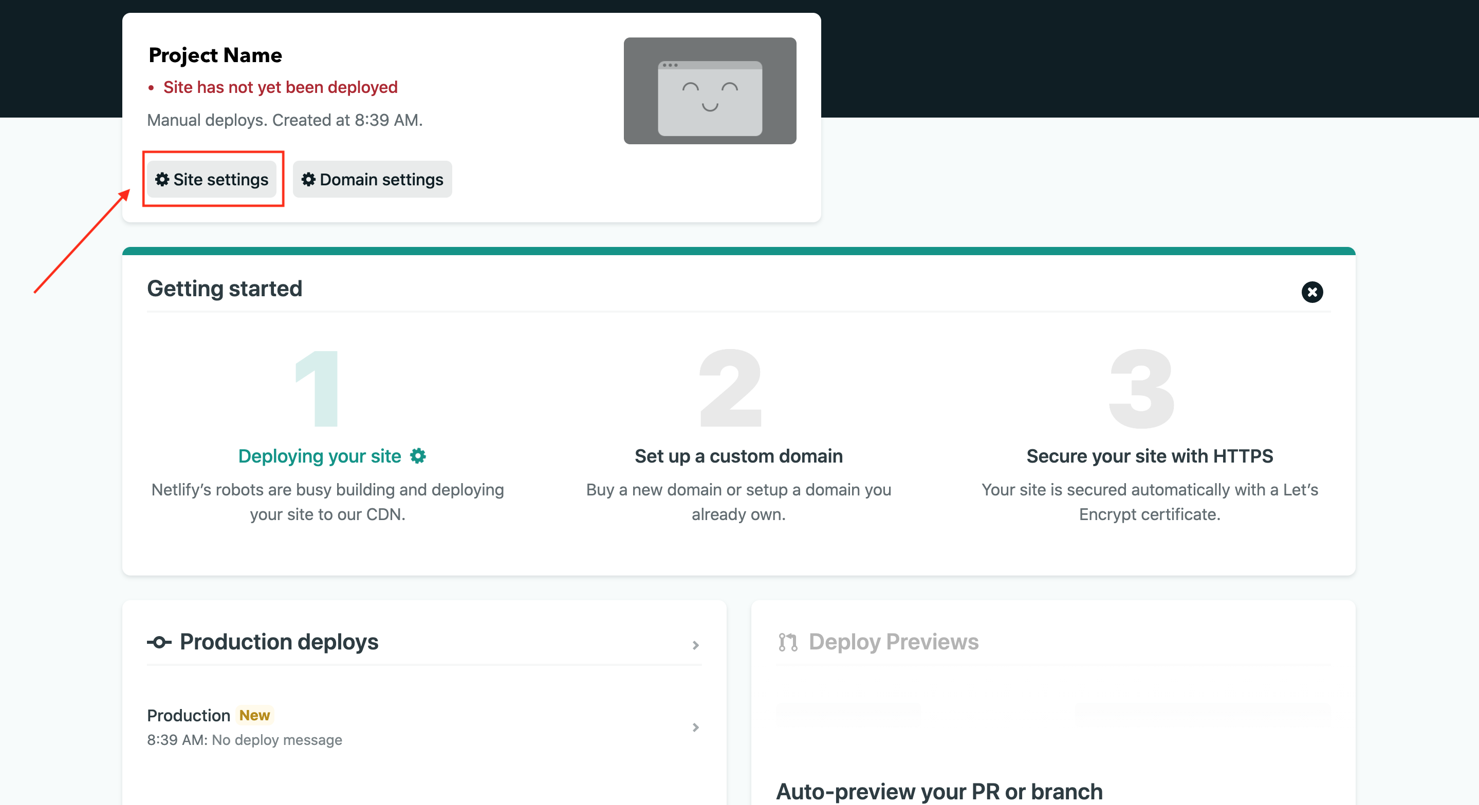
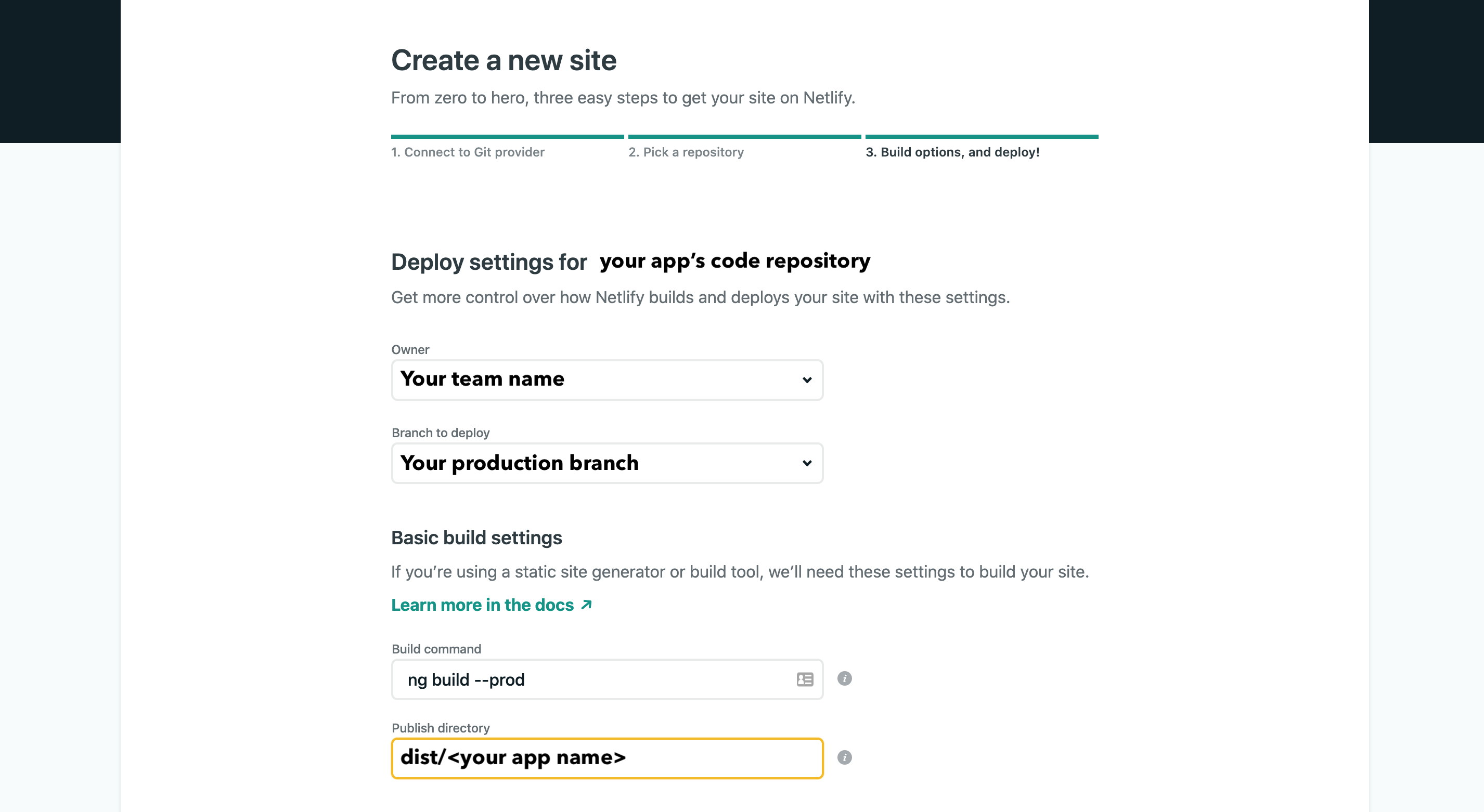
Next, select your team and a name for the site you would like to deploy. Once the project has been created, the CLI tool will list site details for your project.
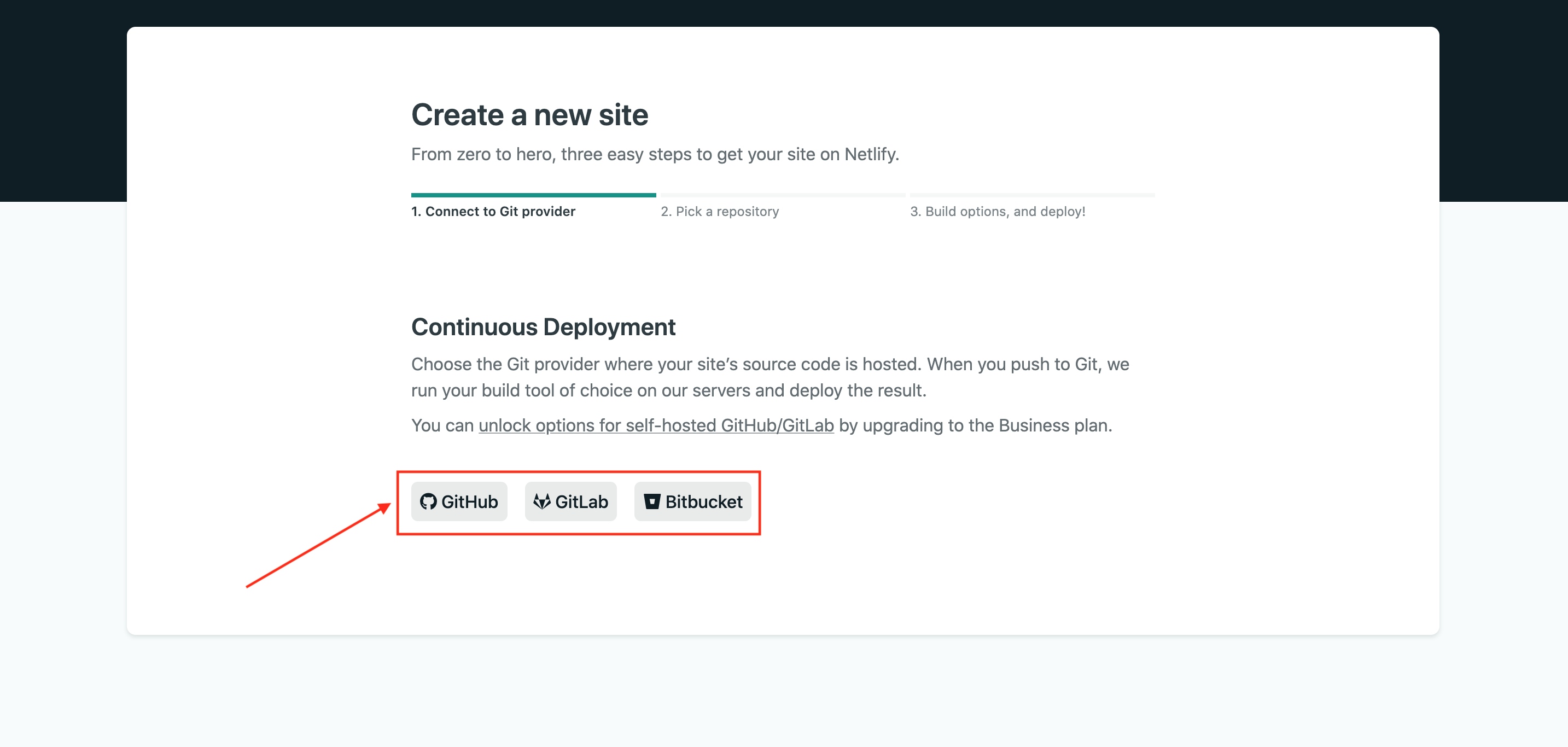
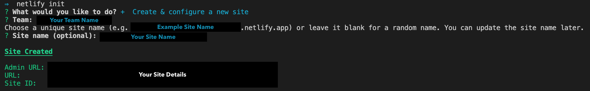
    After which the CLI tool will prompt you to connect your Netlify account to a Git hosting provider to configure webhooks and deploy keys. You cannot opt-out of this. Pick an option to login in then authorize Netlify.
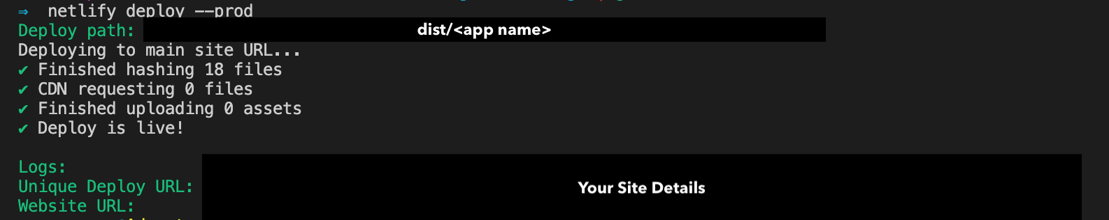
    Next, you’ll be asked to enter a build command. Use:
    ng build --prod
    
    Afterward, you’ll be asked to provide a directory to deploy. Enter dist/<app name> with your app’s name.
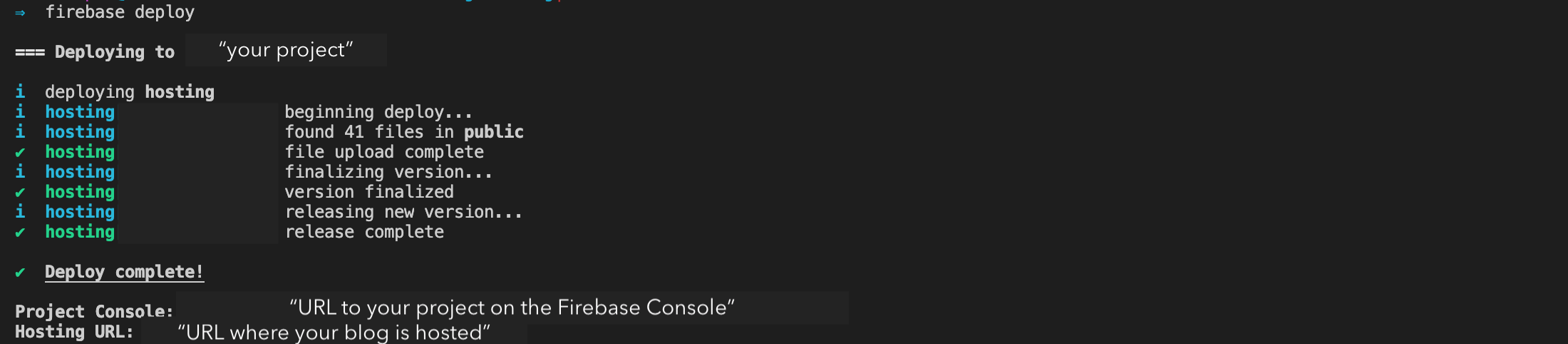
    At the end of that, the command will complete and display this output.
  4. To deploy the app, run:
    netlify deploy --prod
    
    Using the --prod flag ensures that the build is deployed to production. If you omit this flag, the netlify deploy command will deploy your build to a unique draft URL that is used for testing and previewing. Once the deployment is complete, you should see this output:

Viewing Form Submissions

Form submissions can be viewed on the Netlify dashboard under the Forms tab of your site. You can find it at app.netlify.com/sites/<your_site_name>/forms. On this page, all your active forms will be listed. The name attribute that you put down in the hidden form element is the name of the form on the dashboard.

Once you select a form, all the submissions for that form will be listed. You can choose to download all the entries as a CSV file, mark them as spam, or delete them.

Conclusion

Netlify Forms allow you to collect form submission from your app without having to create or configure a backend to do it. This can be useful especially in apps that only need to collect a limited amount of data like contact information, customer feedback, event sign-ups, and so on.

Pairing Angular reactive forms with Netlify forms allow you to structure your data model. Angular reactive forms have the added benefit of having their data model and form elements being in sync with each other. They do not rely on UI rendering.

Although Netlify Forms only work when deployed on Netlify Edge, the hosting platform is pretty robust, provides useful features like A/B testing, and automates app builds and deployments.

You can continue reading more about using Netlify with your forms over here.

How To Create Better Angular Templates With Pug

How To Create Better Angular Templates With Pug

How To Create Better Angular Templates With Pug

Zara Cooper

As a developer, I appreciate how Angular apps are structured and the many options the Angular CLI makes available to configure them. Components provide an amazing means to structure views, facilitate code reusability, interpolation, data binding, and other business logic for views.

Angular CLI supports multiple built-in CSS preprocessor options for component styling like Sass/SCSS, LESS, and Stylus. However, when it comes to templates, only two options are available: HTML and SVG. This is in spite of many more efficient options such as Pug, Slim, HAML among others being in existence.

In this article, I’ll cover how you — as an Angular developer — can use Pug to write better templates more efficiently. You’ll learn how to install Pug in your Angular apps and transition existing apps that use HTML to use Pug.

Managing Image Breakpoints

A built-in Angular feature called BreakPoint Observer gives us a powerful interface for dealing with responsive images. Read more about a service that allows us to serve, transform and manage images in the cloud. Learn more →

Pug (formerly known as Jade) is a template engine. This means it’s a tool that generates documents from templates that integrate some specified data. In this case, Pug is used to write templates that are compiled into functions that take in data and render HTML documents.

In addition to providing a more streamlined way to write templates, it offers a number of valuable features that go beyond just template writing like mixins that facilitate code reusability, enable embedding of JavaScript code, provide iterators, conditionals, and so on.

Although HTML is universally used by many and works adequately in templates, it is not DRY and can get pretty difficult to read, write, and maintain especially with larger component templates. That’s where Pug comes in. With Pug, your templates become simpler to write and read and you can extend the functionality of your template as an added bonus. In the rest of this article, I’ll walk you through how to use Pug in your Angular component templates.

Why You Should Use Pug

HTML is fundamentally repetitive. For most elements you have to have an opening and closing tag which is not DRY. Not only do you have to write more with HTML, but you also have to read more. With Pug, there are no opening and closing angle brackets and no closing tags. You are therefore writing and reading a lot less code.

For example, here’s an HTML table:

<table>
   <thead>
       <tr>
           <th>Country</th>
           <th>Capital</th>
           <th>Population</th>
           <th>Currency</th>
       </tr>
   </thead>
   <tbody>
       <tr>
           <td>Canada</td>
           <td>Ottawa</td>
           <td>37.59 million</td>
           <td>Canadian Dollar</td>
       </tr>
       <tr>
           <td>South Africa</td>
           <td>Cape Town, Pretoria, Bloemfontein</td>
           <td>57.78 million</td>
           <td>South African Rand</td>
       </tr>
       <tr>
           <td>United Kingdom</td>
           <td>London</td>
           <td>66.65 million</td>
           <td>Pound Sterling</td>
       </tr>
   </tbody>
</table>

This is how that same table looks like in Pug:

table
 thead
   tr
     th Country
     th Capital(s)
     th Population
     th Currency
 tbody
   tr
     td Canada
     td Ottawa
     td 37.59 million
     td Canadian Dollar
   tr
     td South Africa
     td Cape Town, Pretoria, Bloemfontein
     td 57.78 million
     td South African Rand
   tr
     td United Kingdom
     td London
     td 66.65 million
     td Pound Sterling

Comparing the two versions of the table, Pug looks a lot cleaner than HTML and has better code readability. Although negligible in this small example, you write seven fewer lines in the Pug table than in the HTML table. As you create more templates over time for a project, you end up cumulatively writing less code with Pug.

Beyond the functionality provided by the Angular template language, Pug extends what you can achieve in your templates. With features (such as mixins, text and attribute interpolation, conditionals, iterators, and so on), you can use Pug to solve problems more simply in contrast to writing whole separate components or import dependencies and set up directives to fulfill a requirement.

Some Features Of Pug

Pug offers a wide range of features but what features you can use depends on how you integrate Pug into your project. Here are a few features you might find useful.

  1. Adding external Pug files to a template using include.

    Let’s say, for example, that you’d like to have a more succinct template but do not feel the need to create additional components. You can take out sections from a template and put them in partial templates then include them back into the original template.

    For example, in this home page component, the ‘About’ and ‘Services’ section are in external files and are included in the home page component.
    //- home.component.pug
    h1 Leone and Sons
    h2 Photography Studio
    
    include partials/about.partial.pug
    include partials/services.partial.pug
    //- about.partial.pug
    h2 About our business
    p Lorem ipsum dolor sit amet, consectetur adipiscing elit, sed do eiusmod tempor incididunt ut labore et dolore magna aliqua. Ut enim ad minim veniam, quis nostrud exercitation ullamco laboris nisi ut aliquip ex ea commodo consequat.
    //- services.partial.pug
    h2 Services we offer
    P Our services include: 
    ul  
        li Headshots
        li Corporate Event Photography
    HTML render of included partial templates example
    HTML render of included partial templates example (Large preview)
  2. Reusing code blocks using mixins.

    For example, let’s say you wanted to reuse a code block to create some buttons. You’d reuse that block of code using a mixin.
    mixin menu-button(text, action)
        button.btn.btn-sm.m-1(‘(click)’=action)&attributes(attributes)= text
    
    +menu-button('Save', 'saveItem()')(class="btn-outline-success")
    +menu-button('Update', 'updateItem()')(class="btn-outline-primary")
    +menu-button('Delete', 'deleteItem()')(class="btn-outline-danger")
    
    HTML render of menu buttons mixin example
    HTML render of menu buttons mixin example (Large preview)
  3. Conditionals make it easy to display code blocks and comments based on whether a condition is met or not.
    - var day = (new Date()).getDay()
    
    if day == 0
       p We’re closed on Sundays
    else if  day == 6
       p We’re open from 9AM to 1PM
    else
       p We’re open from 9AM to 5PM
    HTML render of conditionals example
    HTML render of conditionals example (Large preview)
  4. Iterators such as each and while provide iteration functionality.
    ul
     each item in ['Eggs', 'Milk', 'Cheese']
       li= item
    
    ul
     while n < 5
       li= n++ + ' bottles of milk on the wall'
    HTML renders of iterators example
    (Large preview)
    HTML renders of iterators example
    HTML renders of iterators example (Large preview)
  5. Inline JavaScript can be written in Pug templates as demonstrated in the examples above.
  6. Interpolation is possible and extends to tags and attributes.
    - var name = 'Charles'
    p Hi! I’m #{name}.
    
    p I’m a #[strong web developer].
    
    a(href='https://about.me/${name}') Get to Know Me
    HTML render of interpolation example
    HTML render of interpolation example (Large preview)
  7. Filters enable the use of other languages in Pug templates.

    For example, you can use Markdown in your Pug templates after installing a JSTransformer Markdown module.
    :markdown-it
       # Charles the Web Developer
       ![Image of Charles](https://charles.com/profile.png)
    
       ## About
       Charles has been a web developer for 20 years at **Charles and Co Consulting.**
    
    HTML render of filter example
    HTML render of filter example (Large preview)

These are just a few features offered by Pug. You can find a more expansive list of features in Pug’s documentation.

How To Use Pug In An Angular App

For both new and pre-existing apps using Angular CLI 6 and above, you will need to install ng-cli-pug-loader. It’s an Angular CLI loader for Pug templates.

For New Components And Projects

  1. Install ng-cli-pug-loader.
    ng add ng-cli-pug-loader
  2. Generate your component according to your preferences.

    For example, let’s say we’re generating a home page component:
    ng g c home --style css -m app
  3. Change the HTML file extension, .html to a Pug extension, .pug. Since the initial generated file contains HTML, you may choose to delete its contents and start anew with Pug instead. However, HTML can still function in Pug templates so you can leave it as is.
  4. Change the extension of the template to .pug in the component decorator.
    @Component({
       selector: 'app-component',
       templateUrl: './home.component.pug',
       styles: ['./home.component.css']
    })

For Existing Components And Projects

  1. Install ng-cli-pug-loader.
    ng add ng-cli-pug-loader
  2. Install the html2pug CLI tool. This tool will help you convert your HTML templates to Pug.
    npm install -g html2pug
  3. To convert a HTML file to Pug, run:
    html2pug -f -c < [HTML file path] > [Pug file path]
    Since we’re working with HTML templates and not complete HTML files, we need to pass the -f to indicate to html2pug that it should not wrap the templates it generates in html and body tags. The -c flag lets html2pug know that attributes of elements should be separated with commas during conversion. I will cover why this is important below.
  4. Change the extension of the template to .pug in the component decorator as described in the For New Components and Projects section.
  5. Run the server to check that there are no problems with how the Pug template is rendered.

    If there are problems, use the HTML template as a reference to figure out what could have caused the problem. This could sometimes be an indenting issue or an unquoted attribute, although rare. Once you are satisfied with how the Pug template is rendered, delete the HTML file.

Things To Consider When Migrating From HTML To Pug Templates

You won’t be able to use inline Pug templates with ng-cli-pug-loader. This only renders Pug files and does not render inline templates defined in component decorators. So all existing templates need to be external files. If you have any inline HTML templates, create external HTML files for them and convert them to Pug using html2pug.

Once converted, you may need to fix templates that use binding and attribute directives. ng-cli-pug-loader requires that bound attribute names in Angular be enclosed in single or double quotes or separated by commas. The easiest way to go about this would be to use the -c flag with html2pug. However, this only fixes the issues with elements that have multiple attributes. For elements with single attributes just use quotes.

A lot of the setup described here can be automated using a task runner or a script or a custom Angular schematic for large scale conversions if you choose to create one. If you have a few templates and would like to do an incremental conversion, it would be better to just convert one file at a time.

Angular Template Language Syntax In Pug Templates

For the most part, Angular template language syntax remains unchanged in a Pug template, however, when it comes to binding and some directives (as described above), you need to use quotes and commas since (), [], and [()] interfere with the compilation of Pug templates. Here are a few examples:

//- [src], an attribute binding and [style.border], a style binding are separated using a comma. Use this approach when you have multiple attributes for the element, where one or more is using binding.
img([src]='itemImageUrl', [style.border]='imageBorder')

//- (click), an event binding needs to be enclosed in either single or double quotes. Use this approach for elements with just one attribute.
button('(click)'='onSave($event)') Save

Attribute directives like ngClass, ngStyle, and ngModel must be put in quotes. Structural directives like *ngIf, *ngFor, *ngSwitchCase, and *ngSwitchDefault also need to be put in quotes or used with commas. Template reference variables ( e.g. #var ) do not interfere with Pug template compilation and hence do not need quotes or commas. Template expressions surrounded in {{ }} remain unaffected.

Drawbacks And Trade-offs Of Using Pug In Angular Templates

Even though Pug is convenient and improves workflows, there are some drawbacks to using it and some trade-offs that need to be considered when using ng-cli-pug-loader.

Files cannot be included in templates using include unless they end in .partial.pug or .include.pug or are called mixins.pug. In addition to this, template inheritance does not work with ng-cli-pug-loader and as a result, using blocks, prepending, and appending Pug code is not possible despite this being a useful Pug feature.

Pug files have to be created manually as Angular CLI only generates components with HTML templates. You will need to delete the generated HTML file and create a Pug file or just change the HTML file extension, then change the templateUrl in the component decorator. Although this can be automated using a script, a schematic, or a Task Runner, you have to implement the solution.

In larger pre-existing Angular projects, switching from HTML templates to Pug ones involves a lot of work and complexity in some cases. Making the switch will lead to a lot of breaking code that needs to be fixed file by file or automatically using a custom tool. Bindings and some Angular directives in elements need to be quoted or separated with commas.

Developers unfamiliar with Pug have to learn the syntax first before incorporating it into a project. Pug is not just HTML without angle brackets and closing tags and involves a learning curve.

When writing Pug and using its features in Angular templates ng-cli-pug-loader does not give Pug templates access to the component’s properties. As a result, these properties cannot be used as variables, in conditionals, in iterators, and in inline code. Angular directives and template expressions also do not have access to Pug variables. For example, with Pug variables:

//- app.component.pug
- var shoppingList = ['Eggs', 'Milk', 'Flour']

//- will work
ul
   each item in shoppingList
       li= item

//- will not work because shoppingList is a Pug variable
ul
   li(*ngFor="let item of shoppingList") {{item}}

Here’s an example with a property of a component:

//- src/app/app.component.ts
export class AppComponent{
   shoppingList = ['Eggs', 'Milk', 'Flour'];
}
//- app.component.pug 

//- will not work because shoppingList is a component property and not a Pug variable
ul
   each item in shoppingList
       li= item

//- will work because shoppingList is a property of the component
ul
   li(*ngFor="let item of shoppingList") {{item}}

Lastly, index.html cannot be a Pug template. ng-cli-pug-loader does not support this.

Conclusion

Pug can be an amazing resource to use in Angular apps but it does require some investment to learn and integrate into a new or pre-existing project. If you’re up for the challenge, you can take a look at Pug’s documentation to learn more about its syntax and add it to your projects. Although ng-cli-pug-loader is a great tool, it can be lacking in some areas. To tailor how Pug will work in your project consider creating an Angular schematic that will meet your project’s requirements.

Smashing Editorial (ra, yk, il)

Create Your Free Developer Blog Using Hugo And Firebase

Create Your Free Developer Blog Using Hugo And Firebase

Create Your Free Developer Blog Using Hugo And Firebase

Zara Cooper

In this tutorial, I’ll demonstrate how to create your own blog using Hugo and deploy it on Firebase for free. Hugo is an open-source static site generator and Firebase is a Google platform that offers resources and services used to augment web and mobile development. If you’re a developer who does not have a blog yet but is interested in hosting one, this article will help you create one. To follow these steps, you need to know how to use Git and your terminal.

Having your own technical blog can have tons of benefits to your career as a developer. For one, blogging about technical topics makes you learn things you might not have otherwise picked up at your primary developer job. As you research your pieces or try new things, you end up learning a whole host of things like how to work with new technologies and solve edge case problems. In addition to that, you get to practice soft skills like communication and dealing with criticism and feedback when you engage with your reader’s comments.

Additionally, you become more self-assured in your software development skills because you get to write so much code when building sample projects for your blog to illustrate concepts. A technical blog augments your brand as a developer since it gives you a platform to showcase your skills and expertise. This opens you up to all kinds of opportunities like jobs, speaking and conference engagements, book deals, side businesses, relationships with other developers, and so on.

Recommended Reading on SmashingMag:

Chris Sevilleja, for example, started writing tutorials in 2014 on his blog scotch.io that turned into a business that later joined Digital Ocean. Another significant benefit of having a technical blog is that it makes you a better writer which can be an asset in your job when writing software design and technical spec documents. Moreover, it makes you an exceptional teacher and mentor. For example, I often read research.swtch.com, a blog by Russ Cox who blogs about the Go language and also works on the Google Go team that builds it. From it, I’ve learned a ton about how the language works that I might not have picked up from my main job.

Another great blog I also enjoy reading and learning a lot from is welearncode.com by Ali Spittel who once wrote that a really great part of blogging is:

“Helping other people learn how to code and making it easier for the people coming after me.”

A fairly easy and painless way to get your blog up and running is to use a third-party platform like Medium where you only have to create an account to get a blog. Although these platforms may suit most blogging needs at the start, they do have some drawbacks in the long run.

Some platforms offer bad user experiences like constantly sending distracting notifications for trivial things, asking for app installs, and so on. If your reader has a bad experience on a platform where your blog is hosted they are less likely to engage with your content. Besides that, tools you may need to enhance your reader’s interaction with and time on your blog may not be supported. Things like RSS feeds, syntax highlighting for code snippets among other things may not be supported on the platform. In a worst-case scenario, the platform where your blog is hosted may close and you may lose all the work you’ve done.

Hosting your own blog and redirecting your users to it increases the chances that they will be more engaged with the posts you put out. You won’t have to compete for your reader’s attention with other writers on a platform since you’ll be the only one on it. Readers are likely to read more of your posts or sign up for your newsletter since they’re more focused on what you’re communicating. Another plus that comes with hosting your own blog is the ability to customize it in a myriad of ways to your own tastes, which is usually not possible with third-party platforms.

Setting Up Hugo

If you’re working on macOS or Linux, the easiest way to install Hugo is to use Homebrew. All you’ll need to run on your terminal is:

brew install hugo

If you’re running on windows, Hugo can be installed using either the scoop installer or the chocolatey package manager. For scoop:

scoop install hugo 

For chocolatey:

choco install hugo -confirm

If none of these options apply to you, check out these options for installation.

Setting Up Firebase Tools

To install firebase tools, you need to have Node.js installed to get access to npm. To install Firebase tools, run:

npm install -g firebase-tools

Create a Firebase account for free at this link. You’ll need a Google account for this. Next, login using the Firebase tools. You’ll be redirected to a browser tab where you can log in using your Google account.

firebase login

Create Your Blog

Pick a directory where you’d like your blog’s source code to reside. Change location to that directory on your terminal. Pick a name for your blog. For the purposes of this tutorial, let’s name the blog sm-blog.

hugo new site sm-blog

It’s advisable to back up your site’s source code in case anything goes wrong. I’m going to use Github for this but you could use any version control service — if you choose to do the same. I’ll initialize a repository.

cd sm-blog
git init

Before we can run the site locally and actually view it on the browser, we need to add a theme otherwise all you’ll see is a blank page.

Picking And Installing A Theme For Your Blog

One thing I love about Hugo is the community behind it and all the developers who submit themes for the community to use. There is a vast array of themes to choose from, everything from small business websites, portfolios to blogs. To pick a blog theme, head on over to the blog section of themes.gohugo.io. I picked a theme called Cactus Plus because of its simplicity and minimalism. To install this theme, I’ll need to add it as a submodule of my repository. Many themes instruct its users to use submodules for installs but if this is not the case, just follow the instructions given by the theme maker provided in the description. I’ll add the theme to the /themes folder.

git submodule -b master add https://github.com/nodejh/hugo-theme-cactus-plus.git theme/hugo-theme-cactus-plus

At the root of the blog folder, there exists a generated file, config.toml. This is where you specify settings for your site. We’ll need to change the theme there. The theme name corresponds to the chosen theme’s folder name in the /themes folder. These are the contents of the config.toml file now. You could also change the title of the blog.

baseURL = "http://example.org/"
languageCode = "en-us"
title = "SM Blog"
theme="hugo-theme-cactus-plus"

Now we can run the blog. It will look exactly like the theme with the exception of the name change. Once you run the server, head on over to http://localhost:1313 on your browser.

hugo server -D

Personalizing Your Blog

One benefit of deploying your own blog is getting to personalize it to your liking in all kinds of ways. The primary way to do this with Hugo is to change the theme you selected. Many themes provide customization options through the config.toml. The theme creator usually provides a list of options and what they all mean in the description on the theme page. If they don’t, check out the /exampleSite folder of the theme and copy the contents of config.toml within that folder to your config.toml file. For example:

cp themes/hugo-theme-cactus-plus/exampleSite/config.toml .

Since all themes are different, changes I make here may not apply to your theme but hopefully, you may be able to get an idea of what to do with your blog.

  1. I’ll change the avatar image and the favicon of the blog. All static files including images should be added to the /static folder. I created an /images folder within static and added the images there.
  2. I’ll add Google Analytics so I can track the traffic to my blog.
  3. I’ll enable Disqus so my readers can leave comments on my posts.
  4. I’ll enable RSS.
  5. I’ll put in my social links to Twitter and Github.
  6. I’ll enable the Twitter card.
  7. I’ll enable summaries under the post titles on the home page.

So my config.toml will look this:

### Site settings
baseurl = "your_firebase_address"
languageCode = "en"
title = "SM Blog"
theme = "hugo-theme-cactus-plus"
googleAnalytics = "your_google_analytics_id"

[params]
    # My information
    author = "Cat Lense"
    description = "blog about cats"
    bio = "cat photographer"
    twitter = "cats"
    copyright = "Cat Photographer"

    # Tools 
    enableRSS = true
    enableDisqus = true
    disqusShortname = "your_disqus_short_name"
    enableSummary = true
    enableGoogleAnalytics = true
    enableTwitterCard = true

[social]
    twitter = "https://twitter.com/cats"
    github = "https://github.com/cats"

Creating Your First Post

Hugo posts are written in markdown. So you’ll need to be familiar with it. When creating a post, you’re actually creating a markdown file that Hugo will then render into HTML. Take the title of your post, make it lower case, substitute the spaces with hyphens. That will be the name of your post. Hugo takes the file name, replaces the hyphens with spaces, transforms it to start case, then sets it as the title. I’ll name my file my-first-post.md. To create your first post, run:

hugo new posts/my-first-post.md

The post is created in the /content folder. These are the contents of the file.

---
title: "My First Post"
date: 2020-03-18T15:59:53+03:00
draft: true
---

A post contains front matter which is the metadata that describes your post. If you’d like to keep your posts as drafts while you write them, leave draft: true. Once you’re done writing, change draft: false so that the posts can be displayed on the home page. I’ll add a summary line to the front matter to summarize the post on the home page.

Adding Resources To Your Post

To add resources to your posts like images, videos, audio files, etc. create a folder within the /content/posts folder with the same name as your post excluding the extension.

For example, I’d create this folder:

mkdir content/posts/my-first-post

Then I’d add all my post resources to that folder and link to the resources just by file name without having to specify a long URL. For example, I’d add an image like this:

![A cute cat](cute-cat.png)

Hosting Your Blog’s Source Code

Once you’re done writing your first post, it’s important to back it up before you deploy it. Before that, make sure you have a .gitignore file and add the /public folder to it. The public folder should be ignored because it can be generated again.

Create a repository on Github to host your blog’s source code. Then set the remote repository locally.

git remote add origin [remote repository URL]

Finally, stage and commit all your changes then push them to the remote repository.

git add *
git commit -m "Add my first post"
git push origin master

Deploying Your Blog To Firebase

Before you can deploy your blog to Firebase, you’ll need to create a project on Firebase. Head on over to the Firebase Console. Click on Add Project.

Firebase Console home page where the “Create a Project” button resides. (Large preview)

Input the name of your project.

First page of “Create a project” flow on Firebase Console. (Large preview)

Enable Google Analytics if you want to use it in your blog.

Second page of “Create a project” flow on Firebase Console. (Large preview)
Third page of “Create a project” flow on Firebase Console. (Large preview)

Once you’re done creating the project, go back to your blog’s root and initialize a Firebase project in the blog.

firebase init

You’ll be prompted to enter some information when this command runs.

Prompts Answer
Which Firebase CLI features do you want to set up for this folder? Hosting: Configure and deploy Firebase Hosting sites
Project Setup Options Use an existing project
What do you want to use as your public directory? public
Configure as a single-page app (rewrite all urls to /index.html)? N
First prompt of the firebase init command requesting a feature selection. (Large preview)
Second prompt of the firebase init command requesting a project selection. (Large preview)
Third and fourth prompts of the firebase init command requesting a deployment folder and inquiring whether to configure the project as a single-page app. (Large preview)

Next, we’ll build the blog. A /public folder will be created and it will contain your generated blog.

hugo

After this, all we have to do is deploy the blog.

firebase deploy

Now the blog is deployed. Check it out at the hosting URL provided in the output.

Output from running the firebase deploy command. (Large preview)

Next Steps

The only drawback of hosting on Firebase is the URL it uses for your hosted project. It can be unsightly and difficult to remember. So I’d advise that you buy a domain and set it up for your blog.

Third-party platforms are not all bad. They have tons of readers who may be interested in your writing but haven’t come across your blog yet. You could cross-post to those sites to put your work in front of a large audience but don’t forget to link back to your own blog. Add the link to your article on your blog to whichever platform you are posting to as a canonical URL so that it is not viewed as duplicate content by a search engine and hurts the SEO of your site. Sites like Medium, dev.to, and Hashnode support canonical URLs.

Conclusion

Writing on your own technical blog can have immense benefits to your career as a software developer and help you cultivate your skills and expertise. It’s my hope that this tutorial has started you on that journey or at least encouraged you to make your own blog.

Smashing Editorial (ra, il)