The Power of Storytelling in Branding

Storytelling

The best writers, speakers, trainers, leaders, teachers tell stories.

A brand that is engaging is easier to remember and easier to process than others in the same category. Over time, it manages to establish a connection with potential customers, which directly contributes to a relevance in the market.

An emerging brand can evolve into a strong brand.

The most accessible tools for brands to become strong are words. Words create a story, and the story is what manages to capture the attention of any user. Stories portray emotion, and emotion attaches us to everything.

Story

To build your brand’s story, you have to answer two questions:

1.What is the purpose of your brands existence?

An excellent example of storytelling that can easily answer this question is represented by non-profit organizations (non-governmental organizations). In NGOs, we choose to invest our money and time without receiving a specific product or service in return.

They promote a cause, we become attached to that cause through emotion, and we choose to give them money.

If brands would address the communication process from an NGO perspective, helping the consumer first and selling second, they would all be more successful.

Storytelling

2. How does your brand differ from others?

The importance of a brand’s offer, whether it be a product or service, has diminished over time. On a constantly growing market, competition is unavoidable, and what makes the biggest difference is how a brand promotes the offer. Why does the brand choose to do what it does? What drives us to do what we do regarding the brand?

How to turn your story into a tool

To turn a story into an effective tool for your brand, it must be narrated in a transparent and authentic way. It must have a core belief (the moral of the story) and help the target audience reach the happy ending they hoped for.

The stronger the moral of the story is, the more significant of an impact it makes, the stronger the relationship between brand and consumer. However, the moral of the story can not be the same for all audiences. Brands need to understand this and create different approaches if they want to identify themselves with a larger audience of individuals.

Advertising. Storytelling. Engagement.

Storytelling

Every brand tries to create a connection with the audience to which it addresses, but this goal is not always met as expected. Most brands create user personas to help them better understand the kinds of people that usually buy from them. By doing this, you can also understand who isn’t buying from you, and develop strategies to reach those people.

Over 75% of emails received from companies are not open and over 99% of banners end up being ignored. The main objective of advertising is to attract long term attention. Another objective is to engage customers on a personal level. Make them feel at home with your brand, and develop a relationship that fortifies their decision in choosing you.

In advertising, the story is not just an entertainment tool, but the basis for changing a decision, attitude, or behavior. That’s why brands need to invest time building relationships to help them integrate the target audience into the brand story.

The conclusion

Storytelling is a key element in advertising. It’s not enough anymore to simply sell a product. You have to sell your story. You have to make these potential customers believe in what you believe. They have to understand why you do what you do, and the journey you took to get there. A story is more than a tool for a brand, but the brand itself.

The evolution of a brand involves all these elements, based on two fundamental concepts: creating a story and transmitting the narrative. They aim to establish a long-term connection with the target audience in order to build relationships, and generate not just customers, but loyal and happy customers.

Read More at The Power of Storytelling in Branding
The Good, the Bad, and the Ugly? 10 Features of a Good Logo

What is a logo? Basically, it is a symbol, a text, or a combination of the two that helps us identify a brand. The latter is not just a logo, it is the general way in which customers perceive you. This includes the way of communication, promotional materials, images, products or services, physical stores or online stores, and more.

Why is it important to have a logo? Representing the “face” of your business, it is necessary for the purpose of identifying, differentiating competition, constant communication and loyalty.

With that in mind, let’s talk about 10 of the biggest features that should go into a logo:

Represents the niche and the target audience

The features of a logo must depend on the niche and the target audience accordingly. That’s why a marketing brief is the basis for creating a good logo.

For a specific example, let’s use a heavy metal band’s logo. The band’s logo might look ugly and grotesque to some, but it’s exactly what it should be for their target audience.

It is adaptable

Good Logo

A good logo can be easily used in the online environment, embroidery, huge banners, small labels, business cards, bottles, you name it. Keep in mind that you need a logo in vector format, not just .png or .jpg, because this format offers scalability. Do not forget to always ask the graphic designer.

In this regard, you really should consider working with a graphic designer. Remember, your logo is the face of your company. It’s the thing that almost every customer sees before they even know what you do as a company. Spend the extra time and money to get it right the first time, and avoid having to spend more time and money in the future.

It differentiates you from the competition

Good Logo

First, to differentiate yourself, you have to know your competition. Considering the multitude of existing business and logos, it is extremely important to assume your own identity and not to copy it from others. Of course, in this case, differentiation must target the niche and the target audience. To continue with the previous example, heavy metal logos do not fit a law firm.

It is timeless

Good Logo

Trends come and go, but your logo does not have to be based on time preferences, but it has to pass the test of time. Of course, many businesses change their logos through rebranding campaigns, because they have changed their values ​​or just because they originally made a trendy logo.

A good example of a timeless logo is the Coca-Cola logo. Since its creation in 1887, it’s kept roughly the same design. It’s easily recognized, and it stays up-to-date.

It’s memorable

The memorable character of a logo can be provided by simplicity, uniqueness, color, hidden elements or many other features. The customer will choose a brand they know and trust, and ultimately become faithful to your brand.

Leave a lasting impression, and gain a lasting customer.

It’s read easily

Good Logo

Handwriting fonts can be beautiful for a particular audience, but they are often hard to read and therefore hard to remember and perceive. If a font is not readable at a comfortable size, how does it look on a business card or a mobile site?

Again, keep it simple and clean, and you’ll avoid this mistake.

It doesn’t describe the business

Good Logo

Just because you deal with car production does not mean that your car needs a car illustration. Of all existing car brands, none of them include the main subject of their business (except those that make toy cars).

Many graphic designers (or business owners) tend to make the logo descriptive. This might not be considered a mistake, but, more often than not, it comes off as a generic looking logo. It usually limits you to certain services, which can prevent the expansion of your business.

It’s smart

A visible concept is not a must, but it’s a plus . A logo that contains a surprise item or something that needs to be discovered generates interest (have you ever noticed the arrow in the FedEx logo?). But one element is more than enough. Many times, designers take this idea too far, and overcomplicate the logo.

Good Logo

Contains the appropriate fonts and colors

Fonts and colors are excellent forms of communication. For example, a handwritten font is more feminine and personal, usually unmatched in a corporate logo. Every color has its psychology, which is dependent on culture. In this sense, have you ever wondered why most corporations have the blue logo? The answer is simple: because blue inspires confidence and is a favorite color of both genders.

Good Logo

It’s not complicated

Too many fonts, colors, elements, symbols, or slogans can complicate the design. This leads to a hard-to-remember and unidentifiable logo.

The summary

Now you know what a logo is, why it is important to have one, and what  the characteristics that can fit it into the category of good ones are.

There are lots of examples of great logos out there. I’m sure you can think of a few right off the top of your head right now. But, for every good example of a logo, there’s at least one bad example. Avoid being one of those bad examples, and stick to these 10 features.

Read More at The Good, the Bad, and the Ugly? 10 Features of a Good Logo

5 Mistakes You Are Not Allowed to Make on Your Website

website mistakes

Your website is your business card in the online environment. As a representative element for your business image, your website needs to look and behave impeccably in the online environment. This is a must if you want your site to bring you results, drive traffic, and ultimately increase conversion rates.

In a world where the number of websites is growing from day to day, only the most advanced and well-developed websites will manage to bring your business to another level. Sites that contain very few mistakes, if any at all.

In today’s article, we’re going to reveal 5 mistakes that you are simply not allowed to make in making your website – especially if you want it to bring you the desired results.

Not mobile friendly

Website Mistakes

If anyone were to compile a massive list of mistakes to avoid in regards to building a website in 2019, this would definitely be at the top. Everyone preaches this. A website that isn’t friendly to mobile users is 100% wasted potential.

Currently, over 7 out of 10 people are searching on Google with their mobile devices. In addition, Google made it clear a while ago that mobile adaptive sites will have advantages in terms of positioning in SERP. In other words, the adaptability of your website is becoming an extremely important SEO factor.

More and more people are making the switch to mobile browsing, so we can only expect mobile search percentages to go up from here. If you do not have a mobile and tablet-compatible website in 2019, it’s like opening a business and consciously closing the door in your nose for your clients in 7 out of 10 cases.

Unoptimized SEO content

web design

This is the second fatal mistake in 2019, and again, something that most people know by now. SEO content will always make the top of everyone’s list because the Google algorithm is always changing. It’s no small task to optimize your SEO content, but it’s a vital one.

Writing SEO optimized content means you adopt the text to Google’s requirements. For the most part, that’s pretty straight forward. However, the tricky part comes into play when you have to keep it SEO optimized and appeal to real people. You’re not just creating content to make a robot happy, you have to keep the users happy, too. SEO in 2019 greatly relies on relevance – the content of your website should be 100% relevant to your target audience.

You have to find the balance. Find your brand voice and keep the Google robots in mind. If you don’t, this might be the first and last mistake you make on your website.

Slow loading time

Website Mistakes

This mistake is every bit as unforgiving as the first 2. People come to your website to get what they need and get out. If you hinder their convenience in any way, you might find yourself minus a customer.

There are a lot of factors that come into play regarding loading speeds. Most of them have to do with your content. Think of it this way: longer content = longer loading times. That’s why it’s so important to say what you need to say, and leave it at that.

Lots of people mistake detail with long-form content. While it’s true that Google favors longer content, it doesn’t always mean your users will. Again, the key here is to keep it short and sweet for the sake of the real people but to keep those keywords in mind for Google.

Bad CTA elements

A website that does not present the information in an attractive way, influencing the sales by Call-to-Action elements, will be a website that is not successful in the online environment. If the essential information and the call to action are not VISIBLE on the site, in a way that will invite the visitor to act, the site will not help you accomplish anything. So basically, it’s useless.

It is recommended that each page uses buttons, icons, and links that will lead to the contact forms or the offer request pages. Each page of the website must push the user one step closer to the final stage: the sale.

Nowadays, everything happens at the speed of lightning. No one has time to read hot air on your website. The world searches for fast, easy-to-understand and understandable information. Take that away, you take your customers away, too.

Lack of updates

In 2019 everyone expects your website to be “up to date” with all the trends and information. If you provide outdated information (even information about your products), you’ve lost the race with competing sites.

Your site needs to be updated and provide real-time information about you, about your products and about your business in general. Also, functionality is very important.

Sites with dead links or pages leading to errors – lack of content or missing pages are among the most common errors that turn users away from your website. Keep your site up-to-date. All pages should follow this rule and all information needs to be up to date.

Your website will always be a work-in-progress

Website Mistakes

Don’t let this header discourage you. A proper website, no matter the content or who owns it, will always need improvements and updates. There will always be something new to do, optimize, or add.

These are the 5 biggest mistakes people make when creating a new website in 2019, and they most likely always be mistakes that developers struggle with. The biggest takeaway from all these mistakes? Learn and adapt. If you see a mistake, fix it, and always be on the lookout for ways to improve.

Read More at 5 Mistakes You Are Not Allowed to Make on Your Website

10 Alternative Typefaces to the Ubiquitous Gotham

Gotham Alternatives

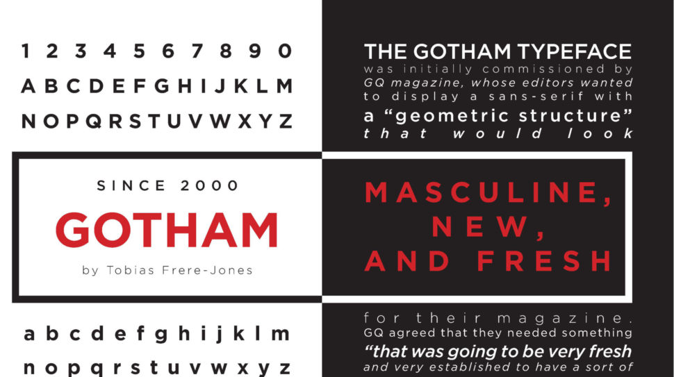
Gotham has become one of the most ubiquitous typographies of the 21st century. Its versatility and, undoubtedly, its good design makes it useable in many spaces. Even more, since it became the official typography of the campaign that led Obama to become president. However, in the typographic universe, there are hundreds and hundreds of typefaces to choose from. Since we live in a world that loves variety, here are 10 alternative typefaces to the Gotham.

1. Proxima Nova

Gotham Alternatives

Designed by Mark Simonson, Proxima Nova is perhaps one of the fonts that best presents itself as an alternative to the Gotham family. According to the author, this source “closes the gap between fonts such as Futura and Akzidenz Grotesk.” The result is a hybrid that combines modern proportions with a geometric appearance. It is a balanced and versatile source – the complete family includes 48 sources, eight pesos in three widths with their italics – the result of extensive work dating back to 1994. In recent years, Proxima Nova has become of the most popular web sources.

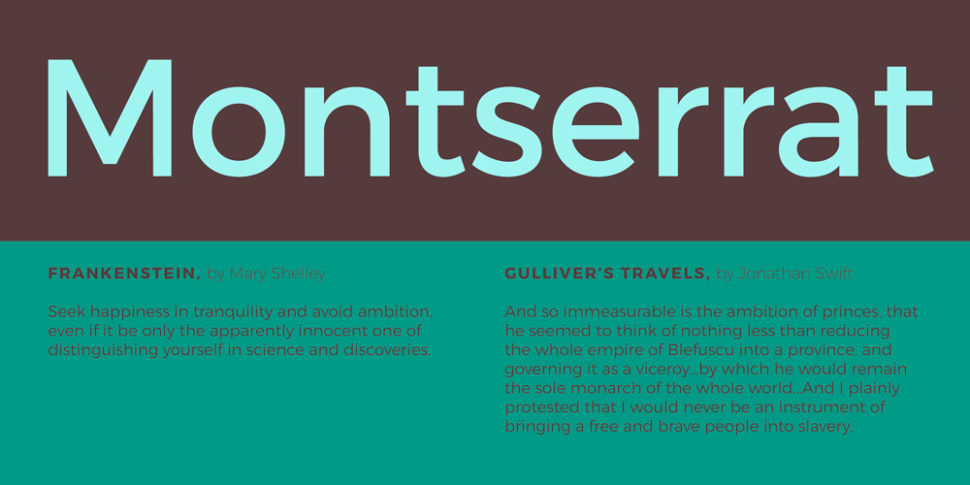
2. Montserrat

Gotham Alternatives

Montserrat was created by the designer Julieta Ulanovsky. He took inspiration from the architecture, the old posters, the luminous signs and the canopies of the neighborhood named after him in Buenos Aires. Ulanovsky’s intention was to rescue the beauty of urban typography from the first half of the 20th century. This inspiration taken from the local signs and architectural ques bring it closer to Gotham. Even so, the Montserrat forms are a little broader, giving a less solemn and more relaxed feeling that Gotham doesn’t provide. Montserrat was chosen to be among the 10 best fonts of Google Fonts in 2017.

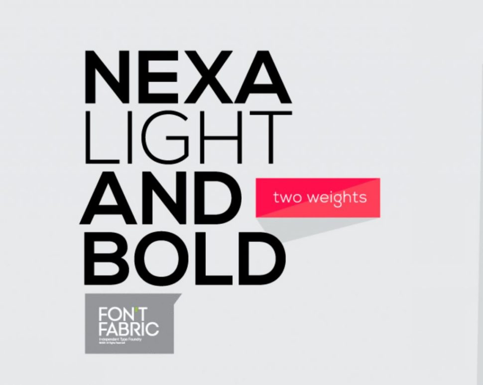
3. Nexa

Gotham Alternatives

Directly from FontFabric comes Nexa, a sans serif font available in Light & Bold. This alternative to Gotham is possibly more expressive typography than some of the fonts that appear in this list. For example, the lowercase letter ‘g’ and the capital letters ‘J’ and ‘Q’ are far more expressive. In terms of its uses and applications, Nexa is perfect for branding and packaging projects. Nexa Light & Bold is freely available for download.

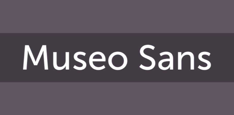
4. Sans Museo

Gotham Alternatives

Sans Museo coems directly from Exljbris foundry. This type of sans serif is robust, geometric, low contrast and highly readable; very suitable for use on any screen or for any text. This family of OpenType fonts is in all the languages ​​of the European Union and even in Esperanto. The Sans Museo package contains 10 fonts, 5 pesos, and their respective italics.

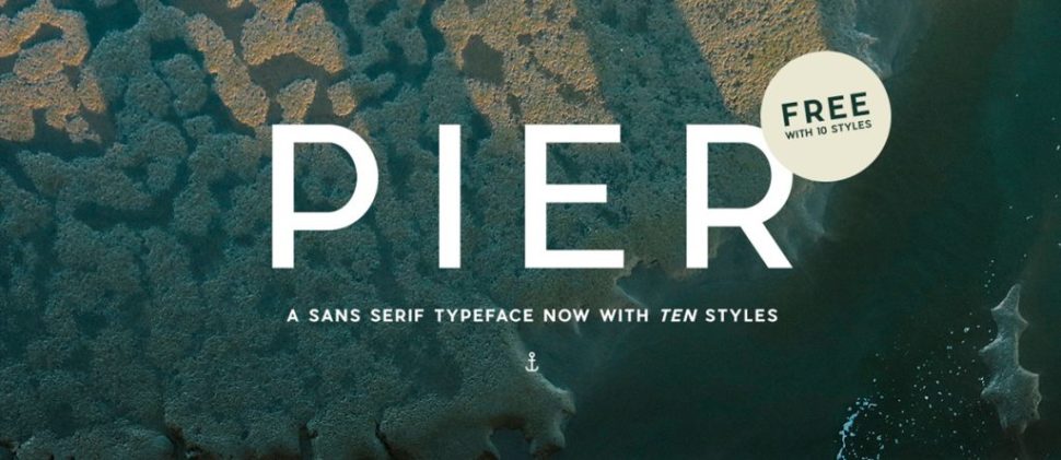
5. Pier Sans

Gotham Alternatives

According to Mathieu Desjardins, the designer of Pier Sans, it is a modern and geometric typeface, specially designed to be able to adapt to any size of text without losing legibility. This font, besides being a good alternative to Gotham typography, is quite useful for projects of all kinds, since it is able to cover the needs of any text.

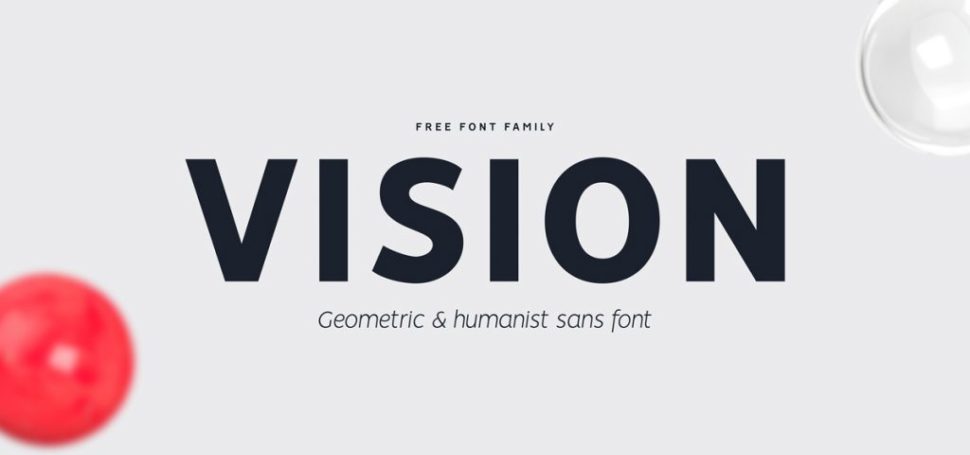
6. Vision

Gotham Alternatives

Vision is a complete typographic package. It is elegant and offers very good readability, both on screen and in the text. It consists of 12 free sources available for commercial and non-commercial work. As an alternative to Gotham, it presents a more humanistic invoice, especially in its lowercase. It was born to be versatile, a clear and modern font with great readability in large and short texts. In addition, it has ligatures, alternative glyphs and OpenType features that provide flexibility and uniqueness wherever they are placed.

7. Avenir

Gotham Alternatives

Designed by Adrian Frutiger in 1988 and published by Linotype, Avenir is one of the best-known sans serif typefaces from the Swiss typographer. The word ‘Avenir’ comes from the French and means ‘future’. Frutiger wanted Avenir to convey a more organic interpretation of the geometric style. He wanted it to be more uniform for extensive texts, with details reminiscent of more traditional typefaces, such as ‘a’ and ‘t’ – two letters with a curl at the bottom, and letters like the ‘o’ that are not exact or perfect circles, but with optical correction. Avenir is not purely geometric. The vertical strokes are thicker than their horizontal ones, the ascending ones are shortened and the ‘o’ is not perfectly round, adjustments that help readability and give the typeface a more harmonious appearance.

8. Lato

Gotham Alternatives

Lato is the most popular font from Łukasz Dziedzic, a designer based in Warsaw. Designed in 2010, this free font contains more than 3,000 glyphs in 18 styles. It offers solutions to virtually everything a designer may need. Lato, which means ‘summer’ in Polish, is a semi-rounded sans serif that, like Gotham, achieves a convincing balance between what can be a serious and friendly conversation.

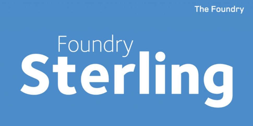
9. Foundry Sterling

Gotham Alternatives

Foundry Sterling is a functional and eloquent typographic family. It was born from the desire to create a modern sans serif with an essentially English flavor. It has been designed by paying special attention to the classical proportion and the purity of the forms, which has resulted in the creation of functional, beautiful and elegant typography. Like Gotham, Foundry Sterling has a wide range of weights that make it very versatile in its applications, whether for identity, editorial, signage or other uses.

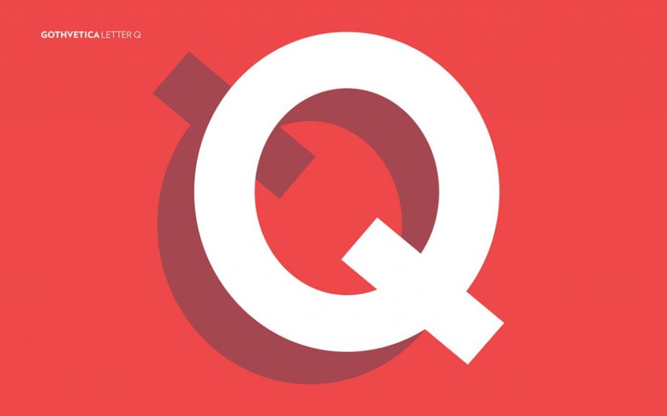
10. Gothvetica

Gotham Alternatives

Its name says it all. Gothvetica is a hybrid between Gotham and Helvetica. This MarkStudio typographic exercise began as a question: How similar are Gotham and Helvetica? What would happen if they both merged? The result is this typographic mix, a kind of Frankenstein font, and we must admit that it works as alternative typography to Gotham and can give a solution to certain projects. Oh! and, by the way, it’s free.

Conclusion

Although Gotham is one of the most popular fonts on the market today, it doesn’t mean we all have to follow its trends. There are plenty of alternatives out there, and we shouldn’t limit ourselves. Try out one or all of the fonts above and let your creative spirit fly.

Read More at 10 Alternative Typefaces to the Ubiquitous Gotham

Turkish Airlines Updated its Logo

Turkish Airlines

The national airline of Turkey, which flies to 122 countries around the world, has updated its branding hand in hand with the Imagination studio.

Airlines always look for the best design that defines their identity. Therefore, Turkish Airlines has renewed its image, refining its traditional bird symbol and adopting a new wave that seeks to reflect the seven continents of the world to which the company travels.
Turkish Airlines

The previous logo showed the name of the airline in bold, typography sans serif in blue on the left, with a red circle and an abstract image of a bird in the center on the right. According to the Turkish airline, the shape of a bird drawn on a line represents a “wild goose”. This has been chosen as his mascot, since geese are well known for traveling great distances.

Turkish Airlines

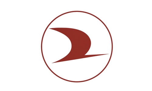
The new brand presents a refined version of the goose symbol encapsulated within the circle, which is now red in color. The goose has been adjusted, now placed at a more diagonal angle, and is smaller in size, as it does not reach the edges of the circle.

Turkish Airlines

The logo is now configured in white within the circumference, created with a palette of colors in red and white. The typography has been modified and now has rounded corners in some characters. The logo is accompanied by a wave chart composed of seven horizontal lines, which seek to refer to the seven continents of the world, in an attempt to transmit the airline as an international entity.

The logo is located at the point of convergence, or center of the graphic line, which appears to represent “Turkish Airlines at the center of global travel,” the design consultancy mentioned.

Red and white are the main corporate colors of the brand, and have been used to represent the economy class, while a combination of golden and black rose is the main palette of the business class, to create a more “premium” feeling and “distinctive” look.

In addition, a new set of graphic icons has been designed, representing different elements of the airline’s experience, including hold baggage and items that are restricted by airport security.

The presentation of this new image coincides with the launch of the new Istanbul airport in Turkey, which will become the new center of Turkish Airlines operations and which will open its doors in April. The current hubs of the airline are Istanbul-Atatürk Airport and Ankara Airport.

The new brand has begun to expand, starting with signage, positioning, billing counters and other interior points of contact at the new airport.

This new rebranding will continue to be implemented over the next few months in interior aircraft designs, digital platforms that include the website and social networks, printed advertising materials and merchandise.

Imagination has also created a set of guidelines for Turkish Airlines, so that the company can continue to produce branded products in the future, such as signs, shoes and blankets in the cabin.

Read More at Turkish Airlines Updated its Logo

Starbucks Will Redesign its Packaging to Fight Against Pollution

Starbucks

The international coffee chain Starbucks will make the change to an eco-friendly packaging design that allows its customers to recycle the packaging of the products.

Starbucks makes a change

Starbucks sells about 4 billion glasses per year. Each and every one of the drinks offered by the company are distributed through these disposable containers that significantly damage the environment. Only 10% of the material that composes them is recycled, so the margin of improvement that the company seeks can be very remarkable.

CHENGDU, SICHUAN PROVINCE, CHINA – 2015/09/13: Coffee cup on table in a Starbucks cafe. Starbucks is streamlining the ordering process so customers are able to get that cup of coffee faster than usual. (Photo by Zhang Peng/LightRocket via Getty Images)

Each year, an estimated 600 billion paper and plastic cups are distributed globally*, and though Starbucks cups only account for an estimated 1 percent of that total, we are invested in finding a more sustainable solution. We have made substantial progress to reduce the impact of waste generated in our stores through cup innovation and improved packaging design, advocacy for local recycling infrastructure, and offering reusable cups.

– Starbucks Headquarters

The international coffee chain, like food giants such as McDonald’s , Coca-Cola or Nestlé , has joined the investment platform for sustainable consumer goods NextGen Consortium. Through the enactment of the NextGen Cup Challenge last autumn , more than 500 participants from 50 different countries have presented innovative design proposals. After months of rigorous evaluation, the number has been reduced to 12 projects, which, in addition to being able to be selected to change the appearance of Starbucks packaging, opt for a prize of one million euros.

Starbuck packaging

New packaging

These finalist projects are divided into three large groups. The first one is related to the initiatives to create a new design for the lining of the cups. One of the selected ones was from the company Footprint US, which has created new containers based on 100% recyclable fiber. The second one is the group that studies the work with new materials, a category in which only Solublue has been selected, which has created a biodegradable plant-based cup. The third and last group is the one that has created reusable containers, among which we can highlight CupClub, which aims to create cups that are returned to Starbucks after use.

Our goal: Double the recycled content, recyclability and compostability, and reusability of our cups and packaging by 2022.

Despite all the proposals and the great commitment to eco-friendly packaging , we still have to wait a few years for the change to be real and our coffees to be respectful with the environment.

Starbucks – providing global solutions since 1997

Although this is a massive leap in the production process, one that could literally change the way products are made for years to come, it’s not their first run-in with eco-friendly products.

Back in 1997, Starbucks introduced the now widely used cup sleeve. Yep, the little cardboard sleeve that goes around your cup and pretty much any coffee shop was invented first by the people at Starbucks. It may seem a little counterintuitive, but it was actually a very green solution to the impractical practice of double cupping. Back in the day, people used to just use two cups in order to absorb the heat.

And, the push to change the impact of plastic cups and lids didn’t stop there.

In 2006, Starbucks developed paper cups manufactured with 10 percent post-consumer recycled fiber, the first cup of its kind in the food packaging industry to be approved by the U.S. Food and Drug Administration in 2006. We also introduced a more recyclable cup lid in 2016 which allowed the cup to be more widely accepted.

– Starbucks HQ

What’s next?

It’s very clear that Starbucks both as one of the most well known coffee brands in the world, and a food industry powerhouse is concerned for the environment. As time goes on, I imagine that we will see lots of changes come out of Starbucks HQ, more particularly, ones that positively affect our planet.

Only time will tell if these changes will actually make a change. Starbucks and the other companies mentioned are a great start to this ever growing problem, but it will take all of us being a little more cautious with our choices to reverse the damage that we’ve already done.

Read More at Starbucks Will Redesign its Packaging to Fight Against Pollution

6 Questions to Ask Before Picking an eCommerce Platform

e-commerce platform

Behind every successful ecommerce website is an ecommerce platform that makes it possible for the business to manage content, promotions, profiles, shopping carts, orders, inventory and fulfillment.

There are many on the market today to choose from, so it can be difficult to know which one is right for you. And when you consider that what works well for one business may not work well for the next, it only makes the decision that much harder.


If you’re trying to decide which ecommerce platform to use or preparing to switch to another that better fits your needs, use this to help guide the decision-making process.


What Kind of Products Are You Selling?


There’s a big difference between selling digital products and physical ones, and there’s a big difference between selling to end consumers and selling on a wholesale or enterprise supply basis.

e-commerce platform


If you’re selling digital products, you need a system that will make it easy to automate product delivery emails and give you the option to limit the number of times the media you’re offering to buyers can be accessed or downloaded.


If you’re selling physical products, there’s shipping to consider. Does the system make it easy to choose between shipping providers, so you can get the best deal on shipping parcels to buyers without having to pass on a huge shipping expense? Is it easy enough to store information about the size and weight of your inventory, so you can print shipping labels with ease? Does the platform have the capability to surface different content experiences and pricing structures to bulk buyers?


Are You Hosting the Store Yourself?


You have the option to choose between a self-hosted platform – where you source your own server from a hosting company and install the ecommerce platform there – and a hosted platform, where all you do is login to the store’s cloud-based backend and the platform handles hosting and software upkeep. The latter is known as Software-as-a-Service, or SaaS.

e-commerce platform


This might be the biggest differentiating factor for all of the various types of ecommerce platforms on offer today. If you host the store yourself, you’ll have costs associated with hosting, and you’ll need to be sure your host has a high uptime rate, so you can be sure your website is always up and running. You’ll want to know what will happen to your sales emails if another website on the server gets backlisted. You’ll also want to know what kind of security measures they take to protect your website from hacks, and how frequently they save backups.

If you opt for a hosted platform, you’ll likely pay a monthly fee to the service to help them cover the hosting expense and product updates. Which leads us to the next point – the affordability of the pricing model.


Which Pricing Model Is More Affordable?


This primarily depends on your expected sales volume. Some platforms don’t charge a monthly rate but will instead charge a percentage of each transaction to cover their costs. You’ll have to run some calculations based on your projected average transaction figures and the average number of transactions you can expect to process, to help you determine which price model is the more affordable option for you.

e-commerce platform


Take for instance a comparison between the Basic Plans offered by BigCommerce and Shopify. BigCommerce is $29.95 a month and does not charge a transaction fee, but you’ll have to pay fees if you use PayPal as a payment processor – those fees go to PayPal, to the tune of 2.9% and 30 cents per transaction. Shopify on the other hand, charges $29/month, plus the same 2.9% and 30 cents per transaction you’d pay PayPal.


Yes, on the surface, this means that BigCommerce and Shopify have similar price tags to merchants. Ultimately, though, there are other costs involved, as each platform has different tools, functionalities and themes that come with basic accounts, while billing more monthly fees to access other features. With self-hosted platforms like Magento or WooCommerce, you’ll
pay less for the software license, but more for the hosting – and there are often “hidden” development costs, since installable packages generally don’t have the same self-service accessibility that SaaS solutions have.


Is It Easy to Use, and How Much Control Do You Have?


If the people who are responsible for managing your e-shop’s content, transactions and shipments cannot easily use the platform, you’ll lose money in lost productivity and potential errors. While you always have the option to train your staff on a new platform, it makes sense to use one that is intuitive and won’t require a lot of training. In this case, you can sign up for trials of your top two picks, then let the staff vote on which one is easier to use. Even if it’s the more expensive platform, the difference may pay for itself.

e-commerce platform


Just keep in mind that you’ll usually get the most control over design if you opt for a self-hosted platform, since you’ll have access to the source code. But that also means you have more responsibility to keep things up and running. And if something breaks, it’ll likely be on you to fix it.


If you don’t have a lot of experience designing for e-commerce, it may make more sense to have most of the design covered for you – but if you want to make sure your shop’s interface fits in visually with the rest of your branding, you may feel differently.


Is It SEO Friendly?

If you don’t have control over various SEO elements, like schema, xml sitemaps, page titles and meta descriptions, then you’ll have a harder time ranking the store in search engines, which is vital to your overall success.
Ads are expensive, organic social media doesn’t offer the customer acquisition impact that it once did, and while email marketing is huge, you won’t have much of a subscriber list of people don’t have an easy way to find your website.

e-commerce platform


You want to aim for as much organic traffic as you can, so optimizing your site for discoverability on Google matters. If a given platform strikes you as being not particularly SEO friendly, there’s really no point in investing in it, regardless of how great a platform seems to be otherwise.


Read Up and Run Experiments


Don’t expect to be able to do 15 minutes of research and emerge on the other side confident that you know which platform you want to use for the tech infrastructure of your online store. It’s not a decision to be taken lightly – it has the potential to have too much influence on your bottom line.


Take your time and do your homework when comparing platforms. Make a list of the platforms you’re considering and why, then compare them side by side to help you narrow it down to a couple you want to try. Only when you try the platforms hands-on will you be able to determine which is best for your business.

Read More at 6 Questions to Ask Before Picking an eCommerce Platform

7 Important Steps After Installing the WordPress Platform

wordpress Platform

You’ve taken the first steps towards building your own website after installing WordPress, but you’re wondering what’s next?

(You can refer to the WordPress installation guide here)

Well, WordPress is an incredible content management system (CMS) – the most popular in the world – and it is quite easy to learn. But, after installing WordPress and seeing the blank screen of the new website, moving ahead may seem intimidating.

After all, there are tons of unique ways to bring a WordPress site through its many themes and plugins. Not to mention basic requirements such as general setup adjustments that allow data analysis, contact form creation, and other essential information on the website.

Wordpress Platform

Here’s a checklist at your fingertips covering the first 7 steps you should complete making your site run.

1. Enter the site information (Title, Time Zone, Profile)

Website Title and Slogan In the WordPress control panel (which will be accessible immediately after installation), navigate to Settings> General. Here you can enter the website name and a slogan. Many websites choose to use the slogan space to display a brand motto.

Time zone
While you are still in the General section, scroll down to adjust the date and time format you want to display on the website, and the time zone in which it operates.

Profile
Profiles are implemented in the WordPress theme, and if you are blogging, your profile can be represented alongside uploaded posts. It’s a good idea to fill this short section earlier in the process.

From the dashboard, navigate to Users> Personal Profile. From here you will be able to enter your user name, contact information, a short biography, and a profile picture.

2. Delete unwanted content (examples of articles and themes)

Wordpress Platform


• Deleting article and page examples
If you look at the Dashboard articles section, you will see content as a blog post called “Hello World”. You can remove unwanted posts by navigating to Articles > All Articles and selecting the Garbage option. In the same way, to remove unwanted pages, go to Pages> All Pages and choose the garage option.

• Deleting default themes
You will also find default themes included with the WordPress installation by default. While you are already removing excess content, it is possible to delete other unwanted themes to clear your navigation and save space.
To delete a theme from the dashboard, navigate to Layout> Themes, then select the delete option in the lower right corner of the unwanted theme.
Note: Active themes cannot be deleted. If you want to remove an active theme, you will need to disable it before deleting it as usual.

3. Choose a WordPress theme


Provided by WordPress or third-party developers, the WordPress theme will determine the look of your website. Free or paid themes are available in the WordPress thematic directory.

While you should choose a theme based on taste and budget, it is important to keep in mind that paid themes offer wider customization options, frequent updates, more careful assistance, and easier functionality.

Also, it is important to remember that each theme is coded and works differently, so make sure you look at the support documentation when you modify the theme or check the compatibility of the modules.

4. Install plugins

wordpress platform


Plugins are great because they extend the functionality of WordPress sites and are essential for most sites. This is because WordPress is packaged with everything that is needed for the sites itself, so additional site features such as a list of products and services, two-factor authentication, payment processing, and more are possible only by installing plugins.

5. Securing the site

The real trick in keeping your site safe is a good security practice.
Strong passwords, a hidden address of the administrator and making sure your site is up to date is all needed to protect your website.

WordPress security plug-ins are available to further enhance site protection by adding additional features, such as two-factor authentication password protection.

Two-factor authentication requires a second user-specific code that changes during authentication to make strong passwords.

In addition, to demonstrate that your site is safe for users, you will want to install an SSL certificate.
SSL certificates protect against external attempts to intercept registered users.

6. Link your site to Google Analytics


Making and developing a website is one thing, but ensuring that it works well and continues to do this is something else.

To monitor website statistics and plan stronger strategies for your site, you’ll want to link it to Google Analytics.

This will allow you to analyze traffic, user behavior, and other useful information to better understand the audience. Virtually all successful companies follow their operational data to influence managerial decisions, which means you can not afford to neglect your own data.

7. Create a backup


With the preliminary steps completed, you are almost ready to launch the website. But, before doing so, it is worth creating a backup reserve.
This last task may seem easy to ignore, but it could become the most important.

Imagine that after all your work and effort you have made a popular and profitable site. But then somebody manages to break it and suddenly everything that you have worked is gone and nothing has ever been there.

Having a website backup, it can be restored.

However, remember that WordPress does not come with a backup system, so you will need to manually backup.

Read More at 7 Important Steps After Installing the WordPress Platform

This Is How You Choose A Domain Name

Domain name

Choosing a domain name is similar to choosing a company’s name – it requires a lot of thought and consideration.

Your domain name is your identity on the web!

So you have to make sure that you choose a domain name that not only fits your business, but it is also easy to find and promote.

Do you want your website to make an impression and stir the user’s interest ever since the name was pronounced?

Find a domain name relevant to your activity, using Google’s keywords and Keyword Planner to describe your business and the services you provide.

Keyword Planner can be used to find a domain name, but you can also run a marketing and advertising strategy.

Do not use a long and complex domain name, risk being misspelled by users. Better short and easy to write, this is essential for online success.

Appropriate extension for domain names

Extensions are suffixes, such as .com or .net, at the end of web addresses. They may have specific uses, so make sure you choose one that works for your business. 

There are a multitude of new generic top-level domains – such as .bar.pizza, club , .pro etc – offers a great opportunity to record short and very relevant names.

See here a list of over 400 domain extensions you can buy.

Avoid numbers and crap

Numbers and mistakes are often misunderstood!

Without numbers and hyphens, the domain name is easier to write / pronounce, and you can avoid any confusion that the user can do, but this is not a general rule.

Be memorable

There are millions of registered domain names, having a field that is appealing and memorable is essential. Once you come up with a name, share it with your close friends to make sure it sounds appealing and makes sense to others.

Read More at This Is How You Choose A Domain Name

3 Ways to Increase Organic Impact on Facebook

Organic Impact

Organic impact on Facebook seems to be a continual challenge in recent years. When we talk about organic impact, we mean those people who see what you post on your facebook wall or on the business page, on a case-by-case basis. Well, Facebook algorithms increasingly limit this impact.

This is logical if we think about how much content is produced on a daily basis. It is normal that if we have 5000 friends, we can not see what everyone posts. We typically only see a select few posts, from a few people that we interact with regularly.

However, when we have an online business and promote it on Facebook, the organic impact is extremely important. Each of us wants our audience to be as broad as possible. We want to expose our products to as many people as possible.

Organic Impact

Now, you may be asking, “If Facebook limits our reach, how can all this be possible?” Fear not, and read on:

3 tricks to increase organic impact on Facebook

For more organic impact there are a few small tricks you can do. Let’s break it down:

Post more videos

Statistically speaking, more videos means more interactions. If you really think about it, it makes a lot of sense. The video format provides easy sharing of quality content. Even if someone isn’t on your page, they may end up seeing something from your brand that has been shared, as long as it’s worthy of being shared.

According to a study by Harvard Business Review, users who are exposed to video content are twice as attracted and more attached to the company that distributes them compared to companies that distribute basic content: simple text and a few images.

Another positive for distributing videos is the amount of varied content that can come out of them. You can use videos for a lot of things: presentation video, unboxing products (user-generated video – it also greatly contributes to the credibility of the company). You can also post short product advertisements, internal videos, training sessions, sessions, interviews, testimonials, etc.

Organic Impact

Create dialogue and answer questions

Facebook allows you to post questions on the home page. Use this feature to engage other users. These questions are seen by Facebook as a way of engaging people in discussions, therefore, they have priority at the top of the page

Facebook has a unique way of bringing people together. In a way, it’s the perfect platform to make your customers feel comfortable to ask these questions and get the answers they’ve been looking for.

Bringing your business to where most people feel most comfortable (social media) it provides a comfortable environment for you and them to discuss more about your product.

The secret? Engage with your customers. In most cases, it’s even worth it to have a team member dedicated to social media interaction completely.  

Use the power of groups

If Facebook does not help you get an organic impact, make yourself a place in the sea of ​​posts on your fans wall. Use group posts. For example, are you launching a new product? Post a video about it on your business page, encourage people to tell you what they like about this new product, and then share the post with interest groups.

Moreover, you can encourage your employees to share their page posts on your personal page. This will multiply the overall page audience by 5% of each of your employees’ list of friends.

Organic Impact

The perfect mix between organic and paid impact – the ideal promotion solution

How can you find the perfect mix between organic impact and impact paid by ads?

Facebook Ads provides quite a few helpful numbers. They allow you to track performance pretty easily, actually. With this information, start up an impact campaign. Use the same budget on both organic and paid traffic promotion. After you’ve gathered enough data, compare the two, and find the balance.

The goal is to answer this question: How much does it cost (time/money) to grow organically up to 10% extra impact after every month vs. how much would it cost me to bring that 10% + impact through a paid campaign? Is it worth my time and my efforts to keep on increasing the organic impact or could I invest to get better and faster results?

You will find the mix between organic and paid by testing different variants. One month, you can try growing just organically. And the month, you can try to see how much money you have to spend to achieve the same results. After that, you can simultaneously try organic and paid growth.

It’s really nothing tricky, but that’s how you estimate growth and impact. It takes time, sure, but it’s worth it!

Organic Impact

How can you determine the perfect balance?

After taking the organic route for 6 months – 12 months, compare the results and see how much the site’s impact rate has increased (how many visits in analytics). Then you take the keywords that you’ve focused on organic promotion (the products you’ve shared, the keywords used in SEO campaigns), make an Adwords keyword plan with those words, and see what impact you could get using a Google Ads ad using those same words. Keep in mind, these will be paid ads, so keep track of costs at all times.

How big is the organic impact relative to what you might get from the ad? How much did it cost you to get that organic impact, in relation to the cost of advertising? Using that information, ask yourself if it’s worth the paid advertisement cost. If you can get the same results, and spend less money using organic searches, it’s probably within your best interests to take the organic route.

The conclusion

There are quite a few little tricks here and there to help increase your impact on Facebook, but these are the most widely used, and arguably the most effective. The best mindset to have when going into Facebook advertising is to be ready for a change. Algorithms change, and so do people. You have to be ready to change up your strategies at any moment and adapt them when they aren’t working like you want them to.

Read More at 3 Ways to Increase Organic Impact on Facebook

10 reasons why your website doesn’t get enough traffic

website traffic

Every online business you can name has one goal: increase sales and profit as much as possible. In the online environment, this all starts with a simple process: increasing traffic on your website. Look at it from this perspective, if you have an online site but you do not have enough traffic, it consumes your resources in vain.

And yet, there are so many online sites that don’t benefit from user visits. Why? To be honest, there are quite a few reasons this could be. Below are the top 10 reasons.

1. SEO optimization on irrelevant words

Each niche has certain keywords that need they aim for to rank decently in Google. If you sell TVs and you rank on Google for audio systems, it doesn’t really help you. In addition, if you try to rank yourself for an extremely general keyword (like the word “TVs”) you will notice that it’s pretty much impossible to rank decently, or, at the very least, there’s an insane amount of competition.

You have to choose something specific. Keyword research is a vital part of SEO for this very reason. Identify what users are looking for on Google and optimize those words.

website traffic

2. Faulty links

Another very common cause that affects traffic is lost or defective links on the site. Have you ever gotten that infamous error 404? In this case, check where that page is on your site. You may have redirected the page, or you may have changed the URL and did not make the interconnection by 301 redirects. This can lead to the loss of links, and this will surely lead to a decrease in traffic.

3. Penalties from Google

Google’s penalties are quite rare, but cannot be eliminated from the equation. If you’ve tried to optimize the website, if you have multiple suspicious links to your site, if you have duplicate content, or if you do not respect Google’s rules, it will penalize you. If your website traffic has fallen sharply, or if you simply launch the site and fail to get visits, that’s probably the cause.

website traffic

4. Site loading speed

Ask anyone, absolutely anyone, and they’ll tell you that slow loading screens will make them click away. People use the internet for their convenience, if you interrupt that in any way, you’ve most likely lost traffic.

Every website should be optimized for the fastest loading speed possible. Here are a few, very quick ways to do that:

  • Use images sparingly
  • Limit the amount of GIFs and videos
  • Condense text

Simply explained, if your website has a lot to load, it will take a while. You have to find the balance between necessary and extra content.

5. Server issues – low-quality hosting

And here, the problems are quite common. Visits to your site can be clearly influenced by the quality of your chosen hosting. Perhaps the site is offline fixed when a large part of your users enters it. To have quality hosting, make sure that uptime is guaranteed, as high as possible. What is the uptime of a website? You can see this here.

6. Navigation issues

The way users are able to navigate your site can influence traffic. If the user finds it hard to find the information they want on the site, they will definitely leave. Try to make a site as clear as possible, with an airy and clean structure. And do not forget, the content is also extremely important. It must walk the user up to the final step – the command. If he does not find interesting content on the site, the user will leave.

The answer here, for most sites, is almost always placing the search bar in an easy to find area. Don’t hide it, make the icon small, or neglect to use one entirely. Place that search bar front and center.

7. Unoptimized mobile site

Over 70% of current traffic comes from mobile, and we can expect those numbers to go up increasingly in the next few years. A website that is not optimized for mobile will have clear deficiencies in attracting traffic. From the start, your website should be optimized for mobile. As more and more users are starting to use mobile devices to find what they’re looking for, your website can become obsolete really fast if it’s not mobile optimized.

website traffic

8. Lack of promotion

You can’t find a website if you don’t know about its existence. It’s not enough to build a model website if it’s not promoted as it should be. Online promotion is the best way to bring traffic to a site, especially if it’s new. Closely related to SEO optimization, promotion is an unimaginable growth engine for your business.

With that said, look for ways to advertise your website. Whether it’s organic growth, or growth created by paid ads, growth is still growth.

9. Poor or unattractive content

If your site does not tell a story to the visitor, they will leave and avoid ever landing on your site ever again. Poor, unskilled, and unattractive content for the user will quickly deter users from visiting your website. Try to maximize the attractiveness of content through copywriting techniques in terms of text, by combining text with pictures and techniques for creating interactive content.

10. Incorrect indexing

Indexing is the process by which Google sends crawlers to your site to view, categorize content, and position you on the search engine. If the indexing was done incorrectly (either because of technical difficulties or because of mistakes made by you in optimizing the site), it will not appear on Google and therefore will not have traffic. Make sure your site is properly optimized and reindeer it on Google.

website traffic

The conclusion

Hopefully you don’t have any of these issues, but if you do, try to get them resolved as quickly as possible. The web holds infinite possibilities for us all, and it’s worth taking advantage of them.

Even if you are happy with your current site traffic, try approaching a few of these issues and optimize your website as best as you can. In the end, hopefully you’ll see growth, and we all want that, don’t we?

Read More at 10 reasons why your website doesn’t get enough traffic

White space and action buttons – 3 UX rules to perfect design

White space

Studies have shown that the first impression a user gets when visiting a site is strictly influenced by the design of the page they are reaching. Design is a very subjective element, just like user preferences. Using these elements, some UX rules have been created. If we abide by these rules, we can pretty much expect a massive change in the way users view and use our sites.

Each site has a well-defined purpose. It usually involves sales. In order to sell, a site must guide the user, and urge them to act. This is done by action buttons. The more convincing they are, the easier it will be to attract the user and get them to act. But the attractiveness of the buttons is not the only factor at play here.

Here are some UX rules that we can apply to make sure our site is successful.

How do we design attractive web buttons?

The most important thing in designing an action button is the color of the button. The negative space (the space around the button) is also important. There must be a strong contrast between the two so that the action button stands out.

White space

Thus, the Contrast Rule is paramount in this case.

The most contrasting color schemes are:

  • yellow on black/black on yellow
  • blue on white
  • red on white

Using these color schemes between the button and the negative space can ensure the success of that button. Thus, it can help the user interact with the button.

Negative space is extremely important. Another rule that applies in this step is the Rule of the Laws of Gestalt. If a form is extremely close to another form, they will be perceived as a unity. Thus, if the action button is not effectively isolated in the negative space, it can be perceived as a unit of another section. In this case, the button will lose its relevance and will certainly affect the conversion in a negative way.

White space of web design is extremely important. White space items should include:

  • margins, padding, gutters
  • white spaces between sections
  • line spacing and background – negative space

UX Rules: Why should the negative space always be white?

White space

White is a non-color. So every color placed above the white will contrast. It’s twice as easy to identify an action button placed on white than any other color. The white spaces of the sites should not be seen as simply background but as a negative element. They should be used strategically to isolate CTA buttons and clearly delimit sections of the site.

White will help the site look tidier but, most importantly, will help the visitor understand the purpose of each section.

According to specialists, pages with a lot of white space helped up to 20% more users to read content and interact with the site. Why do you think most online stores have a white background? Because administrators want to highlight products, purchase sections, and action buttons. And it really works.

White space

How important is content for action buttons?

The content is EVERYTHING in this case. You have 2 to 3 words to push the user to click on the button. Here’s what you need to consider: Less is More. This also applies to design. Less color more clarity. But as far as content is concerned, it is the first rule that we should take into account.

The fewer words the stronger and more convincing the button will be. It always starts with a verb and keeps an imperative tone. These are the buttons that convert, according to the specialists.

There you have it

Just to recap, the 3 very important rules for creating and designing the perfect CTA button are:

  • Use contrast
  • Optimize your white space
  • Less is more

The idea is to get people to see the button, distinguish it from everything else on the page, and convince them to click it. In most cases, you only have a few seconds to show them why it’s worth it, so make it count.


Read More at White space and action buttons – 3 UX rules to perfect design

10 extremely useful tools for a web design company

useful tips

The web design world and the online jungle are changing daily. To cope with change and keep us at the top of our game, adaptability is needed. Learning to use the latest tools, always looking for information, and always following the new trends is nothing shocking for web specialists.

A web design firm needs to always be up to date with everything happening online. Because of the increasing amount of work and information, we must always look for ways to make our work easier.

Today we present 10 such ways, represented by 10 tools (mostly free) that we can use in a web agency to make our work more efficient.

useful tools

Tools for web designers

DotColors – is a great program that can extract color from CSS, HTML and JavaScript based on the color code. All you have to do is copy the color code, and it will show your results in an orderly list, showing you both the color you are looking for and other variations that match it. This will make it easier for you to create a graphical layout by helping choose the right colors.

Duet – your extra display when you need it. It is an extremely useful application that allows you to see real-time changes made to a website without switching from one window to the next. All you have to do is use a device connected to your laptop with a 30-pin cable. You will have instant access to 2 screens.

Duotone Effect Generator – as the name implies, this is a program that helps you to make any image in duotone. Select the image, apply the layout over it and have a perfect image for a slider, for example. This is very useful when you want to change black and white images or other color schemes without opening Photoshop.

udeful tools

Tools for Project Management

Monday – Monday is one of the most popular project-management tools on the market today. It is one of the most effective ways of managing tasks and communicating with customers. It is the only program that is not free on this list, but it could be worth the full cost.

Prompts – a program that can be programmed to automatically answer questions. While it is usually a better option to have human to human interactions, Prompts offers a faster solution for those who are overwhelmed in the customer service department.

Tools for Content Managers

FindShot – your free collection of pictures. You can use pictures for blog articles or content on your site. If you choose to use this, you’ll receive monthly suggestions of full sets of images.  

Semantic Experience by Google – this tool is useful for content marketers or copywriters, but it can also be useful for programmers. It’s interactive training to find semantic links between words and site content. For example, one of its functions will help you quickly find synonyms for words, engaging in a counter-timing game where you have to type the first thing that comes to your mind when you read a word. You can find synonyms or you can quickly create a lexical field, and this helps you to establish keywords in your SEO plan or Adwords promotion plan for your site.

useful tools

Tools for the programming team

Trueface – an application that easily integrates facial recognition into any mobile application.

Lhobes – an educational application that automatically creates visual or auditory patterns using a built-in layout. It can be used to create icons, storyboards, or info-charts and sounds for the site, which can then be automatically enhanced by default commands.

Fonts.LOL – Free and scalable OpenType SVG Font Library. You do not have to sit and make graphic fonts or write specific code for each font. You can implement a custom, automatically-crafted font that allows live and customized changes of any kind, without editing shapes or colors.

Read More at 10 extremely useful tools for a web design company

The unofficial Pantone color of the year 2020

Pantone


Every year in December, Pantone, a color categorizing company, nominates their color of the year. Typically speaking, these colors are meant to represent something significant going on in the world. But the Pantone color of the year 2019 has stirred up quite a controversy.

Let’s start by mentioning last year’s color: ultraviolet. This wild shade of purple was chosen because it stands for originality, ingenuity, and visionary thinking.

Now, fast forward to Pantone color of the year 2019, they’ve decided on a lush red called living coral.

What’s wrong with Pantone color of the year 2019?

As I mentioned before, these colors are chosen to represent something significant. According to Melbourne based design agency Jack and Huei, this “living coral” glosses over the fact that corals are dying at an alarming rate all over the world.

Being from Australia, Jack Railton-Woodstock and Huei Yin Wong, owners of Jank and Huei are greatly concerned. You see, Australia’s waters are home to some of the most beautiful and endangered coral species on the Earth.

The unofficial Pantone color of the year

In protest to the official choice from Pantone, Jack and Huei have taken it upon themselves to create a new color of the year.

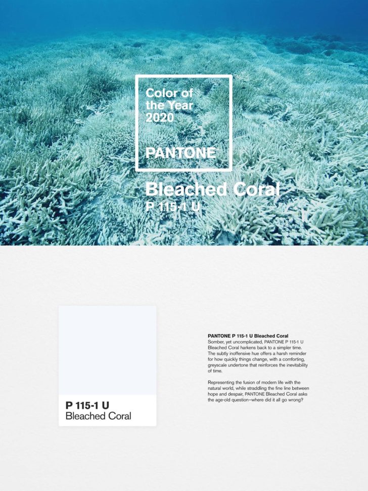
During their search for a more appropriate color, the duo came across Pantone sample #F0F6F7. This is a very pale, washed out blue that perfectly matches the dead stems of the coral being affected.

The process of coral dying is called bleaching. As the coral begins to die, it’s exposed skeleton loses all color, and becomes nothing more than a glorified stone.

In light of this color, and the name of the process, Jack and Huei decided to call the unofficial Pantone color of the year “Bleached coral” instead.

This is an issue we care about deeply and we think the creative industry has an opportunity to bring this global issue from the depths of the ocean to the surface of our screens. – Jack and Huei

Pantone’s reaction

As of right now, Pantone has yet to have any sort of reaction to this sort of protest. Most likely, they won’t have much to say.

But, the good news is that artists and designers just like Jack and Huei are using their talents and skills to bring more awareness to issues just like this one.

It’s the responsibility of all of us, creative or otherwise, to find creative solutions to big problems, and right now there aren’t many problems facing humanity that are bigger than climate change. – Jack and Huei

What’s next?

Jack and Huei’s plans are to continue their efforts well into 2020. They’ve begun to brand their newly proposed color using Pantone’s style in order to help bring in more awareness.

“Somber, yet uncomplicated, PANTONE P 115-1 U Bleached Coral harkens back to a simpler time. The subtly inoffensive hue offers a harsh reminder for how quickly things change, with a comforting, greyscale undertone that reinforces the inevitability of time.

Representing the fusion of modern life with the natural world, while straddling the fine line between hope and despair, PANTONE Bleached Coral asks the age-old question – where did it all go wrong?”

These are powerful words that bring a powerful message with them. Hopefully, the efforts of Jack and Huei, as well as others around the world will begin a new age for our planet. One where we value the natural beauty and wonders that we’re surrounded by each and every day. One where all life is valued and fought to be protected, instead of ignored. One where we can look at the issues we face, and overcome them together. We only have one Earth, it’s about time we started to treat it with respect.

Read More at The unofficial Pantone color of the year 2020

Is Your Web Design SEO Workflow Optimized?


Search engine optimization projects can be very complex, from ​SEO audits​ to content development. Having an optimized strategy on how to approach SEO for web designers not only ensures your design team has clear project direction but also increases client satisfaction. Is your SEO workflow optimized? Here are a few productivity tips to make sure your strategy is fully-optimized.


Make SEO Project Management Visual


This is a very important tip to improve productivity and optimize your SEO workflow. Unfortunately, this is where many SEO and marketing agencies fall short on projects. By having a visual representation of a project, you and your team can see the progression of projects and tasks, as well as what is still to do.

This also helps keep tasks from falling through the cracks, especially since search engine optimization projects are so complex. There are plenty of ways you can approach this. One way is manually, but that can be time consuming. The other is using process documentation software that does the work for you.


Process documentation is a roadmap for your organization—it helps you identify the current state of a process to know how you can improve it. Any task that is done more than once or completed by multiple people needs to be documented.

Develop a Task Workflow for Maximum Productivity


Simply outlining tasks, or sprints within the project backlog is great, but doesn’t necessarily enhance the overall productiveness of your SEO agency. To truly ensure workflow is optimized, you need to develop a workflow for tasks within the project workflow. It is kind of like setting small goals supported by a detailed plan to achieve on big goal down the road.
There are four elements of a task workflow that is highly productive for SEO, or any other project management process. These include, task planning, daily check-ins, review and feedback sessions, and post task analysis to ​improve strategies​.

1.Task Planning

This is the strategizing stage of a task and answers the what and how questions. For example, let’s say one SEO task, or sprint within a client project is to create six location based landing pages to capitalize on local search results. Task planning would consist of the what is needed to accomplish these pages, like location specific keywords, addresses, phone numbers, and content, as well as how to implement these pages.

It is important to keep task planning time efficient, since some tasks don’t need a lot of strategy to get started. In other words, don’t spend an hour strategizing the what and how when it comes to creating a single web page. Utilize your time efficiently.

2. Daily Check-Ins


This is a very important part of increasing project productivity. Essentially, daily check- ins are quick 15 to 20 minute meetings where project anagers, SEO managers, and team members gather to update one another on tasks and the overall pace of the project.


For instance, if you were a project manager, you would huddle your team and find out what each team member has completed from their task list, what they are currently working on, and any issues that need to be resolved. Then you can jot down notes, move the needle on the visual project board, and address issues.


Daily check-ins also give you a clear picture of the entire project in a very short amount of time. This helps ​keep team communication open​, and also allows you to update the client on progress and hiccups moving forward.

3. Review and Feedback Sessions


These sessions are imperative to ensure projects remain mission focused, based on the client business objectives defined by the project manager and SEO manager. By looking at all completed tasks, project managers can evaluate work done and examine it based on meeting client expectations.
If something seems out of place, the project manager can connect with the team and make tweaks on those completed tasks to ensure they are perfect before being closed out. These review and feedback sessions are great for client updates too. You can show clients how the project is progressing and highlight the benefits of each task for the main business aim.

4. Post Task Analysis

Each SEO project is unique, even if you deal with a specific industry niche. This makes post task analysis vital to keeping your SEO workflow optimized on future projects. For example, you and your team may identify a task or sprint that could have been paired with another task for more efficient progress. These sessions generally happen bi- weekly or monthly.
● Main questions to address during the post task analysis include:
● What did we learn from the tasks?
● What issues did we identify?
● How did we solve the problems?
● What areas could we make better?
After the meeting, the project manager and SEO manager can huddle and develop two potential new strategies that can be implemented next time around to increase productivity.


Wrapping Up . . .


Optimizing your web design SEO workflow is essential to growing your client list, as well as retaining existing clients. Using a strategic planning model like the one outlined above can make this happen. Search engine optimization is complex and depending on the size of the project, can be downright overwhelming. Is Your Web Design SEO Workflow Optimized?

Read More at Is Your Web Design SEO Workflow Optimized?

4 ways to attract customers by simplifying your website design

website design

There are times when customers want as much content as possible, as many design elements and drop-downs as possible. They saw some cool sites and they wanted a little of everything.

That’s quite understandable, but we’re trying to explain that a site with a lot of content and complicated design is not necessarily easy to use, sometimes even having the opposite effect for users.

That’s why we’ve created a mini guide of 4 Ways To Simplify Your Website Design To Attract Customers:

1) Shorten the content of the website:

Web visitors rarely read line by line, usually, they only scan the web pages and their focus is only on a few words and images. However, there are many web pages that have content that is not needed to send the message. You can clean up a lot of the content of a website by limiting the number of words on the screen. Try refraining text to remove parasite words.

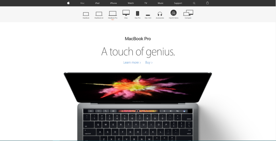
How can you do that? You can practice by expressing a single idea in a single paragraph – it’s a good way to write and helps readers “scan” the text with the look. Another way to write is the “pyramid” format, that is, start from the conclusion and add content along the way. A site that I really like for the simplicity offered is Apple.com.

2) Delete the visual decorations:

When it comes to visuals, it often happens that we want to add extra elements because it ‘looks good’. Everyone desires a design that looks good and unique. But although intentions are good, the end result may be disastrous. Try to have as little decoration as possible or other items that won’t distract the reader from what is important.

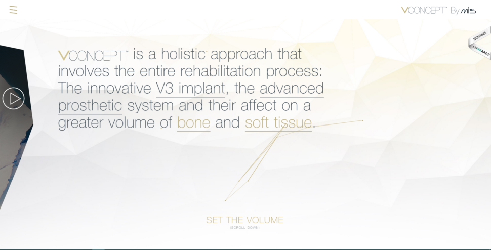
Below I attached a screenshot on the Vconcept.com page. It can be noticed that they do not have a lot of text, but the text is very difficult to understand and they have a problem with the fonts. They use plain text, underlined text, some words have a different color, and the first word that represents the company’s logo is a different font. We can also talk about all triangles flying in the background, a decoration that does not bring any benefit to the site.

3) Reuse design elements:

Try to create repetitive elements and consolidate them. If you use a lot of colors, fonts and style variations, the result will be overwhelming, but in a ba way. I recommend that you re-use the design elements to maintain a consistent design on the page. There are also some basic rules such as: Do not use more than two types of font per page. The same rule applies to colors and design elements. If you have a quote at the end of each page, make sure it looks the same on all pages.

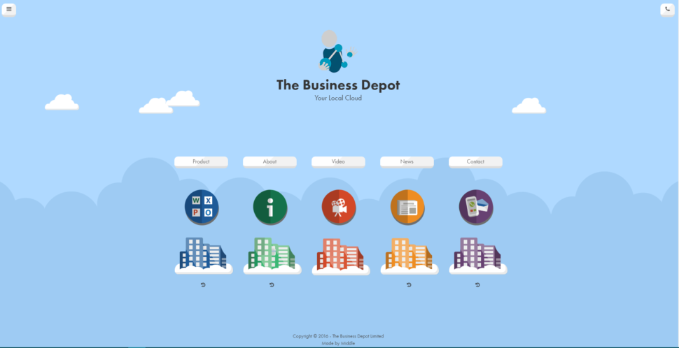
An example would be thebusinessdepot.co.uk. They seem to use a simple theme, but too many colors are used. Also for each page, there is a different color that has no meaning.

4) Have one user as target:

I know it sounds a little crazy for me to tell you this, but it works. I’ve encountered too many companies that are trying to address a wide range of clients, different ages, different backgrounds, different sexes, and so on. Which person do you think your message will reach if you have such a large target? Surely the message will be very diluted and so will be the results. Try to have one user in the head when thinking about the design of a site. Think exactly who you are addressing, what age you have, what educational profile, what gender, what hobbies and concentrate all your energy and resources on this person.

Also, if you have product campaigns on your site, try making them as clear as possible. If your goal is to make a customer purchase a particular online course, delete all the things that might distract him. I also recommend a landing page dedicated to each marketing campaign you have. This way you can send a much clearer message to your customers.

We hope that you found these tips helpful and that you will make your website stand out in the crowd.

Read More at 4 ways to attract customers by simplifying your website design

Spring fonts that will make you as fresh as a daisy

Spring fonts

Soon, the daisies will be in full bloom, and we can finally hang up that winter coat. As we enter these final phases of winter, it’s time that we start thinking about our Spring projects. Of course, no Spring project is complete without Spring fonts, but where do you even begin? Right here, of course! We’ve put together a quick list of some of our favorite spring fonts for you to use in your upcoming projects.

Lazy spring day

Spring fonts

Since winter is over, and we can feel the tips of our toes again, it’s time to relax. Not too much, of course, there’s work to be done. In order to get in that relaxed spirit, try adding Lazy Spring Day to your list of spring fonts.

This handwritten font puts off the perfect vibes for a nice Spring day. The rounded curves give it a welcoming feel that pretty much anyone can relate to. Give it a try.

Ofaly

Spring fonts

It’s pretty easy to see how Ofaly fits into the Spring fonts category. It’s handwritten, beautifully curved, and you practically smell the flowers through the screen. If you’re a fan of the Spring season, consider adding Ofaly to your collection.

Sunny Spring day

Spring fonts

The name of this font perfectly sums up the feel it gives off. Sunny Spring Day is bright, warm, and perfect for a variety of Spring projects. The color theme matches perfectly to that of a daisy, and it couldn’t be more perfect for a Spring project.

Lemon Jelly

Spring fonts

Whether you’re a fan of lemons or not, there’s no arguing the authenticity of this font. Lemon Jelly brings the beauty of Spring right to our computer screens. The bold, rounded letters are perfect for a variety of projects. It’s unique, but still perfectly legible.

Blackberry Jam

Spring fonts

Let’s continue the fruit flavored dessert trend, shall we? Blackberry Jam is another excellent font that displays both rounded curves, and a few sharp edges. It’s almost as if it was handwritten by a fountain pen. Regardless of how it was made, Blackberry Jam would be a great choice for any Spring themed project.

Bunch Blossoms

Spring fonts

Continuing with the handwritten theme, Bunch Blossoms is a great addition to anyone’s collection of Spring fonts. The messy, somewhat cursive style of the letters give a very personal and homemade feel. Just like that apple pie that sits on the windowsill on the perfect Spring day.

Melon Mojito

Spring fonts

Spring brings a freshness like no other season. With that freshness comes fresh fruits and veggies that we all like to enjoy. The Melon Mojito font perfectly captures the fresh feeling Spring brings with it. It’s fun, playful, and one of the best Spring fonts out there.

Vigenta

Spring fonts

Let’s not forget about Easter! Vigenta is a great font to help capture the spirit of Easter. It features tall, but narrow letters that look good on any Spring themed project. It’s classy, simple, and a great addition to your Spring fonts.

Fairy Tales

Spring fonts

Based on old-fashioned ads, the Fairy Tales font makes your next Spring project come to life. It’s not everyday that you get to live in a fairy tale, but this font makes it a little more achievable. This font package also comes with 10 animal vectors to add to your collection. All hand-drawn, of course.

The Fontaholics Colourbox

Spring fonts

Let’s finish off this list of Spring fonts with a bang, shall we? There’s no better way to celebrate Spring than with some color. The Fontaholics Colourbox comes with your own personal Spring care package. It features 10 fonts, 40 watercolors, 100 vectors, and 14 different patterns. Regardless of the project you’re working on, I’m sure this package will have something for you.

Spring, here we come

And there you have it, our favorite Spring fonts for this season. If you like any of them, and want to spice up your Spring projects, follow the links below each font, and enjoy!

Read More at Spring fonts that will make you as fresh as a daisy

Firefox Has a Rebrand in the Works

Firefox

Even though most of us use Google Chrome nowadays, and maybe even Explorer for those of us that are little more patient, Firefox is still a common and recognizable name. That’s right, Firefox.

In recent news, Firefox has a complete rebranding in the works. We’re not just talking about a new logo and a catchy phrase or two, we’re talking a complete overhaul of the name and what it represents as a whole. As they put it on their blog:

“With the rapid evolution of the internet, people need new tools to make the most of it. So Firefox is creating new types of browsers and a range of new apps and services with the internet as the platform.”

The new logo

A lot at Mozilla is changing, including the Firefox logo. In fact, all of their icons are changing in attempt to be more uniform. According to the team at Firefox, the old Fast Fox doesn’t offer enough design tools to represent what they’re about anymore.

In order to design the perfect logo and corresponding icons, a specialized team of designers over at Mozilla has been put together. So far, they’ve put together 2 new systems:

“Working across traditional silos, we’re designing a system that can guide people smoothly from our marketing to our in-product experiences.”

“Today, we’re sharing our two design system approaches to ask for your feedback.”

Firefox

As you can see, there are a few design ques that they’re keeping from the original logo. After all, Firefox just wouldn’t be the same without their iconic fast fox logo.

Involving the community

In the past, there have been quite a few rebranding attempts that didn’t really sit well with the community. Perhaps to avoid this sort of backlash, Mozilla has allowed the community to weigh their opinions on the blog post that announced this change.

Of course, Mozilla is taking caution during this transition, and rightfully so. We’re not just talking about a logo change, we’re talking about a structural change that can easily decide the future of the company. And, even though they want to know your opinion, they make it very clear that there will be no voting or crowdsourcing. The final decision will be up to them.

The masterbrand icon

One of the most noticeable changes will be the master icon. Yes, that little flying fox that circles the ominous blue circle will be leaving us, but not completely. As we said before, taking away the fox completely would mean abandoning their name, too. The design team is very aware of that, and came up with two new master icons:

Firefox

The spirit of the Firefox is still very much alive in these new icons, taking the most iconic characteristics from the original image, and evolving them. One being the face, and the other the tail, it’s still very easy to pick these icons out as Firefox icons. Although they seem to be shifting towards a more universal look, the colors and overall recognizability is still there.

Firefox Quantum desktop icon

Surprisingly, the desktop icon isn’t changing that drastically. Albeit, it’s not exactly the same, but it’s still the fox that we’ve all grown to know and love:

Firefox
Firefox

Above are the two proposed system designs that may be coming to a desktop icon near you. As you can already tell, it’s still a fox. The first system seems to relate more to the original icon, just with a different color theme and fox position. The second goes a little bit farther off the beaten path and ditches the blue circle, and gives the fox arms, as well as a more rounded look.

Which set will they choose?

Arguably, both sets of icons look pretty good. They’re still probably going to pump out a few more ideas and listen to the feedback, but ultimately, I would think that these two systems are very close to the finished product that we can expect.

What do you think? Is Mozilla going through a much needed change, or are they making the biggest mistake of their careers? There are quite a few icon possibilities in the images above, so take a look and decide for yourself.

Read More at Firefox Has a Rebrand in the Works