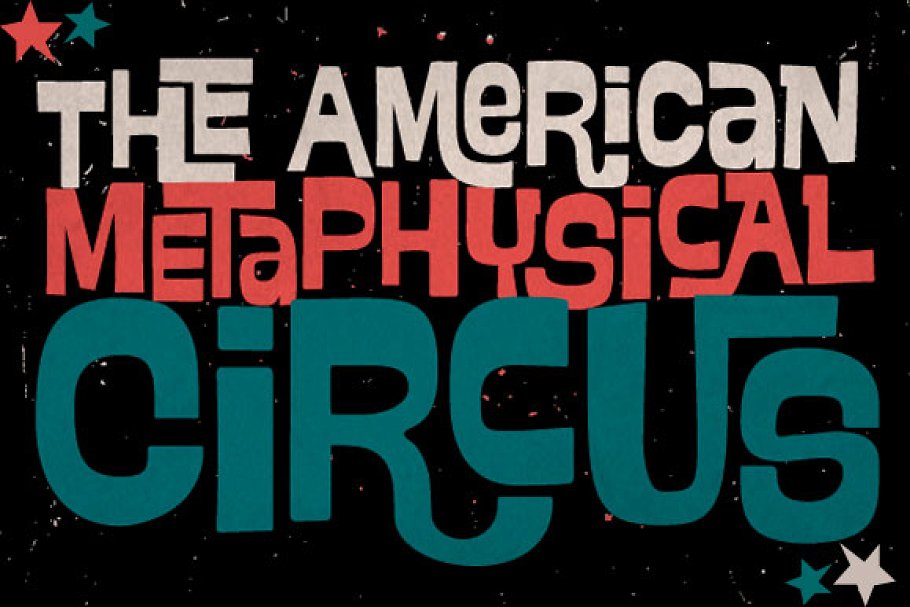
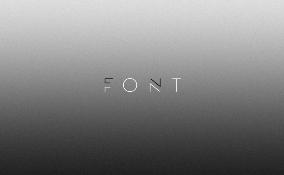
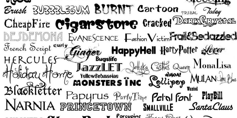
In the past few articles on Web Design Ledger, we tried to bring into your attention some of the most important categories of fonts:
modern, classic, and retro. Today we will continue with another important category: Vintage Fonts. Designers say that, in order for a fashion product, be it clothing, font, or a decorative piece, to become “vintage” they need at least 40-years-period from the time they were released. Based on that definition, we could consider anything older than 40 as being vintage, or new products that have the vintage vibe, well, not vintage. So in order to make peace with everybody, the fonts our professional designers have chosen for this article, are exclusively based on their looks, not on the time they were created.
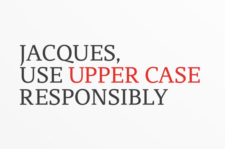
What particularities do vintage fonts have? you might be wondering. Well, as dictionaries tell us, vintage means “something from the past of high quality, especially something representing the best of its kind.” My question then is: are vintage fonts the best? They may very well be for some. Usually, vintage fonts stand out because of their complex details, exquisite calligraphy, and versatile looks.
Keeping these details in mind, we’ve put together a list of some of our favorite vintage fonts, both free and premium, so you can stay stocked up.
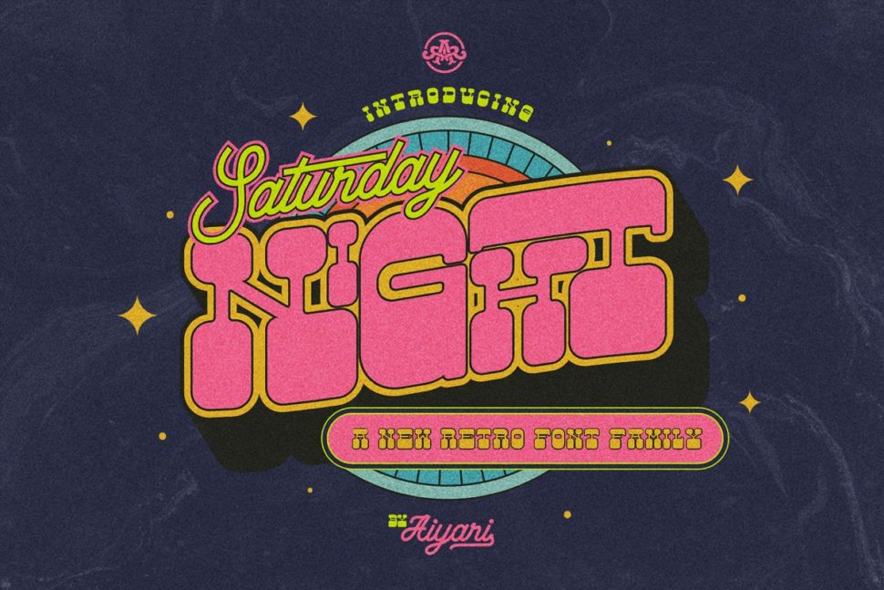
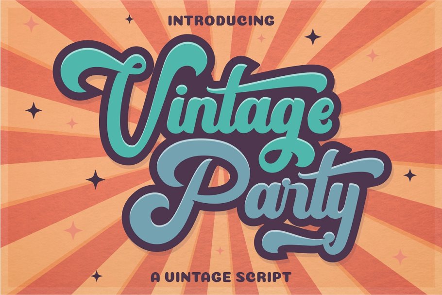
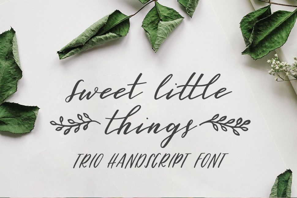
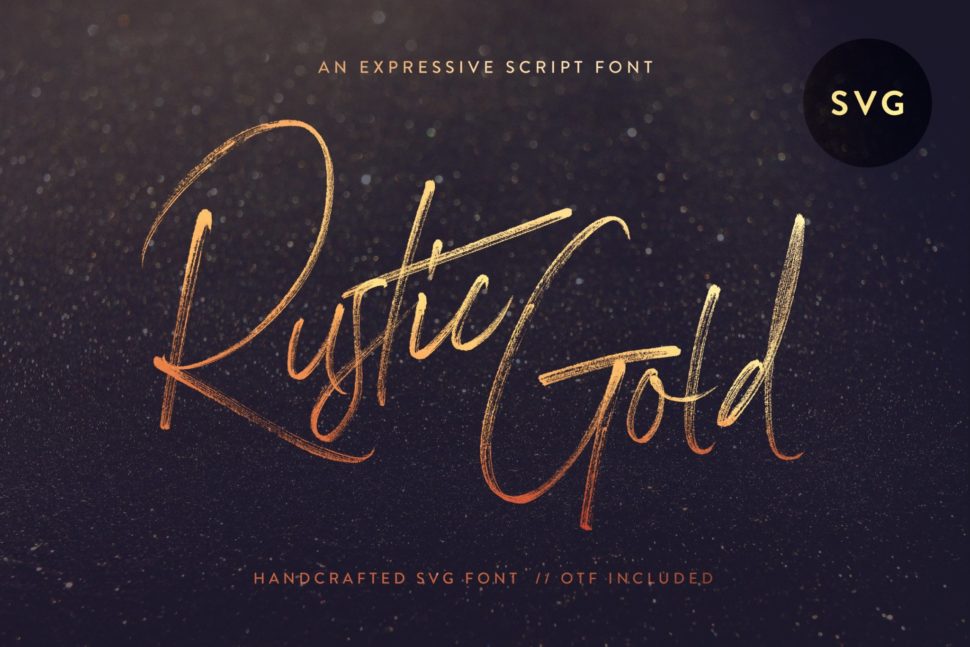
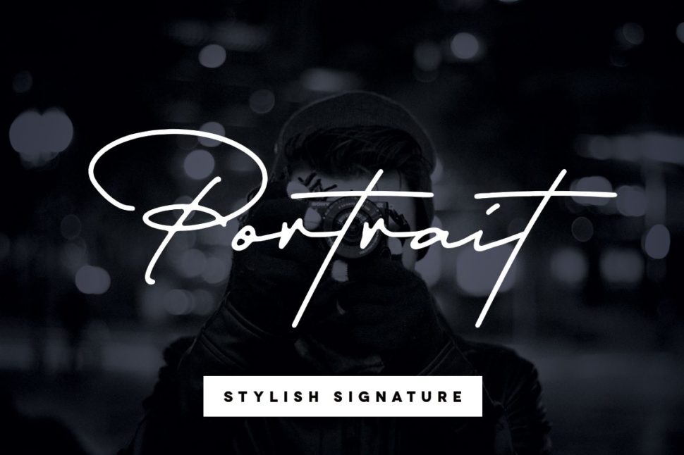
1. Vintage Party – Bold Retro Script
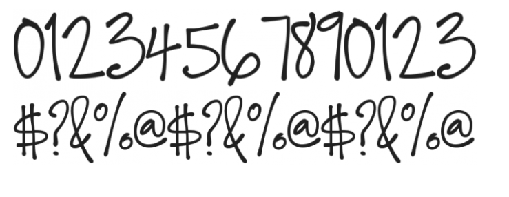
Vintage Party font screams fun. Use this font in any project that is meant to bring people joy.
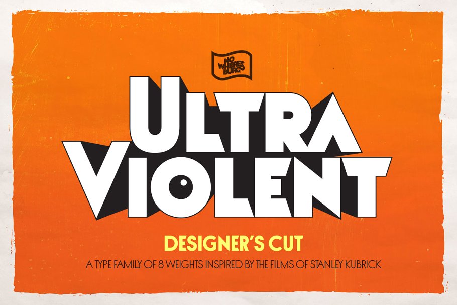
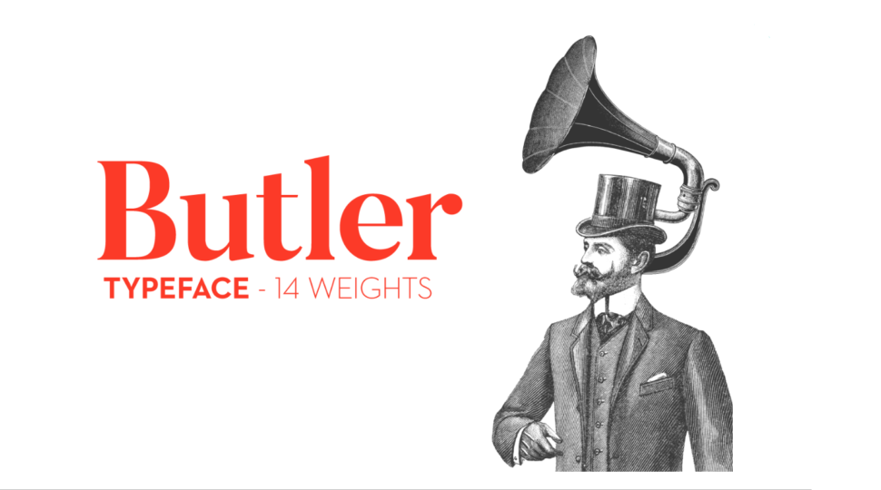
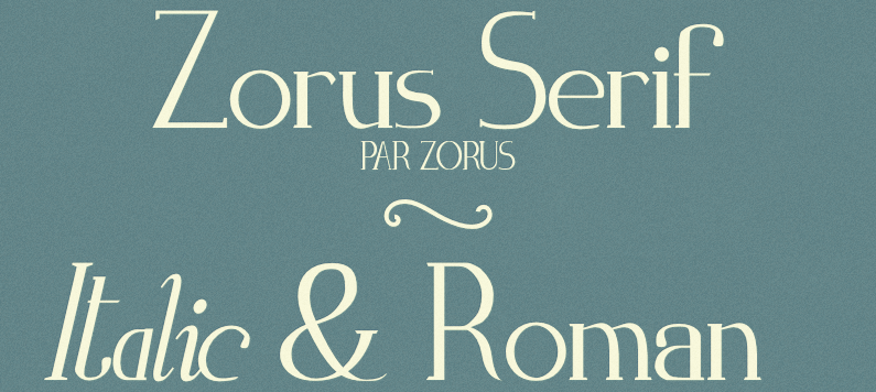
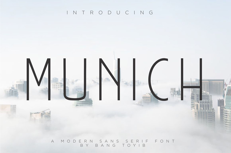
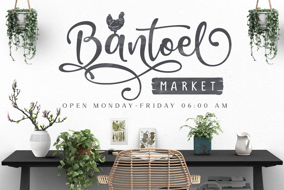
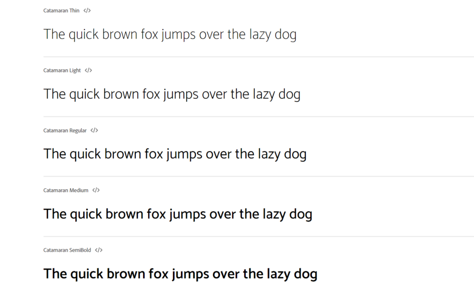
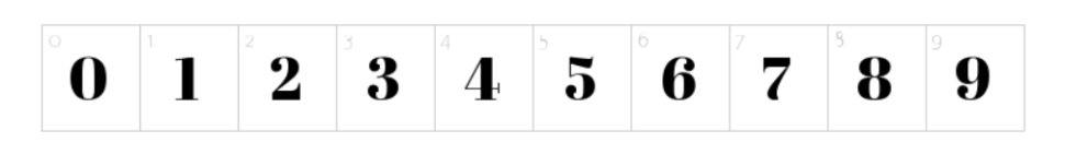
2. Berringer – Vintage Type Family
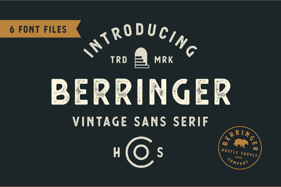
Berringer is a beautiful vintage font for when a sans serif is a must.
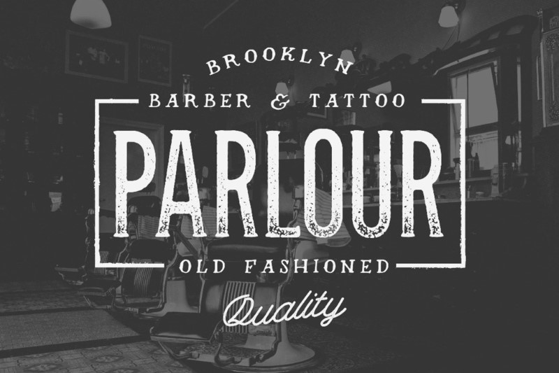
3. Stamp & Co – Vintage Stamp Font
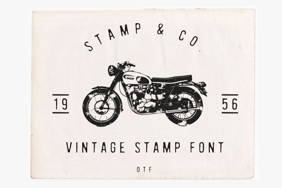
Nothing gives a project the vintage look better than a stamp vintage font.
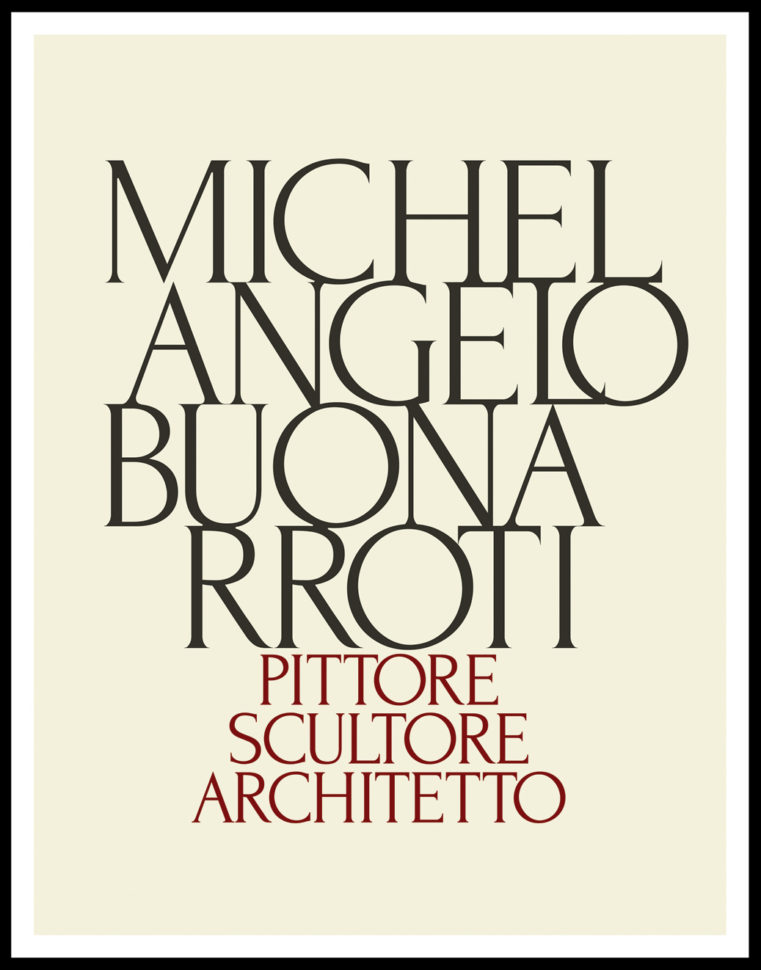
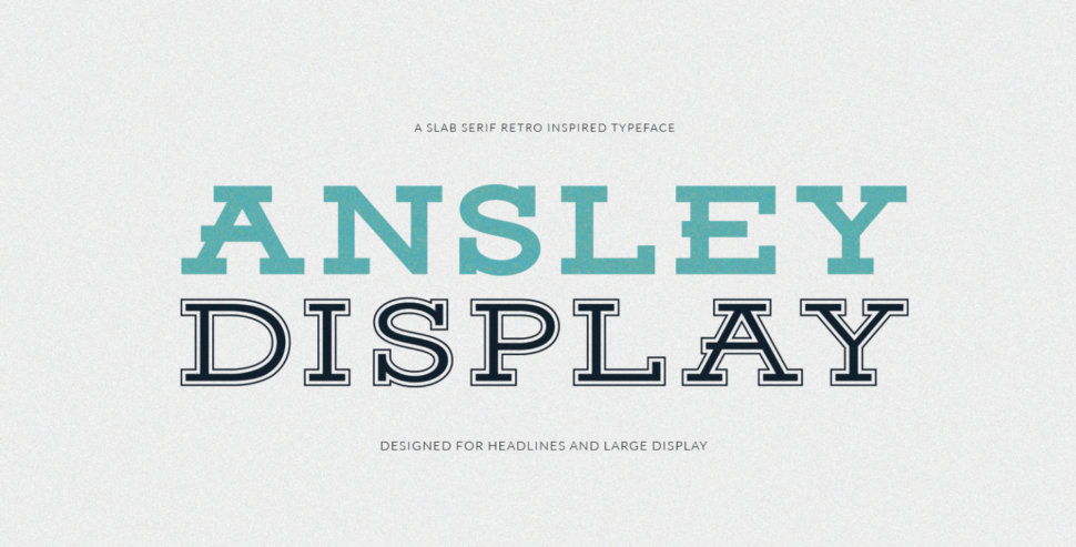
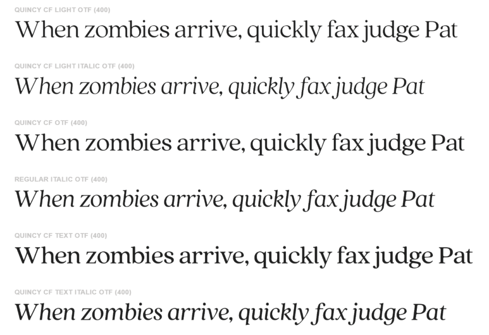
4. Bignord – Vintage Typeface
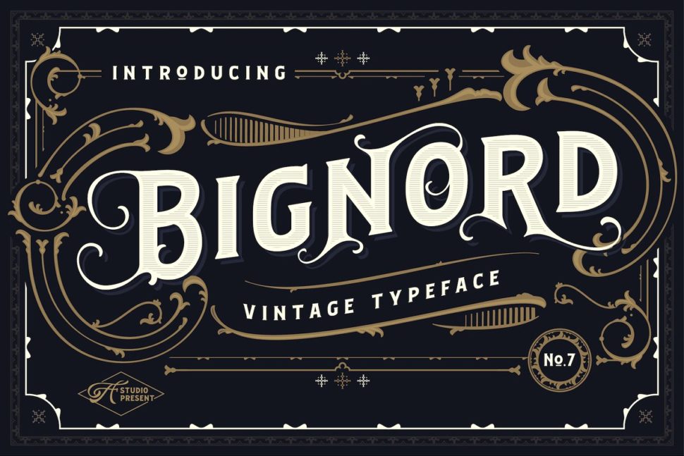
Bignord is a classic vintage featuring amazing and detailed serifs.
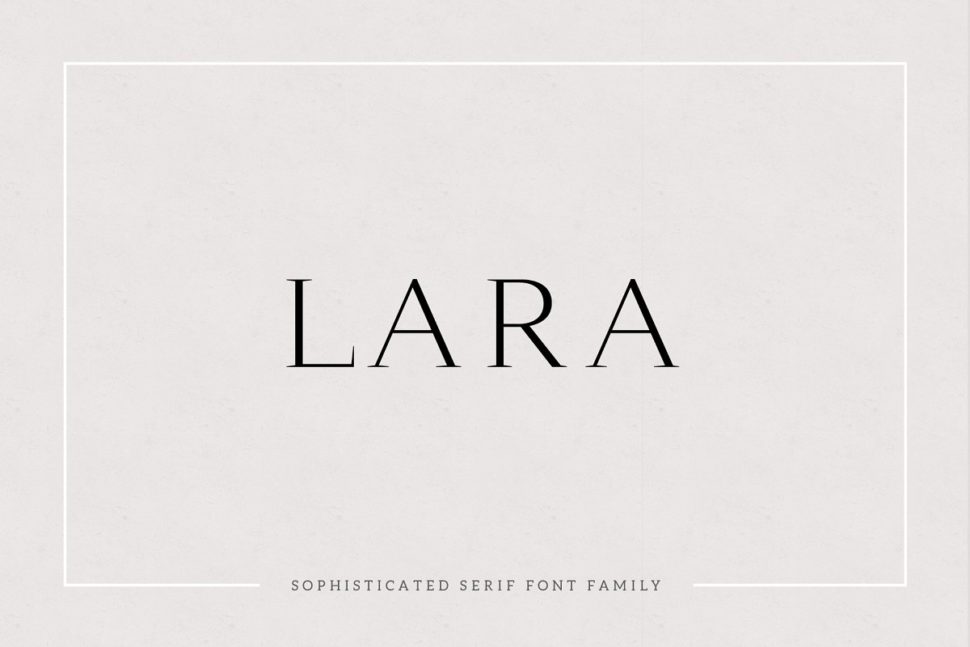
5. Vintage Modern Typeface
If you’ve ever wondered what a vintage font with modern features would look like, here you have it.
6. Hemera II – Vintage Decorative Font
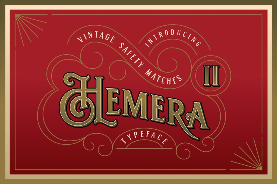
This elegant vintage typeface will make any packaging shine.
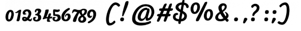
7. Sarcastic Typeface + Extras
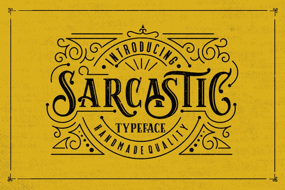
Can fonts inspire attitudes? Sarcastic can answer that question the best.
8. Rust & Nails Vintage Farmhouse Slab
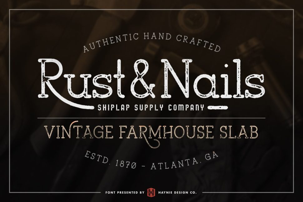
Rust & Nailsis a rustic and charming font inspired by vintage farmers markets and mid-century modern farmhouse signage.

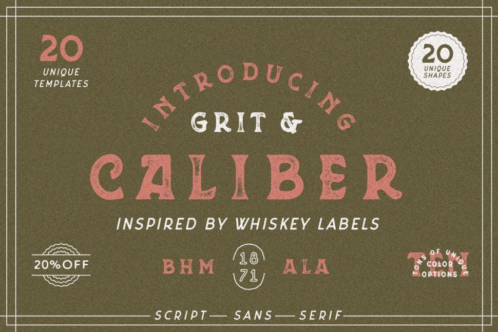
Caliber is inspired by the Whiskey Labels, and for other lables that need the vintage look.
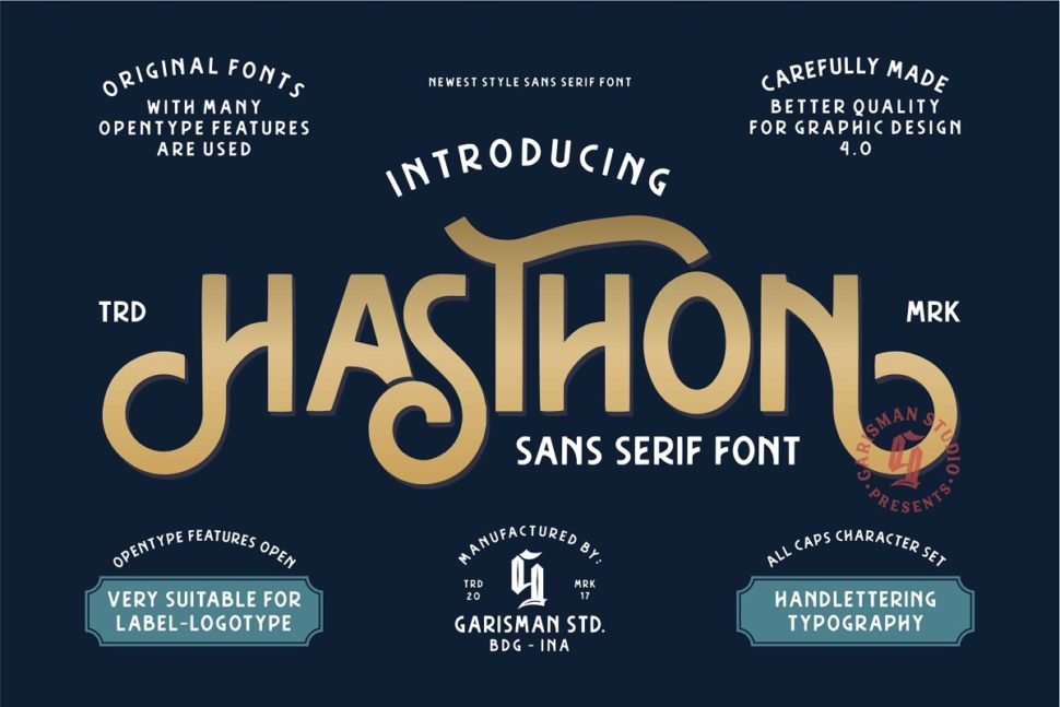
Hasthon features polished letters, very suitable for label and logo designs.
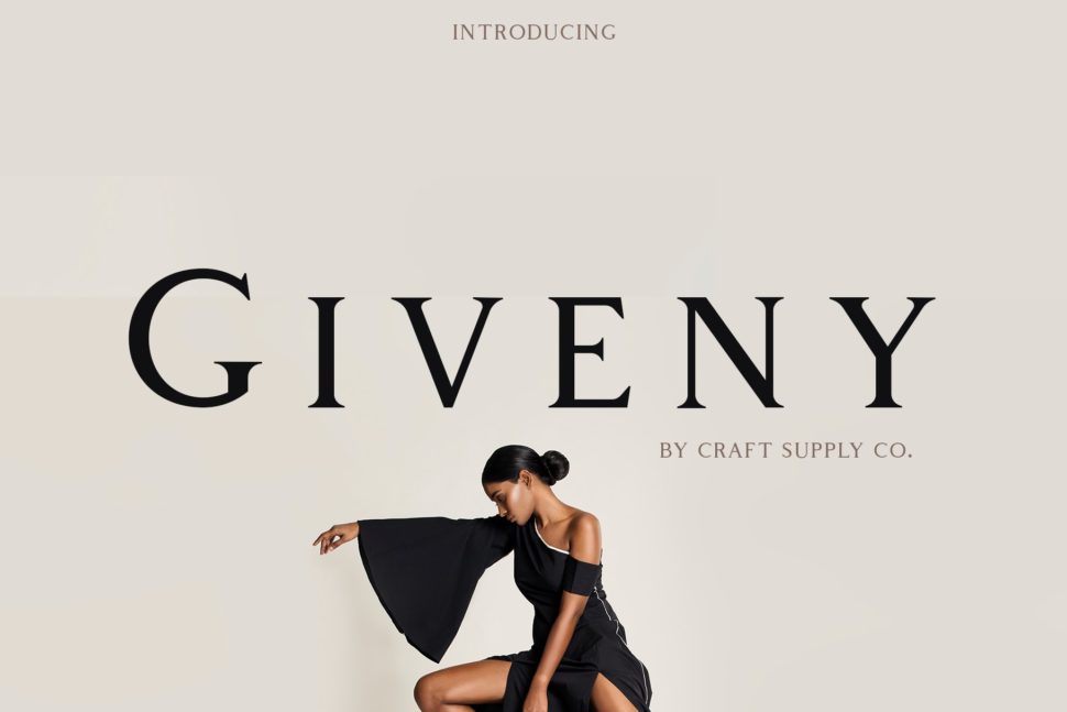
11. Arber Vintage font
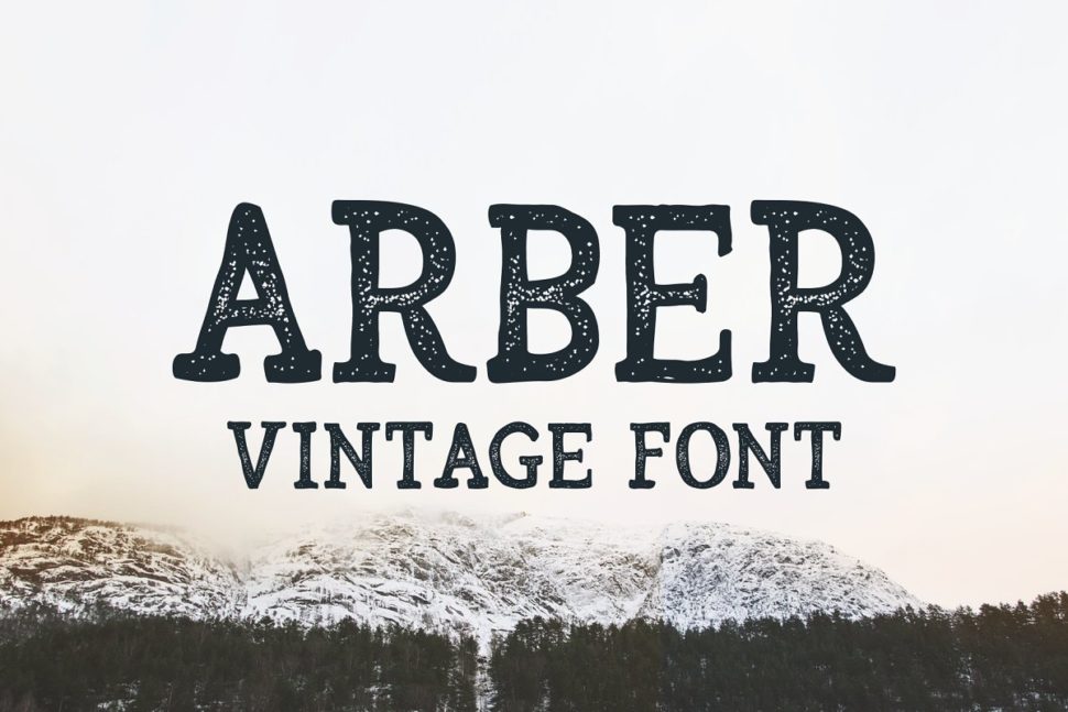
Arber gives your projects a wintery and cinematic look.
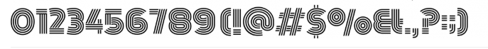
12. Chivels – Chiseled Vintage 3D Type
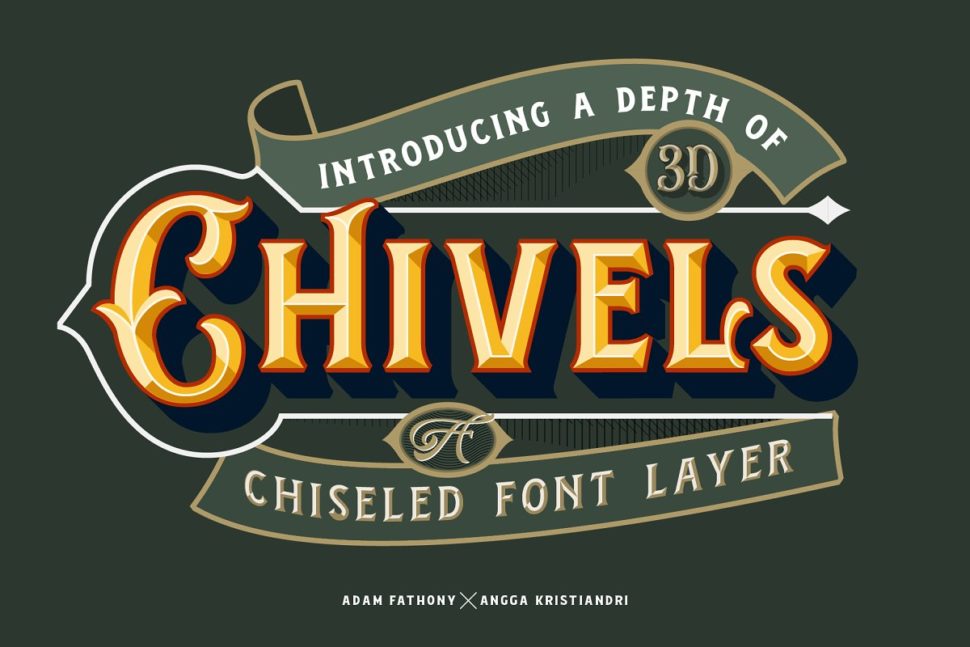
This 3D font would make a great ornament on any packaging designs.
13. Prequel – The vintage Sequel
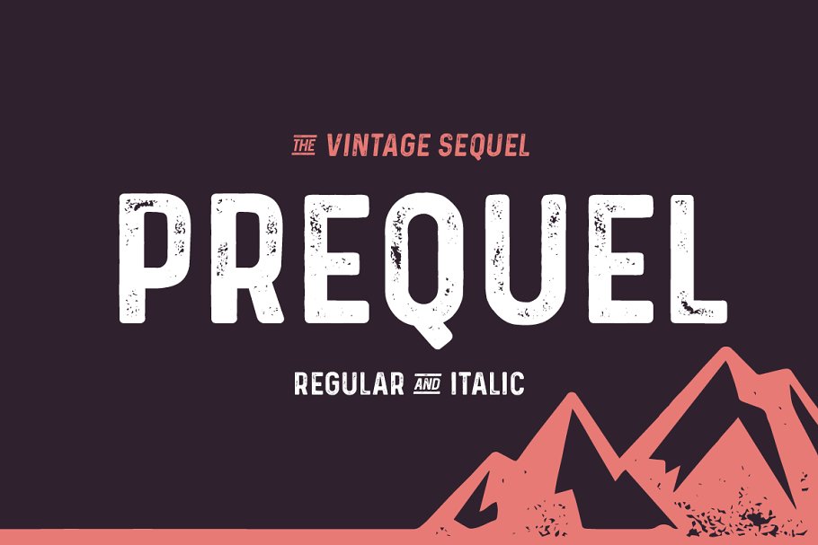
Prequel’s stony texture will help your poster catch the attention of all pass-byers.
14. Cache – Vintage Font Family
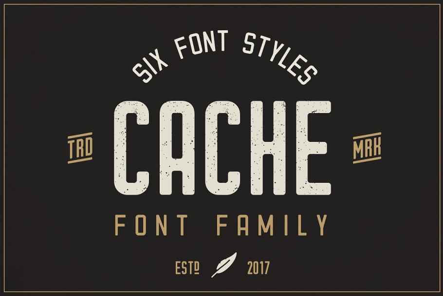
Its authentic vintage look and feel will give you that exact look you’ve been aiming for.
15. Ranch vintage font & illustrations
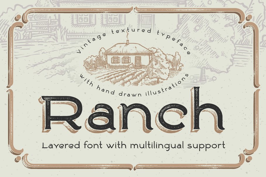
This layered font reminds me of quality bakery products, quality being the words you should be looking for when designing.
16. Royaland Vintage Font
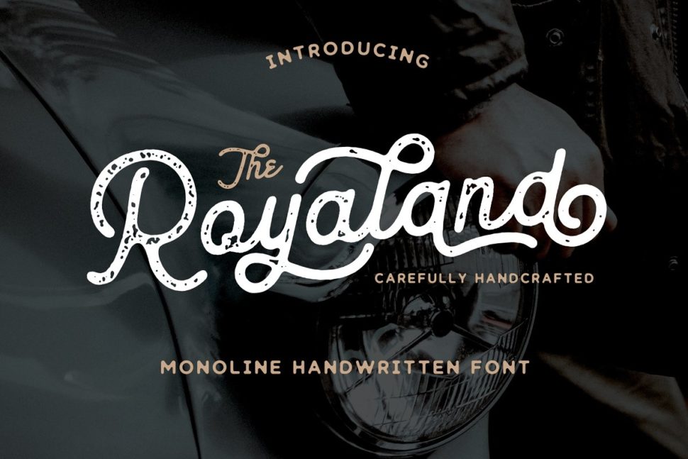
The Royaland Font is a monoline font which has two styles, Clean and Rough (stamped). Featureing these styles, The Royaland Font will give your projects a more vintage look.
17. OldBarrel Vintage Typeface
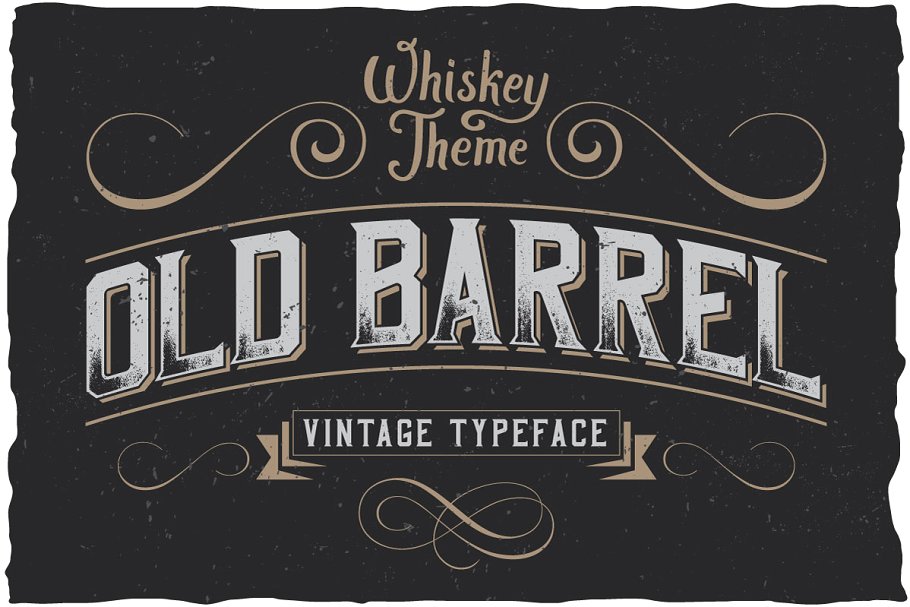
Old Barrel is made in a strong and dynamic label style. The font is perfect for any labels designed for whiskey, rum or brandy.
18. Etherion – Vintage Display
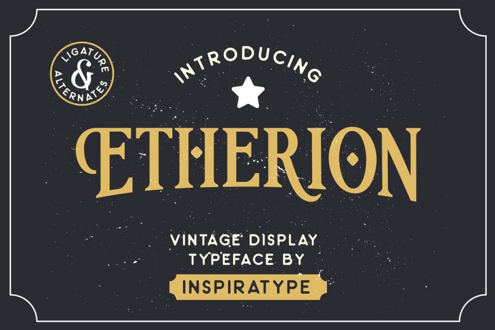
“Etherion” is a font display made by hand and inspired by classic posters.
19. Gold Queen Vintage Font
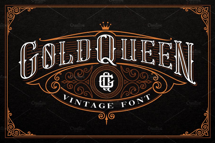
Remember the saying “Oldie, but Goldie?” Gold Queen is this saying’s illustration.
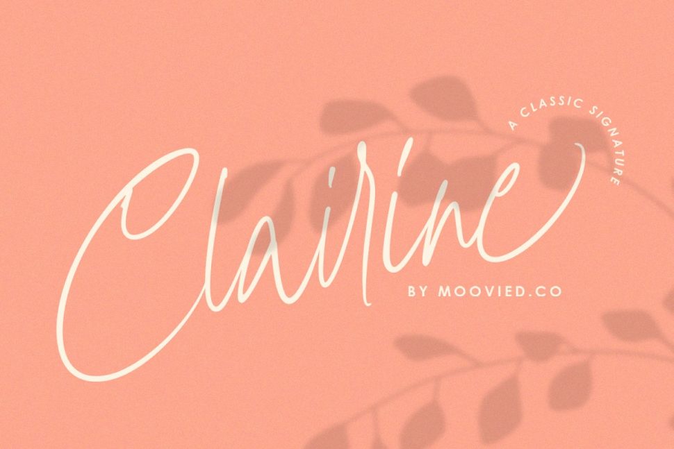
20. Cairlinn | Vintage Font
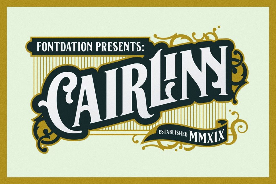
Clairlinn was inspired by the old letters that are used in classic advertisements.
21. Grand Baron – A Vintage Typeface
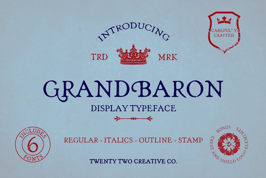
GRANDBARON takes my imagination to Transylvania, in Dracula’s Castle.
22. The Crow – Vintage Style Font
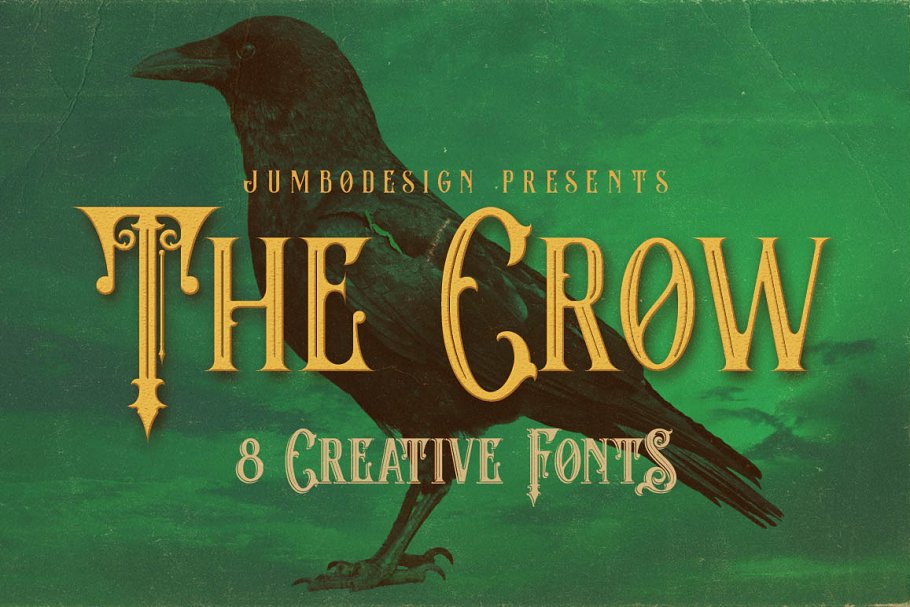
The Crow is an elegant, cinematic, and detailed font, perfect for fantasy-book covers.
23. Aesthetic – vintage typeface
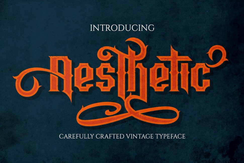
At first glance, Aesthetic has a pixeled look. Use that to your advantage in an original design.
24. Service Station Vintage Market Font
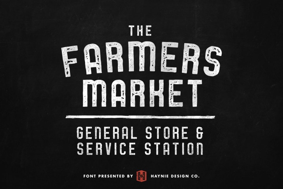
The Farmers Market font is inspired by the classic styles of vintage signage, retro gas stations, and old repair shops.
25. Fisherman – Vintage Ocean Font
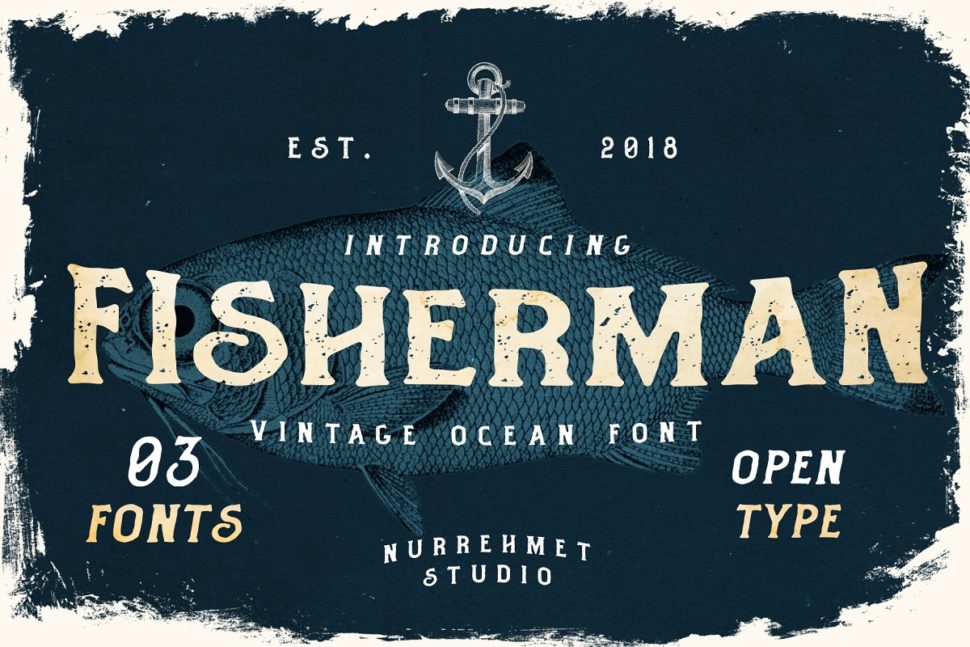
Fisherman Fonts is perfect for branding projects, logos, wedding designs, social media posts, product packaging, product designs, labels, photography, watermarks, invitations, stationery and any project that needs an ocean and beach feel.
26. Old Pines Vintage Type
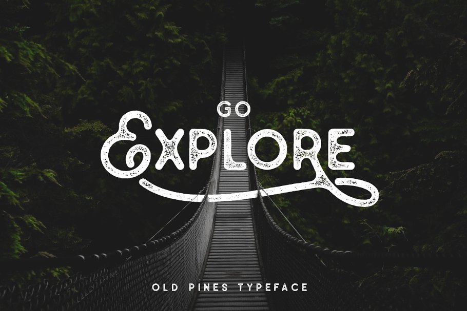
Go Explore is an invitation to adventure. Go Explore, Go Design.
27. Blacktail – Vintage Font
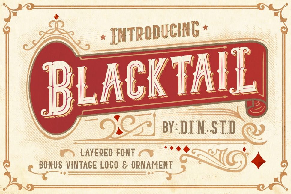
This font presents a vintage and layered style that contains four detailed layers.
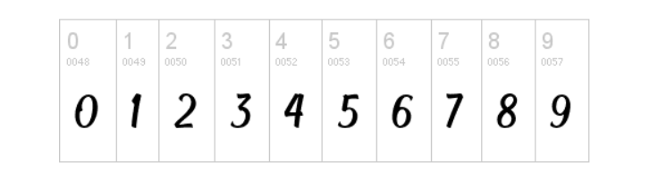
28. Striped King Vintage Script
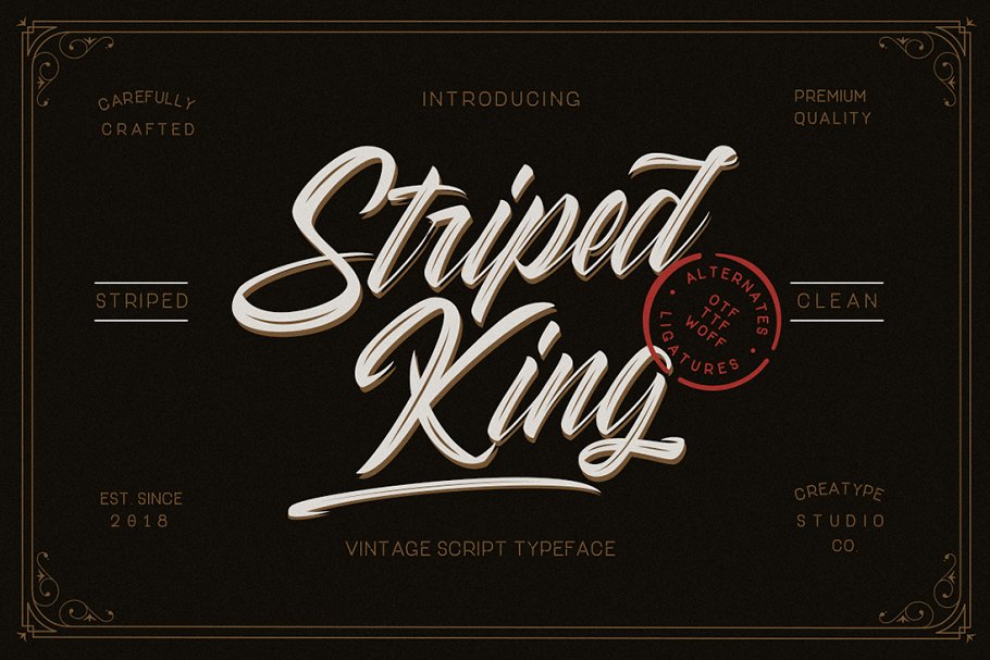
Striped Kind is the script typeface you need in your tool kit, due to its versatile looks.
29. Wolf Gang – Vintage Typeface
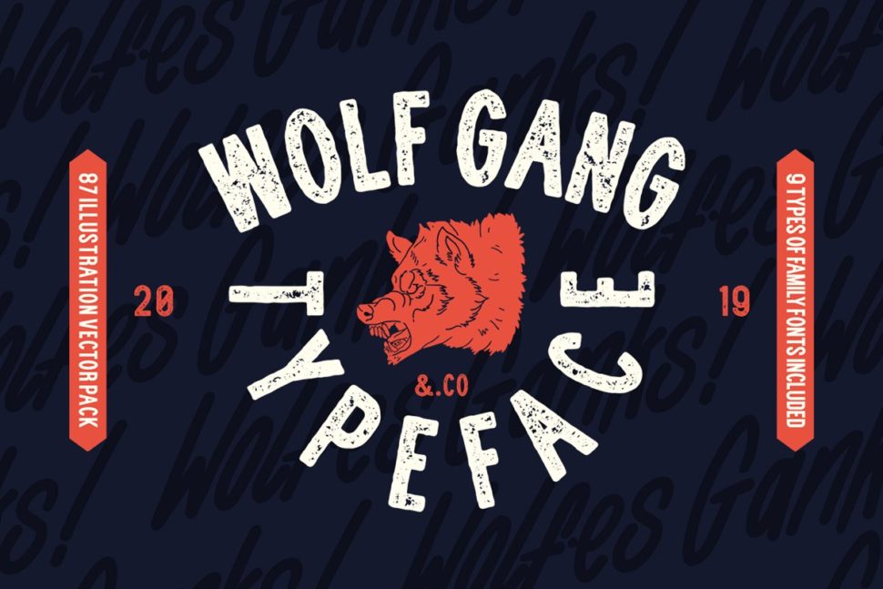
WOLF GANG was created with the concept of the wild in the designer’s mind, by adding pictorial elements such as wolves and other wildlife.
30. Vallely | Vintage Font
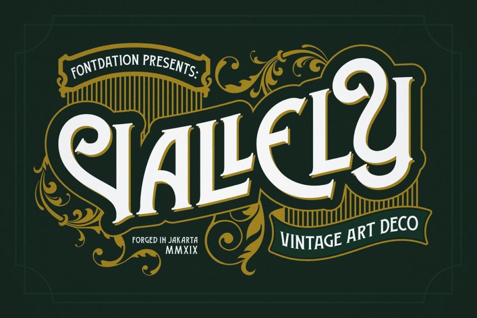
Vallely is a classic art-deco-ish serif inspired by the old typography/letterings used in packaging labels and advertisements
31. Java Heritages + Extras (UPDATE)
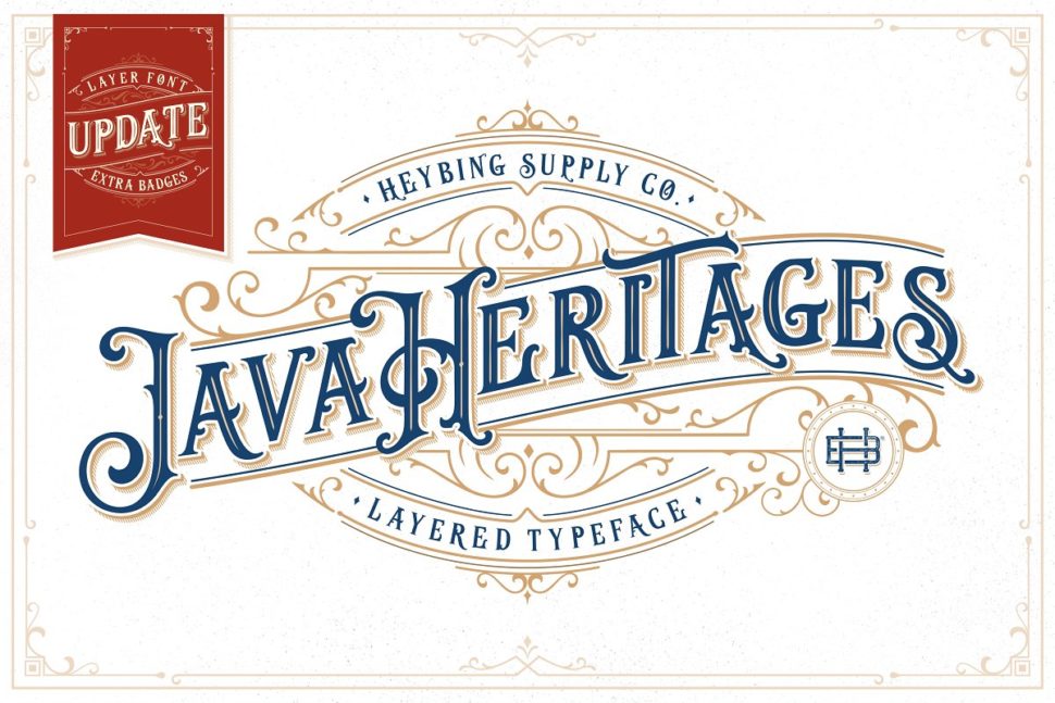
Java Heritages Typeface is a multi-layered typeface family with OpenType features, inspired by the vintage signage that has unique decorative shapes.
32. Vintage Font – Harvels
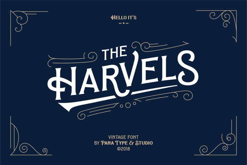
This amazing font comes in different weights so that you can customize it to your preferences.
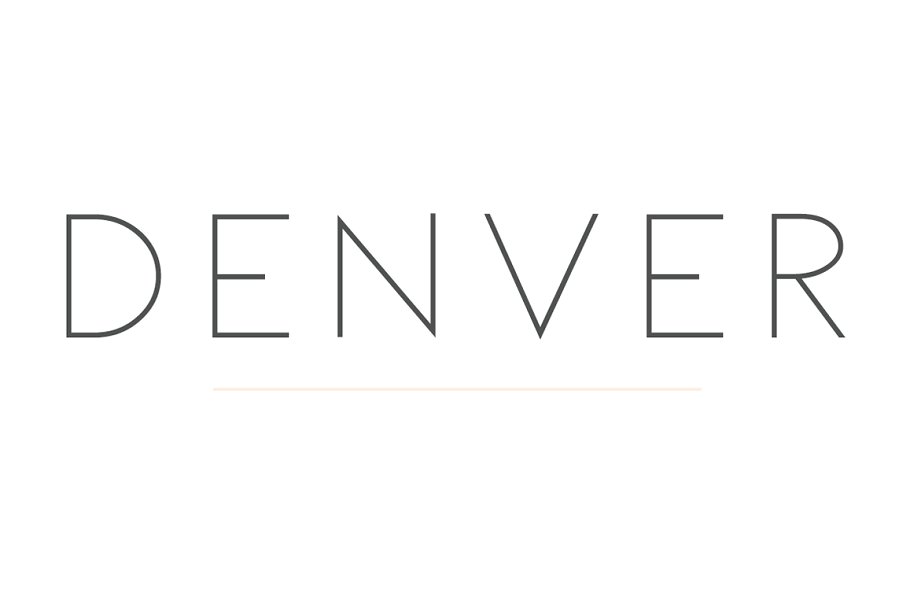
33. Dallas | A Vintage Sans
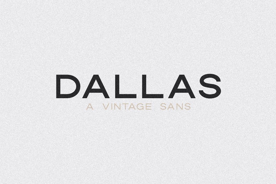
This beautiful all caps vintage sans serif is so versatile and looks great in just about any context.
34. Greatest – A Vintage Font
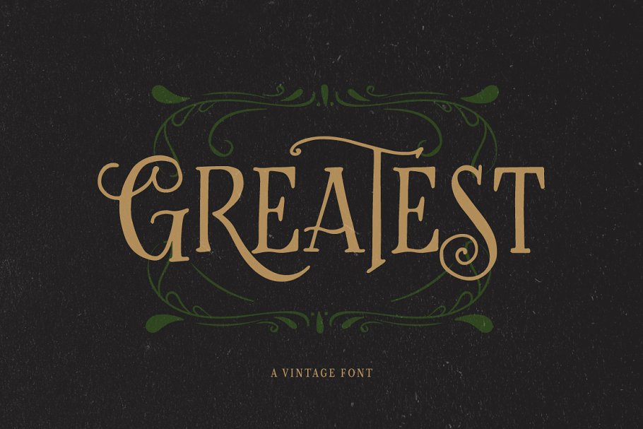
Greatest will remind the readers of gardens and forests instantly. It looks like the perfect look for a fantasy book cover.
35. Vintage Wood Type Classics
The Vintage Wood Type Classics set contains the Applewood, Bootstrap and Buckboard families, all worth including to your projects.
36. Hesland – Vintage Font Duo
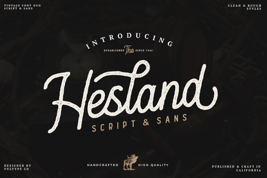
Hesland Vintage Font Duo was inspired by the vintage old American labels and has two styles: Clean and Stamped.
37. Fright Night! A vintage horror font
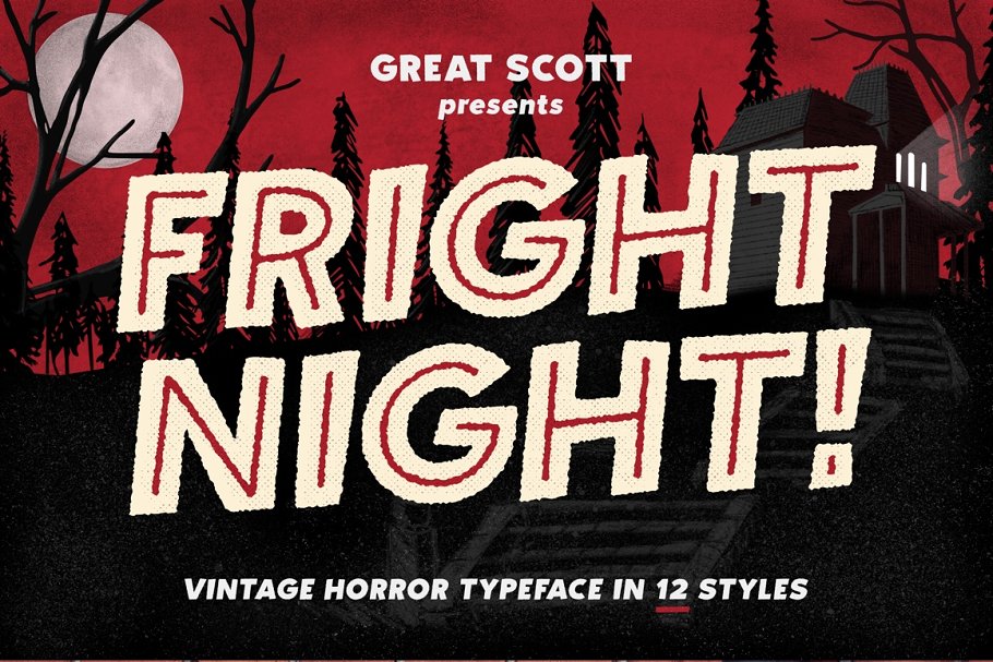
The Horror! The Horror! will be the first thing that comes to your clients’ minds when they’ll see this font. But that’s a good thing.
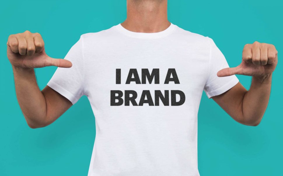
38. Forester Vintage Sans Serif
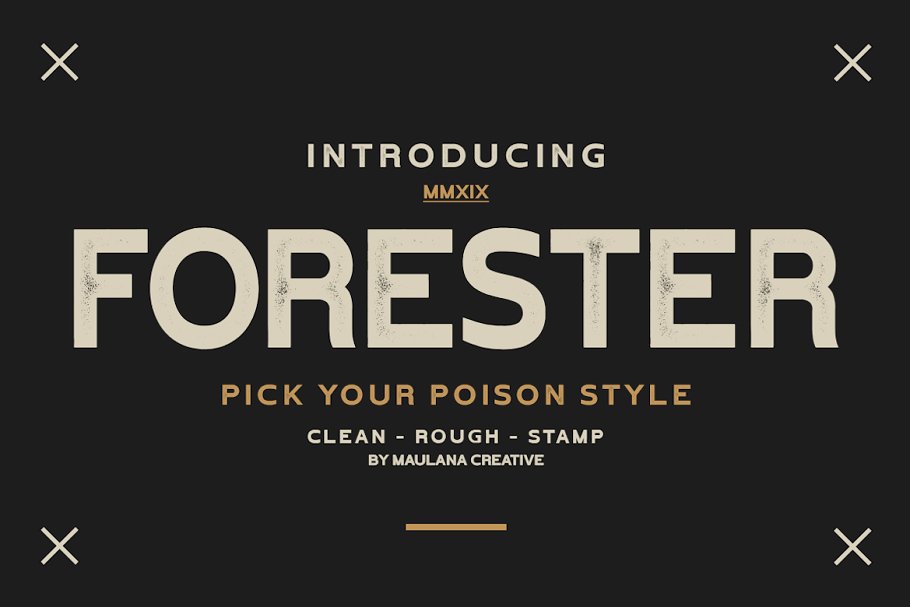
Forester Vintage makes a perfect font for branding, logos, magazines, films, websites, headlines, titles, captions, games, apps, posters, t-shirts and more.
39. Vintage Whiskey Typeface
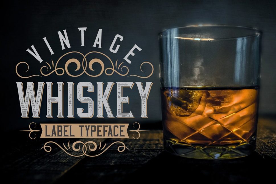
Whiskey can give your project an eye-turning effect. And it’s suited for more than just Whiskey labels.
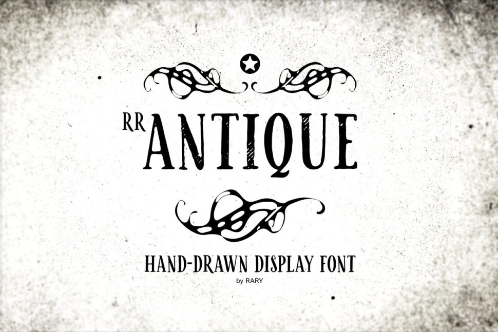
40. RR Antique / Vintage branding font
Read More at 40 Of the best Free vintage Fonts picked by professional designers