6 Logo Design Principles That We Swear By

Making a logo is typically one of your first tasks as a new, up-and-coming designer.

I know I had my fair share of making logos for far too cheap, and mostly for my close friends and their small businesses, but it’s something I’ll never forget.

Although there are a few things that I wish I had known when I was at the beginning of my career, so I’m here to shed some light on a few basic design principles that I swear by.

6 Basic Logo Design Principles For Beginners 

There are a few things, in my opinion, that every novice designer should know about logo design. Of course, you’ll end up doing whatever feels right for you, but just hear me out.

Alright guys, let’s do this.
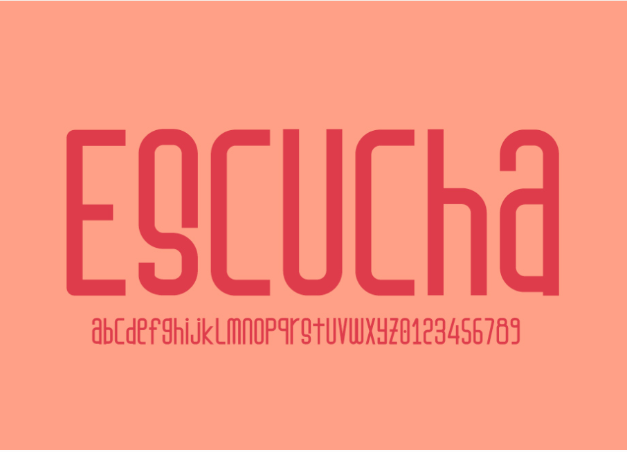
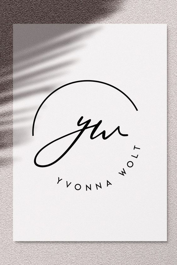
1. Keep it simple

By now you’ve already heard of the K.I.S.S. principle. Keep it stupid simple. 

This is going to be key in making any logo.

I’ve learned that the hard way.

[source]

When someone looks at your logo, it should be easy for any viewer to understand, interpret, and digest.

simple logo design

[source]

No one should have to stare at your logo, cock their head to the side like a confused, adorable puppy, and wonder just what the heck you have created there.

simple logo design

[source]

[source]

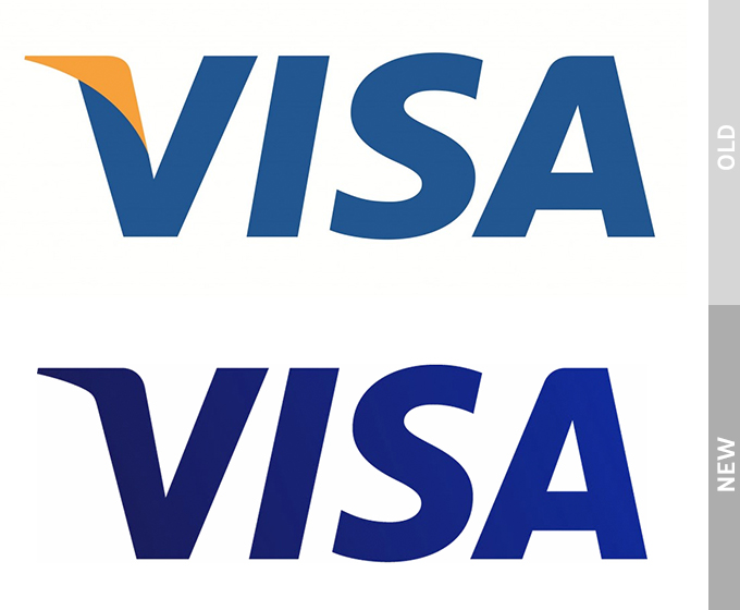
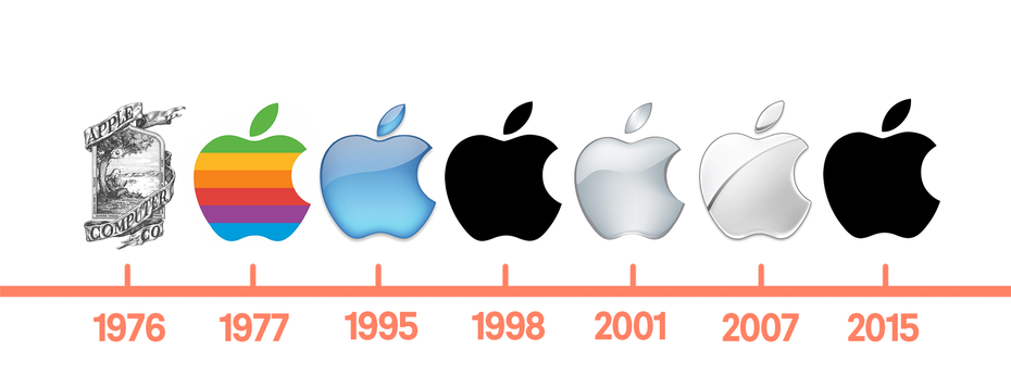
Take Apple, for example. One of the biggest dogs in the game.

apple logo design evolution

[source]

Back in the 60’s… Well, only they knew what they created for a logo.

But as the years went by, they kept simplifying and simplifying it.

And that was the key!

By simplifying their logo, it was easy to understand, it was easy on the eyes, and of course, it was memorable as heck.

Which brings me to my next point.

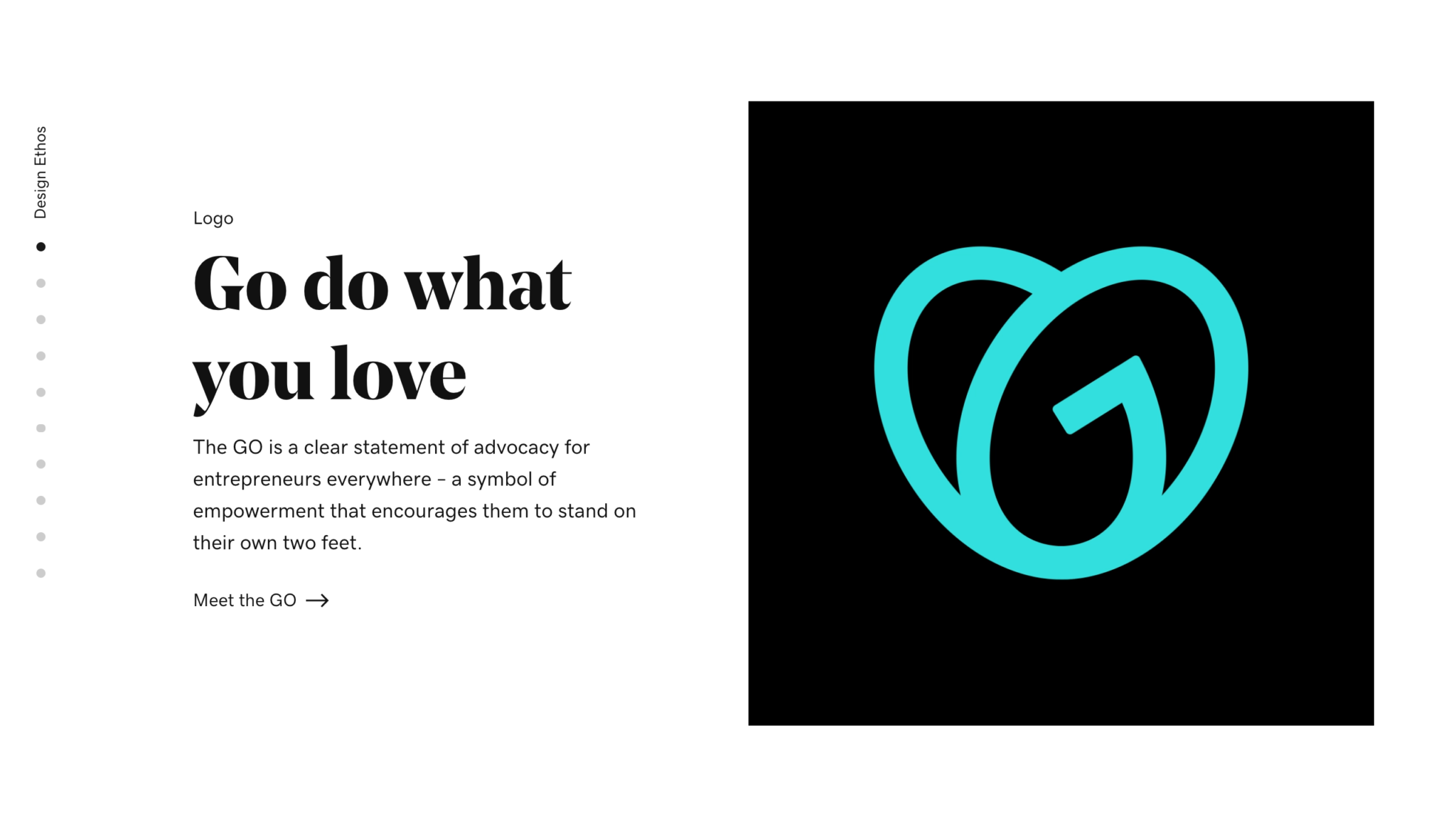
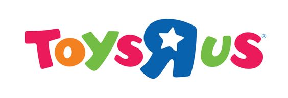
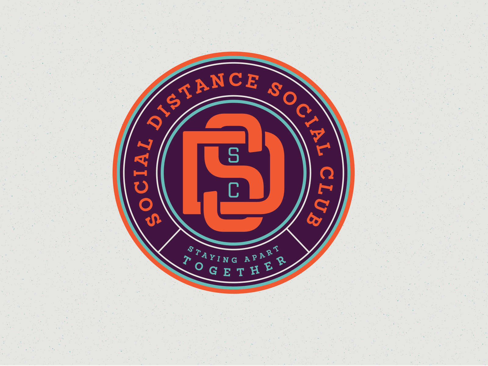
2. Make It Memorable

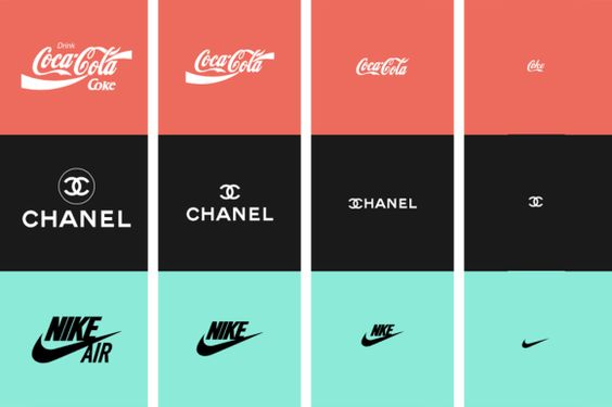
I know you immediately recognized my first simple logo example, which was obviously the Nike swoosh.

But why did you recognize it so quickly?

Because it was simple and memorable.

What’s the point in having an amazing design, if it’s not memorable?

You’ll lose brand recognizability. If your logo design is no good, well, you’ll have people talking about the business you’re designing for like this, “You know… that one place! With the thing… You know what I’m talking about!”

Nobody wants that. You need something simple, and memorable.

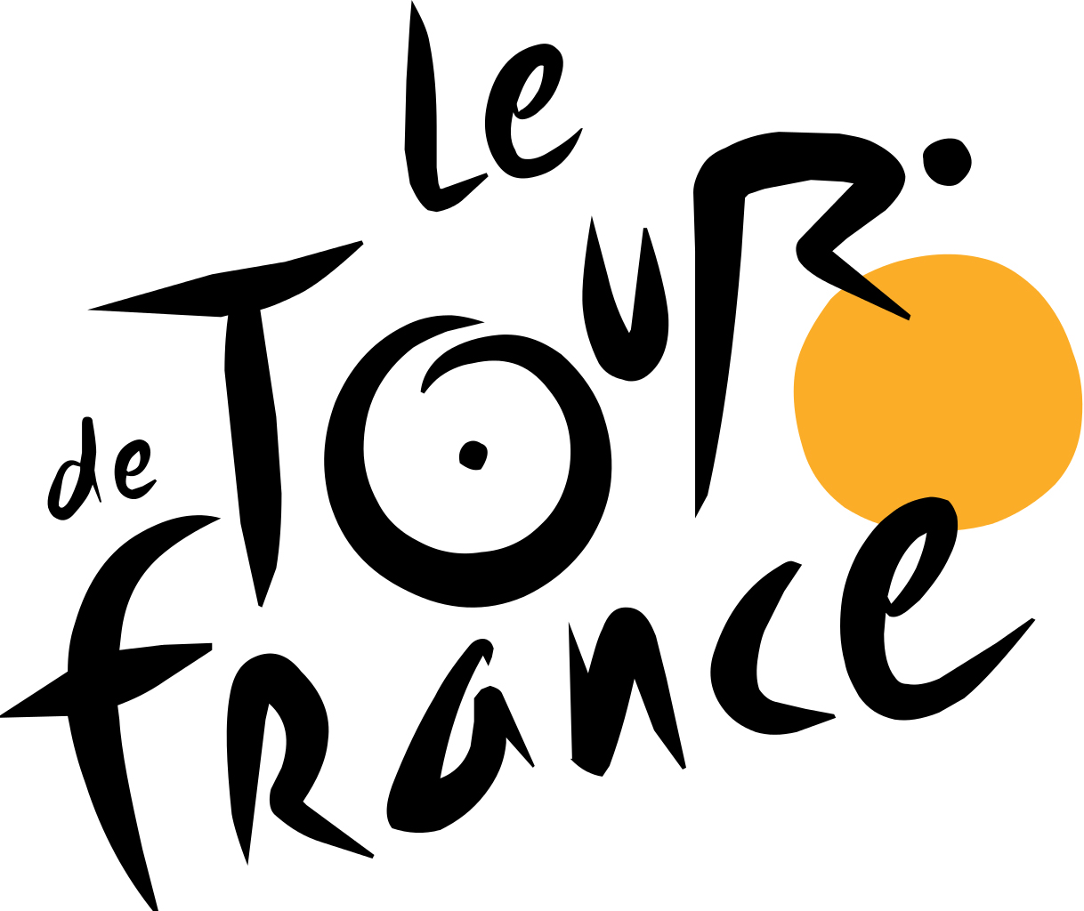
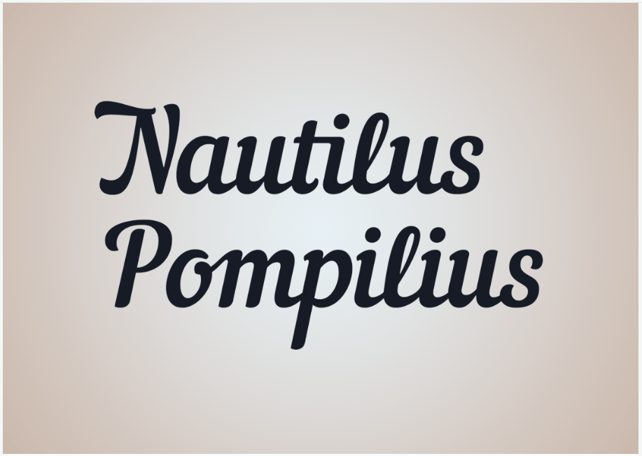
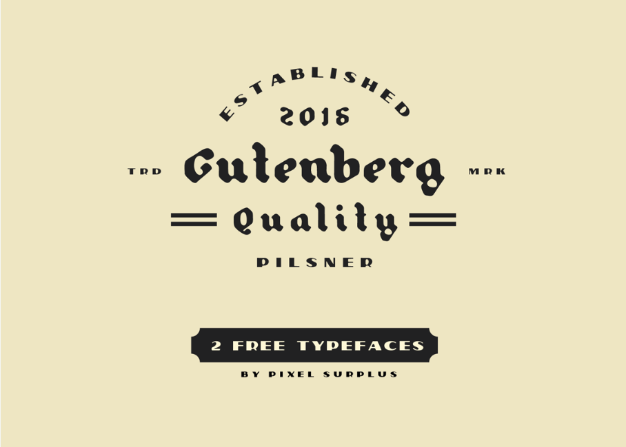
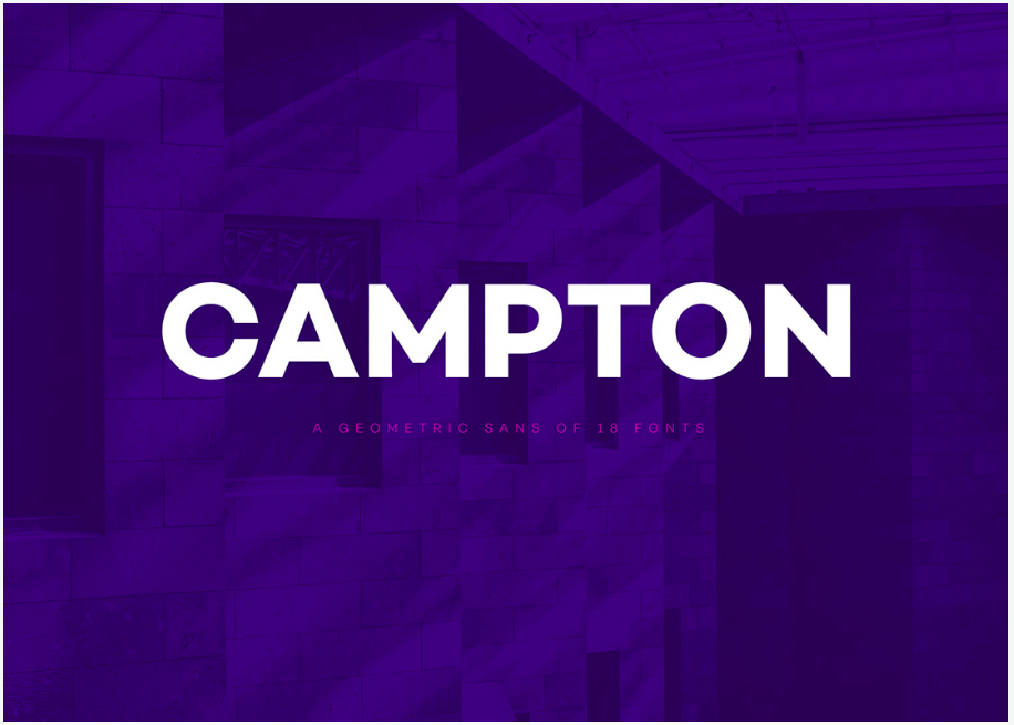
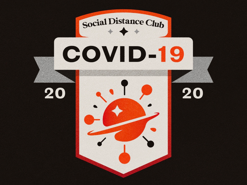
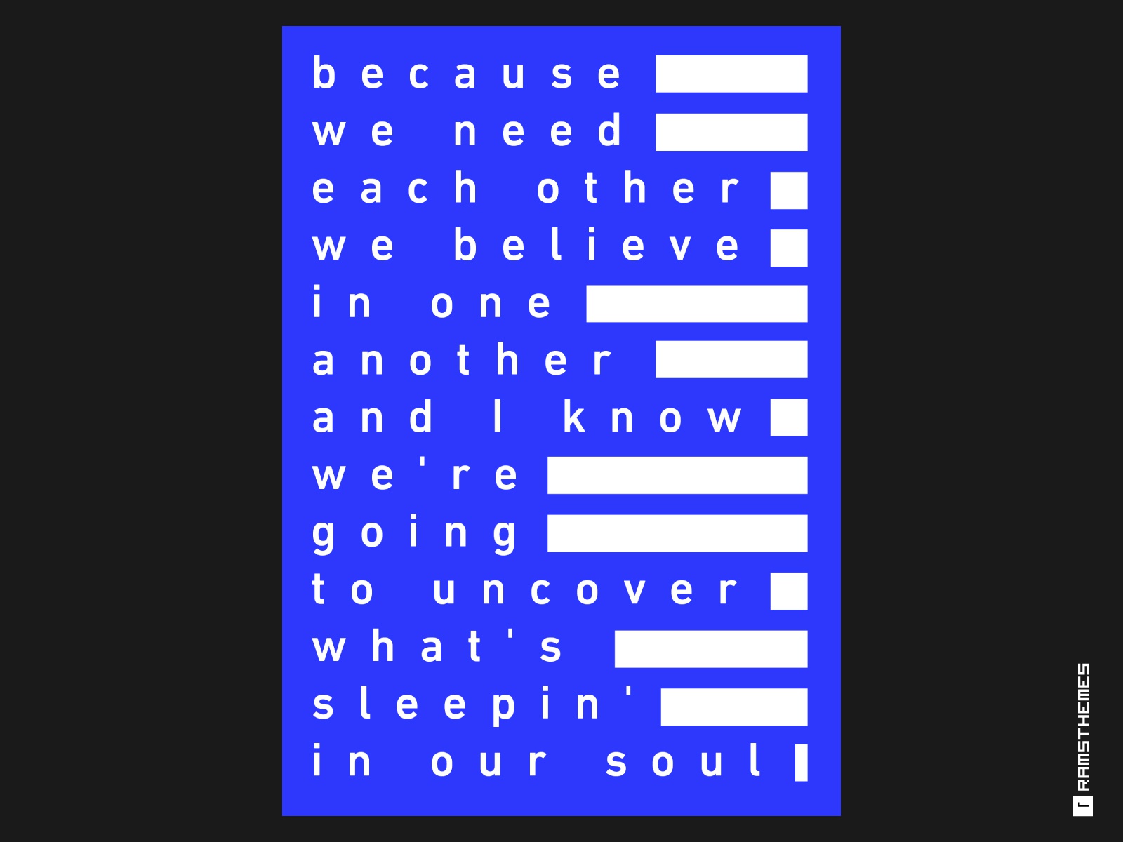
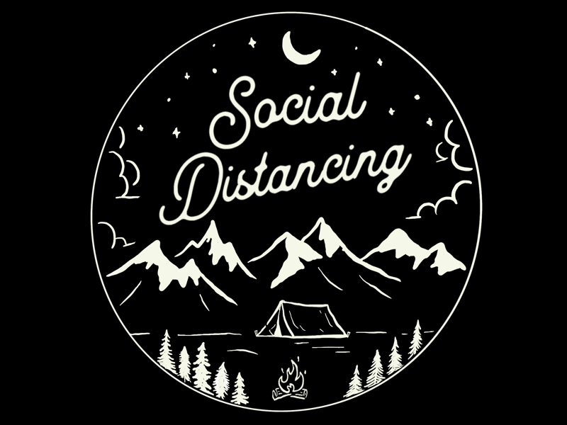
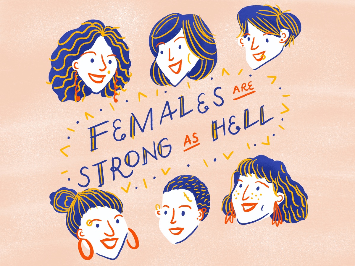
Let me show you some memorable logos that I know you’ll recognize.

[source]

[source]

[source]

[source]

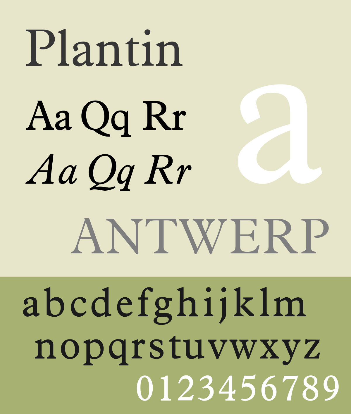
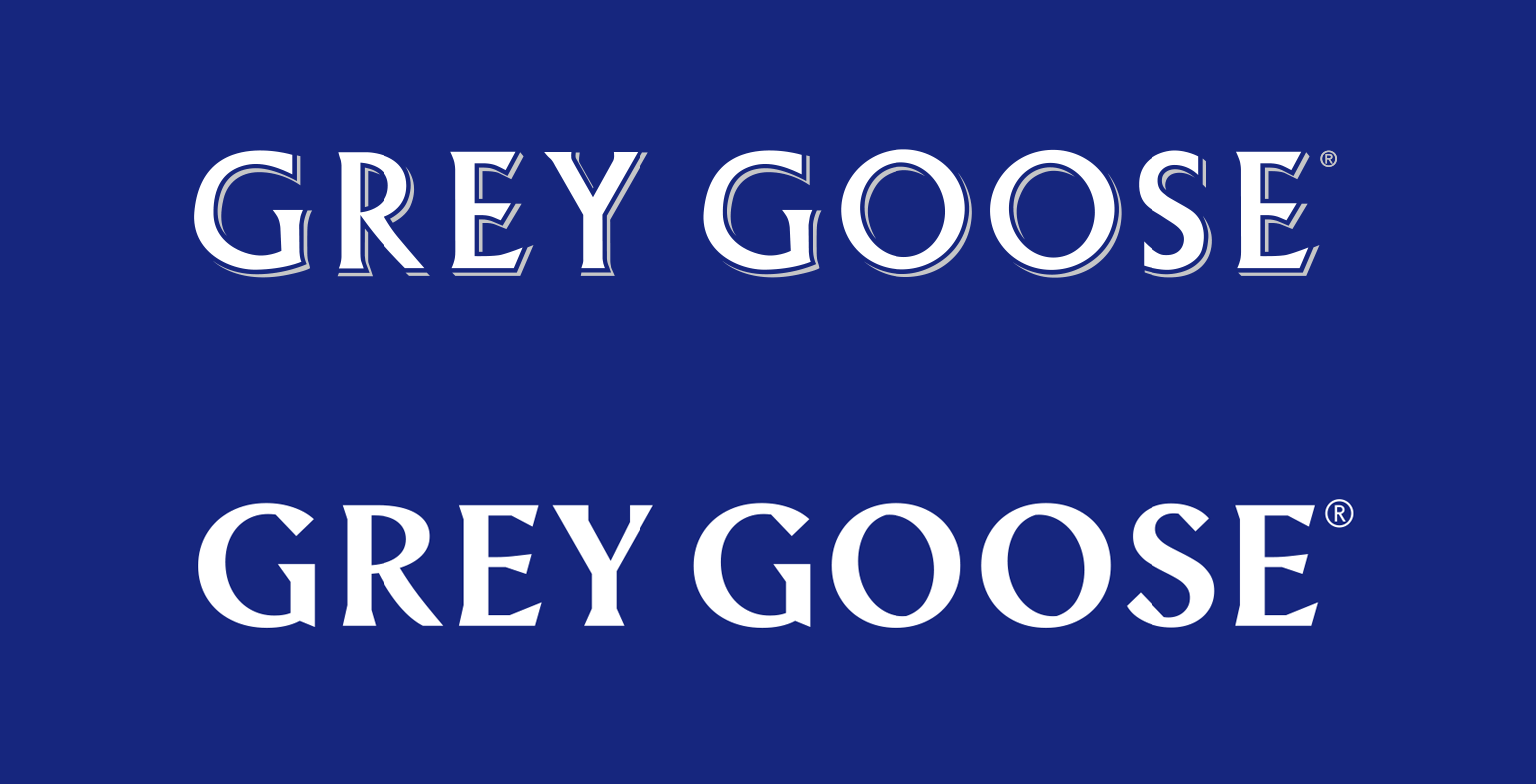
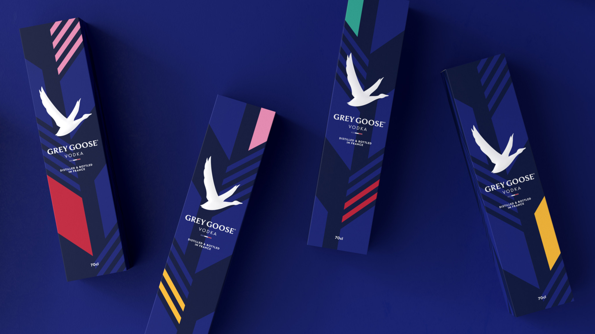
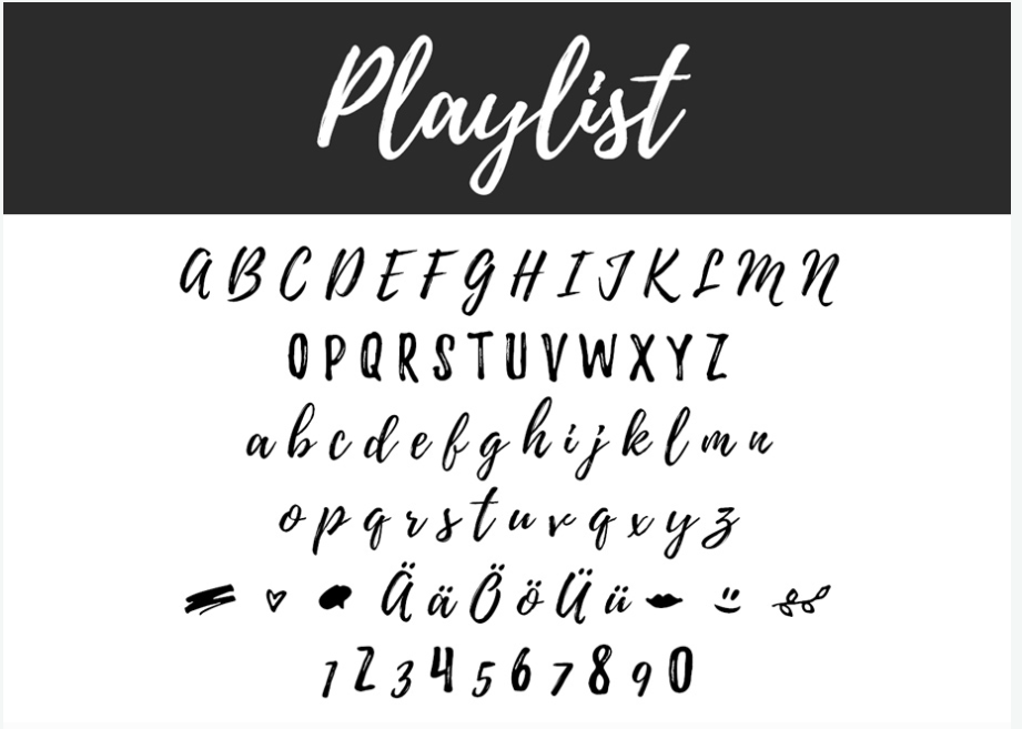
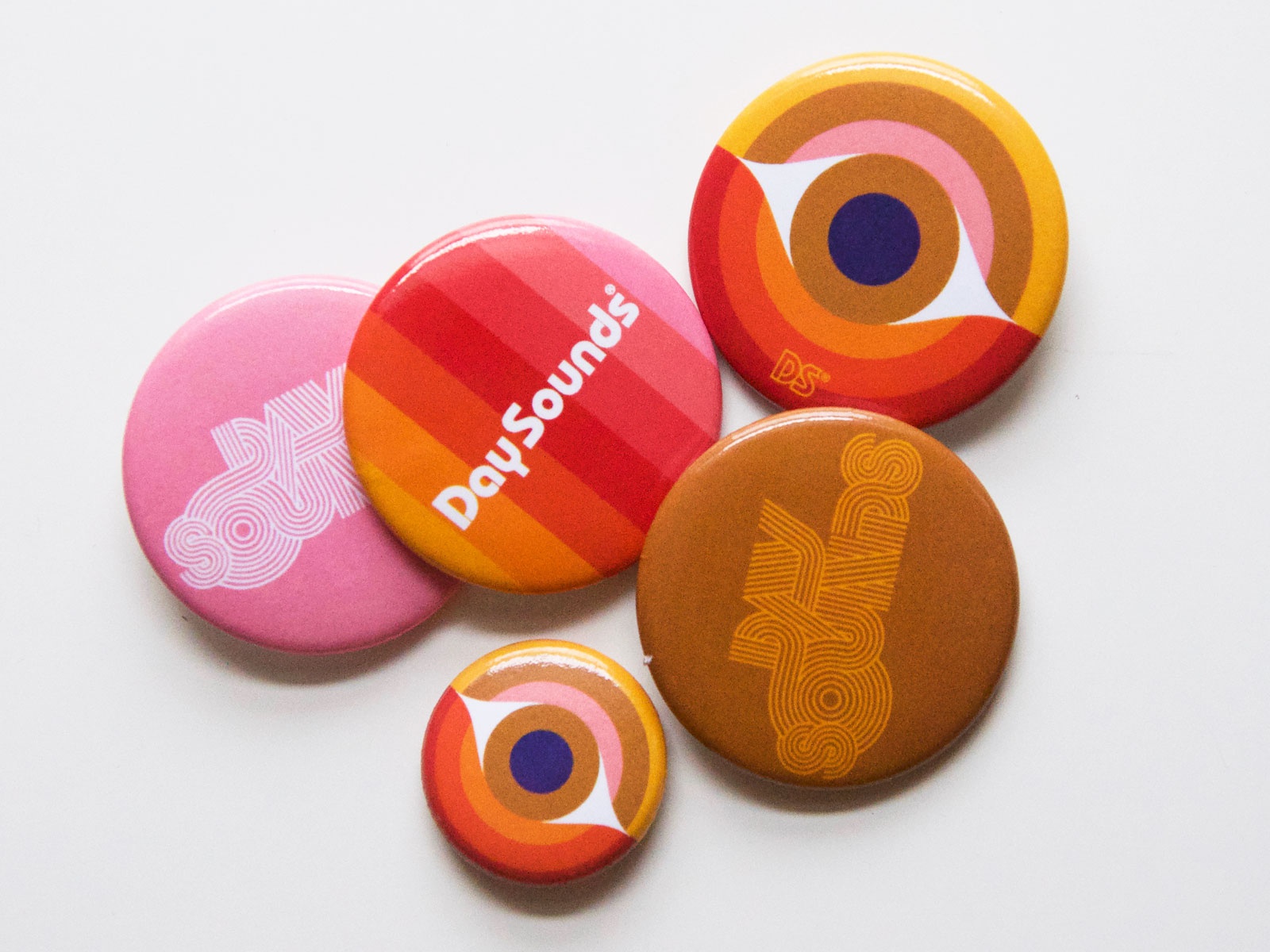
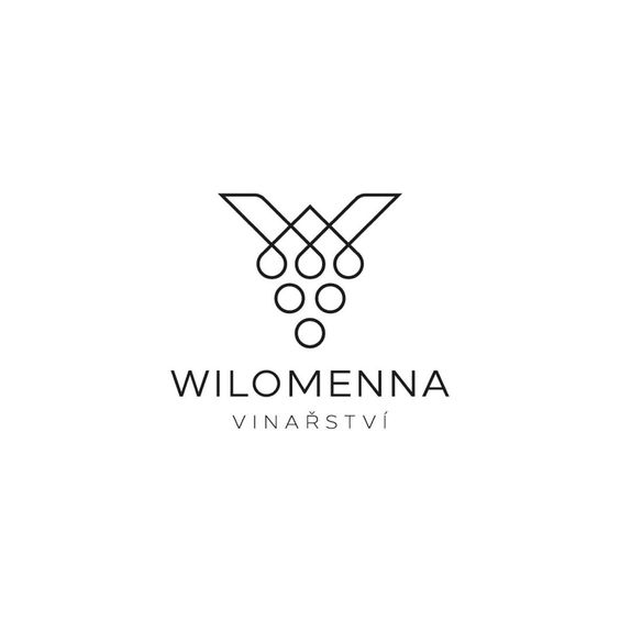
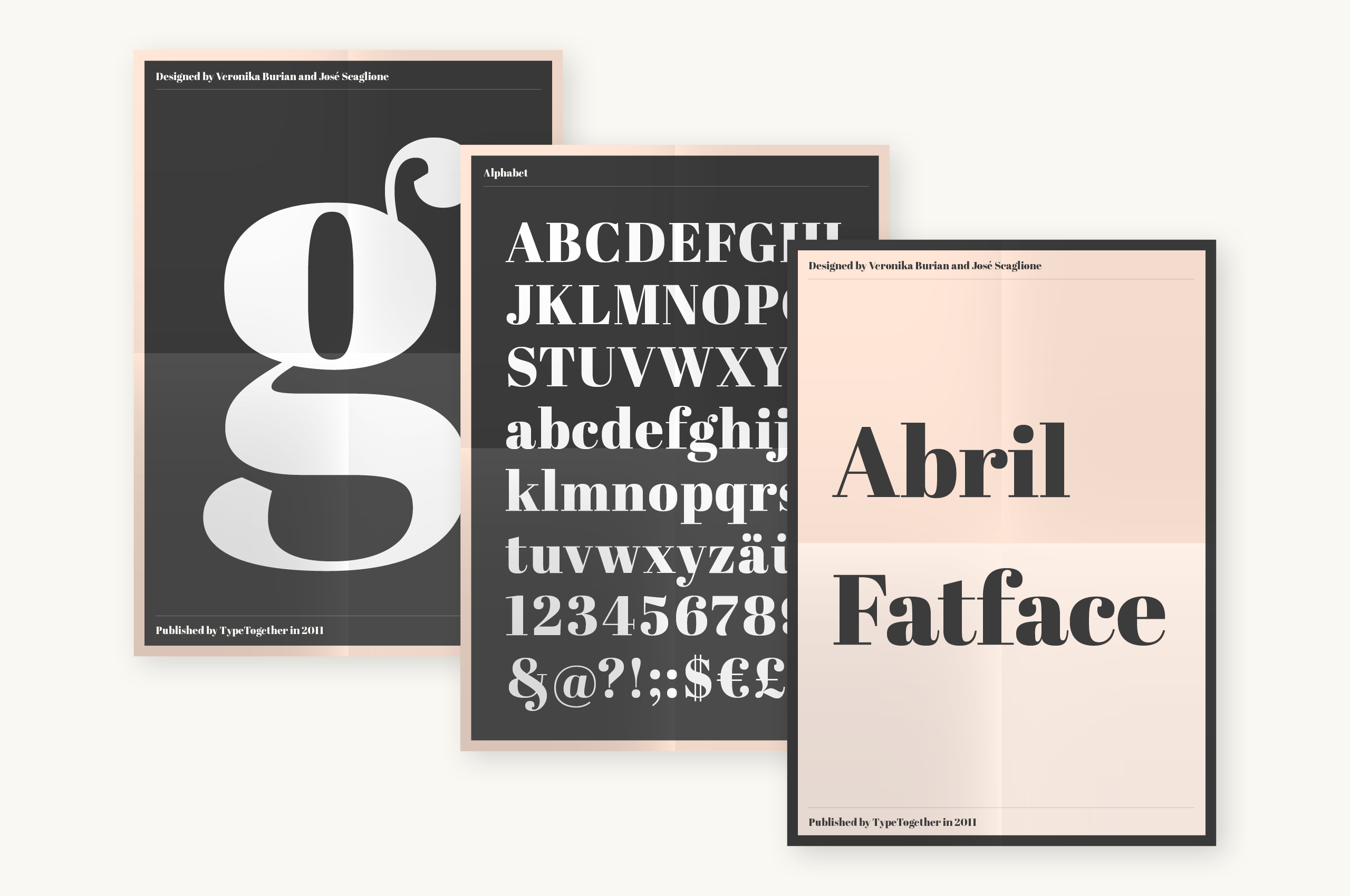
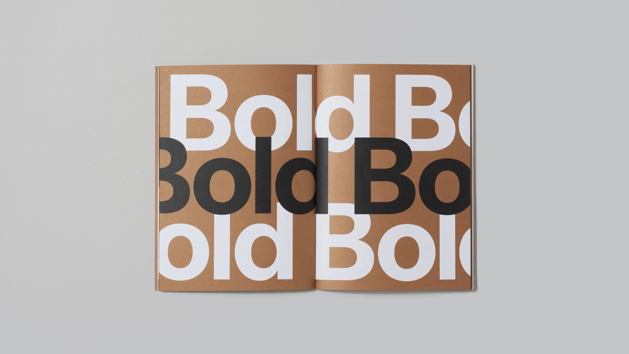
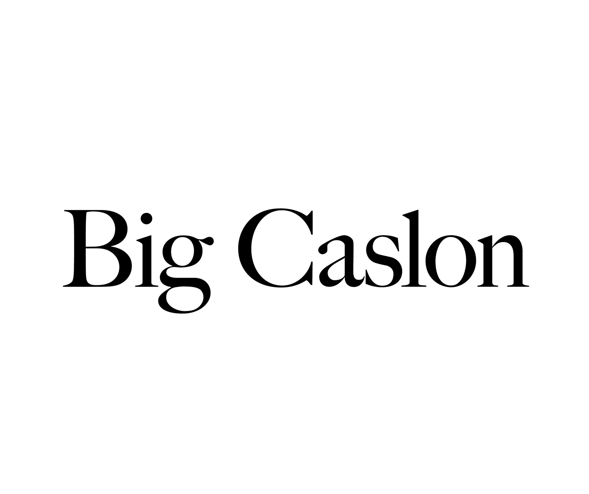
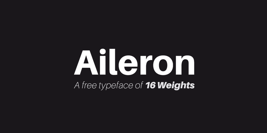
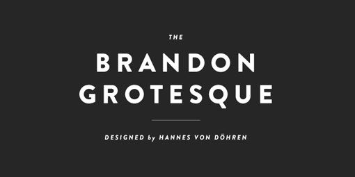
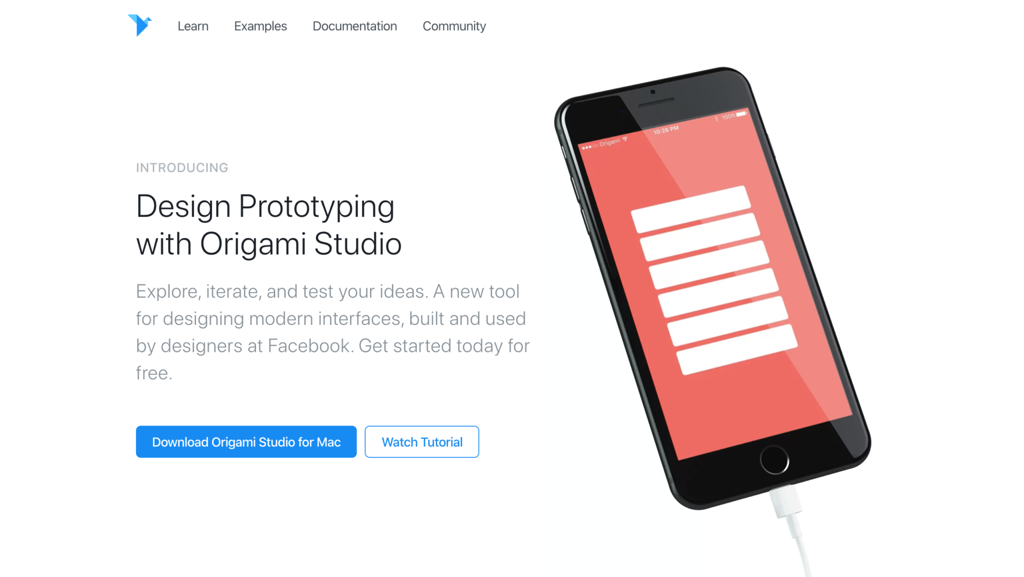
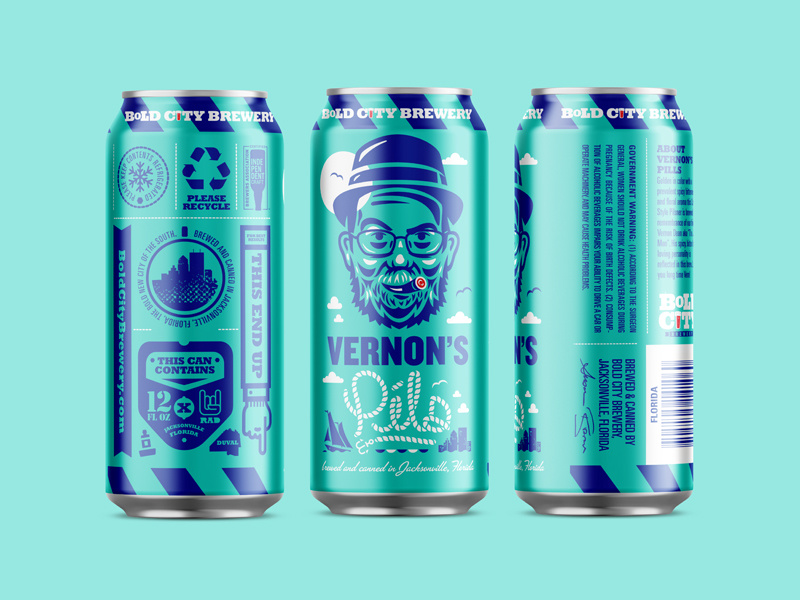
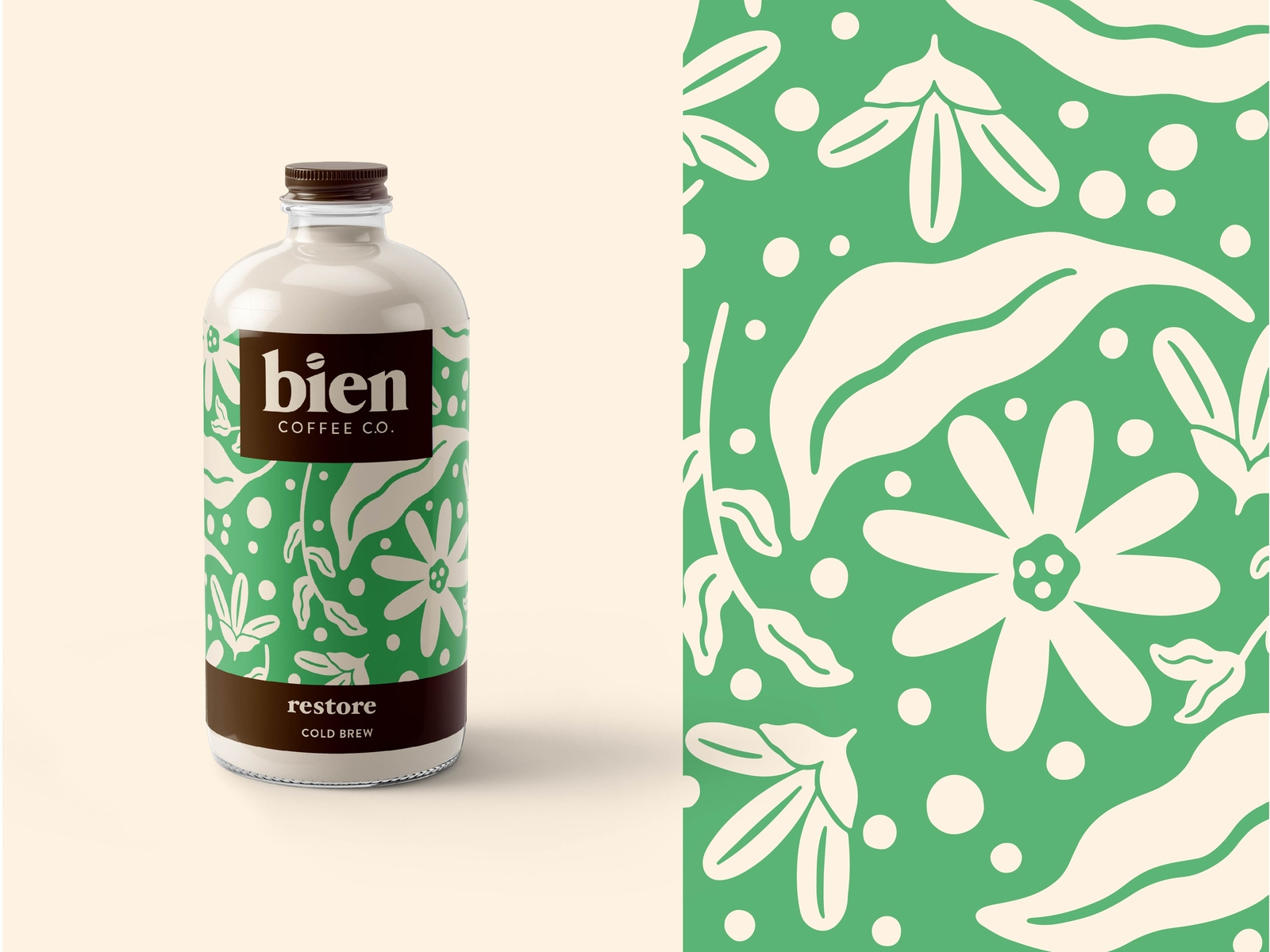
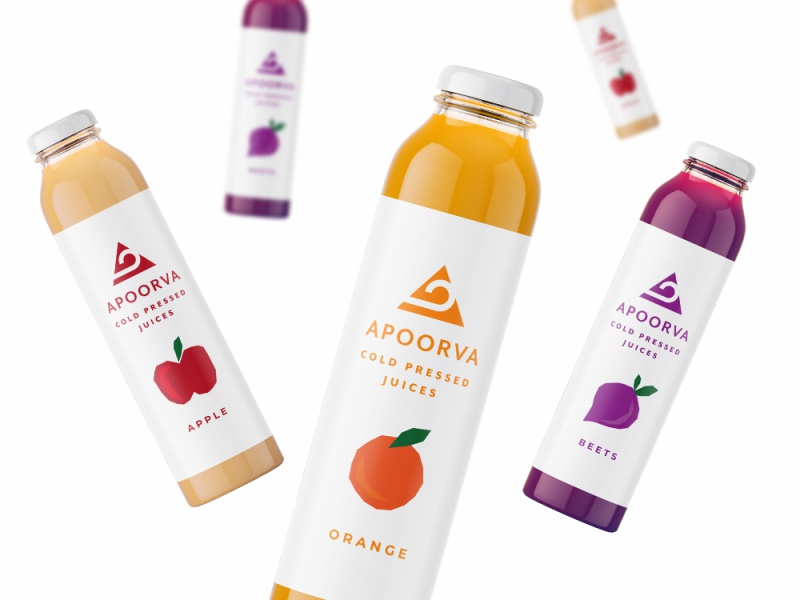
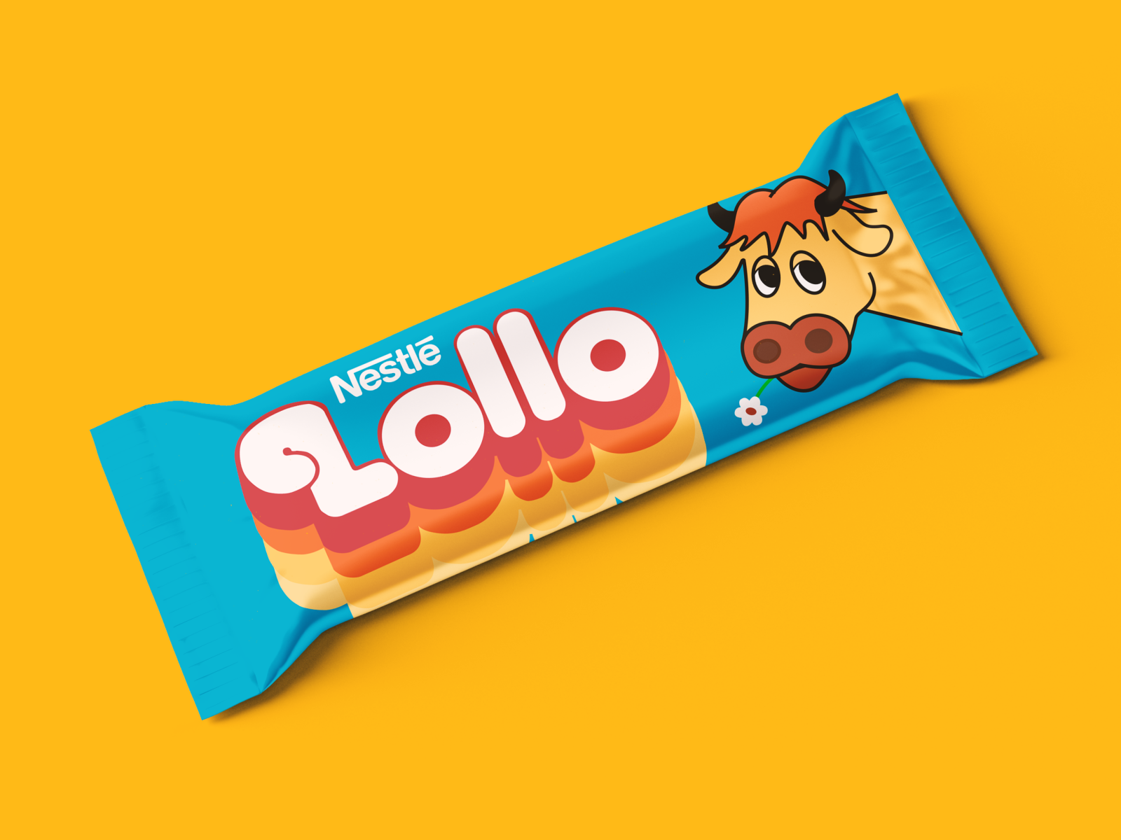
3. Use A Cohesive Color Scheme

A good color choice is going to make or break your design.

If you’re going to be using multiple colors, then I suggest that you choose a great color palette or use some sort of cohesive color scheme.

[source]

Using a bunch of colors that don’t match won’t be a good choice.

You can always do a quick google search and see what colors are predicted to be most popular this year, or you can use color psychology and pick a color scheme that will match your service best.

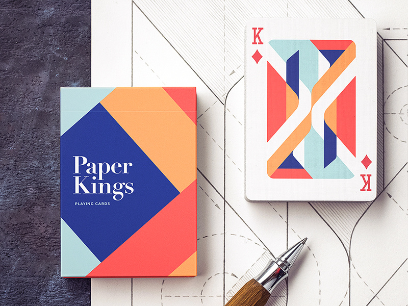
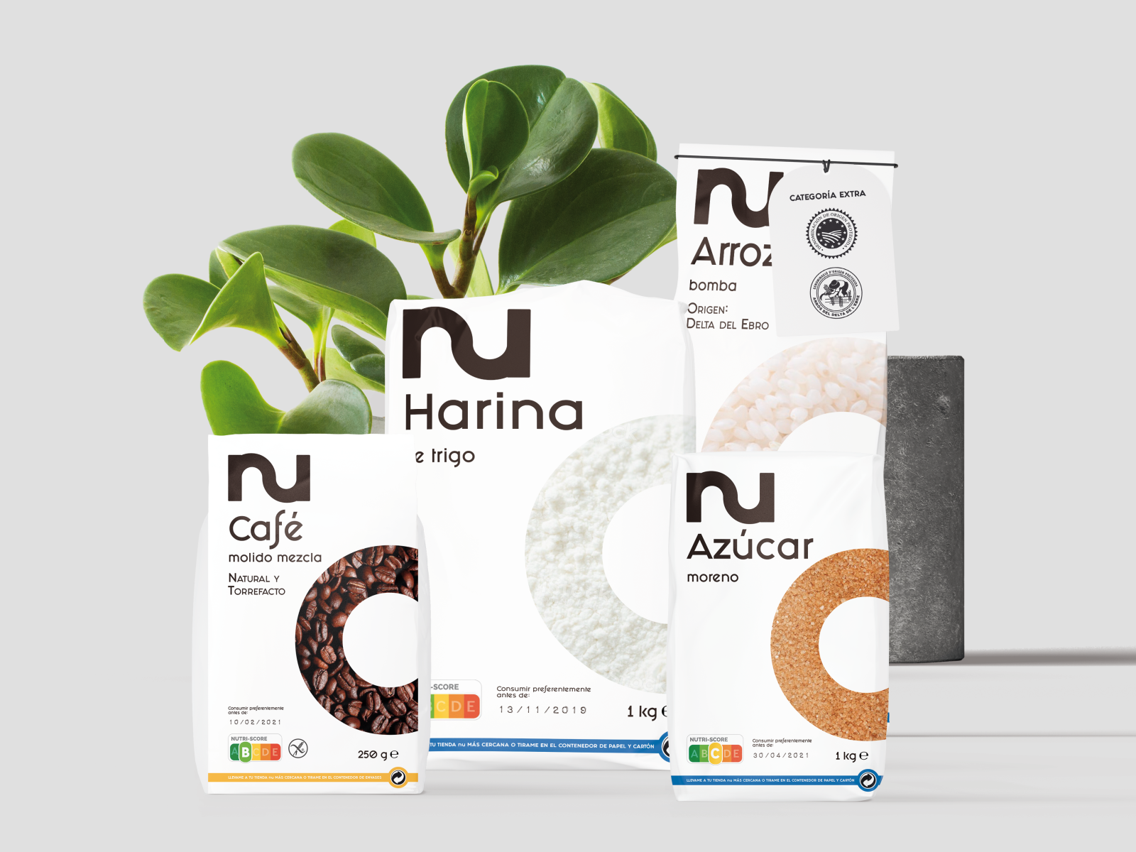
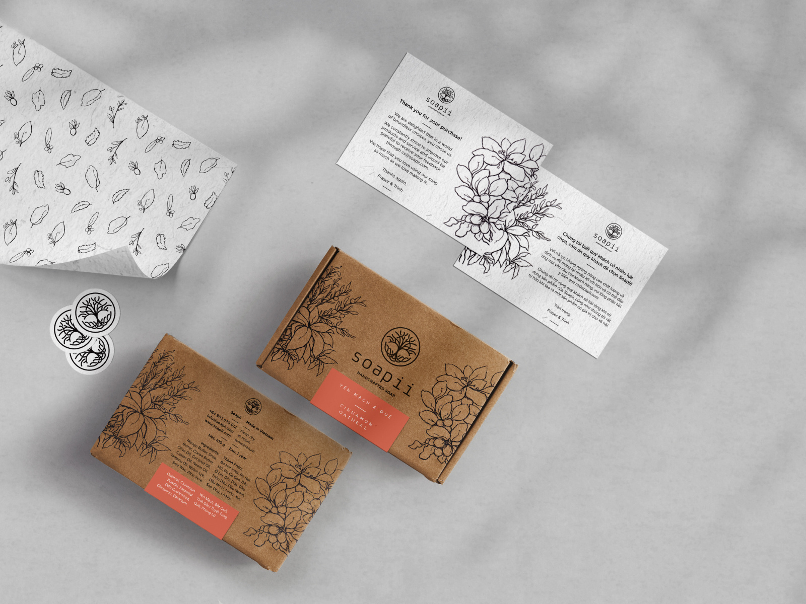
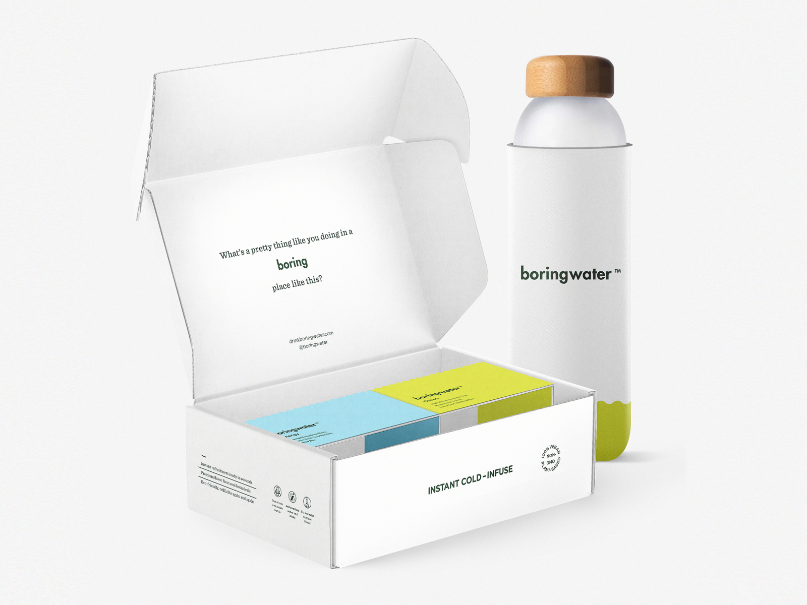
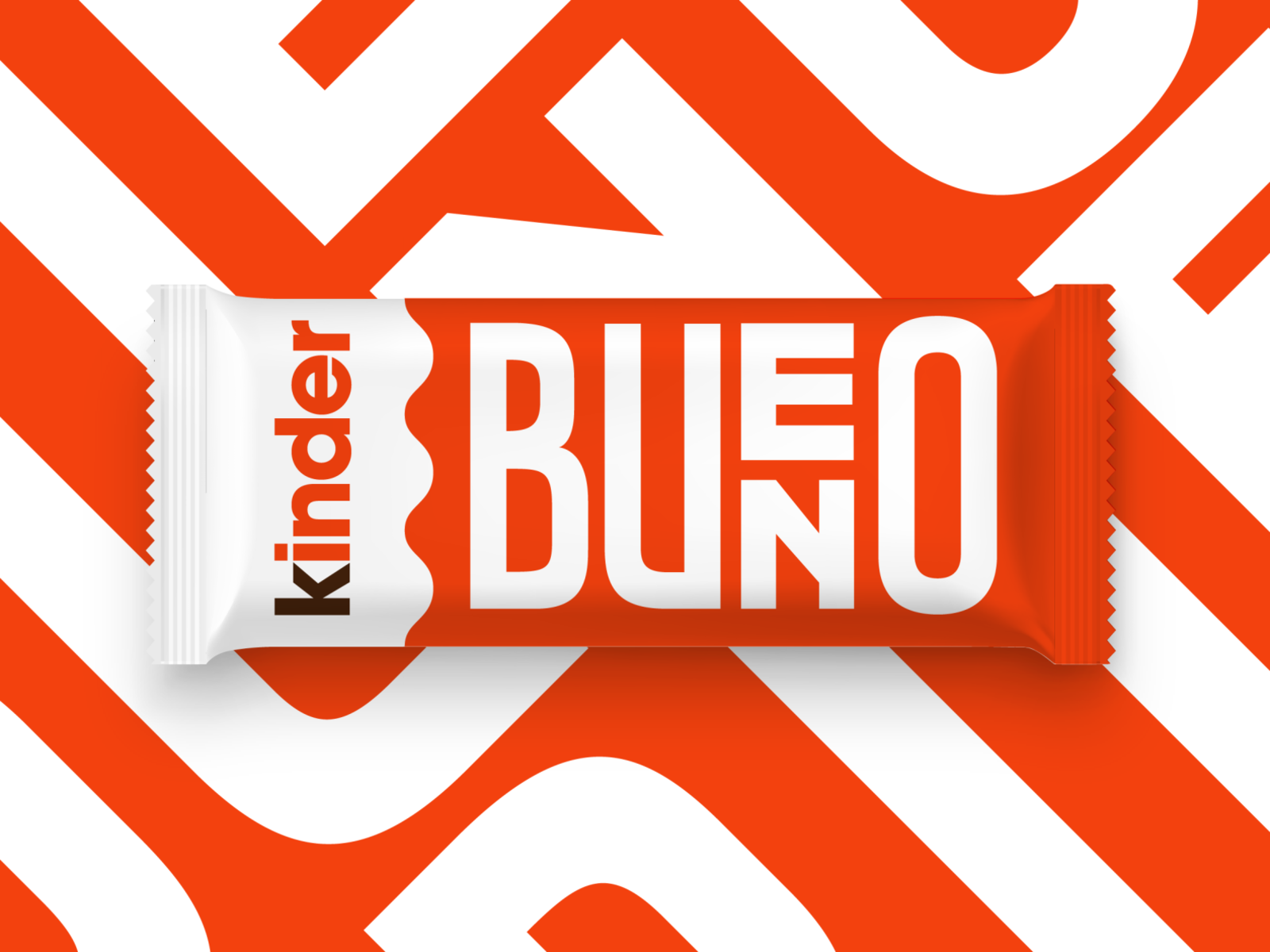
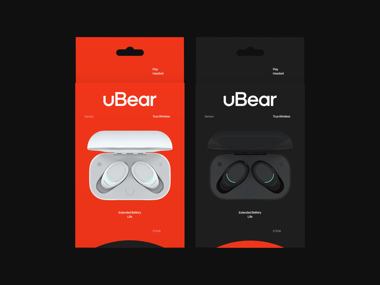
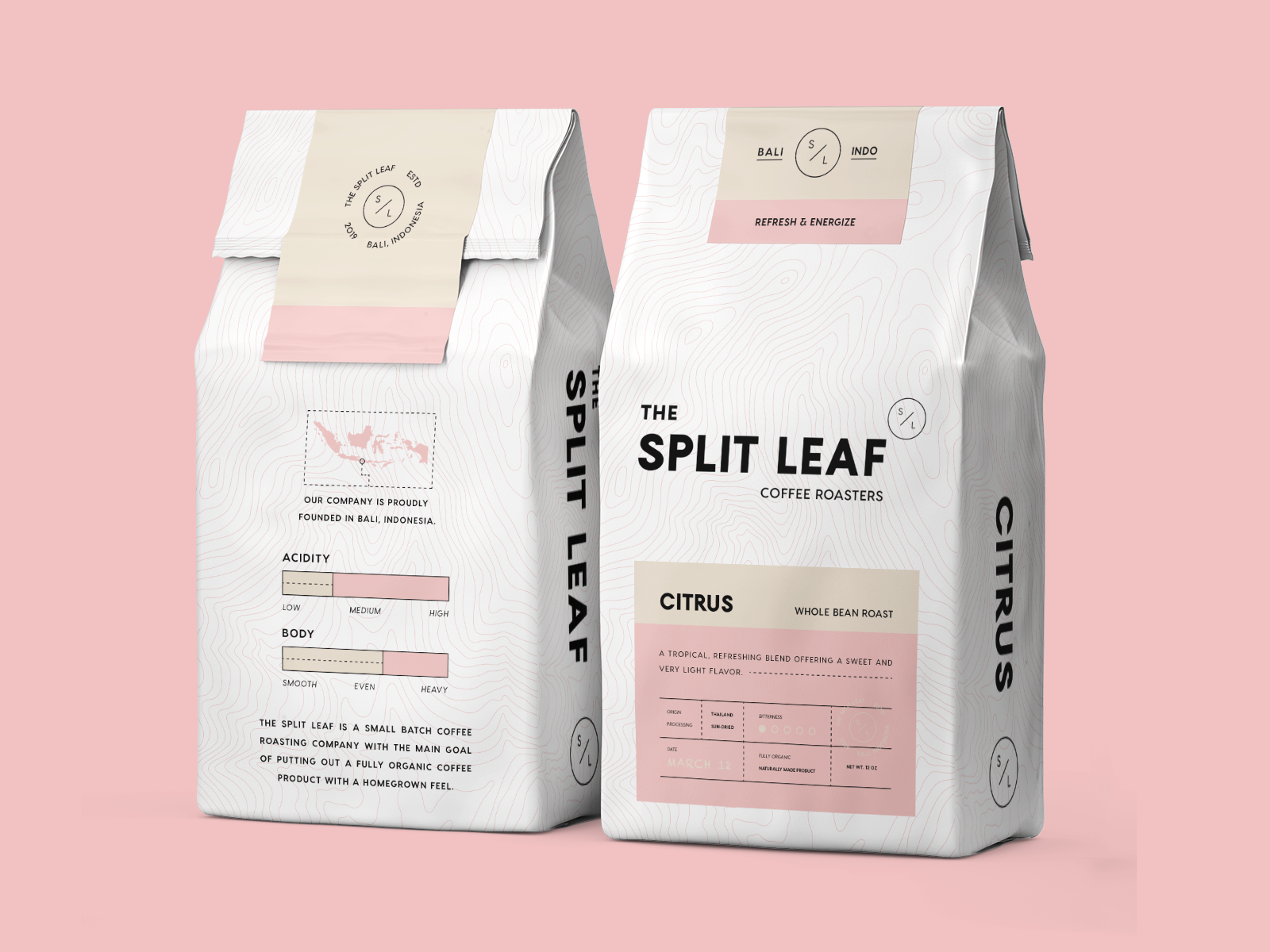
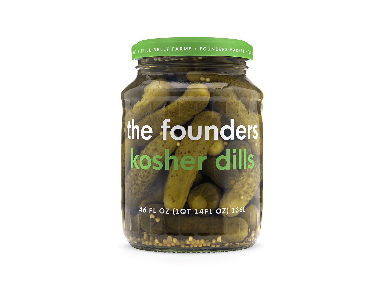
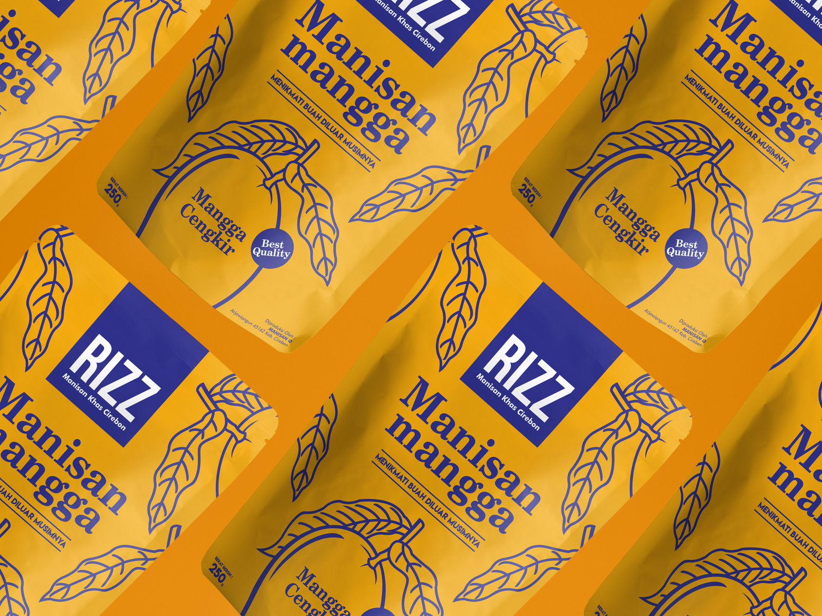
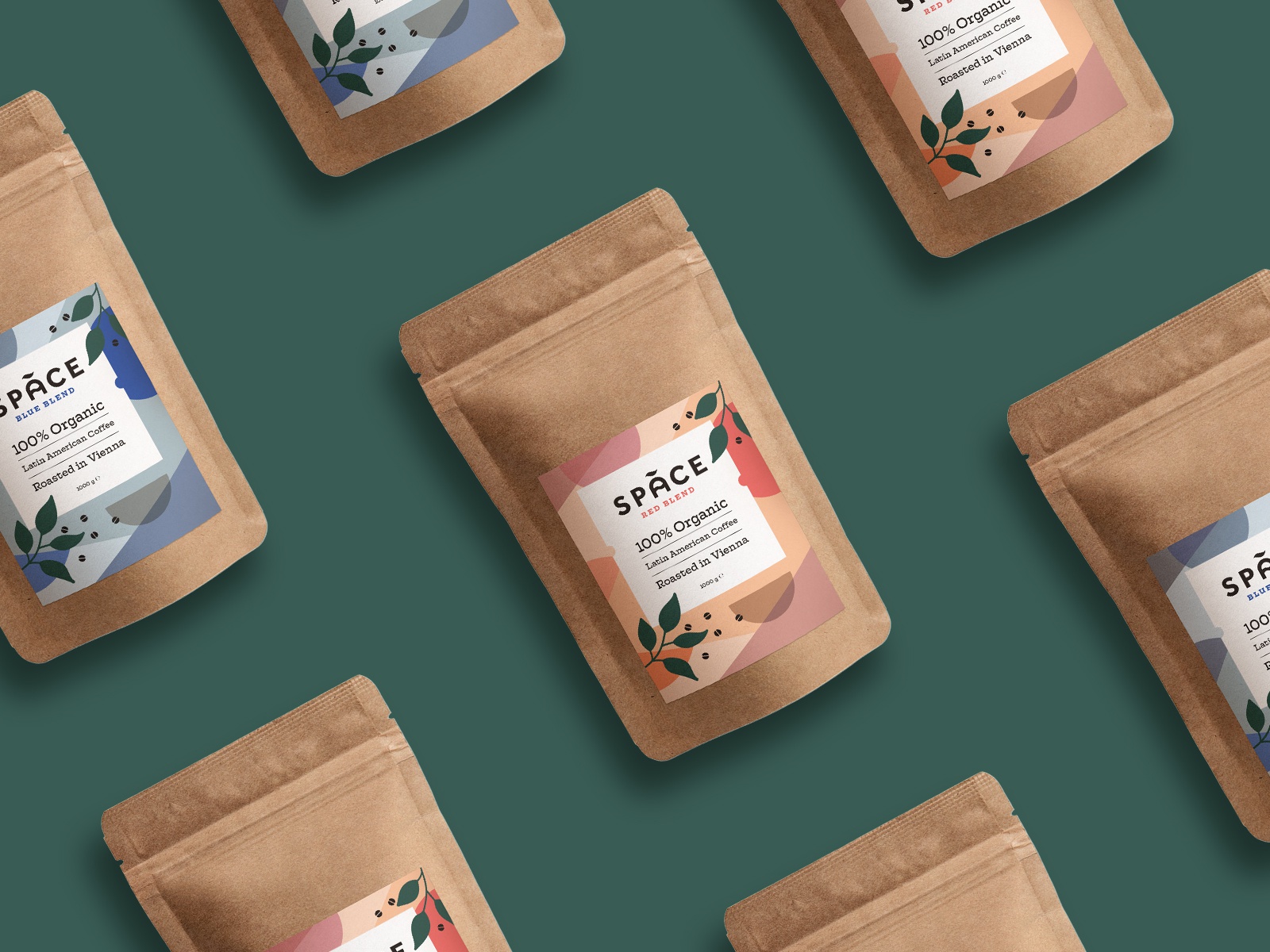
4. Make It Scalable And Versatile

Keep in mind that the company, business, or client that you’re designing for will be using their logo on a multitude of services.

From big signs to coffee mugs, you need to make sure your logo won’t lose its quality and that it’s recognizable no matter where it’s displayed.

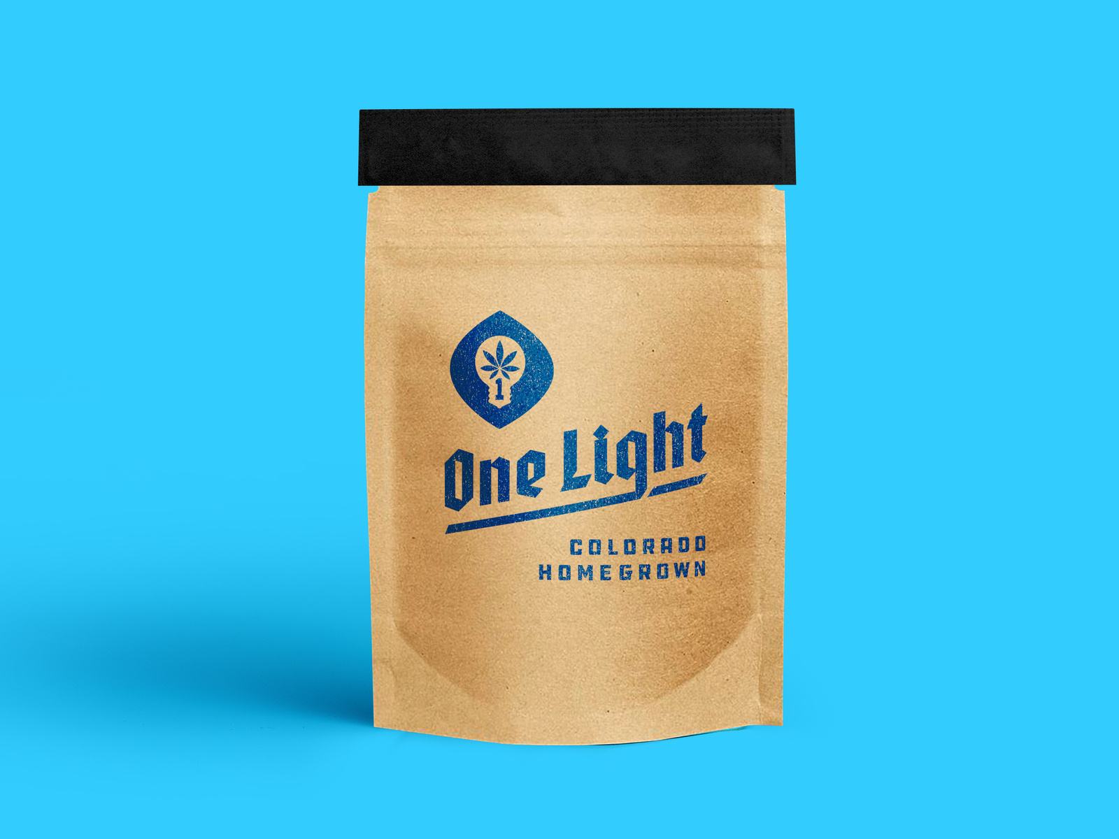
One way to make sure that your design looks good across all platforms is by creating mockups. We know lots of free mock-up sites that you might be interested in using.

[source]

[source]

[source]

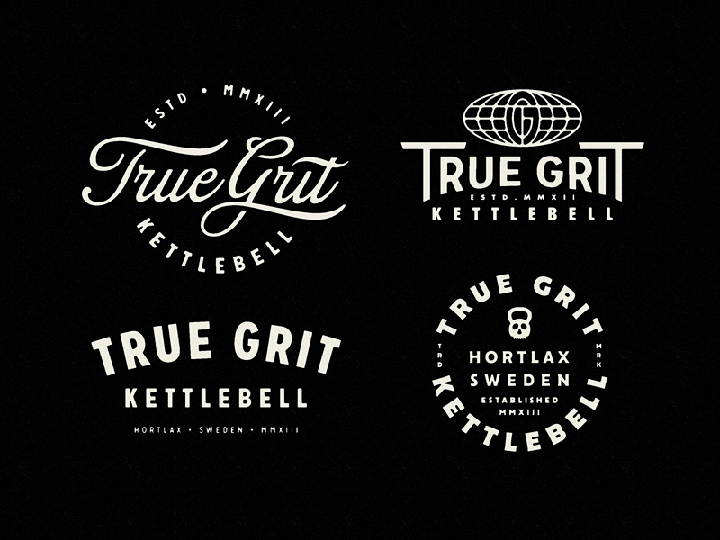
5. Always Keep Your Audience in Mind

You always, always, always have to remember who you’re designing for, and adapt.

If you’re designing for kids, you don’t want to go with neutral colors and a minimalist, flat design. You’re going to want to use bright colors that catch their eye and look fun.

On the other hand, if you’re designing for a winery, you’re going to want something sleek, minimal, and elegant.

So whoever the audience is, you have to take your unique style and just adapt it to your situation.

6. Go With Your Gut

And finally, go with your gut and make the designs you love.

Not everyone will understand your designs, and you won’t always understand everyone’s request.

But you’re going to live and learn from those experiences and in the end, it’ll make you a better and more experienced designer.

Try to make a new logo design every day. It doesn’t need to be spectacular, but just something that will keep your creative wheels turning.

If you ever need some inspiration, we have lots of tips on how you can find design inspiration in everyday things.

Until next time,

Stay creative and stay safe, folks!

Read More at 6 Logo Design Principles That We Swear By

10 Tip For How To Work From Home and Stay Focused – The Social Distancing Edition

The novel coronavirus has made a huge impact on the world as we know it.

People have been asked to stay home as much as possible and practice social distancing.

For many of us, this means that we’re taking our jobs home, and we get to work remotely.

If you’ve never worked remotely before, it might seem like a dream come true and a walk in the park.

“You get to work from home? That’s so easy.” “Lucky!” “I’d like to wake up late, stay in my pajamas all day and do whatever I want too.”

home office how to work from home

As a person who works from home, these are a few of the things I hear quite often.

And while working from home is something I cherish and it truly is a dream come true, it certainly does come with its own set of difficulties. Staying focused and getting things done can be difficult sometimes.

When you work from home, you are accountable for yourself. No one is there looking over your shoulder and pushing you to get your work done.

It all comes down to how you’re going to take on your day.

10 Tips For Working From Home and How To Stay Focused While Social Distancing

So today, I’m going to be sharing 10 things I learned while working from home, what habits helped me stay productive and on top of my tasks, and what I do to stay focused. Let’s get into it!

1. Have a Designated Space for Working

This is my biggest tip that I could ever give you when it comes to working from home.

Don’t just roll over in your bed in the morning, grab your laptop, and start working.

You need to have a designated workspace where your brain recognizes that “this is a place that we get stuff done”.

how to work from home tips

Your bed is a place your brain recognizes as a sleepy place. So if you get all cozy and work there, you won’t be as productive and will likely get tired.

What you can do is go to a corner in your home where there is lots of natural light, set up a little table, and make it aesthetically pleasing so that it’s a place your where brain says “I want to go there because it’s nice and clean, looks good, and I get work done there.”.

I have learned from experience that I get the most work done when I’m sitting at my desk. I only work at my desk and do nothing else there, so it’s easy for me to get work done there, as opposed to sitting on the couch where I could easily be distracted by the tv. Or my cute dogs

2. Have A Good Morning Routine – Get Dressed

My second most important tip for staying focused while working from home is to have a great morning routine and treat workdays, like workdays.

I admit, some days I do like to relax and chill in my sweats, throw on my glasses, get a cup of coffee, work and call it a day.

But those days are not my most productive.

get dressed for work at home

I recommend that every day before you start work that you wake up reasonably earlier than when you should start working, that you shower and get dressed, have some time to relax and wake up, then start working.

The way you look can directly correlate to how you feel.

When you work from home and no one sees you, you have to show up for you.

When you dress for success, you’re going to have a better day. Guaranteed.

3. Make a To-Do List

Once you’re in your designated working space, you’re dressed and have your coffee in your hand, it’s time to get to work.

But what are you going to do today?

tips for working from home to do list

It’s so important to make a to-do list every day before you start work. When you work from home, lots of the days get jumbled together and you can’t seem to remember things as well as you would in an office in town.

I recommend that you make a “weekly goals” list, and then a to-do list every day.

This will keep you on track and motivated to keep going when you see all the little tasks you get to tick off every few hours.

4. Have a Schedule Guideline 

This is optional, but something I enjoy writing along with a to-do list is an hourly timeline.

When you work from home, it’s easy to get distracted, so I find that if I say, “Okay, from 8-10, I want to focus on emails and communicating with my clients and from 10-12 I want to work on my new visuals,” then I’m way more motivated to get things done than if I just set vague goals.

When I set some hourly goals, I am much more satisfied with my workflow, and reward myself with a pretty long break to play with the dogs and go for a short walk.

5. Try Out The Pomodoro Technique

Another highly useful productivity tip is to follow and practice the Pomodoro technique.

This technique states that you should work in increments, as it is one of the most productive ways to work.

So here’s how you do it.

Set a 20 minutes timer. In those 20 minutes, you smash out as much work as you can, with no distractions.

Have the timer will set a sense of urgency and you’ll get things done quickly. It’s like a game that awakens our inner, competitive child to beat the clock.

Once the timer goes off, you take a short, 5-minute break as a reward for your focused work. In this time you can stretch, get a cup of tea, or check your social media and reply to texts.

You repeat this 20-minutes-of-work-and-5-minutes-of-break cycle 4 times before you take a long, proper break of 15 to 20 minutes.

Try this method out and let me know how it worked for you! It works wonders for me and my easily distracted self.

6. Use a Time Tracking Tool

The Pomodoro technique is awesome because even though you’re taking a lot of breaks, you’re working way more efficiently and the breaks don’t add up to much time at the end of the day.

If you catch yourself taking more breaks than working, then maybe you should consider using a time tracking tool.

free time tracking tool work from home tips

Clockify is a free time tracker that will keep you accountable throughout the day so you get your tasks done.

It’s also nice to see how much you’ve done throughout the day so that you can adjust your workflow for the next day until you get the hang of staying focused working from home.

7. Use a Team Collaboration Tool

If you used to work from an office with all your colleagues and planning was done easily, but now you’re all working remotely and can’t stay on top of tasks, you’re not alone.

That’s where a team collaboration tool comes in handy.

Airfocus is a team collaboration tool that’s going to help you and your team prioritize what needs to get done and when. Everyone will have access to the schedule so no one is left out of the loop.

airfocus team collaboration tips for working home

Not only did they develop an amazing tool, but they’re also supporting small businesses that are taking hits from COVID-19 and giving them 6 months of the starter plan for free.

Airfocus is definitely my team’s favorite tool that we ever used, and I highly recommend that you and your team try it out.

Get your hands on it while you can!

8. Set Boundaries For Yourself

You need to set up some boundaries for yourself if you’re truly serious about staying focused while working from home.

You need to decide how much downtime you’re going to give yourself, how long you’re going to spend on social media, how long your lunch break will be, etc.

Without setting boundaries for yourself, you can get lost in your free time, only to realize that “omg it’s 5 o’clock already??” and then pull an all-nighter, which nobody wants.

Setting boundaries will create freedom for you.

9. Talk to People You Care About

Working from home, especially if you don’t live with someone or have a roommate can get really lonely.

Especially now that you can’t even go on a walk in town and socialize a little.

Even though we are social distancing, that doesn’t mean that we are socially distant.

Facetime someone that you care about, that makes you happy.

Even just a call on the phone and seeing or hearing the person you care about is going to make your day that much better and make you feel less lonely.

Set up a lunch date with someone and have lunch over a video chat.

Trust me, it’s a must.

10. Get Some Fresh Air and Sunshine

Finally, get a breath of fresh air every time you need it.

Follow the rules and regulations that your country has given, and if you can, go for a brisk walk. This will boost your creativity by a million and you’ll be more inspired to work when you come back inside.

If you can’t go for a walk, open a window and let your face meet the sun for a few minutes.

Fresh air brings new ideas and the sun is scientifically proven to boost your mood.

Stay Safe

Alright you guys, this is where I’m going to wrap things up.

The more we stay inside, the more we slow down this terrible virus, and the sooner we can all go back to the beautiful world as we know it.

Stay safe during this time and enjoy working from home while you can.

Until next time,

Stay creative, folks!

Read More at 10 Tip For How To Work From Home and Stay Focused – The Social Distancing Edition

27 Social Distancing Designs That Are Just Too Good Not To Share

COVID-19 is no joke and we’re all practicing some social distancing right now.

If you’re not, and you have the choice to stay home, then you really should do it.

While social distancing can be boring or lonely, just remember that by staying home, you are saving lives, and literally changing the fate of our world.

The little things we choose to do right now are important.

And luckily for us designers, a lot of us can do our work from home.

[source]

That is a privilege I will always be grateful for and my gratitude, thoughts, and prayers are with everyone who has to go to work every day to make the world go round.

One of the many wonderful things I have noticed during this time, is that a lot designers have taken no break during this pandemic to create some beautiful designs regarding social distancing and self-quarantining.

Have a look for yourself to take your mind off of the crazy things going around us, and enjoy these 27 social distancing designs that some creative people of our beautiful world have created.

27 Social Distancing Designs To Scroll Through While We All Stay Home

social distancing design

[source]

social distancing design

[source]

social distancing design

[source]

social distancing design

[source]

social distancing club

[source]

[source]

social distancing

[source]

[source]

[source]

[source]

[source]

[source]

[source]

[source]

[source]

[source]

[source]

[source]

[source]

[source]

[source]

[source]

[source]

[source]

[source]

[source]

We’re In This Together

You guys… we’re in this together.

We can make a difference by staying home and doing our work from home.

Do the thing that you haven’t had time to do. Learn a new skill, cook a meal, play with your dog, talk to your loved ones.

We have all the time in the world right now to stay at home and focus on ourselves and the things that matter to us.

Take this time and create something beautiful with it.

Stay safe, everyone.

Until next time,

Stay creative, folks!


Read More at 27 Social Distancing Designs That Are Just Too Good Not To Share

Top 10 Logo Fonts in 2020 That All Designers Want To Get Their Hands On

Picking the right logo font can be an excruciatingly hard and tedious task.

The font you choose and the colors that go with it will make or break your design.

As font trends are always changing, we’ve got you covered and are here to share our most recent top picks with you.

The Best 10 Logo Fonts You’ll Want To Use in 2020

There are loads of lists of fonts out there, but we’ve picked the best of the best.

From our professional designers to you, here’s our personally curated list of the best logo fonts of 2020.

1. Ambit

logo fonts of 2020

Starting off the list with a bang, I present to you, Ambit.

Ambit is a classic font that I’ve loved for a long time now and have used it in a fair amount of logos that I designed.

This classic and timeless sans serif was designed by CoType Foundry, with their inspiration coming from early grotesque, but has now been adapted for modern design use in the 21st century.

From Thin to Black, Ambit features 7 different weights, so that there is something for everyone.

Ambit is the perfect font for a modern and sleek logo.

2. Bodoni

bodoni logo font

Didot


Bodoni is next up on the list.

Bodoni is the perfect font to use for any type of elegant fashion logo.

Giambattista Bodoni created this font in a time when loads of designers were experimenting with a dramatic contrast between thick and thin lines.

This font looks like it came straight out of a Vogue or Calvin Klein magazine.

Give it a whirl on your next design. You’ve got nothing to lose because it’s free!

3. Didot

Didot is another gorgeous, yet dramatic serif font that would go great not only with fashion logos, but anything modern, sleek, luxurious, and elegant.

There are many different versions of Didot, but perhaps the most well-known version is the one that Giorgio Armani used in their logo.

With the right tracking and kerning, this logo could be the perfect font for your next elegant logo project.

4. Helvetica Now

After being named one of the most widely appreciated fonts of 2019, we see no slowing in its widespread use and continual growth.

Helvetica Now is available in 3 optical sizes, Micro, Text, and Display.

Helvetica Now is essentially everything you’ve ever loved about Helvetica, with all sorts of little tweaks and improvements, all wrapped up into one new font.

And that font, may just be your new favorite.

It might be mine.

5. Untitled Sans

Meet Untitled Sans.

Untitled Sans is the product of the Super Normal project, created by Jasper Morrison and Naoto Fukasawa.

Untitled sans comes in 10 different styles, so you can find the one that works best for you.

6. TT Norms Pro

Another great typeface we want to highlight today is TT Norms Pro.

TT Norms Pro was the #1 best selling geometric sans on Myfont in 2017 and continues to trend in 2020.

The font comes in an astounding 22 different styles. 11 uprights and 11 italics.

7. Big Caslon

This font is actually pretty historical. Back in the 1600s, there was a group of serif typefaces created by by William Caslon I.

Big Caslon is a revival of the said font group that dates all the way back to the 1600s, and is now making a marvelous appearance in the digital age of the 21st century.

8. Abril Fatface

You may recognize Abril Fatface from the Abril family of fonts.

Abril Fatface has 18 different styles and variations of the serif for you to use.

9. Aileron

Aileron was inspired by aircrafts of the ’40s and is a Neo-Grotesque sans serif typeface.

This sleek sans serif comes in 16 different weights and the best part about it all?

It’s free-99.

10. Brandon Grotesque

Brandon Grotesque is a staple font for me.

One of my go-to’s.

Brandon Grotesque gets its origin inspiration from old gothic fonts from the 1920s/1930s and is aesthetically pleasing as heck.

We predict that we’ll be seeing this font all over in 2020, so you might want to hop on this train soon!

Stay Safe, Everyone

We hope you enjoyed this list and that it took your mind off of the current events going on around us.

If you’re working from home now due to COVID-19 and are looking for tips on how to stay focused and productive, we’ve got you covered.

Stay safe and stay home if you can, everyone.

And as always,

Stay creative, folks!


Read More at Top 10 Logo Fonts in 2020 That All Designers Want To Get Their Hands On

5 Free Prototyping Tools That You Won’t Want to Live Without

A pictures is worth a thousand words, but if that’s true, then a single prototype is worth a thousand meetings.

We all know as designers how difficult it can sometimes be to communicate your ideas and visions clearly with a client.

When it comes to the custom design of a product, you have to try and try again to absolutely nail everything perfectly.

But even when the creation of a product is done… it never truly is, is it?

You always have room for a few modifications and improvements here and there.

And it’s better to find the little mistakes that were made on the product sooner rather than later, right?

And it’s an especially good thing to be able to run your designs by other colleagues, friends, fresh eyes, and ultimately, your client, in order to make sure you’ve done everything to the best of your ability.

The best way to do that is by using prototyping tools.

That’s why, today, we are going to go over 5 different prototyping tools.

Prototyping tools are especially helpful so that you can ensure that you are making your client happy by working alongside them, allowing them to see your process, and ultimately making sure that you keep your customer empathy intact while you’re going through the developmental phases.

And of course, we found the best free prototyping tools for you to use because we’ve always got your back when it comes to saving a buck.

So without further ado, let’s do this.

1. Adobe Experience Design

Alright, let’s just jump into this list and start it off with a banger. This is my personal favorite of the bunch of free prototyping tools, but maybe that’s because I’m a major Adobe fan-girl. And we can just let Adobe themselves sum up the tool in just a few words.

free protoype tool adobe xd

“Adobe XD is a powerful, collaborative, easy-to-use platform that helps you and your team create designs for websites, mobile apps, voice interfaces, games and more.”

You can work together with your team in real-time so that everyone is always on the same page and you can work faster and more efficiently.

“For designers, by designers.”

“We’re not just building a product — we’re building a community of designers striving for a better way to work.”

Price:

  • Free

Compatible with:

  • Windows
  • iOS
  • OS X
  • Android

Prototypes for:

  • All

Try it here: https://www.adobe.com/in/products/xd.html

2. Origami Studio

“Explore, iterate, and test your ideas. A new tool for designing modern interfaces, built and used by designers at Facebook. Get started today for free.”

origami studio free prototyping tool design

What may have started just for the design team at Facebook, has now been launched for all of us designers out there to use, for free.

“We created Origami to help us design and build many of our products like Facebook, Messenger and Instagram. We’re excited to see what you make in Origami.” 

With Origami Studio, once you’ve created your mockup, you can view it in real-time on your phone to catch any bugs or errors, or just simply to enjoy the fruits of your labors.

Price:

  • Free

Compatible with:

  • OS X

Prototypes for:

  • iOS
  • Android

3. Invision

Design better. Faster. Together.

The digital product design platform powering the world’s best user experiences

By far the most popular prototyping tool in the entire world, I present to you, Invision.

Because they know how important it is to be able to create an amazing prototype, they constantly have their team testing and improving their product.

Because of this, they are continuously adding new, relevant features they will help you create the best prototype that you possibly could.

My favorite part of this prototyping tool is that you can set up planning columns like to-do lists, in progress, needs review, etc.

That way, everyone is on the same page and nothing gets lost in planning.

The tool is free at first, and if you get hooked, in my opinion, the price of it is quite affordable thereafter.

Price:

  • The first project is free
  • 3 projects (which is the starter package) – $15/month
  • Unlimited Projects (which is the professional package) – $25/month

Runs on:

  • Web

Prototypes for:

  • Web
  • iOS
  • Android

4. Atomic

Atomic makes it easy to create and deliver functionality to your users on any device or platform.

If you’re a major Google Chrome fan, then this tool might just be for you.

In order to use Atomic, because it is a web-based tool, you have to use Google Chrome.

Because it is a web-based tool, other designers and developers do not need to install any app, but instead, simply use the Chrome browser in order to see the prototype.

One thing that really does comes in handy is the play button. By clicking on it, you get to see all of your changes and animations in action and progression.

It’s pretty satisfying, but you can also see if there’s anything that went wrong that you’d like to change.

Cost:

  • 1 prototype (30-day trial) – Free
  • Unlimited prototypes for 1 user – $19
  • Unlimited prototypes for up to 10 users – $99

Runs on:

  • Web

Prototypes for:

  • All

5. Sketch

The best products start with Sketch

Create, prototype, collaborate and turn your ideas into incredible products with the definitive platform for digital design.

And last but not least, I present you with Sketch.

If you love photoshop, then you’re in luck.

Sketch is very similar to photoshop in many different ways, but it is most similar in the fact that you can manipulate and edit photos any way that you want.

Because Sketch’s workflow is completely vector-based, it makes it easy to create amazing prototypes.

Another nice thing about Sketch is that you can easily copy and paste things that are constantly repeating themselves in UI, such as buttons, menus, bars… You name it. It’ll save you lots of time and headache in the end.

Cost:

  • Trial – Free
  • Full version – One-time $99 payment

Compatible with:

  • OS X

Prototypes for:

  • Web
  • iOS
  • OS X

Wrapping up…

We hope you found this article helpful and the perfect prototype tool for you.

If we missed any free prototyping tools that you use on a daily basis, let us know in the comments below which ones are your favorite and we’ll cover them in another article.

Until next time,

Stay creative, folks!


Read More at 5 Free Prototyping Tools That You Won’t Want to Live Without

Here’s A Major International Women’s Day Appreciation Post – Happy Women’s Day

Today is a glorious day to be celebrated by all.

Happy International Women’s Day!

Here’s to all the strong, loving, independent, wonderful, creative, and special women out there.

Every day, I truly believe, women deserve to be celebrated.

[source]

Every day, but today especially, we want to honor women the way that they deserve.

Women contribute a billion and one things to society 👏every 👏single 👏day, whether you realize it or not, and deserve to be celebrated and treated as such.

Without women, our world would be bland.

Without women, we wouldn’t know our world as we know it today.

Women make our world a better place.

By women, for women. 

That’s why, today, I want to shine the spotlight on the talented and amazing women who created art to share on this International Women’s Day.

Here are 19 designs to celebrate Women’s Day and to appreciate the women in our lives and the ones that change the world each day for the better.

[source]

[source]

[source]

[source]

[source]

[source]

[source]

[source]

[source]

[source]

[source]

[source]


[source]

[source]


[source]

[source]


Happy International Women’s Day

From the bottom of our hearts, Happy Women’s Day.

We see you killing the game, hustling, climbing to the top, running a business, being a mom, taking care of others, fighting for freedom, protecting others… basically, being a woman.

You are strong.

You are a woman.

And we thank you for that.


Read More at Here’s A Major International Women’s Day Appreciation Post – Happy Women’s Day

Are You Ready to Play Uno Minimalista? We Know We Are.

uno minimalista

Oh, the golden days of Uno, when everyone would carry their pack of fun and good memories in their pocket.

I remember playing Uno all throughout my childhood and even to this day when we get a good old group of friends together, we’ll play our version of Uno extreme.

And there are no promises that someone won’t get hurt, so you play at your own risk.

Uno brings so many good memories to my mind when I think about it, and I was absolutely stoked when I heard the news that they going to make a minimalist version of it.

And we all know I’m a sucker for some minimalist design.

So let’s get into the story behind it all.

Meet Uno Minimalista

uno minimalista

[Image credit: Warleson Oliveira]

Just like we talked about last week, everyone is loving a dark mode of anything nowadays, and many people are calling Uno Minimalista the dark mode of the original Uno.

What started as a petition, is just about to become a reality.

[Image credit: Warleson Oliveira]

Last month, the new concept of Uno Minimalista drove people crazy, in the best way.

There was just an uproar of how people needed this version of Uno in their life. And I was 100% apart of this crowd.

[Image credit: Warleson Oliveira]

Warleson Oliveira was the mastermind behind this gorgeous minimalist concept of Uno that made the internet go wild.

A petition started on change.org to see this concept become a reality and Mattel heard us.

Mattel tweeted out the thing we were all dying to hear. “You asked for it, you got it.”


As soon as I saw this, you know I was just dying to get my hands on it, and if you’re anything like me, you probably had your credit card in your hand, ready to go and order a few packs.

Well, unfortunately, we don’t have an exact date yet, but we sure are looking forward to getting our hands on this new Uno Minimalista.

[Image credit: Warleson Oliveira]

They tweeted that we should “stay tuned for the summer”, so within a few short months, we will all be reliving our childhood all over again.

So call your friends and set up a camping trip, get your Uno Minimalista cards ready, and have a great time together creating new memories.

[Image credit: Warleson Oliveira]

We can’t wait to get this new and improved Uno and play all night.

Let us know what you think aboutthis new Uno design in the comments!

What do you love about it or what would you have done differently?

And of course…

Until next time,

Stay creative, folks!


Read More at Are You Ready to Play Uno Minimalista? We Know We Are.

4 Tips For Dark User Interface Design – What You Need to Know

dark and light mode design

Today we’re getting into the nitty-gritty of integrating dark theme design into your website, app, and overall designs.

We are major stans of dark UI, and we know that lots of other people are too.

youtube dark mode design

Considering that dark UI was the most highly requested thing of Apple by their clients in 2019.

apple dark mode design

Lots of apps like Instagram and YouTube have given users the option to use their dark theme and people are living for it.

instagram dark vs light mode

[source]

4 Tips For Dark User Interface Design – What You Need to Know

If you’re considering “coming to the dark side”, then there are 5 things you need to know before you start designing.

So, here we go!

1. Allow People to Use Dark or Regular Mode

The first and most important thing is to give your clients and users the option of using dark or regular mode.

You can’t please everyone 100%, but at least you can give people the option of using whatever mode they like most.

dark and light mode design

Some people like dark mode, some people like regular mode. I, personally, am one of the few of my friends that will always use regular mode.

I am definitely the outcast of my group when it comes to using dark mode.

I’m literally the only person who will ever use regular mode because all of my co-workers and friends are obsessed with dark mode.

So remember, it’s important to let people choose what they want to use.

2. Don’t Use Pure Black

Dark mode doesn’t mean you have to use the color pure black as your background.

In fact, using a pure black color can actually cause more harm to your eye than using the bright mode.

One of the many reasons people use dark mode is to protect their eyes from all the bright colors, and when you use pure black, it can be hard for people’s eyes to adjust and register everything.

dont use pure black in dark mode[source]

Especially if your primary color is pure white. It’ll just be a disaster, which I’ll unpack more in the next point.

So, instead of using pure black, use a dark grey color instead. Or even a lighter grey. The choice is yours.

3. Make Sure You Use Desaturated Colors

Just like using pure black can damage your eyes, you should also avoid using very bright, saturated colors.

When you use saturated colors, it strains your eyes to be able to decipher what is written.

Take these 2 different color choices for example. One is easy to read, the other is more difficult.

dark mode tips

[source]

It’s safest to go with the more neutral version of whatever color you’ve chosen as your primary and secondary colors.

It’ll still be beautiful, and it will be less straining on your client’s eyes.

Wouldn’t you hate to lose a client that loves your product, over a poor color choice?

4. Use Depth to Your Advantage

When you decide to create and design a dark mode for your app, it’s very important to use depth to your advantage and create a sense of hierarchy and to put lots of emphasis on important elements in your design.

As you know, in regular or light mode, you can use shadows to express elevation. But that approach won’t work well in dark mode.

Since you can’t see a shadow on a dark color very well, a better approach to this problem would be to use lighter colors to create some depth.

[source]

It’s best to illuminate the surface of each level because the higher a surface’s elevation, the lighter that surface becomes.

Wrapping up

We hope you found these 4 tips of dark UI design helpful and that you can integrate these principals with ease into your next design project.

Let us know what other tips you all have when designing a dark mode for an app.

Until next time,

Stay creative, folks!


Read More at 4 Tips For Dark User Interface Design – What You Need to Know

Kroger Gets A New Logo And Slogan – Fresh For Everyone

Kroger is hands-down one of my favorite grocery stores ever.

And I’m not the only one, apparently.

With 2,800 stores nationwide and in 35 states, Kroger is easily the largest grocery store retailer in the United States of America.

Kroger has been around for a long, long time.

I’m talking over 100 year’s time! Kroger was established in 1883 in Cinncinatti, where the Kroger headquarters still is.

Not only does Kroger have over 500,000 (yes, folks, you heard correctly. That’s five-hundred-thousand employees), but they also donate hundreds of millions of dollars to help feed the hungry all over the country.

Now that’s the kind of grocery store I want to be a part of.

And I have been!

For years my family and I shopped at Kroger and to this day, we still do.

That’s why I wanted to talk a little bit about the new logo and slogan that they came out with at the end of last year.

As I said, Kroger has been around for a long, long time. And because they’ve been around for so long, you can imagine that their logo can quickly become dated.

One thing that completely distinguishes Kroger from other brands the curvy letters.

The “K” and “G” have a very distinct, curvy look to them that you don’t just see around.

And with this unique design, you either love it or hate it.

I’ve read loads of comments and talked to other designers who absolutely hate the curves.

But are the curvy letters what really brings the brand to life?

If they were to drop the curves, which, visually speaking would probably be the best thing to do, they would lose brand recognizability.

Since the brand has been repping the unique font for so long, it’d just feel wrong to change it so drastically at this point.

The logo went from a 3D realistic style to minimal, flat design, which is a trend we’ve been seeing from huge brands all through-out 2019.

Beyond changing the font to be a little simpler and with better tracking, the also dropped the 3D border that they had before.

Which to me seemed to be the smart choice.

They also threw in a slogan now.

“Fresh is for everyone.”

Which is just what we need to see and hear in 2020.

Their commercial just about sums it up.

And “What are all those little animated people called?”, you may ask.

Well, those adorable little animations are called Krojis.

Only the cutest grocery store representatives I’ve ever seen.

The versatility you can get with these characters is amazing. The commercial was very relatable and inclusive, which I personally loved.

Having them on every sign in the store though does seem a bit overwhelming and excessive, but hey. They’re just trying to make us remember them, I suppose.

I think Kroger is on just the right path to becoming more relevant and modern, design-wise.

What do you guys think of all these new changes and the little Krojis?

I know many of us are in an uproar about the combination of fonts that they chose to go with.

A rounded sans serif with ITC Avant Garde Gothic… Maybe not the best choice to go with.

Be we want to know your thoughts on everything.

Let us know in the comments what you think about Kroger’s new logo and slogan.

Until next time,

Stay creative, folks!


Read More at Kroger Gets A New Logo And Slogan – Fresh For Everyone

6 Amazing Packaging Design Ideas for 2020 That Are on Point

You’re here because you’re looking for amazing packaging ideas for 2020.

Well, you’re in luck, because I’m showing you 6 ideas for you to implement this year into your packaging designs.

Well, what are we waiting for?

Let’s just jump right in!

Sustainable Packaging

Sustainability. It’s at the forefront of all of our minds nowadays.

As it should be!

It’s so important that we take care of our world because it’s the only one we’ve got.

And what better way for you as a designer to contribute to this world, than to create your own sustainable packaging ideas for yourself and for your clients?

So here are various sustainable packaging design ideas for you to draw inspiration from!

[source]

[source]

[source]

[source]

Minimalism

Next up, we have minimalism.

Minimalism was all over the globe last year and we don’t expect anything less this year.

On the contrary, we expect to see minimalism rise up even more and overtake many packaging designs.

Imagine the combo of minimalism and sustainability.

That just warms my designer soul.

[source]

[source]

https://dribbble.com/shots/6937829-uBear-Package

[source]

[source]

Bold Typography

Boldness.

You need packaging that is as bold as the product.

Sometimes the best way to display the boldness of your packaging is by simplicity.

By using bold text, you can have an intricate yet simple design that speaks louder than loads of 3D design factors could.

Here are some examples of what I mean.

[source]

[source]

[source]

[source]

[source]

Flat Design

Flat design was another trend that took over all of 2019 but that we only expect it to continue growing in 2020.

Flat design is also a type of minimal design, which is the undertone of the ultimate trend of 2019, which in my opinion was minimal design.

Check some of these designs out!

[source]

[source]

[source]

[source]

Metallic & Holographic Material

Alright you guys, it’s time to get to the 2 packaging designs that I’m most excited about this year.

And that is metallic and holographic material.

There’s just something so luxurious and eye-catching about this flashy material that will draw the eye of anyone onto your product.

I love the way it looks and the way each designer used it differently.

Here are some examples of what I mean.

[source]

[source]

[source]

[source]

[source]

[source]

Summing Things Up

I hope you found these packaging ideas inspiring!

Soon we’ll have an entire guide dedicated to sustainable packaging, so keep your eyes peeled for that.

Til next time,

Stay creative, folks!

Read More at 6 Amazing Packaging Design Ideas for 2020 That Are on Point

GoDaddy Goes All-In With New Logo Design And Identity

Ah, GoDaddy.

The father of loads of website domains and the place of website hosting.

GoDaddy has been around for a long, long time. For 23 years to be exact.

And it was about time they got a little facelift.

GoDaddy Goes All-In With New Logo Design And Identity

go-daddy-logo-before-and-after

GoDaddy was established back in 1997 and is a website registrar and web hosting company.

The company hosts over 19 million users, and if that’s not impressive enough, let me hit you with this statistic.

78 Million website domains have been registered through them.

So, if that doesn’t prove credibility, then I don’t know what will.

I personally use GoDaddy and have been using it for many years now.

Just a few months back when I was using GoDaddy, I remember thinking, “Man, this website and logo needs some help.”

old go daddy logo and website

(before)

And I’m happy to announce that I checked back in recently and was shocked but what I saw!

I did a double-take and thought I might be on the wrong website.

So I double-checked the domain and to my delight, it was the right website domain that I had typed in. (All those years of typing classes in 2nd grade paid off)

Their site looks so good, so modern, and so sleek now. I love it.

(after)

Here’s what GoDaddy had to say about it all.

“We thoughtfully considered every detail of our brand design system and centered it around our Design Ethos.

Our design originates from a tasteful, considered aesthetic, with every creative piece distilled down to its essential form.

The GO is a clear statement of advocacy for entrepreneurs everywhere – a symbol of empowerment that encourages them to stand on their own two feet.

godaddy new logo

Always bright and dynamic, our brand colors speak to the creativity of our customers.

Our wide palette connects with people across the globe and promotes inclusivity for all cultures. We use color to bring joy to our brand.

new go daddy website design

Our bold, serif headline font is elegant and expressive projecting a fresh, modern voice.

It presents a hint of flair for professionalism, giving the brand a distinguished feel.

We use it to establish strong moments of brand for customers.”

I personally love all of the changes that GoDaddy underwent.

The colors, the new and understandable typeface they’re using, the new logo that’s got the word “Go” in it and it’s shaped like a heart.

I really think they took a huge step in the right direction when it comes to approachability.

When you change everything about your website and logo and design, well… that can be truly nerve-wracking.

Kudos to them for taking that huge leap of faith, because I really think it worked out in their favor.

No more weird animation dude sticking out of the side of the logo. Just a really cool, well-thought-out modern logo and great colors.

I personally like all of the changes made, although I know that’s an unpopular opinion.

What do you guys think?


Let us know in the comment section below what you think of GoDaddy’s new identity and design!

Until next time,

Stay creative, folks!


Read More at GoDaddy Goes All-In With New Logo Design And Identity

Top 8 Fonts We Expect To See Designers Use in 2020

Helvetica Now 2020 fonts

Fonts are used to embody the style, direction, feeling, and overall vibe you want your current design project to have.

Since the year has begun, we’re seeing quite a few font trends.

While many people are using brand-new modern fonts, lots of people are digging up old literature and bringing old retro fonts back to life.

8 Fonts We Expect To See Designers Using in 2020

Today we want to go over the most popular fonts in 2020 that we expect to see.

So without further ado, let’s do this.

1. Ambit

Top fonts 2020 Ambit

Who doesn’t love an amazing grotesque font? I know I sure do.

Ambit is a unique sans serif font that was inspired by early grotesques but has been adapted and modified to suit the 21st century.

One of the most unique parts of this font is definitely the curly letters, “r” and “f”.

But if you’re not a huge fan of the curly letters, then that’s no problem. The second set of Ambit will be the one for you!

Because Ambit is so sleek and unique, it’s perfect for packaging and branding.

Check it out here: https://cotypefoundry.com/our-fonts/ambit/

2. Helvetica Now

Helvetica Now 2020 fonts

We all know about Helvetica.

You either love it or you hate it, and I’m on the side of the fence that loves it.

I’m a major fan of Helvetica, and Helvetica Now this is the new chapter of this era.

It comes in three different sizes, Micro, Text, and Display. Every character of Helvetica now has been refit and redrawn and they are looking mighty fine in my opinion.

Check it out here: https://www.monotype.com/fonts/helvetica-now

3. Sweet Sans

Sweet Sans font 2020

[source]

Sans, Sweet Sans.

Sans serifs always look so sleek and modern, in my opinion.

Sweet Sans is a sans serif typeface that was designed by Mark van Bronkhorst.

Sweet Sans came about after Mark was inspired by engraver’s lettering templates from the early 20th century.

Check it out here: Sweet Sans

4. Knile

Knile was designed by Atipo Foundry and is a beautiful typeface that you can integrate into your projects today!

Check it out here: http://atipofoundry.com/fonts/knile

5. Mantra

Mantra Font 2020

Mantra is a gorgeous Sans Serif created by Cynthia Torrez. Being the unique sans serif that it is, it’s perfect for branding, using it as a logotype, and more.

You’ll definitely stand out of the crowd with this font and have some amazing brand recognizability.

Check it out here: https://www.behance.net/gallery/81001925/Mantra-Typeface-Type-Editorial-Specimen

6. Supria Sans

2020 popular fonts Supria Sans

Supria Sans is a unique sans serif that was designed by Hannes von Döhren.

Check it out here: https://fonts.adobe.com/fonts/supria-sans

7. Plantin

2020 popular fonts plantin

Alright guys, check out this typeface.

Plantin is an old-style serif typeface that was created in 1913. A true antique font that you can incorporate in your elegant design projects.

Check it out here: https://www.myfonts.com/fonts/mti/plantin/

8. Brandon Grotesque

BRandon Grotesque 2020 popular fonts

Brandon Grotesque is another sans-serif typeface that we’ll be talking about that was also designed by Hannes von Döhren.

The kerning and spacing of this font were done by Igino Marini of iKern.

Brandon Grotesque is a font that I personally use weekly.

The typefaces of Brandon Grotesque include Thin, Light, Regular, Medium, Bold and Black weights.

There are also italic version for each weight.

Check it out here: https://fonts.adobe.com/fonts/brandon-grotesque

Finally…

We’ve made it to the end of our popular font list of 2020. We hope you enjoyed these fonts that we expect to see in 2020.

Let us know what fonts you’ll be using this year in the comment section below.

Until next time,

Stay creative, folks!

Read More at Top 8 Fonts We Expect To See Designers Use in 2020

4 Ways to Optimize Your Design for Google Images

Google Image Search has millions of users.

In fact, nearly a quarter of all Google search queries return an image. Visual search on multiple online channels will also continue to grow.

Just look at how social media has shifted from text to images and videos.

Using more images is a very clear call to action for businesses looking to drive more traffic to their websites.

“Images play an important role in your website design,” Garry Grant, CEO of a global SEO services company explained. “They allow your business to capitalize on more keywords while increasing total online visibility.”

However, optimizing images is no simple endeavor. There are a few ins-and-outs you will need to know and leverage.

For instance, those free stock photos you can get from sites like Pexels or Pixabay may not drive the traffic you want from Google Images.

That doesn’t mean that you can’t use them, because they still serve a purpose. But designing your own images may have better Google Images results.

Let’s take a closer look at a few ways to optimize your design for Google Images.

1. Image Filenames Are Important

Image optimization actually begins before you even upload an image to your website during the site design process.

This is where adding a strong filename to your image makes an impact on your Google Images visibility. 

The image itself, or text within the image is not read by Google crawlers (as far as we SEO professionals know). This means you want to give Google as much information as possible using the image filename.

To optimize this process, you want to think like a user. What would you type into the Google search bar to find your image.

This includes keywords, action happening in the image itself, and more. 

For example, if it is a construction worker at a job site, your image filename could be this: commercial-construction-worker-job-site-inspection.

2. Optimizing Images During Website Design

With a strong filename, you are ready to upload the image to your website during the design process. This is an essential point when it comes to optimizing design for Google Images.

If you are using a CMS like WordPress, you will notice a number of image attributes you can enter once you upload an image. These include title, alt text, and description.

All of these are important to optimizing website design for Google Images, but alt text, also known as alt tag, remains the most valuable for SEO.

The alt text gives you the opportunity to describe the image in more detail. You can put the same text as your image filename, or you can do a bit of variation. It is up to you.

Just be sure to fill in that alt text to get maximum search visibility for your website images.

3. Ensure Website Images Are Compressed

This is a very important way to optimize your design for Google Images. You can have the right filename, perfect alt text, but if your image is slow to load, it can do more damage to your website design than good. 

For example, if you upload an original design image that is 4000px, it will surely increase the load time for the page that image is on.

Google will also flag it and not show the image in Google Image Search results.

How do you ensure this doesn’t happen during your site design process? First, you want to upload an image that is the size you need. Not larger. Then you want to compress it.

You can use WordPress plugins like Smush to compress your image and optimize it.

4. Add Top Images To Your Website’s Sitemap

This way to optimize your design for Google Images is a lesser-known tactic. You may have already indexed the pages of your website, but what about the images?

Image sitemaps work the same way as page indexing, only they highlight the images you want Google to focus on.

For instance, a few of your homepage images are probably top on your list, so you will index them along with a few other images from other pages using an image sitemap.

You will only want to index your top images, because doing all is not going to have a major impact on your Google Image Search results.

Wrapping Up . . . 

The above ways to optimize your design for Google Images is not the be-all, end-all by any means. However, the above are a quick roadmap to optimizing your site’s images for maximum effect.

Pay close attention to filenames, alt text, and image compression, as these are what many SEOs believe Google looks for. Do you have an image optimization tactic?

Read More at 4 Ways to Optimize Your Design for Google Images

9 Social Media Kits with a Retro Vibe Inspired by the 80s

It’s no secret anymore that a good social media presence can bring anyone some sweet cash. It’s also no secret that in order to start making money online and become an “influencer,” you have to put a lot of work into your online activity and image. From personalized messages, engaging videos, spontaneous stories, charming photos, to matching backgrounds and fonts, they are all contributing keys to an attractive and followable account. But nothing would matter if the style, the theme, and the design you choose doesn’t match YOU.

If color, glow, bold typography, radical shapes, and retro aesthetics define you, you have to show it to your audience in the purerest forms. How? Let me introduce you to the ultimate social media kits with a retro vibe. Start being your true self online and the followers with flow.

Let’s get started.

1. OMG80s Background Image Pack


The combination of bright colors and radical shapes has always been the ace up the sleeve of many big companies when it came to marketing. Why not use this trend to your own benefit? OMG80s Image Pack not only features eye-catching colors, but the images also come in a square shape, ready for Instagram or Facebook!

2. 80s Synthwave Square Art Pack


Words and images go hand-in-hand when transmitting a message. But words need to have their own personality, too, which can simply be achieved if you use the right font. What looks more like the 80s and sounds more like the 80s than Synthwave? The music genre transcribed into this font masterpiece will wow your followers and fans. Now, the message is just as important. Whether you are the girly, all pink type or the high-fashion guy that prefers quality over anything, use this versatile Art Pack. It will do the job well. Moreover, the files are highly editable and the guide will teach you how to use them.

3. BOLD Social Media Brand Templates


Do you plan on creating your own brand or do you already own a brand? Get your campaign going the right, retro way! Inspired by the Swiss design, this pack of Bold Social Media Brand Templates features bold fonts and overlaying images that create a visual impact. With only a few clicks you can design perfect, captivating Instagram, Facebook, Twitter, and Pinterest posts. The 90 PSD File Design will make your account on any of the mentioned platforms popular in no time.

4. Celebgram Instagram Fashion Pack

Everybody can sell clothes online, but not everybody can do it with style. This particular pack screams glam-retro, and it’s perfect for anyone going for that vibe. The kit comes with 10 Photoshop/Illustrator files, and the templates are optimized for Instagram. You can customize pretty much every aspect of these templates, so let your inner retro-glam shine.

5. Retro 80’s Social Media Template Pack


One of the biggest fashion trends from the 80s and 90s were the colors! Pastels, pinks, blues, and many more lit up the design world back then, and it’s definitely something that needs to be incorporated into any retro-themed social media kit. This particular kit comes with 9 templates in 5 different colors. All of which can be edited in Photoshop.

6. Flat Memphis style Instagram Stories Collection


The 80s were wild, weren’t they? Any time you look back on old pictures, or see movies from that time, they had the strangest patterns on their clothes, in their carpets, and painted on their walls. These abstract patterns are definitely signature 80s retro, and they’re differently the perfect fit for any retro-inspired design. The Flat Memphis Style Instagram Stories Collection takes everything we remember and loved about the 80s and crammed it into 9 templates. Each template has similar style, but they all most cool colors and wild patterns that is unmistakably retro 80s.

7. NEORD Social Media Brand Templates


As we’ve stated before, bold is the theme for the 80s and 90s. At least, what is considered bold to us now. The NEORD kit has lots of bold lines, sharp patterns, and interesting color choices, making it perfect for a retro vibe. Everything is easily editable, and it includes 30 files for Insta, Facebook, and Pinterest. It’s worth the purchase for the uniqueness alone.

8. Stream 10 Duotone Instagram Posts


Some of the best designs out there take inspiration from previous trends, and put a modern twist on it. The Stream 10 Duotone Instagram Posts are a perfect example of reimagined design. These10 Photoshop files take all the vibrant colors from the 80s and 90s and turns them into unique gradients that are sure to light up anyone’s Instagram feed. But, as cool as the colors are, you can certainly edit them if you want to in Photoshop.

9. Colorful Summer Party


Hosting a party soon? Want to shout it out on Instagram? Then you’ve found the perfect retro-inspired stories template to do it. This social media kit comes with 9 vibrant templates that are perfect to share your upcoming house party. Or, maybe you have other ideas for how to use this. No worries. Simply drop it into Photoshop, and change any aspect you’d like.

Start posting
These are just a few of our favorite retro inspired social media kits out there right now. That being said, there are plenty more on the market you can choose from. There is a very clear theme present throughout all of them, but the uniqueness of each one is why they made this list

The key to nailing any retro-themed design is clearly the right choice of colors and imagery. Often times, as we saw in a few examples above, it really only takes a few shapes to pull of the 80s vibe.

We hope you enjoyed this fun little list. If you have any other suggestions and want to share, feel free to let us know in the comments below. Not every occasion allows you to rock a retro design on social media, so make sure you find the perfect one to fit the mood. But, most importantly, have some fun!

Read More at 9 Social Media Kits with a Retro Vibe Inspired by the 80s

Grey Goose Redesign: 50ml of Minimalism and 1tsp of Flat Graphics

Grey Goose has revamped their visual identity and we love it. The redesign was done by London, UK-based Ragged Edge.

“We needed a bold statement. So we started by redrawing the logotype from scratch – the biggest change to the brand’s identity since its launch in 1997. [The] bespoke type is more contemporary, with just a hint of swagger. The perfect complement to the iconic lone goose symbol.”

When it comes to the goose logo, I have some reservations regarding just how distinctive the goose will actually be.
Although I love the movement towards a more minimalistic icon, the 3D texturing that the logo previously had gave it character and a more luxurious identity.
Ragged Edge has successfully made the brand feel more accessible in their attempt to, as they said it, “build a flexible identity full of optimism”


From a marketing perspective, the shorter tagline that spells just “Vodka” now instead of “World’s best tasting Vodka” makes a lot of sense. Most people shop for alcohol based on the label. In recent years, more and more consumers will go for a more minimal tag. This is a trend we’ve seen in wine bottles as well.


However, having a splash of color on your label does help a lot as this study proves. This is why the new Grey Goose packaging will definitely draw your attention in a duty free store. The new subtle patters and their dynamic with the other visuals are definitely my favorite part of the redesign. 
Now back to you. What do you think about the Grey Goose Vodka redesign? What do you like and what do you dislike about it?
Let us know in the comments bellow.

Read More at Grey Goose Redesign: 50ml of Minimalism and 1tsp of Flat Graphics

40 of the Best Free Typography Fonts Choosen by Designers

typography fonts

The past few articles covered four of the most important categories of fonts: modern fonts, classic fonts, retro fonts, and vintage fonts. For today’s article, we won’t focus on a single category, but we will list the best typography fonts out there. What does this mean? Our professional designers have put up a list of the fonts they use the most and like the most. This list will include all kinds of fonts, from script, serif, sans serif, calligraphic, geometric fonts, to rounded, slab serif, and handwritten.

If the word FREE is music to your ears, then you better expect to see the best of the best free typography fonts cataloged below. Most of these amazing typography examples come from awwwards.com, so show your appreciation for their hard work by sharing, liking, and commenting in the comment section below. Let’s get started!

1. Wolf in the City

typography fonts

Wolf in the City is a classic, elegant handwritten font with amazing details, and 3 weights available.


2. WILD YOUTH

typography fonts

Wild Youth is a gorgeous brush script that will give your designs a natural look.

3. Linux Libertine

typography fonts

Linux is for fonts what Zeus is for Greek mythology. This typography font can easily be introduced to many projects, and will always be an important font found in books, dictionaries, and magazines.

4. Bebas Neue

typography fonts

Bebas Neue Sans Serif font inspires a versatility without limits.

5. Somatic Rounded

typography fonts

Risking to be a little bit predictable, this font looks like the best font for any mobile app.

6. Nautilus Pompilius

typography fonts

Nautilus Pompilius is a perfect script font that excels in symmetry and precision.

7. PILSNER & GUTENBERG

typography fonts

Yes, Gutenberg does have the smell of an old newspaper and will give your projects the needed old-school look.

8. Tracks Type

typography fonts

And if I said that Gutenberg smells like old newspapers, Tracks Type screams urban, modern font.

9. Campton Typefamily

typography fonts

This geometric sans that features perfect circles has a futuristic touch, one that will not go outdated any time soon.

10. Gandhi Sans

typography fonts

We need creative typography fonts like Gandi Sans when the meaning of the text is more important than the looks of a text. Use this font for meaningful projects.

11. Blenda Script

typography fonts

Blenda is a classic font that will always look perfect on packaging designs.

12. Bitter Ht

typography fonts

Serif fonts add wight to a font, making it stand out in the crowd. The same thing applied regarding this bold font.

13. Hello Stockholm

typography fonts

Hello Stockholm makes me nostalgic. This is the perfect example of how fonts carry a certain message and a certain feeling with them. You can enhance the meaning of a text by using an expressive font,

14. Poetesen One

typography fonts

Poesten One makes a great font for company logos and branding.

15. Free Font – New Day

typography fonts

New Day talks about a project that needs a futuristic touch.

16. Ginebra free font

typography fonts

Ginebra, as shown in the presentation image, is an amazing font suited for magazines.

17. Big John – Free Font

typography fonts

Both BIG JOHN and SLIM JOE want to be displayed on the billboards. Want to fulfill their wishes?

18. Fibre Free Vintage Font

typography fonts

This free vintage font features a great chuck texture, great for posters, book titles, and packaging.

19. Westfalia Free Font

typography fonts

You’ve probably seen this brush sans before because designers fell in love with it from the first sight. Did you?

20. Islander free font

typography fonts

Islander, just like Somatic Rounded, looks like the perfect font for a mobile app.

21. Simplifica – Free Font

typography fonts

Simplifica is not as simple as its name suggests. It actually comes with many alternatives to the font which will make it very difficult to choose the right one for your project.

22. Bohem Free Font

typography fonts

Bohem vintage font is the perfect font for all vintage product packaging and branding.

23. Playlist Free Font

typography fonts

Playlist has a natural feel to it, the right amount of naturalness for a cursive font.

24. Cast Iron

typography fonts

Cast Iron features elements of a unique 3D typeface which will make your text pop.

25. Noway Free Font

typography fonts

“Functionality is the smart way,” says the motto of this strong, bold font. No further description needed.

26. Elisabeth Font

typography fonts

Elisabeth is simple but modern, easy to incorporate into various projects.

27. Wavehaus Sans Typeface

typography fonts

Details make the difference. Did you not see the details of this font? Look again!

28. Wesley Gothic

typography fonts

If Wesley Gothic is indeed a gothic font, then it must be a modernized one. Use this unique font with care, as it might not do the magic to all your projects due to its complex particularities.

29. Youth Culture

typography fonts

Youth Culture reminds me of tattoo fonts. This says a lot about the personality of this amazing font.

30. Kitchen Sink

typography fonts

This wall texture marks an innovation in the history of textured fonts. Hard to miss in this sea of fonts online.

31. HK NOVA

typography fonts

HK NOVA’s bold font deserves to be placed on the cover of magazines and books of science.

32. Black Animal

typography fonts

This bold brush looks rather like a bold marker that highlights an important message.

33. Belda Regular

typography fonts

Belda is such an elegant and delicate font, exactly the looks this font will offer your designs.

34. Bunday Slab Bold , Light & Italic

typography fonts

Bunday comes with a package of contemporary moods and styles in almost 100 languages/

35. Aloja handwriting font

typography fonts

Aloja is such a joyful font, perfect for party posters, wedding invitations with a twist, and any other project you think it would work with.

36. Space Grotesk

typography fonts

At first glance, Space Grotesk looks like any classic font, but when studied a little bit more, you notice those little details that will intrigue any reader.

37. Fat Font

typography fonts

Fat fonts have one purpose only: to be the center of attention. And oh, do they do it with ease.

38. Labour Union

typography fonts

The Labor Union calls out for all the farmers to gather at the market.

39. Circus Display Font

typography fonts
The Circous explains itself and it does it right. It’s a font so full of personality!

40. Escucha (+ Consuela font duo)

typography fonts

Last, but not least, Escucha is the modern font that every designer needs in their tool kit yesterday.


Did I mention that all these fonts are free? Hurry to download them as soon as possible. Until later,


WDL


Read More at 40 of the Best Free Typography Fonts Choosen by Designers