7 Graphic Design Tools I Can’t Live Without in 2020

graphic designer tools i can't live without

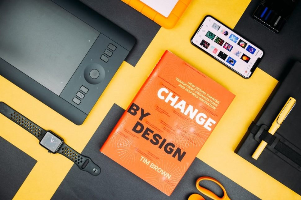
Have you ever been talking to a friend who is an aspiring graphic designer, and they asked you what your go-to graphic design tools are and which tools you could never live without?

Because I have.

And it happened to me this week.

One of my friends and I were chatting over a coffee when she asked me what tools she absolutely needs to start out as a graphic designer.

And that’s when it actually hit me that I love and use so many tools on a daily basis, that it’s hard to keep count.

So I went home that night and wrote up a list of graphic design tools that I really consider crucial, and the list was at around 25 tools.

7 Design Tools I Can’t Live Without

But I’ve compacted only my very favorites into this list of 7 tools that I’m going to share with you today that I simply can’t do without.

So without further ado, let’s jump right into them.

1. Affinity Designer

Affinity Designer Products Homepage

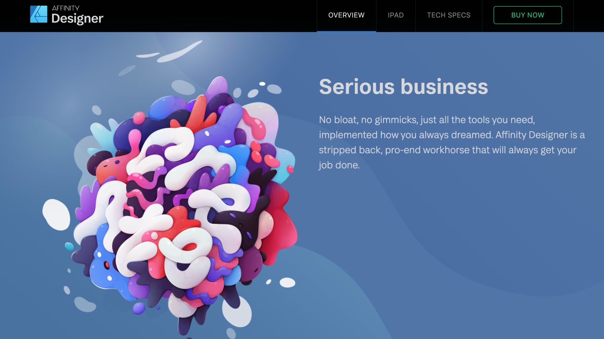
If you’re not a Creative Cloud user, then Affinity Designer could be the thing for you.

I used to be a die-hard Adobe user until I started getting incredibly bothered by just how sluggish Illustrator had become.

I remembered reading about Affinity products and decided to give them a go, and never turned back.

The design revolution.

“Affinity Designer has truly changed the world of graphic design. Five years of intensive refinement since launch have been dedicated to our unwavering vision of a powerful, super-smooth app that improves your workflow and allows your creativity to shine.”

Of course, there are lots of other great tools out there like Figma and Sketch, but after trying out Affinity Designer for a while, I was hooked.

And yes, there are things that still need some improving, like their color tools, but other than that, I can actually say that I’m obsessed.

2. Affinity Photo

Affinity Photo Homepage

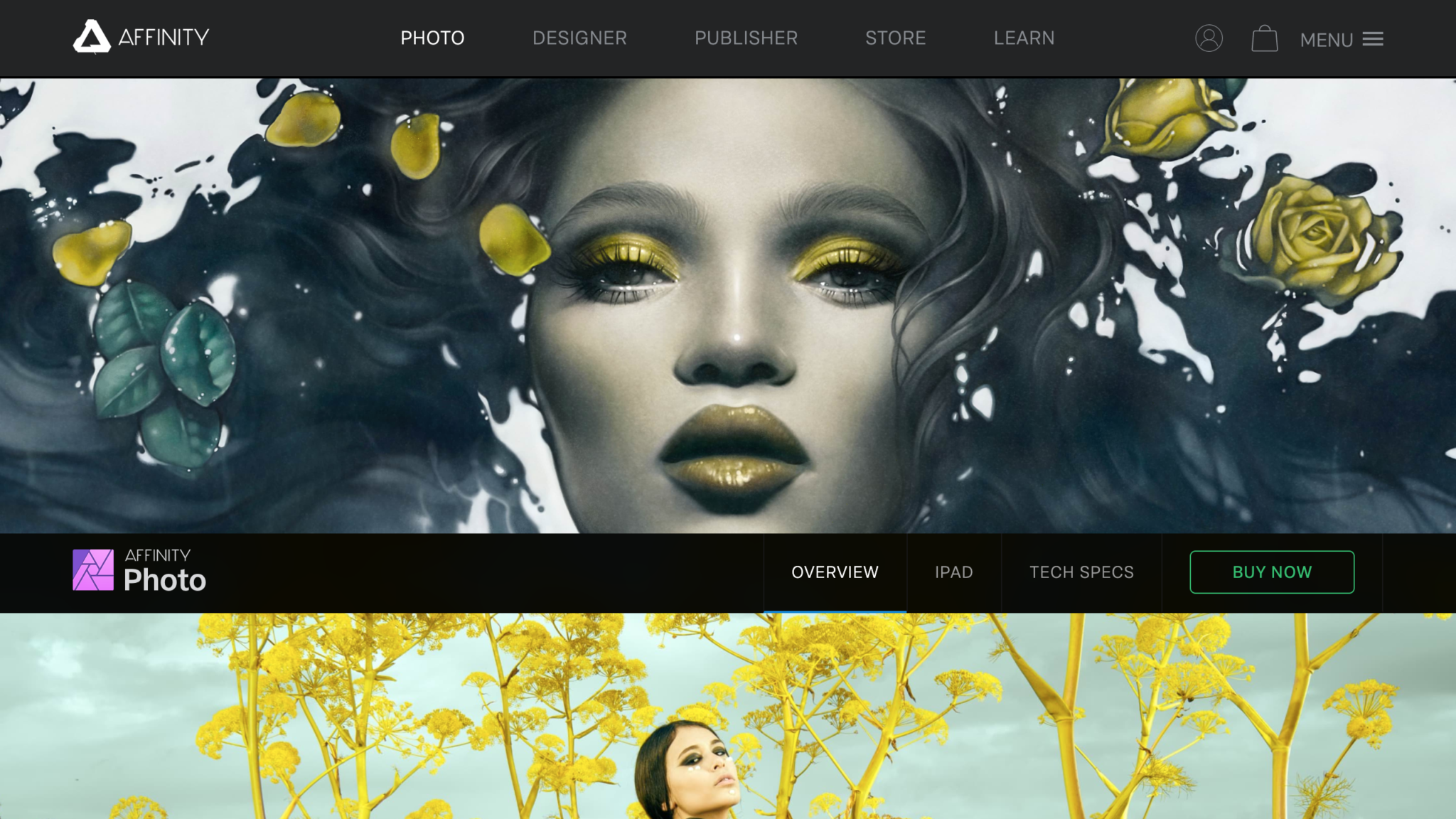
Another tool that I simply can’t do without is Affinity Photo.

If you happen to manipulate a lot of photos, you might find that Affinity Photo is much stronger than Photoshop in some areas, and mainly in bitmap scaling.

Due to Lanczos 3 sampling, Affinity Photo’s bitmap scaling is incredibly better and more useful than Photoshop’s.

If you’ve ever gotten frustrated with the hours that you’ve lost just manually calculating the horizontal whitespace so that it’s proportionate to the vertical, you’re not alone.

Affinity Photo has solved many of the small annoyances we’ve all had to deal with Photoshop, so if you’re over Creative Cloud, it’s time to give Affinity products a go.

3. TinyPng

TinyPng Design Tool Homepage

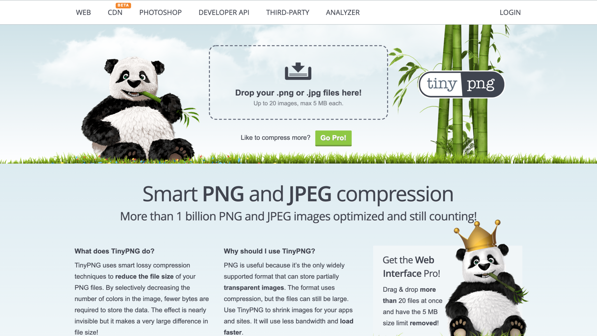
There’s nothing worse than slow loading times.

If a webpage doesn’t load in half a second, I’m gone.

And I’m not alone in this. 47 percent of consumers expect a web page to load in two seconds or less. 40 percent of consumers will wait no more than three seconds for a web page to render before abandoning the site.

So, when I need to optimize my designs for the web, I need to use some sort of tool that is going to help me with that.

TinyPng has been my go-to tool for the longest time. It’s free and it works quickly and efficiently.

So if you to optimize some of your images and designs for web format, ues TinyPng!

Not to mention that their mascot is the cutest little panda I’ve ever seen.
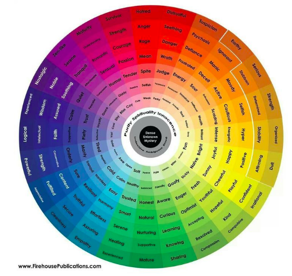
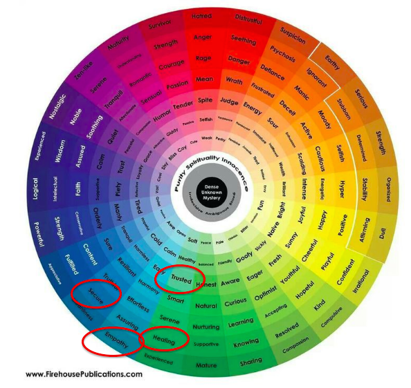
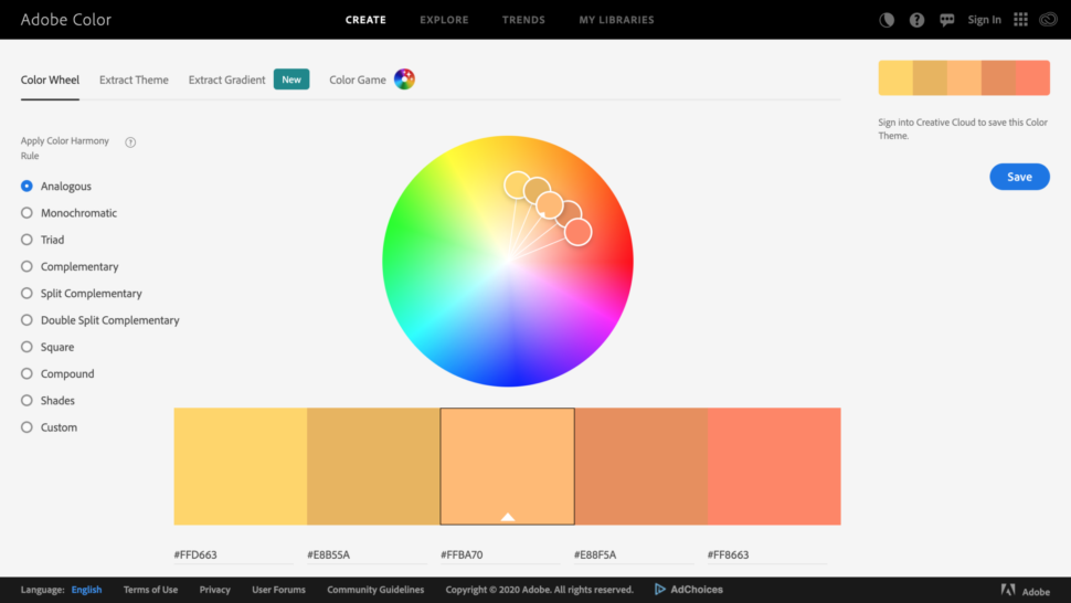
4. Khroma

Khroma color matching graphic design tool

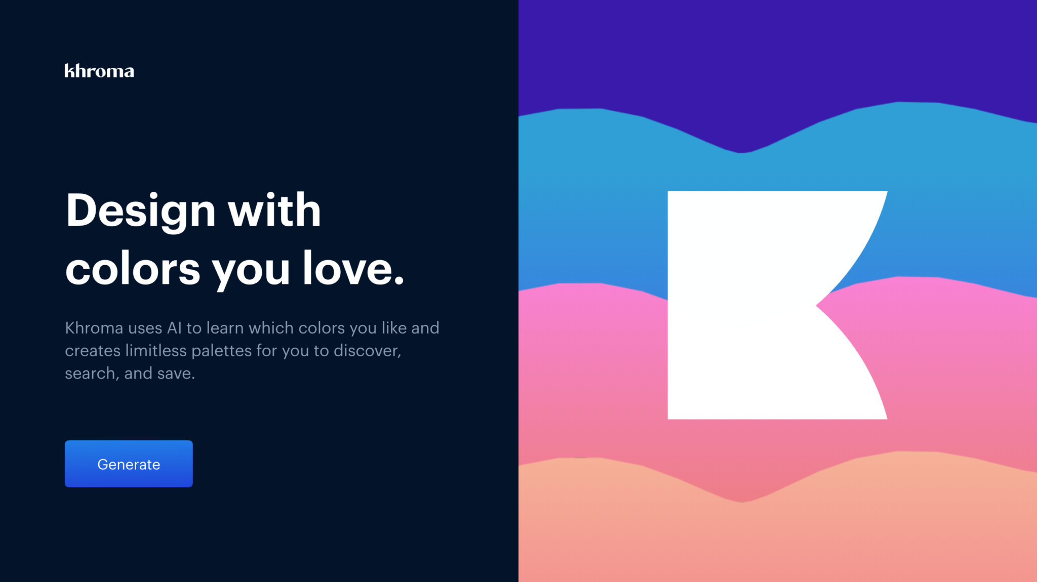
If you’re amazing at finding, matching, and combining colors, then you could probably skip over this tool.

But this is a tool that I definitely wouldn’t want to design without.

Khroma uses AI to learn which colors you like and creates limitless palettes for you to discover, search, and save.

The way it works is quite intricate.

Khroma’s search allows you to search and filter the generator by hue, tint, value, color, as well as hex and rgb values.

Give it a go and see how you like it!

5. Codekit

Codekit homepage

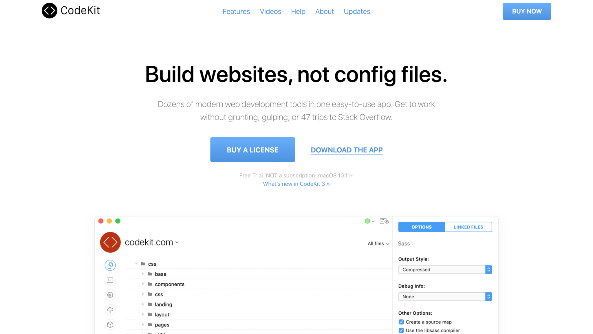
Like most of us, I didn’t invest in getting into compilers as soon as I should have.

I used all the apps, like Minify, to minify CSS and JavaScript, but then one day, I found Codekit.

And I never went back.

What I found amazing about Codekit is that while I’m coding, I can also change the settings because it is a GUI, and don’t have to think another coding language.
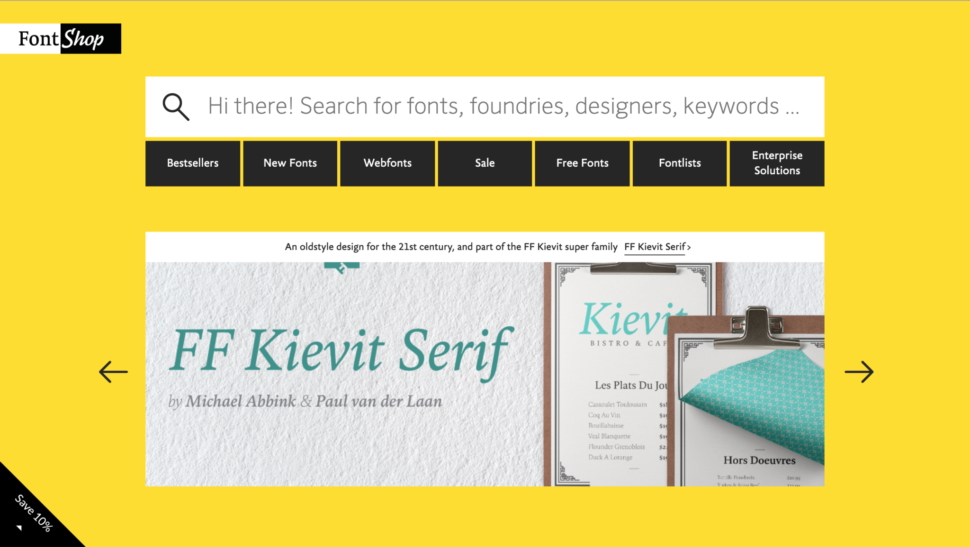
6. Fontstand

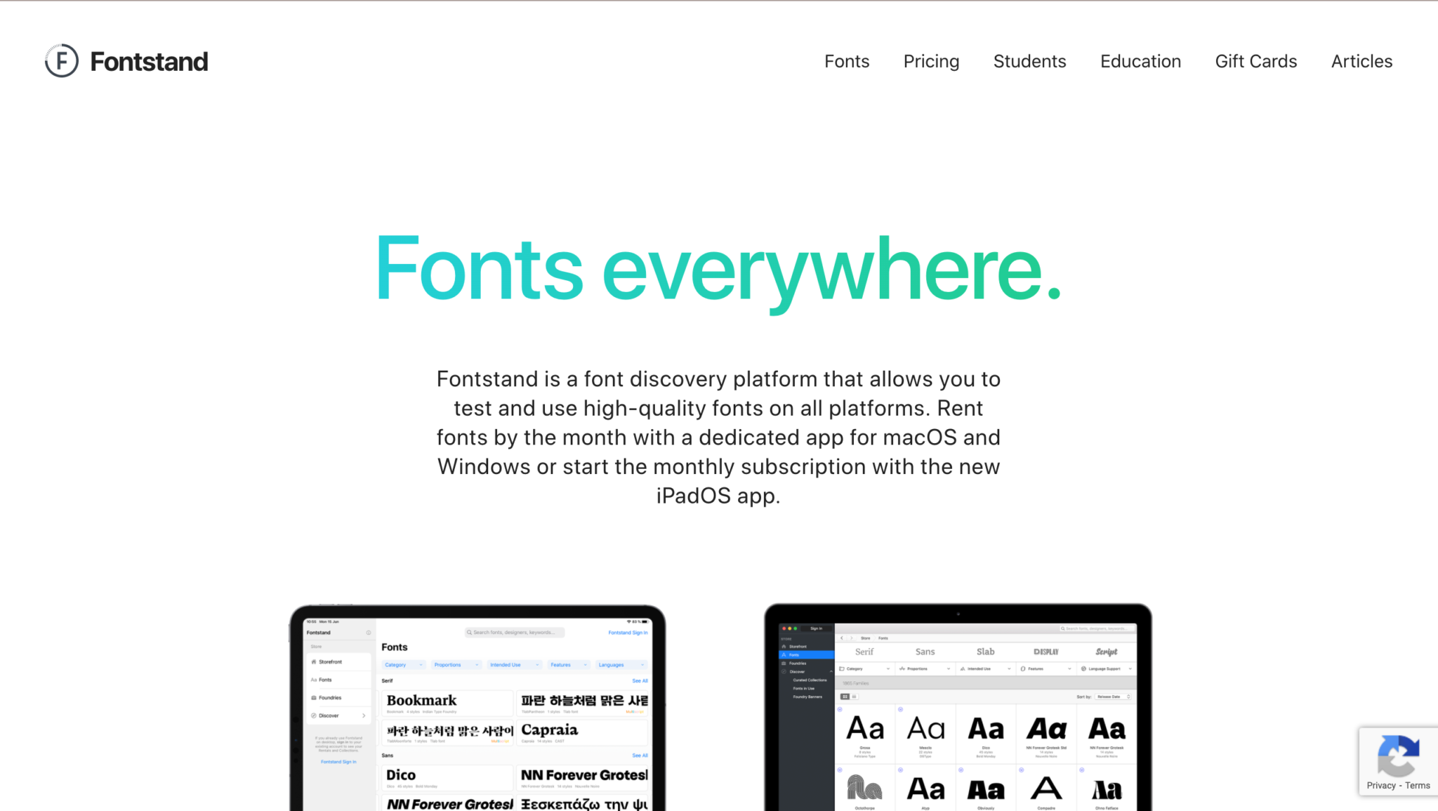
If you’re not using Creative Cloud, then you need somewhere new to get your fonts from.

Fontstand is a font discovery platform that allows you to test and use high-quality fonts on all platforms.

You can rent fonts by the month with a dedicated app for macOS and Windows or start the monthly subscription with the new iPadOS app.

So basically, if you find a font you like, you get a 1-hour free trial with it to see if it fits your vibe, and if it does, then you can choose to rent the font for a small fee.

I think it’s an amazing platform that’s definitely worth looking into!

7. BrowserStack

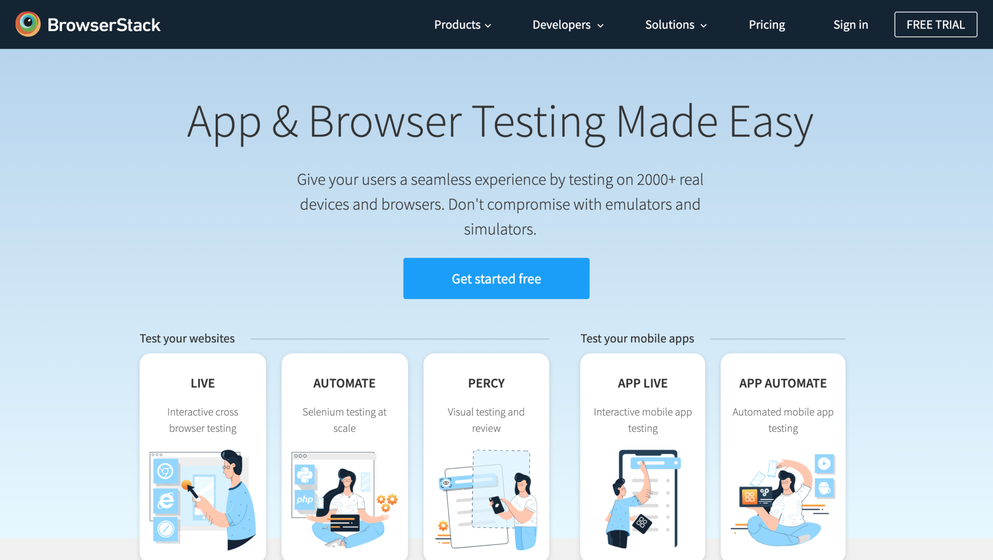
And finally, we come to our last “can’t-live-without” product which is BrowserStack.

No matter what it is you’re building, it needs to be tested.

If you could, it would be best to test on real devices. But in the case that you can’t afford it, or don’t want to spend your money on that, you’ll need a live testing solution.

You can use BrowserStack for that. With their product, you can give your users a seamless experience by testing on 2000+ real devices and browsers.

No need to compromise with emulators and simulators!

Final Thoughts

So that concludes my list of must-use tools for 2020.

Or at least, a part of that list.

Let me know in the comments which tools you started using this year that you think you’ll be using for the long-haul!

Until next time,

Stay creative, folks!

Read More at 7 Graphic Design Tools I Can’t Live Without in 2020

6 Web Design Concepts Proven To Increase Conversions

Every business owner wants more conversions.

More conversions equal more sales, and more sales mean exponential business growth. But netting those conversions can prove challenging, especially if your website is not in the best shape.

This is where web design plays a major role.

The web design concepts you utilize directly impacts growth and how many of those coveted conversions your business racks up.

Let’s say your SEO is on point, but conversions are lacking. Yes, optimization is a must-do for your website.

Unfortunately, if you’re not converting site visitors, all is for not.

From New York to Houston, a web design agency could be useful to fix that conversion problem. But you can certainly develop a web design plan starting today.

This is why we compiled the following 6 web design concepts proven to increase conversions.

Let’s dive in!

1. Grab Attention In 8 Seconds Or Less

The human attention span has been compared to that of goldfish.

This may be a myth, but there is no denying that online consumers have a very short attention span.

To ensure you lead potential customers down the path toward conversions, you need to grab their attention fast.

The 8-second rule is a web design concept that can help you increase conversions.

This small window of opportunity is critical, so make it count, because you are on the clock.

For example, you can employ creative imagery to grab attention, like this example from Mailchimp:

This artistic image has little to do with email marketing, the core of Mailchimp’s business. However, it is so unique, it catches the site visitor’s eye quickly.

Other web design assets for grabbing attention in under 8 seconds include:

  • Large signup and CTA buttons
  • Power words and clever terms that are engaging
  • Video and other interactive content
  • Hover effect on buttons and links
  • Animated transitions in sections
  • Pop-ups that add value to the site visitor
  • Big benefit headlines that are concise

Web design is not solely about making Google happy. A clever design that grabs attention quickly can have a serious positive impact on your conversion rate.

2. Encompass Speed And Increase Conversions

“Most industries are highly competitive, and to gain a competitive advantage in your market, you need to have a fast website. This is a search optimization (SEO) essential that is tethered to web design.

This is especially so for image search and compatibility with Google’s spiders. If images & design are slow to render, Google views that as an unfavorable compared to your competitors in a particular SERP” says Matt Bertram, co-host of BestSEOPodcast.  

Let’s face it: A consumer’s attention span is pretty low. But not as low as his or her patience level. Did you know that a one-second delay in page loading can decrease your conversion rates by 7 percent?

Is your website fast enough to keep potential customers on-page and off your competitors’ pages? To find out, you can utilize a few different speed check platforms, such as Google PageSpeed Insights:

Pingdom is another good site speed platform you can use to get insight on just how fast your website is, on desktop and mobile, as well as info on what you can do to fix poor page load time.

3. The “Rule Of Thirds” Is Also A Web Design Concept

The Rule of Thirds is a very important photography concept that can also be used in web design.

What is the Rule of Thirds exactly?

This web design concept divides a screen by thirds horizontally and vertically.

The intersections created by this division become very important strategic points.

The Rule of Thirds looks like this for web design:

You can see that the intersecting lines are more enticing to the eyes. This could be why the Apple web design team placed the iPhone image directly in the middle of the bottom horizontal line. 

The price point also sits strategically between the two top intersection points, just above the horizontal line:

The Rule of Thirds can help you design each section of your website with strategic focal points in mind. You can place CTAs on these intersection points, key marketing messages, product images, and more.

4. Maximize Conversions With Powerful Color Design

Color remains an essential part of quality web design, especially when it comes to increasing conversions. But choosing the right color scheme for your website, and subsequently, your brand can prove a bit difficult.

There are a ton of colors to choose from, but you should consider employing a bit of color psychology. That’s right, consumers are more motivated to buy from a website based on the color scheme used.

Here’s a color wheel you can use:

Most consumers don’t even know that color played a role in the purchase. For example, a HealthTech website will need to convey trust, empathy, and security on their website to increase conversions. The colors used could be:

Using this color psychology, a website in the HealthTech industry can convey confidence to buy or signup quickly using a subconscious psychological connection.

However, do not just pick a few colors and start developing your website. Quality web design using color means utilizing the power of contrast as well.

Contrast will ensure headlines, CTAs, and text standout against your primary brand colors.

Contrast looks like this in web design:

You can see how HubSpot used contrast and a mixup of their primary brand colors to create a visually aesthetic website that also serves up a psychological connection.

5. Employ The Law Of Similarity (Gestalt Principle)

The Law of Similarity, Gestalt Principle, is another web design concept worth employing to increase conversions.

How? The Law of Similarity states that the human eye groups similar objects, which enables the human brain to make sense and organize what we see.

This is important for web design since websites have multiple aspects. By grouping together these aspects using the Law of Similarity, site visitors can easily and quickly process website information and make a purchasing decision.

For example, you can group testimonials with CTA buttons to drive more conversions. Here’s how this looks on a website using the Law of Similarity:

You also serve up a powerful user experience when using the Law of Similarity as a web design concept. By having main aspects of your site grouped, like headline, paragraph text, and CTA, information is much easier to process for the visitor.

6. Increase Conversions By Using Real People In Images

To make your business more familiar, it is essential to put real people front and center.

Most consumers can tell a stock image from a unique one, so having the people of your business front and center on your website can make the difference between conversion, or lost customer.

This supports the current shift in marketing messaging for brands. In fact, a study found that 80 percent of consumers are more likely to make a purchase from a business that provides a personalized touch. Images of you and your team can achieve this.

A good example small businesses can draw from is this image from Paradise Service Technologies:

You can see the people that represent this small business. Having a personalized, real-life touch within your web design is paramount. 

Videos are also exceptional for delivering these personalized moments consumers demand in today’s overly competitive market. The same website that served up the team image employed video content as well:

Are You Using Web Design Concepts To Increase Conversions?

Creating a website for your business is more than simply putting optimized text and images together.

You need to add that human element in order to net the conversions you want and need for growth and success.

The above 6 web design concepts can prove useful while revamping your website. You may choose a few to implement, or maybe even all.

Combining every web design concept, and more you find online can ensure that conversion rate continues to rise. Happy designing!

Read More at 6 Web Design Concepts Proven To Increase Conversions

Nasa’s New Mars 2020 Logo is Amazing and We’re Over The Moon

Nasa Mars Logo 2020

On July 30th, 2020 at 7.50am EDT (4.50am PDT), NASA intends to embark on its Mars 2020 mission with Perseverance, its fifth Mars rover, via the Atlas V rocket to look for evidence of ancient life.

To keep up with where Perseverance is at this very moment, you can check out Nasa’s website with live information.

And along with this new experience, comes a new visual identity and logo.

And who was considered worthy enough to create this once in a lifetime chance to design the logo?

The extraordinary task was assigned to none other than the multidisciplinary designer Tobias van Schneider’s studio House of van Schneider.

According to The House of Van Schneider, NASA emphasized that the new logo needed to encompass “the energy and legacy of space travel”, while simultaneously being able to bring immense amounts of honor to the engineers who worked day and night to make this historical moment possible.

Here’s what the team had to say about this momentous opportunity.

From the moment we first set eyes on our sparkling sky, there was no going back.

We had to know what lay beyond our planet and when we found out, we had to know more.

Our curiosity and perseverance have put us into space, on the moon and now: to Mars.

For the 2020 launch of the Mars Rover, NASA asked House of van Schneider to design a symbol capturing the energy and legacy of space travel, while celebrating the engineers who worked tirelessly on this mission.

At once an abstract representation of the iconic rover and blocks reaching up to the sky, the logomark works as beautifully on the rover as it does on a 191-foot tall rocket ship.”

This new, abstract symbol is amazingly intricate, yet simple.

The 2D design symbolizes the iconic rover, whose structure is recognizable from any distance, that is going towards the Red Planet. You can even see planet earth in the distance of this design.

There’s nothing quite like this logo.

It perfectly encompasses what humanity once saw as only a dream, now made a reality.

This truly must’ve been a bucket-list moment, just like Van Schneider said.

I can’t imagine having the immense honor of creating something so historical for Nasa.

Truly, amazing.

Read More at Nasa’s New Mars 2020 Logo is Amazing and We’re Over The Moon

Toyota’s New Logo 2020 | The Iconic Wordmark Was Dropped and Design Simplified

Toyota new logo 2020

Wow, has 2020 been a rollercoaster.

For many, many reasons, but one in particular is that it seems to me that every single big player in the car industry game is redesigning their logo.

And they’re all revamping and going for a flat logo design.

First it was BMW, then VW, then just last week it was Nissan and I really thought we weren’t going to be hit with anymore major changes.

But now, we see Toyota coming in hot with a brand new logo design specifically for Europe.

And the people are torn.

Toyota’s New Logo Design

This is Toyota’s first redesign since 2009, and I’m personally happy to say that not only did they decide to drop the incredibly bright red color in the logo, they also decided to drop their famous wordmark.

And also, did you happen to notice how the top of the smaller, center ellipsis doesn’t connect to the top of the logo anymore?

Yes, it irks us as much as I’m sure it irks you too.

I have no idea why they chose to do that, and the internet is not very happy about it.

But I must say, I am in favor of the flat design and the monochrome color scheme they chose to go with in this new Toyota logo.

The red is not completely gone tho, as they use it in different parts of the marketing.

Which I’m honestly not opposed to. A little bit of color in a monochrome scheme can be an amazing idea.

toyota color scheme 2020

Another selling point that we love is the new sans serif that they came out with and they said that their aim is to be “approachable, human and highly technical, and it has been conscientiously engineered.”

This Sans Serif comes in four preferred and two optional weights, with each weight coming in upright and italics. 

The Drop of The Wordmark

One of the most noticeable feature of all, besides the fact that they embraced a flat design and changed their color design, is that they dropped their iconic wordmark.

But, because Toyota’s logo is such a strong one, it can 100% stand alone and be recognized just as easily with or without the wordmark.

Personally, the more minimal, the better.

So, yes, dropping the wordmark was definitely a bold move, but a smart one.

In Conclusion

Here’s what Toyota had to say about their new logo and design.

“The aim of the redesign was to build Toyota’s image as a more progressive brand, while guaranteeing longevity in a digital world and ensuring that the brand continues to appeal to a modern and expanding customer base.

The direction for the new VI is shaped by four key goals: Forward-Thinking, More Premium feel, Consistent and Mobile-First.

The&Partnership’s design approach employed simplification, distilling Toyota’s key visual properties into a clean, considered system that better unifies the brand.

At its core is the new logo, which distils the brand’s emblem to a simplified 2-D design, losing the ‘Toyota’ wordmark; an acknowledgement of its status as one of the most recognisable brands in the world.

The new bespoke typography is Toyota Type, a sans serif font which enhances clarity and consistency across Toyota’s different business units.

Emphasising this is the primary colour palette, a clean, premium monochrome, with a red accent that provides a distinctive nod to Toyota.

The brand architecture has been streamlined and simplified through name changes, consistent typesetting and logo lock-ups.”

Toyota new logo 2020

All in all, I think that the update was desperately needed and it looks much, much cleaner and modern.

The only thing is that little elipisis that doesn’t touch the top of the logo.

Honestly, it bothers me more than I thought it would.

But other than that, a great update.

What do you guys think of this new logo and all of these new car logos in general?

Let us know in the comment section below!

Until next time,

Stay creative, folks!

Read More at Toyota’s New Logo 2020 | The Iconic Wordmark Was Dropped and Design Simplified

Nissan Releases New Logo Design After Nearly 20 Years

Nissan New Logo

We all know that flat design is all the rage right now, and for good reason.

Almost every major company that has done a logo redesign in the past two years has gone for a completely minimalist and simple design.

Nissan is no exception.

Nissan’s New Logo Design 2020

After nearly 20 years, Nissan has gone through its first redesign glow-up and we are loving it.

New nissan logo

It all started in 2017…

The Nissan redesign process all began back in the summer of 2017.

Nissan’s Senior Vice President of Global Design, Alfonso Albaisa, started looking at the logo and decided it needed a good freshening-up.

The design team at Nissan took this time to decide how they were going to redesign the logo.

They thought of everything from a complete and total revamping of the logo, or just a simplified version that is sleek and modern and fits every occasion.

This new simplified version of Nissan’s logo still holds fast to its original logo roots but fits better in our modern world than the anterior logo.

New Nissan logo on building

This is their first logo redesign in 20 years, which to me is just mind-boggling. 

And the first sign we got that they were under redesign was back in March of 2020 when they applied for some trademarks. 

The 3 words that Alfonso and Tsutomu Matsuo(Nissan’s design department deputy general manager) used to describe the new logo for Nissan were “thin, light and flexible”.

And the new logo is nothing short of that.

Nissan Logo on Car 2020

This new logo needed to be sleek and minimal, but they also wanted it to glow.

In an era where people are leaning towards getting electric cars, this new logo needed to stand out and match the style of a new and modern electric car. 

In order for this logo to look good across all digital platforms and also in real life on cars, the design team needed to decide on an appropriate thickness that would always be visible. 

Nissan logo redesign of 2020

Like I said, Nissan really held onto the heritage of the original logo and the slogan they work by, which states “If you have a strong belief, it penetrates even the sun.” 

You can see this implemented through the fundamental elements in the logo, which are the circle and the horizontal plate of the name.

So while the new design isn’t completely revamped, it definitely looks a lot better and newer.

It looks amazing across all platforms and also when it’s displayed on the car.

We are huge fans of Nissan’s new logo design.

New nissan logo

In Conclusion

2020 has been the year that lots of car companies have redesigned their logos.

First, we saw BMW come in full force with a gorgeous, minimalistic logo redesign. Secondly, we saw VW hit us with a new sleek design, and now Nissan.

Who do you think will grace us next with a new logo design?

What do you think of Nissan’s new logo? Are you for it or would you have done things differently?

Let us know in the comment section down below.

Until next time,

Stay creative!

Read More at Nissan Releases New Logo Design After Nearly 20 Years

This Broken Typeface Symbolizes The Struggle of Illiteracy for 18% of New Yorkers

iliteract in new york broken type face

You just read the title of this article and you didn’t even think twice about it.

When we read, we don’t even realize that we’re reading and doing something incredible.

Something so simple, so insignificant to us, is an entirely vital part of life.

Something we do all day long and don’t pay any attention to it.

Did you know that 18% percent of New Yorkers face the daily struggle of illiteracy?

Think about what life would be like if you couldn’t read.

How difficult day to day life would be.

Sans 18% is a broken typeface created specifically to show us what it’s like to not be able to read.

This new typeface was intentionally created to be unintelligible.

To show us the struggle of what it is like to not be able to read, and to put ourselves in the shoes of others.

Sans 18% was created by Literacy Partners with the intent to show us what life is like for roughly 18% of New Yorkers who can not read, and to give a solution to people who face this problem.

When you can’t read, you face problems you would never imagine.

Reading and understanding important documents is impossible.

Being independent becomes a million times harder.

This font shows you what it’s like to look a billboard, document, or even doctor’s prescription and not be able to understand what’s going on.

The video from up above, which is narrated by a person who learned how to read from the Literacy Partners association, shows just how important it is to be able to read.

I personally am all for Literacy Partners.

Literacy Partners provides free classes, books, workshops, and education to immigrants and caregivers in New York who want to learn how to read.

The PSA video was shared on Times Square for one day, and is running digitally with pro bono support from media agency m/SIX.

CEO of Literacy Partners, Anthony Tassi said, “We can’t afford for some members of our community not to be able to read basic public health information. Their inability to do so has potentially fatal consequences for not only their families but for everyone around them.”

They have also ensured that the literacy programs have been made available online for those who cannot attend in person, and they have made sure that the families who participate in these workshops and classes have all the technology they need in order to participate.

If you want to help teach New Yorkers how to read and come together as a community to support Literacy Partners, you can donate directly on their website.

Any donation helps.

You can also download the font by creating an account on their website.

What do you guys think about this broken font?

I found it very eye opening.

Let us know in the comments what you think!

And of course, until next time,

Stay creative, folks!

Read More at This Broken Typeface Symbolizes The Struggle of Illiteracy for 18% of New Yorkers

5 Essential Elements of Brand Storytelling You Need To Know

Storytelling is essential when it comes to branding.

Without a story, your brand won’t stand out and you’ll look like everyone else.

When you have a story, people are more likely to remember who you are and what you have to offer.

Storytelling in branding can have an emotional impact on your clients, and while you tell your story, you’re also telling them important facts about your business.

You may have an amazing story, but you might not be telling it right.

You can tell your story just through your design and it can be very easy to understand.

For example, look at the branding below.

[source]

Today we’re going to cover 5 essential elements of storytelling in branding that you need to know about.

Let’s do it!

1. Know Your Audience

You know you have an amazing, effective brand story when you can impact your audience in all stages of their customer journey.

One of the greatest ways you can find out who your audience is through the use of research.

So who is your core demographic?

You can answer this is a few different ways, but two ways specifically are obtaining customer data using the browser and purchase history to track preferences, and also by asking your followers directly on your social media.

The reason why it’s so important to know your audience is because you’re designing for them.

You need to know who you are trying to reach because design is not one-size-fits-all.

Once you know who your audience is, you’ll know what style to go for.

2. Find Your Style and Be Authentic

Once you know your audience, it’s time to determine your style.

You don’t need to fit into the mold and be like everyone else.

You need to be authentic, true to yourself, and relevant to your product.

A few questions you can ask yourself before figuring out your style are:

  1. Why does my brand exist?
  2. What problems do I help people solve?
  3. What do I do differently than my competitors?
  4. What obstacles have we overcome as a brand?

Once you start answering some of these questions, you can start designing.

3. Be Consistent

You’ve heard it been said before, “Consistency is key”.

Having consistent branding is going to be crucial in your brand recognition.

You can’t have half of your branding be neutral, flat design and minimalistic, and the other half neon and 3-D.

It just doesn’t work.

Your branding needs to be aesthetic and should be consistent over all platforms.

Once you create a consistent branding style that works for you, people will begin to recognize your brand subconsciously.

4. Build Your Character

In order to have effective brand storytelling, you have to build a brand character that your audience will be able to relate to.

You have to be approachable by your audience.

The way that you can build character for your brand is by using a language that your audience would use, so that you’re relatable.

So if you are approaching a younger, fun generation, then maybe use terminology they understand and create fun memes to post on social media, talk to them like they’re as your friends, etc.

You could create cool and colorful visuals that they would be happy to share.

And the opposite would be true for a more formal branding approach. If you’re a large corporation, then use more formal language and more elegant and sleek visuals.

Create the character that reflects your brand and try to reach your audience at the level they’re at.

Be true to yourself and your brand, because people can see right through a pretend character.

5. Find Your Competitors, Then Do Better

My final piece of advice definitely sounds a bit harsh, but find your competitors, research their branding, see what you like and dislike about what they’ve done, then do better.

You need to prove yourself to your audience and tell them why they should use your services and buy your product, instead of buying your competitor’s products.

What makes you different? What makes you stand out?

Answer those questions throughout your website through your design.

So, see what your competition is doing, do it better.

Do it for yourself.

Your product deserves the attention of others and you’ll get that through great storytelling in your branding.

We hope you found these 5 tips helpful and that you’ll have a great time finding clever ways to implement your story into your branding.

And as always,

Stay safe and stay creative, folks!

Read More at 5 Essential Elements of Brand Storytelling You Need To Know

ZeroSSL: The Answer to Trusted Certificate Authority and SSL

One of the biggest concerns for anyone on the internet, whether you’re selling a product or buying one, is security.

And honestly, nobody can blame them.

The internet is a scary place with lots of potential security threats.

But, don’t freak out too much.

There are lots of security measures in place to make sure that your internet browsing session is an enjoyable one.

Today, we’re going to be highlighting one of the best security measures any brand can make with their website: SSL protection.

Now, thanks to our friends at ZeroSSL, SSL protection just became a lot easier.

Let’s go over exactly what ZeroSSL is and what it can do to help you.

What is ZeroSSL?

To put it simply, ZeroSSL is a new, completely free to use, and trusted certificate authority and SSL platform.

Their aim is to make it easy and extremely affordable to create SSL certificates for anyone.  

ZeroSSL is the first real alternative to Let’s Encrypt, offering completely free SSL certificates through an easy-to-use UI and API.

They’re launching this in partnership with an existing CA, and are a completely trusted Sub-Authority on their own.

Unlike Let’s Encrypt, ZeroSSL not only offers an API/ACME, but also an easy-to-use API that allows users to create both 90-day and 1-year validity certificates through an unprecedentedly easy and simple process.

They are also currently testing their own ACME Server in BETA which will be released in May, and allows all existing ACME & Let’s Encrypt Clients to automate certificate issuing through ZeroSSL.

Basically, it’s a plug-in alternative to Let’s Encrypt’s ACME.

ZeroSSL offers both single domain, multi-domain and wildcard certificates for free through ACME, and allows users to create 1-year certificates with an affordable subscription plan.

In addition to ACME, they also offer a REST API to issue certificates automatically.

Unlike Let’s Encrypt, they also allow users to validate domain ownership via email (not just DNS), making it much easier to quickly issue certificates via the UI.

ZeroSSL features

Honestly, there are so many features that ZeroSSL has to offer.

If we tried to mention them all in this article, you’d be here a while. 

We mentioned a few just above, but it really only scratches the surface.

Here are some of the highlights that you’ll probably want to know about:

  • Wildcard SSL

Need to protect a fixed or variable number of subdomains using your SSL certificate?

Wildcards can be issued for any type of ZeroSSL certificate, regardless of validity.

  • One-step validation


To validate SSL certificates using Zero SSL, it only takes a few minutes.

It’s straightforward and supports automatic CSR-generation and domain verification via email, HTTP or DNS (CNAME) file upload.

  • Super quick installation

Installing SSL certificates literally couldn’t be any easier with Zero SSL.

Using the readily available instructions online, all you have to do is download your certificate file and follow a few easy steps before you’re ready to roll.

  • Management console

ZeroSSL’s user interface is as intuitive and easy to use as they come.

Everything that you could possibly need to manage your SSL certificates is all gathered in one place.

  • SSL certificate monitoring

ZeroSSL takes certificate security very seriously. By enabling certificate monitoring, you’ll get security measures beyond a simple expiration warning message.

  • ACME automation

Automatically renew your 90 day certificates with ACME automation.

ZeroSSL comes with a dedicated ACME certbot.

It’s also supported by all major ACME integrations.

  • SSL REST API

ZeroSSL features a straightforward SSL REST API that supports certificate creation, validation, renewal, management, and automated status webhooks.

Trusted by major brands

ZeroSSL is not only the greatest SSL certificate authority and SSL platforms on earth, but it’s also trusted by numerous, massive brands around the world. 

With 1,000,000+ certificates issued monthly, 500,000+ happy customers, and 99.9$ internet coverage, it’s no wonder major brands like Lenovo, Slack, and Uber trust ZeroSSL every day.

Pricing

As we mentioned at the start, ZeroSSL offers a free package that contains 3 90-day certificates, and there’s no need to enter a credit card whatsoever.

In addition to that free plan, they also have a lot of other pricing options to offer, too.

No matter the size of your brand or your specific needs, ZeroSSL has something for you.

Starting at just $10 per month, there’s really no competition. 

Keep in mind that if you don’t see a package that fits your needs, they also offer custom enterprise packages just for you. 

After everything we’ve mentioned here today, and the unrivaled support that ZeroSSL offers, the only conclusion that we can come up with is that we all should sign up as soon as possible. 

Creating an encrypted channel between you and your clients in order to insure security is vital in this day and age.

SSL certificates provide that security and ZeroSSL provides a quick and easy way to obtain those certificates.

Read More at ZeroSSL: The Answer to Trusted Certificate Authority and SSL

20 Amazing Examples of Neumorphism – New Design Trends 2020

Ah, Neumorphism. We love to see it.

Neumorphism is my favorite design trend thus far in 2020 and it’ll take a lot to surpass it.

We’ve been seeing it a lot lately, and we stan.

What is Neumorphism?

Neumorphism is a new modern graphic design technique that is a combination of skeuomorphism, flat design, and realism.

[source]

Neumorphism is actually a play on words that means New Skeuomorphism.

If you’re not familiar with the term skeuomorphism, well, think of the old version of Apple, before they had all their sleek, minimalist, and modern updates.

[source]

Skeuomorphism is the design concept of making items represented resemble their real-world counterparts. Skeuomorphism is commonly used in many design fields, including user interface (UI) and Web design, architecture, ceramics, and interior design. Skeuomorphism contrasts with flat design, a simpler graphic style. [source]

Neumorphism, on the other hand, takes all of the best qualities of skeuomorphism and combines it with flat design.

Which gives us my favorite design trend of all time.

It’s like when you see neumorphism on an app, you actually think you’re going to touch it and experience it in real life.

It’s the craziest feeling, and that’s probably why I love it so much.

30 Examples of Neumorphism Done Right

I want to show you guys my top favorite examples of neumorphism that I found on Dribbble, so let’s have at it.

[source]

[source]

[source]

[source]

[source]

[source]
[source]
[source]
[source]
[source]
[source]
[source]
[source]
[source]
[source]
[source]
[source]
[source]
[source]
[source]
[source]
[source]
[source]
[source]
[source]
[source]
[source]
[source]

I know I love neumorphism, but I want to know what you think about it!

Let me know in the comments if you think this new trend is a vibe, or if you’re onto a whole different trend.

Until next time,

Stay creative, everybody!

Read More at 20 Amazing Examples of Neumorphism – New Design Trends 2020

5 Best Platforms to Get Exposure For Your Work

You have all the potential in the world to be the most sought-after graphic designer in history.

Re-read that sentence again and believe it.

There are a lot of factors that go into being the best designer you can be, but one thing stands true; You could be the best designer in your field, but no one knows about you.

One reason you might not be wildly succeeding right now is that you’re not promoting yourself and your work.

Or you’re not taking advantage of all the places you could be publishing your work.

5 Platforms That Will Help You Grow

Today I want to go over my 5 go-to platforms where I publish my work when I create osmething I’m proud of.

And you should do the same!

Without further ado, let’s get into it.

1. Dribbble

Okay, I know that you were expecting to see this as number one, but that’s for good reason!

If you’re not posting your work to Dribbble, every time you create something bomb, then you’re doing it wrong.

If by the smallest chance in the world, you don’t know what Dribbble is, then let me break it down for you.

According to Wikipedia, Dribbble is a self-promotion and social networking platform for digital designers and creatives.

It serves as a design portfolio platform, jobs and recruiting site and is one of the largest platforms for designers to share their work online.

The company is fully remote with no headquarters.

A place where designers gain inspiration, feedback, community, and jobs and is your best resource to discover and connect with designers worldwide.

Let me just show you what 2018 held for Dribbble.

You can easily sign up and upload your work. It’s free to join and to post JPG images, but for more advanced project, you might have to upgrade to pro.

Lots of people have been connected with contractors and found jobs through this platform, so I highly recommend!

2. Behance

Are you surprised to see Behance right after Dribbble?

I suppose that none of us are.

If you have Dribbble, you need to have Behance as well.

I just feel like the two really are the perfect combo.

Behance is owned by Adobe and is a social media platform that was created for designers to showcase their work and get feedback from other designers

You might also be found by your next client, who knows!

Behance is very similar to Dribbble, in the fact that you just search for a keyword and find loads of inspirational designs and you can find likeminded designers.

Behance is also free of cost, and we all love that.

3. Hunie

If you’re always second-guessing your work, then you need to get on Hunie.

Hunie is a platform where you can submit your work strictly to get constructive criticism back from professionals.

It’s great to have an awesome community of other designers who are ready and willing to help you improve.

All you have to do is request an invite and then submit your work for advice and opinions.

You will get the opportunity to connect with others and grow, and also be able to give your opinion and help to other designers.

4. Pinterest

If you’re sleeping on Pinterest, then you’ve got another thing coming.

Pinterest is such a powerful tool for gaining a following and exposure.

It’s completely free, and although it’s not made specifically for designers, that doesn’t mean you can’t engage with awesome other designers on the platform.

Use the right keywords and find out what’s trending and post your work!

5. Instagram

I’m almost certain you have an Instagram.

You should be using Instagram to your advantage!

I wouldn’t necessarily say you should post your work on your personal profile, but I have definitely created a secondary profile.

Make a profile that’s dedicated to sharing your work.

The power of hashtags in incredible.

Whenever you upload your work, make sure you use about 5 meaningful hashtags to describe your work so you can be on the search page!

You can also promote your work very inexpensively and get thousands of impressions and likes from people who genuinely will love your work.

Wrapping up

Your work deserves to be seen, because it’s awesome.

All you need to do is put yourself out there!

Use these platforms daily to gain inspiration from others, and to grow your own following and community.

Let me know what other platforms you guys use to promote your work.

Until next time,

Stay creative!

Read More at 5 Best Platforms to Get Exposure For Your Work

OLX Gets A Brand New Logo and Platform Design

If you’ve lived outside of the US, then you’ve probably heard of or even used OLX at least once in your lifetime.

OLX is a pretty big deal.

OLX is a platform where you can buy and sell anything; services and goods alike.

You want to get rid of that old scarf hanging in the back of your closet? Awesome. Snap a pic and post it to OLX and wait for someone to buy it off of you.

Looking for a job or want to hire someone? Post about it.

OLX was established back in 2006 in Amsterdam but has since spread worldwide.

This buy-and-sell platform is now in 45 different countries and I personally browse through it every. single. day.

Their logo has always been a little different though, and their new one is no exception.

Today we’re talking about OLX’s new logo and app design.

Before…

old olx logo design

After…

olx new logo design

This is the first time that OLX has ever changed their logo, and if I’m completely honest, when I first saw it, I wasn’t sure how I felt about it.

The first logo was very colorful, and although the colors weren’t necessarily bad, they did make you wonder “why”.

This new logo has a very interesting font. The “L” could easily be mistaken for a bar and be read as “O|X”. 

OLX did take a step into the right direction, though.

It is much more modern and it is unique.

Even though there is no symmetry whatsoever in the logo, I can’t say that I hate it.

I actually really like it.

It has a very strong presence, and although the “L” is very thick and the “x” seems too small, I like it.

The fact that each letter is unique is a great representation of how everyone has different needs and that this app has been accommodated to fit the needs of every buyer.

Overall, even though this new transformation may be a little bit all over the place and the ads don’t really explain what OLX actually stands for, it definitely was a step in the right direction.

The app was in need of some modernisation and that’s what they gave it.

With a few tweaks here and there, it could be the perfect fit for them.

What do you make of their new logo and platform?

Let us know in the comments.

Until next time,

Stay creative, folks!

Read More at OLX Gets A Brand New Logo and Platform Design

10 Websites and Apps All Designers Should Be Using

As a designer, we’re overloaded with choices every day, but there are some apps that are absolutely worth your time and investment.

Finding the best ones and most useful ones can be a difficult task, so we’re going to make things easy for you and give you our top 10 apps and websites we couldn’t live without.

So sit back, relax, eat your popcorn, and let’s get into this list.

If You’re a Designer, You Better Be Using These Apps and Sites

Whether it’s for inspiration or it’s a useful tool that will make your life easier, we’re covering it today.

Let’s do it!

1. Dribbble

dribble explore page

This one is probably obvious, because if you’re a designer, then you know Dribbble.

Type literally anything you’re looking for in the search bar and see what other creative people, like yourself, created and uploaded. 

You can upload your own content to share and get exposure, or you can get inspiration for your next project.

You can also follow other designers and have an awesome feed page where you’ll find inspiration you didn’t even know you were looking for.

But we all know that if you’re looking for any type of graphic design inspiration you’re either going to come here or go to Behance. Which leads me to my next must-use design site.

2. Behance

Another great platform where you can get incredible amounts of inspiration from is Behance.

You can also follow other designers and upload your own work there as well.

We recommend that you use both Dribble and Behance to make the most of your inspiration hunt.

And the other obvious ones, don’t sleep on Instagram or Pinterest either!

3. Adobe XD

Adobe XD (and Adobe in general) might be the best thing that happened to designers, especially those that work with other designers.

You can literally work on the same project, in real time, and both make edits at the same time.

Adobe XD has everything you need for team projects. You can edit together, give feedback, work in real time, and everyone stays on the same page at all times.

4. Adobe Edge Inspect

As a designer, you have to make sure your work looks good across all devices.

That’s where Adobe Edge Inspect comes in.

All you need to do is pair your smartphone or tablet to your computer and you can see exactly what your designs will look like across devices.

With Adobe Edge inspect, you will be able to see real-time results from changes to HTML, CSS and JavaScript.

5. Adobe Color

If you want to save time on finding quality color schemes that look bomb, then you’re going to want to get your hands on Adobe Color.

Create and save a color scheme that works for you.

Drag the pins around the color wheel and let Adobe work its magic for you.

6. Adobe Creative Cloud

If you can’t decide what apps you absolutely need and want to invest a lot of money into, well, you’re not alone.

One thing you could do is sign up for Adobe Creative Cloud.

Adobe Creative Cloud is a platform made for creators and artists.

You’ll get access to 20+ apps that will help you be the best artist you can be.

“Creative Cloud is a collection of 20+ desktop and mobile apps and services for photography, design, video, web, UX and more. Now you can take your ideas to new places with Photoshop on the iPad, draw and paint with Fresco, and design for 3D and AR. Join our global creative community — and make something better together.”

Start a free trial today, find out what you like, and invest in your future!

7. Milanote

Milanote will help you stay creative and stay organized.

Yes, I totally believe that there is organization in chaos, but I also like to try to keep a tidy workspace, which equals a tidy mind.

With Milanote you can organize your ideas and projects into visual boards.

You can put all your ideas into one place, make a vision board, and invite your team to see it.

8. Color Hunt

You guys already know that we are huge fans of Gal Shir here at Web Design Ledger.

If you don’t know about him and his work, we have an article where we featured him as Designer of the Week!

Anyway, he made this awesome free and open platform, called Color Hunt, where you can get color inspiration by going through thousands of trendy and hand-picked color palettes.

If you just scroll through, you’ll see tons of different, gorgeous color palettes, and I’m sure you’re bound to find the perfect one for you and your next project.

9. iFontMaker

If you’re really looking for an original font, you might as well create your own.

If you have an iPad, then you need to get iFontMaker ASAP.

In just five minutes, you can create your own custom font.

You can be as crazy or as elegant as you want.

I think this is actually one of the coolest apps I’ve seen in a hot minute.

10. Font Shop

And finally, I present to you, the Font Shop.

If you feel like you can’t find the right font anywhere, try the Font Shop.

They have over 130,000 fonts! Which is quite frankly, insane.

If you’re looking for something classic, they’ve got it. Something funky? They got it.

Give it a go and see what you find!

Just a Few of My Favorite Things…

Of course there are tons of apps that are absolutely essential for your work, and everyone’s list will be slightly different.

These were just a few of the apps I go back and forth with throughout the work day and thought I’d share to make your life a little bit easier.

Next week I’ll make another list if you guys are interested in seeing that, then stay tuned and keep checking back in on the blog.

What are you must-have design tools that you use on a daily basis that I didn’t cover?

Let me know in the comments.

Until next time,

Stay safe and stay creative, folks!

Read More at 10 Websites and Apps All Designers Should Be Using

We Redesigned Web Design Ledger – Here’s It Is!

The news is true, we completely redesigned the best blog in the world, Web Design Ledger!

Okay, maybe we’re a little bit biased, but there’s no denying that the new web design layout is amazing.

We are so excited to show you guys the finished product.

Let me just hit you with the most satisfying before and after ever.

Before…

After!

Amazing, right?!

With this new era and new decade that we’ve come into this year, we wanted to bring our design blog along with it and let it go through a major change.

We really wanted it to symbolise a new design era.

It was about time our blog got a facelift, and we’re obsessed with it.

Everything is minimal and has soft edges, and what I’m really thrilled about is that gradient bar at the top of the home page.

Our blog is easier to browse through now than ever and it just has an all-around crisp and fresh vibe to it.

We’ve been working on this design for a long time now, and we couldn’t be happier for you guys to see it.

The old design was great too, but it was time for the old design to retire and for the new design to have its moment and really flourish.

We hope that the rest of this year will be full of exciting things and new changes.

We’re excited to be alongside you through this year and see what it all has to offer.

I know we’re all going through a strange time right now, but together, we’ll pull through this and come out newer and better than ever.

Just like our new design 😉

What do you guys think of the new design?

Let us know in the comments!

Until next time,

Stay safe and stay creative, folks!

Read More at We Redesigned Web Design Ledger – Here’s It Is!

7 Biggest Mistakes Freelance Designers Make That Will Ruin Their Career

When you’re a freelancer and you start to work directly with your clients, there’s something crucial you need to know.

Your design is not the one and only, most important aspect of the transaction.

While presenting your client with an amazing design is the final goal, there are a lot of other things at stake that could make or break your business deal.


There are 7 things that could potentially ruin any partnership with a client, and they have nothing to do with your design style.

7 Biggest Mistakes Freelance Designers Make And How To Avoid Making Them

I don’t want you to have to make the same mistakes I’ve made when I was a beginner freelancer.

Today, I want to learn from my mistakes and avoid these 7 deadly sins of freelance graphic designers.

1. Poor Communication Skills

Poor communication is the biggest bummer of all the freelance design mistakes that you could make.

Everything you do and the way you’re going to make your client feel is all going to come back to how well you communicate with your client.

Now, communication is a two-way street.

If you and your client don’t communicate exactly what they’re looking for and what you’re capable of doing, then you’re going to find yourself working all-nighters to revise mistakes that could’ve easily been avoided had you communicated.

Some clients are angels, and some are the opposite.

Some clients will verbalize exactly what they’re looking for, and others will give you the vaguest idea of what they want and let you try to figure it out, which sometimes is a blessing, and others, a curse.

One way you can avoid poor communication is by creating a list of basic questions you want to ask each of your clients, regarding their expectations of what your design will be.

Decide what platform you’ll be communicating through and make sure you set hours you will be readily available to discuss changes and set your notification to loud so you never miss a beat.

If you ever feel like a client is being rude, take a deep breath, decide whether you’ll continue working with them or not, then write them a calm message. Remember: things on the internet last forever! Don’t let one snooty client ruin your reputation.

2. Limited Number of Revisions

Nothing is worse than thinking you finally finished a design that you’re happy with and proud of, you just presented it to your client, and they don’t love it.

They want you to revise it.

The number of times you agree to revise your project is something you will need to have discussed beforehand.

Not everyone will be on the same wavelength, so it’s important you decide how many times you will change the final version of your design, and what you will charge if they ask for supplementary changes.

And what do you know it, this all leads back to good communication.

Don’t let people walk all over you, but also don’t be so prideful you won’t make any changes. It’s a beautiful and delicate balance.

3. Not Fulfilling Client’s Needs

Speaking of being prideful, sometimes, you have to suck it up and make a design that you’re not completely proud of.

Lots of clients have complained that some designers they worked with only had themselves in mind when creating their design.

Needs and requests were not met, therefore leading to awful conflict and probably bad word of mouth followed shortly after that.

Try to sus out the vibe of what your client is looking for and see if the style aligns with yours. If it does, awesome!

If it doesn’t, decide whether or not you’re going to do the work anyway and get that coin, or whether to respectfully decline the offer to work with them.

4. Missing The Deadline

When you’re your own boss, it’s easy to get behind and have no “work anxiety” or drive to finish your work on time.

But a good reputation is crucial and constantly missing deadlines is a terrible way to do things.

Set up a deadline that you really think you can make.

Don’t think your Superman or Superwoman, and can handle 10 projects that are all due by next week.

Take on what you know you can handle, and discuss that with your client.

Everyone understands a pushback here and there, but don’t make that a habit.

People might eventually perceive you as lazy, and that’s not what we’re going for here.

5. Mispriced Work

Listen, you gotta know your worth.

In saying this, you should know how much to charge.

Don’t undersell yourself, because you’re the bomb!

But don’t overcharge either, because people don’t like it when someone takes advantage of them.

Give them a quote, and negotiate from there.

6. Not Making Clients Feel Like a Priority

No one likes to feel unimportant.

And maybe you’re not making your clients feel unimportant intentionally.

Sometimes, we all take on more than we can handle.

But if your clients don’t feel like a priority, they might cut your work contract short, or choose not to work with you again in the future.

This mistake goes hand-in-hand with missing deadlines. You can’t take on so much that you will make people feel unimportant.

Everyone wants to feel heard and important, and some companies or clients are cut-throat and won’t work with you again if you don’t make them feel like they’re important to you.

Do your best to make your clients know they’re important to you and you’re doing your best.

Communication, communication, communication.

7. Wasting Time

The final thing I want to talk about is wasting time.

When you work from home, it’s easy to get distracted.

Blame it on your pets or a messy kitchen, and then suddenly you’re 5 hours behind schedule and things are getting out of hand.

I have a whole list of things you can do to stay productive while working from home that will help you stay on top of your A-game.

Make sure you make a good schedule for yourself, one that works for you.

Don’t waste too much time on things that don’t matter. The dishes can wait. Or maybe, they can’t. You should definitely have a clean workspace. But right after that, get back to work!

Wrapping up

Everything is a learning curve, and while you start working from home, take advantage of all the freedom that comes with that, but make a good name for yourself and do your best.

What other giant mistakes do you think designers make that we should cover?

Let us know in the comments.

Until next time,

Stay creative, folks!


Read More at 7 Biggest Mistakes Freelance Designers Make That Will Ruin Their Career

10 Tools That Will Help Your Remote Design Team Stay On The Same Page

If you weren’t working on a remote team before, well, chances are that you probably are now!

I know that I love working from home, but when you first start working remotely, it can start as a bit of a challenge.

Of course, it has its pros and cons, but it’s just a learning curve.

Through this global pandemic, you can still be as productive and connected to your team as ever, despite working remotely.

There are a few tools that will make your team’s remote life easier, so I’m going to share 10 tools with you that can help you and your team stay productive.

10 Tools That Will Help Your Remote Design Team Stay On The Same Page

We will be going over different categories of tools that will help your remote design team, like project management and roadmapping tools, organization tools, and tools to help you stay personally productive.

Project Management, Communication, and Roadmapping Tools

The first category we’ll be diving into is all about staying on the same page and plan as your team, so let’s get into the best tools for that.

1. Airfocus

Airfocus productivity tool remote work

If you haven’t heard of Airfocus by now, well then, you’ve been missing out big time.

Airfocus is a roadmapping and prioritization tool that will help your team see what is most important to get done today and what needs to get done in the future.

Airfocus will help you make the best decisions today, so that you can get the right stuff done in the future. You don’t have to outdated spreadsheets and unclear roadmaps anymore.

Create priorities, have a bird’s eye view of all your tasks, make to-do lists, and more!

With a beautiful design and easy-to-understand-and-use platform, you can start using Airfocus today so that you can get the right stuff done!

2. Asana

Another tool that will help you and your team all stay on the same page is Asana.

Asana will help you visualize your team’s plan so you can all stay on top of the game.

With Asana’s work management platform, your team can stay focused on their goals, projects, and tasks—no matter when or where they work

You can build project plans, coordinate tasks, and hit all your deadlines all in one app!


3. Basecamp

Basecamp is another great tool for keeping everyone in the loop on what’s going on.

One thing that is different about this tool is that it has an in-app chat, so you can talk directly to your teammates without ever leaving the app.

Set your goals, priorities, and talk to everyone all in one place.

4. Slack

This one is probably a no-brainer, but Slack is a must when it comes to communication.

Probably the best part of Slack is that you can organize loads of channels so there’s a place for everything to be discussed.

No more endless scrolling looking for that “one time” we talked about this or that.

You can have a channel for memes, a channel for sharing ideas, and channel for half the team, and a channel for sharing pictures of your pets.

Anything is possible with Slack.

5. Zoom

My final communication tool that I 100% recommend is Zoom.

Remember the struggle of trying to organize a group call on skype? You could never use video for group calls and it was a premium feature.

Not anymore!

You can use Zoom whenever, wherever, with as many people as you want, and it’s free.

Use Zoom to organize video calls with your entire team!

Organization tools

6. InVision

Design better. Faster. Together.

That’s InVision’s motto. This tool was designed specifically with designers in mind.

My favorite bit of this tool is the Design System Manager. The Design System Manager helps teams centralize their design assets, all in one place, as visuals and in code.

Directly comment on a design and give feedback immediately to your coworkers!

7. Abstract

If you use tools like Sketch and Adobe XD, then you’re going to love this product.

With Abstract, you can integrate the tools you already use, import your design files from your computer that need some teamwork, and collaborate with your team directly on the platform.

Productivity Tools

8. Noisli

Noisli is a must-have app. Sometimes listening to the same old songs gets boring, and you can’t always focus and be able to listen to a podcast while creating something amazing for work.

They have every sound you’re looking for. You want the sound of the rainforest? Cool. You want the sound of a busy coffee shop? Why not. You can also adjust the volume of each individual sound so you can tailor it to the way you can focus best.

Noisli will let you choose any background noise you want and it’ll help you stay productive and on top of things.

9. Figure it out 

If you happen to work on a remote team that is currently all over the globe, then you know how hard it is to organize a time to video call that works for everyone.

You gotta know that Betty lives California, but Jack lives in Germany, and you gotta figure out the time difference and it’s a whole thing that will do a number on your sanity.

Figure it out is a chrome extension that will help you know all of your team member’s locations and what time it is for them so that you can easily schedule a meeting or find time to collaborate.

10. Take a Break

Finally, I present to you, Take a Break.

Here’s a direct quote from their site regarding exactly what this app does.

Staring at your computer for too long is not good, and Take A Break, Please is a simple menubar app that forces* you to take your break. You can configure time between breaks and the duration of the break.

When the scheduled break starts, the app will dim your screen and prompt you to take a short break. Take that time to stand up, do some stretching, take a walk, or get yourself a cup of coffee.

That’s an app I can get behind. I’m all for working productively in increments and rewarding myself with 10 minutes of downtime.

I hope you found these tools helpful

If you enjoyed this list, let me know in the comments what your favorite tools was and what you’ll be integrating into your workflow!

If I missed any of your favorite tools, let me know what they are so I can cover them in the future.

Until next time,

Stay creative!


Read More at 10 Tools That Will Help Your Remote Design Team Stay On The Same Page

5 Incredible Free Tools For Designers That You Need To Try

There’s nothing better than finding a new design tool that will make your life a million times easier.

After all, we all want to get our work done as quickly and efficiently as possible, and if there’s a tool for that, then I want it.

And I did find some tools that I absolutely love that come in handy, and that’s why I want to share my life of new favorite design tools.

5 Design Tools You Have to Try

Once you try these tools, there’s no going back.

Let me tell you all about them.

1. Opensource Builders

Opensoure Builder app for designers

I want to start this list off strongly, so let’s hit it off with Opensource Builders.

Have you ever found an app that you absolutely love but your budget doesn’t allow you to purchase?

Or maybe you’re just a cheapo(aka, maximizer) like me, and try to get the most bang for your buck.

Opensource Builder will help you find open-source alternatives for your favorite apps!

Just type in the name of the app you’re looking for, and you’ll find a ton of alternatives for it.

Compare the cons and pros, prices, and more to find the ideal app for your project.

2. Unscreen

Unscreen design apps

Next up, we have Unscreen.

Have you ever tried to remove the background of a video? It’s not that easy.

Unscreen will automatically remove the background of any video 100% automatically, and for free.

We love a double-whammy.

This means you can record any video, upload the clip into Unscreen, use their tool to scrub the background of your video, and then you can add any background element of your own!

All of this, for free.

Soon enough, they’ll have a pro version as well. I’m excited to see what else they will come up with when they already have such an amazing free design tool.

3. Neumorphism.io

Neumorphism.io design app

Neumorphism seems like it’s everywhere nowadays, and I know an app that can help you integrate that into your CSS code.

Neumorphism.io is a generator that will create the CSS for this soft UI style that we’ve been seeing everywhere. This makes your job a lot easier and you can experiment quickly to see what you like for your website.

4. Glitch Art Generator

glitch art generator design apps

We have another generator on our list!

Glitch Art Generator will help you achieve the perfect glitch background for your project.

You can easily adjust all the colors, the amount of glitching, the space from the center, gradient, etc! You can adjust basically anything.

Once you like what you see, you can just download the file and integrate it right into your project.

5. Vangogh

Vangogh design tool

Finally, and arguably the most aesthetically pleasing app of all, is Vangogh.

If you are ever looking for the perfect color palette, look no further.

All you have to do is type in a keyword, it could be an object or an actual color, and it’ll generate a few variations of the perfect color palette for you.

I can literally just sit here and type in a bunch of random words and get lost for hours in these beautiful colors.

I highly recommend you use this app in your next project!

Wrapping things up

I hope you found this list of my favorite design tools at the moment useful!

Let me know which apps were your favorite and what other design tools that you use daily that I missed.

Stay safe, everyone.

And as always,

Stay creative!


Read More at 5 Incredible Free Tools For Designers That You Need To Try

Check Out These Famous Logos Practicing Social Distancing – McDonald’s, Mercedes, and More

volkswagen social distancing logo

We all know about the new coronavirus that has been affecting hundreds of thousands of people worldwide.

And while scientists, researchers, and doctors are all working tirelessly to find a cure for this terrible disease, one thing is for sure: staying home is saving lives.

The greatest tool that we have right now to help prevent or slow the spread of this disease is by social distancing.

I believe I speak for everyone when I say that social distancing has been hard. From loneliness to a bit of relaxation, binge designing, and probably doing a good, deep-cleaning of your house, we’re all doing the best we can from behind our front doors.

But people are not the only ones practicing social distancing.

Brands Are Changing Their Logos To Practice Social Distancing

brands creating social distancing logos

[source]

We’re seeing loads of different companies change their logos to demonstrate them practicing social distancing and the importance of it in general. 

Not everyone is a fan of this new trend, though. Many people are looking at it as insensitive and saying that it diminishes the seriousness of this pandemic.

And while brands are getting backlash for this, I have something to say to those people throwing shade.

I genuinely love this trend.

Seeing the creativity brands are putting into designing new logos brings a little smile to my face and I’m sure to lots of other people as well.

So let me show you the different brands that changed their logos to encourage social distancing during COVID-19.

1. McDonald’s

mcdonald's social distancing logo

Last week, we saw that McDonald’s Brazil did something crazy to their logo. They separated the two iconic yellow arches, in order to keep their social distance from each other.

When they posted their new social distancing logo to Facebook, they wrote that although people can’t come to McDonald’s and eat and be together right now, they are still delivering food and have their drive-thru open to all those who are having a strong burger and fries craving.

2. Coca-Cola

coca-cola logo social distancing

[source]

Coca-cola ads have never been anything short of loving, fun, and dreamy. They’ve always been focus on sharing a coke with friends, going outside, and adventuring.

But things are different now with this new virus going around, and they’re adapting and spreading a great message.

“Staying apart is the best way to stay united.”

Have a Coke at home, and soon enough, we’ll all be able to go outside and enjoy each other’s company again.

3. Mercedes

mercedes social distancing logo

Mercedes was the newest company to join the bandwagon and create a social distancing logo.

And they demonstrate that perfectly by keeping the Mercedes star just out of reach of the iconic rim.

4. Audi

audi social distance logo

These four rings have been separated for the first time and finally get to breathe.

Audi left a bit of room between each ring and told all of their followers to stay home for the time being.

Audi has posted a video on social media encouraging people to stay home and stay safe during this time.

Be like the four rings!

5. Volkswagen

volkswagen social distancing logo

Volkswagen has separated its letter elements within the logo to demonstrate social distancing.

They took to social media and posted the clever logo for all their followers to see.

Volkswagen also released an emotional video that they created, along with the new social distancing logo, that encourages people to stay home.

“We stood strong through more than one crisis. We did this together. We need to keep our distance. Thank you for keeping yours.”

6. Nike

Although Nike didn’t tweak their logo, they did start a huge social media campaign encouraging followers to stay home and play for the world.

We’ve all wanted to do something big, life-changing, and even world-changing at some point.

Well, now is your chance.

Just by staying inside and keeping your social distance, you are keeping others safe, and even alive.

Doing something bigger than yourself and stay home for the time being.

Things will be better eventually, and we’ll have the time to do all the things we’ve planned.

Until then, stay home, create something new, start that new design project you never had the time for, and just be still.

Until next time, folks.

Stay creative!


Read More at Check Out These Famous Logos Practicing Social Distancing – McDonald’s, Mercedes, and More