Accessible Web Animation: The WCAG on Animation Explained

It’s true, web animation can be accessible! Sometimes it just takes a little extra effort to make sure that it is. There are strategic things we can do to make sure our animations have a positive impact on accessibility, like planning how they contribute to the overall UX and ease of use of our site. There are also more tactical considerations for making sure the animations on our site are accessible, and that’s where the Web Content Accessibility Guidelines (WCAG) comes in.

While different contexts can affect the details of what you need to do, the WCAG provides a number of recommendations for animated content and interactions. These include guidelines for when to provide pause and play controls, limits for blinking or flashing the screen, and advice on when to provide reduced motion options for users with motion sensitivities. If you haven’t looked at it in a while, the specification has been updated to version 2.1, and now has even more useful guidance on how we can design web animations that are accessible. 

Let’s dig into each of those recommendations in more detail to see how we can apply them to our work on the web:

Pause, Stop, Hide 

The first of the WCAG recommendations that applies specifically to animation is Pause, Stop, Hide. For this one, the title gives a pretty big clue into what the recommendation is all about. It states:

For any moving, blinking or scrolling information that (1) starts automatically, (2) lasts more than five seconds, and (3) is presented in parallel with other content, there is a mechanism for the user to pause, stop, or hide it unless the movement, blinking, or scrolling is part of an activity where it is essential; […]

The recommendation specifically applies to motion initiated by the web page without user interaction, and it might sound like something that doesn’t apply to UI animation work at first. Most of the durations we might use in UI animation work are far under this five second threshold individually. But there are some common patterns where this would apply. For example: auto-advancing carousels or slideshows, animated backgrounds, or animated illustrations. While each individual animation within these patterns might still be very short, the overall motion that is created often plays out over more than five seconds. This is especially true when these are designed to play on an infinite loop, which is most definitely longer than five seconds.

How to meet the Pause, Stop, Hide criteria

If you have some of these longer playing animations, you’ll need to add some kind of pause and play controls that allow users to control the motion and/or auto playing behaviour. The WCAG specification doesn’t dictate what these controls need to look like though, you have complete design control over that.

A good example of this in practice is how the article series “Dark Side of The Grid” handles the example animations. Each animated figure loops infinitely once it starts, so they provide a play/stop button for readers to play the animation when they want to see it, and stop it when they’re done. Other more decorative or illustrative animations in the article play once and then present a button to replay them, if users want to. The placement and design of the buttons also fits the aesthetic of the overall design of the article which makes them both functional and aesthetically pleasing. 

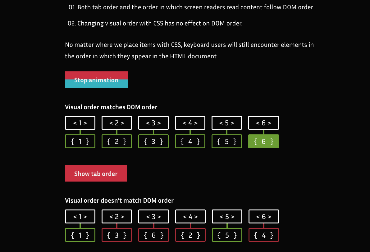
Animated GIFs are something to look out for too. If you’ve got a looping animated GIF, that’s going to need some sort of pause/play controls to successfully meet this criteria. Both of the techniques mentioned in this post are helpful for pulling that off. 

There are some exceptions for this recommendation, as noted by the WCAG. One exception specifically worth noting is loaders and preloaders.

Three flashes or below threshold 

This recommendation is one that probably has the most research behind it because it stems from the days of broadcast TV. The main reason behind this recommendation is that significant flashing on screen has been known to trigger seizures.

In short three flashes or below threshold states: 

Web pages do not contain anything that flashes more than three times in any one second period, or the flash is below the general flash and red flash thresholds.

How to meet the three flashes or below threshold criteria

The WCAG provides details on the size, ratio and viewing angle thresholds under which flashing the screen could be considered safe. But for most of us, it’s probably easiest to avoid anything that flashes more than three times in one second. I don’t think many UX designers set out to flash the screen excessively on purpose, but it can happen. For example, a design that’s going for a video game sort of feel or a glitchy vibe might involve some screen flashing that happens more frequently than three times in a second. 

One specific example of a design that includes a significant amount of flashing is this article from the Huffington Post, pictured below. It’s a highly stylized piece on how millennials have a tougher go at things like jobs and saving for retirement than previous generations. Its  glitchy 8-bit video game design is very on point with the theme of the article. Design-wise, it’s a great choice for the subject matter and is well executed. But there are times, as you can see from the frame-by-frame stills below, where the text color flashes more than three times a second. 

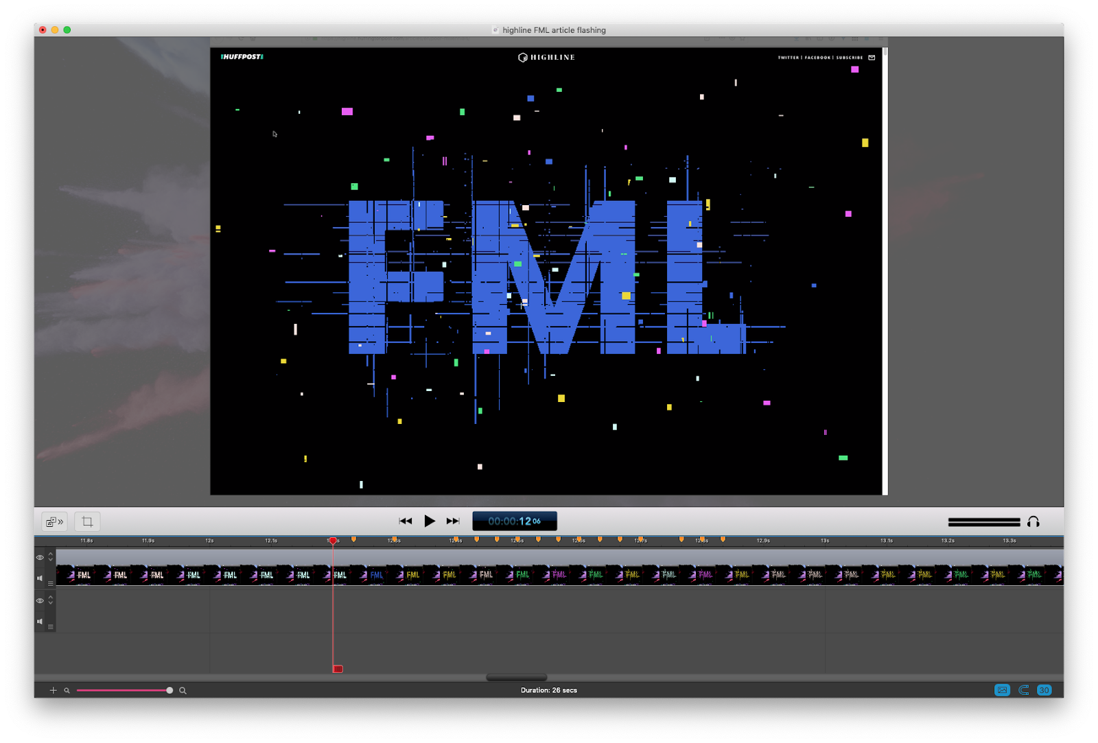
This amount of flashing could be problematic for people with epilepsy or other physical reactions triggered by flashing. To their credit, the Huffington Post also provided a text-only version of the article for anyone sensitive to flashing, as Eileen mentions in this post, as well as advanced warning of the potential flashing hazard.

In general, avoiding effects that require frequent flashing is the safest way to meet this criteria. However, If you can’t avoid flashing animations in your project the WCAG provides detailed instructions around the safe thresholds for flashing the screen. Also, providing advanced warning of flashing content and an alternate version of the content without the flashing effect (like the example above) is a good thing to do as well.  

The A, AA, and AAA levels of the WCAG 

The WCAG has multiple levels of criteria and conformance, which is why each recommendation has a notation of what level it falls under. Level A compliance is the minimum level of conformance. Level AA is the middle level of conformance and indicates that the criteria for both level A and AA have been met. Level AAA is the highest level of conformance and requires satisfying the criteria from level A, AA and AAA. Typically, the guidelines found in level AAA require additional effort to meet. (If you want to learn more about these levels and what’s included in them outside of the animation-related recommendations we’re covering here, I’ve put together a list of helpful resources at the end of this article.) 

In general, most people are aiming for level AA compliance when they say they are making an accessible website. This is also the level you might see requested in an RFP or project brief. The last two guidelines we discussed fall under the level AA criteria and, therefore, must be met to claim level AA compliance. The next guideline, however, is part of the level AAA criteria. Even though it’s outside of the typical level of conformance, it’s a very useful recommendation to take into consideration if your project relies significantly on animation. I highly recommend implementing it in your work.

Animation from interactions 

This guideline covers a different kind of animation than the previous two. While the first two are generally applied to animation that’s initiated by the web page itself, this one applies to animation initiated by user interaction. More specifically, it states: 

Motion animation triggered by interaction can be disabled, unless the animation is essential to the functionality or the information being conveyed.

At first read, the term “motion animation” can be confusing since we typically use the terms “motion” and “animation” interchangeably. It might seem overly specific at first, but it makes sense to get this specific in this case. The WCAG defines motion animation as animation that is used to ”create the illusion of movement”, and specifies that “motion animation does not include changes of color, blurring or opacity.”

Essentially, the term motion animation is used to indicate that certain types of animation create the sense of movement, while others do not. It’s those animations that create a sense of movement that concerns this guideline. It’s important to keep that distinction in mind when discussing animation and accessibility to help make sure you focus your efforts efficiently. If we were to express this distinction in a very eyeball-like Venn Diagram, it would look  like this:

A large light purple circle with the word Animation on it in white with a smaller white circle contained at the bottom of the larger circle with the word Motion on it in black.

Over the last few years, we’ve come to realize that some types of motion on screen, even as part of an interface, can cause people with motion sensitivities to become physically ill. So this is why we might want to consider creating a reduced motion mode in our  work. I wrote more about the kinds of motion effects that are most likely to be triggering in this article, and this post from the WebKit blog covers some examples in detail.

How to meet the animation from interactions criteria

The WCAG suggests we avoid unnecessary animation, provide a control for users to turn off any non-essential motion, or take advantage of the reduced motion setting in operating systems and user agents. Let’s look at each of these in a bit more detail. There are a few different things we can do to help avoid exposing people to animation that might make them dizzy, nauseous, or worse.

Avoid unnecessary animation

Context and expectations also play a role here. The amount of motion you might reasonably expect to encounter on a website for a movie or video game is very different from what you might reasonably expect to encounter on say a government site or construction company’s site. The same amazing effects that might fit in just fine on a video game’s site would feel unnecessary or out of place on, say, a government website. Consider the context and expectations that apply to your site and whether the amount of animation you’re using in your design fits that context. 

Provide a way for users to turn off potentially problematic motion animation

If you have motion in your product that might be a trigger for folks with motion sensitivities, providing a way for users to avoid those triggering animations is the responsible thing to do. Based on the WCAG’s definition, any effect that could be considered motion animation should be one that includes a reduced version. 

Parallax effects are a good example. Those are universally problematic for folks with motion sensitivities based on my own research, yet it’s also still a very popular technique. While it wouldn’t be realistic to call for an end to all parallax effects entirely, implementing parallax responsibly requires giving your users some level of control to turn off that triggering motion. 

Typically, this is interpreted as including a toggle, setting, or preference for users to indicate their preference for reduced motion, and providing reduced versions of those motion animation effects when it’s activated. The Netlify 1 Million Devs site is one example of a motion toggle in action, and the official Animal Crossing site has one too.

Showing a screenshot of Netlify's Thanks a Million webpage. A toggle to disable animation is located in the top left corner of the page, above the content, which is set against a mint green background.
Take advantage of the reduce motion feature 

Sites or apps that don’t rely heavily on large amounts of motion might find that a custom toggle isn’t the right strategy for them, and instead use the prefers-reduced-motion media query on its own. This allows you to provide a reduced version of highly animated content when that preference is present globally via the user’s operating system. It’s also a setting they can set in one place and have it affect a variety of content they encounter. That makes it a great tool for us to use to detect and respond to a user’s need for reduced motion. 

I’ve written about using prefers-reduced-motion in detail over at Smashing Magazine, and it’s also been covered by other articles on this site. In short, it allows us to access someone’s OS-level motion preference via a media query. We can access it in CSS or JavaScript and use the returned value to provide a reduced motion experience for those who want it. For example, we could do this to create a reduced motion variation of a bouncing CSS animation:  

/* A constant bouncing motion effect applied to the title */
h2 {
  animation: bouncing 1.5s linear infinite alternate;
}

/* Replace it with a safer effect when prefers-reduced-motion returns true */
@media (prefers-reduced-motion: reduce) {
  h2 {
    animation: fade 0.5s ease-in both;
  }
}

Some sites opt to use both a custom toggle and reduced motion preferences together. If you go to the site with reduced motion requested in your operating system settings, you automatically get the reduced motion mode. This two-pronged approach is a great strategy for sites with large amounts of motion. Marcy Sutton covers the basics of how to set up this approach in her egghead.io course, as well as in this CodePen demo

Use these guidelines for your next animation project

There you have it, everything the WCAG says about animation explained in one place. I hope this article will help you to confidently make your web animation work accessible. Sometimes it takes a little extra effort, but that extra effort is totally worth it when it means you’ve expanded the number of people who can meaningfully interact with your site.

This article focused on the recommendations specific to animation, but animation isn’t the only place in our work where accessibility considerations can make a big impact. There are some great resources on accessibility out there that cover a more holistic view on accessibility. One of my favorites is the book Accessibility for Everyone by Lara Kalbag. Sites like WebAIM and the A11y Project are great ones to check out for a wealth of resources. If you’re doing a lot of your animation work with SVG, Heather’s SVG accessibility article is a good resource as well. I highly recommend checking out these resources if you haven’t already. 


The post Accessible Web Animation: The WCAG on Animation Explained appeared first on CSS-Tricks.

You can support CSS-Tricks by being an MVP Supporter.

Designing With Reduced Motion For Motion Sensitivities

CSS has recently added features that allow us to recognize certain user preferences and qualities of the user’s current environment. One of those new features, specifically the prefers-reduced-motion media feature, can be especially useful for designing more inclusive motion on the web.

A few years back, I wrote an article about designing safer web animation for motion sensitivity and the limited options we had at the time to design safe motion on the web. Some things have remained the same since that original article, like the types of motion effects that can be triggering, and the importance of context and user expectations. But what has changed is the existence and support of the prefers-reduced-motion media feature. That makes a big difference in how we can design the motion in our work to be inclusive and accessible.

Why Reduce Motion?

The release of iOS7 back in 2013 sparked a realization throughout the digital design world that some motion on screen — even if it was part of an interface — could have physical consequences for people with motion sensitivities. In the years since then, the major mobile and desktop operating systems have added functionality for people to reduce the amount of motion they encounter in their operating systems.

Articles like “Your Interactive Is Making Me Sick” and “Accessibility For Vestibular Disorders” share first-hand stories of how our design choices, especially around motion, can have physical consequences for those with motion sensitivities. The root causes of these motion sensitivities can vary greatly between individuals. For some, it’s rooted in a vestibular disorder, while for others it might stem from migraines or other factors. What’s triggering can also vary from person to person, or even from day to day for some. The physical symptoms individuals experience as a result of that triggering motion can range from slight dizziness or headaches to nausea or worse.

The design choices we make around animation in our work directly impacts how our work affects people with motion sensitivities. Knowing what kinds of motion are potentially triggering, and how we can mitigate them with our design choices, helps us design experiences that are safe for our audience and won’t cause unintended harm. Animation still absolutely can have a positive impact on our UX efforts, but it’s up to us to make sure we use it responsibly, just like we try to use our other design tools responsibly.

Prefers Reduced Motion On The Web

The prefers-reduced-motion media feature now has strong browser support. It’s supported in current versions of Edge, Firefox, Chrome, Safari, Opera, iOS Safari, as well as on Android Browsers and Chrome for Android. The level of support we have today makes it something that you can absolutely use in production. Also, if someone’s browser doesn’t support this feature, nothing bad happens, it will just be ignored and things will carry on as before.

On the development side, we can test for prefers-reduced-motion in the same way that we would use any other media query in CSS or JavaScript to find out if reduced motion has been requested.

In CSS that will look something like this:

@media (prefers-reduced-motion: reduce)  {
    /* reduced behaviour */   
}

And in JavaScript:

let motionQuery = matchMedia('(prefers-reduced-motion)');

const handleReduceMotionChanged = () => {
  if (motionQuery.matches) //reduced behaviour;
}

motionQuery.addListener(handleReduceMotionChanged);
handleReduceMotionChanged()

Whichever way you choose to access it, this media query will return one of two values: no-preference (false), or reduce (true). Once retrieved, you can use these values to inform what you display in the browser.

Of the two values that can be returned, the only one we can be sure has been set intentionally is the reduce (true) value. No-preference (false) can mean that the person in question is fine with all types of motion, or it could mean that that preference just hasn’t been set yet. This makes any approach that equates the value of no preference (false) to the person in question opting in to all levels of motion unreliable. Because of this, the better approach is to reduce potentially triggering motion effects when a value of reduce (true) is returned.

For example, here the looping bounce animation is replaced with a fade in animation when reduced motion is requested:

/* A constant bouncing motion effect applied to the title */
h2 {
  animation: bouncing 1.5s linear infinite alternate;
}

/* Replace it with a safer effect when prefers-reduced-motion returns true */
@media (prefers-reduced-motion) {
  h2 {
  animation: fade 0.5s ease-in both;
   }

Reduced Motion From The Users’ Perspective

Most major operating systems allow people to set their preferences in their system settings. The exact wording and location of the settings vary, but the preference can be set on iOS, OSX, Windows, and Android operating systems.

The Prefers Reduced Motion Media Feature In Practice

Deciding how to put the prefers-reduced-motion media feature to use is where we have space for creating solutions that best fit the context of our products and content. For most web projects, you’ll want to first identify any potentially triggering motion effects on your site, and then use the prefers-reduced-motion media feature to provide a reduced version of that effect.

Let’s look at each step in more detail.

Identifying Potentially Triggering Motion

To find any potentially triggering motion you might have, go through some typical user flows for your site or product and take a closer look at the motion effects used: Do you have any interactions that have large movements? Any large zooms, spinning effects, or parallax effects? All of those types of animated effects are very likely to be problematic for people with motion sensitivities. In contrast, animated effects like color fades, opacity changes and small changes in scale are unlikely to be problematic. If in doubt, it can’t hurt to add the effect in question to your “to reduce” list to err on the side of caution.

The Web Content Accessibility Guidelines recommend providing a reduced version for any “motion that creates the illusion of movement...that is not essential to the content’s meaning”. I think it’s helpful to see some examples too, especially if you don't consider yourself to be sensitive to motion on screen. I cover examples of potentially triggering motion in my previous article and this post on the Webkit blog has some too. Chances are, unless your site relies heavily on motion, you’ll end up with a fairly short list of effects to focus on here.

Create A Reduced Motion Version

Next, you want to determine the most appropriate reduced motion condition for these potentially triggering effects. Can the animation easily be adjusted to use a non-motion effect like an opacity fade or crossfade for reduced motion requests? Would pausing the motion or removing the effect entirely for reduced motion preserve the meaning of the content?

The role of the motion in question will be an important factor in deciding what the most appropriate reduced version would be. You don’t want to unintentionally remove content or degrade the overall experience. Here are a few examples of what might work well for the potentially triggering effects you find:

Large Page Transitions

Large page transition effects can likely be replaced with a crossfade effect for a reduced motion mode. The same is usually true for large zooming or spinning transitions that transition between different states or views.

Animated Illustrations

Animated illustrations, on the other hand, might be best replaced with a static version for reduced motion if they are mostly for personality or branding effect. You’ll want to make sure the static version is still meaningful, and the arrangement that has the most meaning may not always be the very beginning or very end of the animation. Adding in functionality to play animated illustrations on demand for reduced motion could also be useful by allowing people to play the animation when they’re ready for it.

Don’t forget to consider the motion in your animated gifs or auto-playing videos here as well. These can also contain potentially triggering motion and would need a reduced version if they do.

Parallax Effects

Parallax effects and exaggerated smooth scrolling effects are universally triggering for folks with motion sensitivities, so those should be significantly reduced or entirely removed for reduced motion. (Every single person I’ve talked to in my research on this has called out parallax specifically as being a problem for them.) Smooth scrolling effects can be replaced with the default browser anchor link behaviour as described here by Eric Bailey. Removing parallax effects for reduced motion is the ideal solution, but make sure to check that all the necessary content is still visible and usable with the parallax removed.

In most cases substituting the potentially triggering effect with a safer effect for reduced motion is the best way to preserve as much of the content’s intent and usability as possible. Luckily, substituting a reduced effect can be pretty straight forward too.

An Example Of Reducing Motion

For example, let’s say I flagged this header animation as potentially triggering when I went through my site. The motion is large enough to create the illusion of motion, so it’s likely to be triggering, and the multiple directions of motion are also likely to be problematic. It’s definitely one I’d put on my list of effects that need a reduced version when reviewing my site.

The Airpods Pro page also responds to reduced motion preferences, but in a very different way because of the content and effects used. Almost all of the motion on the page could be potentially triggering since it has a lot of big zooming movements and parallax-style effects. When reduced motion is requested, all the parallax and large motion effects are removed, but they do more than just pause or remove the animations. The version you see with reduced motion selected has been designed with care to preserve the same content and meaning from the full motion experience. (Here’s a video of The Airpods Pro site both with and without reduced motion selected for reference.)

Add Custom Toggles For Motion-Heavy Experiences

I mentioned above that most “task-based” sites likely have only a handful of animations that might be triggering and need a reduced version. But those aren’t the only kind of web sites out there on the web. Projects that involve a large amount of motion, like sites that are meant more for storytelling or creating an experience might benefit from a slightly different approach.

For projects like these, it would be difficult to make a list of potentially triggering motions and provide a reduced alternative for each because almost all of the motion used could be potentially triggering. Plus, the motion is very much part of the content and its meaning. Designing a reduced motion mode for these types of sites will take a more global approach and more effort to be sure the meaning of your content is preserved even as motion is reduced.

For these highly animated experience sites, providing a visible custom motion toggle is a useful thing to include. This will allow people who may not yet know about the reduced motion setting, or who are experiencing some motion sensitivity at that moment in time, to quickly adjust the experience. A motion toggle provides a way for motion-sensitive folks to participate in your content in a way that won’t make them sick. That’s definitely better for everyone involved than them having to avoid your site entirely.

Context Is A Key Factor

Remember that context also plays a big role here. No one wants to be surprised by large amounts of motion where they don’t expect it. If you’re visiting a site billed as a highly interactive storytelling experience you’ll have very different expectations than when you’re visiting your bank’s web site. Both of those sites certainly could feature large amounts of animation, but it would be an unexpected surprise on the bank site.

Building A Custom Motion Toggle

The idea of a custom toggle is something that I mentioned back in my 2015 article, but today it’s a much more viable option. On today’s web, we can create one with more ease, and even make a smarter toggle than we could have just a few years ago.

Marcy Sutton has a great example of how a modern custom motion toggle could work in this CodePen. (This example is part of her course on making accessible web apps, which is also very much worth checking out.) Her example uses a toggle to remove all motion because it only includes one animation, but this approach can be used to provide reduced motion effects across an entire application or site following the same logic as well.

The key feature of this approach is how nicely Marcy ties it in with modern web technology, i.e. prefers reduced motion and local storage. When using this approach, if someone comes to your site with reduced motion requested, they automatically get the reduced motion version without having to manually activate the toggle as well. And if someone invokes the toggle to reduce motion, that preference will be saved via local storage so they won’t have to repeatedly make this selection every time they visit.

The official Animal Crossing site is a wonderful real-world example of a custom reduce motion toggle combined with the prefers-reduced-motion media feature. It’s one of my favorite examples of handling reduced motion. The design choices they made around how to reduce potentially the triggering motion, while still keeping true to the overall feel of the site and the content, is great. I wrote more about how they pulled it off in this blog post. There are a lot of sites out there whose audience could benefit from a similar approach.

Other Ways To Use Motion Toggles

If you already have a preferences or settings panel, adding a toggle to request reduced motion could be a valuable thing to add to these settings like Twitter does on its site. In this case, there aren’t large amounts of motion immediately presented when visiting the site and there’s already a settings panel, so implementing the toggle as part of the settings preferences fits well. Twitter’s toggle also respects OS-level settings via the preferes reduced motion query and is preset to either on or off based on what the user has set at the OS level. Designing your motion toggle to respect OS settings is definitely a smart approach to implementing them well no matter where the toggle might appear.

Contextual toggles are another approach that could be used to reduce motion on specific animated illustrations or other content areas that appear throughout your site. The Dark Side of The Grid article does this nicely by adding contextual toggle buttons to each animate figure to allow the reader to play the animation when they want to see it, but not have it loop endlessly while they are reading.

Along those same lines, Dave Rupert shared a technique for combining prefers reduced motion with the picture element to show static elements in place of animated gifs when reduced motion has been requested. Chris Coyier took that one step further and suggested presenting a play toggle for those animated gifs based on the same approach. Steve Faulkner’s gif de-animator example could also be a useful approach.

All of these, or something similar, could be good options for mitigating any potentially triggering motion on the web. I bring up these examples for two reasons. The first is to show that there are a number of ways to approach providing reduced motion variations and you have lots of flexibility to find an approach that fits best for your content. And secondly, as time goes on and more folks are building sites with reduced motion options, the more innovative solutions we’ll see shared in the community.

There are many creative ways to add toggles and settings in a way that makes sense for the context of your project. It’s an interesting parallel that we’re seeing more and more web sites include settings panels or options for setting preferences like dark mode. Including an option for reduced motion could be a natural next step.

The More We Use It, The Better It Will Get For Everyone

I think it’s important for us, the people designing and building things for the web, to take advantage of the prefers-reduced-motion media feature to make our work more inclusive. By taking steps to respect motion preferences we make the web safer for more people to use, and that can only be a good thing. We absolutely can be expressive and creative with motion on the web while also being responsible and inclusive.

But the awareness level is still something we need to be, well, aware of. Not everyone who might need reduced motion is aware of the option in their OS settings. Perhaps even fewer people know that it can take effect on content in their browser too since so few websites currently take advantage of it. The more we take advantage of the prefers-reduced-motion media feature, and provide a quality reduced motion experience with it, the more meaningful of a feature it will be for those who need it.

Including Animation In Your Design System

Including Animation In Your Design System

Including Animation In Your Design System

Val Head

(This article is sponsored by Adobe.) Design systems come in all shapes and sizes, but as Sparkbox’s design system survey noted, not all of them include guidelines for animation. Sure, some teams may have decided that motion wasn’t something their product needed guidance on, but I suspect that in some cases motion was left out because they weren’t sure what to include.

In the past few years, I’ve talked with many teams and designers who admit they think motion is something they should address, but they just aren’t sure how. If you’re in that boat, you’re in luck. This article is all about what to include in a set of motion guidelines for your design system and how to pull it off.

Why Animation?

Animation is an important design tool for both UX and brand messaging. Just like typography and color, the animation you use says something about your product and its personality. So, when it’s not addressed in a design system, that system essentially leaves that area of UI design tooling unaccounted for. Then people following the design system either do whatever they want with animation — which can lead to a strange mish-mash of animation execution across the experience — or, they just don’t use animation at all because they don’t have time to figure out all the details themselves. Neither case is ideal.

Having a clear stance on how animation is used (or not used) in your design system can help ensure your brand is using animation consistently and effectively while also helping your team work faster. Let’s dig in to get started on a set of motion guidelines for your design system.

The Groundwork: Defining What You Need To Cover

First, Talk To People

As Jina Anne says, “Design systems are for people.” I’ve often heard the advice that talking to the people who will be using the design system you’re creating is key to making a design system people will actually use. That holds true for the guidelines you create around animation too. The biggest thing you can gain from this is finding out what they need and what to focus on. This helps you set an appropriate scope for what you need to cover in your guidelines. No one wants to spend hours on extensive guidelines that address more than your team will ever actually need. That wouldn’t be any fun (or use).

Your team may not tell you about their animation pain points unprompted, but that doesn’t mean they don’t have any.

Set up some user interviews (the users of your design system) and ask them about where they get stuck with animation. Ask them how/if they use animation, and where animation falls in their design process. Ask them about what they wish they had to help with the pain points they encounter. Most importantly, listen to how they talk about using animation in their work and what goes well or not so well.

While every team is different, the concerns and questions I’ve heard most often when doing this research are things like: “How do I know an animation is good, or fits with our brand?”, “How can I convey the animation details to our engineers effectively?”,or “Our developers always say there’s no time to implement the animations we design.”

You’ve probably guessed where I’m going with this, but all of those concerns are things you can help provide answers to in your motion guidelines. And you can use the questions and pain points that come up most often to guide and focus your motion guideline efforts.

Reference Other Systems

Not every design system has to be public, but it’s great that so many of them are. They make for a helpful resource when planning your design system, and they can be useful research for your design system’s motion guidelines too. (In fact, we’ll be referencing a few them in this very article.)

Using other motion sections as reference for your own design system is very helpful, but I don’t recommend adopting another brand’s motion guidelines wholesale in place of your own. No, not even if it’s Material Design’s motion guidelines.

Material Design’s motion section is Google’s take on motion guidelines. A good one, yes, but its aim is to show you how to animate the Google way. That’s perfect if you’re making something for the Google ecosystem (or intentionally wanting to seem like you are). But it’s not a good fit when that’s not your goal. You wouldn’t use another brand’s colors or typeface on your product, so don’t just follow another brand’s motion guidelines either.

The most effective design systems contain a branded point of view unique to them — things that make their design system more specific to the product they’re for — along with common design best practices. Spend a little time researching and reading through other systems’ motion guidelines, and you start to get a feel for which parts are best practices and which parts are customized to that brand or product’s point of view. Then you can decide which best practices you might also like to include in your guidelines, as well as where to customize the guidelines for your product.

For example, using ease-ins for exits and ease-outs for entrances is a common best practice for UI animation. But the exact ease-in or ease-out curve is usually customized to a brand’s intended message and personality.

To quote Dan Mall:

“This is the kind of thing a design system should have guidelines for: perspective, point of view, extending creative direction to everyone that decides to build something with the design system. That stuff should be baked in.”

I totally agree.

The Two Main Sections Of A Design System’s Motion Guidelines

There’s no specific rule out there stating that you must have these two sections, but I’ve found this breakdown to be an effective way to approach the motion guidelines I’ve worked on. And I’ve also noticed that most design systems out there that address motion have these two categories as well, so it seems to be an approach that works for others too.

The two main sections are:

  1. Motion Principles
    Principles are typically high-level statements that explain how that brand uses motion. They’re the big picture point of view or design intention behind why the brand uses animation and their perspective on it.
  2. Implementation
    This section focuses on how to carry out those principles practically in design and/or code. It serves as the building blocks of animation for the design system, and the amount of detail they cover varies based on brand needs.

Motion Principles

The principles section is where to state your brand values around animation. They’re the high-level principles to measure design decisions against, and a place to state some specific definitions or values around animation. Principles often tend to focus on the “why” of using animation within a particular design system and the UX-driven purpose they serve. In many cases, design systems list these under the heading of Principles in their motion section. However, you can see the concept of principles present in ones that don’t include a specific section for them as well.

Your motion principles can be modeled after existing global design principles that your brand might have, extrapolated from things like voice and tone guidelines, or even be inferred from looking at your product’s existing UI animations in a motion audit.

Let’s look at some examples to get a better idea of how these play out. Microsoft’s Fluent design system lists their motion principles as being physical, functional, continuous, and contextual. They include a short description and illustration of each to explain how it applies to UI animation.

Screenshot of the Fluent’s first motion principle
A segment of Fluent’s motion principles page (Large preview)

Audi doesn’t have a separate principles section, but they start off their animation section with a declaration of why they use animation, which is setting the stage for what sort of motion is to be used in the design system, just like a principle would. They state:

“We stand for dynamic premium mobility. As such, movements in the Audi look have a typically dynamic character.”

While developing the motion section for Spectrum, Adobe’s design system, we opted for a principles section to match the pattern used in other sections of the system. Within Spectrum, animation aims to be purposeful, intuitive, and seamless.

Note: Spectrum does not have a publicly available site at the time of writing.

Spectrum’s motion principles of purposeful, intuitive and seamless
Spectrum’s guiding motion principles for UI animation (Large preview)

No matter how you decide to present them, your design system’s animation principles can be used to both establish the system’s expectation around animation and to evaluate potential future UI animation for the product(s) the design system is applied to. For example, if a designer following the Fluent design system wanted to introduce a large bouncing animation into a component, there could be discussion around whether that meets the motion principles. (Does it fit the principles of functional and continuous?) Then a decision could be made as to whether or not that particular animation warranted breaking from the stated principles, or if the animation should be redesigned to fit the principles.

This helps to keep the design discussions away from the “do you like it?” or personal opinion realm and gives a structure for evaluating animation in a more pragmatic design-oriented way. That’s my favorite advantage of having declared motion principles; they make discussing animation meaningfully so much easier, even for people who don’t have a lot of animation experience.

Quick Tip: For more motion principles references, check out Photon’s motion principles, Material Design motion principles and Carbon’s motion principles. There are also others out there, but these are a good start.

Implementation

Motion principles are great for some high-level guidance, but without some details on exactly how to implement them, you’ll be missing the biggest time-saving benefits of including animation in your design system. The implementation section (though rarely actually titled as such) helps to answer many of the “how” and “what” questions your team has around animation. The objective is to provide smart defaults for anyone following the design system. That way, instead of spending ages playing around with durations and easing for every animation, they can use the smart defaults you’ve provided in the guidelines and be on their way. It’s a huge timesaver that also makes your UI animation much more consistent across the board.

The implementation guidelines are where a lot of design systems diverge in their approach and coverage. The amount of detail you include and the topics you cover in these guidelines will depend on how big of a role animation plays in your design efforts and what your team needs. For example, Photon’s implementation section includes just one duration and one easing curve, while Material Design’s includes individual sections on duration and easing as well as additional pages full of implementation details.

There’s no perfect length for a motion section; it’s more about covering the details your team needs than hitting a specific number of pages or rules. Some of the animation building blocks to consider including in your motion guidelines are:

The first three in the list are the main ways we customize or style animation. Variations in the properties, durations, and easings used for animation can drastically affect how animations come across. (And the last one is a way of packing up the first three.)

Let’s dig into each in more detail, and for each of these I’ll point out some of the common best practices and where there’s room for your own customized interpretation.

Durations, Ranges, And Rhythm

Duration has to do with how long animations should be, and when we’re talking about UI animation, these values tend to be very short. It’s amazing how much information we can convey in fractions of a second! This is a key aspect of animation, so every design system with motion guidelines covers it, but they do it in a variety of ways.

Some of the best practices around duration that you’ll see addressed in most motion guidelines include:

  • Shorter durations should be used for simpler effects and animationsof relatively small-sized (such as fades or color changes);
  • Longer durations should be used for more complex effects andanimations of larger relative scale (such as page transitions or moving objects on and offscreen);
  • Optimal timing can change based on viewport size. While the specifics of each set of guidelines varies — sometimes even greatly — you’ll see these common best practices in almost all of them. Different systems have different definitions of exactly what “short” or “long” durations are, and go into varying amounts of detail on the difference between the two. Also, while it’s more of a design system thing than an animation best practice, providing design tokens for your specified duration values is a useful thing to consider here as well.

Carbon provides a short table of ranges of duration values based on the type of animation in question. While Material Design breaks down recommendations on duration speed in categories based on the complexity of the animation, as well as by the relative area covered by the animation. Pluralsight takes a different approach and provides a set of keywords for different durations paired with cute animals.

An animated illustration and data table for guidance on Carbon’s animation duration
Carbon’s illustration and table sorted by interaction type give guidance on what durations to use for UI animation within the system. (Large preview)
Animals ranging from a snail to a cheetah to represent possible animation durations
Pluarsight’s design system lists durations, animals and design tokens for each of its duration options. (Large preview)

Easing Values

My number one advice for easing guidelines is to create your own customized curves and don’t just use the CSS defaults. This is the most effective way to build some consistent motion association for your brand and as Sarah Drasner puts it: build “motion equity.” You’ll be on solid ground with just three curves: a custom eas-out, ease-in, and ease-in-out. And there’s always the option to add more if needed.

Quick Tip: If you’re totally stumped on where to start on easing curves, check out the Penner Easing equations on easings.net. These are designed to give you some nice looking motion and are grouped in threes for easy use. They’re much more expressive and flexible than the CSS defaults. Using a set of these in your motion guidelines can be a great place to start.

Six sets of easing curves that vary in their range of speed changes for an animation
A few of the Penner Easing Equations illustrated as cubic-bezier curves. (Large preview)
Essential Easing Functions

I recommend defining the three core easing curves because that will cover all your main easing needs for various animations.

  • Ease-in This curve is the one that accelerates as it begins any movement which reads well for moving an object out of view.
  • Ease-out This curve causes objects to decelerate before stopping which makes for a more natural feeling way to bring objects into view.
  • Ease-in-out As the name suggests, this curve combines the features of the first two and is best for moving elements from point to point.

With these three custom curves, you’ll have almost all your animation needs covered.

One curve for accelerating into the action, one for decelerating out of the action, and one for doing both
The three main types of curves most motion guidelines include (Large preview)

For Spectrum, we did exactly that and created three custom easing curves along with recommendations on which kinds of animation to use each for. (We came up with these curves through looking at existing animation and experimenting with some motion studies.)

Carbon and Pluralsight take a similar approach, designating three curves with suggested uses, as well as designating one as the default curve to use when in doubt. In some cases, you might only feel the need to have one custom easing curve (like Photon does) defining one curve for use across all animations.

The ease-out curve for Spectrum
One of Spectrum’s three custom easing curves (Large preview)

Along with the easing curves, it’s helpful to provide some supporting information like associated design tokens, language-specific code (for CSS, JS, iOS and/or Android), or After Effects keyframe velocities depending on which tools your team uses. This adds to the ease of use and helps make following the smart defaults in your motion guidelines the path of least resistance.

A visual illustration of the curve and interactive examples of the curve are also a big plus for quickly demonstrating how the easing curves work and what they look like. Never underestimate the power of showing instead of telling. (Or showing along with telling!)

Easing Hierarchy

Including a hierarchy of easing is one way you can take things a little further than the three core custom curves. This can be especially useful for brands that use motion as a core method of conveying their design message. Just like with type, you may want a way to make certain animation stand out more than others. Animations that stand out more strongly can be used to emphasize a particular point or interaction. In these cases, structuring your easing curves so that you have one that is more dramatic to stand out from the others can be a useful technique.

Off To A Good Start

At this point, armed with principles plus your durations and easing sections, you have a solid set of motion guidelines. That might be all you need for a version one of your motion guidelines, or for a brand that doesn’t rely heavily on motion in its design. If you’re pressed for time, establishing smart defaults for durations and easing will get far enough to see the benefits of establishing motion guidelines and save your team time.

Named Effects

Providing a listing of named effects or a library of animations to use can be a useful thing to have in your motion guidelines. Not all design system’s motion guidelines have these, some opt to bake the animation guidelines into their components instead (or as well), and some just don’t need this level of detail.

One word of caution on these though: more isn’t always better. It might look cool to have a huge library of animations as part of your design system, but the more effects you list, the more time and effort it will take to maintain those effects. To avoid creating a huge time sink for you and your team, I’d suggest making any collection of named effects as small as you possibly can.

There tend to be two approaches to providing a library of effects in motion guidelines. One approach is the way the Lightning design system does it, providing a library of small animation effects (molecules of animation, if you will) that can be used individually or composed together to build up more complex animations.

A listing of small named animations that can be composed into more complex effects
A few of Lightning Design System’s named animation library (Large preview)

The other approach is to provide more comprehensive and purpose-specific effects like Audi does for its show and hide, transform, shift, and superimposing effects and Fluent does for its page transition effects. For either approach, providing the design rationale and specific code implementations for each is useful.

Quick Tip: If you’re looking for additional motion guidelines for research, Adele is a design system collection that lets you filter by topics like motion, and styleguides.io is always a great resource for finding public design systems too.

Other Places Motion Might Come Up In Your Design System

Design systems come in all shapes and sizes. And in many cases these animation guidelines are also baked into the DNA or components of your design systems. Digging into how to do that is beyond the scope of what we’re covering here, but I do want to note that can also be useful to include animation information on component-specific pages instead of in a named effects section. It all depends on what works best for your team and your design system.

Additionally, it might be useful to call out performance and accessibility considerations for animation either in those sections of your design system, in guidelines for components, or in the motion section itself. Performance and accessibility goals affect all aspects of our design work, and animation is no exception there.

Some Parting Thoughts

I hope this article has helped to show that including motion guidelines in your design system can be incredibly useful, and helped to demystify the process of creating one. Addressing animation in your design system can be beneficial to the consistency of your product’s design and doesn’t have to be an overly time-consuming effort.

As you’re working on your motion guidelines, I encourage you to work in stages instead of waiting for your motion guidelines to be perfect. Shipping a version one with the intention of adding to it and updating it is much easier on you, the person or people authoring the guidelines, and can help you make sure you’re creating guidelines that are useful.

As hard as it can be to share something that you know is missing some detail, it can be hugely useful to ship a version one of your motion guidelines then talk to your team again to see how the first version of the guidelines has helped them and which pain points are still a factor. This iterative approach can go far towards making your guidelines cover the most relevant topics, and lets you adapt them to your team’s needs. Both are good for having a system that’s useful and avoiding unnecessary extra effort.

Smashing Editorial (il)

This article is part of the UX design series sponsored by Adobe. Adobe XD is made for a fast and fluid UX design process, as it lets you go from idea to prototype faster. Design, prototype and share — all in one app. You can check out more inspiring projects created with Adobe XD on Behance, and also sign up for the Adobe experience design newsletter to stay updated and informed on the latest trends and insights for UX/UI design.