Biometrics And Neuro-Measurements For User Testing

Biometrics And Neuro-Measurements For User Testing

Biometrics And Neuro-Measurements For User Testing

Susan Weinschenk

(This article is sponsored by Adobe.) So it’s time to test the latest version of your app with users. You schedule your first user testing session. The participant enters the room; your lab partner puts velcro on the participant’s finger and fits a headband and head cap on before she sits down at a computer to start the user test session. What’s all this for? It’s biometrics and neuro-measurements.

In a “traditional” user test, you put a participant in front of your app, product, or software and give them tasks to do, ask them to “think aloud”, and observe and record what they say and what they do. You may ask them some questions before and after the session, too. I’ve done thousands of these sessions, and chances are that if you are a user researcher, you have to.

A traditional way or user testing in which a participant is seated in front of a screen and asked to say what they see and feel
The most common way of user testing: participants are seated in front of a screen and asked to say what they see and feel. (Image source: iMotions) (Large preview)

There’s nothing really wrong with user testing this way except that it relies on the participant telling you (either during or after the session) why they did what they did, and how they feel about the product or app. You can see that they clicked on a particular button or touched a link on the mobile app, but if they explain why, you are only getting the conscious reason why.

People filter their feelings, decisions and reasons consciously.

What if you could get their unconscious reactions? What if you could take a look inside your users’ brains and see what it is they aren’t saying, i.e. the things they themselves may not realize about their reactions to your product?

We know that most mental processing — including decision-making and emotional reactions — occurs unconsciously. So if people tell you how they feel and why they did something, it is possible that they believe what they are saying is the truth, but it’s also possible that they don’t know how they feel or why they did or did not take an action.

People filter their feelings, decisions and reasons consciously and by that time you aren’t necessarily getting real data. Add to that the fact that users aren’t always truthful during user tests. They may not want to offend you by telling you they think your product is hard to use or boring.

So that’s why user researchers are starting to use some other tools to get reactions and data directly from the body without the filtering of conscious thought. Hence, biometrics and neuro-measurements.

Some of these new tools are easy and inexpensive to use. Others may take more investment of your time and budget. Or you may want to bring in an outside firm that specializes in these tools. (Some suggestions for outside vendors are at the end of the article.)

Let’s take a look at what’s available.

Galvanic Skin Response (GSR)

GSR is also called “electrodermal activity” or EDA. A typical GSR measurement device is a relatively small, unobtrusive sensor that is connected to the skin of your finger or hand.

Sweat glands on the hands are very sensitive to changes in your emotional state. If you become emotionally aroused — either positively or negatively — then you will release more sweat in your hands. Sometimes, these are very small changes that you may not notice. This is what a GSR monitor is measuring.

An image of a GSR measurement device
You may not notice that there is a small amount of moisture, but even the tiniest amount of increase in moisture changes the amount of electrical conductance of your skin. (Image source: iMotions) (Large preview)

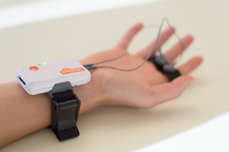
The GSR monitor can’t tell if you are happy, sad, scared, and so on, but it can tell if you are becoming more or less emotional. And since the amount of sweat you release is not under conscious control, a GSR monitor can measure what you may not be consciously aware of.

GSR monitoring has been around for over a hundred years. The monitors are relatively inexpensive and easy to learn how to use. The price for a GSR monitor ranges from about $150 to $600, depending on the brand and model you get. If you want to buy your own, check out Carolina Supply. iMotions also has a great downloadable guide to GSR monitors that you can get for free.

Recommended reading: How People Make Decisions

Respiration

It’s also relatively easy to measure respiration. When people are emotionally aroused they breathe faster. This can be detected in several ways — the easiest being to place a cloth band around the chest and/or stomach and measure the expansion of the chest or stomach as people breathe.

Belt from Biopac
A ‘respiration transducer’ helps measure any changes in the abdominal circumference that occur as a subject breathes. (Image source: iMotions) (Large preview)

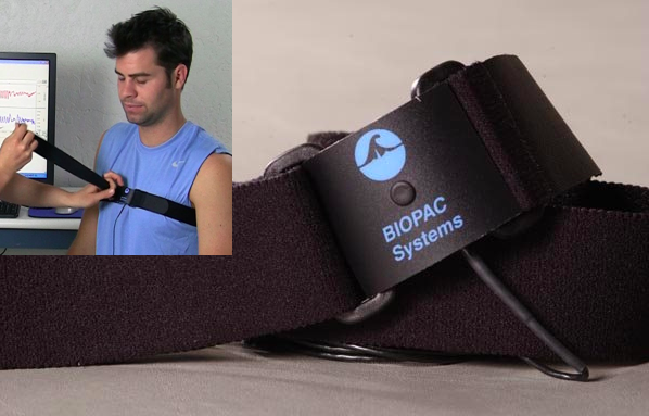
If/when they are using your product and they start breathing faster, you can deduce that something has (either positively or negatively) affected them emotionally.

Heart Rate

You can also use the band around the chest or even a simpler measurement on a finger to measure heart rate/pulse. When you are emotionally aroused, your heart beats faster and your pulse increases.

How would you use GSR, respiration, or heart rate data in a user test or study? Let’s say you are testing an app for getting an insurance quote. You ask the user what they think of the insurance quote app, and they answer:

“It was OK, it wasn’t too hard to use.”

But looking at their GSR, respiration, and/or heart rate might tell you that they were stressed. The data will also show you when and where in the process they had the most stress.

Like GSR monitors, heart-rate and respiration monitors are relatively inexpensive (under $100). What you may really want, however, is a total package that includes, a universal monitor that you can plug more than one measurement into.

For example, you can use GSR, heart rate, respiration and even EEG (discussed below), plus software that lets you monitor the data and combine it with actions your users are taking at specific moments during your user study. These packages will cost you a lot, however. A whole system may run as much as $7,000.

To get started, you may want to bring in a vendor who has the equipment to get your feet wet before you decide to buy these tools for your lab.
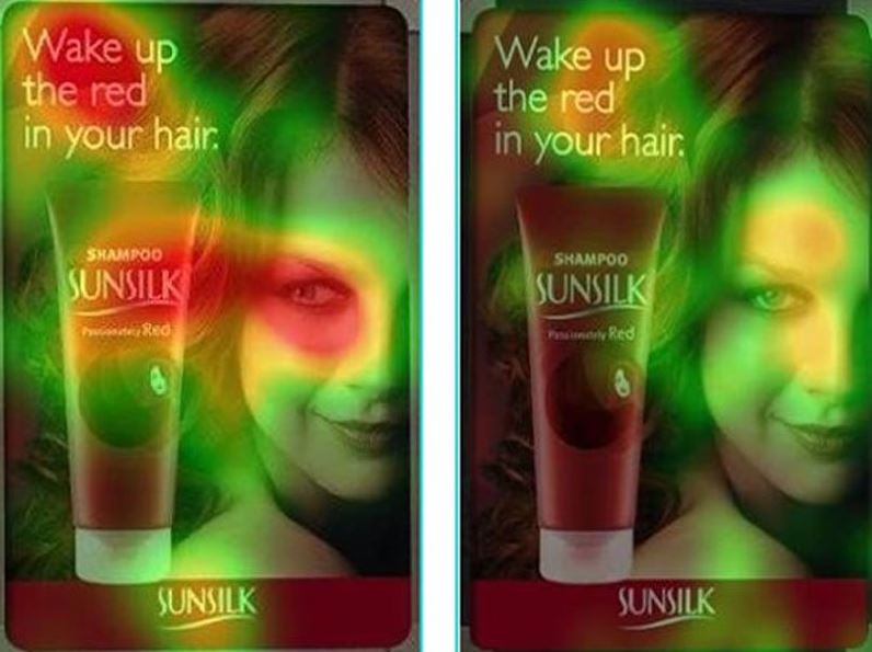
Eye Tracking

I am probably unusual in my criticisms of eye-tracking. A lot of people like eye tracking, but I think it has some problems. I’ll explain why.

Eye tracking involves having people look at a special monitor while wearing eye-tracking headsets/glasses. The eye tracker measures what you look at and how long you look at it. If you were doing user testing on a web page, then you could see (either for an individual or through aggregated data) where people looked most, how long they looked at it, and what people did not look at, and so on.

Eye tracking works just fine in measuring what it is measuring. But here’s my criticism: Eye tracking only measures where people are looking with their central vision. It doesn’t measure peripheral vision.

Recent research on peripheral vision shows that peripheral vision is more important than once thought for information process. For example, images of danger and emotion are processed faster in peripheral vision than in central vision. We also know now that people use peripheral vision to decide if they are the right place, or in the case of software and website design, if they are at the right page or screen. It’s possible for people to “see” something in peripheral vision, but not be consciously aware that they have. And what they see can influence the action they take.

Since eye tracking doesn’t track any peripheral vision data, I am not a big fan of it. Monitors with eye tracking built in, plus the software to analyze and report on the data can cost around $7,000 to $10,000.

Eye tracking only measures where people are looking with their central and not with their peripheral vision.

Facial Coding

Cameras can capture someone’s face as they use a product or watch a video. Algorithms can then analyze the facial expressions and tell you whether the person is confused, happy, scared, and so on.

Facial coding used on a scene of a movie played on a screen
Facial coding uses algorithms to take a good guess at what the person is feeling. (Image source: iMotions) (Large preview)

Facial coding is also an “add-on” feature to eye tracking. You should assume similar pricing ($7,000 to $10,000) for facial coding as for eye tracking

fEMG

EMG stands for Electromyography, or muscle movement. Whenever a muscle contracts it generates a small amount of electricity which can be detected with some fairly simple electrodes. Muscle movement can be very small — you may not see the muscle move, but you can measure it.

This means that some of the most interesting EMG measurements come from the movement of muscles in the face or fEMG. Facial coding uses algorithms to take a good guess at what the person is feeling, but with fEMG you can actually measure the muscles in the face and thereby more accurately assess the emotion that the person is feeling. There is muscle activity in the face that a video won’t detect, but that the fEMG recordings will detect. This means that with fEMG you can pick up on emotions that are not being obviously displayed through just facial coding.

An image of a testing person using a fEMG measurement device placed to his forehead that records facial muscle movement
(Image source: iMotions) (Large preview)

When would you use facial coding or fEMG?

Well, let’s say you have created some new videos for the careers/employment page of your company’s website. The videos have real people who work at the company talking about how they came to be an employee, and what it is they like about working at the company. You want to know if people like and resonate with the videos. Facial coding and, even better, fEMG, would help you measure what people are feeling, and even tell you which parts of the video are eliciting which emotions.

fEMG equipment and software are expensive and not easy to learn how to use. For this reason, you will probably want to start by bringing in a vendor rather than using this on your own.

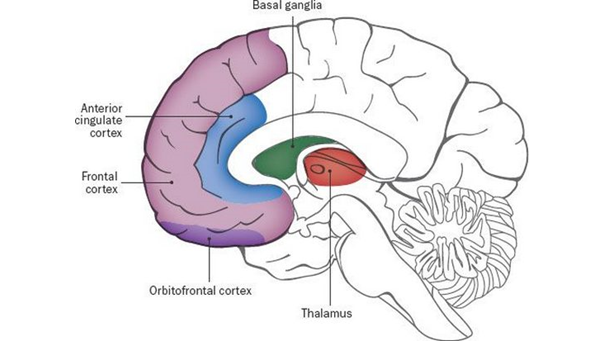
EEG (Electroencephalography)

You can directly measure the electrical activity of the brain by placing electrodes on the scalp. EEG devices measure the electrical activity generated by neurons.

EEG measures electrical changes on the surface of the brain — not deep within particular brain structures. This means that EEG can’t tell you that a particular part of the brain is active. It can only tell you when there is more or less brain activity. You would need to use more sophisticated methods, such as fMRI (functional Magnetic Resonance Imaging) to study more specific brain activity. fMRI equipment is very large and very expensive, which is why only research and medical institutions use them. In contrast, EEG is inexpensive.

EEG measures whether a person is engaged and paying attention. EEG measurements are particularly good at showing you activity by seconds or even parts of a second. Let’s go back to the example of the user test to measure the impact of the employee story videos at the careers/jobs page of the corporate website. Are the videos interesting? Do people pay attention while watching them? Exactly which parts of the videos are engaging? EEG can tell you this.

When I was in graduate school and doing EEG research, we had to use electrodes and gel to get EEG readings, but now there are easier ways. You can place a cap on someone’s head, kind of like a swim cap, and the electrodes are built in to the cap.

An EEG measurement device designed similar to a swim cap
(Image source: iMotions) (Large preview)

Some devices are like headsets rather than swim caps:

An EEG measurement device shaped like a headset
(Image source: Spark Neuro) (Large preview)

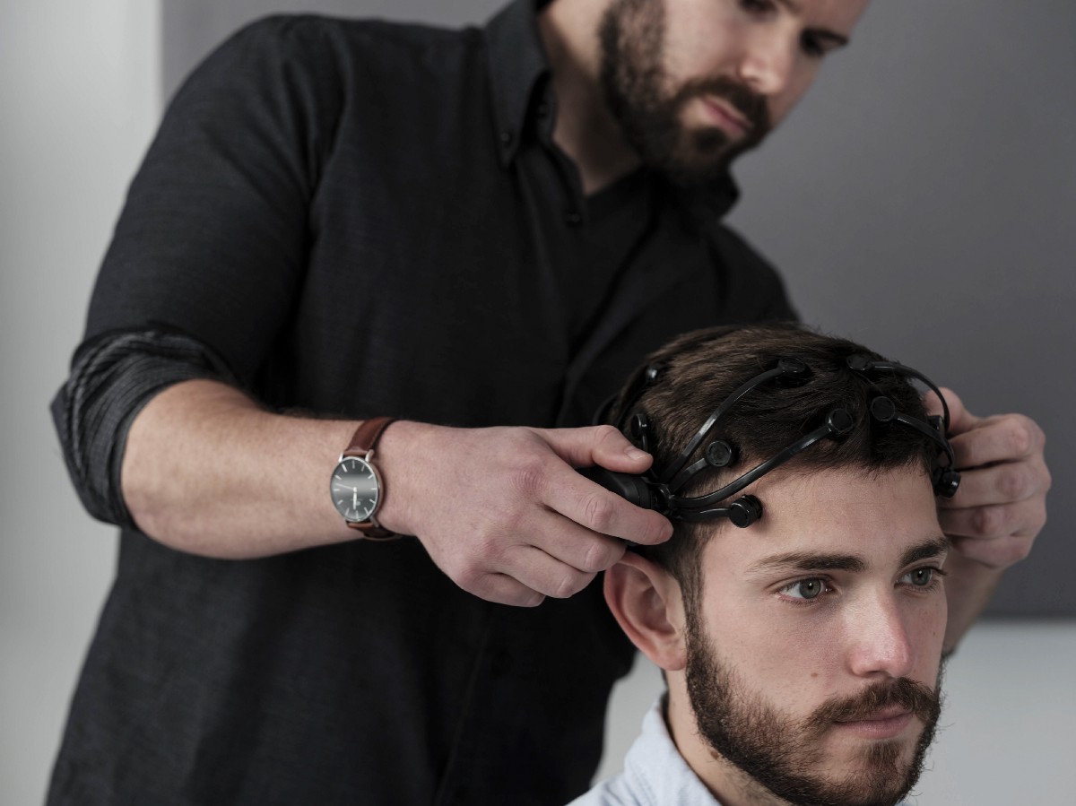
EEG devices range from the inexpensive to the expensive. For example, Emotiv makes a $299 EEG headset. You will probably, however, want to get a higher end version for $799, and then you will need a subscription for the software ($99 a month).

It can take a while to learn how to accurately read EEG data, so, again, it might be better to start by bringing in a vendor who has all the equipment and know-how until you learn.

Recommended reading: Grabbing Visual Attention With The Visual Cortex

Combining Measurements

It is common to combine multiple methods of biometrics together to help with the accuracy and interpretation of the results.

Although biometrics and neuro-measurements don’t tell the whole story, the data that we get from biometrics and neuro-measurements is more accurate than self-reporting. As the tools become easier to use and researchers get used to using them, they will become more common. We may even get to the point where we stop using the think-aloud technique altogether, although I don’t think we are there yet!

Takeaways

  • If you haven’t already researched biometrics for your user testing projects, now is a good time to check out these measurements as an addition to your current testing.
  • Pick a modality and/or a vendor and do a trial project.
  • If you are in charge of user-testing budgets, add in some biometrics to your budgeting process for the next year or two so you can get started.

Vendors

Vendors to consider for a biometric study:

This article is part of the UX design series sponsored by Adobe. Adobe XD tool is made for a fast and fluid UX design process, as it lets you go from idea to prototype faster. Design, prototype and share — all in one app. You can check out more inspiring projects created with Adobe XD on Behance, and also sign up for the Adobe experience design newsletter to stay updated and informed on the latest trends and insights for UX/UI design.

Smashing Editorial (cm, ms, ra, il)

How People Make Decisions

How People Make Decisions

How People Make Decisions

Susan Weinschenk

(This article is sponsored by Adobe.) Kelly’s in charge of choosing IT cloud services at her company. She has signed the company up for a chatbot service, and has had the “Pro” level service (not the “Free” or “Standard”) for two years.

It’s time for the annual renewal. Will she renew? Will she decide to renew, but switch to the free service only? Is there anything about the email notice and/or webpage for the service that will either encourage her or discourage her from renewing?

A pricing plan that is presented to Kelly
The pricing plan that is presented to Kelly. (Large preview)

There is a lot of research on human decision-making. Here are some of my favorite insights from the research.

Most Decisions Are Not Made “Logically”

We like to think that we are logical and that when we are making a decision, we carefully weigh all of our alternatives. When it’s time to buy a new car, do we read all the specs and reviews, and choose the one that is the safest and most economical? When it’s time to renew the chatbot service, does Kelly do a study to see how much use she has made of the “Pro” services and evaluate whether she should stay with that level and pay that amount each month?

These would be the logical ways to make the decision, and although we sometimes make decisions rationally and logically, there are hundreds of decisions we make every day, and we don’t do a logical think through of every one. Even the big decisions where we think we are being logical, the research shows that most of our decisions — big or small — are made unconsciously and involve emotion.

Here are some facts about decisions that may surprise you.

Most Of Our Decisions Are Made Unconsciously

By looking at brain activity while making a decision, researchers could predict what choice people would make 7-10 seconds before they themselves were even aware of having made a decision. This means that even when people think they are making a conscious, logical, decision, chances are that they aren’t aware that they’ve already made a decision and that it was unconscious. We aren’t even aware of our own process.

Do you write your messaging and content to appeal to logical thinking?

If so, it’s possible and even probable that your logical, persuasive arguments to your target audience about why they should go with the premium service, or why they should purchase a particular product may be in vain.

Be suspicious of what people say.

Another problem is that if you are diligent in your design process and ask people what factors are important to them, you might not be getting a true answer.

For example, if someone interviewed Kelly and asked her why she chooses the “Pro” level each year, it is likely that she will come up with an answer that sounds very logical (i.e. about the service, how her company uses it and so on) when the real reason she stays with “Pro” rather than the “Free” plan may be emotional (“I don’t want to have things go wrong and if I pay money things won’t go wrong”) or just habit (“It’s what we always sign up for”). What people tell you is the reason for why they do what they do may not be the actual reason.

People need to feel in order to decide.

If you can’t feel emotions, then you can’t make decisions — thanks to our ventro-medial pre-frontal cortex (or ‘vmPFC’).

The vmPFC is part of the prefrontal cortex, i.e. the front of your brain. It is important in regulating fear. Other parts of your brain (in particular the amygdala) tell you when you should be afraid and what you should be afraid of. The amygdala is where “conditioned” fear responses are born and perpetuated. The vmPFC, in contrast, has an opposite role. It mitigates conditioned fear. It stops you from continuing to be afraid in certain situations. When the vmPFC is active then you are able to let go of conditioned fears. As a result, you are then able to make a decision.

You should just assume that all decisions involve emotions. Rather than just making logical arguments to persuade, you are more likely to persuade people to take an action if you understand how they are feeling about the decision and feed their feeling. For example, if Kelly is feeling apprehensive about making a wrong decision then your messaging should be more about making her feel secure and safe than it is about product features.

People buy when they feel confident of their decision.

There is actually a neuron that fires up in the brain that triggers people to take action when the brain decides it is confident of a decision. This is subjective. It’s not necessarily based on the amount of information you’ve collected — it’s a feeling of confidence.

If you want people to take an action then you need to make them feel confident. If you want Kelly to choose the “Pro” level again, then you need to give her messaging about the “Pro” version that makes her confident of her choice. For example, feed data back to her about how much she has used the service. This will make her feel confident that she is making the correct choice.

Don’t Confuse Unconscious With Irrational Or Bad

I take exception with writers who equate unconscious decision making with making poor or irrational decisions. For example, Dan Ariely in his book, “Predictably Irrational: The Hidden Forces That Shape Our Decisions” implies that unless we work hard to prevent it, many to most of our decisions are poor and irrational.

Most of our mental processing is unconscious, and most of our decision-making is unconscious, but that doesn’t mean it’s faulty, irrational, or bad. We are faced with an overwhelming amount of data (11,000,000 pieces of data come into the brain every second according to Dr. Timothy Wilson in his book “Strangers To Ourselves: Discovering The Adaptive Unconscious”) and our conscious minds can’t process all of that.

Our unconscious has evolved to process most of the data and to make decisions for us according to guidelines and rules of thumb that are in our best interest most of the time. This is the genesis of “trusting your gut”, and most of the time it works!

People do like to think that they are being logical and thorough, however, so you may want to offer logical reasons for why a certain decision should be made so that the person making the decision has a rational reason they can give themselves and others. Go ahead and give Kelly the rational reasons she should renew for the “Pro” level, but just understand that that reason is probably not the actual reason.

Recommended reading: Grabbing Visual Attention With The Visual Cortex

Only Give More Information If People Are Making A Goal-Based Decision

There are two different types of decisions that people make. Value-based decisions are made in the orbitofrontal cortex (OFC). So, during those times when you really are comparing the Honda to the Subaru when you are shopping for a car, then you are making a value-based goal decision. If Kelly was comparing the features of the different levels for the chatbot service then she would be making a value-based goal decision.

Habit-based decisions occur in the basal ganglia (deep in the brain). When you pull your usual cereal off the shelf at the grocery store and put it in your cart, that’s a habit-based decision. If Kelly presses the ‘Renew’ button for the Chatbot software then she is making a habit-based decision.

What’s interesting is that if the OFC is quiet then the habit part of the brain takes over. This means that people are either making a goal-directed decision or a habit decision, but not both at the same time.

An illustration showing the parts of the human brain
Structure of the human brain and location of the basal ganglia (Large preview)

If you give someone a lot of information then they will switch from habit to goal-directed. So if you want someone to make a habit decision, don’t give them too much information to review. If you want them to make a goal-directed decision then do give them information to review.

If you want Kelly to renew for the “Pro” level then don’t give her lots of data. Let her make the habit-based decision to renew. If you are hoping that she will go up a level (not down) then you may want to give her data on her options as that will kick her from a habit decision to a goal-directed decision.

Too Many Choices Means People Won’t Choose

You may have heard the idea that people can only remember, or deal with 7 plus or minus 2 things at a time (5 to 9). This actually is not true. It was a theory first mentioned by Miller in 1956 at a talk he gave at the American Psychological Association meeting. But research since then shows that 7 +- 2 is a myth. The real number is 3-4 not 5-9. Refuting research includes:

And most recently, Sheena Iyengar (author of “The Art Of Choosing”), has conducted several studies that clearly show that if you give people too many choices then they end up not choosing anything at all.

People liked having more choices to choose from but they were more satisfied with their choice when there was less to choose from.

So, if you show someone too many choices (in this case of sales/CRM services) they might not choose any and instead abandon the page.

An example of a ‘customer success platform’ with 12 options to choose from
Showing too many options can only overwhelm your users. Choose less with your goals in mind. (Large preview)

Kelly was given five choices for the Chatbot service. Three to four would have been better.

So, is there anything you can do to encourage Kelly to re-subscribe and not change her level of membership?

In this case, the decision is probably a habit-based decision. The best thing to do, then, is to not do much at all. Don’t send her an email with information on all the membership levels. Instead, give her one or two reasons why continuing with her current subscription is the way to go and leave it at that. At a different time (not when she is deciding whether to renew), you can make a pitch for a higher premium level. But if you do that pitch while she is about to renew, you may jeopardize her habit-based renewal.

Recommended reading: Don’t Let Your Brain Deceive You: Avoiding Bias In Your UX Feedback

Takeaways

  • If someone is making a habit-based decision, do not give them a lot of information.
  • Provide people with a brief, but a logical reason for their decision so they can use that to tell themselves and others why they did what they did.
  • Limit the number of choices people have to make to one, two or three. If you provide too many choices then people likely won’t choose at all.

This article is part of the UX design series sponsored by Adobe. Adobe XD tool is made for a fast and fluid UX design process, as it lets you go from idea to prototype faster. Design, prototype and share — all in one app. You can check out more inspiring projects created with Adobe XD on Behance, and also sign up for the Adobe experience design newsletter to stay updated and informed on the latest trends and insights for UX/UI design.

Smashing Editorial (cm, ms, ra, il)

Grabbing Visual Attention With The Visual Cortex

Grabbing Visual Attention With The Visual Cortex

Grabbing Visual Attention With The Visual Cortex

Susan Weinschenk

(This is a sponsored post.) You are designing a landing page. The goal of the page is to get people to notice, and hopefully click on a button on the screen to subscribe to a monthly newsletter. “Make sure the button captures people’s attention” is the goal you’ve been given.

So how, exactly, do you do that?

Research on the visual cortex in the brain can give you some ideas. The visual cortex is the part of the brain that processes visual information. Each of the senses has an area of the brain where the signals for that sensory perception are usually sent and processed. The visual cortex is the largest of the sensory cortices because we are very visual animals.

Recommended reading: What Is The Role Of Creativity In UX Design?

The Pre-Attention Areas Of The Visual Cortex

There are special areas of the visual cortex that process visual information very quickly. These are called the “pre-attention” areas because they process information faster than someone may realize they’ve even noticed something visually.

Within the visual cortex are four areas called V1, V2, V3 and V4. These are the “pre-attention” areas of the visual cortex, and they are dedicated to very small and specific visual elements.

Let’s take a look at each one:

Orientation

If one item is oriented differently than others, then it is noticed right away:

An image of fifteen short lines with one that stands out because it is oriented differently
(Large preview)

Size And Shape

If one item is either a different size or shape than others then it is noticed right away:

An image of twelve circles with one larger than the rest
(Large preview)

Color

If one item is a different color than others around it then it is noticed right away:

An image of thirteen black circles with one of them shown in red
(Large preview)

Movement

If one item moves in quickly, especially if it zooms in from starting at a small size and then becoming larger quickly (think tiger running quickly towards you), that grabs attention.

But Only One At A Time

The interesting, not immediately obvious factor here is that if you use these factors together at the same time then nothing really attracts attention.

An abstract image of colorful circles in different sizes
(Large preview)

If you want to capture attention then, pick one of the methods and use it only.

Take a look at the two designs presented below. Which one draws your attention to the idea that you should enroll?

A minimalistic image that uses mostly two colors
(Large preview)
An image using a variety of colors and tones
(Large preview)

Obviously, the image that has just one color area draws your attention more, rather than the one area that is color.

The Fusiform Facial Area

The pre-attention areas of the visual cortex are not the only visual/brain connection to use. Another area of the brain you can tap to grab attention on a page could be the Fusiform Facial Area (or FFA).

The FFA is a special part of the brain that is sensitive to human faces. The FFA is located in the mid/social part of the brain near the amygdala which processes emotions. Faces grab attention because of the FFA.

A screenshot of the WIX website with a smiling person presented on the front page
(Large preview)

The FFA identifies:

  • Is this a face?
  • Someone I know?
  • Someone I know personally?
  • What are they feeling?

What stimulates the FFA?

  • Faces that look straight out stimulate the FFA.
  • Faces that are in profile may eventually stimulate the FFA, but not as quickly. In the example below the face is in profile and obscured by hair. It may not stimulate the FFA at all.
  • An image of a woman with her face covered by her hair so that her facial features cannot be seen well
    (Large preview)
  • Even inanimate objects like the picture of the car below may stimulate the FFA area if they have things that look like facial parts such as eyes and a mouth.
A picture of a car that looks like it has facial parts such as eyes and a mouth (front)
(Large preview)

Looking Where The Face Looks?

You may have seen the heat maps that show that if you show a face and the face is looking at an object (for example, a button or a product) on the screen then the person looking at the page will also look at the same object. Here’s an example:

An advertisement for Sunsilk Shampoo in which the lady in the picture is looking at the product compared to a picture of her looking straight
(Large preview)

The red areas show where people looked most. When the model looks at the shampoo bottle then people tend to look there too.

But be careful about drawing too many conclusions from this. Although the research shows that people’s eye gaze will follow the eye gaze of the photo, that doesn’t necessarily mean that people will take action. Highly emotional facial expressions lead to more action taking than just eye gaze.

Recommended reading: The Importance Of Macro And Micro-Moment Design

Takeaways

If you want to grab someone’s visual attention:

  • Use the pre-attention areas of the visual cortex: make everything on the page plain except for one element.

or

  • Show a large face, facing forward;
  • If you want to spur action have the face show a strong emotion;
  • Resist the urge to use many methods at once, such as a face, and color, and size, and shape, and orientation.

This article is part of the UX design series sponsored by Adobe. Adobe XD tool is made for a fast and fluid UX design process, as it lets you go from idea to prototype faster. Design, prototype and share — all in one app. You can check out more inspiring projects created with Adobe XD on Behance, and also sign up for the Adobe experience design newsletter to stay updated and informed on the latest trends and insights for UX/UI design.

Smashing Editorial (cm, ms, yk, il)