Everything I Know About UX Research I First Learned From Lt. Columbo

If you don’t know Lieutenant Columbo, I envy you. I wish I could erase my memory and watch this TV masterpiece for the first time again. Columbo, a Los Angeles homicide detective, has become a cult character in American crime drama in the 1970s. Each episode of this show reveals the murderer from the first minute, and the main mystery is how Columbo proves their guilt and distinguishes between lies and the truth.

When I reflect back on this series, it becomes apparent that the UX area has so much in common with crime scene investigation: the truth is unknown, people tend to disguise their real needs, and you have to discover missing facts as soon as possible to build and launch something useful. I’ve never specialized in UX research, but it has been part of my job as a designer for years. When I started, we rarely had the luxury of a dedicated researcher on a team.

So, let’s see what we can learn from a classical fictional character and apply it in the UX area.

Lesson 1: Understate Your Role To Users

It’s not a secret that people behave differently in the vicinity of police, state officials, or management. Columbo understood that if a suspect or witness realized who he was, they would try to disguise or tweak facts (either consciously or subconsciously). That’s why our hero preferred to blend in and keep his position out of sight as long as possible.

For instance, in the episode “By Dawn’s Early Light” (S4E3), the commandant of a military academy murders the chairman of the board. So, Columbo stayed in the barracks for several days and talked with cadets informally until he exposed the killer.

Sometimes, such an approach has caused funny situations. In the episode “Negative Reaction” (S4E2), Columbo was mistaken for a hobo at St. Matthew’s Mission. Lieutenant patiently accepted the nun’s caring and ate a bowl of stew, and only when she suggested a new raincoat instead of Columbo’s beloved old one, he revealed his purpose.

UX research is no less challenging because we explore human behavior but inevitably influence the findings since we are humans, too. Designers often run the risk of receiving twisted information when they forget to tackle users’ fears and insecurity, for example:

  • Interviewees believe their boss sent you to assess their skills;
  • Users think you created this design, and now they try not to offend you;
  • Customers worry that you’ll judge their computer literacy.

Understating your official role gives you precious moments to talk with people more sincerely. In contrast, here is a perfect intro to annihilate research accuracy: “Hello! I’m a Senior UX Designer and Product Manager. Today, I’ll conduct a usability testing session and jobs-to-be-done interview to identify UX gaps in our design…” After hearing that, people would probably flood you with socially expected answers.

Instead, designers should keep their fancy titles to themselves. Try to start a usability testing session humbly, “My name is <…>, and I was asked to check whether this website is useful and clear to you.” Don’t make people think you designed it (even if you did).

And here is an intro phrase I recommend using for a user interview, “I’m a researcher, and today I’d like to ask you a couple of questions about <…>.” Give a simple description without redundant details that may scare people and increase tension.

Depending on the situation, you can even say, “I didn’t design this, so I won’t be offended if you criticize it; please be honest with your feedback!” But it’s on the thin edge between ensuring less biased research and lying.

Lesson 2: “You Don’t Know My Boss…”

Lieutenant Columbo usually dealt with wealthy and mighty criminals who were sure they would go unpunished. So, he played the role of a “little man” and wasn’t ashamed of it. He realized that exposing his authority would only make people stay within their own shells. Not only did he hide his intellect, but he also encouraged others to feel superior towards him so that people behaved more freely and revealed their true motives.

Columbo looked messy — in a creased beige raincoat, with a cigar, driving an old Peugeot — and concealed his shrewd mind behind this slack appearance and sloppy communication manner. He often told naive stories about his wife and appeared henpecked:

Columbo: I’m a worrier. I mean, little insignificant details, I lose my appetite, I can’t eat. My wife, she says to me, “You know, you can really be a pain.”

Another quote is about the “strict” boss, although it’s apparent from the series that the Lieutenant was a self-organized expert:

Columbo: You’re a celebrity. Because of you, my boss, he won’t let me close up this case until I have covered everything. Every loose end gotta be tied up.

As a newbie designer, I was indoctrinated about the value of presentation skills, making a positive first impression, and the necessity of defending design decisions. However, later, these conventions played a cruel joke on me.

In UX research, a common misconception is that you should look confident and competent in front of users. Let me get this straight: conducting research is not the same as presenting designs to top management. During any research, the goal is to make people feel relaxed so that they tell you the truth. However, at a presentation, the main task is to assure everyone that your decision is well-informed and your input helps steer the business in the right direction.

Research is not meant to show off. You see a user for the first and probably the last time in your life; they won’t influence your career; they aren’t here to be impressed. Behave humbly while staying in control of the session. Yes, you may come across as an ordinary person, but it’ll pay off and bring more insights compared to “boss-subordinate” or “expert-noob” paradigms. I’m not saying one should literally look messy like Columbo. The idea is to blend in, for instance:

  • Match interviewees’ dress code (within reason, of course).
    Try not to appear much more official or extravagant than a person in front of you, and you’d better keep that creative “Helvetica” T-shirt and “You ≠ user” pin for a UX meetup.
  • Avoid design jargon or terminology you have to explain.
    However, a reasonable dose of your interviewees’ professional lingo will boost communication if you work on a specialized topic.
  • Behave neutrally but naturally.
    It means balancing impartiality and separation from the subject with normal human behavior and empathy (simply saying, not being a robot).
Lesson 3: Deep-dive Into A New Topic

We call this approach “user safari” nowadays, but Lieutenant Columbo had been practicing it long before it became designers’ mainstream. If you want to understand your suspects (in our case, users), observe their behavior in a “natural habitat,” and don’t miss a chance to try users’ occupations. It’s better to see once than to hear a thousand times, right?

For example, in the episode “Any Old Port in a Storm” (S3E2), a wine connoisseur kills his brother to prevent him from selling the family winery. Columbo had to turn into a sommelier enthusiast for a while to investigate this crime and recognize unusual evidence, which would have been overlooked without specialized knowledge.

The episode “Negative Reaction” (S4E2) features a talented photographer and Pulitzer Prize winner who kills his wife and blames her death on a failed kidnapping. Columbo gets a camera and learns the basic principles of photography to convict the criminal. The detective had absolutely no proof, but owing to the newly gained knowledge, he set a cunning trap so that the murderer gave himself away.

Now, UX research. Of course, we shouldn’t literally follow the TV series and get expensive equipment just to step into users’ shoes. Fortunately, one can empathize much more easily nowadays. I mean observation studies and contextual inquiries when you can access users or documentaries, YouTube blogs, and professional communities if you want to prepare to face real users and avoid surface-level questions.

For example, several years ago, I was preparing for interviews with drilling engineers — future users of a new app suite for drilling planning. So, I watched “Deepwater Horizon,” a U.S. movie about a historical oil spill disaster in the Gulf of Mexico. This movie was recommended by a subject matter expert from the client’s side; he told me it realistically showed a drilling rig in action. As a result, I understood the technical jargon and used interviews with engineers to figure out really unobvious facts, not Wikipedia-level basics.

Another vivid example is a project I heard about from my former colleagues, who conducted product discovery for a Middle East logistics company several years ago. So, during an on-site, the discovery team observed the actual work of delivery crews and eventually witnessed a problem that couriers didn’t dare to report to their superiors. The app was designed for European address conventions and didn’t consider Middle-Eastern reality. Couriers only simulated using the navigation feature because the app required it to proceed to the next step. Frankly, I don’t believe this could’ve been learned from interviewing users or workshops with the client’s management.

Lesson 4: “Uhh… Just One More Thing!”

I guess Columbo used this catchphrase in each of the 69 episodes. In some cases, Lieutenant sounded like a narrow-minded, forgetful cop; sometimes, the question that followed “just one more thing” made a suspect worry. But does it have anything to do with UX research?

If we translate this phrase into modern language, we are talking about the skill of asking follow-up questions and improvising in pursuit of UX insights. Of course, our task in tech is way simpler than Columbo’s: we don’t have to provoke criminals to obtain irrefutable evidence for trial. But what detectives and UX folks share is the sense of valuable information and information buzz. This feeling pushes us to step aside from protocols and scripts and dig deeper.

“I have always found that plans are useless, but planning is indispensable.”
— Dwight Eisenhower

Even the best script for an interview, usability testing, or workshop won’t take into account all nuances.

In qualitative research, you cannot just read prepared questions out loud and call it a day; otherwise, it would’ve been already outsourced to robots.

I learned that what you want to know doesn’t equal the questions you ask.

  • Research questions are something you want to learn to make better design decisions. You keep them secret from respondents; they are only for your team’s internal use. For example, Will they buy this app? What is their top problem? Why are we worse than our competitors? In Columbo’s terms, they are equivalent to “Who is the murderer?”
  • Interview questions are what you actually ask. They are formulated in a certain way because not every answer can be retrieved directly. For example, Please tell me about the last time you ordered grocery delivery. How often do you buy non-fiction books online? They resemble Columbo’s “What did you do after 10 PM last Friday?”

While research questions are agreed upon with the team in advance, interview questions are left to the researcher’s discretion. For example, in one case, you ask a single “Tell me about the last time…” question and get tons of data from a talkative and relaxed person. But another respondent will give you a tiny piece of a puzzle at a time, and you’ll need to ask more granular questions, “What did you order? How did you choose? What payment did you choose? Why this option?” and so on.

Lesson 5: Don’t Take Words At Face Value

Why is “Columbo” so fun to watch? Because the Lieutenant always allows his suspects to justify themselves and compose plausible explanations in a naive attempt to ward off suspicion. I think the suspects should’ve kept silent instead of trying to divert Columbo’s investigation.

The iconic dialog between Columbo and Paul Gerard shows how early one can recognize lies. The episode “Murder Under Glass” (S7E2) tells about a food critic who extorted money from restaurant owners in exchange for positive reviews and poisoned one of them for fear of exposure.

Paul Gerard: When did you first suspect me?
Columbo: As it happens, sir… about two minutes after I met you.
Paul Gerard: That can’t be possible.
Columbo: Oh, you made it perfectly clear, sir, the very first night when you decided to come to the restaurant directly after you were informed that Vittorio was poisoned.
Paul Gerard: I was instructed to come here by the police.
Columbo: And you came, sir.
Paul Gerard: Yes.
Columbo: After eating dinner with a man that had been poisoned. You didn’t go to a doctor. You came because the police instructed you. You didn’t go to a hospital. You didn’t even ask to have your stomach pumped. Mr. Gerard, that’s the damnedest example of good citizenship I’ve ever seen.

Surprisingly, this strongly relates to UX.

All people lie. Influential stakeholders try to push forward their ideas. Some people desire to appear more knowledgeable than they are. Others are afraid to share opinions if they don’t know how they’ll be used. You can also find yourself in the center of office politics when officially declared messages contradict actual goals.

Due to classical UX doctrines, designers are called “user advocates” and broadcasters of the “user’s voice,” but it doesn’t mean we should listen to people indiscriminately.

If a person craves a feature but has zero examples of how something similar has helped them in the past, it might be an exaggeration. If a business owner says an app is successful but has only feedback from her colleagues, it may be overly optimistic. And so on. When we notice information discrepancies, the best choice is to continue asking questions, and then, maybe, your interlocutor will start to doubt their own words. For example,

Product owner: Hey, Ann! We need to have an export feature so that users can download nice-looking PDF reports.
Designer: Just for my understanding. Can you please explain the context of this feature idea?
Product owner: Well, I think it’s pretty clear. Export is a standard thing for engineering applications. Probably, there should be a button or icon above the dashboard; a user clicks, and then a PDF with our logo…
Designer: Jack, sorry for interrupting. I’m asking this not out of curiosity but because I want to get it right. If you remember the user interviews last month, engineers usually copy-paste data from the dashboard into a PowerPoint template with their company’s branding…
Product owner: That’s a very good question. I need to double-check it.

So, Columbo teaches us to trust but verify. Carefully listen to what you’re told, don’t show skepticism or suspicion, and continue asking questions until you reach the root cause of a problem.

Summary

Of course, the lessons I deduced from TV series aren’t even close to being comparable with mature research methodologies and UX culture. Unlike the time when I started my design career, today, I see more and more dedicated researchers who take care of insights that steer businesses in the right direction. So, I hope this article entertains you with unusual parallels between UX and fictional crime investigation.

If Lieutenant Columbo were a UX guru like Don Norman or Jacob Nielsen, he would probably give us the following advice:

  1. Don’t flash your fancy UX title without necessity.
  2. Don’t show off in front of users; this is not a job interview or top management presentation.
  3. Strive to observe users in context, in their “natural habitat.”
  4. Have plenty of contextual and follow-up questions up your sleeve.
  5. All people lie (often unintentionally). Double-check their words.

Further Reading

A Comprehensive Checklist For Running Design Workshops

The more workshops you organize, the better you realize how similar they actually are, regardless of the methodology or tool used. I would like to share a comprehensive checklist that will help you prepare for any workshop and take care of all the tiny details (i.e., enablers of the workshop’s success).

Table Of Contents

You can jump directly to the topic you’re interested in or browse through all the steps. Enjoy!

Step 1: Scoping

Problem

The better you understand a problem, the smoother your workshop will be. If you cannot name a problem, the workshop will fall apart.

What problem are you trying to solve?

Don’t skip this step while striving to come up with a robust solution. If you notice a workshop goes sideways at some point, you can always say, “Wait a minute. What problem are we trying to solve?” and refer to the agenda where it’s written.

Remember to formulate the problem negatively (risk of…, lack of…, low…, prefixes ‘un’ and ‘in’). Otherwise, it might not be a real problem but rather an attempt to push your preconceived solution.

Is a workshop the right choice?

Workshops are a tool. They require much preparation but help tackle problems where conventional methods — presentations or discussions — won’t help. Here is what workshops are capable of:

  • Align people: let them exchange opinions and reveal contradictions, not just be informed about something.
  • Reach agreements: resolve conflicts and create a joint action plan, vision, or set of principles.
  • Engage people: excite them about the topic and let them contribute.
  • Have fun: let the team also feel entertained during hard brainwork.

If you want to share fully reliable and accurate information, there is no need to arrange a workshop; a simple meeting will do.

Context

A problem doesn’t exist in a vacuum. There is a chance someone has tried to solve or investigate it before. Turn it to your advantage.

What information is already available?

You don’t want people to write known information again from scratch (it’s just wasting their time) or hear such complaints as:

  • “If only I knew you would need this, I would prepare it properly.”
  • “We already have it, and here is a Confluence link.”

What information can you prepare in advance?

Starting from an empty canvas rarely works in actual business conditions, and here is how you can prepare:

  • Partially pre-fill the workshop canvas with available facts.
  • Create a structure where participants will add their information.
  • Place essential reference information on the side of the canvas.
  • Share pre-reading with participants (documents to review, Loom videos to watch, questionnaires to fill in, and so on).

Expected Output

Planning a workshop is thinking backward. Visualize the ideal result at the beginning, and you won’t be stuck while composing its agenda.

What deliverable will you produce at the end?

Depending on the problem defined in the previous step, you may want to prepare a certain artifact after the workshop, for example:

  • Not clear what to do → an action plan;
  • Efforts without a focus → a list of priorities;
  • Dependencies and many parallel projects → a roadmap;
  • Broken processes → a guideline;
  • Many contradicting opinions → a vision document;
  • Lack of understanding → visualization or storyboard, and so on.

Note: There might be an immediate deliverable right after the workshop and a more elaborate one to be created later.

Who and how will use this deliverable?

Think of it in advance not to produce something people won’t find useful (even if it’s objectively great). A few things to consider:

  • A deliverable for workshop participants or a larger audience;
  • For regular or one-time use;
  • A final artifact or invitation to further discussion and contribution.

Expected Outcome

Apart from creating an immediate artifact, workshops are a great opportunity to make a long-lasting impact on the team.

What long-term effect can this workshop have on your team?

In other words, with what feeling should participants leave the meeting room or Zoom call? For example:

  • Higher transparency around who does what;
  • Better alignment and trust;
  • A new way of doing work and avoiding misunderstandings, and so on.

What other initiatives can build on the achievements of this workshop?

This is an optional point. If you skip it, nothing terrible will happen, but you might overlook an opportunity. Questions to answer here:

  • If this workshop goes as expected, will you want to scale the success to other teams or topics?
  • Can it serve as a role model for others? How can you show the value?
  • What can be the next workshop to build upon the current one?

Step 2: Participants

Expertise, Role, And Experience

Workshops are all about people. Even the best technique won’t help you extract good ideas from the minds of the wrong people.

What expertise do you need to be present in the workshop?

Depending on the subject, you’ll need to involve people with suitable knowledge and skills:

  • Technical (engineering, data science, quality assurance);
  • User experience (design, research, content);
  • Operations, marketing, finances, and so on.

For example, you need to involve software engineers if you’ll talk about the feasibility and business logic, you need to go for customer support and operations specialists, researchers, product managers, and designers if the topic is about user experience, or you need all of them if you are going to identify problems and search for holistic solutions.

Who exactly should participate?

When it comes to choosing particular people, you need to take into account their connection to the subject:

  • Topic promoters
    Who was involved in the workshop topic the most and consistently pushed it?
  • Domain experts
    Who is a go-to person for the topic? Is there anyone with deep knowledge of the subject? Remember: It’s often not the highest-ranking professional.
  • Local context
    If there are multiple representatives of the same role, do you want to involve people from countries where your business is in trouble or, let’s say, gets most of its profits?

Do you need decision-makers or knowledge-keepers? Or both?

There are workshops for gathering and structuring new information and workshops for decision-making with known data.

Depending on participants’ positions and experience, they can be inclined to certain workshop activities. Of course, this is quite simplified, but it narrows down to the following:

  • Hands-on folks are exposed to the topic every day and can share and structure useful information. At the same time, they may lack a bird’s-eye view of the situation.
  • Managers have a mindset of analyzing data and making decisions on the overlap of different factors and limitations. However, they might not be the best source of precise information.

Do you need a co-facilitator, and who can it be?

If your team is large and enthusiastic about workshopping, you might need help with facilitation. Below are several examples of what a co-facilitator can help you with, depending on the workshop format.

Online workshops:

  • Help the participants, who were disconnected, to rejoin the call;
  • Move disordered sticky notes into respective canvas cells;
  • Remove accidentally created elements, fix mistakenly unlocked and moved canvas parts, and so on.

Offline workshops:

  • Put sticky notes that fell on the floor back into place;
  • Quietly instruct participants who came late and missed the beginning;
  • Gently invite not very active participants to the conversation, and so on.

An optimal co-facilitator is a trusted team member who has participated in workshops before, understands workshop basics well, and is proficient with the tool (if you collaborate online).

Team Dynamics

Do not only participants matter but also the way they interact with each other.

How many representatives of one role or function do you need? How will you ensure equality?

When the list of expertise to involve is ready, it’s time to think about the number of people from each side. In a narrowly focused workshop, one expertise can prevail (for example, three-fourths of engineers for a technical feasibility workshop or more than half of product managers for product roadmap alignment).

But if the workshop goal is to co-create a new solution to a large problem, you’ll need an equal representation of product management, design, UX research, software engineering, operations, marketing, customer support, data analysis, and others.

Will you collaborate all together or split into working groups?

Efficient collaboration where everyone contributes equally is possible in groups of 3–5 people. When the team is larger, you’ll need to split it into workgroups. You can organize their work in two ways:

  1. Each group works on a separate aspect of a large problem.
  2. Groups work on the same problem in parallel and then exchange findings and find overlaps.

The number of workgroups also depends on how many representatives of essential roles participate in the workshop. For example, if one of the exercises is sketching potential solutions, it would be helpful to have at least one designer in each workgroup. If the exercise is about mapping pain points on a journey map, having at least one customer support or operations specialist makes sense.

Step 3: Format
When the problem and relevant people are chosen, it’s time to think about how to use everyone’s time in the most productive way possible.

✅ Format: online, offline, or hybrid? Several hours or full-day?

Many factors impact the format choice, for instance:

  • Topic complexity → how much time will you need for it?
  • Team location → can people gather offline without much traveling?
  • Secondary goals → what about an informal part (party) afterward?
  • Team size → how much space do you need?

And here are the main workshop formats:

  • Online works the best when it’s shorter than 3–4 hours; otherwise, people will experience ‘Zoom fatigue’ and be quickly distracted. Complex topics can be split into several sessions instead of working non-stop the whole day.
  • Offline is preferable for all workshop types by default if the team is already collocated, or you can bring them together without too much cost and effort. Such a workshop can be up to several days long and combined with entertainment after work.
  • Hybrid is a rare and fragile format. It works fine when participants are equally distributed and fails when, let’s say, ten people are sitting in the room, and two persons join remotely. In this case, remote team members will eventually drop off the call or make an extra effort to stay as engaged as their colleagues in the room.

✅ A digital tool or paper canvas?

The format influences other workshop parameters, including how people accomplish exercises.

  • Digital tools are a great option for both offline and online workshops. The choice of a particular tool (FigJam, Miro, Mural, Whimsical, and so on) depends on team members’ skills. It’s always better to pick something they’ve already used or just something as simple as possible. It’ll save you quite a few precious workshop minutes.
  • Paper canvases and colored sticky notes are a good match for offline workshops or non-tech-savvy participants. They give a feeling of more valuable contribution and collaboration, but after the workshop, you’ll need to decode and digitize all the handwritten notes.

✅ How to inform people so that they attend and know what to do?

Satisfaction is a matter of expectations. That’s why it’s essential to set the right expectations. If team members lack awareness and alignment, even a perfect workshop is destined to fail before it even starts.

The best approach is to blend in and use channels that people check regularly. If people don’t read emails, don’t spend time on them and better write a Slack message or compose a Google document.

Information to share in advance:

  • Agenda: with all the major stages, coffee breaks, and lunch (no need to describe exercises in detail);
  • Tool-related instructions: if this is a new tool or if not everyone knows how to work with it;
  • Questions or topics: to think about in advance if you expect participants to have certain data at hand or think in a specific direction.

Step 4: Agenda

Workshop Activities

This part will take most of your time to prepare, but is the easiest one if you’ve checked all the boxes above.

What will participants do in the workshop?

Formulate the plan on a high-level first, without diving into individual exercises. Try to fit it into one sentence.

It may sound like this: “Vote for the previously discovered (pre-filled) UX issues, take three top-voted items for brainstorming, generate solution ideas, vote for the strongest ideas, make sketches of the top-voted ideas, vote for the most promising sketches for further prototyping.”

Another example: “Write feedback about team collaboration in a matrix, group positive and negative feedback pieces by topics, rank the issues from minor to major ones, and assign people to solve five major issues.”

Note: Feel free to check a comprehensive anatomy of design workshops where I dwell on typical ‘atomic’ activities all workshops consist of.

✅ What will each exercise be like?

When the general plan is ready, it’s time to think about the way you’ll organize each exercise, for example:

  • How many sticky notes per participant will you give?
  • Do you need to compose input examples so that people submit the information in a proper format?
  • How many votes will you assign to participants? In what order should they vote (if offline)? And so on.

How much time will participants need for each exercise?

Usually, the simplest exercise requires 15–20 minutes, while more sophisticated ones may take 40–50 minutes. And don’t forget to include a few minutes to instruct the participants before each activity and summarize their contributions afterward. Besides, you cannot immediately dive into the workshop since people are a few minutes late and need to switch to a workshopping mood.

However, every team has its own dynamics, that’s why accurate estimations are possible only after you conduct a couple of workshops and witness your teammates’ actual speed and engagement.

Will you need to break the ice at the beginning and keep people energized during the workshop?

Unlike the main workshop activities, these ones play an auxiliary role and help you keep the team spirit high:

  • Ice-breaker or check-in: a fun exercise to fill the time while you are waiting for participants, help people get acquainted with each other, or create a creative mood in the team.
  • Warm-up or energizer: an intermediate short exercise between the sessions of concentrated work. Usually, it’s a physical activity like jumping or stretching.

Structure

When you know what you need from people, you can pack it into a visual structure to help everyone grasp the topic.

Input: where will participants get the information for each exercise?

Every exercise should be based on the previous one. You need to check if there are no logical gaps between the workshop stages.

For example, if you want people to vote for the most critical problems with your digital product, you must get a list of problems first. In this case, ask people to write them down in the previous exercise or add them to the canvas yourself in advance.

Output: how will each exercise feed into the next one?

This is just a double-check that each next exercise will build upon the findings from the previous one. If the information from a previous step doesn’t go anywhere further, the team will be naturally curious about why you even asked them to share this data.

Canvas: what visual structure will help the team to contribute?

Information is clearer and more useful when it’s structured and visualized. Besides, participants can submit better data if you guide them with a relevant canvas. Depending on the workshop goal and expected outcome, you might choose one of the following structures:

  • User journeys, storyboards, and project timelines: for time-based information like stories and processes;
  • Matrices or ratings: for priorities and comparison;
  • Tables, blueprints, and maps: for interconnected data;
  • Mindmaps: for hierarchies, and so on.

Step 5: Risk Management

Prevention is always better than a cure. When you involve many people in any activity, there will always be an element of ‘chaos’. But, like a seasoned standup comedian always finds a way out when they forget a joke or when a microphone stops working, the workshop facilitator should also have a trump up their sleeve just in case.

Workshops have many ‘moving parts’, which means things may not go as expected. So, having Plan B (and C, and D) is indispensable.

⚠️ Some people are skeptical and resist the workshop idea.

How to prevent it:

  • One-on-one interviews with skeptics before the workshop to learn more about their concerns and expectations.
  • A survey about expectations from the workshop and urgent needs.
  • Asking about participants’ expectations at the beginning of the workshop and then comparing them to the actual result at the end.
  • Sharing stories about similar successful workshops conducted with other teams in the company earlier.

When it has happened:

  • Figure out what the actual concern is and adjust if it makes sense.
  • Invite the workshop ‘sponsor’ (usually a domain, product, or discipline manager) to explain to a skeptical participant why this activity is crucial and how the team will benefit from it.
  • Ask people to stick to the agreed agenda since they received it in advance, and thus could’ve shared their concerns before the event instead of disrupting it.

⚠️ You are about to exceed the planned timeline.

How to prevent it:

  • Don’t let people discuss random things; politely interrupt and remind them about the workshop goal.
  • Use a ‘parking lot’ for spin-off topics and questions. Don’t dismiss ideas but keep people focused on the subject.
  • Split a large team into working groups where everyone can contribute more efficiently without long debates.
  • Analyze previous workshops and how long it actually took people to do corresponding activities.

When it has happened:

  • Skip or shorten inessential workshop steps (if you have any).
  • Predict the delay at least half an hour before the planned finish and openly announce it.
  • Properly finish the last exercise, summarize intermediate results, and announce another session for later.

⚠️ The online workshop tool stopped working.

How to prevent it:

  • Use a reliable and robust tool that has good reviews.
  • If participants have non-standard software or hardware setup, share a test canvas in advance so that they can try the tool and tell you if everything works fine.

When it has happened:

  • Wrap up the last step and schedule the workshop continuation.
  • If the remaining exercise is simple, create an empty canvas in another tool and continue there.

⚠️ The key people are absent.

How to prevent it:

  • Talk with all the major stakeholders one-on-one in advance and make sure they understand why their participation is important.
  • Choose the time slot when the key participants can attend.
  • Reach out to people who haven’t confirmed the appointment in their calendars and ask them to respond.

When it has happened:

  • If you receive last-minute appointment rejections, reschedule the workshop as soon as possible.
  • If the key people didn’t show up without any notification, reschedule the workshop or conduct a simplified session to gather preliminary information from the available people.

⚠️ In the middle of a workshop, you suddenly discover the actual hidden problem that changes your initial plan.

How to prevent it:

  • Choose a significant problem that people would have tried to solve anyway — with or without a workshop.
  • Confirm the workshop topic and format with the key stakeholders.
  • Send the workshop goal and agenda via a channel where participants will notice and, if needed, challenge it.
  • Justify the presence of each participant; be able to explain to yourself and others why these people are invited and others aren’t.

When it has happened:

  • Wrap up the workshop and agree to organize another, more relevant team activity soon.
  • Repurpose the existing workshop if you can use the same canvas and all the participants have sufficient expertise to work on the new problem.

⚠️ People get distracted during the workshop.

How to prevent it:

  • Don’t leave the team unattended for too long: even if the exercise needs a lot of time, split it into parts and check the progress, for example, every 20 minutes.
  • Include a reasonable dose of fun and humor in exercises.
  • Create a space for random stuff and jokes so that enthusiastic people can express themselves in a non-intrusive way.
  • Set the right expectations: participants shouldn’t think they’ll be able to multitask during the workshop. If someone has an urgent task, let them leave the room/call and turn back later.

When it has happened:

  • Conduct an energizer/warm-up activity or give people a short break.
  • Gently remind the team that you should achieve a certain result and that you don’t want to finish late or schedule another session, thus using everyone’s time inefficiently.

Summary

Design workshops are no rocket science. In the ideal world, there would probably be no workshops: people would just have common sense by default. Maybe, that’s why small, close-knit teams usually don’t need special workshop preparations because they share the same values and already speak the same language.

However, in most cases, workshops are inevitable. They help build trust if it doesn’t appear between team members naturally and align people of different backgrounds who haven’t collaborated a lot before. That’s why you should plan workshops with people in mind. And if I had to choose one point that contributes to the workshop’s success the most, it’s involving the right people.

Meanwhile, here is a short version of the checklist:

Problem framing

  • Choose the topic and formulate the problem.
  • Check if a workshop will be the right tool to use.
  • Analyze already available information on the subject.
  • Prepare known information for the workshop.
  • Decide what deliverable you’ll produce as a result of the workshop.
  • Think of making the future deliverable relevant and valuable for the team.
  • Envision the long-term effect of this workshop on your team.
  • Think of other initiatives that can build on the achievements of this workshop.

Participant selection

  • Define the expertise you need to be present in the workshop.
  • Think of the potential participants based on their knowledge and experience.
  • Invite decision-makers and knowledge-keepers according to the workshop goal.
  • If you’ll need help, assign a co-facilitator.
  • Ensure equality by inviting a certain number of representatives of each role or function.
  • If your team is large, plan how to create constructive group dynamics.

Workshop format

  • Define the optimal format and timeline based on the problem scale and team availability.
  • Choose a digital workshopping tool if you decide to work paperlessly.
  • Find an optimal way to invite people and set their expectations from the workshop.

Agenda and canvas

  • Formulate the general workshop outline in one or two sentences.
  • Plan the details of each exercise based on the workshop goals.
  • Allocate time for all exercises and auxiliary activities.
  • Prepare ice-breakers and energy boosters, just in case.
  • Make sure each exercise will be based on the results of the previous one.
  • Identify how each exercise will lead to the next one.
  • Choose or compose a canvas — a visual structure to organize information from the team.

Risk management: what can go wrong

  • Some people are skeptical and resist the workshop idea.
  • You are about to exceed the planned timeline.
  • The online workshop tool stopped working.
  • The key people are absent.
  • In the middle of a workshop, you suddenly discover the actual hidden problem that changes your initial plan.
  • People get distracted during the workshop.

Designing Better Links For Websites And Emails: A Guideline

Why are “click here” and “by this link” poor choices? And is it acceptable to use “read more”? All these phrases have become so common that many people don’t see any problems with them.

How many times have you encountered or composed the following on websites, in emails, or intranets?

  • Fill in this form by the end of the day.
  • Check the equipment policy by the link.
  • You can find more information here, here, and here.

In this article, I’ll explain popular wording and formatting mistakes and will show more accessible and informative alternatives. Let’s go!

Meaningful Links

So what exactly is a hyperlink? It’s a combination of a web address (URL) and a clickable element (oftentimes a word or phrase, sometimes an image). While this is a vast topic, we’ll focus on text links, namely their usability and accessibility.

Thoughtfully composed links express respect to readers, whereas jumbled-up ones cause confusion and suspicion. When a link is presented as “here” or “this,” it’s harder to aim it with a cursor or finger. Also, it lacks transparency. What is hidden behind it: a page or file, an article or web form? One should re-read the whole sentence or paragraph to guess.

On the contrary, URLs attached to concise self-explanatory phrases inform people about the destination and are more convenient targets for clicking or tapping. Moreover, a well-composed link makes sense out of context and typically combines a topic (e.g. security, brand, marketing) and format (questionnaire, request form, guideline, policy, and so on).

Exposing URLs

If a web address is short and doesn’t look like M$c0P88%X4LHr&dxQ1A, then exposing it right away will work quite well, too, especially if the audience is supposed to copy it and paste it somewhere else.

And if you’ve got a long indecipherable chain of symbols, exposing it isn’t a great idea in most situations. In this case, consider embedding a URL into a succinct phrase or shortening the address in tools like Bitly or Cuttly.

However, these tools aren’t silver bullets: you do get a shorter link, but its meaningful parts will be replaced with random symbols, which are suspicious and not informative. Customizing shortened URLs is possible, but it’s typically a paid feature.

Compare the following examples:

  • bit.ly/30SjUa4y (suspicious and unreadable);
  • bit.ly/smashing-books (readable topic);
  • smash.ing/30SjUa4y (recognizable domain);
  • smash.ing/books (fully transparent).

Download Links

A link that guides to some downloadable resource needs a slightly different treatment. Besides embedding it into a meaningful phrase, you should also inform users about the file format and size:

  • The format gives clues to what you can do with this data (e.g. if the information is read-only or editable);
  • The file size is crucial for people with costly internet, slow connection, or limited local storage.

When you share a bunch of files (let’s say in different formats or versions), it’s not enough to design each link correctly. The whole series should be well-scannable and easy to use.

Links vs. Buttons

Not all links on a page or in an email are equally important. Authors often want their audience to click on the primary link, whereas other links can be skipped. If you’re going to draw people’s attention to the main action, think of presenting it as a button:

  • “Subscribe to the newsletter”
  • “Buy tickets”
  • “Get the white paper”
  • “Download the recording”

If you cannot create a button because of technical or time constraints, go for a quick-and-dirty solution: put that link in a separate line, make it bold, add spacing above and below, and so on.

Of course, button text should follow corresponding patterns so that you don’t cross the line between motivating readers and manipulating them:

  • Be concise (up to 4–5 words);
  • Ideally, start with a verb (e.g. “get”, “buy”, “download”, “apply for”, and so on);
  • Call the action honestly (i.e. avoid hushing up unpleasant steps like watching ads, registration or submitting personal data).

Compare “Download the report,” which assumes that downloading starts immediately after clicking, and “Get the report,” when a user downloads the file in exchange for their name and contact details.

Link-Rich Texts

Links enable the functioning of the Internet, however, vigorously pumping URLs into each sentence isn’t a good practice (of course, unless you contribute to a Wikipedia-like knowledge base that is cross-connected by nature).

Step zero is to make sure you really—really—need all the links. If you can edit something out, there won’t be a problem to solve. Otherwise, try to group the links: as a bulleted list, on the side of related paragraphs, or under a suitable title (e.g. “Recommended materials” or “Resources”).

Grouping the links helps a lot, but if the goal is to trigger action, the primary link should stand out. So, why not make it a button, then?

In the previous sections, we figured out how descriptive links increase usability and accessibility. At the same time, such links are longer, and consequently, can appear divided in a paragraph, when the first part of a link remains at the end of the previous line, and the second part jumps to the next line. It seems trivial compared to bigger flaws, but distorted links are a bit annoying in link-crowded texts.

If a paragraph width is fixed, compose text the way all links fit into lines, for example, try to start a paragraph with a link. However, browsers and devices render content differently, and links will still shift for some users. That’s why lists are a safer option for a set of links.

Link Accessibility

Accessible links are not only the ones that look tidy and clear; they should also be properly working. Web Content Accessibility Guidelines (WCAG), the world’s most famous digital accessibility standard, includes recommendations about hyperlinks, including some non-visual features.

Distinction

One of the WCAG requirements is not to rely on color only when you want to distinguish a button or link from the rest of the text. Painting links in blue or another color doesn’t suffice since it still might not be visible for people with color blindness. The most typical method is underlining links; they can also appear in bold font.

Color Contrast

Links are essential interactive elements and have to comply with contrast recommendations. WCAG has two levels of contrast compliance:

  1. AA: medium, used by many websites for a mass audience;
  2. AAA: high, primarily applied on governmental sites and by communities of people with disabilities.

For example, the AA level requires maintaining a contrast between a link and background of at least 4.5:1 for normal font size and 3:1 for large text.

Note: You can always check your colors with the help of the online Contrast Checker or Figma’s Contrast plugin.

Focus State

Like all interactive components, links should have a visible keyboard focus. All popular browsers have an embedded accessible focus by default (you might have seen this bold blue frame around input fields, dropdowns, buttons, and links in Google Chrome). Unfortunately, on some sites, focus gets manually removed or visually customized so that a focused link can look even less noticeable (e.g. faded out).

Optimization For Screen Readers

Blind users don’t see the web — they listen to it by means of “screen readers,” assistive programs that transform a written text into fast robotic speech. They navigate with a keyboard and remember dozens of handy shortcuts to jump between headings, buttons, or links instead of obediently listening to the entire content on a page.

So, when you remove wordiness for sighted people (for example, in the lists of different language versions or formats), it’s important to keep links clear for screen reader users, too. Otherwise, blind visitors will hear the following:

“Ukrainian — link, English — link, German — link”

The self-explanatory should be heard instead:

“Download project plan template in Ukrainian — link, download project plan template in English — link…”

And probably the most annoying thing on a news website is to hear this:

“Read more — link, read more — link, read more — link”

Sighted people can guess that “Read more…” relates to the nearest title, and blind people need individualized read-mores. Fortunately, the HTML attribute aria-label comes in handy here; it enables attaching explanatory text for screen reader users.

It’s often a designer’s responsibility to compose accessibility-related text and collaborate with a developer around optimal implementation, so here is a simplified code example:

<h4>News</h4>
<p>Eleks Design Team will participate in the Space Hackathon.
<a href="aerospace-hackathon.html" aria-label="Read more about Eleks participation in the Space Hackathon">Read more...</a>
</p>
<p>Projector Tech and Creative Institute launches five courses on web accessibility this year.
<a href="new-courses.html" aria-label="Read more about new courses on accessibility by Projector Institute">Read more...</a>
</p>

As you can see, each “Read more” has an extended explanation for screen readers. However, you won’t need to take care of article links with aria-label if each title is a link itself.

<h4>News</h4>
<h5><a href="aerospace-hackathon.html">Eleks Design Team will participate in the Space Hackathon</a>
</h5>
<h5><a href="new-courses.html">Projector Tech and Creative Institute launches five courses on web accessibility this year</a>
</h5>

Duplicated links

Multiple identical links are yet another widespread controversial practice. For example, on a web page, it means that the same web address is attached to an article title, hero image, and intro sentence. At first glance, nothing’s wrong: wherever you click — you get to the article. But for blind users, it means repeating the same information thrice, which extends the time they need to sift through content to what they are interested in.

An important note: We are now talking about identical destinations, but a card can include different ones, for instance, a link to the article, author’s profile, and tags. In this case, minor links can appear “wrapped” in the main one.

Now, emails. Let’s say we have an invitation to some online event, where a Zoom link repeats several times. In the event description, “what/when/where” section, and closing part. Not only will it create an impression of mess for sighted users, but also visually impaired users will be troubled with jumping between duplicated links.

Recommended Reading

In this article, I wanted to suggest options instead of showing the topic in black and white. There are multiple shades of good design, and you can find yours on the overlap of best practices and your particular case. Meanwhile, some additional reading on this topic:

Feature Prioritizing: Ways To Reduce Subjectivity And Bias

How familiar is this scenario: A team employs modern decision-making methods and performs all design-thinking rituals, but the result remains guesswork. Or this: Soon after having prioritized all features, the key stakeholders change their mind and you have to plan everything again. Both situations have happened to my team and my colleagues quite a few times.

Feature prioritization succeeds or fails because of one tiny thing, and I won’t keep you in suspense until the end of this article to find out. The key factor is selection criteria. But first things first. Let’s see what can go wrong, and then we’ll talk about ways to mitigate those risks.

Flaws of Popular Prioritization Methods

Challenge 1: Non-Experts and Experts Have the Same Voting Power

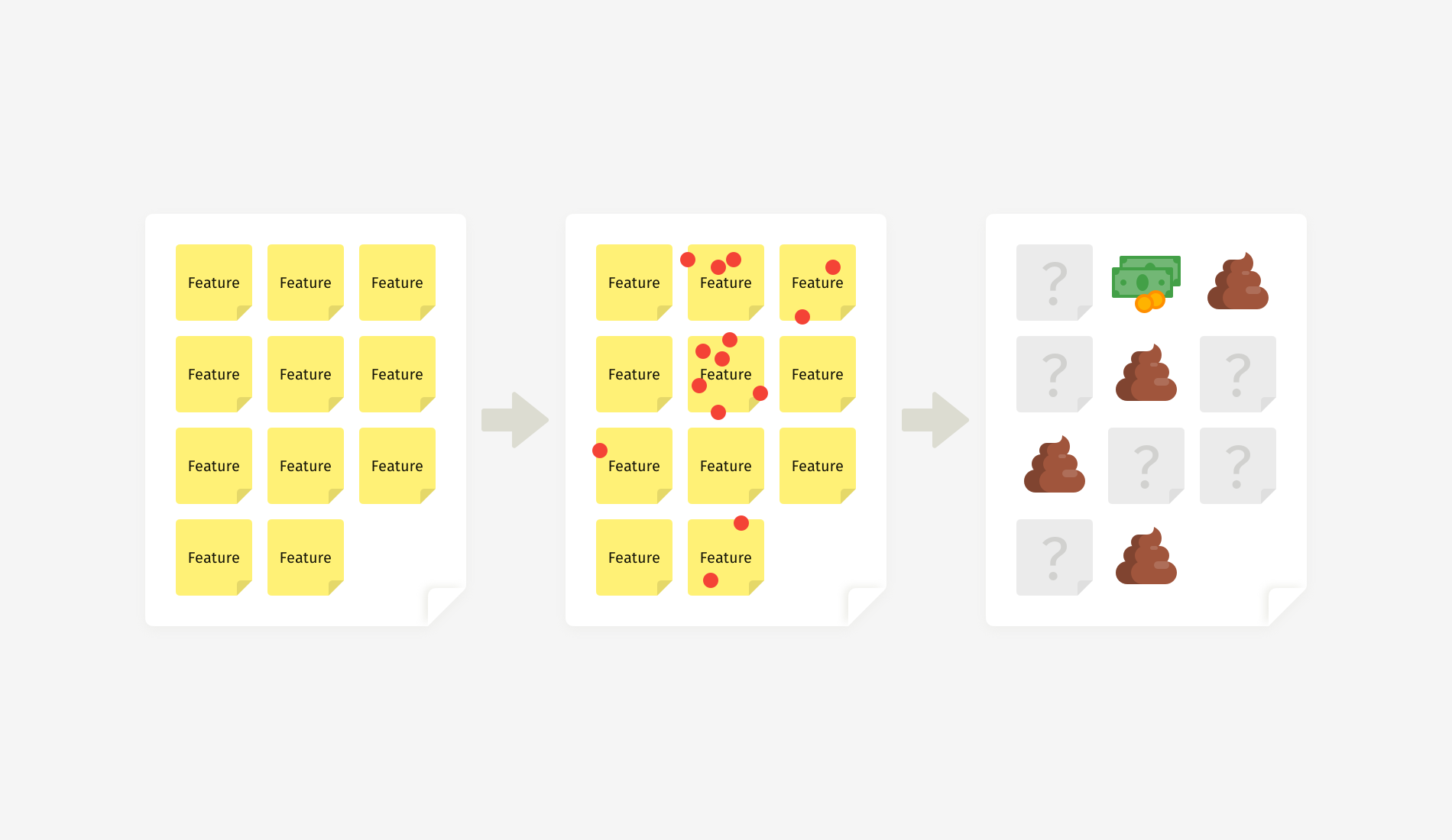
Product teams strive to make the right trade-offs and marry an infinite number of options with limited resources. Typically, a decision appears as a result of collaborative activities, such as dot voting, the value-versus-feasibility canvas, MoSCoW, the Kano model, etc.

While these techniques were invented by different people, they essentially work the same way: Team members put sticky notes with all feature ideas on a board, and then they shortlist the most promising ones. Either participants rate the ideas with marks or votes or they arrange them along the axes according to how feasible, desirable, or innovative each feature is.

Such a manifestation of democracy works great when you involve experts — people who know the topic inside out or who, as Danish physicist Niels Bohr puts it, “have made all the mistakes that can be made in a very narrow field.” When everyone on a team is an expert, then the distribution of votes will indicate the best ideas.

But let’s be honest: Workshops often have a flavor of office politics. For example, a workshop might involve high-power stakeholders with low interest in what you are building, or you might have to invite non-essential specialists who lose motivation and affect the work of the whole team. That’s why it becomes so easy to end up with only two or three people in the room who can make informed decisions.

In real life, “popular” doesn’t equal “the best”. And as a facilitator, you’re eager to bring the strongest opinions to light, which becomes problematic when an expert’s voice weighs the same as a non-expert’s.

Challenge 2: People Don’t Decide Rationally by Default

Even if you involve experts, they could represent diverse areas and domains; thus, they’ll make choices differently. Besides, rational thinking is not the default mode, even for knowledgeable and skilled people.

Humans have to cope with many concurrent thinking processes and are exposed to over 180 cognitive biases. The priming effect is an example: What happens to a person right before a workshop will affect their behavior during the workshop. So, how do you ensure that expertise — not personal preference or emotion — drives feature prioritization?

It’s almost impossible to guess the reasoning behind each choice afterwards — unless you somehow support rational thinking in advance.

Business is not all fun and games: Teams have to make hard decisions based on data and leave their whims, tastes, and prejudices at the door. As a facilitator, you certainly don’t want to make a business decision based on what stakeholders like or how they feel at the moment, do you? But in many exercises, “I love this idea” turns out to be no less trusted than “This will help our company grow.”

Challenge 3: Measurement Units Are Open to Interpretation

Another trap in prioritization activities is the measurement system, such as:

  • numeric marks (from 1 to 5, the Fibonacci scale, etc.);
  • symbols (dots, stars, smileys, etc.);
  • metaphors (for example, pebble, rock, boulder);
  • t-shirt sizing (S, M, L, XL);
  • the position of an item on the horizontal or vertical axis of a canvas.

Getting a certain number of votes or special measurement units is intended to balance opinions during a prioritization exercise. But they don’t take into account how differently people perceive reality, not to mention cultural differences on global teams. An aspect that is critical to one person might be insignificant to another.

For example, if I hear “good” instead of “awesome” or “fantastic” from a US client, I know I’m in trouble. It means they aren’t quite satisfied. But “good” is a common expression of praise in Europe. The same goes for votes: An S-size task will mean one thing to an in-house senior back-end developer and another thing to a marketing consultant.

Moreover, many people are now Design Thinking-savvy and Agile-savvy and can subconsciously manipulate votes or intentionally exploit the vagueness of a measurement system to push their own ideas.

If an argument between team members gets out of hand, you’ll spend a lot of time in vain and won’t reach consensus on time. Or worse, the debate will end up in forced agreement of the idea advocated by the most influential stakeholder in the room. So, how can we handle prioritization better?

Overcoming Prioritization Bias

Method 1: Annotated Marks

In one of my projects, we were designing a complex solution that involved technology, business processes, and the expertise of hundreds of people worldwide. Therefore, we couldn’t narrowly define the expected value of features (like user satisfaction or usability) because it wasn’t solely about end users or interfaces.

Our team identified five stakeholder types who would benefit from the solution, and we came up with a descriptive scale to evaluate features. It took into account both stakeholder coverage and the significance of tasks that the solution could potentially help them with.

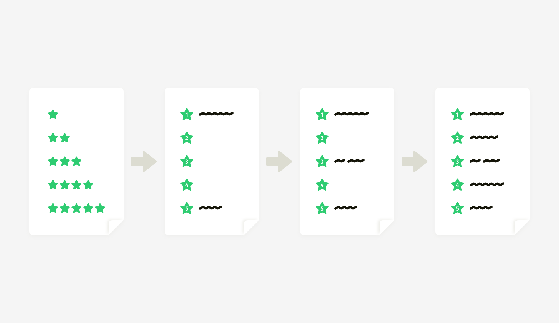
Of course, we could have used a simple scale of 1 to 5, where 1 represented the lowest value and 5 the highest. But it wouldn’t have given us clarity on what each feature’s value means in reality. Besides, evaluating items in a vacuum is always challenging. “Low” related to what? “Medium” compared to what? Such questions will undoubtedly arise.

Another example from the same project: an effort estimation scale. Again, we decided to add real-life descriptions. Instead of the abstract “low”, “medium”, and “high”, we gave marks according to how much workforce and money should be involved in the feature’s implementation. We knew that the factor that would largely determine the level of effort required was whether we could do it ourselves or do it only together with a third party.

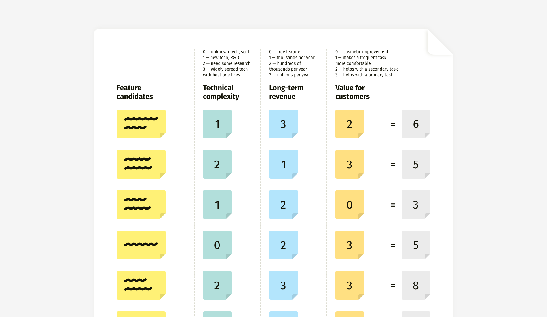
As a result, numbers gained meaning.

Later, we created a nerdy table that combined multiple characteristics. This helped us to check whether a feature had well-balanced feasibility, desirability, and profitability — simply put, whether it could be done, would be desired by customers, and would make money for the business.

Depending on your project, the criteria can vary. One project might call for you to evaluate revenue potential and implementation effort, whereas in another you might have to focus heavily on ease of adoption, expected deployment effort, and estimated cost of maintenance. In any case, the method remains the same: First, define essential criteria, then build a meaningful scale, and, finally, evaluate.

How to build such a scale? Start from the extremes — the minimal and maximal marks. What does 1 (or 0) mean? What does 5, 10, or whatever the maximum is mean?

When the minimal and maximal marks are defined (1 and 5 in the example above), you can write a description for the middle mark (3) and then for the remaining marks (2 and 4). Such an approach helps to maintain more or less equal increments between the mark definitions.

In a Nutshell
  • Method
    Add real-life descriptions to abstract numeric marks.
  • Strengths
    Clarity in selection criteria makes for easier agreement, less subjectivity, and less time spent on discussions.
  • Limitations
    Developing a meaningful scale needs time; such a scale is contextual and might not be reused for another project.

Method 2: Descriptive Canvas

This technique is a logical continuation of the previous one but adapted for use on a canvas. Unlike ranking in a table, a canvas offers more flexible representation and more distinct winners. However, with vague criteria, you run the risk of destroying the whole exercise.

The main problem with low-to-high scales is their categorical nature. No author of an idea will ever admit it is of low value. They’ll stand their ground persuading team members to put the sticky note anywhere but in the “low-low” zone. Alternatively, you might discover that all of the “outsider” ideas just belong to less powerful stakeholders.

Minimize subjectivity by using concrete descriptions, which participants can match with what they’ve experienced in previous projects. “Difficult” could mean anything, but “Needs external expertise and resources” gives a better impression of the difficulty. The same goes for the expected value: “Solves a proven critical pain” serves as a filter that won’t let people push forward ideas not backed up by any evidence — be it user research, customer support tickets, or market analysis.

This method streamlines prioritization but at the cost of some time spent on preparing the scale, particularly on formulating concise section names.

When you work with such a canvas, beware of traffic-light color-coding. It might be a decent choice for the final output presentation, but in the workshop, it will increase bias and make people unwilling to let their votes end up in the red area.

In a Nutshell
  • Method
    Add real-life descriptions to the axes of a canvas.
  • Strengths
    Clarity in mapping criteria makes for easier agreement, less subjectivity, and less time spent on discussions.
  • Limitations
    The canvas works best with three sections on each axis; scales are contextual and might not be reused in another project.

Method 3: Diversified Votes

Voting is a quick-and-dirty way to reach consensus. With anonymity, all votes are accepted and have equal weight. Voting empowers humble stakeholders and lowers hierarchical barriers. However, it also obscures the reason behind each individual choice. And the biggest challenge is that participants need to somehow weigh all possible criteria at once and choose quickly (and, hopefully, wisely).

I’ve included classic dot voting in many planning sessions with clients, and often it yielded decisions that we would completely change later. Naturally, I wanted to avoid double work. So, during one of the sessions, we tried an enhanced version and assigned specific colors to people with different expertise — green for the “keepers” of the customer’s voice, blue for people with financial thinking, and red for technical specialists who can evaluate feasibility.

First of all, this approach gave us a sense of what people might have thought about while making a choice. Secondly, we narrowed down the list of feature winners. Only a few sticky notes gained votes from all three colors and were recognized as profitable, feasible, and valuable to customers simultaneously.

This approach enabled us to focus on the best features and not be distracted by one-sidedly promising items. With classic voting, we usually had five to seven finalists. And diversified voting revealed only two or three top ideas that matched all of the criteria.

In a Nutshell
  • Idea
    Give people with different expertise dots of different colors.
  • Strengths
    It narrows down the number of final ideas; it takes into account both the number of votes and the balance of various benefits; and it remains a quick and simple exercise.
  • Limitations
    It still doesn’t fully eliminate subjectivity.

One More Thing: Language!

There is one utterance that can ruin prioritization: “Vote for the features you like the most”, or a variation, “Now choose your favorite ideas.” These words open the gates of the Hell of Subjectivity, and they grant your team an official invitation to fantasize and speculate.

Not Recommended
  • “Stick the dots on the features you like the most.”
  • “Now, please vote for the best features.”
  • “Choose the most valuable features and vote for them.”
  • “What are your favorite ideas on the whiteboard?”

Instead of giving these unhelpful instructions, put people in a rational mood and help them listen to their inner voice of reason.

Recommended
  • “Based on your knowledge and on precedents from your practice, which of the feature ideas would pay off the soonest?”
  • “Please recall a recent development project — specifically, how long it took and what slowed or blocked the work. Now, which of the feature ideas on the board would be easiest to implement?”
  • “In a minute, we’ll vote on the expected value for customers. Let’s recall what they complained about in support tickets, what they requested in interviews, and what they used the most according to our analytics. So, which of the features presented on the whiteboard address the most critical needs?”
  • “Recall your conversations with end users and recent user-research results. Which features address their most acute pains?”

Summary and Miro Templates

Subjectivity is a part of human nature. We inevitably make emotional decisions, but there are ways to make a choice a little less biased. Facilitators have no control over what is happening in experts’ minds, but we can try to put team members in the right decision-making mood. I recommend two fundamental things to streamline decision-making:

  1. Announce, repeat, and embed meaningful selection or voting criteria into your decision-making process.
  2. Push people to think about their relevant professional experience and data from prior research, rather than their own preference.

Feel free to use these Miro templates for prioritization exercises.

Organizing Brainstorming Workshops: A Designer’s Guide

Organizing Brainstorming Workshops: A Designer’s Guide

Organizing Brainstorming Workshops: A Designer’s Guide

Slava Shestopalov

When you think about the word “brainstorming”, what do you imagine? Maybe a crowd of people who you used to call colleagues, outshouting each other, assaulting the whiteboard, and nearly throwing punches to win control over the projector? Fortunately, brainstorming has a bright side: It’s a civilized process of generating ideas together. At least this is how it appears in the books on creativity. So, can we make it real?

I have already tried the three methodologies presented in this article with friends of mine, so there is no theorizing. After reaching the end of this article, I hope that you’ll be able to organize brainstorming sessions with your colleagues and clients, and co-create something valuable. For instance, ideas about a new mobile application or a design conference agenda.

Building Diverse Design Teams

What is diversity and what does it have to do with design? It’s important to understand that design is not only critical to solving problems on the product and experience level, but also relevant on a bigger scale to close social divides and to create inclusive communities. Learn more →

Universal Principles

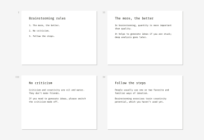
Don’t be surprised to notice all brainstorming techniques have much in common. Although “rituals” vary, the essence is the same. Participants look at the subject from different sides and come up with ideas. They write their thoughts down and then make sorting or prioritizing. I know, sounds easy as pie, doesn’t it? But here’s the thing. Without the rules of the game, brainstorming won’t work. It all boils down to just three crucial principles:

  1. The more, the better.
    Brainstorming aims at the quantity, which later turns into quality. The more ideas a team generates the wider choice it gains. It’s normal when two or more participants say the same thing. It’s normal if some ideas are funny. A facilitator’s task is encouraging people to share what is hidden in their mind.
  2. No criticism.
    The goal of brainstorming is to generate a pool of ideas. All ideas are welcome. A boss has no right to silence a subordinate. An analyst shouldn’t make fun of a colleague’s “fantastic” vision. A designer shouldn’t challenge the usability of a teammates’ suggestion.
  3. Follow the steps.
    Only a goal-oriented and time-bound activity is productive, whereas uncontrolled bursts of creativity, as a rule, fail. To make a miracle happen, organize the best conditions for it.

Here are the universal slides you can use as an introduction to any brainstorming technique.

Examples of slides that describe the three core brainstorming rules
(Large preview)

Now when the principles are clear, you are to decide who’s going to participate. The quick answer is diversity. Invite as many different experts as possible including business owners, analysts, marketers, developers, salespeople, potential or real users. All participants should be related to the subject or be interested in it. Otherwise, they’ll fantasize about the topic they’ve never dealt with and don’t want to.

One more thing before we proceed with the three techniques (Six Thinking Hats, Walt Disney’s Creative Strategy, and SCAMPER). When can a designer or other specialist use brainstorming? Here are two typical cases:

  1. There is a niche for a new product, service or feature but the team doesn’t have a concept of what it might be.
  2. An existing product or service is not as successful as expected. The team generally understands the reasons but has no ideas on how to fix it.

1. Six Thinking Hats

The first technique I’d like to present is known as “Six Thinking Hats”. It was invented in 1985 by Edward de Bono, a Maltese physician, psychologist, and consultant. Here’s a quick overview:

Complexity Normal
Subject A process, a service, a product, a feature, anything. For example, one of the topics at our session was the improvement of the designers' office infrastructure. Another team brainstormed about how to improve the functionality of the Sketch app.
Duration 1–1.5 hours
Facilitation One facilitator for a group of 5–8 members. If there are more people, better divide them into smaller groups and involve assistants. We split our design crew of over 20 people into three workgroups, which were working simultaneously on their topics.
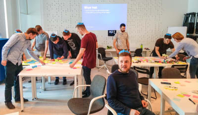
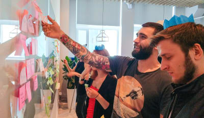
A photo of the brainstorming session using the Six Thinking Hats technique
Brainstorming workshop for the ELEKS design team (Large preview)

Materials

  • Slides with step-by-step instructions.
  • A standalone timer or laptop with an online timer in the fullscreen mode.
  • 6 colored paper hats or any recognizable hat symbols for each participant. The colors are blue, yellow, green, white, red, and black. For example, we used crowns instead of hats, and it was fun.
  • Sticky notes of 6 colors: blue, yellow, green, white, red, and brown or any other dark tint for representing black. 1–2 packs of each color per team of 5–8 people would be enough.
  • A whiteboard or a flip-chart or a large sheet of paper on a table or wall.
  • Black marker pens for each participant (markers should be whiteboard-safe if you choose this kind of surface).

Process

Start a brainstorming session with a five-minute intro. What will participants do? Why is it important? What will the outcome be? What’s next? It’s time to explain the steps. In my case, we described the whole process beforehand to ensure people get the concept of “thinking hats.” De Bono’s “hat” represents a certain way of perceiving reality. Different people are used to “wearing” one favorite “hat” most of the time, which limits creativity and breeds stereotypes.

For example, risk analysts are used to finding weaknesses and threats. That’s why such a phenomenon as gut feeling usually doesn’t ring them a bell.

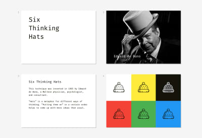
A set of slide samples for conducting a brainstorming session due to the method of Six Thinking Hats
(Large preview)

Trying on “hats” is a metaphor that helps people to start thinking differently with ease. Below is an example of the slides that explain what each “hat” means. Our goal was to make people feel prepared, relaxed, and not afraid of the procedure complexity.

A set of slide samples for conducting a brainstorming session due to the method of Six Thinking Hats
(Large preview)

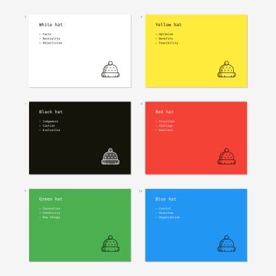
The blue “hat” is an odd one out. It has an auxiliary role and embodies the process of brainstorming itself. It starts the session and finishes it. White, yellow, black, red, and green “hats” represent different ways to interpret reality.

For example, the red one symbolizes intuitive and emotional perception. When the black “hat” is on, participants wake up their inner “project manager” and look at the subject through the concepts of budgets, schedule, cost, and revenue.

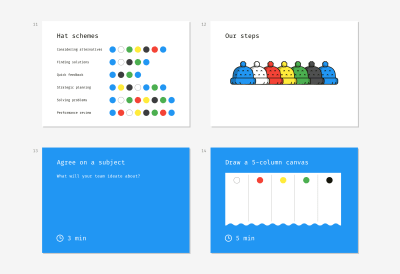
There are various schemas of “hats” depending on the goal. We wanted to try all the “hats” and chose a universal, all-purpose order:

Blue Preparation
White Collecting available and missing data
Red Listening to emotions and unproven thoughts
Yellow Noticing what is good right now
Green Thinking about improvements and innovations
Black Analyzing risks and resources
Blue Summarizing
A set of slide samples for conducting a brainstorming session due to the method of Six Thinking Hats
(Large preview)

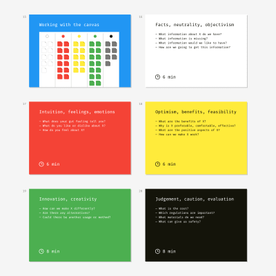
Now the exercise itself. Each slide is a cheat sheet with a task and prompts. When a new step starts and a proper slide appears on the screen, a facilitator starts the timer. Some steps have an extended duration; other steps require less time. For instance, it’s easy to agree on a topic formulation and draw a canvas but writing down ideas is a more time-consuming activity.

When participants see a “hat” slide (except the blue one), they are to generate ideas, write them on sticky notes and put the notes on the whiteboard, flip-chart or paper sheet. For example, the yellow “hat” is displayed on the screen. People put on yellow paper hats and think about the benefits and nice features the subject has now and why it may be useful or attractive. They concisely write these thoughts on the sticky notes of a corresponding color (for the black “hat” — any dark color can be used so that you don’t need to buy special white markers). All the sticky notes of the same color should be put in the corresponding column of the canvas.

A set of slide samples for conducting a brainstorming session due to the method of Six Thinking Hats
(Large preview)

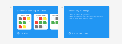
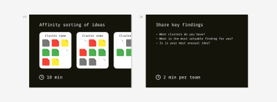
The last step doesn’t follow the original technique. We thought it would be pointless to stick dozens of colored notes and call it a day. We added the Affinity sorting part aimed at summarizing ideas and making the moment of their implementation a bit closer. The teams had to find notes about similar things, group them into clusters and give a name to each cluster.

For example, in the topic “Improvement of the designers’ office infrastructure,” my colleagues created such clusters as “Chair ergonomics,” “Floor and walls,” “Hardware upgrade.”

A set of slide samples for conducting a brainstorming session due to the method of Six Thinking Hats
(Large preview)

We finished the session with the mini-presentations of findings. A representative from each team listed the clusters they came up with and shared the most exciting observation or impression.

Walt Disney’s Creative Strategy

Walt Disney’s creative method was discovered and modeled by Robert Dilts, a neuro-linguistic programming expert, in 1994. Here’s an overview:

Complexity Easy
Subject Anything, especially projects you’ve been postponing for a long time or dreams you cannot start fulfilling for unknown reasons. For example, one of the topics I dealt with was “Improvement of the designer-client communication process.”
Duration 1 hour
Facilitation One facilitator for a group of 5–8 members. When we conducted an educational workshop on brainstorming, my co-trainers and I had four teams of six members working simultaneously in the room.
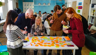
A photo of the brainstorming session using Walt Disney's Creative Strategy
Educational session on brainstorming for the Projector Design School (Large preview)

Materials

  • Slides with step-by-step instructions.
  • A standalone timer or laptop with an online timer in the fullscreen mode.
  • Standard or large yellow sticky notes (1–2 packs per team of 5–8 people).
  • Small red sticky notes (1–2 packs per team).
  • The tiniest sticky stripes or sticky dots for voting (1 pack per team).
  • A whiteboard or a flip-chart or a large sheet of paper on a table or wall.
  • Black marker pens for each participant (markers should be whiteboard-safe if you choose this kind of surface).

Process

This technique is called after the original thinking manner of Walt Disney, a famous animator and film producer. Disney didn’t use any “technique”; his creative process was intuitive yet productive. Robert Dilts, a neuro-linguistic programming expert, discovered this creative knowhow much later based on the memories of Disney’s colleagues. Although original Dilts’s concept is designed for personal use, we managed to turn it into a group format.

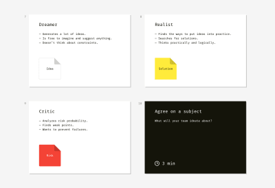
Slide examples for conducting a rainstorming workshop according to Walt Disney's Strategy
(Large preview)

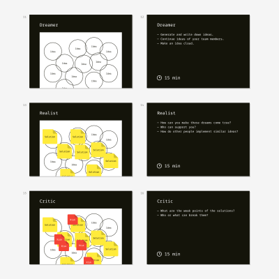
Disney’s strategy works owing to the strict separation of three roles — the dreamer, the realist, and the critic. People are used to mixing these roles while thinking about the future, and that’s why they often fail. “Let’s do X. But it’s so expensive. And risky… Maybe later,” this is how an average person dreams. As a result, innovative ideas get buried in doubts and fears.

In this kind of brainstorming, the facilitator’s goal is to prevent participants from mixing the roles and nipping creative ideas in the bud. We helped the team to get into the mood and extract pure roles through open questions on the slides and introductory explanations.

Slide examples for conducting a rainstorming workshop according to Walt Disney's Strategy
(Large preview)

For example, here is my intro to the first role:

“The dreamer is not restrained by limitations or rules of the real world. The dreamer generates as many ideas as possible and doesn’t think about the obstacles on the way of their implementation. S/he imagines the most fun, easy, simple, and pleasant ways of solving a problem. The dreamer is unaware of criticism, planning, and rationalism altogether.”

As a result, participants should have a bunch of encircled ideas.

When participants come up with the cloud of ideas, they proceed to the next step. It’s important to explain to them what the second role means. I started with the following words:

“The realist is the dreamer’s best friend. The realist is the manager who can convert a vague idea into a step-by-step plan and find necessary resources. The realist has no idea about criticism. He or she tries to find some real-world implementation for dreamer’s ideas, namely who, when, and how can make an idea true.”

Brainstormers write down possible solutions on sticky notes and put them on the corresponding idea circles. Of course, some of the ideas can have no solution, whereas others may be achieved in many ways.

Slide examples for conducting a rainstorming workshop according to Walt Disney's Strategy
(Large preview)

The third role is the trickiest one because people tend to think this is the guy who drags dreamer’s and realist’s work through the mud. Fortunately, this is not true.

I started my explanation:

“The critic is the dreamer’s and realist’s best friend. This person analyses risks and cares about the safety of proposed solutions. The critic doesn’t touch bare ideas but works with solutions only. The critic’s goal is to help and foresee potential issues in advance.”

The team defines risks and writes them down on smaller red notes. A solution can have no risks or several risks.

After that’s done, team members start voting for the ideas they consider worth further working on. They make a decision based on the value of an idea, the availability of solutions, and the severity of connected risks. Ideas without solutions couldn’t be voted for since they had no connection with reality.

During my workshops, each participant had three voting dots. They could distribute them in different ways, e.g. by sticking the dots to three different ideas or supporting one favorite idea with all of the dots they had.

Slide examples for conducting a rainstorming workshop according to Walt Disney's Strategy
(Large preview)

The final activity is roadmapping. The team takes the ideas that gained the most support (typically, 6–10) and arrange them on a timeline depending on the implementation effort. If an idea is easy to put into practice, it goes to the column “Now.” If an idea is complex and requires a lot of preparation or favorable conditions, it’s farther on the timeline.

Of course, there should be time for sharing the main findings. Teams present their timelines with shortlisted ideas and tell about the tendencies they have observed during the exercise.

SCAMPER

This technique was proposed in 1953 by Alex Osborn, best known for co-founding and leading BBDO, a worldwide advertising agency network. A quick overview:

Complexity Normal to difficult
Subject Ideally, technical or tangible things, although the author and evangelists of this method say it’s applicable for anything. From my experience, SCAMPER works less effective with abstract objects. For example, the team barely coped with the topic “Improve communication between a designer and client,” but it worked great for “Invent the best application for digital prototyping.”
Duration Up to 2 hours
Facilitation One facilitator for a group of 5–8 members
A photo of the brainstorming session using the SCAMPER technique
Brainstorming workshop for the ELEKS design team (Large preview)

Materials

  • Slides with step-by-step instructions.
  • A standalone timer or laptop with an online timer in the fullscreen mode.
  • Standard yellow sticky notes (7 packs per team of 5–8 people).
  • A whiteboard or a flip-chart or a large sheet of paper on a table or wall.
  • Black marker pens for each participant (markers should be whiteboard-safe if you choose this kind of surface).
  • Optionally: Thinkpak cards by Michael Michalko (1 pack per team).

Process

This brainstorming method employs various ways to modify an object. It’s aimed at activating the inventory thinking and helps to optimize an existing product or create a brand new thing.

Samples of slides for conducting a brainstorming workshop employing SCAMPER method
(Large preview)

Each letter in the acronym represents a certain transformation you can apply to the subject of brainstorming.

S  Substitute
C Combine
A Adapt
M Modify
P Put to other uses
E Eliminate
R Rearrange/Reverse

It’s necessary to illustrate each step with an example and ask participants to generate a couple of ideas themselves for the sake of training. As a result, you’ll be sure they won’t get stuck.

We explained the mechanism by giving sample ideas for improving such an ordinary object as a ballpoint pen.

  • Substitute the ink with something edible.
  • Combine the body and the grip so that they are one piece.
  • Adapt a knife for “writing” on wood like a pen.
  • Modify the body so that it becomes flexible — for wearing as a bracelet.
  • Use a pen as a hairpin or arrow for darts.
  • Eliminate the clip and use a magnet instead.
  • Reverse the clip. As a result, the nib will be oriented up, and the pen won’t spill in a pocket.
Samples of slides for conducting a brainstorming workshop employing SCAMPER method
(Large preview)

After the audience doesn’t have questions left, you can start. First of all, team members agree on the subject formulation. Then they draw a canvas on a whiteboard or large paper sheet.

Once a team sees one of the SCAMPER letters on the screen, they start generating ideas using the corresponding method: substitute, combine, adapt, modify, and so on. They write the ideas down and stick the notes into corresponding canvas columns.

The questions on the slides remind what each step means and help to get in a creative mood. Time limitation helps to concentrate and not to dive into discussions.

Samples of slides for conducting a brainstorming workshop employing SCAMPER method
(Large preview)

Affinity sorting — the last step — is our designers’ contribution to the original technique. It pushes the team to start implementation. Otherwise, people quickly forget all valuable findings and return to the usual state of things. Just imagine how discouraging it will be if the results of a two-hour ideation session are put on the back burner.

Samples of slides for conducting a brainstorming workshop employing SCAMPER method
(Large preview)

Thinkpak Cards

It’s a set of brainstorming cards created by Michael Michalko. Thinkpak makes a session more exciting through gamification. Each card represents a certain letter from SCAMPER. Participants shuffle the pack, take cards in turn and come up with corresponding ideas about an object. It’s fun to compete in the number of ideas each participant generates for a given card within a limited time, for instance, three or five minutes.

My friends and I have tried brainstorming both with and without a Thinkpak; it works both ways. Cards are great for training inventory thinking. If your team has never participated in brainstorming sessions, it’ll be great to play the cards first and then switch to a business subject.

Lessons Learned

  1. Dry run.
    People often become disappointed in brainstorming if the first session they participate in fails. Some people I worked with have a prejudice towards creativity and consider it the waste of time or something not proven scientifically. Fortunately, we tried all the techniques internally — in the design team. As a result, all the actual brainstorming sessions went well. Moreover, our confidence helped others to believe in the power of brainstorming exercises.
  2. Relevant topic and audience.
    Brainstorming can fail if you invite people who don’t have a relevant background or the power and willing to change anything. Once I asked a team of design juniors to ideate about improving the process of selling design services to clients. They lacked the experience and couldn’t generate plenty of ideas. Fortunately, it was a training session, and we easily changed the topic.
  3. Documenting outcomes.
    So, the session is over. Participants go home or return to their workplaces. Almost surely the next morning they will recall not a single thing. I recommend creating a wrap-up document with photos and digitized canvases. The quicker you write and share it, the higher the chances will be that the ideas are actually implemented.

Further Resources

Smashing Editorial (dm, ra, il)