Infinite-Scrolling Logos In Flat HTML And Pure CSS

When I was asked to make an auto-scrolling logo farm, I had to ask myself: “You mean, like a <marquee>?” It’s not the weirdest request, but the thought of a <marquee> conjures up the “old” web days when Geocities ruled. What was next, a repeating sparkling unicorn GIF background?

If you’re tempted to reach for the <marquee> element, don’t. MDN has a stern warning about it right at the top of the page:

Deprecated: This feature is no longer recommended. Though some browsers might still support it, it may have already been removed from the relevant web standards, may be in the process of being dropped, or may only be kept for compatibility purposes. Avoid using it, and update existing code if possible […] Be aware that this feature may cease to work at any time.”

That’s fine because whatever infinite scrolling feature <marquee> is offered, we can most certainly pull off in CSS. But when I researched examples to help guide me, I was surprised to find very little on it. Maybe auto-scrolling elements aren’t the rage these days. Perhaps the sheer nature of auto-scrolling behavior is enough of an accessibility red flag to scare us off.

Whatever the case, we have the tools to do this, and I wanted to share how I went about it. This is one of those things that can be done in lots of different ways, leveraging lots of different CSS features. Even though I am not going to exhaustively explore all of them, I think it’s neat to see someone else’s thought process, and that’s what you’re going to get from me in this article.

What We’re Making

But first, here's an example of the finished result:

See the Pen CSS only marquee without HTML duplication [forked] by Silvestar Bistrović.

The idea is fairly straightforward. We want some sort of container, and in it, we want a series of images that infinitely scroll without end. In other words, as the last image slides in, we want the first image in the series to directly follow it in an infinite loop.

So, here’s the plan: We’ll set up the HTML first, then pick at the container and make sure the images are correctly positioned in it before we move on to writing the CSS animation that pulls it all together.

Existing Examples

Like I mentioned, I tried searching for some ideas. While I didn’t find exactly what I was looking for, I did find a few demos that provided a spark of inspiration. What I really wanted was to use CSS only while not having to “clone” the marquee items.

Geoff Graham’s “Sliding Background Effect” is close to what I wanted. While it is dated, it did help me see how I could intentionally use overflow to allow images to “slide” out of the container and an animation that loops forever. It’s a background image, though, and relies on super-specific numeric values that make it tough to repurpose in other projects.

See the Pen Untitled [forked] by @css-tricks.

There’s another great example from Coding Journey over at CodePen:

See the Pen Marquee-like Content Scrolling [forked] by Coding Journey.

The effect is what I’m after for sure, but it uses some JavaScript, and even though it’s just a light sprinkle, I would prefer to leave JavaScript out of the mix.

Ryan Mulligan’s “CSS Marquee Logo Wall” is the closest thing. Not only is it a logo farm with individual images, but it demonstrates how CSS masking can be used to hide the images as they slide in and out of the container. I was able to integrate that same idea into my work.

See the Pen CSS Marquee Logo Wall [forked] by Ryan Mulligan.

But there’s still something else I’m after. What I would like is the smallest amount of HTML possible, namely markup that does not need to be duplicated to create the impression that there’s an unending number of images. In other words, we should be able to create an infinite-scrolling series of images where the images are the only child elements in the “marquee” container.

I did find a few more examples in other places, but these were enough to point me in the right direction. Follow along with me.

The HTML

Let's set up the HTML structure first before anything else. Again, I want this to be as “simple” as possible, meaning very few elements with the shortest family tree possible. We can get by with nothing but the “marquee” container and the logo images in it.

<figure class="marquee">
  <img class="marquee__item" src="logo-1.png" width="100" height="100" alt="Company 1">
  <img class="marquee__item" src="logo-2.png" width="100" height="100" alt="Company 2">
  <img class="marquee__item" src="logo-3.png" width="100" height="100" alt="Company 3">
</figure>

This keeps things as “flat” as possible. There shouldn’t be anything else we need in here to make things work.

Setting Up The Container

Flexbox might be the simplest approach for establishing a row of images with a gap between them. We don’t even need to tell it to flow in a row direction because that’s the default.

.marquee {
  display: flex;
}

I already know that I plan on using absolute positioning on the image elements, so it makes sense to set relative positioning on the container to, you know, contain them. And since the images are in an absolute position, they have no reserved height or width dimensions that influence the size of the container. So, we’ll have to declare an explicit block-size (the logical equivalent to height). We also need a maximum width so we have a boundary for the images to slide in and out of view, so we’ll use max-inline-size (the logical equivalent to max-width):

.marquee {
  --marquee-max-width: 90vw;

  display: flex;
  block-size: var(--marquee-item-height);
  max-inline-size: var(--marquee-max-width);
  position: relative;
}

Notice I’m using a couple of CSS variables in there: one that defines the marquee’s height based on the height of one of the images (--marquee-item-height) and one that defines the marquee’s maximum width (--marquee-max-width). We can give the marquee’s maximum width a value now, but we’ll need to formally register and assign a value to the image height, which we will do in a bit. I just like knowing what variables I am planning to work with as I go.

Next up, we want the images to be hidden when they are outside of the container. We’ll set the horizontal overflow accordingly:

.marquee {
  --marquee-max-width: 90vw;

  display: flex;
  block-size: var(--marquee-item-height);
  max-inline-size: var(--marquee-max-width);
  overflow-x: hidden;
  position: relative;
}

And I really like the way Ryan Mulligan used a CSS mask. It creates the impression that images are fading in and out of view. So, let’s add that to the mix:

.marquee {
  display: flex;
  block-size: var(--marquee-item-height);
  max-inline-size: var(--marquee-max-width);
  overflow-x: hidden;
  position: relative;
  mask-image: linear-gradient(
    to right,
    hsl(0 0% 0% / 0),
    hsl(0 0% 0% / 1) 20%,
    hsl(0 0% 0% / 1) 80%,
    hsl(0 0% 0% / 0)
  );
  position: relative;
}

Here’s what we have so far:

See the Pen CSS only marquee without HTML duplication, example 0 [forked] by Silvestar Bistrović.

Positioning The Marquee Items

Absolute positioning is what allows us to yank the images out of the document flow and manually position them so we can start there.

.marquee__item {
  position: absolute;
}

That makes it look like the images are completely gone. But they’re there — the images are stacked directly on top of one another.

Remember that CSS variable for our container, --marquee-item-height? Now, we can use it to match the marquee item height:

.marquee__item {
  position: absolute;
  inset-inline-start: var(--marquee-item-offset);
}

To push marquee images outside the container, we need to define a --marquee-item-offset, but that calculation is not trivial, so we will learn how to do it in the next section. We know what the animation needs to be: something that moves linearly for a certain duration after an initial delay, then goes on infinitely. Let’s plug that in with some variables as temporary placeholders.

.marquee__item {
  position: absolute;
  inset-inline-start: var(--marquee-item-offset);
  animation: go linear var(--marquee-duration) var(--marquee-delay, 0s) infinite;
}

To animate the marquee items infinitely, we have to define two CSS variables, one for the duration (--marquee-duration) and one for the delay (--marquee-delay). The duration can be any length you want, but the delay should be calculated, which is what we will figure out in the next section.

.marquee__item {
  position: absolute;
  inset-inline-start: var(--marquee-item-offset);
  animation: go linear var(--marquee-duration) var(--marquee-delay, 0s) infinite;
  transform: translateX(-50%);
}

Finally, we will translate the marquee item by -50% horizontally. This small “hack” handles situations when the image sizes are uneven.

See the Pen CSS only marquee without HTML duplication, example 2 [forked] by Silvestar Bistrović.

Animating The Images

To make the animation work, we need the following information:

  • Width of the logos,
  • Height of the logos,
  • Number of items, and
  • Duration of the animation.

Let’s use the following configurations for our set of variables:

.marquee--8 {
  --marquee-item-width: 100px;
  --marquee-item-height: 100px;
  --marquee-duration: 36s;
  --marquee-items: 8;
}

Note: I’m using the BEM modifier .marquee--8 to define the animation of the eight logos. We can define the animation keyframes now that we know the --marquee-item-width value.

@keyframes go {
  to {
    inset-inline-start: calc(var(--marquee-item-width) * -1);
  }
}

The animation moves the marquee item from right to left, allowing each one to enter into view from the right as it travels out of view over on the left edge and outside of the marquee container.

Now, we need to define the --marquee-item-offset. We want to push the marquee item all the way to the right side of the marquee container, opposite of the animation end state.

You might think the offset should be 100% + var(--marquee-item-width), but that would make the logos overlap on smaller screens. To prevent that, we need to know the minimum width of all logos combined. We do that in the following way:

calc(var(--marquee-item-width) * var(--marquee-items))

But that is not enough. If the marquee container is too big, the logos would take less than the maximum space, and the offset would be within the container, which makes the logos visible inside the marquee container. To prevent that, we will use the max() function like the following:

--marquee-item-offset: max(
  calc(var(--marquee-item-width) * var(--marquee-items)),
  calc(100% + var(--marquee-item-width))
);

The max() function checks which of the two values in its arguments is bigger, the overall width of all logos or the maximum width of the container plus the single logo width, which we defined earlier. The latter will be true on bigger screens and the former on smaller screens.

See the Pen CSS only marquee without HTML duplication, example 3 [forked] by Silvestar Bistrović.

Finally, we will define the complicated animation delay (--marquee-delay) with this formula:

--marquee-delay: calc(var(--marquee-duration) / var(--marquee-items) * (var(--marquee-items) - var(--marquee-item-index)) * -1);

The delay equals the animation duration divided by a quadratic polynomial (that’s what ChatGPT tells me, at least). The quadratic polynomial is the following part, where we multiply the number of items and number of items minus the current item index:

var(--marquee-items) * (var(--marquee-items) - var(--marquee-item-index))

Note that we are using a negative delay (* -1) to make the animation start in the “past,” so to speak. The only remaining variable to define is the --marquee-item-index (the current marquee item position):

.marquee--8 .marquee__item:nth-of-type(1) {
  --marquee-item-index: 1;
}
.marquee--8 .marquee__item:nth-of-type(2) {
  --marquee-item-index: 2;
}

/* etc. */

.marquee--8 .marquee__item:nth-of-type(8) {
  --marquee-item-index: 8;
}

Here’s that final demo once again:

See the Pen CSS only marquee without HTML duplication [forked] by Silvestar Bistrović.

Improvements

This solution could be better, especially when the logos are not equal widths. To adjust the gaps between inconsistently sized images, we could calculate the delay of the animation more precisely. That is possible because the animation is linear. I’ve tried to find a formula, but I think it needs more fine-tuning, as you can see:

See the Pen CSS only marquee without HTML duplication, example 4 [forked] by Silvestar Bistrović.

Another improvement we can get with a bit of fine-tuning is to prevent big gaps on wide screens. To do that, set the max-inline-size and declare margin-inline: auto on the .marquee container:

See the Pen CSS only marquee without HTML duplication, example 5 [forked] by Silvestar Bistrović.

Conclusion

What do you think? Is this something you can see yourself using on a project? Would you approach it differently? I am always happy when I land on something with a clean HTML structure and a pure CSS solution. You can see the final implementation on the Heyflow website.

Further Reading On SmashingMag

How to Make a “Raise the Curtains” Effect in CSS

“Raise the curtains” is what I call an effect where the background goes from dark to light on scroll, and the content on top also goes from light to dark while in a sticky position.

Here’s an example where I used the effect on a real-life project:

Want to know how it’s done? I will take you behind the curtain and show you how to raise it, with nothing but HTML and CSS.

Let’s start with the HTML

What we’re making is sort of a simplified “raise the curtain” effect like this:

Showing the raise the curtains effect from dark blue to wheat.
The background and text both change color while scrolling over the element.

I’m keeping things simple for the sake of clarity, but we can stub this out with three elements:

<div class="curtain">
  <div class="invert">
    <h2>Section title</h2>
  </div>
</div>

First, we need a container for the curtain, which we’ll give a .curtain class. Then, inside the .curtain, we have the an .invert child element that will serve as our “sticky” box. And, finally, we have the content inside this box — a good old-fashioned <h2> element for this specific example.

Let’s set up some CSS variables

There are three values we know we’ll need upfront. Let’s make CSS variables out of them so it’s easy to write them into our styles and easily change them later if we need to.

  • --minh – The height of the container
  • --color1 – The light color
  • --color2 – The dark color
:root {
  --minh: 98vh;
  --color1: wheat;
  --color2: midnightblue;
}

Time to draw the curtain

Next, we can define our .curtain element using the following techniques:

  • A linear-gradient for the “split” background
  • min-height for the extra space at the bottom of the container

We use the ::after pseudo-element to add the extra space to the bottom. This way, our “sticky” content will actually stick to the container while scrolling past the ::after element. It’s an illusion.

.curtain {
  /** create the "split" background **/
  background-image: linear-gradient(to bottom, var(--color2) 50%, var(--color1) 50%);
}

/** add extra space to the bottom (need this for the "sticky" effect) **/
.curtain::after {
  content: "";
  display: block;
  min-height: var(--minh);
}

Making sticky content

Next up, we need to make our content “sticky” in the sense that it sits perfectly inside the container as the background and text swap color values. In fact, we already gave the .curtain‘s child element an .invert class that we can use as the sticky container.

Stay with me for a moment — here’s how this is going to play out:

  • position: sticky and top define the stickiness and where it sticks.
  • mix-blend-mode: difference blends the color of the content inside the <h2> element into the .curtain‘s background gradient.
  • display: flex centers the content for presentation.
  • min-height defines the height of the container and allows for the extra space at the bottom.
  • color sets the color of the h2 heading.

Now to put that into CSS code!

.invert {
  /** make the content sticky **/
  position: sticky;
  top: 20px;

  /** blend the content with the contrast effect **/
  mix-blend-mode: difference;

  /** center the content **/
  display: flex;
  align-items: center;
  justify-content: center;
  
  /** set the minimum height of the section **/
  min-height: var(--minh);
}

h2 {
  /** set the color of the text **/
  color: var(--color1);
}

There are many things going on here, so let’s explain each one of them.

First, we have a sticky position that is self-explanatory and flexbox to help center the content. Nothing new or particularly tricky about this.

The content’s height is set using CSS variable and the value is the same height value as the .curtain::after pseudo-element.

The mix-blend-mode: difference declaration blends our content with the background. The difference value is complicated, but you might visualize it like inverted text color against the background. Here’s a nice demo from the CSS-Tricks Almanac showing off the different mix-blend-mode values:

To make the blending work, we need to set the color of our heading. In this case, we’re assigning a light color value (wheat) to the --color1 variable.

“Raise the Curtains” Demo

Gotchas

I experienced a few problems while working out the details of the “raise the curtain” effect. If you want to add images to the “sticky” content, for example, avoid using images that don’t look good when their colors are inverted. Here’s a quick demo where I made a simple SVG and transparent PNG image, and it looks good.

Another gotcha: there’s no way to set mix-blend-mode: difference on specific child elements, like headings, while avoiding the effect on images. I discovered there are several reasons why it doesn’t work, the first of which is that position: sticky cancels the blending.

The same goes when using something like transform: skewY on the container to add a little “tilt” to things. I suspect other properties don’t play well with the blending, but I didn’t go that far to find out which ones.

Here’s the demo without scrolling that removes the troubling properties:

Curtain call!

I enjoyed building this component, and I always love it when I can accomplish something using only HTML and CSS, especially when they work smoothly on every browser.

What will make with it? Is there a different way you would approach a “raise the curtain” effect like this? Let me know in the comments!


How to Make a “Raise the Curtains” Effect in CSS originally published on CSS-Tricks. You should get the newsletter.

The CSS from-font Value Explained in 4 Demos

I was doing my Advent of UI Components, and I stumbled upon the from-font value for the text-decoration-thickness CSS property. I was curious about it, so I did a little research and I think what I found (and learned) is both interesting and worth sharing.

About the from-font value

Here’s how MDN defines the from-font value:

If the font file includes information about a preferred thickness, use that value. If the font file doesn’t include this information, behave as if auto was set, with the browser choosing an appropriate thickness.

So, the from-font value is used only if the font file has the definition for the thickness of the line. Otherwise, browsers use the auto value, which tells the browser to choose the thickness. I wanted to find out how that works, so I made a few demos comparing it to the other values.

Demo 1: text-decoration-thickness: auto

In the first demo, I wanted to see how the auto value for thickness works with under, over, and strikethrough lines for the default font family.

I didn’t find anything particularly interesting here, except that some combinations don’t work very well for strikethrough text (if you ask me). For example, using a wavy decoration with strikethrough isn’t readable, but that might be the desired output in some scenarios, I guess.

Demo 2: text-decoration-thickness: 0px

In the second demo, I wanted to see how the text works with thin lines.

The lines work with paragraphs or smaller text, but the thin strikethrough line doesn’t work very well with large text as the strikethrough line is hard to detect.

Showing the from-font value on larger text. The text is black and the line through the text is thin and barely noticeable.

I also learned that you cannot set the line thickness below 1px. In the demo, the line thickness is set to 0px, but the browser renders a 1px line anyway.

Demo 3: text-decoration-thickness: from-font and font-weight

Next, I wanted to see if the text-decoration-thickness: from-font declaration changes with the font weight. On the left, the value is set to from-font; on the right, the value is set to auto.

The from-font value doesn’t seem to follow changes to the text’s font weight, at least not with when Roboto is the font family. There is no difference between how big or bold the text is set. The line thickness is the same if the value is set to from-font.

It is worth noting that Firefox renders the line thickness the same for both values, so my guess is that Firefox actually uses the from-font value for the auto value.

Demo 4: text-decoration-thickness: from-font and font-family

In this final demo, I wanted to see how the from-font value works with different font families. It doesn’t impact the paragraphs or the smaller font sizes because it renders the smallest value, 1px. The difference is visible for the bigger font sizes, like default <h1> elements, but only if you look very closely. Also, the strikethrough line is once again too thin on bigger text. This is something that font designers and developers might consider when designing and defining fonts.

Browser support

You can most certainly use the text-decoration-thickness property today since most modern browsers support this property.

So, should you use it?

Although the from-font value might seem like a good idea, I don’t think it should be used just yet. There are too many inconsistencies with the default text-decoration-thickness value across the browsers (which Šime Vidas has covered in great depth), so it is no surprise that the from-font value is still not working that well. Maybe the from-font value should be defined in percentages or some other relative unit so that it changes with the font size. Maybe font designers feel that it shouldn’t work that way. Either way, it seems like more discussion is warranted to nail down the property value’s default behavior and how it renders.

I am using the from-font value on my personal site for the link underlines in the articles, and I think it works great. The line is subtle, but it still communicates the interaction.

I look forward to seeing more options for the text-decoration-thickness in the future.


The CSS from-font Value Explained in 4 Demos originally published on CSS-Tricks. You should get the newsletter and become a supporter.

How To Build An Expandable Accessible Gallery

One of the use cases for using CSS Grid is to display a gallery of images, but a gallery on its own may not be that exciting. We could, for example, add a click effect to enlarge the image without affecting the grid to make it a little bit more fun. And of course, as to not exclude anybody from enjoying this feature, we should make it accessible, too.

In this article, I’ll explain how to build an accessible expandable gallery with a few tips and tricks along the way. Here’s how the final result looks like:

See the Pen How to build accessible expandable gallery by Silvestar Bistrović.

The HTML

First, we are going to set the HTML structure. Of course, we could always do it in various ways, but let us use a list of images wrapped in buttons.

<ul class="js-favs">
  <li>
    <button>
      <img src="/path/to/image" alt="" />
    </button>
  </li>
  ...
</ul>

Now, to make the gallery accessible, we need to make some adjustments:

  • Add the descriptive alt attribute to every image to help visually impaired people understand what is in the image;
  • Use the aria-expanded attribute which informs assistive technologies if the image is expanded or not;
  • Include role="list" to make sure assistive technologies announce the list because some screen readers might remove the list announcement.
“It’s not just using list-style: none, but any CSS that would remove the bullet or number indicators of a list’s items will also remove the semantics.”

“Fixing” Lists, Scott O’Hara

Finally, let’s add a paragraph with helpful text on how to use the gallery, and wrap the whole code in a landmark (in this case, the main element).

<main>
  <p>Use ESC to close larger picture.</p>
  <ul class="js-favs" role=”list”>
    <li>
      <button aria-expanded="false">
        <img src="/path/to/image" alt="Description of the image." />
      </button>
    </li>
    ...
  </ul>
</main>

For the simplicity of the demo, I decided to use images wrapped with the aria-expanded attribute. A better solution might be to add only image tags and then use JavaScript to wrap these images in a button with the aria-expanded attribute. This may be considered as progressive enhancement since the expanding effect wouldn’t work without JavaScript anyway.

The CSS

To define the grid layout, we could use CSS Grid. We’ll use auto-fit so that items can fit into the available space, but restrict themselves from shrinking under a certain width. This means that we’ll see a different number of items on different viewports without writing too many media queries.

:root {
  --gap: 4px;
}

ul {
  display: grid;
  grid-template-columns: repeat(1, 1fr);
  grid-gap: var(--gap);
}

@media screen and (min-width: 640px) {
  ul {
    grid-template-columns: repeat(auto-fit, minmax(300px, 1fr));
  }
}

To preserve the correct aspect ratio of the image, we could use the aspect-ratio property. To reset the button style, we could add the all: initial declaration. We should also hide the overflow of the button.

To make the image fit right into the button, we’ll use object-fit: cover declaration and set both width and height to 100%:

button {
  all: initial;
  display: block;
  width: 100%;
  aspect-ratio: 2/1;
  overflow: hidden;
  cursor: pointer;
}

img {
  height: 100%;
  width: 100%;
  object-fit: cover;
}

The expanding effect is done with the scale transformation. The transition is enabled by default, but if the user does not prefer transitions and animations, we can use the prefers-reduced-motion media query and set the transition-duration property to 0s.

:root {
  --duration-shrink: .5s;
  --duration-expand: .25s;
  --no-duration: 0s;
}

li {
  transition-property: transform, opacity;
  transition-timing-function: ease-in-out;
  transition-duration: var(--duration-expand);
}

li.is-zoomed {
  transition-duration: var(--duration-shrink);
}

@media (prefers-reduced-motion) {
  li,
  li.is-zoomed {    
    transition-duration: var(--no-duration);
  }
}
The JavaScript

Preparation

Before we make the element expandable, we need to prepare and calculate a few things.

First, we’ll need to get the duration of the transition by reading the CSS Custom Property --duration-on.

let timeout = 0

// Get the transition timeout from CSS
const getTimeouts = () => {
  const durationOn = parseFloat(getComputedStyle(document.documentElement)
    .getPropertyValue('--duration-on'));

  timeout = parseFloat(durationOn) * 1000
}

Next, we’ll set the data attributes for the later calculation:

  • the gap of the grid elements;
  • the width of a single element;
  • the number of items per row.

The first two are pretty straightforward. We could get the values from the computed CSS style.

To find the number of columns, we should iterate through each tile and compare the top position of each element. Once the top position changes, the item is in the new row, which gets us the number of items.

// Set data attributes for calculations
const setDataAttrs = ($elems, $parent) => {
  // Get the top offset of the first element
  let top = getTop($elems[0])

  // Set grid gap from CSS
  const gridColumnGap = parseFloat(getComputedStyle(document.documentElement)
    .getPropertyValue('--gap'))
  $parent.setAttribute('data-gap', gridColumnGap)

  // Set grid item width from CSS
  const eStyle = getComputedStyle($elems[0])
  $parent.setAttribute('data-width', eStyle.width)

  // Iterate through grid items
  for (let i = 0; i < $elems.length; i++) {
    const t = getTop($elems[i])

    // Check when top offset changes
    if (t != top) {
      // Set the number of columns and break stop the loop
      $parent.setAttribute('data-cols', i)
      break;
    }
  }
}

Expanding Direction

To achieve the expandable effect, we should make some checks and calculations first. First, we should check if the item is in the last row and at the end of the row. If the item is in the last row, it should expand to the top. That means it should have the transform-origin property set to the bottom value.

Important: If the element should expand to one direction, its transform-origin property should be set to an “opposite” value. Note that vertical and horizontal values should be combined.

// Set active item
const activateElem = ($elems, $parent, $elem, $button, lengthOfElems, i) => {
  // Get data attributes from parent
  const cols = parseInt($parent.getAttribute('data-cols'))
  const width = parseFloat($parent.getAttribute('data-width'))
  const gap = parseFloat($parent.getAttribute('data-gap'))

  // Calculate the number of rows
  const rows = Math.ceil(lengthOfElems / cols) - 1

  // Calculate if the item is in the last row
  const isLastRow = i + 1 > rows * cols
  // Set default transform direction to top (expand down) 
  let transformOrigin = 'top'

  if (isLastRow) {
    // If the item is in the last row, set transform direction to bottom (expand up) 
    transformOrigin = 'bottom'
  }

  // Calculate if the item is the most right
  const isRight = (i + 1) % cols !== 0

  if (isRight) {
    // If the item is the most right, set transform direction to left (expand right) 
    transformOrigin += ' left'
  } else {
    // If the item is the most right, set transform direction to right (expand left) 
    transformOrigin += ' right'
  }

  $elem.style.transformOrigin = transformOrigin
}

Expanding Effect

To enlarge the image without affecting the grid, we could use CSS transforms. In particular, we should use the scale transformation. I decided to make the image double in size, i.e. the factor is the ratio of the double width of the element plus grid-gap.

// Calculate the scale coefficient
const scale = (width * 2 + gap) / width

// Set item CSS transform
$elem.style.transform = `scale(${scale})`

Keyboard Support

Users who navigate sites by using a keyboard should be able to use the gallery. Going through the list works by default when using key Tab. Emulating the click works by default by pressing the Enter key while the item is focused. To enhance the default behavior, we should add support for Esc and the arrow keys.

Once we expand the item, pressing Esc should revert it to its standard size. We could do it by checking the code of the pressed key. The same goes for arrow keys, but the action is different. When pressing arrow keys, we want to get the previous or next sibling and then emulate the click on that element.

// Set sibling as an active item
const activateSibling = ($sibling) => {
  // Find anchor
  const $siblingButton = $sibling.querySelector('button')

  // Unset global active element
  $activeElem = false

  // Focus and click on current
  $siblingButton.focus()
  $siblingButton.click()
}

// Set keyboard events
const setKeyboardEvents = () => {
  document.addEventListener('keydown', (e) => {
    // Take action only if global active element exists
    if ($activeElem) {
      // If key is “escape”, emulate the click on the global active element
      if (e.code === 'Escape') {
        $activeElem.click()
      }

      // If key is “left arrow”, activate the previous sibling
      if (e.code === 'ArrowLeft') {
        const $previousSibling = $activeElem.parentNode.previousElementSibling

        if($previousSibling) {
          activateSibling($previousSibling)
        }
      }

      // If key is “right arrow”, activate the next sibling
      if (e.code === 'ArrowRight') {
        const $nextSibling = $activeElem.parentNode.nextElementSibling

        if($nextSibling) {
          activateSibling($nextSibling)
        }
      }
    }
  })
}

Toggling

To make the gallery element expanded, we should deactivate all other elements first. Then, if we click on the expanded element, it should revert to the standard size.

let $activeElem = false

// Deactivate grid items
const deactiveElems = ($elems, $parent, $currentElem, $button) => {
  // Unset parent class
  $parent.classList.remove('is-zoomed')

  for (let i = 0; i < $elems.length; i++) {
    // Unset item class
    $elems[i].classList.remove('is-zoomed')
    // Unset item CSS transform
    $elems[i].style.transform = 'none'

    // Skip the rest if the item is the current item
    if ($elems[i] === $currentElem) {
      continue
    }

    // Unset item aria expanded if element exists
    if($button) {
      $button.setAttribute('aria-expanded', false)
    }
  }
}

// Set active item
const activateElem = ($elems, $parent, $elem, $button, lengthOfElems, i) => {
  ...

  // Reset all elements
  deactiveElems($elems, $parent, $elem, $button)

  if ($activeElem) {
    $activeElem = false
    return
  }

  $activeElem = $button

  ...
}


// Set click events on anchors
const setClicks = ($elems, $parent) => {
  $elems.forEach(($elem, i) => {
    // Find anchor
    const $button = $elem.querySelector('button')

    $button.addEventListener('click', (e) => {
      // Set active item on click
      activateElem($elems, $parent, $elem, $button, $elems.length, i)
    })
  })
}

Z-index Issues

To prevent issues with z-index and stacking context, we should use the timeout to delay the transform. That is the same timeout that we calculated in the preparation phase.

// Deactivate grid items
const deactiveElems = ($elems, $parent, $currentElem, $button) => {
  for (let i = 0; i < $elems.length; i++) {
    ...

    // After a half of the timeout, reset CSS z-index to avoid overlay issues
    setTimeout(() => {
      $elems[i].style.zIndex = 0
    }, timeout)
  }
}

// Set active item
const activateElem = ($elems, $parent, $elem, $button, lengthOfElems, i) => {
  ...
  setTimeout(() => {
    // Set parent class
    $parent.classList.add('is-zoomed')
    // Set item class
    $elem.classList.add('is-zoomed')
    // Set item CSS transform
    $elem.style.transform = `scale(${scale})`
    // Set item aria expanded
    $button.setAttribute('aria-expanded', true)
    // Set global active item
    $activeElem = $button
  }, timeout)
}

Viewport Resizing

If the viewport changes the size, we need to recalculate defaults because we defined a fluid grid that allows items to fill the available space and move from row to row.

// Set resize events
const setResizeEvents = ($elems, $parent) => {
  window.addEventListener('resize', () => {
    // Set data attributes for calculations
    setDataAttrs($elems, $parent)
    // Deactivate grid items
    deactiveElems($elems, $parent)
  })
}
A Word About Accessibility And Credits

I had no problems building this demo except with the accessibility part. I was not sure what to do and which aria attributes to use at first. Even after figuring out which attributes to use, I could not be 100% sure it was right. So the first step was to test everything with a keyboard. That was the easy part. Then I used the VoiceOver application (since I am using a Mac) to test how it works for visually impaired persons. It sounded good enough to me.

However, even after all that testing, I was still not 100% sure. So I decided to ask for help. I am a part of one Slack community for designers and developers (BoagWorld), and I posted a question there. Fortunately, accessibility experts like Todd Libby helped me test the demo on different devices and correct the code. I also asked Manuel Matuzović for help and he helped me clean up the code.

I’m grateful to have the Internet and developer communities where we can all ask for help, get answers from professionals, and solve problems together. That is especially true with sensitive issues like accessibility. Accessibility is hard, and it does not take much to make it wrong. Less is more — at least it was in my case.

And finally, I wanted to share the greatest lesson:

“If you can use a native HTML element [HTML51] or attribute with the semantics and behavior you require already built-in, instead of re-purposing an element and adding an ARIA role, state or property to make it accessible, then do so.”

First Rule of ARIA Use, W3C Working Draft 27 (Sept. 2018)

Further Reading on Smashing Magazine

How to Get Sticky and Full-Bleed Elements to Play Well Together

I had a unique requirement the other day: to build a layout with full-bleed elements while one element stays stuck to the top. This ended up being rather tricky to pull off so I’m documenting it here in case anyone needs to re-create this same effect. Part of the trickiness was dealing with logical positioning on small screens as well.

It’s tough to describe the effect, so I recorded my screen to show what I mean. Pay special attention to the main call to action section, the one with the “Try Domino Today” header.

The idea is to display the main call to action on the right side while users scroll past other sections on larger viewports. On smaller viewports, the call to action element has to display after the main hero section with the “Start your trial” header.

There are a two main challenges here:

  • Make full-bleed elements that don’t interfere with the sticky element
  • Avoid duplicating the HTML

Before we dive into a couple of possible solutions (and their limitations), let’s first set up the semantic HTML structure.

The HTML

When building these kinds of layouts, one might be tempted to build duplicate call-to-action sections: one for the desktop version and the other for the mobile version and then toggle the visibility of them when appropriate. This avoids having to find the perfect place in the HTML and needing to apply CSS that handles both layout needs. I must admit, I am guilty of doing that from time to time. But this time, I wanted to avoid duplicating my HTML.

The other thing to consider is that we’re using the sticky positioning on the .box--sticky element, which means it needs to be the sibling of other elements, including full-bleed ones, for it to properly work.

Here’s the markup:

<div class="grid">

  <div class="box box--hero">Hero Box</div>

  <div class="box box--sticky">Sticky Box</div>

  <div class="box box--bleed">Full-bleed Box</div>
  <div class="box box--bleed">Full-bleed Box</div>
  <!-- a bunch more of these -->

</div>

Let’s get sticky

Making sticky elements in a CSS grid layout is pretty straightforward. We add position: sticky to the .box--sticky element with a top: 0 offset, indicating where it starts to stick. Oh, and notice that we’re only making the element sticky on viewports larger that 768px.

@media screen and (min-width: 768px) {
  .box--sticky {
    position: sticky;
    top: 0;
  }
}

Beware that there is a known issue with sticky positioning in Safari when it’s used with overflow: auto. It is documented over at caniuse in the known issues section:

A parent with overflow set to auto will prevent position: sticky from working in Safari.

Nice, that was easy. Let’s solve the challenge of full-bleed elements next.

Solution 1: Pseudo-elements

The first solution is something I use often: absolutely positioned pseudo-elements that stretch from one side to side. The trick here is to use a negative offset.

If we are talking about centered content, then the calculation is quite straightforward:

.box--bleed {
  max-width: 600px;
  margin-right: auto;
  margin-left: auto;
  padding: 20px;
  position: relative; 
}

.box--bleed::before {
  content: "";
  background-color: dodgerblue; 
  position: absolute;
  top: 0;
  bottom: 0;
  right: calc((100vw - 100%) / -2);
  left: calc((100vw - 100%) / -2);
}

In short, the negative offset is the width of the viewport, 100vw, minus the width of the element, 100%, and then divided by -2, because we need two negative offsets.

Beware that there is a known bug when using 100vw, that is also documented over at caniuse:

Currently all browsers but Firefox incorrectly consider 100vw to be the entire page width, including vertical scroll bar, which can cause a horizontal scroll bar when overflow: auto is set.

Now let’s make full-bleed elements when the content is not centered. If you watch the video again, notice that there is no content below the sticky element. We don’t want our sticky element to overlap the content and that is the reason why be don’t have centered content in this particular layout.

First, we are going to create the grid:

.grid {
  display: grid;
  grid-gap: var(--gap);
  grid-template-columns: var(--cols);
  max-width: var(--max-width);
  margin-left: auto;
  margin-right: auto;
}

We’re using custom properties which allows us to redefine the maximum width, the gap, and grid columns without redeclaring the properties. In other words, instead of redeclaring the grid-gap, grid-template-columns, and max-width properties, we are re-declaring variable values:

:root {
  --gap: 20px;
  --cols: 1fr;
  --max-width: calc(100% - 2 * var(--gap));
}

@media screen and (min-width: 768px) {
  :root {
    --max-width: 600px;
    --aside-width: 200px;
    --cols: 1fr var(--aside-width);
  }
}

@media screen and (min-width: 980px) {
  :root {
    --max-width: 900px;
    --aside-width: 300px;
  }
}

On viewports that are 768px wide and above, we have defined two columns: one with a fixed width, --aside-width, and one with that fills the remaining space, 1fr, as well as maximum width of the grid container, --max-width.

On viewports smaller than 768px, we have defined a single column and the gap. The maximum width of the grid container is 100% of the viewport, minus gaps on each side.

Now comes the fun part. The content isn’t centered on bigger viewports, so the calculation isn’t as straightforward as you might think. Here’s how it looks:

.box--bleed {
  position: relative;
  z-index: 0;
}

.box--bleed::before {
  content: "";
  display: block;
  position: absolute;
  top: 0;
  bottom: 0;
  left: calc((100vw - (100% + var(--gap) + var(--aside-width))) / -2);
  right: calc(((100vw - (100% - var(--gap) + var(--aside-width))) / -2) - (var(--aside-width)));
  z-index: -1;
}

Instead of using 100% of the parent’s width, we’re taking into account the widths of the gap and the sticky element. That means width of the content in full-bleed elements will not exceed the bounds of the hero element. That way, we ensure the sticky element won’t overlap any important piece of information.

The left offset is simpler because we only need to subtract the width of the element (100%), the gap (--gap), and the sticky element (--aside-width) from the viewport width (100vw).

left: (100vw - (100% + var(--gap) + var(--aside-width))) / -2);

The right offset is more complicated because we have to add the width of the sticky element to the previous calculation, --aside-width, as well as the gap, --gap:

right: ((100vw - (100% + var(--gap) + var(--aside-width))) / -2) - (var(--aside-width) + var(--gap));

Now we are sure the sticky element doesn’t overlap any content in full-bleed elements.

Here’s the solution with a horizontal bug:

And here’s the solution with a horizontal bugfix:

The fix is to hide overflow on the x-axis of the body, which might be a good idea in general anyway:

body {
  max-width: 100%;
  overflow-x: hidden;
}

This is a perfectly viable solution and we could end here. But where’s the fun in that? There’s usually more than one way to accomplish something, so let’s look at another approach.

Solution 2: Padding calculations

Instead of using a centered grid container and pseudo elements, we could achieve the same effect by configuring our grid. Let’s start by defining the grid just as we did last time:

.grid {
  display: grid;
  grid-gap: var(--gap);
  grid-template-columns: var(--cols);
}

Again, we are using custom properties to define the gap and the template columns:

:root {
  --gap: 20px;
  --gutter: 1px;
  --cols: var(--gutter) 1fr var(--gutter);
}

We’re showing three columns on viewports smaller than 768px. The center column takes as much space as possible, while the other two are used only to force the horizontal gap.

@media screen and (max-width: 767px) {
  .box {
    grid-column: 2 / -2;
  }
}

Note that all grid elements are placed in the center column.

On viewports bigger than 768px, we are defining a --max-width variable that limits the width of the inner columns. We’re also defining --aside-width, the width of our sticky element. Again, this way we ensure the sticky element won’t be positioned over any content inside the full-bleed elements.

:root {
  --gap: 20px;
}

@media screen and (min-width: 768px) {
  :root {
    --max-width: 600px;
    --aside-width: 200px;
    --gutter: calc((100% - (var(--max-width))) / 2 - var(--gap));
    --cols: var(--gutter) 1fr var(--aside-width) var(--gutter);
  }
}

@media screen and (min-width: 980px) {
  :root {
    --max-width: 900px;
    --aside-width: 300px;
  }
}

Next, we are calculating the gutter width. The calculation is:

--gutter: calc((100% - (var(--max-width))) / 2 - var(--gap));

…where 100% is the viewport width. First, we are subtracting the maximum width of the inner columns from the width of the viewport. Then, we are dividing that result by 2 to create the gutters. Finally, we are subtracting the grid’s gap to get the correct width of the gutter columns.

Now let’s push the .box--hero element over so it starts at the first inner column of the grid:

@media screen and (min-width: 768px) {
  .box--hero {
    grid-column-start: 2;
  }
}

This automatically pushes the sticky box so it starts right after the hero element. We could also explicitly define the placement of the sticky box, like this:

.box--sticky {
  grid-column: 3 / span 1;
}

Finally, let’s make the full-bleed elements by setting grid-column to 1 / -1. That tells the elements to start the content at the first grid item and span through to the last one.

@media screen and (min-width: 768px) {  
  .box--bleed {
    grid-column: 1 / -1;
  }
}

To center the content, we are going to calculate left and right padding. The left padding is equal to the size of the gutter column, plus the grid gap. The right padding is equal to the size of the left padding, plus another grid gap as well as the width of the sticky element.

@media screen and (min-width: 768px) {
  .box--bleed {  
    padding-left: calc(var(--gutter) + var(--gap));
    padding-right: calc(var(--gutter) + var(--gap) + var(--gap) + var(--aside-width));
  }
}

Here’s the final solution:

I prefer this solution to the first one because it isn’t using buggy viewport units.


I love CSS calculations. Using mathematical operations is not always straightforward, especially when combining different units, like 100%. Figuring out what 100% means is half of the effort.

I also love solving simple, yet complicated layouts, like this one, using only CSS. Modern CSS has native solutions — like grid, sticky positioning and calculations — that remove complicated and somewhat heavy JavaScript solutions. Let’s leave the dirty work for the browser!

Do you have a better solution or different approach for this? I would be happy to hear about it.


The post How to Get Sticky and Full-Bleed Elements to Play Well Together appeared first on CSS-Tricks.

You can support CSS-Tricks by being an MVP Supporter.

A Comparison of Static Form Providers

Let’s attempt to coin a term here: "Static Form Provider." You bring your HTML <form>, but don’t worry about the back-end processing that makes it work. There are a lot of these services out there!

Static Form Providers do all tasks like validating, storing, sending notifications, and integrating with other APIs. It’s lovely when you can delegate big responsibilities like this. The cost? Typically a monthly or annual subscription, except for a few providers and limited plans. The cost is usually less than fancier "form builders" that help you build the form itself and process it.

In this article, we are going to review some of the most popular static form providers:

Before moving forward, just a note that the information for these comparisons came from visiting the site for each product and learning about the included features. Once I got all the information, I sent an email to each provider to confirm the list of features. Some of them confirmed, some didn't. Special thanks to Kwes, FormKeep, Formspree, FormSubmit, formX, and Netlify Forms teams for confirming.

Form building components and validation

Name Custom Components Front-End Validation Back-End Validation
Kwes
Basin
FieldGoal Unable to confirm Unable to confirm Unable to confirm
FormCarry
FormKeep
Formspree
FormSubmit
formX
Getform
Netlify Forms

Components for building a form are HTML input elements, like text inputs, textareas, checkboxes, and radio buttons. When using a static form, most providers require adding custom HTML attributes. By providing the custom URL in the form action attribute, the form gets submitted on the provider’s side where it gets stored.

If you are looking for a form builder, FormKeep has a form designer feature. That means you embed custom HTML and JavaScript files in the page, and you get a styled form. Otherwise, you have to style the form by yourself.

If you need custom components, like a date picker or card inputs, Kwes and FormKeep are the only providers with this feature. If you want to validate input fields in the browser, you might use third-party libraries or writing your code which means adding additional JavaScript code to the site. Kwes is the only provider that supports front-end validation based on the rules you set in each input component. To enable this feature, you should include additional JavaScript file, which you might do nevertheless. Other static form providers rely only on HTML5 validation.

Kwes is the only provider with back-end validation, too. The rules you set in the front end are passed to the back end side. In case when front-end validation fails, you are safe, the backend validation would work. Other providers don't have this feature; they rely only on spam protection.

Spam protection

Name Spam Protection
Kwes Artificial intelligence
Automatic Honeypot
Blacklists
Proprietary technology
Basin Akismet
CleanTalk
reCAPTCHA
Honeypot
FieldGoal Provided, but unable to confirm what powers it
FormCarry Akismet
reCAPTCHA
FormKeep Akismet
reCAPTCHA
Honeypot
Proprietary technology
Formspree reCaptcha
Profanity filter
Automated classification
FormSubmit reCaptcha
Honeypot
formX reCAPTCHA
Honeypot
Getform Akismet
reCAPTCHA
Netlify Forms Akismet
reCAPTCHA
Honeypot

Kwes advertises a 99.6% spam block success rate with no setup required.

Once your form is ready for submissions, you might find it hard to deal with spam. That’s why spam protection is essential, especially if you want to keep your sanity and serenity. All providers provide spam protection in this way or another. Some rely on Google reCAPTCHA or Akismet, some on Honeypot techniques, and some use artificial intelligence to get the job done. It is worth noting that adding an additional step to your form, like adding reCAPTCHA might affect the conversion rates on form submissions.

Email notifications

Name Confirmations Notifications Email Routing Logic
Kwes
Basin
FieldGoal Unable to confirm Unable to confirm Unable to confirm
FormCarry
FormKeep
Formspree
FormSubmit
formX
Getform
Netlify Forms

Email confirmations are essential if you want to provide a fast response to your users. With a contact form, for example, you want to get an email for every new submission. That way, you're able to respond to the submission quickly and efficiently.

All providers, except FieldGoal, have confirmation, notification, and email routing logic features. You could set up an email form element which would be used to send an email automatically to the user with confirmation about the submission.

Some providers have other sorts of notifications besides email, like push notifications or Slack messages, which might be handy.

White labeling

Name White Label
Kwes
Basin
FieldGoal Unable to confirm
FormCarry
FormKeep
Formspree
FormSubmit
formX
Getform
Netlify Forms

When communicating via email notifications with your clients, you might want to use your brand and style. It creates better awareness and that way you familiarize your clients with your product. All providers offer this feature, with the exception of FieldGoal, which I was unable to confirm (although it might be under paid plans).

Custom redirects

Name Custom Redirects
Kwes
Basin
FieldGoal Unable to confirm
FormCarry
FormKeep
Formspree
FormSubmit
formX
Getform
Netlify Forms

Once you have captured a response from your user, you may want to let the user continue using your site. Also, you might want to communicate to the user that the submission was received. This feature is called "custom redirect," and every provider has this feature (with another exception for FieldGoal because I was unable to confirm). Note that this feature might not be available in a free plan and require a paid or upgraded account.

Upload storage

Name Upload Storage
Kwes 200MB per file
20GB storage
Basin 100MB per submission
FieldGoal Amazon S3
FormCarry 5MB per file
5GB storage
FormKeep 2.5G storage
Formspree 10MB per file
10GB storage
FormSubmit Included, but unconfirmed storage amounts
formX
Getform 25MB per submission
25GB storage
Netlify Forms 1GB storage

Not every static form provider provides file storage. For example, formX doesn't provide it at all. In most cases, this feature is available under paid plans. You might want to invest additional time to find out which provider offers the best service for you. Be sure to look specifically at single file size and form submission size limitations.

Data export

Name Data Export
Kwes
Basin
FieldGoal Unable to confirm
FormCarry
FormKeep
Formspree
FormSubmit
formX
Getform
Netlify Forms

Data export is important feature if you want to use it for analysis or for import to third-party software. Most providers offers CSV and JSON exports, which are the most commonly used ones.

API access

Name API Access
Kwes
Basin
FieldGoal Unable to confirm
FormCarry
FormKeep
Formspree
FormSubmit
formX On demand
Getform
Netlify Forms

If you want to control your data submissions by building custom application or script, you might benefit from having API access. Most providers have this feature, except Getform. formX offers it, but only on demand.

Webhooks/Zapier

Name Webhooks Zapier
Kwes
Basin
FieldGoal Unable to confirm
FormCarry
FormKeep
Formspree
FormSubmit
formX
Getform
Netlify Forms

When building a custom application or a script is out of budget, you might want to use webhooks to integrate data submissions with third-party software. Zapier is one of the most commonly used services for this, and only FormSubmit doesn't support it (though it does support webhooks).

Analytics

Name Analytics
Kwes
Basin
FieldGoal Unable to confirm
FormCarry
FormKeep
Formspree
FormSubmit
formX
Getform
Netlify Forms

Analytics for static forms is a neat feature that could offer beneficial insight into how your form is performing. It may help you understand how your users interact with it, and you may spot ways to improve the form submission experience as a result. This feature is the least supported of all other features. Only Basin, FormKeep, and formX provide it.

Plan comparison

Name Plan 1 Plan 2 Plan 3 Plan 4
Kwes Free Tier
$0/mo.
Build spam-protected, and validated forms quicker than ever.

1 Website
Unlimited Forms
50 Spam Blocks

Bronze Tier
$9/mo.
Unlimited spam blocks, more form tools, and submissions.
1 Website
Unlimited Forms
Unlimited Spam Blocks
Silver Tier
$29/mo.
Build more powerful forms with integrations and webhooks.
3 Websites
Unlimited Forms
Unlimited Spam Blocks
4 Users
Gold Tier
$79/mo.
Enjoy more team members and everything with increased limits.
10 Websites
Unlimited Forms
Unlimited Spam Blocks
11 Users
Basin Standard Tier
$4.17/mo. (billed annually)
Premium Tier
$12.50/mo. (billed annually)
FieldGoal Single Tier
1 form
$5/mo.
Freelancer Tier
5 forms
$15/mo.
Studio Tier
15 forms
$39/mo.
Agency Tier
50 forms
$79/mo.
FormCarry Baby Tier
Free
Basic Tier
$15/mo.
Growth Tier
$40/mo.
FormKeep Starter Tier
$4.99/mo.
Starter Pack
$7.50 per form per month
Freelancer Tier
$5.90 per form per month
Agency Tier
$3.30 per form per month
Formspree Free Tier
$0/mo.
Gold Tier
$10/mo.
Platform Tier
$40/mo.
FormSubmit Unlimited
formX Free Tier
$0/mo.
100 submissions max.
Starter Tier
$4.99/mo.
SMBs & Freelancers
$49.99/mo.
Business & Agencies
$99.99/mo.
Getform Free Tier
$0/mo.
Basic Tier
Perfect for small businesses
$7.5/mo.
$90 per year
Agency Tier
$24/mo.
$290 annually
Enterprise Tier
$57.5/mo.
$690 annually
Netlify Forms Level 0
$0
100 submissions/mo.
10MB uploads/mo.
Level 1
$19/mo. per site
1,000 submissions/mo.
1GB uploads/mo.
Level 2
Custom pricing and limits

Static form providers have different plans, from entirely free plans and trials, to enterprise plans for every business need. Depending on a plan, you might have different features enabled. For example, FormSubmit is the only provider that offers all of its features for free, though it doesn't support every feature we've covered here. You will want to invest some time to learn about which features that are most important for you and your product or business. Then go ahead and decide on which provider is most suitable for your needs.

Wrapping up

Having a form of any kind is a must-have for a large number of sites. When you use a static site generator, you might discover that static form providers make adding forms to a site almost trivial. By following a few rules for enabling static forms, you could benefit from essential features like spam protection and email notifications.

I have been using Kwes for a while now and I can honestly tell you it is a great product that fulfills all of my needs. It has smart spam protection, an easy-to-use dashboard, and impressive validation, both on the front end and back end.

Before choosing your static form providers, be sure to put down all requirements to the paper, and then find your perfect provider.

The post A Comparison of Static Form Providers appeared first on CSS-Tricks.

My Favorite Netlify Features

👋 Hey folks! Silvestar pitched this post to us because he is genuinely enthusiastic about JAMstack and all of the opportunities it opens up for front-end development. We wanted to call that out because, although some of the points in here might come across as sponsored content and Netlify is indeed a CSS-Tricks sponsor, it’s completely independent of Netlify.

Being a JAMstack developer in 2019 makes me feel like I am living in a wonderland. All these modern frameworks, tools, and services make our lives as JAMstack developers quite enjoyable. In fact, Chris would say they give us superpowers.

Yet, there is one particular platform that stands out with its formidable products and features — Netlify. You’re probably pretty well familiar with Netlify if you read CSS-Tricks regularly. There’s a slew of articles on it. There are even two CSS-Tricks microsites that use it.

This article is more of a love letter to Netlify and all of the great things it does. I decided to sit down and list my most favorite things about it. So that’s what I’d like to share with you here. Hopefully, this gives you a good idea not only what Netlify is capable of doing, but helps you get the most out of it as well.

You can customize your site’s Netlify subdomain.

When creating a new project on Netlify, you start by either:

  • choosing a repository from a Git provider, or
  • uploading a folder.

The project should be ready in a matter of minutes, and you could start configuring it for your needs right away. Start by choosing the site name.

The site name determines the default URL for your site. Only alphanumeric characters and hyphens are allowed.

Netlify randomly creates a default name for a new project. If you don’t like the name, choose your own and make it one that would be much easier for you to remember.

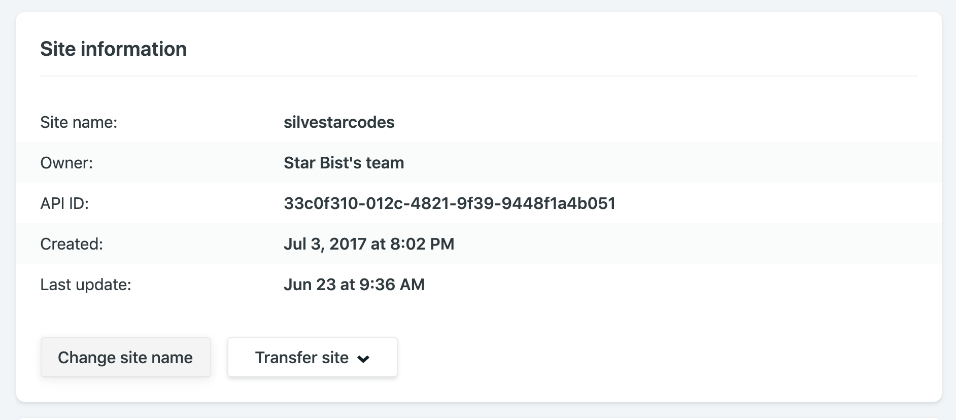
The "Site information" section of the Netlify dashboard.

For example, my site name is silvestarcodes, and I could access my site by visiting silvestarcodes.netlify.com.

You can manage all your DNS on Netlify.

If you are setting up an actual site, you would want to add a custom domain. From the domain management panel, go to the custom domains section, click on the "Add custom domain" button, enter your domain, and click the "Verify" button.

Now you have two options:

  1. Point your DNS records to Netlify load balancer IP address
  2. Let Netlify handle your DNS records

For the first option, you could read the full instructions in the official documentation for custom domains.

For the second option, you should add or update the nameservers on your domain registrar. If you didn’t buy the domain already, you could register it right from the dashboard.

Netlify has a service for provisioning DNS records called Netlify DNS.

Once you have configured the custom domain, you could handle your DNS records from the Netlify dashboard.

The "DNS" section of the Netlify dashboard.

If you want to set up a dev subdomain for your dev branch to preview development changes for your site, you could do it automatically. From the Domain Management section in the Settings section of your site, select the dev branch and Netlify would add a new subdomain dev for you automagically. Now you could see the previews by visiting dev subdomain.

The "Subdomains" section of the Netlify dashboard.

You could configure a subdomain for a different website. To achieve this, create a new Netlify site, enter a new subdomain as a custom domain, and Netlify would automatically add the records for you.

As an icing on the DNS management cake, Netlify lets you create Let’s Encrypt certificates for your domain automatically... for free.

You can inject snippets into pages, which is sort of like a Tag Manager.

Snippet injection is another excellent feature. I am using it mostly for inserting analytics, but you could use it for adding meta tags for responsive behavior, favicon tags, or Webmention.io tags.

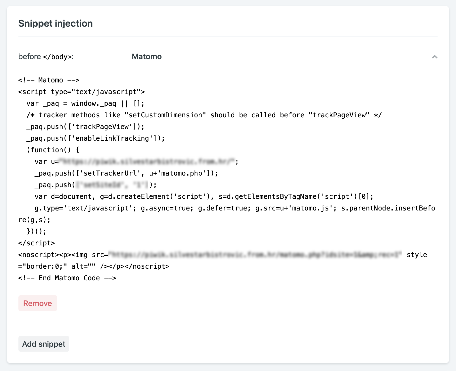
The "Snippet injection" section of the Netlify dashboard.

When inserting snippets, you could choose to append the code fragment at the end of the <head> block, or at the end of the <body> block.

Every deploy has its own URL forever.

Netlify creates a unique preview link for every successful build. That means you could easily compare revisions made to your site. For example, here is the link to my website from January this year, and here is the link from January last year. Notice the style and content changes.

In his talk, Phil Hawksworth calls this feature immutable, atomic deploys.

They are immutable deployments that live on forever.
— Phil Hawksworth

I found this feature useful when completing tasks and sending the preview links to the clients. If there is a person in charge of handling Git-related tasks, like publishing to production, these preview links could be convenient to understand what to expect during the merge. You could even set up the preview builds for every pull request.

Netlify allows for the cleanest and most responsible A/B testing you can do.

If you ever wanted to run A/B tests on your site, you would find that Netlify makes running A/B tests quite straightforward. Split testing on Netlify allows you to display different versions of your website from different Git branches without any hackery.

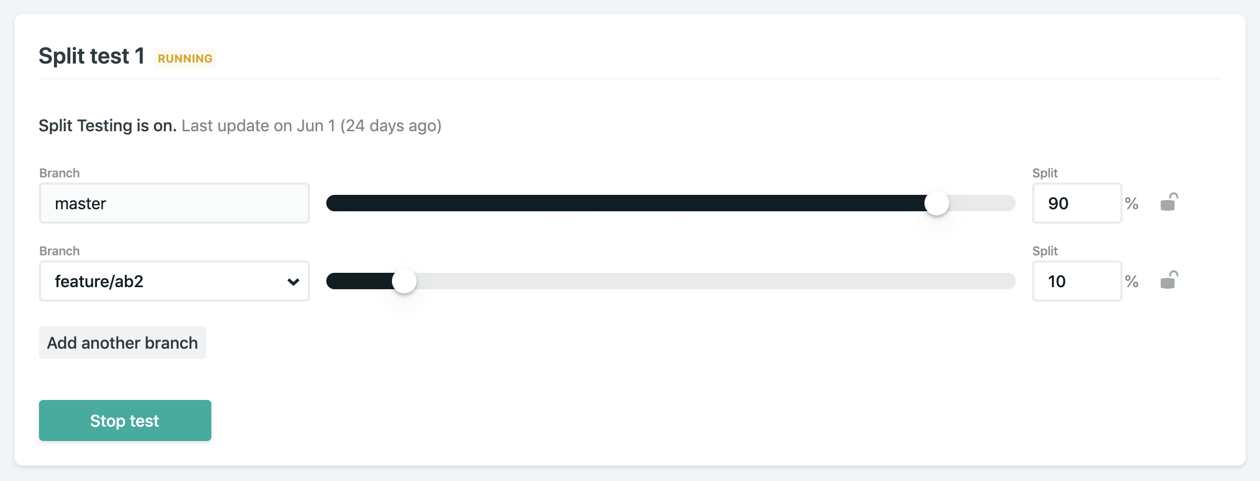
The "Split testing" section of the Netlify dashboard.

Start by adding and publishing a separate branch with desired changes. From “Split testing” panel, select which branches to test, set a split percentage, and start the test. You could even set a variable in analytics code to track which branch is currently displayed. You might need to active branch deploys if you didn't do this already.

Netlify’s Split Testing lets you divide traffic to your site between different deploys, straight from our CDN network, without losing any download performance, and without installing any third party JavaScript library.
Netlify documentation

I have been using A/B testing on my site for a few different features so far:

  • Testing different versions of contact forms
  • Displaying different versions of banners
  • Tracking user behavior, like heatmaps

If you want to track split testing information, you could set up the process environment variable for this purpose. You could learn more about it in the official documentation. The best part? Most A/B testing services use client-side JavaScript to do it, which is unreliable and not great for performance. Doing it at the load balancer level like this is so much better.

There are lots of options for notifications, like email and Slack.

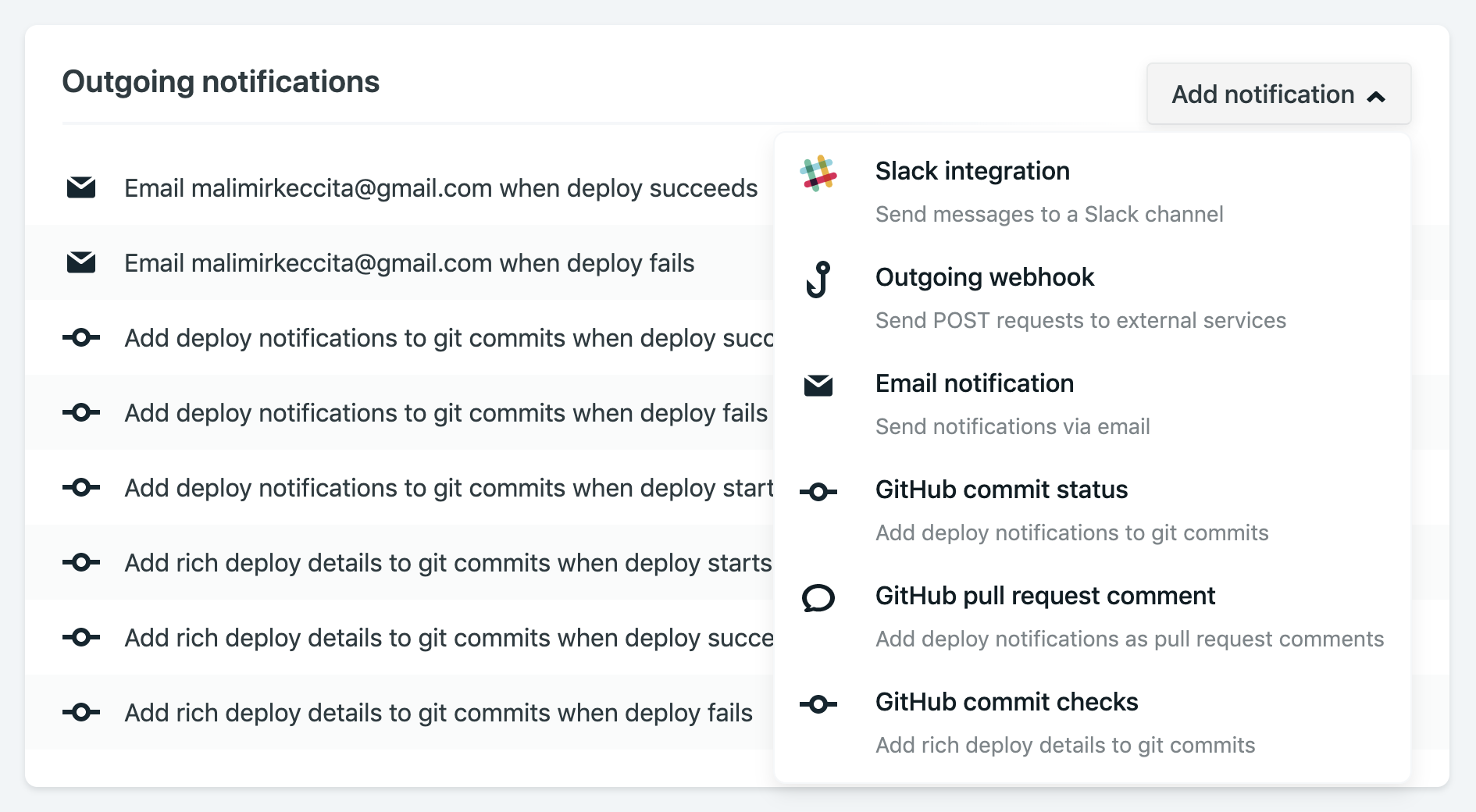
If you want to receive a notification when something happens with your Netlify project, you could choose from a wide variety of notification options. I prefer getting an email for every successful or failed build.

The "Notifications" section of the Netlify dashboard.

If you are using Gmail, you could notice "See the changes live" link for every successful build when hovering your message in Gmail inbox. That means you could open a preview link without opening the email. There are other links like "See full deploy logs" when your build have any issues or "Check usage details" when your plan is near its limits. How awesome is that?

Netlify email notifications include a preview link.

If you want to set up a hook for third-party services, all you need is a URL (JWS secret token is optional). Slack hooks are built-in with Netlify and could be set up within seconds if you know your Slack incoming webhook URL.

Conclusion

All of the features mentioned above are part of the free Netlify plan. I cannot even imagine the effort invested in providing a seamless experience as it is now. But Netlify doesn’t stop there. They are introducing more and more new and shiny features, like Netlify Dev CLI for local development and deploy cancelations. Netlify has established as an undoubtedly game-changing platform in modern web development of static websites, and it is a big part of the growth and popularity of static sites.

The post My Favorite Netlify Features appeared first on CSS-Tricks.

Oh, the Many Ways to Make Triangular Breadcrumb Ribbons!

Oh, the Many Ways to Make Triangular Breadcrumb Ribbons

Let’s have a look at how we can create a row of links that sorta run into each other with a chevron-like shape and notch on each block like you might see in a hierarchical breadcrumb navigation.

You’ve probably seen this pattern a lot. It comes up often in things like multi-step forms and site breadcrumbs. For our purposes we’re going to call these “ribbons" so we know what we’re referring to as we go.

Like a lot of things on the web, we can make ribbons like these in many ways! I’ve created a demo page that brings a variety of them together, like using CSS triangles, SVG backgrounds, and the CSS clip-path property.

Starting with the HTML structure

For each demo, the HTML structure will largely be the same where we have a <nav> that acts as the parent element and then links inside it as the children.

<nav class="ribbon ribbon--modifier" role="navigation" aria-label="breadcrumbs">
  <a class="ribbon__element" href="https://www.silvestar.codes/">Home</a>
  <a class="ribbon__element" href="https://www.silvestar.codes/categories/articles/">Blog</a>
  <a class="ribbon__element" href="https://www.silvestar.codes/articles/building-an-animated-sticky-header-with-custom-offset/" aria-current="page">Post</a>
</nav>

Note that these elements should be accessible, according to A11y Style Guide website. It’s a good rule to build components with accessibility in mind and introducing accessibility at the very start is the best way to prevent the classic “I forgot to make it accessible" situation.

Let’s create some baseline styles

When it comes to things like this, we want to make sure the sizing of the elements is done right. For this purpose, we are going to define the font size of the .ribbon (that’s what we’re going to call these things) wrapper element and then use em units on the child element which are the links themselves.

/* Define font size of the wrapper element */ 
.ribbon {
  font-size: 15px;
}

/* Use ems to define the size of the ribbon element */ 
.ribbon__element {
  font-size: 1.5em;
  letter-spacing: 0.01em;
  line-height: 1.333em;
  padding: 0.667em 0.667em 0.667em 1.333em;
}

This particular technique would be beneficial for defining the size of the triangle shape for each ribbon because we would use the same sizes to calculate triangle. And since we are using em units to calculate the ribbon element size, we could resize all elements by redefining the font-size on the wrapper element.

Let’s use CSS Grid for the layout because, well, we can. We could do this in a way that offers deeper browser support, but we’ll leave that up to you based on your support requirements.

We are going to define four columns:

  • Three for ribbon elements
  • One to fix spacing issues. As it is, the right arrow shape would be placed outside of the ribbon component and that could mess up the original layout.
/* The wrapper element 
 * We're using CSS Grid, but ensure that meets your browser support requirements.
 * Assuming the use of autoprefixer for vendor prefixes and properties.
 */
  
.ribbon {
  display: grid;
  grid-gap: 1px;
  grid-template-columns: repeat(auto-fill, 1fr) 1em; /* Auto-fill the three ribbon elements plus one narrow column to fix the sizing issues */
}

If you prefer to avoid stretching the ribbon elements, the grid could be defined differently. For example, we could use max-content to adjust columns by content size. (Note, however, that max-content is not very well supported yet in some key browsers.)

/* Make ribbon columns adjust to the maximum content size */
.ribbon--auto {
  grid-template-columns: repeat(3, max-content) 1em;
}

I am sure there are many different ways we could have gone about the layout. I like this one because it defines the exact gap between ribbon elements without complicated calculations.

Accessibility is not only adding aria attributes. It also includes color contrast and readability, as well as adding hover and focus states. If you don’t like outline style, you could use other CSS properties, like box-shadow, for example.

/* Use current link color, but add underline on hover  */
.ribbon__element:hover, 
.ribbon__element:active {
  color: inherit;
  text-decoration: underline;
}

/* Clear default outline style and use inset box shadow for focus state */
.ribbon__element:focus {
  box-shadow: inset 0 -3px 0 0 #343435;
  outline: none;
}

Creating the unique triangular shape

We have more than one option when it comes down to defining the triangle at the end of each ribbon. We could:

  1. We could create a triangle using borders with pseudo-elements
  2. We could use an SVG background image on pseudo-elements
  3. We could use inline SVG images
  4. We could create a clip-path using the polygon() function

Let’s dig into each one.

Option 1: The border approach

First, we should set the element’s width and height to zero so it doesn’t get in the way of the pseudo-elements we’re using to draw the triangle with borders. Then we should draw the triangle using borders, specifically by defining a solid left border that matches the color of the background to make it blend in with the rest of the ribbon. From there, let’s define top and bottom borders and make them transparent. The trick here is to calculate the size of the border.

Our ribbon element has a content size of the line-height value plus the top and bottom paddings:

0.333em + 0.667em + 0.667em = 2.667em

That means our top and bottom borders should be half that size. The only thing left to do is to position elements absolutely to the correct side of the component.

/* The left arrow */
.ribbon--alpha .ribbon__element:before {
  /* Make the content size zero */
  content: '';  
  height: 0;  
  width: 0;

  /* Use borders to make the pseudo element fit the ribbon size */
  border-bottom: 1.333em solid transparent;
  border-left: 0.667em solid #fff;
  border-top: 1.333em solid transparent;

  /* Position the element absolutely on the left side of the ribbon element */
  position: absolute;
  top: 0;  
  bottom: 0;  
  left: 0;
}

/* The right arrow */
.ribbon--alpha .ribbon__element:after {
  /* Make the content size zero */
  content: '';  
  height: 0;  
  width: 0;

  /* Use borders to make the pseudo-element fit the ribbon size */
  border-bottom: 1.333em solid transparent;
  border-left: 0.667em solid;
  border-top: 1.333em solid transparent;

  /* Position the element absolutely on the right side of the ribbon element and push it outside */
  position: absolute;
  top: 0;
  right: 0;
  bottom: 0;
  -webkit-transform: translateX(0.667em);
  transform: translateX(0.667em);
}

Since the right triangle should match the background color of the ribbon, let’s remember to add the correct border color for each ribbon’s pseudo-element.

/* The right arrow of the first element */
.ribbon--alpha .ribbon__element:nth-child(1):after {
  border-left-color: #11d295;
}

/* The right arrow of the second element */
.ribbon--alpha .ribbon__element:nth-child(2):after {
  border-left-color: #ef3675;
}

/* The right arrow of the third element */
.ribbon--alpha .ribbon__element:nth-child(3):after {
  border-left-color: #4cd4e9;
}

And there we go!

See the Pen
CSS Grid Ribbon - Alpha
by Silvestar Bistrović (@CiTA)
on CodePen.

Option 2: The background image approach

We can also create a triangle using a background image. This requires creating an image that matches the design, which is a little cumbersome, but still totally possible. We are going to use SVG here since it’s smooth at any resolution.

Unlike the border triangle approach, we want to match the height of our pseudo-element with the height of the ribbon element, or 100%. The width of the component should match the left border width of the border triangle, which is 0.666666em in our case. Then we should use a white triangle for the background image on the triangle of the left side, and then use triangle images with color for the triangles on the right side. Again, we are using absolute positioning to place our triangles to the correct side of the ribbon element.

/* The left arrow */
.ribbon--beta .ribbon__element:before {
  /* Define the arrow size */
  content: '';  
  height: 100%;  
  width: 0.666666em;
  
  /* Define the background image that matches the background color */
  background-image: url(data:image/svg+xml;base64,PHN2ZyBoZWlnaHQ9IjQwIiB2aWV3Qm94PSIwIDAgMTAgNDAiIHdpZHRoPSIxMCIgeG1sbnM9Imh0dHA6Ly93d3cudzMub3JnLzIwMDAvc3ZnIiBmaWxsPSIjZmZmIj48cGF0aCBkPSJtNSAxNSAyMCAxMGgtNDB6IiBmaWxsLXJ1bGU9ImV2ZW5vZGQiIHRyYW5zZm9ybT0ibWF0cml4KDAgLTEgLTEgMCAyNSAyNSkiLz48L3N2Zz4=);
  background-position: center left;
  background-repeat: no-repeat;
  background-size: 100%;
  
  /* Position the element absolutely on the left side of the ribbon element */
  position: absolute;
  bottom: 0;
  top: 0;
  left: 0;
}

/* The right arrow */
.ribbon--beta .ribbon__element:after {
  /* Define the arrow size */
  content: '';  
  height: 100%;
  width: 0.667em;

  /* Define the background image attributes */
  background-position: center left;
  background-repeat: no-repeat;
  background-size: 100%;

  /* Position the element absolutely on the right side of the ribbon element and push it outside */
  position: absolute;
  top: 0;
  right: 0;
  bottom: 0;
  -webkit-transform: translateX(0.667em);
  transform: translateX(0.667em);
}

/* Define the background image that matches the background color of the first element */
.ribbon--beta .ribbon__element:nth-child(1):after {
  background-image: url(data:image/svg+xml;base64,PHN2ZyBoZWlnaHQ9IjQwIiB2aWV3Qm94PSIwIDAgMTAgNDAiIHdpZHRoPSIxMCIgeG1sbnM9Imh0dHA6Ly93d3cudzMub3JnLzIwMDAvc3ZnIj48cGF0aCBkPSJtNSAxNSAyMCAxMGgtNDB6IiBmaWxsPSIjMTFkMjk1IiBmaWxsLXJ1bGU9ImV2ZW5vZGQiIHRyYW5zZm9ybT0ibWF0cml4KDAgLTEgLTEgMCAyNSAyNSkiLz48L3N2Zz4=);
}

/* Define the background image that matches the background color of the second element */
.ribbon--beta .ribbon__element:nth-child(2):after {
  background-image: url(data:image/svg+xml;base64,PHN2ZyBoZWlnaHQ9IjQwIiB2aWV3Qm94PSIwIDAgMTAgNDAiIHdpZHRoPSIxMCIgeG1sbnM9Imh0dHA6Ly93d3cudzMub3JnLzIwMDAvc3ZnIj48cGF0aCBkPSJtNSAxNSAyMCAxMGgtNDB6IiBmaWxsPSIjZWYzNjc1IiBmaWxsLXJ1bGU9ImV2ZW5vZGQiIHRyYW5zZm9ybT0ibWF0cml4KDAgLTEgLTEgMCAyNSAyNSkiLz48L3N2Zz4=);
}

/* Define the background image that matches the background color of the third element */
.ribbon--beta .ribbon__element:nth-child(3):after {
  background-image: url(data:image/svg+xml;base64,PHN2ZyBoZWlnaHQ9IjQwIiB2aWV3Qm94PSIwIDAgMTAgNDAiIHdpZHRoPSIxMCIgeG1sbnM9Imh0dHA6Ly93d3cudzMub3JnLzIwMDAvc3ZnIj48cGF0aCBkPSJtNSAxNSAyMCAxMGgtNDB6IiBmaWxsPSIjNGNkNGU5IiBmaWxsLXJ1bGU9ImV2ZW5vZGQiIHRyYW5zZm9ybT0ibWF0cml4KDAgLTEgLTEgMCAyNSAyNSkiLz48L3N2Zz4=);
}

There we go!

See the Pen
CSS Grid Ribbon - Beta
by Silvestar Bistrović (@CiTA)
on CodePen.

Option 3: The inline SVG approach

Instead of loading a different SVG triangle for each background image, we could use inline SVG directly in the HTML.

This particular approach allows us to control the fill color of each SVG arrow with CSS. The arrow size is calculated by the ribbon size. Once again, we are using the em units to define the size and arrows are absolutely positioned, like the other approaches we’ve seen so far.

/* Position arrows absolutely and set the correct size */
.ribbon--gamma .ribbon__element svg {
  height: 2.667em;
  position: absolute;
  top: 0;
  width: 0.667em;
}

/* The left arrow */
.ribbon--gamma .ribbon__element svg:first-child {
  fill: #fff; /* Define the background image that matches the background color */
  left: 0; /* Stick left arrows to the left side of the ribbon element */
}

/* The right arrow */
.ribbon--gamma .ribbon__element svg:last-child {
  left: 100%; /* Push right arrows outside of the ribbon element */
}

/* Define the fill color that matches the background color of the first element */
.ribbon--gamma .ribbon__element:nth-child(1) svg:last-child {
  fill: #11d295;
}

/* Define the fill color that matches the background color of the second element */
.ribbon--gamma .ribbon__element:nth-child(2) svg:last-child {
  fill: #ef3675;
}

/* Define the fill color that matches the background color of the third element */
.ribbon--gamma .ribbon__element:nth-child(3) svg:last-child {
  fill: #4cd4e9;
}

See the Pen
CSS Grid Ribbon - Gamma
by Silvestar Bistrović (@CiTA)
on CodePen.

Option 4: The clip-path approach

We can create the ribbon triangles with a polygon that masks the background. Firefox’s Shape Editor is a fantastic tool to draw shapes directly in the browser with a GUI, as is Clippy.

Since polygons must be created using percentages, we should use our best judgment to match the size of border triangles. Also, note that percentage-based polygons might look a little funny on some viewports, especially when element sizes are adapting to its surroundings, like wrapper elements. Consider redefining polygons for different viewports.

.ribbon--delta .ribbon__element {
  clip-path: polygon(95% 0, 100% 50%, 95% 100%, 0% 100%, 5% 50%, 0% 0%);
}

Since we defined our wrapper element using CSS Grid, we should expand the ribbon elements but leave the last one at the size of the polygon triangle, which is 5% in our case. The last ribbon element should be wider by the size of the border triangle width to match the first two examples.

/* Make all ribbon elements (except the last one) wider by the size of the polygon triangle */
.ribbon--delta .ribbon__element:not(:last-child) {
  width: 105%;
}

/* Make the last ribbon element wider by the size of the border triangle */
.ribbon--delta .ribbon__element:last-child {
  width: calc(100% + .667em);
}

See the Pen
CSS Grid Ribbon - Delta
by Silvestar Bistrović (@CiTA)
on CodePen.

Variations on these options

Now that we’ve learned how to create the breadcrumb ribbon a few different ways, we could play around with it, like adding shadows or gradients and different sizes.

Adding a shadow

We could add the shadow on our ribbon elements. Make sure to avoid the shadow on the left or right side of the ribbon element.

/* Add shadow under each ribbon element */
.ribbon--shadow .ribbon__element {
  box-shadow: 1px 3px 3px -3px black;
}

See the Pen
CSS Grid Ribbon - Shadow
by Silvestar Bistrović (@CiTA)
on CodePen.

Using gradients for color

We could add gradients to our ribbon element. Be sure to match the color of the right triangle when doing so. Also, make sure to comply with contrast accessibility.

For example, if we are going to use the border approach or background image approach, we should use mostly horizontal (i.e. left-to-right) gradients (with the exceptions of some carefully calculated angled gradients). If we are using the clip-path approach, we could use any gradient version we wish.

/* Add gradient to the first ribbon element */
.ribbon--gradient .ribbon__element:nth-child(1) {
  background-image: linear-gradient(to right, #11ced2, #11d295);
}

/* Add gradient to the second ribbon element */
.ribbon--gradient .ribbon__element:nth-child(2) {
  background-image: linear-gradient(to right, #ef36b2, #ef3675);
}

/* Add gradient to the third ribbon element */
.ribbon--gradient .ribbon__element:nth-child(3) {
  background-image: linear-gradient(to right, #4c9fe9, #4cd4e9);
}

See the Pen
CSS Grid Ribbon - Gradient
by Silvestar Bistrović (@CiTA)
on CodePen.

Working with size variations

Since the size of our ribbon elements depends on the font size of the wrapper element, defining different sizes is pretty straightforward.

/* Small ribbons */
.ribbon--small {
  font-size: 10px;
}

/* Big ribbons */
.ribbon--big {
  font-size: 20px;
}

Here we go with a smaller set of ribbons:

See the Pen
CSS Grid Ribbon - Small
by Silvestar Bistrović (@CiTA)
on CodePen.

And here’s a nice set of chunky ribbons:

See the Pen
CSS Grid Ribbon - Big
by Silvestar Bistrović (@CiTA)
on CodePen.

Combining all the things!

We can also combine different modifier classes to achieve an even more styling. For example, let’s use gradient and shadow modifiers together:

See the Pen
CSS Grid Ribbon - Shadow Gradient
by Silvestar Bistrović (@CiTA)
on CodePen.

Any other angles to consider?

Making custom elements using different CSS techniques is a great way how each one of us could improve or refresh our knowledge. Before starting, it’s worth investing some thought into the maintainability and modularity of the component being built. A consistent naming convention, like BEM, is certainly helpful that. Accessibility is also a big deal, so starting with it in mind and documenting accessibility features along the way will serve you well.

We looked at four different approaches for drawing ribbon triangles. Have you used a different approach or know of one we haven’t considered here? Let me know in the comments!

The post Oh, the Many Ways to Make Triangular Breadcrumb Ribbons! appeared first on CSS-Tricks.