Is it controversial to say deep integration of design systems, removing the need to maintain both a code and design version of each component, is the current Holy Grail of Web Design?
Traditionally the “Holy Grail” was the full-height three-column layout, but that is now consigned to history. Similarly, vertical centering can no longer be the punchline of a CSS joke. Even Container Queries, often considered an impossible task, are making their way into browsers.
This historical precedence gives me optimism. People throughout the web industry worked together, both in collaboration and competitively, to gradually, step-by-step, improve the web. To fundamentally improve the way we all work. The same is happening now with design systems. For all the advantages there are, we still have many things to solve. UXPin is focused on the goal of removing the gap between design and development tools.
Introducing UXPin’s npm Integration
We’ve written aboutour friends at UXPin before, and it’s been really great watching them iterate their product towards bringing designers and engineers closer. Recently UXPin have extended their powerful Merge functionality by adding npm integration, allowing designers to sync React component libraries without requiring any developer input.
Previously Merge required engineers to export the components to UXPin in the build/deployment pipeline... That’s not required when importing components from npm packages.
To understand how this works, we need to step back and look at how UXPin differs from other design tools. Usually, the canvas on which you design is an image. In the past, these were raster and, nowadays, vector, a step in the right direction, but you are still drawing images that are supposed to represent the direction of your product’s look and feel.
When you use your components on the canvas in UXPin, you aren’t drawing rectangles styled to look about right — you are placing the real components the developers will use in the end product. This means you can easily prototype fully interactive high-fidelity designs that would previously require coded prototypes, without any coding using the exact same components as the end product. This reduces the gap between designers and developers both in terms of overlapping effort as well as the gap between what’s designed and what the users interact with.
But npm Is For Developers, Isn’t It?
Let’s be clear: you do not need to install anything on your computer to import component libraries into UXPin using npm integration. You don’t need to write any code. All you need is an existing package hosted on npm. This may be a package that is open source and widely used, such as Ant UI or Material, or it may be specific to your company and already in use by developers.
Node Package Manager (npm) is a tool for importing specified versions of code. Developers use this for managing versions of “packages” of code that someone else has written. For example, they would tell it which version of React to download, and if a new version is released, they can update it when they are ready. This is basically an automated way to avoid copying and pasting zip files everywhere.
With UXPin’s npm integration, you can grab the components from npm packages and use them within the design tool.
Okay... How Do I Use It?
Within UXPin, you define the UI component library by adding a new library to the “Merge: Component Manager” section. You will be given options and need to select “Import React Components with npm integration.” Here you will be asked to write the name of the library, and this can be anything. You will also need the package name and version (which can be latest), the path to the styling assets, and any permissions you wish to set up. For a more thorough explanation, see the documentation.
Import npm package with UI component on UXPin’s trial.
Once that’s complete, you will have imported your component library from npm into UXPin!
This is not the end of the process, however. With the components imported, you need to configure the Merge Component Manager for the library you’ve imported. You need to specify each component individually and set up each of the properties that relate to it.
Although the setup, especially of a large library, can be quite a lot of effort, it really is worth putting in the time upfront to reap the rewards of an integrated design system. At this point, you will be able to build prototypes that are as realistic and true to the medium of the web as any prototype can be. If you want to avoid the integration process and use open-source solutions, you can also use built-in libraries of Ant design and MUI.
Try code-based libraries that are built-in in UXPin.
This Sounds Great, But Is It Suitable For My Team?
Your Developers Already Have An npm Package For Your Design System
This is the perfect situation for an integrated design system. A common situation is to create components both in code and a design tool and aim to sync them. Documentation tools such as Storybook are often used to provide shared knowledge and a source of truth between designers and developers. With npm integration, you are able to further reduce the handover process by literally using the same technologies without the step in the middle.
Designing Without Access To Developers
If you’re in the discovery phase for a new project and don’t yet have access to any developers just yet, UXPin gives you an advantage. You can prototype using open-source component libraries (for example MUI) and adjust them to your needs. When developers join the team those components can be swapped out for the ones you design from scratch and developers then code.
Fully-Fledged Team With Existing Practices
In a seasoned team, changing your tools can be the last thing anyone wants to do and can be hard to agree on. But even for these teams, the reward of having a consistent, integrated solution for sharing components between designers and developers is likely worth the investment.
Conclusion
The team at UXPin has taken an impressive step towards making their Merge technology more accessible with npm integration. With each new Merge release, we can see their vision of how teams can work more closely together with their design systems integrated throughout their process. We can see the future, and gradually we are getting there just as we did with their walking away from the vector-based design standard into working closer with devs. It was a long journey, but worth it in the end.
Web design is full of people who value open collaboration and knowledge sharing. It’s a career in which you can be completely self-taught, using affordable — if not free — resources from experts and like-minded people around the world. This is worth celebrating!
But with so much to learn, how do we decide what to focus our time on? How do we maintain our existing skills? Where should a beginner start? How do we become hireable? Let’s take a look at how Uxcel (pronounced “You Excel”) goes about answering these questions.
The Three Pillars
Uxcel believes its platform can help you become a better web designer using three core pillars. These essentially involve an iterative process of learning and practicing, with the aim to use progress enough (and have something to show for it) to improve our job prospects over time.
1. Improve Your Design Skills With Interactive Learning
We start with learning — no surprise there! Uxcel has courses specific to individual areas of web design, each one consisting of many interactive bite-sized lessons. This removes the time that gets wasted when you don’t know what to focus on next. Each lesson is small enough to fit in during the spare time. With all the courses being available at the same time, without needing to register for a specific course, you are able to dip your toes into any areas of design without committing to an entire course.
2. Test And Measure Your Design Knowledge
Closely linked to interactive learning is the importance of testing yourself. Alongside the courses, Uxcel also has an entire section of skill tests and assessments dedicated to measuring your progress as you improve. Particularly intriguing is that you can only take these tests once a month! This is a clever mechanism for ensuring you don’t cheat yourself and are able to see a real indication of your improvement over time rather than just practicing to pass tests.
3. Build Your Professional Profile And Get Hired
After learning and measuring come improving your professional profile and hireability. Getting the roles you want can be hard, especially at the early stage of your career. It’s often a catch-22 situation between needing experience to get a job and needing a job to get experience. So showing that you have a clear focus on the steps, you need to take and are regularly practicing can help to elevate your profile when applying for a new role.
Theory, practice, and getting a job. This may sound idealistic; however, it’s a framework that, when done regularly with purpose, is bound to help you go in the right direction. One thing is clear though: whether you use Uxcel or Bootcamps, YouTube or University, you’ve got to put the work in.
Don’t Cheat Yourself
Osmosis. Have you ever bought a book that is full of valuable information and somehow felt good about seeing it on your bookshelf but never actually ended up reading it? Or maybe you keep a gym membership even when you haven’t been in a while? I’m guilty, too; it’s such a natural thing to do even when we all know full well you need to put the work in!
Uxcel’s Skill Tests can only be completed once a month. At first, this felt like the antithesis of not cheating yourself; it felt lazy. But when you think about it, learning shouldn’t be a chore or something you feel bad about if you miss a day. The technique of stopping for a moment and looking back at your progress over the past month is a really useful tool that you can use.
In fact, completing these skill tests once a month helps to prevent you from cheating yourself. You cannot go back and change your answers; your ranking against the other designers on the site for that assessment will stay the same for an entire month. So you’re going to feel the encouragement to do it well and to focus and take pride in what you’re doing.
This is a concept we can apply to much of what we do. How often have you marked an article as “Read later” and never did it? I do it all the time, but it’s just a subconscious attempt at osmosis.
Improve Your Skills In Five Minutes
According to Uxcel, even just 5 minutes per day over the course of a month is enough time to see measurable improvement in anything you’re trying to learn. This might sound in direct contrast to not cheating; five minutes is hardly any time at all. But — as with any fad diet — if you try to deep dive, you may learn a lot in a short amount of time, but it will not become part of your routine, and it will not be a long-lasting habit.
Build a habit. Bad habits are hard to break, and good habits are hard to make. To build a habit, we need to keep up the momentum, which means it’s better to have low expectations and minimal effort. The more we see progress on achievable goals, the more rewarding it is, and the more we can maintain the habit.
Anyone can find five minutes in a day. It’s really easy to persuade ourselves against learning. Maybe it’s too expensive or too hard. By keeping the aim manageable, it becomes easy to fit around our daily lives.
Interactivity is fun! If your experience of education to date has not been so great, perhaps even five minutes of concerted learning a day sounds tedious to you. But let me promise you, this is a fun way to learn! It’s so easy to get carried away completing the skill tests and reading the theory.
Building up a mechanism for knowing how to learn efficiently will always help with everything we do going forward. We can take these approaches of keeping small manageable chunks per day to achieve anything we want.
How Do I Know What I Don’t Know?
So you’ve decided to learn a new area of web design. You have set aside 5 minutes a day. You know it will require effort on your part there’s no point in cheating yourself. Now, the question is where to start?
Let’s make one thing clear. You will never be able to know everything, and you don’t need to. It’s impossible. Technologies and best practices that feel like they are the final solution quickly become old hats. Entire new disciplines crop up, sometimes seemingly out of the blue. Trends and opinions flow in and out like the tide.
There are countless ways to successfully navigate challenges in order to learn just enough about the right thing at the right time.
If you’re anything like me, it can feel like a ping-pong ball. One minute you can feel like an expert, and the next, as if you’ve started back at square one. Even knowing how and where to start learning it is full of choices, and not every solution is as suitable as another.
Let’s take a quick look at Smashing Magazine, for example. This is a website full to the brim of content written by all kinds of people in the industry. It’s completely free to read and browse more than a decade of articles. As I said in my introduction, we are incredibly lucky to be in a situation like this. However, browsing aimlessly through thousands of articles is a lovely thing to do, and of course, there is so much to learn. We do need some kind of structure to effectively be productive in our learning.
Uxcel structures the courses in a very clear way. Each course is clear from the title what it covers at the high level, for example, “Design Accessibility,” “UX Design Foundations” and “HTML for designers”. This helps the initial overwhelming sensation that is so common when looking for information as it feels like a small list to choose from despite each containing a large amount of information. Then when you go into the course, it’s again broken down into very easily digestible chunks such as “Common Designer Roles”, “Atomic Design by Brad Frost” and “Design Grids”.
This structure provides the best of both worlds. It gives you both the freedom to explore and the structure to be guided further.
Am I Really Making Progress?
My favorite way to learn something new has always been to apply it to a side project. This complements the courses in Uxcel very well as having little side projects you can apply the lessons learned in the courses will help to cement the knowledge, and you’re likely to see the difference when measuring your progress each month.
Unfortunately, side projects can feel like a disappointment. I start a new project thinking it’s a great idea, and I then realize how much time I’ve spent on something that no one else will ever see. It’s easy to feel disheartened by this and feel like these projects have been a waste of time. I know I’m not the only one!
To change this mindset, I’ve been going through old projects and making notes of what I learned from them. In theory, I would write an in-depth case study each time. But that hardly ever happens, So setting a goal of a few bullet points for each project is much more achievable and helps to see the benefit from the effort I’ve put in over time.
I noticed a similar approach with Uxcel. The monthly skill tests are just like my bullet points; a low-pressure way to check in with your progress without high expectations. I see there being two kinds of progress to test and measure: specific goals that you have a strong focus on, and general stuff that you learn as you go. I often had specific goals for the side projects, but even if I didn’t achieve those goals, I was still able to find benefits from looking at the things I did learn, even if I had not intended to.
Learning Through Play
Children learn everything from coordination to social skills through play. It is interesting to see a platform that specializes in self-development have a section of these games in their navigation alongside Courses, Skill Tests and Job Board. Uxcel treats games as a first-class citizens on their platform.
In fact, gamification is a key part of Uxcel across the entire platform. In the skills tests, it doesn’t tell you which answers you got wrong but it does say how you compared against everyone else. I have to admit, as a developer that has always had an informal interest in design, to be placed in the “top 10% of designers” (humble brag!) is rather motivational!
What makes these games useful? They are specifically targeted at practical skills that will benefit you as a web designer. And so it comes back to the second pillar “Test and measure your design knowledge”; having these informal games that you can play as often as you want means there’s a way for you to continuously test and measure yourself on these hyper-focussed practical tasks. It’s great to understand the theory of design, but you need to be able to put it into practice and these small games give you practice for skills that you will be using time and time again.
Another key point is that it’s fun and challenging; there’s something healthily addictive about trying to get a high score in comparing color contrasts.
Getting Hired
The third pillar is to build a professional profile and to make it easier to be hired. I considered skipping this pillar entirely — thinking it is not related to learning. I’ve come to the realization that this isn’t true. One main reason for learning is to improve your career. If I look back at things I’ve learned over time, I can see a clear correlation between the stuff I focussed on learning and the roles I later got because of it.
Uxcel understand this. While it may not be as simple as “Course + Test = Job”, the platform is organized in such a way that your profile is being updated as you go through the courses and skill tests. Without even necessarily realizing it, you’re building a picture that shows the things you are focusing your time on. You’re building your professional profile — you’re breaking out of the Catch-22 situation. Say, for example, you’ve been working in a visual design role but want to move into a UX role. You can use this profile as a way to prove that alongside your work experience, you also have a keen focus on UX.
No matter where you are in your career, the idea of using stepping stones to plan your journey is important. Seeds that can be sown, knowing where you want to get to and how you can go about it. Learning and career improvement is intrinsically related.
Learning As A Team
Taking it a step further, Uxcel provides tools for companies to use Uxcel within their teams. Many companies already use a Skill Matrix to see which areas of knowledge and experience are well covered within the team and how it’s distributed across members.
If a team of designers is using Uxcel as a learning platform, then it gives a consistent approach to managing this skill matrix as the strengths and weaknesses can be easily measured. This is not to judge employees but to assist in the development of skills across the team.
In Conclusion
Building a career will always be hard, but we’ve seen that by applying a focus on how we learn, we are able to give ourselves the best possible start. This is true for anyone with an ambition of improving their skill set, no matter how far along the journey you already are. Uxcel has a clear vision for its platform; the three pillars are being implemented in everything they do. This is something we can take forward ourselves, whether using the platform or not. The key is to make purposeful choices, have a structure to fall back on, put the effort in, and measure our progress throughout.
Git was released almost 15 years ago. In that time it has gone from underdog to unbeaten champion, git init is often the first command run on a new project. It is undoubtedly an important tool that many of us use on a daily basis, and yet it is often seen as magic: brilliant, but scary.
There’s been a lot written about getting started with git, understanding how git works under the hood or techniques for better branching strategies. In this article, we will specifically target the stuff that just makes your life better in a small way.
Finding Your Old Socks
The whole point of git is to be able to save your work, to switch context and do something else. It could be to backup the code for the future, or to be able to make progress on a few different features asynchronously. It would be awful to have to throw out v2 just because there was a bug in v1, it would be equally a shame to have files named like v1_final_bug_fixed which notoriously become an impossible mess.
We know life is easier, to some extent, with our updates neatly compartmentalised into git branches that can be shared with other team members. However, I’m sure you can agree, there are often times when you’ve context switched and when you go back it’s impossible to find the right branch. Was it ever committed? Maybe it was stashed? Maybe it wasn’t committed and now the work is in the wrong branch and everything is going awful and I am awful at my job! We’ve all been there.
Sort Branches By Date
My first attempt at figuring out how to find lost work, in a short blog post titled “How to find the branch you lost in git” was to sort the branches by date. This outputs every single branch you’ve got locally beginning with the one most recently committed to. It’s not fancy or surprising but it has helped me many times.
# To sort branches by commit date
git branch --sort=-committerdate
Previous Branch
What can you do if you didn’t commit, switched branch then wanted to get back to it? You could probably work out frorm the branch list anyway, if you’ve some idea of the branch name. But what if it wasn’t a branch, if it was a “detached HEAD”, a specific commit.
It turns out there is a way to do this with ease:
# Checkout previous branch
git checkout -
The - acts as a shorthand for @{-1} which is a syntax you can use for going back any given amount of checkouts. So if, for example, you had checked out branch feature/thing-a then feature/thing-b then bugfix/thing-c, you can use @{-2} to get back to feature/thing-a.
# Checkout branch N number of checkouts ago
git checkout @{-N}
Show Information About All Branches
If you are looking for a way to see what the last commit in each branch was, you can use option flags v to show a list of all branches with the last commit ID and message from each. If you do it twice (vv) then it will also show the upstream remote branch that it is linked to.
# List branches along with commit ID, commit message and remote
git branch -vv
That One File
We’ve all done it: Somehow, a single file was left in the wrong branch. Do you need to redo all of your work, or copy and paste between the two branches? Nope, thankfully there’s a way to do it.
It’s a bit odd, especially given git checkout - goes back a previous branch; if you use -- after a branch name on checkout then it will let you specify the specific file you’re looking for. It’s not something you would guess, but really handy once you know it.
In a tweet, Tomasz Łakomy mentioned about reducing the output of git status using -sb flags and said, “I’ve been using git for YEARS and nobody told me about this.” This isn’t strictly about finding lost files, but there’s cases where simplifying the output could make it easier to see what’s been changed.
Most git commands have flags like this so it’s always worth looking into how you can use them to customise your workflow!
# Usually we would use git status to check what files have changed
git status

# Outputs:
On branch master
Changes not staged for commit:
  (use "git add <file>..." to update what will be committed)
  (use "git checkout -- <file>..." to discard changes in working directory)

    modified:   README.md

Untracked files:
  (use "git add <file>..." to include in what will be committed)

    another-file
    my-new-file

# Using the flags -sb we can shorten the output
git status -sb

# Outputs:
## master
 M README.md
?? another-file
?? my-new-file
See Everything That Has Happened
There are times when something goes completely wrong — such as accidentally discarding staged changes before commiting them. When git log isn’t enough to get back to what you were last doing and none of the above tips are helpful, then there’s git reflog.
Everything you do in git that changes where HEAD@{} points to (such as push/pull/branch/checkout/commit) will update the reference log so it essentially acts as a history of everything you’ve done no matter which branch you’re on. This contrasts with git log which is everything that has changed over time for the particular branch.
With the commit ID, you are able to do git show to see the change and if it’s definitely the one you want you can use git checkout or even select a specific file as shown above.
# See the reference log of your activity
git reflog --all

# Look at the HEAD at given point from reflog
git show HEAD@{2}

# Checkout the HEAD, to get back to that point
git checkout HEAD@{2}
Staged Files That Were Never Commited
In the extreme case that git reflog is unable to help you get your files back (e.g. if you ran a hard reset with staged files), there’s one more trick up your sleeve. Every change is stored in .git/objects which on an active project would be full of files and impossible to decipher. There is, however, a git command called git fsck which is used to verify integrity (check for corrupt files) within a repository. We are able to use this command with the --lost-found flag to find all files that are not related to a commit; these files are called a “dangling blob”.
It will also find “dangling trees” and “dangling commits” — you can use --dangling if you want but --lost-found has the advantage that it extracts all of the appropriate files into a folder .git/lost-found. On an active project, it’s likely you will have a lot of these dangling files without even knowing about it; git has a garbage cleanup command that runs regularly to get rid of them.
So, by using --lost-found, you’re then able to list the files and see the time/date they were made which makes it a lot easier to see the files you’re looking for. Note that each individual file will still be an individual file (you cannot use checkout) and all files will have unrecognisable names (a hash) so you will need to copy the files you want.
# This will find any change that was staged but is not attached to the git tree
git fsck --lost-found

# See the dates of the files
ls -lah .git/lost-found/other/

# Copy the relevant files to where you want them, for example:
cp .git/lost-found/other/73f60804ac20d5e417783a324517eba600976d30 index.html
Git As A Team
Using Git as a single user is one thing but when you’re on a team of people — usually with a mix of backgrounds and technologies — Git can become both a blessing and a curse. It can be powerful for sharing the same codebase, getting code reviews, and seeing progress of the whole team. But at the same time, everyone needs to have a shared understanding of how the team intends to use it. Whether it is branch naming conventions, how you structure a commit message or exactly which files are committed, it’s essential to have good communication and talk about how you will all use the tool.
It’s always important to consider how easy it is to on-board a new developer, what would happen if they began committing without knowing some of the agreed principles and conventions? It wouldn’t be the end of the world, but it would likely cause some confusion and take time to get things back to the agreed approach.
This section has some tips and tricks for getting the repository itself to know the conventions, to automate and declare as much as possible. In the ideal case, any new contributor would almost straight away be working the same way as the rest of the team.
Same Line Endings
By default, Windows uses DOS line endings \r\n (CRLF) while Mac and Linux both use UNIX line endings \n (LF) and really old versions of Mac used to use \r (CR). So as a team grows, it becomes more likely that mismatched line endings will become a problem. Usually, these are an inconvenience; they (probably) won’t break your code but will make commits and pull requests show all kinds of irrelevant changes. Quite often people will just ignore them — it’s quite a hassle to go through and change.
There is a solution to this: You can get everyone on the team to set their local configs to automatic line endings.
# This will let you configure line-endings on an individual basis
git config core.eol lf
git config core.autocrlf input
Of course, that would mean making sure the new contributor does that and it’s so easy to forget to tell them. So how would we do it for the whole team? Well the way Git works is it checks for a config file in the repository at .git/config, then it checks the user’s system-wide config at ~/.git/config then checks the global config at /etc/gitconfig. These are all useful at times but it turns out that none of those can be set through the repository itself. You can add repository-specific configurations but that will not carry over to other members of the team.
There is, however, a file that does get committed to the repository. It’s called .gitattributes. You won’t have one by default, so make a new file and save it as “*.gitattributes*”. This file is used for setting attributes per file; for example, you could make git diff use exif data for image files instead of trying to diff a binary file. In this case, we can use a wildcard to make the setting work for all files, essentially acting as a team-wide config file.
# Adding this to your .gitattributes file will make it so all files
# are checked in using UNIX line endings while letting anyone on the team
# edit files using their local operating system’s default line endings.
* text=auto
Auto-Collapse
It’s a well-known solution to add package-managed files (such as node_modules/) to the .gitignore file in order to keep compiled files locally and not add them to the repository. However, sometimes there are files that you do want to check in but don’t want to see each time in the pull request.
For this situation (at least on GitHub), you can add paths annotated with linguist-generated to your .gitattributes file and check that file in at the root of the repository. This will collapse the files in the pull request, so you can still see they were changed without the full contents of the change.
For example, if you have a Unity project, you would want to check-in your asset files but not actually care about them so you can add it to the attributes file like so:
*.asset linguist-generated
Use Git Blame More Often
This is a tip that Harry Roberts suggested in his post about Git, “Little Things I Like To Do With Git.” He says to alias git blame to git praise so it feels like a positive action. This seems like semantics — renaming something doesn’t change what it does at all. But whenever I’ve seen any team speak about using Git’s blame feature, everyone tenses up, and I certainly do, too. It’s a natural reaction to think it’s a negative thing… it really shouldn’t be!
It’s a powerful feature knowing who last touched the code you’re looking at. Not to blame them or even to praise them, but simply to ask the right person questions and to save time figuring out who to talk to.
Not only should you think of git blame as a good thing (call it ‘praise’ if you want to), but you should think of it as a communication tool that will help the entire team reduce confusion and prevent wasting time figuring out who knows about what. Some IDEs such as Visual Studio include this feature as annotations (without any negative connotation at all) of each function so you can instantly see who last modified it (and therefore who to talk to about it).
Git Blame For A Missing File
Recently, I saw a developer on the team trying to figure out who removed a file, when it was, and why it was removed. This seems like a useful time for git blame but that works based on lines in a file; it doesn’t help with stuff that isn’t there any more. There is, however, a solution. The old trusty git log. If you look at the log with no arguments, then you will see a long list of all the changes on the current branch. You can add a commit ID to see the log for that specific commit, but if you use -- (which we’ve used before to target a specific file), then you can get the log for a file — even one that no longer exists.
# By using -- for a specific file,
# git log can find logs for files that were deleted in past commits
git log -- missing_file.txt
Commit Message Template
One thing that eventually gets mentioned within teams is that commit messages could be improved. Maybe they could reference a project management tool’s ID for the bug the commit fixes or maybe you want to encourage some text instead of an empty message.
This one needs to be run manually each time someone clones the repository (as git config files are not committed to the repository), but it is handy because you can have a shared file in the repository (named anything you want) that can act as the commit message template.
# This sets the commit template to the file given,
# this needs to be run for each contributor to the repository.
git config commit.template ./template-file
Git As Automation
Git is powerful for automation. This is not immediately obvious but if you consider that it knows all of your past activity within the repository — plus that of other contributors — it has a lot of information that can be very useful.
Git Hooks
Quite often you will find that within a team you all want to be doing repeated tasks while you work. This could be ensuring tests and code linters pass before it lets you push using the pre-push hook, or to enforce a branch naming strategy using the pre-commit hook. Here on Smashing Magazine, Konstantinos Leimonis wrote an article titled “How To Ease Your Team’s Development Workflow With Git Hooks” which is all about improving workflow using Git Hooks.
Manual Automation
One of the key automation features that Git has is git bisect. This is something that many people have heard of but probably not used. The purpose of it is to work through the git tree (the history of commits) and work out where a bug was introduced. The simplest way to do this is manually; you run git bisect start, give it the good and bad commit IDs, then git bisect goodor git bisect bad for each commit.
This is more powerful than it seems at first because it doesn’t iterate linearly through the git log, which you could do manually and it would be a repetitive process. It, instead, uses a binary search so it’s an efficient way to go through the commits with the least amount of steps.
# Begin the bisect
git bisect start

# Tell git which commit does not have the bug
git bisect good c5ba734

# Tell git which commit does have the bug
git bisect bad 6c093f4

# Here, do your test for the bug.
# This could be running a script, doing a journey on a website, unit test etc.

# If the current commit has bug:
git bisect bad

# If the current commit does not have the bug
git bisect good

# This will repeat until it finds the first commit with the bug
# To exit the bisect, either:

# Go back to original branch:
git bisect reset

# Or stick with current HEAD
git bisect reset HEAD

# Or you can exit the bisect at a specific commit
git bisect reset <commit ID>
Taking It Further: Automating The Scientific Method
In his talk “Debugging With The Scientific Method,” Stuart Halloway explained how Git’s bisect functionality could be used to automate debugging. It focuses on Clojure but you don’t need to know that language to find the talk interesting and useful.
“Git bisect is actually partial automation of the scientific method. You write a little program that will test something and git will bounce back and fourth cutting the world in half each time until it finds the boundary at which your test changes.”
— Stuart Halloway
At first, git bisect can feel interesting and quite cool but in the end not very useful. Stuart’s talk goes a long way to showing how it’s actually counterproductive to debug in the way most of us usually do. If you, instead, focus on the empirical facts whether or not a test passes, you can run it against all commits since a working version and reduce the “feeling around in the dark” kind of debugging that we are used to.
So how do we automate git bisect? We pass it a script to run for each appropriate commit. Previously, I said we can manually run a script at each step of the bisect but if we pass it a command to run then it will automatically run the script at each step. This could be a script you write specifically to debug this one particular issue, or it could be a test (unit, functional, integration, any type of test could be used). So you could write a test to ensure the regression doesn’t happen again and use that test on previous commits.
# Begin the bisect
git bisect start

# Tell git which commit does not have the bug
git bisect good c5ba734

# Tell git which commit does have the bug
git bisect bad 6c093f4

# Tell git to run a specific script on each commit
# For example you could run a specific script:
git bisect run ./test-bug

# Or use a test runner
git bisect run jest
On Every Commit In The Past
One of the strengths of git bisect is the efficient use of binary searches to iterate through history in a non-linear way. However, sometimes a linear crawl through history is exactly what you need. You could write a script that reads git log and loops through each commit executing code, but there’s a familiar command that can do this for you git rebase.
Kamran Ahmed wrote a tweet about using rebase to run a test suite on every commit to see which commit fails the test:
Find the commit that broke the tests
$ git rebase -i --exec "yarn test" d294ae9
This will run "yarn test" on all the commits between d294ae9 and HEAD and stop on the commit where the tests fail
We’ve already looked at using git bisect to do this efficiently so that’s generally more useful for this use-case, but what if we could have all of the other use-cases running a script for a given set of commits?
There’s room to be creative here. Maybe you want a way to generate a report of how your code has changed over time (or maybe show history of tests) and parsing the git log is not enough. This is perhaps the least directly useful trick in this article, but it’s interesting and raises the possibility of doing things that maybe we wouldn’t realise is possible.
# This will run for every commit between current and the given commit ID
git rebase -i --exec ./my-script
Further Reading
It’s impossible to more than scratch the surface of git in an article — it would end up being a book! In this article, I have chosen little tricks that could be new to even someone that’s been using git for years.
There’s so much more to Git from the foundations through to complex scripting, precise configurations and integrating into the terminal, so here are some resources to look at if this has piqued your interest:
Git Explorer
This interactive website makes it easy to figure out how to achieve what you are trying to do.
Dang it Git!
Everyone at some point gets lost in git and doesn’t know how to solve an issue. This gives solutions to a lot of the most common issues people have.
Pro Git
It’s a book and yet it is available online for free too, so Pro Git is an invaluable resource for understanding git.
Git Docs
It’s become a meme to tell developers to read the manual, but seriously both the git docs website and man git (for example man git-commit) go into detail about the internals of git and can be really useful.
Thoughtbot
The git category on Thoughtbot has some very useful tips for using git.
Git Hooks
The git hooks website has resources and ideas for all the available git hooks.
Demystifying Git Internals
Trees, blobs… these terms can seem a bit odd. This article explains some of the fundamentals of how Git works internally which can be useful (as shown already) to use Git to it’s full potential.
Little Things I Like To Do With Git
It was this article by Harry Roberts that made me realise how much more there is to Git after you’ve learned enough to move code around.
Ever spent an hour (or even a day) working on something just to throw the whole lot away and redo it in five minutes? That isn’t just a beginner’s code mistake; it is a real-world situation that you can easily find yourself in especially if the problem you’re trying to solve isn’t well understood to begin with.
This is why I’m such a big proponent of upfront design, user research, and creating often multiple prototypes — also known as the old adage of “You don’t know what you don’t know.” At the same time, it is very easy to look at something someone else has made, which may have taken them quite a lot of time, and think it is extremely easy because you have the benefit of hindsight by seeing a finished product.
This idea that simple is easy was summed up nicely by Jen Simmons while speaking about CSS Grid and Piet Mondrian’s paintings:
“I feel like these paintings, you know, if you look at them with the sense of like ‘Why’s that important? I could have done that.’ It's like, well yeah, you could paint that today because we’re so used to this kind of thinking, but would you have painted this when everything around you was Victorian — when everything around you was this other style?”
I feel this sums up the feeling I have about seeing websites and design systems that make complete sense; it’s almost as if the fact they make sense means they were easy to make. Of course, it is usually the opposite; writing the code is the simple bit, but it’s the thinking and process that goes into it that takes the most effort.
With that in mind, I’m going to explore building a text box, in an exaggeration of situations many of us often find ourselves in. Hopefully, by the end of this article, we can all feel more emphatic to how the journey from start to finish is rarely linear.
A Comprehensive Guide To User Testing
So you think you’ve designed something that’s perfect, but your test tells you otherwise. Let’s explore the importance of user testing. Read more →
Brief
We all know that careful planning and understanding of the user need is important to a successful project of any size. We also all know that all too often we feel to need to rush to quickly design and develop new features. That can often mean our common sense and best practices are forgotten as we slog away to quickly get onto the next task on the everlasting to-do list. Rinse and repeat.
Today our task is to build a text box. Simple enough, it needs to allow a user to type in some text. In fact, it is so simple that we leave the task to last because there is so much other important stuff to do. Then, just before we pack up to go home, we smirk and write:
<input type="text">
There we go!
Oh wait, we probably need to hook that up to send data to the backend when the form is submitted, like so:
<input type="text" name="our_textbox">
That’s better. Done. Time to go home.
How Do You Add A New Line?
The issue with using a simple text box is it is pretty useless if you want to type a lot of text. For a name or title it works fine, but quite often a user will type more text than you expect. Trust me when I say if you leave a textbox for long enough without strict validation, someone will paste the entire of War and Peace. In many cases, this can be prevented by having a maximum amount of characters.
In this situation though, we have found out that our laziness (or bad prioritization) of leaving it to the last minute meant we didn’t consider the real requirements. We just wanted to do another task on that everlasting to-do list and get home. This text box needs to be reusable; examples of its usage include as a content entry box, a Twitter-style note box, and a user feedback box. In all of those cases, the user is likely to type a lot of text, and a basic text box would just scroll sideways. Sometimes that may be okay, but generally, that’s an awful experience.
Thankfully for us, that simple mistake doesn’t take long to fix:
<textarea name="our_textbox"></textarea>
Now, let’s take a moment to consider that line. A <textarea>: as simple as it can get without removing the name. Isn’t it interesting, or is it just my pedantic mind that we need to use a completely different element to add a new line? It isn’t a type of input, or an attribute used to add multi-line to an input. Also, the <textarea> element is not self-closing but an input is? Strange.
This “moment to consider” sent me time traveling back to October 1993, trawling through the depths of the www-talk mailing list. There was clearly much discussion about the future of the web and what “HTML+” should contain. This was 1993 and they were discussing ideas such as <input type="range"> which wasn’t available until HTML5, and Jim Davis said:
“Well, it's far-fetched I suppose, but you might use HTML forms as part of a game playing interface.”
This really does show that the web wasn’t just intended to be about documents as is widely believed. Marc Andreessen suggested to have <input type="textarea"> instead of allowing new lines in the single-line text type, [saying]: (http://1997.webhistory.org/www.lists/www-talk.1993q4/0200.html)
“Makes the browser code cleaner — they have to be handled differently internally.”
That’s a fair reason to have <textarea> separate to text, but that’s still not what we ended up with. So why is <textarea> its own element?
I didn’t find any decision in the mailing list archives, but by the following month, the HTML+ Discussion Document had the <textarea> element and a note saying:
“In the initial design for forms, multi-line text fields were supported by the INPUT element with TYPE=TEXT. Unfortunately, this causes problems for fields with long text values as SGML limits the length of attributea literals. The HTML+ DTD allows for up to 1024 characters (the SGML default is only 240 characters!)”
Ah, so that’s why the text goes within the element and cannot be self-closing; they were not able to use an attribute for long text. In 1994, the <textarea> element was included, along with many others from HTML+ such as <option> in the HTML 2 spec.
Okay, that’s enough. I could easily explore the archives further but back to the task.
Styling A <textarea>
So we’ve got a default <textarea>. If you rarely use them or haven’t seen the browser defaults in a long time, then you may be surprised. A <textarea> (made almost purely for multi-line text) looks very similar to a normal text input except most browser defaults style the border darker, the box slightly larger, and there are lines in the bottom right. Those lines are the resize handle; they aren’t actually part of the spec so browsers all handle (pun absolutely intended) it in their own way. That generally means that the resize handle cannot be restyled, though you can disable resizing by setting resize: none to the <textarea>. It is possible to create a custom handle or use browser specific pseudo elements such as ::-webkit-resizer.
It’s important to understand the defaults, especially because of the resizing ability. It’s a very unique behavior; the user is able to drag to change the size of the element by default. If you don’t override the minimum and maximum sizes then the size could be as small as 9px × 9px (when I checked Chrome) or as large as they have patience to drag it. That’s something that could cause mayhem with the rest of the site’s layout if it’s not considered. Imagine a grid where <textarea> is in one column and a blue box is in another; the size of the blue box is purely decided by the size of the <textarea>.
Other than that, we can approach styling a <textarea> much the same as any other input. Want to change the grey around the edge into thick green dashes? Sure here you go: border: 5px dashed green;. Want to restyle the focus in which a lot of browsers have a slightly blurred box shadow? Change the outline — responsibly though, you know, that’s important for accessibility. You can even add a background image to your <textarea> if that interests you (I can think of a few ideas that would have been popular when skeuomorphic design was more celebrated).
Scope Creep
We’ve all experienced scope creep in our work, whether it is a client that doesn’t think the final version matches their idea or you just try to squeeze in a tiny tweak and end up taking forever to finish it. So I ( enjoying creating the persona of an exaggerated project manager telling us what we need to build) have decided that our <textarea> just is not good enough. Yes, it is now multi-line, and that’s great, and yes it even ‘pops’ a bit more with its new styling. Yet, it just doesn’t fit the very vague user need that I’ve pretty much just thought of now after we thought we were almost done.
What happens if the user puts in thousands of words? Or drags the resize handle so far it breaks the layout? It needs to be reusable, as we have already mentioned, but in some of the situations (such as a ‘Twittereqsue’ note taking box), we will need a limit. So the next task is to add a character limit. The user needs to be able to see how many characters they have left.
In the same way we started with <input> instead of <textarea>, it is very easy to think that adding the maxlength attribute would solve our issue. That is one way to limit the amount of characters the user types, it uses the browser’s built-in validation, but it is not able to display how many characters are left.
We started with the HTML, then added the CSS, now it is time for some JavaScript. As we’ve seen, charging along like a bull in a china shop without stopping to consider the right approaches can really slow us down in the long run. Especially in situations where there is a large refactor required to change it. So let’s think about this counter; it needs to update as the user types, so we need to trigger an event when the user types. It then needs to check if the amount of text is already at the maximum length.
So which event handler should we choose?
change
Intuitively, it may make sense to choose the change event. It works on <textarea> and does what it says on the tin. Except, it only triggers when the element loses focus so it wouldn’t update while typing.
keypress
The keypress event is triggered when typing any character, which is a good start. But it does not trigger when characters are deleted, so the counter wouldn’t update after pressing backspace. It also doesn’t trigger after a copy/paste.
keyup
This one gets quite close, it is triggered whenever a key has been pressed (including the backspace button). So it does trigger when deleting characters, but still not after a copy/paste.
input
This is the one we want. This triggers whenever a character is added, deleted or pasted.
This is another good example of how using our intuition just isn’t enough sometimes. There are so many quirks (especially in JavaScript!) that are all important to consider before getting started. So the code to add a counter that updates needs to update a counter (which we’ve done with a span that has a class called counter) by adding an input event handler to the <textarea>. The maximum amount of characters is set in a variable called maxLength and added to the HTML, so if the value is changed it is changed in only one place.
var textEl = document.querySelector('textarea')
var counterEl = document.querySelector('.counter')
var maxLength = 200

textEl.setAttribute('maxlength', maxLength)
textEl.addEventListener('input', (val) => {
var count = textEl.value.length
counterEl.innerHTML = ${count}/${maxLength}
})
Browser Compatibility And Progressive Enhancement
Progressive enhancement is a mindset in which we understand that we have no control over what the user exactly sees on their screen, and instead, we try to guide the browser. Responsive Web Design is a good example, where we build a website that adjusts to suit the content on the particular size viewport without manually setting what each size would look like. It means that on the one hand, we strongly care that a website works across all browsers and devices, but on the other hand, we don’t care that they look exactly the same.
Currently, we are missing a trick. We haven’t set a sensible default for the counter. The default is currently “0/200” if 200 were the maximum length; this kind of makes sense but has two downsides. The first, it doesn’t really make sense at first glance. You need to start typing before it is obvious the 0 updates as you type. The other downside is that the 0 updates as you type, meaning if the JavaScript event doesn’t trigger properly (maybe the script did not download correctly or uses JavaScript that an old browser doesn’t support such as the double arrow in the code above) then it won’t do anything. A better way would be to think carefully beforehand. How would we go about making it useful when it is both working and when it isn’t?
In this case, we could make the default text be “200 character limit.” This would mean that without any JavaScript at all, the user would always see the character limit but it just wouldn’t feedback about how close they are to the limit. However, when the JavaScript is working, it would update as they type and could say “200 characters remaining” instead. It is a very subtle change but means that although two users could get different experiences, neither are getting an experience that feels broken.
Another default that we could set is the maxlength on the element itself rather than afterwards with JavaScript. Without doing this, the baseline version (the one without JS) would be able to type past the limit.
User Testing
It’s all very well testing on various browsers and thinking about the various permutations of how devices could serve the website in a different way, but are users able to use it?
Generally speaking, no. I’m consistently shocked by user testing; people never use a site how you expect them to. This means that user testing is crucial.
It’s quite hard to simulate a user test session in an article, so for the purposes of this article, I’m going to just focus on one point that I’ve seen users struggle with on various projects.
The user is happily writing away, gets to 0 characters remaining, and then gets stuck. They forget what they were writing, or they don’t notice that it had stopped typing.
This happens because there is nothing telling the user that something has changed; if they are typing away without paying much attention, then they can hit the maximum length without noticing. This is a frustrating experience.
One way to solve this issue is to allow overtyping, so the maximum length still counts for it to be valid when submitted but it allows the user to type as much as they want and then edit it before submission. This is a good solution as it gives the control back to the user.
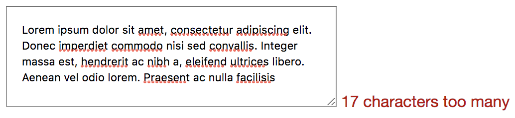
Okay, so how do we implement overtyping? Instead of jumping into the code, let’s step through in theory. maxlength doesn’t allow overtyping, it just stops allowing input once it hits the limit. So we need to remove maxlength and write a JS equivalent. We can use the input event handler as we did before, as we know that works on paste, etc. So in that event, the handler would check if the user has typed more than the limit, and if so, the counter text could change to say “10 characters too many.” The baseline version (without the JS) would no longer have a limit at all, so a useful middle ground could be to add the maxlength to the element in the HTML and remove the attribute using JavaScript.
That way, the user would see that they are over the limit without being cut off while typing. There would still need to be validation to make sure it isn’t submitted, but that is worth the extra small bit of work to make the user experience far better.
This gets us to quite a solid position: the user is now able to use any device and get a decent experience. If they type too much it is not going to cut them off; instead, it will just allow it and encourage them to edit it down.
There’s a variety of ways this could be designed differently, so let’s look at how Twitter handles it:
Twitter has been iterating its main tweet <textarea> since they started the company. The current version uses a lot of techniques that we could consider using.
As you type on Twitter, there is a circle that completes once you get to the character limit of 280. Interestingly, it doesn’t say how many characters are available until you are 20 characters away from the limit. At that point, the incomplete circle turns orange. Once you have 0 characters remaining, it turns red. After the 0 characters, the countdown goes negative; it doesn’t appear to have a limit on how far you can overtype (I tried as far as 4,000 characters remaining) but the tweet button is disabled while overtyping.
So this works the same way as our <textarea> does, with the main difference being the characters represented by a circle that updates and shows the number of characters remaining after 260 characters. We could implement this by removing the text and replacing it with an SVG circle.
The other thing that Twitter does is add a red background behind the overtyped text. This makes it completely obvious that the user is going to need to edit or remove some of the text to publish the tweet. It is a really nice part of the design. So how would we implement that? We would start again from the beginning.
You remember the part where we realized that a basic input text box would not give us multiline? And that a maxlength attribute would not give us the ability to overtype? This is one of those cases. As far as I know, there is nothing in CSS that gives us the ability to style parts of the text inside a <textarea>. This is the point where some people would suggest web components, as what we would need is a pretend <textarea>. We would need some kind of element — probably a div — with contenteditable on it and in JS we would need to wrap the overtyped text in a span that is styled with CSS.
What would the baseline non-JS version look like then? Well, it wouldn’t work at all because while contenteditable will work without JS, we would have no way to actually do anything with it. So we would need to have a <textarea> by default and remove that if JS is available. We would also need to do a lot of accessibility testing because while we can trust a <textarea> to be accessible relying on browser features is a much safer bet than building your own components. How does Twitter handle it? You may have seen it; if you are on a train and your JavaScript doesn’t load while going into a tunnel then you get chucked into a decade-old legacy version of Twitter where there is no character limit at all.
What happens then if you tweet over the character limit? Twitter reloads the page with an error message saying “Your Tweet was over the character limit. You’ll have to be more clever.” No, Twitter. You need to be more clever.
Retro
The only way to conclude this dramatization is a retrospective. What went well? What did we learn? What would we do differently next time or what would we change completely?
We started very simple with a basic textbox; in some ways, this is good because it can be all too easy to overcomplicate things from the beginning and an MVP approach is good. However, as time went on, we realized how important it is to have some critical thinking and to consider what we are doing. We should have known a basic textbox wouldn’t be enough and that a way of setting a maximum length would be useful. It is even possible that if we have conducted or sat in on user research sessions in the past that we could have anticipated the need to allow overtyping. As for the browser compatibility and user experiences across devices, considering progressive enhancement from the beginning would have caught most of those potential issues.
So one change we could make is to be much more proactive about the thinking process instead of jumping straight into the task, thinking that the code is easy when actually the code is the least important part.
On a similar vein to that, we had the “scope creep” of maxlength, and while we could possibly have anticipated that, we would rather not have any scope creep at all. So everybody involved from the beginning would be very useful, as a diverse multidisciplinary approach to even small tasks like this can seriously reduce the time it takes to figure out and fix all the unexpected tweaks.
Back To The Real World
Okay, so I can get quite deep into this made-up project, but I think it demonstrates well how complicated the most seemingly simple tasks can be. Being user-focussed, having a progressive enhancement mindset, and thinking things through from the beginning can have a real impact on both the speed and quality of delivery. And I didn’t even mention testing!
I went into some detail about the history of the <textarea> and which event listeners to use, some of this can seem overkill, but I find it fascinating to gain a real understanding of the subtleties of the web, and it can often help demystify issues we will face in the future.


 Import npm package with UI component on UXPin’s trial.
 Try code-based libraries that are built-in in UXPin.
This Sounds Great, But Is It Suitable For My Team?
Try code-based libraries that are built-in in UXPin.
This Sounds Great, But Is It Suitable For My Team?