Is There Too Much CSS Now?

As front-end developers, we’ve wished for a lot of things over the years — ways to center things in CSS, encapsulate styles, set an element’s aspect ratio, get finer-grained control over our colors, select an element based on its children’s properties, manage layers of specificity, allow elements to respond to the width of their parents… the list goes on and on.

And now that we got all we wished for and more, some of us are asking — do we now have too much CSS?

The dark times

If you, like me, came up in web development during CSS’s infancy, the idea of having too much of it seems ludicrous.

Back in the days, virtually the entire job description of a front-end developer consisted of dealing with CSS’s limitations. The clearfix hack to clear floats, the 100% padding hack to make square divs, not to mention semi-randomly applying unrelated properties to trick Internet Explorer into doing your bidding.

At the time, the browser was a devious foe to be defeated through sheer cunning and arcane incantations. Today, the perfect property is waiting and just a copy-paste away on MDN.

The new era of CSS

But today things are vastly different: not only are things moving much faster, but browser vendors actually care about making developers happy! I know, I couldn’t believe it either. But I run the yearly State of CSS developer survey (which is open now by the way — go take it!) and I know for a fact that browser development teams use the survey results (among many other data points) to inform their roadmap.

Beyond this, Google has also helped finance my work on the survey, and even hired Lea Verou to take the lead on selecting this year’s survey questions.

It’s not just Google. It’s become fashionable to bash Safari and Apple in general (sometimes deservedly so), but you can’t deny how passionate someone like Jen Simmons is about listening to developers and improving the web.

And not only are browser vendors improving CSS on their own; they’re even collaborating across battle lines with initiatives such as Interop 2023 to help reduce inconsistencies and incompatibilities between browsers.

Too much of a good thing?

The result of all this is that we are now faced with an embarrassment of CSS riches, and it can be hard to catch up. CSS Grid started being supported in major browsers almost five years ago, yet I still check a reference every time I use it. And as cool as subgrid seems, I’ve yet to even try it out.

During the process of selecting which CSS features to include or not in the State of CSS, Lea and myself considered many features, but we also rejected quite a few. Some examples of the feature we didn’t include are:

  • The linear() easing function, which lets you define easing curves with more granularity. 
  • The env() function, which lets you use variables defined by the browser or device. 
  • The scrollbar-width property, which helps control a scrollbar’s appearance. 
  • The margin-trim property, which lets you control how a container’s children’s margins behave. 

These are all potentially very useful, and would’ve all been big news during the CSS drought of past years. But in today’s context they have to fight for attention with much larger announcements, like the has() selector or CSS nesting!

Not excited

As Silvestar Bistrović writes, he is “not that excited about all these new CSS features.” This found an echo on Twitter, with Sara Soueidan stating that what she cares about is “practicality, not how shiny a feature looks at the moment.”

This may seem like a negative attitude, but I think it’s understandable. Nobody can be expected to keep up with so many new features!

Another unintended (or maybe, intended?) consequence is that the more complex CSS becomes, the more it raises the bar for any new company wanting to develop a browser engine — to say nothing of the added workload when it comes to maintaining and documenting all these new features. 

CSS overreach

There’s also the very valid concern that CSS might be branching out into areas it’s not quite suitable to handle. That’s another thing Sara Soueidan pointed out when reacting to the new CSS Toggles experimental implementation (here’s a ticket discussing it):

Many have made the very reasonable point that this kind of behavior would be best handled by a new HTML element instead of managing toggle state purely through CSS, and that CSS may not be the best medium to ensure accessibility issues are properly addressed. 

When CSS takes over something that was previously handled through JavaScript, this is generally seen as a good thing, as it often reduces the amount of code the browser has to load. So, I’m cautiously optimistic about CSS Toggles and trust that the CSS Working Group will properly address the concerns of the community. But there may yet come a day when we start to worry that CSS may be expanding beyond its borders and encroaching on HTML and JavaScript’s responsibilities.

New expectations

And maybe this is what needs to change: maybe we should drop the expectation that CSS developers have to know all of CSS? 

This expectation stems from the days where CSS was an afterthought, that little annoying syntax you had to learn to make your button blue and bold just like the client asked. But I think we need to accept that today’s CSS might just be way too vast for a single person to master, especially in addition to other front-end duties.

As Michelle Barker puts it:

And that’s where I, myself, land in the end. I’ve made my peace with the fact that I will probably never use — or even know about — all possible CSS features. And this is coming from someone who runs a survey about CSS!

But these new features will surely be useful to someone. Someone will write blog posts about them, create cool CodePens with them, give talks about them. That person will be a cool, young, energetic developer who still have all their hair. In other words, it won’t be me — and that’s fine. 

And maybe you’re worried that this new developer will be overwhelmed by all the stuff they have to learn at once. But do keep in mind all the things they won’t have to learn about, precisely because it’s been replaced by these newer alternatives. I know I’d take that deal anytime.

But think about it: in the past couple years, not only have we seen a huge increase in the number of devices we need to cater to, we’ve also started to recognize that we all consume the web in slightly different manners, whether due to disabilities, current context, or just personal preferences. Shouldn’t CSS adapt to this new reality?

Now, I have to confess this has all made me feel a bit nostalgic… so excuse me while I go clear a couple floats, just for old time’s sake.


As I mentioned, the yearly State of CSS survey is now open. Whether you think there’s too much CSS or not, the survey is a great way to let browser developers know how you feel, so go fill it out if you have 10 minutes. 


Is There Too Much CSS Now? originally published on CSS-Tricks, which is part of the DigitalOcean family. You should get the newsletter.

Futuristic CSS

I run the yearly State of CSS survey, asking developers about the CSS features and tools they use or want to learn. The survey is actually open right now, so go take it!

The goal of the survey is to help anticipate future CSS trends, and the data is also used by browser vendors to inform their roadmap.

This year, Lea Verou pitched in as lead survey designer to help select which CSS features to include. But even though we added many new and upcoming features (some of which, like CSS nesting, aren’t even supported yet), some features were so far off, far-fetched, and futuristic (or just plain made-up!) that we couldn’t in good conscience include them in the survey.

But it’s fun to speculate. So today, let’s take a look at some CSS features that might one day make their way to the browser… or not!

CSS Toggles

The CSS checkbox hack has been around for over ten years, and it still remains the only way to achieve any kind of “toggle effect” in pure CSS (I actually used it myself recently for the language switcher on this page).

But what if we had actual toggles, though? What if you could handle tabs, accordions, and more, all without writing a single line of JavaScript code?

That’s exactly what Tab Atkins and Miriam Suzanne’s CSS Toggles proposal wants to introduce. The proposal is quite complex, and the number of details and edge cases involved makes it clear that this will be far from trivial for browser vendors to implement. But hey, one can dream, and in fact, an experimental implementation recently appeared in Chrome Canary!

CSS Switch Function

A major trend in recent years — not only in CSS but in society at large — has been recognizing that we’ve often done a poor job of serving the needs of a diverse population. In terms of web development, this translates into building websites that can adapt not only to different devices and contexts but also to different temporary or permanent disabilities such as color blindness or motion sickness.

The result is that we often need to target these different conditions in our code and react to them, and this is where Miriam Suzanne’s switch proposal comes in:

.foo {
  display: grid;
  grid-template-columns: switch(
    auto /
     (available-inline-size > 1000px) 1fr 2fr 1fr 2fr /
     (available-inline-size > 500px) auto 1fr /
   );
}

While the initial proposal focuses on testing available-inline-size as a way to set up grid layouts, one can imagine the same switch syntax being used for many other scenarios as well, as a complement to media and container queries.

Intrinsic Typography

Intrinsic typography is a technique coined by Scott Kellum, who developed the type-setting tool Typetura. In a nutshell, it means that instead of giving the text a specific size, you let it set its own size based on the dimensions of the element containing it:

Instead of sizing and spacing text for each component at every breakpoint, the text is given instructions to respond to the areas it is placed in. As a result, intrinsic typography enables designs to be far more flexible, adapting to the area in which it is placed, with far less code.

This goes beyond what the already quite useful Utopia Type Scale Calculator can offer, as it only adapts based on viewport dimensions — not container dimensions.

The only problem with Typetura is that it currently requires a JavaScript library to work. As is often the case, though, one can imagine that if this approach proves popular, it’ll make its way to native CSS sooner or later.

We can already achieve a lot of this today (or pretty soon, at least) with container query units, which lets you reference a container’s size when defining units for anything inside it.

Sibling Functions

It’s common in Sass to write loops when you want to style a large number of items based on their position in the DOM. For example, to progressively indent each successive item in a list, you could do the following:

@for $i from 1 through 10 {
  ul:nth-child(#{$i}) {
    padding-left: #{$i * 5px}
  }
}

This would then generate the equivalent of 10 CSS declarations. The obvious downside here is that you end up with ten lines of code! Also, what if your list has more than ten elements?

An elegant solution currently in the works is the sibling-count() and sibling-index() functions. Using sibling-index(), the previous example would become:

ul > li {
  padding-left: calc(sibling-index() * 5px); 
}

It’s an elegant solution to a common need!

CSS Patterns

A long, long time ago, I made a little tool called Patternify that would let you draw patterns and export them to base64 code to be dropped inline in your CSS code. My concept was to let you use patterns inside CSS but with CSS Doodle. Yuan Chuan had the opposite idea: what if you used CSS to create the patterns?

Now pure-CSS pattern-making has been around for a while (and recently got more elaborate with the introduction of conic gradients), but Yuan Chuan definitely introduced some key new concepts, starting with the ability to randomize patterns or easily specify a grid.

Obviously, CSS Doodle is probably far more intricate than a native pattern API would ever need to be, but it’s still fun to imagine what we could do with just a few more pattern-focused properties. The @image proposal might be a step in that direction, as it gives you tools to define or modify images right inside your CSS code.

Native HTML/CSS Charts

Now we’re really getting into wild speculation. In fact, as far as I know, no one else has ever submitted a proposal or even blogged about this. But as someone who spends a lot of their time working on data visualizations, I think native HTML/CSS charts would be amazing!

Now, most charts you’ll come across on the web will be rendered using SVG or sometimes Canvas. In fact, this is the approach we use for the surveys through the DataViz library Nivo.

The big problem with this, though, is that neither SVG nor Canvas are really responsive. You can scale them down proportionally, but you can’t have the same fine-grained control that something like CSS Grid offers.

That’s why some have tried to lay out charts using pure HTML and CSS, like charting library Charts.css.

The problem here becomes that once you go past simple blocky bar charts, you need to use a lot of hacks and complex CSS code to achieve what you want. It can work, and libraries like Charts.css do help a lot, but it’s not easy by any means.

That’s why I think having native chart elements in the browser could be amazing. Maybe something like:

<linechart>
  <series id=”series_a”>
    <point x=”0” y=”2”/>
    <point x=”1” y=”4”/>
    <point x=”2” y=”6”/>
  </series>
  <series id=”series_b”>
    <point x=”0” y=”6”/>
    <point x=”1” y=”4”/>
    <point x=”2” y=”2”/>
  </series>
</linechart>

You would then be able to control the chart’s spacing, layout, colors, and so on by using good old CSS — including media and container queries, to make your charts look good in every situation.

Of course, this is something that’s already possible through web components, and many are experimenting in this direction. But you can’t beat the simplicity of pure HTML/CSS.

And Also…

Here are a couple more quick ones just to keep you on your toes:

Container Style Queries

You might already know that container queries let you define an element’s style based on the width or height of its containing element. Container style queries let you do the same, but based on that container’s — you guessed it — style, and there’s actually already an experimental implementation for it in Chrome Canary.

As Geoff Graham points out, this could take the form of something like:

.posts {
  container-name: posts;
}

@container posts (background-color: #f8a100) {
  /* Change styles when `posts` container has an orange background */
  .post {
    color: #fff;
  }
}

This is a bit like :has(), if :has() lets you select based on styles and not just DOM properties and attributes, which, now that I think about it, might be another cool feature too!

Random Numbers

People have tried to simulate a random number generator in CSS for a long time (using the “Cicada Principle” technique and other hacks), but having true built-in randomness would be great.

A CSS random number generator would be useful not just for pattern-making but for any time you need to make a design feel a little more organic. There is a fairly recent proposal that suggests a syntax for this, so it’ll be interesting to see if we ever get CSS randomness!

Grid Coordinates Selector

What if you could target grid items based on their position in a grid or flexbox layout, either by styling a specific row or column or even by targeting a specific item via its x and y coordinates?

It might seem like a niche use case at first, but as we use Grid and Subgrid more and more, we might also need new ways of targeting specific grid items.

Better Form Styling

Styling form inputs has traditionally been such a pain that many UI libraries decide to abstract away the native form input completely and recreate it from scratch using a bunch of divs. As you might imagine, while this might result in nicer-looking forms, it usually comes at the cost of accessibility.

And while things have been getting better, there’s certainly still a lot we could improve when it comes to forming input styling and styling native widgets in general. The new <selectmenu> element proposal is already a great start in that direction.

Animating To Auto

We’ve all run into this: you want to animate an element’s height from 0 to, well, however big it needs to be to show its contents, and that’s when you realize CSS doesn’t let you animate or transition to auto.

There are workarounds, but it would still be nice to have this fixed at the browser level. For this to happen, we’ll also need to be able to use auto inside calc, for example calc(auto / 2 + 200px / 2).

Predicting The Future

Now let’s be real for a second: the chances of any of these features being implemented (let alone supported in all major browsers) are slim, at least if we’re looking at the next couple of years.

But then again, people thought the same about :has() or native CSS nesting, and it does look like we’re well on our way to being able to use those two — and many more — in our code sooner than later.

So let’s touch base again five years from now and see how wrong I was. Until then, I’ll keep charting the course of CSS through our yearly surveys. And I hope you’ll help us by taking this year’s survey!

Thanks to Lea Verou and Bramus Van Damme for their help with this article.

Practice GraphQL Queries With the State of JavaScript API

Learning how to build GraphQL APIs can be quite challenging. But you can learn how to use GraphQL APIs in 10 minutes! And it so happens I've got the perfect API for that: the brand new, fresh-of-the-VS-Code State of JavaScript GraphQL API.

The State of JavaScript survey is an annual survey of the JavaScript landscape. We've been doing it for four years now, and the most recent edition reached over 20,000 developers.

We've always relied on Gatsby to build our showcase site, but until this year, we were feeding our data to Gatsby in the form of static YAML files generated through some kind of arcane magic known to mere mortals as "ElasticSearch."

But since Gatsby poops out all the data sources it eats as GraphQL anyway, we though we might as well skip the middleman and feed it GraphQL directly! Yes I know, this metaphor is getting grosser by the second and I already regret it. My point is: we built an internal GraphQL API for our data, and now we're making it available to everybody so that you too can easily exploit out dataset!

"But wait," you say. "I've spent all my life studying the blade which has left me no time to learn GraphQL!" Not to worry: that's where this article comes in.

What is GraphQL?

At its core, GraphQL is a syntax that lets you specify what data you want to receive from an API. Note that I said API, and not database. Unlike SQL, a GraphQL query does not go to your database directly but to your GraphQL API endpoint which, in turn, can connect to a database or any other data source.

The big advantage of GraphQL over older paradigms like REST is that it lets you ask for what you want. For example:

query {
  user(id: "foo123") {
    name
  }
}

Would get you a user object with a single name field. Also need the email? Just do:

query {
  user(id: "foo123") {
    name
    email
  }
}

As you can see, the user field in this example supports an id argument. And now we come to the coolest feature of GraphQL, nesting:

query {
  user(id: "foo123") {
    name
    email
    posts { 
      title
      body
    }
  }
}

Here, we're saying that we want to find the user's posts, and load their title and body. The nice thing about GraphQL is that our API layer can do the work of figuring out how to fetch that extra information in that specific format since we're not talking to the database directly, even if it's not stored in a nested format inside our actual database.

Sebastian Scholl does a wonderful job explaining GraphQL as if you were meeting it for the first time at a cocktail mixer.

Introducing GraphiQL

Building our first query with GraphiQL, the IDE for GraphQL

GraphiQL (note the "i" in there) is the most common GraphQL IDE out there, and it's the tool we'll use to explore the State of JavaScript API. You can launch it right now at graphiql.stateofjs.com and it'll automatically connect to our endpoint (which is api.stateofjs.com/graphql). The UI consists of three main elements: the Explorer panel, the Query Builder and the Results panels. We'll later add the Docs panels to that but let's keep it simple for now.

The Explorer tab is part of a turbo-boosted version of GraphiQL developed and maintained by OneGraph. Much thanks to them for helping us integrate it. Be sure to check out their example repo if you want to deploy your own GraphiQL instance.

Don't worry, I'm not going to make you write any code just yet. Instead, let's start from an existing GraphQL query, such as the one corresponding to developer experience with React over the past four years.

Remember how I said we were using GraphQL internally to build our site? Not only are we exposing the API, we're also exposing the queries themselves. Click the little "Export" button, copy the query in the "GraphQL" tab, paste it inside GraphiQL's query builder window, and click the "Play" button.

Source URL
The GraphQL tab in the modal that triggers when clicking Export.

If everything went according to plan, you should see your data appear in the Results panel. Let's take a moment to analyze the query.

query react_experienceQuery {
  survey(survey: js) {
    tool(id: react) {
      id
      entity {
        homepage
        name
        github {
          url
        }
      }
      experience {
        allYears {
          year
          total
          completion {
            count
            percentage
          }
          awarenessInterestSatisfaction {
            awareness
            interest
            satisfaction
          }
          buckets {
            id
            count
            percentage
          }
        }
      }
    }
  }
}

First comes the query keyword which defines the start of our GraphQL query, along with the query's name, react_experienceQuery. Query names are optional in GraphQL, but can be useful for debugging purposes.

We then have our first field, survey, which takes a survey argument. (We also have a State of CSS survey so we needed to specify the survey in question.) We then have a tool field which takes an id argument. And everything after that is related to the API results for that specific tool. entity gives you information on the specific tool selected (e.g. React) while experience contains the actual statistical data.

Now, rather than keep going through all those fields here, I'm going to teach you a little trick: Command + click (or Control + click) any of those fields inside GraphiQL, and it will bring up the Docs panel. Congrats, you've just witnessed another one of GraphQL's nifty tricks, self-documentation! You can write documentation directly into your API definition and GraphiQL will in turn make it available to end users.

Changing variables

Let's tweak things a bit: in the Query Builder, replace "react" with "vuejs" and you should notice another cool GraphQL thing: auto-completion. This is quite helpful to avoid making mistakes or to save time! Press "Play" again and you'll get the same data, but for Vue this time.

Using the Explorer

We'll now unlock one more GraphQL power tool: the Explorer. The Explorer is basically a tree of your entire API that not only lets you visualize its structure, but also build queries without writing a single line of code! So, let's try recreating our React query using the explorer this time.

First, let's open a new browser tab and load graphiql.stateofjs.com in it to start fresh. Click the survey node in the Explorer, and under it the tool node, click "Play." The tool's id field should be automatically added to the results and — by the way — this is a good time to change the default argument value ("typescript") to "react."

Next, let's keep drilling down. If you add entity without any subfields, you should see a little squiggly red line underneath it letting you know you need to also specify at least one or more subfields. So, let's add id, name and homepage at a minimum. Another useful trick: you can automatically tell GraphiQL to add all of a field's subfields by option+control-clicking it in the Explorer.

Next up is experience. Keep adding fields and subfields until you get something that approaches the query you initially copied from the State of JavaScript site. Any item you select is instantly reflected inside the Query Builder panel. There you go, you just wrote your first GraphQL query!

Filtering data

You might have noticed a purple filters item under experience. This is actually they key reason why you'd want to use our GraphQL API as opposed to simply browsing our site: any aggregation provided by the API can be filtered by a number of factors, such as the respondent's gender, company size, salary, or country.

Expand filters and select companySize and then eq and range_more_than_1000. You've just calculated React's popularity among large companies! Select range_1 instead and you can now compare it with the same datapoint among freelancers and independent developers.

It's important to note that GraphQL only defines very low-level primitives, such as fields and arguments, so these eq, in, nin, etc., filters are not part of GraphQL itself, but simply arguments we've defined ourselves when setting up the API. This can be a lot of work at first, but it does give you total control over how clients can query your API.

Conclusion

Hopefully you've seen that querying a GraphQL API isn't that big a deal, especially with awesome tools like GraphiQL to help you do it. Now sure, actually integrating GraphQL data into a real-world app is another matter, but this is mostly due to the complexity of handling data transfers between client and server. The GraphQL part itself is actually quite easy!

Whether you're hoping to get started with GraphQL or just learn enough to query our data and come up with some amazing new insights, I hope this guide will have proven useful!

And if you're interested in taking part in our next survey (which should be the State of CSS 2020) then be sure to sign up for our mailing list so you can be notified when we launch it.

State of JavaScript API Reference

You can find more info about the API (including links to the actual endpoint and the GitHub repo) at api.stateofjs.com.

Here's a quick glossary of the terms used inside the State of JS API.

Top-Level Fields

  • Demographics: Regroups all demographics info such as gender, company size, salary, etc.
  • Entity: Gives access to more info about a specific "entity" (library, framework, programming language, etc.).
  • Feature: Usage data for a specific JavaScript or CSS feature.
  • Features: Same, but across a range of features.
  • Matrices: Gives access to the data used to populate our cross-referential heatmaps.
  • Opinion: Opinion data for a specific question (e.g. "Do you think JavaScript is moving in the right direction?").
  • OtherTools: Data for the "other tools" section (text editors, browsers, bundlers, etc.).
  • Resources: Data for the "resources" section (sites, blogs, podcasts, etc.).
  • Tool: Experience data for a specific tool (library, framework, etc.).
  • Tools: Same, but across a range of tools.
  • ToolsRankings: Rankings (awareness, interest, satisfaction) across a range of tools.

Common Fields

  • Completion: Which proportion of survey respondents answered any given question.
  • Buckets: The array containing the actual data.
  • Year/allYears: Whether to get the data for a specific survey year; or an array containing all years.

The post Practice GraphQL Queries With the State of JavaScript API appeared first on CSS-Tricks.

Three Predictions From the State of CSS 2019 Survey

Running a developer survey like the State of CSS is a multi-stage process. First, you need to collect the data. Then, you process it into a usable shape. Finally, you come up with nifty ways to visualize it and release it to the world.

But then, once the dust settles and the traffic dies down comes my favorite part: actually thinking about the data. By taking a deeper look at our data, as well as observing how the community discussed our findings, three unexpected trends ended up coming into focus.

But first, some background for those not already familiar with the project.

I first started the State of JavaScript survey three years ago in 2016 as a way to answer my own uncertainties about the future of web development. At the time, JavaScript fatigue was running wild and I thought a comprehensive developer survey could prove itself the antidote.

The original State of JavaScript 2016 edition

Turns out I hit a nerve: that first survey turned out to be very popular, and our audience has grown each year since, along with the scope of the survey. (I was also joined by Raphael Benitte, creator of the Nivo.js dataviz library, to help me with data processing and visualization.) This year marks the first time we're pivoting out into a new dimension, namely the not-so-simple world of CSS.

Taking on CSS

Prediction 1: CSS still has a lot of unexplored territory

One of the things we wanted to quantify with the survey was how much of CSS was still left "unexplored." In other words, what CSS features are developers either unfamiliar with, or else hadn't yet used. For that reason we decided early-on to focus our Features section on new CSS properties, like shapes, masking, or scroll-snap rather than “boring” floats or tables.

The resulting data paints an interesting picture: it turns out that when you look at it this way, CSS morphs from a familiar landscape to a wild, unexplored jungle.

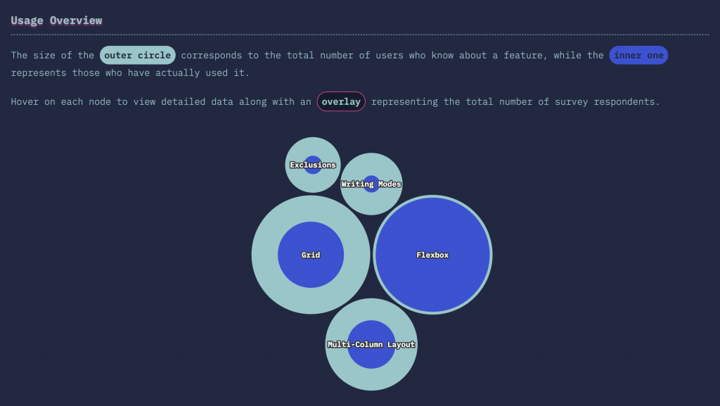
A look at comparing Flexbox vs. CSS Grid provides a good illustration of this trend. While nearly everybody who's heard of Flexbox has also used it, only 55% of developers who are aware of CSS Grid have actually tried it. That's a big gap, especially for a technology as important as CSS Grid!

Layout Features

Or take CSS Shapes: 68% of developers are aware of them, only 31% of that group has actually used the feature.

CSS Shapes

This all points at a big gap between what we collectively want to learn and what we actually know. It's that potential for growth that is exactly what makes CSS so exciting in 2019.

Prediction 2: Functional CSS will keep rising

If you're old enough to remember the CSS Zen Garden — or to have actually learned CSS through it (in which case I know how you feel, my back hurts when I get up in the morning as well) — then this next trend might seem weird, or even downright wrong.

CSS Zen Garden: one page, many themes.

Functional CSS rejects the platonic ideal of pure, untainted markup free from any styling concerns and embraces "functional" (aka "atomic" or "utility") classes. Think <div class="text-red text-medium border-1">...</div>.

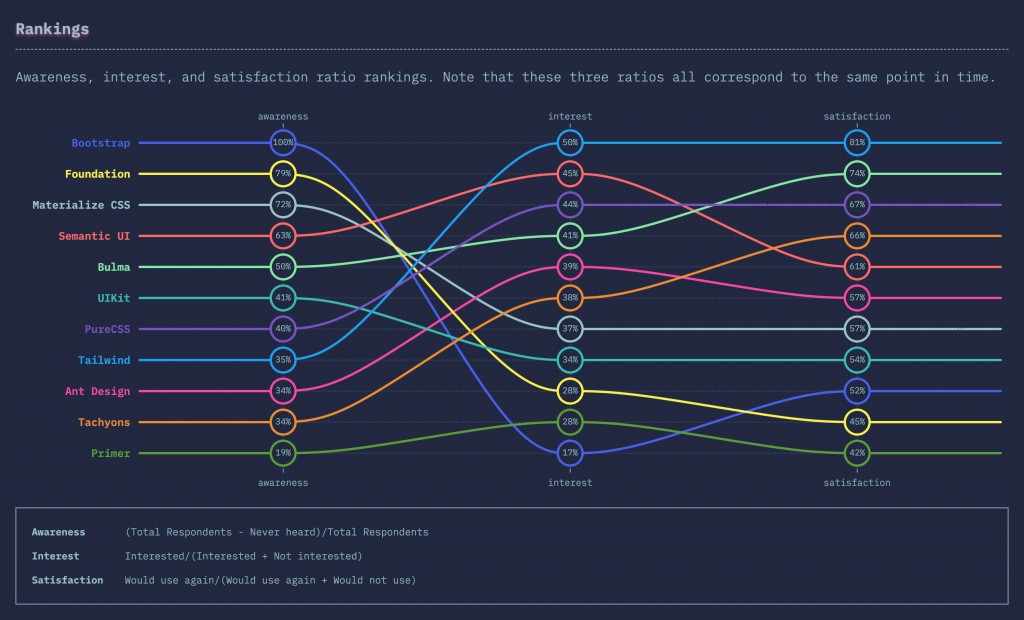
Adopting this approach means you can't magically update your stylesheet and change your entire design without modifying a single line of markup. But be honest, how often does this happen anyway? Compared to the often theoretical elegance of the Zen Garden philosophy, libraries like Tailwind and Tachyons provide tangible, real-world benefits, which explains why they're so highly regarded. In fact, those take the #1 and #4 spots, respectively, in terms of satisfaction ratio in the CSS Framework category.

Awareness, interest, and satisfaction ratio rankings for CSS frameworks.

Tailwind especially seems to be picking up speed, at least judging by the Twitter engagement from its community in response to the survey results. Having just hit version 1.0, it's definitely a project to keep an eye on!

Prediction 3: The battle for CSS has just begun

Looking at our data, I can't help but wonder if "JavaScript fatigue" will soon be replaced by "CSS fatigue."

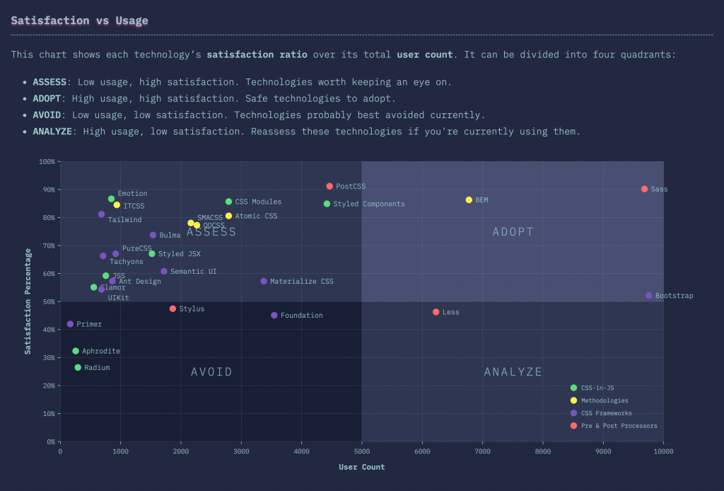
When evaluating technologies, it's important to look not just at raw usage numbers, but also at user satisfaction. After all, you don't want to jump on the latest bandwagon just to find out its current occupants can't wait to hop off it.

This scatterplot chart that's divided into quadrants is perfect for this. It plots usage against satisfaction, making it easy to isolate popular, high-satisfaction tools into their own quadrant.

Usage vs. Satisfaction

What's apparent in this chart is that the most densely populated area is the "Assess" quadrant. In other words, the low-usage, high-satisfaction technologies that are still battling it out for supremacy. This is exactly the state that the JavaScript ecosystem finds itself in as well. Many contenders, but few decisive winners as of today.

This is not necessarily a bad thing: yes, it does make the average developer's life harder when it comes to picking the right tool, but hey, this is why we do what we do! Additionally, competition can only be good for the ecosystem as a whole. Once the dust settles, we'll hopefully end up with the best possible options having survived!

CSS in 2019

Overall, the State of CSS survey shows that this is not your grandpa's CSS anymore. For years, we developers have loved to complain about the inadequacies of CSS and its lack of powerful features. But in 2019, CSS is challenging us to put our money where our mouthes are: here's all the features you've always wanted. Now what are you going to do about it?

I, for one, am very excited to dive even deeper into this new world of styling. And, of course, to tune back in 2020 to see what new trends we find then!

The post Three Predictions From the State of CSS 2019 Survey appeared first on CSS-Tricks.

Why CSS Needs its Own Survey

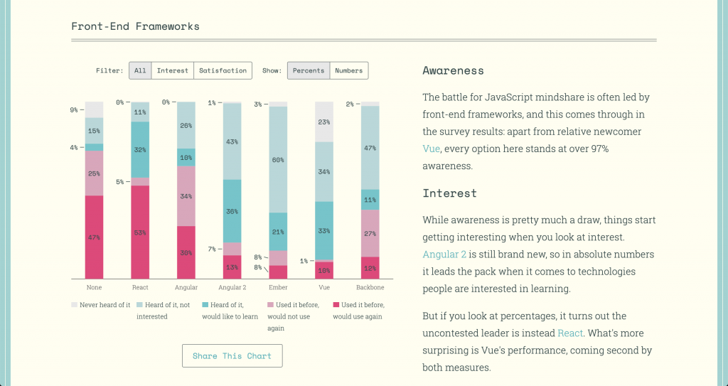
2016 was only three years ago, but that’s almost a whole other era in web development terms. The JavaScript landscape was in turmoil, with up-and-comer React — as well as a little-known framework called Vue — fighting to dethrone Angular.

Like many other developers, I felt lost. I needed some clarity, and I figured the best way to get it was simply to ask fellow coders what they used, and more importantly, what they enjoyed using. The result was the first ever edition of the now annual State of JavaScript survey.

The State of JavaScript 2018

Things have stabilized in the JavaScript world since then. Turns out you can’t really go wrong with any one of the big three frameworks, and even less mainstream options, like Ember, have managed to build up passionate communities and show no sign of going anywhere.

But while all our attention was fixated on JavaScript, trouble was brewing in CSS land. For years, my impression of CSS’s evolution was slow, incremental progress. Back then, I was pretty sure border-radius support represented the crowning, final achievement of web browser technology.

But all of a sudden, things started picking up. Flexbox came out, representing the first new and widely adopted layout method in over a decade. And Grid came shortly after that, sweeping away years of hacky grid frameworks into the gutter of bad CSS practices.

Something even crazier happened: now that the JavaScript people had stopped creating a new framework every two weeks, they decided to use all their extra free time trying to make CSS even better! And thus CSS-in-JS was born.

And now it’s 2019, and the Flexbox Cheatsheet tab I’ve kept open for the past two years has now been joined by a Grid Cheatsheet, because no matter how many times I use them, I still need to double-check the syntax. And despite writing a popular introduction to CSS-in-JS, I still lazily default to familiar Sass for new projects, promising myself that I’ll "do things properly" the next time.

All this to say that I feel just as lost and confused about CSS in 2019 as I did about JavaScript in 2016. It’s high time CSS got a survey of its own.

Starting from scratch

Coming up with the idea for a CSS survey was easy, but deciding on the questions themselves was far from straightforward. Like I said, I didn’t feel confident in my own CSS knowledge, and simply asking about Sass vs. Less for the 37th time felt like a missed opportunity…

Thankfully, the CSS Gods decided to smile down upon me: while attending the DotJS conference in France I discovered that, not only did fellow speaker Florian Rivoal live in Kyoto, Japan, just like me; but that he was a member of the CSS Working Group! In other words, one of the people who knows the most about CSS on the planet was living a few train stops away from me!

Florian was a huge help in coming up with the overall structure and content of the survey. And he also helped me realize how little I really knew about CSS.

Kyoto, Japan: a hotbed of CSS activity (Photo by Jisu Han)

You don’t know CSS

I’m not only talking about obscure CSS properties here, or even new up-and-coming ones, but about how CSS itself is developed. For example, did you know that the development of the CSS Grid spec was sponsored by Bloomberg, because they needed a way to port the layout of their famous terminal to the web?

Did you ever stop to wonder what top: 30px is supposed to mean on a circular screen, such as the one on a smartwatch? Or did you know that some people are laying out entire printed books in CSS, effectively replacing software like InDesign?

Talking with Florian really expanded my mind to how broad and interesting CSS truly is, and convinced me doing the survey was worth it.

"What do you mean, ‘Make the <table> circular’?" Photo by Artur Łuczka

About that divide...

The idea of a CSS survey became all the more important as my new-found admiration for CSS seemed to coincide with a general sentiment that HTML and CSS mastery were becoming under-appreciated skills in the face of JavaScript hegemony.

Myself, personally, I’ve always enjoyed being a generalist in the sense that I happily hop from one side of the great divide to another whenever I feel like it. At the same time, I’m also wholly convinced that the world needs specialists like Florian; people who dedicate their lives to championing and improving a single aspect of the web.

Devaluing the work the work of generalists is not only unfair, but it’s also counter-productive — after all, HTML and CSS are the foundation on which all modern JavaScript frameworks are built; and on the other hand, new patterns and approaches pioneered by CSS-in-JS libraries will hopefully find their way back into vanilla CSS sooner or later.

Thankfully, I feel like a minority of developers hold those views, and those who do generally hold them do so out of ignorance for what the "other side" really stands for more than any well-informed opinion.

So that’s where the survey comes in: I’m not saying I can fill up the divide, but maybe I can throw a couple walkways across, or distribute some jetpacks — you know, whatever works. 🚀

If that sounds good, then the first step is — you guessed it — taking the survey!

Take Survey

The post Why CSS Needs its Own Survey appeared first on CSS-Tricks.