Here’s a nifty trick from Andy Bell that now seems a little obvious in hindsight: if you set an SVG to have a width and height of 1em then you can change the size of it with the font-size property.
Try and change the font-size on the body element below to see the icon scale with the text:
You pretty much always want your icons to be aligned with text so this trick helps by creating that inherent relationship in your code. Pretty nifty, eh?
How do we avoid the most common mistakes when it comes to setting type on the web? That’s the question that’s been stuck in my head lately as I’ve noticed a lot of typography that’s lackluster, frustrating, and difficult to read. So, how can we improve interfaces so that our content is easy to read at all times and contexts? How do learn from everyone else’s mistakes, too?
These questions encouraged me to jot down some rules that are easy to apply and have the greatest impact on legibility, based on my own personal experience. And, if you didn't know, I'm kinda a geek when it comes to typography. So, I thought I'd share the following six rules that I've come to adopt to get us started.
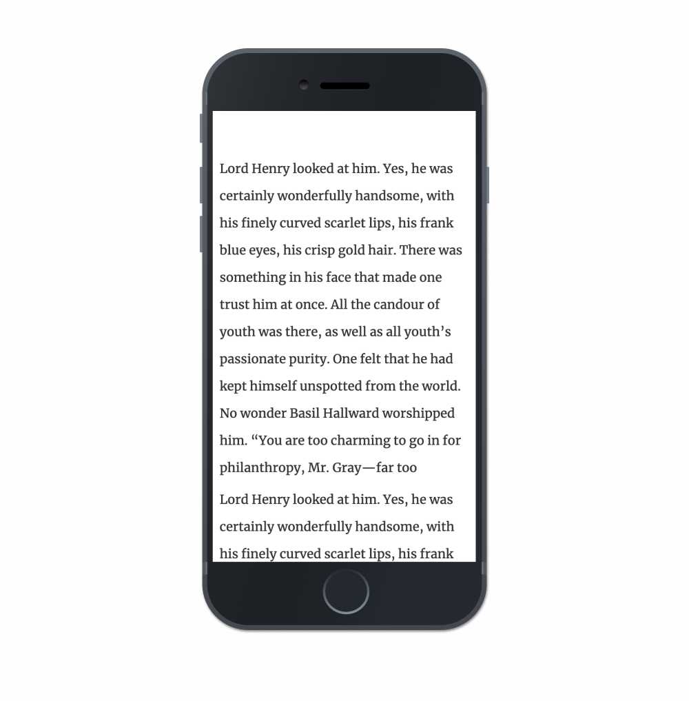
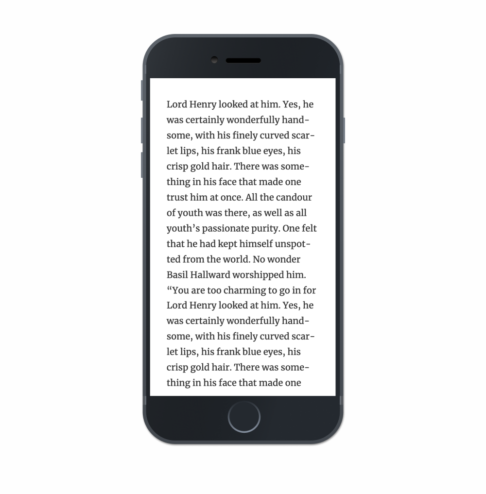
Rule #1: Set a good max-width for paragraphs
This is typically referred to as the measure in typographic circles and highly esteemed typographers will recommend that a paragraph have a width of around 75 characters for legibility reasons. Anything longer than that becomes difficult to read and causes unnecessary strain on the eyes because of the distance the eye has to travel left-to-right and back again (assuming ltr that is).
Here’s a quick example of a good max-width setting for a paragraph. Oh, and make sure to check out this demo on larger screen devices.
Now, this all depends on a ton of factors that great designers contemplate when setting a paragraph. However, as web designers, the difficulty for us is that we have to make sure that paragraphs feel good in additional contexts, like on mobile devices, too. So, while this rule of ~75 characters is nice to have in our back pocket, it's most helpful when we’re trying to figure out the maximum width of our text block. More on this in a bit.
Also, I’d recommend setting that width on a container or grid class that wraps the paragraph instead of setting a max-width value on the paragraph element itself.
Kind of like this:
<div class="container">
  <p>This is where our text goes.</p>
</div>
Otherwise, there may be moments in the future when there's a need for certain paragraphs to be bigger and have a wider measure (like for introductory paragraphs perhaps). In those situations, making a different container class that just handles the larger width of the elements inside them is a nice and modular approach.
I’ve found that by having a system of classes that just deals with the width of things encourages writing much less code but also much more legible code as well. Although, yes, there is more HTML to write but I’d say that’s preferable to a lot of whacky CSS that has to be refactored in the future.
In short: make sure to set a good max-width for our paragraphs but also ensure that we set the widths on a parent class to keep our code readable.
Rule #2: Make the line height smaller than you think
One problem I often see in the wild is with paragraphs that have a line height that’s just way too big. This makes reading long blocks of text pretty exhausting and cumbersome as each hop from one line to the next feels like an enormous jump.
On mobile devices this is particularly egregious as I tend to see something like this often:
For some reason, a lot of folks tend to think that paragraphs on smaller devices require a larger line-height value — but this isn’t the case! Because the width of paragraphs are smaller, line-height can be even smaller than you might on desktop displays. That’s because on smaller screens, and with smaller paragraphs, the reader’s eye has a much shorter distance to hop from the end of one line to the beginning of the next.
This demo certainly isn’t typographically perfect (there’s no such thing), but it’s much easier to read than the majority of websites I stumble across today. In this example, notice how the line-height is probably much smaller than you’re familiar with and see how it feels as you read it:
Another common mistake I frequently see is the use of very large margins on either side of a paragraph of text, it's often on mobile devices that make for blocks of text that are difficult to read like this:
Just — yikes! How are we expected to read this?
Instead try using no more than 10-15px of margin on either side of the paragraph because we need to ensure that our paragraphs are as wide as possible on smaller devices.
I even see folks bump the font-size down on mobile to try and have a nice paragraph width but I’d highly recommend to avoid this as well. Think of the context, because mobile devices are often held in front of the user's face. There's no need to force the user to bring the device any closer to read a small block of text.
Most of the time, smaller margins are the better solve.
Rule #4: Make sure that the type isn’t too thin
This is perhaps my biggest complaint when it comes to typography on the web because so many websites use extraordinarily thin sans-serif typefaces for paragraph text. This makes reading difficult because it’s harder to see each stroke in a letter when they begin to fade away into the background due to the lack of contrast.
Here’s an example of using a typeface that’s too thin:
Try and read the text there. Do you notice yourself struggling to read it? Because we’re using the light weight of Open Sans in this example, letterforms start to break apart and fall to bits. More focus is required to read it. Legibility decreases and reading becomes much more annoying than it really has to be.
I recommend picking a regular weight for body text, then trying to read a long string of text with those settings. Thin fonts look cute and pretty at a glance, but reading it in a longer form will reveal the difficulties.
Rule #5: Use bold weights for headings
Clear hierarchy is vital for controlling the focus of the reader, especially in complex applications that show a ton of data. And although it used to be more common a couple of years ago, I still tend to see a lot folks use very thin weights or regular weights for headings on websites. Again, this isn’t necessarily a die-hard rule — it’s a suggestion. That said, how difficult is it to scan this headline:
It’s a little difficult to see in this example but it's easy to missing the headline altogether in a large application with lots of UI. I’ve often found that inexperienced typographers tend to create hierarchy with font-size whilst experienced typographers will lead with font-weight instead.
Here’s an example of something much easier to scan:
In this example, I’ve set the paragraph text to a dark gray and the heading to a color closer to black while applying a bold weight. It’s not a substantial change in the code but it’s an enormous improvement in terms of hierarchy.
Little improvement like this will quickly add up to a better experience overall when the user is asked to slog through a ton of text.
Rule #6: Don’t use Lorem Ipsum to typeset a page
I think this advice might be the most underrated and I rarely hear it raised in front-end, typography, or design groups. I’ve even noticed seasoned designers struggle to typeset a page because Lorem Ipsum is used for the placeholder content, which makes it impossible for to gauge whether a paragraph of text is easy to read or not.
Setting text in Lorem Ipsum makes good typesetting kind of impossible.
Instead, pick text that you really enjoy reading. Ideally, typesetting would be done with finalized content but that's often a luxury in front-end development. That's why I’d recommend picking text that sounds close to the voice and tone of the project if there's a lack of actual content.
Seriously though, this one change will have an enormous impact on legibility and hierarchy because it encourages reading the text instead of looking at it all aesthetically. I noticed a massive improvement in my own designs when I stopped using undecipherable Lorem Ipsum text and picked content from my favorite novels instead.
And that’s it! There sure are a lot of rules when it comes to typography and these are merely the ones I tend to see broken the most. What kind of typographic issues do you see on the web though? Let us know in the comments!
Violet Peña has shared her recommendations for using CSS Grid. They basically boil down to these high-level points:
Use names instead of numbers for setting up our grid columns.
fr should be our flexible unit of choice.
We don’t really need a grid system anymore.
Although this is all great advice and Violet provides a few examples to support her recommendations, I particularly like what she has to say about learning CSS Grid:
“Learning” CSS Grid requires developing working knowledge of many new properties that don’t just describe one aspect of appearance or behavior, but feed into a completely new layout system. This system includes around 18 properties which use paradigms and syntax rarely (or never) seen anywhere else in the CSS spec.
This means that CSS Grid has a pretty high skill floor — a developer needs to learn and internalize lots of new information in order to be effective with it. Once you’re above that skill floor, Grid is an amazing ally in layout creation. Below that skill floor, Grid is an encumbrance. You wonder why you’re bothering to use it at all, since it seems to require lots of additional work for little reward.
In this post, I want to help you overcome that skill floor by showing you the most effective ways to leverage the Grid spec.
Also this post reminded me that, although I’m not sure why, I tend to avoid naming my grid columns up. Like in this bit of code that Violet walks us through:
Now we can use the sidebar or content names when we define our grid-column like this:
.content {
  grid-column: content;
}
I really like that! It seems super easy to read and if we wanted to change the size of our .content, class then it only requires going back to where the grid is defined in the first place. Anyway, I’ll be sure to name my grid columns from here on out.
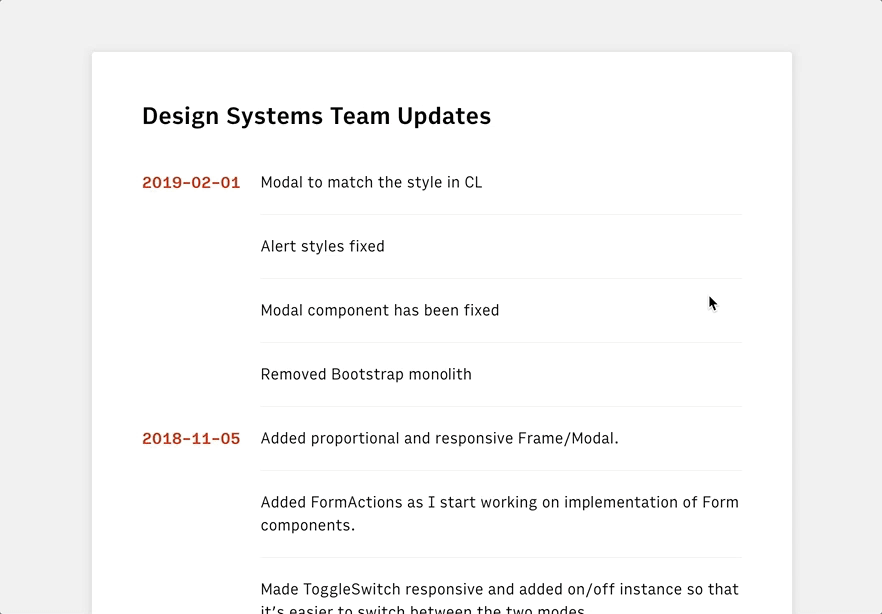
The Airtable web app is pretty neat. You can use it like a spreadsheet but it’s useful for all sorts of other things too. The neatest thing about it for me is that it has an API so that you can treat it like a database.
I’ve been thinking about making weekly notes for the different teams I work with at Gusto to read about what the design systems team is working on, things we've fixed, and any bugs we've encountered during that might impact other designers and engineers across our organization. I’ve spent a couple of hours thinking about how we might use Airtable to collect a whole bunch of data and then use its API to extract that info and show it in a web app.
Here’s an example of what we’ll end up building, which is basically a React web app that’s using Airtable as a nifty sorta CMS:
To get started, we have to head on over to the command line and run the following (but first make sure npm is installed):
npx create-react-app airtable-test
This will create a new directory called airtable-test which is where we’ll be making our little React app. If we run yarn start in the command line after that’s finished installing, then we’ll see the default page for the project:
And, if we open up src/App.js in that airtable-test directory, we can see how this page is being rendered with React:
import React, { Component } from 'react';
import logo from './logo.svg';
import './App.css';

class App extends Component {
  render() {
    return (
      <div className="App">
        <header className="App-header">
          <img src={logo} className="App-logo" alt="logo" />
          <p>
            Edit src/App.js and save to reload.
          </p>
          <a
            className="App-link"
            href="https://reactjs.org"
            target="_blank"
            rel="noopener noreferrer"
          >
            Learn React

        </header>
      </div>
    );
  }
}

export default App;
Now that we have React up and running, we can go ahead and install airtable in the command line which will let us interact with the Airtable API:
npm i airtable
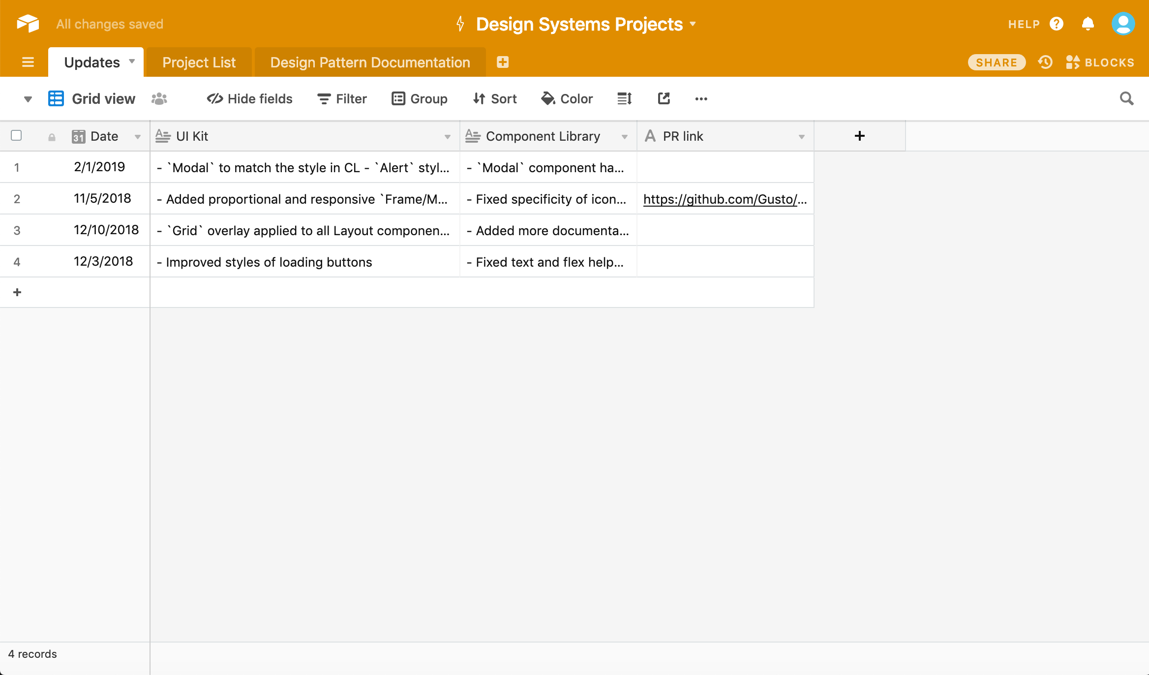
Once we’ve done that, we’ll need to create an Airtable account and create a project. We should wind up with something like this spreadsheet:
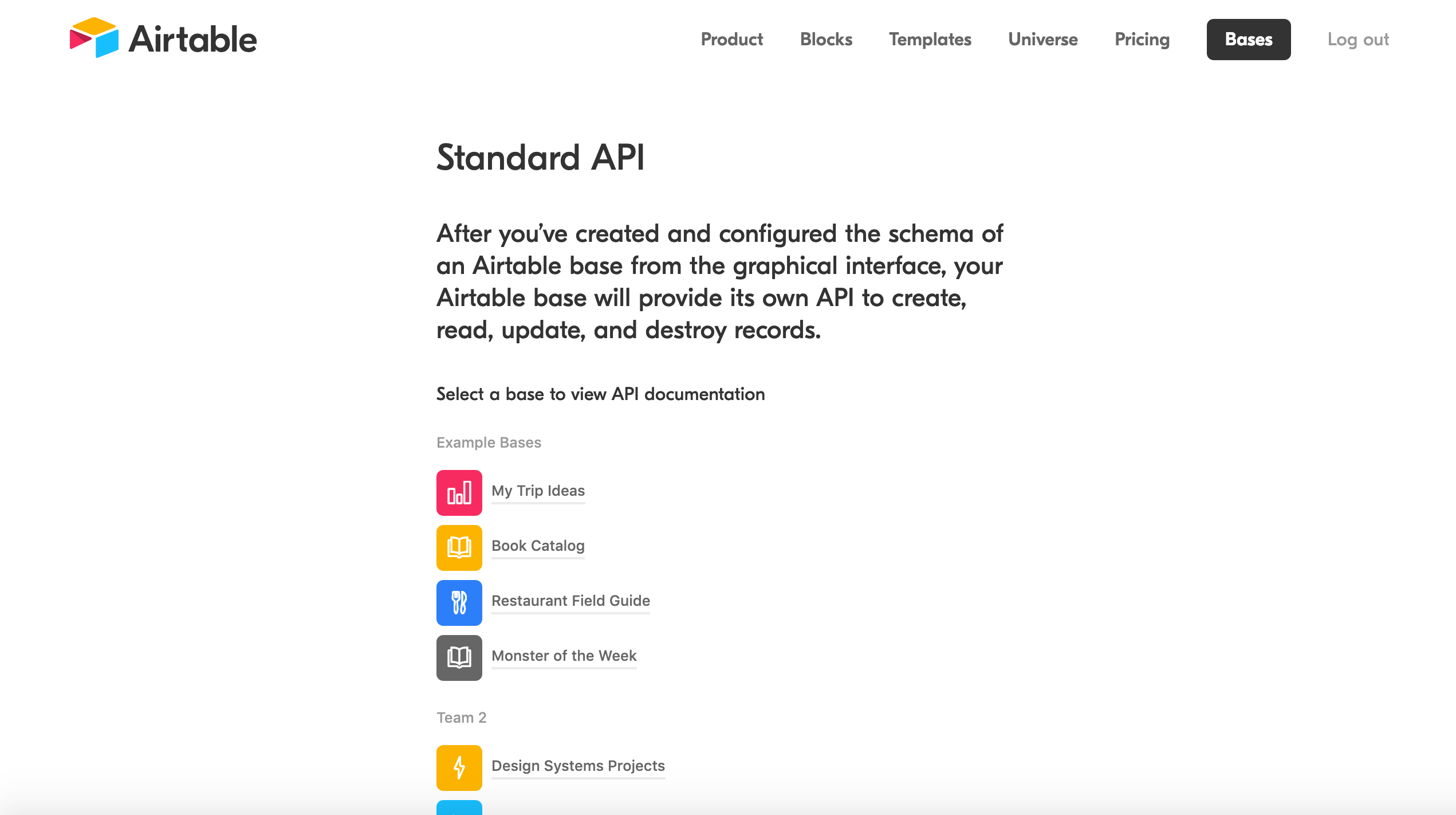
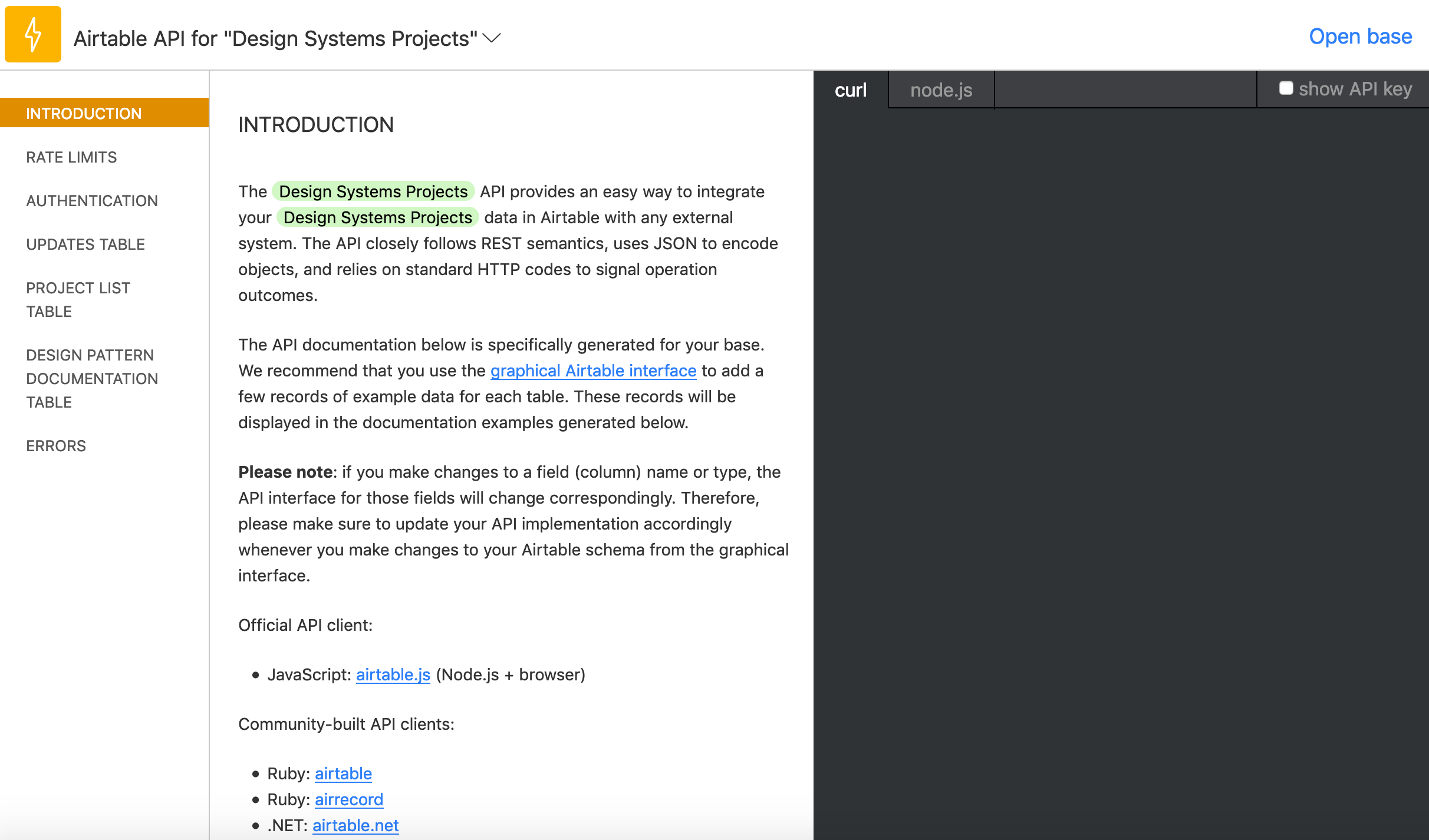
Now we can then head to airtable.com/api and select our project so that is serves as data we're pulling from. In this case, I selected “Design Systems Projects” which you can see right at the bottom here:
This will send us to a handy docs website that gives us an incredibly easy to read API for our specific project! Scrolling down we’ll find our API key which we’ll need to access this data as well as a ton of examples that we can use to manipulate the data we get back:
Let's head back to App.js in our airtable-test directory, delete all the code in that file, and replace it with the following:
import React, { Component } from 'react';
import Airtable from 'airtable';
const base = new Airtable({ apiKey: 'XXXXXXXXXXX' }).base('XXXXXXXXXXX');
Make sure to replace those Xs with the details that you can see in that Airtable API doc we just opened. But now that we’ve done all the setup, we can finally get around to creating our interface by calling data from our spreadsheet.
In App.js we can start to construct the App component:
All this will do for now is setup the app’s state and then render “Hello” on the page. Next up, we’ll be add each record from Airtable to that state.
First thing that’s important to note below: in componentDidMount() we’ll be selecting Updates which is just a way of telling Airtable that we want the spreadsheet called Updates. Make sure that this name is the same name as the spreadsheet. We’ll also be looping through all the records, or rows, of our table in that function too:
fetchNextPage() is the Airtable API’s way of giving us the next record in our spreadsheet and it’s neat that it will keep going until there are no more records. Again, we’re not doing anything with that data yet; we only want to make sure everything is working correctly at this point.
Open up the console in DevTools and we should see something like this:
Array(4) [ {…}, {…}, {…}, {…} ]
And if we dive through each of the objects in this array, then we should find all the data from the spreadsheet! Doing this bit always feels like magic to me.
Anyway, next up we can update our render() function like so:
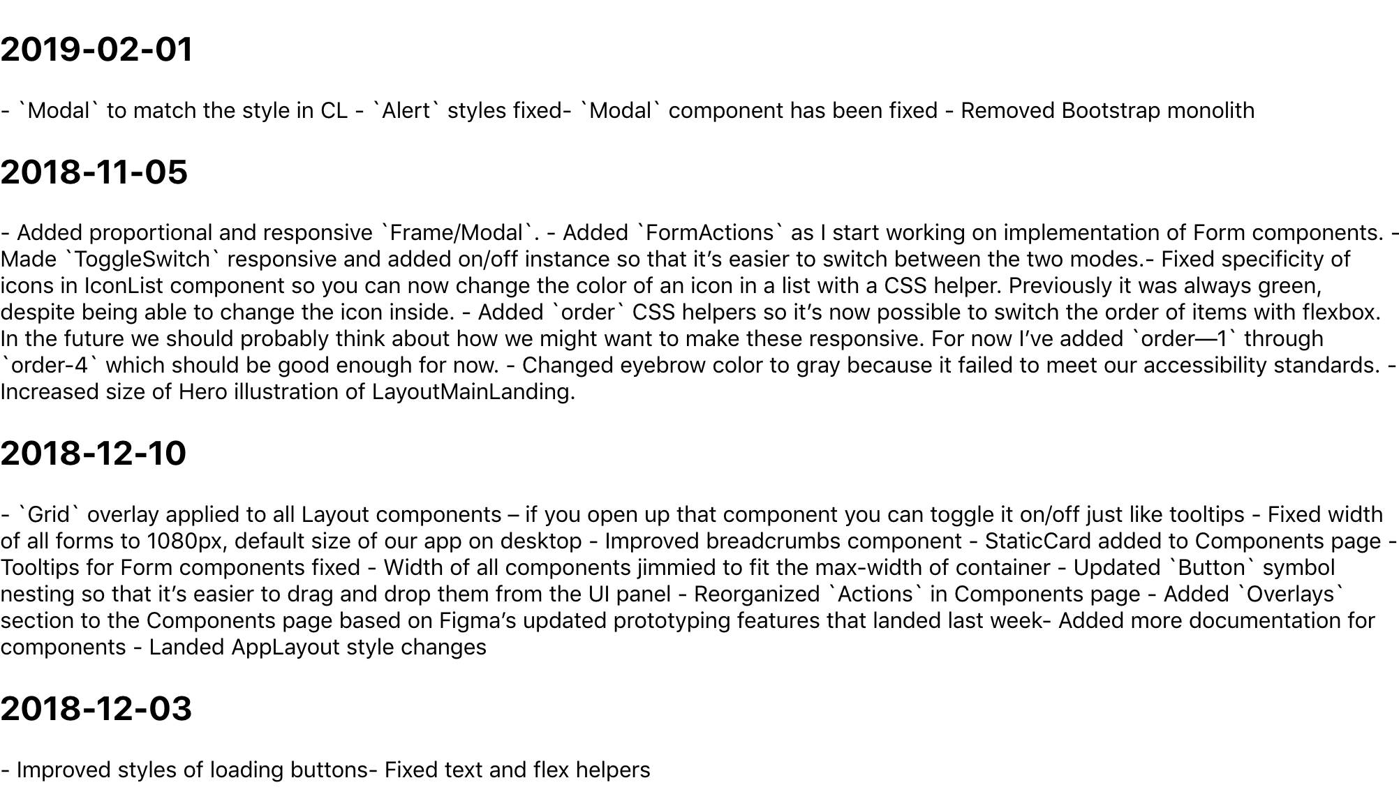
We’re going to be looping through the state that we setup earlier and then rendering the record.fields[] for each column in our spreadsheet. We have a Date, UI Kit, and Component Library column, and once we’ve updated our App.js with the code above, we should see all the content from our spreadsheet!
It’s like magic! But why does this data look so weird? Well, it’s because I wanted to write Markdown in each cell, so now we’ll need to use a parser to convert that data into good ol’ fashioned HTML. First, we need to head back to the command line though:
npm i showdown
showdown will help us parse all that Markdown we’ve written in our Airtable spreadsheet. After installing it, we only need to import it at the top of our App.js file, like this:
import showdown from 'showdown';
const markdownConverter = new showdown.Converter();
After the componentDidMount() function, we can create another function that will create our HTML using showdown:
We’re doing a couple of new things here: we’re using dangerouslySetInnerHTML in each div which, in turn, uses our createHTML function to convert the data from each column (specifically, the UI Kit and Component Library columns). We’re also converting the dates of each row into headings to make things a bit easier to read.
And with that we’re pretty much done! Here’s the final App.js:
There’s still a ton of updates we could make to improve things. I took a first pass at styling, but we probably want to do things like improve the date format and maybe have some kind of indication as to which updates refer to which rows in the spreadsheet. Maybe we could even toggle showing which information to show depending on whether you’re a designer or engineer.
Anyway! I think this is a good start to getting to grips with the Airtable API and I’d love to hear about how you use it in the comments below.
David Heinemeier Hansson has written an interesting post about the current state of web design and how designers ought to be able to still work on the code side of things:
We build using server-side rendering, Turbolinks, and Stimulus. All tools that are approachable and realistic for designers to adopt, since the major focus is just on HTML and CSS, with a few sprinkles of JavaScript for interactivity.
And it’s not like it’s some well kept secret! In fact, every single framework we’ve created at Basecamp that allows designers to work this way has been open sourced. The calamity of complexity that the current industry direction on JavaScript is unleashing upon designers is of human choice and design. It’s possible to make different choices and arrive at different designs.
I like this sentiment a whole lot — not every company needs to build their websites the same way. However, I don’t think that the approach that Basecamp has taken would scale to the size of a much larger organization. David continues:
Also not interested in retreating into the idea that you need a whole team of narrow specialists to make anything work. That “full-stack” is somehow a point of derision rather than self-sufficiency. That designers are so overburdened with conceptual demands on their creativity that they shouldn’t be bordered or encouraged to learn how to express those in the native materials of the web. Nope. No thanks!
Designing for the modern web in a way that pleases users with great, fast designs needn’t be this maze of impenetrable complexity. We’re making it that! It’s possible not to.
Again, I totally agree with David’s sentiment as I don’t think there’s anyone in the field who really wants to make the tools we use to build websites overly complicated; but in this instance, I tend to agree with what Nicolas recently had to say on this matter:
You don't like lots of minified class names in Twitter's markup. I don't like apps that only support English and Western desktop hardware. You don't like losing control over hand-made CSS files. I don't like shipping 600KB of CSS every time a big app is deployed.
The interesting thing to note here is that the act of front-end development changes based on the size and scale of the organization. As with all arguments in front-end development, there is no “right” way! Our work has to adapt to the problems that we’re trying to solve. Is a large, complex React front-end useful for Basecamp? Maybe not. But for some organizations, like mine at Gusto, we have to specialize in certain areas because the product that we’re working on is so complicated.
I guess what I also might be rambling about is that I don’t think it’s engineers that are making front-end development complicated — perhaps it’s the expectations of our users.
Over the past week or so, I’ve been reading Refactoring by Martin Fowler and it’s all about how to make sweeping changes to a large codebase in a way that doesn’t cause everything to break. I bring this up because there’s a lot of really good notes in this book that have challenged my recent approach to auditing and refactoring a ton of CSS. A lot of the advice is small, kinda obvious stuff, but I realized that I’ve recently been lazy when it comes to how many of those small, obvious things I brush off on projects like this.
Martin writes:
…if I can’t immediately see and fix the problem, I’ll revert to my last good commit and redo what I just did with smaller steps. That works because I commit so frequently and because small steps are the key to moving quickly, particularly when working with difficult code.
So: commit frequently and only do one thing in that commit. Further, constantly test those changes as you code.
The other thing I’ve started to be more aware of — thanks to this book — is that commit messages are precious things because they help other folks understand the meaning of changed work. We’ve all seen seemingly simple commit messages, like “refactored typography” that turn out to be thousands of lines long and we roll our eyes. That’s just asking for bugs to be introduced and visual regressions to happen. Smaller commits should prevent that sort of thing from ever happening. A good string of commit messages should sort of feel like you’re pairing with someone, as if you’re walking them through the changes step-by-step.
Although I’m getting better at this, I find this method of working extraordinarily difficult because it feels slower than sweeping changes and hoping for the best. In his book, Martin encourages us to subside that feeling. When we’re refactoring large portions of our codebase, he argues, we should always be slow and steady, patient and disciplined.
For some reason, I’ve lately been thinking a lot about what it takes to break into the web design industry and learn CSS. I reckon it has something to do with Keith Grant’s post earlier this month on a CSS mental model where he talks about a “common core for CSS”:
We need common core tricks like this for CSS. Not “tricks” in the old sense (like how to fake a gradient border), but mental patterns: ways to frame the problem in our heads, so we can break problems into their constituent parts and notice recurring patterns. Those of us who deeply understand the language do this internally. We need to start working on distilling out these mental patterns we use for understanding layout and positioning and working with relative units, so that we can articulate them to others.
On this note, Rachel Andrew also wrote about how to learn CSS, but in this case, she focuses more on technical CSS specifics:
For much of CSS, you don’t need to worry about learning properties and values by heart. You can look them up when you need them. However, there are some key underpinnings of the language, without which you will struggle to make sense of it. It really is worth dedicating some time to making sure you understand these things, as it will save you a lot of time and frustration in the long run.
This ties in nicely with Andy Bell's "CSS doesn’t suck" argument. Andy says that perhaps the reason why people attack CSS so often is because they simply don’t fundamentally understand it and thereby don’t respect why it works the way it does:
It’s getting exhausting spending so much of my time defending one of the three pillars of the web: CSS. It should sit equal with HTML and JavaScript to produce accessible, progressively enhanced websites and web apps that help everyone achieve what they need to achieve.
As I read these and other posts, I couldn’t stop thinking about the advice that I would give to a fledgling developer who's interested in web design and CSS—where would I recommend that they start? There’s so much to cover that merely thinking about it gives me a headache.
Personally, I often start with the basics of HTML and slowly introduce folks to CSS properties like color or font-family. But this sort of advice is generally only useful if you’re sitting right next to someone and have the time to explain everything about HTML and CSS: how to lay out a page, how to handle performance, how to think about progressive enhancement, etc. These topics alone are worthy of a month-long workshop—and that’s only the beginning!
Where to get started then? What sort of advice would help a student in the long run?
My experience in the industry probably matches that of a lot of other web designers: I didn’t go to school for this. I figured things out by myself while using referential sites like CSS-Tricks and Smashing Magazine to fill in the gaps. I would start with a project (like making a website for my high school band—and no, I will tell you the name of it), and in the process, I would haphazardly learn about typesetting, Sass, build tools, as well as accessible, hand-written markup.
Hear me out, but I don’t think the best way to get started in the web design industry is to learn the latest doodad or widget. Yes, you’ll have to get to that eventually. Or maybe not. At some point, getting a firm handle on flexbox and grid and memorizing a few properties is a good thing to do. But I want to teach web designers to fish and make sure that they can set themselves up for the future. And the best way to fish for CSS probably won't be found in a particular book or classroom curriculum. Instead, I think it’s best to recommend something else entirely.
My advice can be summarized in just four words: Get an RSS reader.
After thinking about this, I figured out that the most useful advice I can give is to get involved with the community—and, for me, that has been via RSS. Find a ton of blogs and subscribe to them. Over time, you’ll not only learn about the craft, but have a hefty (and hopefully organized) set of resources that cover basics, tricks, standards, personal struggles, and news, among many, many other things.
This is still how I learn about web design today. RSS is the most important tool I have to help me continue learning about the web—from working with tiny CSS properties to giant frameworks. Sure, Twitter is a good place to learn from (and even connect with) heavy hitters in the web design industry quickly, but there’s no better technology than RSS to constantly keep yourself informed of how people are thinking about CSS and web development.
With that, I encourage you (yes, you) to get an RSS reader if you don't already have one, or dust off the one you do have if it's been a while. I use Reeder 3 on OSX and iOS and pair that with Feedbin. From there, subscribe to a ton of blogs or follow a lot of folks on Twitter to find their websites. There's no shortage of material or sources out there!
This sounds like a silly thing to recommend but fitting yourself into the web design community is more important than learning about any cool CSS trick. You’ll be creating an environment where you can constantly learn new things for the future. And I promise that, once you start, finding people who care about web development and, ultimately, learning about CSS, isn’t as intimidating as it could be on your own.
Which websites should you subscribe to? Well, Stuart Robson made a wonderful list of all the websites that he subscribes to via RSS—you should be able to download that file and drop it straight into your RSS reader. Also, Rachel Andrew made a great list of websites a while back when she asked what’s happening in CSS? And of course our very own newsletter, This Week in Web Design and Development, is certainly a good place to start, too. Speaking of email and newsletters—Dev Tips by Umar Hansa is another great resource where I’m constantly learning new things about Chrome’s DevTools.
What websites do you like though? What’s the best resource for keeping up with CSS? Let us know in the comments below!
Here’s a wonderful post by Nicolas Chevobbe on what the Firefox DevTools team was up to last year. What strikes me is how many improvements they shipped — from big visual design improvements to tiny usability fixes that help us make sure our code works as we expect it to in the console.
There are lots of interesting hints here about the future of Firefox DevTools, too. For example, tighter integrations with MDN and, as Nicolas mentions in that post, tools to make it feel like a playground where you can improve your design, rather just fixing things. Anyway, I already feel that Firefox DevTools has the best features for typography of any browser (make sure to check out the “Fonts” tab in the Inspector). I can’t wait to see what happens next!
Tim Kadlec on the issues surrounding poor web performance and why it’s so important for us to care about making our sites as fast as possible:
Poor performance can, and does, lead to exclusion. This point is extremely well documented by now, but warrants repeating. Sites that use an excess of resources, whether on the network or on the device, don’t just cause slow experiences, but can leave entire groups of people out.
There is a growing gap between what a high-end device can handle and what a middle to low-end device can handle. When we build sites and applications that include a lot of CPU-bound tasks (hi there JavaScript), at best, those sites and applications become painfully slow on people using those more affordable, more constrained devices. At worst, we ensure that our site will not work for them at all.
Forget about comparing this year’s device to a device a couple of years old. Exclusion can happen on devices that are brand-new as well. The web’s growth is being pushed forward primarily by low-cost, underpowered Android devices that frequently struggle with today’s web.
As Tim mentions at the end of that piece though, it’s easy to forget web performance and it’s sometimes hard to make the case for making a website fast. It’s often seen as a nice-to-have instead of as a core feature in and of itself, like semantic markup and accessibility compliance.
I’m optimistic that the conversation surrounding this topic is improving things though. Having tools like Lighthouse built straight into the browser makes things easier and the abundance of testing tools such as Calibre gives us insights into exactly what and where issues might be. But we also need to remember that this isn’t solely a technical problem — it’s an ethical one, too.
I’m a huge fan of CSS Grid and I use it on pretty much every project these days. However, there’s one part of it that makes things much more complicated than they really ought to be: the lack of subgrids. And in this post on the matter, Ken Bellows explains why they’d be so gosh darn useful:
But one thing still missing from the Level 1 spec is the ability to create a subgrid, a grid-item with its own grid that aligns in one or both dimensions with the parent grid. It was originally planned to be in Level 1, but the working group decided they needed more time to work out the details, so it was removed, and it will ship in CSS Grid Layout Module Level 2, which seems to be nearing completion.
There has been a lot of discussion over the last 2 years about the use cases for subgrid, how it should be implemented, and even some debate over whether you even need it. A lot of that discussion was centered around two other approaches that can handle many of the same problems as subgrid: nested grids and display: contents
I remember one of the very first websites I worked on was much like the demo that Ken uses as an example, but this was way back in 2012 and grid didn’t exist yet. Sadly, I had to write a lot more CSS than I felt was necessary to get elements in one div to line up with elements in another. Anyway, this article kinda riffs off of Rachel Andrew’s post about subgrid and what problems it would help solve which is definitely worth checking out, too.
I’ve been auditing a ton of CSS lately and thought it would be neat to jot down how I’m going about doing that. I’m sure there are a million different ways to do this depending on the size and scale of your app and how your CSS works under the hood, so please take all this with a grain of salt.
First a few disclaimers: at Gusto, the company I work for today, our engineers and designers all write in Sass and use webpack to compile those files into CSS. Our production environment minifies all that code into a single CSS file. However, our CSS is made up of three separate domains. so I downloaded them all to my desktop because I wanted to test them individually.
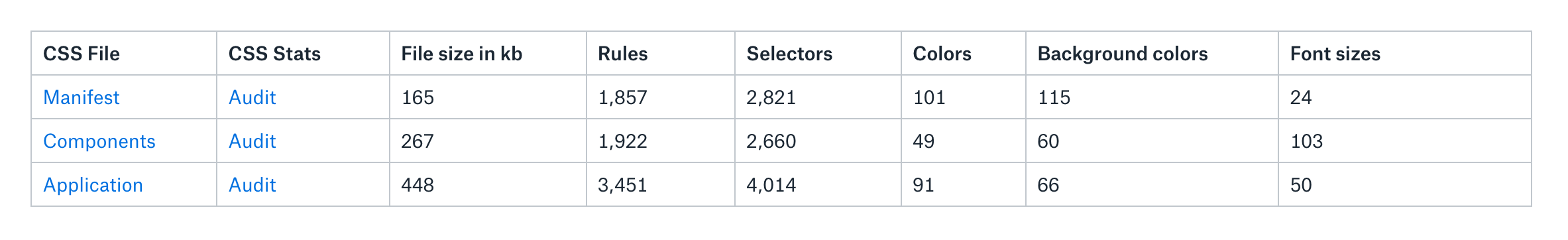
Here’s are those files and what they do:
manifest.css: a file that’s generated from all our Sass functions, mixins and contains all of our default HTML styles and utility classes.
components.css: a file that consists of our React components such as Button.scss, Card.scss, etc. This and manifest.css both come from our Component Library repo and are imported into our main app.
app.css: a collection of styles that override our components and manifest. Today, it exists in our main application repo.
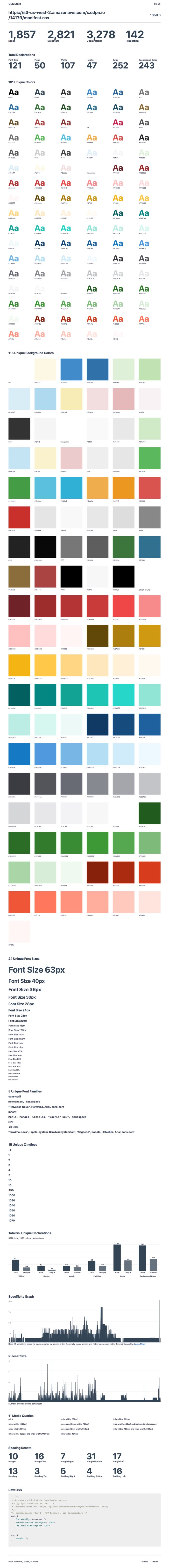
After I downloaded everything, I threw them into an S3 bucket and ran them through CSS Stats. (I couldn’t find a command line tool that I liked, so I decided stuck with this tool.) The coolest thing about CSS Stats is that it provides a ton of clarity about the health and quality of a site’s CSS, and in turn, a design system. It does this by showing the number of unique font-size and unique background-color CSS declarations there are, as well as a specificity graph for that particular CSS file.
I wanted to better understand our manifest.css file first. As I mentioned, this file contains all our utility classes (such as padding-top-10px and c-salt-500) as well as our normalize and reset CSS files, so it's pretty foundational for everything else. I started digging through the results:
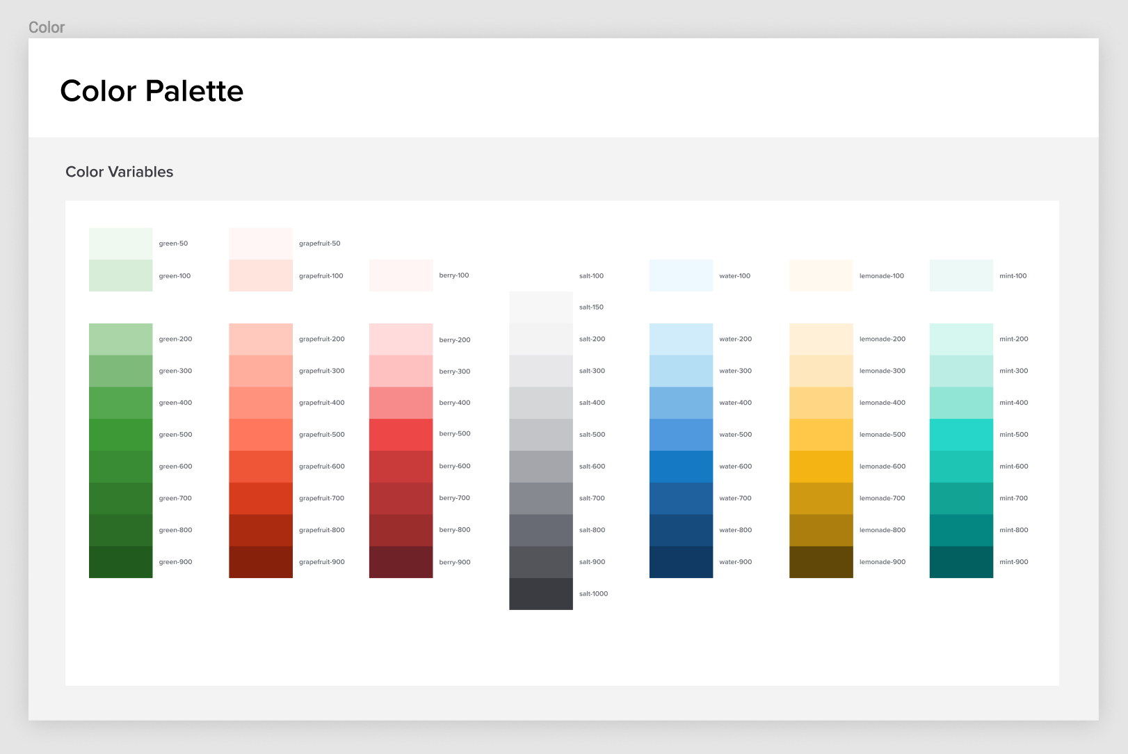
There are some obvious issues here, like the fact that there are 101 unique colors and 115 unique background colors. Why is this a big deal? Well, it’s a little striking to me because our team had already made a collection of Sass functions to output a very specific number of colors. In our Figma UI Kit and variables_color.scss (which gets compiled into our manifest file, we declare a total of 68 unique colors:
So, where are all these extra colors coming from? Well, I assume that they’re coming from Bootstrap. Back when we started building the application, we hastily built on top of Bootstrap’s styles without refactoring things as we went. There was a certain moment when this started to hurt as we found visual inconsistencies across our application and hundreds of lines of code being written that simply overrode Bootstrap. In a rather gallant CSS refactor, I removed Bootstrap’s CSS from our main application and archived it inside manifest.css, waiting for the day when we could return to it and refactor it all.
These extra colors are likely come from that old Bootstrap file, but it’s probably worth investigating some more. Anyway, the real issue with this for me is that my understanding of the design system is different from what’s in the front-end. That’s a big problem! If my understanding of the design system is different from how the CSS works, then there’s enormous potential for engineers and designers to pick up on the wrong patterns and for confusion to disseminate across our organization. Think about the extra bloat and lack of maintainability, not to mention other implications.
I was reading Who Are Design Systems For? by Matthew Ström and perked up when he quotes a talk by Julie Ann-Horvath where she’s noted as saying, “a design system doesn’t exist until it’s in production.” Following the logic, it's clear the design system I thought we had didn't actually exist.
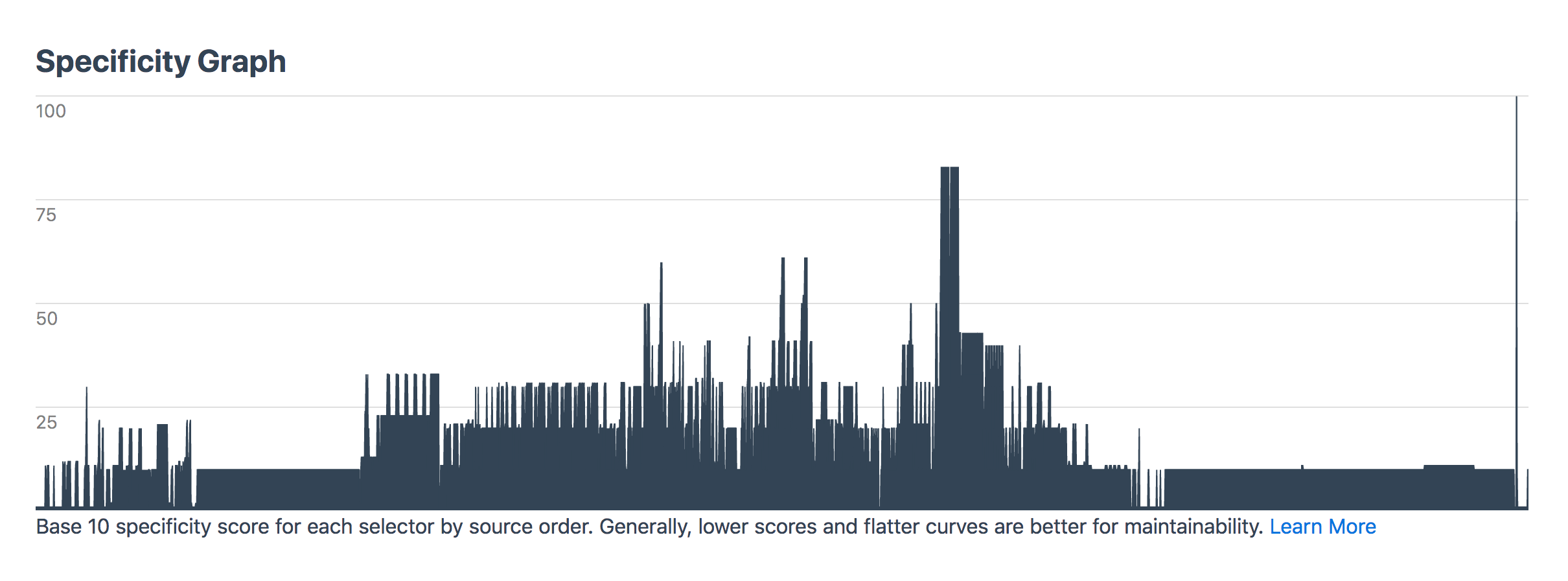
Going back to manifest.css though: the specificity graph for this file should be perfectly gradual and yet there are some clear spikes that show there’s probably a bit more CSS that needs to be refactored in there:
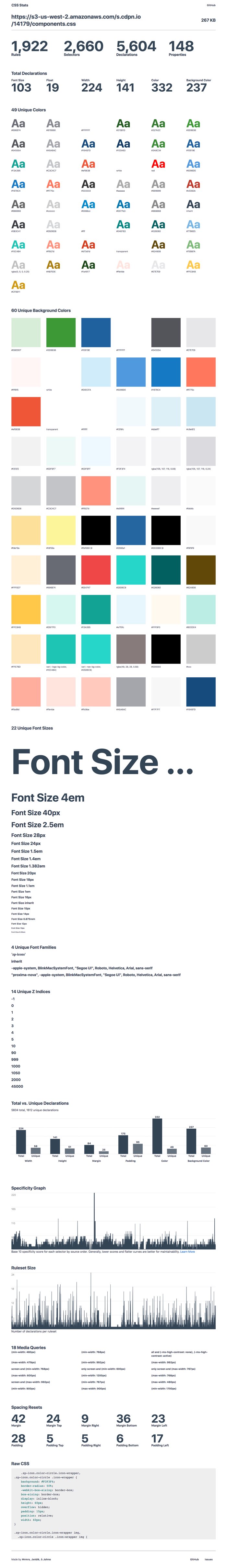
Anyway, next up is our components.css. Remember that’s the file that our styles for our components come from so I thought beforehand that it’s bound to be a little messier than our manifest file. Throwing it into CSS Stats returns the following:
CSS-Stats shows some of the same problems — like too many font sizes (what the heck is going on with that giant font size anyway?) — but there are also way too many custom colors and background-colors. I already had a hunch about what the biggest issue with this CSS file was before I started and I don’t think the problem is not shown in this data here at all.
Let me explain.
A large number of our components used to be Bootstrap files of one kind or another. Take our Accordion.jsx React component, for instance. That imports an accordion.css file which is then compiled with all the other component’s CSS into a components.css file. The problem with this is that some Accordion styles affect a lot more than just that component. CSS from this this file bleeds into other patterns and classes that aren’t tied to just one component. It’s sort of like a poison in our system and that impacts our team because it makes it difficult to reliably make changes to a single component. It also leads to a very fragile codebase.
So I guess what I’m saying here is that tools like CSS Stats are wondrous things to help us check core vital signs for CSS health, but I don’t think they’ll ever really capture the full picture.
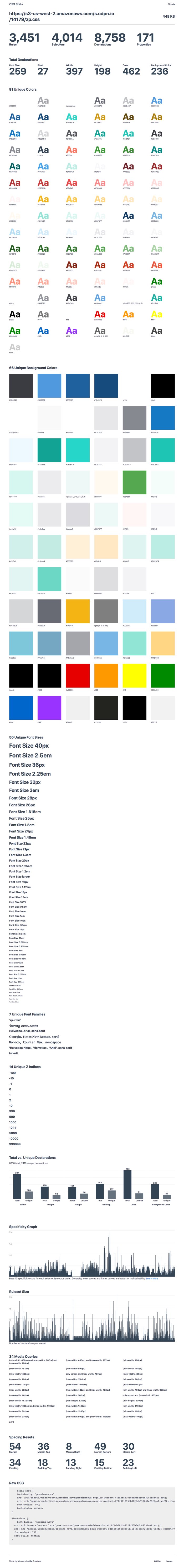
Anyway, next up is the app.css file:
This is the “monolith” — the codebase that our design systems team is currently trying to better understand and hopefully refactor into a series of flexible and maintainable React components that others can reuse again and again.
What worries me about this codebase is the specificity of it all what happens when something changes in the manifest.css or in our components.css? Will those styles be overridden in the monolith? What will happen to the nice and tidy component styles that we import into a new project?
Subsequently, I don’t know where I stole this, but I’ve been saying it an awful lot lately — you should always be able to predict what your CSS is going to do, whether that’s a single line of code or a giant codebase of intermingled styles. That’s what design systems are all about — designing and building predictable interfaces for the future. And if our compiled CSS has all these unpredictable and unknowable parts to it, then we need to gather everyone together to fix it.
Anywho, I threw some of the data into a Dropbox Paper doc after all this to make sure we start tackling these issues and see gradual improvements over time. That looks something like this today:
How have you gone about auditing your CSS? Does your team code review CSS? Are there any tricks and tips you’d recommend? Leave a comment below!
There’s not much talk about frameworks here. There’s no shaming about old techniques, or jokes about JavaScript. There’s just a couple hundred people all around me laughing and smiling and watching talks about making things on the web and it all feels so fresh and new to me. Unlike many other conferences I’ve visited, these talks are somehow inclusive and rather feel, well, there’s no other word for it: inspiring.
I’m sitting in a little room buried underneath the Veterans Memorial Coliseum in Portland and I’m here for my third XOXO. And I can’t stop smiling.
Although the festival is not entirely focused on coding and front-end development, there are a lot of developers here that make art on the web for fun. From Jenn Schiffer’s pixel art to Monica Dinculescu’s emoji projects and Nicole He’s buck-wild enhance.computer, there’s a lot of interesting discussions about coding — but! — it’s from a very different perspective than the one I’m familiar with.
Most conferences tend to focus on being practical. Here’s the newest technique! Here’s how to improve your career! Here’s the coolest new folks that you should be following! But it’s important to remember that the web isn’t only a serious place for serious work. It can be this entirely other thing, too.
The web can be for fun. It can be utterly weird and unexpected. And that’s what we’re all seeing in this little room right now at XOXO; websites that can’t be monetized, websites that can’t be controlled by corporate interests or giant ad networks.
Here’s a nifty post by Chen Hui Jing where she walks us through her process for making radio buttons accessible via keyboard. I particularly enjoyed this bit where she discusses the four options that are available to us to hide the radio input and replace them with a selection of cards that act like toggles instead:
Most of us mess up the keyboard navigation portion of things when we hide the input element. There are several ways to make something invisible or hidden:
clip-path: polygon(0 0)
display: none
opacity: 0
visibility: hidden
For custom radios (or checkboxes), option 2 and 4 are not recommended because screen readers won’t be able to read the default radio element. This also prevents us from using the :focus pseudo-element on the hidden input, so those are out of the picture.
Which leaves us with option 1 and option 3. I sort of like option 1, because clip-path is fun. Clip-path creates a clipping region which defines what portion of an element is visible. This clipping region can be a basic shape or a url referencing a clipping path element.