Here’s a neat trick from Andy Bell where he uses CSS Custom Properties to check if a particular CSS feature is supported by using JavaScript.
Basically, he's using the ability CSS has to check for browser support on a particular property, setting a custom property that returns a value of either 0 or 1 (Boolean!) and then informing the JavaScript to execute based on that value.
As Andy mentions, another common way to do this is to use pseudo elements on the body element and then access them with JavaScript, but this approach with @supports seems a whole lot cleaner and less hacky to me, personally. I wonder how many more intuitive things we’ll find we can do with CSS Custom Properties because this is an interesting case where CSS instructs JavaScript, instead of the other way around.
Toggles. Switches. Whatever you want to call them, they've been with us for some time and have been a dominant a staple for many form interfaces. They're even baked right into many CSS frameworks, including Bootstrap and Foundation.
It's easy to think of them in binary terms: on and off. Off and on. Click to change the state and call it a day, right? I mean, it's just a checkbox with a styled visual representation.
Well, Adrian Roselli shows us that there's a lot more to think about. And, not only that, but he shows how we can under-engineer them:
I am only going to provide styles to visually convert a standard checkbox into a visual toggle. No ARIA, no script, no special features. A progressively enhanced checkbox that will continue to work if the CSS file does not load
There's a lot to digest here. His approaches to accessibility run the gamut, from hover, active, focus and disabled states to contrast in both light and dark modes, and many things in between. What's particularly key is the progressive enhancement he mentions in that quote above.
I think the most interesting thing about Adrian’s post is just how flexible his approach is to handle any situation, including color schemes and writing modes. He also takes note of the indeterminate checkbox, that state that's nether on or off, but something perhaps in between. We have a CSS pseudo-selector for that and it could warrant a post its own, given that it's a purely visual state that cannot be set in the HTML and needs to be registered via JavaScript. It's interesting to think of an "in between" state for a switch and Adrian's use case for the default state Airplane Mode is pretty compelling.
It’s an awful lot of work that we have to do to ensure that the front-end is designed well and I think this post is the best example I’ve seen in a while as to why our work is not a problem to be solved and more of a challenge to better understand the tools of our craft.
Have you ever created a well-intentioned, thoughtful design system only to watch it grow into an ever-increasing and scary codebase? I've been working in sort of the opposite direction, inheriting the scary codebase and trying to create a thoughtful system from it.
Here's Alex Sanders on the topic, explaining how his team at The Guardian has tackled the task of creating design systems while combating complexity:
Systems that try to contain complexity over long periods of time by convention will inevitably tend toward entropy, because one significant characteristic of convention is that it is trivially simple to break one.
You do not even need to be malicious. A convention is not a line in the sand. You can have a very good case for breaking or stretching one, but once a convention is no longer fully observed, subsequent cases for breaking or stretching it are automatically stronger, because the convention is already weakened. The more this happens, the weaker it gets.
Complexity and entropy can be two outcomes in the same situation, but need not be mutually exclusive. Interesting to think that our best intentions to guard against complexity can be somewhat destructive.
I also love how Alex explains why it’s not possible for their team to use a Tachyons-esque approach to writing styles because of the way that their development environment is kinda slow. It would be painful for the team to make that switch, despite how it could solve some other problems. This reminded me that measuring problems in this way is why there can never be a single way to write CSS. We need that inherent flexibility, even at the expense of introducing inconsistencies. Hence, conventions being less of a line in the sand and more of a guide post.
On a separate note, I really like how Alex describes styles and attributes as the reasons why his team is writing those styles. It's about aligning with business objectives:
...tens of thousands of rules that are intended to describe a maintainable set of responses to business and design problems.
That’s interesting since I don’t think we spend much time here talking specifically about the business side of CSS and the functional requirements that a styled user interface needs to accomplish.
And perhaps thinking about that can help us write better styles in the long term. Is this line of CSS solving a problem? Does this new class resolve an issue that will help our customers? These are good questions to keep in mind as we work, yet I know I don’t spend enough time thinking about them. I often see the design I’m turning into code as a problem to be solved instead.
Perhaps we should expand the way we styling a webpage because maybe, just maybe, it will help us write more maintainable code that's built to solve a real business objective.
We just made a note about this article by Jeremy Wagner in our newsletter but it’s so good that I think it’s worth linking to again as Jeremy writes about how our obsession with JavaScript can lead to accessibility and performance issues:
What we tend to forget is that the environment websites and web apps occupy is one and the same. Both are subject to the same environmental pressures that the large gradient of networks and devices impose. Those constraints don’t suddenly vanish when we decide to call what we build “apps”, nor do our users’ phones gain magical new powers when we do so.
It’s our responsibility to evaluate who uses what we make, and accept that the conditions under which they access the internet can be different than what we’ve assumed. We need to know the purpose we’re trying to serve, and only then can we build something that admirably serves that purpose—even if it isn’t exciting to build.
That last part is especially interesting because it's in the same vein as what Chris wrote just the other day about embracing simplicity in our work. But it’s also interesting because I've overheard a lot of engineers at work asking how we might use CSS-in-JS tools like Emotion or Styled Components, both of which are totally neat in and of themselves. But my worry is about jumping to a cool tool before we understand the problem that we want to tackle first.
Jumping on a bandwagon because a Twitter celebrity told us to do so, or because Netflix uses tool X, Y or Z is not a proper response to complex problems. And this connects to what Jeremy says here:
This is not to say that inaccessible patterns occur only when frameworks are used, but rather that a sole preference for JavaScript will eventually surface gaps in our understanding of HTML and CSS. These knowledge gaps will often result in mistakes we may not even be aware of. Frameworks can be useful tools that increase our productivity, but continuing education in core web technologies is essential to creating usable experiences, no matter what tools we choose to use.
Just – yikes. This makes me very excited for the upcoming articles in the series.
I’ve been hearing a lot about design tokens lately, and although I’ve never had to work on a project that’s needed them, I think they’re super interesting and worth jotting down a few notes about. As I understand it, the general idea is this: design tokens are an agnostic way to store variables such as typography, color, and spacing so that your design system can be shared across platforms like iOS, Android, and regular ol’ websites.
Design tokens are starting to gain a bit of momentum in the design systems community, but they're not an entirely new concept. There’s a great talk with Jina Anne and Jon Levine from 2016 where they talk about how design tokens are used in the Lightning Design System at Salesforce. They describe the complexity of the world we’re living in where a single organization that is building multiple web apps and native applications need to feel and look the same whilst not slowing down the development team. Jina also has made an in-depth video course about design tokens and in the preview for that she writes:
With design tokens, you can capture low-level values and then use them to create the styles for your product or app. You can maintain a scalable and consistent visual system for UI development.
Let’s take just one example: you probably have a typographic scale that you want to be identical across a bunch of platforms. Instead of storing the values for that scale in a CSS file and replicating them in every app or website, they can be stored in a JSON file that will then be transformed into the code needed for all those other platforms. Something like this:
You could write your own code to take this JSON file and convert it into all the variables you might need, for example, a Sass file would depend upon these tokens and might consume them as variables to be used elsewhere in a web app. One example of a tool that can do a lot of the hard work for us is Amazon’s Style Dictionary and here’s an example of how that works in practice:
I think this is ridiculously neat stuff. And I can see how it saves a ton of duplicate code and confusion across multiple teams since it serves as a single source of truth as opposed to having several codebases that have the same design requirements and their own stylesheets to maintain. Cristiano Rastelli also wrote about managing design tokens with Style Dictionary a little while ago and goes into a lot more depth on how to get started.
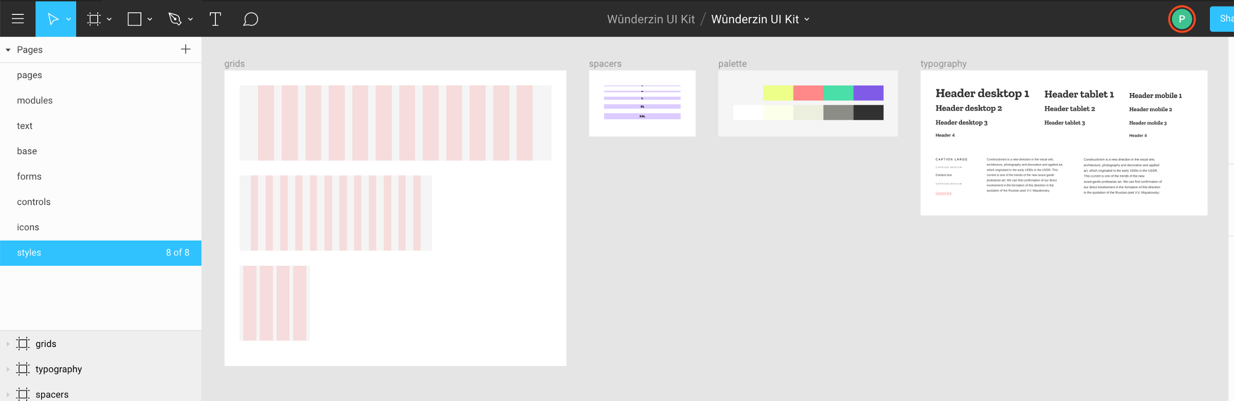
Your source of truth doesn’t even have to be a JSON file! In a post from earlier this year, Pavel Laptev shows us how to make these design tokens in Figma and, by using their API, abstract those values out of design mockups and use them in a codebase.
Pavel broke up his Figma doc into separate pages for his grid, spacers, palette and typography like this:
Right now, it seems like this requires a ton of effort to set up, but I reckon that tools like Sketch and Figma are only going to make stuff like this way easier for us in the near future – they probably want the source of truth to be in their specific design tool instead of some other tool.
The last thing I want to mention is this post by Brent Jackson where he wrote up some thoughts about interoperability when it comes to design systems. Specifically, he argues that there should be a specification for design tokens so that any CSS-in-JS library could consume that code in any format or style:
Design system tokens are meant to be flexible and work cross-platform, which means different teams, different implementations, and different libraries will name things differently. This is where this specification would fit in. A lot of interoperability could be realized, if we all, for example, named our color palette colors and named the font sizes we use fontSizes. What you do beyond that and what data format you use to store these values, is up to you. It's trivial to convert JSON to ES modules to YAML or even TOML, if that's your thing. It's also just a data structure, so transforming between other data structures (e.g. design tools or a GraphQL API) should also be possible. This standard also wouldn't try to solve the extremely complex problems of how to name the colors themselves.
Brent then went ahead and created a theme specification to solve this very problem. It looks like having a single standard for writing all our variables and settings would help us if we wanted to switch from one CSS-in-JS library to another, or if we wanted to switch to some other system that we haven’t imagined yet.
Anyway, I believe that design tokens are only starting to become mainstream and their popularity is about to increase as these tools, workflows, and standards become better with time — it’s all thoroughly exciting stuff!
Jake Archibald looks at the websites of Formula One race teams and rates their performance, carefully examining their images and digging into the waterfall of assets for each site:
Trying to use a site while on poor connectivity is massively frustrating, so anything sites can do to make it less of a problem is a huge win.
In terms of the device, if you look outside the tech bubble, a lot of users can't or don't want to pay for a high-end phone. To get a feel for how a site performs for real users, you have to look at mid-to-lower-end Android devices, which is why I picked the Moto G4.
This reminds me of Tim Kadlec’s post earlier in the year about the ethics of performance:
Poor performance can, and does, lead to exclusion. This point is extremely well documented by now, but warrants repeating. Sites that use an excess of resources, whether on the network or on the device, don’t just cause slow experiences, but can leave entire groups of people out.
Anyway, back to Jake’s post about Formula One websites. I love that Jake writes in such a way that his points aren't insulting to those who work on these sites, but hones in on what we can learn about the myriad issues that lead to bad web performance. Subsequently, Jake provides us all with a ton of useful ideas for fixing performance issues like annoying layout changes, scripts that block rendering, unused CSS issues that also block rendering, and loading states.
Oh, and this reminds me that Chris noted a while back that the loading experience for most websites can be vastly improved:
Client side rendering is so interesting. Look at this janky loading experience. The page itself isn't particularly slow, but it loads in very awkwardly. A whole thing front-end devs are going to have to get good at. pic.twitter.com/sMcD4nsL98
Brad Frost wrote about a recent experience with a website that used <input type="number">:
Last week I got a call from my bank regarding a wire transfer I had just scheduled. The customer support guy had me repeat everything back to him because there seemed to be a problem with the information. “Hmmmm, everything you said is right right except the last 3 digits of the account number.”
He had me resubmit the wire transfer form. When I exited the account number field, the corner of my eye noticed the account number change ever so slightly. I quickly refocused into the field and slightly moved my index finger up on my Magic Mouse. It started looking more like a slot machine than an input field!
Brad argues that we then shouldn’t be using <input type="number"> for “account numbers, social security numbers, credit card numbers, confirmation numbers” which makes a bunch of sense to me! Instead we can use the pattern attribute that Chris Ferdinandi looked at a while back in a post all about constraint validation in HTML.
It's worth mentioning that numeric inputs can be more complex than they appear and that their appearance and behavior vary between browsers. All good things to consider along alongside Brad's advice when evaluating user experience.
Also:
<input inputmode="numeric"> is the way forward for mobile numeric keyboards (paired with `pattern="[0-9]*"` on iOS pending inputmode support).
Refactoring is one of those words that evokes fear in the eyes of many folks, from developers to product owners and everyone in between. It may as well be a four-letter word in many ways. It's also something that we talk about quite a bit around here because, like books on the topic, where to start with one, and the impact of letting technical debt pile up.
Ben Rady has thoughts on refactoring as well, but in the context of pair programming:
We pair for about 6 hours a day, every day. Everything that's on the critical path is worked on in a pair. Always. Our goal is always to get the thing we're working on to production as fast as we responsibly can, and the best way I've found to that is with a pair.
Ben then dives into the process of working alongside others and how to ship software with that approach, a lot of which I think relates to front-end development best practices, too. But I also love how punk rock this team is, as they appear not to develop software with a backlog or a ton of meetings for managing their projects:
No formal backlog. We have three states for new features. Now, next, and probably never. Whatever we're working on now is the most valuable thing we can think of. Whatever's next is the next most valuable thing. When we pull new work, we ask "What's next?" and discuss. If someone comes to us with an idea, we ask "Is this more valuable that what we were planning to do next?" If not, it's usually forgotten, because by the time we finish that there's something else that's newer and better. But if it comes up again, maybe it'll make the cut.
I wonder how much time a year they save without having to argue about stories and points and whether this one tiny feature is more important than this other one. Anyway, I find all of this stuff thoroughly inspiring.
Andy Bell wrote up his thoughts about the whole web versus native app debate which I think is super interesting. It was hard to make it through the post because I was nodding so aggressively as I read:
The whole idea of competing with native apps seems pretty daft to me, too. The web gives us so much for free that app developers could only dream of, like URLs and the ability to publish to the entire world for free, immediately.
[...] I believe in the web and will continue to believe that building Progressive Web Apps that embrace the web platform will be far superior to the non-inclusive walled garden that is native apps and their app stores. I just wish that others thought like that, too.
If the goal of the web is just to compete with native, then we’ve set the bar way too low.
I entirely agree with both Andy and Jeremy. The web should not compete with native apps that are locked within a store. The web should be better in every way — it can be faster and more beautiful, have better interactions, and smoother animations. We just need to get to work.
Here’s a wonderful post by Eric Higgins all about refactoring and technical debt. He compares giant refactoring projects to being similar to Tetris:
Similar to running a business, Tetris gets harder the longer you play. Pieces move faster and it becomes harder to keep up.
Similar to running a business, you can never win Tetris. There is no true finish line. You only control how quickly you lose.
Similar to running a business, allowing too many gaps to build up in Tetris will cause you to lose.
I love this comparison, despite my mediocre Tetris skills. It does feel like even "easy" development becomes harder as technical debt grows on a project, much the same way Tetris pieces gain speed and provide little time to react as the stack grows. However, I do think perhaps I have a more optimistic view of technical debt overall. If you work slowly and carefully then you can build up a culture of refactoring and gather momentum over time.
Earlier this month Eric Bailey wrote about the current state of accessibility on the web and why it felt like fighting an uphill battle:
As someone with a good deal of interest in the digital accessibility space, I follow WebAIM’s work closely. Their survey results are priceless insights into how disabled people actually use the web, so when the organization speaks with authority on a subject, I listen.
WebAIM’s accessibility analysis of the top 1,000,000 homepages was released to the public on February 27, 2019. I’ve had a few days to process it, and frankly, it’s left me feeling pretty depressed. In a sea of already demoralizing findings, probably the most notable one is that pages containing ARIA—a specialized language intended to aid accessibility—are actually more likely to have accessibility issues.
Following up from that post, Ethan Marcotte jotted down his thoughts on the matter and about who has the responsibility to fix these issues in the long run:
Organizations like WebAIM have, alongside countless other non-profits and accessibility advocates, been showing us how we could make the web live up to its promise as a truly universal medium, one that could be accessed by anyone, anywhere, regardless of ability or need. And we failed.
I say we quite deliberately. This is on us: on you, and on me. And, look, I realize it may sting to read that. Hell, my work is constantly done under deadline, the way I work seems to change every year month, and it can feel hard to find the time to learn more about accessibility. And maybe you feel the same way. But the fact remains that we’ve created a web that’s actively excluding people, and at a vast, terrible scale. We need to meditate on that.
I suppose the lesson I’m taking from this is, well, we need to much, much more than meditating. I agree with Marcy Sutton: accessibility is a civil right, full stop. Improving the state of accessibility on the web is work we have to support. The alternative isn’t an option. Leaving the web in its current state isn’t fair. It isn’t just.
I entirely agree with Ethan here – we all have a responsibility to make the web a better place for everyone and especially when it comes to accessibility where the bar is so very low for us now. This isn’t to say that I know best, because there’s been plenty of times when I’ve dropped the ball when I’m designing something for the web.
What can we do to tackle the widespread issue surrounding web accessibility?
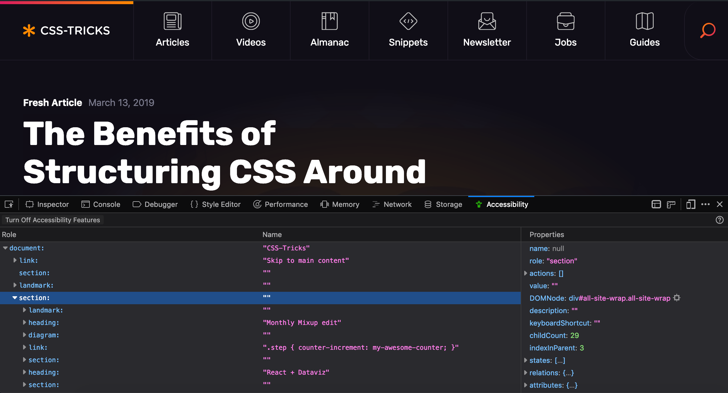
Well, as Eric mentions in his post, it’s first and foremost a problem of education and he points to Firefox and their great accessibility inspector as a tool to help us see and understand accessibility principles in action:
This inspector is not meant as an evaluation tool. It is an inspection tool. So it will not give you hints about low contrast ratios, or other things that would tell you whether your site is WCAG compliant. It helps you inspect your code, helps you understand how your web site is translated into objects for assistive technologies.
Chris also wrote up some of his thoughts a short while ago, including other accessibility testing tools and checklists that can help us get started making more accessible experiences. The important thing to note here is that these tools need to be embedded within our process for web design if they’re going to solve these issues.
We can’t simply blame our tools.
I know the current state of web accessbility is pretty bad and that there’s an enormous amount of work to do for us all, but to be honest, I can’t help but feel a little optimistic. For the first time in my career, I’ve had designers and engineers alike approach me excitedly about accessibility. Each year, there are tons of workshops, articles, meetups, and talks (and I particularly like this talk by Laura Carvajal) on the matter meaning there's a growing source of referential content that can teach us to be better.
And I can’t help but think that all of these conversations are a good sign – but now it’s up to us to do the work.
Chrome on Android’s Data Saver feature helps by automatically optimizing web pages to make them load faster. When users are facing network or data constraints, Data Saver may reduce data use by up to 90% and load pages two times faster, and by making pages load faster, a larger fraction of pages actually finish loading on slow networks. Now, we are securely extending performance improvements beyond HTTP pages to HTTPS pages and providing direct feedback to the developers who want it.
To show users when a page has been optimized, Chrome now shows in the URL bar that a Lite version of the page is being displayed.
All of this is pretty neat but I think the name Lite Pages is a little confusing as it’s in no way related to AMP and Tim Kadlec makes that clear in his notes about the new feature:
Lite pages are also in no way related to AMP. AMP is a framework you have to build your site in to reap any benefit from. Lite pages are optimizations and interventions that get applied to your current site. Google’s servers are still involved, by as a proxy service forwarding the initial request along. Your URL’s aren’t tampered with in any way.
A quick glance at this seems great! We don’t have to give up ownership of our URLs, like with AMP, and we don’t have to develop with a proprietary technology — we can let Chrome be Chrome and do any performance things that it wants to do without turning anything on or off or adding JavaScript.
But wait! What kind of optimizations does a Lite Page make and how do they affect our sites? So far, it can disable scripts, replace images with placeholders and stop the loading of certain resources, although this is all subject to change in the future, I guess.
The optimizations only take effect when the loading experience for users is particularly bad, as the announcement blog post states:
...they are applied when the network’s effective connection type is “2G” or “slow-2G,” or when Chrome estimates the page load will take more than 5 seconds to reach first contentful paint given current network conditions and device capabilities.
It’s probably important to remember that the reason why Google is doing this isn’t to break our designs or mess with our websites — they’re doing this because there are serious performance concerns with the web, and those concerns aren't limited to developing nations.
In my experience working with design systems, I’ve found that I have to sacrifice my portfolio to do it well. Unlike a lot of other design work where it’s relatively easy to present Dribbble-worthy interfaces and designs, I fear that systems are quite a bit trickier than that.
You could make things beautiful, but the best work that happens on a design systems team often isn’t beautiful. In fact, a lot of the best work isn’t even visible.
For example, most days I’m pairing up with folks on my team to help them understand how our system works; from the CSS architecture, to the font stack, to the UI Kit to how a component can be manipulated to solve a specific problem, to many things in between. I’m trying as best as I can to help other designers understand what would be hard to build and what would be easy, as well as when to change their designs based on technical or other design constraints.
Further, there's a lot of hard and diligent work that goes into projects that have no visible impact on the system at all. Last week, I noticed a weird thing with our checkboxes. Our Checkbox React component would output HTML like this:
We needed to wrap the checkbox with a <div> for styling purposes and, from a quick glance, there’s nothing wrong with this markup. However, the <div> and the <input> both have a class of .checkbox and there were confusing styles in the CSS file that styled the <div> first and then un-did those styles to fix the <input> itself.
The fix for this is a pretty simple one: all we need to do is make sure that the class names are specific so that we can safely refactor any confusing CSS:
The thing is that this work took more than a week to ship because we had to refactor a ton of checkboxes in our app to behave in the same way and make sure that they were all using the same component. These checkboxes are one of those things that are now significantly better and less confusing, but it’s difficult to make it look sexy in a portfolio. I can’t simply drop them into a big iPhone mockup and rotate it as part of a fancy portfolio post if I wanted to write about my work or show it to someone else.
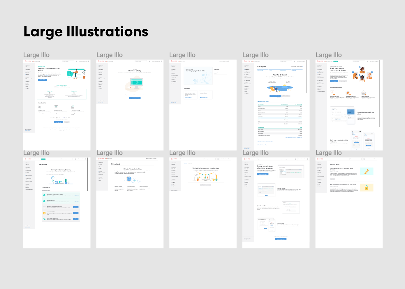
Take another example: I spent an entire day making an audit of our illustrations to help our team get an understanding of how we use them in our application. I opened up Figma and took dozens of screenshots:
It’s sort of hard to take credit for this work because the heavy lifting is really moderating a discussion and helping the team plan. It’s important work! But I feel like it’s hard to show that this work is valuable and to show the effects of it in a large org. “Things are now less confusing,” isn’t exactly a great accomplishment – but it really should be. These boring, methodical changes are vital for the health of a good design system.
Also... it’s kind of weird to putm “I wrote documentation” in a portfolio as much as it is to say, “I paired with designers and engineers for three years.” It’s certainly less satisfying than a big, glossy JPEG of a cool interface you designed. And I’m not sure if this is the same everywhere, but only about 10% of the work I do is visual and worthy of showing off.
My point is that building new components like this RadioCard I designed a while back is extraordinarily rare and accounts for a tiny amount of the useful work that I do:
I’d love to see how you’re dealing with this problem though. How do you show off your front-end and design systems work? How do you make it visible and valuable in your organization? Let me know in the comments!
I like this point that Jonathan Snook made on Twitter and I’ve been thinking about it non-stop because it describes something that’s really hard about writing CSS:
I feel like that tweet sounds either very shallow or very deep depending on how you look at it but in reality, I don't think any system, framework, or library really take this into consideration—especially in the context of maintainability.
In fact, I reckon this is the hardest thing about writing maintainable CSS in a large codebase. It’s an enormous problem in my day-to-day work and I reckon it’s what most technical debt in CSS eventually boils down to.
Let’s imagine we’re styling a checkbox, for example – that checkbox probably has a position on the page, some margins, and maybe other positioning styles, too. And that checkbox might be green but turns blue when you click it.
I think we can distinguish between these two types of styles as layout and appearance.
But writing good CSS requires keeping those two types of styles separated. That way, the checkbox styles can be reused time and time again without having to worry about how those positioning styles (like margin, padding or width) might come back to bite you.
At Gusto, we use Bootstrap’s grid system which is great because we can write HTML like this that explicitly separates these concerns like so:
<div class="row">
  <div class="col-6">
    <!-- Checkbox goes here -->
  </div>
  <div class="col-6">
    <!-- Another element can be placed here -->
  </div>
</div>
Otherwise, you might end up writing styles like this, which will end up with a ton of issues if those checkbox styles are reused in the future:
When I see code like this, my first thought is, "Why is the width 40% – and 40% of what?" All of a sudden, I can see that this checkbox class is now dependent on some other bit of code that I don’t understand.
So I’ve begun to think about all CSS as fitting into one of those two buckets: appearance and layout. That’s important because I believe those two types of styles should almost never be baked into one set of styles or one class. Layout on the page should be one set of styles, and appearance (like what the checkbox actually looks like) should be in another. And whether you do that with HTML or a separate CSS class is up for debate.
The reason why this is an issue is that folks will constantly be trying to overwrite layout styles and that’s when we eventually wind up with a codebase that resembles a spaghetti monster. I think this distinction is super important to writing great CSS that scales properly. What do you think? Add a comment below!
We’ve been writing a lot about refactoring CSS lately, from how to take a slow and methodical approach to getting some quick wins. As a result, I’ve been reading a ton about this topic and somehow stumbled upon this post by Harry Roberts about refactoring and how to mitigate the potential risks that come with it:
Refactoring can be scary. On a sufficiently large or legacy application, there can be so much fundamentally wrong with the codebase that many refactoring tasks will run very deep throughout the whole project. This puts a lot of pressure on developers, especially considering that this is their chance to "get it right this time". This can feel debilitating: "Where do I start?" "How long is this going to take?" "How will I know if I’m doing the right thing?"
Harry then comes up with this metaphor of a refactoring tunnel where it’s really easy to find yourself stuck in the middle of a refactor and without any way out of it. He argues that we should focus on small, manageable pieces instead of trying to tackle everything at once:
Resist the temptation to refactor anything that runs right the way throughout the project. Instead, identify smaller and more manageable tasks: tasks that have a much smaller surface area, and therefore a much shorter Refactoring Tunnel.
These tasks can still aim toward a larger and more total goal but can be realised in much safer and shorter timeframes. Want to move all of your classes from BEM to BEM(IT)? Sure, but maybe just implement it on the nav first.
This way feels considerably slower, for sure, but there’s so much less risk involved.
I reckon that a lot of our uses of Sass maps can be replaced with CSS Custom properties – but hear me out for a sec.
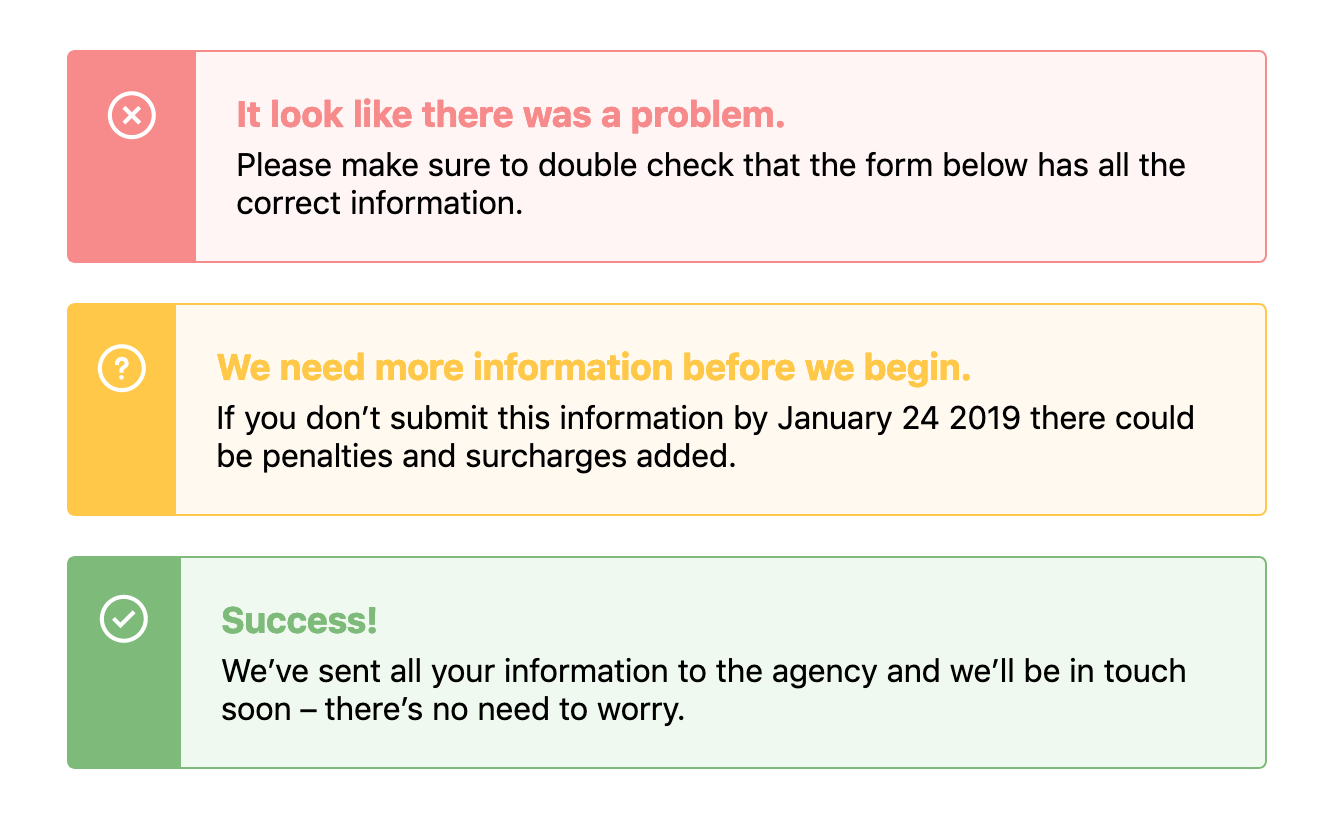
When designing components we often need to use the same structure of a component but change its background or text color based on a theme. For example, in an alert, we might need a warning style, an error style, and a success style – each of which might be slightly different, like this:
There’s a few ways we could tackle building this with CSS, and if you were asking me a couple of years ago, I would’ve tried to solve this problem with Sass maps. First, I would have started with the base alert styles but then I’d make a map that would hold all the data:
Pretty complicated, huh? This would output classes such as .alert-error, .alert-success and .alert-warning, each of which would have a bunch of CSS within them that overrides the default alert styles.
This would leave us with something that looks like this demo:
However! I’ve always found that using Sass maps and looping over all this data can become unwieldy and extraordinarily difficult to read. In recent projects, I’ve stumbled into fantastically complicated uses of maps and slowly closed the file as if I’d stumbled into a crime scene.
How do we keep the code easy and legible? Well, I think that CSS Custom Properties makes these kinds of loops much easier to read and therefore easier to edit and refactor in the future.
Let’s take the example above and refactor it so that it uses CSS Custom Properties instead. First we’ll set out core styles for the .alert component like so:
As we create those base styles, we can setup variables in our .alert class like this:
.alert {
  --theme: #ccc;
  --darkTheme: #777;
  --icon: '';
  background: var(--theme);
  border: 1px solid var(--darkTheme);
  /* other styles go here */

  &:before {
    background-image: var(--icon);
  }
}
We can do a lot more with CSS Custom Properties than changing an interface to a dark mode or theme. I didn’t know until I tried that it's possible to set an image in a custom property like that – I simply assumed it was for hex values.
Anyway! From there, we can style each custom .alert class like .alert-warning by overriding these properties in .alert:
However! I think there’s an enormous improvement here that’s been made in terms of legibility. It’s much easier to look at this code and to understand it right off the bat. With the Sass loop it almost seems like we are trying to do a lot of clever things in one place – namely, nest classes within other classes and create the class names themselves. Not to mention we then have to go back and forth between the original Sass map and our styles.
With CSS Custom Properties, all the styles are contained within the original .alert.
There you have it! I think there’s not much to mention here besides the fact that CSS Custom Properties can make code more legible and maintainable in the future. And I reckon that’s something we should all be a little excited about.
Although there is one last thing: we should probably be aware of browser support whilst working with Custom Properties although it’s pretty good across the board.
Here’s a great post by Roman Komarov on what he learned by improving the performance of his personal website. There’s a couple of neat things he does to tackle font loading in particular, such as adding the <link rel="preload"> tags for fonts. This will encourage those font files to download a tiny bit faster which prevents that odd flash of un-styled text we know all too well. Roman also subsets his font files based on language which I find super interesting – as only certain pages of his website use Cyrillic glyphs.
He writes:
I was digging into some of the performance issues during my work for a few weeks, and I thought that it can be interesting to see how those could be applied to my site. I was already quite happy with how it performed (being just a small static site) but managed to find a few areas to improve.
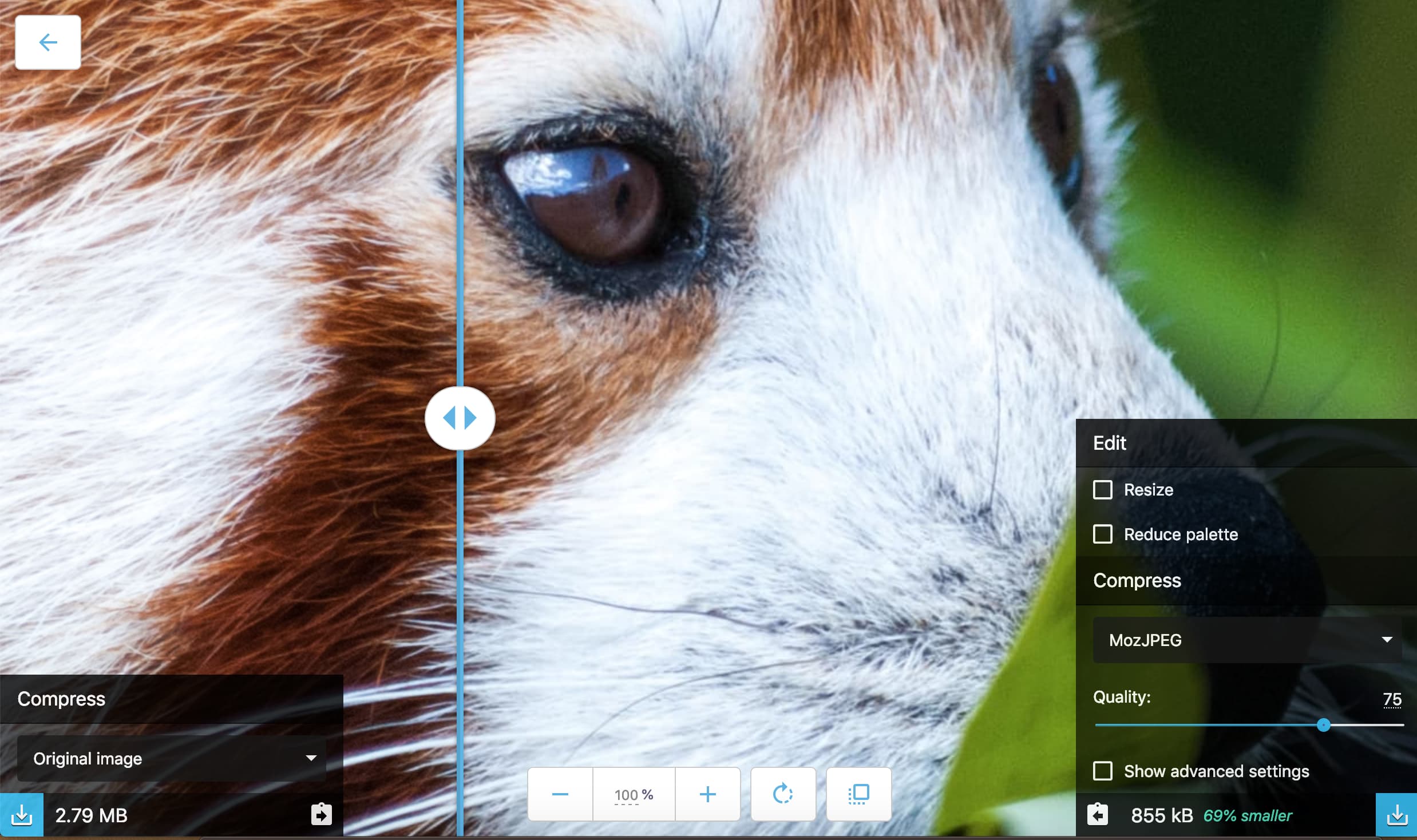
I had also never heard of Squoosh, which happens to be an incredible image optimization tool that looks like this when you’re editing an image:
With that slider in the middle, it shows the difference between the original image and the newly optimized one, which is both super neat and helpful.
Well, I had seen this pattern so often that I thought Custom Properties could only be used for color values like rgba or hex – although that’s certainly not the case! After a little bit of experimentation and sleuthing around, I realized that it’s possible to use Custom Properties to set image paths, too.
Kinda neat, huh? I think this could be used to make an icon system where you could define a whole list of images in the :root and call it whenever you needed to. Or you could make it easier to theme certain classes based on their state or perhaps in a media query, as well. Remember, too, that custom properties can be overridden within an element:
And, considering that custom properties are selectable in JavaScript, think about the possibilities of swapping out images as well. I reckon this might useful to know!