Drop caps & design systems

Ethan Marcotte has written up his process for how to make drop caps accessible for screen readers and browsers alike. All of that is very interesting and I’m sure I’ll use a technique like this in the near future, but the part that made me hop out of my seat is where Ethan notes his experience with design systems at Vox:

Since rolling out our new and improved drop caps, we’ve continued to iterate on them. (Including fixing a number of bugs that I, a professional web designer, introduced.) We’ve also discussed potential changes to the custom styles feature, in order to make it sustainable. But for my money, the real benefit of the work wasn’t the drop caps themselves, but the process that emerged from it.

This is something I’ve been thinking about a lot. The tricky thing to understanding design systems is that the process of creating and maintaining them is just as important than the code it uses. Sure, yes, fixing small things is very important, but the long-lasting improvements to a design system will always be around process. Why is this thing breaking? How long has it been broken for? How do we setup a way to make sure that this problem never pops up again?

Questions about process will always be the most useful questions to ask. The system will reward you for asking.

Direct Link to ArticlePermalink

The post Drop caps & design systems appeared first on CSS-Tricks.

Every Layout

Every Layout is a new work-in-progress website and book by Heydon Pickering and Andy Bell that explains how to make common layout patterns with CSS. They describe a lot of the issues when it comes to the design of these layouts, such as responsive problems and making sure we all write maintainable code, and then they’ve provided a handy generator at the end of each article to create our own little frameworks for dealing with these things.

They also have a complementary blog and one of the posts called "Algorithmic Design" caught my eye:

We make many of our biggest mistakes as visual designers for the web by insisting on hard coding designs. We break browsers’ layout algorithms by applying fixed positions and dimensions to our content.

Instead, we should be deferential to the underlying algorithms that power CSS, and we should think in terms of algorithms as we extrapolate layouts based on these foundations. We need to be leveraging selector logic, harnessing flow and wrapping behavior, and using calculations to adapt layout to context.

The tools for flexible, robust, and efficient web layout are there. We are just too busy churning out CSS to use them.

I’m looking forward to seeing where this project goes and how many more layouts these two end up documenting.

Direct Link to ArticlePermalink

The post Every Layout appeared first on CSS-Tricks.

Your first performance budget with Lighthouse

Ire Aderinokun writes about a new way to set a performance budget (and stick to it) with Lighthouse, Google’s suite of tools that help developers see how performant and accessible their websites are:

Until recently, I also hadn't setup an official performance budget and enforced it. This isn’t to say that I never did performance audits. I frequently use tools like PageSpeed Insights and take the feedback to make improvements. But what I had never done was set a list of metrics that I needed the site to meet, and enforce them using some automated tool.

The reasons for this were a combination of not knowing what exact numbers I should use for budgets as well as there being a disconnect between setting a budget and testing/enforcing it. This is why I was really excited when, at Google I/O this year, the Lighthouse team announced support for performance budgets that can be integrated with Lighthouse. We can now define a simple performance budget in a JSON file, which will be tested as part of the lighthouse audit!

I completely agree with Ire, and much in the same way I’ve tended to neglect sticking to a performance budget simply because the process of testing was so manual and tedious. But no more! As Ire shows in this post, you can even set Lighthouse up to test your budget with every PR in GitHub. That tool is called lighthousebot and it’s just what I’ve been looking for – an automated and predictable way to integrate a performance budget into every change that I make to a codebase.

Today lighthousebot will comment on your PR after a test is complete and it will show you the before and after score:

How neat is that? This reminds me of Gareth Clubb’s recent post about improving web performance and building a culture around budgets in an organization. What better way to remind everyone about performance than right in GitHub after each and every change that they make?

Direct Link to ArticlePermalink

The post Your first performance budget with Lighthouse appeared first on CSS-Tricks.

Self-Host Your Static Assets

Harry Roberts digs into why hosting assets on someone else’s servers (including CDNs) is not such a great idea if we want our websites to be lightning fast.

Harry writes:

One of the quickest wins—and one of the first things I recommend my clients do—to make websites faster can at first seem counter-intuitive: you should self-host all of your static assets, forgoing others’ CDNs/infrastructure.

I think perhaps the most shocking example Harry shows is this one:

...on a reasonably fast connection, hosting these static assets off-site is 311ms, or 1.65×, slower than hosting them ourselves.

By linking to three different origins in order to serve static assets, we cumulatively lose a needless 805ms to network negotiation. Full test. Okay, so not exactly terrifying, but Trainline, a client of mine, found that by reducing latency by 300ms, customers spent an extra £8m a year. This is a pretty quick way to make eight mill.

It’s clear from Harry’s example (as well as the rest of the examples on WPO stats) every millisecond counts when it comes to performance. And, if we can alleviate even a third of a second of latency by moving our assets around, we should probably go do that.

Direct Link to ArticlePermalink

The post Self-Host Your Static Assets appeared first on CSS-Tricks.

Reducing motion with the picture element

Here’s a bonafide CSS/HTML trick from Brad Frost and Dave Rupert where they use the <picture> element to switch out a GIF file with an image if the user has reduced motion enabled. This is how Brad goes about implementing that:

<picture>
  <!-- This image will be loaded if the media query is true  -->
  <source srcset="no-motion.jpg" media="(prefers-reduced-motion: reduce)"></source>

  <!--  Otherwise, load this gif -->
  <img srcset="animated.gif" alt="brick wall"/>
</picture>

How nifty is this? It makes me wonder if there are other ways this image-switching technique can be used besides accessibility and responsive images...

Also, it’s worth noting that Eric Bailey wrote about the reduced motion media query a while back where he digs into its history and various approaches to use it.

Direct Link to ArticlePermalink

The post Reducing motion with the picture element appeared first on CSS-Tricks.

The difference between keyboard and screen reader navigation

There are a few differences between keyboards and screen readers and Léonie Watson highlights of them:

When using the tab key, keyboard focus and screen reader focus are synchronised with each other. The rest of the time, screen reader users have an enormous range of commands at their disposal for reading and navigating content independently of keyboard focus. The commands vary between screen readers, but they all have one thing in common: they’re tied to different HTML elements.

This is also a good reminder that screen readers behave differently from one another. It’s worth doing some research to see how our sites work in all these environments. One thing is clear from this post though: writing semantic and concise HTML is the best way to improve accessibility for both users with keyboards and screen readers. For example, Scott O'Hara has this recent post on best practices using the tabindex attribute to ensure accessible navigation using the keyboard.

Direct Link to ArticlePermalink

The post The difference between keyboard and screen reader navigation appeared first on CSS-Tricks.

Color contrast accessibility tools

Accessibility is all the rage these days, specifically when it comes to color contrast. I’ve stumbled upon a couple of tools this week that I think are pretty nifty for helping make sure that all of the text on our websites is legible regardless of what background color they might have.

First up is the Accessible Color Generator which happens to be a wonderful tool for picking alternative colors. Let’s say you’re working on a brand with color X. You can generate a host of other complimentary colors like this:

Next up is Contrast, a rather great MacOS app that sits in the menu bar at all times and helps identify accessible color pairings based on WCAG Guidelines. This one is particularly useful if you happen to be a designer:

This reminds me of a wonderful post about how the Lyft design team re-approached the way they use color in their app. Kevyn Arnott explains:

Color, at least on the surface, appears almost naively simple, yet as it scales across larger products it becomes unbelievably complex. You have thousands of people building products all at once, and those products are all heavily reliant on color. This puts a lot of pressure on the color system to ensure that all the products are being created consistently, but very hard to implement since it’s all too easy to apply colors on a one-off basis.

The team then went ahead and built ColorBox.io which lets you systematically build out a ton of colors for your design systems work. It’s pretty nifty!

Plus the folks over at GOV.UK made their own color accessibility tool called Contrast Checker which (as you have guessed by the name) helps check the contrast between the background of an element and the page itself:

And, of course, there's the trusty WebAIM contrast checker, which is a go-to for many developers out there.

So far, we've looked at tools that check contrast. But there is a class of tooling that can automate accessible contrasts during development. Josh Bader wrote up an approach that enforces high contrast by pairing CSS custom properties with the calc() function. Facundo Corradini did something similar that switches font color based on the background color behind it.

Oh! And we may have something to look forward to with the color-adjust property. It is proposed in the CSS Color Module Level 4 specification and could give browsers more control to adjust color values that are declared in the stylesheet. It's not really geared towards color contrast, but there's something interesting about handing off the responsibility of rendering color values to the browser based on certain conditions.

The post Color contrast accessibility tools appeared first on CSS-Tricks.

Night Mode with Mix Blend Mode: Difference

Dark mode designs are all the rage right now but here’s an interesting take: Wei Gao has built a night mode on her own site that uses mix-blend-mode: difference to create an effect that looks like this:

Wei explains how she implemented this technique and the edge cases she encountered along the way. I especially love what she had to say about mix-blend-mode functions here:

I remember first playing around with them in Photoshop years ago. Now that browsers are becoming more powerful and we are seeing complex graphical features native to browser rendering. This doesn’t mean we should implement a full photoshop in browsers and nor should we limit our imaginations to just that. Browsers and web pages have their own contexts and goals, as well as a different set of limits. Maybe we should welcome them like new habitants and discover use cases native to this territory.

Indeed! Although Wei's technique is pretty unique and awesome on its own, this all ties back into the thing that kicked off the whole trend: the prefers-color-scheme media feature that was released in Safari as part of the MacOS 10.4 release that gave us a dark mode preference setting. This is a developing space, so we're certain to see more innovations and approaches ahead.

Direct Link to ArticlePermalink

The post Night Mode with Mix Blend Mode: Difference appeared first on CSS-Tricks.

A Better Approach for Using Purgecss with Tailwind

Greg Kohn looks at how to use Purgecss — a tool that helps remove unused styles — and Tailwind — a utility-based CSS framework — and why we might want to pair these tools together:

Tailwind, by intention, is aiming to equip you with an arsenal of utility classes by generating more than you need. There are some best practices which will help keep this overall build size down, like limiting your colors and breakpoints or turning off the modules by default before adding them as necessary. Still, you’ll inevitably generate classes that go unused. And honestly, approaching your configuration with an unrelenting miserly attitude will slow you down and make development less fun. By leaning on Purgecss, there’s no worry that the CSS your users download will only include classes that are ultimately needed.

I’ve never used Tailwind or Purgecss, but I reckon the latter could be particularly useful if you have a giant old codebase and you don’t have the resources to refactor things just yet. I guess my only concern with introducing a tool like that is it could encourage folks to not refactor large and problematic areas in their styles – taking the safest route with this tool instead.

For more info about Tailwind, though, Ben Tinsley wrote a great post a while back about how to get started and Nick Basile showed us how to style a form with Tailwind.

Direct Link to ArticlePermalink

The post A Better Approach for Using Purgecss with Tailwind appeared first on CSS-Tricks.

Google Fonts is Adding font-display

Google announced at I/O that their font service will now support the font-display property which resolves a number of web performance issues. If you're hearing cries of joy, that's probably Chris as he punches the air in celebration. He's wanted this feature for some time and suggests that all @font-face blocks ought to consider using the property.

Zach Leatherman has the lowdown:

This is big news—it means developers now have more control over Google Fonts web font loading behavior. We can enforce instant rendering of fallback text (when using font-display: swap) rather than relying on the browser default behavior of invisible text for up to 3 seconds while the web font request is in-flight.

It’s also a bit of trailblazing, too. To my knowledge, this is the first web font host that’s shipping support for this very important font-display feature.

Yes, a big deal indeed! You may recall that font-display instructs the browser how (and kinda when) to load fonts. That makes it a possible weapon to fight fight FOUT and FOIT issues. Chris has mentioned how he likes the optional value for that exact reason.

@font-face {
  font-family: "Open Sans Regular";
  src: url("...");
  font-display: optional;
}

Oh and this is a good time to remind everyone of Monica Dinculescu’s font-display demo where she explores all the various font-display values and how they work in practice. It’s super nifty and worth checking out.

Direct Link to ArticlePermalink

The post Google Fonts is Adding font-display appeared first on CSS-Tricks.

A responsive grid layout with no media queries

Andy Bell made a really cool demo that shows us how to create a responsive grid layout without any media queries at all. It happens to look like this when you change the size of the browser window:

I think this is a wonderful layout technique that’s just 6 lines (!) of CSS.

.auto-grid {
  --auto-grid-min-size: 16rem;
  display: grid;
  grid-template-columns: repeat(auto-fill, minmax(var(--auto-grid-min-size), 1fr));
  grid-gap: 1rem;
}

What this shows us is that we don’t have to write a million media queries to change the number of columns in a grid. Andy also proves that CSS Grid can automate so much of the tedious work of styling layouts.

I’ve seen this technique used in a couple of places (and we have a few starter grid templates to boot) but Andy’s article about how it all works finally made it all sink in just how useful grid is.

Direct Link to ArticlePermalink

The post A responsive grid layout with no media queries appeared first on CSS-Tricks.

A Conspiracy to Kill IE6

Chris Zacharias published a few notes about why the team at YouTube added a banner that asked users to switch from IE6 to a more modern browser back in 2009:

The bittersweet consequence of YouTube’s incredible growth is that so many stories will be lost underneath all of the layers of new paint. This is why I wanted to tell the story of how, ten years ago, a small team of web developers conspired to kill IE6 from inside YouTube and got away with it.

I do not recall the exact triggering event that led to our web development team laying out plans to kill IE6 over lunch in the YouTube cafeteria. Perhaps it was the time I pushed out a CSS stylesheet that included an attribute selector on a semi-supported HTML element. Any reasonable web developer would expect this to be ignored by browsers not up to the task. This was not the case with older flavors of IE. Under very specific conditions, an attribute selector on an unsupported HTML element in IE would create an internal recursion that would at best, cause the browser to crash and at worst, trigger a blue screen of death.

There are a lot of interesting things to consider here. IE6 was notoriously difficult for developers to work with and would cause teams to spend a great deal of time fixing game-breaking bugs for what often represented a mere slither of their overall site traffic. However, it’s important to note that as soon as you make a call like this, where do you stop? It suddenly becomes easier to make a Chrome-only website, to ignore basic accessibility principles, to ignore semantic markup, and to make a website optimized for yourself. That leads us to more sticky topics, such as browser diversity and proprietary resources that seem at odds with an open, inclusive web.

I’m reminded here of Jeremy Keith’s book, Resilient Web Design, where he writes:

If a website is built using progressive enhancement then it’s okay if a particular feature isn’t supported or fails to load: Ajax, geolocation, whatever. As long as the core functionality is still available, web designers don’t need to bend over backwards trying to crowbar support for newer features into older browsers.

And Jeremy quotes Mat Marquis, who happened to work on the responsive redesign of The Boston Globe, where he argued that:

Lots of cool features on the Boston Globe don’t work when JS breaks; “reading the news” is not one of them.

Maybe there’s a middle ground here; maybe there’s not. But I find Mat and Jeremy’s approach to be more inspiring and kinder to the overall health of the web.

Direct Link to ArticlePermalink

The post A Conspiracy to Kill IE6 appeared first on CSS-Tricks.

Currently Reading: Progressive Web Apps by Jason Grisby

I’ve been reading Jason Grigsby’s new book on progressive web apps this past week and it’s exciting. Jason explains what PWAs are and how they work while while doing a bang-up job covering the business case for using them them, too. But perhaps you might be thinking that a PWA isn’t necessary for the project you’re working on right now. Well, Jason argues that progressive web apps are for everybody:

Should your website be a progressive web app? The answer is almost certainly yes. Even if you don’t think of your website as an “app,” the core features of progressive web apps can benefit any website. Who wouldn’t profit from a fast, secure, and reliable website?

One of the challenges I’ve experienced when thinking about how to apply a progressive web app to a project I’m working on is figuring out what content to cache. Should the homepage be cached? Do we make a custom offline page? What is useful information to provide a user in that context?

Jason goes there, too, and even describes how he tackles that for his own projects:

For cloudfour.com, we chose to only cache recently viewed pages because the main reason people come to our site is to read the articles. If we tried to anticipate which articles someone would want offline access to, we’d likely guess incorrectly. If we precached top-level pages, we might force people on a metered network connection to download content they would never look at...

That makes a ton of sense to me and I realize that the offline cache should probably be different depending on the situation and the website. For example, maybe a design agency website could replace the big flashy homepage with an offline page that only shows the phone number of the agency instead. Or perhaps a restaurant website could cache the food menu and make that experience offline, but remove all the images to make sure it’s not too impactful for folks on those metered networks.

Anyway, I think that Jason’s book is wonderful as it reveals to us all this complexity and a whole new set of opportunities to improve the design and experience of our websites, which, by the way, is something we should strive for in this new and exciting age of web app development.

The post Currently Reading: Progressive Web Apps by Jason Grisby appeared first on CSS-Tricks.

Earth day, API’s and sunshine.

Cassie Evans showcases some really nifty web design ideas and explores using the API provided by the company her team over at Clearleft recently hired to cover their building's roof with solar panels. Cassie outlines her journey designing a webpage that uses the API to populate some light data visualizations about the energy the building uses now that the solar panels are installed.

Here at Clearleft we’ve been taking small steps to reduce our environmental impact. In December 2018 we covered the roof of our home with solar panels.

With the first of the glorious summer sun starting to shine down on us, we started to ponder about what environmental impact they'd had over the last 5 months.

Luckily for us, our solar panels have an API, so we can not only find out that information, we can request it from SolarEdge and display it in our very own interface.

The post is a great practical look into using the Fetch API which is also something Zell Liew wrote up in thorough detail, covering the history of using APIs with JavaScript, handling errors and other weird things that might happen when working with it.

But, equally interesting and useful is reading through Cassie's thought process as she sketches a wireframe for the page, researches how to use the Fetch API, and integrates animation into a lovely SVG illustration. It's an exercise in both design and development that many of us can relate to but also learn from.

Oh and while we're on the topic of data visualizations, Dan Englishby posted something just today on the many ways if getting data into charts. Working with real-time APIs is covered there as well, and is a nice segue from Cassie's post.

Direct Link to ArticlePermalink

The post Earth day, API’s and sunshine. appeared first on CSS-Tricks.

Moving from Gulp to Parcel

Ben Frain just made some notes about the switch from Gulp to Parcel, a relatively new "web application bundler" which, from a quick look at things, is similar to webpack but without all the hassle of setting things up. One of the things I’ve always disliked about webpack is that you kinda have to teach it what CSS, HTML and JS are before making whatever modifications you want to those files. However, Parcel does a lot of the asset management and configuration stuff for us which is super neat — hence, Parcel claim that it requires “zero configuration.”

If you’d like to learn more about Parcel then there’s a great post by Indrek Lasn that details how to get started and even shows off a little bit about how Parcel is often faster than alternatives like webpack. We also just published a post by Kingsley Silas that explains how to use Parcel with React.

Direct Link to ArticlePermalink

The post Moving from Gulp to Parcel appeared first on CSS-Tricks.

Preload, prefetch and other link tags

Ivan Akulov has collected a whole bunch of information and know-how on making things load a bit more quickly with preload and prefetch. That's great in and of itself, but he also points to something new to me – the as attribute:

<link rel="preload" href="/style.css" as="style" />

Supposedly, this helps browsers prioritize when to download assets and which assets to load.

My favorite part of this post is Ivan’s quick summary at the end which clearly defines what all these different tags can be used for:

<link rel="preload"> – when you’ll need a resource in a few seconds
<link rel="prefetch"> – when you’ll need a resource on a next page
<link rel="preconnect"> – when you know you’ll need a resource soon, but you don’t know its full url yet

Make sure to check out our own post on the matter of prefetching, preloading, and prebrowsing, too. Adding these things to our links can make significant performance improvements and so check it out to add more resources to your performance toolbox.

Direct Link to ArticlePermalink

The post Preload, prefetch and other link tags appeared first on CSS-Tricks.

Clever code

This week, Chris Ferdinandi examined a clever JavaScript snippet, one that's written creatively with new syntax features, but is perhaps less readable and performant. It's a quick read, but his callout of our industry's fixation on cleverness is worth... calling out:

...we’ve become obsessed as an industry with brevity and clever code, and it results in code that’s sometimes less performant, and typically harder to read and make sense of for most people.

He made a similar argument late last month when he wrote about code readability, noting that brevity might look cool but ultimately leads to all sorts of issues in a codebase:

Often, web developers are obsessed with brevity. There’s this thing were developers will try to write the same function in the fewest number of characters possible.

Personally, I think brevity is pointless. Readability is a lot more important.

I entirely agree with Chris on this point, however, I think there is one important distinction to make and that's the difference between code that's intended as a prototype and code that's intended for production. As Jeremy Keith argued a short while ago:

What’s interesting is that—when it comes to prototyping—our usual front-end priorities can and should go out the window. The priority now is speed. If that means sacrificing semantics or performance, then so be it. If I’m building a prototype and I find myself thinking “now, what’s the right class name for this component?”, then I know I’m in the wrong mindset. That question might be valid for production code, but it’s a waste of time for prototypes.

I agree with Chris that we should be writing code that is easy to read when we’re in production. I also think experimenting with code in this way is a good thing when it comes to prototypes. We shouldn’t ever shy away from playing with code and pushing things a little bit – so long as we’re not doing that in a giant web app with a a team of other developers working alongside us.


I’ve noticed that there are some folks that are doing genuinely ingenious things with Sass. I consistently sit back and think, "Wow, I’ve never seen anything like this before." But when it comes to a production web app that has to be understood by hundreds of people at the same time, I don’t believe that this is the reaction we want when someone looks at the code.

As a result, I’ve been trying to write Sass code that is actually so simple that it almost looks dumb. One easy way to make code a lot simpler is to reduce the amount of nesting:

.element {
  .heading { ... }
}

This looks fine when there’s code inside — and it’s pretty easy to understand — but add a complex bit of design in the mix (say, using pseudo elements and media queries) and you suddenly have a rather complex set of rules in front of you. Creativity and cleverness can be harder to scan and identify one small part of the code that you’re looking for. Plus, in this example, we’ve unnecessarily made our .heading class a little bit more specific which might encourage us to override things in a hacky way elsewhere in the codebase.

We could write the following:

.element { ... }

.element-heading { ... }

I know this looks foolishly simple but the relationship between these two classes is easier to see and easier to extend in the future. Bundling all that code into a single nested class can get out of hand real fast. Even if it happens to look a lot cooler.

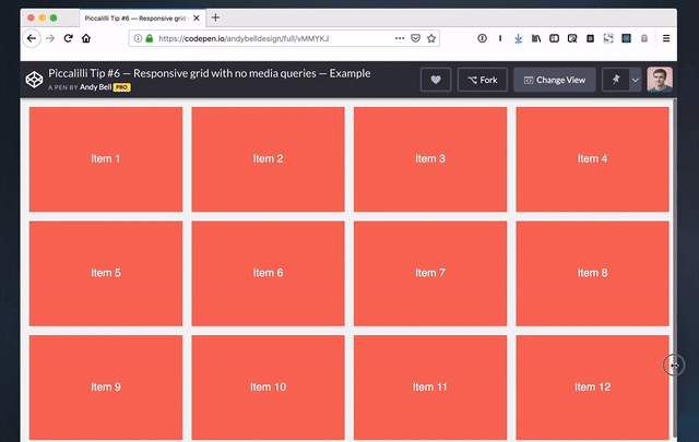
(As an aside, Andy Bell's post on using the ampersand in Sass — and the resulting comments — is a great example of the clash between creativity and practicality.)

Anyway, the point I’m trying to make here is that CSS (and JavaScript for that matter) is a strange language because there are no definite rules you can make about it. It all really depends on the codebase and the project. But I think we can safely say that our code ought to be a lot more boring than our prototypes when it moves to production.

Continue to make prototypes that are wild and experimental or impossibly weird! Code quality be damned.

The post Clever code appeared first on CSS-Tricks.

A Website is a Car and Not a Book

I’ve been wondering for a good long while why it feels like web design and development isn’t respected as much as native app development= and why the front-end role in many organizations is seen as a nice-to-have rather than a vital part of the business. Why is it so hard to see that this gig we call "front-end development" is crucial for business and even the day-to-day lives of users?

Is it just me that feels this way?

We depend on front-end developers to help us file our taxes, buy our food and clothes, pay our bills, and entertain us. We find new music, we read stories and play games, and we fall in love... all on websites made up of nothing more than HTML, CSS, and JavaScript written by front-enders.

I’m not trying to be a jerk here, but you can see organizations everywhere that de-prioritize front-end development. There are slow websites! Ad-tech junk everywhere! Poor responsive interfaces! Divs used for buttons! Inaccessible forms! The problems on the web today are daunting and overwhelming to those who care about both good front-end development and the health of the web itself.

What's the cause? Well, I certainly don’t believe that it’s malice. Nobody wants to make slow websites or broken interfaces and nobody (I think) is intentionally trying to break the web. So, why do we all end up doing things that go against what we know to be best practices? What is it about the complexities of web design that is so hard to grasp?

Again, I’m not being mean here – this is an honest question.

I got coffee with my pal Lindsay Grizzard the other day and we were talking about this stuff, asking each other these and other really tough questions related to our work. We both see problems in this industry and it drives us both a little mad to some extent.

Anyway, I asked Lindsay that question: what is it about web design that makes it so difficult to understand? She posited that the issue is that most people believe web design is like designing a book. Heck, we still call these things web pages. But Lindsay argued that building a modern website is nothing like designing a book; it’s more like designing a car.

Lindsay and I looked at the cars parked on the street next to us: they have to be mass produced and they have to be tested. Each has to be built up of perfectly identical components that need to fit together in a very specific format. There are technical issues – limitations of physics, money, and time – that require confronting on a daily basis. You can’t point at one part of the car and have an opinion about aesthetics because that one component changes the relationships of the others. You have to understand that you’re looking at an immensely complicated system of moving parts.

I love that comparison though, even if it’s not particularly helpful to give others insight into what we do: a website is a car and not a book.

The post A Website is a Car and Not a Book appeared first on CSS-Tricks.