Making Tables Responsive With Minimal CSS

Here’s a fabulous CSS trick from Bradley Taunt in which he shows how to make tables work on mobile with just a little bit of extra code. He styles each table row into a card that looks something like this:

See the Pen
Responsive Tables #2.5: Flexbox
by Bradley Taunt (@bradleytaunt)
on CodePen.

(Make sure to grab the Pen and make it a bit smaller to see how the design works responsively.)

Bradley’s example markup looks like this – clean, accessible, regular ol’ HTML:

<table>
  <thead>
    <tr>
      <th>Type of Food</th>
      <th>Calories</th>
      <th>Tasty Factor</th>
    </tr>
  </thead>
  <tbody>
    <tr>
      <td><span>Type of Food</span> Slice of Pizza</td>
      <td><span>Calories</span> 450</td>
      <td><span>Tasty Factor</span> 95%</td>
    </tr>
  </tbody>
</table>

How does he make that card effect? He uses flexbox on smaller screens and sets the span elements to reveal themselves.

However! I’m not a big fan of those spans. They’re hidden on larger screen sizes but the markup is still there, so it doesn’t feel particularly clean to me. I was working on a project a little while ago where we stumbled on the same problem. We decided to use data attributes on each td instead, like this:

<table>
  <thead>
    <tr>
      <th>Type of Food</th>
      <th>Calories</th>
      <th>Tasty Factor</th>
    </tr>
  </thead>
  <tbody>
    <tr>
      <td data-title="Type of Food">Slice of Pizza</td>
      <td data-title="Calories">450</td>
      <td data-title="Tasty Factor">95%</td>
    </tr>
  </tbody>
</table>

Then we can grab that data attribute in our styles and render it on the page in a pseudo element:

td:before {
  content: attr(data-title);
}

From there we absolutely position the pseudo element to the side and only show it on smaller screens with a media query. I’m uncertain about the accessibility implications of this but it just feels a bit easier to read and understand in my opinion.

Either way, I think this post is a great reminder about all the tricky issues that pop up once you start using tables. There’s so many ways to handle things responsively and those decisions should entirely be made on the context of the design.

Direct Link to ArticlePermalink

The post Making Tables Responsive With Minimal CSS appeared first on CSS-Tricks.

Why Progressive Web Apps Are The Future of Mobile Web

Here’s one of the best essays I’ve ever read about why progressive web apps are important, how they work, and what impact they have on a business:

PWAs are powerful, effective, fast and app-like.

It’s hard to imagine a mobile web property that could not be significantly improved via PWA implementation. They can also potentially eliminate the need for many “vanity” native apps that exist today.

My only small disagreement with this piece is their use of the term “mobile web.” I know it’s a tiny thing to get persnickety over but my hot take after reading it is this: it’s important to remember that progressive web apps are for everyone, desktop and mobile users alike. I think it’s important to reiterate that there is no mobile web. And that our goal is to be better than native.

Direct Link to ArticlePermalink

The post Why Progressive Web Apps Are The Future of Mobile Web appeared first on CSS-Tricks.

Enhancing The Clickable Area Size

Here’s a great post by Ahmad Shadeed on making sure that clickable areas in our interfaces are, well, clickable. He writes about making sure that links, buttons and other elements meet accessibility standards for both touch and mouse, too.

I particularly like the section where Ahmad writes about making a fake circle around an element and where he shows this example:

On a similar note, Andy Bell just wrote up a few notes about creating a semantic “breakout” button to make an entire element clickable. This is a common pattern where you might want a design element that looks like a card but the whole thing is effectively a single button. There are a few accessibility tips that Andy brings up that are very much worth taking a look at!

The same sort of thing might be said about buttons. Using a rounded border-radius trims the corners, creating small un-clickable areas.

Direct Link to ArticlePermalink

The post Enhancing The Clickable Area Size appeared first on CSS-Tricks.

A Codebase and a Community

I woke up one morning and realized that I had it all wrong. I discovered that code and design are unable to solve every problem on a design systems team, even if many problems can be solved by coding and designing in a dark room all day. Wait, huh? How on earth does that make any sense? Well, that’s because good design systems work is about hiring, too.

Let me explain.

First, let’s take a look at some common design systems issues. One might be that your components are a thick div soup which is causing issues for users and is all-round bad for accessibility. Another issue might be that you have a large number of custom components that are fragile and extremely difficult to use. Or maybe you have eight different illustration styles and four different modal components. Maybe you have a thousand different color values that are used inconsistently.

Everyone in an organization can typically feel these problems but they’re really hard to describe. Folks can see that it takes way longer to build things than it should and miscommunication is rampant. Our web app might have bad web performance, major accessibility issues and wildly inconsistent design. But why is this? What’s the root cause of all these dang problems?

The strange thing about design systems is it’s difficult to see what the root cause of all these inconsistencies and issues might be. And even the answer isn’t always entirely obvious once you see the problem.

A design systems team can write component documentation to fix these issues, or perhaps refactor things, audit patterns, refactor even more things, redesign components, and provide training and guidance. But when apps get to a certain size then one person (or even a whole team of people) tackling these problems isn’t enough to solve them.

Sure a design systems team can spend a whole bunch of time helping fix an issue but is that really the best use of their time? What if they convinced another team in the company to instead hire a dedicated front-end engineer to build a sustainable working environment? What if they hired an illustrator to make things consistent and ensure high quality across the entire app?

This is why design systems work is also about hiring.

A design systems team is in the perfect place to provide guidance around hiring because they’ll be the first to spot issues across an organization. They’ll see how components are being hacked together or where there’s too many unnecessary custom components that are not part of a library or style guide. The design systems team will see weaknesses in the codebase that no one else can see and they can show which teams are missing which particular skill sets — and fix that issue by hiring folks with skills in those specific areas.

If you're in management and don’t see all those inconsistencies every day, then it’s likely nothing will get done about it. We're unlikely to fix the issues we cannot see.

So as design systems folks, we ultimately need to care about hiring because of this: a codebase is a neighborhood and a community.

And the only way we can fix the codebase is by fixing the community.

The post A Codebase and a Community appeared first on CSS-Tricks.

Thinking in React Hooks

Amelia Wattenberger has written this wonderful and interactive piece about React Hooks and details how they can clean up code and remove all those troubling lifecycle events:

React introduced hooks one year ago, and they've been a game-changer for a lot of developers. There are tons of how-to introduction resources out there, but I want to talk about the fundamental mindset change when switching from React class components to function components + hooks.

Make sure you check out that lovely animation when you select the code, too. It’s a pretty smart effect to show the old way of doing things versus the new and fancy way. Also make sure to check out our very own Intro to React Hooks once you’re finished to find more examples of this pattern in use.

Direct Link to ArticlePermalink

The post Thinking in React Hooks appeared first on CSS-Tricks.

(Why) Some HTML is “optional”

Remy Sharp digs into the history of the web and describes why the <p> tag doesn’t need to be closed like this:

<p>Paragraphs don’t need to be closed
<p>Pretty weird, huh?

Remy writes:

Pre-DOM, pre-browsers, the world's first browser was being written by Sir Tim Berners-Lee. There was no reference implementation and certainly no such thing as a parsing specification. The first browser, the WorldWideWeb.app, parsed HTML character by character applying styles as it went along. As opposed to today's methods whereby a document object model is built up, then rendered.

[...] The paragraph tag (yes, in upper case) was intended to separate paragraphs, not wrap them.

<P>
Paragraph one.
<P>
Paragraph two.
<P>
Paragraph three.

Weird, huh! Remy wrote this in response to Chris’ post the other day about optional HTML and how browsers will close certain tags for us or even insert the right elements in place.

Direct Link to ArticlePermalink

The post (Why) Some HTML is “optional” appeared first on CSS-Tricks.

5G Will Definitely Make the Web Slower, Maybe

Scott Jehl has written this wonderful piece about how 5G is on the horizon and how it could cause problems for users. But first, he starts by talking about the overwhelming positive news about it:

[...] as it matures 5G is predicted to improve network speeds dramatically. Carriers are predicting download speeds in 2019 for anywhere from 100Mb to 1 Gbit per second on average.

This is...bonkers! Numbers like this make it seem as though the web’s performance problems are merely a matter of infrastructure. But Scott continues:

Faster networks should fix our performance problems, but so far, they have had an interesting if unintentional impact on the web. This is because historically, faster network speed has enabled developers to deliver more code to users—in particular, more JavaScript code.

During the years 2011 through 2019, 4g coverage spread from 5% to 79% of the world. During that same time period, the median average JavaScript transfer size to mobile devices increased by 611%, from 52kb to 372.9 KB.

When I read this, I thought of how adding extra lanes to highways actually causes more traffic, which is equally weird and counterintuitive. But networks are like highways in this way, as Scott shows above. He continues to look at how most phones won’t be using the latest and greatest tech and we’ll always have to consider the users that are using the slowest devices on the slowest networks, regardless of how fast our connection might be:

As networks improve, we have a huge opportunity to improve the web we build, but it’s on us to take that opportunity, or squander it.

Direct Link to ArticlePermalink

The post 5G Will Definitely Make the Web Slower, Maybe appeared first on CSS-Tricks.

Simplicity

Earlier this week, Bastian Allgeier published some interesting thoughts about complexity in web development and how changing simple things can often feel far more difficult than they need to be:

You want to build a JS file? Please update Webpack first. Oh, that new version of Webpack is no longer compatible with your Node version. Oh, your new Node version is no longer compatible with that other dependency. Oh, now you have 233 detected security issues in all your node_modules but you can't fix them because that would break something completely unrelated.

It's a UX nightmare and I haven't found a single exception yet. Vue Cli or Parcel are the most positive examples, where positive means: not as horrible as the rest.

This dependency hell is also the reason why old projects are almost like sealed capsules. You can hardly let a project lie around for more than a year, because afterwards it's probably broken.

A couple of weeks ago, I returned to a web app that was built with a variety of tools I hadn’t updated in quite some time and realized that it would be an enormous effort to fix all the packages and dependencies; instead I should just start over again. I can certainly empathise with Bastian on this stuff.

This reminds me that Chris wrote a great essay not so long about simple web development and collected a ton of thoughts from other developers out there.

Direct Link to ArticlePermalink

The post Simplicity appeared first on CSS-Tricks.

Firefox blocks third-party tracking cookies and cryptominers

This is super interesting stuff from Mozilla: the most recent update of Firefox will now block cryptominers and third-party tracking scripts by default. In the press release they write:

For today’s release, Enhanced Tracking Protection will automatically be turned on by default for all users worldwide as part of the ‘Standard’ setting in the Firefox browser and will block known “third-party tracking cookies” according to the Disconnect list. We first enabled this default feature for new users in June 2019. As part of this journey we rigorously tested, refined, and ultimately landed on a new approach to anti-tracking that is core to delivering on our promise of privacy and security as central aspects of your Firefox experience.

Compare this to A Vox interview with Mat Marquis discussing Google's efforts to make Chrome more private:

“Google is an advertising company, not a group of concerned altruists; there aren’t any charts at stakeholder meetings showing what amount they ‘saved the web’ this past quarter. They’re notorious for overstepping and outright abusing users’ personal data in pursuit of, well, making money as an advertising company,” Mat Marquis, a web developer, told Recode. “Their business model — the thing that keeps all these genuinely brilliant, genuinely well-meaning designers and developers employed — depends on convincing a company that they can make their users look at your ads.”

This is yet another reason why Firefox is my browser of choice and why, as concerned web designers and developers, I suggest others consider joining me in making the switch.

Direct Link to ArticlePermalink

The post Firefox blocks third-party tracking cookies and cryptominers appeared first on CSS-Tricks.

Jeremy Keith – Building the Web

I really enjoyed this interview with Jeremy Keith on the state of the web, how things have changed in recent years and why he’s a mix of optimistic and nervous for the future.

One thing that caught my attention during the interview more than anything was where Jeremy started discussing how folks think that websites are pretty crummy in general. This reminded me that I cannot count the number of times when someone has said to me “ah, I can’t view this website on my phone.”

We have websites that aren’t responsive! We have websites that litter the UI with advertisements and modals! And we have websites that are slow as all heck just when we need them the most!

Of course folks are going to start complaining about the web and working around them if they find that this is the case. I’ll even catch myself sending an email to myself when I know that the mobile experience is going to be crummy. Or I’ll Instapaper something because the design of the website is particularly difficult to read. Remember, Reader Mode is the button to beat.

My quick thought on this is that we shouldn’t become sour and pessimistic. We should roll up our sleeves and get to work because clearly there’s much left to do.

Direct Link to ArticlePermalink

The post Jeremy Keith – Building the Web appeared first on CSS-Tricks.

Accessibility and web performance are not features, they’re the baseline

This week I’ve been brooding about web performance and accessibility. It all began when Ethan Marcotte made a lot of great notes about the accessibility issues that are common with AMP:

In the recordings above, I’m trying to navigate through the AMP Story. And as I do, VoiceOver describes a page that’s impossible to understand: the arrows to go back or forward are simply announced as “button”; most images are missing text equivalents, which is why the screen reader spells out each and every character of their filenames; and when a story’s content is visible on screen, it’s almost impossible to access. I’d like to say that this one AMP Story was an outlier, but each of the nine demos listed on the AMP Stories website sound just as incomprehensible in VoiceOver.

Ethan continues to argue that these issues are so common in AMP that accessibility must not be a priority at all:

Since the beginning, Google has insisted AMP is the best solution for the web’s performance problem. And Google’s used its market dominance to force publishers to adopt the framework, going so far as to suggest that AMP’s the only format you need to publish pages on the web. But we’ve reached a point where AMP may “solve” the web’s performance issues by supercharging the web’s accessibility problem, excluding even more people from accessing the content they deserve.

I’ve been thinking a lot about this lately — about how accessibility work is often seen as an additional feature that can be tacked onto a project later — rather than accessibility work being a core principle or standard of working on the web.

And I’ve seen this sentiment expressed time and time again, in the frameworks, on Twitter, in the design process, in the development process, and so much so that arguing about the importance of accessibility can get pretty exhausting. Because at some point we’re not arguing about the importance of accessibility but the importance of front-end development itself as a series of worthy skills to have. Skills that can’t be replaced.

Similarly, this post by Craig Mod, on why software should be lightning fast, had me thinking along the same lines:

I love fast software. That is, software speedy both in function and interface. Software with minimal to no lag between wanting to activate or manipulate something and the thing happening. Lightness.

Later in the piece, Mod describes fast software as being the very definition of good software and argues that every action on a computer — whether that’s a website or an app — should feel as if you’re moving without any latency whatsoever. And I couldn’t agree more; every loading screen and wait time is in some degree a mark of failure.

Alex Russell made a similar point not so long ago when he looked at the performance of mobile phones and examined how everyone experiences the web in a very different way:

The takeaway here is that you literally can't afford desktop or iPhone levels of JS if you're trying to make good web experiences for anyone but the world's richest users, and that likely means re-evaluating your toolchain.

I’m sort of a jerk when it comes to this stuff. I don’t think a website can be good until it’s fast. The kind of fast that takes your breath away. As fast as human thought, or even faster. And so my point here is that web performance isn’t something we should aspire to, it should be the standard. The status quo. The baseline that our work is judged by. It ought to be un-shippable until the thing is fast.

The good news is that it’s easier than ever to ship a website with these base requirements of unparalleled speed and accessibility! We have Page Speed Insights, and Web Page Test, not to mention the ability to have Lighthouse perform audits with every commit in GitHub automatically as we work. Ire Aderinokun showed us how to do this not so long ago by setting up a performance budget and learning how to stick to it.

The tools to make our websites fast and accessible are here but we’re not using them. And that’s what makes me mad.


While I’m on this rant — and before I get off my particularly high horse — I think it’s important to make note of Deb Chachra’s argument that “any sufficiently advanced negligence is indistinguishable from malice.” With that in mind, it’s not just bad software design and development if a website is slow. Performance and accessibility aren’t features that can linger at the bottom of a Jira board to be considered later when it’s convenient.

Instead we must start to see inaccessible and slow websites for what they are: a form of cruelty. And if we want to build a web that is truly a World Wide Web, a place for all and everyone, a web that is accessible and fast for as many people as possible, and one that will outlive us all, then first we must make our websites something else altogether; we must make them kind.

The post Accessibility and web performance are not features, they’re the baseline appeared first on CSS-Tricks.

The Real Dark Web

Here’s a wonderful reminder from Charlie Owen that everyone in the web design industry isn’t using the latest and greatest technology. And that’s okay! Charlie writes:

Most web developers are working on very "boring" teams. They're producing workhorse products that serve the organisation needs. They aren't trying to innovate. They aren't trying to impress the next recruiter with their CV. They simply want to get paid, produce a solution that works, and go home.

Yet they are told, mostly implicitly, sometimes directly, that if they're not innovating and using the latest tools that they are somehow a failure. This feeling of failure for not implementing the latest tech permeates our industry.

This feeling needs to end.

I feel that this is a big problem for our community because there are a small number of folks on the bleeding edge that happen to be quite loud about their work (even here at CSS-Tricks) – and that’s great! We all need to learn from folks that are doing this work. However, we need to remind ourselves that this is a very small number of folks and not every project has to be a technical marvel to be a success.

Take Michelle Barker's personal site, for example. It's slick but is also dependency-free so she could focus on writing the languages she loves: HTML and CSS. Not a bad goal, nor a bad outcome.

This also harkens back to something Chris mentioned when discussing complexity in web development:

There are more developers these days working on in-house teams or agencies with big-ticket clients. That is, more and more developers on large-scope, long-scale, highly-complex jobs. So that's where their minds are at. Big complicated problems with big complicated solutions. That's what gets talked about. That's what gets blogged about. That's what gets argued about. That's the topic at a lot of conferences I've been to.

While you certainly can make a soup-of-the-day website with an index.html file and FTP, blog posts about that are fewer and farther between and don't get as many claps.

It's not so much that we need cheers to validate our work; it's merely recognizing that not everything has to be on the bleeding edge of technology. There's something to be said about "simple and boring" projects.

Perhaps the real thing to fear is less about what we're sharing and more about what we're not sharing.

Direct Link to ArticlePermalink

The post The Real Dark Web appeared first on CSS-Tricks.

The Guardian digital design system

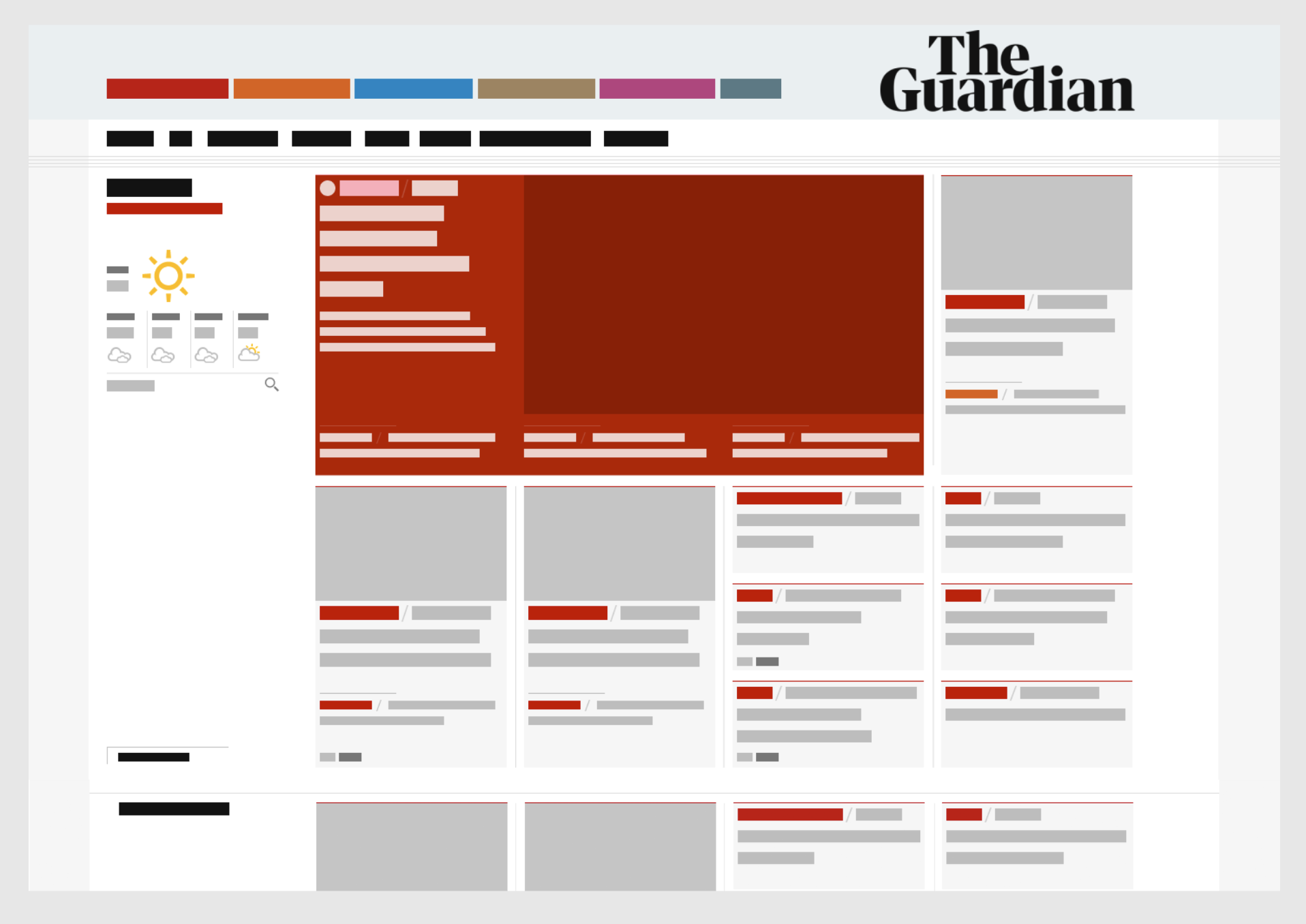
Here’s a fascinating look at The Guardian’s design system with a step-by-step breakdown of what's gone into it and what options are available to designers and developers. It shows us how the team treats colors, typography, layouts, and visual cues like rules and borders.

I’ve been struggling to think about how to describe design systems internally to folks and this is giving me a ton of inspiration right now. I like that this website has all the benefits of a video (great tone and lovely visuals) with all the benefits of a UI kit (by showing what options are available to folks).

This also loosely ties back into something Chris has been discussing lately, which is being mindful of knowing who a design system is for. Some are meant for internal use and others, some are meant for internal use but are openly available for people like contractors, and others are meant for varying degrees of external use. Here, The Guadian is not explicit about who their design system is for, but the description of it gives a pretty good hint:

A guide to digital design at the Guardian

So please, enjoy looking at this well-documented, highly interactive and gorgeous design system. At the same time, remember it's made for a specific use case and may not line up with all the needs of your project or organization. It sure is inspirational to look at, one way or the other!

Direct Link to ArticlePermalink

The post The Guardian digital design system appeared first on CSS-Tricks.

What I Like About Vue

Dave Rupert digs into some of his favorite Vue features and one particular issue that he has with React:

I’ve come to realize one thing I don’t particularly like about React is jumping into a file, reading the top for the state, jumping to the bottom to find the render function, then following the method calls up to a series other sub-rendering functions only to find the component I’m looking for is in another castle. That cognitive load is taxing for me.

I wrote about this very problem recently in our newsletter where I argued that finding my way around a React component is difficult. I feel like I have to spend more energy than necessary figuring out how a component works because React encourages me to write code in a certain way.

On the other hand, Dave, says that Vue matches his mental model when authoring components:

<template>
  // Start with a foundation of good HTML markup 
</template>
<script>
  // Add interaction with JavaScript
</script>
<style>
  // Add styling as necessary. 
</style>

And this certainly matches the way I think about things, too.

Direct Link to ArticlePermalink

The post What I Like About Vue appeared first on CSS-Tricks.

Developing a robust font loading strategy for CSS-Tricks

Zach Leatherman worked closely with Chris to figure out the font loading strategy for this very website you're reading. Zach walks us through the design in this write-up and shares techniques that can be applied to other projects.

Spoiler alert: Font loading is a complex and important part of a project.

The really interesting part of this post is the way that Zach talks about changing the design based on what’s best for the codebase — or as Harry Roberts calls it, “normalising the design.” Is a user really going to notice the difference between font-weight: 400 and font-weight: 500? Well, if we can ditch a whole font file, then that could have a significant impact on performance which, in turn, improves the user experience.

I guess the conversation can instead be framed like this: Does the user experience of this font outweigh the user experience of a slightly faster website?

And this isn’t a criticism of the design at all! I think Zach shows us what a healthy relationship between designers and developers can look like: collaborating and making joint decisions based on the context and the problem at hand, rather than treating static mockups as the final, concrete source of truth.

Direct Link to ArticlePermalink

The post Developing a robust font loading strategy for CSS-Tricks appeared first on CSS-Tricks.

Making width and flexible items play nice together

The short answer: flex-shrink and flex-basis are probably what you’re lookin’ for.

The long answer

Let’s say you want to align an image and some text next to each other with like this:

A small image of a yellow illustrated bird to the left of a block of text.

Now let's say you reach for flexbox to make it happen. Setting the parent element to display: flex; is a good first start.

.container { 
  display: flex; 
}

And this results in...

See the Pen
Flex-Shrink Example 1
by Robin Rendle (@robinrendle)
on CodePen.

Yikes! Well, that's kinda okay, I guess. It makes sense that the image would bump right up against the text like that because we haven’t set a width on the image. Ideally, though, we’d like that image to have a fixed width and then the text should take up whatever space is left over.

Okay, so let’s go do that!

.container { 
  display: flex; 
}

img { 
  width: 50px;
  margin-right: 20px; 
}

See the Pen
Flex-Shrink Example 2
by Robin Rendle (@robinrendle)
on CodePen.

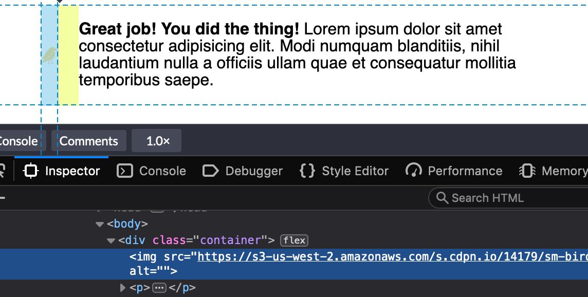
This looks great in Chrome. But wait, what? If we inspect the image tag in Firefox DevTools, we’ll find that it’s not the width value that we set at all:

We could use min-width to force the image to the 50px width we want:

img {
  min-width: 50px;
  margin-right: 20px;
}

Buuuuuuut, that only sets helps with the width so we've got to put a margin in as well.

img {
  min-width: 50px;
  margin-right: 20px;
}

There we go. That's better in Firefox and still works in Chrome.

The even longer answer

I realized the image is getting the squished treatment because we need to use the flex-shrink property to tell flex items not to decrease in size, regardless of whether or not they have a width.

All flex-items have a flex-shrink value of 1. We need to set the image element to 0:

.container { 
  display: flex; 
}

img {
  width: 50px;
  margin-right: 20px;
  flex-shrink: 0;
}

See the Pen
Flex-Shrink Example 3
by Robin Rendle (@robinrendle)
on CodePen.

Getting better! But we can still do more to improve this.

The director's cut answer

We can tidy things up further because flex-shrink is included in the flex shorthand property.

flex: none | [ <'flex-grow'> <'flex-shrink'>? || <'flex-basis'> ]

If we set the flex-shrink value to 0 and the flex-basis value to the default width we want the image to be, then we can get rid of the width property altogether.

.container { 
  display: flex; 
}

img {
  flex: 0 0 50px;
  margin-right: 20px;
}

Oh yeah:

See the Pen
Flex-Shrink Example 2
by Geoff Graham (@geoffgraham)
on CodePen.

Another example

That flex-shrink property solves a ton of other problems and is pretty dang important if you want to start using flexbox. Here’s another example why: I stumbled upon yet another problem like the one above and I mentioned it in a recent edition of the newsletter. I was building a navigation component that would let users scroll left and right through multiple items. I noticed the following problem when checking my work:

See the Pen
flex-shrink nav item 1
by Robin Rendle (@robinrendle)
on CodePen.

That longer navigation item shouldn’t break into multiple lines like that — but I finally understood why this was happening, thanks to the previous issue. If you set the flex-shrink property to 0 then it will tell each item in this navigation not to shrink and instead assume the width of the content instead, like this:

See the Pen
flex-shrink nav item
by Robin Rendle (@robinrendle)
on CodePen.

And, yes, we can go the extra step once again to use the flex property instead, this time using auto as the flex-basis since we want the maximum amount of space for all items to be considered when divvying up space in the navigation container.

See the Pen
Setting flex for flexible nav elements
by Geoff Graham (@geoffgraham)
on CodePen.

Huzzah! We figured it out. Even though the answer is a single line of code, it's is pretty essential one to making truly flexible elements.

Why I don’t use web components

Here’s an interesting post by Rich Harris where he’s made a list of some of the problems he’s experienced in the past with web components and why he doesn’t use them today:

Given finite resources, time spent on one task means time not spent on another task. Considerable energy has been expended on web components despite a largely indifferent developer population. What could the web have achieved if that energy had been spent elsewhere?

The most convincing part of Rich’s argument for me is where he writes about progressive enhancement and the dependence on polyfills for using web components today. And I’m sure that a lot of folks disagree with many of Rich’s points here, and there’s an awful amount of snark in the comments beneath his post, but it’s certainly an interesting conversation worth digging into. For an opposing perspective, go read the very last paragraph in the last installment of our Web Components Guide, where author Caleb Williams suggests that there's no need to wait to use web components in projects:

These standards are ready to adopt into our projects today with the appropriate polyfills for legacy browsers and Edge. And while they may not replace your framework of choice, they can be used alongside them to augment you and your organization’s workflows.

But all of this is a good reminder that hey: web components are a thing that we should be able to freely criticize and talk about without being jerks. And I think Rich does that pretty well.

Direct Link to ArticlePermalink

The post Why I don’t use web components appeared first on CSS-Tricks.

Hello Subgrid!

Rachel Andrew’s talk at CSSconf is wonderful because it digs into one of the most exciting changes that’s coming soon to a browser near you: subgrid! That’s a change to the CSS Grid spec that allows for much greater flexibility for our visual designs. Subgrid allows us to set one grid on an entire page and let child elements use that very same grid tracks.

The reason why I’m very excited is because this solves one of the most annoying visual layout issues that I’ve come across since becoming a web developer, and if that sounds bonkers and/or wonderful to you, then make sure to check out Rachel’s talk because she does a much better job of describing this than I possibly could:

Direct Link to ArticlePermalink

The post Hello Subgrid! appeared first on CSS-Tricks.