CSS Lists, Markers, And Counters

CSS Lists, Markers, And Counters

CSS Lists, Markers, And Counters

Rachel Andrew

Lists in CSS have particular properties which give us the standard list styling we expect. An unordered list gains a list bullet, of the type disc, and ordered lists are numbered. My interest in exploring lists in more detail came from some work I did to document the ::marker pseudo-element for MDN. This pseudo-element ships in Firefox 68 and is being released today. With the ::marker pseudo element available to us, we can start to do some interesting things with lists, and in this article, I’ll explain more.

Deconstructing A List

You may not have thought much about lists, although we use them frequently in our markup. Many things can be marked up quite logically as a list. While step-by-step instructions or ranked elements may naturally be described by an ordered list <ol>, many things in a design can be described using an unordered list <ul>. A very common usage of the element, for example, is to mark up navigation, as it is a list of destinations on the site. For our exploration, let’s start by finding out exactly what a list is in CSS.

As with many things in CSS, lists have some initial values applied to them. These values make them look like a list. These special values begin with the information that a list item has the display property with a value of list-item. This creates a block-level box, with an additional marker box. The marker box is where the list bullet or number is added.

Lists were defined early on in CSS, and much of the definition of lists as we use them today is from CSS2. The CSS2 specification describes a list item as follows:

“An element with display: list-item generates a principal block box for the element’s content and, depending on the values of list-style-type and list-style-image, possibly also a marker box as a visual indication that the element is a list item.”

The principal block box is the main box of the element and contains all of the children as a list item can contain other markup. The marker box is then placed in respect to this principal box. The specification goes on to detail the fact that any background color will be only behind this principal box, and not the marker. Also that the marker can be set to one of a range of pre-defined values:

  • disc
  • circle
  • square
  • decimal
  • decimal-leading-zero
  • lower-roman
  • upper-roman
  • lower-greek
  • lower-latin
  • upper-latin
  • armenian
  • georgian
  • lower-alpha
  • upper-alpha
  • none
  • inherit

The Level 3 display specification defines display: list-item along with the other possible values for the display property. It refers back to CSS 2.1 — as do many CSS properties and values which come from CSS2 — but describes the list-item keyword as, “causing the element to generate a ::marker pseudo-element”.

The Level 3 specification also introduces the ability to create an inline list item with the two value syntax being used display: inline list-item. This is as yet unimplemented by browsers.

Creating Marker Boxes On Non-List Items

As with other values of display, it is perfectly valid to give any HTML element a display type of list-item (should you wish to generate a ::marker pseudo-element on the item). This will not cause the element to become a list item semantically, but instead it will only visually display as a list item, and therefore be able to have a ::marker. When we discuss the ::marker pseudo-element below, you will discover some cases where giving other elements display: list-item can be useful.

The CSS Lists Level 3 Specification: ::marker And Counters

The display specification expands and clarifies the definition of lists that we find in CSS2, however, there is also a specification which defines list behavior in detail: the CSS Lists Specification Level 3. As the basic behavior of list items is defined in display, this specification details the marker box generated when something has display: list-item along with the counters which are used by default whenever you create an ordered list. There is some potentially useful functionality accessed via these features.

The ::marker Pseudo-Element

The ::marker pseudo-element allows you to target the list marker — separately from the content of the list item. This was not possible in previous versions of CSS, therefore, if you changed the color or font size of the ul or li, this would also change the color and font size of the markers. In order to do something as seemingly simple as having different color list bullets than text, would involve either wrapping the content of the list item in a span (or using an image for the marker).

ul {
  color: #00b7a8;
}

ul span {
  color #333;
}

With the ::marker pseudo element, the simplest thing you might want to try is having a different bullet to text color, which means that instead of the code in the example above you can use:

ul {
    color: #333;
}

ul ::marker {
    color: #00b7a8;
}

You might also want to use a different size and font-family for the numbering on an ordered list.

ol ::marker {
  font-size: 200%;
  color: #00b7a8;
  font-family: "Comic Sans MS", cursive, sans-serif;
}

You can see all of these in a supporting browser by using my CodePen example:

See the Pen [Colored bullets with and without marker](https://codepen.io/rachelandrew/penVJQyoR) by Rachel Andrew.

See the Pen Colored bullets with and without marker by Rachel Andrew.

You could use the ::marker pseudo-element on non-list items. In the code below, I have set a heading to display: list-item. This gives it a bullet and therefore a ::marker box to target.

I have changed the bullet to use an emoji:

h1 {
  display: list-item;
}

h1::marker {
  content: "🐱";
}
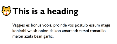
 Heading with a cat emoji to the left of it
In Firefox, you can see the emoji used as a marker.

See the Pen [Heading and marker](https://codepen.io/rachelandrew/pen/wLyyMG) by Rachel Andrew.

See the Pen Heading and marker by Rachel Andrew.

In the above example, I have used generated content in the rules for the marker. Only a small subset of CSS properties is available for use on ::marker. These include font properties and color, however, they also include the content property, for including generated content.

The addition of content as an allowed property for ::marker is recent, however, it is included in the Firefox implementation. The inclusion means that you can do things like include a string of text in a ::marker. It also raises additional possibilities for formatting of markers when you combine the use of counters with ::marker.

Browser Support And Fallbacks

For browsers that do not support the ::marker pseudo-element, the fallback is the regular marker that would have been displayed anyway. Unfortunately, we can’t currently use Feature Queries to detect support for selectors such as this pseudo-element right now, although there has been an issue raised about adding this to the specification. This means that you can’t fork your code to do one thing when you have support and something else if you do not. In most cases, falling back to the regular marker will be a reasonable solution.

Counters

Ordered lists have list numbering — something which is achieved by way of a CSS Counter. The CSS Lists specification therefore also describes these counters. We can access and create counters ourselves which, combined with the ::marker pseudo-element can give us some useful functionality. These counters can also be used in regular (non ::marker) generated content.

If I have a numbered list of steps (and I would like to write out “Step 1”, “Step 2”, and so on), I can do this by using generated content in my marker and appending the list-item counter, this represents the built-in counter:

::marker {
  content: "Step " counter(list-item) ": ";
}
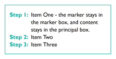
An ordered list with Step 1, Step 2, and so on, before each list item
In Firefox, you will see the counter prefixed with the word “Step”.

See the Pen [Counters and marker](https://codepen.io/rachelandrew/pen/BgRaoz) by Rachel Andrew.

See the Pen Counters and marker by Rachel Andrew.

Nested Counters

If you have nested lists, a common way to number them is to have the top-level item a whole number, (1), then child items as (1.1, 1.2) and their children (1.1.1, 1.1.2), and so on. You can achieve this by using more functionality of counters.

When you nest HTML lists, you will end up with multiple counters of the same name — nested inside each other. The nest of counters can be accessed using the counters() function.

In the code below, I am using counters() to format my list markers as described above. The first argument for counters() is the name of the counter to use. I’m using the built-in list-item counter. The second argument is a string — this is what will be concatenated between output counters (I’m using a .). Finally, I add a : outside of the counter function but inside the value of content so that my counter output will be separated from the content by a colon.

::marker {
  content: counters(list-item,'.') ':';
  color: #00b7a8;
  font-weight: bold;
}

This gives me the output as in the image. If you are using a browser which supports ::marker and counters, then you can see it working in the CodePen example — try changing the string from a . to something else to see how that changes the output.
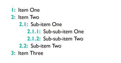
A set of nested lists
In Firefox, you will see nested list numbering separated by dots.

See the Pen [Nested counters](https://codepen.io/rachelandrew/pen/VJbwxL) by Rachel Andrew.

See the Pen Nested counters by Rachel Andrew.

What’s The Difference Between counter() And counters()?

The counter() function we used in the first example to write out our steps uses the innermost counter only. Therefore, in the situation where you have a set of nested lists, you will write out the counter which related to the level you are currently on.

The counters() function essentially writes out that whole branch and gives you the opportunity to concatenate a string between counters in the branch. So if you have a list item with a counter of 2 (which is part of a list nested inside a list item with a counter of 4), then the branch contains:

  • 4
  • 2

You can output this as 4.2 in the marker by using:

::marker {
  content: counters(list-item,'.');
}

Counters On Other Elements

Counters can be used on things which are not lists — either to output a marker — in which case the element will need to have display: list-item — or to output regular generated content. Counters are used extensively in book production, in order to enable chapter and figure numbering amount other things. There is no reason not to take a similar approach on the web, in particular for longer articles.

The CSS properties defined in the CSS Lists specification which deal with these counters are:

  • counter-set
  • counter-reset
  • counter-increment

To see how these work outside of lists we can look at an example of using counters to number the headings in a document.

The first thing I need to do is to create a counter for headers on the body element — ready for use. I’m using the counter-reset property to do this. The counter-reset and counter-set properties are very similar. The counter-reset property will create a new counter if a counter of the specified name does not already exist, but will also create nested counters as described above if a counter of that name does exist. The counter-set property will only create a new counter if there is no counter of that name. For this, use either property would work just fine, however, counter-set does not have as good browser support as counter-reset, so I am taking the practical route:

body {
  counter-reset: heading-counter;
}

Now that I have a counter, I can then use the counter-increment property on the selector for the headers; this should increment the counter every time the selector matches.

h2 {
  counter-increment: heading-counter;
}

To see the value, I need to output it to the document. I can do this by using Generated Content and adding it before the heading as shown in the following CodePen example:

h2::before {
  content: counter(heading-counter) ": ";
  color: #00b7a8;
  font-weight: bold;
}

See the Pen [Headings and counters](https://codepen.io/rachelandrew/pen/gNGjxq) by Rachel Andrew.

See the Pen Headings and counters by Rachel Andrew.

Alternatively, I could make the h2 element into a list-item and then use ::marker, as demonstrated below. As already detailed, using the ::marker element has limited browser support. In Firefox, you should see the counter used as the marker for the heading, while other browsers will show the default bullet.

h2 {
  display: list-item;
}

h2::marker {
  content: counter(heading-counter)  ": ";
  color: #00b7a8;
  font-weight: bold;
}

See the Pen [Headings, markers, and counters](https://codepen.io/rachelandrew/pen/pXWZay) by Rachel Andrew.

See the Pen Headings, markers, and counters by Rachel Andrew.

Counters On Form Elements

There is also a little bit of interactivity that you can achieve using CSS Counters — something that you might think you need JavaScript to do.

I have a form which has a number of required fields. The required status can be selected in CSS with a :required pseudo-class, and the fact that a field has not been completed can be detected by way of the :invalid pseudo class. This means that we can check for fields which are both required and invalid, and increment a counter. Then output that as generated content.

See the Pen [Counting required form fields](https://codepen.io/rachelandrew/pen/vqpJdM) by Rachel Andrew.

See the Pen Counting required form fields by Rachel Andrew.

How useful this is in reality is debatable — given that we can’t really do anything with that value other than stick it into generated content. There are also concerns with regard to generated content being inaccessible to certain screen readers, therefore any usage that is more than decorative would need to ensure other ways of accessing that information. Read, “Accessibility Support For CSS Generated Content” and the more recent information, “CSS Content Property Screen Reader Compatibility” for more details regarding accessibility and generated content.

However, it demonstrates that counters can achieve more useful things than simply numbering lists. It may be that one day that knowledge does come in handy to solve some problem you are working on.

Find Out More

This article ended up rather a long way from styling lists, despite the fact that everything I have described is found in the CSS Lists specification. You can find more information about the things described in the links below. If you have found an interesting use for CSS Counters, or can think of things you could use ::marker for, add a note in the comments.

Smashing Editorial (il)
How To Create A PDF From Your Web Application

How To Create A PDF From Your Web Application

How To Create A PDF From Your Web Application

Rachel Andrew

Many web applications have the requirement of giving the user the ability to download something in PDF format. In the case of applications (such as e-commerce stores), those PDFs have to be created using dynamic data, and be available immediately to the user.

In this article, I’ll explore ways in which we can generate a PDF directly from a web application on the fly. It isn’t a comprehensive list of tools, but instead I am aiming to demonstrate the different approaches. If you have a favorite tool or any experiences of your own to share, please add them to the comments below.

Starting With HTML And CSS

Our web application is likely to be already creating an HTML document using the information that will be added to our PDF. In the case of an invoice, the user might be able to view the information online, then click to download a PDF for their records. You might be creating packing slips; once again, the information is already held within the system. You want to format that in a nice way for download and printing. Therefore, a good place to start would be to consider if it is possible to use that HTML and CSS to generate a PDF version.

CSS does have a specification which deals with CSS for print, and this is the Paged Media module. I have an overview of this specification in my article “Designing For Print With CSS”, and CSS is used by many book publishers for all of their print output. Therefore, as CSS itself has specifications for printed materials, surely we should be able to use it?

The simplest way a user can generate a PDF is via their browser. By choosing to print to PDF rather than a printer, a PDF will be generated. Sadly, this PDF is usually not altogether satisfactory! To start with, it will have the headers and footers which are automatically added when you print something from a webpage. It will also be formatted according to your print stylesheet — assuming you have one.

The problem we run into here is the poor support of the fragmentation specification in browsers; this may mean that the content of your pages breaks in unusual ways. Support for fragmentation is patchy, as I discovered when I researched my article, “Breaking Boxes With CSS Fragmentation”. This means that you may be unable to prevent suboptimal breaking of content, with headers being left as the last item on the page, and so on.

In addition, we have no ability to control the content in the page margin boxes, e.g. adding a header of our choosing to each page or page numbering to show how many pages a complex invoice has. These things are part of the Paged Media spec, but have not been implemented in any browser.

My article “A Guide To The State Of Print Stylesheets In 2018” is still accurate in terms of the type of support that browsers have for printing directly from the browser, using a print stylesheet.

Printing Using Browser Rendering Engines

There are ways to print to PDF using browser rendering engines, without going through the print menu in the browser, and ending up with headers and footers as if you had printed the document. The most popular options in response to my tweet were wkhtmltopdf, and printing using headless Chrome and Puppeteer.

wkhtmltopdf

A solution that was mentioned a number of times on Twitter is a commandline tool called wkhtmltopdf. This tool takes an HTML file or multiple files, along with a stylesheet and turns them into a PDF. It does this by using the WebKit rendering engine.

Essentially, therefore, this tool does the same thing as printing from the browser, however, you will not get the automatically added headers and footers. On this positive side, if you have a working print stylesheet for your content then it should also nicely output to PDF using this tool, and so a simple layout may well print very nicely.

Unfortunately, however, you will still run into the same problems as when printing directly from the web browser in terms of lack of support for the Paged Media specification and fragmentation properties, as you are still printing using a browser rendering engine. There are some flags that you can pass into wkhtmltopdf in order to add back some of the missing features that you would have by default using the Paged Media specification. However, this does require some extra work on top of writing good HTML and CSS.

Headless Chrome

Another interesting possibility is that of using Headless Chrome and Puppeteer to print to PDF.

However once again you are limited by browser support for Paged Media and fragmentation. There are some options which can be passed into the page.pdf() function. As with wkhtmltopdf, these add in some of the functionality that would be possible from CSS should there be browser support.

It may well be that one of these solutions will do all that you need, however, if you find that you are fighting something of a battle, it is probable that you are hitting the limits of what is possible with current browser rendering engines, and will need to look for a better solution.

JavaScript Polyfills For Paged Media

There are a few attempts to essentially reproduce the Paged Media specification in the browser using JavaScript — essentially creating a Paged Media Polyfill. This could give you Paged Media support when using Puppeteer. Take a look at paged.js and Vivliostyle.

Using A Print User Agent

If you want to stay with an HTML and CSS solution then you need to look to a User Agent (UA) designed for printing from HTML and CSS, which has an API for generating the PDF from your files. These User Agents implement the Paged Media specification and have far better support for the CSS Fragmentation properties; this will give you greater control over the output. Leading choices include:

A print UA will format documents using CSS — just as a web browser does. As with browser support for CSS, you need to check the documentation of these UAs to find out what they support. For example, Prince (which I am most familiar with) supports Flexbox but not CSS Grid Layout at the time of writing. When sending your pages to the tool that you are using, typically this would be with a specific stylesheet for print. As with a regular print stylesheet, the CSS you use on your site will not all be appropriate for the PDF version.

Creating a stylesheet for these tools is very similar to creating a regular print stylesheet, making the kind of decisions in terms of what to display or hide, perhaps using a different font size or colors. You would then be able to take advantage of the features in the Paged Media specification, adding footnotes, page numbers, and so on.

In terms of using these tools from your web application, you would need to install them on your server (having bought a license to do so, of course). The main problem with these tools is that they are expensive. That said, given the ease with which you can then produce printed documents with them, they may well pay for themselves in developer time saved.

It is possible to use Prince via an API, on a pay per document basis, via a service called DocRaptor. This would certainly be a good place for many applications to start as if it looked as if it would become more cost effective to host your own, the development cost of switching would be minimal.

A free alternative, which is not quite as comprehensive as the above tools but may well achieve the results you need, is WeasyPrint. It doesn’t fully implement all of Paged Media, however, it implements more than a browser engine does. Definitely, one to try!

Other tools which claim to support conversion from HTML and CSS include PDFCrowd, which boldly claims to support HTML5, CSS3 and JavaScript. I couldn’t, however, find any detail on exactly what was supported, and if any of the Paged Media specification was. Also receiving a mention in the responses to my tweet was mPDF.

Moving Away From HTML And CSS

There are a number of other solutions, which move away from using HTML and CSS and require you to create specific output for the tool. A couple of JavaScript contenders are as follows:

Recommendations

Other than the JavaScript-based approaches, which would require you to create a completely different representation of your content for print, the beauty of many of these solutions is that they are interchangeable. If your solution is based on calling a commandline tool, and passing that tool your HTML, CSS, and possibly some JavaScript, it is fairly straightforward to switch between tools.

In the course of writing this article, I also discovered a Python wrapper which can run a number of different tools. (Note that you need to already have the tools themselves installed, however, this could be a good way to test out the various tools on a sample document.)

For support of Paged Media and fragmentation, Prince, Antenna House, and PDFReactor are going to come out top. As commercial products, they also come with support. If you have a budget, complex pages to print to PDF, and your limitation is developer time, then you would most likely find these to be the quickest route to have your PDF creation working well.

However, in many cases, the free tools will work well for you. If your requirements are very straightforward then wkhtmltopdf, or a basic headless Chrome and Puppeteer solution may do the trick. It certainly seemed to work for many of the people who replied to my original tweet.

If you find yourself struggling to get the output you want, however, be aware that it may be a limitation of browser printing, and not anything you are doing wrong. In the case that you would like more Paged Media support, but are not in a position to go for a commercial product, perhaps take a look at WeasyPrint.

I hope this is a useful roundup of the tools available for creating PDFs from your web application. If nothing else, it demonstrates that there are a wide variety of choices, if your initial choice isn’t working well.

Please add your own experiences and suggestions in the comments, this is one of those things that a lot of us end up dealing with, and personal experience shared can be incredibly helpful.

Further Reading

A roundup of the various resources and tools mentioned in this article, along with some other useful resources for working with PDF files from web applications.

Specifications

Articles and Resources

Tools

Smashing Editorial (il)
Digging Into The Display Property: Grids All The Way Down

Digging Into The Display Property: Grids All The Way Down

Digging Into The Display Property: Grids All The Way Down

Rachel Andrew

Today, we are going to take a look at what happens when we use display: grid and how we might use the new subgrid value of grid-template-columns and grid-template-rows to allow for grids all the way down through our markup, which relate to each other.

This article is part of a series that look at various aspects of the CSS display property, and is a follow-on to the first two articles:

  1. The Two Values Of display
  2. Box Generation
  3. Grids All The Way Down

What Happens When We Create A Grid Container?

CSS Grid Layout is switched on by using display: grid. If you have read the first article in this series, you will know that what this single value property actually means is display: block grid. We get a block level box which is defined as a grid container, with direct children that are grid items and participate in grid layout.

If you take a look at the display specification, you will see that in the table that defines all of the different values for display. The words grid container are linked to the definition of a grid container in the Grid Specification. Therefore, to find out what this actually means we need to go look there. When we do, we get some useful clarification of the behavior of a grid container.

A grid container is said to establish a Grid Formatting Context which is similar to a Block Formatting Context (BFC). I’ve written an extensive guide to the Block Formatting Context. In that article you will discover two things about a BFC that are the same for a grid formatting context. Floats do not intrude into the grid container, and the margins on the container do not collapse with those of the contents.

There are differences, however, only once we get inside the grid container. The children of a grid container and not participating in block and inline layout, they are grid items and therefore participating in grid layout. This means that a few things we are used to in block and inline layout do not hold true.

If any item in the layout is floated or cleared, the float and clear properties do not have an effect once the item becomes a grid item. The vertical-align property has no effect, and the ::first-letter and ::first-line pseudo-elements cannot be used.

The fact that an item cannot be both floated and a grid item is helpful in terms of creating fallbacks. When creating a fallback for browsers which do not support grid using floats (when grid is supported), you don’t need to do anything special: the float is overwritten.

I outline this approach in my article on supporting browsers without grid. There are situations where the behavior has turned out to be problematic, although these issues could be solved by using another part of CSS as described in this post unpacking an issue with grid and floats, “Editorial Layouts, Exclusions, and CSS Grid”.

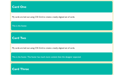
With all that said, if we do nothing else than change the value of display to grid, we won’t see much of a difference to our layout. The direct children are grid items, however, by default we end up with a one-column grid. A grid always has one column and one row. The rest of the rows that we can see after doing this are implicit rows, i.e. rows created to hold the content.

A set of cards laid out one below the other in a single column.
When we create a grid container with no columns, we get a one column grid. (Large preview)

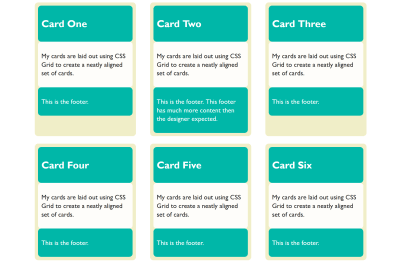
We can start to form something that looks more like a grid to us by giving the property grid-template-columns a value. The property takes a track listing as a value; if I give it three 1fr tracks, we now find ourselves with a three-column grid, and using the gap property gives me spacing between those cards.

We now have something that looks to us like a grid:

Cards laid out in three columns and two rows
We define some column tracks and a gap to get an obvious grid layout (Large preview)

Each of the grid items in our example has children of its own. The cards have headers and footers and an area for the main content of the card. These children are grid items, but their children have returned to block and inline layout. The header, content area and footer do not do any grid like things. This is because when we change the value of display to grid, it doesn’t inherit but instead only the children become grid items; their children return to block layout.

Nesting Grids

If a card has more content than the other cards, the cards in that row get taller. The initial value of align-items for grid items is stretch. Our cards stretch to full height. The items inside, however, are in normal block and inline flow and so they don’t stretch magically to fill the card. (This is why in the image above you can see that the cards with less content have a gap at the bottom.)

If we wanted them to (in order to make that footer always sit at the bottom), we could make our grid item a grid, too. In this case, a single-column grid is all we need. We can then define row tracks, giving the area into which the div with a class of content sits, a track size of 1fr. This causes it to take up all of the available space in the container, and will push the footer to the bottom of the card.

See the Pen display: subgrid is not what we want by Rachel Andrew.

See on Codepen

You can do this nesting of grids as much as you need. I don’t really think of it as nesting since we’re not creating nested tables here, and we are usually using the structural HTML elements already in place. We are just changing the value of display one level at a time to what is most appropriate for the children of that element. That might be flex layout or grid layout, but most often it will be block and inline layout. In that case, we don’t need to do anything because that is what happens by default.

Lining Up The Headers And Footers

As we have now seen, if we want a set of cards laid out on a grid, and we want them to display as tall as the tallest card, and we want the footers pushed to the bottom of the card, we need very little CSS. The layout CSS for the above example is as follows:

.cards {
  display: grid;
  gap: 20px;
  grid-template-columns: 1fr 1fr 1fr;
}

article {
  display: grid;
  grid-template-rows: auto 1fr auto;
  row-gap: 20px;
}

What if we want the background color on the headers and footers to line up though? Each card is a grid item, but the headers and footers are in the grid on the item. They have no relationship to each other and so we can’t line them up. Here it would be nice if we could somehow inherit the grid through the children.

If we could define a grid on the parent which had three rows, then place the cards across these three rows and have the header, content and footer each sit in one of the rows. That way, each header would be in the same row, and therefore if one header got taller, the whole row would get taller.

We don’t have a good solution to that in browsers today, but it is on the way. The subgrid feature of CSS Grid Layout Level 2 will enable this exact pattern. You will be able to create a grid on the parent and then selectively opt the rows and/or columns to use that grid, rather than define a new grid on the child element which is completely independent of that grid.

Note that the examples which follow only work at the time of writing in Firefox Nightly. The subgrid value of grid-template-columns and grid-template-rows is a new feature and part of Level 2 of the CSS Grid Specification. To try out this feature, download a copy of Firefox Nightly.

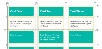
You can see how this works in the images below. In the first image, I have created three row tracks on the parent and spanned the card across them. With the Firefox Grid Inspector highlighting the grid, you can see that the rows of the parent don’t relate to the rows used by the children.

An image of a three column grid with the Firefox Grid Inspector tracks overlaid.
Inspecting the grid with the Firefox Grid Inspector shows the elements are not displaying in the tracks of the parent. (Large preview)

If, instead of defining three rows on the child, I use the subgrid value for grid-template-rows, the card now uses those rows on the parent. You can see how the two are now aligned and therefore the headers and footers align as well:

An image of a three column grid, all elements inside the cards aligned.
Using subgrid each part of the card goes into its own track (Large preview)

What we are doing here with subgrid isn’t a new value of display. The item which is a subgrid is a grid container itself, as we have set display: grid on it. The grid items are behaving as grid items normally do. This is regular grid layout — no different from the original nested grid except that (instead of the item having its own row track sizing) it is using the tracks of the parent.

.cards {
  display: grid;
  gap: 20px;
  grid-template-columns: 1fr 1fr 1fr;
  grid-template-rows: repeat(2,auto 1fr auto);
}

article {
  grid-row-end: span 3;
  display: grid;
  grid-template-rows: subgrid;
}

This is the nice thing about subgrid; there isn’t a whole lot to learn if you already know how to use grid layout. You can read about the rest of the details in my previous post here on Smashing Magazine, “CSS Grid Level 2: Here Comes Subgrid”.

Yesterday (23rd May 2019), subgrid landed in Firefox Nightly, so we have a testable implementation of the subgrid value of grid-template-columns and grid-template-rows. Please do grab a copy of Nightly and try this out. With a copy of Nightly, you can see the final example working in this CodePen:

See the Pen display: subgrid is not what we want by Rachel Andrew.

See on Codepen

See if you can think up other use cases that are solved by having the subgrid feature, or perhaps things which you think are missing. While a feature is only available in a Nightly browser, that’s the time where it is possible to make changes to the spec if some issue are discovered. So, do a favor to your future web developing self and try out features like this in order that you can help contribute to the web platform and make things better.

If you think you have found a bug in the Firefox implementation, you can take a look at the main implementation bug on Bugzilla which links to related issues in the Depends on section. If you can’t see your issue, create as a simple a reduced test case as possible and raise the bug. If you think that subgrid should do something in order to solve a use case, and that is something not detailed in the specification, you can raise an issue on the CSS Working Group GitHub for a potential enhancement.

What About display: contents?

If you have been following along, you might think that display: contents (as described in the previous article about display) might solve the problems that subgrid seeks to solve — that of allowing indirect children to participate in a grid layout. That isn’t the case, and our example of cards is a perfect way to demonstrate the difference.

If, instead of making our card a grid layout with display: grid, we removed the box using display: contents, we would get this result in this next CodePen. (Try removing the display: contents line from the rules for .card to see the difference.)

See the Pen display: subgrid is not what we want by Rachel Andrew.

See on Codepen

In this example, the box of the card has been removed and so the header, content and footer directly participate in grid layout and are autoplaced across the grid. This wasn’t what we wanted at all! The contents value of display will be really helpful once the accessibility issues in browsers mentioned in my last article are dealt with, however, it solves different problems to the one that we are exploring.

More Reading And Examples

I’ve been creating a number of examples and demos to help everyone understand subgrid. You can try those out at the links below:

Smashing Editorial (il)

Designing For Users Across Cultures: An Interview With Jenny Shen

Designing For Users Across Cultures: An Interview With Jenny Shen

Designing For Users Across Cultures: An Interview With Jenny Shen

Rachel Andrew

In this video, we are pleased to feature Jenny Shen who is a UX Consultant and has worked with numerous startups and brands including Neiman Marcus, Crate&Barrel, eBuddy, IBM, TravelBird and Randstad. Her current focus is helping businesses innovate and designing inclusive product experiences for global users. She is interviewed by Jason Pamental, who has already spoken at our San Francisco conference. Jason is a strategist, designer, technologist, and author of Responsive Typography from O’Reilly.

In their conversation, we discover how we can approach localizing and internationalizing our websites, over and above simply offering a translation of the material. This is something that Jenny will also focus on in her talk at our Toronto SmashingConf.

Vitaly: Okay, hello everyone. I’m looking forward to having a wonderful conversation today. We have Jason with us today. Jason, how are we doing today?

Jason: I’m doing very well. I’m excited about this.

Vitaly: Oh yes.

Jason: Something new and fun.

Vitaly: This is new and fun. Some of you might know we have Smashing TV and Smashing TV is all about planning some sort of webinars and sessions and interviews and all that. We always look for new adventures. Jason, you like adventures?

Jason: Very much.

Vitaly: Who doesn’t like adventures? In this particular adventures, we’re looking into actually just having conversations. Like, you know, you take a cup of coffee, sit down with a person you admire or you like or you feel like they have something to share. You just have a conversation. This is not about slides, it’s not about presenting, it’s all about really just kind of human interaction between two people genuinely interested in a particular topic. And so, with that, I’m very privileged to have Jason with us today, who’s going to be the interviewer, and who’s going to introduce the speaker or the person who he’s going to speak with. We just came from Smashing Con, San Francisco two weeks ago. It was a wonderful experience because Jason would just come on stage, sit down, take a cup of coffee, work through his design process and stuff. And he’s very curious, right? This is something that you need in a person who can run interviews really well. You might see Jason more often in the future. Maybe, Jason, you can introduce yourself. What do you do for life? What’s the meaning of life for you?

Jason: Well, I suppose in the order of frequency, it’s spending time with my wife, walking the dogs which, most people see on Instagram, riding my bike, and then a whole lot of stuff about typography. Which, is what I was demonstrating when I was at Smashing, San Francisco. The thing that is sort of common for me that runs through is just being curious about stuff and learning new things so the chance to actually learn from more amazing people who are gonna be getting on stage at other Smashing events was too good to pass up. So, I’m pretty excited about this.

Vitaly: We couldn’t be more excited to have you. I think it’s time for me to get my breakfast. I’m sorry, I’m so hungry. I woke up four hours ago, was all about meetings and Jason will take over. Jason, have a wonderful time. I’m looking forward to seeing you when they’re wrapping up this session. Okay? Jason, the stage is yours.

Jason: Thanks, Vitaly. Well, I’m super excited about this for a whole bunch of reasons. But, the main one is I get to introduce to you someone who, correct me if I’m wrong, but I think this is the first time you’re speaking at a Smashing Event? Is that true?

Jenny Chen: Yes. It is the first time.

Jason: Okay. Well, The voice that you’re hearing and the face that you’re seeing is Jenny Chen who is a UX and localization consultant who’s worked with all kinds of big brands including Neiman Marcus, Crate and Barrel, and IBM. In the course of your travels over the web of a number of years which has some pretty amazing lists of credentials. I mean, some things that really stood out to me, that actually I think kind of made you a little bit more compelling in terms of who I really wanted to talk to first: is that not only are you doing all of this incredible work but you’re also a regional director for EMEA for Ladies UX, which is an amazing organization, and you also started your own mentorship program. That teaching aspect, you know, I think is one of the things that I love about getting up on stage and giving talks and workshops and stuff. So, before we actually jump into what you’re gonna be talking about, I’d really love to hear a little bit more from you, about your journey from Taipei, to where you are now, to how you came to be in this industry.

Jenny Chen: Yeah, sure. Thank you, Jason, for the amazing introduction. Yeah. So, as you were saying, I started from Taipei. I was born in Taipei, Taiwan. My journey was…I moved around in a lot of places. My family moved to Canada and I studied there. I studied in Vancouver, Canada.

Jason: Oh, wow.

Jenny Chen: Yeah. I studied Interaction Design. At the time it was like Human-Computer Interaction.

Jason: Right.

Jenny Chen: And then I moved to Singapore and now I’m based in the Netherlands consulting regarding UX projects/localization projects. And just like you mentioned, I am a volunteer EMEA director at Ladies UX and I also run my own mentorship program in the spare time. Yeah. I’ve also been speaking in [crosstalk 00:04:59]

Jason: Because you must have a load of spare time then? So, tell me a little bit about the typical day for you if there is one.

Jenny Chen: Mm-hmm (affirmative) Typical day. These days I have more of a typical day because I’m working with clients and then I am basically just taking my to-do list and doing the job that can help the organization, can help shape product strategy, offer feedback to designers, do some consulting on localization, working on research. And, yeah, like a typical day I could be reviewing a design, giving feedback to my design team. I could be helping a client with more of an approach to hire a designer and I could be running a workshop on product strategy, like really talking about, “This is model canvas and valid composition.” And some days I’m drafting a user research strategy and on some days I am flying over to a different country to actually conducting on-site localization and culture research. So, yeah, there’s not really a typical day because I really do different types of work, types of projects, and I get to work with really amazing clients.

Jason: That’s amazing. I’ve looked at your resume. Your speaking schedule last year was incredible. You were at some of the best events on the web. You were speaking on all kinds of different things. It makes me feel so monotonous. All I ever do is talk about web typography and you seem to cover an incredible range of topics. That really is fascinating to me. And I love that your focus is so well-rounded in that it’s not just about UX it’s also about how design can impact the business. And that’s something that I think is really fascinating and it’s really starting to gain a lot of prominence with research from InVision and McKinsey about what design can bring to the rest of the organization. So, how long has that been more of the focus about business model innovation and all those kinds of strategic topics?

Jenny Chen: Yeah. I actually just transitioned from a designer to a strategist in a little bit more than a year ago. I’d been in the design-

Jason: Really?

Jenny Chen: Yeah. I’d been in the design industry for like six, seven years and I’d been doing, you know, wireframing, the same type of thing the designer would do. Wireframes, prototypes, icons, and stuff like that and it was to the point I really wanted to be more involved on the business side of things. Now that I’m in this role for like more than a year, I really see how being more business-minded and being aware of the business goals and how that needs to work together with a strategy and a design to actually move the needle. Really, the starting point just because I’d been a designer for like six, seven years and I really want to do more. I really want to actually see the impact of my designs. So, that seems like the natural step. And I think learning from a lot of experts from my community as well as going to different conferences and listen and learn from those people who do strategy and are leading design. So, I’m very honored to have a chance to be in those conferences and learn from these leaders.

Jason: That’s really amazing. I hope we’ll have time to come back to that a little bit because I think a lot of designers, as they advance in their career, really look for ways that they can achieve a greater level of impact than just this one project they’re working on. And I think it’s really hard for designers to kind of figure out where they can go.

Jenny Chen: Yeah.

Jason: So, that’s amazing to hear that you’ve made such a great transition. I can’t help but think that there’s a really great relationship between multi-lingual, multi-cultural and localization as this sort of central part of business strategy and how it relates to design and I gather that’s kind of what you’re gonna be talking about in San Francisco. Is that…I’m sorry, in Toronto. Is that true?

Jenny Chen: Yeah. So, my talk will be on moreover how culture affects the design and then I’ll also be touching on how…what are some of the reasons…how can companies benefit from localization. How can companies benefit from expanding to a new market? So these are the type of things that I want to talk about in my talk in Toronto as well as showcasing some case studies. How do reputable companies…how do big companies approach localization and market expansion? Because I have been doing this specifically designs with multiple cultures since 2013 and I’ve definitely learned a lot and then also learned from the companies who are really experts in doing internationalization and localization. So, yeah. I am really excited to share about this.

Jason: That’s really great. And I think for a lot of people, when they think about a language addition to a website, they kind of lump adding a language into what people refer to when they say internationalization. But I know I learned a ton when I listened to Robin Larson from Shopify talk about their work over the past year or so in adding multiple languages to their system. But the phrase you used was localization and that was the thing that really stuck out to me and what I wanted to ask you about because that was something Robin spoke about where it’s not just the language but it’s the phrasing and it’s the cultural things about other aspects of design. So, I’d love to hear more about what that means to you when you’re designing and the kinds of things that you consider in adding a language…whether it’s English and Chinese or Korean or whatever the other kind of cultural implications that go along with that.

Jenny Chen: Yeah. So, regarding localization, for me, it means in all kinds of ways how to adapt a product, an interface, an application to meet the needs, the preferences, expectations, and behaviors of the local users. Like you mentioned, it’s not just about translation, but there are many things from icons, from symbols and colors and sometimes you have text direction and of course the content…all these sort of things that can help a local user feel like, “Hey, this app or this software is designed with me in mind. It’s just not some foreign company…they only hired some translators and they expect me to feel connected to the product.” So, localization, that’s what it means for me and that’s the kind of work that I like to do.

Jason: Mm-hmm (affirmative) And so how often is that work…just for frame of reference, I’ve mostly worked on web content management systems. So, when that first comes up, the first thing that comes to mind is, “Okay. I need to add a language pack. I need to factor this into the language encodings for the theme,” and that sort of thing. But I know there’s a lot of other considerations and there’s a whole range of what people work with. From things that are sort of static sites, where you have a lot of freedom to customize things. But I think a lot of us end up dealing with either its an app infrastructure or a website infrastructure that has to support those multiple languages. So what kind of scenarios have you had to deal with in terms of the technology behind…you know and how you…I’m trying to phrase this better. You know sort of implementing that design and finding the freedom to change the icons to change the phrasing to chan — you know, to make it feel connected. Are you often involved in the technical implementation of that or at least mapping things properly?

Jenny Chen: So actually, on a technical side, not really and there is really different kinds of clients. And then some of them I come into a project and they have already things mapped out, and then usually when I come in is when they have decided a market, or maybe they are thinking about localization. They haven’t decided what market, but they have the infrastructures in place, so I can’t really speak to about the technical infrastructure. But then I’m thinking like what might be useful for someone to know about like why rolling the process, and how to actually even think about, “Well should we change this icon?” It’s all related to — We should think about the business case of localization. I mean we don’t do it just because we can we don’t do it just because its fun, but localization or expanding to a different market or supporting multiple languages. There must be, well, there should be a business reason behind it: is because we want to expand markets, we want to expand to a different market, we want to reach the users, and definitely we are hoping for some success matrix from that market. And if we deem that this is a market that is likely to succeed, or we want to experiment and then the users of that culture/of that market, and they have a strong tendency to let say go for applications that are feel more native, feel more intuitive. And as user experience practitioners like we know that designing the user experience like is going to make the users more loyal, more engaged. So its also considering like the user experience business matrix to decide: Okay, do we want to have this customization available, do we even want to customize it, or do we just want to go for like the minimum localization effort which typically is translations and content localization.

Jason: And so how often does it go further than that? So I mean the things that come to mind that we had kinda gone back and forth a little bit in the questions beforehand: language length, or color, or typography, or layout. How often does that come into play?

Jenny Chen: Mm-hmm (affirmative) That’s a really good question. I would say that it really depends on the industry, it depends on the company stage, it also depends on like where are they, what their business goals are. For just a start-up it’s unlikely that they will fully customize it. They may even not expand into multiple markets when they are just figuring out their product market fit. But lets say for a really established company like Spotify, Shopify as well, they are… they already have a like a market that’s a home market that’s doing really well, and they want to expand and for the — for some target market where they have a really distinct culture like Japan for example, where there’s a lot of different like influences and that can actually affect the layout or the localization element, for example, Singapore or China. And then we look at evaluating what is the — what do we have to do to be successful in the market? For some market, it might not be necessary, like maybe for some markets, they might require less changes than the other. So, I would say, this is a really — it depends, kind of [inaudible 00:17:06] answer to kind of, for us to know, what is actually required and how often does it actually go beyond the basic localization?

Jason: Right, and so in your role, sort of advising your clients on these sorts of things… Do you actually go so far as think about what would the team look like that could do this successfully? Like, what kinds of designers and skills sets you would want to see, to help them be successful?

Jenny Chen: Hmm. Yeah, in my experience, the localization team — then again, depending on the state, depending on — are they in the beginning of setting up the team? Let’s say if they haven’t gotten a team set-up, usually, there is a localization team that takes care of the localization elements, or maybe some, to make sure there is consistency but there is also certain customization elements with the differing market but while the other product team could be focused on specific features. So let’s say like, the whole market team will design the checkout flow, the localization team will then take that checkout flow and customize it for a different market. And, depending on the company size, some more established companies, they could have like the Germany team, the Netherlands team, the Nordics team, the Latin team, to actually hire people who are aware of the culture differences, of the local expectations, the legal requirements and all those things that can actually make or break the product. They either hire people on the ground, or they hire people with that experience, with that knowledge, in their office.

Jason: Right.

Jenny Chen: But there’s really multiple ways we could go about it. What’s really most necessary is people with that knowledge, people with that cultural understanding who can actually design for that target market.

Jason: That’s great. I think that leads into a couple of other things that I really wanted to ask you about. One is, I mean, your background is so geographically varied. How much has that influenced your career direction, in terms of what interests you, and the kinds of things you’ve wanted to focus on?

Jenny Chen: When I was still studying [inaudible 00:19:36] people always like set out their career goal, and what they wanted to be, in 5 years, 10 years, what I want to do. I honestly have never thought that I would be in this industry, in the localization industry. And, I really love what I do, and I think the reason why I’m doing this and maybe like, what shaped my path going here is just having curiosity, you know, towards other cultures and towards the world. I guess, as I traveled more and more, my mind started to open and to really understand cultural differences, the local ways of life. And, being a UX designer like understanding how important it is to have our product user-centered. Then I look at people who are living in other countries and I see, you know, what kind of things do they actually use: What kind of apps, what kind of website, and how that’s so different from what we know and what we’re accustomed to. That’s one of the reasons, curiosity. I really love to travel and I also have moved to many countries just to really be immersed in the local culture, really connect with the local people, try to learn some local language. I’m terrible at Dutch (laughs), but I try where I can. I think it really has enriched my life, it really has enriched my professional experience. I mean, when I moved to Singapore, that’s actually how it gave me the opportunity to design for Malaysia, the Philippines, and Indonesia and countries in that region. When I moved to Amsterdam, I was able to design for Spain, and France, and Germany, and Turkey, like all the countries in this region. I feel very blessed and I really love what I do. I think, again, my curiosity and passion for traveling definitely have played a role in this.

Jason: Yeah, sure sounds like it. So, if you were to try and take — well, so, there’s two parts to this one: I’m wondering if there’s something that you would want, if you could go back to do differently? Like, is there something you had wished you learned more. You’ve moved into business strategy quite a bit more, do you wish you would have studied business? What are the sorts of things that you’re looking to fill in now, that you maybe wished you had learned earlier?

Jenny Chen: Yeah, I think about this sometimes. I think it might have been quite helpful if I studied business administration. But, at the same time, having a degree in design, and having a solid training background in research…I think that’s also a huge asset. Often times I talk to clients and they actually need a researcher. They need somebody who has done this a lot, and somebody who understands the science behind user interface, visibility test and how to like, minimize bias in the whole research process. So I feel like, maybe I should’ve studied business but at the same time, I’m also really happy that I studied design.

Jason: Sure.

Jenny Chen: But, something I’m definitely trying to make up where I don’t have so much expertise regarding the business side. It’s just that I am talking to experts in this area, I’m reading books and listening to podcasts. But definitely, if someone who wants to take on a strategist role, I would say that would be really helpful. Right now that’s actually something that, rather than the design and what tools to use, I’m definitely more interested to learn about the business side of things.

Jason: Mm-hmm (affirmative). At an agency I worked at a few years ago, a bunch of us actually took a Coursera class together, and had a little discussion every week about — It was an MBA focused program to learn about business models, structures, and what is the business model canvas and all those kinds of things. That was really fascinating, I certainly appreciated that. So, the other side of that last question was: your advice to designers who are looking to do more work like this. What are the kinds of things that if a designer wants to understand localization more, and start to move into this world, what kinds of advice would you have for them?

Jenny Chen: I think one thing that quite helped me to do my work in localization is just to be, again, be curious. Not just curious, and physically traveling. Let’s say at the designer who might not have the opportunity to go abroad and do a research trip in another country, we can at least look at international tech news. I still say in [inaudible 00:24:38] my contact in Singapore, and I read tech news in South East Asia, in Taiwan, in other countries where there are English versions available or at least in a language that I can read. You can also download apps or go on websites and really just try to be more aware of how designs or how the software can be different. And, definitely keep an eye out what the other companies are doing in other markets. That is definitely really interesting. We can follow that news like tech crimes to next lab, there’s a lot of news sources, just to keep an eye out and also learn on what people are actually doing regarding localization.

Jason: That’s amazing, great. That’s awesome advice, thank you. The last thing I’m going to ask you about — I think we’re probably getting close to a good time to wrap up but, for you, now, with all these things that you’re doing, what’s getting you really excited? What’s the new thing that you see coming that you’re really excited to learn about and incorporate in the work that you do?

Jenny Chen: Something that’s really new and really exciting… For me personally, I’m just really happy that more and more people are thinking about localization and sharing that knowledge. Like what you just said, Robin is great, and I really like the work that she does, and so people like her, people like me, who are sharing/ raising the awareness of the importance of considering the local cultures, considering the nuances when developing a localized product. Overall, I’m just happy that people are raising awareness of this issue. I really hope more and more companies who actually doing it would be on-stage, or like writing or speaking more about it so other people can ultimately learn from the successful companies. I’m sure like, Facebook does a lot of things, DropBox does a lot of things, but then it’s just that so far we haven’t seen people actively talking about localization or internationalization, so that’s something I’m really excited about.

Jason: That’s great. Well, this has been absolutely amazing, I can’t thank you enough. For anyone who is going to be in Toronto, I hope that — if any of you are listening, I hope that you take this to heart. Go say hi to Jenny, tell her how much this work has influenced you. It’s such a big part of being at these events to be able to people and learn more about what they’re working on. Don’t hesitate, that’s what we’re all there for. We’re all learning together, some of us have just read a couple of pages ahead, and we’re happy to share what we’ve learned. Thank you so much, Jenny, this has been amazing.

Jenny Chen: Thank you so much Jason. I’m so happy to take part in this, thank you.

Vitaly: Thank you so both of you for actually making it all happen. Wonderful interview and also wonderful insights from you Jenny, thank you so much for that. Just a quick note from me, this is just one of the little sessions that we have about people who are going to kind of speak at our conferences but also just interesting people doing interesting work. This is important. I think at this point there’s a lot of failure of highlighting people who are kind of passionately and working hard behind the scenes doing incredible work to change the world. So this is kind of just our humble attempt to bring a little bit of spotlight to those people. With this in mind, thank you so much for watching. Looking forward to the next one.

That’s A Wrap!

We’re looking forward to welcoming Jenny at SmashingConf Toronto 2019, with a live session on designing for users across cultures. We’d love to see you there as well!

Please let us know if you find this series of interviews useful, and whom you’d love us to interview, or what topics you’d like us to cover and we’ll get right to it!

Smashing Editorial (ra, il)

Digging Into The Display Property: Box Generation

Digging Into The Display Property: Box Generation

Digging Into The Display Property: Box Generation

Rachel Andrew

This is the second in a short series of articles about the display property in CSS. You can read the initial article in the series at “The Two Values Of Display”. The display specification is a very useful spec to understand as it underpins all of the different layout methods we have.

While many of the values of display have their own specification, many terms and ideas are detailed in display. This means that understanding this specification helps you to understand the specifications which essentially detail the values of display. In this article, I am going to have a look at the box generation values of displaynone and contents.

Everything Is A Box

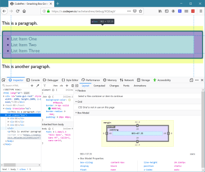
In CSS everything generates boxes. A webpage is essentially a set of block and inline boxes, something you get to understand very well if you open up DevTools in your favorite browser and start selecting elements on the page. You can see the boxes that make up the layout, and how their margins, padding and borders are applied.

An image of a simple layout with an unordered list highlighted in browser DevTools
I have highlighted the ul element using Firefox DevTools so I can inspect the different parts of the box. (Large preview)

Controlling Box Generation

The none and contents values of display deal with whether boxes should appear at all. If you have elements in your markup and don’t want them to generate a box in CSS then you need to somehow suppress generation of the box. There are two possible things you might want to do. Which are:

  • Prevent generation of a box and all of its children.
  • Prevent generation of a box but still display the children.

We can take a look at each of these scenarios in turn.

display: none

The none value of display is how we prevent the generation of a box and all the children of that box. It acts as if the element was not there at all. Therefore, it is useful in situations where you intend to completely hide that content, perhaps because it will be revealed later after activating a link.

If I have an example with a paragraph, an unordered list, and another paragraph you can see that the items are displaying in normal flow. The ul has a background and border applied, plus some padding.

See the Pen Box Generation example by Rachel Andrew.

See on Codepen

If I add display: none to the ul it disappears from the visual display, taking with it the children of the ul plus the background and border.

See the Pen Box Generation example display: none by Rachel Andrew.

See on Codepen

If you use display: none it hides the content from all users of the website. This includes screen reader users. Therefore, you should only use this if your intention is that the box and everything inside it is completely hidden to everyone.

There are situations where you might want to add additional information for users of assistive technology like screen readers but hide it for other users; in such cases, you need to use a different technique. Some excellent suggestions are made by Scott O ’Hara in his article “Inclusively Hidden”.

Using display: none is therefore pretty straightforward. Use it in a situation where you want a box and contents to vanish from the display, from the box tree, and from the accessibility tree (as if it were never there in the first place).

display: contents

For the second scenario, we need to look at a much newer value of display. The value display: contents will remove the box it is applied to from the box tree in the same way that display: none does, but leave the children in place. This causes some useful behavior in terms of things we can then do in our layouts. Let’s look at a simple example and then explore further.

I am using the same example as before, but this time I have used display: contents on the ul. The list items are now visible, however, they have no background and borders and are acting as if you have added li elements to the page without any enclosing ul.

See the Pen Box Generation example display: contents by Rachel Andrew.

See on Codepen

The reason that removing a box and keeping the children is useful is due to the way that other values of display behave. When we change the value of display we do so on a box and the direct children of that box, as I described in the last article. If I add display: flex to the CSS rules for an element, that element becomes a block-level box, and the direct children become flex items. The children of those flex items return to normal flow (they are not part of the flex layout).

You can see this behavior in the next example. Here I have a containing element set to display flex, it has four direct children, three div elements and a ul. The ul has two list items. The direct children all participate in the flex layout and lay out as flex items. The list items are not direct children and so display as list items inside the box of the ul.

See the Pen Box Generation flexbox and display: contents 1 by Rachel Andrew.

See on Codepen

If we take this example and add display: contents to the ul, the box is removed from the visual display and now the children participate in the flex layout. You can see that they do not become direct children. They are not selected by the direct child universal selector (.wrapper > *) in the way that the div and ul elements are, and they maintain the background given to them. All that has happened is that the box of the containing ul has been removed, everything else carries on as normal.

See the Pen Box Generation flexbox and display: contents 2 by Rachel Andrew.

See on Codepen

This has potentially very useful implications if we consider elements in HTML which are important for accessibility and semantic data, but which generate an additional box that may prevent us from laying the content out with flex or grid layout.

This Is Not A CSS “Reset”

You may have noticed how one side effect of using display: contents is that the margin and padding on the element are removed. This is because they are related to the box, part of the CSS Box Model. This might lead to you think that display: contents is a good way to quickly rid yourself of the padding and margin on an element.

This is a use that Adrian Roselli has spotted in the wild; he was concerned enough to write a detailed post explaining the problems of doing so — “display: contents is not a CSS reset.” Some of the issues he raises are due to an unfortunate accessibility issue in browsers currently with display: contents which we will discuss below. However, even once those issues are resolved, removing an element from the box tree simply to rid yourself of the margin and padding is somewhat extreme.

If nothing else, it would be problematic for the future maintenance of the site, a future developer might wonder why they didn’t seem to be able to apply anything to this mysterious box — missing the fact it had been removed! If you need margin and padding to be 0, do your future self a favor and set them to 0 in a time-honored way. Reserve use of display: contents for those special cases where you really do want to remove the box.

It is also worth noting the difference between display: contents and CSS Grid Layout subgrid. Where display: contents completely removes the box, background, and border from the display, making a grid item a subgrid would maintain any box styling on that item, and just pass through the track sizing so that nested items could use the same grid. Find out more in my article, “CSS Grid Level 2: Here Comes Subgrid.”

Accessibility Issues And display: contents

A serious issue currently makes display: contents not useful for the very thing it would be most useful for. The obvious cases for display: contents are those cases where additional boxes are required to add markup that makes your content more easily understood by those using screen readers or other assistive devices.

The ul element of our list in the first display: contents CodePen is a perfect example. You could get the same visual result by flattening out the markup and not using a list at all. However, if the content was semantically a list, would be best understood and read out by a screen reader as a list, it should be marked up as one.

If you then want the child elements to be part of a flex or grid layout, just as if the box of the ul was not there, you should be able to use display: contents to magic away the box and make it so — yet leave the semantics in place. The specification says that this should be the case,

“The display property has no effect on an element’s semantics: these are defined by the document language and are not affected by CSS. Aside from the none value, which also affects the aural/speech output and interactivity of an element and its descendants, the display property only affects visual layout: its purpose is to allow designers freedom to change the layout behavior of an element without affecting the underlying document semantics.”

As we have already discussed, the none value does hide the element from screen readers, however, other values of display are purely there to allow us to change how things display visually. They should not touch the semantics of the document.

For this reason, it took many of us by surprise to realize that display: contents was, in fact, removing the element from the accessibility tree in the two browsers (Chrome and Firefox) that had implemented it. Therefore changing the document semantics, making it so that a screen reader did not know that a list was a list once the ul had been removed using display: contents. This is a browser bug — and a serious one at that.

Last year, Hidde de Vries wrote up this issue in his post “More Accessible Markup with display:contents” and helpfully raised issues against the various browsers in order to raise awareness and get them to work on a fix. Firefox have partially fixed the problem, although issues still exist with certain elements such as button. The issue is being actively worked on in Chrome. There is also an issue for WebKit. I’d encourage you to star these bugs if you have use cases for display: contents that would be impacted by the issues.

Until these issues are fixed, and the browser versions which exhibited the issue fall out of use, you need to be very careful when using display: contents on anything which conveys semantic information and needs to be exposed to assistive technology. As Adrian Roselli states,

“For now, please only use display: contents if you are going to test with assistive technology and can confirm the results work for users.”

There are places where you can safely use display: contents without this concern. One would be if you need to add additional markup to create fallbacks for your grid of flex layouts in older browsers. Browsers which support display: contents also support grid and flexbox, therefore you could display: contents away the redundant div elements added. In the example below, I have created a float based grid, complete with row wrappers.

I then use display: contents to remove the row wrappers to allow all of the items to become grid items and therefore be able to be part of the grid layout. This could give you an additional tool when creating fallbacks for advanced layouts in that if you do need to add extra markup, you can remove it with display: contents when doing your grid or flex layout. I don’t believe this usage should cause any issues — although if anyone has better accessibility information than me and can point out a problem, please do that in the comments.

See the Pen Removing row wrappers with display: contents by Rachel Andrew.

See on Codepen

Wrapping Up

This article has taken a look into the box generation values of the display property. I hope you now understand the different behavior of display: none — which removes a box and all children completely, and display: contents which removes just the box itself. You also should understand the potential issues of using these methods where accessibility is concerned.

Smashing Editorial (il)

Looking Back At SmashingConf San Francisco 2019

Looking Back At SmashingConf San Francisco 2019

Looking Back At SmashingConf San Francisco 2019

Rachel Andrew

This year, SmashingConf took place at the Fort Mason Center which has superb views of the Bay and Golden Gate Bridge. The weather was very kind to us making it a very pleasant location to spend a few days in.

As always with any Smashing Conference, there were plenty of surprises! We had icecream and cookies, our amazing DJ Tobi Lessnow kept everyone well entertained between talks, and Vitaly opened the conference with just the right amount of balloons!

Conference attendees playing with colored balloons
Balloons, anyone? (Image credit: Marc Thiele) (Large preview)

The videos are now posted, so you can see exactly what our speakers got up to, most of them presenting slides-free, with livecoded sessions.

Conference Videos (Day One)

Chris Coyier and Brad Frost sitting at a desk on stage talking
Chris Coyier interviews Brad Frost (Image credit: Marc Thiele) (Large preview)

Conference Videos (Day Two)

Katie Sylor-Miller at a desk on stage with a laptop
Katie Sylor-Miller explaining Git (Image credit: Drew McLellan) (Large preview)

Our attendees collaborated on a Google Doc for both conference days. These documents are a treasure trove of information and links from our speakers.

  • Collaborative Doc (Day 1)
    Notes for talks by Brad Frost, Sara Soueidan, Anna Migas, Darin Senneff, Steve Schoger, Chris Coyier, Jennifer Brook and David P. Simon.
  • Collaborative Doc (Day 2)
    Notes for talks by Miriam Suzanne, Katie Sylor-Miller, Brendan Dawes, Jeremy Wagner, Jason Pamental and Jen Simmons.

In between the scheduled sessions, we had some great lunch sessions on both days from our friends at Deque, Netlify, and Medium.

Photo of DJ Tobi Lessnow on stage with the crowd watching
DJ Tobi Lessnow hard at work (Image credit: Marc Thiele) (Large preview)

Workshops

Workshops are a great way to spend a day really thinking about a subject. We ran workshops on Monday (the day before) and on Thursday (the day after the conference); they were all sold out, and the rooms were packed! I got to demo subgrid in my workshop which had just appeared in an early build of Firefox the day previously, so they were some of the first people outside of Mozilla to get to see that working.

Monday

  • “How To Translate Wireframes Into Accessible HTML/CSS,” Deque Team (free workshop)
  • “Accessible UI Patterns,” Sara Soueidan
  • “Next Steps With CSS Layout,” Rachel Andrew
  • “New Front-end Adventures, 2019 Edition,” Vitaly Friedman
Sara Soueidan leading a workshop
Sara Soueidan running her accessible UI patterns workshop (Image credit: Marc Thiele) (Large preview)

Thursday

  • “The Design System Process,” Brad Frost
  • “Git To The Next Level,” Katie Sylor-Miller
  • “Advanced CSS & Sass For Modern Applications,” Miriam Suzanne
  • “Smart Responsive UX Design Patterns,” Vitaly Friedman

Side Events

We always want to offer more than the conference, and try to arrange a bunch of side events which offer something for everyone.

Jam Session

On Monday, before the conference began, we had a Jam Session, organized by Mozilla and Shopify and held at the Mozilla offices. In addition to drinks and snacks, there were several micro-talks including:

  • “Creative Design With CSS Shapes And clip-path,” Mandy Michael
  • “Building Accessible Experiences,” Tiffany Tse
  • “The Power Of Code–Based Design,” Marcin Treder
  • “Axe-Pro: A New Kind Of Accessibility Tool,” April Ellsey
  • “Scroll Up! Scroll Up! A Tale Of Animating Over 10,000 Data Points,” Becky Rush
  • “What’s New At Mozilla,” Ali Spivak

Graffiti Walk

Also on Monday, we got together for a graffiti walk led by Scott Whitehead. A group of attendees spent time together exploring the street art of the Clarion Alley Art Street.

The Smashing Run Club

At Smashing SF 2018, Josh Clark suggested a morning run, which I helped organize. I thought we should continue the tradition this year and we had two lovely runs on both conference days out towards the Golden Gate Bridge. It has to be one of the most scenic locations possible for a conference run. It really is a great way to start a day of sitting and learning, by stretching your legs and getting some fresh air.

Conference Party

I was surprised to see so many Wednesday morning conference runners, as on Tuesday night we had a party sponsored by Speedcurve. There were drinks, mediterranean food, and the venue was filled with old-school arcade games!

The Photo Walk

After the final day of the conference, some attendees went off on a photo walk, to enjoy a pleasant San Francisco evening. If you have any photos from that we would love to see them — drop a note in the comments.

There are a few other places you can find conference resources, photos and feedback. If you have written a blog post, posted photos or anything else, add a link in the comments.

Smashing cat stickers on a table
Stickers! (Image credit: Marc Thiele) (Large preview)

Coming Up Next: SmashingConf Toronto

We are going to catch our breath and then we will be straight back into getting ready for our next SmashingConf in Toronto. We still have only a few tickets left, so be quick if you don’t want to miss out.

Note: Tickets to SmashingConf SF were quickly sold out. If you are keen to experience Smashing in San Francisco in 2020, tickets for that event are already on sale with super early-bird pricing.

Follow us on Instagram and Twitter for live updates when any Smashing Conference is ongoing — we always try and share some of the buzz and information with our friends around the world.

Smashing Editorial (il)

Digging Into The Display Property: The Two Values Of Display

Digging Into The Display Property: The Two Values Of Display

Digging Into The Display Property: The Two Values Of Display

Rachel Andrew

A flex or grid layout starts out with you declaring display: flex or display: grid. These layout methods are values of the CSS display property. We tend not to talk about this property on its own very much, instead concentrating on the values of flex or grid, however, there are some interesting things to understand about display and how it is defined that will make your life much easier as you use CSS for layout.

In this article, the first in a short series, I’m going to take a look at the way that the values of display are defined in the Level 3 specification. This is a change to how we defined display in earlier versions of CSS. While it may seem unusual at first for those of us who have been doing CSS for many years, I think these changes really help to explain what is going on when we change the value of display on an element.

Block And Inline Elements

One of the first things we teach people who are new to CSS are the concepts of block and inline elements. We will explain that some elements on the page are display: block and they have certain features because of this. They stretch out in the inline direction, taking up as much space as is available to them. They break onto a new line; we can give them width, height, margin as well as padding, and these properties will push other elements on the page away from them.

We also know that some elements are display: inline. Inline elements are like words in a sentence; they don’t break onto a new line, but instead reserve a character of white space between them. If you add margins and padding, this will display but it won’t push other elements away.

The behavior of block and inline elements is fundamental to CSS and the fact that a properly marked up HTML document will be readable by default. This layout is referred to as “Block and Inline Layout” or “Normal Flow” because this is the way that elements lay themselves out if we don’t do anything else to them.

Inner And Outer Values Of display

We understand block and inline elements, but what happens if we make an item display: grid? Is this something completely different? If we look at a component on which we have specified display: grid, in terms of the parent element in the layout it behaves like a block level element. The element will stretch out and take up as much space in the inline dimension as is available, it will start on a new line. It behaves just like a block element in terms of how it behaves alongside the rest of the layout. We haven’t said display: block though, or have we?

It turns out that we have. In Level 3 of the Display specification, the value of display is defined as two keywords. These keywords define the outer value of display, which will be inline or block and therefore define how the element behaves in the layout alongside other elements. They also define the inner value of the element — or how the direct children of that element behave.

This means that when you say display: grid, what you are really saying is display: block grid. You are asking for a block level grid container. An element that will have all of the block attributes — you can give it height and width, margin and padding, and it will stretch to fill the container. The children of that container, however, have been given the inner value of grid so they become grid items. How those grid items behave is defined in the CSS Grid Specification: the display spec gives us a way to tell the browser that this is the layout method we want to use.

I think that this way of thinking about display is incredibly helpful; it directly explains what we are doing with various layout methods. If you were to specify display: inline flex, what would you expect? Hopefully, a box that behaves as an inline element, with children that are flex items.

There are a few other things neatly explained by thinking about display in this new way, and I’ll take a look at some of these in the rest of this article.

We Are Always Going Back To Normal Flow

When thinking about these inner and outer display properties, it can be helpful to consider what happens if we don’t mess around with the value of display at all. If you write some HTML and view it in a browser, what you get is Block and Inline Layout, or Normal Flow. The elements display as block or inline elements.

See the Pen Block and Inline Layout by Rachel Andrew.

See on Codepen

The example below contains some markup that I have turned into a media object, by making the div display: flex (the two direct children) now become flex items, so the image is now in a row with the content. If you see in the content, however, there is a heading and a paragraph which are displaying in normal flow again. The direct children of the media object became flex items; their children return to normal flow unless we change the value of display on the flex item. The flex container itself is a block box, as you can see by the fact the border extends to the edge of its parent.

See the Pen Block and Inline Layout With Flex Component by Rachel Andrew.

See on Codepen

If you work with this process, the fact that elements on your page will lay themselves out with this nice readable normal flow layout, rather than fighting against it and trying to place everything, CSS is much easier. You are also less likely to fall into accessibility issues, as you are working with the document order, which is exactly what a screen reader or a person tabbing through the document is doing.

Explaining flow-root And inline-block

The value of inline-block is also likely to be familiar to many of us who have been doing CSS for a while. This value is a way to get some of the block behavior on an inline element. For example, an inline-block element can have a width and a height. An element with display: inline-block also behaves in an interesting way in that it creates a Block Formatting Content (BFC).

A BFC does some useful things in terms of layout, for example, it contains floats. To read about Block Formatting Contexts in more detail see my previous article “Understanding CSS Layout And The Block Formatting Context.” Therefore saying display: inline-block gives you an inline box which also establishes a BFC.

As you will discover (if you read the above-mentioned article about the Block Formatting Context), there is a newer value of display which also explicitly creates a BFC. This is the value of flow-root. This value creates a BFC on a block, rather than an inline element.

  • display: inline-block gives you a BFC on an inline box.
  • display: flow-root gives you a BFC on a block box.

You are now probably thinking that is all a bit confusing: why do we have two completely different keywords here, and what happened to the two-value syntax we were talking about before? This leads neatly into the next thing I need to explain about display, i.e. the fact that CSS has a history we need to deal with in terms of the display property.

Legacy Values Of Display

The CSS2 Specification detailed the following values for the display property:

  • inline
  • block
  • inline-block
  • list-item
  • none
  • table
  • inline-table

Also defined were the various table internal properties such as table-cell which we are not dealing with in this article.

We then added to these some values for display, to support flex and grid layout:

  • grid
  • inline-grid
  • flex
  • inline-flex

Note: The specification also defines ruby and inline-ruby to support Ruby Text which you can read about in the Ruby specification.

These are all single values for the display property, defined before the specification was updated to explain CSS Layout in this way. Something very important about CSS is the fact that we don’t go around breaking the web; we can’t simply change things. We can’t suddenly decide that everyone should use this new two-value syntax and therefore every website ever built that used the single value syntax will break unless a developer goes back and fixes it!

While thinking about this problem, you may enjoy this list of mistakes in the design of CSS which are less mistakes in many cases as things that were designed without a crystal ball to see into the future! However, the fact is that we can’t break the web, which is why we have this situation where right now browsers support a set of single values for display, and the specification is moving to two values for display.

The way we get around this is to specify legacy and short values for display, which includes all of these single values. This means that a mapping can be defined between single values and new two keyword values. Which gives us the following table of values:

Single Value Two-Keyword Values Description
block block flow Block box with normal flow inner
flow-root block flow-root Block box defining a BFC
inline inline flow Inline box with normal flow inner
inline-block inline flow-root Inline box defining a BFC
list-item block flow list-item Block box with normal flow inner and additional marker box
flex block flex Block box with inner flex layout
inline-flex inline flex Inline box with inner flex layout
grid block grid Block box with inner grid layout
inline-grid inline grid Inline box with inner grid layout
table block table Block box with inner table layout
inline-table inline table Inline box with inner table layout

To explain how this works, we can think about a grid container. In the two-value world, we would create a block level grid container with:

.container {
    display: block grid;
}

However, the legacy keyword means that the following does the same thing:

.container {
    display: grid;
}

If, instead, we wanted an inline grid container, in the two-value world we would use:

.container {
    display: inline grid;
}

And if using the legacy values:

.container {
    display: inline-grid;
}

We can now go back to where this conversation began and look at display: inline-block. Looking at the table, you can see that this is defined in the two-value world as display: inline flow-root. It now matches display: flow-root which in a two-value world would be display: block flow-root. A little bit of tidying up and clarification of how these things are defined. A refactoring of CSS, if you like.

Browser Support For The Two-Value Syntax

As yet, browsers do not support the two-value syntax for the display property. The implementation bug for Firefox can be found here. Implementation — when it happens — would essentially involve aliasing the legacy values to the two-value versions. It’s likely to be a good while, therefore, before you can actually use these two-value versions in your code. However, that really isn’t the point of this article. Instead, I think that looking at the values of display in the light of the two-value model helps explain much of what is going on.

When you define layout on a box in CSS, you are defining what happens to this box in terms of how it behaves in relation to all of the other boxes in the layout. You are also defining how the children of that box behave. You can think in this way long before you can explicitly declare the values as two separate things, as the legacy keywords map to those values, and it will help you understand what happens when you change the value of display.

Smashing Editorial (il)

How To Align Things In CSS

How To Align Things In CSS

How To Align Things In CSS

Rachel Andrew

We have a whole selection of ways to align things in CSS today, and it isn’t always an obvious decision which to use. However, knowing what is available means that you can always try a few tactics if you come across a particular alignment problem.

In this article, I will take a look at the different alignment methods. Instead of providing a comprehensive guide to each, I’ll explain a few of the sticking points people have and point to more complete references for the properties and values. As with much of CSS, you can go a long way by understanding the fundamental things about how the methods behave, and then need a place to go look up the finer details in terms of how you achieve the precise layout that you want.

Aligning Text And Inline Elements

When we have some text and other inline elements on a page, each line of content is treated as a line box. The property text-align will align that content on the page, for example, if you want your text centered, or justified. Sometimes, however, you may want to align things inside that line box against other things, for example, if you have an icon displayed alongside text, or text of different sizes.

In the example below, I have some text with a larger inline image. I am using vertical-align: middle on the image to align the text to the middle of the image.

The line-height Property And Alignment

Remember that the line-height property will change the size of the line-box and therefore can change your alignment. The following example uses a large line-height value of 150px, and I have aligned the image to top. The image is aligned to the top of the line box and not the top of the text, remove that line-height or make it less than the size of the image and the image and text will line up at the top of the text.

It turns out that line-height and indeed the size of text is pretty complicated, and I’m not going to head down that rabbit hole in this article. If you are trying to precisely align inline elements and want to really understand what is going on, I recommend reading “Deep Dive CSS: Font Metrics, line-height And vertical-align.”

When Can I Use The vertical-align Property?

The vertical-align property is useful if you are aligning any inline element. This includes elements with display: inline-block. The content of table cells can also be aligned with the vertical-align property.

The vertical-align property has no effect on flex or grid items, and therefore if used as part of a fallback strategy, will cease to apply the minute the parent element is turned into a grid or flex Container. For example, in the next pen, I have a set of items laid out with display: inline-block and this means that I get the ability to align the items even if the browser does not have Flexbox:

See the Pen inline-block and vertical-align by Rachel Andrew.

In this next pen, I have treated the inline-block as a fallback for Flex layout. The alignment properties no longer apply, and I can add align-items to align the items in Flexbox. You can tell that the Flexbox method is in play because the gap between items that you will get when using display: inline-block is gone.

See the Pen inline-block flex fallback by Rachel Andrew.

The fact that vertical-align works on table cells is the reason that the trick to vertically center an item using display: table-cell works.

Now that we do have better ways to align boxes in CSS (as we will look at in the next section), we don’t need to employ the vertical-align and text-align properties in places other than the inline and text elements for which they were designed. However, they are still completely valid to use in those text and inline formats, and so remember if you are trying to align something inline, it is these properties and not the Box Alignment ones that you need to reach for.

Box Alignment

The Box Alignment Specification deals with how we align everything else. The specification details the following alignment properties:

  • justify-content
  • align-content
  • justify-self
  • align-self
  • justify-items
  • align-items

You might already think of these properties as being part of the Flexbox Specification, or perhaps Grid. The history of the properties is that they originated as part of Flexbox, and still exist in the Level 1 specification; however, they were moved into their own specification when it became apparent that they were more generally useful. We now also use them in Grid Layout, and they are specified for other layout methods too, although current browser support means that you won’t be able to use them just yet.

Therefore, next time someone on the Internet tells you that vertical alignment is the hardest part of CSS, you can tell them this (which even fits into a tweet):

.container {
  display: flex;
  align-items: center;
  justify-content: center;
}

In the future, we may even be able to dispense with display: flex, once the Box Alignment properties are implemented for Block Layout. At the moment, however, making the parent of the thing you want centering a flex container is the way to get alignment horizontally and vertically.

The Two Types Of Alignment

When aligning flex and grid items, you have two possible things to align:

  1. You have the spare space in the grid or flex container (once the items or tracks have been laid out).
  2. You also have the item itself inside the grid area you placed it in, or on the cross axis inside the flex container.

I showed you a set of properties above, and the alignment properties can be thought of as two groups. Those which deal with distribution of spare space, and those which align the item itself.

Dealing With Spare Space: align-content And justify-content

The properties which end in -content are about space distribution, so when you choose to use align-content or justify-content you are distributing available space between grid tracks or flex items. They don’t change the size of the flex or grid items themselves; they move them around because they change where the spare space goes.

Below, I have a flex example and a grid example. Both have a container which is larger than required to display the flex items or grid tracks, so I can use align-content and justify-content to distribute that space.

See the Pen justify-content and align-content by Rachel Andrew.

Moving Items Around: justify-self, align-self, justify-items And align-items

We then have align-self and justify-self as applied to individual flex or grid items; you can also use align-items and justify-items on the container to set all the properties at once. These properties deal with the actual flex or grid item, i.e. moving the content around inside the Grid Area or flex line.

  • Grid Layout You get both properties as you can shift the item on the block and inline axis as we have a defined Grid Area in which it sits.
  • Flex Layout You can only align on the cross axis as the main axis is controlled by space distribution alone. So if your items are a row, you can use align-self to shift them up and down inside the flex line, aligning them against each other.

In my example below, I have a flex and a grid container, and am using align-items and align-self in Flexbox to move the items up and down against each other on the cross axis. If you use Firefox, and inspect the element using the Firefox Flexbox Inspector, you can see the size of the flex container and how the items are being moved vertically inside of that.

Flex items aligned in their container
Aligned flex items with the flex container highlighted in Firefox (Large preview)

In grid, I can use all four properties to move the items around inside their grid area. Once again, the Firefox DevTools Grid Inspector will be useful when playing with alignment. With the grid lines overlaid, you can see the area inside which the content is being moved:

Aligned grid items
Aligned grid items with the Grid highlighted in Firefox (Large preview)

Play around with the values in the CodePen demo to see how you can shift content around in each layout method:

See the Pen justify-self, align-self, justify-items, align-items by Rachel Andrew.

Confused By align And justify

One of the cited issues with people remembering the alignment properties in Grid and Flexbox, is that no one can remember whether to align or to justify. Which direction is which?

For Grid Layout, you need to know if you are aligning in the Block or Inline Direction. The Block direction is the direction blocks lay out on your page (in your writing mode), i.e. for English that is vertically. The Inline direction is the direction in which sentences run (so for English that is left to right horizontally).

To align things in the Block Direction, you will use the properties which start with align-. You use align-content to distribute space between grid tracks, if there is free space in the grid container, and align-items or align-self to move an item around inside the grid area it has been placed in.

The below example has two grid layouts. One has writing-mode: horizontal-tb (which is the default for English) and the other writing-mode: vertical-rl. This is the only difference between them. You can see that the alignment properties which I have applied work in exactly the same way on the block axis in both modes.

See the Pen Grid Block Axis Alignment by Rachel Andrew.

To align things in the inline direction, use the properties which begin with justify-. Use justify-content to distribute space between grid tracks, and justify-items or justify-self to align items inside their grid area in the inline direction.

Once again, I have two grid layout examples so that you can see that inline is always inline — no matter which writing mode you are using.

See the Pen Grid Inline Alignment by Rachel Andrew.

Flexbox is a little trickier due to the fact that we have a main axis which can be changed to row or column. So, let’s first think about that main axis. It is set with the flex-direction property. The initial (or default) value of this property is row which will lay the flex items out as a row in the writing mode currently in use — this is why when working in English, we end up with items laid out horizontally when we create a flex container. You can then change the main axis to flex-direction: column and the items will be laid out as a column which means they are laid out in the block direction for that writing mode.

As we can do this axis switching, the most important factor in Flexbox is asking, “Which axis is my main axis?” Once you know that, then for alignment (when on your main axis) you simply use justify-content. It doesn’t matter if your main axis is row or column. You control space between the flex items with justify-content.

See the Pen justfy-content in Flexbox by Rachel Andrew.

On the cross axis, you can use align-items which will align the items inside the flex container or flex line in a multi-line flex container. If you have a multi-line container using flex-wrap: wrap and have space in that container, you can use align-content to distribute the space on the cross axis.

In the example below, we are doing both with a flex container displayed as a row and a column:

See the Pen Cross axis alignment in Flexbox by Rachel Andrew.

When justify-content Or align-content Do Not Work

The justify-content and align-content properties in Grid and Flexbox are about distributing extra space. So the thing to check is that you have extra space.

Here is a Flex example: I have set flex-direction: row and I have three items. They don’t take up all of the space in the flex container, so I have spare space on the main axis, the initial value for justify-content is flex-start and so my items all line up at the start and the extra space is at the end. I am using the Firefox Flex Inspector to highlight the space.

Flex items aligned left, highlighted spare space on the right
The spare space at the end of the container (Large preview)

If I change flex-direction to space-between, that extra space is now distributed between the items:

Flex items aligned so space is distributed between the items
The spare space is now between the items (Large preview)

If I now add more content to my items so they become larger and there is no longer any additional space, then justify-content does nothing — simply because there is no space to distribute.

Flex items are filling the container with no spare space
There is now no space to distribute (Large preview)

A common question I’m asked is why justify-content isn’t working when flex-direction is column. This is generally because there is no space to distribute. If you take the above example and make it flex-direction: column, the items will display as a column, but there will be no additional space below the items as there is when you do flex-direction: row. This is because when you make a Flex Container with display: flex you have a block level flex container; this will take up all possible space in the inline direction. In CSS, things do not stretch in the block direction, so no extra space.

Flex items arranged as a column
The column is only as tall as needed to display the items (Large preview)

Add a height to the container and — as long as that is more than is required to display the items — you have extra space and therefore justify-content will work on your column.

A column of flex items with space between them.
Adding a height to the container means we have spare space (Large preview)

Why Is There No justify-self In Flexbox?

Grid Layout implements all of the properties for both axes because we always have two axes to deal with in Grid Layout. We create tracks (which may leave additional space in the grid container in either dimension,) and so we can distribute that space with align-content or justify-content. We also have Grid Areas, and the element in that area may not take up the full space of the area, so we can use align-self or justify-self to move the content around the area (or align-items, justify-items to change the alignment of all items).

Flexbox does not have tracks in the way that Grid layout does. On the main axis, all we have to play with is the distribution of space between the items. There is no concept of a track into which a flex item is placed. So there is no area created in which to move the item around in. This is why there is no justify-self property on the main axes in Flexbox.

Sometimes, however, you do want to be able to align one item or part of the group of items in a different way. A common pattern would be a split navigation bar with one item being separated out from the group. In that situation, the specification advises the use of auto margins.

An auto margin will take up all of the space in the direction it is applied, which is why we can center a block (such as our main page layout) using a left and right margin of auto. With an auto margin on both sides, each margin tries to take up all the space and so pushes the block into the middle. With our row of flex items, we can add margin-left: auto to the item we want the split to happen on, and as long as there is available space in the flex container, you get a split. This plays nicely with Flexbox because as soon as there is no available space, the items behave as regular flex items do.

Flexbox And Micro-Components

One of the things I think is often overlooked is how useful Flexbox is for doing tiny layout jobs, where you might think that using vertical-align is the way to go. I often use Flexbox to get neat alignment of small patterns; for example, aligning an icon next to text, baseline aligning two things with different font sizes, or making form fields and buttons line up properly. If you are struggling to get something to line up nicely with vertical-align, then perhaps try doing the job with Flexbox. Remember that you can also create an inline flex container if you want with display: inline-flex.

There is no reason not to use Flexbox, or even Grid for tiny layout jobs. They aren’t just for big chunks of layout. Try the different things available to you, and see what works best.

People are often very keen to know what the right or wrong way to do things is. In reality, there often is no right or wrong; a small difference in your pattern might mean the difference between Flexbox working best, where otherwise you would use vertical-align.

Wrapping Up

To wrap up, I have a quick summary of the basics of alignment. If you remember these few rules, you should be able to align most things with CSS:

  1. Are you aligning text or an inline element? If so, you need to use text-align, vertical-align, and line-height.
  2. Do you have an item or items you want to align in the center of the page or container? If so, make the container a flex container then set align-items: center and justify-content: center.
  3. For Grid Layouts, the properties that start with align- work in the Block direction; those which start with justify- work in the inline direction.
  4. For Flex Layouts, the properties that start with align- work on the Cross Axis; those which start with justify- work on the main axis.
  5. The justify-content and align-content properties distribute extra space. If you have no extra space in your flex or grid container, they will do nothing.
  6. If you think you need justify-self in Flexbox, then using an auto margin will probably give you the pattern you are after.
  7. You can use Grid and Flexbox along with the alignment properties for tiny layout jobs as well as main components — experiment!

For more information about alignment, see these resources:

Smashing Editorial (il)

Designing An Aspect Ratio Unit For CSS

Designing An Aspect Ratio Unit For CSS

Designing An Aspect Ratio Unit For CSS

Rachel Andrew

One of the things that come up again and again in CSS is the fact that there is no way to size things based on their aspect ratio. In particular when working with responsive designs, you often want to be able to set the width to a percentage and have the height correspond to some aspect ratio. This is something that the folks who are responsible for designing CSS (i.e. the CSS Working Group) have recently been discussing and a proposed solution was agreed upon at a recent CSSWG meeting in San Francisco.

This is a new resolution, so we have no browser implementations yet, but I thought it would be worth writing up the proposal in case anyone in the wider web community could see a showstopping issue with it. It also gives something of an insight into the work of the CSSWG and how issues like this are discussed, and new features designed.

What Is The Problem We Are Trying To Solve?

The issue in in regard to non-replaced elements, which do not have an intrinsic aspect ratio. Replaced elements are things like images or a video placed with the <video> element. They are different to other boxes in CSS as they have set dimensions, and their own behavior. These replaced elements are said to have an intrinsic aspect ratio, due to them having dimensions.

A div or some other HTML element which may contain your content has no aspect ratio, you have to give it a width and a height. There is no way to say that you want to maintain a 16 / 9 aspect ratio, and that whatever the width is, the height should be worked out using the given aspect ratio.

A very common situation is when you want to embed an iframe in order to display a video from a video sharing site such as YouTube. If you use the <video> element then the video has an aspect ratio, just like an image. This isn’t the case if the video is elsewhere and you are using an embed. What you want is for your video to be responsive, yet remain at the correct aspect ratio for the video. What you get however, if you set width to 100%, is the need to then set a height. Your video ends up stretched or squished.

Let’s also look at a really simple case of creating a grid layout with square cells. If we were using fixed column track sizes, then it is easy to get our square cells as we can define rows to be the same size as the column tracks. We could also make our row tracks auto-sized, and have items and set the height on the items.

The problem comes when we want to use auto-fill and fill a container with as many column tracks as will fit. We now can’t simply give the items a height, as we don’t know what the width is. Our items are no longer square.

Being able to size things based on their aspect ratio would mean we could calculate the correct aspect ratio once the grid item is laid out. Thus making the grid items as tall as they are wide, so that they always maintain as a square no matter what their width.

Current Aspect Ratio Solutions

Web developers have been coping with the lack of any aspect ratio in CSS in various ways — the main one being the “padding hack”. This solution uses the fact that padding % in the block direction (so top and bottom padding in a horizontal top to bottom language) is calculated from the inline size (width).

The article “Aspect Ratio Boxes” on CSS-Tricks has a good rundown of the current methods of creating aspect ratio boxes. The padding hack works in many cases but does require a bunch of hoops to jump through in order to get it working well. It’s also not in the slightest bit intuitive — even if you know why and how it works. It’s those sort of things that we want to try and solve in the CSS Working Group. Personally, I feel that the more we get elegant solutions for layout in CSS, the more the messy hacks stand out as something we should fix.

For the video situation, you can use JavaScript. A very popular solution is to use FitVids — as also described in the CSS-Tricks article. Using JavaScript is a reasonable solution, but there’s more script to load, and also something else to remember to do. You can’t simply plonk a video into your content and it just works.

The Proposed Solution

What we are looking for is a generic solution that will work for regular block layouts (such as a video in an iframe or a div on the page). It should also work if the item is a grid or flex item. There is a different issue of wanting grid tracks to maintain an aspect ratio (having the row tracks match the columns), this solution would fix many cases, however, where you might want that (you would be working from the item out rather than the track in).

The soluion will be part of the CSS Sizing Specification, and is being written up in the CSS Sizing 4 specification. This is the first step for new features being designed by the CSS Working Group, the idea is discussed, and then written up in a specification. An initial proposal for this feature was brought to the group by Jen Simmons, and you can see her slide deck which goes through many of the use cases discussed in this article here.

The new property introduced to the Sizing specification is the aspect-ratio property. This property will accept a value which is an aspect ratio such as 16/9. For example, if you want a square box with the same width and height, you would use the following:

.box {
  width: 400px;
  height: auto;
  aspect-ratio: 1/1;
}

For a 16 / 9 box (such as for a video):

.box {
  width: 100%;
  height: auto;
  aspect-ratio: 16/9;
}

For the example with the square items in a grid layout, we leave our grid tracks auto-sized, which means they will take their size from the items; we then make our items sized with the aspect-ratio unit.

.grid {
    display: grid;
    grid-template-columns: repeat(autofill, minmax(200px, 1fr));
}

.item {
    aspect-ratio: 1/1;
}

Features often go through various iterations before browsers start to implement them. Having discussed the need for an aspect ratio unit previously, this time we were looking at one particular concern around the proposal.

What happens if you specify an aspect ratio box, but then add too much content to the box? This same issue is brought up in the CSS-Tricks article about the padding hack — with equally unintuitive solutions required to fix it.

Dealing With Overflow

What we are dealing with here is overflow, as is so often the case on the web. We want to have a nice neatly sized box: our design asks for a nice neatly sized box, our content is less well behaved and turns out to be bigger than we expected and breaks out of the box. In addition to specifying how we ask for an aspect ratio in one dimension, we also have to specify what happens if there is too much content, and how the web developer can tell the browser what to do about that overflowing content.

There is a general design principle in CSS that we use in order to avoid data loss. Data loss in a CSS context is where some of your content vanishes. That might either be because it gets poked off the side of the viewport, or is cropped when it overflows. It’s generally preferable to have a messy overflow (as you will notice it and do something about it). If we cause something to vanish, you may not even realize it, especially if it only happens at one breakpoint.

We have a similar issue in grid layout which is nicely fixed with the minmax() function for track sizes. You can define grid tracks with a fixed height using a length unit. This will give you a lovely neat grid of boxes, however, as soon as someone adds more content than you expected into one of those boxes, you will get overflow.

The fix for this in grid layout is to use minmax() for your track size, and make the max value auto. In this case, auto can be thought of as “big enough to fit the content”. What you then get is a set of neat looking boxes that, if more content than expected gets in, grow to accept that content. (Infinitely better than a messy overflow or cropped content.)

In the example below, you can see that while the first row with the box with extra content has grown, the second row is sized at 100 pixels.

We need something similar for our aspect ratio boxes, and the suggestion turns out to be relatively straightforward. If you do nothing about overflow, then the default behavior will be that the content is allowed to grow past the height that is inferred by the aspect ratio. This will give you the same behavior as the grid tracks size with minmax(). In the case of height, it will be at least the height defined by the aspect ratio, i.e. if the content is taller, the height can grow to fit it.

If you don’t want that, then you can change the value of overflow as you would normally do. For example hiding the overflow, or allowing it to scroll.

Commenting On Proposals In Progress

I think that this proposal covers the use cases detailed in the CSS-Tricks article and the common things that web developers want to do. It gives you a way to create aspect ratio-sized boxes in various layout contexts, and is robust. It will cope with the real situation of content on the web, where we don’t always know how much content we have or how big it is.

If you spot some real problem with this, or have some other use case that you think can’t be solved, you can directly comment on the proposal by raising an issue in the CSSWG GitHub repo. If you don’t want to do that, you can always comment here, or post to your own blog and link to it here so I can see it. I’d be very happy to share your thoughts with the working group as this feature is discussed.

Smashing Editorial (il)

Breaking Boxes With CSS Fragmentation

Breaking Boxes With CSS Fragmentation

Breaking Boxes With CSS Fragmentation

Rachel Andrew

In this article, I’m going to introduce you to the CSS Fragmentation specification. You might never have heard of it, however, if you have ever created a print stylesheet and wanted to control where the content breaks between pages, or multi-column layout and wanted to stop a figure breaking between columns, you have encountered it.

I find that quite often problems people report with multicol are really problems with browser support of fragmentation. After a quick rundown of the properties contained in this specification, I’ll be explaining the current state of browser support and some of the things you can do to get it working as well as it can in your multicol and print projects.

What Is Fragmentation?

Fragmentation in CSS describes the process by which content becomes broken up into different boxes. Currently, we have two places in which we might run into fragmentation on the web: when we print a document, and if we use multi-column layout. These two things are essentially the same. When you print (or save to PDF) a webpage, the content is fragmented into as many pages as are required to print your content.

When you use multicol, the content is fragmented into columns. Each column box is like a page in the paged context. If you think of a set of columns as being much like a set of pages it can be a helpful way to think about multicol and how fragmentation works in it.

If you take a look at the CSS Fragmentation Specification you will see a third fragmented context mentioned — that context is Regions. As there are no current usable implementations of Regions, we won’t be dealing with that in this article, but instead looking at the two contexts that you might come across in your work.

Block And Inline Boxes

I am going to mention block boxes a lot in this article. Every element of your page has a box. Some of those boxes are laid out as blocks: paragraphs, list items, headings. These are said to be participating in a block formatting context. Others are inline such as the words in a paragraph, spans and anchor elements. These participate in an inline formatting context. Put simply, when I refer to a block box, I’m talking about boxes around things like paragraphs. When dealing with fragmentation, it is important to know which kind of box you are dealing with.

For more information on block and inline layout, see the MDN article “Block And Inline Layout In Normal Flow”. It is one of those things that we probably all understand on some level but might not have encountered the terminology of before.

Controlling Breaks

Whether you are creating a print stylesheet, using a specific print user agent to make a PDF,or using multicol, you will sometimes run into problems that look like this.

In the below multicol example, I have some content which I am displaying as three columns. In the middle of the content is a boxed out area, which is being broken across two columns. I don’t want this behavior — I would like the box to stay together.

Three columns with a boxed out area broken across two of them
The box breaks across two columns (Large preview)

To fix this, I add the property break-inside: avoid to the box. The break-inside property controls breaks inside elements when they are in a fragmented context. In a browser which supports this property, the box will now stay in one of the columns. The columns will look less well balanced, however, that is generally a better thing than ending up with the boxout split across columns.

The break-inside property is one of the properties detailed in the fragmentation spec. The full list of properties is as follows:

  • break-before
  • break-after
  • break-inside
  • orphans
  • widows
  • box-decoration-break

Let’s have a look at how these are supposed to work before we move onto what actually happens in browsers.

The break-before And break-after Properties

There are two properties that control breaks between block-level boxes: break-before and break-after. If you have an h2 followed by two paragraphs <p> you have three block boxes and you would use these properties to control the breaks between the heading and first paragraph, or between the two paragraphs.

The properties are used on selectors which target the element you want to break before or after.

For example, you might want your print stylesheet to break onto a new page every time there is a level 2 heading. In this case, you would use break-before: page on the h2 element. This controls the fragmentation and ensures there is always a break before the box of the h2 element.

h2 {
    break-before: page;
}

Another common requirement is to prevent headings ending up as the last thing on a page or column. In this case, you might use break-after with a value of avoid. This should prevent a break directly after the box of the element:

h1, h2, h3, h4 {
    break-after: avoid;
}
Fragments Within Fragments

It is possible that you might have an element that is fragmented nested inside another. For example, having a multicol inside something which is paged. In that case, you might want to control breaks for pages but not for columns, or the other way around. This is why we have values such as page which would always force a break before or after the element but only when the fragment is a page. Or avoid-page which would avoid a break before or after the element only for paged contexts.

The same applies to columns. If you use the value column, this would always force a break before or after that element, but only for multicol contexts. The value avoid-column would prevent a break in multicol contexts.

There is an always value in the Level 4 specification which indicates that you want to break through everything - page or column. However, as a recent addition to the spec it is not currently useful to us.

Additional Values For Paged Media

If you are creating a book or magazine, you have left and right pages. You might want to control breaking in order to force something onto the left or right page of a spread. Therefore, using the following would insert one or two-page breaks before the h2 to ensure it was formatted as a right page.

h2 {
    break-before: right;
}

There are also recto and verso values which relate to page progression as books written in a vertical or right to left language have a different page progression than books written in English. I’m not going to cover these values further in this article as I’m primarily concerned with what is possible from the browser this time.

break-inside

We have already seen an example of the break-inside property. This property controls breaking inside block boxes, e.g. inside a paragraph, heading or a div.

Things that you may not want to break can include a boxout as described above: figures where you do not want the caption detached from the image, tables, lists and so on. Add break-inside: avoid to any container you don’t wish to break in any fragmentation context. If you only wish to avoid breaks between columns use break-inside: avoid-column and between pages break-inside: avoid-page.

The orphans And widows Properties

The orphans and widows properties deal with how many lines should be left before or after a break (either caused by a column or a new page). For example, if I want to avoid a single line being left at the end of a column, I would use the orphans property, as in typography, an orphan is the first line of a paragraph that appears alone at the bottom of a page with the rest of the paragraph broken onto another page. The property should be added to the same element which is fragmenting (in our case, the multicol container).

.container {
    column-count: 3;
    orphans: 2;
}

To control how many lines should be at the top of a column or page after a break, use widows:

.container {
    column-count: 3;
    widows: 2;
}

These properties deal with breaks between inline boxes such as the lines of words inside a paragraph. Therefore, they don’t help in the situation where a heading or other block element is alone at the bottom of a column or page, you need the break properties discussed above for that.

Box Decoration

A final property that may be of interest is the box-decoration-break property. This controls the situation where you have a box with a border broken between two column boxes or pages. Do you want the border to essentially be sliced in half? Or do you want each of the two halves of the box to be wrapped fully in a border?

The first scenario is the default, and is as if you set the box-decoration-break property to slice on the box.

.box {
    box-decoration-break: slice;
}
A box with a border which is broken between columns
A value of slice means the border is effectively sliced in half (Large preview)

To get the second behavior, set box-decoration-break to clone.

.box {
    box-decoration-break: clone;
}
Boxes are completely wrapped in borders
A value of clone means the border is wrapped fully round each fragment of the box (Large preview)

Browser Support For Fragmentation

Now we come to the reason I don’t have a bunch of CodePen examples above to demo all of this to you, and the main reason for my writing this article. Browser support for these properties is not great.

If you are working in Paged Media with a specific user agent such as Prince, then you can enjoy really good support for fragmentation, and will probably find these properties very useful. If you are working with a web browser, either in multicol, creating print stylesheets, or using something like Headless Chrome to generate PDFs, support is somewhat patchy. You’ll find that the browser with the best support is Edge — until it moves to Chromium anyway!

Can I Use isn’t overly helpful with explaining support due to mixing the fragmentation properties in with multicol, then having some separate data for legacy properties. So, as part of the work I’ve been doing for MDN to document the properties and their support, I began testing the actual browser support. What follows is some advice based on that testing.

Legacy And Vendor Prefixed Properties

I can’t go much further without a history lesson. If you find you really need support for fragmentation then you may find some relief in the legacy properties which were originally part of CSS2 (or in some prefixed properties that exist).

In CSS2, there were properties to control page breaking. Multicol didn’t exist at that point, so the only fragmented context was a paged one. This meant that three specific page breaking properties were introduced:

  • page-break-before
  • page-break-after
  • page-break-inside

These work in a similar way to the more generic properties without the page- prefix, controlling breaks before, after and inside boxes. For print stylesheets, you will find that some older browsers which do not support the new break- properties, do support these page prefixed properties. The properties are being treated as aliases for the new properties.

In a 2005 Working Draft of the multicol specification are details of breaking properties for multicol — using properties prefixed with column- (i.e. column-break-before, column-break-after, and column-break-inside). By 2009, these had gone, and a draft was in the multicol specification for unprefixed break properties which eventually made their way into the CSS Fragmentation specification.

However, some vendor prefixed column-specific properties were implemented based on these properties. These are:

  • -webkit-column-break-before
  • -webkit-column-break-after
  • -webkit-column-break-inside

Support For Fragmentation In Multicol

The following is based on testing these features in multicol contexts. I’ve tried to explain what is possible, but do take a look at the CodePens in whichever browsers you have available.

Multicol And break-inside

Support in multicol is best for the break-inside property. Up to date versions of Chrome, Firefox, Edge, and Safari all support break-inside: avoid. So you should find that you can prevent boxes from breaking between columns when using multicol.

Several browsers, with the exception of Firefox, support the -webkit-column-break-inside property, this can be used with a value of avoid and may prevent boxes breaking between columns which do not have support for break-inside.

Firefox supports page-break-inside: avoid in multicol. Therefore, using this property will prevent breaks inside boxes in Firefox browsers prior to Firefox 65.

This means that if you want to prevent breaks between boxes in multicol, using the following CSS will cover as many browsers as possible, going back as far as possible.

.box {
    -webkit-column-break-inside: avoid;
    page-break-inside: avoid;
    break-inside: avoid;
}

As for the column value, explicitly stating that you only want to avoid breaks between columns, and not pages, works in all browsers except Firefox.

The below CodePen rounds up some of these tests in multicol so you can try them for yourself.

Multicol And break-before

In order to prevent breaks before an element, you should be able to use break-before: avoid or break-before: avoid-column. The avoid property has no browser support.

Edge supports break-before: column to always force a break before the box of the element.

Safari, Chrome and Edge also support -webkit-column-break-before: always which will force a break before the box of the element. Therefore, if you want to force a break before the box of an element, you should use:

.box {
    -webkit-column-break-before: always;
    break-before: column;
}

Preventing a break before the box is currently an impossible task. You can play around with some examples of these properties below:

Multicol And break-after

To prevent breaks after an element, to avoid it becoming the last thing at the bottom of a column, you should be able to use break-after: avoid and break-after: avoid-column. The only browser with support for these is Edge.

Edge also supports forcing breaks after an element by using break-after: column, Chrome supports break-after: column and also -webkit-column-break-after: always.

Firefox does not support break-after or any of the prefixed properties to force or allow breaks after a box.

Therefore, other than Edge, you cannot really avoid breaks after a box. If you want to force them, you will get results in some browsers by using the following CSS:

.box {
    -webkit-break-after: always;
    break-after: column;
}

Support When Printing From The Browser

Whether you print directly from your desktop browser or generate PDF files using headless Chrome or some other solution reliant on browser technology doesn’t make any difference. You are reliant on the browser support for the fragmentation properties.

If you create a print stylesheet you will find similar support for the break properties as for multicol, however, to support older browsers you should double up the properties to use the page- prefixed properties.

In modern browsers ,the break-inside property can be used to prevent breaks inside boxes, add the page-break-inside property to add support for older browsers.

.box {
    page-break-inside: avoid;
    break-inside: avoid;
}

To force breaks before a box use break-before:page along with page-break-before: always.

.box {
    page-break-before: always;
    break-before: page;
}

To avoid breaks before a box use break-before: avoid-page along with page-break-before: avoid.

.box {
    page-break-before: avoid;
    break-before: avoid-page;
}

There is better support for the page and avoid-page values than we see for the equivalent multicol values. The majority of modern browsers have support.

To force breaks after a box, use break-after: page along with page-break-after: always.

.box {
    page-break-after: always;
    break-after: page;
}

To prevent breaks after a box use break-after: avoid-page along with page-break-after: avoid.

.box {
    page-break-after: avoid;
    break-after: avoid-page;
}

Widows And Orphans

The widows and orphans properties enjoy good cross-browser support — the only browser without an implementation being Firefox. I would suggest using these when creating a multicol layout or print stylesheet. If they don’t work for some reason, you will get widows and orphans, which isn’t ideal but also isn’t a disaster. If they do work your typography will look all the better for it.

box-decoration-break

The final property of box-decoration-break has support for multicol and print in Firefox. Safari, Chrome and other Chromium-based browsers support -webkit-box-decoration-break, but only on inline elements. So you can clone borders round lines of a sentence for example; they do not have support in the context we are looking at.

In the CodePen below, you can see that testing for -webkit-box-decoration-break: clone with Feature Queries returns true, however, the property has no effect on the border of the box in the multicol context.

Using Fragmentation

As you can see, the current state of fragmentation in browsers is somewhat fragmented! That said, there is a reasonable amount you can achieve and where it fails, the result tends to be suboptimal but not a disaster. Which means it is worth trying.

It is worth noting that being too heavy handed with these properties could result in something other than what you hoped for. If you are working on the web rather than print and force column breaks after every paragraph, then end up with more paragraphs than space for columns, multicol will end up overflowing in the inline direction. It will run out of columns to place your additional paragraphs. Therefore, even where there is support, you still need to test carefully, and remember that less is more in a lot of cases.

More Resources

To read more about the properties head over to MDN, I’ve recently updated the pages there and am also trying to keep the browser compat data up to date. The main page for CSS Fragmentation links to the individual property pages which have further examples, browser compat data and other information about using these properties.

Smashing Editorial (il)

A Guide To CSS Support In Browsers

A Guide To CSS Support In Browsers

A Guide To CSS Support In Browsers

Rachel Andrew

We will never live in a world where everyone viewing our sites has an identical browser and browser version, just as we will never live in a world where everyone has the same size screen and resolution. This means that dealing with old browsers — or browsers which do not support something that we want to use — is part of the job of a web developer. That said, things are far better now than in the past, and in this article, I’m going to have a look at the different types of browser support issues we might run into. I’m going to show you some ways to deal with them, and also look at things which might be coming soon which can help.

Why Do We Have These Differences?

Even in a world where the majority of browsers are Chromium-based, those browsers are not all running the same version of Chromium as Google Chrome. This means that a Chromium-based browser such as Vivaldi, might be a few versions behind Google Chrome.

And, of course, users do not always quickly update their browsers, although that situation has improved in recent years with most browsers silently upgrading themselves.

There is also the manner in which new features get into browsers in the first place. It is not the case that new features for CSS are designed by the CSS Working Group, and a complete spec handed down to browser vendors with an instruction to implement it. Quite often it is only when an experimental implementation happens, that all the finer details of the specification can be worked out. Therefore, feature development is an iterative process and requires that browsers implement these specifications in development. While implementation happens these days most often behind a flag in the browser or available only in a Nightly or preview version, once a browser has a complete feature, it is likely to switch it on for everyone even if no other browser yet has support.

All this means that — as much as we might like it — we will never exist in a world where features are magically available on every desktop and phone simultaneously. If you are a professional web developer then your job is to deal with that fact.

Bugs vs. Lack Of Support

There are three issues that we face with regard to browser support:

  1. No Support Of A Feature
    The first issue (and easiest to deal with) is when a browser does not support the feature at all.
  2. Dealing With Browser “Bugs”
    The second is when the browser claims to support the feature, but does so in a way that is different to the way that other browsers support the feature. Such an issue is what we tend to refer to as a “browser bug” because the end result is inconsistent behavior.
  3. Partial Support Of CSS Properties
    This one is becoming more common; a situation in which a browser supports a feature — but only in one context.

It’s helpful to understand what you are dealing with when you see a difference between browsers, so let’s have a look at each of these issues in turn.

1. No Support Of A Feature

If you use a CSS property or value that a browser does not understand, the browser will ignore it. This is the same whether you use a feature that is unsupported, or make up a feature and try to use it. If the browser does not understand that line of CSS, it just skips it and gets on with the next thing it does understand.

This design principle of CSS means that you can cheerfully use new features, in the knowledge that nothing bad will happen to a browser that doesn’t have support. For some CSS, used purely as an enhancement, that is all you need to do. Use the feature, make sure that when that feature is not available the experience is still good, and that’s it. This approach is the basic idea behind progressive enhancement, using this feature of the platform which enables the safe use of new things in browsers which don’t understand them.

If you want to check whether a feature you are using is supported by browsers then you can look at the Can I Use website. Another good place to look for fine-grained support information is the page for each CSS property on MDN. The browser support data there tends to be very detailed.

New CSS Understands Old CSS

As new CSS features are developed, care is taken in terms of how they interact with existing CSS. For example, in the Grid and Flexbox specification, it is detailed in terms of how display: grid and display: flex deal with scenarios such as when a floated item becomes a grid item, or a multicol container is turned into a grid. This means that certain behaviors are ignored, helping you to simply overwrite the CSS for the nonsupporting browser. These overrides are detailed in the page for Progressive enhancement and Grid Layout on MDN.

Detecting Support With Feature Queries

The above method only works if the CSS you need to use does not need other properties to go along with it. You might need to add additional properties to your CSS for older browsers which would then also be interpreted by the browsers which support the feature too.

A good example of this can be found when using Grid Layout. While a floated item which becomes a grid item loses all float behavior, it is likely that if you are trying to create a fallback for a grid layout with float, you will have added percentage widths and possibly margins to the items.

.grid > .item {
    width: 23%;
    margin: 0 1%;
}
A four column layout
Using floats we can create a four column layout, widths and margins need to be set in %. (Large preview)

These widths and margins will then still apply when the floated item is a grid item. The width becomes a percentage of the grid track rather than the full width of the container; any margin will then be applied as well as a gap you may have specified.

.grid > .item {
    width: 23%;
    margin: 0 1%;
}

.grid {
    display: grid;
    grid-template-columns: 1fr 1fr 1fr 1fr;
    column-gap: 1%;
}
A four column layout with squished columns
The width is now a percentage of the grid track — not the container. (Large preview)

Thankfully, there is a feature built into CSS and implemented into modern browsers which helps us deal with this situation. Feature Queries allow us to directly ask the browser what they support and then act on the response. Just like a Media Query — which tests for some properties of the device or screen — Feature Queries test for support of a CSS property and value.

Test For Support

Testing for support is the simplest case, we use @supports and then test for a CSS property and value. The content inside the Feature Query will only run if the browser responds with true, i.e. it does support the feature.

Test For No Support

You can ask the browser if it does not support a feature. In this case, the code inside the Feature Query will only run if the browser indicates it has no support.

@supports not (display: grid) {
    .item {
        /* CSS from browsers which do not support grid layout */
    }
}
Test For Multiple Things

If you need more than one property to be supported, use and.

@supports (display: grid) and (shape-outside: circle()){
    .item {
        /* CSS from browsers which support grid and CSS shapes */
    }
}

If you need support of one property or another, use or.

@supports (display: grid) or (display: flex){
    .item {
        /* CSS from browsers which support grid or flexbox */
    }
}
Picking A Property And Value To Test For

You don’t need to test for every property you want to use — just something which would indicate support for the features you are planning to use. Therefore, if you want to use Grid Layout, you might test for display: grid. In the future (and once subgrid support lands in browsers), you might need to be more specific and test for subgrid functionality. In that case, you would test for grid-template-columns: subgrid to get a true response from only those browsers which had implemented subgrid support.

If we now return to our floated fallback example, we can see how feature queries will sort it out for us. What we need to do is to query the browser to find out if it supports grid layout. If it does, we can set the width on the item back to auto and the margin to 0.

.grid > .item {
    width: 23%;
    margin: 0 1%;
}

@supports(display: grid) {
    .grid {
        display: grid;
        grid-template-columns: 1fr 1fr 1fr 1fr;
        column-gap: 1%;
    }

    .grid > .item {
        width: auto;
        margin: 0;
    }
}

Note that while I have included all of the grid code inside my feature query, I don’t need to. If a browser didn’t understand the grid properties it would ignore them so they could safely be outside of the feature query. The things that must be inside a feature query in this example are the margin and width properties, as these are needed for the old browser code but would also be applied by supporting browsers.

Embrace The Cascade

A very simple way to offer fallbacks is to utilize the fact that browsers ignore CSS that they don’t understand, and the fact that where everything else has equal specificity, source order is taken into account in terms of which CSS is applied to an element.

You first write your CSS for browsers which do not support the feature. Then test for support of property you want to use, if the browser confirms it has support overwrite the fallback code with your new code.

This is pretty much the same procedure that you might use when using media queries for responsive design, following a mobile-first approach. In that approach, you start with your layout for smaller screens, then add or overwrite things for larger ones as you move up through your breakpoints.

Can I Use CSS Feature Queries? Data on support for CSS Feature Queries across the major browsers from caniuse.com.

The above way of working means that you do not need to worry about browsers which do not support Feature Queries. As you can see from Can I Use, Feature Queries have really great support. The standout browsers that do not support them being any version of Internet Explorer.

It is likely, however, that the new feature you want to use is also not supported in IE. So, at the present time you will almost always start by writing CSS for browsers without support, then you test with a Feature Query. This Feature Query should test for support.

  1. Browsers which support Feature Queries will return true if they have support and so the code inside the query will be used, overwriting the code for older browsers.
  2. If the browser supports Feature Queries but not the feature being tested, it will return false. The code inside the feature query will be ignored.
  3. If the browser does not support Feature Queries then everything inside the Feature Query block will be ignored, which means that a browser such as IE11 will use your old browser code, which is very likely exactly what you want!

2. Dealing With Browser “Bugs”

The second browser support issue is thankfully becoming less common. If you read “What We Wished For” (published at the end of last year), you can get a little tour into some of the more baffling browser bugs of the past. That said, any software is liable to have bugs, browsers are no exception. And, if we add to that the fact that due to the circular nature of specification implementation, sometimes a browser implemented something and then the spec changed so they now need to issue an update. Until that update ships, we might be in a situation where browsers do something different to each other.

Feature Queries can’t help us if the browser reports support of something supports it badly. There is no mode by which the browser can say, “Yes, but you probably won’t like it.” When an actual interoperability bug shows up, it is in these situations where you might need to be a little more creative.

If you think you are seeing a bug then the first thing to do is confirm that. Sometimes when we think we see buggy behavior, and browsers doing different things, the fault lies with us. Perhaps we have used some invalid syntax, or are trying to style malformed HTML. In those cases, the browser will try to do something; however, because you aren’t using the languages as they were designed, each browser might cope in a different way. A quick check that your HTML and CSS is valid is an excellent first step.

At that point, I’d probably do a quick search and see if my issue was already widely understood. There are some repos of known issues, e.g. Flexbugs and Gridbugs. However, even just a well-chosen few keywords can turn up Stack Overflow posts or articles that cover the subject and may hand you a workaround.

But let’s say you don’t really know what is causing the bug, which makes it pretty hard to search for a solution. So, the next step is to create a reduced test case of your issue, i.e. stripping out anything irrelevant to help you identify exactly what triggers the bug. If you think you have a CSS bug, can you remove any JavaScript, or recreate the same styling outside of a framework? I often use CodePen to pop together a reduced test case of something I am seeing; this has the added advantage of giving me the code in a way I can easily share with someone else if I need to ask about it.

Most of the time, once you have isolated the issue, it is possible to think up an alternate way of achieving your desired result. You will find that someone else has come up with a cunning workaround, or you can post somewhere to ask for suggestions.

With that said, if you think you have a browser bug and can’t find anyone else talking about the same issue, it is quite possible you have found something new that should be reported. With all of the new CSS that has landed recently, issues can sometimes show up as people start to use things in combination with other parts of CSS.

Check out this post from Lea Verou about reporting such issues, “Help The Community! Report Browser Bugs!”. The article also has great tips for creating a reduced test case.

3. Partial Support Of CSS Properties

The third type of issue has become more common due to the way that modern CSS specifications are designed. If we think about Grid Layout and Flexbox, these specs both use the properties and values in Box Alignment Level 3, to do alignment. Therefore, properties such as align-items, justify-content, and column-gap are specified to be used in both Grid and Flexbox as well as other layout methods.

At the time of writing, however, the gap properties work in Grid Layout in all grid-supporting browsers, and column-gap works in Multicol; however, only Firefox has implemented these properties for Flexbox.

If I were to use margins to create a fallback for Flexbox, then test for column-gap and remove the margins, my boxes will have no space between them in browsers which support column-gap in Grid or multicol, so my fallback spacing will be removed.

@supports(column-gap: 20px) {
    .flex {
        margin: 0; /* almost everything supports column-gap so this will always remove the margins, even if we do not have gap support in flexbox. */
    }
}

This is a current limitation of Feature Queries. We don’t have a way to test for support of a feature in another feature. In the above situation, what I want to ask the browser is, “Do you have support for column-gap in Flexbox?” This way, I can get a negative response so I can use my fallback.

There is a similar issue with the CSS fragmentation properties break-before, break-after, and break-inside. As these have better support when the page is printed, browsers will often claim support. However, if you are testing for support in multicol, you get what appear to be false positives. I’ve raised an issue over at the CSS Working Group for this issue, however, it isn’t a straightforward problem to solve. If you have thoughts, please do add them there.

Testing For Selector Support

Currently, Feature Queries can only test for CSS Properties and Values. Another thing we might like to test for is the support of newer selectors, such as those in Level 4 of the Selectors specification. There is an explainer note and also an implementation behind a flag in Firefox Nightly of a new feature for Feature Queries which will achieve this.

If you visit about:config in Firefox and enable the flag layout.css.supports-selector.enabled then you can test to see if various selectors are supported. The syntax is currently very straightforward, for example to test for the :has selector:

@supports selector(:has){
  .item {
      /* CSS for support of :has */
  }
}

This is a specification in development, however, you can see how features to help us manage the ever-present issues of browser support are being added as we speak.

Further Reading

It can seem frustrating when you want to use a feature and discover that it isn’t supported by one major browser, or if things seem to be behaving in different ways. I’ve rounded up some practical further reading that might help.

Smashing Editorial (il)

The Smashing Survey: Join In!

The Smashing Survey: Join In!

The Smashing Survey: Join In!

Rachel Andrew

Our entire aim here at Smashing Magazine — and my focus as Editor-in-Chief — is to provide the most helpful and interesting content and resources for web professionals. We aim not only to introduce new tools, technologies, and best practices, but also to give you handy resources to refer back to and put on interesting live events such as our conferences and webinars.

To be able to do that well, we need to understand the people who read Smashing Magazine, come to our conferences, and sign up as members. Given that we don’t ever get to meet or interact with the majority of folks who visit the site, this can make it quite difficult for us to better understand our readers and subscribers. Many of our Smashing Members join us in Slack, and we get to chat with conference attendees. However, these two groups are small in comparison to our worldwide audience.

So today, we’ve decided to launch a Smashing Survey which will help us create even more relevant content and shape the future of Smashing. The information will be used only here at Smashing to guide our content and our work, to ensure that we are doing the best we can for those who you who give us your time and attention.

The Smashing Survey 2019
The survey contains up to 35 questions and will take you only 5–10 minutes to complete. Join in!

We look forward to learning more about your experience with Smashing Magazine, and the things that matter to you. We promise to use that information to provide the resources that you need.

Smashing Editorial (ra, vf, il)

When And How To Use CSS Multi-Column Layout

When And How To Use CSS Multi-Column Layout

When And How To Use CSS Multi-Column Layout

Rachel Andrew

In all of the excitement about CSS Grid Layout and Flexbox, another layout method is often overlooked. In this article I’m going to take a look at Multi-column Layout — often referred to as multicol or sometimes “CSS Columns”. You’ll find out which tasks it is suited for, and some of the things to watch out for when making columns.

What Is Multicol?

The basic idea of multicol, is that you can take a chunk of content and flow it into multiple columns, as in a newspaper. You do this by using one of two properties. The column-count property specifies the number of columns that you would like the content to break into. The column-width property specifies the ideal width, leaving the browser to figure out how many columns will fit.

It doesn’t matter which elements are inside the content that you turn into a multicol container, everything remains in normal flow, but broken into columns. This makes multicol unlike other layout methods that we have in browsers today. Flexbox and Grid for example, take the child elements of the container and those items then participate in a flex or grid layout. With multicol, you still have normal flow, except inside a column.

In the below example I am using column-width, to display columns of at least 14em. Multicol assigns as many 14em columns as will fit and then shares out the remaining space between the columns. Columns will be at least 14em, unless we can only display one column in which case it may be smaller. Multicol was the first time that we saw this kind of behavior in CSS, columns being created which were essentialy responsive by default. You do not need to add Media Queries and change the number of columns for various breakpoints, instead we specify an optimal width and the browser will work it out.

See the Pen Smashing Multicol: column-width by Rachel Andrew (@rachelandrew) on CodePen.

Styling Columns

The column boxes created when you use one of the column properties can’t be targeted. You can’t address them with JavaScript, nor can you style an individual box to give it a background color or adjust the padding and margins. All of the column boxes will be the same size. The only thing you can do is add a rule between columns, using the column-rule property, which acts like border. You can also control the gap between columns using the column-gap property, which has a default value of 1em however you can change it to any valid length unit.

See the Pen Smashing Multicol: column styling by Rachel Andrew (@rachelandrew) on CodePen.

That is the basic functionality of multicol. You can take a chunk of content and split it into columns. Content will fill the columns in turn, creating columns in the inline direction. You can control the gaps between columns and add a rule, with the same possible values as border. So far so good, and all of the above is very well supported in browsers and has been for a long time, making this spec very safe to use in terms of backwards compatibility.

There are some further things you might want to consider with your columns, and some potential issues to be aware of when using columns on the web.

Spanning Columns

Sometimes you might like to break some content into columns, but then cause one element to span across the column boxes. Applying the column-span property to a descendent of the multicol container achieves this.

In the example below, I have caused a <blockquote> element to span across my columns. Note that when you do this, the content breaks into a set of boxes above the span, then starts a new set of column boxes below. The content doesn’t jump across the spanned element.

The column-span property is currently being implemented in Firefox and is behind a feature flag.

See the Pen Smashing Multicol: column-span by Rachel Andrew (@rachelandrew) on CodePen.

Be aware that in the current spec, the values for column-span are either all or none. You can’t span just some of the columns, but you can get the kind of layout you might see in a newspaper by combining multicol with other layout methods. In this next example, I have a grid container with two column tracks. The left-hand track is 2fr, the right-hand track 1fr. The article in the left-hand track I have turned into a multicol container with two tracks, it also has a spanning element.

On the right, we have an aside which goes into the second Grid column track. By playing around with the various layout methods available to us, we can figure out exactly which layout method suits the job at hand — don’t be afraid to mix and match!

See the Pen Smashing Multicol: mixing layout methods by Rachel Andrew (@rachelandrew) on CodePen.

Controlling Content Breaks

If you have content containing headings, then you probably want to avoid the situation where a heading ends up as the last thing in a column with the content going into the next column. If you have images with captions then the ideal situation would be for the image and caption to stay as one unit, not becoming split across columns. To deal with these problems CSS has properties to control where the content breaks.

When you split your content into columns, you perform what is known as fragmentation. The same is true if you split your content between pages, such as when you create a stylesheet for a print context. Therefore, multicol is closest to Paged Media than it is to other layout methods on the web. Because of this, for several years the way to control breaks in the content has been to use the page-break- properties which were part of CSS2.1.

  • page-break-before
  • page-break-after
  • page-break-inside

More recently the CSS Fragmentation specification has defined properties for fragmentation which are designed for any fragmented context, the spec includes details for Paged Media, multicol and the stalled Regions spec; Regions also fragments a continuous piece of content. By making these properties generic they can apply to any future fragmented context to, in the same way that the alignment properties from Flexbox were moved into the Box Alignment spec in order that they could be used in Grid and Block layout.

  • break-before
  • break-after
  • break-inside

As an example, I have used break-inside avoid on the <figure> element, to prevent the caption being detached from the image. A supporting browser should keep the figure together even if that causes the columns to look unbalanced.

See the Pen Smashing Multicol: break-inside by Rachel Andrew (@rachelandrew) on CodePen.

Unfortunately, support for these properties in multicol is pretty patchy. Even where supported they should be seen as a suggestion due to the fact that it would be possible to make so many requests while trying to control breaking, that essentially the browser can’t really break anywhere. The spec does define priorities in this case, however it is probably more useful for you to control only the most important cases.

The Problem Of Columns On the Web

One reason why we don’t see multicol used much on the web is the fact that it would be very easy to end up with a reading experience which made the reader scroll in the block dimension. That would mean scrolling up and down vertically for those of us using English or another vertical writing mode. This is not a good reading experience!

If you fix the height of the container, for example by using the viewport unit vh, and there is too much content, then overflow will happen in the inline direction and so you get a horizontal scrollbar instead.

See the Pen Smashing Multicol: overflow columns by Rachel Andrew (@rachelandrew) on CodePen.

Neither of these things are ideal, and making use of multicol on the web is something we need to think about very carefully in terms of the amount of content we might be aiming to flow into our columns.

Block Overflow Columns

For Level 2 of the specification, we are considering how to enable a method by which overflow columns, those which currently end up causing the horizontal scrollbar, could instead be created in the block direction. This would mean that you could have a multicol container with a height, and once the content had made columns which filled that container, a new set of columns would be created below. This would look a little like our spanning example above, however, instead of having a spanner causing the new column boxes to start, it would be the overflow caused by a container with a restriction in the block dimension.

This feature would make multicol far more useful for the web. While we are a little way off right now, you can keep an eye on the issue in the CSS Working Group repo. If you have additional use cases for this feature do post them, it can really help when designing the new feature.

What Is Multicol Useful For Today?

With the current specification, splitting all of your content into columns without consideration for the problems of scrolling isn’t advised. However, there are some cases where multicol is ideal on the web. There are enough uses cases to make it something you should consider when looking at design patterns.

Collapsing Small UI Or Text Elements

Multicol can be useful in any place where you have a small list of items that you want to take up less space. For example a simple listing of checkboxes, or a list of names. Often in these scenarios, the visitor is not reading down one column and then going back to the top of the next, but scanning the content for a checkbox to click or an item to select. Even if you do create a scrolled experience, it may not be an issue.

You can see an example of multicol used in this way by Sander de Jong on the DonarMuseum website.

Names are arranged into multiple columns on the DonarMuseum website
On DonarMuseum, we can see multicol used to display lists of names. (Image source) (Large preview)

Known Small Amounts Of Content

There are times when we design a site where we know that some piece of content is relatively small, and will fit on the majority of screens without causing unwanted scrolling. I’ve used multicol on Notist presentation pages, for the introduction to a talk.

Andy Clarke designed a lovely example for the Equfund website.

A two-column layout including various content
On the Equfund website, you can see how different HTML elements remain in normal flow while displayed inside columns. (Image source) (Large preview)

To avoid the possibility of very small screens causing scrolling, remember that you can use media queries to check for height as well as width (or in a logical world, block as well as inline). If you only enable columns at a breakpoint which has a min-height large enough for their content, this can save users of very small devices having a poor scrolling experience.

Masonry-Like Display Of Content

Another place where Multiple-column Layout works beautifully is if you want to create a Masonry type of display of content. Multicol is the only layout method that will currently create this kind of layout with unequal height items. Grid would either leave a gap, or stretch the items to make a strict two-dimensional grid.

Veerle Pieters has a beautiful example of using multicol in this way on her inspiration page.

An arrangement of multiple boxes in columns designed by Veerle Pieters
In this design by Veerle Pieters, multicol is used to layout multiple boxes or cards as columns. (Large preview)

Grid And Flexbox Fallbacks

The column- properties can also be used as a fallback for Grid and Flex layout. If you specify one of the properties on a container, then turn that container into a Flex or Grid layout by using display: flex or display: grid any column behavior will be removed. If you have, for example, a cards layout that uses Grid Layout, and the layout would be readable if it ran in columns rather than across the page, you could use multicol as a simple fallback. Browsers that do not support Grid will get the multicol display, those which support Grid will get the Grid Layout.

Don’t Forget Multicol!

Fairly frequently I answer Grid and Flexbox questions where the answer is to not use Grid or Flexbox, but instead to look at Multicol. You probably won’t use it on every site, but when you come across a use case it can be really helpful. Over at MDN there are useful resources for multicol and the related fragmentation properties.

If you have used multicol on a project, perhaps drop a note in the comments, to share other ways in which we can use the feature.

Smashing Editorial (il)

2018: A Smashing Year In Review

2018: A Smashing Year In Review

2018: A Smashing Year In Review

Rachel Andrew

As we come to the end of 2018, I spoke to some of the Smashing team, to get some thoughts on what the past year has been like for Smashing Magazine. We’re a small and fully remote team, communicating via Slack and Notion. Many of us only work part-time for Smashing, however, in many ways, I think that is one of our strengths.

We’re not just the publishers of an online magazine or conference organizers, we are people who work in the web industry. Among the team, products have been launched, books are being written, conferences have been spoken at, and websites launched that have nothing to do with Smashing Magazine itself. I love that. It stops us being insular, and I hope this helps us to constantly broaden our reach — bringing people together from all over the world to share ideas and inspiration as we all work together to build a better web.

As Editor in Chief of Smashing Magazine, I look after the content that goes out on the online magazine, and also our upcoming print magazine for members. This year, we have published almost every weekday — that represents over 290 articles! That’s a whole lot of content on subjects from privacy and accessibility to CSS and WordPress. While I read every article that goes out, I do not have the expertise to know everything about all of these subjects. I couldn’t do my job without the help of our talented editors who work with individual authors: Alma Hoffmann (Design), Chui Chui Tan (UX Design), Drew McLellan (Coding), Jim Dabell (Mobile), Marko Dugonjić (Typography), Michel Bozgounov (Graphics), and Rey Bango (Coding). Plus thanks to Iris Lješnjanin, Markus Seyfferth, Yana Kirilenko, Cosima Mielke, Andrew Lobo and Ricardo Gimenes for their hard work and efforts.

In Between Timezones

On a personal note, this year has once again involved a lot of travel, as I continue to tour around speaking about new CSS and CSS Layout. That has included talks and workshops for Smashing. In total (with speaking engagements, workshops and CSS Working Group meetings), I have traveled 272,865 kilometers while visiting 45 cities and 15 countries. That amounts to spending 146 days on the road.

Here’s a fun fact: My weekly standup post in our Smashing Slack usually starts with sharing the timezones I’m going to be in that week. Well, next year will involve more travel, and I’ll be bringing my new CSS Layout workshop to San Francisco, Toronto, and New York.

As for the magazine, I hope we can continue to publish great content from authors — those who are experienced writers but also folks writing for the first time. We are very happy to work with you to shape an article for publication. Personally, writing has helped boost my career more than anything else I have done. I love to help other people get started. So, if you have an idea, read this and then send over an outline.

Please don’t hesitate. Some of our most popular posts have been beginner guides to a technology, so don’t feel you need to have solved a big problem, or have some brand new technique in order to contribute. A nice technique, demonstrated and explained well, is worth a lot to someone who has just hit that same issue.

Anyway, enough from me! What were the highlights of the year for everyone else here at Smashing?

Vitaly Friedman: A Transitional Year

2018 was a quite busy and adventurous year for me, with a good number of ups and downs, challenges, surprises, and rewards. I was honored to have had the opportunity to run trainings, workshops and even offer consultancy to the European Parliament, EPAM, OTTO, Sipgate, Axel Springer and Wondrous, among others. I was happy to support dozens of local meet-ups and conferences around the world with the kind help of our Smashing Members.

Earlier this year, I explored how we can improve the level of education for front-end and design. While speaking at universities and schools, I was also teaching to get a sense of what’s required to set up a proper design school. In February, I taught at the New Digital School in Porto, Portugal, for a week, while exploring the state of front-end and responsive interface design in a class of 20 students. In June, I helped dear friends from the Projector Design School in Kyiv, Ukraine, set up Berlin Design Campus, an initiative for Ukrainian students to explore how digital agencies and designers work and live in Berlin. In October, I participated in a week-long co-working co-living campus in Mokrin, Serbia.

Specifically, I was exploring the state of design and front-end in uncommon locations, mostly second- and third-largest cities: Porto and Braga in Portugal (thanks Tiago!), Yerevan in Armenia (thanks Sona and Sargis!), Gdansk in Poland (thanks Patrycja!), Salzburg in Austria (thanks Markus!), Moscow and Saint Petersburg in Russia (thanks Julia, Daria, Alex, Andrey, Vadim and Alexey!), Split and Labin in Croatia (thanks Toni, Antonio and Domagoj!), Belgrade and Mokrin in Serbia (thanks Tatjana and Marija!), Belfast in Northern Ireland (thanks Tash and Oliver!), Manila in Philippines (thanks Sophia!), Tallinn in Estonia (thanks Artur!).

Much of the time in the second half of the year was spent with wonderful people at the European Parliament in Brussels, where Nicolas and Manuel were kind enough to invite me to work on refinements and improvements of UIs for election sites, media library, and a few smaller sites. That was quite a bit of traveling, with the absolute worst highlight of the last years being a massively delayed 47-hour trip to the Philippines due to a closed runway at the Manila airport (thanks for bearing with me through this, dear Sophia and the crew!)

Over the course of the year, I have spoken at 17 conferences, and was privileged to meet many — many! — remarkable people. It ended up with conversations I will remember for years to come. Some of these conversations changed me for the better as a person and professional, so I was happy to receive constructive criticism on MCing skills, writing, as well as code and design. I managed to wrap my head around the intricacies of CSS Grid Layout and Service Workers but also spent a lot of time learning about network protocols and the underlying layers of the Internet. I also attended 6 workshops to stay afloat of what’s happening in our industry these days and sharpened up my front-end/UX/communication skills. In September, I was honored to participate in the Mozilla Tech Speakers coaching, along with Ada Rose Edwards and Marc Thiele, mentoring and giving feedback to dozens of new speakers (here’s a review of the event by Havi Hoffman).

In terms of the Smashing Universe, we spent quite a bit of time revising our workflows and streamlining our processes for conferences, books, and the Smashing Membership. With fantastic event management skills of Mariona Ciller, Amanda Tamny Annandale and Charis Rooda, we’ve run 5 conferences this year: in London, San Francisco, Toronto, Freiburg and New York.

For the first time, we experimented with a ’no-slides’ format in Toronto (every speaker presented “live” on stage in front of a large screen shwoing how they build and design — with performance and accessibility audits to live designing/coding/sketching sessions on stage. In fact, that’s the format we are going to continue exploring in 2019.

Editor’s Note: If this format sounds interesting to you, you can watch all of the SmashingConf talks on Vimeo.

Nadieh Bremer presenting at SmashingConf Toronto (watch on Vimeo)

After many months of work, we finally published “Smashing Book 6” and “Form Design Patterns” by Adam Silver, but quite a bit of time was spent on the next upcoming books that will be published in the next years. For the Membership, we were able to secure Scott Whitehead and Bruce Lawson to help evolve the Membership program.

On a more personal level, I will vividly remember vacations to Morocco (Marrakesh, Fez and the Sahara desert trip) and Sardinia (Northern part) earlier this year. Also, on a sad note, I’ve moved out from Vilnius, Lithuania, where I’ve resided for the past 3 years.

Overall, I see 2018 as an important “transitional” year which took a lot of time, effort, and hard work. It feels like it’s been a transitional year between how things used to be and what’s coming up next. With this in mind, I couldn’t be more excited to see what 2019 will bring us! Expect a few new books coming up, Smashing Magazine Print edition, four Smashing Conferences (San Francisco, Toronto, Freiburg, New York) and many wonderful Smashing TV sessions!

Markus Seyfferth: Never Stand Still

Change happens everywhere and all the time — in all organizations, agencies, and businesses. If you don’t thrive change on your own, then there comes a time when change takes place on its own and things get out of control.

Looking back on the year 2018, we’ve undergone changes to even better fit the needs of our readers. We published the Smashing Book 6: New Frontiers in Web Design, a book packed into the probably the most beautiful cover that we have had designed so far. It’s a book that sheds light on all kinds of upcoming challenges that await web designers and developers in the near future.

A photo of the Smashing Book 6
Smashing Book 6 (photo credit Marc Thiele)

We also published Form Design Patterns, a book that focusses on building all sorts of accessible and resilient web forms, and how to make them pretty (thanks to progressive enhancement) — a book that I personally learned a lot from. We’ve also started working on two new books that we’ll be publishing early next year: “Art Direction on the Web” by Andy Clarke, and “Inclusive Components” by Heydon Pickering. I am eagerly looking forward to holding both of them in my hands!

At the end of last year, we did something that we usually wouldn’t do because it would be too much of a risk. We launched a fully redesigned site: we migrated the entire magazine, the Job Board, and our Smashing Shop onto a new platform, and also launched our Membership initiative to reduce advertising on the site and to make Smashing more independent from ads in the long run. All of this took place at the same time. Was it worth it? A definite “Yes!” We’ve seen a noticeable uptrend in our analytics and many positive outcomes. At around mid-2018, we had already crossed the 1,000 members mark, and we look forward to breaking the next big mark in the next year (always with the long-term goal of getting fully independent within the next three years)!

That’s right; Smashing Membership continues to evolve. In the upcoming months, we’ll be introducing a new print magazine for our Members — something that is both visually appealing and also most useful to read. Rachel will be building the print magazine mostly with print.css, so I’m really looking forward to seeing how this will turn out and whether we can reuse some of it for our upcoming books!

And that’s not the only sort of change that is still ongoing at Smashing. We also tried a new live coding and design conference format at this year’s SmashingConf in Toronto; we thought that the old format had gotten a bit too much of the same, something that makes SmashingConf a bit too similar with what others already do. After all, we want to run conferences that contain content that we ourselves find most useful and interesting, and the new live format brings precisely that! It did take quite a bit of a risk though, and we’re thrilled that it turned out to be a tremendous success! So we are going to double down with this new format in the next year.

Last but not least, we also moved our smashingconf.com site to Netlify just recently, but that happened mostly in the background, so if no one really noticed the change, I guess that’s a good thing.

Yes, 2018 was a year full of transitions, but I guess you never can afford to stand still anyway? ;-)

Bruce Lawson: Joining The Team

Before the end of the first year of Smashing Membership, we reached a thousand members — thank you so much, everyone! Those extra-special people who were with us for the whole year received a little thank you in the post.

I joined Scott in October, which allowed us to increase the number of Smashing TV webinars (which are free to Members and Smashing Members, of course). We’ve had sessions on coding Machine Learning, Designing with Ethics, the State of the Web in South-East Asia, and statistical techniques for collecting user data without compromising privacy. (All are recorded and available to members, if you have FOMO!)

When we set up Membership, we promised that it would be an inclusive place where lesser-heard voices (in addition to big names) would be beamed straight to your living room/ home office/ sauna over Smashing TV. While we’ve been speaking at other non-Smashing events, we’ve watched other sessions from lesser-known talents in our industry. With only $5 to $9 a month, your Membership subscription allows us to bring you even greater content, pay all our contributors fairly, and reduce advertising on the site.

Next year, we’ll be increasing the number of webinars again. Lined up is a course on how to make Progressive Web Apps, Internationalization, Semantic HTML, Houdini, as well as a monthly show hosted by me and Vitaly with industry guests. We sincerely hope you’ll join us!

Amanda Annandale: A Year Of Firsts

2018 was a year of firsts, new cities, new attendees, new speakers, and even a couple new formats. We had more than a few challenges in store, but if you have any experience with the Smashing Team, you’ll know that we thrive on challenges.

We started the year in London (our first time in the capital city and the first time in England in a couple of years). The sold-out conference took place in LSO’s St. Luke’s Church, and bathed in sunlight. This performance-based conference brought in a new crowd of attendees and speakers — all discussing why Performance Matters, the common pitfalls, and the tips and tricks for improving the day to day user experience. With Una Kravets and Patrick Hamman as MCs, the experience was new and empowering.

In April, the Smashing team headed back to San Francisco. The weather was wonderful as we returned to the bay, with 14 speakers, 8 workshops, and nearly 500 attendees. Held at the Palace of Fine Arts, Mina Markham walked us through the process of redesigning Slack, while Joe Leech broke down the process of “Designing Powerful User Experiences With Psychology.” We toured the area, competed with each other at the arcade, and came together to find new ways to solve new processes and challenges.

A photo of Amanda at a desk at the conference
Backstage at Smashing Conf Toronto (Photo credit: Marc Thiele)

A couple of months later, SmashingConf experimented with its boldest change: no slides! All of the presenters, from Aaron Draplin to Rachel Andrew, tossed out their ‘normal’ presentation format and showed the attendees how they work. The experience was enlightening, showing how similar we all are in our work processes in some ways, while approaching things from an entirely different angle in others. In fact, we loved it so much that we’ve decided 2019 should be the year of No Slides!

The end of the summer is when Smashing goes home. Set on the foothills of the Black Forest, at the infamous Markethall, SmashingConf came back to Freiburg, Germany with 14 speakers. Chui Chui Tan spoke about Designing for Global Audiences while Josh Clark talked about Design in the Era of the Algorithm. In addition, we had a new experience adding community lightning talks to our program. No matter what changes though, there’s nothing like hosting SmashingConf Freiburg and bringing people to our home.

And finally, we ended the year in the city that never sleeps — and lived up to the name! In New York City, we had 14 speakers, 8 workshops, a packed speaker panel, a couple of retro parties, and events that kept everyone busy for four days. Smashing challenged the sold-out audience with an engaging group of speakers from John Maeda to Debbie Millman and Sara Soueidan. No matter how many times we go back, the experiences always change us in a way.

But, then again, that’s how the Smashing team always feels at the end of a season: challenged, moved, and driven. We’ve learned from over 30 speakers, met over 1500 attendees, flown to 5 cities, eaten lots of incredible food, and had countless wonderful experiences. Now, the team is ready to create, improve, and progress to see what 2019 has in store for us!

Marc Thiele: Moving Closer Together

If you ask me, I think that this year went by really quickly. When I look back, I see five Smashing conferences, which took place in London, San Francisco, Toronto, Freiburg and New York, as well as many improvements which we’ve achieved in the background.

Editor’s note: Marc has taken photos of many of our conferences, you can find the albums on his Flickr account.

When I say background, I mean that maybe readers, attendees or folks who visit Smashing Magazine don’t even recognize the work we do behind the curtains. Of course, there are final products that are presented in the articles published on Smashing Magazine, the Smashing Books, or projects that have been brought to your attention via Smashing TV or while attending a Smashing conference or workshops, but there is a small team of people who work hard to continue improving workflows and experiences for our cherished customers. What you often don’t see is see the messy middle and the bumpy journey we are on — from talking about a new idea to the final product. There actually is a lot of work, a lot of failure, and many discussions and conversations involved.

From the end of April onwards, we had many meetings and conversations to see where we can improve the work that we do. Defining clear roles and tasks, checking how the many different parts of the Smashing Universe can grow closer together, and also looking for new, exciting ideas to bring to life. There are also many new faces on board of the Smashing boat — fresh energy to move forward — and I am very much looking forward to seeing the results of their passion and input. Expect the quality you know from the magazine and the events and an even better Smashing Membership, Smashing TV, and maybe the one or other new idea.

So, when I personally speak about 2018, I tend to say that this year was not too good and felt strange for a reason that I can’t really grab and describe. Perhaps it is the overall mood and spirit that comes from what you see when you turn on the news, read the newspaper in the morning or talk to your neighbor? All I know is that it is important to stay positive and have a positive look into the future. I ran three very successful beyond tellerrand shows in Munich, Dusseldorf and Berlin, and I’ve seen the success we had with all the Smashing conferences and the improvements we’ve accomplished for the overall Smashing experience.

My wish for the upcoming new year: let’s meet — even more. Let’s share ideas and what we’ve learned. Let’s not just meet on the web, but in real life. It is wonderful to teach and share and to see other people taking what they’ve learned from you and take it further to create, inspire and teach others with it. One more thing that also is important: Stay curious and ask questions. Never fear to ask a question as you “might look stupid asking.” If you have a question, then it’s stupid not to ask.

With this, I wish everyone a wonderful journey over to 2019 and I am looking forward to meeting you in 2019!

Alma Hoffmann: Reflections

Working at Smashing Magazine has been a very rewarding experience. Each time one of the articles I have edited gets published, I think I am happier than the authors.

One article, in particular, that was very meaningful to me was written by Trine Falbe and titled “Ethical Design The Practical Getting-Started Guide.” We all talk about ethical design, but not often we are provided with a way to get started. It is a good article to reflect upon as the current year ends and the new starts.

Thank you, Smashing, for keeping me around!

A Truly Smashing Year

Reading all of this certainly makes me proud to be part of the Smashing team. At the heart of everything Smashing, is an absolute focus on you, our readers, members, and conference attendees. We hope that the things we do demonstrate that, and we are always happy to listen and to learn when we get it wrong!

I’m excited for the things we will be sharing in 2019, and along with all of the team I am always happy to hear your feedback. What can we do better? What do you want to learn? How can we help? We will be opening up a survey for some more formal feedback early in 2019, but our door (or email inbox at least) is always open!

Smashing Editorial (il)

Take A New Look At CSS Shapes

Take A New Look At CSS Shapes

Take A New Look At CSS Shapes

Rachel Andrew

CSS Shapes Level 1 has been available in Chrome and Safari for a number of years, however, this week it ships in a production version of Firefox with the release of Firefox 62 — along with a very nice addition to the Firefox DevTools to help us work with Shapes. In this article, I’ll take a look at some of the things you can do with CSS Shapes. Perhaps it’s time to consider adding some curves to your designs?

What Are CSS Shapes?

The CSS Shapes specification Level 1 defines three new properties:

  • shape-outside
  • shape-image-threshold
  • shape-margin

The purpose of this specification is to allow content to flow around a non-rectangular shape, something which is quite unusual on our boxy web. There are a few different ways to create shapes, which we will have a look at in this tutorial. We will also have a look at the Shape Path Editor, available in Firefox, as it can help you to easily understand the shapes on your page and work with them.

In the current specification, shapes can only be applied to a float, so any shapes example needs to start with a floated element. In the example below, I have a PNG image with a transparent background in which I have floated the image left. The text that follows the image now flows around the right and bottom of my image.

What I would like to happen is for my content to follow the shape of the opaque part of the image, rather than follow the line of the physical image file. To do this, I use the shape-outside property, with the value being the URL of my image. I’m using the actual image file to create a path for the content to flow around.

See the Pen Smashing Shapes: image by Rachel Andrew (@rachelandrew) on CodePen.

Note that your image needs to be CORS compatible, so hosted on the same server as the rest of your content or sending the correct headers if hosted on a CDN. Browser DevTools will usually tell you if your image is being blocked due to CORS.

This method of creating shapes uses the alpha channel of the image to create the shape, as we have a shape with a fully transparent area, then all we need do is pass the URL of the image to shape-outside and the shape path follows the line of the fully opaque area.

Creating A Margin

To push the line of the text away from the image we can use the shape-margin property. This creates a margin between the line of the shape and the content running alongside it.

See the Pen Smashing Shapes: shape-margin by Rachel Andrew (@rachelandrew) on CodePen.

Using Generated Content For Our Shape

In the case above, we have the image displayed on the page and then the text curved around it. However, you could also use an image as the path for the shape in order to create a curved text effect without also including the image on the page. You still need something to float, however, and so for this, we can use Generated Content.

See the Pen Smashing Shapes: generated content by Rachel Andrew (@rachelandrew) on CodePen.

In this example, we have inserted some generated content, floated it left, given it a width and a height and then used shape-outside with our image just as before. We then get a curved line against the whitespace, but no visible image.

Using A Gradient For Our Shape

A CSS gradient is just like an image, which means we can use a gradient to create a shape, which can make for some interesting effects. In this next example, I have created a gradient which goes from blue to transparent; your gradient will need to have a transparent or semi-transparent area in order to use shapes. Once again, I have used generated content to add the gradient and am then using the gradient in the value for shape-outside.

Once the gradient becomes fully transparent, then the shape comes into play, and the content runs along the edge of the gradient.

See the Pen Smashing Shapes: gradients by Rachel Andrew (@rachelandrew) on CodePen.

Using shape-image-threshold To Position Text Over A Semi-Opaque Image

So far we have looked at using a completely transparent part of an image or of a gradient in order to create our shape, however, the third property defined in the CSS Shapes specification means that we can use images or gradients with semi-opaque areas by setting a threshold. A value for shape-image-threshold of 1 means fully opaque while 0 means fully transparent.

A gradient like our example above is a great way to see this in action as we can change the shape-image-threshold value and move the line along which the text falls to more opaque areas or more transparent areas. This property works in exactly the same way with an image that has an alpha channel yet is not fully transparent.

See the Pen Smashing Shapes: shape-image-threshold by Rachel Andrew (@rachelandrew) on CodePen.

This method of creating shapes from images and gradients is — I think — the most straightforward way of creating a shape. You can create a shape as complex as you need it to be, in the comfort of a graphics application and then use that to define the shape on your page. That said, there is another way to create our shapes, and that’s by using Basic Shapes.

CSS Shapes With Basic Shapes

The Basic Shapes are a set of predefined shapes which cover a lot of different types of shapes you might want to create. To use a basic shape, you use the basic shape type as a value for shape-outside. This type uses functional notation, so we have the name of the shape followed by brackets (inside which are some values for our shape).

The options that you have are the following:

  • inset()
  • circle()
  • ellipse()
  • polygon()

We will take a look at the circle() type first as we can use this to understand some useful things which apply to all shapes which use the basic shape type. We will also have a look at the new tools in Firefox for inspecting these shapes.

In the example below, I am creating the most simple of shapes: a circle using shape-outside: circle(50%). I’m using generated content again, and I have given the box a background color, and also added a margin, border, and padding to help highlight some of the concepts of using CSS Shapes. You can see in the example that the circle is created centered on the box; this is because I have given the circle a value of 50%. That value is the <shape-radius> which can be a length or a percentage. I’ve used a percentage so that the radius is half of the size of my box.

See the Pen Smashing Shapes: shape-outside: circle() by Rachel Andrew (@rachelandrew) on CodePen.

This is a really good to time have a look at the shape that has been created using the Firefox Shape Path Editor. You can inspect the shape by clicking on the generated content and then clicking the little shape icon next to the property shape-outside; your shape will now highlight.

The shape highlighted with a line
The Shape Path Editor highlights the circle shape (Large preview)

You can see how the circle extends to the edge of the margin on our box. This is because the initial reference box used by our shape is margin-box. You already know something of reference boxes if you have ever added box-sizing: border-box to your CSS. When you do this, you are asking CSS to use the border-box and not the default content-box as the size of elements. In Shapes, we can also change which reference box is used. After any basic shape, add border-box to use the border to define the shape or content-box to use the edge of the content (inside the padding). For example:

.content::before {
    content: "";
    width: 150px;
    height: 150px;
    margin: 20px;
    padding: 20px;
    border: 10px solid #FC466B;
    background: linear-gradient(90deg, #FC466B 0%, #3F5EFB 100%);
    float: left;
    circle(50%) content-box;
}

You will see the circle appear to become much smaller. It is now using the width of the content — in this case the width of the box at 150px — rather than the margin box which includes the padding, border, and margin.

A smaller circle is highlighted
The content-box is the edge of the content of the square we created with our generated content (Large preview)

Inspecting your element in Firefox DevTools will also show you the reference boxes so you can choose which might give you the best result with your particular shape.

Highlights showing the margin, border and padding
Reference boxes highlighted in Firefox (Large preview)
The Position Value

A second value can be passed to circle() which is a position; if you do not pass this value, it defaults to center. However, you can use this value to pull your circle around. In the next example, I have positioned the circle by using shape-outside(50% at 30%); this changes where the center of the circle is positioned.

See the Pen Smashing Shapes: circle() with position by Rachel Andrew (@rachelandrew) on CodePen.

clip-path

Something useful to know is that the same <basic-shape> values can be used as a value for clip-path. This means that after creating a shape, you can clip away the image or background color that extends outside of the shape. In the example below, I am going to do this with our example gradient background, so that we end up with a circle that has text curved around from our square box.

See the Pen Smashing SHapes: circle() with clip-path by Rachel Andrew (@rachelandrew) on CodePen.

All of the above concepts can be applied to our other basic shapes. Now let’s have a quick look at how they work.

inset()

The inset() value defines a rectangle. This might not seem very useful as a float is a rectangle, however, this value means that you can inset the content wrapping your shape. It takes four values for top, right, bottom, and left plus a final value which defines a border radius.

In the example below, I am using the values to inset the content on the right and bottom of the floated image, plus adding a border radius around which my content will wrap using shape-outside: inset(0 30px 100px 0 round 40px). You can see how the content is now over the background color of the box:

See the Pen Smashing Shapes: inset() by Rachel Andrew (@rachelandrew) on CodePen.

ellipse()

An ellipse is a squashed circle and as such needs two radii for x and y (in that order). You can then push the ellipse around just as with circle using the position value. In the example below, I am creating an ellipse and then using clip-path with the same values to remove the content outside of my shape.

See the Pen Smashing Shapes: ellipse() by Rachel Andrew (@rachelandrew) on CodePen.

In the above example, I also used shape-margin to demonstrate how we can use this property as with our image generated shapes to push the content away.

polygon()

Creating polygon shapes gives us the most flexibility, as our shapes can be created with three or more points. The value passed to the polygon needs to be three or more pairs of values which represent coordinates.

It is here where the Firefox tools become really useful as we can use them to help create our polygon. In the below example, I have created a polygon with four points. In the Firefox DevTools, you can double-click on any line to create a new point, and double-click again to remove it. Once you have created a polygon that you are happy with, you can then copy the value out of DevTools for your CSS.

See the Pen Smashing Shapes: polygon() by Rachel Andrew (@rachelandrew) on CodePen.

Fallbacks

As CSS Shapes are applied to a float, in many cases the fallback is that instead of seeing the content wrap around a shape, the content will wrap around a floated element (in the way that content has always wrapped around floats). Browsers ignore properties they do not understand, so if they don’t understand Shapes, it doesn’t matter that the shape-outside property is there.

Where you should take care would be in any situation where not having shapes could mean that content overlaid an area which made it difficult to read. Perhaps you are using Shapes to push content away from a busy area of a background image, for example. In that case, you should first make sure that your content is usable for the non-Shapes people, then use Feature Queries to check for support of shape-outside and overwrite that CSS and apply the shape. For example, you could use a margin to push the content away for non-Shapes visitors and remove the margin inside your feature query.

.content {
    margin-left: 120px;
}

@supports (shape-outside: circle()) {
    .content {
        margin-left: 0;
        /* add the rest of your shapes CSS here */
    }

}

With Firefox releasing their support we now only have one main browser without support for Shapes — Edge. If you want to see Shapes support across the board you could go and vote for the feature here, and see if we can encourage the implementation of the feature in Edge.

Find Out More About CSS Shapes

In this article, I’ve tried to give a quick overview of some of the interesting things that are possible with CSS Shapes. For a more in-depth look at each feature, check out the Guides to CSS Shapes over at MDN. You can also read a guide to the Shape Path Editor in Firefox.

Smashing Editorial (il)