2019 has been quite a productive (sometimes challenging, but ultimately very successful) year for the Smashing team. In this annual round-up, I’d like to share some of my thoughts and those of some of the Smashing team, as we look back on the past year as well as look forward to 2020.
Travel And Friendships
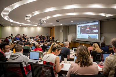
As always, my 2019 has involved a lot of travel. In addition to my conference speaking engagements and travel to W3C meetings, I attended all four of our Smashing conferences; I ran CSS Layout workshops in Toronto, New York and San Francisco. The conferences are a time when most of the team is together in person.
The home of Smashing is in Freiburg, Germany, and before SmashingConf Freiburg, we held a big team meeting, with almost everyone who is involved with Smashing able to take part. There have been many changes in the Smashing Team this year, and that meeting in Freiburg was a chance for us all to come together; I believe that it was one of the most valuable things we have done this year.
There are many challenges in doing all of the things we do as a small (mainly part-time and remote) team. However, if we keep talking and keep the Smashing community at the heart of everything we do, the past year demonstrates that we can achieve amazing things!
The Conferences
The SmashingConf team of Amanda Annandale, Charis Rooda and Mariona Jones are a force of nature. They seem to achieve the impossible and (as Charis told me) still have time to enjoy the surroundings of the places they visit.
The SmashingConf team in Toronto
I’m always blown away when I walk into the venue and see what has been achieved — even before the event starts. Artwork created by the very talented Ricardo Gimenes is everywhere — such as the movie posters from Toronto, and the artwork in the theater we use as a venue in New York.
Our movie posters in Toronto (Photo credit Marc Thiele)
The signage in the theater in New York (Photo credit Drew McLellan)
One of my favorite things to do at the conferences is to lead the Smashing Run which we normally manage to do on both conference days. This is becoming quite a fixture, with several attendees and speakers running and chatting for half an hour before breakfast. I’m already looking forward to our inaugural run in Austin in 2020, although it may be a bit of a warm one!
I sometimes help the conference team out when words need writing or editing, and sometimes when the legality of balloons is called into question. As Amanda Annandale (Senior Event Manager) remembers:
“September marked my third year at Smashing, and while it provided a whole new set of challenges, it also provided a huge sense of accomplishments. The conference team sat down at the end of 2018 and was able to make some big plans for the future.
“It’s been amazing to see these plans (from organization to side-events to new locations), and our team, come together. But, new tasks can bring about some hilarious roadblocks. Smashing is on a long and necessary quest to reduce our carbon footprint. BUT, Vitaly is rather partial to balloons.
“For those who may not know (because Rachel Andrew and I were shocked to learn), foil balloons are heavily regulated in the state of California. This (we discovered while spending a disproportionate time researching eco-balloons over plastic balloons) is obviously bad for the environment. We’ve never been so happy to find a company making fully eco-friendly balloons, that are fully biodegradable in a very short amount of time! This experience definitely strengthened our resolve.
“We are now working with a company out of Austin to improve our printing processes to be more eco-friendly, and working with each of our caterers to reduce our waste. We still have a way to go, but we’re aiming for a Smashing impact in 2020!”
The (eco-friendly) balloons are deployed in San Francisco (Photo credit Marc Thiele)
Conferences are expensive to produce and we are fortunate to have some wonderful partners who help us to create these events. They are looked after by our partnerships manager, Mariona Jones, who has been joined this year by Esther Fernández. Between them, they are working to bring together all of the Smashing properties in order to create new partnership opportunities. Mariona told me,
“The most exciting moment this year has been to be able to create together with the whole team the Smashing Media platform bringing together events, magazine, publishing house, membership and Smashing TV. The highlight of the year is undoubtedly the birth of the partnerships and data office and the addition to the Smashing Family of my dear colleague Esther.”
Esther adds,
“Joining the Smashing team has been one of the highlights of the year. It’s been a pleasure to enter this community and to make the Smashing conferences happen.”
I’m looking forward to working together with Mariona and Esther this year as we open up new opportunities for partnerships that cross the boundaries of the different parts of the platform!
Smashing Magazine
The heart of what I do at Smashing is the online magazine; as Editor in Chief, my role here is to try to bring you web design and development content that will inform you, help with your day-to-day work, and also make you think. We publish almost every weekday, so always have a large list of articles moving through the writing, editing and publishing process.
Covering such a broad spectrum of web design and development is certainly a challenge and one I couldn’t do alone. My subject editors Alma Hoffmann, Chui Chui Tan, Drew McLellan and Michel Bozgounov bring their expertise to the topics they help curate. Copy editors Andrew Lobo and Owen Gregory help preserve the tone of voice of our authors while ensuring the content is easy to understand for an international audience. Cosima Mielke ensures that the newsletter is well researched along with many other roles (including eBook production), and Yana Kirilenko does a great job of getting articles from Google Docs, Dropbox Paper and various Markdown apps into the CMS. Senior editor Iris Lješnjanin does an amazing job of keeping everything on track, fielding the email, hitting publish on most of the pieces, and making sure that we are all using smashingly correct punctuation! I am very grateful for all of their work.
Vitaly and I are well-known faces in the web community, however, there is a whole cast of folk working behind the scenes to keep the magazine running successfully. I don’t say thank you enough, but I sincerely appreciate all the work that goes into the magazine across the team.
Smashing Magazine turned 13 this year to which I shared personal stories from the team — you can read more about the people behind the Smashing scenes over here.
This year, I’ve tried to bring the various facets of the business into the magazine. For example, each conference results in a set of high-quality videos of the presentations which was hidden away on Vimeo. This year, I’ve published a write-up of each event, listing all of the videos. I hope that this means more people can benefit from the wisdom of our speakers and also shows the brilliant work the conference team does in curating and putting on these events.
Something that I really enjoy is to publish articles by folks who have never written for a large publication before and to help their articles go through the process. Earlier this year, I wrote an article on Pitching Your Writing To Publications. If your 2020 goals include writing for Smashing Magazine, drop us a line with an outline of your idea. We would love to work with you!
Smashing Books And Our First Print Magazine
In 2019, we published two printed books, plus our very first print magazine. Art Direction For The Web was published in the spring, and at the end of the year, we began shipping Inclusive Components.
In the middle of the launch of Inclusive Components, we welcomed a new team member, Ari Stiles. She told me,
“It was challenging and fun to start working on the Smashing Library right after Heydon’s book was released, when promotion was already in full swing. A bit like stepping in front of a firehose — but in a good way! It helps that Inclusive Components is a well-written, timely book. I love helping people discover new and helpful resources like this one, and I’m excited about all of our new books for 2020.”
Selecting a topic for our first print magazine was tricky. We wanted these magazines to be a snapshot of the industry at a certain time, but also to have a longer shelf life than tutorials on topics that will be out of date in a few months. Ultimately, for issue one, we chose a subject that was at the forefront of many minds in 2019 — that of ethics and privacy. The collection of essays I commissioned is designed to make you think, and we still have a few print copies and the digital version, if you would like to read them.
🎉 We’re currently in the planning stage for issue 2 — watch this space!
All of our books come with an eBook version, and one of Cosima Mielke’s many roles is to produce this version from the final manuscript. Memories of working on these projects were her response when I asked her about her 2019:
“As an eBook Producer, the moment when you’re being handed over the proofread manuscript to get started with eBook production is always a special moment. So many people — reviewers, proofreaders, and most importantly, the authors themselves, have already invested so much time and efforts into the manuscript, and now it’s your turn to put it into its final shape: the eBook that people are going to download and read.
“My personal highlight (and biggest challenge) this year was to turn the monumental opus that Andy provided with “Art Direction for the Web” into an eBook. The assets included almost 600 images — most of the designs created by Andy from scratch — and turning these into an eBook that does justice to the author’s meticulous work, provides a pleasant reading experience (given the rather limited possibilities that eBook reading devices usually offer), and has a reasonable file size at the same time, was quite a balancing act. Looking back, it was the most challenging eBook I have worked on to date — and, naturally, these kinds of projects make you feel proudest once you’ve accomplished them. I’m already curious to find out what 2020 will bring.”
The Smashing Podcast
For the first time this year, Smashing Magazine has a podcast. Hosted by Drew McLellan, this bi-weekly show interviews someone from the world of web design and development. We hope to bring you some well-known names, but also speak to folks doing interesting things across the industry.
In addition to having a very broad base of subject matter, Smashing has a global audience; we’d like to reflect that and bring you interviews from people all over the world. I asked Drew for his thoughts on these first few episodes:
“I was really pleased to be able to launch the Smashing Podcast this year. We spent quite a bit of time in development with it, trying to work out what the best format and tone to take would be. We tried to make it sound like Smashing and embody the same values; a good place to learn and stay informed, but with a sense of fun.
Our early guests have included experts such as Jina Ann, Liz Elcoate, and Jason Pamental. And we’ve spoken to authors of Smashing books Andy Clarke and Heydon Pickering.
The reception so far has been great, and you can always let us know what you think via the contact page. I’m looking forward to releasing episodes with the guests we have lined up for 2020!”
We love our Smashing Members! This year you have continued to sign up and support the publication of independent content. We’ve been running webinars (with the help of Scott Whitehead and Bethany Andrew where members get to chat with one another in our Membership Slack, while enjoying free copies of our eBooks, plus a copy of the print magazine! We’re really keen to build on and evolve membership over the next years, and we sincerely thank our members for their support.
We have been running a membership table at our event, where members and prospective members can chat with the team. Our partnership manager, Mariona Jones remembers,
“While running the membership table at SmashingConf, I met a group of attendees who shared their passion for many things, among them open-source, stickers, code, and caffeine while browsing together through the first-ever Smashing print magazine on ethics and privacy and conversing about the relevance of this important topic.”
That’s enough from me! Still, we can’t wrap up 2019 without some thoughts from Vitaly, without who Smashing would not exist at all.
Vitaly opens a SmashingConf (Photo credit Marc Thiele)
“It’s common to think that it’s all about the achievements or goals that make a year special, but for me, this year was full of meeting wonderful people. So, so many people. I’ve had a chance to speak with hundreds of people all around the globe, learning from their experiences and sharing mine. I was lucky to travel to over 40 places this year, from Albania, Serbia and Bosnia-Herzegovina to Kyiv, Sweden and Budapest. I vividly remember some of the stories and experiences I shared over a fire in the evening, in cars on the way somewhere, and in buses talking to strangers I’ll never see again. These were extremely rewarding, valuable and precious moments for me. They are the ones that I’ll be looking back to years from now. In essence, it’s all about people in the end.
“It was wonderful to connect with some of our readers at New Adventures in Nottingham, InfoShare in Gdansk, Poland, BTConf in Dusseldorf, FrontEndUnited in Utrecht, Netherlands, YGLF in Vilnius, Lithuania, perf.now in Amsterdam, Netherlands, and so many others! That said, travel is not without drama. When I was on a short vacation in Albania, I ended up getting lost in the woods in the middle of nowhere at midnight. That was quite scary, but thanks to 6% on my phone and a hardly visible, remote McDonalds sign, I was able to get out in a few hours, returning to the hotel around 5 AM.
“I think that this year at Smashing we’ve learned what it really means to be a team. We had tough and difficult situations, but we pulled together in a respectful, kind and very supportive way, and we kept strong and we made it. It was a year full of challenges and adventures, but in the end, we’ve grown even closer together, and I’m very proud of our team for getting there. I’m also very proud of the fact that we have been exploring topics that are often not seen as particularly interesting nor trendy — accessibility, ethical design, privacy. At our conferences, for example, we’ve looked into common problems and issues that developers and designers struggle with, and tried to find solutions and common techniques to tackle them. It’s something that I strongly believe is important for the health of our industry, and I’m happy to see more discussions around these topics this year.
“My sincere hope is that we’ll establish an even stronger team filling in the gaps we currently have, and we’ll manage to create a very strong alignment within the company. I hope we’ll be able to reach out to more people — especially the new generation of designers and developers — and connect with them. I can’t wait for the books that we’ll be releasing next year as well! I have a number of ideas in mind of things I think we could do, but before jumping there, I want to make sure we are stable, healthy and strong. No rush — I’ve been patient my entire life.”
Onwards To 2020!
The whole team is looking forward to seeing what 2020 brings, and to sharing that with the Smashing Community — wherever you are in the world. Thank you for being part of our journey!
The Smashing team on stage in New York (Photo credit: Drew McLellan)
Helping Browsers Optimize With The CSS Contain Property
Helping Browsers Optimize With The CSS Contain Property
Rachel Andrew
In this article, I’m going to introduce a CSS Specification that has just become a W3C Recommendation. The CSS Containment Specification defines a single property, contain, and it can help you to explain to the browser which parts of your layout are independent and will not need recalculating if some other part of the layout changes.
While this property exists for performance optimization reasons, it can also affect the layout of your page. Therefore, in this article, I’ll explain the different types of containment you can benefit from, but also the things you need to watch out for if applying contain to elements in your site.
The Problem Of Layout Recalculation
If you are building straightforward web pages that do not dynamically add or change elements after they have loaded using JavaScript, you don’t need to worry about the problem that CSS Containment solves. The browser only needs to calculate your layout once, as the page is loaded.
Where Containment becomes useful is when you want to add elements to your page without the user needing to reload it. In my example, I created a big list of events. If you click the button, the first event is modified, a floated element is added, and the text is changed:
When the content of our box is changed, the browser has to consider that any of the elements may have changed. Browsers are in general pretty good at dealing with this, as it’s a common thing to happen. That said, as the developer, you will know if each of the components is independent, and that a change to one doesn’t affect the others, so it would be nice if you could let the browser know this via your CSS. This is what containment and the CSS contain property gives you.
How Does Containment Help?
An HTML document is a tree structure which you can see when inspecting any element with DevTools. In my example above, I identify one item that I want to change by using JavaScript, and then make some changes to the internals. (This means that I’m only changing things inside the subtree for that list item.)
Inspecting a list item in DevTools
Applying the contain property to an element tells the browser that changes are scoped to the subtree of that element, so that the browser can do any possible optimizations — safe in the knowledge that nothing else outside of that element will change. Exactly what a particular browser might do is down to the engine. The CSS property simply gives you — as the developer and expert on this layout — the chance to let it know.
In many cases, you will be safe to go right ahead and start using the contain property, however, the different values come with some potential side effects which are worth understanding before adding the property to elements in your site.
Using Containment
The contain property can set three different types of containment:
layout
paint
size
Note: There is a style value in the Level 2 Specification. It was removed from Level 1, so does not appear in the Recommendation, and is not implemented in Firefox.
Layout
Layout containment brings the biggest benefits. To turn on layout containment, use the following snippet:
.item {
  contain: layout;
}
With layout containment enabled, the browser knows that nothing outside the element can affect the internal layout, and nothing from inside the element can change anything about the layout of things outside it. This means that it can make any possible optimizations for this scenario.
A few additional things happen when layout containment is enabled. These are all things which ensure that this box and contents are independent of the rest of the tree.
The box establishes an independent formatting context. This ensures that the content of the box stays in the box — in particular floats will be contained and margins will not collapse through the box. This is the same behavior that we switch on when we use display: flow-root as in explained in my article “Understanding CSS Layout And The Block Formatting Context”. If a float could poke out of your box, causing following text to flow around the float, that would be a situation where the element was changing the layout of things outside it, making it a poor candidate for containment.
The containing box acts as the containing block for any absolutely or fixed position descendants. This means it will act as if you had used position: relative on the box you have applied contain: layout.
The box also creates a stacking context. Therefore z-index will work on this element, it’s children will be stacked based on this new context.
If we look at the example, this time with contain: layout, you can see that when the floated element is introduced it no longer pokes out the bottom of the box. This is our new Block Formatting Context in action, containing the float.
With paint containment enabled, the same side effects as seen with layout containment occur: The containing box becoming an independent formatting context, a containing block for positioned elements, and establishing a stacking context.
What paint containment does is indicate to the browser that elements inside the containing block will not be visible outside of the bounds of that box. The content will essentially be clipped to the box.
We can see this happen with a simple example. Even if we give our card a height, the floated item still pokes out the bottom of the box, due to the fact that the float is taken out of flow.
The float is not contained by the list item
With paint containment turned on the floated item is now clipped to the size of the box. Nothing can be painted outside of the bounds of the element with contain: paint applied.
Size containment is the value that is most likely to cause you a problem if you aren’t fully aware of how it works. To apply size containment, use:
.item {
  contain: size;
}
If you use size containment then you are telling the browser that you know the size of the box and it is not going to change. This does mean that if you have a box which is auto-sized in the block dimension, it will be treated as if the content has no size, therefore the box will collapse down as if it had no contents.
In the example below, I have not given the li a height; they also have contain: size applied. You can see that all of the items have collapsed as if they had no content at all, making for a very peculiar looking listing!
If you give the boxes a height then the height will be respected when contain: size is used. Alone, size containment will not create a new formatting context and therefore does not contain floats and margins as layout and paint containment will do. It’s less likely that you would use it alone; instead, it is most likely you would apply it along with other values of contain to be able to get the most possible containment.
Shorthand Values
In most cases, you can use one of two shorthand values to get the best out of containment. To turn on layout and paint containment, use contain: content;, and to turn on all possible containment (keeping in mind that items which do not have a size will then collapse), use contain: strict.
“contain: content is reasonably "safe" to apply widely; its effects are fairly minor in practice, and most content won’t run afoul of its restrictions. However, because it doesn’t apply size containment, the element can still respond to the size of its contents, which can cause layout-invalidation to percolate further up the tree than desired. Use contain: strict when possible, to gain as much containment as you can.”
Therefore, if you do not know the size of the items in advance, and understand the fact that floats and margins will be contained, use contain: content. If you do know the size of items in addition to being happy about the other side effects of containment, use contain: strict. The rest is down to the browser, you have done your bit by explaining how your layout works.
Can I Use Containment Now?
The CSS Containment specification is now a W3C Recommendation which is what we sometimes refer to as a web standard. In order for the spec to get to this stage, there needed to be two implementations of the feature which we can see in both Firefox and Chrome:
Browser support for containment (Source: Can I Use)
As this property is transparent to the user, it is completely safe to add to any site even if you have lots of visitors in browsers that do not support it. If the browser doesn’t support containment then the visitor gets the experience they usually get, those in supporting browsers get the enhanced performance.
I would suggest that this is a great thing to add to any components you create in a component or pattern library, if you are working in this way it is likely each component is designed to be an independent thing that does not affect other elements on the page, making contain: content a useful addition.
Therefore, if you have a page which is adding content to the DOM after load, I would recommend giving it a try — if you get any interesting results let me know in the comments!
Related Resources
The following resources will give you some more detail about the implementation of containment and potential performance benefits:
Web Design And Development Advent Roundup For 2019
Web Design And Development Advent Roundup For 2019
Rachel Andrew
In the run-up to Christmas, there is a tradition across the web design and development community to produce advent calendars, typically with a new article or resource for each day of December. Last year, I did a roundup of these calendars, and now that the 2019 season is in full swing, here is this year’s line-up.
I’m sure you’ll notice that the majority of the calendars published here are true community efforts, often with the bulk of the work falling to an individual or tiny team, with no budget to pay authors and editors. So, please join us in supporting these efforts; share the articles that you enjoyed reading and join the discussions respectfully.
Whether you celebrate Christmas or not, you can certainly learn a lot of new things. (Large preview)
What follows is an amazing variety of calendars, taking different approaches to the idea of publishing something every day in advent. There are plenty of traditional articles, but also code challenges to get involved with. I’ve tried to locate RSS Feeds and Twitter accounts to make it easy for you to keep track of your favorites. Enjoy!
It’s A Shape Christmas is a digital calendar that counts down to Christmas and reveals a bespoke illustration each day themed around four different shapes (Square, Triangle, Circle and Hexagon) and Christmas. The project was started in 2011 by a UK design agency called Made by Shape. This year, it is showcasing some of the best of the previous seasons.
For twenty-four days, 24 ways is publishing a daily dose of web design and development goodness to bring folks a little Christmas cheer. It’s celebrating 15 years of advent publishing and will be taking a well-earned break after this year’s “final countdown”.
24 Days In Umbraco is a calendar of articles relating to the Umbraco CMS. However, the themes of the articles so far this year will be of interest to more people than just those who use Umbraco. I enjoyed the article from December 2nd — Setting The Stage by Laura Weatherhead about public speaking.
PerfPlanet is back for another season with all things speed and web performance. The Web Performance Calendar has been publishing since 2009 and is maintained by Sergey Chernyshev.
Lean UXMas has been publishing each advent since 2014 and is a collection of the most popular articles from this year’s Agile & Lean UX News delivered daily this coming December.
Back with 24 thoughts from the PHP family is 24 Days in December. They began publishing in 2015, when Andreas Heigl realized that he missed Web Advent who had stopped publishing in 2012.
Perl Advent is back. Mark Fowler has been publishing since 2000 and is the longest running web advent calendar that I know of. You’ll find insightful articles written by diverse author submissions from all types of Perl programming levels, so sit back and enjoy 2019’s for 24 merry days of Perl!
24 Accessibility are back for a third year of accessibility posts in the run-up to Christmas. The site also has an excellent set of a11y related books, events, and Twitter accounts to follow in the sidebar.
In this calendar, Andrew Shitov is introducing a different programming language each day. I like the fact that for each language he is examining the same set of tasks, which makes for interesting comparisons. It’s an impressive amount of work to undertake.
In 2017 RIPSTECH published a PHP Security calendar and in 2018 a WordPress Security calendar. They are back for 2019 with a focus on Java security. Can you spot the vulnerability in each of the 24 challenges?
Elliott Richmond has come together with other folks in the WordPress community to publish useful WordPress snippets every day of advent to help developers improve their workflow.
A community effort with 50 slots, two per day, for people to claim and write an article about C# development. The articles are hosted on the authors' sites or on Medium, and so the calendar is a list of links to them all.
Marco Zehe is posting daily until Christmas, and says these posts could be about “everything and anything”. However, expect a strong accessibility focus given his areas of expertise!
“Stay safe online all Advent time” is the credo of the IT Security Advent Calendar. Counting down to Christmas, it features a new tip for protecting your devices, networks, and data each day.
HaXmas is a security advent calendar by Rapid7 that is full of stories, advice, inspiration, and a bit of fun. Keep an eye on a new tidbit every day throughout December!
Every year, for the first 24 days in December, the PHP Advent Calendar invites members of the PHPamily to share some gifts with you. And this year is no exception, of course.
Run by Richard Hooper and Gregor Suttie, the initial idea of this advent calendar was to give people who aren’t that well-known an opportunity to share their content with the community. What started with 25 slots expanded to 75. A small community-driven idea brought to you by the community!
This Japanese advent calendar has been running since 2013. Its focus lies on web accessibility, with a new author exploring a topic each day. The calendar is moderated by @hokaccha.
24 Jours De Web is a lovely French calendar which first appeared back in 2012. The creators support the Pierre Deniker Foundation and kindly ask readers to donate to help this charity support mental health research and education.
This Norwegian calendar is a series of programming challenges (each open for 24 hours only) with a prize draw at the end. Solving more puzzles gets you more entries. Good luck!
For the Dutch speakers among you, Fronteers are running an advent calendar on their blog. As last year, each writer chooses a charity, and the Fronteers organization will donate 75 euros on their behalf.
An advent calendar with web development tips in German comes from the SELFHTML community, who are committed to documenting web technologies for German-speaking developers in their SELFHTML wiki.
If you prefer a puzzle over an article, take a look at Advent of Code. Created by Eric Wastl, this is an advent calendar of small programming puzzles for a variety of skill sets and skill levels that can be solved in any programming language you like.
The folks at Hacking Lab bring you a new (white-hack) hacking challenge every day during advent. You earn points based on the difficulty of your solution, but be quick, you need to solve the challenge on the same day to receive full points.
25 Days Of Serverless has a new coding challenge waiting for you every day, for 25 days. Solve it in the programming language of your choice and submit your solution via GitHub. The best solutions will be showcased every week and possibly in a final series recap.
Advent of Cyber is TryHackMe's Christmas Security Challenge. And since security can be a daunting field, they break down common security topics into “byte-sized” challenges leading up to Christmas.
Last year Sarah Drasner announced that she would be highlighting a person and project every day of Advent using the hashtag #devAdvent. She is continuing the tradition this year. Follow along to get to know some new folks and the work they do.
Last year I did a dev advent calendar, and I'm going to keep it going this year. Every day from the 1st to the 25th, I’ll highlight a new person/project that I’m into and think people would benefit from knowing about. ❤️
The hashtag is #devAdvent if you want to follow along
Last year, Norwegian company Bekk produced four calendars. This year, they are back with twelve! In a blog post, they explain why they are producing such a huge number of articles this year. I learned that there are over 100 authors from within the company — many of who have not written articles before. Therefore, in the lead up they have been taking part in writing workshops. Perhaps we will find some future Smashing authors among them!
The homepage for the project is at bekk.christmas where you can check out the topics that interest you most.
There seem to be even more calendars publishing this year than last, despite the fact that some are taking a break this year. It’s been nice to find some calendars in languages other than English, too! If you know of a calendar related to web design and development that I haven’t mentioned here, please post it in comments section below.
Every time I have checked my email over the last two weeks, it has been full of Black Friday deals. We will get a short respite before the New Year offers start to roll in. I like a bargain as much as anyone, however, I think that plenty of sites will be covering the best offers on electronics and tech.
I thought we would do something different this year at Smashing. I’ve launched a number of independent products over the years — downloadable software, software as a service, self-published books, and a course. I know how difficult it can be to get the word out about your products when self-funding, so I thought we could give a boost to all the indie makers out there and feature some of their products.
We asked the Smashing community for their suggestions, and so here is a list covering pretty much every kind of product you can imagine. I hope you can find something you need in these, and help support these hard-working folks.
A book project started by the talented Cindy Li, who was a friend to many of us in the web community. After Cindy passed away, her friends got together to finish the book, and all proceeds will go to Cindy’s two young sons.
You don’t need an army of consultants to help you protect your organization from brand degradation and reputational threats. This practical guide by Kristina Podnar will guide you in minimizing risks and maximizing opportunities.
This book details techniques such as raycasting, compiled scalers, deferred rendition, VGA Mode-Y, linear feedback shift register, fixed point arithmetic, and many others tricks. Fabien Sanglar also went into much detail to describe the hardware of 1991, and has released the source code under GPL license.
Founded by two publishing freelancers, Heather McDaid and Laura Jones, this publisher has one goal: supporting careers of new and emerging writers — and making as much noise as possible about each.
Books available in two formats (Standards and Briefs) on topics ranging from technical to theory: responsive web design, Git, and JavaScript to content strategy, design principles, management, and more. For people who design, write, and code.
Our very own Smashing books aim to deliver in-depth knowledge and expertise shared by experts and practitioners from the industry. Our most recent one, Inclusive Components, explores bulletproof solutions for building accessible interfaces.
Gifts, Artwork, And Posters
If you are finding gifts for friends and family for the holidays, why not support these independent makers.
Topple the cat approves of this website of cat-themed products! Created by artist Beth Wilson, you’ll find a wide range of cute cat-themed greetings cards, gifts and accessories.
Jessica is a lettering artist who has been creating custom lettering artwork for established brands, classic books and postage stamps for over the past ten years. You’ll find a wonderful collection of prints, cards and pins on her site.
The graphic design and illustration studio Hey launched an online shop back in 2014. Since then, they’ve been sharing their personal creations with the public.
A nice and lovely graphic shop that focuses on handmade, limited, signed, numbered and self-published production. Artists who mainly use screen printing without forgetting other techniques such as risograph printing or letterpress. Graphic work of more than 100 international and local artists. All at affordable and real prices.
Inspired by Andalusian religious imaginary and classical jewellery, the work of Cristina Junquero revisits tradition to bring something new. Her studio is set in Barcelona.
Since 2014, Casa Atlântica works to give value to trades that are gradually being lost: their objects are born in villages of Galicia and Portugal from the hands of artisans who, with materials such as ceramics, wicker or wood, give life to their designs.
Established in 2009, this accessories and objects studio creates designs that are inspired from the observation of different cultures and traditions — seeking people and places authenticity through books and travels.
As I know from launching our own print magazine here at Smashing Magazine this year, creating a print magazine requires a huge amount of work. Here are some of your favorites.
Offscreen is an independent print magazine that examines how we shape technology and how technology shapes us. Offscreen Magazine is a favorite of many Smashing readers. Also check out the Dense Discovery email newsletter (I always find something new there).
Zines by Julia Evans that are aimed at working programmers who want to know how to use grep / tcpdump / strace in a fun way. (A lot of them are focused on systems/Linux concepts.)
3D is a creative playground for designers, yet still uncharted territory for most of us. 3D Fundamentals teaches you shape, form, lighting, color, and animation in a beginner-friendly course.
If you find yourself wrestling with CSS layout, Every Layout is for you. Through a series of simple, composable layouts, you will learn how to better harness the built-in algorithms that power browsers and CSS.
Working with Terminal can be daunting. This video course wants to cure you from any fear of the terminal. For designers, new developers, UX, UI, product owners, and anyone who’s been asked to “just open the terminal”.
If you’re tired of configuration, build tools, spagetti code and want to focus on building amazing web apps with the latest features, this complete video course will get you fit for building web apps with Next.js for React.
Learn CSS layout through a series of video tutorials. Straightforward and practical examples help you banish layout confusion for good.
Software And Tools
A whole selection of interesting products and tools. Many of these have free plans. If you love one of these products, however, do consider signing up for the paid version if you can. Bootstrapped products need sales, or they go away!
A privacy tool for Safari on iPhone, iPad, and Mac. Launched by Aral Balkan and Laura Kalbag, the aim is to protect users from behavioural ads and companies that track and profile folks on the web.
Built for designers and developers, the browser Polypane lets you create sites and apps that work for everyone. Features include multiple synced viewports for responsive design, visual impairment simulators, built-in accessibility testing tools, live refreshing, layout debugging and screenshotting.
The Common Ninja team creates plugins with the purpose to help web designers, developers, and site owners to upgrade and color their website with zero effort, time, and knowledge.
The browser extension wants to bring the benefits of accessbility and customization to everyone, with features such as dyslexia fonts, changing the font and background color, text to speech, overlays, dyslexia rulers and more to make the web accessible to your needs.
No matter where you are in the world, Lunch Money keeps track of every dollar, euro, and yen spent. At the end of the day, they add it all up in your currency of choice so that you stay on top of your spendings without doing the maths.
Timemator automatically captures everything you do on your Mac. You define the rules, and once you open your working file or application, Timemator will start the timer for you automatically.
By combining data from services you already use, Exist can help you understand what makes you more happy, productive, and active. Bring your activity from your phone or fitness tracker and add other services like your calendar for greater context on what you’re up to.
Proxyman is a native, high-performance macOS application, which enables developers to observe and manipulate HTTP/HTTPS requests. Intuitive and friendly.
Sometimes all you need is a reliable and fuss-free tool to jot down your thoughts and ideas. Standard Notes is just that, a free, open-source, and completely encrypted notes app.
Unsubscribing from the emails you don’t want to receive any longer can be time-consuming. Leave Me Alone shows you all of your subscription emails in one place so that you can unsubscribe from them with a single click.
You’re getting distracted easily when you read? Reader Mode instantly removes clutter, ads, and distractions from any article. Dyslexia support is built in, too.
Stop scrolling through pages of reports and collecting gobs of personal data about your visitors, both of which you probably don’t need. Fathom is a simple and private website analytics platform that lets you focus on what’s important: your business.
Buttondown is a small elegant tool for producing newsletters. The minimalist interface makes it easy to write great emails; the automation acts like the editorial assistant you wish you had; and the portable subscription widget helps grow your audience from anywhere.
No matter if it’s a personal profile, a landing page to capture emails, or something a bit more elaborate, Carrd lets you create simple and responsive one-page sites for pretty much anything.
Facebook, Twitter, Pinterest — all of them have different requirements when it comes to social share images. To save you time, Placid creates your social share images automatically. You define a template once, the tool does the rest.
Calibre helps you monitor and audit web performance and make meaningful improvements where it matters. You can simulate real-world conditions to understand what your audience is experiencing, see the impact of third-party code, receive monthly reports on crucial metrics without having to spend hours on distilling performance data, and much more.
Have you ever considered starting your own podcast? Transistor helps you with the rather boring part, storing your MP3 files, generating your RSS feed, hosting your podcast’s website, and distributing your show to Apple Podcasts, Spotify, and more.
Kirby is a file-based CMS for building your own ideal interface. Combine forms, galleries, articles, spreadsheets and more into an amazing editing experience.
The Really Little CMS. Used by thousands of happy customers around the world, Perch does not dictate your front-end code but lets you bring your own code to your project.
Statamic cuts out the database and creates a faster, more productive way for you to build, manage, and version control beautifully creative, bespoke websites.
Other Things
A bunch of things that didn’t really fit into any other category.
An online magazine for design students and free design awards, Rookie was born out of the frustration in finding good, free resources for design students. Now, you can find everything you need in one single place.
Stay up-to-date and read about the latest industry trends, while you learn more about founders, companies, organizations and investors at the intersection of tech and women’s health.
“We are living in a world today where lemonade is made from artificial flavours & furniture polish is made with real lemons.” The handmade, bootstrapped soda company from Glasgow wants to change that.
With Jack is all about insurance for freelance creatives, giving designers, developers, illustrators, and other web professionals the insurance they need. No endless features or stale service but one solid policy and the personal touch.
Find Support If You Are An Indie Maker
There are some excellent communities that seek to support bootstrapped businesses, sole founders and small teams. Check these out to find interesting products — or to get help in shipping your own.
IndieHackers: Work together to build profitable online businesses.
Makerlog: A collaborative task log that helps over 3000+ creators get things done.
Did we miss one of your favorite independent products? If so, please add a link in the comments, and don’t forget to let us know what it is and why you love it, too!
Become An HTML Email Geek With These Videos From Rémi Parmentier
Become An HTML Email Geek With These Videos From Rémi Parmentier
Rachel Andrew
Creating an HTML email can feel like stepping back a few years as a web developer. All of our new layout functionality is unavailable to us &mdasj; email clients render the same layout in completely different ways. Just when we think we have it all fixed, another email client shows up with a new set of bugs.
Not too long ago, Rémi Parmentier, an HTML Email developer, ran a session with practical front-end techniques for building modern, cross-client emails. A few weeks later, he gave a wonderful talk at SmashingConf Freiburg highlighting some of the common struggles and shared useful strategies for avoiding problems in email development.
There was so much useful information contained in these sessions that we wanted to release them more widely — including the webinar transcript and references to slides and resources. If you have ever struggled with email development, these will give you a great starting point to understand why an email isn’t rendered properly, and how to squash those nasty bugs quickly.
If you enjoy learning from these videos, check out Smashing Membership. Starting from this month, we will be showing some of the live sessions we run every month to a wider audience — absolutely free of charge to view. However, if you’d like to join the discussion live and perhaps have your work reviewed by an expert, join Smashing Membership. For the price of one coffee a month, you can support the creation of more content like this.
Now get ready to learn everything you need to know about HTML email!
Rémi Parmentier: Thanks, everyone, for coming to my presentation. My name is Rémi Parmentier. Some of you might know me from Twitter or from my blog under the nickname hteumeuleu. I’ve been doing HTML emails for as long as I’ve been working in this industry. For the past few years, I’ve started to give training in HTML emails as well I am spending a lot of time online on Slack, on Twitter, on forums to help people find solutions for their email problems. This gave me a pretty good view of most of the coding problems that people have and how to actually solve them. I started working on this email coding guidelines project this year. This was greatly inspired by some of the work that’s been done on the web about I think a decade ago.
Rémi Parmentier: About a decade ago, there was a lot of trends of web guidelines being shared by people from many different companies. First one was the most famous one was this code guide by Mark Otto, who was then working at Twitter. The point of the document was to share a lot of guidelines about how HTML and CSS should be coded within the company. There was a lot of good practices shared in this document, like which doctype you should use or to close your tag and such. I think this is really interesting to have.
Rémi Parmentier: In the email world, Ted Goas from Stack Overflow actually made a very similar document with a lot of content as well about how they’re building the emails at Stack Overflow. This really gave me the lust to make a similar document that everyone could share within their company or everyone could pick good practices for building HTML emails. We’re going to see a few of these best practices and you’ll be able to see the document afterwards online. Let’s start ahead.
Rémi Parmentier: The first thing that I usually share is to use the HTML5 doctype. Whenever I help people online of open HTML email, it makes me sad to see that a lot of people are still using HTML4 doctype or XHTML 1. The first reason to use the HTML5 doctype is that it’s really nice. Actually, it’s very short. You can type it by hand, you can remember it, and that’s already a good reason to use it.
Rémi Parmentier: The most important reason to use the HTML5 doctype is that when an email is displayed in webmail, our doctype is usually removed and we inherit from the webmail’s doctype. Most webmails use the HTML5 doctype, so even for you wish you could use HTML1 or HTML4 doctype, this won’t work because webmails will remove it.
Rémi Parmentier: I made this little illustration of how this actually works. On the left, you can see an email address coded. It’s got a style tag and it’s got a div and an H1 inside. What happens when a webmail like Gmail, for example, wants to display this content, it will pick the style tags and pick the content within the body, and it will prefix the styles, it will remove all the styles that it won’t support, and then it will include this inside the HTML of the actual webmail, because webmails are actually just HTML and CSS. This means that even if I use an HTML4 doctype, because Gmail uses HTML5 doctype, my code will be random thanks to that doctype. This is a good thing to have in mind.
Rémi Parmentier: I made this about this, about which doctype you should use in HTML emails, about three years ago already, but what I saw back then was that most of the email clients already were using an HTML5 doctype. A few of them didn’t have a doctype at all, like on mobile apps sometimes, but a lot of them were on HTML5.
Rémi Parmentier: It’s important to know that you can end up on different doctypes because there can be differences. The first one is that HTML5 actually have spaces between images. If you slice some big image inside your email, you will see something like this if you try it with an HTML5 doctype.
Rémi Parmentier: Let me actually show you this with a little demo. Here, I have this … Oops, it’s the wrong one. Here I have this little demo of a T-Rex. It’s actually three images. Here with an HTML1 doctype, everything is working fine, but if I use an HTML5 doctype instead, boom, you have white lines appearing between each images.
Rémi Parmentier: Now, I’m not exactly sure why this happens, but I think it’s because when HTML5 upgraded, they cannot change some of the way that images are supposed to behave according to the specification, so now it looks more like a paragraph with text, so there are lines in between images.
Rémi Parmentier: Email Geeks have found very good solutions to the service. One of the solutions is to actually add a display block style to every images. Once you do this, it will remove the white lines between the images. Another solution to avoid this if you can’t use display block is to add a vertical align middle style and then you will remove these white lines as well.
Rémi Parmentier: This is a first quirk that you can encounter with HTML5 doctype, but there is another interesting case is that you can’t display block a table cell in WebKit without a doctype. This one is really interesting as well. I’ve got a table for this as well, which would be right here.
Rémi Parmentier: Here I’ve got a table with three little dinosaurs next to each others. Usually when we’ve got tables like this and we want to make our emails optimized for mobiles, what we can do is apply the display block to our TDs and then they will stack on each others like this.
Rémi Parmentier: As we can see here, we have an HTML5 doctype. This is working fine, but if I would ever end up in an image client that will remove the doctype, then this won’t work anymore in WebKit. As you can see now, it’s back to the regular pattern display.
Rémi Parmentier: I think this has to do with legacy websites and quirk modes and all of these things, but one solution that was found by the email community is to actually use TH tags instead of TD. If I remove every TD here by TH, you can see that, here, even without a doctype, it’s working again. This is some kind of the quirks that you have to deal with in HTML emails because of not only email clients behave but also rendering engines like WebKit here.
Rémi Parmentier: The second best practice I’d want to share with you today is to use the lang attributes. The lang attribute in HTML is to define the language of your document. This is very important for accessibility, and mostly this is because accessibility tools like screen readers will be able to pick the right voice for it.
Rémi Parmentier: Once again, let me show you a demo of this live, and hopefully it won’t crash. Here I have this very nice email from Mailchimp. As it was said before, I am French, so my computer is set in French. My screen reader is in French as well, so every time we’ll see some new content, it will try to read it in French. I will stop my screen reader now. You try to see when we’ll get to this paragraph and see how it will read it.
Rémi Parmentier: I know that I don’t really have a good English accent, but this is even worse than mine. If you don’t set the lang attributes, your content will be read on whatever default language is for your users. The quick phase here is to add the lang attributes, and then I can restart my screen reader.
Screenreader:: Mailchimp Presents has a new collection of original content made with entrepreneurs in mind. In recent months, we’ve rolled out documentaries, short-form series and podcasts that live only on Mailchimp. Today, we officially launch a platform.
Rémi Parmentier: As you can hear, even for my screen reader, and my system is still set in French, once the screen reader is actually on HTML contents, it will use another voice, an English voice there, to read the content which makes the experience much, much better here.
Rémi Parmentier: One small difference that we have in HTML emails with the lang attribute is that, just like for the doctype, the doctype might not be picked up by webmails, because webmails will only take just styles and the content of the body. It’s usually a good practice to add the lang attribute as well on the wrapper that you have on your content inside your body, so you’ll make sure that this will get picked by webmails as well.
Rémi Parmentier: Now a third best practice that I like is to actually use styles over HTML attributes. This is really something that people hate about HTML emails because they feel that they have to use all the HTML attributes, they have to use all code, and this makes emails look very different from the web, but there is really no reason for this at all unless you need to support very old email clients like Lotus Notes 6 or similar.
Rémi Parmentier: In this example here, in the first example, you can see I’ve used valign, align and bgcolor attributes in HTML, but all of those can be very easily and robustly replaced by the corresponding styles. Here I only have one style attribute and inside I have the vertical align CSS property, text align and background color.
Rémi Parmentier: One reason I like to do this is because it makes go cleaner and more readable. All your presentational properties are grouped in a single style attribute instead of being all over the place with valign, align and all the stuff. This makes it, in my opinion, very, very better to read and to maintain.
Rémi Parmentier: There’s another reason I like to use styles over attributes is that it helps taking over email clients’ own styles. For example, on the French webmail of Orange, the webmail’s UI actually has a CSS that has a rule that sets every TD to vertical align top. Because of this rule, if you were to use only HTML attributes like valign=middle, the CSS role from the webmail would override with the HTML attributes because this is how the cascade works in HTML and CSS.
Rémi Parmentier: Instead, if we use an inline style with a vertical align property on the TD here, well, this style will take over the webmail style because inline styles are more important than external style sheets. Using styles over attributes is also a good way to fight other email clients’ and webmails’ default styles.
Rémi Parmentier: There are a few exceptions to the attributes that I still use. The first exceptions is to center a table in Outlook 2007 to 2019 on Windows, because as Scott said in the introduction, Outlook uses Word as a rendering engine in those versions and it’s not really good at understanding CSS, at least for some properties.
Rémi Parmentier: For example, here, it would understand the margin properties for pixel values, but it wouldn’t understand the margin zero auto value to center a table. We still need the align=center attribute to center elements and data, especially in Outlook, but we no longer need to use which attributes as in the first example here. This can be replaced by the width style instead.
Rémi Parmentier: Now other exception in Outlook as well is when you want to define a fluid image width. In the first example, I use a width attribute with 100% value. The thing is that Outlook actually doesn’t deal with percentage width for images the same way as it should be in CSS.
Rémi Parmentier: The percentage in Outlook is actually matching the physical image size and not the parent size in the HTML. If you’ve got an image that’s 600-pixel wide and you use a width=50%, then your image will actually be 300 pixels no matter what the size of your parent in HTML is.
Rémi Parmentier: Usually, to avoid any quirks with this is then I always define a fixed width in pixels for Outlook using the width attribute in HTML, and then using a style, I use a width with 100%. Outlook will only pick the attribute value here and not the style value.
Rémi Parmentier: Then, another exception I have when I use styles over attributes is to reset the default styles of the table. By default, the HTML tables have borders and padding inside and cells, et cetera. The proper way to do this in CSS is to set border zero, border spacing zero, our padding is zero, our border is zero, the first ones on the table, and expanding your border actually for each cell of your table.
Rémi Parmentier: This is pretty much why I don’t really like to do it the CSS way because you need to repeat the padding and border for every TD of your table, while if you use the attributes, you only need to use them on the table, and then you’re all set for any … no matter on any cells you have inside your table. This is probably something I will change my mind in a few years maybe, I hope, but for now, I’m still used and I prefer using the attribute way for resetting default styles on tables.
Rémi Parmentier: Now another best practice I’d like to share is, do not split the visuals. This was actually a very common practice maybe a decade ago. When we had large images, it was always better, at least it was always shared that you should split it to make download faster and things like that, but this is not true today.
Rémi Parmentier: Not splitting visual actually has a lot of benefits. The first one is that it’s easier to maintain. If you have a big visual in your email and it’s Friday night and your project manager comes at you and asks you to change it at the last minute, well, you don’t have to open Photoshop and slice your images again and where you’ve got everything. You can just replace that image and you’re done.
Rémi Parmentier: It’s also better for accessibility because you have a single image, you have a single element, so a single alt attribute. This is simpler and better for accessibility. One thing it’s also better for is for web performance, because downloading 100 kilobytes image is theoretically faster than downloading five image of 20 kilobytes.
Rémi Parmentier: That’s because for each image of 20 kilobytes, the request to the server needs to be made and we need to wait the answer five times. Even for the really small micro-transactions between the client and the server, this add up the more image you have, and it can slow down the download of your email image, so this is something to avoid.
Rémi Parmentier: Next, on the WebKit, there’s also a very weird behavior. Whenever you use a CSS transform on sliced images, WebKit will have very thin lines between split images. I would just show you a demo of this as well. Back to my first T-Rex image here, if I add a small transform here that will scale the image, here you can see that at this ratio, there are very small lines that appear within each slices of my image.
Rémi Parmentier: This is really due to WebKit not handling well the way they should scaled images like this. Maybe there’s a node size somewhere and it doesn’t compute properly, so you end up with small hair lines like this. Yes, the best practice here is to avoid to split your visuals.
Rémi Parmentier: This is actually something that will happen inside email clients because in Outlook.com, for example, if your email is bigger than the actual view of emails inside the clients, then your email will be resized using a CSS transform to feed the view port of the email client. This is something that you should be wary of.
Rémi Parmentier: Finally about splitting visual, I always try not to do it because this kind of things happens. This is something that was shared on Reddit almost 10 years ago. This is an email by LinkedIn and the face of this young lady, it was cut in half, maybe because some text was longer than expected or maybe because here the user chose to set up his email client with a bigger font than expected, so all kind of things can happen inside email clients, just like on the web. If you want to avoid these kind of strange situations, just don’t split visuals.
Rémi Parmentier: Next, this is a big one. This is tables for layouts. This surely is the most common thing that people think about when they think about HTML emails. It always annoys because we mostly don’t really need tables for layouts, except for one email client, and that is the Outlooks on Windows from 2007 to the latest 2019 version.
Rémi Parmentier: The reason of that, as we said before, is because all of those versions of Outlooks use Word as a rendering engine. Word is not really good in interpreting HTML and CSS. There is this documentation online about what it should be capable of, but it’s pretty hard to read and to make sense of, so I try to make this diagram to actually make sense of it.
Rémi Parmentier: From this documentation, what it says is that CSS supports in Outlook will actually vary from which elements you use CSS on. It will be different in body and span than in div and p and then all the other supported HTML tags.
Rémi Parmentier: First, if you have a body and span, you can only use what Microsoft calls Core CSS properties. That’s the color property, the font, text align and background color property. On the body element and the span element, you can only use those four CSS properties.
Rémi Parmentier: Then, on divs and paragraphs, you can use all those four properties from the Core level, but you can also use two new properties from what Microsoft calls the Coreextended level. In this level, you have two new properties, the text indent and margin properties.
Rémi Parmentier: Then, for all the other tags, you can use properties of the two previous levels, and you have what Microsoft calls the Full CSS support with many more CSS properties, but I think the most interesting are the width, height, padding, border and this kind of properties for defining elements.
Rémi Parmentier: This means here that if you want to use width and height properties and make it work in Outlook, you won’t be able to do this on a div because div only support Coreextended and Core CSS properties. You will need to use tables for those CSS properties, and the same thing for padding and border.
Rémi Parmentier: I usually narrow it down to the few following guidelines to use tables. I try to only use a table when I want to set a fixed width on an element. If I need an element to be a certain width, then I will use a table and define the width from that table.
Rémi Parmentier: Also, if I want to set two block elements side by side, because even Outlook doesn’t really support any advanced CSS layout property, so even float is not really well-supported, so if you need to have two elements side by side, then as you make a table with two cells, and those two elements will be next to each others then. Then I use tables whenever I need to set a padding, a background color or border style. This make it very reliant, very robust to use a table for those styles only.
Rémi Parmentier: Now a problem with tables is something we’ve learned in the way a long time ago is that tables are not made for presentation. They are made for actual data tables. This can be very problematic for screen readers especially. In order to improve accessibility here, we will use the role=presentation attribute whenever we will make a layout table.
Rémi Parmentier: Let me show you a quick example of how this will change the way your email is interpreted by a screen reader. I will take a new demo here. I’ve got this email from Jacadi, which is a French children clothing brand. They have this table here with different sizes of products. This is actually a table inside the code. I’ve pre-recorded a video here to show you how this is read by a screen reader.
Screenreader: Counting pairs, web content. Blank, blank, blank. Table 1 column. Nine rows. Blank. Column 1 of 1. Row 2. Nine Level 2 tables, seven columns. One row, Column 1 of 1. Blank. Column 3 of 7. Blank. Column 4 of 7. Blank. Column 5 of 7. Blank. Column 7 of 7. End of table. Row 3 of 9, blank. Column 1 of 1. Row 4 of 9, Row 2 table, seven columns, one blank. Column 1 of 7. Blank. Blank. End of table. Row 5 of 9, blank. Row 6 of 9, blank. Column, blank, blank, column end of table. Row 7 of 9, blank. Row 8 of 9 Row 2 table, blank. Column 1, blank. Column end of table. Row 9 of 9 blank. Column end of table.
Rémi Parmentier: This is terrible. This is so annoying. Now let’s see how we can fix these cells. The way we can fix this is by adding the role=presentation attributes. This is not something that it reads from tables to tables, so we need to add this attribute whenever we’ll have a new table. We have a few nested tables here, so we’ll add a few. Here is how the results sound.
Screenreader: Blank. Blank. Voice-over off.
Rémi Parmentier: This is so much better. This is so much smoother and it makes for much nicer experience. I hope this convinced you that you should always use as less tables as you can, but if you do, use role=presentation attributes on those tables.
Rémi Parmentier: Now, one step that we can take even further is that since tables are mostly for Outlook, we can use conditional comments to make those tables only visible on Outlook. Conditional comments are actually something that was available in Internet Explorer as well until I think I9. With these, if MSOs are in text, we can tell the borders that all the following contents within that conditional comment will be available only for MSO clients, so that’s mostly Outlook.
Rémi Parmentier: Then, between those opening and closing tables comments, we can have a div with a role or stuff that will come just like for a regular web border, although webmails will pick the div and Outlook will pick the table. This is video how I got most of my emails.
Rémi Parmentier: Now another small good practice to have is to use margin or padding for spacing. This is mostly to avoid empty containers, empty cells like this where we have a role within a cell with a height of 20 and then we have TDs with width of 20 to create margin all along with this content. I still see this done a lot, and this make your code really, really heavy. It’s less readable and it’s really bad in my opinion.
Rémi Parmentier: The proper way to do something like this would be to use a table as well if you want and have the padding style on the first TD, and then inside use margin to space tags between each others. This works again really well in every popular image client and in Outlook as well.
Rémi Parmentier: Now the small quirk that can happen in the Outlook and Windows is that there is the background color. If you use the background color on any of these elements with margin, it actually bleeds through the margin. Here’s an example where I should have a margin between the red background and blue background, but in Outlook, the margin is actually the same color of the background of that element. In those cases, then the solution is to maybe use another table and nest your content like this to space elements, but if you don’t use background, then margin is really safe even in Outlook.
Rémi Parmentier: Finally, this is perhaps my favorite recommendation. It’s to make it work without style tags. It’s not necessarily about having this raw HTML rendering, but thinking about progressive enhancements and graceful degradation and about how your emails will look without this guideline. This is something pretty unusual in cooperation of the web because it doesn’t happen on the web, but not having a style tag actually happens a lot on email clients.
Rémi Parmentier: First, not all email clients support style tags. Perhaps one of the most common example I see is Gmail on its mobile applications on iOS and Android lets you configure a third-party email address. You can use your Yahoo or Outlook.com address inside the Gmail app. If you do so, then every emails that you check won’t have support for style tags. This is what Email Geeks have nicknamed GANGA for Gmail apps with non-Gmail accounts. This is a very common occurrence that you can have.
Rémi Parmentier: Then you have a lot of cases for smaller or local or international email clients like SFR in France or Yandex and Mail.ru in Russia, et cetera. Even to this day, there are a lot of email clients that don’t support style tag, so if you want to make your code more robust, make sure that it can work without style tag.
Rémi Parmentier: Sometimes it’s also temporary. For example, in the past year or so, Gmail has had two days where style tags were completely removed from every email on every one of their email clients. We don’t know why this happened. There has been zero communication on that, but there’s a good chance that maybe they detected some kind of attacks that use certain styles, and so they needed to remove it very fastly and secure their users, so they removed style tag support for a few hours or almost a day. If you were to send a campaign that day, you were out of luck if your emails required style tags to work.
Rémi Parmentier: Sometimes also it’s contextual. For example, in Gmail, when you forward an email to someone, then you won’t have any style tags anymore, or when an email is viewed in its unclean version, you know when you have a view entire messaging at the bottom of your email because it was too long, if you view your email in that window, you won’t be able to have a style tag.
Rémi Parmentier: Then finally, sometimes it’s buggy. For example, in Yahoo Android in the app, the head is removed, so every style tag inside it are removed as well, but only the first head. We don’t really usually think as HTML documents are in multiple heads, but you can actually totally do this.
Rémi Parmentier: This has been pretty much a common practice now for a few years to deal with this bug in Yahoo. If you have a second head with your style with it, then it will work fine in Yahoo Android and in most email clients as well. We have just this empty head first so that Yahoo will strip it, and this will work.
Rémi Parmentier: Now, what I mean by making an email works is that the email should adjust its layer to any width without horizontal scroll and the email should reflect the branding of the sender. This can be colors often, this can be fonts or whatever, but make sure that it works without styles.
Rémi Parmentier: In order to do this, we can use inline styles. This is why most emails still use inline style, and I really recommend to do this for most of your styles. Make sure that the brand, the colors and everything can come up with just inline style.
Rémi Parmentier: Then, to tackle mobile emails to make sure that your emails can work fine from desktop to mobile, we have different solutions. The first one is to make your email fluid. I’ve got a little demo here as well, which I will show you right now.
Rémi Parmentier: This is an email that I’ve worked on almost four years ago for a French magazine, GEO. It’s got a lot of interesting things here. The first one is this grid here. If I try to resize it to make it responsive, you can see that it’s 100% fluid and it will scale accordingly to whatever the width for the image client is.
Rémi Parmentier: This works absolutely well without even a single style tag. This is just two tables on top, one for each lines, and we’ve got image inside it and the image are set with a fluid width, and so this works well enough even without style tags. This is good to have elements like this that can scale accordingly.
Rémi Parmentier: Now, this might not be the most optimal for every email, so another technique is to make your content hybrid. “Hee-breed,” or “hi-breed,” I’m not sure how you pronounce it, sorry for that, hybrid comes from the fact that you can still use media queries, but only as progressive enhancements, and then you need to make sure that your layout can fall back gracefully even without styles.
Rémi Parmentier: I would go back to this exact same email that I just showed you. A little bit lower here, we’ve got this gallery of user portraits. We can scale it as well. We have three columns here and then it will get on to two columns, and then only to one column.
Rémi Parmentier: The way this works here is using div width display in my block. We’ve got actually three divs like this next to each others and they all have a width of 33%. They will set so three can sit next to each others. They all have a minimum width of 140 pixels, so if there is no longer enough room to fit all those three elements because they’re in display inline block, they will naturally match even CSS flow down next to each others. This is a pretty good way to make it work like this.
Rémi Parmentier: I also use CSS and media queries here to make it a little bit more graceful when you have content here. If I disable the styles here, if I remove all of this, you can see that the layout has changed a little bit. We still have two columns, but they’re more stuck together. The layout still works appropriately where we can go from three to two to one layouts even without any styles, just with both div display and line blocks.
Rémi Parmentier: Then, perhaps the final, most popular way to make your emails work on mobiles is to make them mobile-first, to code them mobile-first. I will once again go back to that exact same email. You can see here that … Oops, it’s not fitting. I’ve got these two email columns next to each others. If I resize my window a little bit smaller, they will stack on each others.
Rémi Parmentier: Now because this is coded mobile-first, it means that this is actually the default layout for this zoom. On them, I use a min-width media query to change the layouts on desktop, on larger window sizes to make this work. If I remove all the styles here, just like I did before, you can see that now, our images are stacked on each others just like on mobile. This is what you’ll get when you code mobile-first. You get mostly your mobile view, but larger on desktop. This is really a lot of considerations to have when you’re coding emails for mobiles and for every email clients.
Rémi Parmentier: That’s pretty much it for me. All those recommendations, all those guidelines, you can find them online on GitHub, where I have these documents available. I really strongly encourage you really to share it within your colleagues and also to contribute to it.
Rémi Parmentier: If you think you have good recommendations that could apply to every emails you will code, feel free to share with me, feel free to contribute to this document as well. Hopefully you will have some questions. You can find me on Twitter or on my blog or you can send me an email as well if you have any questions after this session. Thank you.
Scott: Thank you very much, Rémi. “Re-my.” That was really very good. I’ve had a lot of questions about … Oh, hey, Vitaly.
Vitaly: Hello. Hello, Rémi. I’m so sorry about being late. Hello, everybody, dear Smashing members. I had a train delay and all. Scott, you wanted to say something? Sorry I interrupted you.
Scott: No. There was just two questions I was going to get out of the way. One was from Pawan, who’s a very, very active member of the Smashing membership. He is asking us, any thoughts on applying fonts consistently through HTML email?
Rémi Parmentier: Sorry, can you repeat?
Scott: Do you have any thoughts about applying fonts consistently through HTML email?
Rémi Parmentier: Yes. Well, for fonts, I usually encourage my clients to use web fonts in emails because it’s always better when you can have your own brand fonts. Now the thing to have in mind is that it won’t work everywhere. When using web fonts, especially, it almost works nowhere. It works in Apple Mail and in Thunderbird and maybe a few local email clients, but that’s really it. It doesn’t work in Gmail, it doesn’t work in Yahoo. If you can adapt to that, if that’s good for you, then go ahead and do it.
Rémi Parmentier: Now, the problem that you can have with web fonts like this is that if you try to use really funky fonts like Lobster or Pacifico on Google fonts, if it falls back to something like Arial or Helvetica, your email will definitely look very, very different. If you can use Montserrat and it falls back to Helvetica, that’s less a problem in my opinion. It really depends on the fonts you want to use and how much you are ready to not have this font in the cases where it won’t work.
Scott: That’s a really good point. There’s Zach Leatherman, who’s a very active member with Smashing and a presenter at SmashingConf, he’s done a lot of presentations about the fallback on fonts, so that’s interesting to make that correlation between email and web-based fonts.
Scott: Before I hand it over to Vitaly, my other question is, a lot of people are talking about interactive emails. There was actually, not this past SmashingConf, I believe the SmashingConf before, there was a presentation about interactive emails where you can actually complete an action just with one click of a button in an email, and mostly it’s based on AMP email. I was just curious, what do you know, what is AMP email and what’s the support for it currently?
Rémi Parmentier: AMP for Email is still something relatively new. It was announced by Google about a year ago, but it was only made available in Gmail desktop webmail about a few months ago, I think, in maybe April or something. AMP for Email is basically bringing the AMP Javascript framework to HTML email so that now inside Gmail, you can use interactive components like carousels or accordions, and you’ve got also, more interestingly, in my opinion, have live data.
Rémi Parmentier: If you’re selling clothes, for example, you can make sure that the clothes you’re presenting in your email are available in stock and are the ones in the best interest for your customer that’s viewing this email. This brings a lot of new customizations and possibilities for emails like that.
Rémi Parmentier: The thing is that it’s very still in its infancy and it mostly only works on Gmail desktops so far. It should come in on Gmail mobiles in the coming months, but then, there is also Yahoo and Outlook.com I think who said they were interested in implementing it.
Rémi Parmentier: Maybe this is something that will actually grab attention and go in the future. Yes, this is something I’m looking into and I’m really interested in. It’s still very hard to say if it will work and be successful, but there are a lot of interesting things in it.
Scott: Definitely. That falls back on what I was asking at the beginning before you started the presentation is, is there going to be some sort of standard that comes across for email clients? That’s my dream is that that will happen. On that note, Vitaly, I’m going to hand over to you for some questions.
Vitaly: Excellent. Thank you so much, Scott. Actually, Rémi, that was a brilliant presentation. Thank you so much. I learned-
Rémi Parmentier: Oh, thank you.
Vitaly: … a lot. I was a little bit not shocked, but in a way, I felt like it’s just wrong that we’re preaching these best practices for email which are not necessarily best practices full stop in 2019. It’s really about time that web standards have evolved.
Vitaly: We do have an open question from Pawan. Just before we do that, I have a couple, but one thing I wanted to know from somebody who’s so deeply motivated by the beauty and horror of email, I do have to find out, do you sleep well at night?
Rémi Parmentier: Oh, yes.
Vitaly: Excellent.
Rémi Parmentier: It depends because I have two small children, so not every night, but it’s not because of email.
Vitaly: Okay. The thing is, if you look back, let’s say, over the last, I don’t know, how many years have you been now in this madness?
Rémi Parmentier: Almost 15 years, but I really started digging into emails maybe five years ago, or maybe a little bit more, but yeah, about five years.
Vitaly: I’m curious, then, do you see that there has been a lot of progress in terms of email client supporting new features, broadening CSS support, Gmail, support of media queries and all? Do you see that the differences have been remarkable over the last five years or is it a very slow progress? Just so we can set expectations of what we should be expecting coming up next on the platform.
Rémi Parmentier: I would say both. It’s been both slow, but there has been progress. If you look back five years ago, five years ago, Gmail didn’t support media queries, and neither did Yahoo, I think, and neither did Outlook.com. Media queries are a huge tool to make email works well on mobile. The simple fact that those emails were able to adapt and add this to their list of CSS properties and features supported is actually a very good thing.
Rémi Parmentier: Now, it’s always a bit frustrating because it definitely doesn’t move as fast as the web is moving nowadays where you can see new features added in Chrome or Firefox every week and new articles about it. Things are moving slowly for really unknown reasons. That’s perhaps the biggest problem of emails is that everything is really opaque.
Rémi Parmentier: We don’t know how things work within Gmail or within Outlook and we have a lot of advantages for the web, people from the Chrome team, from the Firefox team sharing all the new advances in their browsers, but this is not the case in email clients, and this is really perhaps the most frustrating thing is that if you see a bug, if you have a problem, you pretty much have no one to talk to.
Vitaly: It’s a little bit loud here. I’m just in a park, I promise. Pawan is wondering, do you have any thoughts on embedding HTML forms in emails? Is it a good idea or not?
Rémi Parmentier: It can work. This is actually something that’s done a lot by us in the presentation you mentioned. Mark Robbins was the godfather of interactive emails. A lot of people actually use form in emails. Just like everything, you just need to realize that this won’t work everywhere. You need to think about, what happens if my form doesn’t work? Do I show something different? Do I have a link that sets to a form on my website? This is perhaps the hardest part, when you try to think of advances in emails like that. Every time, you need to think about what happens if this doesn’t work and what will I show to the people when it won’t work.
Vitaly: That makes sense. Well, I have so many questions. If you do have a few minutes, I just wanted-
Rémi Parmentier: Yeah, sure.
Vitaly: Because just today, I had to send out a wonderful email to our wonderful Smashing subscribers. One thing that stuck with me, and I wasn’t really sure how to deal with it. Not every client who understand media queries. Gmail does. You will have the media rule and then it will be all fine, but then, for some reason, when we’re sending out with Mailchimp and we do inline styles, actually inline styles in the attributes, what happens is you have the inline styles say font size 21 pixel, let’s say, on H2. Then you have a media that overrides it with font size 28 or something else.
Vitaly: Am I correct to assume that it’s probably a good idea to avoid bang importance one way or the other, because it will override whatever you have in the inline styles? If you have a media rule, and then that media rule, you actually have font size 30 pixels importance, will it override inline styles or not in most-
Rémi Parmentier: Yeah, definitely importance will override inline style.
Vitaly: But then it’s included in the media rule, right? If a client doesn’t understand media, they wouldn’t know-
Rémi Parmentier: Yes, exactly. Yes, which is why you once again need to think what happens if media is not supported. There, your inline style will be picked up. Maybe you will need to have the mobile-first approach and have the smaller font size inline and then use a min-width media query to have the different font size on desktop.
Vitaly: Makes sense. When you start building, do you actually build mobile-first or do you build desktop-first?
Rémi Parmentier: Well, it really depends. As I just show in my last three examples between-
Vitaly: Oh, sorry, I must have missed a few things.
Rémi Parmentier: Yeah. Between the three examples or if we do mobile-first, these are different approaches that you can have and that makes sense, depending on the contents you have. Most of the time, I usually go mobile-first, but it really depends on how you want your fallback to display. Sometimes it makes sense to have more desktop layouts and sometimes it makes more sense to have more mobile layouts.
Vitaly: For testing, we’re using Mailchimp just to see how it looks in different clients, but Doug Working is asking, do you have any recommendations for tools to test email code to see how it looks in different email clients?
Rémi Parmentier: Yes. There are two very good and very popular email tools that will allow you to take screenshots of how your email render across many, many email clients. Those are Litmus and Email on Acid. They work really similarly for email testing.
Rémi Parmentier: You just import your code and you will get screenshots very fast of how your email looks. This is really how I recommend to test emails because, of course, you need to do some ports manually as well, but it’s so much faster when you have a tool like this that it’s really more professional and you will win a lot of time by working with tools like this.
Vitaly: But then, it basically takes screenshots that you have to analyze. If you discover something like a major bug, how do you debug? Any tools for remote debugging, so to say?
Rémi Parmentier: Yeah. Debugging is the hardest part. In webmails, actually, it’s pretty easy because since the webmail is just a webpage, you can fire up your browser inspector tools and inspect the webmail’s code. This is really something interesting to do. I encourage everyone to do it at least once in a while because you will see how the webmail transforms your code in ways that you maybe have never imagined, like prefixing and renaming the classes you can have in your code.
Rémi Parmentier: This is a good way to see if maybe an image client has removed some of your styles or maybe if you did a mistake somewhere. For webmail, this is the best way to debug. For other email clients like Outlook, this is really a try-and-retry approach where you just send a code, change something, resend the email-
Vitaly: It sounds like fun.
Rémi Parmentier: Yeah, this can be a bit irritating. With the experience, you do less and less of this, but yes, unfortunately, there are no developer to see in Outlook.
Vitaly: That makes sense. One more thing that actually came up as well, is it safe to use SVG in emails? Or if you’re having the same image, would you prefer to use SVG or would you recommend to stay away from SVG and use PNG or JPEG instead, or God forbid GIF?
Rémi Parmentier: GIFs are actually still very popular in email-
Vitaly: I know. I noticed.
Rémi Parmentier: … but there are actually no reason because PNG is just as well-supported as GIFs for that matter. Regarding SVGs, just as my previous answers, I will say do it if you can manage to make it fall back to something I think for other email clients.
Rémi Parmentier: I think SVG works very well in Apple Mail, in Mac OS and iOS. It might work in a few more email clients, but I don’t think it works well in webmails. If you can have a distant SVGs that you call maybe in … For example, if you use a picture tag, you can have a source with your SVG, so this will be picked up by Apple Mail. Inside this picture, you can have an image tag as a fallback with a regular PNG or JPEG. This will work in other email clients.
Rémi Parmentier: There are different ways to tackle this kind of things, but SVG is definitely not the first format for images that you were shown when you built emails, but this is definitely something you can use, even though it won’t work everywhere. If you can have the proper fallback, then go ahead and use it.
Vitaly: Willow Cheng is asking, would you have recommendation on design tools which could let you design and export email in HTML?
Rémi Parmentier: No. Unfortunately, nothing that I can think of right now. Because most of the time, tools that will offer you to generate your HTML from design tool will be really rubbish because it will be either completely outdated and not work well in most modern versions of email clients, so I would actually recommend to stay away from those tools. From design point of view, I’m not sure there are any tools that will let you export clean, proper HTML for emails.
Vitaly: That’s actually an answer I was expecting, to be honest. Maybe just one final question. I’m sure I’ll have more later, but I know you do also have family and all and it’s quite late as well, and I get to meet you in Freiburg, so this is just a couple of weeks from now, so at SmashingConf Freiburg. This is going to be exciting.
Vitaly: I do have a question, though, still. I remember for a while, maybe a year ago, maybe two years ago, I found these two resources which were great. One of them was responsiveemailpatterns.com. The other is responsiveemailresources, or something like that, .com. One of them has gone away. It’s just down I think at this point, but I will also post the link later. Can you recommend some websites, resources where you can get copy-pastes almost email codes, snippets or something that you can reuse on a daily basis? I have heard that you might be working on something. Was I wrong?
Rémi Parmentier: I’m not sure, but I won’t talk about this for now, but it’s always [inaudible 01:04:56] snippets of codes that you can share because there are a lot of factors inside an email that can make your code behave differently. Every time there’s a tool that says it makes bulletproof backgrounds or bulletproof buttons, for example, you can always very easily, very shortly find email clients in which this doesn’t work properly. This is always a problem.
Rémi Parmentier: I remember the websites we were talking about, about responsive patterns, but I actually don’t know who were maintaining those. I don’t think they are ever really updated. As for websites, I can’t think of any right now. Maybe it will come later, that’s too bad, but the two things I will recommend is, if you’re into Twitter, follow the Email Geeks hashtag. That’s #emailgeeks, G-E-E-K-S. There are always a lot of people sharing good resources and the latest good articles that are always interesting.
Rémi Parmentier: The other thing I recommend is to join the Email Geeks at Slack channel. This is a really good community that’s growing a lot. There are all sorts of channels for marketing or for design or for code. People are really, really nice there and really always trying to help and almost available at any hours of the day, so this is incredible. If you look up for Email Geeks Slack on Google, you will see a subscription page that you can join. I hope you can join and just say “Hi” if you come.
Vitaly: Just one final, just the really, really last one, and then I’ll let you go. Sorry, excuse me if you mentioned it already in the session, but I’m wondering, as of today, as of 2019, looking at the best practices and the email clients, what are the baseline where you would say, let’s support this kind of client?
Vitaly: Because at this point, when we think about a 8, sometimes you obviously want to search something accessible to a 8, but you’re not going to optimize for a 8. We’re getting to the point where some companies can actually start dropping a 9 in the same way, but again, we’re quite far away yet.
Vitaly: When it comes to email clients, is Outlook 2013 still a thing? I remember the big update that Outlook brought in 2013 changed a lot of things in email, if I remember correctly. As of today, when we look into the landscape of email clients, what is the baseline we absolutely have to support at least?
Rémi Parmentier: I think the-
Vitaly: To support.
Rémi Parmentier: The others’ basis is Outlook 2007, because this is something actually pretty annoying is that this is used in a lot of big companies, and those big companies don’t pays new license for new versions of Outlook every year and they pay for a decade or so. There are still quite a lot of people I think using those older versions. This is still something that we have to account for.
Rémi Parmentier: Now, it’s not really that much a problem because between Outlook 2007 and Outlook 2019, unfortunately there weren’t that much of progress made because it’s still Word as a rendering engine. I think this is maybe the worst case we have to support mainly because, yes, we are not getting rid of those versions of Outlook anytime soon, I think.
Vitaly: That’s very optimistic, a bright outlook in life. I like that. I respect that. Thank you so much, Rémi, for being with us today and sharing all the wonderful insights.
Rémi Parmentier: Thank you for having me.
Vitaly: Of course. Will you be kind enough to share the slides of your presentation as well?
Rémi Parmentier: Yes, absolutely.
Vitaly: If you have any other resources that come to your mind, please send them over to us and we’ll publish them, too.
Rémi Parmentier: Sure.
Vitaly: All right? That’s been very exciting. It wasn’t actually as dirty as I thought it would be. Just humble in a way, even. I didn’t see anything that would screech and make me feel uncomfortable at night when I want to sleep. Thank you so much for that, Rémi.
Rémi Parmentier: Thank you.
Vitaly: On that note, Scott, any other updates we should keep in mind or anything we need to mention?
Scott: I was going to ask you, Vitaly. Tomorrow, we have another Smashing TV.
Vitaly: Yes. Friends, we’re trying something else and something new every time. Apparently, well, finally, today we got … I hope we received, because I didn’t get the confirmation yet, but we’re supposed to receive the first copies of the Smashing Print or our new printed magazine dedicated to topics that are often not covered well enough on the web, or maybe that just got lost in the myriad of workflows.
Vitaly: The first issue is dedicated to ethics and privacy. As a dedication to that, we’re going to have a live session, a live stream on Smashing TV tomorrow with five panelists, all contributors to this first issue of Smashing Print. It’s going to be broadcasted on YouTube. If you go on Smashing.TV, you’ll find the links, but we also will be publishing an article tomorrow featuring the links and everything.
Vitaly: The printed magazine, that by the way, Smashers, the ones with $9 plan are getting it for free, and the members with $5 plan are getting the ebook and the heavy discount on the ebook as well. Rémi is getting a printed magazine as well just because he’s so awesome.
Rémi Parmentier: Thank you.
Scott: Thanks, Rémi.
Vitaly: Beyond that, we also have a few more things coming up, I think.
Scott: On the 13th, Mr. Paul Boag, who has been a very prominent mentor in the Smashing community, many Smashing Conferences, many webinars, August 13th, Paul Boag is doing the customer journey mapping where UX and marketing meet.
Vitaly: Then we have Cassie Evans on August 20th exploring the interactive web animation with SVG. This is going to be fun as well. If you actually ever wanted to do a bit more or try to figure out a better workflow for SVG animation, that’s definitely a session not to miss, so looking forward to that.
Vitaly: All right, I think we’re good here. Any more announcements, major announcements, Scott, that we need to share with the world around us?
Scott: You’re making me feel like I’m forgetting something, but … SmashingConf Freiburg?
Vitaly: Yes, we do have a SmashingConf Freiburg, where Rémi is going to speak as well, but we also have the videos of Toronto conference which will be released today, or maybe tomorrow. Maybe they already released. See how well-prepared I am. Watch out for that and you’ll get them, you’ll find them also in your dashboard, so keep that in mind. All right. I think we’re good!
Scott: Okay. Thank you everybody for attending. Thank you-
Vitaly: Thanks, everyone, for attending.
Rémi Parmentier: Bye! Thank you and bye.
Vitaly: Thank you and see you next time. Thank you, Rémi. Bye-bye.
Rémi Parmentier: Thanks. Bye.
Vitaly: See you next time.
SmashingConf Freiburg Presentation “Think Like An Email Geek”
At the end of the Webinar, Vitaly mentions that Remi will be speaking at Freiburg. You don’t have to wait for that as we also have that video to share with you, along with the slides and resources.
We hope you enjoyed this look into HTML email. If you would like to enjoy more of this kind of content, plus the chance to interact with the presenters and other members while helping to support the creation of independent content for web designers and developers join us here.
Rachel Andrew
<p>We love running our event in New York, and given that it sold out a long way in advance we think that you do too. If you didn’t manage to get a ticket, this post should give you a feel for what happened. We also have the video of the presentations to share with you.</p>
<p>Enjoy this roundup, and if you want to be there in person for one of our events next year, tickets are on sale right now!</p>
<figure class="
break-out article__image
">
<a href="https://www.flickr.com/photos/drewm/albums/72157711342495838/">
<img
srcset="https://res.cloudinary.com/indysigner/image/fetch/f_auto,q_auto/w_400/https://cloud.netlifyusercontent.com/assets/344dbf88-fdf9-42bb-adb4-46f01eedd629/183cd430-f62c-4d9a-88f5-0a448c08b882/ny-posters.jpg 400w,
https://res.cloudinary.com/indysigner/image/fetch/f_auto,q_auto/w_800/https://cloud.netlifyusercontent.com/assets/344dbf88-fdf9-42bb-adb4-46f01eedd629/183cd430-f62c-4d9a-88f5-0a448c08b882/ny-posters.jpg 800w,
https://res.cloudinary.com/indysigner/image/fetch/f_auto,q_auto/w_1200/https://cloud.netlifyusercontent.com/assets/344dbf88-fdf9-42bb-adb4-46f01eedd629/183cd430-f62c-4d9a-88f5-0a448c08b882/ny-posters.jpg 1200w,
https://res.cloudinary.com/indysigner/image/fetch/f_auto,q_auto/w_1600/https://cloud.netlifyusercontent.com/assets/344dbf88-fdf9-42bb-adb4-46f01eedd629/183cd430-f62c-4d9a-88f5-0a448c08b882/ny-posters.jpg 1600w,
https://res.cloudinary.com/indysigner/image/fetch/f_auto,q_auto/w_2000/https://cloud.netlifyusercontent.com/assets/344dbf88-fdf9-42bb-adb4-46f01eedd629/183cd430-f62c-4d9a-88f5-0a448c08b882/ny-posters.jpg 2000w"
src="https://res.cloudinary.com/indysigner/image/fetch/f_auto,q_auto/w_400/https://cloud.netlifyusercontent.com/assets/344dbf88-fdf9-42bb-adb4-46f01eedd629/183cd430-f62c-4d9a-88f5-0a448c08b882/ny-posters.jpg"
sizes="100vw"
alt="A set of mock show posters feature the Smashing cat"
/>
</a>
<figcaption class="op-vertical-bottom">
Topple the Cat greeted attendees by way of our Broadway posters (Photo credit: <a href='http://drewm.photo'>Drew McLellan</a>)
</figcaption>
</figure>
<ul>
<li><a href="#the-presentations">The Presentations</a></li>
<ul>
<li><a href="#day-1">Day 1</a></li>
<li><a href="#day-2">Day 2</a></li>
</ul>
<li><a href="#workshops">Workshops</a></li>
<li><a href="#side-activities">Side Activities</a></li>
<ul>
<li><a href="#morning-run">Morning Run</a></li>
<li><a href="#evening-events">Evening Events</a></li>
</ul>
</ul>
<h3 id="the-presentations">The Presentations</h3>
<p>The main focus of the conference is the speakers and the presentations they bring. As with all of our 2019 events, some speakers opted to present without slides.</p>
<figure class="
break-out article__image
">
<a href="https://www.flickr.com/photos/drewm/albums/72157711342495838/">
<img
srcset="https://res.cloudinary.com/indysigner/image/fetch/f_auto,q_auto/w_400/https://cloud.netlifyusercontent.com/assets/344dbf88-fdf9-42bb-adb4-46f01eedd629/734455b5-4fce-4a36-ab4e-b53c5d457e66/ny-brad.jpg 400w,
https://res.cloudinary.com/indysigner/image/fetch/f_auto,q_auto/w_800/https://cloud.netlifyusercontent.com/assets/344dbf88-fdf9-42bb-adb4-46f01eedd629/734455b5-4fce-4a36-ab4e-b53c5d457e66/ny-brad.jpg 800w,
https://res.cloudinary.com/indysigner/image/fetch/f_auto,q_auto/w_1200/https://cloud.netlifyusercontent.com/assets/344dbf88-fdf9-42bb-adb4-46f01eedd629/734455b5-4fce-4a36-ab4e-b53c5d457e66/ny-brad.jpg 1200w,
https://res.cloudinary.com/indysigner/image/fetch/f_auto,q_auto/w_1600/https://cloud.netlifyusercontent.com/assets/344dbf88-fdf9-42bb-adb4-46f01eedd629/734455b5-4fce-4a36-ab4e-b53c5d457e66/ny-brad.jpg 1600w,
https://res.cloudinary.com/indysigner/image/fetch/f_auto,q_auto/w_2000/https://cloud.netlifyusercontent.com/assets/344dbf88-fdf9-42bb-adb4-46f01eedd629/734455b5-4fce-4a36-ab4e-b53c5d457e66/ny-brad.jpg 2000w"
src="https://res.cloudinary.com/indysigner/image/fetch/f_auto,q_auto/w_400/https://cloud.netlifyusercontent.com/assets/344dbf88-fdf9-42bb-adb4-46f01eedd629/734455b5-4fce-4a36-ab4e-b53c5d457e66/ny-brad.jpg"
sizes="100vw"
alt="One person in the middle of the stage, two behind a desk"
/>
</a>
<figcaption class="op-vertical-bottom">
Brad Frost, Dan Mall, and Ian Frost co-presenting (Photo credit: <a href='http://drewm.photo'>Drew McLellan</a>)
</figcaption>
</figure>
<p>In the tables below, I’ve linked to slides for those talks which had them, plus the video of each presentation. Enjoy two days worth of learning from the comfort of your own couch!</p>
<h4 id="day-1">Day One</h4>
<p>The <a href="http://smashed.by/midtown">Day One Collaborative Doc</a> created by attendees is full of takeaways from the first day of the conference.</p>
<table class="tablesaw break-out" data-tablesaw-mode="stack" data-tablesaw-minimap>
<thead>
<tr>
<th data-tablesaw-priority="persist">Speaker Name</th>
<th>Talk Title</th>
<th>Video & Slides</th>
</tr>
</thead>
<tbody>
<tr>
<td>Dan Mall and Brad Frost</td>
<td>Designer vs. Developer</td>
<td><a href="https://vimeo.com/367846576">Video</a>, <a href="https://smashingconf.com/pdf/smashingConfNYC2019-designerVsDeveloper.pdf">Slides</a></td>
</tr>
<tr>
<td>Marcy Sutton</td>
<td>Garbage Pail Components</td>
<td><a href="https://vimeo.com/367853694">Video</a>, <a href="https://marcysutton.github.io/garbage-pail-components/">Slides</a>
</td>
</tr>
<tr>
<td>Trine Falbe</td>
<td>Designing For Kids Is Not A Game</td>
<td><a href="https://vimeo.com/367858039">Video</a>, <a href="https://smashingconf.com/pdf/2019-smashing-design-for-kids.pdf">Slides</a></td>
</tr>
<tr>
<td>Denys Mishunov</td>
<td>I Built A Frankenstein Monster:
3 Stories Of Migration</td>
<td><a href="https://vimeo.com/367865086">Video</a>, <a href="https://noti.st/mishunov/SfkHLg/i-built-frankenstein-monster-3-stories-of-migration">Slides</a></td>
</tr>
<tr>
<td>Maggie Wachs</td>
<td>Lessons Learned From A Decade Of Building Pattern Libraries</td>
<td><a href="https://vimeo.com/367869445">Video</a>, <a href="https://github.com/maggiewachs/SmashingConf2019NYC">Slides</a></td>
</tr>
<tr>
<td>Wes Bos</td>
<td>Slam Dunk Your JavaScript Fundamentals</td>
<td><a href="https://vimeo.com/367872808">Video</a>, <a href="https://wesbos.github.io/Slam-Dunk-JavaScript/#1">Slides</a></td>
</tr>
</tbody>
</table>
<h4 id="day-2">Day Two</h4>
<p>Check out the <a href="http://smashed.by/broadway">Day Two Collaborative Doc</a> for more resources and thoughts from our attendees and speakers.</p>
<p>Our mystery speaker was dina Amin. The Smashing Team love her <a href="https://www.instagram.com/dina.a.amin/">Instagram</a>!</p>
<blockquote class="twitter-tweet"><p lang="en" dir="ltr">Mystery speaker was soooo good! Dina’s talk about the stop motion animation and her videos blew the minds away of the audience! Enjoyed every bit of it <a href="https://twitter.com/hashtag/smashingconf?src=hash&ref_src=twsrc%5Etfw">#smashingconf</a> 🗽<a href="https://twitter.com/hashtag/animation?src=hash&ref_src=twsrc%5Etfw">#animation</a> <a href="https://twitter.com/hashtag/productdesign?src=hash&ref_src=twsrc%5Etfw">#productdesign</a> <a href="https://t.co/YRS41ou9LZ">pic.twitter.com/YRS41ou9LZ</a></p>— Naresh Baleswaran (@nareshbabub) <a href="https://twitter.com/nareshbabub/status/1184478978440126466?ref_src=twsrc%5Etfw">October 16, 2019</a></blockquote>
<p>We then enjoyed talks covering a wide range of topics from our day two speakers.</p>
<figure class="
break-out article__image
">
<a href="https://www.flickr.com/photos/drewm/albums/72157711342495838/">
<img
srcset="https://res.cloudinary.com/indysigner/image/fetch/f_auto,q_auto/w_400/https://cloud.netlifyusercontent.com/assets/344dbf88-fdf9-42bb-adb4-46f01eedd629/49cca749-d654-4f33-b719-379e1a981eb9/ny-dina.jpg 400w,
https://res.cloudinary.com/indysigner/image/fetch/f_auto,q_auto/w_800/https://cloud.netlifyusercontent.com/assets/344dbf88-fdf9-42bb-adb4-46f01eedd629/49cca749-d654-4f33-b719-379e1a981eb9/ny-dina.jpg 800w,
https://res.cloudinary.com/indysigner/image/fetch/f_auto,q_auto/w_1200/https://cloud.netlifyusercontent.com/assets/344dbf88-fdf9-42bb-adb4-46f01eedd629/49cca749-d654-4f33-b719-379e1a981eb9/ny-dina.jpg 1200w,
https://res.cloudinary.com/indysigner/image/fetch/f_auto,q_auto/w_1600/https://cloud.netlifyusercontent.com/assets/344dbf88-fdf9-42bb-adb4-46f01eedd629/49cca749-d654-4f33-b719-379e1a981eb9/ny-dina.jpg 1600w,
https://res.cloudinary.com/indysigner/image/fetch/f_auto,q_auto/w_2000/https://cloud.netlifyusercontent.com/assets/344dbf88-fdf9-42bb-adb4-46f01eedd629/49cca749-d654-4f33-b719-379e1a981eb9/ny-dina.jpg 2000w"
src="https://res.cloudinary.com/indysigner/image/fetch/f_auto,q_auto/w_400/https://cloud.netlifyusercontent.com/assets/344dbf88-fdf9-42bb-adb4-46f01eedd629/49cca749-d654-4f33-b719-379e1a981eb9/ny-dina.jpg"
sizes="100vw"
alt="A woman presenting on stage"
/>
</a>
<figcaption class="op-vertical-bottom">
dina Amin (Photo credit: <a href='http://drewm.photo'>Drew McLellan</a>)
</figcaption>
</figure>
<table class="tablesaw break-out" data-tablesaw-mode="stack" data-tablesaw-minimap>
<thead>
<tr>
<th data-tablesaw-priority="persist">Speaker Name</th>
<th>Talk Title</th>
<th>Video & Slides</th>
</tr>
</thead>
<tbody>
<tr>
<td>dina Amin</td>
<td>Mystery Speaker</td>
<td><a href="https://vimeo.com/367875942">Video</a></td>
</tr>
<tr>
<td>Harry Roberts</td>
<td>Demystifying Vim, Live!</td>
<td><a href="https://vimeo.com/367879587">Video</a></td>
</tr>
<tr>
<td>Sara Soueidan</td>
<td>Applied Accessibility: Practical Tips For Building More Accessible Front-Ends</td>
<td><a href="https://vimeo.com/367882926">Video</a>, <a href="https://www.dropbox.com/s/g344gdjlijyuqj1/applied-accessibility-talk.pdf?dl=0">Slides</a></td>
</tr>
<tr>
<td>Remy Sharp</td>
<td>Using A Modern Web To Create 1980s Horrible Slow and Loud Loading Screens</td>
<td><a href="https://vimeo.com/367885607">Video</a></td>
</tr>
<tr>
<td>Scott Jehl</td>
<td>Move Fast And Don't Break Things</td>
<td><a href="https://vimeo.com/367887672">Video</a></td>
</tr>
<tr>
<td>Miriam Suzanne</td>
<td>CSS is Rad</td>
<td><a href="https://vimeo.com/367890815">Video</a>, <a href="https://sliiides.netlify.com/css-is-rad/">Slides</a></td>
</tr>
</tbody>
</table>
<h3 id="workshops">Workshops</h3>
<figure class="
break-out article__image
">
<a href="https://www.flickr.com/photos/drewm/albums/72157711342495838/">
<img
srcset="https://res.cloudinary.com/indysigner/image/fetch/f_auto,q_auto/w_400/https://cloud.netlifyusercontent.com/assets/344dbf88-fdf9-42bb-adb4-46f01eedd629/3a2f5db7-48a5-4ca9-8f62-abc6d0320b56/ny-workshop.jpg 400w,
https://res.cloudinary.com/indysigner/image/fetch/f_auto,q_auto/w_800/https://cloud.netlifyusercontent.com/assets/344dbf88-fdf9-42bb-adb4-46f01eedd629/3a2f5db7-48a5-4ca9-8f62-abc6d0320b56/ny-workshop.jpg 800w,
https://res.cloudinary.com/indysigner/image/fetch/f_auto,q_auto/w_1200/https://cloud.netlifyusercontent.com/assets/344dbf88-fdf9-42bb-adb4-46f01eedd629/3a2f5db7-48a5-4ca9-8f62-abc6d0320b56/ny-workshop.jpg 1200w,
https://res.cloudinary.com/indysigner/image/fetch/f_auto,q_auto/w_1600/https://cloud.netlifyusercontent.com/assets/344dbf88-fdf9-42bb-adb4-46f01eedd629/3a2f5db7-48a5-4ca9-8f62-abc6d0320b56/ny-workshop.jpg 1600w,
https://res.cloudinary.com/indysigner/image/fetch/f_auto,q_auto/w_2000/https://cloud.netlifyusercontent.com/assets/344dbf88-fdf9-42bb-adb4-46f01eedd629/3a2f5db7-48a5-4ca9-8f62-abc6d0320b56/ny-workshop.jpg 2000w"
src="https://res.cloudinary.com/indysigner/image/fetch/f_auto,q_auto/w_400/https://cloud.netlifyusercontent.com/assets/344dbf88-fdf9-42bb-adb4-46f01eedd629/3a2f5db7-48a5-4ca9-8f62-abc6d0320b56/ny-workshop.jpg"
sizes="100vw"
alt="People behind desks working with stickers and paper"
/>
</a>
<figcaption class="op-vertical-bottom">
Workshop attendees working together (Photo credit: <a href='http://drewm.photo'>Drew McLellan</a>)
</figcaption>
</figure>
<p>Our workshops are a big part of each of our Smashing conferences. We held busy workshops the day before and day after SmashingConf New York, at the Microsoft Technology Center. Here is what attendees could choose from.</p>
<table class="tablesaw break-out" data-tablesaw-mode="stack" data-tablesaw-minimap>
<thead>
<tr>
<th data-tablesaw-priority="persist">Name</th>
<th>Workshop Title</th>
</tr>
</thead>
<tbody>
<tr>
<td>Dan Mall and Brad Frost</td>
<td><a href="https://smashingconf.com/ny-2019/workshops/dan-mall-brad-frost/">Designer / Developer Collaborative Workflow</a></td>
</tr>
<tr>
<td>Scott Jehl</td>
<td><a href="https://smashingconf.com/ny-2019/workshops/scott-jehl/">Lightning Fast Web Performance</a></td>
</tr>
<tr>
<td>Marcy Sutton</td>
<td><a href="https://smashingconf.com/ny-2019/workshops/marcy-sutton/">Building Accessible Sites With Gatsby</a></td>
</tr>
<tr>
<td>Vitaly Friedman</td>
<td><a href="https://smashingconf.com/ny-2019/workshops/vitaly-friedman-ux/">Smart Responsive UX Design Patterns</a></td>
</tr>
<tr>
<td>The Deque Team</td>
<td><a href="https://smashingconf.com/ny-2019/workshops/deque/">How To Translate Wireframes Into Accessible HTML/CSS</a></td>
</tr>
<tr>
<td>Rachel Andrew</td>
<td><a href="https://smashingconf.com/ny-2019/workshops/rachel-andrew/">Next Steps With CSS Layout</a></td>
</tr>
<tr>
<td>Remy Sharp</td>
<td><a href="https://smashingconf.com/ny-2019/workshops/remy-sharp/">Modern Universal React Dev With Next.js</a></td>
</tr>
<tr>
<td>Harry Roberts</td>
<td><a href="https://smashingconf.com/ny-2019/workshops/harry-roberts/">Front-End Performance: Building Faster Websites</a></td>
</tr>
<tr>
<td>Vitaly Friedman</td>
<td><a href="https://smashingconf.com/ny-2019/workshops/vitaly-friedman/">New Front-End Adventures</a></td>
</tr>
</tbody>
</table>
<blockquote class="twitter-tweet"><p lang="en" dir="ltr">Spending the next few days disgesting all of the front-end nuggets from today's workshop. Thanks <a href="https://twitter.com/hashtag/smashingconf?src=hash&ref_src=twsrc%5Etfw">#smashingconf</a>! <a href="https://t.co/c8oBcWa0Fw">pic.twitter.com/c8oBcWa0Fw</a></p>— Misha Trombley (@mishhmich) <a href="https://twitter.com/mishhmich/status/1184951201332375552?ref_src=twsrc%5Etfw">October 17, 2019</a></blockquote>
<h3 id="side-activities">Side Activities</h3>
<p>A conference isn’t just about the talks and speakers. We want to make spaces where attendees and speakers can learn from each other and share experiences in a more informal setting. We want to offer something for everyone — from the party-goers to the fitness enthusiasts, and everyone in-between! So at lunchtime, we had lunch sessions: On Day 1, we saw the “Web We Want” panel discussion from Microsoft, and on Day 2, Deque ran a session for those who wanted to learn more about accessibility over a plate of lunch.</p>
<p>We also invited people who organize community meetups in the local area onstage to tell the audience about their group.</p>
<figure class="
break-out article__image
">
<a href="https://www.flickr.com/photos/drewm/albums/72157711342495838/">
<img
srcset="https://res.cloudinary.com/indysigner/image/fetch/f_auto,q_auto/w_400/https://cloud.netlifyusercontent.com/assets/344dbf88-fdf9-42bb-adb4-46f01eedd629/dc3c7484-90a1-4490-b619-dc5e67303a6b/ny-community.jpg 400w,
https://res.cloudinary.com/indysigner/image/fetch/f_auto,q_auto/w_800/https://cloud.netlifyusercontent.com/assets/344dbf88-fdf9-42bb-adb4-46f01eedd629/dc3c7484-90a1-4490-b619-dc5e67303a6b/ny-community.jpg 800w,
https://res.cloudinary.com/indysigner/image/fetch/f_auto,q_auto/w_1200/https://cloud.netlifyusercontent.com/assets/344dbf88-fdf9-42bb-adb4-46f01eedd629/dc3c7484-90a1-4490-b619-dc5e67303a6b/ny-community.jpg 1200w,
https://res.cloudinary.com/indysigner/image/fetch/f_auto,q_auto/w_1600/https://cloud.netlifyusercontent.com/assets/344dbf88-fdf9-42bb-adb4-46f01eedd629/dc3c7484-90a1-4490-b619-dc5e67303a6b/ny-community.jpg 1600w,
https://res.cloudinary.com/indysigner/image/fetch/f_auto,q_auto/w_2000/https://cloud.netlifyusercontent.com/assets/344dbf88-fdf9-42bb-adb4-46f01eedd629/dc3c7484-90a1-4490-b619-dc5e67303a6b/ny-community.jpg 2000w"
src="https://res.cloudinary.com/indysigner/image/fetch/f_auto,q_auto/w_400/https://cloud.netlifyusercontent.com/assets/344dbf88-fdf9-42bb-adb4-46f01eedd629/dc3c7484-90a1-4490-b619-dc5e67303a6b/ny-community.jpg"
sizes="100vw"
alt="A woman onstage under a slide saying Local Community"
/>
</a>
<figcaption class="op-vertical-bottom">
Community Groups talk to the Smashing audience (Photo credit: <a href='http://drewm.photo'>Drew McLellan</a>)
</figcaption>
</figure>
<h4 id="morning-run">Morning Run</h4>
<blockquote class="twitter-tweet"><p lang="en" dir="ltr">What a smashing way to start a day of <a href="https://twitter.com/smashingconf?ref_src=twsrc%5Etfw">@smashingconf</a> 🏃♂️☀️ <a href="https://twitter.com/hashtag/grouprun?src=hash&ref_src=twsrc%5Etfw">#grouprun</a> <a href="https://twitter.com/hashtag/morningrun?src=hash&ref_src=twsrc%5Etfw">#morningrun</a> <a href="https://twitter.com/hashtag/5k?src=hash&ref_src=twsrc%5Etfw">#5k</a> <a href="https://twitter.com/hashtag/centralpark?src=hash&ref_src=twsrc%5Etfw">#centralpark</a> <a href="https://twitter.com/KajBergkvist?ref_src=twsrc%5Etfw">@kajbergkvist</a> <a href="https://t.co/1lo19y12Ed">https://t.co/1lo19y12Ed</a> <a href="https://t.co/elCmYwAePo">pic.twitter.com/elCmYwAePo</a></p>— Tobias Löfstrand (@tobeleaf) <a href="https://twitter.com/tobeleaf/status/1184081029595832321?ref_src=twsrc%5Etfw">October 15, 2019</a></blockquote>
<p>The SmashingConf run is becoming a fixture, and in New York we had Central Park to run around. We started just as it was getting light and joined the runners of New York for a lap of the park.</p>
<h4 id="evening-events">Evening Events</h4>
<p>The <a href="https://smashingconf.com/ny-2019/jam-session">Jam Session</a> this time round was hosted by Shopify. Attendees spent time socializing and hearing some lightning talks from <a href="https://twitter.com/tiffany_tse">Tiffany Tse</a>, <a href="https://www.twitter.com/partytimeHXLNT">Rachel Weil</a>, <a href="https://www.linkedin.com/in/aprilellsey/">April Ellsey</a>, <a href="https://twitter.com/TimirahJ">Timirah James</a>, <a href="https://twitter.com/jtjpatterson">Jordan Patterson</a>, and <a href="https://twp.io/">Taylor Poulos</a>.</p>
<figure class="
break-out article__image
">
<a href="https://www.flickr.com/photos/drewm/albums/72157711342495838/">
<img
srcset="https://res.cloudinary.com/indysigner/image/fetch/f_auto,q_auto/w_400/https://cloud.netlifyusercontent.com/assets/344dbf88-fdf9-42bb-adb4-46f01eedd629/0ca713fb-4955-4d82-8758-57397fc1f07e/ny-jam.jpg 400w,
https://res.cloudinary.com/indysigner/image/fetch/f_auto,q_auto/w_800/https://cloud.netlifyusercontent.com/assets/344dbf88-fdf9-42bb-adb4-46f01eedd629/0ca713fb-4955-4d82-8758-57397fc1f07e/ny-jam.jpg 800w,
https://res.cloudinary.com/indysigner/image/fetch/f_auto,q_auto/w_1200/https://cloud.netlifyusercontent.com/assets/344dbf88-fdf9-42bb-adb4-46f01eedd629/0ca713fb-4955-4d82-8758-57397fc1f07e/ny-jam.jpg 1200w,
https://res.cloudinary.com/indysigner/image/fetch/f_auto,q_auto/w_1600/https://cloud.netlifyusercontent.com/assets/344dbf88-fdf9-42bb-adb4-46f01eedd629/0ca713fb-4955-4d82-8758-57397fc1f07e/ny-jam.jpg 1600w,
https://res.cloudinary.com/indysigner/image/fetch/f_auto,q_auto/w_2000/https://cloud.netlifyusercontent.com/assets/344dbf88-fdf9-42bb-adb4-46f01eedd629/0ca713fb-4955-4d82-8758-57397fc1f07e/ny-jam.jpg 2000w"
src="https://res.cloudinary.com/indysigner/image/fetch/f_auto,q_auto/w_400/https://cloud.netlifyusercontent.com/assets/344dbf88-fdf9-42bb-adb4-46f01eedd629/0ca713fb-4955-4d82-8758-57397fc1f07e/ny-jam.jpg"
sizes="100vw"
alt="People watching a talk and raising their hands"
/>
</a>
<figcaption class="op-vertical-bottom">
The Jam Session (Photo credit: <a href='http://drewm.photo'>Drew McLellan</a>)
</figcaption>
</figure>
<p>We also had a party after day one which was held at The Waylon, where there were some nice craft beers and a lovely outdoor space to enjoy. Luckily the torrential rain didn’t arrive until day 2!</p>
<figure class="
break-out article__image
">
<a href="https://www.flickr.com/photos/drewm/albums/72157711342495838/">
<img
srcset="https://res.cloudinary.com/indysigner/image/fetch/f_auto,q_auto/w_400/https://cloud.netlifyusercontent.com/assets/344dbf88-fdf9-42bb-adb4-46f01eedd629/e340d8ff-31d4-4e31-b401-6fb70d8588f3/ny-waylon.jpg 400w,
https://res.cloudinary.com/indysigner/image/fetch/f_auto,q_auto/w_800/https://cloud.netlifyusercontent.com/assets/344dbf88-fdf9-42bb-adb4-46f01eedd629/e340d8ff-31d4-4e31-b401-6fb70d8588f3/ny-waylon.jpg 800w,
https://res.cloudinary.com/indysigner/image/fetch/f_auto,q_auto/w_1200/https://cloud.netlifyusercontent.com/assets/344dbf88-fdf9-42bb-adb4-46f01eedd629/e340d8ff-31d4-4e31-b401-6fb70d8588f3/ny-waylon.jpg 1200w,
https://res.cloudinary.com/indysigner/image/fetch/f_auto,q_auto/w_1600/https://cloud.netlifyusercontent.com/assets/344dbf88-fdf9-42bb-adb4-46f01eedd629/e340d8ff-31d4-4e31-b401-6fb70d8588f3/ny-waylon.jpg 1600w,
https://res.cloudinary.com/indysigner/image/fetch/f_auto,q_auto/w_2000/https://cloud.netlifyusercontent.com/assets/344dbf88-fdf9-42bb-adb4-46f01eedd629/e340d8ff-31d4-4e31-b401-6fb70d8588f3/ny-waylon.jpg 2000w"
src="https://res.cloudinary.com/indysigner/image/fetch/f_auto,q_auto/w_400/https://cloud.netlifyusercontent.com/assets/344dbf88-fdf9-42bb-adb4-46f01eedd629/e340d8ff-31d4-4e31-b401-6fb70d8588f3/ny-waylon.jpg"
sizes="100vw"
alt="People in an outdoor space at a pub"
/>
</a>
<figcaption class="op-vertical-bottom">
Enjoyng good conversations with new friends (Photo credit: <a href='http://drewm.photo'>Drew McLellan</a>)
</figcaption>
</figure>
<h3 id="want-to-join-us-in-2020">Want To Join Us in 2020?</h3>
<p>We packed a lot into those few days! If you were there, we hope that you enjoyed it as much as we did. It was great to meet so many of you.</p>
<figure class="
break-out article__image
">
<a href="https://www.flickr.com/photos/drewm/albums/72157711342495838/">
<img
srcset="https://res.cloudinary.com/indysigner/image/fetch/f_auto,q_auto/w_400/https://cloud.netlifyusercontent.com/assets/344dbf88-fdf9-42bb-adb4-46f01eedd629/9b34022b-e45d-4f7e-893a-e77111235f2d/ny-balloons.jpg 400w,
https://res.cloudinary.com/indysigner/image/fetch/f_auto,q_auto/w_800/https://cloud.netlifyusercontent.com/assets/344dbf88-fdf9-42bb-adb4-46f01eedd629/9b34022b-e45d-4f7e-893a-e77111235f2d/ny-balloons.jpg 800w,
https://res.cloudinary.com/indysigner/image/fetch/f_auto,q_auto/w_1200/https://cloud.netlifyusercontent.com/assets/344dbf88-fdf9-42bb-adb4-46f01eedd629/9b34022b-e45d-4f7e-893a-e77111235f2d/ny-balloons.jpg 1200w,
https://res.cloudinary.com/indysigner/image/fetch/f_auto,q_auto/w_1600/https://cloud.netlifyusercontent.com/assets/344dbf88-fdf9-42bb-adb4-46f01eedd629/9b34022b-e45d-4f7e-893a-e77111235f2d/ny-balloons.jpg 1600w,
https://res.cloudinary.com/indysigner/image/fetch/f_auto,q_auto/w_2000/https://cloud.netlifyusercontent.com/assets/344dbf88-fdf9-42bb-adb4-46f01eedd629/9b34022b-e45d-4f7e-893a-e77111235f2d/ny-balloons.jpg 2000w"
src="https://res.cloudinary.com/indysigner/image/fetch/f_auto,q_auto/w_400/https://cloud.netlifyusercontent.com/assets/344dbf88-fdf9-42bb-adb4-46f01eedd629/9b34022b-e45d-4f7e-893a-e77111235f2d/ny-balloons.jpg"
sizes="100vw"
alt="An audience throwing colored balloons into the air, taken from the stage"
/>
</a>
<figcaption class="op-vertical-bottom">
Balloons! (Photo credit: <a href='http://drewm.photo'>Drew McLellan</a>)
</figcaption>
</figure>
<p>In 2020 we’re back with many more cats, mysteries and 4 friendly and inclusive conferences. Join us in:</p>
<ul>
<li><a href="https://smashingconf.com/sf-2020/">San Francisco</a> — April 21–22, 2020.</li>
<li><a href="https://smashingconf.com/austin-2020/">Austin</a> — June 9–10, 2020.</li>
<li><a href="https://smashingconf.com/freiburg-2020/">Freiburg</a> — September 7–8, 2020.</li>
<li><a href="https://smashingconf.com/ny-2020/">New York</a> — October 20–21, 2020.</li>
</ul>
<p>The team are already hard at work making these events as amazing as those we have enjoyed running for you this year. Grab an Early Bird ticket and we’ll see you there!</p>
<figure class="
break-out article__image
">
<a href="https://www.flickr.com/photos/drewm/albums/72157711342495838/">
<img
srcset="https://res.cloudinary.com/indysigner/image/fetch/f_auto,q_auto/w_400/https://cloud.netlifyusercontent.com/assets/344dbf88-fdf9-42bb-adb4-46f01eedd629/4966a5cf-2d13-4fe1-80ae-ccc7431f0ea6/ny-thankyou.jpg 400w,
https://res.cloudinary.com/indysigner/image/fetch/f_auto,q_auto/w_800/https://cloud.netlifyusercontent.com/assets/344dbf88-fdf9-42bb-adb4-46f01eedd629/4966a5cf-2d13-4fe1-80ae-ccc7431f0ea6/ny-thankyou.jpg 800w,
https://res.cloudinary.com/indysigner/image/fetch/f_auto,q_auto/w_1200/https://cloud.netlifyusercontent.com/assets/344dbf88-fdf9-42bb-adb4-46f01eedd629/4966a5cf-2d13-4fe1-80ae-ccc7431f0ea6/ny-thankyou.jpg 1200w,
https://res.cloudinary.com/indysigner/image/fetch/f_auto,q_auto/w_1600/https://cloud.netlifyusercontent.com/assets/344dbf88-fdf9-42bb-adb4-46f01eedd629/4966a5cf-2d13-4fe1-80ae-ccc7431f0ea6/ny-thankyou.jpg 1600w,
https://res.cloudinary.com/indysigner/image/fetch/f_auto,q_auto/w_2000/https://cloud.netlifyusercontent.com/assets/344dbf88-fdf9-42bb-adb4-46f01eedd629/4966a5cf-2d13-4fe1-80ae-ccc7431f0ea6/ny-thankyou.jpg 2000w"
src="https://res.cloudinary.com/indysigner/image/fetch/f_auto,q_auto/w_400/https://cloud.netlifyusercontent.com/assets/344dbf88-fdf9-42bb-adb4-46f01eedd629/4966a5cf-2d13-4fe1-80ae-ccc7431f0ea6/ny-thankyou.jpg"
sizes="100vw"
alt="A large group of people on stage under a slide that says Thank You."
/>
</a>
<figcaption class="op-vertical-bottom">
The Smashing Team on stage at the end of the conference (Photo credit: <a href='http://drewm.photo'>Drew McLellan</a>)
</figcaption>
</figure>
<script async src="https://platform.twitter.com/widgets.js" charset="utf-8"></script>
<div class="signature">
<img src="https://www.smashingmagazine.com/images/logo/logo--red.png" alt="Smashing Editorial">
<span>(il)</span>
</div>
Building “magazine-style layouts” by using CSS Grid has become something of a pastime of CSS fans, keen to play with the capabilities of new Grid Layout. It’s something I’ve done myself as well as with people who’ve attended my workshops. However, I always have to pick the layouts carefully because, in truth, there are a number of very common print layout patterns that we can’t currently do on the web.
In a lot of cases, however, we can do these things with CSS —just not on the web. If you have read some of my previous articles, such as “Designing For Print With CSS”, you’ll be aware that CSS is also used for print formatting via user agents designed for outputting to PDF. These user agents have often implemented specifications or extensions to specifications that have never been implemented in continuous media, such as the scrolling and non-paged content that we have on the web.
In addition, we have some CSS specifications that haven’t yet been implemented by a browser or have only been implemented in an experimental way on one browser. We also have some things which are just at the discussion phase, perhaps as a note in the current level of a spec as to where we might take it in future.
So while most of my articles are about things we can do, this one is about things we can’t but that perhaps we might be able to do in the future. Take a look.
Floating Things From Specific Points
On the web, a floated element is taken out of flow and following text wraps around it (due to the line boxes of the following text becoming shortened). Therefore, you only have the option to float a thing to the left or right.
In print, however, you often need to float items to specific places on the page. For example, by floating an element to the top or bottom of a page.
When creating a printed document, you define the size of your pages by using the @page rule, and then your content flows into those pages. By increasing the amount of content or the font size of the text, more pages will be created. Therefore, you might have an element that you know you want to display at the top of the page it appears in, but don’t know exactly on which page it will be.
The CSS Specification that deals with this behavior is called Page Floats. Your image would display in the normal flow of the content — just as on the web — except that the content is fragmented into pages. When the page with the image is encountered, the image is moved out of the normal flow and floated to the top of the page where it appears on. (Content that would have been above the image will display below it and normal flow resumes.)
img {
    float-reference: page;
    float: top;
}
On the left is the image in normal flow, using Page Floats it can be made to appear at the top of the page with the rest of the content coming after it (Large preview)
There is an issue raised against the Page Floats specification to rename it, as there are use cases for this kind of pattern continuous media, e.g. in a multicolumn layout. Currently, if you float an item inside a column, it behaves in the same way as a float in regular normal flow. Assuming there is room, the line boxes of the following items will be shortened and text will wrap around the float within the column.
By using a “page float”, we could float an item to the top of the column that could give you much more control over the placement of elements within the flow of content in a multicolumn context.
Columns are essentially just like pages; we fragment our content between column boxes in the same way that we fragment our content between pages. Therefore, a more generic name would make sense in terms of this behavior being the same for columns and pages.
The concept of “page” floats, would be even more necessary if we were to implement block dimension overflow columns in Multicol. Currently, if you fix the height of a multicol container, additional columns will be created in the inline direction causing an inline scrollbar.
As I describe in my article “When And How To Use Multiple-Column Layout”, in the CSS Working Group we have considered how we might specify overflow in the block dimension. This would allow us to fix the height of the multicol container in the block dimension, and if there was more content that could fit, create another row of columns below and fill that with content.
How does this tie into Page Floats? Well, in this scenario, you would want more control over where images and other elements end up in these rows of columns. I wouldn’t want, for example, an image to have one line of text below it before the content, and then fragmented to form the next row of columns. Page Floats would enable me to specify that images in that situation would be floated to the bottom of the column or to the top of the first column in the new row.
Spanning n Columns
In the next version of Firefox (Firefox 71), the column-span property from the Multiple-Column Layout specification is implemented, meaning that all of our web browsers implement column-span. The column-span property can take one of two values, all or none. If the value is all, it spans all of the columns; if it is none (which is the initial value), it doesn’t span.
What about multi-column layouts with elements that span some columns? This is a pattern I find in print design quite frequently. The spanning element will generally be at the top or bottom of the page, shortening the columns below or above it.
A quote spans two columns in this article (Large preview)
This is not currently possible on the web, and we don’t have a spec yet for this behavior, however, some print user agents have already implemented an extension to the spec to do this. By using Prince, I can use the following CSS to span two columns:
img {
    float: column-top-corner;
    column-span: 2;
}
This would enable an element to be floated to the top corner using the Prince version of Page Floats, and then span two of the columns. The rest of the content flows into column boxes as is normal when using multicol. In Prince, the spanning of some columns is tied to floated elements; non-floated elements behave as per the Level 1 multicol spec and can only span all or none.
Specifying this raises some interesting issues. Currently, when we introduce a spanner in multicol, the spanning element essentially creates a row of column boxes above it, and a row of column boxes below. The content doesn’t jump over the spanning element and continue — as you can see in his next CodePen.
What should happen if we have an item spanning two out of three columns that is placed in the middle of the content? In many of the print examples I have seen, the content jumps the spanner when encountering these partial spans, rather than behaving as multicol does today.
In this example, the column content jumps over the spanner and continues. (Large preview)
Both Flexbox and Grid Layout give us the ability to do columns which are of different sizes that remain in proportion to one another as they flex. Multicol, however, can only split content into equal-sized columns. It is common in print design to have columns of unequal sizes.
Now that Flexbox and Grid have this behavior it makes sense that multicol should follow suit and allow for different column sizes. Perhaps something to consider for level 2 of the Multicol specification.
Text Wrapping All Sides Of An Element
You will have trouble opening a magazine and not spotting something like the image below. Content wrapping all sides of a quote, callout or image. It is a very common pattern and seems reasonable as a pattern we might want to use on the web.
Content wrapping three sides of a floated element in this article in Monocle (Large preview)
We do have a CSS Specification that enables this behavior. CSS Exclusions, at one time bundled with the CSS Shapes specification as CSS Exclusions and Shapes, defines the wrap-flow and wrap-through properties. Exclusions doesn’t define positioning. Instead, you would use it with another positioning method — most likely CSS Grid Layout. This enables a pattern such as in the image below (taken in IE11):
Note: If you have a pre-Chromium Edge or Internet Explorer 11 installed, see the CodePen example.
The above example works in Internet Explorer 11 (or pre-Chromium Edge) using the -ms prefixed grid version. Internet Explorer is the only browser to have attempted to implement the property. I am very keen to see implementations of exclusions. I think it solves a number of issues that we have with editorial layouts on the web.
Print design often includes content that flows in a similar way to multicol, however, the content boxes are not connected to each other.
You can see an example below from the magazine Monocle:
The content of this article flows between two boxes (Large preview)
This is very difficult to do on the web. If you know how much content you are likely to have, you can make these layouts using Grid in many cases. However, they are then fairly fragile; they rely on us understanding how much content we have and in breaking it up into separate HTML elements. This will usually require us to wrap chunks of content in a div in order to have an element to position on the grid.
A more ideal scenario would be to keep the article as one (properly marked-up thread of content) which could flow into defined areas in the layout.
An article which is then displayed in disconnected areas of the grid
We do have a specification that details something like this: the CSS Regions specification. This was implemented in IE10 (and is therefore in pre-Chromium Edge), and was also in Chrome and WebKit before being removed. Can I use shows the state of affairs.
There were some significant issues with the Regions specification in that it required HTML elements to be present to flow the content into. Unlike multicol, in which anonymous column boxes are generated to hold the content, Regions requires an existing HTML element to host the content. So while you did get the nice behavior of content flowing through these disconnected boxes, you still had to work out how many boxes you needed and create empty divs to hold that content.
Your solution for more content than would fit would be to have a final auto-sized element to “mop up” this extra content without a home. This doesn’t seem like a very elegant solution!
For more information on the problems with the Regions spec as it currently stands, see “CSS Regions Considered Harmful.”
A Future For Regions?
I would be very keen to see something like Regions make a comeback. I think that we know more now about the sorts of layouts that we want to build — now that we have Grid Layout. Regions would enable a sensibly marked-up article to flow through defined boxes in a grid layout, and enable exactly the sort of layouts we see in magazines. From the very simple — skipping a center column that contains a quote or image — to complex sets of boxes and images.
In the Paged Media specification, we have a model for a defined box which is duplicated over and over to create as many pages as needed for the content we have — you don’t need to define those pages upfront. In the developing idea for block dimension overflow columns in multicol, we are considering a model where new rows of columns can be created, as many as are needed until we run out of content. Could we see a future for Regions where we can define a pattern of areas and keep repeating that pattern until we run out of content to fill it?
The article is flowed into the layout, once all the boxes are filled the pattern repeats
Whatever solution is found for Regions, it would reply on solid support for Fragmentation in browsers. Once you break your content across Regions, you will be keen to avoid things like a heading becoming the last thing in a Region — with the associated content somewhere completely disconnected. As with the multicol ideas, I think it would also require support for Page Floats so that we’re able to better control how certain elements display in a Region and stop orphan lines displaying below an image as the content fragments to another Region. In addition Regions would add to the potential of confusing content re-ordering on the web, therefore I think there are a number of related things to get right before we could see a robust and elegant solution to this problem.
Share Your Use Cases
I would love to know if you have use cases for any of the above types of layouts, or if there are other layouts you would love to do but are impossible (or only possible in a fragile way). Let me know in the comments — or even better — write up the issue on your own site and drop a link into the comments section below. Adding new features to CSS starts with understanding what the use cases and requirements are.
You can also follow the discussion on all CSS specifications at the CSS Working Group GitHub repo and Issues List.
Last week, the World Wide Web Consortium (W3C) celebrated its 25th anniversary and invited folks to share why the open web platform matters to them via the hashtag #WebStories. As I’m both a member of the CSS Working Group at W3C and the representative for Fronteers, I think it’s a good time to explain a bit more about the role of the W3C in the work that we all do.
What Exactly Is The W3C?
On the W3C website, the About page describes the W3C as:
"... an international community where Member organizations, a full-time staff, and the public work together to develop Web standards. Led by Web inventor and Director Tim Berners-Lee and CEO Jeffrey Jaffe, W3C’s mission is to lead the Web to its full potential."
There are links on that page to details of the mission and vision of the W3C, however, the key motivation of the organization is to ensure that the web is for everybody — and on everything.
A W3C Member is an organization who pays a membership fee to be part of the W3C. At the time of writing, there are 449 members, and you can see the full list here. If you read through this list, you will find that the majority of members are very large companies. Some are names that we as web developers readily recognize: browser vendors such as Google and Mozilla, large internet companies such as Airbnb and Facebook. However, there are members from many different industries. The web touches pretty much every area of life and business, and there are companies doing interesting things in the space that we might not think of as web companies. For example, people working in traditional publishing (a lot of books are formatted using web technologies) and the automotive industry.
What all the members have in common is that the web impacts the work that they do, and they are keen to have a say in the direction things move, and even to play a part in creating and specifying web technologies.
I represent Fronteers (the Dutch organization of web developers) in the W3C. This year, Fronteers took the unusual* step of becoming a W3C Member Organization.
* “Unusual” because they are a voluntary organization representing web developers, rather than a big company representing the interests of a big company.
The Advisory Committee (AC)
Member organizations take part in the business of the W3C by having a vote on various matters. This is organized by the organization’s AC representative whose job it is to ferry information from the W3C to the organization, and also bring the point of view of the organization to relevant topics being discussed at the W3C.
I’m the rep for Fronteers and so I attend two AC meetings a year — and get a lot of emails! On voting matters, I have to find out from Fronteers how they want to vote and then cast the Fronteers vote. In the last year, one important voting matter was the election of Advisory Board (AB) members; Fronteers held an internal vote, and I took the results back to make the official vote at the W3C.
W3C Groups
Most web developers are probably more aware of the W3C working groups than the rest of the organization, as it is through these groups that most of the work we care about goes on. Any member organization can opt people from their organization onto a working group. In addition, the groups may invite certain people (known as Invited Experts) to participate in that group. I was an Invited Expert on the CSS Working Group, and now am part of the group as the representative for Fronteers. In practical terms, my interaction with the CSS Working Group remains the same, however, I now have a role to play in the W3C as a whole as the W3C rep for Fronteers.
There are a large number of working groups, covering a whole range of technologies. These groups typically work on some kind of deliverable, such as the specifications produced by the CSS Working Group. There are also a number of Interest Groups, which allow for the exchange of ideas around particular topics which may also fall partly into the remit of some of the working groups.
The above groups require a significant time commitment and either a W3C membership or Invited Expert status, however, there are a number of Community and Business Groups that are open to any interested person and do not impose a particular time commitment. The Web Platform Incubator Community Group is one such group and has a Discourse forum for the discussion of new web features, and also various proposals on GitHub. Many of these features ultimately become CSS or other language specifications and therefore part of the platform.
Getting Involved And Following Along
In addition to joining a community group, it is worth noting that anyone can become involved in the work of the W3C, i.e. you don’t need to be an Invited Expert, part of a member organization, or have any special qualifications. For example, if you want to know what is happening at the CSS Working Group, you can take a look at our Issues on GitHub. Anyone can comment on these issues to offer new use cases for a feature and can even raise an issue for a feature they feel should be part of a CSS specification.
As with most W3C groups, the CSS WG uses IRC to minute meetings; any discussion on an issue will be posted back to the issue afterward so anyone who is interested can follow along.
An example of a message that was auto-generated regarding an issue that had been discussed in a meeting.
If you are keen to know what the wider W3C is doing, then the strategic highlights document is a good place to look. The latest document was produced in September, and exposes some of the key work recently achieved by W3C groups. Scrolling through that document demonstrates the wide range of activities that the W3C is involved with. It is so important for the web community to engage with standards, as we’ve already seen examples in the past of what happens when vendors control the direction of the web.
"Without the Web Standards community, browser makers would be the ones making decisions on what should and shouldn’t be features of the world wide web. This could lead to the web becoming a monopolized commodity, where only the largest players would have a say in what the future holds."
My #WebStory
Why does all of this matter to me? One of the reasons I care so much about the web platform remaining open and accessible to new people who want to publish on and build things for the web is because of the route I took to get here.
As mentioned earlier, the W3C is celebrating their anniversary by inviting people to share stories of how they became involved in the web.* In that spirit (and perhaps to encourage Smashing readers to share their stories), here is mine.
* So many folks have already shared their journey on the W3C Blog of how they were first amazed by the web and continue to be in awe of its potential. Join in and share your story!
I had never intended to work with computers. I intended to become a dancer and singer, and I left school at 16 to go to dance college. My father is a programmer, however, so we were fairly unusual at the time as we had a computer in the house by 1985 when I was 10.
As a child, I liked typing in the code of “choose your own adventure” games, which appeared in books and magazines. I liked spotting the strings of text which would then show up in the game I would later play (usually, once my dad had fixed it up) on our Amstrad CPC464. I liked to visit the computer lab at Newcastle University, see the huge computers, and talk to the women who worked on them. Perhaps most importantly (and despite my arty interests), I never grew up thinking I couldn’t use computers. I just wasn’t especially interested.
The books I copied games out of as a child.
At school, I learned to type on an electronic typewriter, and the only computer in evidence was in the art room that was used for basic drawing applications. As we did have computers at home, I had used them for schoolwork, despite some teachers not being happy about printed essays.
I ultimately left dance and went backstage, working in the West-End of London. Moving lights, automated sets, and show control systems were about to make huge changes to an industry that had seen little change in years. We were seeing the beginnings of that change when I was in the West End; I remember laughing with the crew as we heard news about some show with a “fancy computer system” which had lots of problems that our traditional production didn’t have. None of us could have imagined the changes that were coming.
Then I became pregnant with my daughter and had to leave the theatre. I was good at crewing and loved the theatre, but it was heavy and sometimes dangerous work with unsociable hours — not really a job for someone with a baby. I didn’t know what I would do, but I could type so I thought that perhaps I could type up essays for people. I was upsold to a computer — having gone into PC World looking for a wordprocessor. It was a Packard Bell 486 with a built-in 640×480 screen — a terrible machine that would allow me to either get the sound card working or the modem, but not both at once. I chose the modem and this is where my web story really begins. Even getting this modem working and getting the computer onto the Internet was something of a challenge and, once I did, I went looking for information about… babies.
I didn’t know anything about babies. All my friends were men who worked backstage in theatre. I had no support network, no family around me to help, and so I logged onto ParentsPlace and found people who didn’t mind my questions and were happy to help. At the time, there obviously was no Facebook. This meant that if you wanted to share photos and stories, you built a website. So among the forums about childbirth and toddler tantrums, there were people teaching each other HTML and sharing sets of graphics along with the code to place them. It was like typing out those “choose your own adventure” books again. I was amazed that I didn’t need anyone to fix my code — it just worked!
Pulled out from the Internet Archive, this was a website named ‘ParentsPlace’ that existed around the time I was pregnant with my daughter. archive.org link
Before long, people would pay me to build them a website, and I felt that I should repay at least in some way for all of the questions I had asked. So, I started to answer questions in the forums. That was how it seemed to work. People would learn and move one step up the ladder, the new people would come in with the same questions and the people a step ahead would answer — all the while asking their own questions of those further along. I loved this. I could never have afforded lessons, but I had time. I could help others, and in return, people helped me. I discovered through this that I was quite good at explaining technical things in a straightforward way — an ability I have always accredited to the fact that I struggled to learn these new things myself. It was never easy. I was willing to spend the time, however, and found it interesting.
With my daughter on my knee, I started to teach myself Perl because I didn’t like any of the off-the-shelf guestbooks and wanted to write my own. I installed Linux on a second-hand Compaq, and learned the basics of systems administration, how to compile Apache, wrapped my head round file permissions, and so by the time my daughter was three years old, I got a job heading up a technical team in a property “dot com” company.
I became interested in web standards essentially because it made no sense to me that we would have to build the same website twice — in order that it would work in both browsers. At the time, Dreamweaver was the tool of choice for many web developers, as it made dealing with the mess of nested tables we had to battle with much easier. So, influenced by the work of The Web Standards Project, I (along with my then-boyfriend, now-husband Drew McLellan) began sharing tips and Dreamweaver extensions with the Dreamweaver Usenet group, while all along explaining why web standards were important and showing how to make Dreamweaver support standards.
My bio on the WaSP site in 2002 — there wasn’t much to say! (archive.org link)
Ultimately, we both ended up on the Macromedia Beta, helping to make Dreamweaver itself more standards-compliant. We were also invited to join the Web Standards Project — specifically to be part of the Dreamweaver Task Force. I couldn’t believe that Jeffrey Zeldman emailed me, asking me to join WaSP! These were the people I looked up to and had learned so much from. The fact that they wanted me to be part of the organization was amazing and gave me so much confidence to continue with the work I was already doing.
That involvement became the bedrock of my career; I realized that my ability to explain technical things could help other web developers learn these new technologies and understand the need for standards. I also discovered that being able to explain things clearly was useful in raising bug reports, and writing up use cases for new software features (in browsers or tools such as Dreamweaver). Two decades after discovering web standards, I am still doing this work. It continues to interest me, and I think it is more important than ever.
The open nature of the web, the relative simplicity of the technologies, and the helpful, sharing attitude of the community is why I am here at all. One of the biggest reasons why I have stayed after all these years is because of Web standards and the continued fight for the open web. That’s why I think that the W3C and the standards process is vitally important, and why I think it so important that web developers get involved in the process, too.
I want to help ensure that the voice of the web developer working on small projects is heard, and that the direction of the web isn’t dictated by a few giant companies. The web is where we have made our careers, and often even our social lives; it is the way that we communicate with each other. I want it to stay a place where I want to be. I want it to remain open enough that the next person without a technical background can pitch up and start publishing and creating, and find it a place they want to establish a career, too.
What’s Your Web Story?
Whether you have been working on the web for over 20 years or only one, please share your stories on the W3C blog, on your own site, or perhaps write up something in the comments section here below. I’d love to hear your journey!
Editorial Design Patterns With CSS Grid And Named Columns
Editorial Design Patterns With CSS Grid And Named Columns
Rachel Andrew
Many websites, in particular those which display long-form content, have a fairly straightforward repeating pattern of components: a full-width area for images, a central content area, and perhaps a split view of two half-width blocks. These components repeat to display an article, images and other related content — with content editors selecting the right component as they create articles for publication.
In this article, I’m going to demonstrate an approach to this kind of editorial design, which builds on a few techniques some of which are discussed in the following articles:
In addition to this being a nice way to name sections of your layout, this technique exposes a whole bunch of interesting things about Grid Layout which you may find useful in creating your own layout patterns. It also demonstrates more of the promise of subgrid (a part of the upcoming Level 2 of the grid specification and being implemented in Firefox).
Naming Things In CSS Grid Layout
When using CSS Grid Layout, you can name lines and areas. Both of these things can make working with Grid — especially complex grids — more straightforward. Defining naming conventions for things in your layout can be useful when working with your team; it is much easier to understand where anything placed with grid-area: content will end up than having something placed from column-line: 3 / 9.
When using the grid-template-areas approach, you give the items that you want to place on the grid a name by using the grid-area property and then placing them around the grid. In the following example, the item with grid-area: content goes into the grid area defined by the grid-template-areas property:
See the Pen [Layout With Named Area](https://codepen.io/rachelandrew/pen/zYOQBba) by Rachel Andrew.
This works well for components where you have one item to go into one area; however, if you want to place multiple things into the content area (one below the other), using grid-area is the wrong approach. Instead, you might define names for the column lines and place the item from the start to end line.
See the Pen [Layout With Named Columns](https://codepen.io/rachelandrew/pen/xxKNONQ) by Rachel Andrew.
This isn’t as neat, however, when using the grid-area approach we have to know both the start and end line when placing an item using grid-column or grid-row — or do we?
Take a look at this next CodePen example. My items are placed using a single name or ident by using the grid-column property, even though some of the grid areas being targeted cross a number of columns:
See the Pen [Layout with Named Columns](https://codepen.io/rachelandrew/pen/mdbYEod) by Rachel Andrew.
My aim here is to abstract away the complexity of the grid setup when actually using the grid. I can put a lot of work into creating the initial grid, but then place things without thinking too much about it as I populate my pages. I also want to make sure that we can repeat the components as often as we need to as we build up the article. What I have in mind is a content creator using a CMS, and creating blocks of content using the different patterns whilst knowing that they will be placed correctly one below the other on the overall grid.
In order to understand how I got to this point requires an understanding of a few things about CSS Grid Layout as well as named lines and areas.
We Can Name Lines
As you’ve already seen in my second example above, we can name lines on the grid that can be pretty much anything we like — other than the word span. The name is an ident rather than a string which is why it is not quoted.
However, you will see many examples where the naming conventions name-start and name-end are used that append -start onto the name of the start line and -end on the name of the end line. This is not purely convention and for the technique I am going to show you why we need to name our lines this way. So you should pick a name for the area you are describing, and then add the -start and -end suffixes — which need to match, of course!
We name our lines inside square brackets. Lines can (and often need to) have multiple names. In this case, space separates the names. When placing the items using line-based positioning, you can pick any name for the line to do the placement.
With our named lines in place, we could place our items using grid-column by specifying the start and end line name. This pattern is just the same as using line numbers, so the name before the slash is the start line and the name after is the end line.
See the Pen [Example using start and end lines](https://codepen.io/rachelandrew/pen/VwZOPgO) by Rachel Andrew.
This places the items but isn’t the neat single name per item that I used in the example. However, we now have everything in place due to the special way that Grid handles named areas and lines.
Line Names Give Us A Named Area
Assuming you have named your lines with -start and -end as I have, Grid will give you a named area of the main name you used. Therefore, in my case, I have areas named content, start-half, end-half, full and center. Each of these areas is a single row (as I don’t have named rows), however, it will span the column tracks from the -start to the -end line.
Named Areas Give Us A Named Line Of The Main Name Used
If we want to be able to place our items as if we have a column name, we also need to make use of the fact that when we create a grid area, we get a line name of the main name used; that is, the main name being the name with -start and -end removed. This line name resolves to the start or end of the area depending on whether we are targeting grid-column-start or grid-column-end.
So, we have an area named content, because we have column lines named content-start and content-end. The area named content also gives us the ability to use grid-column-start: content which will resolve to the start line of that content area, while grid-column-end: content will resolve to the end line of the content area.
This, therefore, means that we can place an item into the content area by using the following:
.content {
    grid-column: content / content;
}
Next, we can now tidy up this technique further due to the fact that if you use a named line for grid-column-start and omit the end line (rather than spanning one track as would be the case if you used line numbers), grid copies the name over to the end line. Therefore, grid-column: content is exactly the same as grid-column: content / content;
This is then all we need to be able to place items using grid-column with a simple, single name. This behavior is all exactly as specified and not some kind of “hack”. It demonstrates the depth of thinking that went into the creation of the Grid Layout specification, and the amount of careful work that has gone into making it so straightforward to lay items out in our designs.
Giving This Technique Superpowers With Subgrid
I think this technique is a nice one that enables a very straightforward way of declaring where elements should be placed on the grid. However, if we add subgrid support to the mix, it becomes very powerful indeed.
Currently, subgrid is being implemented in Firefox, and so these next examples require Firefox Nightly to run. You can download Nightly here.
The subgrid value of grid-template-columns and grid-template-rows means that sizing created on a parent grid can be opted into by an item which is a child of the grid (assuming it is also using grid layout) by having display: grid applied.
Line Names From The Parent Are Passed Into Subgrids
In addition to the track sizing information being passed into the child grid, any line names set on the parent will be passed in. This means that we can use our “column names” within subgridded components, making this solution very useful in a world where subgrid exists. An item placed in content — even if nested down inside subgrids — will line up with one placed as a direct child of the main grid.
In this next example, I have nested two elements directly inside the div with a class of full-2. I have also placed a ul inside .content. If we look at the items inside full-2, in order to place these on the parent grid, we need to make the selector full-2 a grid with display: grid then use the grid-template-columns property with a value of subgrid.
This causes the grid on .full-2 to use the tracks defined on the parent grid, and have access to the named lines defined there. As this is a full-width item, this really will behave just like the parent grid in terms of placing our items. We can then use any of the names we defined for the different columns to place the items. In this case, I have set both child elements to grid-column: center and they display one after the other in that center area.
The nested elements line up with the grid on the parent (Large preview)
If we take a look at our nested ul inside .content, we will need to create a subgrid on the selector .content just as with the last example; when we do this, the ul falls into the first track of the subgrid. If we want to lay out the listen items on the subgrid, we need to do two things: cause the ul to take up the same area as its parent by placing it with grid-column: content, and then making it a grid which is a subgrid.
Having done this the list items will lay out using auto-placement into the column tracks of the subgrid:
You can keep “nesting’ subgrids into your markup structure like this, and each time the line names will be passed through. This is a feature that I think will be particularly useful.
When you create a subgrid, the line numbers correspond to the lines of the subgrid and not the parent grid. Therefore, if you do want to ensure that elements in the subgrid line up with the parent grid, then using line names or named areas (as shown in this example) will make that straightforward and logical.
Wrapping Up
You now know how to use this technique for your main grid, and hopefully, it won’t take too long before we start seeing support for subgrid in all browsers. It’ll enable techniques such as this one and make it incredibly powerful for us to use.
SmashingConf 2020 – San Francisco, Freiburg, New York And Austin
SmashingConf 2020 – San Francisco, Freiburg, New York And Austin
Rachel Andrew
We’ve been running SmashingConf since 2012, when we held our very first conference in Freiburg, Germany. Since then, we’ve continued to experiment and improve on our conference experience. Our aim is that you enjoy your time with us, but also return to work with new insights and knowledge. Each time we hope to leave you with practical takeaways that will help you in your own work and want to share with your team.
What is a SmashingConf like? It’s hard to explain until you have been there, however ,this video compilation from Toronto might just give you an idea!
Experimenting With Presentation Formats
Back in 2018, we began to experiment with the live-coding format. While not every presentation at SmashingConf was live-coded, many presenters brought a live element to their talk. Some speakers opted to present without slides completely, and these interactive sessions have been incredibly popular with audiences. Being able to watch an expert doing their work, seeing the tools they use and the choices they make in real time, brought many subjects to life.
“I love the fact that this talk format also kind of rid me of the expectation that it needed to be flawless.”
Many of our speakers enjoyed the chance to try something different on stage; some have gone so far as to decide to make live-coding part of how they present in the future.
“I didn’t expect this, but I’m now seriously considering this format as a way I do talks at other conferences.”
Not every talk fits a live-coding format, of course. Throughout 2019, we feel that we’ve found a great balance of practical live-coded (or live-designed) sessions, more traditional presentations with slides, and some which have mixed the two approaches. SmashingConf audiences are a mixture of designers and developers, of visual thinkers and those who learn best from seeing a lot of code.
“A few designers felt validated in their processes by seeing mine [...]
“A few developers said design felt less intimidating now, both to understand as well as to try.”
In mixing up the formats as well as the subjects being discussed, we hope to bring parts of the industry to life — even for those who don’t normally work in that area.
Talks are usually followed by an interview. (Photo credit: Drew McLellan)
In addition to playing with the format of presentations, we encourage audiences to engage with the speakers and each other. Talks are followed by an interview on stage — with the emcee posing questions asked by the audience. We publish a live Google Doc, so everyone can share their thoughts and ideas with the speakers as well as each other. Most of our speakers will attend the entire event, and enjoy the chance to chat with attendees. We believe everyone has useful knowledge to share — whether on stage or from the comfort of your seat!
Looking Forward To 2020
SmashingConf has always taken a holistic approach to the web. We believe that we all do better work when we work together and understand something of the roles of other team members. In 2020, we hope to build on the successes of 2019 by continuing to bring you some of the best live sessions — mixed with case studies, opportunities for networking, and surfacing some topics that are sometimes forgotten when focusing on design and development! We’ll cover topics such as HTML email, internationalization and localization, how to provide more accurate estimates, privacy, security, refactoring, debugging and the way designers and developers think as they work through their tasks and challenges.
We’re currently working hard on curating the line-up for all of the events next year. So, the big question is… where will you join us?
San Francisco, Freiburg, New York Or Austin!
The Smashing Cat will soon be on its way to Austin for the first time. We’re really excited about heading to Texas and about our events in cities we already know and love. Over the next few months, we’ll be announcing speakers and schedules for all of the events, but early-bird tickets are already available for San Francisco, Austin, and Freiburg 2020.
This year’s events have all been sold out well in advance of the conference dates, so mark the following dates in your calendars, have a chat with your boss, and work out where you will be heading to spend a fun and educational few days with the Smashing crew!
San Francisco, USA
SmashingConf SF will be taking place on April 21–22 where we’ll be bringing back two full days packed with front-end, UX and all that jazz! Live sessions on performance, accessibility, security, interface design, debugging and fancy CSS/JS techniques — and a few surprises along the way, of course! 🎸
Austin, USA
SmashingConf Austin will be taking place in the wonderful ZACH Theatre on June 9–10, 2020. Tacos, cats, and a friendly community — see ya in Austin, I reckon? 🌮
Freiburg, Germany
We will be returning to our hometown for SmashingConf Freiburg on the 7-8 September 2020. We pour our hearts into creating friendly, inclusive events that are focused on real-world problems and solutions. Our focus is on front-end and UX, but we cover all things web — be it UI design or machine learning. The Freiburg edition is, of course, no exception!
New York, USA
Join us for SmashingConf NYC on the 20-21 October 2020. This event is always a popular one, so watch out for tickets going on sale very soon!
This week, Smashing Magazine turned thirteen years old. The web has changed a lot since Vitaly posted his first article back in 2006. The team at Smashing has changed too, as have the things that we bring to our community — with conferences, books, and our membership added to the online magazine.
One thing that hasn’t changed is that we’re a small team — with most of us not working fulltime for Smashing. Many in the team, however, have been involved with the magazine since the early days. You may not know them by name, but you will have enjoyed and benefited from their work. I enjoyed finding out what everyone gets up to outside of Smashing, and also how they came to be involved — I hope that you will, too.
Vitaly Friedman is the person you probably think of when you think of Smashing Magazine, and rightfully so. He posted his first article to the site on September 2nd, 2006. When asked what he likes to do outside of Smashing, he says,
“I’m a big fan of hiking, running, ironing and fruits! For me, ironing shirts is really like meditation — and I also loooooove music festivals (which is something most people don’t know about me as I tend to be quite obscure about that).”
Vitaly has done pretty much everything at Smashing at one time or another — web developer, writer, editor, designer, creative lead and curator. These days, he helps to keep us all on track with his vision for all of the Smashing things, and always has some new ideas! Vitaly (originally from Belarus) travels as much as I do, our company standups usually involve us reporting our current and next location and timezone! As you’ll discover, however, while Smashing Magazine is a German company, the team lives — or has roots — all over the world.
Iris Lješnjanin is our senior editor on the magazine, and does an amazing job maintaining communication between our many authors, editors, and reviewers. She also does the majority of the subediting work on the magazine, trying to maintain the individual voices of our authors while ensuring the articles are easy to read for our worldwide audience. She has been part of Smashing since 2010, helping to develop the brand, mentoring in-house interns, and developing the process for working with authors and editors that keeps our daily publishing schedule rolling!
Iris grew up in Abu Dhabi, UAE, after the Bosnian War broke out, and moved to Germany to pursue her degree in linguistics. As I was gathering information for this article, she explained:
“I grew up multilingual, so it’s difficult for me not to love languages. Everything from the differences in tones, melodies, rhythms and cultural undertones of various languages is what will never cease to amaze me. Since I currently live in Freiburg, German is obviously the predominant language in my daily life alongside my mother tongue (Bosnian), but I try my best to learn new ones by listening to music, reading books and newspapers, watching TV series, and so on. One thing I find funny and interesting about languages is that, at the end of the day, they’re out of our control. Just like you can’t control who you meet in life, you can’t control which languages you learn. You meet them, get to know them, and fall in love with them.”
Unless you write for Smashing, you may never encounter Iris, however, her work is a key part of everything we do — a true behind-the-scenes superstar!
Another person who does a lot of work behind-the-scenes is Cosima Mielke, who joined Smashing in 2012 for a six-month long internship and is still working with us. Cosima is our e-book producer and editor, but gets involved in far more than that. She is behind the posts in the newsletter, and the ever-popular monthly wallpapers post, and many other editorial tasks that crop up.
Cosima loves being outside in nature, riding her bike, and creating things. Her background is not web development, and she told me,
“At Smashing, I’ve gained an entirely new look at the web which I only knew from a user’s perspective before I started working here. What fascinates me most is the strong community sense in the web community, that people are so open to sharing their knowledge and the tools they build to make life easier for everyone else — without asking for anything in return.”
As we cover such a wide range of topics here at Smashing, no one person can be an expert at all of them. Therefore, Iris and I are assisted by our subject-matter editors, some of who have been with us for a very long time.
One such editor is Alma Hoffmann. Originally from Puerto Rico, she moved to the USA to study for her MFA in Graphic Design and now teaches at the University of Alabama. Like so many of our Smashing crew, Alma is bilingual, though I believe she is the only one of the team who can claim to have been a ballroom dancer!
Alma first became involved with Smashing Magazine when she wrote an article in 2010. We perhaps didn’t have the editorial process then that we do now as she got a surprise when her first draft showed up live! She remembers,
“I emailed Vitaly thanking him and since then we have been in touch. He tested the waters by sending me articles to review and in 2013, he and Iris asked me to be the design editor. I wear that title like a badge of honor. Later on, in 2017, I was invited to be a speaker at the conference in Freiburg. I had a blast and met so many interesting people!”
Another of our editors is Michel Bozgounov. Like Alma, he originally became involved with SmashingMag by writing an article. After writing a second article in 2010, Vitaly asked him if he would like to edit a section of the magazine dedicated to Adobe Fireworks. Michel wrote an article when Adobe ultimately ended work on the product, however ,he now edits articles about the newer tools that have filled the gap — such as Sketch and Figma.
In his spare time, Michel loves to draw:
“It all started a few years ago, with a notebook, a fineliner, and a few watercolor pencils that I stole from my wife. Turned out I couldn’t stop drawing and for the last three years or so I imagine and then draw on paper small bits of a strange, but kind of fascinating world that I see in my mind — the world of Monsters & Carrots. For now, this world exists nowhere else but in my notebooks, and I showed only some small parts of it on Twitter.
Michel said that through working for Smashing,
“I learned how to be a better editor, and how to be more careful with words. I consider my experience at Smashing Magazine to be invaluable. I got in touch with so many people from all over the world and developed good online and offline friendships with many of the authors, experts, and editors that I worked with.
Definitely, I can say that my job at Smashing Magazine opened many new doors and changed my life in a good way.”
When it comes to UX-related content, Chui Chui is one of our wonderful editors who works with authors to cover the most up-to-date topics on the magazine. Drew McLellan has recently taken on editing the coding section of the magazine, which includes everything from PHP to HTML, to JavaScript and more! If you write for Smashing Magazine it is likely that your main editorial contact will be with one of these editors, who will work with you to make sure your article is the best it can be.
Yana Kirilenko helps with preparations of articles to be published and talks to all our Smashing TV speakers to arrange the formalities, so they can connect with our wonderful community.
Next, we have Inge Emmler who has been on board since 2011 and keeps us all on track with our expense receipts, and requests to spend money! In addition, she helps out our community when they get in touch. If your book order didn’t show up, then Inge is probably the person who will help you. She loves to be able to make our customers happy and remembers an anecdote from her time at Smashing where she sent a free e-book to one person, brightening their day despite the fact they had just lost their job.
When not helping our the Smashing community and chasing us for our expenses, Inge loves to do things with her hands, be that refurbishing her house, gardening, cooking, and more recently taking photographs of flowers.
Jan Constantin has been part of the team since 2012, between then and now has fulfilled a number of roles — office manager, event manager, junior editor, and fullfillment manager! The nature of a small team is that we all sometimes end up doing something quite different than we originally imagined. Jan enjoys rock climbing, tabletop games and Sci-fi/Fantasy. He confesses that despite working for Smashing all these years he still doesn’t know more than basic HTML.
Ricardo Gimenes is the creator of the Smashing mascot, and therefore is the person we all go to with requests for illustrations of cats involved in a variety of non-catlike activities. Ricardo told he is:
“A half-Brazilian half-Spanish designer who loves graphic and motion. I’ve been a kind of "gypsy" for the past 20 years since I’ve lived in 6 different countries working as a designer (Brazil, Italy, Germany, England, Japan, and now Sweden). I love board games — I have more than 80 games (and counting) in my collection. Every week, we have a board game/beer night with friends here at my home. I’m a big fan of football (and weekend player). I love to play guitar, blues, and rock and roll.”
Ricardo has been with Smashing since 2009, however, he didn’t meet Vitaly or the rest of the team in person for five years as he was based in Brazil. You can see his work all over the magazine and also at our conferences, as he designs each of the conferences to match the location and theme of the event.
Among many other things, Ricardo illustrated these posters for our Toronto Conference. (Photo credit Marc Thiele)
I was lucky enough to speak at the very first SmashingConf in Freiburg in 2012. Marc Thiele brought his expertise and knowledge of conference organization to that event. It was a great success and the SmashingConf series has gone from strength to strength, with events happening in Europe, America, and Canada. Marc is still involved with Smashing, offering advice and experience as a friend of the team and also serves on the Smashing Board, helping to shape the direction of the company. He also takes photos at many of our conferences — such as the one above. Marc told me that,
“Working on the Events team, it’s exciting to bring Smashing Conference to all those different places and many people. Creating the Smashing Conference in old town halls, in beautiful theatre and music venues, this is exciting and wonderful to see the outcome and the effect it has on many people attending the event.”
The conference team has grown since those early days. Amanda Annandale joined the team three years ago, and now produces our New York event and has also produced events in London and Toronto. Originally from a theater background, Amanda was a professional stage manager in the USA for ten years.
Producing SmashingConf NY has created a strange turn of events in Amanda’s life,
“For 10 years I was a professional stage manager in New York City, working on musicals, new performance pieces, dance, you name it. One place I worked in was the New World Stages. It was working an event at this venue that I met my husband! Now — nearly 8 years later, I’m back working at the same venue, but this time on the other side when we hold our SmashingConf NY event every year!”
Amanda has the help of Charis Rooda, also an experienced conference organizer outside of Smashing, who runs WebConf.asia and was involved running conferences in The Netherlands before moving to Hong Kong. Charis makes sure that our speakers know where they are supposed to be and when, and also takes care of much of the social media and website content around the conferences. When not working, Charis loves doing art puzzles, and tells me that,
“With 1000 pieces you think you’re never going to finish it, but when you start and keep on going, you will make it. Pretty much like running a conference!”
When asked what surprising thing she had learned while working at Smashing Charis told me,
“I learned how to use em dashes — the punctuation mark which can be used instead of a comma, not to be mistaken for the en dash or hyphen — and my life will never be the same.”
Mariona Cíller was part of the conference team but this year her role is transitioning to more broadly lead the Partnerships and Data side of the business. She has been part of the team since 2015 at SmashingConf Barcelona.
Mariona is a former web designer and developer, and describes herself as, “in love with science and technology, the open web, open-source hardware, and software”. She lives in a laboratory at her grandfather’s 1920’s embroideries factory which she remodeled over the past 5 years. Today, it is a digital fabrication laboratory (FabLab) connected to 1700+ labs from all over the world via the Fab Lab Network and the Center for Bits & Atoms at the Massachusetts Institute of Technology (MIT), where she graduated from the Fab Academy in 2015.
Mariona is currently studying for a Ph.D. in computer science and human-computer interaction at the Open University of Catalonia (UOC). Her research focuses on digital social inclusion programs for the neighborhood youth and community in Barcelona. She manages to find time to be a Mozillian and volunteer her time as a wrangler for MozFest2019!
I’ve learned a lot about many of the Smashing team while researching this piece, however, someone very familiar to me is Bethany Andrew — as she’s my daughter! Bethany has been doing some work for Smashing for a little over a year, first brought in to do some video editing work on the conference video. She still edits many of our videos and has also run a Smashing TV session. A trained dancer and singer, Bethany is part of a gospel choir in London, a true crime nerd, and a lover of Indian food. She said about her time at Smashing,
“It’s so lovely to now be working with everyone at Smashing. So many people have known me since I was a kid through my mum, or she’s always spoken about them. It’s nice now I’m all grown up (or trying to be) that I get to work with this lovely lot and develop my own friendships with them.”
The newest member of our team is Esther Fernández, who has joined Mariona to work on Partnerships and Data, and will be meeting the team for the first time in Freiburg at SmashingConf. I asked Esther to tell me something about her life outside of Smashing, and she said,
“I’m a very curious person. I love the sensation of having learned something new by the end of the day. I get part of that knowledge through books — I’m an eager reader — but also through films and any kind of artistic expression. I have a self-taught knowledge in psychology and I really enjoy hiking, riding my bike, and having conversations with other inquisitive people.”
Then, there is me. Editor in Chief since October 2017, however, I felt part of Smashing long before that. My first Smashing article was published in June 2010 and I was part of the review panel for several years. In addition, I have had chapters in a number of Smashing books, and have spoken and run workshops at SmashingConf since the beginning. Smashing has been part of my own journey as a web developer, speaker, writer, and editor. I love to work with people who are committed to doing the best they can do, dedicated to the web platform and the community who work on it, which is why I’m very proud to be part of this team.
I hope that you, now feel you know us a little better. I certainly found out a lot about my colleagues while writing this. I love how much everyone feels a part of Smashing, whether they work a few hours a month or full time. And, the reason we do this at all? That should be left to Vitaly, who describes best how all of us feel about working on the magazine, conferences and all the other things we do.
“One incredible thing that keeps happening to me all the time is that people come to me and tell stories of how Smashing changed their lives many years ago. Maybe it’s just one article that really nailed it and helped a developer meet the deadline, and sometimes it’s those certain encounters at a conference that simply change your life. I vividly remember stories of people whom I’ve met at conferences when they were students, and who now have companies with dozens of employees. These stories change everything — we don’t hear them most of the time, sitting everywhere in the world and just writing, publishing and curating events, but there is always impact of our work at people around us. And that’s something we shouldn’t take lightly.”
CSS is designed to keep your content readable. If you consider an HTML document that is marked up with headings and paragraphs (with no CSS applied), it displays in the browser in a readable way. The headings are large and bold, and the paragraphs have space between them which is controlled by the browser default stylesheet. As soon as you want to change the layout of your page, however, you start to take some of the control into your own hands. In some cases, this will mean that you give yourself the job of dealing with overflow.
In this article, I’m going to take a look at the different ways we encounter overflow on the web. We’ll see how new layout methods and new values in CSS can help us to deal with overflow and create less fragile designs. I’ll also explain one of the fundamental concepts behind the design of CSS — that of avoiding data loss.
CSS Lists, Markers, And Counters
There is more to styling lists in CSS than you might think. Let’s take a look at lists in CSS, and moving onto some interesting features defined in the CSS Lists specification: markers and counters. Read more →
What Do We Mean By Overflow?
If we look back a few years (before the advent of layout methods such as Flexbox and Grid Layout), then consider being handed a design like the one below. A very simple layout of three boxes, different amounts of content in each, but the bottom of those boxes needs to line up:
With a floated layout, such a seemingly straightforward task was impossible. When floated, each box has no relationship to its neighbor; this means that has no way to know that the next door box is taller and to grow to match the height.
Sometimes, in an attempt to make things line up, designers would then restrict the height of the boxes by second-guessing the amount of content in order to make the boxes tall enough to match. Of course, things are never that simple on the web and when the amount of content differed, or the text size was larger, the text would start to poke out of the bottom of the box. It would overflow.
Overflow caused by fixing the box heights (Large preview)
This would sometimes lead to people asking how they could prevent too much content getting into the site. I’ve had people in support for my own CMS product asking how to restrict content for this very reason. They tell me that this extra content is “breaking the design”. For those of us who understood that not knowing how tall things were was a fundamental nature of web design, we would create designs that hid the lack of equal height boxes. A common pattern would have a gradient fading away — to mask the unevenness. We would avoid using background colors and borders on boxes. Or, we would use techniques such as faux columns to create the look of full-height columns.
This inability to control the height of things in relationship to other things therefore influenced web design — a technical limitation changing the way we designed. (I enjoy the fact that with Flexbox and Grid.) Not only did this problem disappear but the default behavior of these new layout methods is to stretch the boxes to the same height. The initial value of align-items is stretch, which causes the boxes to stretch to the height of the grid area or flex container.
See the Pen [Equal Height Boxes](https://codepen.io/rachelandrew/pen/VwZzxjV) by Rachel Andrew.
In addition, CSS Grid gives us a nice way to ask for things to be at least a certain size, but grow larger if they need to. If you set a track size using the minmax() function, you can see a minimum and maximum size for the track. Setting rows to minmax(200px, auto) means that the track will always be at least 200 pixels in the block dimension — even if the grid items are empty. If, however, the content of a grid item means that it will be larger than 200 pixels, with the max set to auto it can grow. You can see this in the example below: The first row is 200 pixels as there are no items making it larger. The second row has a grid item with more content in than will fit, and so auto is being used and the track has grown larger than 200 pixels.
See the Pen [Minmax()](https://codepen.io/rachelandrew/pen/zYOdjKP) by Rachel Andrew.
The minmax() function gives you the ability to create designs that look as if they have that perfect fixed size. In an ideal world (when the amount of content is pretty much as you expected), you will get those nice uniform rows. However, if additional content is added, there will be no overflow as there would be if you had fixed the height of the rows to 200 pixels. The row will expand; it might not be exactly what you wanted as a designer, but it will not be unreadable.
Inline Overflow
The potential for overflow happens whenever we restrict the size of things. In the above example, I am describing restriction in the block dimension, which horizontal language users will think of as height. However, we can also end up with overflow in the inline direction if we restrict the inline size or width of a box. This is something that we see in the “CSS is Awesome” meme:
“I do have a slightly better grasp on the concept of overflow now, but at the time it just blew my mind that someone thought the default behavior should be to just have the text honk right out of the box, instead of just making the box bigger like my nice, sensible tables had always done.”
So why does CSS make the text “honk right out of the box” rather than grow the box?
In the meme, you have overflow in the inline direction. The word “awesome” is larger than the width applied to the box, and so it overflows. CSS fairly reasonably assumes that if you have made the box a certain width, you want the box that width. Perhaps it needs to fit into a layout which would break if boxes suddenly became larger than set.
That particular issue (i.e. the need to set sizes on everything in a layout and making sure they did not total more than the available inline size of the container) is something that our modern layout methods have addressed for us. If we imagine that our box had that absolute inline size so that it could fit in a line with other boxes in a float-based grid, today you might choose to approach that layout using Flexbox.
With the floated layout, you have to set the sizing on each item — potentially before you know what the content will be. You will then have big things forced into small containers and small things left with a lot of space around them.
Items in a floated layout need to have a width set (Large preview)
However, if we use Flexbox, we can allow the browser to work out how much space to assign each item. Flexbox will then ensure that bigger things get assigned more space while smaller things get less. This squishy sizing means that the box that contains the word “awesome” will grow to contain the box, and the text won’t honk right out or overlap anything else. Overflow issue solved; this behavior is really what Flexbox was designed for. Flexbox excels at taking a bunch of unevenly sized stuff and returning the most useful layout for those things.
Flexbox distributes space between the items (Large preview)
Outside of Flexbox, it is possible to tell our box to be as big as is needed for the content and no more. The min-content keyword can be used as a value for width or inline-size if working with flow-relative logical properties. Set width: min-content and the box grows just as big as is needed to contain the word “awesome”:
See the Pen [Awesome with min-content](https://codepen.io/rachelandrew/pen/LYPjmbJ) by Rachel Andrew.
The reason that the box overflows as it does (with the word escaping from the border of the box), is that the default value for the overflow property is visible. You could (if you wanted) manage that overflow in a different way. For example, using overflow: auto or overflow: scroll would give your box scrollbars. This is probably not something you want in this scenario, but there are design patterns where a scrolling box is appropriate.
Another possibility would be to decide that you are happy to crop the overflow by using overflow: hidden. Perhaps you might think that hiding the overflow would have been a better default, however, the fact that CSS chooses to make the overflow visible by default (and not hidden) is a clue to a core value of designing CSS. In CSS (as in most places), we try to avoid data loss. When we talk about data loss in CSS, we are typically describing some of your content going missing. In the case of overflow: hidden, the overflowing content disappears. This means that we have no way to get to it to see what we have missed out on.
In some cases, this could be a real problem. If you have managed to create a design so fragile that the button of your form is in the cropped-off area, your user has no ability to complete the form. If the final paragraph is trimmed off, we never know how the story ends! Also, the problem with things vanishing is that it isn’t always obvious that they have gone. As the designer, you may not spot the problem, especially if it only happens in certain viewport sizes in a responsive design. Your users may not spot the problem — they just don’t see the call to action, or think it is somehow their problem they can’t place their order and so go away. However, if things overflow messily, you will tend to spot it. Or, at worse, someone using the site will spot it and let you know.
So this is why CSS overflows in a messy, visible way. By showing you the overflow, you are more likely to get a chance to fix it than if it hides the overflow. With the overflow property, however, you get a chance to make the decision yourself about what should happen. If you would prefer the overflow be cropped (which may be the right decision in some cases), use overflow: hidden.
Data Loss And Alignment
The better alignment abilities we have gained in recent years also have the potential for data loss. Consider a column of flex items that are up against the edge of the viewport and with different sizes. Aligned to flex-start, the items all stick out more to the right. Aligned to center, however, the longer item would actually end up off the side of the viewport. Alignment could therefore cause data loss.
To prevent accidental data loss caused by alignment, CSS now has some new keywords which can be used along with the alignment properties. These are specified in the Box Alignment specification — the specification which deals with alignment across all layout methods including Grid and Flexbox. They are currently only supported in Firefox. In our example above, if we set align-items: safe center, then the final item would become aligned to start rather than forcing the content to be centered. This would prevent the data loss caused by the item being centered and therefore pushed off the side of the viewport.
If you do want the alignment (even if it would cause overflow), then you can specify unsafe center. You’ve then requested that the browser does your chosen alignment no matter what then happens to the content. If you have Firefox, then you can see the two examples: one with safe and the second with unsafe alignment.
See the Pen [Safe and unsafe alignment](https://codepen.io/rachelandrew/pen/QWLMrpE) by Rachel Andrew.
In the talk on which I based this article, I described web design as being a constant battle against overflow. One of the truths of designing for the web is that it’s very hard to know how tall or how large any element that contains text (in the block dimension) will be. However, as I have shown above, we have never had so many ways to manage overflow or the potential of overflow. This means that our designs can be far more resilient, and we can create patterns that will work with varying amounts of content. These might seem like small shifts in our capabilities, but I think the possibilities they open up to us are huge.
Recently, I had a chat with Chris Coyier and Dave Rupert over on the Shoptalk Podcast about writing for publications such as Smashing Magazine and CSS-Tricks. One of the things we talked about was submitting ideas to publications — something that can feel quite daunting even as an experienced writer.
In this article, I’m going to go through the process for pitching, heavily based on my own experience as a writer and as Editor in Chief of Smashing. However, I’ve also taken a look at the guidelines for other publications in order to help you find the right places to pitch your article ideas.
Do Your Research
Read existing articles on the site that you would like to write for. Who do they seem to be aimed at? What tone of voice do the writers take? Does the publication tend to publish news pieces, opinion, or how-to tutorials? Check to see if there are already other pieces which are on the same subject as your idea, i.e. will your piece add to the conversation already started by those articles? If you can show that you are aware of existing content on a particular subject, and explain how you will reference it or add to that information, the editor will know you have done some research.
Research more widely; are there already good pieces on the subject that an editor will consider your piece to be a repeat of? There is always space for a new take on an issue, but in general, publications want fresh material. You should be ready to explain how your piece will reference this earlier work and build upon it, or introduce the subject to a new audience.
A good example from our own archives is the piece, “Replacing jQuery With Vue.js”. There are a lot of introductions to Vue.js, however, this piece was squarely aimed at the web developer who knows jQuery. It introduced the subject in a familiar way specifically for the target audience.
Find The Submission Guide
The next thing to do is to find the submission information on the site you want to write for. Most publications will have information about who to contact and what information to include. From my point of view, simply following that information and demonstrating you have done some research puts you pretty high up the queue to be taken seriously. At Smashing Magazine, we have a link to the guide to writing for us right there on the contact form. I’d estimate that only 20% of people read and follow those instructions.
The link to our submission guide on our Contact Us page.
When you submit your idea, it is up to you to sell it to the publication. Why should I run with your idea over the many others that will show up today? Spending time over your submissions will make a huge difference in how many pieces you have accepted.
Different publications have different requirements. At Smashing Magazine, we ask you to send an outline first, along with some information about you so that we can understand your expertise in the subject matter. We’re very keen to feature new voices, and so we’ll accept pieces from writers who haven’t got a huge string of writing credentials.
The information we request helps us to decide if you are likely to be able to deliver a coherent piece. As our articles are technical in nature (often tutorials), I find that an outline is the best way to quickly see the shape of the proposal and the scope it will cover. A good outline will include the main headings or sections of the article, along with an explanation of what will be taught in that section.
For many other publications, a common request is for you to send a pitch for the article. This would typically be a couple of paragraphs explaining the direction your piece will take. Once again, check the submission guide for any specific details that publication is interested to see.
The Verge has an excellent submission guide which explains exactly what they want to see in a pitch:
“A good pitch contains a story, a narrative backbone. Pitches should clearly and concisely convey the story you plan to write and why it matters. The best pitches display promising pre-reporting and deep knowledge of the topic as well as a sense of the angle or insight you plan to pursue. If your story depends on access to a person or company, you should say whether you have obtained it already (and if not, what your prospects are). Pitches should also be written in the style you expect to write the story.”
A List Apart explains what they will accept in their contribution page:
“... a rough draft, a partial draft, or a short pitch (a paragraph or two summarizing your argument and why it matters to our readers) paired with an outline. The more complete your submission is, the better feedback we can give you.”
The Slate has a list of Do’s and Don’ts for pitching:
“Do distill your idea into a pitch, even if you have a full draft already written. If you happen to have a draft ready, feel free to attach it, but please make sure you still include a full pitch describing the piece in the body of the email.”
Including your pitch or outline in the body of the email is a common theme of pitch guidelines. Remember that your aim is to make it as easy as possible for the editor to think, “that looks interesting”.
Include A Short Biography
The editor doesn’t need your life story, however, a couple of sentences about you is helpful. This is especially useful if you are a newer writer who has subject matter expertise but fewer writing credentials. If you are proposing an article to me about moving a site from WordPress to Gatsby, and tell me that the article is based on your experience of doing this on a large site, that is more interesting to me than a more experienced writer who has just thought it would be a good topic to write about.
If you do have writing credits, a few relevant links are more helpful than a link to your entire portfolio.
When You Can’t Find A Submission Guide
Some publications will publish an email address or contact form for submissions, but have no obvious guide. In that case, assume that a short pitch as described above is appropriate. Include the pitch in the body of the email rather than an attachment, and make sure you include contact details in addition to your email address.
If you can’t find any information about submitting, then check to see if the publication is actually accepting external posts. Are all the articles written by staff? If unsure, then get in touch via a published contact method and ask if they accept pitches.
I’ve Already Written My Article, Why Should I Send An Outline Or Pitch?
We ask for an outline for a few reasons. Firstly, we’re a very small team. Each proposal is assessed by me, and I don’t have time in the day to read numerous 3000-word first draft proposals. In addition, we often have around 100 articles in the writing process at any one time. It’s quite likely that two authors will want to write on the same subject.
On receiving an outline, if it is going in a similar direction to something we already have in the pipeline, I can often spot something that would add to — rather than repeat — the other piece. We can then guide you towards that direction, and be able to accept the proposal where a completed piece may have been rejected as too similar.
If you are a new writer, the ability to structure an outline tells me a lot about your ability to deliver us something useful. We are going to spend time and energy working with you on your article, and I want to know it will be worthwhile for all of us.
If you are an experienced writer, the fact that you have read and worked with our guidelines tells me a lot about you as a professional. Are you going to be difficult for our editorial team to work with and refuse to make requested changes? Or are you keen to work with us to shape a piece that will be most useful and practical for the audience?
In The Verge submission guide included above, they ask you to “clearly and concisely” convey the story you plan to write. Your pitch shouldn’t be an article with bits removed or about the first two paragraphs. It’s literally a sales pitch for your proposed article; your job is to make the editor excited to read your full proposal! Some publications — in particular those that publish timely pieces on news topics — will ask you to attach your draft along with the pitch, however, you still need to get the editor to think it is worth opening that document.
Promoting Yourself Or Your Business
In many guides to self-promotion or bootstrapping the promotion of a startup, writing guest posts is something that will often be suggested. Be aware that the majority of publications are not going to publish an advert and pay you for the privilege.
Writing an article that refers to your product may be appropriate, as most of our expertise comes from doing the job that we do. It is worth being upfront when proposing a piece that would need to mention your product or the product of the company you work for. Explain how your idea will not be an advert for the company and that the product will only be mentioned in the context of the experience gained in your work.
Some publications will accept a trade of an article for some promotion. CSS-Tricks is one such publication, and describes what they are looking for as follows:
“The article is intended to promote something. In that case, no money changes hands. In this scenario, your pitch must be different from a sponsored post in that you aren’t just straight up pitching your product or service and that you’re writing a useful article about the web; it just so happens to be something that the promotion you’ll get from this article is valuable to you.”
Writing for a popular publication will give you a byline, i.e. your credit as an author. That will generally give you at least one link to your own site. Writing well-received articles can be a way to build up your reputation and even introduce people to your products and services, but if you try and slide an advert in as an article, you can be sure that editors are very well used to spotting that!
Pitching The Same Idea To Multiple Publications
For time-sensitive pieces, you might be keen to spread the net. In that case, you should make publications aware of submitting that you have submitted it elsewhere. Otherwise, it is generally good practice to wait for a response before offering the piece to another publication. The Slate writes,
“Do be mindful if you pitch your idea to multiple publications. We try to reply to everyone in a timely manner, typically within one to two days. As a general rule, and if the story isn’t too timely, it’s best to wait that amount of time before sharing the pitch with another publication. If you do decide to cast a wide net, it’s always helpful to let us know ahead of time so we can respond accordingly.”
You will have ideas rejected. Sometimes, the editor will let you know why, but most often you’ll get a quick no, thanks. Try not to take these to heart; there are many reasons why the piece might be rejected that have nothing to do with the article idea or the quality of your proposal.
The main reasons I reject pitches are as follows:
Obvious Spam
This is the easy one. People wanting to publish a “guest post” on vague subjects, and people wanting “do-follow links”. We don’t tend to reply to these as they are essentially spam.
No Attempt At A Serious Outline
I can’t tell anything about an idea from two sentences or three bullet points, and if the author can’t spend the time to write an outline, I don’t think I want to have a team member working with them.
Not A Good Topic For Us
There are some outlines that I can’t ever see being a great fit for our readers.
An Attempt To Hide An Advert
In this case, I’ll suggest that you talk to our advertising team!
Difficult To Work With
Last but not least, authors who have behaved so badly during the pitch process that I can’t bring myself to inflict them on anyone else. Don’t be that person!
If I have a decent outline on a relevant subject in front of me, then one of two things are going to happen: I’ll accept the outline and get the author into the writing process or I’ll reply to the author because there is some reason why we can’t accept the outline as it is. That will usually be because the target audience or tone is wrong, or we already have a very similar piece in development.
Quite often in these scenarios, I will suggest changes or a different approach. Many of those initial soft rejections become an accepted idea, or the author comes back with a different idea that does indeed work.
Ultimately, those of us who need to fill a publication with content really want you to bring us good ideas. To open my inbox and find interesting pitches for Smashing is a genuine highlight of my day. So please do write for us.
Things To Do
Research the publication, and the type of articles they publish;
Read their submissions guide, and follow it;
Be upfront if you have sent the pitch to other publications;
Include a couple of sentences about you, and why you are the person to write the article. Link to some other relevant writing if you have it;
Be polite and friendly, but concise.
Things To Avoid
Sending a complete draft along with the words, “How do I publish this on your site?”;
Sending things in a format other than suggested in the submissions guide;
Pitching a piece that is already published somewhere else;
Pitching a hidden advert for your product or services;
Following up aggressively, or sending the pitch to multiple editors, Facebook messenger, and Twitter, in an attempt to get noticed. We publish a pitch contact, because we want pitches. It might take a day or two to follow up though!
Smashing TV Interviews: The Mozilla View Source Line-Up
Smashing TV Interviews: The Mozilla View Source Line-Up
Rachel Andrew
Smashing TV has been working with our friends over at Mozilla to bring you content from their upcoming View Source conference in Amsterdam. We’re really excited about the event that they are putting together.
Here on Smashing Magazine, we often feature articles that explain a little bit about how web technologies are created. I’m a CSS Working Group member, and I enjoy sharing the things that we’ve been discussing in our meetings, such as my post on “Designing An Aspect Ratio Unit For CSS”. Earlier this year, we published an article by Amy Dickens, “Web Standards: The What, The Why, And The How” in which Amy explained what we mean by web standards and how standards groups work. We’ve also shared with you how browser vendors such as Mozilla are making web platform features easier for us to use in our work, such as this post by Chen Hui Jing, “Debugging CSS Grid Layouts With Firefox Grid Inspector”.
If you enjoy articles like these, then you will love View Source, and the chance to spend two days with people who are involved with specifying the web, and implementing it in our browsers. It’s a very special View Source because friends from Google, Microsoft, Samsung, and the W3C are joining Mozilla to bring the best of the web to developers and designers this year. I’ll be there too, wearing my CSS Working Group hat, as part of a discussion corner on how CSS gets into browsers.
Our own Vitaly Friedman has been interviewing some of the speakers from the upcoming event, and you can watch the first of those interviews now.
Enjoy this conversation with Kenji Baheux, a Product Manager at Google, working on Chrome/Web Platform, about the web in different parts of the world, differences between usage of the web, and what we need to be aware of when expanding to an unfamiliar market in India or Southeast Asia.
Mozilla’s View Source Amsterdam event is happening on Monday and Tuesday, Sept 30th and October 1st at Theater Amsterdam. Get your tickets here. You can save 25% with the code Smashing_VS, or use a direct link to check out. I look forward to meeting you there!
An Interview With Kenji Baheux
Vitaly: Hello and welcome to one of those interviews on view source speakers, live sessions with a few behind-the-scenes about the speakers and the sessions and the talks and the interesting topics. And I’m very happy and honored to have Kenji Baheux with us today, from Google, currently living in Tokyo, Japan. How’re you doing today, Kenji?
Kenji Baheux: I’m doing pretty good, thank you.
Vitaly: Fantastic. I have questions. You know, I always do, I have too many questions I believe, but I’m really curious because you know, I know that you’ve spent quite a bit of time and you know, the session you’re going to present today, you’re going to present that in view source which is all about multicultural web thing, right? It’s like the web beyond the scope of what we’re used to, and very often when we think about designing a building for the web, we’re thinking about designing and building for our web. You know, for wonderful screens and wonderful devices and wonderful connections and powerful devices, and all of that. But when we think about designing for Indonesia, when you think about designing for Southeast Asia or India or kind of all places where we’re are not familiar with, we have stereotypes, right? We tend to believe slow devices, unreliable connections, bad screens, you know, horrible, horrible conditions. Almost the opposite of what we’re used to, is it the true web outside of the comfortable bubble that we live in? Tell us.
Kenji Baheux: So, unfortunately, there is some truth to that, and the interesting thing is that the market in India and Indonesia they have like a common aspect, but there are differences — especially around connectivity, for instance. It used to be the case that connectivity in India was very expensive, and so people like wanted to save like data and so they, you know, they didn’t want to use the web too much. For instance, today, it has become a lot more affordable and so people are not concerned too much about data consumption. It is still true that maybe in the newer kind of like user segment, it might still be quite expensive, but it’s getting better quite fast. So I think like in term of like data usage, it’s not so much a concern anymore, but at the same time like 4G is available over there, but if you look at the speed and the like readability of the collection, it’s more kind of like a 3G connection than a 4G connection.
Kenji Baheux: And so you need to be careful about like your assumption about, “Oh, 4G is affordable and therefore the connectivity is going to be the same than what I experience in my own country.” Like there are some stats but like, for instance, I think India is actually at the bottom in terms of speed for 4G and it’s about a 10x slower than what it should be compared to like the top one, for instance. So there is some nuance there and also because there are a lot of users in India depending on the time of the day, the speed will like fluctuate and also sometimes like depending on the bandwidth the [inaudible] will keep up.
Kenji Baheux: And so you might lose connection. You might be on the go. There are a lot of dot points, like not enough antennas and things like that. So you need to be careful about speed and also like this idea that not always on connectivity is not always what user experience is over there. And if you contrast that with Indonesia, Indonesia is doing a bit better in terms of speed, like 4G over there is more kind of like 4G, and there are some reasons to that. The country is much smaller, urbanization is much higher, and so it does help, right? The user, they can reach out in Indonesia tend to have better infrastructure. So that’s one aspect. You mentioned also the devices, so on that, like it’s still very true that the devices tend to be on the lower end of the spectrum. And so like iPhone for instance, are a very tiny market share mostly because those devices are too expensive. And so most of the people can’t afford like high-premium devices.
Kenji Baheux: It used to be the case also that the memory that devices have was very low and this has become better, but it doesn’t mean that the device is cracked, right. I think the OEMs understood what the user cares about. Like does it have a great camera, does it have enough RAM, what about the storage? But then they want to keep the price low and so they are going to find ways to make the device cheap, right? And so it means like slow CPU, slow storage, and things like that. So you need to be careful about the connectivity, but also how much JavaScript you send because it’s going to make your page go slow, right?
Vitaly: It’s, you know, you spend quite a bit of time thinking about performance and also now because you’re working at the Chrome team and you kind of want to work on the instant loading team — if I’m correct, right? It means for me, personally, it means that you have very different challenges at times as well because probably now living in Japan or living in Indonesia kind of have to really look into the types of devices people are using, the habits that they have, the cultural ways of how the web is different. You know, if you look into Africa, for example, I’m sure as you probably know, of course, many people that Africa will be using kind of totally bypassing credit cards altogether, sending money by SMS and having a different kind of web applications, right? So that makes me think as well, when it comes to performance, obviously we want to make things fast and all that, would you say that progressive web apps as a model has become or is becoming more and more established just because it’s kind of an easier way in to get to better performance in India, in Southeast Asian, and so on?
Kenji Baheux: Yeah, we’ve seen a trend of success with PWA in those markets, for the reasons that I’ve outlined, right? If you build a PWA right, it’s going to minimize the amount of data that you fetch, right? You can use the storage and API to make sure that you don’t over-fetch. You can also deliver a very fast-like experience by showing at least a bit of like a piece of UX and then fetching the new content, right? You can minimize the amount of content you need to fetch in order to show the letters like data. So it’s, I think it’s a great fit. It does help a lot of like partners over there.
Vitaly: Many companies that they kind of work with and some of my colleagues are working with, they have a very difficult time moving kind of exploring new markets, moving their architecture, their application, the the way they built up their app or the website really on these markets kind of trying to gather that market share. And it’s very often not very clear why is that? Is it just because the architecture that we’re used to with this mountain of JavaScript that we are pushing with, you know, the Western World that say it’s just totally unacceptable for Southeast Asia? And again, I don’t know, China’s a difficult story anyway, and India. So in many ways, many of these companies see as one of the paths to get to those markets is just built something entirely different. So when you see, if you see, let’s say somebody who had maybe watching this session later trying to get through those markets, would you recommend to adapt the existing architecture, try to kind of make it work for those markets, or would you say it’s better to start from scratch and use something like an assistant ecosystem that’s already there?
Kenji Baheux: Yeah, I think it’s usually better to start from scratch because you might be tempted to try to keep around different features because maybe you’ve seen them doing well in your market and so you, you think those will be like super important to have. And so it’s going to be hard to make some trade off. And so it might be better to start from scratch and like really find, okay, what are the keys— what is the goal of this product? What are we trying to achieve? And keep it to the essential and start from there and see if you really like your product too, it’s bare minimum, like how fast can it float on the connectivity that you can find in markets like that? Like, try to get a low-end device, it’s not too hard to get something that could feel relevant for the market that you are trying to target and just play with it.
Kenji Baheux: I think trying to create a product on your desktop computer or even looking at it like on an iPhone or like a high-end Android device is not going to give you a good idea of like what your experience is going to be. And so you need to really like put yourself in the the shoes of your customers and really like confirm for yourself that what you have is going to work. So yeah, start from something very simple like the bare minimum that your product is about, and see how far you can take it from there.
Vitaly:It’s interesting to also be talking about people, but also… most of the time when we have these conversations about performance, we think about devices. You know, when you start thinking about internationalization and localization and all those things that are actually just going to those markets, I start wondering about the habits of people. Maybe they use the web very differently. So this is exactly what you’re saying, right? We need to do some research to understand how people are used to certain things. What would work? Maybe a feature you spent two years on here in Germany somewhere is just not going to work at all in India, right? So because, I mean, I just have to ask you because I’m so curious, it’s maybe not on the technical side, but I’m just curious. So if you compare the web, how people use the web, but say in the Western World, and again, let’s say in Japan where you spent the last 20 years, I believe, how is it different? I mean, I’m sure that there are certain things that are just, just totally confusing for somebody who experiences, let’s say, the way people are using the web in Japan coming from very different culture, did you have any kind of cultural shocks or anything of that kind or do you see things differently?
Kenji Baheux: That’s an interesting one. I think one of the most surprising thing for me when I arrived in Japan, like 20 years ago, was the fact that the website were like very visual, to the point of like being very noisy. Like from a European viewpoint, it’s kind of like, oh, this is way too much in your face. Like, there was so much going on on that page, how can you even understand how to use it? But actually this is what like most users are actually here, like when it comes to user experience, they want to know more upfront about the product, and so you end up with this like long page detailing all the things about why this project is like the most amazing thing in the world. And then at the bottom of it, there is like finally a way to purchase that product, so that’s one typical user experience that I’ve seen a couple of times already.
Kenji Baheux: So yeah, so that’s very visual: Trying to put as much information upfront about what the product is about. So that’s for Japan. And then for countries like Indonesia and India, especially in India, there are a lot of difficulties around language. As you probably know, India has a lot of official languages and so you really need to understand which users you are trying to reach. Because if you don’t have the content in their language, it’s going to be very hard for them to understand how to use the website, and so on. For most, it’s the first time that they are getting online and there are still a lot like new users getting online every day, and so they don’t have any like notion of like what a tab is like background tab, all of these things that we take for granted, like a lot of users actually that’s the first time that they are online, and so it’s very hard for them to just know about the things we take for granted. And so be very careful about making sure that your product is like self-explaining, and that there is nothing that people need to know in advance, for instance.
Vitaly: I’m also wondering, very often when we’re building products or when we’re designing products, we tend to think that we are building this technology that’s almost neutral, but in the end, whenever we’re building something, we always reflect our identity somehow in the little snippets of JavaScript and CSS we’re writing, and so I think that, in many ways, as designers and developers, we also have certain stereotypes when it comes to designing for those markets or kind of adapting for those markets. So what do you see, I mean, I mentioned one of them in the very beginning, like everything is slow, everything is horrible, totally unreliable and all of that — what do you see maybe as other common misconceptions or myths surrounding global web from people who are designing and building in a Western World Web?
Kenji Baheux: Yeah, that’s an interesting one. I think one particular aspect is the local players tend to be much more successful for various reasons, but one of them is that, especially in Indonesia, they know that the population is very young in general, and so they opt for a more casual tone which is something that I guess most websites in the US and EU don’t tend to do a lot. And so if you’re in e-commerce, you might be tempted to be very serious because you want to present yourself as the company that people can trust, but it might actually be the [inaudible] to your brand image if you go to a market like Indonesia where people want to have a more fun experience maybe.
Vitaly: Right, and also if you look forward into how things are evolving or how they’ve changed, I mean, you’ve seen tremendous change on the web over the last 20 years, I’m sure, but I’m wondering also when we look forward, let’s say five years from now, and look into connectivity, it seems like there is this gap that we used to have. It’s kind of bridging, we have pretty much stable connectivity that’s coming, at least worldwide, it’s still a long way to go, but it’s, you know, it’s coming. How do you see the web — the World Wide Web as we intended it to be from the very first place — evolving? Will we breach all these gaps between the Western world and non-Western world, at least in terms of the web? Or are there going to be significant cultural differences still?
Kenji Baheux: Obviously, eventually, things will get in a similar place in terms of conductivity and, like, maybe even like devices. But I think it’s going to take a while because as I said, there is still a lot of like new users getting online for the first time, and for them it’s like the price of data and devices are getting in the affordable realm, and you see, especially in markets like India for instance, there is still a lot of like feature phone and it’s not the like the old-side feature phone. It’s kind of like a more fully-fledged feature phone. I believe that KaiOS is getting a lot of attraction — people should be aware of that brand. Go check it online, google for KaiOS devices, and you will see that it’s actually bringing the modern web into a feature phone from factor.
Kenji Baheux: And so the idea is that the lowest end of the smartphone is still too expensive for a lot of users, and so by bringing something that people can use and get connected to on a feature phone from factor, like carriers can lower the price points where a lot more users can get online. So I think this is still going to be the case for a long time, and so having to be mindful about low-end devices and slow connectivity because as more people get online, the infrastructure should keep up but it’s going to be very hard. All of these programs are still going to be a thing for a long time, I think.
Vitaly: When I was in Indonesia, by the way, I was surprised about one thing because it’s the first time when I experienced it, and it was the fact that I would go online and we’d get a SIM card and then there would be a Facebook Internet and everything else. Essentially, whenever I go through the gates of Facebook and I try to, you know, going to click on the links and all that, it’s free. But then as long as I want to type in anything else in my URL bar, I have to pay. So this is where I actually got to be hit almost by the role that net neutrality has and how it’s actually not respected really in those countries where you have to pay more for access in certain parts of the web. In terms of net neutrality, how do you see things there? Because I’ve only been to Indonesia where it happened to me. Is that a common thing that we have a Facebook Internet in many places around the world?
Kenji Baheux: So I believe this is part of something that was called Facebook Basics. I don’t know if it’s still the same name, but I’ve seen different countries where you can get online for free but you only have access to a few websites. And I’m just guessing that it’s a deal between those websites and the carrier. The stats that we have indicate that it only gets, like, a lot of people would just move away from that very soon, like quickly because as they get to hear from their friends and family about all the different things that they are able to do, they quickly realize that what they have is like very limited. And so as the purchasing power like grows, they do like pay a few additional like quota, not maybe for the full month, and eventually at some point they will be able to do so, but there is an appetite for getting beyond this like few websites sites that are available for free.
Vitaly: Yeah. And then maybe the final one, Kenji, and I will let you go, and free… So, if you look forward, let’s say in a few years from now, and maybe if you look back into that interview when I asked that question, what would you like to see changed in the next two years? Is there anything on the web that you desperately want to fix or something that kind of bothers you for quite a bit of time where you are spending all your time and efforts and you know, you’re in the nighttime when you can’t sleep, and just to solve that thing… If you had to, if you could solve just one thing for good on the web, what would it be?
Kenji Baheux: That’s a tough one. I feel that the web in general is still, like, we say that web is like very low friction and it is in a sense because everything is just like one link away. And so, and also there’s like no new install phase, it’s very safe and secure, right? But at the same time, on mobile, a lot of time it’s very frustrating because you have to wait and the pages load very slowly, the UX is not always great… So I hope that the work we do will eventually get us in a place where the web feels like instant, seamless, and delightful. And I’m wondering if there is something that is missing, which is some of the, like the native apps are on, you know, like do provide a better user experience cause I feel they have the incentive to do so to like things like ratings and reviews, right? There is a way to know where you are falling off the path, like what is wrong about my app? How can I fix it? And also you have the incentive to do it because there is like rankings and people can see what other people think about your app, and so I’m wondering if there is something on the web that is missing there where we could get more signals from users and help the web get better based on that, and so I would like to, to get some feedback on that and what people think about this idea.
Vitaly: Oh, that sounds exciting. So I guess that maybe that’s something you’ll bring up in your session on October 1st at View Source in Amsterdam, and I can’t wait to hear more insights about the web in different parts of the world because the web is much bigger than just us sitting here in fancy offices in front of wonderful displays. Alright, Kenji, thank you so much for being with us today, and thanks to everyone for watching as well. I’m looking forward to the next one and I’m looking forward to seeing you in Amsterdam.
We have edited and prepared the video from SmashingConf Toronto, and it is all now live for you to watch and learn from. To get a feel for the event, watch our compilation. We think that it really captures the atmosphere of a SmashingConf!
Day One
The Day One Collaborative Doc created by attendees is full of takeaways from the first day of the conference. You might find some of those notes helpful as you watch the video linked below.
If you would like to be part of the SmashingConf fun next year, we already have tickets on sale for SmashingConf San Francisco 2020. The rest of this year’s events (New York and Freiburg) are already sold out! There are a few workshop-only tickets available for New York 2019, but be quick!
In this article I am going to take a look at the CSS writing-mode property. However this is not an article about the practical or creative application of this property. Instead, I want to demonstrate why understanding writing modes is so important, even to those of us who rarely need to change the writing mode of a page or component. The support of multiple writing modes is key to the way that our new layout methods of Flexbox and Grid Layout have been designed. Understanding this can unlock a better understanding of how these layout methods work.
What Are Writing Modes?
The writing mode of a document or a component refers to the direction that text flows. In CSS, to work with writing modes we use the writing-mode property. This property can take the following values:
horizontal-tb
vertical-rl
vertical-lr
sideways-rl
sideways-lr
If you are reading this article on Smashing Magazine in English then the writing mode of this document is horizontal-tb, or Horizontal Top To Bottom. In English sentences are written horizontally, the first letter of each line starting on the left.
A language such as Arabic also has a horizontal-tb writing mode. It is written horizontally, top to bottom, however Arabic script is written right to left, and so sentences in Arabic start on the right.
Chinese, Japanese and Korean are written vertically, with the first character of the first sentence being top right. Following sentences being added to the left. Therefore the writing mode used is vertical-rl. A vertical writing mode running from right to left.
Mongolian is also written vertically, but from left to right. Therefore, should you want to typeset Mongolian script you would use the writing mode vertical-lr.
The other two values of writing-mode are designed more for creative purposes than for typesetting vertical scripts. Using sideways-lr and sideways-rl turns text sideways - even characters normally written vertically and upright. The values unfortunately are only supported in Firefox at the moment. The following CodePen shows all of the different values of writing-mode, you will need to use Firefox if you want to see the sideways-* ones in action.
See the Pen [Writing Mode demo](https://codepen.io/rachelandrew/pen/dxVVRj) by Rachel Andrew.
Writing Modes can be used when creating a document that uses a language written using that writing mode. They can also be used creatively, for example to set a heading vertically down the side of some content. In this article however, I want to take a look at the impact that supporting vertical languages, and the possibility of vertical text, has on CSS layout, and across CSS in general.
Before I do so, if you are interested in the use of writing modes for vertical text, here are some useful resources.
The W3C Internationalization site has a wealth of useful information. Read about RTL scripts and vertical text.
Jen Simmons wrote an excellent article about CSS Writing Modes which also includes several examples from print of these modes in use.
When we change the writing mode of a document, what we are doing is switching the direction of the block flow. Therefore it quickly becomes very useful for us to understand what is meant by block and inline.
One of the first things we learn about CSS is that some elements are block elements, for example a paragraph. These elements display one after the other in the block direction. Inline elements, such as a word in a sentence display one after the other in the inline direction. Working in a horizontal writing mode, we become used to the fact that the block dimension runs top to bottom vertically, and the inline dimension left to right horizontally.
As block and inline elements relate to the writing mode of our document however, the inline dimension is horizontal only if we are in a horizontal writing mode. It doesn’t relate to width, but instead to inline size. The block dimension is only vertical when in a horizontal writing mode. Therefore it doesn’t relate to height, but to block size.
Logical, Flow-relative Properties
These terms, inline size and block size are also used as the names of new CSS properties designed to reflect our new writing mode aware world. If, in a horizontal writing mode you use the property inline-size instead of width, it will act in exactly the same way as width - until you switch the writing mode of your component. If you use width that will always be a physical dimension, it will always be the size of the component horizontally. If you use inline-size, that will be the size in the inline dimension, as the below example shows.
See the Pen [width vs. inline-size](https://codepen.io/rachelandrew/pen/RXLLyd) by Rachel Andrew.
The same is true for height. The height property will always be the size vertically. It relates to how tall the item is. The block-size property however gives the size in the block dimension, vertically if we are in a horizontal writing mode and horizontal in a vertical one.
As I described in my article “Understanding Logical Properties And Values”, there are mappings for all of the physical properties, those which are tied to the dimensions of the screen. Once you start to think about it, so much of CSS is specified in relation to the physical layout of a screen. We set positioning, margins, padding and borders using top, right, bottom, and left. We float things left and right. Sometimes tying things to the physical dimension will be what we want, however increasingly we are thinking about our layouts without reference to physical location. The Logical Properties and Values specification rolls out this writing mode agnostic way of working right across CSS.
Writing Modes, Grid and Flexbox
When our new layout methods landed on the scene, they brought with them an agnostic way of looking at the writing mode of the component being laid out as a flex or grid layout. For the first time people were being asked to think about start and end, rather than left and right, top and bottom.
When I first started to present on the subject of CSS Grid, my early presentations were a rundown of all of the properties in the specification. I mentioned that the grid-area property could be used to set all four lines to place a grid item. The order of those lines was not however the familiar top, right, bottom and left we use to set all four margins. Instead, we need to use top, left, bottom, right - the reverse of that order! Until I understood the connection between grid and writing modes, this seemed a very odd decision. I came to realise that what we are doing is setting both start lines, then both end lines. Using top, right, bottom and left would work fine if we were in a horizontal writing mode, turn the grid on its side however and that makes no sense. If we use grid-area: 1 / 2 / 3 / 5; as in the pen below the lines are set as follows:
grid-row-start: 1; - block start
grid-column-start: 2 - inline start
grid-row-end: 3 - block end
grid-column-end: 5 - inline end
See the Pen [grid-area](https://codepen.io/rachelandrew/pen/zgEEQW) by Rachel Andrew.
If you use flexbox, and add display: flex to a container, your items will display as a row as the intial value of the flex-direction property is row. A row will follow the inline dimension of the writing mode in use. Therefore if your writing mode is horizontal-tb a row runs horizontally. If the text direction of the current script is left to right then items will line up starting from the left, if it is right to left they will line up starting on the right.
Use a vertical writing mode however, such as vertical-rl and flex-direction: row will cause the items to lay out vertically, as the inline direction is vertical. In this next CodePen all of the examples have flex-direction: row, only the writing mode or direction has changed.
See the Pen [flex-direction: row](https://codepen.io/rachelandrew/pen/XvezrE) by Rachel Andrew.
Add flex-direction: column, and the items layout in the block dimension of your writing mode. In a horizontal writing mode the block dimension is top to bottom, so a column is vertical. With a writing mode of vertical-rl a column is horizontal. As with the previous example, the only difference between the below flex layouts, is the writing mode being used.
See the Pen [flex-direction: column](https://codepen.io/rachelandrew/pen/RXLjbX) by Rachel Andrew.
When using auto-placement in grid, you will see similar behavior to that in flex layout. Grid items auto-place according to the writing mode of the document. The default is to place items in rows, which will be the inline direction - horizontally in a horizontal writing mode and vertically in a vertical one.
See the Pen [Grid auto-placement row](https://codepen.io/rachelandrew/pen/eqGeYV) by Rachel Andrew.
Try changing the flow of items to column as in the example below. The items will now flow in the block dimension - vertically in a horizontal writing mode and horizontally in a vertical one.
See the Pen [Grid auto-placement column](https://codepen.io/rachelandrew/pen/xvXPby) by Rachel Andrew.
Line-based placement also respects writing mode. The lines of our grid start at 1, both for rows and columns. If we position an item from column line 1 to column line 3, and are in a horizontal writing mode with a left to right direction, that item will stretch from the left-most column line across two grid tracks horizontally. Thus spanning two columns.
Change the writing mode to vertical-rl and column line 1 will be at the top of the grid, the item spanning two tracks vertically. Still spanning two columns, but the columns are now running horizontally.
See the Pen [Margins: adjacent siblings](https://codepen.io/rachelandrew/pen/mNBqEy) by Rachel Andrew.
One of the first places many people will have come into contact with the way Flexbox dealt with writing modes, would be when aligning items in a flex layout. If we take the flex-direction: row example above, and use the justify-content property to align all of the items to flex-end the items move to the end of their row. This means that in a horizontal writing mode with left to right direct the items all move to the right, as the end of that row is on the right. If the direction is right to left they all move to the left.
In the vertical writing mode they move to the bottom, assuming there is space for them to do so. I have set an inline-size on the components in this example to ensure that we have spare space in our flex containers to see the alignment in action.
Alignment is a little easier to understand in grid layout, as we always have the two axes to play with. Grid is two-dimensional, those two dimensions are block and inline. Therefore, you can remember one rule if you want to know whether to use the properties that begin with align- or those which begin with justify-. In grid layout the align- properties:- align-content, align-items, align-self are used to do block axis alignment. In a horizontal writing mode that means vertically, and in a vertical writing mode horizontally.
Once again we don’t use left and right or top and bottom, as we want our grid layout to work in exactly the same way no matter what the writing mode. So we align using start and end. If we align to start on the block dimension, that will be top when in horizontal-tb, but will be right when in vertical-rl. Take a look in the example below, the alignment values are identical in both grids, the only difference is the writing mode used.
See the Pen [Margins: adjacent siblings](https://codepen.io/rachelandrew/pen/jgGaML) by Rachel Andrew.
The properties justify-content, justify-items,justify-self are always used for inline alignment in grid layout. That will be horizontal in a horizontal writing mode and vertical in a vertical writing mode.
See the Pen [Margins: adjacent siblings](https://codepen.io/rachelandrew/pen/RXLjpP) by Rachel Andrew.
Flexbox alignment is complicated somewhat by the fact that the main axis can be switched from row to column. Therefore in flexbox we need to think about the alignment method as main axis versus cross axis. The align- properties are used on the cross axis. On the main axis all you have is justify-content due to the fact that in flexbox we deal with items as a group. On the cross axis you can use align-content in cases where you have multiple flex lines AND space in the flex container to space them out. You can also use align-items and align-self to move the flex items on the cross axis in relationship to each other and their flex line.
See the Pen [Flexbox alignment](https://codepen.io/rachelandrew/pen/YmrExP) by Rachel Andrew.
Not all of CSS has fully caught up with this flow-relative, writing mode agnostic way of working. The places where it has not start to stand out as unusual the more you think of things in terms of block and inline, start and end. For example in multi-column layout we specify column-width, which really means column inline-size, as it isn’t mapped to the physical width when working in a vertical writing mode.
See the Pen [Multicol and writing-mode](https://codepen.io/rachelandrew/pen/pMWdLL) by Rachel Andrew.
As you can see, writing modes underpin much of what we do in CSS, even if we never use a writing mode other than horizontal-tb.
I find it incredibly helpful to think about CSS layout in this writing mode agnostic way. While it is perhaps a little early to be switching all of our properties and values to logical ones, we are already in a flow-relative world when dealing with new layout methods. Having your mental model be one of block and inline, start and end, rather than tied to the four corners of your screen, clarifies many of the things we come across when using flexbox and grid.
One of the first things most of us learned when we learned CSS, was details of the various parts of a box in CSS, described as The CSS Box Model. One of the elements in the Box Model is the margin, a transparent area around a box, which will push other elements away from the box contents. The margin-top, margin-right, margin-bottom and margin-left properties were described right back in CSS1, along with the shorthand margin for setting all four properties at once.
A margin seems to be a fairly uncomplicated thing, however, in this article, we will take a look at some of the things which trip people up with regard to using margins. In particular, we will be looking at how margins interact with each other, and how margin collapsing actually works.
The CSS Box Model
As with all articles about parts of the CSS Box Model, we should define what we mean by that, and how the model has been clarified through versions of CSS. The Box Model refers to how the various parts of a box — the content, padding, border, and margin — are laid out and interact with each other. In CSS1, the Box Model was detailed with the ASCII art diagram shown in the image below.
Depiction of the CSS Box Model in CSS1
The four margin properties for each side of the box and the margin shorthand were all defined in CSS1.
The CSS2.1 specification has an illustration to demonstrate the Box Model and also defines terms we still use to describe the various boxes. The specification describes the content box, padding box, border box, and margin box, each being defined by the edges of the content, padding, border, and margin respectively.
Depection of the CSS Box Model in CSS2
There is now a Level 3 Box Model specification as a Working Draft. This specification refers back to CSS2 for the definitions of the Box Model and margins, therefore it is the CSS2 definition we will be using for the majority of this article.
Margin Collapsing
The CSS1 specification, as it defined margins, also defined that vertical margins collapse. This collapsing behavior has been the source of margin-related frustration ever since. Margin collapsing makes sense if you consider that in those early days, CSS was being used as a documenting formatting language. Margin collapsing means that when a heading with a bottom margin, is followed by a paragraph with a top margin, you do not get a huge gap between those items.
When margins collapse, they will combine so that the space between the two elements becomes the larger of the two margins. The smaller margin essentially ending up inside the larger one.
Let’s take a look at each of these scenarios in turn, before looking at the things which prevent margins from collapsing in these scenarios.
Adjacent Siblings
My initial description of margin collapsing is a demonstration of how the margins between adjacent siblings collapse. Other than in the situations mentioned below, if you have two elements displaying one after the other in normal flow, the bottom margin of the first element will collapse with the top margin of the following element.
In the CodePen example below, there are three div elements. The first has a top and bottom margin of 50 pixels. The second has a top and bottom margin of 20px. The third has a top and bottom margin of 3em. The margin between the first two elements is 50 pixels, as the smaller top margin is combined with the larger bottom margin. The margin between the second two elements in 3em, as 3em is larger than the 20 pixels on the bottom of the second element.
See the Pen [Margins: adjacent siblings](https://codepen.io/rachelandrew/pen/OevMPo) by Rachel Andrew.
If a box is empty, then it’s top and bottom margin may collapse with each other. In the following CodePen example, the element with a class of empty has a top and bottom margin of 50 pixels, however, the space between the first and third items is not 100 pixels, but 50. This is due to the two margins collapsing. Adding anything to that box (even padding) will cause the top and bottom margins to be used and not collapse.
See the Pen [Margins: empty boxes](https://codepen.io/rachelandrew/pen/JQLGMr) by Rachel Andrew.
This is the margin collapsing scenario which catches people out most often, as it does not seem particularly intuitive. In the following CodePen, I have a div with a class of wrapper, and I have given that div an outline in red so that you can see where it is. The three child elements all have a margin of 50 pixels. However, the first and last items are flush with the edges of the wrapper; there is not a 50-pixel margin between the element and the wrapper.
See the Pen [Margins: margin on first and last child](https://codepen.io/rachelandrew/pen/BgrKGp) by Rachel Andrew.
This is because the margin on the child collapses with any margin on the parent thus ending up on the outside of the parent. You can see this if you inspect the first child using DevTools. The highlighted yellow area is the margin.
DepvTools can help you see where your margin ends up
Only Block Margins Collapse
The last example also highlights something about margin collapsing. In CSS2, only vertical margins are specified to collapse — that is the top and bottom margins on an element if you are in a horizontal writing mode. So the left and right margins above are not collapsing and ending up outside the wrapper.
Note: It is worth remembering that margins only collapse in the block direction, such as between paragraphs.
Things Which Prevent Margin Collapsing
Margins never collapse if an item has absolute positioning, or is floated. However, assuming you have run into one of the places where margins collapse outlined above, how can you stop those margins collapsing?
The first thing that stops collapsing is situations where there is something between the elements in question.
For example, a box completely empty of content will not collapse it’s top and bottom margin if it has a border, or padding applied. In the example below I have added 1px of padding to the box. There is now a 50-pixel margin above and below the box.
See the Pen [Margins: empty boxes with padding do not collapse](https://codepen.io/rachelandrew/pen/gNeMpg) by Rachel Andrew.
This has logic behind it, if the box is completely empty with no border or padding, it is essentially invisible. It might be an empty paragraph element thrown into the markup by your CMS. If your CMS was adding redundant paragraph elements, you probably wouldn’t want them to cause large gaps between the other paragraphs due to their margins being honored. Add anything to the box, and you will get those gaps.
Similar behavior can be seen with margins on first or last children which collapse through the parent. If we add a border to the parent, the margins on the children stay inside.
See the Pen [Margins: margin on first and last child doesn’t collapse if the parent has a border](https://codepen.io/rachelandrew/pen/vqRKKX) by Rachel Andrew.
Once again, there is some logic to the behavior. If you have wrapping elements for semantic purposes that do not display visually, you probably don’t want them to introduce big gaps in the display. This made a lot of sense when the web was mostly text. It is less useful as behavior when we are using elements to lay out a design.
Creating a Block Formatting Context
A new Block Formatting Context (BFC) will also prevent margin collapsing through the containing element. If we look again at the example of the first and last child, ending up with their margins outside of the wrapper, and give the wrapper display: flow-root, thus creating a new BFC, the margins stay inside.
See the Pen [Margins: a new Block Formatting Context contains margins](https://codepen.io/rachelandrew/pen/VJXjEp) by Rachel Andrew.
To find out more about display: flow-root, read my article “Understanding CSS Layout And The Block Formatting Context”. Changing the value of the overflow property to auto will have the same effect, as this also creates a new BFC, although it may also create scrollbars that you didn’t want in some scenarios.
Flex And Grid Containers
Flex and Grid containers establish Flex and Grid formatting contexts for their children, so they have different behavior to block layout. One of those differences is that margins do not collapse:
“A flex container establishes a new flex formatting context for its contents. This is the same as establishing a block formatting context, except that flex layout is used instead of block layout. For example, floats do not intrude into the flex container, and the flex container’s margins do not collapse with the margins of its contents.”
If we take the example above and make the wrapper into a flex container, displaying the items with flex=direction: column, you can see that the margins are now contained by the wrapper. Additionally, margins between adjacent flex items do not collapse with each other, so we end up with 100 pixels between flex items, the total of the 50 pixels on the top and bottom of the items.
See the Pen [Margins: margins on flex items do not collapse](https://codepen.io/rachelandrew/pen/mZxreL) by Rachel Andrew.
Due to margin collapsing, it is a good idea to come up with a consistent way of dealing with margins in your site. The simplest thing to do is to only define margins on the top or bottom of elements. In that way, you should not run into margin collapsing issues too often as the side with a margin will always be adjacent to a side without a margin.
Note: Harry Roberts has an excellent post detailing the reasons why setting margins only in one direction is a good idea, and not just due to solving collapsing margin issues.
This solution doesn’t solve the issues you might run into with margins on children collapsing through their parent. That particular issue tends to be less common, and knowing why it is happening can help you come up with a solution. An ideal solution to that is to give components which require it display: flow-root, as a fallback for older browsers you could use overflow to create a BFC, turn the parent into a flex container, or even introduce a single pixel of padding. Don’t forget that you can use feature queries to detect support for display: flow-root so only old browsers get a less optimal fix.
Most of the time, I find that knowing why margins collapse (or didn’t) is the key thing. You can then figure out on a case-by-case basis how to deal with it. Whatever you choose, make sure to share that information with your team. Quite often margin collapsing is a bit mysterious, so the reason for doing things to counter it may be non-obvious! A comment in your code goes a long way to help — you could even link to this article and help to share the margin collapsing knowledge.
I thought that I would round up this article with a few other margin-related pieces of information.
Percentage Margins
When you use a percentage in CSS, it has to be a percentage of something. Margins (and padding) set using percentages will always be a percentage of the inline size (width in a horizontal writing mode) of the parent. This means that you will have equal-sized padding all the way around the element when using percentages.
In the CodePen example below, I have a wrapper which is 200 pixels wide, inside is a box which has a 10% margin, the margin is 20 pixels on all sides, that being 10% of 200.
See the Pen [Margins: percentage margins](https://codepen.io/rachelandrew/pen/orqzrP) by Rachel Andrew.
We have been talking about vertical margins throughout this article, however, modern CSS tends to think about things in a flow relative rather than a physical way. Therefore, when we talk about vertical margins, we really are talking about margins in the block dimension. Those margins will be top and bottom if we are in a horizontal writing mode, but would be right and left in a vertical writing mode written left to right.
Once working with logical, flow relative directions it becomes easier to talk about block start and block end, rather than top and bottom. To make this easier, CSS has introduced the Logical Properties and Values specification. This maps flow relative properties onto the physical ones.
For margins, this gives us the following mappings (if we are working in English or any other horizontal writing mode with a left-to-right text direction).
margin-top = margin-block-start
margin-right = margin-inline-end
margin-bottom = margin-block-end
margin-left = margin-inline-start
We also have two new shorthands which allow for the setting of both blocks at once or both inline.
margin-block
margin-inline
In the next CodePen example, I have used these flow relative keywords and then changed the writing mode of the box, you can see how the margins follow the text direction rather than being tied to physical top, right, bottom, and left.
See the Pen [Margins: flow relative margins](https://codepen.io/rachelandrew/pen/BgrQRj) by Rachel Andrew.
You now know most of what there is to know about margins! In short:
Margin collapsing is a thing. Understanding why it happens and when it doesn’t will help you solve any problems it may cause.
Setting margins in one direction only solves many margin related headaches.
As with anything in CSS, share with your team the decisions you make, and comment your code.
Thinking about block and inline dimensions rather than the physical top, right, bottom and left will help you as the web moves towards being writing mode agnostic.
We all enjoyed returning to Toronto for the second Smashing conference, and in this post, I am sharing some of the things that took place as well as the resources that were shared over the course of the two conference and two workshop days. Look out for the videos of all the presentations which will be released very soon.
The team worked hard to create a friendly welcoming space for everyone at the conference. We all know how it can be a little overwhelming to walk into a room of a few hundred strangers, knowing that you would love to make friends and have interesting discussions, but finding it hard to get started.
In order to avoid that, we asked everyone to read and follow our Code Of Conduct, try to create a range of spaces and activities where people can meet like-minded people, and also encourage everyone to follow “The Pac-Man Rule” when standing in a group.
I’m not usually a conference Twitter person, but I have to shout-out the fantastic job @smashingconf have done of making this such a warm, welcoming, inclusive place.
Some places talk inclusivity, but here you can feel it, even in the little things. Thanks y’all!#SmashingConf
“It’s a genuine friendliness that the Smashing team possesses, and that serves as the foundation for an inclusive, approachable event. It turns out that little things like launching balloons to kick off the event and advocating for the Pac-Man Rule go a long way towards making everyone feel welcome.”
The first thing you think about when attending a conference is to wonder who is speaking, and what they will be talking about. At SmashingConf Toronto, we had an amazing lineup of speakers, with people you might know quite well plus some new faces. As many of our speakers presented without slides, we don’t have a huge number of slide decks to share. However, the list below links to some of the resources our speakers shared. We will also have videos available very soon!
The Day One Collaborative Doc created by attendees is full of takeaways from day one of the conference.
In 45 mins @sarah_edo: - creates SSR Vue app - with multiple routes - beautifully styled (with flex grid) - SVG animated - calls 3 party APIs - hooks up state management - pushed to GitHub - and deployed
We then enjoyed talks covering a wide range of topics from our day two speakers.
Speaker Name
Talk Title
Phil Nash
Diving Into Service Workers, Live
Jules Forrest
For The Love Of The Grid
Dan Rose
Seeing The Pages For The Components
Diana Mounter
The Secret Lives of Color Systems
Scott Jehl
Move Fast & Don’t Break Things
We found a few blog posts sharing takeaways from these talks. Arshabhi Rai recapped Day 1 and Day 2; and kinopo shared their takeaways in What a lovely SmashingConf.
Our workshops are a big part of each of our Smashing conferences. In Toronto, we had two days of full-day workshops, with some attendees choosing to do a workshop day before and after the conference. Workshops this time round were as follows:
Name
Talk Title
Rachel Andrew
Next Steps With CSS Layout
Chris Gannon
Designing Delightful Animations For The Web
The Deque Team
How To Translate Wireframes Into Accessible HTML/CSS
Vitaly Friedman
Smart Responsive UX Design Patterns
Scott Jehl
Lightning Fast Web Performance
Sarah Drasner
Intro To Vue.js
Brad Frost
The Design System Process
Vitaly Friedman
New Front-end Adventures, 2019 Edition
Cloudinary
Hacking Lizard Brain: Improving Visual Experience On The Web
A great day learning about everything #designsystems with the talented Mr. @brad_frost! The cherry on top to a wonderful week at #SmashingConf 🎉🎉 Can’t wait to share all this knowledge with the rest of the Hulu design family 🤓😊🇨🇦💚🎉 pic.twitter.com/EaTndwlFxm
A conference isn’t just about the talks and speakers. We want to make spaces where attendees and speakers can learn from each other and share experiences in a more informal setting. To help with that, we ran various other things over the conference. At lunchtime, we had lunch sessions run by Deque on Day 1, and Netlify on Day 2, attendees could grab a plate of lunch and settle down in a more cozy environment to take part in those sessions.
If you follow me on Twitter, you’ll know that I’m a keen runner, and it’s always nice to have some company on an early morning run. For a few conferences now, we’ve been organizing pre-conference runs — Toronto was no exception. We had 12 runners on Day 1, and 6 hardy souls on Day 2 joining us despite having attended the party. We only got slightly off-track once, and got a nice view of Toronto to take our photos.
On the day before and last evening of the conference, walks took place to explore graffiti around Toronto and take photos of the city. A great way to meet people and explore the location for those coming from out of town.
There has to be a party, and we always try to do something fun and perhaps a little unusual for our conference parties. This time, we went bowling — courtesy of sponsorship by SpeedCurve.
Focus On The Local Community
Between sessions on stage, we invited organizers of community groups in the Toronto area on stage to share information about their groups. We hope that local attendess found some new meetups to go to. The groups that we featured were:
We packed a lot into those few days! If you were there, we hope that you enjoyed it as much as we did. It was great to meet so many of you.
SmashingConf Toronto opened with balloons (Photo credit: Marc Thiele)
If you would like to be part of the SmashingConf fun next year, we already have tickets on sale for SmashingConf San Francisco and you can leave your email to be the first to know when SmashingConf Toronto 2020 goes on sale. The rest of the 2019 events (New York and Freiburg) are already sold out! There are a few workshop-only tickets available for New York 2019, but be quick!


 The home of Smashing is in Freiburg, Germany, and before SmashingConf Freiburg, we held a big team meeting, with almost everyone who is involved with Smashing able to take part. There have been many changes in the Smashing Team this year, and that meeting in Freiburg was a chance for us all to come together; I believe that it was one of the most valuable things we have done this year.


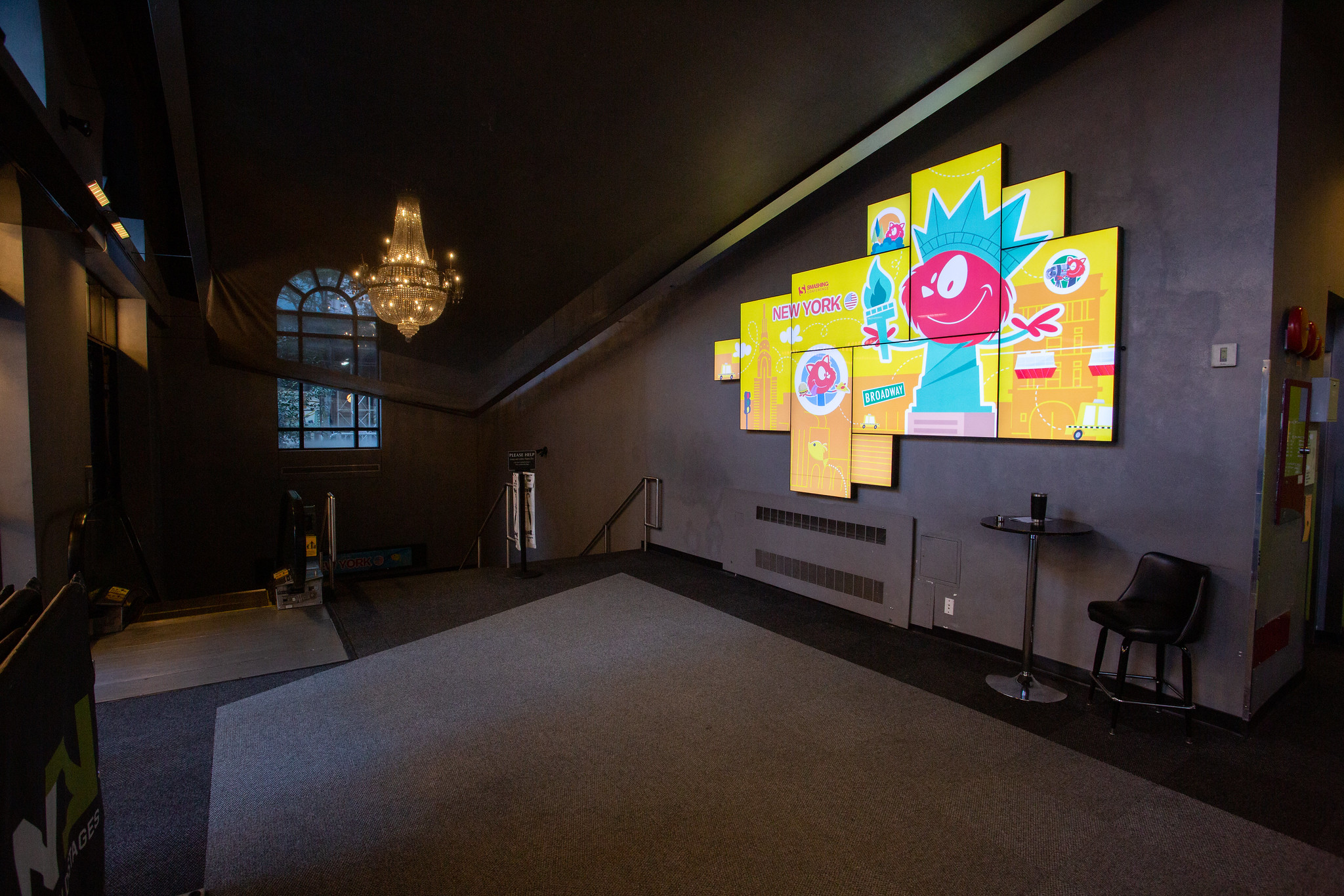

 The heart of what I do at Smashing is the online magazine; as Editor in Chief, my role here is to try to bring you web design and development content that will inform you, help with your day-to-day work, and also make you think. We publish almost every weekday, so always have a large list of articles moving through the writing, editing and publishing process.
 Selecting a topic for our first print magazine was tricky. We wanted these magazines to be a snapshot of the industry at a certain time, but also to have a longer shelf life than tutorials on topics that will be out of date in a few months. Ultimately, for issue one, we chose a subject that was at the forefront of many minds in 2019 — that of ethics and privacy. The collection of essays I commissioned is designed to make you think, and we still have a few print copies and the digital version, if you would like to read them.
 For the first time this year, Smashing Magazine has a podcast. Hosted by Drew McLellan, this bi-weekly show interviews someone from the world of web design and development. We hope to bring you some well-known names, but also speak to folks doing interesting things across the industry.
 We love our Smashing Members! This year you have continued to sign up and support the publication of independent content. We’ve been running webinars (with the help of Scott Whitehead and Bethany Andrew where members get to chat with one another in our Membership Slack, while enjoying free copies of our eBooks, plus a copy of the print magazine! We’re really keen to build on and evolve membership over the next years, and we sincerely thank our members for their support.


 (il)
(il)


 Yana Kirilenko helps with preparations of articles to be published and talks to all our
  Next, we have Inge Emmler who has been on board since 2011 and keeps us all on track with our expense receipts, and requests to spend money! In addition, she helps out our community when they get in touch. If your book order didn’t show up, then Inge is probably the person who will help you. She loves to be able to make our customers happy and remembers an anecdote from her time at Smashing where she sent a free e-book to one person, brightening their day despite the fact they had just lost their job.


 The newest member of our team is Esther Fernández, who has joined Mariona to work on Partnerships and Data, and will be meeting the team for the first time in Freiburg at SmashingConf. I asked Esther to tell me something about her life outside of Smashing, and she said,