If you are missing your festive meetups this year or just fancy seeing some friendly faces and learning some new things join us on December 17th for another Smashing Meets event.
Tickets are only 10 USD (and free for our lovely Smashing Members). The fun starts at 9AM ET (Eastern Time) or 15:00 CET (Central European Time) on the 17th December.
Ok. This is important. Smashing Meets by @smashingconf was soooo much fun. I will have to tune in whenever the timezone suits, it was an absolute blast!!!
This time, we will have talks from three speakers—Adekunle Oduye, Ben Hong, and Michelle Barker. There will be an interface design challenge and chance to network and meet other attendees. Just like an in-person meetup but you won’t have to go out in the cold!
A Level 3 of the CSS Grid specification has been published as an Editor’s Draft, this level describes a way to do Masonry layout in CSS. In this article, I’ll explain the draft spec, with examples that you can try out in Firefox Nightly. While this is a feature you won’t be able to use in production right now, your feedback would be valuable to help make sure it serves the requirements that you have for this kind of layout. So let’s take a look.
What Is A Masonry Layout?
A masonry layout is one where items are laid out one after the other in the inline direction. When they move onto the next line, items will move up into any gaps left by shorter items in the first line. It’s similar to a grid layout with auto-placement, but without sticking to a strict grid for the rows.
The most well-known example of masonry is on Pinterest, and you will sometimes hear people refer to the layout as a "Pinterest layout".
There are a number of JavaScript tools to help you create this kind of layout, such as David DeSandro’s Masonry plugin.
Can’t We Already Do This In CSS?
We can come close to a masonry layout in a couple of ways. The closest way to achieve the look of this type of layout is to use Multi-column Layout. In the example below, you see something which looks visually like a masonry layout. However, the order of the boxes runs down the columns. Therefore, if the first items have the highest priority (e.g. if this were search results), then the apparent first items in the top row aren’t actually the ones that came back first.
That’s all you need to do to get a simple masonry layout. Using Firefox, you can see that in the CodePen example below.
Note: You can use any of the values used for align-content for align-tracks and justify-tracks. There are some nice examples in the spec of different combinations.
If you set align-tracks: stretch, then any auto-sized items in the layout will stretch. The masonry effect is retained, but anything with a definite size on that axis will not be stretched out of shape.
The align-tracks and justify-tracks properties can take multiple values. One for each track in the grid axis. This means that in our four-track grid we could have the first track stretching, the second aligned to start, the third aligned to end, and the fourth aligned to center.
This did not seem to work at the time of writing in Firefox.
The spec details that if there are fewer values than tracks, the remaining tracks will use the final specified value. If there are more values than tracks, additional ones will be ignored.
Fallback Behavior
The inclusion of this feature into the grid specification has a definite benefit where creating a fallback layout is concerned. As masonry behaves in a similar way to auto-placement, if a browser doesn’t support masonry then regular auto-placement can be used instead. This is likely to create the gaps in the layout as seen in the earlier example, but is certainly not terrible.
You can see this in action by looking at any of the demos so far using a browser with no support for masonry. You still get a layout. If you wanted to do something entirely different then you could check for support for masonry with feature queries. You could perhaps do the layout with multicol for non-supporting browsers.
@supports (grid-template-rows: masonry) {
  /* masonry code here */
}
If the masonry layout is vital then you could check for masonry support using CSS.supports and only use the JavaScript masonry script if there is no support. This would mean that as browsers implement native masonry they would lose the overhead of the scripted version, but it would be there as a polyfill.
Potential Accessibility Concerns
While masonry in CSS is exciting, it is yet another place where content reordering and a disconnection of the document order from the visual order may happen. As I noted on a recent issue that was raised, I feel that we are creating exciting layout possibilities and then needing to tell people to be very careful how they use them.
I’ve written about this problem in Grid, content reordering, and accessibility. I hope that as we move forward with this specification, there are also renewed efforts to find a good way forward with regard to content vs. display order.
Your Feedback Is Needed
We are really lucky to not only have this new spec, but to have a browser implementation to test it in. If you have examples where you have used masonry, why not try replacing your JavaScript with the grid version and see if it works for you? If you run into problems or can’t do something you were able to do in your previous implementation, please let the CSSWG know by raising an issue.
While things are in an experimental state, this is your chance to help influence any changes and point out any problems. So please do, and help make this really great feature even better!
This week at Smashing, we celebrated 14 years of bringing you the best web design and development content — and what an interesting year it has been! Last year, I published the 13th birthday post from our team meeting in Freiburg. Back then, we were about to run SmashingConf Freiburg and our meeting was full of our plans for 2020. We were looking forward to another exciting year of conferences, and everything else that team Smashing creates. Little did we know that a year later we would all be working from our home locations, our conferences moved online, and the whole world struggling with a virus that no-one had heard of at the time.
The last year has been difficult for many people — our little team didn’t escape that. Between us, we’ve dealt with a bunch of stressful life events in addition to the pandemic. We also lost a good friend in Scott Whitehead, who died last month aged just 39. He will be dearly missed by all of us who worked with him.
Through it all, however, there is always a cheerful greeting when I log into the Smashing Slack. Some positivity on days when it seems as if nothing is going right; and a million ideas and plans despite it sometimes seeming like it makes no sense to plan anything. We’re weathering the storm, along with our wider Smashing community, and we hope that our articles, conferences, meetups, and membership have helped to make lockdown just a little less lonely.
Birthdays should be a celebration, even when times are difficult. I asked some of our Smashing Team and friends what their favorite Smashing memories were. Earlier this week, we ran SmashingConf Freiburg online, so it seems fitting that this first memory is from Vitaly about the very first SmashingConf:
“I vividly remember the first time we were waving Smashing Flags at the balcony of the very first SmashingConf in Freiburg. It was a very sunny day, with a few clouds rising above the sky, and I was walking towards Historisches Kaufhaus to get ready for the setup. It was such a powerful feeling: as I was approaching the building, I could see the flags waving from the balcony far, far away. It’s such an empowering feeling to see that something that has always been digital actually became real right in front of you.
Another feeling that had a tremendous impact on me was in a coffee shop in Kyiv, Ukraine. I was sitting and working there at a large wooden table at some point in 2014, and there was a group of young people sitting next to me. Of course, it turned out that they were designers and developers. So at some point, they stumbled upon some issue, and they opened a Smashing article and were all reading it together. It was quite a feeling because it was actually one of my earlier articles from 2010 or so, and it was so nice to see it actually being used and valued. I didn’t say anything but ordered another cappuccino, then put my headphones on and kept on working with a smile on my face. :-)
”
I remember that first conference well, as I was one of the speakers along with many of my friends in the industry. Kristof Van den Eede was an attendee, and told me:
“I attended the first-ever Smashing Conference in Freiburg as a starting front-end developer. The impression it left on me is huge. I couldn’t believe I was offered the opportunity to go by the company I worked for at the time. The overall experience was amazing. I remember having my mind blown by Aarron Walter, Rachel Andrew, and so many other speakers. Since then, I’ve never missed a Smashing update or newsletter!”
Freiburg, as the home of Smashing, always has a special feel and was mentioned in many people’s memories. Sarah Drasner remembers being in Freiburg “for the 10th anniversary for the famous chocolate fondue carpet massacre!” One of our subject editors, Alma Hoffmann, also remembers meeting up with the team at a Freiburg event:
“I love Smashing! Been working with these fabulous people since 2010 when I published my first article. My most cherished memory is meeting Iris, Vitaly, Phil, Markus, Amanda, and everyone else in person at the conference in Freiburg. Vitaly, Iris and I had been working online for so long and had only seen each other on video call. Meeting in person was like out of this world! I also met incredible and amazing people whom I keep in touch with. I love the commitment to quality content we all share and want. It has been a dream to work here. Love you all!”
Marc Thiele was part of the team for the very first Smashing event and was able to host Vitaly (and provide a good camera and internet connection) for Smashing Live. He said:
“This is, by any means, the craziest and strangest year in my life. Luckily the looser restrictions now allowed, that Vitaly came over to my place to run his part of the first SmashingConf Live from my house. It was a lovely and uplifting experience in these dark days. Let’s hope that we are able to meet in person soon again.”
We often refer to our Smashing community as our friends and we love it when you feel part of what we are doing. Greg Vissing remembers his first SmashingConf,
“My favorite Smashing memory was being able to attend my first Smashing Conference in 2018 in San Francisco, CA. I had always wanted to go because Smashing Magazine was one of the reasons I got into web development. When I was told by my current employer that I could pick any conference, it was a no-brainer which one I would pick. Once I met the staff of Smashing in person, it was though I had been friends with them for years because of how friendly and inviting the conference is. I’m so appreciative of how much Smashing has furthered my career and the friendships I have made with the staff!”
I often hear from people how being involved with something at Smashing has led to unexpected things happening. Here is one such story from Eric Portis.
“In 2014 I didn’t work in tech and hadn’t spoken publicly since high school and, after a series of increasingly fantastical events, was invited to speak halfway 'round the world, to tell a few hundred people how they should put images on websites at SmashingConf Freiburg.
It was all very surreal. I met a bunch of heroes who accepted me unquestioningly as a peer. Vitaly kept asking random questions and making insane demands, always with a puckish smile. There were surprise fireworks at the speaker’s dinner. And, in line for lunch, Guy Podjarny told me I should really talk to some friends of his at an image-centric startup called Cloudinary. Yadda-yadda-yadda I switched careers and work for Cloudinary, now.
I’ll be trying to pay all of this forward for the rest of my career.
Thanks, Smashing!”
The conference team has had to quickly put everything they know about in-person events and figure out how to translate that into virtual ones. We’ve now run two conferences, Smashing Live! and Smashing Freiburg, and have two more to go — Austin and San Francisco. Charis and Jarijn are based out in Hong Kong, and were involved with the in-person conferences last year. Jarijn told me that a favorite Smashing memory was in getting to Toronto for the first time, and being able to reunite with a childhood friend who lives nearby. Charis talked about how we had to very quickly change from thinking about in-person events to figuring out how to do online ones.
“I was super looking forward to what 2020 had to bring us. 2019 was a fantastic conference year, and running our conferences in SF, Toronto, Freiburg, and New York was one of my best memories of 2019.
Looking back at what we’ve done the past few months, I can only be super proud. We had our online workshops going very quickly after lockdowns were announced, and it was great to see how well they were received. It was so much fun meeting people on the other side of the world and getting a peek into their lives.
It’s been a lot of fun figuring out how to run events online. Working together with Amanda and Vitaly has been an absolute joy.”
While I get involved with the events, the majority of my work at Smashing is already virtual. The pandemic has sometimes meant delays with writing or editing as people struggled to cope with this new normal, but we have ticked along much as we always do. We’ve managed to publish our usual article-per-weekday throughout the past few months and introduced many new writers to the magazine, as well as publishing pieces from some of your favorite authors.
We’re always happy to see your article ideas, whether you are an experienced writer or have not been published before. Don’t just take my word for it, here is what Eric Bailey had to say,
“I’ve been reading Smashing Magazine for years, and it’s had such a positive impact on my growth and career development. Having the opportunity to give back and write for the website was a dream come true.
The Smashing team is friendly, whipsmart, and an absolute joy to work with. If you have been debating writing an article about working on the web, I enthusiastically encourage you to pitch them.
Happy birthday, Smashing! Here’s to many more!”
For the conference team, however, it’s all about in-person events, and a lot of planning had already happened for 2020. Venues and caterers were booked, flights and hotels arranged, and speakers planned. A memory I will take from this period is the day we realized it would be impossible to run the April San Francisco event. Things were changing so quickly, a week previously it looked as if we could go ahead. Rather than complaining, or sitting about bemoaning our misfortune, everyone swung into action to ensure that speakers and attendees were informed and logistics for postponing dealt with. Within a few days, we had online workshops in place and were building out contingency plans just in case — as ultimately happened — we needed to move the events fully online.
Amanda is our head of events, and she remembers this time saying,
“For many people, 2020 has been a challenging year, and at Smashing this has been no exception. However, when the team made the decision to first postpone SmashingConf SF, there was a lot of unknown, yet a beautiful display of teamwork, respect, and truly love coming through. For those who don’t know, the Conf team is fully remote, spanning 4 countries, and 2 continents, and this is the longest we’ve all gone from being together in person. Yet, this is probably the closest we’ve ever felt as a team and as a Smashing Family.”
I’ve mentioned family quite a lot, and some of us actually are family! My daughter Bethany has helped with video editing for Smashing in the past. With everything moved online and her theatre job furloughed, she’s been on board to help with conferences and workshops. She shared her thoughts on being part of the team,
“Though 2020 has been a bit of a disaster in many many ways I feel really lucky that the lockdown and the fact that I’ve been left without my main job has meant I’ve been able to work more and spend more (virtual) time with the Smashing team. It’s been so nice that even though we can’t all get together we’ve still been able to do so many workshops and conferences and get together over a screen. It’s just been lovely to get more involved with a company who is just full of awesome people and I wouldn’t have had this opportunity without this free time that was suddenly thrust upon us.”
And our CEO Inge Emmler linked family and work too, saying that working at Smashing is all about, “being in touch with nice, dear people only — online and offline — what could be more smashing? Well, perhaps celebrating my Mom´s 90th birthday in March. ”
I don’t think any of us want to predict what will be in store for our next year at Smashing. We are continuing to plan — perhaps with a few more plan B and C options that we had last year! One thing I do feel sure of though, is that we’ll continue supporting each other and our Smashing Community, through whatever the next 12 months bring.
Last week, we ran our very first SmashingConf Live! event, the first in a series of online events taking us through to the end of 2020. We had an amazing two days and we hope that all of our speakers and attendees did too. In this post, I’ll round up some of the key moments and feedback we’ve had.
A Team Spread Around The World
Here at Smashing, we take remote, distributed working to the extreme, and are very used to dealing with all of our different timezones. However, the conferences are the one time when most of us are together in one place. With all of us in our home locations and timezones, things were very different this time. We shared pictures of our setups in the Slack for the event, and lots of attendees joined in the fun and showed us how they were attending the conference themselves.
Top row (left to right): Amanda, Charis and Jarijn, Rachel. Bottom row (left to right): Phil, Vitaly, Tobi
Trying to coordinate watching @smashingconf and playing with the 👶🏽 🙂
It takes a lot of people to bring you an online multi-track conference, so the full team taking care of everything and everyone behind the scenes on the day were:
When selecting a conference platform it was important to us to have something that would enable the fun and interactivity of an in-person SmashingConf. We wanted to have sidetracks, games, places to ask questions of our speakers, all along with main stage content. While we use Zoom for workshops, we didn’t feel that asking you all to sit through two days of Zoom meetings would be very Smashing at all.
We're running our conferences on Hopin, a friendly, inclusive platform, with Smashing branding and plenty of cats. With interactive, live sessions and live captioning. Watch a video preview. (Large preview)
Amanda and the rest of the team looked at a number of options and we ultimately chose to use Hopin. We trialed the platform for our Smashing Meets events, but this was the first time we would be running at such a scale. Everything worked really well, and speakers and attendees seemed to like the setup. As a speaker, I found it felt far more interactive than the usual online conference solutions, and less like I was presenting to my office wall!
With multiple sessions happening at once we had a lot of speakers sharing their knowledge with us. As with our in-person events, everyone created shared Google Docs of takeaways over the two days — Day One, Day Two. MC Phil Hawksworth kept everything on track on the main stage.
Some amazing sketchnotes were created by Ximena which give you a snapshot of the key takeaways from many of the talks and sessions.
I think this may be the last of the #sketchnotes maybe.
GREAT TALK at @smashingconf from dina Amin. Beautiful story and Stop Motion creations with a few other thinkery things 😉💙
We even had our conference DJ Tobi playing some tunes between the mainstage talks — just like at our in-person events.
Badges
We felt that a virtual conference should have badges too. So, for SmashingConf Live we had badges featuring a variety of cats. Attendees tried to find all of the different cats — all 96 of them!
Friendly SmashingConf badges for cat collectors! Every attendee gets their own badge and can trade them when meeting new people. Illustrated by our cherished illustrator, Ricardo Gimenes.
It really did feel like an event, rather than a webinar, and it was great to see so many people — and to meet their cats! That’s something we don’t get to do at our usual events.
These virtual badges for @smashingconf are awesome! 😺
If you wish you could have joined us then you have three more chances for some SmashingConf online fun! We’ve taken all of our 2020 events online, which means that between now and the end of the year you have three to choose from.
SmashingConf Freiburg Online (Sep 7–8)
The SmashingConf Freiburg is moving online on the original dates: September 7th–8th. One track, two days and 13 speakers, with all of the actionable insights you expect from SmashingConf. We’ll be running the event tied to the timezone in Germany — making this a great event for Europeans. Check out the schedule, and buy tickets here.
SmashingConf Austin/NY Online (Oct 13–14)
We have combined the programming for New York and Austin as these two events were so close together and similar to each other. We’ll be running this event in Central time, just as if we were all in Austin. Check out the schedule, and buy tickets here. We’d love to see you in October!
SmashingConf SF Online (Nov 10–11)
In PST, join us for a SmashingConf San Francisco on November 10th–11th. The schedule and tickets are online for you to take a look at. We’ll be sure to have a great celebration for our final event of 2020!
2020 has been quite the year, and it’s only July. None of us can be certain what the rest of the year looks like, in particular for travel and events where lots of folks gather together. Given the uncertainty and the success of our online workshop series and Meets events, we’re taking all of our 2020 conferences online. How will that work? Read on to find out!
All of our online conference events will take place on the Hopin platform. We roadtested this platform for our Smashing Meets, and we love the way it allows for social chat and side events alongside the main conference. It’s as close as we can get to an in-person experience.
I just attended my second meetup with @hopinofficial and I can say this is the future of conferences.
Such a great experience!
— Pablo E. Carvallo (@pabloecarvallo) June 4, 2020
First Up: The Rescheduled SmashingConf Live!
We will be presenting SmashingConf Live on August 20th-21st. Two half-days, with four talks each day on UX, data visualization, CSS, and JavaScript.
Meet other people in our chat or network on our event platform. Join in on our Design and Coding Tournament, or enjoy watching folks taking part.
Join one of the many sessions! Listen to one of the fireside chats on privacy, web performance, and Machine Learning (ML). Get your website reviewed by one of our speakers.
Take a look at the full schedule. If you have bought a ticket to the postponed SmashingConf Live, your ticket will still be valid. We still have tickets available: register here and we will see you at the event.
We are still scheduling new workshops and repeats of our most popular workshops. Purchase a workshop with your conference ticket and save 100USD.
Then, we have moved our in-person events online. These will be as close as possible to the in-person experience, with side-events, a mystery speaker, and all the fun you expect from a SmashingConf.
September 7th–8th: SmashingConf Freiburg Online
The Freiburg conference is moving online on the original dates: September 7th–8th. One track, two days and 13 speakers, with all of the actionable insights you expect from SmashingConf. We’ll be running the event tied to the timezone in Germany — making this a great event for Europeans. Check out the schedule, and buy tickets here.
October 13th–14th: SmashingConf Austin (and New York) Online
We have combined the programming for New York and Austin as these two events were so close together and similar to each other. We’ll be running this event in Central time, just as if we were all in Austin. Check out the schedule, and buy tickets here. We’d love to see you in October!
November 10th–11th: SmashingConf San Francisco Online
In PST join us for a virtual San Francisco event on November 10th–11th. The schedule and tickets are online for you to take a look. We’ll be sure to have a great celebration for our final event of 2020!
Existing Ticketholders
We have moved your in-person ticket to the 2021 edition of your chosen conference and in order that you don’t miss out this year, you are invited to the online version of the event you registered for. Two for the price of one as our thanks for your support. If that doesn’t work out for you, we do have options as explained in the email. Didn’t get the email? Drop the team a line at hello@smashingconf.com and we will get back to you.
Join Us!
There are tickets now on sale for all of the above events — we are really looking forward to all of them! One thing we have learned with our online workshops is that taking events online means that lots of people can attend who can’t travel to conferences even in more usual times. That’s really exciting, and we look forward to sharing some days of learning and fun with you all!
Crowdfunding Web Platform Features With Open Prioritization
Crowdfunding Web Platform Features With Open Prioritization
Rachel Andrew
In my last post, I described some interesting CSS features — some of which are only available in one browser. Most web developers have some feature they wish was more widely available, or that was available at all. I encourage developers to use, talk about, and raise implementation bugs with browsers to try to get features implemented, however, what if there was a more direct way to do so? What if web developers could get together and fund the development of these features?
This is the model that open-source consultancy Igalia is launching with their Open Prioritization experiment. The basic idea is a crowdfunding model for web platform features. If we want a feature implemented, we can put in a small amount of money to help fund that work. If the goal is reached, the feature can be implemented. This article is based on an interview with Brian Kardell, Developer Advocate at Igalia.
What Is Open Prioritization?
The idea of open prioritization is that the community gets to choose and help fund feature development. Igalia have selected a list of target features, all of which are implemented or currently being implemented in at least one engine. Therefore, funding a feature will help it become available cross-browser, and more usable for us as developers. The initial list is:
CSS lab( ) colors in Firefox
:focus-visible in WebKit/Safari
HTML inert in WebKit/Safari
Selector list arguments for :not( ) in Chrome
CSS Containment support in WebKit/Safari
CSS d (SVG path) support in Firefox
The website gives more explanation of each feature and all of the details of how the funding will work. Igalia are working with Open Collective to manage the pledges.
Who Are Igalia?
You may never have heard of Igalia, but you will have benefited from their work. Igalia works on browser engines, and have specialist knowledge of all of the engines. They had the second-highest number of commits to the Chrome and WebKit source in 2019. If you love CSS Grid Layout, then you have Igalia to thank for the implementation in Chrome and WebKit. The work to add the feature to those browsers was done by a team at Igalia, rather than engineers working internally at the browser company.
This is what makes this idea so compelling. It isn’t a case of raising some money and then trying to persuade someone to do the work. Igalia have a track record of doing the work. Developers need to be paid, so by crowdsourcing the money we are able to choose what is worked on next. Igalia also already have the relationships with the engines to make any suggested feature likely to be a success.
Will Browsers Accept These Features If We Fund Them?
The fact that Igalia already have relationships within browser engine teams, and have already discussed the selected features with them means that if funded, we should see the features in browsers. And, there are already precedents for major features being funded by third parties and developed by Igalia. The Grid Layout implementation in Chrome and WebKit was funded by Bloomberg Tech. They were frustrated by the lack of Grid Layout implementation, and it was Bloomberg Tech who provided the money to develop that feature over several years.
Chrome and WebKit were happy to accept the implementation; there was no controversy over adding the feature. Rather, it was a matter of prioritization. The browsers had other work that was deemed a higher priority, and financial commitment and developer time was therefore directed elsewhere. The features that have been selected for this initial crowdfunding attempt are also non -controversial in terms of their implementation. If the work can be done then the engines are likely to accept it. Interoperability — things working in the same way across browsers — is something all browser vendors care about. There is no benefit to an engine to lag behind. We essentially just get to bypass the internal prioritization process for the feature.
Why Don’t Browsers Just Do This Stuff?
I asked Brian why the browser companies don’t fund these things themselves. He explained,
“People might think, for example, ‘Apple has all of the money in the world’ but this ignores complex realities. Apple’s business is not their Web browser. In fact, the web browser itself isn’t a money-making endeavor for anyone. Browsers and standards are voluntary, they are a commons. Cost-wise, however, browsers are considerable. They are massively more complex than most of us realize. Only 3 organizations today have invested the many years and millions of dollars annually that it takes to evolve and maintain a rendering engine project. Any one of them is already making a massive and unparalleled investment in the commons.”
Brian went on to point out the considerable investment of Firefox into Servo, and Google into LayoutNG, projects which will improve the browser experience and also make it possible to implement new features of the platform. There is a lot that any browser could be implementing in their engine, but the way those features are internally prioritized may not always map to our needs as developers.
It occurred to me that by funding browser implementation, we are doing the same thing that we do for other products that we use. Many of us will have developed a plugin for a needed feature in a CMS or paid a third party to provide it. The CMS developers spend their time working on the core product, ensuring that it is robust, secure, and up to date. Without the core product, adding plugins would be impossible. Third parties however can contribute parts to that platform, and in a sense that is what we can do via open prioritization. Show that a feature is worthwhile enough for us to pledge some cash to get it over the line.
How Does This Fit With Projects Such As Web We Want?
SmashingConf has supported the Web We Want project, where developers pitched web platform ideas to be discussed and voted for onstage at conferences. I was involved in several of these events as a host and on the panel. I wondered how open prioritization fits with these existing efforts. Brian explained that these are quite different things saying,
“... if you asked me what could make my house better I could name a million things. Some of those aren’t even remotely practical, they would just be really neat. But if you said make a list of things you could do with a budget for what each one costs — my list will be considerably more practical and bound by realities I know exist.
At the end of the month if you say "there is your list, and here is $100, what will you do with it?" that’s a very direct question that helps me accomplish something practical. Maybe I will paint. Maybe I will buy some new lighting. Or, maybe I will save it for some months toward something more costly.”
The Web We Want project asks an open question, it asks what we want of the platform. Many of the wants aren’t things that already exist as a specification. To actually start to implement any of these things would mean starting right at the beginning, with an idea that needs taking right from the specification stage. There are few certainties, and they would be very hard to put a price on.
The features selected for this first open prioritization experiment are deliberately limited in scope. They already have some implementation; they have a specification, and Igalia have already spoken to browser maintainers to check that the features are ready to work on but don’t feature in immediate priorities.
Supporting this project means supporting a concrete chunk of development, that can happen within a reasonably short timeframe. Posting an idea to Web We Want, writing up an idea on your blog, or adding an issue describing a totally new feature on the CSSWG GitHub repo potentially gets a new idea out into the discussion. However, those ideas may have a long slow path to becoming reality. And, given the nature of standards discussions, probably won’t happen in exactly the way that you imagined. It is valuable to propose these things, but very hard to estimate time and costs to a final implementation.
The same problem is true for the much-wanted feature of container queries, Igalia have gone so far as to mention container queries in their FAQ. Container queries are something that many people involved in the standards process and at browser vendors are looking into, however, those discussions are at an early stage. It isn’t something it would be possible to put a monetary value on at this point.
Get Involved!
There is more information at the Open Prioritization site, along with a detailed FAQ answering other questions that you might have. I’m excited about this because I’m always keen to help find ways for designers and developers to get involved in the web platform. It is our platform. We can wait for things to be granted to use by browser vendors, or we can actively contribute via ideas, bug reports, and with Open Prioritization a bit of cash, to help to make it better.
Things move a lot faster than they used to in terms of the implementation of Web Platform features, and this post is a round-up of news about CSS features that are making their way into the platform. If you are the sort of person who doesn’t like reading about things if you can’t use them now, then this article probably isn’t for you — we have many others for you to enjoy instead! However, if you like to know what is on the way and read more about the things you can play with in a beta version of a browser, read on!
Flexbox Gaps
Let’s start with something that is implemented in the shipping version of one browser, and in beta in another. In CSS Grid, we can use the gap, column-gap and row-gap properties to define the gaps between rows and columns or both at the same time. The column-gap feature also appears in the Multi-column layout to create gaps between columns.
While you can use margins to space out grid items, the nice thing about the gap feature is that you only get gaps between your items; you do not end up with additional space to account for at the start and end of the grid. Adding margins has typically been how we have created space between flex items. To create a regular space between flex items, we use a margin. If we do not want a margin at the start and end, we have to use a negative margin on the container to remove it.
It would be really nice to have that gap feature in Flexbox as well, wouldn’t it? The good news is that we do have — it’s already implemented in Firefox and is in the Beta version of Chrome.
In the next CodePen, you can see all three options. The first are flex items using margins on each side. This creates a gap at the start and end of the flex container. The second uses a negative margin on the flex container to pull that margin outside of the border. The third dispenses with margins altogether and instead uses gap: 20px, creating a gap between items but not on the start and end edge.
The Flexbox gap implementation highlights a few interesting things. Firstly, you may well remember that when the gap feature was first introduced to Grid Layout, the properties were:
grid-gap
grid-row-gap
grid-column-gap
These properties were shipped when grid first appeared in browsers. However, in much the same way as the alignment features (justify-content, align-content, align-items, and so on) first appeared in Flexbox and then became available to Grid (once it was decided the gap features were useful to more than grid), they were moved and renamed.
Along with those alignment features, the gap properties are now in the Box Alignment specification. The specification deals with alignment and space distribution so is a natural home for them. To prevent us from having multiple properties prefixed with a spec name, they were also renamed to drop the grid- prefix.
If you have the grid- prefixed versions in your code, you don’t need to worry. They have been kept as an alias of the properties so your code won’t break. For new projects, however, the unprefixed versions are implemented in all browsers.
Detecting Gap Support For Flexbox
You might be thinking that you could use the gap feature in Flexbox and use Feature Queries to test for support by using a margin as fallback. Sadly, this isn’t the case because feature queries test for a name and value. For example, if I want to test for grid support, I can use the following query:
If I were to test for gap: 20px, however, I would get a positive response in Chrome which currently does not support gap in Flexbox but does support it in Grid. All those feature queries do is check to see if the browser recognizes the property and value. They have no way to test for support within a particular layout mode. I raised this as an issue in the CSS WG, however, it turns out to not be an easy thing to fix, and there are limited places currently where we have this partial implementation problem.
Aspect Ratio Unit
Some things have an aspect ratio that we want to preserve, and image or a video for example. If you place an image or video directly on the page using the HTML img or video element, then it nicely keeps the aspect ratio it arrives with (unless you forcibly change the width or height). However, we sometimes want to add an element with no intrinsic aspect ratio while making one dimension flexible with the other retaining a specific aspect ratio. This most often happens when we embed a video with an iframe, however, you might also want to make perfectly square areas on your grid (something which also requires that one dimension can react to another).
The way we currently deal with this is by way of the padding hack. This uses the fact that padding in the block direction is copied from the inline direction when we use a percentage. It’s a not very elegant solution to the problem, but it works.
The aspect ratio unit seeks to solve that by allowing us to specify an aspect ratio for a length. Chrome has implemented this in Canary, so you can take a look at the demo below using Canary if you enable the Experimental Web Platform Features flag.
I have created a grid layout and set my grid items to use a 1 / 1 aspect ratio. The width of the items is determined by their grid column track size (as is flexible). The height is then being copied from that to make a square. Just for fun, I then rotated the items.
In Canary, you can take a look in the demo and see how the items remain square even as their track grows and shrinks, due to the fact that the block size is using a 1/1 ratio of the inline size.
Developers often ask if CSS Grid can be used to create a Masonry- or Pinterest-styled layout. While some demos look a bit like that, Grid was never designed to do Masonry.
To explain, you need to know what a Masonry layout is. In a typical Masonry layout, items display by row. Once the first row is filled, new items populate another row. However, if some of the items in the first row are shorter than others, the second-row items will rise up to fill the gap. The Masonry library is how many people achieve this using JavaScript.
If you try to create this layout using CSS Grid and auto-placement, you will see that you lose that block direction rearrangement of items. They lay themselves out in strict rows and columns because that is what a grid does.
So could grid ever be used as a Masonry layout? One of the engineers at Mozilla thinks so, and has created a prototype of the functionality. You can test it out by using Firefox Nightly with the flag layout.css.grid-template-masonry-value.enabled set to true by going to about:config in the Firefox Nightly URL bar.
While this is very exciting for anyone who has had to create this kind of layout using JavaScript, a number of us do wonder if the grid specification is the place to define this very specific layout. You can read some of my thoughts in my article “Does Masonry Belong In The CSS Grid Specification?”.
Subgrid
We have had support for the subgrid value of grid-template-columns and grid-template-rows in Firefox for some time. Using this value means that you can inherit the size and number of tracks from a parent grid down through child grids. Essentially, as long as a grid item has display: grid, it can inherit the tracks that it covers rather than creating new column or row tracks.
However, the first question people have when I talk about subgrid is, “When will it be available in Chrome?” I still can’t give you a when, but some good news is on the horizon. On June 18th in a Chromium blog post, it was announced that the Microsoft Edge team (now working on Chromium) are working to reimplement Grid Layout into the LayoutNG engine, i.e. Chromium’s next-generation layout engine. Part of this work will involve also added subgrid support.
Adding features to browsers isn’t a quick process, however, the Microsoft team brought us Grid Layout in the first place — along with the early prefixed implementation that shipped in IE10. So this is great news and I look forward to being able to test the implementation when it ships in Beta.
prefers-reduced-data
Not yet implemented in any browser — but with a bug listed for Chrome with recent activity— is the prefers_reduced_data media feature. This will allow CSS to check if the visitor has enabled data saving in their device and adjust the website accordingly. You might, for example, choose to avoid loading large images.
The prefers_reduced_data media feature works in the same way as some of the already implemented user preference media features in the Level 5 Media Queries Specification. For example, the media features prefers_reduced_motion and prefers_color_scheme allow you to test to see if the visitor has requested to reduce motion or a dark mode in their operating system and tailor your CSS to suit.
::marker
The ::marker pseudo-element allows us to target the list marker. At a very straightforward level, this means that we can target the list bullet and change its color or size. (This was previously impossible due to the fact that you could only target the entire list item — text and marker.)
Support for ::marker is already available in Firefox, and can now be found in Chrome Beta, too.
In addition to styling bullets on actual lists, you can use ::marker on other elements. In the example below, I have a heading which has been given display: list-item and therefore has a marker which I have replaced with an emoji.
Note: You can read more about ::marker and other list-related things in my article “CSS Lists, Markers and Counters” here on Smashing Magazine.
Please Test New Features
While it’s fun to have a little peek into what is coming up, I recommend testing out the implementations if you have a use case for any of these things. You may well find a bug or something that doesn’t work as you expect. Browser vendors and the CSS Working Group would love to know. If you think you have found a bug in a browser — perhaps you are testing ::marker in Chrome and find it displays differently to the implementation in Firefox — then raise an issue with the browser: “How To File A Good Bug” explains how. If you think that the specification could do something it doesn’t yet, then raise an issue against the specification over at the CSS Working Group GitHub repository.
Smashing Meets Gives A Sneak Preview Of What To Expect At Live!
Smashing Meets Gives A Sneak Preview Of What To Expect At Live!
Rachel Andrew
Last week we had our first Smashing Meets event. A free event across two days and many timezones, with three speakers each day and plenty of chance for attendees to chat and ask questions of the speakers. In addition to brightening your day with a virtual meetup, Meets was a chance for us to test the conference platform we’ll be using for our first Smashing Live conference. So, how did it go?
Three more great talks today at #smashingmeets (one same as yesterday - but a brilliant talk) exciting stuff to come from CSS layout and Speed/Sensor APIs. Can’t wait to give them a try! @smashingmag
With Smashing Meets, we were attempting to bring some of the feel of a community meetup to an online format. We’ve all been missing meeting up, chatting, and hearing from speakers at local events. As Smashing readers live all over the world, we decided to do two events, one which was better suited to US timezones, and another more suited to Europe and Asia.
“What a delightful few hours over both days it was! I had a blast, and I think the experience as a speaker was great. Well done to all the team!”
— Mark Boulton
Across the two days, over 500 attendees heard talks from:
Yiying Lu
Phil Hawksworth
Mark Boulton
Mandy Michael
and me, Rachel Andrew!
As a speaker, I really enjoyed the format. Presenting online can seem a bit strange as you have none of the immediate audience feedback from the faces in front of you. However, after the talk, I moved to a session room to take questions. I was definitely able to answer far more individual questions than I normally can after an in-person talk. Attendees seemed to really enjoy getting to talk to speakers in this way too. One attendee told us in the feedback form:
“I am more likely to ask a question in a chat setting (nerves/shyness keep me from physically asking questions in a conference setting.) It was SO cool to have my question answered and be able to directly interact with the speaker!”
In addition to the Q&A sessions with speakers, we tried other ways to encourage people to interact with other attendees from around the world. We encouraged them to meet our community partners, do challenges, and take part in a quiz. We were pleased to get feedback that some of our attendees picked up on the meetup atmosphere:
“It really felt like a community meetup: laidback, fun and just everyone wanting to have a good time, having the chat along with the talks was fun.”
What Did We Learn?
The attendees certainly seemed to take a lot away from our speakers, but we also learned a lot about running an online event.
We found that, in some ways, online is the same as offline; if we place the experience of our attendees first, we don’t go too far wrong. Good talks by smashing speakers are why people attend. Interactive Sessions are an added value.
Just as with offline events, some people prefer a single track and not missing anything, while others love the idea of picking their favorite things to do. It is possible to make online events social and interactive. It takes work, and a reimagining of how things work in this setting, however as I have found in workshops people are often more keen to chat online than off. The choice of platform is important here too, if the event isn’t to just be one presentation playing after another.
Ultimately, we found the only things people really missed are the snacks and lunches!
Up Next, Smashing Live!
We hope to do another Meets at some point, however, our next event is on a somewhat larger scale. We’ll be taking everything we learned from Meets and using it to make our Smashing Live conference even better. Join us for Smashing Live, a virtual conference with plenty of real-life fun and interaction with new friends from all over the world.
And, of course, a Mystery Speaker, and unlike a regular SmashingConf, where you might spot a likely candidate walking around the venue, it’s going to be pretty hard to work out who they are this time! If you think you know, we’ll be inviting you to guess, and maybe win a prize.
Timings And Practical Things
Smashing Live is on June 9th and 10th, 2020. 11am - 4pm in New York, making it 5pm-10pm in Amsterdam. You can find more timezones on the website.
We have thought a lot about what it means to attend a virtual conference. Feedback from Meets and our workshops tells us that shorter days make more sense than one long day. Many of you are also doing stellar work homeschooling children, taking care of family tasks, and trying to do your regular job all from home. Therefore Live will run for two half days, this also has the advantage of making the content accessible for more timezones. Recordings will be available after the event too, so no-one misses a thing.
A ticket for SmashingLive is USD $225, with a discount for Smashing Members (10% for Members, 25% for Smashers). If you are a member head over to your Member Dashboard for your discount links. For everyone else, book your ticket here.
Workshops
We’ll run online workshops before and after the conference, just as we do at our regular events. The aim is to give attendees the same experience and access to experts as with an in-person workshop, without needing to leave a desk. The workshops are taught live, and you’ll have plenty of chances to ask questions. You save USD $100 if you add a workshop to your conference ticket.
Feedback from our previous workshops has been amazing, and many of them have sold out as we have limited capacity depending on how each expert likes to teach. So don’t delay if you see a favorite on the list.
The whole team thanks you for your support of our events and everything else we’ve been doing since we all ended up in lockdown. We’re happy we have managed to keep the community spirit going, and provide lots of chances to learn from our speakers and each other.
Smashing Meets! Free Online Meetups On May 18th And 19th 2020
Smashing Meets! Free Online Meetups On May 18th And 19th 2020
Rachel Andrew
We’re having a meetup! Join us for Smashing Meets — two free online meetups with speakers, activities, and plenty of chances to make new friends. Just like a real meetup, though you’ll need to bring your own pizza.
What Will Happen At Smashing Meets?
3×30-mins interactive talks from experts, followed by a short Q&A.
Interactive activities in breakout rooms, with friendly communities around the world and collaborative design and coding challenges.
A fun quiz show where you can win some smashing prizes!
Two Days, Different Timezones
To help make this a truly global meetup, we have two meets to sign up for:
Building With JAMstack: Keeping UIs And APIs Aligned by Phil Hawksworth In his talk, Phil will shed light on some of the techniques you can use when working with serverless functions, proxies and Jamstack tools to help you build projects with confidence.
Accessible Typography by Mark Boulton Mark will be sharing his personal advice on how to use that particular typeface you want to use in the most accessible way. A practical talk that covers a bit of type design as well as the details of typesetting.
Creativity In Cross-Cultural Innovation by Yiying Lu Yiying will tell us how we can create more business and cultural value by integrating creativity in our product, messaging, and delivery. By the end of this talk, you’ll be sure to have learned how to start creating design that bridges the gap between Art and Tech, Business and Culture, East and West.
Fun With Browser And Sensor APIs by Mandy Michael Whether it’s a practical implementation of the Light Sensor API or abducting a cat with a combination of sensors, Mandy will be looking — some simple code demos by exploring possibilities, tools and resources that are needed to create engaging and creative effects, visualizations and experiences.
Hello, Subgrid by Rachel Andrew In this talk, Rachel will introduce Subgrid alongside use cases, example code, and some thoughts on where we might see Grid heading in the future.
Accessible Typography by Mark Boulton Mark will be sharing his personal advice on how to use that particular typeface you want to use in the most accessible way. A practical talk that covers a bit of type design as well as the details of typesetting.
Join Our New Online Workshops On CSS, Accessibility, Performance, And UX
Join Our New Online Workshops On CSS, Accessibility, Performance, And UX
Rachel Andrew
It has been a month since we launched our first online workshop and, to be honest, we really didn’t know whether people would enjoy them — or if we would enjoy running them. It was an experiment, but one we are so glad we jumped into!
I spoke about the experience of taking my workshop online on a recent episode of the Smashing podcast. As a speaker, I had expected it to feel very much like I was presenting into the empty air, with no immediate feedback and expressions to work from. It turned out, however, that in some ways I felt more connected to the group by sharing my knowledge with a bunch of folks who were exactly in the same situation as me — at home trying to make the best of things!
I spoke to Vitaly about how he felt about leading a workshop online, and he also felt that everyone felt more equal, rather than having a teacher up on a podium. He also noted that we were able to see how global our audience is. Online workshops are more accessible to people who can’t travel even in normal times, and seeing everyone at home in their own environment really brought to life that we were working with folks from all around the world.
Vitaly Friedman’s online workshop setup
As a participant, there are definite advantages in attending a workshop from home. You have your own desk and usual setup, and space to spread out. And, given the workshop seating I’ve encountered in the past, most of you probably have a more comfortable chair. You can also rewatch the recording if you want to listen to an explanation again.
All The Details
As we have now formalized our workshop process, I thought I’d share a little more about how these events run. Unlike in-person workshops where we keep you in a room for an eight hour day, we realized than many of you have a lot of other commitments right now. Perhaps you are also homeschooling your children, trying to keep up with work from home, and it’s hard to be sat in front of a screen working all day. So all of our workshops are split over multiple shorter sessions, so check each workshop description for the full details of days and times. We’ve had great feedback from attendees and speakers about this approach.
In addition to the presenter, there is always at least one other member of the team online, to help with any connectivity or other issues that you might have.
With so many conferences around the world being cancelled, I’m grateful to have virtually attended a very informative @smashingconf workshop for the past couple days. Even from home, the learning never stops. pic.twitter.com/K3pbJBNpof
We’ve chosen Zoom because they turned out to be the best compromise in terms of quality, reliability, and accessibility. You can customize your Zoom setup that works best for you. You can resize the windows of the shared screen and the speaker. You can pop out the chat. Whatever works best for you!
We record each of the sessions for attendees, so if you do miss a session you can catch up later. Or you can go back to check out a detail you want to confirm.
Chat and connect
You can also join us in Slack, to chat during or after the workshop with fellow attendees.
We have also been using collaborative Google docs during the workshops for attendees to write down their own thoughts, resources, tips, and questions. It’s interesting to see people helping each other in those docs as well as posting questions for the Q&A.
A surprising thing for me about the online workshops was that I answered more questions than I do when I teach in-person. Each session has dedicated time for Q&A, and I did not expect to be able to fill 30 minutes, but could have easily been answering questions for longer.
Blown away by all the knowledge I've soaked in from @rachelandrew's online CSS layout masterclass. Incredible how much you can learn about a thing you thought you already knew just by hearing it explained again. Thanks for organising this @smashingconf#smashingconf ✨
We have an amazing line-up of folk coming to share their wisdom in this online format. There really is something for everyone. Many of the previous workshops sold out, and we have a hard limit on each one, so if you want to be there, please grab a ticket now.
Join Miriam for a deep-dive into the heart of CSS: how it works, what makes it special, and how we can harness it for resilient and maintainable design systems that scale. This workshop is spread over six days, 2h each day, with a huge amount to learn and take away.
You’ll study 100s of hand-picked interface design examples in this one. We’ll be designing interfaces together, starting from accordions, to mega-drop-downs, sliders, feature comparisons, car configurators — all the way to timelines and onboarding. This workshop is spread over five days, 2.5h each day, with a huge amount to learn and take away.
Over the course of several sessions, we’ll take a journey from the back-end to the front, auditing the performance of real websites. We’ll be plotting data and findings, making it compelling to clients and non-technical stakeholders; drawing up backlogs and hit-lists; hacking on fixes, improvements, and experiments; and learning a whole lot of obscure performance details on the way.
Over two days learn the key skills you need to learn CSS Layout and put it into practice in your work. A mix of theory and pragmatic advice in terms of how to deal with browser support. This workshop is at an earlier Europe and Asia friendly time, so folk in those places don’t need to concentrate on Grid late at night.
By adopting an accessibility mindset and making improvements throughout the design and development process, we can truly make an impact in people’s lives. This workshop will cover how to approach accessibility with HTML, CSS, and JavaScript using modern tools and techniques to eliminate barriers to access in web projects.
Coding HTML emails is a beast of its own with lots of differences from coding web pages. This workshop will make you reconsider everything you know about coding HTML emails and hopefully make you love the craft.
We hope you’ll join us at one of the workshops. We’d also love to know which other workshop topics and speakers you would like to see online. Read more about the workshops and sign up here.
Sharing the things we have learned is at the heart of everything we do at Smashing. That goes for the team as well as our authors, and Vitaly has been working on a set of checklists to accompany his workshop, Smart Interface Design Patterns. The resulting PDF is 152 pages packed with useful information to help you create better interfaces. And, we’re offering it to you free of charge.
These checklists are based on the work Vitaly has been doing for many years, exploring and examining examples of desktop and mobile interfaces. Learning what works and what doesn’t in usability tests and user interviews.
The cover of the PDF deck on “Smart Interface Design Patterns”, curated by Vitaly Friedman. You can get the entire deck (150 pages) by subscribing to our lovely email newsletter.
In the PDF is a collection of over 150 questions to ask yourself when designing and building almost anything — accordions, drop-downs, carousels, timelines, tables, sliders, advanced configurators, maps, seating selection, and onboarding. They can act as a jumping-off point for discussion, as designers and developers sit together to plan a component, or work through a particular design problem.
An example: Hamburger Design Checklist, with questions to discuss when designing and building a good navigation.
They can help to bring to mind all the fine details that go into interface design. How large should a hamburger icon be to avoid rage clicks? Should sections in an accordion collapse automatically when moving from one to another? Can users tap on the same spot to undo actions when zooming or filtering?
These aren’t golden rules, but rather starting points to help you consider all angles when working alone, or in a team. These checklists have been created after years of work on real projects with real users. Your projects can benefit from all of that existing knowledge, rather than needing to discover these issues for yourself or wait for your visitors to tell you about the problems they are having.
The PDF deck features some examples of design patterns as well. A quick peek at some navigation design patterns without hamburger navigation. Large preview)
Subscribe To Newletter and Get The PDF
To download, we ask for one thing: your real email address. In return, you’ll get the checklist and also our Smashing bi-monthly email newsletter and occasional emails when we have a new book or event that might be of interest. We don’t spam, nor do we pass on your email address to anyone outside of Smashing.
Verify your email. Please check your inbox and click on a button in the confirmation email.
Download the checklist PDF. Voilà! We hope you’ll find the PDF useful for your work.
Smashing Newsletter
Every second Tuesday, we send a newsletter on front-end and UX. Subscribe and get “Smart Interface Design Checklists” in your inbox.
Front-end, design and UX. Sent 2× a month. You can always unsubscribe with just one click.
After subscribing, you’ll get a link to the PDF via email. If you are already subscribed, look out for the link in the upcoming newsletter issue coming this Tuesday, March 31. And please, ask your friends and colleagues to subscribe rather than simply forwarding the link on.
There is a huge amount of work that has gone into this PDF. We hope you’ll find it useful in your work. Thank you for your trust, and we hope to release more useful tools for you soon!
Rescheduling SmashingConf SF And Looking Out For Each Other
Rescheduling SmashingConf SF And Looking Out For Each Other
Rachel Andrew
We have all been looking forward to our SmashingConf in San Francisco, and are so sad to have to announce that the conference is being postponed until 10th–11th November 2020. If you have tickets for the event, you should already have received an email. If not, then please see the detailed information on this page, get in touch with us, and we will help you out. The team is on standby to try and help you as quickly as possible.
As you can imagine, it was a very tough decision for our team to make. We have been working hard to plan this event and were looking very much forward to it for the last few months, however, we believe it is the right decision for the conference and for everyone we hoped to meet there.
We are all faced with a difficult few weeks ahead, but we still need to do our jobs, keep learning, and also stay connected with our friends. We hope that even though we can’t all meet in person, we can help a little bit as we all get through this together.
Topple the Cat agrees that this is the best way forward for the safety and health of you, our dearest Smashing Family! (Read our full statement here.)
Stay Connected
We know that many of you are working from home for the first time to help prevent the spread of COVID-19, and the events and meetups that we all love to attend are being cancelled. We’re working on some ideas for the coming weeks that can be attended virtually — with no need for awkward elbow bumps and footshakes. Our online communities are going to become even more important than usual.
Lot's of us will be stuck at home for weeks if not months. Let's help each other. What are your best coping tips? How do you take care of your mental health?
The entire Smashing team are remote, and the conferences are one place that many of us get to meet and spend time in person, so we know how hard it can be to lose those opportunities. The community have been sharing some great resources online, however, for those of you who are new to working from home, we went ahead and asked Twitter for tips and got some great replies — as well as links to resources.
The Smashing Team are all remote, but many of our friends are having to work or lead teams remotely for the first time.
What are your top tips, or useful websites and apps for remote working, or remote team leading?
Some of you might be having to manage a remote team for the first time, with little time to prepare. In “You’ve Found Yourself Leading A Remote Design Team,” Mark Boulton shares some tips from his own experience having led remote teams for many years. On Twitter, Linda Eliasen wrote a thread with all her tips on leading a team remotely. Also, Holloway have released a section from their upcoming guide which covers morale, mental health, and burnout in remote teams.
We have a whole back catalog of video from previous conferences, which you can enjoy from the comfort of your sofa. The talks from last year alone should keep you occupied for a while.
SmashingConf NYC 2019
Watch videos featuring Dan Mall, Brad Frost and Ian Frost, Marcy Sutton, Denys Mishunov, Trine Falbe, Maggie Wachs, Wes Bos, dina Amin, Harry Roberts, Sara Soueidan, Remy Sharp, Scott Jehl, and Miriam Suzanne.
SmashingConf Freiburg 2019
Watch talks from Guillaume Kurkdjian, Joe Leech, Heather Burns, Uri Shaked and Benjamin Gruenbaum, Anna Migas, Val Head, Rémi Parmentier, Sara Soueidan, Robyn Larsen, Benjamin Hersh, and Philip Walton.
SmashingConf Toronto 2019
Listen to talks from Brad Frost, Sarah Drasner, Phil Hawksworth, Jenny Shen, Kristina Podnar, Steven Hoober, Phil Nash, Dan Rose, Diana Mounter, Scott Jehl, and Chris Gannon.
SmashingConf SF 2019
Watch and learn from Jen Simmons, Jason Pamental, Jeremy Wagner, Katie Sylor-Miller, Miriam Suzanne, Chris Coyier, Darin Senneff, Anna Migas, Sara Soueidan, and Brad Frost.
Last But Not Least, Smashing Podcast
If you haven’t found our Smashing Podcast yet, we’re already up to episode 11. Check out the episodes and subscribe here. Of course, we will also be bringing you an article every day here on Smashing Magazine, and perhaps if you find yourself with some extra time, you might like to join our authors and write for us.
Keep In Touch
We are obviously dealing with a fast changing situation, and can only take each day or week as it comes. Take every chance to keep in touch with your friends and peers via phone, text and video chat. Check in on people who might be having a hard time. Your outgoing extrovert friend may be the person who finds the isolation of the next few weeks the hardest. Look after yourselves, each other, and please wash your hands!
There has been some discussion recently about whether there should be a CSS4, as in a defined “next version” of CSS. In this article, I take a look at the discussions around this, the pros and cons of creating a feature release for CSS, and the potential problems in deciding what goes into it.
I’m using the term CSS4 as that is how the discussion was started, and not attempting to discuss what the naming should actually be, should this approach be taken forward. Bikeshedding naming is an excellent distraction from the discussion of whether we should do this at all, so I will use CSS4 as a placeholder for the version of CSS we are proposing to define, and CSS5 for the next one along the line.
The Issue
A discussion around whether we should define a CSS4 has been raised in the community, and Jen Simmons then raised a CSS Working Group issue which neatly rounds up some of that existing debate. Outside of the actual issue that we are discussing, it is fantastic to see so many people who are not part of the CSS WG replying on this thread, and I hope that having commented once, people will be happy to come and comment on some of our other issues.
In order to understand why there is no CSS4, we need to look at a little bit of web platform history. The initial versions of CSS were as a single, monolithic specification. These specifications contained every possible CSS property and value. This worked well as there wasn’t a lot of CSS to detail. CSS1 mostly covered features for formatting text documents, additional features and clarifications were added to CSS2 and CSS2.1 however CSS was still a relatively small specification.
CSS3
At the point the CSS Working Group began work on CSS3, it was decided to split the big spec into modules. These modules would each cover part of CSS. Not all of CSS was immediately placed into a new module. Many things remained defined in CSS2.1 as there were no changes or additions to them. For this reason, you will still find links to the CSS2 specification in modern modules, if the thing that is being referenced is still defined in CSS2. However, any new CSS is created in separate modules. This modularization continues today as new CSS is being created. For example, several of the features that make up the Box Alignment specification initially started life in the Flexbox spec. Once it became apparent that they could apply to other layout methods such as Grid Layout, they were moved into a new module to be defined for that other method too.
We stopped referring to new specifications as CSS3 Specifications, partly because it didn’t make a lot of sense. The way that modules are versioned is that the modules which were a progression of CSS2, for example Selectors, became a Level 3 module. Brand new CSS, for example CSS Grid Layout, did not exist at all in CSS2 and so start life as a Level 1 module. Some of those initial modules are now at Level 4 or even Level 5. Therefore, calling all new CSS CSS3 doesn’t map to the level numbers anymore, and is potentially rather confusing.
Specification Maturity Levels
In addition to specification levels, each individual level goes through a staged process from the initial draft to becoming a W3C Recommendation, the steps in the process are referred to as Maturity Levels. A W3C Recommendation is what you might think of as a “web standard”, however many of the things we use daily in our work are defined in specifications that are not at that maturity level yet. You can see the list of specifications and their status on the CSS WG Current Work page.
Explaining The Missing CSS4
Many of us involved with the process saw the confusion about CSS3 or the apparent lack of progress to CSS4 and began to write articles, post videos, and try to help people understand a bit about how the process actually worked. That said, while it was important to share this information so that people teaching CSS would explain it correctly, I am not sure how much this information matters to the average web developer. What level a specification is at, or the internal W3C process of specification maturity, is far less important to a web developer than the issue of what CSS can actually be used in browsers.
Looking through the responses to the issue, and the discussion around the web, there are certainly some potential benefits of having a clear version number for CSS.
As a writer of books and a producer of educational materials, I would probably benefit from CSS version numbers. It’s an excuse to publish an updated book that covers the latest and greatest version of CSS. On the other side of that, it is a way for the purchasers of books and courses to be sure that what they are buying is reasonably up to date - although the publishing date is arguably a better indication of that than anything else.
One thing we did lose by moving away from a version number of all of CSS, was the ability to do something like the Acid Test. The Acid 1 Test tested for support of CSS1, Acid 2 for support of CSS2.1. These tests were reasonably well known and seen as a good benchmark for browser support of web standards. A version 3 test was developed, however, it tested for a range of features and was less tightly tied to the Level 3 CSS Modules than previous tests had been to CSS1 and 2.1. A definite line drawn around a set of features would allow for user agents to declare their level of support for those features.
Some commenters on the issue have mentioned that a version would allow them to push for dropping of older browser versions because they “don’t support CSS4”.
“[...] perhaps CSS4 could help to push their mindset towards a more secure and better web. During pitch meeting, it’s hard to tell them we can’t support IE10 because we want CSS Variables and Grid Layout. Stakeholders do not know and do not care. They just want to support as many browsers as they could (very typical FOMO mindset) and they have the dollars to throw.
However, if we could tell them we can’t support IE10 because it doesn’t have the latest CSS4 technology and throw them the "Are you sure you want your newly created website to be behind your competitors because of that?" question, that might ponder them (of course, on top of the fact that IE10 is completely obsolete and vulnerable).”
There is an argument that defining a version gives developers a clear set of things to learn. In opening the issue on the CSS WG Jen Simmons said,
“I see a lot of resistance to learning the CSS that came after CSS3. People are tired and overwhelmed. They feel like they’ll never learn it all, never catch up, so why try, or why try now? If the CSSWG can draw a line around the never-ending pile of new, and say 'Here, this. This part is ready. This part is done. This part is what you should take the time to learn. You can do this. It’s not infinite.' I believe that will help tremendously.”
What Are The Problems Of Versioning CSS?
The first issue is that any collection of “ready for the primetime” CSS, is not as straightforward as selecting a set of specifications. Many specifications are partially implemented, with great support for some properties and none for others. There are features which many web developers would see as mature, sat in specifications still at Working Draft status alongside features which are still being debated and clarified in the Working Group.
If we take Multiple-column Layout as an example. The majority of properties have had widespread browser implementation for many years. However, the column-span property has only recently been implemented in Firefox, and there are a number of features that have recently been clarified, such as column-fill.
We could decide to ignore specifications altogether and look at properties. That isn’t straightforward either due to the fact that we have partial implementations across layout methods. The Box Alignment Properties are an excellent example. These are defined for all layout methods, where the property makes sense in that layout method. However support for Box Alignment is currently only seen in Grid and Flexbox. Therefore is justify-self, which is defined for block-level boxes, absolutely-positioned boxes, and grid items stable? Yes in a Grid context, no in a Block Layout context.
Box Sizing is another area, we have support for the intrinsic sizing valuefit-content() in CSS Grid Layout for track sizing, yet not as a value for width. Then, none of the intrinsic sizing keywords are implemented for flex-basis by browsers other than Firefox.
Finally, if we return to multicol, many of the problems people have with multicol are nothing to do with the properties themselves, but are to do with poor support of fragmentation across browsers. This makes multicol seem to behave badly despite there being excellent support of the various properties. Disentangling all of these dependencies to come up with a set of features is going to be quite a difficult job.
CSS Is Not Just For Web Browsers
As I and one other commenter have mentioned, CSS is not just for web browsers. There are a whole raft of user agents that take CSS and HTML and output printed documents by way of creating a print-ready PDF. They typically have excellent support for the Paged Media specification, fragmentation and so on. However, they often lag behind browsers in terms of implementing newer CSS, for example Grid Layout. How do they fit into CSS4?
People Expect A Feature Release To Include Currently Non-Existent Features
Something interesting that has happened in the discussion on the issue, is that a number of people have commented saying that their expectations of a CSS4 are that it would contain certain features that are not yet part of CSS at all. Joshua Lindquist, in his excellent roundup of the comments notes that,
“When discussing authors that do not keep up with the latest developments, I think this approach will be simple to understand. Everything will feel like it's brand new to them, even though some of these features, like Grid and Flexbox, have been in browsers for years.
But anyone who does keep up will likely be confused about why there is a ‘new’ specification full of things that are actually old.”
Who Would Decide What Makes The Cut?
Given the fact that the features that would make up CSS4 are not completely straightforward, someone is going to have to make the decision as to what is included.
The CSS Working Group has criteria for stability via the Maturity Levels already discussed. Once a spec has two implementations of each feature it can progress from Candidate Recommendation Status to become a Recommendation. However, as detailed above, it can take some time for that to happen, and while we are waiting for some features in a spec to have implementations, other may have widespread and stable browser support. If we were to say that CSS4 was only those specifications that were at Recommendation Status it would include:
CSS Color Level 3
CSS Namespaces
Selectors Level 3
CSS Level 2 Revision 1
Media Queries
CSS Style Attributes
CSS Fonts Level 3
CSS Writing Modes Level 3
CSS Basic User Interface Level 3
CSS Containment Level 1
So, no Grid, Flexbox, Box Alignment, and many more specifications that most of us are using.
If we are going to define a version of CSS, that is separate to the existing specification levels and maturity that we already have as part of the W3C process, then there needs to be a group with the time and resources to work on this. That group not only needs to define CSS4, but needs to do that as part of developing a framework to make these decisions this time, and for the next n versions of CSS. Otherwise, we will be having this discussion again in another two years, about the fact that no-one has shipped CSS5. I don’t believe the CSS Working Group is the right venue for that, even if only that there is other work that the WG needs to be doing to actually develop and define new CSS. There are already more jobs to be done than we have time to do. In addition, having another consideration when working on specifications will make decisions around each spec harder. Currently, we have situations where parts of a spec are marked as at-risk if their inclusion might prevent the spec from progressing to a Recommendation. It was for this reason that subgrid was bumped to Level 2 of Grid. If we have this additional level of abstraction, which doesn’t really fit into the process, will this just be another thing to consider and thus delay work on specifications?
What Problem Are We Trying To Solve?
In many of the responses to this issue, web developers brought up browser support as being key to what should be included in a CSS4, and I think that the issue we face is less one of CSS versioning and more of web developers being clear as to which collection of features should generally be considered usable in their projects.
“One of the advantages of a CSS4 approach is that it signals two things. First, that there’s a significant bundle of new CSS features that have been developed after CSS3 and which are ready for use and second, that they are ready for use. Not experimental or implemented by Chrome but no one else, but ready for broad adoption.”
The fact that browser support comes up so frequently in this discussion makes me wonder if a better place to be defining this would be somewhere like MDN. MDN is already contributed to by all browser vendors, it already has support data for these features in a way that allows us to see partial implementations of things like Box Alignment. MDN is the documentation for the web platform, so we could sidestep the issue of print implementations, or any other implementations of CSS, scoping the feature set to the web alone.
I remain unconvinced that a CSS4, or whatever we choose to call a version of CSS, will actually make any difference to the perception of CSS outside of a relatively small community. Nor do I think it will help to solve the problems that web developers have in terms of convincing their bosses and clients to upgrade browsers. If Microsoft, who provides the software, is telling companies to upgrade and companies are not upgrading, I fail to see what the carrot of supporting CSS4 will do. And, I’ve been doing this a long time and know that back when we did have versions of CSS, people still didn’t upgrade their browsers. However, I think it will make it easier to talk about a particular chunk of functionality in a less abstract way, but I think that it needs to happen outside of the CSS Working Group and the specification process, and be based on what is usable as opposed to what is well specified.
“However, I must agree with several others that major marketing versions only have meaning in a compatibility situation. If we announce that CSS5 is finally here, it must mean all major browsers have full or near-full support.
Without this compatibility condition met, I think some developers will be cynical, and return to feature or module based thinking, the current status quo.”
I wanted to bring the discussion to Smashing Magazine as I think that many of our readers won’t have noticed this discussion. I’d be interested in what you think. Are there ways in which declaring a version of CSS would help you, that I haven’t mentioned here? Would checking to see what was in this version be something you would do, or would you be more inclined to check Can I Use, or MDN to find out what is supported? Do you think the average web developer cares about this stuff? Let us know in the comments, post to the original issue, or join the new Community Group set up to discuss this.
When using CSS Grid Layout, you can always place items from one grid line to another. However, there is an alternate way of describing your layout, one that is visual in nature. In this article, we will learn how to use the grid-template-areas property to define placement on the grid and find out how the property really works.
In case you missed the previous articles in this series, you can find them over here:
The grid-template-areas property accepts one or more strings as a value. Each string (enclosed in quotes) represents a row of your grid. You can use the property on a grid that you have defined using grid-template-rows and grid-template-columns, or you can create your layout in which case all rows will be auto-sized.
The following property and value describe a grid with four areas — each spanning two column tracks and two row tracks. An area is caused to span multiple tracks by repeating the name in all of the cells that you would like it to cover:
grid-template-areas: "one one two two"
                     "one one two two"
                     "three three four four"
                     "three three four four";
Items are placed into the layout by being named with an indent using the grid-area property. Therefore, if I want to place an element with a class of test into the area of the grid named one, I use the following CSS:
.test {
  grid-area: one;
}
You can see this in action in the CodePen example shown below. I have four items (with classes one to four); these are assigned to the relevant grid area using the grid-area property and therefore display on the grid in the correct boxes.
If you use the Firefox Grid Inspector, then you can see the area names and the grid lines demonstrating that each item does indeed span two row and two column tracks — all without doing any line-based positioning on the item itself.
Each items spans two rows and two columns
Rules For Using grid-template-areas
There are a few rules when creating a layout in this way. Breaking the rules will make the value invalid and therefore your layout will not happen. The first rule is that you must describe a complete grid, i.e. every cell on your grid must be filled.
If you do want to leave a cell (or cells) as empty space, you do this by inserting a . or series such as ... with no space between them.
Therefore, if I change the value of grid-template-areas as follows:
grid-template-areas: "one one two two"
                     "one one two two"
                     ". . four four"
                     "three three four four";
I now have two cells with no content in them. Item three only displays in the last row of the grid.
There is now whitespace in the grid
You can only define each area once, meaning that you can’t use this property to copy content into two places on the grid! So the following value would be invalid and cause the entire property to be ignored as we have duplicated the area three:
grid-template-areas: "one one three three"
                     "one one two two"
                     "three three four four"
                     "three three four four";
You can’t create a non-rectangular area, so the property can’t be used to create an ‘L’ or ‘T’ shaped area — making the following value also invalid:
grid-template-areas: "one one two two"
                     "one one one one"
                     "three three four four"
                     "three three four four";
Formatting The Strings
I like to display the value of grid-template-areas as I have above (with each string representing a row below the row before). This gives me a visual representation of what the layout will be.
To help with this, it is valuable to add additional whitespace characters between each cell, and also to use multiple . characters denoting empty cells.
In the value below, I have used multiple whitespace characters between smaller words, and also multiple . characters so the empty cells line up:
grid-template-areas: "one   one   two  two"
                     "one   one   two  two"
                     "..... ..... four four"
                     "three three four four";
That said, it is also completely valid to have all of the strings on one line, so we could write our example as follows:
grid-template-areas: "one one two two" "one one two two" "three three four four" "three three four four";
Explaining grid-template-areas And grid-area
The reason that each area needs to be a complete rectangle is that it needs to be the same shape that you could create by using line-based placement. If we stick with our example above, we could make this layout with grid lines as in the next CodePen. Here I have created my grid as before. This time, however, I used grid lines to create the positioning using the longhand grid-column-start, grid-column-end, grid-row-start and grid-row-end properties.
Note: If you read my previous article “Understanding CSS Grid: Grid Lines” you will know that it is possible to use grid-area as a shorthand for declaring all four lines at once.
This means that we could also create our layout with the following order of lines:
The grid-area property is interesting as it can take line numbers and line names. It is also important to understand the different way it behaves when in each mode.
Using grid-area With Line Numbers
If you use the grid-area property with line numbers, then the lines are assigned in the order described above.
If you miss off any values — therefore providing 1, 2 or 3 line numbers — missing values are set to auto which means that the area will span 1 track (that being the default). So the following CSS would place an item grid-row-start: 3 with all other values set to auto, therefore, the item would be auto-placed in the first available column track, and span one row track and one column track.
grid-area: 3;
Using grid-area With Idents
If you use an ident (which is what a named area is called in Grid Layout), then the grid-area property also takes four lines. If you have named lines on your grid as described in “Understanding CSS Grid: Creating A Grid Container”, then you can use these named lines in the same way as numbered lines.
However, what happens when you miss off some lines is different to when you use idents and not numbers.
Below, I have created a grid with named lines and used grid-area to place an item (missing off the final value):
This means that we are missing the line name for grid-column-end. The spec says that in this situation, grid-column-end should use a copy of grid-column-start. If grid-column-end and grid-column-start are identical, then the end line is thrown away, and essentially the value is set to auto so we span one track as in the numbered version.
The same thing happens if we miss off the third value grid-row-end; it becomes the same as grid-row-start and therefore becomes auto.
Take a look at the next CodePen example of how each grid-area is used and how this then changes the layout of the item:
This then explains why grid-area works with a single value ident representing an area name.
When we create a named area with the grid-template-areas property, the edge of each area can be referenced by a line name which is the same as the area name you used. In our case, we could take our area named one and place our item using named lines as follows:
If the line is a -start line, then one resolves to the start end of the column or row. If it is an -end line, then one resolves to the end line of the column or row.
This means that when we say grid-area: one, we have omitted the last three values for the grid-area shorthand; they all end up being copies of the first value — all in our case become one and the item is placed just as with our longhand usage.
Only one name can occupy each cell when using grid-template-areas, however, you can still add additional items to the grid after doing your main layout in this way. You can use the line numbers as usual.
In the below CodePen example, I have added an additional item and positioned it using line-based positioning over the items already positioned:
You can also use lines names defined when creating your usual columns or rows. Even better, you’ll have some line names created by the formation of the areas. We’ve already seen how you can get four line names with the name of the area. You also get a line on the start edge of each area with -start appended to the name of the area, and a line at the end edge of each area with -end appended.
Therefore, the area named one has start edge lines named one-start and end edge lines named one-end.
You can then use these implicit line names to place an item on the grid. This can be useful if you are redefining the grid at different breakpoints as long as you always want the placed item to come after a certain line name.
I often work with building up components in a component library and I find that using grid-template-areas can be helpful in terms of being able to see exactly what a component will look like from the CSS. It is also very straightforward to redefine the component at different breakpoints by redefining the value of grid-template-areas sometimes in addition to changing the number of available column tracks.
In the CSS below, I have defined a single column layout for my component. Next, at a minimum width of 600px, I redefine the number of columns and also the value of grid-template-areas in order to create a layout with two columns. The nice thing about this approach is that anyone looking at this CSS can see how the layout works!
You need to be aware when using this method that it is very easy to move things around and cause the problem of disconnecting the visual display from the underlying source order. Anyone tabbing around the site, or who is watching the screen while having the content spoken, will be using the order that things are in the source. By moving the display from that order, you could create a very confusing, disconnected experience. Don’t use this method to move things around without also ensuring that the source is in a sensible order and matching the visual experience.
Summary
That’s the lowdown on using the grid-template-area and grid-area properties to create layouts. If you haven’t used this layout method before, give it a try. I find that it is a lovely way to experiment with layouts and often use it when prototyping a layout — even if for one reason or another we will ultimately use a different method for the production version.
Overflow And Data Loss In CSS
CSS is designed to keep your content readable. Let’s explore situations in which you might encounter overflow in your web designs and how CSS has evolved to create better ways to manage and design around unknown amounts of content. Read article →
An Interview With Zach Leatherman: A SmashingConf Austin Speaker
An Interview With Zach Leatherman: A SmashingConf Austin Speaker
Rachel Andrew
We are so excited to be bringing SmashingConf to a new city this year. We’re bringing you SmashingConf Austin and we have a fantastic line-up of speakers.
Check out this post, where we introduce our new venue of Austin and share an interview with Miriam Suzanne. This time we have an interview with Zach Leatherman.
Zach will be talking about type and font performance at SmashingConf Austin. See you there?
Zach is no stranger to the Smashing stage, and if you want to find out more about web fonts and loading strategies, you can watch his talk from SmashingConf London 2018, paired with a talk by Monica Dinculescu from SmashingConf Barcelona, “Web Fonts And Performance: SmashingConf Videos".
Also, take a look at some of the resources that Zach has made available on the subject in his archive of posts about web fonts. There is plenty to get you started, and I think you can agree that there is no-one better to help us understand the current state of font loading while we are in Austin!
Tickets Are On Sale Now!
If you want to join in the fun, tickets are on sale. Last year, we sold out three of our conferences well before the conference date, and popular workshops also fill up fast. Just saying!
We are so excited to be bringing SmashingConf to a new city this year. We’re bringing you SmashingConf Austin where, in addition to our amazing line-up of conference talks and workshops, there will be plenty of fun and things to see and do. The team has been quite busy finding out about the local area, and we hope you’ll be as excited as we are to explore.
The Venue
We’ve found a fantastic conference venue in the Topfer Theatre at The ZACH. This 420-seat theater was constructed in 2011 as part of the complex of theater buildings belonging to the ZACH Theater company. The company was founded in 1932 as The Austin Civic Theater, and is the oldest continuously operating theater company in Texas as well as the tenth oldest in the USA.
The Conference Line-Up
Our line-up for Austin is now complete. The Smashing double-act of Vitaly Friedman and Phil Hawksworth will be making a return — guiding you through the two days and helping you to get the most out of every minute.
In Austin, we have an amazing line-up of returning Smashing friends but also new faces. The topics have been carefully curated to ensure there really is something for every member of your team!
Chris Coyier created and runs CSS-Tricks, and is also the co-founder of CodePen. In his talk “Building Websites,” he will talk about how we can build websites with almost no fancy technology at all — just raw HTML. From that point on, we complicate things as the websites we build have different needs. It’s a reminder to everyone that complications are OK when they are need-based, but also that they have costs and we should minimize the number of things we add.
Frontend UI/UX developer Sara Soueidan returns to the Smashing stage to talk about accessibility and CSS; she will build some components live in order that you can see her process as she develops accessible components for a site.
Consultant Performance Engineer Harry Roberts will take a look at some of the numbers powering the web performance industry from both sides of the table: What do performance improvements mean for your clients, and how do we translate that into a working relationship?
We loved Gemma O’Brien’s fantastic work when she spoke in Toronto, so she is returning to our Smashing stage for Austin. She makes beautiful murals and illustrations (take a look at her Instagram account to see some of her work!).
Gemma on stage in Toronto (Photo credit Marc Thiele)
They will be joined by Brad Frost speaking on Design Patterns, Mandy Michael on Front-end development, Miriam Suzanne on CSS, Rémi Parmentier on HTML email, Robyn Larsen on internationalization, Luke Wroblewski on UX, metrics and conversion, and Zach Leatherman on type and performance.
Vitaly has been recording interviews with some of our speakers, to give you a taste for what they will be sharing at the conference. Enjoy this chat with Miriam Suzanne, and watch out for more interviews in the coming weeks.
Miriam will be talking about “CSS is Rad” at SmashingConf Austin. See you there?
Our Wonderful Workshops
In addition to her talk, Miriam will also be running a workshop at SmashingConf showing you how to use CSS and Sass to create resilient and maintainable design systems that scale. We have a total of 8 workshops, 4 on the day before the conference and 4 on the day after. Workshops are a full day of learning — on the subject of your choice.
Friendly reminder: As with every SmashingConf event, booking a workshop plus a conference ticket can save you $100 on the cost of the workshop!
I'm SO psyched for the @smashingconf in Austin this summer! Already got my ticket and registered for @SaraSoueidan front-end accessibility workshop. Who else is going??
Attending a conference can be a great way to meet new people, or to spend some time getting to know your own team better. We believe that the social events and opportunities to explore the area are an important part of each and every one of our events.
In Austin, we will hold a pre-event on the day before the conference. There will be snacks, drinks and talks from fellow attendees. Then, between the two conference days, there will be a SmashingConf party! We try to choose a venue where you can enjoy conversations with your attendees and speakers and talk about what you have learned.
Running And Swimming
Get outside and join me for a 5k run on Tuesday and Wednesday. We’ll find a route and run at a sociable pace! We have been doing our pre-conference runs for several events now, and it’s a great way to chat and get some exercise and fresh air before the day starts.
If running isn’t your thing, how about a swim? The Barton Springs Pool is an open-air swimming pool filled with water from natural springs. The pool is open daily between 5 AM and 10 PM, and costs $9 for a swim. If you are looking for other people to swim with, why not post in the conference Slack and get a group together.
Food And Things To Do
After all that learning, networking, running and swimming, you will be hungry! We’ve created a map of recommended local restaurants and other things to do. Our conference handbook also contains some suggestions.
Something we’re quite excited about this year’s event is the idea of going bat watching! In warm months, thousands of Mexican free-tailed Bats emerge from under the Congress Avenue Bridge and form clouds in the sky. Another reason not to forget your cameras!
You can see them while standing on the bridge or from a small park located at the foot of the bridge on the south bank of the river. Learn more about this wonderful weirdness of Austin over here.
Our Recommended Hotel
There are several great hotels in Austin, but we have arranged a special Smashing discount at The Carpenter Hotel, which is a five-minute walk to the venue. You’ll save some money to spend on BBQ or tacos and also be staying in the same place as other attendees which will make meeting up easy!
Scholarships, Student Discounts And Volunteering
We have a few ways in which we try to help folk attend our conference who don’t have the budget to do so.
Anyone from an underrepresented group in tech is invited to apply for a scholarship. We especially invite and welcome LGBTQIA+ people, people with disabilities, and people facing economic or social hardships to apply.
You can have fun being part of the team, get a behind-the-scenes look and attend some talks and a full workshop if you volunteer with us. We need lots of friendly people to help on the conference days, and it’s a great way to meet people in the industry as well as see some of the conference.
Each conference also has 20 discounted tickets for students and non-profits. For more details on each of these schemes, which run at all our events, see the Scholarships and Volunteering page.
Tickets Are On Sale Now!
If you want to join in the fun, tickets are on sale. Last year, we sold out three of our conferences well before the conference date, and popular workshops also fill up fast. Just saying!
In the first article in this series, I took a look at how to create a grid container and the various properties applied to the parent element that make up your grid. Once you have a grid, you have a set of grid lines. In this article, you will learn how to place items against those lines by adding properties to the direct children of the grid container.
We will cover:
The placement properties grid-column-start, grid-column-end, grid-row-start, grid-row-end and their shorthands grid-column and grid-row.
How to use grid-area to place by line number.
How to place items according to line name.
The difference between the implicit and explicit grid when placing items.
Using the span keyword, with a bit of bonus subgrid.
What to watch out for when mixing auto-placed and placed items.
Basic Concepts Of Line-Based Positioning
To place an item on the grid, we set the line on which it starts, then the line that we want it to end on. Therefore, with a five-column, five-row grid, if I want my item to span the second and third column tracks, and the first, second and third row tracks I would use the following CSS. Remember that we are targetting the line, not the track itself.
Note that the reason our box background stretches over the entire area is because the initial values of the alignment properties align-self and justify-self are stretch.
If you only need your item to span one track, then you can omit the end line, as the default behavior is that items span one track. We see this when we auto place items as in the last article, each item goes into a cell - spanning one column and one-row track. So to cause an item to span from line 2 to 3 you could write:
.item {
  grid-column: 2 / 3;
}
It would also be perfectly correct to miss off the end line:
.item {
  grid-column: 2;
}
The grid-area Shorthand
You can also place an item using grid-area. We’ll encounter this property again in a future article, however, when used with line numbers it can be used to set all four lines.
.item {
  grid-area: 1 / 2 / 4 / 4;
}
The order of those line numbers is grid-row-start, grid-column-start, grid-row-end, grid-column-end. If working in a horizontal language, written left to right (like English), that’s top, left, bottom, right. You may have realized this is the opposite of how we normally specify shorthands such as margin in CSS - these run top, right, bottom, left.
The reason for this is that grid works in the same way no matter which writing mode or direction you are using, and we’ll cover this in detail below. Therefore, setting both starts then both ends makes more sense than mapping the values to the physical dimensions of the screen. I don’t tend to use this property for line-based placement, as I think the two-value shorthands of grid-column and grid-row are more readable when scanning through a stylesheet.
Lines On The Explicit Grid
I mentioned the explicit versus the implicit grid in my last article. The explicit grid is the grid that you create with the grid-template-columns andgrid-template-rows properties. By defining your column and row tracks, you also define lines between those tracks and at the start and end edges of your grid.
Those lines are numbered. The numbering starts from 1 at the start edge in both the block and inline direction. If you are in a horizontal writing mode, with sentences which begin on the left and run towards the right this means that line 1 in the block direction is at the top of the grid, and line 1 in the inline direction is the left-hand line.
The item placed on the grid
If you are working in a horizontal RTL language - as you might be if working in Arabic - then line 1 in the block direction is still at the top, but line 1 in the inline direction is on the right.
The same placement with direction: rtl
If you are working in a Vertical Writing Mode, and in the image below I have set writing-mode: vertical-rl, then line 1 will be at the start of the block direction in that writing mode, in this case on the right. Line 1 in the inline direction is at the top.
The same placement in writing-mode: vertical-rl
Therefore, grid lines are tied to the writing mode and script direction of the document or component.
The end line of your explicit grid is number -1 and lines count back in from that point, making line -2 the second from the last line. This means that if you want to span an item across all tracks of the explicit grid you can do so with:
.item {
  grid-column: 1 / -1;
}
Lines On The Implicit Grid
If you have created implicit grid tracks then they also count up from 1. In the example below, I have created an explicit grid for columns, however, row tracks have been created in the implicit grid, where I am using grid-auto-rows to size these to 5em.
The item with a class of placed has been placed to span from row line 1 to row line -1. If we were working with an explicit grid for our two rows, then the item should span two rows. Because the row tracks have been created in the implicit grid, line -1 resolved to line 2, and not line 3.
There is currently no way to target the last line of the implicit grid, without knowing how many lines you have.
Placing Items Against Named Lines
In the last article I explained that in addition to line numbers, you can optionally name lines on your grid. You name the lines by adding a name or names inside square brackets between your tracks sizes.
If your line has several names, you can pick whichever one you like when placing your item, all of the names will resolve to that same line.
Note: There are some interesting things that happen when you name lines. Take a look at my article “Naming Things In CSS Grid Layout” for more.
What Happens If There Are Multiple Lines With The Same Name?
You get some interesting behavior if you have multiple lines that have the same name. This is a situation that could happen if you name lines within repeat() notation. In the example below I have an 8 column grid, created by repeating 4 times a pattern of 1fr 2fr. I have named the line before the smaller track sm and the larger track lg. This means that I have 4 lines with each name.
In this situation, we can then use the name as an index. So to place an item starting at the second line named sm and stretching to the third line named lg I use grid-column: sm 2 / lg 3. If you use the name without a number that will always resolve to the first line with that name.
There are situations where you know that you want an item to span a certain number of tracks, however, you don’t know exactly where it will sit on the grid. An example would be where you are placing items using auto-placement, but want them to span multiple tracks rather than the default 1. In this case, you can use the span keyword. In the example below, my item starts on line auto, this is the line where auto-placement would put it, and it then spans 3 tracks.
This technique will become very useful once we have wide support of the subgrid value for grid-template-columns and grid-template-rows. For example, in a card layout where the cards have a header and main content area in which you want to align with each other, you can cause each card to span 2 rows, while still allowing for the usual auto-placement behavior. The individual cards will use subgrid for their rows (i.e. getting two rows each). You can see this in the below example if you use Firefox, and read my article CSS Grid Level 2: Here Comes Subgrid to learn more about subgrid.
Grid will auto-place items into empty cells on the grid, it won’t stack items into the same cell. However, by using line-based placement you can put items into the same grid cell. In this next example, I have an image that spans two-row tracks, and a caption which is placed in the second track and given a semi-transparent background.
Items will stack up in the order that they appear in the document source. So in the above example, the caption comes after the image and therefore displays on top of the image. If the caption had come first then it would end up displaying behind the image and we wouldn’t be able to see it. You can control this stacking by using the z-index property. If it was important for the caption to be first in the source, then you can use z-index, with a higher value for the caption than the image. This would force the caption to display on top of the image so that it can be read.
Mixing Line-Based And Auto-Placement
You need to take a little extra care if you are mixing placed items with auto-placed ones. When items are fully auto-placed in grid, they will place themselves sequentially onto the grid, each finding the next available empty space to put themselves into.
The default behavior is always to progress forwards, and to leave a gap if an item does not fit on the grid. You can control this behavior by using the property grid-auto-flow with a value of dense. In this case, if there is an item that fits a gap already left in the grid, it will be placed out of source order in order to fill the gap. In the example below using dense packing, item 3 is now placed before item 2.
Note that this behavior can cause problems for users who are tabbing through the document as the visual layout will be out of sync with the source order that they are following.
Auto-placement works slightly differently if you have already placed some items. The placed items will be positioned first, and auto-placement will then look for the first available gap to start placing items. If you have left some whitespace at the top of your layout by way of an empty grid row, then introduce some items which are auto-placed, they will end up in that track.
To demonstrate in this final example I have placed with the line-based positioning properties, items 1 and 2 leaving the first row empty. Later items have moved up to fill the gaps.
This behavior is worth understanding, as it can mean that items end up in strange places if you introduce some new elements to your layout which haven’t been given a placement on the grid.
Wrapping Up
That is pretty much all you need to know about grid lines. Remember that you always have numbered lines, no matter how else you are using grid you can always place an item from one line number to another. The other methods we will look at in future articles are alternate ways to specify your layout, but are based on the grid created by numbered lines.
This is the start of a new series here at Smashing Magazine concentrating on CSS Grid Layout. While Grid has been available in browsers since 2017, many developers won’t have had a chance to use it on a project yet. There seem to be a lot of new properties and values associated with CSS Grid Layout. This can make it seem overwhelming. However, quite a lot of the specification details alternate ways to do things, meaning that you don’t have to learn the entire spec to get started. This series aims to take you from grid novice to expert — with lots of practical usage tips along the way.
This initial article will cover what happens when you create a grid container and the various properties that you can use on the parent element to control that grid. You will discover that there are several use cases that are fulfilled only with the properties that you apply to the grid container.
In this article, we will cover:
Creating a grid container with display: grid or display: inline-grid,
Setting up columns and rows with grid-template-columns and grid-template-rows,
Controlling the size of implicit tracks with grid-auto-columns and grid-auto-rows.
Overflow And Data Loss In CSS
CSS is designed to keep your content readable. Let’s explore situations in which you might encounter overflow in your web designs and how CSS has evolved to create better ways to manage and design around unknown amounts of content. Read article →
Creating A Grid Container
Grid, like Flexbox, is a value of the CSS display property. Therefore to tell the browser that you want to use grid layout you use display: grid. Having done this, the browser will give you a block-level box on the element with display: grid and any direct children will start to participate in a grid formatting context. This means they behave like grid items, rather than normal block and inline elements.
However, you may not immediately see a difference on your page. As you haven’t created any rows or columns, you have a one-column grid. Enough rows are being generated to hold all of your direct children, and they are displaying one after the other in that single column. Visually they look just like block elements.
You will see a difference if you had any string of text, not wrapped in an element, and a direct child of the grid container, as the string will be wrapped in an anonymous element and become a grid item. Any element which is normally an inline element, such as a span, will also become a grid item once its parent is a grid container.
The example below has two block-level elements, plus a string of text with a span in the middle of the string. We end up with five grid items:
If you inspect the grid using the Firefox Grid Inspector, you can see the five-row tracks that have been created for the items.
The Grid Inspector is useful to help you see how many rows have been created
You can also create an inline grid by using display: inline-grid; in this case, your grid container becomes an inline-level box. However, the direct children are still grid items and behave in the same way as grid items inside a block-level box (it is only the outer display type). That is why the grid container behaves the way it does above when it is alongside other boxes on the page.
This next example has a grid followed by a string of text, as this is an inline-level grid, the text can display alongside it. Inline-level things do not stretch to take up all the space in the inline dimension in that way that block-level things do.
Note: In the future, we will be able to better describe our layout by usingdisplay: block gridin order to create our block-level container, anddisplay: inline gridto create an inline-level container. You can read about this change to the display specification in my article, “Digging Into The DIsplay Property: The Two Values Of Display”.
Columns And Rows
To get something that looks like a grid, we will need to add columns and rows. These are created using the grid-template-columns and grid-template-rows properties. These properties are defined in the spec as accepting a value called a track-list.
These properties specify, as a space-separated track list, the line names and track sizing functions of the grid. The grid-template-columns property specifies the track list for the grid’s columns, while grid-template-rows specifies the track list for the grid’s rows.
Some valid track-list values are as follows:
grid-template-columns: 100px 100px 200px;
Creates a three-column grid: The first column is 100px, the second 100px, the third 200px.
Creates a three-column grid: The first column is the min-content size for that track, the second the max-content size. The third is either max-contentunless the content is larger than 10em, in which case it is clamped to 10em.
grid-template-columns: 1fr 1fr 1fr;
Creates a three-column grid using the fr unit. The available space in the grid container is divided into three and shared between the three columns.
grid-template-columns: repeat(2, 10em 1fr);
Creates a four-column grid with a repeating pattern of 10em 1fr 10em 1fr as the track-list in the repeat statement is repeated twice.
grid-template-columns: repeat(auto-fill, 200px);
Fills the container with as many 200px columns as will fit leaving a gap at the end if there is spare space.
Creates a three-column grid: The first and third columns have 1 part each of the available space while the middle column has 3 parts. The lines are named by putting line names in square brackets.
As you can see there are many ways to create a track listing! Let’s have a look at exactly how these all work, with a few tips in terms of why you might use each one.
Using Length Units
You can use any length units, or a percentage to create your tracks. If the size of the tracks adds up to less than is available in the grid container, then by default the tracks will line up at the start of the container and the spare space will go to the end. This is because the default value of align-content and justify-content is start. You can space out the grid tracks, or move them to the end of the container using the alignment properties, which I explain in detail in my article “How To Align Things In CSS”.
You can also use the keywords min-content, max-content and fit-content(). Using min-content will give you a track that is as small as it can be without causing overflow. Therefore, when used as a column size, the content will softly wrap wherever possible. The track becoming the size of the longest word in the column or largest fixed-size element.
Using max-content will cause the content to not do any soft-wrapping at all. In a column, any string of text will unwrap which may cause overflow.
The fit-content keyword can only be used by passing in a value. That value becomes the max that this track will grow to. Therefore, the track will act like max-content with the content unwrapping and stretching out until it hits the value you passed in. At that point, it will start wrapping as normal. So your track may be smaller than the value you pass in, but never larger.
If you end up with tracks that take up more space than you have in your container, they will overflow. If you use percentages then, as with percentage-based float or flex layouts, you will need to take care that the total percentage is not more than 100% if you want to avoid overflow.
The fr Unit
Grid Layout includes a method that can save you calculating percentages for yourself — track sizing with the fr unit. This unit isn’t a length, and therefore can’t be combined with calc(); it is a flex unit and represents the available space in the grid container.
This means that with a track-list of 1fr 1fr 1fr; the available space is divided into three and shared evenly between the tracks. With a track-list of 2fr 1fr 1fr, the available space is divided into four and two parts are given to track one — one part each to tracks two and three.
Something to watch out for is that what is being shared out by default is available space which is not the total space in the container. If any of your tracks contain a fixed-size element or a long word that can’t be wrapped, this will be laid out before the space is shared out.
In the next example, I removed the spaces between the words of ItemThree. This made a long unbreakable string so space distribution happens after the layout of that item has been accounted for.
You can mix the fr unit with fixed length tracks, and this is where it becomes very useful. For example, you could have a component with two fixed-sized columns and a center area that stretches:
You can have a component with one track set to fit-content(300px) and the other to 1fr. This makes for a component that can have something smaller than 300px in the first track, in which case it only takes the space it needs and the fr unit expands to take up the rest of the space.
If you add something larger (such as an image with max-width: 100%), the first track will stop growing at 300px and the fr unit takes the rest of the space. Mixing the fr unit with fit-content is a way to make some very flexible components for your site.
When using repeat() the value before the column is the number of times to repeat the track-list that comes after the comma. That track-list can be multiple values. This means you can repeat a pattern of tracks.
You can use the repeat() function for part of a track-list. For example, the following line would give you a 1fr track, 3 200px tracks, and a final 1fr track.
grid-template-columns: 1fr repeat(3,200px) 1fr
In addition to a number before the comma to indicate a fixed number of times to repeat the pattern, you can also use the keywords auto-fill or auto-fit. Using one of these keywords means that instead of a fixed number of tracks, your grid container will be filled with as many tracks as will fit.
Using a fixed-length unit means that, unless the container is able to be exactly divided by that size, you will end up with some spare space remaining. In the example above my container is 500px wide, so I get two 200px tracks plus space at the end.
We can use another grid function to make the value a minimum, with any spare space distributed across all of the tracks. The minmax() function takes a minimum and a maximum size. With a minimum of 200px and a max of 1fr, we get as many 200px tracks as will fit and because the max is 1fr, which we already know will share out the space evenly, the extra is distributed across the tracks.
I mentioned there are two possible keywords: auto-fill and auto-fit. If you have enough content to fill the first row of cells, then these will behave in exactly the same way. If, however, you do not (e.g. if we remove all but one item inside the container above), then they behave differently.
Using auto-fill will maintain the available track sizing even if there is no content to go into it.
By using the Firefox Grid Inspector, you can see that the tracks are still there, but have been collapsed to zero. The end line of our grid is still line 3 as we can fit two tracks.
The track is still there but collapsed
Named Lines
My final example above used the named lines approach. When using Grid. you always have line numbers, however, you can also name the lines. Lines are named inside square brackets. You can have multiple names for one line; in that case, a space separates them. For example, in the following track-list, all of my lines have two names.
You can name your lines anything that you like, except the word span as that is a reserved word due to being used when placing items on the grid.
Note: In the next article in this series, I’ll be talking more about line-based placement and how named lines are used. In the meantime, read my article on “Naming Things in CSS Grid Layout” to help you learn more on the topic.
The Explicit vs The Implicit Grid
When creating a grid using grid-template-columns and grid-template-rows with a track-list, you are creating what is referred to as the explicit grid. This is the grid you have defined which has the sizing you have chosen for each track.
If you have more items than will fit, or place an item so it falls outside of the bounds of the grid you have created, Grid will create tracks in the implicit grid. These implicit tracks will be auto-sized by default. We saw this implicit grid in action when I declared display: grid on the parent element and grid created rows, one for each item. I didn’t define these rows, but as there were grid items, the row tracks were created to give them somewhere to go.
You can set a size for implicit rows or columns by using the grid-auto-rows or grid-auto-columns properties. These properties take a track-listing, so if you want all implicit columns to be at least 200 pixels tall but grow if there is more content, you could use the following:
grid-auto-rows: minmax(200px, auto)
If you want the first implicit row to be auto-sized, and the second to be min-content sized, and so on (until all of the grid items have been accommodated), you can pass in multiple values:
Creating a grid (and allowing the browser to auto-place items) gets you a long way in terms of the useful patterns you can achieve. We have not yet looked at placing items on the grid, but many layouts that make use of Grid don’t do any placement. They simply rely on placing the items in source order — one in each grid cell.
If you are new to CSS Grid, then playing with different track sizes and seeing how the items place themselves into the cells you create is a great way to start.


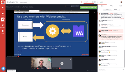


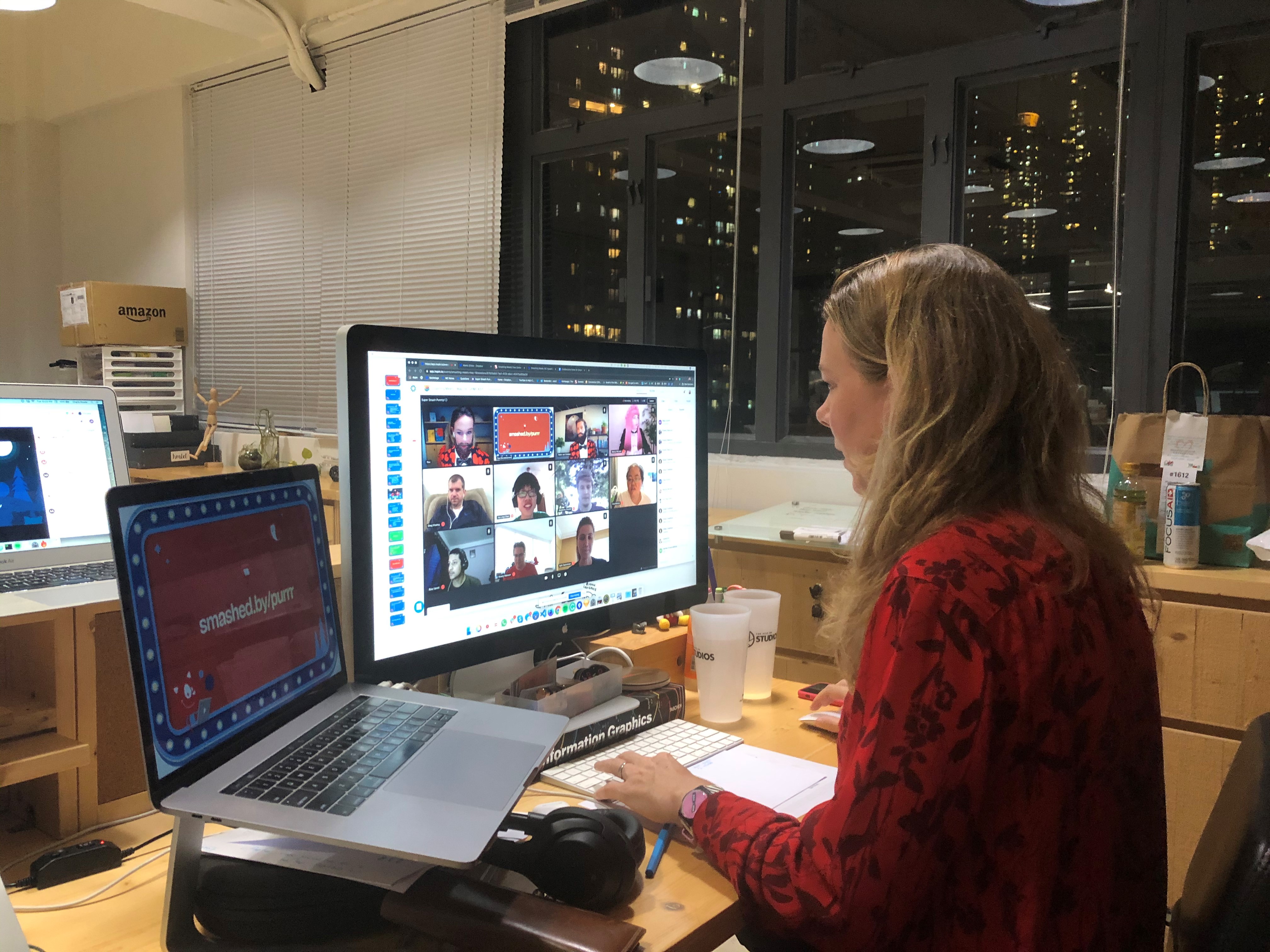


 As you can imagine, it was a very tough decision for our team to make. We have been working hard to plan this event and were looking very much forward to it for the last few months, however, we believe it is the right decision for the conference and for everyone we hoped to meet there.


