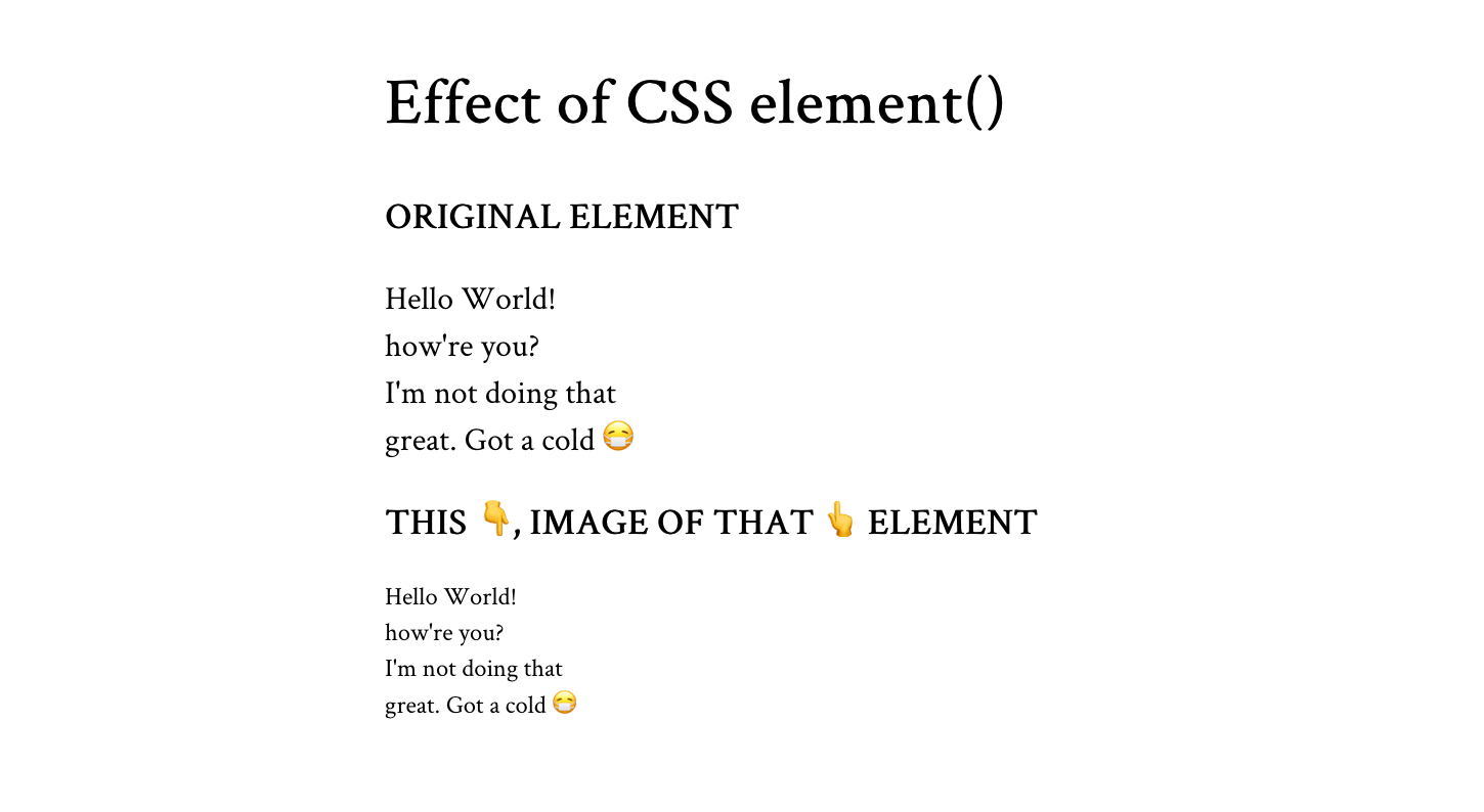
How often to do you reach for the CSS background-size property? If you’re like me — and probably lots of other front-end folks — then it’s usually when you background-size: cover an image to fill the space of an entire element.
Well, I was presented with an interesting challenge that required more advanced background sizing: background stripes that transition on hover. Check this out and hover it with your cursor:
There’s a lot more going on there than the size of the background, but that was the trick I needed to get the stripes to transition. I thought I’d show you how I arrived there, not only because I think it’s a really nice visual effect, but because it required me to get creative with gradients and blend modes that I think you might enjoy.
Let’s start with a very basic setup to keep things simple. I’m talking about a single <div> in the HTML that’s styled as a green square:
<div></div>div {
width: 500px;
height: 500px;
background: palegreen;
}
Setting up the background stripes
If your mind went straight to a CSS linear gradient when you saw those stripes, then we’re already on the same page. We can’t exactly do a repeating gradient in this case since we want the stripes to occupy uneven amounts of space and transition them, but we can create five stripes by chaining five backgrounds on top of our existing background color and placing them to the top-right of the container:
div {
  width: 500px;
  height: 500px;
  background:
    linear-gradient(black, black) top right,
    linear-gradient(black, black) top 100px right,
    linear-gradient(black, black) top 200px right,
    linear-gradient(black, black) top 300px right,
    linear-gradient(black, black) top 400px right,
    palegreen;
}
I made horizontal stripes, but we could also go vertical with the approach we’re covering here. And we can simplify this quite a bit with custom properties:
div {
  --gt: linear-gradient(black, black);
  --n: 100px;

  width: 500px;
  height: 500px;
  background:
    var(--gt) top right,
    var(--gt) top var(--n) right,
    var(--gt) top calc(var(--n) * 2) right,
    var(--gt) top calc(var(--n) * 3) right,
    var(--gt) top calc(var(--n) * 4) right,
    palegreen;
}
So, the --gt value is the gradient and --n is a constant we’re using to nudge the stripes downward so they are offset vertically. And you may have noticed that I haven’t set a true gradient, but rather solid black stripes in the linear-gradient() function — that’s intentional and we’ll get to why I did that in a bit.
One more thing we ought to do before moving on is prevent our backgrounds from repeating; otherwise, they’ll tile and fill the entire space:
div {
  --gt: linear-gradient(black, black);
  --n: 100px;

  width: 500px;
  height: 500px;
  background:
    var(--gt) top right,
    var(--gt) top var(--n) right,
    var(--gt) top calc(var(--n) * 2) right,
    var(--gt) top calc(var(--n) * 3) right,
    var(--gt) top calc(var(--n) * 4) right,
    palegreen;
  background-repeat: no-repeat;
}
We could have set background-repeat in the background shorthand, but I decided to break it out here to keep things easy to read.
Offsetting the stripes
We technically have stripes, but it’s pretty tough to tell because there’s no spacing between them and they cover the entire container. It’s more like we have a solid black square.
This is where we get to use the background-size property. We want to set both the height and the width of the stripes and the property supports a two-value syntax that allows us to do exactly that. And, we can chain those sizes by comma separating them the same way we did on background.
Let’s start simple by setting the widths first. Using the single-value syntax for background-size sets the width and defaults the height to auto. I’m using totally arbitrary values here, so set the values to what works best for your design:
div {
  --gt: linear-gradient(black, black);
  --n: 100px;

  width: 500px;
  height: 500px;
  background:
    var(--gt) top right,
    var(--gt) top var(--n) right,
    var(--gt) top calc(var(--n) * 2) right,
    var(--gt) top calc(var(--n) * 3) right,
    var(--gt) top calc(var(--n) * 4) right,
    palegreen;
  background-repeat: no-repeat;
  background-size: 60%, 90%, 70%, 40%, 10%;
}
If you’re using the same values that I am, you’ll get this:
Doesn’t exactly look like we set the width for all the stripes, does it? That’s because of the auto height behavior of the single-value syntax. The second stripe is wider than the others below it, and it is covering them. We ought to set the heights so we can see our work. They should all be the same height and we can actually re-use our --n variable, again, to keep things simple:
div {
  --gt: linear-gradient(black, black);
  --n: 100px;

  width: 500px;
  height: 500px;
  background:
    var(--gt) top right,
    var(--gt) top var(--n) right,
    var(--gt) top calc(var(--n) * 2) right,
    var(--gt) top calc(var(--n) * 3) right,
    var(--gt) top calc(var(--n) * 4) right,
    palegreen;
    background-repeat: no-repeat;
    background-size: 60% var(--n), 90% var(--n), 70% var(--n), 40% var(--n), 10% var(--n); // HIGHLIGHT 15
}
Ah, much better!
Adding gaps between the stripes
This is a totally optional step if your design doesn’t require gaps between the stripes, but mine did and it’s not overly complicated. We change the height of each stripe’s background-size a smidge, decreasing the value so they fall short of filling the full vertical space.
We can continue to use our --n variable, but subtract a small amount, say 5px, using calc() to get what we want.
background-size: 60% calc(var(--n) - 5px), 90% calc(var(--n) - 5px), 70% calc(var(--n) - 5px), 40% calc(var(--n) - 5px), 10% calc(var(--n) - 5px);That’s a lot of repetition we can eliminate with another variable:
div {
  --h: calc(var(--n) - 5px);
  /* etc. */
  background-size: 60% var(--h), 90% var(--h), 70% var(--h), 40% var(--h), 10% var(--h);
}Masking and blending
Now let’s swap the palegreen background color we’ve been using for visual purposes up to this point for white.
div {
  /* etc. */
  background:
    var(--gt) top right,
    var(--gt) top var(--n) right,
    var(--gt) top calc(var(--n) * 2) right,
    var(--gt) top calc(var(--n) * 3) right,
    var(--gt) top calc(var(--n) * 4) right,
    #fff;
  /* etc. */
}
A black and white pattern like this is perfect for masking and blending. To do that, we’re first going to wrap our <div> in a new parent container and introduce a second <div> under it:
<section>
  <div></div>
  <div></div>
</section>
We’re going to do a little CSS re-factoring here. Now that we have a new parent container, we can pass the fixed width and height properties we were using on our <div> over there:
section {
  width: 500px;
  height: 500px;
}
I’m also going to use CSS Grid to position the two <div> elements on top of one another. This is the same trick Temani Afif uses to create his super cool image galleries. The idea is that we place both divs over the full container using the grid-area property and align everything toward the center:
section {
display: grid;
align-items: center;
justify-items: center;
width: 500px;
height: 500px;
}
section > div {
width: inherit;
height: inherit;
grid-area: 1 / 1;
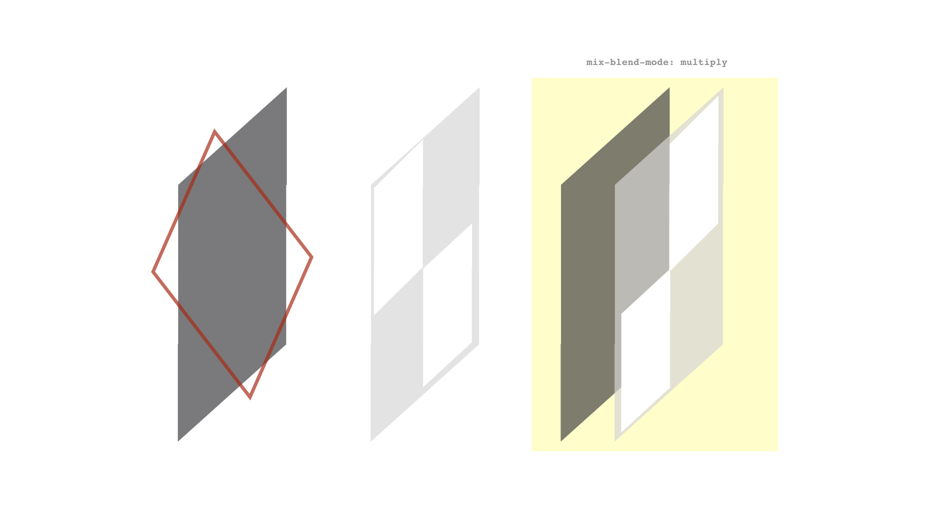
}Now, check this out. The reason I used a solid gradient that goes from black to black earlier is to set us up for masking and blending the two <div> layers. This isn’t true masking in the sense that we’re calling the mask property, but the contrast between the layers controls what colors are visible. The area covered by white will remain white, and the area covered by black leaks through. MDN’s documentation on blend modes has a nice explanation of how this works.
To get that working, I’ll apply the real gradient we want to see on the first <div> while applying the style rules from our initial <div> on the new one, using the :nth-child() pseudo-selector:
div:nth-child(1) {
  background: linear-gradient(to right, red, orange);
}

div:nth-child(2)  {
  --gt: linear-gradient(black, black);
  --n: 100px;
  --h: calc(var(--n) - 5px);
  background:
    var(--gt) top right,
    var(--gt) top var(--n) right,
    var(--gt) top calc(var(--n) * 2) right,
    var(--gt) top calc(var(--n) * 3) right,
    var(--gt) top calc(var(--n) * 4) right,
    white;
  background-repeat: no-repeat;
  background-size: 60% var(--h), 90% var(--h), 70% var(--h), 40% var(--h), 10% var(--h);
}
If we stop here, we actually won’t see any visual difference from what we had before. That’s because we haven’t done the actual blending yet. So, let’s do that now using the screen blend mode:
div:nth-child(2)  {
  /* etc. */
  mix-blend-mode: screen;
}I used a beige background color in the demo I showed at the beginning of this article. That slightly darker sort of off-white coloring allows a little color to bleed through the rest of the background:
The hover effect
The last piece of this puzzle is the hover effect that widens the stripes to full width. First, let’s write out our selector for it. We want this to happen when the parent container (<section> in our case) is hovered. When it’s hovered, we’ll change the background size of the stripes contained in the second <div>:
/* When <section> is hovered, change the second div's styles */
section:hover > div:nth-child(2){
  /* styles go here */
}
We’ll want to change the background-size of the stripes to the full width of the container while maintaining the same height:
section:hover > div:nth-child(2){
  background-size: 100% var(--h);
}
That “snaps” the background to full-width. If we add a little transition to this, then we see the stripes expand on hover:
section:hover > div:nth-child(2){
  background-size: 100% var(--h);
  transition: background-size 1s;
}
Here’s that final demo once again:
I only added text in there to show what it might look like to use this in a different context. If you do the same, then it’s worth making sure there’s enough contrast between the text color and the colors used in the gradient to comply with WCAG guidelines. And while we’re touching briefly on accessibility, it’s worth considering user preferences for reduced motion when it comes to the hover effect.
That’s a wrap!
Pretty neat, right? I certainly think so. What I like about this, too, is that it’s pretty maintainable and customizable. For example, we can alter the height, colors, and direction of the stripes by changing a few values. You might even variablize a few more things in there — like the colors and widths — to make it even more configurable.
I’m really interested if you would have approached this a different way. If so, please share in the comments! It’d be neat to see how many variations we can collect.
Animated Background Stripes That Transition on Hover originally published on CSS-Tricks, which is part of the DigitalOcean family. You should get the newsletter.