CSS Preprocessors – Sass vs LESS vs Stylus (With Examples)

It has been a while since the concept of CSS Preprocessor made its debut into the mainstay of frontend web development and changed the way we code CSS. To say that its impact in pushing the limits of what CSS can achieve has been nothing short of revolutionary, would be a grave understatement. To all the front-end developers actively arguing around the debate for Sass vs LESS in their projects, I can only hope that your neck isn’t sore from nodding in agreement.

It would be unfathomable to go back to the days without Sass, stuck in the messy quagmire of vanilla CSS, which often proved difficult to manage and organize as you scale up. Yet quite a lot of beginners and even some experienced developers, are doing a great disservice to themselves by being reluctant to adopt CSS Preprocessors and continue to ignore them.

CSS Grid Layout vs CSS Frameworks: When To Use What

“CSS Grid or CSS Framework? What should I use for my next project?” It is a question often asked by web developers, specifically new ones after they are introduced to the CSS Grid layout. CSS Grid layouts allow developers to build custom complex layouts with absolute control only by using Native CSS properties without relying on any frameworks which are bound by basic 12 column grid layouts plagued with default styling rules and do not offer a lot of room for customization.

On the other hand building grid layouts with frameworks like Bootstrap feels like a breeze without the need of writing any CSS style rules or media queries to make the layout responsive.

Tools and Frameworks for Faster Front End Testing

Tools and frameworks, just for you!


In every web app, the frontend is the face of the application that is visible to users. It includes the graphical user interface, functionality, and usability of the site. If the front-end is not working properly, you will not be able to earn potential users for your website. That’s why performing frontend testing for your web app is very crucial.

9 Essential Blogs Every Tester Should Follow in 2020

Here's where you need to go to get software testing knowledge in 2020.

2020 is almost here, and it’s time for QA professionals to make new resolutions to improve their testing process. We all understand how software testing has evolved in the last few years. From automating cross-browser testing to real-time testing of web apps with Selenium, a lot of changes have come to the testing process. Though some innovations and technologies made it easy for QA professionals to test their web app, some challenges even made the testing process more complicated than earlier.

You may also enjoy:  The 6 Essential QA Blogs to Read in 2019

Thus, QAs need to keep up with the new trends in the web development sector, and they should take help from blogs and articles published by industry professionals to improve their expertise and make the testing process more efficient and effective.

Variable Fonts vs. Static Fonts and Cross-Browser Compatibility, Part 1

Variable Fonts have unleashed a whole new world of creative possibilities along with enhancing website’s readability, accessibility, performance, flexibility, and responsiveness. Developers no longer need to rely on standard static fonts bound with fixed design limitations, but, rather, can embrace variable fonts to unlock thousands of typographic variations along with font animations to create unique custom font styles.

Variable fonts are part of the ‘OpenType’ specification originally developed as a joint collaborative project between the four giants – Apple, Microsoft, Adobe, and Google. The key concept behind variable fonts is to utilize unlimited font style variations of a specific typeface by relying on just a single font file. This allows a developer to fully utilize the potential of RWD (responsive web design) by modifying or animating the typeface based on a device'c viewport, type, orientation, mouse events, etc. On the contrary, standard static font requires separate font files for each font style, resulting in dreadful site performance.

Feature Detection With Modernizr for Cross-Browser Compatibility

Modernizr is an open source and compact JavaScript library that allows developers to craft various levels of experiences for users with respect to cross-browser compatibility. Modernizr helps developers to perform cross-browser testing to check whether new the generation of HTML5 and CSS3 features are natively supported by their visitor’s browsers or not and to provide dedicated fallbacks for older browsers that are notorious for their poor feature support. Modernizr coupled with the principle of progressive enhancement helps to design cutting-edge websites layer by layer, taking advantage of powerful modern web technologies without discarding users that are still using older browsers like IE.

How Does Modernizr Work?

Modernizr was launched in July 2009 by Faruk Ateş to battle cross-browser compatibility issues in a uniform, standardized manner. Today, Modernizr as feature detection library is one of the most popular JavaScript libraries, offering more than 270 tests, and is being used in 8.76% websites globally (half a million websites in the US alone). Instead of relying on highly untrustworthy browser detection methods using “User-Agent” sniffing, Modernizr is, instead, based on feature detection. While browser detection is centered around the question “what browser is the visitor using?” feature detection revolves around the question, “what features are supported by the visitor’s browser?” Modernizr runs a series of JavaScript-based feature detection tests in a user’s browser to check for cross-browser compatibility for HTML and CSS by allowing you to target each browser's functionality separately.

CSS With Feature Detection for Cross-Browser Compatibility

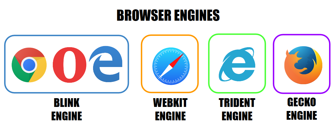
The primary goal of every web developer is to build websites with modern and intuitive designs that deliver a smooth and seamless user experience, irrespective of which browser they might be using to surf the web. The Internet has witnessed a massive unprecedented boom in recent decades. As of December 2018, there are more than 4.1 billion internet users in the world and close to 1.94 billion websites on the web. This consequently implies an expansion in a number of ways websites are being accessed by audiences across the globe. This gives rise to the conundrum of cross-browser compatibility, which poses a huge challenge to developers. As the number of browsers and their versions are growing at such a rapid pace every year, the task of trying to make a website appear and perform consistently across all browsers is every developer’s nightmare. However, as tedious and time-consuming as cross-browser testing may be, it is an imperative phase of every testing cycle. While it is considered nearly impossible to have a website appear and work identically on every browser, there still are a number of ways to deliver consistent user experience and reach a wider target audience. In this article, we’ll explore what cross-browser compatibility issues are and why they occur, how CSS with feature detection is more favorable to browser detection, and tips to achieve near perfect browser compatibility when designing websites.

Why Browsers Render Content Inconsistently

browsers