What does it take to design a new website in 2022? Well, it’s possible to break this process into a few steps. You likely start with choosing a domain name for your website and buying it. Next, you will compare various hosting services and choose the one that satisfies your needs, and lastly, you will select a content management system (CMS) that fits your needs. After installing CMS on your hosting provider, you can start designing your website.
Sounds tedious, right? With so many tools available on the market right now, finding the right tools can take hours or even days, and there is no guarantee that you will have a decent solution in the end.
This proved to be the catalyst for Elementor’s latest solution: the Elementor Cloud Website. The Elementor team aimed to overcome this challenge. The Elementor Cloud Website is a new tool that will expand the WordPress website builder’s offerings with built-in hosting features. This hosting solution is based on the Google Cloud Platform, known for world-class security, scalability, and reliability. The platform offers 20 GB storage, 100 GB bandwidth, and 100K monthly visits which are enough for most types of websites. What it means is that with Elementor’s Cloud Website, web designers and developers can build and host their WordPress websites without the need to switch between different tools.
Creating A New Website With Elementor Cloud Website
The process of creating a new website with Cloud Website is simplified and faster. If you’re new to Elementor, you can visit the Elementor Cloud Website and click “Join Now” to create a new account. Once you’ve created a new account, you need to choose the option “Build & Publish a complete Hosted Elementor Website”.
If you are an Elementor user, you can log in to the Elementor admin panel where you will see a large button named “Create Cloud Website” at the top right corner of the page:
Once you click this button, you will be invited to provide basic information about your website step-by-step. You will provide the website’s name, domain name, and type of website.
All websites created using Elementor Cloud Website will be hosted on subdomain .elementor.cloud by default, but you can easily link your own with no extra costs.
You will be asked to specify the type of website you want to build. Elementor will use this information to suggest a relevant pre-designed website kit for your project.
Lastly, you will be asked to choose the visual kit for your website from the list of available options. You can always choose to design a website from scratch. For our example, I decided to use the Basic kit from the list suggested by Elementor.
Once you do that, Elementor will start building your website. The process of creating a new instance of your website will take a few minutes. Once it is done, you will see a shiny new instance of your website ready for use. Our instance is called WakeUp.
You may notice the badge “Site Lock is On.” When Site Lock is enabled, search engines won’t display your site, so you don’t need to worry that someone will have access to your unfinished website.
But what exactly comes with a newly created instance? You will have access to the WordPress dashboard, Elementor editor, and website settings.
Let’s click “Edit with Elementor” to start designing our website right away.
Modifying Page Layout With Elementor Editor
All front-end designs of your website can be done with the Elementor editor. Elementor offers a WYSIWYG (What You See Is What You Get) editor for your web pages. When you introduce changes to your web page, you immediately see the results of your changes. For example, when we want to change the text in the hero section, all we need to do is to click on the content block and modify the text in it.
If you want to add a new content section on your page, add a new section, choose the most relevant widget from the collection of 100+ widgets, and drag & drop it into this section. Elementor supports almost all types of content — from text to visuals.
But the process of editing is not limited to text or images. You can introduce fancy animated effects such as motion effects on scrolling. Such an effect can help you create a more dynamic scrolling experience and can convey a feeling that your website is alive.
For example, here, I defined the “Fade In” effect with a duration of 300 ms for the section that comes after the Hero section and describes features that our product offers:
The great thing about the Elementor editor is that you can check how your website looks on mobile or any other medium. Simply click “Responsive” Mode in the bottom left menu (next to the button “Update”) and click on the “Mobile” option. What you will see is how your website will look on mobile devices:
Managing The Website Using WordPress
Elementor Cloud Website provides access to full WordPress instances. It’s the same version of WordPress that you might download from the official WordPress website and install on your local or remote machine. Out of the box, this instance of WordPress comes with all essential features. You will have admin access to the CMS and be able to manage users who can access your website, import/export content, and install required plugins. But Elementor Cloud Website also offers a few neat benefits. WordPress comes with a pre-installed Elementor Pro plugin, Activity Log, which tells you what activities are taking place on your dashboard, and a collection of hundreds of visual themes that you can use for your website. Elementor Hello theme is already pre-installed as well.
Another vital thing about Elementor Cloud Website is that you have all ownership of your content. If you decide to move your website to another platform (i.e., switch from WordPress to any other CMS), you can export your website at any time.
Setting Backups And Connecting Domain
Once you finish designing your website, you need to do two things: create a backup and connect the domain name. There are two kinds of people: those who back up and those who have never lost all their data. With Elementor Cloud Website, setting up backups is easy. All you have to do is click the “Manage This Website” option and find the “Backups” section.
As you can see, Elementor creates automatic backups for your website every 24 hours, but you can also create your own backup at any other moment using the “Create new backup” section.
Next, you need to connect your domain name to this website. It can also be done on this page, in the Manage Domain section. Some web creation platforms charge extra for connecting a custom domain name, but Elementor Cloud Website does it at no additional cost.
You can notice that an SSL certificate is also enabled for our website. Elementor Cloud Website provides its users with a built-in free Secure Socket Layer (SSL) from Cloudflare. It gives you a couple of benefits — better search engine ranking (Google ranks SSL higher than non-SSL counterparts) and better user experience (if your website requires data input, site visitors will never see a "Not Secure connection" message in their browser). You can also install your own SSL certificate if required.
After a custom domain is connected, we can safely turn "Site Lock" off so search engines can discover our website. It also can be done in this section.
Measuring The Performance Of Our Newly Created Website
Website performance plays a crucial role in how users think and feel about our website. Nobody likes interacting with slow websites, and when it comes to web performance, every second counts (literally). With every second you make your users wait for the site to load, you increase the chance that they abandon your site.
Measuring performance should be a regular exercise for site owners, so let’s use a popular tool called PageSpeed Insights to see how our newly created website performs. As you can see, the website has a score of 94 out of 100, which is really good.
You may wonder, what might cause slow website performance? While many problems can be responsible for slow site loading, high latency and using heavy imagery are at the top of the list:
High latency. Latency is the time it takes for data to pass from one point on a network to another. High latency can be caused by geographic location. For example, your website is located in the US, but your visitor accesses it from Europe.
Using many heavy imagery assets. Rendering too many high-resolution images in raw formats such as PNG can be time-consuming.
But if you use Elementor Cloud Website, you are safe because it uses content delivery networks (CDNs) distributed worldwide. A CDN allows for the quick transfer of assets needed for loading, including images and videos. Your website content is stored in over 200 locations globally, so it responds quickly wherever your visitors are.
“Okay, this tool demonstrates solid performance when we test it for one visitor, but what happens when hundreds or thousands of visitors access it?”
Rest assured, you will be fine. Elementor Cloud Website harnesses the power of Kubernetes, an open-source system for the management and scaling of containerized applications. Kubernetes enables Elementor Cloud Website to scale its hosting both fast and reliably regardless of a website’s usage, whether it draws ten or ten thousand visitors.
How Much Does An Elementor Cloud Website Cost?
It took us less than an hour to create and publish a website using Elementor Cloud Website. You may assume that this tool will cost a lot of money. But in reality, this solution only costs $99.00/year (excluding VAT). For this sum, you will receive 100GB bandwidth for your website, 100K monthly unique visits, and 20GB of storage for all your content and assets. It’s important to note that Elementor Pro is thrown into the mix (a plan that costs $49 per year). There are no hidden costs. All those features are included at one price.
Conclusion
Web design should be fun and accessible for anyone. After all, when we build a new website, our primary goal is to share our idea, product, or service with the world, not to dive into solving technical problems. Elementor Cloud Website saves us from the tedious and monotonous work of comparing various web services and helps us to focus on what’s really important—sharing our vision with people we care about.
This article has been kindly supported by our dear friends at Elementor whose goal is to empower web creators to design, publish and manage powerful and beautiful WordPress websites using the most comprehensive all-in-one design solution. Thank you!
How To Ensure Your Design System Helps To Achieve The Purpose Of Your Product
How To Ensure Your Design System Helps To Achieve The Purpose Of Your Product
Nick Babich
(This is a sponsored post.) Design systems help product teams to approach design with a system in mind. But not all design systems are equally effective. Some design system help product teams create coherent experience; others produce confusing designs.
The effectiveness of a design system can be measured by how well it works to help achieve the purpose of the product. In this article, we’ll try to find the qualities that make a design system good for your product development.
Do You Clearly Understand Why You Need A Design System?
All too often, product teams attempt to create a solution for a problem they don’t have. And when it comes to creating a design system, some teams attempt to create a system just because other teams are doing it.
Product And Company Maturity
Companies have different levels of design maturity. Some companies have a product with thousands of users, while others are just beginning to implement their product.
Creating a design system from scratch is a time-consuming activity. Small fast-moving teams likely don’t need a design system because it would slow them down. A three-to-five–person startup that is trying to find a product-market fit would probably spend a significant amount of time creating a system. And if resources are being spent on building a design system, they aren’t being spent on building the product. Until the company establishes a clear direction with its product, investing time in creating a design system risks producing a lot of waste.
A design system should come from the need to increase efficiency at scale. And it happens only when a team has real problems with the efficiency that prevent it from moving quickly. Let your team hit scale first and reach a point where inefficiencies such as in the technical and design departments become significant factors in design decisions.
Interface Audit And Technology Stack
Many companies tend to build a design system on top of the current interface, but this approach is not very good for many reasons. Imagine that your company has been building a product for a long time without a system; it’s likely that the product has some level of inconsistency in design.
That’s why if you plan to introduce a design system, start with an audit: Explore existing interactions, and collect all of the UI elements in your product. Collect all elements that make up the interface, and file them for review. The reviews should help you to understand the reason for inconsistency and the changes you’ll need to introduce in the design process in order to avoid such problems in the future.
Does The Design System Set A Clear Direction For Designers And Developers?
A design system is valuable only if the people who are working on the product adopt it. Shared understanding plays a vital role in adoption of the system.
Before starting to design a product, it’s essential to align teams around a clear set of shared goals. Build a vision, and ensure that everyone is looking in the same direction. A design system should give teams a guided way to build solutions for their product problems.
Mapping Out User’s Needs, Goals, And Motivations
One of the first things we need to do when starting to work on a product is to understand who our users are and what are their goals, needs, and motivations. This information should be the foundation of the design system you want to create.
Tools like user-journey mapping and the Jobs to be Done framework will help you to understand how people interact with your product. The product team should keep this information in mind when working on the design system.
Express The Purpose Of The Product
The purpose is the core of the product, and it should inform design and development decisions. The purpose of a product should be expressed in one sentence. For instance, if we were designing a meditation app for quick relaxation, our goal would be to help people who use our app to relax. If we expressed this purpose in a single sentence, it would be something like, “Help people relax in no time.”
Note that the purpose should be natural, not forced; otherwise, the team won’t believe in it.
Establish Clear Design Principles
Solid design principles are the foundation of any well-functioning system. They should capture the essence of what good design means for the company and provide practical recommendations for product teams on how to achieve it.
Design principles should be created on the principles and values of the product. Design Principles of the Lightning Design System. (Large preview)
Below are just a few guidelines for design principles.
Design Principles Should Be Authentic And Genuine
Many of us hear principles like “simple and useful”. But qualities like these should be a given. Knowing that your product should be simple and useful is not going to be helpful in guiding your design decisions. Imagine that a new member joins your team, and you need to share the three guiding principles that are most important when designing a product. You might say something like, “We like simple things — strive to create simple things.” This doesn’t say much to the person. It’s hard to imagine that anyone would intentionally create a complex and useless product.
That’s why principles should offer practical guidance on how to solve a design problem within the context of the particular product. One of the design principles of Medium, a popular blogging platform, is “Direction over choice.” Thanks to this principle, instead of designing a text editor with endless visual styles, Medium’s design team decided to limit the number of visual styles. In doing so, they make the writer focus on what’s really important: the content they are producing.
Ask the people in your company what your design principles are. If no one can remember them, chances are they are not working.
Design Principles Should Provide Practical Examples
Even the best principles can be interpreted in different ways. Nothing makes a principle clearer that being paired with a real-life example, showing how it can be applied in context.
Tip: Sometimes you need to provide counter-examples to help people understand what not to do.
How Effective Is The Design Language Of The Interface?
A design language emerges as a team works on a product. The design language of the interface has a significant impact on how users interact with the product. If a product created with a design system is confusing and doesn’t help users achieve their goals, then the design system is not effective.
How Design Patterns Are Executed And Applied
A pattern is a reusable solution that can be applied to solve a design problem. Design patterns are shaped by the core idea of how a product works, and they form the foundation of the language that the team uses to communicate with users.
There are two types of patterns: functional and perceptual.
Functional Patterns
Functional patterns are the tangible building blocks of an interface. Buttons, icons, text fields and so on all come together to form what we call a product.
Many factors influence the choice of design patterns, and most of them come from the domain that the product belongs to and from its core functionality. Let’s take a finance product as an example. A finance product might need to prioritize multitasking and quick scanning (which require greater information density). In Bloomberg’s interface, shown below, density is achieved through tight spacing, compact controls, and good typography choices.
Bloomberg terminal has a dense design, fitting large amounts of information on the screen. Image: Wikipedia. (Large preview)
Perceptual Patterns
In his book _The Timeless Way of Building_, Christopher Alexander asks why some places feel so great to be in, while others feel dull and lifeless. According to him, the way places and buildings make us feel is the result of specific patterns: perceptual patterns.
Perceptual patterns focus on what users feel. Colors, typography, iconography, shapes, and animation come together to form the identity of a product. Without perceptual patterns, you wouldn’t sense much difference between products in the same domain.
The aesthetics and voice and tone in a product should capture the personality and ethos we want to convey through the interface:
It’s also important to understand that perception is influenced not only by individual elements (text, colors, typefaces, white space, etc.), but also by the relationships between those elements. In other words, it’s not enough to use colors and fonts consistently; we should also be aware of the “just right” combinations that make a product feel a certain way.
Tip: When working on a perceptual pattern, you can use the technique of moodboarding. Collect all elements with relevant visual styles, and define their core visual brand elements. Moodboards are an excellent tool to explore different visual themes. To make one, you can use a digital tool like Pinterest or assemble printed pages on a large board.
Measure Your Progress
Implementing a design system is a process. And it’s crucial to ensure along the way that the system is helpful. No matter how good you are at predicting things, in many cases, it will be hard to predict how a particular change will affect the user experience. That’s why it’s important to define metrics and to track them along the way. After every release, measure how your product performs. Measure the qualitative and quantitative results, and make sure your metrics are going in the right direction.
How Effective Are The Practices Of The Team?
How Fast Does The Internal Design Team Work?
Can the people working on the product ship changes more quickly?
An effective design system allows a business to meet its goals faster and at a lower cost. A design system should reduce implementation decisions, because team members would have all elements of a product ready for use, along with information on how to use them. As the process of building products accelerates, designers will gain time, which they can invest in other areas, such as user research.
Here are a few areas to monitor:
Efficiency
Measure how fast new patterns are integrated and how fast changes to existing patterns are introduced. If designers often have to introduce a new component to solve a problem, that could be a strong sign that the design system is not flexible.
Consistency
How hard is to create consistent experiences across different platforms.
When it comes to design efficiency, investment in tools and technology is essential. A good toolbox will help to eliminate manual operations from your design process. Adobe XD offers two excellent features that can improve design efficiency: components and shared assets panel.
Using XD, you can create a master component to define a reusable UI element, such as a button. Create instances of any component in your UI, and customize them. The components are designed to resize responsively, so you can take any instance and adjust the size of the component, and XD will automatically manage the placement and scaling of the elements within the component for you.
You can use the Assets panel to curate a collection of reusable elements that you want to make available to other designers on your team. To enable others to use the visual styles and components you’ve defined, invite them to the document using “Share” → “Invite to Edit”. The great news is that everyone will leverage the latest assets; whenever the design is updated, team members who have been invited to the collection will be notified about the changes. Team members will be able to update at their own discretion.
How Easily Can Developers Code The UI?
It’s well known that developers and designers must work hand in hand. And when it comes to communication between designers and developers, design specifications play a key role. The most important aspect of the design specification is clarity: If developers don’t understand the specification, they might implement something different from the original idea. A good design specification reduces false interpretation of design decisions.
With Adobe XD, creating an unambiguous specification is a relatively simple process. You can use “Share” → “Share for Development” to publish your design system on the web. The resource will contain information about color values, style attributes, and downloadable assets.
Does the design system allow team members to communicate more efficiently? Language is fundamental to collaboration. Every element in a design system should have a name that is known and that makes sense to the people on your team. Proper naming conventions are especially important for products that will scale — as the number of patterns in a library increases, good naming conventions can help team members quickly find what they’re looking for.
Here are a few tips on naming elements:
The distinguishing aspect of a design system’s language is its stickiness. Similar to any other language, we need to use the language if it is to survive. It needs to be a part of our daily routine.
Naming an element can be hard when the team hasn’t fully understood its purpose. If you have a hard time finding the right name, chances are that something isn’t quite right. Maybe an element’s purpose is unclear.
Name components from the user’s perspective. Speak to users and potential users of the product, and name components according to how their refer to them. This will help engineers to think from the user’s perspective and to always have users in mind.
Test your language with users. This ensures that the modules you’ve defined are aligned with your user’s potential behaviors and mental models.
How Easy Is It To Maintain The System?
A design systems is not a static tool, but rather a living organism in your company. It should grow and evolve together with your product. The time required to keep the system up to date plays a key role in its success or failure. If keeping the design system updated becomes difficult, it will quickly become outdated.
Here are two important moments to consider:
Depending on the size of a company, a design system could be either static or dynamic. It’s always better to have a dynamic design system, one that will be updated in real time with the product. Also, a static design system would not fit a company that has large-scale products, because the time required to introduce changes would be significant.
A design system should have a roadmap and backlog. As with any other product, creating a design system is an iterative process, constantly ongoing.
Does The Design System Extend Creative Directions?
Creative experimentation is an integral part of the design process. Sometimes, effective design decisions are based on intuition. That’s why one of the main goals of a design system is to extend creative direction. A design system should encourage the people who work on the product to be creative and spontaneous.
Invite Everyone To Contribute To The System
Everyone in the company should be not only allowed but encouraged to contribute to the system. Give people enough freedom to contribute, yet make sure the system stays managed and curated.
Tip: Follow a process of peer-to-peer reviews. This will increase awareness of the design system.
Achieve A Balance Between A Sticky And Loose System
Some users of design systems fixate on perfect consistency. But perfect consistency doesn’t guarantee a great product. If the process you’re following is restrictive, you risk ending up with a generic design. That’s why it’s vital to find a balance between consistency and creative expression in the design.
When it comes to creative exploration, it’s always better to experiment on a small scale first. If some elements work well (such as a new style for a call-to-action button), then the design system should make it easy to integrate the changes into other parts of the interface.
Conclusion
A well-crafted design system serves as a North Star of your product development. A design system amplifies design-driven culture — it encourages people who work on the product to look beyond the building blocks and to think of the purpose of their design. The big picture that a design system imparts will lead to a better understanding of your users and, ultimately, a better user experience.
This article is part of the UX design series sponsored by Adobe. Adobe XD tool is made for a fast and fluid UX design process, as it lets you go from idea to prototype faster. Design, prototype and share — all in one app. You can check out more inspiring projects created with Adobe XD on Behance, and also sign up for the Adobe experience design newsletter to stay updated and informed on the latest trends and insights for UX/UI design.
Webflow: The Web Development Platform Of The Future
Webflow: The Web Development Platform Of The Future
Nick Babich
(This is a sponsored article.) Time-to-market plays a crucial role in modern web design. Most product teams want to minimize the time required to go from the idea to a ready-to-use product without sacrificing the quality of the design along the way.
When it comes to creating a website, teams often use a few different tools: one tool for graphics and visual design, another for prototyping, and another for coding. Webflow attempts to simplify the process of web design by enabling you to design and develop at the same time.
Typical Problems That Web Designers Face
It’s important to start with understanding what challenges web design teams face when they create websites:
A disconnection between visual design and coding.
Visual designers create mocks/prototypes in a visual tool (like Sketch) and hand them off to developers who need to code them. It creates an extra round of back-and-forth since developers have to go through an extra iteration of coding.
It’s hard to code complex interactions (especially animated transitions).
Designers can introduce beautiful effects in hi-fi prototypes, but developers will have a hard time reproducing the same layout or effect in code.
Optimizing designs for various screens.
Your designs should be responsive right from the start.
What Is Webflow?
Webflow is an in-browser design tool that gives you the power to design, build, and launch responsive websites visually. It’s basically an all-in-one design platform that you can use to go from the initial idea to ready-to-use product.
Here are a few things that make Webflow different:
The visual design and code are not separated.
What you create in the visual editor is powered by HTML, CSS, and JavaScript.
It allows you to reuse CSS classes.
Once defined, you can use a class for any elements that should have the same styling or use it as a starting point for a variation (base class).
It is a platform and as such, it offers hosting plans.
For $12 per month, it allows you to connect a custom domain and host your HTML site. And for an additional $4 per month, you can use the Webflow CMS.
Building A One-Page Website Using Webflow
The best way to understand what the tool is capable of is to build a real product with it. For this review, I will use Webflow to create a simple landing page for a fictional smart speaker device.
Define The Structure Of The Future Page
While it’s possible to use Webflow to create a structure of your layout, it’s better to use another tool for that. Why? Because you need to experiment and try various approaches before finding the one that you think is the best. It’s better to use a sheet of paper or any prototyping tool to define the bones of your page.
It’s also crucial to have a clear understanding of what you’re trying to achieve. Find an example of what you want and sketch it on paper or in your favorite design tool.
Tip: You don’t need to create a high-fidelity design all of the time. In many cases, it’s possible to use lo-fi wireframes. The idea is to use a sketch/prototype as a reference when you work on your website.
For our website, we will need the following structure:
A hero section with a large product image, copy, and a call-to-action button.
A section with the benefits of using our product. We will use a zig-zag layout (this layout pairs images with text sections).
A section with quick voice commands which will provide a better sense of how to interact with a device.
A section with contact information. To make contact inquiries easier for visitors, we’ll provide a contact form instead of a regular email address.
Create A New Project In Webflow
When you open the Webflow dashboard for the first time, you immediately notice a funny illustration with a short but helpful line of text. It is an excellent example of an empty state that is used to guide users and create the right mood from the start. It’s hard to resist the temptation to click “New Project.”
When you click “New Project,” Webflow will offer you a few options to start with: a blank site, three common presets, and an impressive list of ready-to-use templates. Some of the templates that you find on this page are integrated with the CMS which means that you can create CMS-based content in Webflow.
Templates are great when you want to get up and running very quickly, but since our goal is to learn how to create the design ourselves, we will choose “Blank Site.”
As soon as you create a new project, we will see Webflow’s front-end design interface. Webflow provides a series of quick how-to videos. They are handy for anyone who’s using Webflow for the first time.
Once you’ve finished going through the introduction videos, you will see a blank canvas with menus on both sides of the canvas. The left panel contains elements that will help you define your layout’s structure and add functional elements. The right panel contains styling settings for the elements.
Let’s define the structure of our page first. The top left button with a plus (+) sign is used to add elements or symbols to the canvas. All we have to do to introduce an element/visual block is to drag the proper item to the canvas.
While elements should be familiar for anyone who builds websites, Symbols can still be a new concept for many people. Symbols are analogous to features of other popular design tools, like the components in Figma and XD. Symbols turn any element (including its children) into a reusable component. Anytime you change one instance of a Symbol, the other instances will update too. Symbols are great if you have something like a navigation menu that you want to reuse constantly through the site.
Webflow provides a few elements that allow us to define the structure of the layout:
Sections. Sections divide up distinct parts of your page. When we design a page, we usually tend to think in terms of sections. For instance, you can use Sections for a hero area, for a body area, and a footer area.
Grid, columns, div block, and containers are used to divide the areas within Sections.
Components. Some elements (e.g. navigation bar) are provided in ready-to-use components.
Let’s add a top menu using the premade component Navbar which contains three navigation options and placeholders for the site’s logo:
Let’s create a Symbol for our navigation menu so we can reuse it. We can do that by going to “Symbols” and clicking “Create New Symbol.” We will give it the name “Navigation.”
Notice that the section color turned to green. We also see how many times it’s used in a project (1 instance). Now when we need a menu on a newly created page, we can go to the Symbols panel and select a ready-to-use “Navigation.” If we decide to introduce a change to the Symbol (i.e., rename a menu option), all instances will have this change automatically.
Next, we need to define the structure of our hero section. Let’s use Grid for that. Webflow has a very powerful Grid editor that simplifies the process of creating the right grid — you can customize the number of columns and rows, as well as a gap between every cell. Webflow also supports nested grid structure, i.e. one grid inside the other. We will use a nested grid for a hero section: a parent grid will define the image, while the child grid will be used for the Heading, text paragraph, and call-to-action button.
Now let’s place the elements in the cells. We need to use Heading, Paragraph, Button, and Image elements. By default, the elements will automatically fill out the available cells as you drag and drop them into the grid.
While it’s possible to customize the styling for text and images and add real content instead of dummy placeholders, we will skip this step and move to the other parts of the layout: the zig-zag layout.
For this layout, we will use a 2×3 grid (2 columns × 3 rows) in which every cell that contains text will be divided into 3 rows. We can easily create the first cell with a 3-row grid, but when it comes to using the same structure for the third cell of the master grid, we have a problem. Since Webflow automatically fills the empty cells with a new element, it will try to apply the 3-row child grid to the third element. To change this behavior, we need to use Manual. After setting the grid selection to Manual, we will be able to create the correct layout.
Once we have all the required elements in place, we can create a vertical rhythm by adjusting the position of every item that we use. First, we need to adjust the spacing of elements in grids. Change the margin and paddings and Align self for the image in order to place it in the center of the cell.
Now it’s time to replace the dummy content with real content. To start adding images, we’ll need to click on the gear icon for the Image element and select the image of our choice.
Webflow provides a visual style for every element we use in our design. Let’s take a Heading section as an example: It’s possible to play with font color, font, weight, spacing, shadows, and other visual properties of this object. Here is what we will have when adding real copy and playing with font color.
Once we have a nice and clean hero section, we can add content to our zig-zag layout.
Notice that every time we style something, we give it a Selector (a class), so Webflow will know that the style should be applied specifically for this element. We can use the same class to style other elements. In our case, we need the same style for images, headings, descriptions, and links that we have in the zig-zag layout.
Applying the same “benefit” style for all images in the zig-zag section. (Large preview)
Webflow also allows creating combo classes — when one class is used as a base class, and another class is used to override the styling options of the base class. In the example below, we override the default font color of the Heading using the class “Zig-Heading-Second.” Combo classes can save you a lot of time because you won’t need to create a style from scratch.
Using a combo class for the Heading. The orange indicator is used to highlight the properties that were inherited from the base class. (Large preview)
Here is how our layout will look like after the changes:
Webflow provides a very helpful feature for aligning content named “guide overlay” which can be located in the left menu panel. When you enable the guide, you will see the elements that are breaking the grid.
After finishing with a zig-zag layout, we need to add information on voice commands in the Slider. Add a Heading section in a relevant slide and change the visual styling options of this object.
Last but not least, we need to add a contact form to our website. Let’s add a section right underneath of Slider.
There are two ways we can add a form to the page. First, Webflow has a special element for web forms called Form Block. A form created using Form Block has three elements: Name, Email Address, and a Submit button. For our form, we will need a Message field. We can easily create one by duplicating the element Email Address and renaming it. By default, the Form Block has 100% width alignment, meaning it will take the entire width of the container. We will use the Grid settings to adjust the form width.
Secondly, Webflow allows integrating custom code right in the page. It means that we can create a form in a tool like Typeform, copy the embed code it provides and place it to the component called Embed that we placed to the section. Note that embeds will only appear once the site has been published or exported — not while you’re designing the site.
Once all elements are in place, we need to optimize our design for mobile. Almost half of the users (globally) access websites on mobile. What you can do within Webflow is to resize the browser window so that you can see how your design looks like with different breakpoints.
Let’s change our view to Mobile by clicking on the Mobile - Portrait icon.
As you can see, the design looks bad on mobile. But it’s relatively easy to optimize the design using Webflow: It allows you to change the order of elements, the spacing between elements, as well as other visual settings to make the design look great on mobile.
After we’re done making changes to our design, we have two options: we can export the design and use it on our own web hosting (i.e., integrate it into your existing CMS) or we can use Webflow’s own hosting provided. If we decide to use the second option, we need to click the Publish button and select the relevant publishing options, i.e. either publish it on the webflow.io domain or on a custom domain.
If you decide to export the code, Webflow will prepare a full zip with HTML, CSS, and all the assets you’ve used to create your design. The exported code will help you build a solid foundation for your product.
Conclusion
Webflow is an excellent tool for building high-fidelity prototypes and inviting feedback from team members and stakeholders. People who will review your prototype won’t need to imagine how the finished product will behave and look — they can experience it instead!
The tool simplifies the transition from a prototype into a fully finished UI because you’re designing products with real code, as opposed to creating clickable mocks in Sketch or any other prototyping tool. You won’t waste time by using one piece of software to build prototypes and another to turning those prototypes into real products. Webflow solves this problem for you.
(This is a sponsored article.) A design system enables a product team to create a product faster by making the design reusable. But quite often, despite everyone’s best intentions, all the effort that a product team puts into making a thoughtful design system can go straight down the drain.
Nowadays, there’s no shortage of articles explaining what a design system is and how to create one. However, there’s still a lack of practical recommendations on how to manage a design system.
Let’s fill this gap. In this article, I’ll talk about things you can do to set up your organization for long-term success with your design system.
1. Encourage Adoption Of Your Design System
More important than building a design system is encouraging everyone to use it. A design system sets a new direction for an organization, and whether the organization accepts this direction will largely depend on how people react to the changes. Depending on the size of the company, encouraging people to adopt a single design system can be a tall order. People will be happy to adopt the system only when they find it to be valuable.
Here is what you need to do to get your organization to follow the direction you’ve established with the design system.
Create A Vision Statement
Where are we going? What do we want to achieve? Why do we want to achieve that? Those are fundamental questions that you need to answer in order to build a shared vision.
A vision statement defines what your team, product or company is attempting to achieve and, more importantly, why. The vision statement will become your North Star — it will unite the team and guide it towards a common destination.
A simple technique you can use to create your vision statement is to describe what your product or organization should look like in five years. By doing that, you’ll define a target condition.
The vision statement is the answer to the question, “Where do we want to go?” (Image: UIE) (Large preview)
Establish Guiding Design Principles
How do you define good design? How do you know when something is ready to ship? When it comes to evaluating the quality of a design, designers often rely on their own set of standards. But as a team grows, following such an approach can introduce a lot of chaos in the product design process, because every designer will have their own subjective ideals. That’s where design principles can save the day.
Design principles act as standards for the product team and help them to measure their work. They replace subjective ideals with clear standards that help team members make user-centered design decisions. However, in many cases, it’s not hard to make people follow guidelines, but rather it’s hard to make people agree on guidelines. That’s why it’s essential not only to establish grounding principles of design, but also to get a commitment to those principles from the people involved in the creation of the product.
Here are a few things to remember when working on design principles:
Design principles should reflect the nature of the product.
For example, when it comes to human-machine interface design for automobiles, the most important design principle should be “Safety first”. Every design decision should be measured for safety — the goal is to keep the driver and passengers safe.
Practice open discussion.
If an organization has many design teams, then involving them in a discussion is vital. By getting their feedback on the design principles, you can adapt the principles to the needs of users.
Design principles should not sound like rules.
Product creators should not feel limited or restrained. It’s important to make everyone comfortable when they do their work.
A design system won’t take off if the people who decide on funding don’t buy into it. You need to get buy-in from executives to fund the system.
Write a strategy with a clear proposal, and pitch it to key decision-makers. Your goal is to show that the system solves real problems. Identify key pain points — areas where people spend much time (especially routine operations), and pitch a presentation (or series of presentations) to show how the design system can save the day.
Quick tip: Wrap your presentation in the form of a story. By telling success stories, you will have a better chance of engaging stakeholders.
Promote Your Design System
You can create the best design system in the world, but if you don’t actively promote it in your organization, the entire effort will suffer greatly. That’s why, from the first release of your system, you need to work hard to foster its adoption and create a community of supporters.
Evangelize the design system. Create a group of volunteers, led by senior designers, who will pitch and sell ideas about your design system. The evangelists should participate in various activities such as workshops and webinars. The goal of all of those activities should be to raise awareness that the system exists and to educate people on how to use it.
Show Value Through A Sandbox Environment
It’s well known that the best way for people to see value is to experience it. So, create a sandbox environment that will allow product team members to quickly prototype apps using your design system. Using Adobe XD, it’s easy to create an environment that empowers people to experiment with their own ideas. Actually, it’s a two-step process.
First, you need to teach people how to build things using XD. The XD team has prepared a series of tutorials to familiarize people with the basics of Adobe XD.
Secondly, you need to set a solid foundation for your design system. Again, you don’t need to start from scratch. Ole Fredrik Lie has made a UI kit especially for design systems: Semantic UI Kit (download the ZIP file). The kit includes all of the basic components you need to start designing at scale, such as buttons, inputs, search, tabs and more.
Every team member should use the design system on a regular basis. In doing so, team members will learn to solve problems systematically, not individually. Communication plays a key role in this process. Invest in creating a culture of communication early in the process, because it will increase the likelihood of adoption of the design system.
Shared Language
Language is fundamental to collaboration. The design language needs to be shared among the people involved in the creation of the product. A shared language allows team members to follow the same approach when giving names to new components and interface elements and when referring to existing components in conversation.
Communicate Changes
Once the design system is being used in product design, it’s vital to communicate changes and updates to the entire organization. Ship updates regularly and with a changelog. The log should tell users what changes were introduced in the new version and how upgrades will impact their work.
Bake communication channels into the team’s daily workflow. This will help to keep both the design system’s users and makers engaged.
Start simple. Create a trigger for the update — whenever someone pushes updates to the design system, send a notification to your Slack channel, announcing to the team that a change has been proposed. Also, make an effort to be available via Slack to answer questions.
Establish A Practice Of Regular Checkups
In addition to a day-to-day conversation between the design system’s makers and users, it’s worth scheduling regular meetings to review the design system with makers, users and stakeholders. Discuss what works and what does not, what needs to be improved and when. The meetings will help you set priorities and create a roadmap to improve the system so that it better serves the needs of the business.
3. Improve Design Efficiency
Reduce Duplication Of Design Elements
Duplication of design elements leads to fragmentation, and fragmentation leads to inconsistency. Identifying duplication of design elements helps a team to avoid the scenario in which team members build an element from scratch and after a while find out that a version of it already exists.
Conducting an interface inventory, as described by Brad Frost, is a popular way to understand what’s in use. It’s worth investing time in an interface inventory even before building the actual design system, because going through this process will enable you to identify problem areas that need attention and help you to understand how much design debt your team has.
Interface inventory in action. Image: Brad Frost. (Large preview)
Analyze How People Use Your Design System
Similar to any other product you design, you need to find the answer to the following question: Who will use your design system, and how will they use it? Conduct research to find the answer to this question.
If you’ve just started incorporating a design system into your organization’s design process, conduct a series of interviews to understand how people use it. By doing that, you can pinpoint problems ahead of time. Try to make time for in-person feedback sessions, because such sessions will give you more insight than you would get with remote interviews or online surveys.
It’s also recommended to conduct user journey mapping. User journey mapping helps you better understand the user’s experience.
Strive To Create Reusable Components
Many design systems suffer from the same problem: Team members create components that are too focused on a single use case. As a result, the system becomes too inflexible, and its users (designers and developers) have to create their own components each time they need to cover a particular scenario.
A successful design system is highly reusable. Take Bootstrap. Because it was architected with reusability in mind, thousands of websites use it as their foundation.
Try to develop components that are not tied to a single use case, but can be reused in multiple contexts. To be reusable and scalable, components need to be the following:
Modular
Modular components are self-contained — they don’t have any dependencies.
Composable
It’s possible to combine components to create new components.
Customizable
It’s possible to adjust and extend components to make them work in a variety of contexts.
Every time you want to introduce a new component, consider how it will work on the various platforms you are designing for. Ideally, every component you design should work on all platforms.
Introduce Versioning
Versioning makes it much easier to track changes. With versioned releases, users can reference a specific version as a dependency. They also have control over when and how upgrades to new versions are handled.
Versioning also helps you deal with breaking changes — situations where changes to a component’s code break existing usages of that component.
There are two types of versioning:
Versioning the entire system
Here, everything within the system belongs to just one version number. As users, we deal with versioning for the whole system every time we update our mobile OS — when we update iOS, we’re updating the entire piece of software. Following the same approach for a design system will mean that users will have to update everything within the design system during the update. For example, if you changed a primary font, add a new secondary color or deprecate a particular UI element, when a user of the design system chooses to upgrade, they will get all of those changes together.
Versioning by modules
This type of versioning involves having a version number for every component or style within the design system. Compared with versioning the entire system, versioning by module allows for more flexibility — users can choose to upgrade just the elements they need.
Establish A Clear Governance Strategy
Change is the only constant, as they say. Creating a clear governance strategy is essential to making sure your design system can adapt to changes. A robust governance strategy starts by answering some critical questions about how changes are handled, such as:
Who approves changes to the design system?
How are requests for new components handled?
What happens when bugs are found in the design system?
The organization of a design system is really important to its scalability. In his article, “Team Models for Scaling a Design System”, Nathan Curtis describes the three models:
Solitary model
In this model, an “overlord” rules the design system.
In the solitary model, the one team make a system available. Image: Nathan Curtis. (Large preview)
Centralized model
In this model, one team is in charge of the system and guides its evolution.
A single, central design team produces and supports a system used by others. Image: Nathan Curtis. (Large preview)
Federated model
In this model, several people from several teams are in charge of the system.
Designers from multiple product teams work on the system together. Image: Nathan Curtis. (Large preview)
Each of the models above has strengths and weaknesses, but the first is the most fragile because it has a built-in risk — when one person is in charge of so much, that person can quickly become a bottleneck to the completion of many tasks. As Nathan Curtis mentions in his article, overlords don’t scale. That’s why many teams are moving away from the solitary model to the centralized or federated model — those models are usually much better for scaling the design system.
In many cases, it’s possible to try a combination of models. For instance, the Salesforce team’s model is a combination of the centralized and federated models. Though Salesforce’s Lightning Design System has a core team, there are also contributors who act as a federation of practitioners.
Salesforce uses a hybrid of two models. Image: Jina Anne. (Large preview)
Find The Right Balance Between Strictness And Flexibility
One of the main goals of a design system is to extend creative direction. The system should give designers and developers the freedom to explore various approaches before they select one to follow.
It’s vital that the system does not prevent designers from exploring different styles. In her book, Alla Kholmatova defines two types of design systems:
Strict
Designers and developers have to follow a rigorous process when introducing a new pattern in a system.
Loose
The system acts as a framework, allowing designers and developers to experiment and try various approaches.
You have to find the right balance between the two extremes.
Cross-Functional Collaboration
Design is a team sport, and creating a design system is no exception. You need more than just designers to create an efficient design system. The expertise and creative energy of cross-functional collaboration will help you create a system that works best for your organization’s needs.
Product managers, project managers, executives and other stakeholders have unique perspectives that can undoubtedly inform and shape the work.
Here is a quick list of disciplines you’ll need to involve in the process of creating and managing the system:
Front-end development
Front-end developers review the code and rework it to make it modular.
Back-end development
Back-end engineers help to identify architectural decisions that could affect the front-end UI.
Content management
Content strategists set the voice and tone of the design system.
UX research
Researchers understand the needs of your users and help to bake those needs into the system.
Performance testing
Performance engineers help you to avoid performance degradation.
Leadership
Leaders align the vision throughout the company.
At the same time, it doesn’t mean that every discipline should be constantly involved in developing the system. Cross-discipline exploration is better. Conduct cross-team sprints: Create teams of people from different teams, and have them work together and explore different areas of design and development. Such activities will help them to find common problems that many teams think are important and to propose solutions — in other words, users of the design system will tailor the system to their own needs.
Ship Early And Often
As with regular products, the waiting time for updates plays a key role in adoption of the design system. Practice regular incremental releases, rather than big reveals, and work hard to integrate the components into the products as soon as possible.
To make that happen, define clear timelines for new components, code reviews and other procedures.
Test Your Design Decisions
Some product teams believe that once a design system is built, the work is complete. Not true. A design system is a product, and it’s vital to manage it as a product instead of a project — a designs system requires ongoing maintenance and improvements as needs arise.
It’s essential to test the design system and the products that use it. When you test the design system, you will become confident that you have a solid foundation for your design.
If you’re just starting to introduce the design system into your design process, start small and test the foundation of the system before extending to larger parts. Find a pilot project — rebuild a real part of a product using this new approach — and see whether it works for your team.
Here are three types of testing that will help you:
Functional testing
Visual regression testing
Visual regression testing help you to catch unintended visual changes to component styles.
Manual and automated accessibility testing
This ensures that your components are accessible.
Measure Progress
Assess how effective your design system is at achieving your goals. Define key metrics, and track them with each release.
4. Invest In Documentation
A well-crafted design system is an excellent tool. But even more important than having a great tool is knowing how to use it properly. Documentation is key to adoption.
Write Documentation To Make It Crystal Clear
Minimize jargon and specific terms. Write the documentation in simple, human-readable sentences so that everyone on the team can understand it. This decision will also save a lot of time when onboarding new team members.
Keep Documentation Up To Date
If some part of the system is not documented, it doesn’t exist. When some elements of the design system go undocumented, you run the risk of duplicating elements. Thus, try to keep documentation up to date with your system’s code by automating documentation — the documentation should be automatically updated when a component changes. This should include both visual references and code samples.
Good Findability Of Information
Prioritize sections with information in the documentation, and make sure search works fine. The structure you choose should follow the pattern that users follow when browsing the documentation.
Users should be able to find what they’re looking for themselves and not have to ping other people to find it.
Bake Best Practices Into The Documentation
When best practices — such as accessibility, performance, ergonomics and so on — are baked into the system, it becomes much easier for users to apply them.
Incorporating a system into a design culture takes a lot of time; it’s a gradual process. And the way you manage the design system plays a vital role in its adoption. A successful design system needs to become part of the organization’s DNA, helping your team produce more consistent user experiences, building bridges between design and development, and improving your design process without exposing your orgchart.
This article is part of the UX design series sponsored by Adobe. Adobe XD tool is made for a fast and fluid UX design process, as it lets you go from idea to prototype faster. Design, prototype and share — all in one app. You can check out more inspiring projects created with Adobe XD on Behance, and also sign up for the Adobe experience design newsletter to stay updated and informed on the latest trends and insights for UX/UI design.
(This article is kindly sponsored by Adobe.) Voice-enabled interfaces are challenging the long dominance of graphical user interfaces and are quickly becoming a common part of our daily lives. According to a survey run by Adobe, 76 percent of smart speaker owners increased their usage of voice assistants over the last year.
In this article, I’ll share a flow that you can use to create voice-based experiences. But before we dive into the specific recommendations on how to design for voice, it’s important to understand the user expectations about it.
Why Do People Expect More From Voice?
Voice User Interfaces (VUIs) not only introduce a change in a way people interact with machines, but they also raise the bar for the quality of interaction. When people interact with GUI’s and have troubles with them, they often blame themselves, but when people interact with VUIs and are unable to complete a task, they blame the system.
Why is that? Well, talking is the most naturally convenient medium for communication between people, and people are confident in their talking skills. This can have a direct influence on the retention rate: A 2017 report by Voicelabs states there’s only a 6 percent chance a user will be active in the second week after downloading a voice application.
Design Process
Many designers think that designing voice-based experiences is completely different from graphical user interfaces. That’s not true.
Designing voice-based experiences is not a new direction in UX design; it’s a next natural step. It’s possible to adapt the design process that we use for visual interfaces for voice-based products.
There are five steps should take place before starting development a voice product:
The great thing about this process is that it can be applied to all types of voice interfaces, whether it is a voice-enabled, voice-only or voice-first.
1. Research
Similar to any other digital product we design, we need to apply user-first design in the context of voice user interfaces. The goal of user research is to understand the needs and behaviors of the target user. The information you gather during this step will be a foundation for product requirements.
Identify The Target Audience
Defining and researching the target audience of a product should be one of the first steps in the design process.
Here’s what to focus on during this step:
Look at the current experience and how the users are solving their problem now. By identifying pain points, you’ll find the cases where voice can benefit your users.
User language. The exact phrases that a target user uses when they speak with other people. This information will help us to design a system for different utterances.
2. Define
During this step, we need to shape our future product and define its capabilities.
Define Key Scenarios Of Interaction
Scenarios come before specific ideas for app — they’re a way to think about the reasons someone might have to use a VUI. You need design scenarios that have high value for your target users. If you have many scenarios and do not know which ones are important and which are not, create use case matrix to evaluate each individual scenario. The matrix will tell you what scenarios are primary, what are secondary what are nice-to-haves.
There should be a compelling reason to use voice. Users should be able to solve the problem faster or more efficiently using voice than any of the alternative experiences.
A few common cases when voice interaction might be preferable for users:
When user’s hands are busy (while driving or cooking);
When using voice is an easier and more natural way to interact (for example, it’s much easier to tell your smart speaker to “Play Jazz” rather than jump to a media center and select the right option using a GUI).
Your goal for this step is to identify both common and specific cases that your users will benefit from. It’s also important to consider the limitations of voice interactions. For example, selecting from a long list of menu items is problematic with voice interactions. A good rule of thumb is to keep choices short and to the point — 3 selections maximum. If you find you have more than 3, it’s best to reframe the scenario.
3. Create
With voice prototypes, it’s important to start at the drawing board. The first step is to tackle the voice user flows of your experience, which is the basis from which all user interaction will map back to.
Use Storyboards
Storyboards visualize interactions and flows in context and make them feel more realistic.
A storyboard that illustrate the flow. Image: BBC. (Large preview)
Write Dialogues
Dialogues are the building blocks of voice user flows. For each key scenario that the voice app will support, start creating conversational dialogues between the user and the app.
Strive to make interacting with the app as familiar as having a regular conversation with a real person. Human conversation is complex; it often has many twists and turns. It will be important to take this into account when working through your scenarios and writing dialogues.
A few general recommendations for creating great dialogues:
Reduce the number of steps it takes to complete a task.
Try to eliminate unnecessary information and questions wherever possible. Design should solve the user’s problem with the minimum number of steps. Remember that the longer it takes to complete the task, the less enjoyable the experience becomes. No one likes products that drain on their valuable time, and this is especially true for repetitive tasks. Your app should provide a delightful user experience whether it’s the first time a user completes the task, or it’s the 100th time this month.
Don’t teach “commands”.
Given how hard discovery can be in voice, some designers try to teach users commands so they know what to say. Don’t do that. Phrasing should be natural and intuitive, so users will know what to say in particular situations.
Be brief with your questions and responses.
It’s relatively easy to overload users with too much information when you use long sentences. Try to simplify messages to their essence wherever possible. Users enjoy concise and well-defined information from VUI.
Think about what information is primary, and what information is secondary. Follow the principle of Maximum of Quantity which says that a speaker provides the listener as much information as is necessary to advance the perceived purpose of the interaction but not too much.
Here is a dialogue that doesn’t follow the principle of Maximum of Quantity:
User: “Where’s a good place to go for pizza?”
System: “I have five places for you. The first one is “Pizza & Pasta” is located on 1300-1398 Diamond St San Francisco, 15 minutes away from you, open from 8:00 AM till 8:00 PM, the second is “Italy” which is located on 4100-4148 20th St San Francisco, 1 hour away from you, open from 9:00 AM till 6:00 PM,...”
The dialogue tries to present all options in a single turn. It’s better to try to narrow down the list by asking a clarifying question:
User: “Where’s a good place to go for pizza?”
System: “There are several pizza restaurants in the area — would you like to walk, or drive?”
Handle Errors
No matter how good your VUI will be, one thing is for sure: things will go wrong. And you need to design for those situations. Graceful handling of errors is one of the biggest challenges you’ll face when designing for voice and it’s vital to start thinking about it right at the time when you write your dialogues.
Here are a few common cases that can cause error states:
Misspellings
Some users can mispronounce words and the natural language processing system won’t understand the request.
Ambiguity
Even between humans, speech is sometimes ambiguous. For example, someone might say “Good” and that could be defined as ‘Yes, I agree’ or just be an indication that they’re listening.
Cases when the system is unable to provide valuable information for users. For example, the user wants to book a flight, but the system doesn’t have relevant options.
In all cases, the dialogue shouldn’t end up in a dead end; the system should provide valuable options. Always try to get the dialog back on track.
Let’s check out the first example:
User: “Book me a flight from San Diego to Dallas on Monday.”
System: “I couldn’t find any flights from San Diego to Dallas on Monday.”
It’s evident that users face a dead end. However, it’s relatively easy to modify the dialog to provide some options for users:
User: “Book me a flight from San Diego to Dallas on Monday.”
System: “I couldn’t find any flights from San Diego to Dallas on Monday. Would you like to search for another date?”
Another example for food ordering app:
User: “What’s the ZIP code for delivery?”
System: “Hmm, 811415”
User: “This ZIP is invalid. Try again.”
Not only the word “Invalid” is too technical, but it also doesn’t help get the user back on track. It’s better to offer a user a hint so they can understand what they should do next:
System: “What’s the ZIP code for delivery?”
User: “Hmm, 811415”
System: “This ZIP is longer than expected. It should be five digits, not six.“
User: “81415”
Reflect Your Unique Identity
All voices project a persona whether you plan for one or not. Don’t leave your VUI persona to chance, reflect your unique brand and identity in dialogues you write. Imagine how your ideal employee should interact with customers and try to reflect it in the wording of your dialogues.
Tone of voice has measurable impacts on users’ perceptions of a product. That’s why it’s important to consider the emotional needs of your users when choosing a tone.
A product’s tone of voice can be expressed as a function of the 4 tone dimensions. Image: NNGroup. (Large preview)
Bake Empathy In Interactions
Voice interfaces should take user emotions into account. People like not only friendly people but also friendly computers. For example, when someone wants to book a ticket for a flight and provides information about a trip, the system might respond ‘Sounds like a fun trip!’ The response should be slightly different each time to prevent a feeling of interaction with a machine.
Confirm When A Task Has Been Completed
It’s vital to think about where in the conversation flow the users need confirmations. Usually, people expect a final confirmation at the end of a dialogue. For example, when a user schedules an event, they might want to hear the “The event is on your calendar now.”
Another typical scenario is a checkout flow — let the user know that the transaction has been successfully recorded.
Use explicit confirmation for important actions and implicit for routine tasks. For example, if you ask your Alexa to send money to your friend, a user probably wants to hear “The [amount of money] was sent to [name of the person]” rather than just “OK.” At the same time, when you ask Alexa to turn off the lights in a garage, hearing “The lights in the garage are off” all the time might be too much, so be sure to test confirmations carefully to find out what confirmations your users feel is critical in order to feel successful with the VUI.
Leverage Context
A good conversational system keeps track of the dialog, memorizing all previous turns and of previous interactions. A solid system will use this information to create a better experience for users by offering a more personalized experience.
For example, when a user orders pizza, the system might remind them about their previous order:
User: “I want to order a pizza.”
System: “Last time you ordered Quattro Formaggio from Pizza & Pasta. Do you want to order it again?”
User: “Yay, I do!”
Cover Alternate Phrases
People can use different words to describe the same thing, and it’s vital to take this moment into account when designing your VUI. For each voice user flow that you designed in the previous step, think about the different ways users could phrase those requests. Consider word variations and synonyms that they might use.
Depending on the capabilities of your voice product, the number of utterances that users can vocalize when interacting with VUI can easily run into the hundreds, making the task of mapping them out really complex. Fortunately, there are special tools available to help you with that. For example, if you design apps for Alexa, you can use Amazon Echo Utterance Expander for that purpose.
Test Your Dialogues
Now when you have all your dialogues written, it’s time to start testing them. Why? Because the way we speak is far less formal than the way we write. To make sure you design dialogues that sound natural, it’s vital to test them before moving to prototyping.
Two simple techniques will help you do it:
Record and play audio with your dialogs. You’ll hear nuances of words and sentences that just aren’t natural.
Role play conversations to make sure they’re natural and intuitive. A technique called ‘Wizard of Oz’ will help you quickly identify the problems in your dialogues. If you’re Mac user, you can use a tool called Say Wizard to make things easier.
Prototype Your App
Now that we’ve written, mapped and tested our dialogues we can finally move on to designing and prototyping the experience. Adobe XD makes it easy for designers to create a working prototype for voice-enabled Amazon or Google apps and test it with real users. The tool allows you to prototype the actual voice inputs and outputs for the app.
A typical interaction consists of user input and system responses:
To design user requests, we need to create voice triggers. To add a new voice trigger, drag a connector from an element in one artboard to another. When the attributes menu opens, select Voice from Trigger menu and add your utterance in the Command field.
Speech Playback will simulate the response of the voice app. To add Speech Playback, you need to select Time as the Trigger and set the action to Speech Playback.
Prototyping with Voice in Adobe XD
Adobe XD allows you to prototype for voice-first products like the Amazon Echo Show, and voice-only products such as Google Home.
A few folx have asked about voice-only prototypes in #adobexd - below I made a quick prototype of a Google Home timer in XD using:
🔸Vector file from Illustrator to XD 🔸Auto Animate for the lights 🔸Voice Command as trigger 🔸Speech Response
Last but not least, if you design Amazon Alexa Skill for Amazon Echo Show or Amazon Echo Spot, XD provides a VUI kit for those devices. You can download it here. This VUI kit provides all the building blocks you need to get started building an Alexa skill.
VUI kit for Amazon Echo Show and Spot. (Large preview)
4. Test
Testing is a mandatory part of the design process. Without testing, you can’t say whether your app will work for your users or not.
Test Your Prototypes With Target Users
Conduct usability testing sessions with representatives from your target audience, and observe how users interact with your app. Track the tasks completion rate and CSAT (Customer Satisfaction Score). If possible, try to record a video for each session.
Use Test Simulators
Both Amazon and Google provide testing tools that let you test your Skill or Action in simulation of the hardware devices and their settings. This testing will give you a good feel for the voice experience in the real world.
5. Refine
Refine the voice application after sending it to the market.
Collect Analytics
Once you’ve rolled out your app, you should track how the app is being used with analytics. Here are some of the key metrics to keep an eye out for are:
Intents and utterances,
User engagement metrics,
Behavior flows.
Most of the metrics you need you will find within your Skill developer account without any additional coding.
Conclusion
Human-computer interaction has never been about graphical user interfaces. First and foremost, it has always been about communication. It’s evident that voice will be a natural way for the new generation of users to interact with technology, and as a designer, you should be ready for these new challenges and the opportunities they unlock for new ways of looking at interaction design.
This article is part of the UX design series sponsored by Adobe. Adobe XD tool is made for a fast and fluid UX design process, as it lets you go from idea to prototype faster. Design, prototype and share — all in one app. You can check out more inspiring projects created with Adobe XD on Behance, and also sign up for the Adobe experience design newsletter to stay updated and informed on the latest trends and insights for UX/UI design.
Design System: What It Is And How To Create One Using Indigo.Design
Design System: What It Is And How To Create One Using Indigo.Design
Nick Babich
(This is a sponsored article.) Design is about scaling. Digital products are becoming more and more complex, and it is evident that product teams need to adapt their approach when designing them. To deliver well-designed products to the market, many organizations have started taking a more systematic approach to design, experimenting with style guides and pattern libraries in order to create design systems.
While product teams might face various problems in creating and incorporating a design system into their design process, one of the most common problems is integrating the different tools a team uses. Even if a team has a pixel-perfect visual design with properly handled components, they could face trouble in the design handoff and coding, all because their tools do not work properly with each other.
Indigo.Design attempts to solve this problem by introducing a unified platform for visual design, UX prototyping, code generation and app development. Using this platform increases the chances that you will create a design system that takes root and becomes an essential part of the organization. In this article, we’ll focus on just one aspect of this tool: using a design system in a visual design. But before that, it’s important to define what a design system is.
What Is A Design System?
A design system is a collection of elements that can be combined and reused to build products. This definition might give the wrong impression that it’s a single design deliverable, such as a Sketch library with UI components or a style guide. In fact, a design system is much more than that. Think of it as a process and a set of deliverables that create a shared language that everybody on the team will use when creating a product.
A design system is about communication. A well-crafted design system establishes a common shared language among team members, and this language allows the team to collaborate more effectively. Thus, the ultimate goal in creating a design system is to create both a single source of truth that can be referred to during product design and an effective shared language that all team members can use when working on a product.
What Problems Does A Design System Solve For Team Members?
Perhaps the most crucial thing that a design system brings to a product team is a different approach — members start approaching a design with a system in mind. Here are a few everyday tasks that a design system can help a team member with:
Quickly find and use the right component, pattern or style option (color, typeface, icon, etc.);
Reuse a component or pattern (either in the same product or in another product);
Know how to use a component or pattern properly (product creators will now have this guidance when creating products);
Reassure yourself that the components you are using are up to date.
What Can Motivate A Team To Think About A Design System?
There are a few powerful motivators for a team to think about a design system:
Design debt.
As products and teams age, they accumulate design and development debt. Non-reusable conventions, inconsistent styles and legacy code are the most common sources of design and technical debt. Debt prevents a team from moving quickly. A design system helps an organization to reduce its debt.
Collaboration and communication problems.
In large companies, a few different teams will usually work on a single project. Even with a team that communicates regularly, it’s quite common for their work to overlap (such as by creating similar components or UX patterns). A design system can build bridges between teams and make it easier to reuse work.
Repetitive work.
A design system frees up time from repetitive work so that the team can focus on solving more interesting problems. The fact that team member won’t need to worry about which icon or button to choose in a particular situation not only saves valuable time, but also helps them to focus on the big picture: thinking more about how the user will use the product.
Consistency within a product family.
Large companies need to design for multiple platforms and have a consistent experience across all platforms (both in behavior and interaction). Considering that an individual team is responsible for creating a design for a particular platform, this isn’t a simple task. A design system makes it much easier to design a consistent experience across all platforms.
The Key Qualities Of A Well-Functioning Design System
Regardless of the technologies and tools behind it, an effective design system has the following characteristics:
It should be adopted by the team.
The system should fit the culture of the team. It should become a natural part of the design process and evolve gradually with the team’s products.
It should be balanced.
The system should give team members enough freedom to contribute yet stay within parameters.
It should be consistent.
The different parts of the system work well together.
It should be well-documented.
The quality of documentation has a direct impact on the system’s adoption. If something is not documented, it doesn’t exist. That’s why the documentation should always be up to date.
It should be robust.
Whatever the product or platform to which a design system is applied, the final product should have minimal flaws.
It should be highly reusable.
All components of the system should be able to be reused in many contexts.
Last but not least, it should be cost-effective.
An effective system can make the design process more cost-effective.
How Does Indigo.Design Simplify The Process Of Building A Design System?
Starting a design system can feel daunting. It’s evident that a great design system cannot be built overnight; there are too many things to consider. Even with all its benefits, it’s hard to get buy-in from the teams involved in design and development, mainly because the system will influence the way designers and developers work. Let’s see how Indigo.Design can improve this process.
The key thing that differentiates Indigo.Design from any other tool is that it’s a unified platform for visual design, UX prototyping, code generation and app development. Usually, design systems are created by product companies for their own products.
As a result of the significant number of user requests and expertise in building UI controls, the Indigo team has identified the component and pattern needs of a great number of clients from various industries. Thanks to this knowledge, Indigo.Design’s system goes beyond regular design systems that are created for specific product needs; rather, it is a ready-to-use design system that can be easily adjusted to the needs of a particular team. Users can use Indigo.Design’s Sketch UI kit as a starting point to build their own system using the premade components and patterns.
Indigo.Design consists of three parts: components, patterns and styling. All three parts are integrated as Sketch libraries and are perfectly synced. They will appear in the ‘Symbols’ section in Sketch.
Components
Components are the building blocks of user interfaces. Think of components as LEGO blocks that you can use to create a product. Avatars, cards and dialogs are just a few examples of components.
Components range in complexity, from simple components such as a “Submit” button to more complex components such as interactive cards. Usually, the more complex a component, the fewer the scenarios to which it can be applied.
Component-based design and development bring a lot of benefits to the design process, reducing technical overhead by making design and code reusable.
Because components are designed and built in code, for each component, it’s vital to describe both:
visual language (visual appearance),
functional behavior (code).
Indigo.Design provides a flexible way of working with components:
The design library has over 50 components:
A robust array of components are available in Indigo.Design. (Large preview)
Indigo allows you to modify everything about a component in a structure way. Individual properties, such as size, styling, icons, fonts and events, can be modified in the Overrides section of a component. For example, for avatars, we can select a different shape of the object, changing it from a circle to a square. With overrides, it’s possible to create unlimited design combinations to drive your team’s productivity.
The components of a design system are interdependent. When we introduce a change in one place, the change will be inherited throughout the system.
Indigo makes it easier to translate design into code. All components map to the Ignite UI for Angular components. Data from the DataProperty field will be passed through to the code generator.
Below, you can see a layout with an input component. Sketch’s Overrides section contains the properties of the selected component. Modifying each property in a structured way is easy; basically, everything from styling options to events can be easily adjusted.
Each component can have a different list of Overrides based on its capabilities. For example, for the input field, we notice a DataProperty field, which can be translated directly to a code generator.
Use Overrides to modify the properties of a component. (Large preview)
Patterns
Many designers think that patterns and components are the same things. They are not. The idea of a design pattern was introduced by architect Christopher Alexander. In his book A Pattern Language, Alexander gives the following description:
“Each pattern describes a problem which occurs over and over again in our environment, and then describes the core of the solution to that problem, in such a way that you can use this solution a million times over, without ever doing it the same way twice.”
Similarly to architecture, we use patterns in interface design to solve common problems. For example, many apps have contact lists. It’s possible to create a contact list using components, by pairing avatars and text sections.
Create a contact list using Indigo.Design’s avatar and text component sections. (Large preview)
But there is a much easier approach — use a pattern called ‘List’.
Use Indigo.Patterns’ list for people. (Large preview)
Patterns empower designers, allow people to use their previous experience when interacting with a product. Because many design patterns are familiar to users, they will enable a design to be understood intuitively.
Components and patterns form the language of a product’s interface. But a design system should contain not only patterns, but also techniques and practices for using and iterating on those patterns. For many companies, a pattern library typically lives in a wiki, which means it’s difficult to keep up to date. What makes things worse is that patterns are also shaped by the conventions of platforms (for example, iOS and Android).
Indigo.Design solves these common problems by providing easily customizable UX patterns for a brand’s needs.
Adding elevation for the article details pattern (Large preview)
With the last release of Indigo.Design, it’s become much easier to customize styling options: You can apply your styling options for the entire design all at once using the Theme plugin.
Indigo.Design’s Theme plugin allows you to apply style settings for all elements in a design. (Large preview)
Styling
A style is something we use to create a certain kind of aesthetic and to strengthen the emotional connection between a product and its users. Indigo.Design makes it really easy to create an elegant design that matches your brand.
Indigo-Styling.sketch is a representation of the theming engine. It is separated into two parts, represented as different pages in the library:
Icons are a collection of over a hundred Material icons that you can easily extend.
Colors are a rich collection of primary, secondary and special colors, as well as shades of gray and levels of opacity.
The styling library allows you to do custom branding (changing colors, fonts, etc.), and it is also inherited by the design. With just a few clicks, you can create and reuse a theme.
Change the text color of a form’s active elements to the product’s primary color using Overrides. (Large preview)
(Large preview)
Indigo.Design’s Theme functionality lets you take care of most of your styles in a systematic way.
Conclusion
Design systems have changed the way we design and build applications. They are quickly becoming a cornerstone of an organization’s digital product strategy. And it’s extremely important to select tools that allow you to set a solid cornerstone for your product’s design process. Indigo.Design offers a ready-to-use design system that can be adapted to your individual needs.
Exploring The Latest Web Design Trends Together With Be Theme
Exploring The Latest Web Design Trends Together With Be Theme
Nick Babich
(This is a sponsored article.) Designers have a strange relationship with trends. On the one hand, when designers follow a crowd, they might feel that they aren’t able to express enough creativity. On the other hand, trends can tell designers a lot about user preferences — what people love, what they hate — and ultimately help designers to create products with better adoption rates.
People are visual creatures, and visual design has a significant impact on the way we understand products. In this article, I want to focus on the most crucial web design trends and illustrate each trend using Be Theme, a responsive multipurpose WordPress theme.
Let’s get started.
1. Digital Illustrations
Digital illustrations have become one of the most important trends in visual design. Relevant illustrations can make your design stand out from a crowd and establish a truly emotional connection with visitors. Illustrations are quite a versatile tool; product designers can use digital illustrations for various purposes: for hero sections, for feature descriptions, or even as a subtle icon in the navigation bar.
Two types of illustrations are popular among digital designers: hand-drawn flat illustrations and three-dimensional ones. Flat hand-drawn ones give an impression of fine craftsmanship, of a hand-made design; it’s relatively easy to see the personal style of the illustrator through their work. Slack, Intercom and Dropbox are just a few companies that use flat hand-drawn illustrations.
Three-dimensional illustrations are quite a new trend. Designers started using them to add more realism, blurring the boundary between the digital and physical worlds.
3D illustrations give users the impression that they can almost reach out and touch objects in the scene. (Image source: themes.muffingroup) (Large preview)
2. Vibrant Colors
There is a reason why so many digital product designers strive to use vibrant colors: Vibrant colors give visual interest to a layout. User attention is a precious resource, and one of the most effective ways to grab attention is by using colors that stand out. Bright colors used for the background can capture the visitor’s attention and contribute to a truly memorable experience.
“Show, don’t tell” is a foundational principle of good product design. Imagery plays a key role in visual design because it helps the designers to deliver the main idea quickly.
For a long time, web designers have had to use static imagery to convey their main idea. But the situation has changed. High-speed connections make it much easier for web designers to turn their home pages into immersive movie-style experiences. Video engages users, and users are more willing to spend time watching clips. Video clips used in a hero section can vary from a few seconds of looped video to full-length preview clips with audio.
Split screen is a relatively simple design technique. All you need to do to create one is divide the screen into two parts (usually 50/50) and use each part to deliver a distinct message. This technique translates well on mobile; two horizontal panels of content can be collapsed into vertical content blocks on small screens. The technique works well when you need to deliver two separate messages, as shown below.
Split screen is an excellent choice for e-commerce websites that offer products for both women and men. (Image source: themes.muffingroup) (Large preview)
It also works well when you have to pair a text message with relevant imagery:
Split screen can be used to connect a text message with relevant imagery. (Image source: themes.muffingroup) (Large preview)
5. Geometric Patterns
Designers can use geometric shapes and patterns endlessly to create beautiful ornaments. This technique works equally well for digital products. Designers can use SVG images and high-resolution PNGs with geometric patterns as backgrounds. Such backgrounds scale well, so you won’t have to worry about how they will look on small and large displays.
Gradients are the multipurpose tool that works in pretty much any type of design. Designers often use gradients to give their work a little more depth. Modern graphic design trends dictate the use of big, bold and colorful gradients, which help designers make a statement.
When it comes to gradients, designers have a lot of creative freedom. They can experiment with various colors and types, using radial gradient, linear gradients, etc. For example, this is what happens when you put a linear one-color gradient overlay on a photo:
The duotone effect was made popular by Spotify, the online music-streaming service. The service was searching for a bold identity for its brand and decided to use duotones in its design.
In the simplest terms, duotones are filters that replace the whites and blacks in a photo with two colors. Duotones can make almost any image match your company’s branding; simply use your brand’s primary color as the duotone filter.
Most designers know that content should always come first in the design process. A design should honor the message that the product’s creators want to deliver to their users. Bold typography helps designers to achieve that. Massive, screen-dominating text puts the written content center stage.
Bold fonts serve a functional purpose — they make it easy to read the text. Consider the following example. This template is an excellent example of how powerful a bold font can be:
Designers can use bold typography to make text the focal point in a graphic. (Image source: themes.muffingroup) (Large preview)
Conclusion
“Should I follow the trends?” As a designer, you have to answer that for yourself. But if you want to see how each trend works for your project, you can do it right now. All of the Be Theme examples listed above can serve as excellent starting points for your creative journey.
Mixing Tangible And Intangible: Designing Multimodal Interfaces Using Adobe XD
Mixing Tangible And Intangible: Designing Multimodal Interfaces Using Adobe XD
Nick Babich
(This article is kindly sponsored by Adobe.) User interfaces are evolving. Voice-enabled interfaces are challenging the long dominance of graphical user interfaces and are quickly becoming a common part of our daily lives. Significant progress in automatic speech recognition (APS) and natural language processing (NLP), together with an impressive consumer base (millions of mobile devices with built-in voice assistants), have influenced the rapid development and adoption of voice-based interface.
Products that use voice as the primary interface are becoming more and more popular. In the US alone, 47.3 million adults have access to a smart speaker (that’s one fifth of the US adult population), and the number is growing. But voice interfaces have a bright future not only in personal and home use. As people become accustomed to voice interfaces, they will come to expect them in a business context as well. Just imagine that soon you’ll be able to trigger a conference-room projector by saying something like, “Show my presentation”.
It’s evident that human-machine communication is rapidly expanding to encompass both written and spoken interaction. But does it mean that future interfaces will be voice-only? Despite some science-fiction portrayals, voice won’t completely replace graphical user interfaces. Instead, we’ll have a synergy of voice, visual and gesture in a new format of interface: a voice-enabled, multimodal interface.
In this article, we’ll:
explore the concept of a voice-enabled interface and review different types of voice-enabled interfaces;
find out why voice-enabled, multimodal user interfaces will be the preferred user experience;
see how you can build a multimodal UI using Adobe XD.
The State Of Voice User Interfaces (VUI)
Before diving into the details of voice user interfaces, we must define what voice input is. Voice input is a human-computer interaction in which a user speaks commands instead of writing them. The beauty of voice input is that it’s a more natural interaction for people — users are not restricted to a specific syntax when interacting with a system; they can structure their input in many different ways, just as they would do in human conversation.
Voice user interfaces bring the following benefits to their users:
Less interaction cost Although using a voice-enabled interface does involve an interaction cost, this cost is smaller (in theory) than that of learning a new GUI.
Hands-free control VUIs are great for when the users hands are busy — for example, while driving, cooking or exercising.
Speed Voice is excellent when asking a question is faster than typing it and reading through the results. For example, when using voice in a car, it is faster to say the place to a navigation system, rather than type the location on a touchscreen.
Emotion and personality Even when we hear a voice but don’t see an image of a speaker, we can picture the speaker in our head. This has an opportunity to improve user engagement.
Accessibility Visually impaired users and users with a mobility impairment can use voice to interact with a system.
Three Types Of Voice-Enabled Interfaces
Depending on how voice is used, it could be one of the following types of interfaces.
Voice Agents In Screen-First Devices
Apple Siri and Google Assistant are prime examples of voice agents. For such systems, the voice acts more like an enhancement for the existing GUI. In many cases, the agent acts as the first step in the user’s journey: The user triggers the voice agent and provides a command via voice, while all other interactions are done using the touchscreen. For example, when you ask Siri a question, it will provide answers in the format of a list, and you need to interact with that list. As a result, the user experience becomes fragmented — we use voice to initiate the interaction and then shift to touch to continue it.
Siri executes a voice command to search for news, but then requires users to touch the screen in order to read the items. (Large preview)
Voice-Only Devices
These devices don’t have visual displays; users rely on audio for both input and output. Amazon Echo and Google Home smart speakers are prime examples of products in this category. The lack of a visual display is a significant constraint on the device’s ability to communicate information and options to the user. As a result, most people use these devices to complete simple tasks, such as playing music and getting answers to simple questions.
Amazon Echo Dot is a screen-less device. (Large preview)
Voice-First Devices
With voice-first systems, the device accepts user input primarily via voice commands, but also has an integrated screen display. It means that voice is the primary user interface, but not the only one. The old saying, “A picture is worth a thousand words” still applies to modern voice-enabled systems. The human brain has incredible image-processing abilities — we can understand complex information faster when we see it visually. Compared to voice-only devices, voice-first devices allow users to access a larger amount of information and make many tasks much easier.
The Amazon Echo Show is a prime example of a device that employs a voice-first system. Visual information is gradually incorporated as part of a holistic system — the screen is not loaded with app icons; rather, the system encourages users to try different voice commands (suggesting verbal commands such as, “Try ‘Alexa, show me the weather at 5:00 pm’”). The screen even makes common tasks such as checking a recipe while cooking much easier — users don’t need to listen carefully and keep all of the information in their heads; when they need the information, they simply look at the screen.
Amazon Echo Show is basically an Amazon Echo speaker with a screen. (Large preview)
Introducing Multimodal Interfaces
When it comes to using voice in UI design, don’t think of voice as something you can use alone. Devices such as Amazon Echo Show include a screen but employ voice as the primary input method, making for a more holistic user experience. This is the first step towards a new generation of user interfaces: multimodal interfaces.
A multimodal interface is an interface that blends voice, touch, audio and different types of visuals in a single, seamless UI. Amazon Echo Show is an excellent example of a device that takes full advantage of a voice-enabled multimodal interface. When users interact with Show, they make requests just as they would with a voice-only device; however, the response they receive will likely be multimodal, containing both voice and visual responses.
Multimodal products are more complex than products that rely only on visuals or only on voice. Why should anyone create a multimodal interface in the first place? To answer that question, we need to step back and see how people perceive the environment around them. People have five senses, and the combination of our senses working together is how we perceive things. For example, our senses work together when we are listening to music at a live concert. Remove one sense (for example, hearing), and the experience takes on an entirely different context.
For too long, we’ve thought about the user experience as exclusively either visual or gestural design. It’s time to change this thinking. Multimodal design is a way to think about and design for experiences that connect our sensory abilities together.
Multimodal interfaces feel like a more human way for user and machine to communicate. They open up new opportunities for deeper interactions. And today, it’s much easier to design multimodal interfaces because the technical limitations that in the past constrained interactions with products are being erased.
The Difference Between A GUI And Multimodal Interface
The key difference here is that multimodal interfaces like Amazon Echo Show sync voice and visual interfaces. As a result, when we’re designing the experience, the voice and visuals are no longer independent parts; they are integral parts of the experience that the system provides.
Visual And Voice Channel: When To Use Each
It’s important to think about voice and visuals as channels for input and output. Each channel has its own strengths and weaknesses.
Let’s start with the visuals. It’s clear that some information is just easier to understand when we see it, rather than when we hear it. Visuals work better when you need to provide:
a long lists of options (reading a long list will take a lot of time and be difficult to follow);
data-heavy information (such as diagrams and graphs);
product information (for example, products in online shops; most likely, you would want to see a product before buying) and product comparison (as with the long list of options, it would be hard to provide all of the information using only voice).
For some information, however, we can easily rely on verbal communication. Voice might be the right fit for the following cases:
user commands (voice is an efficient input modality, allowing users to give commands to the system quickly and bypassing complex navigation menus);
simple user instructions (for example, a routine check on a prescription);
warnings and notifications (for example, an audio warning paired with voice notifications during driving).
While these are a few typical cases of visual and voice combined, it’s important to know that we can’t separate the two from each other. We can create a better user experience only when both voice and visuals work together. For example, suppose we want to purchase a new pair of shoes. We could use voice to request from the system, “Show me New Balance shoes.” The system would process your request and visually provide product information (an easier way for us to compare shoes).
What You Need To Know To Design Voice-Enabled, Multimodal Interfaces
Voice is one of the most exciting challenges for UX designers. Despite its novelty, the fundamental rules for designing voice-enabled, multimodal interface are the same as those we use to create visual designs. Designers should care about their users. They should aim to reduce friction for the user by solving their problems in efficient ways and prioritize clarity to make the user’s choices clear.
But there are some unique design principles for multimodal interfaces as well.
Make Sure You Solve The Right Problem
Design should solve problems. But it’s vital to solve the right problems; otherwise, you could spend a lot of time creating an experience that doesn’t bring much value to users. Thus, make sure you’re focused on solving the right problem. Voice interactions should make sense to the user; users should have a compelling reason to use voice over other methods of interaction (such as clicking or tapping). That’s why, when you create a new product — even before starting the design — it’s essential to conduct user research and determine whether voice would improve the UX.
Start with creating a user journey map. Analyze the journey map and find places where including voice as a channel would benefit the UX.
Find places in the journey where users might encounter friction and frustration. Would using voice reduce the friction?
Think about the context of the user. Would voice work for a particular context?
Think about what is uniquely enabled by voice. Remember the unique benefits of using voice, such as hands-free and eyes-free interaction. Could voice add value to the experience?
Create Conversational Flows
Ideally, the interfaces you design should require zero interaction cost: Users should be able to fulfill their needs without spending extra time on learning how to interact with the system. This happens only when voice interaction resemble a real conversation, not a system dialog wrapped in the format of voice commands. The fundamental rule of a good UI is simple: Computers should adapt to humans, not the other way around.
People rarely have flat, linear conversations (conversations that only last one turn). That’s why, to make interaction with a system feel like a live conversation, designers should focus on creating conversational flows. Each conversational flow consists of dialogs — the pathways that occur between the system and the user. Each dialog would include the system’s prompts and the user’s possible responses.
A conversational flow can be presented in the form of a flow diagram. Each flow should focus on one particular use case (for example, setting an alarm clock using a system). For most dialogs in a flow, it’s vital to consider error paths, when things go off the rails.
Each voice command of the user consists of three key elements: intent, utterance and slot.
Intent is the objective of the user’s interaction with a voice-enabled system. An intent is just a fancy way of defining the purpose behind a set of words. Each interaction with a system brings the user some utility. Whether it’s information or an action, the utility is in intent. Understanding the user’s intent is a crucial part of voice-enabled interfaces. When we design VUI, we don’t always know for sure what a user’s intent is, but we can guess it with high accuracy.
Utterance is how the user phrases their request. Usually, users have more than one way to formulate a voice command. For example, we can set an alarm clock by saying “Set alarm clock to 8 am”, or “Alarm clock 8 am tomorrow” or even “I need to wake up at 8 am.” Designers need to consider every possible variation of utterance.
Slots are variables that users use in a command. Sometimes users need to provide additional information in the request. In our example of the alarm clock, “8 am” is a slot.
Don’t Put Words In The User’s Mouth
People know how to talk. Don't try to teach them commands. Avoid phrases like, “To send a meeting appointment, you need to say ‘Calendar, meetings, create a new meeting’.” If you have to explain commands, you need to reconsider the way you’re designing the system. Always aim for natural language conversation, and try to accommodate diverse speaking styles).
Strive For Consistency
You need to achieve consistency in language and voice across contexts. Consistency will help to build familiarity in interactions.
Always Provide Feedback
Visibility of system status is one of the fundamental principles of good GUI design. The system should always keep users informed of what is going on through appropriate feedback within a reasonable time. The same rule applies to VUI design.
Make the user aware that the system is listening. Show visual indicators when the device is listening or processing the user’s request. Without feedback, the user can only guess whether the system is doing something. That’s why even voice-only devices such as Amazon Echo and Google Home give us nice visual feedback (flashing lights) when they are listening or searching for an answer.
Provide conversational markers. Conversational markers tell the user where they’re at in the conversation.
Confirm when a task is completed. For example, when users ask the voice-enabled smart home system “Turn off the lights in the garage”, the system should let the user know that the command has been successfully executed. Without confirmation, users will need to walk into the garage and check the lights. It defeats the purpose of the smart home system, which is to make the user’s life easier.
Avoid Long Sentences
When designing a voice-enabled system, consider the way you provide information to users. It’s relatively easy to overwhelm users with too much information when you use long sentences. First, users can’t retain a lot of information in their short-term memory, so they can easily forget some important information. Also, audio is a slow medium — most people can read much faster than they can listen.
Be respectful of your user’s time; don’t read out long audio monologues. When you’re designing a response, the fewer words you use, the better. But remember that you still need to provide enough information for the user to complete their task. Thus, if you cannot summarize an answer in a few words, display it on the screen instead.
Provide Next Steps Sequentially
Users can be overwhelmed not only by long sentences, but also their number of options at one time. It’s vital to break down the process of interaction with a voice-enabled system into bite-sized chunks. Limit the number of choices the user has at any one time, and make sure they know what to do at every moment.
When designing a complex voice-enabled system with a lot of features, you can use the technique of progressive disclosure: Present only the options or information necessary to complete the task.
Have A Strong Error-Handling Strategy
Of course, the system should prevent errors from occurring in the first place. But no matter how good your voice-enabled system is, you should always design for the scenario in which the system doesn’t understand the user. Your responsibility is to design for such cases.
Here are a few practical tips for creating a strategy:
Don’t blame the user. In conversation, there are no errors. Try to avoid reponses like, “Your answer is incorrect.”
Provide error-recovery flows. Provide an option for back-and-forths in a conversation, or even to exit the system, without losing important information. Save the user’s state in the journey, so that they can re-engage with the system right from where they left off.
Let users replay information. Provide an option to make the system repeat the question or answer. This might be helpful for complex questions or answers where it would be hard for the user to commit all of the information to their working memory.
Provide stop wording. In some cases, the user will not be interested in listening to an option and will want the system to stop talking about it. Stop wording should help them do just that.
Handle unexpected utterances gracefully. No matter how much you invest in the design of a system, there will be situations when the system doesn’t understand the user. It’s vital to handle such cases gracefully. Don’t be afraid to let the system admit a lack of understanding. The system should communicate what it has understood and provide helpful reprompts.
Use analytics to improve your error strategy. Analytics can help you identify wrong turns and misinterpretations.
Keep Track Of Context
Make sure the system understands the context of the user’s input. For example, when someone says that they want to book a flight to San Francisco next week, they might refer to “it” or “the city” during the conversational flow. The system should remember what was said and be able to match it to the newly received information.
Learn About Your Users To Create More Powerful Interactions
A voice-enabled system becomes more sophisticated when it uses additional information (such as user context or past behavior) to understand what the user wants. This technique is called intelligent interpretation, and it requires that the system actively learn about the user and be able to adjust their behavior accordingly. This knowledge will help the system to provide answers even to complex questions, such as "What gift should I buy for my wife’s birthday?"
Give Your VUI A Personality
Every voice-enabled system has an emotional impact on the user, whether you plan for it or not. People associate voice with humans rather than machines. According to Speak Easy Global Edition research, 74% of regular users of voice technology expect brands to have unique voices and personalities for their voice-enabled products. It’s possible to build empathy through personality and achieve a higher level of user engagement.
Try to reflect your unique brand and identity in the voice and tone you present. Construct a persona of your voice-enabled agent, and rely on this persona when creating dialogs.
Build Trust
When users don’t trust a system, they don’t have the motivation to use it. That’s why building trust is a requirement of product design. Two factors have a significant impact on the level of trust built: system capabilities and valid outcome.
Building trust starts with setting user expectations. Traditional GUIs have a lot of visual details to help the user understand what the system is capable of. With a voice-enabled system, designers have fewer tools to rely on. Still, it’s vital to make the system naturally discoverable; the user should understand what is and isn’t possible with the system. That’s why a voice-enabled system might require user onboarding, where it talks about what the system can do or what it knows. When designing onboarding, try to offer meaningful examples to let people know what it can do (examples work better than instructions).
When it comes to valid outcomes, people know that voice-enabled systems are imperfect. When a system provides an answer, some users might doubt that the answer is correct. this happens because users don’t have any information about whether their request was correctly understood or what algorithm was used to find the answer. To prevent trust issues, use the screen for supporting evidence — display the original query on the screen — and provide some key information about the algorithm. For example, when a user asks, “Show me the top five movies of 2018”, the system can say, “Here are top five movies of 2018 according to the box office in the US”.
Don’t Ignore Security And Data Privacy
Unlike mobile devices, which belong to the individual, voice devices tend to belong to a location, like a kitchen. And usually, there are more than one person in the same location. Just imagine that someone else can interact with a system that has access to all of your personal data. Some VUI systems such as Amazon Alexa, Google Assistant and Apple Siri can recognize individual voices, which adds a layer of security to the system. Still, it doesn’t guarantee that the system will be able to recognize users based on their unique voice signature in 100% of cases.
Voice recognition is continually improving, and it will be hard or nearly impossible to imitate a voice in the near future. However, in the current reality, it’s vital to provide an additional authentication layer to reassure the user that their data is safe. If you design an app that works with sensitive data, such as health information or banking details, you might want to include an extra authentication step, such as a password or fingerprint or face recognition.
Conduct Usability Testing
Usability testing is a mandatory requirement for any system. Test early, test often should be a fundamental rule of your design process. Gather user research data early on, and iterate your designs. But testing multimodal interfaces has its own specifics. Here are two phases that should be taken into account:
Ideation phase Test drive your sample dialogs. Practice reading sample dialogs out loud. Once you have some conversational flows, record both sides of the conversation (the user’s utterances and the system’s responses), and listen to the recording to understand whether they sound natural.
Early stages of product development (testing with lo-fi prototypes) Wizard of Oz testing is well-suited to testing conversational interfaces. Wizard of Oz testing is a type of testing in which a participant interacts with a system that they believe is operated by a computer but is in fact operated by a human. The test participant formulates a query, and a real person responds on the other end. This method gets its name from the book The Wonderful Wizard of Oz by Frank Baum. In the book, an ordinary man hides behind a curtain, pretending to be a powerful wizard. This test allows you to map out every possible scenario of interaction and, as a result, create more natural interactions. Say Wizard is a great tool to help you run a Wizard of Oz voice-interface test on macOS.
Designing For Voice: The ‘Wizard Of Oz’ Method (Watch on Vimeo)
Later stages of product development (testing with hi-fi prototypes) In usability testing of graphical user interfaces, we often ask users to speak out loud when they interact with a system. For a voice-enabled system, that’s not always possible because the system would be listening to that narration. So, it might be better to observe the user’s interactions with the system, rather than ask them to speak out loud.
How To Create A Multimodal Interface Using Adobe XD
Now that you have a solid understanding of what a multimodal interface is and what rules to remember when designing them, we can discuss how to make a prototype of a multimodal interface.
Prototyping is a fundamental part of the design process. Being able to bring an idea to life and share it with others is extremely important. Until now, designers who wanted to incorporate voice in prototyping had few tools to rely on, the most powerful of which was a flowchart. Picturing how a user would interact with a system required a lot of imagination from someone looking at the flowchart. With Adobe XD, designers now have access to the medium of voice and can use it in their prototypes. XD seamlessly connects screen and voice prototyping in one app.
New Experiences, Same Process
Even though voice is a totally different medium than visual, the process of prototyping for voice in Adobe XD is pretty much the same as prototyping for a GUI. The Adobe XD team integrates voice in a way that will feel natural and intuitive for any designer. Designers can use voice triggers and speech playback to interact with prototypes:
Voice triggers start an interaction when a user says a particular word or phrase (utterance).
Speech playback gives designers access to a text-to-speech engine. XD will speak words and sentences defined by a designer. Speech playback can be used for many different purposes. For example, it can act as an acknowledgment (to reassure users) or as guidance (so users know what to do next).
The great thing about XD is that it doesn’t force you to learn the complexities of each voice platform.
Enough words — let’s see how it works in action. For all of the examples you’ll see below, I’ve used artboards created using Adobe XD UI kit for Amazon Alexa (this is a link to download the kit). The kit contains all of the styles and components needed to create experiences for Amazon Alexa.
Let’s go into prototyping mode to add in some voice interactions. We’ll start with voice triggers. Along with triggers such as tap and drag, we are now able to use voice as a trigger. We can use any layers for voice triggers as long as they have a handle leading to another artboard. Let’s connect the artboards together.
Once we do that, we’ll find a new “Voice” option under the “Trigger”. When we select this option, we’ll see a “Command” field that we can use to enter an utterance — this is what XD will actually be listening for. Users will need to speak this command to activate the trigger.
Setting a voice trigger in Adobe XD. (Large preview)
That’s all! We’ve defined our first voice interaction. Now, users can say something, and a prototype will respond to it. But we can make this interaction much more powerful by adding speech playback. As I mentioned previously, speech playback allows a system to speak some words.
Select an entire second artboard, and click on the blue handle. Choose a “Time” trigger with a delay and set it to 0.2s. Under the action, you’ll find “Speech Playback”. We’ll write down what the virtual assistant speaks back to us.
We’re ready to test our prototype. Select the first artboard, and clicking the play button in the top right will launch a preview window. When interacting with voice prototyping, make sure your mic is on. Then, hold down the spacebar to speak the voice command. This input triggers the next action in the prototype.
Use Auto-Animate To Make The Experience More Dynamic
Animation brings a lot of benefits to UI design. It serves clear functional purposes, such as:
communicating the spatial relationships between objects (Where does the object come from? Are those objects related?);
communicating affordance (What can I do next?)
But functional purposes aren’t the only benefits of animation; animation also makes the experience more alive and dynamic. That’s why UI animations should be a natural part of multimodal interfaces.
With “Auto-Animate” available in Adobe XD, it becomes much easier to create prototypes with immersive animated transitions. Adobe XD does all the hard work for you, so you don’t need to worry about it. All you need to do to create an animated transition between two artboards is simply duplicate an artboard, modify the object properties in the clone (properties such as size, position and rotation), and apply an Auto-Animate action. XD will automatically animate the differences in properties between each artboard.
Let’s see how it works in our design. Suppose we have an existing shopping list in Amazon Echo Show and want to add a new object to the list using voice. Duplicate the following artboard:
Let’s introduce some changes in the layout: Add a new object. We aren’t limited here, so we can easily modify any properties such as text attributes, color, opacity, position of the object — basically, any changes we make, XD will animate between them.
Two artboards: our original shopping list and its duplicate with a new item. (Large preview)
When you wire two artboards together in prototype mode using Auto-Animate in “Action”, XD will automatically animate the differences in properties between each artboard.
And here’s how the interaction will look to users:
One crucial thing that requires mentioning: Keep the names of all of the layers the same; otherwise, Adobe XD won’t be able to apply the auto-animation.
Conclusion
We’re at the dawn of a user interface revolution. A new generation of interfaces — multimodal interfaces — not only will give users more power, but will also change the way users interact with systems. We will probably still have displays, but we won’t need keyboards to interact with the systems.
At the same time, the fundamental requirements for designing multimodal interfaces won’t be much different from those of designing modern interfaces. Designers will need to keep the interaction simple; focus on the user and their needs; design, prototype, test and iterate.
And the great thing is that you don’t need to wait to start designing for this new generation of interfaces. You can start today.
This article is part of the UX design series sponsored by Adobe. Adobe XD tool is made for a fast and fluid UX design process, as it lets you go from idea to prototype faster. Design, prototype and share — all in one app. You can check out more inspiring projects created with Adobe XD on Behance, and also sign up for the Adobe experience design newsletter to stay updated and informed on the latest trends and insights for UX/UI design.
Screen space is a precious resource on mobile. To meet the challenge of small screen space while still making navigation accessible, designers often rely on hiding navigation behind the hamburger icon, a prime example of hidden navigation. In this article, we’ll see why hidden navigation creates bad UX and what alternatives are available for designers.
Why the Hamburger Menu Is Bad For UX
On mobile, visible navigation is used 1.5x more than hamburger
If you’re working on digital products, you’ve probably already read dozens of articles describing how the hamburger menu on mobile hurts UX metrics. The main downside is its low discoverability, and this is backed up by actual numbers. In qualitative studies, NNGroup found that hidden navigation is less discoverable than visible or partially visible navigation. This means that when navigation is hidden, users are less likely to use navigation. Hamburger menus drive engagement down, slow down exploration and confuse people.
So What Should We Use Instead?
While there is no hard-and-fast rule for mobile apps and websites, a general recommendation is to use either visible—the main navigation options are shown in a visible navigation bar—or combo navigation, where some of the main navigation options are visible and some are hidden under an interactive element.
1. Tab Bar
If you have a limited number of top-level destinations in your website or app, a tabbed navigation might be the solution. When a menu is visible at the top or bottom, it’s basically advertising that a navigation is there and people are able to see the navigation options right from the start.
Tabs seem to be the simplest navigation pattern. However, a few things should be considered when designing this type of navigation:
Tab bar allows 5 or fewer navigation options to display.
One of the options should always be active and should be visually highlighted by, for example, using a contrasting color.
The first tab has to be the home page and the order of the tabs should relate to their priority or logical order in the user flow.
It’s better to use icons together with labels for each navigation option. Icons without labels work only for common actions, like a magnifying glass icon for search, and for interfaces that the users use frequently (e.g. Instagram).
Tip: In order to save screen space, the navigation bar could be hidden/revealed on downward and upward scrolling.
2. Tab Bar With “More” Option
When you have more than 5 top-level destinations, a practical solution might be to show the 4 prioritized sections and have a 5th element as a list of remaining options.
The design principles for this solution are basically the same as for Tab bar. There’s just one exception: the last element is the ‘more’ item.
The ‘more’ item can work as a dropdown menu or even link to a separate navigation page with the remaining sections. From the first glance this solution isn’t much better than the hamburger menu, since it also hides content and its label doesn’t say too much about what’s hidden behind it. If you correctly prioritize navigation options, however, a majority of your users will have 4 or 5 visible top-priority navigation options on the screen all the time so the navigation experience for them will be improved.
3. Progressively Collapsing Menu
Progressively collapsing menu, also known as the “Priority+” pattern, is a menu that adapts to the screen width. It shows as much of the navigation as possible and puts everything else under a “more” button. Basically, this pattern is a sophisticated version of the ‘Tab bar + more’ navigation where the number of navigation options hidden behind the “more” menu depends on the available screen space. The flexibility of this solution provides a better user experience than a ‘static’ ‘Tab bar + more’.
Similar to the previous two patterns, this is another approach for longer lists. If you have a number of navigation options without a big distinction in priorities, for example music genres, you can list all the items in a scrollable view. By making the list scrollable you allow users to move from side-to-side.
The downside of this solution is that still only the top few items are visible without scrolling and all the remaining ones are out of the sight. This is, however, an acceptable solution when the users are expected to explore the content, for example news categories, music categories or in an online store.
5. Full-Screen Navigation
While with other patterns mentioned in this article, the struggle is to minimize the space that the navigation systems take up, the full-screen pattern takes the exact opposite approach. This approach usually devotes the home page exclusively to navigation. Users incrementally tap or swipe to reveal additional menu options as they scroll up and down.
This pattern works well in task-based and direction-based websites and apps, especially when users tend to limit themselves to only one branch of the navigation hierarchy during a single session. Funnelling users from broad overview pages to detail pages helps them to home in on what they’re looking for and to focus on content within an individual section.
Full-screen navigation in Yelp
Using full-screen navigation, designers can organize large chunks of information in a coherent manner and reveal information without overwhelming the user. Once the user makes their decision about where to go, then you can dedicate the entire screen space to content.
Conclusion
With navigation patterns for mobile, there isn’t a one-size-fits-all solution; it always depends on your product, on your users, and on the context. However, the foundation of every well-designed navigation is information architecture: clear structure, priorities, and labels based on your users’ needs. Helping users navigate should be a top priority for every app designer. Both first-time and returning users should be able to figure out how to move through your app with ease.
The split screen technique has long been known in the film industry, with early examples dating back to the silent movies days of the early 20th century, and it is still a popular device in by film and tv today.
A split-screen layout is in use when full-screen elements are divided into two or more vertical parts. A scene from the film “Scott Pilgrim vs the World”
However, this is a relatively new technique for the web design industry. Split screens only became popular around mid-2016 and now we have more and more websites which use this design pattern. There are a few reasons why this design pattern became so popular:
It has a nice aesthetic quality. When executed correctly it can offer users a wonderful viewing experience.
It’s a good choice for responsive frameworks. Split-screen design can be adapted for a variety of screens, even small ones. When it comes to smaller screens, such as mobile displays, the panels can be stacked.
It helps guide navigation. Using simple design techniques, you can draw the user’s attention to a specific part of the screen or encourage them to click.
When Split Screen Works The Best
Split-screen is especially good when you have two things to promote. For example, when a site offers two entirely opposite variations. This approach allows designers to give prominence to both things and allow the user to quickly select between them.
One screen, two messages in Dropbox Guides
When You Should Avoid Split Screen
Split-screen designs don’t expand well as the content grows, therefore it is not recommended to apply them to content-heavy layouts. It’s important to keep the screens simple because complex split screens make the UI look overloaded with information. That’s why split-screen layout would be a perfect fit for minimalist website designs.
How to Decide if Split Screen is Good For You
If you’re considering a split-screen technique for your website, I advise you to ask yourself a few questions:
Is it suitable for your content?
Will there be enough negative space to make the layout work?
Will your users appreciate the layout or it will confuse them?
Will it be OK to split your users’ attention in half?
The most important thing to keep in mind that content is king and split-screen should be a simple way to deliver your message to people.
Design Techniques For Split Screens
1. Pair Vibrant Color and Dramatic Typography
Thanks to Flat and Material Design, vibrant colors and dramatic typography are big trends now. Vibrant colors are visually stimulating and dramatic typography enhances the text content. Simply combine the two and you will create a visually interesting design. Baesman has done this masterfully. They gave equal importance to both elements while, at the same time, allowing the user to choose between them quickly.
Bright colors and interesting typography pairs can add interest
2. Draw User Attention to the CTA Button
Much more than a simple graphic trend, splitting the screen into two distinct parts provides an original way to guide the user through your site. It’s a great option when you want to create a bigger focal point for calls to action. In the example below, you can see how negative space creates a vertical divide to give equal weighting to two different options.
Vertical divide allows emphasis on two different CTAs without favoring either
3. Create Visual Flow Between “Screens”
When split screen represents a single object, it’s important to establish a connection between content containers. One possible way to do that is by using a color. Simply duplicate a distinct color to establish visual flow between two screens. This works particularly well with a brand color or hue with a lot of contrast. Using color it’s possible to communicate a stronger connection between two pieces of content.
Another possible way to create a strong connection is layering a single element such as text copy across screens:
Overlapping text connects two screens
Last but not least you can use a colored overlay for this purpose:
Consider the left part of the screen
4. Use Animation To Encourage Users To Act
Fine animation and interactive effects encourage users to click. Look at the design used for the “Chekhov is Alive” site below. The design begs you to click to find your character.
Conclusion
It takes approximately three seconds for a visitor to make a decision regarding your website. Consequently, your layouts should always be visitor-friendly if you want to reduce bounce rates. Split-screen technique can help you with that. Split-screen designs are a fun, functional, and responsive way to create an engaging design.


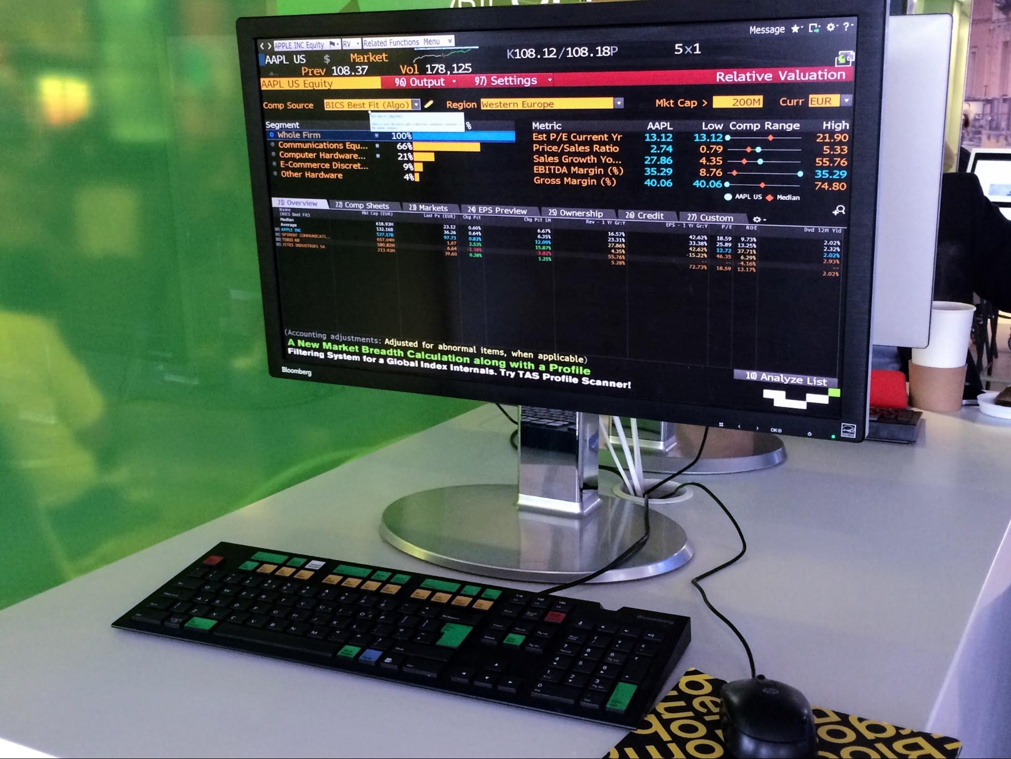
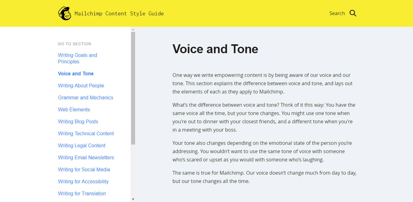


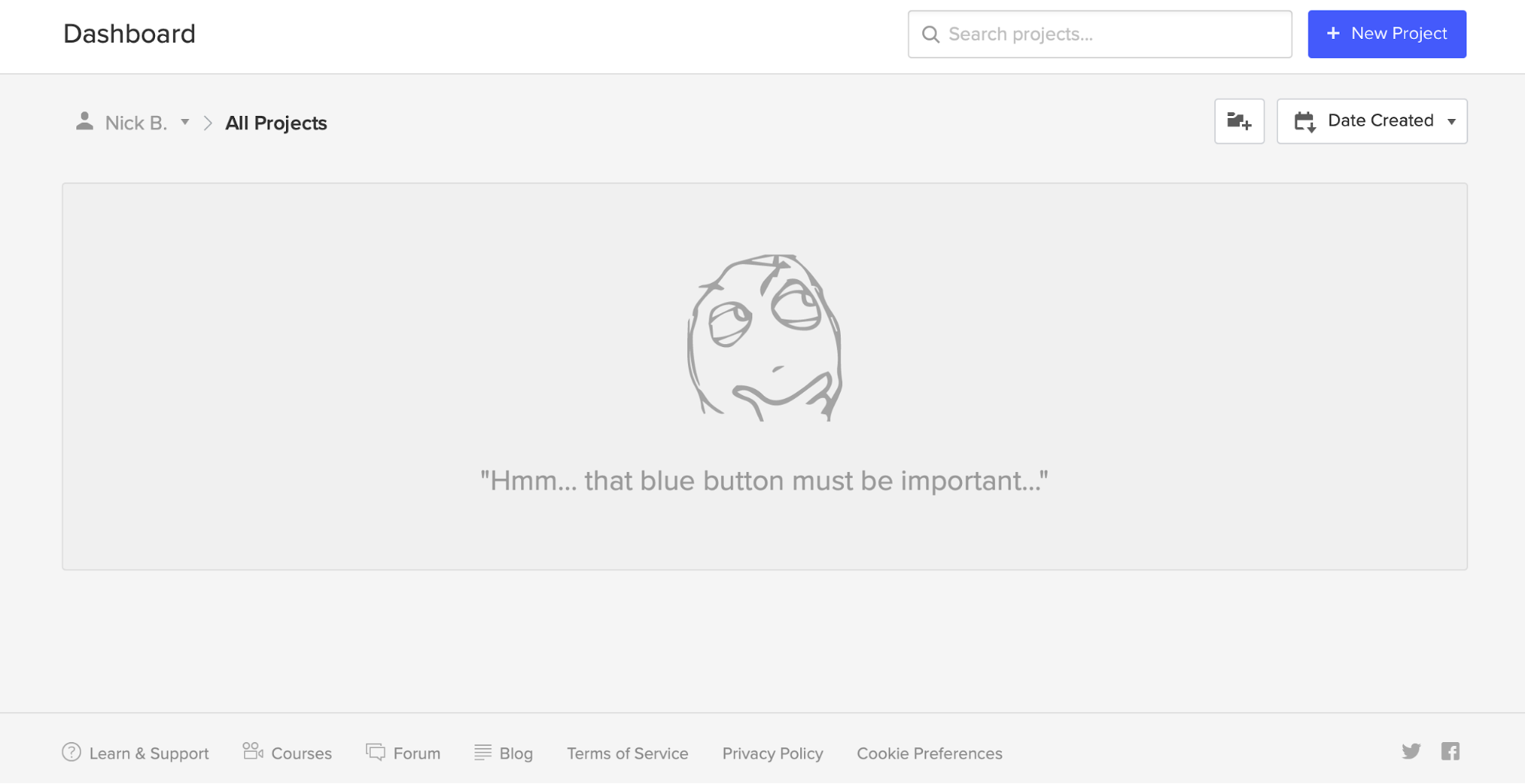


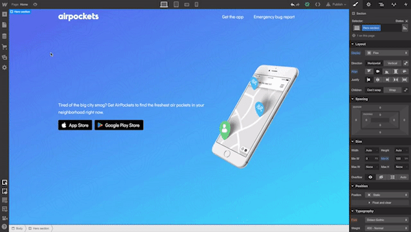
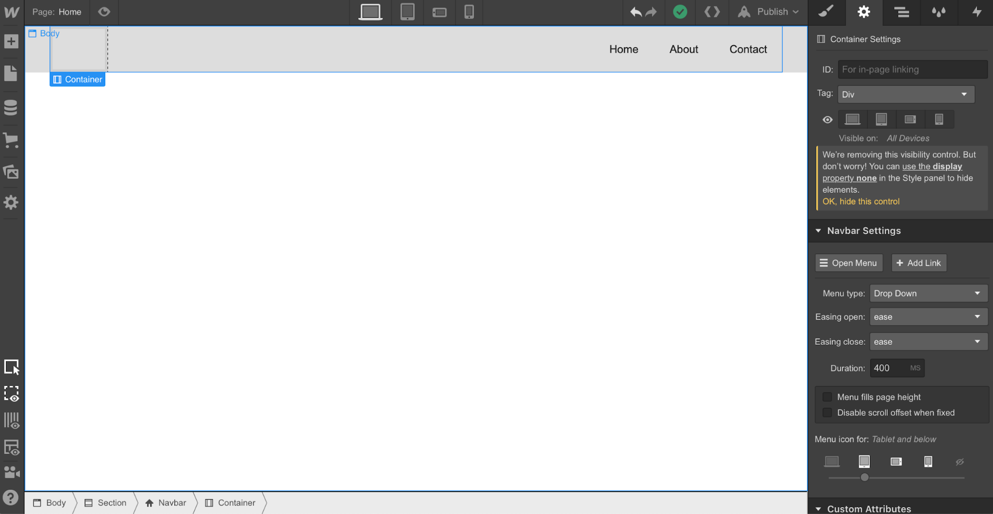


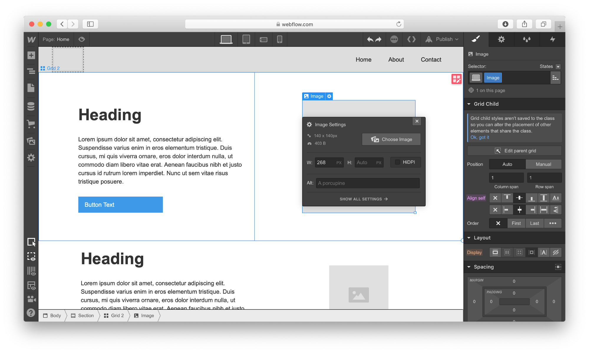

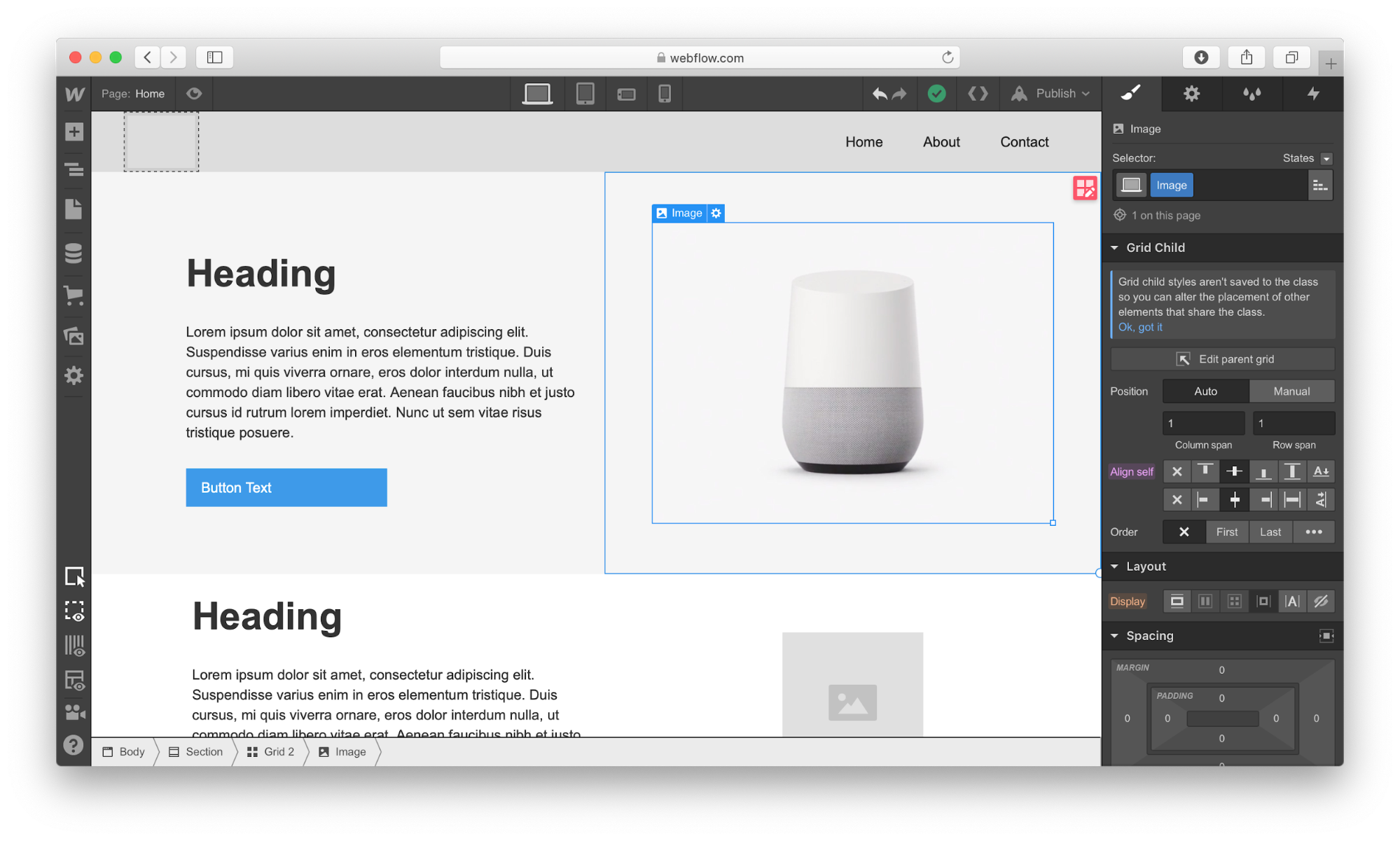


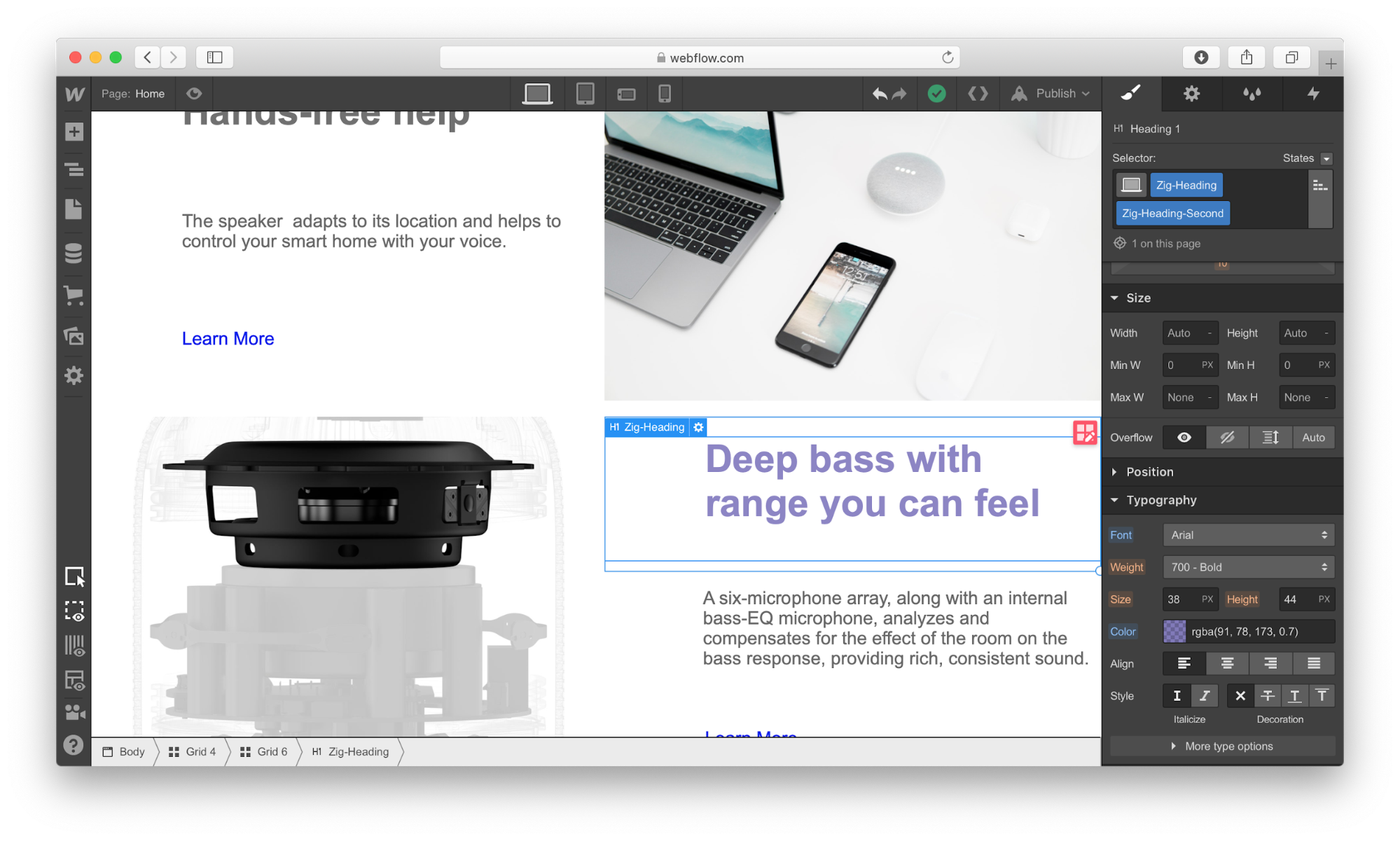


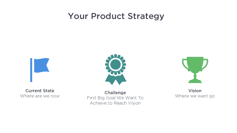


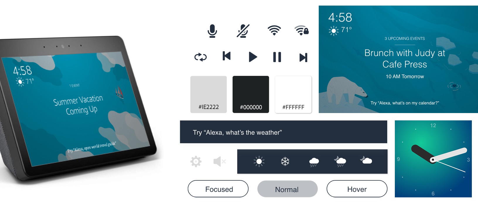


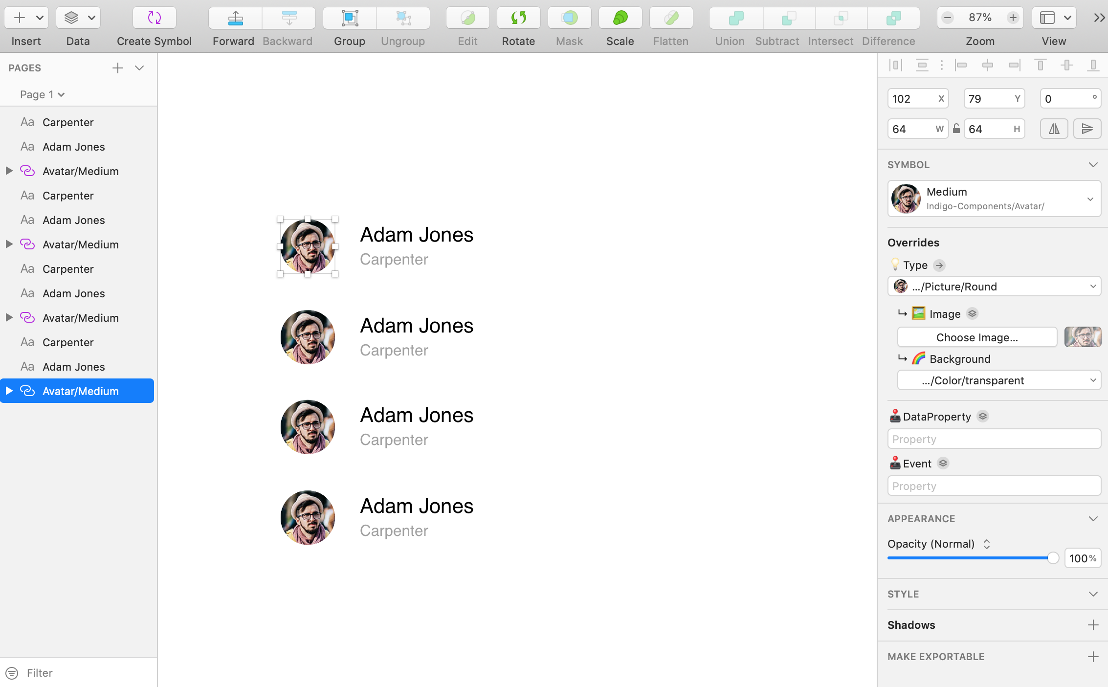
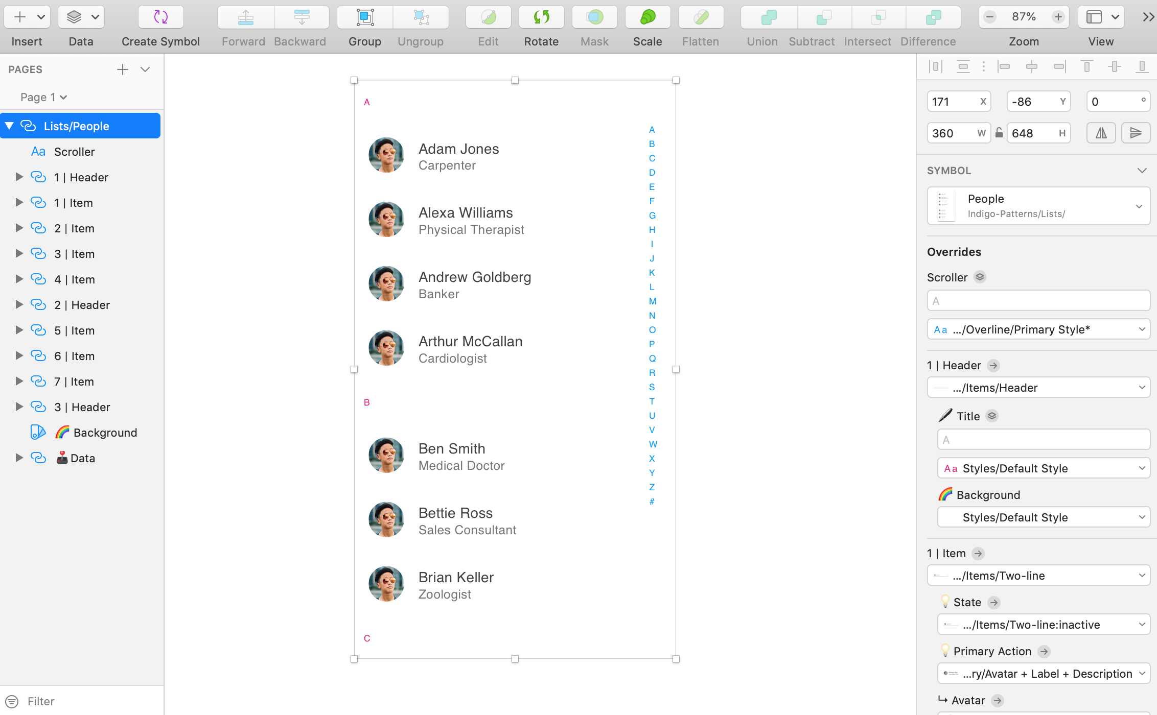
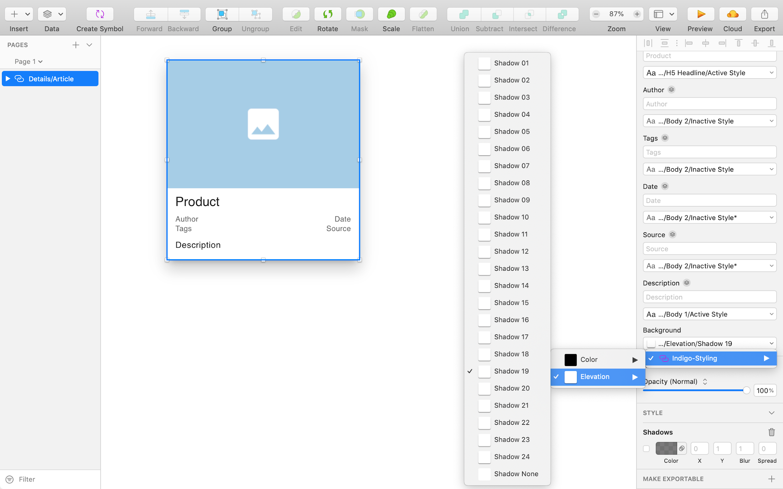

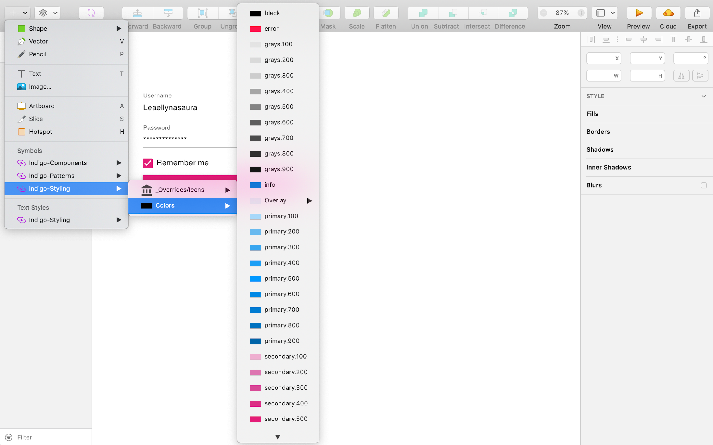


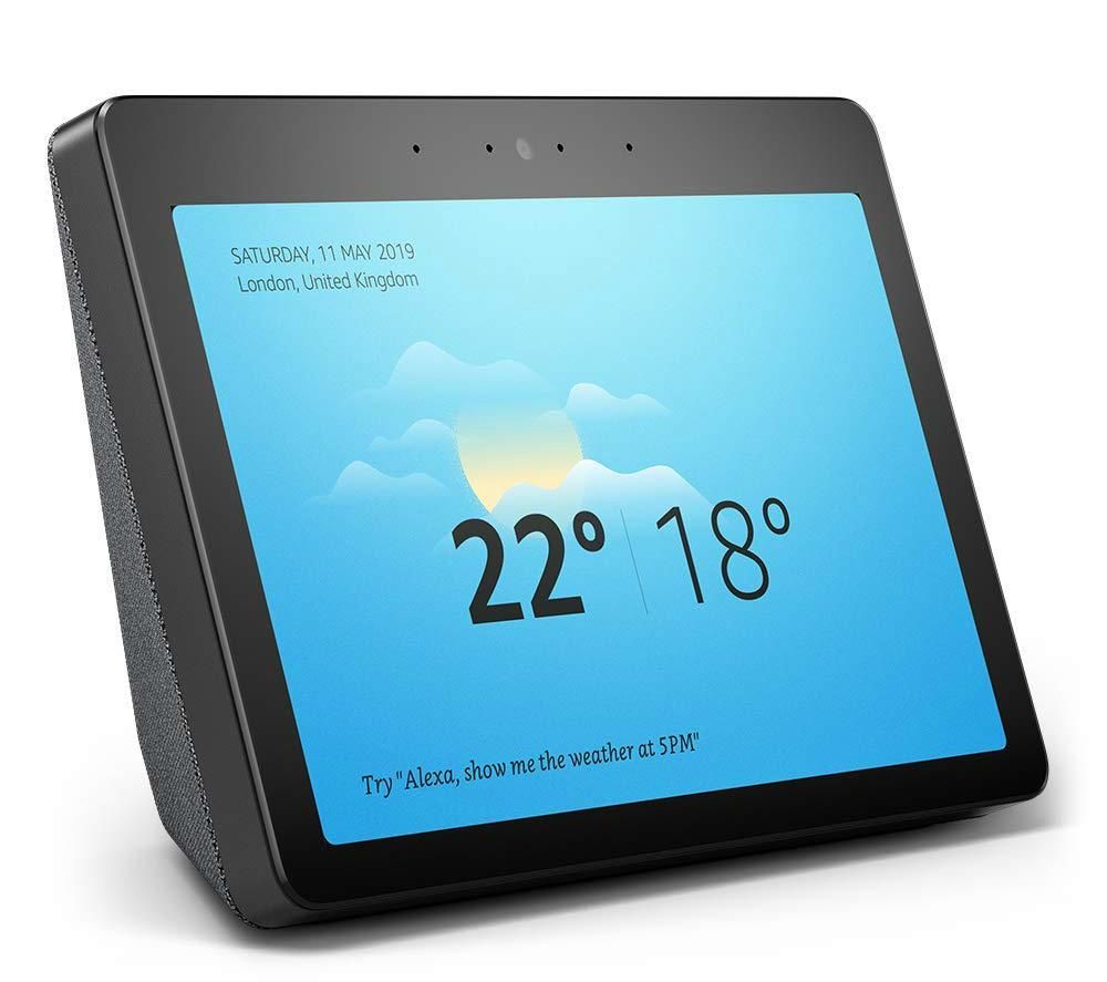


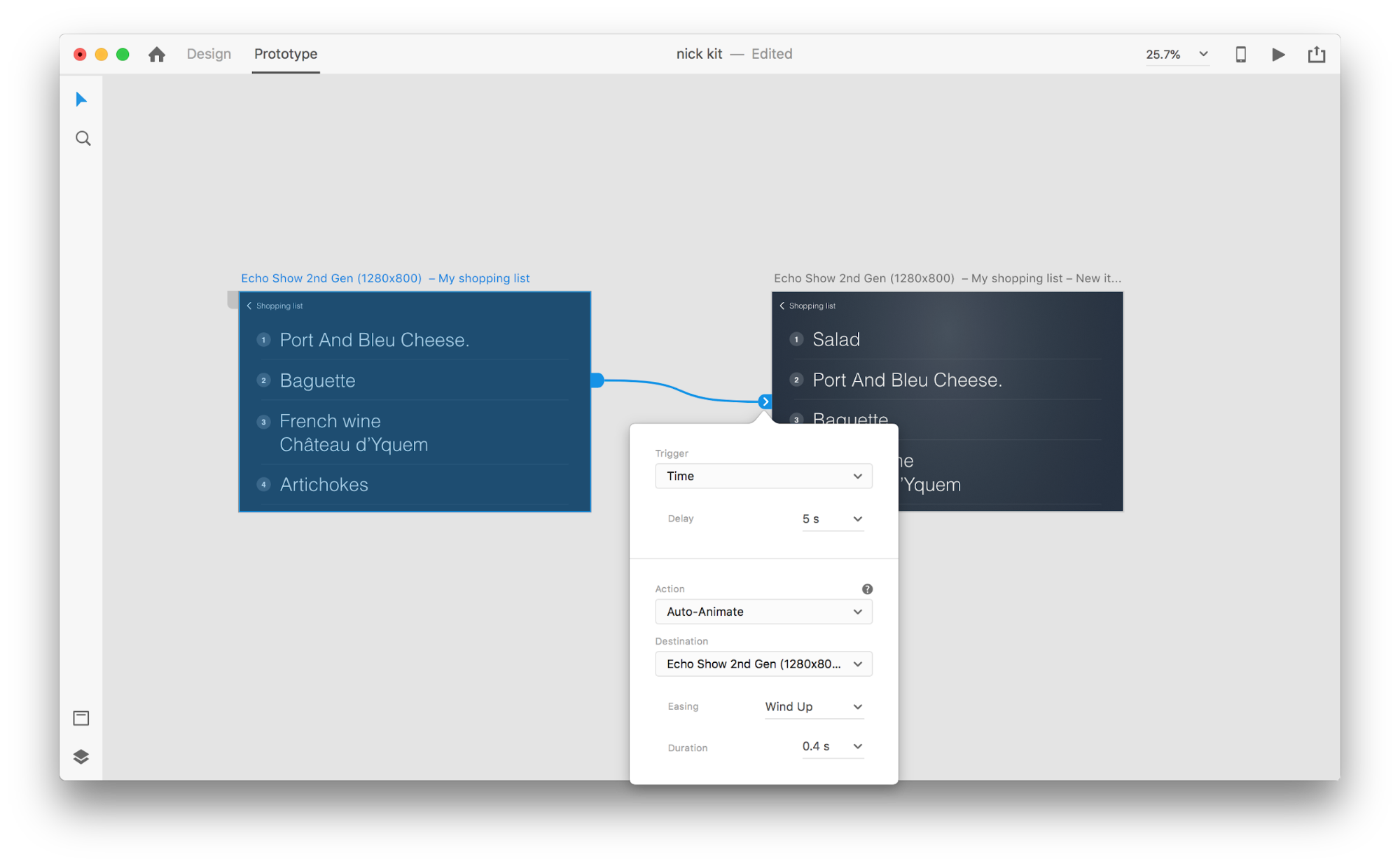

 Screen space is a precious resource on mobile. To meet the challenge of small screen space while still making navigation accessible, designers often rely on hiding navigation behind the hamburger icon, a prime example of hidden navigation. In this article, we’ll see why hidden navigation creates bad UX and what alternatives are available for designers.

 One screen divided in two.