It was less than a year ago when I first had a chance to use Penpot and instantly got excited about it. They managed to build something that designers haven’t yet seen before — a modern, open-source tool for everyone. In the world of technology, that might not sound groundbreaking. After all, open-source tools and software are being taken for granted as a cornerstone of modern web development. But for some reason, not for design — until now. Penpot’s approach to building design software comes with a lot of good arguments. And it gathered a strong community.
One of the reasons why Penpot is so exciting is that it allows creators to build user interfaces in a visual environment, but using the same standards and technologies as the end product. It makes a design workflow easier on many levels. Today, we are going to focus on just one of them, building layouts.
Design tools went a long way trying to make it easier to design complex, responsive layouts and flexible, customizable components. Some of them tried to mimic the mechanisms used in web technologies and others tried to mimic these imitations. But such an approach will take you only so far.
Short History Of Web Layouts
So how are the layouts for the web built in practice?
If you’ve been around the industry long enough, you might remember the times when you used frames, tables, and floats to build layouts. And if you haven’t, you didn’t miss much. Just to give you a taste of how bad it was: same as exporting tiny images of rounded corners from ever-crashing Photoshop, just to meticulously position them in every corner of a rectangle so you could make a dull, rounded button, it was just a pain. Far too often, it was a pleasure to craft yet another amazing design — but so much tears and sorrow to actually implement it.
Then Flexbox came in and changed everything. And soon after it, Grid. Two powerful yet amazingly simple engines to build layouts that changed web developers’ lives forever.
Ironically, design tools never caught up. Flexbox and Grid opened an ocean of possibilities, yet gated behind a barrier of knowing how to code. None of the design tools ever implemented them so a larger audience of designers could leverage them in their workflows. Not until now.
Creating Layouts With Penpot
Penpot is becoming the first design tool to support both Flexbox and Grid in their toolkit. And by support, I don’t mean a layout feature that tries to copy what Flexbox or Grid has to offer. We’re talking about an actual implementation of Flexbox and Grid inside the design tool.
Penpot’s Flexbox implementation went public earlier this year. If you’d like to give it a try, last year, I wrote a separate article just about it. Now, Penpot is fully implementing both Flexbox and Grid.
You might be wondering why we need both. Couldn’t you just use Flexbox for everything, same as you use the same simple layout features in a design tool? Technically, yes, you could. In fact, most people do. (At the time of writing, only a quarter of websites worldwide use CSS Grid, but its adoption is steadily increasing; source)
So if you want to build simple, mostly linear layouts, Flexbox is probably all you’ll ever need. But if you want to gain some design superpowers? Learn Grid.
Penpot’s CSS Grid Layout is out now, so you can already give it a try. It’s a part of their major 2.0 release, bringing a bunch of long-awaited features and improvements. I’d strongly encourage you to give it a go and see how it works for yourself. And if you need some inspiration, keep reading!
CSS Grid Layout In Practice
As an example, let’s build a portfolio page that consists of a sidebar and a grid of pictures.
Creating A Layout
Our first step will be to create a simple two-dimensional grid. In this case using a Grid Layout makes more sense than Flex Layout as we want to have more granular control over how elements are laid out on multiple axes.
To make the grid even more powerful, you can merge cells, group them into functional areas, and name them. Here, we are going to create a dedicated area for the sidebar.
As you adjust the layout later, you can see that the sidebar always keeps the same width and full height of the design while other cells get adjusted to the available space.
Building Even More Complex Grids
That’s not all. Apart from merging cells of the grid, you can tell elements inside it to take multiple cells. On our portfolio page, we are going to use this to make the featured picture bigger than others and take four cells instead of one.
As a result, we created a complex, responsive layout that would be a breeze to turn it into a functional website but at the same time would be completely impossible to build in any other design tool out there. And that’s just a fraction of what Grid Layout can do.
Next Steps
I hope you liked this demo of Penpot's Grid Layout. If you’d like to play around with the examples used in this article, go ahead and duplicate this Penpot file. It’s a great template that explains all the ins and outs of using Grid in your designs!
In case you’re more of a video-learning type, there’s a great tutorial on Grid Layout you can watch now on YouTube. And if you need help at any point, the Penpot community will be more than happy to answer your questions.
Summary
Flexbox and Grid in Penpot open up opportunities to craft layouts like never before. Today, anyone can combine the power of Flex Layout and Grid Layout to create complex, sophisticated structures that are flexible, responsive, and ready to deploy out-of-the-box—all without writing a single line of code.
Working with the right technologies not only makes things easier, but it also just feels right. That's something I've always longed for in design tools. Adopting CSS as a standard for both designers and developers facilitates smoother collaboration and helps them both feel more at home in their workflows.
For designers, that’s also a chance to strengthen their skill set, which matters today more than ever. The design industry is a competitive space that keeps changing rapidly, and staying competitive is hard work. However, learning the less obvious aspects and gaining a better understanding of the technologies you work with might help you do that.
Try CSS Grid Layout And Share Your Thoughts!
If you decide to give CSS Grid Layout a try, don’t hesitate to share your experience! The team behind Penpot would love to hear your feedback. Being a completely free and open-source tool, Penpot’s development thrives thanks to its community and people like you.
Among design tools, Penpot holds a special place. It is an open-source design tool, meant for designers and developers to work together and help them speak the same language. It’s also the first design tool out there to be fully open-source and based on open web standards.
That’s a perfect choice for designers and developers working closely together as Penpot’s approach can help to radically improve design to development processes and effortlessly make them seamless and faster.
As open-source software, Penpot also evolves blazingly fast, fueled by the support of the community. When I was first writing about Penpot a few months ago, I shared my excitement about the app’s layout features that finally bring parity between design and code and follow the same rules as CSS does. Since then, the team behind Penpot has made creating layouts even better, so they deserve another look. I really enjoyed playing with the new Penpot’s features, and I believe you might want to give them a try too.
Designing Layouts Done Right
If you ever wrote or read CSS code, there are high chances you have already stumbled upon Flexbox. It’s a cornerstone of building layouts for the modern web, and quite likely, every single website you visit on an everyday basis uses it.
Flexbox is the bread and butter of creating simple, flexible layouts. It’s the most common way of positioning elements: stacking them in rows and columns and deciding how they are supposed to be aligned and distributed.
Therefore, creating Flexbox layouts is a vital part of most web hand-off processes. And not rarely time-consuming and causing friction between design and development. Usually, developers try to translate static mockups into code by rebuilding layouts made by designers from scratch. As most designers don’t write CSS code and most design tools follow a different logic than CSS does, lots can go wrong or get lost in translation.
This is where Penpot’s Flex Layout comes into play. Layouts built-in Penpot don’t need tedious translating into code. Even though designers can build them using a familiar visual interface, they come as production-ready code out-of-the-box. And even if they need tweaking, they can still save developers plenty of time and guesswork as they follow a logic that is already familiar and understandable to them.
So at the bottom line, it benefits everyone. It’s less work for developers as they get the code they need straight away. It’s better for designers as they have finer control over the final effect and a better understanding of the technologies they are designing for. And finally, it’s good for business as it saves everyone’s time.
All of that without making the designer's job an inch harder or forcing them to write a single line of code. Now, let’s take a look at what building designs with Flex Layout look like in practice!
Getting Started With Flex Layout
As mentioned before, Flexbox can be understood as a toolkit for building layout and positioning elements.
Each Flex Layout is generally an array, a list of elements. This list can be sorted from left to write, right to left, top to bottom, or bottom to top.
Flex Layout allows you to control how elements in these lists are aligned against each other.
You can also control how elements are laid out within containers.
Flex layouts can wrap into multiple lines too. You can also nest them indefinitely to create as complex layouts as you wish.
And that’s just the beginning. There are many more options to explore. As you can see, Flex layout gives you much more possibilities and precision than most design tools do. Creating with it is not only a better process but a more powerful one.
To explore all the possible features of Flex Layout, Penpot’s team created a comprehensive Playground template for you to try. If you don’t have a Penpot account yet, go ahead and create one now. Then, duplicate the file and try to play with it yourself! The file will take you on a journey through each and every Flex layout feature, with clear examples and definitions, so you can start building complex, robust layouts in no time.
Building An Example Together
To give you an even better understanding of what working with Flex Layout is in practice, let’s look at a practical example. In the next few steps, we will dig into the structure of this little mockup and rebuild each and every part of it with Flex Layout.
For the first elements, we can use Flex Layout for our buttons. With a few clicks, we can make sure they are responsive to the size of the icon and the label inside, and set paddings and distances between the children elements.
We can also use Flex Layout for the avatars stack. To make the images overlap, a negative gap between the elements does the trick. We also have full control over the order of elements. We can lay out the stack in any direction. We can also control the stack order of each element individually. That’s thanks to Penpot’s support for z-index, another useful CSS property.
Flex layouts can be nested, creating more complex layouts and dependencies. In this case, we’ll create a separate Flex Layout for the navbar and another for the tiles grid below.
Remember that elements in Flex layouts can be wrapped? Let’s see this in action. In this case, we can create a flexible multi-dimensional layout of elements that’s responsive to the parent container and fill it with blocks both vertically and horizontally, just as CSS would do.
But what if some of the elements don’t belong to the grid? Alongside Flexbox, Penpot provides support for absolute positioning. This means that any element can be picked up from the Flex Layout to still leave in the same container but ignore the layout rules. That’s exactly what we need for the ‘Edit’ button.
Eventually, we can transform the whole board into a Flex Layout. Now, we have a design that is not only easy to work with and edit but is also fully flexible. Wondering how your design would perform on a smaller or bigger screen? All you have to do is to resize the board.
Next Steps
If you’d like to take a look at the source file of the layout we’ve just built, go ahead and duplicate this file.
In case you get stuck or have some questions, Penpot Community would be the best place to look for help.
There is also a great video tutorial that explains how designers and developers can work together using Flex Layout.
Summary
As you can see, with Flex Layout, the possibilities for structuring your designs are endless. I believe that features like this are a welcome change in the design tools scene and a shift in the right direction. Helping designers to take more control over their work and helping developers to work as efficiently as possible.
Coming Soon: Support For CSS Grid
Maybe you’re now thinking the same as I am: CSS layouts are not only Flexbox, are they? If you work with CSS, you probably know that Flexbox alone is not enough. More complex layouts are often better built using CSS Grid. Flexbox and Grid work best when combined together — combined to create precise yet complex and fully responsive websites.
Penpot doesn’t support CSS Grid just yet, but that is about to change! You can learn more about it at the upcoming Penpot Fest. During the event, Penpot’s team will share their plan and a demo of the upcoming Grid Layout feature. Don’t hesitate to join (virtually or in person), if you’d like to learn more about the next steps for Penpot.
The world of developer tools lives and breathes open-source. Open, free programming languages, frameworks, or even code editors everyone can contribute to — lay at the heart of the premise of the free, open web. Yet, with the design tools, it’s always been a much different story. For our design processes, most are sticking to a palette of paid, commercial tools — the majority of them were either created or later acquired by big tech companies. Fortunately, also in this space, we’re starting to see some alternatives.
One such alternative is Penpot, an open-source design app that recently started to boom in popularity. With over 250k signups and 20k GitHub stars, Penpot has already made a name for itself, and it’s growing as a viable alternative to other design tools out there.
However, being open-source is not the only thing that makes Penpot unique. It also has a few killer features up its sleeve that make it a really great match for a good collaboration between designers and developers. Curious to learn more? Let’s take a closer look together.
A Design Tool Done Right
If you’ve ever done a fair share of designing and coding, I bet you also had your moments of confusion and frustration. One thing I never managed to understand: Why are the apps used primarily for designing user interfaces that are later built with web technologies often so bad at matching the standards of these exact technologies?
For example, they offer fancy layout tools that follow a completely different logic than how layouts are built on the web. Or they offer drawing tools that work differently than graphics on the web, so once you export your work, you get weird, unexpected results. Why?
The answer is actually quite simple. For most of the design tools, hand-off and developer-focused features were an afterthought. Based on different patterns and standards, they often prove to be confusing and frustrating for developers.
This is where Penpot is different. Created by a team of designers and developers working very closely together, great design-development collaboration was their priority from the start.
Same as other web apps, Penpot can be run on any operating system or web browser. But to make access to it truly open and democratic, it is also based on Open Web Standards. For example, Penpot’s design files are saved in SVG format — the same standard as the most popular image format for vector graphics on the web.
What it means in practice is not only better compatibility with web technologies but a natural parity between designs and code. With Penpot, you don’t have to export to SVG, your graphics are SVG, by definition.
Same works with translating styles from designs into code. Penpot doesn’t have to generate any CSS values. It can just read and cater CSS values directly from designs.
A great example of that in practice is Flex Layout, i.e. Penpot’s layouting feature that not only works exactly like CSS Flexbox. It simply is CSS Flexbox. We’ll give it a shot together in the later part of the article!
Open Source And Why Should You Care
Before we take a deeper dive into the tool itself, let’s talk about Open Source for a bit. But why is it so important, and what does it mean for you?
It Means It’s Free
In the programming world, Open Source usually means that the source code of the tool, app, or framework is available for anyone to view, modify, and distribute. But why would that be important for you and your choice of a design tool?
First and foremost, the code of the app´ is 100% free and available for commercial use. Every part and feature of the app that is free today will remain as such. Personally, out of all the design tools I have ever tried, I’ve never seen an equally featured and solidly built design app that is completely free, even for a big team. In this field, Penpot is far ahead of any competition.
It Means Better Security And Control
But open source is so much more. It also means greater transparency, control, and security. Anyone can audit the app’s code for potential security vulnerabilities or add new features to the tool that meet specific needs. Additionally, open source means that code cannot be controlled by a single entity or corporation, and users are not locked into a particular vendor’s ecosystem.
That all is true also for Penpot. It might not sound particularly significant or sexy at first glance, but if your company would ever have to worry about maintaining full control over its toolkit’s security standards or if you’d like to avoid vendor lock-in, choosing an app that is Open Source might be a big deal.
It Means Endless Customizability
Have you ever used plugins in a design tool? If so, you’d probably be pleased to hear that customizability is what Penpot brings to a whole new level. Open source means that users can modify the tool’s source code to meet any specific needs, customizing it as necessary.
You not only can extend the functionality of the app. You can literally edit it in any way you like to match your team’s processes and specific needs.
It Means You Can Run It Yourself
Penpot being open source, also means the ability to host your own instance of the tool. This means that you can run Penpot on your servers, having full control over your data and the application itself.
It Means A Peace Of Mind For The Future Of The Tool
Finally, open source provides peace of mind for the future of Penpot. With the tool being open source, users will always have control over the tool they work with, no matter what the future holds. Regardless of what happens next, you’ll always be able to use Penpot on your own terms. This means that people can invest in Penpot with confidence, knowing that they will always have access to the tool and their work (rather than being at the mercy of potential business shifts, acquisitions, pricing changes etc.)
I hope that by now, you’re left with no doubt about how many advantages it brings to work with Open Source tools. Now, let’s take a look at Penpot itself.
Where Penpot Shines...
If you recently worked with any of the most popular design tools in Penpot, you’ll feel right at home. Its interface should be familiar and predictable, and also offer all the basic features you could be looking for.
The user interface is unobtrusive, the perceived performance is good, and everything works as expected. But it’s the handoff-related features where Penpot really shines.
I already mentioned Flex Layout, Penpot’s own layouting feature. If you have ever used the Flexbox model in CSS, it might look oddly familiar. In fact, it’s exactly that: CSS flexbox inside a design app.
And that means not only better parity with code than other design apps (at least as long as you’re planning to use CSS flexbox in your code) but also a better scope of possibilities inside the design tool itself (e.g. you can wrap items of the automatic layout into multiple rows).
More powerful layouts also mean much better possibilities when it comes to designing truly responsive designs. With what Penpot can do, there’s a high chance that, in many cases, you won’t have to create separate designs for different breakpoints ever again.
All of that wouldn’t be as good if not for the great Inspect tab. Penpot gives you all the CSS you might need at hand, as well as the source SVG code of any component you select.
Pretty neat!
...And Where It Doesn’t (Yet)
Regardless of all the praise, Penpot is not perfect either. Being a relatively young tool makes it a challenging task to compete against the giants dominating the design tools scene.
If you compare it closely to other popular design apps, you’ll definitely find a few features missing, as well as some of them not as complex as elsewhere. For example, Penpot’s components toolkit and prototyping features are still relatively simple and limited.
That being said, Penpot’s roadmap is very actively being worked on. You can check what the team is onto right now on their website.
What’s also important to keep in mind is that Penpot’s development potential as an Open Source tool couldn’t be underestimated. The tool’s community of contributors is already pretty strong, and I believe it will only keep growing. That’s a competitive advantage closed source tools will never be able to meet.
Seeing what Penpot can do today, I personally can’t wait to see what’s next.
For example, looking at Penpot’s implementation of Flex Layout, think how cool it would be to have a similar tool for CSS Grid. Who’s in a better place to build it than Penpot? Spoiler alert: if you look at their public roadmap closely enough, you’ll find out they’re already working on it.
Final Thoughts
Even though Penpot is a relatively new tool, it stands as a solid choice for a design platform. It does a great job of narrowing the gap between designers and developers.
I believe it’s an open-source approach and a welcomed change that should only benefit our industry, as hopefully, others will follow.
If you’d like to give Penpot a try, it’s now out of beta and available for you and your team — completely for free
Friction in cooperation between designers and developers is fueling an ever-evolving discussion as old as the industry itself. We came a long way to where we are today. Our tools have changed. Our processes and methodologies have changed. But the underlying problems often remained the same.
One of the recurring problems I often tend to see, regardless of the type and size of the team, is maintaining a reliable source of truth. Even hiring the best people and using proven industry-standard solutions often leaves us to a distaste that something definitely could have been done better. The infamous “final version” is often spread across technical documentation, design files, spreadsheets, and other places. Keeping them all in sync is usually a tedious and daunting task.
Note: This article has been written in collaboration with the UXPin team. Examples presented in this article have been created in the UXPin app. Some of the features are only available on paid plans. The full overview of UXPin’s pricing can be found here.
The Problem With Design Tools
Talking of maintaining a source of truth, the inefficiency of design tools is often being indicated as one of the most wearing pain points. Modern design tools are evolving and they are evolving fast with tremendous efforts. But when it comes to building the bridge between design and development, it’s not rare to get the impression that many of those efforts are based on flawed assumptions.
Most of the modern design tools are based on different models than the technologies used to implement the designs later on. They are built as graphic editors and behave as such. The way layouts are built and processed in design tools is ultimately different from whatever CSS, JavaScript and other programming languages have to offer. Building user interfaces using vector (or even raster) graphics is constant guesswork of how and if what you make should be turned into code later.
Designers often end up lamenting about their creations not being implemented as intended. Even the bravest efforts towards pixel-perfect designs don’t solve all the problems. In design tools, it is close to impossible to imagine and cover all the possible cases. Supporting different states, changing copy, various viewport sizes, screen resolutions and so on, simply provide too many changing variables to cover them all.
On top of that come along some technical constraints and limitations. Being a designer without prior development experience, it is immensely hard to take all the technical factors into account. Remember all the possible states of inputs. Understand the limitations of browser support. Predict the performance implications of your work. Design for accessibility, at least in a sense much broader than color contrast and font sizes. Being aware of these challenges, we accept some amount of guesswork as a necessary evil.
But developers often have to depend on guesswork, too. User interfaces mocked up with graphics editors rarely answer all of their questions. Is it the same component as the one we already have, or not? Should I treat it as a different state or as a separate entity? How should this design behave when X, Y, or Z? Can we make it a bit differently as it would be faster and cheaper? Ironically, asking whoever created the designs in the first place is not always helpful. Not rarely, they don’t know either.
And usually, this is not where the scope of growing frustration ends. Because then, there’s also everyone else. Managers, stakeholders, team leaders, salespeople. With their attention and mental capacity stretched thin among all the tools and places where various parts of the product live, they struggle more than anyone else to get a good grasp of it.
Navigating prototypes, understanding why certain features and states are missing from the designs, and distinguishing between what is missing, what is a work in progress, and what has been consciously excluded from the scope feels almost impossible. Quickly iterating on what was already done, visualizing your feedback, and presenting your own ideas feels hardly possible, too. Ironically, more and more sophisticated tools and processes are aimed at designers and developers to work better together; they set the bar even higher, and active participation in the processes for other people even harder.
The Solutions
Countless heads of our industry have worked on tackling those problems resulting in new paradigms, tools, and concepts. And indeed a lot has changed for the better. Let’s take a quick look and what are some of the most common approaches towards the outlined challenges.
Coding Designers
“Should designers code?” is a cliché question discussed a countless number of times through articles, conference talks, and all other media with new voices in the discussion popping up with stable regularity now and then. There is a common assumption that if designers “knew how to code” (let’s not even start to dwell on how to define “knowing how to code” in the first place), it would be easier for them to craft designs that take the technological constraints into account and are easier to implement.
Some would go even further and say they should be taking an active role in the implementation. At that stage, it’s easy to jump to conclusions that it wouldn’t be without sense to skip using the design tools altogether and just “design in code”.
Tempting as the idea may sound, it rarely proves itself in reality. All the best coding designers I know are still using design tools. And that’s definitely not due to a lack of technical skills. To explain the why is important to highlight a difference between ideation, sketching, and building the actual thing.
As long as there are many valid use cases for “designing in code”, such as utilizing predefined styles and components to quickly build a fully functional interface without bothering yourselves with design tools at all, the promise of unconstrained visual freedom is offered by design tools still stands of undeniable value. Many people find sketching new ideas in a format offered by design tools easier and more suited for the nature of a creative process. And that is not going to change anytime soon. Design tools are here to stay and to stay for good.
Design Systems
The great mission of design systems, one of the greatest buzzwords of the digital design world in the last years, has always been exactly that: to limit guesswork and repetition, improve efficiency and maintainability, and unify sources of truth. Corporate systems such as Fluent or Material Design have done a lot of legwork in advocacy for the idea and bringing momentum to the adoption of the concept across both big and small players. And indeed, design systems helped to change a lot for the better. A more structured approach to developing a defined collection of design principles, patterns, and components helped countless companies to build better, more maintainable products.
Some challenges had not been solved straight away though. Designing design systems in popular design tools hampered the efforts of many in achieving a single source of truth. Instead, a plethora of systems has been created that, even though unified, still exist in two separate, incompatible sources: a design source and a development source. Maintaining mutual parity between the two usually proves to be a painful chore, repeating all the most hated pain points that design systems were trying to solve in the first place.
Design And Code Integrations
To solve the maintainability headaches of design systems another wave of solutions has soon arrived. Concepts such as design tokens have started to gain traction. Some were meant for syncing the state of code with designs, such as open APIs that allow fetching certain values straight from the design files. Others were meant for syncing the designs with code, e.g. by generating components in design tools from code.
Few of these ideas ever gained widespread adoption. This is most probably due to the questionable advantage of possible benefits over the necessary entry costs of still highly imperfect solutions. Translating designs automatically into code still poses immense challenges for most professional use cases. Solutions allowing you to merge existing code with designs have also been severely limited.
For example, none of the solutions allowing you to import coded components into design tools, even if visually true to the source, would fully replicate the behavior of such components. None until now.
Merging Design And Code With UXPin
UXPin, being a mature and fully-featured design app, is not a new player on the design tools stage. But its recent advancements, such as Merge technology, are what can change the odds of how we think about design and development tools.
UXPin with Merge technology allows us to bring real, live components into design by preserving both their visuals and functionality — all without writing a single line of code. The components, even though embedded in design files, shall behave exactly as their real counterparts — because they are their real counterparts. This allows us not only to achieve seamless parity between code and design but also to keep the two in uninterrupted sync.
UXPin supports design libraries of React components stored in git repositories as well as a robust integration with Storybook that allows usage of components from almost any popular front-end framework. If you’d like to give it a shot yourself, you can request access to it on the UXPin website:
Merging live components with designs in UXPin takes surprisingly few steps. After finding the right component, you can place it on the design canvas with a click. It will behave like any other object within your designs. What will make it special is that, even though being an integral part of the designs, you can now use and customize it the same as you would in code.
UXPin gives you access to the component’s properties, lets you change its values and variables, and fill it with your own data. Once starting the prototype, the component shall behave exactly as expected, maintaining all the behaviors and interactions.
Using a component “as is” also means that it should behave according to the change of the context, such as the width of the viewport. In other words, such components are fully responsive and adaptable.
Note: If you would like to learn more about building truly responsive designs with UXPin, I strongly encourage you to check out this article.
Context may also mean theming. Whoever tried to build (and maintain!) a themeable design system in a design tool, or at least create a system that allows you to easily switch between a light and a dark theme, knows how tricky of a task it is and how imperfect the results usually are. None of the design tools is well optimized for theming out of the box and available plugins aimed at solving that issue are far from solving it fully.
As UXPin with Merge technology uses real, live components, you can also theme them as real, live components. Not only can you create as many themes as you need, but switching them can be as quick as choosing the right theme from a dropdown. (You can read more about theme switching with UXPin here.)
Advantages
UXPin with Merge technology allows a level of parity between design and code rarely seen before. Being true to the source in a design process brings impeccable advantages for all sides of the process. Designers can design with confidence knowing that what they make will not get misinterpreted or wrongly developed. Developers do not have to translate the designs into code and muddle through inexplicit edge cases and uncovered scenarios. On top of that, everyone can participate in the work and quickly prototype their ideas using live components without any knowledge about the underlying code at all. Achieving more democratic, participatory processes is much more within reach.
Merging your design with code might not only improve how designers cooperate with the other constituents of the team, but also refine their internal processes and practices. UXPin with Merge technology can be a game-changer for those focused on optimization of design efforts at scale, sometimes referred to as DesignOps.
Using the right source of truth makes it inexplicably easier to maintain consistency between the works produced by different people among the team, helps to keep them aligned, and solves the right problems together with a joint set of tools. No more “detached symbols” with a handful of unsolicited variations.
At the bottom line, what we get are enormous time savings. Designers save their time by using the components with confidence and their functionalities coming out of the box. They don’t have to update the design files as the components change, nor document their work and “wave hands” to explain their visions to the rest of the team. Developers save time by getting the components from designers in an instantly digestible manner that doesn’t require guesswork and extra tinkering.
People responsible for testing and QA save time on hunting inconsistencies between designs and code and figuring out if implantation happened as intended. Stakeholders and other team members save time through more efficient management and easier navigation of such teams. Less friction and seamless processes limit frustration among team members.
Disadvantages
Taking advantage of these benefits comes at some entry costs though. To efficiently use tools such as UXPin in your process, you need to have an existing design system or components library in place. Alternatively, you can base your work on one of the open-source systems which would always provide some level of limitation.
However, if you are committed to building a design system in the first place, utilizing UXPin with Merge technology in your process would come at little to no additional cost. With a well-built design system, adopting UXPin should not be a struggle, whilst the benefits of such a shift might prove drastically.
Summary
Widespread adoption of design systems addressed the issues of the media developers and designers work with. Currently, we can observe a shift towards more unified processes that not only transform the medium but also the way we create it. Using the right tools is crucial to that change. UXPin with Merge technology is a design tool that allows combining design with live code components and drastically narrows the gap between the domains design and development operate in.
SVGator is evolving and it’s evolving a lot. Three years ago, we published a comprehensive introduction to the basic use of SVGator. At that time it was an app meant solely for animating SVG files created in other apps. Two years ago, we introduced you to a new version of SVGator and its improved animation capabilities. This time, we are introducing a new major version of SVGator that offers a matured, complete environment for drawing from scratch and animating SVG graphics.
Note: Some of the SVGator’s features covered in this tutorial are paid. On the free plan, you can create and export an unlimited number of SVG graphics. You can also use basic animation features and export 3 animations per month. Advanced animation features are available under a paid plan, starting at 11 USD/month.
In this article, we will follow a process of creating a custom SVG loader, from drawing it from scratch and applying various visual effects, through creating different types of animations, to exporting your file and preparing it for use on the web.
From here, we can start drawing the illustration we are going to animate later. SVGator allows you to draw all the standard SVG shapes such as ellipses, rectangles and polygons as well as use a Pen and Pencil tools to draw your own. You can also use boolean functions to combine shapes with one another.
To make it easier for me to create the desired shape, I started by drawing a circle as a guide in the center of the canvas. Fortunately, SVGator makes it dead simple to align and measure elements, thanks to a smart system of guides and snapping functions. You can also use grids and rulers for better precision and fidelity.
Next, using a Pen Tool, we draw the first blob roughly following the shape of the circle underneath. The Pencil Tool would also do well for that purpose. What is really cool about this one is that SVGator’s Pencil Tool usually creates shapes with much fewer node points than comparable tools in other apps, which makes the result not only look smoother but also be much lighter on file size.
With a first blob ready, it’s time to style it a bit. Here, we’re stumbling upon one of the biggest competitive advantages of the app. Other popular vector graphics applications that allow you to export SVG files usually have to leverage their features to fit a plethora of formats and use cases. At the same time, apps focused primarily on user interfaces, cater mostly for what’s possible with HTML and CSS properties, rarely giving much love to SVG-specific features such as stroke markers or filters.
SVGator, being solely aimed at creating SVG files, takes full advantage of what this format, in particular, has to offer. This includes options specific to how SVG handles strokes, fills, gradient elements (have you heard about the spreadMethod attribute of SVG gradients?), filters (such as blur, shadow or sepia), and many others.
It also allows you to style (your fills, strokes, effects, and so on) with confidence that the final result will be as expected, as all these features have been created especially for SVG files.
In our case, a single gradient fill and a gradient stroke will do. I also applied a light blur filter on the element as a final touch. Notice that as SVGator uses native SVG filters instead of CSS, it allows you to control the blur properties for both axes separately. In this case, I only applied an x-axis blur.
Next, we can duplicate the blob and use the Pen Tool again to create two more different blobs. The way Pen Tool works makes it really easy to modify the shape without losing the smooth, continuous line of it.
Our loader in its initial state is ready. Now, it’s time for the most fun part: animation!
It doesn’t really matter which element of the illustration we will animate first. In my case, I started with animating the sparkles. By adding a Position animator to each element, we can create complex path animations. Path animations allow us to make an element follow a path of any shape over time. In our case, will make the sparkles circulate around the canvas to create an impression of flying around the center elements of the illustration. We can also use Scale and Opacity Animators to make the sparkle seem to wander further and closer from the viewer and strengthen an illusion of movement in 3-dimensional space.
To animate the blobs, a Morph animator can be used. It allows us to modify a shape in time and create smooth transitions between those states. To achieve a nice, clean transition between two shapes, we add a keyframe to the Morph animator’s timeline and modify the shape with a Pen Tool — just like we did when we drew the additional blobs.
For blobs, I also used an Ease In Out function. You can notice that both timing functions are different from how Ease In Out functions look like by default. I “sharpened” them up a bit using the bezier curve interface. This allowed me to make the movements look smooth and natural, without sudden turns and hiccups but also without too visible slowdowns.
After a few more minor adjustments, the file is ready to be exported. The new version of SVGator combines the preview functionality with exporting functionalities. Thanks to that you can have a real-time browser preview of your animations while you are also testing and changing the export settings.
In our case, we want the animation to act as an infinite loop. You can also control the behavior of the graphic, to show on load or upon user’s action such as click or scroll.
The exported file perfectly matches the animation we created within the app and is ready to use on the web.
(This is a sponsored article.) Last year, a comprehensive introduction to the basic use of SVGator was published here on Smashing Magazine. If you’d like to learn about the fundamentals of SVGator, setting up your first projects, and creating your first animations, we strongly recommended you read it before continuing with this article.
Today, we’ll take a second look to explore some of the new features that have been added to it over the last few months, including the brand new Path Animator.
Note: Path Animator is a premium feature of SVGator and it’s not available to trial users. During a seven-day trial, you can see how Path Animator works in the sample project you’ll find in the app, but you won’t be able to apply it to your own SVGs unless you’re opted-in for a paid plan. SVGator is a subscription-based service. Currently, you can choose between a monthly plan ($18USD/month) and a yearly plan ($144USD total, $12USD/month). For longer projects, we recommend you consider the yearly option.
Path Animator is just the first of the premium features that SVGator plans to release in the upcoming months. All the new features will be available to all paid users, no matter when they subscribed.
The Charm Of Path Animations
SVG path animations are by no means a new thing. In the last few years, this way of enriching vector graphics has been heavily used all across the web:
Path animations gained popularity mostly because of their relative simplicity: even though they might look impressive and complex at first glance, the underlying rule is in fact very simple.
How Do Path Animations Work?
You might think that SVG path animations require some extremely complicated drawing and transform functions. But it’s much simpler than it looks. To achieve effects similar to the example above, you don’t need to generate, draw, or animate the actual paths — you just animate their strokes. This brilliant concept allows you to create seemingly complex animations by animating a single SVG attribute: stroke-dashoffset.
Animating this one little property is responsible for the entire effect. Once you have a dashed line, you can play with the position of dashes and gaps. Combine it with the right settings and it will give you the desired effect of a self-drawing SVG path.
If this still sounds rather mysterious or you’d just like to learn about how path animations are made in more detail, you will find some useful resources on this topic at the end of the article.
No matter how simple path animations are compared with what they look like, don’t think coding them is always straightforward. As your files get more complicated, so does animating them. And this is where SVGator comes to the rescue.
Furthermore, sometimes you might prefer not to touch raw SVG files. Or maybe you’re not really fond of writing code altogether. Then SVGator has got you covered. With the new Path Animator, you can create even the most complex SVG path animations without touching a line of code. You can also combine coding with using SVGator.
To better understand the possibilities that Path Animator gives us, we will cover three separate examples presenting different use cases of path animations.
Example #1: Animated Text
In the first example, we will animate text, creating the impression of self-writing letters.
Often used for lettering, this cute effect can also be applied to other elements, such as drawings and illustrations. There’s a catch, though: the animated element must be styled with strokes rather than fills. Which means, for our text, that we can’t use any existing font.
Outlining fonts, no matter how thin, always results in closed shapes rather than open paths. There are no regular fonts based on lines and strokes.
Outlined fonts are not suitable for self-drawing effects with Path Animator. (Large preview)
Path animations require strokes. These paths would work great with Path Animator. (Large preview)
Therefore, if we want to animate text using path animations we need to draw it ourselves (or find some ready-made vector letters suitable for this purpose). When drawing your letters, feel free to use some existing font or typography as a reference — don’t violate any copyright, though! Just keep in mind it’s not possible to use fonts out of the box.
Preparing The File
Rather than starting with an existing typeface, we’ll begin with a simple hand-drawn sketch:
A rough sketch for the animation (pardon my calligraphy skills!) (Large preview)
Now it’s time to redraw the sketch in a design tool. I used Figma, but you can use any app that supports SVG exports, such as Sketch, Adobe XD, or Adobe Illustrator.
Usually, I start with the Pen tool and roughly follow the sketch imported as a layer underneath:
Once done, I remove the sketch from the background and refine the paths until I’m happy with the result. No matter what tools you use, nor technique, the most important thing is to prepare the drawing as lines and to use just strokes, no fills.
These paths can be successfully animated with Path Animator as they are created with strokes. (Large preview)
In this example, we have four such paths. The first is the letter “H”; the second is the three middle letters “ell”; and “o” is the third. The fourth path is the line of the exclamation mark.
The dot of “!” is an exception — it’s the only layer we will style with a fill, rather than a stroke. It will be animated in a different way than the other layers, without using Path Animator.
Note that all the paths we’re going to animate with Path Animator are open, except for the “o,” which is an ellipse. Although animating closed paths (such as ellipses or polygons) with Path Animator is utterly fine and doable, it’s worth making it an open path as well, because this is the easiest way to control exactly where the animation starts. For this example, I added a tiny gap in the ellipse just by the end of the letter “l” as that’s where you’d usually start writing “o” in handwriting.
A small gap in the letter ‘o’ controls the starting point of the animation. (Large preview)
Before importing our layers to SVGator, it’s best to clean up the layers’ structure and rename them in a descriptive way. This will help you quickly find your way around your file once working in SVGator.
If you’d like to learn more about preparing your shapes for path animations, I would recommend you check out this tutorial by SVGator.
It’s worth preparing your layers carefully and thinking ahead as much as possible. At the time of writing, in SVGator you can’t reimport the file to an already existing animation. While animating, if you discover an issue that requires some change to the original file, you will have to import it into SVGator again as a new project and start working on your animation from scratch.
Creating An Animation
Once you’re happy with the structure and naming of your layers, import them to SVGator. Then add the first path to the timeline and apply Path Animator to it by choosing it from the Animators list or by pressing Shift + T.
To achieve a self-drawing effect, our goal is to turn the path’s stroke into a dashed line. The length of a dash and a gap should be equal to the length of the entire path. This allows us to cover the entire path with a gap to make it disappear. Once hidden, change stroke-dashoffset to the point where the entire path is covered by a dash.
SVGator makes it very convenient for us by automatically providing the length of the path. All we need to do is to copy it with a click, and paste it into the two parameters that SVGator requires: Dashes and Offset. Pasting the value in Dashes turns the stroke into a dashed line. You can’t see it straightaway as the first dash of the line covers the whole path. Setting the Offset will change stroke-dashoffset so the gap then covers the path.
Once done, let’s create an animation by adding a new keyframe further along the timeline. Bring Offset back to zero and… ta-da! You’ve just created a self-drawing letter animation.
Creating a self-writing text animation in SVGator: Part 1
There’s one little issue with our animation, though. The letter is animated — but back-to-front. That is, the animation starts at the wrong end of the path. There are, at least, a few ways to fix it. First, rather than animating the offset from a positive value to zero, we can start with a negative offset and bring it to zero. Unfortunately, this may not work as expected in some browsers (for example, Safari does not accept negative stroke offsets). While we wait for this bug to be fixed, let’s choose a different approach.
Let’s change the Dashes value so the path starts with a gap followed by a dash (by default, dashed lines always start with a dash). Then reverse the values of the Offset animation. This will animate the line in the opposite direction.
Reversing the direction of self-writing animation
Now that we’re done with “H” we can move on to animating all the other paths in the same way. Eventually, we finish by animating the dot of the exclamation mark. As it’s a circle with a fill, not an outline, we won’t use Path Animator. Instead, we use Scale Animator to the make dot pop in at the end of the animation.
Creating a self-writing text animation in SVGator: Part 2
Always remember to check the position of an element’s transform origin when playing with scale animations. In SVG, all elements have their transform origin in the top-left corner of the canvas by default. This often makes coding transform functions a very hard and tedious task. Fortunately, SVGator saves us from all this hassle by calculating all the transforms in relation to the object, rather than the canvas. By default, SVGator sets the transform origin of each element in its own top-left corner. You can change its position from the timeline, using a button next to the layer’s name.
Transform origin control in SVGator’s Timeline panel (Large preview)
Let’s add the final touch to the animation and adjust the timing functions. Timing functions define the speed over time of objects being animated, allowing us to manipulate their dynamics and make the animation look more natural.
In this case, we want to give the impression of the text being written by a single continuous movement of a hand. Therefore, I applied an Ease-in function to the first letter and an Ease-out function to the last letter, leaving the middle letters with a default Linear function. In SVGator, timing functions can be applied from the timeline, next to the Animator’s parameters:
Timing function control in SVGator’s Timeline panel (Large preview)
After applying the same logic to the exclamation mark, our animation is done and ready to be exported!
Final result of the first example
Example #2: Animated Icon
Now let’s analyze a more UI-focused example. Here, we’re going to use SVGator to replicate a popular icon animation: turning a hamburger menu into a close button.
The goal of the animation is to smoothly transform the icon so the middle bar of the hamburger becomes a circle, and the surrounding bars cross each other creating a close icon.
Preparing The File
To better understand what we’re building and how to prepare a file for such an animation, it’s useful to start with a rough sketch representing the key states of the animation.
It’s helpful to plan your animation ahead and start with a sketch. (Large preview)
Once we have a general idea of what our animation consists of, we can draw the shapes that will allow us to create it. Let’s start with the circle. As we’re going to use path animation, we need to create a path that covers the whole journey of the line, starting as a straight bar in the middle of the hamburger menu, and finishing as a circle around it.
Complete path of the middle bar animation turning into a circle. (Large preview)
The other two bars of the menu icon have an easier task — we’re just going to rotate them and align to the centre of the circle. Once we combine all the shapes together we’re ready to export the file as SVG and import it to SVGator.
Our icon, ready to be animated in SVGator. (Large preview)
Creating An Animation
Let’s start by adding the first shape to the timeline and applying Path Animator to it. For the initial state, we want only the horizontal line in the middle to be visible, while the rest of the path stays hidden. To achieve it, set the length of the dash to be equal to the length of the hamburger’s lines. This will make our straight middle line of the menu icon. To find the correct value, you can use the length of one of the other lines of the hamburger. You can copy it from the timeline or from the Properties panel in the right sidebar of the app.
Then set the length of the following gap to a value greater than the remaining length of the path so it becomes transparent.
Creating an icon animation in SVGator: Part 1
The initial state of our animation is now ready. What happens next is that we turn this line into a circle. To do that, two things need to happen simultaneously. First, we use Offset to move the line along the path. Second, we change the width of the dash to make the line longer and cover the entire circle.
Creating an icon animation in SVGator: Part 2
With the circle ready, let’s take care of the close icon. Just as before, we need to add two animations at the same time. First, we want the top line to lean down (45 degrees) and the bottom line to move up (-45 degrees) until they cross each other symmetrically. Second, we need to move the lines slightly to the right so they stay aligned with the circle.
As you might remember from the previous example, in SVGator, transform origins are located in the top-left corner by default. That’s very convenient to us as, in this case, that is exactly where we want them to be. All we need to do is to apply the correct rotation angles.
When it comes to aligning the lines with the circle, note that we don’t have to move them separately. Rather than adding Animators to both of the lines, we can add a group containing both of them to the timeline, and animate them together with a single Position Animator. That’s one of those moments when a nice, clean file structure pays off.
Creating an icon animation in SVGator: Part 3
Next thing to do is add a reverse animation that turns the close button back into a hamburger menu. To achieve that, we can basically follow the previous steps in reverse order. To speed things up a bit, copy and paste the existing keyframes on the timeline — that’s yet another improvement SVGator introduced in the past few months.
Reversing icon animation: back to the hamburger menu.
Once done, don’t forget to adjust the timing functions. Here, I’ve decided to go with an Ease-in-out effect on all elements. Our icon is ready for action.
Final result of the second example
Implementation
Even though implementing microinteractions goes far beyond the scope of this article, let me take a moment to briefly describe how such animation can be brought to life in a real project.
Illustrations and decorative animation are usually more straightforward. Quite often, you can use SVG files generated by SVGator out of the box. We can’t say that about our icon, though. We want the first part of the animation to be triggered when users click the button to open the menu drawer, and the second part of the animation to play once they click it for the second time to close the menu.
To do that, we need to slice our animation into a few separate pieces. We won’t discuss here the technical details of implementing such animation, as it depends very much on the environment and tech stack you’re working with; but let’s at least inspect the generated SVG file to extract the crucial animation states.
We’ll start by hiding the background and adjusting the size of the canvas to match the dimensions of the icon. In SVGator, we can do this at any time, and there are no restrictions to the size of our canvas. We can also edit the styles of the icon, such as color and width of the stroke, and test what your graphic will look like on a dark background using a switch in the top-right corner.
Preparing icon animation for development
When we’re ready, we can export the icon to SVG and open it in a text editor.
Elements you see in the body of the document are the components of your graphic. You should also notice that the first line of code is exceptionally long. Straight after the opening <svg> tag, there’s a <style> element with plenty of minified CSS inside. That’s where all the animation happens.
It’s really nice of SVGator to minify the code for us. However, we’ll have to undo it. Once the CSS code is written out in full (you can do this in your browser’s development tools, or in one of many online code formatters), you’ll see that it’s a long list of @keyframes followed by a list of id rules using the @keyframes in their animation properties.
The code may look unreadable (even when nicely formatted) but, rather, it’s very repetitive. Once you understand the underlying rule, following it is no longer that hard. First, we’ve got the @keyframes. Each animated element has its own @keyframes @-rule. They’re sorted in the same order as elements in SVGator. Therefore, in our case, the first @-rule applies to the middle bar of the hamburger icon, the second one to the top bar, and so on. The keyframes inside also match the order of keyframes created in SVGator:
@keyframes kf_el_VqluQuq4la_an_DAlSHvvzUV{ /* middle bar animation */
    0%{
        stroke-dasharray: 112, 2000; /* initial state */
    }
    25%{
        stroke-dasharray: 112, 2000;
    }
    50%{
        stroke-dasharray: 600, 2000; /* turns into a circle */
    }
    75%{
        stroke-dasharray: 600, 2000; /* back at initial state */
    }
    100%{
        stroke-dasharray: 112, 2000;
    }
}
All you need to do now is use these values from the keyframes to code your interaction. It’s still a lot of work up ahead, but thanks to SVGator the crucial part is already done.
What happens next is another story. However, if you’re curious to see an example of how this animation could work in practice, here’s a little CodePen for you:
See the Pen [Hamburger icon path animation](https://codepen.io/smashingmag/pen/ewNdJo) by Mikołaj.
The example is built with React and uses states to switch CSS classes and trigger transitions between the respective CSS values. Therefore, there’s no need for animation properties and @keyframes @-rules.
You can use a set of CSS custom priorities listed at the top of the SCSS code to control the styling of the icon as well as duration of the transitions.
Example #3: Animated Illustration
For the third and final example of this article, we’re going to create an animated illustration of an atom with orbiting particles.
In the two previous examples, we’ve taken advantage of dashed SVG paths. Dashed lines are cool but did you know that SVG also supports dotted lines? A dotted line in SVG is no more, no less than a dashed line with round caps, and the length of the dashes is equal to zero.
If we can have a path with lots of dots, who said we can’t have a path with a single dot? Animate the stroke’s offset and you’ve got an animation of a circle following any path you want. In this example, the path will be an ellipse, and a circle will represent an orbiting particle.
Preparing The File
As no SVG element can have two strokes at the same time, for each of the particles we need two ellipses. The first of them will be an orbit, the second will be for the particle. Multiply it by three, combine with another circle in the middle for the nucleus and here it is: a simple atom illustration, ready to be animated.
Our illustration, ready to be imported to SVGator. (Large preview)
Note: At the time of writing, creating dotted lines in Figma is a hard task. Not only can’t you set a dash’s length to zero, but neither can you create a gap between the dashes long enough to cover the entire path. And when it comes to export, all your settings are gone anyway. Nonetheless, if you’re working with Figma, don’t get discouraged. We’ll fix all of these issues easily in SVGator. And if you’re working in Sketch, Illustrator, or similar, you shouldn’t experience these problems at all.
Creating An Animation
Once you have imported the SVG file into SVGator, we’ll start by fixing the dotted lines. As mentioned above, to achieve a perfect circular dot, we need a dash length set to zero. We also set the length of the gap equal to the length of the path (copied from above). This will make our dot the only one visible.
Creating an illustration animation in SVGator: Part 1
With all three particles ready, we can add new keyframes and animate the offsets by one full length of the path. Finally, we play a bit with the Offset values to make the dots’ positions feel a bit more random.
Creating an illustration animation in SVGator: Part 2.
Remember that if you find your animation too fast or too slow you can always change its duration in the settings. Right now, SVGator supports animations up to 30 seconds long.
As a final touch, I’ve added a bit of a bounce to the whole graphic.
Creating an illustration animation in SVGator: Part 3
Now the animation is ready and can be used, perhaps as a loader graphic.
Final result of the third example
A Quick Word On Accessibility
As you can see, there’s hardly a limit to what can be achieved with SVG. And path animations are a very important part of its tool kit. But as a wise man once said, with great power comes great responsibility. Please refrain from overusing them. Animation can add life to your product and delight users, but too many animations can ruin the whole experience as well.
Also, consider allowing users to disable animations. People suffering from motion sickness and other related conditions will find such an option very helpful.
Conclusion
That’s it for today. I hope you enjoyed this journey through the possibilities of path animations. To try them out yourself, just visit SVGator’s website where you can also learn about its other features and pricing. If you have any remarks or questions, please don’t hesitate to add them in the comments. And stay tuned for the next updates about SVGator — there are lots of other amazing new features already on the way!
Further Reading
“How SVG Line Animation Works,” Chris Coyer An illustrated guide to SVG path animations that beautifully explains how they really work.
“A Practical Guide To SVG And Design Tools,” Mikołaj Dobrucki An extensive guide to SVG basics to help you understand how SVG is generated by design tools, and how to work with it for your own advantage.
A good understanding of SVG is a rare skill. Surprisingly often, SVG is treated as just another image format. We use SVG because of its scalability and smaller file size, but in reality, SVG is so much more!
In this article, I’ll shed light on three of the most popular design tools: Adobe Illustrator, Sketch, and Figma. There are also other tools available supporting SVG that may have other functionalities and implement other solutions.
Note: If not stated otherwise, the content of this article is referring to SVG 1.1 2nd Edition. Some of the points discussed below would not apply to SVG 2, however, it still hasn’t reached the recommendation status, leaving SVG 1.1 as the most up-to-date specification.
Why Bother About Design Tools?
SVG is an XML-based markup language and, like any other programming language, can be written and edited in a text editor. So theoretically, as opposed to JPG or PNG files, we don’t need any GUI software to create SVG. However, in a vast majority of cases, using graphic design applications is inevitable.
Working with complicated shapes and graphics in a text-based format is utterly possible, but usually would be very tricky and tedious. Therefore, it’s common practice to use applications such as Adobe Illustrator, Sketch or Figma to design graphics visually, and then export them to an SVG format.
So no matter if you’re a designer that codes or a design-conscious developer, a good proficiency in working with SVG requires a bit of knowledge from both sides: design tools and the SVG language itself. To better understand the relation between the two, let’s take a closer look at what graphic design apps have to offer and how their features translate to SVG.
Basic Shapes
Many vector graphics are build out of a few basic shapes — grouped, transformed and combined with each other. The table below represents what shape tools are available in Illustrator, Sketch, and Figma and what SVG elements they are exported as.
Illustrator
Sketch
Figma
Generated SVG
Ellipse Tool
Oval
Ellipse
<circle /> or <ellipse />
Rectangle Tool
Rectangle
Rectangle
<rect />
Rounded Rectangle Tool
Rounded
-
<rect rx="…" />
Line Segment Tool
Line
Line
<line /> (Illustrator and Figma) <path /> (Sketch)
-
Arrow
Arrow
<path />
Polygon Tool
Polygon
Polygon
<polygon /> (Illustrator and Sketch) <path /> (Figma)
Star Tool
Star
Star
<polygon /> (Illustrator and Sketch) <path /> (Figma)
-
Triangle
-
<polygon />
Ellipses And Circles
One of the basic shapes in every design tool is an ellipse. In SVG, we will find a matching <ellipse /> element, defined by the coordinates of the ellipse’s centre (cx and cy) and two radii (rx and ry).
The very special type of ellipse is a circle. A circle is an ellipse with rx and ry radii equal to each other. SVG has its own <circle /> element that takes one attribute less as there’s only one radius to be taken into account:
In case of ellipses and circles, all design tools work the same: Ellipse Tool in Illustrator, Oval tool in Sketch and Ellipse tool in Figma will all generate <ellipse /> element unless the radii are equal: in such cases we will end up with a <circle /> element.
Rectangles And Rounded Rectangles
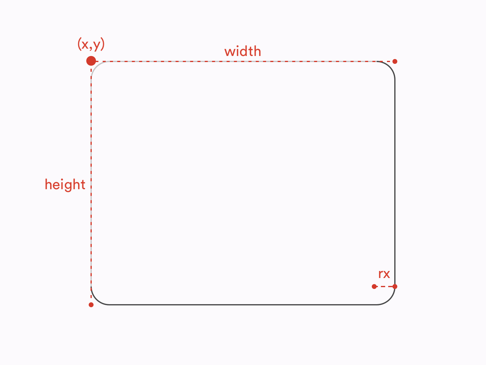
Another basic shape common to all design tools is a rectangle. In case of all design tools, using a rectangle tool generates a <rect /> element in SVG. A basic <rect /> is defined by 4 attributes: its x and y coordinates, along with its width and height:
Notice that while <ellipse />’s and <circle />’s position is defined by their geometrical centers, the position of a <rect /> is defined by the coordinates of its top left corner.
Apart from basic rectangles, we often use rectangles with rounded corners. In all three design tools, you can turn a rectangle into a rounded rectangle by applying a border radius to it in the Inspector or the Properties panel.
Additionally, in Sketch and Illustrator, there are tools dedicated to creating rounded rectangles (Rounded Rectangle Tool in Illustrator and Rounded tool in Sketch). However, there’s no difference between a regular rectangle with a radius applied and a rounded rectangle drawn with a Rounded Rectangle tool.
Therefore, no matter how created, a rounded rectangle will be exported using the following syntax:
One significant difference between design tools and SVG is how radii are defined. In all the design tools we consider, border radius is defined by a single variable. We can think of border radii as little circles used to mask the corners of our rectangles:
Meanwhile, in SVG border radii can be defined by two attributes: rx (as in the example above) and ry. They allow us to create rectangles with elliptical corners. You can think of such rounded corners as ellipses used as masks instead of circles:
So, in this case, SVG offers you more possibilities than design tools.
Note: Even though it’s not exactly related to the topic of this article, it’s worth noting that the difference described above applies to both SVG and HTML/CSS. The CSS propertyborder-radiusthat is used to style nodes such as divs and spans also allows creating elliptical corners. You can see an example below.
border-radius: 10px 5% / 20px 25em 30px 35em;
Values before the slash (/) are horizontal radii (equivalent of rx) and values after the slash are vertical values (equivalent of ry).
Rounded Rectangles With Multiple Radii
In design tools, the same as in CSS, each of the corners of a rectangle can be controlled separately. In other words, each corner can have its own radius (or no radius altogether). Such operation is not possible on a <rect /> element in SVG. Each <rect /> element has only one rx and one ry attribute. If you create a rectangle with multiple radii applied to its corners, the design tool will generate a <path /> element instead of a <rect /> element. We will talk more of a <path /> element in the next section.
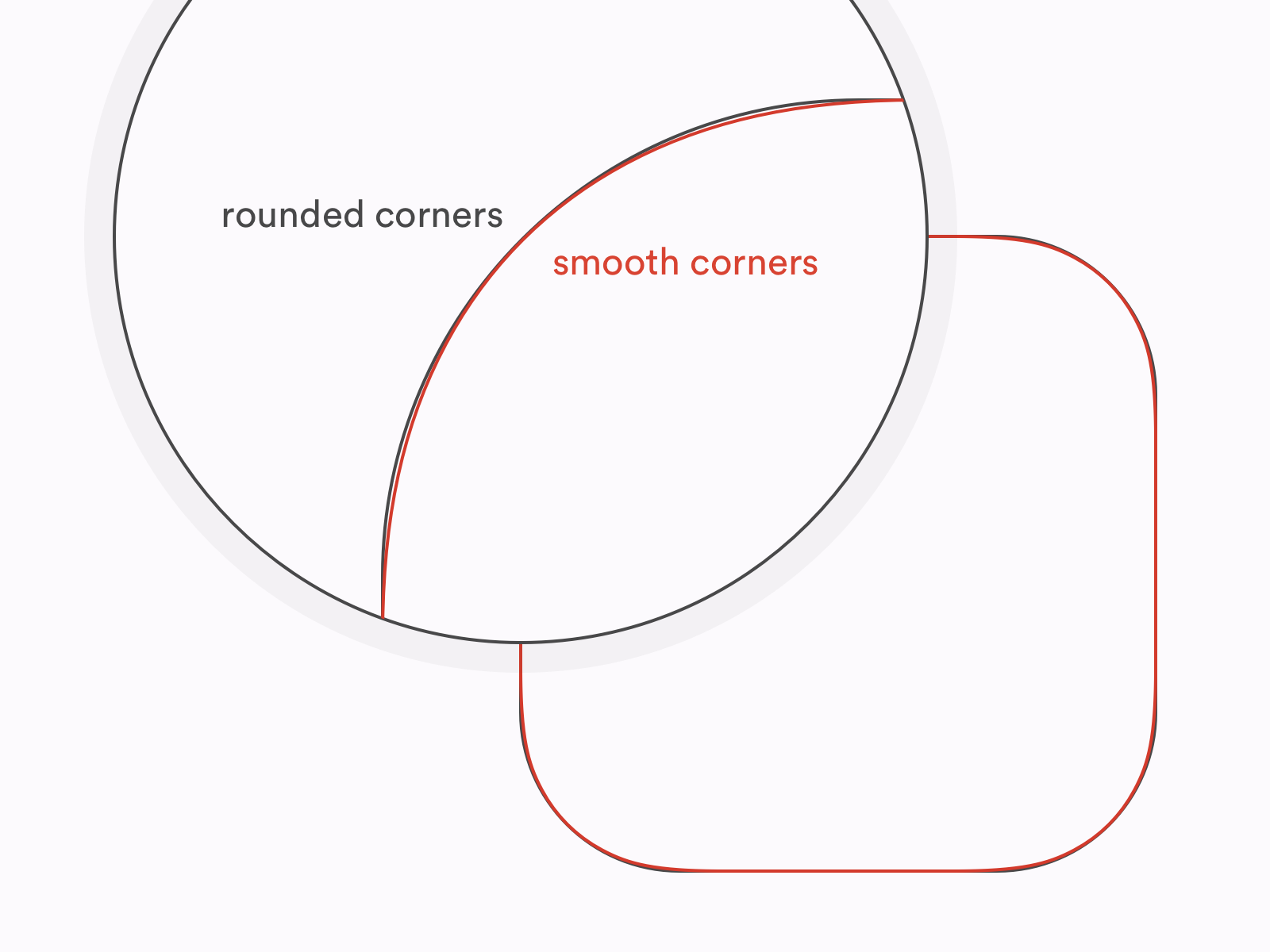
Smooth Corners
One of the interesting features introduced by Sketch and Figma not that long ago is smooth corners. In short, smooth corners use an irregular border-radius to achieve a result that looks more natural and, well, smooth. The most common application of smooth corners is app icons and other rounded elements on iOS. Apple used “regular” rounded corners on its mobile platform until iOS6 and then switched to what we call today “smooth” corners as a part of the big redesign introduced in 2013 (iOS7).
Difference between rounded and smooth corners (Large preview)
In Sketch, you can achieve smooth corners effect by switching between Round Corners and Smooth Corners in Inspector. Figma is giving you even more control over your corners as you can manipulate with the level of smoothness in the Corner Smoothing menu.
Unfortunately, none of these can be easily translated to SVG as SVG doesn’t know the concept of smooth corners at all. There’s also an important difference between what Sketch and Figma do if you try to export a rectangle with smooth corners to SVG.
Figma ignores the smooth corners, and exports a rectangle as a regular <rect /> element with rounded corners. Sketch, on the other hand, exports a rectangle with smooth corners as a <path /> that is trying to replicate the true shape of smooth corners. So Figma gives us worse accuracy for the sake of keeping a rectangle a rectangle, while Sketch is aiming at maximum possible accuracy at the cost of semantics and bigger file size. If you’d like to understand better what does this difference mean, we will dig deeper into the pros and cons of preserving basic shapes a bit later.
Lines
The next basic type of element is a line. In this case, we refer to a line as a single straight line going from point A to point B.
Illustrator, Sketch and Figma all offer their own line tools dedicated to drawing lines.
In SVG, we have a <line /> element. Four of its attributes are required: the coordinates of its starting point and the coordinates of its end point:
When it comes to exporting, Illustrator and Figma will export lines as <line /> elements where possible, while Sketch will always compute lines to <path /> elements.
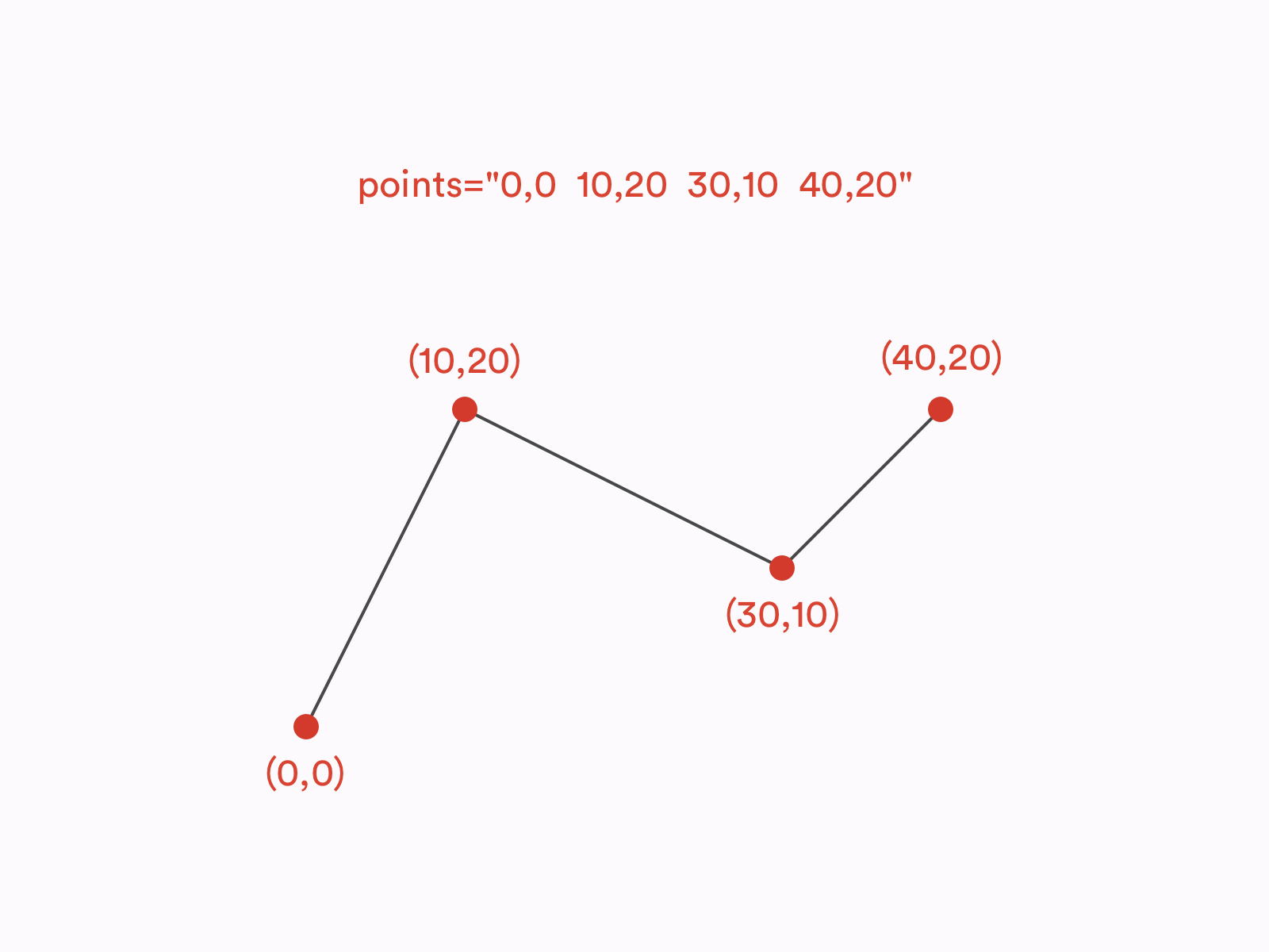
Polylines
Now let’s take a look at polylines. Polyline is a connected series of straight lines. Polylines don’t have dedicated tools in the design tools. They can be drawn with a Pen tool (in Illustrator and Figma) or with a Vector tool (in Sketch).
In, SVG, polylines are defined with a <polyline /> element. <polyline /> is drawn using a points attribute which is a list of coordinates defining all the points that create a polyline. Let’s take a look at an example of a polyline made out of three segments and four points:
Illustrator and Sketch translate polylines to <polyline/> elements, whilst Figma exports polylines as <path />s.
Arrows
In all three tools, you can control the ends of the lines to turn them into arrows and such. And all three tools will export such lines as <path />s, even if without the caps applied the same shapes would be translated to <line />s or <polyline />s. Is it because SVG doesn’t support arrows? Not exactly.
Actually, SVG specification does include customizable line ends which are known as markers. However, none of the design tools we mentioned use markers in the SVG they generate.
<marker> is a separate SVG element that can be defined within SVG’s <defs> and then used on <line>, <polyline> and <path> elements with marker attributes: marker, marker-start, marker-mid and marker-end. If you’d like to learn more about these attributes, I would recommend you to check out the official W3C documentation.
Polygons And Stars
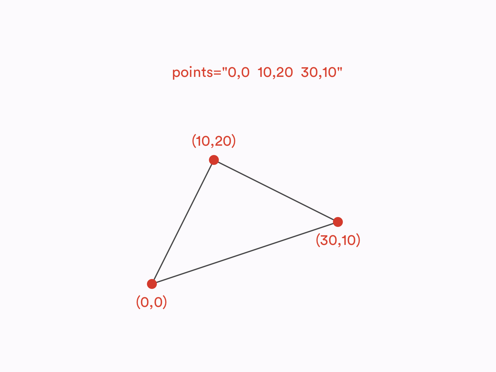
The last basic shape we’ll take a look at it is a polygon. Polygon is a closed shape made of straight lines, e.g. star or a hexagon. You can also think of it as of a closed polyline. The syntax of a <polygon /> element in SVG is actually the same as of a <polyline />. The only difference between the two is that in the <polygon /> the last point on the list is always being connected with the first point to make a <polygon /> a closed shape.
Some polygons are regular polygons. What is special about regular polygons is that all of their sides and angles are equal. To draw regular polygons, such as a hexagon or a pentagon, you can use a Polygon tool, same in Illustrator, Sketch and Figma. Polygon tools in Illustrator and Sketch will generate <polygon /> elements in SVG. In Figma, on the other hand, all shapes made with a Polygon tool result in <path /> elements.
All three design tools also have dedicated Star tools to draw stars. However, when it comes to export, shapes created with Star tools behave exactly the same as those created with Polygon tools. In SVG, stars are just polygons, there is NO ~~<star />~~ element.
It’s important to remember that Star and Polygon tools are used to create regular stars and polygons, while the <polygon /> element in SVG can be used for any polygon, regular or irregular.
All Roads Lead To <path />
As we already learned, in SVG, there are three basic shapes dedicated to drawing shapes made out of straight lines: <line />, <polyline /> and <polygon />. But what if we’d like our lines to be curved? It’s a high time we spoke about the <path /> element.
The <path /> Element
<path /> is the most versatile SVG element. It can be used to draw any possible line and shape, including, but not limited to, all the basic shapes listed above. In fact, every basic shape (<circle/>, <ellipse />, <rect />, <line />, <polyline />, <polygon />) can be described as a <path /> element. What is more, there are many shapes that can be created with <path /> but are not possible to create with any other SVG element. To learn more about <path /> and its syntax, I would recommend you to check out this excellent article by Chris Coyier.
Now, how do we create <path /> elements in design tools? First of all, as we learned above, some of the layers created with shape tools compute to <path /> elements even though they theoretically could be other elements (e.g. Figma exports all polygons as <path />s even though they could have been defined as <polygon />s. Then, every other irregular shape we draw with a Pen tool or a Vector tool must be exported as <path /> as there’s no other SVG element that could define them. Finally, in Sketch and Figma, we can convert any basic shape into a layer that computes to a <path />. In Sketch, we can accomplish this by choosing Layer > Combine > Flatten, while is Figma we can find this function under Object > Flatten Selection (⌘ + E on macOS, Ctrl + E on Windows).
Boolean Operations
Boolean operations are functions performed on shapes to combine them in a few different ways. In Illustrator, Sketch and Figma, there are 4 standard boolean operations:
Union (Unite)
A sum of the shapes
Subtract (Minus front)
Bottom shape subtracted by the common area between the shapes
Intersect
The common area between the shapes
Difference (Exclude)
A sum of the shapes subtracted by the common area between the shapes.
In Illustrator, all of these functions generate a single shape (outline). It is an action that cannot be reversed — otherwise than using Undo (⌘ + Z on macOS, Ctrl + Z on Windows). In Sketch and Figma, on the other hand, boolean operations create layer groups that can be ungrouped later on without any harm caused to the shapes inside. However, you can merge these groups into a single shape to achieve a similar result as in Illustrator using Flatten functions mentioned in the previous paragraph.
The question is, does SVG support boolean operations? No, it doesn’t. They just get merged. Therefore, every combined shape you create with boolean operations in Figma or Sketch will be exported as a single <path /> element.
It Looks The Same, So Why Does It Matter?
In terms of how different shapes can be defined in SVG, its syntax is extremely versatile. Let’s consider a basic rectangle:
Such a shape can be defined in SVG in a few different ways. It can be a <rect /> element, a <polygon /> element. It definitely can be a <path /> element (as everything can be a <path /> element). It can also be a <line /> element (or a <polyline /> element) if we decide to create it using strokes instead of fills.
Each of these elements renders a rectangle that looks exactly the same:
e.g. <path d="M0,0 l2,0 l0,3 l-2,0" fill="black"/> or <path d="M1,0 l0,3" stroke="black" stroke-width="2"/>
But, if the final result (the graphic rendered by a user agent in a browser) looks the same, does it really matter what approach do we choose? Well, it does. As a rule of a thumb, I would always recommend using basic shapes where possible.
Last but not least, use the most obvious shapes for the given case. For example, don’t create rectangles with lines or circles with rectangles if you don’t have a good reason. There are at least a few arguments behind that:
Semantics/Readability
Compression tools, such as SVGO, give you an option to compute all the basic shapes to path elements. It can save you a few bites but will definitely lower the readability of your code. <path /> syntax is extremely unintuitive, so if your SVG is ever about to be modified in a code editor rather than a design tool, it will be so much easier to understand it if you keep the basic shapes as basic shapes.
File Size
Compressing shapes to paths may help you minify files but it’s not always the case! For example, a rounded rectangle takes much more space as a <path /> than as a <rect />.
Animations
Have you ever tried to animate SVG? It’s a lot of fun — as long as you operate on clean, semantic SVG. With basic shapes, you can easily manipulate such parameters as radius, width, height or position of the point. If you merge your shapes into paths, most of those operations will be much harder to achieve or simply impossible.
Variants/Responsiveness
Remember that SVG is not a static image such as JPG. You can style it, theme it, make it responsive, and so on. Same as with animations, keeping your file well-structured and semantic will definitely help you with any of those tasks.
As with every rule, you can find some exceptions. But, on a general basis, it’s good practice to keep your SVG as readable, flexible and structured as possible.
Now, let’s take a look at other attributes and features such as viewBox, groups, transforms and visual effects.
width, height and viewBox
If you already have some experience with SVG, you probably noticed that the opening <svg> tag often has the following attributes: width, height and viewBox. In design tools, we have dimensions of artboards (or frames in case of Figma). So how exactly these values are related to each other?
Let’s start with explaining the <svg> attributes we just mentioned. You can think of a viewBox as of a virtual canvas in the form of a coordinate system. The centre of this coordinate system is placed in the top left corner of the designated area. All items within the <svg viewBox="…"> tag are placed according to this coordinate system and also clipped by it — anything that overflows the viewBox won’t be rendered. viewBox accepts 4 numbers as its value:
As SVG stands for Scalable Vector Graphics, no units are needed on these numbers. Just imagine it as an abstract coordinate system that can be scaled up and down to any size. Don’t worry too much about the first two numbers, most likely you won’t need them. The latter two are what usually matters. These are the actual dimensions of our SVG canvas.
viewBox doesn’t determine SVG’s size. It just specifies the coordinates of the area in which our SVG is drawn. Therefore, when used on the web, <svg> with a specified viewBox will always take all the available space and preserve the ratio set by the viewBox — unless we prevent this with CSS or set the width and/or height attributes.
width and height are the <svg> attributes that set the actual width and height of the SVG element. On the contrary to viewBox, they should use specified units such as pixels, ems or rems. This means that we can also transform the SVG with them — if the ratio between the width and height is different than the ratio between the values of the viewBox, SVG will skew the graphic specified within the viewBox according to the width and height values:
viewBox’s aspect ratio is 3:2 but its width and height attributes make it display as a square. (Large preview)
Now, what happens when we export SVG from design tools? In Sketch and Figma, all assets (no matter if they’re single layers, groups or artboards) will always get a viewBox equal to the dimensions of the exported element and width and height set in pixels, equal to the last two values of the viewBox. In Illustrator, all assets have a viewBox, specified the same way as in Sketch and Figma, but no width and height applied.
Groups
Groups are the basic mean of organizing layers in design tools. Apart from setting hierarchy, groups are used to apply bulk operations, such as transforms, to multiple elements. There’s no significant difference in how groups work across Illustrator, Sketch and Figma and, fortunately, the basic functionality of SVG groups (<g>…</g>) is pretty much the same.
Transforms
In SVG, there are five basic transforms that we can apply to an element:
translate: moves the element along the vertical and/or horizontal axis;
scale: scales the element along the vertical and/or horizontal axis:
rotate: creates a two-dimensional rotation by a given angle specified in degrees around a given point;
skew (skewX or skewY): skews the element by a given angle specified in degrees along the vertical or horizontal axis;
matrix: the most complex and versatile of available transform functions. As it would require quite a lot of algebra talk to explain how matrix transformations work, it goes far beyond the scope of this article. Let’s just acknowledge that matrix allows you to perform many complicated transforms such as stretching, squeezing, shearing, and so on.
Note: Notice that even though some of the SVG transforms look very similar to CSS transforms, they are not the same. For example, CSS offers both 2D and 3D rotation functions while SVG has only one 2D rotate function. Also, while CSS accepts various angle units such as degrees or radians, SVG rotations are always set in degrees, therefore a unit can be omitted (e.g.rotate(45), NOT~~rotate(45deg)~~).
All of these transforms can be applied to any SVG element, such as shapes or groups, and are non-destructive, i.e. do not affect the original geometry of the element. We apply transforms via a transform attribute:
Let’s take a look at the design tools now! So, most of the transforms we apply in design tools interact directly with the objects’ geometry and their position on the canvas. They are not independent from the shapes and will not be exported as SVG transform functions.
Rotations are here the exception, with their values being stored in the Inspector separately from the element’s geometry and they do export as a transform="rotate(…)" function.
Interestingly, the same rule applies to flips (reflections) in Sketch and Figma (not in Illustrator!). Each of them has its own approach though. Sketch uses a combination of negative scaling and translating to achieve a flip effect, while Figma performs a flip within a single matrix function.
Border Radius
We already spoke about rounded rectangles but what about rounding other shapes? In fact, in all the designs tools we discuss, you can round the corners of any shape, not only a rectangle.
But what about SVG? Do <polygon /> and <path /> elements also have a rx and ry attributes? Unfortunately, no. Any shape other than a rectangle, once you round any of its corners, will always be exported as a <path /> element treating the rounded corners as an integral part of the shape’s geometry.
Fills And Strokes
Illustrator, Sketch and Figma all support fills and strokes as the basic properties of any shapes, and so it happens in SVG. Therefore, fills specified in design tools are exported within a fill attribute and stokes are exported within a stroke attribute. Don’t think it’s all that straightforward though. The devil is in the details.
Color Fill
Color fill is the most basic of available fills and is specified with a single plain color (e.g. #3fd8e2). In SVG, this value is put directly in the fill attribute (e.g. fill="#3fd8e2").
Design tools export color fills with hex values (e.g. #0000ff), although, in SVG, you can also use all the other naming schemes known to CSS, such as color names (e.g. blue), RGB values (e.g. rgb(0,0,255)) or even HSL values (e.g. hsl(240,100%,50%)).
Fill Opacity
When it comes to fill opacity, SVG accepts semi-transparent colors (e.g. RGBA values), although it also provides a fill-opacity attribute. Because of compatibility issues, using fill-opacity is a recommended approach and it is also the one used by Figma and Sketch. (I’m not mentioning Illustrator here, as Illustrator does not allow you to control fill opacity.) So, if you want to create an SVG square filled with half-transparent red color, you can do the following:
If you’re familiar with CSS, you may know that when it comes to backgrounds, switching between color and gradient backgrounds is relatively straightforward. The same background-color (or background) property can be used in both cases. As gradients in SVG are much older than CSS gradients, their syntax is also quite different.
To use a gradient is SVG, you first need to define it within the <defs>…</defs> tags and then refer to it in a fill attribute, e.g.:
So, what happens during SVG export when you use a gradient fill is that a gradient is added to the <defs> and it’s being referenced in the code below.
An important thing to remember is that that SVG supports only linear and radial gradients. Effects such as angular gradient or gradient mesh won’t be exported to SVG.
Pattern/Image Fill
Sketch and Figma also offer an Image fill where a raster graphic is used either to fill the entire element or as a repeating pattern.
When it comes to exporting Image fills to SVG, it’s actually quite similar to gradients. Images are being defined in the <defs> with a <pattern>…</pattern> element and then referenced within a fill attribute:
To make it work, the referenced #picture image must be defined somewhere. The design tools will embed them directly in SVG as <image/> elements, although it’s not a recommended approach when it comes to performance. If you really need to use raster images in your SVG, I would suggest to remove the image tag from the SVG and use it a standalone file instead:
stroke attribute in SVG, same as fill attribute accepts colors in various formats, e.g. hex, RGB or HSL. And similarly to fill, you can control stroke’s opacity with stroke-opacity. Also, same as with fill, strokes can use gradients as their value. All of those effects can be achieved in design tools and successfully exported to SVG.
Stroke Caps And Joins
There are also a few stroke specific attributes though. First, you can control the stroke width. Design tools support it and its exported as stroke-width attribute. You can also control ends and joins of the strokes. SVG allows you to define them via stroke-linecap and stroke-linejoin attributes. There are three possible caps: butt cap, round cap and square cap, and three possible joins: miter join, round join and bevel join. Both caps and joins can be controlled in Illustrator, Figma and Sketch and available caps and joins are matching those available in SVG.
Dashed And Dotted Strokes
Another effect we can achieve with strokes is dashed strokes. In Illustrator and Figma, you can set multiple dashes and gaps, while in Sketch, only a single sequence of a dash and a gap is possible.
SVG allows you to create dashed lines with a stroke-dasharray attribute. stroke-dasharray allows a sequence of multiple dashes and gaps to be passed as its value which matches Figma’s and Illustrator’s features. It also means Sketch does not allow you to use the full possibilities of SVG in this case.
An interesting edge case is a dotted line. We achieve it by setting the stroke-linecap to round and a dash’s length to zero, e.g.:
Note: Currently, Figma users experience a bug that doesn’t allow them to create dotted lines. For example, using0, 10or10, 0as Dashes is interpreted the same way as10, 10and gives a regular dashed line rather than a dotted line. Fortunately, there’s a way to get around it. Rather than using zero, use a very small value, e.g.0.0001, 10— this should result in perfectly dotted line, as expected.
Stroke Alignment
There is one other, much more significant difference between design tools and SVG: stroke alignment. Illustrator, Sketch and Figma all allow you to control the alignment of the stroke and set it inside, outside or centre-align it. But guess what? SVG 1.1 does not support stroke alignment. In SVG, all strokes are centre-aligned strokes. No inside strokes or outside strokes. Which is why some very weird things happen when you’re exporting your outside- and inside- aligned strokes to SVG.
Illustrator, in such case, exports the shape and its stroke as two separate shapes. So if you apply an inside stroke or an outside stroke to a rectangle in Illustrator, in SVG it will result in a rectangle and a separate <path /> element representing the rectangle’s stroke, e.g.:
This behavior has some very important repercussions. For example, you can no longer change the width of the stroke or make it dashed. It also won’t scale the same way as “real” strokes. What is more, Illustrator changes the dimensions of the original shape, e.g. a 100×100 square with a 20-units bold inner stroke will actually export as a 120×120 square to avoid rendering issues. Eventually, it’s just not a stroke. It’s just another shape with a fill.
Figma and Sketch have a different approach though. They faithfully export all strokes as strokes but they recalculate the dimensions of the shape. So if you have a circle with a radius equal to 5 and an inside stroke equal to 2, what you’ll find in your SVG will be a circle with a radius equal to 4 (and a stroke still equal to 2).
This approach allows Figma and Sketch to avoid most of the issues mentioned in the case of Illustrator. However, with some more complicated shapes this technique may turn out not to be precise and the final result to be a bit different than expected. With is why Sketch’s and Figma’s approach is not necessarily better — it’s definitely more semantic, performant and flexible, but Illustrator’s solution is more accurate.
Note:The same problem with stroke alignment applies to CSS as well. The CSSborderproperty does not support inside or outside alignment neither. However, if you want, you can hack this behavior withoutlineandbox-shadowproperties.
Multiple Fills And Strokes
In design tools, you can add multiple fills and strokes per layer. This makes a lot of sense once combined with such attributes as opacity and blend modes. Unfortunately, SVG does not support such a feature. If you export a layer that has fills and/or strokes, it will get multiplied and each of the strokes and fills applied to its own layer.
Shadows, Filters, And Other Effects
Let’s talk about some less popular effects now. SVG is a very powerful language, in fact much more powerful than how it’s usually used on the web. One of the most interesting SVG’s features is a wide range of advanced visual effects, known as SVG filters.
The full scope of SVG filter’s possibilities is far too wide to be described in this article. If you’d like to learn more about them I strongly recommend you to check out some talks and articles on this topic by Sarah Soueidan.
Filters, same as patterns or gradients, need to be defined to apply them later to a layer. Every filter is defined as a <filter>…</filter> element that can contain numerous effects, known as filter primitives, each standing for a separate visual effect.
Filter primitives can be combined together to create filters. For example, this is what a basic blur effect applied to a rectangle looks like:
Out of the three design tools we discuss, only Illustrator lets you play with SVG filters. You can find them in the app’s menu, under Effect > SVG Filters. Sketch and Figma are a completely different story. Any effects these applications offer are mostly focused on CSS and native implementations, e.g. Background Blur effect was implemented primarily for designing iOS apps and Drop/Inner Shadow effects parameters are matching CSS properties (box-shadow and text-shadow).
It doesn’t mean we can’t export these effects to SVG. We can. However, translating these effects to SVG is utterly not as straightforward as to CSS. Let’s consider a square with a drop shadow applied.
What happens here is that Sketch duplicates the square, so we have two identical squares, one above another, and turns the duplicate into a shadow.
To accomplish this, it applies a filter to a duplicated square that consists of three different filter primitives:
one to offset the square;
one to set its color to semi-transparent black;
one to blur it.
In other design tools, we would encounter a similar situation.
It doesn’t mean that we should never, by all means, use shadows in SVG. It’s handy to keep in mind though that as long as SVG gives you a very powerful toolkit to modify your graphics, some seemingly simple effects are not that simple to achieve at all.
Blend Modes
Blend modes (such as Darken, Multiply or Overlay) allow blending two or more elements by combining their values in different ways. Well known to graphic designers (and applications such as Adobe Photoshop), blend modes work in Sketch, Figma and Illustrator as well.
In SVG, blend modes exist as one of the filters. They have their own <feBlend /> filter primitive. However, as <feBlend />’s syntax is fairly complicated, Sketch, Figma and Illustrator use CSS instead:
.rectangle {
    mix-blend-mode: overlay;
}
With mix-blend-mode browser support being fairly good nowadays, it shouldn’t be a big issue. However, if it’s important for you to ensure bulletproof browser support that includes Microsoft Edge and IE, you will have to replace the CSS blend modes with SVG filters manually.
Same as with multiple fills and strokes, SVG does not support blend modes applied directly on fill and stroke attributes (rather than on whole layers). If you try to export fill and strokes with their own blend modes from a design tool to SVG, the layer will get multiplied and the blend modes applied to respective copies of the layer.
Symbols And Components
In some of the code examples above, you may have noticed an element we haven’t discussed yet: a <use>…</use> element. <use> lets us define and reuse elements in SVG, a bit similar to Symbols in Illustrator and Sketch or Components in Figma. Remember defining patterns, gradients and filters within the <defs>…</defs> tags so they can be used in some other part of your SVG code? In fact, any SVG element can be defined and reused this way. Once you defined a shape or a group, you can refer to it in the rest of the document as many times as you like, e.g.:
You can also reuse much more complex structures using a <symbol>…</symbol> tag. Symbol acts as a separate body within our SVG and can have its own viewBox attribute (see Width, height and viewBox for reference).
Does it mean our design tools’ symbols and components will be exported to SVG symbols? In Illustrator — yes, it does. In Sketch and Figma — no, it doesn’t. Why? Primarily, because Illustrator symbols are fairly simple and can be easily translated to SVG while Sketch’s symbols and Figma’s components are not that simple at all and exporting some of its features (such as nested overrides) would be very tricky or even impossible.
Text
It wouldn’t be a comprehensive guide if we don’t mention typography. All the design tools offer a wide variety of tools related to text. SVG, even though usually used for graphics, supports text elements too.
Illustrator, Sketch and Figma all support exporting text to SVG and computes text layers into <text>…</text> elements in SVG. SVG text elements are rendered like any other graphic elements, shapes etc. with the only difference is that they’re text.
Same as in CSS, we can control all the basic text’s parameters, such as weight, line height or alignment. In fact, if you know how to style text in CSS, you already know how to do it in SVG. However, it may feel a bit old-school. Firstly, all the parameters must be set in inline attributes, similarly to the golden standards of HTML 3.2. Secondly, there are no shorthands. For example, you won’t find anything resembling a font CSS property. That’s because SVG text attributes are actually based on CSS 2 spec which takes us back to the 90ties and are way older than CSS we know today.
Nonetheless, all of those attributes are being exported from the design tools perfectly well every time we want some text layer to become SVG code.
Custom Fonts
Unfortunately, things get a bit tricky when it comes to custom fonts. Back in the days, when SVG 1 standard was being created, custom typefaces weren’t a common thing to the web. Everybody used standard fonts, such as Tahoma, Verdana or Courier. Going fancy and using fonts people didn’t have on their machines by default, usually meant rasterizing them ruthlessly and using them as images. However, SVG implemented its own fonts format, named SVG fonts. Today, 18 years after the SVG 1.0 was published, SVG fonts are no longer supported in most of the major browsers.
Luckily for us, SVG plays very nicely with CSS, which means we can use web fonts instead of SVG fonts, e.g.:
Let me not get into detail of implementing web fonts here apart from one crucial note: don’t forget about it. In other words, if you use custom fonts in your SVG, you need to remember about providing these fonts to the client, the same as in HTML/CSS.
Outlining Fonts
One may argue that much easier than warring about fonts and all, would be to outline all the text layers and don’t worry about them ever after. Nonetheless, there are at least a few good reasons not to change your text to shapes:
You can’t edit outlined text — before nor after export.
Working with outlined text, you need to remember about keeping an editable copy in your Illustrator, Sketch or Figma file at all times. Otherwise, you won’t be able to edit your text layers, once they are outlined. This adds unnecessary complexity to the process. Not to mention editing the outlined text after the SVG was exported. Text in SVG can be updated at any time. Outlined text requires opening the source file every time you want to make the tiniest copy change.
Outlined text is not accessible.
Text in SVG, same as other text elements on the web, can be read by screen readers and other accessible technologies. By outlining text layers, you prevent people from using such technologies from accessing your content.
People expect text to be text.
Most people using the web know absolutely nothing about SVG, HTML or design tools. If they see text, they expect it to be just that. They may want to select it, copy it or put in a search engine. All of this is possible with text in SVG — unless you outline it.
Don’t forget about SEO.
Text in SVG is also accessible and used by search engines. By outlining text, you make your content less searchable and potentially less visible to the public.
Summary
Thank you a lot for going with me on a journey through the ins and outs of working with SVG and design tools. This article definitely does not cover the full spectrum of the topic, although it should be enough to deal with the most common use cases. If you have any questions or queries regarding the things that have not been mentioned here, don’t hesitate to post them in the comments!


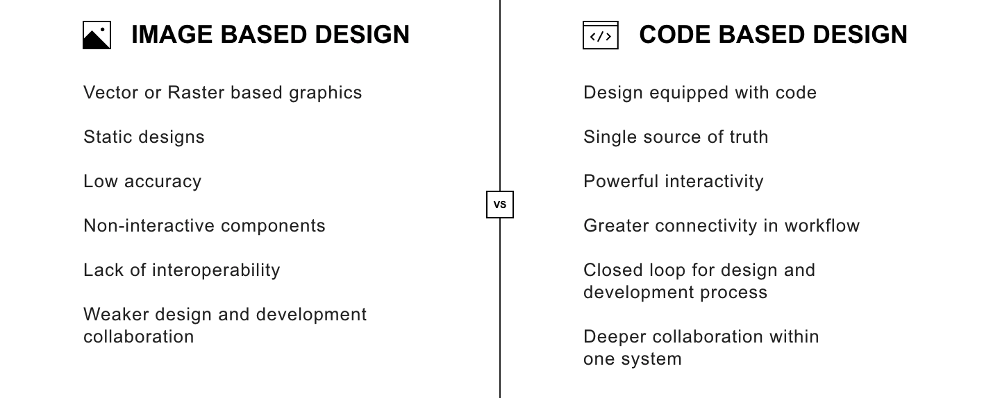


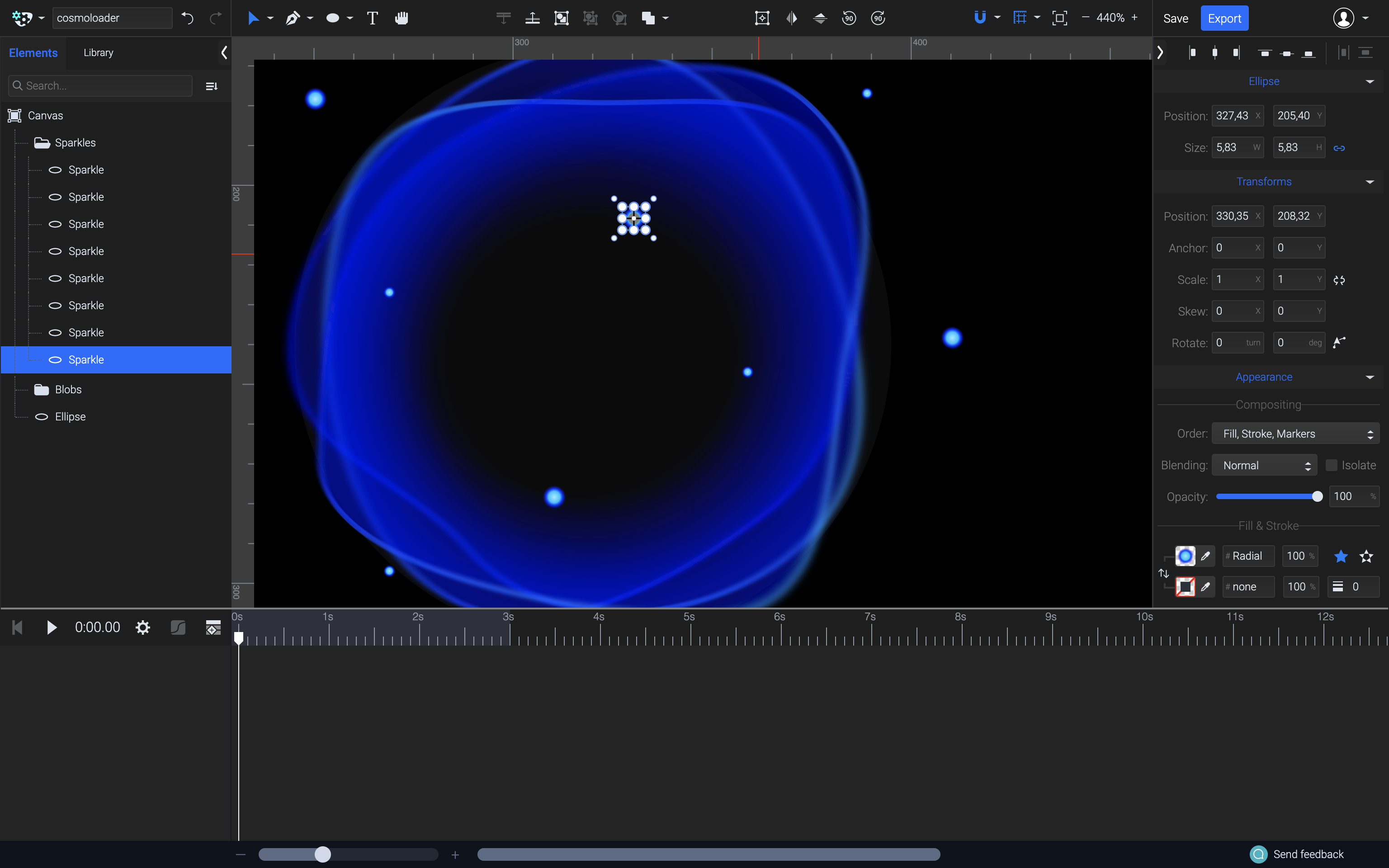


