Let’s Make a Vue-Powered Monthly Calendar

Have you ever seen a calendar on a webpage and thought, how the heck did they did that? For something like that, it might be natural to reach for a plugin, or even an embedded Google Calendar, but it’s actually a lot more straightforward to make one than you might think. Especially when we use the component-driven power of Vue.

I’ve set up a demo over at CodeSandbox so you can see what we’re aiming for, but it’s always a good idea to spell out what we’re trying to do:

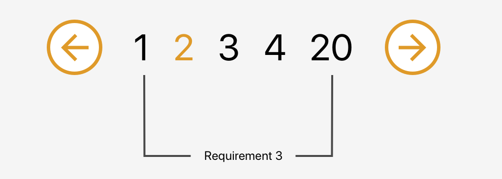
  • Create a month view grid that displays the days of the current month
  • Display dates from the previous and next months to so the grid is always full
  • Indicate the current date
  • Show the name of the currently selected month
  • Navigate to the previous and next month
  • Allow the user to navigate back to the current month with a single click

Oh, and we’ll build this as a single page application that fetches calendar dates from Day.js, a super light utility library.

Step 1: Start with the basic markup

We’re going to jump straight into templates. If you’re new to Vue, Sarah’s introduction series is a nice place to start. It’s also worth noting that I’ll be linking to the Vue 2 docs throughout this post. Vue 3 is currently in beta and the docs for it are subject to change.

Let’s start with creating a basic template for our calendar. We can outline our markup as three layers where we have:

  • A section for the calendar header. This will show components with the currently selected month and the elements responsible for paginating between months.
  • A section for the calendar grid header. A table header that holds a list containing the days of the week, starting with Monday.
  • The calendar grid. You know, each day in the current month, represented as a square in the grid.

Let’s write this up in a file called CalendarMonth.vue. This will be our main component.

<!-- CalendarMonth.vue -->
<template>
  <!-- Parent container for the calendar month -->
  <div class="calendar-month">
     
    <!-- The calendar header -->
    <div class="calendar-month-header"
      <!-- Month name -->
      <CalendarDateIndicator />
      <!-- Pagination -->
      <CalendarDateSelector />
    </div>

    <!-- Calendar grid header -->
    <CalendarWeekdays />

    <!-- Calendar grid -->
    <ol class="days-grid">
      <CalendarMonthDayItem />
    </ol>
  </div>
</template>

Now that we have some markup to work with, let’s go one step further and create required components.

Step 2: Header components

In our header we have two components:

  • CalendarDateIndicator shows the currently selected month.
  • CalendarDateSelector is responsible for paginating between months.

Let’s start with CalendarDateIndicator. This component will accept a selectedDate property which is a Day.js object that will format the current date properly and show it to the user.

<!-- CalendarDateIndicator.vue -->
<template>
  <div class="calendar-date-indicator">{{ selectedMonth }}</div>
</template>

<script>
export default {
  props: {
    selectedDate: {
      type: Object,
      required: true
    }
  },

  computed: {
    selectedMonth() {
      return this.selectedDate.format("MMMM YYYY");
    }
  }
};
</script>

That was easy. Let’s go and create the pagination component that lets us navigate between months. It will contain three elements responsible for selecting the previous, current and next month. We’ll add an event listener on those that fires the appropriate method when the element is clicked.

<!-- CalendarDateSelector.vue -->
<template>
  <div class="calendar-date-selector">
    <span @click="selectPrevious">﹤</span>
    <span @click="selectCurrent">Today</span>
    <span @click="selectNext">﹥</span>
  </div>
</template>

Then, in the script section, we will set up two props that the component will accept:

  • currentDate allows us to come back to current month when the “Today” button is clicked.
  • selectedDate tells us what month is currently selected.

We will also define methods responsible for calculating the new selected date based on the currently selected date using the subtract and add methods from Day.js. Each method will also $emit an event to the parent component with the newly selected month. This allows us to keep the value of selected date in one place — which will be our CalendarMonth.vue component — and pass it down to all child components (i.e. header, calendar grid).

// CalendarDateSelector.vue
<script>
import dayjs from "dayjs";

export default {
  name: "CalendarDateSelector",

  props: {
    currentDate: {
      type: String,
      required: true
    },

    selectedDate: {
      type: Object,
      required: true
    }
  },

  methods: {
    selectPrevious() {
      let newSelectedDate = dayjs(this.selectedDate).subtract(1, "month");
      this.$emit("dateSelected", newSelectedDate);
    },

    selectCurrent() {
      let newSelectedDate = dayjs(this.currentDate);
      this.$emit("dateSelected", newSelectedDate);
    },

    selectNext() {
      let newSelectedDate = dayjs(this.selectedDate).add(1, "month");
      this.$emit("dateSelected", newSelectedDate);
    }
  }
};
</script>

Now, let’s go back to the CalendarMonth.vue component and use our newly created components.

To use them we first need to import and register the components, also we need to create the values that will be passed as props to those components:

  • today properly formats today’s date and is used as a value for the “Today” pagination button.
  • selectedDate is the  currently selected date (set to today’s date by default).

The last thing we need to do before we can render the components is create a method that’s responsible for changing the value of selectedDate. This method will be fired when the event from the pagination component is received.

// CalendarMonth.vue
<script>
import dayjs from "dayjs";
import CalendarDateIndicator from "./CalendarDateIndicator";
import CalendarDateSelector from "./CalendarDateSelector";

export default {
  components: {
    CalendarDateIndicator,
    CalendarDateSelector
  },

  data() {
    return {
      selectedDate: dayjs(),
      today: dayjs().format("YYYY-MM-DD")
    };
  },

  methods: {
    selectDate(newSelectedDate) {
      this.selectedDate = newSelectedDate;
    }
  }
};
</script>

Now we have everything we need to render our calendar header:

<!-- CalendarMonth.vue -->
<template>
  <div class="calendar-month">
    <div class="calendar-month-header">
      <CalendarDateIndicator
        :selected-date="selectedDate"
        class="calendar-month-header-selected-month"
      />
      <CalendarDateSelector
        :current-date="today"
        :selected-date="selectedDate"
        @dateSelected="selectDate"
      />
    </div>
  </div>
</template>

This is a good spot to stop and see what we have so far. Our calendar header is doing everything we want, so let’s move forward and create components for our calendar grid.

Step 3: Calendar grid components

Here, again, we have two components:

  • CalendarWeekdays shows the names of the weekdays.
  • CalendarMonthDayItem represents a single day in the calendar.

The CalendarWeekdays component contains a list that iterates through the weekday labels (using the v-for directive) and renders that label for each weekday. In the script section, we need to define our weekdays and create a computed property to make it available in the template and cache the result to prevent us from having to re-calculate it in the future.

// CalendarWeekdays.vue
<template>
  <ol class="day-of-week">
    <li
      v-for="weekday in weekdays"
      :key="weekday"
    >
      {{ weekday }}
    </li>
  </ol>
</template>


<script>
const WEEKDAYS = ["Mon", "Tue", "Wed", "Thu", "Fri", "Sat", "Sun"];

export default {
  name: 'CalendarWeekdays',

  computed: {
    weekdays() {
      return WEEKDAYS
    }
  }
}
</script>

Next is CalendarMonthDayItem. It’s a list item that receives a day property that is an object, and a boolean prop, isToday, that allows us to style the list item to indicate that it’s the current date. We also have one computed property that formats the received day object to our desired date format (D, or the numeric day of the month).

// CalendarMonthDayItem.vue
<template>
  <li
    class="calendar-day"
    :class="{
      'calendar-day--not-current': !isCurrentMonth,
      'calendar-day--today': isToday
    }"
  >
    <span>{{ label }}</span>
  </li>
</template>


<script>
import dayjs from "dayjs";

export default {
  name: "CalendarMonthDayItem",

  props: {
    day: {
      type: Object,
      required: true
    },

    isCurrentMonth: {
      type: Boolean,
      default: false
    },

    isToday: {
      type: Boolean,
      default: false
    }
  },

  computed: {
    label() {
      return dayjs(this.day.date).format("D");
    }
  }
};
</script>

OK, now that we have these two components, let’s see how we can add them to our CalendarMonth component.

We first need to import and register them. We also need to create a computed property that will return an array of objects representing our days. Each day contains a date property and isCurrentMonth property.

// CalendarMonth.vue
<script>
import dayjs from "dayjs";
import CalendarMonthDayItem from "./CalendarMonthDayItem";
import CalendarWeekdays from "./CalendarWeekdays";


export default {
  name: "CalendarMonth",

  components: {
    // ...
    CalendarMonthDayItem,
    CalendarWeekdays
  },

  computed: {
    days() {
      return [
        { date: "2020-06-29", isCurrentMonth: false },
        { date: "2020-06-30", isCurrentMonth: false },
        { date: "2020-07-01", isCurrentMonth: true },
        { date: "2020-07-02", isCurrentMonth: true },
        // ...
        { date: "2020-07-31", isCurrentMonth: true },
        { date: "2020-08-01", isCurrentMonth: false },
        { date: "2020-08-02", isCurrentMonth: false }
      ];
    }
  }
};
</script>

Then, in the template, we can render our components. Again, we use the v-for directive to render the required number of day elements.

<!-- CalendarMonth.vue -->
<template>
  <div class="calendar-month">
    <div class="calendar-month-header">
      // ...
    </div>

    <CalendarWeekdays/>

    <ol class="days-grid">
      <CalendarMonthDayItem
        v-for="day in days"
        :key="day.date"
        :day="day"
        :is-today="day.date === today"
      />
    </ol>
  </div>
</template>

OK, things are starting to look good now. Have a look at where we are. It looks nice but, as you probably noticed, the template only contains static data at the moment. The month is hardcoded as July and the day numbers are hardcoded as well. We will change that by calculating what date should be shown on a specific month. Let’s dive into the code!

Step 4: Setting up current month calendar

Let’s think how we can calculate the date that should be shown on a specific month. That’s where Day.js really comes into play. It provides all the data we need to properly place dates on the correct days of the week for a given month using real calendar data. It allows us to get and set anything from the start date of a month to all the date formatting options we need to display the data.

We will:

  • Get the current month
  • Calculate where the days should be placed (weekdays)
  • Calculate the days for displaying dates from the previous and next months
  • Put all of the days together in a single array

We already have Day.js imported in our CalendarMonth component. We’re also going to lean on a couple of Day.js plugins for help. WeekDay helps us set the first day of the week. Some prefer Sunday as the first day of the week. Other prefer Monday. Heck, in some cases, it makes sense to start with Friday. We’re going to start with Monday.

The WeekOfYear plugin returns the numeric value for the current week out of all weeks in the year. There are 52 weeks in a year, so we’d say that the week starting January 1 is the the first week of the year, and so on.

Here’s what we put into CalendarMonth.vue to put all of that to use:

// CalendarMonth.vue
<script>
import dayjs from "dayjs";
import weekday from "dayjs/plugin/weekday";
import weekOfYear from "dayjs/plugin/weekOfYear";
// ...


dayjs.extend(weekday);
dayjs.extend(weekOfYear);
// ...

That was pretty straightforward but now the real fun starts as we will now play with the calendar grid. Let’s stop for a second a think what we really need to do to get that right.

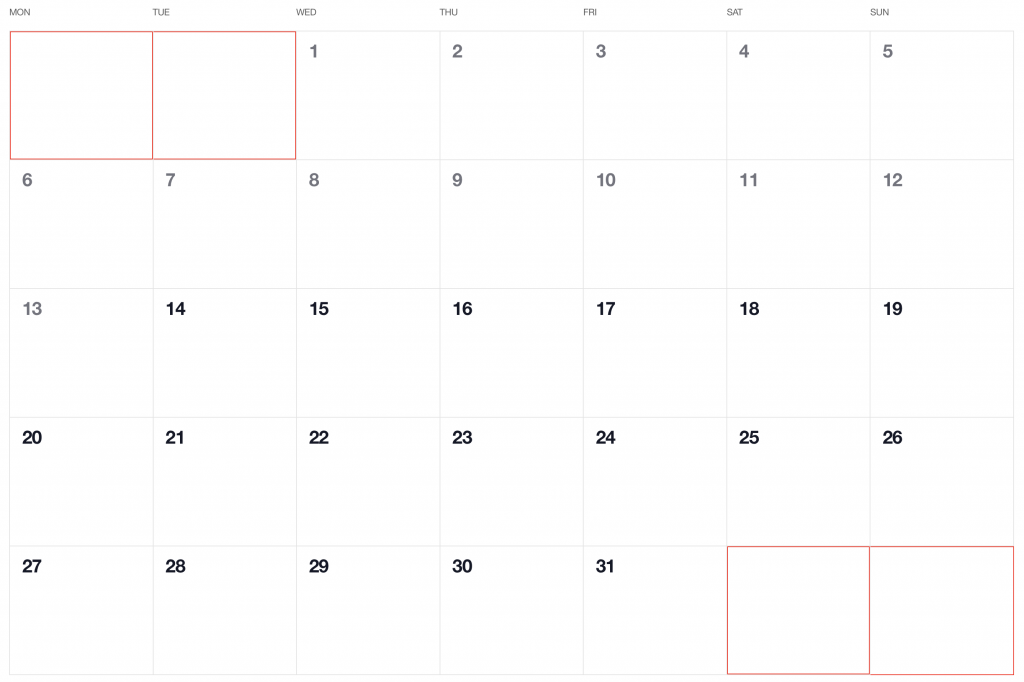
First, we want the date numbers to fall in the correct weekday columns. For example, July 1, 2020, is on a Wednesday. That’s where the date numbering should start.

If the first of the month falls on Wednesday, then that means we’ll have empty grid items for Monday and Tuesday in the first week. The last day of the month is July 31, which falls on a Friday. That means Saturday and Sunday will be empty in the last week of the grid. We want to fill those with the trailing and leading dates of the previous and next months, respectively, so that the calendar grid is always full.

Calendar grid showing the first two and last two days highlighted in red, indicated they are coming from the previous and next months.

Adding dates for the current month

To add the days of the current month to the grid, we need to know how many days exist in the current month. We can get that using the daysInMonth method provided by Day.js. Let’s create a computed property for that.

// CalendarMonth.vue
computed: {
  // ...
  numberOfDaysInMonth() {
      return dayjs(this.selectedDate).daysInMonth();
  }
}

When we know that, we create an empty array with a length that’s equal to number of days in the current month. Then we map() that array and create a day object for each one. The object we create has an arbitrary structure, so you can add other properties if you need them.

In this example, though, we need a date property that will be used to check if a particular date is the current day. We’ll also return a isCurrentMonth value that checks whether the date is in the current month or outside of it. If it is outside the current month, we will style those so folks know they are outside the range of the current month.

// CalendarMonth.vue
computed: {
  // ...
  currentMonthDays() {
    return [...Array(this.numberOfDaysInMonth)].map((day, index) => {
      return {
        date: dayjs(`${this.year}-${this.month}-${index + 1}`).format("YYYY-MM-DD")
        isCurrentMonth: true
      };
    });
  },
}

Adding dates from the previous month

To get dates from the previous month to display in the current month, we need to check what the weekday of the first day is in selected month. That’s where we can use the WeekDay plugin for Day.js. Let’s create a helper method for that.

// CalendarMonth.vue
methods: {
  // ...
  getWeekday(date) {
    return dayjs(date).weekday();
  },
}

Then, based on that, we need to check which day was the last Monday in the previous month. We need that value to know how many days from the previous month should be visible in the current month view. We can get that by subtracting the weekday value from the first day of the current month. For example, if first day of the month is Wednesday, we need to subtract three days to get last Monday of the previous month. Having that value allows us to create an array of day objects starting from the last Monday of the previous month through the end of that month.

// CalendarMonth.vue
computed: {
  // ...
  previousMonthDays() {
    const firstDayOfTheMonthWeekday = this.getWeekday(this.currentMonthDays[0].date);
    const previousMonth = dayjs(`${this.year}-${this.month}-01`).subtract(1, "month");
    const previousMonthLastMondayDayOfMonth = dayjs(this.currentMonthDays[0].date).subtract(firstDayOfTheMonthWeekday - 1, "day").date();

    // Cover first day of the month being sunday 
    (firstDayOfTheMonthWeekday === 0)
    const visibleNumberOfDaysFromPreviousMonth = firstDayOfTheMonthWeekday ? firstDayOfTheMonthWeekday - 1 : 6;
    return [...Array(visibleNumberOfDaysFromPreviousMonth)].map((day, index) = {
      return {
        date: dayjs(`${previousMonth.year()}-${previousMonth.month() + 1}-${previousMonthLastMondayDayOfMonth + index}`).format("YYYY-MM-DD"),
        isCurrentMonth: false
      };
    });
  }
}

Adding dates from the next month

Now, let’s do the reverse and calculate which days we need from the next month to fill in the grid for the current month. Fortunately, we can use the same helper we just created for the previous month calculation. The difference is that we will calculate how many days from the next month should be visible by subtracting that weekday numeric value from seven.

So, for example, if the last day of the month is Saturday, we need to subtract one day from seven to construct an array of dates needed from next month (Sunday).

// CalendarMonth.vue
computed: {
  // ...
  nextMonthDays() {
    const lastDayOfTheMonthWeekday = this.getWeekday(`${this.year}-${this.month}-${this.currentMonthDays.length}`);
    const nextMonth = dayjs(`${this.year}-${this.month}-01`).add(1, "month");
    const visibleNumberOfDaysFromNextMonth = lastDayOfTheMonthWeekday ? 7 - lastDayOfTheMonthWeekday : lastDayOfTheMonthWeekday;

    return [...Array(visibleNumberOfDaysFromNextMonth)].map((day, index) => {
      return {
        date: dayjs(`${nextMonth.year()}-${nextMonth.month() + 1}-${index + 1}`).format("YYYY-MM-DD"),
        isCurrentMonth: false
      };
    });
  }
}

OK, we know how to create all days we need, so let’s use them and merge all days into a single array of all the days we want to show in the current month, including filler dates from the previous and next months.

// CalendarMonth.vue
computed: {
  // ...
  days() {
    return [
      ...this.previousMonthDays,
      ...this.currentMonthDays,
      ...this.nextMonthDays
    ];
  },
}

 Voilà, there we have it! Check out the final demo to see everything put together.


The post Let’s Make a Vue-Powered Monthly Calendar appeared first on CSS-Tricks.

You can support CSS-Tricks by being an MVP Supporter.

How to Make a Monthly Calendar With Real Data

Have you ever seen a calendar on a webpage and thought, how the heck did they did that? For something like that, it might be natural to reach for a plugin, or even an embedded Google Calendar, but it’s actually a lot more straightforward to make one than you might think and only requires the trifecta of HTML, CSS and JavaScript. Let’s make one together!

I’ve set up a demo over at CodeSandbox so you can see what we’re aiming for.

Let’s first identify some requirements for what the calendar should do. It should:

  • Display a month grid for a given month
  • Display dates from the previous and next months to so the grid is always full
  • Indicate current date
  • Show the name of the currently selected month
  • Navigate to the previous and next month
  • Allow the user to navigate back to current month with a single click

Oh, and we’ll build this as a single page application that fetches calendar dates from Day.js, a super light utility library.

We’re going to shy away from choosing a specific framework to keep things easy. For this setup, I’m using Parcel for package management so I can write in Babel, bundle things up, and manage the one and only dependency for the project. Check out the package.json file over at CodeSandbox for specifics.

Step 1: Start with the basic markup and styles

Let’s start with creating a basic template for our calendar. This doesn’t need to be anything fancy. But it also should be done without resorting to tables.

We can outline our markup as three layers where we have:

  • A section for the calendar header. This will show the currently selected month and the elements responsible for paginating between months.
  • A section for the calendar grid header. Again, we’re not reaching form tables, but this would be sort of like a table header that holds a list containing the days of the week, starting with Monday.
  • The calendar grid. You know, each day in the current month, represented as a square in the grid.

Let’s write this up in a file called index.js. This can go inside a src folder in the project folder. We will indeed have an index.html file in the project root that imports our work, but the primary markup will live in the JavaScript file.

<!-- index.js -->
document.getElementById("app").innerHTML = `
<!-- Parent container for the calendar month -->
<div class="calendar-month">
  <!-- The calendar header -->
  <section class="calendar-month-header">
    <!-- Month name -->
    <div
      id="selected-month"
      class="calendar-month-header-selected-month"
    >
      July 2020
    </div>


    <!-- Pagination -->
    <div class="calendar-month-header-selectors">
      <span id="previous-month-selector"><</span>
      <span id="present-month-selector">Today</span>
      <span id="next-month-selector">></span>
    </div>
  </section>
  
  <!-- Calendar grid header -->
  <ol
    id="days-of-week"
    class="day-of-week"
  >
    <li>Mon</li>
    ...
    <li>Sun</li>
  </ol>


  <!-- Calendar grid -->
  <ol
    id="calendar-days"
    class="date-grid"
  >
    <li class="calendar-day">
      <span>
        1
      </span>
      ...
      <span>
        29
      </span>
    </li>
  </ol>
</div>
`;

Let’s go ahead and import this file into that index.html file that lives in the root directory of the project. Nothing special happening here. It’s merely HTML boilerplate with an element that’s targeted by our app and registers our index.js file.

<!DOCTYPE html>
<html>
  <head>
    <title>Parcel Sandbox</title>
    <meta charset="UTF-8" />
  </head>

  <body>
    <div id="app"></div>

    <script src="src/index.js"></script>
  </body>
</html>

Now that we have some markup to work with, let’s style it up a bit so we have a good visual to start with. Specifically, we’re going to:

  • Position the elements using flexbox
  • Create a calendar frame using CSS grid
  • Position the labels within the cells

First up, let’s create a new styles.css file in the same src folder where we have index.js and drop this in:

body {
  --grey-100: #e4e9f0;
  --grey-200: #cfd7e3;
  --grey-300: #b5c0cd;
  --grey-800: #3e4e63;
  --grid-gap: 1px;
  --day-label-size: 20px;
}

.calendar-month {
  position: relative;
  /* Color of the day cell borders */
  background-color: var(--grey-200);
  border: solid 1px var(--grey-200);
}


/* Month indicator and selectors positioning */
.calendar-month-header {
  display: flex;
  justify-content: space-between;
  background-color: #fff;
  padding: 10px;
}


/* Month indicator */
.calendar-month-header-selected-month {
  font-size: 24px;
  font-weight: 600;
}


/* Month selectors positioning */
.calendar-month-header-selectors {
  display: flex;
  align-items: center;
  justify-content: space-between;
  width: 80px;
}


.calendar-month-header-selectors > * {
  cursor: pointer;
}


/* | Mon | Tue | Wed | Thu | Fri | Sat | Sun | */
.day-of-week {
  color: var(--grey-800);
  font-size: 18px;
  background-color: #fff;
  padding-bottom: 5px;
  padding-top: 10px;
}


.day-of-week,
.days-grid {
  /* 7 equal columns for weekdays and days cells */
  display: grid;
  grid-template-columns: repeat(7, 1fr);
}


.day-of-week > * {
  /* Position the weekday label within the cell */
  text-align: right;
  padding-right: 5px;
}


.days-grid {
  height: 100%;
  position: relative;
  /* Show border between the days */
  grid-column-gap: var(--grid-gap);
  grid-row-gap: var(--grid-gap);
  border-top: solid 1px var(--grey-200);
}


.calendar-day {
  position: relative;
  min-height: 100px;
  font-size: 16px;
  background-color: #fff;
  color: var(--grey-800);
  padding: 5px;
}


/* Position the day label within the day cell */
.calendar-day > span {
  display: flex;
  justify-content: center;
  align-items: center;
  position: absolute;
  right: 2px;
  width: var(--day-label-size);
  height: var(--day-label-size);
}

The key part that sets up our grid is this:

.day-of-week,
.days-grid {
  /* 7 equal columns for weekdays and days cells */
  display: grid;
  grid-template-columns: repeat(7, 1fr);
}

Notice that both the calendar grid header and the calendar grid itself are using CSS grid to lay things out. We know there will always be seven days in a week, so that allows us to use the repeat() function to create seven columns that are proportional to one another. We’re also declaring a min-height of 100px on each date of the calendar to make sure the rows are consistent.

We need to hook these styles up with the markup, so let’s add this to the top of our index.js file:

import "./styles.css";

This is a good spot to stop and see what we have so far.

Step 2: Setting up current month calendar

As you probably noticed, the template only contains static data at the moment. The month is hardcoded as July and the day numbers are hardcoded as well. That’s where Day.js comes into play. It provides all the data we need to properly place dates on the correct days of the week for a given month using real calendar data. It allows us to get and set anything from the start date of a month to all the date formatting options we need to display the data.

We will:

  • Get the current month
  • Calculate where the days should be placed (weekdays)
  • Calculate the days for displaying dates from the previous and next months
  • Put all of the days together in a single array

First, we need to import Day.js and remove all static HTML (selected month, weekdays and days). We’ll do that by adding this to our index.js file right above where we imported the styles:

import dayjs from "dayjs";

We’re also going to lean on a couple of Day.js plugins for help. WeekDay helps us set the first day of the week. Some prefer Sunday as the first day of the week. Other prefer Monday. Heck, in some cases, it makes sense to start with Friday. We’re going to start with Monday.

The weekOfYear plugin returns the numeric value for the current week out of all weeks in the year. There are 52 weeks in a year, so we’d say that the week starting January 1 is the the first week of the year, and so on.

So here what we put into index.js right after our import statements:

const weekday = require("dayjs/plugin/weekday");
const weekOfYear = require("dayjs/plugin/weekOfYear");


dayjs.extend(weekday);
dayjs.extend(weekOfYear);

Once we strip out the hardocded calendar values, Here’s what we have in index.js so far:

import dayjs from "dayjs";
import "./styles.css";
const weekday = require("dayjs/plugin/weekday");
const weekOfYear = require("dayjs/plugin/weekOfYear");


dayjs.extend(weekday);
dayjs.extend(weekOfYear);


document.getElementById("app").innerHTML = `
<div class="calendar-month">
  <section class="calendar-month-header">
    <div
      id="selected-month"
      class="calendar-month-header-selected-month"
    >
    </div>
    <div class="calendar-month-header-selectors">
      <span id="previous-month-selector"><</span>
      <span id="present-month-selector">Today</span>
      <span id="next-month-selector">></span>
    </div>
  </section>
  
  <ul
    id="days-of-week"
    class="day-of-week"
  >
  </ul>
  <ul
    id="calendar-days"
    class="days-grid"
  >
  </ul>
</div>
`;

Now let’s set few constants. Specifically, we want to construct an array of days of the weeks (i.e. Monday, Tuesday, Wednesday, etc.):

const WEEKDAYS = ["Mon", "Tue", "Wed", "Thu", "Fri", "Sat", "Sun"];

Then, we want to fetch the current year and set in in YYYY format:

const INITIAL_YEAR = dayjs().format("YYYY");

And we want to set the current month as the starting point when initially loading the calendar, where M formats the month as a numeric value (e.g. January equals 1):

const INITIAL_MONTH = dayjs().format("M");

Let’s go and populate our calendar grid header with the days of the week. First we grab the proper element (#days-of-week), then we iterate through our WEEKDAYS array, creating a list item element for each item in the array while setting the name for each one:

// Select the calendar grid header element
const daysOfWeekElement = document.getElementById("days-of-week");


// Loop through the array of weekdays
WEEKDAYS.forEach(weekday => {
  // For each item in the array, make a list item element
  const weekDayElement = document.createElement("li");
  // Append a child element inside the list item...
  daysOfWeekElement.appendChild(weekDayElement);
  /// ...that contains the value in the array
  weekDayElement.innerText = weekday;
});

Step 3: Creating the calendar grid

That was pretty straightforward but now the real fun starts as we will now play with the calendar grid. Let’s stop for a second a think what we really need to do to get that right.

First, we want the date numbers to fall in the correct weekday columns. For example, July 1, 2020 is on a Wednesday. That’s where the date numbering should start.

If the first of the month falls on Wednesday, then that means we’ll have empty grid items for Monday and Tuesday in the first week. The last day of the month is July 31, which falls on a Friday. That means Saturday and Sunday will be empty in the last week of the grid. We went to fill those with the trailing and leading dates of the previous and next months, respectively, so that the calendar grid is always full.

Create days for the current month

To add the days for the current month to the grid, we need to know how many days exist in the current month. We can get that using the daysInMonth method provided by Day.js. Let’s create a helper method for that.

function getNumberOfDaysInMonth(year, month) {
  return dayjs(`${year}-${month}-01`).daysInMonth()
}

When we know that, we create an empty array with a length that’s equal to number of days in the current month. Then we map() that array and create a day object for each one. The object we create has an arbitrary structure, so you can add other properties if you need them.

In this example, though, we need a date property that will be used to check if a particular date is the current day. We’ll also return a dayOfMonth property that acts as the label (e.g. 1, 2, 3 and so on). isCurrentMonth checks whether the date is in the current month or outside of it. If it is outside the current month, we will style those so folks know they are outside the range of the current month.

function createDaysForCurrentMonth(year, month) {
  return [...Array(getNumberOfDaysInMonth(year, month))].map((day, index) => {
    return {
      date: dayjs(`${year}-${month}-${index + 1}`).format("YYYY-MM-DD"),
      dayOfMonth: index + 1,
      isCurrentMonth: true
    };
  });
}

Add dates from the previous month to the calendar grid

To get dates from the previous month to display in the current month, we need to check what is the weekday of the first day in selected month. That’s where we can use the WeekDay plugin for Day.js. Let’s create a helper method for that.

function getWeekday(date) {
  return dayjs(date).weekday()
}

Then, based on that, we need to check which day was the last Monday in the previous month. We need that value to know how many days from the previous month should be visible in the current month view. We can get that by subtracting the weekday value from the first day of the current month. For example, if first day of the month is Wednesday, we need to subtract 3 days to get last Monday of the previous month. Having that value allows us to create an array of day objects starting from the last Monday of the previous month through the end of that month.

function createDaysForPreviousMonth(year, month) {
  const firstDayOfTheMonthWeekday = getWeekday(currentMonthDays[0].date);


  const previousMonth = dayjs(`${year}-${month}-01`).subtract(1, "month");
  
  const previousMonthLastMondayDayOfMonth = dayjs(
    currentMonthDays[0].date
  ).subtract(firstDayOfTheMonthWeekday - 1, "day").date();


  // Account for first day of the month on  a Sunday (firstDayOfTheMonthWeekday === 0)
  const visibleNumberOfDaysFromPreviousMonth = firstDayOfTheMonthWeekday ? firstDayOfTheMonthWeekday - 1 : 6


  return [...Array(visibleNumberOfDaysFromPreviousMonth)].map((day, index) => {    
    return {
      date: dayjs(
        `${previousMonth.year()}-${previousMonth.month() + 1}-${previousMonthLastMondayDayOfMonth + index}`
      ).format("YYYY-MM-DD"),
      dayOfMonth: previousMonthLastMondayDayOfMonth + index,
      isCurrentMonth: false
    };
  });
}

Add dates from the next month to the calendar grid

Now, let’s do the reverse and calculate which days we need from the next month to fill in the grid for the current month. Fortunately, we can use the same helper we just created for the previous month calculation. The difference is that we will calculate how many days from the next month should be visible by subtracting that weekday numeric value from 7.

So, for example, if the last day of the month is Saturday, we need to subtract 1 day from 7 to construct an array of dates needed from next month (Sunday).

function createDaysForNextMonth(year, month) {
  const lastDayOfTheMonthWeekday = getWeekday(`${year}-${month}-${currentMonthDays.length}`)


  const visibleNumberOfDaysFromNextMonth = lastDayOfTheMonthWeekday ? 7 - lastDayOfTheMonthWeekday : lastDayOfTheMonthWeekday


  return [...Array(visibleNumberOfDaysFromNextMonth)].map((day, index) => {
    return {
      date: dayjs(`${year}-${Number(month) + 1}-${index + 1}`).format("YYYY-MM-DD"),
      dayOfMonth: index + 1,
      isCurrentMonth: false
    }
  })
}

OK, we know how to create all days we need, let’s use the methods we just created and then merge all days into a single array of all the days we want to show in the current month, including filler dates from the previous and next months.

let currentMonthDays = createDaysForCurrentMonth(INITIAL_YEAR, INITIAL_MONTH)
let previousMonthDays = createDaysForPreviousMonth(INITIAL_YEAR, INITIAL_MONTH, currentMonthDays[0])
let nextMonthDays = createDaysForNextMonth(INITIAL_YEAR, INITIAL_MONTH)


let days = [...this.previousMonthDays, ...this.currentMonthDays, ...this.nextMonthDays]

Here’s everything we just covered put together in index.js:

// Same as before ...


const WEEKDAYS = ["Mon", "Tue", "Wed", "Thu", "Fri", "Sat", "Sun"];
const INITIAL_YEAR = dayjs().format("YYYY");
const INITIAL_MONTH = dayjs().format("M");
const daysOfWeekElement = document.getElementById("days-of-week");


// Add weekdays to calendar header
WEEKDAYS.forEach(weekday => {
  const weekDayElement = document.createElement("li");
  daysOfWeekElement.appendChild(weekDayElement);
  weekDayElement.innerText = weekday;
});


let currentMonthDays = createDaysForCurrentMonth(INITIAL_YEAR, INITIAL_MONTH);
let previousMonthDays = createDaysForPreviousMonth(INITIAL_YEAR, INITIAL_MONTH);
let nextMonthDays = createDaysForNextMonth(INITIAL_YEAR, INITIAL_MONTH);
let days = [...previousMonthDays, ...currentMonthDays, ...nextMonthDays];


console.log(days);


function getNumberOfDaysInMonth(year, month) {
  return dayjs(`${year}-${month}-01`).daysInMonth();
}


function createDaysForCurrentMonth(year, month) {
  return [...Array(getNumberOfDaysInMonth(year, month))].map((day, index) => {
    return {
      date: dayjs(`${year}-${month}-${index + 1}`).format("YYYY-MM-DD"),
      dayOfMonth: index + 1,
      isCurrentMonth: true
    };
  });
}


function createDaysForPreviousMonth(year, month) {
  const firstDayOfTheMonthWeekday = getWeekday(currentMonthDays[0].date);
  const previousMonth = dayjs(`${year}-${month}-01`).subtract(1, "month");
  const previousMonthLastMondayDayOfMonth = dayjs(currentMonthDays[0].date)
    .subtract(firstDayOfTheMonthWeekday - 1, "day")
    .date();
  // Cover first day of the month being sunday (firstDayOfTheMonthWeekday === 0)
  const visibleNumberOfDaysFromPreviousMonth = firstDayOfTheMonthWeekday
    ? firstDayOfTheMonthWeekday - 1
    : 6;


  return [...Array(visibleNumberOfDaysFromPreviousMonth)].map((day, index) => {
    return {
      date: dayjs(
        `${previousMonth.year()}-${previousMonth.month() +
          1}-${previousMonthLastMondayDayOfMonth + index}`
      ).format("YYYY-MM-DD"),
      dayOfMonth: previousMonthLastMondayDayOfMonth + index,
      isCurrentMonth: false
    };
  });
}

function createDaysForNextMonth(year, month) {
  const lastDayOfTheMonthWeekday = getWeekday(
    `${year}-${month}-${currentMonthDays.length}`
  );
  const nextMonth = dayjs(`${year}-${month}-01`).add(1, "month");
  const visibleNumberOfDaysFromNextMonth = lastDayOfTheMonthWeekday
    ? 7 - lastDayOfTheMonthWeekday
    : lastDayOfTheMonthWeekday;
  return [...Array(visibleNumberOfDaysFromNextMonth)].map((day, index) => {
    return {
      date: dayjs(
        `${nextMonth.year()}-${nextMonth.month() + 1}-${index + 1}`
      ).format("YYYY-MM-DD"),
      dayOfMonth: index + 1,
      isCurrentMonth: false
    };
  });
}

function getWeekday(date) {
  return dayjs(date).weekday();
}

Step 4: Show calendar dates

OK, so we have the basic markup for our calendar, the data we need to display dates from the current month, plus dates from the previous and next month to fill in empty grid items. Now we need to append the dates to the calendar!

We already have a container for the calendar grid, #calendar-days. Let’s grab that element.

const calendarDaysElement = document.getElementById("calendar-days");

Now, let’s create a function that will append a day to our calendar view.

function appendDay(day, calendarDaysElement) {
  const dayElement = document.createElement("li");
  const dayElementClassList = dayElement.classList;


  // Generic calendar day class
  dayElementClassList.add("calendar-day");


  // Container for day of month number
  const dayOfMonthElement = document.createElement("span");


  // Content
  dayOfMonthElement.innerText = day.dayOfMonth;


  // Add an extra class to differentiate current month days from prev/next month days
  if (!day.isCurrentMonth) {
    dayElementClassList.add("calendar-day--not-current");
  }


  // Append the element to the container element
  dayElement.appendChild(dayOfMonthElement);
  calendarDaysElement.appendChild(dayElement);
}

Notice that we’re tossing in a check for the dates that  are coming from the previous and next months so that we can add a class to style them differently from the dates in the current month:

.calendar-day--not-current {
  background-color: var(--grey-100);
  color: var(--grey-300);
}

That’s it! Our calendar should now look as we wanted.

Step 5: Select current month

What we have so far is pretty nice, but we want the user to be able to paginate from month-to-month forwards and backwards in time, starting from the current month. We have most of the logic in place, so all we really need to do is to add a click listener to the pagination buttons that re-runs the days calculation and re-draws the calendar with updated data.

Before we begin, let’s define variables for dates that are in the current month, previous month, and next month so we can reference them throughout the code.

let currentMonthDays;
let previousMonthDays;
let nextMonthDays;

Now, let’s create a method that will be responsible for re-calculating the calendar days and re-rendering the calendar when paginating to another month. We will call that function createCalendar. This method will accept two attributes — year and month  — and based on that, the calendar will re-render with new data and without a new page load.

The method will replace the header content to always show the selected month label.

function createCalendar(year = INITIAL_YEAR, month = INITIAL_MONTH) {
  document.getElementById("selected-month").innerText = dayjs(
    new Date(year, month - 1)
  ).format("MMMM YYYY");


  // ...

Then it will grab the calendar days container and remove all existing days.

// ...


  const calendarDaysElement = document.getElementById("calendar-days");
  removeAllDayElements(calendarDaysElement);


  // ...

When the calendar is cleared, it will calculate new days that should be displayed using the methods we created before.

//...


currentMonthDays = createDaysForCurrentMonth(
  year,
  month,
  dayjs(`${year}-${month}-01`).daysInMonth()
);


previousMonthDays = createDaysForPreviousMonth(year, month);


nextMonthDays = createDaysForNextMonth(year, month);


const days = [...previousMonthDays, ...currentMonthDays, ...nextMonthDays];


// ...

And, finally, it will append a day element for each day.

// ...
days.forEach(day => {
  appendDay(day, calendarDaysElement);
});

There is one piece of logic still missing: a removeAllDayElements method that clears the existing calendar. This method takes the first calendar day element, removes it, and replaces it with another one. From there, it will run the logic in a loop until all of the elements are removed.

function removeAllDayElements(calendarDaysElement) {
  let first = calendarDaysElement.firstElementChild;


  while (first) {
    first.remove();
    first = calendarDaysElement.firstElementChild;
  }
}

Now we can reuse that logic when we want to change the month. Recall the first step when we created a static template for our component. We added these elements:

<div class="calendar-month-header-selectors">
  <span id="previous-month-selector"><</span>
  <span id="present-month-selector">Today</span>
  <span id="next-month-selector">></span>
</div>

These are the controls for paginating between months. To change it, we need to store the currently selected month. Let’s create a variable to keep track of what that is and set its initial value to the present month.

let selectedMonth = dayjs(new Date(INITIAL_YEAR, INITIAL_MONTH - 1, 1));

Now, to make the selectors work, we need a bit of JavaScript. To make it more readable, we will create another method called initMonthSelectors and we will keep the logic there. This method will add event listeners to the selector elements. It will listen for click events and update the value of selectedMonth to the name of the newly selected month before running the createCalendar method with proper year and month values.

function initMonthSelectors() {
  document
  .getElementById("previous-month-selector")
  .addEventListener("click", function() {
    selectedMonth = dayjs(selectedMonth).subtract(1, "month");
    createCalendar(selectedMonth.format("YYYY"), selectedMonth.format("M"));
  });


  document
  .getElementById("present-month-selector")
  .addEventListener("click", function() {
    selectedMonth = dayjs(new Date(INITIAL_YEAR, INITIAL_MONTH - 1, 1));
    createCalendar(selectedMonth.format("YYYY"), selectedMonth.format("M"));
  });


  document
  .getElementById("next-month-selector")
  .addEventListener("click", function() {
    selectedMonth = dayjs(selectedMonth).add(1, "month");
    createCalendar(selectedMonth.format("YYYY"), selectedMonth.format("M"));
  });
}

That’s it! Our calendar is ready. While that’s great and all, it would be even nicer if we could mark the current date so it stands out from the rest. That shouldn’t be very hard. We are already styling days that are not in the selected month, so let’s do similar thing to that.

We’ll create a variable that’s set for today:

const TODAY = dayjs().format("YYYY-MM-DD");

Then, in the appendDay method where we apply a class for dates outside the current month, we have to add another check to see if the element is today’s date. If it is, we’ll add a class to that element:

function appendDay(day, calendarDaysElement) {
  // ...
  if (day.date === TODAY) {
    dayElementClassList.add("calendar-day--today");
  }
}

Now we can style it!

.calendar-day--today {
  padding-top: 4px;
}


.calendar-day--today > div {
  color: #fff;
  border-radius: 9999px;
  background-color: var(--grey-800);
}

Voilà, there we have it! Check out the final demo to see everything put together.


The post How to Make a Monthly Calendar With Real Data appeared first on CSS-Tricks.

You can support CSS-Tricks by being an MVP Supporter.

Moving from Vanilla JavaScript to a Reusable Vue Component

I recently wrote an article explaining how you can create a countdown timer using HTML, CSS and JavaScript. Now, let’s look at how we can make that a reusable component by porting it into Vue using basic features that the framework provides.

Why do this at all? Well there are few reasons, but two stand out in particular:

  • Keeping UI in sync with the timer state: If you look at the code from the first post,  it all lives in the timerInterval function, most noticeably the state management. Each time it runs (every second) we need to manually find the proper element on our document — whether it’s the time label or the remaining time path or whatever — and change either its value or an attribute. Vue comes with an HTML-based template syntax that allows you to declaratively bind the rendered DOM to the underlying Vue instance’s data. That takes all the burden of finding and updating proper UI elements so we can rely purely on the component instance’s properties.
  • Having a highly reusable component: The original example works fine when only one timer is present on our document, but imagine that you want to add another one. Oops! We rely the element’s ID to perform our actions and using the same ID on multiple instances would prevent them from working independently. That means we would have to assign different IDs for each timer. If we create a Vue component, all it’s logic is encapsulated and connected to that specific instance of the component. We can easily create 10, 20, 1,000 timers on a single document without changing a single line in the component itself!

Here’s the same timer we created together in the last post, but in Vue.

Template and styles

From the Vue docs:

Vue uses an HTML-based template syntax that allows you to declaratively bind the rendered DOM to the underlying Vue instance’s data. All Vue.js templates are valid HTML that can be parsed by spec-compliant browsers and HTML parsers.

Let’s create our component by opening a new file called BaseTimer.vue. Here’s the basic structure we need for that:

// Our template markup will go here
<template>
// ...
</template>

// Our functional scripts will go here
<script>
// ...
</script>

// Our styling will go here
<style>
// ...
</style>

In this step, we will concentrate on the <template> and <style> sections. Let’s move our timer template to the <template> section and all our CSS to <style> section. The markup mostly consists of SVG and we can use the exact same code we used from the first article.

<template>
  // The wrapper for the timer
  <div class="base-timer">

    // This all comes from the first article
    <svg class="base-timer__svg" viewBox="0 0 100 100" xmlns="http://www.w3.org/2000/svg">
      <g class="base-timer__circle">
        <circle class="base-timer__path-elapsed" cx="50" cy="50" r="45"></circle>
        <path
          id="base-timer-path-remaining"
          stroke-dasharray="283"
          class="base-timer__path-remaining ${remainingPathColor}"
          d="
            M 50, 50
            m -45, 0
            a 45,45 0 1,0 90,0
            a 45,45 0 1,0 -90,0
          "
        ></path>
      </g>
    </svg>

    // The label showing the remaining time
    <span
      id="base-timer-label"
      class="base-timer__label"
    >
      ${formatTime(timeLeft)}
    </span>

  </div>
</template>

// "scoped" means these styles will not leak out to other elements on the page
<style scoped>
.base-timer {
  position: relative;
  width: 100px;
  height: 100px;
}
</style>

Let’s have a look at the template we just copied to identify where we can use our framework. There are few parts that are responsible for making our timer count down the time and show the remaining time.

  • stroke-dasharray: A value passed to the SVG <path> element that is responsible for holding the remaining time.
  • remainingPathColor: A CSS class responsible for changing the color of the timer’s circular ring, giving is a way to visually indicate that time is running out.
  • formatTime(timeLeft): A value responsible for showing how much time is left inside the timer

We can control our timer by manipulating those values.

Constants and variables

OK, let’s go down to our <script> section and see what Vue gives us out of the box to make our life easier. One thing it lets us do is define our constants up front, which keeps them scoped to the component.

In the last post, we spent a little time tweaking the stroke-dasharray  value to make sure the animation of the timer’s top layer (the ring that animates and changes color as time progresses) is perfectly in line with its bottom layer (the gray ring that indicates past time). We also defined “thresholds” for when the top layer should change colors (orange at 10 remaining seconds and red at five seconds). We also created constants for those colors.

We can move all of those directly into the <script> section:

<script>
// A value we had to play with a bit to get right
const FULL_DASH_ARRAY = 283;
// When the timer should change from green to orange
const WARNING_THRESHOLD = 10;
// When the timer should change from orange to red
const ALERT_THRESHOLD = 5;

// The actual colors to use at the info, warning and alert threshholds
const COLOR_CODES = {
  info: {
    color: "green"
  },
  warning: {
    color: "orange",
    threshold: WARNING_THRESHOLD
  },
  alert: {
    color: "red",
    threshold: ALERT_THRESHOLD
  }
};

// The timer's starting point
const TIME_LIMIT = 20;
</script>

Now, let’s have a look at our variables:

let timePassed = 0;
let timeLeft = TIME_LIMIT;
let timerInterval = null;
let remainingPathColor = COLOR_CODES.info.color;

We can identify two different types of variables here:

  1. Variables in which the values are directly re-assigned in our methods:
    • timerInterval: Changes when we start or stop the timer
    • timePassed: Changes each second when the timer is running
  2. Variables in which the values change when other variables change:
    • timeLeft: Changes when the value of timePassed changes
    • remainingPathColor: Changes when the value of timeLeft breaches the specified threshold

It is essential to identify that difference between those two types as it allows us to use different features of the framework. Let’s go through each of the type separately.

Variables in which values are directly re-assigned

Let’s think what we want to happen when we change the timePassed value. We want to calculate how much time is left, check if we should change the top ring’s color, and trigger re-render on a part of our view with new values. 

Vue comes with its own reactivity system that updates the view to match the new values of specific properties. To add a property to Vue’s reactivity system we need to declare that property on a data object in our component. By doing that,Vue will create a getter and a setter for each property that will track changes in that property and respond accordingly.

<script>
// Same as before

export default {
  data() {
    return {
      timePassed: 0,
      timerInterval: null
    };
  }
</script>

There are two important things we need to remember.

  1. We need to declare all reactive variables in our data object up front. That means if we know that a variable will exist but we don’t know what the value will be, we still need to declare it with some value. If we forgot to declare it in data it will not be reactive, even if it is added later.
  2. When declaring our data option object, we always need to return a new object instance (using return). This is vital because, if we don’t follow this rule, the declared properties will be shared between all instances of the component.

You can see that second issue in action:

Variables in which values change when other variable change

These variables rely on the value of another variable. For example, timeLeft relies purely on timePassed. In our original example that uses vanilla JavaScript, we were calculating that value in the interval that was responsible for changing the value of timePassed. With Vue, we can extract that value to a computed property.

computed property is a function that returns a value. These values are bound to the dependency values and only update when required. Even more importantly, computed properties are cached, meaning they remember the values that the computed property depends on and calculate the new value only if that dependent property value changed. If the value does not change, the previously cached value is returned.

<script>
// Same as before

computed: {
    timeLeft() {
      return TIME_LIMIT - this.timePassed;
    }
  }
}
</script>

The function passed to the computed property must be a pure function. It can’t cause any side effects and must return a value. Also, the output value must only be dependent on the values passed into the function.

Now, we can move more logic to computed properties:

  • circleDasharray: This returns a value previously that is calculated in the setCircleDasharray method.
  • formattedTimeLeft: This returns a value from the formatTime method.
  • timeFraction: This is an abstraction of the calculateTimeFraction method.
  • remainingPathColor: This is an abstraction of the setRemainingPathColor method.
<script>
// Same as before

computed: {
    circleDasharray() {
      return `${(this.timeFraction * FULL_DASH_ARRAY).toFixed(0)} 283`;
    },

    formattedTimeLeft() {
      const timeLeft = this.timeLeft;
      const minutes = Math.floor(timeLeft / 60);
      let seconds = timeLeft % 60;
      if (seconds < 10) {
        seconds = `0${seconds}`;
      }
      return `${minutes}:${seconds}`;
    },

    timeLeft() {
      return TIME_LIMIT - this.timePassed;
    },

    timeFraction() {
      const rawTimeFraction = this.timeLeft / TIME_LIMIT;
      return rawTimeFraction - (1 / TIME_LIMIT) * (1 - rawTimeFraction);
    },

    remainingPathColor() {
      const { alert, warning, info } = COLOR_CODES;
      if (this.timeLeft <= alert.threshold) {
        return alert.color;
      } else if (this.timeLeft <= warning.threshold) {
        return warning.color;
      } else {
        return info.color;
      }
    }
  }
</script>

We now have all the values we need! But now we need to put them to use in our template.

Using data and computed properties in the template

Here’s where we left off with our template:


<template>
  <div class="base-timer">
    <svg class="base-timer__svg" viewBox="0 0 100 100" xmlns="http://www.w3.org/2000/svg">
      <g class="base-timer__circle">
        <circle class="base-timer__path-elapsed" cx="50" cy="50" r="45"></circle>
        <path
          id="base-timer-path-remaining"
          stroke-dasharray="283"
          class="base-timer__path-remaining ${remainingPathColor}"
          d="
            M 50, 50
            m -45, 0
            a 45,45 0 1,0 90,0
            a 45,45 0 1,0 -90,0
          "
        ></path>
      </g>
    </svg>
    <span
      id="base-timer-label"
      class="base-timer__label"
    >
        ${formatTime(timeLeft)}
    </span>
  </div>
</template>

Let’s start with formatTime(timeLeft). How we can dynamically bind the rendered value to our formattedTimeLeftcomputed property?

Vue uses HTML-based template syntax that allowsus to declaratively bind the rendered DOM to the underlying data of the Vue instance. That means all properties are available in the template section. To render any of them, we use text interpolation using the “Mustache” syntax (double curly braces, or {{ }}).

<span
  id="base-timer-label"
  class="base-timer__label"
>
  {{ formattedTimeLeft }} 
</span>

Next will be stroke-dasharray. We can see we don’t want to render that value. Instead, we want to change the value of the <path> attribute. Mustache cannot be used inside HTML attributes, but fear not! Vue comes with another way: the v-bind directive. We can bind a value to an attribute like this:

<path  v-bind:stroke-dasharray="circleDasharray"></path>

To facilitate the usage of that directive, we can also use a shorthand.

<path  :stroke-dasharray="circleDasharray"></path>

The last one is remainingPathColor, which adds a proper class to an element. We can do that using the same v-bind directive as above, but assign the value to the class attribute of an element.

<path  :class="remainingPathColor"></path>

Let’s have a look at our template after changes.

<template>
  <div class="base-timer">
    <svg class="base-timer__svg" viewBox="0 0 100 100" xmlns="http://www.w3.org/2000/svg">
      <g class="base-timer__circle">
        <circle class="base-timer__path-elapsed" cx="50" cy="50" r="45"></circle>
        <path
          :stroke-dasharray="circleDasharray"
          class="base-timer__path-remaining"
          :class="remainingPathColor"
          d="
            M 50, 50
            m -45, 0
            a 45,45 0 1,0 90,0
            a 45,45 0 1,0 -90,0
          "
        ></path>
      </g>
    </svg>
    <span class="base-timer__label">{{ formattedTimeLeft }}</span>
  </div>
</template>

We have our template ready, we moved all variables to data or computed, and we got rid off most of the methods by creating corresponding computed properties. We are still missing one vital part, though: we need to start our timer.

Methods and component lifecycle hooks

If we look at our startTimer method, we can see that all the calculations, changes in attributes, etc. happen in the interval.

function startTimer() {
  timerInterval = setInterval(() => {
    timePassed = timePassed += 1;
    timeLeft = TIME_LIMIT - timePassed;
    document.getElementById("base-timer-label").innerHTML = formatTime(
      timeLeft
    );
    setCircleDasharray();
    setRemainingPathColor(timeLeft);
    if (timeLeft === 0) {
      onTimesUp();
    }
  }, 1000);
}

Since we’ve already moved all that logic into the computed property, all we need to do in our timerInterval is change the value of timePassed — the rest will happen magically in the computed properties

<script>
// Same as before

methods: {
  startTimer() {
    this.timerInterval = setInterval(() => (this.timePassed += 1), 1000);
  }
}
</script>

We have the method ready, but we still don’t call it anywhere. Each Vue component comes with a series of hooks that allows us to run a specific logic within a specific period of the component’s lifecycle. These are called lifecycle hooks. In our case, as we want to call our method immediately when the component gets loaded. That makes mounted the lifecycle hook what we want.

<script>
// Same as before

mounted() {
  this.startTimer();
},

// Same methods as before
</script> 

That’s it, we just turned our timer into a consistent and reusable component using Vue!

Let's say we now want to use this component in another component. That requires a few things:

  1. First, we import the component.
  2. Next, we register the component.
  3. Finally, we instantiate the component in the template.
// App.vue

import BaseTimer from "./components/BaseTimer"

export default {
  components: {
    BaseTimer
  }
};

That’s a wrap!

This example shows how we can move a component from vanilla JavaScript to a component-based front-end framework, like Vue. 

We can now treat the timer as a standalone component where all the markup, logic and styling is contained in a way that won’t leak out to or conflict with other elements. Components are often children of a larger parent component that assembles multiple components together — like a form or perhaps a card — where the parent’s properties can be accessed and shared. Here’s an example of the timer component where it’s taking orders from a parent component

I hope I got you interested in Vue and the power of components! I’d encourage you to go to Vue docs to get more detailed description of the features we used in our example. There’s so much Vue can do!

The post Moving from Vanilla JavaScript to a Reusable Vue Component appeared first on CSS-Tricks.

How to Create an Animated Countdown Timer With HTML, CSS and JavaScript

Have you ever needed a countdown timer on a project? For something like that, it might be natural to reach for a plugin, but it’s actually a lot more straightforward to make one than you might think and only requires the trifecta of HTML, CSS and JavaScript. Let’s make one together!

This is what we’re aiming for:

Here are a few things the timer does that we’ll be covering in this post:

  • Displays the initial time remaining
  • Converts the time value to a MM:SS format
  • Calculates the difference between the initial time remaining and how much time has passed
  • Changes color as the time remaining nears zero
  • Displays the progress of time remaining as an animated ring

OK, that’s what we want, so let’s make it happen!

Step 1: Start with the basic markup and styles

Let’s start with creating a basic template for our timer. We will add an svg with a circle element inside to draw a timer ring that will indicate the passing time and add a span to show the remaining time value. Note that we’re writing the HTML in JavaScript and injecting into the DOM by targeting the #app element. Sure, we could move a lot of it into an HTML file, if that's more your thing.

document.getElementById("app").innerHTML = `
<div class="base-timer">
  <svg class="base-timer__svg" viewBox="0 0 100 100" xmlns="http://www.w3.org/2000/svg">
    <g class="base-timer__circle">
      <circle class="base-timer__path-elapsed" cx="50" cy="50" r="45" />
    </g>
  </svg>
  <span>
    <!-- Remaining time label -->
  </span>
</div>
`;

Now that we have some markup to work with, let’s style it up a bit so we have a good visual to start with. Specifically, we’re going to:

  • Set the timer’s size
  • Remove the fill and stroke from the circle wrapper element so we get the shape but let the elapsed time show through
  • Set the ring’s width and color
/* Sets the containers height and width */
.base-timer {
  position: relative;
  height: 300px;
  width: 300px;
}

/* Removes SVG styling that would hide the time label */
.base-timer__circle {
  fill: none;
  stroke: none;
}

/* The SVG path that displays the timer's progress */
.base-timer__path-elapsed {
  stroke-width: 7px;
  stroke: grey;
}

Having that done we end up with a basic template that looks like this.

Step 2: Setting up the time label

As you probably noticed, the template includes an empty <span> that’s going to hold the time remaining. We will fill that place with a proper value. We said earlier that the time will be in MM:SS format. To do that we will create a method called formatTimeLeft:

function formatTimeLeft(time) {
  // The largest round integer less than or equal to the result of time divided being by 60.
  const minutes = Math.floor(time / 60);
  
  // Seconds are the remainder of the time divided by 60 (modulus operator)
  let seconds = time % 60;
  
  // If the value of seconds is less than 10, then display seconds with a leading zero
  if (seconds < 10) {
    seconds = `0${seconds}`;
  }

  // The output in MM:SS format
  return `${minutes}:${seconds}`;
}

Then we will use our method in the template:

document.getElementById("app").innerHTML = `
<div class="base-timer">
  <svg class="base-timer__svg" viewBox="0 0 100 100" xmlns="http://www.w3.org/2000/svg">
    <g class="base-timer__circle">
      <circle class="base-timer__path-elapsed" cx="50" cy="50" r="45"></circle>
    </g>
  </svg>
  <span id="base-timer-label" class="base-timer__label">
    ${formatTime(timeLeft)}
  </span>
</div>
`

To show the value inside the ring we need to update our styles a bit.

.base-timer__label {
  position: absolute;
  
  /* Size should match the parent container */
  width: 300px;
  height: 300px;
  
  /* Keep the label aligned to the top */
  top: 0;
  
  /* Create a flexible box that centers content vertically and horizontally */
  display: flex;
  align-items: center;
  justify-content: center;

  /* Sort of an arbitrary number; adjust to your liking */
  font-size: 48px;
}

OK, we are ready to play with the timeLeft  value, but the value doesn’t exist yet. Let’s create it and set the initial value to our time limit.

// Start with an initial value of 20 seconds
const TIME_LIMIT = 20;

// Initially, no time has passed, but this will count up
// and subtract from the TIME_LIMIT
let timePassed = 0;
let timeLeft = TIME_LIMIT;

And we are one step closer.

Right on! Now we have a timer that starts at 20 seconds… but it doesn't do any counting just yet. Let’s bring it to life so it counts down to zero seconds.

Step 3: Counting down

Let’s think about what we need to count down the time. Right now, we have a timeLimit value that represents our initial time, and a timePassed value that indicates how much time has passed once the countdown starts.

What we need to do is increase the value of timePassed by one unit per second and recompute the timeLeft value based on the new timePassed value. We can achieve that using the setInterval function.

Let’s implement a method called startTimer that will:

  • Set counter interval
  • Increment the timePassed value each second
  • Recompute the new value of timeLeft
  • Update the label value in the template

We also need to keep the reference to that interval object to clear it when needed — that’s why we will create a timerInterval variable.

let timerInterval = null;

document.getElementById("app").innerHTML = `...`

function startTimer() {
  timerInterval = setInterval(() => {
    
    // The amount of time passed increments by one
    timePassed = timePassed += 1;
    timeLeft = TIME_LIMIT - timePassed;
    
    // The time left label is updated
    document.getElementById("base-timer-label").innerHTML = formatTime(timeLeft);
  }, 1000);
}

We have a method that starts the timer but we do not call it anywhere. Let’s start our timer immediately on load.

document.getElementById("app").innerHTML = `...`
startTimer();

That’s it! Our timer will now count down the time. While that’s great and all, it would be nicer if we could add some color to the ring around the time label and change the color at different time values.

Step 4: Cover the timer ring with another ring

To visualize time passing, we need to add a second layer to our ring that handles the animation. What we’re doing is essentially stacking a new green ring on top of the original gray ring so that the green ring animates to reveal the gray ring as time passes, like a progress bar.

Let’s first add a path element in our SVG element.

document.getElementById("app").innerHTML = `
<div class="base-timer">
  <svg class="base-timer__svg" viewBox="0 0 100 100" xmlns="http://www.w3.org/2000/svg">
    <g class="base-timer__circle">
      <circle class="base-timer__path-elapsed" cx="50" cy="50" r="45"></circle>
      <path
        id="base-timer-path-remaining"
        stroke-dasharray="283"
        class="base-timer__path-remaining ${remainingPathColor}"
        d="
          M 50, 50
          m -45, 0
          a 45,45 0 1,0 90,0
          a 45,45 0 1,0 -90,0
        "
      ></path>
    </g>
  </svg>
  <span id="base-timer-label" class="base-timer__label">
    ${formatTime(timeLeft)}
  </span>
</div>
`;

Next, let’s create an initial color for the remaining time path.

const COLOR_CODES = {
  info: {
    color: "green"
  }
};

let remainingPathColor = COLOR_CODES.info.color;

Finally, let’s add few styles to make the circular path look like our original gray ring. The important thing here is to make sure the stroke-width is the same size as the original ring and that the duration of the transition is set to one second so that it animates smoothly and corresponds with the time remaining in the time label.

.base-timer__path-remaining {
  /* Just as thick as the original ring */
  stroke-width: 7px;

  /* Rounds the line endings to create a seamless circle */
  stroke-linecap: round;

  /* Makes sure the animation starts at the top of the circle */
  transform: rotate(90deg);
  transform-origin: center;

  /* One second aligns with the speed of the countdown timer */
  transition: 1s linear all;

  /* Allows the ring to change color when the color value updates */
  stroke: currentColor;
}

.base-timer__svg {
  /* Flips the svg and makes the animation to move left-to-right */
  transform: scaleX(-1);
}

This will output a stroke that covers the timer ring like it should, but it doesn’t animate just yet to reveal the timer ring as time passes.

To animate the length of the remaining time line we are going to use the stroke-dasharray property. Chris explains how it’s used to create the illusion of an element “drawing” itself. And there’s more detail about the property and examples of it in the CSS-Tricks almanac.

Step 5: Animate the progress ring

Let’s see how our ring will look like with different stroke-dasharray values:

What we can see is that the value of stroke-dasharray is actually cutting our remaining time ring into equal-length sections, where the length is the time remaining value. That is happening when we set the value of stroke-dasharray to a single-digit number (i.e. 1-9).

The name dasharray suggests that we can set multiple values as an array. Let’s see how it will behave if we set two numbers instead of one; in this case, those values are 10 and 30.

stroke-dasharray: 10 30

That sets the first section (remaining time) length to 10 and the second section (passed time) to 30. We can use that in our timer with a little trick. What we need initially is for the ring to cover the full length of the circle, meaning the remaining time equals the length of our ring.

What’s that length? Get out your old geometry textbook, because we can calculate the length an arc with some math:

Length = 2πr = 2 * π * 45 = 282,6

That’s the value we want to use when the ring initially mounted. Let’s see how it looks.

stroke-dasharray: 283 283

That works!

OK, the first value in the array is our remaining time, and the second marks how much time has passed. What we need to do now is to manipulate the first value. Let’s see below what we can expect when we change the first value.

We will create two methods, one responsible for calculating what fraction of the initial time is left, and one responsible for calculating the stroke-dasharray value and updating the <path> element that represents our remaining time.

// Divides time left by the defined time limit.
function calculateTimeFraction() {
  return timeLeft / TIME_LIMIT;
}
    
// Update the dasharray value as time passes, starting with 283
function setCircleDasharray() {
  const circleDasharray = `${(
    calculateTimeFraction() * FULL_DASH_ARRAY
  ).toFixed(0)} 283`;
  document
    .getElementById("base-timer-path-remaining")
    .setAttribute("stroke-dasharray", circleDasharray);
}

We also need to update our path each second that passes. That means we need to call the newly created setCircleDasharray method inside our timerInterval.

function startTimer() {
  timerInterval = setInterval(() => {
    timePassed = timePassed += 1;
    timeLeft = TIME_LIMIT - timePassed;
    document.getElementById("base-timer-label").innerHTML = formatTime(timeLeft);
    
    setCircleDasharray();
  }, 1000);
}

Now we can see things moving!

Woohoo, it works… but… look closely, especially at the end. It looks like our animation is lagging by one second. When we reach 0 a small piece of the ring is still visible.

This is due to the animation’s duration being set to one second. When the value of remaining time is set to zero, it still takes one second to actually animate the ring to zero. We can get rid of that by reducing the length of the ring gradually during the countdown. We do that in our calculateTimeFraction method.

function calculateTimeFraction() {
  const rawTimeFraction = timeLeft / TIME_LIMIT;
  return rawTimeFraction - (1 / TIME_LIMIT) * (1 - rawTimeFraction);
}

There we go!

Oops… there is one more thing. We said we wanted to change the color of the progress indicator when when the time remaining reaches certain points — sort of like letting the user know that time is almost up.

Step 6: Change the progress color at certain points of time

First, we need to add two thresholds that will indicate when we should change to the warning and alert states and add colors for each of that states. We’re starting with green, then go to orange as a warning, followed by red when time is nearly up.

// Warning occurs at 10s
const WARNING_THRESHOLD = 10;
// Alert occurs at 5s
const ALERT_THRESHOLD = 5;

const COLOR_CODES = {
  info: {
    color: "green"
  },
  warning: {
    color: "orange",
    threshold: WARNING_THRESHOLD
  },
  alert: {
    color: "red",
    threshold: ALERT_THRESHOLD
  }
};

Now, let’s create a method that’s responsible for checking if the threshold exceeded and changing the progress color when that happens.

function setRemainingPathColor(timeLeft) {
  const { alert, warning, info } = COLOR_CODES;

  // If the remaining time is less than or equal to 5, remove the "warning" class and apply the "alert" class.
  if (timeLeft <= alert.threshold) {
    document
      .getElementById("base-timer-path-remaining")
      .classList.remove(warning.color);
    document
      .getElementById("base-timer-path-remaining")
      .classList.add(alert.color);

  // If the remaining time is less than or equal to 10, remove the base color and apply the "warning" class.
  } else if (timeLeft <= warning.threshold) {
    document
      .getElementById("base-timer-path-remaining")
      .classList.remove(info.color);
    document
      .getElementById("base-timer-path-remaining")
      .classList.add(warning.color);
  }
}

So, we’re basically removing one CSS class when the timer reaches a point and adding another one in its place. We’re going to need to define those classes.

.base-timer__path-remaining.green {
  color: rgb(65, 184, 131);
}

.base-timer__path-remaining.orange {
  color: orange;
}

.base-timer__path-remaining.red {
  color: red;
}

Voilà, there we have it. Here’s the demo again with everything put together.

The post How to Create an Animated Countdown Timer With HTML, CSS and JavaScript appeared first on CSS-Tricks.

One Way to Break Users Out of the Habit of Reloading Too Much

Page reloads are a thing. Sometimes we refresh a page when we think it’s unresponsive, or believe that new content is available. Sometimes we’re just mad at the dang site and rage-refresh to let it know we’re displeased.

Wouldn’t be nice to know when a user refreshes the page? Not just that, but how many times? That data can help us trigger some sort of behavior after a certain number of reloads.

A sports site is a good example. If I want to check the score of a game that’s in progress but the scores aren't live-updated, then I might find myself refreshing a bunch.

Our goal is to break users out of that habit. We’ll use our page-refresh-counting powers to let folks know that refreshes are unnecessary, thanks to real-time score updates. And if they reload more than three times? We’ll kick ‘em out of their session. That’ll show them.

Here’s a simple demo of that concept.

Let’s re-create it together. But before we get going, there are few questions we need to answer before we start coding:

  • How can we persist the number of times user reloaded the site? We need a place to keep the number of times user reloaded the site (reloadCount), this place needs to persist that value between the reloads — localStorage sounds like a good solution.
  • How do we detect if user reloaded the site or just came back after few hours? If we store the reloadCount in localStorage it will persist the value between the reloads, but it will keep that value until we remove programmatically or clear the browser storage. It means that if we come back after few hours the site will still remember last reloadCount and may perform logout after first refresh without warning. We want to avoid that and allow user to reload the site two times each time the user comes back after some period of time. That last sentence holds the answer to the question. We need to store the time when the user left the site and then when the site loads again check when that happened. If that time period wasn’t long enough, we activate the reload counting logic.
  • How do we know when the user leaves the site? To store that time, we use beforeunload window event and store that value in localStorage.

OK, now that we have the answers, let’s dive into the code.

Step 1: We’ve gotta store the last reload time

We will store the time of last reload using a beforeunload window event. We need two things: (1) an event listener that will listen to the event and fire the appropriate method, and (2) our beforeUnloadHandler method.

First, let’s create a function called initializeReloadCount that will set our event listener using the addEventListener method on the window object.

function initializeReloadCount() {
  window.addEventListener("beforeunload", beforeUnloadHandler)
}

Then we create a second method that will be fired before we leave the site. This method will save the time the refresh happens in localStorage.

function beforeUnloadHandler() {
  localStorage.setItem("lastUnloadAt", Math.floor(Date.now() / 1000))
  window.removeEventListener("beforeunload", beforeUnloadHandler);
}

Step 2: We need a way to handle and store the reload count

Now that we have the time when the site was last closed, we can proceed and implement logic that’s responsible for detecting and counting how many times the site was reloaded. We need a variable to hold our reloadCount and tell us how many times user reloaded the site.

let reloadCount = null

Then, in our initializeReloadCount function, we need to do two things:

  1. Check if we already have a reloadCount value stored in our localStorage, and if so, get that value and save it in our reloadCount. If the value doesn’t exist, it means that the user loaded the site for the first time (or at least did not reload it). In that case, we set the reloadCount to zero and save that value to localStorage.
  2. Detect if the site was reloaded or the user came back to the site after longer period of time. This is the place where we need our lastUnloadAt value. To detect if the site was actually reloaded, we need to compare the time when the site gets loaded (the current time) with the lastUnloadAt value. If those two happened within, say, five seconds (which is totally arbitrary), that means the user reloaded the site and we should run reload count logic. If the time period between those two events is longer, we reset the reloadCount value.

With that, let’s create a new function called checkReload and keep that logic there.

function checkReload() {
  if (localStorage.getItem("reloadCount")) {
    reloadCount = parseInt(localStorage.getItem("reloadCount"))
  } else {
    reloadCount = 0
    localStorage.setItem("reloadCount", reloadCount)
  }
  if (
    Math.floor(Date.now() / 1000) - localStorage.getItem("lastUnloadAt") <
    5
  ) {
    onReloadDetected()
  } else {
    reloadCount = 0;
    localStorage.setItem("reloadCount", reloadCount)
  }
}

The last function we need in this step is a method responsible for what happens when we confirm that the user reloaded the site. We call that function onReloadDetected, and inside it, we increment the value of reloadCount. If the user refreshed the site third time, we drop the bomb and call our logout logic.

function onReloadDetected() {
  reloadCount = reloadCount + 1
  localStorage.setItem("reloadCount", reloadCount)
  if (reloadCount === 3) {
    logout()
  }
}

Step 3: “Dear user, why you didn’t listen?!”

In this step, we implement the logic responsible for the situation when the user reloads the site to the point of breaching our three-limit threshold, despite our clear warnings to stop doing it.

When that happens, we call our API to log the user out, then we clean up all properties related to the reload count logic. That will allow the user to come back and have a clean account of reloads. We can also redirect the user somewhere useful, like the login screen. (But wouldn’t it be funny to send them here instead?)

function logout(params) {
  // logout API call
  resetReloadCount()
}

function resetReloadCount() {
  window.removeEventListener("beforeunload", beforeUnloadHandler)
  localStorage.removeItem("lastUnloadAt")
  localStorage.removeItem("reloadCount");
}

Bonus: Let’s re-Vue it!

Now that we have the logic implemented, let’s see how can move that logic to a Vue site based on this example:

First, we need to move all of our variables into our component’s data, which is where all reactive props live.

export default {
  data() {
    return {
      reloadCount: 0,
      warningMessages: [...]
    }
  },

Then we move all our functions to methods.

// ...
  methods: {
    beforeUnloadHandler() {...},
    checkReload() {...},
    logout() {...},
    onReloadDetected() {...},
    resetReloadCount() {...},
    initializeReloadCount() {...}
  }
// ...

Since we are using Vue and its reactivity system, we can drop all direct DOM manipulations (e.g. document.getElementById("app").innerHTML) and depend on our warningMessages data property. To display the proper warning message we need to add a computed property that will re-calculate each time our reloadCount is changed so that we can return a string from our warningMessages.

computed: {
  warningMessage() {
    return this.warningMessages[this.reloadCount];
  }
},

Then we can access our computed property directly in the component’s template.

<template>
  <div id="app">
    <p>{{ warningMessage }}</p>
  </div>
</template>

Last thing we need to do is find a proper place to activate the reload prevention logic. Vue comes with component lifecycle hooks that are exactly what we need, specifically the created hook. Let’s drop that in.

// ...
  created() {
    this.initializeReloadCount();
  },
// ...

Nice.

Wrapping up

And there it is, the logic that checks and counts how many times a page has been refreshed. I hope you enjoyed the ride and you find this solution useful or at least inspiring to do something better. 🙂

The post One Way to Break Users Out of the Habit of Reloading Too Much appeared first on CSS-Tricks.

Detecting Inactive Users

Most of the time you don’t really care about whether a user is actively engaged or temporarily inactive on your application. Inactive, meaning, perhaps they got up to get a drink of water, or more likely, changed tabs to do something else for a bit. There are situations, though, when tracking the user activity and detecting inactive-ness might be handy.

Let’s think about few examples when you just might need that functionality:

  • tracking article reading time
  • auto saving form or document
  • auto pausing game
  • hiding video player controls
  • auto logging out users for security reasons

I recently encountered a feature that involved that last example, auto logging out inactive users for security reasons.

Why should we care about auto logout?

Many applications give users access to some amount of their personal data. Depending on the purpose of the application, the amount and the value of that data may be different. It may only be user’s name, but it may also be more sensitive data, like medical records, financial records, etc.

There are chances that some users may forget to log out and leave the session open. How many times has it happened to you? Maybe your phone suddenly rang, or you needed to leave immediately, leaving the browser on. Leaving a user session open is dangerous as someone else may use that session to extract sensitive data.

One way to fight this issue involves tracking if the user has interacted with the app within a certain period of time, then trigger logout if that time is exceeded. You may want to show a popover, or perhaps a timer that warns the user that logout is about to happen. Or you may just logout immediately when inactive user is detected.

Going one level down, what we want to do is count the time that’s passed from the user’s last interaction. If that time period is longer than our threshold, we want to fire our inactivity handler. If the user performs an action before the threshold is breached, we reset the counter and start counting again.

This article will show how we can implement such an activity tracking logic based on this example.

Step 1: Implement tracking logic

Let’s implement two functions. The first will be responsible for resetting our timer each time the user interacts with the app, and the second will handle situation when the user becomes inactive:

  • resetUserActivityTimeout - This will be our method that’s responsible for clearing the existing timeout and starting a new one each time the user interacts with the application.
  • inactiveUserAction - This will be our method that is fired when the user activity timeout runs out.
let userActivityTimeout = null;

function resetUserActivityTimeout() {
  clearTimeout(userActivityTimeout);
  userActivityTimeout = setTimeout(() => {
    inactiveUserAction();
  }, INACTIVE_USER_TIME_THRESHOLD);
}

function inactiveUserAction() {
  // logout logic
}

OK, so we have methods responsible for tracking the activity but we do not use them anywhere yet.

Step 2: Tracking activation

Now we need to implement methods that are responsible for activating the tracking. In those methods, we add event listeners that will call our resetUserActivityTimeout method when the event is detected. You can listen on as many events as you want, but for simplicity, we will restrict that list to a few of the most common ones.

function activateActivityTracker() {
  window.addEventListener("mousemove", resetUserActivityTimeout);
  window.addEventListener("scroll", resetUserActivityTimeout);
  window.addEventListener("keydown", resetUserActivityTimeout);
  window.addEventListener("resize", resetUserActivityTimeout);
}

That’s it. Our user tracking is ready. The only thing we need to do is to call the activateActivityTracker on our page load.

We can leave it like this, but if you look closer, there is a serious performance issue with the code we just committed. Each time the user interacts with the app, the whole logic runs. That’s good, but look closer. There are some types of events that are fired an enormous amount of times when the user interacts with the page, even if it isn’t necessary for our tracking. Let’s look at mousemove event. Even if you move your mouse just a touch, mousemove event will be fired dozens of times. This is a real performance killer. We can deal with that issue by introducing a throttler that will allow the user activity logic to be fired only once per specified time period.

Let’s do that now.

Step 3: Improve performance

First, we need to add one more variable that will keep reference to our throttler timeout.

let userActivityThrottlerTimeout = null

Then, we create a method that will create our throttler. In that method, we check if the throttler timeout already exists, and if it doesn’t, we create one that will fire the resetUserActivityTimeout after specific period of time. That is the period for which all user activity will not trigger the tracking logic again. After that time the throttler timeout is cleared allowing the next interaction to reset the activity tracker.

userActivityThrottler() {
  if (!userActivityThrottlerTimeout) {
    userActivityThrottlerTimeout = setTimeout(() => {
      resetUserActivityTimeout();

      clearTimeout(userActivityThrottlerTimeout);
      userActivityThrottlerTimeout = null;
    }, USER_ACTIVITY_THROTTLER_TIME);
  }
}

We just created a new method that should be fired on user interaction, so we need to remember to change the event handlers from resetUserActivityTimeout to userActivityThrottler in our activate logic.

activateActivityTracker() {
  window.addEventListener("mousemove", userActivityThrottler);
  // ...
}

Bonus: Let’s reVue it!

Now that we have our activity tracking logic implemented let’s see how can move that logic to an application build with Vue. We will base the explanation on this example.

First we need to move all variables into our component’s data, that is the place where all reactive props live.

export default {
  data() {
    return {
      isInactive: false,
      userActivityThrottlerTimeout: null,
      userActivityTimeout: null
    };
  },
// ...

Then we move all our functions to methods:

// ...
  methods: {
    activateActivityTracker() {...},
    resetUserActivityTimeout() {...},
    userActivityThrottler() {...},
    inactiveUserAction() {...}
  },
// ...

Since we are using Vue and it’s reactive system, we can drop all direct DOM manipulations i.(i.e. document.getElementById("app").innerHTML) and depend on our isInactive data property. We can access the data property directly in our component’s template like below.

<template>
  <div id="app">
    <p>User is inactive = {{ isInactive }}</p>
  </div>
</template>

Last thing we need to do is to find a proper place to activate the tracking logic. Vue comes with component lifecycle hooks which are exactly what we need — specifically the beforeMount hook. So let’s put it there.

// ...
  beforeMount() {
    this.activateActivityTracker();
  },
// ...

There is one more thing we can do. Since we are using timeouts and register event listeners on window, it is always a good practice to clean up a little bit after ourselves. We can do that in another lifecycle hook, beforeDestroy. Let’s remove all listeners that we registered and clear all timeouts when the component’s lifecycle comes to an end.

// ...
  beforeDestroy() {
    window.removeEventListener("mousemove", this.userActivityThrottler);
    window.removeEventListener("scroll", this.userActivityThrottler);
    window.removeEventListener("keydown", this.userActivityThrottler);
    window.removeEventListener("resize", this.userActivityThrottler);
  
    clearTimeout(this.userActivityTimeout);
    clearTimeout(this.userActivityThrottlerTimeout);
  }
// ...

That’s a wrap!

This example concentrates purely on detecting user interaction with the application, reacting to it and firing a method when no interaction is detected within specific period of time. I wanted this example to be as universal as possible, so that’s why I leave the implementation of what should happened when an inactive user it detected to you.

I hope you will find this solution useful in your project!

The post Detecting Inactive Users appeared first on CSS-Tricks.

An Early Look at the Vue 3 Composition API in the Wild

I recently had an opportunity to try the new Vue Composition API in a real project to check where it might be useful and how we could use it in the future.

Until now, when we were creating a new component we were using Options API. That API forced us to separate the component’s code by options, meaning that we needed to have all reactive data in one place (data), all computed properties in one place (computed), all methods in one place (methods), and so on.

As it is handy and readable for smaller components, it becomes painful when the component gets more complicated and deals with multiple functionalities. Usually, logic related to one specific functionality contains some reactive data, computed property, a method or a few of them; sometimes it also involves using component lifecycle hooks. That makes you constantly jump between different options in the code when working on a single logical concern.

The other issue that you may have encountered when working with Vue is how to extract a common logic that can be reused by multiple components. Vue already has few options to do that, but all of them have their own drawbacks (e.g. mixins, and scoped-slots).

The Composition API brings a new way of creating component, separating code and extracting reusable pieces of code.

Let’s start with code composition within a component.

Code composition

Imagine you have a main component that sets up few things for your whole Vue app (like layout in Nuxt). It deals with the following things:

  • setting locale
  • checking if the user is still authenticated and redirects them if not
  • preventing the user from reloading the app too many times
  • tracking user activity and reacting when the user is inactive for specific period of time
  • listening on an event using EventBus (or window object event)

Those are just a few things the component can do. You can probably imagine a more complex component, but this will serve the purpose of this example. For the sake of readability, I am just using names of the props without the actual implementation.

This is how the component would look like using Options API:

<template>
  <div id="app">
    ...
  </div>
</template>

<script>
export default {
  name: 'App',

  data() {
    return {
      userActivityTimeout: null,
      lastUserActivityAt: null,
      reloadCount: 0
    }
  },

  computed: {
    isAuthenticated() {...}
    locale() {...}
  },

  watch: {
    locale(value) {...},
    isAuthenticated(value) {...}
  },

  async created() {
    const initialLocale = localStorage.getItem('locale')
    await this.loadLocaleAsync(initialLocale)
  },

  mounted() {
    EventBus.$on(MY_EVENT, this.handleMyEvent)

    this.setReloadCount()
    this.blockReload()

    this.activateActivityTracker()
    this.resetActivityTimeout()
  },

  beforeDestroy() {
    this.deactivateActivityTracker()
    clearTimeout(this.userActivityTimeout)
    EventBus.$off(MY_EVENT, this.handleMyEvent)
  },

  methods: {
    activateActivityTracker() {...},
    blockReload() {...},
    deactivateActivityTracker() {...},
    handleMyEvent() {...},
    async loadLocaleAsync(selectedLocale) {...}
    redirectUser() {...}
    resetActivityTimeout() {...},
    setI18nLocale(locale) {...},
    setReloadCount() {...},
    userActivityThrottler() {...},
  }
}
</script>

As you can see, each option contains parts from all functionalities. There is no clear separation between them and that makes the code hard to read, especially if you are not the person who wrote it and you are looking at it for the first time. It is very hard to find which method is used by which functionality.

Let’s look at it again but identify the logical concerns as comments. Those would be:

  • Activity tracker
  • Reload blocker
  • Authentication check
  • Locale
  • Event Bus registration
<template>
  <div id="app">
    ...
  </div>
</template>

<script>
export default {
  name: 'App',

  data() {
    return {
      userActivityTimeout: null, // Activity tracker
      lastUserActivityAt: null, // Activity tracker
      reloadCount: 0 // Reload blocker
    }
  },

  computed: {
    isAuthenticated() {...} // Authentication check
    locale() {...} // Locale
  },

  watch: {
    locale(value) {...},
    isAuthenticated(value) {...} // Authentication check
  },

  async created() {
    const initialLocale = localStorage.getItem('locale') // Locale
    await this.loadLocaleAsync(initialLocale) // Locale
  },

  mounted() {
    EventBus.$on(MY_EVENT, this.handleMyEvent) // Event Bus registration

    this.setReloadCount() // Reload blocker
    this.blockReload() // Reload blocker

    this.activateActivityTracker() // Activity tracker
    this.resetActivityTimeout() // Activity tracker
  },

  beforeDestroy() {
    this.deactivateActivityTracker() // Activity tracker
    clearTimeout(this.userActivityTimeout) // Activity tracker
    EventBus.$off(MY_EVENT, this.handleMyEvent) // Event Bus registration
  },

  methods: {
    activateActivityTracker() {...}, // Activity tracker
    blockReload() {...}, // Reload blocker
    deactivateActivityTracker() {...}, // Activity tracker
    handleMyEvent() {...}, // Event Bus registration
    async loadLocaleAsync(selectedLocale) {...} // Locale
    redirectUser() {...} // Authentication check
    resetActivityTimeout() {...}, // Activity tracker
    setI18nLocale(locale) {...}, // Locale
    setReloadCount() {...}, // Reload blocker
    userActivityThrottler() {...}, // Activity tracker
  }
}
</script>

See how hard it is to untangle all of those? 🙂

Now imagine you need to make a change in one functionality (e.g. activity tracking logic). Not only do you need to know which elements are related to that logic, but even when you know, you still need to jump up and down between different component options.

Let’s use the Composition API to separate the code by logical concerns. To do that we create a single function for each logic related to a specific functionality. This is what we call a composition function.

// Activity tracking logic
function useActivityTracker() {
  const userActivityTimeout = ref(null)
  const lastUserActivityAt = ref(null)

  function activateActivityTracker() {...}
  function deactivateActivityTracker() {...}
  function resetActivityTimeout() {...}
  function userActivityThrottler() {...}

  onBeforeMount(() => {
    activateActivityTracker()
    resetActivityTimeout()
  })

  onUnmounted(() => {
    deactivateActivityTracker()
    clearTimeout(userActivityTimeout.value)
  })
}
// Reload blocking logic
function useReloadBlocker(context) {
  const reloadCount = ref(null)

  function blockReload() {...}
  function setReloadCount() {...}

  onMounted(() => {
    setReloadCount()
    blockReload()
  })
}
// Locale logic
function useLocale(context) {
  async function loadLocaleAsync(selectedLocale) {...}
  function setI18nLocale(locale) {...}

  watch(() => {
    const locale = ...
    loadLocaleAsync(locale)
  })

  // No need for a 'created' hook, all logic that runs in setup function is placed between beforeCreate and created hooks
  const initialLocale = localStorage.getItem('locale')
  loadLocaleAsync(initialLocale)
}
// Event bus listener registration
import EventBus from '@/event-bus'

function useEventBusListener(eventName, handler) {
  onMounted(() => EventBus.$on(eventName, handler))
  onUnmounted(() => EventBus.$off(eventName, handler))
}

As you can see, we can declare reactive data (ref / reactive), computed props, methods (plain functions), watchers (watch) and lifecycle hooks (onMounted / onUnmounted). Basically everything you normally use in a component.

We have two options when it comes to where to keep the code. We can leave it inside the component or extract it into a separate file. Since the Composition API is not officially there yet, there are no best practices or rules on how to deal with it. The way I see it, if the logic is tightly coupled to a specific component (i.e. it won’t be reused anywhere else), and it can’t live without the component itself, I suggest leaving it within the component. On the flip side, if it is general functionality that will likely be reused, I suggest extracting it to a separate file. However, if we want to keep it in a separate file, we need to remember to export the function from the file and import it in our component.

This is how our component will look like using newly created composition functions:

<template>
  <div id="app">
      
  </div>
</template>

<script>
export default {
  name: 'App',

  setup(props, context) {
    useEventBusListener(MY_EVENT, handleMyEvent)
    useActivityTracker()
    useReloadBlocker(context)
    useLocale(context)

    const isAuthenticated = computed(() => ...)

    watch(() => {
      if (!isAuthenticated) {...}
    })

    function handleMyEvent() {...},

    function useLocale() {...}
    function useActivityTracker() {...}
    function useEventBusListener() {...}
    function useReloadBlocker() {...}
  }
}
</script>

This gives us a single function for each logical concern. If we want to use any specific concern, we need to call the related composition function in the new setup function.

Imagine again that you need to make some change in activity tracking logic. Everything related to that functionality lives in the useActivityTracker function. Now you instantly know where to look and jump to the right place to see all the related pieces of code. Beautiful!

Extracting reusable pieces of code

In our case, the Event Bus listener registration looks like a piece of code we can use in any component that listens to events on Event Bus.

As mentioned before, we can keep the logic related to a specific functionality in a separate file. Let’s move our Event Bus listener setup into a separate file.

// composables/useEventBusListener.js
import EventBus from '@/event-bus'

export function useEventBusListener(eventName, handler) {
  onMounted(() => EventBus.$on(eventName, handler))
  onUnmounted(() => EventBus.$off(eventName, handler))
}

To use it in a component, we need to make sure we export our function (named or default) and import it in a component.

<template>
  <div id="app">
    ...
  </div>
</template>

<script>
import { useEventBusListener } from '@/composables/useEventBusListener'

export default {
  name: 'MyComponent',

  setup(props, context) {
    useEventBusListener(MY_EVENT, myEventHandled)
    useEventBusListener(ANOTHER_EVENT, myAnotherHandled)
  }
}
</script>

That’s it! We can now use that in any component we need.

Wrapping up

There is an ongoing discussion about the Composition API. This post has no intention to promote any side of the discussion. It is more about showing when it might be useful and in what cases it brings additional value.

I think it is always easier to understand the concept on a real life example like above. There are more use cases and, the more you use the new API, the more patterns you will see. This post is merely a few basic patterns to get your started.

Let’s go again through the presented use cases and see where the Composition API can be useful:

General features that can live on its own without tight coupling with any specific component

  • All logic related to a specific feature in one file
  • Keep it in @/composables/*.js and import it in components
  • Examples: Activity Tracker, Reload Blocker, and Locale

Reusable features that are used in multiple components

  • All logic related to a specific feature in one file
  • Keep it in @/composables/*.js and import in components
  • Examples: Event Bus listener registration, window event registration, common animation logic, common library usage

Code organization within component

  • All logic related to a specific feature in one function
  • Keep the code in a composition function within the component
  • The code related to the same logical concern is in the same place (i.e. there’s no need to jump between data, computed, methods, lifecycle hooks, etc.)

Remember: This is all a work-in-progress!

The Vue Composition API is currently at work in progress stage and is subject to future changes. Nothing mentioned in the examples above is sure, and both syntax and use cases may change. It is intended to be shipped with Vue version 3.0. In the meantime, you can check out view-use-web for a collection of composition functions that are expected to be included in Vue 3 but can be used with the Composition API in Vue 2.

If you want to experiment with the new API you can use the @vue/composition library.

The post An Early Look at the Vue 3 Composition API in the Wild appeared first on CSS-Tricks.

Reusable Popovers to Add a Little Pop

A popover is a transient view that shows up on top of a content on the screen when a user clicks on a control button or within a defined area. For example, clicking on an info icon on a specific list item to get the item details. Typically, a popover includes an arrow pointing to the location from which it emerged.

Popovers are great for situations when we want to show a temporary context to get user’s attention when interacting with a specific element on the screen. They provide additional context and instruction for users without having to clutter up a screen. Users can simply close them by clicking the same way they were opened or outside the popover.

We’re going to look at a library called popper.js that allows us to create reusable popover components in the Vue framework. Popovers are the perfect type of component for a component-based system like Vue because they can be contained, encapsulated components that are maintained on their own, but used anywhere throughout an app.

Let’s dig in and get started.

But first: What’s the difference between a popover and tooltip?

Was the name "popover" throwing you for a loop? The truth is that popovers are a lot like tooltips, which are another common UI pattern for displaying additional context in a contained element. There are differences between them, though, so let’s briefly spell them out so we have a solid handle on what we’re building.

Tooltips Popovers
Tooltips are meant to be exactly that, a hint or tip on what a tool or other interaction does. They are meant to clarify or help you use the content that they hover over, not add additional content. Popovers, on the other hand, can be much more verbose, they can include a header and many lines of text in the body.
Tooltips are typically only visible on hover, for that reason if you need to be able to read the content while interacting with other parts of the page then a tooltip will not work. Popovers are typically dismissible, whether by click on other parts of the page or second clicking the popover target (depending on implementation), for that reason you can set up a popover to allow you to interact with other elements on the page while still being able to read it's content.

Popovers are most appropriate on larger screens and we’re most likely to encounter them in use cases such as:

Looking at those use cases, we can glean some requirements that make a good popover:

  1. Reusability: A popover should allow to pass a custom content to the popover.
  2. Dismissibility: A popover should be dismissible by clicking outside of the popover and escape button.
  3. Positioning: A popover should reposition itself when the screen edge is reached.
  4. Interaction: A popover should allow to interact with the content in the popover.

I created an example to refer to as we go through the process of creating a component.

View Demo

OK, now that we’ve got a baseline understanding of popovers and what we’re building, let’s get into the step-by-step details for creating them using popper.js.

Step 1: Create the BasePopover component

Let’s start by creating a component that will be responsible for initializing and positioning the popover. We’ll call this component BasePopover.vue and, in the component template, we’ll render two elements:

  • Popover content: This is the element that will be responsible for rendering the content within the popover. For now we use a slot that will allow us to pass the content from the parent component responsible for rendering our popover (Requirement #1: Reusability).
  • Popover overlay: This is the element responsible for covering the content under the popover and preventing user from interacting with the elements outside the popover. It also allows us to close the popover when clicked (Requirement #2: Dismissibility).
// BasePopover.vue
<template>
  <div>
    <div
      ref="basePopoverContent"
      class="base-popover"
    >
      <slot />
    </div>
    <div
      ref="basePopoverOverlay"
      class="base-popover__overlay"
    />
  </div>
</template>

In the script section of the component:

  • we import popper.js (the library that takes care of the popover positioning), then
  • we receive the popoverOptions props, and finally
  • we set initial popperInstance to null (because initially we do not have any popover).

Let’s describe what the popoverOptions object contains:

  • popoverReference: This is an object in relation to which the popover will be positioned (usually element that triggers the popover).
  • placement: This is a popper.js placement option that specifies the where the popover is displayed in relation to the popover reference element (the thing it is attached to)
  • offset: This is a popper.js offset modifier that allows us to adjust popover position by passing x- and y-coordinates.
import Popper from "popper.js"

export default {
  name: "BasePopover",

  props: {
    popoverOptions: {
      type: Object,
      required: true
    }
  },

  data() {
    return {
      popperInstance: null
    }
  }
}

Why do we need that? The popper.js library allows us to position the element in relation to another element with ease. It also does the magic when the popover gets to the edge of the screen an reposition it to be always in user’s viewport (Requirement #3: Positioning)

Step 2: Initialize popper.js

Now that we have a BasePopover component skeleton, we will add few methods that will be responsible for positioning and showing the popover.

In the initPopper method, we will start by creating a modifiers object that will be used to create a Popper instance. We set the options received from the parent component (placement and offset) to the corresponding fields in the modifiers object. All those fields are optional, which is why we first need to check for their existence.

Then, we initialize a new Popper instance by passing:

  • the popoverReference node (the element to which the popover is pointing: popoverReference ref)
  • the popper content node (the element containing the popover content: basePopoverContent ref)
  • the options object

We also set the preventOverflow option to prevent the popover from being positioned outside of the viewport. After initialization we set the popper instance to our popperInstance data property to have access to methods and properties provided by popper.js in the future.

methods: {
...
  initPopper() {
    const modifiers = {}
    const { popoverReference, offset, placement } = this.popoverOptions
  
    if (offset) {
      modifiers.offset = {
        offset
      }
    }
  
    if (placement) {
      modifiers.placement = placement
    }
  
    this.popperInstance = new Popper(
      popoverReference,
      this.$refs.basePopoverContent,
      {
        placement,
        modifiers: {
          ...modifiers,
          preventOverflow: {
            boundariesElement: "viewport"
          }
        }
      }
    )
  }
...
}

Now that we have our initPopper method ready, we need a place to invoke it. The best place for that is in the mounted lifecycle hook.

mounted() {
  this.initPopper()
  this.updateOverlayPosition()
}

As you can see, we are calling one more method in the mounted hook: the updateOverlayPosition method. This method is a safeguard used to reposition our overlay in case we have any other elements on the page that have absolute positioning (e.g. NavBar, SideBar). The method is making sure the overlay is always covering the full screen and prevent user from interacting with any element except the popover and overlay itself.

methods: {
...
  updateOverlayPosition() {
    const overlayElement = this.$refs.basePopoverOverlay;
    const overlayPosition = overlayElement.getBoundingClientRect();
  
    overlayElement.style.transform = <code>translate(-${overlayPosition.x}px, -${
      overlayPosition.y
    }px)`;
  }
...
}

Step 3: Destroy Popper

We have our popper initialized but now we need a way to remove and dispose it when it gets closed. There’s no need to have it in the DOM at that point.

We want to close the popover when we click anywhere outside of it. We can do that by adding a click listener to the overlay because we made sure that the overlay is always covering the whole screen under our popover

<template>
...
  <div
    ref="basePopoverOverlay"
    class="base-popover__overlay"
    @click.stop="destroyPopover"
  />
...
</template>

Let’s create a method responsible for destroying the popover. In that method we first check if the popperInstance actually exist and if it does we call popper destroy method that makes sure the popper instance is destroyed. After that we clean our popperInstance data property by setting it to null and emit a closePopover event that will be handled in the component responsible for rendering the popover.

methods: {
...
  destroyPopover() {
      if (this.popperInstance) {
        this.popperInstance.destroy();
        this.popperInstance = null;
        this.$emit("closePopover");
      }
    }
...
}

Step 4: Render BasePopover component

OK, we have our popover ready to be rendered. We do that in our parent component, which will be responsible for managing the visibility of the popover and passing the content to it.

In the template, we need to have an element responsible for triggering our popover (popoverReference) and the BasePopover component. The BasePopover component receives a popoverOptions property that will tell the component how we want to display it and isPopoverVisible property bound to v-if directive that will be responsible for showing and hiding the popover.

<template>
  <div>
    <img
      ref="popoverReference"
      width="25%"
      src="./assets/logo.png"
    >
    <BasePopover
      v-if="isPopoverVisible"
      :popover-options="popoverOptions"
    >
      <div class="custom-content">
        <img width="25%" src="./assets/logo.png">
        Vue is Awesome!
      </div>
    </BasePopover>
  </div>
</template>

In the script section of the component, we import our BasePopover component, set the isPopoverVisible flag initially to false and popoverOptions object that will be used to configure popover on init.

data() {
  return {
    isPopoverVisible: false,
    popoverOptions: {
      popoverReference: null,
      placement: "top",
      offset: "0,0"
    }
  };
}

We set popoverReference property to null initially because the element that will be the popover trigger does not exist when our parent component is created. We get that fixed in the mounted lifecycle hook when the component (and the popover reference) gets rendered.

mounted() {
  this.popoverOptions.popoverReference = this.$refs.popoverReference;
}

Now let’s create two methods, openPopover and closePopover that will be responsible for showing and hiding our popover by setting proper value on the isPopoverVisible property.

methods: {
  closePopover() {
    this.isPopoverVisible = false;
  },
  openPopover() {
    this.isPopoverVisible = true;
  }
}

The last thing we need to do in this step is to attach those methods to appropriate elements in our template. We attach the openPopover method to click event on our trigger element and closePopover method to closePopover event emitted from the BasePopover component when the popover gets destroyed by clicking on the popover overlay.

<template>
  <div>
    <img
      ...
      @click="openPopover"
    >
    <BasePopover
      ...
      @closePopover="closePopover"
    >
      ...
    </BasePopover>
  </div>
</template>

Having this in place, we have our popover showing up when we click on the trigger element and disappearing when we click outside of the popover.

Step 5: Create BasePopoverContent component

It does not look like a popover though. Sure, it renders content passed to the BasePopover component, but it does so without the usual popover wrapper and an arrow pointing to the trigger element. We could have included the wrapper component in the BasePopover component, but this would made it less reusable and couple the popover to a specific template implementation. Our solution allows us to render any template in the popover. We also want to make sure that the component is responsible only for positioning and showing the content.

To make it look like a popover, let’s create a BasePopoverContent component. We need to render two elements in the template:

  • an arrow element having a popper.js x-arrow selector needed for the popper.js to properly position the arrow
  • content wrapper that expose a slot element in which our content will be rendered
<template>
  <div class="base-popover-content">
    <div class="base-popover-content__arrow" x-arrow/>
    <div class="base-popover-content__body">
      <slot/>
    </div>
  </div>
</template>

Now let’s use our wrapper component in the parent component where we use BasePopover

<template>
  <div>
    <img
      ref="popoverReference"
      width="25%"
      src="./assets/logo.png"
      @click="openPopover"
    >
    <BasePopover
      v-if="isPopoverVisible"
      :popover-options="popoverOptions"
      @closePopover="closePopover"
    >
      <BasePopoverContent>
        <div class="custom-content">
          <img width="25%" src="./assets/logo.png">
          Vue is Awesome!
        </div>
      </BasePopoverContent>
    </BasePopover>
  </div>
</template>

And, there we go!

You can see the popover animating in and out in the example above. We’ve left animation out of this article for the sake of brevity, but you can check out other popper.js examples for inspiration.

You can see the animation code and working example here.

Let’s look at our requirements and see if we didn’t missed anything:

Pass? Requirement Explanation
Pass Reusability We used a slot in the BasePopover component that decouples the popover implementation from the content template. This allows us to pass any content to the component.
Fail Dismissibility We made it possible to close the popover when clicking outside of it. We still need to make sure we can dismiss the popover by pressing the ESC on the keyboard.
Pass Positioning That’s where popper.js solved an issue for us. It not only gave us positioning superpowers, but also takes care of repositioning the popover when it reaches the edge of the viewport.
Fail Interaction We have a popover popping in and out, but we do not have any interactions with the popover content yet. As for now, it looks more like a tooltip than popover and could actually be used as a tooltip when it comes to showing and hiding the element. Tooltips are usually shown on hover, so that’s the only change we’d have to make.

Darn, we failed interaction requirement. Adding the interaction is a matter of creating a component (or components) that will be placed in the BasePopoverContent slot. In the example, I created a very simple component with a header and text showing a few Vue style guide rules. By clicking on the buttons, we can interact with the popover content and change the rules, when you get to the last rule the button changes its purpose and serve as a close button for the popover. It’s a lot like the new user welcome screens we see in apps.

We also need to fully meet the dismissibility requirement. We want to hit ESC on the keyboard to close the popover in addition to clicking anywhere outside it. For kicks, we’ll also add an event that proceeds to the next Vue style guide rule when pressing Enter.

We can handle that in the component responsible for rendering the popover content using Vue event key modifiers. To make the events work we need to make sure that the popover is focused when mounted. To do that we add a tabindex attribute to the popover content and a ref that will allow us to access the element in the mounted hook and call focus method on it.

// VueTourPopoverContent.vue

<template>
  <div
    class="vue-tour-popover-content"
    ref="vueTourPopoverContent"
    tabindex="-1"
    @keydown.enter="proceedToNextStep"
    @keydown.esc="closePopover"
  >
...
</template
...
<script>
export default {
...
  mounted() {
    this.$refs.vueTourPopoverContent.focus();
  }
...
}
</script>

Wrapping up

And there we have it: a fully functional popover component we can use anywhere in our app. Here are a few things we learned along the way:

  • Use a popover to expose a small amount of information or functionality. Remember that the content will disappear when user is finished with it.
  • Consider using popovers instead of temporary views like sidebars. Popovers leave more space for content and are only temporary.
  • Enable a closure behavior that makes sense based on the popover’s function. A popover should be visible only when needed. If it allows user to make a choice, close the popover as soon as the user makes a decision.
  • Position popovers onscreen with care. A popover’s arrow should always point directly to the element that triggered it and should never cover the trigger element.
  • Display one popover on screen at a time. More than one steals attention.
  • Take care of the popover size. Prevent making it too big but bear in mind that proper use of padding can make things look nice and clean.

If you don't want to dig too deep into the code and you just need the component as it is, you can try out the npm package version of the component.

Hopefully you will find this component useful in your project!

The post Reusable Popovers to Add a Little Pop appeared first on CSS-Tricks.

How to Get a Progressive Web App into the Google Play Store

PWA (Progressive Web Apps) have been with us for some time now. Yet, each time I try explaining it to clients, the same question pops up: "Will my users be able to install the app using app stores?" The answer has traditionally been no, but this changed with Chrome 72 which shipped a new feature called TWA (Trusted Web Activities).

Trusted Web Activities are a new way to integrate your web-app content such as your PWA with yourAndroid app using a protocol based on Custom Tabs.

In this article, I will use Netguru’s existing PWA (Wordguru) and explain step-by-step what needs to be done to make the application available and ready to be installed straight from the Google Play app store.

Some of the things we cover here may sound silly to any Android Developers out there, but this article is written from the perspective of a front-end developer, particularly one who has never used Android Studio or created an Android Application. Also, please do note that a lot of what we're covering here is still extremely experimental since it's limited to Chrome 72.

Step 1: Set up a Trusted Web Activity

Setting up a TWA doesn’t require you to write any Java code, but you will need to have Android Studio. If you’ve developed iOS or Mac software before, this is a lot like Xcode in that it provides a nice development environment designed to streamline Android development. So, grab that and meet me back here.

Create a new TWA project in Android Studio

Did you get Android Studio? Well, I can’t actually hear or see you, so I’ll assume you did. Go ahead and crack it open, then click on "Start a new Android Studio project." From there, let’s choose the "Add No Activity" option, which allows us to configure the project.

The configuration is fairly straightforward, but it’s always good to know what is what:

  • Name The name of the application (but I bet you knew that).
  • Package name: An identifier for Android applications on the Play Store. It must be unique, so I suggest using the URL of the PWA in reverse order (e.g. com.netguru.wordguru).
  • Save location: Where the project will exist locally.
  • Language: This allows us to select a specific code language, but there’s no need for that since our app is already, you know, written. We can leave this at Java, which is the default selection.
  • Minimum API level: This is the version of the Android API we’re working with and is required by the support library (which we’ll cover next). Let’s use API 19.

There are few checkboxes below these options. Those are irrelevant for us here, so leave them all unchecked, then move on to Finish.

Add TWA Support Library

A support library is required for TWAs. The good news is that we only need to modify two files to fill that requirement and the both live in the same project directory: Gradle Scripts. Both are named build.gradle, but we can distinguish which is which by looking at the description in the parenthesis.

There’s a Git package manager called JitPack that’s made specifically for Android apps. It’s pretty robust, but the bottom line is that it makes publishing our web app a breeze. It is a paid service, but I’d say it’s worth the cost if this is your first time getting something into the Google Play store.

Editor Note: This isn’t a sponsored plug for JitPack. It’s worth calling out because this post is assuming little-to-no familiarity with Android Apps or submitting apps to Google Play and it has less friction for managing an Android App repo that connects directly to the store. That said, it’s totally not a requirement.

Once you’re in JitPack, let’s connect our project to it. Open up that build.gradle (Project: Wordguru) file we just looked at and tell it to look at JitPack for the app repository:

allprojects {
  repositories {
    ...
    maven { url 'https://jitpack.io' }
    ...
  }
}

OK, now let’s open up that other build.gradle file. This is where we can add any required dependencies for the project and we do indeed have one:

// build.gradle (Module: app)

dependencies {
  ...
  implementation 'com.github.GoogleChrome:custom-tabs-client:a0f7418972'
  ...
}

TWA library uses Java 8 features, so we’re going to need enable Java 8. To do that we need to add compileOptions to the same file:

// build.gradle (Module: app)

android {
  ...
  compileOptions {
    sourceCompatibility JavaVersion.VERSION_1_8
    targetCompatibility JavaVersion.VERSION_1_8
  }
  ...
}

There are also variables called manifestPlaceholders that we’ll cover in the next section. For now, let’s add the following to define where the app is hosted, the default URL and the app name:

// build.gradle (Module: app)

android {
  ...
  defaultConfig {
    ...
    manifestPlaceholders = [
      hostName: "wordguru.netguru.com",
      defaultUrl: "https://wordguru.netguru.com",
      launcherName: "Wordguru"
    ]
    ...
  }
  ...
}

Provide app details in the Android App Manifest

Every Android app has an Android App Manifest (AndroidManifest.xml) which provides essential details about the app, like the operating system it’s tied to, package information, device compatibility, and many other things that help Google Play display the app’s requirements.

The thing we’re really concerned with here is Activity (<activity>). This is what implements the user interface and is required for the "Activities" in "Trusted Web Activities."

Funny enough, we selected the "Add No Activity" option when setting up our project in Android Studio and that’s because our manifest is empty and contains only the application tag.

Let’s start by opening up the manfifest file. We’ll replace the existing package name with our own application ID and the label with the value from the manifestPlaceholders variables we defined in the previous section.

Then, we’re going to actually add the TWA activity by adding an <activity> tag inside the <application> tag.


<manifest
  xmlns:android="http://schemas.android.com/apk/res/android"
  package="com.netguru.wordguru"> // highlight

  <application
    android:allowBackup="true"
    android:icon="@mipmap/ic_launcher"
    android:label="${launcherName}" // highlight
    android:supportsRtl="true"
    android:theme="@style/AppTheme">

    <activity
      android:name="android.support.customtabs.trusted.LauncherActivity"
      android:label="${launcherName}"> // highlight

      <meta-data
        android:name="android.support.customtabs.trusted.DEFAULT_URL"
        android:value="${defaultUrl}" /> // highlight

      
      <intent-filter>
        <action android:name="android.intent.action.MAIN" />
        <category android:name="android.intent.category.LAUNCHER" />
      </intent-filter>

      
      <intent-filter android:autoVerify="true">
        <action android:name="android.intent.action.VIEW"/>
        <category android:name="android.intent.category.DEFAULT" />
        <category android:name="android.intent.category.BROWSABLE"/>
        <data
          android:scheme="https"
          android:host="${hostName}"/> // highlight
      </intent-filter>
    </activity>
  </application>
</manifest>

And that, my friends, is Step 1. Let’s move on to Step 2.

Step 2: Verify the relationship between the website and the app

TWAs require a connection between the Android application and the PWA. To do that, we use Digital Asset Links.

The connection must be set on both ends, where TWA is the application and PWA is the website.

To establish that connection we need to modify our manifestPlaceholders again. This time, we need to add an extra element called assetStatements that keeps the information about our PWA.

// build.gradle (Module: app)

android {
  ...
  defaultConfig {
    ...
    manifestPlaceholders = [
      ...
      assetStatements: '[{ "relation": ["delegate_permission/common.handle_all_urls"], ' +
        '"target": {"namespace": "web", "site": "https://wordguru.netguru.com"}}]'
      ...
    ]
    ...
  }
  ...
}

Now, we need to add a new meta-data tag to our application tag. This will inform the Android application that we want to establish the connection with the application specified in the manifestPlaceholders.


<manifest
  xmlns:android="http://schemas.android.com/apk/res/android"
  package="${packageId}">

  <application>
    ...
      <meta-data
        android:name="asset_statements"
        android:value="${assetStatements}" />
    ...
  </application>
</manifest>

That’s it! we just established the application to website relationship. Now let’s jump into the conversion of website to application.

To establish the connection in the opposite direction, we need to create a .json file that will be available in the app’s /.well-known/assetlinks.json path. The file can be created using a generator that’s built into Android Studio. See, I told you Android Studio helps streamline Android development!

We need three values to generate the file:

  • Hosting site domain: This is our PWA URL (e.g. https://wordguru.netguru.com/).
  • App package name: This is our TWA package name (e.g. com.netguru.wordguru).
  • App package fingerprint (SHA256): This is a unique cryptographic hash that is generated based on Google Play Store keystore.

We already have first and second value. We can get the last one using Android Studio.

First we need to generate signed APK. In the Android Studio go to: Build → Generate Signed Bundle or APK → APK.

Next, use the existing keystore, if you already have one. If you need one, go to "Create new…" first.

Then let’s fill out the form. Be sure to remember the credentials as those are what the application will be signed with and they confirm your ownership of the application.

This will create a keystore file that is required to generate the app package fingerprint (SHA256). This file is extremely important as it is works as a proof that you are the owner of the application. If this file is lost, you will not be able to do any further updates to your application in the store.

Next up, let’s select type of bundle. In this case, we’re choosing "release" because it gives us a production bundle. We also need to check the signature versions.

This will generate our APK that will be used later to create a release in Google Play store. After creating our keystore, we can use it to generate required app package fingerprint (the SHA256).

Let’s head back to Android Studio, and go to Tools → App Links Assistant. This will open a sidebar that shows the steps that are required to create a relationship between the application and website. We want to go to Step 3, "Declare Website Association" and fill in required data: Site domain and Application ID. Then, select the keystore file generated in the previous step.

After filling the form press "Generate Digital Asset Links file" which will generate our assetlinks.json file. If we open that up, it should look something like this:

[{
  "relation": ["delegate_permission/common.handle_all_urls"],
  "target": {
    "namespace": "android_app",
    "package_name": "com.netguru.wordguru",
    "sha256_cert_fingerprints": ["8A:F4:....:29:28"]
  }
}]

This is the file we need to make available in our app’s /.well-known/assetlinks.json path. I will not describe how to make it available on that path as it is too project-specific and outside the scope of this article.

We can test the relationship by clicking on the "Link and Verify" button. If all goes well, we get a confirmation with "Success!"

Yay! We’ve established a two-way relationship between our Android application and our PWA. It’s all downhill from here, so let’s drive it home.

Step 3: Get required assets

Google Play requires a few assets to make sure the app is presented nicely in the store. Specifically, here’s what we need:

  • App Icons: We need a variety of sizes, including 48x48, 72x72, 96x96, 144x144, 192x192… or we can use an adaptive icon.
  • High-res Icon: This is a 512x512 PNG image that is used throughout the store.
  • Feature Graphic: This is a 1024x500 JPG or 24-bit PNG (no alpha) banner that Google Play uses on the app details view.
  • Screenshots: Google Play will use these to show off different views of the app that users can check out prior to downloading it.

Having all those, we can proceed to the Google Play Store developers console and publish the application!

Step 4: Publish to Google Play!

Let’s go to the last step and finally push our app to the store.

Using the APK that we generated earlier (which is located in the AndroidStudioProjects directory), we need to go to the Google Play console to publish our application. I will not describe the process of publishing an application in the store as the wizard makes it pretty straightforward and we are provided step-by-step guidance throughout the process.

It may take few hours for the application to be reviewed and approved, but when it is, it will finally appear in the store.

If you can’t find the APK, you can create a new one by going to Build → Generate signed bundle / APK → Build APK, passing our existing keystore file and filling the alias and password that we used when we generated the keystore. After the APK is generated, a notice should appear and you can get to the file by clicking on the "Locate" link.

Congrats, your app is in Google Play!

That’s it! We just pushed our PWA to the Google Play store. The process is not as intuitive as we would like it to be, but still, with a bit of effort it is definitely doable, and believe me, it gives that great filling at the end when you see your app displayed in the wild.

It is worth pointing out that this feature is still very much early phase and I would consider it experimental for some time. I would not recommend going with a production release of your application for now because this only works with Chrome 72 and above — any version before that will be able to install the app, but the app itself will crash instantly which is not the best user experience.

Also, the official release of custom-tabs-client does not support TWA yet. If you were wondering why we used raw GitHub link instead of the official library release, well, that’s why.

The post How to Get a Progressive Web App into the Google Play Store appeared first on CSS-Tricks.

Creating a Reusable Pagination Component in Vue

The idea behind most of web applications is to fetch data from the database and present it to the user in the best possible way. When we deal with data there are cases when the best possible way of presentation means creating a list.

Depending on the amount of data and its content, we may decide to show all content at once (very rarely), or show only a specific part of a bigger data set (more likely). The main reason behind showing only part of the existing data is that we want to keep our applications as performant as possible and avoid loading or showing unnecessary data.

If we decide to show our data in "chunks" then we need a way to navigate through that collection. The two most common ways of navigating through set of data are:

The first is pagination, a technique that splits the set of data into a specific number of pages, saving users from being overwhelmed by the amount of data on one page and allowing them to view one set of results at a time. Take this very blog you're reading, for example. The homepage lists the latest 10 posts. Viewing the next set of latest posts requires clicking a button.

The second common technique is infinite scrolling, something you're likely familiar with if you've ever scrolled through a timeline on either Facebook or Twitter.

The Apple News app also uses infinite scroll to browse a list of articles.

We're going to take a deeper look at the first type in this post. Pagination is something we encounter on a near-daily basis, yet making it is not exactly trivial. It's a great use case for a component, so that's exactly what we're going to do. We will go through the process of creating a component that is in charge of displaying that list, and triggering the action that fetches additional articles when we click on a specific page to be displayed. In other words, we’re making a pagination component in Vue.js like this:

Let's go through the steps together.

Step 1: Create the ArticlesList component in Vue

Let’s start by creating a component that will show a list of articles (but without pagination just yet). We’ll call it ArticlesList. In the component template, we’ll iterate through the set of articles and pass a single article item to each ArticleItem component.

// ArticlesList.vue
<template>
  <div>
    <ArticleItem
      v-for="article in articles"
      :key="article.publishedAt"
      :article="article"
    />
  </div>
</template>

In the script section of the component, we set initial data:

  • articles: This is an empty array filled with data fetched from the API on mounted hook.
  • currentPage: This is used to manipulate the pagination.
  • pageCount : This is the total number of pages, calculated on mounted hook based on the API response.
  • visibleItemsPerPageCount: This is how many articles we want to see on a single page.

At this stage, we fetch only first page of the article list. This will give us a list two articles:

// ArticlesList.vue
import ArticleItem from "./ArticleItem"
import axios from "axios"
export default {
  name: "ArticlesList",
  static: {
    visibleItemsPerPageCount: 2
  },
  data() {
    return {
      articles: [],
      currentPage: 1,
      pageCount: 0
    }
  },
  components: { 
    ArticleItem, 
  },
  async mounted() {
    try {
      const { data } = await axios.get(
        `?country=us&page=1&pageSize=${
          this.$options.static.visibleItemsPerPageCount
        }&category=business&apiKey=065703927c66462286554ada16a686a1`
      )
      this.articles = data.articles
      this.pageCount = Math.ceil(
        data.totalResults / this.$options.static.visibleItemsPerPageCount
      )
    } catch (error) {
      throw error
    }
  }
}

Step 2: Create pageChangeHandle method

Now we need to create a method that will load the next page, the previous page or a selected page.

In the pageChangeHandle method, before loading new articles, we change the currentPage value depending on a property passed to the method and fetch the data respective to a specific page from the API. Upon receiving new data, we replace the existing articles array with the fresh data containing a new page of articles.

// ArticlesList.vue
...
export default {
...
  methods: {
    async pageChangeHandle(value) {
      switch (value) {
        case 'next':
          this.currentPage += 1
          break
        case 'previous':
          this.currentPage -= 1
          break
        default:
          this.currentPage = value
      }
      const { data } = await axios.get(
        `?country=us&page=${this.currentPage}&pageSize=${
          this.$options.static.visibleItemsPerPageCount
        }&category=business&apiKey=065703927c66462286554ada16a686a1`
      )
      this.articles = data.articles
    }
  }
}

Step 3: Create a component to fire page changes

We have the pageChangeHandle method, but we do not fire it anywhere. We need to create a component that will be responsible for that.

This component should do the following things:

  1. Allow the user to go to the next/previous page.
  2. Allow the user to go to a specific page within a range from currently selected page.
  3. Change the range of page numbers based on the current page.

If we were to sketch that out, it would look something like this:

Let’s proceed!

Requirement 1: Allow the user to go to the next or previous page

Our BasePagination will contain two buttons responsible for going to the next and previous page.

// BasePagination.vue
<template>
  <div class="base-pagination">
    <BaseButton
      :disabled="isPreviousButtonDisabled"
      @click.native="previousPage"
    >
      ←
    </BaseButton>
    <BaseButton
      :disabled="isNextButtonDisabled"
      @click.native="nextPage"
    >
      →
    </BaseButton>
  </div>
</template>

The component will accept currentPage and pageCount properties from the parent component and emit proper actions back to the parent when the next or previous button is clicked. It will also be responsible for disabling buttons when we are on the first or last page to prevent moving out of the existing collection.

// BasePagination.vue
import BaseButton from "./BaseButton.vue";
export default {
  components: {
    BaseButton
  },
  props: {
    currentPage: {
      type: Number,
      required: true
    },
    pageCount: {
      type: Number,
      required: true
    }
  },
  computed: {
    isPreviousButtonDisabled() {
      return this.currentPage === 1
    },
    isNextButtonDisabled() {
      return this.currentPage === this.pageCount
    }
  },
  methods: {
    nextPage() {
      this.$emit('nextPage')
    },
    previousPage() {
      this.$emit('previousPage')
    }
  }

We will render that component just below our ArticleItems in ArticlesList component.

// ArticlesList.vue
<template>
  <div>
    <ArticleItem
      v-for="article in articles"
      :key="article.publishedAt"
      :article="article"
    />
    <BasePagination
      :current-page="currentPage"
      :page-count="pageCount"
      class="articles-list__pagination"
      @nextPage="pageChangeHandle('next')"
      @previousPage="pageChangeHandle('previous')"
    />
  </div>
</template>

That was the easy part. Now we need to create a list of page numbers, each allowing us to select a specific page. The number of pages should be customizable and we also need to make sure not to show any pages that may lead us beyond the collection range.

Requirement 2: Allow the user to go to a specific page within a range

Let's start by creating a component that will be used as a single page number. I called it BasePaginationTrigger. It will do two things: show the page number passed from the BasePagination component and emit an event when the user clicks on a specific number.

// BasePaginationTrigger.vue
<template>
  <span class="base-pagination-trigger" @click="onClick">
    {{ pageNumber }}
  </span>
</template>
<script>
export default {
  props: {
    pageNumber: {
      type: Number,
      required: true
    }
  },
  methods: {
    onClick() {
      this.$emit("loadPage", this.pageNumber)
    }
  }
}
</script>

This component will then be rendered in the BasePagination component between the next and previous buttons.

// BasePagination.vue
<template>
  <div class="base-pagination">
    <BaseButton />
    ...
    <BasePaginationTrigger
      class="base-pagination__description"
      :pageNumber="currentPage"
      @loadPage="onLoadPage"
    />
    ...
    <BaseButton />
  </div>
</template>

In the script section, we need to add one more method (onLoadPage) that will be fired when the loadPage event is emitted from the trigger component. This method will receive a page number that was clicked and emit the event up to the ArticlesList component.

// BasePagination.vue
export default {
  ...
    methods: {
    ...
    onLoadPage(value) {
      this.$emit("loadPage", value)
    }
  }
}

Then, in the ArticlesList, we will listen for that event and trigger the pageChangeHandle method that will fetch the data for our new page.

// ArticlesList
<template>
  ...
    <BasePagination
      :current-page="currentPage"
      :page-count="pageCount"
      class="articles-list__pagination"
      @nextPage="pageChangeHandle('next')"
      @previousPage="pageChangeHandle('previous')"
      @loadPage="pageChangeHandle"
    />
  ...
</template>

Requirement 3: Change the range of page numbers based on the current page

OK, now we have a single trigger that shows us the current page and allows us to fetch the same page again. Pretty useless, don't you think? Let's make some use of that newly created trigger component. We need a list of pages that will allow us to jump from one page to another without needing to go through the pages in between.

We also need to make sure to display the pages in a nice manner. We always want to display the first page (on the far left) and the last page (on the far right) on the pagination list and then the remaining pages between them.

We have three possible scenarios:

  1. The selected page number is smaller than half of the list width (e.g. 1 - 2 - 3 - 4 - 18)
  2. The selected page number is bigger than half of the list width counting from the end of the list (e.g. 1 - 15 - 16 - 17 - 18)
  3. All other cases (e.g. 1 - 4 - 5 - 6 - 18)

To handle these cases, we will create a computed property that will return an array of numbers that should be shown between the next and previous buttons. To make the component more reusable we will accept a property visiblePagesCount that will specify how many pages should be visible in the pagination component.

Before going to the cases one by one we create few variables:

  • visiblePagesThreshold:- Tells us how many pages from the centre (selected page should be shown)
  • paginationTriggersArray: Array that will be filled with page numbers
  • visiblePagesCount: Creates an array with the required length
// BasePagination.vue
export default {
  props: {
    visiblePagesCount: {
      type: Number,
      default: 5
    }
  }
  ...
  computed: {
    ...
      paginationTriggers() {
        const currentPage = this.currentPage
        const pageCount = this.pageCount
        const visiblePagesCount = this.visiblePagesCount
        const visiblePagesThreshold = (visiblePagesCount - 1) / 2
        const pagintationTriggersArray = Array(this.visiblePagesCount - 1).fill(0)
      }
    ...
    }
  ...
}

Now let's go through each scenario.

Scenario 1: The selected page number is smaller than half of the list width

We set the first element to always be equal to 1. Then we iterate through the list, adding an index to each element. At the end, we add the last value and set it to be equal to the last page number — we want to be able to go straight to the last page if we need to.

if (currentPage <= visiblePagesThreshold + 1) {
  pagintationTriggersArray[0] = 1
  const pagintationTriggers = pagintationTriggersArray.map(
    (paginationTrigger, index) => {
      return pagintationTriggersArray[0] + index
    }
  )
  pagintationTriggers.push(pageCount)
  return pagintationTriggers
}
Scenario 2: The selected page number is bigger than half of the list width counting from the end of the list

Similar to the previous scenario, we start with the last page and iterate through the list, this time subtracting the index from each element. Then we reverse the array to get the proper order and push 1 into the first place in our array.

if (currentPage >= pageCount - visiblePagesThreshold + 1) {
  const pagintationTriggers = pagintationTriggersArray.map(
    (paginationTrigger, index) => {
      return pageCount - index
    }
  )
  pagintationTriggers.reverse().unshift(1)
  return pagintationTriggers
}
Scenario 3: All other cases

We know what number should be in the center of our list: the current page. We also know how long the list should be. This allows us to get the first number in our array. Then we populate the list by adding an index to each element. At the end, we push 1 into the first place in our array and replace the last number with our last page number.

pagintationTriggersArray[0] = currentPage - visiblePagesThreshold + 1
const pagintationTriggers = pagintationTriggersArray.map(
  (paginationTrigger, index) => {
    return pagintationTriggersArray[0] + index
  }
)
pagintationTriggers.unshift(1);
pagintationTriggers[pagintationTriggers.length - 1] = pageCount
return pagintationTriggers

That covers all of our scenarios! We only have one more step to go.

Step 5: Render the list of numbers in BasePagination component

Now that we know exactly what number we want to show in our pagination, we need to render a trigger component for each one of them.

We do that using a v-for directive. Let's also add a conditional class that will handle selecting our current page.

// BasePagination.vue
<template>
  ...
  <BasePaginationTrigger
    v-for="paginationTrigger in paginationTriggers"
    :class="{
      'base-pagination__description--current':
        paginationTrigger === currentPage
    }"
    :key="paginationTrigger"
    :pageNumber="paginationTrigger"
    class="base-pagination__description"
    @loadPage="onLoadPage"
  />
  ...
</template>

And we are done! We just built a nice and reusable pagination component in Vue.

When to avoid this pattern

Although this component is pretty sweet, it’s not a silver bullet for all use cases involving pagination.

For example, it’s probably a good idea to avoid this pattern for content that streams constantly and has a relatively flat structure, like each item is at the same level of hierarchy and has a similar chance of being interesting to the user. In other words, something less like an article with multiple pages and something more like main navigation.

Another example would be browsing news rather than looking for a specific news article. We do not need to know where exactly the news is and how much we scrolled to get to a specific article.

That’s a wrap!

Hopefully this is a pattern you will be able to find useful in a project, whether it’s for a simple blog, a complex e-commerce site, or something in between. Pagination can be a pain, but having a modular pattern that not only can be re-used, but considers a slew of scenarios, can make it much easier to handle.

The post Creating a Reusable Pagination Component in Vue appeared first on CSS-Tricks.