A Super Flexible CSS Carousel, Enhanced With JavaScript Navigation

Not sure about you, but I often wonder how to build a carousel component in such a way that you can easily dump a bunch of items into the component and get a nice working carousel — one that allows you to scroll smoothly, navigate with the dynamic buttons, and is responsive. If that is the thing you’d like to build, follow along and we’ll work on it together!

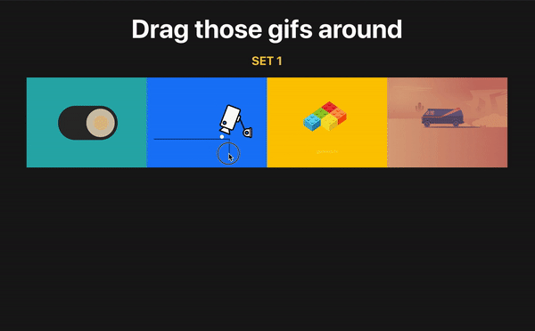
This is what we’re aiming for:

We’re going to be working with quite a bit of JavaScript, React and the DOM API from here on out.

First, let’s spin up a fresh project

Let’s start by bootstrapping a simple React application with styled-components tossed in for styling:

npx create-react-app react-easy-carousel

cd react-easy-carousel
yarn add styled-components
yarn install

yarn start

Styling isn’t really the crux of what we’re doing, so I have prepared aa bunch of predefined components for us to use right out of the box:

// App.styled.js
import styled from 'styled-components'

export const H1 = styled('h1')`
  text-align: center;
  margin: 0;
  padding-bottom: 10rem;
`
export const Relative = styled('div')`
  position: relative;
`
export const Flex = styled('div')`
  display: flex;
`
export const HorizontalCenter = styled(Flex)`
  justify-content: center;
  margin-left: auto;
  margin-right: auto;
  max-width: 25rem;
`
export const Container = styled('div')`
  height: 100vh;
  width: 100%;
  background: #ecf0f1;
`
export const Item = styled('div')`
  color: white;
  font-size: 2rem;
  text-transform: capitalize;
  width: ${({size}) => `${size}rem`};
  height: ${({size}) => `${size}rem`};
  display: flex;
  align-items: center;
  justify-content: center;
`

Now let’s go to our App file, remove all unnecessary code, and build a basic structure for our carousel:

// App.js
import {Carousel} from './Carousel'

function App() {
  return (
    <Container>
      <H1>Easy Carousel</H1>
      <HorizontalCenter>
        <Carousel>
        {/* Put your items here */}
        </Carousel>
      </HorizontalCenter>
    </Container>
  )
}
export default App

I believe this structure is pretty straightforward. It’s the basic layout that centers the carousel directly in the middle of the page.

Let’s talk about the structure of our component. We’re gonna need the main <div> container which as our base. Inside that, we’re going to take advantage of native scrolling and put another block that serves as the scrollable area.

// Carousel.js 
<CarouserContainer>
  <CarouserContainerInner>
    {children}
  </CarouserContainerInner>
</CarouserContainer>

You can specify width and height on the inner container, but I’d avoid strict dimensions in favor of some sized component on top of it to keep things flexible.

Scrolling, the CSS way

We want that scroll to be smooth so it’s clear there’s a transition between slides, so we’ll reach for CSS scroll snapping, set the scroll horizontally along the x-axis, and hide the actual scroll bar while we’re at it.

export const CarouserContainerInner = styled(Flex)`
  overflow-x: scroll;
  scroll-snap-type: x mandatory;
  -ms-overflow-style: none;
  scrollbar-width: none;

  &::-webkit-scrollbar {
    display: none;
  }

  & > * {
    scroll-snap-align: center;
  }
`

Wondering what’s up with scroll-snap-type and scroll-snap-align? That’s native CSS that allows us to control the scroll behavior in such a way that an element “snaps” into place during a scroll. So, in this case, we’ve set the snap type in the horizontal (x) direction and told the browser it has to stop at a snap position that is in the center of the element.

In other words: scroll to the next slide and make sure that slide is centered into view. Let’s break that down a bit to see how it fits into the bigger picture.

Our outer <div> is a flexible container that puts it’s children (the carousel slides) in a horizontal row. Those children will easily overflow the width of the container, so we’ve made it so we can scroll horizontally inside the container. That’s where scroll-snap-type comes into play. From Andy Adams in the CSS-Tricks Almanac:

Scroll snapping refers to “locking” the position of the viewport to specific elements on the page as the window (or a scrollable container) is scrolled. Think of it like putting a magnet on top of an element that sticks to the top of the viewport and forces the page to stop scrolling right there.

Couldn’t say it better myself. Play around with it in Andy’s demo on CodePen.

But, we still need another CSS property set on the container’s children (again, the carousel slides) that tells the browser where the scroll should stop. Andy likens this to a magnet, so let’s put that magnet directly on the center of our slides. That way, the scroll “locks” on the center of a slide, allowing to be full in view in the carousel container.

That property? scroll-snap-align.

& > * {
  scroll-snap-align: center;
}

We can already test it out by creating some random array of items:

const colors = [
  '#f1c40f',
  '#f39c12',
  '#e74c3c',
  '#16a085',
  '#2980b9',
  '#8e44ad',
  '#2c3e50',
  '#95a5a6',
]
const colorsArray = colors.map((color) => (
  <Item
    size={20}
    style={{background: color, borderRadius: '20px', opacity: 0.9}}
    key={color}
  >
    {color}
  </Item>
))

And dumping it right into our carousel:

// App.js
<Container>
  <H1>Easy Carousel</H1>
  <HorizontalCenter>
    <Carousel>{colorsArray}</Carousel>
  </HorizontalCenter>
</Container>

Let’s also add some spacing to our items so they won’t look too squeezed. You may also notice that we have unnecessary spacing on the left of the first item. We can add a negative margin to offset it.

export const CarouserContainerInner = styled(Flex)`
  overflow-x: scroll;
  scroll-snap-type: x mandatory;
  -ms-overflow-style: none;
  scrollbar-width: none;
  margin-left: -1rem;

  &::-webkit-scrollbar {
    display: none;
  }

  & > * {
    scroll-snap-align: center;
    margin-left: 1rem;
  }
`

Take a closer look at the cursor position while scrolling. It’s always centered. That’s the scroll-snap-align property at work!

And that’s it! We’ve made an awesome carousel where we can add any number of items, and it just plain works. Notice, too, that we did all of this in plain CSS, even if it was built as a React app. We didn’t really need React or styled-components to make this work.

Bonus: Navigation

We could end the article here and move on, but I want to take this a bit further. What I like about what we have so far is that it’s flexible and does the basic job of scrolling through a set of items.

But you may have noticed a key enhancement in the demo at the start of this article: buttons that navigate through slides. That’s where we’re going to put the CSS down and put our JavaScript hats on to make this work.

First, let’s define buttons on the left and right of the carousel container that, when clicked, scrolls to the previous or next slide, respectively. I’m using simple SVG arrows as components:

// ArrowLeft
export const ArrowLeft = ({size = 30, color = '#000000'}) => (
  <svg
    xmlns="http://www.w3.org/2000/svg"
    width={size}
    height={size}
    viewBox="0 0 24 24"
    fill="none"
    stroke={color}
    strokeWidth="2"
    strokeLinecap="round"
    strokeLinejoin="round"
  >
    <path d="M19 12H6M12 5l-7 7 7 7" />
  </svg>
)

// ArrowRight
export const ArrowRight = ({size = 30, color = '#000000'}) => (
  <svg
    xmlns="http://www.w3.org/2000/svg"
    width={size}
    height={size}
    viewBox="0 0 24 24"
    fill="none"
    stroke={color}
    strokeWidth="2"
    strokeLinecap="round"
    strokeLinejoin="round"
  >
    <path d="M5 12h13M12 5l7 7-7 7" />
  </svg>
)

Now let’s position them on both sides of our carousel:

// Carousel.js
<LeftCarouselButton>
  <ArrowLeft />
</LeftCarouselButton>

<RightCarouselButton>
  <ArrowRight />
</RightCarouselButton>

We’ll sprinkle in some styling that adds absolute positioning to the arrows so that the left arrow sits on the left edge of the carousel and the right arrow sits on the right edge. A few other things are thrown in to style the buttons themselves to look like buttons. Also, we’re playing with the carousel container’s :hover state so that the buttons only show when the user’s cursor hovers the container.

// Carousel.styled.js

// Position and style the buttons
export const CarouselButton = styled('button')`
  position: absolute;
  cursor: pointer;
  top: 50%;
  z-index: 1;
  transition: transform 0.1s ease-in-out;
  background: white;
  border-radius: 15px;
  border: none;
  padding: 0.5rem;
`

// Display buttons on hover
export const LeftCarouselButton = styled(CarouselButton)`
  left: 0;
  transform: translate(-100%, -50%);

  ${CarouserContainer}:hover & {
    transform: translate(0%, -50%);
  }
`
// Position the buttons to their respective sides
export const RightCarouselButton = styled(CarouselButton)`
  right: 0;
  transform: translate(100%, -50%);

  ${CarouserContainer}:hover & {
    transform: translate(0%, -50%);
  }
`

This is cool. Now we have buttons, but only when the user interacts with the carousel.

But do we always want to see both buttons? It’d be great if we hide the left arrow when we’re at the first slide, and hide the right arrow when we’re at the last slide. It’s like the user can navigate past those slides, so why set the illusion that they can?

I suggest creating a hook that’s responsible for all the scrolling functionality we need, as we’re gonna have a bunch of it. Plus, it’s just good practice to separate functional concerns from our visual component.

First, we need to get the reference to our component so we can get the position of the slides. Let’s do that with ref:

// Carousel.js
const ref = useRef()
const position = usePosition(ref)

<CarouserContainer>
  <CarouserContainerInner ref={ref}>
    {children}
  </CarouserContainerInner>
  <LeftCarouselButton>
    <ArrowLeft />
  </LeftCarouselButton>
  <RightCarouselButton>
    <ArrowRight />
  </RightCarouselButton>
</CarouserContainer>

The ref property is on <CarouserContainerInner> as it contains all our items and will allow us to do proper calculations.

Now let’s implement the hook itself. We have two buttons. To make them work, we need to keep track of the next and previous items accordingly. The best way to do so is to have a state for each one:

// usePosition.js
export function usePosition(ref) {
  const [prevElement, setPrevElement] = useState(null)
  const [nextElement, setNextElement] = useState(null)
}

The next step is to create a function that detects the position of the elements and updates the buttons to either hide or display depending on that position.

Let’s call it the update function. We’re gonna put it into React’s useEffect hook because, initially, we want to run this function when the DOM mounts the first time. We need access to our scrollable container which is available to use under the ref.current property. We’ll put it into a separate variable called element and start by getting the element’s position in the DOM.

We’re gonna use getBoundingClientRect() here as well. This is a very helpful function because it gives us an element’s position in the viewport (i.e. window) and allows us to proceed with our calculations.

// usePosition.js
 useEffect(() => {
  // Our scrollable container
  const element = ref.current

  const update = () => {
    const rect = element.getBoundingClientRect()
}, [ref])

We’ve done a heck of a lot positioning so far and getBoundingClientRect() can help us understand both the size of the element — rect in this case — and its position relative to the viewport.

Credit: Mozilla Developer Network

The following step is a bit tricky as it requires a bit of math to calculate which elements are visible inside the container.

First, we need to filter each item by getting its position in the viewport and checking it against the container boundaries. Then, we check if the child’s left boundary is bigger than the container’s left boundary, and the same thing on the right side.

If one of these conditions is met means that our child is visible inside the container. Let’s convert it into the code step-by-step:

  1. We need to loop and filter through all container children. We can use the children property available on each node. So, let’s convert it into an array and filter:
const visibleElements = Array.from(element.children).filter((child) => {}
  1. After that, we need to get the position of each element by using that handy getBoundingClientRect() function once again:
const childRect = child.getBoundingClientRect()
  1. Now let’s bring our drawing to life:
rect.left <= childRect.left && rect.right >= childRect.right

Pulling that together, this is our script:

// usePosition.js
const visibleElements = Array.from(element.children).filter((child) => {
  const childRect = child.getBoundingClientRect()

  return rect.left <= childRect.left && rect.right >= childRect.right
})

Once we’ve filtered out items, we need to check whether an item is the first or the last one so we know to hide the left or right button accordingly. We’ll create two helper functions that check that condition using previousElementSibling and nextElementSibling. This way, we can see if there is a sibling in the list and whether it’s an HTML instance and, if it is, we will return it.

To receive the first element and return it, we need to take the first item from our visible items list and check if it contains the previous node. We’ll do the same thing for the last element in the list, however, we need to get the last item in the list and check if it contains the next element after itself:

// usePosition.js
function getPrevElement(list) {
  const sibling = list[0].previousElementSibling

  if (sibling instanceof HTMLElement) {
    return sibling
  }

  return sibling
}

function getNextElement(list) {
  const sibling = list[list.length - 1].nextElementSibling
  if (sibling instanceof HTMLElement) {
    return sibling
  }
  return null
}

Once we have those functions, we can finally check if there are any visible elements in the list, and then set our left and right buttons into the state:

// usePosition.js 
if (visibleElements.length > 0) {
  setPrevElement(getPrevElement(visibleElements))
  setNextElement(getNextElement(visibleElements))
}

Now we need to call our function. Moreover, we want to call this function each time we scroll through the list — that’s when we want to detect the position of the element.

// usePosition.js
export function usePosition(ref) {
  const [prevElement, setPrevElement] = useState(null)
  const [nextElement, setNextElement] = useState(null)
  useEffect(() => {
    const element = ref.current
    const update = () => {
      const rect = element.getBoundingClientRect()
      const visibleElements = Array.from(element.children).filter((child) => {
        const childRect = child.getBoundingClientRect()
        return rect.left <= childRect.left && rect.right >= childRect.right
      })
      if (visibleElements.length > 0) {
        setPrevElement(getPrevElement(visibleElements))
        setNextElement(getNextElement(visibleElements))
      }
    }

    update()
    element.addEventListener('scroll', update, {passive: true})
    return () => {
      element.removeEventListener('scroll', update, {passive: true})
    }
  }, [ref])

Here’s an explanation for why we’re passing {passive: true} in there.

Now let’s return those properties from the hook and update our buttons accordingly:

// usePosition.js
return {
  hasItemsOnLeft: prevElement !== null,
  hasItemsOnRight: nextElement !== null,
}
// Carousel.js 
<LeftCarouselButton hasItemsOnLeft={hasItemsOnLeft}>
  <ArrowLeft />
</LeftCarouselButton>

<RightCarouselButton hasItemsOnRight={hasItemsOnRight}>
  <ArrowRight />
</RightCarouselButton>
// Carousel.styled.js
export const LeftCarouselButton = styled(CarouselButton)`
  left: 0;
  transform: translate(-100%, -50%);
  ${CarouserContainer}:hover & {
    transform: translate(0%, -50%);
  }
  visibility: ${({hasItemsOnLeft}) => (hasItemsOnLeft ? `all` : `hidden`)};
`
export const RightCarouselButton = styled(CarouselButton)`
  right: 0;
  transform: translate(100%, -50%);
  ${CarouserContainer}:hover & {
    transform: translate(0%, -50%);
  }
  visibility: ${({hasItemsOnRight}) => (hasItemsOnRight ? `all` : `hidden`)};
`

So far, so good. As you’ll see, our arrows show up dynamically depending on our scroll location in the list of items.

We’ve got just one final step to go to make the buttons functional. We need to create a function that’s gonna accept the next or previous element it needs to scroll to.

const scrollRight = useCallback(() => scrollToElement(nextElement), [
  scrollToElement,
  nextElement,
])
const scrollLeft = useCallback(() => scrollToElement(prevElement), [
  scrollToElement,
  prevElement,
])

Don’t forget to wrap functions into the useCallback hook in order to avoid unnecessary re-renders.

Next, we’ll implement the scrollToElement function. The idea is pretty simple. We need to take the left boundary of our previous or next element (depending on the button that’s clicked), sum it up with the width of the element, divided by two (center position), and offset this value by half of the container width. That will give us the exact scrollable distance to the center of the next/previous element.

Here’s that in code:

// usePosition.js  
const scrollToElement = useCallback(
  (element) => {
    const currentNode = ref.current

    if (!currentNode || !element) return

    let newScrollPosition

    newScrollPosition =
      element.offsetLeft +
      element.getBoundingClientRect().width / 2 -
      currentNode.getBoundingClientRect().width / 2

    currentNode.scroll({
      left: newScrollPosition,
      behavior: 'smooth',
    })
  },
  [ref],
)

scroll actually does the scrolling for us while passing the precise distance we need to scroll to. Now let’s attach those functions to our buttons.

// Carousel.js  
const {
  hasItemsOnLeft,
  hasItemsOnRight,
  scrollRight,
  scrollLeft,
} = usePosition(ref)

<LeftCarouselButton hasItemsOnLeft={hasItemsOnLeft} onClick={scrollLeft}>
  <ArrowLeft />
</LeftCarouselButton>

<RightCarouselButton hasItemsOnRight={hasItemsOnRight} onClick={scrollRight}>
  <ArrowRight />
</RightCarouselButton>

Pretty nice!

Like a good citizen, we ought to clean up our code a bit. For one, we can be more in control of the passed items with a little trick that automatically sends the styles needed for each child. The Children API is pretty rad and worth checking out.

<CarouserContainerInner ref={ref}>
  {React.Children.map(children, (child, index) => (
    <CarouselItem key={index}>{child}</CarouselItem>
  ))}
</CarouserContainerInner>

Now we just need to update our styled components. flex: 0 0 auto preserves the original sizes of the containers, so it’s totally optional

export const CarouselItem = styled('div')`
  flex: 0 0 auto;

  // Spacing between items
  margin-left: 1rem;
`
export const CarouserContainerInner = styled(Flex)`
  overflow-x: scroll;
  scroll-snap-type: x mandatory;
  -ms-overflow-style: none;
  scrollbar-width: none;
  margin-left: -1rem; // Offset for children spacing

  &::-webkit-scrollbar {
    display: none;
  }

  ${CarouselItem} & {
    scroll-snap-align: center;
  }
`

Accessibility 

We care about our users, so we need to make our component not only functional, but also accessible so folks feel comfortable using it. Here are a couple things I’d suggest:

  • Adding role='region' to highlight the importance of this area.
  • Adding an area-label as an identifier.
  • Adding labels to our buttons so screen readers could easily identify them as “Previous” and “Next” and inform the user which direction a button goes.
// Carousel.js
<CarouserContainer role="region" aria-label="Colors carousel">

  <CarouserContainerInner ref={ref}>
    {React.Children.map(children, (child, index) => (
      <CarouselItem key={index}>{child}</CarouselItem>
    ))}
  </CarouserContainerInner>
  
  <LeftCarouselButton hasItemsOnLeft={hasItemsOnLeft}
    onClick={scrollLeft}
    aria-label="Previous slide
  >
    <ArrowLeft />
  </LeftCarouselButton>
  
  <RightCarouselButton hasItemsOnRight={hasItemsOnRight}
    onClick={scrollRight}
    aria-label="Next slide"
   >
    <ArrowRight />
  </RightCarouselButton>

</CarouserContainer>

Feel free to add additional carousels to see how it behaves with the different size items. For example, let’s drop in a second carousel that’s just an array of numbers.

const numbersArray = Array.from(Array(10).keys()).map((number) => (
  <Item size={5} style={{color: 'black'}} key={number}>
    {number}
  </Item>
))

function App() {
  return (
    <Container>
      <H1>Easy Carousel</H1>
      <HorizontalCenter>
        <Carousel>{colorsArray}</Carousel>
      </HorizontalCenter>

      <HorizontalCenter>
        <Carousel>{numbersArray}</Carousel>
      </HorizontalCenter>
    </Container>
  )
}

And voilà, magic! Dump a bunch of items and you’ve got fully workable carousel right out of the box.


Feel free to modify this and use it in your projects. I sincerely hope that this is a good starting point to use as-is, or enhance it even further for a more complex carousel. Questions? Ideas? Contact me on Twitter, GitHub, or the comments below!


The post A Super Flexible CSS Carousel, Enhanced With JavaScript Navigation appeared first on CSS-Tricks.

You can support CSS-Tricks by being an MVP Supporter.

How to Build Your Resume on npm

Just yesterday, Ali Churcher shared a neat way to make a resume using a CSS Grid layout. Let’s build off that a bit by creating a template that we can spin up whenever we want using the command line. The cool thing about that is that you’ll be able to run it with just one command.

I know the command line can be intimidating, and yes, we’ll be working in Node.js a bit. We’ll keep things broken out into small steps to make it easier to follow along.

Like many projects, there’s a little setup involved. Start by creating an empty folder in your working directory and initialize a project using npm or Yarn.

mkdir your-project && cd "$_"

## npm
npm init

## Yarn
yarn init

Whatever name you use for "your-project" will be the name of your package in the npm registry.

The next step is to create an entry file for the application, which is index.js in this case. We also need a place to store data, so create another file called data.json. You can open those up from the command line once you create them:

touch index.js && touch data.json

Creating the command line interface

The big benefit we get from creating this app is that it gives us a semi-visual way to create a resume directly in the command line. We need a couple of things to get that going:

  • The object to store the data
  • An interactive command line interface (which we’ll build using the Inquirer.js)

Let’s start with that first one. Crack open data.json and add the following:

{
  "Education": [
    "Some info",
    "Less important info",
    "Etc, etc."
  ],
  "Experience": [
    "Some info",
    "Less important info",
    "Etc, etc."
  ],
  "Contact": [
    "A way to contact you"
  ]
}

This is just an example that defines the objects and keys that will be used for each step in the interface. You can totally modify it to suit your own needs.

That’s the first thing we needed. The second thing is the interactive interface. Inquirer.js will handle 90% of it., Feel free to read more about this package, cause you can build more advanced interfaces as you get more familiar with the ins and outs of it.

yarn add inquirer chalk

What’s that chalk thing? It’s a library that’s going to help us customize our terminal output by adding some color and styling for a better experience.

Now let’s open up index.js and paste the following code:

#!/usr/bin/env node

"use strict";

const inquirer = require("inquirer");
const chalk = require("chalk");
const data = require("./data.json");

// add response color
const response = chalk.bold.blue;

const resumeOptions = {
  type: "list",
  name: "resumeOptions",
  message: "What do you want to know",
  choices: [...Object.keys(data), "Exit"]
};

function showResume() {
  console.log("Hello, this is my resume");
  handleResume();
}

function handleResume() {
  inquirer.prompt(resumeOptions).then(answer => {
    if (answer.resumeOptions == "Exit") return;

    const options = data[`${answer.resumeOptions}`]
    if (options) {
      console.log(response(new inquirer.Separator()));
      options.forEach(info => {
        console.log(response("|   => " + info));
      });
      console.log(response(new inquirer.Separator()));
    }

    inquirer
      .prompt({
        type: "list",
        name: "exitBack",
        message: "Go back or Exit?",
        choices: ["Back", "Exit"]
      }).then(choice => {
        if (choice.exitBack == "Back") {
          handleResume();
        } else {
          return;
        }
      });
  }).catch(err => console.log('Ooops,', err))
}

showResume();

Zoikes! That’s a big chunk of code. Let’s tear it down a bit to explain what’s going on.

At the top of the file, we are importing all of the necessary things needed to run the app and set the color styles using the chalk library. If you are interested more about colors and customization, check out chalk documentation because you can get pretty creative with things.

const inquirer = require("inquirer");
const chalk = require("chalk");
const data = require("./data.json");

// add response color
const response = chalk.bold.blue;

Next thing that code is doing is creating our list of resume options. Those are what will be displayed after we type our command in terminal. We’re calling it resumeOptions so we know exactly what it does.

const resumeOptions = {
  type: "list",
  name: "resumeOptions",
  message: "What do you want to know",
  choices: [...Object.keys(data), "Exit"]
};

We are mostly interested in the choices field because it makes up the keys from our data object while providing us a way to "Exit" the app if we need to.

After that, we create the function showResume(), which will be our main function that runs right after launching. It shows sorta welcome message and runs our handleResume() function.

function showResume() {
  console.log("Hello, this is my resume");
  handleResume();
}

OK, now for the big one: the handleResume() function. The first part is a conditional check to make sure we haven’t exited the app and to display the registered options from our data object if all is good. In other words, if the chosen option is Exit, we quit the program. Otherwise, we fetch the list of options that are available for us under the chosen key.

So, once the app has confirmed that we are not exiting, we get answer.resumeOptions which, as you may have guessed, spits out the list of sections we defined in the data.json file. The ones we defined were Education, Experience, and Contact.

That brings us to the Inquirer.js stuff. It might be easiest if we list those pieces:

Did you notice that new inquirer.Separator() function in the options output? That’s a feature of Inquirer.js that provides a visual separator between content to break things up a bit and make the interface a little easier to read.

Alright, we are showing the list of options! Now we need to let a a way to go back to the previous screen. To do so, we create another inquirer.prompt in which we’ll pass a new object, but this time with only two options: Exit and Back. It will return us the promise with answers we’ll need to handle. If the chosen option will be Back, we run handleResume() meaning we open our main screen with the options again; if we choose Exit, we quit the function.

Lastly, we will add the catch statement to catch any possible errors. Good practice. :)

Publishing to npm

Congrats! Try running node index.js and you should be able to test the app.

That’s great and all, but it’d be nicer to make it run without having to be in the working directly each time. This is much more straightforward than the functions we just looked at.

  1. Register an account at npmjs.com if you don’t have one.
  2. Add a user to your CLI by running npm adduser.
  3. Provide the username and password you used to register the npm account.
  4. Go to package.json and add following lines:
    "bin": {
      "your-package-name": "./index.js"
    }
  5. Add a README.md file that will show up on the app’s npm page.
  6. Publish the package.
npm publish --access=public

Anytime you update the package, you can push those to npm. Read more about npm versioning here.

npm version patch // 1.0.1
npm version minor // 1.1.0
npm version major // 2.0.0

And to push the updates to npm:

npm publish

Resume magic!

That’s it! Now you can experience the magic of typing npx your-package-name into the command line and creating your resume right there. By the way, npx is the way to run commands without installing them locally to your machine. It’s available for you automatically, if you’ve got npm installed.

This is just a simple terminal app, but understanding the logic behind the scenes will let you create amazing things and this is your first step on your way to it.

Source Code

Happy coding!

The post How to Build Your Resume on npm appeared first on CSS-Tricks.

Why Parcel Has Become My Go-To Bundler for Development

Today we’re gonna talk about application bundlers — tools that simplify our lives as developers. At their core, bundlers pick your code from multiple files and put everything all together in one or more files in a logical order that are compiled and ready for use in a browser. Moreover, through different plugins and loaders, you can uglify the code, bundle up other kinds of assets (like CSS and images), use preprocessors, code-splitting, etc. They manage the development workflow.

There are lots of bundlers out there, like Browserify and webpack. While those are great options, I personally find them difficult to set up. Where do you start? This is especially true for beginners, where a "configuration file" might be a little scary.

That’s why I tend to reach for Parcel. I stumbled upon it accidentally while watching a tutorial on YouTube. The speaker was talking about tips for faster development and he heavily relied on Parcel as part of his workflow. I decided to give it a try myself.

What makes Parcel special

The thing I love the most about this bundler: it doesn’t need any configuration. Literally, none at all! Compare that to webpack where configuration can be strewn across several files all containing tons of code… that you may have picked up from other people’s configurations or inherited from other projects. Sure, configuration is only as complex as you make it, but even a modest workflow requires a set of plugins and options.

We all use different tools to simplify our job. There are things like preprocessors, post-processors, compilers, transpilers, etc. It takes time to set these up, and often a pretty decent amount of it. Wouldn’t you rather spend that time developing?

That’s why Parcel seems a good solution. Want to write your styles in SCSS or LESS? Do it! Want to use the latest JavaScript syntax? Included. Need a server for development? You got it. That’s barely scratching the surface of the large list of other features it supports.

Parcel allows you to simply start developing. That’s the biggest advantage of using it as a bundler — alongside its blazing fast compiling that utilizes multicore processing where other bundlers, including webpack, work off of complex and heavy transforms.

Where using Parcel makes sense

Parcel, like any tool, is not a golden pill that’s designed as a one-size-fits-all solution for everything. It has use cases where it shines most.

I’ve already mentioned how fast it is to get a project up and running. That makes it ideal when working with tight deadlines and prototypes, where time is precious and the goal is to get in the browser as quickly as possible.

That’s not to say it isn’t up to the task of handling complex applications or projects where lots of developers might be touching code. It’s very capable of that. However, I realize that those projects may very well benefit from a hand-rolled workflow.

It’s sort of like the difference between driving a car with an automatic transmission versus a stick shift. Sometimes you need the additional control and sometimes you don’t.

I’ve been working on a commercial multi-page website with a bunch of JavaScript under the hood, and Parcel is working out very well for me. It’s providing my server, it compiles my Sass to CSS, it adds vendor prefixes when needed, and it allows me to use import and export in my JavaScript files out of the box without any configuration. All of this allowed me to get my project up and running with ease.

Let’s create a simple site together using Parcel

Let’s take Parcel for a test drive to see how relatively simple it is to make something with it.

We’re going to build a simple page that uses Sass and a bit of JavaScript. We’ll fetch the current day of the week and a random image from Unsplash Source.

The basic structure

There's no scaffolding we’re required to use or framework needed to initialize our project. Instead, we’re going to make three files that ought to look super familiar: index.html, style.scss and index.js. You can set that up manually or in Terminal:

mkdir simple-site
cd simple-site
touch index.html && touch style.scss && touch index.js

Let’s sprinkle some boilerplate markup and the basic outline into our HTML file:

<!DOCTYPE html>
<html lang="en">
<head>
  <meta charset="UTF-8">
  <meta name="viewport" content="width=device-width, initial-scale=1.0">
  <meta http-equiv="X-UA-Compatible" content="ie=edge">
  <link href="https://fonts.googleapis.com/css?family=Lato&display=swap" rel="stylesheet">
  <link rel="stylesheet" href="style.scss">
  <title>Parcel Tutorial</title>
</head>
<body>
  <div class="container">
    <h1>Today is:</h1>
    <span class="today"></span>
    <h2>and the image of the day:</h2>
    <img src="https://source.unsplash.com/random/600x400" alt="unsplash random image">
</div>
<script src="index.js"></script>
</body>
</html>

You may have noticed that I’m pulling in a web font (Lato) from Google, which is totally optional. Otherwise, all we’re doing is linking up the CSS and JavaScript files and dropping in the basic HTML that will display the day of the week and a link from Unsplash that will serve a random image. This is all we really need for our baseline.

Marvel at Parcel’s quick set up!

Let’s run the application using with Parcel as the bundler before we get into styling and scripts. Installing Parcel is like any thing:

npm install -g parcel-bundler
# or
yarn global add parcel-bundler

Let’s also create a package.json file should we need any development dependencies. This is also where Parcel will include anything it needs to work out of the box.

npm init -y
# or
yarn init -y

That’s it! No more configuration! We only need to tell Parcel which file is the entry point for the project so it knows where to point its server. That’s going to be our HTML file:

parcel index.html

If we open the console we’ll see something like this indicating that the server is already running:

Server running at http://localhost:1234

Parcel’s server supports hot reloading and rebuilds the app as change are saved.

Now, heading back to our project folder, we’ll see additional stuff,that Parcel created for us:

What’s important for us here is the dist folder, which contains all our compiled code, including source maps for CSS and JavaScript.

Now all we do is build!

Let’s go to style.scss and see how Parcel handles Sass. I’ve created variables to store some colors and a width for the container that holds our content:

$container-size: 768px;
$bg: #000;
$text: #fff;
$primary-yellow: #f9f929;

Now for a little styling, including some nested rulesets. You can do your own thing, of course, but here’s what I cooked up for demo purposes:

*, *::after, *::before {
  box-sizing: border-box;
}

body {
  background: $bg;
  color: $text;
  font-family: 'Lato', sans-serif;
  margin: 0;
  padding: 0;
}

.container {
  margin: 0 auto;
  max-width: $container-size;
  text-align: center;

  h1 {
    display: inline-block;
    font-size: 36px;
  }

  span {
    color: $primary-yellow;
    font-size: 36px;
    margin-left: 10px;
  }
}

Once we save, Parcel’s magic is triggered and everything compiles and reloads in the browser for us. No command needed because it’s already watching the files for changes.

This is what we’ve got so far:

Webpage with black background, a heading and an image

The only thing left is to show the current day of the week. We’re going to use imports and exports so we get to see how Parcel allows us to use modern JavaScript.

Let’s create a file called today.js and include a function that reports the current day of the week from an array of days:

export function getDay() {
  const today = new Date();
  const daysArr = ['Sunday', 'Monday', 'Tuesday', 'Wednesday', 'Thursday', 'Friday', 'Saturday'];
  return daysArr[today.getDay()];
}

💡 It’s worth a note to remember that the getDay function returns Sunday as the first day of the week.

Notice we’re exporting the getDay function. Let’s go into our index.js file and import it there so it gets included when compiling happens:

import { getDay } from './today';

We can import/export files, because Parcel supports ES6 module syntax right out of the box — again, no configuration needed!

The only thing left is to select the <span> element and pass the value of the getDay function to it:

const day = document.querySelector('.today');
day.innerHTML = getDay();

Let’s see the final result:

Webpage with black background, heading that includes the day of the week, and an image below.

Last thing is to build for production

We’ve created the app, but we want to serve it somewhere — whether it’s your personal server or some zero-configuration deployment like Surge or Now — and we want to serve compiled and minified code.

Here’s the one and only command we need:

parcel build index.js
Terminal output after a successful build.

This gives us all of the production-ready assets for the app. You can read more about Parcel’s product mode for some tips and tricks to get the most from your environment.


I’ve said it several times and I’ll say it again: Parcel is a great tool. It bundles, it compiles, it serves, it pre- and post-processes, it minifies and uglifies, and more. We may have looked at a pretty simple example, but hopefully you now have a decent feel for what Parcel offers and how you might start to use it in your own projects.

I’m interested if you’re already using Parcel and, if so, how you’ve been using it. Have you found it works better for some things more than others? Did you discover some neat trick that makes it even more powerful? Let me know in the comments!

The post Why Parcel Has Become My Go-To Bundler for Development appeared first on CSS-Tricks.

Let’s Make a Fancy, but Uncomplicated Page Loader

It’s pretty common to see a loading state on sites these days, particularly as progressive web apps and reactive sites are on the rise. It’s one way to improve "perceived" performance — that is, making it feel as though the site is loading faster than it actually is.

There’s no shortage of ways to make a loader — all it takes is a quick search on CodePen to see oodles of examples, from animated GIFs to complex animations. While it’s tempting to build the fanciest of the fancy loaders, we can actually do a pretty darn good job with only a minimal amount of CSS and JavaScript.

Here’s an example we can make together.

See the Pen
Preloader with JavaScript FadeOut
by Maks Akymenko (@maximakymenko)
on CodePen.

SVG and CSS is all we need for the spinner

I’m going to assume that you’ve already created a project, so we’ll jump right in and start with the spinner — or "pre-loader" as it is also called.

SVG is a great option for a spinner. It’s scalable and implementing it is as easy as an image tag. We could make one from scratch, say in an image editor like Illustrator, Sketch or Figma. For this example, I’m just going to grab this one from loading.io, which is a nice resource to make and customize different loaders.

Now that we have an SVG for the visual, we can drop it into HTML:

<div class="preloader">
  <img src="spinner.svg" alt="spinner">
</div>

We’re using .preloader as a wrapper, mostly because it helps us position the image on the page, but also because it will help us hide and reveal the page content while the loader works.

Let’s style it up:

.preloader {
  align-items: center;
  background: rgb(23, 22, 22);
  display: flex;
  height: 100vh;
  justify-content: center;
  left: 0;
  position: fixed;
  top: 0;
  transition: opacity 0.3s linear;
  width: 100%;
  z-index: 9999;
}

This is doing a few things that are more than cosmetic:

  • We’re displaying the loader directly in the center of the screen, using flexbox properties and values.
  • We’ve made the element take up the entire width and height of the screen and given it a black (well, actually a really, really dark gray) background. That means anything behind it (like the page content) is completely hidden. If our page was a different background color (e.g. white), then we would adjust the loader’s background color accordingly.
  • The position is fixed so scrolling won’t affect it’s location on the page. Plus, the z-index is high enough that not other element should stack on top of it and block it from view.

This is what we should see so far when opening it up in the browser:

A circle loader that fades out into a black background.

Some light JavaScript handles the hiding

We’ve got a fancy spinner that covers the entire page, whether we’re viewing this on small or large screens. No we can write some logic to make it fade out after a certain amount of time. That’ll take a small dose of JavaScript.

First, let’s select the .preloader element we just styled up:

const preloader = document.querySelector('.preloader');

It would actually be a lot easier to add a class to the loader that sets its opacity to zero. However, it wouldn’t be as smooth as what we’re doing here, which is using a tiny helping of JavaScript to create a fadeOut function.

const fadeEffect = setInterval(() => {
  // if we don't set opacity 1 in CSS, then
  // it will be equaled to "" -- that's why
  // we check it, and if so, set opacity to 1
  if (!preloader.style.opacity) {
    preloader.style.opacity = 1;
  }
  if (preloader.style.opacity > 0) {
    preloader.style.opacity -= 0.1;
  } else {
    clearInterval(fadeEffect);
  }
}, 100);

💡 jQuery has a function that does this right out of the box. Leverage that if you’re already using jQuery in your project. Otherwise, rolling it with vanilla JavaScript is the way to go.

Let me explain the JavaScript a little bit. As the comment says, if our .preloader element doesn’t have the opacity property set, then it will be equal to empty ("") and we can set it to a value of 1 manually to make sure it displays when the document loads.

Once we know the opacity is set, then we set manipulate it. The whole function is wrapped in setInterval and we check if the opacity property every 100 milliseconds to see if it is greater than zero. As long as it is above zero, we decrease its value in 0.1 increment, which creates a smooth effect that fades the element out over time.

Once we hit zero opacity, we clearInterval to stop the script from running infinitely. Feel free to play around with timing and decreasing points to fit your needs.

The last thing that left to do is to call the function. We’ll call it when the window loads:

window.addEventListener('load', fadeEffect);

We are intentionally using the load event instead of DOMContentLoaded because the DOMContentLoaded event is fired when the document has been completely loaded and parsed. That means it doesn’t *wait for stylesheets, images, and subframes to finish loading* *before it executes*. The load event can be used to detect a fully-loaded page, and that is exactly what we are looking for. Otherwise, the function would start before our CSS and SVG are ready.

Drop some content into the HTML and try things out. Here’s the demo again:

See the Pen
Preloader with JavaScript FadeOut
by Maks Akymenko (@maximakymenko)
on CodePen.


Congratulations! You now know how to build a pretty nice loading effect using nothing but an image and a pinch of CSS and JavaScript. Enjoy!

The post Let’s Make a Fancy, but Uncomplicated Page Loader appeared first on CSS-Tricks.

A Dark Mode Toggle with React and ThemeProvider

I like when websites have a dark mode option. Dark mode makes web pages easier for me to read and helps my eyes feel more relaxed. Many websites, including YouTube and Twitter, have implemented it already, and we’re starting to see it trickle onto many other sites as well.

In this tutorial, we’re going to build a toggle that allows users to switch between light and dark modes, using a <ThemeProvider wrapper from the styled-components library. We’ll create a useDarkMode custom hook, which supports the prefers-color-scheme media query to set the mode according to the user’s OS color scheme settings.

If that sounds hard, I promise it’s not! Let’s dig in and make it happen.

See the Pen
Day/night mode switch toggle with React and ThemeProvider
by Maks Akymenko (@maximakymenko)
on CodePen.

Let’s set things up

We’ll use create-react-app to initiate a new project:

npx create-react-app my-app
cd my-app
yarn start

Next, open a separate terminal window and install styled-components:

yarn add styled-components

Next thing to do is create two files. The first is global.js, which will contain our base styling, and the second is theme.js, which will include variables for our dark and light themes:

// theme.js
export const lightTheme = {
  body: '#E2E2E2',
  text: '#363537',
  toggleBorder: '#FFF',
  gradient: 'linear-gradient(#39598A, #79D7ED)',
}

export const darkTheme = {
  body: '#363537',
  text: '#FAFAFA',
  toggleBorder: '#6B8096',
  gradient: 'linear-gradient(#091236, #1E215D)',
}

Feel free to customize variables any way you want, because this code is used just for demonstration purposes.

// global.js
// Source: https://github.com/maximakymenko/react-day-night-toggle-app/blob/master/src/global.js#L23-L41

import { createGlobalStyle } from 'styled-components';

export const GlobalStyles = createGlobalStyle`
  *,
  *::after,
  *::before {
    box-sizing: border-box;
  }

  body {
    align-items: center;
    background: ${({ theme }) => theme.body};
    color: ${({ theme }) => theme.text};
    display: flex;
    flex-direction: column;
    justify-content: center;
    height: 100vh;
    margin: 0;
    padding: 0;
    font-family: BlinkMacSystemFont, -apple-system, 'Segoe UI', Roboto, Helvetica, Arial, sans-serif;
    transition: all 0.25s linear;
  }

Go to the App.js file. We’re going to delete everything in there and add the layout for our app. Here’s what I did:

import React from 'react';
import { ThemeProvider } from 'styled-components';
import { lightTheme, darkTheme } from './theme';
import { GlobalStyles } from './global';

function App() {
  return (
    <ThemeProvider theme={lightTheme}>
      <>
        <GlobalStyles />
        <button>Toggle theme</button>
        <h1>It's a light theme!</h1>
        <footer>
        </footer>
      </>
    </ThemeProvider>
  );
}

export default App;

This imports our light and dark themes. The ThemeProvider component also gets imported and is passed the light theme (lightTheme) styles inside. We also import GlobalStyles to tighten everything up in one place.

Here’s roughly what we have so far:

Now, the toggling functionality

There is no magic switching between themes yet, so let’s implement toggling functionality. We are only going to need a couple lines of code to make it work.

First, import the useState hook from react:

// App.js
import React, { useState } from 'react';

Next, use the hook to create a local state which will keep track of the current theme and add a function to switch between themes on click:

// App.js
const [theme, setTheme] = useState('light');

// The function that toggles between themes
const toggleTheme = () => {
  // if the theme is not light, then set it to dark
  if (theme === 'light') {
    setTheme('dark');
  // otherwise, it should be light
  } else {
    setTheme('light');
  }
}

After that, all that’s left is to pass this function to our button element and conditionally change the theme. Take a look:

// App.js
import React, { useState } from 'react';
import { ThemeProvider } from 'styled-components';
import { lightTheme, darkTheme } from './theme';
import { GlobalStyles } from './global';

// The function that toggles between themes
function App() {
  const [theme, setTheme] = useState('light');
  const toggleTheme = () => {
    if (theme === 'light') {
      setTheme('dark');
    } else {
      setTheme('light');
    }
  }
  
  // Return the layout based on the current theme
  return (
    <ThemeProvider theme={theme === 'light' ? lightTheme : darkTheme}>
      <>
        <GlobalStyles />
        // Pass the toggle functionality to the button
        <button onClick={toggleTheme}>Toggle theme</button>
        <h1>It's a light theme!</h1>
        <footer>
        </footer>
      </>
    </ThemeProvider>
  );
}

export default App;

How does it work?

// global.js
background: ${({ theme }) => theme.body};
color: ${({ theme }) => theme.text};
transition: all 0.25s linear;

Earlier in our GlobalStyles, we assigned background and color properties to values from the theme object, so now, every time we switch the toggle, values change depending on the darkTheme and lightTheme objects that we are passing to ThemeProvider. The transition property allows us to make this change a little more smoothly than working with keyframe animations.

Now we need the toggle component

We’re generally done here because you now know how to create toggling functionality. However, we can always do better, so let’s improve the app by creating a custom Toggle component and make our switch functionality reusable. That’s one of the key benefits to making this in React, right?

We’ll keep everything inside one file for simplicity’s sake,, so let’s create a new one called Toggle.js and add the following:

// Toggle.js
import React from 'react'
import { func, string } from 'prop-types';
import styled from 'styled-components';
// Import a couple of SVG files we'll use in the design: https://www.flaticon.com
import { ReactComponent as MoonIcon } from 'icons/moon.svg';
import { ReactComponent as SunIcon } from 'icons/sun.svg';

const Toggle = ({ theme, toggleTheme }) => {
  const isLight = theme === 'light';
  return (
    <button onClick={toggleTheme} >
      <SunIcon />
      <MoonIcon />
    </button>
  );
};

Toggle.propTypes = {
  theme: string.isRequired,
  toggleTheme: func.isRequired,
}

export default Toggle;

You can download icons from here and here. Also, if we want to use icons as components, remember about importing them as React components.

We passed two props inside: the theme will provide the current theme (light or dark) and toggleTheme function will be used to switch between them. Below we created an isLight variable, which will return a boolean value depending on our current theme. We’ll pass it later to our styled component.

We’ve also imported a styled function from styled-components, so let’s use it. Feel free to add this on top your file after the imports or create a dedicated file for that (e.g. Toggle.styled.js) like I have below. Again, this is purely for presentation purposes, so you can style your component as you see fit.

// Toggle.styled.js
const ToggleContainer = styled.button`
  background: ${({ theme }) => theme.gradient};
  border: 2px solid ${({ theme }) => theme.toggleBorder};
  border-radius: 30px;
  cursor: pointer;
  display: flex;
  font-size: 0.5rem;
  justify-content: space-between;
  margin: 0 auto;
  overflow: hidden;
  padding: 0.5rem;
  position: relative;
  width: 8rem;
  height: 4rem;

  svg {
    height: auto;
    width: 2.5rem;
    transition: all 0.3s linear;
    
    // sun icon
    &:first-child {
      transform: ${({ lightTheme }) => lightTheme ? 'translateY(0)' : 'translateY(100px)'};
    }
    
    // moon icon
    &:nth-child(2) {
      transform: ${({ lightTheme }) => lightTheme ? 'translateY(-100px)' : 'translateY(0)'};
    }
  }
`;

Importing icons as components allows us to directly change the styles of the SVG icons. We’re checking if the lightTheme is an active one, and if so, we move the appropriate icon out of the visible area — sort of like the moon going away when it’s daytime and vice versa.

Don’t forget to replace the button with the ToggleContainer component in Toggle.js, regardless of whether you’re styling in separate file or directly in Toggle.js. Be sure to pass the isLight variable to it to specify the current theme. I called the prop lightTheme so it would clearly reflect its purpose.

The last thing to do is import our component inside App.js and pass required props to it. Also, to add a bit more interactivity, I’ve passed condition to toggle between "light" and “dark" in the heading when the theme changes:

// App.js
<Toggle theme={theme} toggleTheme={toggleTheme} />
<h1>It's a {theme === 'light' ? 'light theme' : 'dark theme'}!</h1>

Don’t forget to credit the flaticon.com authors for the providing the icons.

// App.js
<span>Credits:</span>
<small><b>Sun</b> icon made by <a href="https://www.flaticon.com/authors/smalllikeart">smalllikeart</a> from <a href="https://www.flaticon.com">www.flaticon.com</a></small>
<small><b>Moon</b> icon made by <a href="https://www.freepik.com/home">Freepik</a> from <a href="https://www.flaticon.com">www.flaticon.com</a></small>

Now that’s better:

The useDarkMode hook

While building an application, we should keep in mind that the app must be scalable, meaning, reusable, so we can use in it many places, or even different projects.

That is why it would be great if we move our toggle functionality to a separate place — so, why not to create a dedicated account hook for that?

Let’s create a new file called useDarkMode.js in the project src directory and move our logic into this file with some tweaks:

// useDarkMode.js
import { useEffect, useState } from 'react';

export const useDarkMode = () => {
  const [theme, setTheme] = useState('light');
  const toggleTheme = () => {
    if (theme === 'light') {
      window.localStorage.setItem('theme', 'dark')
      setTheme('dark')
    } else {
      window.localStorage.setItem('theme', 'light')
      setTheme('light')
    }
  };

  useEffect(() => {
    const localTheme = window.localStorage.getItem('theme');
    localTheme && setTheme(localTheme);
  }, []);

  return [theme, toggleTheme]
};

We’ve added a couple of things here. We want our theme to persist between sessions in the browser, so if someone has chosen a dark theme, that’s what they’ll get on the next visit to the app. That’s a huge UX improvement. For this reasons we use localStorage.

We’ve also implemented the useEffect hook to check on component mounting. If the user has previously selected a theme, we will pass it to our setTheme function. In the end, we will return our theme, which contains the chosen theme and toggleTheme function to switch between modes.

Now, let’s implement the useDarkMode hook. Go into App.js, import the newly created hook, destructure our theme and toggleTheme properties from the hook, and, put them where they belong:

// App.js
import React from 'react';
import { ThemeProvider } from 'styled-components';
import { useDarkMode } from './useDarkMode';
import { lightTheme, darkTheme } from './theme';
import { GlobalStyles } from './global';
import Toggle from './components/Toggle';

function App() {
  const [theme, toggleTheme] = useDarkMode();
  const themeMode = theme === 'light' ? lightTheme : darkTheme;

  return (
    <ThemeProvider theme={themeMode}>
      <>
        <GlobalStyles />
        <Toggle theme={theme} toggleTheme={toggleTheme} />
        <h1>It's a {theme === 'light' ? 'light theme' : 'dark theme'}!</h1>
        <footer>
          Credits:
          <small>Sun icon made by smalllikeart from www.flaticon.com</small>
          <small>Moon icon made by Freepik from www.flaticon.com</small>
        </footer>
      </>
    </ThemeProvider>
  );
}

export default App;

This almost works almost perfectly, but there is one small thing we can do to make our experience better. Switch to dark theme and reload the page. Do you see that the sun icon loads before the moon icon for a brief moment?

That happens because our useState hook initiates the light theme initially. After that, useEffect runs, checks localStorage and only then sets the theme to dark.

So far, I found two solutions. The first is to check if there is a value in localStorage in our useState:

// useDarkMode.js
const [theme, setTheme] = useState(window.localStorage.getItem('theme') || 'light');

However, I am not sure if it’s a good practice to do checks like that inside useState, so let me show you a second solution, that I’m using.

This one will be a bit more complicated. We will create another state and call it componentMounted. Then, inside the useEffect hook, where we check our localTheme, we’ll add an else statement, and if there is no theme in localStorage, we’ll add it. After that, we’ll set setComponentMounted to true. In the end, we add componentMounted to our return statement.

// useDarkMode.js
import { useEffect, useState } from 'react';

export const useDarkMode = () => {
  const [theme, setTheme] = useState('light');
  const [componentMounted, setComponentMounted] = useState(false);
  const toggleTheme = () => {
    if (theme === 'light') {
      window.localStorage.setItem('theme', 'dark');
      setTheme('dark');
    } else {
      window.localStorage.setItem('theme', 'light');
      setTheme('light');
    }
  };

  useEffect(() => {
    const localTheme = window.localStorage.getItem('theme');
    if (localTheme) {
      setTheme(localTheme);
    } else {
      setTheme('light')
      window.localStorage.setItem('theme', 'light')
    }
    setComponentMounted(true);
  }, []);
  
  return [theme, toggleTheme, componentMounted]
};

You might have noticed that we’ve got some pieces of code that are repeated. We always try to follow the DRY principle while writing the code, and right here we’ve got a chance to use it. We can create a separate function that will set our state and pass theme to the localStorage. I believe, that the best name for it will be setTheme, but we’ve already used it, so let’s call it setMode:

// useDarkMode.js
const setMode = mode => {
  window.localStorage.setItem('theme', mode)
  setTheme(mode)
};

With this function in place, we can refactor our useDarkMode.js a little:

// useDarkMode.js
import { useEffect, useState } from 'react';
export const useDarkMode = () => {
  const [theme, setTheme] = useState('light');
  const [componentMounted, setComponentMounted] = useState(false);

  const setMode = mode => {
    window.localStorage.setItem('theme', mode)
    setTheme(mode)
  };

  const toggleTheme = () => {
    if (theme === 'light') {
      setMode('dark');
    } else {
      setMode('light');
    }
  };

  useEffect(() => {
    const localTheme = window.localStorage.getItem('theme');
    if (localTheme) {
      setTheme(localTheme);
    } else {
      setMode('light');
    }
    setComponentMounted(true);
  }, []);

  return [theme, toggleTheme, componentMounted]
};

We’ve only changed code a little, but it looks so much better and is easier to read and understand!

Did the component mount?

Getting back to componentMounted property. We will use it to check if our component has mounted because this is what happens in useEffect hook.

If it hasn’t happened yet, we will render an empty div:

// App.js
if (!componentMounted) {
  return <div />
};

Here is how complete code for the App.js:

// App.js
import React from 'react';
import { ThemeProvider } from 'styled-components';
import { useDarkMode } from './useDarkMode';
import { lightTheme, darkTheme } from './theme';
import { GlobalStyles } from './global';
import Toggle from './components/Toggle';

function App() {
  const [theme, toggleTheme, componentMounted] = useDarkMode();

  const themeMode = theme === 'light' ? lightTheme : darkTheme;

  if (!componentMounted) {
    return <div />
  };

  return (
    <ThemeProvider theme={themeMode}>
      <>
        <GlobalStyles />
        <Toggle theme={theme} toggleTheme={toggleTheme} />
        <h1>It's a {theme === 'light' ? 'light theme' : 'dark theme'}!</h1>
        <footer>
          <span>Credits:</span>
          <small><b>Sun</b> icon made by <a href="https://www.flaticon.com/authors/smalllikeart">smalllikeart</a> from <a href="https://www.flaticon.com">www.flaticon.com</a></small>
          <small><b>Moon</b> icon made by <a href="https://www.freepik.com/home">Freepik</a> from <a href="https://www.flaticon.com">www.flaticon.com</a></small>
        </footer>
      </>
    </ThemeProvider>
  );
}

export default App;

Using the user’s preferred color scheme

This part is not required, but it will let you achieve even better user experience. This media feature is used to detect if the user has requested the page to use a light or dark color theme based on the settings in their OS. For example, if a user’s default color scheme on a phone or laptop is set to dark, your website will change its color scheme accordingly to it. It’s worth noting that this media query is still a work in progress and is included in the Media Queries Level 5 specification, which is in Editor’s Draft.

This browser support data is from Caniuse, which has more detail. A number indicates that browser supports the feature at that version and up.

Desktop

ChromeOperaFirefoxIEEdgeSafari
766267No7612.1

Mobile / Tablet

iOS SafariOpera MobileOpera MiniAndroidAndroid ChromeAndroid Firefox
13NoNo76No68

The implementation is pretty straightforward. Because we’re working with a media query, we need to check if the browser supports it in the useEffect hook and set appropriate theme. To do that, we’ll use window.matchMedia to check if it exists and whether dark mode is supported. We also need to remember about the localTheme because, if it’s available, we don’t want to overwrite it with the dark value unless, of course, the value is set to light.

If all checks are passed, we will set the dark theme.

// useDarkMode.js
useEffect(() => {
if (
  window.matchMedia &&
  window.matchMedia('(prefers-color-scheme: dark)').matches && 
  !localTheme
) {
  setTheme('dark')
  }
})

As mentioned before, we need to remember about the existence of localTheme — that’s why we need to implement our previous logic where we’ve checked for it.

Here’s what we had from before:

// useDarkMode.js
useEffect(() => {
const localTheme = window.localStorage.getItem('theme');
  if (localTheme) {
    setTheme(localTheme);
  } else {
    setMode('light');
  }
})

Let’s mix it up. I’ve replaced the if and else statements with ternary operators to make things a little more readable as well:

// useDarkMode.js
useEffect(() => {
const localTheme = window.localStorage.getItem('theme');
window.matchMedia && window.matchMedia('(prefers-color-scheme: dark)').matches && !localTheme ?
  setMode('dark') :
  localTheme ?
    setTheme(localTheme) :
    setMode('light');})
})

Here’s the userDarkMode.js file with the complete code:

// useDarkMode.js
import { useEffect, useState } from 'react';

export const useDarkMode = () => {
  const [theme, setTheme] = useState('light');
  const [componentMounted, setComponentMounted] = useState(false);
  const setMode = mode => {
    window.localStorage.setItem('theme', mode)
    setTheme(mode)
  };

  const toggleTheme = () => {
    if (theme === 'light') {
      setMode('dark')
    } else {
      setMode('light')
    }
  };

  useEffect(() => {
    const localTheme = window.localStorage.getItem('theme');
    window.matchMedia && window.matchMedia('(prefers-color-scheme: dark)').matches && !localTheme ?
      setMode('dark') :
      localTheme ?
        setTheme(localTheme) :
        setMode('light');
    setComponentMounted(true);
  }, []);

  return [theme, toggleTheme, componentMounted]
};

Give it a try! It changes the mode, persists the theme in localStorage, and also sets the default theme accordingly to the OS color scheme if it’s available.


Congratulations, my friend! Great job! If you have any questions about implementation, feel free to send me a message!

The post A Dark Mode Toggle with React and ThemeProvider appeared first on CSS-Tricks.

Hamburger Menu with a Side of React Hooks and Styled Components

We all know what a hamburger menu is, right? When the pattern started making its way into web designs, it was both mocked and applauded for its minimalism that allows main menus to be tucked off screen, particularly on mobile where every pixel of space counts.

CSS-Tricks is all about double the meat.

Love ‘em or hate ‘em, hamburger menus are here and likely will be for some time to come. The problem is how to implement them. Sure, they look simple and straightforward, but they can be anything but. For example, should they be paired with a label? Are they more effective on the left or right side of the screen? How do we tackle closing those menus, whether by click or touch? Should the icon be an SVG, font, Unicode character, or pure CSS? What about a meatless option?

I wanted to build one of those but failed to find a simple solution. Most solutions are based on libraries, like reactjs-popup or react-burger-menu. They are great, but for more complex solutions. What about the core use case of a three-line menu that simply slides a panel out from the side of the screen when it’s clicked, then slides the panel back in when it’s clicked again?

I decided to build my own simple hamburger with sidebar. No pickles, onions or ketchup. Just meat, bun, and a side of menu items.

Are you ready to create it with me?

Here’s what we’re making

See the Pen
Burger menu with React hooks and styled-components
by Maks Akymenko (@maximakymenko)
on CodePen.

We’re building use React for this tutorial because it seems like a good use case for it: we get a reusable component and a set of hooks we can extend to handle the click functionality.

Spin up a new React project

Let’s spin up a new project using create-react-app, change to that folder directory and add styled-components to style the UI:

npx create-react-app your-project-name
cd your-project-name
yarn add styled-components

Add basic styles

Open the newly created project in your favorite code editor and start adding basic styles using styled-components. In your src directory, create a file called global.js. It will contain styles for the whole app. You can write your own or just copy what I ended up doing:

// global.js
import { createGlobalStyle } from 'styled-components';

export const GlobalStyles = createGlobalStyle`
  html, body {
    margin: 0;
    padding: 0;
  }
  *, *::after, *::before {
    box-sizing: border-box;
  }
  body {
    align-items: center;
    background: #0D0C1D;
    color: #EFFFFA;
    display: flex;
    font-family: -apple-system, BlinkMacSystemFont, "Segoe UI", Roboto, Helvetica, Arial, sans-serif, "Apple Color Emoji", "Segoe UI Emoji", "Segoe UI Symbol";
    height: 100vh;
    justify-content: center;
    text-rendering: optimizeLegibility;
  }
  `

This is only a part of global styles, the rest of it you can find here.

The CreateGlobalStyle function is generally used for creating global styles that are exposed to the whole app. We’ll import it so we have access to these styles as we go.

The next step is to add a theme file that holds all our variables. Create a theme.js file in the src directory and add following:

// theme.js
export const theme = {
  primaryDark: '#0D0C1D',
  primaryLight: '#EFFFFA',
  primaryHover: '#343078',
  mobile: '576px',
}

Add layout, menu and hamburger components 🍔

Go to your App.js file. We’re going to wipe everything out of there and create the main template for our app. Here’s what I did. You can certainly create your own.

// App.js
import React from 'react';
import { ThemeProvider } from 'styled-components';
import { GlobalStyles } from './global';
import { theme } from './theme';

function App() {
  return (
    <ThemeProvider theme={theme}>
      <>
        <GlobalStyles />
        <div>
          <h1>Hello. This is burger menu tutorial</h1>
          <img src="https://image.flaticon.com/icons/svg/2016/2016012.svg" alt="burger icon" />
          <small>Icon made by Freepik from www.flaticon.com</small>
        </div>
      </>
    </ThemeProvider>
  );
}
export default App;

Don’t forget to add the line with the small tag. That’s how we credit flaticon.comhttp://flaticon.com) authors for the provided icon.

Here’s what we’ve got up to this point:

Let me explain a little bit. We imported ThemeProvider, which is a wrapper component that uses the Context API behind the scenes to make our theme variables available to the whole component tree.

We also imported our GlobalStyles and passed them as a component to our app, which means that our application now has access to all global styles. As you can see, our GlobalStyles component is inside ThemeProvider which means we can already make some minor changes in it.

Go to global.js and change the background and color properties to use our defined variables. This helps us implement a theme rather than using fixed values that are difficult to change.

// global.js
background: ${({ theme }) => theme.primaryDark};
color: ${({ theme }) => theme.primaryLight};

We destructure our theme from props. So, instead of writing props.theme each time, we’re using a bunch of brackets instead. I’ll repeat myself: the theme is available because we’ve wrapped our global styles with ThemeProvider.

Create Burger and Menu components

Create a components folder inside the src directory and add two folders in there: Menu and Burger, plus an index.js file.

index.js will be used for one purpose: allow us to import components from one file, which is very handy, especially when you have a lot of them.

Now let’s create our components. Each folder will contain three files.

What’s up with all the files? You’ll see the benefit of a scalable structure soon enough. It worked well for me in a couple of projects, but here is good advice how to create scalable structure.

Go to the Burger folder and create Burger.js for our layout. Then add Burger.styled.js, which will contain styles, and index.js. which will exporting the file.

// index.js
export { default } from './Burger';

Feel free to style burger toggle in a way you want, or just paste these styles:

// Burger.styled.js
import styled from 'styled-components';

export const StyledBurger = styled.button`
  position: absolute;
  top: 5%;
  left: 2rem;
  display: flex;
  flex-direction: column;
  justify-content: space-around;
  width: 2rem;
  height: 2rem;
  background: transparent;
  border: none;
  cursor: pointer;
  padding: 0;
  z-index: 10;
  
  &:focus {
    outline: none;
  }
  
  div {
    width: 2rem;
    height: 0.25rem;
    background: ${({ theme }) => theme.primaryLight};
    border-radius: 10px;
    transition: all 0.3s linear;
    position: relative;
    transform-origin: 1px;
  }
`;

The transform-origin property will be needed later to animate the menu it toggles between open and closed states.

After adding the styles, go to Burger.js and add the layout:

// Burger.js
import React from 'react';
import { StyledBurger } from './Burger.styled';

const Burger = () => {
  return (
    <StyledBurger>
      <div />
      <div />
      <div />
    </StyledBurger>
  )
}

export default Burger;

After that look at the left top corner. Do you see it?

Time to do the same with the Menu folder:

// Menu -> index.js
export { default } from './Menu';

// Menu.styled.js
import styled from 'styled-components';

export const StyledMenu = styled.nav`
  display: flex;
  flex-direction: column;
  justify-content: center;
  background: ${({ theme }) => theme.primaryLight};
  height: 100vh;
  text-align: left;
  padding: 2rem;
  position: absolute;
  top: 0;
  left: 0;
  transition: transform 0.3s ease-in-out;
  
  @media (max-width: ${({ theme }) => theme.mobile}) {
    width: 100%;
  }

  a {
    font-size: 2rem;
    text-transform: uppercase;
    padding: 2rem 0;
    font-weight: bold;
    letter-spacing: 0.5rem;
    color: ${({ theme }) => theme.primaryDark};
    text-decoration: none;
    transition: color 0.3s linear;
    
    @media (max-width: ${({ theme }) => theme.mobile}) {
      font-size: 1.5rem;
      text-align: center;
    }

    &:hover {
      color: ${({ theme }) => theme.primaryHover};
    }
  }
`;

Next, let’s add the layout for the menu items that are revealed when clicking on our burger:

// Menu.js
import React from 'react';
import { StyledMenu } from './Menu.styled';

const Menu = () => {
  return (
    <StyledMenu>
      <a href="/">
        <span role="img" aria-label="about us">&#x1f481;&#x1f3fb;&#x200d;&#x2642;&#xfe0f;</span>
        About us
      </a>
      <a href="/">
        <span role="img" aria-label="price">&#x1f4b8;</span>
        Pricing
        </a>
      <a href="/">
        <span role="img" aria-label="contact">&#x1f4e9;</span>
        Contact
        </a>
    </StyledMenu>
  )
}
export default Menu;

We’ve got nice emojis here, and best practice is to make them accessible by wrapping each one in a span and adding a couple of properties: role="img" and aria-label="your label". You can read more about it here.

Time to import our new components into our App.js file:

// App.js
import React from 'react';
import { ThemeProvider } from 'styled-components';
import { GlobalStyles } from './global';
import { theme } from './theme';
import { Burger, Menu } from './components';

// ...

Let’s see, what we’ve got:

Take a look at this nice navigation bar! But we’ve got one issue here: it’s opened, and we want it initially to be closed. We only need to add one line to Menu.styled.js fix it:

// Menu.styled.js
transform: 'translateX(-100%)';

We are well on our way to calling this burger cooked! But first…

Adding open and close functionality

We want to open the sidebar when clicking the hamburger icon, so let’s get to it. Open App.js and add some state to it. We will use the useState hook for it.

// App.js
import React, { useState } from 'react';

After you import it, let’s use it inside the App component.

// App.js
const [open, setOpen] = useState(false);

We set the initial state to false, because our menu should be hidden when the application is rendered.

We need both our toggle and sidebar menu to know about the state, so pass it down as a prop to each component. Now your App.js should look something like this:

// App.js
import React, { useState } from 'react';
import { ThemeProvider } from 'styled-components';
import { GlobalStyles } from './global';
import { theme } from './theme';
import { Burger, Menu } from './components';

function App() {
  const [open, setOpen] = useState(false);
  return (
    <ThemeProvider theme={theme}>
      <>
        <GlobalStyles />
        <div>
          <h1>Hello. This is burger menu tutorial</h1>
          <img src="https://media.giphy.com/media/xTiTnwj1LUAw0RAfiU/giphy.gif" alt="animated burger" />
        </div>
        <div>
          <Burger open={open} setOpen={setOpen} />
          <Menu open={open} setOpen={setOpen} />
        </div>
      </>
    </ThemeProvider>
  );
}
export default App;

Notice that we’re wrapping our components in a div. This will be helpful later when we add functionality that closes the menu when clicking anywhere on the screen.

Handle props in the components

Our Burger and Menu know about the state, so all we need to do is to handle it inside and add styles accordingly. Go to Burger.js and handle the props that were passed down:

// Burger.js
import React from 'react';
import { bool, func } from 'prop-types';
import { StyledBurger } from './Burger.styled';
const Burger = ({ open, setOpen }) => {
  return (
    <StyledBurger open={open} onClick={() => setOpen(!open)}>
      <div />
      <div />
      <div />
    </StyledBurger>
  )
}
Burger.propTypes = {
  open: bool.isRequired,
  setOpen: func.isRequired,
};
export default Burger;

We destructure the open and setOpen props and pass them to our StyledBurger to add styles for each prop, respectively. Also, we add the onClick handler to call our setOpen function and toggle open prop. At the end of the file, we add type checking, which is considered a best practice for aligning arguments with expected data.

You can check whether it works or not by going to your react-dev-tools. Go to Components tab in your Chrome DevTools and click on Burger tab.

Now, when you click on your Burger component, (don’t mix it up with the tab), you should see, that your open checkbox is changing its state.

Go to Menu.js and do almost the same, although, here we pass only the open prop:

// Menu.js
import React from 'react';
import { bool } from 'prop-types';
import { StyledMenu } from './Menu.styled';
const Menu = ({ open }) => {
  return (
    <StyledMenu open={open}>
      <a href="/">
        <span role="img" aria-label="about us">&#x1f481;&#x1f3fb;&#x200d;&#x2642;&#xfe0f;</span>
        About us
      </a>
      <a href="/">
        <span role="img" aria-label="price">&#x1f4b8;</span>
        Pricing
        </a>
      <a href="/">
        <span role="img" aria-label="contact">&#x1f4e9;</span>
        Contact
        </a>
    </StyledMenu>
  )
}
Menu.propTypes = {
  open: bool.isRequired,
}
export default Menu;

Next step is to pass open prop down to our styled component so we could apply the transition. Open Menu.styled.js and add the following to our transform property:

transform: ${({ open }) => open ? 'translateX(0)' : 'translateX(-100%)'};

This is checking if our styled component open prop is true, and if so, it adds translateX(0) to move our navigation back on the screen. You can already test it out locally!

Wait, wait, wait!

Did you notice something wrong when checking things out? Our Burger has the same color as the background color of our Menu, which make them blend together. Let’s change that and also animate the icon a bit to make it more interesting. We’ve got the open prop passed to it, so we can use that to apply the changes.

Open Burger.styled.js and write the following:

// Burger.styled.js
import styled from 'styled-components';
export const StyledBurger = styled.button`
  position: absolute;
  top: 5%;
  left: 2rem;
  display: flex;
  flex-direction: column;
  justify-content: space-around;
  width: 2rem;
  height: 2rem;
  background: transparent;
  border: none;
  cursor: pointer;
  padding: 0;
  z-index: 10;

  &:focus {
    outline: none;
  }

  div {
    width: 2rem;
    height: 0.25rem;
    background: ${({ theme, open }) => open ? theme.primaryDark : theme.primaryLight};
    border-radius: 10px;
    transition: all 0.3s linear;
    position: relative;
    transform-origin: 1px;

    :first-child {
      transform: ${({ open }) => open ? 'rotate(45deg)' : 'rotate(0)'};
    }

    :nth-child(2) {
      opacity: ${({ open }) => open ? '0' : '1'};
      transform: ${({ open }) => open ? 'translateX(20px)' : 'translateX(0)'};
    }

    :nth-child(3) {
      transform: ${({ open }) => open ? 'rotate(-45deg)' : 'rotate(0)'};
    }
  }
`;

This is a big chunk of CSS, but it makes the animation magic happen. We check if the open prop is true and change styles accordingly. We rotate, translate, then hide the menu icon’s lines while changing color. Beautiful, isn’t it?

Okay, folks! By now, you should know how to create a simple hamburger icon and menu, that incorporates responsiveness and smooth animation. Congratulations!

But there’s one last thing we ought to account for...

Close the menu by clicking outside of it

This part seems like a small bonus, but it’s a big UX win because it allows the user to close the menu by clicking anywhere else on the page. This helps the user avoid having to re-locate the menu icon and clicking exactly on it.

We’re going to put more React hooks to use to make this happen! Create a file in the src directory, called hooks.js and open it. For this one, we’re gonna turn to the useEffect hook, which was introduced in React 18.

// hooks.js
import { useEffect } from 'react';

Before we write the code, let’s think about the logic behind this hook. When we click somewhere on the page, we need to check whether the clicked element is our current element (in our case, that is the Menu component) or if the clicked element contains the current element (for instance, our div that wraps our menu and hamburger icon). If so, we don’t do anything, otherwise, we call a function, that we’ll name handler.

We are going to use ref to check the clicked element, and we will do so every time someone clicks on the page.

// hooks.js
import { useEffect } from 'react';

export const useOnClickOutside = (ref, handler) => {
  useEffect(() => {
    const listener = event => {
      if (!ref.current || ref.current.contains(event.target)) {
        return;
      }
      handler(event);
    };
    document.addEventListener('mousedown', listener);
    return () => {
      document.removeEventListener('mousedown', listener);
    };
  },
  [ref, handler],
  );
};

Don’t forget to return the function from useEffect. That’s so-called "clean up" and, basically, it stands for removing an event listener when the component unmounts. It is the replacement of componentWillUnmount lifecycle.

Now let’s hook up the hook

We’ve got our hook ready, so it’s time to add it to the app. Go to the App.js file, and import two hooks: the newly created useOnClickOutside and also useRef. We’ll need the latter to get a reference to the element.

// App.js
import React, { useState, useRef } from 'react';
import { useOnClickOutside } from './hooks';

To get access these in the current element, we need to get access to the DOM node. That’s where we use useRef, also, the name node perfectly reflects the point of this variable.

From there, we pass the node as a first argument. We’ll pass the function that closes our menu as a second argument.

// App.js
const node = useRef(); 
useOnClickOutside(node, () => setOpen(false));

Lastly, we need to pass our ref to the DOM element. In our case, it will be div, that holds the Burger and Menu components:

// App.js
<div ref={node}>
  <Burger open={open} setOpen={setOpen} />
  <Menu open={open} setOpen={setOpen} />
</div>

Your App.js should look similar to this:

// App.js
import React, { useState, useRef } from 'react';
import { ThemeProvider } from 'styled-components';
import { useOnClickOutside } from './hooks';
import { GlobalStyles } from './global';
import { theme } from './theme';
import { Burger, Menu } from './components';
function App() {
  const [open, setOpen] = useState(false);
  const node = useRef();
  useOnClickOutside(node, () => setOpen(false));
  return (
    <ThemeProvider theme={theme}>
      <>
        <GlobalStyles />
        <div>
          <h1>Hello. This is burger menu tutorial</h1>
          <img src="https://media.giphy.com/media/xTiTnwj1LUAw0RAfiU/giphy.gif" alt="animated burger" />
        </div>
        <div ref={node}>
          <Burger open={open} setOpen={setOpen} />
          <Menu open={open} setOpen={setOpen} />
        </div>
      </>
    </ThemeProvider>
  );
}
export default App;

Check this out! It works as expected, and it’s fully functional and responsive.

Congratulations, everyone! You did a great job! Happy coding!

View on GitHub

The post Hamburger Menu with a Side of React Hooks and Styled Components appeared first on CSS-Tricks.

Draggin’ and Droppin’ in React

The React ecosystem offers us a lot of libraries that all are focused on the interaction of drag and drop. We have react-dnd, react-beautiful-dnd, react-drag-n-drop and many more, but some of them require quite a lot of work to build even a simple drag and drop demo, and some do not provide you with more complex functionality (e.g. multiple drag and drop instances), and if they do, it becomes very complex.

This is where react-sortable-hoc comes into play.

💡 This tutorial requires basic knowledge of React library and React hooks.

This library has “HOC" in its name for a good reason. It provides higher-order components that extends a component with drag and drop functionality.

Let’s walk through an implementation of its functionalities.

Spinning up a project

For this tutorial we are going to build an app with funny GIFs (from Chris Gannon!) that can be dragged around the viewport.

GitHub Repo

Let's create a simple app and add drag-n-drop functionality to it. We're going to use create-react-app to spin up a new React project:

npx create-react-app your-project-name

Now let's change to the project directory and install react-sorting-hoc and array-move. The latter is needed to move items in an array to different positions.

cd your-project-name
yarn add react-sortable-hoc array-move

Adding styles, data and GIF component

For simplicity's sake, we are going to write all styles in our App.css file. You can overwrite styles you have there with the following ones:

.App {
  background: #1a1919;
  color: #fff;
  min-height: 100vh;
  padding: 25px;
  text-align: center;
}

.App h1 {
  font-size: 52px;
  margin: 0;
}

.App h2 {
  color: #f6c945;
  text-transform: uppercase;
}

.App img {
  cursor: grab;
  height: 180px;
  width: 240px;
}

Let's create our state with GIFs. For this purpose we gonna use React’s built-in useState hook:

import React, { useState } from 'react';

Now add following before the return statement:

const [gifs, setGifs] = useState([
  'https://media.giphy.com/media/3ohhwoWSCtJzznXbuo/giphy.gif',
  'https://media.giphy.com/media/l46CbZ7KWEhN1oci4/giphy.gif',
  'https://media.giphy.com/media/3ohzgD1wRxpvpkDCSI/giphy.gif',
  'https://media.giphy.com/media/xT1XGYy9NPhWRPp4pq/giphy.gif',
]);

It's time to create our simple GIF component. Create a Gif.js file in the src directory and pass in the following code:

import React from 'react';
import PropTypes from 'prop-types';

const Gif = ({ gif }) => (<img src={gif} alt="gif" />)

Gif.propTypes = {
  gif: PropTypes.string.isRequired,
};

export default Gif;

We always try to follow the best practices while writing code; thus we also import PropTypes for type checking.

Import the Gif component and add it to the main App component. With a bit of clean up, it looks like this:

import React, { useState } from 'react';
import './App.css';

import Gif from './Gif';

const App = () => {
  const [gifs, setGifs] = useState([
    'https://media.giphy.com/media/3ohhwoWSCtJzznXbuo/giphy.gif',
    'https://media.giphy.com/media/l46CbZ7KWEhN1oci4/giphy.gif',
    'https://media.giphy.com/media/3ohzgD1wRxpvpkDCSI/giphy.gif',
    'https://media.giphy.com/media/xT1XGYy9NPhWRPp4pq/giphy.gif',
  ]);


  return (
    <div className="App">
      <h1>Drag those GIFs around</h1>
      <h2>Set 1</h2>
        {gifs.map((gif,  i) => <Gif key={gif} gif={gif} />)}
    </div>
  );
}

export default App;

Go to http://localhost:3000/ to see what the app looks like now:

A screenshot of react-sortable-hoc-article-app

Onto the drag-n-drop stuff

Alright, it's time make our GIFs draggable! And droppable.

To start, we need two HOCs from react-sortable-hoc, and the arrayMove method from the array-move library to modify our new array after dragging happens. We want our GIFs to stay on their new positions, right? Well, that’s what this is going to allow us to do.

Let's import them:

import { sortableContainer, sortableElement } from 'react-sortable-hoc';
import arrayMove from 'array-move';

As you might have guessed, those components will be wrappers which will expose functionality needed for us.

  • sortableContainer is a container for our sortable elements.
  • sortableElement is a container for each single element we are rendering.

Let's do the following after all our imports:

const SortableGifsContainer = sortableContainer(({ children }) => <div className="gifs">{children}</div>);
    
const SortableGif = sortableElement(({ gif }) => <Gif key={gif} gif={gif} />);

We've just created a container for our children elements that would be passed inside our SortableGifsContainer and also created wrapper for a single Gif component.
If it's a bit unclear to you, no worries — you will understand right after we implement it.

💡Note: You need to wrap your children in a div or any other valid HTML element.

It's time to wrap our GIFs into the SortableGifsContainer and replace the Gif component with our newly created SortableGif:

<SortableGifsContainer axis="x" onSortEnd={onSortEnd}>
  {gifs.map((gif, i) =>
    <SortableGif
    // don't forget to pass index prop with item index
      index={i}
      key={gif}
      gif={gif}
    />
  )}
</SortableGifsContainer>

It’s important to note that you need to pass the index prop to your sortable element so the library can differentiate items. It's similar to adding keys to the lists in React).

We add axis because our items are positioned horizontally and we want to drag them horizontally, while default is vertical dragging. In other words, we’re limiting dragging along the horizontal x-axis. As you can see we also add an onSortEnd function, which triggers every time we drag or sort our items around. There are, of course, a lot more events but you can find more info in the documentation which already does an excellent job of covering them.

Time to implement it! Add the following line above the return statement:

const onSortEnd = ({ oldIndex, newIndex }) => setGifs(arrayMove(gifs, oldIndex, newIndex));

I want to explain one more thing: our function received an old and new index of the item which was dragged and, of course, each time after we move items around we modify our initial array with the help of arrayMove.

Tada! Now you know how to implement drag-n-drop in your project. Now go and do it! 🎉 🎉 🎉

What if we have multiple lists of items?

As you can see, the previous example was relatively simple. You basically wrap each of the items in a sortable HOC and wrap it around with sortableContainer and, bingo, you've got basic drag and drop.

But how will we do it with multiple lists? The good news is that react-sortable-hoc provides us with a collection prop so we can differentiate between lists.

First, we should add second array of GIFs:

const [newGifs, setNewGifs] = useState([
  'https://media.giphy.com/media/xiOgHgY2ceKhm46cAj/giphy.gif',
  'https://media.giphy.com/media/3oKIPuMqYfRsyJTWfu/giphy.gif',
  'https://media.giphy.com/media/4ZgLPakqTajjVFOVqw/giphy.gif',
  'https://media.giphy.com/media/3o7btXIelzs8nBnznG/giphy.gif',
]);

If you want to see them before we move next, add the following lines after the SortableGifsContainer closing tag:

{newGifs.map(gif => <Gif key={gif} gif={gif} />)}

Alright, time to replace it with a draggable version.

Implementation is the same as in first example besides one thing — we have added a collection prop to our SortableGif. Of course, you can come up with any name for the collection, just remember, we're gonna need it in for our onSortEnd function.

<h2>Set 2</h2>

<SortableGifsContainer axis="x" onSortEnd={onSortEnd}>
  {newGifs.map((gif,  i) => <SortableGif index={i} key={gif} gif={gif} collection="newGifs" />)}
</SortableGifsContainer>

Next we need to add the collection prop to our first list. I've chosen the name GIFs for the first list of items, but it's up to you!

Now we need to to change our onSortEnd function. Our function received old and new indexes, but we can also destructure a collection from it. Right, exactly the one we've added to our SortableGif.

So all we have to do now is write a JavaScript switch statement to check for the collection name and to modify the right array of GIFs on drag.

const onSortEnd = ({ oldIndex, newIndex, collection }) => {
  switch(collection) {
    case 'gifs':
      setGifs(arrayMove(gifs, oldIndex, newIndex))
      break;
    case 'newGifs':
      setNewGifs(arrayMove(newGifs, oldIndex, newIndex))
      break;
    default:
      break;
  }
}

Time to check it out!

As you can see, we now have two separate lists of GIFs and we can drag and sort. Moreover, they are independent meaning items from different lists won't be mixed up.

Exactly what we wanted to do! Now you know how to create and handle drag and drop with multiple lists of items. Congratulations 🎉

Hope you've enjoyed it as much as I did writing it! If you’d like to reference the complete code, it’s all up on GitHub here. If you have any questions, feel free to contact me via email.

The post Draggin’ and Droppin’ in React appeared first on CSS-Tricks.