The Path To Awesome CSS Easing With The linear() Function

To paraphrase a saying that has always stuck with me: “The best animation is that which goes unnoticed.” One of the most important concepts of motion design on the web is making motion “feel right.” At the same time, CSS has been fairly limited when it comes to creating animations and transitions that feel natural and are unobtrusive to the user experience.

Fortunately, that’s changing. Today, let’s look at new easing capabilities arriving in CSS. Specifically, I want to demonstrate the easing superpowers of linear() — a new easing function that is currently defined in the CSS Easing Level 2 specification in the Editor’s Draft. Together, we’ll explore its ability to craft custom easing curves that lead to natural-feeling UI movement.

The fact that linear() is in the Editor’s Draft status means we’re diving into something still taking shape and could change by the time it reaches the Candidate Recommendation. As you might imagine, that means linear() has limited support at this moment in time. It is supported in Chrome and Firefox, however, so be sure to bear that in mind as we get into some demos.

Before we jump straight in, there are a couple of articles I recommend checking out. They’ve really influenced how I approach UI motion design as a whole:

There are plenty of great resources for designing motion in UI, but those are two that I always keep within reach in my browser’s bookmarks, and they have certainly influenced this article.

The Current State Of Easing In CSS

We define CSS easing with either the animation-timing-function or transition-timing-function properties, depending on whether we are working with an animation or transition respectively.

Duration is all about timing, and timing has a big impact on the movement’s naturalness.

But, until recently, CSS has limited us to the following easing functions:

  • linear,
  • steps,
  • ease,
  • ease-in,
  • ease-out,
  • ease-in-out,
  • cubic-bezier().

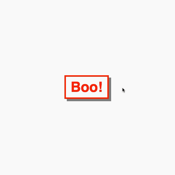
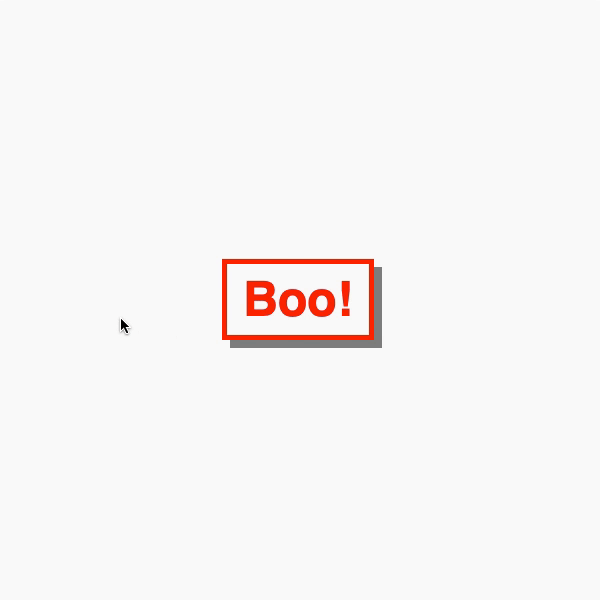
For a refresher, check out this demo that shows the effect of different timings on how this car travels down the track.

Easing curves can also be viewed in Chromium DevTools, allowing you to inspect any curve applied to a transition or animation.

Getting “Extra” Easing With linear()

But what if you need something a little extra than what’s available? For example, what about a bounce? Or a spring? These are the types of easing functions that we are unable to achieve with a cubic-bezier() curve.

This is where the new linear() easing function comes into play, pioneered by Jake Archibald and defined in the CSS Easing Level 2 specification, which is currently in the Editor’s Draft. MDN describes it well:

The linear() function defines a piecewise linear function that interpolates linearly between its points, allowing you to approximate more complex animations like bounce and elastic effects.

In other words, it’s a way to plot a graph with as many points as you like to define a custom easing curve. That’s pretty special and opens new possibilities we could not do before with CSS animations and transitions.

For example, the easing for a bounce could look like this:

:root {
  --bounce-easing: linear(
    0, 0.004, 0.016, 0.035, 0.063, 0.098, 0.141 13.6%, 0.25, 0.391, 0.563, 0.765,
    1, 0.891 40.9%, 0.848, 0.813, 0.785, 0.766, 0.754, 0.75, 0.754, 0.766, 0.785,
    0.813, 0.848, 0.891 68.2%, 1 72.7%, 0.973, 0.953, 0.941, 0.938, 0.941, 0.953,
    0.973, 1, 0.988, 0.984, 0.988, 1
  );
}

Here’s how that looks in action:

Where’s All Of This Going?

For as long as I can remember, if I’ve needed some special easing for the work I’m doing, GreenSock has been my go-to solution. Its ease visualizer is one of my favorite examples of interactive documentation.

As soon as I heard about the linear() function, my mind went straight to: “How can I convert GreenSock eases to CSS?” Imagine how awesome it would be to have access to a popular set of eases that can be used directly in CSS without reaching for JavaScript.

GreenSock’s visualizer accepts JavaScript or an SVG path. So, my first thought was to open DevTools, grab the SVG paths from the visualizer, and drop them into the tool. However, I encountered a hurdle because I needed to scale down the path coordinates for a viewBox of 0 0 1 1. GreenSock’s visualizer has a viewBox set to 0 0 500 500. I wrote a function to convert the coordinates and reverse the path to go in the right direction. Then, I reached out to Jake with some questions about the generator. The code is available on GitHub.

In my head, I thought the SVG route made sense. But, then I created a path that wouldn’t work in the tool. So, I reached back out to Jake, and we both thought the issue was a bug in the tool.

Jake then asked, “Why do you need to go via SVG?”. His question was spot on! The JavaScript input for the tool expects an easing function. An easing function maps time to a progress value. And we can get the easing functions straight out of GreenSock and pass them to the generator. Jake managed to dig the back easing function out of the GreenSock GitHub repo and create the easing I was originally after.

Generating GSAP Eases For CSS

Now that I’ve given you a bunch of context, we have all the parts of the puzzle we need to make something that can convert GSAP easing to CSS code.

First, we extract the parts from Jake’s linear() generator tool into a script. The idea is to loop over a set of keys and generate a block of CSS with linear() easings. GreenSock has a lovely utility method called parseEase. It takes a string and returns the easing function. The accepted strings are the GreenSock easing functions.

const ease = gsap.parseEase('power1.in')
ease(0.5) // === 0.25

As this loops over an object with different easing functions, we can pass them into the extracted code from the tool. We modify that extracted code to our needs.

const easings = ''
const simplified = 0.0025
const rounded = 4
const EASES = {
  'power-1--out': gsap.parseEase('power1.out')
  // Other eases
}
// Loop over the easing keys and generate results.
for (const key of Object.keys(EASES)) {
  // Pass the easing function through the linear-generator code.
  const result = processEase(key, EASES[key])
  const optimised = useOptimizedPoints(result.points, simplified, rounded)
  const linear = useLinearSyntax(optimised, rounded)
  const output = useFriendlyLinearCode(linear, result.name, 0)
  easings += output
}
// Generate an output CSS string.
let outputStart = ':root {'
let outputEnd = '}' 
let styles = ${outputStart}
  ${easings}
  ${outputEnd}
// Write it to the body.
document.body.innerHTML = styles

The functions we extracted from the linear generator do different things:

  • processEase
    This is a modified version of processScriptData. It takes the easing functions and returns points for our graph.
  • useOptimizedPoints
    This optimizes those points based on the simplied and rounded values. This was where I learned about the Douglas Peucker algorithm from Jake.
  • useLinearSyntax
    This takes the optimized points and returns the values for the linear() function.
  • useFriendlyLinearCode
    This takes the linear values and returns a CSS string that we can use with the ease’s custom property name.

It’s worth noting that I’ve tried not to touch these too much. But it’s also worth digging in and dropping in a breakpoint or console.info at various spots to understand how things are working.

After running things, the result gives us CSS variables containing the linear() easing functions and values. The following example shows the elastic and bounce eases.

:root {
  --elastic-in: linear( 0, 0.0019 13.34%, -0.0056 27.76%, -0.0012 31.86%, 0.0147 39.29%, 0.0161 42.46%, 0.0039 46.74%, -0.0416 54.3%, -0.046 57.29%, -0.0357, -0.0122 61.67%, 0.1176 69.29%, 0.1302 70.79%, 0.1306 72.16%, 0.1088 74.09%, 0.059 75.99%, -0.0317 78.19%, -0.3151 83.8%, -0.3643 85.52%, -0.3726, -0.3705 87.06%, -0.3463, -0.2959 89.3%, -0.1144 91.51%, 0.7822 97.9%, 1 );
  --elastic-out: linear( 0, 0.2178 2.1%, 1.1144 8.49%, 1.2959 10.7%, 1.3463 11.81%, 1.3705 12.94%, 1.3726, 1.3643 14.48%, 1.3151 16.2%, 1.0317 21.81%, 0.941 24.01%, 0.8912 25.91%, 0.8694 27.84%, 0.8698 29.21%, 0.8824 30.71%, 1.0122 38.33%, 1.0357, 1.046 42.71%, 1.0416 45.7%, 0.9961 53.26%, 0.9839 57.54%, 0.9853 60.71%, 1.0012 68.14%, 1.0056 72.24%, 0.9981 86.66%, 1 );
  --elastic-in-out: linear( 0, -0.0028 13.88%, 0.0081 21.23%, 0.002 23.37%, -0.0208 27.14%, -0.023 28.64%, -0.0178, -0.0061 30.83%, 0.0588 34.64%, 0.0651 35.39%, 0.0653 36.07%, 0.0514, 0.0184 38.3%, -0.1687 42.21%, -0.1857 43.04%, -0.181 43.8%, -0.1297 44.93%, -0.0201 46.08%, 1.0518 54.2%, 1.1471, 1.1853 56.48%, 1.1821 57.25%, 1.1573 58.11%, 0.9709 62%, 0.9458, 0.9347 63.92%, 0.9349 64.61%, 0.9412 65.36%, 1.0061 69.17%, 1.0178, 1.023 71.36%, 1.0208 72.86%, 0.998 76.63%, 0.9919 78.77%, 1.0028 86.12%, 1 );
    --bounce-in: linear( 0, 0.0117, 0.0156, 0.0117, 0, 0.0273, 0.0468, 0.0586, 0.0625, 0.0586, 0.0468, 0.0273, 0 27.27%, 0.1093, 0.1875 36.36%, 0.2148, 0.2343, 0.2461, 0.25, 0.2461, 0.2344, 0.2148 52.28%, 0.1875 54.55%, 0.1095, 0, 0.2341, 0.4375, 0.6092, 0.75, 0.8593, 0.9375 90.91%, 0.9648, 0.9843, 0.9961, 1 );
  --bounce-out: linear( 0, 0.0039, 0.0157, 0.0352, 0.0625 9.09%, 0.1407, 0.25, 0.3908, 0.5625, 0.7654, 1, 0.8907, 0.8125 45.45%, 0.7852, 0.7657, 0.7539, 0.75, 0.7539, 0.7657, 0.7852, 0.8125 63.64%, 0.8905, 1 72.73%, 0.9727, 0.9532, 0.9414, 0.9375, 0.9414, 0.9531, 0.9726, 1, 0.9883, 0.9844, 0.9883, 1 );
  --bounce-in-out: linear( 0, 0.0078, 0, 0.0235, 0.0313, 0.0235, 0.0001 13.63%, 0.0549 15.92%, 0.0938, 0.1172, 0.125, 0.1172, 0.0939 27.26%, 0.0554 29.51%, 0.0003 31.82%, 0.2192, 0.3751 40.91%, 0.4332, 0.4734 45.8%, 0.4947 48.12%, 0.5027 51.35%, 0.5153 53.19%, 0.5437, 0.5868 57.58%, 0.6579, 0.7504 62.87%, 0.9999 68.19%, 0.9453, 0.9061, 0.8828, 0.875, 0.8828, 0.9063, 0.9451 84.08%, 0.9999 86.37%, 0.9765, 0.9688, 0.9765, 1, 0.9922, 1 );
}

We’re able to adjust this output to our heart’s desire with different keys or accuracy. The really cool thing is that we can now drop these GreenSock eases into CSS!

How To Get Your Very Own CSS linear() Ease

Here’s a little tool I put together. It allows you to select the type of animation you want, apply a linear() ease to it, and determine its speed. From there, flip the card over to view and copy the generated code.

See the Pen GreenSock Easing with CSS linear() ⚡️ [forked] by Jhey.

In cases where linear() isn’t supported by a browser, we could use a fallback value for the ease using @supports:

:root {
  --ease: ease-in-out;
}
@supports(animation-timing-function: linear(0, 1)) {
  :root {
    --ease: var(--bounce-easing);
  }
}

And just for fun, here’s a demo that takes the GreenSock ease string as an input and gives you the linear() function back. Try something like elastic.out(1, 0.1) and see what happens!

See the Pen Convert GSAP Ease to CSS linear() [forked] by Jhey.

Bonus: Linear Eases For Tailwind

You don’t think we’d leave out those of you who use Tailwind, do you? Not a chance. In fact, extending Tailwind with our custom eases isn’t much trouble at all.

/** @type {import('tailwindcss').Config} */
const plugin = require('tailwindcss/plugin')
const EASES = {
  "power1-in": "linear( 0, 0.0039, 0.0156, 0.0352, 0.0625, 0.0977, 0.1407, 0.1914, 0.2499, 0.3164, 0.3906 62.5%, 0.5625, 0.7656, 1 )",
  /* Other eases */
}
const twease = plugin(
  function ({addUtilities, theme, e}) {
    const values = theme('transitionTimingFunction')
    var utilities = Object.entries(values).map(([key, value]) => {
      return {
        [.${e(animation-timing-${key})}]: {animationTimingFunction: ${value}},
      }
    })
    addUtilities(utilities)
  }
)
module.exports = {
  theme: {
    extend: {
      transitionTimingFunction: {
        ...EASES,
      }
    },
  },
  plugins: [twease],
}

I’ve put something together in Tailwind Play for you to see this in action and do some experimenting. This will give you classes like animation-timing-bounce-out and ease-bounce-out.

Conclusion

CSS has traditionally only provided limited control over the timing of animations and transitions. The only way to get the behavior we wanted was to reach for JavaScript solutions. Well, that’s soon going to change, thanks to the easing superpowers of the new linear() timing function that’s defined in the CSS Easing Level 2 draft specification. Be sure to drop those transitions into your demos, and I look forward to seeing what you do with them!

Stay awesome. ┬┴┬┴┤•ᴥ•ʔ├┬┴┬┴

An Interactive Starry Backdrop for Content

I was fortunate last year to get approached by Shawn Wang (swyx) about doing some work for Temporal. The idea was to cast my creative eye over what was on the site and come up with some ideas that would give the site a little “something” extra. This was quite a neat challenge as I consider myself more of a developer than a designer. But I love learning and leveling up the design side of my game.

One of the ideas I came up with was this interactive starry backdrop. You can see it working in this shared demo:

The neat thing about this design is that it’s built as a drop-in React component. And it’s super configurable in the sense that once you’ve put together the foundations for it, you can make it completely your own. Don’t want stars? Put something else in place. Don’t want randomly positioned particles? Place them in a constructed way. You have total control of what to bend it to your will.

So, let’s look at how we can create this drop-in component for your site! Today’s weapons of choice? React, GreenSock and HTML <canvas>. The React part is totally optional, of course, but, having this interactive backdrop as a drop-in component makes it something you can employ on other projects.

Let’s start by scaffolding a basic app

import React from 'https://cdn.skypack.dev/react'
import ReactDOM from 'https://cdn.skypack.dev/react-dom'
import gsap from 'https://cdn.skypack.dev/gsap'

const ROOT_NODE = document.querySelector('#app')

const Starscape = () => <h1>Cool Thingzzz!</h1>

const App = () => <Starscape/>

ReactDOM.render(<App/>, ROOT_NODE)

First thing we need to do is render a <canvas> element and grab a reference to it that we can use within React’s useEffect. For those not using React, store a reference to the <canvas> in a variable instead.

const Starscape = () => {
  const canvasRef = React.useRef(null)
  return <canvas ref={canvasRef} />
}

Our <canvas> is going to need some styles, too. For starters, we can make it so the canvas takes up the full viewport size and sits behind the content:

canvas {
  position: fixed;
  inset: 0;
  background: #262626;
  z-index: -1;
  height: 100vh;
  width: 100vw;
}

Cool! But not much to see yet.

We need stars in our sky

We’re going to “cheat” a little here. We aren’t going to draw the “classic” pointy star shape. We’re going to use circles of differing opacities and sizes.

Draw a circle on a <canvas> is a case of grabbing a context from the <canvas> and using the arc function. Let’s render a circle, err star, in the middle. We can do this within a React useEffect:

const Starscape = () => {
  const canvasRef = React.useRef(null)
  const contextRef = React.useRef(null)
  React.useEffect(() => {
    canvasRef.current.width = window.innerWidth
    canvasRef.current.height = window.innerHeight
    contextRef.current = canvasRef.current.getContext('2d')
    contextRef.current.fillStyle = 'yellow'
    contextRef.current.beginPath()
    contextRef.current.arc(
      window.innerWidth / 2, // X
      window.innerHeight / 2, // Y
      100, // Radius
      0, // Start Angle (Radians)
      Math.PI * 2 // End Angle (Radians)
    )
    contextRef.current.fill()
  }, [])
  return <canvas ref={canvasRef} />
}

So what we have is a big yellow circle:

This is a good start! The rest of our code will take place within this useEffect function. That’s why the React part is kinda optional. You can extract this code out and use it in whichever form you like.

We need to think about how we’re going to generate a bunch of “stars” and render them. Let’s create a LOAD function. This function is going to handle generating our stars as well as the general <canvas> setup. We can also move the sizing logic of the <canvas> sizing logic into this function:

const LOAD = () => {
  const VMIN = Math.min(window.innerHeight, window.innerWidth)
  const STAR_COUNT = Math.floor(VMIN * densityRatio)
  canvasRef.current.width = window.innerWidth
  canvasRef.current.height = window.innerHeight
  starsRef.current = new Array(STAR_COUNT).fill().map(() => ({
    x: gsap.utils.random(0, window.innerWidth, 1),
    y: gsap.utils.random(0, window.innerHeight, 1),
    size: gsap.utils.random(1, sizeLimit, 1),
    scale: 1,
    alpha: gsap.utils.random(0.1, defaultAlpha, 0.1),
  }))
}

Our stars are now an array of objects. And each star has properties that define their characteristics, including:

  • x: The star’s position on the x-axis
  • y: The star’s position on the y-axis
  • size: The star’s size, in pixels
  • scale: The star’s scale, which will come into play when we interact with the component
  • alpha: The star’s alpha value, or opacity, which will also come into play during interactions

We can use GreenSock’s random() method to generate some of these values. You may also be wondering where sizeLimit, defaultAlpha, and densityRatio came from. These are now props we can pass to the Starscape component. We’ve provided some default values for them:

const Starscape = ({ densityRatio = 0.5, sizeLimit = 5, defaultAlpha = 0.5 }) => {

A randomly generated star Object might look like this:

{
  "x": 1252,
  "y": 29,
  "size": 4,
  "scale": 1,
  "alpha": 0.5
}

But, we need to see these stars and we do that by rendering them. Let’s create a RENDER function. This function will loop over our stars and render each of them onto the <canvas> using the arc function:

const RENDER = () => {
  contextRef.current.clearRect(
    0,
    0,
    canvasRef.current.width,
    canvasRef.current.height
  )
  starsRef.current.forEach(star => {
    contextRef.current.fillStyle = `hsla(0, 100%, 100%, ${star.alpha})`
    contextRef.current.beginPath()
    contextRef.current.arc(star.x, star.y, star.size / 2, 0, Math.PI * 2)
    contextRef.current.fill()
  })
}

Now, we don’t need that clearRect function for our current implementation as we are only rendering once onto a blank <canvas>. But clearing the <canvas> before rendering anything isn’t a bad habit to get into, And it’s one we’ll need as we make our canvas interactive.

Consider this demo that shows the effect of not clearing between frames.

Our Starscape component is starting to take shape.

See the code
const Starscape = ({ densityRatio = 0.5, sizeLimit = 5, defaultAlpha = 0.5 }) => {
  const canvasRef = React.useRef(null)
  const contextRef = React.useRef(null)
  const starsRef = React.useRef(null)
  React.useEffect(() => {
    contextRef.current = canvasRef.current.getContext('2d')
    const LOAD = () => {
      const VMIN = Math.min(window.innerHeight, window.innerWidth)
      const STAR_COUNT = Math.floor(VMIN * densityRatio)
      canvasRef.current.width = window.innerWidth
      canvasRef.current.height = window.innerHeight
      starsRef.current = new Array(STAR_COUNT).fill().map(() => ({
        x: gsap.utils.random(0, window.innerWidth, 1),
        y: gsap.utils.random(0, window.innerHeight, 1),
        size: gsap.utils.random(1, sizeLimit, 1),
        scale: 1,
        alpha: gsap.utils.random(0.1, defaultAlpha, 0.1),
      }))
    }
    const RENDER = () => {
      contextRef.current.clearRect(
        0,
        0,
        canvasRef.current.width,
        canvasRef.current.height
      )
      starsRef.current.forEach(star => {
        contextRef.current.fillStyle = `hsla(0, 100%, 100%, ${star.alpha})`
        contextRef.current.beginPath()
        contextRef.current.arc(star.x, star.y, star.size / 2, 0, Math.PI * 2)
        contextRef.current.fill()
      })
    }
    LOAD()
    RENDER()
  }, [])
  return <canvas ref={canvasRef} />
}

Have a play around with the props in this demo to see how they affect the the way stars are rendered.

Before we go further, you may have noticed a quirk in the demo where resizing the viewport distorts the <canvas>. As a quick win, we can rerun our LOAD and RENDER functions on resize. In most cases, we’ll want to debounce this, too. We can add the following code into our useEffect call. Note how we also remove the event listener in the teardown.

// Naming things is hard...
const RUN = () => {
  LOAD()
  RENDER()
}

RUN()

// Set up event handling
window.addEventListener('resize', RUN)
return () => {
  window.removeEventListener('resize', RUN)
}

Cool. Now when we resize the viewport, we get a new generated starry.

Interacting with the starry backdrop

Now for the fun part! Let’s make this thing interactive.

The idea is that as we move our pointer around the screen, we detect the proximity of the stars to the mouse cursor. Depending on that proximity, the stars both brighten and scale up.

We’re going to need to add another event listener to pull this off. Let’s call this UPDATE. This will work out the distance between the pointer and each star, then tween each star’s scale and alpha values. To make sure those tweeted values are correct, we can use GreenSock’s mapRange() utility. In fact, inside our LOAD function, we can create references to some mapping functions as well as a size unit then share these between the functions if we need to.

Here’s our new LOAD function. Note the new props for scaleLimit and proximityRatio. They are used to limit the range of how big or small a star can get, plus the proximity at which to base that on.

const Starscape = ({
  densityRatio = 0.5,
  sizeLimit = 5,
  defaultAlpha = 0.5,
  scaleLimit = 2,
  proximityRatio = 0.1
}) => {
  const canvasRef = React.useRef(null)
  const contextRef = React.useRef(null)
  const starsRef = React.useRef(null)
  const vminRef = React.useRef(null)
  const scaleMapperRef = React.useRef(null)
  const alphaMapperRef = React.useRef(null)
  
  React.useEffect(() => {
    contextRef.current = canvasRef.current.getContext('2d')
    const LOAD = () => {
      vminRef.current = Math.min(window.innerHeight, window.innerWidth)
      const STAR_COUNT = Math.floor(vminRef.current * densityRatio)
      scaleMapperRef.current = gsap.utils.mapRange(
        0,
        vminRef.current * proximityRatio,
        scaleLimit,
        1
      );
      alphaMapperRef.current = gsap.utils.mapRange(
        0,
        vminRef.current * proximityRatio,
        1,
        defaultAlpha
      );
    canvasRef.current.width = window.innerWidth
    canvasRef.current.height = window.innerHeight
    starsRef.current = new Array(STAR_COUNT).fill().map(() => ({
      x: gsap.utils.random(0, window.innerWidth, 1),
      y: gsap.utils.random(0, window.innerHeight, 1),
      size: gsap.utils.random(1, sizeLimit, 1),
      scale: 1,
      alpha: gsap.utils.random(0.1, defaultAlpha, 0.1),
    }))
  }
}

And here’s our UPDATE function. It calculates the distance and generates an appropriate scale and alpha for a star:

const UPDATE = ({ x, y }) => {
  starsRef.current.forEach(STAR => {
    const DISTANCE = Math.sqrt(Math.pow(STAR.x - x, 2) + Math.pow(STAR.y - y, 2));
    gsap.to(STAR, {
      scale: scaleMapperRef.current(
        Math.min(DISTANCE, vminRef.current * proximityRatio)
      ),
      alpha: alphaMapperRef.current(
        Math.min(DISTANCE, vminRef.current * proximityRatio)
      )
    });
  })
};

But wait… it doesn’t do anything?

Well, it does. But, we haven’t set our component up to show updates. We need to render new frames as we interact. We can reach for requestAnimationFrame often. But, because we’re using GreenSock, we can make use of gsap.ticker. This is often referred to as “the heartbeat of the GSAP engine” and it’s is a good substitute for requestAnimationFrame.

To use it, we add the RENDER function to the ticker and make sure we remove it in the teardown. One of the neat things about using the ticker is that we can dictate the number of frames per second (fps). I like to go with a “cinematic” 24fps:

// Remove RUN
LOAD()
gsap.ticker.add(RENDER)
gsap.ticker.fps(24)

window.addEventListener('resize', LOAD)
document.addEventListener('pointermove', UPDATE)
return () => {
  window.removeEventListener('resize', LOAD)
  document.removeEventListener('pointermove', UPDATE)
  gsap.ticker.remove(RENDER)
}

Note how we’re now also running LOAD on resize. We also need to make sure our scale is being picked up in that RENDER function when using arc:

const RENDER = () => {
  contextRef.current.clearRect(
    0,
    0,
    canvasRef.current.width,
    canvasRef.current.height
  )
  starsRef.current.forEach(star => {
    contextRef.current.fillStyle = `hsla(0, 100%, 100%, ${star.alpha})`
    contextRef.current.beginPath()
    contextRef.current.arc(
      star.x,
      star.y,
      (star.size / 2) * star.scale,
      0,
      Math.PI * 2
    )
    contextRef.current.fill()
  })
}

It works! 🙌

It’s a very subtle effect. But, that’s intentional because, while it’s is super neat, we don’t want this sort of thing to distract from the actual content. I’d recommend playing with the props for the component to see different effects. It makes sense to set all the stars to low alpha by default too.

The following demo allows you to play with the different props. I’ve gone for some pretty standout defaults here for the sake of demonstration! But remember, this article is more about showing you the techniques so you can go off and make your own cool backdrops — while being mindful of how it interacts with content.

Refinements

There is one issue with our interactive starry backdrop. If the mouse cursor leaves the <canvas>, the stars stay bright and upscaled but we want them to return to their original state. To fix this, we can add an extra handler for pointerleave. When the pointer leaves, this tweens all of the stars down to scale 1 and the original alpha value set by defaultAlpha.

const EXIT = () => {
  gsap.to(starsRef.current, {
    scale: 1,
    alpha: defaultAlpha,
  })
}

// Set up event handling
window.addEventListener('resize', LOAD)
document.addEventListener('pointermove', UPDATE)
document.addEventListener('pointerleave', EXIT)
return () => {
  window.removeEventListener('resize', LOAD)
  document.removeEventListener('pointermove', UPDATE)
  document.removeEventListener('pointerleave', EXIT)
  gsap.ticker.remove(RENDER)
}

Neat! Now our stars scale back down and return to their previous alpha when the mouse cursor leaves the scene.

Bonus: Adding an Easter egg

Before we wrap up, let’s add a little Easter egg surprise to our interactive starry backdrop. Ever heard of the Konami Code? It’s a famous cheat code and a cool way to add an Easter egg to our component.

We can practically do anything with the backdrop once the code runs. Like, we could make all the stars pulse in a random way for example. Or they could come to life with additional colors? It’s an opportunity to get creative with things!

We’re going listen for keyboard events and detect whether the code gets entered. Let’s start by creating a variable for the code:

const KONAMI_CODE =
  'arrowup,arrowup,arrowdown,arrowdown,arrowleft,arrowright,arrowleft,arrowright,keyb,keya';

Then we create a second effect within our the starry backdrop. This is a good way to maintain a separation of concerns in that one effect handles all the rendering, and the other handles the Easter egg. Specifically, we’re listening for keyup events and check whether our input matches the code.

const codeRef = React.useRef([])
React.useEffect(() => {
  const handleCode = e => {
    codeRef.current = [...codeRef.current, e.code]
      .slice(
        codeRef.current.length > 9 ? codeRef.current.length - 9 : 0
      )
    if (codeRef.current.join(',').toLowerCase() === KONAMI_CODE) {
      // Party in here!!!
    }
  }
  window.addEventListener('keyup', handleCode)
  return () => {
    window.removeEventListener('keyup', handleCode)
  }
}, [])

We store the user input in an Array that we store inside a ref. Once we hit the party code, we can clear the Array and do whatever we want. For example, we may create a gsap.timeline that does something to our stars for a given amount of time. If this is the case, we don’t want to allow Konami code to input while the timeline is active. Instead, we can store the timeline in a ref and make another check before running the party code.

const partyRef = React.useRef(null)
const isPartying = () =>
  partyRef.current &&
  partyRef.current.progress() !== 0 &&
  partyRef.current.progress() !== 1;

For this example, I’ve created a little timeline that colors each star and moves it to a new position. This requires updating our LOAD and RENDER functions.

First, we need each star to now have its own hue, saturation and lightness:

// Generating stars! ⭐️
starsRef.current = new Array(STAR_COUNT).fill().map(() => ({
  hue: 0,
  saturation: 0,
  lightness: 100,
  x: gsap.utils.random(0, window.innerWidth, 1),
  y: gsap.utils.random(0, window.innerHeight, 1),
  size: gsap.utils.random(1, sizeLimit, 1),
  scale: 1,
  alpha: defaultAlpha
}));

Second, we need to take those new values into consideration when rendering takes place:

starsRef.current.forEach((star) => {
  contextRef.current.fillStyle = `hsla(
    ${star.hue},
    ${star.saturation}%,
    ${star.lightness}%,
    ${star.alpha}
  )`;
  contextRef.current.beginPath();
  contextRef.current.arc(
    star.x,
    star.y,
    (star.size / 2) * star.scale,
    0,
    Math.PI * 2
  );
  contextRef.current.fill();
});

And here’s the fun bit of code that moves all the stars around:

partyRef.current = gsap.timeline().to(starsRef.current, {
  scale: 1,
  alpha: defaultAlpha
});

const STAGGER = 0.01;

for (let s = 0; s < starsRef.current.length; s++) {
  partyRef.current
    .to(
    starsRef.current[s],
    {
      onStart: () => {
        gsap.set(starsRef.current[s], {
          hue: gsap.utils.random(0, 360),
          saturation: 80,
          lightness: 60,
          alpha: 1,
        })
      },
      onComplete: () => {
        gsap.set(starsRef.current[s], {
          saturation: 0,
          lightness: 100,
          alpha: defaultAlpha,
        })
      },
      x: gsap.utils.random(0, window.innerWidth),
      y: gsap.utils.random(0, window.innerHeight),
      duration: 0.3
    },
    s * STAGGER
  );
}

From there, we generate a new timeline and tween the values of each star. These new values get picked up by RENDER. We’re adding a stagger by positioning each tween in the timeline using GSAP’s position parameter.

That’s it!

That’s one way to make an interactive starry backdrop for your site. We combined GSAP and an HTML <canvas>, and even sprinkled in some React that makes it more configurable and reusable. We even dropped an Easter egg in there!

Where can you take this component from here? How might you use it on a site? The combination of GreenSock and <canvas> is a lot of fun and I’m looking forward to seeing what you make! Here are a couple more ideas to get your creative juices flowing…


An Interactive Starry Backdrop for Content originally published on CSS-Tricks. You should get the newsletter.

A CSS Slinky in 3D? Challenge Accepted!

Braydon Coyer recently launched a monthly CSS art challenge. He actually had reached out to me about donating a copy of my book Move Things with CSS to use as a prize for the winner of the challenge — which I was more than happy to do!

The first month’s challenge? Spring. And when thinking of what to make for the challenge, Slinkys immediately came to mind. You know Slinkys, right? That classic toy you knock down the stairs and it travels with its own momentum.

Animated Gif of a Slinky toy going down stairs.
A slinking Slinky

Can we create a Slinky walking down stairs like that in CSS? That’s exactly the sort of challenge I like, so I thought we could tackle that together in this article. Ready to roll? (Pun intended.)

Setting up the Slinky HTML

Let’s make this flexible. (No pun intended.) What I mean by that is we want to be able to control the Slinky’s behavior through CSS custom properties, giving us the flexibility of swapping values when we need to.

Here’s how I’m setting the scene, written in Pug for brevity:

- const RING_COUNT = 10;
.container
  .scene
    .plane(style=`--ring-count: ${RING_COUNT}`)
      - let rings = 0;
      while rings < RING_COUNT
        .ring(style=`--index: ${rings};`)
        - rings++;

Those inline custom properties are an easy way for us to update the number of rings and will come in handy as we get deeper into this challenge. The code above gives us 10 rings with HTML that looks something like this when compiled:

<div class="container">
  <div class="scene">
    <div class="plane" style="--ring-count: 10">
      <div class="ring" style="--index: 0;"></div>
      <div class="ring" style="--index: 1;"></div>
      <div class="ring" style="--index: 2;"></div>
      <div class="ring" style="--index: 3;"></div>
      <div class="ring" style="--index: 4;"></div>
      <div class="ring" style="--index: 5;"></div>
      <div class="ring" style="--index: 6;"></div>
      <div class="ring" style="--index: 7;"></div>
      <div class="ring" style="--index: 8;"></div>
      <div class="ring" style="--index: 9;"></div>
    </div>
  </div>
</div>

The initial Slinky CSS

We’re going to need some styles! What we want is a three-dimensional scene. I’m mindful of some things we may want to do later, so that’s the thinking behind having an extra wrapper component with a .scene class.

Let’s start by defining some properties for our “infini-slinky” scene:

:root {
  --border-width: 1.2vmin;
  --depth: 20vmin;
  --stack-height: 6vmin;
  --scene-size: 20vmin;
  --ring-size: calc(var(--scene-size) * 0.6);
  --plane: radial-gradient(rgb(0 0 0 / 0.1) 50%, transparent 65%);
  --ring-shadow: rgb(0 0 0 / 0.5);
  --hue-one: 320;
  --hue-two: 210;
  --blur: 10px;
  --speed: 1.2s;
  --bg: #fafafa;
  --ring-filter: brightness(1) drop-shadow(0 0 0 var(--accent));
}

These properties define the characteristics of our Slinky and the scene. With the majority of 3D CSS scenes, we’re going to set transform-style across the board:

* {
  box-sizing: border-box;
  transform-style: preserve-3d;
}

Now we need styles for our .scene. The trick is to translate the .plane so it looks like our CSS Slinky is moving infinitely down a flight of stairs. I had to play around to get things exactly the way I want, so bear with the magic number for now, as they’ll make sense later.

.container {
  /* Define the scene's dimensions */
  height: var(--scene-size);
  width: var(--scene-size);
  /* Add depth to the scene */
  transform:
    translate3d(0, 0, 100vmin)
    rotateX(-24deg) rotateY(32deg)
    rotateX(90deg)
    translateZ(calc((var(--depth) + var(--stack-height)) * -1))
    rotate(0deg);
}
.scene,
.plane {
  /* Ensure our container take up the full .container */
  height: 100%;
  width: 100%;
  position: relative;
}
.scene {
  /* Color is arbitrary */
  background: rgb(162 25 230 / 0.25);
}
.plane {
  /* Color is arbitrary */
  background: rgb(25 161 230 / 0.25);
  /* Overrides the previous selector */
  transform: translateZ(var(--depth));
}

There is a fair bit going on here with the .container transformation. Specifically:

  • translate3d(0, 0, 100vmin): This brings the .container forward and stops our 3D work from getting cut off by the body. We aren’t using perspective at this level, so we can get away with it.
  • rotateX(-24deg) rotateY(32deg): This rotates the scene based on our preferences.
  • rotateX(90deg): This rotates the .container by a quarter turn, which flattens the .scene and .plane by default, Otherwise, the two layers would look like the top and bottom of a 3D cube.
  • translate3d(0, 0, calc((var(--depth) + var(--stack-height)) * -1)): We can use this to move the scene and center it on the y-axis (well, actually the z-axis). This is in the eye of the designer. Here, we are using the --depth and --stack-height to center things.
  • rotate(0deg): Although, not in use at the moment, we may want to rotate the scene or animate the rotation of the scene later.

To visualize what’s happening with the .container, check this demo and tap anywhere to see the transform applied (sorry, Chromium only. 😭):

We now have a styled scene! 💪

Styling the Slinky’s rings

This is where those CSS custom properties are going to play their part. We have the inlined properties --index and --ring-count from our HTML. We also have the predefined properties in the CSS that we saw earlier on the :root.

The inline properties will play a part in positioning each ring:

.ring {
  --origin-z: 
    calc(
      var(--stack-height) - (var(--stack-height) / var(--ring-count)) 
      * var(--index)
    );
  --hue: var(--hue-one);
  --accent: hsl(var(--hue) 100% 55%);
  height: var(--ring-size);
  width: var(--ring-size);
  border-radius: 50%;
  border: var(--border-width) solid var(--accent);
  position: absolute;
  top: 50%;
  left: 50%;
  transform-origin: calc(100% + (var(--scene-size) * 0.2)) 50%;
  transform:
    translate3d(-50%, -50%, var(--origin-z))
    translateZ(0)
    rotateY(0deg);
}
.ring:nth-of-type(odd) {
  --hue: var(--hue-two);
}

Take note of how we are calculating the --origin-z value as well as how we position each ring with the transform property. That comes after positioning each ring with position: absolute .

It is also worth noting how we’re alternating the color of each ring in that last ruleset. When I first implemented this, I wanted to create a rainbow slinky where the rings went through the hues. But that adds a bit of complexity to the effect.

Now we’ve got some rings on our raised .plane:

Transforming the Slinky rings

It’s time to get things moving! You may have noticed that we set a transform-origin on each .ring like this:

.ring {
  transform-origin: calc(100% + (var(--scene-size) * 0.2)) 50%;
}

This is based on the .scene size. That 0.2 value is half the remaining available size of the .scene after the .ring is positioned.

We could tidy this up a bit for sure!

:root {
  --ring-percentage: 0.6;
  --ring-size: calc(var(--scene-size) * var(--ring-percentage));
  --ring-transform:
    calc(
      100% 
      + (var(--scene-size) * ((1 - var(--ring-percentage)) * 0.5))
    ) 50%;
}

.ring {
  transform-origin: var(--ring-transform);
}

Why that transform-origin? Well, we need the ring to look like is moving off-center. Playing with the transform of an individual ring is a good way to work out the transform we want to apply. Move the slider on this demo to see the ring flip:

Add all the rings back and we can flip the whole stack!

Hmm, but they aren’t falling to the next stair. How can we make each ring fall to the right position?

Well, we have a calculated --origin-z, so let’s calculate --destination-z so the depth changes as the rings transform. If we have a ring on top of the stack, it should wind up at the bottom after it falls. We can use our custom properties to scope a destination for each ring:

ring {
  --destination-z: calc(
    (
      (var(--depth) + var(--origin-z))
      - (var(--stack-height) - var(--origin-z))
    ) * -1
  );
  transform-origin: var(--ring-transform);
  transform:
    translate3d(-50%, -50%, var(--origin-z))
    translateZ(calc(var(--destination-z) * var(--flipped, 0)))
    rotateY(calc(var(--flipped, 0) * 180deg));
}

Now try moving the stack! We’re getting there. 🙌

Animating the rings

We want our ring to flip and then fall. A first attempt might look something like this:

.ring {
  animation-name: slink;
  animation-duration: 2s;
  animation-fill-mode: both;
  animation-iteration-count: infinite;
}

@keyframes slink {
  0%, 5% {
    transform:
      translate3d(-50%, -50%, var(--origin-z))
      translateZ(0)
      rotateY(0deg);
  }
  25% {
    transform:
      translate3d(-50%, -50%, var(--origin-z))
      translateZ(0)
      rotateY(180deg);
  }
  45%, 100% {
    transform:
      translate3d(-50%, -50%, var(--origin-z))
      translateZ(var(--destination-z))
      rotateY(180deg);
  }
}

Oof, that’s not right at all!

But that’s only because we aren’t using animation-delay. All the rings are, um, slinking at the same time. Let’s introduce an animation-delay based on the --index of the ring so they slink in succession.

.ring {
  animation-delay: calc(var(--index) * 0.1s);
}

OK, that is indeed “better.” But the timing is still off. What sticks out more, though, is the shortcoming of animation-delay. It is only applied on the first animation iteration. After that, we lose the effect.

At this point, let’s color the rings so they progress through the hue wheel. This is going to make it easier to see what’s going on.

.ring {
  --hue: calc((360 / var(--ring-count)) * var(--index));
}

That’s better! ✨

Back to the issue. Because we are unable to specify a delay that’s applied to every iteration, we are also unable to get the effect we want. For our Slinky, if we were able to have a consistent animation-delay, we might be able to achieve the effect we want. And we could use one keyframe while relying on our scoped custom properties. Even an animation-repeat-delay could be an interesting addition.

This functionality is available in JavaScript animation solutions. For example, GreenSock allows you to specify a delay and a repeatDelay.

But, our Slinky example isn’t the easiest thing to illustrate this problem. Let’s break this down into a basic example. Consider two boxes. And you want them to alternate spinning.

How do we do this with CSS and no “tricks”? One idea is to add a delay to one of the boxes:

.box {
  animation: spin 1s var(--delay, 0s) infinite;
}
.box:nth-of-type(2) {
  --delay: 1s;
}
@keyframes spin {
  to {
    transform: rotate(360deg);
  }
}

But, that won’t work because the red box will keep spinning. And so will the blue one after its initial animation-delay.

With something like GreenSock, though, we can achieve the effect we want with relative ease:

import gsap from 'https://cdn.skypack.dev/gsap'

gsap.to('.box', {
  rotate: 360,
  /**
   * A function based value, means that the first box has a delay of 0 and
   * the second has a delay of 1
  */
  delay: (index) > index,
  repeatDelay: 1,
  repeat: -1,
  ease: 'power1.inOut',
})

And there it is!

But how can we do this without JavaScript?

Well, we have to “hack” our @keyframes and completely do away with animation-delay. Instead, we will pad out the @keyframes with empty space. This comes with various quirks, but let’s go ahead and build a new keyframe first. This will fully rotate the element twice:

@keyframes spin {
  50%, 100% {
    transform: rotate(360deg);
  }
}

It’s like we’ve cut the keyframe in half. And now we’ll have to double the animation-duration to get the same speed. Without using animation-delay, we could try setting animation-direction: reverse on the second box:

.box {
  animation: spin 2s infinite;
}

.box:nth-of-type(2) {
  animation-direction: reverse;
}

Almost.

The rotation is the wrong way round. We could use a wrapper element and rotate that, but that could get tricky as there are more things to balance. The other approach is to create two keyframes instead of one:

@keyframes box-one {
  50%, 100% {
    transform: rotate(360deg);
  }
}
@keyframes box-two {
  0%, 50% {
    transform: rotate(0deg);
  }
  100% {
    transform: rotate(360deg);
  }
}

And there we have it:

This would’ve been a lot easier if we had a way to specify the repeat delay with something like this:

/* Hypothetical! */
animation: spin 1s 0s 1s infinite;

Or if the repeated delay matched the initial delay, we could possibly have a combinator for it:

/* Hypothetical! */
animation: spin 1s 1s+ infinite;

It would make for an interesting addition for sure!

So, we need keyframes for all those rings?

Yes, that is, if we want a consistent delay. And we need to do that based on what we are going to use as the animation window. All the rings need to have “slinked” and settled before the keyframes repeat.

This would be horrible to write out by hand. But this is why we have CSS preprocessors, right? Well, at least until we get loops and some extra custom property features on the web. 😉

Today’s weapon of choice will be Stylus. It’s my favorite CSS preprocessor and has been for some time. Habit means I haven’t moved to Sass. Plus, I like Stylus’s lack of required grammar and flexibility.

Good thing we only need to write this once:

// STYLUS GENERATED KEYFRAMES BE HERE...
$ring-count = 10
$animation-window = 50
$animation-step = $animation-window / $ring-count

for $ring in (0..$ring-count)
  // Generate a set of keyframes based on the ring index
  // index is the ring
  $start = $animation-step * ($ring + 1)
  @keyframes slink-{$ring} {
    // In here is where we need to generate the keyframe steps based on ring count and window.
    0%, {$start * 1%} {
      transform
        translate3d(-50%, -50%, var(--origin-z))
        translateZ(0)
        rotateY(0deg)
    }
    // Flip without falling
    {($start + ($animation-window * 0.75)) * 1%} {
      transform
        translate3d(-50%, -50%, var(--origin-z))
        translateZ(0)
        rotateY(180deg)
    }
    // Fall until the cut-off point
    {($start + $animation-window) * 1%}, 100% {
      transform
        translate3d(-50%, -50%, var(--origin-z))
        translateZ(var(--destination-z))
        rotateY(180deg)
    }
  }

Here’s what those variables mean:

  • $ring-count: The number of rings in our slinky.
  • $animation-window: This is the percentage of the keyframe that we can slink in. In our example, we’re saying we want to slink over 50% of the keyframes. The remaining 50% should get used for delays.
  • $animation-step: This is the calculated stagger for each ring. We can use this to calculate the unique keyframe percentages for each ring.

Here’s how it compiles to CSS, at least for the first couple of iterations:

View full code
@keyframes slink-0 {
  0%, 4.5% {
    transform:
      translate3d(-50%, -50%, var(--origin-z))
      translateZ(0)
      rotateY(0deg);
  }
  38.25% {
    transform:
      translate3d(-50%, -50%, var(--origin-z))
      translateZ(0)
      rotateY(180deg);
  }
  49.5%, 100% {
    transform:
      translate3d(-50%, -50%, var(--origin-z))
      translateZ(var(--destination-z))
      rotateY(180deg);
  }
}
@keyframes slink-1 {
  0%, 9% {
    transform:
      translate3d(-50%, -50%, var(--origin-z))
      translateZ(0)
      rotateY(0deg);
  }
  42.75% {
    transform:
      translate3d(-50%, -50%, var(--origin-z))
      translateZ(0)
      rotateY(180deg);
  }
  54%, 100% {
    transform:
       translate3d(-50%, -50%, var(--origin-z))
       translateZ(var(--destination-z))
       rotateY(180deg);
  }
}

The last thing to do is apply each set of keyframes to each ring. We can do this using our markup if we want by updating it to define both an --index and a --name:

- const RING_COUNT = 10;
.container
  .scene
    .plane(style=`--ring-count: ${RING_COUNT}`)
      - let rings = 0;
      while rings < RING_COUNT
        .ring(style=`--index: ${rings}; --name: slink-${rings};`)
        - rings++;

Which gives us this when compiled:

<div class="container">
  <div class="scene">
    <div class="plane" style="--ring-count: 10">
      <div class="ring" style="--index: 0; --name: slink-0;"></div>
      <div class="ring" style="--index: 1; --name: slink-1;"></div>
      <div class="ring" style="--index: 2; --name: slink-2;"></div>
      <div class="ring" style="--index: 3; --name: slink-3;"></div>
      <div class="ring" style="--index: 4; --name: slink-4;"></div>
      <div class="ring" style="--index: 5; --name: slink-5;"></div>
      <div class="ring" style="--index: 6; --name: slink-6;"></div>
      <div class="ring" style="--index: 7; --name: slink-7;"></div>
      <div class="ring" style="--index: 8; --name: slink-8;"></div>
      <div class="ring" style="--index: 9; --name: slink-9;"></div>
    </div>
  </div>
</div>

And then our styling can be updated accordingly:

.ring {
  animation: var(--name) var(--speed) both infinite cubic-bezier(0.25, 0, 1, 1);
}

Timing is everything. So we’ve ditched the default animation-timing-function and we’re using a cubic-bezier. We’re also making use of the --speed custom property we defined at the start.

Aw yeah. Now we have a slinking CSS Slinky! Have a play with some of the variables in the code and see what different behavior you can yield.

Creating an infinite animation

Now that we have the hardest part out of the way, we can make get this to where the animation repeats infinitely. To do this, we’re going to translate the scene as our Slinky slinks so it looks like it is slinking back into its original position.

.scene {
  animation: step-up var(--speed) infinite linear both;
}

@keyframes step-up {
  to {
    transform: translate3d(-100%, 0, var(--depth));
  }
}

Wow, that took very little effort!

We can remove the platform colors from .scene and .plane to prevent the animation from being too jarring:

Almost done! The last thing to address is that the stack of rings flips before it slinks again. This is where we mentioned earlier that the use of color would come in handy. Change the number of rings to an odd number, like 11, and switch back to alternating the ring color:

Boom! We have a working CSS slinky! It’s configurable, too!

Fun variations

How about a “flip flop” effect? By that, I mean getting the Slink to slink alternate ways. If we add an extra wrapper element to the scene, we could rotate the scene by 180deg on each slink.

- const RING_COUNT = 11;
.container
  .flipper
    .scene
      .plane(style=`--ring-count: ${RING_COUNT}`)
        - let rings = 0;
        while rings < RING_COUNT
          .ring(style=`--index: ${rings}; --name: slink-${rings};`)
          - rings++;

As far as animation goes, we can make use of the steps() timing function and use twice the --speed:

.flipper {
  animation: flip-flop calc(var(--speed) * 2) infinite steps(1);
  height: 100%;
  width: 100%;
}

@keyframes flip-flop {
  0% {
    transform: rotate(0deg);
  }
  50% {
    transform: rotate(180deg);
  }
  100% {
    transform: rotate(360deg);
  }
}

Last, but not least, let’s change the way the .scene element’s step-up animation works. It no longer needs to move on the x-axis.

@keyframes step-up {
  0% {
    transform: translate3d(-50%, 0, 0);
  }
  100% {
    transform: translate3d(-50%, 0, var(--depth));
  }
}

Note the animation-timing-function that we use. That use of steps(1) is what makes it possible.

If you want another fun use of steps(), check out this #SpeedyCSSTip!

For an extra touch, we could rotate the whole scene slow:

.container {
  animation: rotate calc(var(--speed) * 40) infinite linear;
}
@keyframes rotate {
  to {
    transform:
      translate3d(0, 0, 100vmin)
      rotateX(-24deg)
      rotateY(-32deg)
      rotateX(90deg)
      translateZ(calc((var(--depth) + var(--stack-height)) * -1))
      rotate(360deg);
  }
}

I like it! Of course, styling is subjective… so, I made a little app you can use configure your Slinky:

And here are the “Original” and “Flip-Flop” versions I took a little further with shadows and theming.

Final demos

That’s it!

That’s at least one way to make a pure CSS Slinky that’s both 3D and configurable. Sure, you might not reach for something like this every day, but it brings up interesting CSS animation techniques. It also raises the question of whether having a animation-repeat-delay property in CSS would be useful. What do you think? Do you think there would be some good use cases for it? I’d love to know.

Be sure to have a play with the code — all of it is available in this CodePen Collection!


A CSS Slinky in 3D? Challenge Accepted! originally published on CSS-Tricks. You should get the newsletter.

Creating the DigitalOcean Logo in 3D With CSS

Howdy y’all! Unless you’ve been living under a rock (and maybe even then), you’ve undoubtedly heard the news that CSS-Tricks, was acquired by DigitalOcean. Congratulations to everyone! 🥳

As a little hurrah to commemorate the occasion, I wanted to create the DigitalOcean logo in CSS. I did that, but then took it a little further with some 3D and parallax. This also makes for quite a good article because the way I made the logo uses various pieces from previous articles I’ve written. This cool little demo brings many of those concepts together.

So, let’s dive right in!

Creating the DigitalOcean logo

We are going to “trace” the DigitalOcean logo by grabbing an SVG version of it from simpleicons.org.

<svg role="img" viewbox="0 0 24 24" xmlns="http://www.w3.org/2000/svg">
  <title>DigitalOcean</title>
  <path d="M12.04 0C5.408-.02.005 5.37.005 11.992h4.638c0-4.923 4.882-8.731 10.064-6.855a6.95 6.95 0 014.147 4.148c1.889 5.177-1.924 10.055-6.84 10.064v-4.61H7.391v4.623h4.61V24c7.86 0 13.967-7.588 11.397-15.83-1.115-3.59-3.985-6.446-7.575-7.575A12.8 12.8 0 0012.039 0zM7.39 19.362H3.828v3.564H7.39zm-3.563 0v-2.978H.85v2.978z"></path>
</svg>

Being mindful that we’re taking this 3D, we can wrap our SVG in a .scene element. Then we can use the tracing technique from my “Advice for Advanced CSS Illustrations” article. We are using Pug so we can leverage its mixins and reduce the amount of markup we need to write for the 3D part.

- const SIZE = 40
.scene
  svg(role='img' viewbox='0 0 24 24' xmlns='http://www.w3.org/2000/svg')
    title DigitalOcean
    path(d='M12.04 0C5.408-.02.005 5.37.005 11.992h4.638c0-4.923 4.882-8.731 10.064-6.855a6.95 6.95 0 014.147 4.148c1.889 5.177-1.924 10.055-6.84 10.064v-4.61H7.391v4.623h4.61V24c7.86 0 13.967-7.588 11.397-15.83-1.115-3.59-3.985-6.446-7.575-7.575A12.8 12.8 0 0012.039 0zM7.39 19.362H3.828v3.564H7.39zm-3.563 0v-2.978H.85v2.978z')
  .logo(style=`--size: ${SIZE}`)
    .logo__arc.logo__arc--inner
    .logo__arc.logo__arc--outer
    .logo__square.logo__square--one
    .logo__square.logo__square--two
    .logo__square.logo__square--three

The idea is to style these elements so that they overlap our logo. We don’t need to create the “arc” portion of the logo as we’re thinking ahead because we are going to make this logo in 3D and can create the arc with two cylinder shapes. That means for now all we need is the containing elements for each cylinder, the inner arc, and the outer arc.

Check out this demo that lays out the different pieces of the DigitalOcean logo. If you toggle the “Explode” and hover elements, you can what the logo consists of.

If we wanted a flat DigitalOcean logo, we could use a CSS mask with a conic gradient. Then we would only need one “arc” element that uses a solid border.

.logo__arc--outer {
  border: calc(var(--size) * 0.1925vmin) solid #006aff;
  mask: conic-gradient(transparent 0deg 90deg, #000 90deg);
  transform: translate(-50%, -50%) rotate(180deg);
}

That would give us the logo. The “reveal” transitions a clip-path that shows the traced SVG image underneath.

Check out my “Advice for Complex CSS Illustrations” article for tips on working with advanced illustrations in CSS.

Extruding for the 3D

We have the blueprint for our DigitalOcean logo, so it’s time to make this 3D. Why didn’t we create 3D blocks from the start? Creating containing elements, makes it easier to create 3D via extrusion.

We covered creating 3D scenes in CSS in my “Learning to Think in Cubes Instead of Boxes” article. We are going to use some of those techniques for what we’re making here. Let’s start with the squares in the logo. Each square is a cuboid. And using Pug, we are going to create and use a cuboid mixin to help generate all of them.

mixin cuboid()
  .cuboid(class!=attributes.class)
    if block
      block
    - let s = 0
    while s < 6
      .cuboid__side
      - s++

Then we can use this in our markup:

.scene
  .logo(style=`--size: ${SIZE}`)
    .logo__arc.logo__arc--inner
    .logo__arc.logo__arc--outer
    .logo__square.logo__square--one
      +cuboid().square-cuboid.square-cuboid--one
    .logo__square.logo__square--two
      +cuboid().square-cuboid.square-cuboid--two
    .logo__square.logo__square--three
      +cuboid().square-cuboid.square-cuboid--three

Next, we need the styles to display our cuboids. Note that cuboids have six sides, so we’re styling those with the nth-of-type() pseudo selector while leveraging the vmin length unit to keep things responsive.

.cuboid {
  width: 100%;
  height: 100%;
  position: relative;
}
.cuboid__side {
  filter: brightness(var(--b, 1));
  position: absolute;
}
.cuboid__side:nth-of-type(1) {
  --b: 1.1;
  height: calc(var(--depth, 20) * 1vmin);
  width: 100%;
  top: 0;
  transform: translate(0, -50%) rotateX(90deg);
}
.cuboid__side:nth-of-type(2) {
  --b: 0.9;
  height: 100%;
  width: calc(var(--depth, 20) * 1vmin);
  top: 50%;
  right: 0;
  transform: translate(50%, -50%) rotateY(90deg);
}
.cuboid__side:nth-of-type(3) {
  --b: 0.5;
  width: 100%;
  height: calc(var(--depth, 20) * 1vmin);
  bottom: 0;
  transform: translate(0%, 50%) rotateX(90deg);
}
.cuboid__side:nth-of-type(4) {
  --b: 1;
  height: 100%;
  width: calc(var(--depth, 20) * 1vmin);
  left: 0;
  top: 50%;
  transform: translate(-50%, -50%) rotateY(90deg);
}
.cuboid__side:nth-of-type(5) {
  --b: 0.8;
  height: 100%;
  width: 100%;
  transform: translate3d(0, 0, calc(var(--depth, 20) * 0.5vmin));
  top: 0;
  left: 0;
}
.cuboid__side:nth-of-type(6) {
  --b: 1.2;
  height: 100%;
  width: 100%;
  transform: translate3d(0, 0, calc(var(--depth, 20) * -0.5vmin)) rotateY(180deg);
  top: 0;
  left: 0;
}

We are approaching this in a different way from how we have done it in past articles. Instead of applying height, width, and depth to a cuboid, we are only concerned with its depth. And instead of trying to color each side, we can make use of filter: brightness to handle that for us.

If you need to have cuboids or other 3D elements as a child of a side using filter, you may need to shuffle things. A filtered side will flatten any 3D children.

The DigitalOcean logo has three cuboids, so we have a class for each one and are styling them like this:

.square-cuboid .cuboid__side {
  background: hsl(var(--hue), 100%, 50%);
}
.square-cuboid--one {
  /* 0.1925? It's a percentage of the --size for that square */
  --depth: calc((var(--size) * 0.1925) * var(--depth-multiplier));
}
.square-cuboid--two {
  --depth: calc((var(--size) * 0.1475) * var(--depth-multiplier));
}
.square-cuboid--three {
  --depth: calc((var(--size) * 0.125) * var(--depth-multiplier));
}

…which gives us something like this:

You can play with the depth slider to extrude the cuboids as you wish! For our demo, we’ve chosen to make the cuboids true cubes with equal height, width, and depth. The depth of the arc will match the largest cuboid.

Now for the cylinders. The idea is to create two ends that use border-radius: 50%. Then, we can use many elements as the sides of the cylinder to create the effect. The trick is positioning all the sides.

There are various approaches we can take to create the cylinders in CSS. But, for me, if this is something I can foresee using many times, I’ll try and future-proof it. That means making a mixin and some styles I can reuse for other demos. And those styles should try and cater to scenarios I could see popping up. For a cylinder, there is some configuration we may want to consider:

  • radius
  • sides
  • how many of those sides are displayed
  • whether to show one or both ends of the cylinder

Putting that together, we can create a Pug mixin that caters to those needs:

mixin cylinder(radius = 10, sides = 10, cut = [5, 10], top = true, bottom = true)
  - const innerAngle = (((sides - 2) * 180) / sides) * 0.5
  - const cosAngle = Math.cos(innerAngle * (Math.PI / 180))
  - const side =  2 * radius * Math.cos(innerAngle * (Math.PI / 180))
  //- Use the cut to determine how many sides get rendered and from what point
  .cylinder(style=`--side: ${side}; --sides: ${sides}; --radius: ${radius};` class!=attributes.class)
    if top
      .cylinder__end.cylinder__segment.cylinder__end--top
    if bottom
      .cylinder__end.cylinder__segment.cylinder__end--bottom
    - const [start, end] = cut
    - let i = start
    while i < end
      .cylinder__side.cylinder__segment(style=`--index: ${i};`)
      - i++

See how //- is prepended to the comment in the code? That tells Pug to ignore the comment and leave it out from the compiled HTML markup.

Why do we need to pass the radius into the cylinder? Well, unfortunately, we can’t quite handle trigonometry with CSS calc() just yet (but it is coming). And we need to work out things like the width of the cylinder sides and how far out from the center they should project. The great thing is that we have a nice way to pass that information to our styles via inline custom properties.

.cylinder(
  style=`
    --side: ${side};
    --sides: ${sides};
    --radius: ${radius};`
  class!=attributes.class
)

An example use for our mixin would be as follows:

+cylinder(20, 30, [10, 30])

This would create a cylinder with a radius of 20, 30 sides, where only sides 10 to 30 are rendered.

Then we need some styling. Styling the cylinders for the DigitalOcean logo is pretty straightforward, thankfully:

.cylinder {
  --bg: hsl(var(--hue), 100%, 50%);
  background: rgba(255,43,0,0.5);
  height: 100%;
  width: 100%;
  position: relative;
}
.cylinder__segment {
  filter: brightness(var(--b, 1));
  background: var(--bg, #e61919);
  position: absolute;
  top: 50%;
  left: 50%;
}
.cylinder__end {
  --b: 1.2;
  --end-coefficient: 0.5;
  height: 100%;
  width: 100%;
  border-radius: 50%;
  transform: translate3d(-50%, -50%, calc((var(--depth, 0) * var(--end-coefficient)) * 1vmin));
}
.cylinder__end--bottom {
  --b: 0.8;
  --end-coefficient: -0.5;
}
.cylinder__side {
  --b: 0.9;
  height: calc(var(--depth, 30) * 1vmin);
  width: calc(var(--side) * 1vmin);
  transform: translate(-50%, -50%) rotateX(90deg) rotateY(calc((var(--index, 0) * 360 / var(--sides)) * 1deg)) translate3d(50%, 0, calc(var(--radius) * 1vmin));
}

The idea is that we create all the sides of the cylinder and put them in the middle of the cylinder. Then we rotate them on the Y-axis and project them out by roughly the distance of the radius.

There’s no need to show the ends of the cylinder in the inner part since they’re already obscured. But we do need to show them for the outer portion. Our two-cylinder mixin use look like this:

.logo(style=`--size: ${SIZE}`)
  .logo__arc.logo__arc--inner
    +cylinder((SIZE * 0.61) * 0.5, 80, [0, 60], false, false).cylinder-arc.cylinder-arc--inner
  .logo__arc.logo__arc--outer
    +cylinder((SIZE * 1) * 0.5, 100, [0, 75], true, true).cylinder-arc.cylinder-arc--outer

We know the radius from the diameter we used when tracing the logo earlier. Plus, we can use the outer cylinder ends to create the faces of the DigitalOcean logo. A combination of border-width and clip-path comes in handy here.

.cylinder-arc--outer .cylinder__end--top,
.cylinder-arc--outer .cylinder__end--bottom {
  /* Based on the percentage of the size needed to cap the arc */
  border-width: calc(var(--size) * 0.1975vmin);
  border-style: solid;
  border-color: hsl(var(--hue), 100%, 50%);
  --clip: polygon(50% 0, 50% 50%, 0 50%, 0 100%, 100% 100%, 100% 0);
  clip-path: var(--clip);
}

We’re pretty close to where we want to be!

There is one thing missing though: capping the arc. We need to create some ends for the arc, which requires two elements that we can position and rotate on the X or Y-axis:

.scene
  .logo(style=`--size: ${SIZE}`)
    .logo__arc.logo__arc--inner
      +cylinder((SIZE * 0.61) * 0.5, 80, [0, 60], false, false).cylinder-arc.cylinder-arc--inner
    .logo__arc.logo__arc--outer
      +cylinder((SIZE * 1) * 0.5, 100, [0, 75], true, true).cylinder-arc.cylinder-arc--outer
    .logo__square.logo__square--one
      +cuboid().square-cuboid.square-cuboid--one
    .logo__square.logo__square--two
      +cuboid().square-cuboid.square-cuboid--two
    .logo__square.logo__square--three
      +cuboid().square-cuboid.square-cuboid--three
    .logo__cap.logo__cap--top
    .logo__cap.logo__cap--bottom

The arc’s capped ends will assume the height and width based on the end’s border-width value as well as the depth of the arc.

.logo__cap {
  --hue: 10;
  position: absolute;
  height: calc(var(--size) * 0.1925vmin);
  width: calc(var(--size) * 0.1975vmin);
  background: hsl(var(--hue), 100%, 50%);
}
.logo__cap--top {
  top: 50%;
  left: 0;
  transform: translate(0, -50%) rotateX(90deg);
}
.logo__cap--bottom {
  bottom: 0;
  right: 50%;
  transform: translate(50%, 0) rotateY(90deg);
  height: calc(var(--size) * 0.1975vmin);
  width: calc(var(--size) * 0.1925vmin);
}

We’ve capped the arc!

Throwing everything together, we have our DigitalOcean logo. This demo allows you to rotate it in different directions.

But there’s still one more trick up our sleeve!

Adding a parallax effect to the logo

We’ve got our 3D DigitalOcean logo but it would be neat if it was interactive in some way. Back in November 2021, we covered how to create a parallax effect with CSS custom properties. Let’s use that same technique here, the idea being that the logo rotates and moves by following a user’s mouse cursor.

We do need a dash of JavaScript so that we can update the custom properties we need for a coefficient that sets the logo’s movement along the X and Y-axes in the CSS. Those coefficients are calculated from a user’s pointer position. I’ll often use GreenSock so I can use gsap.utils.mapRange. But, here is a vanilla JavaScript version of it that implements mapRange:

const mapRange = (inputLower, inputUpper, outputLower, outputUpper) => {
  const INPUT_RANGE = inputUpper - inputLower
  const OUTPUT_RANGE = outputUpper - outputLower
  return value => outputLower + (((value - inputLower) / INPUT_RANGE) * OUTPUT_RANGE || 0)
}

const BOUNDS = 100      
const update = ({ x, y }) => {
  const POS_X = mapRange(0, window.innerWidth, -BOUNDS, BOUNDS)(x)
  const POS_Y = mapRange(0, window.innerHeight, -BOUNDS, BOUNDS)(y)
  document.body.style.setProperty('--coefficient-x', POS_X)
  document.body.style.setProperty('--coefficient-y', POS_Y)
}

document.addEventListener('pointermove', update)

The magic happens in CSS-land. This is one of the major benefits of using custom properties this way. JavaScript is telling CSS what’s happening with the interaction. But, it doesn’t care what CSS does with it. That’s a rad decoupling. I use this JavaScript snippet in so many of my demos for this very reason. We can create different experiences simply by updating the CSS.

How do we do that? Use calc() and custom properties that are scoped directly to the .scene element. Consider these updated styles for .scene:

.scene {
  --rotation-y: 75deg;
  --rotation-x: -14deg;
  transform: translate3d(0, 0, 100vmin)
    rotateX(-16deg)
    rotateY(28deg)
    rotateX(calc(var(--coefficient-y, 0) * var(--rotation-x, 0deg)))
    rotateY(calc(var(--coefficient-x, 0) * var(--rotation-y, 0deg)));
}

The makes the scene rotate on the X and Y-axes based on the user’s pointer movement. But we can adjust this behavior by tweaking the values for --rotation-x and --rotation-y.

Each cuboid will move its own way. They are able to move on either the X, Y, or Z-axis. But, we only need to define one transform. Then we can use scoped custom properties to do the rest.

.logo__square {
  transform: translate3d(
    calc(min(0, var(--coefficient-x, 0) * var(--offset-x, 0)) * 1%),
    calc((var(--coefficient-y) * var(--offset-y, 0)) * 1%),
    calc((var(--coefficient-x) * var(--offset-z, 0)) * 1vmin)
  );
}
.logo__square--one {
  --offset-x: 50;
  --offset-y: 10;
  --offset-z: -2;
}
.logo__square--two {
  --offset-x: -35;
  --offset-y: -20;
  --offset-z: 4;
}
.logo__square--three {
  --offset-x: 25;
  --offset-y: 30;
  --offset-z: -6;
}

That will give you something like this:

And we can tweak these to our heart’s content until we get something we’re happy with!

Adding an intro animation to the mix

OK, I fibbed a bit and have one final (I promise!) way we can enhance our work. What if we had some sort of intro animation? How about a wave or something that washes across and reveals the logo?

We could do this with the pseudo-elements of the body element:

:root {
  --hue: 215;
  --initial-delay: 1;
  --wave-speed: 2;
}

body:after,
body:before {
  content: '';
  position: absolute;
  height: 100vh;
  width: 100vw;
  background: hsl(var(--hue), 100%, calc(var(--lightness, 50) * 1%));
  transform: translate(100%, 0);
  animation-name: wave;
  animation-duration: calc(var(--wave-speed) * 1s);
  animation-delay: calc(var(--initial-delay) * 1s);
  animation-timing-function: ease-in;
}
body:before {
  --lightness: 85;
  animation-timing-function: ease-out;
}
@keyframes wave {
  from {
    transform: translate(-100%, 0);
  }
}

Now, the idea is that the DigitalOcean logo is hidden until the wave washes over the top of it. For this effect, we’re going to animate our 3D elements from an opacity of 0. And we’re going to animate all the sides to our 3D elements from a brightness of 1 to reveal the logo. Because the wave color matches that of the logo, we won’t see it fade in. Also, using animation-fill-mode: both means that our elements will extend the styling of our keyframes in both directions.

This requires some form of animation timeline. And this is where custom properties come into play. We can use the duration of our animations to calculate the delays of others. We looked at this in my “How to Make a Pure CSS 3D Package Toggle” and “Animated Matryoshka Dolls in CSS” articles.

:root {
  --hue: 215;
  --initial-delay: 1;
  --wave-speed: 2;
  --fade-speed: 0.5;
  --filter-speed: 1;
}

.cylinder__segment,
.cuboid__side,
.logo__cap {
  animation-name: fade-in, filter-in;
  animation-duration: calc(var(--fade-speed) * 1s),
    calc(var(--filter-speed) * 1s);
  animation-delay: calc((var(--initial-delay) + var(--wave-speed)) * 0.75s),
    calc((var(--initial-delay) + var(--wave-speed)) * 1.15s);
  animation-fill-mode: both;
}

@keyframes filter-in {
  from {
    filter: brightness(1);
  }
}

@keyframes fade-in {
  from {
    opacity: 0;
  }
}

How do we get the timing right? A little tinkering and making use of the “Animations Inspector” in Chrome’s DevTool goes a long ways. Try adjusting the timings in this demo:

You may find that the fade timing is unnecessary if you want the logo to be there once the wave has passed. In that case, try setting the fade to 0. And in particular, experiment with the filter and fade coefficients. They relate to the 0.75s and 1.15s from the code above. It’s worth adjusting things and having a play in Chrome’s Animation Inspector to see how things time in.

That’s it!

Putting it all together, we have this neat intro for our 3D DigitalOcean logo!

And, of course, this only one approach to create the DigitalOcean logo in 3D with CSS. If you see other possibilities or perhaps something that can be optimized further, drop a link to your demo in the comments!

Congratulations, again, to the CSS-Tricks team and DigitalOcean for their new partnership. I’m excited to see where things go with the acquisition. One thing is for sure: CSS-Tricks will continue to inspire and produce fantastic content for the community. 😎


Creating the DigitalOcean Logo in 3D With CSS originally published on CSS-Tricks. You should get the newsletter.

What If Our Sliders Actually Slid?

One of my main mantras is using “Creative Coding” to level up your skills. It’s one of the main reasons I have gotten to where I am. But when so much of the web is very “set in its way”, it takes a little more for us to think “outside the box” and have fun!

See the Pen “Think” Outside The Box Toggle w/ CSS @property ✨ by Jhey.

It’s a muscle that you can train for sure. To have your ideas become more than ideas. To not get deterred by practicality.

Today, we’re going to do all those things. Let’s have some fun and think outside the box with a native HTML element. What if our sliders (<input type="range"/>) actually slid?

Today’s weapon of choice? GreenSock.

GreenSock has some of the best plugins and utilities that are perfect for our task. The idea for our whimsical slider is to respect physics — those being inertia and momentum. GreenSock has some awesome plugins for this. I’m thinking of the “Draggable” and “Inertia” plugins to start with.

For today, let’s make this a React component too. Let’s start by creating a component that renders the input for us:

import React from 'https://cdn.skypack.dev/react'
import ReactDOM from 'https://cdn.skypack.dev/react-dom'

const ROOT_NODE = document.querySelector('#app')

const SlideySlider = ({ min = 0, max = 100, step = 1, value = 0}) => {
  return (
    <input type="range" min={min} max={max} step={step} value={value} />
  )
}

const App = () => <SlideySlider value={gsap.utils.random(0, 100)}/>

ReactDOM.render(<App/>, ROOT_NODE)

See the Pen 1. Rendering our Slider Component by Jhey.

We have a component that accepts props for the standard “range” attributes. But we can’t update the value. We aren’t updating that value anywhere. Keeping the input uncontrolled for this demo makes sense. We could keep the value in the state of the parent component. And any changes we make, we can send back up to the parent. Let’s change it so that the value we pass gets used as the defaultValue:

const SlideySlider = ({ min = 0, max = 100, step = 1, value = 0}) => {
  return (
    <input type="range" min={min} max={max} step={step} defaultValue={value} />
  )
}

See the Pen 1.b. Changing to Uncontrolled by Jhey.

Now we can change the input value, but its value isn’t getting tracked anywhere. We’ll come back to syncing the value up later on.

Now let’s bring in Draggable to get things progressing. Any setup code, etc. we run inside an effect with React.useEffect. Now you might think to make our Draggable, we reach straight for this:

const SlideySlider = ({
  min = 0,
  max = 100,
  step = 1,
  value = 0
}) => {

  React.useEffect(() => {
    Draggable.create('input', {
      type: 'x',
    })
  }, []);

  return (
    <input
      type="range"
      min={min}
      max={max}
      step={step}
      defaultValue={value}
    />
  );
};

But that would make the input itself Draggable. Which makes for an interesting user experience!

See the Pen 2. Adding Draggable 😮 by Jhey.

Instead, we could use a little trick I picked up when making this demo for a Tuggable Light Bulb:

See the Pen Tuggable Light Bulb! 💡(GSAP Draggable && MorphSVG) by Jhey.

The idea is that we can create a proxy element for our Draggable. That gets “fake dragged” when we interact with our input because of the trigger property. The trigger property tells us to initiate dragging when interacting with our input. Note how we are also limiting the drag to the x-axis with the type property:

const SlideySlider = ({
  min = 0,
  max = 100,
  step = 1,
  value = 0
}) => {
  const proxy = React.useRef(document.createElement('div'))
  const inputRef = React.useRef(null)

  React.useEffect(() => {
    Draggable.create(proxy.current, {
      trigger: inputRef.current,
      type: 'x',
    })
  }, []);

  return (
    <input
      ref={inputRef}
      type="range"
      min={min}
      max={max}
      step={step}
      defaultValue={value}
    />
  );
};

See the Pen 3. Attaching Draggable via Proxy by Jhey.

Now we have Draggable in place, it’s time to make use of the Inertia plugin. This will allow us to track the velocity of our dragging. With that velocity, we can animate the value of our input based on the momentum of our sliding:

React.useEffect(() => {
  const PROXY_PROPS = gsap.getProperty(proxy.current)
  const TRACKER = InertiaPlugin.track(proxy.current, 'x')[0]

  const slide = () => {
    gsap.to(inputRef.current, {
      inertia: {
        value: TRACKER.get('x'),
      },
    })
  }

  Draggable.create(proxy.current, {
    trigger: inputRef.current,
    type: 'x',
    onPress: () => {
      gsap.killTweensOf(inputRef.current)
    },
    onDragEnd: slide,
  })
}, []);

With this solution we need to ensure we kill any tweens on the input onPress. That way we don’t interrupt or block the user from interacting with the input:

onPress: () => {
  gsap.killTweensOf(inputRef.current)
},

Once we’ve made those updates, we have the foundations of our SlideySlider!

See the Pen 4. A Basic Slide ✨ by Jhey.

It’s very slidey! A little too slidey. But we can revisit the friction, as we go. At this stage, we’ve also added a label for the input, and we are “controlling” the input value in the parent component:

const App = () => {
  const [value, setValue] = React.useState(gsap.utils.random(0, 100, 1))  
  return (
    <>
      <label htmlFor="slidey">{value}</label>
      <SlideySlider value={value} id="slidey" />
    </>
  )
}

We aren’t done there. If you throw a ball against a wall, does it hit the wall and stop? No! So, why should the thumb for our input?

The trick is to check the input value on an update, as we animate. We know the min and max values for our input. If the value hits one of them, we know that we are going to bounce in the opposite direction:

const checkForBounce = () => {
  let vx = TRACKER.get('x')
  const current = parseInt(inputRef.current.value, 10)

  if (Math.abs(vx) !== 0 && (current === max || current === min)) {
    vx *= FRICTION
    slide(vx)
  }
}

const slide = vx => {
  let value = vx !== undefined ? vx : TRACKER.get('x')
  gsap.to(inputRef.current, {
    overwrite: true,
    inertia: {
      value,
      resistance: 200,
    },
    onUpdate: checkForBounce,
  })
}

But that doesn’t work! It starts to work.

See the Pen 5. Handling the "Bounce" by Jhey.

Though after one bounce, it gives up. This confused me at first, because of this demo from the GSAP docs. Throw that ball around.

See the Pen 5. Handling the "Bounce" by Jhey.

See the Pen Draggable Bounce by Blake Bowen.

What about wrapping the input with a div? And then using another element as a proxy handle? If we try using a “fake” proxy handle, it “can” work. It’s also an easy way to increase the thumb size. But now we’re trying to sync the input value to the thumb which isn’t ideal. It kinda puts the control in the opposite direction.

See the Pen 6. Using Proxy Drag Handle by Jhey.

Notice how the “Handle” doesn’t stay centered on the input thumb. Also, if you were to click the track and start dragging, we wouldn’t get our slide. This is because we would have to tell our handle to start dragging with “startDrag)”. But it would work! 🙌

So, why didn’t it work without the proxy handle then? Well, it’s a case of things being a little too quick for our scenario.

“The main problem was that inertia tracking by its very nature is time-dependent, meaning it sorta keeps track of a certain amount of history so that it can do the calculations. You were creating a scenario where you inverted the velocity via a tween, but it took a little time for that to actually get reflected in the tracked velocity (as it should). So, let’s say it’s moving super fast in one direction, so maybe 3000px/s and then you suddenly start moving it in the opposite direction at half the speed, but it’s taking data points once every tick and must average them out — if it hits the other limit quickly enough, it’ll still have some historical data from when it was going 3000px/s that offsets things. So in your case, that’d result in it still being a positive velocity and you were multiplying it by a negative, thus heading in the same direction as before.”

Jack @ GreenSock

Jack did suggest another way to implement things by using another GSAP utility wrapYoyo). This does give us the effect we are after. It also reduces the code significantly. But it lacks a couple of features that I’d like for other ideas I had for our slider.

See the Pen Jack’s Solution ✨ by Jhey.

Those being how to detect when we hit a side? And also we don’t want any velocity when we click the track away from the thumb. If you click the track further away from the thumb in that demo, you’ll get distance-based velocity.

So, what do we do? Well, the timing couldn’t have been better. With the latest version of GSAP (3.10 at the time of writing), a new plugin is now available. The “Observer” plugin allows developers to tap into interaction events. And the callback system means you can grab things like the velocity on a certain axis. This is perfect for what we are trying to do.

I was fortunate to get early access to this plugin. But I hadn’t considered this use case until Jack mentioned it. I did make a spinny globe with React and ThreeJS — let me know if you want an article about how to do that! 🙌

See the Pen Spinning Globe 🌎 w/ GSAP ScrollTrigger.Observe by Jhey.

Let’s start again with our SlideySlider component.

See the Pen 7. Starting Over by Jhey.

const SlideySlider = ({
  id,
  min = 0,
  max = 100,
  step = 1,
  value = 0,
}) => {

  const inputRef = React.useRef(null)

  React.useEffect(() => {

  }, []);

  return (
    <input
      id={id}
      ref={inputRef}
      type="range"
      min={min}
      max={max}
      step={step}
      defaultValue={value}
    />
  );
};

This time we aren’t going to use Draggable and track the invisible proxy. Instead, we will track the value of the input with the InertiaPlugin. And then we can use the new Observer plugin to catch the “drag”.

Let’s start with that tracking within an effect:

React.useEffect(() => {
  InertiaPlugin.track(inputRef.current, "value");
}, []);

Here we are tracking the value on the input. And this means we can tween the value of the input with a value of auto where the plugin will calculate it for us. See the docs for more) on this.

Here comes the important bit — setting up the Observer:

React.useEffect(() => {
  InertiaPlugin.track(inputRef.current, "value");

  Observer.create({
    target: inputRef.current,
    type: "touch,pointer",
    dragMinimum: 3,
    onPress: () => tweenRef.current && tweenRef.current.kill(),
    onDragEnd: () => {
      tweenRef.current = gsap.to(inputRef.current, {
        inertia: {
          resistance: 200,
          value: "auto"
        }
      });
    }
  });
}, []);

We are telling the Observer to watch any touch or pointer events on the input. If we drag at least 3 pixels, this gets considered a drag. We keep a reference to the sliding tween so that we can destroy it whenever we interact with the input. This means we can click the track anywhere, and there will be no inertia or velocity to deal with. Once we’ve finished dragging, we can tween the value of the input based on the velocity at which we dragged. This is great!

See the Pen 8. Basic Observer Integration 🙌 by Jhey.

All we need now is that bounce! How can we animate the bounce instead of it stopping dead? And also, how do we detect when there is a bounce?

This is where that wrapYoyo utility we mentioned earlier comes into play. Given two parameters (or an Array of values)), we create a wrapping function that can calculate a value for us. In our case, this is the min and max for our input element:

const WRAP = gsap.utils.wrapYoyo(min, max)

How do we use this? Well, we can make use of the “Modifiers” plugin. This allows us to intercept values that GSAP is going to use and run our own custom logic before returning a value. Let’s get the bounce working first. Using a modifier, we can wrap the auto defined value for our input:

const WRAP = gsap.utils.wrapYoyo(min, max)
Observer.create({
  target: inputRef.current,
  type: "touch,pointer",
  dragMinimum: 3,
  onPress: () => tweenRef.current && tweenRef.current.kill(),
  onDragEnd: () => {
    tweenRef.current = gsap.to(inputRef.current, {
      inertia: {
        resistance: 200,
        value: "auto"
      },
      modifiers: {
        value: v => WRAP(v)
      }
    });
  }
});

It’s as easy as that! Boom!

See the Pen 9. Animating the Bounce! by Jhey.

Now to detect a collision. There’s a nifty little way to do this. At the end of each drag, we can detect the number of bounces by dividing the inertia value by the max value. Then if the number changes, we know we’ve had a bounce! We can also tap into the Inertia tracking to get the current value and work out which side is being bounced.

Update our track to instantiate a variable. Note how we are setting, as the first value of the Array returned:

const TRACKER = InertiaPlugin.track(inputRef.current, "value")[0];

Then update our onDragEnd as follows:

onDragEnd: () => {
  let lastCycle = 0;
  tweenRef.current = gsap.to(inputRef.current, {
    inertia: {
      resistance: 200,
      value: "auto"
    },
    modifiers: {
      value: (v) => {
        const cycle = Math.floor(v / max);
        if (cycle !== lastCycle) {
          // Bounce!!!
          console.info(BOUNCE ${TRACKER.get('value') &lt; 0 ? 'LEFT' : 'RIGHT'});
        }
        // Update the cycle count
        lastCycle = cycle;
        return WRAP(v);
      }
    }
  });
}

Now we can start doing some more fun things with it!

How about if we bumped the sides a little based on the velocity? Well, as we can detect which side is getting knocked, we can also tween the input itself. Let’s update our modifiers code:

modifiers: {
  value: (v) => {
    const cycle = Math.floor(v / max);

    if (cycle !== lastCycle) {
      // Bounce!!!
      const vx = TRACKER.get("value");
      const xPercent = gsap.utils.clamp(
        -bump,
        bump,
        gsap.utils.mapRange(-600, 600, -bump, bump, vx)
      );
      gsap.to(inputRef.current, {
        xPercent,
        yoyo: true,
        repeat: 1
      });
    }
    // Update the cycle count
    lastCycle = cycle;
    return WRAP(v);
  }
}

The idea is that if we bounce, we can calculate an xPercent to animate our input by. To do that, we can use another GSAP utility — mapRange. Given some velocity, map an input range to an output range. And we can clamp the value with gsap.utils.clamp. For our xPercent value, we are clamping a bump value (set to 10 in the component props). Then we are mapping the input range -600 to 600 against -10 to 10. We pass the current velocity (vx) into that and clamp the result. The number 600 could also be configured via the component props if we wish:

const xPercent = gsap.utils.clamp(
  -bump,
  bump,
  gsap.utils.mapRange(-600, 600, -bump, bump, vx)
);

Translating alone won’t look great. There are some extra things we can do to make this “feel” better. We could make the duration of that animation be dependent on the velocity too. Again, these numbers could be configured via props:

const duration = gsap.utils.clamp(
  0.05,
  0.2,
  gsap.utils.mapRange(0, 600, 0.2, 0.05, Math.abs(vx))
);

And how about if we play a knocking noise at the start of the animation? We could set the volume based on the velocity:

const volume = gsap.utils.clamp(
  0.1,
  1,
  gsap.utils.mapRange(0, 600, 0, 1, Math.abs(vx))
)

These values are then used to animate the input element. Notice how we use yoyo with repeat: 1 to return the input to its original position. We also reset the audio and play it on each onStart:

gsap.to(inputRef.current, {
  onStart: () => {
    KNOCK.pause()
    KNOCK.currentTime = 0
    KNOCK.volume = volume
    KNOCK.play()
  },
  xPercent,
  duration,
  yoyo: true,
  repeat: 1
});

Awesome!

See the Pen 11. Add Some Whimsy! ✨ by Jhey.

Now we’ve got a little whimsy in, let’s get practical. We need the value to be in sync with whatever React state we have in place. It’d be neat to keep a label value in sync too. We can do that!

Let’s start by updating the parent component:

const App = () => {
  const labelRef = React.useRef(null)
  const [value, setValue] = React.useState(gsap.utils.random(0, 100, 1));

  return (
    <>
      <label htmlFor="slidey" ref={labelRef}>{value}</label>
      <SlideySlider
        id="slidey"
        value={value}
        labelRef={labelRef}
        onChange={setValue}
      />
      <span>{`State value: ${value}`}</span>
    </>
  );
};

We’re controlling the input value in this App component. We are also going to pass a labelRef and an onChange prop to our SlideySlider. The first prop gives our slider access to the label element. The second provides a way for our SlideySlider to communicate value changes. We also have a span in place to show you when the state is getting updated.

The key is using an onChange handler like we usually would. But we also need to invoke that onChange handler at the end of our sliding tween.

Here’s the updated render using the onChange prop:

return (
  <input
    id={id}
    ref={inputRef}
    onChange={e => onChange(e.target.value)}
    type="range"
    min={min}
    max={max}
    step={step}
    defaultValue={value}
  />
);

And we can add an onComplete inside our onDragEnd tween:

onDragEnd: () => {
  let lastCycle = 0;
  tweenRef.current = gsap.to(inputRef.current, {
    inertia: {
      resistance: 200,
      value: "auto"
    },
    onComplete: () => {
      if (onChange) onChange(inputRef.current.value)
    },
    /* Rest of tween */
  }
  /* Rest of onDragEnd */
}

The last piece is to set the visual value of the label as we animate. Inside our value modifier we can use gsap.set if we have a labelRef to use:

if (labelRef.current) gsap.set(labelRef.current, { innerText: Math.floor(WRAP(v)) })

And now we are keeping everything in sync!

See the Pen 12. Syncing Values by Jhey.

And that’s it! What if our sliders actually slid? Well, I guess we have an idea now! What else could we do with this? What other input controls could have “interesting” behavior?

See the Pen What if Sliders actually slid? ✨ (GSAP Observer) by Jhey.

We can do so much with the code, and the web platform is always evolving. The only limit is our imagination, not the tech stack we bring it to life with. But collaboration is the key. Hop in some forums, ask some questions, have fun! And most importantly, stay awesome! ʕ •ᴥ•ʔ

Further Reading And Resources

A Guide To Audio Visualization With JavaScript And GSAP (Part 2)

Last week in Part 1, I explained how the idea about how to record audio input from users and then moved on to the visualization. After all, without any visualization, any type of audio recording UI isn’t very engaging, is it? Today, we’ll be diving into more details in terms of adding features and any sort of extra touches you like!

We’ll be covering the following:

Please note that in order to see the demos in action, you’ll need to open and test directly them on the CodePen website.

Pausing A Recording

Pausing a recording doesn’t take much code at all.

// Pause a recorder
recorder.pause()
// Resume a recording
recorder.resume()

In fact, the trickiest part about integrating recording is designing your UI. Once you’ve got a UI design, it’ll likely be more about the changes you need for that.

Also, pausing a recording doesn’t pause our animation. So we need to make sure we stop that too. We only want to add new bars whilst we are recording. To determine what state the recorder is in, we can use the state property mentioned earlier. Here’s our updated toggle functionality:

const RECORDING = recorder.state === 'recording'
// Pause or resume recorder based on state.
TOGGLE.style.setProperty('--active', RECORDING ? 0 : 1)
timeline[RECORDING ? 'pause' : 'play']()
recorder[RECORDING ? 'pause' : 'resume']()

And here’s how we can determine whether to add new bars in the reporter or not.

REPORT = () => {
  if (recorder && recorder.state === 'recording') {

Challenge: Could we also remove the report function from gsap.ticker for extra performance? Try it out.

For our demo, we’ve changed it so the record button becomes a pause button. And once a recording has begun, a stop button appears. This will need some extra code to handle that state. React is a good fit for this but we can lean into the recorder.state value.

See the Pen 15. Pausing a Recording by Jhey.

Padding Out The Visuals

Next, we need to pad out our visuals. What do we mean by that? Well, we go from an empty canvas to bars streaming across. It’s quite a contrast and it would be nice to have the canvas filled with zero volume bars on start. There is no reason we can’t do this either based on how we are generating our bars. Let’s start by creating a padding function, padTimeline:

// Move BAR_DURATION out of scope so it’s a shared variable.
const BAR_DURATION =
  CANVAS.width / ((CONFIG.barWidth + CONFIG.barGap) * CONFIG.fps)

const padTimeline = () => {
  // Doesn’t matter if we have more bars than width. We will shift them over to the correct spot
  const padCount = Math.floor(CANVAS.width / CONFIG.barWidth)

  for (let p = 0; p < padCount; p++) {
    const BAR = {
      x: CANVAS.width + CONFIG.barWidth / 2,
      // Note the volume is 0
      size: gsap.utils.mapRange(
        0,
        100,
        CANVAS.height * CONFIG.barMinHeight,
        CANVAS.height * CONFIG.barMaxHeight
      )(volume),
    }
    // Add to bars Array
    BARS.push(BAR)
    // Add the bar animation to the timeline
    // The actual pixels per second is (1 / fps * shift) * fps
    // if we have 50fps, the bar needs to have moved bar width before the next comes in
    // 1/50 = 4 === 50 * 4 = 200
    timeline.to(
      BAR,
      {
        x: `-=${CANVAS.width + CONFIG.barWidth}`,
        ease: 'none',
        duration: BAR_DURATION,
      },
      BARS.length * (1 / CONFIG.fps)
    )
    }
  // Sets the timeline to the correct spot for being added to
  timeline.totalTime(timeline.totalDuration() - BAR_DURATION)
}

The trick here is to add new bars and then set the playhead of the timeline to where the bars fill the canvas. At the point of padding the timeline, we know that we only have padding bars so totalDuration can be used.

timeline.totalTime(timeline.totalDuration() - BAR_DURATION)

Notice how that functionality is very like what we do inside the REPORT function? We have a good opportunity to refactor here. Let’s create a new function named addBar. This adds a new bar based on the passed volume.

const addBar = (volume = 0) => {
  const BAR = {
    x: CANVAS.width + CONFIG.barWidth / 2,
    size: gsap.utils.mapRange(
      0,
      100,
      CANVAS.height * CONFIG.barMinHeight,
      CANVAS.height * CONFIG.barMaxHeight
    )(volume),
  }
  BARS.push(BAR)
  timeline.to(
    BAR,
    {
      x: `-=${CANVAS.width + CONFIG.barWidth}`,
      ease: 'none',
      duration: BAR_DURATION,
    },
    BARS.length * (1 / CONFIG.fps)
  )
}

Now our padTimeline and REPORT functions can make use of this:

const padTimeline = () => {
  const padCount = Math.floor(CANVAS.width / CONFIG.barWidth)
  for (let p = 0; p < padCount; p++) {
    addBar()
  }
  timeline.totalTime(timeline.totalDuration() - BAR_DURATION)
}

REPORT = () => {
  if (recorder && recorder.state === 'recording') {
    ANALYSER.getByteFrequencyData(DATA_ARR)
    const VOLUME = Math.floor((Math.max(...DATA_ARR) / 255) * 100)
    addBar(VOLUME)
  }
  if (recorder || visualizing) {
    drawBars()
  }
}

Now, on load, we can do an initial rendering by invoking padTimeline followed by drawBars.

padTimeline()
drawBars()

Putting it all together and that’s another neat feature!

See the Pen 16. Padding out the Timeline by Jhey.

How We Finish

Do you want to pull the component down or do a rewind, maybe a rollout? How does this affect performance? A rollout is easier. But a rewind is trickier and might have perf hits.

Finishing The Recording

You can finish up your recording any way you like. You could stop the animation and leave it there. Or, if we stop the animation we could roll back the animation to the start. This is often used in various UI/UX designs. And the GSAP API gives us a neat way to do this. Instead of clearing our timeline on stop, we can move this into where we start a recording to reset the timeline. But, once we’ve finished a recording, let’s keep the animation around so we can use it.

STOP.addEventListener('click', () => {
  if (recorder) recorder.stop()
  AUDIO_CONTEXT.close()
  // Pause the timeline
  timeline.pause()
  // Animate the playhead back to the START_POINT
  gsap.to(timeline, {
    totalTime: START_POINT,
    onComplete: () => {
      gsap.ticker.remove(REPORT)
    }
  })
})

In this code, we tween the totalTime back to where we set the playhead in padTimeline. That means we needed to create a variable for sharing that.

let START_POINT

And we can set that within padTimeline.

const padTimeline = () => {
  const padCount = Math.floor(CANVAS.width / CONFIG.barWidth)
  for (let p = 0; p < padCount; p++) {
    addBar()
  }
  START_POINT = timeline.totalDuration() - BAR_DURATION
  // Sets the timeline to the correct spot for being added to
  timeline.totalTime(START_POINT)
}

We can clear the timeline inside the RECORD function when we start a recording:

// Reset the timeline
timeline.clear()

And this gives us what is becoming a pretty neat audio visualizer:

See the Pen 17. Rewinding on Stop by Jhey.

Scrubbing The Values On Playback

Now we’ve got our recording, we can play it back with the <audio> element. But, we’d like to sync our visualization with the recording playback. With GSAP’s API, this is far easier than you might expect.

const SCRUB = (time = 0, trackTime = 0) => {
  gsap.to(timeline, {
    totalTime: time,
    onComplete: () => {
      AUDIO.currentTime = trackTime
      gsap.ticker.remove(REPORT)
    },
  })
}
const UPDATE = e => {
  switch (e.type) {
    case 'play':
      timeline.totalTime(AUDIO.currentTime + START_POINT)
      timeline.play()
      gsap.ticker.add(REPORT)
      break
    case 'seeking':
    case 'seeked':
      timeline.totalTime(AUDIO.currentTime + START_POINT)
      break
    case 'pause':
      timeline.pause()
      break
    case 'ended':
      timeline.pause()
      SCRUB(START_POINT)
      break
  }
}

// Set up AUDIO scrubbing
['play', 'seeking', 'seeked', 'pause', 'ended']
  .forEach(event => AUDIO.addEventListener(event, UPDATE))

We’ve refactored the functionality that we use when stopping to scrub the timeline. And then it’s a case of listening for different events on the <audio> element. Each event requires updating the timeline playhead. We can add and remove REPORT to the ticker based on when we play and stop audio. But, this does have an edge case. If you seek after the audio has "ended", the visualization won’t render updates. And that’s because we remove REPORT from the ticker in SCRUB. You could opt to not remove REPORT at all until a new recording begins or you move to another state in your app. It’s a matter of monitoring performance and what feels right.

The fun part here though is that if you make a recording, you can scrub the visualization when you seek 😎

See the Pen 18. Syncing with Playback by Jhey.

At this point, you know everything you need to know. But, if you want to learn about some extra things, keep reading.

Audio Playback From Other Sources

One thing we haven’t looked at is how you visualize audio from a source other than an input device. For example, an mp3 file. And this brings up an interesting challenge or problem to think about.

Let’s consider a demo where we have an audio file URL and we want to visualize it with our visualization. We can explicitly set our AUDIO element’s src before visualizing.

AUDIO.src = 'https://assets.codepen.io/605876/lobo-loco-spencer-bluegrass-blues.mp3'
// NOTE:: This is required in some circumstances due to CORS
AUDIO.crossOrigin = 'anonymous'

We no longer need to think about setting up the recorder or using the controls to trigger it. As we have an audio element, we can set the visualization to hook into the source direct.

const ANALYSE = stream => {
  if (AUDIO_CONTEXT) return
  AUDIO_CONTEXT = new AudioContext()
  ANALYSER = AUDIO_CONTEXT.createAnalyser()
  ANALYSER.fftSize = CONFIG.fft
  const DATA_ARR = new Uint8Array(ANALYSER.frequencyBinCount)
  SOURCE = AUDIO_CONTEXT.createMediaElementSource(AUDIO)
  const GAIN_NODE = AUDIO_CONTEXT.createGain()
  GAIN_NODE.value = 0.5
  GAIN_NODE.connect(AUDIO_CONTEXT.destination)
  SOURCE.connect(GAIN_NODE)
  SOURCE.connect(ANALYSER)

  // Reset the bars and pad them out...
  if (BARS && BARS.length > 0) {
    BARS.length = 0
    padTimeline()
  }

  REPORT = () => {
    if (!AUDIO.paused || !played) {
      ANALYSER.getByteFrequencyData(DATA_ARR)
      const VOLUME = Math.floor((Math.max(...DATA_ARR) / 255) * 100)
      addBar(VOLUME)
      drawBars()  
    }
  }
  gsap.ticker.add(REPORT)
}

By doing this we can connect our AudioContext to the audio element. We do this using createMediaElementSource(AUDIO) instead of createMediaStreamSource(stream). And then the audio elements' controls will trigger data getting passed to the analyzer. In fact, we only need to create the AudioContext once. Because once we’ve played the audio track, we aren’t working with a different audio track after. Hence, the return if AUDIO_CONTEXT exists.

if (AUDIO_CONTEXT) return

One other thing to note here. Because we’re hooking up the audio element to an AudioContext, we need to create a gain node. This gain node allows us to hear the audio track.

SOURCE = AUDIO_CONTEXT.createMediaElementSource(AUDIO)
const GAIN_NODE = AUDIO_CONTEXT.createGain()
GAIN_NODE.value = 0.5
GAIN_NODE.connect(AUDIO_CONTEXT.destination)
SOURCE.connect(GAIN_NODE)
SOURCE.connect(ANALYSER)

Things do change a little in how we process events on the audio element. In fact, for this example, when we’ve finished the audio track, we can remove REPORT from the ticker. But, we add drawBars to the ticker. This is so if we play the track again or seek, etc. we don’t need to process the audio again. This is like how we handled playback of the visualization with the recorder.

This update happens inside the SCRUB function and you can also see a new played variable. We can use this to determine whether we’ve processed the whole audio track.

const SCRUB = (time = 0, trackTime = 0) => {
  gsap.to(timeline, {
    totalTime: time,
    onComplete: () => {
      AUDIO.currentTime = trackTime
      if (!played) {
        played = true
        gsap.ticker.remove(REPORT)
        gsap.ticker.add(drawBars) 
      }
    },
  })
}

Why not add and remove drawBars from the ticker based on what we are doing with the audio element? We could do this. We could look at gsap.ticker._listeners and determine if drawBars was already used or not. We may choose to add and remove when playing and pausing. And then we could also add and remove when seeking and finishing seeking. The trick would be making sure we don’t add to the ticker too much when "seeking". And this would be where to check if drawBars was already part of the ticker. This is of course dependent on performance though. Is that optimization going to be worth the minimal performance gain? It comes down to what exactly your app needs to do. For this demo, once the audio gets processed, we are switching out the ticker function. That’s because we don’t need to process the audio again. And leaving drawBars running in the ticker shows no performance hit.

const UPDATE = e => {
  switch (e.type) {
    case 'play':
      if (!played) ANALYSE()
      timeline.totalTime(AUDIO.currentTime + START_POINT)
      timeline.play()
      break
    case 'seeking':
    case 'seeked':
      timeline.totalTime(AUDIO.currentTime + START_POINT)
      break 
    case 'pause':
      timeline.pause()
      break
    case 'ended':
      timeline.pause()
      SCRUB(START_POINT)
      break
  }
}

Our switch statement is much the same but we instead only ANALYSE if we haven’t played the track.

And this gives us the following demo:

See the Pen 19. Processing Audio Files by Jhey.

Challenge: Could you extend this demo to support different tracks? Try extending the demo to accept different audio tracks. Maybe a user can select from dropdown or input a URL.

This demo leads to an interesting problem that arose when working on "Record a Call" for Kent C. Dodds. It’s not one I’d needed to deal with before. In the demo above, start playing the audio and seek forwards in the track before it finishes playing. Seeking forwards breaks the visualization because we are skipping ahead of time. And that means we are skipping processing certain parts of the audio.

How can you resolve this? It’s an interesting problem. You want to build the animation timeline before you play audio. But, to build it, you need to play through the audio first. Could you disable "seeking" until you’ve played through once? You could. At this point, you might start drifting into the world of custom audio players. Definitely out of scope for this article. In a real-world scenario, you may be able to put server-side processing in place. This might give you a way to get the audio data ahead of time before playing it.

For Kent’s “Record a Call”, we can take a different approach. We are processing the audio as it’s recorded. And each bar gets represented by a number. If we create an Array of numbers representing the bars, we already have the data to build the animation. When a recording gets submitted, the data can go with it. Then when we make a request for audio, we can get that data too and build the visualization before playback.

We can use the addBar function we defined earlier whilst looping over the audio data Array.

// Given an audio data Array example
const AUDIO_DATA = [100, 85, 43, 12, 36, 0, 0, 0, 200, 220, 130]

const buildViz = DATA => {
  DATA.forEach(bar => addBar(bar))
}

buildViz(AUDIO_DATA)

Building our visualizations without processing the audio again is a great performance win.

Consider this extended demo of our recording demo. Each recording gets stored in localStorage. And we can load a recording to play it. But, instead of processing the audio to play it, we build a new bars animation and set the audio element src.

Note: You need to scroll down to see stored recordings in the <details> and <summary> element.

See the Pen 20. Saved Recordings ✨ by Jhey.

What needs to happen here to store and playback recordings? Well, it doesn’t take much as we have the bulk of functionality in place. And as we’ve refactored things into mini utility functions, this makes things easier.

Let’s start with how we are going to store the recordings in localStorage. On page load, we are going to hydrate a variable from localStorage. If there is nothing to hydrate with, we can instantiate the variable with a default value.

const INITIAL_VALUE = { recordings: []}
const KEY = 'recordings'
const RECORDINGS = window.localStorage.getItem(KEY)
  ? JSON.parse(window.localStorage.getItem(KEY))
  : INITIAL_VALUE

Now. It’s worth noting that this guide isn’t about building a polished app or experience. It’s giving you the tools you need to go off and make it your own. I’m saying this because some of the UX, you might want to put in place in a different way.

To save a recording, we can trigger a save in the ondataavailable method we’ve been using.

recorder.ondataavailable = (event) => {
  // All the other handling code
  // save the recording
  if (confirm('Save Recording?')) {
    saveRecording()
  }
}

The process of saving a recording requires a little "trick". We need to convert our AudioBlob into a String. That way, we can save it to localStorage. To do this, we use the FileReader API to convert the AudioBlob to a data URL. Once we have that, we can create a new recording object and persist it to localStorage.

const saveRecording = async () => {
  const reader = new FileReader()
  reader.onload = e => {
    const audioSafe = e.target.result
    const timestamp = new Date()
    RECORDINGS.recordings = [
      ...RECORDINGS.recordings,
      {
        audioBlob: audioSafe,
        metadata: METADATA,
        name: timestamp.toUTCString(),
        id: timestamp.getTime(),
      },
    ]
    window.localStorage.setItem(KEY, JSON.stringify(RECORDINGS))
    renderRecordings()
    alert('Recording Saved')  
  }
  await reader.readAsDataURL(AUDIO_BLOB)
}

You could create whatever type of format you like here. For ease, I’m using the time as an id. The metadata field is the Array we use to build our animation. The timestamp field is being used like a "name". But, you could do something like name it based on the number of recordings. Then you could update the UI to allow users to rename the recording. Or you could even do it through the save step with window.prompt.

In fact, this demo uses the window.prompt UX so you can see how that would work.

See the Pen 21. Prompt for Recording Name 🚀 by Jhey.

You may be wondering what renderRecordings does. Well, as we aren’t using a framework, we need to update the UI ourselves. We call this function on load and every time we save or delete a recording.

The idea is that if we have recordings, we loop over them and create list items to append to our recordings list. If we don’t have any recordings, we are showing a message to the user.

For each recording, we create two buttons. One for playing the recording, and another for deleting the recording.

const renderRecordings = () => {
  RECORDINGS_LIST.innerHTML = ''
  if (RECORDINGS.recordings.length > 0) {
    RECORDINGS_MESSAGE.style.display = 'none'
    RECORDINGS.recordings.reverse().forEach(recording => {
      const LI = document.createElement('li')
      LI.className = 'recordings__recording'
      LI.innerHTML = `<span>${recording.name}</span>`
      const BTN = document.createElement('button')
      BTN.className = 'recordings__play recordings__control'
      BTN.setAttribute('data-recording', recording.id)
      BTN.title = 'Play Recording'
      BTN.innerHTML = SVGIconMarkup
      LI.appendChild(BTN)
      const DEL = document.createElement('button')
      DEL.setAttribute('data-recording', recording.id)
      DEL.className = 'recordings__delete recordings__control'
      DEL.title = 'Delete Recording'
      DEL.innerHTML = SVGIconMarkup
      LI.appendChild(DEL)
      BTN.addEventListener('click', playRecording)
      DEL.addEventListener('click', deleteRecording)
      RECORDINGS_LIST.appendChild(LI)
    })
  } else {
    RECORDINGS_MESSAGE.style.display = 'block'
  }
}

Playing a recording means setting the AUDIO element src and generating the visualization. Before playing a recording or when we delete a recording, we reset the state of the UI with a reset function.

const reset = () => {
  AUDIO.src = null
  BARS.length = 0
  gsap.ticker.remove(REPORT)
  REPORT = null
  timeline.clear()
  padTimeline()
  drawBars()
}

const playRecording = (e) => {
  const idToPlay = parseInt(e.currentTarget.getAttribute('data-recording'), 10)
  reset()
  const RECORDING = RECORDINGS.recordings.filter(recording => recording.id === idToPlay)[0]
  RECORDING.metadata.forEach(bar => addBar(bar))
  REPORT = drawBars
  AUDIO.src = RECORDING.audioBlob
  AUDIO.play()
}

The actual method of playback and showing the visualization comes down to four lines.

RECORDING.metadata.forEach(bar => addBar(bar))
REPORT = drawBars
AUDIO.src = RECORDING.audioBlob
AUDIO.play()
  1. Loop over the metadata Array to build the timeline.
  2. Set the REPORT function to drawBars.
  3. Set the AUDIO src.
  4. Play the audio which in turn triggers the animation timeline to play.

Challenge: Can you spot any edge cases in the UX? Any issues that could arise? What if we are recording and then choose to play a recording? Could we disable controls when we are in recording mode?

To delete a recording, we use the same reset method but we set a new value in localStorage for our recordings. Once we’ve done that, we need to renderRecordings to show the updates.

const deleteRecording = (e) => {
  if (confirm('Delete Recording?')) {
    const idToDelete = parseInt(e.currentTarget.getAttribute('data-recording'), 10)
    RECORDINGS.recordings = [...RECORDINGS.recordings.filter(recording => recording.id !== idToDelete)]
    window.localStorage.setItem(KEY, JSON.stringify(RECORDINGS))
    reset()
    renderRecordings()    
  }
}

At this stage, we have a functional voice recording app using localStorage. It makes for an interesting start point that you could take and add new features to and improve the UX. For example, how about making it possible for users to download their recordings? Or what if different users could have different themes for their visualization? You could store colors, speeds, etc. against recordings. Then it would be a case of updating the canvas properties and catering for changes in the timeline build. For “Record a Call”, we supported different canvas colors based on the team a user was part of.

This demo supports downloading tracks in the .ogg format.

See the Pen 22. Downloadable Recordings 🚀 by Jhey.

But you could take this app in various directions. Here are some ideas to think about:

  • Reskin the app with a different "look and feel"
  • Support different playback speeds
  • Create different visualization styles. For example, how might you record the metadata for a waveform type visualization?
  • Displaying the recordings count to the user
  • Improve the UX catching edge cases such as the recording to playback scenario from earlier.
  • Allow users to choose their audio input device
  • Take your visualizations 3D with something like ThreeJS
  • Limit the recording time. This would be vital in a real-world app. You would want to limit the size of the data getting sent to the server. It would also enforce recordings to be concise.
  • Currently, downloading would only work in .ogg format. We can’t encode the recording to mp3 in the browser. But you could use serverless with ffmpeg to convert the audio to .mp3 for the user and return it.
Turning This Into A React Application

Well. If you’ve got this far, you have all the fundamentals you need to go off and have fun making audio recording apps. But, I did mention at the top of the article, we used React on the project. As our demos have got more complex and we’ve introduced "state", using a framework makes sense. We aren’t going to go deep into building the app out with React but we can touch on how to approach it. If you’re new to React, check out this "Getting Started Guide" that will get you in a good place.

The main problem we face when switching over to React land is thinking about how we break things up. There isn’t a right or wrong. And then that introduces the problem of how we pass data around via props, etc. For this app, it’s not too tricky. We could have a component for the visualization, the audio playback, and recordings. And then we may opt to wrap them all inside one parent component.

For passing data around and accessing things in the DOM, React.useRef plays an important part. This is “a” React version of the app we’ve built.

See the Pen 23. Taking it to React Land 🚀 by Jhey.

As stated before, there are different ways to achieve the same goal and we won’t dig into everything. But, we can highlight some of the decisions you may have to make or think about.

For the most part, the functional logic remains the same. But, we can use refs to keep track of certain things. And it’s often the case we need to pass these refs in props to the different components.

return (
  <>
    <AudioVisualization
      start={start}
      recording={recording}
      recorder={recorder}
      timeline={timeline}
      drawRef={draw}
      metadata={metadata}
      src={src}
    />
    <RecorderControls
      onRecord={onRecord}
      recording={recording}
      paused={paused}
      onStop={onStop}
    />
    <RecorderPlayback
      src={src}
      timeline={timeline}
      start={start}
      draw={draw}
      audioRef={audioRef}
      scrub={scrub}
    />
    <Recordings
      recordings={recordings}
      onDownload={onDownload}
      onDelete={onDelete}
      onPlay={onPlay}
    />
  </>
)

For example, consider how we are passing the timeline around in a prop. This is a ref for a GreenSock timeline.

const timeline = React.useRef(gsap.timeline())

And this is because some of the components need access to the visualization timeline. But, we could approach this a different way. The alternative would be to pass in event handling as props and have access to the timeline in the scope. Each way would work. But, each way has trade-offs.

Because we’re working in "React" land, we can shift some of our code to be "Reactive". The clue is in the name, I guess. 😅 For example, instead of trying to pad the timeline and draw things from the parent. We can make the canvas component react to audio src changes. By using React.useEffect, we can re-build the timeline based on the metadata available:

React.useEffect(() => {
  barsRef.current.length = 0
  padTimeline()
  drawRef.current = DRAW
  DRAW()
  if (src === null) {
    metadata.current.length = 0      
  } else if (src && metadata.current.length) {
    metadata.current.forEach(bar => addBar(bar))
    gsap.ticker.add(drawRef.current)
  }
}, [src])

The last part that would be good to mention is how we persist recordings to localStorage with React. For this, we are using a custom hook that we built before in our "Getting Started" guide.

const usePersistentState = (key, initialValue) => {
  const [state, setState] = React.useState(
    window.localStorage.getItem(key)
      ? JSON.parse(window.localStorage.getItem(key))
      : initialValue
  )
  React.useEffect(() => {
    // Stringify so we can read it back
    window.localStorage.setItem(key, JSON.stringify(state))
  }, [key, state])
  return [state, setState]
}

This is neat because we can use it the same as React.useState and we get abstracted away from persisting logic.

// Deleting a recording
setRecordings({
  recordings: [
    ...recordings.filter(recording => recording.id !== idToDelete),
  ],
})
// Saving a recording
const audioSafe = e.target.result
const timestamp = new Date()
const name = prompt('Recording name?')
setRecordings({
  recordings: [
    ...recordings,
    {
      audioBlob: audioSafe,
      metadata: metadata.current,
      name: name || timestamp.toUTCString(),
      id: timestamp.getTime(),
    },
  ],
})

I’d recommend digging into some of the React code and having a play if you’re interested. Some things work a little differently in React land. Could you extend the app and make the visualizer support different visual effects? For example, how about passing colors via props for the fill style?

That’s It!

Wow. You’ve made it to the end! This was a long one.

What started as a case study turned into a guide to visualizing audio with JavaScript. We’ve covered a lot here. But, now you have the fundamentals to go forth and make audio visualizations as I did for Kent.

Last but not least, here’s one that visualizes a waveform using @react-three/fiber:

See the Pen 24. Going to 3D React Land 🚀 by Jhey.

That’s ReactJS, ThreeJS and GreenSock all working together! 💪

There’s so much to go off and explore with this one. I’d love to see where you take the demo app or what you can do with it!

As always, if you have any questions, you know where to find me.

Stay Awesome! ʕ •ᴥ•ʔ

P.S. There is a CodePen Collection containing all the demos seen in the articles along with some bonus ones. 🚀

3D CSS Flippy Snaps With React And GreenSock

Naming things is hard, right? Well, “Flippy Snaps” was the best thing I could come up with. 😂 I saw an effect like this on TV one evening and made a note to myself to make something similar.

Although this isn’t something I’d look to drop on a website any time soon, it’s a neat little challenge to make. It fits in with my whole stance on “Playfulness in Code” to learn. Anyway, a few days later, I sat down at the keyboard, and a couple of hours later I had this:

3D CSS Flippy Snaps ✨

Tap to flip for another image 👇

⚒️ @reactjs && @greensock
👉 https://t.co/Na14z40tHE via @CodePen pic.twitter.com/nz6pdQGpmd

— Jhey 🐻🛠️✨ (@jh3yy) November 8, 2021

My final demo is a React app, but we don’t need to dig into using React to explain the mechanics of making this work. We will create the React app once we’ve established how to make things work.

Note: Before we get started. It’s worth noting that the performance of this demo is affected by the grid size and the demos are best viewed in Chromium-based browsers.

Let’s start by creating a grid. Let’s say we want a 10 by 10 grid. That’s 100 cells (This is why React is handy for something like this). Each cell is going to consist of an element that contains the front and back for a flippable card.

<div class="flippy-snap">
  <!-- 100 of these -->
  <div class="flippy-snap__card flippy-card">
    <div class="flippy-card__front></div>
    <div class="flippy-card__rear></div>
  </div>
</div>

The styles for our grid are quite straightforward. We can use display: grid and use a custom property for the grid size. Here we are defaulting to 10.

.flippy-snap {
  display: grid;
  grid-gap: 1px;
  grid-template-columns: repeat(var(--grid-size, 10), 1fr);
  grid-template-rows: repeat(var(--grid-size, 10), 1fr);
}

We won’t use grid-gap in the final demo, but, it’s good for seeing the cells easier whilst developing.

See the Pen 1. Creating a Grid by JHEY

Next, we need to style the sides of our cards and display images. We can do this by leveraging inline CSS custom properties. Let’s start by updating the markup. We need each card to know its x and y position in the grid.

<div class="flippy-snap">
  <div class="flippy-snap__card flippy-card" style="--x: 0; --y: 0;">
    <div class="flippy-card__front"></div>
    <div class="flippy-card__rear"></div>
  </div>
  <div class="flippy-snap__card flippy-card" style="--x: 1; --y: 0;">
    <div class="flippy-card__front"></div>
    <div class="flippy-card__rear"></div>
  </div>
  <!-- Other cards -->
</div>

For the demo, I'm using Pug to generate this for me. You can see the compiled HTML by clicking “View Compiled HTML” in the demo.

- const GRID_SIZE = 10
- const COUNT = Math.pow(GRID_SIZE, 2)
.flippy-snap
  - for(let f = 0; f < COUNT; f++)
    - const x = f % GRID_SIZE  
    - const y = Math.floor(f / GRID_SIZE)
    .flippy-snap__card.flippy-card(style=`--x: ${x}; --y: ${y};`)
      .flippy-card__front
      .flippy-card__rear

Then we need some styles.

.flippy-card {
  --current-image: url("https://random-image.com/768");
  --next-image: url("https://random-image.com/124");
  height: 100%;
  width: 100%;
  position: relative;
}
.flippy-card__front,
.flippy-card__rear {
  position: absolute;
  height: 100%;
  width: 100%;
  backface-visibility: hidden;
  background-image: var(--current-image);
  background-position: calc(var(--x, 0) * -100%) calc(var(--y, 0) * -100%);
  background-size: calc(var(--grid-size, 10) * 100%);
}
.flippy-card__rear {
  background-image: var(--next-image);
  transform: rotateY(180deg) rotate(180deg);
}

The rear of the card gets its position using a combination of rotations via transform. But, the interesting part is how we show the image part for each card. In this demo, we are using a custom property to define the URLs for two images. And then we set those as the background-image for each card face.

But the trick is how we define the background-size and background-position. Using the custom properties --x and --y we multiply the value by -100%. And then we set the background-size to --grid-size multiplied by 100%. This gives displays the correct part of the image for a given card.

See the Pen 2. Adding an Image by JHEY

You may have noticed that we had --current-image and --next-image. But, currently, there is no way to see the next image. For that, we need a way to flip our cards. We can use another custom property for this.

Let’s introduce a --count property and set a transform for our cards:

.flippy-snap {
  --count: 0;
  perspective: 50vmin;
}
.flippy-card {
  transform: rotateX(calc(var(--count) * -180deg));
  transition: transform 0.25s;
  transform-style: preserve-3d;
}

We can set the --count property on the containing element. Scoping means all the cards can pick up that value and use it to transform their rotation on the x-axis. We also need to set transform-style: preserve-3d so that we see the back of the cards. Setting a perspective gives us that 3D perspective.

This demo lets you update the --count property value so you can see the effect it has.

See the Pen 3. Turning Cards by JHEY

At this point, you could wrap it up there and set a simple click handler that increments --count by one on each click.

const SNAP = document.querySelector('.flippy-snap')
let count = 0
const UPDATE = () => SNAP.style.setProperty('--count', count++)
SNAP.addEventListener('click', UPDATE)

Remove the grid-gap and you’d get this. Click the snap to flip it.

See the Pen 4. Boring Flips by JHEY

Now we have the basic mechanics worked out, it’s time to turn this into a React app. There’s a bit to break down here.

const App = () => {
  const [snaps, setSnaps] = useState([])
  const [disabled, setDisabled] = useState(true)
  const [gridSize, setGridSize] = useState(9)
  const snapRef = useRef(null)

  const grabPic = async () => {
    const pic = await fetch('https://source.unsplash.com/random/1000x1000')
    return pic.url
  }

  useEffect(() => {
    const setup = async () => {
      const url = await grabPic()
      const nextUrl = await grabPic()
      setSnaps([url, nextUrl])
      setDisabled(false)
    }
    setup()
  }, [])

  const setNewImage = async count => {
    const newSnap = await grabPic()
    setSnaps(
      count.current % 2 !== 0 ? [newSnap, snaps[1]] : [snaps[0], newSnap]
    )
    setDisabled(false)
  }

  const onFlip = async count => {
    setDisabled(true)
    setNewImage(count)
  }

  if (snaps.length !== 2) return <h1 className="loader">Loading...</h1>

  return (
    <FlippySnap
      gridSize={gridSize}
      disabled={disabled}
      snaps={snaps}
      onFlip={onFlip}
      snapRef={snapRef}
    />
  )
}

Our App component handles grabbing images and passing them to our FlippySnap component. That’s the bulk of what’s happening here. For this demo, we’re grabbing images from Unsplash.

const grabPic = async () => {
  const pic = await fetch('https://source.unsplash.com/random/1000x1000')
  return pic.url
}

// Initial effect grabs two snaps to be used by FlippySnap
useEffect(() => {
  const setup = async () => {
    const url = await grabPic()
    const nextUrl = await grabPic()
    setSnaps([url, nextUrl])
    setDisabled(false)
  }
  setup()
}, [])

If there aren’t two snaps to show, then we show a “Loading...” message.

if (snaps.length !== 2) return <h1 className="loader">Loading...</h1>

If we are grabbing a new image, we need to disable FlippySnap so we can’t spam-click it.

<FlippySnap
  gridSize={gridSize}
  disabled={disabled} // Toggle a "disabled" prop to stop spam clicks
  snaps={snaps}
  onFlip={onFlip}
  snapRef={snapRef}
/>

We’re letting App dictate the snaps that get displayed by FlippySnap and in which order. On each flip, we grab a new image, and depending on how many times we’ve flipped, we set the correct snaps. The alternative would be to set the snaps and let the component figure out the order.

const setNewImage = async count => {
  const newSnap = await grabPic() // Grab the snap
  setSnaps(
    count.current % 2 !== 0 ? [newSnap, snaps[1]] : [snaps[0], newSnap]
  ) // Set the snaps based on the current "count" which we get from FlippySnap
  setDisabled(false) // Enable clicks again
}

const onFlip = async count => {
  setDisabled(true) // Disable so we can't spam click
  setNewImage(count) // Grab a new snap to display
}

How might FlippySnap look? There isn’t much to it at all!

const FlippySnap = ({ disabled, gridSize, onFlip, snaps }) => {
  const CELL_COUNT = Math.pow(gridSize, 2)
  const count = useRef(0)

  const flip = e => {
    if (disabled) return
    count.current = count.current + 1
    if (onFlip) onFlip(count)
  }

  return (
    <button
      className="flippy-snap"
      ref={containerRef}
      style={{
        '--grid-size': gridSize,
        '--count': count.current,
        '--current-image': `url('${snaps[0]}')`,
        '--next-image': `url('${snaps[1]}')`,
      }}
      onClick={flip}>
      {new Array(CELL_COUNT).fill().map((cell, index) => {
        const x = index % gridSize
        const y = Math.floor(index / gridSize)
        return (
          <span
            key={index}
            className="flippy-card"
            style={{
              '--x': x,
              '--y': y,
            }}>
            <span className="flippy-card__front"></span>
            <span className="flippy-card__rear"></span>
          </span>
        )
      })}
    </button>
  )
}

The component handles rendering all the cards and setting the inline custom properties. The onClick handler for the container increments the count. It also triggers the onFlip callback. If the state is currently disabled, it does nothing. That flip of the disabled state and grabbing a new snap triggers the flip when the component re-renders.

See the Pen 5. React Foundation by JHEY

We have a React component that will now flip through images for as long as we want to keep requesting new ones. But, that flip transition is a bit boring. To spice it up, we’re going to make use of GreenSock and its utilities. In particular, the “distribute” utility. This will allow us to distribute the delay of flipping our cards in a grid-like burst from wherever we click. To do this, we’re going to use GreenSock to animate the --count value on each card.

It’s worth noting that we have a choice here. We could opt to apply the styles with GreenSock. Instead of animating the --count property value, we could animate rotateX. We could do this based on the count ref we have. And this also goes for any other things we choose to animate with GreenSock in this article. It’s down to preference and use case. You may feel that updating the custom property value makes sense. The benefit being that you don’t need to update any JavaScript to get a different styled behavior. We could change the CSS to use rotateY for example.

Our updated flip function could look like this:

const flip = e => {
  if (disabled) return
  const x = parseInt(e.target.parentNode.getAttribute('data-snap-x'), 10)
  const y = parseInt(e.target.parentNode.getAttribute('data-snap-y'), 10)
  count.current = count.current + 1
  gsap.to(containerRef.current.querySelectorAll('.flippy-card'), {
    '--count': count.current,
    delay: gsap.utils.distribute({
      from: [x / gridSize, y / gridSize],
      amount: gridSize / 20,
      base: 0,
      grid: [gridSize, gridSize],
      ease: 'power1.inOut',
    }),
    duration: 0.2,
    onComplete: () => {
      // At this point update the images
      if (onFlip) onFlip(count)
    },
  })
}

Note how we’re getting an x and y value by reading attributes of the clicked card. For this demo, we’ve opted for adding some data attributes to each card. These attributes communicate a card's position in the grid. We’re also using a new ref called containerRef. This is so we reference only the cards for a FlippySnap instance when using GreenSock.

{new Array(CELL_COUNT).fill().map((cell, index) => {
  const x = index % gridSize
  const y = Math.floor(index / gridSize)
  return (
    <span
      className="flippy-card"
      data-snap-x={x}
      data-snap-y={y}
      style={{
        '--x': x,
        '--y': y,
      }}>
      <span className="flippy-card__front"></span>
      <span className="flippy-card__rear"></span>
    </span>
  )
})}

Once we get those x and y values, we can make use of them in our animation. Using gsap.to we want to animate the --count custom property for every .flippy-card that’s a child of containerRef.

To distribute the delay from where we click, we set the value of delay to use gsap.utils.distribute. The from value of the distribute function takes an Array containing ratios along the x and y axis. To get this, we divide x and y by gridSize. The base value is the initial value. For this, we want 0 delay on the card we click. The amount is the largest value. We've gone for gridSize / 20 but you could experiment with different values. Something based on the gridSize is a good idea though. The grid value tells GreenSock the grid size to use when calculating distribution. Last but not least, the ease defines the ease of the delay distribution.

gsap.to(containerRef.current.querySelectorAll('.flippy-card'), {
  '--count': count.current,
  delay: gsap.utils.distribute({
    from: [x / gridSize, y / gridSize],
    amount: gridSize / 20,
    base: 0,
    grid: [gridSize, gridSize],
    ease: 'power1.inOut',
  }),
  duration: 0.2,
  onComplete: () => {
    // At this point update the images
    if (onFlip) onFlip(count)
  },
})

As for the rest of the animation, we are using a flip duration of 0.2 seconds. And we make use of onComplete to invoke our callback. We pass the flip count to the callback so it can use this to determine snap order. Things like the duration of the flip could get configured by passing in different props if we wished.

Putting it all together gives us this:

See the Pen 6. Distributed Flips with GSAP by JHEY

Those that like to push things a bit might have noticed that we can still “spam” click the snap. And that’s because we don’t disable FlippySnap until GreenSock has completed. To fix this, we can use an internal ref that we toggle at the start and end of using GreenSock.

const flipping = useRef(false) // New ref to track the flipping state

const flip = e => {
  if (disabled || flipping.current) return
  const x = parseInt(e.target.parentNode.getAttribute('data-snap-x'), 10)
  const y = parseInt(e.target.parentNode.getAttribute('data-snap-y'), 10)
  count.current = count.current + 1
  gsap.to(containerRef.current.querySelectorAll('.flippy-card'), {
    '--count': count.current,
    delay: gsap.utils.distribute({
      from: [x / gridSize, y / gridSize],
      amount: gridSize / 20,
      base: 0,
      grid: [gridSize, gridSize],
      ease: 'power1.inOut',
    }),
    duration: 0.2,
    onStart: () => {
      flipping.current = true
    },
    onComplete: () => {
      // At this point update the images
      flipping.current = false
      if (onFlip) onFlip(count)
    },
  })
}

And now we can no longer spam click our FlippySnap!

See the Pen 7. No Spam Clicks by JHEY

Now it’s time for some extra touches. At the moment, there’s no visual sign that we can click our FlippySnap. What if when we hover, the cards raise towards us? We could use onPointerOver and use the “distribute” utility again.

const indicate = e => {
  const x = parseInt(e.currentTarget.getAttribute('data-snap-x'), 10)
  const y = parseInt(e.currentTarget.getAttribute('data-snap-y'), 10)
  gsap.to(containerRef.current.querySelectorAll('.flippy-card'), {
    '--hovered': gsap.utils.distribute({
      from: [x / gridSize, y / gridSize],
      base: 0,
      amount: 1,
      grid: [gridSize, gridSize],
      ease: 'power1.inOut'
    }),
    duration: 0.1,
  })
}

Here, we are setting a new custom property on each card named --hovered. This is set to a value from 0 to 1. Then within our CSS, we are going to update our card styles to watch for the value.

.flippy-card {
  transform: translate3d(0, 0, calc((1 - (var(--hovered, 1))) * 5vmin))
             rotateX(calc(var(--count) * -180deg));
}

Here we are saying that a card will move on the z-axis at most 5vmin.

We then apply this to each card using the onPointerOver prop.

{new Array(CELL_COUNT).fill().map((cell, index) => {
  const x = index % gridSize
  const y = Math.floor(index / gridSize)
  return (
    <span
      onPointerOver={indicate}
      className="flippy-card"
      data-snap-x={x}
      data-snap-y={y}
      style={{
        '--x': x,
          '--y': y,
      }}>
      <span className="flippy-card__front"></span>
      <span className="flippy-card__rear"></span>
    </span>
  )
})}

And when our pointer leaves our FlippySnap we want to reset our card positions.


const reset = () => {
  gsap.to(containerRef.current.querySelectorAll('.flippy-card'), {
    '--hovered': 1,
    duration: 0.1,
  })
}

And we can apply this with the onPointerLeave prop.

<button
  className="flippy-snap"
  ref={containerRef}
  onPointerLeave={reset}
  style={{
    '--grid-size': gridSize,
    '--count': count.current,
    '--current-image': `url('${snaps[0]}')`,
    '--next-image': `url('${snaps[1]}')`,
  }}
  onClick={flip}>

Put that all together and we get something like this. Try moving your pointer over it.

See the Pen 8. Visual Inidication with Raised Cards by JHEY

What next? How about a loading indicator so we know when our App is grabbing the next image? We can render a loading spinner when our FlippySnap is disabled.

{disabled && <span className='flippy-snap__loader'></span>}

He styles for which could make a rotating circle.

.flippy-snap__loader {
  border-radius: 50%;
  border: 6px solid #fff;
  border-left-color: #000;
  border-right-color: #000;
  position: absolute;
  right: 10%;
  bottom: 10%;
  height: 8%;
  width: 8%;
  transform: translate3d(0, 0, 5vmin) rotate(0deg);
  animation: spin 1s infinite;
}
@keyframes spin {
  to {
    transform: translate3d(0, 0, 5vmin) rotate(360deg);
  }
}

And this gives us a loading indicator when grabbing a new image.

See the Pen 9. Add Loading Indicator by JHEY

That’s it!

That’s how we can create a FlippySnap with React and GreenSock. It’s fun to make things that we may not create on a day-to-day basis. Demos like this can pose different challenges and can level up your problem-solving game.

I took it a little further and added a slight parallax effect along with some audio. You can also configure the grid size! (Big grids affect performance though.)

See the Pen 3D CSS Flippy Snaps v2 (React && GSAP) by JHEY

It’s worth noting that this demo works best in Chromium-based browsers.

So, where would you take it next? I’d like to see if I can recreate it with Three.js next. That would address the performance. 😅

Stay Awesome! ʕ•ᴥ•ʔ

Can We Create a “Resize Hack” With Container Queries?

If you follow new developments in CSS, you’ve likely heard of the impending arrival of container queries. We’re going to look at the basics here, but if you’d like another look, check out Una’s “Next Gen CSS: @container” article. After we have a poke at the basics ourselves, we’re going to build something super fun with them: a fresh take on the classic CSS meme featuring Peter Griffin fussing with window blinds. ;)

So, what is a container query? It’s… exactly that. Much like we have media queries for querying things such as the viewport size, a container query allows us to query the size of a container. Based on that, we can then apply different styles to the children of said container.

What does it look like? Well, the exact standards are being worked out. Currently, though, it’s something like this:

.container {
  contain: layout size;
  /* Or... */
  contain: layout inline-size;
}

@container (min-width: 768px) {
  .child { background: hotpink; }
}

The layout keyword turns on layout-containment for an element. inline-size allows users to be more specific about containment. This currently means we can only query the container’s width. With size, we are able to query the container’s height.

Again, we things could still change. At the time of writing, the only way to use container queries (without a polyfill) is behind a flag in Chrome Canary (chrome://flags). I would definitely recommend having a quick read through the drafts over on csswg.org.

The easiest way to start playing would be to whip up a couple quick demos that sport a resizable container element.

Try changing the contain values (in Chrome Canary) and see how the demos respond. These demo uses contain: layout size which doesn’t restrict the axis. When both the height and width of the containers meet certain thresholds, the shirt sizing adjusts in the first demo. The second demo shows how the axes can work individually instead, where the beard changes color, but only when adjusting the horizontal axis.

@container (min-width: 400px) and (min-height: 400px) {
  .t-shirt__container {
    --size: "L";
    --scale: 2;
  }
}

That’s what you need to know to about container queries for now. It’s really just a few new lines of CSS.

The only thing is: most demos for container queries I’ve seen so far use a pretty standard “card” example to demonstrate the concept. Don’t get me wrong, because cards are a great use case for container queries. A card component is practically the poster child of container queries. Consider a generic card design and how it could get affected when used in different layouts. This is a common problem. Many of us have worked on projects where we wind up making various card variations, all catering to the different layouts that use them.

But cards don‘t inspire much to start playing with container queries. I want to see them pushed to greater limits to do interesting things. I‘ve played with them a little in that t-shirt sizing demo. And I was going to wait until there was better browser support until I started digging in further (I’m a Brave user currently). But then Bramus shared there was a container query polyfill!

And this got me thinking about ways to “hack” container queries.

⚠️ Spoiler alert: My hack didn’t work. It did momentarily, or at least I thought it did. But, this was actually a blessing because it prompted more conversation around container queries.

What was my idea? I wanted to create something sort of like the “Checkbox Hack” but for container queries.

<div class="container">
  <div class="container__resizer"></div>
  <div class="container__fixed-content"></div>
</div>

The idea is that you could have a container with a resizable element inside it, and then another element that gets fixed positioning outside of the container. Resizing containers could trigger container queries and restyle the fixed elements.

.container {
  contain: layout size;
}

.container__resize {
  resize: vertical;
  overflow: hidden;
  width: 200px;
  min-height: 100px;
  max-height: 500px;
}

.container__fixed-content {
  position: fixed;
  left: 200%;
  top: 0;
  background: red;
}

@container(min-height: 300px) {
  .container__fixed-content {
    background: blue;
  }
}

Try resizing the red box in this demo. It will change the color of the purple box.

Can we debunk a classic CSS meme with container queries?

Seeing this work excited me a bunch. Finally, an opportunity to create a version of the Peter Griffin CSS meme with CSS and debunk it!

You’ve probably seen the meme. It’s a knock on the Cascade and how difficult it is to manage it. I created the demo using cqfill@0.5.0… with my own little touches, of course. 😅

Moving the cord handle, resizes an element which in turn affects the container size. Different container breakpoints would update a CSS variable, --open, from 0 to 1, where 1 is equal to an “open” and 0 is equal to a “closed” state.

@container (min-height: 54px) {
  .blinds__blinds {
    --open: 0.1;
  }
}
@media --css-container and (min-height: 54px) {
  .blinds__blinds {
    --open: 0.1;
  }
}
@container (min-height: 58px) {
  .blinds__blinds {
    --open: 0.2;
  }
}
@media --css-container and (min-height: 58px) {
  .blinds__blinds {
    --open: 0.2;
  }
}
@container (min-height: 62px) {
  .blinds__blinds {
    --open: 0.3;
  }
}
@media --css-container and (min-height: 62px) {
  .blinds__blinds {
    --open: 0.3;
  }
}

But…. as I mentioned, this hack isn’t possible.

What’s great here is that it prompted conversation around how container queries work. It also highlighted a bug with the container query polyfill which is now fixed. I would love to see this “hack” work though.

Miriam Suzanne has been creating some fantastic content around container queries. The capabilities have been changing a bunch. That’s the risk of living on the bleeding edge. One of her latest articles sums up the current status.

Although my original demo/hack didn’t work, we can still kinda use a “resize” hack to create those blinds. Again, we can query height if we use contain: layout size. Side note: it’s interesting how we’re currently unable to use contain to query a container’s height based on resizing its child elements.

Anyway. Consider this demo:

The arrow rotates as the container is resized. The trick here is to use a container query to update a scoped CSS custom property.

.container {
  contain: layout size;
}

.arrow {
  transform: rotate(var(--rotate, 0deg));
}

@container(min-height: 200px) {
  .arrow {
    --rotate: 90deg;
  }
}

We‘ve kinda got a container query trick here then. The drawback with not being able to use the first hack concept is that we can’t go completely 3D. Overflow hidden will stop that. We also need the cord to go beneath the window which means the windowsill would get in the way.

But, we can almost get there.

This demo uses a preprocessor to generate the container query steps. At each step, a scoped custom property gets updated. This reveals Peter and opens the blinds.

The trick here is to scale up the container to make the resize handle bigger. Then I scale down the content to fit back where it’s meant to.


This fun demo “debunking the meme” isn’t 100% there yet, but, we’re getting closer. Container queries are an exciting prospect. And it’ll be interesting to see how they change as browser support evolves. It’ll also be exciting to see how people push the limits with them or use them in different ways.

Who know? The “Resize Hack” might fit in nicely alongside the infamous “Checkbox Hack” one day.


The post Can We Create a “Resize Hack” With Container Queries? appeared first on CSS-Tricks.

You can support CSS-Tricks by being an MVP Supporter.

Get Started With React By Building A Whac-A-Mole Game

I’ve been working with React since ~v0.12 was released. (2014! Wow, where did the time go?) It’s changed a lot. I recall certain “Aha” moments along the way. One thing that’s remained is the mindset for using it. We think about things in a different way as opposed to working with the DOM direct.

For me, my learning style is to get something up and running as fast as I can. Then I explore deeper areas of the docs and everything included whenever necessary. Learn by doing, having fun, and pushing things!

Aim

The aim here is to show you enough React to cover some of those "Aha" moments. Leaving you curious enough to dig into things yourself and create your own apps. I recommend checking out the docs for anything you want to dig into. I won’t be duplicating them.

Please note that you can find all examples in CodePen, but you can also jump to my Github repo for a fully working game.

First App

You can bootstrap a React app in various ways. Below is an example:

import React from 'https://cdn.skypack.dev/react'
import { render } from 'https://cdn.skypack.dev/react-dom'

const App = () => <h1>{`Time: ${Date.now()}`}</h1>

render(<App/>, document.getElementById('app')

Starting Point

We’ve learned how to make a component and we can roughly gauge what we need.

import React, { Fragment } from 'https://cdn.skypack.dev/react'
import { render } from 'https://cdn.skypack.dev/react-dom'

const Moles = ({ children }) => <div>{children}</div>
const Mole = () => <button>Mole</button>
const Timer = () => <div>Time: 00:00</div>
const Score = () => <div>Score: 0</div>

const Game = () => (
  <Fragment>
    <h1>Whac-A-Mole</h1>
    <button>Start/Stop</button>
    <Score/>
    <Timer/>
    <Moles>
      <Mole/>
      <Mole/>
      <Mole/>
      <Mole/>
      <Mole/>
    </Moles>
  </Fragment>
)

render(<Game/>, document.getElementById('app'))

Starting/Stopping

Before we do anything, we need to be able to start and stop the game. Starting the game will trigger elements like the timer and moles to come to life. This is where we can introduce conditional rendering.

const Game = () => {
  const [playing, setPlaying] = useState(false)
  return (
    <Fragment>
      {!playing && <h1>Whac-A-Mole</h1>}
      <button onClick={() => setPlaying(!playing)}>
        {playing ? 'Stop' : 'Start'}
      </button>
      {playing && (
        <Fragment>
          <Score />
          <Timer />
          <Moles>
            <Mole />
            <Mole />
            <Mole />
            <Mole />
            <Mole />
          </Moles>
        </Fragment>
      )}
    </Fragment>
  )
}

We have a state variable of playing and we use that to render elements that we need. In JSX, we can use a condition with && to render something if the condition is true. Here we say to render the board and its content if we are playing. This also affects the button text where we can use a ternary.

Open the demo at this link and set the extension to highlight renders. Next, you’ll see that the timer renders as time changes, but when we whack a mole, all components re-render.

Loops in JSX

You might be thinking that the way we’re rendering our Moles is inefficient. And you’d be right to think that! There’s an opportunity for us here to render these in a loop.

With JSX, we tend to use Array.map 99% of the time to render a collection of things. For example:

const USERS = [
  { id: 1, name: 'Sally' },
  { id: 2, name: 'Jack' },
]
const App = () => (
  <ul>
    {USERS.map(({ id, name }) => <li key={id}>{name}</li>)}
  </ul>
)

The alternative would be to generate the content in a for loop and then render the return from a function.

return (
  <ul>{getLoopContent(DATA)}</ul>
)

What’s that key attribute for? That helps React determine what changes need to render. If you can use a unique identifier, then do so! As a last resort, use the index of the item in a collection. (Read the docs on lists for more.)

For our example, we don’t have any data to work with. If you need to generate a collection of things, then here’s a trick you can use:

new Array(NUMBER_OF_THINGS).fill().map()

This could work for you in some scenarios.

return (
  <Fragment>
    <h1>Whac-A-Mole</h1>
    <button onClick={() => setPlaying(!playing)}>{playing ? 'Stop' : 'Start'}</button>
    {playing &&
      <Board>
        <Score value={score} />
        <Timer time={TIME_LIMIT} onEnd={() => console.info('Ended')}/>
        {new Array(5).fill().map((_, id) => 
          <Mole key={id} onWhack={onWhack} />
        )}
      </Board>
    }
  </Fragment>
)

Or, if you want a persistent collection, you could use something like uuid:

import { v4 as uuid } from 'https://cdn.skypack.dev/uuid'
const MOLE_COLLECTION = new Array(5).fill().map(() => uuid())

// In our JSX
{MOLE_COLLECTION.map((id) => 
  
)}

Ending Game

We can only end our game with the Start button. When we do end it, the score remains when we start again. The onEnd for our Timer also does nothing yet.

We’re going to bring in a third-party solution to make our moles bob up and down. This is an example of how to bring in third-party solutions that work with the DOM. In most cases, we use refs to grab DOM elements, and then we use our solution within an effect.

We’re going to use GreenSock(GSAP) to make our moles bob. We won’t dig into the GSAP APIs today, but if you have any questions about what they’re doing, please ask me!

Here’s an updated Mole with GSAP:

import gsap from 'https://cdn.skypack.dev/gsap'

const Mole = ({ onWhack }) => {
  const buttonRef = useRef(null)
  useEffect(() => {
    gsap.set(buttonRef.current, { yPercent: 100 })
    gsap.to(buttonRef.current, {
      yPercent: 0,
      yoyo: true,
      repeat: -1,
    })
  }, [])
  return (
    <div className="mole-hole">
      <button
        className="mole"
        ref={buttonRef}
        onClick={() => onWhack(MOLE_SCORE)}>
        Mole
      </button>
    </div>
  )
}

We’ve added a wrapper to the button which allows us to show/hide the Mole, and we’ve also given our button a ref. Using an effect, we can create a tween (GSAP animation) that moves the button up and down.

You’ll also notice that we’re using className which is the attribute equal to class in JSX to apply class names. Why don’t we use the className with GSAP? Because if we have many elements with that className, our effect will try to use them all. This is why useRef is a great choice to stick with.

See the Pen 8. Moving Moles by @jh3y.

Awesome, now we have bobbing Moles, and our game is complete from a functional sense. They all move exactly the same which isn’t ideal. They should operate at different speeds. The points scored should also reduce the longer it takes for a Mole to get whacked.

Our Mole’s internal logic can deal with how scoring and speeds get updated. Passing the initial speed, delay, and points in as props will make for a more flexible component.

<Mole key={index} onWhack={onWhack} points={MOLE_SCORE} delay={0} speed={2} />

Now, for a breakdown of our Mole logic.

Let’s start with how our points will reduce over time. This could be a good candidate for a ref. We have something that doesn’t affect render whose value could get lost in a closure. We create our animation in an effect and it’s never recreated. On each repeat of our animation, we want to decrease the points value by a multiplier. The points value can have a minimum value defined by a pointsMin prop.

const bobRef = useRef(null)
const pointsRef = useRef(points)

useEffect(() => {
  bobRef.current = gsap.to(buttonRef.current, {
    yPercent: -100,
    duration: speed,
    yoyo: true,
    repeat: -1,
    delay: delay,
    repeatDelay: delay,
    onRepeat: () => {
      pointsRef.current = Math.floor(
        Math.max(pointsRef.current * POINTS_MULTIPLIER, pointsMin)
      )
    },
  })
  return () => {
    bobRef.current.kill()
  }
}, [delay, pointsMin, speed])

We’re also creating a ref to keep a reference for our GSAP animation. We will use this when the Mole gets whacked. Note how we also return a function that kills the animation on unmount. If we don’t kill the animation on unmount, the repeat code will keep firing.

See the Pen 9. Score Reduction by @jh3y.

What will happen when a mole gets whacked? We need a new state for that.

const [whacked, setWhacked] = useState(false)

And instead of using the onWhack prop in the onClick of our button, we can create a new function whack. This will set whacked to true and call onWhack with the current pointsRef value.

const whack = () => {
 setWhacked(true)
 onWhack(pointsRef.current)
}

return (
 <div className="mole-hole">
    <button className="mole" ref={buttonRef} onClick={whack}>
      Mole
    </button>
  </div>
)

The last thing to do is respond to the whacked state in an effect with useEffect. Using the dependency array, we can make sure we only run the effect when whacked changes. If whacked is true, we reset the points, pause the animation, and animate the Mole underground. Once underground, we wait for a random delay before restarting the animation. The animation will start speedier using timescale and we set whacked back to false.

useEffect(() => {
  if (whacked) {
    pointsRef.current = points
    bobRef.current.pause()
    gsap.to(buttonRef.current, {
      yPercent: 100,
      duration: 0.1,
      onComplete: () => {
        gsap.delayedCall(gsap.utils.random(1, 3), () => {
          setWhacked(false)
          bobRef.current
            .restart()
            .timeScale(bobRef.current.timeScale() * TIME_MULTIPLIER)
        })
      },
    })
  }
}, [whacked])

That gives us:

See the Pen 10. React to Whacks by @jh3y.

The last thing to do is pass props to our Mole instances that will make them behave differently. But, how we generate these props could cause an issue.

<div className="moles">
  {new Array(MOLES).fill().map((_, id) => (
    <Mole
      key={id}
      onWhack={onWhack}
      speed={gsap.utils.random(0.5, 1)}
      delay={gsap.utils.random(0.5, 4)}
      points={MOLE_SCORE}
    />
  ))}
</div>

This would cause an issue because the props would change on every render as we generate the moles. A better solution could be to generate a new Mole array each time we start the game and iterate over that. This way, we can keep the game random without causing issues.

const generateMoles = () => new Array(MOLES).fill().map(() => ({
  speed: gsap.utils.random(0.5, 1),
  delay: gsap.utils.random(0.5, 4),
  points: MOLE_SCORE
}))
// Create state for moles
const [moles, setMoles] = useState(generateMoles())
// Update moles on game start
const startGame = () => {
  setScore(0)
  setMoles(generateMoles())
  setPlaying(true)
  setFinished(false)
}
// Destructure mole objects as props
<div className="moles">
  {moles.map(({speed, delay, points}, id) => (
    <Mole
      key={id}
      onWhack={onWhack}
      speed={speed}
      delay={delay}
      points={points}
    />
  ))}
</div>

And here’s the result! I’ve gone ahead and added some styling along with a few varieties of moles for our buttons.

See the Pen 11. Functioning Whac-a-Mole by @jh3y.

We now have a fully working “Whac-a-Mole” game built in React. It took us less than 200 lines of code. At this stage, you can take it away and make it your own. Style it how you like, add new features, and so on. Or you can stick around and we can put together some extras!

Tracking The Highest Score

We have a working "Whac-A-Mole", but how can we keep track of our highest achieved score? We could use an effect to write our score to localStorage every time the game ends. But, what if persisting things was a common need. We could create a custom hook called usePersistentState. This could be a wrapper around useState that reads/writes to localStorage.

  const usePersistentState = (key, initialValue) => {
  const [state, setState] = useState(
    window.localStorage.getItem(key)
      ? JSON.parse(window.localStorage.getItem(key))
      : initialValue
  )
  useEffect(() => {
    window.localStorage.setItem(key, state)
  }, [key, state])
  return [state, setState]
}

And then we can use that in our game:

const [highScore, setHighScore] = usePersistentState('whac-high-score', 0)

We use it exactly the same as useState. And we can hook into onWhack to set a new high score during the game when appropriate:

const endGame = points => {
  if (score > highScore) setHighScore(score) // play fanfare!
}

How might we be able to tell if our game result is a new high score? Another piece of state? Most likely.

See the Pen 12. Tracking High Score by @jh3y.

Whimsical Touches

At this stage, we’ve covered everything we need to. Even how to make your own custom hook. Feel free to go off and make this your own.

Sticking around? Let’s create another custom hook for adding audio to our game:

const useAudio = (src, volume = 1) => {
  const [audio, setAudio] = useState(null)
  useEffect(() => {
    const AUDIO = new Audio(src)
    AUDIO.volume = volume
    setAudio(AUDIO)
  }, [src])
  return {
    play: () => audio.play(),
    pause: () => audio.pause(),
    stop: () => {
      audio.pause()
      audio.currentTime = 0
    },
  }
}

This is a rudimentary hook implementation for playing audio. We provide an audio src and then we get back the API to play it. We can add noise when we “whac” a mole. Then the decision will be, is this part of Mole? Is it something we pass to Mole? Is it something we invoke in onWhack ?

These are the types of decisions that come up in component-driven development. We need to keep portability in mind. Also, what would happen if we wanted to mute the audio? How could we globally do that? It might make more sense as a first approach to control the audio within the Game component:

// Inside Game
const { play: playAudio } = useAudio('/audio/some-audio.mp3')
const onWhack = () => {
  playAudio()
  setScore(score + points)
}

It’s all about design and decisions. If we bring in lots of audio, renaming the play variable could get tedious. Returning an Array from our hook-like useState would allow us to name the variable whatever we want. But, it also might be hard to remember which index of the Array accounts for which API method.

See the Pen 13. Squeaky Moles by @jh3y.

That’s It!

More than enough to get you started on your React journey, and we got to make something interesting. We sure did cover a lot:

  • Creating an app,
  • JSX,
  • Components and props,
  • Creating timers,
  • Using refs,
  • Creating custom hooks.

We made a game! And now you can use your new skills to add new features or make it your own.

Where did I take it? At the time of writing, it’s at this stage so far:

See the Pen Whac-a-Mole w/ React && GSAP by @jh3y.

Where To Go Next!

I hope building “Whac-a-Mole” has motivated you to start your React journey. Where next? Well, here are some links to resources to check out if you’re looking to dig in more — some of which are ones I found useful along the way.

Going “Meta GSAP”: The Quest for “Perfect” Infinite Scrolling

I‘m not sure how this one came about. But, it‘s a story. This article is more about grokking a concept, one that’s going to help you think about your animations in a different way. It so happens that this particular example features infinite scrolling — specifically the “perfect” infinite scroll for a deck of cards without duplicating any of them.

Why am I here? Well, this all started from a tweet. A tweet that got me thinking about layouts and side-scrolling content.

I took that concept and used it on my site. And it’s still there in action at the time of writing.

Then I got to thinking more about gallery views and side-scrolling concepts. We hopped on a livestream and decided to try and make something like the old Apple “Cover Flow” pattern. Remember it?

My first thoughts for making this assumed I‘d make this so it works without JavaScript, as it does in the demo above, in a way that uses “progressive enhancement.” I grabbed Greensock and ScrollTrigger, and off we went. I came away from that work pretty disappointed. I had something but couldn‘t quite get infinite scrolling to work how the way I wanted. The “Next” and “Previous” buttons didn’t want to play ball. You can see it here, and it requires horizontal scrolling.

So I opened up a new thread on the Greensock forum. Little did I know I was about to open myself up to some serious learning! We solved the issue with the buttons. But, being me, I had to ask whether something else was possible. Was there a “clean” way to do infinite scrolling? I‘d tried something on stream but had no luck. I was curious. I’d tried a technique like that used in this pen which I created for the ScrollTrigger release.

The initial answer was that it is kinda tricky to do:

The hard part about infinite things on scroll is that the scroll bar is limited while the effect that you’re wanting is not. So you have to either loop the scroll position like this demo (found in the ScrollTrigger demos section) or hook directly into the scroll-related navigation events (like the wheel event) instead of actually using the actual scroll position.

I figured that was the case and was happy to leave it “as-is.” A couple of days passed and Jack dropped a reply that kinda blew my mind when I started digging into it. And now, after a bunch of going through it, I’m here to share the technique with you.

Animate anything

One thing that is often overlooked with GSAP, is that you can animate almost anything with it. This is often because visual things are what spring to mind when thinking about animation — the actual physical movement of something. Our first thought isn’t about taking that process to a meta-level and animating from a step back.

But, think about animation work on a larger scale and then break it down into layers. For example, you play a cartoon. The cartoon is a collection of compositions. Each composition is a scene. And then you have the power to scrub through that collection of compositions with a remote, whether it’s on YouTube, using your TV remote, or whatever. There are almost three levels to what is happening.

And this is the trick we need for creating different types of infinite loops. This is the main concept right here. We animate the play head position of a timeline with a timeline. And then we can scrub that timeline with our scroll position.

Don‘t worry if that sounds confusing. We’re going to break it down.

Going “meta”

Let‘s start with an example. We’re going to create a tween that moves some boxes from left to right. Here it is.

Ten boxes that keep going left to right. That’s quite straightforward with Greensock. Here, we use fromTo and repeat to keep the animation going. But, we have a gap at the start of each iteration. We’re also using stagger to space out the movement and that’s something that will play an important role as we continue.

gsap.fromTo('.box', {
  xPercent: 100
}, {
  xPercent: -200,
  stagger: 0.5,
  duration: 1,
  repeat: -1,
  ease: 'none',
})

Now comes the fun part. Let’s pause the tween and assign it to a variable. Then let’s create a tween that plays it. We can do this by tweening the totalTime of the tween, which allows us to get or set the tween’s playhead tween, while considering repeats and repeat delays.

const SHIFT = gsap.fromTo('.box', {
  xPercent: 100
}, {
  paused: true,
  xPercent: -200,
  stagger: 0.5,
  duration: 1,
  repeat: -1,
  ease: 'none',
})

const DURATION = SHIFT.duration()

gsap.to(SHIFT, {
  totalTime: DURATION,
  repeat: -1,
  duration: DURATION,
  ease: 'none',
})

This is our first “meta” tween. It looks exactly the same but we’re adding another level of control. We can change things on this layer without affecting the original layer. For example, we could change the tween ease to power4.in. This completely changes the animation but without affecting the underlying animation. We’re kinda safeguarding ourselves with a fallback.

Not only that, we might choose to repeat only a certain part of the timeline. We could do that with another fromTo, like this:

The code for that would be something like this.

gsap.fromTo(SHIFT, {
  totalTime: 2,
}, {
  totalTime: DURATION - 1,
  repeat: -1,
  duration: DURATION,
  ease: 'none'
})

Do you see where this is going? Watch that tween. Although it keeps looping, the numbers flip on each repeat. But, the boxes are in the correct position.

Achieving the “perfect” loop

If we go back to our original example, there’s a noticeable gap between each repetition.

Here comes the trick. The part that unlocks everything. We need to build a perfect loop.

Let‘s start by repeating the shift three times. It’s equal to using repeat: 3. Notice how we’ve removed repeat: -1 from the tween.

const getShift = () => gsap.fromTo('.box', {
  xPercent: 100
}, {
  xPercent: -200,
  stagger: 0.5,
  duration: 1,
  ease: 'none',
})

const LOOP = gsap.timeline()
  .add(getShift())
  .add(getShift())
  .add(getShift())

We’ve turned the initial tween into a function that returns the tween and we add it to a new timeline three times. And this gives us the following.

OK. But, there’s still a gap. Now we can bring in the position parameter for adding and positioning those tweens. We want it to be seamless. That means inserting each each set of tweens before the previous one ends. That’s a value based on the stagger and the amount of elements.

const stagger = 0.5 // Used in our shifting tween
const BOXES = gsap.utils.toArray('.box')
const LOOP = gsap.timeline({
  repeat: -1
})
  .add(getShift(), 0)
  .add(getShift(), BOXES.length * stagger)
  .add(getShift(), BOXES.length * stagger * 2)

If we update our timeline to repeat and watch it (while adjusting the stagger to see how it affects things)…

You‘ll notice that there‘s a window in the middle there that creates a “seamless” loop. Recall those skills from earlier where we manipulated time? That’s what we need to do here: loop the window of time where the loop is “seamless.”

We could try tweening the totalTime through that window of the loop.

const LOOP = gsap.timeline({
  paused: true,
  repeat: -1,
})
.add(getShift(), 0)
.add(getShift(), BOXES.length * stagger)
.add(getShift(), BOXES.length * stagger * 2)

gsap.fromTo(LOOP, {
  totalTime: 4.75,
},
{
  totalTime: '+=5',
  duration: 10,
  ease: 'none',
  repeat: -1,
})

Here, we’re saying tween the totalTime from 4.75 and add the length of a cycle to that. The length of a cycle is 5. And that’s the middle window of the timeline. We can use GSAP’s nifty += to do that, which gives us this:

Take a moment to digest what‘s happening there. This could be the trickiest part to wrap your head around. We’re calculating windows of time in our timeline. It’s kinda hard to visualize but I’ve had a go.

This is a demo of a watch that takes 12 seconds for the hands go round once. It‘s looped infinitely with repeat: -1 and then we‘re using fromTo to animate a specific time window with a given duration. If you, reduce the time window to say 2 and 6, then change the duration to 1, the hands will go from 2 o‘clock to 6 o’clock on repeat. But, we never changed the underlying animation.

Try configuring the values to see how it affects things.

At this point, it’s a good idea to put together a formula for our window position. We could also use a variable for the duration it takes for each box to transition.

const DURATION = 1
const CYCLE_DURATION = BOXES.length * STAGGER
const START_TIME = CYCLE_DURATION + (DURATION * 0.5)
const END_TIME = START_TIME + CYCLE_DURATION

Instead of using three stacked timelines, we could loop over our elements three times where we get the benefit of not needing to calculate the positions. Visualizing this as three stacked timelines is a neat way to grok the concept, though, and a nice way to help understand the main idea.

Let’s change our implementation to create one big timeline from the start.

const STAGGER = 0.5
const BOXES = gsap.utils.toArray('.box')

const LOOP = gsap.timeline({
  paused: true,
  repeat: -1,
})

const SHIFTS = [...BOXES, ...BOXES, ...BOXES]

SHIFTS.forEach((BOX, index) => {
  LOOP.fromTo(BOX, {
    xPercent: 100
  }, {
    xPercent: -200,
    duration: 1,
    ease: 'none',
  }, index * STAGGER)
})

This is easier to put together and gives us the same window. But, we don’t need to think about math. Now we loop through three sets of the boxes and position each animation according to the stagger.

How might that look if we adjust the stagger? It will squish the boxes closer together.

But, it’s broken the window because now the totalTime is out. We need to recalculate the window. Now’s a good time to plug in the formula we calculated earlier.

const DURATION = 1
const CYCLE_DURATION = STAGGER * BOXES.length
const START_TIME = CYCLE_DURATION + (DURATION * 0.5)
const END_TIME = START_TIME + CYCLE_DURATION

gsap.fromTo(LOOP, {
  totalTime: START_TIME,
},
{
  totalTime: END_TIME,
  duration: 10,
  ease: 'none',
  repeat: -1,
})

Fixed!

We could even introduce an “offset” if we wanted to change the starting position.

const STAGGER = 0.5
const OFFSET = 5 * STAGGER
const START_TIME = (CYCLE_DURATION + (STAGGER * 0.5)) + OFFSET

Now our window starts from a different position.

But still, this isn’t great as it gives us these awkward stacks at each end. To get rid of that effect, we need to think about a “physical” window for our boxes. Or think about how they enter and exit the scene.

We’re going to use document.body as the window for our example. Let’s update the box tweens to be individual timelines where the boxes scale up on enter and down on exit. We can use yoyo and repeat: 1 to achieve entering and exiting.

SHIFTS.forEach((BOX, index) => {
  const BOX_TL = gsap
    .timeline()
    .fromTo(
      BOX,
      {
        xPercent: 100,
      },
      {
        xPercent: -200,
        duration: 1,
        ease: 'none',
      }, 0
    )
    .fromTo(
      BOX,
      {
        scale: 0,
      },
      {
        scale: 1,
        repeat: 1,
        yoyo: true,
        ease: 'none',
        duration: 0.5,
      },
      0
    )
  LOOP.add(BOX_TL, index * STAGGER)
})

Why are we using a timeline duration of 1? It makes things easier to follow. We know the time is 0.5 when the box is at the midpoint. It‘s worth noting that easing won’t have the effect we usually think of here. In fact, easing will actually play a part in how the boxes position themselves. For example, an ease-in would bunch the boxes up on the right before they move across.

The code above gives us this.

Almost. But, our boxes disappear for a time in the middle. To fix this, let’s introduce the immediateRender property. It acts like animation-fill-mode: none in CSS. We’re telling GSAP that we don’t want to retain or pre-record any styles that are being set on a box.

SHIFTS.forEach((BOX, index) => {
  const BOX_TL = gsap
    .timeline()
    .fromTo(
      BOX,
      {
        xPercent: 100,
      },
      {
        xPercent: -200,
        duration: 1,
        ease: 'none',
        immediateRender: false,
      }, 0
    )
    .fromTo(
      BOX,
      {
        scale: 0,
      },
      {
        scale: 1,
        repeat: 1,
        zIndex: BOXES.length + 1,
        yoyo: true,
        ease: 'none',
        duration: 0.5,
        immediateRender: false,
      },
      0
    )
  LOOP.add(BOX_TL, index * STAGGER)
})

That small change fixes things for us! Note how we’ve also included z-index: BOXES.length. That should safeguard us against any z-index issues.

There we have it! Our first infinite seamless loop. No duplicate elements and perfect continuation. We’re bending time! Pat yourself on the back if you’ve gotten this far! 🎉

If we want to see more boxes at once, we can tinker with the timing, stagger, and ease. Here, we have a STAGGER of 0.2 and we’ve also introduced opacity into the mix.

The key part here is that we can make use of repeatDelay so that the opacity transition is quicker than the scale. Fade in over 0.25 seconds. Wait 0.5 seconds. Fade back out over 0.25 seconds.

.fromTo(
  BOX, {
    opacity: 0,
  }, {
    opacity: 1,
    duration: 0.25,
    repeat: 1,
    repeatDelay: 0.5,
    immediateRender: false,
    ease: 'none',
    yoyo: true,
  }, 0)

Cool! We could do whatever we want with those in and out transitions. The main thing here is that we have our window of time that gives us the infinite loop.

Hooking this up to scroll

Now that we have a seamless loop, let’s attach it to scroll. For this we can use GSAP’s ScrollTrigger. This requires an extra tween to scrub our looping window. Note how we’ve set the loop to be paused now, too.

const LOOP_HEAD = gsap.fromTo(LOOP, {
  totalTime: START_TIME,
},
{
  totalTime: END_TIME,
  duration: 10,
  ease: 'none',
  repeat: -1,
  paused: true,
})

const SCRUB = gsap.to(LOOP_HEAD, {
  totalTime: 0,
  paused: true,
  duration: 1,
  ease: 'none',
})

The trick here is to use ScrollTrigger to scrub the play head of the loop by updating the totalTime of SCRUB. There are various ways we could set up this scroll. We could have it horizontal or bound to a container. But, what we‘re going to do is wrap our boxes in a .boxes element and pin that to the viewport. (This fixes its position in the viewport.) We’ll also stick with vertical scrolling. Check the demo to see the styling for .boxes which sets things to the size of the viewport.

import ScrollTrigger from 'https://cdn.skypack.dev/gsap/ScrollTrigger'
gsap.registerPlugin(ScrollTrigger)

ScrollTrigger.create({
  start: 0,
  end: '+=2000',
  horizontal: false,
  pin: '.boxes',
  onUpdate: self => {
    SCRUB.vars.totalTime = LOOP_HEAD.duration() * self.progress
    SCRUB.invalidate().restart()
  }
})

The important part is inside onUpdate. That’s where we set the totalTime of the tween based on the scroll progress. The invalidate call flushes any internally recorded positions for the scrub. The restart then sets the position to the new totalTime we set.

Try it out! We can go back and forth in the timeline and update the position.

How cool is that? We can scroll to scrub a timeline that scrubs a timeline that is a window of a timeline. Digest that for a second because that‘s what’s happening here.

Time travel for infinite scrolling

Up to now, we‘ve been manipulating time. Now we’re going to time travel!

To do this, we‘re going to use some other GSAP utilities and we‘re no longer going to scrub the totalTime of LOOP_HEAD. Instead, we’re going to update it via proxy. This is another great example of going “meta” GSAP.

Let’s start with a proxy object that marks the playhead position.

const PLAYHEAD = { position: 0 }

Now we can update our SCRUB to update the position. At the same time, we can use GSAP’s wrap utility, which wraps the position value around the LOOP_HEAD duration. For example, if the duration is 10 and we provide the value 11, we will get back 1.

const POSITION_WRAP = gsap.utils.wrap(0, LOOP_HEAD.duration())

const SCRUB = gsap.to(PLAYHEAD, {
  position: 0,
  onUpdate: () => {
    LOOP_HEAD.totalTime(POSITION_WRAP(PLAYHEAD.position))
  },
  paused: true,
  duration: 1,
  ease: 'none',
})

Last, but not least, we need to revise ScrollTrigger so it updates the correct variable on the SCRUB. That’s position, instead of totalTime.

ScrollTrigger.create({
  start: 0,
  end: '+=2000',
  horizontal: false,
  pin: '.boxes',
  onUpdate: self => {
    SCRUB.vars.position = LOOP_HEAD.duration() * self.progress
    SCRUB.invalidate().restart()
  }
})

At this point we’ve switched to a proxy and we won’t see any changes.

We want an infinite loop when we scroll. Our first thought might be to scroll to the start when we complete scroll progress. And it would do exactly that, scroll back. Although that‘s what we want to do, we don’t want the playhead to scrub backwards. This is where totalTime comes in. Remember? It gets or sets the position of the playhead according to the totalDuration which includes any repeats and repeat delays.

For example, say the duration of the loop head was 5 and we got there, we won‘t scrub back to 0. Instead, we will keep scrubbing the loop head to 10. If we keep going, it‘ll go to 15, and so on. Meanwhile, we‘ll keep track of an iteration variable because that tells us where we are in the scrub. We’ll also make sure that we only update iteration when we hit the progress thresholds.

Let’s start with an iteration variable:

let iteration = 0

Now let’s update our ScrollTrigger implementation:

const TRIGGER = ScrollTrigger.create({
  start: 0,
  end: '+=2000',
  horizontal: false,
  pin: '.boxes',
  onUpdate: self => {
    const SCROLL = self.scroll()
    if (SCROLL > self.end - 1) {
      // Go forwards in time
      WRAP(1, 1)
    } else if (SCROLL < 1 && self.direction <; 0) {
      // Go backwards in time
      WRAP(-1, self.end - 1)
    } else {
      SCRUB.vars.position = (iteration + self.progress) * LOOP_HEAD.duration()
      SCRUB.invalidate().restart() 
    }
  }
})

Notice how we‘re now factoring iteration into the position calculation. Remember that this gets wrapped with the scrubber. We‘re also detecting when we hit the limits of our scroll, and that’s the point where we WRAP. This function sets the appropriate iteration value and sets the new scroll position.

const WRAP = (iterationDelta, scrollTo) => {
  iteration += iterationDelta
  TRIGGER.scroll(scrollTo)
  TRIGGER.update()
}

We have infinite scrolling! If you have one of those fancy mice with the scroll wheel that you can let loose on, give it a go! It’s fun!

Here’s a demo that displays the current iteration and progress:

Scroll snapping

We‘re there. But, there are always ”nice to haves” when working on a feature like this. Let’s start with scroll snapping. GSAP makes this easy, as we can use gsap.utils.snap without any other dependencies. That handles snapping to a time when we provide the points. We declare the step between 0 and 1 and we have 10 boxes in our example. That means a snap of 0.1 would work for us.

const SNAP = gsap.utils.snap(1 / BOXES.length)

And that returns a function we can use to snap our position value.

We only want to snap once the scroll has ended. For that, we can use an event listener on ScrollTrigger. When the scroll ends, we are going to scroll to a certain position.

ScrollTrigger.addEventListener('scrollEnd', () => {
  scrollToPosition(SCRUB.vars.position)
})

And here’s scrollToPosition:

const scrollToPosition = position => {
  const SNAP_POS = SNAP(position)
  const PROGRESS =
    (SNAP_POS - LOOP_HEAD.duration() * iteration) / LOOP_HEAD.duration()
  const SCROLL = progressToScroll(PROGRESS)
  TRIGGER.scroll(SCROLL)
}

What are we doing here?

  1. Calculating the point in time to snap to
  2. Calculating the current progress. Let’s say the LOOP_HEAD.duration() is 1 and we’ve snapped to 2.5. That gives us a progress of 0.5 resulting in an iteration of 2, where 2.5 - 1 * 2 / 1 === 0.5 . We calculate the progress so that it’s always between 1 and 0.
  3. Calculating the scroll destination. This is a fraction of the distance our ScrollTrigger can cover. In our example, we’ve set a distance of 2000 and we want a fraction of that. We create a new function progressToScroll to calculate it.
const progressToScroll = progress =>
  gsap.utils.clamp(1, TRIGGER.end - 1, gsap.utils.wrap(0, 1, progress) * TRIGGER.end)

This function takes the progress value and maps it to the largest scroll distance. But we use a clamp to make sure the value can never be 0 or 2000. This is important. We are safeguarding against snapping to these values as it would put us in an infinite loop.

There is a bit to take in there. Check out this demo that shows the updated values on each snap.

Why are things a lot snappier? The scrubbing duration and ease have been altered. A smaller duration and punchier ease give us the snap.

const SCRUB = gsap.to(PLAYHEAD, {
  position: 0,
  onUpdate: () => {
    LOOP_HEAD.totalTime(POSITION_WRAP(PLAYHEAD.position))
  },
  paused: true,
  duration: 0.25,
  ease: 'power3',
})

But, if you played with that demo, you‘ll notice there‘s an issue. Sometimes when we wrap around inside the snap, the playhead jumps about. We need to account for that by making sure we wrap when we snap — but, only when it’s necessary.

const scrollToPosition = position => {
  const SNAP_POS = SNAP(position)
  const PROGRESS =
    (SNAP_POS - LOOP_HEAD.duration() * iteration) / LOOP_HEAD.duration()
  const SCROLL = progressToScroll(PROGRESS)
  if (PROGRESS >= 1 || PROGRESS < 0) return WRAP(Math.floor(PROGRESS), SCROLL)
  TRIGGER.scroll(SCROLL)
}

And now we have infinite scrolling with snapping!

What next?

We’ve completed the groundwork for a solid infinite scroller. We can leverage that to add things, like controls or keyboard functionality. For example, this could be a way to hook up “Next” and “Previous” buttons and keyboard controls. All we have to do is manipulate time, right?

const NEXT = () => scrollToPosition(SCRUB.vars.position - (1 / BOXES.length))
const PREV = () => scrollToPosition(SCRUB.vars.position + (1 / BOXES.length))

// Left and Right arrow plus A and D
document.addEventListener('keydown', event => {
  if (event.keyCode === 37 || event.keyCode === 65) NEXT()
  if (event.keyCode === 39 || event.keyCode === 68) PREV()
})

document.querySelector('.next').addEventListener('click', NEXT)
document.querySelector('.prev').addEventListener('click', PREV)

That could give us something like this.

We can leverage our scrollToPosition function and bump the value as we need.

That’s it!

See that? GSAP can animate more than elements! Here, we bent and manipulated time to create an almost perfect infinite slider. No duplicate elements, no mess, and good flexibility.

Let’s recap what we covered:

  • We can animate an animation. 🤯
  • We can think about timing as a positioning tools when we manipulate time.
  • How to use ScrollTrigger to scrub an animation via proxy.
  • How to use some of GSAP’s awesome utilities to handle logic for us.

You can now manipulate time! 😅

That concept of going “meta” GSAP opens up a variety of possibilities. What else could you animate? Audio? Video? As for the ”Cover Flow” demo, here’s where that went!


The post Going “Meta GSAP”: The Quest for “Perfect” Infinite Scrolling appeared first on CSS-Tricks.

You can support CSS-Tricks by being an MVP Supporter.

Exploring @property and its Animating Powers

Uh, what’s @property? It’s a new CSS feature! It gives you superpowers. No joke, there is stuff that @property can do that unlocks things in CSS we’ve never been able to do before.

While everything about @property is exciting, perhaps the most interesting thing is that it provides a way to specify a type for custom CSS properties. A type provides more contextual information to the browser, and that results in something cool: We can give the browser the information is needs to transition and animate those properties!

But before we get too giddy about this, it’s worth noting that support isn’t quite there. As it current stands at the time of this writing, @property is supported in Chrome and, by extension, Edge. We need to keep an eye on browser support for when we get to use this in other places, like Firefox and Safari.

First off, we get type checking

@property --spinAngle {
  /* An initial value for our custom property */
  initial-value: 0deg;
  /* Whether it inherits from parent set values or not */
  inherits: false;
  /* The type. Yes, the type. You thought TypeScript was cool */
  syntax: '<angle>';
}

@keyframes spin {
  to {
    --spinAngle: 360deg;
  }
}

That’s right! Type checking in CSS. It’s sorta like creating our very own mini CSS specification. And that’s a simple example. Check out all of the various types we have at our disposal:

  • length
  • number
  • percentage
  • length-percentage
  • color
  • image
  • url
  • integer
  • angle
  • time
  • resolution
  • transform-list
  • transform-function
  • custom-ident (a custom identifier string)

Before any of this, we may have relied on using “tricks” for powering animations with custom properties.

What cool stuff can we do then? Let’s take a look to spark our imaginations.

Let’s animate color

How might you animate an element either through a series of colors or between them? I’m a big advocate for the HSL color space which breaks things down into fairly understandable numbers: hue, saturation, and lightness, respectively.

Animating a hue feels like something fun we can do. What’s colorful? A rainbow! There’s a variety of ways we could make a rainbow. Here’s one:

In this example, CSS Custom Properties are set on the different bands of the rainbow using :nth-child() to scope them to individual bands. Each band also has an --index set to help with sizing.

To animate those bands, we might use that --index to set some negative animation delays, but then use the same keyframe animation to cycle through hues.

.rainbow__band {
  border-color: hsl(var(--hue, 10), 80%, 50%);
  animation: rainbow 2s calc(var(--index, 0) * -0.2s) infinite linear;
}

@keyframes rainbow {
  0%, 100% {
    --hue: 10;
  }
  14% {
    --hue: 35;
  }
  28% {
    --hue: 55;
  }
  42% {
    --hue: 110;
  }
  56% {
    --hue: 200;
  }
  70% {
    --hue: 230;
  }
  84% {
    --hue: 280;
  }
}

That might work out okay if you want a “stepped” effect. But, those keyframe steps aren’t particularly accurate. I’ve used steps of 14% as a rough jump.

We could animate the border-color and that would get the job done. But, we’d still have a keyframe step calculation issue. And we need to write a lot of CSS to get this done:

@keyframes rainbow {
  0%, 100% {
    border-color: hsl(10, 80%, 50%);
  }
  14% {
    border-color: hsl(35, 80%, 50%);
  }
  28% {
    border-color: hsl(55, 80%, 50%);
  }
  42% {
    border-color: hsl(110, 80%, 50%);
  }
  56% {
    border-color: hsl(200, 80%, 50%);
  }
  70% {
    border-color: hsl(230, 80%, 50%);
  }
  84% {
    border-color: hsl(280, 80%, 50%);
  }
}

Enter @property. Let’s start by defining a custom property for hue. This tells the browser our custom property, --hue, is going to be a number (not a string that looks like a number):

@property --hue {
  initial-value: 0;
  inherits: false;
  syntax: '<number>';
}

Hue values in HSL can go from 0 to 360. We start with an initial value of 0. The value isn’t going to inherit. And our value, in this case, is a number. The animation is as straightforward as:

@keyframes rainbow {
  to {
    --hue: 360;
  }
}

Yep, that’s the ticket:

To get the starting points accurate, we could play with delays for each band. This gives us some cool flexibility. For example, we can up the animation-duration and we get a slow cycle. Have a play with the speed in this demo.

It may not be the “wildest” of examples, but I think animating color has some fun opportunities when we use color spaces that make logical use of numbers. Animating through the color wheel before required some trickiness. For example, generating keyframes with a preprocessor, like Stylus:

@keyframes party 
  for $frame in (0..100)
    {$frame * 1%}
      background 'hsl(%s, 65%, 40%)' % ($frame * 3.6)

We do this purely because this isn’t understood by the browser. It sees going from 0 to 360 on the color wheel as an instant transition because both hsl values show the same color.

@keyframes party {
  from {
    background: hsl(0, 80%, 50%); 
  }
  to {
    background: hsl(360, 80%, 50%);
  }
}

The keyframes are the same, so the browser assumes the animation stays at the same background value when what we actually want is for the browser to go through the entire hue spectrum, starting at one value and ending at that same value after it goes through the motions.

Think of all the other opportunities we have here. We can:

  • animate the saturation
  • use different easings
  • animate the lightness
  • Try rgb()
  • Try degrees in hsl() and declare our custom property type as <angle>

What’s neat is that we can share that animated value across elements with scoping! Consider this button. The border and shadow animate through the color wheel on hover.

Animating color leads me think… wow!

Straight-up numbering

Because we can define types for numbers—like integer and number—that means we can also animate numbers instead of using those numbers as part of something else. Carter Li actually wrote an article on this right here on CSS-Tricks. The trick is to use an integer in combination with CSS counters. This is similar to how we can work the counter in “Pure CSS” games like this one.

The use of counter and pseudo-elements provides a way to convert a number to a string. Then we can use that string for the content of a pseudo-element. Here are the important bits:

@property --milliseconds {
  inherits: false;
  initial-value: 0;
  syntax: '<integer>';
}

.counter {
  counter-reset: ms var(--milliseconds);
  animation: count 1s steps(100) infinite;
}

.counter:after {
  content: counter(ms);
}

@keyframes count {
  to {
    --milliseconds: 100;
  }
}

Which gives us something like this. Pretty cool.

Take that a little further and you’ve got yourself a working stopwatch made with nothing but CSS and HTML. Click the buttons! The rad thing here is that this actually works as a timer. It won’t suffer from drift. In some ways it may be more accurate than the JavaScript solutions we often reach for such as setInterval. Check out this great video from Google Chrome Developer about JavaScript counters.

What other things could you use animated numbers for? A countdown perhaps?

Animated gradients

You know the ones, linear, radial, and conic. Ever been in a spot where you wanted to transition or animate the color stops? Well, @property can do that!

Consider a gradient where we‘re creating some waves on a beach. Once we’ve layered up some images we could make something like this.

body {
  background-image:
    linear-gradient(transparent 0 calc(35% + (var(--wave) * 0.5)), var(--wave-four) calc(75% + var(--wave)) 100%),
    linear-gradient(transparent 0 calc(35% + (var(--wave) * 0.5)), var(--wave-three) calc(50% + var(--wave)) calc(75% + var(--wave))),
    linear-gradient(transparent 0 calc(20% + (var(--wave) * 0.5)), var(--wave-two) calc(35% + var(--wave)) calc(50% + var(--wave))),
    linear-gradient(transparent 0 calc(15% + (var(--wave) * 0.5)), var(--wave-one) calc(25% + var(--wave)) calc(35% + var(--wave))), var(--sand);
}

There is quite a bit going on there. But, to break it down, we’re creating each color stop with calc(). And in that calculation, we add the value of --wave. The neat trick here is that when we animate that --wave value, all the wave layers move.

This is all the code we needed to make that happen:

body {
  animation: waves 5s infinite ease-in-out;
}
@keyframes waves {
  50% {
    --wave: 25%;
  }
}

Without the use of @property, our waves would step between high and low tide. But, with it, we get a nice chilled effect like this.

It’s exciting to think other neat opportunities that we get when manipulating images. Like rotation. Or how about animating the angle of a conic-gradient… but, within a border-image. Bramus Van Damme does a brilliant job covering this concept.

Let’s break it down by creating a charging indicator. We’re going to animate an angle and a hue at the same time. We can start with two custom properties:

@property --angle {
  initial-value: 0deg;
  inherits: false;
  syntax: '<number>';
}

@property --hue {
  initial-value: 0;
  inherits: false;
  syntax: '<angle>';
}

The animation will update the angle and hue with a slight pause on each iteration.

@keyframes load {
  0%, 10% {
    --angle: 0deg;
    --hue: 0;
  }
  100% {
    --angle: 360deg;
    --hue: 100;
  }
}

Now let’s apply it as the border-image of an element.

.loader {
  --charge: hsl(var(--hue), 80%, 50%);
  border-image: conic-gradient(var(--charge) var(--angle), transparent calc(var(--angle) * 0.5deg)) 30;
  animation: load 2s infinite ease-in-out;
}

Pretty cool.

Unfortunately, border-image doesn‘t play nice with border-radius. But, we could use a pseudo-element behind it. Combine it with the number animation tricks from before and we’ve got a full charging/loading animation. (Yep, it changes when it gets to 100%.)

Transforms are cool, too

One issue with animating transforms is transitioning between certain parts. It often ends up breaking or not looking how it should. Consider the classic example of a ball being throw. We want it to go from point A to point B while imitating the effect of gravity.

An initial attempt might look like this

@keyframes throw {
  0% {
    transform: translate(-500%, 0);
  }
  50% {
    transform: translate(0, -250%);
  }
  100% {
    transform: translate(500%, 0);
  }
}

But, we’ll soon see that it doesn’t look anything like we want.

Before, we may have reached for wrapper elements and animated them in isolation. But, with @property, we can animate the individual values of the transform. And all on one timeline. Let’s flip the way this works by defining custom properties and then setting a transform on the ball.

@property --x {
  inherits: false;
  initial-value: 0%;
  syntax: '<percentage>';
}

@property --y {
  inherits: false;
  initial-value: 0%;
  syntax: '<percentage>';
}

@property --rotate {
  inherits: false;
  initial-value: 0deg;
  syntax: '<angle>';
}

.ball {
  animation: throw 1s infinite alternate ease-in-out;
  transform: translateX(var(--x)) translateY(var(--y)) rotate(var(--rotate));
}

Now for our animation, we can compose the transform we want against the keyframes:

@keyframes throw {
  0% {
    --x: -500%;
    --rotate: 0deg;
  }
  50% {
    --y: -250%;
  }
  100% {
    --x: 500%;
    --rotate: 360deg;
  }
}

The result? The curved path we had hoped for. And we can make that look different depending on the different timing functions we use. We could split the animation into three ways and use different timing functions. That would give us different results for the way the ball moves.

Consider another example where we have a car that we want to drive around a square with rounded corners.

We can use a similar approach to what we did with the ball:

@property --x {
  inherits: false;
  initial-value: -22.5;
  syntax: '<number>';
}

@property --y {
  inherits: false;
  initial-value: 0;
  syntax: '<number>';
}

@property --r {
  inherits: false;
  initial-value: 0deg;
  syntax: '<angle>';
}

The car’s transform is using calculated with vmin to keep things responsive:

.car {
  transform: translate(calc(var(--x) * 1vmin), calc(var(--y) * 1vmin)) rotate(var(--r));
}

Now can write an extremely accurate frame-by-frame journey for the car. We could start with the value of --x.

@keyframes journey {
  0%, 100% {
    --x: -22.5;
  }
  25% {
    --x: 0;
  }
  50% {
    --x: 22.5;
  }
  75% {
    --x: 0;
  }
}

The car makes the right journey on the x-axis.

Then we build upon that by adding the travel for the y-axis:

@keyframes journey {
  0%, 100% {
    --x: -22.5;
    --y: 0;
  }
  25% {
    --x: 0;
    --y: -22.5;
  }
  50% {
    --x: 22.5;
    --y: 0;
  }
  75% {
    --x: 0;
    --y: 22.5;
  }
}

Well, that’s not quite right.

Let’s drop some extra steps into our @keyframes to smooth things out:

@keyframes journey {
  0%, 100% {
    --x: -22.5;
    --y: 0;
  }
  12.5% {
    --x: -22.5;
    --y: -22.5;
  }
  25% {
    --x: 0;
    --y: -22.5;
  }
  37.5% {
    --y: -22.5;
    --x: 22.5;
  }
  50% {
    --x: 22.5;
    --y: 0;
  }
  62.5% {
    --x: 22.5;
    --y: 22.5;
  }
  75% {
    --x: 0;
    --y: 22.5;
  }
  87.5% {
    --x: -22.5;
    --y: 22.5;
  }
}

Ah, much better now:

All that‘s left is the car‘s rotation. We‘re going with a 5% window around the corners. It’s not precise but it definitely shows the potential of what’s possible:

@keyframes journey {
  0% {
    --x: -22.5;
    --y: 0;
    --r: 0deg;
  }
  10% {
    --r: 0deg;
  }
  12.5% {
    --x: -22.5;
    --y: -22.5;
  }
  15% {
    --r: 90deg;
  }
  25% {
    --x: 0;
    --y: -22.5;
  }
  35% {
    --r: 90deg;
  }
  37.5% {
    --y: -22.5;
    --x: 22.5;
  }
  40% {
    --r: 180deg;
  }
  50% {
    --x: 22.5;
    --y: 0;
  }
  60% {
    --r: 180deg;
  }
  62.5% {
    --x: 22.5;
    --y: 22.5;
  }
  65% {
    --r: 270deg;
  }
  75% {
    --x: 0;
    --y: 22.5;
  }
  85% {
    --r: 270deg;
  }
  87.5% {
    --x: -22.5;
    --y: 22.5;
  }
  90% {
    --r: 360deg;
  }
  100% {
    --x: -22.5;
    --y: 0;
    --r: 360deg;
  }
}

And there we have it, a car driving around a curved square! No wrappers, no need for complex Math. And we composed it all with custom properties.

Powering an entire scene with variables

We‘ve seen some pretty neat @property possibilities so far, but putting everything we’ve looked at here together can take things to another level. For example, we can power entire scenes with just a few custom properties.

Consider the following concept for a 404 page. Two registered properties power the different moving parts. We have a moving gradient that’s clipped with -webkit-background-clip. The shadow moves by reading the values of the properties. And we swing another element for the light effect.

That’s it!

It’s exciting to think about what types of things we can do with the ability to define types with @property. By giving the browser additional context about a custom property, we can go nuts in ways we couldn’t before with basic strings.

What ideas do you have for the other types? Time and resolution would make for interesting transitions, though I’ll admit I wasn’t able to make them work that way I was hoping. url could also be neat, like perhaps transitioning between a range of sources the way an image carousel typically does. Just brainstorming here!

I hope this quick look at @property inspires you to go check it out and make your own awesome demos! I look forward to seeing what you make. In fact, please share them with me here in the comments!


The post Exploring @property and its Animating Powers appeared first on CSS-Tricks.

You can support CSS-Tricks by being an MVP Supporter.

Playfulness In Code: Supercharge Your Learning By Having Fun

I’m often asked where the ideas come from. How do I know the things I do? Having ten years of experience in development helps, but what supercharged my learning was pushing myself to build the things that came into my head, however unusual. I developed an appetite for building things that aren’t ‘the norm.’ With that mindset, every idea becomes an opportunity to try something new.

One of my main mantras is to make learning fun. It’s something people have come to know me by. Tuggable SVG light bulbs with GreenSock, Vincent van Git, Useless machines with React… plenty more besides. You can read the docs, you can follow the tutorials, but wouldn’t you be more motivated by trying to make something unique, something no one else has seen before?

Here’s how having fun can supercharge your learning. Throw a record on, pick a mood, and let’s get to it.

See the Pen Superstar DJ v3.0 w/ ScrollTrigger 😎 (Scroll to scratch!) by @jh3y.

Wanting To Learn

There is a big caveat to everything I’m about to say: if you’re not motivated to learn, you won’t learn. Even if you know it’s something you need to learn. The need is optional, but the want is not. Odds are that if you don’t want to do something, you’re not going to do it. After all, most of you reading this are likely out of school now. You’re not obligated to prepare for that exam or get that grade. You have your own free will.

In most cases, learning is driven by some goal or target. An extreme example would be the goal of paying your bills. "I must learn X for my job, to keep my job and pay my bills". This article isn’t about those scenarios. It’s about the times when it’s not necessary. (You can only rebuild your portfolio so many times, after all.)

I have to go back quite a bit to think about how I turned out to be writing this article. I wasn’t always an extracurricular learner or even a creative coder. I actually started out as a middleware developer. I finished my degrees, got my job, and I was happy doing the eight-hour day and leaving it there. It wasn’t until towards the end of my first role that I met the “front-end” and started dabbling in it.

The first thing I remember making was a basic Trello clone. It was an opportunity to try out HTML5 "Drag and Drop" and the contenteditable attribute. It was very basic and you could create tasks and move them about. I put it in a jsfiddle or jsbin and shared it. Some colleagues thought it was cool, and that was that. Unfortunately, I’ve lost that demo now, but here’s a quick recreation from memory.

See the Pen HTML5 Drag & Drop Task Board by @jh3y.

Fast forward a little and CSS animation and 3D transforms were on my radar. In fact, 3D CSS and animation were some of the first things I spent time playing with. One thing I started with was creating a collection of loading spinners. If I had a few moments, I’d mess about with different properties and see what I could make while adding them to a file all the time. Later, I’d turn it all into a GitHub project.

A pattern was emerging of me wanting to make things. And when an opportunity to try something came along, I’d pair that with an idea and see what happened. Further adjustments to that Trello clone got valuable feedback when I posted it on Hacker News. That spurred me to create new versions of it. I haven’t touched it for a few years, but it still lives over on Github.

A few side projects and some time after that came to a winking bear demo, which I posted on CodePen. CodePen was new to me at this point.

See the Pen Gricssly bear by @jh3y.

The next day, I was on a client site and someone said, "I saw your pen on the front page of CodePen! Nice!". I said "Thanks!", but I had no idea what that meant until I went and checked. And there was the winking bear! This was a catalyst for my "playfulness" with code, where the pattern flipped. I went from "I want to learn X, so how do I fit it into Y" to "I want to make Y, can I learn X to do it?".

That’s what motivates me and makes learning fun. It could work for you, too! Instead of the thought of learning X being the driving force, it’s the thought of making Y. The fact you’re learning new skills is a bonus. As my skills have developed, the ability to make my demos more and more "playful" is noticeable. But it all began from making things for the sake of making things and learning something. "How would you do that?" and not "How can you learn that?". As your skills develop, you too can become more playful with your code. And the two will complement each other.

Playful Coding

Where do all the ideas come from? Well, it’s a good question. We can’t force creativity, but there are things I can suggest that might help convince it to appear.

Document Everything

Get a notebook, start a Trello board, open a Notion account. Find a way to take notes of your ideas. No idea is a bad idea. Repeat. No idea is a bad idea. I write down every little spark that comes into my head. That’s why I’d suggest a digital solution you can install on your phone. You never know when you’ll have an idea, and it will be annoying the next day when you can’t remember it. Trust me, I’ve been there.

Here are five random things from my "List" that all trigger something for me:

  • Red and white toadstools;
  • Impossible checkbox spin-off;
  • Peter Griffin blinds in CSS;
  • Power-up screen bear glare huge parallax from the game documentary;
  • Bread Array slice/splice cartoon.

Some of that might make sense. Some of it might not. The important thing is to write down keywords that trigger thoughts of something I want to make. I can tell you the first idea is a Procreate drawing, and the fourth is from a show I watched on Netflix. There was a part in the show where a character’s face almost parallaxes on the screen. I thought it would make an amusing Twitch overlay if I can make it. On the list they go.

Another solution I’ve recently adopted and would also suggest, keep notebooks dotted about. One by the side of the bed is great! It means you don’t need to get out of bed to write down that idea you just had. Your note-taking needn’t be limited to ideas either. Document your processes and other things as you go. You’ll find that scribbling things down can often spark new ideas.

Sparking Ideas

That leads to "Where?". Where can you grab an idea from? The answer here is very cliché: anywhere! The more I speak about it with people, the more it feels like an instinct you refine. Plucking ideas out of nothing is something you train your mind to do over time.

To kickstart things, here’s a list of places you can go to start:

CodePen

CodePen is a great resource. Have a browse, see what people are making. Could you make something similar? Someone created an Elephant with CSS, can you create a Giraffe? CodePen does a weekly prompt via email challenging you to make something. There will be a theme or certain criteria and you can follow the tags to see what people are making. And then there’s the Spark, CodePen’s newsletter which will usually be full of cool things. There are loads of great demos on the site, people giving feedback. It’s an inspiring place.

See the Pen Tuggable Light Bulb! 💡(GSAP Draggable && MorphSVG) by @jh3y.

Media (TV, Books, Film)

You can get a lot of ideas from the media. Seen a cool TV advert? Can you recreate part of it? How about the opening credits of a film? Lots of things pop up that can spark a little creativity. Books are another great resource — fiction and nonfiction. I created this HSL slider after reading Refactoring UI:

See the Pen HSL Slider w/ React + CSS vars 🤓🎨 by @jh3y.

And this is from the closing credits of the Netflix series, “Love, Death, and Robots”:

See the Pen Love, Death & Robots outro w/ GSAP 🤓 by @jh3y.

Newsletters

Sign up for newsletters that interest you. You don’t have to read them all the time, but they’re there for you. I’ve already mentioned the CodePen one. Codrops is another great one for seeing a variety of demos. They also do an "Awesome Demos Roundup". CSS Tricks is another with great reads and resources. Or, of course, the Smashing newsletter.

This demo below was created due to a challenge set in the ViewBox newsletter. And the idea was itself inspired by the film Men in Black which I’d happened to watch twice that week.

See the Pen Orion’s Galaxy v2 by @jh3y.

Muzli

I love this one. Muzli is a browser extension that fills your "New Tab" screen with design inspiration. Have a browse through this when opening a new tab and you’re bound to find some ideas. They also do a roundup for various things over on Medium. I’ve often picked up ideas from looking through these. Such as this demo inspired by this roundup. RamBear was a recreation of this Dribbble shot from “Gigantic” with a bear spin on it.

See the Pen Code name: RamBear 😅 by @jh3y.

News & Seasonal

Current news and seasonal events are sure to get ideas firing. How about spooky demos for Halloween? I made this bear having an X-Ray because of a CodePen challenge set for Halloween.

See the Pen Bear gets an X-Ray w/ CSS Variables 🐻🔍 #CodepenChallenge by @jh3y.

Or remember when everything was cake? Yeah? I thought about making a 3D cake that you could interact with and it kinda went from there. My back catalog is full of demos that relate to current events.

See the Pen CSS is cake 🍰 (Tap the slices! 👇) by @jh3y.

Dribbble

Dribble is a great site for checking out other people’s creative work, and it could spark some ideas of your own. It’s not unusual to see people recreating things they’ve seen on Dribbble. That said, if you do recreation, please credit the original work. It’s not "inspiration" if you take the original, recreate it, and take the credit. You take the opportunity from others to discover work from the original author.

Reddit

I’m not a big Reddit user myself. But, you can sometimes find interesting animations and things in various sub-Reddits. /r/oddlysatisfying has had the occasional animation that I’ve recreated. This cubes animation was something I wanted to recreate. At the same time, I wanted to try GreenSock. So I paired the two and it was the first time I used GreenSock. Honestly, try searching for “oddlysatisfying cubes”.

See the Pen Cubed 😅 by @jh3y.

Years later, I’ve revisited this to build it in a different way. That allowed me to put a spin on it.

See the Pen Infinite Color Cubes by @jh3y.

Twitter

If you have a Twitter account, follow people who interest and inspire. They could be in a completely different field, but their work may well spark ideas for you. There are some fantastic accounts out there. One account that springs to mind is @beesandbombs. They upload real cool animations that often have optical illusions within them. I’ve often thought “I’ll make that,” and then proceeded to try some way of making it whether it be CSS, HTML5 Canvas, and so on. It’s a great way to train to work on the finer details.

pic.twitter.com/OZvKVo0ly1

— dave (@beesandbombs) November 10, 2020
Anywhere Else

I could keep listing sources of inspiration, but it can be different for everyone. These are the ones that work for me. But consider anything. Things you see on your travels, conversations, or things around the house.

Turning Ideas Into Demos And Projects

You’ve got your ideas. But, there’s no rush to make them. You don’t have to make everything you note down. In fact, odds are you’ll never have time to make everything. That’s something you have to deal with. It’s something I struggled with the better I got at documenting my ideas.

See the Pen LEGO Cyber Truck w/ three.js 😅🚙 by @jh3y.

If you browse my CodePen history it’s like a timeline for what I’ve been learning and exploring, driven by ideas and inspiration. The thought of making something, not learning something. I don’t usually have time to look back at old demos but this article has prompted that. It’s interesting to look back and remember what drove what.

For example, I wanted to create Masonry layouts, so I learned the technique for it using flex. I wanted to create star fields, so I learned HTML5 Canvas rendering techniques. In fact, I remember learning the latter in the mornings over breakfast.

See the Pen Randomly generated CSS lava lamp 💡 #CodePenChallenge by @jh3y.

This lava lamp was prompted by a CodePen challenge. I’d seen a bit about SVG filters but not had anything I wanted to try them out on. I wanted to make a lava lamp with CSS and it was a perfect opportunity.

Make for the sake of making. Don’t overthink it. Be driven by the idea because you will learn things. You’ll probably learn a lot more things than you ever expected. It can and will strengthen your ability to rise to a challenge or switch context at the drop of a hat. These are skills that can really empower your career as a developer.

Document your ideas and when you want to make them, go for it! If your first focus is the “How” or the “Why”, that idea might stick around on your list for some time.

Don’t Dwell On The ‘Why’ And ‘How’

I make a lot of ‘whimsical’ things and I am often asked, “Why?”, “Is there any practical use for this?”, and so on. Don’t dwell on that side of things. You’re making something because you want to. Making something unconventional can be more fun than following “Build a TODO app 101”. There’s a time and a place for the 101s, but I want you to enjoy learning. Gain an appetite for creating wonderful things that none of us have ever seen.

Work on the ideas that spark joy for you. Don’t let the "How?" distract you. Focus on the "What?". The goal is to get the idea, then find a way to make it. If it means learning something new — great. If you can do it with something already in your toolbelt — awesome. Let the ideas guide you. The variety of your projects can often challenge you to use tools you already know in different ways. You can pick up new techniques from tackling problems others might not have even seen. It gives you an ability to think “Outside of the box”.

Let’s also address the idea that these things aren’t ‘useful’. I don’t believe this is ever the case. A major example for me is CSS art. “Why do this with CSS? Use an image like SVG”. Don’t buy into that. By drawing something with CSS, you level up your skills by creating interesting shapes, learning the stacking index, and so much more. The cool thing with CSS art, in particular, is that every creation tends to yield a different problem. Yes, you won’t be dropping that 1000 lines of CSS into a production site anytime soon and you’ll use an image. But, did the image teach you how to use clip-path or be a wizard with border-radius?

For example, a demo of mine is "The impossible checkbox". It’s a toggle that when you toggle on, a bear turns off. The more you turn it on, the angrier the bear gets. If I had focused on the “How?” then that demo may never have come to life. Instead, I sketched out what I thought might look like. And then decided I was going to use React and GreenSock together with SVG.

See the Pen Impossible Checkbox v2 🐻 by @jh3y.

Don’t let the idea of “How?” deter you from the “What?”. Also, never question the “Why?” Make cool things and you will learn from them, no doubt.

Make, Make, Make

Start writing down your ideas and making things for the sake of making things. That’s my advice if you want to level up and add some playfulness to your code.

What you learn will find its way back into your work. As a recent example, I put together an eBook on CSS animations. I could’ve created every demo with a red square, but that’s not very engaging. Instead, the book has animated bunnies, racecars and UFOs to help the knowledge stick. Instead of trying to remember what the red square was doing and how. It’s "Remember we made the bunnies all jump at different times using animation-delay".

See the Pen Bouncing Bunnies (animation-delay lesson) 😎 by @jh3y.

This is the major point. Being playful with your code and what might seem like “lateral” learning can be a huge driving factor in evolving your skills. It might not be noticeable at once, but every time you make some new whimsical thing, you’re leveling up!

Grab a notebook, download a note-taking app (Notion, Trello, Keep), and start documenting your ideas. Training yourself to write down ideas. However big, however small, write them down. Create ideas from things that interest you. Hoard inspiration. Sign up for newsletters. They don’t have to be tech-related. Give muz.li a try. Read a book, watch a film. Bookmark Dribbble, perhaps.

And when the moment strikes, start making! Struggle with the “How”? Try different methods, check out how others do things, reach out to people online. Every step teaches you something new. Besides, isn’t fun worth having for its own sake anyway?

CSS in 3D: Learning to Think in Cubes Instead of Boxes

My path to learning CSS was a little unorthodox. I didn’t start as a front-end developer. I was a Java developer. In fact, my earliest recollections of CSS were picking colors for things in Visual Studio.

It wasn’t until later that I got to tackle and find my love for the front end. And exploring CSS came later. When it did, it was around the time CSS3 was taking off. 3D and animation were the cool kids on the block. They almost shaped my learning of CSS. They drew me in and shaped (pun intended) my understanding of CSS more than other things, like layout, color, etc.

What I’m getting at is I’ve been doing the whole 3D CSS thing a minute. And as with anything you spend a lot of time with, you end up refining your process over the years as you hone that skill. This article is a look at how I’m currently approaching 3D CSS and goes over some tips and tricks that might help you!

Everything’s a cuboid

For most things, we can use a cuboid. We can create more complex shapes, for sure but they usually take a little more consideration. Curves are particularly hard and there are some tricks for handling them (but more on that later).

We aren’t going to walk through how to make a cuboid in CSS. We can reference Ana Tudor’s post for that, or check out this screencast of me making one:

At its core, we use one element to wrap our cuboid and then transform six elements within. Each element acts as a side to our cuboid. It’s important that we apply transform-style: preserve-3d. And it’s not a bad idea to apply it everywhere. It’s likely we’ll deal with nested cuboids when things get more complex. Trying to debug a missing transform-style while hopping between browsers can be painful.

* { transform-style: preserve-3d; }

For your 3D creations that are more than a few faces, try and imagine the whole scene built from cuboids. For a real example, consider this demo of a 3D book. It’s four cuboids. One for each cover, one for the spine, and one for the pages. The use of background-image does the rest for us.

Setting a scene

We’re going to use cuboids like LEGO pieces. But, we can make our lives a little easier by setting a scene and creating a plane. That plane is where our creation will sit and makes it easier for us to rotate and move the whole creation.

For me, when I create a scene, I like to rotate it on the X and Y axis first. Then I lay it flat with rotateX(90deg). That way, when I want to add a new cuboid to the scene, I add it inside the plane element. Another thing I will do here is to set position: absolute on all cuboids.

.plane {
  transform: rotateX(calc(var(--rotate-x, -24) * 1deg)) rotateY(calc(var(--rotate-y, -24) * 1deg)) rotateX(90deg) translate3d(0, 0, 0);
}

Start with a boilerplate

Creating cuboids of various sizes and across a plane makes for a lot of repetition for each creation. For this reason, I use Pug to create my cuboids via a mixin. If you’re not familiar with Pug, I wrote a 5-minute intro.

A typical scene looks like this:

//- Front
//- Back
//- Right
//- Left
//- Top
//- Bottom
mixin cuboid(className)
  .cuboid(class=className)
    - let s = 0
    while s < 6
      .cuboid__side
      - s++
.scene
  //- Plane that all the 3D stuff sits on
  .plane
    +cuboid('first-cuboid')

As for the CSS. My cuboid class is currently looking like this:

.cuboid {
  // Defaults
  --width: 15;
  --height: 10;
  --depth: 4;
  height: calc(var(--depth) * 1vmin);
  width: calc(var(--width) * 1vmin);
  transform-style: preserve-3d;
  position: absolute;
  font-size: 1rem;
  transform: translate3d(0, 0, 5vmin);
}
.cuboid > div:nth-of-type(1) {
  height: calc(var(--height) * 1vmin);
  width: 100%;
  transform-origin: 50% 50%;
  position: absolute;
  top: 50%;
  left: 50%;
  transform: translate(-50%, -50%) rotateX(-90deg) translate3d(0, 0, calc((var(--depth) / 2) * 1vmin));
}
.cuboid > div:nth-of-type(2) {
  height: calc(var(--height) * 1vmin);
  width: 100%;
  transform-origin: 50% 50%;
  transform: translate(-50%, -50%) rotateX(-90deg) rotateY(180deg) translate3d(0, 0, calc((var(--depth) / 2) * 1vmin));
  position: absolute;
  top: 50%;
  left: 50%;
}
.cuboid > div:nth-of-type(3) {
  height: calc(var(--height) * 1vmin);
  width: calc(var(--depth) * 1vmin);
  transform: translate(-50%, -50%) rotateX(-90deg) rotateY(90deg) translate3d(0, 0, calc((var(--width) / 2) * 1vmin));
  position: absolute;
  top: 50%;
  left: 50%;
}
.cuboid > div:nth-of-type(4) {
  height: calc(var(--height) * 1vmin);
  width: calc(var(--depth) * 1vmin);
  transform: translate(-50%, -50%) rotateX(-90deg) rotateY(-90deg) translate3d(0, 0, calc((var(--width) / 2) * 1vmin));
  position: absolute;
  top: 50%;
  left: 50%;
}
.cuboid > div:nth-of-type(5) {
  height: calc(var(--depth) * 1vmin);
  width: calc(var(--width) * 1vmin);
  transform: translate(-50%, -50%) translate3d(0, 0, calc((var(--height) / 2) * 1vmin));
  position: absolute;
  top: 50%;
  left: 50%;
}
.cuboid > div:nth-of-type(6) {
  height: calc(var(--depth) * 1vmin);
  width: calc(var(--width) * 1vmin);
  transform: translate(-50%, -50%) translate3d(0, 0, calc((var(--height) / 2) * -1vmin)) rotateX(180deg);
  position: absolute;
  top: 50%;
  left: 50%;
}

Which, by default, gives me something like this:

Powered by CSS variables

You may have noticed a fair few CSS variables (aka custom properties) in there. This is a big time-saver. I’m powering my cuboids with CSS variables.

  • --width: The width of a cuboid on the plane
  • --height: The height of a cuboid on the plane
  • --depth: The depth of a cuboid on the plane
  • --x: The X position on the plane
  • --y: The Y position on the plane

I use vmin mostly as my sizing unit to keep everything responsive. If I’m creating something to scale, I might create a responsive unit. We mentioned this technique in a previous article. Again, I lay the plane down flat. Now I can refer to my cuboids as having height, width, and depth. This demo shows how we can move a cuboid around the plane changing its dimensions.

Debugging with dat.GUI

You might have noticed that little panel in the top right for some of the demos we’ve covered. That’s dat.GUI. It’s a lightweight controller library for JavaScript that super useful for debugging 3D CSS. With not much code, we can set up a panel that allows us to change CSS variables at runtime. One thing I like to do is use the panel to rotate the plane on the X and Y-axis. That way, it’s possible to see how things are lining up or work on a part that you might not see at first.


const {
  dat: { GUI },
} = window
const CONTROLLER = new GUI()
const CONFIG = {
  'cuboid-height': 10,
  'cuboid-width': 10,
  'cuboid-depth': 10,
  x: 5,
  y: 5,
  z: 5,
  'rotate-cuboid-x': 0,
  'rotate-cuboid-y': 0,
  'rotate-cuboid-z': 0,
}
const UPDATE = () => {
  Object.entries(CONFIG).forEach(([key, value]) => {
    document.documentElement.style.setProperty(`--${key}`, value)
  })
}
const CUBOID_FOLDER = CONTROLLER.addFolder('Cuboid')
CUBOID_FOLDER.add(CONFIG, 'cuboid-height', 1, 20, 0.1)
  .name('Height (vmin)')
  .onChange(UPDATE)
CUBOID_FOLDER.add(CONFIG, 'cuboid-width', 1, 20, 0.1)
  .name('Width (vmin)')
  .onChange(UPDATE)
CUBOID_FOLDER.add(CONFIG, 'cuboid-depth', 1, 20, 0.1)
  .name('Depth (vmin)')
  .onChange(UPDATE)
// You have a choice at this point. Use x||y on the plane
// Or, use standard transform with vmin.
CUBOID_FOLDER.add(CONFIG, 'x', 0, 40, 0.1)
  .name('X (vmin)')
  .onChange(UPDATE)
CUBOID_FOLDER.add(CONFIG, 'y', 0, 40, 0.1)
  .name('Y (vmin)')
  .onChange(UPDATE)
CUBOID_FOLDER.add(CONFIG, 'z', -25, 25, 0.1)
  .name('Z (vmin)')
  .onChange(UPDATE)
CUBOID_FOLDER.add(CONFIG, 'rotate-cuboid-x', 0, 360, 1)
  .name('Rotate X (deg)')
  .onChange(UPDATE)
CUBOID_FOLDER.add(CONFIG, 'rotate-cuboid-y', 0, 360, 1)
  .name('Rotate Y (deg)')
  .onChange(UPDATE)
CUBOID_FOLDER.add(CONFIG, 'rotate-cuboid-z', 0, 360, 1)
  .name('Rotate Z (deg)')
  .onChange(UPDATE)
UPDATE()

If you watch the timelapse video in this tweet. You’ll notice that I rotate the plane a lot as I build up the scene.

That dat.GUI code is a little repetitive. We can create functions that will take a configuration and generate the controller. It takes a little tinkering to cater to your needs. I started playing with dynamically generated controllers in this demo.

Centering

You may have noticed that by default each cuboid is half under and half above the plane. That’s intentional. It’s also something I only recently started to do. Why? Because we want to use the containing element of our cuboids as the center of the cuboid. This makes animation easier. Especially, if we’re considering rotating around the Z-axis. I found this out when creating “CSS is Cake”. After making the cake, I then decided I wanted each slice to be interactive. I then had to go back and change my implementation to fix the rotation center of the flipping slice.

Here I’ve broken that demo down to show the centers and how having an offset center would affect the demo.

Positioning

If we are working with a scene that’s more complex, we may split it up into different sections. This is where the concept of sub-planes comes in handy. Consider this demo where I’ve recreated my personal workspace.

There’s quite a bit going on here and it’s hard to keep track of all the cuboids. For that, we can introduce sub-planes. Let’s break down that demo. The chair has its own sub-plane. This makes it easier to move it around the scene and rotate it — among other things — without affecting anything else. In fact, we can even spin the top without moving the feet!

Aesthetics

Once we’ve got a structure, it’s time to work on the aesthetics. This all depends on what you’re making. But you can get some quick wins from using certain techniques. I tend to start by making things “ugly” then go back and make CSS variables for all the colors and apply them. Three shades for a certain thing allows us to differentiate the sides of a cuboid visually. Consider this toaster example. Three shades cover the sides of the toaster:

https://codepen.io/jh3y/pen/KKVjLrx

Our Pug mixin from earlier allows us to define class names for a cuboid. Applying color to a side usually looks something like this:

/* The front face uses a linear-gradient to apply the shimmer effect */
.toaster__body > div:nth-of-type(1) {
  background: linear-gradient(120deg, transparent 10%, var(--shine) 10% 20%, transparent 20% 25%, var(--shine) 25% 30%, transparent 30%), var(--shade-one);
}
.toaster__body > div:nth-of-type(2) {
  background: var(--shade-one);
}
.toaster__body > div:nth-of-type(3),
.toaster__body > div:nth-of-type(4) {
  background: var(--shade-three);
}
.toaster__body > div:nth-of-type(5),
.toaster__body > div:nth-of-type(6) {
  background: var(--shade-two);
}

It’s a little tricky to include extra elements with our Pug mixin. But let’s not forget, every side to our cuboid offers two pseudo-elements. We can use these for various details. For example, the toaster slot and the slot for the handle on the side are pseudo-elements.

Another trick is to use background-image for adding details. For example, consider the 3D workspace. We can use background layers to create shading. We can use actual images to create textured surfaces. The flooring and the rug are a repeating background-image. In fact, using a pseudo-element for textures is great because then we can transform them if needed, like rotating a tiled image. I’ve also found that I get flickering in some cases working directly with a cuboid side.

One issue with using an image for texture is how we create different shades. We need shades to differentiate the different sides. That’s where the filter property can help. Applying a brightness``() filter to the different sides of a cuboid can lighten or darken them. Consider this CSS flipping table. All the surfaces are using a texture image. But to differentiate the sides, brightness filters are applied.

Smoke and mirrors perspective

How about shapes — or features we want to create that seem impossible — using a finite set of elements? Sometimes we can trick the eye with a little smoke and mirrors. We can provide a “faux” like sense of 3D. The Zdog library does this well and is a good example of this.

Consider this bundle of balloons. The strings holding them use the correct perspective and each has its own rotation, tilt, etc. But the balloons themselves are flat. If we rotate the plane, the balloons maintain the counter plane rotation. And this gives that “faux” 3D impression. Try out the demo and switch off the countering.

Sometimes it takes a little out-of-the-box thinking. I had a house plant suggested to me as I built the 3D workspace. I have a few in the room. My initial thought was, “No, I can make a square pot, and how would I make all the leaves?” Well actually, we can use some eye tricks on this one too. Grab a stock image of some leaves or a plant. Remove the background with a tool like remove.bg. Then position many images in the same spot but rotate them each a certain amount. Now, when they’re rotated, we get the impression of a 3D plant.

Tackling awkward shapes

Awkward shapes are tough to cover in a generic way. Every creation has its own hurdles. But, there is a couple of examples that could help give you ideas for tackling things. I recently read an article about the UX of LEGO interface panels. In fact, approaching 3D CSS work like it’s a LEGO set isn’t a bad idea. But the LEGO interface panel is a shape we could make with CSS (minus the studs — I only recently learned this is what they are called). It’s a cuboid to start with. Then we can clip the top face, make the end face transparent, and rotate a pseudo-element to join it up. We can use the pseudo-element for adding the details with some background layers. Try turning the wireframe on and off in the demo below. If we want the exact heights and angles for the faces, we can use some math to workout the hypoteneuse etc.

Another awkward thing to cover is curves. Spherical shapes are not in the CSS wheelhouse. We have various options at this point. One option is to embrace that fact and create polygons with a finite number of sides. Another is to create rounded shapes and use the rotation method we mentioned with the plant. Each of these options could work. But again, it’s on a use case basis. Each has pros and cons. With the polygon, we surrender the curves or use so many elements that we get an almost curve. The latter could result in performance issues. With the perspective trick, we may also end up with performance issues depending. We also surrender being able to style the “sides” of the shape as there aren’t any.

Z fighting

Last, but not least, it’s worth mentioning “Z-fighting.” This is where certain elements on a plane may overlap or cause an undesirable flicker. It’s hard to give good examples of this. There’s not a generic solution for it. It’s something to tackle on a case-by-case basis. The main strategy is to order things in the DOM as appropriate. But sometimes that’s not the only issue.

Being accurate can sometimes cause issues. Let’s refer to the 3D workspace again. Consider the canvas on the wall. The shadow is a pseudo-element. If we place the canvas exactly against the wall, we are going to hit issues. If we do that, the shadow and the wall are going to fight for the front position. To combat this, we can translate things by a slight amount. That will solve the issue and declare what should sit in front.

Try resizing this demo with the “Canvas offset” on and off. Notice how the shadow flickers when there is no offset? That’s because the shadow and the wall are fighting for view. The offset sets the --x to a fraction of 1vmin that we’ve named --cm. That’s a responsive unit being used for that creation.

That’s “it”!

Take your CSS to another dimension. Use some of my tips, create your own, share them, and share your 3D creations! Yes, making 3D things in CSS can be tough and is definitely a process that we can refine as we go along. Different approaches work for different people and patience is a required ingredient. I’m interested to see where you take your approach!

The most important thing? Have fun with it!


The post CSS in 3D: Learning to Think in Cubes Instead of Boxes appeared first on CSS-Tricks.

You can support CSS-Tricks by being an MVP Supporter.

It’s Good To Talk: Thoughts And Feelings On Creative Wellness

It’s Good To Talk: Thoughts And Feelings On Creative Wellness

It’s Good To Talk: Thoughts And Feelings On Creative Wellness

Jhey Tompkins

In fields as fast-paced and technical as web design and development, it’s easy to lose sight of our own wellbeing. For many, there’s a constant sense of trying to keep up or ahead. We may not even realize we’re doing it.

Ask yourself, when was the last time you stepped away for a day and didn’t think about coding or design for a day? For me, that’s very hard to answer. For many, it’s a vocation that we can’t switch on and off. We can’t turn it off at 5 or 6 PM. Let’s talk about that and ways we can deal with it.

It’s important to start right off the bat by saying this article isn’t a dictation. The aim here is to spark interest, engagement, and discussion. These are things that sometimes get lost in the whirlwind industry we are a part of. Different things work for different people, and these words are written with the best intentions.

Why now? I’d planned to write something about this topic at the tail end of last year. I was making my way back from my first NodeConfEU and feeling inspired by a talk I attended, “Building Open Source Communities with Tierney Cyren”.

I made a bunch of notes, then life and other commitments cropped up and the article made its way to the backburner. But, that’s OK. And that’s kind of where this post leads us to. It’s OK if you didn’t write that post, work on that side project this weekend, and so on.

Pressure Culture

If you’re reading this, odds are you’ve seen or experienced pressure culture — that constant, nagging expectation to dedicate every waking hour to skills development and side projects, even if your heart might not be in it. This pressure can be self-imposed, and whether we like it or not social media also plays a big part. If we aren’t careful, it can eat away at us.

Pressure culture isn’t something that’s popped up recently. It’s been around a long time, a constant looming external force. Left unchecked it can fill you with guilt, anxiety, and other feelings we aren’t fond of.

A comic from 'The Awkward Yeti' titled 'Work/Play balance'.
Work/Play balance by The Awkward Yeti. (Image source: theawkwardyeti.com) (Large preview)

This is a common result of the idea of ‘The ideal worker,’ with pressure coming from those higher up in workplace hierarchies. These ‘Never say no’ employees feel obliged to wear themselves thin in order to progress in their careers. There’s a great Harvard Business Review article called “Managing the High-Intensity Workplace” that explores this mindset.

Social media pressure is also very real. The tendency to idealize our online lives is well documented. We often forget that we are likely only looking at someone else’s highlight reel. That is true of work as well as play. If we forget that and spend a lot of time-consuming content from those we idolize, that pressure creeps in. We want to be as awesome as the people on our feed, but at what cost?

There was a period a little while back where tweets like this were quite frequent:

The message is completely understandable. Time is valuable. The hard truth is that if you want to get far in your career, prepare to put in the hours. Nothing gets handed out. Self-improvement and commitment to your craft are great, but only if you find the right balance.

Messages like those above put you under an enormous amount of pressure. That pressure isn’t healthy, and can actually hamper your development. It can lead to things like burnout and potentially, even depression. What is burnout? This study phrases it quite well:

“Burnout is a psychological syndrome characterized by emotional exhaustion, feelings of cynicism and reduced personal accomplishment.”

It’s not a nice place to be. I can speak from experience here. Feeling as if things are bearing down on you and you need to keep up. “I need to make that new thing or learn that new framework to keep up with my peers.” I remember seeing tweets from people. They’d say things like, “I missed a day of my bootcamp course. I’d better do double tonight.” This makes for sad reading. You don’t want to end up resenting what you do for a job.

Burnout cannot only impact your personal wellbeing, but can also affect other areas of your life. Does your work suffer as a result? Do you still have the energy to give it your full attention? How about that creative spark? Is it gone? We’ve all heard of writer’s block. Well, creative’s block is a thing too!

The above tweet was a great example of how social media can influence us. Read the responses and engagement. There’s an almost 5050 split on how it’s perceived. This response from Chris Coyler was great:

And it’s so true. It’s OK to sit back and not force yourself to work on things. It’s fine to take the night off, the week off, and so on. Those projects will still be there for you. They’re not going anywhere. You might even decide you don’t want to return to them at all, and that’s fine too! It’s all about balance.

With the pandemic and many of us in lockdown, this trend has reared its head again. I’ve seen my fair share of messages implying if you haven’t picked up new skills with your new free time, you’ve wasted it. As if it’s some kind of opportunity. Not that a global pandemic is exhausting enough right?

A comic from “The Awkward Yeti” titled 'Hope and dreams'
Hopes and Dreams by The Awkward Yeti. (Image source: theawkwardyeti.com) (Large preview)

Even now, pressure culture is not black and white. The free time gained where we had other commitments is an opportunity. An opportunity to try something new or do something we haven’t had the time for. It might be that that thing is ‘rest’. For me, my weekend commitments halted, so I decided to finally start streaming. And, I’ve loved it! Still, I try not to let it take up more time than my other commitments would. If it gets too much, I take a break and step away.

Handling Pressure Culture

Getting AFK (Away from keyboard)

How can we combat these feelings of pressure? It sounds like the opposite of what our minds tell us, but one way is to get away from that keyboard. Disconnect and go do something else. I’m not saying lock up your laptop for a week and go cold turkey, but a break does you good.

Go for a walk, read a book, do nothing! We already saw that Chris enjoys a night with Netflix! I myself recently picked up a stylus for the iPad so I can go chill out on a bean bag and sketch doodles. There’s also a 1000 piece puzzle laid out on a table downstairs that’s quite good to sit next to zone out with.

Yes, it’s difficult at the moment. We can’t make a trip to the theme park or the cinema or even hit the gym. But, we can still get AFK. Even sporadic breaks throughout the day can do you wonders. I often get up every once in a while and do a few handstands!

This is true even when the world isn’t in crisis. Getting away from things can be great for you. It’s not healthy to tie yourself to the same thing 24 hours a day. Step back, broaden your scope, and appreciate that there’s so much more on offer for you. Close this tab and get away now if you’d like. I’d prefer it if you stuck around until the end, though.

It might not even be a case of getting physically AFK either. There’s a Slack community I’m in that has this notion of ‘fun laptop time’ which is an interesting idea. Have a separate machine that you can unwind on or do other things on. One that isn’t logged in to social media perhaps? One that you can do ‘fun’ things on. Maybe that is still coding something or creative writing or watching a live stream. The possibilities are endless.

Give yourself space to live away from your work. This article on Lifehacker cites the case that taking up something new can help with burnout. I can relate to that too. Scheduling something completely unrelated to work is quite good at this. For me, I know when the season is in full swing, I’ll be spending some of my Saturdays AFK running around a field.

With AFK, we’re mainly referring to sitting at a desk with a physical keyboard. Odds are, if you have a smartphone, the little digital one on that isn’t far away. A FOMO tip that might seem counterintuitive is to share being AFK. Share what you’re up to with people. It might surprise you how much people appreciate seeing others getting AFK. Rachel’s been plane spotting for example!

Please Talk

And that leads us to the title of this post. It’s good to talk. Is there a stigma attached to talking about our feelings and struggles? Yes. Should there be? Hell no!

FOMO, burnout, depression, anxiety, and so on. They’re all real things and likely touch more of us than we know. I listen to various podcasts. I remember one in which the speaker and guest spoke about almost an obsession with chasing goals. When you reach that goal, you hit a low. Maybe it didn’t fill that void you were hoping for? But, although I wasn’t having a conversation with them, hearing that did me some good. It was relatable.

I’d had this feeling inside, never expressing it. Now I knew it wasn’t uncommon. So I spoke about it with other people, and they could relate too. One big example for me was buying my house. It had been a goal for a year or so to get on the property ladder. Once I got the keys, it was a bit deflating. But, I should’ve been super happy about it.

A comic from 'The Awkward Yeti' titled 'Return of Me'
Return of Me by The Awkward Yeti. (Image source: theawkwardyeti.com) (Large preview)

We could all bottle those things up. But, speaking about things and getting your thoughts out can go some way in taking the pressure off. Another perspective can really help you out! It might be hearing something as little as ‘I do that too’ or ‘Don’t be so hard on yourself, you’re doing great!’ that can go a long way. It’s not that you’re fishing for compliments, but it sometimes takes that other perspective to bring you back to reality.

Now don’t get me wrong. Talking about things is easier said than done, but the results might surprise you. Based on my own experience and others I’ve spoken to, here are some things you can do to combat those negative feelings.

  • Be willing to take the first step.
    Interaction doesn’t have to be a dying art. It won’t work for everyone and you can’t force others to embrace it. There will be those who do, though, people who feel exactly the same and were looking for someone to talk to.
  • Speak more openly.
    I’ve personally been terrible at this and I don’t mind admitting it. I’m getting better though. I speak more openly with those I engage with both on and offline and I’m happier for it. The takeaway being that there’s no shame in being yourself and doing what you want to do. If you’re being made to feel that way, it could be a good time to shift your circle or change up those you engage with. One nifty tip if you work remotely and feel isolated during the day is to set a reminder for yourself. For example, set a reminder every day at noon to reach out to people. This is quite effective. Most IM services can do this. For example, with Slack:
    /remind me "Reach out to people!" every weekday at 12:00 pm
  • If it can’t be offline, take it online.
    You don’t have to speak to people in person. Hop on a call with someone. Or even a video call. There are also so many online communities out there now too. If you don’t want to talk about how you feel, it’s great to even talk about what you’re up to or hear what others are up to. You soon realize people aren’t churning 24 hours a day like social media might have you think. I’ve recently joined an online community of creatives on Discord. I must say, it’s been brilliant. The Party Corgi network has been a game changer for me.
  • Broaden your scope.
    It’s so easy to lose track and become so focussed on your own little circle. I ended up randomly hopping around Twitch the other day. And I sat there and thought to myself, “This is brilliant”. There are so many creatives out there doing fantastic things, things I wasn’t even aware of. Why do I get so fixated on my own little bubble?
  • One tip that trumps all others? Be humble.
    You gain more from being positive. Good vibes breed good vibes. Plus, no one likes a hater.

To Conclude

It’s completely normal to feel a sense of pressure or get that horrible ‘imposter syndrome.’ But, don’t let it get to you. Do what you can and what you want to. Don’t sacrifice your health to get ahead. It’s OK to step away sometimes.

The next time you feel a little overwhelmed with things and feel that pressure coming for you. Have a chat with a family member, reach out to a colleague, even an online acquaintance. Maybe share it with folks at Smashing? I love seeing what people get up to.

If this is a career you plan on sticking with, what’s the rush? You might be doing this for tens of years. Embrace your journey. It’s not a race. For one thing, you might not even be on the same road.

Further Reading on SmashingMag:

Smashing Editorial (fb, yk, il)

Advice for Complex CSS Illustrations

If you were to ask me what question I hear most about front-end development, I’d say it’s“How do I get better at CSS?”. That question usually comes up after sharing a CSS illustration I have made. It’s something I love to do over on CodePen.

To many, CSS is this mythical beast that can’t be tamed. This tweet from Chris made me chuckle because, although ironic, there’s a lot of truth to it. That said, what if I told you that you were only a few properties and techniques away from creating anything you wanted? The truth is that you are indeed that close.

I’ve been wanting to compose an article like this for some time, but it’s a hard topic to cover because there are so many possibilities and so many techniques that there’s often more than one way to accomplish the same thing. The same is true with CSS illustrations. There’s no right or wrong way to do it. We’re all using the same canvas. There are simply so many different tools to get those pixels on the page.

While there is no “one size fits all” approach to CSS illustration, what I can offer is a set of techniques that might help you on your journey.

Time and practice

CSS illustration takes lots of time and practice. The more accurate you want to be and the more complicated the illustration, the longer it’s going to take. The time-consuming part isn’t usually deciding on which properties to use and how, but the tinkering of getting things to look right. Be prepared to get very familiar with the styles inspector in your browser dev tools! I also recommend trying out VisBug if you haven’t.

Two fantastic CSS artists are Ben Evans and Diana Smith. Both have recently talked about time consumption when referring to CSS illustration.

Screenshot of a realistic looking woman gazing up with her hards across her chest.
Diana’s PureCSS Gaze took her two long weekends to complete. She talks about some of her techniques here and here. “If you have the time, patience, and drive, it is certainly possible,” she says.

I posted a meme-like picture about a cup and Ben’s response summed things up perfectly:

I was tempted to create this in CSS when I first saw the tweet but then thought my reply would take about a month.

It takes time!

https://twitter.com/jh3yy/status/1259487385554911233

Tracing is perfectly acceptable

We often have an idea of what it is that we want to illustrate. This article isn’t about design, after all.; it’s about taking an image and rendering it with the DOM and CSS. I’m pretty sure this technique has been around since the dawn of time. But, it’s one I’ve been sharing the last few months.

  • Find or create an image of what it is you want to illustrate.
  • Pull it into your HTML with an <img> tag.
  • Position it in a way that it will sit underneath your illustration.
  • Reduce the image opacity so that it’s still visible but not too overpowering.
  • Trace it with the DOM.

To my surprise, this technique isn’t common knowledge. But it’s invaluable for creating accurate CSS illustrations.

See this trick in action here:

And try it out here:

Pay attention to responsiveness

If there are two takeaway techniques to take from this article, let it be the “Tracing” one above and this next one. 

There are some fantastic examples of CSS illustration out there. But the one unfortunate thing about some of them is that they aren’t styled — or even viewable — on small screens. We live in an age where first impressions with tech are important. Consider the example of a keyboard illustrated with CSS. Someone comes across your work, opens it up on their smartphone, and they’re greeted with only half the illustration or a small section of it. They probably missed the coolest parts of the demo!

Here’s my trick: leverage viewport units for your illustrations and create your own scaled unit. 

For sizing and positioning, you either have the option of using a scaled unit or percentage. This is particularly useful when you need to use a box shadow because the property accepts viewport units but not percentages.

Consider the CSS egghead.io logo I created above. I found the image I wanted to use and popped it in the DOM with an img tag.

<image src='egghead.png'/>
img {
  height: 50vmin;
  left: 50%;
  opacity: 0.25;
  position: fixed;
  top: 50%;
  transform: translate(-50%, -50%);
}

The height, 50vmin, is the desired size of the CSS illustration. The reduced opacity allows us to “trace” the illustration clearly as we progress.

Then, we create our scaled unit.

/**
  * image dimensions are 742 x 769
  * width is 742
  * height is 769
  * my desired size is 50vmin
*/
:root {
  --size: 50;
  --unit: calc((var(--size) / 769) * 1vmin);
}

With the image dimensions in place, we can create a uniform unit that’s going to scale with our image. We know the height is the largest unit, so we use that as a base to create a fractional unit.

We get something like this:

--unit: 0.06501950585vmin;

That looks awkward but, trust me, it’s fine. We can use this to size our illustration’s container using calc().

.egg {
  height: calc(769 * var(--unit));
  position: relative;
  width: calc(742 * var(--unit));
  z-index: 2;
}

If we use either percentages or our new --unit custom property to style elements within the container of our CSS illustration, we will get responsive CSS illustrations… and all it took was a few lines of math using CSS variables!

Resize this demo and you’ll see that everything stay in proportion always using 50vmin as the sizing constraint.

Measure twice, cut once

Another tip is to measure things. Heck, you van even grab a tape measure if you’re working with a physical object!

This may look a little funky but I measured this scene. It’s the TV combo unit I have in my lounge. Those measurements equate to centimeters. I used those to get a responsive unit based on the actual height of the TV. We can give that number — and all others — a name that makes it easy to remember what it’s for, thanks to custom properties.

:root {
  --light-switch: 15;
  --light-switch-border: 10;
  --light-switch-top: 15;
  --light-switch-bottom: 25;
  --tv-bezel: 15;
  --tv-unit-bezel: 4;
  --desired-height: 25vmin;
  --one-cm: calc(var(--desired-height) / var(--tv-height));
  --tv-width: 158.1;
  --tv-height: 89.4;
  --unit-height: 42;
  --unit-width: 180;
  --unit-top: 78.7;
  --tv-bottom: 114.3;
  --scaled-tv-width: calc(var(--tv-width) * var(--one-cm));
  --scaled-tv-height: calc(var(--tv-height) * var(--one-cm));
  --scaled-unit-width: calc(var(--unit-width) * var(--one-cm));
  --scaled-unit-height: calc(var(--unit-height) * var(--one-cm));
}

As soon as we calculate a variable, we can use it everywhere. I know my TV is 158.1cm wide and 89.4cm tall. I checked the manual. But in my CSS illustration, it will always scale to 25vmin.

Use absolute positioning on all the things

This one will save you a few keystrokes. More often than not, you’ll be looking to absolutely position elements. Save yourself and put this rule somewhere.

/* Your class name may vary */
.css-illustration *,
.css-illustration *:after,
.css-illustration *:before,
.css-illustration:after,
.css-illustration:before {
  box-sizing: border-box;
  position: absolute;
}

Your keyboard will thank you!

Positioning is a tricky concept in CSS. You can read up on it in the CSS Almanac for more information on how to use it.

Or, have a play with this little positioning playground:

Stick to an approach

This is by far the hardest thing to do. How do you approach a CSS illustration? Where do you even start? Should you start with the outermost part and work your way in? That doesn’t work so well.

Odds are that you’ll try some approaches and find a better way to go about it. You’ll certainly do a little back-and-forth but, the more you practice, the better you’ll get at spotting patterns and developing an approach that works best for you.

I tend to relate my approach to how you’d go about creating a vector image where illustrations are made up of layers. Split it up and sketch it on paper if you need to. But, start from the bottom and work your way up. This tends to mean larger shapes first, and finer details later. You can always tinker with the stacking index when you need to move elements around.

Maintain a solid structure for your styles

That leads us to the structure. Try to avoid a flat DOM structure for your illustration. Keeping things atomic makes it easier to move parts of your illustration. It will also makes it much easier to show and hide parts of the illustration or even animate them later. Consider the CSS Snorlax demo. The arms, feet, head, etc. are separate elements. That made animating the arm a lot easier than if I had tried to keep things together since I could simply apply the animation to the .snorlax__arm-left class.

Here’s a timelapse shot of me creating the demo:

Handling awkward shapes

There’s a pretty good article right here on CSS-Tricks for creating shapes with CSS. But what about more “awkward” shapes, like a long curve or even an outer curve? In these scenarios, we need to think outside the box. Properties such as overflow, border-radius, and clip-path are big helpers.

Consider this CSS Jigglypuff demo. Toggle the checkbox.

That’s the key for creating curved shapes! We have an element much larger than the body with a border-radius applied. We then apply overflow: hidden to the body to cut that part off.

How might we create an outer curve? This one’s a little tricky. But a trick I like to use is a transparent element with a thick border. Then apply a border-radius and clip the excess, if required.

If you hit the toggle, it reveals the element we are using to go across that corner. Another trick might be to overlay a circle that matches the background color. This is fine until we need to change the background color. It’s OK if you have a variable or something in place for that color. But, it could make things a little harder to maintain.

clip-path is your friend

You might have noticed a couple of interesting CSS properties in that last demo, including clip-path. You’ll most likely need clip-path if you want to create complex CSS shapes. It’s especially handy for cutting off bits of elements when hiding parent box overflow doesn’t do.

Here’s a little demo I built some time ago that showcases different clip-path possibilities.

There’s also this demo that takes ideas from the “Shapes of CSS” article and re-created with clip-path.

border-radius is your other friend

You’re going to need border-radius to create curves. One uncommon trick is to use a “double” syntax. This allows you to create a horizontal and vertical radius for each corner.

Play with this demo to really appreciate the power of border-radius. I advocate using percentages across the board in order keep things responsive.

Shading techniques

You’ve got all the shapes, everything is nicely laid out, and all the right colors are in place… but something still looks off. Odds are that it’s a lack of shading.

Shading adds depth and create a realistic feel. Consider this ecreation of a Gal Shir illustration. Gal is fantastic at using shades and gradients to make beautiful illustrations. I thought it would be fun to do a recreate it and include a switch that toggles the shading to see just what a difference it makes.

Shading effects are often created with a box-shadow and background-image combination.

The key thing with these properties is that we can stack them in a comma-separated list. For example, the cauldron in the demo has a list of gradients that are being used across the body.

.cauldron {
  background:
    radial-gradient(25% 25% at 25% 55%, var(--rim-color), transparent),
    radial-gradient(100% 100% at -2% 50%, transparent, transparent 92%, var(--cauldron-color)),
    radial-gradient(100% 100% at -5% 50%, transparent, transparent 80%, var(--darkness)),
    linear-gradient(310deg, var(--inner-rim-color) 25%, transparent), var(--cauldron-color);
}

Note that radial-gradient() and a linear-gradient() are being used here and not always with perfectly round numeric values. Again, those numbers are just fine. In fact, you’ll spend a lot of time tweaking and tinkering with things in the style inspector.

It’s generally the same working with box-shadow. However, with that, we can also use the inset value to create tricky borders and additional depth.

.cauldron__opening {
  box-shadow:
    0 0px calc(var(--size) * 0.05px) calc(var(--size) * 0.005px) var(--rim-color) inset,
    0 calc(var(--size) * 0.025px) 0 calc(var(--size) * 0.025px) var(--inner-rim-color) inset,
    0 10px 20px 0px var(--darkness), 0 10px 20px -10px var(--inner-rim-color);
}

There are certainly times where it will make more sense to go with filter: drop-shadow() instead to get the effect you want.

Lynn Fisher’s a.singlediv.com is a brilliant example of these properties in action. Have a poke around on that site and inspect some of the illustrations for great ways to use box-shadow and background-image in illustrations.

box-shadow is so powerful that you could create your entire illustration with it. I once joked about creating a CSS illustration of a dollar.

I used a generator to create the illustration with a single div. But Alvaro Montoro took it a little further and wrote a generator that does it with box-shadow instead.

Preprocessors are super helpful

While they aren’t required, using preprocessors can help keep your code neat and tidy. For example, Pug makes writing HTML faster, especially when it comes to using loops for dealing with a bunch of repeating elements. From there, we can scope CSS custom properties in a way that we only need to define styles once, then overwrite them where needed.

Here’s another example that demonstrates a DRY structure. The flowers are constructed with the same markup, but each has its own index class that is used to apply scoped CSS properties.

The first flower has these properties:

.flower--1 {
  --hue: 190;
  --x: 0;
  --y: 0;
  --size: 125;
  --r: 0;
}

It’s the first one, so all the others are based off it. Notice how the second flower is off to the right and up slightly. All that takes is assigning different values to the same custom properties:

.flower--2 {
  --hue: 320;
  --x: 140;
  --y: -75;
  --size: 75;
  --r: 40;
}

That’s it!

Go forth, use these tips, come up with your own, share them, and share your CSS masterpieces! And hey, if you have your own advice, please share that too! This is definitely the sort of thing that is learned through lots of trial and error — what works for me may look different from what works for you and we can learn from those different approaches

The post Advice for Complex CSS Illustrations appeared first on CSS-Tricks.

Create a Responsive CSS Motion Path? Sure We Can!

There was a discussion recently on the Animation at Work Slack: how could you make a CSS motion path responsive? What techniques would be work? This got me thinking.

A CSS motion path allows us to animate elements along custom user-defined paths. Those paths follow the same structure as SVG paths. We define a path for an element using offset-path.

.block {
  offset-path: path('M20,20 C20,100 200,0 200,100');
}

These values appear relative at first and they would be if we were using SVG. But, when used in an offset-path, they behave like px units. This is exactly the problem. Pixel units aren’t really responsive. This path won’t flex as the element it is in gets smaller or larger. Let’s figure this out.

To set the stage, the offset-distance property dictates where an element should be on that path:

Not only can we define the distance an element is along a path, but we can also define an element’s rotation with offset-rotate. The default value is auto which results in our element following the path. Check out the property’s almanac article for more values.

To animate an element along the path, we animate the offset-distance:

OK, that catches up to speed on moving elements along a path. Now we have to answer…

Can we make responsive paths?

The sticking point with CSS motion paths is the hardcoded nature. It’s not flexible. We are stuck hardcoding paths for particular dimensions and viewport sizes. A path that animates an element 600px, will animate that element 600px regardless of whether the viewport is 300px or 3440px wide.

This differs from what we are familiar with when using SVG paths. They will scale with the size of the SVG viewbox.

Try resizing this next demo below and you’ll see:

  • The SVG will scale with the viewport size as will the contained path.
  • The offset-path does not scale and the element goes off course.

This could be okay for simpler paths. But once our paths become more complicated, it will be hard to maintain. Especially if we wish to use paths we’ve created in vector drawing applications.

For example, consider the path we worked with earlier:

.element {
  --path: 'M20,20 C20,100 200,0 200,100';
  offset-path: path(var(--path));
}

To scale that up to a different container size, we would need to work out the path ourselves, then apply that path at different breakpoints. But even with this “simple” path, is it a case of multiplying all the path values? Will that give us the right scaling?

@media(min-width: 768px) {
  .element {
    --path: 'M40,40 C40,200 400,0 400,200'; // ????
  }
}

A more complex path such as one drawn in a vector application is going to be trickier to maintain. It will need the developer to open the application, rescale the path, export it, and integrate it with the CSS. This will need to happen for all container size variations. It’s not the worst solution, but it does require a level of maintenance that we might not want to get ourselves into.

.element {
  --path: 'M40,228.75L55.729166666666664,197.29166666666666C71.45833333333333,165.83333333333334,102.91666666666667,102.91666666666667,134.375,102.91666666666667C165.83333333333334,102.91666666666667,197.29166666666666,165.83333333333334,228.75,228.75C260.2083333333333,291.6666666666667,291.6666666666667,354.5833333333333,323.125,354.5833333333333C354.5833333333333,354.5833333333333,386.0416666666667,291.6666666666667,401.7708333333333,260.2083333333333L417.5,228.75';
  offset-path: path(var(--path));
}


@media(min-width: 768px) {
  .element {
    --path: 'M40,223.875L55.322916666666664,193.22916666666666C70.64583333333333,162.58333333333334,101.29166666666667,101.29166666666667,131.9375,101.29166666666667C162.58333333333334,101.29166666666667,193.22916666666666,162.58333333333334,223.875,223.875C254.52083333333334,285.1666666666667,285.1666666666667,346.4583333333333,315.8125,346.4583333333333C346.4583333333333,346.4583333333333,377.1041666666667,285.1666666666667,392.4270833333333,254.52083333333334L407.75,223.875';
  }
}


@media(min-width: 992px) {
  .element {
    --path: 'M40,221.625L55.135416666666664,191.35416666666666C70.27083333333333,161.08333333333334,100.54166666666667,100.54166666666667,130.8125,100.54166666666667C161.08333333333334,100.54166666666667,191.35416666666666,161.08333333333334,221.625,221.625C251.89583333333334,282.1666666666667,282.1666666666667,342.7083333333333,312.4375,342.7083333333333C342.7083333333333,342.7083333333333,372.9791666666667,282.1666666666667,388.1145833333333,251.89583333333334L403.25,221.625';
  }
}

It feels like a JavaScript solution makes sense here. GreenSock is my first thought because its MotionPath plugin can scale SVG paths. But what if we want to animate outside of an SVG? Could we write a function that scales the paths for us? We could but it won’t be straightforward.

Trying different approaches

What tool allows us to define a path in some way without the mental overhead? A charting library! Something like D3.js allows us to pass in a set of coordinates and receive a generated path string. We can tailor that string to our needs with different curves, sizing, etc.

With a little tinkering, we can create a function that scales a path based on a defined coordinate system:

This definitely works, but it’s also less than ideal because it’s unlikely we are going to be declaring SVG paths using sets of coordinates. What we want to do is take a path straight out of a vector drawing application, optimize it, and drop it on a page. That way, we can invoke some JavaScript function and let that do the heavy lifting.

So that’s exactly what we are going to do.

First, we need to create a path. This one was thrown together quickly in Inkscape. Other vector drawing tools are available.

A path created in Inkscape on a 300×300 canvas

Next, let’s optimize the SVG. After saving the SVG file, we’ll run it through Jake Archibald’s brilliant SVGOMG tool. That gives us something along these lines:

<svg xmlns="http://www.w3.org/2000/svg" viewBox="0 0 79.375 79.375" height="300" width="300"><path d="M10.362 18.996s-6.046 21.453 1.47 25.329c10.158 5.238 18.033-21.308 29.039-18.23 13.125 3.672 18.325 36.55 18.325 36.55l12.031-47.544" fill="none" stroke="#000" stroke-width=".265"/></svg>

The parts we’re interested are path and viewBox.

Expanding the JavaScript solution

Now we can create a JavaScript function to handle the rest. Earlier, we created a function that takes a set of data points and converts them into a scalable SVG path. But now we want to take that a step further and take the path string and work out the data set. This way our users never have to worry about trying to convert their paths into data sets.

There is one caveat to our function: Besides the path string, we also need some bounds by which to scale the path against. These bounds are likely to be the third and fourth values of the viewBox attribute in our optimized SVG.

const path =
"M10.362 18.996s-6.046 21.453 1.47 25.329c10.158 5.238 18.033-21.308 29.039-18.23 13.125 3.672 18.325 36.55 18.325 36.55l12.031-47.544";
const height = 79.375 // equivalent to viewbox y2
const width = 79.375 // equivalent to viewbox x2


const motionPath = new ResponsiveMotionPath({
  height,
  width,
  path,
});

We won’t go through this function line-by-line. You can check it out in the demo! But we will highlight the important steps that make this possible.

First, we’re converting a path string into a data set

The biggest part of making this possible is being able to read the path segments. This is totally possible, thanks to the SVGGeometryElement API. We start by creating an SVG element with a path and assigning the path string to its d attribute.

// To convert the path data to points, we need an SVG path element.
const svgContainer = document.createElement('div');
// To create one though, a quick way is to use innerHTML
svgContainer.innerHTML = `
  <svg xmlns="http://www.w3.org/2000/svg">
    <path d="${path}" stroke-width="${strokeWidth}"/>
  </svg>`;
const pathElement = svgContainer.querySelector('path');

Then we can use the SVGGeometryElement API on that path element. All we need to do is iterate over the total length of the path and return the point at each length of the path.

convertPathToData = path => {
  // To convert the path data to points, we need an SVG path element.
  const svgContainer = document.createElement('div');
  // To create one though, a quick way is to use innerHTML
  svgContainer.innerHTML = `<svg xmlns="http://www.w3.org/2000/svg">
                              <path d="${path}"/>
                            </svg>`;
  const pathElement = svgContainer.querySelector('path');
  // Now to gather up the path points.
  const DATA = [];
  // Iterate over the total length of the path pushing the x and y into
  // a data set for d3 to handle 👍
  for (let p = 0; p < pathElement.getTotalLength(); p++) {
    const { x, y } = pathElement.getPointAtLength(p);
    DATA.push([x, y]);
  }
  return DATA;
}

Next, we generate scaling ratios

Remember how we said we’d need some bounds likely defined by the viewBox? This is why. We need some way to calculate a ratio of the motion path against its container. This ratio will be equal to that of the path against the SVG viewBox. We will then use these with D3.js scales.

We have two functions: one to grab the largest x and y values, and another to calculate the ratios in relation to the viewBox.

getMaximums = data => {
  const X_POINTS = data.map(point => point[0])
  const Y_POINTS = data.map(point => point[1])
  return [
    Math.max(...X_POINTS), // x2
    Math.max(...Y_POINTS), // y2
  ]
}
getRatios = (maxs, width, height) => [maxs[0] / width, maxs[1] / height]

Now we need to generate the path

The last piece of the puzzle is to actually generate the path for our element. This is where D3.js actually comes into play. Don’t worry if you haven’t used it before because we’re only using a couple of functions from it. Specifically, we are going to use D3 to generate a path string with the data set we generated earlier.

To create a line with our data set, we do this:

d3.line()(data); // M10.362000465393066,18.996000289916992L10.107386589050293, etc.

The issue is that those points aren’t scaled to our container. The cool thing with D3 is that it provides the ability to create scales. These act as interpolation functions. See where this is going? We can write one set of coordinates and then have D3 recalculate the path. We can do this based on our container size using the ratios we generated.

For example, here’s the scale for our x coordinates:

const xScale = d3
  .scaleLinear()
  .domain([
    0,
    maxWidth,
  ])
  .range([0, width * widthRatio]);

The domain is from 0 to our highest x value. The range in most cases will go from 0 to container width multiplied by our width ratio.

There are times where our range may differ and we need to scale it. This is when the aspect ratio of our container doesn’t match that of our path. For example, consider a path in an SVG with a viewBox of 0 0 100 200. That’s an aspect ratio of 1:2. But if we then draw this in a container that has a height and width of 20vmin, the aspect ratio of the container is 1:1. We need to pad the width range to keep the path centered and maintain the aspect ratio.

What we can do in these cases is calculate an offset so that our path will still be centered in our container. 

const widthRatio = (height - width) / height
const widthOffset = (ratio * containerWidth) / 2
const xScale = d3
  .scaleLinear()
  .domain([0, maxWidth])
  .range([widthOffset, containerWidth * widthRatio - widthOffset])

Once we have two scales, we can map our data points using the scales and generate a new line.

const SCALED_POINTS = data.map(POINT => [
  xScale(POINT[0]),
  yScale(POINT[1]),
]);
d3.line()(SCALED_POINTS); // Scaled path string that is scaled to our container

We can apply that path to our element by passing it inline via a CSS property 👍

ELEMENT.style.setProperty('--path', `"${newPath}"`);

Then it’s our responsibility to decide when we want to generate and apply a new scaled path. Here’s one possible solution:

const setPath = () => {
  const scaledPath = responsivePath.generatePath(
    CONTAINER.offsetWidth,
    CONTAINER.offsetHeight
  )
  ELEMENT.style.setProperty('--path', `"${scaledPath}"`)
}
const SizeObserver = new ResizeObserver(setPath)
SizeObserver.observe(CONTAINER)

This demo (viewed best in full screen) shows three versions of the element using a motion path. The paths are present to easier see the scaling. The first version is the unscaled SVG. The second is a scaling container illustrating how the path doesn’t scale. The third is using our JavaScript solution to scale the path.

Phew, we did it!

This was a really cool challenge and I definitely learned a bunch from it! Here’s a couple of demos using the solution.

It should work as a proof of concept and looks promising! Feel free to drop your own optimized SVG files into this demo to try them out! — it should catch most aspect ratios.

I’ve created a package named “Meanderer” on GitHub and npm. You can also pull it down with unpkg CDN to play with it in CodePen, if you want to try it out.

I look forward to seeing where this might go and hope we might see some native way of handling this in the future. 🙏

The post Create a Responsive CSS Motion Path? Sure We Can! appeared first on CSS-Tricks.

The Power (and Fun) of Scope with CSS Custom Properties

You’re probably already at least a little familiar with CSS variables. If not, here’s a two-second overview: they are really called custom properties, you set them in declaration blocks like --size: 1em and use them as values like font-size: var(--size);, they differ from preprocessor variables (e.g. they cascade), and here’s a guide with way more information.

But are we using them to their full potential? Do we fall into old habits and overlook opportunities where variables could significantly reduce the amount of code we write?

This article was prompted by a recent tweet I made about using CSS variables to create dynamic animation behavior.

Let’s look at a couple of instances where CSS variables can be used to do some pretty cool things that we may not have considered.

Basic scoping wins

The simplest and likely most common example would be scoped colors. And what’s our favorite component to use with color? The button. 😅

Consider the standard setup of primary and secondary buttons. Let’s start with some basic markup that uses a BEM syntax.

<button class="button button--primary">Primary</button>
<button class="button button--secondary">Secondary</button>

Traditionally, we might do something like this to style them up:

.button {
  padding: 1rem 1.25rem;
  color: #fff;
  font-weight: bold;
  font-size: 1.25rem;
  margin: 4px;
  transition: background 0.1s ease;
}

.button--primary {
  background: hsl(233, 100%, 50%);
  outline-color: hsl(233, 100%, 80%);
}

.button--primary:hover {
  background: hsl(233, 100%, 40%);
}

.button--primary:active {
  background: hsl(233, 100%, 30%);
}

.button--secondary {
  background: hsl(200, 100%, 50%);
  outline-color: hsl(200, 100%, 80%);
}

.button--secondary:hover {
  background: hsl(200, 100%, 40%);
}

.button--secondary:active {
  background: hsl(200, 100%, 30%);
}

See the Pen
Basic buttons
by Jhey (@jh3y)
on CodePen.

That’s an awful lot of code for something not particularly complex. We haven’t added many styles and we’ve added a lot of rules to cater to the button’s different states and colors. We could significantly reduce the code with a scoped variable.

In our example, the only differing value between the two button variants is the hue. Let’s refactor that code a little then. We won’t change the markup but cleaning up the styles a little, we get this:

.button {
  padding: 1rem 1.25rem;
  color: #fff;
  font-weight: bold;
  font-size: 1.25rem;
  margin: 1rem;
  transition: background 0.1s ease;
  background: hsl(var(--hue), 100%, 50%);
  outline-color: hsl(var(--hue), 100%, 80%);

}
.button:hover {
  background: hsl(var(--hue), 100%, 40%);
}

.button:active {
  background: hsl(var(--hue), 100%, 30%);
}

.button--primary {
  --hue: 233;
}

.button--secondary {
  --hue: 200;
}

See the Pen
Refactoring styles with a scoped variable
by Jhey (@jh3y)
on CodePen.

This not only reduces the code but makes maintenance so much easier. Change the core button styles in one place and it will update all the variants! 🙌

I’d likely leave it there to make it easier for devs wanting to use those buttons. But, we could take it further. We could inline the variable on the actual element and remove the class declarations completely. 😲

<button class="button" style="--hue: 233;">Primary</button>
<button class="button" style="--hue: 200;">Secondary</button>

Now we don’t need these. 👍

.button--primary {
  --hue: 233;
}

.button--secondary {
  --hue: 200;
}

See the Pen
Scoping w/ inline CSS variables
by Jhey (@jh3y)
on CodePen.

Inlining those variables might not be best for your next design system or app but it does open up opportunities. Like, for example, if we had a button instance where we needed to override the color.

button.button.button--primary(style=`--hue: 20;`) Overridden

See the Pen
Overridden with inline scope
by Jhey (@jh3y)
on CodePen.

Having fun with inline variables

Another opportunity is to have a little fun with it. This is a technique I use for many of the Pens I create over on CodePen. 😉

You may be writing straightforward HTML, but in many cases, you may be using a framework, like React or a preprocessor like Pug, to write your markup. These solutions allow you to leverage JavaScript to create random inline variables. For the following examples, I’ll be using Pug. Pug is an indentation-based HTML templating engine. If you aren’t familiar with Pug, do not fear! I’ll try to keep the markup simple.

Let’s start by randomizing the hue for our buttons:

button.button(style=`--hue: ${Math.random() * 360}`) First

With Pug, we can use ES6 template literals to inline randomized CSS variables. 💪

See the Pen
Random inline CSS variable hues
by Jhey (@jh3y)
on CodePen.

Animation alterations

So, now that we have the opportunity to define random characteristics for an element, what else could we do? Well, one overlooked opportunity is animation. True, we can’t animate the variable itself, like this:

@keyframes grow {
  from { --scale: 1; }
  to   { --scale: 2; }
}

But we can create dynamic animations based on scoped variables. We can change the behavior of animation on the fly! 🤩

Example 1: The excited button

Let’s create a button that floats along minding its own business and then gets excited when we hover over it.

Start with the markup:

button.button(style=`--hue: ${Math.random() * 360}`) Show me attention

A simple floating animation may look like this:

@keyframes flow {
  0%, 100% {
    transform: translate(0, 0);
  }
  50% {
    transform: translate(0, -25%);
  }
}

This will give us something like this:

See the Pen
The excited button foundation
by Jhey (@jh3y)
on CodePen.

I’ve added a little shadow as an extra but it’s not vital. 👍

Let’s make it so that our button gets excited when we hover over it. Now, we could simply change the animation being used to something like this:

.button:hover {
  animation: shake .1s infinite ease-in-out;
}

@keyframes shake {
  0%, 100% {
    transform: translate(0, 0) rotate(0deg);
  }
  25% {
    transform: translate(-1%, 3%) rotate(-2deg);
  }
  50% {
    transform: translate(1%, 2%) rotate(2deg);
  }
  75% {
    transform: translate(1%, -2%) rotate(-1deg);
  }
}

And it works:

See the Pen
The excited button gets another keyframes definition
by Jhey (@jh3y)
on CodePen.

But, we need to introduce another keyframes definition. What if we could merge the two animations into one? They aren’t too far off from each other in terms of structure.

We could try:

@keyframes flow-and-shake {
  0%, 100% {
    transform: translate(0, 0) rotate(0deg);
  }
  25%, 75% {
    transform: translate(0, -12.5%) rotate(0deg);
  }
  50% {
    transform: translate(0, -25%) rotate(0deg);
  }
}

Although this works, we end up with an animation that isn’t quite as smooth because of the translation steps. So what else could we do? Let’s find a compromise by removing the steps at 25% and 75%.

@keyframes flow-and-shake {
  0%, 100% {
    transform: translate(0, 0) rotate(0deg);
  }
  50% {
    transform: translate(0, -25%) rotate(0deg);
  }
}

It works fine, as we expected, but here comes the trick: Let’s update our button with some variables.

.button {
  --y: -25;
  --x: 0;
  --rotation: 0;
  --speed: 2;
}

Now let’s plug them into the animation definition, along with the button’s animation properties.

.button {
  animation-name: flow-and-shake;
  animation-duration: calc(var(--speed) * 1s);
  animation-iteration-count: infinite;
  animation-timing-function: ease-in-out;
}

@keyframes flow-and-shake {
  0%, 100% {
    transform: translate(calc(var(--x) * -1%), calc(var(--y) * -1%))
      rotate(calc(var(--rotation) * -1deg));
  }
  50% {
    transform: translate(calc(var(--x) * 1%), calc(var(--y) * 1%))
      rotate(calc(var(--rotation) * 1deg));
  }
}

All is well. 👍

Let’s change those values when the button is hovered:

.button:hover {
  --speed: .1;
  --x: 1;
  --y: -1;
  --rotation: -1;
}

See the Pen
The excited button with refactored keyframes & scoped variables
by Jhey (@jh3y)
on CodePen.

Nice! Now our button has two different types of animations but defined via one set of keyframes. 🤯

Let’s have a little more fun with it. If we take it a little further, we can make the button a little more playful and maybe stop animating altogether when it’s active. 😅

See the Pen
The Excited Button w/ dynamic animation 🤓
by Jhey (@jh3y)
on CodePen.

Example 2: Bubbles

Now that we’ve gone through some different techniques for things we can do with the power of scope, let’s put it all together. We are going to create a randomly generated bubble scene that heavily leverages scoped CSS variables.

Let’s start by creating a bubble. A static bubble.

.bubble {
  background: radial-gradient(100% 115% at 25% 25%, #fff, transparent 33%),
    radial-gradient(15% 15% at 75% 75%, #80dfff, transparent),
    radial-gradient(100% 100% at 50% 25%, transparent, #66d9ff 98%);
  border: 1px solid #b3ecff;
  border-radius: 100%;
  height: 50px;
  width: 50px;
}

We are using background with multiple values and a border to make the bubble effect — but it’s not very dynamic. We know the border-radius will always be the same. And we know the structure of the border and background will not change. But the values used within those properties and the other property values could all be random.

Let’s refactor the CSS to make use of variables:

.bubble {
  --size: 50;
  --hue: 195;
  --bubble-outline: hsl(var(--hue), 100%, 50%);
  --bubble-spot: hsl(var(--hue), 100%, 75%);
  --bubble-shade: hsl(var(--hue), 100%, 70%);
  background: radial-gradient(100% 115% at 25% 25%, #fff, transparent 33%),
    radial-gradient(15% 15% at 75% 75%, var(--bubble-spot), transparent),
    radial-gradient(100% 100% at 50% 25%, transparent, var(--bubble-shade) 98%);
  border: 1px solid var(--bubble-outline);
  border-radius: 100%;
  height: calc(var(--size) * 1px);
  width: calc(var(--size) * 1px);
}

That’s a good start. 👍

See the Pen
Bubbles foundation
by Jhey (@jh3y)
on CodePen.

Let’s add some more bubbles and leverage the inline scope to position them as well as size them. Since we are going to start randomizing more than one value, it’s handy to have a function to generate a random number in range for our markup.

- const randomInRange = (max, min) => Math.floor(Math.random() * (max - min + 1)) + min

With Pug, we can utilize iteration to create a large set of bubbles:

- const baseHue = randomInRange(0, 360)
- const bubbleCount = 50
- let b = 0
while b < bubbleCount
  - const size = randomInRange(10, 50)
  - const x = randomInRange(0, 100)
  .bubble(style=`--x: ${x}; --size: ${size}; --hue: ${baseHue}`)
  - b++

Updating our .bubble styling allows us to make use of the new inline variables.

.bubble {
  left: calc(var(--x) * 1%);
  position: absolute;
  transform: translate(-50%, 0);
}

Giving us a random set of bubbles:

See the Pen
Adding bubbles
by Jhey (@jh3y)
on CodePen.

Let’s take it even further and animate those bubbles so they float from top to bottom and fade out.

.bubble {
  animation: float 5s infinite ease-in-out;
  top: 100%;
}

@keyframes float {
  from {
    opacity: 1;
    transform: translate(0, 0) scale(0);
  }
  to {
    opacity: 0;
    transform: translate(0, -100vh) scale(1);
  }
}

See the Pen
Bubbles rising together
by Jhey (@jh3y)
on CodePen.

That’s pretty boring. They all do the same thing at the same time. So let’s randomize the speed, delay, end scale and distance each bubble is going to travel.

- const randomInRange = (max, min) => Math.floor(Math.random() * (max - min + 1)) + min
- const baseHue = randomInRange(0, 360)
- const bubbleCount = 50
- let b = 0
while b < bubbleCount
  - const size = randomInRange(10, 50)
  - const delay = randomInRange(1, 10)
  - const speed = randomInRange(2, 20)
  - const distance = randomInRange(25, 150)
  - const scale = randomInRange(100, 150) / 100
  - const x = randomInRange(0, 100)
  .bubble(style=`--x: ${x}; --size: ${size}; --hue: ${baseHue}; --distance: ${distance}; --speed: ${speed}; --delay: ${delay}; --scale: ${scale}`)
  - b++

And now, let’s update our styles

.bubble {
  animation-name: float;
  animation-duration: calc(var(--speed) * 1s);
  animation-delay: calc(var(--delay) * -1s);
  animation-iteration-count: infinite;
  animation-timing-function: ease-in-out;
}

@keyframes float {
  from {
    opacity: 1;
    transform: translate(-50%, 0) scale(0);
  }
  to {
    opacity: 0;
    transform: translate(-50%, calc(var(--distance) * -1vh)) scale(var(--scale));
  }
}

And we will get this:

See the Pen
Random bubble scene using variable scope 😎
by Jhey (@jh3y)
on CodePen.

With around 50 lines of code, you can create a randomly generated animated scene by honing the power of the scope! 💪

That’s it!

We can create some pretty cool things with very little code by putting CSS variables to use and leveraging some little tricks.

I do hope this article has raised some awareness for the power of CSS variable scope and I do hope you will hone the power and pass it on 😎

All the demos in this article are available in this CodePen collection.

The post The Power (and Fun) of Scope with CSS Custom Properties appeared first on CSS-Tricks.

Ghost Buttons with Directional Awareness in CSS

It would surprise me if you'd never come across a ghost button 👻. You know the ones: they have a transparent background that fills with a solid color on hover. Smashing Magazine has a whole article going into the idea. In this article, we’re going to build a ghost button, but that will be the easy part. The fun and tricky part will be animating the fill of that ghost button such that the background fills up in the direction from which a cursor hovers over it.

Here’s a basic starter for a ghost button:

See the Pen
Basic Ghost Button 👻
by Jhey (@jh3y)
on CodePen.

In most cases, the background-color has a transition to a solid color. There are designs out there where the button might fill from left to right, top to bottom, etc., for some visual flair. For example, here’s left-to-right:

See the Pen
Directional filling Ghost Button 👻
by Jhey (@jh3y)
on CodePen.

There's a UX nitpick here. It feels off if you hover against the fill. Consider this example. The button fills from the left while you hover from the right.

Hover feels off 👎

It is better if the button fills from our initial hover point.

Hover feels good 👍

So, how can we give the button directional awareness? Your initial instinct might be to reach for a JavaScript solution, but we can create something with CSS and a little extra markup instead.

For those in camp TL;DR, here are some pure CSS ghost buttons with directional awareness!

See the Pen
Pure CSS Ghost Buttons w/ Directional Awareness ✨👻😎
by Jhey (@jh3y)
on CodePen.

Let’s build this thing step by step. All the code is available in this CodePen collection.

Creating a foundation

Let’s start by creating the foundations of our ghost button. The markup is straightforward.

<button>Boo!</button>

Our CSS implementation will leverage CSS custom properties. These make maintenance easier. They also make for simple customization via inline properties.

button {
  --borderWidth: 5;
  --boxShadowDepth: 8;
  --buttonColor: #f00;
  --fontSize: 3;
  --horizontalPadding: 16;
  --verticalPadding: 8;

  background: transparent;
  border: calc(var(--borderWidth) * 1px) solid var(--buttonColor);
  box-shadow: calc(var(--boxShadowDepth) * 1px) calc(var(--boxShadowDepth) * 1px) 0 #888;
  color: var(--buttonColor);
  cursor: pointer;
  font-size: calc(var(--fontSize) * 1rem);
  font-weight: bold;
  outline: transparent;
  padding: calc(var(--verticalPadding) * 1px) calc(var(--horizontalPadding) * 1px);
  transition: box-shadow 0.15s ease;
}

button:hover {
  box-shadow: calc(var(--boxShadowDepth) / 2 * 1px) calc(var(--boxShadowDepth) / 2 * 1px) 0 #888;
}

button:active {
  box-shadow: 0 0 0 #888;
}

Putting it all together gives us this:

See the Pen
Ghost Button Foundation 👻
by Jhey (@jh3y)
on CodePen.

Great! We have a button and a hover effect, but no fill to go with it. Let’s do that next.

Adding a fill

To do this, we create elements that show the filled state of our ghost button. The trick is to clip those elements with clip-path and hide them. We can reveal them when we hover over the button by transitioning the clip-path.

Child element with a 50% clip

They must line up with the parent button. Our CSS variables will help a lot here.

At first thought, we could have reached for pseudo-elements. There won't be enough pseudo-elements for every direction though. They will also interfere with accessibility... but more on this later.

Let's start by adding a basic fill from left to right on hover. First, let's add a div. That div will need the same text content as the button.

<button>Boo!
  <div>Boo!</div>
</button>

Now we need to line our div up with the button. Our CSS variables will do the heavy lifting here.

button div {
  background: var(--buttonColor);
  border: calc(var(--borderWidth) * 1px) solid var(--buttonColor);
  bottom: calc(var(--borderWidth) * -1px);
  color: var(--bg, #fafafa);
  left: calc(var(--borderWidth) * -1px);
  padding: calc(var(--verticalPadding) * 1px) calc(var(--horizontalPadding) * 1px);
  position: absolute;
  right: calc(var(--borderWidth) * -1px);
  top: calc(var(--borderWidth) * -1px);
}

Finally, we clip the div out of view and add a rule that will reveal it on hover by updating the clip. Defining a transition will give it that cherry on top.

button div {
  --clip: inset(0 100% 0 0);
  -webkit-clip-path: var(--clip);
  clip-path: var(--clip);
  transition: clip-path 0.25s ease, -webkit-clip-path 0.25s ease;
  // ...Remaining div styles
}

button:hover div {
  --clip: inset(0 0 0 0);
}

See the Pen
Ghost Button w/ LTR fill 👻
by Jhey (@jh3y)
on CodePen.

Adding directional awareness

So, how might we add directional awareness? We need four elements. Each element will be responsible for detecting a hover entry point. With clip-path, we can split the button area into four segments.

Four :hover segments

Let's add four spans to a button and position them to fill the button.

<button>
  Boo!
  <span></span>
  <span></span>
  <span></span>
  <span></span>
</button>
button span {
  background: var(--bg);
  bottom: calc(var(--borderWidth) * -1px);
  -webkit-clip-path: var(--clip);
  clip-path: var(--clip);
  left: calc(var(--borderWidth) * -1px);
  opacity: 0.5;
  position: absolute;
  right: calc(var(--borderWidth) * -1px);
  top: calc(var(--borderWidth) * -1px);
  z-index: 1;
}

We can target each element and assign a clip and color with CSS variables.

button span:nth-of-type(1) {
  --bg: #00f;
  --clip: polygon(0 0, 100% 0, 50% 50%, 50% 50%);
}
button span:nth-of-type(2) {
  --bg: #f00;
  --clip: polygon(100% 0, 100% 100%, 50% 50%);
}
button span:nth-of-type(3) {
  --bg: #008000;
  --clip: polygon(0 100%, 100% 100%, 50% 50%);
}
button span:nth-of-type(4) {
  --bg: #800080;
  --clip: polygon(0 0, 0 100%, 50% 50%);
}

Cool. To test this, let's change the opacity on hover.

button span:nth-of-type(1):hover,
button span:nth-of-type(2):hover,
button span:nth-of-type(3):hover,
button span:nth-of-type(4):hover {
  opacity: 1;
}
So close

Uh-oh. There's an issue here. If we enter and hover one segment but then hover over another, the fill direction would change. That's going to look off. To fix this, we can set a z-index and clip-path on hover so that a segment fills the space.

button span:nth-of-type(1):hover,
button span:nth-of-type(2):hover,
button span:nth-of-type(3):hover,
button span:nth-of-type(4):hover {
  --clip: polygon(0 0, 100% 0, 100% 100%, 0 100%);
  opacity: 1;
  z-index: 2;
}

See the Pen
Pure CSS Directional Awareness w/ clip-path 👻
by Jhey (@jh3y)
on CodePen.

Putting it all together

We know how to create the fill animation, and we know how to detect direction. How can we put the two together? Use the sibling combinator!

Doing so means when we hover a directional segment, we can reveal a particular fill element.

First, let's update the markup.

<button>
  Boo!
  <span></span>
  <span></span>
  <span></span>
  <span></span>
  <div>Boo!</div>
  <div>Boo!</div>
  <div>Boo!</div>
  <div>Boo!</div>
</button>

Now, we can update the CSS. Referring to our left-to-right fill, we can reuse the div styling. We only need to set a specific clip-path for each div. I've approached the ordering the same as some property values. The first child is top, the second is right, and so on.

button div:nth-of-type(1) {
  --clip: inset(0 0 100% 0);
}
button div:nth-of-type(2) {
  --clip: inset(0 0 0 100%);
}
button div:nth-of-type(3) {
  --clip: inset(100% 0 0 0);
}
button div:nth-of-type(4) {
  --clip: inset(0 100% 0 0);
}

The last piece is to update the clip-path for the relevant div when hovering the paired segment.

button span:nth-of-type(1):hover ~ div:nth-of-type(1),
button span:nth-of-type(2):hover ~ div:nth-of-type(2),
button span:nth-of-type(3):hover ~ div:nth-of-type(3),
button span:nth-of-type(4):hover ~ div:nth-of-type(4) {
  --clip: inset(0 0 0 0);
}

Tada! We have a pure CSS ghost button with directional awareness.

See the Pen
Pure CSS Ghost Button w/ Directional Awareness 👻
by Jhey (@jh3y)
on CodePen.

Accessibility

In its current state, the button isn't accessible.

The extra markup is read by VoiceOver.

Those extra elements aren't helping much as a screen reader will repeat the content four times. We need to hide those elements from a screen reader.

<button>
  Boo!
  <span></span>
  <span></span>
  <span></span>
  <span></span>
  <div aria-hidden="true">Boo!</div>
  <div aria-hidden="true">Boo!</div>
  <div aria-hidden="true">Boo!</div>
  <div aria-hidden="true">Boo!</div>
</button>

No more repeated content.

See the Pen
Accessible Pure CSS Ghost Button w/ Directional Awareness 👻
by Jhey (@jh3y)
on CodePen.

That’s it!

With a little extra markup and some CSS trickery, we can create ghost buttons with directional awareness. Use a preprocessor or put together a component in your app and you won't need to write out all the HTML, too.

Here's a demo making use of inline CSS variables to control the button color.

See the Pen
Pure CSS Ghost Buttons w/ Directional Awareness ✨👻😎
by Jhey (@jh3y)
on CodePen.

The post Ghost Buttons with Directional Awareness in CSS appeared first on CSS-Tricks.