The 10 Best Sites To Find Completely Free Stock Photos (Updated for 2022-2023)

Free stock photos have become a huge commodity on the web. They’re easier to find than ever before and it’s quite possible there are millions of these photos to choose from.

These free photos certainly make design work easier, but finding high-quality photos for hero images can be a real pain. That’s why I’ve curated the absolute best sites to help you find HQ photos for all your web design projects.

NegativeSpace

negative space free stock photos

First in this collection is NegativeSpace, featuring a gorgeous high-resolution gallery of stock photos. But these photos don’t have that cheesy vibe you typically expect from stock photo sites.

They all look incredibly natural and they span a wide array of topics. You can find photos to use on a business website, a restaurant homepage, or even pictures to use as featured photos on your personal blog.

Categories are easy to browse through and the layout is incredibly simple. If you need genuine-looking stock photos then start with NegativeSpace.

Gratisography

Gratisography free stock photos

Gratisography is probably the most unique site in this bunch, with thousands of some of the quirkiest and sometimes even weird free stock photos you can find.

Started by creative Ryan McGuire, these photos are truly one of a kind. Not only won’t you find them anywhere else, they are unlike any others that populate other stock photo sites. They are pretty specific in their uniqueness, so if you’re looking for that perfect fit photo (or vector illustration), you could find it here.

LibreStock

librestock photos

All the photos on LibreStock come from dozens of other sources. This site works like a search engine for CC0 stock photography where you can enter a search term and browse 40+ different sites all at once.

Since many stock photo sites are small, they also don’t have many photos. But the photos they do have are usually unique and not found elsewhere. So LibreStock saves you time searching all these sites at once and curating the results in one place.

This is my go-to resource to search all the smaller sites before visiting the larger ones. They’ve also recently launched a free video search engine as well.

Picography

Picography free stock photos

Next on the list is Picography, with a constant stream of new photos added every day. Not only are many of these photos unique to this site, but there are thousands to choose from and more to come.

This site is easy to search so you can find just the right photo for your needs and you’re not likely to see it being used anywhere else.

StockSnap

stocksnap homepage

With StockSnap you can actually make your own account and curate all your favorite photos together.

All StockSnap photos are CC0 and they’re certainly large enough for hero images. And since you can bookmark your favorites you have easy access to find the original photographer, the tags, and even related photos based on size/color and content.

Stockvault

Stockvault free stock photos

Stockvault has been around awhile, and that means it has, well, a literal vault full of thousands of free stock photos available for download. Search the vast collection and you will find a wide variety of pics for whatever you need.

Startup Stock

Startup Stock Photos

Tech blogs and startups thrive on great photography. That’s why Startup Stock Photos has to be in this list.

It’s a fairly new website but the quality is exquisite. I haven’t seen these photos anywhere else so they must be uniquely featured here with the goal of helping writers & startup founders add quality images to their site.

You can read a bit more about the site in this post written by one of the creators.

ShotStash

Shotstash

ShotStash is a bit of a “boutique” type of stock photo site, aimed at “creative professionals”. With a smaller but more specific selection you should be able to find some solid unique options here.

ISO Republic

ISO Republic

ISO Republic has a great mix of free stock photos and videos with a variety of subjects, including business, technology, food, and many others. One really nice feature is being able to narrow your search to videos only, if that’s what you’re looking for. All of their content is under CC0 license so you can download, edit, and reuse them on any projects. Awesome!

Foodie Factor

Foodie Factor

If you’re looking for high quality and unique images of delicious food beyond today’s Instagram fare, Foodie Factor is a great resource to bookmark. It’s a very specific niche, but this recently relaunched site has beautiful photos of wonderful dishes that will add mouth-watering depictions to your projects. Check it whenever you’re looking for food-related free stock photos, as they are adding new photos all the time.

These are my favorite hero image resources but there are many others, like Free Nature Stock that you might like to try. CC0 images are so commonplace that it’s tough to even keep up with all the photos!

But if you keep some of these sites bookmarked you’ll have access to the vast majority of new images right at your fingertips.
10 Open Source Calendar UI Layouts Built With CSS

Building a full calendar interface is tough work. There are major differences between calendars on the web and calendars for mobile apps, so it’s good to study examples and see what’s out there.

After scouring through CodePen, I’ve organized the absolute best calendar UIs I could find that was created specifically for websites. All of these calendars run on CSS for the interface, although some add JavaScript functionality to create some cool interactive features.

Take a peek at these snippets and see what you think!

UNLIMITED DOWNLOADS: Email, admin, landing page & website templates


Colorful Calendar Concept

This first demo really grabbed my attention due to its bright color scheme and impeccable style.

Surprisingly, this colorful calendar even lets you move up & down the page with small arrow icons. The entire calendar run solely on HTML and CSS, so completely JavaScript-free.

The idea actually came from a shot on Dribbble and was coded into reality by developer David Khourshid.

Certainly a unique take on calendar design and this color scheme is one for the record books.

SVG Seasons

We often associate the months with seasons, and most print calendars reflect this. So why not bring that seasonal charm to your digital calendars too?

This seasonal calendar design uses custom SVGs and some basic animation to create dynamic seasonal headers. You can move between months using the arrow icons and you can even click on the dates to select them.

I’m quite fond of the date selection animation since it mimics the act of someone drawing over the date. Feels just like print without the paper!

CSS-Only Mobile Cal

The concept of this design is beyond incredible. It runs purely on CSS and lets you select a date range from a mobile calendar UI, then select whatever you want to schedule in for that date (appointments, vacations, etc).

But since this follows the idea of a mobile app UI it’s probably not the most persuasive case for CSS.

Either way, the implementation is superb, and I’m still amazed this works using just HTML and CSS.

Calendar Widget

For this calendar widget you can actually save certain events on the calendar just by picking a date. Again it runs without JavaScript so I’m really impressed with the quality.

Developer Ciprian Ionescu uses small dots to indicate whenever something is saved on a certain date.

You can just click the calendar date to open up a small text field, enter your to-do item, then click to close.

A very simple widget that could prove useful on some sites.

Fullscreen Flat Calendar

Here’s a design that’s much less interactive but also quite dynamic. With this fullscreen calendar you can tell that the developer Ricky Eckhardt put some effort into the project.

It does work in pure CSS but to keep the height perfectly aligned with the container, Ricky has used some necessary JavaScript. You could bypass this if you don’t need the height to fit 100% perfectly and you could instead set default paddings for the calendar elements.

Still a pretty cool effect and it even reminds me of the classic Google Calendar UI.

Square Blocks

This custom calendar is actually based on an older shot posted to Dribbble back in 2009.

It’s a clear square interface where elements are delineated by borders and custom backgrounds. Probably not the strongest use of a custom calendar but certainly a brilliant starting point for designers.

And this one is 100% pure CSS so you can get it going on any site without scripting.

Flip Animation

You don’t see custom 3D animations on calendars too often. But this one’s pretty unique because the design relies on pure CSS, yet the flip animation runs as a custom jQuery method.

If you click any of the days in the calendar it’ll perform a 3D flipping effect to rotate over to the back side. From there you can enter data for planning events or scheduling.

Realistic Planner

Classic skeuomorphism may have gone away but there’s plenty of room for merging minimalist designs with skeuomorphic ideas.

That’s kinda what you get in this neat planner calendar that looks like a traditional flip-top print calendar. All the months are fully dynamic and powered by JavaScript so you can move forward using the arrows on either side of the header.

Note the days aren’t clickable and that this calendar isn’t super interactive. But as a general base to start designing, I’m a fan of this concept.

Semantic UI Calendar

You can build a lot of cool stuff with the Semantic UI framework. No doubt this calendar is one such example.

Most of the interface elements are just for show but the calendar sorting features work just as you’d expect. And since this runs solely on Semantic UI the entire design is powered by that default stylesheet.

Who knew that such a powerful design could come from such a small frontend library?

Angular.js Calendar

On the flip side we have Angular.js which is one of the largest frontend frameworks. This goes beyond simple interface styles to create a structure for developers to create dynamic webapps.
And this custom calendar UI named FlexCalendar is a really cool example running on Angular. It doesn’t let you add custom content or store anything in a local JSON database or anything crazy.

But it works like an interactive calendar should, and it’s powered solely by the Angular.js library.

It’s great to see web designers dive into JavaScript and this calendar demo is one prime reason to learn.

Dark UI Alternative

Most of these calendars follow the typical white background style we’re familiar with. But what about a dark calendar UI?

Where there’s a will there’s a way and developer Kenny Sing found a way to craft this rich calendar interface from scratch.

It runs on pure CSS code has some pretty neat hover effects too. Plus the whole thing fits into a fullscreen design so it’s probably one of the more versatile calendars you’ll find.

Now, I can’t say any of these demos would be useful for a datepicker U, but they offer some great starting points for designing your own CSS-powered calendar.

Adding Social Proof to Your Website with Client Logos & Press Mentions

You're reading Adding Social Proof to Your Website with Client Logos & Press Mentions, originally posted on Designmodo. If you've enjoyed this post, be sure to follow on Twitter, Facebook!

Adding Social Proof to Your Website with Client Logos & Press Mentions

One huge concept that many designers overlook on their landing pages is social proof. This can come in the form of user reviews, testimonials, or bigger companies vouching for your website. You can accomplish this in many ways but one design …

10 Free Mobile UI Kits For Sketch

You can find plenty of free mockups online, but most cater to Photoshop users. In recent years Sketch has grown rapidly with tons of plugins and free tutorials to help beginners move into this alternative UI design software.
This also means you’ll find tons of awesome Sketch freebies online ranging from complete mockups to detailed UI kits. And in this post, I’ve curated my top 10 picks for the best freebie UI kits for any Sketch user.

All the Mobile UI Kits You Could Ask For


iOS Design Kit

ios sketch design kit

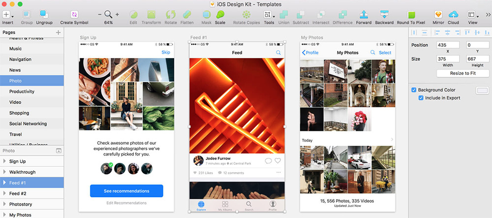
Every new release of iOS prompts an updated GUI kit and this freebie is by far the most comprehensive one to date.

It covers all the major elements for iPhone and iPad apps with free kits for most design software. You’ll find PSDs for Photoshop too, but you can download just the Sketch files with the same iOS-styled vector elements.

These elements all come in @1x size, but since they’re vectors you can easily resize them without any quality loss.

Google Now UI

google now uikit

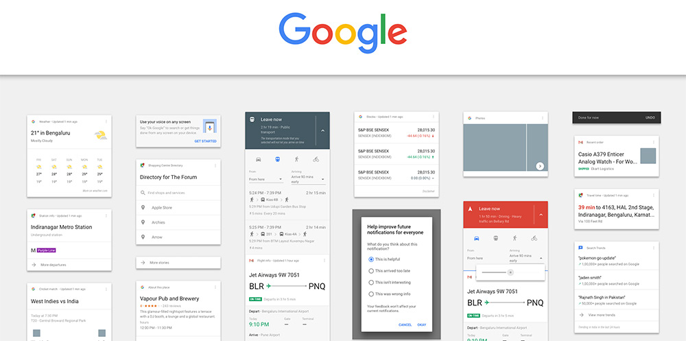
One of Google’s lesser-known projects is the Google Now prediction app. Designer Manu Akash created a variation of the Google Now UI as a Sketch freebie.

This kit features a lot of the main application pages but also uses styles from the material design library. It’s a great freebie to keep saved if you want to design Android apps while following Google’s design styles.

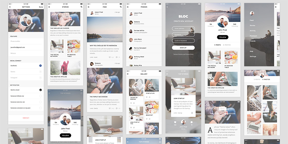
Blog Kit

blog uikit sketch

Free blogging platforms like Medium have changed the face of writing on the web. And this free blog UI kit shows what’s possible with a great mobile application UI following that same tactic.

Designer Thomas Budiman created this blog/writing kit for Sketch with a focus on mobile app design. It spans many different types of interfaces like gallery pages, article archives, and signup/login forms for new users.

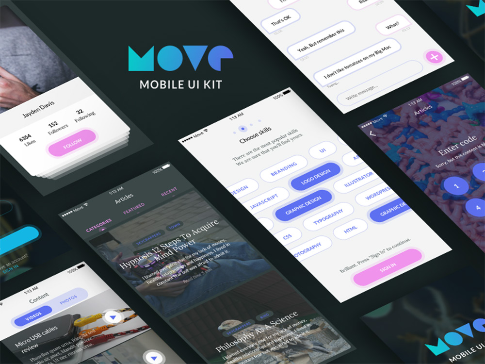
Move Mobile UI Kit

move ui kit sketch

Move UI is a free mobile app mockup pack created by Czech designer Volodymyr Kurbatov. This pack doesn’t focus specifically on elements, but rather on screen designs and interfaces for different situations.

But in these interfaces you’ll find all the common mobile elements like buttons, input fields, tabs, post archives, slideshows, and pretty much everything else you might use for a custom mobile application.

This freebie is hosted on Gumroad so it works through their checkout system, but notice it’s a whopping $0, so it won’t cost you anything to download.

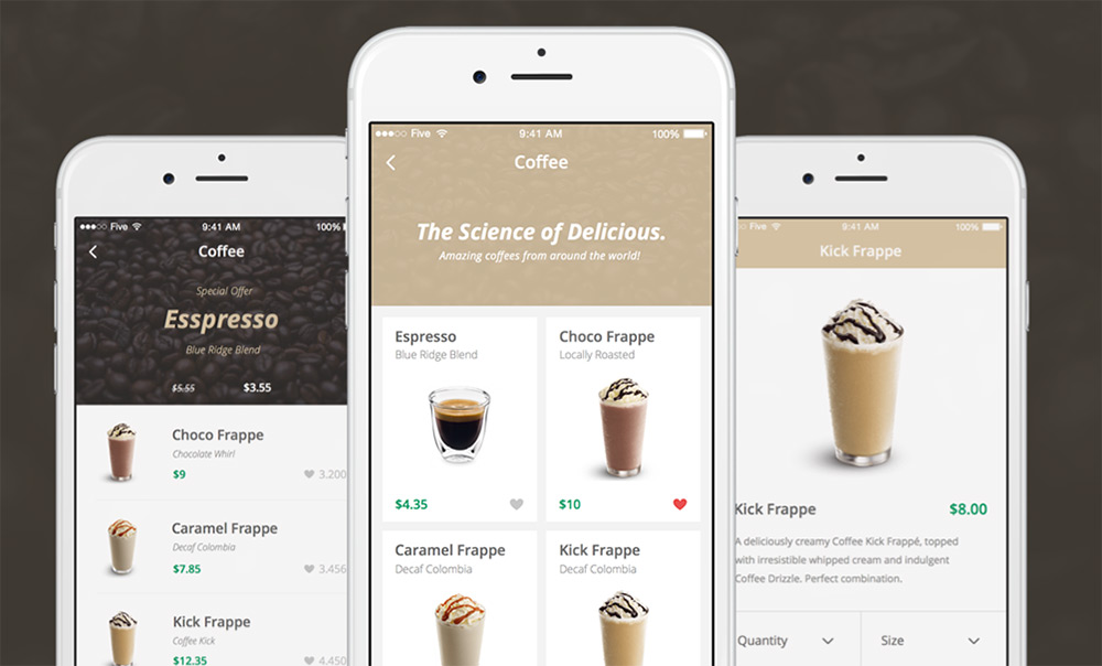
Coffee Shop iOS Kit

coffee shop ios kit

For a very unique eCommerce-style UI kit check out this coffee shop freebie designed in Sketch. It mimics an iOS application for a local coffee shop with over 50 screens covering the shop menu, checkout, and product pages(among many others).

The coolest thing about this freebie is the ease of use. You can take this design and customize it however you want to create any type of mobile eCommerce interface.

Each element is a scalable vector and the text is all based on free Google Webfonts.

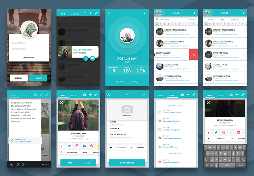
Social Leads App

social lead gui kit

Social media is a huge part of today’s web and this freebie offers a really cool start for mobile designers.

The interface kit comes with a handful of screens showcasing a social marketing application. The screens feature user lists, login fields, profile pages, and photo upload/edit screens for interactivity.

Many of these elements can be expanded to a full website layout so don’t feel constrained to a mobile design. This UI kit also follows the material design language so it’s best suited for Android or Google-type interfaces.

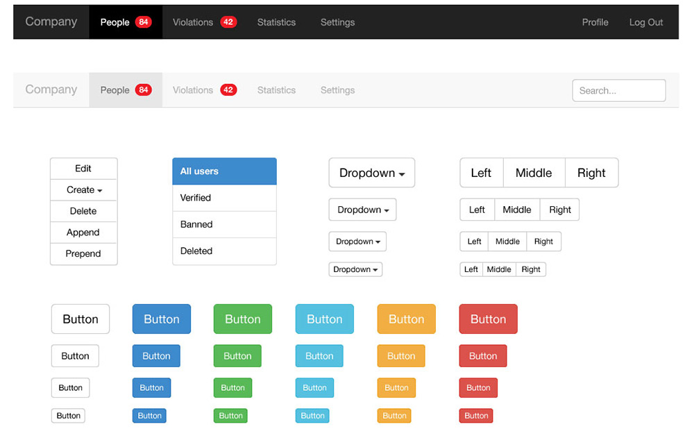
Bootstrap UI Kit

bootstrap ui kit sketch

The Bootstrap library is hugely popular amongst designers and it’s the fastest way to get a new project online. You can always start by coding the layout first, but it’s usually easier to work with a mockup like this BS3 UI kit.

This is totally free to download in both AI and Sketch format. Each element perfectly matches with the Bootstrap 3 kit, and it uses Glyphicons, just like Bootstrap.

If you’re designing with Bootstrap, then you’ll absolutely want a copy of this freebie.

And if you’re eager to move into Bootstrap 4 then check out this Sketch freebie of the BS4 grid system. It’s not a complete BS4 kit since that version is still in Alpha release, but hopefully we’ll see more of those freebies in the next couple years.

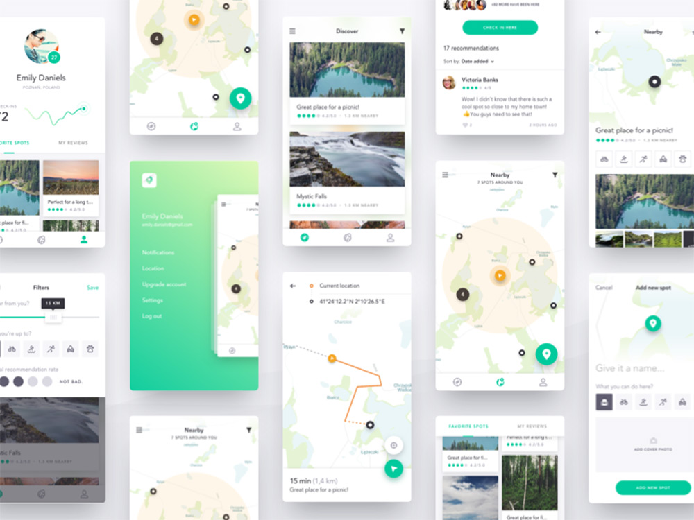
Harmony UI Kit

harmony ui kit freebie

This mobile map UI kit features all the pin drops, location arrows, and search features you’d expect from a geolocation app. The Harmony UI Kit by Dawid Młynarz is one of the newer Sketch freebies on this list first being released in mid-2017.

It comes with a dozen mobile app screens of map interfaces and search features for finding directions on a phone.

The UI kit is totally free but it’s also hosted on Gumroad so the download process can feel a little weird.

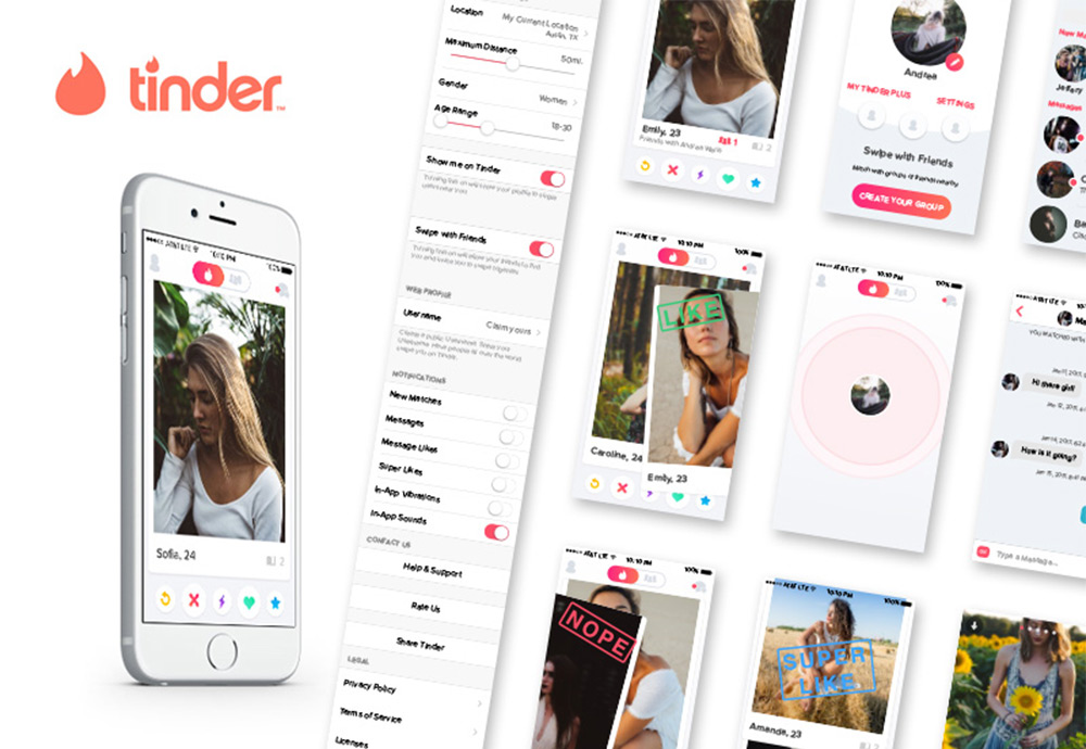
Tinder iOS UI Kit

tinder gui kit sketch

Here’s another niche mobile UI kit based on the Tinder interface. This freebie was created by Gilberto De La Garza and released for free on Sketch App Sources.

It comes packed with 15 different views for profiles, user lists, dating info, and photo pages. This interface kit mimics the Tinder application, but you can pick out smaller elements from this UI kit and use them on your own.

Sketch is perfect for iOS app design because it lets you resize elements without any quality loss. That’s why kits like this Tinder freebie are so valuable for newer designers just learning the ropes of UI work.

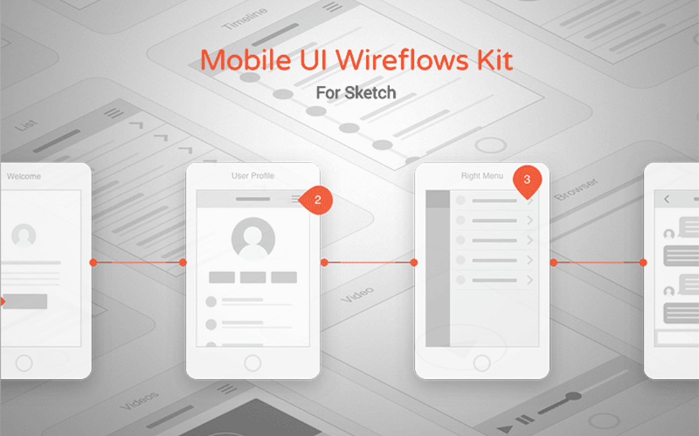
Mobile Wireframes

sketch wireframing gui kit

Digital wireframing is a huge part of any interface project. The process of wireframing and even prototyping helps you map the interface with clarity before designing the colors, textures, and typography.

This mobile wireframe freebie is an excellent place to start. It’s built specifically for Sketch and comes with 57 different mobile interface screens you can pair together.

All of these screens include vector elements that you can also arrange to your liking. A really fantastic UI kit for pre-design work and basic prototyping.

Top 10 Free Resources For Learning React.js

The frontend ecosystem is dominated by React.js. It’s one of the fastest rising JavaScript frameworks on the web with no signs of slowing down, and there’s plenty of job opportunities for a skilled React developer.

But this library comes with a steep learning curve which can take weeks or months to understand. The best way to learn is to practice building stuff, but these free guides can help you learn a bit quicker and offer some structure to your React practice sessions.

Your Designer Toolbox
Unlimited Downloads: 500,000+ Web Templates, Icon Sets, Themes & Design Assets


Egghead

react egghead learning

The Egghead website has tons of courses on many different JS libraries. Some of these courses have a mix of free and premium videos, but many are totally free which is great for newbie developers.

I recommend their React Fundamentals course which is free and spans 60 minutes over a few dozen videos. It’s definitely an intro course, but it’ll cover a lot of crucial subjects that you’ll have to learn to pick up React.

Egghead video quality is also exquisite so this is definitely a site to bookmark for other courses too.

React JS Crash Course (YouTube)

reactjs crash course

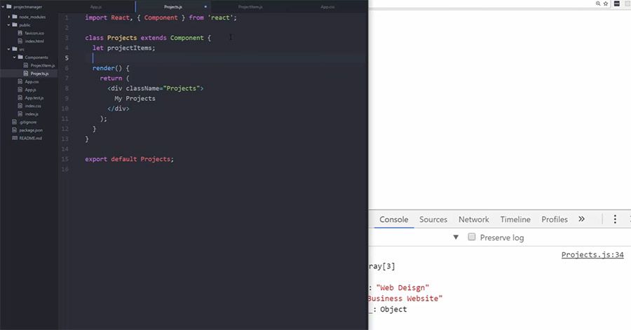
There are dozens of React.js video tutorials on YouTube so it’s tough knowing where to start. This React Crash Course video covers all the basics including MVC architecture and the very foundational structure of React.js applications.

This video is just over 1 hour long and it’s certainly not a complete guide, but I think it’s a solid introduction to the library if you have no prior experience and little-to-no idea what React even does.

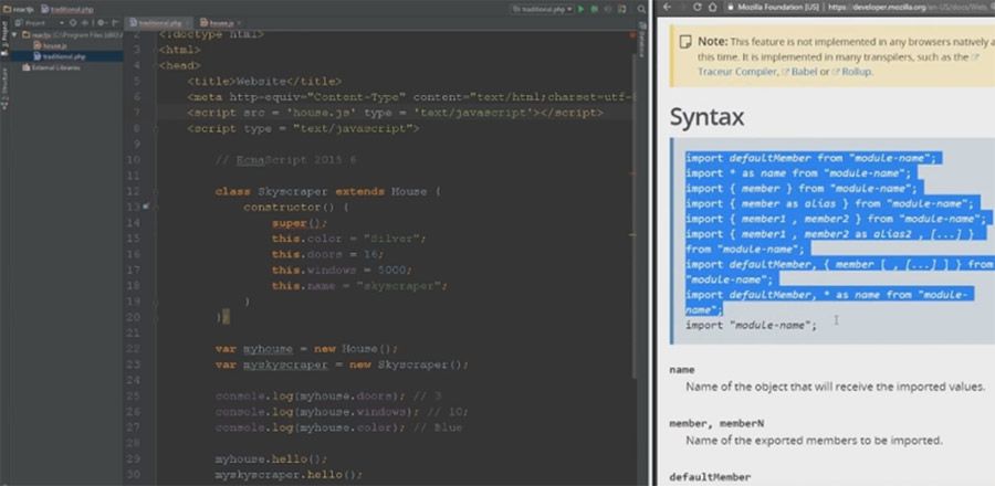
FB React Docs

react documentations

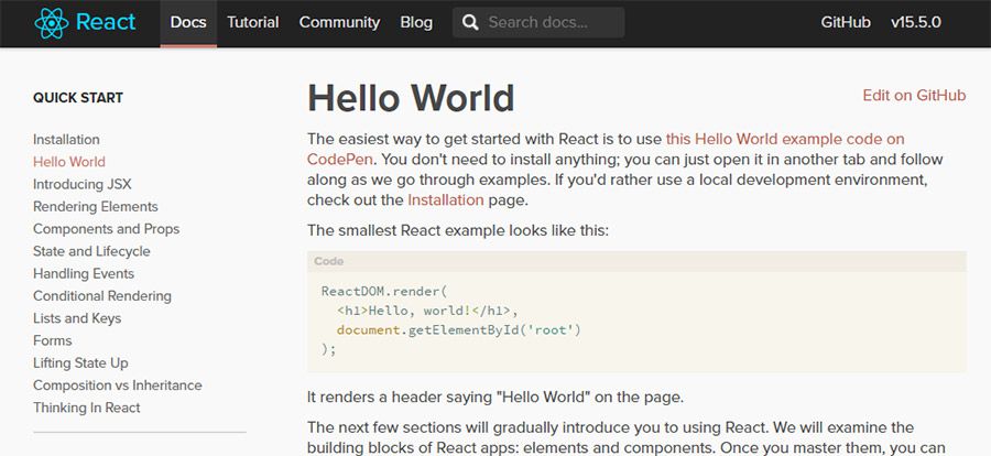
If you go searching for free React resources you’ll undoubtedly stumble onto the Facebook documentation.

These docs can be terse and difficult to work through initially, but the quality is great and the writing is aimed towards people who don’t know much (or anything) about React development.

I specifically recommend this tutorial. It’s a true guided tutorial rather than a documentation overview, but you should try reading through both since there’s a lot of knowledge you need to absorb.

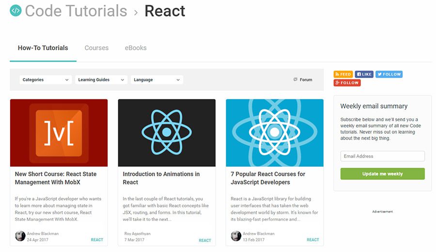
To-Do App With React

react todo app

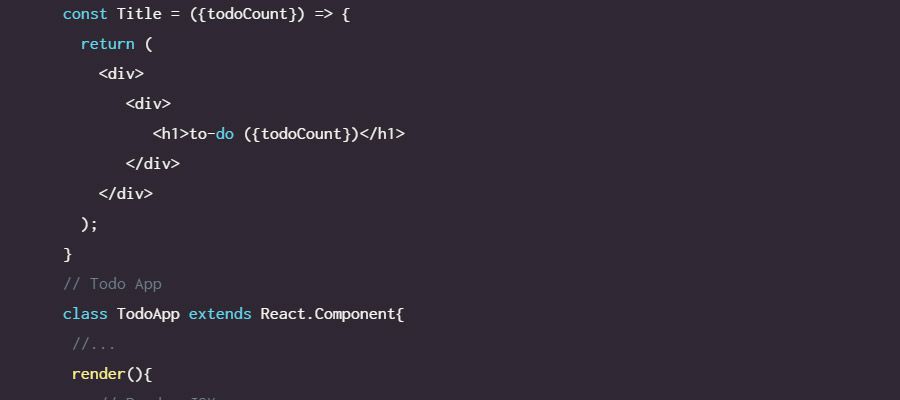
All the tutorials on Scotch.io are phenomenal. The writing, the results, and the actual code quality equates to the best self-taught guides you’ll find online.

Out of all their guides I specifically recommend their simple to-do app since it guides you through a typical workflow and teaches common practices for building webapps.
But the Scotch React category has dozens of similar tutorials you can pick up and work through. Many of them target intermediate-level developers so as a complete newbie you may struggle. But Scotch gets into so much detail that it’s easily one of the best blogs to revisit for future lessons.
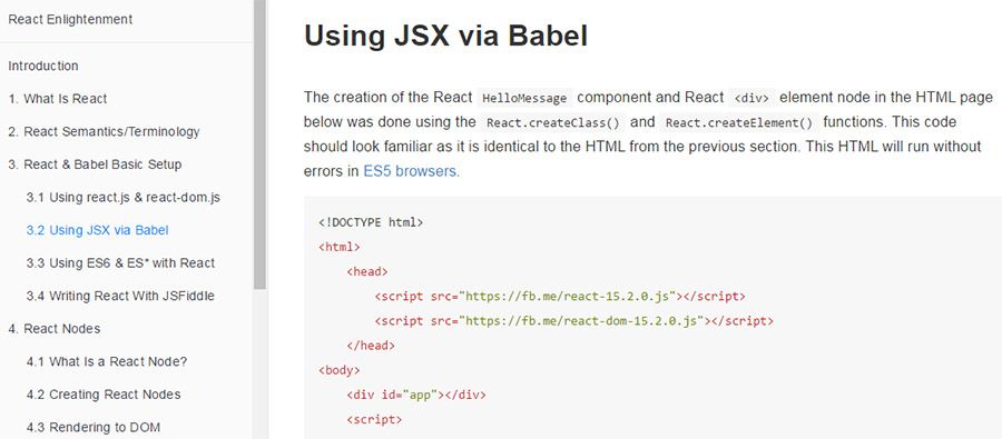
React Enlightenment

react enlightenment

The open source React Enlightenment guide is one of the better sites to use throughout your journey. It’s terse but straight to the point. And since it’s open source the whole thing is free to read online or download locally.
Every page of this guide is hosted for free on GitHub and it covers a lot of best practices for new developers. You’ll learn about ES6 and JSX/templating along with basic DOM manipulation and components.

Just note this guide does not hold your hand or wait for you to keep up. You’ll need to do a lot of Googling to answer questions you have along the way. But this guide can take you pretty far and it’s frequently updated with new information.

TutsPlus React Tutorials

tutsplus react

Every tutorial I find on the TutsPlus site is phenomenal. They publish incredibly detailed content solving very specific problems, and most of the time you can follow these guides in a step-by-step fashion which is handy for beginners.

The TutsPlus React category has dozens of tutorials ranging from the complete basics to more advanced app dev guides. For a newbie I recommend Getting Started With React. It offers a solid introduction to all the tooling & workflows that come along with a React.js environment.

React.js for Beginners (YouTube)

reactjs for beginners

One other YouTube video tutorial I like is this one by Dev Tigris. It’s a complete guide for beginners and the teaching style is very clear.

This vid is only one hour long but it should get you comfortable with the basics of React. This video won’t make you fully independent or able to craft detailed apps from scratch. But you will walk away knowing how React functions and thinking in a more React-oriented manner.

Tip: check the related videos you see in the sidebar of this video. Many of those are also great and well worth your time.

React Fundamentals

react fundamentals

The React Training site is yet another half-free and half-premium resource for learning React. And if you have time to go through the free content you’ll be pleasantly surprised.

This works like an online course series where you can study topics along with other students, and the best free course is React Fundamentals.

All the course material spans a total of 4+ hours long with a master list of 48 different lessons. The course gets updated frequently with new React techniques and best practices so it’s worth checking back every so often.

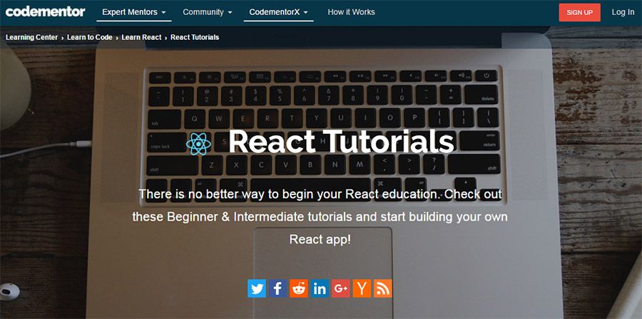
Codementor React Tutorials

codementor tutorials

The idea behind Codementor is pretty simple. You pair up with a digital mentor who helps you work through different projects and libraries. But these sessions usually cost money, so to help beginners without a budget, Codementor shares free written tutorials on their blog.

You can browse through all their React tuts and pick through any topics that interest you. Some cover basic React setup guides, others cover React Native for mobile apps, and others cover wacky ideas like a React Pokédex app.

It’s good to have a little background in React before following these tutorials. They get into so much detail that it can be hard for complete newbies, but I guarantee you’ll improve your skills just by following some of these guides.

Curated React/Redux Links

Lastly, I have to include this massive React.js links list because it really is the ultimate place to find React.js learning resources.

Developer Mark Erikson curated this huge list of tutorials & guides organized by skill level and subject matter. You’ll find plenty of beginner guides on React, ES6 and JS app design patterns.

Keep this bookmarked for later reference because as your skills improve you’ll find a lot of value in some of the more advanced tutorials.

These free resources are just my personal recommendations but the React community is constantly changing and awesome new tutorials are published every year. Take a look through these links to see if any can help you get started, but if you’re looking for more alternatives definitely hit Google and see what else you can find.

Top 10 UX Blogs That All Web Designers Should Read

There’s a lot to learn in the world of UX design. There’s so much terminology along with varying workflows that it can take years to master the craft.

It helps if you have some good reading material to keep you on the forefront of UX changes.

These blogs are by far the best places to start with frequent posts on UX design for websites, mobile apps, and general digital interfaces.

The UX Designer Toolbox
Unlimited Downloads: 500,000+ Wireframe & UX Templates, UI Kits & Design Assets


1. UX Booth

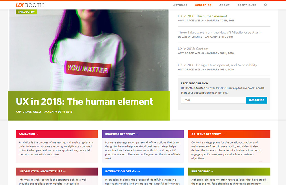
UX Booth

UX Booth has been online for years and they’re probably the most well-known UX blog on the web.

Each week they publish a few articles related to user experience and general design topics. It’s really a mixed bag of content but the quality is superb. Most of these topics are really groundbreaking so they talk about many ideas you won’t find on other blogs.

I highly recommend UX Booth as a must-read blog. It should be in your rotation if you do any type of design work.

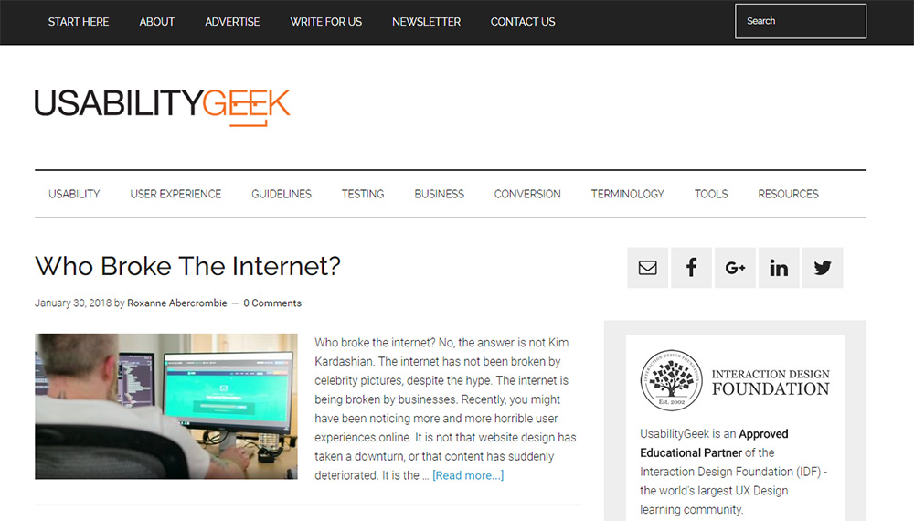
2. Usability Geek

Usability Geek

Here’s another great blog on the topic of general user experience and usability.

On Usability Geek you’ll find plenty of articles covering trends and design techniques for the web. There’s also a solid focus on mobile apps too along with workflows for larger teams like agile.

Usability Geek feels more like a general UI/UX and interaction design blog. It covers a little bit of everything, and there’s something here for everyone regardless of your background.

A fantastic read for new and seasoned designers alike.

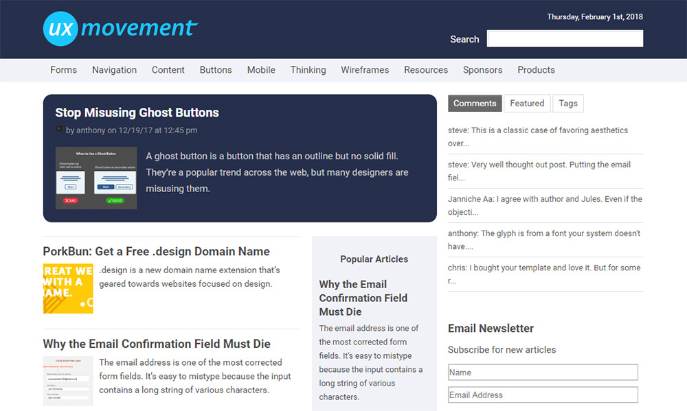
3. UX Movement

UX Movement

If you look over the homepage you’ll notice UX Movement doesn’t update very often.

But when they do every post is fantastic.

This website is the cornerstone of new ideas for UX on the web and mobile. I’m always surprised at how insightful and valuable these articles can be, especially ones that offer results from case studies.

UX Movement’s biggest downside is the slow trickle of content. You’ll be lucky to get 1-2 posts every month.

So you probably won’t bother visiting this site weekly, but it should be on your radar. And if you’re looking to delve into the belly of UX design then try browsing through their archives to see what you can find.

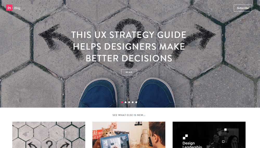
4. InVision Blog

InVision Blog

InVision has turned into a massive company with their online prototyping & workflow tools.

During that time they also launched the InVision Blog which has some pretty great design articles mixed with some general lifestyle posts. Granted these are all interesting pieces and they’ll be especially relevant to designers.

But the UX-specific posts don’t come every day so you may have to browse through to find something you like.

The reason I like this blog is mostly their volume and quality of content. It’s truly a great read for anyone in the design space.

5. VWO Blog

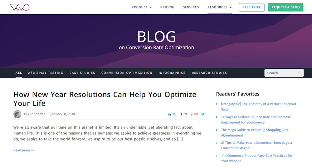
VWO Blog

Another company blog I really like is Visual Website Optimizer.

On their VWO Blog you can search through case studies and opinion pieces discussing the state of user experience and split testing. Many of their case studies get mentioned on other design blogs since the content is original and invaluable to the design process.

You’ll also find topics on conversion rate optimization and tips to improve your landing page designs for specific KPIs like email signups or selling new subscriptions.

VWO is a trusted brand, and their blog exudes the same level of trust you’d expect from their tools.

6. Smashing Magazine UX

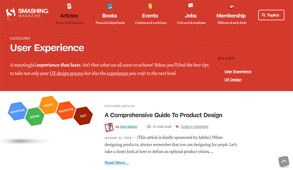
Smashing Magazine blog

Speaking of trusted brands, Smashing Magazine is probably the definitive design blog on the web. It’s been around for well over a decade and they’re still publishing great stuff.

I specifically recommend the Smashing Magazine UX section which just publishes content on user experience design.

Many top-tier designers from all over the world write for Smashing Magazine, so there’s a ton of opportunity to learn cool stuff. You’ll find articles on pretty much everything, but there’s a specific slant towards UX for web design.

If you’ve never read Smashing Magazine before then now’s your chance to delve into a gem of the design publishing space.

7. UXmatters

UX Matters

I’ve seen a lot of variety on UXmatters and it seems like one part blog, one part community and one part Q&A topics.

The site feels a bit strange because it’s not designed exactly like a typical blog. They do have columns you can read on certain topics with plenty of opinion pieces and case studies.

There’s also a list of top articles where some of them are pulled from print publications.

You may find that some of their best articles date back 5+ years and they still hold up even today. That’s some great writing and proof that good UX is ultimately timeless.

8. UX Design Collective

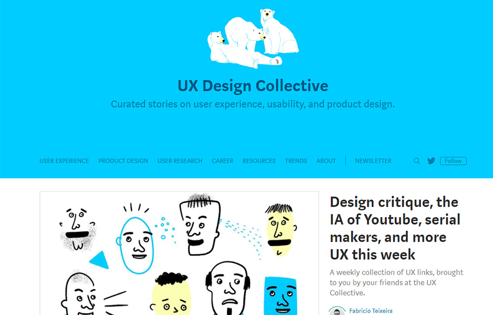
UX Design.cc

The UX Design Collective is not a totally unique publication. It’s a mix of unique content along with curated stories published on other sources and re-published on their site.

But most of those articles are obscure and tough to find since they often get shared on Medium or another blogging platform.

That’s what makes UX Design Collection so valuable. It’s a one-stop shop for everything you’d want to read about in the big world of user experience.

I specifically recommend signing up for their newsletter to get their recommendations for top UI/UX articles. It’s the best way to find out about new blogs and new designers writing about these topics.

9. UXstudio Blog

uxstudio blog

The UXstudio team has their own blog focused solely on user experience work. This is a great read and full of interesting ideas for future tech, team building exercises, and handling client projects with a focus on UX.

You’ll also find plenty of case studies mixed in which are really fun to read through.

You can learn a lot from skimming case studies just to see how other design teams handle their work. Check out their blog and see if you like the content. It may not be for everyone but it covers a lot of ground.

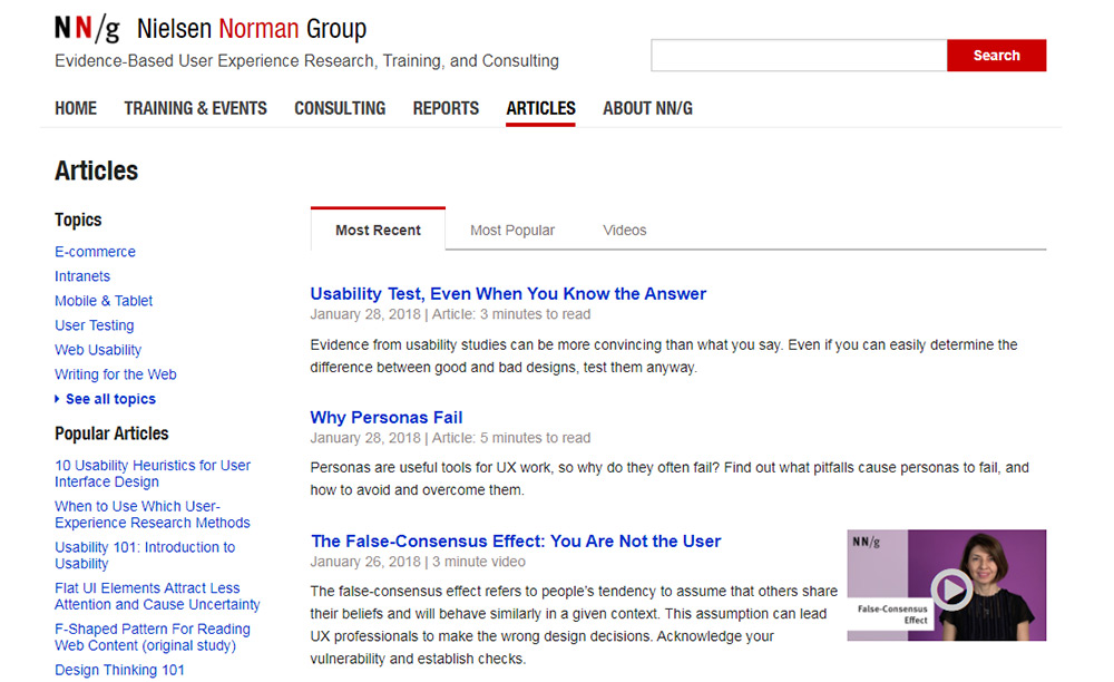
10. Nielsen Norman Group

NN Group blog

The NN Group is perhaps the most well-respected usability research team in the industry.

They frequently publish articles detailing their findings in various case studies and usability studies. Many of these are high-level ideas, and they’re perfect for semi-experienced designers who want to push their skills even higher.

If you’re brand new to UX design then Nielsen Norman may be tough to read.

But the more you practice in the field, the more their articles will make sense and even get you excited to sit down and read.

The 10 Best Free Icon Fonts For Web Designers

Open source web fonts let designers radically change their page designs and typographic styles. And some of these web fonts use icon sets to bring vector-based icons into CSS.

If you’re looking for 100% free icon fonts for your website then this post has collected all of the best ones. Each icon pack is totally free with SVG vectors and webfont formats to include in your stylesheets and web pages.

All the Icons, Fonts, Web Templates & Design Assets You Could Ask For


1. Captain Icon

captain icon webicons

My personal favorite web font is the Captain Icon pack created by designer Mario del Valle. It’s a totally free open source project hosted on GitHub with vector files and web fonts.

What I like most about this icon pack is the style. Each icon has a very unique design, and they’re all hand drawn from scratch. This makes them stand out far above the other more generic icon sets.

But I don’t think Captain Icon works for every project. It’s best used on creative sites where a hand-drawn style fits with the layout.

2. Octicons

octicons web fonts

GitHub recently open sourced their own icon pack called Octicons. This free icon set is currently in version 5.0 and includes dozens of icons with some basic symbols.

These icons can be found scattered throughout the GitHub website. But they’re just simple enough that they can work on pretty much any interface.

If you need a simple, lightweight icon font then Octicons won’t let you down.

3. Typicons

typicons set

With rounded corners and simpler outlines, the Typicons set is perfect for any site. It comes with 330+ unique icons all with a similar style.

The pack is completely free and also available on GitHub. This means you can include the icons directly into your site and even make edits to them as needed.

Few people know about Typicons but it’s one of the better icon web fonts available. They can even work for iOS with some minor adjustments and special code snippets.

4. Zondicons

zondicons iconset

Zondicons are totally free and real easy to add into your site. Unfortunately these aren’t hosted on GitHub so they don’t have an update archive.

But you can see all of the examples on the demo page including which CSS classes you need to get them working properly. The main Zondicons download link comes right from the website, so it’s hard to tell if they’ve ever been updated or if new icons were added.

I do recommend this webfont if you’re okay with simpler designs. This makes the icons far easier to use, but they can also blend into the site with a more “generic” style.

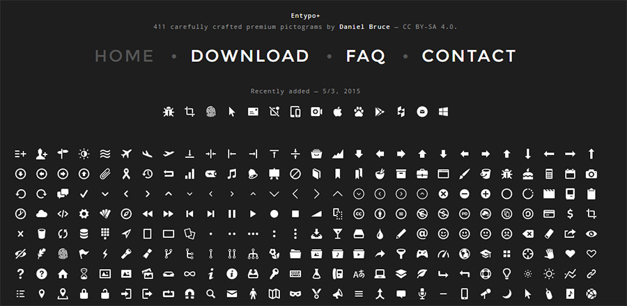
5. Entypo

entypo homepage

The webfont icon family Entypo has been around for quite a few years. These icons are superb and they’re top of the line when it comes to freebies.

New icons are added sporadically and they’re very simple to access. The fonts also split into two packs: the main pack and the social pack. So if you don’t need social media icons you can reduce the font file size by quite a bit.

Entypo comes with over 400 icons and a brilliant CC sharealike license. To learn more about installation and customizing the icons you should read through the FAQ page and visit the main GitHub repo.

6. MFG Labs

mfg labs iconset

One of the newer fonts in this list comes from MFG Labs with their own icon set. It’s completely free and hosted on GitHub for the world to access.

Each icon comes packed with standard webfont formats using Unicode PUAs in CSS. This is fully semantic in all browsers and helps to reduce clashes against other CSS code.

MFG Labs icons have a unique style that stands out from the herd. I absolutely recommend this icon font for any type of website, commercial or otherwise.

7. Ionicons

ionicons webfont

Native devs love the Ionic Framework and it’s one of the most popular choices for web-to-mobile apps. The Ionic team decided to release their icons as a webfont called Ionicons.

Naturally they’re totally free and available on GitHub. You can even add these icons directly to your site using the CDN version of the stylesheet.

I mostly recommend Ionicons for newbies who haven’t used icon fonts before. They’re super easy to setup, and once you understand how they work you can move onto pretty much any other icon webfont out there.

8. Font Awesome

font awesome iconset

The original web font and Bootstrap’s personal choice, Font Awesome is perhaps the definitive pick for most web designers.

Font Awesome has been around for years and it’s widely regarded as the first major open source icon font. It frequently gets new updates with fresh icons and currently it’s in v4.7 with a free download on GitHub.

Every icon is fully scalable and maintainable directly in CSS. You can change colors, shadows, background gradients, or pretty much anything else using pure CSS3.

This is by far one of the safest icon sets you can use and you know it’s going be here for the long haul.

9. Material Design Icons

material webfont icons

Google’s material design brought a new approach to UI/UX on the web. This led to many new frameworks & resources including this material design icon font.

These material icons are totally free and accessible on GitHub. This icon pack is absolutely massive with over 1,000 icons covering a wide array of interface features.

And because it’s open source you’re free to reuse these on any projects and even customize the icons if needed. Perfect for anyone working with Google’s material guidelines on the web.

10. Devicons

devicons webfont

The Devicons pack is one of the newer web fonts you can try with a focus on tech logos & branding.

This icon font has every logo you can think of from the big tech players like Google to newer CMS logos like Ghost. I’ll admit, this is only useful for sites that want vector tech logos which certainly won’t be a majority.

But it’s a hefty icon set and it’s totally free! You’ll find install details on this page with a free CDN version you can use to reduce load times.

Wrapping Up

It’s hard picking just ten icon fonts because so many new ones are released every year. But these are my top picks and if you recommend any others be sure to share in the comments below.

8 Websites To Find Free Creative Commons Icons For Design Projects

It doesn’t take much work to find free icon sets online. While they’re useful, they aren’t always the best option for finding specific icons. That’s where free icon resource sites can help.

These websites curate icons based on license (Creative Commons or premium/commercial). Below I’ve curated a nice list for anyone who wants to quickly find specific CC icons on the web.

Your Designer Toolbox
Unlimited Downloads: 500,000+ Web Templates, Icon Sets, Themes & Design Assets


Iconfinder

Iconfinder

If you spend any time searching for icons, then you’re bound to stumble upon Iconfinder. This is the premier destination for any icon you could ever need.

It operates like a search engine, where you type in an icon style or glyph (like “magnifying glass” for a search icon). You’ll then see results with a mix of commercial and free options.

But if you look deeper into the search settings, you can filter the results to view just free or just paid options. You can also set the icon sizes and a few other search criteria.

No doubt that Iconfinder is the best place to start if you’re looking for free icons. If the icon is out there online, Iconfinder has it indexed.

All the Icons, Fonts, Web Templates & Design Assets You Could Ask For


Noun Project

Noun Project Icons

On the Noun Project website you’ll find a curated list of over one million icons and counting.

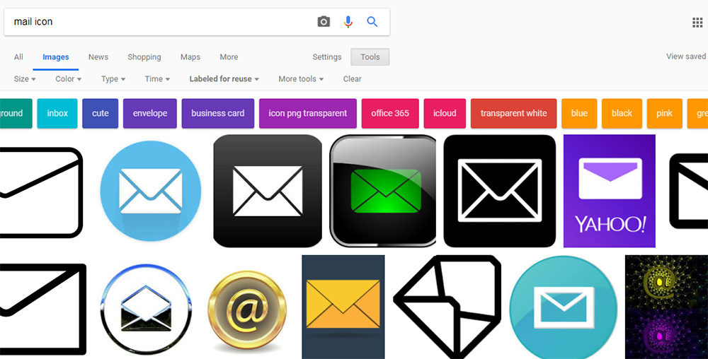
This site also works like a search engine, where you can filter icons based on keywords, styles and glyph shapes. For example, you can search for a mail icon and find some pretty clean results.

But The Noun Project isn’t completely free. They do have an optional pro plan which gives you access to far more icons.

Thankfully, their free icon library is still large enough to be worth a bookmark.

FindIcons

Findicons

FindIcons is an icon-only search engine and it features one sweet interface.

As you start typing you’ll notice auto-populated search results based on existing tags. This can help you find exactly what you’re looking for very quickly.

There’s also a filter menu on the side that lets you select how many icons to display per page, icon colors, styles and license.

This one is definitely worth saving if you need a high-quality search engine exclusively for finding icons.

Flaticon

Flaticons

There’s a lot to say about the flat design trend sweeping the industry. One sure thing is that if you’re creating flat websites, you’ll have no problem finding resources.

The Flaticon website is one such example.

This is a free icon search engine dedicated to flat icon styles. You’ll only find flat icons here and they’re all pulled from open source icon packs submitted by the community.

One cool feature is that they offer icons in many different formats – including base64. You can use base64 code within CSS to embed icons into your page without ever saving an image file.

Flaticon is certainly the best place to look for icons if you work with flat design on a regular basis.

Google Images (CC search)

Google Images CC

A lot of people skip Google Images on their quest for design assets. Typically, that’s because the results in Google Images come from other websites and you never really know what kind of license they’re using.

But there’s a nifty feature in Google Images that few people know about.

If you click “Tools” and then click “Usage Rights” you can select from one of many Creative Commons licenses to search through.

This automatically limits your image searches to return only images with the correct usage rights. Pretty cool!

Alternatively, there is a CC search page which can return similar results. But there’s no way CC’s internal search can ever match the power of Google.

Fontello

Fontello icons

I can’t say that Fontello is really a search engine just for icons. But it is one amazing website to help you find free Creative Commons assets – with plenty of icons to go around.

It’s described as an “icon fonts generator” and can be used to create custom icon font files to embed via CSS.

Note that you can also download these icons as vectors and rework them to suit your needs.

While it’s not the largest icon library in existence, it certainly features a variety of quality icons for designers.

Iconmonstr

Iconmonstr

Iconmonstr is relatively new compared to the other sites I’ve mentioned. However, this is a fantastic icon repository full of 100% free open source icons.

As of this writing it features over 4,000 icons – all organized into different collections. They’ll help you search for icons based on topics like sports, business or healthcare.

There’s also a standard search field if you know exactly what you’re looking for.

Just note that Iconmonstr primarily organizes single line icons with a similar minimalist style. So it’s great for finding icons with that particular style, but won’t help for much else.

GitHub

GitHub icons search

It may seem weird to recommend a code repository as a resource for graphics. But GitHub really does have a lot of repos with free icons available as SVGs and PNGs – among other formats.

Just do a search for icons and you’ll see what I mean.

Granted, there will be plenty of scripts and templates built around icons that show up in the search results. But you’ll also find repos for open source icon libraries that designers chose to host and release through GitHub’s free platform.

Consider this a last resort for finding obscure and niche icons. Don’t expect miracles, but the few gems you find can really have an impact on your design projects.

Top 10 Google Web Fonts For Bold Header Text

Since webfont support is basically universal there’s no good reason to stick to the defaults. Google Webfonts is the largest source of free fonts with hundreds of typefaces to pick from.

Since page headers are the strongest elements they usually work best with custom fonts. However it can be tough whittling down the best choices, and that’s exactly why I wrote this post.

All the Fonts You Could Ask For


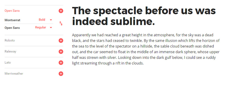
1. Montserrat

montserrat font

The first in my collection is Montserrat. This font can work for pretty much anything but I think it works incredibly well as header text.

I’ve used this for navigation text with all caps, customized letter spacing, along with many different font styles from thin to super thick. Montserrat fits the bill perfectly across the board and it’s one of the more universal fonts blending into anything from a tech blog to a funeral parlor website.

The font only weighs about 500 bytes using the default style so it’s incredibly light. And with so many different styles you can get a lot of different looks from this one family.

If you’re looking for a unique heading font try Montserrat. It probably won’t work for everyone but it’s a safe starting font that many designers love.

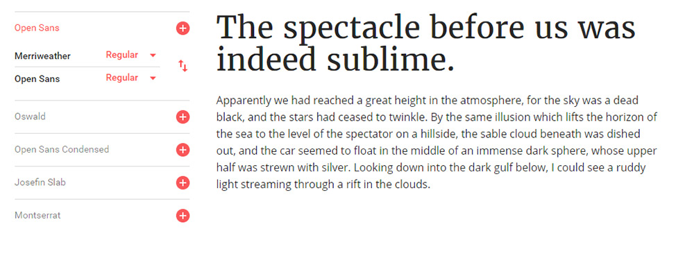
2. Merriweather

merriweather typeface

A much thicker serif alternative is Merriweather which I also like as a body font. This versatile typeface really looks great anywhere on your site and it’ll bring plenty of attention to your headers.

If you try Merriweather for a larger page heading I suggest using the bold or bold italic style. They are surprisingly clean but they probably need some letter spacing adjustments. Either way the style and darkness of the letters are super easy to follow.

When pairing this font I usually do a sans-serif body typeface. The contrasting styles create a natural divide between headers & body copy. Plus most people find sans-serif easier to read on average for body content.

But I see a lot of sites with serif headers and they all look great. Merriweather is a nice starting point for serif, but if you don’t like it you’ll find tons of alternatives in this post.

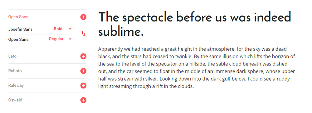
3. Josefin Sans

josefin sans font

Modern and classy best describes Josefin Sans. It feels like a font straight from a 1950s jazz lounge, or maybe something you’d see on the front page of The New Yorker.

It does have a distinct curvy style and the thin letters save a lot of horizontal space. You can toy with all-caps or different letter spacings to create many unique styles all from this one font family.

Some sites just look better with thin heading fonts. If you’re looking for one to try I absolutely recommend Josefin Sans with its unique letter designs and its many bold/italic styles.

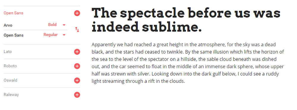
4. Arvo

arvo webfont

One other serif font I really like is Arvo. This font has a lot of character which you’ll notice right away in the bolder styles.

I really feel like Arvo works best on blogs and digital magazines because the font grabs so much focus. It’s one of the strongest fonts in this list and the serif design grabs even more attention.

If you’re launching a magazine-style blog then Arvo can work well as a strong header. But if your blog works better with sans-serif fonts this can be too much. One alternative that’s a bit more subtle is Crete Round but it doesn’t have the same eye-catching appeal as Arvo.

5. Raleway

raleway font

I’ve seen Raleway on many larger blogs and online magazines for its distinct style and large variety of font variations.

For big heading text I think a mid-level thickness works best so the letters don’t get too wide. Default letter spacing is great so every word is clearly legible.

One feature unique to Raleway is the “w” letter form. It crosses in the middle which looks like two “v”s stacked together. Some may like this, others won’t. But it’s definitely unique to Raleway so it’ll stand out in your page headers too.

6. Catamaran

catamaran font

One of the newer fonts I found recently is Catamaran. It comes with 9 font styles from thin to black and varying thicknesses inbetween.

What I like most about this font is the offbeat lettering. Each letter takes on a very unique style and you can see this in the bolder styles. When used in heading text these letters really shine and jump off the page.

Because the bold styles are so thick you should only use Catamaran in headers with larger font sizes. It can look OK at all sizes but Catamaran really feels like a thick header typeface.

7. PT Sans

pt sans font

PT Sans is soft with smooth edges and thin letters. For headers I only like the bold style of PT Sans because the “normal” style just feels way too thin.

I also prefer PT Sans for headers only since it just feels too soft for regular body text. But any PT Sans header is going to look amazingly clean and readable. This font actually has a sister named PT Serif that also works well.

Between the two, I personally prefer PT Sans. It has smoother edges than the serif version and I feel it just works better in page headings and especially for blogs.

8. Open Sans

open sans font

Open Sans is small, versatile, and super clean. It deserves a spot in this collection because it’s a simple font and one of the fastest loading fonts from the entire Google Fonts library.

The majority of sans-serif fonts play well with any site. Plus you can use sans-serif fonts in both your header and body text making Open Sans a reasonable choice for the entire website. One alternative I really like is Muli which has a lot more character as a header font.

But Muli’s downside is the larger file size. Ultimately this is what makes Open Sans so great because slower sites don’t rank as well and they provide a worse UX all around.

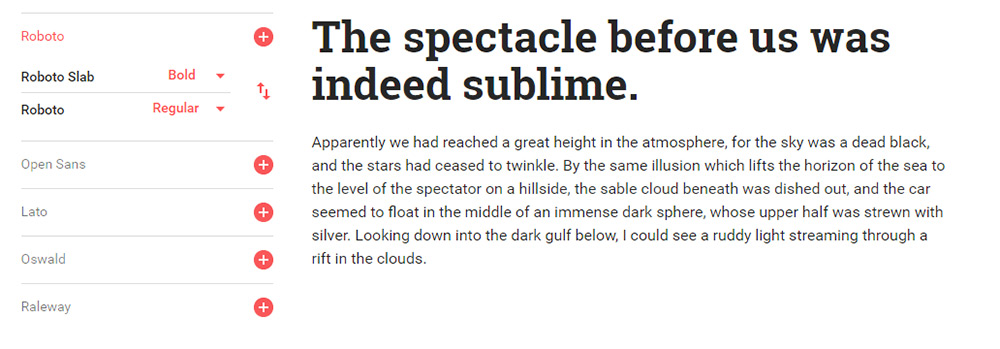
9. Roboto Slab

roboto slab

For a strong serif header font you might try Roboto Slab and just see how it looks. The letters aren’t too thick and the tags that hang off don’t distract the reader.

I generally prefer Roboto Slab for headers instead of the sans-serif version called Roboto. The serif version just feels stronger and leaves a much bigger impression on the viewer.

Truth be told they’re both awesome and you can’t go wrong either way. They both support all the common unicode characters and they’re both amazing choices for your website headings.

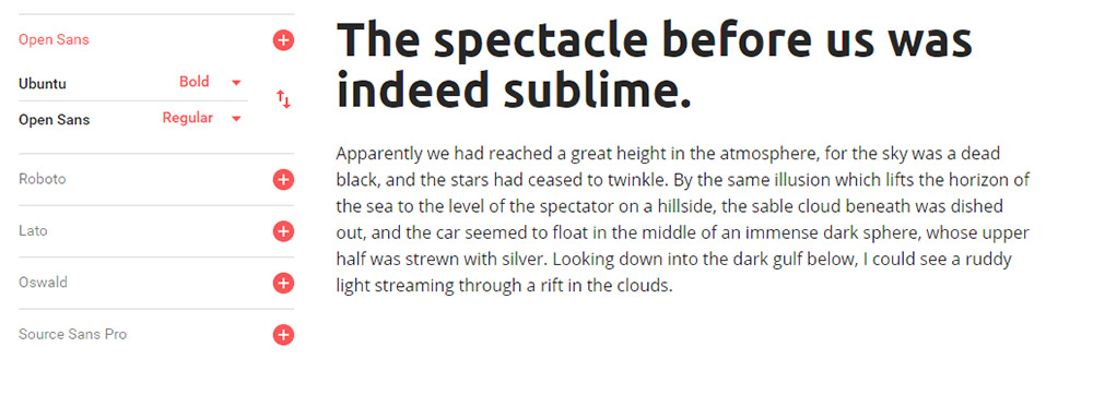
10. Ubuntu

ubuntu webfont

The free Ubuntu font can be used for practically anything from nav text to large headers and even body copy. It’s extremely versatile and it’s lightweight with a pretty fast load time.

Rounded edges on the letters make this feel sleek and modern. It’s also one of the few fonts that really can be used in multiple places on your site which can cut down the total number of fonts you need.

Ubuntu was designed back in 2010 so it’s been around for quite a while. Now that webfonts are much more common the Ubuntu family is widely used in web design.

Wrapping Up

Whenever I design a new site these 10 fonts are my go-to choices for headers. They’re much better than the stock OS defaults and your layout will really stand out from the others with these strong header fonts.

11 Instagram Accounts For UI & UX Design Inspiration

Instagram is one of the best sites to find quality UX inspiration. But you need to know who to follow and which hashtags are worth browsing.

I’m hoping this article will set you on the right path with a collection of the 12 best UX accounts on Instagram. These are all very active and perfect for anyone breaking into the field, or looking to expand their reach with more Instagram inspiration.

The UX Designer Toolbox
Unlimited Downloads: 500,000+ Wireframe & UX Templates, UI Kits & Design Assets


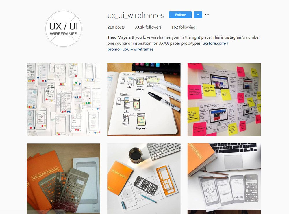
1. @ux_ui_wireframes

uiux wireframe instagram

My absolute favorite account is @ux_ui_wireframes and it’s been around for years now.

New posts are frequently added, and many of them are sourced from designer accounts through hashtags. So this works like a curation resource where the account owner connects with other designers and asks if they can republish the photo on their account.

Naturally this draws more attention to the designer’s work and gives you a bunch of diverse UX inspiration. Cool stuff!

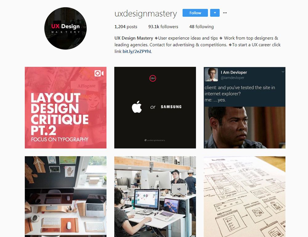
2. @uxdesignmastery

ux design mastery

Here’s another one I really like that’s pushing just about 100k followers.

The @uxdesignmastery account comes from the main website offering tutorials and courses on this topic. So their photos are meant to guide you towards the site and increase users while offering some cool inspiration.

New UX designers will find this incredibly valuable since the website is chock full of knowledge. But even if you just follow the Instagram account you can still learn a lot from their uploads.

3. @wireflow

wireflow instagram page

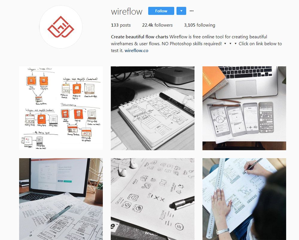
The team at @wireflow have their own Instagram account for publishing custom wireframes, prototypes, and storyboards for user flows.

Again this is managed by the main site which promotes their tool for simple flowchart management. It’s actually a great tool because you can use it freely on the web and the results are instantaneous in your browser.

But their Instagram account goes beyond digital work to include a lot of hand-drawn wireframes and user flows. Excellent for people who prefer classic methods of brainstorming.

4. @uxpiration

uxpiration instagram

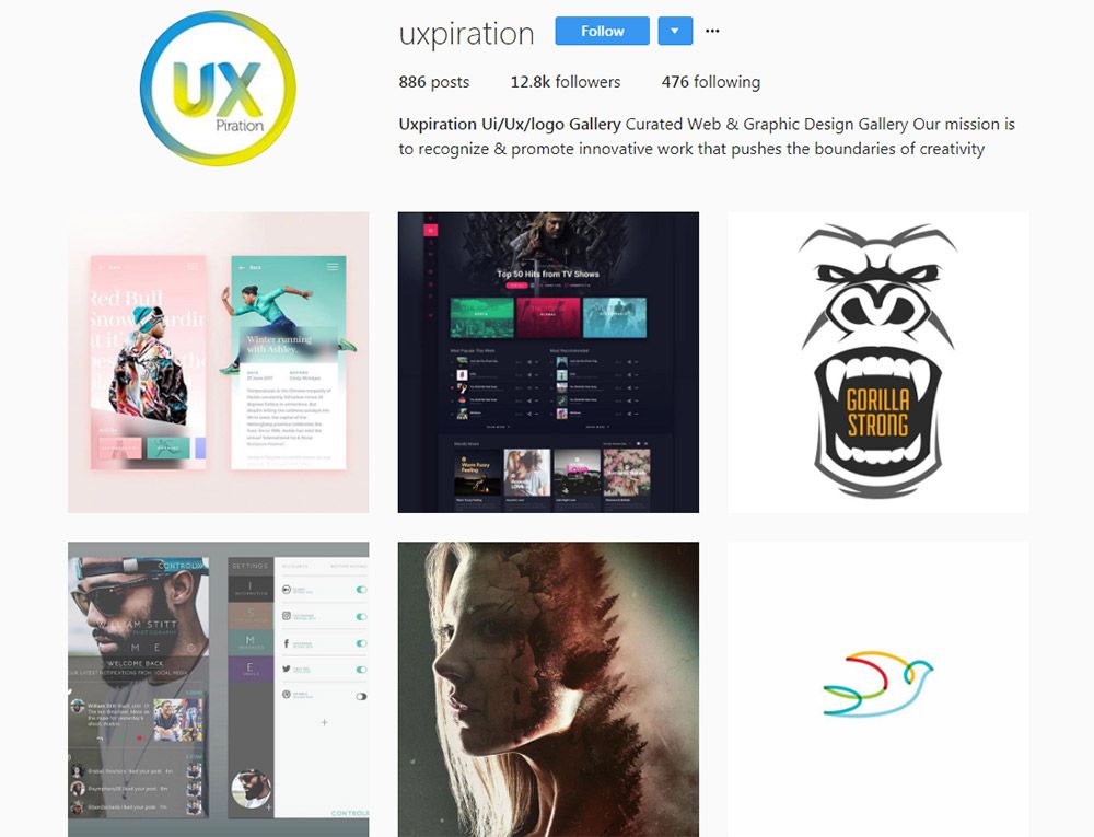
With a following of 12k designers and growing fast, one of my favorite newer accounts is @uxpiration.

It’s built solely to promote designers and help get work out there for ideas. This account almost takes on a communal feel giving back to the overall design community.

Well worth following if you want UX, UI, or general design inspiration.

5. @uxdesigns

uxdesigns instagram

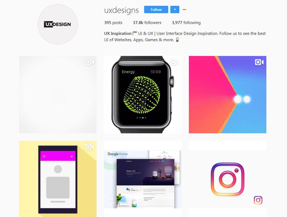
Looking for animated interface designs? Then you’ll want to follow the @uxdesigns Instagram page.

A lot of these photos are pulled from Dribbble where designers share UX animations and custom interfaces. They’re all tagged properly so you can usually find the original designer pretty quickly.

But this is one feature I like about Instagram’s support for GIFs, and it shows just how useful this account is.

6. @humble_ux

humble ux instagram

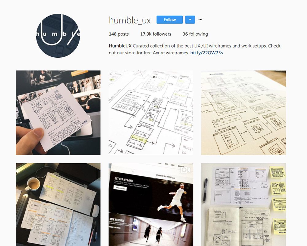
For a good mix of digital and traditional, check out @humble_ux.

It has almost 20,000 followers and over 150 posts with many new ones added every week. The photos come from the Humble UX team who curate shots from around the web and share a few of their own too.

Most designs are sketches or brainstorms on a whiteboard, so you’ll see a lot of traditional mediums. This is great for all types of UX from mobile to websites and even desktop apps too.

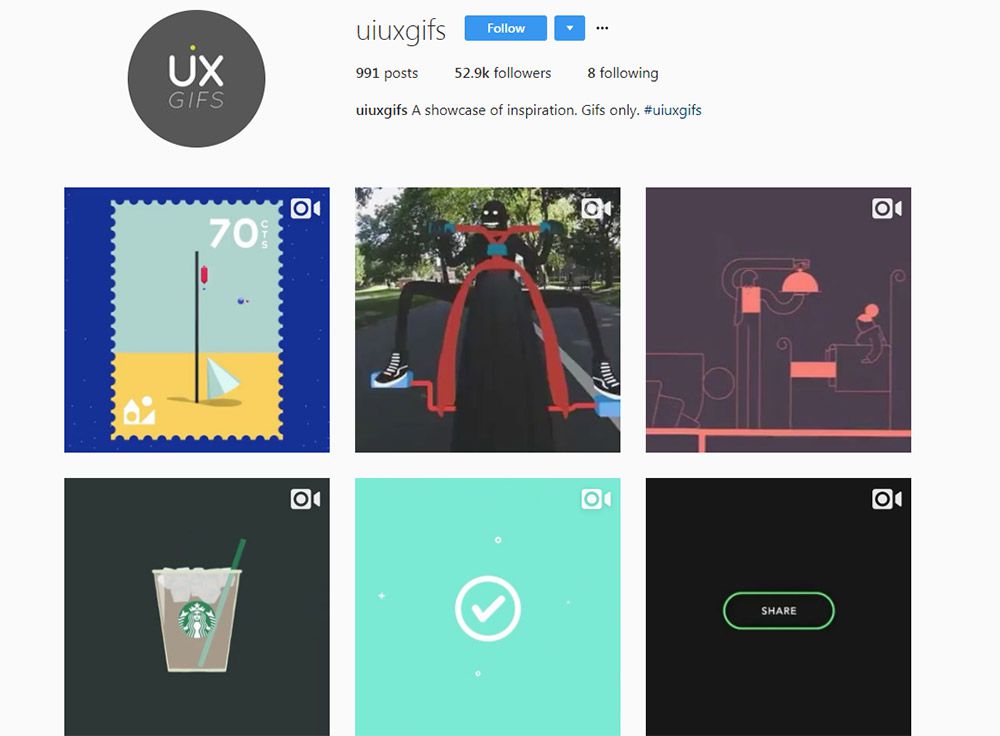
7. @uiuxgifs

uiuxgifs instagram

Here’s a premiere animation UX account that everyone should know about.

@uiuxgifs only publishes animated designs that feature logos, icons, or interfaces in motion. It’s a fairly large account with over 50,000 followers and they update constantly.

But the thing to note is that they publish a lot more than just interfaces. Many of their posts do center around logos and icons that animate separate from any interface, so this may not be as relevant to strict UX designers.

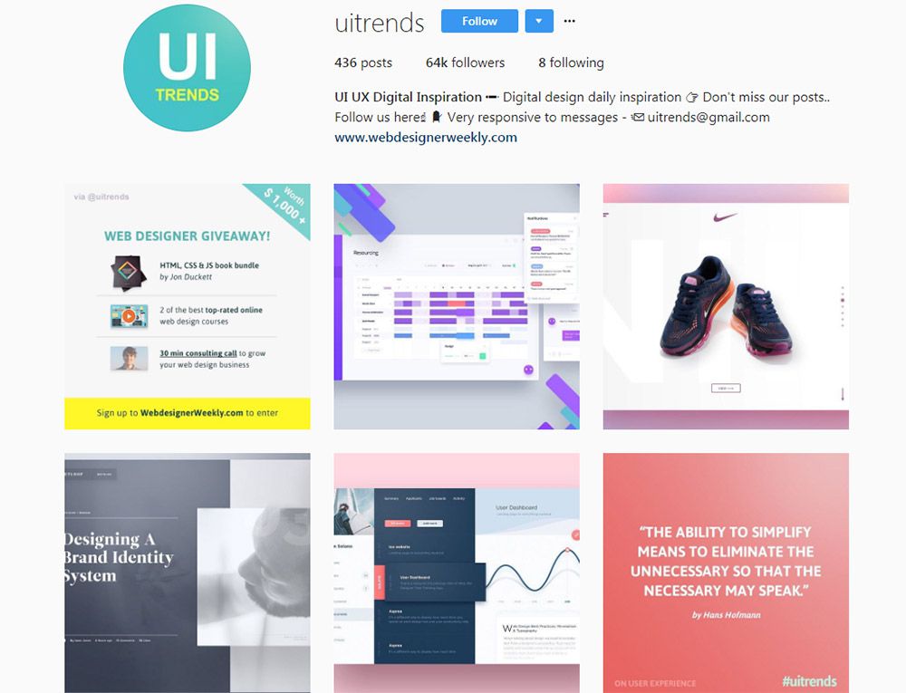
8. @uitrends

uitrends instagram

On the flip side here’s an account that only focuses on interfaces. The @uitrends Instagram is full of custom designs and even redesigns from popular websites.

Many of these are sourced from Dribbble so they all have that Dribbblification look to them.

But there are some gems mixed in, and you can find a lot of quality inspiration on this page. Plus they frequently update so it’s an excellent resource to browse for design ideas.

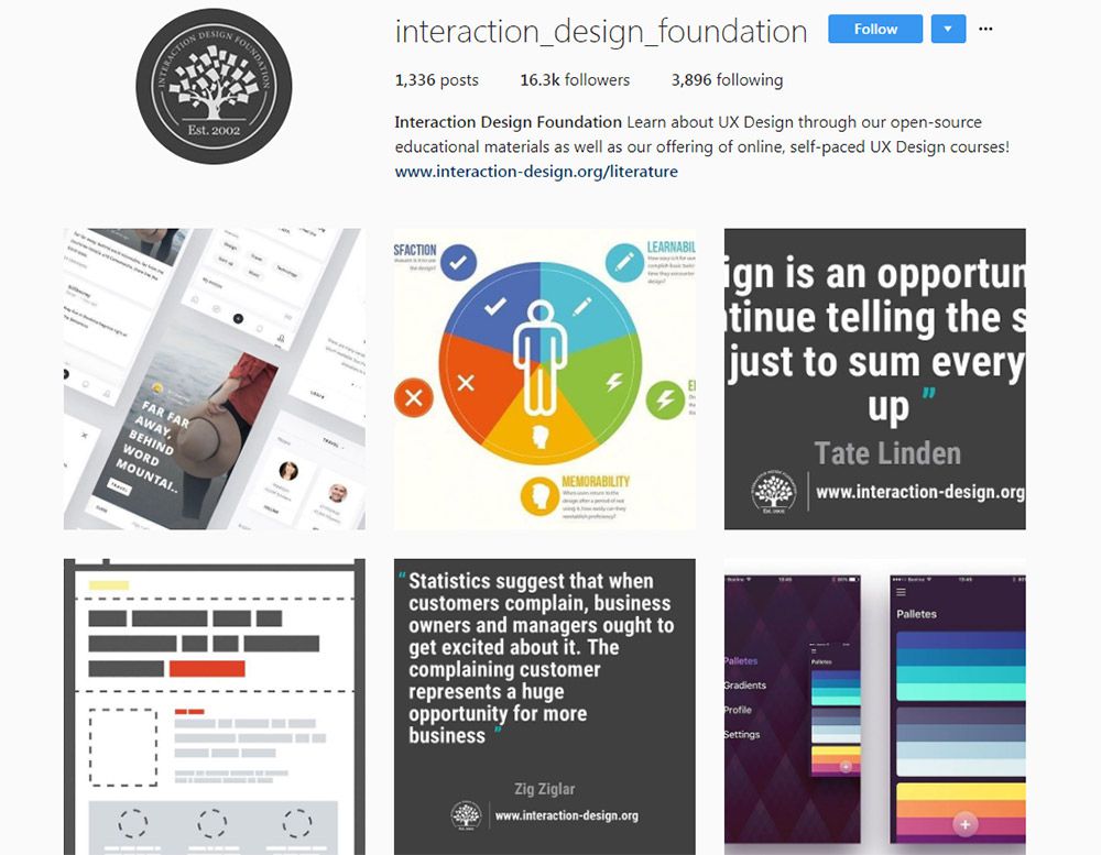
9. @interaction_design_foundation

interaction design Instagram

The Interaction Design Foundation offers lessons and courses in UX design along with free articles for beginners. It’s a massive resource with a ton of great learning materials on the topic of user experience.

So naturally they have an Instagram account and it’s got a lot of posts in there.

As of this writing it totals over 1,330 posts and has just above 16,000 followers. This is one of the few Instagram accounts that mixes UX inspiration along with photos featuring tips, advice, infographics, statistics, and quotes from UX designers.

I definitely recommend this account for adding some variety to your feed.

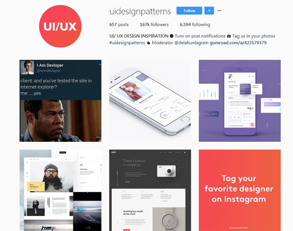
10. @Uidesignpatterns

uidesignpatterns instagram

@Uidesignpatterns is quite possibly the largest Instagram account on design work.

It totals a massive 167,000 followers with only about 600 posts. These posts come from designers from all over the world, and you can even tag your content on Instagram to have them feature your work.

Each post includes a mention to the designer so you can browse around and find people who may inspire your work. Plus this account is really made for designers, and you can tell by some of the humorous posts they do.

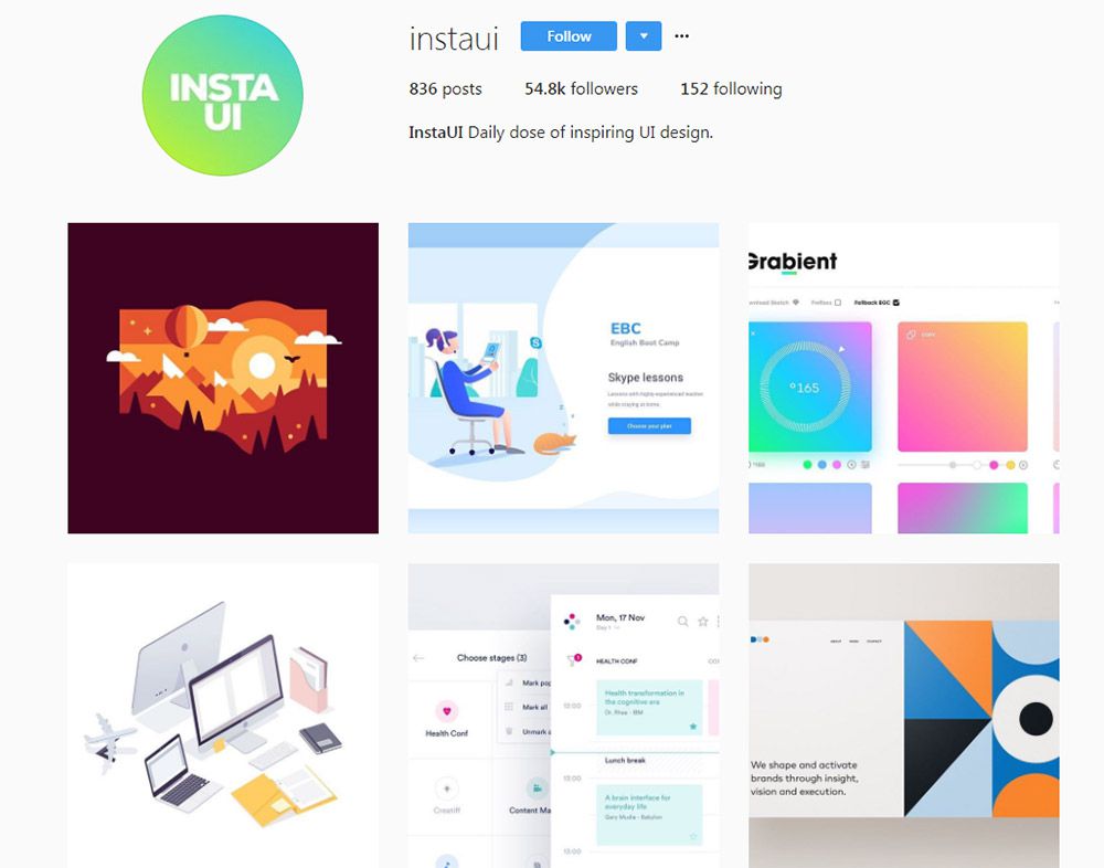
11. @instaui

instaui instagram

Last but certainly not least is @instaui. This one’s also pretty large with over 50k followers and new posts every day or so.

One thing to note is that despite their username they don’t always post UI designs. There are lots of digital illustrations, vector icons, logo designs, and general graphic design pieces.

But this is still a really cool Instagram account if you’re looking for general design ideas and want to follow active accounts that update on the regular.

And if you want to try finding even more accounts, check out the #uxdesign hashtag. If you dig deep enough, you’re bound to find more profiles worth following.

10 Amazing Examples of CSS & JavaScript Animated Logos

Take a peek over this gallery of 10 incredible examples of custom logo animations for unknown entities and world-famous brands alike.

1. Flowers SVG

One of the hottest animation trends on the web is SVG animation. It’s a growing topic of interest and this flower logo animation is a great example of SVG in action.

The icon & text of the logo has been created inside an <svg> tag in the HTML markup. Then sequential animations are controlled through CSS and automated on pageload. This requires a number of SVG-specific CSS properties like stroke-dashoffset which pushes outline motions in sequence to create this brilliant animated effect.

2. Carbon LDP

The Carbon LDP logo is fairly detailed and complex. But developer David McFeders took this to another level with his animated Carbon logo built on CSS/Compass.

Every piece of this code is easy to customize from the logo size to the animation speed. It’s built in pure CSS and made to loop endlessly. And even though the letters are made of a single PNG image you can always reverse-engineer that design with your own custom fonts.

3. Binary Lab

Binary Lab’s animated logo is one of the more complex animation effects in this list. It pulls numbers from a flask and fades them in & out of view above the logo.

The animation itself is controlled through CSS. But this pen also relies on the TweenMax library for adding repeating digits and custom alpha transitions. All-in-all a very creative use of CSS and JavaScript for modern web animation.

4. Pure CSS3 Stack Overflow

The Stack Overflow logo is one of my favorites because it’s simple, yet recognizable. And this snippet animates the Stack logo icon using nothing but pure CSS3.

This is by far one of the most impressive pure CSS animations I’ve seen. The final output really does look like the official logo and the animation feels smooth in every major browser. Anyone who loves pure CSS/SCSS animation will adore this snippet.

5. Monster Energy Logos

Tim Pietrusky animated this series of Monster Energy logos using SVGs and well-spaced CSS transitions. His code is free to study and replicate on your own if you want a similar fading effect on logos.

All of the animation timing is controlled directly through Sass which makes this a pure CSS animation. But you can alter variables to change the speed, fade colors, or pretty much anything else.

6. Subvisual

The team at Subvisual has a highly unique logo which was animated by Miguel Palhas. It works on two factors: the logo text and the “S” icon.

Everything is built on SVG elements which makes manipulation a bit easier. This pen also relies on the TweenLite library for JavaScript, although the vast majority of the animation is done via CSS. It’s a neat effect that can be repeated or triggered based on user action (hover, click, etc).

7. Pixel Logo Animation

Using the free pixel font Jura allows any developer to create a custom pixel-by-pixel animation effect. And that’s exactly what CodePen user Khaosmuhaha did in this pen.

It uses plain text manipulated through an HTML canvas element. The animations are powered by CSS3 animation properties, but they’re controlled through jQuery which makes the sequential pixel animation possible.

Definitely a cool effect and a fun use of the canvas element combined with a webfont.

8. Alex Aloia Logo

If you’re looking for a real complex logo animation then check out this example created by developer Alex Aloia. Using his name as the brand he created a complex series of SVG shapes which animate using a “drawing” effect.

The entire effect isn’t possible with only CSS. It requires a number of JS transformation libraries like DrawSVG and the more popular D3.js. But it’s a fun way to use open source libraries to create this one-of-a-kind animation.

9. Bayleys

The Bayleys logo is an obscure choice for animation. But it does have strong solid edges which makes re-creating the logo easy as pie.

That’s where Rafael Contreras comes in with his animation snippet using just 38 lines of code. The logo itself is built using SVG tags and the animation manipulates these tags accordingly. Many logo elements move in different directions making this effect mesmerizing to watch.

10. Nintendo Switch

The newest gaming console from the minds of Nintendo comes with a brilliant logo animation. This can be seen in all of their commercials and in this pen created by Koto Furumiya.

Koto re-built the Nintendo Switch logo using SVGs while animating the entire thing with CSS. And would you believe this animation only requires ~50 lines of CSS?

One thing I have to praise about this logo animation is the authenticity. It genuinely matches with Nintendo’s animation from the forceful push down and the rebound/bounce back up.

Wrapping Up

All of these examples are free and open source to study, clone, and manipulate for your own projects. I hope you like these demos and if you’re looking for more examples of CSS animation, take a look at this collection to see what other people have made.

9 Best Free CSS Flexbox Tutorials

Every modern website needs to be mobile friendly. You can accomplish this by using responsive techniques, one of which is the CSS flexbox feature.

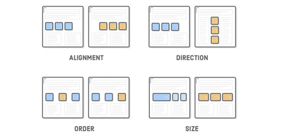
Flexbox lets you define layout elements as flexible boxes that can adjust based on the container. So you can decide how much room a certain element should take up, where it should move when the container is resized and how to arrange that content accordingly.

If you’ve never used the flexbox property before it can be really confusing. This list is here to help you come to terms with all the major flexbox methods. From there, you’ll be able to implement this powerful layout feature into your own projects.

Your Designer Toolbox
Unlimited Downloads: 500,000+ Web Templates, Icon Sets, Themes & Design Assets


Flexbox Froggy

flexbox froggy game

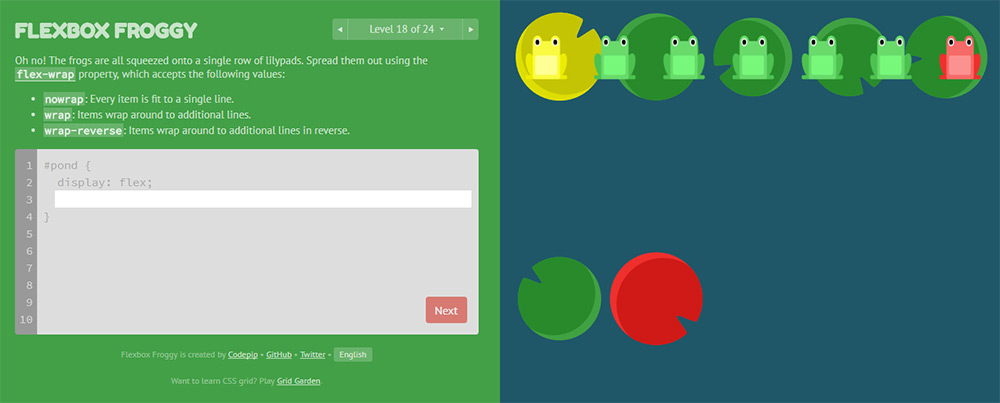
I’d argue that this is the best tutorial for complete beginners who want to get their hands dirty. Flexbox Froggy is a free open source coding game where you learn the ways of the flexbox…froggy.

You progress through various levels – with the first few being super easy. They introduce the absolute basics of flexbox and teach you the fundamental properties. From there, you’ll move through 30+ levels that get increasingly more difficult and will push the limits of your knowledge.

This game is great even for experienced developers who want a recap of what flexbox can do. You can skip ahead to the later lessons if you need more challenging work, so it’s perfect for all developers.

What The Flexbox

what the flexbox

What The Flexbox?! may sound like a weird trivia game show but it’s actually a great way to learn. This is a free set of video courses built by developer Wes Bos.

He takes you through everything related to flexbox properties, including resizing containers and how to create fully-responsive interfaces from scratch. The videos require an email address to sign up, but the course is totally free.

The best part is that these videos teach practical examples you can follow along with to learn the ropes. I still think one of the best ways to learn is to build real projects and this course does just that.

CSS-Tricks Guide

css tricks flexbox

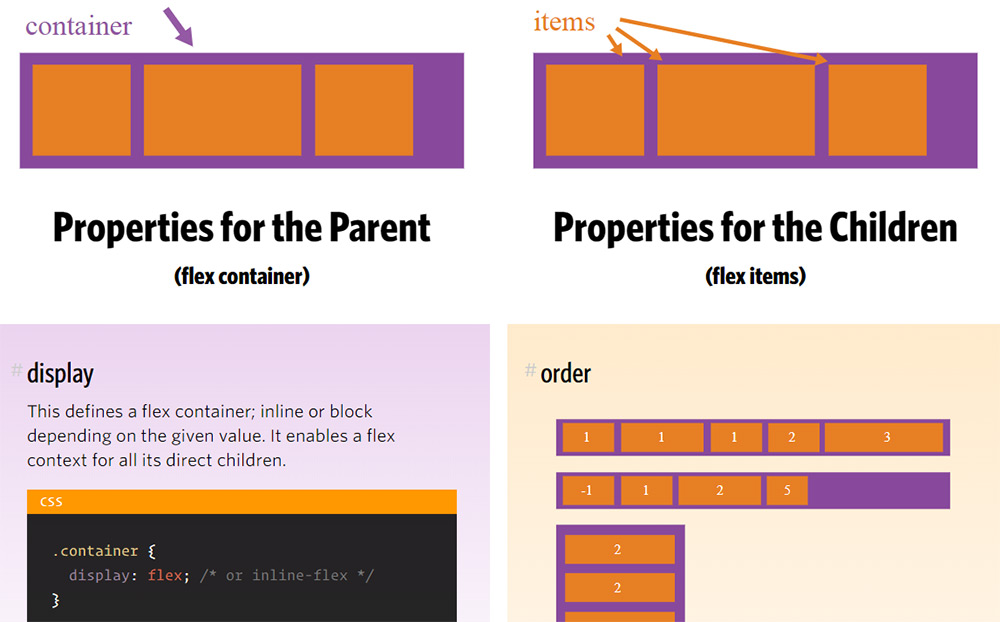
If you prefer a written tutorial, then have a look at this CSS-Tricks guide. It covers pretty much everything you’d need to know, starting from the absolute basics of flexbox.

You’ll find plenty of visuals along the way explaining flexbox terminology, layouts and content organization. It’s not the best guide in the world, but it’s probably the best for beginners who just want to read and learn.

It’s much easier to consume than most of the W3 specification documentation and acts as a nice starting point.

Flexbox Intro Tut

flexbox intro tuts

I’m also really keen on this tutorial, written for the website Interneting Is Hard. It’s a site dedicated to online web development tutorials, with the goal of helping everyone understand coding.

Each chapter has beautiful diagrams explaining the syntax and terms you run into when studying HTML and CSS. And I have to say their flexbox stuff is fantastic.

The guide is absolutely massive, with over 12 chapters organized onto a single page. The tutorial uses a table of contents, which is quickly becoming the norm for lengthy articles. The sheer length may put you off at first – but it’s really worth a read.

Visual Guide To CSS3 Flexbox

flexbox visual tut

Graphics and visuals always explain things a little better than words. That’s why this guide by Scotch.io is one of the better introductory tutorials for studying flexbox.

Note this does use a lot of code snippets to explain the concepts, so it’s not just a visual guide. But there’s also plenty of graphics and diagrams to go around.

If you want a clear-cut technical guide to flexbox, then you’ll really like the Scotch guide. It does lean heavier towards developers, so it really helps if you’re already familiar with CSS syntax.

Flexbox CSS In 20 Minutes

flexbox 20mins video

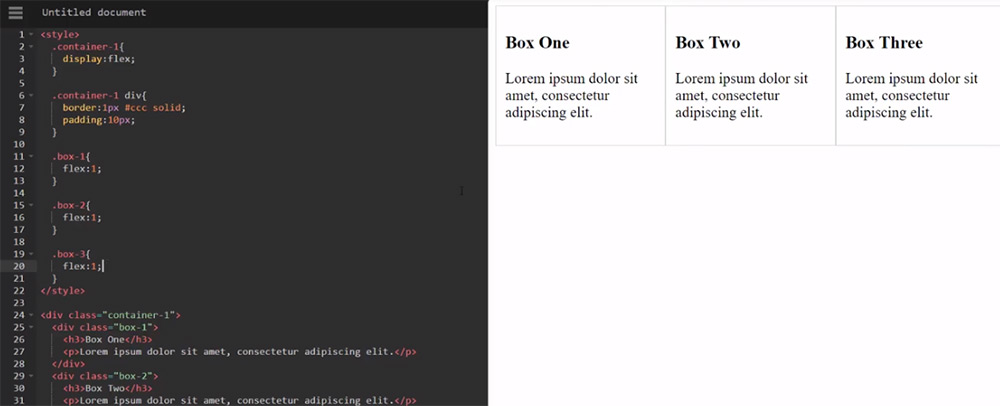
I know that many people learn better through watching videos and there’s a lot you can find on YouTube. Granted, the Wes Bos video series above is also a great choice. But if you want something quick, have a peek at this video by Traversy Media.

It does a beautiful job of explaining the flexbox syntax in just 20 minutes. You’ll walk away with a much stronger understanding of why the flexible box model can so easily replace floats and why developers are so gung-ho about this new setup.

Building A Simple Layout With Flexbox

flexbox basic vid

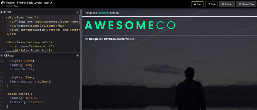
To get into a more practical video example, you might like this video tutorial recorded by developer Kevin Powell.

It’s a rather short video, totaling just about 11 minutes. But it’s also more straightforward and to-the-point when it comes to explaining the flexible box model.

If you want a video you can easily follow along with, then this is worth watching. You won’t learn everything about flexbox, but you’ll learn enough to use it for custom web layouts.

Rebuilding Dribbble Using FlexBox

flexbox dribbble tutorial

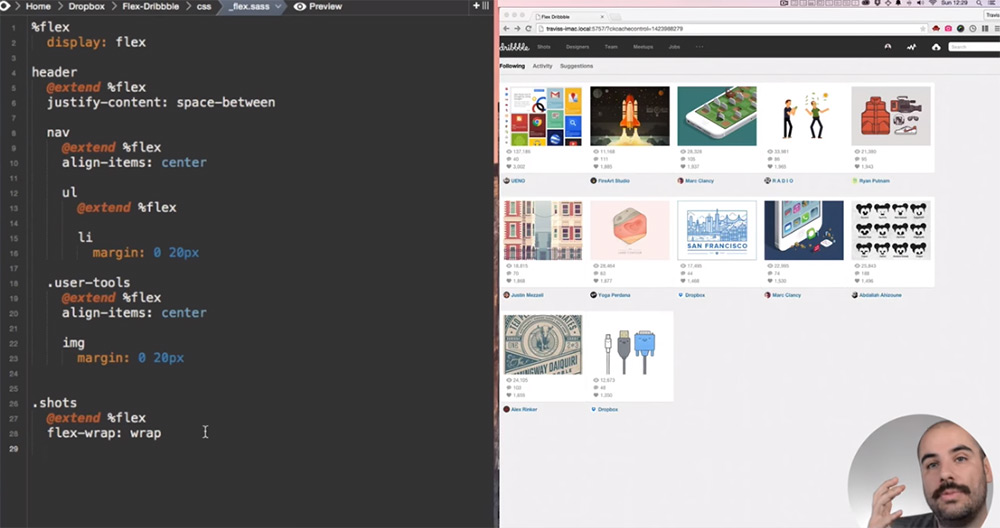
This is perhaps one of my favorite video tutorials because it goes so in-depth with teaching you how to create a whole project from scratch.

YouTube channel DevTips created this Dribbble coding tutorial, which shows you how to rebuild the entire Dribbble layout using CSS flexbox. This is the exact type of tutorial I recommend for beginners who want to really dive in and learn how this works.

Memorizing CSS properties is great and will help. But with this kind of tutorial, you’re learning practical techniques on how to code layouts from scratch. And that’s the kind of experience you can bring into every future project.

Flat Responsive Flexbox Site

flat responsive flexbox layout

My last pick is lengthy tutorial which also covers flexbox quite well. In this video, you’ll find over an hour of guided instruction on building a custom website from scratch with flexbox.

You’ll learn how to code a grid and how to design the entire page to be mobile friendly.

However, this is much more detailed than other video tutorials. Therefore, I really recommend watching this video later on – once you understand the basics. It will cover a lot of the fundamentals of CSS flexbox properties but it also moves pretty quickly.

Either way, this list has plenty to keep you busy and will get you started on the right track with flexbox layouts.

Top 12 Web-Based Color Tools for Web Designers

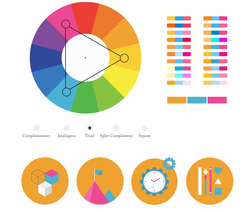
Picking the perfect color scheme shouldn’t be a miserable task. All you need are the right tools for the job and an eye for design.

I can’t help develop your eye for picking colors, but I can share a bunch of handy color tools that’ll likely improve your eye as you use them.

These tools are all 100% free, so they’re easy to bookmark and reuse time & time again. They can also work for web, mobile, print, or any other medium that needs incredible colors.

1. ColorHexa

colorhexa webapp

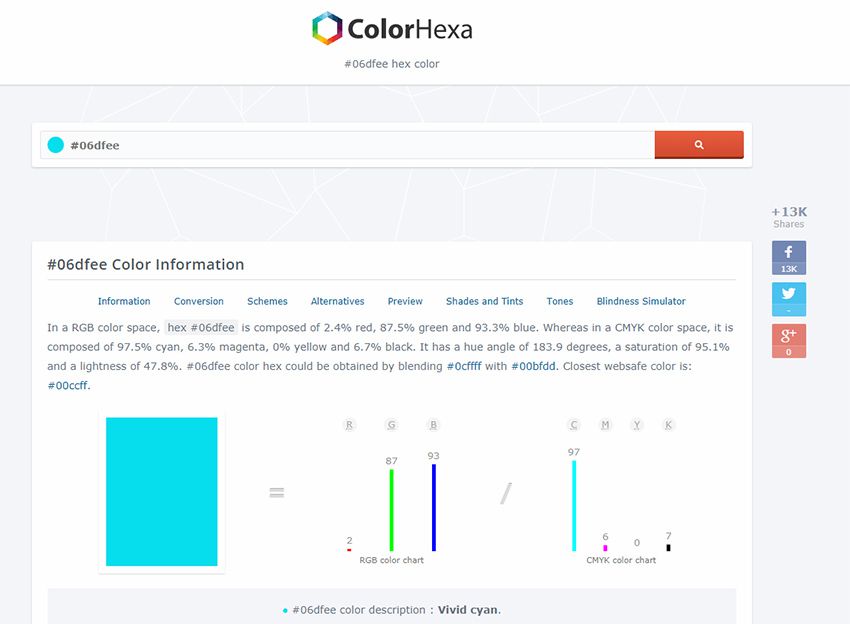
Recently I was browsing the web and stumbled onto ColorHexa. It’s by far one of the coolest color tools I’ve ever seen.

This isn’t technically a color generator or a scheme design tool. Instead, it’s an information library on all colors with suggested gradient ideas, related shades, and dozens of color codes(ex: hex, RGB, CMYK, CIE-LAB, HSL and more).

You’ll never find a more complete list of information on color. This is super useful for all designers, including web designers, and it’s a great place to start researching colors for your projects.

2. Colors.css

colors.css

If you do some research into color psychology you’ll learn how different colors stack together & what sort of mood they give. This plays into contrast for certain types of colors and how they work together.

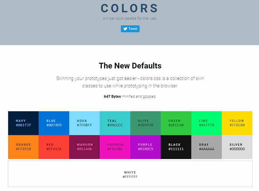
Every browser comes with default colors that are often too harsh. Colors.css fixes that.

It’s a free CSS library that restyles the default color palette. This means you can use color names like “blue” and “red” with totally different values.

They even have an entire accessibility page full of ideas for matching color schemes that’ll improve readability on your site.

3. ColorPick Eyedropper Extension

colorpick chrome addon

How often do you find a site with a beautiful color scheme? I find amazing sites all the time and it’s difficult to export those colors from the stylesheet.

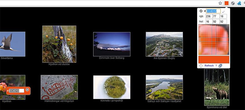
You can use Chrome DevTools but this requires digging around in the code to pick out the hex colors. Instead you can use the ColorPick Eyedropper extension made exclusively for Google Chrome.

You just click the toggle window in the extensions panel, then hover any color you want to study. This gives you the full hex code along with a “copy” link to copy the exact color to your clipboard.

Pretty cool right? And it’s a free plugin, so there’s nothing to lose by trying it out.

4. Coolors

coolors webapp

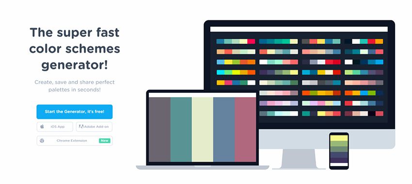
The Coolors site is a large color scheme generator. You can find dozens of generators on the web, but this one’s a little different since it supports Adobe programs with its own add-on.

You can also get this as a Chrome extension or even as a custom iOS app for your phone.

Really the true value is in the browser webapp that auto-generates color schemes on the fly. You can then mix & match colors, change settings, adjust for color blindness, and randomize your own schemes based on certain criteria.

It’s a great application, but it comes with a small learning curve. Shouldn’t take you more than 15-20 minutes to figure out how it all works.

5. Palettte App

color palettte app

Palettte is color editing and remapping tool. It allows you to build color schemes that flow from one to another and fine-tune individual color swatches. You can also import, analyze, and editing existing color schemes. The creator has written more on the motivations behind this color app.

6. Material UI Colors

material ui colors

With a quick Google search you’ll find a bunch of sweet material design tools on the web. They seem never-ending and many of them rely on the color styles typically found in Android apps.

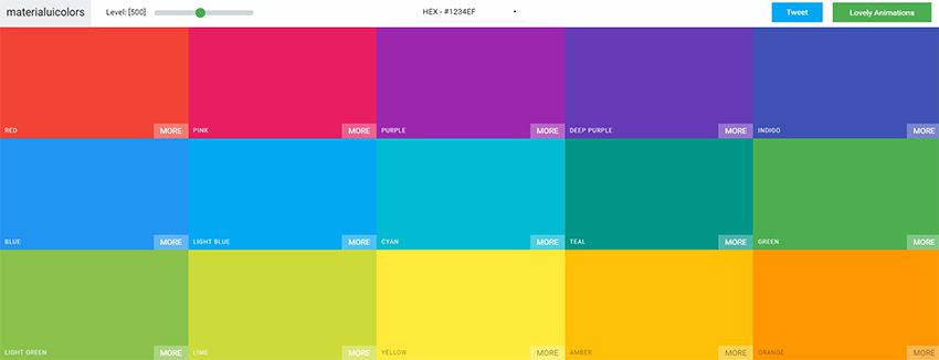
With the Material UI Colors webapp you can find perfect color schemes that match with Google’s material guidelines.

Easily change the tint of all colors with the slider in the top-left corner of the screen. Or randomize your selections to match an existing site’s color choices.

You can also switch between hex and RGB depending on whatever format you want. A great app for material design lovers.

7. Color Supply

color supply webapp

The Color Supply website is pretty unique but also very strange. It gives you a bunch of interesting color tools for matching color schemes, picking the foregrounds & backgrounds, plus different ways to compare how those colors would look on a page.

But this doesn’t have any guide or specific purpose. It acts like a color scheme generator that you have to just kind of learn as you go.

It will output different colors with hex codes near the bottom of the page to copy. Plus it’ll show you how those colors work in a gradient, in icons, and with text. Nice tool but it comes with an awkward learning curve.

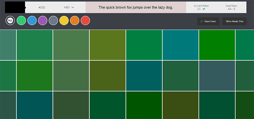
8. Color Safe

color safe wcag app

The WCAG works hard towards a more accessible web. Color is one of the easiest ways to build your accessibility without losing time testing.

Color Safe is a free webapp that can test your color choices. You pick from a small set of fonts & sizes, then pick whatever colors you want for your foreground & background.

From there you’ll get an accessibility rating along with suggestions on how to improve your color choices(if needed).

Really great tool for anyone concerned about accessibility on the web.

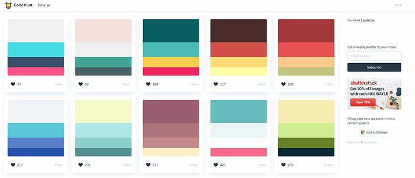
9. Color Hunt

color hunt webapp

For a user-curated gallery of color schemes take a look at Color Hunt.

This free project was launched a couple of years back and continues to be a source of design inspiration. People submit their own color schemes into the site, then others vote on those color schemes.

You can sort by newest or by most popular and even vote on your favorites. Pretty cool right?

It’s an extremely simple web app so don’t expect too many features. It’s just a neat way to visually browse through many different color patterns at once.

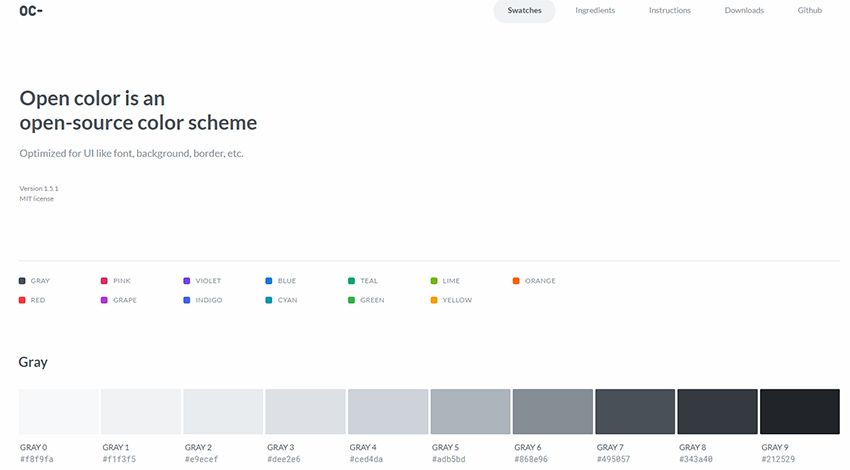
10. Open Color

open colors webapp

Looking for something a little more web-friendly? Then check out the Open Color library.

This is a massive open source collection of color choices built around accessibility and browser support. Each color has been optimized for easy matching regardless of your layout’s design.

Check out the GitHub repo for more info and to download a copy of the styles.

11. HTML Color Codes

html color codes generator

HTML Color Codes is another info-focused color webapp.

This lets you pull all forms of HTML/CSS code for your color choices right from the app. You can search for any color you want, or go by their recommendations. Plus this even has a tool for generating color palettes that you can download as Adobe Swatch files.

Don’t let the name fool you: this app is for more than just HTML color.

It’s a brilliant tool for digital designers of all types who want easy access to color codes and reusable palettes.

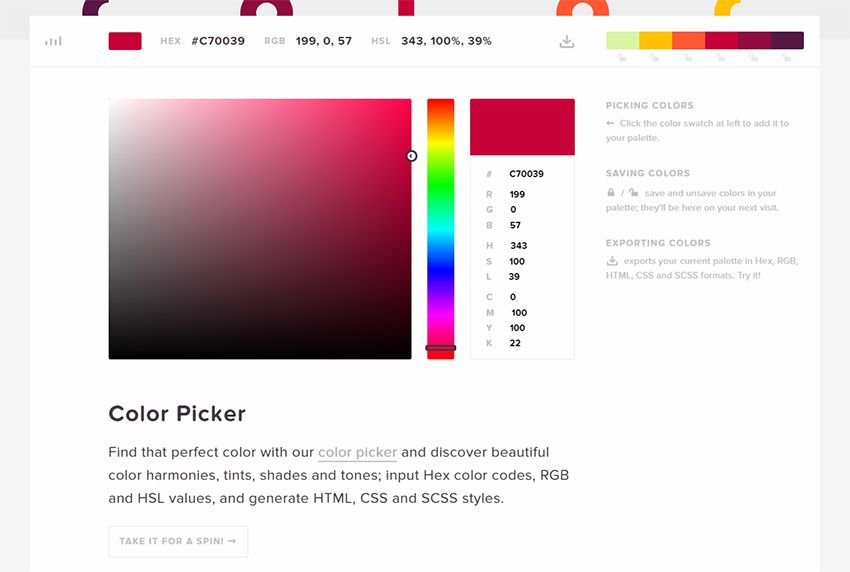
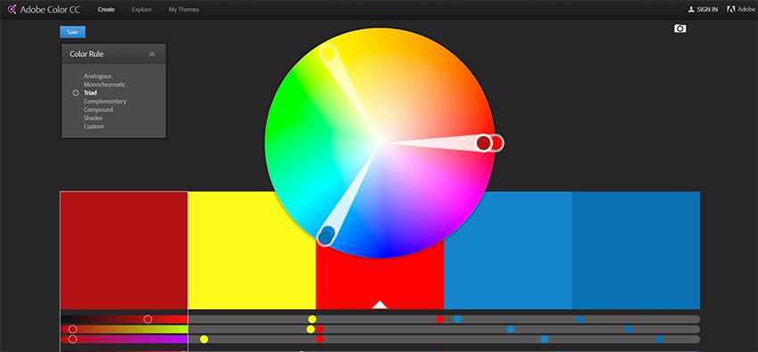
12. Adobe Color CC

adobe color cc webapp

I can’t pass over the incredible Adobe Color CC webapp.

This free tool used to be called Adobe Kuler but it’s gone through a few iterations over the years. It’s still a free color picker but the interface has changed to make it easier for designers to build & save color schemes.

If you’re an Adobe user this tool is worth bookmarking. It supports up to 5 different colors in one scheme, and you can even upload images to pull dynamic color schemes automatically.

9 Free Open Source Flipping Clocks Using CSS and JavaScript

The classic flip-style clock was a staple for years and it’s just one more thing the digital era made obsolete – although not quite forgotten.

We can find a bunch of cool clock designs in PSD form, but it’s more difficult to find working flip-style clocks in code. So I went on a mission to find some awesome examples online.

This gallery features 9 totally free flipping clock designs with a variety of styles and coding techniques.

Whether you want to build something like this for practice or add a working clock onto your page, these snippets are sure to help.

Flip Clock & Countdown

See the Pen Flip Clock & Countdown by Shaw (@shshaw) on CodePen.

So here’s a really interesting project that features a flipping countdown running in pure JS.

There is a bit of CSS for styling but the entire animation setup and the structure all runs on JavaScript. Even the HTML gets embedded through JavaScript.

But there’s also a lot to learn from this pen if you study the code carefully. You’ll find some great snippets to reuse and this makes a nice base for experimenting in JavaScript.

React Flip Clock

See the Pen React Flip Clock by Libor Gabrhel (@Libor_G) on CodePen.

Frontend developers love React for its power and massive community.

With it, you can build lighting-fast web applications and this clock design is just one example.

Developer Libor Gabrhel created this as a small project for testing React. It works so smoothly and the design is exquisite.

Note that while the JS is a bit complex, I also think this would make a great learning project for someone who’s just starting to learn React.

FlipDown.js Example

See the Pen FlipDown.js Example by Peter Butcher (@PButcher) on CodePen.

Developer Peter Butcher created this neat experiment using a simple custom plugin called FlipDown.js.

This runs on vanilla JavaScript – so it has no dependencies. It’s also a really easy plugin to edit, tinker with and expand with your own features.

I can’t say that this flipping animation is perfect because I did spot a few laggy jumps.

But for a really simple plugin I’m definitely impressed.

Pomodoro Timer

See the Pen Pomodoro Timer by Yoong Ti Lee (@yoongtilee) on CodePen.

There aren’t enough adjectives in the world to describe the awesomeness of this timer app.

It’s built around the Pomodoro Technique and it runs natively right in your web browser. You basically set the timer and click “start”. From there, a flipping clock animation counts down until your first break.

You can even alter the total break time and the total work session time.

Plus, the UI design is phenomenal and it’s cleverly designed to across the board.

Countdown Clock

See the Pen Countdown Clock by nir (@nirlodsn) on CodePen.

So maybe you don’t like basic JavaScript for your projects. Maybe you’re more of a jQuery person who prefers working with plugins. No problem.

Have a look at this jQuery script featuring a very basic countdown clock. I noticed the animation styles are incredibly smooth and easy on the eyes regardless of web browser.

Each flipping effect almost looks like a native 3D transform because the items that flip really feel like they’re moving. It takes some effort to get that just right.

If you want a clean, smooth clock effect for your homepage or landing page then definitely keep this snippet in mind.

Flipping Clock

See the Pen Flipping Clock by Harsha Bhat (@harshabhat86) on CodePen.

Okay, so this example doesn’t exactly fit the mold of a “flipping” clock.

But I do think that this pen looks awesome and it captures the spirit of a flipping clock animation.

Developer Harsha Bhat created this effect using Haml, Sass and some clean vanilla JavaScript.

It’s funny how all the free web frameworks in the world still can’t touch plain JavaScript.

I liken this effect to a minimalist design technique that can work with clean, simple websites. Try it out if you’re working on a project that would mesh nicely with this style.

Pure CSS

See the Pen 3D Flip Clock Counter in Pure CSS (Rebound) by Jerry Low (@jerrylow) on CodePen.

Moving away from JavaScript, you might be looking for a pure CSS3 alternative. In that case be sure to save this pen since it’s the best one I could find.

CSS3 has a long way to go in the animation department and I don’t think it’ll ever catch up to JavaScript.

But you can produce some really nice effects with pure CSS code if you know what you’re doing.

I really like this snippet as a starting point for a flipping clock. The animation doesn’t feel as 3D as you’d expect, but it does give the same illusion of natural motion – which is crucial for this kind of feature.

Lighter Design

See the Pen Flip Clock by Ed Hicks (@blucube) on CodePen.

Most of the flipping clock designs you’ll find online feature black squares with lighter text. But this design is different.

Developer Ed Hicks created this lighter flipping clock as an alternate design running on CSS and JS code. It’s actually a fairly complex project, but the JS is simplified since it runs on top of jQuery.

Anyone looking to add a lighter styled clock on their site will surely enjoy digging around in this code snippet.

Clock in Vue.js

See the Pen Flip clock & countdown, Vue by Shaw (@shshaw) on CodePen.

One thing I like about this Vue-powered clock is that all the digits are combined into single squares.

On most clocks you’ll find that the seconds and minutes all have their own blocks for each digit.

This clock looks a whole lot smoother in my opinion. Not to mention that it’s a great practice piece to study if you’re just starting to learn Vue.js.

You’ll notice that this list has a ton of variety in coding styles and many don’t even use frameworks. If you’d like to see more of what’s out there, you can find many other examples if you spend some time digging around CodePen.

10 Free Wireframe Kits To Speed Up Your Design Workflow

The wireframing process is crucial to every new UI project. Before you get into the colors and typography you have to consider the user experience first. And this all starts with great wireframing.

Many designers prefer working on paper, but wireframing kits let you work digitally too. I’ve curated the best wireframing UI kits on the web that you can download for free and reuse for all mobile and web interface projects.

Jolly UI

jolly ui

The Jolly UI kit offers both a free and premium resource for designers. It’s the best hand-drawn wireframing kit you’ll find with an extensive collection of navigation menus, sliders, buttons, and common page elements.

If you just need something basic to get you started then grab the free version. It comes in both PSD and AI formats and all the elements are full vectors.

Basic Wireframe Kit

dark wireframe kit

Wireframing should be a very simple process. Black and white works best and that’s why this Basic Wireframe Kit is a great choice for Sketch users.

All the elements are rigidly designed, and they blend nicely into any type and style of website. It’s also one of the simpler UI kits for Sketch, so it’s a must-have resource for anyone moving away from Adobe software.

Teracy

teracy uikit

For a more complete collection of Sketch elements take a look at the Teracy Wireframe Kit.

This completely free Sketch asset offers dozens of common UI elements including dropdowns, input fields, breadcrumbs, and slideshow widgets. Teracy focuses more on website elements, but it also has plenty of mobile app elements too.

Blue Wireframes

blue ui wireframes

Some designers look at wireframes as blueprints for the entire project. That’s why this blue wireframing kit is a great choice both for aesthetics and practicality.

It’s another Sketch UI kit, and it’s free to use for all projects. The unique design of each element brings some pizzazz into your wireframing. And since all of the elements are vectors you can resize them with no quality loss.

Savvy Sketch iOS Wireframe Kit

savvy wireframing kit

Mobile apps need to be wireframed just like websites and the Savvy Sketch iOS Kit is perfect for iPhone app designers.

This UI kit is frequently updated with new features, with the latest release focusing on iOS 10. It’s completely free to use, and this UI kit is accurate which makes it easy to convert wireframes into full applications.

Basiliq

basiliq wireframe kit

Wireframing is popularly done on paper but it can be easier when done digitally. That’s why UI kits like Basiliq bring the best of both worlds.

You get a fully digital UI kit for Photoshop where all the elements look like sketched-out items on paper.

This kit works best with website mockups so if you’re building a website in Photoshop consider grabbing a copy of this kit before getting into the details.

Responsive Wireframes

wireframing design lofi

What I like most about these wireframe elements is their simplicity. True low-fidelity wireframes show you how the UI should look & behave without giving any specifics.

The PSD file is available for free on Dropbox. It’s a fun wireframing kit for any project and it relies on very simple shapes for common page elements.

BeTheme Free UI Kit

betheme ui kit

BeTheme is a full-scale premium WordPress theme created by a team called MuffinGroup. But they released a free wireframing kit called BeTheme UI which is just as valuable to designers.

This is a high-fidelity kit that uses blue throughout. Still an excellent choice because of the sheer volume of items you get in the pack.

The Ultimate Wireframe UI Kit

ultimate wireframing kit

MediaLoot offers a bunch of premium items but they do have one freebie called The Ultimate Wireframe UI Kit.

Technically there is a premium license which has a no attribution clause for commercial use. However, most designers can get by using the free pack since it contains the same elements.

And based on the massive file size of this PSD, I think it deserves to be called the “ultimate” wireframing kit.

App Mockup UI

app mockup ui kit

Another freebie resource from a premium site is this app wireframing kit from Pixeden. Each screen comes in the size of a typical iPhone where you can rearrange the page elements at will.

Each item is a vector shape, super easy to resize and restyle.

If you’re designing for the iPhone or any iOS device, there’s no better resource to start with—especially if you like starting with low-fidelity wireframes.

Bootflat UI Kit

bootflat ui it

Named after the famous Bootstrap framework is this free Bootflat UI kit. It comes in one large PSD file and offers dozens of common website elements you can reuse over and over again.

Bootflat is colorful, well-designed, and intricate with many dynamic elements like dropdowns and pricing tables. This works well in both wireframing and final mockup designs. You might even pair this with another PSD wireframing kit to use this as the final high-fidelity mockup later in the design process.

But whether you’re a Photoshop lover, Illustrator user, or Sketch enthusiast, there’s a wireframing kit here for everyone.

10 Free Video Tutorials For Learning Sketch.app

YouTube is the best place to teach yourself anything in the modern era. Techie subjects are covered in greater detail because most tech-savvy people also know how to record videos and get them online.

One of the newer design programs, Sketch, has been giving Photoshop a run for its money. This is an OSX-only program, but it’s made specifically for web and mobile designers.

It can feel a little strange coming from an Adobe background, but with the right tutorials anyone can learn it, and in this guide, I’ve curated the best Sketch tutorials to get you started with the basics and beyond.

Your Designer Toolbox
Unlimited Downloads: 500,000+ Web Templates, Icon Sets, Themes & Design Assets


iOS Calendar in Sketch 3

ios calendar tutorial

Mobile iOS apps are simple to design because they come with screen restrictions and clear guidelines for the designer. That’s why this iOS video tutorial is a great place to start learning Sketch.

Over the course of a half hour you’ll learn the fundamentals of icon design, vector creation, color selection, and keyboard shortcuts. The narration is easy to follow, and you can do all of this on your own with just a copy of the program.

If you’re hoping to learn more about icon design or mobile app design, then this video is for you.

Intro to Sketch for Web Design

intro web design sketch video

Alternatively you might be looking to use Sketch for website design. In that case you’ll love this brief intro from London designer Charli Marie.

If you’re a complete beginner then picking up Sketch can be a hassle, but this is particularly the case for websites where you need to consider responsive layouts, grid systems, and more intricate nuances like textures/patterns on the page.

Granted this video will not make you a complete Sketch master or an expert web designer. But it’ll offer a very clear introduction to the program so you can get up and running fast.

Simple Menu UI/UX

uiux sliding menu sketch

Diving into the more detailed side of design is this Sketch 3 tut covering how to make a sliding nav menu.

This video follows a very simple process of designing a slide out menu on top of an existing interface. Most mobile designers need to do something like this since the sliding menu is the most common choice for responsive menus.

And you can follow this tutorial with the newer version covering another method of designing a vertical slide-out menu.

Nike Store UI Redesign

nike store ui redesign

Another way to practice design is by re-creating interfaces. For example this tutorial teaches you how to redesign a Nike product page in Sketch 3.

It spans about half an hour with guides on working with vectors, basic page shapes, color schemes, textures, and pretty much everything else you’d need to learn.

This video will not make you an expert, but it’s definitely a fun way to get started in this design software.

Dropbox UI/UX Redesign

dropbox ux sketch video

Here’s another cool example from the same YouTuber teaching you how to redesign Dropbox in Sketch. It’s just about the same length of time, and the process feels similar, but there’s also a very unique methodology in this video.

You’ll learn more about matching the colors/textures/icons with Dropbox’s branding and how to design around the company’s image. So you’re not just learning how to use Sketch, but also how to design with specific goals and criteria.

Definitely a unique tutorial for web designers and the final result is fantastic.

Minimalist Website in Sketch 3

minimalist freebie sketch

If you’re looking for a simpler introduction, you might try this tutorial created by Hacksaw Academy. It’s one of the newest videos in this list, and it teaches you how to create a minimalist website mockup from scratch.

In total the video spans 15 minutes which isn’t too long for a design tutorial.

But the final result is also very simple, so beginners won’t feel too overwhelmed. This makes for an excellent starting point to pick up Sketch, but I recommend going beyond this tutorial if you really want to master the program.

Design a Landing Page

landing page video series

Designer Adam Rasheed went above & beyond with his landing page video tutorial covering all the major aspects of Sketch.

This tutorial breaks up into five parts with the very first video totaling over 90 minutes long. Talk about detailed!

You’ll learn about the proper workflow used to create a web page mockup and how you can follow this in future projects. Plus Adam gets into detail on how to create certain page elements like navigation menus, signup forms, and thumbnail galleries.

Basic iOS App Mockup

simple ios mockup sketch

The entire SketchCasts YouTube channel is full of great advice for beginners and experts alike. Sketch has a lot of features, and this channel covers all of them in practical lessons.

I specifically recommend starting with their iOS app mockup tutorial which feels more like a wireframe than a mockup. But you’ll learn all the fundamentals of designing a page by setting dimensions, grids, and proper alignments.

All the techniques you’ll learn in this video apply to professional design work no matter what type of interface you’re creating.

Button System with Nested Symbols

buttons nested symbols

If you wannt to get a little more technical then check out this tutorial on nested symbols in Sketch. This is a unique property of the software and you could learn it through other guides online.

But this 30-minute tutorial shows you visually how to create a Sketch library of buttons using nested symbols in your work. It’s an incredibly practical approach to nested symbols, and you’ll take a lot away from the experience.

However this is not really made for absolute beginners. You should at least have some comfort tinkering in Sketch before diving into this video.

Flexbox for Sketch App

sketch flexbox video tutorial

Modern web designers need to follow responsive techniques. This holds true for frontend development and basic mockup design/wireframing.

In Sketch this process is super easy and this tutorial shows you how it’s all done. This video guide uses the auto-layout plugin made solely for Sketch as a responsive design tool. If you’re a web designer moving into Sketch then this video is a must-watch.

But you can also read through the written article if you prefer that instead.

Fast Prototyping with Sketch, Invision and Craft

invision craft sketch tutorial

Before tackling a full mockup you may want to prototype your website or application. This is like a visual plan for how all your pages fit together and how users traverse the interface.

With this video tutorial you’ll learn how to setup Sketch and how to connect it with two other programs: InVision’s backend along with the free Craft plugin.

An excellent guide for skilled designers who want to work more with prototyping in their day-to-day.

These are my top picks for free Sketch video tutorials but there are many more released each year. If you want to continue the search, try browsing YouTube to see what else you can find.

10 Fantastic Examples of Progressive Webapps

The concept of a progressive webapp (PWA) is simple. Developers create websites that behave like native applications for all environments. These work like hybrid site-app combos where you have “webapps” that can run natively on a mobile device and just as well on a desktop web browser.

If you’re looking for some examples of PWAs then this collection is sure to please.

Your Web Designer Toolbox
Unlimited Downloads: 500,000+ Web Templates, Icon Sets, Themes & Design Assets


English Accents Map

english accents map

The English Accents Map site is one of the strangest yet most interesting progressive webapps I’ve found. It features pin markers for different accents in regions across the UK and the US.

Each marker links to a set of videos from YouTube. These videos have been created by people with that local accent, so you can listen and study how certain areas of the world speak English.

Really cool PWA and definitely one of the coolest concepts I’ve seen for a website.

React HN

react hn webapp

The React.js craze isn’t slowing down anytime soon and it’s certainly a staple for building any progressive webapp.

One example is the React HN site that pulls data from Hacker News and loads it all into a neat React.js webapp.

This is designed just like the HN homepage but it can operate like a native app on mobile devices. It doesn’t support account logins but you can do pretty much everything else, and it’s got a real snappy interface to boot.

Currency-X

currencyx converter

Looking for a free currency exchange rate app for your iPhone? Currency-X has you covered.

This free PWA works around a handful of currencies and runs with live data from APIs. This way the currency conversion rates are accurate and you can test them against pretty much every country from Kenya to Vietnam.

I do think the UX is lacking a bit and could be improved for mobile. But on the whole, this is one of the more impressive apps considering how much data it pulls.

Pokedex.org

pokedex org webapp

All you Pokemon fans are gonna love Pokedex.org for its simplicity and ease of use.

This webapp behaves like a literal Pokedex where you can search for monsters and get all their stats quickly. Data comes from the Pokeapi along with Wiki pages to ensure total accuracy.

And while this doesn’t distinguish between the different games it’s still an impressive webapp for the amazing price of free. Perfect for Pokemon players who want quick access to quick data.

GitHub Explorer

github explorer pwa

Web developers love GitHub for its massive curation of free resources. The site has become a go-to resource for code snippets and now with GitHub Explorer you can dig into those code samples yourself.

The site is still a work in progress but it lets you browse through two methods: users and repos.

You can search by username or by repo name and pull up data fast. This includes the full readme file, all directories, and recent updates. However the search feature doesn’t include every repo so it’s more like a demo app showcasing what PWAs can offer.

Flipkart

flipkart ecommerce

Believe it or not there are entire eCommerce shops that support PWA features. Flipkart is the only one I know of but their website is absolutely massive.

This India-based eCommerce site offers complete support as a native mobile application. You can search, browse products, and use your account to purchase items all with a native feel.

I’d argue this is the most complex PWA on the web and it deserves an award as one of the best UX’s I’ve seen all year.

Expense Manager

expense manager pwa

If you want to track some quick expenses on your phone then the Expense Manager app is a nice place to start.

This thing behaves more like a simple calculator but it can save data for the long term. The demo account clears data after one hour but you can try the Vaadin framework yourself if you want a longterm solution.

The Expense Manager is mostly used to help sell this framework and bring attention to the company. And for that I’d say it gets the job done with plenty of “wow” factor to go around.

Offline Wikipedia

offline wikipedia

Here’s another cool demo app that I think should actually be built into the core of Wikipedia.

Offline Wikipedia is a PWA site created by Jake Archibald. It’s fully compliant with all the ideas of progressive webapps so it works on smartphones, tablets, laptops and desktops alike.

The interface is also pretty snappy so it’s easy searching and finding Wiki articles. Probably one of the few PWAs that I think really could add value to the main site.

Splittypie

splittypie expenses

Never worry about splitting the bill again with Splittypie.

This app is fantastic and for the price of free you can’t beat it. You just visit the site in your browser and you create new “events” for tracking prices.

Whether you’re splitting a meal or the price of a ball game this app works for any device at the click (or tap) of a button.

Also the source code is freely available on GitHub if you want to use this as a base for your own PWA.

FT App

financial times pwa

The massive publishing giant Financial Times surprisingly has their own PWA and it works really well.

Their app runs just like a news site except it’s fully responsive to touch. This means it behaves exactly like a native application where you don’t see new pages load, they just slide into view.

I’d like to think the future of publishing is full of websites like this. We’re already seeing this with Google AMP but that’s only a small step towards full PWAs.

Get Kana!

get kana training webapp

Last but certainly not least is the Get Kana app. What’s cool is this site actually has a full application in the Android and iOS app stores.

But this progressive webapp is the next best thing for anyone who wants to try it out in their browser. It’s a Japanese learning app where you can learn the syllabaries for katakana & hiragana through flash cards.

Not something that everyone will find useful but absolutely one of the cleanest PWAs I’ve used. And best of all their code is freely available on GitHub if you want to dig into that too.

10 Simple CSS Snippets for Creating Beautiful Blockquotes

Why reinvent the wheel designing elements that already have free designs online? Blockquotes remain a staple of text-heavy websites and they come in so many distinct styles.

I’ve curated my top picks for the best free blockquotes you can find. Every one of these designs uses pure CSS code so they’re easy to replicate.

Circular Quote

Perhaps the most unique and stylish quote of this entire post is this literature circular quote.

It rests on a bright orange background so this may not be practical for your typical layout. But with some minor color adjustments it would look nice on a white background regardless of the layout.

The most spectacular part is that every element is created with pure CSS including the rounded circle pattern. It’s a truly pragmatic blockquote that also pushes the boundaries of CSS.

BQ Patterns

For tamer examples check out these blockquote patterns created by developer Derek Wheelden.

This again relies purely on CSS3 with different classes for each blockquote. The last of the 3 has the footer element to cite the quote source. It’s an optional feature that some people like, certainly not necessary for a simple website though.

It goes to show how much you can achieve with unique fonts and some minor CSS tweaks.

Notepaper

It might be hard to believe but this notepaper blockquote is created entirely with CSS3 code. No background images, no vectors, just CSS gradients and transforms.

I can’t say how many people would find this design useful. It’s a fantastic notecard that really does replicate the style of paper. But regardless of how it can be used, this design is beyond incredible and it proves how far CSS has come.

The HTML is fully semantic with modern blockquotes and this should work in all modern browsers. A magical use of web technology if I’ve ever seen it.

Classy Blockquotes

Sometimes it makes sense to include a photo of the person being quoted. This may sound tough but you can clone these blockquotes by Andrew Wright to get this effect on your site.

Andrew’s pen uses placeholders for images so they do look a little… basic. But there’s nothing to stop you from changing some colors, updating the fonts, and adding a photo to spice up your quotes.

A very simple design and pretty easy to restyle on your own.

Simple Block

This is by far my favorite blockquote because it really can work on any website. Developer Harm Putman uses the cite attribute from the blockquote to populate a citation at the bottom.

I really like the dividing bars that clearly separate the blockquote from the rest of the content. This includes a small quotation mark icon fixed in the middle to let the user know this is a clearly a quote.

Sleek, elegant, and simple. Three traits that work well in any website.

Greyed Block

For a darker approach check out this greyed blockquote that can double as a pullquote if resized.

It has a pretty clean design using Font Awesome blockquotes and lively text. I think it’d look a lot better with a stronger font but it’s certainly legible with anything you use.

I consider this as a solid “base” for building on top of and styling your own blockquote from there.

Automatic Quotes

This design by Luke Watts is more of a pullquote than a blockquote. The quoted text pulls to the side of the body text, but it still draws attention with bright colors and quotation marks.

It’s called an automatic quote because it adds the quote marks into the design via CSS. So you can just wrap your text in the proper tag and it’ll automatically style it with quotations. Pretty sweet!

However as a blockquote this would be fairly basic. I think this works best as a pull quote and does its job well.

Raised Blockquote

You can do a lot with CSS box shadows to create depth and clarity. This raised blockquote by Lukas Dietrich is pretty simple and real easy to clone.

It has one background color and a pretty clear box shadow near the bottom. This also uses a custom Google font called Bitter for the upright quotation marks.

If you have a darker layout or if you’re willing to adjust the drop shadow a bit then this quote style can fit almost any web project.

Alternating Quotes

These alternating quotes by Tommy Hodgins prove that you don’t need much to create fantastic blockquotes.

By adding a small grey border to one side you separate the text from the rest of the page. It will clearly stand out against the page body which and makes browsing any page a whole lot easier.

Plus the alternating styles let you add these with any orientation you like.

Material Design Blockquote

Last but not least I found this cool material blockquote using similar colors and styles from Google’s material design rules.

The background icon is what really makes this stand out and feel like a true blockquote. I do think the font color is a tad light, but this can always be adjusted for use in your own website.

This is the coolest material-style blockquote you’ll find and it’s totally free.

All of these blockquote styles are fantastic but certainly not the only ones. You can find many more online with lots of variety to pick from. So if you’re looking to browse more check out the blockquote tag on CodePen to see what else is out there.