Visual Design Language: The Building Blocks Of Design

Visual Design Language: The Building Blocks Of Design

Visual Design Language: The Building Blocks Of Design

Gleb Kuznetsov
“Design is not just what it looks like and feels like. Design is how it works.”

— Steve Jobs

Like written words are to language, fonts, colors, shapes and icons are to visual design. An effective visual design language not only acts as a communication framework for all stakeholders on a product development team, but unites a brand and its customers to ensure that a company’s brand identity matches a customer’s brand perception.

We use language as a tool for communication with other people. Writers use words to communicate with their readers, while designers use visual language to communicate with their users. Fonts, colors, shapes, visual elements such as icons — those are elements of design language. Effective design language streamlines communication.

While working at Fantasy in 2016, my team was tasked with designing the interface for Huawei’s mobile OS (EMUI 5 interface). I personally was responsible for the visual design language for this OS. Surprisingly, the company didn’t have its own language at initiation; instead, they relied on a customized version of Android that was plagued by inconsistency and lacked a coherent vision. This was largely due to the existence of multiple teams and multiple functional roles with different skillsets and perspectives all grasping at straws to invent a way to communicate. UX designers, interaction designers, visual designers and graphic designers had all worked on the OS in the past, all using their own best efforts to communicate.

Without a uniform system of communication, not only was the user experience jumbled and confusing, it was extremely difficult to integrate changes into a final design. It was a true Tower of Babel.

Writers use words to communicate with their readers, while designers use visual language to communicate with their users.

What Does Design Language Provide?

By unifying the project teams under one shared language, a project can move forward with clarity, cohesion and speed.

Consistency

Digital design has few physical constraints compared to industrial disciplines. This gives designers a lot of power to experiment and propose a variety of solutions to any given challenge. However, this can easily lead to disjointed user experiences.

To achieve consistency in design, it’s vital to define reusable and cross-platform components and styling options. Consistent design makes it much easier to ship products on a multitude of platforms and devices, which is especially crucial for companies like Huawei.

Brand Recall

When they interact with a product that has a strong visual language, users tend to remember it better. Unfortunately, a majority of products available on the market have generic designs. It is too easy to confuse one product with another when they share the same visual styles.

Creating a strong visual identity is a goal that design teams should state when working on visual design. This is the personality of a digital product! The colors, typefaces, photos, illustrations, animations are all part of a brand, and they should be designed in a way that helps people remember the product. When an authentic design language is followed consistently, it creates recognizability for the brand.

Clarity

We put a strong focus on clarity — we wanted to make our GUI clean, not cluttered. By following a minimalist approach, we minimized the number of elements that users have on every screen and created a highly-focused experience.

Design concept of EMUI 5 interface
Minimalist design helps to focus user attention on important elements of your design. EMUI 5.0 Concept by Fantasy (Design concept of EMUI 5 interface) (Large preview)

A Way To Innovate

With so much competition in the phone market, companies invest significant resources to make people try their products. Companies invest in innovation and try to break new ground to attract users and peak their interest. Visual design is often the fastest and cheapest way for a product to innovate.

How Do We Create A Design Language?

For me and my teams, the process of creating a design language, we follow the same rubric we would create any complete consumer product: research-ideate-design-validate- implement. This is how we ensure that the language will work for our target audience.

Research

Often, the VDL is the most important, cornerstone product we create. And like every product you design, research should always be the first. When we started this Huawei project, it was important to understand the opportunities for our design. Jeshua Nanthakumar, a lead UX designer on this project, and his UX research team analyzed all mobile OS available on the market and identified the full range of challenges typically faced by users.

The UI Audit

As I’ve mentioned above, achieving consistency was one of the goals of creating a shared design language. It’s essential to standardize the visual design. That’s why even before starting work on a visual language, we decided to conduct a UI audit. Our goal was to understand the anatomy of the Android OS.

We broke down the whole mobile OS into atomic elements—colors, shapes, shadows, lines, transitions. By decomposing the design, our team was able to see how individual pieces work together and form a greater whole. At the end of UI audit, we had all the elements that make up the digital product (buttons, navigation bars, icons, etc.) grouped into distinct categories.

Understand How Users Perceive The Brand

When working on visual language, it’s essential to have a clear understanding of who you’re designing for and how they perceive your brand. Ideally, brand identity (the way the brand wants to be perceived by users) should match with the brand image (the way users actually perceive the brand). Designers have a direct impact on brand identity. Aesthetic styles, language & tone, iconography, and illustrations — all these are elements of brand identity.

Our goal was to create an innovative design language that feels customized for its audience. To understand how your users perceive the Huawei brand, our team invested in user research. We knew that design language should successfully meet the needs of both Eastern and Western design sensibilities, so we categorized large groups of users and created summaries based on the available information about our target groups. Every summary about our audience had the following information blocks — demographics, what they care about, and their expectations. Here is an example of the summary of the group of North American customers:

  • Huawei’s core audience lives both Urban and Suburban environments;
  • They are driven by business, social status, and personal organization;
  • Age range 30-64;
  • Average income: USD $75.000 per annum
  • They care about:
    • Being organized and ordered
    • Efficiency and productivity to enable them to enjoy their own time
  • Their expectations
    • Contributing to something bigger than themselves
    • Maximizing life and living for happiness

With the idea that design should match the audience’s lifestyle and be extremely refined, we evaluated every design decision in accordance with the needs of our target segments. This understanding will give you a reason for your visual direction.

Analyze Major Competitors

To identify strategic design opportunities, our team conducted the competitors’ analysis. We’ve identified four major competitors who had strong design languages and focussed on identifying their strengths and weaknesses. For example, when we evaluated Apple iOS, we’ve mentioned the following strengths of the language — scalable across devices, great focus on standardization, unique identity — and the following weakness — inconsistency with iconography, overuse of blur effects.

Icons of the four major Huawei competitors.
Four major competitors of Huawei at the time of our analysis. Every brand represented a large part of the market and had its own robust visual language. (Large preview)

This analysis helped us to identify four major directions that brands followed when they create products:

  1. Empathetic to me (design tailored for the needs of the target audience; design that demonstrates real empathy with the human and truly reflects the audience)
  2. Novel design (design that uses innovative visual styles and interaction patterns)
  3. Commonplace design (design that utilizes conservative style elements)
  4. Standardized for all (heavy standardized design)

We put every brand on the plot with those four directions.

Quadrant diagram of Huawei visual language
Identifying opportunities for Huawei visual language (Large preview)

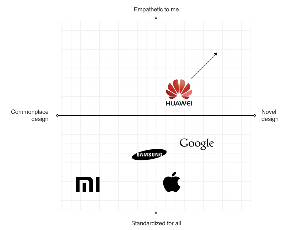
This process helped us to identify the opportunities for Huawei language:

  • Scalable Design Language
    The language should scale across devices and across third-party developer apps as well.
  • Unique Design DNA
    The language should be unique and distinct from the major competitors.
  • Be Bold Yet Timeless
    The language should be long-lasting.
Define Requirements For Visual Hierarchy

When UX researchers analyzed typical user complaints, they found that the location of key interactive elements was one of the most common problems that many mobile users mentioned. In 2016 mobile screens become larger and larger, but the location of key functional elements in Android remained the same — the top area of the screen. As a result, users had to stretch their fingers or change their grip in order to interact with the elements.

Diagram of reachable zones on mobile devices
Thumb Zone: how easy it is for our thumbs to tap areas on a phone’s screen. (Image credit: Luke W) (Large preview)

Today a bottom-area navigation is an industry-standard, but back in 2016, the situation was a bit different. We’ve reached the Huawei engineering team with this insight and asked about the technical feasibility of moving controls to the bottom area of the screen — this area is more comfortable for user interaction. The engineering team confirmed that it was possible to move the elements, and we helped define the new default location for functional elements.

Design concept of EMUI 5 interface
Functional controls are located at the bottom of the screen — in the easy-to-reach area. (Design concept of EMUI 5 interface by Fantasy) (Large preview)

Ideation: Defining A Design Vision

Creating A Philosophy Of Design

Imagine that you need to design a language that will be integrated into products that will be used by people all over the world. The natural language we use in interpersonal communications cannot be separated from a culture because it has a close relation to the attitude or behavior of speakers of the languages. The digital language is absolutely the same — it should look natural for customers in the Americas, Europe, Asia, Africa, and Oceania.

The success of any visual design highly relates to how people perceive it. Many factors are influencing human perception, and the significant part goes to psychology. To create a sophisticated design, you need to consider the meaning of shapes and the impact which they have on users’ minds.

Creating a philosophy of design is extremely challenging, and you cannot do it alone. That’s why I worked with Abigail Brody, a former Apple creative director who joined Huawei in September 2015 as Chief UX design and VP of Huawei Devices. At Apple, Abigail was responsible for iOS design. She was the one who described the methodology of visual language to me.

Together we spend a lot of time trying to find the direction for visual design, and we’ve decided to use the philosophy of organic design as a foundation for our design language. Organic design is centered around using nature as the biggest inspiration.

Frank Lloyd Wright chair
Organic Design was pioneered by Frank Lloyd Wright who believed in creating harmony between people and nature. (Image credit: museiitaliani) (Large preview)

According to this philosophy, design should help to achieve harmony between people and nature. When we worked on our visual language, we focused on incorporating natural forms (smooth curves and organic forms) in our visual design. As a result, all visual elements, such as buttons, icons, and shapes, had an organic design aesthetic.

Design concept of EMUI 5 interface
Round shapes are one of the things that make organic objects different from non-organic. (Large preview)
Using Motion Design To Create A Distinct Visual Identity

There is no doubt about the importance of the role that motion plays in mobile design. For many product motion serves a purely-functional role—it provides feedback for user action and connects different states of the mobile app together. The well-crafted motion also makes things more attractive, and as we know, attractive things work better (the aesthetic-usability effect says that people are more tolerant of minor usability issues when they find an interface visually appealing).

Our team put high stakes on the motion. Our ultimate goal was to use motion to breathe life into our products — make the interface feel alive and dynamic. We wrote a motion design manifesto with solid design principles. Every animated effect and transition that we wanted to introduce in our design was measured in accordance with the functional and emotional benefits it delivers to end-users.

We know that early impressions of a product design are especially important. And for that very reason our key focus was on creating magical moments — surprise and delight users while they interact with the OS.

This video demonstrates the visual effects we used in EMUI.

Design And Testing: Build, Test, Iterate

Baking Meaning Into Every Design Element/Design Decision

Just like we have rules for using words in sentences in a natural language, we should have rules for using visual elements in visual language. Strong semantics is what makes visual communication efficient.

When a team works on a visual language, it should take two rules into account:

  • There are no random visual elements in a visual language. Every element serves a purpose.
  • There should be no isolated units in visual language. Every unit in a visual language should be a part of a greater whole.
Design concept of EMUI 5 interface
The animated effect behind the user avatar is used to convey a sense of active call. The animation is both meaningful and pleasurable. (Design concept of EMUI 5 interface) (Large preview)
Experimentation And Design Review

It’s impossible to create a great design from the first attempt. Design is an iterative process, and whenever our team created a new visual solution, they evaluated it by comparing it with previous solutions. The comparison was visual—the screens were laid side by side on a board, so everyone could see the parts that require additional polishing. Team members gather together on informal design reviews where they discuss the pros and cons of individual solutions.

Team reviewing designs on computer screen
Design review in progress at Fantasy Interactive (Large preview)
Pattern Libraries, Style Guides And Design Principles

Pattern libraries (reusable building blocks such as UI bars), style guides, and design principles (principles that allow developers to propagate design language in their own apps) are essential elements of design language. They are the foundation of the design system — a shared resource that teams use when they create interfaces. The fact that we’ve conducted a UI audit during the research phase helped us to categorize the visual design elements. We’ve established a toolbox for everyone who worked on the project. So, when a new member joins a team, all they need is the toolbox, and they are set to maintain consistency.

There are no random visual elements in a visual language. Every element serves a purpose.

Test Early, Test Often

The Huawei EMUI project was an extremely important project for the Huawei Corporation. It was essential to ensure that the language we’ve defined work for the users. And the only way to get this understanding is to test our design as soon as possible.

We’ve followed a simple but effective technique — build, measure, learn. By following this approach, the design team didn’t postpone the testing design until the release. We’ve incorporated visual language into functional prototypes and tested them both inside our group (dogfooding) and outside (with real users). The feedback collected during the testing allowed us to understand what worked/doesn’t work for users.

Product team meeting at Fantasy Interactive
Sharing the results of testing with product teams at Fantasy Interactive (Large preview)

Implementation

If you have had a chance to use the Huawei EMUI 5 interface, you are probably thinking to yourself, “Um, that doesn’t look exactly like Gleb said!” And that’s true.

Huawei OS screenshot
Production version of the Huawei EMUI 5 interface. (Image credit: androidauthority) (Large preview)

It is a sad reality that almost no design team is responsible for the implementation of this solution. Unfortunately, a lot of solutions we proposed to the engineering team weren’t implemented properly, or at all. As a result, the design language we’ve created and the design language the end-user saw in Huawei products end up as two different animals. But this is purely my opinion. In 2018, Huawei surpassed Apple in smartphone sales. The UI was a critical element to user confidence.

Based on my experience, the challenge of implementation is common for large-scale corporations. When designers who created the language aren’t invited into the process of implementing this language into the product, the final results will always be compromised. What usually happens is the engineering team follows a path of least resistance — they adjust the design solutions to the technical constraints they face when they start.

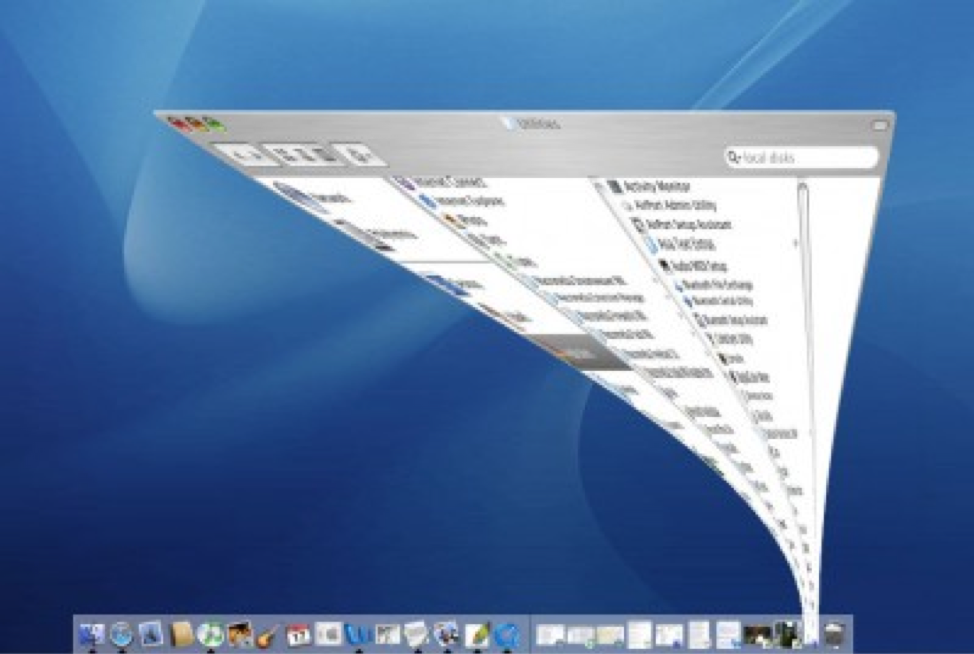
Every company needs a top-manager who cares about design and is ready to fight for it. It’s a well-known fact that when the original minimize animation in macOS that was proposed by the Apple motion design team, the engineering team said that it was impossible to implement that. At that time, Steve Jobs insisted that this animation is a must-have for MacOS. As a result, this animation became not only the most memorable transition for first-time users but also one of the things that contribute to good UX in MacOS.

A screenshot of Mac OS
The instantly memorable window animation of the Mac OS (Large preview)

A Robust Visual Design Language Is The Heart Of Good UX

Visual language can have a dramatic impact on user experience. It’s able not only to reduce friction by making UI more predictable but also to create delight. By pairing great form with excellent function, we will have an excellent user experience.

Visual language is a by-product of product design, and it requires a similar design process. It’s iterative and requires validation at every step along the way. When you build a visual language, you establish a new ecosystem for designers, and this ecosystem creates harmony between different teams involved in product development.

Smashing Editorial (cc, ra, il)

What I Learned From Designing AR Apps

What I Learned From Designing AR Apps

What I Learned From Designing AR Apps

Gleb Kuznetsov

The digital and technological landscape is constantly changing — new products and technologies are popping up every day. Designers have to keep track of what is trending and where creative opportunities are. A great designer has the vision to analyze new technology, identify its potential, and use it to design better products or services.

Among the various technologies that we have today, there’s one that gets a lot of attention: Augmented Reality. Companies like Apple and Google realize the potential of AR and invest significant amounts of resources into this technology. But when it comes to creating an AR experience, many designers find themselves in unfamiliar territory. Does AR require a different kind of UX and design process?

As for me, I’m a big fan of learning-by-doing, and I was lucky enough to work on the Airbus mobile app as well as the Rokid AR glasses OS product design. I’ve established a few practical rules that will help designers to get started creating compelling AR experiences. The rules work both for mobile augmented reality (MAR) and AR glasses experiences.

Rokid Glasses motion design exploration by Gleb Kuznetsov

Glossary

Let’s quickly define the key terms that we will use in the article:

  • Mobile Augmented Reality (MAR) is delivering augmented reality experienced on mobile devices (smartphones and tablets);
  • AR Glasses are a wearable smart display with a see-through viewing an augmented reality experience.

1. Get Buy-In From Stakeholders

Similar to any other project you work for, it is vital that you get support from stakeholders as early in the process as is possible. Despite being buzzed about for years, many stakeholders have never used AR products. As a result, they can question the technology just because they don’t understand the value it delivers. Our objective is to get an agreement from them.

“Why do we want to use AR? What problem does it solve?” are questions that stakeholders ask when they evaluate the design. It’s vital to connect your design decisions to the goals and objectives of the business. Before reaching stakeholders, you need to evaluate your product for AR potential. Here are three areas where AR can bring a lot of value:

  • Business Goals
    Understand the business goals you're trying to solve for using AR. Stakeholders always appreciate connecting design solutions to the goals of the business. A lot of time business will respond to quantifiable numbers. Thus, be ready to provide an explanation off how your design is intended to help the company make more money or save more money.
  • Helpfulness For Users
    AR will provide a better user experience and make the user journey a lot easier. Stakeholders appreciate technologies that improve the main use of the app. Think about the specific value that AR brings to users.
  • Creativity
    AR is excellent when it comes to creating a more memorable experience and improving the design language of a product. Businesses often have a specific image they are trying to portrait, and product design has to reflect this.

Only when you have a clear answer to the question “Why is this better with AR?”, you will need to share your thoughts with stakeholders. Invest your time in preparing a presentation. Seeing is believing, and you’ll have better chances of buy-in from management when you show a demo for them. The demo should make it clear what are you proposing.

2. Discovery And Ideation

Explore And Use Solutions From Other Fields

No matter what product you design, you have to spend enough time researching the subject. When it comes to designing for AR, look for innovations and successful examples with similar solutions from other industries. For example, when my team was designing audio output for AR glasses, we learned a lot from headphones and speakers on mobile phones.

Design User Journey Using “As A User I Want” Technique

One of the fundamental things you should remember when designing AR experiences is that AR exists outside of the phone or glasses. AR technology is just a medium that people use to receive information. The tasks that users want to accomplish using this technology are what is really important.

“How to define a key feature set and be sure it will be valuable for our users?” is a crucial question you need to answer before designing your product. Since the core idea of user-centered design is to keep the user in the center, your design must be based on the understanding of users, their goals and contexts of use. In other words, we need to embrace the user journey.

When I work on a new project, I use a simple technique “As a [type of user], I want [goal] because [reason].” I put myself in the user's shoes and think about what will be valuable for them. This technique is handy during brainstorming sessions. Used together with storyboarding, it allows you to explore various scenarios of interaction.

In the article “Designing Tomorrow Today: the Airbus iflyA380 App,” I’ve described in detail the process that my team followed when we created the app. The critical element of the design process was getting into the passenger’s mind, looking for insights into what the best user experience would be before, during and after their flight.

To understand what travelers like and dislike about the travel experience, we held a lot of brainstorming sessions together with Airbus. Those sessions revealed a lot of valuable insights. For example, we found that visiting the cabin (from home) before flying on the A380 was one of the common things users want to do. The app uses augmented reality so people can explore the cabin and virtually visit the upper deck, the cockpit, the lounges — wherever they want to go — even before boarding the plane.

IFLY A380 iOS app design by Gleb Kuznetsov
IFLY A380 iOS app design by Gleb Kuznetsov. (Large preview)

App also accompanies passengers from the beginning to the end of their journey — basically, everything a traveler wants to do with the trip is wrapped up in a single app. Finding your seat is one of the features we implemented. This feature uses AR to show your seat in a plane. As a frequent traveler, I love that feature; you don’t need to search for the place at the time when you enter the cabin, you can do it beforehand — from the comfort of your couch. Users can access this feature right from the boarding pass — by tapping on ‘glass’ icon.

IFLY A380 app users can access the AR feature by tapping on the ‘glass’ icon
IFLY A380 app users can access the AR feature by tapping on the ‘glass’ icon. (Large preview)

Narrow Down Use Cases

It might be tempting to use AR to solve a few different problems for users. But in many cases, it’s better to resist this temptation. Why? Because by adding too many features in your product, you make it not only more complex but also more expensive. This rule is even more critical for AR experience that generally requires more effort. It’s always better to start with simple but well-designed AR experience rather than multiple complex but loose designed AR experiences.

Here are two simple rules to follow:

  • Prioritize the problems and focus on the critical ones.
  • Use storyboarding to understand exactly how users will interact with your app.
  • Remember to be realistic. Being realistic means that you need to strike a balance between creativity and technical capabilities.

Use Prototypes To Assess Ideas

When we design traditional apps, we often use static sketches to assess ideas. But this approach won’t work for AR apps.

Understanding whether a particular idea is good or bad cannot be captured from a static sketch; quite often the ideas that look great on paper don’t work in a real-life context.

Thus, we need to interact with a prototype to get this understanding. That’s why it’s essential to get to prototyping state as soon as possible.

It’s important to mention that when I say ‘prototyping state’ I don’t mean a state when you create a polished high-fidelity prototype of your product that looks and work as a real product. What I mean is using a technique of rapid prototyping and building a prototype that helps you experience the interaction. You need to make prototypes really fast — remember that the goal of rapid prototyping is in evaluating your ideas, not in demonstrating your skills as a visual designer.

3. Design

Similar to any other product you design, when you work on AR product, your ultimate goal is to create intuitive, engaging, and clean interface. But it can be challenging since the interface in AR apps accounts both for input and output.

Physical Environment

AR is inherently an environmental medium. That’s why the first step in designing AR experience is defining where the user will be using your app. It’s vital to select the environment up front. And when I say ‘environment’, I mean a physical environment where the user will experience the app — it could be indoors or outdoors.

Here are three crucial moments that you should consider:

  1. How much space users need to experience AR? Users should have a clear understanding of the amount of space they’ll need for your app. Help users understand the ideal conditions for using the app before they start the experience.
  2. Anticipate that people will use your app in environments that aren’t optimal for AR. Most physical environments can have limitations. For example, your app is AR table tennis game but your users might not have a large horizontal surface. In this case, you might want to use a virtual table generated based on your device orientation.
  3. Light estimation is essential. Your app should analyze the environment automatically and provide contextual guidance if the environment is not good enough. If the environment is too dark or too bright for your app, tell the user that they should find a better place to use your app. ARCore and ARKit have a built-in system for light estimation.

When my team designed Airbus i380 mobile AR experience, we took the available physical space into account. Also, we’ve considered the other aspects of interaction, such as the speed at which the user should make decisions. For instance, the user who wants to find her seat during the boarding won’t have too much time.

We sketched the environment (in our case, it was a plane inside and outside) and put AR objects in our sketch. By making our ideas tangible, we got an understanding of how the user will want to interact with our app and how our app will adapt to the constraints of the environment.

AR Realism And AR Objects Aesthetics

After you define the environment and required properties, you will need to design AR objects. One of the goals behind creating AR experience is to blend virtual with real. The objects you design should fit into the environment — people should believe that AR objects are real. That’s why it’s important to render digital content in context with the highest levels of realism.

Here are a few rules to follow:

  • Focus on the level of details and design 3D assets with lifelike textures. I recommend using multi-layer texture model such as PBR (Physically Based Rendering model). Most AR development tools support it, and this is the most cost-effective solution to achieve an advanced degree of detail for your AR objects.
  • Get the lighting right. Lighting is a very crucial factor for creating realism — the wrong light instantly breaks the immersion. Use dynamic lighting, reflect environmental lighting conditions on virtual objects, cast object shadows, and reflections on real-world surfaces to create more realistic objects. Also, your app should react to real-world changing of lighting.
  • Minimize the size of textures. Mobile devices are generally less powerful than desktops. Thus, to let your scene load faster, don’t make textures too large. Strive to use 2k resolution at most.
  • Add visual noise to AR textures. Flat-colored surfaces will look fake to the user's eye. Textures will appear more lifelike when you introduce rips, pattern disruptions, and other forms of visual noise.
  • Prevent flickering. Update the scene 60 times per second to prevent flickering of AR objects.

Design For Safety And Comfort

AR usually accompanied by the word ‘immersive.’ Creating immersive experience is a great goal, but AR immersion can be dangerous — people can be so immersed in smartphones/glasses, so they forget what is happening around them, and this can cause problems. Users might not notice hazards around them and bump into objects. This phenomenon is known as cognitive tunneling. And it caused a lot of physical traumas.

  • Avoid users from doing anything uncomfortable — for example, physically demanding actions or rapid/expansive motion.
  • Keep the user safe. Avoid situations when users have to walk backward.
  • Avoid long play AR sessions. Users can get fatigued using AR for extended periods. Design stop points and in-app notifications that they should take a break. For instance, if you design an AR game, let users pause or save their progress.

Placement For Virtual Objects

There are two ways of placing virtual objects — on the screen or in the world. Depending on the needs of your project and device capabilities, you can follow either the first or second approach. Generally, virtual elements should be placed in world space if they suppose to act like real objects (e.g., a virtual statue in AR space), and should be placed as an on-screen overlay if they intended to be UI controls or information messages (e.g., notification).

Rokid Glasses
Rokid Glasses. (Large preview)

‘Should every object in AR space be 3D?’ is a common question among designers who work on AR experiences. The answer is no. Not everything in the AR space should be 3D. In fact, in some cases like in-app notifications, it's preferable to use flat 2D objects because they will be less visually distracting.

Rokid Glasses motion design exploration by Gleb Kuznetsov
Rokid Glasses motion design exploration by Gleb Kuznetsov. (Large preview)

Avoid Using Haptic Feedback

Phone vibrations are frequently used to send feedback in mobile apps. But using the same approach in AR can cause a lot of problems — haptic feedback introduces extra noise and makes the experience less enjoyable (especially for AR Glasses users). In most cases, it’s better to use sound effect for feedback.

Make A Clear Transition Into AR

Both for MAR and AR glass experiences, you should let users know they’re about to transition into AR. Design a transition state. For the ifly380 app, we used an animated transition — a simple animated effect that user sees when taps on the AR mode icon.

Trim all the fat.

Devote as much of the screen as possible to viewing the physical world and your app's virtual objects:

  • Reduce the total number of interactable elements on the screen available for the user at one moment of time.
  • Avoid placing visible UI controls and text messages in your viewport unless they are necessary for the interaction. A visually clean UI lends itself seamlessly to the immersive experience you’re building.
  • Prevent distractions. Limit the number of times when objects appear on the user screen out of the blue. Anything that appears out of the blue instantly kills realism and make the user focus on the object.

AR Object Manipulation And Delineating Boundaries Between The ‘Augment’ And The ‘Reality’

When it comes to designing a mechanism of interaction with virtual objects, favor direct manipulation for virtual objects — the user should be able to touch an object on the screen and interact with it using standard, familiar gestures, rather than interact with separate visible UI controls.

Also, users should have a clear understanding of what elements they can interact with and what elements are static. Make it easy for users to spot interactive objects and then interact with them by providing visual signifiers for interactive objects. Use glowing outlines or other visual highlights to let users know what’s interactive.

Scan object effect for outdoor MAR by Gleb Kuznetsov
Scan object effect for outdoor MAR by Gleb Kuznetsov. (Large preview)

When the user interacts with an object, you need to communicate that the object is selected visually. Design a selection state — use either highlight the entire object or space underneath it to give the user a clear indication that it’s selected.

Last but not least, follows the rules of physics for objects. Just like real objects, AR objects should react to the real-world environment.

Design For Freedom Of Camera

AR invites movement and motion from the user. One of the significant challenges when designing or AR is giving users the ability to control the camera. When you give users the ability to control the view, they will swing device around in an attempt to find the points of interest. And not all apps are designed to help the user to control the viewfinder.

Google identifies four different ways that a user can move in AR space:

  1. Seated, with hands fixed.
  2. Seated, with hands moving.
  3. Standing still, with hands fixed.
  4. Moving around in a real-world space.

The first three ways are common for mobile AR while the last one is common for AR glasses.

In some cases, MAR users want to rotate the device for ease of use. Don’t interrupt the camera with rotation animation.

Consider Accessibility When Designing AR

As with any other product we design, our goal is to make augmented reality technology accessible for people. Here are a few general recommendations on how to address real-world accessibility issues:

  • Blind users. Visual information is not accessible to blind users. To make AR accessible for blind users, you might want to use audio or haptic feedback to deliver navigation instructions and other important information.
  • Deaf or hard-hearing users. For AR experience that requires voice interaction, you can use visual signals as an input method (also known as speechreading). The app can learn to analyze lip movement and translate this data in commands.

If you're interested in learning more practical tips on how to create accessible AR apps, consider watching the video talk by Leah Findlater:

Encourage Users To Move

If your experience demands exploration, remind users they can move around. Many users have never experienced a 360-degree virtual environment before, and you need to motivate them to change the position of their device. You can use an interactive object to do that. For example, during I/0 2018, Google used an animated fox for Google Maps that guided users to the target destination.

This AR experience uses an animated bird to guide users
This AR experience uses an animated bird to guide users. (Large preview)

Remember That Animation Is A Designer’s Best Friend

Animation can be multipurpose. First, you can use a combination of visual cues and animation to teach users. For example, the animation of a moving phone around will make it clear what users have to do to initialize the app.

Second, you can use animation to create emotions.

One second of emotion can change the whole reality for people engaging with a product.

Well-designed animated effects help to create a connection between the user and the product — they make the object feel tangible. Even a simple object such as loading indicator can build a bridge of trust between users and the device.

Rokid Alien motion design by Gleb Kuznetsov
Rokid Alien motion design by Gleb Kuznetsov. (Large preview)

A critical moment about animation — after discovering the elements of design and finding design solutions for the animation base, it’s essential to spend enough time on creating a proper animated effect. It took lots of iterations to finish a loading animation that you see above. You have to test every animation to be sure it works for your design and be ready to adjust color, positioning, etc. to give the best effect.

Prototype On The Actual Device

In the interview for Rokid team, Jeshua Nanthakumar mentioned that the most effective AR prototypes are always physical. That’s because when you prototype on the actual device, from the beginning, you make design work well on hardware and software that people actually use. When it comes to unique displays like on the Rokid Glasses, this methodology is especially important. By doing that you’ll ensure your design is implementable.

Motion design language exploration for AR Glasses Rokid by Gleb Kuznetsov
Motion design language exploration for AR Glasses Rokid by Gleb Kuznetsov. (Large preview)

My team was responsible for designing the AR motion design language and loading animation for AR glasses. We decided to use a 3D sphere that will be rotated during the loading and will have nice reflections on its edges. The design of the animated effect took two weeks of hard work of motion designers and it looked gorgeous on high-res monitors of our design team, but the final result wasn’t good enough because the animation caused motion sickness.

Motion sickness often caused by the discrepancies between the motion perceived from the screen of AR Glasses and the actual movement of the user's head. But in our case, the root cause of the motion sickness was different — since we put a lot of attention in polishing details like shapes, reflections, etc. unintentionally we made users focus on those details while the sphere was moving.

As a result, the motion happened in the periphery, and since humans are more sensitive to the moving objects in the periphery this caused motion sickness. We solved this problem by simplifying the animation. But it’s critical to mention that we won’t be able to find this problem without testing on the actual device.

If we compare the actual procedure of testing of AR apps with traditional GUI apps, it will be evident that testing AR apps require more manual interactions. A person who conducts testing should determine whether the app provides the correct output based on the current context.

Here are a few tips that I have for conducting efficient usability testing sessions:

  • Prepare a physical environment to test in. Try to create real-world conditions for your app — test it with various physical objects, in different scenes with different lighting. But the environment might not be limited to scene and lighting.
  • Don’t try to test everything all at once. Use a technique of chunking. Breaking down a complex flow into smaller pieces and testing them separately is always beneficial.
  • Always record your testing session. Record everything that you see in the AR glass. A session record will be beneficial during discussions with your team.
  • Testing for motion sickness.
  • Share your testing results with developers. Try to mitigate the gap between design and development. Make sure your engineering team knows what problem you face.

Conclusion

Similar to any other new technology, AR comes with many unknowns. Designers who work on AR projects have a role of explorers — they experiment and try various approaches in order to find the one that works best for their product and delivers the value for people who will use it.

Personally, I believe that it’s always great to explore new mediums and find new original ways of solving old problems. We are still at the beginning stages of the new technological revolution — the exciting time when technologies like AR will be an expected part of our daily routines — and it’s our opportunity to create a solid foundation for the future generation of designers.

Smashing Editorial (cc, yk, il)

Designing Emotional Interfaces Of The Future

Designing Emotional Interfaces Of The Future

Designing Emotional Interfaces Of The Future

Gleb Kuznetsov

Emotions play a vital role in our decision-making process. One second of emotion can change the whole reality for people engaging with a product.

Humans are an emotionally driven species; we choose certain products not because of what makes sense, but because of how we think they will make us feel. The interfaces of the future will use the concept of emotions within the foundation of product design. The experiences that people use will be based both on intellectual quotient (IQ) and emotional quotient (EQ).

This article is my attempt to look into the future and see what interfaces we will design in the next ten years. We’ll be taking a closer look at the three mediums for interaction:

  1. Voice
  2. Augmented Reality (AR)
  3. Virtual Reality (VR)

Developing For Virtual Reality

It’s not that difficult to create content for VR nowadays. Still, if you’re looking for a way to get a better understanding of VR development, working a demo project can help. Learn more →

Practical Examples Of Future Emotional Interfaces

How will interfaces look like in the future? Even though we do not have an answer to this question just yet, we can discuss what characteristics interfaces might have. In my opinion, I’m sure that we will eventually move away from interfaces full of menus, panels, buttons, and move towards more ‘natural interfaces’, i.e. interfaces that extend our bodies. The interfaces of the future will not be locked in a physical screen, but instead they will use the power of all five senses. Because of that, they will require a less learning curve — ideally, no learning curve at all.

The Importance Of EQ Emotional Intelligence In Business

Apart from making the experience more natural and reducing the learning curve, designing for emotion has another benefit for product creators: it improves user adoption of the product. It’s possible to use humans’ ability to act on emotions to create better user engagement.

Voice Interfaces That Feel Real

Products that use voice as the primary interface are becoming more and more popular. Many of us use Amazon Echo and Apple Siri for daily routine activities such as setting an alarm clock or making an appointment. But a majority of voice interaction systems available on the market today still have a natural limitation: they do not take user emotions into account. As a result, when users interact with products like Google Now, they have a strong sense of communicating with a machine — not a real human being. The system responds predictably, and their responses are scripted. It’s impossible to have a meaningful dialogue with such a system.

But there are some completely different systems available on the market today. One of them is Xiaoice, a social chatbot application. This app has an emotional computing framework at its core; the app is built on the idea that it’s essential to establish an emotional connection with the user first. Xiaoice can dynamically recognize emotion and engage the user throughout long conversations with relevant responses. As a result, when users interact with Xiaoice they feel like they’re having a conversation with a real human being.

The limitation of Xiaoice is that it’s a text-based chat app. It’s evident that you can achieve a more powerful effect by making voice-based interactions (the human voice has different characteristics such as a tone that can convey a powerful spectrum of emotions).

Many of us have seen the power of voice-based interactions in the film “Her” (2013). Theodore (the main character played by Joaquin Phoenix) fell in love with Samantha (a sophisticated OS). This also makes us believe that one of the primary purposes of voice-based systems of the future will be a virtual companion to users. The most interesting thing about this film is that Theodore did not have a visual image of the Samantha — he only had her voice. To build that kind of intimacy, it’s essential to generate responses that reflect a consistent personality. This will make the system both predictable and trustworthy.

Technology is still a long away from a system like Samantha, but I believe that voice-first multimodal interfaces will be the next chapter in the evolution of voice-enabled interfaces. Such interfaces will use voice as a primary way of interaction and provide additional information in a context that creates and builds a sense of connection.

Voice interfaces for Brain.ai Image: Gleb Kuznetsov
An example of a voice interface designed for Brain.ai (Image credit: Gleb Kuznetsov)

The Evolution Of AR Experience

Augmented Reality (AR) is defined as a digital overlay on top of the real world and transforms the objects around us into interactive digital experiences. Our environment becomes more ‘intelligent’ and users have an illusion of ‘tangible’ objects on the tips of their fingers, which establishes a deeper connection between a user and a product (or content).

Reimagine Existing Concepts Using AR

The unique aspect of AR is that it gives us an extraordinary ability to physically interact with digital content. It allows us to see things that we could not see before and this helps us learn more about the environment around us. This AR property helps designers to create new level experiences using familiar concepts.

For example, by using mobile AR, it’s possible to create a new level of in-flight experience that allows a passenger to see detailed information about her class or current flight progress:

AR in flight experience for Airbus A380
AR in flight experience for Airbus A380. (Image credit: Gleb Kuznetsov)

AR helps us find our way through spaces and get the required information at a glance. For example, AR can be used to create rich contextual hints for your current location. The technology known as SLAM (Simultaneous Localization And Mapping) is perfect for this. SLAM allows real-time mapping of an environment and also makes it possible to place multimedia content into the environment.

There are massive opportunities for providing value to users. For example, users can point their devices at a building and learn more about it right there on their screens. It significantly reduces the effort and allows for an emotional experience of ease by allowing navigation and access.

Providing additional information in context
Providing additional information in context (Image credit: Gleb Kuznetsov)

The environment around us (such as walls or floors) can become a scene for interactivity in ways that used to be limited to our smartphones and computers.

The concept that you see below does just that; it uses a physical object (white wall) as a canvas for the content usually delivered using a digital device:

The concept of interactive walls a digital overlay on top of the real world.
The concept of interactive walls — a digital overlay on top of the real world. (Image credit: Gleb Kuznetsov)

Avoiding Information Overload

Many of us saw the video called “HYPER-REALITY”. In this video, the physical and digital worlds have merged, and the user is overwhelmed with a vast amount of information.

Technology allows us to display several different objects at the same time. When it’s misused, it can easily cause overload.

Information overload is a serious issue that has a negative impact on user experience and avoiding it will be one of the goals of designing for AR. Well-designed apps will filter out elements that are irrelevant to users using the power of AI.

Advanced Personalization

Personalization in digital experience happens when the system curates the content or functionality to users’ needs and expectations in real time. Many modern mobile apps and websites use the concept of personalization to provide relevant content. For example, when you visit Netflix, the list of movies you see is personalized based on your interests.

AR glasses allow creating a new level of personalization, i.e. an ‘advanced’ level of personalization. Since the system ‘sees’ what the user sees, it’s possible to utilize this information to make a relevant recommendation or provide additional information in context. Just imagine that you’ll soon be wearing AR glasses, and the information that is transferred to your retina will be tailored to your needs.

Here’s a foretaste of what’s in store for us:

Moving From Augmented Reality Towards Virtual Reality To Create An Immersive Experience

AR experience has a natural limitation. As users, we have a clear line between us and content; this line separates one world (AR) with another (real world). This line causes a sense that the AR world is clearly not real.

You probably know how to solve this limitation, i.e. with virtual reality (VR), of course. VR is not exactly a new medium, but it’s only been in the last few years that technology has reached a point where it allowed designers to create immersive experiences.

Immersive VR experiences remove the barrier between the real world and digital. When you put on a VR headset, it’s difficult for your brain to process whether the information that you are receiving is real. The idea of how VR experiences can look in the nearest future is well explained in the movie “Ready Player One”:

Here is what designers need to remember when creating immersive virtual environments:

  1. Write a story
    Meaningful VR has a strong story at its core. That’s why before you even start designing for a VR environment, you need to write a narrative for the user journey. A powerful tool known as a ‘storyboard’ can help you with that. Using a storyboard, it’s possible to create a story and examine all the possible outcomes. When you examine your story, you will see when and how to use both visual and audio cues to create an immersive experience.
  2. Create a deeper connection with a character
    In order to make users believe that all things around them in VR are real, we need to create a connection with the characters played by the users. One of the most obvious solutions is to include a representation of users’ hands in the virtual scene. This representation should be of actual hands — not just a rigged replica. It’s vital to consider different factors (such as gender or skin color) because it’ll make interactions more realistic.
    If a user looks at her hands she sees that she is a character.
    A user can look at his or her hands and see themselves appear as a character. (Source: leapmotion)

    It’s also possible to bring some objects from real life to a VR environment in order to create this connection. For instance, a mirror. When the user looks at a mirror and sees their character in the reflection, it enables more realistic interactions between the user and virtual characters.
    A VR user looks into a virtual mirror and sees himself as a character in a VR environment. (Image credit: businesswire)
    A virtual reality user looks into a virtual mirror and sees himself as a character in a VR environment. Credits: businesswire. (Large preview)
  3. Use gestures instead of menus
    When designing immersive VR experiences, we can’t rely on traditional menus and buttons. Why? Because it is relatively easy to break a sense of immersion by showing a menu. Users will know that everything around them is not real. Instead of using traditional menus, designers need to rely on gestures. The design community is still in the process of defining a universal language for using gestures, and taking part in this activity is fun and exciting exercise. The tricky part is to make gestures familiar and predictable for users.
    Hovercast VR menu is an attempt to reuse existing concepts of interaction for VR experience. Unfortunately, this concept can break the sense of  immersion. New medium requires a new model of interaction.
    Hovercast VR menu is an attempt to reuse existing concepts of interaction for VR experience. Unfortunately, this concept can break the sense of immersion. New medium requires a new model of interaction.
  4. Interact with elements in the VR environment
    To create an environment that feels real, we need to give the user the ability to interact with objects in that reality. Ideally, all objects in the environment can be designed in a way that allows users to touch and inspect them. Such objects will act as stimuli and will help you create a more immersive experience. Touch is extremely important for exploring the environment; the most important information that babies get in the first days is received through touch.
  5. Share emotion in VR
    VR has a real opportunity to become a new level of social experience. But to make it happen, we need to solve one significant problem, i.e. bring the non-verbal cues into the interaction.

    When we interact with other people, a significant part on information that we get comes from body language. Surprise, disgust, anger — all these emotions are in our facial expressions, and during face-to-face interactions, we infer information from the eye region. It’s important to provide this information when people interact in a VR environment to create more realistic interactions.

    The good news is that the head-mounted devices (HMDs) will soon cover emotion recognition. Almost any area of human-to-human interaction will benefit from facial expressions in VR.
    Sharing emotions in VR space. Credits: Rachel Metz of MITReview
    Sharing emotions in VR space (Source: Rachel Metz of MITReview)
  6. Design sound and music suitabke for a VR environment
    Audio is a huge component of the immersive experience. It’s impossible to create a genuinely immersive experience without designing sound for the environment. The sound can both be used as a background element (i.e., ambient sound of wind) or directional. In the latter case, the sound can be used as a cue — by playing with directionality (where the sound comes from) and distance (it’s possible to focus user attention on particular elements).

    When it comes to designing audio for VR, it’s essential to make the sound 3D. 2D sound doesn’t work for VR very well because it makes everything too flat. The 3D sound is the sound that you can hear in every direction around you — front, behind, above and beyond — all over the place. You don’t need specialized headphones to experience 3D sound; it’s possible to create it using standard stereo speakers of HMD.

    Head tracking is another critical aspect of a good sound design. It’s vital to make sounds behave in a realistic manner. That’s why when a user moves his head, the sound should change according to the head movement.
  7. Prevent motion sickness
    Motion sickness is one of the primary pain-points in VR. It’s a condition in which a disagreement exists between visually perceived movement and the vestibular system’s sense of movement. It’s vital to keep users comfortable while they experience VR.

    There are two popular theories what causes motion sickness in VR:
    • ‘Sensory Conflict’ Theory
      According to this theory, motion sickness occurs as a result of a sensory disagreement between expected motion and motion that is actually experienced.
    • ‘Eye Movement’ Theory
      In the book “The VR Book: Human-Centered Design For Virtual Reality”, Jason Jerald mentions that motion sickness occurs because of the unnatural eye motion that is required to keep the scene’s image stable on the retina.
    Here are a few tips that will help you prevent users from reaching for the sickbag:
    • Physical body movement should match with visual movement. Sometimes even a small visual jitter can have an enormously negative impact on the experience.
    • Let users rest between moving scenes (this is especially important when the VR experience is really dynamic).
    • Reduce virtual rotations.

Conclusion

When we think about the modern state of product design, it becomes evident that we are only at the tip of the iceberg because we’re pretty limited to flat screens.

We’re witnessing a fundamental shift in Human-Computer Interaction (HCI) — rethinking the whole concept of digital experience. In the next decade, designers will break the glass (the era of mobile devices as we know them today) and move to the interfaces of the future — sophisticated voice interfaces, advanced ARs, and truly immersive VRs. And when it comes to creating a new experience, it’s essential to understand that the only boundary we have are our brains telling us it’s got to be how it’s always been.

Smashing Editorial (cc, ra, yk, il)