Visualizing Distributions With Scatter Plots in Matplotlib

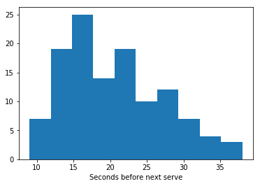
Let's say that we want to study the time between the end of a marked point and next serve in a tennis game. After gathering our data, the first thing that we can do is to draw a histogram of the variable that we are interested in: 

import pandas as pd
import matplotlib.pyplot as plt

url = 'https://raw.githubusercontent.com/fivethirtyeight'
url += '/data/master/tennis-time/serve_times.csv'
event = pd.read_csv(url)

plt.hist(event.seconds_before_next_point, bins=10)
plt.xlabel('Seconds before next serve')

plt.show()

Histogram

Exporting Decision Trees in Textual Format With sklearn

In the past, we have covered Decision Trees showing how interpretable these models can be (see the tutorials here). In the previous tutorials, we exported the rules of the models using the function export_graphviz from sklearn and visualized the output of this function in a graphical way with an external tool which is not easy to install in some cases. Luckily, since version 0.21.2, scikit-learn offers the possibility to export Decision Trees in a textual format (I implemented this feature personally!) and in this post we will see an example how of to use this new feature.

Let's train a tree with two layers on the famous iris dataset using all the data and print the resulting rules using the brand new function export_text:

A Visual Introduction to Gap Statistics

We have previously seen how to implement K-Means. However, the results of this algorithm strongly rely on the choice of the parameter K. In this post, we will see how to use Gap Statistics to pick K in an optimal way. The main idea of the methodology is to compare the clusters inertia on the data to cluster and a reference dataset. The optimal choice of K is given by k for which the gap between the two results is maximum. To illustrate this idea, let’s pick as reference dataset a uniformly distributed set of points and see the result of K-Means increasing K: 

import numpy as np
import matplotlib.pyplot as plt

from sklearn.datasets import make_blobs
from sklearn.metrics import pairwise_distances
from sklearn.cluster import KMeans


reference = np.random.rand(100, 2)
plt.figure(figsize=(12, 3))
for k in range(1,6):
    kmeans = KMeans(n_clusters=k)
    a = kmeans.fit_predict(reference)
    plt.subplot(1,5,k)
    plt.scatter(reference[:, 0], reference[:, 1], c=a)
    plt.xlabel('k='+str(k))
plt.tight_layout()
plt.show()