MDX Or: How I Learned To Stop Worrying And Love Multimedia Writing

Prior to the World Wide Web, the act of writing remained consistent for centuries. Words were put on paper, and occasionally, people would read them. The tools might change — quills, printing presses, typewriters, pens, what have you — and an adventurous author may perhaps throw in imagery to compliment their copy.

We all know that the web shook things up. With its arrival, writing could become interactive and dynamic. As web development progressed, the creative possibilities of digital content grew — and continue to grow — exponentially. The line between web writing and web technologies is blurry these days, and by and large, I think that’s a good thing, though it brings its own challenges. As a sometimes-engineer-sometimes-journalist, I straddle those worlds more than most and have grown to view the overlap as the future.

Writing for the web is different from traditional forms of writing. It is not a one-size-fits-all process. I’d like to share the benefits of writing content in digital formats like MDX using a personal project of mine as an example. And, by the end, my hope is to convince you of the greater writing benefits of MDX over more traditional formats.

A Little About Markdown

At its most basic, MDX is Markdown with components in it. For those not in the know, Markdown is a lightweight markup language created by John Gruber in 2003, and it’s everywhere today. GitHub, Trello, Discord — all sorts of sites and services use it. It’s especially popular for authoring blog posts, which makes sense as blogging is very much the digital equivalent of journaling. The syntax doesn’t “get in the way,” and many content management systems support it.

Markdown’s goal is an “easy-to-read and easy-to-write plain text format” that can readily be converted into XHTML/HTML if needed. Since its inception, Markdown was supposed to facilitate a writing workflow that integrated the physical act of writing with digital publishing.

We’ll get to actual examples later, but for the sake of explanation, compare a block of text written in HTML to the same text written in Markdown.

HTML is a pretty legible format as it is:

<h2>Post Title</h2>

<p>This is an example block of text written in HTML. We can link things up like this, or format the code with <strong>bolding</strong> and <em>italics</em>. We can also make lists of items:</p>

<ul>
  <li>Like this item<li>
  <li>Or this one</li>
  <li>Perhaos a third?</li>
</ul>

<img src="image.avif" alt="And who doesn't enjoy an image every now and then?">

But Markdown is somehow even less invasive:

## Post Title

This is an example block of text written in HTML. We can link things up like this or format the code with **bolding** and *italics*. We can also make lists of items:

- Like this item
- Or this one
- Perhaos a third?


I’ve become a Markdown disciple since I first learned to code. Its clean and relatively simple syntax and wide compatibilities make it no wonder that Markdown is as pervasive today as it is. Having structural semantics akin to HTML while preserving the flow of plain text writing is a good place to be.

However, it could be accused of being a bit too clean at times. If you want to communicate with words and images, you’re golden, but if you want to jazz things up, you’ll find yourself looking further afield for other options.

Gruber set out to create a “format for writing for the web,” and given its ongoing popularity, you have to say he succeeded, yet the web 20 years ago is a long way away from what it is today.

This is the all-important context for what I want to discuss about MDX because MDX is an offshoot of Markdown, only more capable of supporting richer forms of multimedia — and even user interaction. But before we get into that, we should also discuss the concept of web components because that’s the second significant piece that MDX brings to the table.

Further Reading

A Little About Components

The move towards richer multimedia websites and apps has led to a thriving ecosystem of web development frameworks and libraries, including React, Vue, Svelte, and Astro, to name a few. The idea that we can have reusable components that are not only interactive but also respond to each other has driven this growth and continues to push on evolving web platform features like web components.

MDX is like a bridge that connects Markdown with modern web tooling. Simply put, MDX weds Markdown’s simplicity with the creative possibilities of modern web frameworks.

By leaning into the overlaps rather than trying to abstract them away at all costs, we find untold potential for beautiful digital content.

Further Reading

A Case Study

My own experience with MDX took shape in a side project of mine: teeline.online. To cut a long story short, before I was a software engineer, I was a journalist, and part of my training involved learning a type of shorthand called Teeline. What it boils down to is ripping out as many superfluous letters as possible — I like to call this process “disemvowelment” — then using Teeline’s alphabet to write the remaining content. This has allowed people like me to write lots of words very quickly.

During my studies, I found online learning resources lacking, so as my engineering skills improved, I started working on the kind of site I’d have used when I was a student if it was available. Hence, teeline.online.

I built the teeling.online site with the Svelte framework for its components. The site’s centerpiece is a dataset of shorthand characters and combinations with which hundreds of outlines can be rendered, combined, and animated as SVG paths.

Likewise, Teeline’s “disemvowelment” script could be wired into a single component that I could then use as many times as I like.

Then, of course, as is only natural when working with components, I could combine them to show the Teeline evolution that converts longhand words into shorthand outlines.

The Markdown, meanwhile, looks as simple as this:

It’s not exactly the sort of complex codebase you might expect for an app. Meanwhile, the files themselves can sit in a nice, tidy directory of their own:

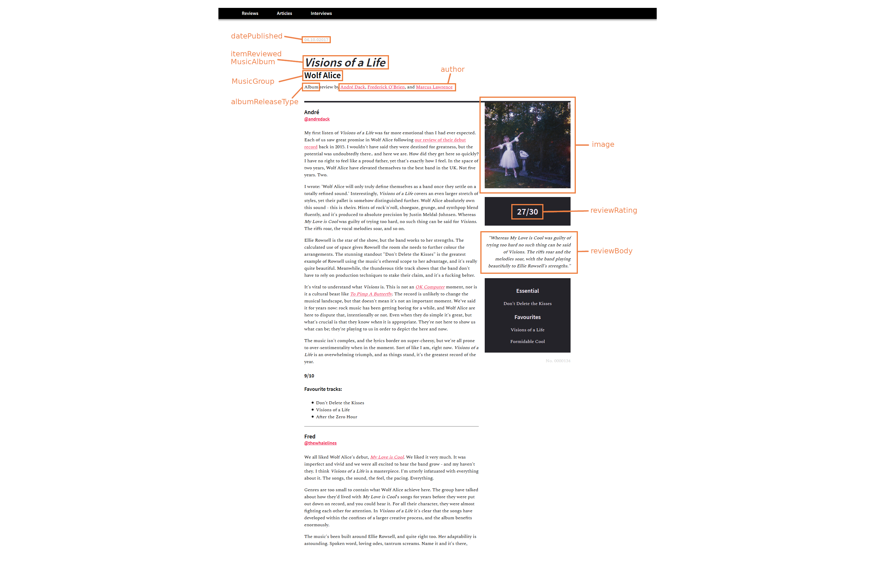
The syllabus is neatly filed away in its own folder. With a bit of metadata sprinkled in, I have everything I need to render an entire section of the site using routing. The setup feels like a fluid medium between worlds. If you want to write with words and pictures, you can. If an idea comes to mind for a component that would better express what you’re going for, you can go make it and drop it in.

In fairness, a “WordToOutline” component like this might not mean much to Teeline newcomers, though with such a clear connection between the Markdown and the rendered pages, it’s not much of a stretch to work out what it is. And, of course, there’s always the likes of services like Storybook that can be used to organize component libraries as they grow.

The raw form of multimedia content can be pretty unsightly — something that needs to be kept at arm’s length by content management systems. With MDX — and its ilk — the content feels rather friendly and legible.

Benefits

I think you can start to see some of the benefits of an MDX setup like this. There are two key benefits in particulart that I think are worth calling out.

Editorial Benefits

First and foremost, MDX doesn’t distract the writing and editorial flow of working with content. When we’re working with traditional code languages, even HTML, the code format is convoluted with things like opening and closing tags. And it’s even more convoluted if we need the added complexity of embedding components in the content.

MDX (and Markdown, for that matter) is much less verbose. Content is a first-class citizen that takes up way less space than typical markup, making it clear and legible. And where we need the complex affordance of components, those can be dropped in without disrupting that nice editorial experience.

Another key benefit of using MDX is reusability. If, for example, I want to display the same information as images instead, each image would have to be bespoke. But we all know how inefficient it is to maintain content in raster images — it requires making edits in a completely different application, which is highly inconvenient. With an old-school approach, if I update the design of the site, I’m left having to create dozens of images in the new style.

With MDX (or an equivalent like MDsveX), I only need to make the change once, and it updates everywhere. Having done the leg work of building reusable components, I can weave them throughout the syllabus as I see fit, safe in the knowledge that updates will roll out across the board — and do it without affecting the editorial experience whatsoever.

Consider the time it would take to create images or videos representing the same thing. Over time, using fixed assets like images becomes a form of technical — or perhaps editorial — debt that adds up over time, while a multimedia approach that leans into components proves to be faster and more flexible than vanilla methods.

Tech Benefits

I just made the point that working with reusable components in MDX allows Markdown content to become more robust without affecting the content’s legibility as we author it. Using Svelte’s version of MDX, MDsveX, I was able to combine the clean, readable conventions of Markdown with the rich, interactive potential of components.

Caveats

It’s only right that all my gushing about MDX and its benefits be tempered with a reality check or two. Like anything else, MDX has its limitations, and your mileage with it will vary.

That said, I believe that those limitations are likely to show up when MDX is perhaps not the best choice for a particular project. There’s a sweet spot that MDX fills and it’s when we need to sprinkle in additional web functionality to the content. We get the best of two worlds: minimal markup and modern web features.

But if components aren’t needed, MDX is overkill when all you need is a clean way to write content that ports nicely into HTML to be consumed by whatever app or platform you use to display it on the web.

Without components, MDX is akin to caring for a skinned elbow with a cast; it’s way more than what’s needed in that situation, and the returns you get from Markdown’s legibility will diminish.

Similarly, if your technical needs go beyond components, you may be looking at a more complex architecture than what MDX can support, and you would be best leaning into what works best for content in the particular framework or stack you’re using.

Code doesn’t age as well as words or images do. An MDX-esque approach does sign you up for the maintenance work of dependency updates, refactoring, and — god forbid — framework migrations. I haven’t had to face the last of those realities yet, though I’d say the first two are well worth it. Indeed, they’re good habits to keep.

Key Takeaways

Writing with MDX continues to be a learning experience for me, but it’s already made a positive impact on my editorial work.

Specifically, I’ve found that MEX improves the quality of my writing. I think more laterally about how to convey ideas.

Is what I’m saying best conveyed in words, an image, or a data visualization? Perhaps an interactive game?

There is way more potential to enhance my words with componentry than I would get with Markdown alone, opening more avenues for what I can say and how I say it.

Of course, those components do not come for free. MDX does sign you up to build those, regardless of whether you have a set of predefined components included in your framework. At the same time, I’d argue that the opportunities MDX opens up for writing greatly outweigh having to build or maintain a few components.

If MDX had been around in the age of Leonardo Di Vinci, perhaps he may have reached for MDX in his journals. I know I’m taking a great leap of assumption here, but the complexity of what he was writing and trying to describe in technical terms with illustrations would have benefited greatly from MDX for everything from interactive demos of his ideas to a better writing experience overall.

Further Reading

Multimedia Writing

In many respects, MDX’s rich, varied way of approaching content is something that Markdown — and writing for the web in general — encourages already. We don’t think only in terms of words but of links, images, and semantic structure. MDX and its equivalents merely take the lid off the cookie jar so we can enhance our work.

Wouldn’t it be nice if… is a redundant turn of phrase on the web. There may be technical hurdles — or, in my case, skill and knowledge hurdles — but it’s a buzz to think about ways in which your thoughts can best manifest on screen.

At the same time, the simplicity of Markdown is so unintrusive. If someone wants to write content formatted in vanilla Markdown, it’s totally possible to do that without trading up to MDX.

Just having the possibility of bespoke multimedia content is enough to change the creative process. It leaves you using words because you want to, not because you have to.

Why describe the solar system when you can render an explorable one? Why have a picture of a proposed skyscraper when you can display a 3D model? Writing with MDX (or, more accurately, MDsveX) has changed my entire thought process. Potential answers to the question, How do I best get this across?, become more expansive.

As You Please

Good things happen when worlds collide. New possibilities emerge when seemingly disparate things come together. Many content management systems shield writers — and writing — from code. To my mind, this is like shielding painters from wider color palettes, chefs from exotic ingredients, or sculptors from different types of tools.

Leaning into the overlap between writing and coding gets us closer to one of the web’s great joys: if you can imagine it, you can probably do it.

Designing Web Design Documentation

As an occasionally competent software developer, I love good documentation. It explains not only how things work but why they work the way they do. At its best, documentation is much more than a guide. It is a statement of principles and best practices, giving people the information they need to not just understand but believe.

As soft skills go in tech land, maintaining documentation is right up there. Smashing has previously explored design documents in a proposal context, but what happens once you’ve arrived at the answer and need to implement? How do you present the information in ways that are useful to those who need to crack on and build stuff?

Documentation often has a technical bent to it, but this article is about how it can be applied to digital design — web design in particular. The idea is to get the best of both worlds to make design documentation that is both beautiful and useful — a guide and manifesto all at once.

An Ode To Documentation

Before getting into the minutia of living, breathing digital design documentation, it’s worth taking a moment to revisit what documentation is, what it’s for, and why it’s so valuable.

The documentation describes how a product, system, or service works, what it’s for, why it’s been built the way it has, and how you can work on it without losing your already threadbare connection with your own sanity.

We won’t get into the nitty-gritty of code documentation. There are plenty of Smashing articles to scratch that itch:

However, in brief, here are a few of the key benefits of documentation.

Less Tech Debt

Our decisions tend to be much more solid when we have to write them down and justify them as something more formal than self-effacing code comments. Having clear, easy-to-read code is always something worth striving for, but supporting documentation can give essential context and guidance.

Continuity

We work in an industry with an exceptionally high turnover rate. The wealth of knowledge that lives inside someone’s head disappears with them when they leave. If you don’t want to reinvent the wheel every time someone moves on, you better learn to love documentation. That is where continuity lies.

Prevents Needless Repetition

Sometimes things are the way they are for very, very good reasons, and someone, somewhere, had to go through a lot of pain to understand what they were.

That’s not to say the rationale behind a given decision is above scrutiny. Documentation puts it front and center. If it’s convincing, great, people can press on with confidence. If it no longer holds up, then options can be reassessed, and courses can be altered quickly.

Documentation establishes a set of norms, prevents needless repetition, allows for faster problem-solving, and, ideally, inspires.

Two Worlds

In 1959, English author C. P. Snow delivered a seminal lecture called “The Two Cultures” (PDF). It is well worth reading in full, but the gist was that the sciences and the humanities weren’t working together and that they really ought to do so for humanity to flourish. To cordon ourselves off with specialisations deprives each group of swathes of knowledge.

“Polarisation is sheer loss to us all. To us as people and to our society. It is at the same time practical and intellectual and creative loss [...] It is false to imagine that those three considerations are clearly separable.”

— Charles Percy Snow

Although Snow himself conceded that “attempts to divide anything into two ought to be regarded with much suspicion,” the framing was and remains useful. Web development is its own meeting of worlds — between designers and engineers, art and data — and the places where they meet are where the good stuff really happens.

“The clashing point of two subjects, two disciplines, two cultures — two galaxies, so far as that goes — ought to produce creative chances.”

— Charles Percy Snow

Snow knew it, Leonardo da Vinci knew it, Steve Jobs knew it. Magic happens when we head straight for that collision.

A Common Language

Web development is a world of many different yet connected specialisations (and sub-specialisations for that matter). One of the key relationships is the one between engineers and designers. When the two are in harmony, the results can be breathtaking. When they’re not, everything and everyone involved suffers.

Digital design needs its own language: a hybrid of art, technology, interactivity, and responsiveness. Its documentation needs to reflect that, to be alive, something you can play with. It should start telling a story before anyone reads a word. Doing so makes everyone involved better: writers, developers, designers, and communicators.

Design documentation creates a bridge between worlds, a common language composed of elements of both. Design and engineering are increasingly intertwined; it’s only right that documentation reflects that.

Design Documentation

So here we are. The nitty-gritty of design documentation. We’re going to cover some key considerations as well as useful resources and tools at your disposal.

The difference between design documentation, technical documentation, and a design system isn’t always clear, and that’s fine. If things start to get a little blurry, just remember the goal is this: establish a visual identity, explain the principles behind it, and provide the resources needed to implement it as seamlessly as possible.

What should be covered isn’t the point of this piece so much as how it should be covered, but what’s listed below ought to get you started:

The job of design documentation is to weave all these things (and more) together. Here’s how.

Share The Why

When thinking of design systems and documentation, it’s understandable to jump to the whats — the fonts, the colors, the components — but it’s vital also to share the ethos that helped you to arrive at those assets at all.

Where did this all come from? What’s the vision? The guiding principles? The BBC does a good job of answering these questions for Global Experience Language (GEL), its shared design framework.

On top of being public-facing (more on that later), the guidelines and design patterns are accompanied by articles and playbooks explaining the guiding principles of the whole system.

Include proposal documents, if they exist, as well as work practices. Be clear about who the designs are built for. Just about every system has a target audience in mind, and that should be front and center.

Cutting the guiding principles is like leaving the Constitution out of a US history syllabus.

Make Its Creation Is A Collaborative Process

Design systems are big tents. They incorporate design, engineering, copywriting, accessibility, and even legal considerations — at their best anyway.

All of those worlds ought to have input in the documentation. The bigger the company/project, the more likely multiple teams should have input.

If the documentation isn’t created in a collaborative way, then what reason do you have to expect its implementation to be any different?

Use Dynamic Platforms

The days are long gone when brand guidelines printed in a book are sufficient. Much of modern life has moved online, so too should guidance for its documentation. Happily (or dauntingly), there are plenty of platforms out there, many with excellent integrations with each other.

Potential resources/platforms include:

There can be a chain of platforms to facilitate the connections between worlds. Figma can lead into Storybook, and Storybook can be integrated directly into a project. Embrace design documentation as an ecosystem of skills.

Accommodate agile, constant development by integrating your design documentation with the code base itself.

Write With Use Cases In Mind

Although the abstract, philosophical aspects of design documentation are important, the system it described is ultimately there to be used.

Consider your users’ goals. In the case of design, it’s to build things consistent with best practices. Show readers how to use the design guidelines. Make the output clear and practical. For example,

  • How to make a React component with design system fonts;
  • How to choose appropriate colors from our palette.

As we’ve covered, the design breaks down into clear, recognizable sections (typography, color, and so on). These sections can themselves be broken down into steps, the latter ones being clearly actionable:

  • What the feature is;
  • Knowledge needed for documentation to be most useful;
  • Use cases for the feature;
  • Implementation;
  • Suggested tooling.

The Mailchimp Pattern Library is a good example of this in practice. Use cases are woven right into the documentation, complete with contextual notes and example code snippets, making the implementation of best practices clear and easy.

Humanising Your Documentation, a talk by Carolyn Stranksy, provides a smashing overview of making documentation work for its users.

Documentation should help people to achieve their goals rather than describe how things work.

As StackOverflow founder Jeff Atwood once put it, “A well-designed system makes it easy to do the right things and annoying (but not impossible) to do the wrong things.”

Use Case Driven Documentation” by Tyner Blain is a great breakdown of this ethos, as is “On Design Systems: Sell The Output, Not The Workflow” by our own Vitaly Friedman.

Language

The way things are said is important. Documentation ought to be clear, accessible, and accepting.

As with just about any documentation, give words like ‘just’, ‘merely’, and ‘simply’ a wide berth. What’s simple to one person is not always to another. Documentation should inform, not belittle. “Reducing bias in your writing” by Write the Docs gives excellent guidance here.

Another thing to keep in mind is the language you use. Instead of using “he” or “she,” use “one,” “they,” “the developer,” or some such. It may not seem like a big deal to one (see what I did there), but language like that helps reinforce that your resources are for everyone.

More generally, keep the copy clear and to the point. That’s easier said than done, but there are plenty of tools out there that can help tidy up your writing:

  • Alex, a tool for catching insensitive, inconsiderate writing;
  • Write Good, an English prose linter.

In a previous Smashing article, “Readability Algorithms Should Be Tools, Not Targets,” I’ve shared a wariness about tools like Grammarly or Hemingway Editor dictating how one writes, but they’re useful tools.

Also, I can never resist a good excuse to share George Orwell’s rules for language:

  1. Never use a metaphor, simile, or other figure of speech that you are used to seeing in print.
  2. Never use a long word where a short one will do.
  3. If it is possible to cut a word out, always cut it out.
  4. Never use the passive where you can use the active.
  5. Never use a foreign phrase, a scientific word, or a jargon word if you can think of an everyday English equivalent.
  6. Break any of these rules sooner than say anything outright barbarous.

Books like The Elements of Style (PDF) by William Strunk Jr are good to be familiar with, too. Keep things informative but snappy.

Make It Beautiful

Design documentation has a lot more credibility if it’s walking the walk. If it looks like a hot mess, what are the chances of it being taken seriously?

Ideally, you should be showcasing a design ethos, not just explaining it. NASA showed way back in 1976 (PDF) that manuals can themselves be beautiful. The Graphics Standards Manual by Richard Danne and Bruce Blackburn feels like a creative work in its own right.

Show the same care and attention to detail in your design documentation that you expect users to show in applying it. Documentation should be the first and best example of it in action.

Make your documentation easy to navigate and search. The most wonderful resources in the world aren’t doing anyone much good if they can’t be found. It’s also a splendid opportunity to show information architecture best practice in action too.

Publish it

Once you’ve gone through the trouble of creating a design system and explaining how it works, why keep that to yourself? Publishing documentation and making it freely available for anyone to browse is a fantastic final polish.

Here at the Guardian, for example, our Source design system Storybook can be viewed by anyone, and its code is publicly available on GitHub. As well as being a proving ground for the system itself, it creates a space for knowledge sharing.

Here are just a few fantastic examples of publicly available design documentation:

There are plenty more where these came from in the Design Systems Gallery — a fantastic place to browse for inspiration and guidance.

What’s more, if there are stories from the formation of your system, writing articles or blog posts are also totally legit ways of documenting it. What did the New York Times do when they developed a design system? They wrote an article about it, of course.

Publishing design documentation — in all its forms — is a commitment, but it’s also a statement of purpose. Why not share something beautiful, right?

And Maintain It

This is all well and good, I hear you say, arms crossed and brow furrowed, but who’s going to keep all this stuff up to date? That’s all the time that could be spent making things.

I hear you. There are reasons that Tweets (Xs?) like this make the rounds from time to time:

Yes, it requires hard work and vigilance. The time, effort, and heartache you’ll save by having design documentation will be well worth the investment of those same things.

The better integrated the documentation is with the projects it guides, the more maintenance will take care of itself. As components and best practices change, as common issues arise and are ironed out, the system and its documentation can evolve in kind.

To spare you the suspense, your design documentation isn’t going to be perfect off the bat. There will be mistakes and situations that aren’t accounted for, and that’s fine. Own them. Acknowledge blindspots. Include ways for users to give feedback.

As with most things digital, you’re never really “done.”

Start Small

Such thorough, polished design documentation can almost be deterrents, something only those with deep pockets can make. It may also seem like an unjustifiable investment of time. Neither has to be true.

Documentation of all forms saves time in the long run, and it makes your decisions better. Whether it’s a bash script or a newsletter signup component, you scrutinize it that little bit more when you commit to it as a standard rather than a one-off choice. Let a readme-driven ethos into your heart.

Start small. Choose fonts and colors and show them sitting together nicely on your repo wiki. That’s it! You’re underway. You will grow to care for your design documentation as you care for the project itself because they are part of each other.

Go forth and document!

What Leonardo Da Vinci Can Teach Us About Web Design

Exhaustive, sometimes bizarre notes… wireframes… mind-bending blends of art and science. Is it a GitHub repository? No, it’s the life of a Renaissance genius. With the right lessons, we can all write some da Vinci code.

Web development is a pretty big tent. It encompasses color, mathematics, accessibility, typography, photography, copywriting, ethics, and the list goes on and on. The web is a near-infinite world which — for all its relentless innovation and disruption — inherits many of its most beautiful qualities from old ways.

It is in that spirit that we’ll be looking at the Italian polymath Leonardo da Vinci, the latest in a rather eclectic lineup of old maestros I’ve had the pleasure of writing about:

Perhaps more than any other person in history, da Vinci showed the kind of magic that can happen in the overlap between art and science, where much of web development lives. His methods and outlooks are as applicable today as they were in Renaissance Italy.

Document Your Thoughts, Ideas, And Work

Da Vinci was a fastidious writer, producing tens of thousands of pages of notes and sketches during his life. Their content ranged from mundane to genius, and that was part of their value. One day it’s a shopping list, another it’s flying machines. There was no filter, no preciousness, only expression and exploration.

This exhaustive documentation was valuable for a number of reasons. They were of benefit to him as an outlet for his thoughts, ambitions, and experiences and as points of reference for long-term projects. Getting his thoughts down allowed them to be tested and iterated on.

The benefits of such extensive documentation were not limited to da Vinci himself. Writing his ideas down also allowed them to survive him for the benefit of countless millions since. Centuries on his notebooks continue to surprise, delight and educate.

Da Vinci’s zeal for writing and sketching lends itself to web development. First is the powerful — sometimes downright mysterious — creative freedom of jotting down what’s going on inside your head. Sometimes you start writing down idea A and suddenly find yourself at solution X.

Not everything we do has to be perfect. Anyone expecting to arrive directly at the final product is going to be disappointed or have a pretty shoddy final product. Writing and sketching give you the license to be playful, maybe even a little bit audacious. Many timeless ideas are born on notebook paper.

There is a sense sometimes that the code we write is akin to sand sculptures — pretty but temporary. This doesn’t have to be the case. Even if the final form of websites continues to change, the thinking behind that evolution is invaluable. How did we get here, and why?

Documenting your pull requests to survive when you’re dead may be a bit strong, but your successors at old jobs will be grateful for the insight and guidance.

Web devs and designers ought to document their own journey, be it through PR descriptions or an actual notebook of their own:

  • Flesh out ideas,
  • Jot down idle thoughts,
  • Doodle page layouts.

May future generations be delighted and awed by your pull request descriptions. May the feature ideas in your GitHub issues be as aspirational as da Vinci’s flying machines.

The best ideas in the world are of no practical use for as long as they’re stuck in one’s head.

Obsess Over Geometry

As most famously demonstrated by the Vitruvian Man, da Vinci was a lifelong student of geometry, shape, and proportion. He was fascinated by the recurrence of various shapes in nature, as well as by the workings of proportion and perspective. He understood their value to paintings and architecture alike.

Da Vinci took great pains to understand these invisible frameworks and replicate them in his work. Although he is more often remembered for his fine art, everything he did was underpinned by a fascination with science and mathematics.

These are essential tools for any web developer. Pages look similarly off-kilter if they are not assembled around invisible guidelines. Grids are the most common example of this, but areas like typography and responsive design are similarly rooted in questions of size, proportion, ratio, and shape.

Showing a da Vinci-like interest in the rules behind these subjects is the difference between a website being pleasing to the eye and being a complete disaster. If you’re unsure where to start, then it’s safe to say Smashing has you covered:

From nature to painting to architecture to web design, applied geometry can create a sense of the sublime.

Think Right-To-Left

In his notebooks, da Vinci typically wrote right to left in ‘mirror script’. He only wrote the ‘normal’ way when he intended it to be read by other people.

Why did he write that way? He was left-handed and wasn’t classically schooled. It prevented him from smudging the ink. It made his ideas harder to steal. Whatever the combination, it’s clearly what he felt most comfortable with.

Da Vinci’s mirror script shows the value of embracing ways of working that suit you. Da Vinci didn’t have to justify his methods to anyone else. And neither do you.

Trust what feels natural and customize the way you work to fit. Personalize your IDE, choose fonts and colors that you like, and write and draw however comes naturally — be that with a tablet or in a leatherbound journal.

Norms being what they are doesn’t necessarily mean that’s how they should be. You will feel better about yourself, and who knows, maybe making space for your methods will allow unexpected ideas to appear.

Find Good Patrons (Or Failing That, Good Employers)

Da Vinci was picky about the work he did and the patrons he found. He lived in places that gave space to his flamboyance and creativity. Florence valued the arts, so it valued da Vinci as well as peers like Michelangelo.

When he moved to Milan, he delighted the courts with his theatrics, eloquence, and stagecraft. On the other end of the spectrum, da Vinci also spent a couple of years in the service of Cesare Borgia, a man so conniving, violent, and altogether horrible that he was a major inspiration for Machiavelli’s book The Prince. Still, it gave him the opportunity to apply himself in new areas like mapping.

Time inside the belly of the beast can be educational in its own way. However, it’s telling that da Vinci only spent a few years in Borgia’s service before slipping back into the less murderous company.

Although patrons are all well and good, we, in the world of web development, usually have to settle for employers. We owe it to ourselves — if at all possible — to find spaces for our creativity, to find outlets for our passions, or at the very least, not feel like a cog in some colossal evil machine.

Have enough pride in your work to channel it into projects you care about. Even da Vinci needed a good working culture. Find your Florence, and if you can’t, do what you can to make where you are a little more like it.

Iterate, Iterate, Iterate

It may be of some comfort to know that Leonardo da Vinci was, at times, a breathtaking procrastinator. He would take years to complete works, and that’s if he finished them at all.

Da Vinci worked on many of his paintings for years, including the Mona Lisa, which he took with him on his travels until the day he died.

Da Vinci’s creations were the result of countless experiments, tangents, and iterations. The final products are what looms large in the public consciousness today, but each was but the final step of long, often difficult journeys.

One particularly pertinent example of this process in action is Leonardo’s Horse, an equestrian monument da Vinci was commissioned to design and build in 1482 by the Duke of Milan Ludovico il Moro. A decades-long frenzy of research ensued, ranging from horse anatomy to concocting entirely new bronze casting techniques.

The project was not completed in da Vinci’s lifetime, but his work made it possible for the effort to be renewed when his extensive notes resurfaced in the 20th century. In 1999, a cool 517 years after he was commissioned, da Vinci’s horse was finally unveiled in Milan.

For all his brilliance, da Vinci was also an exemplar of the power of slow, steady progress — even procrastination. Yes, sometimes inspiration strikes, but more often, we find it at the end of a long, laborious journey. As Steven Pressfield puts it in The War of Art, “The Muse favors working stiffs.”

In the world of web design, the idea of something being ‘finished’ is pretty quaint. There will always be dependencies to update, tweaks to make, and new devices to accommodate. This is a good thing. It is true to nature. It’s exciting. In how many fields can one rebuild something they’ve made? Architects don’t have that luxury. Even painters can only change so much before they have to start again.

The ethereal nature of the web and its technologies lends itself to a da Vinci-esque approach to iteration. Build it, then build it again better. And again. And again.

Do not get too attached to what it is now. It is valuable, yes, but ultimately a stepping stone to what is to come. It is not about throwing away your work but evolving it.

Seldom is a work truly finished. There are always more perfections to be made.

“Art is never finished, only abandoned.”
— Leonardo da Vinci
Feed Your Inner Polymath

Leonardo da Vinci was too multifaceted to be tied down with one label. He was a writer, painter, sculptor, architect, inventor, scientist, philosopher, and the list goes on and on.

“He who loves practice without theory is like the sailor who boards a ship without a rudder and compass and never knows where he may cast.”
— Leonardo da Vinci

His knowledge of each field improved his proficiency in others. Anatomical studies led to more realistic illustrations. His studies of light helped him to create more lifelike paintings.

This, in part, stemmed from his atypical education. By avoiding the classical syllabus, he was able to explore on his own terms, blurring the lines between different subjects. His understanding of the world was fluid and holistic.

Web developers operate within a similarly vast and beautiful constellation of interconnected disciplines. The really good stuff happens when we tie them together.

“Technology alone is not enough — it’s technology married with liberal arts, married with the humanities, that yields us the results that make our heart sing.”
Steve Jobs

Play with new languages, old languages, frameworks, and libraries. Browse Smashing Magazine categories that you’re a novice in. Go down those rabbit holes. Pull on those threads. As da Vinci said of art, so too is true of the web: it can never be finished, only abandoned.

Further Reading

How Web Development Tools Are Helping Users Keep Pace With Rapid Change

Several years ago, I wrote about website builders for a living. Yes, that’s a thing. Back then there seemed to be a gulf between drag-and-drop tools and full-blown web development. Today, it’s heartening to see the likes of Wix adding more code-heavy options to their repertoire.

Judging by Velo by Wix’s report, I’m not alone in feeling that way.

The Covid-19 pandemic has forced much of the world online. Billions of people have been working, dating, and doom scrolling on the web more than ever before. To meet this change, businesses have been beefing up their online offering. Demand for web developers and development tools is higher than ever.

The team at Velo by Wix — which offers a full-stack Rapid Web Development platform — wanted to examine what this mass digital migration means for the industry. What web development platforms are being used? Who are they being used by, and why?

To answer those questions, Velo has conducted a survey of 1,200 developers and the resulting Rapid Web Development Report is pretty fascinating. In the space between drag-and-drop website builders and from-the-ground-up development, there’s an awful lot of demand, and not always for the reasons you might expect.

What Are Rapid Web Development Platforms?

Before getting into the meat and potatoes of the report, we should be clear on how Velo defines Rapid Web Development (RWD). In the broadest sense, it means using builders or tools that streamline the development process.

We all recognize the spectrum these things sit on, even if we haven’t put a name to it. From no- and low-code platforms like Wix and Weebly to techier visual tools like, well, Velo by Wix, they’re what we use when we want or need to quickly build sites and web apps — without coding everything from scratch.

Convenience and accessibility have long been the selling points of Rapid Web Development platforms. They handle many of the foundational aspects of sites so developers (or business owners, bloggers or activists) can focus instead on the functionality of their project.

They provide ready-made or built-in solutions for many aspects of the site. These include:

  • Infrastructure
  • Databases
  • Content management
  • Design
  • Servers
  • Security and privacy
  • Deployment
  • Maintenance
  • Business solutions
  • Search engine optimization

In short, they take care of the foundations while still giving control. Each of the aspects listed above could be full-time jobs on their own (at Smashing Magazine we’ve published enough articles on them to know), so the value of assistive tools is undeniable.

Key Findings

Let’s cover the key points before getting into the nitty-gritty. The report uses data from 1,200 respondents, 60% of whom describe themselves as entrepreneurs or freelancers. Together with agencies, these make up the majority of RWD users.

Those surveyed typically use Rapid Web Development platforms to support and grow their businesses, with speed, flexibility, and cost-effectiveness being their main appeals — especially in the Covid-19 era. Convenience trumps technical capabilities. The real value of such tools is how they can facilitate the running of businesses.

The Times They Are A-Changin’

Such a sharp focus on business makes sense given what’s gone on in the last 18 months. To call the Covid-19 a time of upheaval would be an understatement. Even the ever-changing web has been shaken up.

Of those surveyed, 42% said the pandemic has been a time of large or extreme change. There has been something of mass migration to e-commerce, with businesses having to move online to meet the demand.

Few businesses can afford to take months building bespoke web presences. The streamlined, out-of-the-box convenience and scalability of Rapid Web Development platforms have always made commercial sites a natural fit. This bears out in the report, with more than 80% of respondents saying RWD tools helped their businesses during the pandemic.

No Time To Waste

When it comes to the whys, 61% of respondents said they use Rapid Web Development platforms because they "improve efficiency." That and "productivity" were the two most popular choices.

Why Use Rapid Web Development Platforms?

You also get a sense of how varied the use cases really are. While 56% of respondents said they use one RWD platform, the other 44% use multiple. Different builders have always had different strengths (Squarespace for design, Shopify for online shops, and so on), but it’s still interesting to see so many people seek efficiency and yet still find themselves using multiple platforms.

E-Commerce Thrives

In keeping with the march online, 44% of respondents said they use Rapid Web Development platforms to build e-commerce sites. This was the most common answer by far. Cost-effectiveness was the deciding factor for 64% of that subset. When people want to sell online, they want to get set up quickly and affordably. Add hospitality and restaurants into the mix and you have a hefty portion of the Rapid Web Development user base.

What Markets Are RWDs Used For?

That said, it’s clearly not all about the money. The second most common usage of Rapid Web Development was blogging and media, closely followed by tech. Having an online presence is invaluable across countless sectors, and website builders remain a popular way of achieving that.

Buckling Frameworks

A particularly insightful part of the report examines how Rapid Web Development platforms fit within the wider frameworks ecosystem. Gone are the days where website builders are only used by those who can’t code. Their convenience and flexibility make them viable options for just about everyone.

The most used framework among those surveyed was React, with just under two-thirds saying they were familiar with it. Angular was second with 33.6% and Vue third with 30.9%. Technical know-how is solid.

Despite that familiarity, frameworks are mainly used because they’re familiar, not necessarily because they’re loved. Only 25% of respondents said they use the frameworks they use because they like the product. Not a number totally out of the blue, but pretty damning all the same.

The appeal of web development tools takes on another dimension with this in mind. When faced with a one-off project like, say, a portfolio website, why would someone use a framework they don’t even like? Maybe they’d rather rustle something up with a builder in half the time.

Cost A Major Factor

Not everyone has the resources to hire a development team out of the gate. It’s a major investment of not only money, but time, too. When all is said and done, offsetting that cost is the main appeal of Rapid Web Development platforms.

When asked why they use them, the top three reasons from respondents were:

Percentage Reason
64% “It’s more cost effective.”
61% “Keeps pace with customer needs.”
46% “Gives leg up on competition.”

That one-two of being affordable and up to date is far ahead of any other factors. Even if those issues aren’t quite removed, they’re much more manageable.

Meanwhile, openness was something users didn’t care much about when it came to RWD tools. There is a time and place for open-source code and total technical control, and it ain’t business websites in a pandemic.

Tools In The Toolbox

There is no one right way to do web development. The overarching sense one gets from the Rapid Web Development Report is that a greater variety of tools ensures we can each build websites and applications in ways that are right for us.

As the report itself summarises, users “aren’t committed to one specific technology, but to practicality.” Each platform is a tool in our web development toolbox. Sometimes only a React app from scratch will do. Other times, however, assistive technology is the only way to get the results you're looking for, by the deadline you need to meet.

This has rung especially true during the pandemic, with countless businesses moving online and turning to Rapid Web Development tools to help them keep up with seemingly relentless change.

Would-be web developers sit on a spectrum all the way from total beginners to full-stack experts, and everything in between. It’s reassuring to see tools reflecting that reality and helping people get online.

Web Design Done Well: Excellent Editorial

A lot of web design talk concerns itself with what goes on around content. Page speed, design systems, search engine optimization, frameworks, accessibility — the list goes on and on. This gives us at Smashing Magazine plenty to write about, which is great, though it’s worth reminding ourselves what it’s all in service of.

In this third edition of our Web Design Done Well series, we’re honing in on the beating heart of many websites: content. More specifically, editorial content. The Web has given storytellers an incredible selection of tools to work with, and as an occasional semi-competent journalist myself, I love a good scoop.

What follows are examples of web technologies being woven in with editorial content to take it to the next level. We’ll then close with broader tips on thinking creatively about digital content. Even now, overwhelmed by the content production line, the good stuff still shines through.

Part Of: Web Design Done Well

Reuters Lean Into Swiping

In this piece about systemic racism in the US, Reuters shapes the content around swiping, breaking the story up into bite-sized chunks. Reading feels far more purposeful than it would have through a traditional scrolling approach. It’s like turning the pages of a book. On mobile, you literally flick to the next section. It makes for snappy, immediate reporting — and that’s to say nothing of the excellent data visualization on show.

We live in a mobile-first world. There is no point in being precious about this. Yes, magazine spreads have a certain class about them. Yes, a desktop view gives you a bigger canvas to work with. The reality is most people will be viewing what you publish on a mobile phone, so lean into it. For a similar approach, these ‘tap stories’ by The New York Times and Input are also excellent. For those interested in further reading on mobile-centric editorial, The Story by legendary newspaper designer Mario Garcia is heartily recommended.

The New York Times Shows Rather Than Tells

For all the awful things the COVID-19 pandemic has caused, it has at least led to some breathtakingly good reporting. This interactive New York Times piece explains how face masks work by taking readers to particle level. You can see how fibers catch particles, and why different masks have different levels of effectiveness. Any fool can make complicated topics hard to understand, but making them easy to understand? That’s an art form all of its own.

There are a lot of elements at play here. Graphics, color, animation — there’s even an augmented reality experience if that floats your boat. What could so easily have been a dry, stuffy subject is brought to life. And most importantly of all, it’s vital information. Stuff like this is why Gabriel Gianordoli was voted World’s Best Designer at the 2020 Society for News Design awards. Smashing.

The Washington Post Visualises Exponential Spread

The pandemic has also forced data visualization to the front pages of publications all over the world. This article on exponential spreading from March 2020 (remember that?) does an incredible job of visualizing how and why certain viruses become real big problems real quick. From full-blown simulations to little inline sparkline graphs, this is editorial that takes full advantage of its digital setting.

What I especially like about this one is that it never feels gratuitous. Every visual improves the story, to the point where you almost feel sorry for anyone having to explain the same concepts with words alone. It being available in more than a dozen languages at the click of a button is another wonderful touch — a reminder that the Web is in fact borderless. I can only imagine how many people around the world this article has helped.

The Marshall Project Mixes Media

Here The Marshall Project presents hard-hitting journalism about the US criminal justice system with the elegance and bittersweet beauty of a children’s storybook. In “The Zo”, creative writing, striking illustration, mesmerizing narration, and an important story combine. This is multimedia editorial in full flow.

They say that songs can take several forms. The same is true of editorial content online. What you see above was inspired by a 96-page academic paper. That it could find a new audience as an animated series online, then be nominated for not one but two Emmys, is testament to the transformative powers of the internet.

SBS’s Interactive Graphic Novel Is No Novelty

Speaking of the transformative powers of the internet, how about an interactive story. We’re all familiar with film adaptations, radio play adaptations, miniseries adaptations, and so on. Why not web page adaptations? That’s just what Australian broadcaster SBS set out to do with The Boat, an interactive retelling of a short story in Nam Le’s book of the same name.

The page’s opening sequence pulls you right in, its words tilting and tumbling with the waves as you read, with the sounds of thunder and rain filling your senses to the brim. As the story settles, Matt Huynh’s illustrations drift by like memories. It’s a remarkably vivid experience, beautiful in its own right as well as a savvy way to bring literature to younger generations.

The Pudding Monkeys Around

I wish I’d come across this in time for the sound edition of this inspiring sites series. No matter, it’s here now. In a truly superb showcase of digital editorial, The Pudding doesn’t so much explain the Infinite Monkey Theorem as live it through music. Don’t know what the Monkey Theorem is? Well, what are you waiting for, the page will do an infinitely better job of explaining than I could. I’ll wait.

By using interactive four-note examples, the article involves the reader while also making the concept simple to understand. As a final, delightful touch, the page is itself a live, ongoing experiment, randomly working its way through increasingly complex tunes. You can expect it to get “Seven Nation Army” right in about 19 years. One wonders whether a monkey typing at a keyboard for long enough could create the perfect JavaScript framework. Hope springs eternal.

A List Apart: A Class Apart

For all the talk of data visualization, music, augmented reality, and other snazzy tools, there’s a lot to be said for getting the fundamental right. Pages don’t have to be the web equivalent of the Vegas Strip to be eye-catching. A list Apart shows that better than most. Its approach to content will always hold a place in my heart. Title, illustration, copy, blue hyperlinks. Beautiful.

What I now realize was an unsettlingly long time ago, I wrote about the two branches of ‘brutalist’ web design. The gist of what I said was that one approach is loud and brash, the other resolutely functional. A List Apart shows the beauty of the latter done right. The multimedia toolkit is a wonderful asset to have, but even now there are times when only words will do.

Thinking Creatively About Content

For better or worse, the web is absolutely awash with content. A lot of it is great, a lot of it is not. A lot of the talk around it has the cold, calculating cadence you’d sooner expect from industrialists talking about assembly lines. The examples shared above hopefully speak to the value of resisting the urge to churn things out, but let’s be real: most websites don’t have the resources of, say, The Washington Post.

However, there are ways to think creatively about content at all levels, from personal blogs to global publications. Here are a few of them:

  • Question your default approach.
    We are creatures of habit, including in how we tell our stories. Take the time early on to step back and ask, How could I do this differently? Maybe a photo essay would be more prudent than an article. Maybe a heat map is better than a table. Specialization is important of course, but don’t let it blind you to other, often complementary ways of doing things.
  • Use free resources.
    One of the great gifts of the internet is how much amazing free stuff there is. Like, actually free, on purpose. From photography to graphic design to data visualization tools to audio editing software, the resources you need to transform your content are just a click away. Our freebies tag is a good place to start.
  • Give content multiple forms.
    As The Marshall Project showed especially well with “The Zo”, stories can find new audiences when they take different shapes. Wrote an article? Great, why not record an audio version? Produced a data-driven report? Pretty cool, though is it as cool as it might be if you started plugging those numbers into D3? Only one way to find out.
  • Experiment.
    The examples here are the cream of the crop, but it’s worth mentioning there is a tremendous amount to be gained from trying new ideas and embracing the occasional failure that brings. Iteration is key to the creative process. If you try something and it doesn’t work, fine, no matter. It’s the only way to get to what does work.

There is no one-size-fits-all approach to content, but respecting the story is essential. Web technologies are supplemental, not the main event. Don’t let them be the tail that wags the dog. The best results come when the story is in harmony with how it’s told. That’s the kind of content that sticks with people for years.

Web Design Done Well: Making Use Of Audio

It’s easy to get hyper-focused on how things look on the web. There’s a lot to look at. You’re looking at this right now! However, in the age of touchscreens and home assistants, it’s safe to say sight isn’t the only sense worth caring about.

George Lucas once said half of any movie’s magic comes from its sounds. The same could be said of certain online experiences. For part two of this series, we’ve assembled some of our favorite examples of sound being used on the web. Most of us have had the misfortune of crossing bad examples (auto-playing videos being a particularly egregious example) but audio can give web experiences a whole new dimension when applied well.

What follows are some astounding sounds from the World Wide Web. We hope these bright ideas help you to think about your own projects a little bit differently.

Part Of: Web Design Done Well

The New Yorker’s Audio Articles

The word ‘article’ generally brings to mind words on a page, with some wiggle room on whether that page is paper or on a screen. With each passing year, this assumption becomes more restrictive and reductive. Words can be heard as well as read. This is something a growing number of websites are clocking on to, with the The New Yorker being a particularly good example. Much of their writing — fiction and non-fiction — comes complete with an audio version, often read by the authors themselves.

Most websites don’t have the luxury of recording people like Margaret Atwood, but with text-to-speech software getting better and better, we love seeing sites incorporating it into their design and functionality. Nieman Reports did a fantastic article on the subject last year, and yes, there’s an audio version.

Tune In To The World’s Radios In Radio Garden

Lest we forget, websites can take forms other than grids. Radio Garden takes you around the world’s radio stations in an instant. It’s like Google Earth, but with music. Spin the globe, turn on, tune in, drop out. A deceptively simple idea executed with a playful elegance.

A lot of pieces are needed for this to be possible, among them CesiumJS for the globe, Esri for satellite imagery, and Free GeoIP for the location API. A wonderful idea beautifully executed. (An honorable mention must also go to Radiooooo, a kind of time travel equivalent.)

Botany And Symphonies In Penderecki’s Garden

We doubt you’ve ever seen a memorial garden quite like Krzysztof Penderecki. Wander the virtual garden of the legendary Polish composer (and keen gardener) with his music playing in the background. It’s a beautiful tribute, and a cracking case study in web design to boot. There’s a lot of cool stuff going on but the music seemed the apt thing to focus on.

Akkers van Margraten’s Oral Histories Of WWII

The scope for archival material to reinvent itself online in new and exciting ways is almost limitless. The Akkers van Margraten oral history project builds its website around its audio content, with the audio clips accompanied by mournful musical arrangements.

The music is supplemental, helping the interviewees to conjure the spirit of a time and place. Would the effect be the same without? We’re not so sure.

Netflix Brings Trailer-Like Intensity To Its Dark Series Guide

There is a wariness of media that plays automatically on web pages. This wariness is well earned. Still, the guide for Netflix’s “Dark” series shows how powerful it can be when done right. The site’s deep ambient tones pull you headfirst into the mood.

Imagine a long-form article with the right accompaniment — a horror story paired with dissonant ambient arrangements perhaps, or a look back at the Swinging Sixties with a Jefferson Airplane song playing in the distance. This Dark guide shows how much of a shot in the arm that can be.

IT Museum Brings Audio Tours To The Web

The DataArt IT Museum is an ever-growing collection of Eastern European tech hardware, each item appropriately brought online. This e-museum is beautiful in all sorts of ways, but its use of interview snippets is particularly sharp. Not unlike Akkers van Margraten, the audio snippets bridge the gap between then and now.

It almost feels obvious once you see it. Just about everyone has wandered through a museum or gallery or historical building while listening to an audio guide. Why shouldn’t the same option be available to us online?

Ethics For Design

What is the role of a designer? That is the question posed to a dozen designers and researchers in Ethics for Design, with the answers presented in a way only the web could really pull off. Instead of presenting the results in one glossy run-of-the-mill video, the site instead separates all the pieces.

As much as anything else, it shows how much can be lost when we limit ourselves to one medium — be it text, sound, videos, photographs, or graphics. Although a little jarring to begin with, maybe that’s what’s needed to think about how each piece fits into a wider puzzle.

SoundCloud’s Sticky Music Player Bar

We figured we should close with a god-honest feature. For that, we turn to SoundCloud, which has a music player that plays independently of the rest of the site. Clicking on a new page doesn’t reset the player, allowing visitors to browse artists and albums without breaking the flow of what they’re listening to. It feels so natural that it’s hard to imagine there one not being there.

We’ve become used to this through apps like Spotify, but on the web proper, it still screams untapped potential. Think of how it might be combined with other ideas featured here. Imagine you’re on a news website and start listening to a story, a la The New Yorker. With a player like this, visitors could continue browsing the site while still listening to the original story. Sounds like the future.

Wrapping Up

The sites featured here only scratch the surface of what’s possible. Sound can take countless forms: radio, music players, interviews, narration, and navigation to name but a few. We’re not all that far away from conversing with websites.

If you’re interested in learning more, the articles below offer a sound starting point for audio design online:

Technical capabilities have grown massively in recent years, with more and more flexibility demanded of the sites we use. They are seen, they are touched, and, increasingly, they are heard. We’ll hold off advocating for edible, pleasantly scented websites (for now) but sometimes it’s absolutely worth making them noisier.

Web Design Done Well: The Ordinary Made Extraordinary (Part 1)

Great ideas in web design come so thick and fast that it can be easy to miss them if you’re not careful. This series is a small antidote to that, piecing together splashes of inspiration that caught our eye. Whether it’s a mind-bending new feature or simply an old trick delivered with new elegance, they share the quality of making us think a little differently.

I recently wrote a piece lauding the work of Saul Bass in the world of web design. One of his great gifts was making even the tiniest details beautiful. It is in that same spirit we kick off this series by honing in on website trends and features we’ve grown accustomed to being dull. As you’ll see, they needn’t be. The trick is often in the execution. Just about anything can be beautiful. Why aim for anything less?

Glasgow International’s Pages Within Pages

We’re used to plenty of scrolling these days, but the Glasgow International festival website has found a simple, clever way to scratch that itch while keeping pages short:

On mobile, the same three sections form one big column. It’s a savvy solution to the mobile/desktop relationship, and a pretty stylish one too. (Shout out to the ‘Support’ button, which starts spinning when you hover on it.)

The CSS behind this is suitably simple. The three sections sit inside a flex container, with all three sharing the values of overflow-y: auto; and height: 100vh; so that they always fit the desktop viewport. The really nice touch here is using scrollbar-width: auto; to remove the sidebar. Because the columns take up the whole screen you intuitively work out the way the page works as soon as you move your mouse.

Kenta Toshikura’s Dimension-Bending Portfolio

A recent site of the week on Awwwards, this portfolio website by Japanese frontend developer Kenta Toshikura is simply breathtaking:

If in doubt, the tendency is to lean towards flat, modular arrangements, but maybe we should be thinking in three dimensions a little more often. This is a fantastic example of lateral thinking transforming what could easily have been a column of boxes into something truly memorable.

We may not all be equipped to do something quite this fancy (I’m certainly not) but it’s well worth remembering that web pages aren’t blank canvases so much as they are windows into alternate dimensions.

Stripe Documentation Is The Teacher We All Want

Documentation is all too often one of the first casualties of the Web’s mile-a-minute pace. It needn’t be. I have no qualms calling Stripe’s documentation beautiful:

I’m sure most of us have ground through enough bad documentation to appreciate the effort put into this approach. Clear, hierarchical navigation for the content, bite-sized step-by-step-copy, and of course the code snippets. Dynamic previews of code across multiple platforms and languages is above and beyond, but then why shouldn’t it be?

There are few things more valuable — and more elusive — than quality learning resources. Stripe shows there is a world of possibilities online beyond the standard words on a page. I’ve shared this before (and I’ll share it again) but Write the Doc’s documentation guide is a smashing resource for presenting informative content in useful, dynamic ways.

Max Böck’s Technicolor Dream

There is an awful lot to like about Max Böck’s personal website, but for the purposes of this piece, I’m honing in on color schemes. Most websites have one color scheme.

Light and dark is the new normal, but as Böck himself writes in his blog post about the theme switcher, only Siths deal in absolutes. Through the magic CSS custom properties the site switches between color schemes seamlessly. For a full breakdown of how it works I heartily recommend reading the full post linked above. And for further reading on custom properties Smashing has plenty too:

The themes are named after Mario Kart 64 tracks, if you were wondering. Except Hacker News. That’s named after Hacker News, with the marvellous touch of adding ‘considered harmful’ to the end of every single Böck blog post title.

It’s a fun twist on the traditional light/dark dichotomy, and also speaks to just how fluid sites can be nowadays. The same groundwork could allow you to adjust color schemes depending on where people are visiting the site from, for example.

Overpass Sells Sales

Sales isn’t exactly a sector that screams innovation, but credit where credit is due. Overpass’s carousels bounce and shrink and expand so smoothly that it almost feels like you’re interacting with something tactile, like a rubber band.

Here, both the touch-action and translate3d()) CSS functions are used to great effect, making the cards container something that can be effectively dragged around the screen. In the event of the container being grabbed, all cards use scale(0.95)) to recede ever so slightly until the user lets go. It gives the carousel a lovely sense of depth and lightness.

The audio clips are a nice touch. Multimedia integration has been a running theme in these examples. Always lay the accessibility groundwork, but be bold. At this stage the only real limits are those of our imaginations.

E-Commerce Meets Long Form Storytelling On Mammut

From Steve Jobs to Seth Godin, it is often said marketing is a storytelling game. This is something that a lot of e-commerce websites seem to have forgotten, each serving up page after page of glossy products floating in front of perfect white backgrounds. You can almost hear the sucking sound of conversion funnels trying to draw you in.

It’s refreshing then to see a company like Mammut going all in on storytelling to sell its hiking products. Their long-form expedition articles are as immersive as the finest New York Times feature, with audio clips, maps, and, naturally, stunning photography. Mammut gear features heavily, of course, but it’s done in a way that’s tasteful. More importantly than that, it’s authentic.

Although there is some super slick styling going on here that’s not why I’ve included it. In a way it’s incredible just how impersonal much of the Web feels these days, with e-commerce being a particularly egregious offender.

This is the kind of thing people would share even if they had no interest in buying mountaineering gear. It’s superb content. Instagram influencer posts look like child’s play compared to this. Do those prompts to shop take you to the aforementioned squeaky clean e-commerce checkout? Naturally. But, by God do they earn it. Not everyone has the resources for something this cutting edge, but it shows that e-commerce doesn’t have to be sterile and lifeless.

Axeptio Makes Its Cookies Palatable

You can’t swing a cat without hitting a disclaimer pop-up these days. It’s bizarre, then, that so many of them are so ugly. More often than not, they feel tacked on and graceless. Now, to be fair, that’s because they are tacked on and graceless, but some genuinely are just there to Improve Your Browsing Experience™.

Instead of treating its cookie pop-up like a bad odour, web consent solution provider Axeptio walks the walk by making them look stylish, and even rather charming. With GDPR (and basic decency) to think about, it’s essential to weave ethical design into a website’s fabric.

A lovely touch is that it doesn’t actually pop up until users start moving around the site. Why bother people if they’re not even interested in the content? Notice as well that they’ve dropped the boilerplate cookie lingo in favor of something more conversational.

Granted, this may not make the mundane ‘extraordinary’ exactly, but it does make it a whole lot classier. It’s a small touch, but one which makes an excellent first impression. Without even touching my mouse, I already have a sense of Axeptio’s attention to detail and commitment to quality. A blocky ‘We care about your privacy’ pop-up would have given a very different impression.

As far as cookies and pop-ups are necessary, we may as well own them. The same applies to other unsexy staples of the modern web. Do legal consent forms, email signups, and privacy pages have to be ugly and evasive, or do we just need to think a little differently? Share your thoughts below!

Guarding Against Disposable Design

Disposability is a tricky term to handle in the digital world. So many things are changing so quickly — programming languages, frameworks, and design trends to name but a few — that it often feels inevitable that the things we make will be outdated almost as soon as we finish making them. This is in many ways an exciting and positive thing, but it can also cause long-term thinking to be drowned out by short-term priorities.

This piece is about what I take disposable web design to mean, and the kind of trouble it can cause. It’s also about longevity in a digital context, with steps we can all take to find the sweet spot between re-inventing the wheel and twiddling our thumbs as the world rushes past us. There is a time and place for different approaches. Planning long-term in some areas allows for unbridled innovation and experimentation in others. Evolution and improvement are good. Cutting corners and putting the cart before the horse is not.

Let’s dive, Troy McClure's style, into the do’s and don’ts of disposable design.

What Is Disposable Design?

First things first. I think most of us intuitively understand what disposable design means in a general sense: good and bad. Disposable design is single-use plastics. Its structures built using second-rate materials which crumble well before their time. At its worst, it’s short-term thinking and long-term headaches. At its best, it can be savvy and conscientious, like biodegradable tent pegs at a music festival, or scale models.

In this web design context, we’ll be focusing mostly on the ‘at its worst’ aspects, with similar nods to times when it can be (and is) very useful. Longevity is a more slippery concept online, but again we tend to recognize the sins when we see them. Here is a handful:

  • Unpleasant UX.
    We’ve all stumbled across websites warped out of shape due to lack of future-proofing. Elements out of place, buttons not working, and the site gently croaking ‘kill me’ are just a few of the things we notice in the seconds before clicking away, never to return.
  • Following design fads rather than shaping design around content.
    Do you remember parallax scrolling? Carousels? There are perfectly good reasons for any feature in the right context; being cool is not one of them. Fads are even more egregious when they clash with the rest of the design.
  • Broken links, internal and external.
    One of the Web’s greatest gifts is links. Dead links rob users of context, destroy the browsing flow, and perhaps worst of all, waste people’s time.
  • Ever-growing navigation drawers with no obvious pattern or logic.
    Headers are supposed to make navigating the site easier, not harder.
  • Quick fixes.
    This runs a gauntlet all the way from obvious hotfixes that were never followed up on to hardcoded snippets with uncanny knacks for breaking everything else on the site.

As well as being frustrating on a day-to-day basis, these kinds of issues tend to stem from the kind of approach that leaves sites needing replacing or redesigning far sooner than they should. Sometimes only a new website will do, but every year? There comes a point where such projects become a resource drain.

The Causes

In a way, disposable design is the tip of a bad practice iceberg. There are a lot of potential factors that lead to it which can wreak havoc elsewhere. Some I’ve witnessed (and to be frank, been guilty of) myself, others from afar.

Poor Planning

Fail to prepare, prepare to fail. The maxim rings true in the world of web development. Whether you’re building a portfolio, an e-commerce store, a magazine, a hotel booking site, or whatever else, flimsy planning will lead to flimsy design. If you don’t know what you need, the odds of you landing on the right answer by chance are pretty slim.

Design goes hand in hand with purpose. You wouldn’t build an airplane without a blueprint, would you? We need to know the purpose before steaming into building things. I touched on this in What Vitruvius Can Teach Us About Web Design, and there is a near-endless supply of great material on the topic. Below are just a handful:

As ever there is a balance to be struck. Things like accessibility, navigation, and information architecture have to be baked into a website early on, while the styling of your hyperlinks can afford to evolve as the site settles. You can’t account for everything, but you can certainly point yourself in the right direction and give the project a decent shot at success. If you set yourself up with a working compass then you don’t necessarily need to know the exact path.

Following Fads

The Web evolves much faster than the natural world. Every day brings with it new ideas, new standards, new frameworks, new possibilities. All that is gold does not glitter, though. There is a fine line between progress and fads, but again we tend to intuitively recognize the difference when we see it.

Parallax scrolling may look snazzy, and that full-page video loop on the home page may have a certain wow factor, but are those things serving the site and its users? Sometimes the answer is yes, and that’s fine, but sometimes they feel like they’re overcompensating for a lack of substance.

A similar ethos applies to frameworks, though for slightly different reasons. As former Smashing editor-in-chief Rachel Andrew writes, HTML and CSS “is the bedrock of everything that we do,” but most projects larger than a few pages are likely to involve the likes of React or Vue. No-one likes a monopoly, but using established, supported frameworks is usually the sensible choice. That revolutionary new one you’ve been reading about certainly deserves attention, but maybe not on your client’s make-or-break online store.

In short, make choices based on what’s right for the project, not on what everyone else is doing in a given week.

Poor Documentation

Good documentation is so important. It forces you to clarify your own thinking as well as giving other people a fighting chance of understanding what on earth you’ve done. If you fled the country tomorrow would anyone else know how the site works? Can the client use it? Are they able to post blog entries themselves and update key content? Usage and handover documentation keep projects alive and growing.

Knowledge hoarding might be good for you, but it’s terrible for the project. Not only does it obscure the inner workings, but it also denies them the outside scrutiny that would likely make them better. Everyone being on the same page about the fundamentals allows you all to focus on the more inspiring stuff. (This also is a key benefit of using proven frameworks. People may come and go but at least there’s continuity in the tech, which requires less personalized explanation.)

Below are some good starting points for better documentation:

In fairness, some people have no interest in knowing how certain things work. I don’t like that as an excuse to skip documentation altogether, though. Anything worth doing is worth doing well for its own sake. Even documentation can be beautiful and inspiring. A friend of mine was working on Stripe integration a while back and linked me to their documentation. I was rather floored by how well done it is:

As you scroll through the documentation, a preview of example code scrolls along with you, highlighting the sections you’re reading. We don’t all have to go this far, by why aim for less than excellence?

Outsourcing

It’s tempting to embed third-party platforms on websites. It’s easy and it spares you the hassle of building something yourself. Why make an image gallery when I can just slap it on my Instagram feed instead? Why maintain a blog when I can just show my Twitter feed? Hell, why build a site at all? Squarespace templates are pretty cool and it’s not my money anyway.

The answer to most of these questions is: you don’t own the content that is not on your own website. You’re a guest playing by someone else’s rules, and usually paying more money for the privilege. As Ana Rodrigues wrote about in her case for the IndieWeb last year, a website is the beating heart of your web presence. If you outsource your content to third-party platforms, it’s not going to age well. It rings hollow.

Short-termism

A lot of this boils down to short-term thinking and rushed (or nonexistent) preparation. I’ve developed something of a nervous tick when it comes to the phrase ‘quick wins.’ They can be useful, but easily corrupted. Too many quick wins create disposable design, and a race to the bottom. There is no question time passes faster online, but that doesn’t mean longevity isn’t a worthy goal. If anything it’s all the more important.

What, then, does that look like?

Building To Last

In many ways, the ease with which sites can be chopped and changed is one of the web’s greatest strengths. In the real world, junk has a very real negative impact on the world — landfills of obsolete tech, abandoned buildings, beaches piled high with plastics. Not so online. When something is outdated you press delete and poof! it’s gone. There are no beaches piled high with discarded websites; it’s just code. (That said, the carbon footprint of the web is growing and not to be dismissed.)

What exactly is the benefit of longevity online? And how can it be sustainable given the relentless change we all have to deal with? Jeremy Keith’s presentation ‘The Long Web’ gets to the roots of those questions just as well today as when he delivered it in 2008. For me, it boils down to direction. If you understand what a site is for, where it’s going, and how it’s likely to change, you can separate what should be constant and what should be flexible.

In some areas consistency is essential. For example:

  • URL structure.
    Playing fast and loose with page slugs is generally a bad idea. It’s bad for SEO, it’s dreadful for UX, and it’s a real pain to tidy up.
  • Branding.
    Familiarity breeds… familiarity. Let’s say you run an online store and make wholesale changes to the layout and navigation every couple of months. Eventually, customers are going to get tired of the constant reinventions.
  • Content strategy and tone of voice.
    What we write and how we write it has a huge impact on a site’s character. Whether it’s a magazine or a weather forecast web app, unclear, inconsistent writing comes across as amateurish. On the flipside, a reliable voice connects past, present, and future.
  • Design best practice.
    For all the trends in graphic design and UX, the fundamentals change much more slowly. A site that embraces the basics of typography, color palettes, grid systems, and navigation is setting itself up to last.
  • Accessibility.
    You can’t retrofit fit website accessibility. Not well anyway. As Joy Heron writes in her recent piece on ‘Responsible Web Applications,’ failure to do so is frankly irresponsible (and I write that as someone guilty of it myself in the past).

In many ways disposable design makes change harder. It forces you to start from scratch when history tells us it’s generally better to iterate. Sometimes you have to go back to the drawing board — no doubt — but there comes a point where there is more to be gained on nailing down a core offering.

Sustainable Web Design

Longevity is different online than it is in, say, infrastructure or housing. If a pair of shoes lasts thirty years, what do you have? A good pair of shoes. If a building stands for centuries and remains structurally sound and useful, what do you have? A good building. If a website is the same now as it was thirty years ago, what do you have? Well, the Space Jam promo site. Iconic perhaps, but hardly the cutting edge of web design.

In the realm of web development, I’ve grown to think the International Space Station is a particularly good model to follow when seeking that sweet spot between durability and flexibility. Hear me out. The station has been operating since 1998. That’s right, it’s almost a quarter of a century old. How is that possible? Modular design and long-term thinking.

Is the total as cutting edge as a new one from scratch would be? Not by a long shot, but that is also a testament to its longevity. It’s already the most expensive thing ever built (over $100 billion, baby) so best make it last. And yes, one day there will have to be a successor to the ISS — a rebuild, if you will. They’re already preparing for it. New modules will be made with a view for them to detach as part of a separate station. Neat, huh?

Changeability is part of the design. It is modular rather than a monolith, changing organically over time. For a similar example in the natural world look no further than your own body, which replaces its own cells over time. By breaking up projects into different sections or repositories, it frees you up to innovate without having to rebuild the whole thing. Amendments are smoother than rewrites.

Resilience

Making a website’s design last in this way means solving not just current problems, but future problems too. Some things are impossible to predict, but others aren’t. Asking the right questions can make a huge difference to longevity. While discussing this topic with Vitaly Friedman, he summed up the process in three simple words: What happens if...?

Some examples to raise your blood pressure a few notches:

  • What happens if... we have 50 items in the navbar, rather than 5?
  • What happens if... we hit 100 blog posts, or 1,000?
  • What happens if... we have a very dense table with 15 columns on this page?
  • What happens if... we include a third-party widget that loads 10 external resources?
  • What happens if... our heaviest page is being viewed on the worst possible mobile device with a poor 3G connection?
  • What happens if... we want to flesh out our Progressive Web App functionality?
  • What happens if... we want to translate our UI to other languages?
  • What happens if... the text on a button is lengthy?
  • What happens if... someone can only navigate the site with a screen reader?

That simple prompt can lead to all sorts of good follow-up questions, questions that you as a designer will need to answer. Of all things, I’m reminded of one of Kurt Vonnegut’s rules for writing fiction:

“Be a sadist. No matter how sweet and innocent your leading characters, make awful things happen to them — in order that the reader may see what they are made of.”

Give your websites the same treatment. Subject them to the kinds of (hypothetical) strains and mishaps you wouldn’t wish osn your worst enemy. Only then can you see what it is made of, and what you need to do to make it truly resilient.

From architecture to manufacturing to space exploration, the value of that inner sadist is immeasurable. Do you think the brains behind the International Space Station haven’t considered every possible way things could go wrong? They probably have a plan for an alien invasion, just in case.

Longevity Success Stories

If a space station can function for 20 years without becoming obsolete, websites can too. Indeed, many have. Conveniently for me, Wikipedia happened to hit that very benchmark in January. Despite being one of the most visited, most edited sites on the Web, its core offering now is the same now as it was in the early 2000s. If it ain’t broke...

At the same time, few would argue the Wikimedia Foundation has been static or behind the times. Its Wikidata and Abstract Wiki initiatives, for example, serve as nodes, bringing new qualities to the table while enriching the project as a whole. Wikipedia and its ‘modules’ endure because they are shaped around a clear purpose and a long-term outlook.

For a more commercial it’s hard to look past Amazon. Version Museum’s history of the site is fascinating. Today’s Amazon is wildly different from the Amazon of 1994, and yet there’s a smooth sense of evolution. Aside from some early teething, none of the design changes feel jarring.

On a less gargantuan scale, I have nothing but respect and admiration for Jeffrey Zeldman’s preservation of content dating back to 1995. (See the ‘Pardon My Archives’ section at the bottom.) A solid 26 years of content. Now there’s a website built to last.

Meanwhile, under the hood examples run across a spectrum. Frameworks like React and Vue have modular design baked in via components. With them, a site is not a monolith, but a series of bite-sized parts which can be chopped and changed without breaking everything.

Further along the scale, you’ll find the likes of The Guardian, which publishes its source code on GitHub. From front-end website code to apps to in-house tools, there are tens of hundreds of repositories, modules which when pieced together result in an award-winning digital news product. Most of us don’t need thousands of repositories, but the ethos is the same.

There is no one-size-fits-all approach for sustainable web design, but there are recurring principles of purpose, evolution, and long-term thinking. Those are the qualities that allow sites to weather the constant tempests of the Web.

Sustainability Online

There is nothing wrong with redesigns, migrations, and exploring mysterious new online worlds. There is plenty wrong with doing those things for the wrong reasons, and it will catch up with you eventually. Jeff Huang’s Manifesto for Preserving Content on the Web lays out the basics in a way I like very much.

Below are just a few ways to start thinking about long-term:

  • Don’t just think about next year.
    What do you think it could look like in two years, or five? Or 20?! What can you do to meet that future gracefully?
  • Design for accessibility.
    Not only is this right for its own sake, but it helps make content clearer, machine-readable, and better equipped to adapt to evolving technologies.
  • Think modular.
    As is so often the case in life, breaking down big projects into smaller pieces makes them more manageable and more flexible. Channel your inner International Space Station.

Everyone’s needs are a little different, but the ethos holds true. By laying strong foundations you allow yourself, your peers, and your successors to focus on improvement rather than fixes. It gets us closer to a Web where dead links, by-the-numbers design, and third-party domination are exceptions rather than the norm.

What Saul Bass Can Teach Us About Web Design

Web design exists at a lovely intersection of different disciplines. In previous articles, I’ve written about the lessons to be learned from newspapers and from ancient Roman architects. This time we’ll be looking at one of the all-time great graphic designers — Saul Bass.

Saul Bass is a graphic design legend. Responsible for title sequences in films like North by Northwest and Anatomy of a Murder, as well as a number of iconic posters and brand logos over the years. His work, in the words of Martin Scorses, “distilled the poetry of the modern, industrialized world.”

We’re in a different world now, a breakneck speed digital world, but that carries with it its own poetry. Although the backdrop has changed, Saul Bass’s methods and mindset have stood the test of time, and web designers would do well to remember them.

Making The Mundane Extraordinary

Before getting into the particulars of Saul Bass and his work, it’s worth outlining his approach to design in broader terms. Big characters inspire big ideas, but as is so often the case the real trick is in the details.

Concerning his approach to title sequences, Bass said:

“Deal with ordinary things, things that we know so well that we’ve ceased to see them; deal with them in a way that allows us to understand them anew — in a sense making the ordinary extraordinary.”

— Saul Bass (Source)

A similar ethos can and should be applied to web design. As we look at his work, yes, by all means envision homepage splashes, but also think about buttons and signup forms and legal disclaimers. There is just as much beauty to be found in the little things. Sometimes more.

That Bass is even renowned for title sequences is a testament to his creativity. Before Saul Bass entered the scene film titles were usually dull affairs, names and static images delivered with all the bizazz of divorce papers. Under his eye, they became pieces of art, statements on the tone, and texture of what was to come. As he so brilliantly put it,

“Design is thinking made visual.”

— Saul Bass

You can find more about Saul Bass' vision of his work and his influences in the following pages and videos:

Color

Let’s start with the most basic aspect — color. Bass once said that ‘audience involvement with a film should begin with its first frame.’ So too should visitor involvement begin upon first load. We process the colors and arrangement of a website before we have time to process its content. You’ll find no greater advocate for quality content than me, but it is hampered if not given a quality canvas to unfold on.

For Bass is typically translated into simple, vivid color palettes with no more than three of four colors. Not too busy, but plenty of pop. Red, white, and black is one of the golden color combinations — one Bass put to use many times. Bright colors don’t always mean ‘loud’, sometimes they mean ‘striking.’

What does this mean in terms of web design? Well, a little more than ‘use bright colors,’ I’m afraid. Study color theory then apply it to your projects in tasteful, audacious ways. Several excellent articles on the subjects on the subject listed at the end of this section, and the ‘Colors’ category of Smashing Magazine is home to plenty more. It’s well worth the attention. The right palette can set a tone before visitors have even processed what they’re looking at.

For an uncannily Saul Bass-esque example of color and shape in action on the web, take the Holiday Center for Working Youth in Ottendorf. What better way to celebrate bold, functional architecture than through bold, functional design? It’s like a Vertigo poster in digital form.

Red, white, and black isn’t always the answer (though it is an incredibly sharp combination). The right mix depends on the story you’re trying to tell, and how you’re trying to tell it. Saul Bass knew full well that color is an incredibly powerful tool, and it’s one still often underused in the prim, white-space world of today’s web.

Audience involvement with a website begins with color, so make it count. For those unsure where to start here are a selection of Smashing articles on the topic:

Typography

Words, words, words. Design may be thinking made visual, but sometimes the best way to say something is to come right out with it in words. Bass had a typographical style almost as distinctive as his visual one. Rough, hand-drawn, and almost always all-caps, he made words powerful without being overbearing.

Fonts can tell stories too. They communicate tone of voice, formality, importance, and structure, among other things. Combined with a strong color scheme they can make copy dance where it might otherwise slouch along feeling sorry for itself.

Copywriter Jon Ryder showcases this beautifully on his personal website, which is the full package of strong color and bold, playful typography. As you click the prompts the copy rearranges and edits itself. It’s a brilliant idea elegantly executed. If Saul Bass was around to design portfolios this is the kind of thing you’d expect him to come up with.

Art of the Title refers to Bass’s approach as ‘kinetic typography’, and I think that’s a lovely turn of phrase to keep in mind when choosing font combinations for the web. Yes, Times New Roman or Arial will do a job, but with the wealth of free fonts and CSS stylings available why wouldn’t want to try giving your words more life? It’s not always appropriate, but sometimes it can be just the ticket.

Resources

Drawing

This one is as much about the process as it is about websites themselves. Saul Bass was a big believer in drawing. Even as technologies advanced and opportunities arose to streamline the design process, he understood there is no substitute for working with your hands when trying to get ideas out of your head and into the world. To aspiring designers, he advised,

“Learn to draw. If you don’t, you’re going to live your life getting around that and trying to compensate for that.”

Whatever it is you’re dealing with — page layout, logos, icons — there is no faster way to get the ideas out of your head than by drawing them. In this day and age that doesn’t necessarily mean pen and paper, you can always use tablets and like, but the underlying principle is the same. There are no presets — just you and your ideas. I’m no Saul Bass, but I’ve had a few good ideas in my time (at least two or three) and most of them happened almost by accident in the flow drawing.

The value of drawing pops up in the unlikeliest of places and I love it every time I do. Every front page of The New York Times starts as a hand-drawn pencil sketch, for example. Are there fancy computer programs that could do a similar job? Sure, and they’re used eventually, but they’re not used first. It doesn’t matter if they’re brainstorming corporate logos, revamping a website’s homepage, or preparing the front page of a newspaper — designers draw.

Here are some good articles about the value of drawing in a web design context:

An Interdisciplinary Approach

It’s near impossible to fix one label on Saul Bass. At any given time he was a graphic designer, a filmmaker, a photographer, an architect. The list goes on and on. Having to be literate in so many areas was a necessity, but it was also a genuine passion, a constant curiosity.

Take the title sequence of Vertigo. Its iconic spiral aesthetic dated back years earlier when Bass came across spiral diagrams by 19th-century French mathematician Jules-Antoine Lissajous. When asked to work on Vertigo, the idea clicked into place immediately. Mathematical theory found its way into an Alfred Hitchcock film poster, and who are we to argue with the results?

Having a specialization is obviously important in any field, but there is so much to be gained from stepping outside our lanes. Anyone with even a casual interest in web development has almost certainly found themselves needing a similarly protean approach — whether they wanted to or not.

Engineering, design, UX, typography, copywriting, ethics, law… much like in architecture there are few fields that don’t enrich one’s understanding of web design, so don’t be afraid to immerse yourself in the unfamiliar. You just might find the perfect inspiration.

Iterate, Collaborate

Even the masters are students, always learning, always iterating, often collaborating. Bass of course had strong ideas about what form his projects ought to take, but it was not his way or the highway. Look no further than Stanley Kubrick’s feedback on potential posters for The Shining. The two went through hundreds of drafts together. In one letter Hitchcock wrote, “beautifully done but I don’t think any of them are right.”

One can only imagine how many hours Bass slaved over those mockups, but when you look at those rejected it’s hard to disagree with Kubrick; beautifully done, but not quite right. I think the final result was worth the work, don’t you?

We live and work in a largely corporate world. Like Bass, that doesn’t have to hamstring the things you make. Hold your ground when that’s what the moment calls for, but always be on the lookout for genuine partners. They are out there. The client isn’t always right, but they’re not always wrong either. Collaboration often brings out the best in a project, and even geniuses have to work like hell to get it right.

There are few things more valuable than feedback from people you trust. It’s hard to beat that cool, communicative flow where egos and insecurities are out of the picture and it’s all about making the thing as good as it can be.

Here are a couple of articles on iteration and experimentation in web design that I’ve really enjoyed working on:

Beauty For Beauty’s Sake

No-one dreams of doing corporate art, but Bass is a model example of excellence thriving in that world. Decades it still holds its own and is oftentimes genuinely beautiful. He showed better than most that designing for a living didn’t mean creativity couldn’t thrive. Whether you’re making brand logos or homepages there’s a lot to be said for creatives fighting their corner. You owe it to the work.

Bass put it better than I ever could.

“I want everything we do to be beautiful. I don’t give a damn whether the client understands that that’s worth anything, or that the client thinks it’s worth anything, or whether it is worth anything. It’s worth it to me. It’s the way I want to live my life. I want to make beautiful things, even if nobody cares.”

Everything else stems from this ethos, from beauty for beauty’s sake. From color to iteration to delight in the little details, Saul Bass showed the way for graphic and web designers alike. Be audacious, curious, and learning all the time. Make beautiful things, even if nobody cares.

Towards An Ad-Free Web: Diversifying The Online Economy

Money talks, and there is an awful lot of money on the web these days. That is not necessarily a bad thing in and of itself, but it does seem to have hamstrung how websites are designed and financed. The pandemic — and the consequent collapse of an already warped online ad ecosystem — makes it all the clearer that the web needs to diversify the way it makes money, and who it ultimately serves.

State Of The Web

The Internet is not in the best shape right now. Back in 2017, the founder of the World Wide Web, Sir Tim Berners-Lee, said:

“The system is failing. The way ad revenue works with clickbait is not fulfilling the goal of helping humanity promote truth and democracy.”

I think it’s safe to say things have largely gotten worse since then. Ads everywhere, tracking run amok, clickbait, misinformation, net neutrality under siege... engagement is king — more important than nuance, ethics, or truth — because that’s where the money is. The average user sees thousands of ads per day. The World Wide Web isn’t exactly humanity’s shining light right now, at a time when a whole lot of things are compounding our general sense of inescapable doom.

In the midst of this dog-track-dog online culture, the common website has been browbeaten into meek, insipid husks of what they could be. Can we get another ad in there? What about a few more pop-ups? Maybe a few affiliate links. We’ve all experienced the insidiousness of the modern web, we’ve all seen the pop-ups saying ‘We care about your privacy’ before asking us to sign away our privacy. One tires of being lied to so often, and so casually.

Still, I’m not here to complain. At least, I’m not just here to complain. There are flickers of light in the darkness. There are other ways to pay for websites. It’s just as well too because legislation will catch up with the wild wild World Wide Web eventually and then ads will be worth even less.

That’s what this piece is about: alternatives, and why they’re worth embracing. There will always be ads, and up to a point that’s fine, but there shouldn’t only be ads.

Further Reading

Exploring Alternatives

Not every website needs to make money. Let’s get that out of the way. Making money is not the measure of a thing. Not every website needs to care about cost. Hobbies, blogs, forums, digital art… plenty of things are worth doing for their own sake.

This article is directed at sites or web apps that offer some kind of service, with operational costs and long-term financial factors that extend beyond a few dollars on a domain name. This article is about widening the horizon of the online economy beyond ads, ads, and more ads.

Subscriptions

This is probably the most obvious alternative to ads, and trickier than you might think to implement. The principle of it is simple: a website does something of value and asks users to pay for it.

A major advantage of subscriptions is their simplicity. Want X? Pay for X. More and more people are wising up to the fact that few things online are truly free. More often than not when an online service is ‘free’ its users are the product. A valuable service reasonably priced is a welcome antidote to that.

A high profile example of this is Medium. Signing up for a few dollars a month gives members access to articles. It’s an increasingly popular approach in editorial circles. Some publications, like The Guardian, make their content accessible to everyone, while the likes of The New York Times use a paywall. In either case, the pitch is the same: help make what we do possible by subscribing.

Smashing itself does this well, having pivoted away from ads during the big site redesign a few years back. Ads still play a big part, yes, but they’re not the only part. Sustainability online isn’t about moving all your eggs from one basket to another — it’s about variety, about escaping the tunnel vision of advertising.

There are examples of subscriptions and donations working away from editorial contexts. Lynda charges for its courses. Wikipedia, mercifully, is ad-free, sustained by intermittent donation drives to its parent organization, the Wikimedia Foundation.

The subscription approach isn’t for everyone. The above examples all happen to be household names, after all. Strange that. Trust is such a big factor, and if you’re new on the block how many people are likely to give you their moola?

And, of course, there is also the Catch-22 situation of paywalls making a site inaccessible to most of the Internet. It’s bad for growing an audience and at odds with the web’s founding spirit of openness and transparency. That doesn’t sit well with a lot of people — including myself.

I think the saving grace here is that the ‘subscription model’ is much more of a spectrum than it was even five years ago. You can have everything from paywalls to ‘buy me a coffee’ buttons depending on what a website does.

If you provide a service — be it quality editorial content, useful tools, open access to data, or whatever else — don’t be shy about asking for support. And don’t be shy about incorporating those requests into the website’s design. A variety of tools and platforms can be integrated into existing sites with relative ease. Patreon, Ko-fi, and plenty more.

This is not about making people feel guilty. Not everyone can afford to support the sites they visit, and not everyone will think you’re worth supporting. It’s on you to make a positive case for yourself. Crowdfunding platforms like Open Collective and Chuffed are especially good reference points for this, modeling behavior such as:

  • Not making visitors feel guilty;
  • Telling stories people want to be part of and support;
  • Transparency about where the money’s going.

There is also the question of integration. Buttons, pop-ups, prudently placed CTAs. It all adds up, having started and pushed a reader patron scheme at a previous job.

Further Reading & Resources

Micropayments

It’s early days for this one, but something to keep an eye on. Web Monetization is a concept whereby Internet users have a kind of fund they top up regularly — let’s say $5 every month. When time is spent on a site, a fraction of the fund is transferred to that site.

The Brave web browser is a major example of this. Another is Web Monetization, which is being proposed as a W3C standard. Or Scroll, a kind of catch-all ad-free web package.

This approach seems to have struck a nerve, I think because it hits a balance between a Wild West Internet and a corporate one. The more people believe in it, the better it works. Three billion people use the web. If 10% signed up for three bucks a month that would still be a cool ten billion dollars up for grabs.

For the time being results are closer to pennies. But hey, nothing worth having comes easy. Supporting this approach is a two-way street. Depending on the system, implementation can be as simple as adding a line of code to the <head> of your website. It’s also a case of walking the walk.

Will this approach alone save the Internet? Probably not, but again, moving away from ads is about diversification, not finding a silver bullet.

Free, Non-Corporate Platforms

Now obviously, free platforms are not the answer to large-scale applications and web experiences. They are, however, often a perfect way to have an online presence without being sucked into the engagement black hole of modern social media.

Places like Neocities — a homage of sorts to GeoCities — still have a lot of life in them. I know, I’m on it. Independent, playful non-corporate platforms feel like something from another time, but they’re still perfectly good ways of planting your flag online.

It seems marketing has hammered into people that the only website worth having is one you’re paying through the nose for. Not so. The DIY weird web is alive and well.

With the likes of Netlify and GitHub pages about it’s perfectly possible to piggyback along without paying for anything more than a domain name, and even that is optional.

Of course, there is a limit to this kind of approach, but that doesn’t make it any less viable. By the time a website is bringing in enough traffic to warrant a dedicated hosting plan, it’s likely well placed to be asking for support.

Further Reading

Taking Control Of Your Data

All this talk of diversification and sustainability ties into a broader discussion going on right now about privacy. Half the battle is messaging. Although awareness is growing, a lot of people still don’t know about the costs of ‘free’ online experiences. That’s not an accident. Take the time to explain that if someone subscribes to a website’s service, they’re not just receiving the service. They’re receiving priority, respect, and privacy.

Advocating for a less ad-centric web means taking an honest look at who our masters are online. When you make a site, who is the site for? Is it for advertisers? Affiliates? Clients? Or is it for the people visiting the site? How lovely would it be to have robust, ethical income strategies that made websites beholden first and foremost to the people who use them.

The Role Of Developers

In a line of work where projects are increasingly fragmented, it’s easy to remove oneself from the moral failings of any given project. Edward Snowden said the same was true of the NSA spying programs he leaked in 2013. Just this year he identified social networks and apps as carrying similar risks.

Incorporate sustainability into your designs. Communicate what you do and how you survive and what people can do to help. Progress does not happen on its own. It never has and it never will. We have to be the change we want to see.

Search Engine Optimization Checklist (PDF)

Search engine optimization (SEO) is an essential part of a website’s design, and one all too often overlooked. The most beautiful, spectacular site in the world won’t do anyone much good if people can’t find it on Google (or Bing, or DuckDuckGo).

Implementing SEO best practice doesn’t just give you the best chance possible of ranking well in search engines; it makes your websites better by scrutinizing quality, design, accessibility, and speed, among other things. It’s a daunting world for those who aren’t familiar with it (and even those who are at times), so this checklist breaks down key factors to consider when undertaking an audit.

For an overview of the SEO community — publications, thought leaders, podcasts, documentation, forums, things like that — I humbly point you towards the Smashing Guide To The World of Search Engine Optimization.

If you’re ready to get stuck in, read on.

Table Of Contents

Note: You can also just download the checklist (PDF, 158 KB). Happy optimizing, everyone!

Get Ready: A Healthy Mindset

  1. Establishing A Shared SEO Culture
    Done properly SEO is not something you implement once then walk away from never to think about again. It’s something that ought to be carefully maintained over years. One of the reasons audits can feel so overwhelming is because long-neglected SEO piles up into a big problem. Well maintained SEO runs like a dream, and is better placed to adapt to the turbulence of algorithm updates. Communicate the value of SEO, and don’t do it by lecturing. Following best practice usually means a better website, more organic traffic, and happier visitors. Win, win, win.
  2. Quality, Not ‘Quality’
    There is sometimes more talk about quality than there is commitment to it. Behind all the stats, tools, and quick wins there sits one simple SEO truth: it is your job to make the site as good as it possibly can be. Only then can you hope to be better than all the other sites you’re competing with for search queries. From UX design to copywriting, quality content takes commitment, passion, and time. Be ready to face your site’s limitations and work to improve them — for your sake as much as anyone else’s. Great content is so, so much easier to optimize than bad content is.
  3. A Holistic Approach
    Strong SEO is the sum total of a website, it’s not something to saddle one department (or person) with. It can be bolted on to an extent, but that’s never as good as when it’s woven into the site’s DNA. Implementing SEO well means open communication between different members of the team — from SEO execs to writers to developers. Before you even start, understand everyone likely has a role to play.
  4. Join The Community
    Guides like this cover as much as they can but there’s no getting away from the fact that SEO is constantly evolving. It is a huge industry, with its own publications, thought leaders, podcasts, video series, and more. Take advantage of those resources, plug into the SEO world. Just following a handful of reputable Twitter accounts and listening to a podcast or two a month will go a long way.

Setting Realistic Goals

  1. Prioritizing Metrics
    Online metrics are almost limitless. Like, literally. They just won’t stop. Numbers are useful, but if you’re not careful they’ll be the ones calling the shots rather than you. Don’t let KPIs be the tail that wags the dog. Work out what your priorities are, how you can measure progress, and the limitations of the available data. The answers to these questions vary from site to site.
  2. Timeframes
    Goals border on meaningless if you don’t have a time frame for them. It doesn’t have to be the be all and end all (SEO never stops, after all) but by giving yourself a date to work towards gives you a target, and a ready made opportunity to reassess what you’re doing. Have a schedule and stick to it as best you can. This also means having a plan for tracking and analysing search data. Putting a few minutes aside each week adds up nicely over six months.
  3. Keyword Research
    This is absolutely essential to targeted SEO. If you don’t know what keywords you’re hoping to rank for how can you possibly target them? What are popular search terms in your field? What are your competitors ranking for? What is your website already ranking well for and why? With Google Search Console you can see exactly where your pages are (or aren’t) ranking for different keywords.
  4. Size Up The Competition
    The internet is a big place. Odds are you’re not the only one trying to rank for certain searches. Competition is fierce, and that’s good. It forces websites to improve themselves. Analyse rival websites and note what they’re doing well, as well as what you do or can do better. Remember, search engines just want to connect searchers with the best results for their queries. Being the best means being better than everyone else.
  5. Involve Colleagues In Setting Goals
    SEO is a deceptively big topic that affects all aspects of a site, so it’s only reasonable to involve your colleagues when setting ambitious yet achievable goals. Everyone knows something you don’t, and you might be surprised by how much smoother SEO implementation can be when everyone’s on board with it.

Defining The Environment

  1. Mobile-First
    A lot of SEO revolves around how you organize content, and more than anything else you need to organize content well for mobile devices. More people browse on mobile devices than on desktops. In acknowledgement of this trend, Google went fully mobile-first in early 2020. This means the mobile version of your website is what crawlers look at and index. Fabulous desktop layouts are great, but SEO, like the web, is now a mobile-first world.
  2. Google’s Monopoly
    For better or worse, search is currently monopolised by one company — Google. It continues to dominate the space, handling more than 90% of global mobile searches, and 70% of desktop. There are others of course — Bing, Waibu, DuckDuckGo, and more — but for the time being SEO gravitates around Google. Tick their boxes while keeping an eye on the wider terrain, which isn’t as static as you might think.

On-Page

  1. Quality Content
    That’s right, folks. All the SEO in the world will only get you so far if a website’s content is rubbish. There’s no question that there exist bad websites that perform well, but more and more are weeded out with each update. What does quality content look like? There are countless articles on the topic, but here are a few things to be aiming for — clear, original, properly sourced, well written, accessible, and honest. Search engines (generally) want to connect searchers with high-quality results.
  2. Meta Titles And Descriptions
    Eat your sprouts, cross your i’s and dot your t’s, and use descriptive meta titles. Every web page should have a meta title and meta description. The title should tell people and web crawlers alike what the page is about. Meta descriptions are purely for browsers’ benefit — crawlers don’t look at them. Think of them as little blurbs for when that page pops up in search results. Entice the reader.
  3. Image Alt Text
    A depressing number of websites don’t do this properly. It’s so easy, and so helpful. Every image on your website should have alt text describing what the image shows. This helps crawlers understand your visual content, and allows screen readers to describe what visually impaired web browsers cannot see. Alt text also improves your chances of appearing in image search results.
  4. Internal Links
    A few years back scientists discovered that ancient Roman concrete gets stronger over time. Internal links are a prime example of a similar phenomenon in SEO. When you create a new website, linking to other, relevant parts of your site makes for a solid foundation. Continuing to do it over time makes it even stronger. Not only do internal links make websites easier to browse, but they also provide crucial context for search engine crawlers. Each one makes a site’s SEO that little bit stronger.
  5. External Links
    Some SEO types get a bit precious about ‘link juice’, loath to directing people away from their own site. While this is great for shoving people down funnels, it’s pretty slimy behavior. It’s bad for readers and it’s bad for SEO. If you cite something, link to it. If you quote someone, link to the source. Citing one’s sources is writing 101, and again, it provides context to your own content. It helps search engines to understand the type of website you are, and what sort of company you keep. Scour through your copy and make sure the appropriate external links are there.
  6. Clear Structure Markup
    This is so simple and so, so important. Just like meta titles and descriptions show what a page is about, following best practice for HTML makes page structure clear and easy to understand. Use the right tags in the right places, make sure headings are arranged logically. A great way to do this is to strip away CSS and look at pages in pure HTML. If the structure isn’t obvious there then there’s work still to do. Google’s free Lighthouse assessment is good at spotting problems of this kind.
  7. Structured Data
    Semantic markup is becoming increasingly important to SEO, and web design in general. It makes your website’s content machine readable, which in turn makes it easier to crawl, understand, index, and return as sophisticated search results. There are plenty of plugins to help with this, or if you’re feeling daring the markup is simpler than you might think to add yourself. Schema has emerged as the language of choice for search engines, with Google, Microsoft, Yahoo, and others all collaborating on its development. Our guide on structured data is a good place to start.
  8. Sitemaps
    Every website should have a site map. It’s the ultimate reference point for web crawlers on how pages are organized and where to find all the content you want to be found. What would a metro system be without a map? Or a library without clearly marked sections? Take the time to do this properly as doing so will save you a lot of time in the long run. A badly organized, unmapped website is typically unpleasant for both people and crawlers to browse.
  9. Descriptive, Logical URL Structure
    This is a little one, but well worth standardising early. Use clear, succinct URL structures. This denotes both site structure and page content.
    E.g. www.mywebsite.com/book-reviews/catch-22-joseph-heller/ is infinitely clearer than www.mywebsite.com/js7gw788. One is clear to people and algorithms alike; the other is a random jumble of letters. Take the time to establish formats for different post types then stick to them.
  10. Multimedia Content
    Search engines like to see variety on pages — provided it loads quickly. A blog post with relevant images, audio clips, and an embedded video is likely to be more engaging than a plain text blog post. Never add these things just for the sake of adding them, but don’t be shy about getting creative. This is the internet; you can do just about anything.
  11. Assets Optimization
    Whatever media assets you have on-site, for goodness sake optimize them. Compressing image files is the most obvious example here, and often overlooked. That 2GB photograph from your family vacation might look sharp as the banner image on your photography portfolio — too bad nobody will stick around long enough for it to load. In a mobile-first world, super-high-resolution images are seldom necessary. Compress your images. Stagger CSS rollout. Your website has to be quick.

Off-Page

  1. HTTPs
    HTTPS (Hypertext Transfer Protocol Secure) improves the connection security between users and a website. Google and other search engines punish websites that don’t have it. Have HTTPS. Most web hosting providers throw it in for free. If they don’t, get it, or change providers.
  2. Backlinks
    Credibility plays a huge part in SEO, and backlinks are a major indicator of trust. If reputable, relevant sites are linking to your site, that makes you more credible in your field. Doing this properly takes time and dedication. Nobody owes you backlinks — you have to earn them. Earn. Not buy. Black hat approaches to backlinks (spamming comment sections, paying for them, etc.) will get you nowhere. If anything search engines will catch on and punish the offending site.

Testing And Monitoring

  1. Site Speed
    You can’t really be sure of site speed until it’s live. Run your site through speed testing tools like PageSpeed Insights and GTmetrix. Search engines like fast websites and dislike slow ones. So do people. Keep an eye on this over time. Just because a site was fast six months ago doesn’t mean it’s fast now, since you’ve been unloading uncompressed images again. Tut tut.
  2. Analytics
    In the long term SEO is as much about monitoring as it is about on-site changes. There are numerous free tools available for tracking search analytics. Google has Search Console (GDPR friendly) and Analytics (not always so GDPR friendly). Microsoft has the Bing panel. Then there are third party outfits like Moz, SEMRush, and Screaming Frog. As mentioned at the start of this checklist, don’t drown in numbers. Ease yourself in with essential tools and explore from there as your priorities become clearer.
  3. Reports
    Boiling down your SEO performance into regular reports makes progress more manageable. Be it weekly, monthly, or quarterly, these are vital for staying focused on your goals… and achieving them! Keeping tabs on your performance over time means you can nip problems in the bud, and make proactive adjustments to your approach.

Quick Wins

Not everyone has the time or resources to go through a full audit of their website’s SEO. That’s ok, and it doesn’t mean you have to fall behind. The following tips are particularly easy to implement, can return quick results, and allow you to keep an eye on your search performance long term.

  1. Basic Analytics
    If you’re completely new to SEO there are few better ways to get started than getting basic analytics up and running. By this, we mean Google Search Console and Google Analytics. Both are free and easy to add to a site. Having these up and running will immediately give you a better sense of your SEO situation.
  2. Purge Low Quality Content
    Producing great content takes time and a lot of work. Deleting rubbish content takes seconds. Your website is the sum total of its pages. If a site has a lot of ‘thin’ content, that’s going to weigh down the good stuff. Go through your existing content and honestly assess whether it’s worthy of the standard you want to live up to. If the answer’s no, maybe you should delete it. Doing this can give your SEO an immediate bounce. Depending on the site, purging low quality content can be like removing a ball and chain.
  3. Optimize Images
    A great way to speed up your website is to properly compress your images. If this isn’t something you’ve thought about before you may be slightly mortified by how big some of the files are. It can be tedious, but it has to be done and is an immediate way to speed up your site speed. And make sure they’ve all got alt text, while you’re at it.

Please note that this cheat sheet will be updated occasionally, so if you think anything is missing and should be added, feel free to let us know! We’ll consider it for inclusion the next time we update the list.

Making Websites Easier To Talk To

A website without a screen doesn’t sound right does it. Like a book without pages, or a car without a steering wheel. Yet there are audiobooks, hand-free vehicles. And increasingly websites are being used without even being looked at — at least by humans.

Phone assistants and home speakers are a growing part of the Internet ecosystem. In the article, I will try to break down what that means for websites going forward, what designers can do about it, and why this might finally be a leap forward to accessibility. More than two thirds of the web is inaccessible to those with visual impairments, after all. It’s time to make websites easy to talk to.

Invasion Of The Home Speakers

Global smart speaker sales topped 147 million in 2019 and pandemic or no pandemic the trend is going up. Talking is faster than typing, after all. From Google Home to Alexa to smartphone assistants, cars, and even fridges, more and more people are using programmes to search the web on their behalf.

Putting aside the rather ominous Big Brother Inc undertones of this trend, it’s safe to say hundreds of millions of people are already exploring the web each day without actually looking at it. Screens are no longer essential to browsing the web and sites ought to adapt to this new reality. Those that don’t are cutting themselves off from hundreds of millions of people.

Developers, designers and writers alike should be prepared for the possibility that their work will not be seen or clicked at all — it will be heard and spoken to.

Designing Invisibility

There are two main prongs to the topic of website talkiness — tech and language. Let’s start with tech, which runs the gauntlet all the way from basic content structure to semantic markup and beyond. I’m as keen on good writing as anyone, but it’s not the place to start. You could have website copy worthy of a Daniel Day-Lewis performance, but if it isn’t arranged and marked up properly it won’t be worth much to anyone.

Age Old Foundations

The idea of websites being understood without being seen is not a new one. Screen readers have been around for decades, with two-thirds of users choosing speech as their output, with the final third choosing braille.

The focus of this article goes further than this, but making websites screen reader friendly provides a rock solid foundation for the fancier stuff below. I won’t linger on this too long as others have written extensively on the topic (links below) but below are things you should always be thinking about:

  • Clear navigation in-page and across the site.
  • Align DOM structure with visual design.
  • Alt text, no longer than 16 words or so, if an image does not need alt text (if it’s a background for example) have empty alt text, not no alt text.
  • Descriptive hyperlinks.
  • ‘Skip to content links’.

Visual thinking actually blinds us to many design failings. Users can and often do put the pieces together themselves, but that doesn’t do much for machine-readable websites. Making websites easy to talk to starts with making them text-to-speech (TTS) friendly. It’s good practice and it massively improves accessibility. Win win.

Further Reading On TTS Design And Accessibility

Fancier Stuff

As well as laying a strong foundation, designing for screen readers and accessibility is good for its own sake. That’s reason enough to mention it first. However, it doesn’t quite provide for the uptick of ‘hands-free’ browsing I spoke about at the start of this piece. Voice user interfaces, or VUIs. For that we have to dig into semantic markup.

Making websites easy to talk to means labelling content at a much more granular level. When people ask their home assistant for the latest news, or a recipe, or whether that restaurant is open on Tuesday night, they don’t want to navigate a website using their voice. They want the information. Now. For that to happen information on websites needs to be clearly labelled.

I’ve rather tumbled down the Semantic Web rabbit hole this year, and I don’t intend to repeat myself here. The web can and should aspire to be machine readable, and that includes talkiness.

Semantic markup already exists for this. One is called ‘speakable’, a Schema.org property currently in beta which highlights the parts of a web page which are ‘especially appropriate for text-to-speech conversion.’

For example, I and two friends review an album a week as a hobby. We recently redesigned the website with semantic markup integrated. Below is a portion of a page’s structured data showing speakable in action:

{
  "@context": "http://schema.org",
  "@type": "Review",
  "reviewBody": "It's breathless, explosive music, the kind of stuff that compels listeners to pick up an instrument or start a band. Origin of Symmetry listens like a spectacular jam — with all the unpolished, patchy, brazen energy that entails — and all in all it's pretty rad, man.",
  "datePublished": "2015-05-23",
  "author": [
    {
      "@type": "Person",
      "name": "André Dack"
    },
    {
      "@type": "Person",
      "name": "Frederick O'Brien"
    },
    {
      "@type": "Person",
      "name": "Andrew Bridge"
    }
  ],
  "itemReviewed": {
    "@type": "MusicAlbum",
    "name": "Origin of Symmetry",
    "@id": "https://musicbrainz.org/release-group/ef03fe86-b54c-3667-8768-029833e7e1cd",
    "image": "https://alpha.audioxide.com/api/images/album-artwork/origin-of-symmetry-muse-medium-square.jpg",
    "albumReleaseType": "http://schema.org/AlbumRelease",
    "byArtist": {
      "@type": "MusicGroup",
      "name": "Muse",
      "@id": "https://musicbrainz.org/artist/9c9f1380-2516-4fc9-a3e6-f9f61941d090"
    }
  },
  "reviewRating": {
    "@type": "Rating",
    "ratingValue": 26,
    "worstRating": 0,
    "bestRating": 30
  },
  "speakable": {
    "@type": "SpeakableSpecification",
    "cssSelector": [
      ".review-header__album",
      ".review-header__artist",
      ".review-sidebar__summary"
    ]
  }
}

So, if someone asks their home speaker assistant what Audioxide thought of Origin of Symmetry by Muse, speakable should direct it to the album name, the artist, and the bite-sized summary of the review. Convenient and to the point. (And spares people the ordeal of listening to our full summaries.) Nothing’s there that wasn’t there before; it’s just labelled properly. You’ll notice as well that choosing a CSS class is enough. Easy.

This kind of functionality lends itself better so certain types of sites than others, but possibilities are vast. Recipes, news stories, ticket availability, contact information, grocery shopping… all these things and more can be made better if only we get into the habit of making websites easier to talk to, every page packed with clearly structured and labelled information ready and waiting to answer queries when they come their way.

Beyond that the big brains at places like Google and Mozilla are hard at work on dedicated web speech APIs, allowing for more sophisticated user interactions with things like forms and controls. It’s early days for tech like this but absolutely something to keep an eye on.

The rise of home speakers means old and new worlds are colliding. Providing for one provides for the other. Let’s not forget websites are supposed to have been designed for screen readers for decades.

Further Reading

Writing For Speaking

You’ve taken steps to make your website better understood by screen readers, search engines, and all that good stuff. Congratulations. Now we get to the fuzzier topics of tone and personality.

Designing a website to speak is different to designing it to be read. The nature of user interactions is different. A major point to keep in mind is that where voice queries are concerned websites are almost always responsive — answering questions, giving recipes, confirming orders.

An Open NYT study found that for household users ‘interacting with their smart speakers sometimes results in frustrating, or even funny, exchanges, but that feels like a better experience than being tethered to a phone that pushes out notifications.’

In other words, you can’t and shouldn’t force the issue. The look-at-me ethos of pop ups and ads and endless engagement has no place here. Your task is having a good site that gives information on command as clearly and succinctly as possible. A virtual butler, if you will.

What this means in linguistic terms is:

  • Succinct sentences,
  • Plain, simple language,
  • Front-loaded information (think inverted pyramid)),
  • Phrasing answers as complete sentences.

Say what you write out loud, have free text-to-speech systems like TTSReacher say it back to you. Words can sound very different out loud than they do written down, and visa versa. I have my reservations about readability algorithms, but they’re useful tools for gauging clarity.

Further Reading

HAL, Without The Bad Bits

Talking with websites is part of a broader shift towards channel-agnostic web experiences. The nature of websites is changing. From desktop to mobile, and from mobile to smart home systems, they are becoming more fluid. We all know about ‘mobile-first’ indexing. How long until it’s ‘voice-first’?

Moving away from rigid constraints is daunting, but it is liberating too. We look at websites, we listen to them, we talk to them. Each one is like a little HAL, with as much or little personality and/or murderous intent as we see fit to design into it.

Here are steps we can take to make websites easier to talk to, whether building from scratch or updating old projects:

  • Navigate your site using screen readers.
  • Try vocal queries via phone/home assistants.
  • Use semantic markup.
  • Implement speakable markup.

Designing websites for screenless situations improves their accessibility, but it also sharpens their personality, their purpose, and their usefulness. As Preston So writes for A List Apart, ‘it’s an effective way to analyze and stress-test just how channel-agnostic your content truly is.’

Making your websites easy to talk to prepares them for the channel-agnostic web, which is fast becoming a reality. Rather than text and visuals on a screen, sites must be abstract and flexible, ready to interact with an ever growing range of devices.

Developing For The Semantic Web

In July the Wikimedia Foundation announced Abstract Wikipedia, an attempt to markup knowledge that is language-independent. In many respects, this is the culmination of decades of buildup, during which the dream of a Semantic Web has never quite taken off, but never quite disappeared either.

As a matter of fact the Semantic Web is growing, and as it renews its mission we all stand to gain from incorporating semantic markup into our websites, be they personal blogs or social media giants. Whether you care about sophisticated web experiences, SEO, or fending off the tyranny of web monopolies, the Semantic Web deserves our attention.

The benefits of developing for the Semantic Web are not always immediate, or visible, but every site that does strengthens the foundations of an open, transparent, decentralized internet.

The Semantic Web

What exactly is the Semantic Web? It is a machine-readable web, providing through metadata “a common framework that allows data to be shared and reused across application, enterprise, and community boundaries."

The idea is as old as the World Wide Web itself. Older, in fact. It was a focal point of Tim Berners-Lee's 1989 proposal. As he outlined, not only should documents form webs, but the data inside them should too:

The Semantic Web’s tread a rocky road in the decades since. Since the turn of the millennium, it has morphed into multiple concepts — open data, knowledge graphs — all effectively meaning the same thing: webs of data.

As the W3C summarises, it is “an extension of the current web in which information is given well-defined meaning, better-enabling computers and people to work in cooperation."

The idea has had its fair share of advocates. Internet hacktivist Aaron Swartz wrote a book manuscript about the Semantic Web called A Programmable Web. In it he wrote:

“Documents can’t really be merged and integrated and queried; they serve mostly as isolated instances to be viewed and reviewed. But data are protean, able to shift into whatever shape best suits your needs.”

For a variety of reasons, the Semantic Web has not taken off in the same way the Web has, though it is catching up. Several markups have tried to seize the mantle over the years — RDFa, OWL, and Schema to name a few — though none have become standard in the way, say, HTML or CSS have. The barrier to entry was too high.

However, the dream of the Semantic Web has endured, and as more and more sites incorporate it into their designs there’s all the more reason to join the party. The more sites that get on board, the stronger the Semantic Web becomes.

Further Reading

Knowledge Without Borders

Before getting into the weeds of how to design for the Semantic Web, it’s worth digging a little deeper into the why. What does it matter whether data is connected? Aren’t connected documents enough?

There are several reasons why the Semantic Web continues to be pushed by those who care about a free and open internet. Understanding those reasons is essential to the implementation process. It shouldn’t be a case of ‘eat your vegetables, use semantic markup.’ The Semantic Web is something to believe in and be a part of.

Benefits of the Semantic Web include:

  • Richer, more sophisticated web experiences
  • Bypassing content silos and internet monopolies
  • Improved search engine readability and rankings
  • Democratisation of information

Most of these can be traced back to a core tenet of the Semantic Web: a universal language for data. Although the internet has already done wonders for international communication, there’s no escaping the fact some countries have it much better than others. Take languages used on the web vs. languages used in the real world, for example. The eagle-eyed among you may be able to spot a slight imbalance in the data below...

The borderless utopia of the web is not as close as it might seem to those of us inside the English-speaking bubble. Is that something to chastise anyone for? Not necessarily, but it is something to face up to. Doing so highlights the importance of markup that bridges those gaps. By enriching the data of the web, we take the strain off of its languages.

This is the crux of the recently announced Abstract Wikipedia, which will attempt to decouple articles from the language they happen to be written in. Wikimedia Executive Director Katherine Maher writes: “Using code, volunteers will be able to translate these abstract ‘articles’ into their own languages. If successful, this could eventually allow everyone to read about any topic in Wikidata in their own language.”

Abstract Wikipedia creator Denny Vrandečić has been a Semantic Web advocate for years, recognizing its potential to unlock untapped potential online. Breaking down national barriers is essential to that process.

“No matter what language you publish your content in, you are going to miss out on including the vast majority of people in the world. The Web gave us this wonderful opportunity to have global reach — but by relying on a single language, or a small set of languages, we are squandering this opportunity. While the most important objective is to create good content in the first place, you invite more people to participate in the development of better content by being language-independent. It helps you lower the barriers to contribution and consumption, and it allows for many more people to benefit from that effort.”

— Denny Vrandečić, Abstract Wikipedia creator

A timely example of this has been data visualization during the COVID-19 pandemic. The virus has wreaked unspeakable havoc worldwide, but it has also been a shining moment for open data networks, allowing superb web apps, reporting, and more to be common across the web.

And of course, when data is transparent and easily accessible, it makes it easier to identify anomalies… or straight up deceit. Widespread public access to the kind of information above would be unthinkable even 20 years ago. Now we expect it, and smell a rat when it’s denied us. Data is powerful, and if we want to, can be wielded for good.

Similarly, checking ourselves out of content silos — a hallmark of the modern web experience — takes power away from web monopolies like Google, Facebook, and Twitter. We’re so used to third party platforms deciphering and presenting information that we forget they’re not strictly necessary.

“If we had shared formats, shared protocols, we might still end up with certain providers playing a large role in certain markets — think of Gmail for email — but everyone is free to move to another provider, and the market remains competitive.”

— Denny Vrandečić, Abstract Wikipedia creator

The Semantic Web is silo-less; it is free, open, and abstract, enabling communication between different languages and platforms that would be far more difficult otherwise.

Data-fying Online Content

Designing for the Semantic Web boils down to data-fying online content — looking at your content and seeing what can (and should) be abstracted. What does this mean in practical terms, beyond vaguely agreeing it’s a worthwhile thing to do? It depends:

  1. If starting a project from scratch, incorporate Semantic Web considerations into what you do. As a website takes shape, weave semantic markup into its DNA.
  2. If updating or rebuilding a project, assess what could be woven into the Semantic Web that currently isn’t, then implement.

Both cases basically amount to data-fying content. In this section, we will go through some examples of data abstraction and how it can make content better, smarter, and more widely available.

Abstracting Information

Designing and developing for the Semantic Web means looking at online content with your data hat on. Most of us experience the web as a series of connecting documents or pages; what you want to do with the Semantic Web is connect information. This means assessing your content for data points then adjusting the design based on what you find.

Semantic Web advocate James Hendler outlines this process particularly well with his DIVE ethos. (DIVE into the data, eh? Eh?). It breaks down as follows:

  • Discover
    Find datasets and/or content (including outside your own organization).
  • Integrate
    Link the relations using meaningful labels.
  • Validate
    Provide inputs to modeling and simulation systems.
  • Explore
    Develop approaches to turn data into actionable knowledge.

Developing for the Semantic Web is largely about having that birds-eye view of the things you make, and how it potentially feeds into infinitely richer web experiences. As Hendler says, actionable knowledge is the goal.

This really can be applied to almost any type of web content, but let’s start with a common example: recipes. Let’s say you run a cooking blog, with new recipes every Thursday. If you’re French and post a smashing soufflé recipe on your personal blog in plain text, it’s only useful to those who can read French.

However, by implementing semantic markup the blog can be transformed into a machine-readable recipe data set. Syntax exists for cooking terms to be abstracted. Schema, for example, which can work alongside Microdata, RDFa, or JSON-LD, has markup including:

  • prepTime
  • cookTime
  • recipeYield
  • recipeIngredient
  • estimatedCost
  • nutrition, breaking down into calories and fatContent
  • suitableForDiet.

I could go on. The full range of options, with examples, can be read at Schema.org. In adding them to the post format the format of the recipe needn’t change at all — you’re simply putting the information in terms computers can understand.

For example, everything highlighted blue in the BBC recipe above has also been given semantic markup — from cooking time to nutritional content. You can see what’s going on under the hood by entering the recipe URL into Google’s Rich Results Test. Note the ‘Add to shopping list’ functionality, an example of connection made possible by Semantic Web implementation. Good content becomes usable data.

Most of us have crossed paths with this kind of sophistication via search results, but the applications are much wider than that. Semantic markup of recipes makes it easier for websites to be found and used by home assistants. Listed ingredients can be ordered from the local supermarket. Recipes could be filtered in all sorts of ways — for diets, allergies, religion, cost, you name it. Or let's say you had a limited number of ingredients in the house. With a database you could input those ingredients and see what recipes fit the bill.

The range of possibilities really do border on limitless. As Swartz said, data is protean. Once you have it you can use it in all sorts of weird and wonderful ways. This piece is not about those weird and wonderful ways so much as it is about making them possible. Designing for the Semantic Web makes subsequent design infinitely richer.

Here’s a more personal example to show what I mean. A couple of friends and I run a little music webzine as a hobby. Though we publish the odd article or interview, the ‘main event’ is our weekly album reviews, in which the three of us each assign a score, choose favorite tracks, and write summaries. We’ve been going for more than five years, which means we have close to 250 reviews, which means an awful lot of potential data. We didn’t realize how much until we started redesigning the site.

I touched upon this in a piece about baking structured data into the design process. In dissecting our reviews we realized they were chock full of information that could be given semantic markup. Artists, album names, artwork, release date, individual scores, overall scores, release type, and more. What’s more — and this is where it gets really exciting — we realized we could connect to an existing database: MusicBrainz.

This two-way approach is the crux of the Semantic Web. When our music website relaunches it will be its own open data source with thousands of unique data points. Connecting to an existing music database will give our own data more context — and potential. Thousands of data points becomes tens of thousands of data points, maybe more.

The graphic above only scratches the surface of how much information will be connected to reviews pages. The content is the same as it was before, only now it is plugged into a metadata ecosystem — the Giant Global Graph, as Berners-Lee once called it.

Developing for the Semantic Web means identifying your own data, markup it up, then sussing out how it connects to other data. Because it does. It always does. And that process is how this…

… in time becomes this…

The second image is The Linked Open Data Cloud, a constantly updating visualization of the web’s connected data. That red hive of connections is the sciences; the rest has some way to go. That’s where we come in.

Useful Semantic Web Resources

Plugging In

The ideal of the Semantic Web is connection. Make data, share data, demand data. Be part of an information ecosystem. When you’re creating original data, great. Share it. When data already exists and you’d like to use it, pull it in.

Here are just a handful of the data resources out there:

Indeed, where databases like these exist, I’d go so far as to say the right thing to do would be update them where they’re lacking information. Why keep it to yourself? Become a contributor, a Semantic Web advocate.

Implementation

As far as building Semantic Webness into your sites goes, I’m certainly not advocating manual, doc-by-doc markup. Who’s got time for that? More often than not the solution is a case of standardizing a format and templating for it.

Templating is the big opportunity here. How many people really have time to markup all that information manually? However, if you have custom inputs, you get the best of both worlds. Content can be filled with people-friendly information and the information exists as data ready to serve whatever purpose comes to mind.

Take, for example, a static site generator like Eleventy, which has been enjoying a bit of a love-in from the dev community lately. You write a post, run it through a template, and you’re golden. So why not incorporate semantic markup into the template itself?

Like Eleventy, the new version of our music webzine site uses Markdown for its posts. While we have the same old text posts we always did, every review now also includes the following metadata inputs, which are then pulled into the template:

Together with author details in the body of the post and some generic website info, this then translates to the following semantic markup:

<script type="application/ld+json">
    {
  "@context": "http://schema.org/",
  "@type": "Review",
  "reviewBody": "One of the definitive albums released by, quite possibly, the greatest singer-songwriter we've ever seen. To those looking to probe Young's daunting discography: start here.",
  "datePublished": "2020-08-14",
  "author": [{
    "@type": "Person",
    "name": "André Dack"
  },
             {
    "@type": "Person",
    "name": "Frederick O'Brien"
  },
             {
    "@type": "Person",
    "name": "Marcus Lawrence"
  }],
  "itemReviewed": {
    "@type": "MusicAlbum",
      "name": "After the Gold Rush",
      "@id": "https://musicbrainz.org/release-group/b6a3952b-9977-351c-a80a-73e023143858",
      "image": "https://audioxide.com/images/album-artwork/after-the-gold-rush-neil-young.jpg",
      "albumProductionType": "http://schema.org/StudioAlbum",
    "albumReleaseType": "http://schema.org/AlbumRelease",
      "byArtist": {
        "@type": "MusicGroup",
        "name": "Neil Young",
        "@id": "https://musicbrainz.org/artist/75167b8b-44e4-407b-9d35-effe87b223cf"
      }
  },
  "reviewRating": {
    "@type": "Rating",
    "ratingValue": 27,
    "worstRating": 0,
    "bestRating": 30
  },
  "publisher": {
      "@type": "Organization",
      "name": "Audioxide",
      "description": "Independent music webzine founded in 2015. Publishes reviews, articles, interviews, and other oddities.",
      "url": "https://audioxide.com",
      "logo": "https://audioxide.com/logo-location.jpg",
      "sameAs" : [
    "https://facebook.com/audioxide",
    "https://twitter.com/audioxide",
    "https://instagram.com/audioxidecom"
  ]
    }
}

    </script>

Where before there was just text, on every single review page there will now also be machine-readable versions of what readers see when they visit the site. The words are all still there, the content has barely changed at all — it’s just been data-fyed. From rich search results to interactive review statistics pages, this massively increases what’s possible. The road ahead is wide and open. It also gives us a stake in MusicBrainz’s future. By connecting their data to our own data, we in turn want to see it do well, and will do our part to ensure it does.

The appropriate semantic markup depends on the nature of a website, but odds are it exists. Start with the obvious inputs (date, author, content type, etc.) and work your way into the weeds of the content. The first step could be as simple as a hCard (a kind of digital ID card) for your personal website. Print out screenshots of pages and start annotating. You’ll be amazed by how much content can be data-fyed.

Beyond Imagination

Designing and developing for the Semantic Web is a practice that dates back to the Internet’s founding ideals. Whether you value beautiful, informative data visualization, want more sophisticated search results, wish to remove power from web monopolies, or simply believe in free and open information, the Semantic Web is your ally.

Aaron Swartz closed his manuscript with a call to hope:

“The Semantic Web is based on bet, a bet that giving the world tools to easily collaborate and communicate will lead to possibilities so wonderful we can scarcely even imagine them right now.”

Abstract Wikipedia Denny Vrandečić echoes those sentiments today, saying:

“There’s a need for a web infrastructure that will facilitate interoperability between services, which requires a common set of standards for representing data, and common protocols across providers.”

The Semantic Web has limped along long enough for it to be clear that a silver bullet language is unlikely to appear, but there are enough now peacefully coexisting for Berners-Lee’s founding dream to be a reality for most of the web. Each of us can be advocates in our own neighborhoods.

Be Better, Demand Better

As Tim Berners-Lee has said, the Semantic Web is a culture as much as it is a technical hurdle. In a 2009 TED Talk he summed it up nicely: make linked data, demand linked data. That’s truer now than ever. The World Wide Web is only as open and connected and good as we force it to be. Whenever you make something online ask yourself, “How can this plug into the Semantic Web?” The answers will add new dimensions to the things we create, and create unimaginably wonderful new possibilities for years to come.

A Smashing Guide To The World Of Search Engine Optimization

A Smashing Guide To The World Of Search Engine Optimization

A Smashing Guide To The World Of Search Engine Optimization

Frederick O’Brien

Search engine optimization is essential to most websites. The industry is worth more than $70 billion a year, and it’s only going to grow. It has specialists, sub-specialists, thought leaders, dedicated publications, fantastically complex tools, and constant uncertainty at its heart. As Bob Dylan says, it’s just a shadow we’re all chasing.

All the more reason to stay sharp, no? Every tweak to major search engine algorithms sends shockwaves throughout the web. For those who don’t follow the SEO space it can be easy to lose track of the latest trends, authorities, and resources.

That’s what this page is for. It will break down SEO’s hot topics, common questions, and the best resources for staying up to date with that world. As such, this isn’t so much a guide to SEO as it is a guide to the world of SEO. Think of it as a cliff-notes, a primer for those looking to top up their knowledge and understand the latest trends.

For those really in a rush to get back into the groove, skip ahead to the cheat sheet rounding up all the resources included in this piece. As for the rest of you, on we go. It’s quite Google-heavy, because Google currently holds 85%+ market share, but rest assured the points apply to the likes of Baidu and DuckDuckGo as well.

And remember, this is a live document. If there’s something we’ve missed, tell us. In a world as fast-changing as SEO no resources can afford to sit on their hands.

Why SEO Matters

We won’t linger on this point, but it’s useful to remind ourselves what SEO is, why it’s important, and how it has evolved over the years. Keeping the foundational principles in mind allow you to see the woods rather than the trees.

So, in a nutshell, search engine optimisation is the means by which websites appear in search engines like Google, Bing, Baidu, and DuckDuckGo. It remains one of the best ways for websites to be found. More than 90% of web traffic comes through search engines, with Google alone processing trillions of searches a year. If you want your website to be seen, you want to be appearing in relevant search results.

Although SEO isn’t controversy-free, it is in principle the great equalizer. Positions can’t be bought; they’re based on relevance and quality. It is in the interest of search engines to deliver the best results possible, so SEO is the process by which a site becomes the best results possible.

The New Yorker's image
Image by John Caldwell of The New Yorker. (Large preview)

In a word, the appeal of SEO is traffic. It’s getting people to drop by and hopefully stick around. More traffic means more readers, more viewers, more customers, more attention.

Whatever your motivation is, the game is fundamentally the same. From content to site design, implementing makes websites better. Design is clearer and content is more focused, with visitors’ needs always front and centre. In a sense it gives you a 3D vision of the web, seeing web experiences from both human and computer perspectives.

Despite quick-fix guides to the contrary, SEO is best not retrofitted. As Suzanne Scacca writes, SEO belongs at the heart of the web design process. It can’t — and shouldn’t — be pushed off to writers or SEO executives. It is a sitewide concern, requiring sitewide attention.

Hot Topics

If you’re not comfortable with the basics of SEO — meta tags, alt text, link building, etc. — this page is not for you. This piece assumes a certain amount of foundational knowledge. Don’t panic, though, we won’t leave you hanging. Here are several terrific resources for getting started from scratch:

As for the rest of you, what follows are some of the SEO space’s slightly more technical hot topics, complete with conventional wisdom and resources for keeping up with their evolutions.

Great Content

I had to put this first. The sheer amount of data involved in SEO makes it easy to lose sight of an important fact: you’re making websites for people, not search engines. As corny as it sounds, in the long term the best way to perform well in organic search is to be the best you possible.

Search engines value good content above all else. However much the intricacies of SEO change, this remains true. It’s a rock solid foundation for SEO. Optimising a brilliant website is easy; optimising a bad one is hard, and often leads to black hat behaviour. (More on that below.) Yes, there are poorly optimised websites that perform well in search, for a variety of reasons, but grumbling about will get you nowhere.

What does ‘good content’ mean in concrete terms? It’s not as arbitrary as you might think. Search engines generally keep their cards close to their chest, but where content quality is concerned they’re as transparent as you could hope.

For those out of the SEO loop there are few better ways of getting up to speed than reading through Google’s latest Search Quality Evaluator Guidelines. Why guess what search engines want when they’ve written a book’s worth of documentation on the subject? Topics covered in the latest edition include:

  • Expertise, Authoritativeness, and Trustworthiness (E-A-T),
  • Your Money or Your Life (YMYL) Pages,
  • The reputation of websites and creators,
  • Mobile user needs,
  • Auto-generated content,
  • Deceptive page design,
  • What low quality pages look like.

Whether you’re a designer or a copywriter, this is all valuable information.

Say what you like about Google’s more nefarious practices, but where organic search is concerned they want websites to be goodie two shoes. Write brilliant articles; build fast, practical sites; use beautiful visuals; design ethically; be transparent about who you are and what you do; and never, ever let SEO be the tail that wags the dog. Quality will win out in the end.

Accessibility

Happily, the web development space seems to be warming up to talk of accessibility. There is plenty of natural overlap between SEO and accessibility, though sadly there is currently little evidence that super accessible websites get a boost in search. Accessibility barely features in Google’s mammoth Search Quality Guidelines document.

There is, however, a huge amount of overlap between accessibility best practice and SEO best practice. These include:

  • Image alt text,
  • Descriptive title and header tags,
  • Video transcriptions,
  • Content sections,
  • Clear, logical sitemaps,
  • Colour contrast,

Almost everything worth doing for its own sake becomes SEO best practice eventually, so I’m inclined to endorse accessibility on both counts. The Web Content Accessibility Guidelines are a great place to start, especially the Four Principles of Accessibility.

WebAIM publishes annual reports on web accessibility, and Global Accessibility Awareness Day is a fantastic hub for events and campaigns. Also, to get a Smashing plug in, Steven Lambert’s piece on designing for accessibility and inclusion breaks the topic down splendidly.

The Curious Case Of JavaScript

JavaScript has grown into the third pillar of web design — joining HTML and CSS. The language allows for all manner of fancy interactive features that aren’t possible on static sites. That sophistication has brought with it some confusion where SEO is concerned.

Can JavaScript-heavy websites perform well in search? Yes, they can and do. When issues arise it’s almost always in the indexing process, when search engines crawl and render web pages for their databases.

Google has a finite crawl budget. If your page takes ages to load, there’s a decent chance search engines will skip over it. Render-blocking JavaScript is also frowned upon, especially for above the fold content. If possible, execute scripts after the page is loaded.

URL Inspection Tool
(Large preview)

In short, let search engines see pages the way people see them. Google Search Console has a URL Inspection Tool that will show you what it retrieves, what it renders, and any glaring issues.

Developers should not shy away from JavaScript for fear of angering the SEO gods. Yes, bloated, slow, gratuitous JavaScript will hurt your website’s search performance, but applied properly the language can also improve it. Indeed, formats like JSON are a staple of more sophisticated SEO markup, like Schema.

Here are some resources for getting into the weeds of JavaScript and SEO:

Remember also that the more solid your SEO foundations are, the less pressure there is on JavaScript to perform. Think of it as something that enhances the browsing experience rather than carries the water.

Structured Data

Metadata has come a long way since the early days of SEO. Meta titles and descriptions remain important, but there’s a whole other level becoming increasingly difficult to ignore — structured data.

Structured data, more specifically Schema, has been adopted by all the major search engines. Part of the Semantic Web push to make online data machine-readable, it allows you to label content with specificity that simply wasn’t possible before. Structured data is how search engines display rich results like recipes, reviews excerpts, event details, and more.

Schema vocabulary works alongside Microdata, RDFa, and JSON-LD formats, and there are plenty of free tools to help you learn the language and how to implement it. These include:

Search engines are ominously clever, but they’re not that clever. Structured data removes much of the guesswork from the crawling process, making it easier to understand and index content for relevant searches.

For a more in-depth introduction to the topic I humbly point you towards my article on Baking Structured Data Into the Design Process.

Site Speed

Search engines like fast websites. They’re easier to crawl, and they’re easier for users to browse. It doesn’t matter how wonderful your site is, if it takes ages to load people aren’t going to stick around to find out. Search engines are similarly impatient.

Like most things SEO, site speed best practice covers a spectrum all the way from common sense to highly technical tinkering. On the common sense side, don’t upload 12MB images when 200KB ones look exactly the same. If you absolutely must have massive high resolution images, link away to them instead. Images are the most popular resource type on the web, so don’t skimp on the compression. Most people will be browsing on their phones anyway.

Beyond that you get into more technical waters, though the goal remains the same: load quickly and smoothly. Streamline your code, cut out superfluous HTML, CSS, and JavaScript. Most importantly, as always, test what you’ve done. Site speed isn’t a theoretical concern; it’s a practical one.

Typically, Google has a dedicated tool for that purpose:

It will tell you exactly what’s wrong with a URL’s content and what you can do to improve it. Site speed is no great mystery; more often than not it’s simply a case of trimming the fat.

Mobile First

Most web browsing now takes place on mobile devices, not desktops. It is for this reason that Google will move to mobile-first indexing for all websites in September 2020. What that means is mobile renders of a page are what will be indexed, not desktop. That’s where you need to bring your A-game.

People are understandably drawn to the broad canvas offered by desktop-first design, but it’s not where our skills are most useful. If your website is a work of art on desktop but a mess on mobile your SEO will suffer — and that’s to say nothing of user experience.

Think with your mobile cap on. Are ads monopolising above the fold space? Google dedicates 20 pages of its Search Quality Guidelines to understanding mobile user needs, covering everything from search engine result pages (SERPs) to location-specific search queries. Again, what search engines want needn’t be a mystery.

The Dark Side Of SEO

It would be remiss not to address the seedier side of SEO. There’s a lot of money to be made from ranking well for popular search terms. One of the main reasons search engines are so secretive about how they work is they know a number of websites will try to game the system in the name of Quick Wins™.

Black Hat SEO is quite a vibrant world in its own mustache-twirling way. From cramming keywords out of sight to purchasing backlinks from reputable websites, there’s an almost cartoonish instinct among some to avoid the hard work and self-improvement that good SEO entails.

Has black hat SEO worked in the past? Sometimes, yes. Sometimes very well indeed. However, search engines are always on the watch for bad behaviour, and they will punish it when they find it. The damage can be irreparable and besides, nobody likes a sleazeball.

There’s no substitute for quality long-term SEO strategies. Which brings us to…

Playing The Long Game

SEO is a marathon, not a sprint. Implementing best practice can produce immediate results, but long-term performance requires long-term maintenance. Besides, the journey is more important than the destination, isn’t it?

This article does not presume to give you a comprehensive guide to SEO. This is a resource for those who want to stay up to date with the industry as part of long-term self-improvement. In that spirit, the cheat sheet below is one of documentation, tools, journalists, thought leaders, podcasts, and other resources.

A reminder also that this is a live document, so don’t be shy about suggesting adjustments and additions as the SEO world continues to change.

Happy searching.

A Smashing SEO Cheat Sheet

This is not an exhaustive list, but hopefully there is enough for you to fall down the SEO rabbit hole. Please note that this cheat sheet will be updated occasionally, so if something/someone is missing, feel free to let us know! We’ll consider it for inclusion the next time we update the sheet.

Documentation

Authorities And Journalists

Publications, Blogs, & Forums

Tools

Free
Freemium/Paid

Podcasts And Video Series

Conferences

Smashing Editorial (ra, yk, il)

What Vitruvius Can Teach Us About Web Design

What Vitruvius Can Teach Us About Web Design

What Vitruvius Can Teach Us About Web Design

Frederick O’Brien

There’s no escaping the ancient masters. Their shadows loom large over philosophy, literature, architecture, warfare, and… web design? Believe it or not, yes. Although Plato infamously omitted CSS Grid from from the final draft of The Republic, there is nonetheless plenty the old heads can teach us about web development.

Today’s lecture is about architecture, and how some of its core tenets apply to the worldwide web. Architectural terms are not unusual in web development, and for good reason. In many ways, web developers are digital architects. This piece will focus on Vitruvius, a Roman architect, and how his principles can and should be applied to websites.

This will focus in particular on the Vitruvian triad, three qualities essential to any building: durability (firmitas) , usefulness (utilitas), and beauty (venustas). Familiarity with these terms — and what they mean in practice — will help make your website better.

Vitruvius

Marcus Vitruvius Pollio was a Roman architect, civil engineer, and author who lived during the first century BC. He is remembered mainly for his writings on architecture, De architectura. Addressing the then emperor Augustus, Vitruvius outlines his thoughts on architectural theory, history, and methods.

Drawing of Roman architect Marcus Vitruvius Pollio
Vitruvius posing for a LinkedIn headshot. (Large preview)

De architectura is the only treatise on architecture to survive from antiquity, and remains a design touchstone to this day. As you could probably guess, Leonardo da Vinci’s Vitruvian Man was inspired by Vitruvius’s writings about proportion.

For those of you interested in going down an architecture rabbit hole, the full text of De architecture is available for free on Project Gutenberg. This piece will not attempt to summarise the whole book. There are a couple of reasons for this. First, there’d be an awful lot to cover. Second, I haven’t totally lost sight of the fact this is a web design magazine. We will be honing in on the Vitruvian triad, a standard for design that applies well beyond architecture.

The ancients had a knack for reducing topics to their bare — you might say elemental — essentials. The Vitruvian triad is one such case. There are other architects worth studying, other design theories worth being familiar with, but Vitruvius offers a particularly neat ABC that applies just as well to the web as it does to temples.

The Vitruvian Triad

In De architectura, Vitruvius identified three qualities essential to any piece of architecture. In the centuries since they have established themselves as his ‘golden rules.’ If you want to make Vitruvius happy — which of course you do — whenever you make a thing you should strive to make it:

  • Useful (utilitas)
  • Durable (firmitas)
  • Beautiful (venustas)

Designing with these three things in mind will elevate your work. Having one of these qualities is nice; having two is good; and having all three together is divine. Divine seems like the best option. Let’s break down what each of the three qualities mean in principle, then how they can be applied to web design.

Useful (utilitas)

In principle

Buildings are designed and erected for a reason. Whatever that purpose is, it should always be an architect’s mind. If the structure does not meet its purpose then odds are it isn’t going to be very useful. A theatre with no stage has rather dropped the ball, for example.

According to Vitruvius, usefulness will be assured “when the arrangement of the apartments is faultless and presents no hindrance to use, and when each class of building is assigned to its suitable and appropriate exposure.”

You’ve heard this one before, albeit with different language. Vitruvius is the granddaddy of harping on about how form should follow function. Louis Sullivan, the ‘father of skyscrapers’, coined that particular term in 1896. Sullivan supposedly attributed the idea back to Vitruvius, although documentation of this is dubious. In any case, that’s what utilitas boils down to.

Photograph of the old Public Library of Cincinnati
Purpose: Library. All clear? (Large preview)

Different types of buildings have different requirements. A building designed with these requirements as an afterthought will likely disappoint. This may sound obvious, but there are enough white elephants in this world to warrant caution. Labyrinthine shopping centres and highly conductive metal domes in playgrounds may look cool in investor presentations, but they don’t wind up being terribly useful.

Screenshot of New York Times news article about a playground lawsuit
Don’t be the playground designer whose playground gives children second-degree burns. Full story in The New York Times. (Large preview)

This also means the individual parts of a structure should be logically connected. In other words, they should be simple to access and navigate. If a building is useful and easy to use that’s a very good start.

Online

Utilitas also applies to web design. Every website has a purpose. That purpose may be practical, like a search engine or weather forecast, or it may be artistic, like an interactive story or graphic design portfolio. Whatever it is, it has a reason to exist, and if it is designed with that reason in mind it is more likely to be useful to anyone who visits the site.

An encyclopedia you would expect to be easy to search and navigate, with cleanly presented and properly cited information. Wikipedia, for example, ticks all of those boxes. It is the web equivalent of an enormous library, right down to the obscure sections and staff bickering behind the scenes. It was built with usefulness front and center, and so its core design has remained consistent in the years since its founding.

Alternatively, the purpose of a publication is to produce original content that is of value or interest to its readers. To be useful, a website’s publication would present said content in a vibrant and direct way, paying special attention to the reading experience across various devices. A website with wonderful content and bad design undermines its own usefulness.

Homepage screenshot of The Guardian newspaper
The Guardian is a newspaper. It’s purpose is to report the news. Its award-winning website doesn’t faff around with slogans or spectacle; it packs it full of content. (Large preview)

A clear purpose leads to clear design. If a purpose has you pulling in several different directions then the same will be true of the website. You can’t be all things to all people, and it is pointless to try. Usefulness tends to meet specific needs, not all needs.

When it comes to usefulness you can’t afford to treat websites as something abstract. Like buildings, websites are visited and used by people, and ought to be designed with them in mind above all others. Investors, advertisers, and all the other sordid actors will have their time, but if you let them in too early a site’s usefulness will be compromised. When a publication breaks up articles across multiple pages purely to inflate traffic numbers, its usefulness is reduced. When an e-commerce platform seems more concerned with shoving you down conversion funnels than with providing honest information about its products, its usefulness is reduced. In such cases, the purpose has become secondary, and the design suffers as a result.

Homepage screenshot of the DuckDuckGo search engine
We recognise the hallmarks of search engine design just like we recognise theatres, libraries, or sport stadiums. Their forms are shaped around their function. (Large preview)

Also, like buildings, websites should be easy to navigate. Ensuring the usefulness of a website requires thorough planning. Where the architect has floor plans and models, the web developer has sitemaps, wireframes, and more. These allow us to identify layout problems early and address them.

Looking at the design through different lenses is especially important here. Does the palette account for colour blindness and cultural differences? Colours mean different things in different places, after all. Is it easy to browse using keyboards and screen readers? Not everyone navigates the web the same way you do. Surely it’s better to be useful to as many people as possible? There is no good excuse for websites not to be both accessible and inclusive.

Durable (firmitas)

In principle

Firmitas boils down to the idea that things should be built to last. A fantastically useful structure that topples over after a couple of years would be widely regarded as a failure. A well-made building can last for centuries, even millenniums. Ironically, none of Vitruvius’s own buildings survive, but the point still stands.

This principle encompasses more aspects of architecture than might immediately come to mind.

Durability will be assured when foundations are carried down to the solid ground and materials wisely and liberally selected.
— Vitruvius

In other words, choose your destination carefully, lay deep foundations, and use appropriate materials.

Photograph of the Great Wall of China
With some sections well over 2,000 years old, it’s safe to say the Great Wall of China was built to last. Photograph by Andrea Leopardi. (Large preview)

We all instinctively understand longevity is a mark of good design. It reflects quality materials, meticulous planning, and loving maintenance. The Pantheon in Rome, or the Great Wall of China, are testaments to durable design, renowned as much for their longevity as for their majesty.

The principle also concerns environmental factors. Are buildings designed with due thought to the strains of weather, earthquakes, erosion, etc.? If not, it may not be a building for long...

Footage of the Tacoma Narrows Bridge shortly before its collapse
The Tacoma Narrows Bridge has its durability put to the test after engineers cut corners on cost. Spoiler: it collapsed.

It’s reassuring to know you can count on a structure not collapsing for a while, and in the long run, it usually winds up being cheaper. A durable building sits on strong foundations and uses materials appropriate to its purpose and its environment. Buildings that aren’t designed to last are typically glorified film sets. Before long, they are rubble.

Online

Time seems to pass much faster on the web, but the principle of firmitas still applies. Given the endless turbulence of online life it makes sense to plant your flag in something sturdy. Out of the three qualities, it is the one least visible to users, but without it, everything else would fall apart.

This starts with under the hood considerations. The foundations must be strong. Where will the website go? Is the content management system the right fit? Can your web hosting provider handle the expected traffic (and more) and still run smoothly? As anyone who has migrated from one CMS to another can tell you, it’s worth getting it right the first time if possible.

A generic error message for websites with server issues
This is what a crumbling website looks like. (Large preview)

There is also the longevity of the web technologies you’re using. New frameworks may seem like a good idea at the time, but if a site needs to be around for years it may make sense to fall back on HTML, CSS, and JavaScript, as well as universally supported SEO markups like structured data. As in architecture, building things to last often means using established materials rather than newfangled ones.

Durability extends to design. Web pages have to bend and stretch and warp in ways that would make architects weep. A responsive website is a durable website. As new devices — foldables, for example — and markups enter come at us, websites need to be able to take them in stride. Architects don’t get to cross their arms and sulk about earthquakes, so why should web designers shy away from the hazards of the web? Great design faces up to environmental challenges; it doesn't avoid them.

As a site grows its users will become familiar with its design. The more that happens the more of a headache it is to make wholesale changes. If a site is designed carefully from the start then renovations are more likely than rebuilds, and the appearance remains familiar even when it is updated. In this sense, a site’s durability is helped immeasurably by clear purpose. That in itself is a kind of bedrock, helping to keep sites sturdy in times of change. Even the best sites need updates from time to time.

Homepage screenshot of Smashing Magazine website
Smashing Magazine’s 2017 redesign solidified behind the scenes elements like content management, job boards, and ecommerce while keeping the front-end character familiar. (Large preview)

There is also the question of sustainability. Is due attention being paid to the commercial realities of the site? In other words, where is the box office? Be it paywalls, advertising, or membership systems, there’s no shame in incorporating these into the design process. They are not a site’s purpose, but they help make it durable.

Beautiful (venustas)

In principle

As Vitruvius says, “the eye is always in search of beauty.” It is a perfectly legitimate quality to aim for.

According to De architectura, beauty occurs “when the appearance of the work is pleasing and in good taste, and when its members are in due proportion according to correct principles of symmetry.”

As well as being useful and well made, buildings ought also to be pleasing to the eye. Some may even touch the heart.

An illustration for Vitruvius’s writings on architecture
If you want to design a good temple, Vitruvius is useful for that, too. (Large preview)

Vitruvius outlines several qualities that help make buildings beautiful. Symmetry and proportion were of particular interest to him (hence Da Vinci’s Vitruvuian Man). Obsessively incorporating shapes into everything predates graphic design by a few millennia.

Each element of a structure should be considered in relation to others near it, as well as to the environment that it is being built. Vitruvius sums up this interplay with one word: eurythmy, a Greek term for harmonious rhythm. (British pop duo Eurythmics drew their name from the same term, in case you were wondering.) Vitruvius defines it in an architectural context as follows:

Eurythmy is beauty and fitness in the adjustments of the members. This is found when the members of a work are of a height suited to their breadth, of a breadth suited to their length, and, in a word, when they all correspond symmetrically.

Like music, buildings have rhythm; their individual pieces forming into a kind of harmony. A beautiful building might be the carved marble equivalent of a Beach Boys chorus, while an ugly one is like nails on a chalkboard.

An example of McMansion Hell critiquing shoddy architecture
For those curious what beautiful architecture doesn’t look like, McMansion Hell is a good place to start. (Large preview)

As well as being well proportioned and symmetrical, individual pieces can enhance beauty in other ways. Good craftsmanship is beautiful, as is attention to detail. Materials appropriate to the structure are also beautiful — reflecting the sound judgment and good taste of the designer.

Ornamentation is acceptable, but it must complement the core design of the structure — think column engravings, paving patterns, etc. All these little details and considerations amount to the building as a whole. When they all fall together, it’s breathtaking.

Online

Beautiful websites adhere to many of the same standards as architecture. Proportion and symmetry are mainstays of attractive design. Grid systems serve the same purpose of organizing content clearly and attractively. Beyond that, there are questions of color, typography, imagery, and more, all of which feed into a website’s beauty — or lack thereof.

To get the ball rolling, here are a handful of resources on Smashing Magazine alone:

An aspect of venustas that is especially relevant to web design is how users can interact with it. As well as being nice to look at, websites have the potential to be playful, even surprising. It’s one thing to sit there and be admired, it’s another to invite visitors to become part of the beauty.

Screenshot of Bruno Simon’s portfolio website
Bruno Simon’s portfolio website invites visitors to drive around using their arrow keys. (Large preview)

Google’s interactive doodles are another good — and less daunting — example of this. Covering all manner of subjects, they invite users to play games, to learn, and to be entertained. It’s nice in its own right, and aligns with Google’s purpose as a source of information.

Example of a Google Doodle
Ironically, this is just a GIF of an interactive thing rather than the interactive thing itself, but you can see the full doodle and details of its making here. (Large preview)

With the web continuing its shift towards mobile-first experience, in which users can literally touch the websites they visit, it should be remembered that beauty pertains to all the senses — not just sight.

As for the ‘environment’, with web design that is the device it is being displayed on. Unlike buildings, websites don’t have the luxury of being one shape at all times. To be beautiful they must be responsive, shifting size and proportion to compliment the device. This is pleasing on its own, and done well the shape shifting itself becomes beautiful in its own way.

A Balancing Act

Vitruvius’s rules of utilitas, firmitas, and venustas have endured because they work, and they have endured as a triad because they work best together. Attaining all three is a balancing act. If they pull in different directions then the quality of whatever is being made will suffer. Beautiful but unuseable is poor design, for example. On the flip side, when they work together the result can be far greater than the sum of their parts.

As with architecture this requires a bird's eye view. The pieces cannot be done one at a time, they must be done with the others in mind.

The architect, as soon as he has formed the conception, and before he begins the work, has a definite idea of the beauty, the convenience, and the propriety that will distinguish it.
— Vitruviuas

No doubt the details will change, but the harmony should not.

This extends to the people making a website. As with architecture websites typically have to balance the wants of a client, an architect, and a builder — not to mention investors, financiers, statisticians, and so on. For a website to be harmonious, so do the people responsible for building it.

None of this is to say that the three qualities are equally important regardless of the project — only that each should be given due thought in relation to the others. The usefulness of the Eiffel Tower seems fairly trivial, as does the beauty of the Hoover Dam, and that’s fine. If a website is made to be ornamental or temporary, it doesn’t have to be more than that. The natures of utilitas, firmitas, and venustas themselves change depending on the project. Like most rules worth following, don’t be afraid to bend — or even break — them when the mood takes you.

My Website Is A Temple

Web developers are the architects of the Internet, and websites are their buildings. Vitruvius makes a point of saying architects are not — and indeed cannot be — experts in every field. Instead, they are jacks of all trades (my phrasing, not his). For the triad to be achieved it is better to have a good grasp of many subjects than expertise in one:

Let him be educated, skillful with the pencil, instructed in geometry, know much history, have followed the philosophers with attention, understand music, have some knowledge of medicine, know the opinions of the jurists, and be acquainted with astronomy and the theory of the heavens.

The relevance of some of these is obvious, others less so, but it’s all valuable to architects and web developers alike. Geometry informs proportion and layout; history puts designs in context and ensures they are understood as they are meant to be; philosophy helps us to approach projects honestly and ethically; music awakens us to the role of sound; medicine gives thought to accessibility, and potential strains on the eye, ear, or even thumb; and law looms larger now than ever. The theory of the heavens might be a stretch, but you get the idea.

Here are yet more links to help you on your way:

Not that theory alone will get you there. There’s no substitute for learning through doing. As the Stanford Encyclopedia of Philosophy notes, “the Vitruvian picture of architecture is rooted in experiential knowledge of making, doing, and crafting.” Or better yet, as Vitruvius himself puts it: “Knowledge is the child of practice and theory.”

The Vitruvian triad is a worthy standard to use whether you’re building a coliseum or a portfolio website. Not everyone has the luxury of (or budget for) a team of experts, and even if we did, why deny ourselves of the breadth of knowledge that strong design requires? We can build Levittown or we can build Rome, and everything in between. A useful, durable, beautiful Internet sounds like a good deal to me.

Smashing Editorial (ra, yk, il)

Readability Algorithms Should Be Tools, Not Targets

Readability Algorithms Should Be Tools, Not Targets

Readability Algorithms Should Be Tools, Not Targets

Frederick O’Brien

The web is awash with words. They’re everywhere. On websites, in emails, advertisements, tweets, pop-ups, you name it. More people are publishing more copy than at any point in history. That means a lot of information, and a lot of competition.

In recent years a slew of ‘readability’ programs have appeared to help us tidy up the things we write. (Grammarly, Readable, and Yoast are just a handful that come to mind.) Used everywhere from newsrooms to browser plugins, these systems offer automated feedback on how writing can be clearer, neater, and less contrived. Sounds good right? Well, up to a point.

xkcd webcomic about algorithms
As with most things, there’s an xkcd comic for this. (Large preview)

The concept of ‘readability’ is nothing new. For decades researchers have analyzed factors like sentence length, syllable count, and word complexity in order to ‘measure’ language. Indeed, many of today’s programs incorporate decades-old formulas into their scoring systems.

The Flesch-Kincaid system, for example, is a widely used measure. Created by Rudolf Flesch in 1975, it assigns writing a US grade level. The Gunning fog index serves a similar purpose, and there are plenty more where they came from. We sure do love converting things into metrics.

It’s no mystery why formulas like this are (quite rightly) popular. They help keep language simple. They catch silly mistakes, correct poor grammar, and do a serviceable job of ‘proofreading’ in a pinch. Using them isn’t a problem; unquestioning devotion to their scores, however, is.

No A-Coding For Bad Taste

I want to tread carefully here because I have a lot of time for readability algorithms and the qualities they tend to support — clarity, accessibility, and open communication. I use them myself. They should be used, just not unquestioningly. A good algorithm is a useful tool in the writer’s proverbial toolbox, but it’s not a magic wand. Relying on one too heavily can lead to clunkier writing, short-sightedness, and, worst of all, a total uniformity of online voices.

One of the beauties of the internet is how it melts national borders, creating a fluid space for different cultures and voices to interact in. Readability historically targets academic and professional writing. The Flesch-Kincaid test was originally developed for US Navy technical manuals, for example. Most developers can appreciate the value of clear documentation, but it’s worth remembering that in the world of writing not everything should sound like US Navy technical manuals. There are nuances to different topics, languages, and cultures that monosyllabic American English can’t always capture.

Deference to these algorithms can take writers to absurd lengths. Plain English is one thing, but unquestioning obedience is another. I’ve seen a good few sentences butchered into strings of words that tick readability boxes like ‘write in short sentences’ and ‘use monosyllabic words wherever possible’, but border on nonsensical to the human eye. It’s a near-impossible thing to quantify, but it has been a recurring phenomenon in my own work, and having spoken with other copywriters and journalists I know it’s not just my rampant paranoia at work.

Let’s look at the limitations of these tools. When faced with some of the greatest writers of all time — authors, journalists, copywriters, speech writers — what’s the verdict? How do the masters manage?

  • A Tale of Two Cities by Charles Dickens.
    The opening chapter receives a grade of E from Readable.
  • George Orwell’s essay ‘Politics and the English Language’, which bemoans how unclear language hides truth rather than expresses it. He gets a grade of D. Talk about having egg on your face!
  • The beginning of The Old Man and the Sea by Ernest Hemingway does tolerably well in the Hemingway Editor, though you’d have to edit a lot of it down to appease it completely.

A personal favorite that came up here was Ernie Pyle, one of the great war correspondents. His daily columns from the front lines during World War II were published in hundreds of newspapers nationwide. One column, ‘The Death of Captain Waskow’, is widely regarded as a high watermark of war reporting. It receives a grade of B from Readable, which notes the writing is a tad ‘impersonal.’ Have a read and decide for yourself.

War correspondent Ernie Pyle during World War II
Impersonal war correspondent Ernie Pyle. Credit: Indiana University. (Large preview)

Not all copywriting is literary of course, but enjoyable writing doesn’t always have to please readability algorithms. Shoehorning full stops into the middle of perfectly good sentences doesn’t make you Ernest Hemingway. I’m an expert in not being as good as Ernest Hemingway, so you can trust me on that.

Putting Readability Into Context

None of this is supposed to be a ‘gotcha’ for readability algorithms. They provide a quick, easy way to identify long or complex sentences. Sometimes those sentences need editing down and sometimes they’re just fine the way they are. That’s at the author’s discretion, but algorithms speed up the process.

Alternatively, if you’re trying to cut down on fluffy adverbs like ‘very’ you can do a lot worse than turning to the cold, hard feedback of a computer. Readability programs catch plenty of things we might miss, and there are plenty of examples of great writing that would receive suitably great scores when put through the systems listed above. They are useful tools; they’re just not infallible.

Algorithms can only understand topics within the confines of their system. They know what the rules are and how to follow them. Intuition, personal experience, and a healthy desire to break the rules remain human specialties. You can’t program those, not yet anyway. Things aren’t the done thing until they are, after all.

It’s a fine line between thinking your writing has to be clear, and thinking your readers are stupid. You stop seeing the woods for the trees. Every time I hear that the ‘ideal’ article length is X words regardless of the topic or audience, or that certain words should always be used because they improve CTR by 0.06%, I want to gauge my eyes out. Readability algorithms can make sloppy writing competent, but they can’t make good writing great.

Remember, when all is said and done, copy is written for people. From an SEO perspective, Google itself has made it clear in the past that readability should match your target audience. If you’re targeting a mass audience that needs information in layman’s terms, great, do that. If you produce specialized content for experts in a certain field then being more specialized is perfectly appropriate.

As Readable has itself explored, readability can be a kind of public good. Easy to read newspapers spread information better than obtuse ones do. Textbooks written for specific age groups teach better than highly technical ones do. In other words, understand the context you are writing in. Just remember:

“When a measure becomes a target, it ceases to be a good measure.”

— Goodhart’s Law

Find Your Voice

I have no beef with readability algorithms. My problem is with the laziness they can enable, the thoughtlessness. Rushing out a draft and running it through a readability tool is not going to improve your writing. As with any skill worth developing you have to be willing to put the hours in. That means going a step or two beyond blindly appeasing algorithms.

Not everyone has a luxury of a great editor, but when you work with one, make full use of the opportunity. Pay attention to their suggestions, ask yourself why they made them. Ask questions, identify recurring problems in your writing and work to address them.

Analyse how the algorithms themselves work. If you’re going to use readability systems they should be supplemental to a genuine search for your own voice. Know how the things calculate scores, what formulas they’re drawing from. Learn the rules yourself. By doing so you earn the knowledge required to break them.

In his aforementioned essay George Orwell offers up his own approach to rules:

  1. Never use a metaphor, simile, or other figure of speech which you are used to seeing in print.
  2. Never use a long word where a short one will do.
  3. If it is possible to cut a word out, always cut it out.
  4. Never use the passive where you can use the active.
  5. Never use a foreign phrase, a scientific word, or a jargon word if you can think of an everyday English equivalent.
  6. Break any of these rules sooner than say anything outright barbarous.

These are founded on solid principles applicable to the web. Where did those principles come from? Not computers, that’s for sure.

Real editors and honest self-reflection do a lot more for your writing ability long term than obeying algorithms does. It all feeds back into your communication, which is an essential skill whether you’re a copywriter, a developer, or a manager. Empathy for other people’s work improves your own.

There is another essential thing good writers do: they read. No algorithm can paper over the cracks of an unengaged mind. Whatever your interests are I guarantee there are people out there writing about it beautifully. Find them and read their work, and find the bad writing too. That can be just as educational.

If you’re so inclined, you may even decide to get all meta about it and read about writing. If you’re not sure where to start, here are a handful of suggestions to get the ball rolling:

Also keep in mind that readability is not just a question of words. Design is also essential. Layout, visuals, and typography can have just as much impact on readability as the text itself. Think about how copy relates to the content around it or the device it’s being read on. Study advertising and newspapers and branding. On the other side of that sprawling jungle is your voice, and that’s the most valuable thing of all.

To reiterate one last time, readability algorithms are handy tools and I wholeheartedly support using them. However, if you’re serious about making your copy ‘compelling’, ‘informative’, or even (shudder) ‘convert’, then you’re going to have to do a lot more besides. The best writers are those algorithms are trying to imitate, not the other way around.

Whoever you are and whatever your discipline, your writing deserves attention. Whether it’s website copy, technical guides, or marketing material, developing your voice is the best way to communicate the things most important to you. By all means, use the tools at your disposal, but just don’t phone it in.

Smashing Editorial (ra, yk, il)

Baking Structured Data Into The Design Process

Baking Structured Data Into The Design Process

Baking Structured Data Into The Design Process

Frederick O’Brien

Search engine optimization (SEO) is essential for almost every kind of website, but its finer points remain something of a specialty. Even today SEO is often treated as something that can be tacked on after the fact. It can up to a point, but it really shouldn’t be. Search engines get smarter every day and there are ways for websites to be smarter too.

The foundations of SEO are the same as they’ve always been: great content clearly labeled will win the day sooner or later — regardless of how many people try to game the system. The thing is, those labels are far more sophisticated than they used to be. Meta titles, image alt text, and backlinks are important, but in 2020, they’re also fairly primitive. There is another tier of metadata that only a fraction of sites are currently using: structured data.

All search engines share the same purpose: to organize the web’s content and deliver the most relevant, useful results possible to search queries. How they achieve this has changed enormously since the days of Lycos and Ask Jeeves. Google alone uses more than 200 ranking factors, and those are just the ones we know about.

SEO is a huge field nowadays, and I put it to you that structured data is a really, really important factor to understand and implement in the coming years. It doesn’t just improve your chances of ranking highly for relevant queries. More importantly, it helps make your websites better — opening it up to all sorts of useful web experiences.

Recommended reading: Where Does SEO Belong In Your Web Design Process?

What Is Structured Data?

Structured data is a way of labeling content on web pages. Using vocabulary from Schema.org, it removes much of the ambiguity from SEO. Instead of trusting the likes of Google, Bing, Baidu, and DuckDuckGo to work out what your content is about, you tell them. It’s the difference between a search engine guessing what a page is about and knowing for sure.

As Schema.org puts it:

By adding additional tags to the HTML of your web pages — tags that say, "Hey search engine, this information describes this specific movie, or place, or person, or video" — you can help search engines and other applications better understand your content and display it in a useful, relevant way.

Schema.org launched in 2011, a project shared by Google, Microsoft, Yahoo, and Yandex. In other words, it’s a ‘bipartisan’ effort — if you like. The markup transcends any one search engine. In Schema.org’s own words,

“A shared vocabulary makes it easier for webmasters and developers to decide on a schema and get the maximum benefit for their efforts.”

It is in many respects a more expansive cousin of microformats (launched around 2005) which embed semantics and structured data in HTML, mainly for the benefit of search engines and aggregators. Although microformats are currently still supported, the ‘official’ nature of the Schema.org library makes it a safer bet for longevity.

JSON for Linked Data (JSON-LD) has emerged as the dominant underlying standard for structured data, although Microdata and RDFa are also supported and serve the same purpose. Schema.org provides examples for each type depending on what you’re most comfortable with.

As an example, let’s say Joe Bloggs writes a review of Joseph Heller’s 1961 novel Catch-22 and publishes it on his blog. Sadly, Bloggs has poor taste and gives it two out of five stars. For a person looking at the page, this information would be understood unthinkingly, but computer programs would have to connect several dots to reach the same conclusion.

With structured data, the following markup could be added to the page’s <head> code. (This is a JSON-LD approach. Microdata and RDFa can be used to weave the same information into <body> content):

<script type="application/ld+json">
{
  "@context" : "http://schema.org",
  "@type" : "Book",
  "name" : "Catch-22",
  "author" : {
    "@type" : "Person",
    "name" : "Joseph Heller"
  },
  "datePublished" : "1961-11-10",
  "review" : {
    "@type" : "Review",
    "author" : {
      "@type" : "Person",
      "name" : "Joe Bloggs"
    },
    "reviewRating" : {
      "@type" : "Rating",
      "ratingValue" : "2",
    "worstRating" : "0",
      "bestRating" : "5"
    },
    "reviewBody" : "A disaster. The worst book I've ever read, and I've read The Da Vinci Code."
  }
}
</script>

This sets in stone that the page is about Catch-22, a novel by Joseph Heller published on November 10th, 1961. The reviewer has been identified, as has the parameters of the scoring system. Different schemas can be combined (or tiered) to describe different things. For example, through tagging of this sort, you could make clear a page is the event listing for an open-air film screening, and the film in question is The Life Aquatic with Steve Zissou by Wes Anderson.

Recommended reading: Better Research, Better Design, Better Results

Why Does It Matter?

Ok, wonderful. I can label my website up to its eyeballs and it will look exactly the same, but what are the benefits? To my mind, there are two main benefits to including structured data in websites:

  1. It makes search engine’s jobs much easier.
    They can index content more accurately, which in turn means they can present it more richly.
  2. It helps web content to be more thorough and useful.
    Structured data gives you a ‘computer perspective’ on content. Quality content is fabulous. Quality content thoroughly tagged is the stuff of dreams.

You know when you see snazzy search results that include star ratings? That’s structured data. Rich snippets of film reviews? Structured data. When a selection of recipes appear, ingredients, preparation time and all? You guessed it. Dig into the code of any of these pages and you’ll find the markup somewhere. Search engines reward sites using structured data because it tells them exactly what they’re dealing with.

Review snippets using structured data markup on Google Search
(Large preview)
Recipe snippets using structured data markup on Google Search
Examine the code on the websites featured above and sure enough, structured data is there. (Large preview)

It’s not just search either, to be clear. That’s a big part of it but it’s not the whole deal. Structured data is primarily about tagging and organizing content. Rich search results are just one way for said content to be used. Google Dataset Search uses Schema.org/Dataset markup, for example.

Below are a handful of examples of structured data being useful:

There are thousands more. Like, literally. Schema.org even fast-tracked the release of markup for Covid-19 recently. It’s an ever-growing library.

In many respects, structured data is a branch of the Semantic Web, which strives for a fully machine-readable Internet. It gives you a machine-readable perspective on web content that (when properly implemented) feeds back into richer functionality for people.

As such, just about anyone with a website would benefit from knowing what structured data is and how it works. According to W3Techs, only 29.6% of websites use JSON-LD, and 43.2% don’t use any structured data formats at all. There’s no obligation, of course. Not everyone cares about SEO or being machine-readable. On the flip side, for those who do there’s currently a big opportunity to one-up rival sites.

In the same way that HTML forces you to think about how content is organized, structured data gets you thinking about the substance. It makes you more thorough. Whatever your website is about, if you comb through the relevant schema documentation you’ll almost certainly spot details that you didn’t think to include beforehand.

As humans, it is easy to take for granted the connections between information. Search engines and computer programs are smart, but they’re not that smart. Not yet. Structured data translates content into terms they can understand. This, in turn, allows them to deliver richer experiences.

Resources And Further Reading

Incorporating Structured Data Into Website Design

Weaving structured data into a website isn’t as straightforward as, say, changing a meta title. It’s the data DNA of your web content. If you want to implement it properly, then you need to be willing to get into the weeds — at least a little bit. Below are a few simple steps developers can take to weave structured data into the design process.

Note: I personally subscribe to a holistic approach to design, where design and substance go hand in hand. Juggling a bunch of disciplines is nothing new to web design, this is just another one, and if it’s incorporated well it can strengthen other elements around it. Think of it as an enhancement to your site’s engine. The car may not look all that different but it handles a hell of a lot better.

Start With A Concept

I’ll use myself as an example. For five years, two friends and I have been reviewing an album a week as a hobby (with others stepping in from time to time). Our sneering, insufferable prose is currently housed in a WordPress site, which — under my well-meaning but altogether ignorant care — had grown into a Frankenstein’s monster of plugins.

We are in the process of redesigning the site which (among other things) has entailed bringing structured data into the core design. Here, as with any other project, the first thing to do is establish what your content is about. The better you answer this question, the easier everything that follows will be.

In our case, these are the essentials:

  • We review music albums;
  • Each review has three reviewers who each write a summary by choosing up to three favorite tracks and assigning a personal score out of ten;
  • These three scores are combined into a final score out of 30;
  • From the three summaries, a passage is chosen to serve as an ‘at-a-glance’ roundup of all our thoughts.

Some of this may sound a bit specific or even a bit arbitrary (because it is), but you’d be surprised how much of it can be woven together using structured data.

Below is a mockup of what the revamped review pages will look like, and the information that can be translated into schema markup:

A web page annotated with structured data markup
Even the most sprawling content is packed full of information just waiting to be tagged and structured. (Large preview)

There’s no trick to this process. I know what the content is about, so I know where to look in the documentation. In this case, I go to Schema.org/MusicAlbum and am met with all manner of potential properties, including:

  • albumReleaseType
  • byArtist
  • genre
  • producer
  • datePublished
  • recordedAt

There are dozens; some exclusive to MusicAlbum, others falling under the larger umbrella of CreativeWork. Digging deeper into the documentation, I find that the markup can connect to MusicBrainz, a music metadata encyclopedia. The same process unfolds when I go to the Review documentation.

From that one simple page, the following information can be gleaned and organized:

<script type="application/ld+json">
    
        {
  "@context": "http://schema.org/",
  "@type": "Review",
  "reviewBody": "Whereas My Love is Cool was guilty of trying too hard no such thing can be said of Visions. The riffs roar and the melodies soar, with the band playing beautifully to Ellie Rowsell's strengths.",
  "datePublished": "October 4, 2017",
  "author": [{
    "@type": "Person",
    "name": "André Dack"
  },
             {
    "@type": "Person",
    "name": "Frederick O'Brien"
  },
             {
    "@type": "Person",
    "name": "Marcus Lawrence"
  }],
  "itemReviewed": {
    "@type": "MusicAlbum",
      "@id": "https://musicbrainz.org/release-group/7f231c61-20b2-49d6-ac66-1cacc4cc775f",
      "byArtist": {
        "@type": "MusicGroup",
        "name": "Wolf Alice",
        "@id": "https://musicbrainz.org/artist/3547f34a-db02-4ab7-b4a0-380e1ef951a9"
      },
      "image": "https://lesoreillescurieuses.files.wordpress.com/2017/10/a1320370042_10.jpg",
      "albumProductionType": "http://schema.org/StudioAlbum",
    "albumReleaseType": "http://schema.org/AlbumRelease",
      "name": "Visions of a Life",
      "numTracks": "12",
      "datePublished": "September 29, 2017"
  },
  "reviewRating": {
    "@type": "Rating",
    "ratingValue": 27,
    "worstRating": 0,
    "bestRating": 30
  }
}
</script>

And honestly, I may yet add a lot more. Initially, I found the things that are already part of a review page’s structures (i.e. artist, album name, overall score) but then new questions began to present themselves. What could be clearer? What could I add?

This should obviously be counterbalanced by questions of what’s unnecessary. Just because you can do something doesn’t mean that you should. There is such a thing as ‘too much information’. Still, sometimes a bit more detail can really take a page up a notch.

Familiarize Yourself With Schema

There’s no way around it; the best way to get the ball rolling is to immerse yourself in the documentation. There are tools that implement it for you (more on those below), but you’ll get more out of the markup if you have a proper sense of how it works.

Trawl through the Schema.org documentation. Whoever you are and whatever your website’s for, the odds are that there are plenty of relevant schemas. The site is very good with examples, so it needn’t remain theoretical.

The step beyond that, of course, is to find rich search results you would like to emulate, visiting the page, and using browser dev tools to look at what they’re doing. They are often excellent examples of websites that know their content inside out. You can also feed code snippets or URLs into Google’s Structured Data Markup Helper, which then generates appropriate schema.

Example of Google Structured Data Markup Helper in action
Tools like Google’’s Structured Data Markup Helper are excellent for getting to grips with how structured data works. (Large preview)

The fundamentals are actually very simple. Once you get your head around them, it’s the breadth of options that take time to explore and play around with. You don’t want to be that person who gets to the end of a design process, looks into schema options, and starts second-guessing everything that’s been done.

Ask The Right Questions

Now that you’re armed with your wealth of structured data knowledge, you’re better positioned to lay the foundations for a strong website. Structured data rides a fairly unique line. In the immediate sense, it exists ‘under the hood’ and is there for the benefit of computers. At the same time, it can enable richer experiences for the user.

Therefore, it pays to look at structured data from both a technical and user perspective. How can structured data help my website be better understood? What other resources, online databases, or hardware (e.g. smart speakers) might be interested in what you’re doing? What options appear in the documentation that I hadn’t accounted for? Do I want to add them?

It is especially important to identify recurring types of content. It’s safe to say a blog can expect lots of blog posts over time, so incorporating structured data into post templates will yield the most results. The example I gave above is all well and good on its own, but there’s no reason why the markup process can’t be automated. That’s the plan for us.

Consider also the ways that people might find your content. If there are opportunities to, say, highlight a snippet of copy for use in voice search, do it. It’s that, or leave it to search engines to work it out for themselves. No-one knows your content better than you do, so make use of that understanding with descriptive markup.

You don’t need to guess how content will be understood with structured data. With tools like Google’s Rich Results Tester, you can see exactly how it gives content form and meaning that might otherwise have been overlooked.

Resources And Further Reading

Quality Content Deserves Quality Markup

You’ll find no greater advocate of great content than me. The SEO industry loses its collective mind whenever Google rolls out a major search update. The response to the hysteria is always the same: make quality content. To that I add: mark it up properly.

Familiarize yourself with the documentation and be clear on what your site is about. Every piece of information you tag makes it that much easier for it to be indexed and shared with the right people.

Whether you’re a Google devotee or a DuckDuckGo convert, the spirit remains the same. It’s not about ranking so much as it is about making websites as good as possible. Accommodating structured data will make other aspects of your website better.

You don’t need to trust tech to understand what your content is about — you can tell it. From reviews to recipes to audio search, developers can add a whole new level of sophistication to their content.

The heart and soul of optimizing a website for search have never changed: produce great content and make it as clear as possible what it is and why it’s useful. Structured data is another tool for that purpose, so use it.

Smashing Editorial (ra, yk, il)