What Does A Foldable Web Actually Mean?
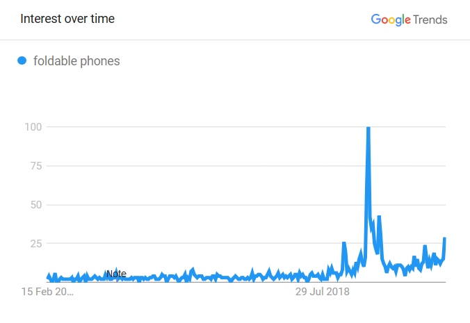
Frederick O'BrienAfter years of talk, experimentation, and plateauing smartphone sales, foldable devices are finally entering the market. Samsung, Huawei, and Motorola have all released phones with foldable screens, and tinkering away behind the scenes the likes of Apple aren’t far behind. The ‘foldable web’ is coming.
Its devices are taking various forms, from laptops to phones to newfangled dual-screen hybrids. There is no catch-all definition for this new class of gizmos, but most fit into one of two categories. ‘Foldables’ are devices in which the screen literally folds, while on ‘dual-screens’ the screens are separate but can be used as one. Where web design is concerned the two types will likely play by similar rules. Should the technology take off in a big way then web design could be looking at its biggest shakeup in well over a decade.
It all sounds very exciting, but what does it actually mean? The ‘foldable web’ will bring with it new challenges, new opportunities, and, in all likelihood, new syntax. The web could be in for its biggest shakeup since the smartphone. Users and coders alike have gotten rather used to the playing field: desktop and mobile with a sprinkling of tablets. Not any more. If you thought you knew responsive design before you ain’t seen nothing yet.
Further Reading
- “The Future Is Foldable: Developing The Galaxy Fold’s App Ecosystem,” Samsung Newsroom
- “Foldable Phones Are Here. Do We Really Want Them?,” Brian X. Chen, The New York Times
New Web Standards, New Experiences, And New Problems
Flexible screen technology has been researched since the 1970s but has only been developed in earnest since the turn of the millennium. It’s only in the last couple of years that consumer devices have started to enter the market — in all shapes and sizes.
Some, like the Galaxy Z Flip, mimic an old-school flip-phone. Others, like the Huawei Mate X, have the screen(s) wrap around the outside of the phone. Plenty more are built like electronic books, with two interior displays becoming one when the device is fully opened. Oftentimes there is a separate, smaller screen on the outside so users don’t have to unfold it when they use it.

The hardware hiccups are well documented and are being worked through. Foldable devices are coming. That is not the focus. Here the focus is on how the technology will impact web developers, UX designers, and anyone else whose business it is to deliver quality browsing experiences.
Updates To CSS And JavaScript
New hardware means updated software. Microsoft has been particularly responsive to the arrival of foldable tech, in part because the company is working on its own foldable devices. Three Microsoft developers — Bogdan Brinza, Daniel Libby, and Zouhir Chahoud — have published an explainer in which they propose a new JavaScript API and a CSS media query. Chahoud expanded on this with a GitHub post on February 3rd.
They highlight potential issues with foldable devices, including:
- Variety of hardware in the foldable market.
Some devices are seamless while others aren’t, and their shapes vary wildly. The Windows Surface Duo and Galaxy Fold are both shaped like books - one with a seam and one without. The seamless Motorola Razr harkens back to the flip-phones of old, with the two ‘halves’ of the screen closer to squares than rectangles. Consider as well that it’s surely only a matter of time before a three-part foldable appears on the scene. With so much variety in the shape and size of foldables it’s important to target a _class _of device rather than specific hardware. - ‘Fold area’ functionality.
The miracle of foldable screens has required a few sacrifices. A major one is the potential awkwardness of the screen(s) near the fold. Content positioned on or across the seam of a partially folded screen may be difficult to view or interact with. Books and magazines tend to avoid printing content across their folds; the same will likely hold true for foldable screens. What’s more, some usability tests have suggested touchscreen responsiveness isn’t as reliable on foldables.
In an attempt to address these issues and others, Brinza, Libby, and Chahoud have proposed a spanning CSS media feature, which can test whether the browser window is being displayed across two screens or across a fold. If it is, then content can then be positioned relative to the fold or seam. This plays into the ongoing evolution of responsive design, which increasingly has to account for more than screen size.
Accordingly, environment variables have also been proposed, providing a way to recognise segment size and orientations. Such additions would effectively allow websites to shape themselves across three dimensions. The same page can behave differently when it’s flat than when it’s an L shape.
The CSS suggestions are accompanied by a new Window Segments enumeration for JavaScript API, which would allow sites to behave more dynamically. For example, what’s displayed could change depending on whether the screen is bent or not, or behave differently depending on whether users touch one half of the display or the other. The new JavaScript API also improves functionality on non-Document Object Model targets where CSS is not available, such as Canvas2d or WebGL.

These proposals don’t account for more than two screens or segments, but for now the tech seems to be headed that way. Should these proposals be implemented they would add a new layer to responsive web design. The time may soon come when we can no longer assume sites need only function in single rectangular spaces. New CSS and JavaScript specifications like those proposed by Brinza, Libby, and Chahoud would give developers a way of doing something about it.
Chahoud doesn’t expect many teething problems:
“We view dual-screen and foldable devices as another responsive web design target, something web developers have been doing for years with CSS specific to phones, desktops, tablets,and so on.”
If new web primitives stay ahead of the tech, developers will be able to focus on improving the functionality of their sites.
A New Fold And Dual-Screen Experiences
What does that improved functionality involve? One of the main takeaways is that there’s a new fold in town. While ‘above the fold’ has been around for as long as there’s been scrolling (a throwback to newspaper design) developers will soon have to contend with folds in the middle of the page.
At the very least this will likely mean adjusting content so users don’t have to interact with anything on the fold. If touch controls are limited at the fold, or the device is partially folded, it makes sense to reposition certain elements so that they sit on one half of the screen or the other.

“I think there are a lot of opportunities not only in the increased real estate but also in the ‘defined’ real-estate,” Chahoud says. “The fold (whether the device is seamless or has a seam) splits the screen into two nicely defined display regions and creators can organize specific content per region.”
This is genuinely handy.
— Adrian Weckler (@adrianweckler) February 19, 2020
Switch it to selfie mode, half fold it and it (obviously) sits upright for your call. pic.twitter.com/5reTQlpkXp
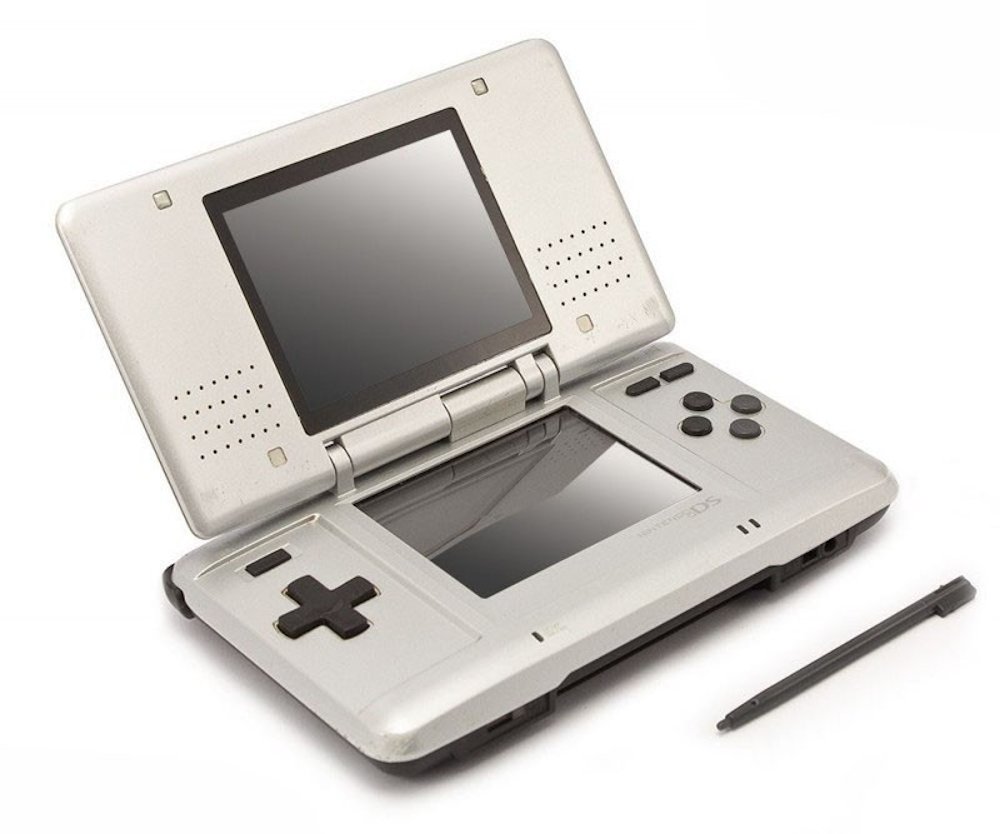
On the more ambitious end of the spectrum, foldable devices effectively mean a mini dual-screen setup, in which the two halves of the display can be used for different things. Indeed, when you boil down the foldable web it bears an uncanny resemblance to devices like the Nintendo DS — a single device with two screens working together. Tech has advanced massively since then, to the point where the two displays can be seamlessly connected, but the core experience is very similar.
In terms of web design, this allows for content to be presented in a more app-like way. Chahoud says: “I believe designs targeting dual-screen or foldable devices will be a two-column grid at the base, representing the available logical or physical display regions.” Samsung Developer documentation goes even further, suggesting the secondary display can itself be split into two, providing three separate ‘screens’ in all.

On a cooking website, this might mean having the recipe on one screen and the ingredients on the other. On a news website, it might mean having article copy on one screen and related reading on the other. It depends, as ever, on the content. At its most ambitious the foldable web could function like dual mobile screens.
Tidying Up
For many, the rise of foldable devices won’t be a game-changer so much as a modest improvement for user experience. Steve Krug, author of Don’t Make Me Think! A Common Sense Approach to Web Usability, sees the foldable web as an evolution rather than a revolution. “Unfoldable phones always struck me as the next reasonable step,” he says. Not because of dual-screen capabilities, but because they make tablet experiences more portable, fulfilling the desire for “a tablet I can carry in my pocket.”
Phablet, as well as being a top contender for worst portmanteau of all time (it narrowly lost to ‘guesstimate’ in the 2019 World Championships), may well find a new home. Rather than meaning a phone so large it’s basically a tablet, a phablet will be one or the other depending on whether the device is open, closed, or somewhere inbetween.
“There are classes of apps that would benefit from split-screen or different aspect ratios, but for the most part those devices are not going to bring you anything new if you just want a larger screen to watch videos on.”
— Steve Krug
In many cases, the ‘foldable web’ will simply mean better-optimizing sites for tablet-sized displays. At present tablets only have around 3% market share worldwide (compared to 52% for mobile and 45% for desktop). If foldable devices make a dent in that they will be much harder to ignore.
When the likes of Apple release a foldable device, it’s safe to say it will sell like hotcakes. As more foldable tech enters the market, web design will need to up its responsiveness just to maintain existing functionality. At the very least there’s going to be some tidying up to do.
Further Reading
- “Galaxy Fold Documentation,” Samsung Developers, Samsung
- “Foldable Phones’ Potential To Turn UX Into A Disaster,” Moses Kim, Medium
- “The Evolution Of Responsive Design,” Rachel Andrew, Notist (talk slides)
- “Microsoft Developer Day: Building Dual-Screen Experiences,” Microsoft (video)
Be Flexible
So what does the foldable web mean? In short, it’s up to you. The trend likely marks the next step in responsive design. With the aid of new CSS and JavaScript features, developers will be able to build multi-screen experiences where before there was the single, uninterrupted rectangles of desktop, mobile, and tablet.
How far those experiences can go remains to be seen. It’s safe to assume the ‘foldable web’ won’t arrive readymade. There is no guarantee that devices will take off like smartphones did, especially while most of them still cost upwards of 2,000 dollars. There will be teething on the hardware side, a period of turbulence after which tech will likely settle into reliable styles.
It is the role of developers and designers to push these platforms as far as they can. The foldable web is an opportunity to give websites fluidity and functionality that wasn’t possible before. It means making websites more responsive than ever.
It also marks a unique opportunity to explore uncharted territory. Though not a seismic change, the foldable web is probably the biggest change to the status quo since the iPhone. What that means as far as syntax goes is very much up for grabs. Web standards aren’t concocted in smoke-filled back rooms. Now is the time for getting involved, offering feedback, making suggestions, and experimenting.
Here are some resources for getting involved.
- “Proposing New CSS Primitives To Enable Great Web Experiences On Foldable And Dual-Screen Devices,” Zouhir Chahoud, GitHub
- “
css-media-queriesFoldables Support And Enablement,” Adam Argyle, GitHub - Windows 10X development tools (download)
- Microsoft Edge Insider Channels (download)
- Comment below!
Mobile-first design is about to get more complicated, but also more exciting. The foldable web could be the first time handheld devices feel expansive rather than restrictive. For some websites, it will mean tweaks, while for others, wholesale redesigns. The scope of what’s possible depends on the innovation of developers.
So, what do you think is possible?
 (ra, il)