Designing Better Tooltips For Mobile User Interfaces

Ideally, mobile designs would be seamless with no need for technical documentation, online help, or tooltips. In reality, even the best designs can benefit from supplemental information. A tooltip provides this supplemental information when users tap an icon, image, hyperlink, or other elements in a mobile user interface (UI). For example:

By identifying the “Solid Fill” and “Radial Fill” functions, the tooltips shown above make it easy for users to find the drawing function they need. These tooltips appear in the proper context and are not obtrusive. A first-time user can easily understand the meaning of each icon while an experienced user is unlikely to find these tooltips distracting. In short, the designer has balanced the needs of new and seasoned users. The result of this successful balance is a set of tooltips that users will perceive as a natural extension of the design experience.

Too often, however, tooltips are an afterthought as shown in the following example of a mobile contrast checker:

While the explanation about the contrast checker is clear, the text is too long and covers important information on the screen. The result is a clunky tooltip that confuses as much as it elucidates. Avoiding troublesome tooltips requires thought and planning.

How To Design Effective Tooltips

The key to designing tooltips that fit seamlessly into the overall design is to plan for them early in the design process. Specifically, designing useful tooltips requires:

  • Proper timing
    Paying attention to tooltips and related design techniques during the sketching and early prototyping stages.
  • Proper implementation
    Carefully considering tooltip context, placement, and clarity.

Timing

Timing refers to when during the design process to consider tooltips. By referring to the widely use design sprint, developed by Jake Knapp, we can identify the right stages in the design process to make decisions about design elements like tooltips.

Knapp’s sprint process consists of mapping out the problem, sketching solutions, choosing one solution, building a prototype, and then testing that prototype. In short, generate an idea, build it, and test it. The following image shows Knapp’s five-day design sprint process. I’ve added text to the sketching and prototype days to show when designers and developers should start thinking about tooltips.

Sketching is the logical place to begin when considering tooltips because potential points of confusion emerge as the layout and preliminary content take shape. Because initial sketches often do not include complete or detailed content, it is not necessary to identify every possible tooltip or even to include all designated tooltips at this stage. Rather, the point is to identify parts of the UI where a well-designed tooltip would help users complete the task at hand or more easily understand content.

For example, a tooltip on a field label makes it easier to fill out the form while also reducing data-entry errors. If it’s not yet clear whether a tooltip is necessary, simply include a callout with a question as shown in the figure below.

The callout shown above serves as a reminder for the team to discuss before building the prototype. In the “CVV” example above, the team might decide that one persona represents users who are unfamiliar with financial terms and abbreviations. For this group, a CVV tooltip would likely be useful and could easily be incorporated into the prototype as shown below.

Considering the need for tooltips and other supplemental information early in the design process increases the chance of developing a useful and usable prototype.

Implementation

The increasing complexity of mobile apps and limited space on mobile devices pose a significant challenge to designing effective tooltips.

Designers can meet this challenge by focusing on:

  • Context
    Check, check, and re-check the context for every tooltip. What might appear obvious to you as the designer could easily confuse a first-time user. The principle of attending to context applies to all aspects of UX and UI design. It’s especially important for tooltips because their necessary brevity will leave users confused if the context is not clear.
  • Placement
    Tooltips should be prominent and easy to find but should not obstruct important information on the screen.
  • Clarity and brevity
    Edit each tooltip for clarity and brevity. As many editors tell their writers: “Cut, cut, and cut some more.” It’s okay to write longer tooltip text in early iterations as long as you remember to keep editing and condensing for clarity.

The tooltip in the following example fulfills these criteria by providing essential information without disrupting the flow in the mobile form.

Because space is limited on mobile devices, clarity, brevity, and placement are essential. The tooltip on the Mint registration screen shown above is well designed. It is clear, concise, and appears directly below the zip code field when users tap the information icon.

The Square mobile app shown below provides another example of good tooltip design by helping bi-lingual users select their preferred language.

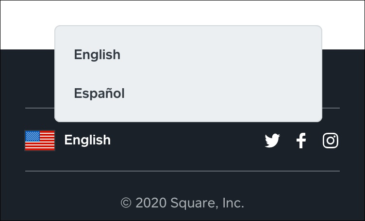
The “English/Español” tooltip shown above is clear, brief, and properly placed. When users tap the flag icon or “English” text, a tooltip appears with the option to select “English” or “Español.”

Well-placed tooltips enhance visual design by providing short, specific explanations when users need them. In the example above, users who are seeking information in other languages know immediately that they can choose between English or Spanish for this website. The language tooltip helps native Spanish speakers who might read English well but feel more comfortable using the Square app in their native language.

Utility is essential but not sufficient. Effective tooltips should be discreet to the point that users barely register their presence. Users only miss tooltips when they aren’t there. This approach to tooltips is an example of the long-standing view that great design is invisible. From this perspective, users never notice the design. Instead, they feel engaged and easily complete the task at hand.

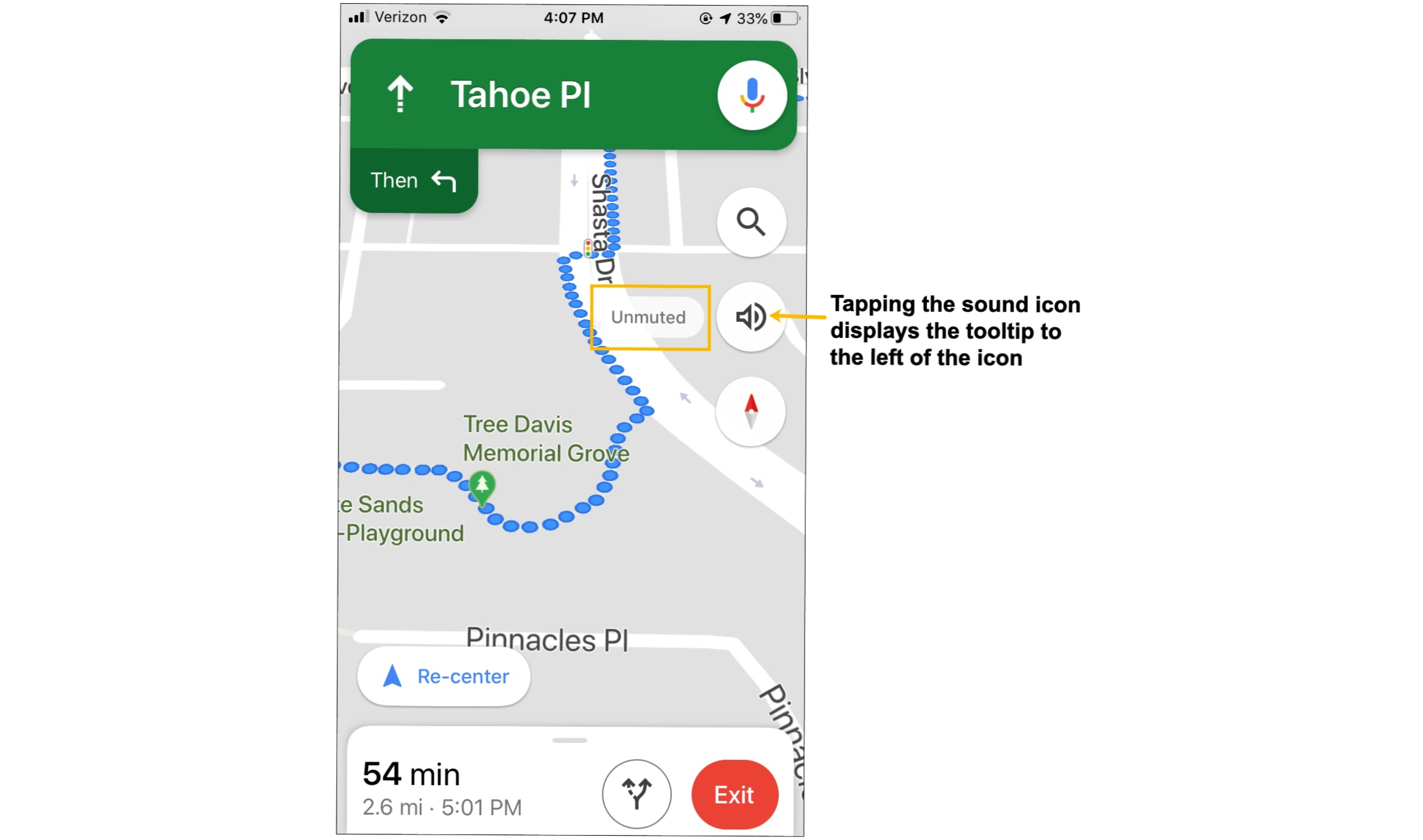
The tooltip shown below on the Google Maps app is easy to find yet subtly integrated into the existing design:

  • The icon for muting/unmuting appears in a vertical row of icons.
  • The placement of these icons on the right makes them easy to see without obscuring important information on the map.
  • The mute/unmute icon follows the same style and color scheme as the search icon immediately above.

This Google map tooltips works because:

  • The context is clear. The option to toggle on sound (before pulling out of the driveway) is useful because it’s easier and safer to listen to directions while driving than to look at the phone.
  • The placement of the mute/unmute icon in a group of existing icons makes it easy to see without obscuring important information on the map.
  • The one-word tooltip is brief, and its meaning is clear.

In contrast, the tooltip shown in the MyZone fitness mobile app below is poorly designed.

While the context is clear, there are problems with the MyZone app tooltip:

  • The placement is clunky because it obscures important information.
  • The tooltip text is lengthy, and the explanation of “Max HR” is confusing.

To accommodate this lengthy text and the distracting green bar at the top, the tooltip is unnecessarily large. The result is a tooltip that is not discrete; it does not feel like a natural extension of the design.

Poor placement and confusing explanations are not the only problems users experience with mobile tooltips. A surprisingly common issue is the redundant tooltip. The tooltip example below is part of an illustration of cascading style sheets (CSS) smooth animation. The animation works and the illustration itself is clear; the problem is that the tooltip simply repeats the button text.

In the article about CSS animation, the illustration shown above is only for demo purposes. Nonetheless, the image would be more useful with a clear and useful tooltip. As used here, the tooltip is not useful.

While redundant tooltips are useless, tooltips that appear in the wrong part of the UI are especially problematic because they distract users from the task at hand.

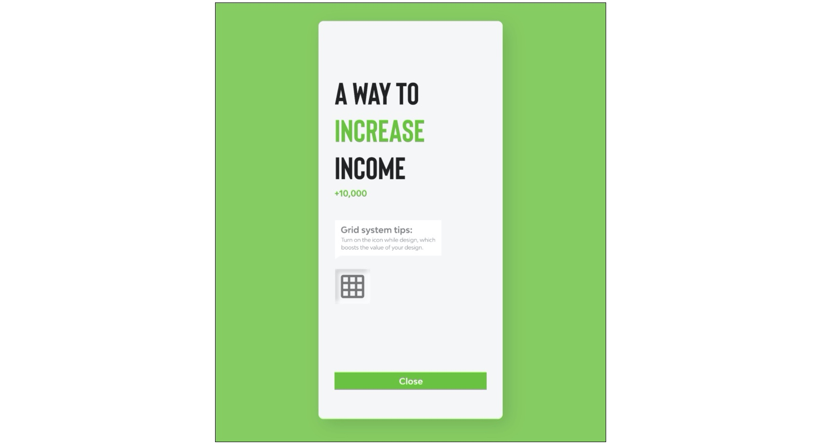
The screen shown above includes a title in large font with a statement about increasing income. Yet, the tooltip refers to a grid system tip icon that supposedly “boosts the value of your design.” At best, there is a tenuous connection between the tooltip and the main theme on this screen, increasing income. The icon and tooltip might be important, but they are in the wrong place in this app.

More broadly, context is a bedrock UX principle and applies to all design elements. For example, an image of a $150,000 sports car on a site or app targeting budget car shoppers would look and feel incongruous because the image would not match the user’s expectations. In short, the image would likely confuse the targeted user group.

Context is particularly important for tooltips because the purpose of a tooltip is to clarify and provide additional information. A misplaced tooltip does the opposite; it causes confusion.

Where To Use Tooltips

Context is also a critical consideration when deciding where to use tooltips. Because tooltips work best when they amplify a well-designed UI, they are particularly effective for:

  • Contextual Help,
  • Brief instructions,
  • New features.

Contextual Help

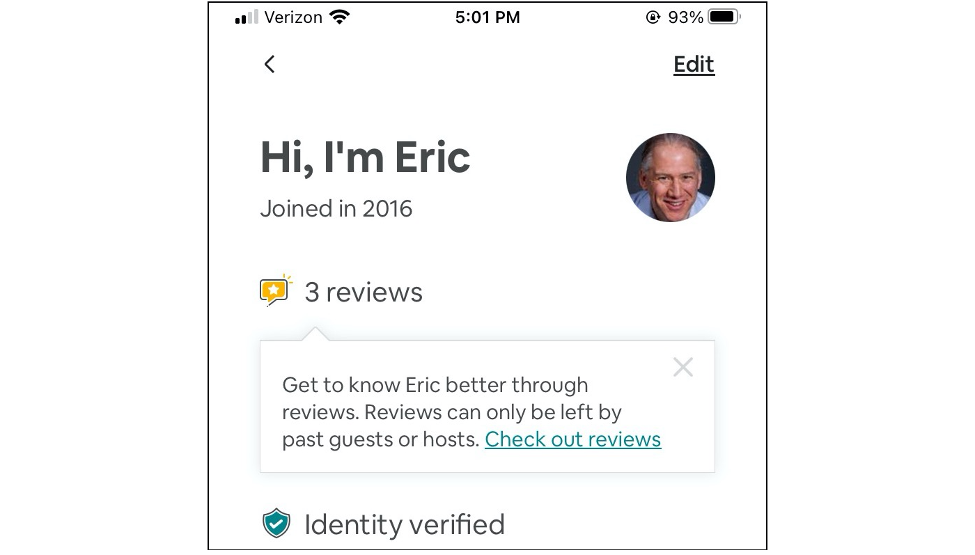
Contextual help appears when users are in a specific part of the UI. The following example is from Airbnb. Tapping the icon or “3 reviews” text displays a tooltip with an explanation of reviews and a link that takes users to reviews about the individual shown on screen (the author, in this example).

The tooltip shown above is informative because it explains what reviews mean in the Airbnb app and, specifically, in the context of a single profile. In short, contextually specific tooltips appear at the precise moment users need additional information.

Brief Instructions

Instructional tooltips should also appear when users need more information. The difference is that certain aspects of a mobile app might require an explanation at each step to ensure that users can complete the task at hand. For example:

Each tooltip in this part of the IRS app is paired with a specific task such as entering a social security number, date of birth, or street address. Because each tooltip is context-specific, users can easily learn what they need to do during each step and why the IRS needs this information.

New Features

As Sofia Quintero explains in Tooltips: your secret weapon for improving feature discovery, tooltips are an effective way to draw the user’s attention to new features, “To promote and publicize its new GIFs, Twitter displayed a full-screen message to users before gently directing them on how to incorporate GIFs into their tweets using a traditional tooltip.”

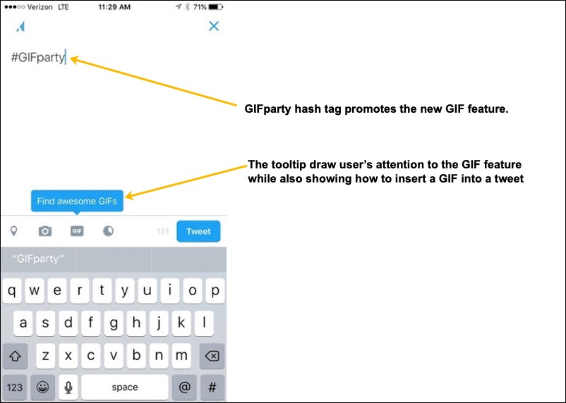
The GIF feature was introduced a few years ago, but it holds up as a useful presentation of a new feature. It’s clear and clean, standing out without dominating the UI. New users will see it while experienced users can proceed without distraction because the tooltip is well-integrated into the UI and does not cover up other screen elements.

Conclusion

Tooltips amplify a mobile UI by providing supplemental information precisely when users need it. Leverage the power of tooltips by considering them when sketching designs and building early prototypes. During implementation, ensure that tooltips will help users by focusing on:

  • Context
    Effective tooltips appear precisely when users need them.
  • Placement
    Tooltips should be prominent and easy to find but should not obstruct important information on the screen.
  • Clarity and brevity
    Review every tooltip in your app to ensure that it makes sense. Edit for brevity.

For tooltips to reinforce a well-designed UI, use them in parts of the UI where they work best such as:

  • Contextual Help,
  • Brief instructions,
  • New features.

Tooltips are a powerful design pattern with a light footprint that enhances mobile designs when used judiciously.

Additional Resources

Reducing Design Risk

Reducing Design Risk

Reducing Design Risk

Eric Olive

Lean, agile, do more with less. Again, and again, design culture urges us to move quickly and trim research and design operations to the point where design becomes a mere thread in the larger corporate spool.

Author and designer Nikki Anderson explains the consequences of this pressure to conduct research at lightning speed:

“When we’re asked to synthesize at the speed of light, user research becomes a way for teams to take a shortcut — to invent assumptions based on quickly made correlations, opinions, and quotes.”

The result is design based on assumptions or incomplete information about users and customers. For example, a Fortune 500 company (let’s call it Company Q) hired me to conduct a usability test for a complex user interface (usability testing involves a series of one-on-one sessions with real users who are asked to complete specific tasks while using a product or piece of software).

The test yielded what would likely become recognizable patterns, and I was halfway through the analysis when I was ordered to pause and send the client the findings immediately. My explanation about the need for more time to conduct a thorough and nuanced analysis fell on deaf ears:

“Just send a short video.”

I reluctantly sent a video snippet showing a participant struggling with the user interface (UI).

Biased design decision based on observation of a single usability test participant. (Large preview)

There was no time for background, context, or nuance. The product manager at Company Q recognized the participant in the video from a previous encounter and dismissed his struggles:

“He’s a crank, we can’t base decisions on him.”

The company moved forward without addressing this serious UI issue.

This product manager had become emotionally attached to his product (see endowment effect below). This emotional attachment hindered his ability to assess the product’s strengths and weaknesses objectively. It’s not surprising that professionals develop strong feelings about their products.

Understandable, but also problematic. As UX guru Jared Spool explains in an article about the ROI of UX, dismissing user needs carries a high cost:

For example, say you get many support calls because the design doesn’t do something the users expect. That’s a high cost due to a poor design decision.

How costly? According to Jeffrey Rumburg of HDI, the average cost of a single support call in North America is $15.56. Even if support calls only increase by 83,000 each month, the annual cost is over $15 million.

In contrast, addressing design problems works. According to the McKinsey report, “The Business Value of Design”:

“One online gaming company discovered that a small increase in the usability of its home page was followed by a dramatic 25 percent increase in sales.”

Note: For this study, McKinsey tracked the design practices of 300 publicly listed companies over a five-year period in multiple countries and industries. Their senior business and design leaders were interviewed or surveyed. The McKinsey team collected more than two million pieces of financial data and recorded more than 100,000 design actions.

These numbers demonstrate the direct financial costs associated with rushing market research and shortchanging user and customer concerns. They also illustrate the financial benefit of addressing customer concerns.

In this article, I’ll shed light on the techniques for addressing these concerns:

  1. Carefully selecting a research location;
  2. Compromising with stakeholders to allow sufficient time for analysis without delaying the design process;
  3. Making sound, evidence-based design decisions;
  4. Engaging in design reduction.

1. Context Over Convenience: Why Location Matters

Where you conduct research matters as much as the research method. Before booking a facility for your next user interview, consider the importance of location. You might not want to book a quiet meeting room if users work in a noisy environment with numerous distractions. In fact, the user’s environment will help you identify the best research method for gathering insights (interviews, diary studies, observation/contextual inquiry, usability tests, cognitive walkthroughs, etc.).

This is precisely what happened when our team conducted UX research for a manufacturer of large construction equipment. We could have brought machine operators to a quiet showroom to ask them questions about the equipment and what did and did not work well.

This would have been the easy but incorrect choice. Instead, we traveled to construction sites in the U.S., Mexico, and Colombia where we observed operators using the equipment outside where it was dusty, dirty, and loud.

Construction Site in Colombia. (Large preview)

On-the-ground observations included:

  • Risks of vehicle collisions due to noise and low visibility when winds were high.
  • The difficulty shorter operators encountered when reaching for certain controls in the cab (operators in Latin America were, on average, smaller than their U.S. counterparts).
  • The rapid corrosion of metal equipment caused by salt on a construction site near the ocean.

Observing users in their real-world work environment:

  • Reduced the risk of solving the wrong problem because we did not rely on second-hand information from sales or product (this happens more often than you might think).
  • Allowed us (the researchers) to hear the noise, see the dust, and feel the bumps while riding on these enormous machines.
  • Provided actionable insights that could not have been gathered in an office.
The author interviewing a machine operator in Colombia. (Large preview)

Our research at sites in Mexico and Colombia demonstrated the truth of the old adage. Meeting users where they worked every day yielded rich, qualitative data that our client used to inform important design decisions.

2. Compromise

This was a good outcome. The fieldwork in Mexico and Colombia identified real-world problems, and stakeholders acted on this information.

This is not always the case. There is a temptation to make design decisions quickly based on incomplete information as happened to Walmart when management decided to change aisle and shelving design based on a customer survey. When customers were asked if stores were too cluttered, they said yes. Walmart spent millions re-designing stores only to lose more than $1 billion in revenue. When Walmart reverted to the cluttered aisles, sales increased. What happened?

Two reasons for this fiasco were likely a poorly worded survey and incomplete analysis. Walmart relied too heavily on what customers said rather than what they did. The importance of placing considerable weight on what users and customers do is a bedrock principle in customer and user experience.

“Rather than just ask shoppers what they think they would like, I can follow someone through their shopping trip in a grocery or mass merchandise store like Walmart and Sam’s Club and then interview them as they load their bags into the car. What is striking is the wide gap between what they say they did, and what I observed.”

— Paco Underhill, author of Why We Buy. New York Times Article about Walmart.

Underhill, a legend in consumer and market research, is exactly right. Unfortunately, even when stakeholders agree to fund observation (ride-alongs, shop-alongs, contextual inquiry), there is considerable pressure to move forward the moment a UX or market study is done leaving little time for thorough analysis.

The goal in these situations is to strike a balance between speed and thoroughness. Product managers and other stakeholders have a great deal of responsibility and are often under pressure to move products to market quickly. Rushing the design process, however, can result in overlooking key user needs emerging from research.

Analysis. (Image by StartupStockPhotos from Pixabay) (Large preview)
Preliminary Design Work. (Photo by Syda Productions from Depositphotos) (Large preview)

Compromise during the transition from research analysis to design serves two purposes. First, it allows researchers sufficient time to review, reflect, and report accurate and actionable findings that will help the design team move forward. Second, as with any endeavor, a willingness to compromise establishes a degree of trust.

3. Better Design Decisions

Compromise and trust are a sound basis for establishing a constructive relationship between researchers, designers, and stakeholders. Such relationships contribute to an environment conducive to better design decisions. These points seem straightforward, even obvious.

Straightforward perhaps but not easily achieved. Why? Human nature. Humans are subject to what psychologists call the endowment effect, the tendency to overvalue objects you own simply because they belong to you. Selling a house is a classic example. As the homeowner, you are emotionally attached to your house because you’ve put effort into maintenance and improvements. The house holds fond memories. After all, you live there. None of this matters to the buyer. She only cares about the objective market value and getting the best house for the least amount of money.

Endowment Effect: Emotional attachment leads to an inflated sense of value. (Image by Pexels from Pixabay) (Large preview)

Once the endowment effect takes hold, it’s difficult for people to part with the object, a house in this example. In the context of design, changing a UI or physical product is roughly equivalent to parting with it.

For example, while evaluating a complex UI for a programmable logic controller, the product manager announced to me and a room full of stakeholders: “My name is Jim, and I love this product.” Points for honesty. As expected, when I delivered the report, Jim held firmly to his belief that the UI was fine and did not require modification. He was, understandably, attached to the machine and the UI. Unfortunately, the company’s customers did not share this attachment as illustrated by ongoing customer complaints.

The data supports this conclusion. According to the McKinsey report mentioned above: “Less than 5 percent of those we surveyed reported that their leaders could make objective design decisions.”

The endowment effect is one of many barriers to making sound design decisions. See A Designer’s Guide To Better Decisions to learn how to avoid other, common decision traps.

Awareness of the endowment effect and other decision traps contributes to better design because it allows us to make tough choices during the actual design process.

4. Design Reduction

One such choice is what to remove from an existing design or an early design iteration. For example, the image shown below left could easily be an early iteration of a mobile app.

Cluttered Layout: Fake Fitness App. (Large preview)
Cleaner Layout: Fake Fitness App. (Large preview)

Few will argue against the power of simple, elegant, and engaging design. Such successes are often the result of careful, thoughtful reduction. From the number and size of elements on the screen to the simplicity or complexity of the color palette, it all comes down to reducing the design to the point that it’s clean and easy to use without removing anything essential.

Even in the cleaner example (above right), a designer might ask if “This Month” and “165: Max Pulse” are necessary. If not, removing them would be yet another reduction.

The point is not to debate the UI details for this fake fitness app. Rather, designers must anticipate the “everything-but-the-kitchen-sink” effect and make the case for removing unnecessary design elements. Effective techniques include:

  • Gently reminding stakeholders and other team members about the risks of a heavy cognitive load.
  • Sharing cluttered designs (any app or site will do) with the team and asking them to quickly locate a specific feature. Their struggle to find the feature will make the point.
  • Sharing video clips of past research projects for your company showing how easily users become confused when interacting with a crowded UI.

Adhering to this reduction technique early in the design process benefits the business by decreasing the chance of user confusion, task or cart abandonment, and unhappy customers.

Design reduction is essential to creating engaging, user-centered design but only works when coupled with rigorous user research that contributes to informed design decisions.

Conclusion

Because research, decisions, and the design process go together, the focus of this article has been to identify the risks of rushing user research and design. Mitigating this risk does not require doubling the size of research and design teams. Instead, we’ve proposed four practical techniques that teams can implement immediately:

  • Context over convenience
    Location matters. Whether at home, a café, or on a noisy construction site, conduct UX and market research where users will be when interacting with your product.
  • Compromise
    When business stakeholders cannot simply wait for a thorough analysis, compromise. At the stakeholder’s direction, the design team can move forward with limited design changes while agreeing not to make major changes until the final research analysis is complete.
  • Better design decisions
    Make better decisions by keeping an eye out for the all-too-human tendency to become attached to a design you have created.
  • Reduction
    Remove unnecessary UI elements leaving only what is necessary for users and customers to complete the task at hand.
Smashing Editorial (ah, yk, il)

Better Design With Deep Thinking

Better Design With Deep Thinking

Better Design With Deep Thinking

Eric Olive

Interruptions, administrative tasks, and too many meetings are among the common complaints voiced by today’s professionals. When was the last time someone complained about a canceled meeting? In other words, everyone understands what hinders productivity, right?

Not so fast, says computer scientist Cal Newport. While we all realize that interruptions and fragmented time are troublesome, we fail to recognize:

  • The frequency of interruptions: We convince ourselves that we are focusing on one task at a time, such as a complex interaction design problem. Yet, every ten minutes or so, we check email or answer a text. Yes, we’re performing one task at a time, but the duration of that task is brief.
  • The cost of these interruptions: As Newport explains on a recent episode of Hidden Brain: “Even those very brief checks that switch your context even briefly can have this massive negative impact on your cognitive performance. It’s the switch itself that hurts, not how long you actually switch.” (Emphasis mine)

This task switching was the focus of a study by business professor Sophie Leroy. She gave participants a cognitively demanding activity, such as solving a puzzle, and then briefly interrupted them before they completed it. When they returned to the original task, their performance dropped. As Leroy explains, these “results indicate it is difficult for people to transition their attention away from an unfinished task and their subsequent task performance suffers.”

Leroy calls this carryover from one activity to another “attention residue,” meaning that people are still thinking about the previous task even as they turn to the new one.

The most effective way to avoid attention residue is to structure your work in a way that reduces interruptions. Such structure requires understanding the difference between deep and shallow work.

Deep Work, Shallow Work, And Why They Matter

“Deep work is the ability to focus without distraction on a cognitively demanding task,” writes Newport in his book Deep Work. This work allows us to absorb, understand, and act on complicated information. Examples including coding, complex project plans, user research, and sophisticated design work.

Shallow work refers to tasks that do not require extensive thought and focus such as filling out expense reports and answering emails, texts, and Slack messages.

Shallow tasks are necessary. The question is how much time to devote to shallow and deep work and how to structure work in a way that facilitates reflection and concentration.

Left image: Design is deep work. Right image: Filling out a checklist is shallow work.
Left: Design is deep work. Right: Filling out a checklist is shallow work. (Image credits: FirmBee | raw pixel) (Large preview)

The Solution: Five Practical Tips For Pursuing Deep Work

Tip 1: Jump Into Design Work

Avoid the temptation to text or check email first thing. Put your phone on do not disturb. Get out your sketch pad or open your design tool and challenge yourself to solve one gnarly design problem by 10:00 am.

While this tip sounds like common sense, it’s not quite so straightforward because we are conditioned to respond to signals around us: “External triggers are cues from our environment that tell us what to do next. These are the dings and pings that prompt us to check our email, answer a text, or look at a news alert,” explains habit expert Nir Eyal in a post about distraction.

Eyal continues: “Competition for our attention can come from a person as well, such as an interruption from a coworker when we are in the middle of doing focused work.”

Computer scientist Cal Newport expands on this point by explaining the biology behind the itch to respond. When we don’t reply promptly to a text or email, we feel like we are ignoring someone from our tribe. Emotionally, it’s the modern-day equivalent of ignoring someone who is tapping on our shoulder as we sit around the fire. In short, it’s difficult to ignore messages and requests from co-workers.

Difficult but not impossible. Extend jumping into design work by blocking out untouchable time on your calendar. What about emergencies? “The short answer is that there really never are any,” writes podcaster and New York Times bestselling author, Neil Pasricha in Why You Need an Untouchable Day Every Week. These untouchable days involve deep, creative work.

While most professionals cannot set aside an entire day each week, they can mark two-hour blocks on their calendar a few times each week. Colleagues simply see “busy” when viewing your calendar. While not foolproof, this quiet signal shows that you know how to manage your time in order to engage in the deep work that your job requires.

Tip 2: Kickstart Your Brain With Useful Questions

By definition, deep work takes time and considerable brain resources. Sometimes we need a cognitive boost before tackling the problem head-on. When this is the case, ease into deep work by composing a list of questions to stimulate reflection. For example:

  • What is the organization trying to accomplish?
  • How does this site, product, or app align with that goal?
  • If revising an existing design: What would I do differently if I could recreate the design from scratch?
  • What would I do now if there were no legacy system constraints?

Note that these questions involve design but also encourage reflection beyond the immediate design challenge. The latter is important because the longer you work on a product or project, the easier it is to develop design blinders.

Kickstart your brain (Image credit: geralt) (Large preview)

Easing into deep work or jumping in with both feet are often useful as long as it’s possible to avoid those nettlesome distractions. Even so, everyone gets stuck and needs time to regroup and let the mind wander.

Tip 3: Schedule Unstructured Thinking Time

Just as designers and other professionals need time to think through complex problems, they also need time to let the mind wander. The reason is the science behind “shower moments,” when ideas seem to arrive out of the blue.

In fact, the brain needs time for incubation, the psychological term for the unconscious recombination of thought processes after they are stimulated by conscious mental effort such as working on a specific design problem. In other words, when you set aside a strenuous mental task and do something less demanding, the brain is able to process and organize your thoughts to form new ideas.

Effective leaders value unstructured thinking time as outlined in How to Regain the Art of Lost Reflection. Jeff Weiner, CEO at LinkedIn, blocks at least 90 minutes for reflection and describes these buffers as “the single most important productivity tool” he uses. Susan Hakkarainen, Chairman and co-CEO of Lutron Electronics, uses 40-minute walks to reflect explaining that “Thinking is the one thing you can’t outsource as a leader. Holding this time sacred in my schedule despite the deluge of calls, meetings, and emails is essential.”

In short, designers should take their cues from these business leaders. Give your brain a break.

Tip 4: Vote It Off The Island

This tip comes from the Harvard Business Review article Stop Doing Low-Value Work by Priscilla Claman. She cites the example of a controller who was producing monthly reports that nobody read. He sent a list to his colleagues asking them to identify the three or four most important reports. He simply stopped writing the reports that no one was reading.

Another approach is to request permission to not do something such as asking customers if they really want their receipts. The point, writes Claman, is to stop doing something that is not important but to ask first to avoid getting in trouble. It’s vital that we stop ourselves from doing unimportant work.

Designers can identify possibly unimportant work by asking if:

  • Every wireframe must include detailed annotations;
  • Every design deliverable must include a detailed design document;
  • It’s really necessary to produce many variations of a design when studies about choice and decision making show that too many options make it harder to reach a decision.

No one wants to feel as if their work is sitting on a virtual shelf. By asking clients and stakeholders what matters to them, you’ll cater to their needs and save time by discarding unnecessary tasks.

The next step is to assess the remaining important work to determine how much time you can, and should, devote to deep thinking.

Tip 5: Distinguish Deep And Shallow Work

Follow the steps below to make this assessment concrete, something you can point to and share with your boss.

  1. Identify the activities that you consider deep work such as planning a usability test, drawing wireframes, or mocking up a prototype.
  2. Identify shallow work activities like answering emails, attending administrative meetings or meetings tangentially related to your core responsibilities.
  3. Estimate the amount of time you spend on deep and shallow work each week.
  4. Meet with your boss for thirty minutes and ask her what she thinks the ratio of deep to shallow work should be. Ask for a specific number. If you disagree, politely ask if you may experiment with a different ratio for one month.
  5. Then, stick to the agreed-upon number for one month. Document any changes to your productivity, anything that contributes to a better product or service. After one month, report these findings to your boss.

This approach offers two advantages:

  • It’s usually wise to solicit the boss’s support.
  • A single proposal about deep work will not change an entire organization. Involving management, however, can serve as a catalyst for broader change just as the Google Ventures Design Sprint influenced the design process at Google and beyond.

Why Deep Work Makes Everything Better

Deep work allows designers and developers to thrive by leveraging their skills to solve complex problems and create better products and designs. Better products are likely to boost the bottom line while thriving and highly satisfied employees are more likely to stay (reducing turnover) and put their best selves forward.

Perhaps the best news for employers is that deep work does not require adding staff. The solution, explains computer scientist Cal Newport, is to re-configure work and communication. In other words, it’s not more people; it’s the same people managing work differently.

For example, agencies often answer to clients and need to be available at a moment’s notice. Rather than require every employee to be tethered to a phone or laptop, Newport suggests assigning a different employee each day to a dedicated email or a special “bat phone.” This shows the client their importance to the agency while also allowing designers to concentrate on designing, building, and solving problems.

Conclusion

Deep work is the ability to focus on challenging tasks like design and coding. Frequent interruptions make deep work nearly impossible and impose a high financial cost. In this piece, we’ve described five tips for maximizing the time you devote to deep work.

  1. Jump into design work.
    Draw fresh wireframes or work on a new design problem before checking emails and Slack messages. Block two-hour chunks on your calendar to allow time for deep thinking.
  2. Kickstart your brain with useful questions.
    Take a few minutes to ask what you are trying to accomplish and how it aligns with the company’s keep performance indicators (KPIs). Alignment with KPIs is especially important for user experience designers who are frequently asked to justify their budget
  3. Schedule unstructured thinking time.
    Take a walk, stare out the window, or whatever allows your mind to wander. This “downtime” allows the brain to form new connections.
  4. Vote it off the island.
    Are you writing reports that no one reads? Are you scheduling meetings that your co-workers find less than useful? Ask your colleagues if it’s okay to stop. They might respond with a gleeful “yes!”
  5. Distinguish deep and shallow work.
    Then, meet with your boss to arrive at the right balance between these two types of work.

Further Reading on SmashingMag:

Smashing Editorial (ah, il)