Lists—we’ve all worked with them in one form or another. I’m talking about HTML’s <ol> and <ul>. Much of the time, because we desire styling control, we turn off the list’s markers completely with list-style-type: none, and start styling from there. Other times, we choose from a very limited set of unordered list markers, such as disc, circle, or square; or a (much) wider range of ordered list markers. We might even, from time to time, supply the URL of an image to be used.
But what if we want to style the markers differently than the contents of the list items? That’s always been difficult at best. Now, thanks to the ::marker pseudo-element, it’s a whole lot easier. You don’t get the full range of CSS to apply to the markers, but there’s still a great deal that can be done.
::marker is available in Firefox and, thanks to work by Igalia, Chrome as well.
Consider this list:
By default, that will yield an ordered list numbered from 1 to 5, using Arabic numerals (1, 2, 3, etc.), each followed by a dot (period), all of which will match the text contents in font face, size, style, color, and so on.
If you had a design direction that required making the numbers smaller or a different color, you’d have to manually create that effect by suppressing the markers and using the ::before pseudo-element and CSS counters and negative text indenting and… well, it would take a scientist to explain it all.
Enter ::marker. Add these styles to the above list, and you’ll get the result shown after.
That’s all you need!
Before you go tearing off to rewrite all your CSS, though, beware: the properties you can apply via ::marker are fairly limited at the moment. As of February 2021, the properties that markers should recognize are:
All font properties (font-face, font-size, etc.)
The white-space property
The color property
The internationalization properties text-combine-upright, unicode-bidi, and direction
The content property
All animation and transition properties
There are some additions in some browsers, but almost all of the additions relate to text styling, not the box model. So if you were thinking you could put all your list numbers into circles with shaded backgrounds, ::marker won’t get you there—you’ll have to return to the hackfest of ::before generated content. For now, anyway: the specification explicitly says more properties may be permitted for ::marker in the future.
There’s also a limitation around white-space, which has rendering bugs in varying browsers. Chrome, for example, treats all whitespace in markers as white-space: pre as the specification says, but won’t let you change it. This should be fixed when Chrome’s LayoutNG (Next Generation) ships, but not until then. Firefox, on the other hand, ignores any white-space values, and treats whitespace like normal-flow text by default.
With those limits in mind, you can still jazz up your markers with the content property. Instead of numbers followed by a period, you can put each number in brackets with a combination of counters and strings.
Note the space after the closing bracket in the content value. That’s included to provide a little bit of space between the marker and the list content. Ordinarily you might think to use a marking or padding, but as we saw earlier, those properties can’t be applied with ::marker. Which is frustrating! Also note the CSS counter list-item. That wasn’t defined anywhere else in the CSS—it’s a built-in counter that all browsers (that understand CSS counters) use to count list items, like those in ordered lists. You can use it in your CSS as well!
If all you want to do is change the text content of a list marker and don’t care about changing any of its styles, you can do that with ::marker, or you can do it with the new cross-browser support for string values on the list-style-type property.
li.warning {
  list-style-type:"⚠";
}
So that’s what’s new in the world of list markers. It might not be something you need to do often, but if you ever do, it’s good to know that the capabilities in this area have increased, and stand to be even better in the future. Let us know if you come up with some clever markers!
At first, there were flexboxes (the children of a display: flex container). If you wanted them to be visually separate, you had to use content justification (i.e. justify-content: space-between), margin trickery, or sometimes, both. Then along came grids (a display: grid container), and grids could have not-margin not-trickeried minimum gaps between grid cells, thanks to grid-gap. Flexboxes did not have gaps.
Now they can, thanks to the growing support of gap, the grid-gap successor that isn’t confined to grids. With gap, you can gap your grids, your flexboxes, and even your multiple columns. It’s gaptastic!
Gap with Grid
Let’s start where gap is the most robust: CSS Grid. Here’s a basic grid setup in HTML and CSS:
That places the grid cells at least 1em apart from each other. The separation distance can be greater than that, depending on other conditions beyond the scope of this post, but at a minimum they should be separated by 1em. (OK, let’s do one example: gap’s gaps are in addition to any margins on the grid cells, so if all the grid items have margin: 2px;, then the visual distance between grid cells would be at least 1em plus 4px.) By default, changes to the gap size causes resizing of the grid items, so that they fill their cells.
This all works because gap is actually shorthand for the properties row-gap and column-gap. The gap: 1em is interpreted as gap: 1em 1em, which is shorthand for row-gap: 1em; column-gap: 1em;. If you want different row and column gap distances, then something like gap: 0.5em 1em will do nicely.
Gap with Flexbox
Doing the same thing in a flexbox context gives you gaps, but not in quite the same way they happen in grids. Assume the same HTML as above, but this CSS instead:
The flexboxes are pushed apart by at least the value of gap here, and (thanks to flex-wrap) wrap to new flex lines when they run out of space inside their flex container. Changing the gap distance could lead to a change in the wrapping of the flex items, but unlike in Grid, changing gaps between flex items won’t change the sizes of the flex items. Gap changes can cause the flex wrapping to happen at different places, meaning the number of flex items per row will change, but the widths will stay the same (unless you’ve set them to grow or shrink via flex, that is).
Gap with Multi-Column
In the case of multicolumn content, there is bit of a restriction on gap: only column gaps are used. You can declare row gaps for multicolumn if you want, but they’ll be ignored.
section {
  columns: 2;
  gap: 1em;
}
Support
Support for gap, row-gap, and column-gap is surprisingly widespread. Mozilla’s had them since version 61, Chromium since version 66, and thanks to work byIgalia’s Sergio Villar, they’re coming to Safari and Mobile Safari soon (they’re already in the technology preview builds). So if your grid, flex, or multicolumn content needs a bit more space to breathe, get ready to fall into the gap!
Something I learned (or, I guess, re-learned) this year is how important it is to pay close attention to the bit depth of images. Way back in the day, we used to obsessively choose between 2-, 4-, or 8-bit color depth on our GIFs, because when lots of users were using dialup modems to surf the web, every kilobyte counted.
Now that a huge number of us access the web via broadband, guess what? Every kilobyte still counts. Because not everyone has access to broadband, particularly in the mobile space; and also, any time we can shave off page rendering is worth pursuing. I’d assumed that optimization tools handled things as trivial as color depth optimization that for us, but discovered I was wrong there.
This is particularly true for PNGs. By default, lots of image editing tools save PNGs with 2^24 color depth, just in case.
For a photograph, that makes some sense (though if it’s a photograph, you should probably save it as JPG or WebP) but for things like logos and icons, that’s approximately 2^24 more colors than you’re going to be using.
So in Acorn, my image editor of choice, I’ve been taking special care to crank down the bit depth on PNGs in the export dialog. In many cases, I’ve cut image weight 80% or more by indexing colors to a palette of 256 or fewer values, with no loss of visual fidelity. (Again, these aren’t photographs I’m talking about.)
Here’s an example:
PNG export from Acorn
That PNG at full-color depth is about 379KB. Restricted to a palette of 32 colors, it’s 61KB. And that’s just at the export time: once I run them through ImageOptim, the optimized sizes are 359KB and 48KB. That’s a weight savings of about 85%, just by lowering the color depth. And if I deployed the image and discovered it needs a few more colors, I could re-run the process to use 64 colors: the final size, in that case, is 73KB, still enormous savings.
Image run through ImageOptim, reducing size by another 22%
Reducing color depth by eye is clearly more onerous than throwing an optimization script at a directory of images, but in my experience, the results are much more efficient in terms of image weight and therefore user experience. And that’s really what all this is about, isn’t it?
A little while back, I was in the process of adding focus styles to An Event Apart’s web site. Part of that was applying different focus effects in different areas of the design, like white rings in the header and footer and orange rings in the main text. But in one place, I wanted rings that were more obvious—something like stacking two borders on top of each other, in order to create unusual shapes that would catch the eye.
I toyed with the idea of nesting elements with borders and some negative margins to pull one border on top of another, or nesting a border inside an outline and then using negative margins to keep from throwing off the layout. But none of that felt satisfying.
It turns out there are a number of tricks to create the effect of stacking one border atop another by combining a border with some other CSS effects, or even without actually requiring the use of any borders at all. Let’s explore, shall we?
Outline and box-shadow
If the thing to be multi-bordered is a rectangle—you know, like pretty much all block elements—then mixing an outline and a spread-out hard box shadow may be just the thing.
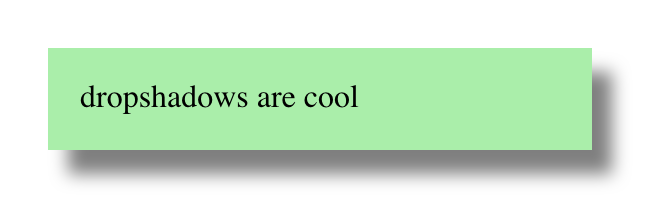
Let’s start with the box shadow. You’re probably used to box shadows like this:
That gets you a blurred shadow below and to the right of the element. Drop shadows, so last millennium! But there’s room, and support, for a fourth length value in box-shadow that defines a spread distance. This increases the size of the shadow’s shape in all directions by the given length, and then it’s blurred. Assuming there’s a blur, that is.
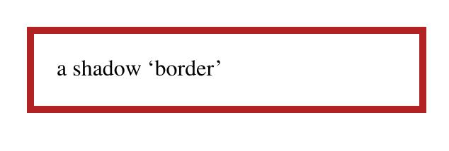
So if we give a box shadow no offset, no blur, and a bit of spread, it will draw itself all around the element, looking like a solid border without actually being a border.
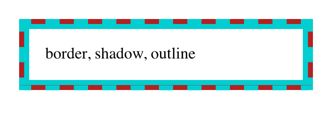
This box-shadow "border" is being drawn just outside the outer border edge of the element. That’s the same place outlines get drawn around block boxes, so all we have to do now is draw an outline over the shadow. Something like this:
Bingo. A multicolor "border" that, in this case, doesn’t even throw off layout size, because shadows and outlines are drawn after element size is computed. The outline, which sits on top, can use pretty much any outline style, which is the same as the list of border styles. Thus, dotted and double outlines are possibilities. (So are all the other styles, but they don’t have any transparent parts, so the solid shadow could only be seen through translucent colors.)
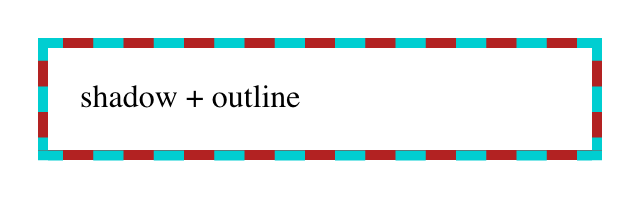
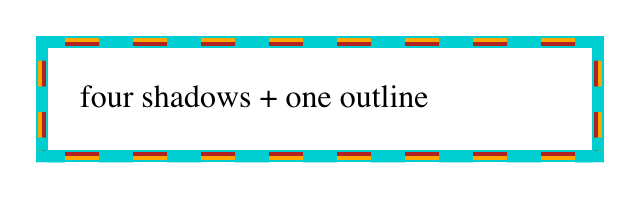
If you want a three-tone effect in the border, multiple box shadows can be created using a comma-separated list, and then an outline put over top that. For example:
Taking it back to simpler effects, combining a dashed outline over a spread box shadow with a solid border of the same color as the box shadow creates yet another effect:
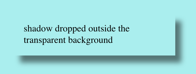
The extra bonus here is that even though a box shadow is being used, it doesn’t fill in the element’s background, so you can see the backdrop through it. This is how box shadows always behave: they are only drawn outside the outer border edge. The "rest of the shadow," the part you may assume is always behind the element, doesn’t exist. It’s never drawn. So you get results like this:
An outer box-shadow casts a shadow as if the border-box of the element were opaque. Assuming a spread distance of zero, its perimeter has the exact same size and shape as the border box. The shadow is drawn outside the border edge only: it is clipped inside the border-box of the element.
(Emphasis added.)
Border and box-shadow
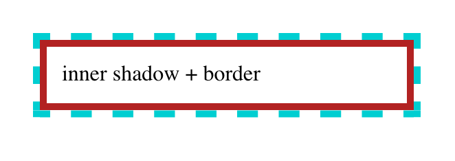
Speaking of borders, maybe there’s a way to combine borders and box shadows. After all, box shadows can be more than just drop shadows. They can also be inset. So what if we turned the previous shadow inward, and dropped a border over top of it?
That’s... not what we were after. But this is how inset shadows work: they are drawn inside the outer padding edge (also known as the inner border edge), and clipped beyond that:
An inner box-shadow casts a shadow as if everything outside the padding edge were opaque. Assuming a spread distance of zero, its perimeter has the exact same size and shape as the padding box. The shadow is drawn inside the padding edge only: it is clipped outside the padding box of the element.
(Ibid; emphasis added.)
So we can’t stack a border on top of an inset box-shadow. Maybe we could stack a border on top of something else...?
Border and multiple backgrounds
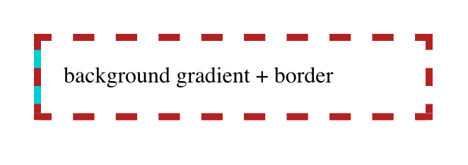
Inset shadows may be restricted to the outer padding edge, but backgrounds are not. An element’s background will, by default, fill the area out to the outer border edge. Fill an element background with solid color, give it a thick dashed border, and you’ll see the background color between the visible pieces of the border.
So what if we stack some backgrounds on top of each other, and thus draw the solid color we want behind the border? Here’s step one:
We can see, there on the left side, the blue background visible through the transparent parts of the dashed red border. Add three more like that, one for each edge of the element box, and:
In each case, the background gradient runs for five pixels as a solid dark turquoise background, and then has a color stop which transitions instantly to transparent. This lets the "backdrop" show through the element while still giving us a "stacked border."
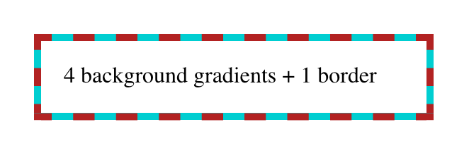
One major advantage here is that we aren’t limited to solid linear gradients—we can use any gradient of any complexity, just to spice things up a bit. Take this example, where the dashed border has been made mostly transparent so we can see the four different gradients in their entirety:
.multibg-me {
  border: 15px dashed rgba(128,0,0,0.1);
  background:
    linear-gradient(to top,    darkturquoise, red 15px, transparent 15px),
    linear-gradient(to right,  darkturquoise, red 15px, transparent 15px),
    linear-gradient(to bottom, darkturquoise, red 15px, transparent 15px),
    linear-gradient(to left,   darkturquoise, red 15px, transparent 15px);
  background-origin: border-box;
}
If you look at the corners, you’ll see that the background gradients are rectangular, and overlap each other. They don’t meet up neatly, the way border corners do. This can be a problem if your border has transparent parts in the corners, as would be the case with border-style: double.
Also, if you just want a solid color behind the border, this is a fairly clumsy way to stitch together that effect. Surely there must be a better approach?
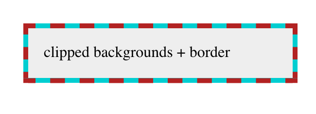
Border and background clipping
Yes, there is! It involves changing the clipping boxes for two different layers of the element’s background. The first thing that might spring to mind is something like this:
But that does not work, because CSS requires that only the last (and thus lowest) background be set to a <color> value. Any other background layer must be an image.
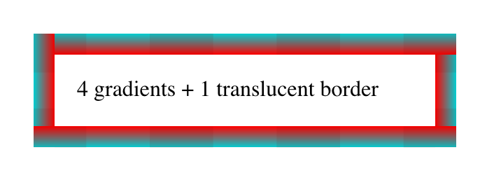
So we replace that very-light-gray background color with a gradient from that color to that color: this works because gradients are images. In other words:
The light gray "gradient" fills the entire background area, but is clipped to the padding box using background-clip. The dark turquoise fills the entire area and is clipped to the border box, as backgrounds always have been by default. We can alter the gradient colors and direction to anything we like, creating an actual visible gradient or shifting it to all-white or whatever other linear effect we would like.
The downside here is that there’s no way to make that padding-area background transparent such that the element’s backdrop can be seen through the element. If the linear gradient is made transparent, then the whole element background will be filled with dark turquoise. Or, more precisely, we’ll be able to see the dark turquoise that was always there.
In a lot of cases, it won’t matter that the element background isn‘t see-through, but it’s still a frustrating limitation. Isn’t there any way to get the effect of stacked borders without wacky hacks and lost capabilities?
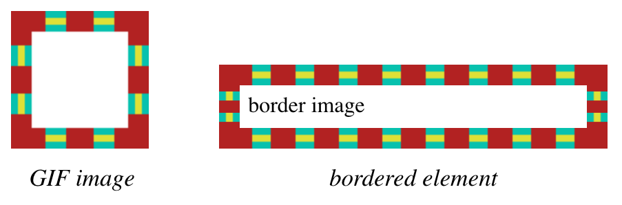
Border images
In fact, what if we could take an image of the stacked border we want to see in the world, slice it up, and use that as the border? Like, say, this image becomes this border?
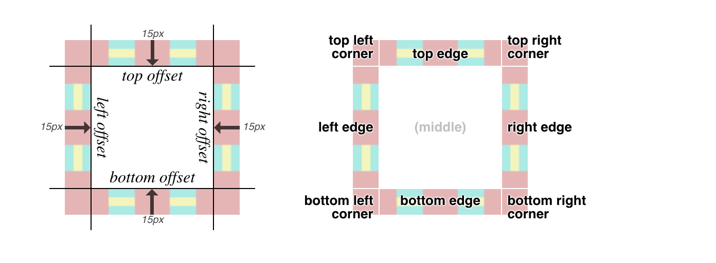
First, we set a solid border with some width. We could also set a color for fallback purposes, but it’s not really necessary. Then we point to an image URL, define the slice inset(s) at 15 and width of the border to be 15px, and finally the repeat pattern of round.
There are more options for border images, which are a little too complex to get into here, but the upshot is that you can take an image, define nine slices of it using offset values, and have those images used to synthesize a complete border around an image. That’s done by defining offsets from the edges of the image itself, which in this case is 15. Since the image is a GIF and thus pixel-based, the offsets are in pixels, so the "slice lines" are set 15 pixels inward from the edges of the image. (In the case of an SVG, the offsets are measured in terms of the SVG’s coordinate system.) It looks like this:
Each slice is assigned to the corner or side of the element box that corresponds to itself; i.e., the bottom right corner slice is placed in the bottom right corner of the element, the top (center) slice is used along the top edge of the element, and so on.
If one of the edge slices is smaller than the edge of the element is long—which almost always happens, and is certainly true here—then the slice is repeated in one of a number of ways. I chose round, which fills in as many repeats as it can and then scales them all up just enough to fill out the edge. So with a 70-pixel-long slice, if the edge is 1,337 pixels long, there will be 19 repetitions of the slice, each of which is scaled to be 70.3 pixels wide. Or, more likely, the browser generates a single image containing 19 repetitions that’s 1,330 pixels wide, and then stretches that image the extra 7 pixels.
You might think the drawback here is browser support, but that turns out not to be the case.
This browser support data is from Caniuse, which has more detail. A number indicates that browser supports the feature at that version and up.
Desktop
Chrome
Opera
Firefox
IE
Edge
Safari
56
43
50
11
12
9.1
Mobile / Tablet
iOS Safari
Opera Mobile
Opera Mini
Android
Android Chrome
Android Firefox
9.3
46
all*
67
71
64
Just watch out for the few bugs (really, implementation limits) that linger around a couple of implementations, and you’ll be fine.
Conclusion
While it might be a rare circumstance where you want to combine multiple "border" effects, or stack them atop each other, it’s good to know that CSS provides a number of ways to get the job done, and that most of them are already widely supported. And who knows? Maybe one day there will be a simple way to achieve these kinds of effects through a single property, instead of by mixing several together. Until then, happy border stacking!