This Week In Web Design – June 11, 2021

…

Tips, Expertise, Articles and Advice from the Pro's for Your Website or Blog to Succeed
Glassmorphism is a term used to describe UI design that emphasizes light or dark objects, placed on top of colorful backgrounds. A background-blur is placed on the objects which allows the background to shine through – giving it the impression of frosted glass.
In this post we’ve collected 10 stunning examples of this design trend from Codepen. Have a look and see how you could possibly use this effect in your upcoming projects!
See the Pen Glassmorphism by Albert (@walickialbert) on CodePen.light
See the Pen Glassmorphism Creative Cloud App Redesign by Aysenur Turk (@TurkAysenur) on CodePen.light
See the Pen Glassmorphic Sign in Form by Shounak Das (@dasshounak) on CodePen.light
See the Pen Glassmorphism Credit/Debit Card (pure CSS) by Shounak Das (@dasshounak) on CodePen.light
See the Pen Glassmorphism by Jayasree (@Jayasree_0708) on CodePen.light
See the Pen Glassmorphism by Vihanga nivarthana (@vihanga) on CodePen.light
See the Pen Glassmorphism by Supriya (@omeal) on CodePen.light
See the Pen Glassmorphism vs Neumorphism Cards | CSS, Js & VanillaTilt by Quentin Feret (@quentin-feret) on CodePen.light
See the Pen Glassmorphism Animated by jSpilka95 (@jspilka95) on CodePen.light
See the Pen Glassmorphism Post grid by Vinothkanna (@vinocrazy) on CodePen.light
In 2020, smartphone sales were 1.57 billion units worldwide, an increase from 1.52 billion units in 2019. Such impressive figures continue when we look at the world’s tablet shipments and deliveries. In the third quarter of 2020, Apple alone shipped 13.9 million units of tablets. These figures, as surprising as they are, make us think about the impact on mobile websites and website owners. The demand for smartphones and other mobile devices have been responsible for connecting 4.66 billion people with the internet. This number has gone up by 7.3 per cent since last year. Out of this, mobile internet traffic has been more than half of all the internet traffic all around the world. As a website owner whose website is not mobile-friendly, this is a matter of great concern and something to help shape our website in the correct direction.
It is now time that website owners understand that mobile users are top priority and should be taken seriously. If you are still backing on the desktop website with a bunch of media queries and letting luck shape your revenue, I will help you decode the importance of responsive design and how to make a high converting mobile web pages.
A lot of the people take the responsiveness and conversion rates as a cause and solution pair in the website world. But converting a mobile web page is a much more complex process than just making your website responsive or mobile-friendly. Sure, responsiveness is an important aspect of conversion and is the first step in the website development but it alone cannot increase your CTR. In 2015, Google started giving more preference to responsive and mobile-friendly websites. Improving for a better experience for their users, Google does not want people to keep searching for that one perfect website which is rendered proportionately on the device. This move gave the website owners a wake-up call to focus on the user experience and mobile-friendliness as much as possible.
So how can we improve our conversion rates once we have the responsive website built? To be fair, responsiveness is more concerned towards scaling your website up and down. If my images are scaled in the proper ratio on a 5.5-inch device, I have got a responsive website. But the user is never concerned about responsiveness. Instead of praising the scalable elements, the user is more concerned about how fast those elements rendered on to the device? My user is more concerned about their own preferences and benefits.
Nearly 8 out of 10 users bounce back when the content is not properly visible on the mobile device. Such anomalies on the mobile website bring down conversion rates and affect the business. In the subsequent sections, we will focus on things that are responsive in nature (no doubt!) but is not enough that can make the user click that CTA of yours or purchase a product from your website. Soon we will realise that responsiveness has much more than what meets the eye. Let’s see how we can put ourselves up to the user’s expectations.
PS – We have used LambdaTest LT Browser to show website view in various device viewports. Know more here – https://www.lambdatest.com/lt-browser
Do you need all the content on the mobile?
The first thing to ask in developing a website for mobile is the content you are about to show on the device. A device’s screen is small, which means you have to show less but relevant content on the small space provided to you. The content should be able to communicate to the user without using too many words. A user is not going to read everything just to find if he gets anything pleasing for himself. That is your job to show him what he needs to see. The content analysis can be boiled down to three major categories: the headline, the font size and the content.
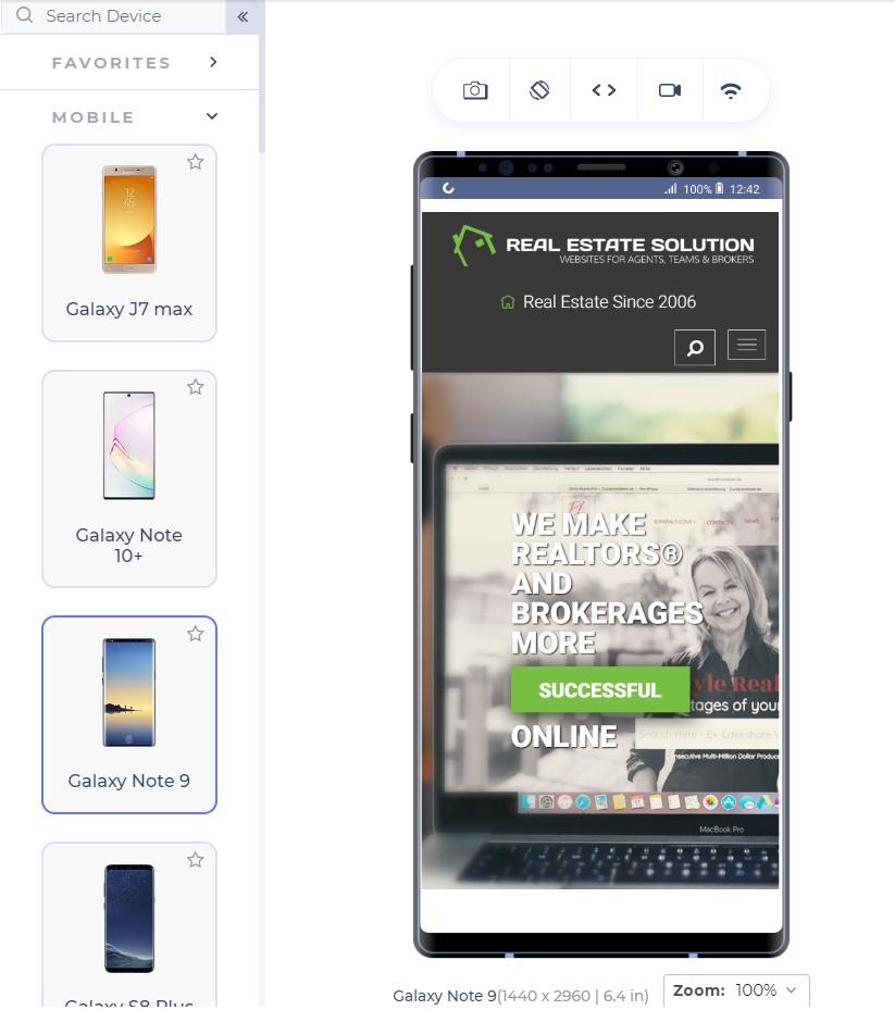
A web page starts with a headline which is probably the first thing a user sees. This is your chance, the moment that decides whether the user will increase the session duration or will bounce back. The following two website ranks on the first page of Google for “real estate solutions”:
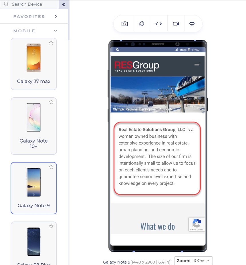
The above landing page is from RESGroup while the below screenshot is from Getrealestatesolution.
Apart from a weird header which is taking 25% of your valuable screen space, the headline is concise and easy to read. The RESGroup have focussed on a long heading (if that what it is) and forces users to scroll the entire page to find something meaningful for them. A good point to note is that although building up trust on the user is important by embellishing the web page with your achievements, a user needs to find something which they can use. They rarely care about what you have to offer but more about how they can be benefitted. Remember, a user makes up his mind about the website in just 50 milliseconds.
Scrolling from up to bottom and reading about your achievements will result in an increased bounce rate. Getrealestatesolution is building up trust and showing their achievement both cleverly into a single line: “We make realtors and brokers more successful”. This more or less would translate to “We are capable enough to make you successful” and “You will be successful if you join us”.
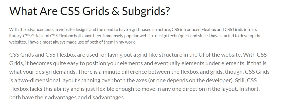
Font-size is an extremely important part of a landing page (or any other page) to determine the conversion rate of your website. A font-size of 16 px or 1 em is considered perfect for good readability of the content. Although one might argue that they can still read properly on 14 px, there are a large percentage of visually impaired people to be taken into account. The main target audience of the majority of businesses lies in the range of 15-49 years which is 28% visually impaired, as per WHO data. The following screenshot shows a blog on CSS Subgrids with 12 px font and the original font below it.
Although text can be enlarged by zooming into the mobile device, it moves the content out of the screen and makes the screen scrollable which is not liked by the users.
The relevance of Keywords- Which words to choose?
The final thing to remember while presenting content to the user is to use specific keywords which are relevant to the user. Mobile screens are very small with 5.5 inches being the most popular among the users as per a 2019 study. With a little time and smaller space in our hands, we want to gain a user’s trust as soon as possible so that he sticks on the website and does not bounce back.
The specific keywords process first starts by eliminating all the redundancy and loose words. Words such as “very”, “extremely”, “best” etc are considered fillers in the content. “We are very professional and provide the best services” could be transformed to “We are professional in providing real-estate services”. The second sentence is more effective and uses 1 less word than the first.
After elimination comes the relevant keywords to pitch to help you convert through the web page. These keywords will work as something your user can trust upon. At least, the user should be well convinced that you are the best and believe me, writing “best” does no charm in conversions. So, instead of being verbose and explicitly pitching your projects, choose minimal but effective words that show your confidence, experience and professionalism. In my analysis, I found two interior design services websites that portray this point quite clearly.
This is the landing page of Woodenstreet
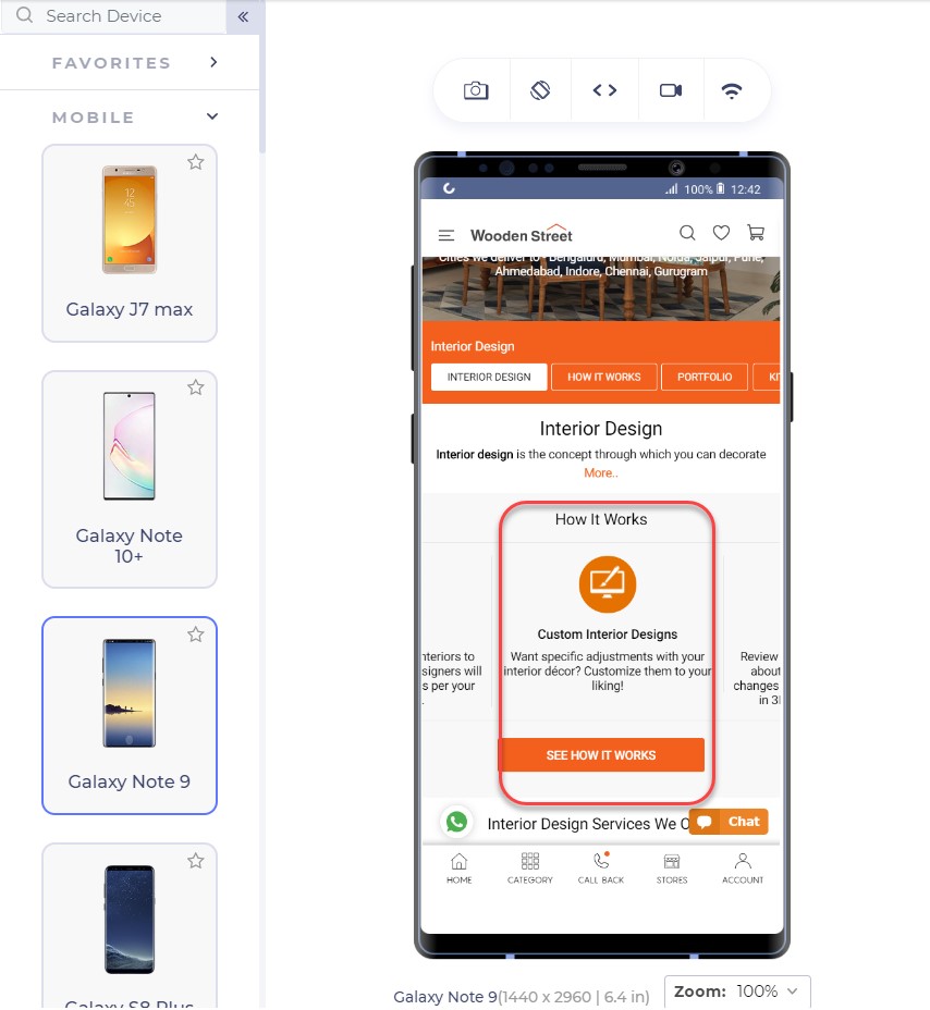
In addition to proving our point of small font-size, the only effective sentence in this segment is “Customize them to your liking!” which makes me feel the fact that I will have control over customizations but not a strong one. The words are loose to build trust over to the service company.
Another competitor of this website is Livespace. The same section on their website looks like this:
The segment focuses on keywords and experience by the lines of sophisticated keywords that will lure the user. I too want someone who knows a bohemian bedroom!! (Just Kidding!)
Also, notice the transformation of the same sentence in these two websites. Where Woodenstreet says, “Customize them to your liking!”, Livespace says, “Your wish is our command!”.
For the enhancements of the content, you do not need to remove the white spaces and fill every gap on the web page. White spaces are good! They let the elements breath in the congested space and every element can get proper attention from the user. For larger content, you can also use bullets that can deliver more information in lesser sentences.
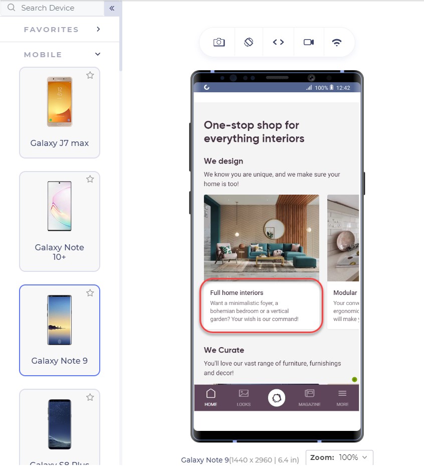
To ensure yourselves of the appearance of your website on mobile devices, you can use tools which can help you emulate the experience. A developer-friendly browser such as LT browser is also a great choice since it provides a complete solution with loads of features (including a debugger) and performance reports to analyze. LT browser can show you your website on any mobile device of your choice in a couple of clicks.
Emulators and simulators have been long used to test the website on different devices. But today, for a specific tester’s need, we can take advantage of a mobile-specific testing browser that provides a complete environment for the tester. A developer-oriented browser such as LT browser can provide additional features highlights of which are given below:
The thumb zone has been a conclusive argument for some time now and a strong foundation to many pieces of research in mobile designs and mobile web implementation. The thumb zone is the area on the mobile screen determining how hard or easy it is for our thumb to reach a certain point. A research study by Hoober concluded that 49% of people operate their mobile phones with one hand and only a 15% with two hands. Among those who do, 67% are operating through their right thumb with two major positions:
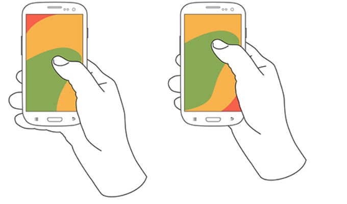
Note: The second image is placed slightly above as compared to the first image.
The color that you see in the above image: is our thumb zone. A thumb zone in general for a person using their phone with one-hand can be magnified as follows:
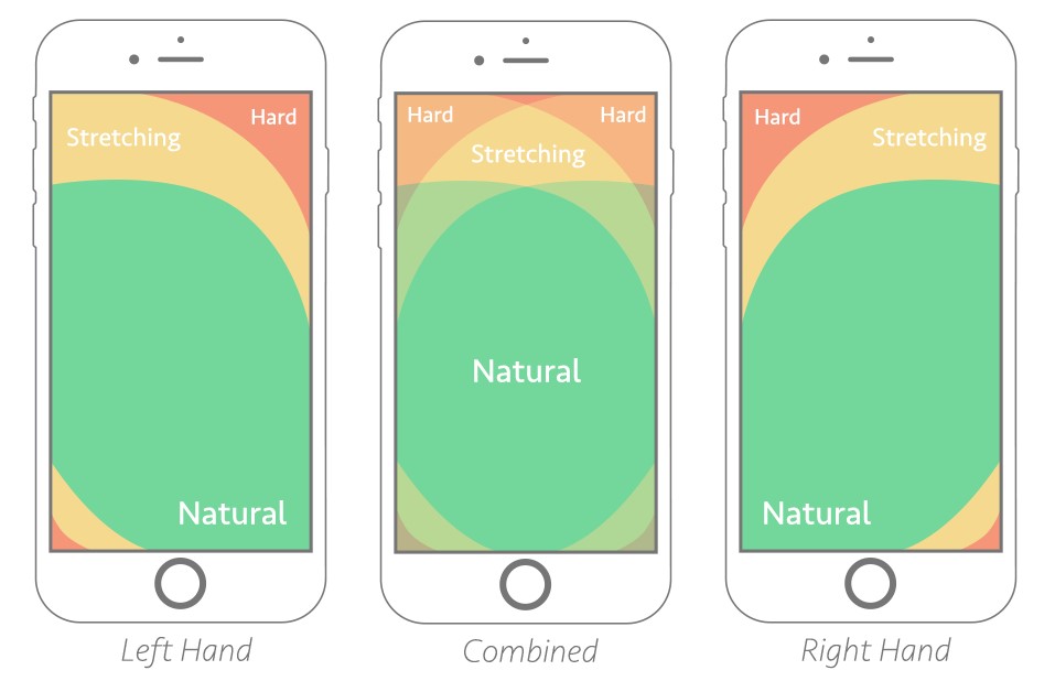
The green zone is the easiest to achieve: hence the most important for our conversion goals. The yellow zone is a bit hard to reach but manageable: something we can put less important things in such as headings and other content, things which are not clickable. Finally, the red zone is the toughest to reach and is the worst place to put our CTA.
Another worst position to put our CTA is at the bottom of the page or deep down below. No user would want to scroll down 4 5 times and search your CTA on the webpage. A lot of them probably don’t even know about CTA buttons and if it exists on that website or not.
The best way is to put CTA in the thumb zone and on above-fold in the first web page view. Amazon has put similar thought into their CTA and the following is their landing page:
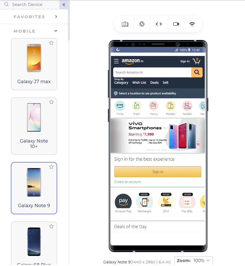
The Sign In button is exactly where our green zone lies with the width being enough that we do not touch anything accidentally.
From the above page, we observe two interesting things: first the Sign In is also available at the top right (the hardest) position too and our green zone has another CTA “Create Account”.
Having two sign-in options reminds the user about signing in two times. You would see the button anyway even if you do not click that. LiveSpace uses the same approach on its website in a little different way:
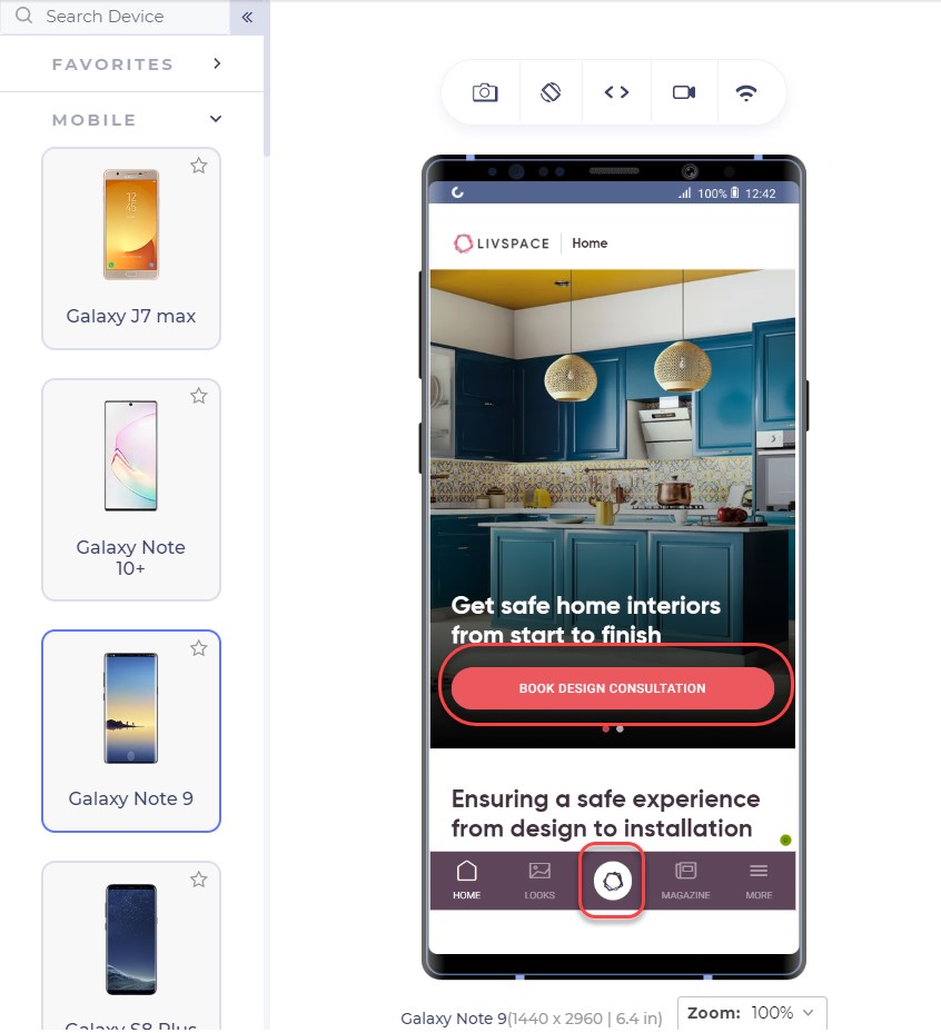
The bottom button is fixed and is a constant reminder to “book design consultation”. The second approach is interesting. There are two possibilities of an unknown user: either he signs in (given that he has already registered) or he creates a new account.
Deciding among the two is important for an owner to come to a final conclusion of primary CTA and secondary CTA. Having two CTAs is generally not considered a good approach as it confuses the user but even if you do, one of them should stand out in comparison to another, as in Amazon.
What CTA to use?
As a website owner, you might have a lot of services to provide: a consultation booking form, you want to showcase your cheap pricing too! And you want them to call you by a single click from the home page itself!! A CTA can increase your revenue with high conversions but a CTA cannot be the developer’s wish. It has to be what the audience wants. To increase your mobile conversions through CTAs, you need to analyse what your visitors are more interested in.
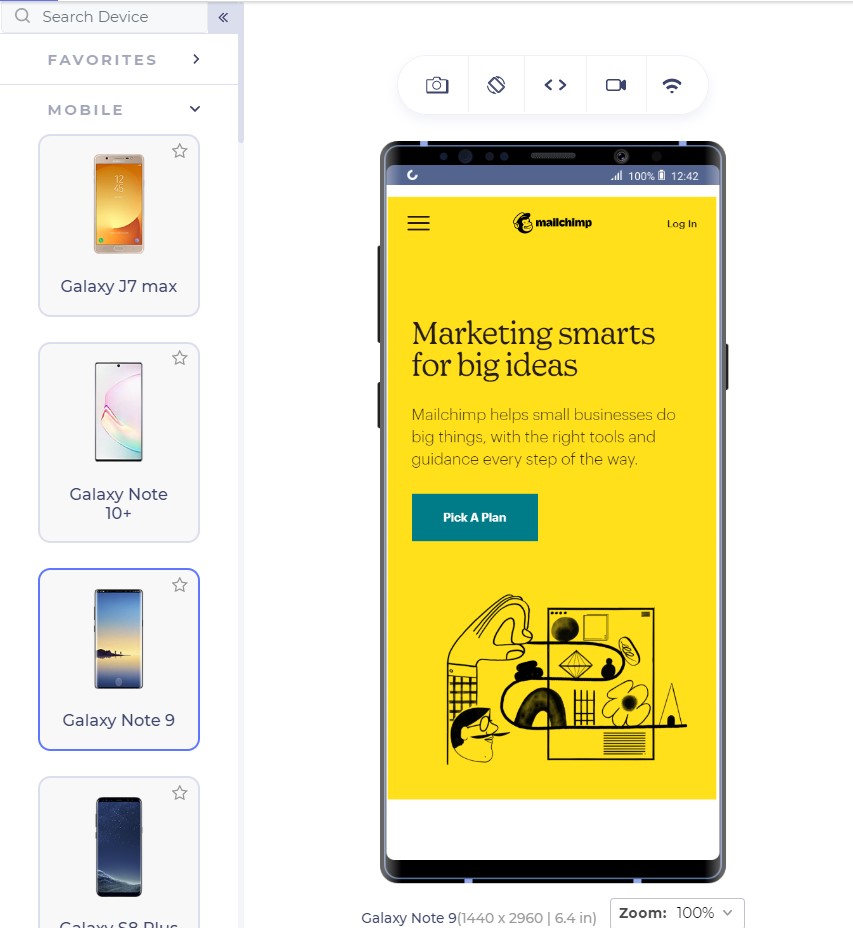
Google Analytics is a great way to start here. Google Analytics provides the keywords your visitor is most interested in. Mailchimp has a lot of good features which can be used as CTAs for example, “Start Campaign”. But their website on mobile uses the CTA linked to pricing:
CTAs are something to ponder upon and it is also a good idea to include a good input from the marketing and sales team which can suggest to you the user’s inclination quite well.
With keywords in hand, the next step is to think about the CTA text that can bring out more conversions through a responsive mobile web design. In the above screenshot, Mailchimp could have used, “See pricing” but they went with “Pick a plan” even though the page links to the pricing page.
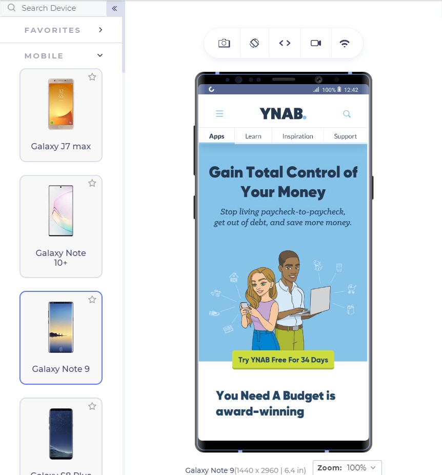
Similarly, Youneedabudget provides the user with “Try YNAB Free For 34 Days” instead of Sign Up or Try YNAB Free.
Research these words and find out why your user visits your website. Show them exactly what they are looking for through the CTAs and the conversion rates would see an increase.
The CTA should also look like a “CTA” and work like one. If the CTA gets blended into the background and looks like a ghost button, it loses its purpose. CTAs should be a contrast in colour speaking out loud and demanding attention from the user; that is what they are there for.
Mailchimp does that perfectly with a little darker shade of yellow in the background and CTA with blue; a complete contrast.

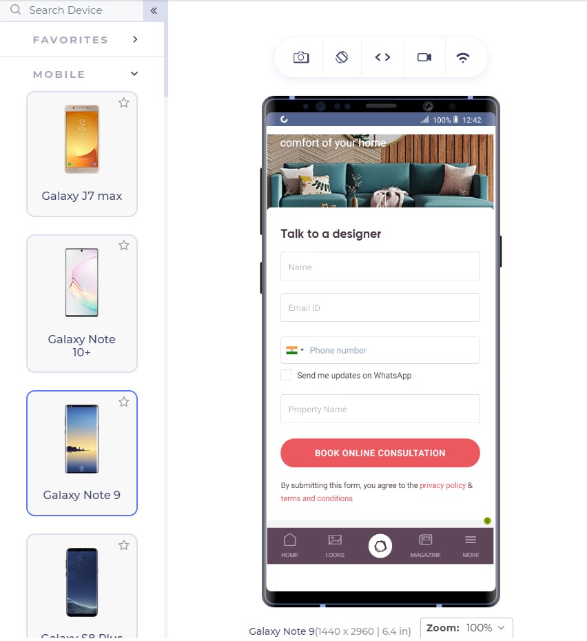
For business providers looking for direct leads, forms work as fine as a button since they cannot provide all the information in concise segments and users have a lot of other doubts. For example, interior designing. Interior designing has different requirements for different users and personal contact is necessary. A responsive form works as a great CTA here:
The number of fields is important to understand the conversion rates. A user is not interested in filling too many fields and will bounce back too easily. Quicksprout shows how the number of fields leads to a lower conversion rate on the mobile:
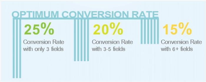
More than 5 fields in a form is intimidating for the user and the user is unlikely to complete the form. If you cannot manage to lower down the fields below 6 or 7, use the autocomplete feature of the browser in your HTML code so that the user can quickly fill out the form in one tap. Autocomplete is available in major browsers today and is helpful for the user.
If your CTA is a call button, it should be a one-click button instead of plain text. Do not expect your user to take the burden of copying the number and moving onto his dial pad, paste it and then call you.
Google aims at 0.5 second load time when it comes to loading any Google’s product. But don’t worry, we still have not touched such a high-performance statistic practically although we have come a long way in the last decade. Google states that 2 second is the user’s “acceptability” for the website load time. So how is it affecting our conversion rates?
As it turns out, the bounce rate depends heavily on the website loading time:
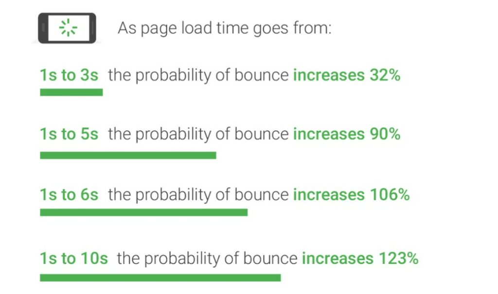
Gone are the days of 2G connection when people could wait a hundred seconds for the website to load. With the increase in elements on the website leading to a lower load time, the conversion rate drops by a whopping 95%!!
What can we do to increase loading speed?
The question drops to the mind as to what we can do as web developers to decrease the web page load time when the network plays a vital role which we have no idea about. As a developer, we can follow a series of checks on our responsive mobile design to ensure higher conversion rate and simultaneously lower bounce rates:
A good way to start is to code the web page to display something (if not all) to the user as early as possible. For example, AJAX queries are a great way to show a partial content to the user on the first view.
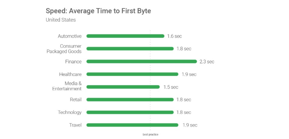
Use a good server!! Servers play an important role as they are responsible for not only communicating with requests but also sending the first byte to the user. Google recommends a time of 1.3 seconds for the mobile server to communicate with the first byte. The lower the better.
The figure shows recommended average response time of the mobile server in various categories:
Lowering the number of requests to the server also decreases the overall page load time. The lesser number of requests would generally mean lesser elements to fetch. While Google recommends less than 50, today’s average lies somewhere between 120-170.
An extremely important factor in determining the loading speed of the website is the weight of elements present in the mobile web page. The study found out that websites use too many elements in order to lure the users which slows down the loading speed even on the 4G connection (which is the most popular). 70% of the pages took 5 seconds for any visual element to first appear on the web page. This has made the average loading time to 15 seconds as compared to the recommended 2 seconds.
The main culprit; images. Providing an extremely high-quality image will just decrease the conversion rates especially the ones which are nowhere related to the product such as background or achievement thumbnails. Applying very high-quality images without compression can load up the page to as high as 4MB which is more than the average.
The analysis is done in the study also found an image worth 16 MB of size on a web page which is a simple blunder, an invitation to decrease the conversion rates. What can we do? Compress these images and use proper image formats.
By simply compressing the images on the web page, the developers can save up to 250 KB of size on as high as 25% of the website analysed. Image format can help you in decreasing the load time too. Out of all the mobile-friendly websites, 46% use JPEG and 28% use PNG. The reason behind the success of JPEG is that it is a lossy compression losing bits in the process. JPEG is a great format to use when too much focus is not on the extreme detail of the image like nature images, landscapes or background color shades etc. PNG on the other hand is lossless and saves the bits in the process. PNG images are great when sharpness, details and observations are required in the image.
The following image is a JPEG image:

This image is of a natural scene and hence does not demand very small details for the user. Your user will not zoom into the Taj dome to check out the colour shade. This image makes about 127 KB in size.
The same image in PNG consumes 714 KB of the web page which is extremely unnecessary.

To determine your website’s performance, you can use a trusted tool PageSpeedInsights by Google.
A/B Testing and you are done!
When Google launched ads on Gmail, they were not sure which blue colour to use. In their experiment, they decided to provide different shades of blue to different users and see their response. With 1% of users getting one shade and another 1% getting another, Google ended up testing among 40 shades of blue to 40 different groups. The final blue selected in this experiment earned them an additional $200 million in revenue.
This is termed as A/B testing. A/B testing is a process of comparing two different versions of a web page by giving them to different groups and recording their response. A/B testing has been used extensively today to finalize the colour, location or size of the CTA button. An experiment between green and red CTA buttons showed that the red CTA button performed 21% better on 2000 page visits. The 21% increase in the conversion rates points towards how important A/B testing is today.
This does not mean every red CTA button will outperform green ones. Performing A/B testing will provide conclusive results by which you can increase the conversions and they are different for different websites.
Not only CTAs, as a developer you can also test the headlines, buttons and other important content to decrease the bounce rate which eventually does result in increased conversions. You can use Heatmap tools for A/B testing.
If you ever believed that responsiveness is everything there is to increase the CTR, you are not alone. The researches and studies have brought out a lot more about the behavioural aspect of a user than we knew before. From colour to the font-size, conversion rates on a mobile device is like a house on wooden pillars. All of them together increases the CTR to its capabilities and give your revenue a boost up.
Apart from the points discussed in this post, as a developer, you can also perform certain enhancements on the website for better conversions. User experience always matters on a mobile website. Whether it is conversions, word of mouth or any other target, you will always be rewarded for a better user experience. Enhancements such as not losing the sessions when the back button is pressed, providing cart support on multiple devices or shutting up the navigation bar in a hamburger menu. These enhancements are always noticed by the user and the easier it is for him, the better are the chances of conversions. So the next time you are busy developing your website, make a checklist and boost up that conversion rate from mobile web pages.
We have collected 22 fantastic Christmas gifts for all your creative web designer and graphic designer friends out there. While not exhaustive, these are some of the best gifts for designers available right now, just in time for your holiday shopping.
Ready? Let’s get started with our 2019 gift guide!
The Rocketbook notebook provides a classic pen and paper experience, yet is built for the digital age. Although it feels like a traditional notebook, the Rocketbook is endlessly reusable and connected to all of your favorite designer’s relevant cloud services. When your designer friend writes using any pen from the Pilot Frixion line, their writing sticks to Rocketbook pages like regular paper. But add a drop of water… and the notebook erases like magic. Designed for those who want an endlessly reusable notebook to last for years, if not a lifetime, the Rocketbook has pages made with synthetic materials that provide an extremely smooth writing experience. Blast handwritten notes to popular cloud services like Google Drive, Dropbox, Evernote, box, OneNote, Slack, iCloud, email and more using the free Rocketbook application for iOS and Android.
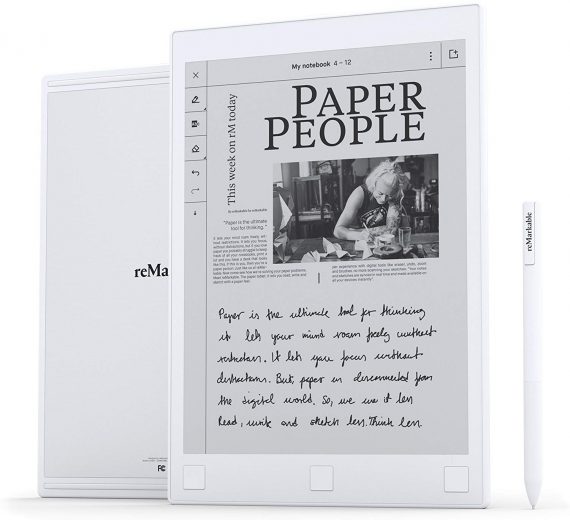
reMarkable is the first digital device that gives your favorite designer a pen-to-paper note-taking experience. reMarkable converts theirr hand-written notes to typed text, making them easy to refine, organize and share. With no backlight or glare, reMarkable offers a paper-like reading experience they won’t find on any LCD display. Annotate on their documents just like theywould on paper. Includes digital tools like undo, erase, move, and many more.
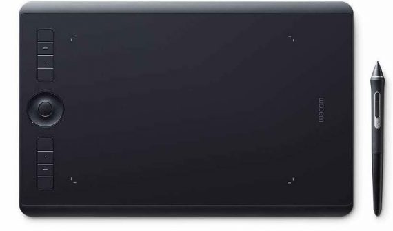
The professional standard in creative pen tablets Wacom Intuos Pro sets a new standard for professional graphics tablets. The new Wacom Pro Pen 2 features impressive pressure sensitivity, tilt response and virtually lag free tracking. Your favorite designer will get natural creative control while they illustrate, edit or design digitally with Intuos Pro.
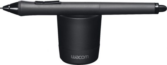
Sketch and write on an Intuos tablet or Cintiq display comfortably with this Wacom Grip Pen stylus. It has a contoured body and ergonomic weight to help prevent wrist fatigue during extended use, and its tilt sensitivity provides a natural feel for accurate drawing. Maximize productivity with the programmable side switches and pressure-sensitive eraser.
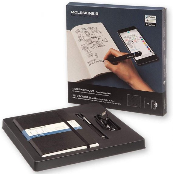
Your favorite designer will watch their ideas travel off the page and evolve on screen. Part of the Smart Writing System, the Smart Writing Set is an instant-access kit containing a dotted layout Paper Tablet, Pen+ smart pen and Moleskine Notes app: everything needed to bring all the advantages of digital creativity to freehand notes and sketches.

Give the gift that keeps on giving, starting with a risk-free 30-day trial! Find the perfect high-res, royalty-free, stock image to enhance your favorite designer’s next creative project. Preview watermarked images inside designs first. Then license, access and manage them directly within Photoshop, InDesign, Illustrator, and other Adobe desktop apps.
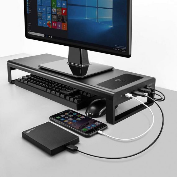
Your favorite designer can create additional space on their desktop while adding USB 3.0 ports, wireless charging for your devices, and keyboard and mouse storage, all in a sleek and affordable package!
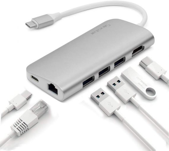
This handy little device features three USB 3.0 ports, SD and Micro SD card slots, Ethernet, charging port, and 4K HDMI video output. The compact and easy-to-use design makes it simple to take the Type-C USB Hub with you anywhere you go. Your favorite designer won’t be far from the convenience of accessing their favorite USB devices.
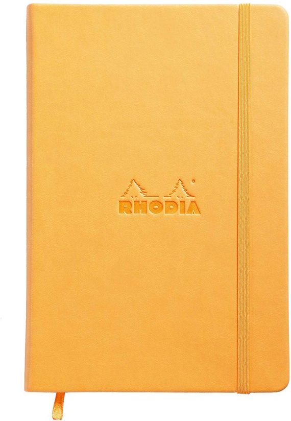
The Rhodia Webnotebook has a leatherette cover with a glued spine. The Webnotebook is A5 in size and has 96 sheets with an elastic closure to keep the book closed. The Webnotebook has a coloured ribbon and expanding pocket.
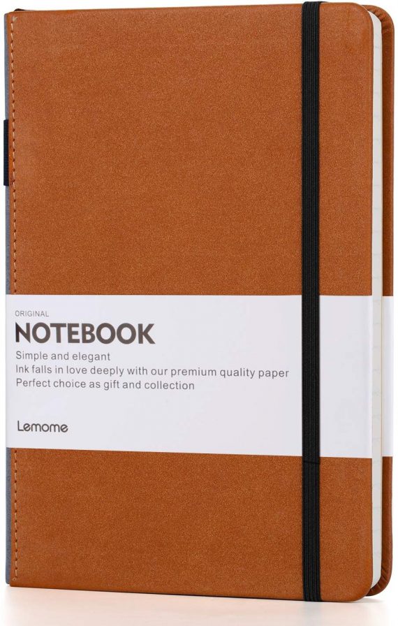
A popular choice for everyday use, designers can use it to capture ideas, drafts, and drawings. Never lose your pen again, since the strap holds the pen and fits securely onto the side of the notebook. You’ll never have to rummage around again for something to write. Thick premium paper means it’s perfect to write and draw on.
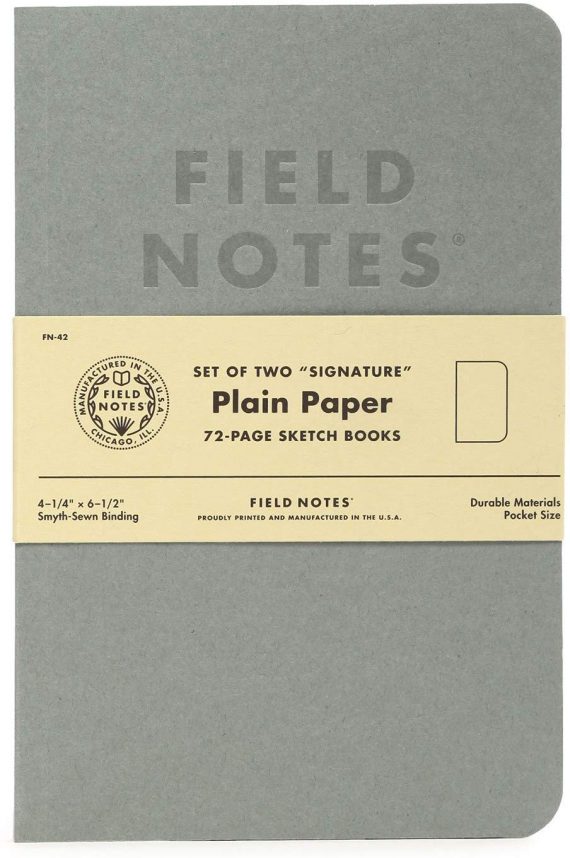
What designer doesn’t want Field Notes? Field Notes Signature Series Notebook 2-Packs are available in two versions: Cream covered books with plain ruled paper inside, or gray covered sketch books with plain paper inside. The covers are gently debossed with just a tint of ink. Inside you’ll find 72 pages of very high quality white Strathmore Premium Wove paper. The ruled pack has a fine application of gray lines on the pages.
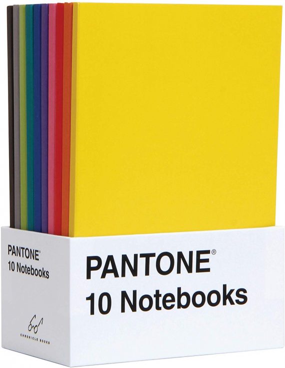
Ten petite journals feature Pantone’s iconic color chip design in ten sumptuous shades. Grid-dot interior pages and a sturdy slipcase make these notebooks eminently practical and chic for on-the-go note-taking when used solo, and an eye-catching object for desktop display when grouped together.
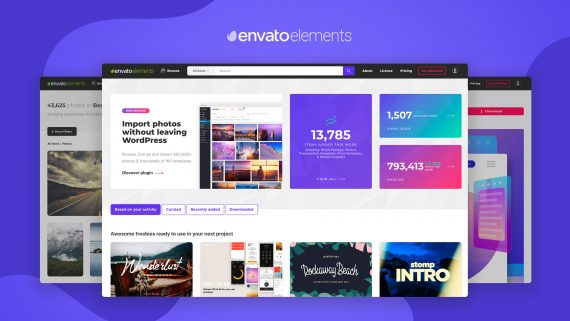
Another gift that keeps on giving! One affordable subscription provides access to 1,800,000+ assets, including graphics, video, audio, presentation templates, photos, fonts, WordPress themes and plugins, and so much more. Sign up the designer you care about and they will forever be grateful!
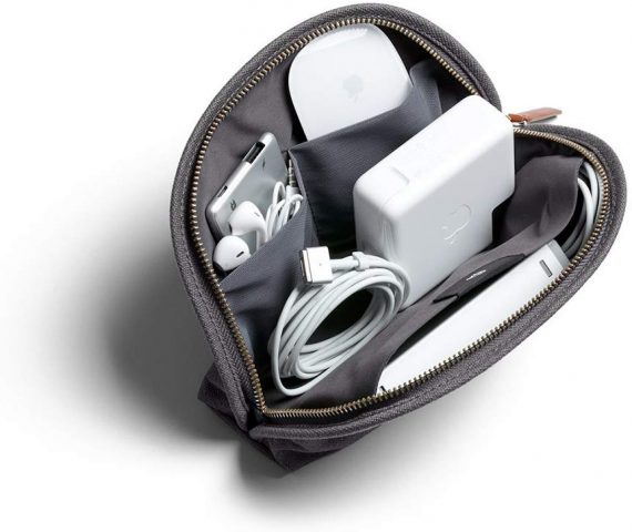
The Classic Pouch is the humble sidekick that can make a big difference to your favorite designer’s day. They’ll never again leave behind their pen, charger, gum or lip balm, just because they can’t keep track of their essentials. And they won’t rummage around their bag looking for them, either. The Classic Pouch is the place to keep them in one place (and in the right place). An everyday pouch for keeping daily essentials in one spot — cables, cosmetics, toiletries, tools and more!
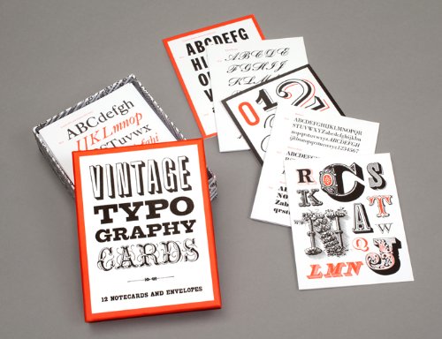
Discovered in vintage typographic manuals, the specimens featured on these elegant cards range from one-of-a-kind hand-drawn samples to classic favorites used in the early decades of the twentieth century. The back of each card features a minihistory of the typeface’s origins and use.
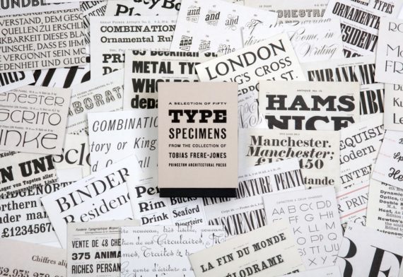
Fifty Type Specimens is a collection of postcards with stunning images of typography, for inspiration, correspondence, or display. Cards feature classic letterforms, pages from specimen books, and crops of gorgeous letters presented in a box with the feel of an old specimen book. Historic typefaces, selected by renowned designer Tobias Frere-Jones, are organized into four geographic categories by thumb tabs: Germany, France, United States, and the United Kingdom.
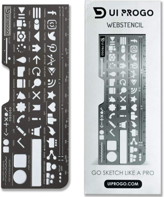
Premium quality materials with innovative design to create the ultimate tool for stenciling. With icons that are large enough to actually use, these stencils are a must-have for all designers, artists, students, and journaling enthusiasts. Complete with the latest social media icons, these stencils give you what you need to create the perfect design you have in mind. Made to be portable, you can take them with you to work, the office, or class.
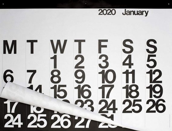
This calendar is special. It is much more than just a wall calendar: It is a masterpiece of art. This is the original, genuine and authentic work of the great Massimo Vignelli, designed in 1966. This modern calendar has withstood the test of time. Year after year designers, architects, doctors, lawyers, and many others purchase this calendar to let guests in their home or office know one thing: “I have style”.
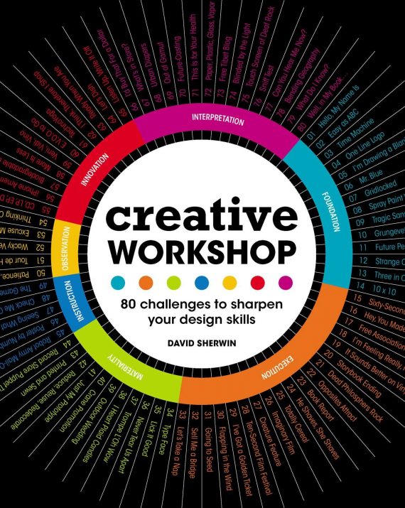
80 creative challenges that will help designers achieve a breadth of stronger design solutions, in various media, within any set time period. Exercises range from creating a typeface in an hour to designing a paper robot in an afternoon to designing web pages and other interactive experiences. Each exercise includes compelling visual solutions from other designers and background stories to help your favorite designer increase their capacity to innovate.
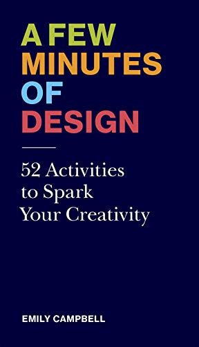
This colorful, handy card deck presents fifty-two exercises and activities to jump-start your favorite designer’s creative juices, free them from creative block, start a new project, or finish an existing one. Each exercise offers insight into the innumerable small decisions involved in design: How to establish a pattern, continue a series, how to say it without words, how to name a project, what fits, and what doesn’t? These cards benefit established practicing designers or creatives in any field with activities that are sometimes playful, sometimes challenging, but always enlightening. Each activity is estimated to take 15 minutes.
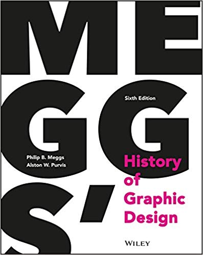
Meggs’ History of Graphic Design is the industry’s unparalleled, award-winning reference. With over 1,400 high-quality images throughout, this visually stunning text will guide your favorite designer through a saga of artistic innovators, breakthrough technologies, and groundbreaking developments that define the graphic design field. The initial publication of this book was heralded as a publishing landmark, and author Philip B. Meggs is credited with significantly shaping the academic field of graphic design.
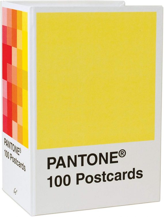
With a palette drawn from the systems of Pantone, each postcard in this set of 100 offers a different bold hue to brighten up your favorite designer’s mail.
