I Used The Web For A Day On A 50 MB Budget

I Used The Web For A Day On A 50 MB Budget

I Used The Web For A Day On A 50 MB Budget

Chris Ashton

This article is part of a series in which I attempt to use the web under various constraints, representing a given demographic of user. I hope to raise the profile of difficulties faced by real people, which are avoidable if we design and develop in a way that is sympathetic to their needs.

Last time, I navigated the web for a day using Internet Explorer 8. This time, I browsed the web for a day on a 50 MB budget.

Why 50 MB?

Many of us are lucky enough to be on mobile plans which allow several gigabytes of data transfer per month. Failing that, we are usually able to connect to home or public WiFi networks that are on fast broadband connections and have effectively unlimited data.

But there are parts of the world where mobile data is prohibitively expensive, and where there is little or no broadband infrastructure.

People often buy data packages of just tens of megabytes at a time, making a gigabyte a relatively large and therefore expensive amount of data to buy.
— Dan Howdle, consumer telecoms analyst at Cable.co.uk

Just how expensive are we talking?

The Cost Of Mobile Data

A 2018 study by cable.co.uk found that Zimbabwe was the most expensive country in the world for mobile data, where 1 GB cost an average of $75.20, ranging from $12.50 to $138.46. The enormous range in price is due to smaller amounts of data being very expensive, getting proportionally cheaper the bigger the data plan you commit to. You can read the study methodology for more information.

Zimbabwe is by no means a one-off. Equatorial Guinea, Saint Helena and the Falkland Islands are next in line, with 1 GB of data costing $65.83, $55.47 and $47.39 respectively. These countries generally have a combination of poor technical infrastructure and low adoption, meaning data is both costly to deliver and doesn’t have the economy of scale to drive costs down.

Data is expensive in parts of Europe too. A gigabyte of data in Greece will set you back $32.71; in Switzerland, $20.22. For comparison, the same amount of data costs $6.66 in the UK, or $12.37 in the USA. On the other end of the scale, India is the cheapest place in the world for data, at an average cost of $0.26. Kyrgyzstan, Kazakhstan and Ukraine follow at $0.27, $0.49 and $0.51 per GB respectively.

The speed of mobile networks, too, varies considerably between countries. Perhaps surprisingly, users experience faster speeds over a mobile network than WiFi in at least 30 countries worldwide, including Australia and France. South Korea has the fastest mobile download speed, averaging 52.4 Mbps, but Iraq has the slowest, averaging 1.6 Mbps download and 0.7 Mbps upload. The USA ranks 40th in the world for mobile download speeds, at around 34 Mbps, and is at risk of falling further behind as the world moves towards 5G.

As for mobile network connection type, 84.7% of user connections in the UK are on 4G, compared to 93% in the USA, and 97.5% in South Korea. This compares with less than 50% in Uzbekistan and less than 60% in Algeria, Ecuador, Nepal and Iraq.

The Cost Of Broadband Data

Meanwhile, a study of the cost of broadband in 2018 shows that a broadband connection in Niger costs $263 ‘per megabit per month’. This metric is a little difficult to comprehend, so here’s an example: if the average cost of broadband packages in a country is $22, and the average download speed offered by the packages is 10 Mbps, then the cost ‘per megabit per month’  would be $2.20.

It’s an interesting metric, and one that acknowledges that broadband speed is as important a factor as the data cap. A cost of $263 suggests a combination of extremely slow and extremely expensive broadband. For reference, the metric is $1.19 in the UK and $1.26 in the USA.

What’s perhaps easier to comprehend is the average cost of a broadband package. Note that this study was looking for the cheapest broadband packages on offer, ignoring whether or not these packages had a data cap, so provides a useful ballpark figure rather than the cost of data per se.

On package cost alone, Mauritania has the most expensive broadband in the world, at an average of $768.16 (a range of $307.26 to $1,368.72). This enormous cost includes building physical lines to the property, since few already exist in Mauritania. At 0.7 Mbps, Mauritania also has one of the slowest broadband networks in the world.

Taiwan has the fastest broadband in the world, at a mean speed of 85 Mbps. Yemen has the slowest, at 0.38 Mbps. But even countries with good established broadband infrastructure have so-called ‘not-spots’. The United Kingdom is ranked 34th out of 207 countries for broadband speed, but in July 2019 there was still a school in the UK without broadband.

The average cost of a broadband package in the UK is $39.58, and in the USA is $67.69. The cheapest average in the world is Ukraine’s, at just $5, although the cheapest broadband deal of them all was found in Kyrgystan ($1.27 — against the country average of $108.22).

Zimbabwe was the most costly country for mobile data, and the statistics aren’t much better for its broadband, with an average cost of $128.71 and a ‘per megabit per month’ cost of $6.89.

Absolute Cost vs Cost In Real Terms

All of the costs outlined so far are the absolute costs in USD, based on the exchange rates at the time of the study. These costs have not been accounted for cost of living, meaning that for many countries the cost is actually far higher in real terms.

I’m going to limit my browsing today to 50 MB, which in Zimbabwe would cost around $3.67 on a mobile data tariff. That may not sound like much, but teachers in Zimbabwe were striking this year because their salaries had fallen to just $2.50 a day.

For comparison, $3.67 is around half the $7.25 minimum wage in the USA. As a Zimbabwean, I’d have to work for around a day and a half to earn the money to buy this 50MB data, compared to just half an hour in the USA. It’s not easy to compare cost of living between countries, but on wages alone the $3.67 cost of 50 MB of data in Zimbabwe would feel like $52 to an American on minimum wage.

Setting Up The Experiment

I launched Chrome and opened the dev tools, where I throttled the network to a slow 3G connection. I wanted to simulate a slow connection like those experienced by users in Uzbekistan, to see what kind of experience websites would give me. I also throttled my CPU to simulate being on a lower end device.

I opted to throttle my network to Slow 3G and my CPU to 6x slowdown. (Large preview)

I installed ModHeader and set the ‘Save-Data’ header to let websites know I want to minimise my data usage. This is also the header set by Chrome for Android’s ‘Lite mode’, which I’ll cover in more detail later.

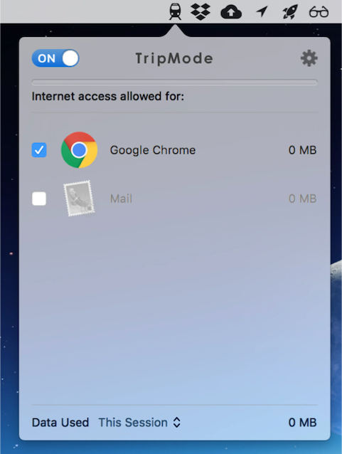
I downloaded TripMode; an application for Mac which gives you control over which apps on your Mac can access the internet. Any other application’s internet access is automatically blocked.

Screenshot of Tripmode settings; Chrome is enabled, Mail is disabled
You can enable/disable individual apps from connecting to the internet with TripMode. I enabled Chrome. (Large preview)

How far do I predict my 50 MB budget will take me? With the average weight of a web page being almost 1.7 MB, that suggests I’ve got around 29 pages in my budget, although probably a few more than that if I’m able to stay on the same sites and leverage browser caching.

Throughout the experiment I will suggest performance tips to speed up the first contentful paint and perceived loading time of the page. Some of these tips may not affect the amount of data transferred directly, but do generally involve deferring the download of less important resources, which on slow connections may mean the resources are never downloaded and data is saved.

The Experiment

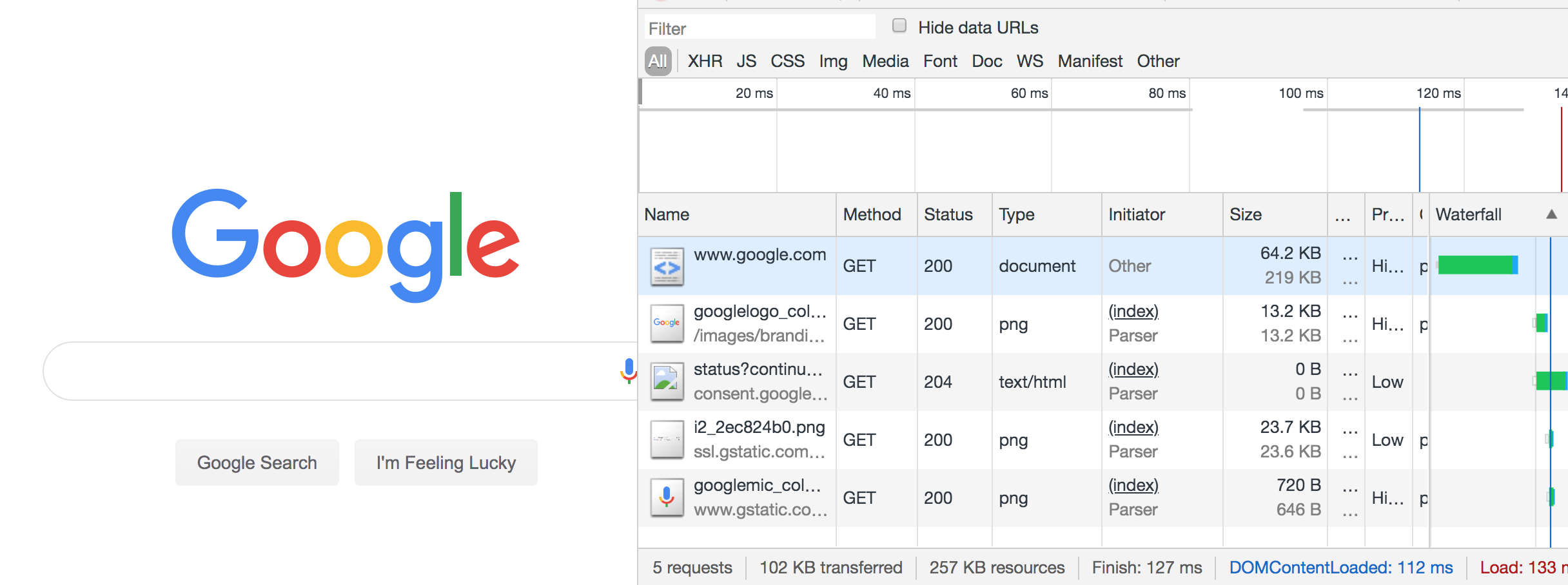
Without any further ado, I loaded google.com, using 402 KB of my budget and spending $0.03 (around 1% of my Zimbabwe budget).

402 KB transferred, 1.1 MB resources, 24 requests
402 KB transferred, 1.1 MB resources, 24 requests. (Large preview)

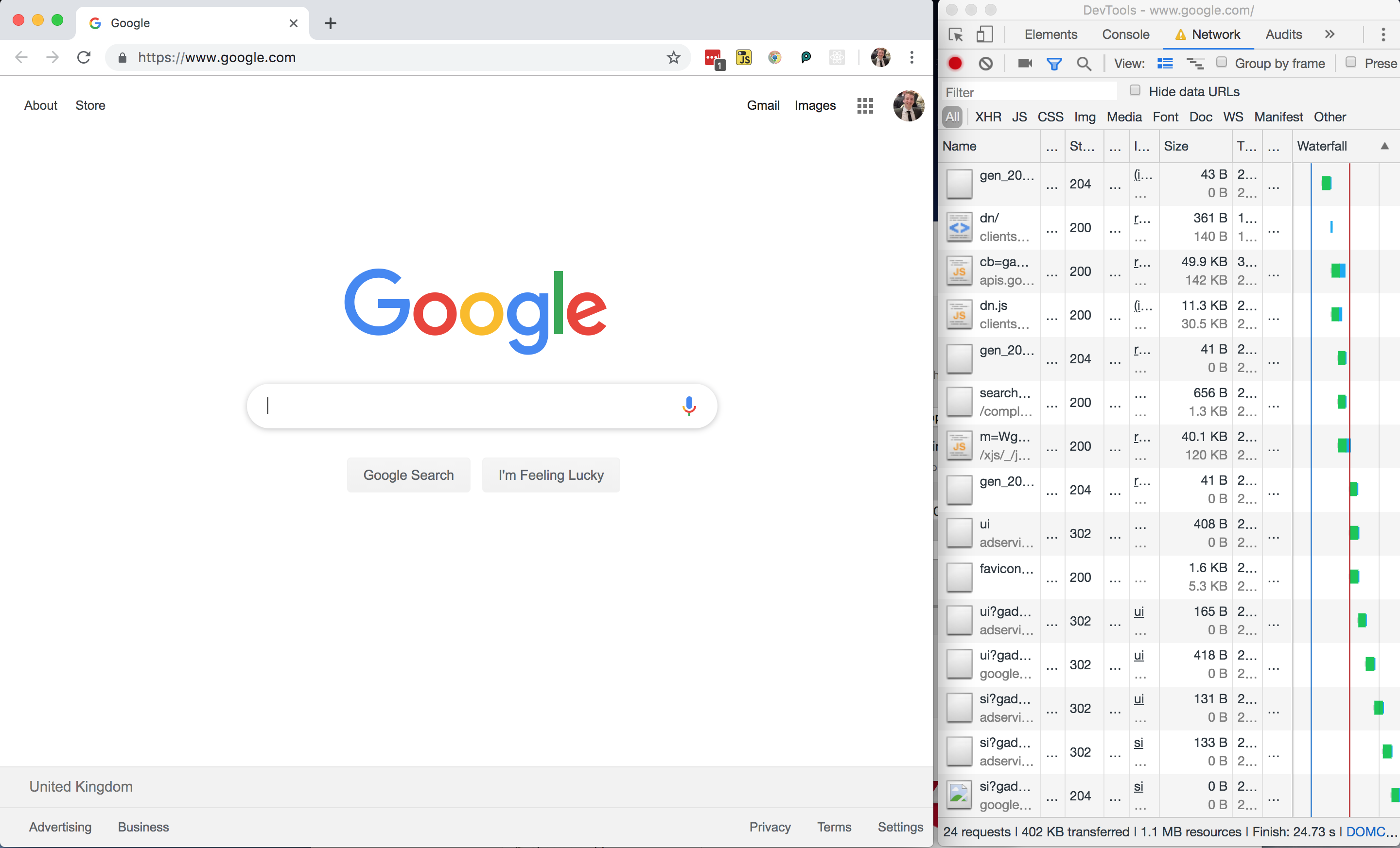
All in all, not a bad page size, but I wondered where those 24 network requests were coming from and whether or not the page could be made any lighter.

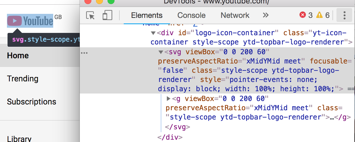
Google Homepage — DOM

Chrome devtools screenshot of the DOM, where I’ve expanded one inline style tag. (Large preview)

Looking at the page markup, there are no external stylesheets — all of the CSS is inline.

Performance Tip #1: Inline Critical CSS

This is good for performance as it saves the browser having to make an additional network request in order to fetch an external stylesheet, so the styles can be parsed and applied immediately for the first contentful paint. There’s a trade-off to be made here, as external stylesheets can be cached but inline ones cannot (unless you get clever with JavaScript).

The general advice is for your critical styles (anything above-the-fold) to be inline, and for the rest of your styling to be external and loaded asynchronously. Asynchronous loading of CSS can be achieved in one remarkably clever line of HTML:

<link rel="stylesheet" href="/path/to/my.css" media="print" onload="this.media='all'">

The devtools show a prettified version of the DOM. If you want to see what was actually downloaded to the browser, switch to the Sources tab and find the document.

A wall of minified code.
Switching to Sources and finding the index shows the ‘raw’ HTML that was delivered to the browser. What a mess! (Large preview)

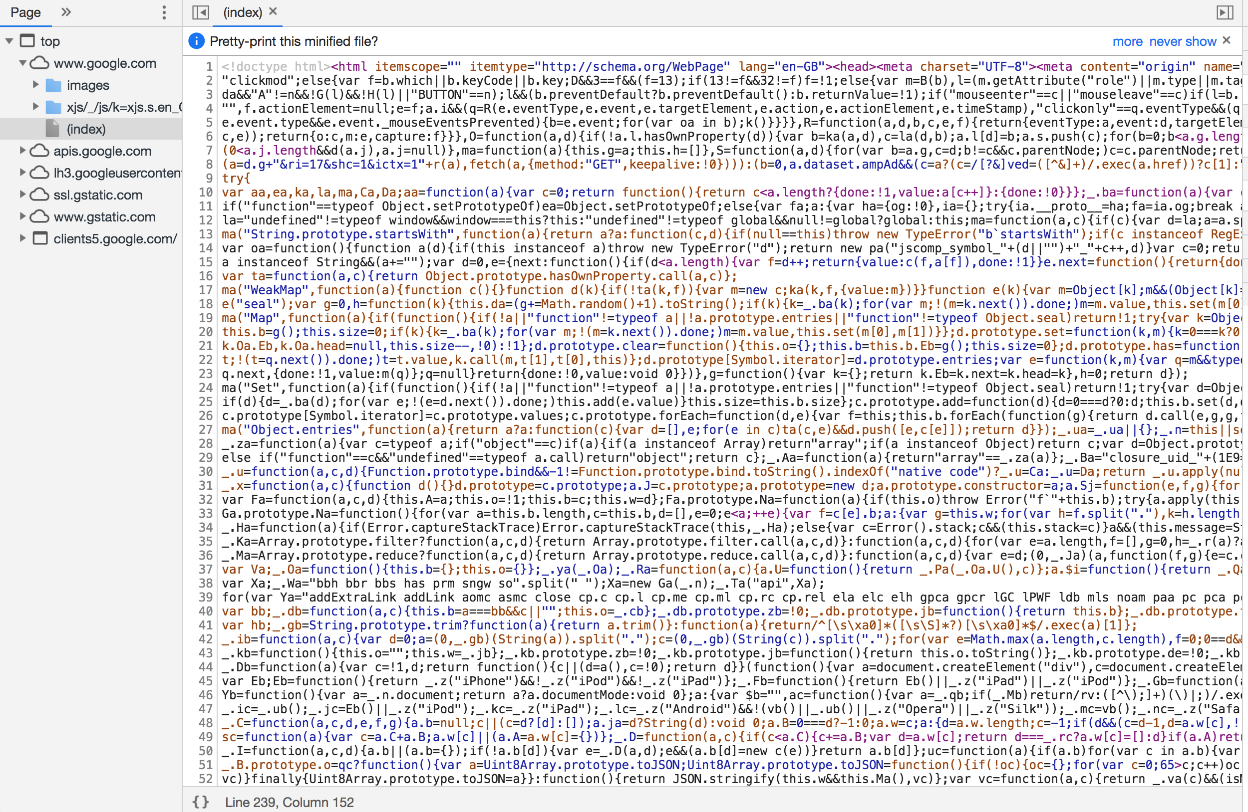
You can see there is a LOT of inline JavaScript here. It’s worth noting that it has been uglified rather than merely minified.

Performance Tip #2: Minify And Uglify Your Assets

Minification removes unnecessary spaces and characters, but uglification actually ‘mangles’ the code to be shorter. The tell-tale sign is that the code contains short, machine-generated variable names rather than untouched source code. This is good as it means the script is smaller and quicker to download.

Even so, inline scripts look to be roughly 120 KB of the 210 KB page resource (about half the 60 KB gzipped size). In addition, there are five external JavaScript files amounting to 291 KB of the 402 KB downloaded:

Network tab of DevTools showing the external javascript files
Five external JavaScript files in the Network tab of the devtools. (Large preview)

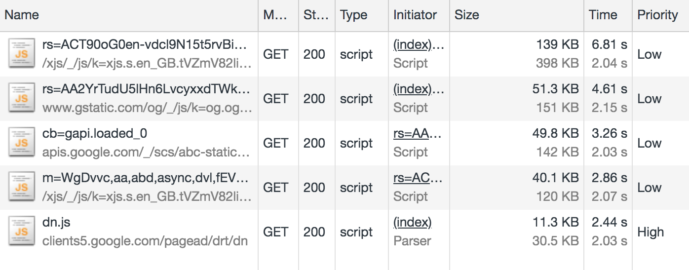
This means that JavaScript accounts for about 80 percent of the overall page weight.

This isn’t useless JavaScript; Google has to have some in order to display suggestions as you type. But I suspect a lot of it is tracking code and advertising setup.

For comparison, I disabled JavaScript and reloaded the page:

DevTools showing only 5 network requests
The disabled JS version of Google search was only 102 KB and had just 5 network requests. (Large preview)

The JS-disabled version of Google search is just 102 KB, as opposed to 402 KB. Although Google can’t provide autosuggestions under these conditions, the site is still functional, and I’ve just cut my data usage down to a quarter of what it was. If I really did have to limit my data usage in the long term, one of the first things I’d do is disable JavaScript. It’s not as bad as it sounds.

Performance Tip #3: Less Is More

Inlining, uglifying and minifying assets is all well and good, but the best performance comes from not sending down the assets in the first place.

  • Before adding any new features, do you have a performance budget in place?
  • Before adding JavaScript to your site, can your feature be accomplished using plain HTML? (For example, HTML5 form validation).
  • Before pulling a large JavaScript or CSS library into your application, use something like bundlephobia.com to measure how big it is. Is the convenience worth the weight? Can you accomplish the same thing using vanilla code at a much smaller data size?

Analysing The Resource Info

There’s a lot to unpack here, so let’s get cracking. I’ve only got 50 MB to play with, so I’m going to milk every bit of this page load. Settle in for a short Chrome Devtools tutorial.

402 KB transferred, but 1.1 MB of resources: what does that actually mean?

It means 402 KB of content was actually downloaded, but in its compressed form (using a compression algorithm such as gzip or brotli). The browser then had to do some work to unpack it into something meaningful. The total size of the unpacked data is 1.1 MB.

This unpacking isn’t free — there are a few milliseconds of overhead in decompressing the resources. But that’s a negligible overhead compared to sending 1.1MB down the wire.

Performance Tip #4: Compress Text-based Assets

As a general rule, always compress your assets, using something like gzip. But don’t use compression on your images and other binary files — you should optimize these in advance at source. Compression could actually end up making them bigger.

And, if you can, avoid compressing files that are 1500 bytes or smaller. The smallest TCP packet size is 1500 bytes, so by compressing to, say, 800 bytes, you save nothing, as it’s still transmitted in the same byte packet. Again, the cost is negligible, but wastes some compression CPU time on the server and decompression CPU time on the client.

Now back to the Network tab in Chrome: let’s dig into those priorities. Notice that resources have priority “Highest” to “Lowest” — these are the browser’s best guess as to what are the more important resources to download. The higher the priority, the sooner the browser will try to download the asset.

Performance Tip #5: Give Resource Hints To The Browser

The browser will guess at what the highest priority assets are, but you can provide a resource hint using the <link rel="preload"> tag, instructing the browser to download the asset as soon as possible. It’s a good idea to preload fonts, logos and anything else that appears above the fold.

Let’s talk about caching. I’m going to hold ALT and right-click to change my column headers to unlock some more juicy information. We’re going to check out Cache-Control.

Screenshot showing how to display cache-control information
There are lots of interesting fields tucked away behind ALT. (Large preview)

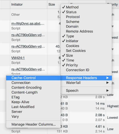
Cache-Control denotes whether or not a resource can be cached, how long it can be cached for, and what rules it should follow around revalidating. Setting proper cache values is crucial to keeping the data cost of repeat visits down.

Performance Tip #6: Set cache-control Headers On All Cacheable Assets

Note that the cache-control value begins with a directive of public or private, followed by an expiration value (e.g. max-age=31536000). What does the directive mean, and why the oddly specific max-age value?

Screenshot of Google network tab with cache-control column visible
A mixture of max-age values and public/private. (Large preview)

The value 31536000 is the number of seconds there are in a year, and is the theoretical maximum value allowed by the cache-control specification. It is common to see this value applied to all static assets and effectively means “this resource isn’t going to change”. In practice, no browser is going to cache for an entire year, but it will cache the asset for as long as makes sense.

To explain the public/private directive, we must explain the two main caches that exist off the server. First, there is the traditional browser cache, where the resource is stored on the user’s machine (the ‘client’). And then there is the CDN cache, which sits between the client and the server; resources are cached at the CDN level to prevent the CDN from requesting the resource from the origin server over and over again.

Diagram showing how caches interact with the server
Source. (Large preview)

A Cache-Control directive of public allows the resource to be cached in both the client and the CDN. A value of private means only the client can cache it; the CDN is not supposed to. This latter value is typically used for pages or assets that exist behind authentication, where it is fine to be cached on the client but we wouldn’t want to leak private information by caching it in the CDN and delivering it to other users.

Screenshot of Google logo cache-control setting: private, max-age=31536000
A mixture of max-age values and public/private. (Large preview)

One thing that got my attention was that the Google logo has a cache control of “private”. Other images on the page do have a public cache, and I don’t know why the logo would be treated any differently. If you have any ideas, let me know in the comments!

I refreshed the page and most of the resources were served from cache, apart from the page itself, which as you’ve seen already is private, max-age=0, meaning it cannot be cached. This is normal for dynamic web pages where it is important that the user always gets the very latest page when they refresh.

It was at this point I accidentally clicked on an ‘Explanation’ URL in the devtools, which took me to the network analysis reference, costing me about 5 MB of my budget. Oops.

Google Dev Docs

4.2 MB of this new 5 MB page was down to images; specifically SVGs. The weightiest of these was 186 KB, which isn’t particularly big — there were just so many of them, and they all downloaded at once.

Gif scrolling down the very long dev docs page
This is a loooong page. All the images downloaded on page load. (Large preview)

That 5 MB page load was 10% of my budget for today. So far I’ve used 5.5 MB, including the no-JavaScript reload of the Google homepage, and spent $0.40. I didn’t even mean to open this page.

What would have been a better user experience here?

Performance Tip #7: Lazy-load Your Images

Ordinarily, if I accidentally clicked on a link, I would hit the back button in my browser. I’d have received no benefit whatsoever from downloading those images — what a waste of 4.2 MB!

Apart from video, where you generally know what you’re getting yourself into, images are by far the biggest culprit to data usage on the web. A study of the world’s top 500 websites found that images take up to 53% of the average page weight. “This means they have a big impact on page-loading times and subsequently overall performance”.

Instead of downloading all of the images on page load, it is good practice to lazy-load the images so that only users who are engaged with the page pay the cost of downloading them. Users who choose not to scroll below the fold therefore don’t waste any unnecessary bandwidth downloading images they’ll never see.

There’s a great css-tricks.com guide to rolling out lazy-loading for images which offers a good balance between those on good connections, those on poor connections, and those with JavaScript disabled.

If this page had implemented lazy loading as per the guide above, each of the 38 SVGs would have been represented by a 1 KB placeholder image by default, and only loaded into view on scroll.

Performance Tip #8: Use The Right Format For Your Images

I thought that Google had missed a trick by not using WebP, which is an image format that is 26% smaller in size compared to PNGs (with no loss in quality) and 25-34% smaller in size compared to JPEGs (and of a comparable quality). I thought I’d have a go at converting SVG to WebP.

Converting to WebP did bring one of the SVGs down from 186 KB to just 65 KB, but actually, looking at the images side by side, the WebP came out grainy:

Comparison of the two images
The SVG (left) is noticeably crisper than the WebP (right). (Large preview)

I then tried converting one of the PNGs to WebP, which is supposed to be lossless and should come out smaller. However, the WebP output was *heavier* (127 KB, from 109 KB)!

Comparison of the two images
The PNG (left) is a similar quality to the WebP (right) but is smaller at 109 KB compared to 127 KB. (Large preview)

This surprised me. WebP isn’t necessarily the silver bullet we think it is, and even Google have neglected to use it on this page.

So my advice would be: where possible, experiment with different image formats on a per-image basis. The format that keeps the best quality for the smallest size may not be the one you expect.

Now back to the DOM. I came across this:

Screenshot of code
(Large preview)

Notice the async keyword on the Google analytics script?

Screenshot of performance analysis output of devtools
Google analytics has ‘low’ priority. (Large preview)

Despite being one of the first things in the head of the document, this was given a low priority, as we’ve explicitly opted out of being a blocking request by using the async keyword.

A blocking request is one that stops the rendering of the page. A <script> call is blocking by default, stopping the parsing of the HTML until the script has downloaded, compiled and executed. This is why we traditionally put <script> calls at the end of the document.

Performance Tip #9: Avoid Writing Blocking Script Calls

By adding the async attribute to our <script> tag, we’re telling the browser not to stop rendering the page but to download the script in the background. If the HTML is still being parsed by the time the script is downloaded, the parsing is paused while the script is executed, and then resumed. This is significantly better than blocking the rendering as soon as <script> is encountered.

There is also a defer attribute, which is subtly different. <script defer> tells the browser to render the page while the script loads in the background, and even if the HTML is still being parsed by the time the script is downloaded, the script must wait until the page is rendered before it can be executed. This makes the script completely non-blocking. Read “Efficiently load JavaScript with defer and async” for more information.

Anyway, enough Google dissecting. It’s time to try out another site. I’ve still got almost 45 MB of my budget left!

Amazon

screenshot of Amazon homepage
(Large preview)

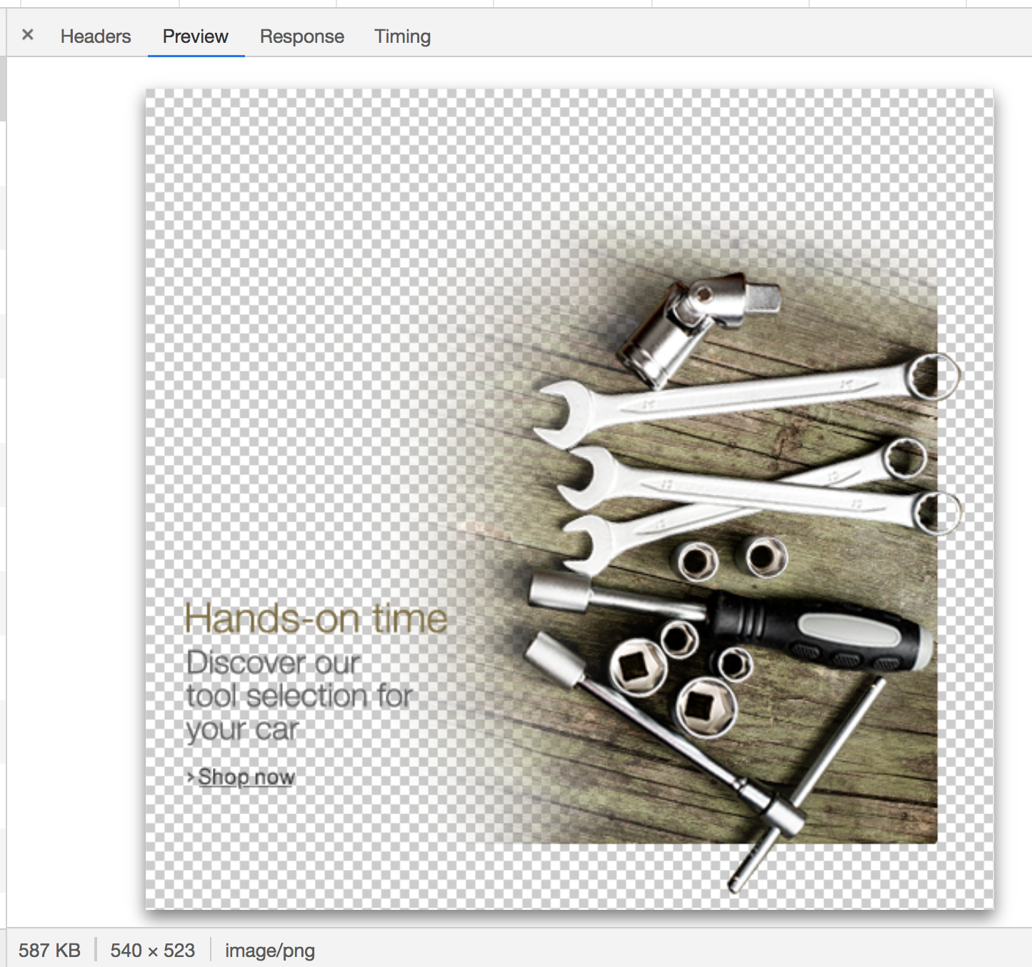
The Amazon homepage loaded with a total weight of about 6 MB. One of these was a 587 KB image that I couldn’t even find on the page. This was a PNG, presumably to have crisp text, but on a photographic background — a classic combination that’s terrible for performance.

image of spanners with overlaid text: Hands-on time. Discover our tool selection for your car
This grainy image used over 1% of my budget. (Large preview)

In fact, there were a few several-hundred-kilobyte images in my network tab that I couldn’t actually see on the page. I suspect a misconfiguration somewhere on Amazon, but these invisible images combined chewed through at least 1 MB of my data.

How about the hero image? It’s the main image on the page, and it’s only 94 KB transferred — but it could be reduced in size by about 15% if it were cropped directly around the text and footballers. We could then apply the same background color in CSS as is in the image. This has the additional advantage of being resizable down to smaller screens whilst retaining legibility of text.

Screenshot says: Premier league football - Live on Prime video
(Large preview)

I’ve said it once, and I’ll say it again: optimising and lazy-loading your images is the single biggest benefit you can make to the page weight of your site.

Optimizing images provided, by far, the most significant data reduction. You can make the case JavaScript is a bigger deal for overall performance, but not data reduction. Optimizing or removing images is the safest way of ensuring a much lighter experience and that’s the primary optimization Data Saver relies on.
— Tim Kadlec, Making Sense of Chrome Lite Pages

To be fair to Amazon, if I resize the browser to a mobile size and refresh the page, the site is optimized for mobile and the total page weight is only 2.1 MB.

101 requests, 2.1 MB transferred
101 requests, 2.1 MB transferred. (Large preview)

But this brings me onto my next point…

Performance Tip #10: Don’t Make Assumptions About Data Connections

It’s difficult to detect if someone on a desktop is on a broadband connection or is tethering through a data-limited dongle or mobile. Many people work on the train like that, or live in an area where broadband infrastructure is poor but mobile signal is strong. In Amazon’s case, there is room to make some big data savings on the desktop site and we shouldn’t get complacent just because the screen size suggests I’m not on a mobile device.

Yes, we should expect a larger page load if our viewport is ‘desktop sized’ as the images will be larger and better optimized for the screen than a grainier mobile one. But the page shouldn’t be orders of magnitude bigger.

Moreover, I was sending the Save-Data header with my request. This header explicitly indicates a preference for reduced data usage, and I hope more websites start to take notice of it in the future.

The initial ‘desktop’ load may have been 6 MB, but after sitting and watching it for a minute it had climbed to 8.6 MB as the lower-priority resources and event tracking kicked into action. This page weight includes almost 1.7 MB of minified JavaScript. I don’t even want to begin to look at that.

Performance Tip #11: Use Web Workers For Your JavaScript

Which would be worse — 1.7 MB of JavaScript or 1.7 MB of images? The answer is JavaScript: the two assets are not equivalent when it comes to performance.

A JPEG image needs to be decoded, rasterized, and painted on the screen. A JavaScript bundle needs to be downloaded and then parsed, compiled, executed —and there are a number of other steps that an engine needs to complete. Be aware that these costs are not quite equivalent.
— Addy Osmani, The Cost of JavaScript in 2018

If you must ship this much JavaScript, try putting it in a web worker. This keeps the bulk of JavaScript off the main thread, which is now freed up for repainting the UI, helping your web page to stay responsive on low-powered devices.

I’m now about 15.5 MB into my budget, and have spent $1.14 of my Zimbabwe data budget. I’d have had to have worked for half a day as a teacher to earn the money to get this far.

Pinterest

I’ve heard good things about Pinterest’s performance, so I decided to put it to the test.

A staggering 327 requests, making 6.1 MB of data.
A staggering 327 requests, making 6.1 MB of data. (Large preview)

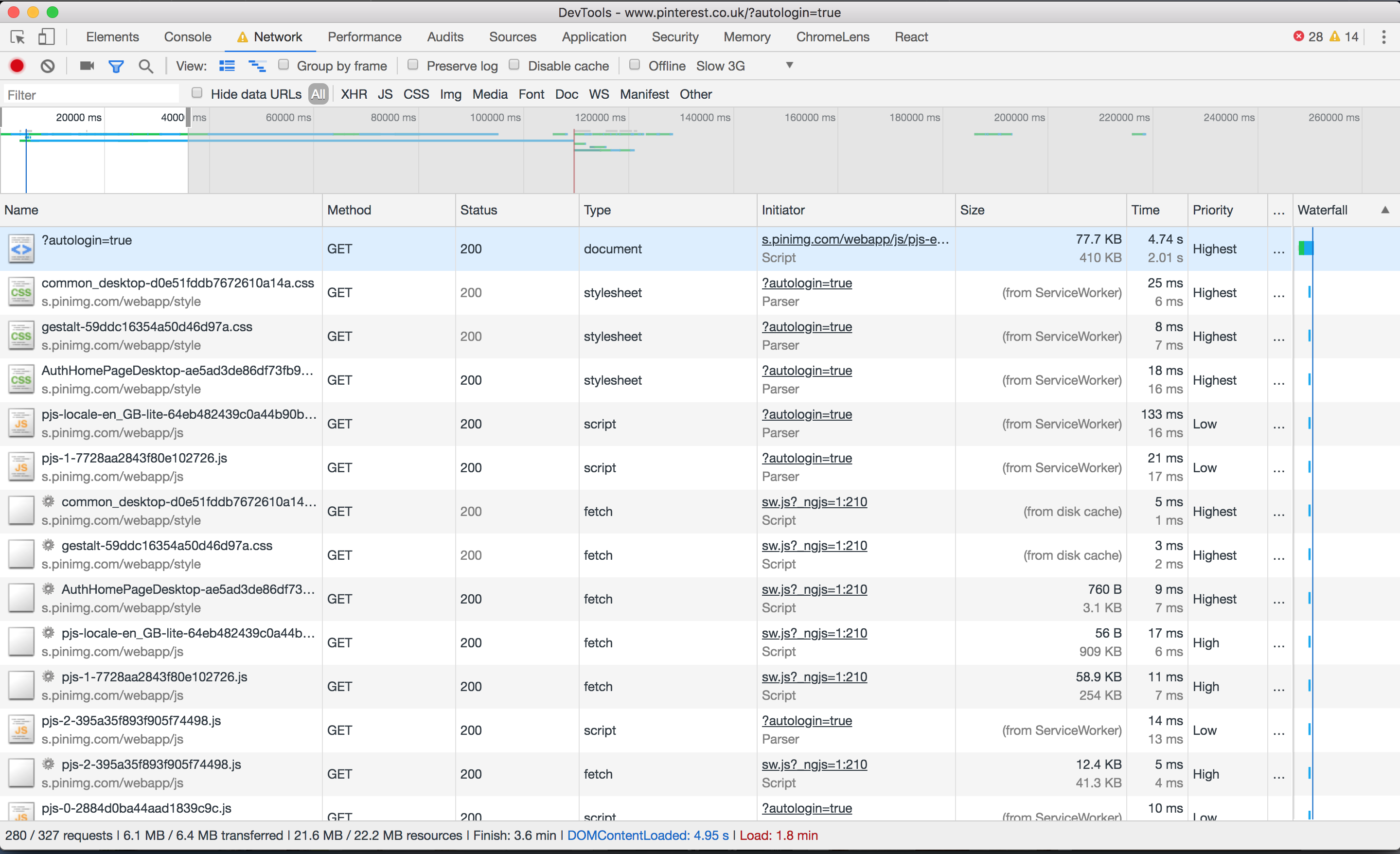
Perhaps this isn’t the fairest of tests; I was taken to the sign-in page, upon which an asynchronous process found I was logged into Facebook and logged me in automatically. The page loaded relatively quickly, but the requests crept up as more and more content was preloaded.

However, I saw that on subsequent page loads, the service worker surfaced much of the content — saving about half of the page weight:

8.2 / 15.6 MB resources, and 39 / 180 requests handled by the service worker cache.
8.2 / 15.6 MB resources, and 39 / 180 requests handled by the service worker cache. (Large preview)

The Pinterest site is a progressive web app; it installed a service worker to manually handle caching of CSS and JS. I could now turn off my WiFi and continue to use the site (albeit not very usefully):

Loading spinner and message saying: you're not connected to the internet
You can’t do much when you’re offline. (Large preview)
Performance Tip #12: Use Service Workers To Provide Offline Support

Wouldn’t it be great if I only had to load a website once over network, and now get all the information I need even if I’m offline?

A great example would be a website that shows the weather forecast for the week. I should only need to download that page once. If I turn off my mobile data and subsequently go back to the page at some point, it should be able to serve the last known content to me. If I connect to the internet again and load the page, I would get a more up to date forecast, but static assets such as CSS and images should still be served locally from the service worker.

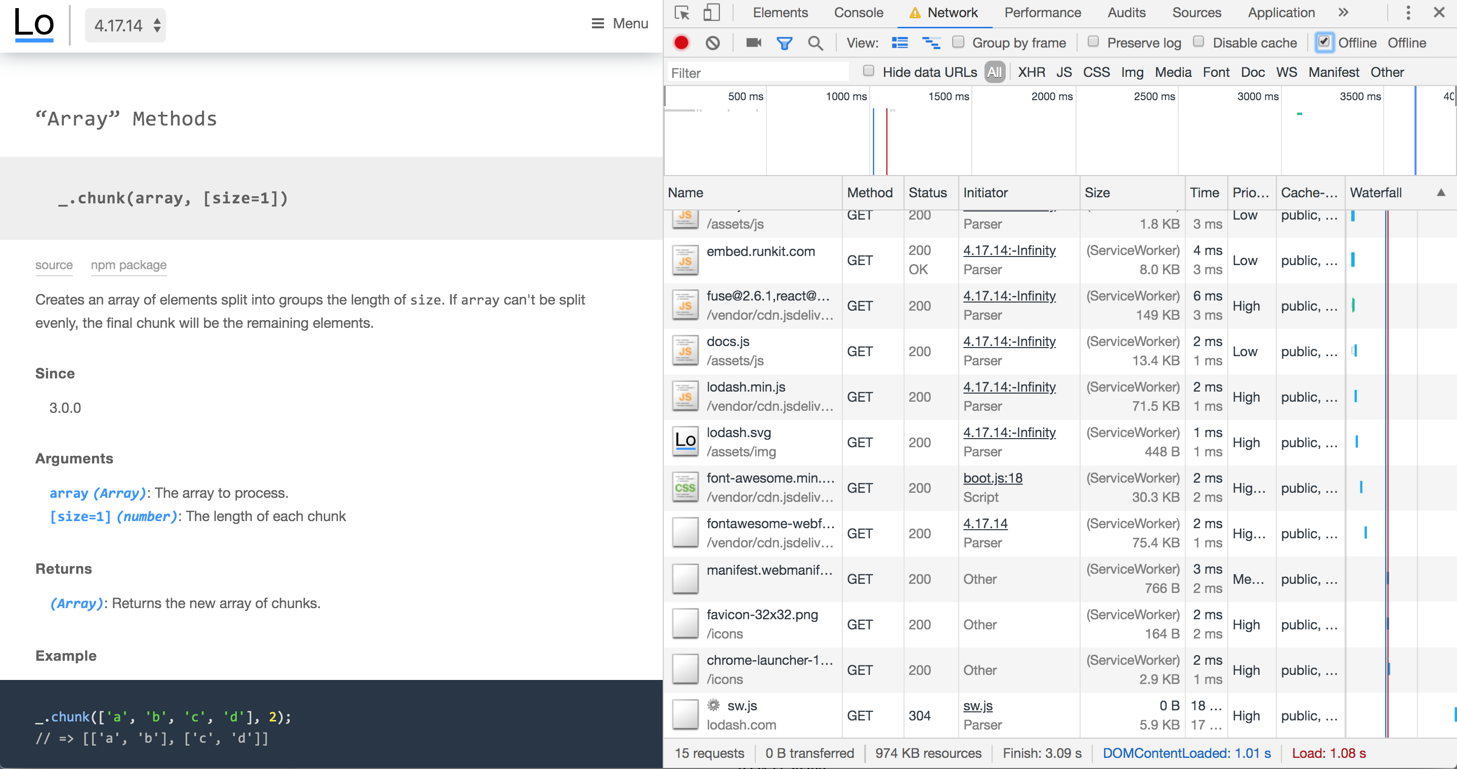
This is possible by setting up a service worker with a good caching strategy so that cached pages can be re-accessed offline. The lodash documentation website is a nice example of a service worker in the wild:

Screenshot of devtools showing 'ServiceWorker' next to each request
The Lodash docs work offline. (Large preview)

Content that rarely updates and is likely to be used quite regularly is a perfect candidate for service worker treatment. Dynamic sites with ever-changing news feeds aren’t quite so well suited for offline experiences, but can still benefit.

Screenshot of Chris Ashton profile on Pinterest
The second Pinterest page load was 443 KB. (Large preview)

Service workers can truly save the day when you’re on a tight data budget. I’m not convinced the Pinterest experience was the most optimal in terms of data usage – subsequent pages were around the 0.5 MB mark even on pages with few images — but letting your JavaScript handle page requests for you and keeping the same navigational elements in place can be very performant. The BBC manages a transfer size of just 3.1 KB for return-visits to articles that are renderable via the single page application.

So far, Pinterest alone has chewed through 14 MB, which means I’ve blown around 30 MB of my budget, or $2.20 (almost a day’s wages) of my Zimbabwe budget.

I’d better be careful with my final 20 MB… but where’s the fun in that?

Gamespot

I picked this one because it felt noticeably sluggish on my mobile in the past and I wanted to dig into the reasons why. Sure enough, loading the homepage consumes 8.5 MB of data.

Screenshot of devtools alongside homepage
The Gamespot homepage trickled up to 8.5 MB, and a whopping 347 requests. (Large preview)

6.5 MB of this was down to an autoplaying video halfway down the page, which — to be fair — didn’t appear to download until I began scrolling. Nevertheless…

Gif screenshot of the video within my viewport
The video is clipped off-screen. (Large preview)

I could only see half the video in my viewport — the right hand side was clipped. It was also 30 seconds long, and I would wager that most people won’t sit and watch the whole thing. This single asset more than tripled the size of the page.

Performance Tip #13: Don’t Preload Video

As a rule, unless your site’s primary mode of communication is video, don’t preload it.

If you’re YouTube or Netflix, it’s reasonable to assume that someone coming to your page will want the video to auto-load and auto-play. There is an expectation that the video will chew through some data, but that it’s a fair exchange for the content. But if you’re a site whose primary medium is text and image — and you just happen to offer additional video content — then don’t preload the video.

Think of news articles with embedded videos. Many users only want to skim the article headline before moving on to their next thing. Others will read the article but ignore any embeds. And others will diligently click and watch each embedded video. We shouldn’t hog the bandwidth of every user on the assumption that they’re going to want to watch these videos.

To reiterate: users don’t like autoplaying video. As developers we only do it because our managers tell us to, and they only tell us to do it because all the coolest apps are doing it, and the coolest apps are only doing it because video ads generate 20 to 50 times more revenue than traditional ads. Google Chrome has started blocking autoplay videos for some sites, based on personal preferences, so even if you develop your site to autoplay video, there’s no guarantee that’s the experience your users are getting.

If we agree that it’s a good idea to make video an opt-in experience (click to play), we can take it a step further and make it click to load too. That means mocking a video placeholder image with a play button over it, and only downloading the video when you click the play button. People on fast connections should notice no difference in buffer speed, and people on slow connections will appreciate how fast the rest of your site loaded because it didn’t have to preload a large video file.

Anyway, back to Gamespot, where I was indeed forced to preload a large video file I ended up not watching. I then clicked through to a game review page that weighed another 8.5 MB, this time with 5.4 MB of video, before I even started scrolling down the page.

What was really galling was when I looked at what the video actually was. It was an advert for a Samsung TV! This advert cost me $0.40 of my Zimbabwe wages. Not only was it pre-loaded, but it also didn’t end up playing anywhere as far as I’m aware, so I never actually saw it.

Screenshot of the offending request
This advert wasted 5.4 MB of my precious data. (Large preview)

The ‘real’ video — the gameplay footage (in other words, the content) — wasn’t actually loaded until I clicked on it. And that ploughed through my remaining data in seconds.

That’s it. That’s my 50 MB gone. I’ll need to work another 1.5 days as a Zimbabwean schoolteacher to repeat the experience.

Performance Tip #14: Optimize For First Page Load

What’s striking is that I used 50 MB of data and in most cases, I only visited one or two pages on any given site. If you think about it, this is true of most user journeys today.

Think about the last time you Googled something. You no doubt clicked on the first search result. If you got your answer, you closed the tab, or else you hit the back button and moved onto the next search result.

With the exception of a few so-called ‘destination sites’ such as Facebook or YouTube, where users habitually go as a starting point for other activities, the majority of user journeys are ephemeral. We stumble across random sites to get the answers to our questions, never to return to those sites again.

Web development practices are heavily skewed towards optimising for repeat visitors. “Cache these assets — they’ll come in handy later”. “Pre-load this onward journey, in case the user clicks to read more”. “Subscribe to our mailing list”.

Instead, I believe we should optimize heavily for one-off visitors. Call it a controversial opinion, but maybe caching isn’t really all that important. How important can a cached resource that never gets surfaced again be? And perhaps users aren’t actually going to subscribe to your mailing list after reading just the one article, so downloading the JavaScript and CSS for the mail subscription modal is both a waste of data and an annoying user experience.

The Decline Of Proxy Browsers

I had hoped to try out Opera Mini as part of this experiment. Opera Mini is a mobile web browser which proxies web pages through Opera’s compression servers. It accounts for 1.42% of global traffic as of June 2019, according to caniuse.com.

Opera Mini claims to save up to 90% of data by doing some pretty intensive transcoding. HTML is parsed, images are compressed, styling is applied, and a certain amount of JavaScript is executed on Opera’s servers. The server doesn’t respond with HTML as you might expect — it actually transcodes the data into Opera Binary Markup Language (OBML), which is progressively loaded by Opera Mini on the device. It renders what is essentially an interactive ‘snapshot’ of the web page — think of it as a PDF with hyperlinks inside it. Read Tiffany Brown’s excellent article, “Opera Mini and JavaScript” for a technical deep-dive.

It would have been a perfect way to eek my 50 MB budget as far as possible. Unfortunately, Opera Mini is no longer available on iOS in the UK. Attempting to visit it in the app store throws an error:

The item you've requested is not currently available in the UK Store.
(Large preview)

It’s still available “in some markets” but reading between the lines, Opera will be phasing out Opera Mini for its new app — Opera Touch — which doesn’t have any data-saving functionality apart from the ability to natively block ads.

Opera desktop used to have a ‘Turbo mode’, acting as a traditional proxy server (returning a HTML document instead of OBML), applying data-saving techniques but less intensively than Opera Mini. According to Opera, JavaScript continues to work and “you get all the videos, photos and text that you normally would, but you eat up less data and load pages faster”. However, Opera quietly removed Turbo mode in v60 earlier this year, and Opera Touch doesn’t have a Turbo mode either. Turbo mode is currently only available on Opera for Android.

Android is where all the action is in terms of data-saving technology. Chrome offers a ‘Lite mode’ on its mobile browser for Android, which is not available for iPhones or iPads because of “platform constraints“. Outside of mobile, Google used to provide a ‘Data Saver’ extension for Chrome desktop, but this was canned in April.

Lite mode for Chrome Android can be forcibly enabled, or automatically kicks in when the network’s effective connection type is 2G or worse, or when Chrome estimates the page will take more than 5 seconds to reach first contentful paint. Under these conditions, Chrome will request the lite version of the HTTPS URL as cached by Google’s servers, and display this stripped-down version inside the user’s browser, alongside a “Lite” marker in the address bar.

Screenshot showing button in toolbar denoting 'Lite' mode
‘Lite mode’ on Chrome for Android. Image: Google. (Large preview)

I’d love to try it out — apparently it disables scripts, replaces images with placeholders, prevents loading of non-critical resources and shows offline copies of pages if one is available on the device. This saves up to 60% of data. However, it isn’t available in private (Incognito) mode, which hints at some of the privacy concerns surrounding proxy browsers.

Lite mode shares the HTTPS URL with Google, therefore it makes sense that this mode isn’t available in Incognito. However other information such as cookies, login information, and personalised page content is not shared with Google — according to ghacks.net — and “never breaks secure connections between Chrome and a website”. One wonders why seemingly none of these data-saving services are allowed on iOS (and there is no news as to whether Lite mode will ever become available on iOS).

Data saver proxies require a great deal of trust; your browsing activity, cookies and other sensitive information are entrusted to some server, often in another country. Many proxies simply won’t work anymore because a lot of sites have moved to HTTPS, meaning initiatives such as Turbo mode have become a largely “useless feature“. HTTPS prevents this kind of man-in-the-middle behaviour, which is a good thing, although it has meant the demise of some of these proxy services and has made sites less accessible to those on poor connections.

I was unable to find any OSX or iOS compatible data-saving tool except for Bandwidth Hero for Firefox (which requires setting up your own data compression service — far beyond the technical capabilities of most users!) and skyZIP Proxy (which, last updated in 2017 and riddled with typos, I just couldn’t bring myself to trust).

Conclusion

Reducing the data footprint of your website goes hand in hand with improving frontend performance. It is the single most reliable thing you can do to speed up your site.

In addition to the cost of data, there are lots of good reasons to focus on performance, as described in a GOV.UK blog post on the subject:

  • 53% of users will abandon a mobile site if it takes more than 3 seconds to load.
  • People have to concentrate 50% more when trying to complete a simple task on a website using a slow connection.
  • More performant web pages are better for the battery life of the user’s device, and typically require less power on the server to deliver. A performant site is good for the environment.

We don’t have the power to change the global cost of data inequality. But we do have the power to lessen its impact, improving the experience for everyone in the process.

Smashing Editorial (yk,ra)

I Used The Web For A Day On Internet Explorer 8

I Used The Web For A Day On Internet Explorer 8

I Used The Web For A Day On Internet Explorer 8

Chris Ashton

This article is part of a series in which I attempt to use the web under various constraints, representing a given demographic of user. I hope to raise the profile of difficulties faced by real people, which are avoidable if we design and develop in a way that is sympathetic to their needs.

Last time, I navigated the web for a day using a screen reader. This time, I spent the day using Internet Explorer 8, which was released ten years ago today, on March 19th, 2009.

Who In The World Uses IE8?

Before we start; a disclaimer: I am not about to tell you that you need to start supporting IE8.

There’s every reason to not support IE8. Microsoft officially stopped supporting IE8, IE9 and IE10 over three years ago, and the Microsoft executives are even telling you to stop using Internet Explorer 11.

But as much as we developers hope for it to go away, it just. Won’t. Die. IE8 continues to show up in browser stats, especially outside of the bubble of the Western world.

Browser stats have to be taken with a pinch of salt, but current estimates for IE8 usage worldwide are around 0.3% to 0.4% of the desktop market share. The lower end of the estimate comes from w3counter:

Graph of IE8 usage over time
From a peak of almost 30% at the end of 2010, W3Counter now believes IE8 accounts for 0.3% of global usage. (Large preview)

The higher estimate comes from StatCounter (the same data feed used by the “Can I use” usage table). It estimates global IE8 desktop browser proportion to be around 0.37%.

Graph of IE8 usage vs other browsers
Worldwide usage of IE8 is at 0.37% according to StatCounter. (Large preview)

I suspected we might see higher IE8 usage in certain geographical regions, so drilled into the data by continent.

IE8 Usage By Region

Here is the per-continent IE8 desktop proportion (data from February 2018 — January 2019):

1. Oceania 0.09%
2. Europe 0.25%
3. South America 0.30%
4. North America 0.35%
5. Africa 0.48%
6. Asia 0.50%

Someone in Asia is five times more likely to be using IE8 than someone in Oceania.

I looked more closely into the Asian stats, noting the proportion of IE8 usage for each country. There’s a very clear top six countries for IE8 usage, after which the figures drop down to be comparable with the world average:

1. Iran 3.99%
2. China 1.99%
3. North Korea 1.38%
4. Turkmenistan 1.31%
5. Afghanistan 1.27%
6. Cambodia 1.05%
7. Yemen 0.63%
8. Taiwan 0.62%
9. Pakistan 0.57%
10. Bangladesh 0.54%

This data is summarized in the map below:

Graph showing IE8 breakdown in Asia
Iran, Turkmenistan and Afghanistan in the Middle East, and China, North Korea & Cambodia in the Far East stand out for their IE8 usage. (Large preview)

Incredibly, IE8 makes up around 4% of desktop users in Iran — forty times the proportion of IE8 users in Oceania.

Next, I looked at the country stats for Africa, as it had around the same overall IE8 usage as Asia. There was a clear winner (Eritrea), followed by a number of countries above or around the 1% usage mark:

1. Eritrea 3.24%
2. Botswana 1.37%
3. Sudan & South Sudan 1.33%
4. Niger 1.29%
5. Mozambique 1.19%
6. Mauritania 1.18%
7. Guinea 1.12%
8. Democratic Republic of the Congo 1.07%
9. Zambia 0.94%

This is summarized in the map below:

Graph showing IE8 breakdown in Africa
Eritrea stands out for its IE8 usage (3.24%). A number of other countries also have >1% usage. (Large preview)

Whereas the countries in Asia that have higher-than-normal IE8 usage are roughly batched together geographically, there doesn’t appear to be a pattern in Africa. The only pattern I can see — unless it’s a coincidence — is that a number of the world’s largest IE8 using countries famously censor internet access, and therefore probably don’t encourage or allow updating to more secure browsers.

If your site is aimed at a purely Western audience, you’re unlikely to care much about IE8. If, however, you have a burgeoning Asian or African market — and particularly if you care about users in China, Iran or Eritrea — you might very well care about your website’s IE8 experience. Yes — even in 2019!

Who’s Still Using IE?

So, who are these people? Do they really walk among us?!

Whoever they are, you can bet they’re not using an old browser just to annoy you. Nobody deliberately chooses a worse browsing experience.

Someone might be using an old browser due to the following reasons:

  • Lack of awareness They simply aren’t aware that they’re using outdated technology.
  • Lack of education They don’t know the upgrade options and alternative browsers open to them.
  • Lack of planning Dismissing upgrade prompts because they’re busy, but not having the foresight to upgrade during quieter periods.
  • Aversion to change The last time they upgraded their software, they had to learn a new UI. “If it ain’t broke, don’t fix it.”
  • Aversion to risk The last time they upgraded, their machine slowed to a crawl, or they lost their favorite feature.
  • Software limitation Their OS is too old to let them upgrade, or their admin privileges may be locked down.
  • Hardware limitation Newer browsers are generally more demanding of your hard disk space, memory and CPU.
  • Network limitation A capped data allowance or slow connection mean they don’t want to download 75MB of software.
  • Legal limitation They might be on a corporate machine that only condones the use of one specific browser.

Is it really such a surprise that there are still people around the world who are clinging to IE8?

I decided to put myself in the shoes of one of these anonymous souls, and browse the web for a day using IE8. You can play along at home! Download an “IE8 on Windows 7” Virtual Machine from the Microsoft website, then run it in a virtualizer like VirtualBox.

IE8 VM: Off To A Bad Start

I booted up my IE8 VM, clicked on the Internet Explorer program in anticipation, and this is what I saw:

Screenshot of default homepage of IE8 not loading
The first thing I saw was a 404. Great. (Large preview)

Hmm, okay. Looks like the default web page pulled up by IE8 no longer exists. Well, that figures. Microsoft has officially stopped supporting IE8 so why should it make sure the IE8 landing page still works?

I decided to switch to the most widely used site in the world.

Google

Screenshot of Google.com
The Google homepage renders fine in IE8. (Large preview)

It’s a simple site, therefore difficult to get wrong — but to be fair, it’s looking great! I tried searching for something:

Screenshot of Google search results for Impractical Jokers
Those who have read my previous articles may notice a recurring theme here. (Large preview)

The search worked fine, though the layout looks a bit different to what I’m used to. Then I remembered — I’d seen the same search result layout when I used the Internet for a day with JavaScript turned off.

For reference, here is how the search results look in a modern browser with JavaScript enabled:

Screenshot of Google Chrome search results for Impractical Jokers
Cleaner layout, extra images and meta information, Netflix/Twitter integration. (Large preview)

So, it looks like IE8 gets the no-JS version of Google search. I don’t think this was necessarily a deliberate design decision — it could just be that the JavaScript errored out:

Screenshot of Google search error “Object doesn’t support this property or method”
The page tried and failed to run JavaScript. (Large preview)

Still, the end result is fine by me — I got my search results, which is all I wanted.

I clicked through to watch a YouTube video.

YouTube

Screenshot of buggy YouTube video page
Funky logo, no images for related videos, and unsurprisingly, no video. (Large preview)

There’s quite a lot broken about this page. All to do with little quirks in IE.

The logo, for instance, is zoomed in and cropped. This is down to IE8 not supporting SVG, and what we’re actually seeing is the fallback option provided by YouTube. They’ve applied a background-image CSS property so that in the event of no SVG support, you’ll get an attempt at displaying the logo. Only they seem to have not set the background-size properly, so it’s a little too far zoomed in.

Screenshot of YouTube logo in IE8 and Developer Tools inspecting it
YouTube set a background-img on the logo span, which pulls in a sprite. (Large preview)

For reference, here is the same page in Chrome (see how Chrome renders an SVG instead):

Screenshot of Chrome DevTools inspecting YouTube logo
(Large preview)

And what about that Autoplay toggle? It’s rendered like a weird looking checkbox:

Screenshot of Autoplay toggle
Looks like IE8 defaults to a checkbox under the hood. (Large preview)

This appears to be down to use of a custom element (a paper-toggle-button, which is a Material Design element), which IE doesn’t understand:

Screenshot of Autoplay toggle markup
paper-toggle-button is a custom element. (The screenshot is from Chrome DevTools, alongside how the Autoplay toggle SHOULD render.) (Large preview)

I’m not surprised this hasn’t rendered properly; IE8 doesn’t even cope with the basic semantic markup we use these days. Try using an <aside> or <main> and it will basically render them as divs, but ignoring any styling you apply to them.

To enable HTML5 markup, you have to explicitly tell the browser these elements exist. They can then be styled as normal:

<!--[if lt IE 9]>
   <script>
      document.createElement('header');
      document.createElement('nav');
      document.createElement('section');
      document.createElement('article');
      document.createElement('aside');
      document.createElement('footer');
   </script>
<![endif]-->

That is wrapped in an IE conditional, by the way. <!--[if lt IE 9]> is a HTML comment to most browsers — and therefore gets skipped — but in IE it is a conditional which only passes “if less than IE 9”, where it executes/renders the DOM nodes within it.

So, the video page was a fail. Visiting YouTube.com directly didn’t fare much better:

Screenshot of IE8 YouTube homepage: “Your web browser is no longer supported”
At least I had a visible error message this time! (Large preview)

Undeterred, I ignored the warning and tried searching for a video within YouTube’s search bar.

Screenshot of Google “Sorry, your computer may be sending automated queries. We can't process your request”
Computer says no. (Large preview)

IE8 traffic is clearly suspicious enough that YouTube didn’t trust that I’m a real user, and decided not to process my search request!

Signing Up To Gmail

If I’m going to spend the day on IE8, I’m going to need an email address. So I go about trying to set up a new one.

First of all, I tried Gmail.

Screenshot of Gmail homepage
The text isn’t going to pass color contrast standards! (Large preview)

There’s something a bit off about the image and text here. I think it’s down to the fact that IE8 doesn’t support media queries — so it’s trying to show me a mobile image on desktop.

One way you can get around this is to use Sass to generate two stylesheets; one for modern browsers, and one for legacy IE. You can get IE-friendly, mobile-first CSS (see tutorial by Jake Archibald) by using a mixin for your media queries. The mixin “flattens” your legacy IE CSS to treat IE as though it’s always a specific predefined width (e.g. 65em), giving only the relevant CSS for that width. In this case, I’d have seen the correct background-image for my assumed screen size and had a better experience.

Anyway, it didn’t stop me clicking ‘Create an Account’. There were a few differences between how it looked in IE8 and a modern browser:

Screenshot comparing Gmail signup screen on Chrome and IE8
IE8 is missing the tight layout, and there’s an overlap of text, but otherwise still works. (Large preview)

Whilst promising at first sight, the form was quite buggy to fill in. The ‘label’ doesn’t get out of the way when you start filling in the fields, so your input text is obfuscated:

Screenshot of buggy labels
The labels overlapped the text I was writing. (Large preview)

The markup for this label is actually a <div>, and some clever JS moves the text out of the way when the input is focussed. The JS doesn’t succeed on IE8, so the text stays stubbornly in place.

Screenshot of gmail form markup
The ‘label’ is a div which is overlaid on form input using CSS. (Large preview)

After filling in all my details, I hit “Next”, and waited. Nothing happened.

Then I noticed the little yellow warning symbol at the bottom left of my IE window. I clicked it and saw that it was complaining about a JS error:

Screenshot of Gmail error
I got reasonably far, but then the Next button didn’t work. (Large preview)

I gave up on Gmail and turned to MSN.

Signing Up To Hotmail

I was beginning to worry that email might be off-limits for a ten-year-old browser. But when I went to Hotmail, the signup form looked OK — so far so good:

Screenshot of signup page for MSN
The signup page looked fine. Guessed we’d have more luck with a Microsoft product! (Large preview)

Then I noticed a CAPTCHA. I thought, “There’s no way I’ll get through this…”

Screenshot of captcha verification of signup state
I could see and complete the CAPTCHA. (Large preview)

To my surprise, the CAPTCHA worked!

The only quirky thing on the form was some slightly buggy label positioning, but the signup was otherwise seamless:

Screenshot of first name label, surname label, and then two empty input fields, no clear visual hierarchy
The label positions were a bit off, but I guessed my last name followed by my surname would be fine. (Large preview)

Does that screenshot look OK to you? Can you spot the deliberate mistake?

The leftmost input should have been my first name, not my surname. When I came back and checked this page later, I clicked on the “First name” label and it applied focus to the leftmost input, which is how I could have checked I was filling in the correct box in the first place. This shows the importance of accessible markup — even without CSS and visual association, I could determine exactly which input box applied to which label (albeit the second time around!).

Anyhow, I was able to complete the sign-up process and was redirected to the MSN homepage, which rendered great.

Screenshot of MSN homepage looking good
If any site is going to work in IE8, it will be the Microsoft homepage. (Large preview)

I could even read articles and forget that I was using IE8:

Screenshot of MSN article
The article works fine. No dodgy sidebars or borked images. (Large preview)

With my email registered, I was ready to go and check out the rest of the Internet!

Facebook

I visited the Facebook site and was immediately redirected to the mobile site:

Screenshot of Facebook mobile
“You are using a browser that is not supported by Facebook, so we have redirected you to a simpler version to give you the best experience.” (Large preview)

This is a clever fallback tactic, as Facebook need to support a large global audience on low-end mobile devices, so need to provide a basic version of Facebook anyway. Why not offer that same baseline of experience to older desktop browsers?

I tried signing up and was able to make an account. Great! But when I logged into that account, I was treated with suspicion — just like when I searched for things on YouTube — and was faced with a CAPTCHA.

Only this time, it wasn’t so easy.

Screenshot of CAPTCHA message, but CAPTCHA image failing to load
“Please enter the code below”. Yeah, right. (Large preview)

I tried requesting new codes and refreshing the page several times, but the CAPTCHA image never loaded, so I was effectively locked out of my account.

Oh well. Let’s try some more social media.

Twitter

I visited the Twitter site and had exactly the same mobile redirect experience.

Screenshot of mobile view for Twitter
Twitter treats IE8 as a mobile browser, like Facebook does. (Large preview)

But I couldn’t even get as far as registering an account this time:

Screenshot of Twitter registration screen
Your browser is no longer supported. To sign up, please update it. You can still log in to your existing user accounts. (Large preview)

Oddly, Twitter is happy for you to log in, but not for you to register in the first place. I’m not sure why — perhaps it has a similar CAPTCHA scenario on its sign-up pages which won’t work on older browsers. Either way, I’m not going to be able to make a new account.

I felt awkward about logging in with my existing Twitter account. Call me paranoid, but vulnerabilities like the CFR Watering Hole Attack of 2013 — where the mere act of visiting a specific URL in IE8 would install malware to your machine — had me nervous that I might compromise my account.

But, in the interests of education, I persevered (with a temporary new password):

Screenshot of Twitter feed
Successfully logged in. I can see tweets! (Large preview)

I could also tweet, albeit using the very basic <textarea>:

Screenshot of me writing a tweet, lamenting about the lack of emojis in the IE8 twitter view
You only miss them when they’re gone. (Large preview)

In conclusion, Twitter is basically fine in IE8 — as long as you have an account already!

I’m done with social media for the day. Let’s go check out some news.

BBC News

Screenshot of BBC homepage with “Security Warning” browser popup
The BBC appears to be loading a mixture of HTTPS and HTTP assets. (Large preview)

The news homepage looks very basic and clunky but basically works — albeit with mixed content security warnings.

Take a look at the logo. As we’ve already seen on YouTube, IE8 doesn’t support SVG, so we require a PNG fallback.

The BBC uses the <image> fallback technique to render a PNG on IE:

Screenshot of IE8 BBC News logo with devtools open
IE8 finds the base64 image inside the SVG and renders it. (Large preview)

…and to ignore the PNG when SVG is available:

Screenshot of Chrome BBC News logo with devtools open
The image part is ignored and the svg is rendered nicely. (Large preview)

This technique exploits the fact that older browsers used to obey both <image> and <img> tags, and so will ignore the unknown <svg> tag and render the fallback, whereas modern browsers ignore rendering <image> when inside an SVG. Chris Coyier explains the technique in more detail.

I tried viewing an article:

Screenshot of a BBC article, which displays fine but has a warning message at the top
This site is optimised for modern browsers, and does not fully support your browser. (Large preview)

It’s readable. I can see the headline, the navigation, the featured image. But the rest of the article images are missing:

Screenshot of BBC article with references to images that are not displaying
(Large preview)

This is to be expected, and is due to the BBC lazy-loading images. IE8 not being a ‘supported browser’ means it does not get the JavaScript that enables lazy-loading, thus the images never load at all.

Out of interest, I thought I’d see what happens if I try to access the BBC iPlayer:

Screenshot of BBC iPlayer - just a black screen
...not a lot. (Large preview)

And that got me wondering about another streaming service.

Netflix

I was half expecting an empty white page when I loaded up Netflix in IE8. I was pleasantly surprised when I actually saw a decent landing page:

Screenshot of Netflix homepage
“Join free for a month” call to action, over a composite image of popular titles. (Large preview)

I compared this with the modern Chrome version:

Screenshot of Netflix homepage
“Watch free for 30 days” call to action, over a composite image of popular titles. (Large preview)

There’s a slightly different call to action (button text) — probably down to multivariate testing rather than what browser I’m on.

What’s different about the render is the centralized text and the semi-transparent black overlay.

The lack of centralized text is because of Netflix’s use of Flexbox for aligning items:

Netflix Flexbox aligning items
Netflix uses the Flexbox property justify-content: center to align its text. (Large preview)

A text-align: center on this class would probably fix the centering for IE8 (and indeed all old browsers). For maximum browser support, you can follow a CSS fallbacks approach with old ‘safe’ CSS, and then tighten up layouts with more modern CSS for browsers that support it.

The lack of background is due to use of rgba(), which is not supported in IE8 and below.

A background of rgba(0,0,0,.5) is meaningless to older browsers
A background of rgba(0,0,0,.5) is meaningless to older browsers. (Large preview)

Traditionally it’s good to provide CSS fallbacks like so, which show a black background for old browsers but show semi-transparent background for modern browsers:

rgb(0, 0, 0); /* IE8 fallback */
rgba(0, 0, 0, 0.8);

This is a very IE specific fix, however, basically every other browser supports rgba. Moreover, in this case, you’d lose the fancy Netflix tiles altogether, so it would be better to have no background filter at all! The surefire way of ensuring cross-browser support would be to bake the filter into the background image itself. Simple but effective.

Anyway, so far, so good — IE8 actually rendered the homepage pretty well! Am I actually going to be watching Breaking Bad on IE8 today?

My already tentative optimism was immediately shot down when I viewed the sign-in page:

Screenshot comparing sign-in page for Netflix on Chrome and IE8. IE version colors are all over the place, and it's hard to read the text
Can you guess which side is IE8 and which is Chrome? (Large preview)

Still, I was able to sign in, and saw a pared-back dashboard (no fancy auto-expanding trailers):

Screenshot of Netflix dashboard for logged in user
Each programme had a simple hover state with play icon and title. (Large preview)

I clicked on a programme with vague anticipation, but of course, only saw a black screen.

Amazon

Ok, social media and video are out. All that’s left is to go shopping.

I checked out Amazon, and was blown away — it’s almost indistinguishable from the experience you’d get inside a modern browser:

Screenshot of Amazon homepage
The Amazon homepage looks almost as good on IE8 as it does on any other browser. (Large preview)

I’ve been drawn in by a good homepage before. So let’s click on a product page and see if this is just a fluke.

Screenshot of Amazon product page for Ferrero Rocher chocolates
The product page also looks fantastic (and makes me hungry). (Large preview)

No! The product page looked good too!

Amazon wasn’t the only site that surprised me in its backwards compatibility. Wikipedia looked great, as did the Gov.UK government website. It’s not easy to have a site that doesn’t look like an utter car crash in IE8. Most of my experiences were decidedly less polished…!

Screenshot of sky.com on IE8, layout is all over the place and text is hard to read when placed over images
It is difficult to read or navigate sky.com on IE8. (Large preview)

But a deprecated warning notice or funky layout wasn’t the worst thing I saw today.

Utterly Broken Sites

Some sites were so broken that I couldn’t even connect to them!

Screenshot: Internet Explorer cannot display the webpage
No dice when accessing GitHub. (Large preview)

I wondered if it might be a temporary VM network issue, but it happened every time I refreshed the page, even when coming back to the same site later in the day.

This happened on a few different sites throughout the day, and I eventually concluded that this never affected sites on HTTP — only on HTTPS (but not all HTTPS sites). So, what was the problem?

Using Wireshark to analyze the network traffic, I tried connecting to GitHub again. We can see that the connection failed to establish because of a fatal error, “Description: Protocol Version.”

Screenshot of Wireshark output
TLSv1 Alert (Level: Fatal, Description: Protocol Version) (Large preview)

Looking at the default settings in IE8, only TLS 1.0 is enabled — but GitHub dropped support for TLSv1 and TLSv1.1 in February 2018.

Screenshot of settings panel
Default advanced settings for IE8: TLS 1.0 is checked, TLS 1.1 and 1.2 are unchecked. (Large preview)

I checked the boxes for TLS 1.1 and TLS 1.2, reloaded the page and — voilà! — I was able to view GitHub!

Screenshot of GitHub homepage, with a “no longer supports Internet Explorer” message on it
It doesn’t look pretty, but at least I can now see it! (Large preview)

Many thanks to my extremely talented friend Aidan Fewster for helping me debug that issue.

I’m all for backwards compatibility, but this presents an interesting dilemma. According to the PCI Security Standards Council, TLS 1.0 is insecure and should no longer be used. But by forcing TLS 1.1 or higher, some users will invariably be locked out (and not all are likely to be tech-savvy enough to enable TLS 1.2 in their advanced settings).

By allowing older, insecure standards and enabling users to continue to connect to our sites, we’re not helping them — we’re hurting them, by not giving them a reason to move to safer technologies. So how far should you go in supporting older browsers?

How Can I Begin To Support Older Browsers?

When some people think of “supporting older browsers”, they might be thinking of those proprietary old hacks for IE, like that time the BBC had to do some incredibly gnarly things to support iframed content in IE7.

Or they may be thinking of making things work in the Internet Explorer “quirks mode”; an IE-specific mode of operation which renders things very differently to the standards.

But “supporting older browsers” is very different to “hacking it for IE”. I don’t advocate the latter, but we should pragmatically try to do the former. The mantra I try to live by as a web developer is this:

“Optimize for the majority, make an effort for the minority, and never sacrifice security.”

I’m going to move away from the world of IE8 now and talk about general, sustainable solutions for legacy browser support.

There are two broad strategies for supporting older browsers, both beginning with P:

  1. Polyfilling Strive for feature parity for all by filling in the missing browser functionality.
  2. Progressive Enhancement Start from a core experience, then use feature detection to layer on functionality.

These strategies are not mutually exclusive from one another; they can be used in tandem. There are a number of implementation decisions to make in either approach, each with their own nuances, which I’ll cover in more detail below.

Polyfilling

For some websites or web pages, JavaScript is very important for functionality and you simply want to deliver working JavaScript to as many browsers as possible.

There are a number of ways to do this, but first, a history lesson.

A Brief History Of ECMAScript

ECMAScript is a standard, and JavaScript is an implementation of that standard. That means that ES5 is “ECMAScript version 5”, and ES6 is “ECMAScript version 6”. Confusingly, ES2015 is the same as ES6.

ES6 was the popularized name of that version prior to its release, but ES2015 is the official name, and subsequent ECMAScript versions are all associated with their release year.

Note: This is all helpfully explained by Brandon Morelli in a great blog post that explains the full history of JavaScript versions.

At time of writing, the latest standard is ES2018 (ES9). Most modern browsers support at least ES2015. Almost every browser supports ES5.

Technically IE8 isn’t ES5. It isn’t even ES4 (which doesn’t exist — the project was abandoned). IE8 uses the Microsoft implementation of ECMAScript 3, called JScript. IE8 does have some ES5 support but was released a few months before ES5 standards were published, and so has a mismatch of support.

Transpiling vs Polyfilling

You can write ES5 JavaScript and it will run in almost every ancient browser:

var foo = function () {
  return 'this is ES5!';
};

You can also continue to write all of your JavaScript like that — to enable backwards compatibility forever. But you’d be missing out on new features and syntactic sugar that has become available in the evolving versions of JavaScript, allowing you to write things like:

const foo = () => {
  return 'this is ES6!';
};

Try running that JavaScript in an older browser and it will error. We need to transpile the code into an earlier version of JavaScript that the browser will understand (i.e. convert our ES6 code into ES5, using automated tooling).

Now let’s say our code uses a standard ES5 method, such as Array.indexOf. Most browsers have a native implementation of this and will work fine, but IE8 will break. Remember IE8 was released a few months before ES5 standards were published, and so has a mismatch of support? One example of that is the indexOf function, which has been implemented for String but not for Array.

If we try to run the Array.indexOf method in IE8, it will fail. But if we’re already writing in ES5, what else can we do?

We can polyfill the behavior of the missing method. Developers traditionally polyfill each feature that they need by copying and pasting code, or by pulling in external third-party polyfill libraries. Many JavaScript features have good polyfill implementations on their respective Mozilla MDN page, but it’s worth pointing out that there are multiple ways you can polyfill the same feature.

For example, to ensure you can use the Array.indexOf method in IE8, you would copy and paste a polyfill like this:

if (!Array.prototype.indexOf) {
  Array.prototype.indexOf = (function (Object, max, min) {
    // big chunk of code that replicates the behaviour in JavaScript goes here!
    // for full implementation, visit:
    // https://developer.mozilla.org/en-US/docs/Web/JavaScript/Reference/Global_Objects/Array/indexof#Polyfill
  })(Object, Math.max, Math.min);
}

So long as you call the polyfill before you pull in any of your own JS, and provided you don’t use any ES5 JavaScript feature other than Array.indexOf, your page would work in IE8.

Polyfills can be used to plug all sorts of missing functionality. For example, there are polyfills for enabling CSS3 selectors such as :last-child (unsupported in IE8) or the placeholder attribute (unsupported in IE9).

Polyfills vary in size and effectiveness and sometimes have dependencies on external libraries such as jQuery.

You may also hear of “shims” rather than “polyfills”. Don’t get too hung up on the naming — people use the two terms interchangeably. But technically speaking, a shim is code that intercepts an API call and provides a layer of abstraction. A polyfill is a type of shim, in the browser. It specifically uses JavaScript to retrofit new HTML/CSS/JS features in older browsers.

Summary of the “manually importing polyfills” strategy:

  • ✅ Complete control over choice of polyfills;
  • ✅ Suitable for basic websites;
  • ⚠️ Without additional tooling, you’re forced to write in native ES5 JavaScript;
  • ⚠️ Difficult to micromanage all of your polyfills;
  • ⚠️ Out of the box, all your users will get the polyfills, whether they need them or not.

Babel Polyfill

I’ve talked about transpiling ES6 code down to ES5. You do this using a transpiler, the most popular of which is Babel.

Babel is configurable via a .babelrc file in the root of your project. In it, you point to various Babel plugins and presets. There’s typically one for each syntax transform and browser polyfill you’ll need.

Micromanaging these and keeping them in sync with your browser support list can be a pain, so the standard setup nowadays is to delegate that micromanagement to the @babel/preset-env module. With this setup, you simply give Babel a list of browser versions you want to support, and it does the hard work for you:

{
  "presets": [
    [
      "@babel/preset-env",
      {
        "useBuiltIns": "usage",
        "targets": {
          "chrome": "58",
          "ie": "11"
        }
      }
    ]
  ]
}

The useBuiltIns configuration option of @babel/preset-env is where the magic happens, in combination with an import "@babel/polyfill" (another module) in the entry point of your application.

  • When omitted, useBuiltIns does nothing. The entirety of @babel/polyfill is included with your app, which is pretty heavy.
  • When set to "entry", it converts the @babel/polyfill import into multiple, smaller imports, importing the minimum polyfills required to polyfill the targeted browsers you’ve listed in your .babelrc (in this example, Chrome 58 and IE 11).
  • Setting to "usage" takes this one step further by doing code analysis and only importing polyfills for features that are actually being used. It’s classed as “experimental” but errs on the side of “polyfill too much” rather than “too little”. In any case, I don’t see how it’s possible that it would create a bigger bundle than "entry" or false, so is a good option to choose (and is the way we’re going at the BBC).

Using Babel, you can transpile and polyfill your JavaScript prior to deploying to production, and target support in a specific minimum baseline of browsers. NB, another popular tool is TypeScript, which has its own transpiler that transpiles to ES3, in theory supporting IE8 out of the box.

Summary of using @babel/preset-env for polyfilling:

  • ✅ Delegate micromanagement of polyfills to a tool;
  • ✅ Automated tool helps prevent inclusion of polyfills you don’t need;
  • ✅ Scales to larger, complex sites;
  • ⚠️ Out of the box, all your users will get the polyfills, whether they need them or not;
  • ⚠️ Difficult to keep sight of exactly what’s being pulled into your application bundle.

Lazy Loading Polyfills With Webpack And Dynamic Imports

It is possible to leverage the new import() proposal to feature-detect and dynamically download polyfills prior to initializing your application. It looks something like this in practice:

import app from './app.js';

const polyfills = [];

if (!window.fetch) {
  polyfills.push(import(/* webpackChunkName: "polyfill-fetch" */ 'whatwg-fetch'));
}

Promise.all(polyfills)
  .then(app)
  .catch((error) => {
    console.error('Failed fetching polyfills', error);
  });

This example code is shamelessly copied from the very good article, “Lazy Loading Polyfills With Webpack And Dynamic Imports” that delves into the technique in more detail.

Summary:

  • ✅ Doesn’t bloat modern browsers with unnecessary polyfills;
  • ⚠️ Requires manually managing each polyfill.

polyfill.io

polyfill.io is polyfilling as a service, built by the Financial Times. It works by your page making a single script request to polyfill.io, optionally listing the specific features you need to polyfill. Their server then analyzes the user agent string and populates the script accordingly. This saves you from having to manually provide your own polyfill solutions.

Here is the JavaScript that polyfill.io returns for a request made from IE8:

Screenshot of response from polyfill.io service for IE8
Lots of JS code to polyfill standard ES5 methods in IE8. (Large preview)

Here’s the same polyfill.io request, but where the request came from modern Chrome:

Screenshot of response from polyfill.io service for Chrome - no polyfill was required
No JS code, just a JS comment. (Large preview)

All that’s required from your site is a single script call.

Summary:

  • ✅ Ease of inclusion into your web app;
  • ✅ Delegates responsibility of polyfill knowledge to a third party;
  • ⚠️ On the flipside, you’re now reliant on a third-party service;
  • ⚠️ Makes a blocking <script> call, even for modern browsers that don’t need any polyfills.

Progressive Enhancement

Polyfilling is an incredibly useful technique for supporting older browsers, but can be a bloat to web pages and is limited in scope.

The progressive enhancement technique, on the other hand, is a great way of guaranteeing a basic experience for all browsers, whilst retaining full functionality for your users on modern browsers. It should be achievable on most sites.

The principle is this: start from a baseline of HTML (and styling, optional), and “progressively enhance” the page with JavaScript functionality. The benefit is that if the browser is a legacy one, or if the JavaScript is broken at any point in its delivery, your site should still be functional.

The term “progressive enhancement” is often used interchangeably with “unobtrusive JavaScript“. They do mean essentially the same thing, but the latter takes it a little further in that you shouldn’t litter your HTML with lots of attributes, IDs and classes that are only used by your JavaScript.

Cut-The-Mustard

The BBC technique of “cutting the mustard” (CTM) is a tried and tested implementation of progressive enhancement. The principle is that you write a solid baseline experience of HTML, and before downloading any enhancing JavaScript, you check for a minimum level of support. The original implementation checked for the presence of standard HTML5 features:

if ('querySelector' in document
  && 'localStorage' in window
  && 'addEventListener' in window) {
    // Enhance for HTML5 browsers
}

As new features come out and older browsers become increasingly antiquated, our cuts the mustard baseline will change. For instance, new JavaScript syntax such as ES6 arrow functions would mean this inline CTM check fails to even parse in legacy browsers — not even safely executing and failing the CTM check — so may have unexpected side-effects such as breaking other third-party JavaScript (e.g. Google Analytics).

To avoid even attempting to parse untranspiled, modern JS, we can apply this “modern take” on the CTM technique, taken from @snugug’s blog, in which we take advantage of the fact that older browsers don’t understand the type="module" declaration and will safely skip over it. In contrast, modern browsers will ignore <script nomodule> declarations.

<script type="module" src="./mustard.js"></script>
<script nomodule src="./no-mustard.js"></script>

<!-- Can be done inline too -->

<script type="module">
  import mustard from './mustard.js';
</script>

<script nomodule type="text/javascript">
  console.log('No Mustard!');
</script>

This approach is a good one, provided you’re happy treating ES6 browsers as your new minimum baseline for functionality (~92% of global browsers at the time of writing).

However, just as the world of JavaScript is evolving, so is the world of CSS. Now that we have Grid, Flexbox, CSS variables and the like (each with a varying efficacy of fallback), there’s no telling what combination of CSS support an old browser might have that might lead to a mishmash of “modern” and “legacy” styling, the result of which looks broken. Therefore, sites are increasingly choosing to CTM their styling, so now HTML is the core baseline, and both CSS and JS are treated as enhancements.

The JavaScript-based CTM techniques we’ve seen so far have a couple of downsides if you use the presence of JavaScript to apply CSS in any way:

  1. Inline JavaScript is blocking. Browsers must download, parse and execute your JavaScript before you get any styling. Therefore, users may see a flash of unstyled text.
  2. Some users may have modern browsers, but choose to disable JavaScript. A JavaScript-based CTM prevents them from getting a styled site even when they’re perfectly capable of getting it.

The ‘ultimate’ approach is to use CSS media queries as your cuts-the-mustard litmus test. This “CSSCTM” technique is actively in use on sites such as Springer Nature.

<head>
  <!-- CSS-based cuts-the-mustard -->
  <!-- IMPORTANT: the JS depends on having this rule somewhere in the CSS: `body { clear: both }` -->
  <link rel="stylesheet" href="mq-test.css"
      media="only screen and (min-resolution: 0.1dpcm),
      only screen and (-webkit-min-device-pixel-ratio:0)
      and (min-color-index:0)">
</head>
<body>
  <!-- content here... -->
  <script>
    (function () { // wrap in an IIFE to prevent global scope pollution
      function isSupported () {
        var val = '';
        if (window.getComputedStyle) {
          val = window.getComputedStyle(document.body, null).getPropertyValue('clear');
        } else if (document.body.currentStyle) {
          val = document.body.currentStyle.clear;
        }
        if (val === 'both') { // references the `body { clear: both; }` in the CSS
          return true;
        }
        return false;
      }
      if (isSupported()) {
        // Load or run JavaScript for supported browsers here.
      }
    })();
  </script>
</body>

This approach is quite brittle — accidentally overriding the clear property on your body selector would ‘break’ your site — but it does offer the best performance. This particular implementation uses media queries that are only supported in at least IE 9, iOS 7 and Android 4.4, which is quite a sensible modern baseline.

“Cuts the mustard”, in all its various guises, accomplishes two main principles:

  1. Widespread user support;
  2. Efficiently applied dev effort.

It’s simply not possible for sites to accommodate every single browser / operating system / network connection / user configuration combination. Techniques such as cuts-the-mustard help to rationalize browsers into C-grade and A-grade browsers, according to the Graded Browser Support model by Yahoo!.

Cuts-The-Mustard: An Anti-Pattern?

There is an argument that applying a global, binary decision of “core” vs “advanced” is not the best possible experience for our users. It provides sanity to an otherwise daunting technical problem, but what if a browser supports 90% of the features in your global CTM test, and this specific page doesn’t even make use of the 10% of the features it fails on? In this case, the user would get the core experience, since the CTM check would have failed. But we could have given them the full experience.

And what about cases where the given page does make use of a feature the browser doesn’t support? Well, in the move towards componentization, we could have a feature-specific fallback (or error boundary), rather than a page-level fallback.

We do this every day in our web development. Think of pulling in a web font; different browsers have different levels of font support. What do we do? We provide a few font file variations and let the browser decide which to download:

@font-face {
  font-family: FontName;
  src: url('path/filename.eot');
  src: url('path/filename.eot?#iefix') format('embedded-opentype'),
    url('path/filename.woff2') format('woff2'),
    url('path/filename.woff') format('woff'),
    url('path/filename.ttf') format('truetype');
}

We have a similar fallback with HTML5 video. Modern browsers will choose which video format they want to use, whereas legacy browsers that don’t understand what a <video> element is will simply render the fallback text:

<video width="400" controls>
  <source src="mov_bbb.mp4" type="video/mp4">
  <source src="mov_bbb.ogg" type="video/ogg">
  Your browser does not support HTML5 video.
</video>

The nesting approach we saw earlier used by the BBC for PNG fallbacks for SVG is the basis for the <picture> responsive image element. Modern browsers will render the best fitting image based on the media attribute supplied, whereas legacy browsers that don’t understand what a <picture> element is will render the <img> fallback.

<picture>
  <source media="(min-width: 650px)" srcset="img_pink_flowers.jpg">
  <source media="(min-width: 465px)" srcset="img_white_flower.jpg">
  <img src="img_orange_flowers.jpg" alt="Flowers" style="width:auto;">
</picture>

The HTML spec has carefully evolved over the years to provide a basic fallback mechanism for all browsers, whilst allowing features and optimisations for the modern browsers that understand them.

We could apply a similar principle to our JavaScript code. Imagine a Feature like so, where the foo method contains some complex JS:

class Feature {
  browserSupported() {
    return ('querySelector' in document); // internal cuts-the-mustard goes here
  }

  foo() {
    // etc
  }
}

export default new Feature();

Before calling foo, we check if the Feature is supported in this browser by calling its browserSupported method. If it’s not supported, we don’t even attempt to call the code that would otherwise have errored our page.

import Feature from './feature';

if (Feature.browserSupported()) {
  Feature.foo();
}

This technique means we can avoid pulling in polyfills and just go with what’s natively supported by each individual browser, gracefully degrading individual features if unsupported.

Note that in the example above, I’m assuming the code gets transpiled to ES5 so that the syntax is understood by all browsers, but I’m not assuming that any of the code is polyfilled. If we wanted to avoid transpiling the code, we could apply the same principle but using the type="module" take on cuts-the-mustard, but it comes with the caveat that it already has a minimum ES6 browser requirement, so is only likely to start being a good solution in a couple of years:

<script type="module">
  import Feature from './feature.js';
  if (Feature.browserSupported()) {
    Feature.foo();
  }
</script>

We’ve covered HTML, and we’ve covered JavaScript. We can apply localized fallbacks in CSS too; there’s a @supports keyword in CSS, which allows you to conditionally apply CSS based on the presence or absence of support for a CSS feature. However, it is ironically caveated with the fact that it is not universally supported. It just needs careful application; there’s a great Mozilla blog post on how to use feature queries in CSS.

In an ideal world, we shouldn’t need a global cuts-the-mustard check. Instead, each individual HTML, JS or CSS feature should be self-contained and have its own error boundaries. In a world of web components, shadow DOM and custom elements, I expect we’ll see more of a shift to this sort of approach. But it does make it much more difficult to predict and to test your site as a whole, and there may be unintended side-effects if, say, the styling of one component affects the layout of another.

Two Main Backwards Compatibility Strategies

A summary of polyfilling as a strategy:

  • ✅ Can deliver client-side JS functionality to most users.
  • ✅ Can be easier to code when delegating the problem of backwards-compatibility to a polyfill.
  • ⚠️ Depending on implementation, could be detrimental to performance for users who don’t need polyfills.
  • ⚠️ Depending on complexity of application and age of browser, may require lots of polyfills, and therefore run very poorly. We risk shipping megabytes of polyfills to the very browsers least prepared to accept it.

A summary of progressive enhancement as a strategy:

  • ✅ Traditional CTM makes it easy to segment your code, and to manually test.
  • ✅ Guaranteed baseline of experience for all users.
  • ⚠️ Might unnecessarily deliver the core experience to users who could handle the advanced experience.
  • ⚠️ Not well suited to sites that require client-side JS for functionality.
  • ⚠️ Sometimes difficult to balance a robust progressive enhancement strategy with a performant first render. There’s a risk of over-prioritizing the ‘core’ experience to the detriment of the 90% of your users who get the ‘full’ experience (e.g. providing small images for noJS and then replacing with high-res images on lazy-load means we’ve wasted a lot of download capacity on assets that are never even viewed).

Conclusion

IE8 was once a cutting edge browser. (No, seriously.) The same could be said for Chrome and Firefox today.

If today’s websites are totally unusable in IE8, the websites in ten years time’ are likely to be about as unusable in today’s modern browsers — despite being built upon the open technologies of HTML, CSS, and JavaScript.

Stop and think about that for a moment. Isn’t it a bit scary? (That said, if you can’t abandon browsers after ten years and after the company who built it has deprecated it, when can you?)

IE8 is today’s scapegoat. Tomorrow it’ll be IE9, next year it’ll be Safari, a year later it might be Chrome. You can swap IE8 out for ‘old browser of choice’. The point is, there will always be some divide between what browsers developers build for, and what browsers people are using. We should stop scoffing at that and start investing in robust, inclusive engineering solutions. The side effects of these strategies tend to pay dividends in terms of accessibility, performance and network resilience, so there’s a bigger picture at play here.

We tend not to think about screen reader numbers. We simply take it for granted that it’s morally right to do our best to support users who have no other way of consuming our content, through no fault of our own. The same principle applies to people using older browsers.

We’ve covered some high-level strategies for building robust sites that should continue to work, to some degree, across a broad spectrum of legacy and modern browsers.

Once again, a disclaimer: don’t hack things for IE. That would be missing the point. But be mindful that all sorts of people use all sorts of browsers for all sorts of reasons, and that there are some solid engineering approaches we can take to make the web accessible for everyone.

Optimize for the majority, make an effort for the minority, and never sacrifice security.

Further Reading on SmashingMag:

Smashing Editorial (ra, il)

I Used The Web For A Day Using A Screen Reader

I Used The Web For A Day Using A Screen Reader

I Used The Web For A Day Using A Screen Reader

Chris Ashton

This article is part of a series in which I attempt to use the web under various constraints, representing a given demographic of user. I hope to raise the profile of difficulties faced by real people, which are avoidable if we design and develop in a way that is sympathetic to their needs. Last time, I navigated the web for a day with just my keyboard. This time around, I’m avoiding the screen and am using the web with a screen reader.

What Is A Screen Reader?

A screen reader is a software application that interprets things on the screen (text, images, links, and so on) and converts these to a format that visually impaired people are able to consume and interact with. Two-thirds of screen reader users choose speech as their screen reader output, and one-third of screen reader users choose braille.

Screen readers can be used with programs such as word processors, email clients, and web browsers. They work by mapping the contents and interface of the application to an accessibility tree that can then be read by the screen reader. Some screen readers have to manually map specific programs to the tree, whereas others are more generic and should work with most programs.

Accessibility Originates With UX

You need to ensure that your products are inclusive and usable for disabled people. A BBC iPlayer case study, by Henny Swan. Read article →

Chart showing popularity of desktop screen readers ranks JAWS first, NVDA second and VoiceOver third.
Pie chart from the Screen Reader Survey 2017, showing that JAWS, NVDA and VoiceOver are the most used screen readers on desktop. (Large preview)

On Windows, the most popular screen reader is JAWS, with almost half of the overall screen reader market. It is commercial software, costing around a thousand dollars for the home edition. An open-source alternative for Windows is NVDA, which is used by just under a third of all screen reader users on desktop.

There are other alternatives, including Microsoft Narrator, System Access, Window-Eyes and ZoomText (not a full-screen reader, but a screen magnifier that has reading abilities); the combined sum of these equates to about 6% of screen reader usage. On Linux, Orca is bundled by default on a number of distributions.

The screen reader bundled into macOS, iOS and tvOS is VoiceOver. VoiceOver makes up 11.7% of desktop screen reader users and rises to 69% of screen reader users on mobile. The other major screen readers in the mobile space are Talkback on Android (29.5%) and Voice Assistant on Samsung (5.2%), which is itself based on Talkback, but with additional gestures.

Table showing popularity of mobile screen readers. Ranks VoiceOver first, Talkback second, Voice Assistant third.
Popularity of mobile screen readers: Ranks VoiceOver first, Talkback second, Voice Assistant third. (Large preview)

I have a MacBook and an iPhone, so will be using VoiceOver and Safari for this article. Safari is the recommended browser to use with VoiceOver, since both are maintained by Apple and should work well together. Using VoiceOver with a different browser can lead to unexpected behaviors.

How To Enable And Use Your Screen Reader

My instructions are for VoiceOver, but there should be equivalent commands for your screen reader of choice.

VoiceOver On Desktop

If you’ve never used a screen reader before, it can be a daunting experience. It’s a major culture shock going to an auditory-only experience, and not knowing how to control the onslaught of noise is unnerving. For this reason, the first thing you’ll want to learn is how to turn it off.

The shortcut for turning VoiceOver off is the same as the shortcut for turning it on: + F5 ( is also known as the Cmd key). On newer Macs with a touch bar, the shortcut is to hold the command key and triple-press the Touch ID button. Is VoiceOver speaking too fast? Open VoiceOver Utility, hit the ‘Speech’ tab, and adjust the rate accordingly.

Once you’ve mastered turning it on and off, you’ll need to learn to use the “VoiceOver key” (which is actually two keys pressed at the same time): Ctrl and (the latter key is also known as “Option” or the Alt key). Using the VO key in combination with other keys, you can navigate the web.

For example, you can use VO + A to read out the web page from the current position; in practice, this means holding Ctrl + + A. Remembering what VO corresponds to is confusing at first, but the VO notation is for brevity and consistency. It is possible to configure the VO key to be something else, so it makes sense to have a standard notation that everyone can follow.

You may use VO and arrow keys (VO + and VO + ) to go through each element in the DOM in sequence. When you come across a link, you can use VO + Space to click it — you’ll use these keys to interact with form elements too.

Huzzah! You now know enough about VoiceOver to navigate the web.

VoiceOver On Mobile

The mobile/tablet shortcut for turning on VoiceOver varies according to the device, but is generally a ‘triple click’ of the home button (after enabling the shortcut in settings).

You can read everything from the current position with a Two-Finger Swipe Down command, and you can select each element in the DOM in sequence with a Swipe Right or Left.

You now know as much about iOS VoiceOver as you do desktop!

Think about how you use the web as a sighted user. Do you read every word carefully, in sequence, from top to bottom? No. Humans are lazy by design and have learned to ‘scan’ pages for interesting information as fast as possible.

Screen reader users have this same need for efficiency, so most will navigate the page by content type, e.g. headings, links, or form controls. One way to do this is to open the shortcuts menu with VO + U, navigate to the content type you want with the and arrow keys, then navigate through those elements with the ↑↓ keys.

screenshot of 'Practice Webpage Navigation' VoiceOver tutoriasl screen
(Large preview)

Another way to do this is to enable ‘Quick Nav’ (by holding along with at the same time). With Quick Nav enabled, you can select the content type by holding the arrow alongside or . On iOS, you do this with a Two-Finger Rotate gesture.

screenshot of rota in VoiceOver, currently on 'Headings'
Setting the rotor item type using keyboard shortcuts. (Large preview)

Once you’ve selected your content type, you can skip through each rotor item with the ↑↓ keys (or Swipe Up or Down on iOS). If that feels like a lot to remember, it’s worth bookmarking this super handy VoiceOver cheatsheet for reference.

A third way of navigating via content types is to use trackpad gestures. This brings the experience closer to how you might use VoiceOver on iOS on an iPad/iPhone, which means having to remember only one set of screen reader commands!

screenshot of ‘Practice Trackpad Gestures’ VoiceOver tutorial screen
(Large preview)

You can practice the gesture-based navigation and many other VoiceOver techniques in the built-in training program on OSX. You can access it through System Preferences → Accessibility → VoiceOver → Open VoiceOver Training.

After completing the tutorial, I was raring to go!

Case Study 1: YouTube

Searching On YouTube

I navigated to the YouTube homepage in the Safari toolbar, upon which VoiceOver told me to “step in” to the web content with Ctrl + + Shift + . I’d soon get used to stepping into web content, as the same mechanism applies for embedded content and some form controls.

Using Quick Nav, I was able to navigate via form controls to easily skip to the search section at the top of the page.

screenshot of YouTube homepage
When focused on the search field, VoiceOver announced: 'Search, search text field Search'. (Large preview)

I searched for some quality content:

Screenshot of 'impractical jokers' in input field
Who doesn’t love Impractical Jokers? (Large preview)

And I navigated to the search button:

VoiceOver announces “Press Search, button.”
VoiceOver announces “Press Search, button.” (Large preview)

However, when I activated the button with VO + Space, nothing was announced.

I opened my eyes and the search had happened and the page had populated with results, but I had no way of knowing through audio alone.

Puzzled, I reproduced my actions with devtools open, and kept an eye on the network tab.

As suspected, YouTube is making use of a performance technique called “client-side rendering” which means that JavaScript intercepts the form submission and renders the search results in-place, to avoid having to repaint the entire page. Had the search results loaded in a new page like a normal link, VoiceOver would have announced the new page for me to navigate.

There are entire articles dedicated to accessibility for client-rendered applications; in this case, I would recommend YouTube implements an aria-live region which would announce when the search submission is successful.

Tip #1: Use aria-live regions to announce client-side changes to the DOM.

<div role="region" aria-live="polite" class="off-screen" id="search-status"></div>

<form id="search-form">
  <label>
    <span class="off-screen">Search for a video</span>
    <input type="text" />
  </label>
  <input type="submit" value="Search" />
</form>

<script>
  document.getElementById('search-form').addEventListener('submit', function (e) {
    e.preventDefault();
    ajaxSearchResults(); // not defined here, for brevity
    document.getElementById('search-status').textContent = 'Search submitted. Navigate to results below.'; // announce to screen reader
  });
</script>

Now that I’d cheated and knew there were search results to look at, I closed my eyes and navigated to the first video of the results, by switching to Quick Nav’s “headings” mode and then stepping through the results from there.

Playing Video On YouTube

As soon as you load a YouTube video page, the video autoplays. This is something I value in everyday usage, but this was a painful experience when mixed with VoiceOver talking over it. I couldn’t find a way of disabling the autoplay for subsequent videos. All I could really do was load my next video and quickly hit CTRL to stop the screen reader announcements.

Tip #2: Always provide a way to suppress autoplay, and remember the user’s choice.

The video itself is treated as a “group” you have to step into to interact with. I could navigate each of the options in the video player, which I was pleasantly surprised by — I doubt that was the case back in the days of Flash!

However, I found that some of the controls in the player had no label, so ‘Cinema mode’ was simply read out as “button”.

screenshot of YouTube player
Focussing on the 'Cinema Mode' button, there was no label indicating its purpose. (Large preview)

Tip #3: Always label your form controls.

Whilst screen reader users are predominantly blind, about 20% are classed as “low vision”, so can see some of the page. Therefore, a screen reader user may still appreciate being able to activate “Cinema mode”.

These tips aren’t listed in order of importance, but if they were, this would be my number one:

Tip #4: Screen reader users should have functional parity with sighted users.

By neglecting to label the “cinema mode” option, we’re excluding screen reader users from a feature they might otherwise use.

That said, there are cases where a feature won’t be applicable to a screen reader — for example, a detailed SVG line chart which would read as a gobbledygook of contextless numbers. In cases such as these, we can apply the special aria-hidden="true" attribute to the element so that it is ignored by screen readers altogether. Note that we would still need to provide some off-screen alternative text or data table as a fallback.

Tip #5: Use aria-hidden to hide content that is not applicable to screen reader users.

It took me a long time to figure out how to adjust the playback position so that I could rewind some content. Once you’ve “stepped in” to the slider (VO + Shift + ), you hold + ↑↓ to adjust. It seems unintuitive to me but then again it’s not the first time Apple have made some controversial keyboard shortcut decisions.

Autoplay At End Of YouTube Video

At the end of the video I was automatically redirected to a new video, which was confusing — no announcement happened.

screenshot of autoplay screen on YouTube video
There’s a visual cue at the end of the video that the next video will begin shortly. A cancel button is provided, but users may not trigger it in time (if they know it exists at all!) (Large preview)

I soon learned to navigate to the Autoplay controls and disable them:

In-video autoplay disable
In-video autoplay disable. (Large preview)

This doesn’t prevent a video from autoplaying when I load a video page, but it does prevent that video page from auto-redirecting to the next video.

Case Study 2: BBC

As news is something consumed passively rather than by searching for something specific, I decided to navigate BBC News by headings. It’s worth noting that you don’t need to use Quick Nav for this: VoiceOver provides element search commands that can save time for the power user. In this case, I could navigate headings with the VO + + H keys.

The first heading was the cookie notice, and the second heading was a <h2> entitled ‘Accessibility links’. Under that second heading, the first link was a “Skip to content” link which enabled me to skip past all of the other navigation.

“Skip to content” link is accessible via keyboard tab and/or screen reader navigation.
“Skip to content” link is accessible via keyboard tab and/or screen reader navigation. (Large preview)

‘Skip to content’ links are very useful, and not just for screen reader users; see my previous article “I used the web for a day with just a keyboard”.

Tip #6: Provide ‘skip to content’ links for your keyboard and screen reader users.

Navigating by headings was a good approach: each news item has its own heading, so I could hear the headline before deciding whether to read more about a given story. And as the heading itself was wrapped inside an anchor tag, I didn’t even have to switch navigation modes when I wanted to click; I could just VO + Space to load my current article choice.

Headings are also links on the BBC
Headings are also links on the BBC. (Large preview)

Whereas the homepage skip-to-content shortcut linked nicely to a #skip-to-content-link-target anchor (which then read out the top news story headline), the article page skip link was broken. It linked to a different ID (#page) which took me to the group surrounding the article content, rather than reading out the headline.

“Press visited, link: Skip to content, group” &mdash; not the most useful skip link result.
“Press visited, link: Skip to content, group” — not the most useful skip link result. (Large preview)

At this point, I hit VO + A to have VoiceOver read out the entire article to me.

It coped pretty well until it hit the Twitter embed, where it started to get quite verbose. At one point, it unhelpfully read out “Link: 1068987739478130688”.

VoiceOver can read out long links with no context.
VoiceOver can read out long links with no context. (Large preview)

This appears to be down to some slightly dodgy markup in the video embed portion of the tweet:

We have an anchor tag, then a nested div, then an img with an <code>alt</code> attribute with the value: “Embedded video”.
We have an anchor tag, then a nested div, then an img with an alt attribute with the value: “Embedded video”. (Large preview)

It appears that VoiceOver doesn’t read out the alt attribute of the nested image, and there is no other text inside the anchor, so VoiceOver does the most useful thing it knows how: to read out a portion of the URL itself.

Other screen readers may work fine with this markup — your mileage may vary. But a safer implementation would be the anchor tag having an aria-label, or some off-screen visually hidden text, to carry the alternative text. Whilst we’re here, I’d probably change “Embedded video” to something a bit more helpful, e.g. “Embedded video: click to play”).

The link troubles weren’t over there:

One link simply reads out “Link: 1,887”.
One link simply reads out “Link: 1,887”. (Large preview)

Under the main tweet content, there is a ‘like’ button which doubles up as a ‘likes’ counter. Visually it makes sense, but from a screen reader perspective, there’s no context here. This screen reader experience is bad for two reasons:

  1. I don’t know what the “1,887” means.
  2. I don’t know that by clicking the link, I’ll be liking the tweet.

Screen reader users should be given more context, e.g. “1,887 users liked this tweet. Click to like.” This could be achieved with some considerate off-screen text:

<style>
  .off-screen {
    clip: rect(0 0 0 0);
    clip-path: inset(100%);
    height: 1px;
    overflow: hidden;
    position: absolute;
    white-space: nowrap;
    width: 1px;
  }
</style>

<a href="/tweets/123/like">
  <span class="off-screen">1,887 users like this tweet. Click to like</span>
  <span aria-hidden="true">1,887</span>
</a>

Tip #7: Ensure that every link makes sense when read in isolation.

I read a few more articles on the BBC, including a feature ‘long form’ piece.

Reading The Longer Articles

Look at the following screenshot from another BBC long-form article — how many different images can you see, and what should their alt attributes be?

Screenshot of BBC article containing logo, background image and foreground image (with caption).
Screenshot of BBC article containing logo, background image, and foreground image (with caption). (Large preview)

Firstly, let’s look at the foreground image of Lake Havasu in the center of the picture. It has a caption below it: “Lake Havasu was created after the completion of the Parker Dam in 1938, which held back the Colorado River”.

It’s best practice to provide an alt attribute even if a caption is provided. The alt text should describe the image, whereas the caption should provide the context. In this case, the alt attribute might be something like “Aerial view of Lake Havasu on a sunny day.”

Note that we shouldn’t prefix our alt text with “Image: ”, or “Picture of” or anything like that. Screen readers already provide that context by announcing the word “image” before our alt text. Also, keep alt text short (under 16 words). If a longer alt text is needed, e.g. an image has a lot of text on it that needs copying, look into the longdesc attribute.

Tip #8: Write descriptive but efficient alt texts.

Semantically, the screenshot example should be marked up with <figure> and <figcaption> elements:

<figure>
  <img src="/havasu.jpg" alt="Aerial view of Lake Havasu on a sunny day" />
  <figcaption>Lake Havasu was created after the completion of the Parker Dam in 1938, which held back the Colorado River</figcaption>
</figure>

Now let’s look at the background image in that screenshot (the one conveying various drinking glasses and equipment). As a general rule, background or presentational images such as these should have an empty alt attribute (alt=""), so that VoiceOver is explicitly told there is no alternative text and it doesn’t attempt to read it.

Note that an empty alt="" is NOT the same as having no alt attribute, which is a big no-no. If an alt attribute is missing, screen readers will read out the image filenames instead, which are often not very useful!

screenshot from BBC article
My screen reader read out ‘pushbutton-mr_sjdxzwy.jpg, image’ because no `alt` attribute was provided. (Large preview)

Tip #9: Don’t be afraid to use empty alt attributes for presentational content.

Case Study 3: Facebook

Heading over to Facebook now, and I was having withdrawal symptoms from earlier, so went searching for some more Impractical Jokers.

Facebook takes things a step or two further than the other sites I’ve tried so far, and instead of a ‘Skip to content’ link, we have no less than two dropdowns that link to pages or sections of pages respectively.

Facebook offers plenty of skip link keyboard shortcuts.
Facebook offers plenty of skip link keyboard shortcuts. (Large preview)

Facebook also defines a number of keys as shortcut keys that can be used from anywhere in the page:

Keyboard shortcuts for scrolling between news feed items, making new posts, etc.
Keyboard shortcuts for scrolling between news feed items, making new posts, etc. (Large preview)

I had a play with these, and they work quite well with VoiceOver — once you know they’re there. The only problem I see is that they’re proprietary (I can’t expect these same shortcuts to work outside of Facebook), but it’s nice that Facebook is really trying hard here.

Whilst my first impression of Facebook accessibility was a good one, I soon spotted little oddities that made the site harder to navigate.

For example, I got very confused when trying to navigate this page via headings:

The “Pages Liked by This Page” heading (at the bottom right of the page) is in focus, and is a “heading level 3”.
The “Pages Liked by This Page” heading (at the bottom right of the page) is in focus, and is a “heading level 3”. (Large preview)

The very first heading in the page is a heading level 3, tucked away in the sidebar. This is immediately followed by heading level SIX in the main content column, which corresponds to a status that was shared by the Page.

‘Heading level 6’ on a status shared to the Page.
‘Heading level 6’ on a status shared to the Page. (Large preview)

This can be visualized with the Web Developer plugin for Chrome/Firefox.

h1 goes to multiple h6s, skipping h2/h3/h4/h5
h1 goes to multiple h6s, skipping h2, h3, h4, h5. (Large preview)

As a general rule, it’s a good idea to have sequential headings with a difference no higher than 1. It’s not a deal-breaker if you don’t, but it’s certainly confusing coming to it from a screen reader perspective and worrying that you’ve accidentally skipped some important information because you jumped from a h1 to a h6.

Tip #10: Validate your heading structure.

Now, onto the meat of the website: the posts. Facebook is all about staying in touch with people and seeing what they’re up to. But we live in a world where alt text is an unknown concept to most users, so how does Facebook translate those smug selfies and dog pictures to a screen reader audience?

Facebook has an Automatic Alt Text generator which uses object recognition technology to analyze what (or who) is in a photo and generate a textual description of it. So, how well does it work?

Cambridge Cathedral
How do you think this image fared with the Automatic Alt Text Generator? (Large preview)

The alt text for this image was “Image may contain: sky, grass and outdoor.” It’s a long way off recognizing “Cambridge Cathedral at dusk”, but it’s definitely a step in the right direction.

I was incredibly impressed with the accuracy of some descriptions. Another image I tried came out as “Image may contain: 3 people, including John Smith, Jane Doe and Chris Ashton, people smiling, closeup and indoor” — very descriptive, and absolutely right!

But it does bother me that memes and jokes that go viral on social media are inherently inaccessible; Facebook treats the following as “Image may contain: bird and text”, which whilst true is a long way off the true depiction!

Scientifically, a raven has 17 primary wing feathers, the big ones at the end of the wing. They are called pinion feathers. A crow has 16. So, the difference between a crown and a raven is only a matter of a pinion.
Sadly, Facebook’s alt text does not stretch to images-with-text-on. (Large preview)

Luckily, users can write their own alt text if they wish.

Case Study 4: Amazon

Something I noticed on Facebook, happens on Amazon, too. The search button appears before the search input field in the DOM. That’s despite the fact that the button appears after the input field visually.

Screenshot of Chrome inspector against Amazon search area
The 'nav-fill' text input appears lower in the DOM than the search button. (Large preview)

Your website is likely to be in a logical order visually. What if somebody randomly moved parts of your webpage around — would it continue to make sense?

Probably not. That’s what can happen to your screen reader experience if you aren’t disciplined about keeping your DOM structure in sync with your visual design. Sometimes it’s easier to move content with CSS, but it’s usually better to move it in the DOM.

Tip #11: Make the DOM order match the visual order.

Why these two high profile sites choose not to adopt this best practice guideline with their search navigation baffles me. However, the button and input text are not so far apart that their ordering causes a big accessibility issue.

Headings On Amazon

Again, like Facebook, Amazon has a strange headings order. I searched via headings and was most confused that the first heading in the page was a heading level 5 in the “Other Sellers on Amazon” section:

Screenshot of Amazon product page with VoiceOver overlay
'First heading, heading level 5, Other Sellers on Amazon'. (Large preview)

I thought this must be a bug with the screen reader, so I dug into Amazon’s source code to check:

screenshot of source code
The h5 'Other Sellers on Amazon' appears on line 7730 in the page source. It is the first heading in the page. (Large preview)

The h1 of the page appears almost 10,000 lines down in the source code.

screenshot of source code
The 'Red Dead Redemption 2 PS4' h1 appears on line 9054. (Large preview)

Not only is this poor semantically and poor for accessibility, but this is also poor for SEO. Poor SEO means fewer conversions (sales) — something I’d expect Amazon to be very on top of!

Tip #12: Accessibility and SEO are two sides of the same coin.

A lot of what we do to improve the screen reader experience will also improve the SEO. Semantically valid headings and detailed alt text are great for search engine crawlers, which should mean your site ranks more highly in search, which should mean you’ll bring in a wider audience.

If you’re ever struggling to convince your business manager that creating accessible sites is important, try a different angle and point out the SEO benefits instead.

Miscellaneous

It’s hard to condense a day’s worth of browsing and experiences into a single article. Here are some highlights and lowlights that made the cut.

You’ll Notice The Slow Sites

Screen readers cannot parse the page and create their accessibility tree until the DOM has loaded. Sighted users can scan a page while it’s loading, quickly determining if it’s worth their while and hitting the back button if not. Screen reader users have no choice but to wait for 100% of the page to load.

Screenshot of a website, with '87 percent loaded' in VoiceOver overlay
87 percent loaded. I can’t navigate until it’s finished. (Large preview)

It’s interesting to note that whilst making a performant website benefits all, it’s especially beneficial for screen reader users.

Do I Agree To What?

Form controls like this one from NatWest can be highly dependent on spacial closeness to denote relationships. In screen reader land, there is no spacial closeness — only siblings and parents — and guesswork is required to know what you’re ticking ‘yes’ to.

Screenshot of web form, ‘Tick to confirm you have read this’
Navigating by form controls, I skipped over the ‘Important’ notice and went straight to the ‘Tick to confirm’ checkbox. (Large preview)

I would have known what I was agreeing to if the disclaimer had been part of the label:

<label>
  Important: We can only hold details of one trip at a time.
  <input type="checkbox" /> Tick to confirm you have read this. *
</label>

Following Code Is A Nightmare

I tried reading a technical article on CSS Tricks using my screen reader, but honestly, found the experience totally impossible to follow. This isn’t the fault of the CSS Tricks website — I think it’s incredibly complex to explain technical ideas and code samples in a fully auditory way. How many times have you tried debugging with a partner and rather than explaining the exact syntax you need, you give them something to copy and paste or you fill it in yourself?

Look how easily you can read this code sample from the article:

Sample of code from CSS Tricks
(Large preview)

But here is the screen reader version:

slash slash first we get the viewport height and we multiple it by one [pause] percent to get a value for a vh unit let vh equals window inner height star [pause] zero zero one slash slash then we set the value in the [pause] vh custom property to the root of the document document document element style set property [pause] vh dollar left brace vh right brace px

It’s totally unreadable in the soundscape. We tend not to have punctuation in comments, and in this case, one line flows seamlessly into the next in screen reader land. camelCase text is read out as separate words as if they’d been written in a sentence. Periods such as window.innerHeight are ignored and treated as “window inner height”. The only ‘code’ read out is the curly brackets at the end.

The code is marked up using standard <pre> and <code> HTML elements, so I don’t know how this could be made better for screen reader users. Any who do persevere with coding have my total admiration.

Otherwise, the only fault I could find was that the logo of the site had a link to the homepage, but no alt text, so all I heard was “link: slash”. It’s only in my capacity as a web developer that I know if you have a link with an attribute href="/" then it takes you to the website homepage, so I figured out what the link was for — but “link: CSS Tricks homepage” would have been better!

screenshot showing markup of CSS Tricks website
(Large preview)

VoiceOver On iOS Is Trickier Than OSX

Using VoiceOver on my phone was an experience!

I gave myself the challenge of navigating the Twitter app and writing a Tweet, with the screen off and using the mobile keyboard. It was harder than expected and I made a number of spelling mistakes.

If I were a regular screen reader user, I think I’d have to join the 41% of mobile screen reader users who use an external keyboard and invest in a Bluetooth keyboard. Clara Van Gerven came to the same conclusion when she used a screen reader for forty days in 2015.

It was pretty cool to activate Screen Curtain mode with a triple-tap using three fingers. This turned the screen off but kept the phone unlocked, so I could continue to browse my phone without anyone watching. This feature is essential for blind users who might otherwise be unwittingly giving their passwords to the person watching over their shoulder, but it also has a side benefit of being great for saving the battery.

Summary

This was an interesting and challenging experience, and the hardest article of the series to write so far.

I was taken aback by little things that are obvious when you stop and think about them. For instance, when using a screen reader, it’s almost impossible to listen to music at the same time as browsing the web! Keeping the context of the page can also be difficult, especially if you get interrupted by a phone call or something; by the time you get back to the screen reader you’ve kind of lost your place.

My biggest takeaway is that there’s a big cultural shock in going to an audio-only experience. It’s a totally different way to navigate the web, and because there is such a contrast, it is difficult to even know what constitutes a ‘good’ or ‘bad’ screen reader experience. It can be quite overwhelming, and it’s no wonder a lot of developers avoid testing on them.

But we shouldn’t avoid doing it just because it’s hard. As Charlie Owen said in her talk, Dear Developer, the Web Isn’t About You: This. Is. Your. Job. Whilst it’s fun to build beautiful, responsive web applications with all the latest cutting-edge technologies, we can’t just pick and choose what we want to do and neglect other areas. We are the ones at the coal face. We are the only people in the organization capable of providing a good experience for these users. What we choose to prioritize working on today might mean the difference between a person being able to use our site, and them not being able to.

Let us do our jobs responsibly, and let’s make life a little easier for ourselves, with my last tip of the article:

Tip #13: Test on a screen reader, little and often.

I’ve tested on screen readers before, yet I was very ropey trying to remember my way around, which made the day more difficult than it needed to be. I’d have been much more comfortable using a screen reader for the day if I had been regularly using one beforehand, even for just a few minutes per week.

Test a little, test often, and ideally, test on more than one screen reader. Every screen reader is different and will read content out in different ways. Not every screen reader will read “23/10/18” as a date; some will read out “two three slash one zero slash one eight.” Get to know the difference between application bugs and screen reader quirks, by exposing yourself to both.

Did you enjoy this article? This was the third one in a series; read how I Used The Web For A Day With JavaScript Turned Off and how I Used The Web For A Day With Just A Keyboard.

Smashing Editorial (rb, ra, yk, il)