Responsive Animations for Every Screen Size and Device

Before I career jumped into development, I did a bunch of motion graphics work in After Effects. But even with that background, I still found animating on the web pretty baffling.

Video graphics are designed within a specific ratio and then exported out. Done! But there aren’t any “export settings” on the web. We just push the code out into the world and our animations have to adapt to whatever device they land on.

So let’s talk responsive animation! How do we best approach animating on the wild wild web? We’re going to cover some general approaches, some GSAP-specific tips and some motion principles. Let’s start off with some framing…

How will this animation be used?

Zach Saucier’s article on responsive animation recommends taking a step back to think about the final result before jumping into code.

Will the animation be a module that is repeated across multiple parts of your application? Does it need to scale at all? Keeping this in mind can help determine the method in which an animation should be scaled and keep you from wasting effort.

This is great advice. A huge part of designing responsive animation is knowing if and how that animation needs to scale, and then choosing the right approach from the start.

Most animations fall into the following categories:

  • Fixed: Animations for things like icons or loaders that retain the same size and aspect ratio across all devices. Nothing to worry about here! Hard-code some pixel values in there and get on with your day.
  • Fluid: Animations that need to adapt fluidly across different devices. Most layout animations fall into this category.
  • Targeted: Animations that are specific to a certain device or screen size, or change substantially at a certain breakpoint, such as desktop-only animations or interactions that rely on device-specific interaction, like touch or hover.

Fluid and targeted animations require different ways of thinking and solutions. Let’s take a look…

Fluid animation

As Andy Bell says: Be the browser’s mentor, not its micromanager — give the browser some solid rules and hints, then let it make the right decisions for the people that visit it. (Here are the slides from that presentation.)

Fluid animation is all about letting the browser do the hard work. A lot of animations can easily adjust to different contexts just by using the right units from the start. If you resize this pen you can see that the animation using viewport units scales fluidly as the browser adjusts:

The purple box even changes width at different breakpoints, but as we’re using percentages to move it, the animation scales along with it too.

Animating layout properties like left and top can cause layout reflows and jittery ‘janky’ animation, so where possible stick to transforms and opacity.

We’re not just limited to these units though — let’s take a look at some other possibilities.

SVG units

One of the things I love about working with SVG is that we can use SVG user units for animation which are responsive out of the box. The clue’s in the name really — Scalable Vector Graphic. In SVG-land, all elements are plotted at specific coordinates. SVG space is like an infinite bit of graph paper where we can arrange elements. The viewBox defines the dimensions of the graph paper we can see.

viewBox="0 0 100 50”

In this next demo, our SVG viewBox is 100 units wide and 50 units tall. This means if we animate the element by 100 units along the x-axis, it will always move by the entire width of its parent SVG, no matter how big or small that SVG is! Give the demo a resize to see.

Animating a child element based on a parent container’s width is a little tricker in HTML-land. Up until now, we’ve had to grab the parent’s width with JavaScript, which is easy enough when you’re animating from a transformed position, but a little fiddlier when you’re animating to somewhere as you can see in the following demo. If your end-point is a transformed position and you resize the screen, you’ll have to manually adjust that position. Messy… 🤔

If you do adjust values on resize, remember to debounce, or even fire the function after the browser is finished resizing. Resize listeners fire a ton of events every second, so updating properties on each event is a lot of work for the browser.

But, this animation speed-bump is soon going to be a thing of the past! Drum roll please… 🥁

Container Units! Lovely stuff. At the time I’m writing this, they only work in Chrome and Safari — but maybe by the time you read this, we’ll have Firefox too. Check them out in action in this next demo. Look at those little lads go! Isn’t that exciting, animation that’s relative to the parent elements!

This browser support data is from Caniuse, which has more detail. A number indicates that browser supports the feature at that version and up.

Desktop

ChromeFirefoxIEEdgeSafari
105NoNo10516.0

Mobile / Tablet

Android ChromeAndroid FirefoxAndroidiOS Safari
106No10616.0

Fluid layout transitions with FLIP

As we mentioned earlier, in SVG-land every element is neatly placed on one grid and really easy to move around responsively. Over in HTML-land it’s much more complex. In order to build responsive layouts, we make use of a bunch of different positioning methods and layout systems. One of the main difficulties of animating on the web is that a lot of changes to layout are impossible to animate. Maybe an element needs to move from position relative to fixed, or some children of a flex container need to be smoothly shuffled around the viewport. Maybe an element even needs to be re-parented and moved to an entirely new position in the DOM.

Tricky, huh?

Well. The FLIP technique is here to save the day; it allows us to easily animate these impossible things. The basic premise is:

  • First: Grab the initial position of the elements involved in the transition.
  • Last: Move the elements and grab the final position.
  • Invert: Work out the changes between the first and last state and apply transforms to invert the elements back to their original position. This makes it look like the elements are still in the first position but they’re actually not.
  • Play: Remove the inverted transforms and animate to their faked first state to the last state.

Here’s a demo using GSAP’s FLIP plugin which does all the heavy lifting for you!

If you want to understand a little more about the vanilla implementation, head over to Paul Lewis’s blog post — he’s the brain behind the FLIP technique.

Fluidly scaling SVG

You got me… this isn’t really an animation tip. But setting the stage correctly is imperative for good animation! SVG scales super nicely by default, but we can control how it scales even further with preserveAspectRatio, which is mega handy when the SVG element’s aspect ratio and the viewBox aspect ratio are different. It works much in the same way as the background-position and background-size properties in CSS. The declaration is made up of an alignment value (background-position) and a Meet or Slice reference (background-size).

As for those Meet and Slice references — slice is like background size: cover, and meet is like background-size: contain.

  • preserveAspectRatio="MidYMax slice" — Align to the middle of the x-axis, the bottom of the y-axis, and scale up to cover the entire viewport.
  • preserveAspectRatio="MinYMin meet" — Align to the left of the x-axis, the top of the y-axis, and scale up while keeping the entire viewBox visible.

Tom Miller takes this a step further by using overflow: visible in CSS and a containing element to reveal “stage left” and “stage right” while keeping the height restricted:

For responsive SVG animations, it can be handy to make use of the SVG viewbox to create a view that crops and scales beneath a certain browser width, while also revealing more of the SVG animation to the right and left when the browser is wider than that threshold. We can achieve this by adding overflow visible on the SVG and teaming it up with a max-height wrapper to prevent the SVG from scaling too much vertically.

Fluidly scaling canvas

Canvas is much more performant for complex animations with lots of moving parts than animating SVG or HTML DOM, but it’s inherently more complex too. You have to work for those performance gains! Unlike SVG that has lovely responsive units and scaling out of the box, <canvas> has to be bossed around and micromanaged a bit.

I like setting up my <canvas> so that it works much in the same way as SVG (I may be biased) with a lovely unit system to work within and a fixed aspect ratio. <canvas> also needs to be redrawn every time something changes, so remember to delay the redraw until the browser is finished resizing, or debounce!

George Francis also put together this lovely little library which allows you to define a Canvas viewBox attribute and preserveAspectRatio — exactly like SVG!

Targeted animation

You may sometimes need to take a less fluid and more directed approach to your animation. Mobile devices have a lot less real estate, and less animation-juice performance-wise than a desktop machine. So it makes sense to serve reduced animation to mobile users, potentially even no animation:

Sometimes the best responsive animation for mobile is no animation at all! For mobile UX, prioritize letting the user quickly consume content versus waiting for animations to finish. Mobile animations should enhance content, navigation, and interactions rather than delay it. Eric van Holtz

In order to do this, we can make use of media queries to target specific viewport sizes just like we do when we’re styling with CSS! Here’s a simple demo showing a CSS animation being handled using media queries and a GSAP animation being handled with gsap.matchMedia():

The simplicity of this demo is hiding a bunch of magic! JavaScript animations require a bit more setup and clean-up in order to correctly work at only one specific screen size. I’ve seen horrors in the past where people have just hidden the animation from view in CSS with opacity: 0, but the animation’s still chugging away in the background using up resources. 😱

If the screen size doesn’t match anymore, the animation needs to be killed and released for garbage collection, and the elements affected by the animation need to be cleared of any motion-introduced inline styles in order to prevent conflicts with other styling. Up until gsap.matchMedia(), this was a fiddly process. We had to keep track of each animation and manage all this manually.

gsap.matchMedia() instead lets you easily tuck your animation code into a function that only executes when a particular media query matches. Then, when it no longer matches, all the GSAP animations and ScrollTriggers in that function get reverted automatically. The media query that the animations are popped into does all the hard work for you. It’s in GSAP 3.11.0 and it’s a game changer!

We aren’t just constrained to screen sizes either. There are a ton of media features out there to hook into!

(prefers-reduced-motion) /* find out if the user would prefer less animation */

(orientation: portrait) /* check the user's device orientation */

(max-resolution: 300dpi) /* check the pixel density of the device */

In the following demo we’ve added a check for prefers-reduced-motion so that any users who find animation disorienting won’t be bothered by things whizzing around.

And check out Tom Miller’s other fun demo where he’s using the device’s aspect ratio to adjust the animation:

Thinking outside of the box, beyond screen sizes

There’s more to thinking about responsive animation than just screen sizes. Different devices allow for different interactions, and it’s easy to get in a bit of a tangle when you don’t consider that. If you’re creating hover states in CSS, you can use the hover media feature to test whether the user’s primary input mechanism can hover over elements.

@media (hover: hover) {
 /* CSS hover state here */
}

Some advice from Jake Whiteley:

A lot of the time we base our animations on browser width, making the naive assumption that desktop users want hover states. I’ve personally had a lot of issues in the past where I would switch to desktop layout >1024px, but might do touch detection in JS – leading to a mismatch where the layout was for desktops, but the JS was for mobiles. These days I lean on hover and pointer to ensure parity and handle ipad Pros or windows surfaces (which can change the pointer type depending on whether the cover is down or not)

/* any touch device: */
(hover: none) and (pointer: coarse)
/* iPad Pro */
(hover: none) and (pointer: coarse) and (min-width: 1024px)

I’ll then marry up my CSS layout queries and my JavaScript queries so I’m considering the input device as the primary factor supported by width, rather than the opposite.

ScrollTrigger tips

If you’re using GSAP’s ScrollTrigger plugin, there’s a handy little utility you can hook into to easily discern the touch capabilities of the device: ScrollTrigger.isTouch.

  • 0no touch (pointer/mouse only)
  • 1touch-only device (like a phone)
  • 2 – device can accept touch input and mouse/pointer (like Windows tablets)
if (ScrollTrigger.isTouch) {
  // any touch-capable device...
}

// or get more specific: 
if (ScrollTrigger.isTouch === 1) {
  // touch-only device
}

Another tip for responsive scroll-triggered animation…

The following demo below is moving an image gallery horizontally, but the width changes depending on screen size. If you resize the screen when you’re halfway through a scrubbed animation, you can end up with broken animations and stale values. This is a common speedbump, but one that’s easily solved! Pop the calculation that’s dependent on screen size into a functional value and set invalidateOnRefresh:true. That way, ScrollTrigger will re-calculate that value for you when the browser resizes.

Bonus GSAP nerd tip!

On mobile devices, the browser address bar usually shows and hides as you scroll. This counts as a resize event and will fire off a ScrollTrigger.refresh(). This might not be ideal as it can cause jumps in your animation. GSAP 3.10 added ignoreMobileResize. It doesn’t affect how the browser bar behaves, but it prevents ScrollTrigger.refresh() from firing for small vertical resizes on touch-only devices.

ScrollTrigger.config({
  ignoreMobileResize: true
});

Motion principles

I thought I’d leave you with some best practices to consider when working with motion on the web.

Distance and easing

A small but important thing that’s easy to forget with responsive animation is the relationship between speed, momentum, and distance! Good animation should mimic the real world to feel believable, and it takes a longer in the real world to cover a larger distance. Pay attention to the distance your animation is traveling, and make sure that the duration and easing used makes sense in context with other animations.

You can also often apply more dramatic easing to elements with further to travel to show the increased momentum:

For certain use cases it may be helpful to adjust the duration more dynamically based on screen width. In this next demo we’re making use of gsap.utils to clamp the value we get back from the current window.innerWidth into a reasonable range, then we’re mapping that number to a duration.

Spacing and quantity

Another thing to keep in mind is the spacing and quantity of elements at different screen sizes. Quoting Steven Shaw:

If you have some kind of environmental animation (parallax, clouds, trees, confetti, decorations, etc) that are spaced around the window, make sure that they scale and/or adjust the quantity depending on screen size. Large screens probably need more elements spread throughout, while small screens only need a few for the same effect.

I love how Opher Vishnia thinks about animation as a stage. Adding and removing elements doesn’t just have to be a formality, it can be part of the overall choreography.

When designing responsive animations, the challenge is not how to cram the same content into the viewport so that it “fits”, but rather how to curate the set of existing content so it communicates the same intention. That means making a conscious choice of which pieces content to add, and which to remove. Usually in the world of animation things don’t just pop in or out of the frame. It makes sense to think of elements as entering or exiting the “stage”, animating that transition in a way that makes visual and thematic sense.

And that’s the lot. If you have any more responsive animation tips, pop them in the comment section. If there’s anything super helpful, I’ll add them to this compendium of information!

Addendum

One more note from Tom Miller as I was prepping this article:

I’m probably too late with this tip for your responsive animations article, but I highly recommend “finalize all the animations before building”. I’m currently retrofitting some site animations with “mobile versions”. Thank goodness for gsap.matchMedia… but I sure wish we’d known there’d be separate mobile layouts/animations from the beginning.

I think we all appreciate that this tip to “plan ahead” came at the absolute last minute. Thanks, Tom, and best of luck with those retrofits.


Responsive Animations for Every Screen Size and Device originally published on CSS-Tricks, which is part of the DigitalOcean family. You should get the newsletter.

Empathetic Animation

Animation on the web is often a contentious topic. I think, in part, it’s because bad animation is blindingly obvious, whereas well-executed animation fades seamlessly into the background. When handled well, animation can really elevate a website, whether it’s just adding a bit of personality or providing visual hints and lessening cognitive load. Unfortunately, it often feels like there are two camps, accessibility vs. animation. This is such a shame because we can have it all! All it requires is a little consideration.

Here’s a couple of important questions to ask when you’re creating animations.

Does this animation serve a purpose?

This sounds serious, but don’t worry — the site’s purpose is key. If you’re building a personal portfolio, go wild! However, if someone’s trying to file a tax return, whimsical loading animations aren’t likely to be well-received. On the other hand, an animated progress bar could be a nice touch while providing visual feedback on the user’s action.

Is it diverting focus from important information?

It’s all too easy to get caught up in the excitement of whizzing things around, but remember that the web is primarily an information system. When people are trying to read, animating text or looping animations that play nearby can be hugely distracting, especially for people with ADD or ADHD. Great animation aids focus; it doesn’t disrupt it.

So! Your animation’s passed the test, what next? Here are a few thoughts…

Did we allow users to opt-out?

It’s important that our animations are safe for people with motion sensitivities. Those with vestibular (inner ear) disorders can experience dizziness, headaches, or even nausea from animated content.

Luckily, we can tap into operating system settings with the prefers-reduced-motion media query. This media query detects whether the user has requested the operating system to minimize the amount of animation or motion it uses.

Screenshot of the user preferences settings in MacOS, open to Accessibility and displaying options for how to display things, including one option for reduce motion, which is checked.
The reduced motion settings in macOS.

Here’s an example:

@media (prefers-reduced-motion: reduce) {
  *,
  *::before,
  *::after {
    animation-duration: 0.01ms !important;
    animation-iteration-count: 1 !important;
    transition-duration: 0.01ms !important;
    scroll-behavior: auto !important;
  }
}

This snippet taps into that user setting and, if enabled, it gets rid of all your CSS animations and transitions. It’s a bit of a sledgehammer approach though — remember, the key word in this media query is reduced. Make sure functionality isn’t breaking and that users aren’t losing important context by opting out of the animation. I prefer tailoring reduced motion options for those users. Think simple opacity fades instead of zooming or panning effects.

What about JavaScript, though?

Glad you asked! We can make use of the reduced motion media query in JavaScript land, too!

let motionQuery = matchMedia('(prefers-reduced-motion)');

const handleReduceMotion = () => {
  if (motionQuery.matches) {
    // reduced motion options
  }
}

motionQuery.addListener(handleReduceMotion);
handleReduceMotion()

Tapping into system preferences isn’t bulletproof. After all, it’s there’s no guarantee that everyone affected by motion knows how to change their settings. To be extra safe, it’s possible to add a reduced motion toggle in the UI and put the power back in the user’s hands to decide. We {the collective} has a really nice implementation on their site

Here’s a straightforward example:

Scroll animations

One of my favorite things about animating on the web is hooking into user interactions. It opens up a world of creative possibilities and really allows you to engage with visitors. But it’s important to remember that not all interactions are opt-in — some (like scrolling) are inherently tied to how someone navigates around your site.

The Nielson Norman Group has done some great research on scroll interactions. One particular part really stuck out for me. They found that a lot of task-focused users couldn’t tell the difference between slow load times and scroll-triggered entrance animations. All they noticed was a frustrating delay in the interface’s response time. I can relate to this; it’s annoying when you’re trying to scan a website for some information and you have to wait for the page to slowly ease and fade into view.

If you’re using GreenSock’s ScrollTrigger plugin for your animations, you’re in luck. We’ve added a cool little property to help avoid this frustration: fastScrollEnd.

fastScrollEnd detects the users’ scroll velocity. ScrollTrigger skips the entrance animations to their end state when the user scrolls super fast, like they’re in a hurry. Check it out!

There’s also a super easy way to make your scroll animations reduced-motion-friendly with ScrollTrigger.matchMedia():


I hope these snippets and insights help. Remember, consider the purpose, lead with empathy, and use your animation powers responsibly!

Motion Paths – Past, Present and Future

Making animations that “feel right” can be tricky.

When I’m stuck, I find Disney’s 12 principles of animation useful. They’re from the book ‘The Illusion of Life’ and although the book was written about hand-drawn character animation, a lot of the principles are relevant for animation on the web.

The 7th principle of animation is about arcs:

Most natural action tends to follow an arched trajectory, and animation should adhere to this principle by following implied “arcs” for greater realism.

In other words, animating along a curved path can make movement feel more realistic.

Straight lines are what browsers do best though. When we animate an element from one place to another using a translation the browser doesn’t take realism into account. It’ll always take the fastest and most efficient route.

This is where motion paths can come in handy. Motion paths give us the ability to move an element along a predefined path. They’re great for creating trajectories to animate along.

Use the toggle to see the paths.

See the Pen Alien Abduction- toggle by Cassie Evans (@cassie-codes) on CodePen.default

As well as being useful, they’re quite a lot of fun to play around with.

See the Pen Loop by Cassie Evans (@cassie-codes) on CodePen.default

So, how do you animate along a motion path?

I use GreenSock (GSAP) for most of my SVG animation and I made these demos using the newly released GSAP 3 and their MotionPathPlugin. So, if you want to skip to that bit, go ahead!

Otherwise let’s take a little journey through the past, present and future of motion path animation.

(Did someone say CSS motion paths?)

First, a little setup tip.

Make sure to keep the path and element you’re animating in the same SVG and co-ordinate space, otherwise things get a bit messy.

<svg xmlns="http://www.w3.org/2000/svg" viewBox="0 0 1300 800">
  <path class="path" d="M1345.7 2.6l2.4-4.4"/>
  <g class="rocket">
    ...
  </g>
</svg>

SMIL

If you google “SVG motion path animation”, you’re going to get a lot of hits talking about SMIL.

SMIL was the original proposed method for SVG animation. It included the ability to animate along a path using the <animatemotion> element.

It’s nice and declarative and currently the browser support is surprisingly good, covering all modern browsers except Edge and Opera Mini.

But, and this is a big but, the future of SMIL is uncertain, and has been for a while.

It was deprecated by Chrome a few years back and although they’ve now suspended that deprecation, implementations still vary and there’s no clear path towards cross-browser support.

Although it’s fun to play around with, SMIL isn’t very future-proof, so I’m only going to touch on it.

In order to animate along a path with the animateMotion element, you reference the path you want to animate along using path="..." and define the element you want to animate using xlink:href="#...":

<animateMotion 
    path="M20.2..."
    xlink:href="#rocket" 
    dur="10s" 
    rotate="auto"
    
/>

See the Pen loop SMIL by Cassie Evans (@cassie-codes) on CodePen.default

With SMIL effectively out of the picture, browser vendors are now focused on supporting modern alternatives like the CSS Motion Path Module.

CSS Motion Path Module

Attention: As of the time of writing, the examples in this section are experimental and best viewed in Chrome.

You can check out which features your browser supports in the demo below.

See the Pen Browser Support – CSS motion path module by Cassie Evans (@cassie-codes) on CodePen.default

If you’ve got all green smiley faces, you’re good to go. But you may have a sad face for offset-anchor. This is because this property is currently still experimental. It’s behind a flag in Chrome, meaning it’s not turned on by default.

You can choose to enable it by going to this URL in Chrome:

chrome://flags/#enable-experimental-web-platform-features

and enabling experimental web platform features.

This module is joint work by the SVG and CSS working groups, so unlike SMIL, we’ll be able to use CSS motion paths to animate both, HTML and SVG DOM elements. I love a CSS-only solution, so although it’s not ready to use in production (yet), this is pretty exciting stuff.

The motion path module consists of five properties:

  • offset (shorthand property for the following)
  • offset-path
  • offset-distance
  • offset-anchor
  • offset-rotate

offset-path

offset-path defines the path that we can place our element on. There are a few proposed values but path() seems to be the only one supported right now.

.rocket {
	offset-path: path('M1345.7 2.6l2.4-4.4');
}

path() takes a path string with SVG coordinate syntax, which may look scary, but you don’t have to write this out. You can create a path in a graphics editing program and copy and paste it in.

offset-distance

offset-distance specifies the position along an offset-path for an element to be placed. This can be either in pixels or as a percentage of the length of the path.

See the Pen Rocket – CSS motion path – offset-distance by Cassie Evans (@cassie-codes) on CodePen.default

offset-anchor

By default the element’s top left corner will be aligned with the path, but we can change this with offset-anchor.
offset-anchor behaves a lot like transform-origin. In fact if set to auto, it’s given the same value as the element’s transform-origin, so we can optionally use transform-origin for the same results.

Like transform-origin it accepts a position with x and y values, either as a percentage or a keyword like bottom or left.

Have a play with the values:

See the Pen Rocket – CSS motion path – offset anchor by Cassie Evans (@cassie-codes) on CodePen.default

offset-rotate

offset-rotate defines the direction the element faces on the path.

By default it’s set to auto and will rotate with the path. You can pass in an optional second value in degrees in order to tweak the direction of this rotation.

See the Pen Rocket – CSS motion path – offset-rotate – auto deg by Cassie Evans (@cassie-codes) on CodePen.default

If you want your element to face the same direction throughout, and not rotate with the path, you can leave out auto and pass in a value in degrees.

See the Pen Rocket – CSS motion path – offset-rotate – deg by Cassie Evans (@cassie-codes) on CodePen.default

These properties were renamed from motion to offset since this spec was proposed. This is because alone, these properties just provide another way to set the position and rotation of absolutely positioned elements. But we can create motion by using them in conjunction with CSS animations and transitions.

.rocket {
  offset-path: path('M20.2...');
  offset-anchor: 50% 50%;
  offset-rotate: auto;
  /*   if offset anchor isn't supported we can use transform-origin instead */
  transform-origin: 50% 50%;
  animation: move 8s forwards linear;
  transform-box: fill-box;
}

@keyframes move {
  from {
    offset-distance: 0%;
  }
  to {
    offset-distance: 100%;
  }
}

See the Pen Rocket – CSS motion path by Cassie Evans (@cassie-codes) on CodePen.default

Attention: SVG transform-origin quirks.

In this demo, I’m using a relatively new CSS property, transform-box.

This is to avoid a browser quirk that’s caught me out a few times. When calculating transforms and transform-origin, some browsers use the element’s bounding box as the reference box and others use the SVG viewbox.

If you set the value to fill-box the objects bounding box is used as the reference box.

And if you set the value to view-box the nearest SVG viewbox is used as the reference box.

You can see what happens to the center of rotation when we change it here:

See the Pen Rocket – CSS motion path – transform-box by Cassie Evans (@cassie-codes) on CodePen.default

GreenSock Animation Platform (GSAP)

While we wait for the CSS solution to be more widely implemented we’re in a bit of a motion path limbo. Thankfully there’s some JavaScript animation libraries that are bridging this gap.

I usually use GreenSock for SVG animation for a few reasons.

There are some cross browser quirks with SVG, especially with how transforms are handled. The folks at GreenSock go above and beyond to handle these inconsistencies.

Animation can also be a bit fiddly, especially when it comes to fine-tuning timings and chaining different animations together. GreenSock gives you a lot of control and makes creating complex animations fun.

They also provide some plugins that are great for SVG animation like DrawSVG, MorphSVG and MotionPathPlugin.

They’re all free to experiment with on Codepen, but some of the plugins are behind a membership fee. MotionPathPlugin is one of the free ones, and part of the new GSAP 3 release.

MotionPathPlugin gives you the ability to turn an SVG path into a motion path, or specify your own path manually. You can then animate SVG or DOM elements along that path, even if those elements are in a completely different coordinate space.

Here’s a demo with the necessary libraries added to start you off.

In order to use a plugin we have to register it, like this:

gsap.registerPlugin(MotionPathPlugin);

Then we can start animating. This is what a tween using the simplified GSAP 3 syntax looks like:

gsap.to(".rocket", {
	motionPath: ...
	duration: 5,
});

The name ‘tween’ comes from the world of hand-drawn animation, too.

Tweening is the process of generating intermediate frames between two images to give the appearance that the first image evolves smoothly into the second image.

That’s pretty much what a GSAP tween does. You feed in the element you want to animate, the duration, and the properties you want to target and the tween will figure out the in-between states.

The motionPath attribute can be used shorthand, and passed a path:

gsap.to(".rocket", {
	motionPath: "#path",
	duration: 5,
});

Or, if we want more control over the settings we can pass it an object of options:

gsap.to(".rocket", {
	motionPath: {
		path: "#path",
		align: "#path",
		autoRotate: true,
	},
	duration: 5,
});

See the Pen Rocket – GSAP motion path by Cassie Evans (@cassie-codes) on CodePen.default

Here are some of the properties we can control.

path

This defines the motion path we’re animating along, we can reference a path that exists in the document by using a selector,

motionPath: {
	path: "#path",
}

a string that contains SVG path data,

motionPath: {
	path: 'M125.7 655a9.4 9.4...',
}

an object containing an array of x and y co-ordinates to move between,

motionPath: {
	path: [{x: 100, y: 100}, {x: 300, y: 20}]
}

or a variable referring to one of these options:

const myPath = 'M125.7 655a9.4 9.4...'

motionPath: {
	path: myPath,
}

align

We can use this to align the element to the path, or other elements in the document by passing in a selector:

motionPath: {
	path: "#path",
	align: "#path"
}

We can also align the element to itself if we want the animation to start from the element’s current position.

motionPath: {
	path: "#path",
	align: "self"
}

In the next demo, the purple rocket is aligned to self and the green rocket is aligned to the path.

align: “self” is like moving the path to the element, rather than the element to the path.

See the Pen Rocket – GSAP motion path – align by Cassie Evans (@cassie-codes) on CodePen.default

By default, the element’s top left corner will be the center of rotation and alignment. In order to align the element accurately on the path you’ll need to set the element’s center of rotation, like this:

gsap.set(".rocket", { 
	xPercent: -50,    
	yPercent: -50,    
	transformOrigin: "50% 50%"
});

autoRotate

This is how we get our element to rotate along with the curvature of the path:

motionPath: {
	path: "#path",
	align: "#path"
	autoRotate: true,
}

We can also provide a number value. This will rotate along with the path, but maintain that angle relative to the path.

motionPath: {
	path: "#path",
	align: "#path"
	autoRotate: 90,
}

start & end

These properties let us define where on the path the motion should begin and end.

By default, it starts at 0 and ends at 1, but we can provide any decimal number:

motionPath: {
	path: "#path",
	align: "#path"
	autoRotate: true,
	start: 0.25,
	end: 0.75,
}

If you want the element to go backwards along the path, you can provide negative numbers.

See the Pen Rocket – GSAP motion path – align by Cassie Evans (@cassie-codes) on CodePen.default

immediateRender

If your element is starting off at a different position in the document and you want it to align with the path you might notice a jump as it moves from its position to the path.

See the Pen Rocket – GSAP motion path – align by Cassie Evans (@cassie-codes) on CodePen.default

You can fix force it to render immediately upon instantiation by adding immediateRender:true to the tween.

// animate the rocket along the path
gsap.to(".rocket", {
    motionPath: {
        path: "#path",
        align: "#path",
        autoRotate: true,
    },
    duration: 5,
    ease: "power1.inOut",
    immediateRender: true,
});

MotionPathHelper

Another super cool feature of the GSAP 3 release is the MotionPathHelper.

It enables you to edit paths directly in the browser! I found this really helpful, as I’m always going back and forth between the browser and my graphics editor.

Give it a go in the demo below. When you’re done, click “copy motion path” to copy the SVG path data to your clipboard. Paste the new path data into the d=”” attribute in the SVG code to update your path.

There are instructions on how to edit the path in the GSAP docs.

See the Pen Rocket – GSAP motion path – helper by Cassie Evans (@cassie-codes) on CodePen.default

GreenSock is a ton of fun to play around with!

There are a bunch of other features and plugins that when paired with motion path animation can be used to create really cool effects.

In this demo, DrawSVG is progressively showing the text path as some staggered elements animate along the path using MotionPathPlugin:

See the Pen Squiggle text animation by Cassie Evans (@cassie-codes) on CodePen.default

If you’ve had fun with these examples and want to explore GreenSock some more, Christina Gorton has written The New Features of GSAP 3 providing a practical overview.

GreenSock also have a great getting started guide.

Happy animating!

Motion Paths – Past, Present and Future was written by Cassie Evans and published on Codrops.

The Many Ways to Change an SVG Fill on Hover (and When to Use Them)

SVG is a great format for icons. Vector formats look crisp and razor sharp, no matter the size or device — and we get tons of design control when using them inline.

SVG also gives us another powerful feature: the ability to manipulate their properties with CSS. As a result, we can make quick and simple interactions where it used to take crafty CSS tricks or swapping out entire image files.

Those interactions include changing color on hover states. It sounds like such a straightforward thing here in 2019, but there are actually a few totally valid ways to go about it — which only demonstrates the awesome powers of SVG more.

First off, let’s begin with a little abbreviated SVG markup:

<svg class="icon">
  <path .../>
</svg>

Target the .icon class in CSS and set the SVG fill property on the hover state to swap colors.

.icon:hover {
  fill: #DA4567;
}

This is by far the easiest way to apply a colored hover state to an SVG. Three lines of code!

SVGs can also be referenced using an <img> tag or as a background image. This allows the images to be cached and we can avoid bloating your HTML with chunks of SVG code. But the downside is a big one: we no longer have the ability to manipulate those properties using CSS. Whenever I come across non-inline icons, my first port of call is to inline them, but sometimes that's not an option.

I was recently working on a project where the social icons were a component in a pattern library that everyone was happy with. In this case, the icons were being referenced from an <img> element. I was tasked with applying colored :focus and :hover styles, without adjusting the markup.

So, how do you go about adding a colored hover effect to an icon if it's not an inline SVG?

CSS Filters

CSS filters allow us to apply a whole bunch of cool, Photoshop-esque effects right in the browser. Filters are applied to the element after the browser renders layout and initial paint, which means they fall back gracefully. They apply to the whole element, including children. Think of a filter as a lens laid over the top of the element it's applied to.

These are the CSS filters available to us:

  • brightness(<number-percentage>);
  • contrast(<number-percentage>);
  • grayscale(<number-percentage>);
  • invert(<number-percentage>);
  • opacity(<number-percentage>);
  • saturate(<number-percentage>);
  • sepia(<number-percentage>);
  • hue-rotate(<angle>);
  • blur(<length>);
  • drop-shadow(<length><color>);

All filters take a value which can be changed to adjust the effect. In most cases, this value can be expressed in either a decimal or percent units (e.g. brightness(0.5) or brightness(50%)).

Straight out of the box, there's no CSS filter that allows us to add our own specific color.
We have hue-rotate(), but that only adjusts an existing color; it doesn't add a color, which is no good since we're starting with a monochromatic icon.

The game-changing bit about CSS filters is that we don't have to use them in isolation. Multiple filters can be applied to an element by space-separating the filter functions like this:

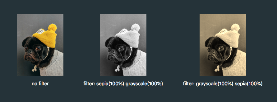
.icon:hover {
  filter: grayscale(100%) sepia(100%);
}

If one of the filter functions doesn't exist, or has an incorrect value, the whole list is ignored and no filter will be applied to the element.

When applying multiple filter functions to an element, their order is important and will affect the final output. Each filter function will be applied to the result of the previous operation.

So, in order to colorize our icons, we have to find the right combination.

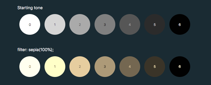
To make use of hue-rotate(), we need to start off with a colored icon. The sepia() filter is the only filter function that allows us to add a color, giving the filtered element a yellow-brown-y tinge, like an old photo.

The output color is dependent on the starting tonal value:

In order to add enough color with sepia(), we first need to use invert() to convert our icon to a medium grey:

.icon:hover {
  filter: invert(0.5)
}

We can then add the yellow/brown tone with sepia():

.icon:hover {
  filter: invert(0.5) sepia(1);
}

...then change the hue with hue-rotate():

.icon:hover {
  filter: invert(0.5) sepia(1) hue-rotate(200deg);                                  
}

Once we have the rough color we want, we can tweak it with saturation() and brightness():

.icon:hover {
  filter: 
    invert(0.5)
    sepia(1)
    hue-rotate(200deg)
    saturate(4)
    brightness(1);
}

I've made a little tool for this to make your life a little easier, as this is a pretty confusing process to guesstimate.

See the Pen CSS filter example by Cassie Evans (@cassie-codes)
on CodePen.

Even with the tool, it's still a little fiddly, not supported by Internet Explorer, and most importantly, you're unable to specify a precise color.

This browser support data is from Caniuse, which has more detail. A number indicates that browser supports the feature at that version and up.

Desktop

ChromeOperaFirefoxIEEdgeSafari
18*15*35No186*

Mobile / Tablet

iOS SafariOpera MobileOpera MiniAndroidAndroid ChromeAndroid Firefox
6.0-6.1*46No4.4*7164

So, what do we do if we need a specific hex code?

SVG Filters

If we need more precise control (and better browser support) than CSS filters can offer, then it's time to turn to SVG.

Filters originally came from SVG. In fact, under the hood, CSS filters are just shortcuts to SVG filters with a particular set of values baked in.

Unlike CSS, the filter isn't predefined for us, so we have to create it. How do we do this?

This is the syntax to define a filter:

<svg xmlns="<http://www.w3.org/2000/svg>" version="1.1">
  <defs>
    <filter id="id-of-your-filter">
      ...          
      
      ...
    </filter>
    ...
  </defs>
</svg>

Filters are defined by a <filter> element, which goes inside the <defs> section of an SVG.

SVG filters can be applied to SVG content within the same SVG document. Or, the filter can be referenced and applied to HTML content elsewhere.

To apply an SVG filter to HTML content, we reference it the same way as a CSS filter: by using the url() filter function. The URL points to the ID of the SVG filter.

.icon:hover {
  filter: url('#id-of-your-filter');
}

The SVG filter can be placed inline in the document or the filter function can reference an external SVG. I prefer the latter route as it allows me to keep my SVG filters tidied away in an assets folder.

.icon:hover {
  filter: url('assets/your-SVG.svg#id-of-your-filter');
}

Back to the <filter> element itself.

<filter id="id-of-your-filter">
  ...          
  
  ...
</filter>

Right now, this filter is empty and won't do anything as we haven't defined a filter primitive. Filter primitives are what create the filter effects. There are a number of filter primitives available to us, including:

  • [<feBlend>]
  • [<feColorMatrix>]
  • [<feComponentTransfer>]
  • [<feComposite>]
  • [<feConvolveMatrix>]
  • [<feDiffuseLighting>]
  • [<feDisplacementMap>]
  • [<feDropShadow>]
  • [<feFlood>]
  • [<feGaussianBlur>]
  • [<feImage>]
  • [<feMerge>]
  • [<feMorphology>]
  • [<feOffset>]
  • [<feSpecularLighting>]
  • [<feTile>]
  • [<feTurbulence>]

Just like with CSS filters, we can use them on their own or include multiple filter primitives in the <filter> tag for more interesting effects. If more than one filter primitive is used, then each operation will build on top of the previous one.

For our purposes we're just going to use feColorMatrix, but if you want to know more about SVG filters, you can check out the specs on MDN or this (in progress, at the time of this writing) article series that Sara Soueidan has kicked off.

feColourMatrix allows us to change color values on a per-channel basis, much like channel mixing in Photoshop.

This is what the syntax looks like:

<svg xmlns="<http://www.w3.org/2000/svg>" version="1.1">
  <defs>
    <filter id="id-of-your-filter">
      <feColorMatrix
        color-interpolation-filters="sRGB"
        type="matrix"
        values="1 0 0 0 0
                0 1 0 0 0
                0 0 1 0 0
                0 0 0 1 0 "/>
    </filter>
    ...
  </defs>
</svg>

The color-interpolation-filters attribute specifies our color space. The default color space for filter effects is linearRGB, whereas in CSS, RGB colors are specified in the sRGB color space. It's important that we set the value to sRGB in order for our colors to match up.

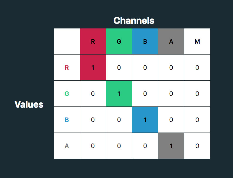
Let’s have a closer look at the color matrix values.

The first four columns represent the red, green and blue channels of color and the alpha (opacity) value. The rows contain the red, green, blue and alpha values in those channels.

The M column is a multiplier — we don’t need to change any of these values for our purposes here. The values for each color channel are represented as floating point numbers in the range 0 to 1.

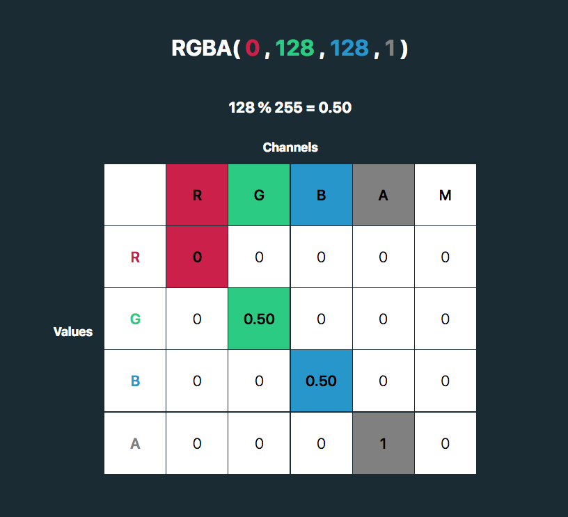
We could write these values as a CSS RGBA color declaration like this:

rgba(255, 255, 255, 1)

The values for each color channel (red, green and blue) are stored as integers in the range 0 to 255. In computers, this is the range that one 8-bit byte can offer.

By dividing these color channel values by 255, the values can be represented as a floating point number which we can use in the feColorMatrix.

And, by doing this, we can create a color filter for any color with an RGB value!

Like teal, for example:

rgba(0, 128, 128, 1). 128%255=0.50

See the Pen
SVG filter - teal hover
by Cassie Evans (@cassie-codes)
on CodePen.

This SVG filter will only impart color to icons with a white fill, so If we have an icon with a black fill, we can use invert() to convert it to white before applying the SVG filter.

.icon:hover {
  filter: invert(100%) url('assets/your-SVG.svg#id-of-your-filter');
}

If we just have a hex code, the math is a little trickier, although there are plenty of hex-to-RGBA converters out there. To help out, I've made a HEX to feColorMatrix converter.

See the Pen
HEX to feColorMatrix converterr
by Cassie Evans (@cassie-codes)
on CodePen.

Have a play around, and happy filtering!

The post The Many Ways to Change an SVG Fill on Hover (and When to Use Them) appeared first on CSS-Tricks.