Intuitive Design? No Such Thing!

Let’s start off by taking a quick glance at the definition of the word “intuitive” presented on Dictionary.com:

“Using or based on what one feels to be true even without conscious reasoning: instinctive.”

At the same time, Cambridge provides us with this definition:

“Based on feelings rather than facts or proof:
an intuitive approach/judgment.
Most people have an intuitive sense of right and wrong.”

Based on these dictionary definitions, intuition is associated with a gut instinct or feeling that allows us to make decisions with no conscious proof of reasoning. While it may serve us well during various life situations, does our intuition really function to provide us with unconscious guidance when relating to digital interfaces? In reality, the intuitive behaviour that designers strive to create must rely on using familiar design patterns that the users have experienced before. In this context, an intuitive design interaction is not grounded in unconscious reasoning, but from a feeling of familiarity.

As a UX designer, how many times has a client or stakeholder said to you “It needs to be intuitive”. While this is a common request or even a requirement for an interface or software app design, it’s not really something that is easy to measure, or even define.

Most of us have had a gut feeling or an instinct about a decision or an outcome. I have had intuitive feelings about my teenage daughter where I just feel like something bad has happened. I’m not always right (thankfully), but it still feels like a gut impulse tapping into my emotions. If this is an example of how intuition can behave for us in a particular circumstance, it is hard to imagine having these same kinds of instinctive feelings when interacting with an interface.

The truth is, what is intuitive for you or your client, would probably not be intuitive for your mother, for example, or even for their clients. An interface can feel familiar if you (the user) have experienced a similar interface or interaction before, and it is this familiarity that is often referred to as intuitive.

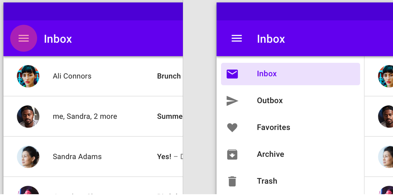
For example, the first time I saw that non-descript hamburger menu on a mobile app, it didn’t intuitively call out to me and say “Tap on me, I’m a menu!”. It was only through tapping around that I discovered that those three bars when tapped gave me a menu. Now, when I see a hamburger menu, I know what it does. Not intuitively, but because I’ve done it before. Nothing instinctive about that.

Here is an example of the ubiquitous hamburger menu.
As another example, take a simple registration form on a mobile app where you need to enter your email address to receive email updates. Because we understand that you need to tap into the field and start typing, it makes sense and is a simple interaction. We’ve all done it many times before. But if my father were trying to use this, he probably wouldn’t understand that you need to tap into the field and start typing. How would he know, unless someone gave him step by step simple instructions.

In an article published by Jeff Raskin, most famously known for starting the Macintosh program at Apple in the late 70s, he says:

“It has been claimed that the use of a computer’s mouse is intuitive. Yet it is far from that.”

When I was teaching Pagemaker (Adobe’s InDesign® predecessor) classes back in the 90s to corporate employees, one action by one of the students in the class still makes me chuckle. I asked the participants to use the mouse to click on the OK button on the screen. One woman picked up the mouse and clicked it on the screen. We can’t imagine anyone doing this now because we have learned how a mouse works, but this demonstrates that it is not an intuitive device.

We know that intuitive design isn’t a thing, but we also know that familiarity with certain types of interactions that we have experienced before are easier to understand. For those users that are even slightly tech savvy, we can make use of already existing and familiar interface patterns to base our design decisions on. These users will most likely recognize these previously established patterns in our interface design, referred to as design patterns. According UI Patterns, design patterns are recurring solutions that solve common design problems.

What Are Design Patterns And Why Are They Important?

Design patterns are important because they provide recognizable interactions so that users spend less time trying to understand how to interact.

Reducing time and effort for users will create a better user experience and minimise the time spent on achieving an outcome. For UX designers, the benefits are in the time saved by not having to reinvent a proven design component.

Below is a pattern template table that provides a structure for defining or identifying patterns, originating from the authors of the book Design Patterns. Although this was originally aimed at software developers, most of the criteria are relevant to UX designers.

Term Description
Pattern Name Describes the essence of the pattern in a short, but expressive, name.
Intent Describes what the pattern does.
Also Known As List any synonyms for the pattern.
Motivation Provides an example of a problem and how the pattern solves that problem.
Applicability Lists the situations where the pattern is applicable.
Structure Set of diagrams of the classes and objects that depict the pattern.
Participants Describes the classes and objects that participate in the design pattern and their responsibilities.
Collaborations Describes how the participants collaborate to carry out their responsibilities.
Consequences Describes the forces that exist with the pattern and the benefits, trade-offs, and the variable that is isolated by the pattern.

Source: What Are Design Patterns and Do I Need Them? by James Maioriello

To explore the idea of design patterns further, below are some examples of common design patterns as found on the UI Patterns website. This site is a great reference tool for designers to help recognize existing patterns for use in your design process. While there are too many design patterns to include here, I chose the following patterns as ones I have used over the years.

Password Strength Meter Design Pattern

This pattern provides the user with both instruction and feedback on their interactions.

A wizard is another common design pattern that you may have encountered. It’s often used for form-based interactions where the user needs to complete a predefined sequence of steps. The wizard structure is used to direct the user through each section of the process.

Wizard Design Pattern

Wizards are used when you want to guide a user through a series of steps to achieve a single goal. The pattern below indicates where the user is in the process, a summary of completed steps on the right, contextual help, and a CONTINUE button to move to the next step in the process. All these components as commonly used in a wizard pattern support the users interactions by providing context of what they’ve done, what step they are at, and what to do next.

Calendar Picker Pattern

This pattern is used when the user needs to add in a date or dates to complete a task. It’s important that a date could also be entered in a text field if this is a more efficient or preferred way to do so. In this example, a calendar icon indicates that there is a calendar drop down, which is a commonly used pattern. Calendar widgets like this don’t always work well when you have to choose a birth date unless you have the ability to change the year easily.

Form Defaults

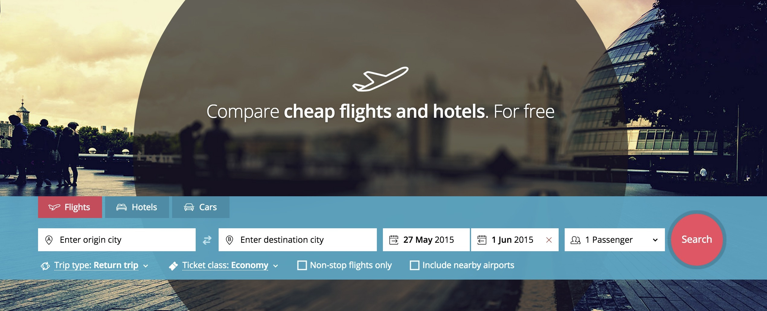
Form defaults can be used to pre-fill certain form fields to match a typical user selection. It creates a quicker and easier way to complete a process. This travel site has prefilled data for dates based on the current date, and also the number of passengers.
Navigation Tabs

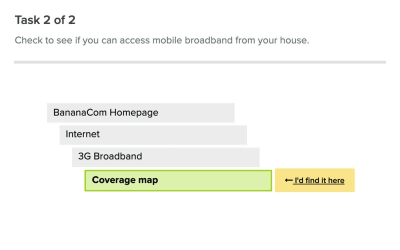
Navigation tabs are commonly used to break up content into distinct categories and to visually indicate what content you are viewing. The example here demonstrates a content rich website with the first tab selection displaying the subcategories and a third level below.

When you are implementing an existing design pattern in your design, it’s all about using the pattern to create context, as well as familiarity for the user. You may need to adapt any existing pattern to provide this context, as described for the calendar picker widget.

We’ve explored the pitfalls of “intuitive design” and how we can mitigate this with design patterns. So if we utilize common design patterns to reduce the cognitive load for users, how do we introduce new design patterns when we are designing something fresh and innovative? Let’s look at this concept by investigating this in the context of emerging technologies.

Why Design Innovation Can Be Risky

Any design that is new or unfamiliar to a user will create a learning curve that we as designers strive to minimize or eliminate altogether. How do we balance the need to innovate quickly, while still providing a solid, contextual experience that makes sense to our users?

By considering the business outcomes, carrying out enough user research to ensure a good market fit, and user testing your design flow with the intended audience, we can ensure that our design solution hypothesis can be validated as much as possible. This helps to mitigate the additional risks inherent in any product or service design execution. Ideally, we can design to incorporate interactions that measure the users level of comprehension and allow them to personalize their path to achieve their desired outcomes in an unknown environment.

Innovation With Artificial Intelligence

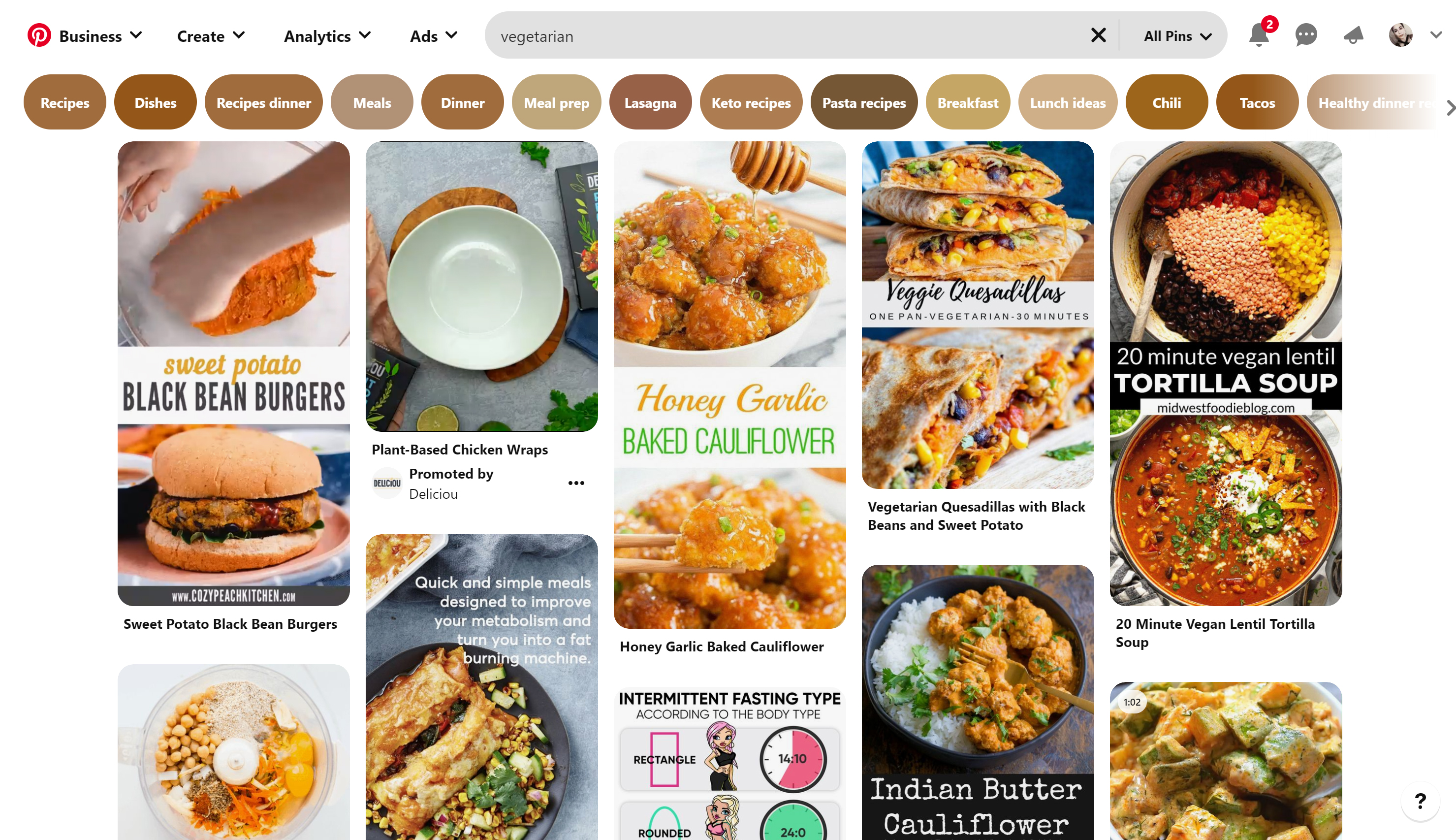
Artificial Intelligence (AI) technology is innovating all the time, but organisations still manage to create a good user experience with these advancements. For example, Pinterest’s AI is used to understand the intention behind a simple search to deliver highly personalized results. According to this article in Wired, 80 percent of users are more likely to make a purchase if their experience is personalized.

Below is an example of a search for “vegetarian”. Pinterest uses an AI engine to return a whole lot of related topics to allow discovery and displays them as tags across the top of the page.
AI is fast becoming integrated into many products and services. AI relies on big data and can be used to create interventions or notify the user to take a specific action (or not). This can create a more passive experience for the user as previously manual tasks are automated behind the scenes.

For example, a spam filter that is used in your email account automatically moves suspicious emails into a junk folder, without any user intervention required. Google has been using AI and rule-based filters for years, but continuing innovation now sees the ability for Google AI to recognize those weekly newsletters you may not be interested in moving them straight to the spam folder. The Google spam filter can now identify and respond to individual preferences.

Where to from here? With technology advancing at a rapid pace, let’s explore how interfaces may evolve in the coming years.

The Future Of Interfaces

If interfaces don’t provide natural interactions for humans, what can? Speaking is our natural communication tool and advances in technology have seen speech recognition devices come into our homes and our lives.

It’s no secret that large design driven software developers, such as Apple, Amazon, Google and Microsoft are all investing in speech recognition and natural language technologies. Advances in this technology could see us relying less on interacting with interfaces for our desired outcome. Personalisation and context is the key, although it means that our devices will need to use our data to learn about our habits and desires to provide a truly personalized experience.

Picture a world where we can simply talk to our device and ask for what we need, and better still, we can be asked for or given what we need at exactly the right time by our device. Wait, isn’t this what Siri already does? Yes, but there is so much further to go.

Bill Stasior, Apple’s former Siri chief, says that the next advancements to virtual assistants will see improvements to the understanding of how people naturally speak.

“I think everyone learns what commands work with the assistants and what commands don’t work with the assistants. And while that’s improving very rapidly right now, I think there’s still a long way to go.”

— Bill Stasior

Although there has been major advancements in the use of natural language processing since 2011 when Siri was first released, we will see it become more mainstream and more advanced across multiple industries such as health and education over the coming years. This could be life-changing particularly for older people that are not tech-savvy.

For instance, imagine an older person who needs medical attention simply talking to their device to arrange a doctor’s visit. Or the patient is given medical advice based on their medical history and current symptoms. Imagine someone suffering from mental health issues being able to talk to an artificial intelligence bot for advice or to just to relieve loneliness.

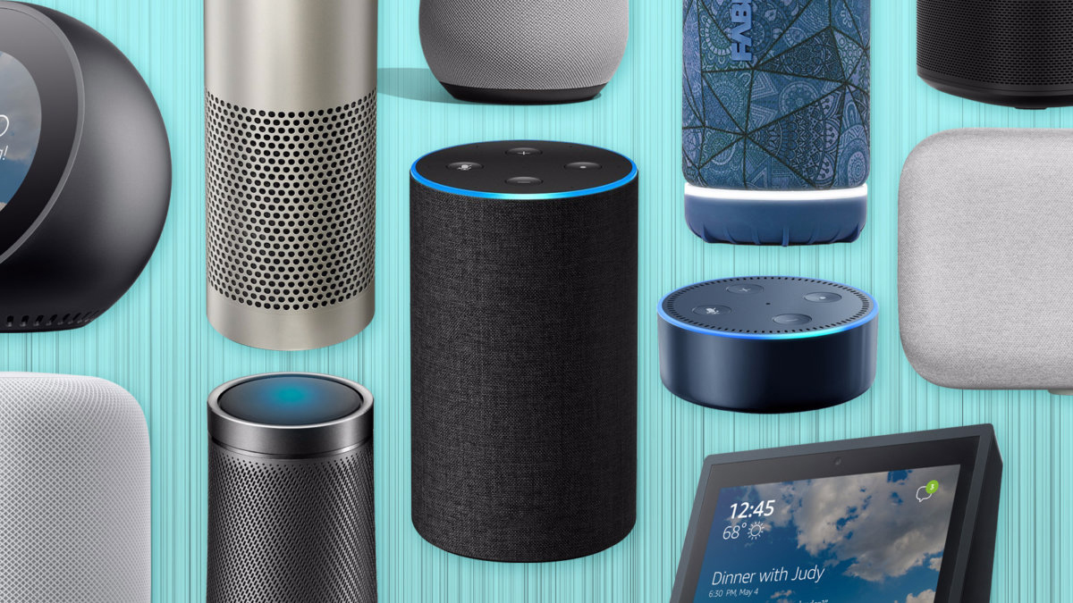
There is already an array of “virtual assistants” that have been designed for the home market that use speech recognition technology. Below is an image displaying the “smart speakers” that are readily available for the consumer market.
Although speech recognition channels may not require a typical user interface, they still require a design process to create an usable outcome. The diagram below illustrates conversational AI touch points as described in this article by Deloitte Digital.

In order to design effectively for speech recognition tools, Deloitte suggests that the following aspects need to be considered:

  • The business objective and outcomes.
  • Carrying out testing, and tuning. The algorithm needs to account for pronunciation across different geographical locations, natural pauses in conversation, and pitch and pace that may convey emotion.
  • Consideration for the given scenario, rather than attempting to design a broader outcome.
  • Ongoing iterations and improvements. By focusing on a clear goal, designers can continue to enhance their voice assistants to be more human sounding with each new iteration.

What Does All This Mean For The Common User Interface?

Will the pervasiveness of natural language recognition technologies see the death of the user interface as we know it? While no one can accurately predict the future, the fact remains that we are still visual creatures, and we still need to see things as part of our learning process. Research shows that the human brain processes images 60,000 times faster than text, and 90 percent of information transmitted to the brain is visual.

For example, can you imagine having to make a purchase decision on a clothes item by listening to a description of it rather than seeing an image of the item? As they say, a picture is worth a thousand words, and in many instances an image is a much more powerful way to convey meaning. While we could still specify what we are searching for by speaking, in many scenarios we would expect to see an image as part of the response. And what if we didn’t know what we were looking for, we would still need the ability to browse through the available options.

Below is a typical example of an e-commerce site where images are an integral part of how we make purchasing decisions.

Another recent technology that is becoming more pervasive is Augmented and Virtual reality. Let’s explore what it means and how it is applied.

What About Augmented And Virtual Reality?

Then there is the world of augmented and virtual reality. Augmented reality is the integration of digital elements into a live camera view commonly used on a mobile phone, and virtual reality is an fully immersive experience in a digital world typically using a headset. Applications of these technologies have already been applied to areas such as education, retail, training, navigation, entertainment, health and enterprise, and the future applications are limitless.

For designers, it's a new and exciting world that can involve creating new design standards. This article from Toptal describes the main considerations for designers venturing into this space. Firstly, the design moves from the 2D world of interfaces into 3D design, where an understanding of spatial design and UI elements is required. There are new input elements for users that may involve gestures, eye movements, and voice which are very different from the standard 2D interactions that we as designers are familiar with.

The image below illustrates an example of how augmented reality can be used in retail scenarios. Here, the customer is able to virtually try on clothes without the need for a physical change room.

Conclusion

We know that intuitive interfaces are difficult to define, design patterns are important, and natural speech, AR and VR technologies are advancing at a rapid pace. With the continued innovation of artificial intelligence and its integration with speech recognition, AR and VR, we will see increased personalization as our software learns about us and in turn, assists us in our interactions. As designers, we can learn to adapt our design solutions to fit the context of these emerging tools.

While the future of the interface as we know it is uncertain, the interface as a tool is going to be around for a long time to come. As designers, we need to ensure that we can design and importantly, test our designs to validate the market fit and usefulness. Here’s to a world where speech recognition, virtual reality and interfaces work seamlessly together to provide us with constantly enhanced life experiences.

Further Reading on SmashingMag:

Information And Information Architecture: The BIG Picture

Information And Information Architecture: The BIG Picture

Information And Information Architecture: The BIG Picture

Carrie Webster

We are living in a world exploding with information, but how do we find what is relevant to us at the time that we need it? I believe that good information architecture is key to helping us navigate through the mountains of data and information we have created for ourselves. 

In this article, we will first describe what information architecture is, why it’s important, and approaches to effective implementation. Then we explore ideas around the broader view of the information age, how we use information, and how it impacts our world and our lives. These insights are designed to help you to understand the bigger picture, which enables us to grasp the value that good information architecture delivers to help our information-overloaded lives.

What Is Information Architecture And Why Is It Important?

“Information architecture is the practice of deciding how to arrange the parts of something to be understandable.”

The Information Architecture Institute

From a user experience perspective, this really means understanding how your users think, what problems they are trying to solve, and then presenting information in a logical way that makes sense from within this context. 

Whether it is a website, a software application or a smartphone app, it’s about first designing the structure of how your information is organized, and then translating this into a logical navigation hierarchy that makes sense to the users who will be accessing it. In this world where we can sometimes feel as though we are drowning in data, information architecture provides us with a logical way of organizing this data to make it easier to locate. 

Here are some other reasons why good information architecture is important:

For The User

  • It reduces cognitive load.
    Too much information on a screen with no clear pathway can make it difficult for a user to focus. Too many options can lead to choice deferral where a user chooses not to make a decision at all.
  • It speeds up the process of finding the right information.
    This is the opposite of choice deferral, where the user is able to easily locate what they are looking for with clear navigation choices.
  • It can keep the user focussed on the task they are trying to achieve.
    If the task a user is engaging in is easy to follow without additional non-contextual navigation elements, it’s less likely they will be distracted.
  • It makes it easier to analyze and understand information by the addition of context.
    Providing a visual navigation path of exactly where the user is within a website can provide more context for the content they are viewing. For example, during an online bank account application, displaying the total number of steps in the process and visually indicating exactly which step you are at, and what the next steps may involve gives context to the flow.
  • Reduces frustration and contacting support.
    If it is clear to the user where they can find what they need, there is no need to request help. For example, if a customer has received a purchased item that is faulty, without obvious instruction on how to rectify the situation, they may call the customer support center. 

Below are a couple of examples helping to illustrate the points about the user.

Wizard example
(Image source: Shaun Utter) (Large preview)

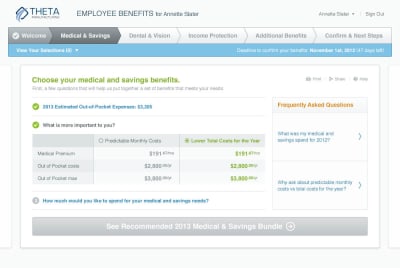
The example above demonstrates:

  • The use of a “wizard” style application form and illustrates many of the points above. 
  • Clear navigation steps across the top of the page providing context as to where the user is in the process.
  • Simple choices to guide the user. 
  • Contextual information links in the form of FAQs relating to the step the user is at. 
  • Navigation button at the bottom of the page giving specific instructions for the next step.
(Large preview)

The website example above, Punk Avenue shows another example of clear main navigation, with a brief summary of what you will find on each page. Below that is a series of tabs that keep you on the same page and visually indicate what information you are viewing. 

For A Business

  • Keeps customers on their website for longer.
    Research shows that visitors to a website will often leave within 10-20 seconds, but with a clear purpose, you can engage your visitors for a longer period. Although good design and messaging help to present the site’s value proposition, a well-designed navigation display can also contribute to demonstrate what kind of information supports this value proposition.

  • Increases the chance of customer conversion.
    If your site visitor can find what they want via the navigation, and there are simple and minimal steps provided on how to acquire it, the chances of conversion are far higher than a site design that is unable to direct the user to the right information.

  • Reduces risk of customers going to a competitor.
    If a visitor to your site can easily find what they are looking for through effective navigation and good design, chances are they’ll stay there rather than move onto the next Google search result.

  • Reduces duplication of information (by design).
    Good information architecture can ensure that the same or similar content is not replicated. Understanding and documenting the content structure, particularly on information-heavy sites, can prevent these potential issues.

  • Better ROI through efficient use of the platform.
    The investment spent on ensuring that the information architecture on your site is effective and makes sense to your users is a compelling way to increase your customer conversions and the income derived from those sales.

  • Reduces cost of support when a user can’t find something.
    As described earlier, creating an unnecessary load on the customer support team is an additional cost that can be avoided by a site that functions well and provides assistance for customers when they need it. 

The example below helps to illustrate some of the points above about business.

(Image source: Optimizely Blog) (Large preview)

The example above demonstrates how poor navigation displays can impact customer conversion. This case study shows an increase in customer revenue by 53.8%. The additional information in-between the search bar and the products was removed which also served to move the product display closer to the top of the page. The vertical information that was removed created the effect of what may have been perceived as a superfluous navigation bar, or maybe just information that was not considered relevant for a user in their product search. 

When thinking about designing the information architecture for your website or app, efficient site navigation is crucial.

As a designer, ask yourself “Does the language resonate with the user, does the hierarchy make sense to the user flow, can they easily find their way back to where they were?”

If your website is content-heavy, you may also consider the use of site search. Let’s explore some research around site search vs navigation.

Search vs Navigation

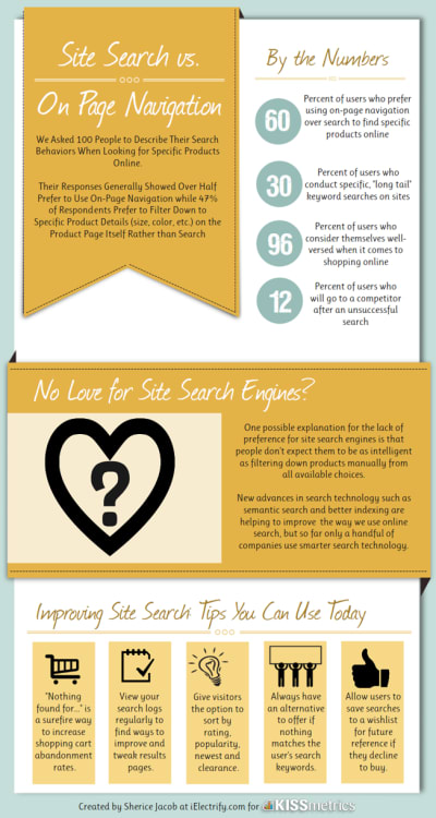
In 1997, Jakob Neilson conducted a study that showed over 50% of website users would use the search function over site navigation. In 2012, econsultancy.com reported that 30% of website visitors to e-commerce sites will use the site search, while a Kiss metrics study found that 40% of users preferred using search. In 2010, Gerry Mcgovern’s study demonstrated 30% of users preferring search.

(Image source: Neil Patel) (Large preview)

Although the relationship between these findings may seem elusive, one thing is clear; and that is that users will use both site search and site navigation to find information, in varying proportions.

In order to provide the best user experience for your customers, you may need to consider integrating a site search, in conjunction with an effective and well-designed site navigation if your website has a complex structure and large amounts of information.

Here is a practical example of where a site search would be useful for site visitors. Let’s say you visit a website that sells cleaning and health products, and you were looking to buy some antibacterial hand wash. There are two categories you can see, “Body Washing Products” and “Skin Cleansers”. Which one do you choose? 

Body washing products
Body washing products (Image source: Good Housekeeping) (Large preview)
Skin cleansers
Skin cleansers (Image source: Skincare Hero) (Large preview)

And if you were to browse these categories that may have products listed alphabetically, there may be a large list to scan through. Below are some similar phrases that could be used, depending on what any individual’s idea of antibacterial hand wash could also be called:

  • hand sanitizer
  • sanitizing soap
  • hand disinfectant
  • disinfectant hand wash
  • hand sterilizer
  • hygienic soap
  • antiseptic handwash

If you are looking for “hygienic soap”, it may take you a while to scan the list to find the “antibacterial hand wash”. As it is difficult to cater to all possible synonym variations in the navigation structure of a site, a well-designed site search can allow users to search for these variations, by adding what we call metatags to each piece of content. For example, the “antibacterial hand wash” product could have additional hidden information or tags that include all the terms listed above, allowing users to search for any of these and return search results that match.

The Politico website below uses both navigation and a search function. It demonstrates an example of a content-heavy site that groups the information into categories making it easier to find topics. The site utilizes a “megamenu” which is accessed from the top left corner of the page. This is a common way to provide a menu of options with categories and subcategories that can be used for those visitors that want to browse content, and the search function can be used to locate a specific piece of information.

(Large preview)

According to research from measuringu.com, about 14% of users will start with a search and the rest will start by browsing through the navigation options.

Good And Bad Information Architecture Examples

Let’s review some website examples demonstrating good and bad uses of information architecture. Great navigation is a reflection of well-designed information architecture that considers the target audience’s needs.

Useful Navigation

This Sears website makes good use of mega drop-down menus. These help to provide navigation options to sub-categories that are clearly grouped. It also uses images to provide much faster cognition for the user.

(Large preview)

Pinterest demonstrates a useful way to present visual user-generated content based on search terms. The search is the navigation. This works well based on the sheer amount of content available on the site, which would make it difficult to provide a simple navigation system based on categories.

Pinterest website
Pinterest (Large preview)

Overwhelming Navigation

This website example is complete information overload with bad use of white space and way too many choices. It doesn’t help that the design of the website is cramped making it hard to identify all the options available.  

Frys.com
(Large preview)

How Do You Get It Right?

Here is a brief list of considerations and processes to use when you are designing the information architecture for a product or service.

  • First understand your user’s needs and what tasks they are trying to achieve.
    You can conduct user interviews to really understand what problems your product or service is solving. From here, think about how they might interact with your website and what pathways they could take to achieve their objectives.
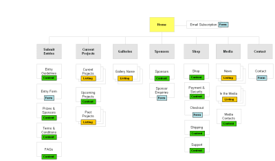
  • Try to create a hierarchy with minimal sub-levels.
    If you can achieve this, then the user can access any information on your site with a maximum of two clicks.
Sitemap example
Map out your site navigation to see if you can organise into a minimal number of sub-levels or categories. (Large preview)
  • Don’t use jargon in the navigation language.
    Understand the language of your audience. Test with your users to ensure they understand the correct meaning of the language used.
  • Don’t rely on images or icons alone as a navigation tool.
    There are very few universally understood icons, such as Help, Error, and Print, and these may differ culturally. 
(Large preview)
iphone icons with labels
Note that on smartphones, icons are always accompanied by a text label to help you navigate. (Large preview)
  • Always indicate to the user exactly where they are within the site so they can easily navigate back to a previous page. Breadcrumb navigation is one example of how to do this effectively as shown in the example below. It can sit below the main navigation showing you each page you have clicked on with the current location displaying as the last on the right.
Breadcrumb examples
Breadcrumb navigation example (Large preview)
  • Use design to create distinct visual differences between the hierarchy levels.
    For example, a top-level hierarchy heading may be displayed with a larger font size. These visual differences can guide the user’s eye to more important information first. It can also be the job of the visual designer to help differentiate these areas.

Methods To Test Your Navigation

Card Sorting

Write out the name of each information section on paper, and have participants sort cards containing all your navigation sections into groups that make sense to them. Try doing this same sort with at least five participants so you can start to identify patterns and preferences for the categories and subcategories that are created. This is called an open card sort. A closed card sort can be used if you decide to have predetermined top-level categories that the participants place the cards under based on what makes sense to them.

Card sorting
Card sorting (Image source: UX Indonesia on Unsplash) (Large preview)

Recommended reading: Card Sorting Beginner’s Guide: Improving Your Information Architecture

Scenario Testing

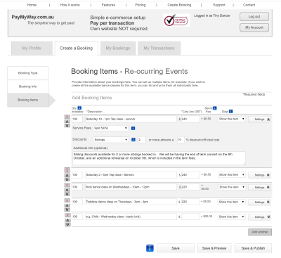
By using a wireframe or prototype, ask participants to complete a specific task by navigating through the site. You can use a clickable wireframe to test this by observing how clear it is for a user to carry out the activity. An example task (refer to the wireframe below) might be to register on the website and then make a booking for a single event and publish it.

Wireframe example
Scenario testing (Large preview)

Tools

Treejack is a tool that allows you to validate your navigation structure. It asks the participants to indicate where they would look to find specific information and provides you with insightful actions.

Treejack tool
Navigation testing tool (Large preview)

Free Keyword Tools

You can use free tools to help to identify commonly used search terms that can help with language choice in your navigation. For example, answerthepublic.com is a free site that allows you to enter a search term to see what other related search terms are being used.

Answer the public keyword search tool
Keyword search tool (Large preview)

We’ve covered the basics of information architecture, and now it’s time to move onto the bigger picture, the Information Age. Understanding context around the massive amounts of data and information we are surrounded by can help to shape your outlook as a UX designer, as it has helped inform the direction and approach to my own design practice.

The Information Age

We live in a time where our access to information is unprecedented. It is instantaneous, it is global, it is everywhere, it is the Internet. News stories are broadcast as they unfold, communication with friends and family in other parts of the world has never been easier, and Google has become our personal library of virtually limitless topics. Information is king and queen. 

Key Facts About Information

  • 90% of the world’s data has been created in the past 2 years.
  • The amount of data in the world doubles every two years.
  • If all the data in our world was stored on 128G iPad tablets, they would create a stack going from the Earth to the Moon 6.6 times! 
  • Only 37% of all data is considered “useful”. And of that 37%, a much smaller percentage is actually analyzed.
  • 33 percent of managers feel that information overload was impacting their health.
  • 66 percent of managers reported increased conflict with teammates as well as reduced job satisfaction.

And finally, let’s examine how information can be used and abused in this age of information.

“We live in a time where our access to information is unprecedented. It is instantaneous, it is global, it is everywhere, it is the Internet.”

The Power Of Information

“With power comes great responsibility.”

This famous quote is often attributed to Uncle Ben from Spiderman. We can think of this in reference to how powerful information can be, but when in the wrong hands, there is an opportunity to abuse this power. Below is my perspective on how the power of information can manifest in our world, and why it is both a precious and dangerous commodity. 

“Information Is Power”

Internet activist, Aaron Swartz, took his life in 2013 at the age of 26. Aaron was the original creator of Reddit, and among many achievements, his untimely death occurred when he was fighting felony charges for illegally accessing and downloading academic information. He wrote a manifesto that called for activists to “liberate” information secured by corporations, and campaigned against Internet censorship. 

We recognize that information alone is useless if no one can find it. And then once it is made available, it needs to be acted upon. On a large scale, information can be shared to protect public health and safety, to help governments to create better policies and to empower individuals to live better lives. It can also be used for propaganda purposes for political gain, to create fear for the purpose of control, and to instill beliefs for the sole purpose of financial profit. 

Information Can Change World Events In An Instant

How quickly have governments pivoted and changed their approach to the COVID-19 pandemic based on new information? Not to mention the release of conflicting information from alternate sources that has also created mass confusion.

An example of this pivot was seen in Australia, when our Prime Minister announced non-elective surgery would be suspended from March 26, but just hours later, it was moved to April 1st after the health minister met with the private hospital sector that afternoon. This was due to the updated information received that would see the stand-down of medical staff, even as hospitals prepared for a surge in COVID-19 cases. 

Dangers Of Misinformation

In current times, examples: “Fake news” claims, presidential tweets, and allegations of misinformation coming from China around the COVID19 pandemic. Donald Trump who is attributed with the reference to “Fake News”, now more generally attributes incorrect news reporting to journalists and media outlets such as CNN.

Unfounded “conspiracy theories” are another example of ways to link seemingly related information points that have no solid relationship evidence. For example:

Information Security

In 2018, it was revealed Facebook was exposed to a massive security breach after hackers exploited a vulnerability to access user’s personal data. The impact of the access to this kind of personal information could have ramifications for those individuals impacted for years to come.

In July 2017, shortly after I left employment at Equifax (no connection whatsoever!), a data breach impacting over 147 million people occurred in the US. The data exposed included Social Security numbers, birth dates, and some credit card details. After spending $1.4 billion on security upgrades, it is still resolving ongoing class actions from consumers that were impacted.

The importance of protecting privacy and personal data has become increasingly important throughout the world. 132 of 194 countries currently have legislation in place to protect the sharing of personal information without consent, and the data and privacy of individuals. In 2017-18 there was a 10% rise in the number of countries enacting data privacy laws.

Based on the examples above, it is clear that information in itself doesn’t discriminate for good or for evil. That’s why it is so important to validate data sources and analyze information before taking it on board.

Conclusion

We have reviewed how we use information, the power it yields, the sheer volume of data we have created, the impacts of information overload, and how information architecture can be used to organize and structure this information for those seeking it. There is no denying that in this age of Information why it is so important to focus on information architecture as a solid foundation for delivering the right information to your customers to make their lives easier.

Further Reading on SmashingMag:

Smashing Editorial (ah, ra, il)