What’s New In Flutter 2?

Last year, I wrote two articles here on Smashing Magazine about using Flutter on web and desktop platforms. The first article was a general introduction to web and desktop development, and focused on building responsive UI; the second article was about the challenges you might face when trying to develop a Flutter app that runs on multiple platforms.

Back then, Flutter support for non-mobile platforms wasn’t considered stable and production-ready by the Flutter team, but things have changed now.

Flutter 2 Is Here

On the 3rd of March, Google held the Flutter Engage event, where Fluter 2.0 was launched. This release is really a proper 2.0 release, with many changes promising to make Flutter really ready for going beyond mobile app development.

The change that is central to understanding why Flutter 2.0 matters is that web development is now officially part of the stable channel and desktop support will follow soon on the stable channel as well. In fact, it is currently enabled in release candidate-like form as an early release beta snapshot in the stable channel.

In the announcement, Google didn’t just give a hint of what the future of Flutter will be like. There were also actual examples of how large companies are already working on Flutter apps to replace their existing apps with ones that perform better and allow developers to be more productive. E.g. the world’s biggest car manufacturer, Toyota, will now be building the infotainment system on their cars using Flutter.

Another interesting announcement — this one showing how fast Flutter is improving as a cross-platform SDK — is Canonical’s announcement that, in addition to developing their new Ubuntu installer using Flutter, they will also be using Flutter as their default option to build desktop apps.

They also released a Flutter version of Ubuntu’s Yaru theme, which we will use later in the article to build a Flutter desktop app that looks perfectly at home in the Ubuntu desktop, also using some more of the new Flutter features. You can take a look at Google’s Flutter 2 announcement to get a more complete picture.

Let’s look at some of the technical changes to Flutter which got onto the stable channel with version 2.0 and build a very simple example desktop app with Flutter before we draw some conclusions on what specific project types we could and couldn’t use Flutter for as of now.

General Usability Changes For Bigger Devices

According to the announcement, many changes have been made to Flutter to provide better support for devices that aren’t mobile devices.

For example, an obvious example of something that was needed for web and desktop apps and until now had to be done using third-party packages or by implementing it yourself is a scrollbar.

Now there is a built-in Scrollbar which can fit right into your app, looking exactly how a scrollbar should look in the specific platform: with or without a track, with the possibility of scrolling by clicking on the track, for example, which is huge if you want your users to feel right at home from the start when using your Flutter app. You can also theme it and customize it.

It also looks like at some point Flutter will automatically show suitable scrollbars when the content of the app is scrollable.

Meanwhile, you can just wrap any scrollable view with the scrollbar widget of your choice and create a ScrollController to add as the controller for both the scrollbar and the scrollable widget (in case you’ve never used a ScrollController, you use exactly like a TextEditingController for a TextField). You can see an example of the use of a regular Material scrollbar a bit further down this article in the desktop app example.

Flutter Web Changes

Flutter for the web was already in a quite usable form, but there were performance and usability issues which meant it never felt as polished as mobile Flutter. With the release of Flutter 2.0, there have been many improvements to it, especially when it comes to performance.

The compilation target, previously very experimental and tricky to use to render your app (with WebAssembly and Skia) is now called CanvasKit. It’s been refined to offer a consistent and performant experience when going from running a Flutter app natively on mobile devices to running it in a browser.

Now, by default, your app will render using CanvasKit for desktop web users and with the default HTML renderer (which has had improvements as well, but is not as good as CanvasKit) for mobile web users.

If you’ve tried to use Flutter to build web apps, you might have noticed it wasn’t particularly intuitive to have something as simple as a hyperlink. Now at least, you can create hyperlinks a bit more like you would when using HTML, using the Link class.

This is actually not an addition to Flutter itself, but a recent addition to Google’s url_launcher package. You can find a complete description and examples of usage of the Link class in the official API reference.

Text selection was improved as now the pivot point corresponds to where the user started selecting text and not the left edge of the SelectableText in question. Also, now Copy/Cut/Paste options exist and work properly.

Nevertheless, text selection still isn’t top-notch as it’s not possible to select text across different SelectableText widgets and selectable text still isn’t default, but we will talk about this as well as other outstanding Flutter web drawbacks (lack of SEO support, first and foremost) in the conclusion to this article.

Flutter Desktop Changes

When I wrote about web and desktop development with Flutter last year, I focused mostly on building web apps with Flutter, given that desktop development was still considered very experimental (not even on the beta channel). Now though, Flutter desktop support is soon to follow web support and will be going stable.

Performance and stability have been improved quite a lot, and the improvements in general usability for bigger devices operated with a mouse and keyboard that benefit web apps so much also mean that Flutter desktop apps are now more usable.

There is still a lack of tooling for desktop apps and there are still many quite severe outstanding bugs, so don’t try to use it for your next desktop app project meant for public distribution.

Example Desktop App Built With Flutter

Flutter desktop support is now quite stable and usable though, and it will surely get better in the future just as much as Flutter in its entirety has gotten better until now, so let’s give it a try to see it in action! You can download the entire code example on a GitHub repo.

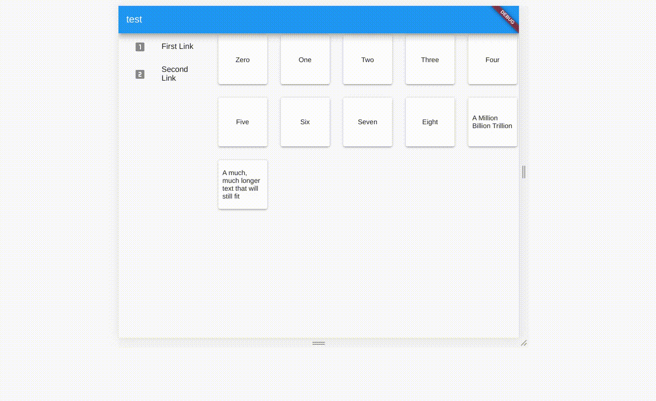
The app we will build is the following very simple app. We have a sidebar navigation along with some content items for each of the navigation sections.

We are going to restrict the Column on the left (the one showing the controls for the widgets to show on the right side of the app) to a certain width (400 pixels for example) using a Container, whereas the GridView on the right should be Expanded to fill the view.

On the left side of the Row (within the Column), the ListView should expand to fill the vertical space below the Row of buttons at the top. Within the Row at the top, we also need to expand the TextButton (the reset button) to fill the space to the right of the left and right chevron IconButtons.

The resulting HomePageState that does all of that, along with the necessary logic to show the right stuff on the right depending on what the user selects on the left, is the following:

class HomePageState extends State<HomePage> {
  int selected = 0;

  ScrollController _gridScrollController = ScrollController();

  incrementSelected() {
    if (selected != widget.dataToShow.length - 1) {
      setState(() {
        selected++;
      });
    }
  }

  decrementSelected() {
    if (selected != 0) {
      setState(() {
        selected--;
      });
    }
  }

  @override
  Widget build(BuildContext context) {
    return Scaffold(
      body: Row(
        children: [
          Container(
              color: Colors.black12,
              width: 400.0,
              child: Column(
                children: [
                  Row(
                    children: [
                      IconButton(
                        icon: Icon(Icons.chevron_left),
                        onPressed: decrementSelected,
                      ),
                      IconButton(
                        icon: Icon(Icons.chevron_right),
                        onPressed: incrementSelected,
                      ),
                      Expanded(
                          child: Center(
                        child: TextButton(
                          child: Text("Reset"),
                          onPressed: () => setState(() => selected = 0),
                        ),
                      ))
                    ],
                  ),
                  Expanded(
                    child: ListView.builder(
                      itemCount: widget.dataToShow.length,
                      itemBuilder: (_, i) => ListTile(
                        title: Text(widget.dataToShow[i].key),
                        leading: i == selected
                            ? Icon(Icons.check)
                            : Icon(Icons.not_interested),
                        onTap: () {
                          setState(() {
                            selected = i;
                          });
                        },
                      ),
                    ),
                  ),
                ],
              )),
          Expanded(
            child: Scrollbar(
              isAlwaysShown: true,
              controller: _gridScrollController,
              child: GridView.builder(
                  controller: gridScrollController,
                  itemCount: widget.dataToShow[selected].value.length,
                  gridDelegate: SliverGridDelegateWithMaxCrossAxisExtent(
                      maxCrossAxisExtent: 200.0),
                  itemBuilder: (, i) => Container(
                        width: 200.0,
                        height: 200.0,
                        child: Padding(
                          padding: const EdgeInsets.all(8.0),
                          child: Card(
                            child: Center(
                                child:
                                    Text(widget.dataToShow[selected].value[i])),
                          ),
                        ),
                      )),
            ),
          ),
        ],
      ),
    );
  }
}

and we’re done!

Then you build your app with

flutter build ${OS_NAME}

where ${OS_NAME} is the name of your OS, the same you used earlier to enable Flutter desktop development using flutter config.

The compiled binary to run your app will be

build/linux/x64/release/bundle/flutter_ubuntu_desktop_example

on Linux and

build\windows\runner\Release\flutter_ubuntu_desktop_example.exe

on Windows, you can run that and you’ll get the app that I showed you at the start of this section.

On macOS, you need to open macos/Runner.xcworkspace in Xcode and then use Xcode to build and run your app.

Other Flutter Changes

There have also been a few changes that also affect mobile development with Flutter, and here is just a brief selection of some of them.

A feature that so many of us, Flutter developers, wanted is better support for Admob ads, and it’s now finally included in the official google_mobile_ads package. Another one is autocomplete; there is an Autocomplete material widget for it, as well as a more customizable RawAutocomplete widget.

The addition of the Link that we discussed in the section about web development actually applies to all platforms, even though its effects will be felt most by those working on Flutter web projects.

Recent Dart Language Changes

It is important to be aware of the changes that were made to the Dart language that affect Flutter app development.

In particular, Dart 2.12 brought C language interoperability support (described in detail and with instructions for different platforms on the official Flutter website); also, sound null-safety was added to the stable Dart release channel.

null-safety

The biggest change that was made to Dart is the introduction of sound null-safety that it’s getting more and more support from third-party packages as well as the Google-developed libraries and packages.

Null safety brings compiler optimizations and reduces the chance of runtime errors so, even though right now it’s optional to support it, it is important you start at least understanding how to make your app null-safe.

At the moment though, that may not be an option for you as not all Pub packages are fully null-safe and that means that if you need one of those packages for your app you won’t be able to take advantage of the benefits on null-safety.

Making Your App null-safe

If you’ve ever worked with Kotlin, Dart’s approach to null safety will be somewhat familiar to you. Take a look at Dart’s official guide on it for a more complete guide to Dart’s null-safety.

All of the types you’re familiar with (String, int, Object, List, your own classes, etc.) are now non-nullable: their value can never be null.

This means that a function that has a non-nullable return type must always return a value, or else you’ll get a compilation error and you always have to initialize non-nullable variables, unless it’s a local variable that gets assigned a value before it’s ever used.

If you want a variable to be nullable you need to add a question mark to the end of the type name, e.g. when declaring an integer like this:

int? a = 1

At any point, you can set it to null and the compiler won’t cry about it.

Now, what if you have a nullable value and use it for something that requires a non-nullable value? To do that, you can simply check it isn’t null:

void function(int? a) {
    if(a != null) {
        // a is an int here
    }
}

If you know with 100% certainty that a variable exists and isn’t null you can just use the ! operator, like this:

String unSafeCode(String? s) => s!;

Drawing Conclusions: What Can We Do With Flutter 2?

As Flutter keeps evolving, there are more and more things we can do with it, but it’s still not reasonable to say that Flutter can be used for any app development project of any kind.

On the mobile side, it’s unlikely you’re going to run into something that Flutter isn’t great at because it’s been supported since the start and it’s been polished. Most things you’ll ever need are already there.

On the other hand, web and desktop aren’t quite there yet.

Desktop is still a bit buggy and Windows apps (which are an important part of desktop development) still require a lot of work before they look good. The situation is better on Linux and macOS only to an extent.

The web is in a much better place than desktop. You can build decent web apps, but you’re still mostly limited to single-page applications and Progressive Web Apps. We still most certainly don’t want to use it for content-centric apps where indexability and SEO are needed.

Content-centric apps probably will not be that great because text selection still isn’t top-notch, as we’ve seen in the section about the current state of Flutter for the web.

If you need the web version of your Flutter app, though, Flutter for the web will probably be just fine, especially as there are a huge amount of web-compatible packages around already and the list is always growing.

Additional Resources

Solving Common Cross-Platform Issues When Working With Flutter

Solving Common Cross-Platform Issues When Working With Flutter

Solving Common Cross-Platform Issues When Working With Flutter

Carmine Zaccagnino

I’ve seen a lot of confusion online regarding Web development with Flutter and, often, it’s sadly for the wrong reasons.

Specifically, people sometimes confuse it with the older Web-based mobile (and desktop) cross-platform frameworks, which basically were just Web pages running within browsers running within a wrapper app.

That was truly cross-platform in the sense that the interfaces were the same anyway because you only had access to the interfaces normally accessible on the Web.

Flutter isn’t that, though: it runs natively on each platform, and it means each app runs just like it would run if it were written in Java/Kotlin or Objective-C/Swift on Android and iOS, pretty much. You need to know that because this implies that you need to take care of the many differences between these very diverse platforms.

In this article, we’re going to see some of those differences and how to overcome them. More specifically, we’re going to talk about storage and UI differences, which are the ones that most often cause confusion to developers when writing Flutter code that they want to be cross-platform.

Example 1: Storage

I recently wrote on my blog about the need for a different approach to storing JWTs in Web apps when compared to mobile apps.

That is because of the different nature of the platforms’ storage options, and the need to know each and their native development tools.

Web

When you write a Web app, the storage options you have are:

  1. downloading/uploading files to/from disk, which requires user interaction and is therefore only suitable for files meant to be read or created by the user;
  2. using cookies, which may or may not be accessible from JS (depending on whether or not they’re httpOnly) and are automatically sent along with requests to a given domain and saved when they come as part of a response;
  3. using JS localStorage and sessionStorage, accessible by any JS on the website, but only from JS that is part of the pages of that website.

Mobile

The situation when it comes to mobile apps is completely different. The storage options are the following:

  1. local app documents or cache storage, accessible by that app;
  2. other local storage paths for user-created/readable files;
  3. NSUserDefaults and SharedPreferences respectively on iOS and Android for key-value storage;
  4. Keychain on iOS and KeyStore on Android for secure storage of, respectively, any data and cryptographic keys.

If you don’t know that, you’re going to make a mess of your implementations because you need to know what storage solution you’re actually using and what the advantages and drawbacks are.

Cross-Platform Solutions: An Initial Approach

Using the Flutter shared_preferences package uses localStorage on the Web, SharedPreferences on Android and NSUserDefaults on iOS. Those have completely different implications for your app, especially if you’re storing sensitive information like session tokens: localStorage can be read by the client, so it’s a problem if you’re vulnerable to XSS. Even though mobile apps aren’t really vulnerable to XSS, SharedPreferences and NSUserDefaults are not secure storage methods because they can be compromised on the client side since they are not secure storage and not encrypted. That’s because they are meant for user preferences, as mentioned here in the case of iOS and here in the Android documentation when talking about the Security library which is designed to provide wrappers to the SharedPreferences specifically to encrypt the data before storing it.

Secure Storage On Mobile

The only secure storage solutions on mobile are Keychain and KeyStore on iOS and Android respectively, whereas there is no secure storage on the Web.

The Keychain and KeyStore are very different in nature, though: Keychain is a generic credentials storage solution, whereas the KeyStore is used to store (and can generate) cryptographic keys, either symmetric keys or public/private keys.

This means that if, for instance, you need to store a session token, on iOS you can let the OS manage the encryption part and just send your token to the Keychain, whereas on Android it’s a bit more of a manual experience because you need to generate (not hard-code, that’s bad) a key, use it to encrypt the token, store the encrypted token in SharedPreferences and store the key in the KeyStore.

There are different approaches to that, as are most things in security, but the simplest is probably to use symmetric encryption, as there is no need for public key cryptography since your app both encrypts and decrypts the token.

Obviously, you don’t need to write mobile platform-specific code that does all of that, as there is a Flutter plugin that does all of that, for instance.

The Lack Of Secure Storage On the Web

That was, actually, the reason that compelled me to write this post. I wrote about using that package to store JWT on mobile apps and people wanted the Web version of that but, as I said, there is no secure storage on the Web. It doesn’t exist.

Does that mean your JWT has to be out in the open?

No, not at all. You can use httpOnly cookies, can’t you? Those aren’t accessible by JS and are sent only to your server. The issue with that is that they’re always sent to your server, even if one of your users clicks on a GET request URL on someone else’s website and that GET request has side effects you or your user won’t like. This actually works for other request types as well, it’s just more complicated. It’s called Cross-Site Request Forgery and you don’t want that. It’s among the web security threats mentioned in Mozilla’s MDN docs, where you can find a more complete explanation.

There are prevention methods. The most common one is having two tokens, actually: one of them getting to the client as an httpOnly cookie, the other as part of the response. The latter has to be stored in localStorage and not in cookies because we don’t want it to be sent automatically to the server.

Solving Both

What if you have both a mobile app and a Web app?

That can be dealt with in one of two ways:

  1. Use the same backend endpoint, but manually get and send the cookies using the cookie-related HTTP headers;
  2. Create a separate non-Web backend endpoint that generates different token than either token used by the Web app and then allow for regular JWT authorization if the client is able to provide the mobile-only token.

Running Different Code On Different Platforms

Now, let’s see how we can run different code on different platforms in order to be able to compensate for the differences.

Creating A Flutter Plugin

Especially to solve the problem of storage, one way you can do that is with a plugin package: plugins provide a common Dart interface and can run different code on different platforms, including native platform-specific Kotlin/Java or Swift/Objective-C code. Developing packages and plugins is rather complex, but it’s explained in many places on the Web and elsewhere (for example in Flutter books), including the official Flutter documentation.

For mobile platforms, for instance, there already is a secure storage plugin, and that’s flutter_secure_storage, for which you can find an example of usage here, but that doesn’t work on the Web, for example.

On the other hand, for simple key-value storage that also works on the web, there’s a cross-platform Google-developed first-party plugin package called shared_preferences, which has a Web-specific component called shared_preferences_web which uses NSUserDefaults, SharedPreferences or localStorage depending on the platform.

TargetPlatform on Flutter

After importing package:flutter/foundation.dart, you can compare Theme.of(context).platform to the values:

  • TargetPlatform.android
  • TargetPlatform.iOS
  • TargetPlatform.linux
  • TargetPlatform.windows
  • TargetPlatform.macOS
  • TargetPlatform.fuchsia

and write your functions so that, for each platform you want to support, they do the appropriate thing. This will come especially useful for the next example of platform difference, and that is differences in how widgets are displayed on different platforms.

For that use case, in particular, there is also a reasonably popular flutter_platform_widgets plugin, which simplifies the development of platform-aware widgets.

Example 2: Differences In How The Same Widget Is Displayed

You can’t just write cross-platform code and pretend a browser, a phone, a computer, and a smartwatch are the same thing — unless you want your Android and iOS app to be a WebView and your desktop app to be built with Electron. There are plenty of reasons not to do that, and it’s not the point of this piece to convince you to use frameworks like Flutter instead that keep your app native, with all the performance and user experience advantages that come with it, while allowing you to write code that is going to be the same for all platforms most of the time.

That requires care and attention, though, and at least a basic knowledge of the platforms you want to support, their actual native APIs, and all of that. React Native users need to pay even more attention to that because that framework uses the built-in OS widgets, so you actually need to pay even more attention to how the app looks by testing it extensively on both platforms, without being able to switch between iOS and Material widget on the fly like it’s possible with Flutter.

What Changes Without Your Request

There are some aspects of the UI of your app that are automatically changed when you switch platforms. This section also mentions what changes between Flutter and React Native in this respect.

Between Android And iOS (Flutter)

Flutter is capable of rendering Material widgets on iOS (and Cupertino (iOS-like) widgets on Android), but what it DOESN’T do is show exactly the same thing on Android and iOS: Material theming especially adapts to the conventions of each platform.

For instance, navigation animations and transitions and default fonts are different, but those don’t impact your app that much.

What may affect some of your choices when it comes to aesthetics or UX is the fact that some static elements also change. Specifically, some icons change between the two platforms, app bar titles are in the middle on iOS and on the left on Android (on the left of the available space in case there is a back button or the button to open a Drawer (explained here in the Material Design guidelines and also known as a hamburger menu). Here’s what a Material app with a Drawer looks like on Android:

image of an Android app showing where the app bar title appears on Flutter Android Material apps
Material app running on Android: the AppBar title is in the left side of the available space. (Large preview)

And what the same, very simple, Material app looks like on iOS:

image of an iOS app showing where the app bar title appears on Flutter iOS Material apps
Material app running on iOS: the AppBar title is in the middle. (Large preview)
Between Mobile and Web and With Screen Notches (Flutter)

On the Web there is a bit of a different situation, as mentioned also in this Smashing article about Responsive Web Development with Flutter: in particular, in addition to having to optimize for bigger screens and account for the way people expect to navigate through your site — which is the main focus of that article — you have to worry about the fact that sometimes widgets are placed outside of the browser window. Also, some phones have notches in the top part of their screen or other impediments to the correct viewing of your app because of some sort of obstruction.

Both of these problems can be avoided by wrapping your widgets in a SafeArea widget, which is a particular kind of padding widget which makes sure your widgets fall into a place where they can actually be displayed without anything impeding the users’ ability to see them, be it a hardware or software constraint.

In React Native

React Native requires much more attention and a much deeper knowledge of each platform, in addition to requiring you to run the iOS Simulator as well as the Android Emulator at the very least in order to be able to test your app on both platforms: it’s not the same and it converts its JavaScript UI elements to platform-specific widgets. In other words, your React Native apps will always look like iOS — with Cupertino UI elements as they are sometimes called — and your Android apps will always look like regular Material Design Android apps because it’s using the platform’s widgets.

The difference here is that Flutter renders its widgets with its own low-level rendering engine, which means you can test both app versions on one platform.

Getting Around That Issue

Unless you’re going for something very specific, your app is supposed to look different on different platforms otherwise some of your users will be unhappy.

Just like you shouldn’t simply ship a mobile app to the web (as I wrote in the aforementioned Smashing post), you shouldn’t ship an app full of Cupertino widgets to Android users, for example, because it’s going to be confusing for the most part. On the other hand, having the chance to actually run an app that has widgets that are meant for another platform allows you to test the app and show it to people in both versions without having to use two devices for that necessarily.

The Other Side: Using The Wrong Widgets For The Right Reasons

But that also means that you can do most of your Flutter development on a Linux or Windows workstation without sacrificing the experience of your iOS users, and then just build the app for the other platform and not have to worry about thoroughly testing it.

Next Steps

Cross-platform frameworks are awesome, but they shift responsibility to you, the developer, to understand how each platform works and how to make sure your app adapts and is pleasant to use for your users. Other small things to consider may be, for example, using different descriptions for what might be in essence the same thing if there are different conventions on different platforms.

It’s great to not have to build the two (or more) apps separately using different languages, but you still need to keep in mind you are, in essence, building more than one app and that requires thinking about each of the apps you are building.

Further Resources

Smashing Editorial (ra, yk, il)

Responsive Web And Desktop Development With Flutter

Responsive Web And Desktop Development With Flutter

Responsive Web And Desktop Development With Flutter

Carmine Zaccagnino

This tutorial is not an introduction to Flutter itself. There are plenty of articles, videos and several books available online with simple introductions that will help you learn the basics of Flutter. Instead, we’ll be covering the following two objectives:

  1. The current state of Flutter non-mobile development and how you can run Flutter code in the browser, on a desktop or laptop computer;
  2. How to create responsive apps using Flutter, so that you can see its power — especially as a web framework — on full display, ending with a note about routing based on URL.

Let’s get into it!

What Is Flutter, Why It’s Important, What It Has Evolved Into, Where It’s Going

Flutter is Google’s latest app development framework. Google envisions it to be all-encompassing: It will enable the same code to be executed on smartphones of all brands, on tablets, and on desktop and laptops computer as native apps or as web pages.

It’s a very ambitious project, but Google has been incredibly successful until now particularly in two aspects: in creating a truly platform-independent framework for Android and iOS native apps that works great and is fully ready for production use, and in creating an impressive front-end web framework that can share 100% of the code with a compatible Flutter app.

In the next section, we’re going to see what makes the app compatible and what’s the state of non-mobile Flutter development as of now.

Non-Mobile Development With Flutter

Non-mobile development with Flutter was first publicized in a significant way at Google I/O 2019. This section is about how to make it work and about when it works.

How To Enable Web And Desktop Development

To enable web development, you must first be on Flutter’s beta channel. There are two ways to get to that point:

  • Install Flutter directly on the beta channel by downloading the appropriate latest beta version from the SDK archive.
  • If you already have Flutter installed, switch to the beta channel with $ flutter channel beta, and then perform the switch itself by updating your Flutter version (which is actually a git pull on the Flutter installation folder) with $ flutter upgrade.

After that, you can run this:

$ flutter config --enable-web

Desktop support is much more experimental, especially due to a lack of tooling for Linux and Windows, making plugin development especially a major pain, and due to the fact that the APIs used for it are intended for proof-of-concept use and not for production. This is unlike web development, which is using the tried-and-tested dart2js compiler for release builds, which are not even supported for Windows and Linux native desktop apps.

Note: Support for macOS is slightly better than support for Windows and Linux, but it still isn’t as good as support for the web and not nearly as good as the full support for mobile platforms.

To enable support for desktop development, you need to switch to the master release channel by following the same steps outlined earlier for the beta channel. Then, run the following by replacing <OS_NAME> with either linux, windows, or macos:

$ flutter config --enable-<OS_NAME>-desktop

At this point, if you have issues with any of the following steps that I’ll be describing because the Flutter tool isn’t doing what I’m saying it should do, some common troubleshooting steps are these:

  • Run flutter doctor to check for issues. A side effect of this Flutter command is that it should download any tools it needs that it doesn’t have.
  • Run flutter upgrade.
  • Turn it off and on again. The old tier-1 technical-support answer of restarting your computer might be just what is needed for you to be able to enjoy the full riches of Flutter.

Running And Building Flutter Web Apps

Flutter web support isn’t bad at all, and this is reflected in the ease of development for the web.

Running this…

$ flutter devices

… should show right away an entry for something like this:

Web Server • web-server • web-javascript • Flutter Tools

Additionally, running the Chrome browser should cause Flutter to show an entry for it as well. Running flutter run on a compatible Flutter project (more on that later) when the only “connected device” showing up is the web server will cause Flutter to start a web server on localhost:<RANDOM_PORT>, which will allow you to access your Flutter web app from any browser.

If you have installed Chrome but it’s not showing up, you need to set the CHROME_EXECUTABLE environment variable to the path to the Chrome executable file.

Running And Building Flutter Desktop Apps

After you’ve enabled Flutter desktop support, you can run a Flutter app natively on your development workstation with flutter run -d <OS_NAME>, replacing <OS_NAME> with the same value you used when enabling desktop support. You can also build binaries in the build directory with flutter build <OS_NAME>.

Before you can do any of that, though, you need to have a directory containing what Flutter needs to build for your platform. This will be created automatically when you create a new project, but you’ll need to create it for an existing project with flutter create .. Also, the Linux and Windows APIs are unstable, so you might have to regenerate them for those platforms if the app stops working after a Flutter update.

When Is An App Compatible?

What have I meant all along when mentioning that a Flutter app has to be a “compatible project” in order for it to work on desktop or the web? Put simply, I mean that it mustn’t use any plugin that doesn’t have a platform-specific implementation for the platform on which you’re trying to build.

To make this point absolutely clear to everyone and avoid misunderstanding, please note that a Flutter plugin is a particular Flutter package that contains platform-specific code that is necessary for it to provide its features.

For example, you can use the Google-developed url_launcher package as much as you want (and you might want to, given that the web is built on hyperlinks).

An example of a Google-developed package the usage of which would preclude web development is path_provider, which is used to get the local storage path to save files to. This is an example of a package that, incidentally, isn’t of any use to a web app, so not being able to use it isn’t really a bummer, except for the fact that you need to change your code in order for it to work on the web if you’re using it.

For example, you can use the shared_preferences package, which relies on HTML localStorage on the web.

Similar caveats are valid regarding desktop platforms: Very few plugins are compatible with desktop platforms, and, as this is a recurring theme, much more work on this needs to be done on the desktop side than is really necessary on Flutter for the web.

Creating Responsive Layouts In Flutter

Because of what I’ve described above and for simplicity, I’m going to assume for the rest of this post that your target platform is the web, but the basic concepts apply to desktop development as well.

Supporting the web has benefits and responsibilities. Being pretty much forced to support different screen sizes might sound like a drawback, but consider that running the app in the web browsers enables you to see very easily how your app will look on screens of different sizes and aspect ratios, without having to run separate mobile device emulators.

Now, let’s talk code. How can you make your app responsive?

There are two perspectives from which this analysis is done:

  1. “What widgets am I using or can I use that can or should adapt to screens of different sizes?”
  2. “How can I get information about the size of the screen, and how can I use it when writing UI code?”

We’ll answer the first question later. Let’s first talk about the latter, because it can be dealt with very easily and is at the heart of the issue. There are two ways to do this:

  1. One way is to take the information from the MediaQueryData of the MediaQuery root InheritedWidget, which has to exist in the widget tree in order for a Flutter app to work (it’s part of MaterialApp/WidgetsApp/CupertinoApp), which you can get, just like any other InheritedWidget, with MediaQuery.of(context), which has a size property, which is of type Size, and which therefore has two width and height properties of the type double.
  2. The other way is to use a LayoutBuilder, which is a builder widget (just like a StreamBuilder or a FutureBuilder) that passes to the builder function (along with the context) a BoxConstraints object that has minHeight, maxHeight, minWidth and maxWidth properties.

Here’s an example DartPad using the MediaQuery to get constraints, the code for which is the following:

import 'package:flutter/material.dart';

void main() => runApp(MyApp());

class MyApp extends StatelessWidget {
  @override
  Widget build(context) =>
    MaterialApp(
      home: MyHomePage()
    );
}

class MyHomePage extends StatelessWidget {
  @override
  Widget build(context) =>
    Scaffold(
      body: Center(
        child: Column(
          mainAxisAlignment: MainAxisAlignment.spaceEvenly,
          children: [
            Text(
              "Width: ${MediaQuery.of(context).size.width}",
              style: Theme.of(context).textTheme.headline4
            ),
            Text(
              "Height: ${MediaQuery.of(context).size.height}",
              style: Theme.of(context).textTheme.headline4
            )
          ]
       )
     )
   );
}

And here’s one using the LayoutBuilder for the same thing:

import 'package:flutter/material.dart';

void main() => runApp(MyApp());

class MyApp extends StatelessWidget {
  @override
  Widget build(context) =>
    MaterialApp(
      home: MyHomePage()
    );
}

class MyHomePage extends StatelessWidget {
  @override
  Widget build(context) =>
    Scaffold(
      body: LayoutBuilder(
        builder: (context, constraints) => Center(
          child: Column(
            mainAxisAlignment: MainAxisAlignment.spaceEvenly,
            children: [
              Text(
                "Width: ${constraints.maxWidth}",
                style: Theme.of(context).textTheme.headline4
              ),
              Text(
                "Height: ${constraints.maxHeight}",
                style: Theme.of(context).textTheme.headline4
              )
            ]
         )
       )
     )
  );
}

Now, let’s think about what widgets can adapt to the constraints.

Fist of all, let’s think about the different ways of laying out multiple widgets according to the size of the screen.

The widget that most easily adapts is the GridView. In fact, a GridView built using the GridView.extent constructor doesn’t even need your involvement to be made responsive, as you can see in this very simple example:

import 'package:flutter/material.dart';

void main() => runApp(MyApp());

class MyApp extends StatelessWidget {
  @override
  Widget build(context) =>
    MaterialApp(
      home: MyHomePage()
    );
}

class MyHomePage extends StatelessWidget {
  final List elements = [
    "Zero",
    "One",
    "Two",
    "Three",
    "Four",
    "Five",
    "Six",
    "Seven",
    "Eight",
    "A Million Billion Trillion",
    "A much, much longer text that will still fit"
  ];


  @override
  Widget build(context) =>
    Scaffold(
      body: GridView.extent(
        maxCrossAxisExtent: 130.0,
        crossAxisSpacing: 20.0,
        mainAxisSpacing: 20.0,
        children: elements.map((el) => Card(child: Center(child: Padding(padding: EdgeInsets.all(8.0), child: Text(el))))).toList()
      )
   );
}

You can accommodate content of different sizes by changing the maxCrossAxisExtent.

That example mostly served the purpose of showing the existence of the GridView.extent GridView constructor, but a much smarter way to do that would be to use a GridView.builder with a SliverGridDelegateWithMaxCrossAxisExtent, in this case where the widgets to be shown in the grid are dynamically created from another data structure, as you can see in this example:

import 'package:flutter/material.dart';

void main() => runApp(MyApp());

class MyApp extends StatelessWidget {
  @override
  Widget build(context) =>
    MaterialApp(
      home: MyHomePage()
    );
}

class MyHomePage extends StatelessWidget {
  final List<String> elements = ["Zero", "One", "Two", "Three", "Four", "Five", "Six", "Seven", "Eight", "A Million Billion Trillion", "A much, much longer text that will still fit"];


  @override
  Widget build(context) =>
    Scaffold(
      body: GridView.builder(
        itemCount: elements.length,
        gridDelegate: SliverGridDelegateWithMaxCrossAxisExtent(
          maxCrossAxisExtent: 130.0,
          crossAxisSpacing: 20.0,
          mainAxisSpacing: 20.0,
        ),
        itemBuilder: (context, i) => Card(
          child: Center(
            child: Padding(
              padding: EdgeInsets.all(8.0), child: Text(elements[i])
            )
          )
        )
      )
   );
}

An example of GridView adapting to different screens is my personal landing page, which is a very simple Flutter web app consisting of a GridView with a bunch of Cards, just like that previous example code, except that the Cards are a little more complex and larger.

A very simple change that could be made to apps designed for phones would be to replace a Drawer with a permanent menu on the left when there is space.

For example, we could have a ListView of widgets, like the following, which is used for navigation:

class Menu extends StatelessWidget {
  @override
  Widget build(context) => ListView(
    children: [
      FlatButton(
        onPressed: () {},
          child: ListTile(
          leading: Icon(Icons.looks_one),
          title: Text("First Link"),
        )
      ),
      FlatButton(
        onPressed: () {},
          child: ListTile(
          leading: Icon(Icons.looks_two),
          title: Text("Second Link"),
        )
      )
    ]
  );
}

On a smartphone, a common place to use that would be inside a Drawer (also known as a hamburger menu).

Alternatives to that would be the BottomNavigationBar or the TabBar, in combination with the TabBarView, but with both we’d have to make more changes than are required with the drawer, so we’ll stick with the drawer.

To only show the Drawer containing the Menu that we saw earlier on smaller screens, you’d write code that looks like the following snippet, checking the width using the MediaQuery.of(context) and passing a Drawer object to the Scaffold only if it’s less than some width value that we believe to be appropriate for our app:

Scaffold(
    appBar: AppBar(/* ... \*/),
    drawer: MediaQuery.of(context).size.width < 500 ?
    Drawer(
      child: Menu(),
    ) :
    null,
    body: /* ... \*/
)

Now, let’s think about the body of the Scaffold. As the sample main content of our app, we’ll use the GridView that we built previously, which we keep in a separate widget named Content to avoid confusion:

class Content extends StatelessWidget {
  final List elements = ["Zero", "One", "Two", "Three", "Four", "Five", "Six", "Seven", "Eight", "A Million Billion Trillion", "A much, much longer text that will still fit"];
  @override
  Widget build(context) => GridView.builder(
    itemCount: elements.length,
    gridDelegate: SliverGridDelegateWithMaxCrossAxisExtent(
      maxCrossAxisExtent: 130.0,
      crossAxisSpacing: 20.0,
      mainAxisSpacing: 20.0,
    ),
    itemBuilder: (context, i) => Card(
      child: Center(
        child: Padding(
          padding: EdgeInsets.all(8.0), child: Text(elements[i])
        )
      )
    )
  );
}

On bigger screens, the body itself may be a Row that shows two widgets: the Menu, which is restricted to a fixed width, and the Content filling the rest of the screen.

On smaller screens, the entire body would be the Content.

We’ll wrap everything in a SafeArea and a Center widget because sometimes Flutter web app widgets, especially when using Rows and Columns, end up outside of the visible screen area, and that is fixed with SafeArea and/or Center.

This means the body of the Scaffold will be the following:

SafeArea(
  child:Center(
    child: MediaQuery.of(context).size.width < 500 ? Content() :
    Row(
      children: [
        Container(
          width: 200.0,
          child: Menu()
        ),
        Container(
          width: MediaQuery.of(context).size.width-200.0,
          child: Content()
        )
      ]
    )
  )
)

Here is all of that put together:

(Large preview)
import 'package:flutter/material.dart';

void main() => runApp(MyApp());

class MyApp extends StatelessWidget {
  @override
  Widget build(context) => MaterialApp(
    home: HomePage()
  );
}


class HomePage extends StatelessWidget {
  @override
  Widget build(context) => Scaffold(
    appBar: AppBar(title: Text("test")),
    drawer: MediaQuery.of(context).size.width < 500 ? Drawer(
      child: Menu(),
    ) : null,
    body: SafeArea(
        child:Center(
          child: MediaQuery.of(context).size.width < 500 ? Content() :
          Row(
            children: [
              Container(
                width: 200.0,
                child: Menu()
              ),
              Container(
                width: MediaQuery.of(context).size.width-200.0,
                child: Content()
              )
            ]
          )
        )
    )
  );
}

class Menu extends StatelessWidget {
  @override
  Widget build(context) => ListView(
    children: [
      FlatButton(
        onPressed: () {},
          child: ListTile(
          leading: Icon(Icons.looks_one),
          title: Text("First Link"),
        )
      ),
      FlatButton(
        onPressed: () {},
          child: ListTile(
          leading: Icon(Icons.looks_two),
          title: Text("Second Link"),
        )
      )
    ]
  );
}

class Content extends StatelessWidget {
  final List<String> elements = ["Zero", "One", "Two", "Three", "Four", "Five", "Six", "Seven", "Eight", "A Million Billion Trillion", "A much, much longer text that will still fit"];
  @override
  Widget build(context) => GridView.builder(
    itemCount: elements.length,
    gridDelegate: SliverGridDelegateWithMaxCrossAxisExtent(
      maxCrossAxisExtent: 130.0,
      crossAxisSpacing: 20.0,
      mainAxisSpacing: 20.0,
    ),
    itemBuilder: (context, i) => Card(
      child: Center(
        child: Padding(
          padding: EdgeInsets.all(8.0), child: Text(elements[i])
        )
      )
    )
  );
}

This is most of the stuff you’ll need as a general introduction to responsive UI in Flutter. Much of its application will depend on your app’s specific UI, and it’s hard to pinpoint exactly what you can do to make your app responsive, and you can take many approaches depending on your preference. Now, though, let’s see how we can make a more complete example into a responsive app, thinking about common app elements and UI flows.

Putting It In Context: Making An App Responsive

So far, we have just a screen. Let’s expand that into a two-screen app with working URL-based navigation!

Creating A Responsive Login Page

Chances are that your app has a login page. How can we make that responsive?

Login screens on mobile devices are quite similar to each other usually. The space available isn’t much; it’s usually just a Column with some Padding around its widgets, and it contains TextFields for typing in a username and a password and a button to log in. So, a pretty standard (though not functioning, as that would require, among other things, a TextEditingController for each TextField) login page for a mobile app could be the following:

Scaffold(
  body: Container(
    padding: const EdgeInsets.symmetric(
      vertical: 30.0, horizontal: 25.0
    ),
    child: Column(
      mainAxisAlignment: MainAxisAlignment.spaceAround,
      children: [
        Text("Welcome to the app, please log in"),
        TextField(
          decoration: InputDecoration(
            labelText: "username"
          )
        ),
        TextField(
          obscureText: true,
          decoration: InputDecoration(
            labelText: "password"
          )
        ),
        RaisedButton(
          color: Colors.blue,
          child: Text("Log in", style: TextStyle(color: Colors.white)),
          onPressed: () {}
        )
      ]
    ),
  ),
)

It looks fine on a mobile device, but those very wide TextFields start to look jarring on a tablet, let alone a bigger screen. However, we can’t just decide on a fixed width because phones have different screen sizes, and we should maintain a degree of flexibility.

For example, through experimentation, we might find that the maximum width should be 500. Well, we would set the Container’s constraints to 500 (I used a Container instead of Padding in the previous example because I knew where I was going with this) and we’re good to go, right? Not really, because that would cause the login widgets to stick to the left side of the screen, which might be even worse than stretching everything. So, we wrap in a Center widget, like this:

Center(
  child: Container(
    constraints: BoxConstraints(maxWidth: 500),
    padding: const EdgeInsets.symmetric(
      vertical: 30.0, horizontal: 25.0
    ),
    child: Column(/* ... \*/)
  )
)

That already looks fine, and we haven’t even had to use either a LayoutBuilder or the MediaQuery.of(context).size. Let’s go one step further to make this look very good, though. It would look better, in my view, if the foreground part was in some way separated from the background. We can achieve that by giving a background color to what’s behind the Container with the input widgets, and keeping the foreground Container white. To make it look a little better, let’s keep the Container from stretching to the top and bottom of the screen on large devices, give it rounded corners, and give it a nice animated transition between the two layouts.

All of that now requires a LayoutBuilder and an outer Container in order both to set a background color and to add padding all around the Container and not just on the sides only on larger screens. Also, to make the change in padding amount animated, we just need to turn that outer Container into an AnimatedContainer, which requires a duration for the animation, which we’ll set to half a second, which is Duration(milliseconds: 500) in code.

Here’s that example of a responsive login page:

(Large preview)
class LoginPage extends StatelessWidget {
  @override
  Widget build(context) =>
    Scaffold(
      body: LayoutBuilder(
        builder: (context, constraints) {
          return AnimatedContainer(
            duration: Duration(milliseconds: 500),
            color: Colors.lightGreen[200],
            padding: constraints.maxWidth < 500 ? EdgeInsets.zero : EdgeInsets.all(30.0),
            child: Center(
              child: Container(
                padding: EdgeInsets.symmetric(
                  vertical: 30.0, horizontal: 25.0
                ),
                constraints: BoxConstraints(
                  maxWidth: 500,
                ),
                decoration: BoxDecoration(
                  color: Colors.white,
                  borderRadius: BorderRadius.circular(5.0),
                ),
                child: Column(
                  mainAxisAlignment: MainAxisAlignment.spaceAround,
                  children: [
                    Text("Welcome to the app, please log in"),
                    TextField(
                      decoration: InputDecoration(
                        labelText: "username"
                      )
                    ),
                    TextField(
                      obscureText: true,
                      decoration: InputDecoration(
                        labelText: "password"
                      )
                    ),
                    RaisedButton(
                      color: Colors.blue,
                      child: Text("Log in", style: TextStyle(color: Colors.white)),
                      onPressed: () {
                        Navigator.pushReplacement(
                          context,
                          MaterialPageRoute(
                            builder: (context) => HomePage()
                          )
                        );
                      }  
                    )
                  ]
                ),
              ),
            )
          );
        }
      )
   );
}

As you can see, I’ve also changed the RaisedButton’s onPressed to a callback that navigates us to a screen named HomePage (which could be, for example, the view we built previously with a GridView and a menu or a drawer). Now, though, that navigation part is what we’re going to focus on.

Named Routes: Making Your App’s Navigation More Like A Proper Web App

A common thing for web apps to have is the ability to change screens based on the URL. For example going to https://appurl/login should give you something different than https://appurl/somethingelse. Flutter, in fact, supports named routes, which have two purposes:

  1. In a web app, they have exactly that feature that I mentioned in the previous sentence.
  2. In any app, they allow you to predefine routes for your app and give them names, and then be able to navigate to them just by specifying their name.

To do that, we need to change the MaterialApp constructor to one that looks like the following:

MaterialApp(
  initialRoute: "/login",
  routes: {
    "/login": (context) => LoginPage(),
    "/home": (context) => HomePage()
  }
);

And then we can switch to a different route by using Navigator.pushNamed(context, routeName) and Navigator.pushReplacementNamed(context, routeName), instead of Navigator.push(context, route) and Navigator.pushReplacement(context, route).

Here is that applied to the hypothetical app we built in the rest of this article. You can’t really see named routes in action in DartPad, so you should try this out on your own machine with flutter run, or check the example in action:

(Large preview)
import 'package:flutter/material.dart';

void main() => runApp(MyApp());

class MyApp extends StatelessWidget {
  @override
  Widget build(context) =>
    MaterialApp(
      initialRoute: "/login",
      routes: {
        "/login": (context) => LoginPage(),
        "/home": (context) => HomePage()
      }
    );
}

class LoginPage extends StatelessWidget {
  @override
  Widget build(context) =>
    Scaffold(
      body: LayoutBuilder(
        builder: (context, constraints) {
          return AnimatedContainer(
            duration: Duration(milliseconds: 500),
            color: Colors.lightGreen[200],
            padding: constraints.maxWidth < 500 ? EdgeInsets.zero : const EdgeInsets.all(30.0),
            child: Center(
              child: Container(
                padding: const EdgeInsets.symmetric(
                  vertical: 30.0, horizontal: 25.0
                ),
                constraints: BoxConstraints(
                  maxWidth: 500,
                ),
                decoration: BoxDecoration(
                  color: Colors.white,
                  borderRadius: BorderRadius.circular(5.0),
                ),
                child: Column(
                  mainAxisAlignment: MainAxisAlignment.spaceAround,
                  children: [
                    Text("Welcome to the app, please log in"),
                    TextField(
                      decoration: InputDecoration(
                        labelText: "username"
                      )
                    ),
                    TextField(
                      obscureText: true,
                      decoration: InputDecoration(
                        labelText: "password"
                      )
                    ),
                    RaisedButton(
                      color: Colors.blue,
                      child: Text("Log in", style: TextStyle(color: Colors.white)),
                      onPressed: () {
                        Navigator.pushReplacementNamed(
                          context,
                          "/home"
                        );
                      }
                    )
                  ]
                ),
              ),
            )
          );
        }
      )
   );
}


class HomePage extends StatelessWidget {
  @override
  Widget build(context) => Scaffold(
    appBar: AppBar(title: Text("test")),
    drawer: MediaQuery.of(context).size.width < 500 ? Drawer(
      child: Menu(),
    ) : null,
    body: SafeArea(
        child:Center(
          child: MediaQuery.of(context).size.width < 500 ? Content() :
          Row(
            children: [
              Container(
                width: 200.0,
                child: Menu()
              ),
              Container(
                width: MediaQuery.of(context).size.width-200.0,
                child: Content()
              )
            ]
          )
        )
    )
  );
}

class Menu extends StatelessWidget {
  @override
  Widget build(context) => ListView(
    children: [
      FlatButton(
        onPressed: () {},
          child: ListTile(
          leading: Icon(Icons.looks_one),
          title: Text("First Link"),
        )
      ),
      FlatButton(
        onPressed: () {},
          child: ListTile(
          leading: Icon(Icons.looks_two),
          title: Text("Second Link"),
        )
      ),
      FlatButton(
        onPressed: () {Navigator.pushReplacementNamed(
          context, "/login");},
          child: ListTile(
          leading: Icon(Icons.exit_to_app),
          title: Text("Log Out"),
        )
      )
    ]
  );
}

class Content extends StatelessWidget {
  final List<String> elements = ["Zero", "One", "Two", "Three", "Four", "Five", "Six", "Seven", "Eight", "A Million Billion Trillion", "A much, much longer text that will still fit"];
  @override
  Widget build(context) => GridView.builder(
    itemCount: elements.length,
    gridDelegate: SliverGridDelegateWithMaxCrossAxisExtent(
      maxCrossAxisExtent: 130.0,
      crossAxisSpacing: 20.0,
      mainAxisSpacing: 20.0,
    ),
    itemBuilder: (context, i) => Card(
      child: Center(
        child: Padding(
          padding: EdgeInsets.all(8.0), child: Text(elements[i])
        )
      )
    )
  );
}

Onward With Your Flutter Adventure

That should give you an idea of what you can do with Flutter on bigger screens, specifically on the web. It’s a lovely framework, very easy to use, and its extreme cross-platform support only makes it more essential to learn and start using. So, go ahead and start trusting Flutter for web apps, too!

Further Resources

Smashing Editorial (ra, yk, il, al)